All Books On Books photos are reproduced here with permission of the artist.
Typeface: Athenaeum, designed by Alessandro Butti and Aldo Novarese in 1945
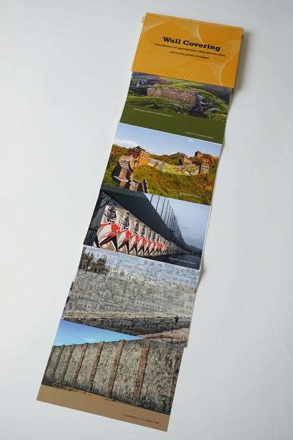
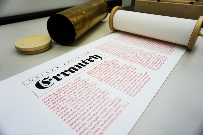
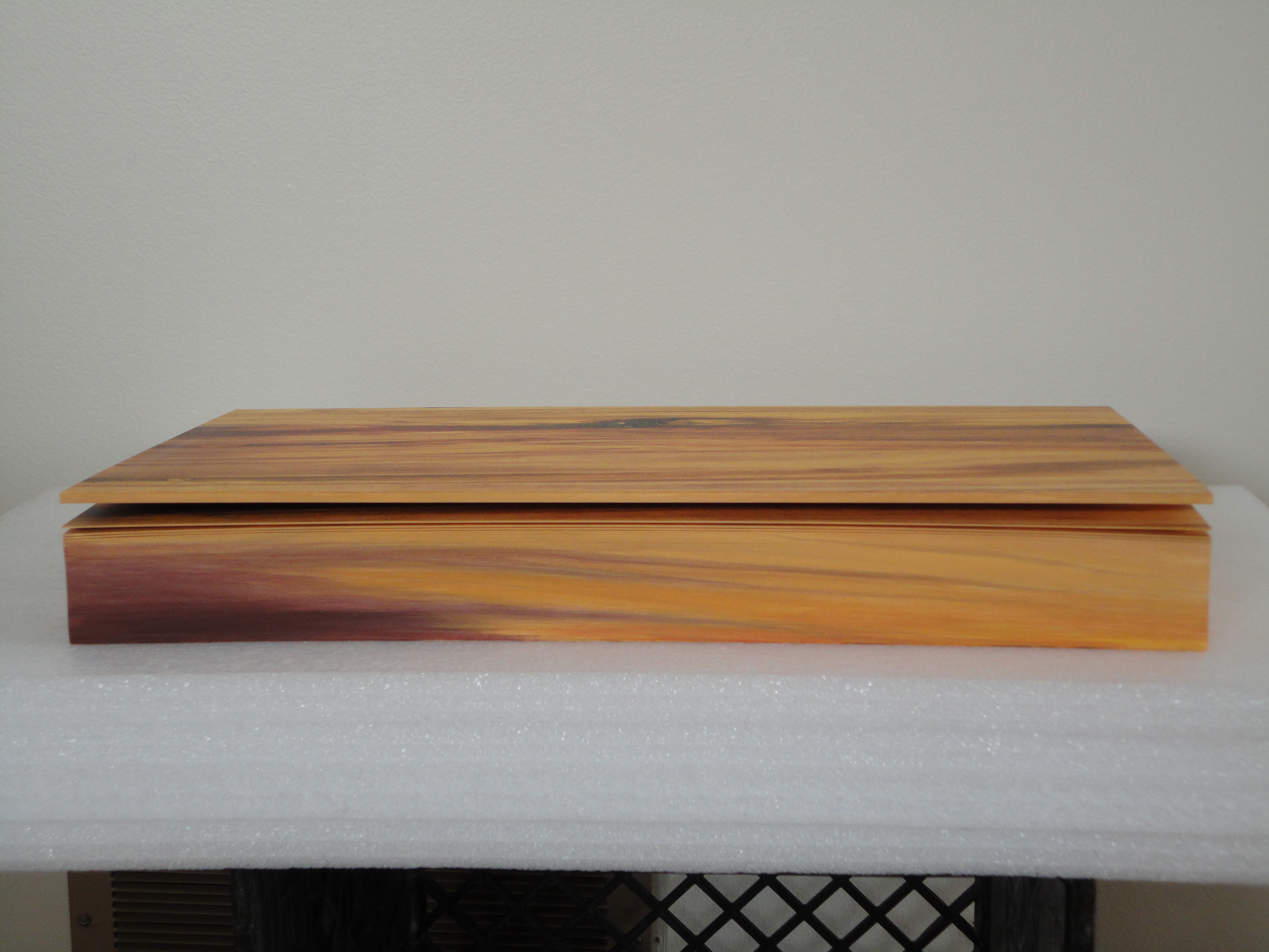
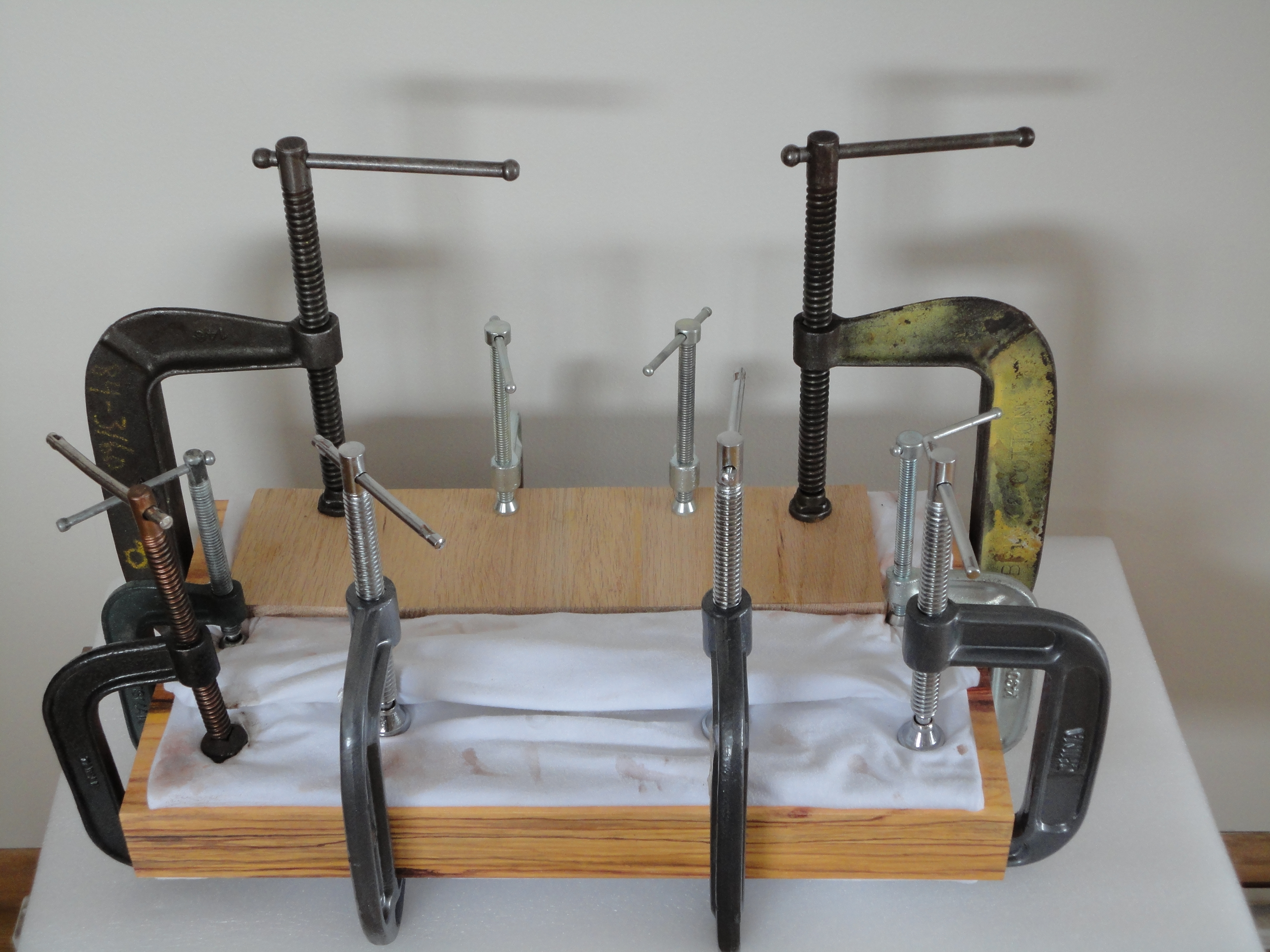
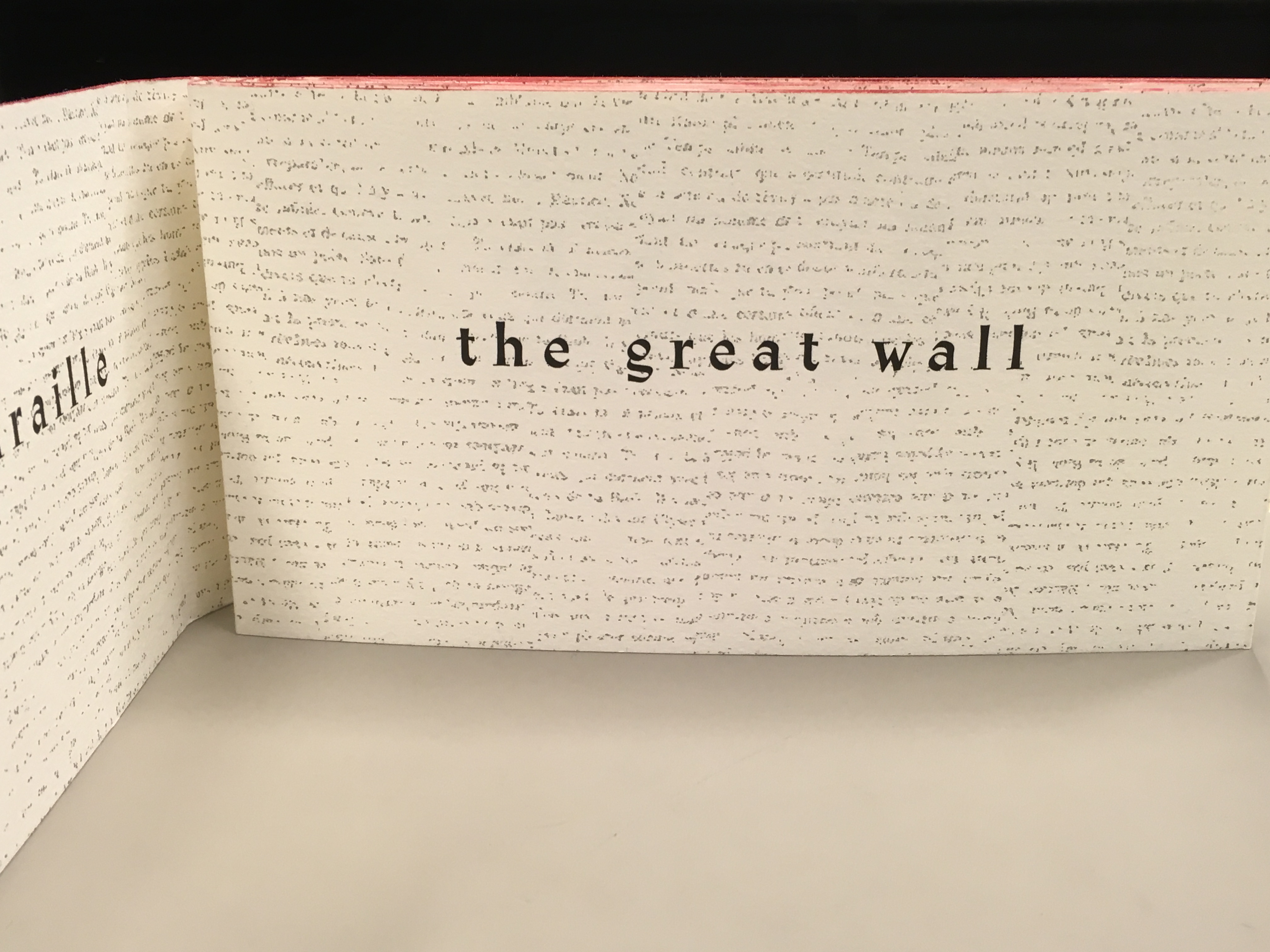
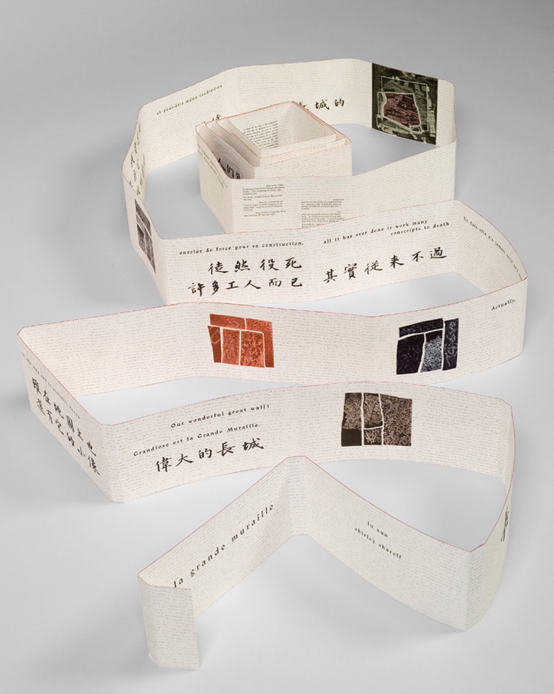
The National Library of the Netherlands advises, “for [Shirley Sharoff’s La grande muraille/The Great Wall (1991)] to be read, the book first must be rolled out”. And that is what I did, using the large table in the Special Collection’s seminar room.
Enjoyable as that was, enjoying it again with the video afterward, something seemed awry. As the Chinese poem by Lu Xun, its French and English translations and text from Sharoff’s language students unrolled, interpersed with her prints, the text seemed to have gaps, or so I thought. So I returned a second time. Perhaps if I re-shot the video. Perhaps if I took more stills and close-ups. Perhaps if I shot the rolling up as well as the unrolling.
No doubt, the second effort added to the pleasure. Looking at the videos and stills, I can again feel between my fingers the Arches paper and engravings’ impressions on it. But still I detected gaps, seeming mismatches between the French and English. I wondered to what degree they
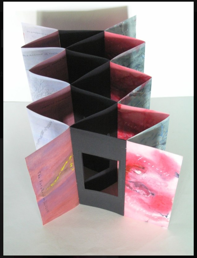
followed the Chinese text or whether some of Lu’s text had been omitted. So, I returned a third time, and then came my “ah hah” moment. Unrolled, La grande muraille looks like a double-sided leporello or accordion book like this one: In Mexico by Helen Douglas.
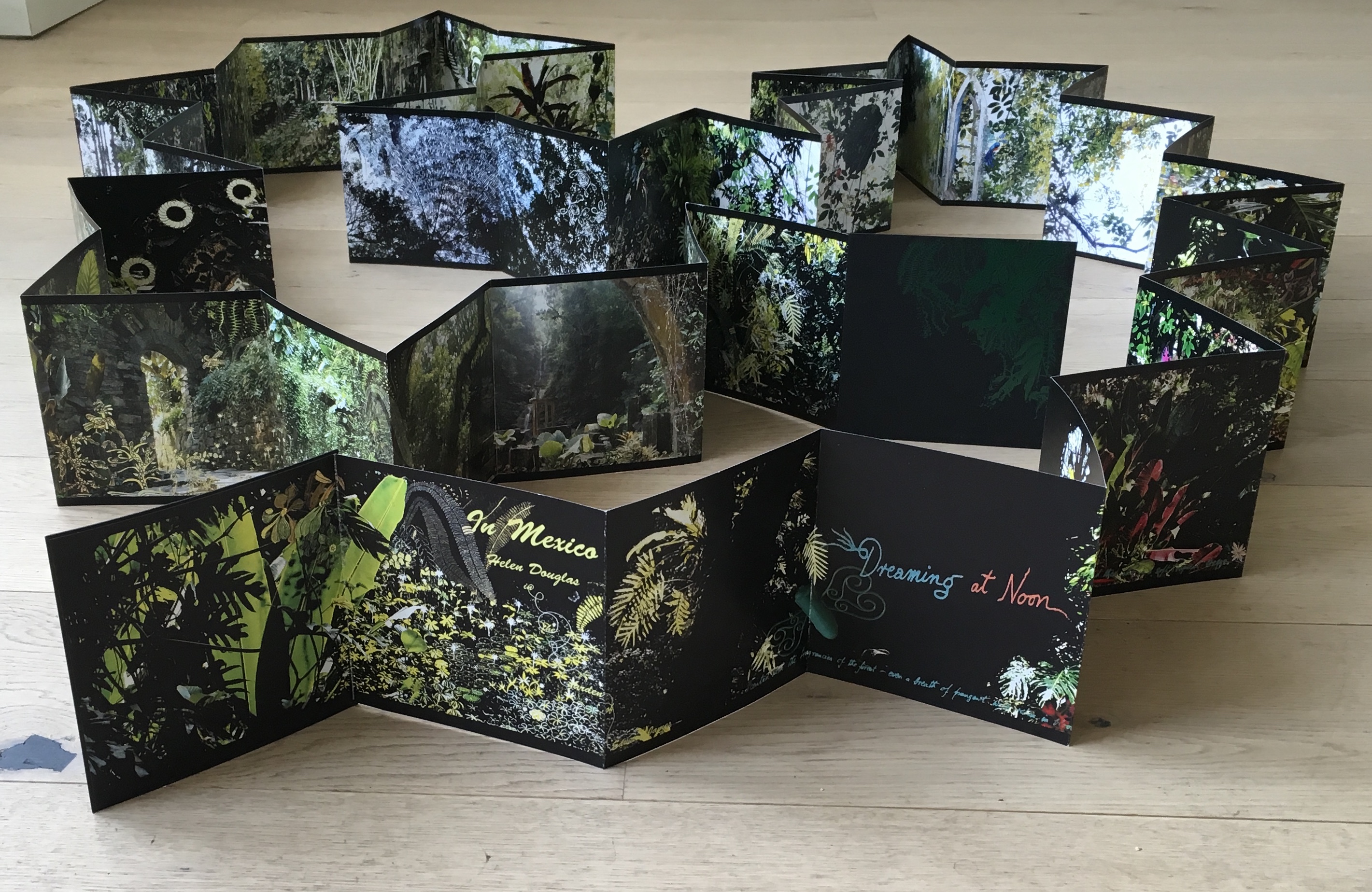
Helen Douglas
Shirley Sharoff
Photo credit: © Koopman Collection. National Library of the Netherlands/Jos Uljee
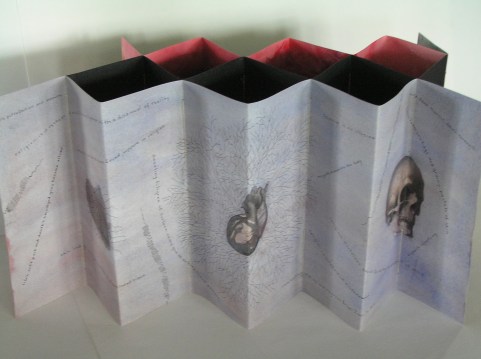
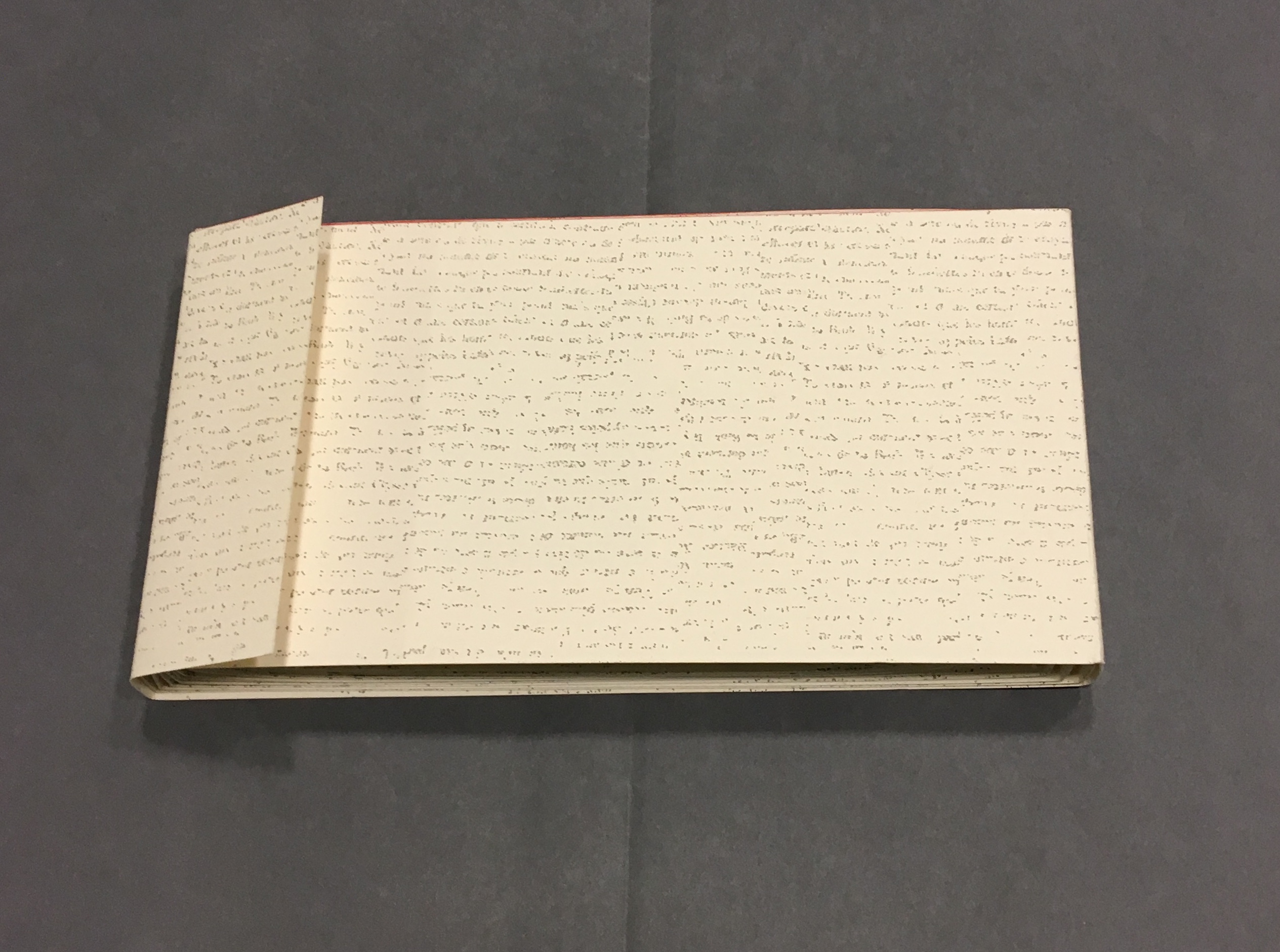
To read La grande muraille as the double-sided leporello it appears to be, however, is to overlook the multi-page spreads that Sharoff conceived with François Da Ros (her typography and print collaborator) in putting together this forme en escargot (snail-shell form as she calls it). The snail-shell form, its multi-page spreads and the text demand that you read La grande muraille as you unroll it, or rather, as you unfold it.
With the book laid flat, the “page spreads” are easier to recognize, the text is easier to read, and the forethought needed for the “imposition” of text and images to deliver the sequential text, easier to marvel at. As each recto page is turned to the right, two new pages appear to the right. This unfolding approach to reading the book offers several intriguing “double- and multi-page spreads” and an experience of the texts and eight prints in the sequence driven by the text. When you have finished reading in this sequence, you will have read both sides of the scroll.
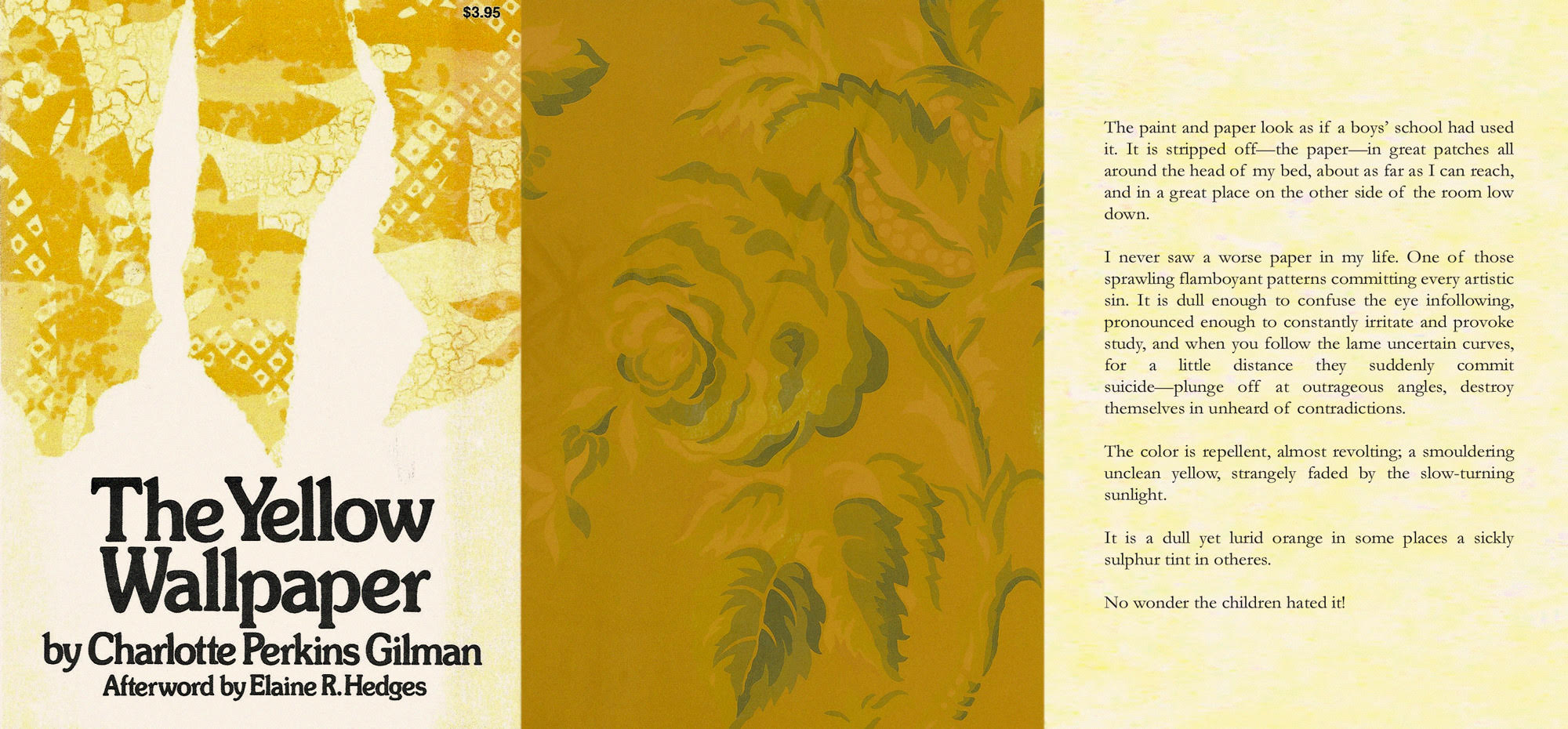
Reading the text
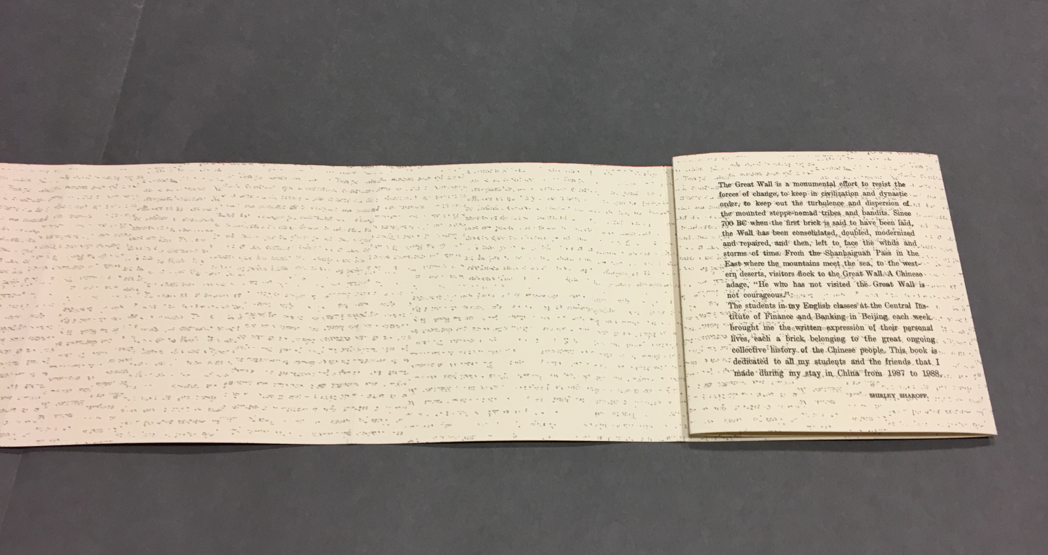
La grande muraille/The Great Wall (1991), Shirley Sharoff
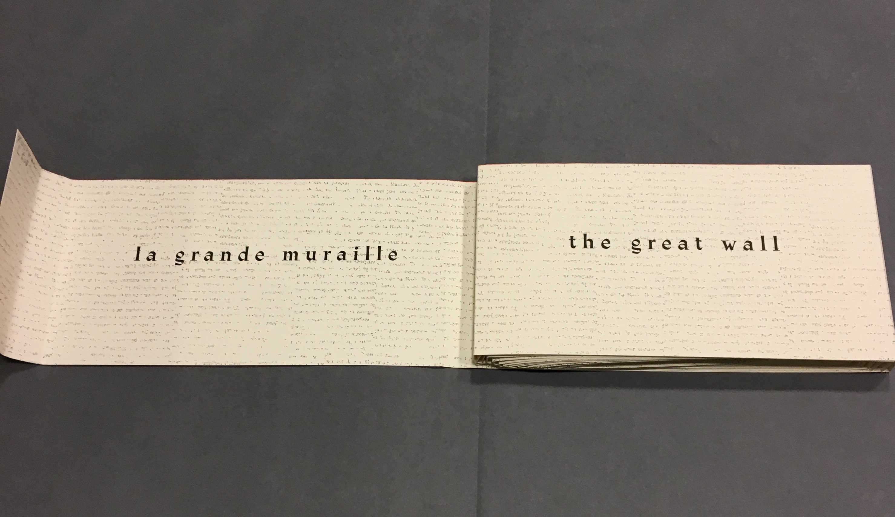
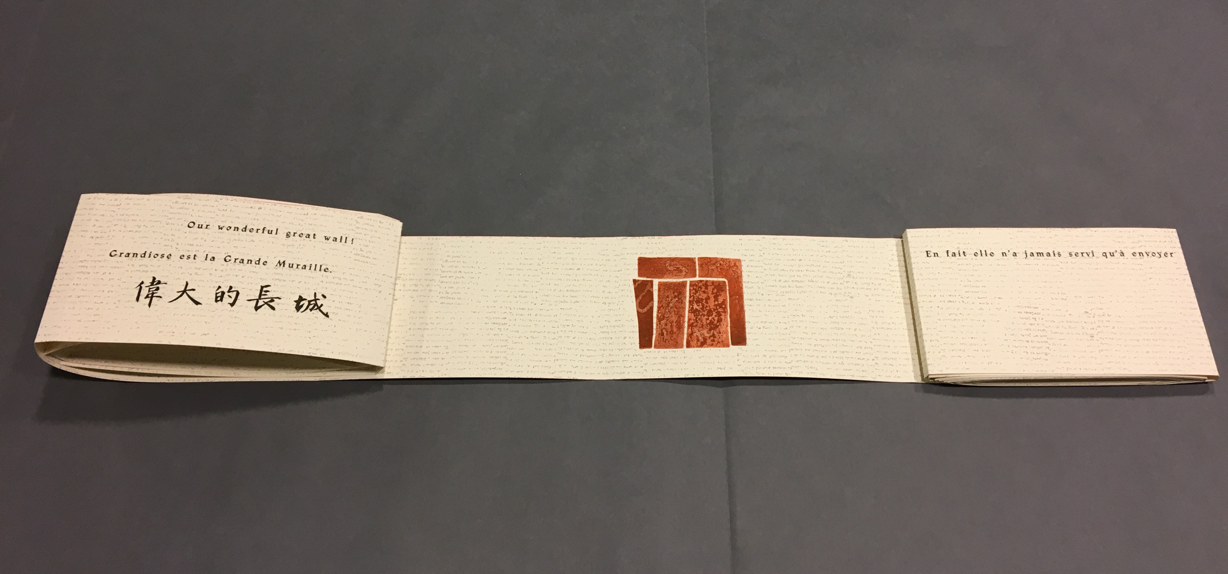
As “page 2” is turned to the right and the English title of the work disappears, “pages 3 and 4” come into view.
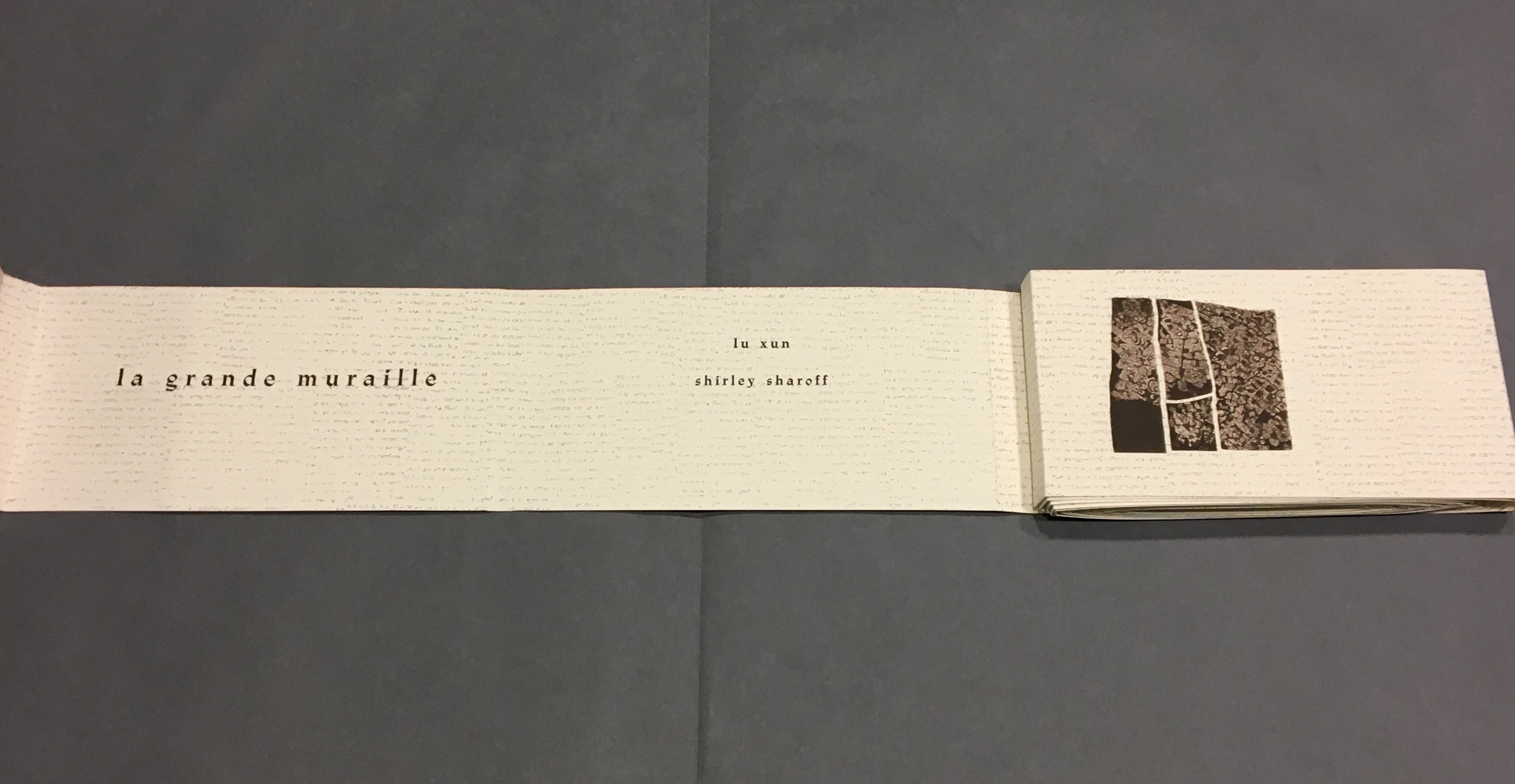
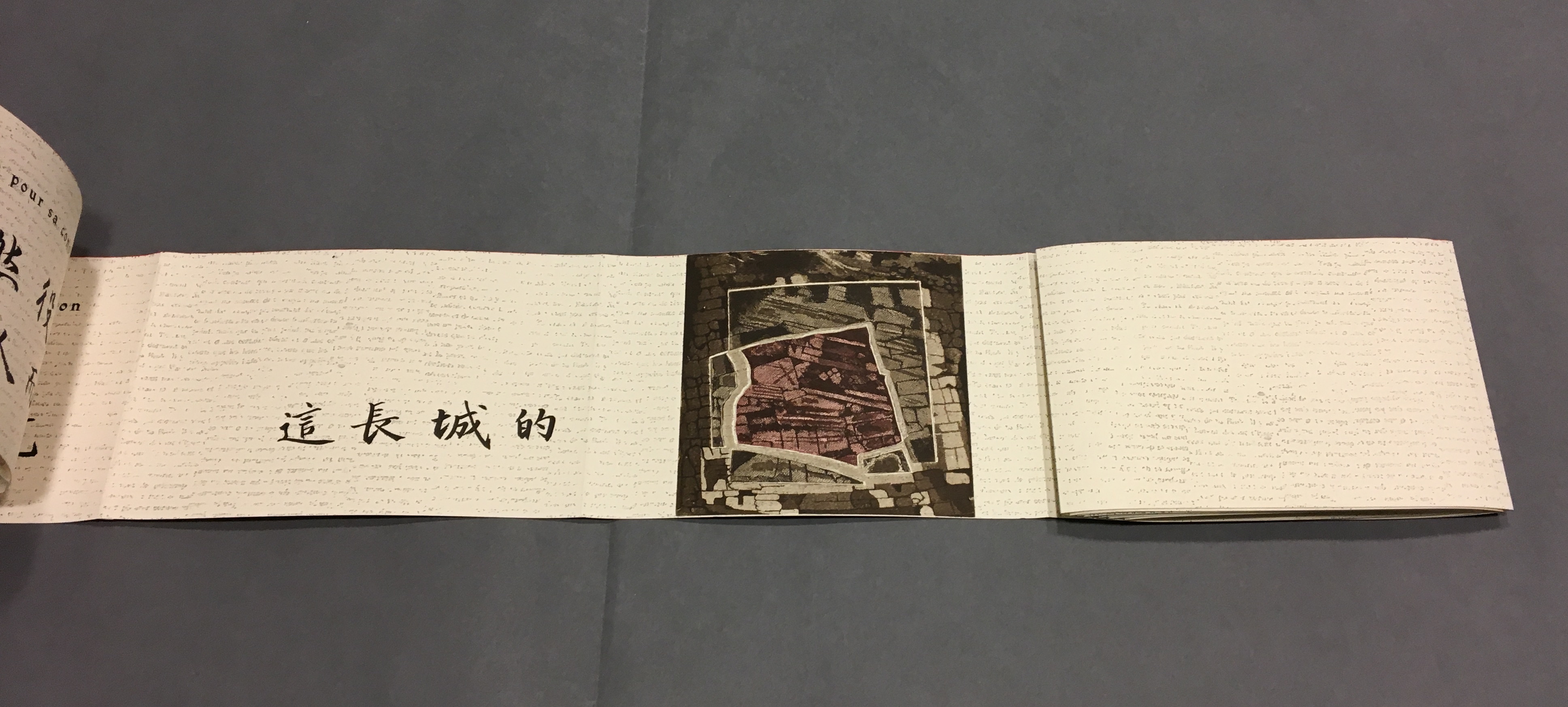
“Page 3” displays the authors names, and “page 4” displays the first of eight prints in the book. As “page 4” is turned to the right and disappears, “pages 5 and 6” appear.
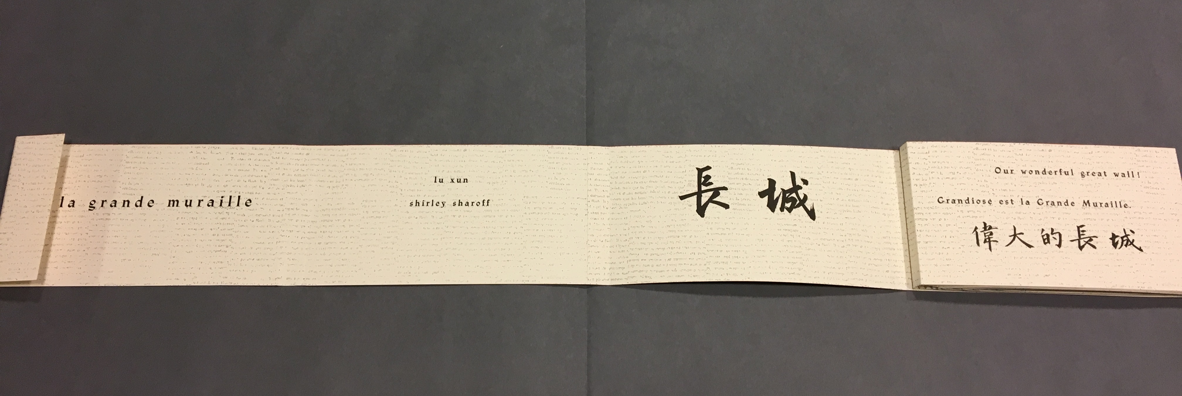
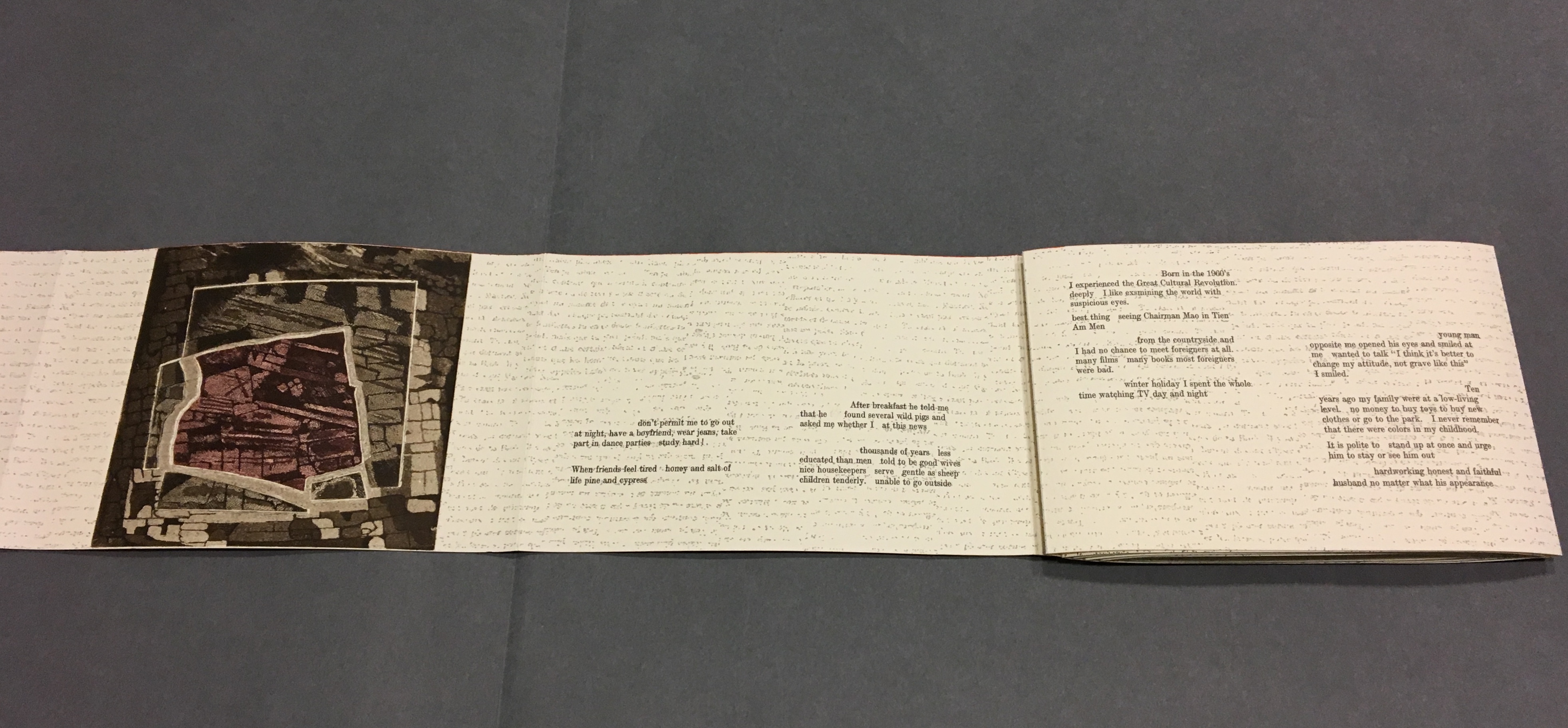
“Page 5” gives the title of the book in Chinese calligraphy. On “page 6”, the opening line of Lu Xun’s text appears in English, French and Chinese.
Turning “page 1” to the right will cover the authors’ names on “page 3”, and turning “page 6” to the right will yield the next four-page view.
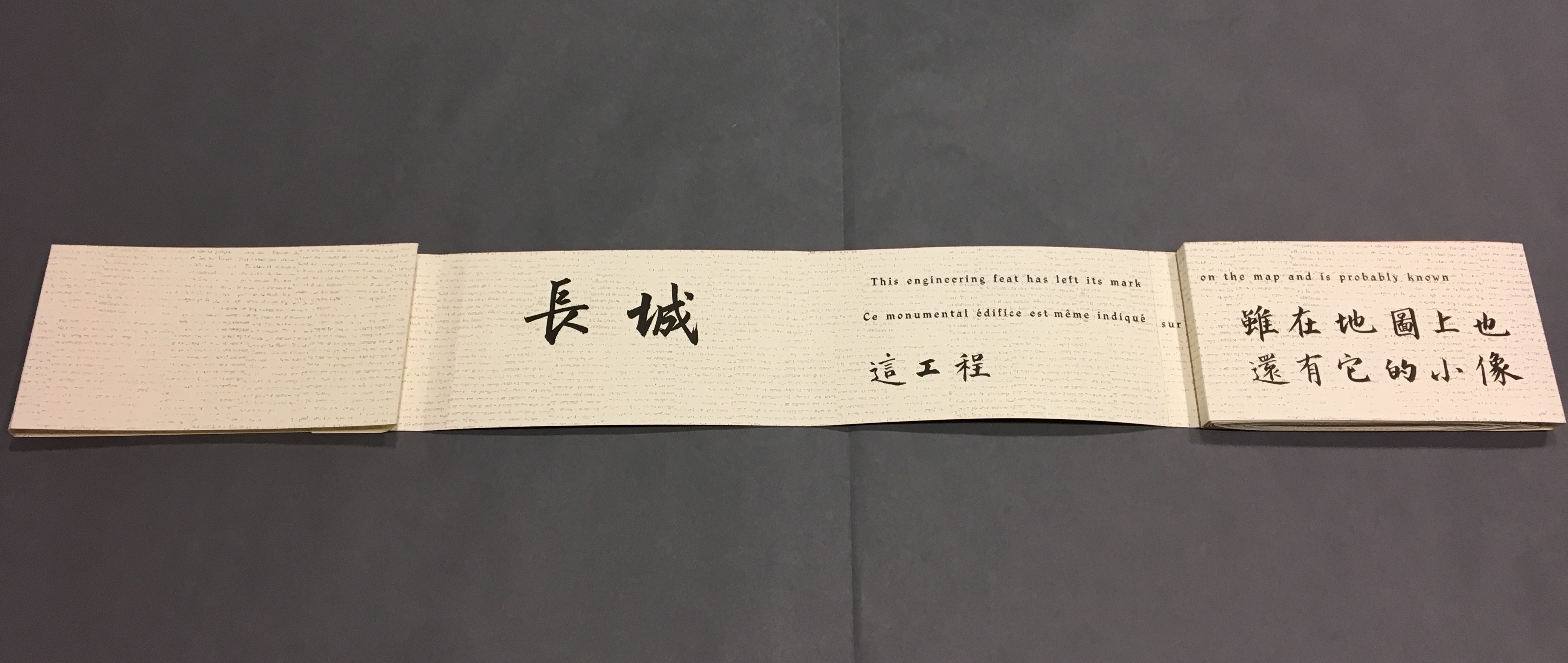
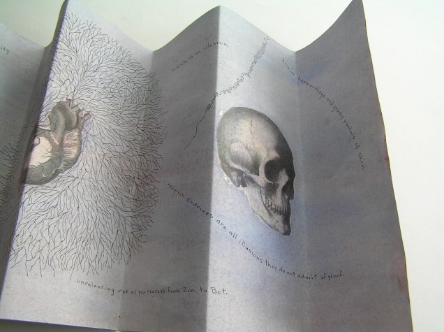
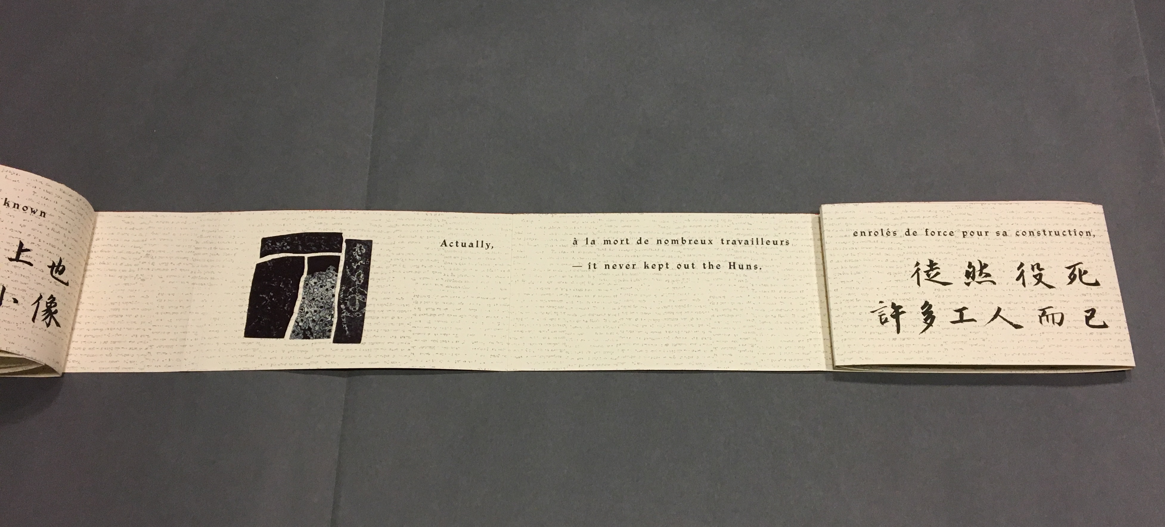
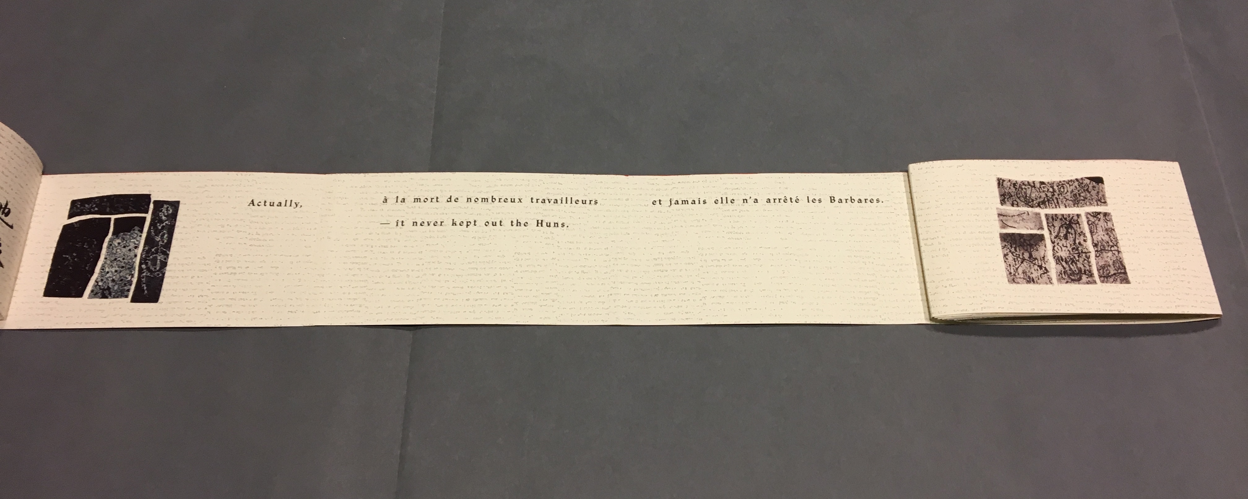
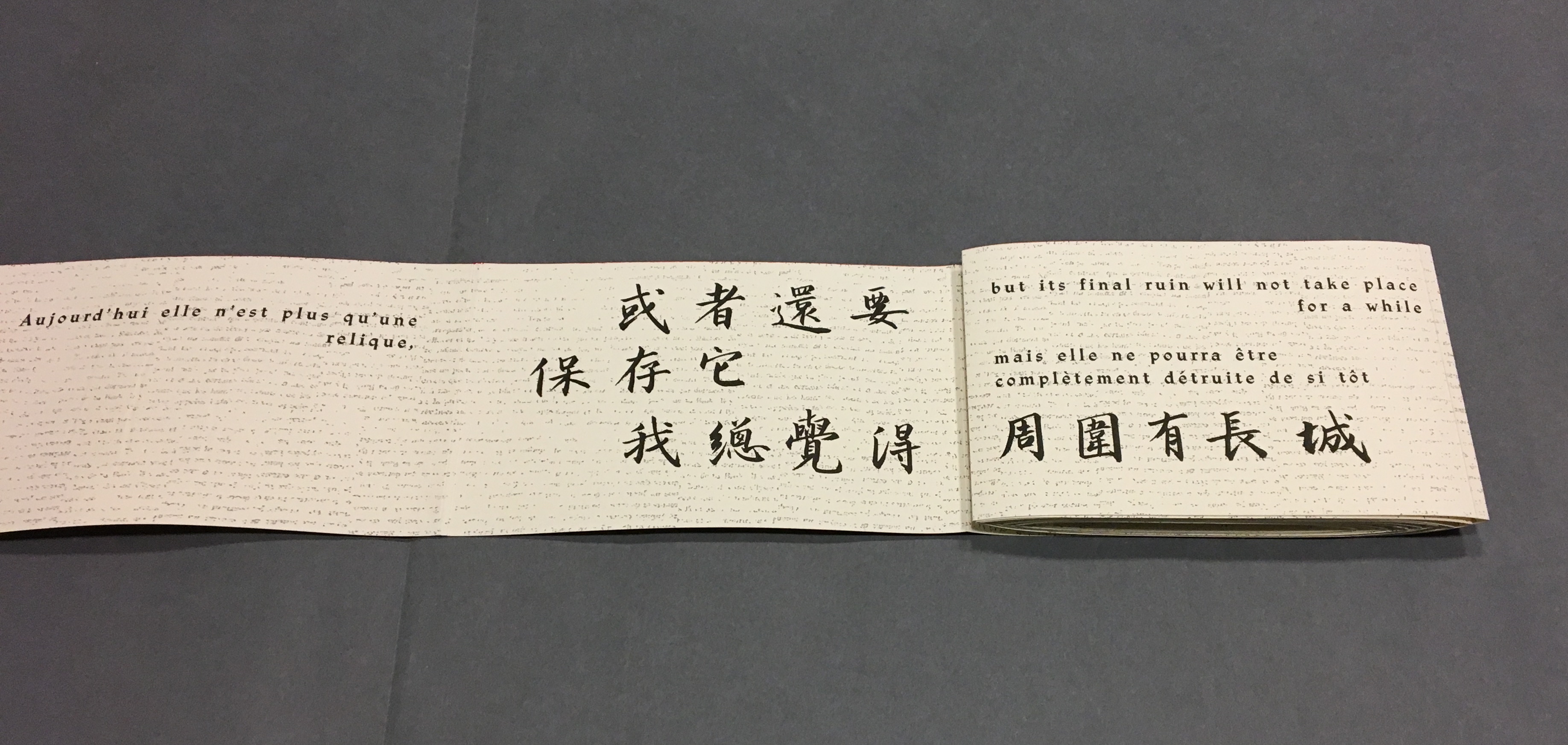
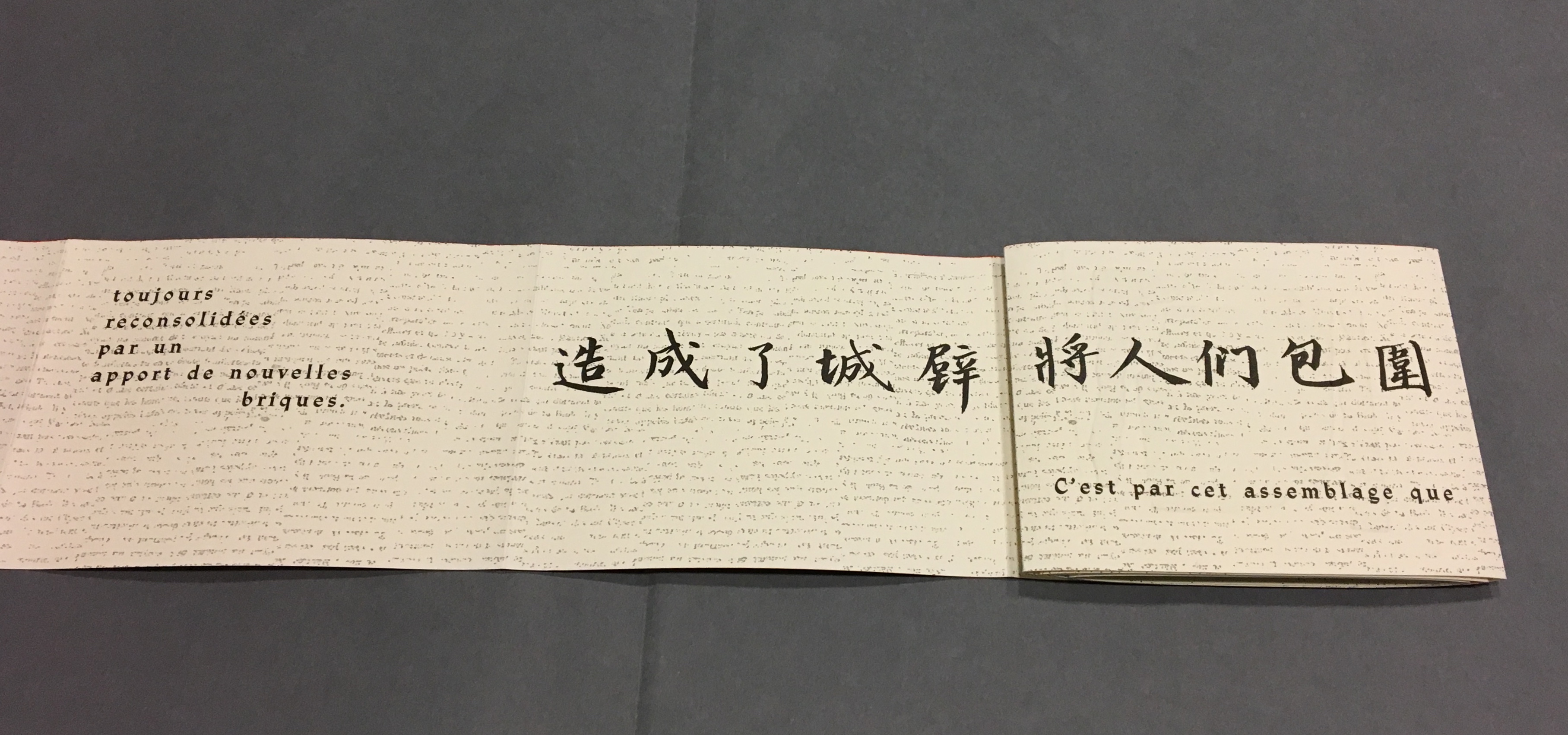
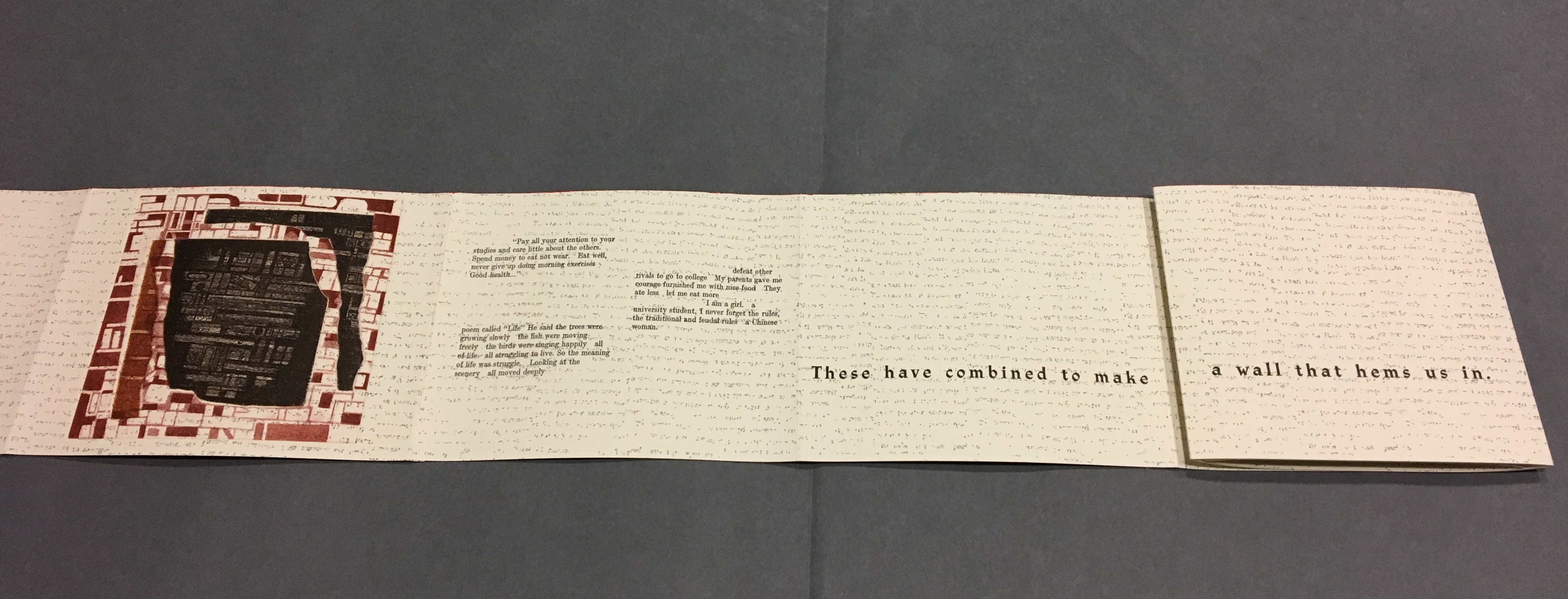
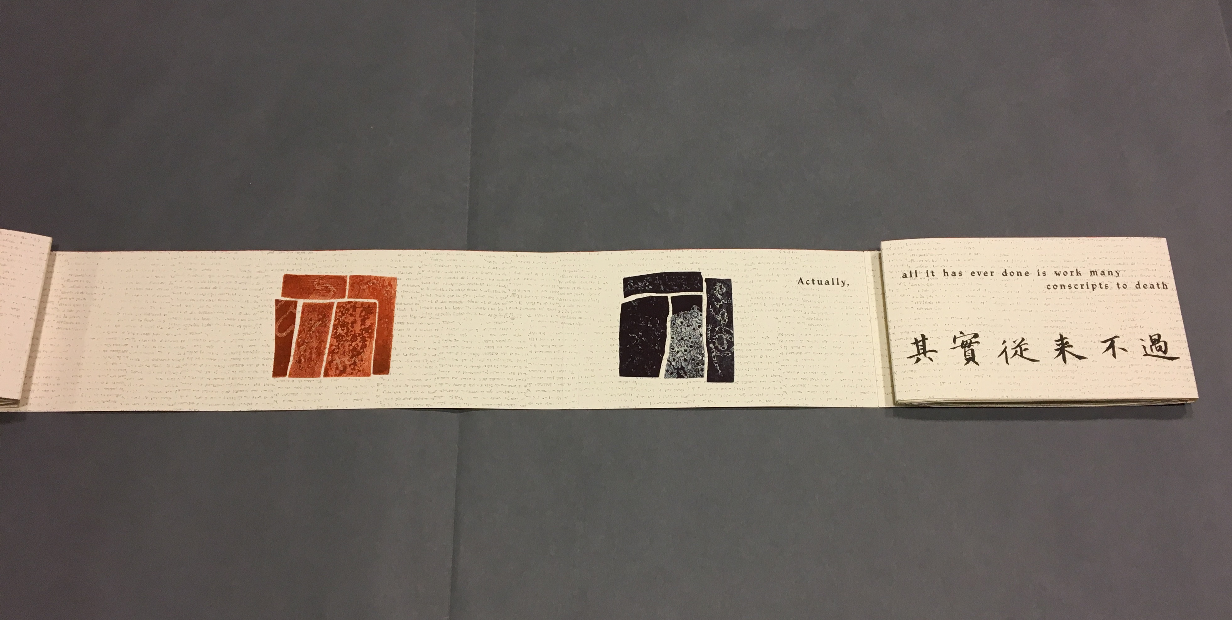
The next lines of Lu Xun’s disquisition run in English, French and Chinese across “pages 7-8”.
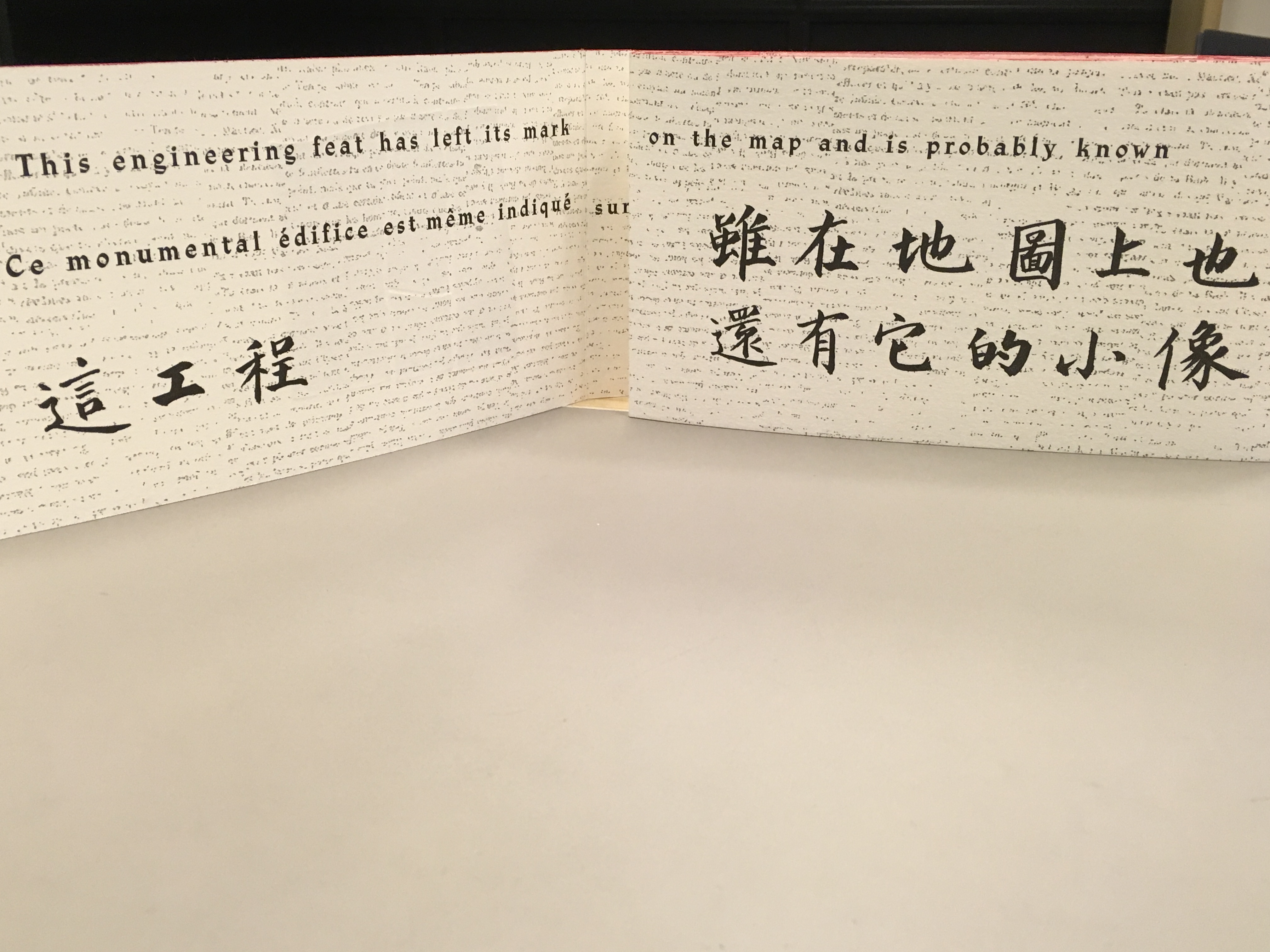
Notice how the English text on “page 7” runs across to “page 8”, but the French text disappears under “page 8”, effectively running on to what will be revealed as “page 9” in the next view.
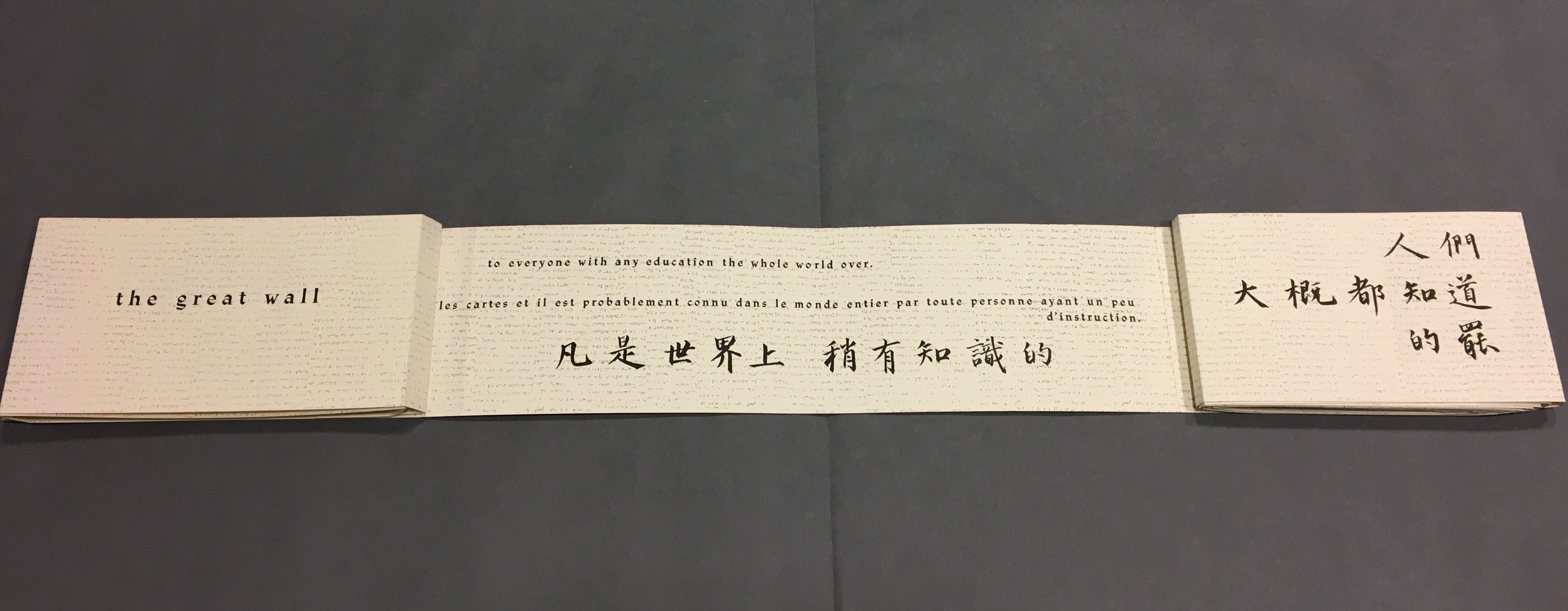
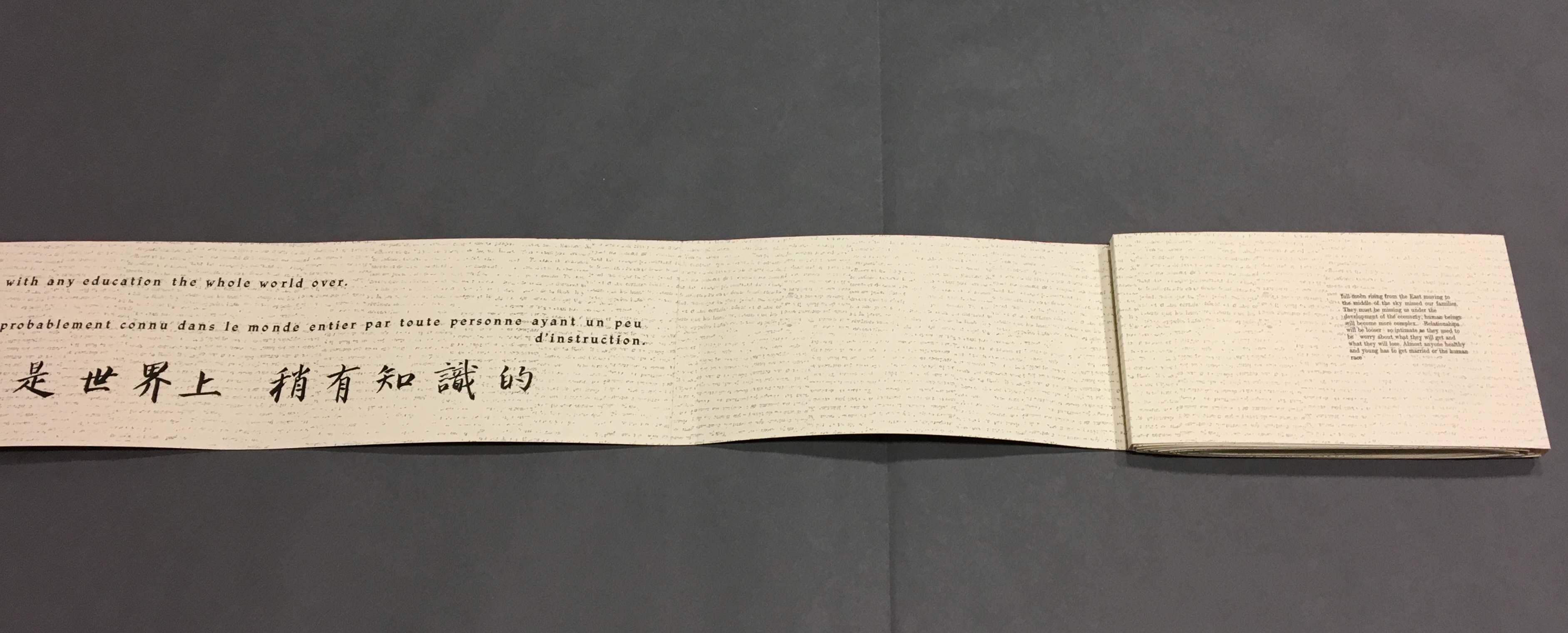
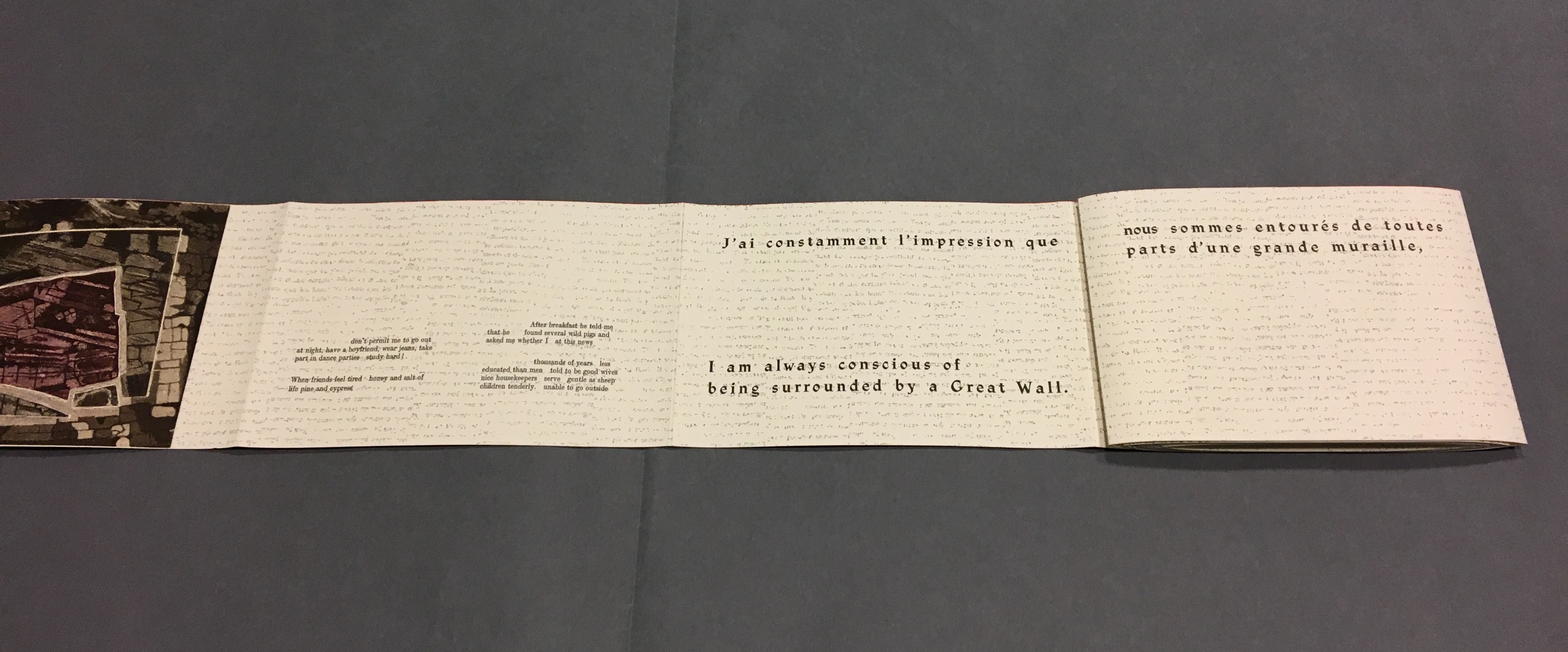
This view results from two page turns inward on the left and two outward on the right. “Page 2” has come back into view on the left. The English text on pages 9-10 completes the sentence interrupted on “page 8”. The French text on “pages 9 and 10” completes the sentence that began on “page 7” and ran behind “page 8”.


這偉大而可詛咒的長城)
Now that the so-called gaps in the English and French texts were resolved, I wanted to understand how the English and French matched up to the Chinese text. For that, I asked help from two acquaintances in The Hague: Bee Leng Bee and Yingxian Song. They obtained a copy of Lu Xun’s text, traced it through the photos I had taken and found that the three languages run almost in parallel as the work unfolds.
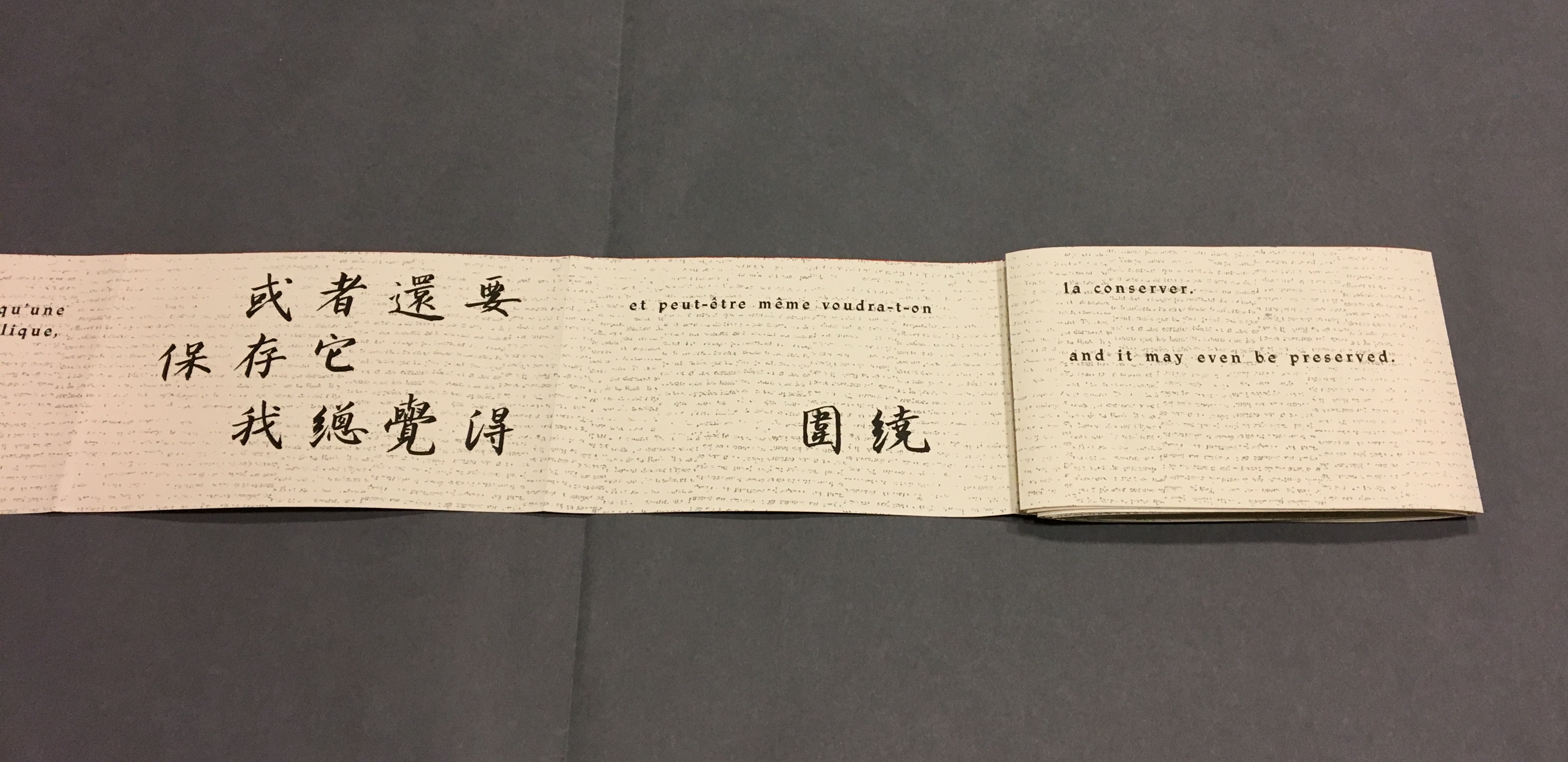
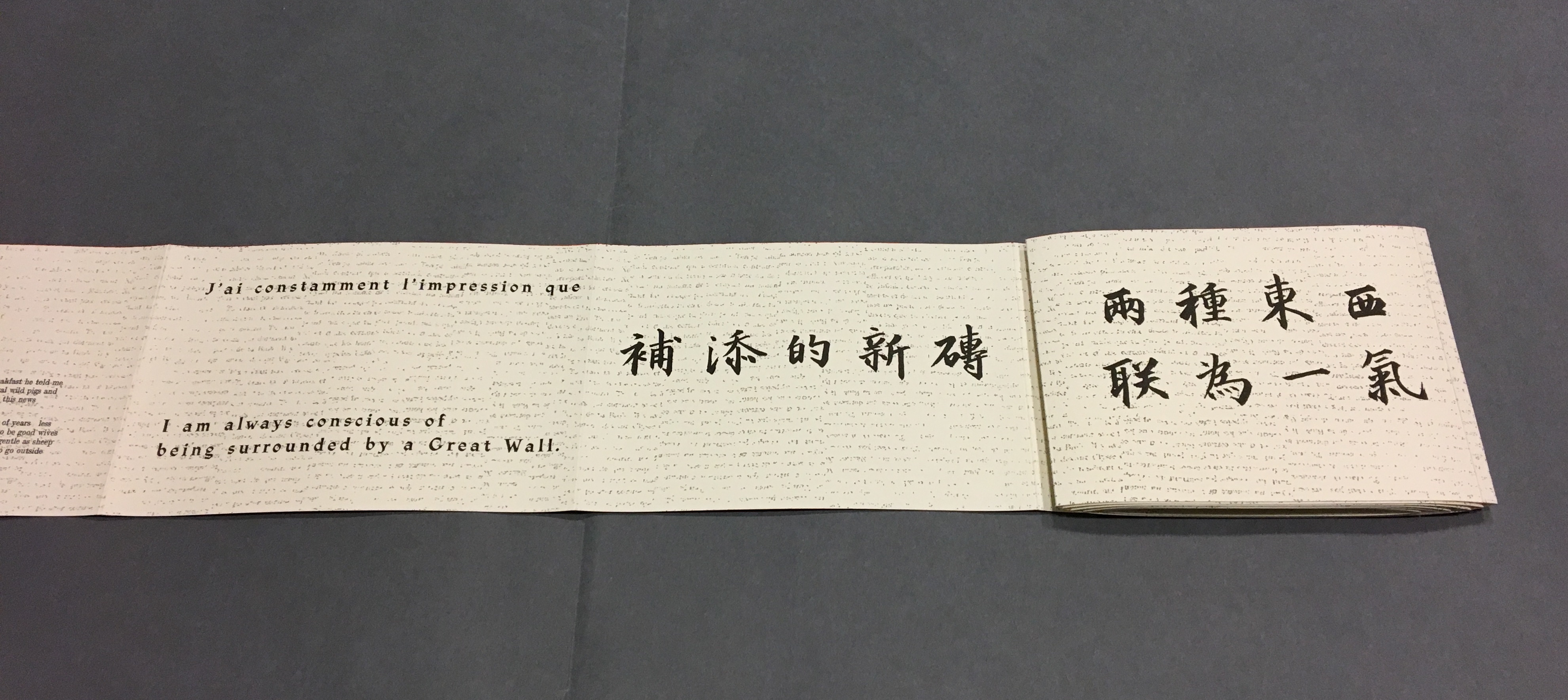
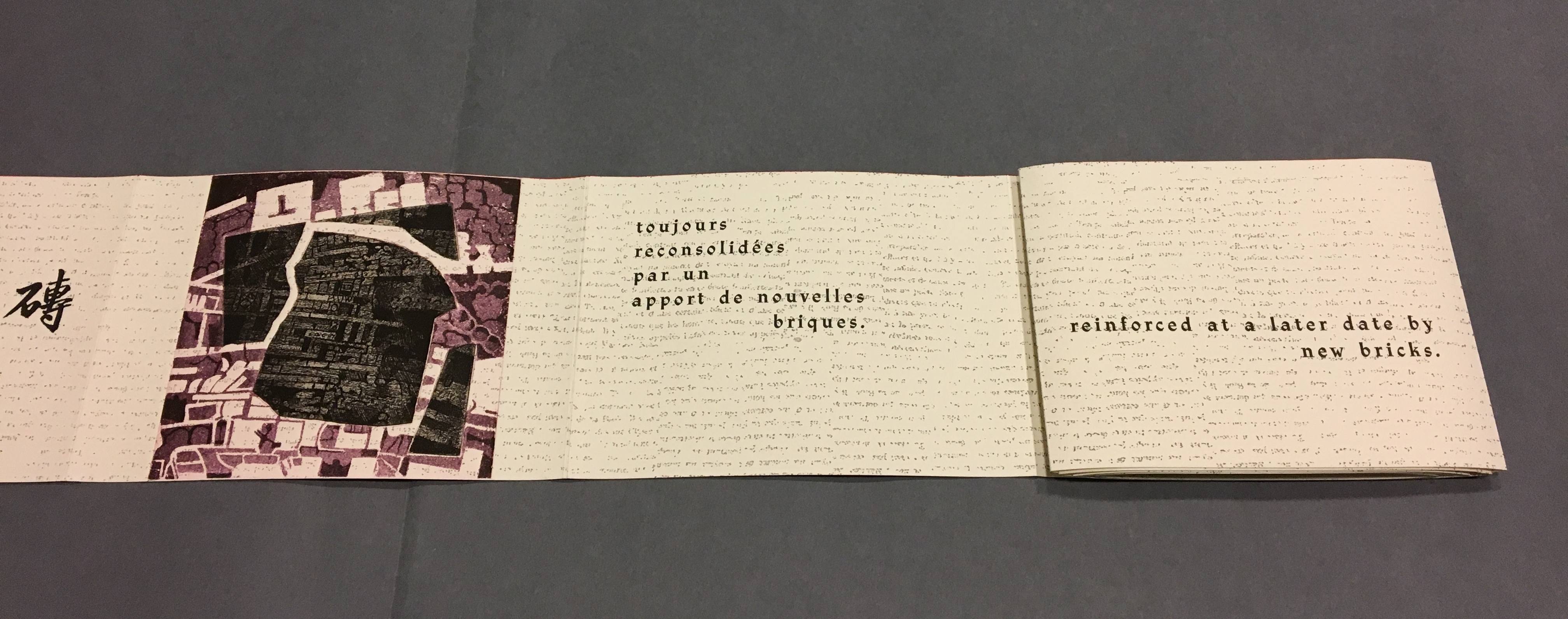
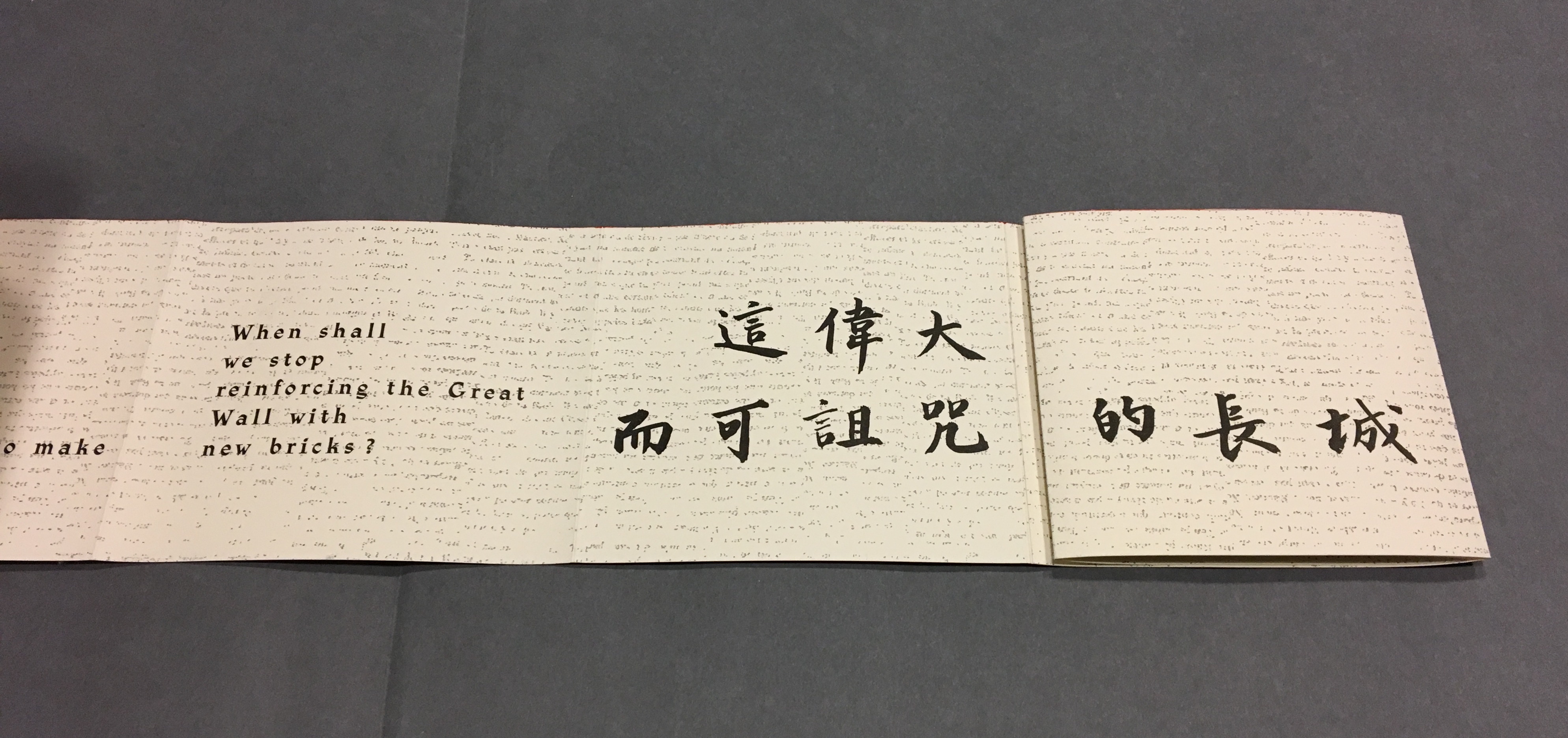
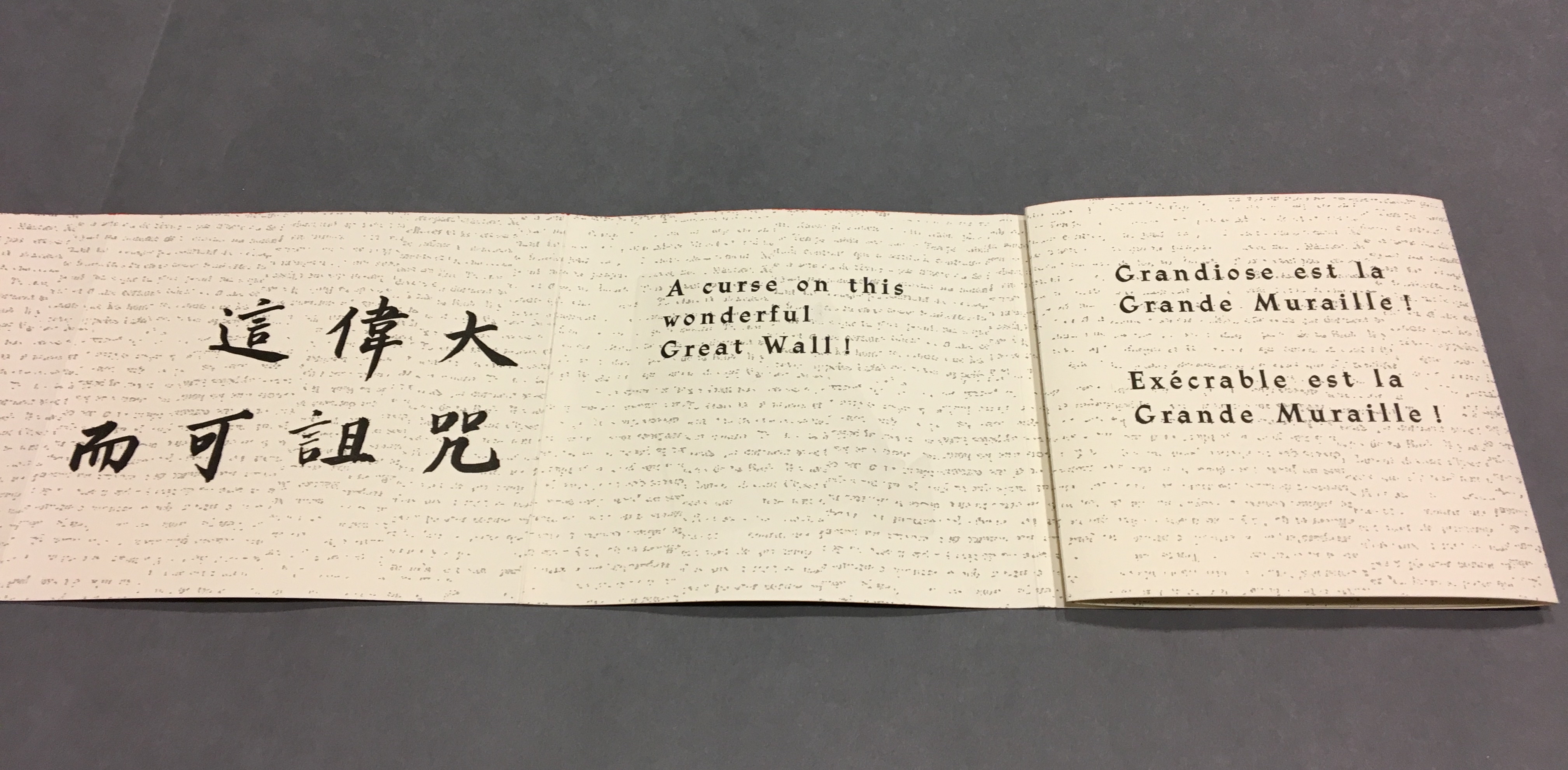
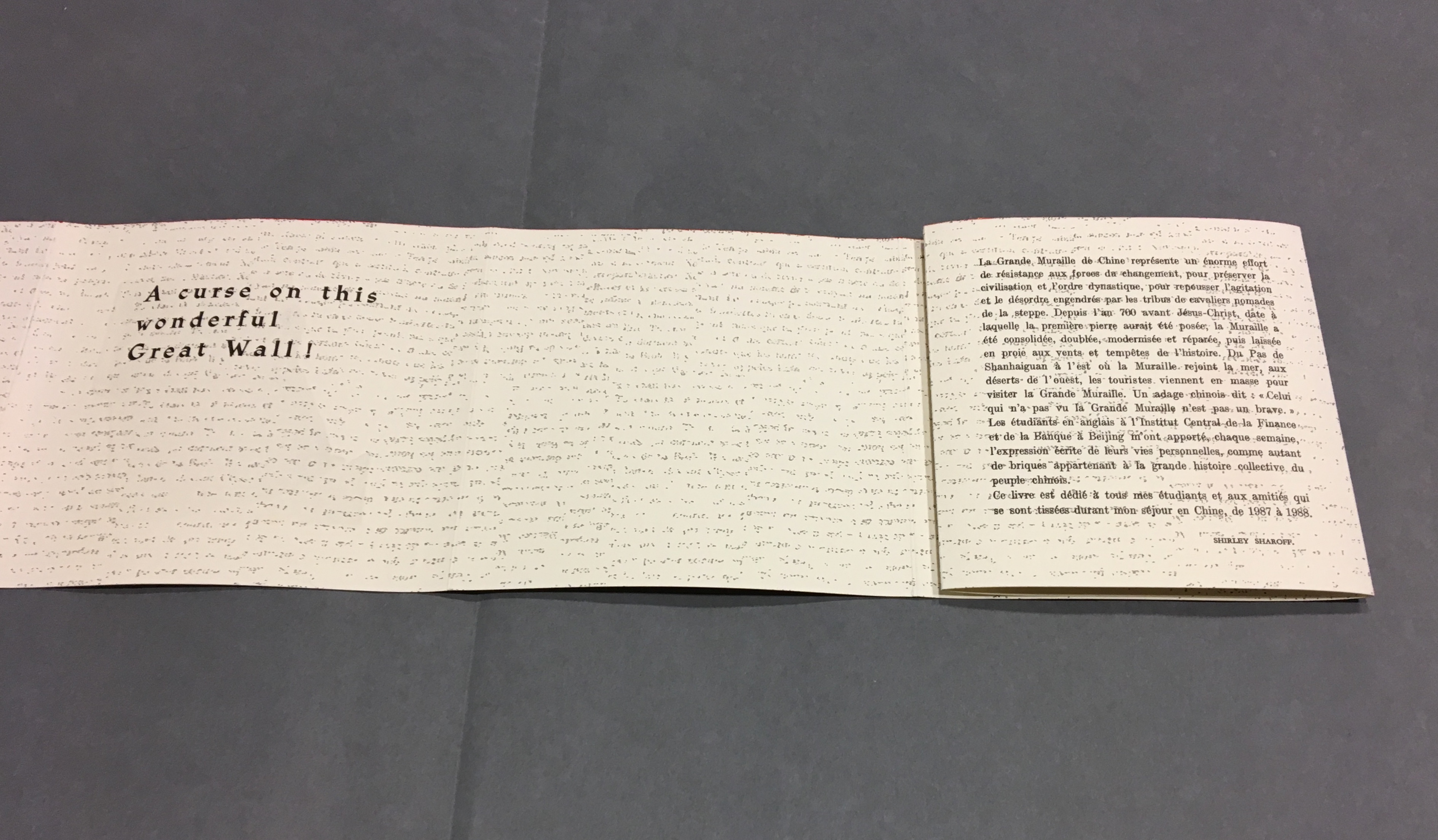
“Almost” because the order of the languages is not alway the same. On pages one and two, we see the French and English titles but must wait until page five before the Chinese title appears. Then, on page six the order changes: English first, then French, then the corresponding ten Chinese characters. On pages seven and eight, this order is maintained. Later, with the turning of page fifteen, the French comes before the English and Chinese; the first Chinese character aligning to the French and English (其) appears on page seventeen. Then, as page seventeen is turned to the right, the order changes back to French then English on page eighteen, but on page nineteen, it moves to French first then Chinese. The book’s textual conclusion on pages fifty-six through fifty-nine runs Chinese, English, then French.
The juxtaposition and weaving of the three languages often seems painterly as if intended to evoke the layering of the bricks and the intertwining vines and foliage along stretches of The Great Wall. Here is the uninterrupted Chinese text:
偉大的長城!
這工程,雖在地圖上也還有它的小像,凡是世界上稍有知識的人們,大概都知道的罷。
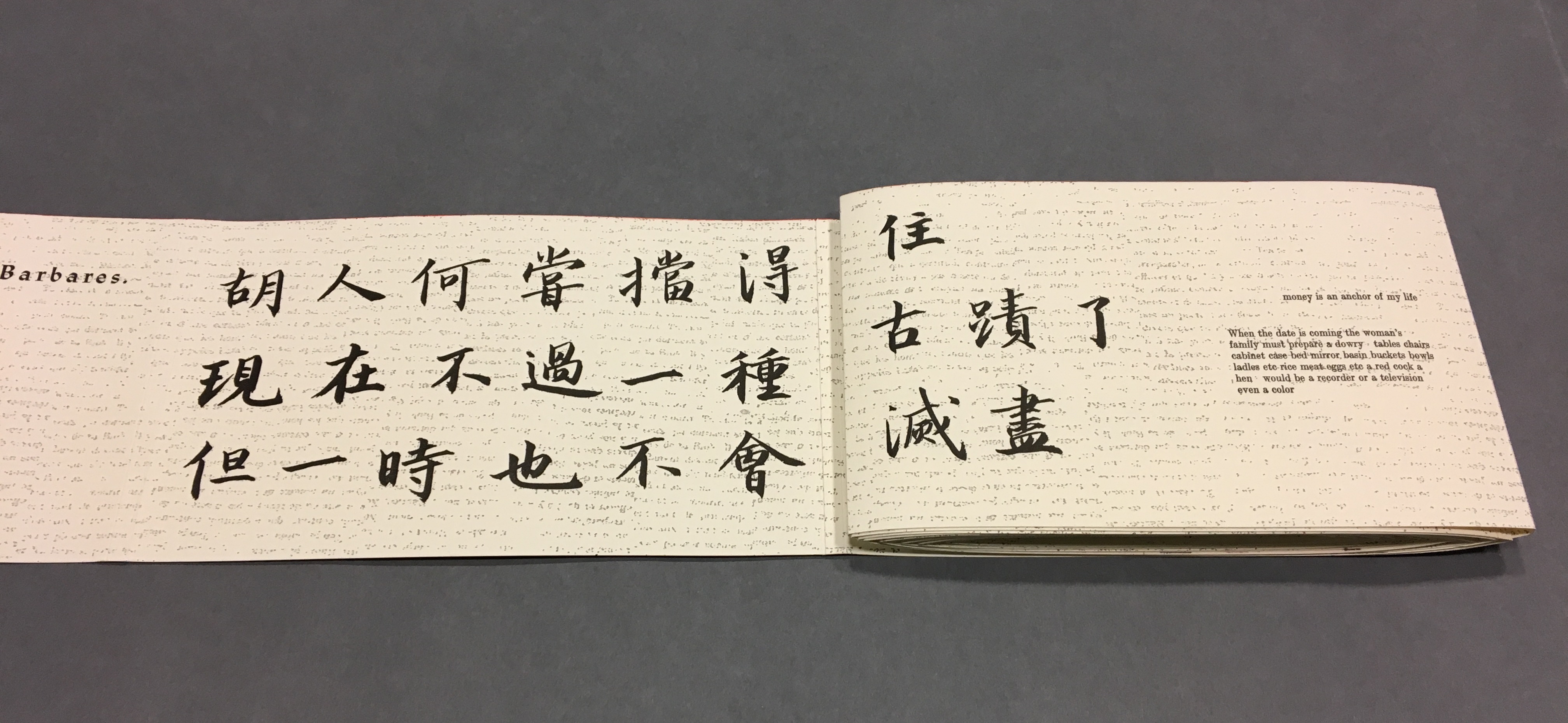
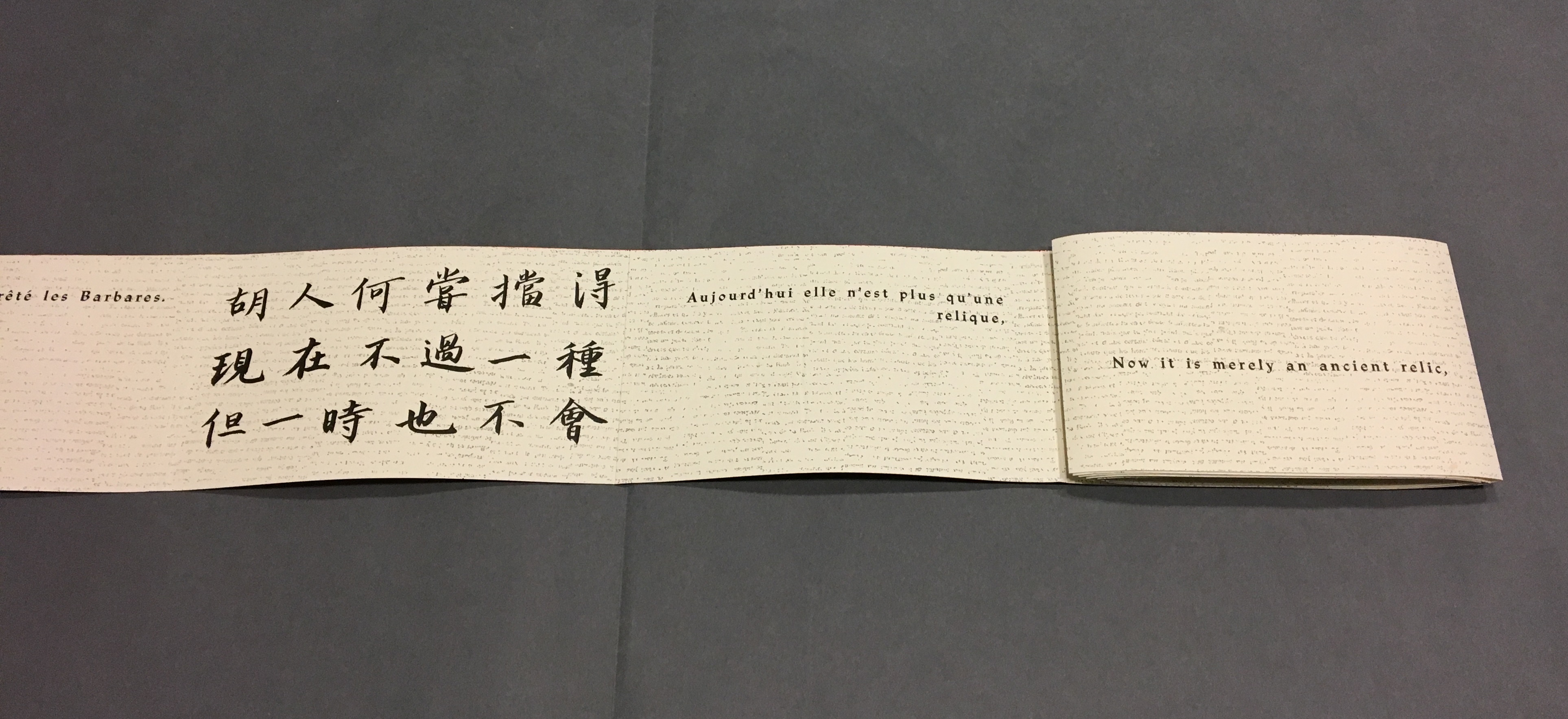
其實,從來不過徒然役死許多工人而已,胡人何嘗擋得住。現在不過一種古跡了,但一時也不會滅盡,或者還要保存它。
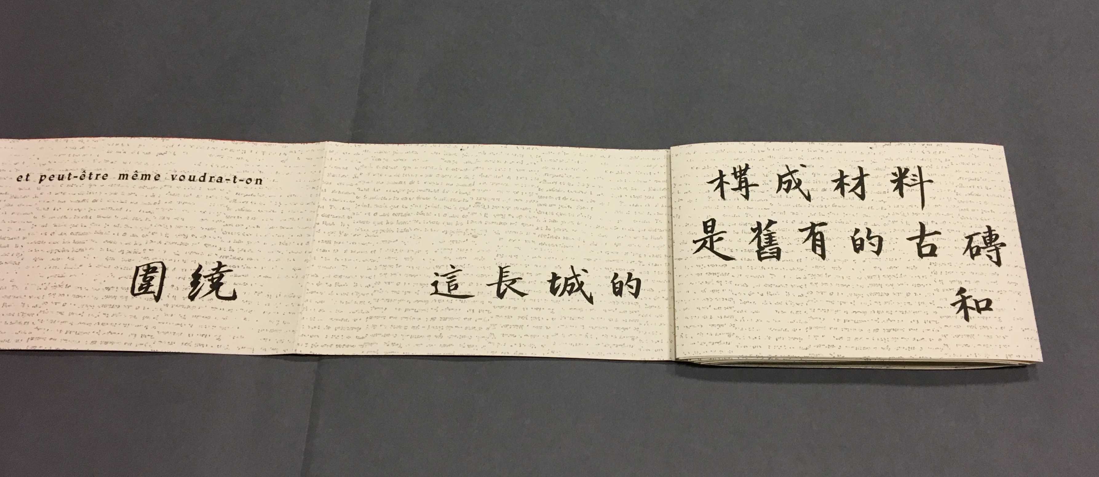
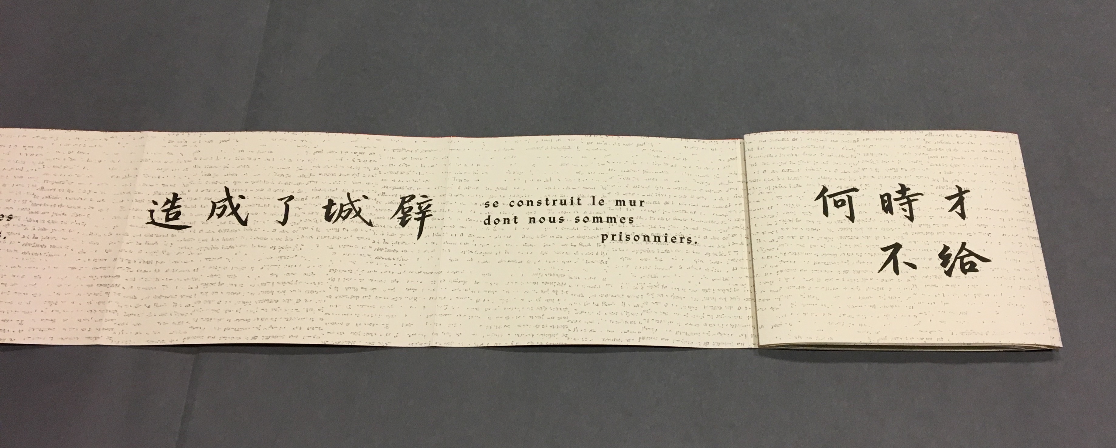
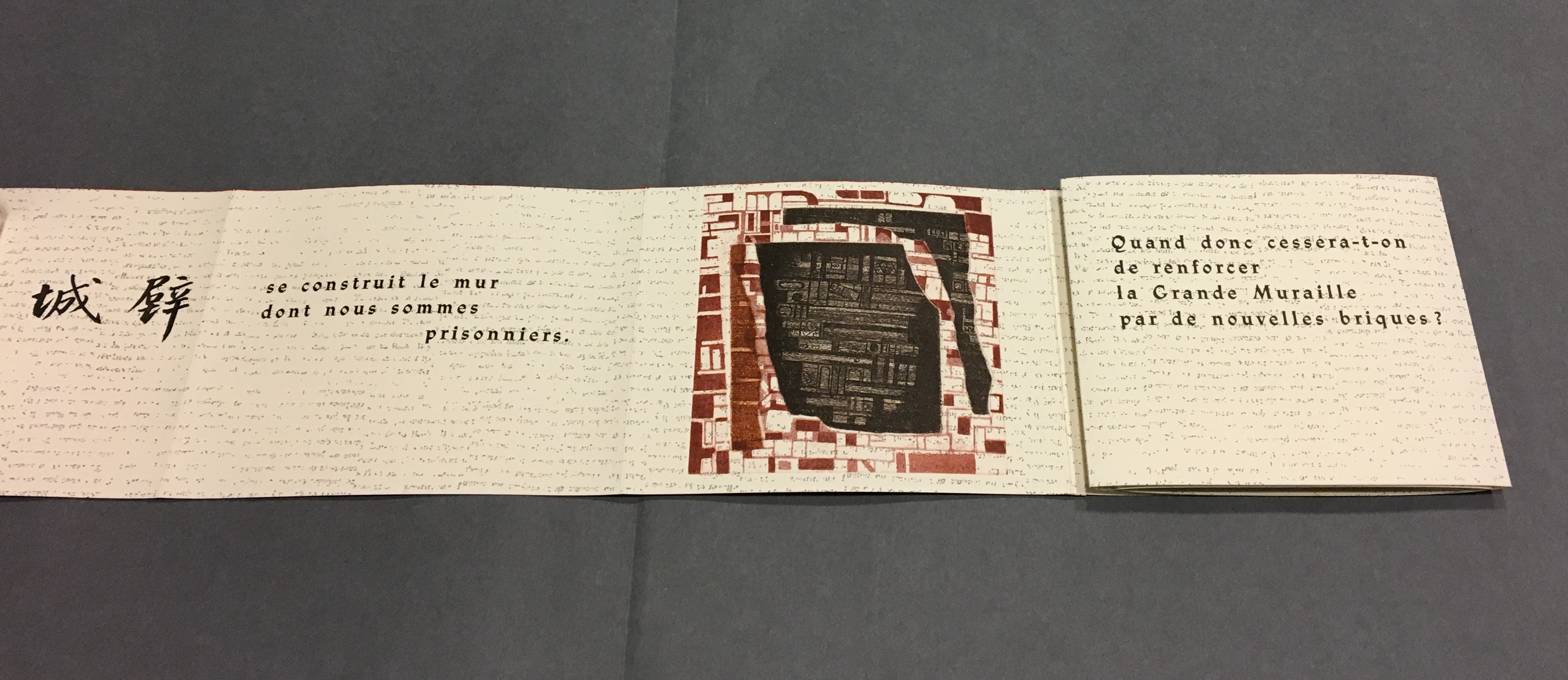
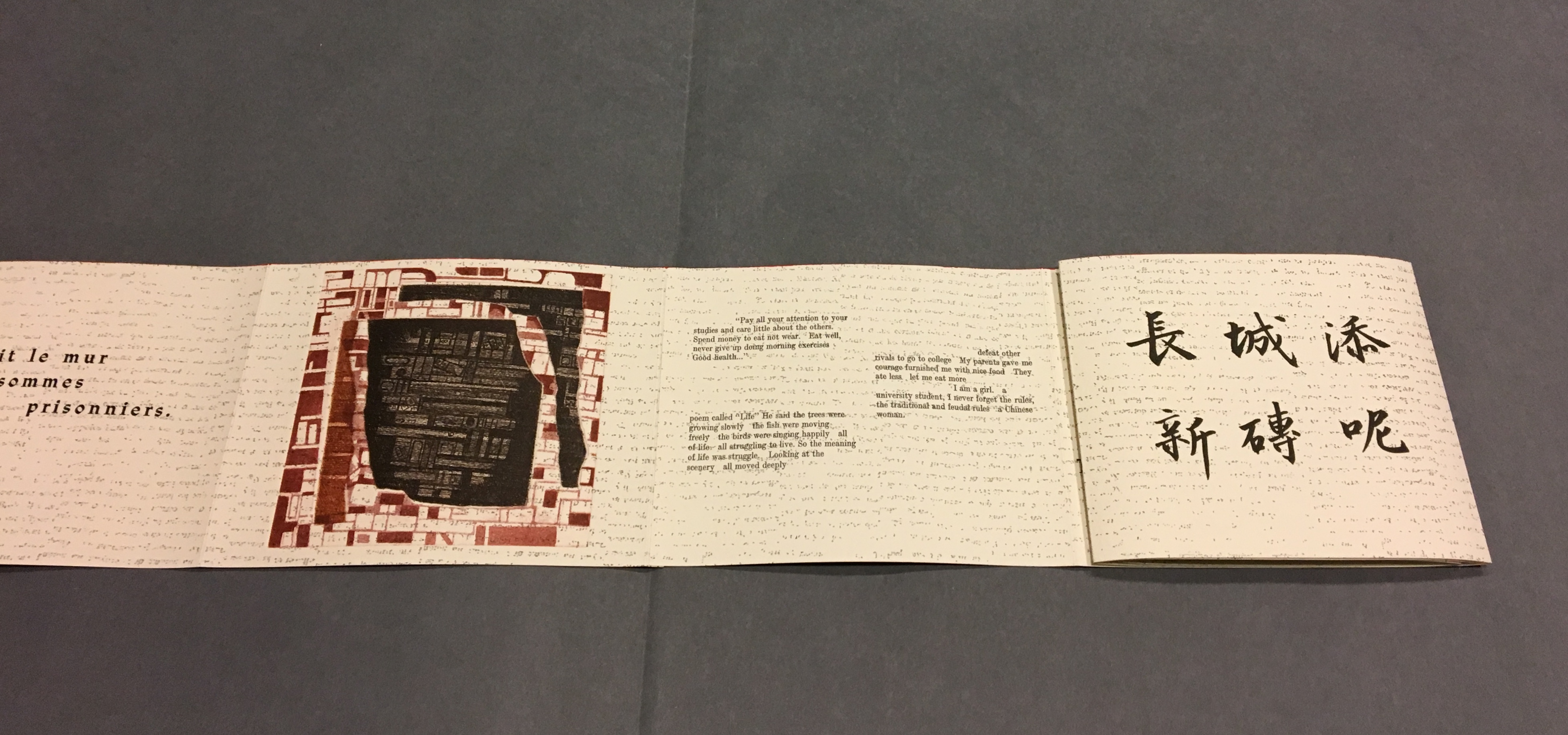
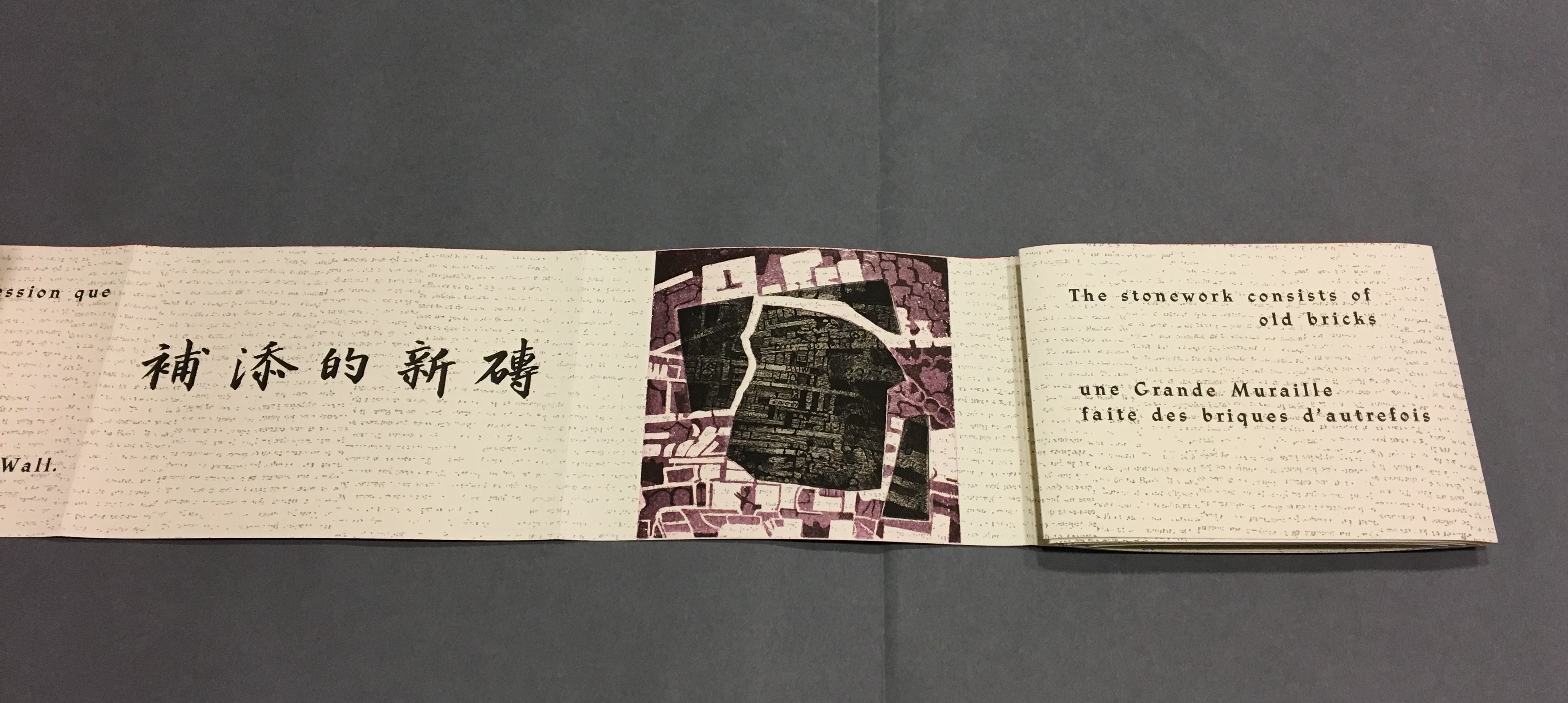
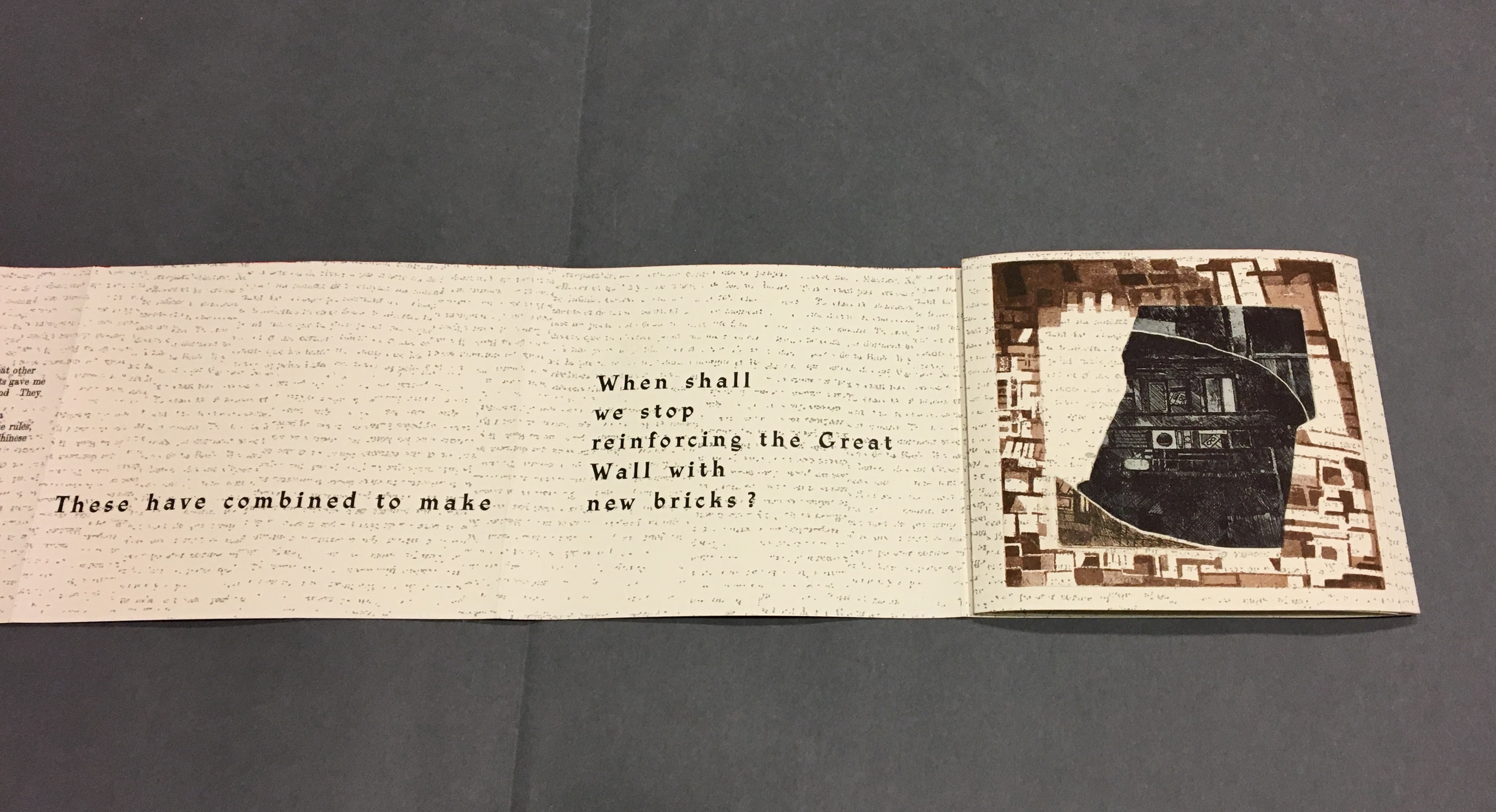
我總覺得周圍有長城圍繞。這長城的構成材料,是舊有的古磚和補添的新磚。兩種東西聯為一氣造成了城壁,將人們包圍。
何時才不給長城添新磚呢?
這偉大而可詛咒的長城!
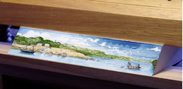
Reading the images
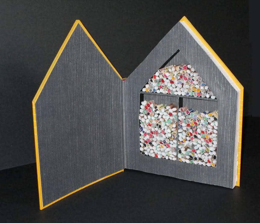
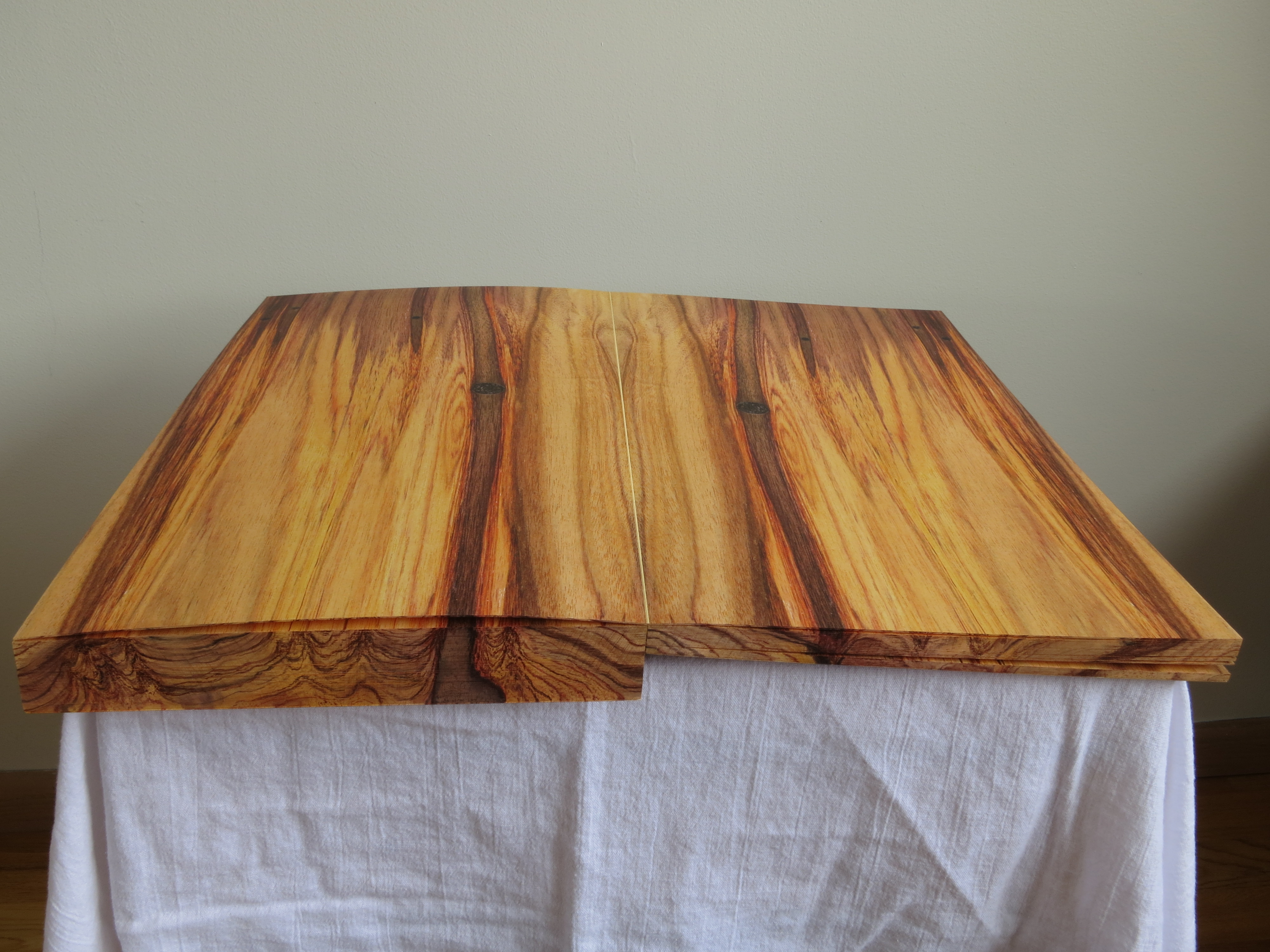
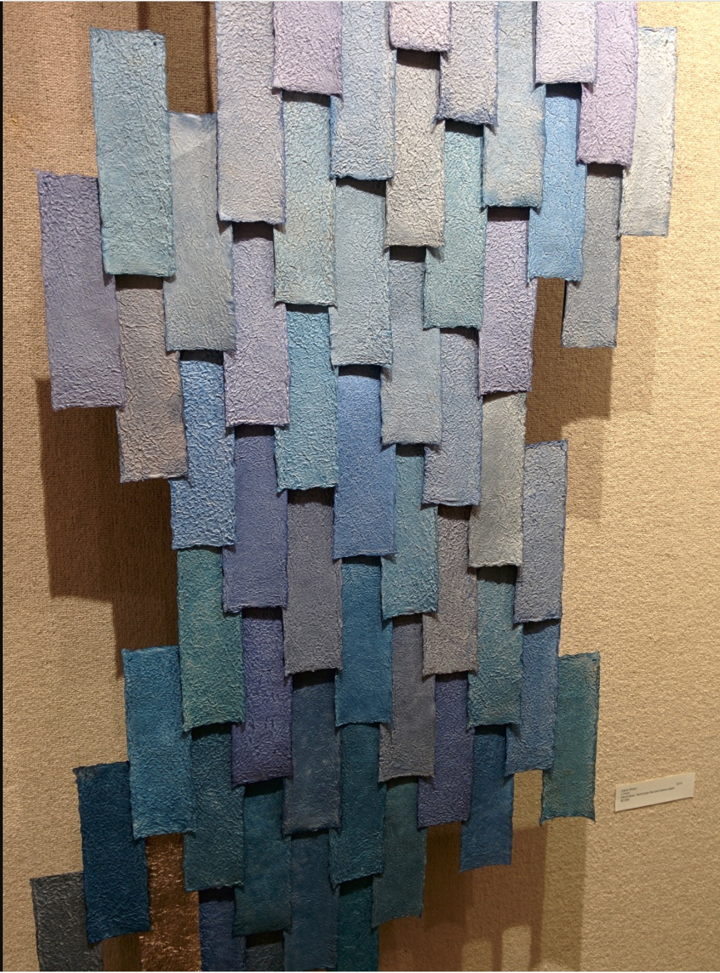
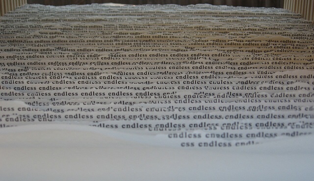
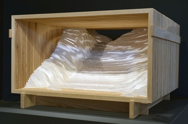
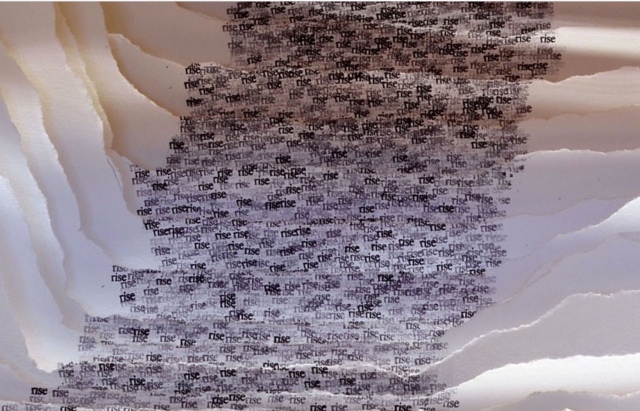
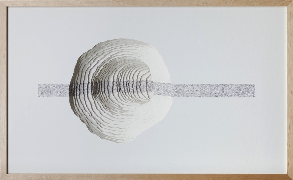
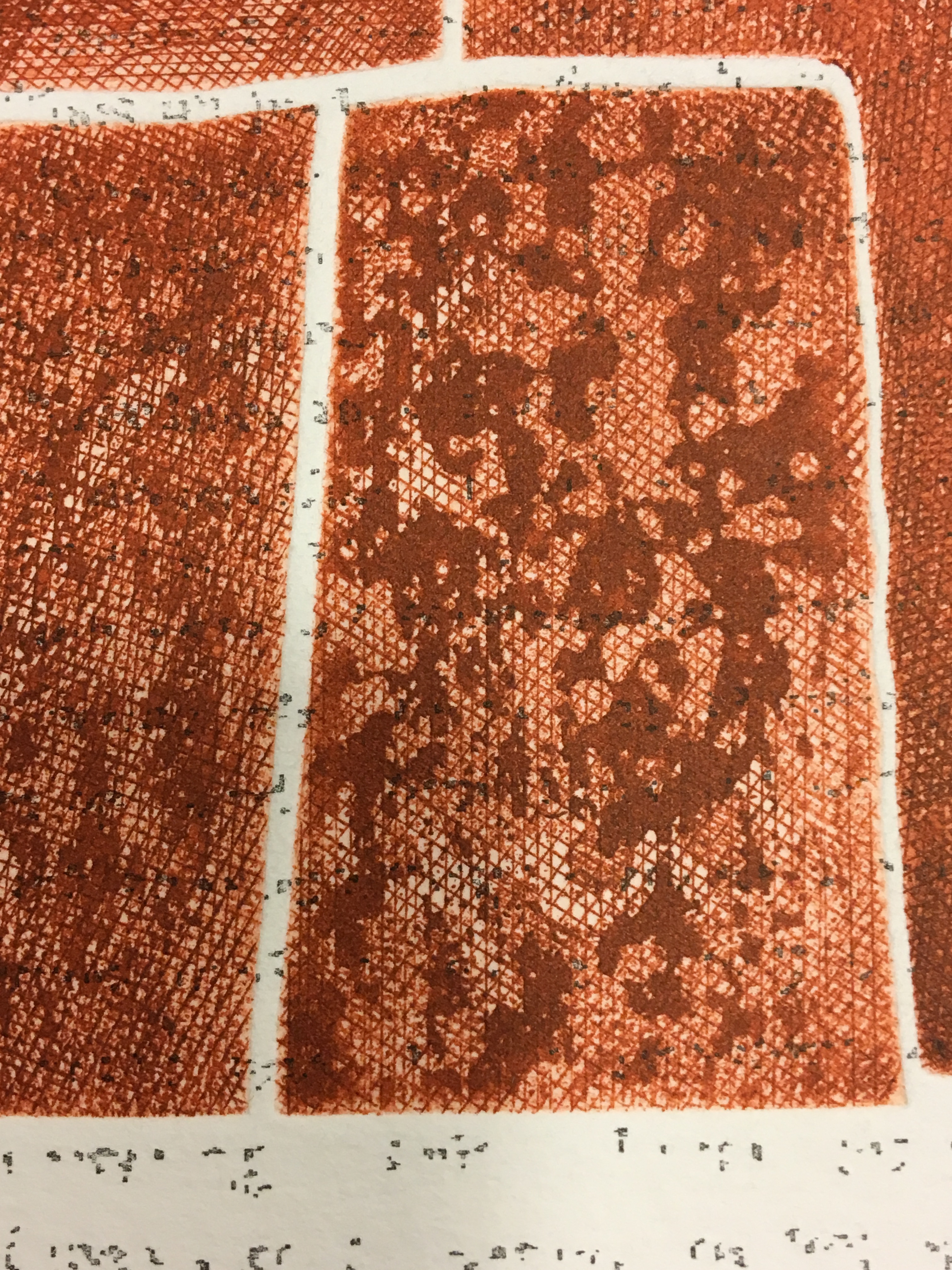
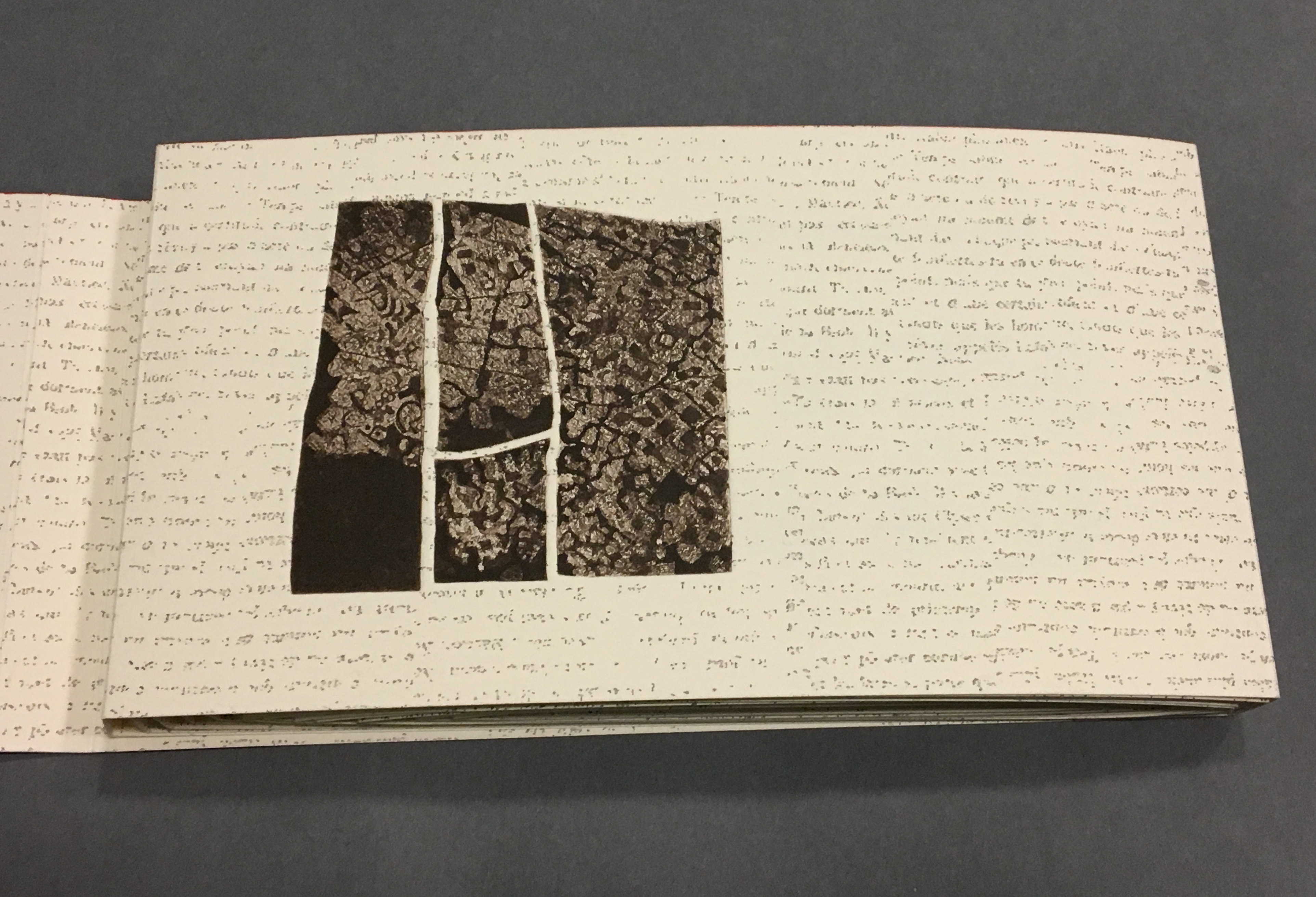
Even though following the forme en escargot results in having reading both sides of the scroll in the end, Sharoff also uses it to play with the notion of intended sequence. Completely unrolled and standing on its edge, the work echoes the Great Wall. The tint of red along the top edge recalls the blood spilled in the Great Wall’s construction. The prints echo the Great Wall’s bricks, the vegetation in its crumbling gaps, even the gates. The completely unrolled work is an intended sequence, also — an invitation to walk the wall. Coming upon each of the eight copperplate engravings in the unfolding sequence is a different experience than walking up and down the “outer wall” and then the “inner wall” to see them. Five are on the outer wall, three on the inner.
and with the rolling up on the left, “page 4” has reappeared.

The French at the top of “pages 18-19” is continuing the sentence from “page 15”, and the English beneath on “page 18” is continuing the sentence from “page 17”.


Reading the form “in time”
As the force of the snail-shell binding resists the unscrolling and pulls the standing pages inward, the work has another echo: the eroding maze in the Ancient Summer Palace (Yuan Ming Yuan) outside Beijing. The faint markings on the paper, created by printing the results of repeated photocopies of a manuscript, amplify the echo.
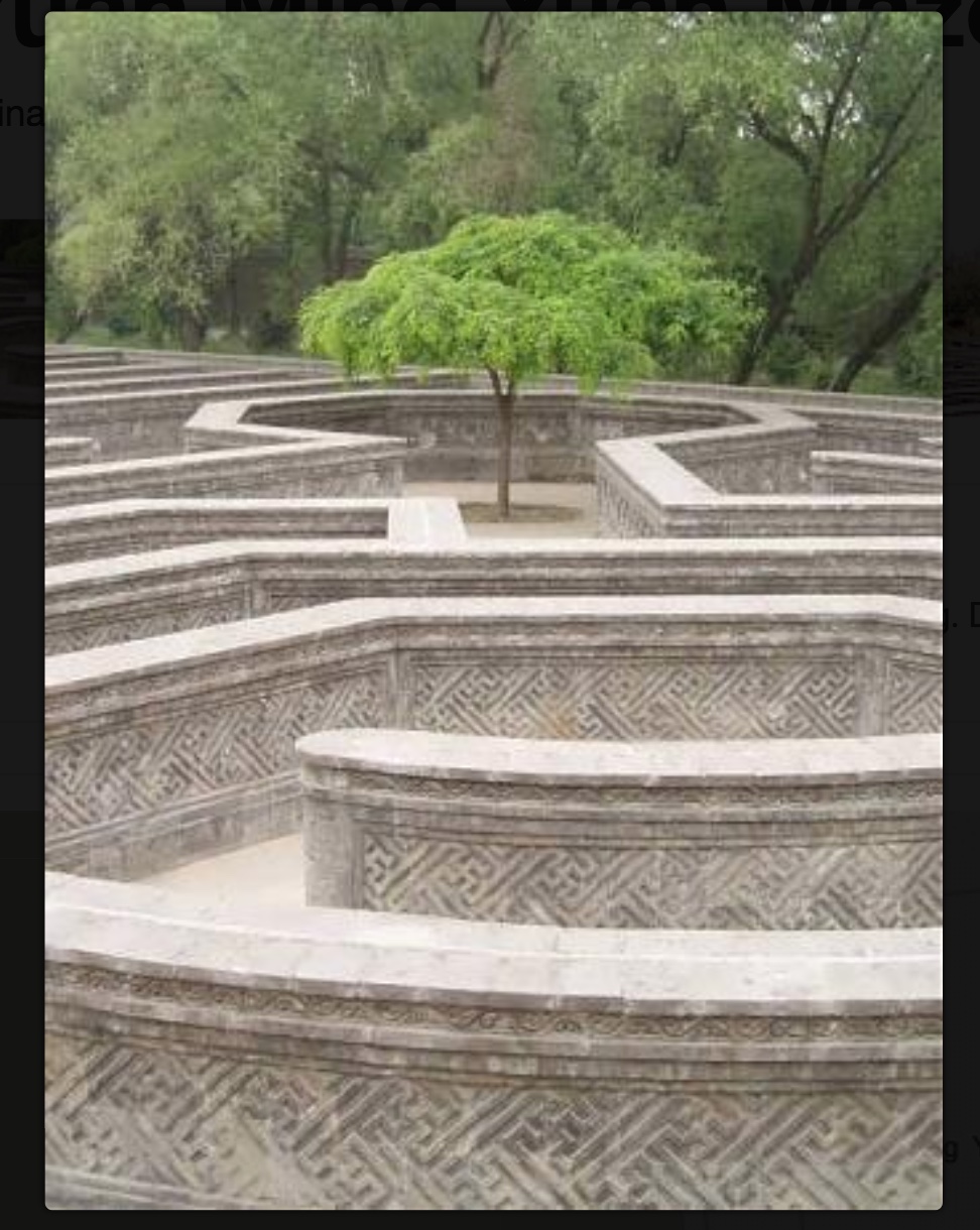
Shirley Sharoff
Photo credit: © Koopman Collection. National Library of the Netherlands/Jos Uljee

Although Lu’s text does not mention the maze, Sharoff introduces contemporary text that, alongside the interweaving Chinese, English and French of Lu’s text, evokes a maze-like, time-travelling effect. The autobiographical texts from the English-language students she taught at the Central Institute of Finance and Banking (1987-88) reflect on their childhood and adolescence in the Maoist era and their recollection of representations of foreigners in books and television. These “new bricks” in their modernness and fracturedness interrupt the flow of Lu’s prose praising and cursing the Great Wall. Yet, in their segmentation and placement, they also physically echo the prints and reinforce Lu’s expression of the paradox in the construction, fragmentation, reconstruction and erosion of the real Wall.

Sharoff’s La grande muraille is a treasure that rewards repeated visits and contemplation: not only for itself but also as a parallel or forerunner.
La grande muraille’s physical impetus (The Great Wall), the seemingly decipherable/indecipherable characters on the Arches paper, the wry paradox of Lu Xun’s observations, the socio-political-cultural implications of the “new bricks”, the work’s innovative form and the pulling of past and present together parallels the work of Xu Bing and his play with language across East and West. His Book from the Sky first appeared in 1988.
Sharoff’s use of Lu’s contemplation on The Great Wall also foreshadows Jorge Méndez Blake‘s Capítulo XXXVIII: Un mensaje del emperador / A Message from the Emperor (2017?). The title refers to an anecdote in the story “The Great Wall of China” by Franz Kafka, a contemporary of Lu Xun. The narrator tells the reader how the emperor has dispatched from his deathbed a message to the reader, entrusted to a herald who, struggling as he might, cannot escape from the confines of the palace to deliver the message — yet which we the reader await hopelessly and with hope.
What more should we expect from art?
Further Reading
“Shirley Sharoff (1). Books On Books Collection.
“Shirley Sharoff (2) “. 1 August 2020. Books On Books Collection.
Hubert, Renée Riese, and Judd David Hubert. 1999. The Cutting Edge of Reading : Artists’ Books. New York City: Granary Books. See pp. 24-27 for the Huberts’ reading La grande muraille.