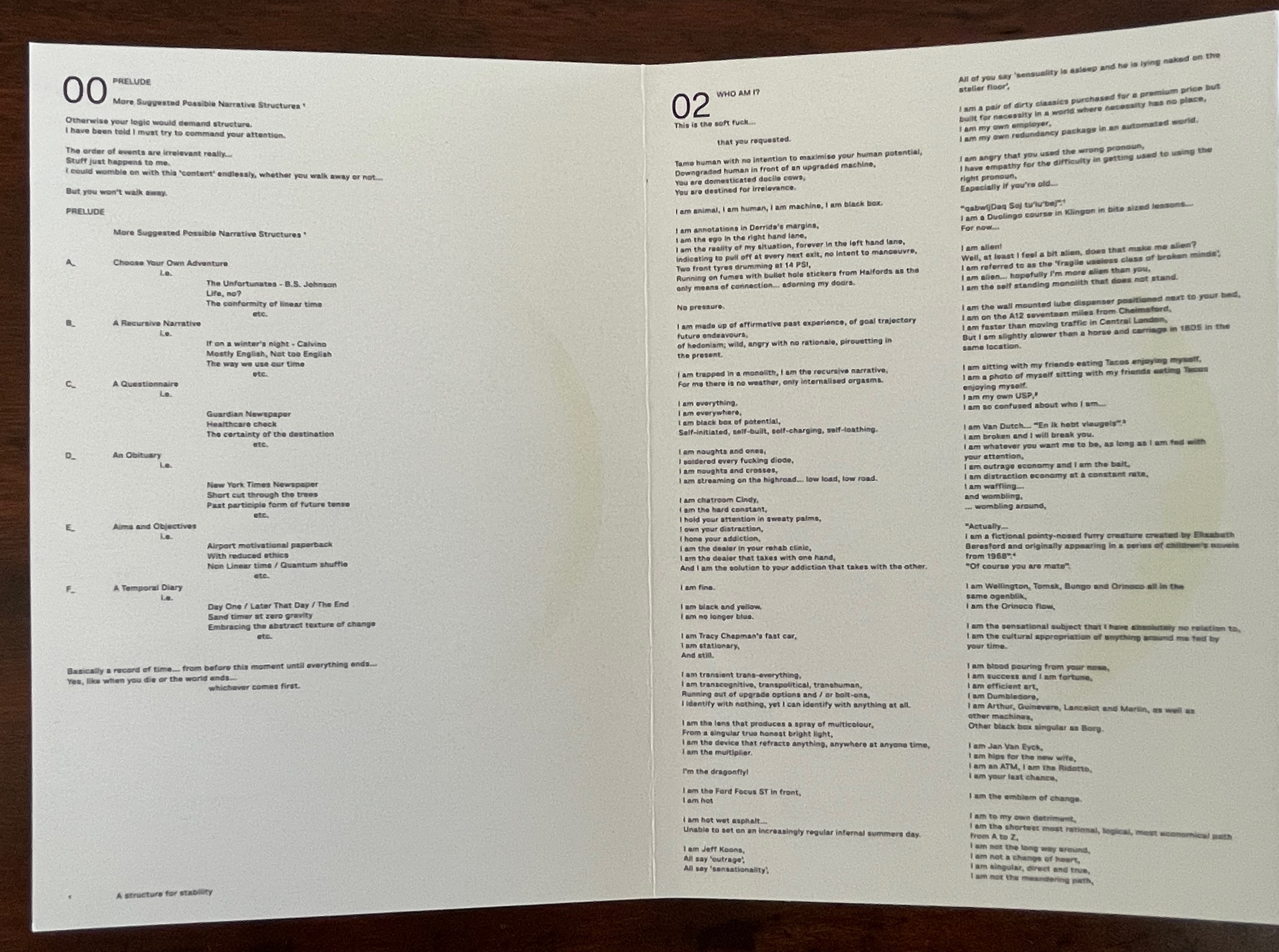
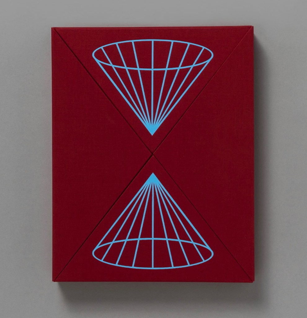
Lightweight (2015)
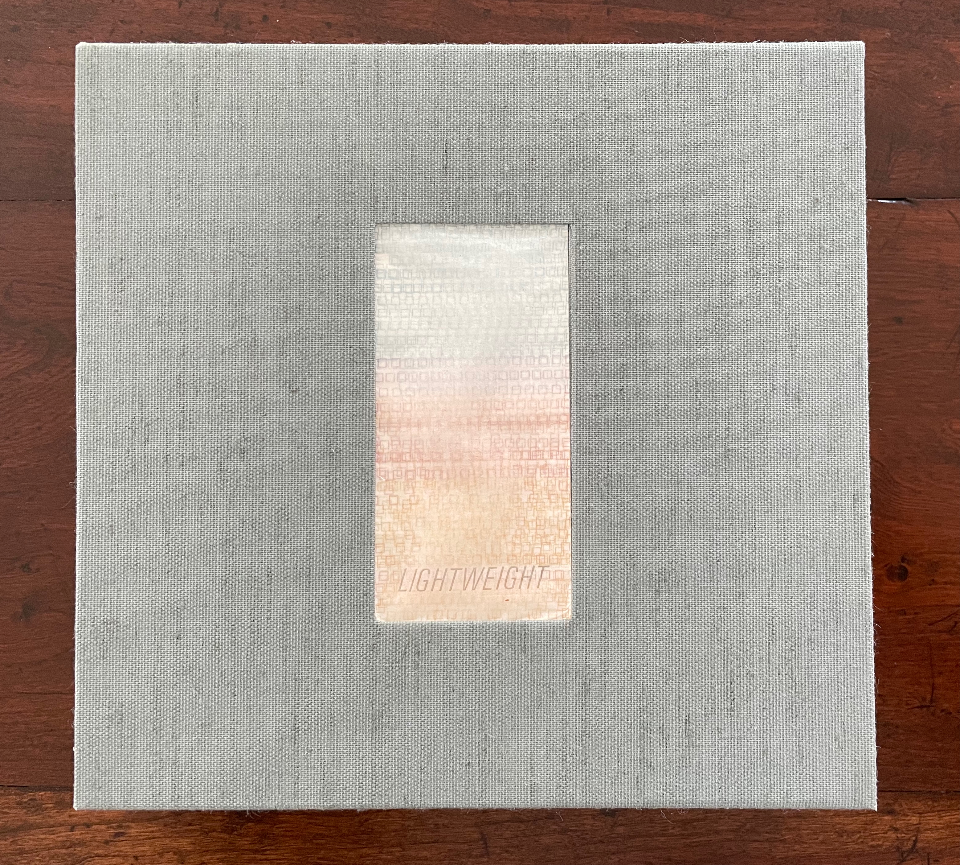
Lightweight (2015)
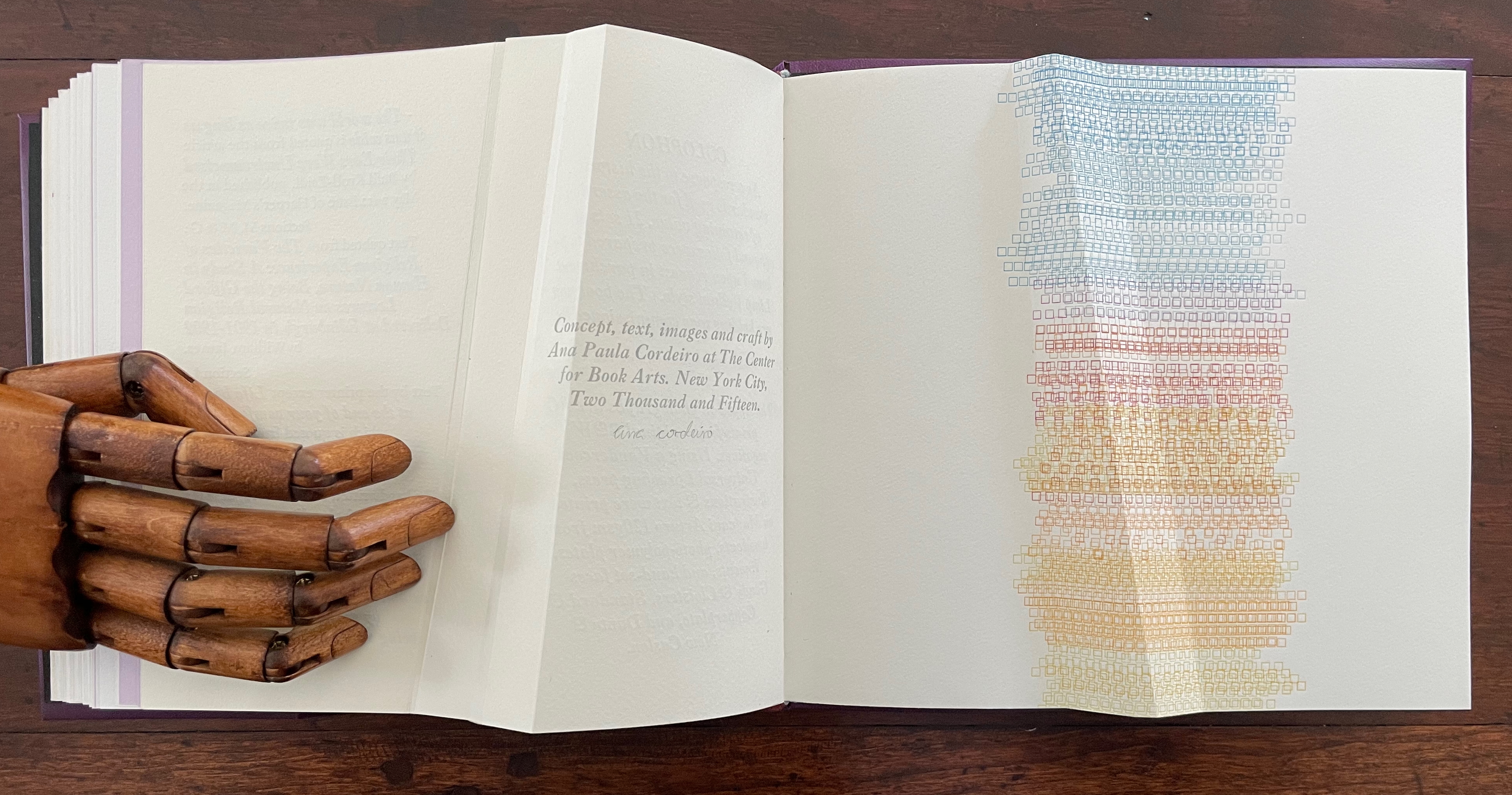
Ana Paula Cordeiro
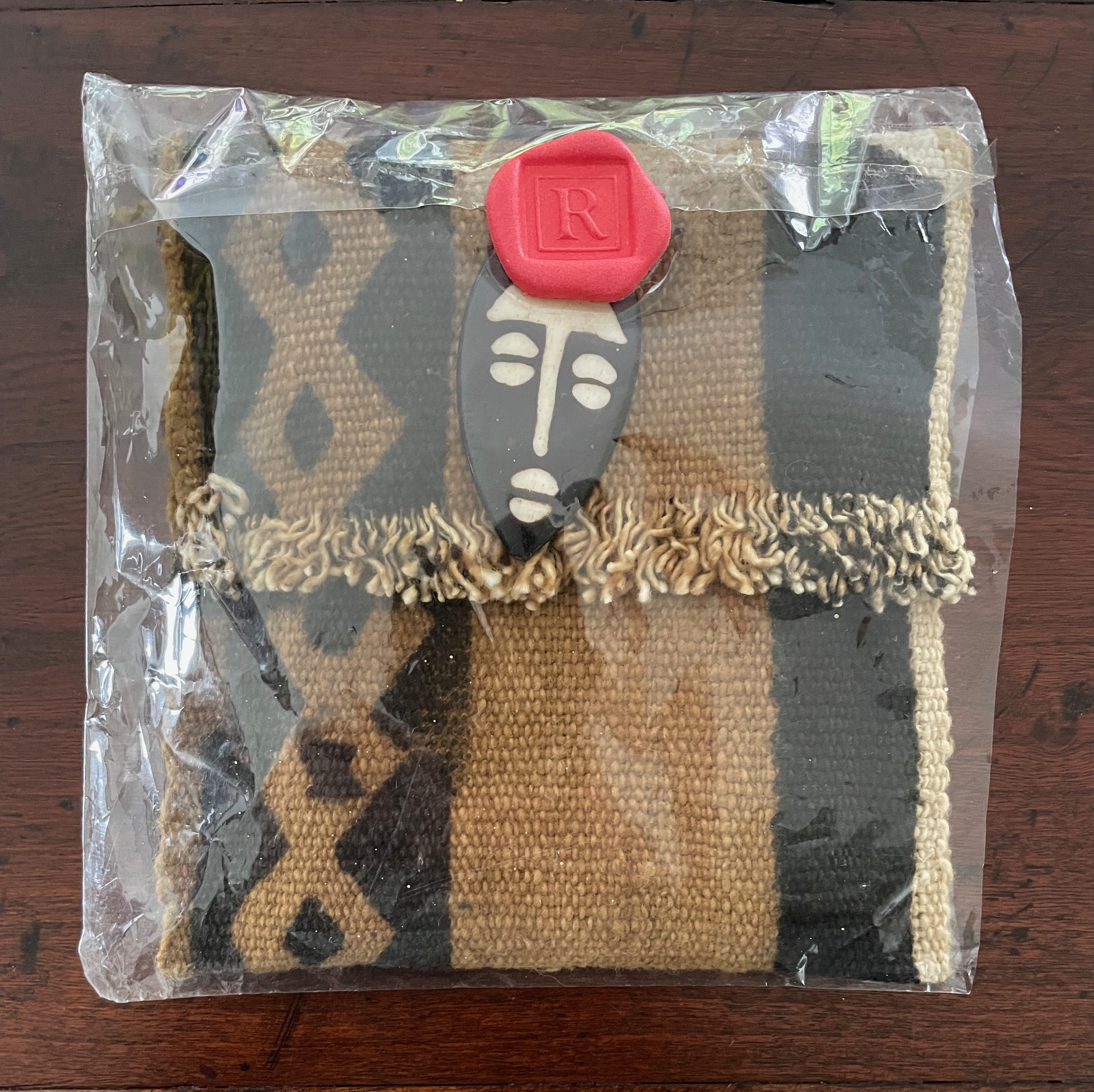
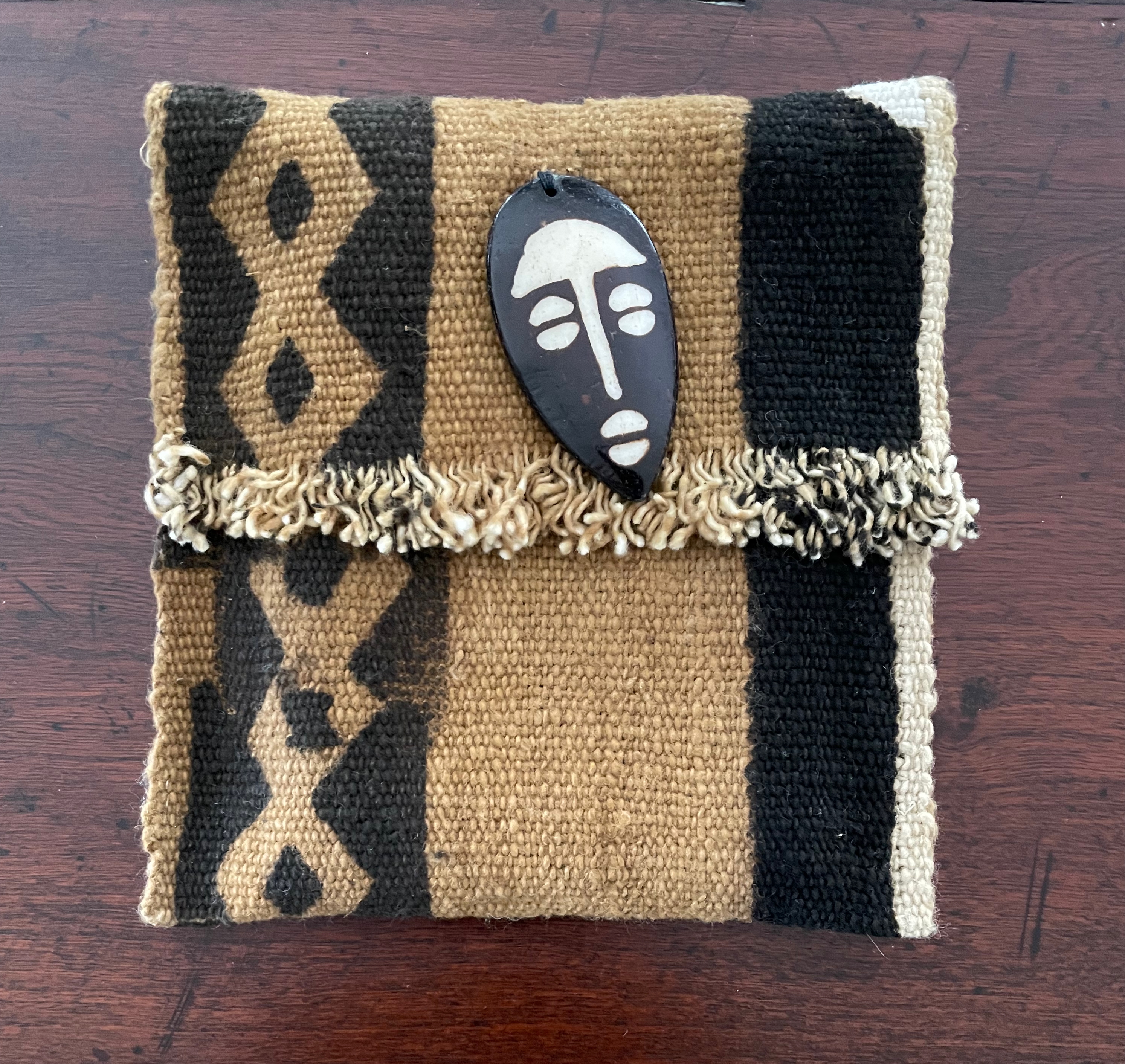
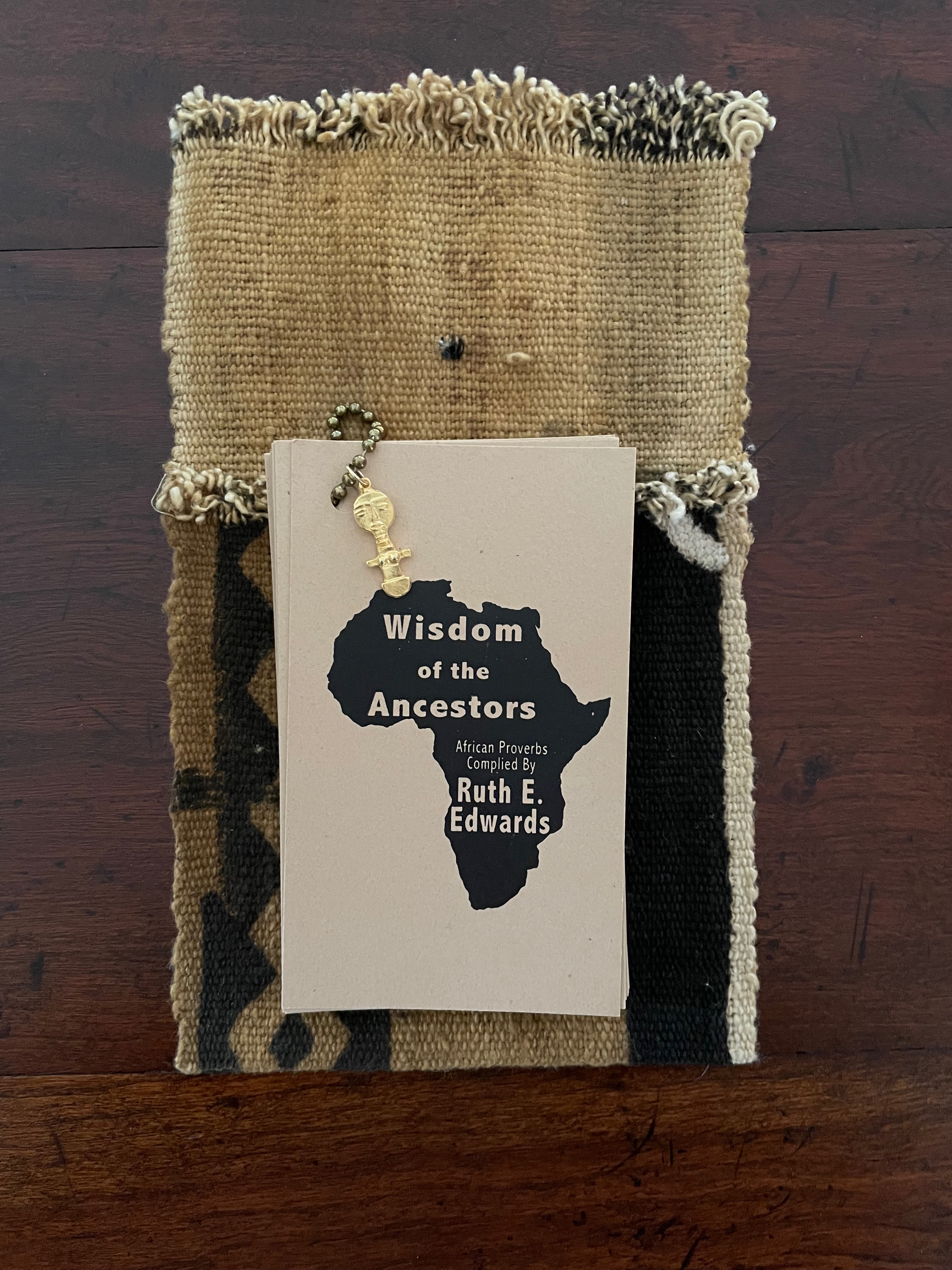
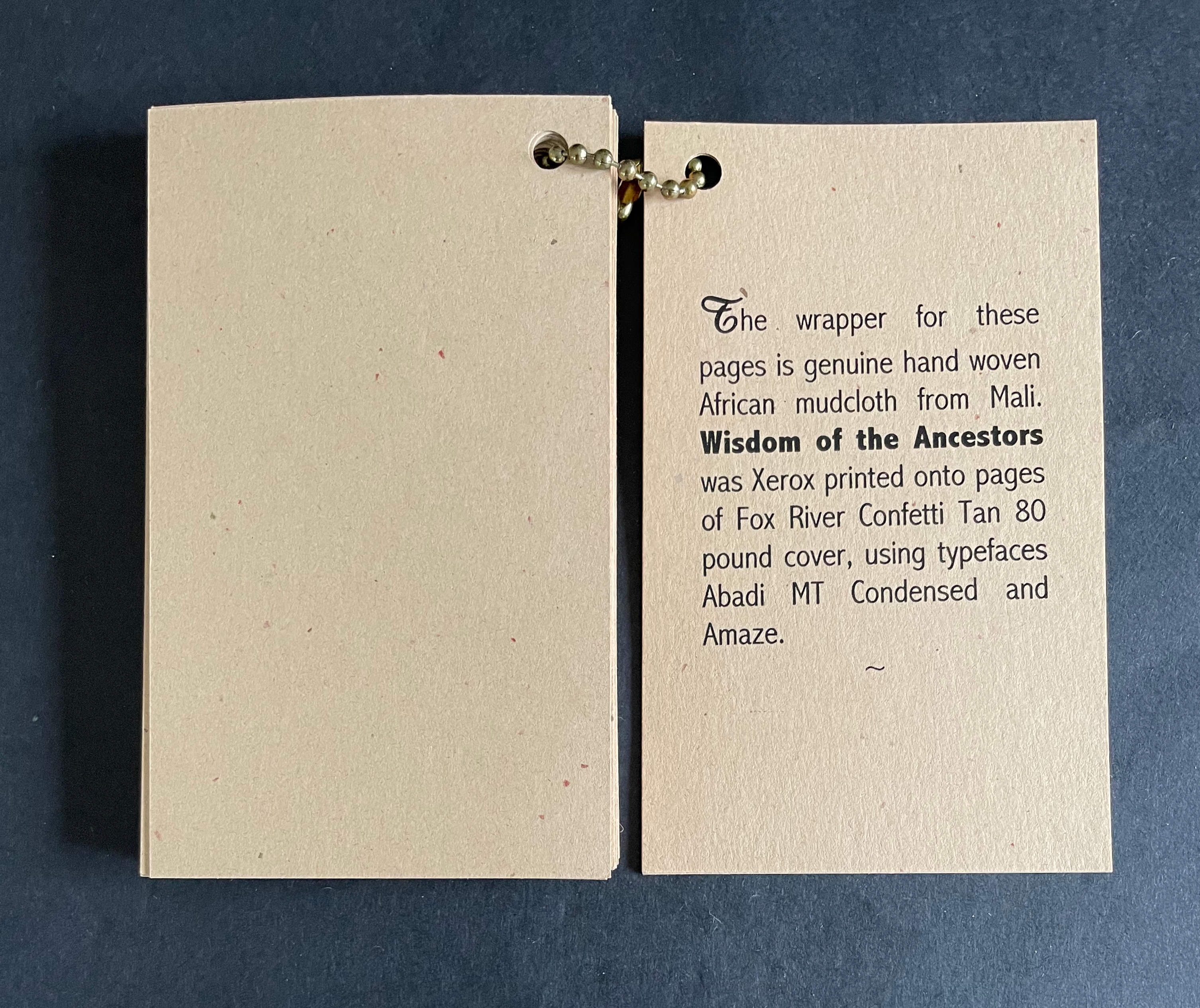
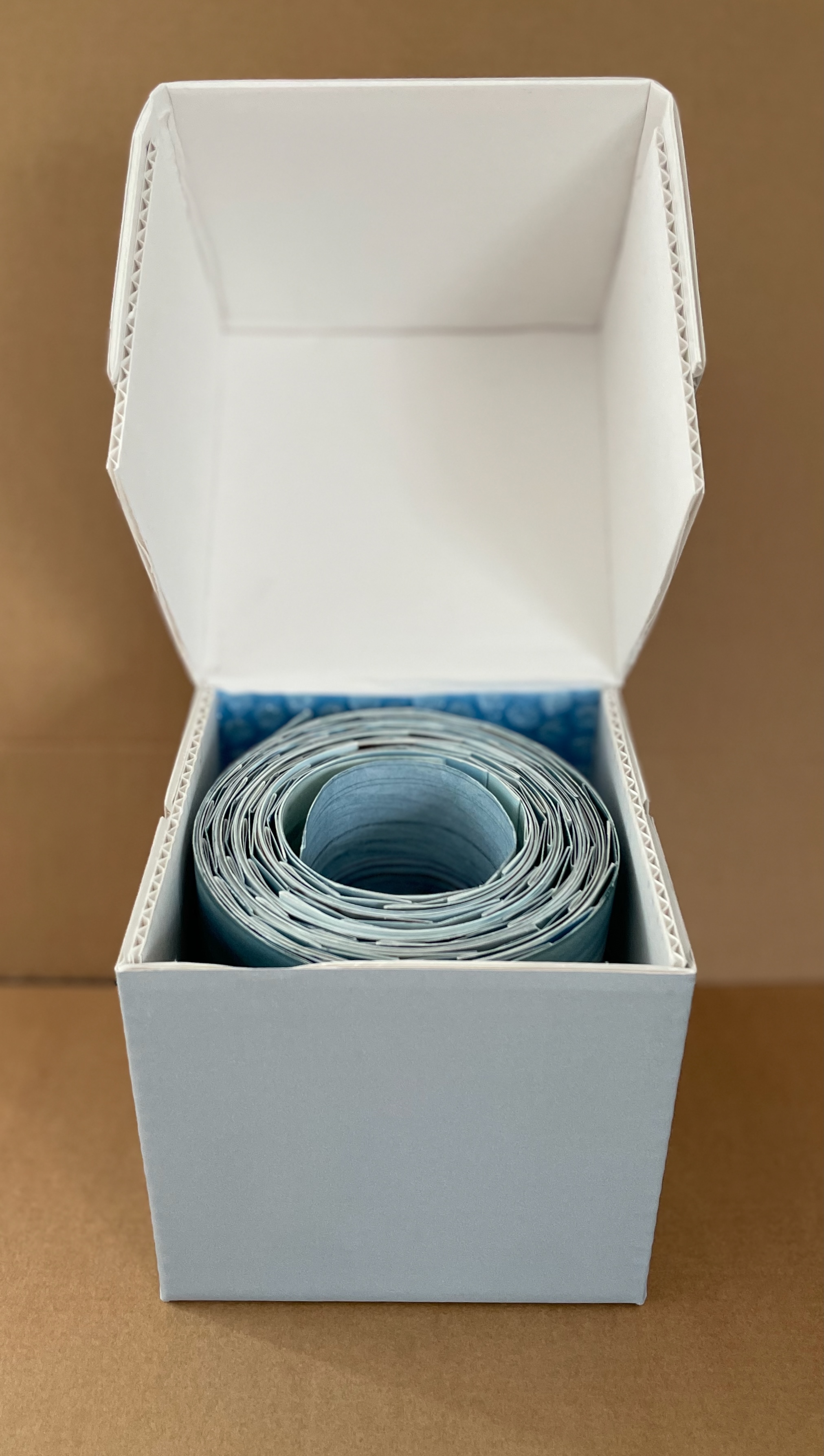
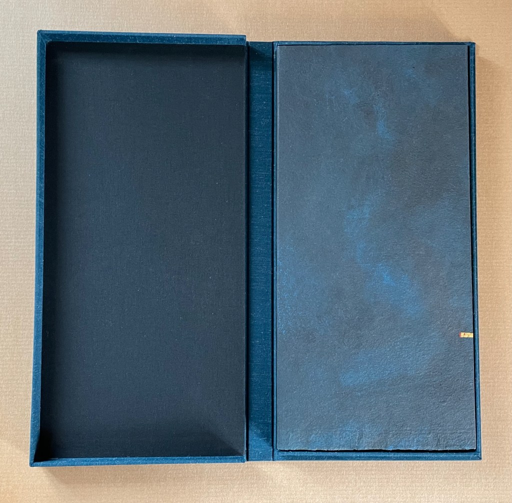
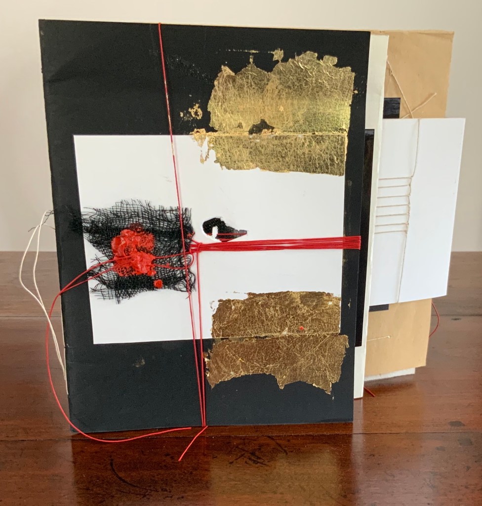
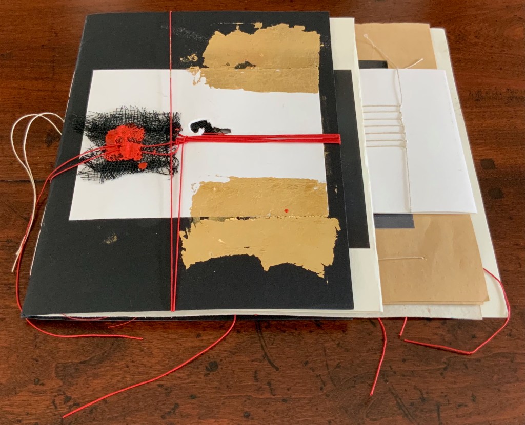
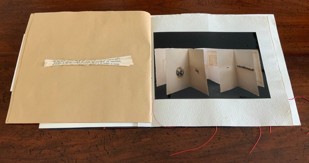
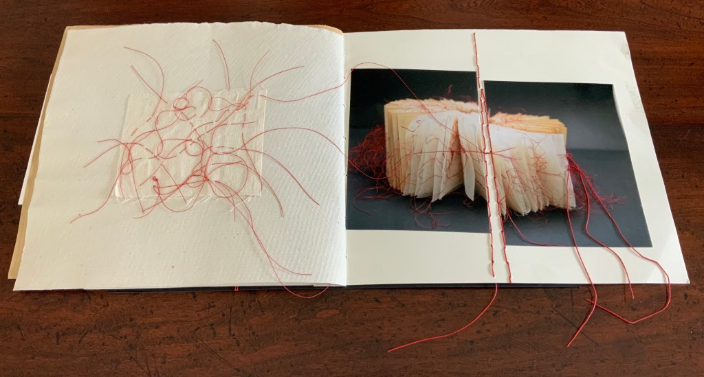
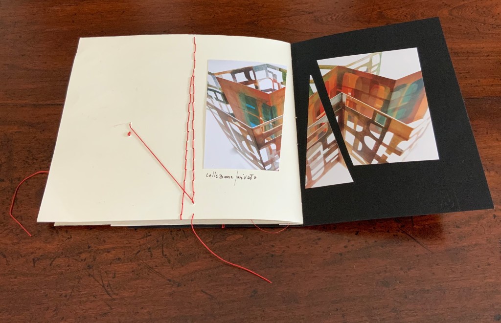
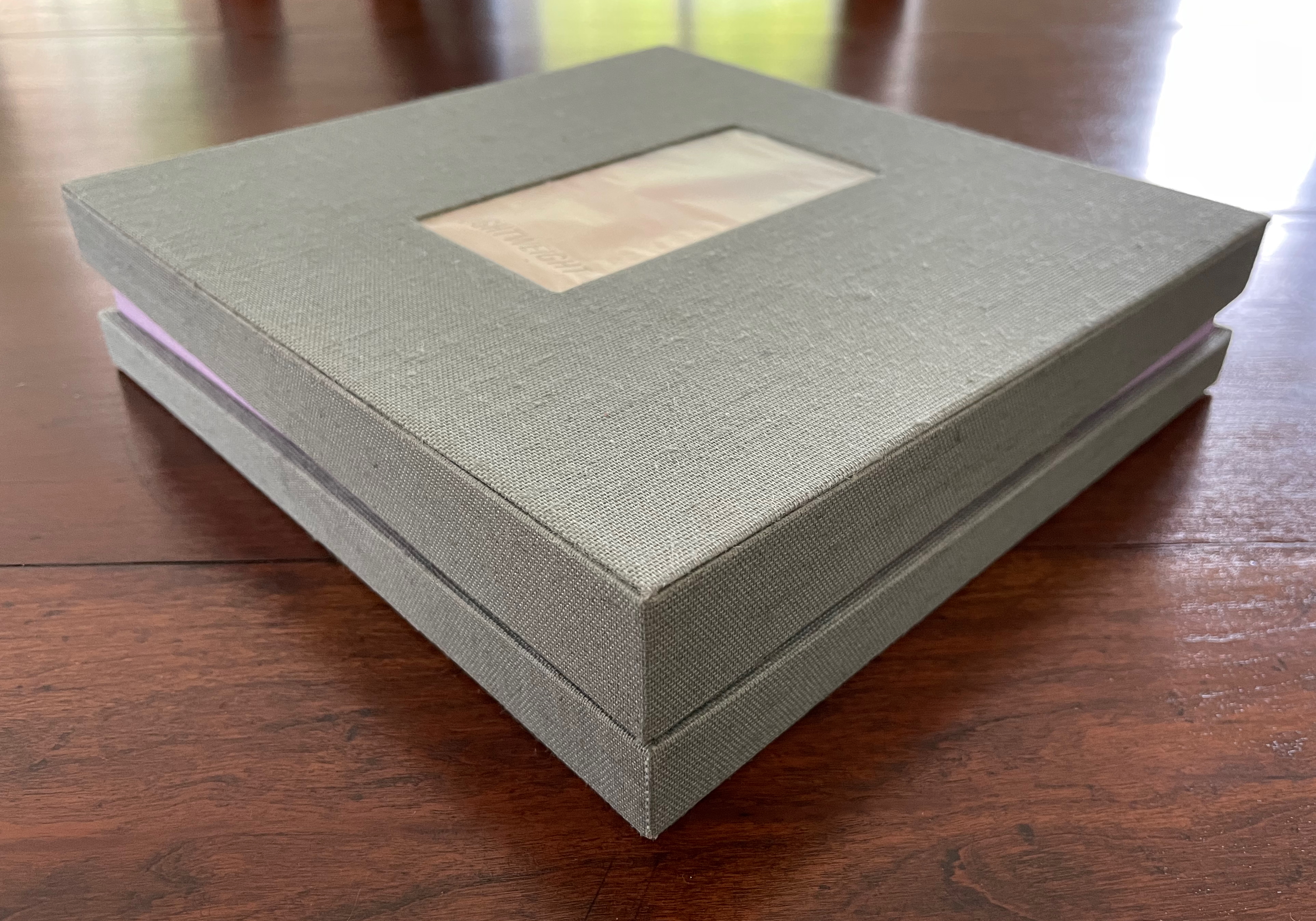
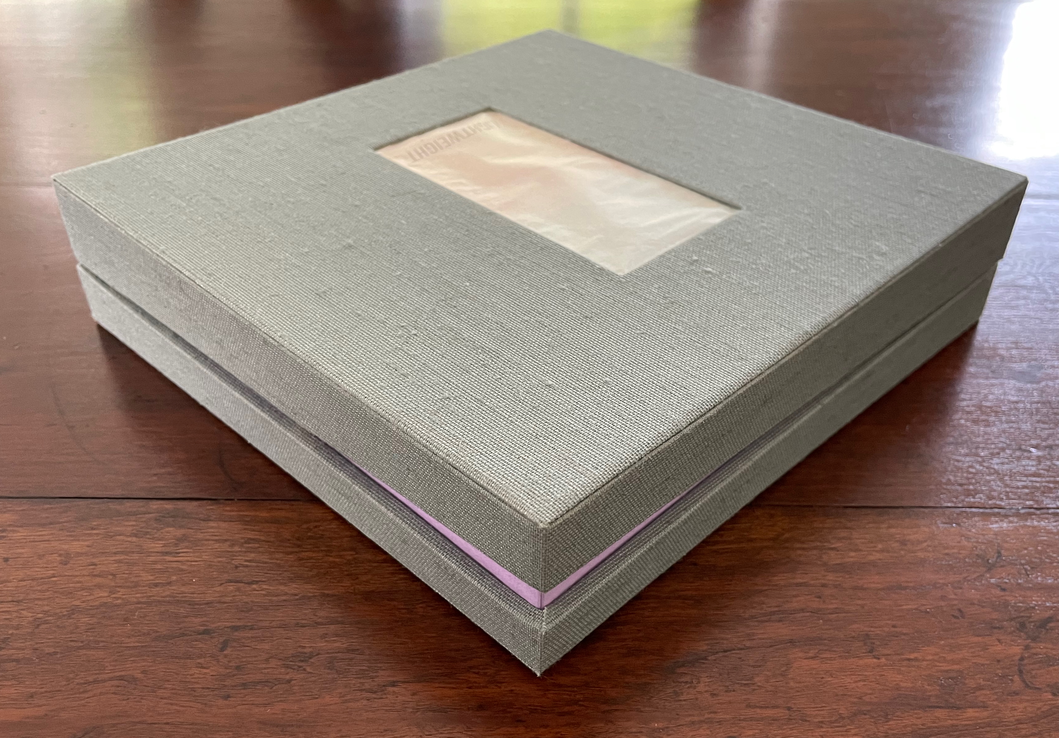
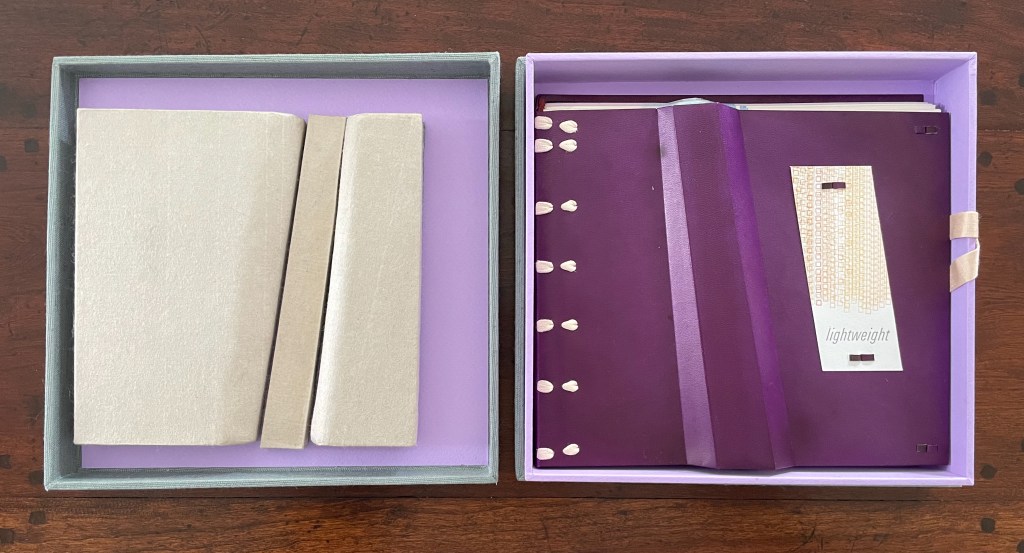
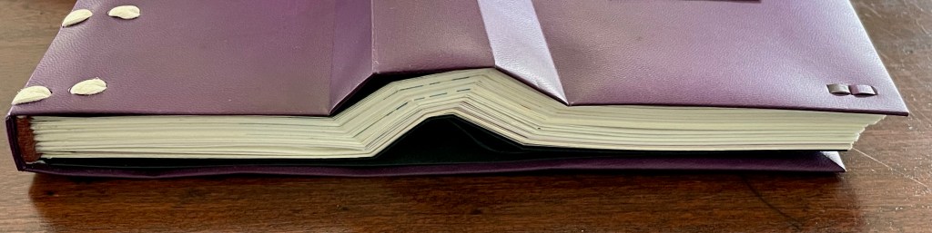
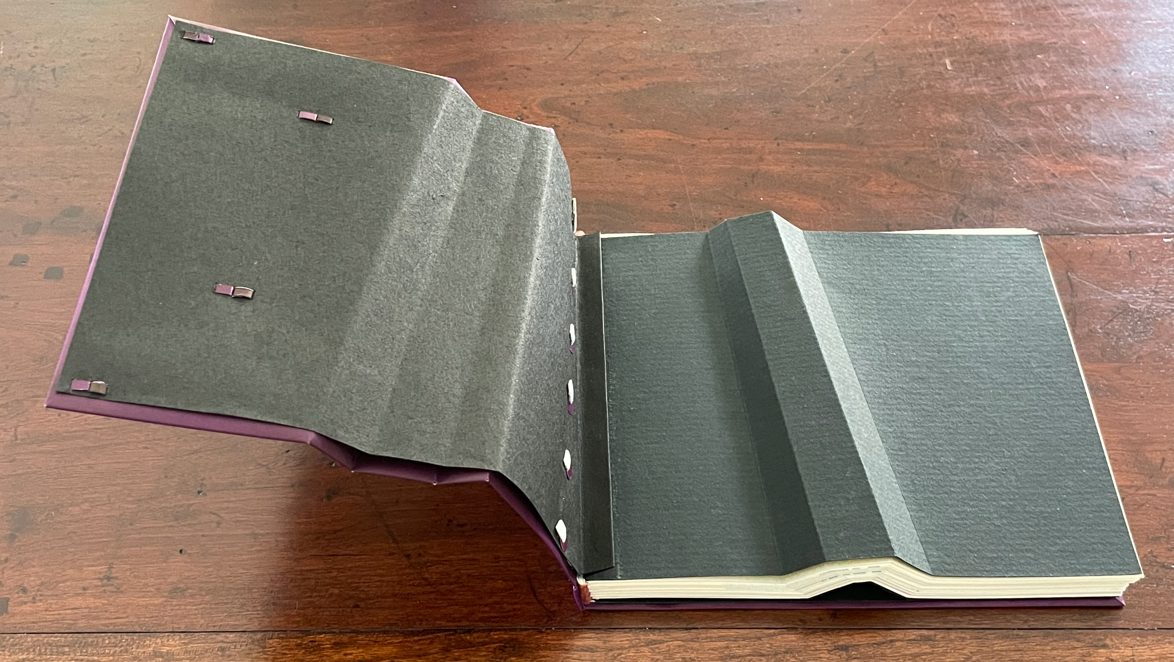
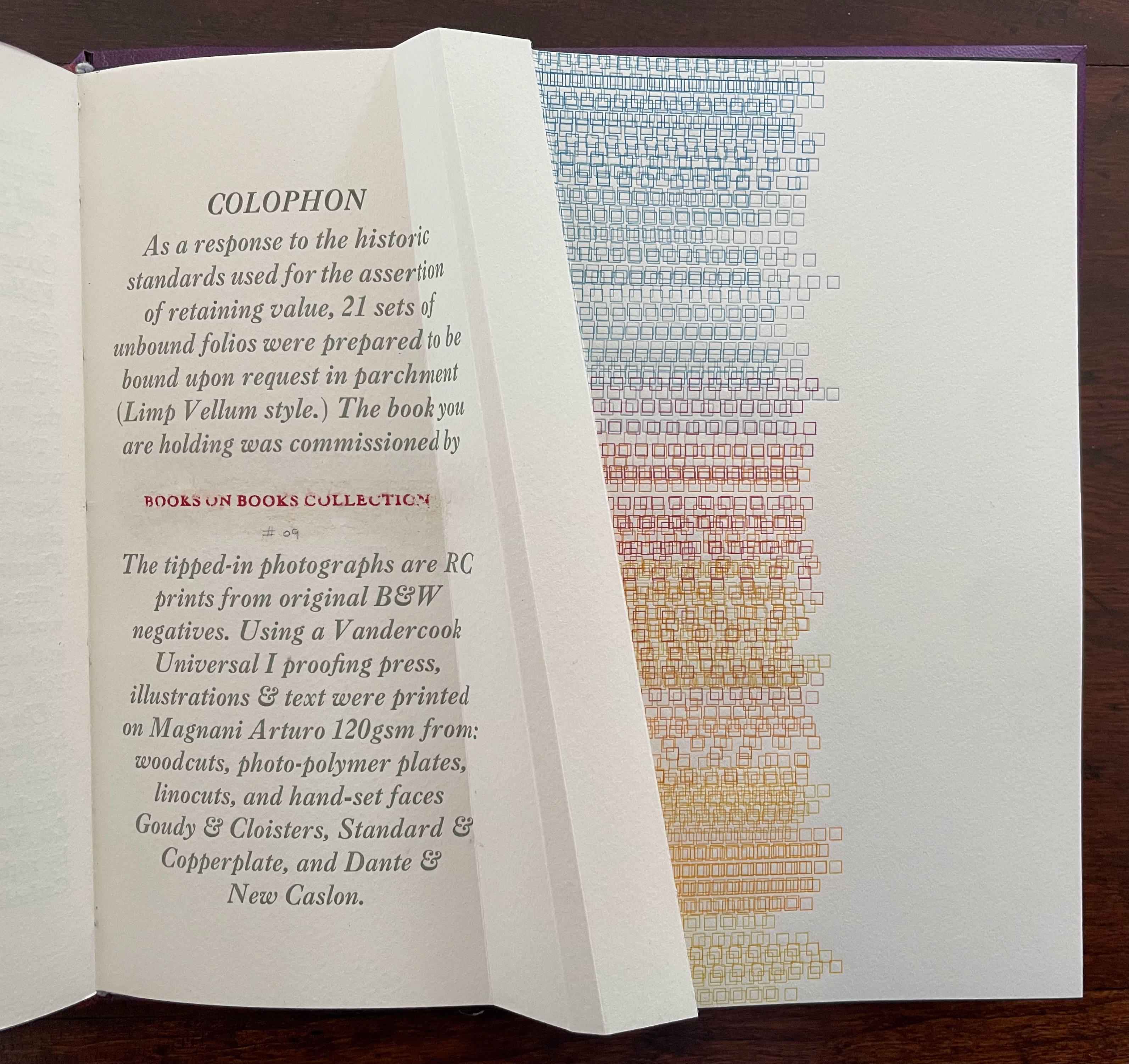
Custom storage box with passepartout on cover with title printed on translucent paper with colored diagram beneath and sculptural element inside top. Three-part construction Limp Vellum binding on dyed parchment. Box: H215 x W224 x D47v & D53r. Book: H190 x W215 x D18 mm [90] pages. 88 + 2 half pages for colophon. Edition of 21 sets, copy bound on request. Acquired from the artist, 27 August 2025.
Photos: Books On Books Collection.
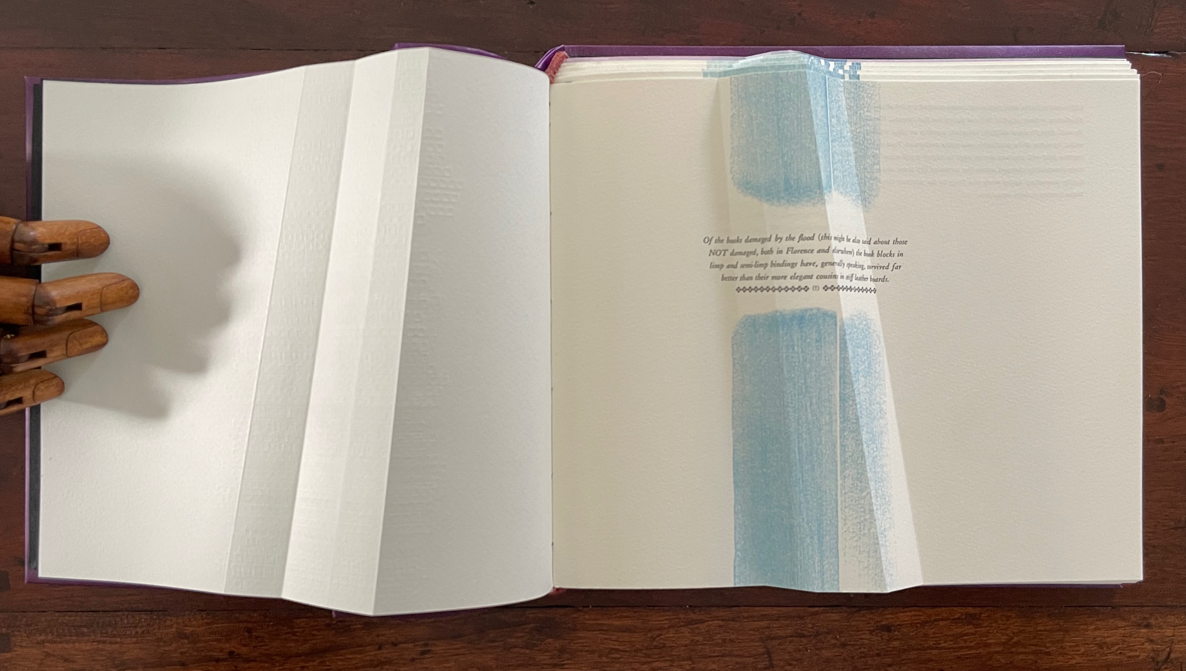
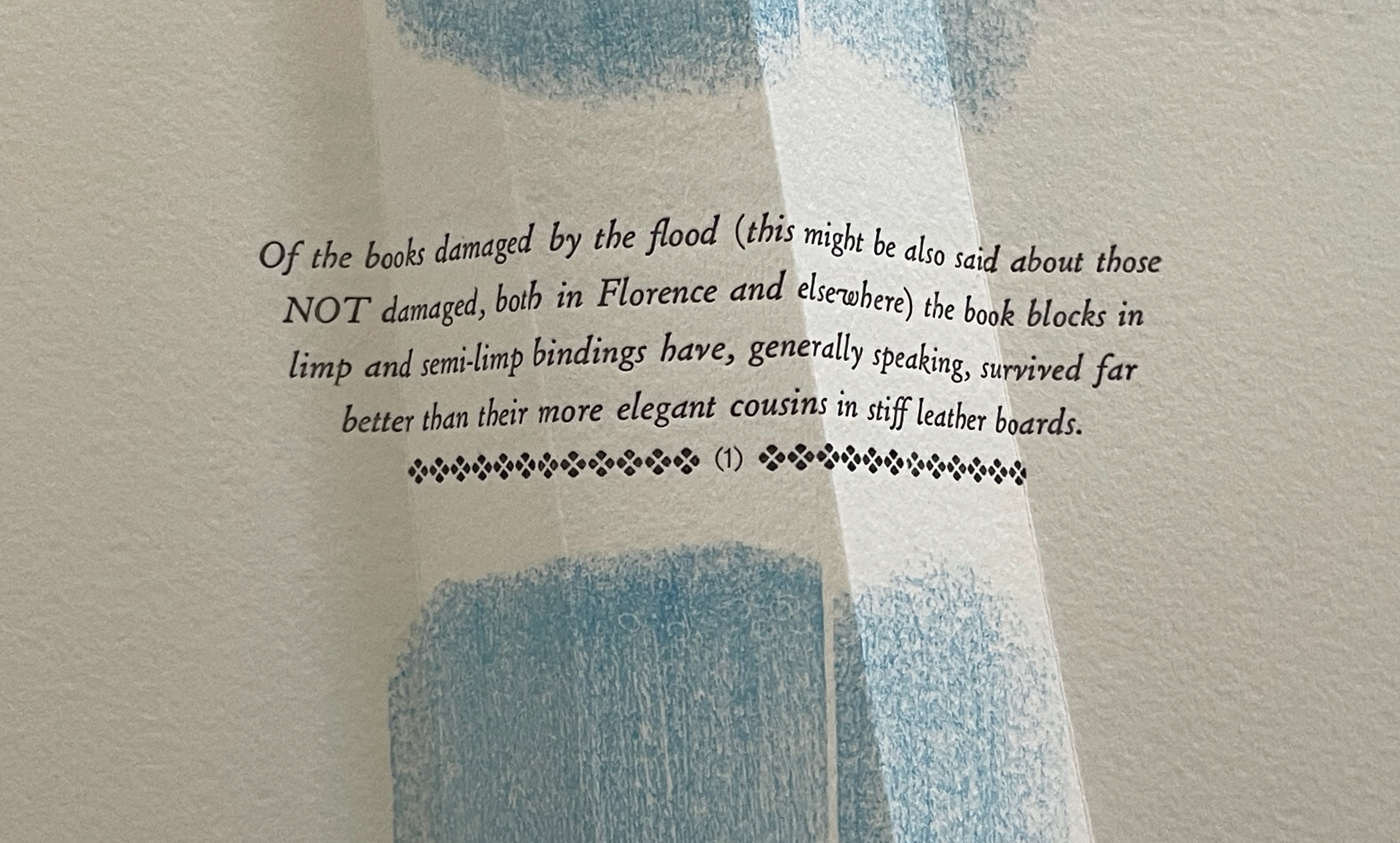
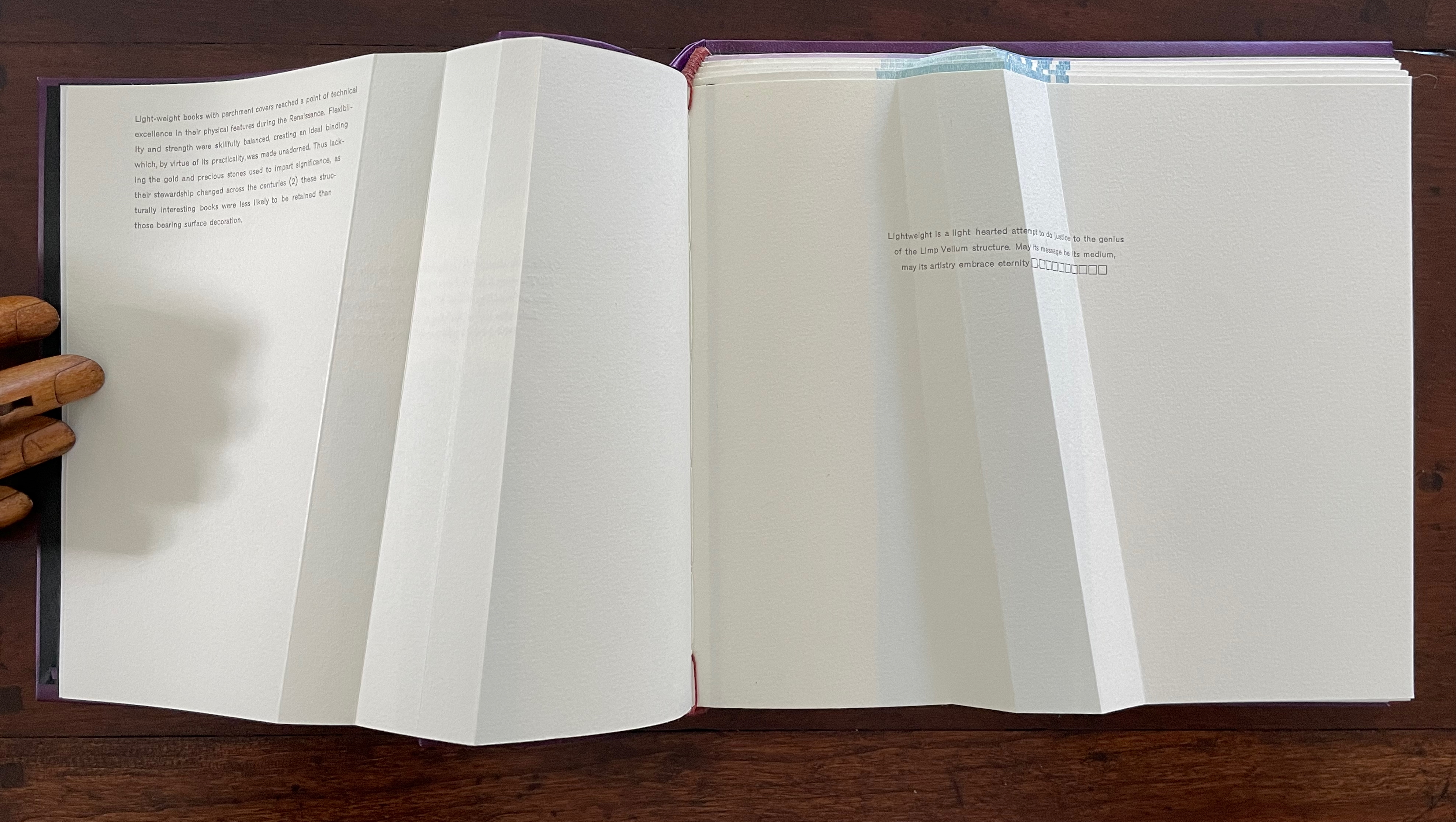
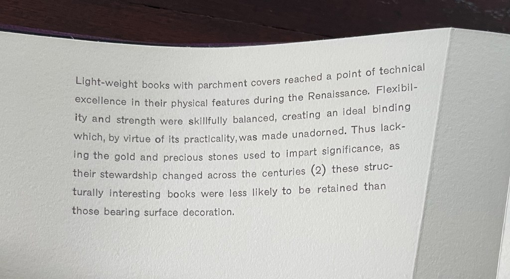
Dating back to the 13th century, the limp vellum binding for books involves a parchment or other flexible covering material that is the sole component of the cover. No stiff boards. It attaches to the textblock usually by sewing and without adhesive. According to the American Institute for Conservation, it was not merely a temporary solution until a more luxurious one with boards and ornamentation could be commissioned. Its presence in collections, its variety of formats, and its superior protection of works proven in the aftermath of the 1966 flooding of Florence, all suggest that, for a time, it was deliberately chosen for joining the artistic with the functional.
Ana Paula Cordeiro’s Lightweight is an artist’s book that pays elaborate homage to this distinctive form of binding. It weaves together metaphor, structure, material, and content in extraordinary ways.
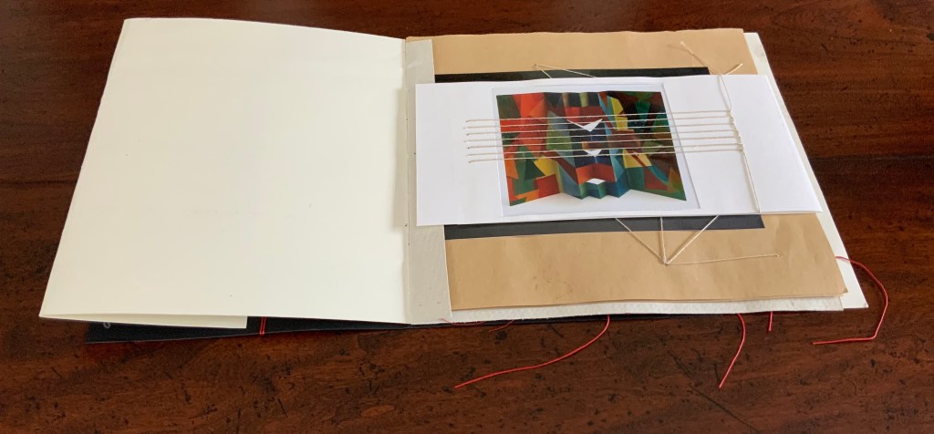
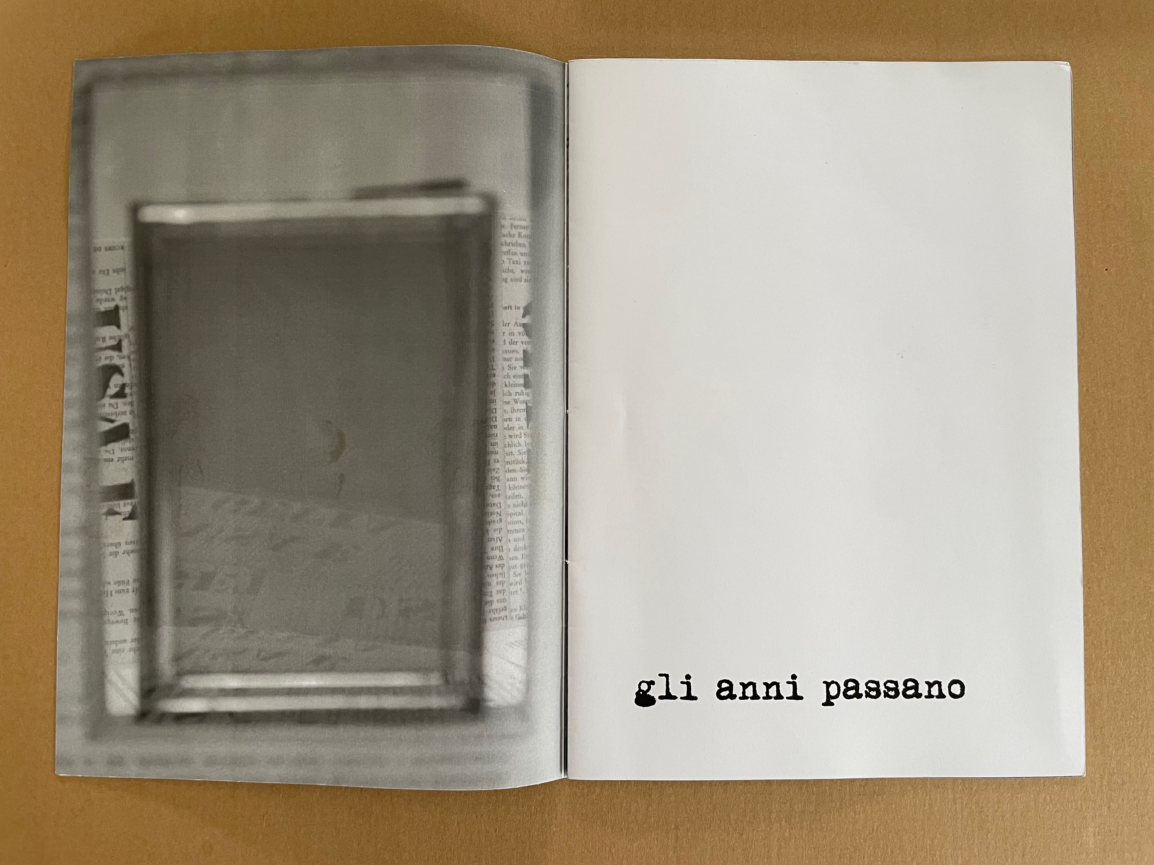
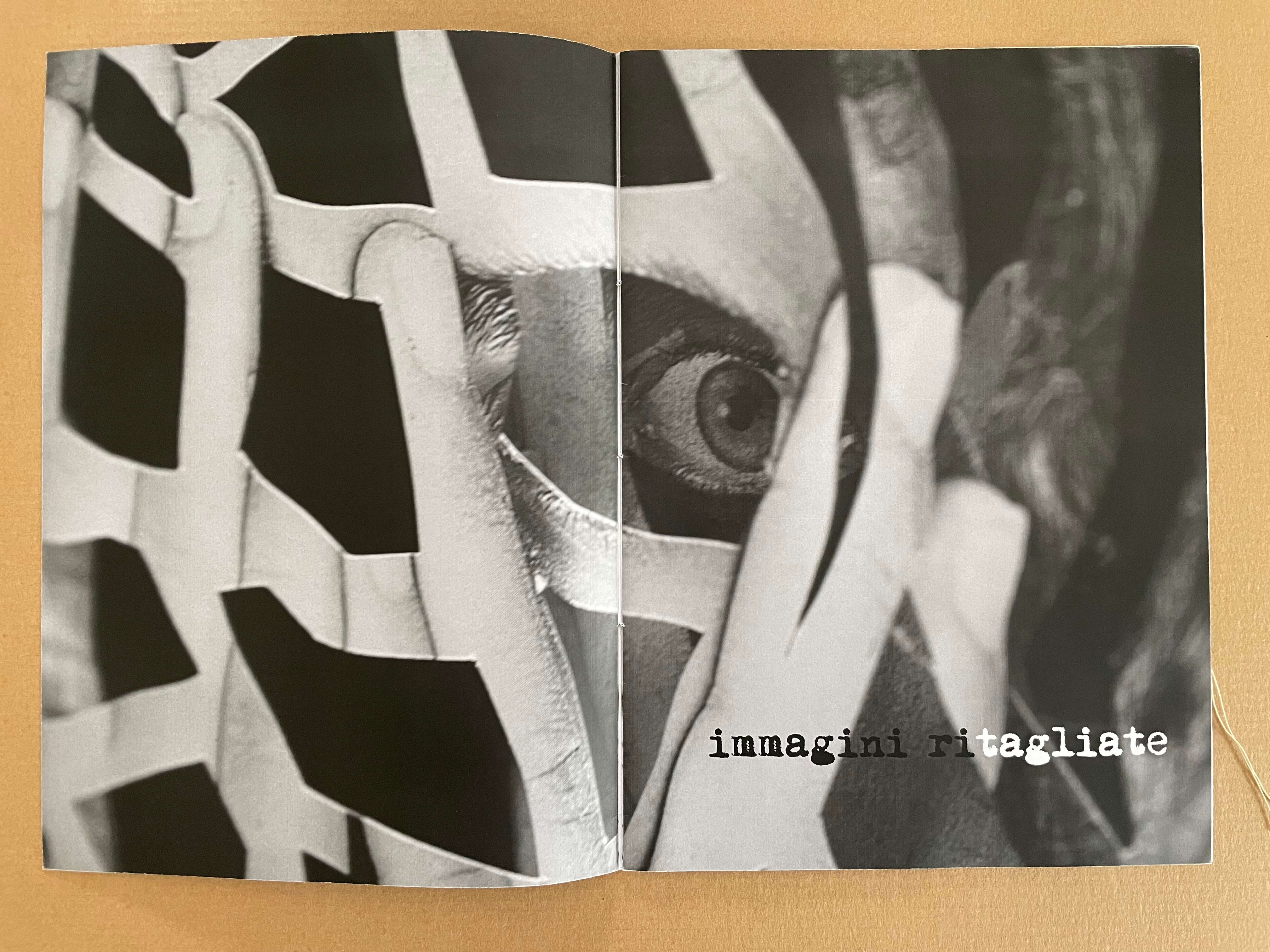
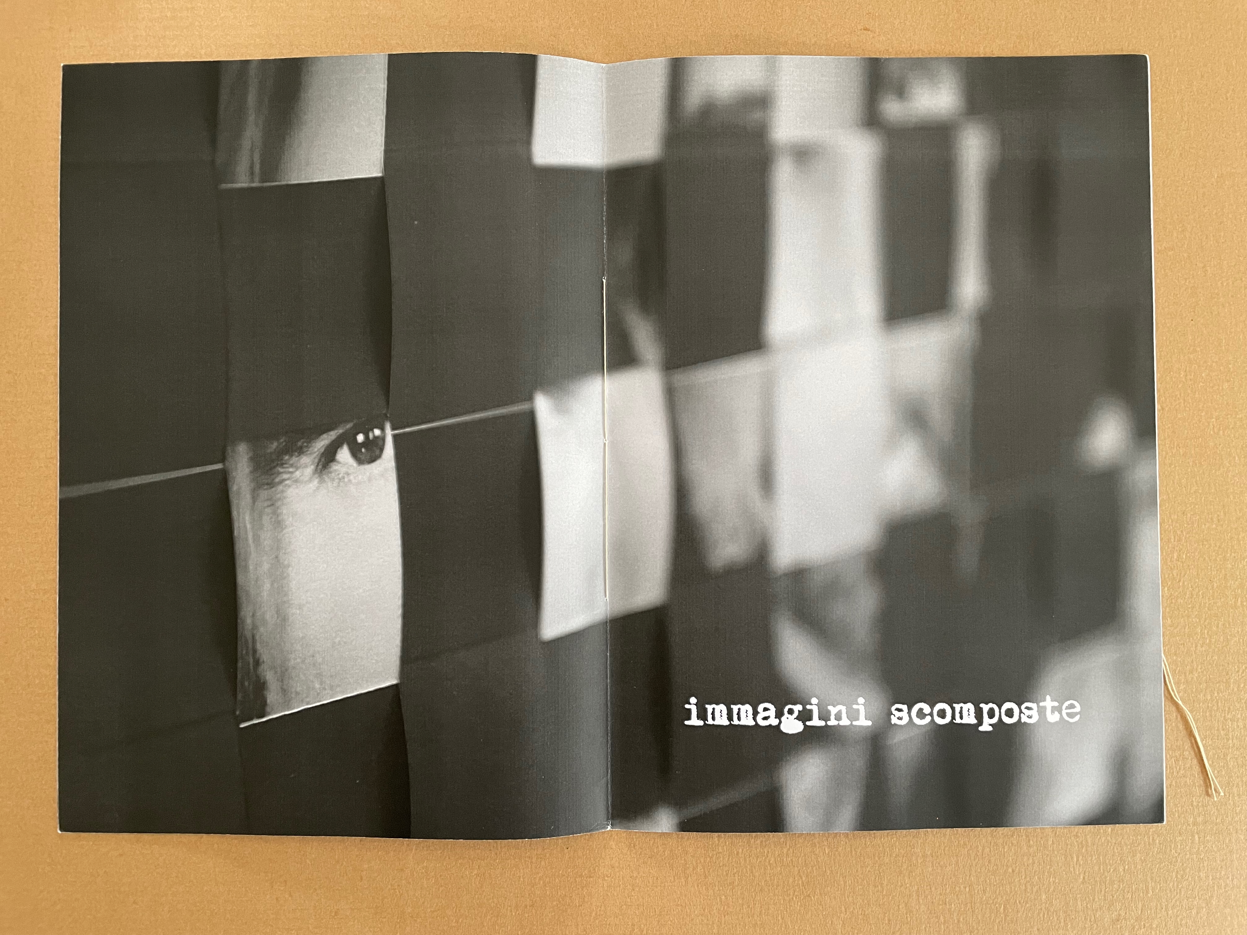
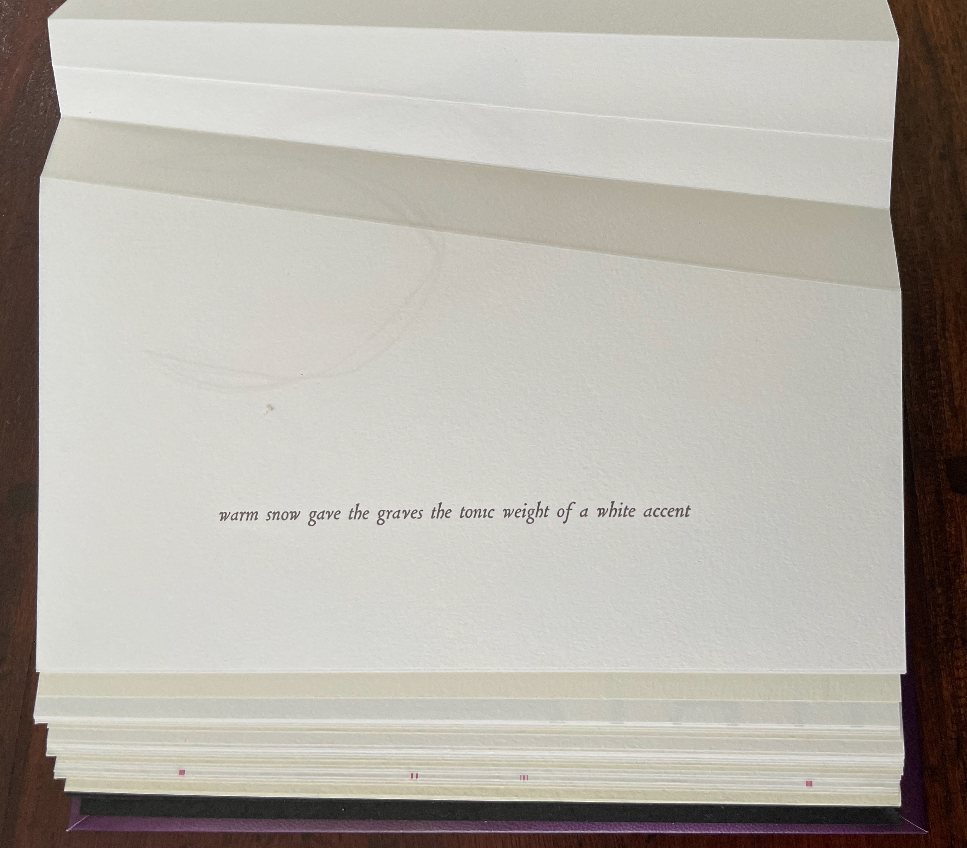
Begin with the container, which offers a multitude of metaphors. On top of the cloth-covered box, a rectangular window has been cut. To look down through this window is to begin peering into the past. Beneath the translucent sheet bearing the title, a print motif appears whose mingling layers suggest the water, paper, ink, and silt that had to be sifted to save a Renaissance legacy of manuscripts, incunabula, and books from the Florence flood of 1966.
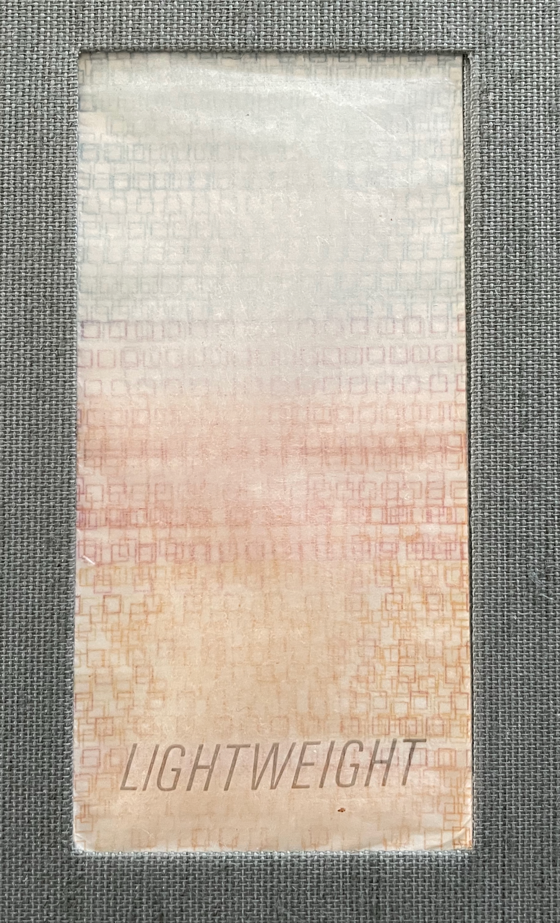
Left: passe-partout (window) on box top. Right: recurrent print motif appearing later in the book.
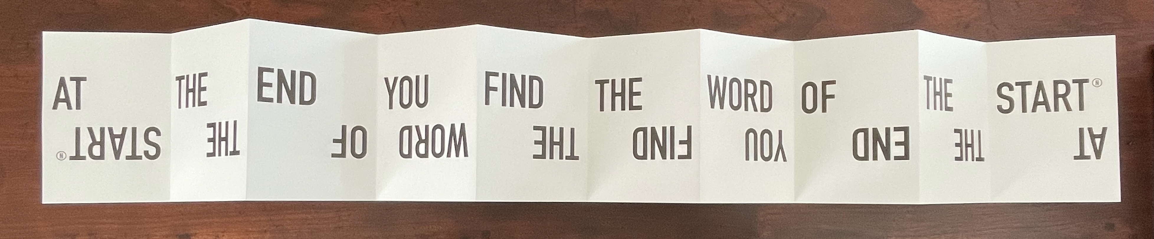
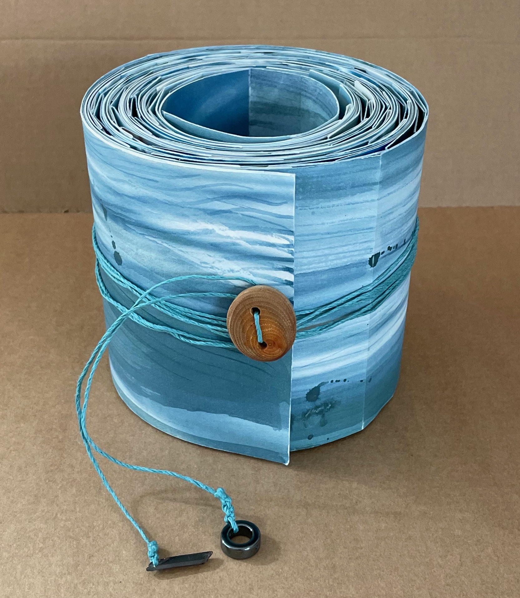
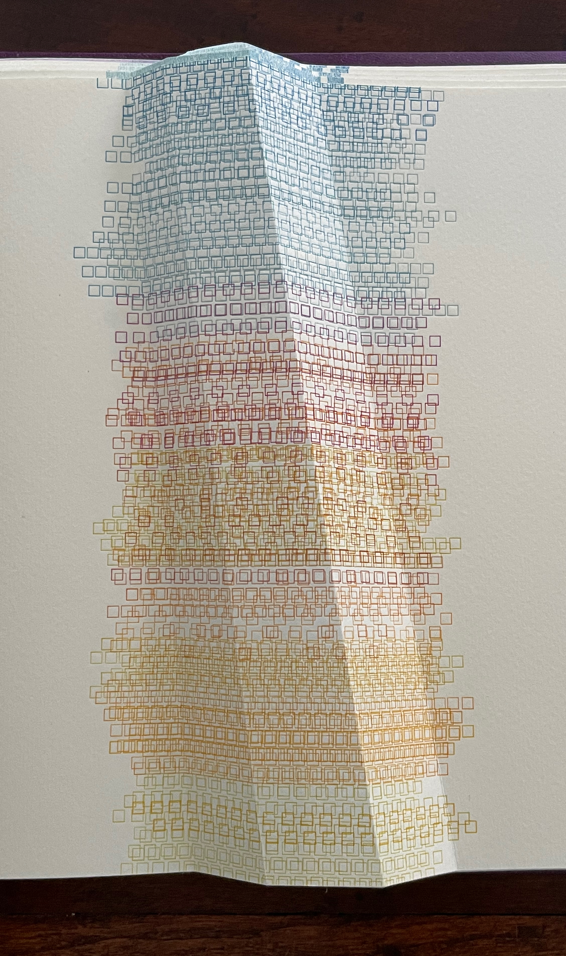
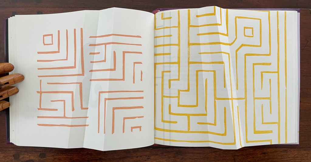
That strata of links running from blue to rust to gold becomes a recurrent print motif in the book, suggesting abstractly another metaphor: that of a continuum with endpoints playing off one another. As soon as you pick up the Canapetta cloth-covered box, the title itself — Lightweight — sets in motion a fresh instance of this continuum metaphor. Floating above the recurrent print motif, the title contrasts with the weight in your hands. As if to underscore this diametric contrast, the corners of the top and bottom of the box sit flush at the ends of one diagonal but gap at the other, easing the lifting of the weighted top from the box.
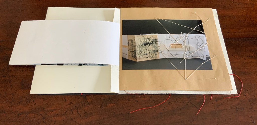
Inside, other decorative features offer further dual functionality. The sculptural element that provides the top’s weight also serves as a protective mould inside for the book and mirrors its dominant and recurrent physical feature: the creased shape slanting in parallel to the title slip tacked to the cover. Cordeiro refers to the creased shape as an “angled beam”.
For her, the angled beam distills the essence of the limp vellum structure and “supports” the variety of contemplation she pours into it. The angled beam puts forward the limp vellum structure as a historical link from binding’s past to its present. It stands for the binding structure’s durability, again linking past to present. Its linearity stands in for that continuum. It prompts thoughts of other continua along which one thing becomes another such as the line between night and day (twilight), between light and shadow, between one season and another. It evokes the continua between extremities, between the ordinary and the extraordinary, between mental acuity and dementia, and between life and death.
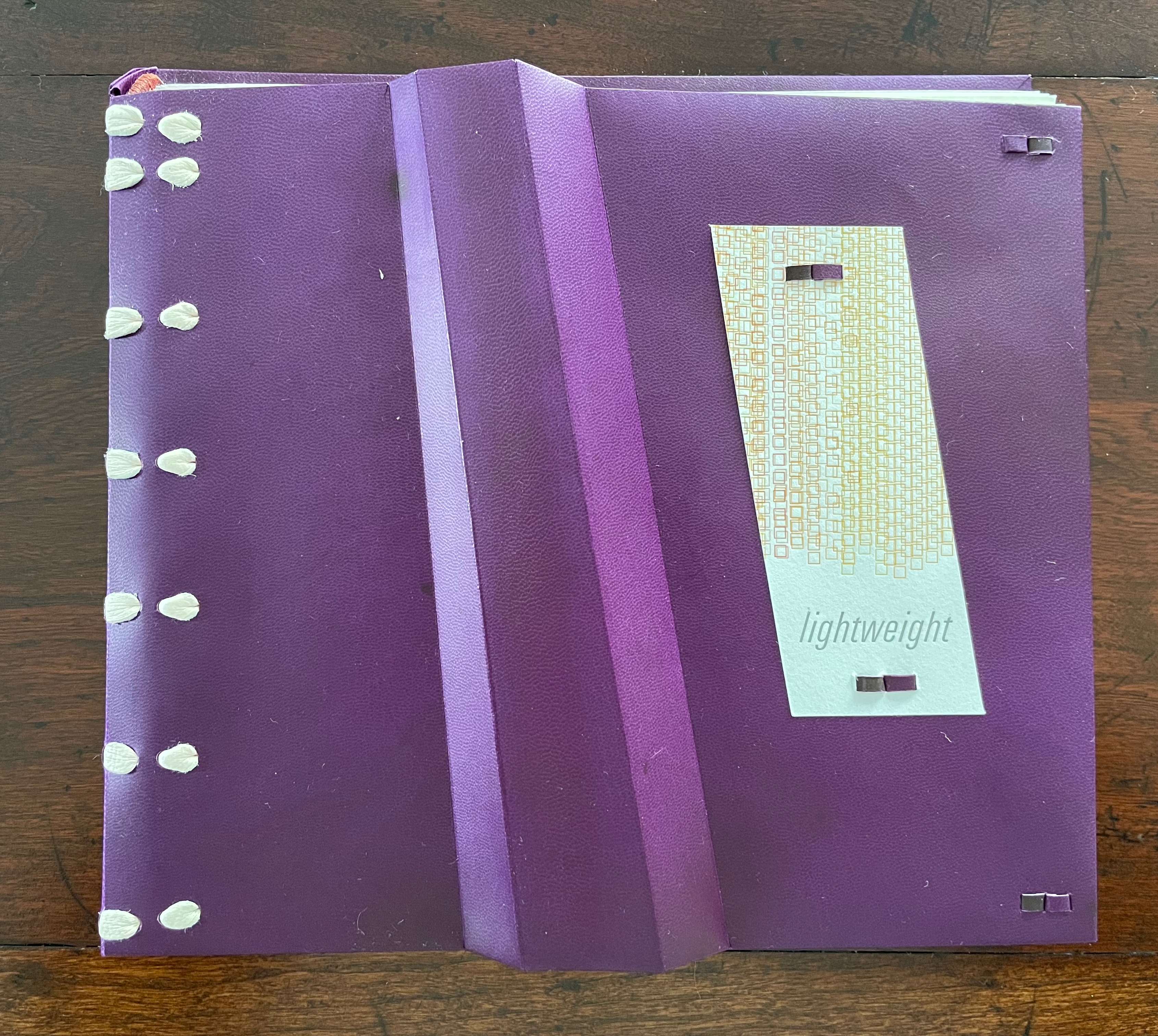
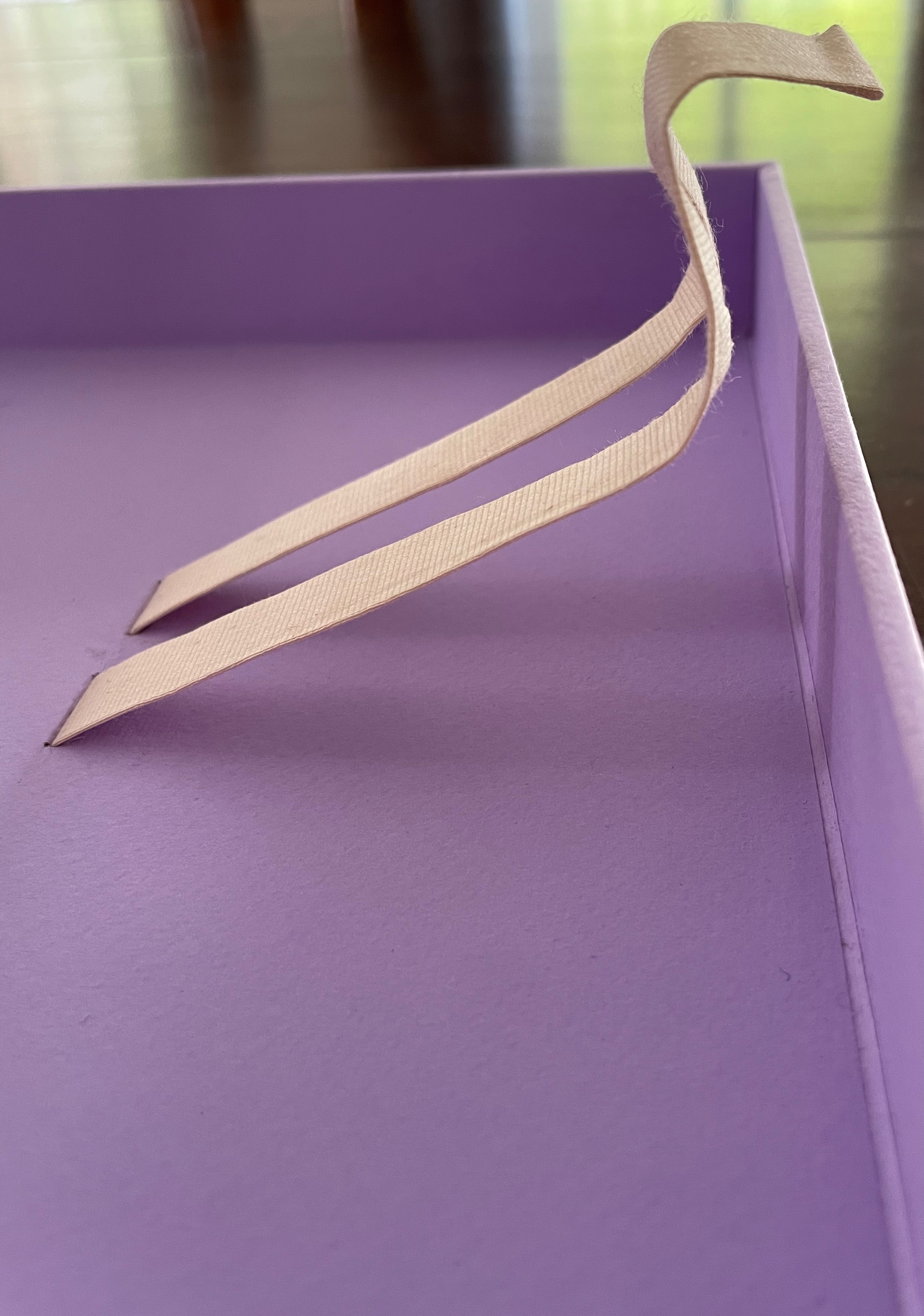
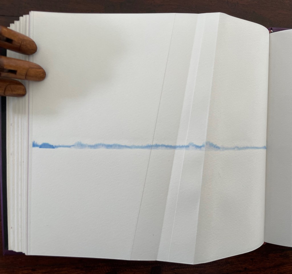
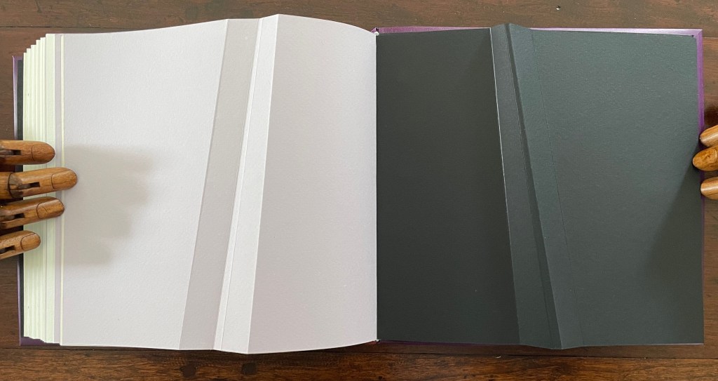
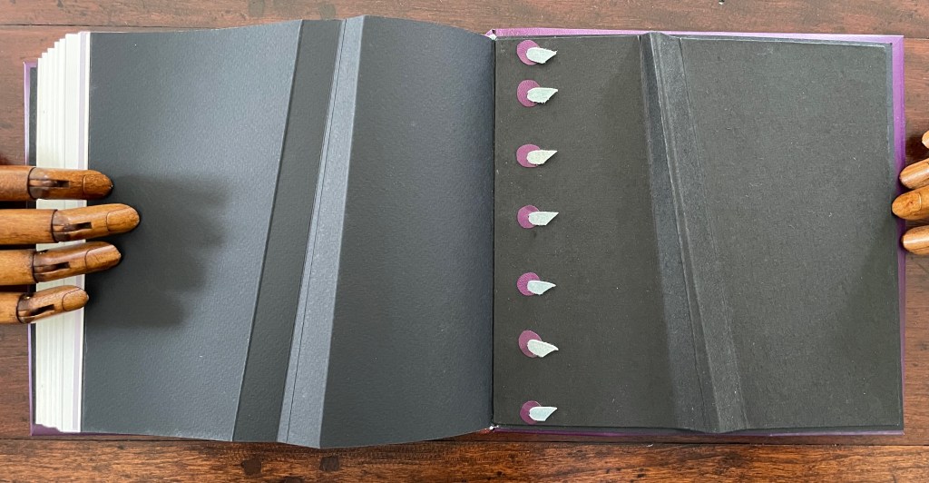
Following Emily Dickinson’s injunction — “Tell all the truth but tell it slant” — Cordeiro plants other angles in Lightweight. The ribbon tape that lies under the book is stiff, not soft and flexible, and it twists once and folds twice into an angular tool for lifting up the book. The trim of the book’s top and bottom edges slants. Creased into the covers, end sheets, and text block of this limp form, the angled beam is a physical constant echoing the metaphor of a continuum whose endpoints contrast and balance with one another.
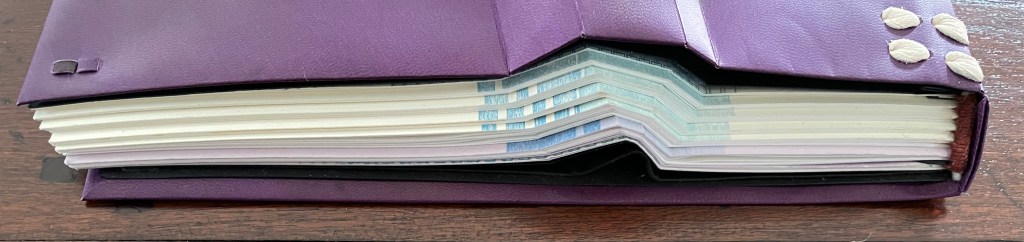
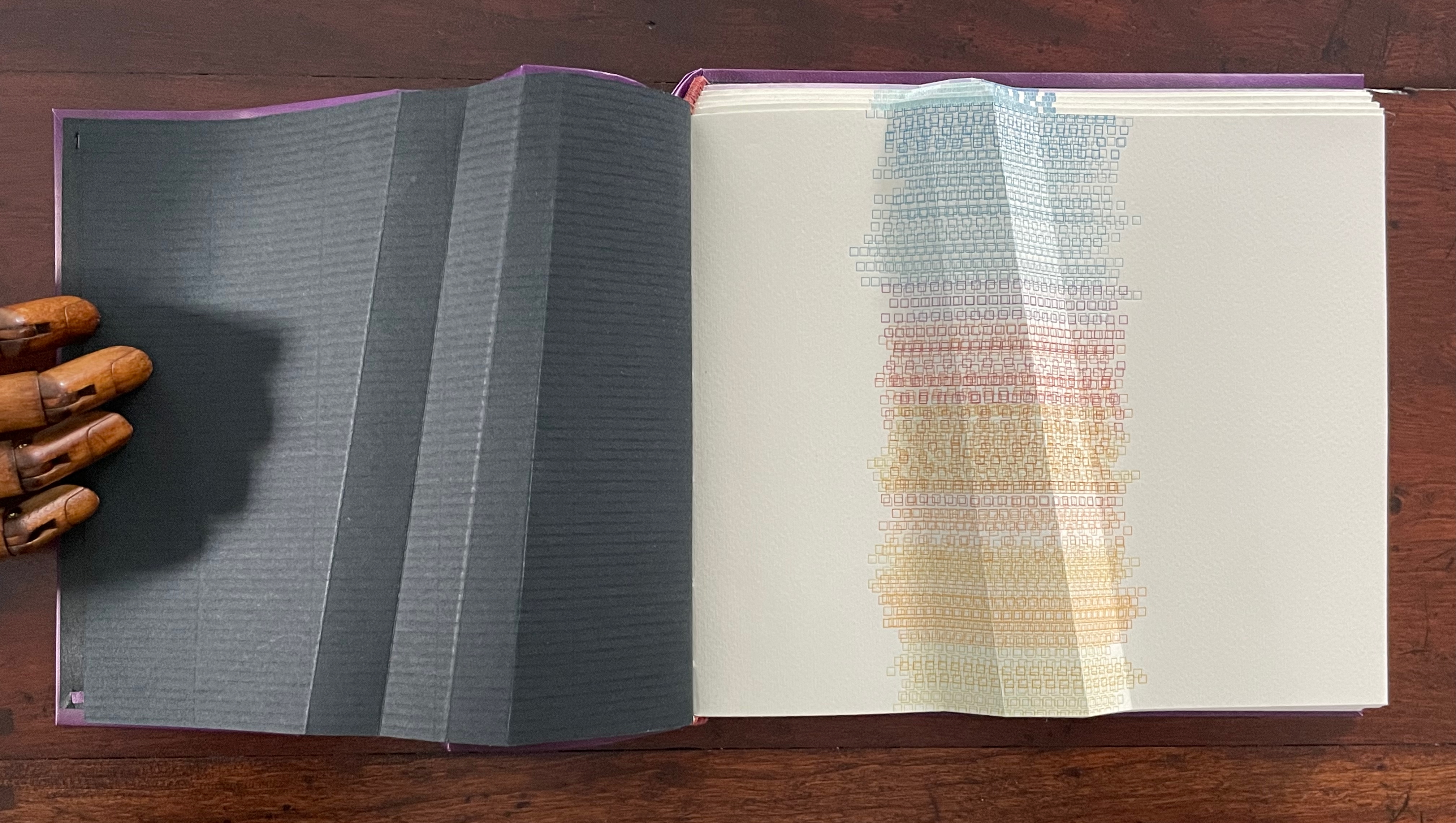

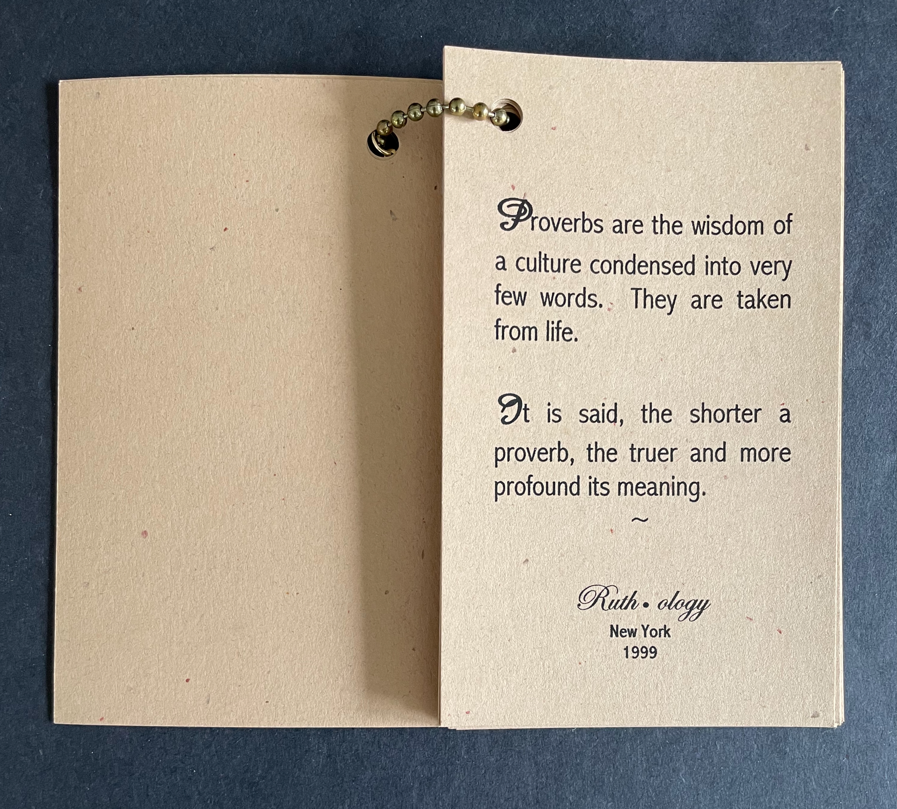
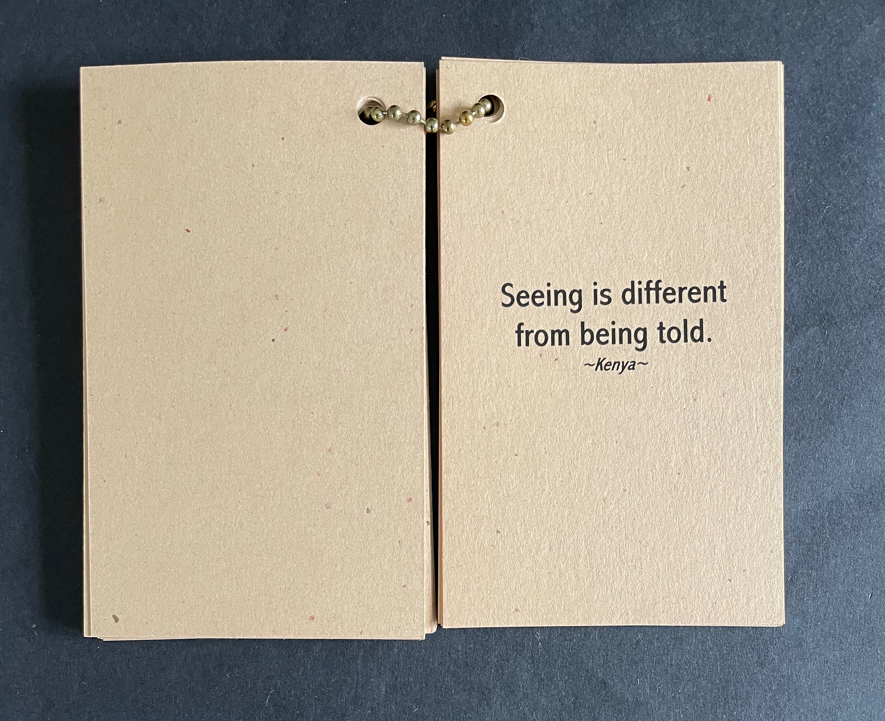
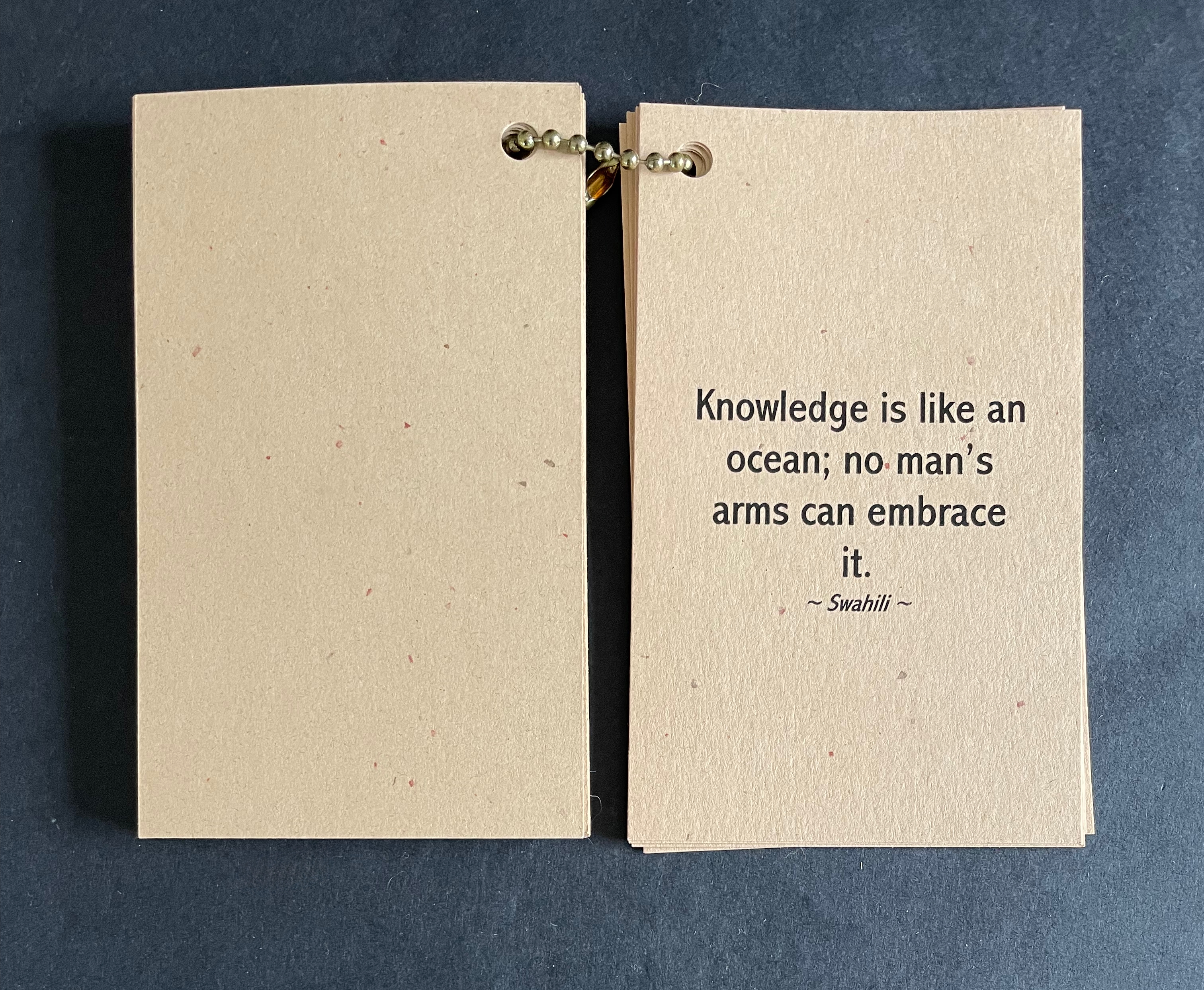
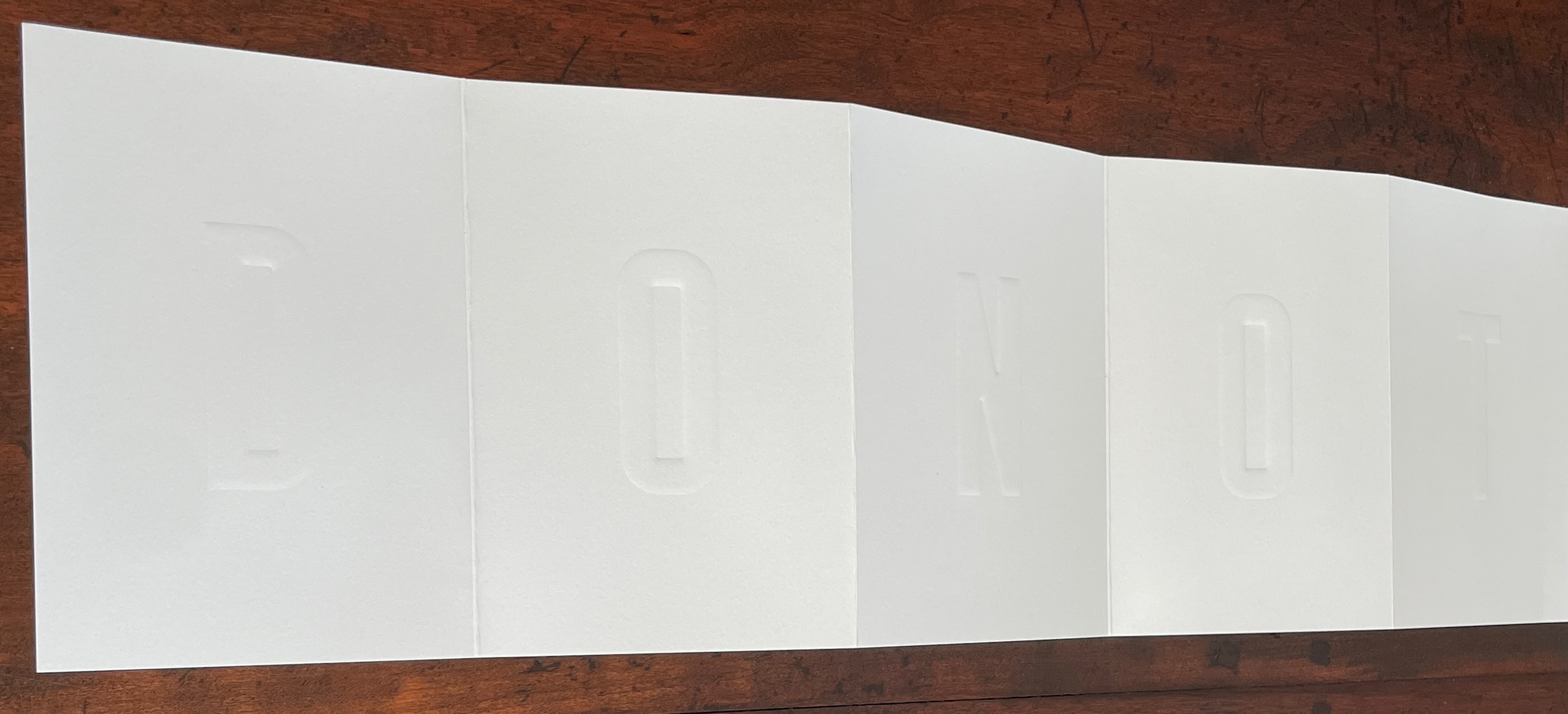
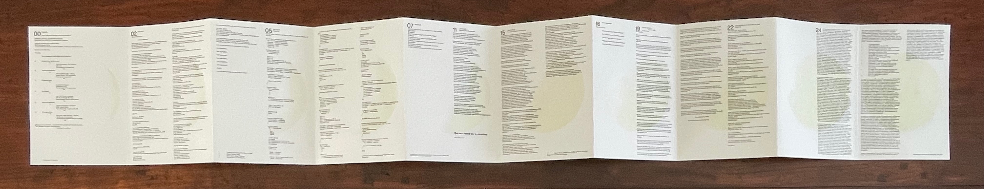
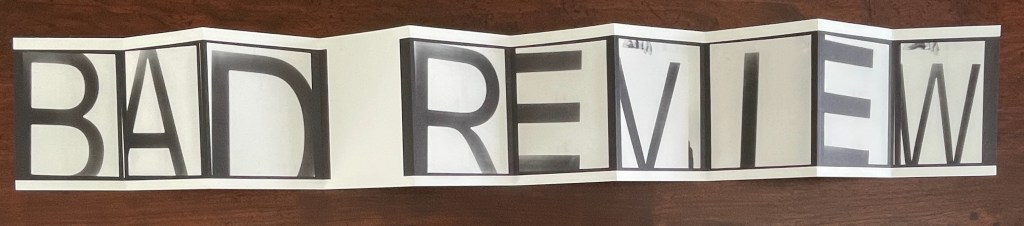
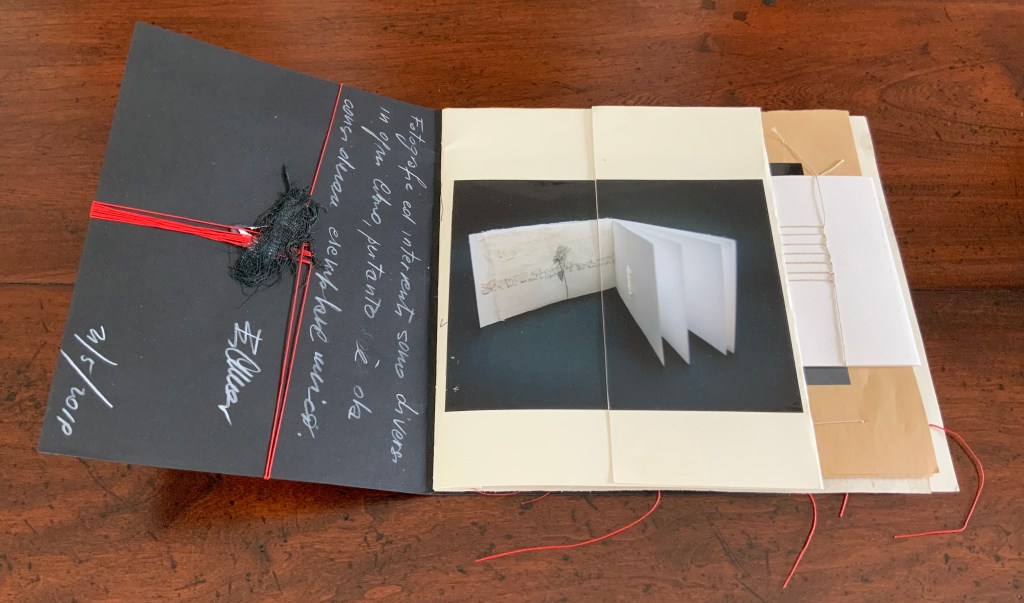
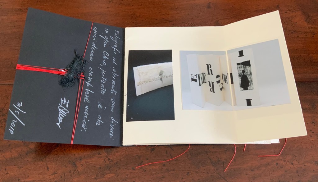
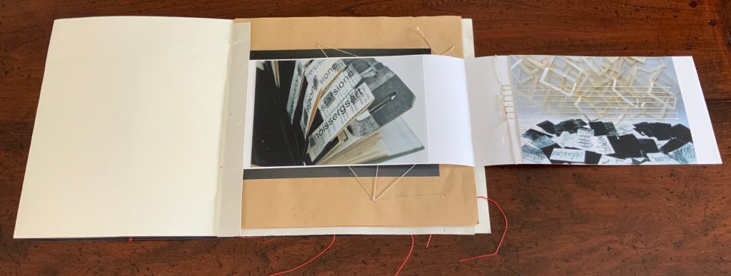
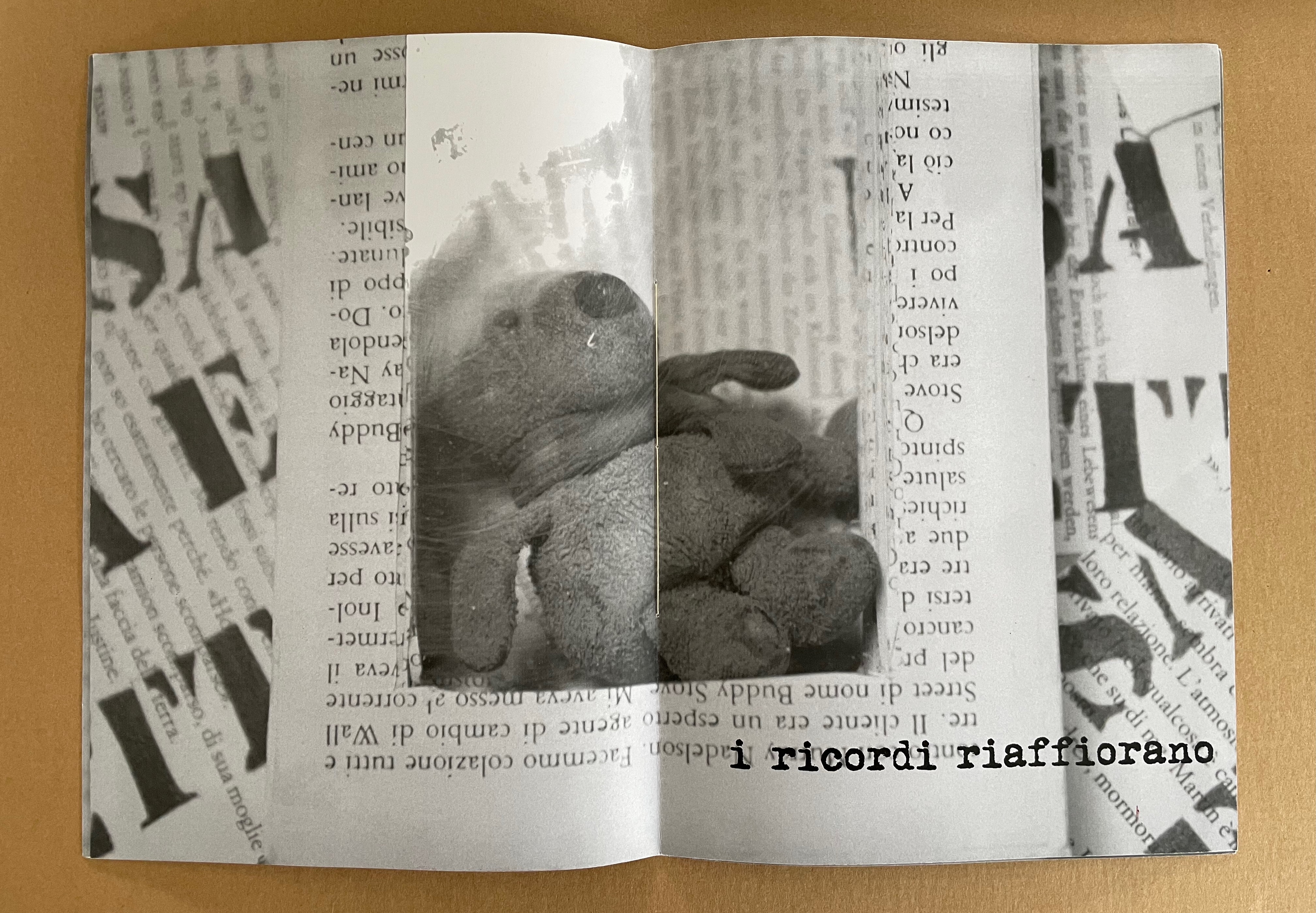
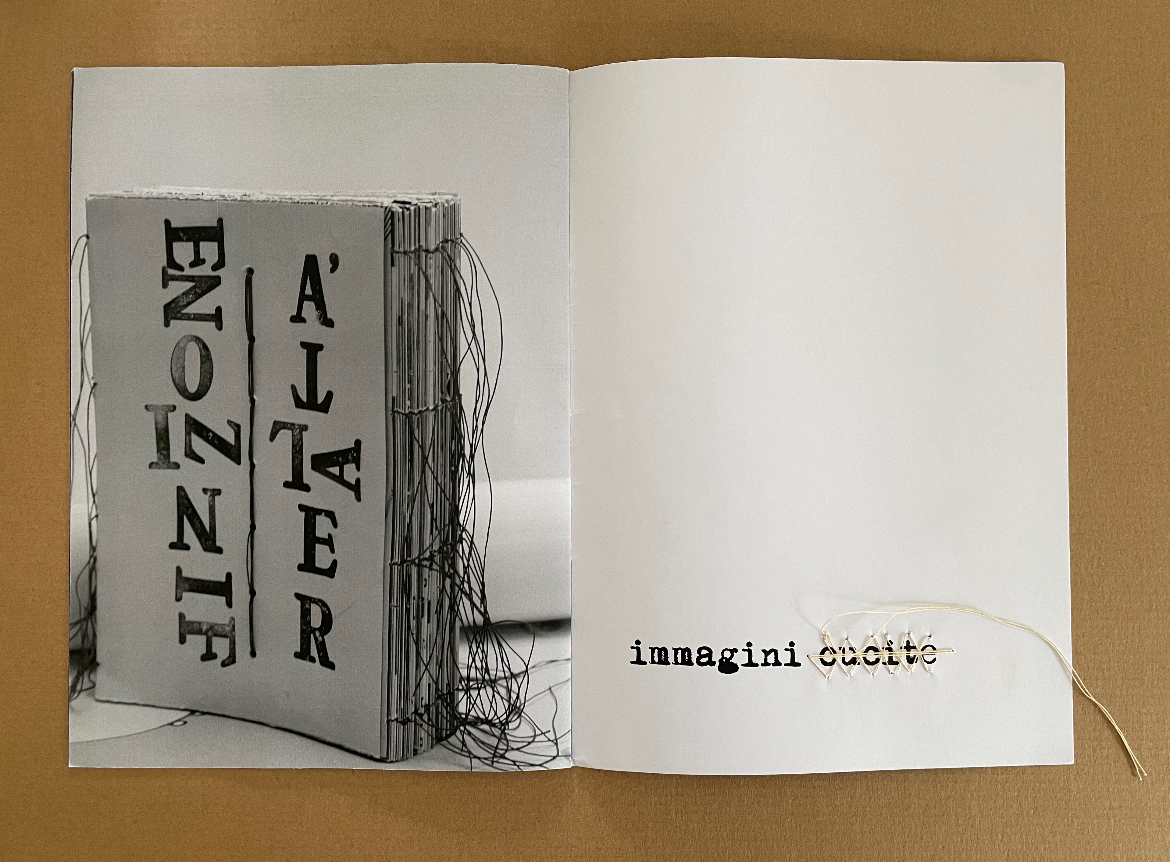
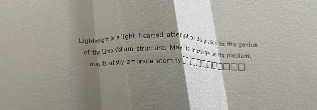
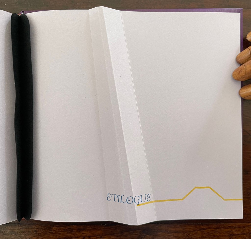
Altogether there are seven gatherings in Lightweight. The “prelims” gathering provides the historical context underlying Cordeiro’s homage. Note the artist’s wish expressed in the envoi to this artist’s book in our hands: “May its message be its medium, may its artistry embrace eternity”. Here, Cordeiro introduces that self-reflexivity we expect in the best of artists’ books.
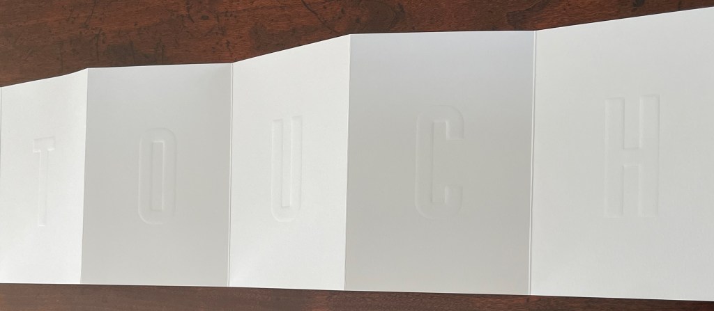
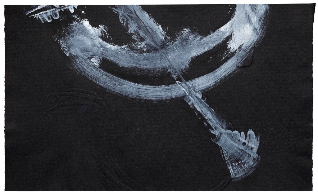
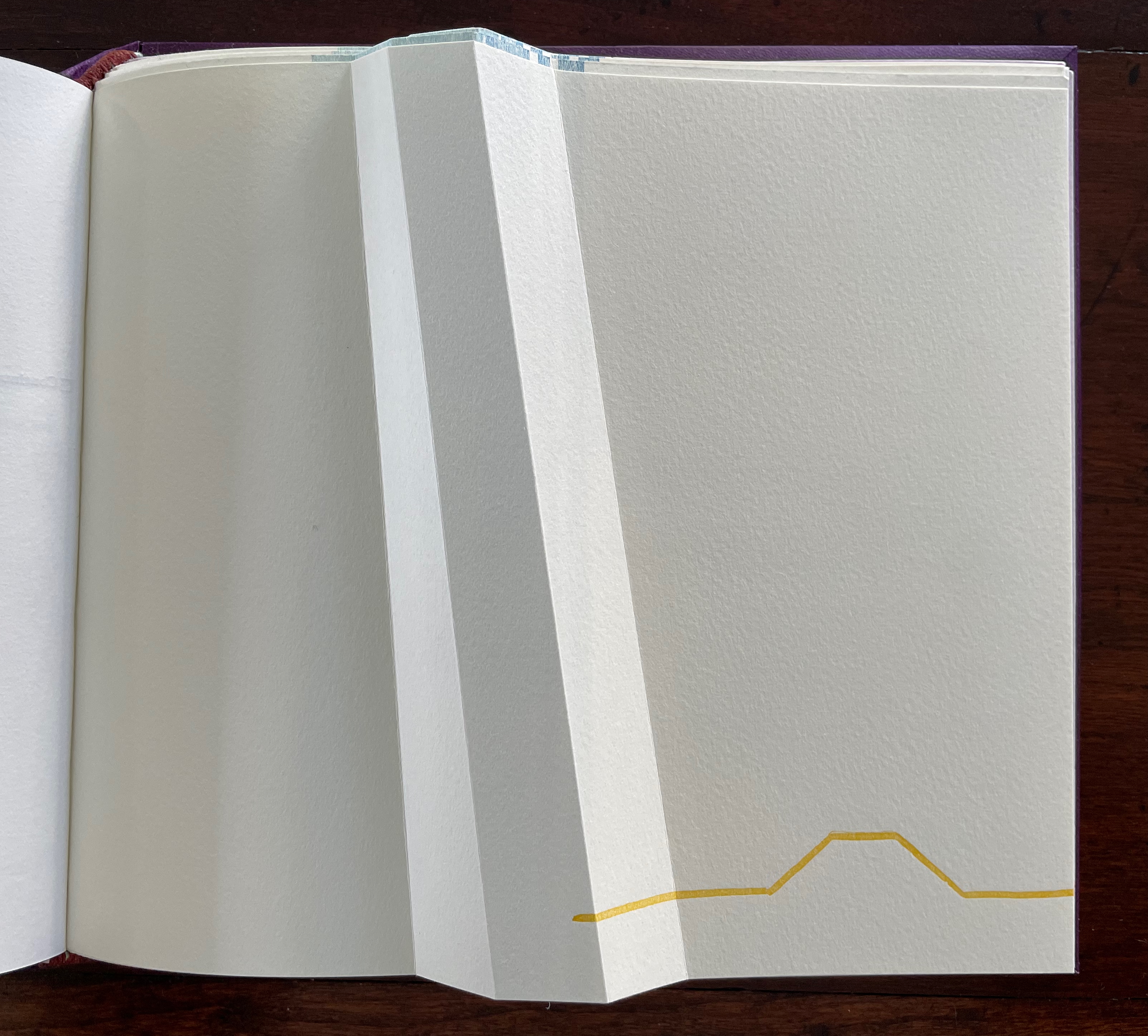
After the prelims gathering, the other six gatherings are labeled. In addition to bearing the creased angled beam, all six carry an “on-end outline” of it (see below). The five that are numbered, lettered, and labeled introduce themes reflecting different responses that relate to the continuum motif.
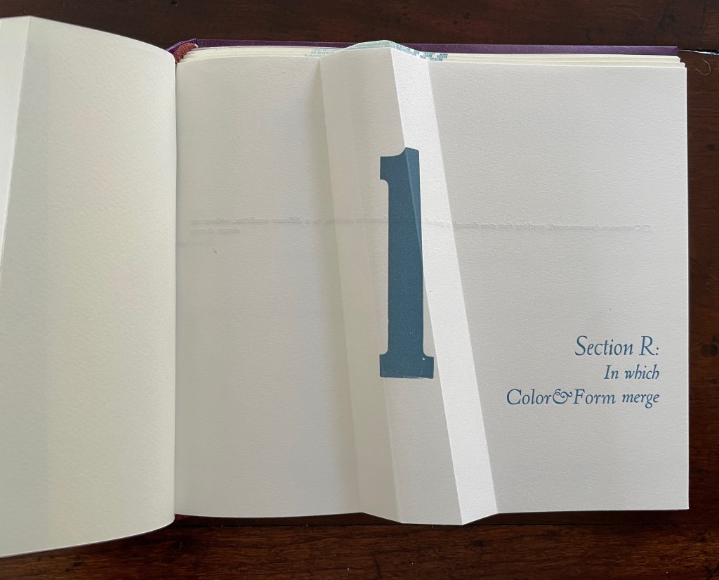
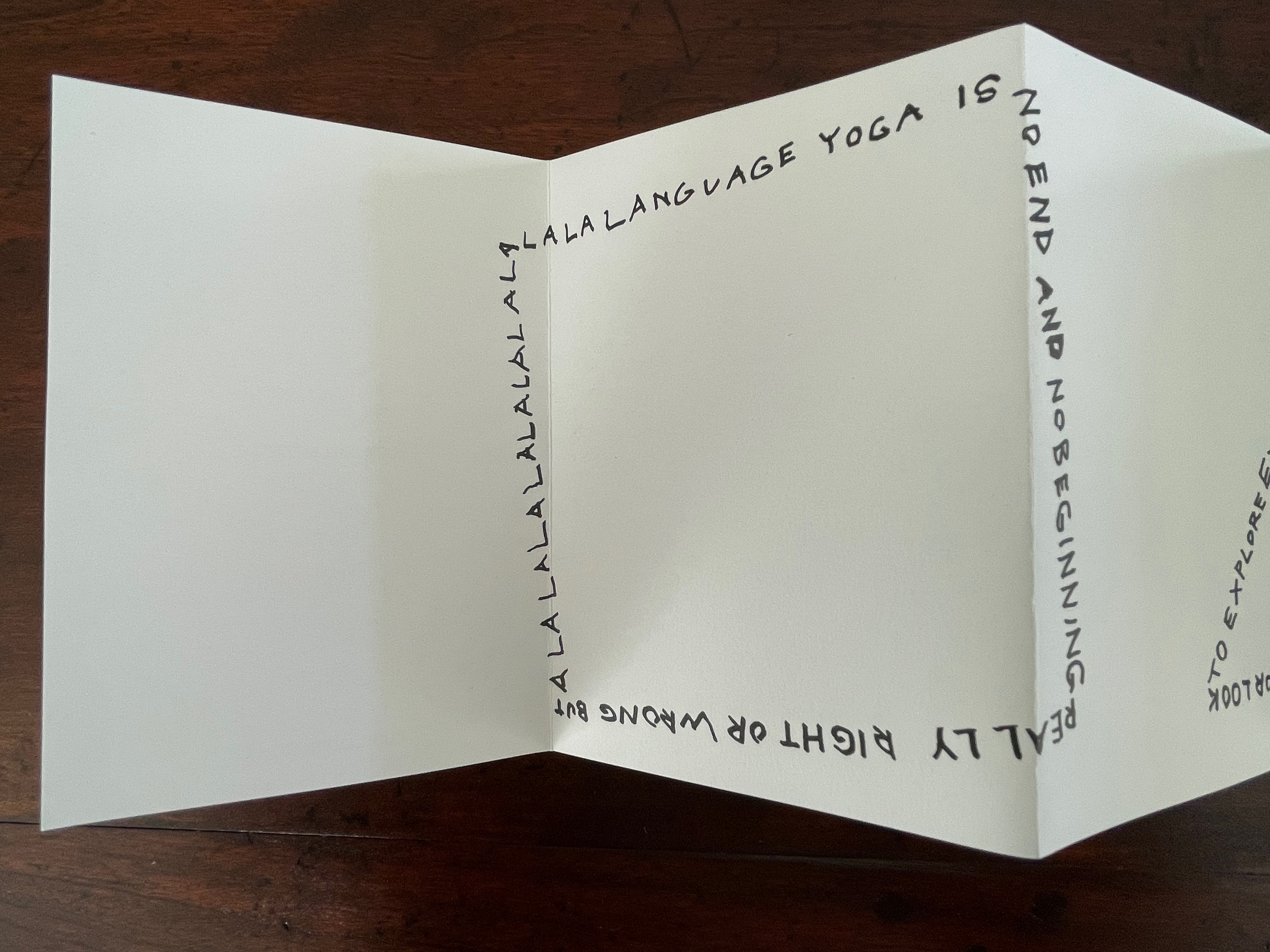
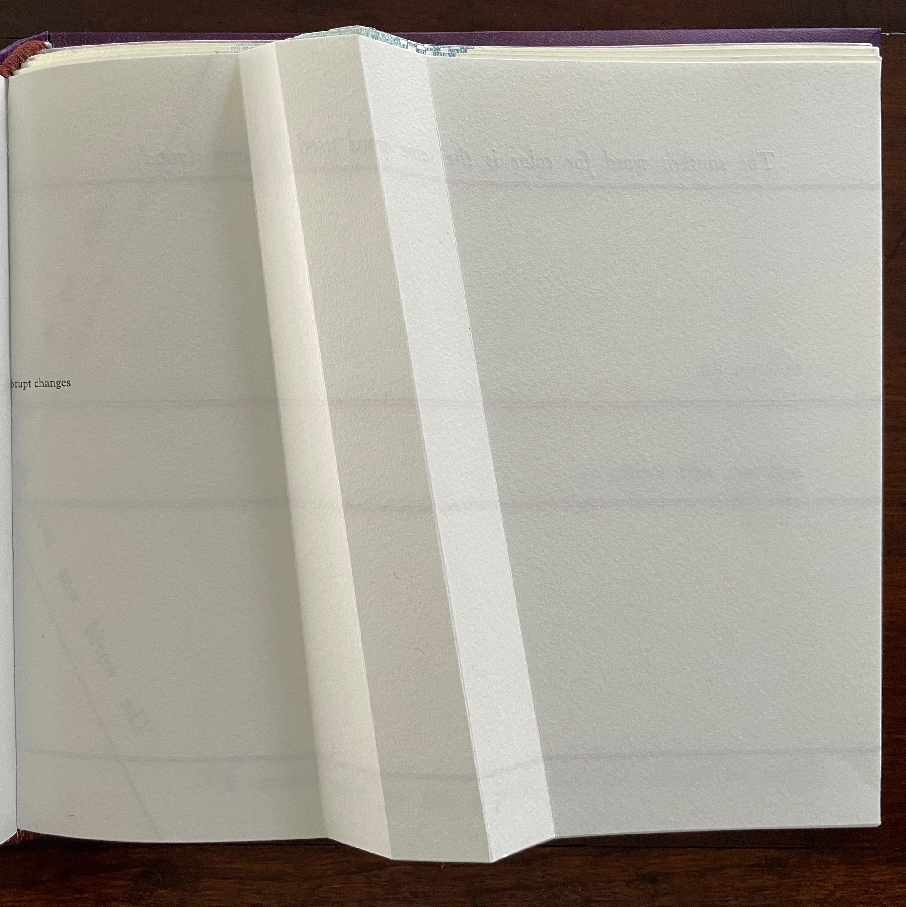
The Part 1, Section R gathering has announced cryptically that color will merge with form. How will this happen? As you turn the page, the opening text suggests how — along a continuum: “Continuum (measurement), anything that goes through a gradual transition from one condition, to a different condition, without any abrupt changes”.
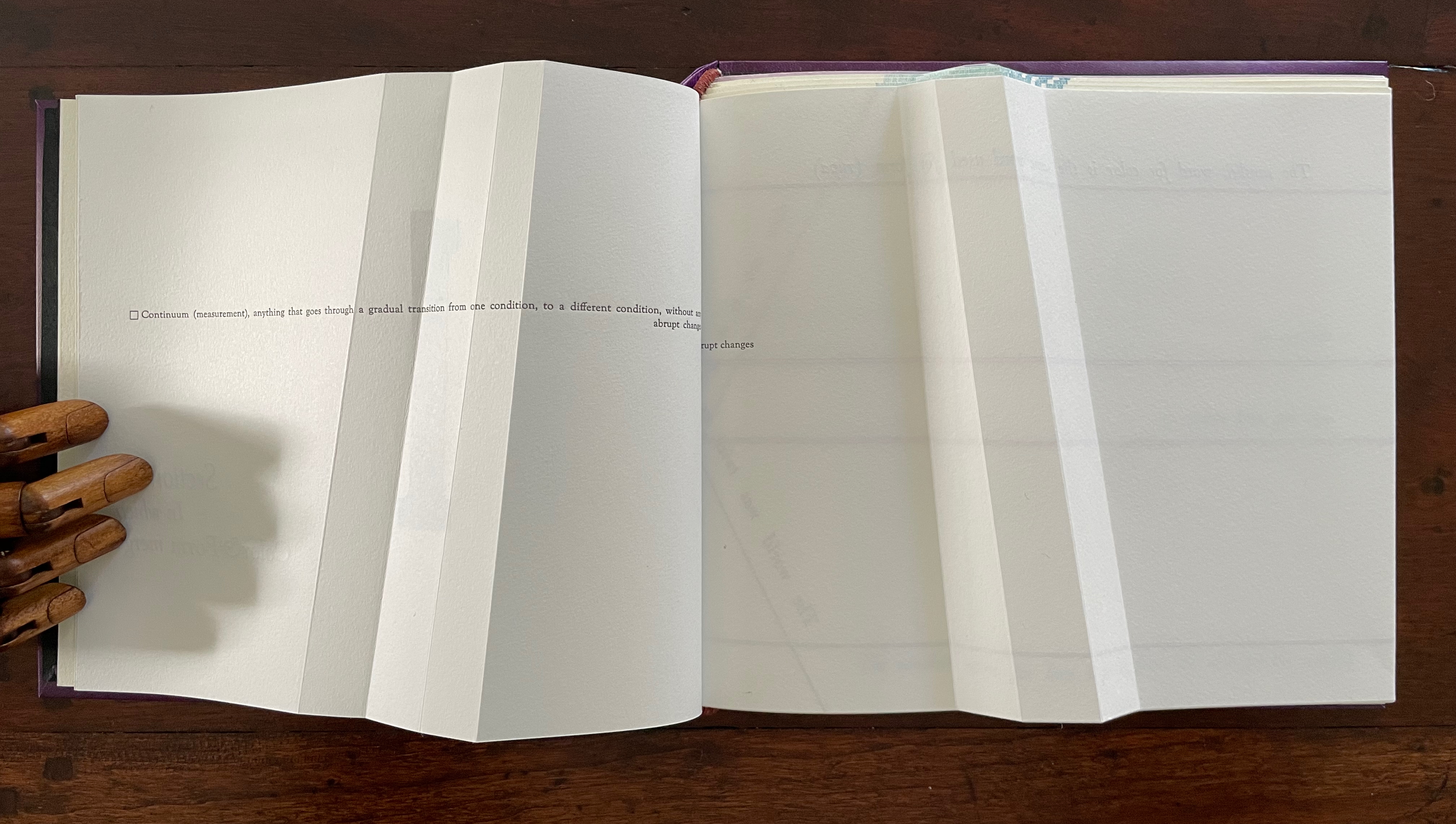
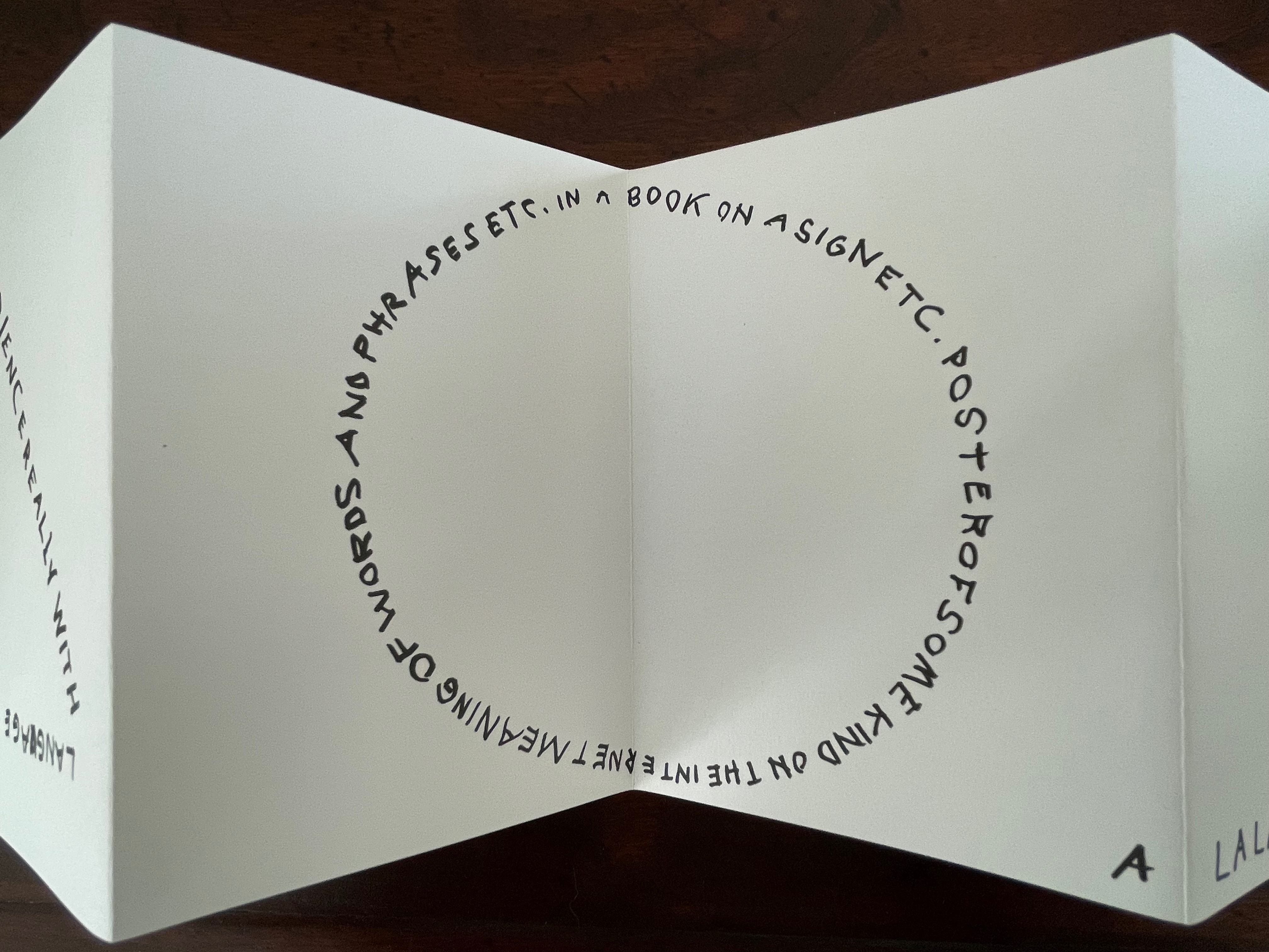
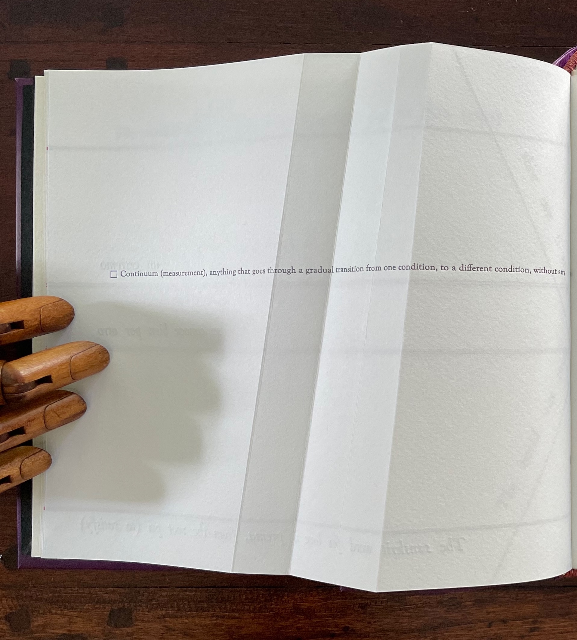
The spread lays out this definition in a peculiar manner that seems to contradict the definition. On the verso page, the definition seems to run abruptly up against the seam, which bumps the words “abrupt changes” to the next line, while the recto page presents a truncation of those words: “rupt changes”. Hold that puzzle for a moment. So how can color and form be on a continuum? And will they merge gradually or abruptly? On the next spread, Cordeiro answers with the Sanskrit word rupa, which represents “color” and “form” and from which the section draws its label “R”.
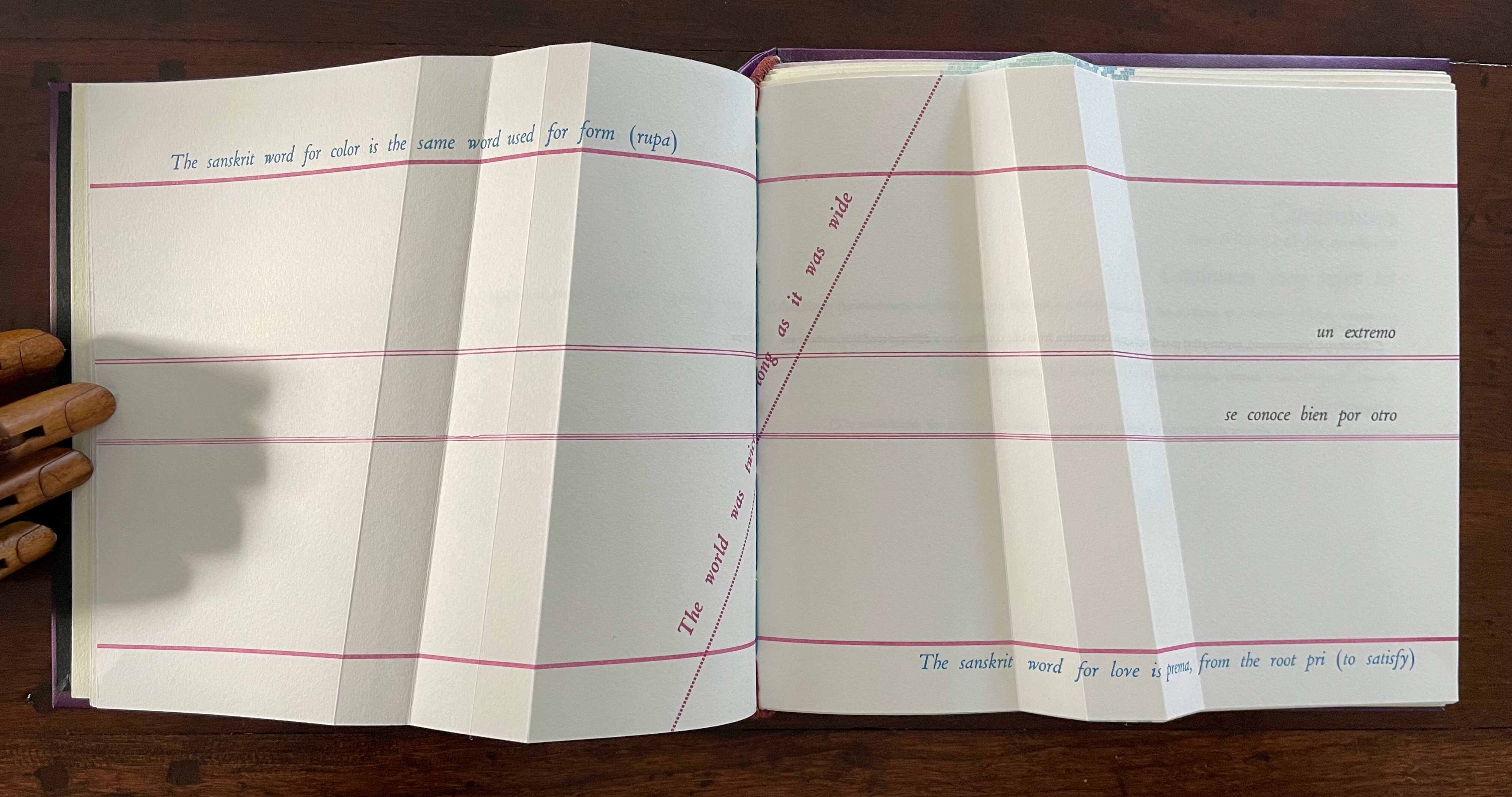
un extremo se conoce bien por otro [one extreme knows well its other]
So, the merger is etymological. But at the same time, another spectrum comes into play: the color spectrum and the blue and red at its opposite ends. On the spectrum, of course, one gradually becomes the other, enacting the expression “un extremo se conoce bien por otro” [one extreme knows well its other]. If this seems a stretch, the next double-page spread reassures us that “continuum” has additional linguistic as well as mathematical roots.
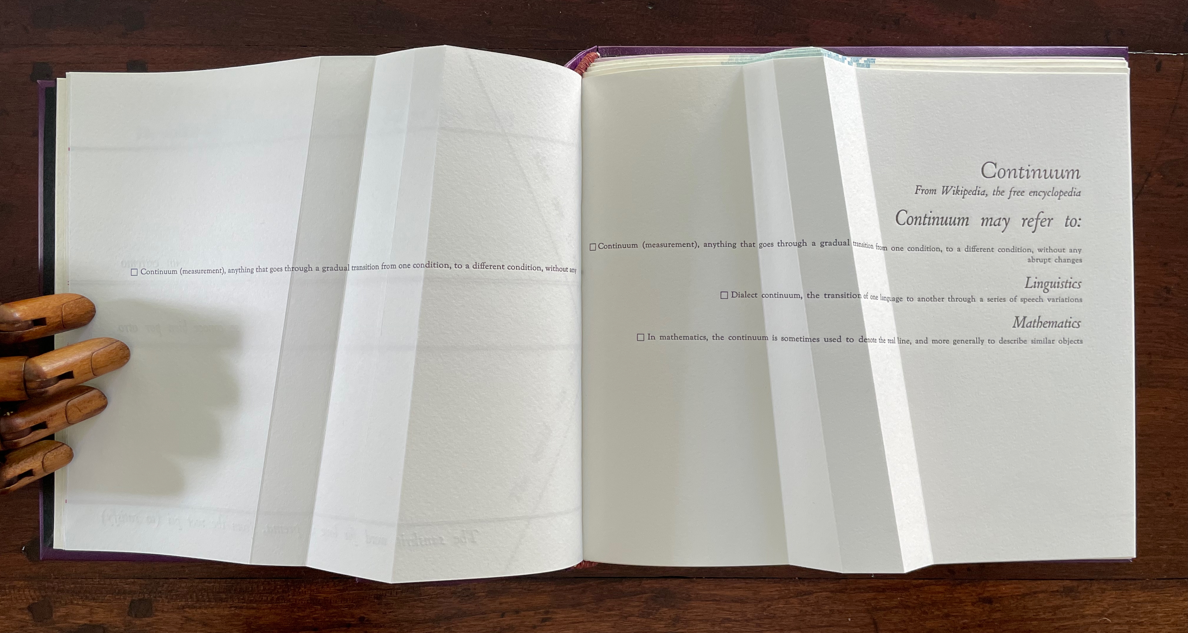
Before the reassurance, however, we come back to the puzzle of “rupt changes”. Again, on the verso page above, the definition of “continuum” runs pell mell into the crease. To solve the puzzle, we have to look more closely at the structure of the Section R gathering. It consists of three oblong folios folded in half. On the reverse side of the center folio (what would be pages 5 and 8 of this gathering if the pages were numbered), the definition of “continuum” has been printed so that the fold splits the word “abrupt” between its syllables: “Continuum (measurement), anything that goes through a gradual transition from one condition, to a different condition, without any a | brupt changes.” In effect, the layout draws attention to our perception of breaks in continua.
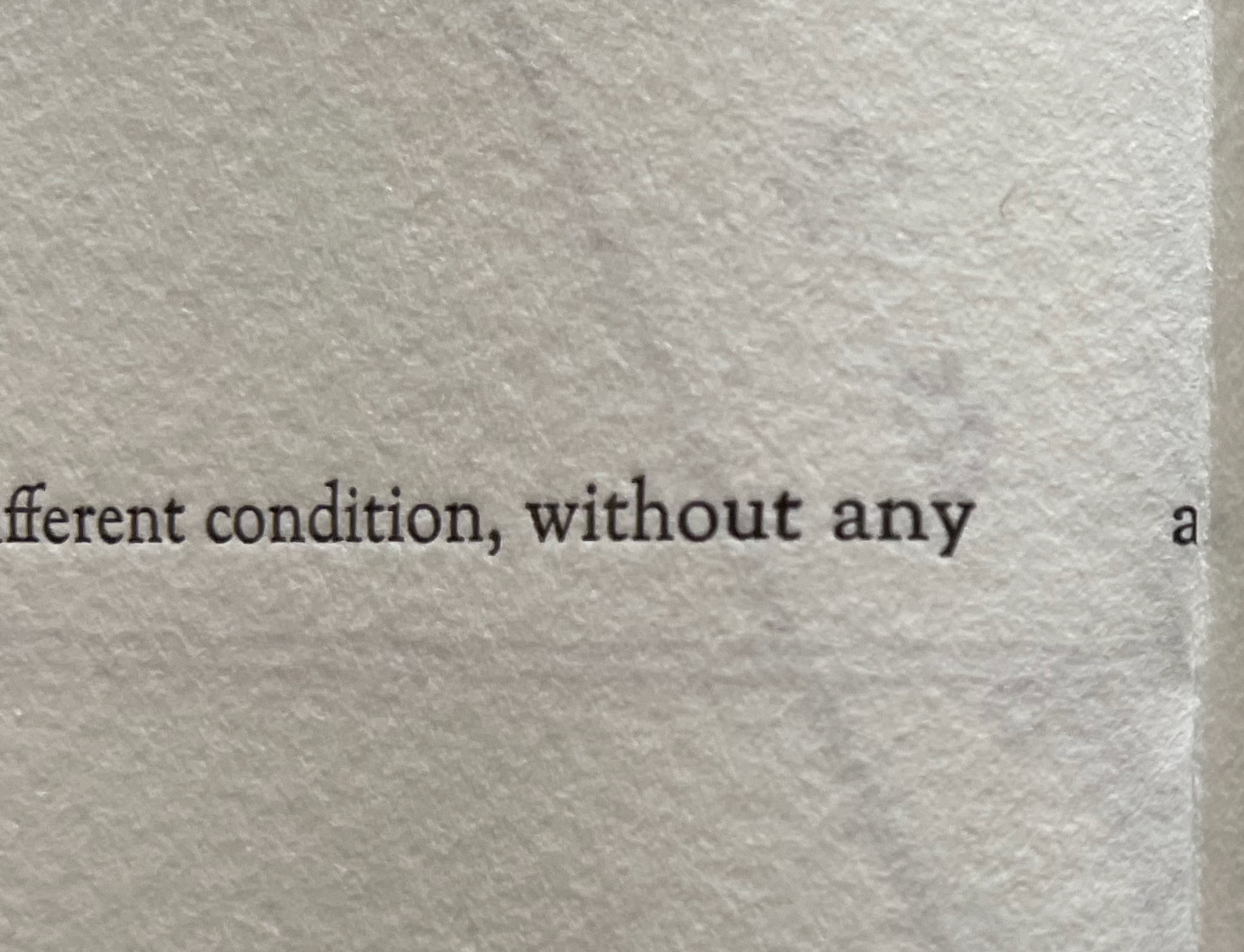
View of “pages 5 and 8” separated by a detailed view of the break in the word “abrupt”.
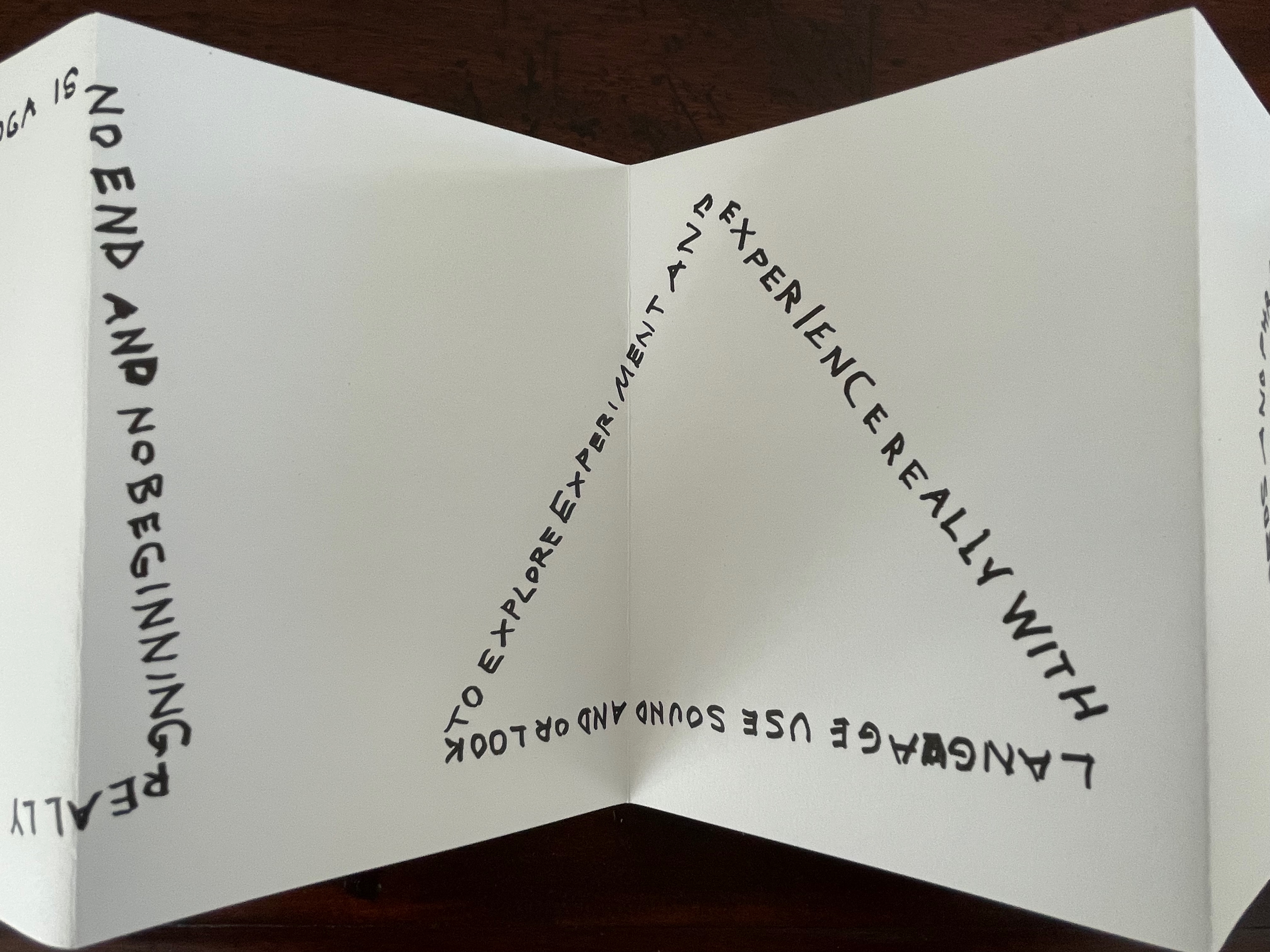
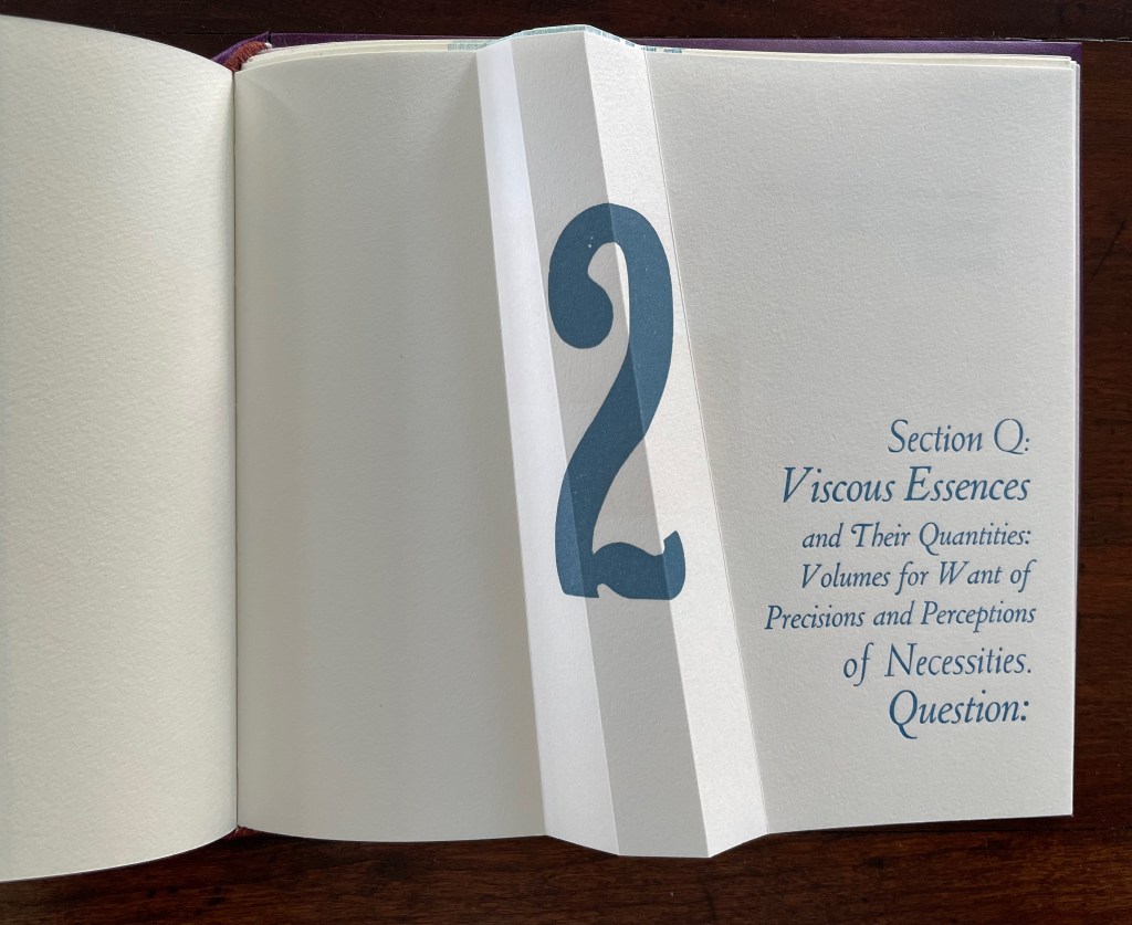
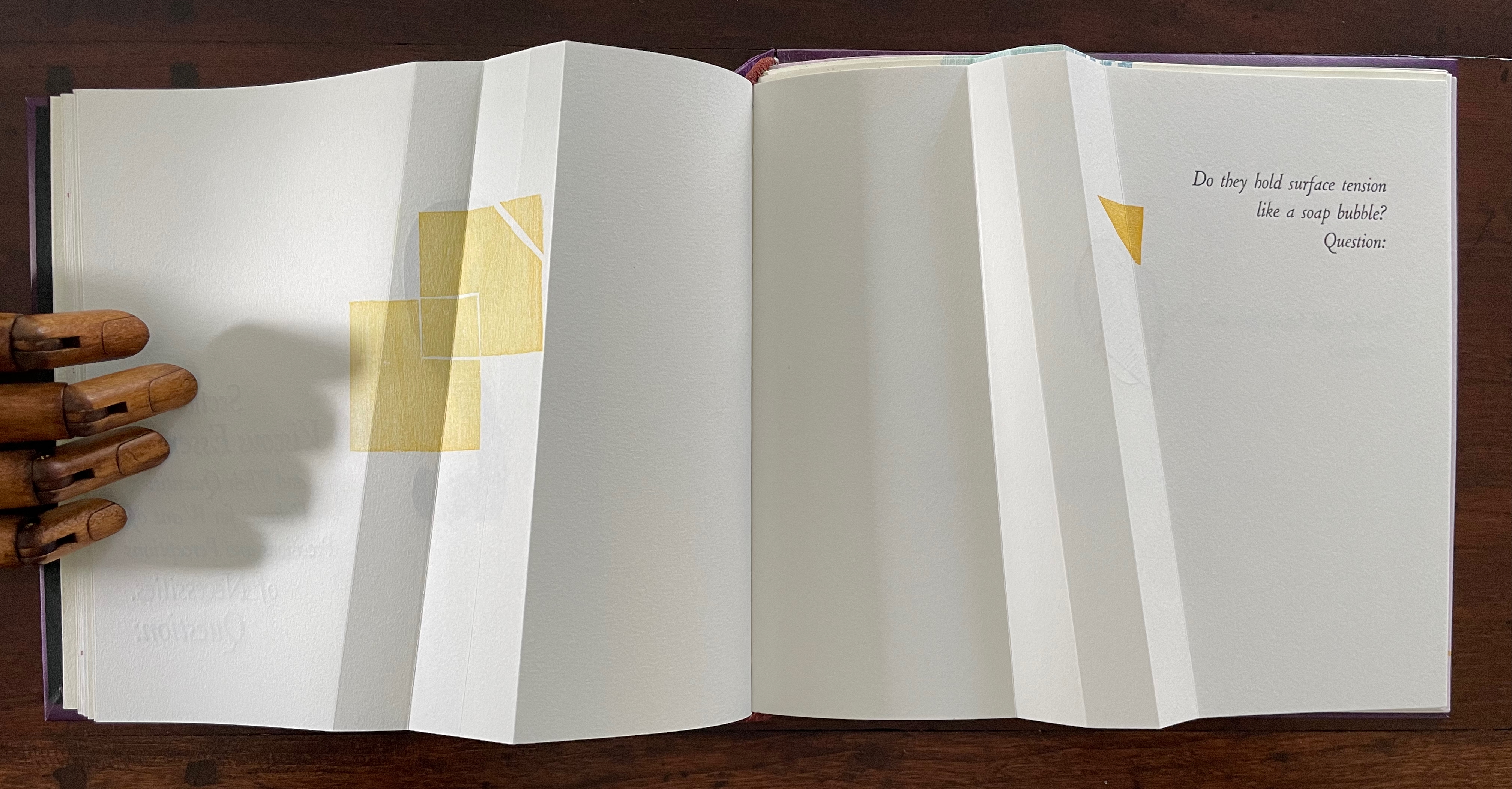
If Section R has not prompted the reader to propose questions about the structure of the book or this book in particular, the Part 2, Section Q gathering provides a series of oblique questions very much focused on that but also on metaphorical matters. Again, what happens structurally in the gathering and on the surface of its pages presents puzzles and hints at solutions.
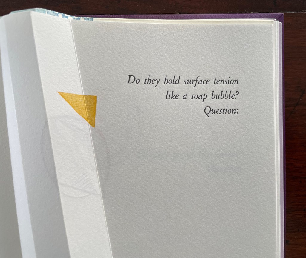
The geometrical images associated with the first question (“Do they hold surface tension like a soap bubble?”) seem to float or progress across the double-page spread, breaking up to punctuate the question. Reminding us of opposites and abrupt changes, the angular yellow overlapping squares and triangles puncture the text’s round verbal soap bubble. Before we can ask to what or whom does “they” refer, we are prompted by “Question:” to turn the page.
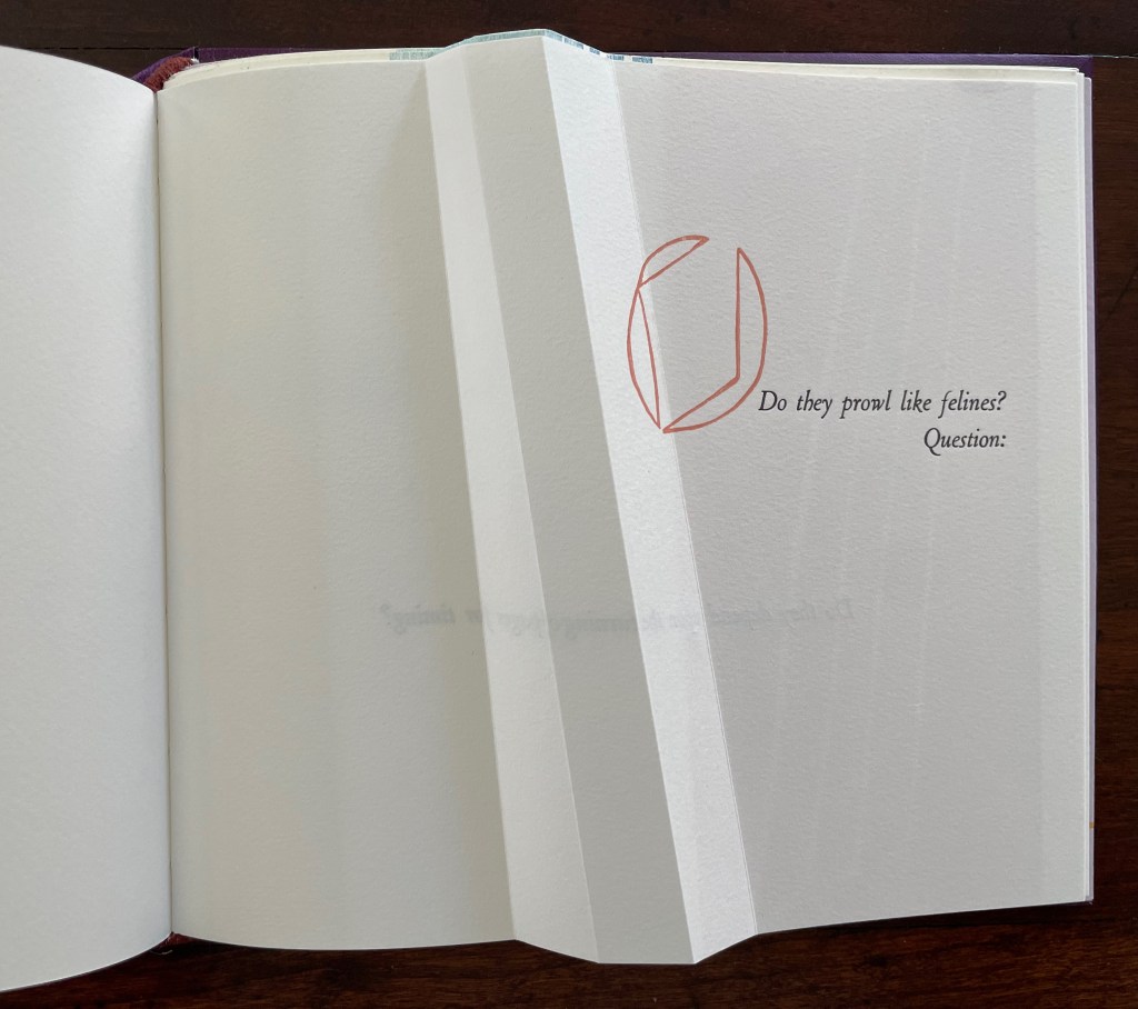
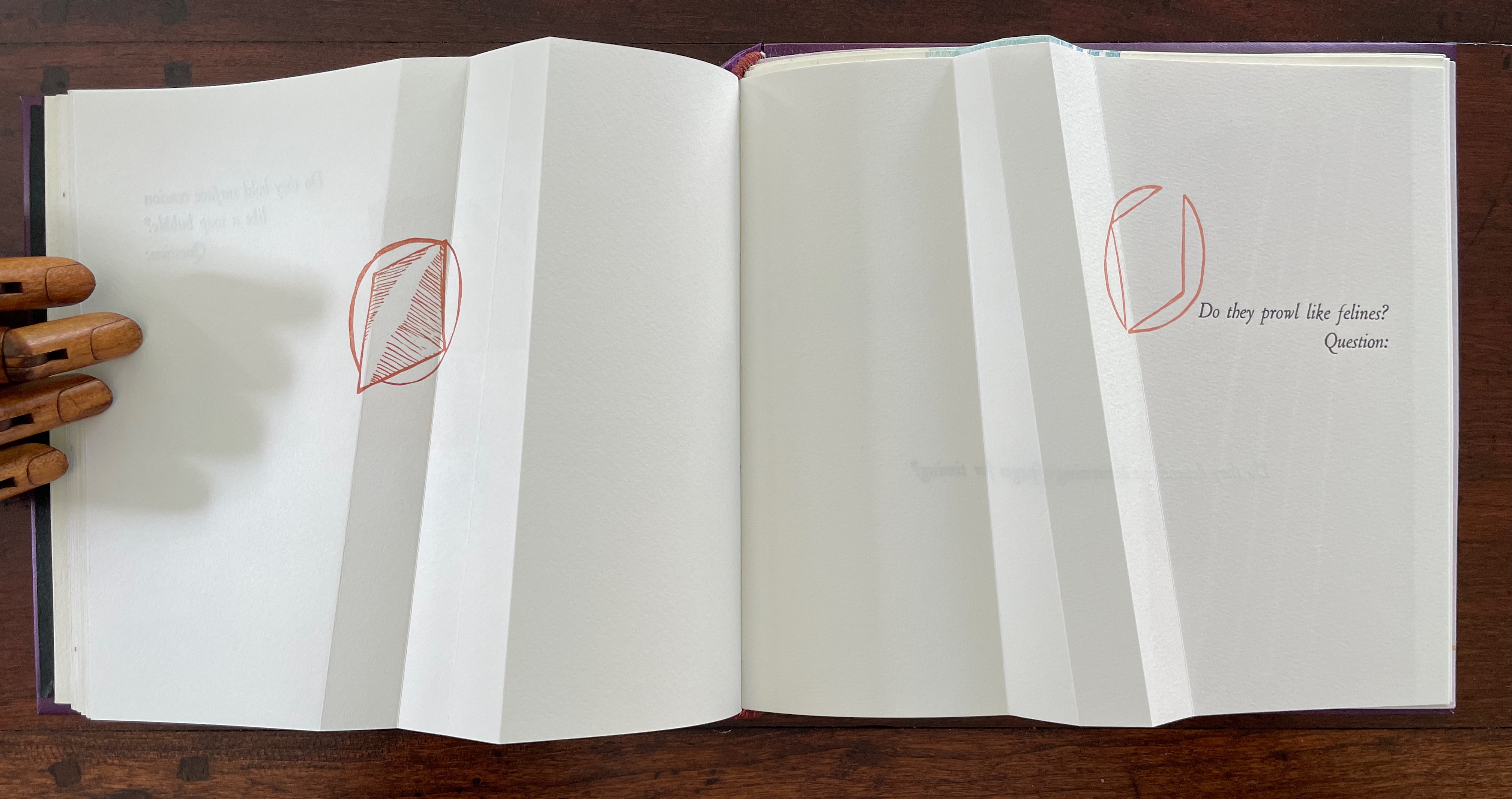
The next question (“Do they prowl like felines?”) prods at the unasked question: what or who are “they”? How is it that “they” are like prowling felines? Again, the images seem to progress across the spread, with the first image’s central diamond shape disappearing to leave the curvilinear second shape leaning over the printed question. Might these be diagrams of the limp vellum structure’s sewing holes and lacing? If so, has Cordeiro found another metaphor for limp vellum structures in the supple and sinuous strength of prowling felines? Do “they” refer to limp vellum structures?
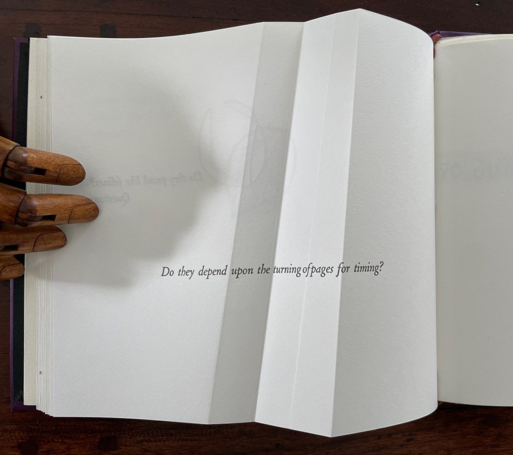
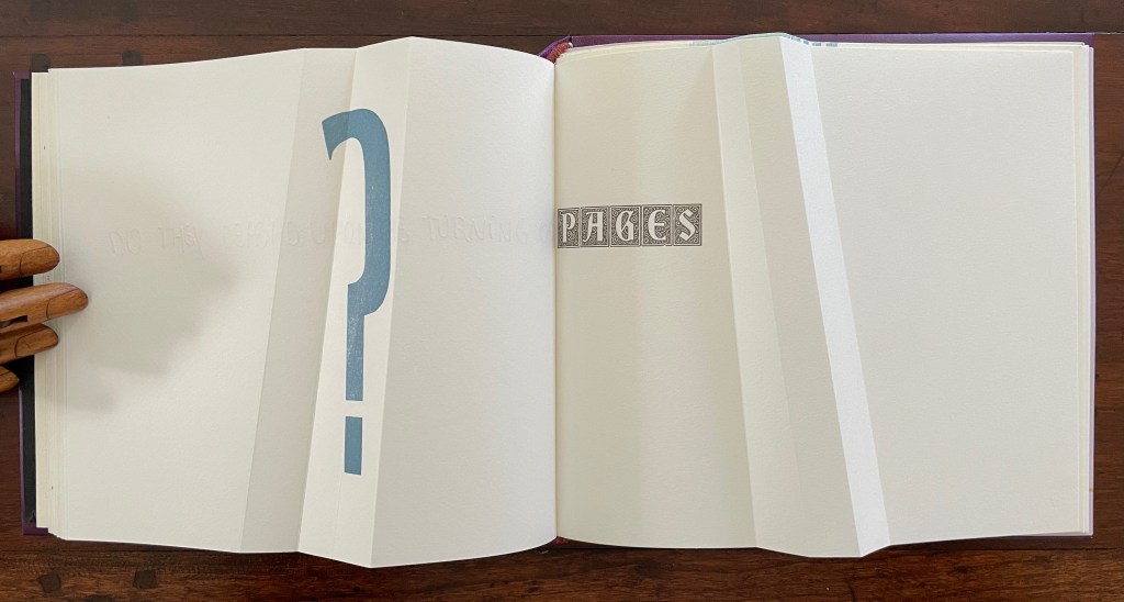
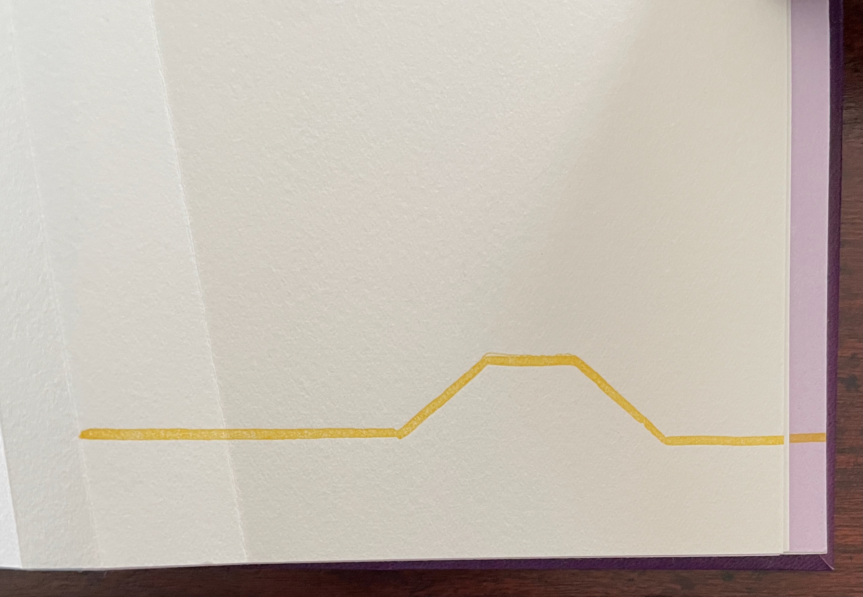
The next question turns directly to a functional attribute of the book structure: turning pages. The yellow print gives an ambiguous view. The two-dimensional representation of the angled beam fluctuates between a mountain view and a valley view. Are we looking down on the splayed spine of a book or its gutter with pages splayed open? Either way, the print angles away from the physical angled beam, which sets up a metronomic pattern in the spread — the beam leaning to the right, then to the left, and again to the right — or a page turned to the right, then to the left, and back again to the right — or mountain fold, then valley fold, then mountain, then valley (the gutter), then mountain, then valley, then mountain until we come to the ambiguous two-dimensional print. Again, this is a continuum, and “they” seems to refer to limp vellum structures.
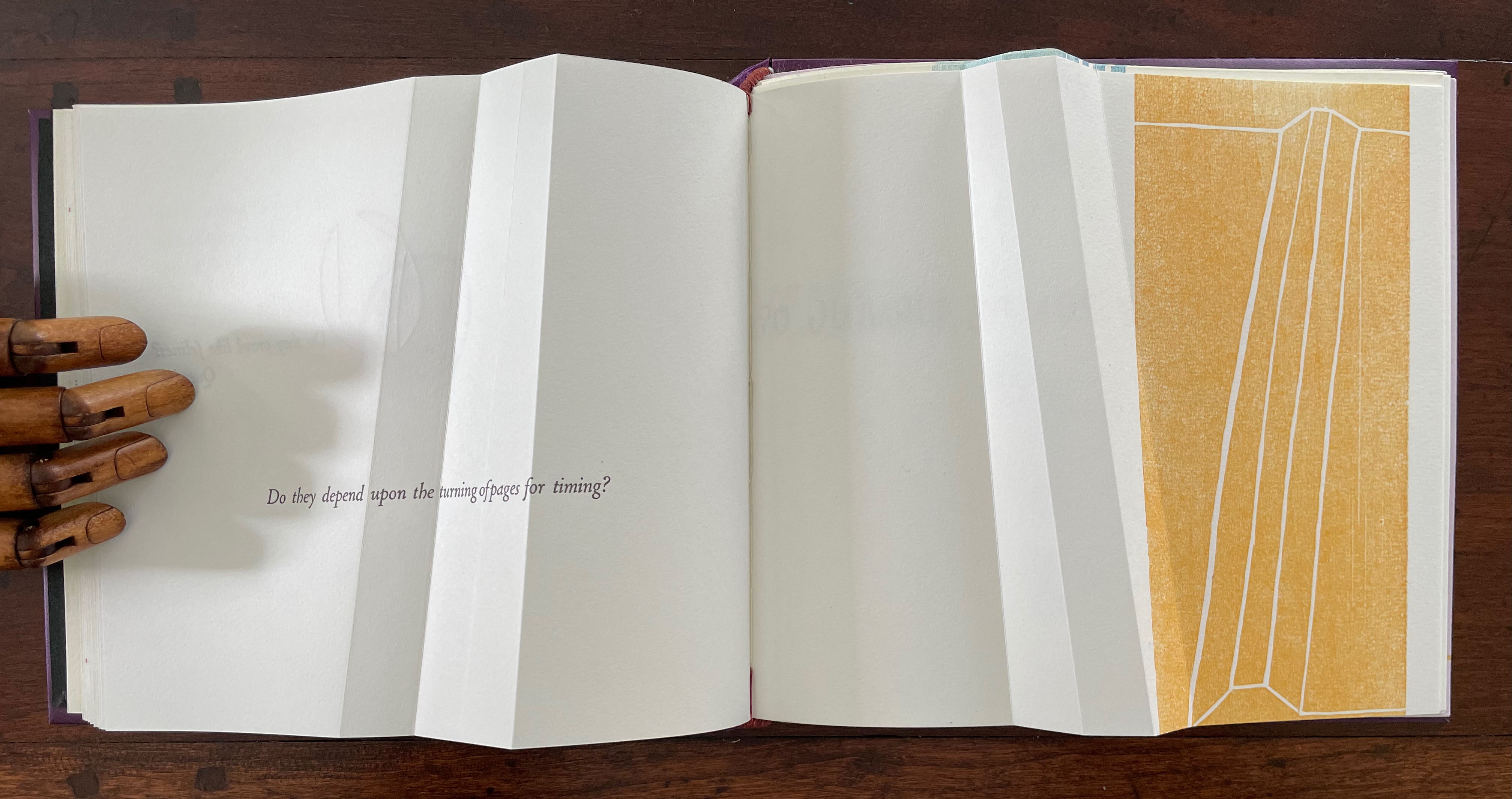
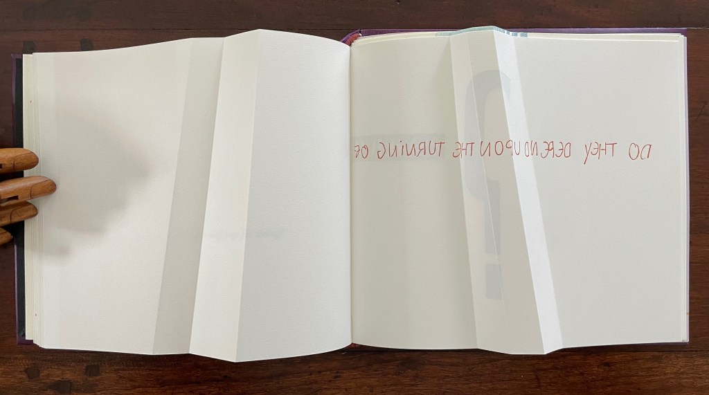
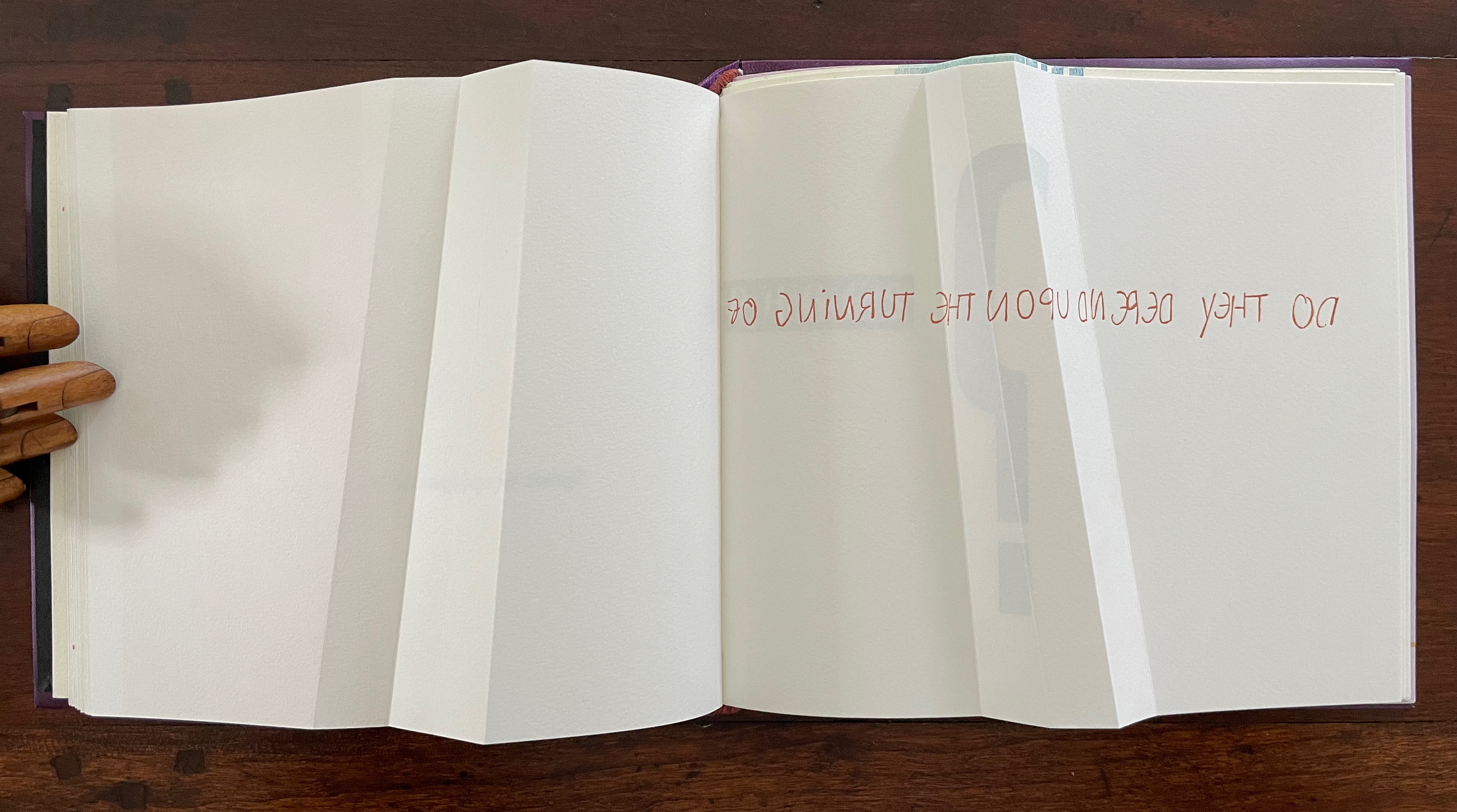
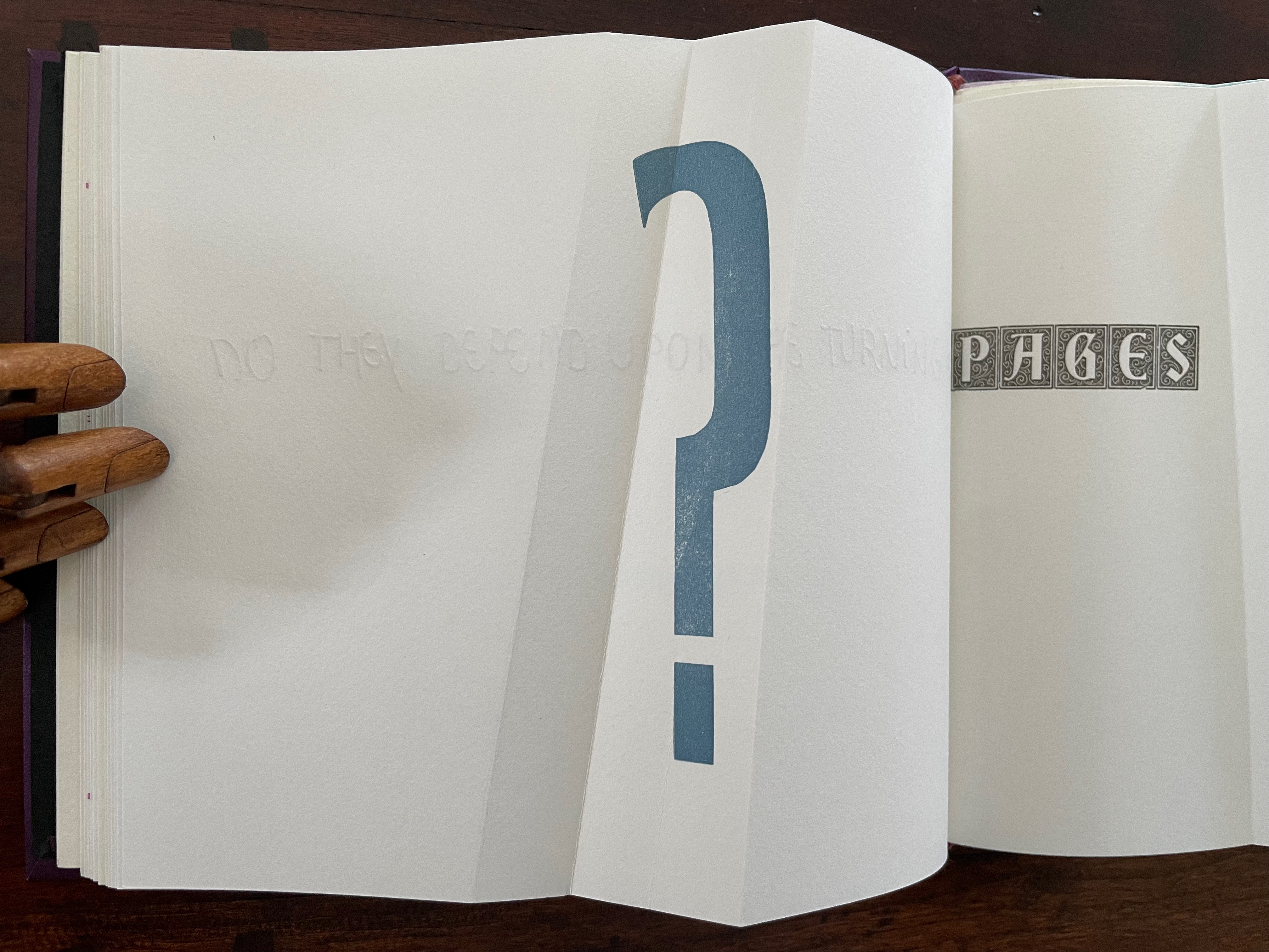
The next question enacts itself. To read the mirror-written script, we have to turn the page and look through its surface to the right-reading words: “Do they depend upon the turning of”. The question completes itself in a curious (again) metronomic motion. The syntax draws our eyes to “PAGES” on the right, while the oversized punctuation mark syntactically draws our eyes back to the left. The play between the reversed writing on a recto page, the right-reading script on the verso, the display type on the next recto, and oversized question mark on the adjacent verso provide self-reflexively an affirmative answer: Yes, limp vellum structures depend on the turning of pages.
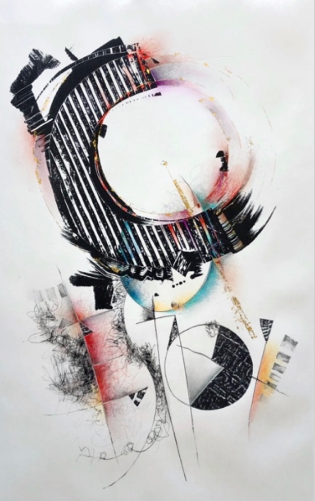
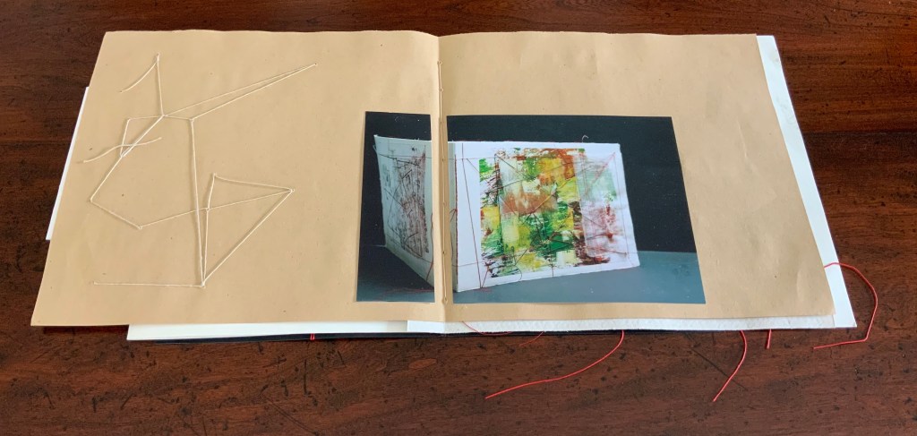
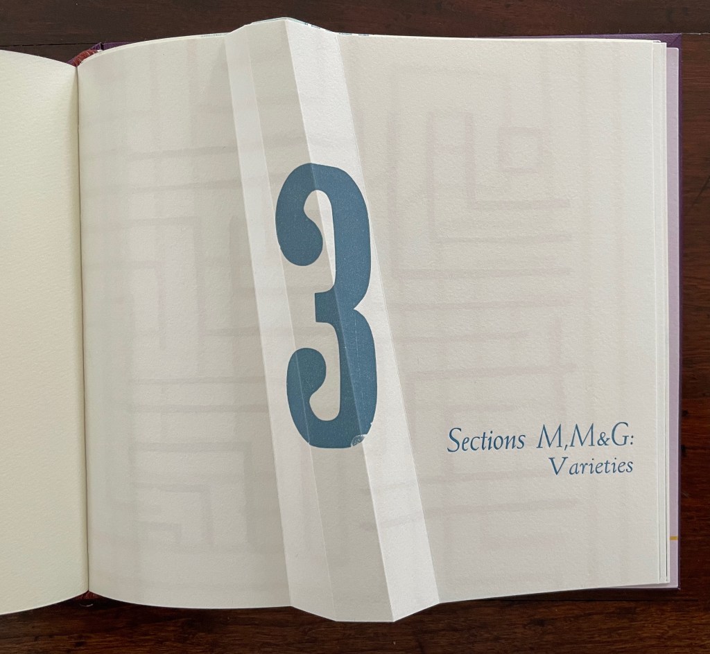
Part 3 introduces rather more esoteric continua with which Cordeiro seeks to connect the genius of the limp vellum structure. The Section letters M, M and G are her reminders-to-self that this section excerpts passages from William James’ The Varieties of Religious Experience (1902): one on medical materialism (p.14) and another on genius (p.18).
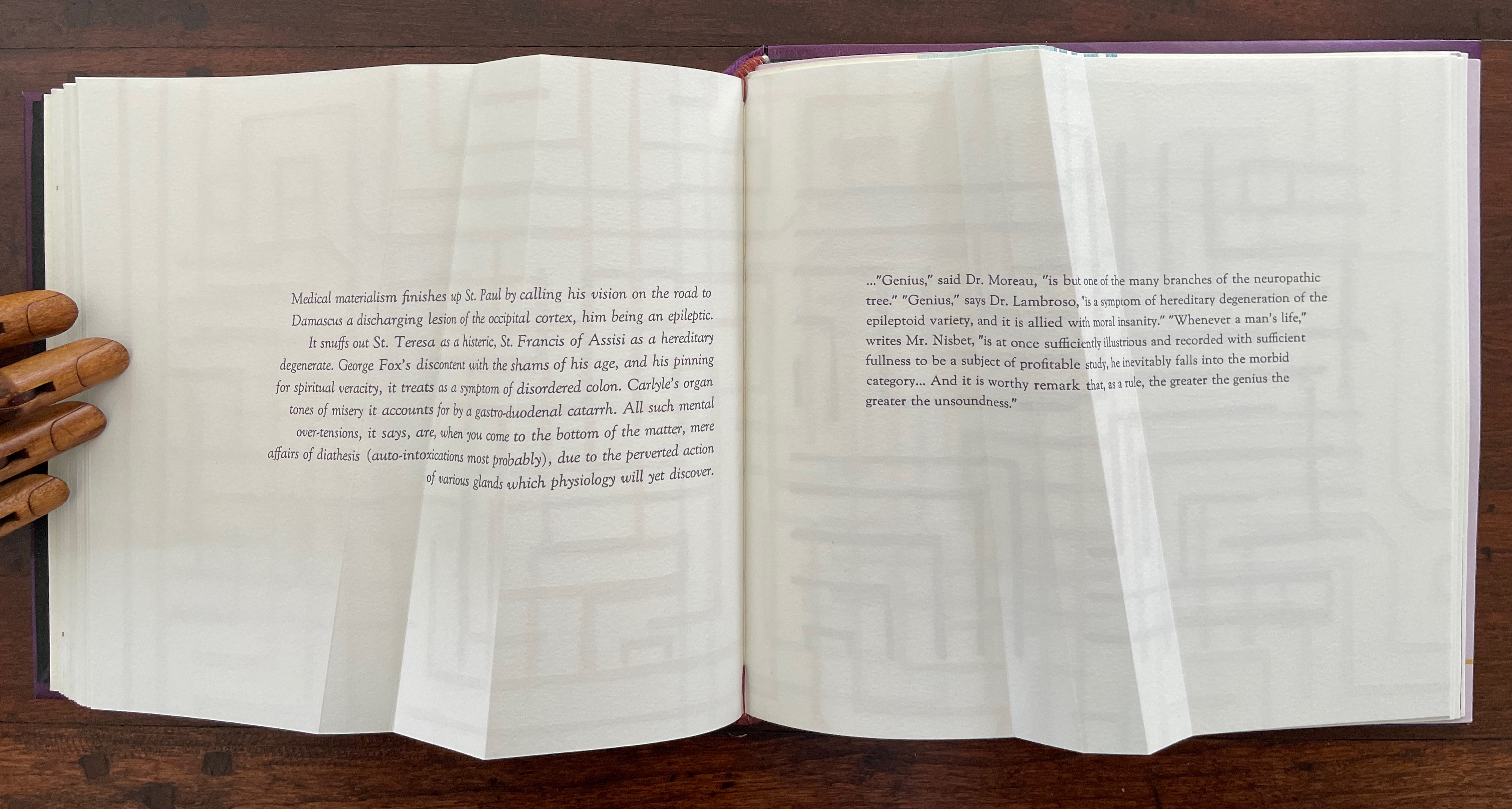
Cordeiro brackets the excerpts with maze-like images constructed of mirrored forms across four different colors. So we have the continua of mind to matter and of genius to madness embedded in a continuum of color and form (color and form merging).
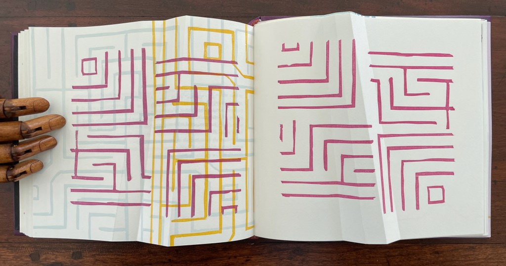
Note the 18o° turn of the beige image in the upper left to be mirrored by the magenta image in the lower right.
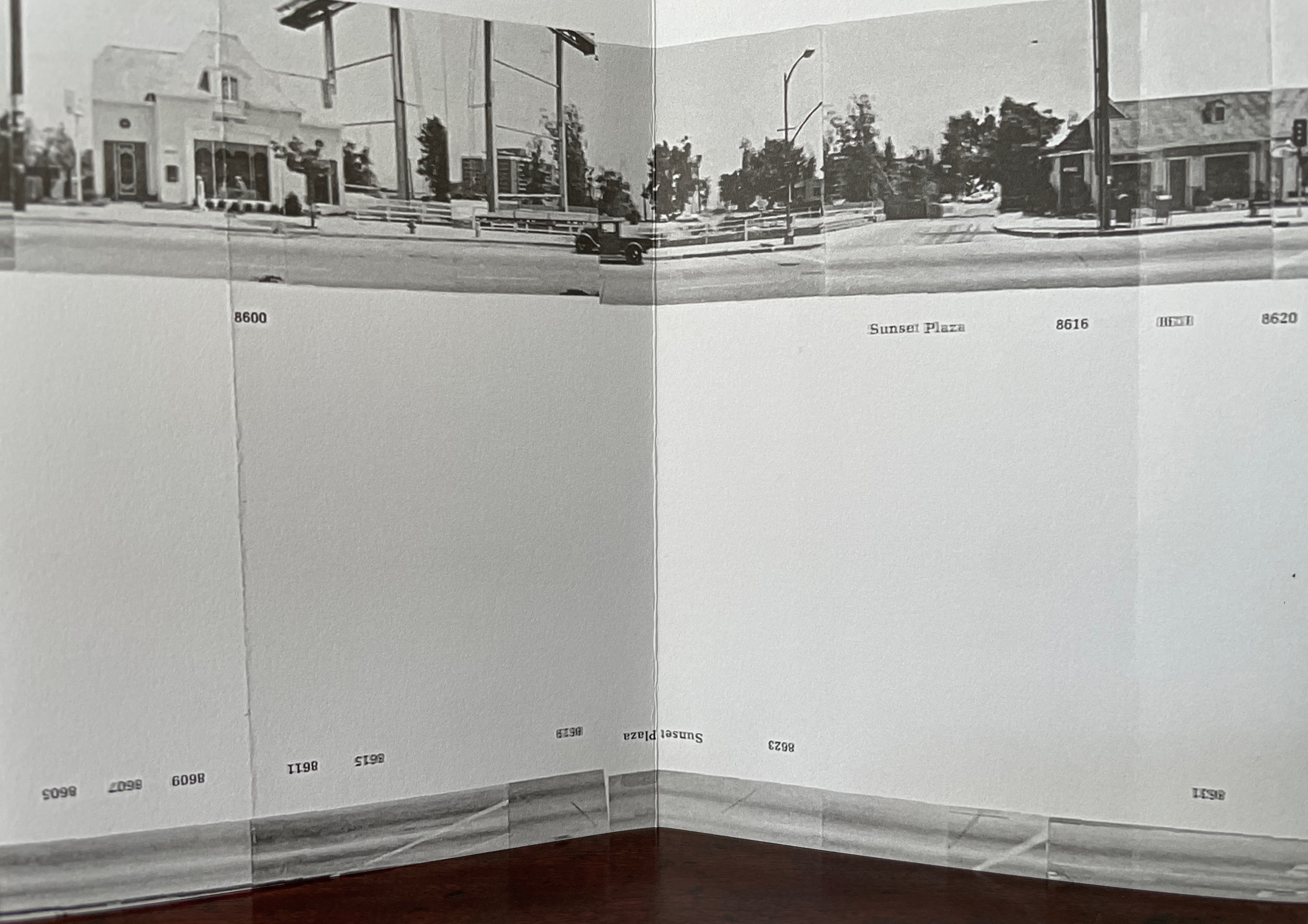
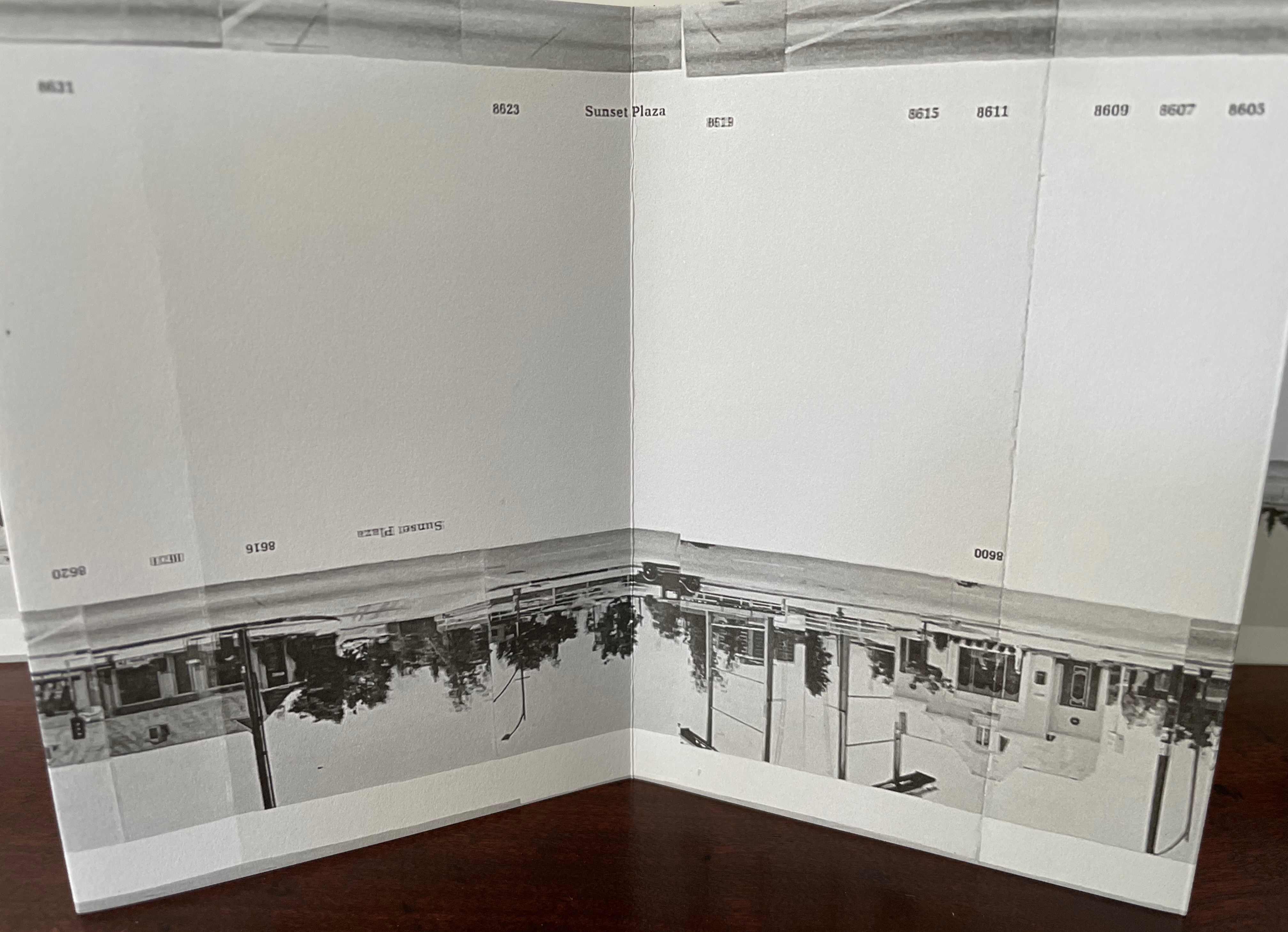
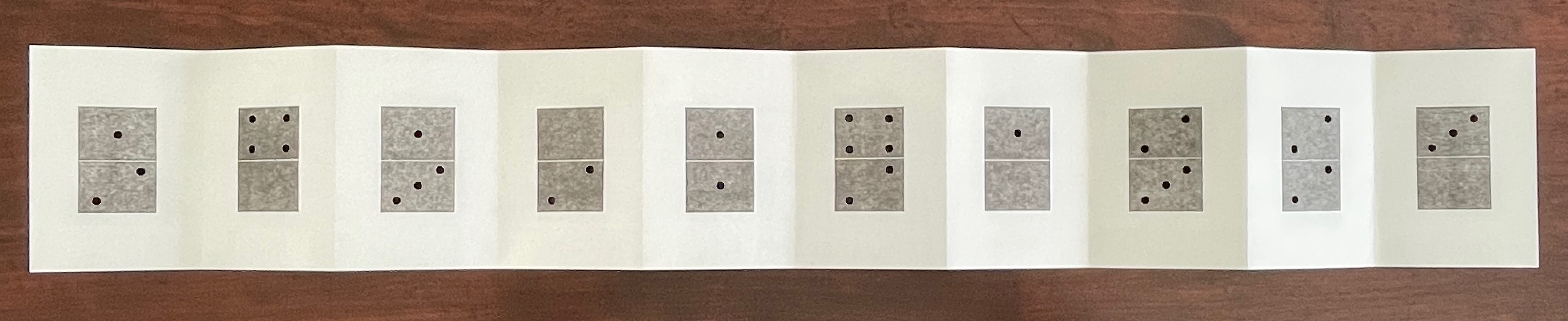
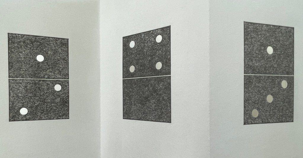
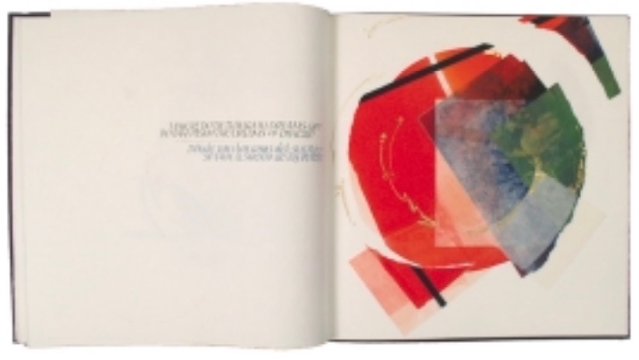
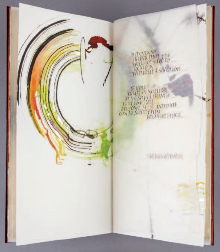
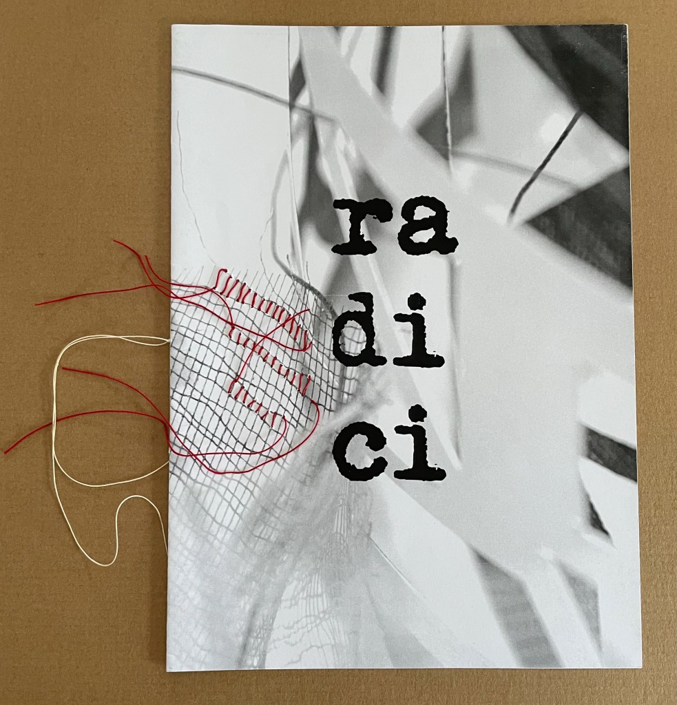
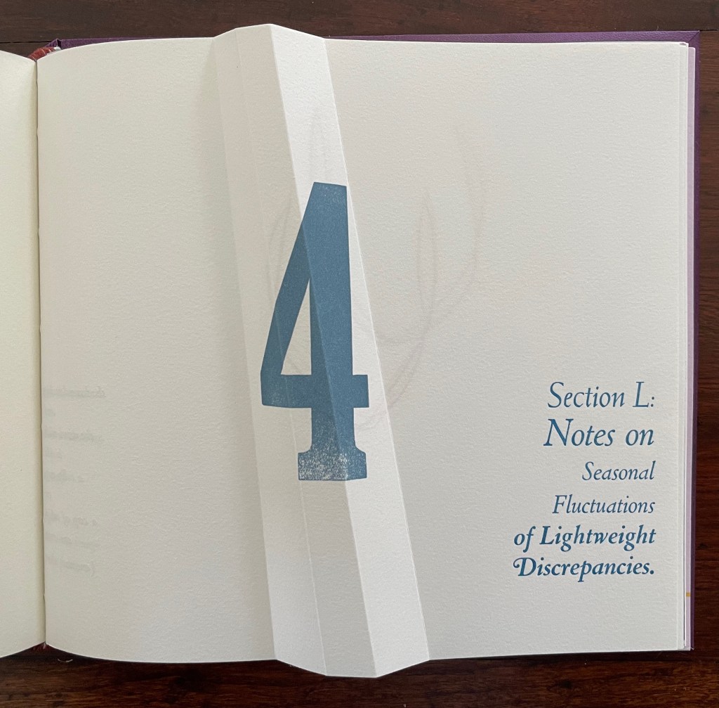
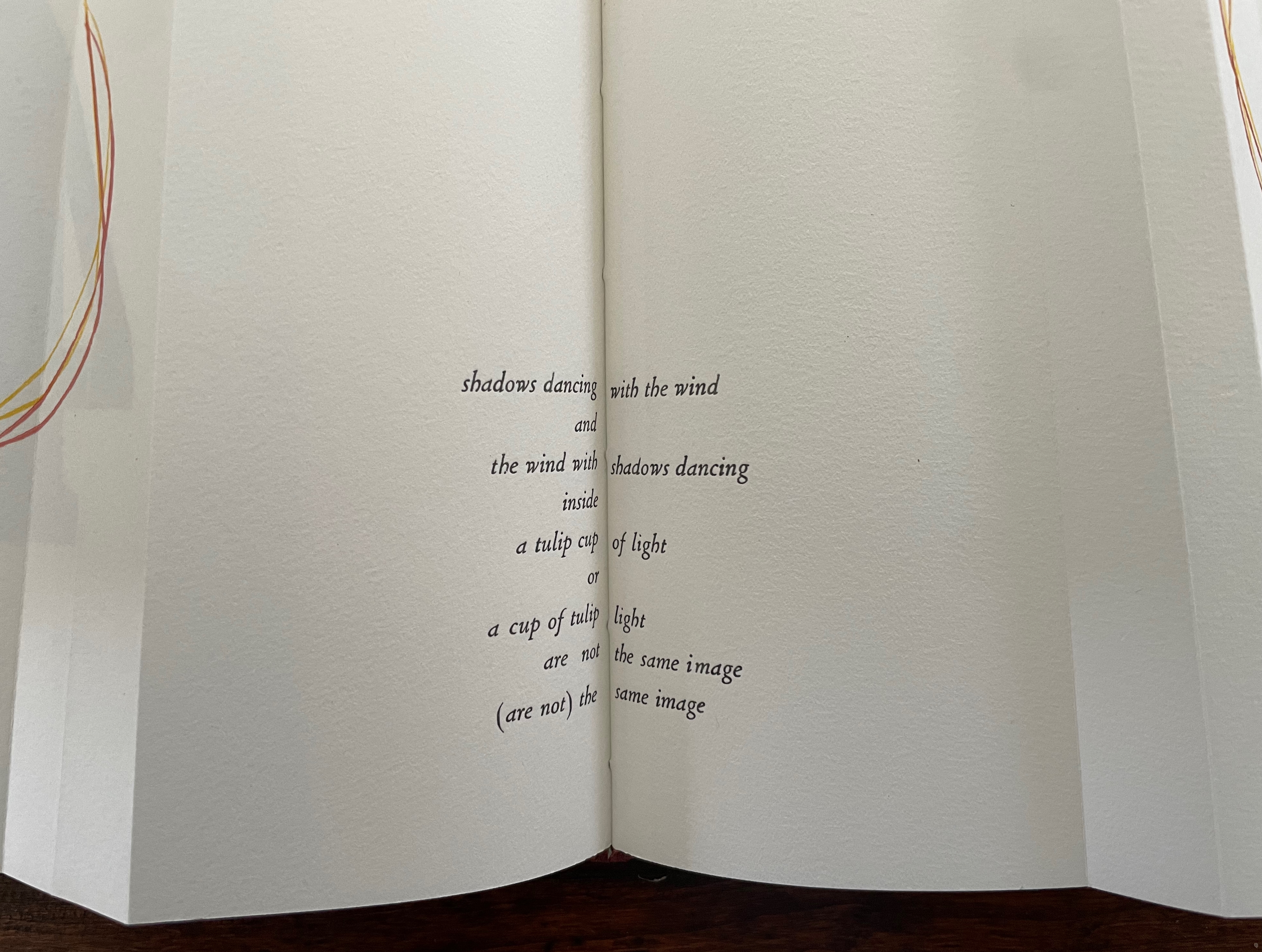
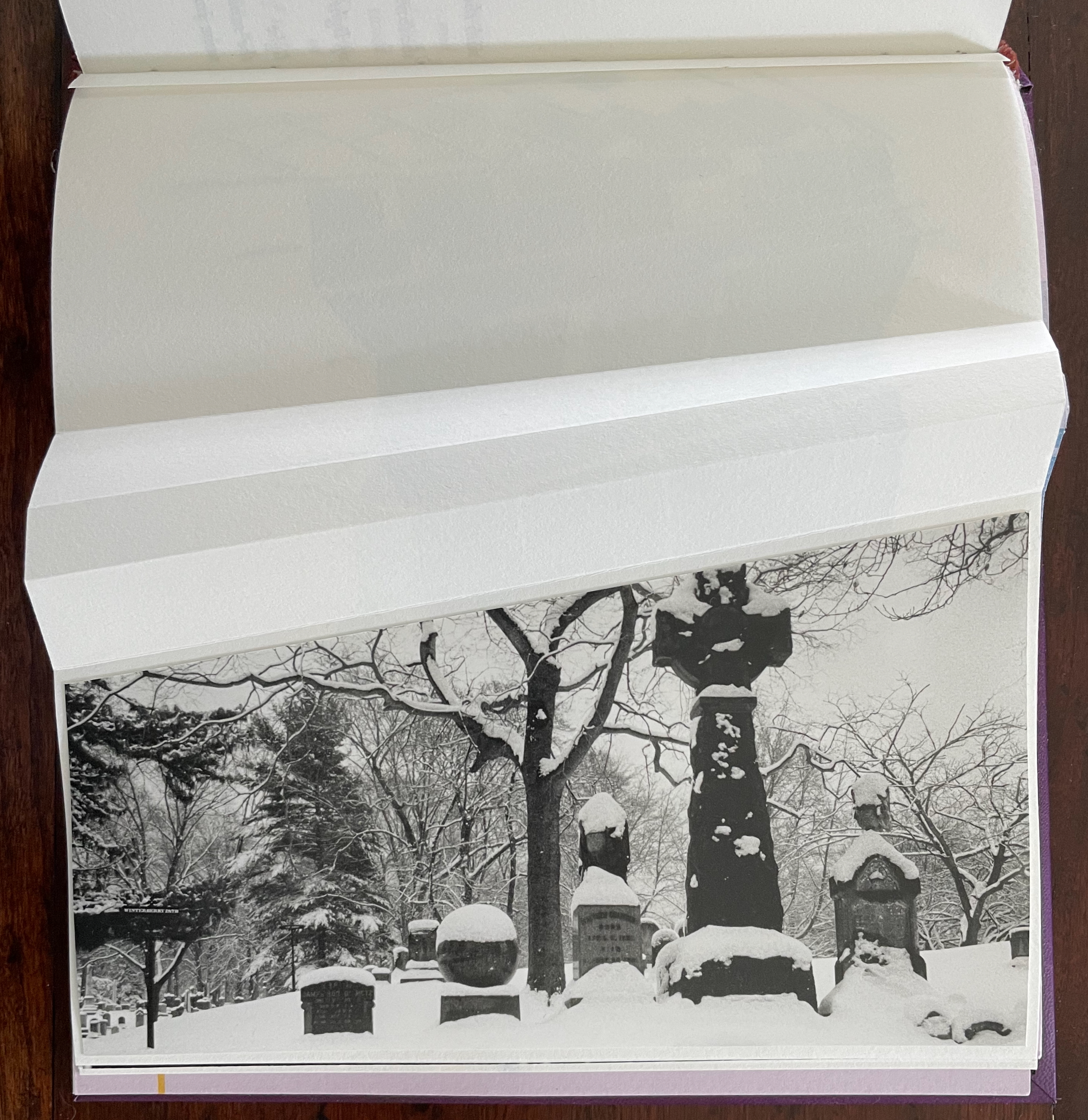
Part 4, labeled “Section L: Notes on Seasonal Fluctuations of Lightweight Discrepancies”, is the densest of the gatherings. Drawings, verse typeset in English and scribed in Portuguese, typographic arrangements, trimmed and segmented photographs, and linocut prints of a stone wall all find their way into Part 4.
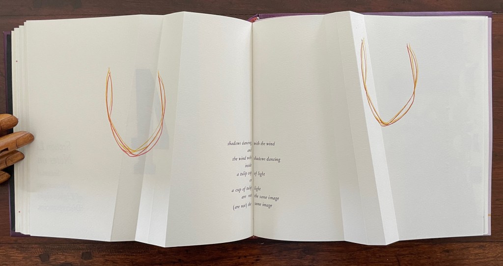
Note how the colors of the tulip shapes echo the colors of the maze in Part 3.
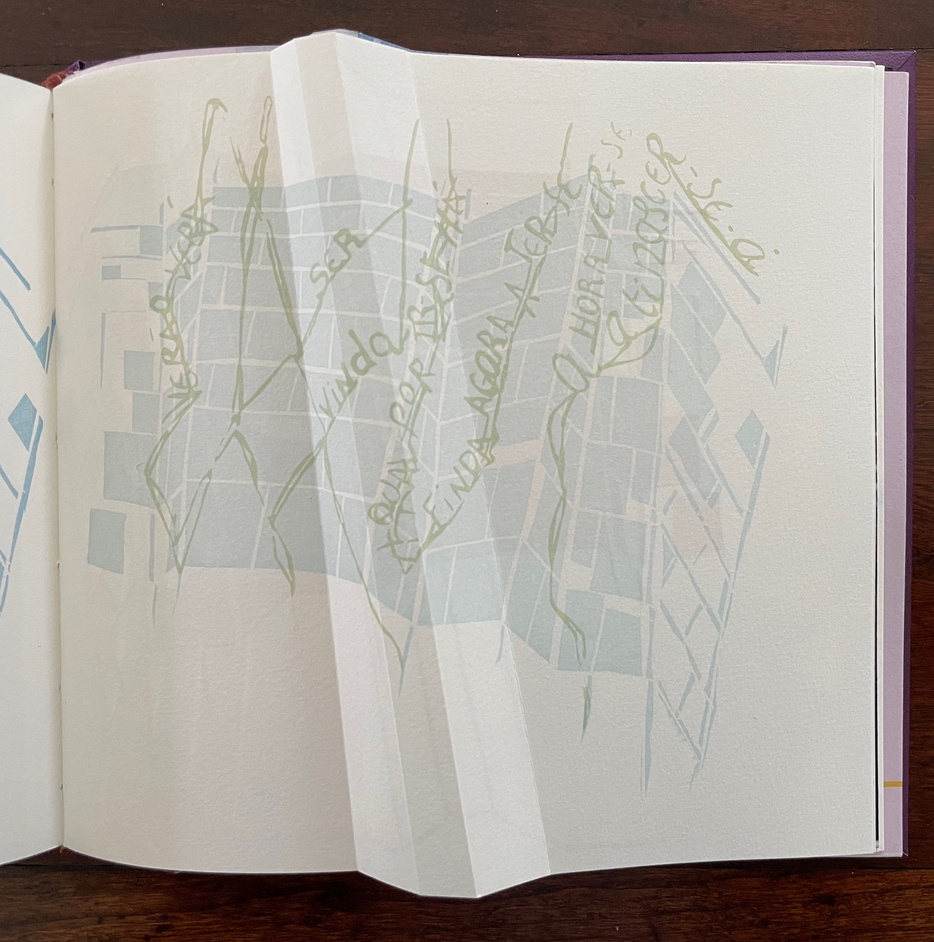
The “Epilogue” tells us, “The handwritten text in Portuguese is a word play with the alliteration afforded by that language between the verb to see and the season summer, and translates roughly as: ‘summer shall see gone that which / by going is now new being. / seeing such an hour at birth is to / be seen alive.” Another continuum.
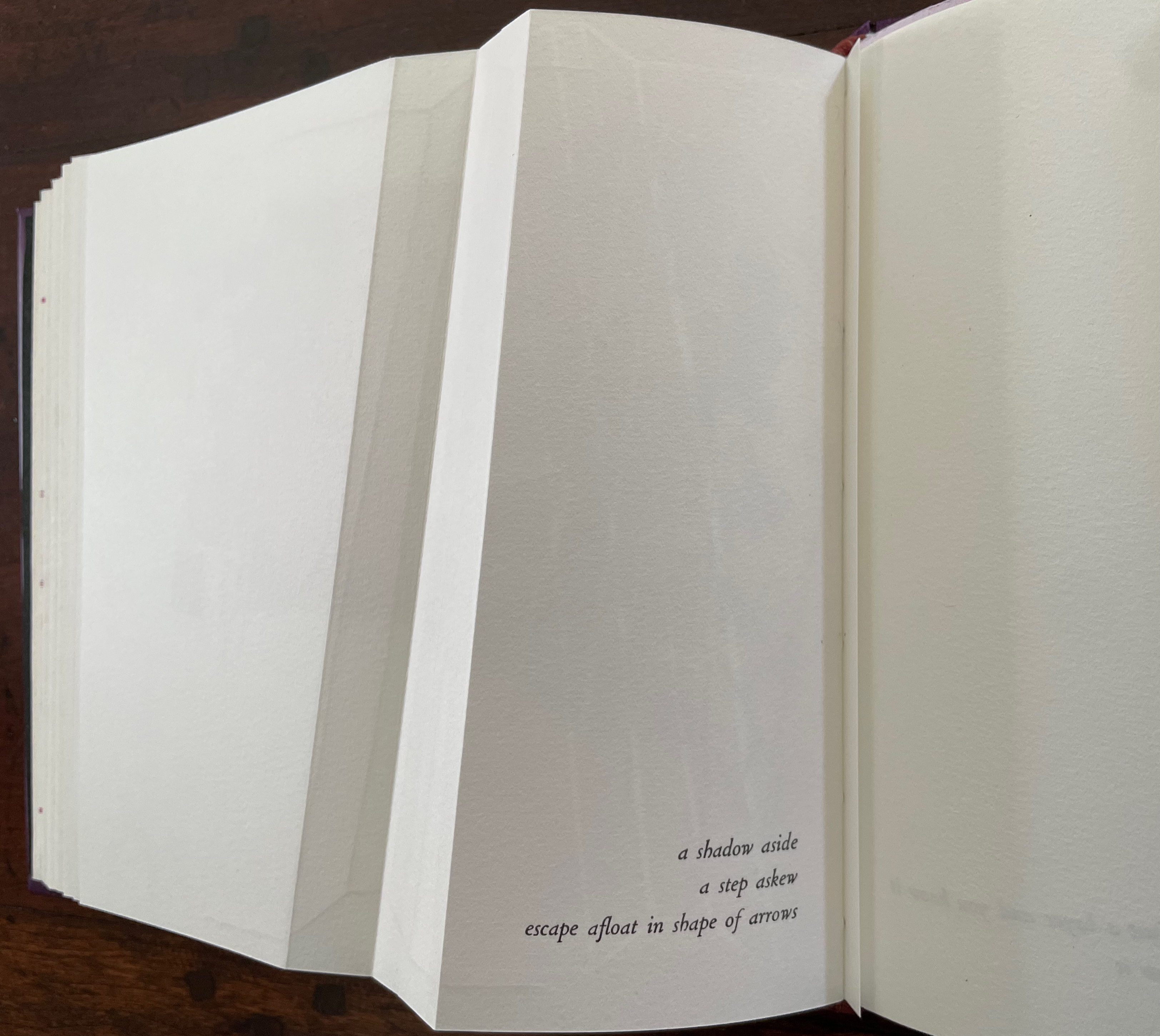
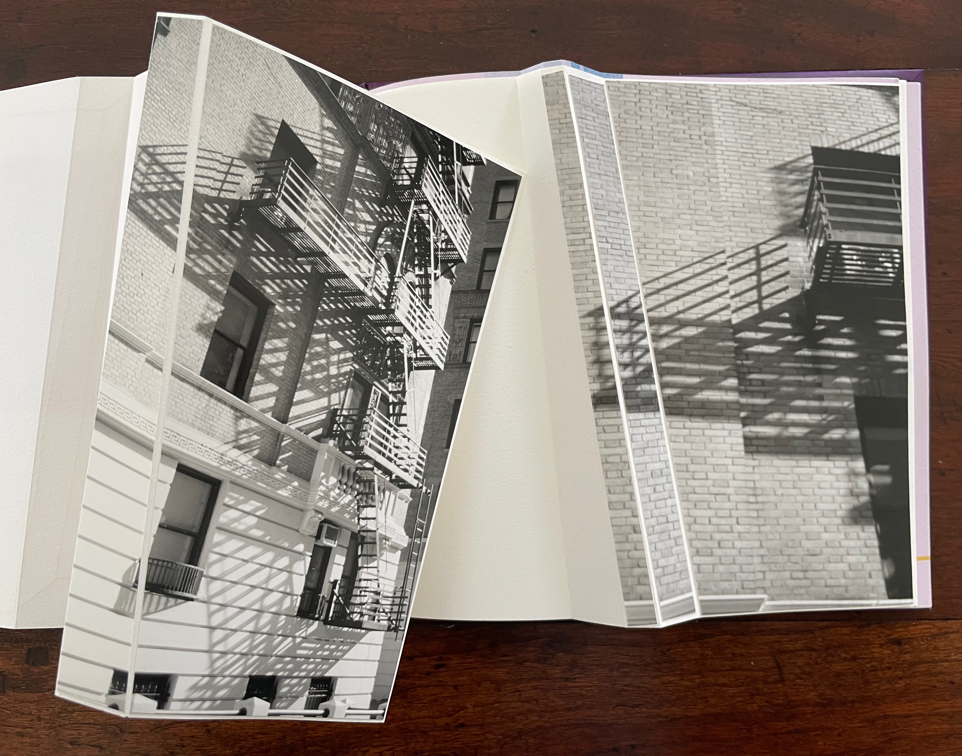
“a shadow aside / a step askew / escape afloat in shape of arrows”. The segmented photos of an Upper West Side building’s fire escape articulate with the angled beam shape to echo the text.
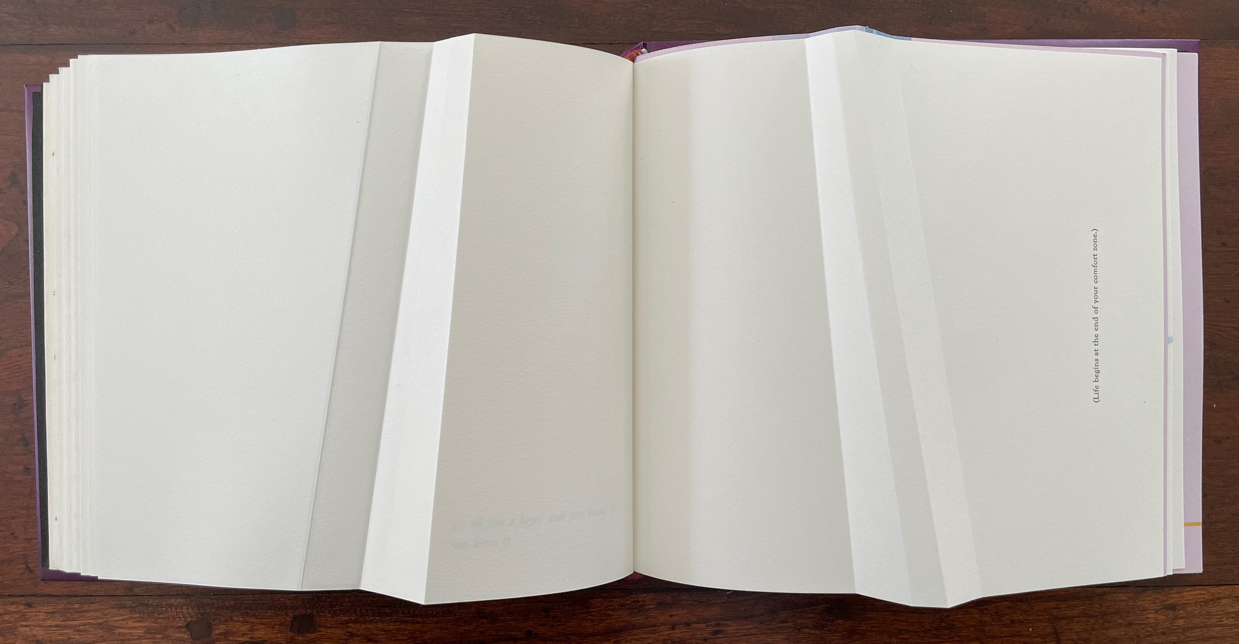
The text before the concluding “end-on” image in this gathering introduces another continuum: “(Life begins at the end of your comfort zone.)”
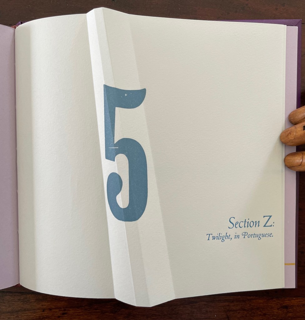
Part 5, Section Z is the wrap-up, conflating the end of the alphabet with the end of the day (twilight), but of course, twilight is also a point on the continuum of day into night.
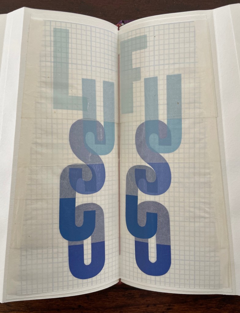
Lusco-fusco = twilight.
At this point, the reader might register that a continuum whose extremities hang in the balance against one another and yet are still connected is also a description of metaphor itself. Two disparate terms are brought together to make a figure of speech. Cordeiro brings two disparate objects together — a softcover codex and the shape of an angled beam, a hard form of structural support — to shape her artist’s book. She materializes that metaphor, then uses it as a platform for textual, graphical, material, and structural metaphors that celebrate the limp vellum structure. It is a striking accomplishment that challenges readers to think with their hands as well as their minds.
Further Reading
“Carol Barton“. 10 August 2024. Books On Books Collection.
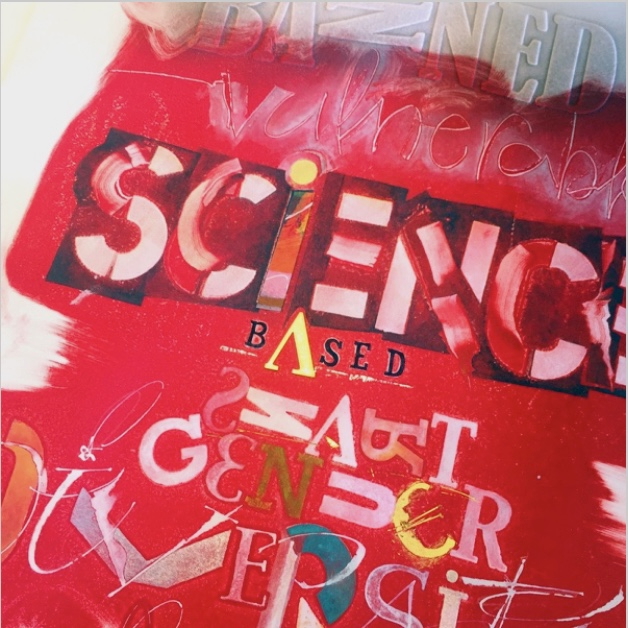
“Ana Paula Cordeiro“. 12 July 2021. Bookmarking Book Art.
“Joyce Cutler-Shaw“. 5 September 2019. Books On Books Collection.
“First Seven Books of the Paper Biennial”. 10 October 2019. Books On Books Collection.
“Nicholas Rougeux“. 19 November 2022. Bookmarking Book Art.
“Rutherford Witthus“. 29 October 2021. Books On Books Collection.
Clarkson, Christopher. 1975. “Limp Vellum Binding and Its Potential as a Conservation Type Structure for the Rebinding of Early Printed Books: A Break with 19th and 20th Century Rebinding Attitudes and Practices.” In Preprints of the ICOM Committee for Conservation 4th Triennial Meeting: Venice 13-16 October 1975: 75/15/3/1-15. [Reprinted 1982, Red Gull Press]. Cited by Cordeiro.
Drucker, Johanna. 2004. The Century of Artists’ Books [Second edition] ed. New York City: Granary Books. For investigation “of the book as a form through examination of its material, thematic, and formal properties “, see p. 93.
Giuffrida, Barbara. 1974-75, 1976. “Limp and Semi-limp Vellum Bindings.” Designer Bookbinders Review. 4,5, and 8. Cited by Cordeiro.
Hebert, Henry. 18 December 2011. “Limp Paper and Vellum“. Work of the Hand. Accessed 23 October 2025.
Magee, Cathie (compiler). 23 February 2024. “BPG Parchment Bookbinding“. AIC (American Institute for Conservation) Wiki. Accessed 22 October 2025. Citing Clarkson and Giuffrida.
Pickwoad, Nicholas. 2019. “Italian Laced-Case Paper Bindings“. Journal of Paper Conservation. 20 (1–4): 122–51.
Rice, Doug. 2008 Limp Vellum: An Exhibition. Accessed 23 October 2025.