For 2014-15, the New England Guild of Book Workers have organized a traveling exhibition: Geographies: New England Book Work, its itinerary covering each of the 6 New England states. Last year, the Rhode Island School of Design (RISD), the Wishcamper Center at the University of Southern Maine and the Bailey Howe Library at the University of Vermont hosted it. This year, the show has appeared at Williams College Library and is scheduled for Dartmouth College Library and the Creative Arts Workshop in New Haven, CT. Criss-crossing geographical boundaries as well as those of book art and the book arts, Geographies calls to mind the last line of Elizabeth Bishop’s “The Map“:
More delicate than the historians’ are the map-makers’ colors.
Or, in this case:
More delicate than the historians’ are the [book-artists’] colors.
Although born in Nova Scotia, Elizabeth Bishop grew up as a New Englander in Massachusetts with her paternal grandparents. As a far-traveller and visual artist as well as poet, she would have enjoyed this exhibition and found it fitting if it had included a broadside of “The Map”.
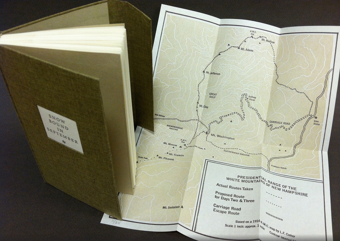
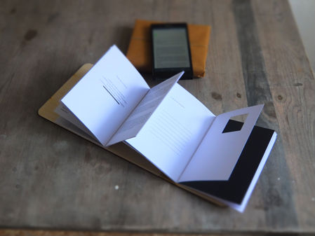
Nevertheless, what a range of “colors” from all the New England states and beyond – from historic to modern, from fine and design bindings to traditional and creative bookbinding, from artist books to calligraphic manuscripts, from masters to apprentices and from object to narrative. The latter finds a wintry exemplar in Snow Bound in September: A Re-Imagining by Laurie Whitehill Chong, retired Special Collections librarian and curator of Artists’ Books at RISD.
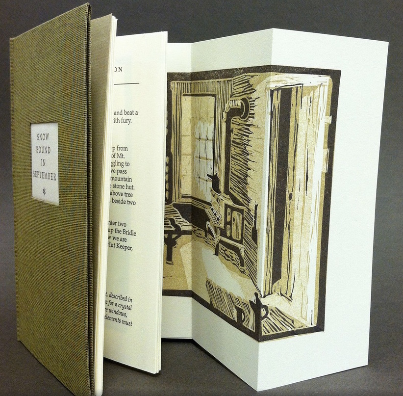 Snow Bound in September: A Re-Imagining © Laurie Whitehill Chong
Cloth covered binding with flap and front pocket, smythe sewn.
Text in book Antiqua letterpress printed on Rives Lightweight paper using polymer plates, with 13 fold-out
two and three-color linocut illustrations. Folded map in inside back cover pocket, letterpress
printed using polymer plate and linocut.
15.24 x 8.89 x 2.54 cm
Edition of 25
The artist made this book the same size as her grandfather’s Appalachian Mountain Club hiking guide. Snow Bound is an invented ancestral narrative, in which the artist uses a surviving photograph and her grandfather’s notes about being stranded with his wife for five days on Mount Washington by a hurricane-driven snowstorm in September 1915 to re-imagine the ordeal from her grandmother’s perspective. Note the slotted front cover into which the flap extending from the back cover fits to keep the book closed, snug against the elements.
 Snow Bound in September: A Re-Imagining © Laurie Whitehill Chong
Julie B. Stackpole’s creative re-binding of Samuel Eliot Morison’s Spring Tides takes us from the New England mountains to the shore as can be seen from the layered binding.
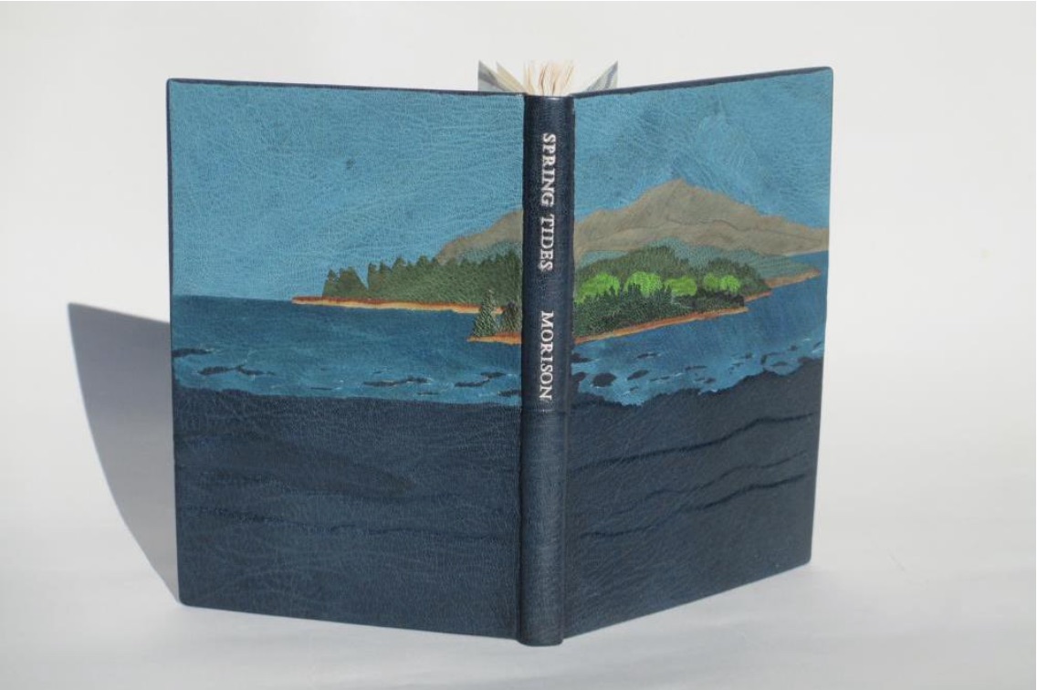 Spring Tides
by Samuel Eliot Morison
Boston: Houghton-Mifflin Co., 1965.
Julia B. Stackpole, Design binding
21.8 x1 5.0 x 1.6 cm
January 2014
In Stackpole’s words:
The traditional tight-joint binding is covered in navy blue Niger goatskin with waves in the lower parts created by paring before covering. Cut-outs in the onlays of the lighter blue leather of the water help it transition from the dark of the navy to the sky’s azure. Onlays of other leathers create the forested landscape of the shoreline and hills. These blues were chosen because the only blue leather in a large enough piece to cover the whole binding was the dark navy, while I only had scraps of the water and sky’s blue. The endpapers are a Cockerell marbled paper over-painted with blue, with leather hinges.
Pictures of the works in the catalog (and others not) can also be found at the Williams College Flickr site (for now). I say “for now” because they will be pushed downstream inevitably in the way of today’s digital flow. They may even disappear; although as Matthew Kirschenbaum has explained in Mechanisms, something digitally forensic will remain. That boundary of the tangible and the digital, the haptic and the virtual, is only lightly but evocatively touched in this collection.
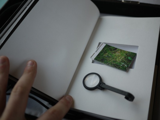
When Julia Stackpole writes in the online catalog about that Cockerell marbled paper that it “felt to me like the waves and the shoals and ledges of Maine waters”, you long to lay hands on the Spring Tide. Anne McClain’s Place includes photographs taken digitally of places on Maine’s midcoast that have been special to her her “entire life and will continue to be a constant as other things change and move on”. What is captured digitally is reproduced physically to fix those places that will “continue to be a constant”. But places do change.
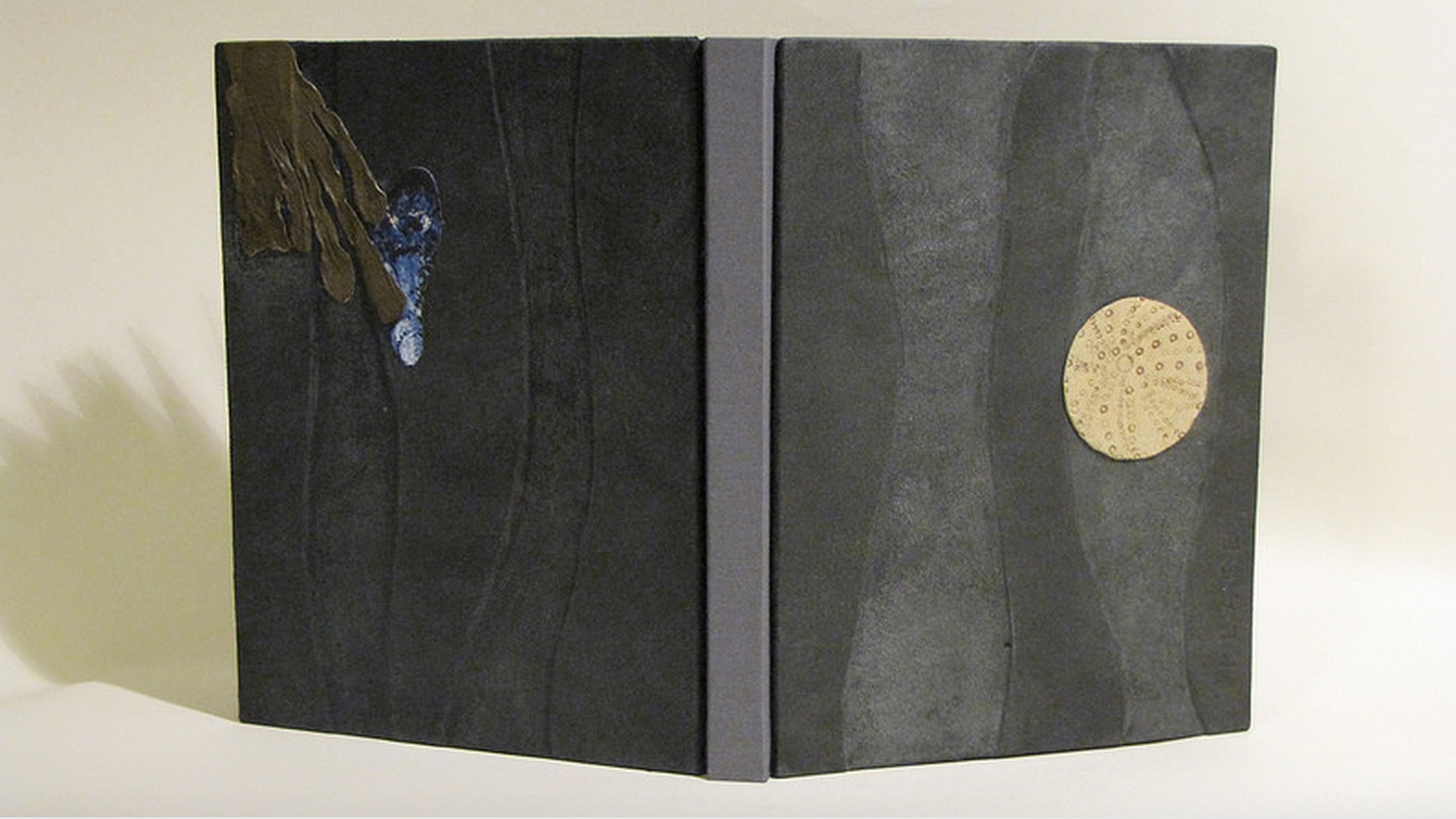 Anne McClain, Place
Drum Leaf Binding
19 x 15 x 1.8 cm
February 2014
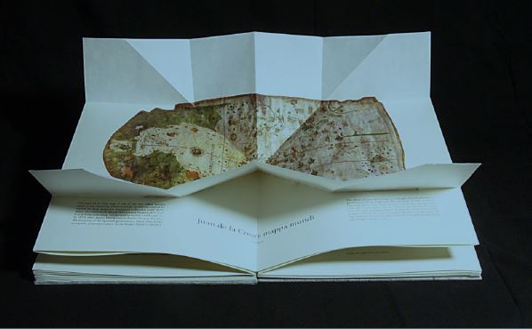
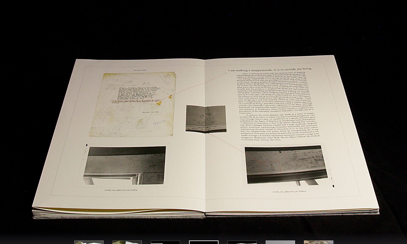
Rutherford Witthus’ contribution touches the boundary between the digital and physical most directly. His artist’s book is entitled 28 Fort Square: What Charles Olson wrote on the window casings of his apartment in Gloucester, Massachusetts, of which there are eleven copies.
 Rutherford Witthus, 28 Fort Square: What Charles Olson wrote on the window
casings of his apartment in Gloucester, Massachusetts, 2014
In these 11 copies, Witthus digitally reconstructs the windows of Charles Olson’s apartment at 28 Fort Square where he wrote his main work, The Maximus Poems, and covered the window casings with meteorological data. The artist book “presents for the first time all of the images of the window casings”.
 Rutherford Witthus
28 Fort Square: What Charles Olson wrote on the window casings of his apartment in Gloucester, Massachusetts
Artist book
42 x 28 x 2.5 cm
2014
Edition of 11
Athena Moore, chapter secretary of The New England Guild of Bookworkers, produced the catalog for this itinerant exhibition organized by Stephanie Wolff, Exhibitions Coordinator and Todd Pattison, Chapter Chair. If you have the chance to see the exhibition in its next venue, take it.
Just as Elizabeth Bishop questioned the depiction of the boundary between land and water on her map – “Shadows or are they shallows at its edges …”, you will find the juxtaposition of these works reminds you that the boundary between book art and the book arts can be shadowy or shallow indeed.


, by Giuseppe...")


