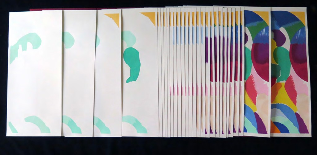
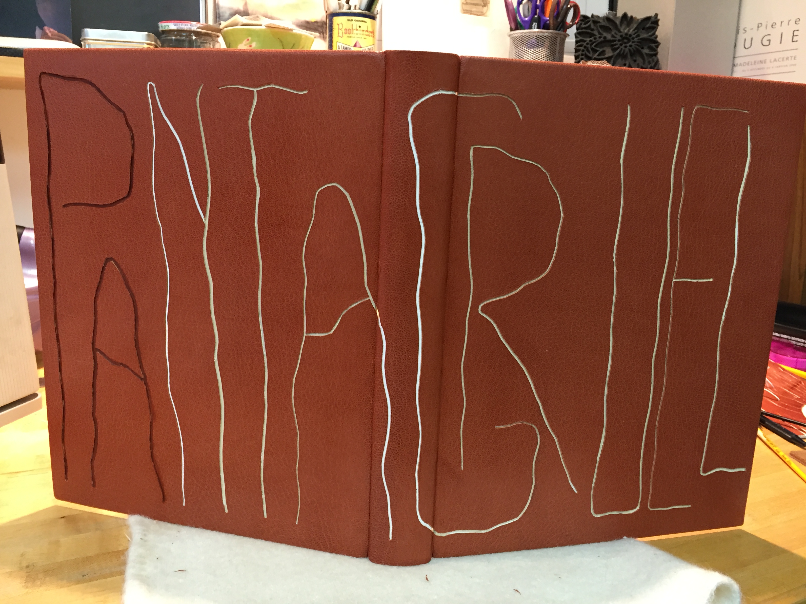
An Unusual Animal Alphabet (2021) Rose Sanderson Casebound with illustrated paper over boards and patterned doublures, perfect bound. H155 x W215 mm 54pages. Edition of 100, of which this is #89. Acquired from the artist, 17 April 2023. Photos: Books On Books Collection. Displayed with artist’s permission.
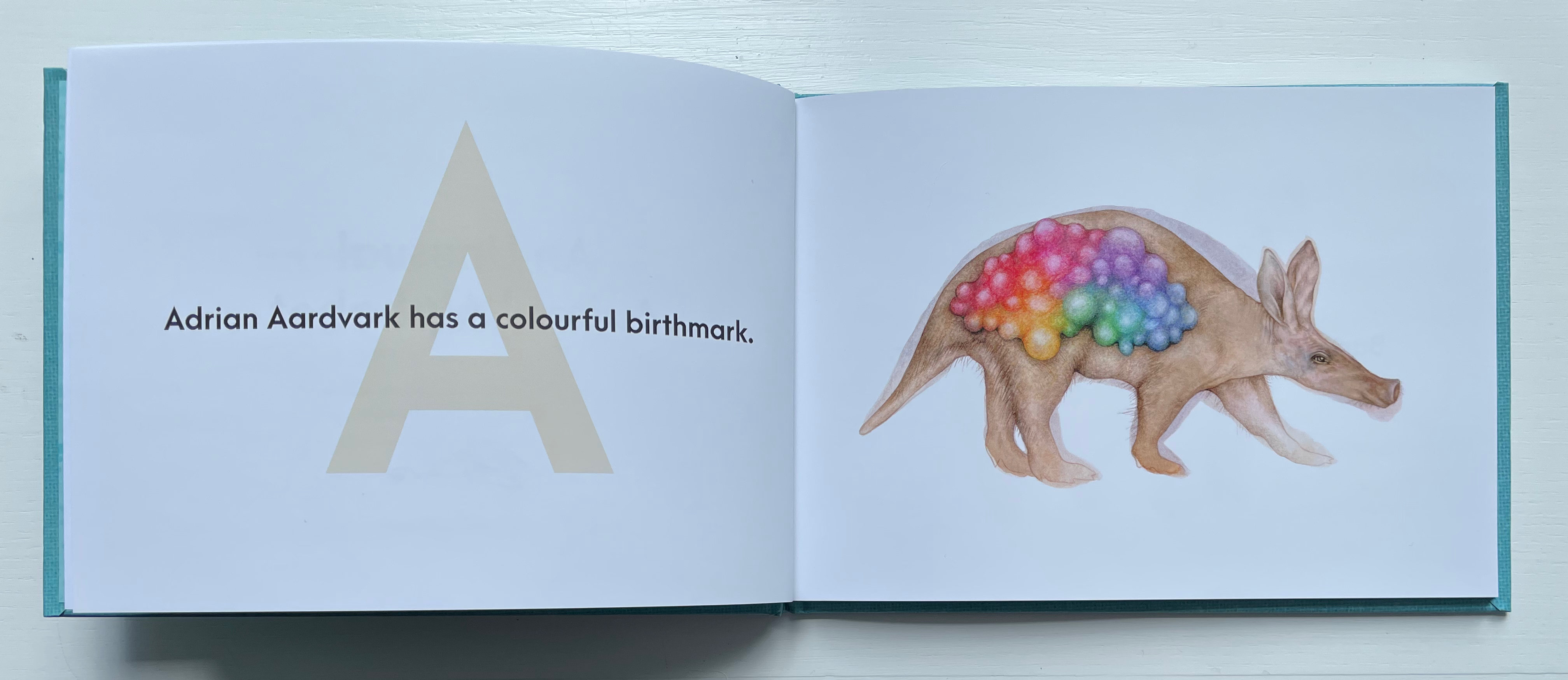
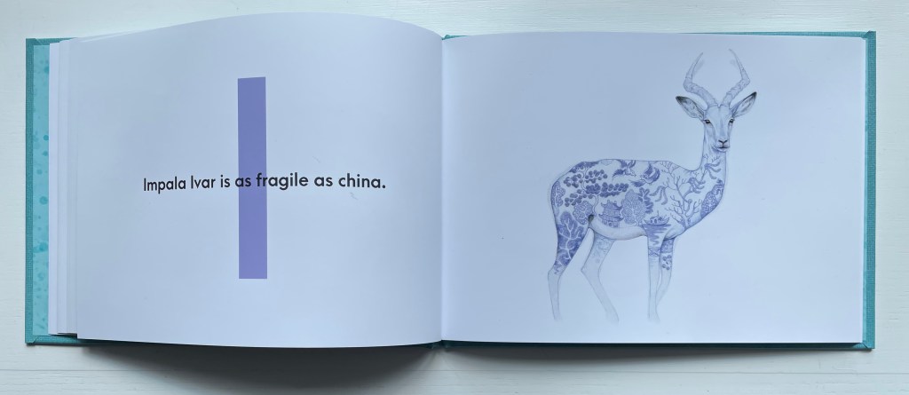
Written and illustrated by Rose Sanderson, this abecedary introduces children to the alphabet with humorous clashes of colors and animals (a pink bear or blue and white impala?) as well as odd combinations of concepts (topiaries and mammals, skyscapes and kangaroos). It all tips over into the surreal, which, with the vocabulary (spirograph, topiary, uakari), implies an audience of older children and adults.
Adding to the humor are other incongruities such as a paisley-patterned dingo and a camouflaged goat. The many half- or near-rhymes also enhance the humor: “Elephant Etta looks good in a sweater” and “Impala Ivar is as fragile as china”).
The production is of high quality. The text is printed on 170gsm silk paper and in full color. The cover comes from a scan of linen/canvas overlayed with a color layer with a balanced transparency that softly merges the two together. Whether or not inspired by the book’s half-rhymes, the designer (Emrys Plant) contributes an effective visual “half rhyme” of Arca Majora for the text type with Futura for the display type. Along with Sanderson’s conceptualization, imagination and craft, such touches nudge this work toward the category of artist’s book or, at least, sophisticated alphabet book.
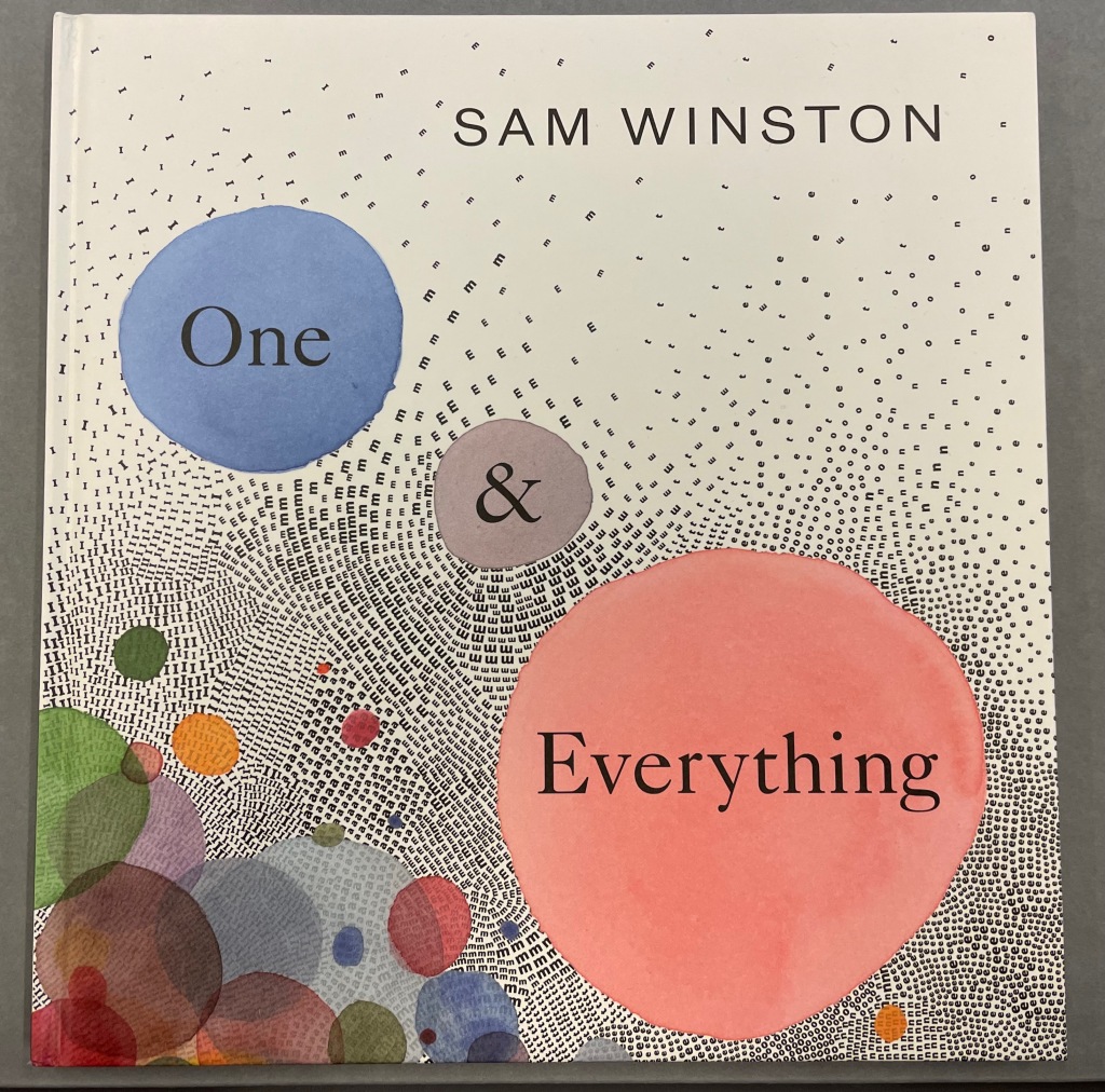
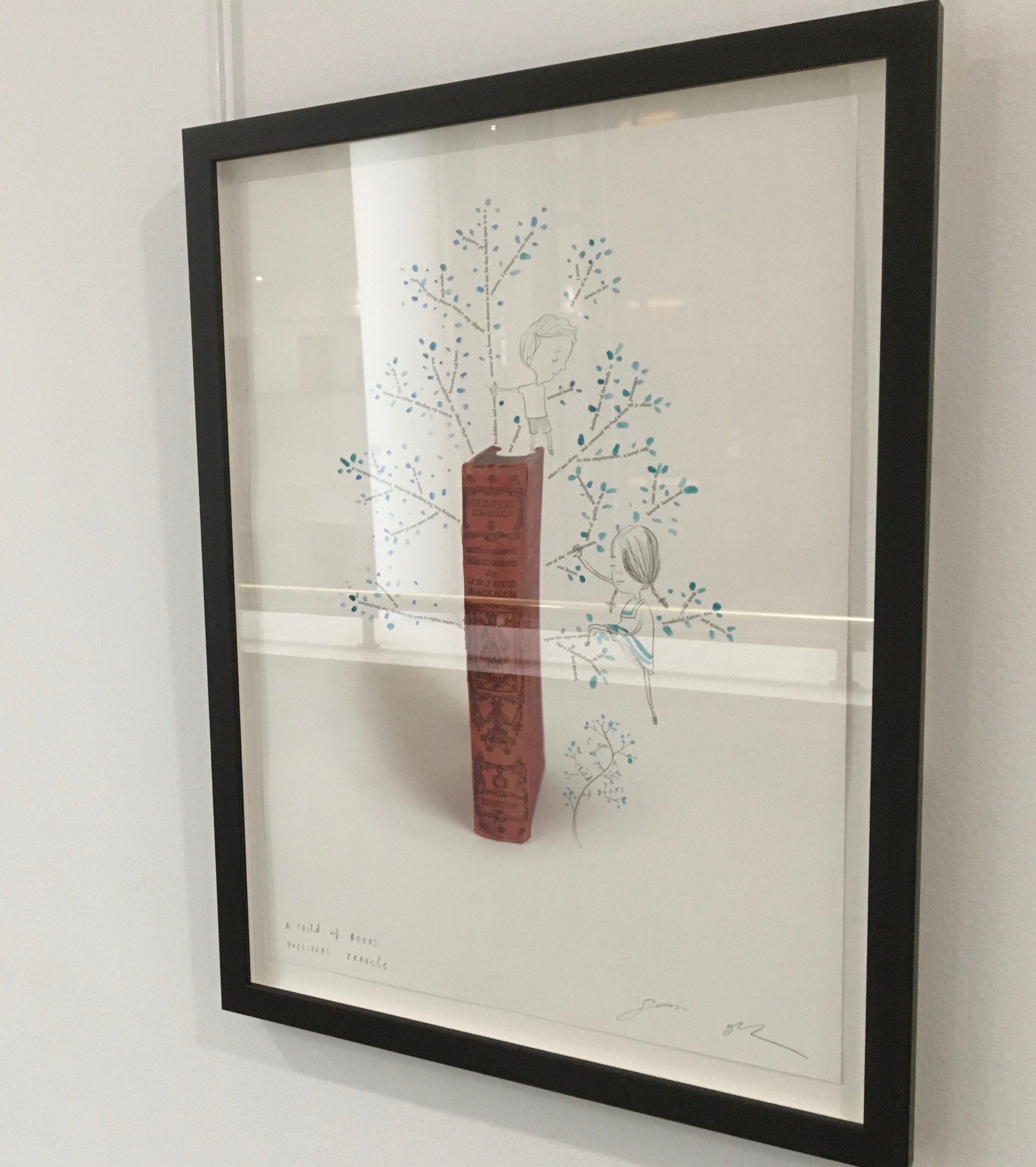
One & Everything(2022) Sam Winston Casebound with illustrated paper over boards. H265 x W255 mm. 48 unnumbered pages. Acquired 23 November 2022. Photos: Books On Books Collection. Displayed with artist’s permission.
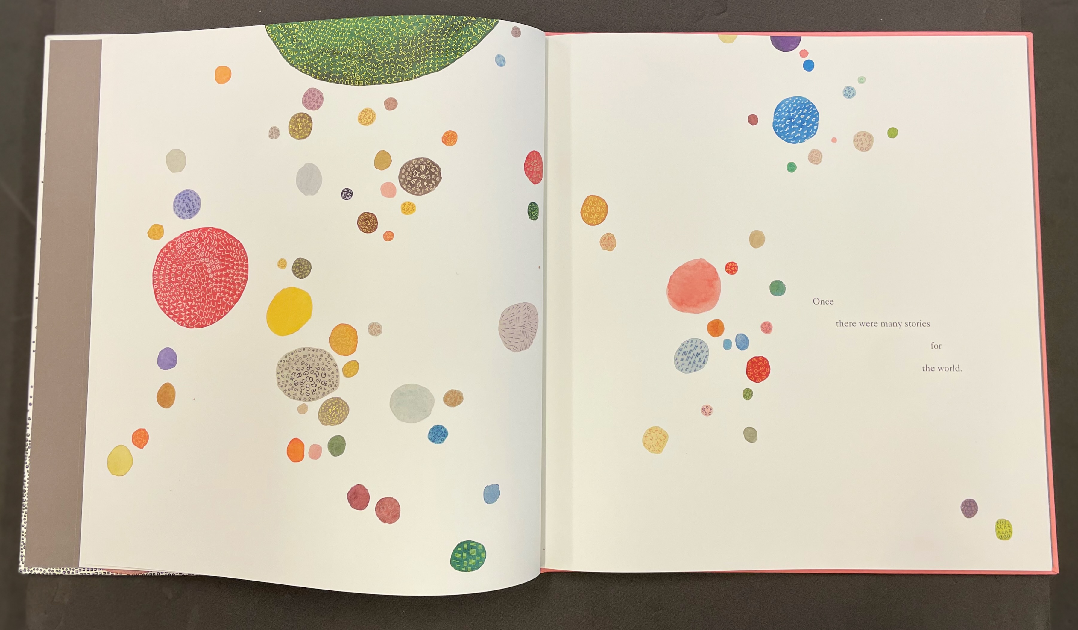
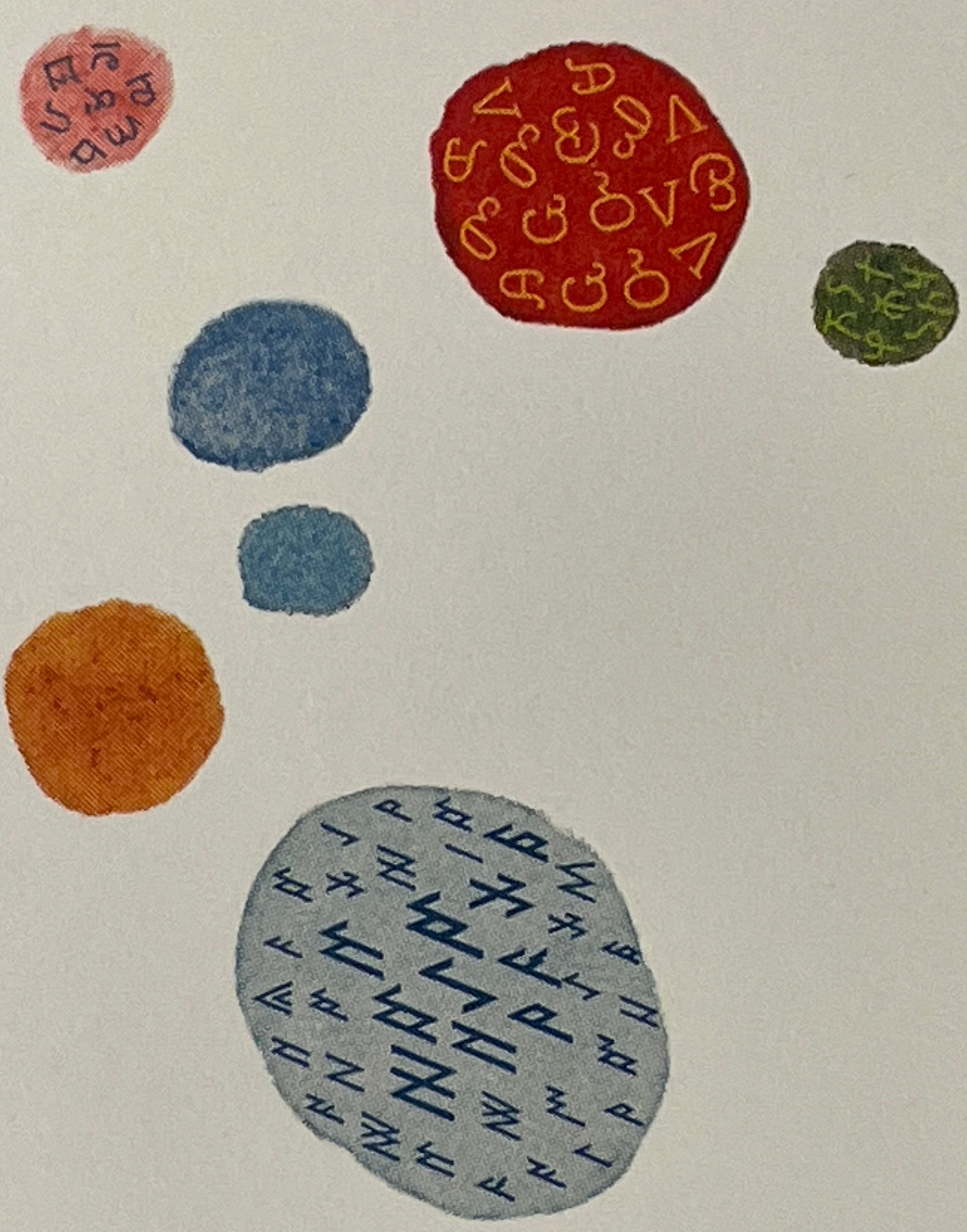
Sometimes you just know that you have read a classic. This is one of those times. Winston and Candlewick Press (Walker Books in the UK) have worked a fresh tale, tone and meaning together with image, color, design and production values to an extraordinary level. Inspired by Tim Brookes’ “Endangered Alphabets Project“, Winston uses the striking shapes of letters and scripts from the Latin, Ogham, Cherokee, Armenian, Hebrew, Tibetan and dozens more alphabets and syllabaries to create the characters in his fable about the story that decides one day that it is the One and Only story.
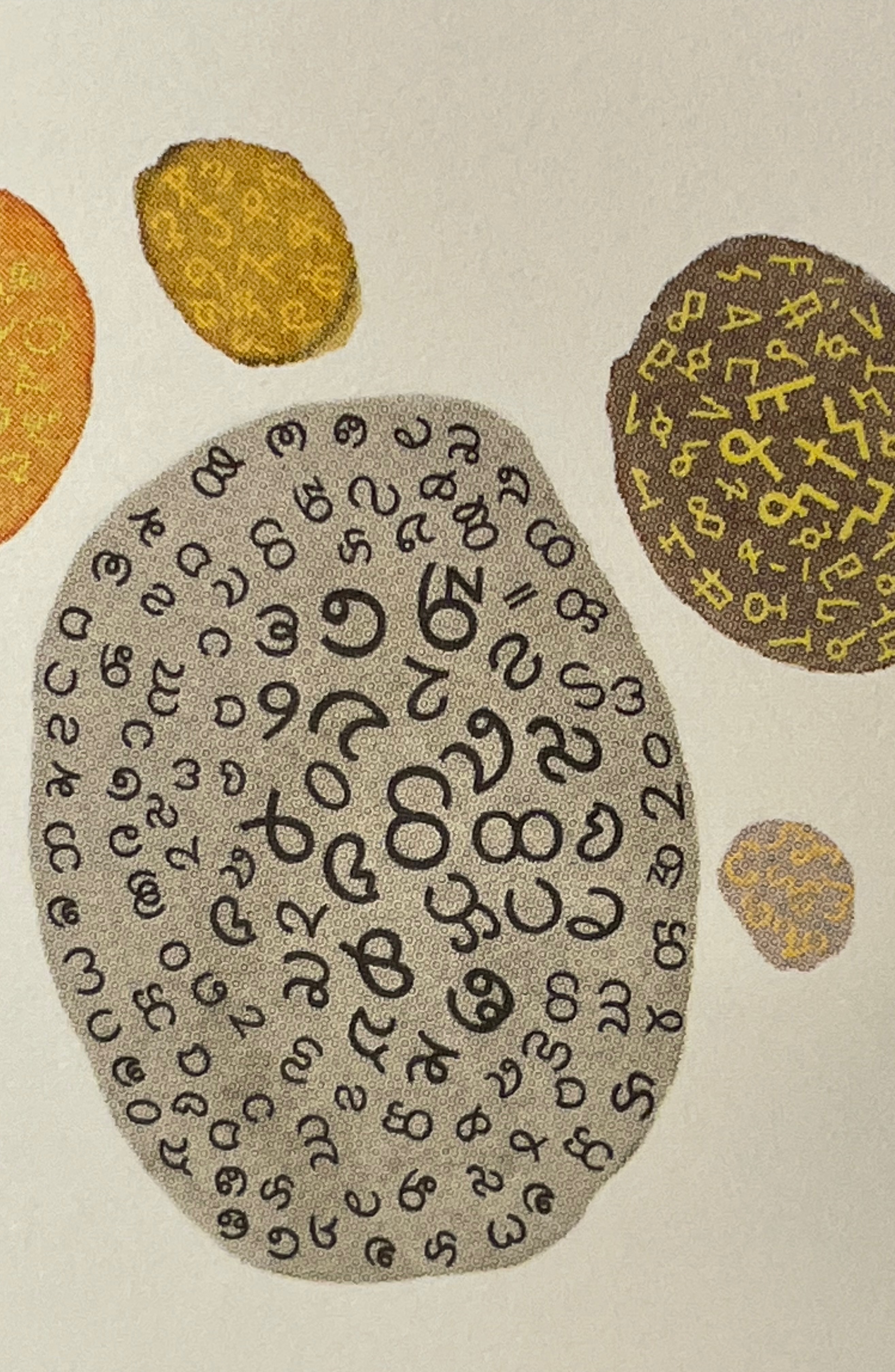
Shapes like single-celled creatures (each filled with a different alphabet) represent the many stories existing before “The One” arrives.
“The One” is made of the English (i.e., Latin or Roman) alphabet. Will it listen to and make sense of all these other stories?
The fable of One & Everything does more than support the notion that alphabets and languages can be endangered. Implicit in the fate of the “One & Everything” story” is the message that Babel was more of a blessing than a curse.
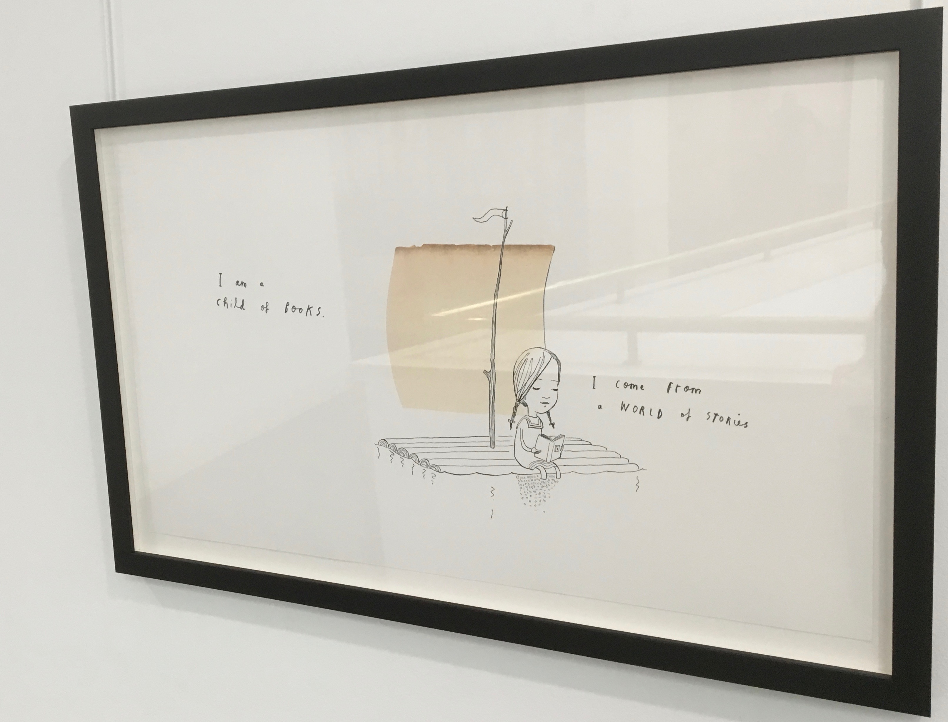
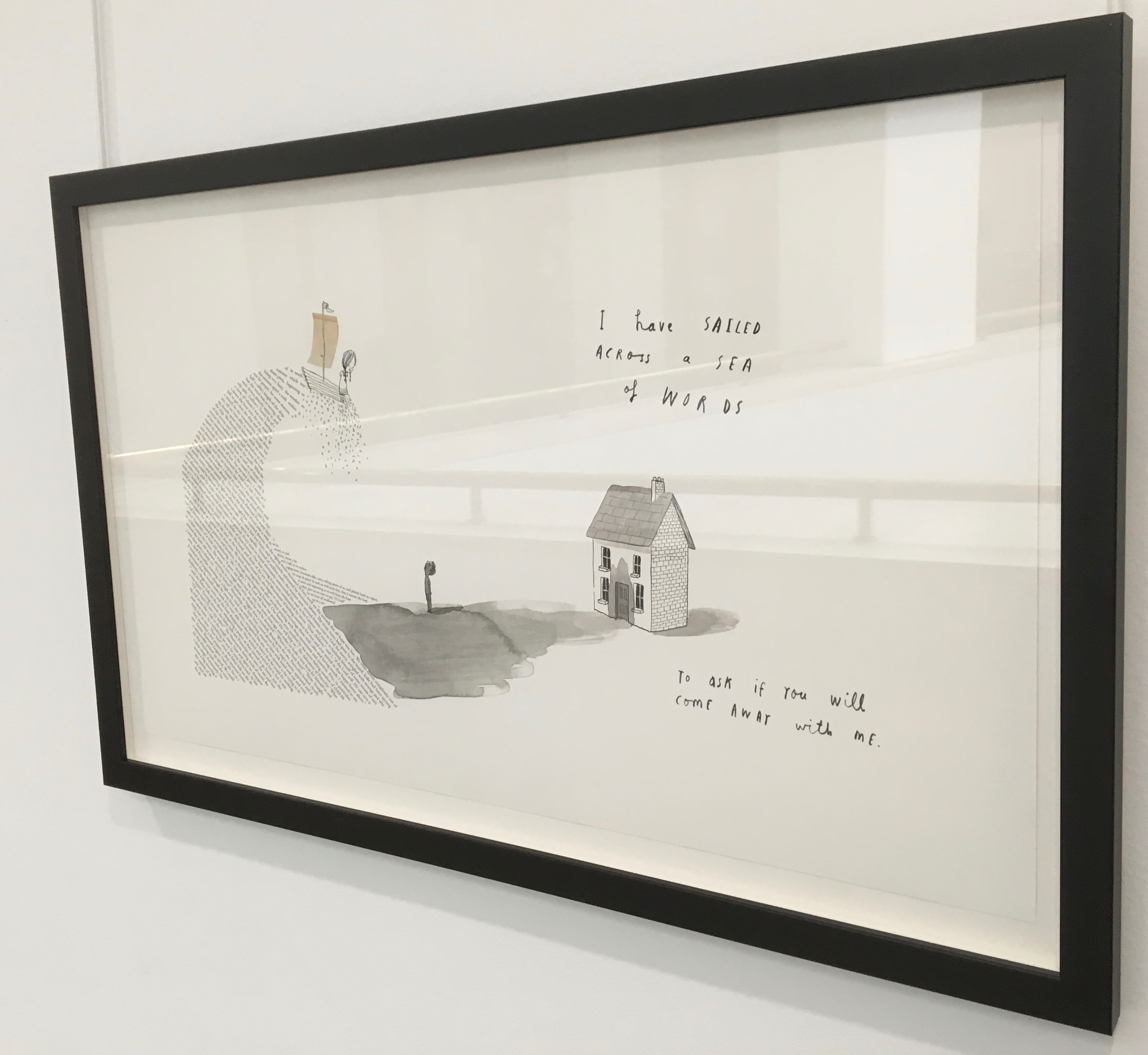
Readers familiar with Winston’s A Dictionary Story and his collaboration with Oliver Jeffers in A Child of Books (both below) will recognize a growing refinement and, now, breadth and depth in Winston’s storytelling. The youngest audience and beginning readers will be held by the shapes, colors and simplicity of the story. Older readers will easily grasp its underlying meanings and be intrigued by the variety of letters and scripts and the idea that languages and alphabets can die. Still older readers and teachers will appreciate the helpful resources following the story’s ending invitation. At all levels, the audience will delight in Winston’s creation of his characterful abstractions with letters from the alphabets and scripts identified in those resources. Those with an eye for such artistry will appreciate Winston’s extension of a tradition embraced by Paul Cox, Roberto de Vicq de Cumptich, Sharon Forss and Nicolas McDowall.
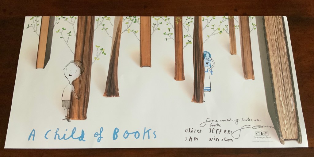
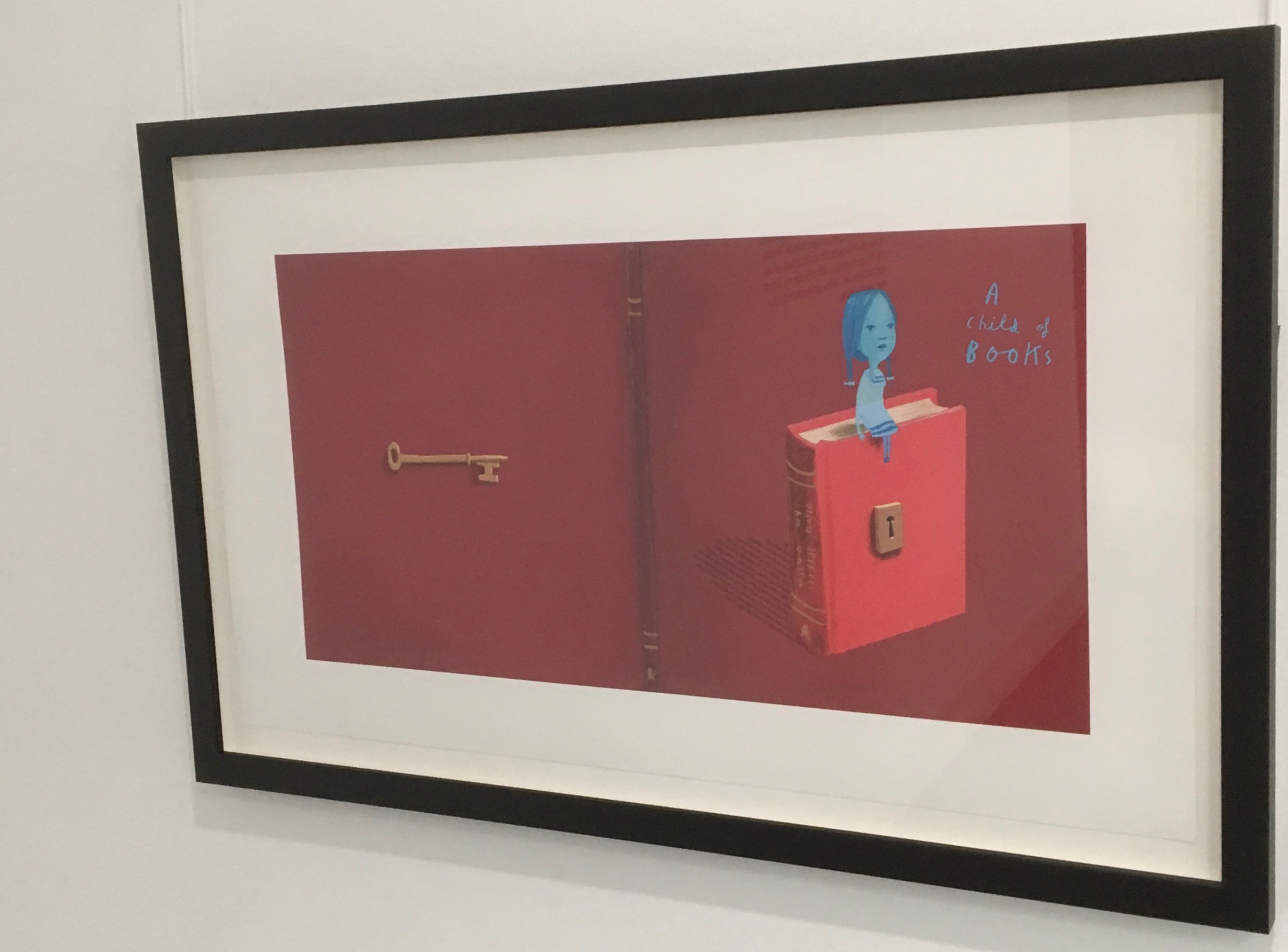
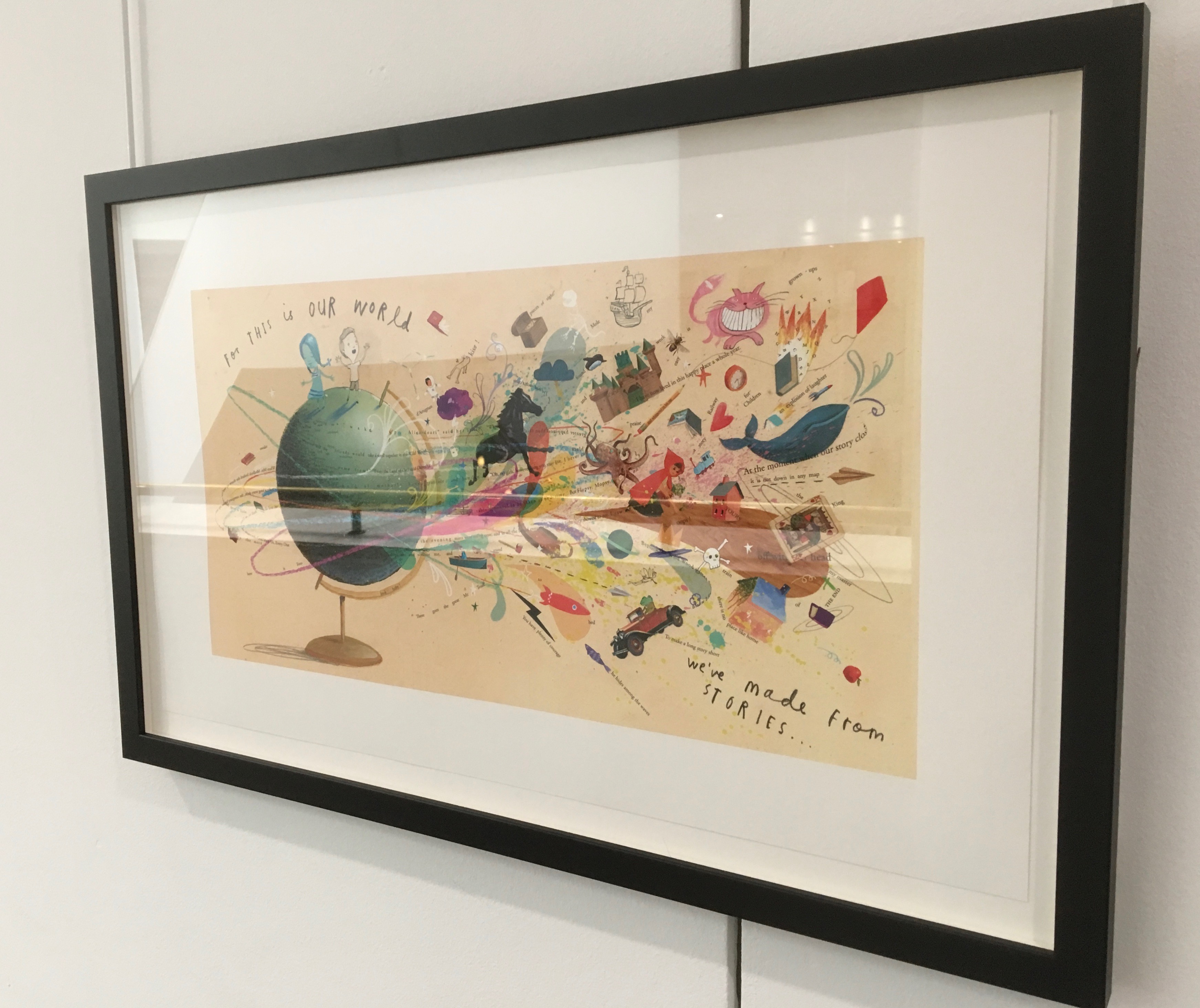
A forest made of fore-edges. A raft made of spines and its sail a book page. A wave and a path made of excerpts from books. In this fabulous world made from the features of books, the simpatico imaginations of Oliver Jeffers and Sam Winston deliver a heroine and an invitation that are hard to resist.
Promotional poster. Displayed with permission of Sam Winston.
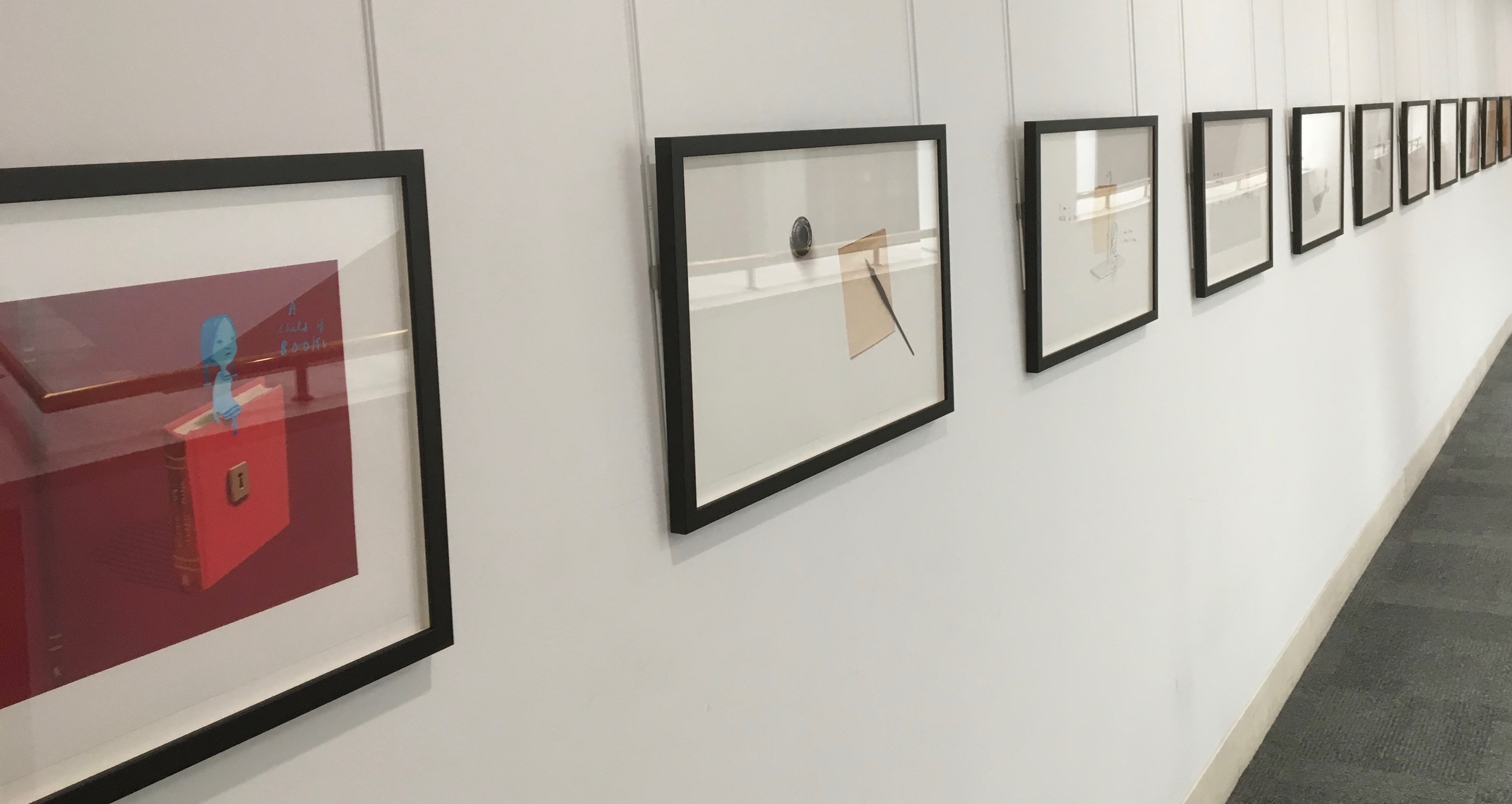
In addition to the poster above and the trade book it promotes, Winston created an artist’s book edition celebrated by this hallway gallery below mounted by the British Library shortly after its appearance.
A Child of Books prints displayed at the British Library, 9 August – 27 September 2019.
Winston’s abiding love of letters, words and stories shines through in A Child of Books. Arguably, it has its origins in an earlier work whose story is told by his invention of a very different “child of books”.
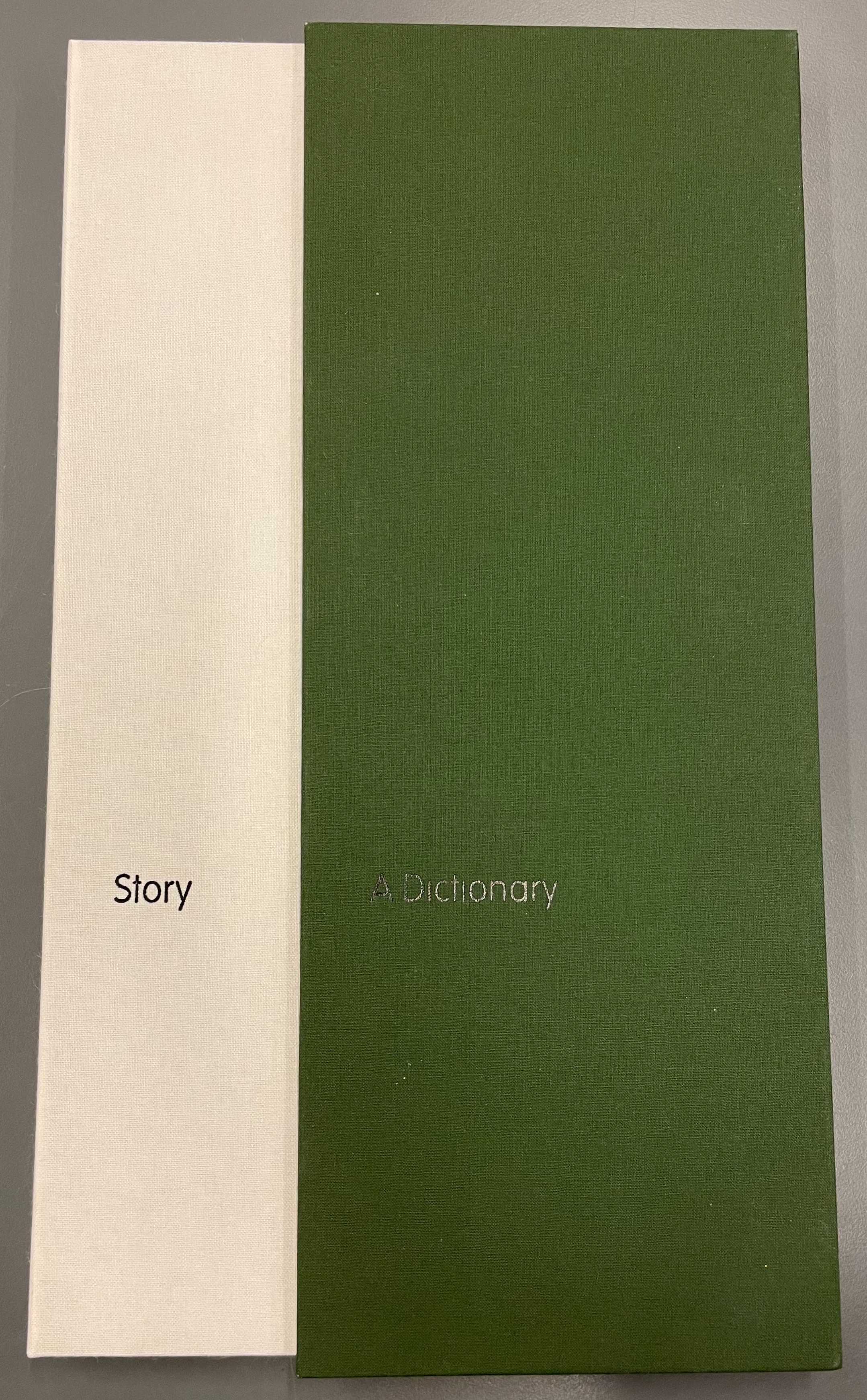
A Dictionary Story (2001 – 2020)
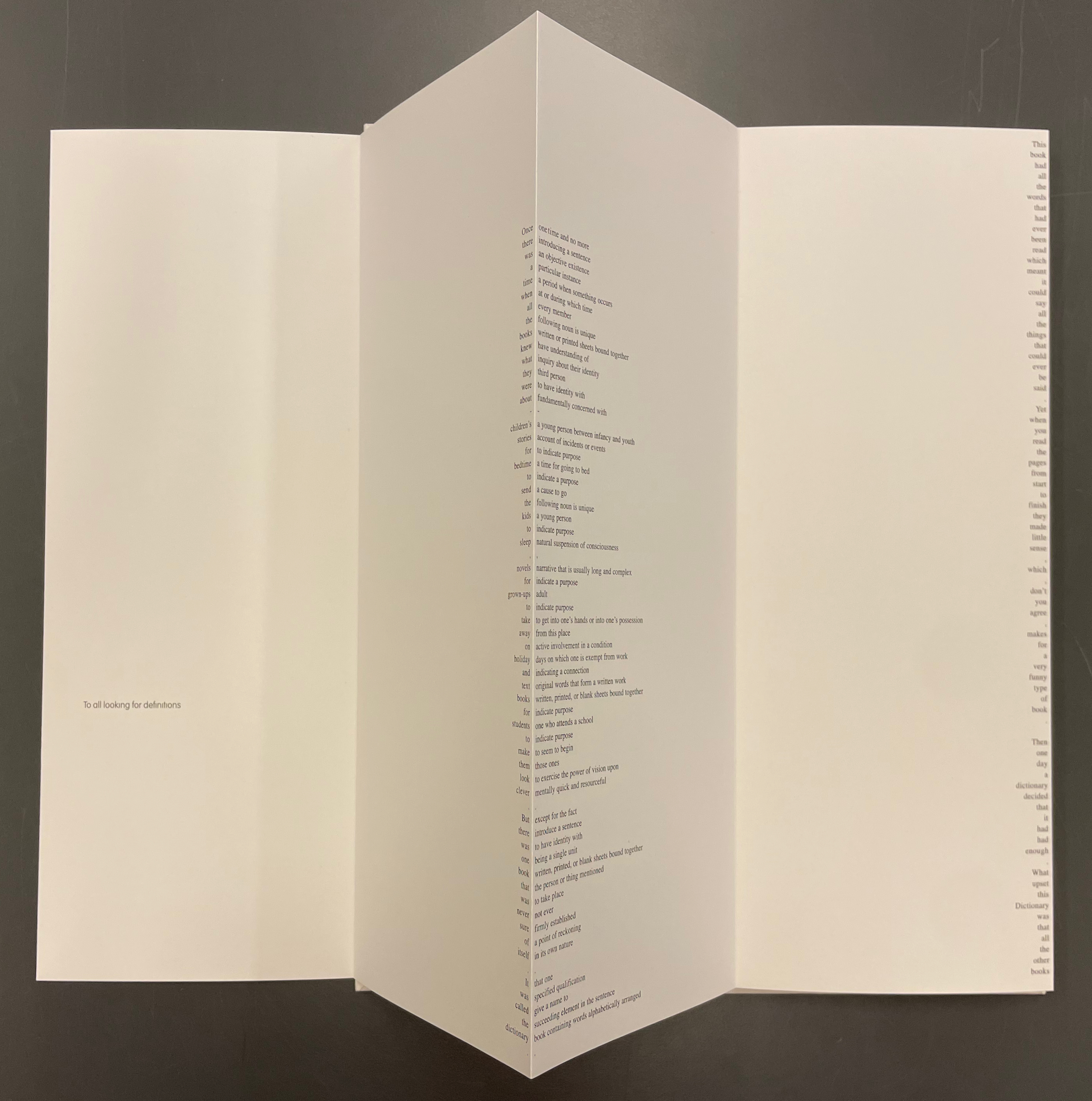
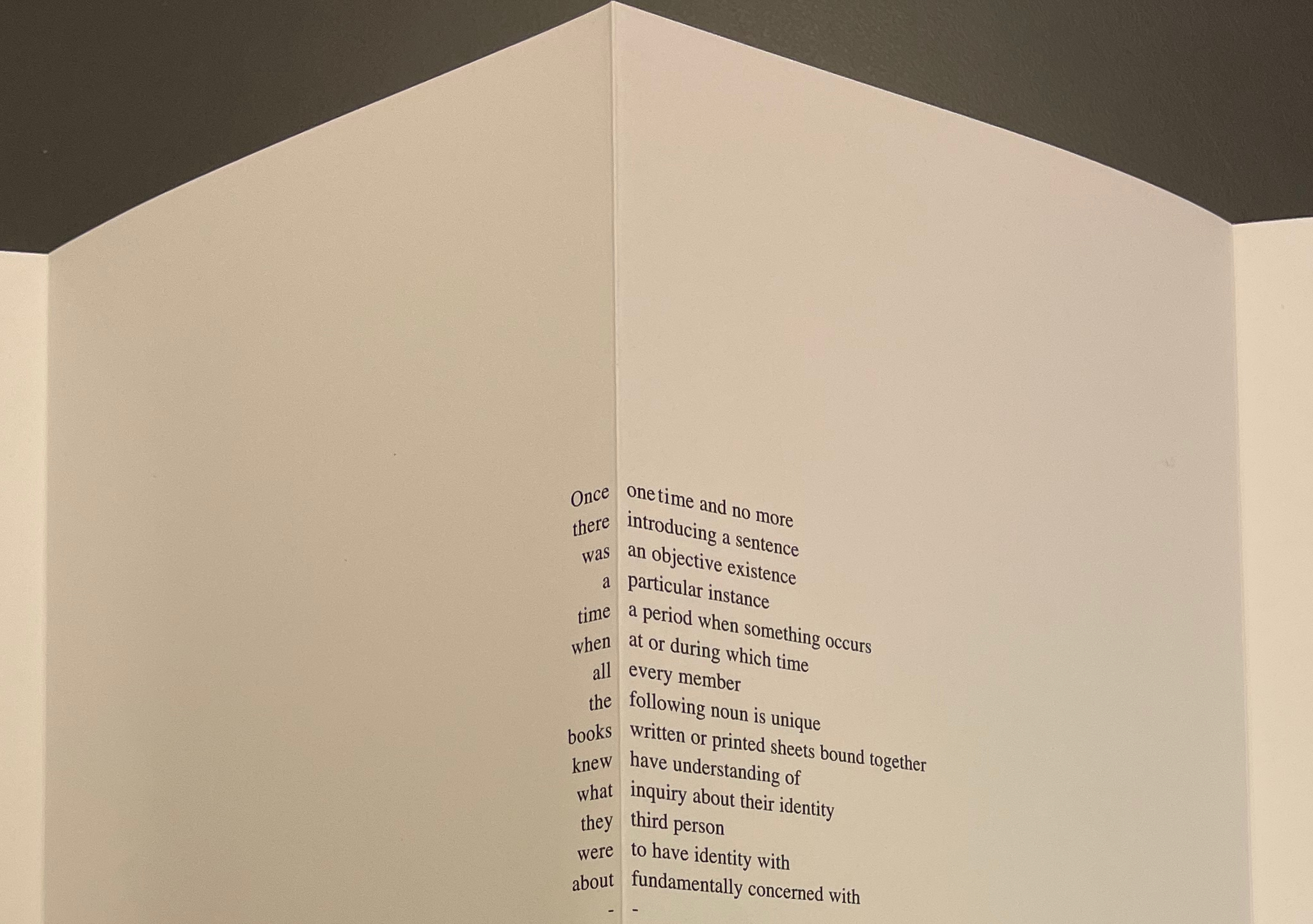
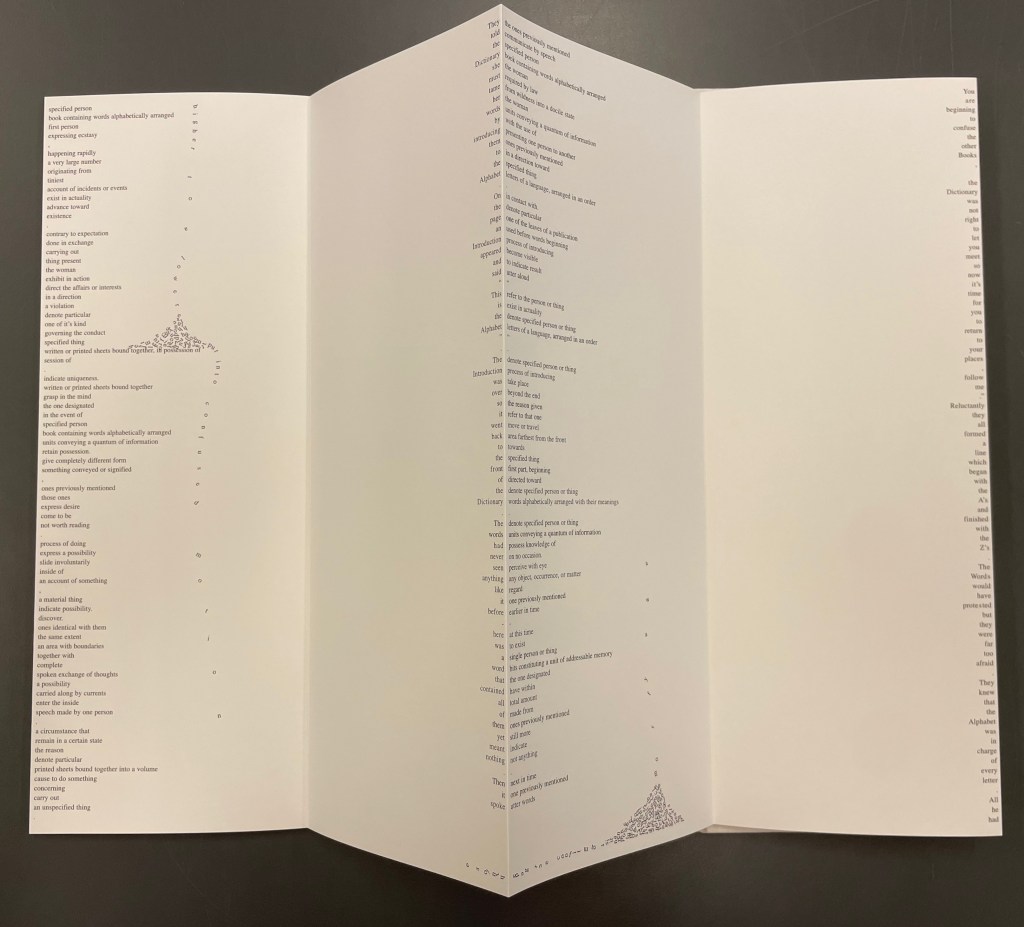
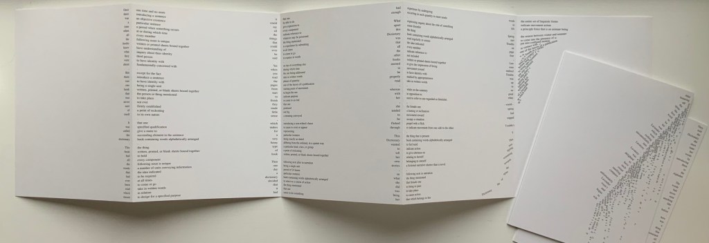
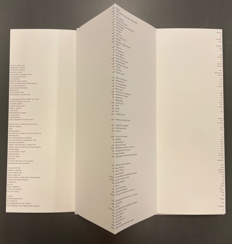
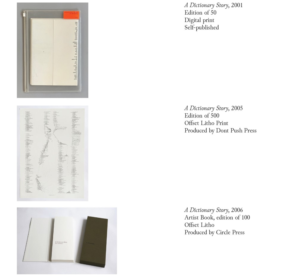
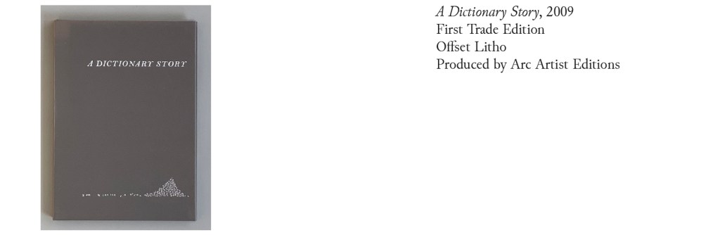
Since its origin as a student project in 2001, A Dictionary Story has appeared in an accordion book form as a fine press edition and two trade editions and as single-sheet prints. The Books On Books Collection holds the fine press edition and the second trade edition, both of which have in common a vertical flush-right single-word column that tells the story and the immediately adjacent vertical flush-left column of definitions of the words in the story. In the fine press edition, the two columns meet at each mountain peaks of the accordion fold.
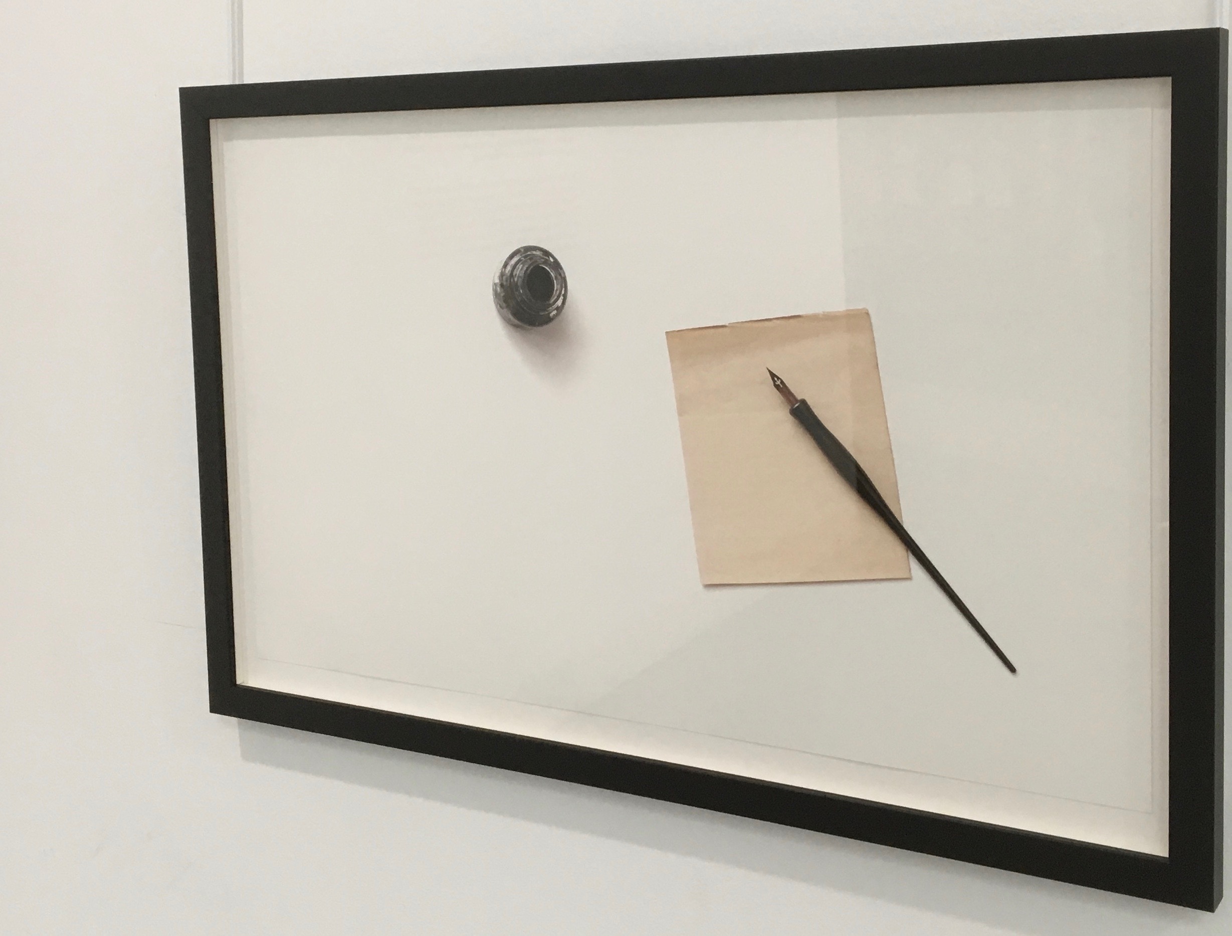
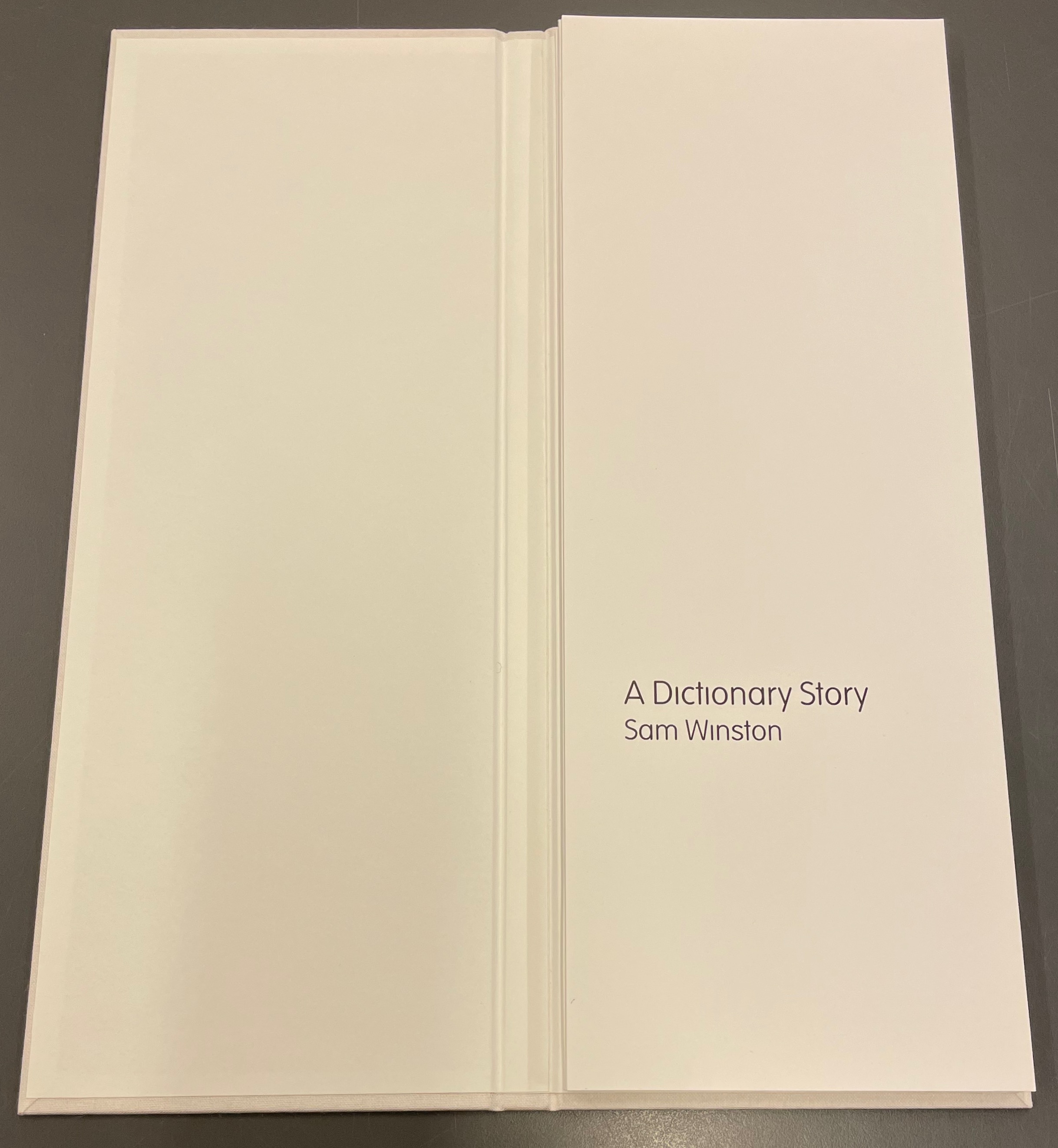
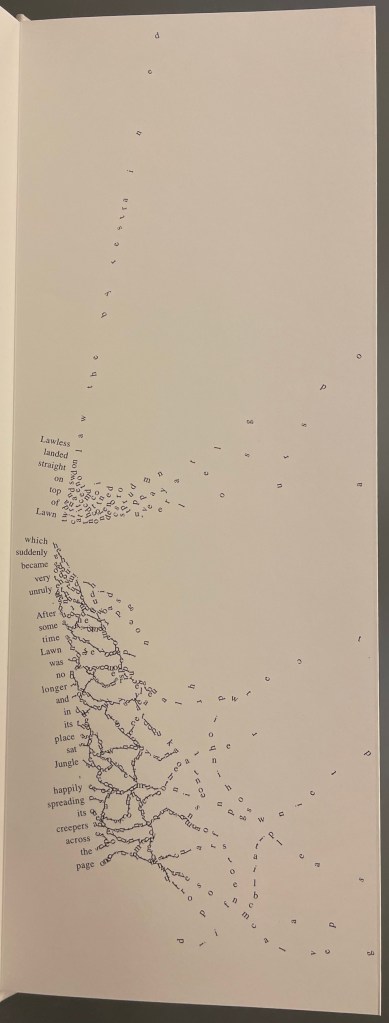
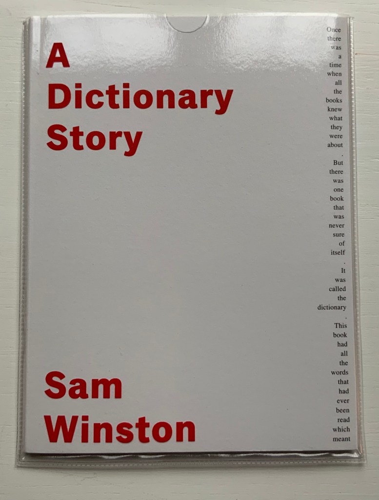
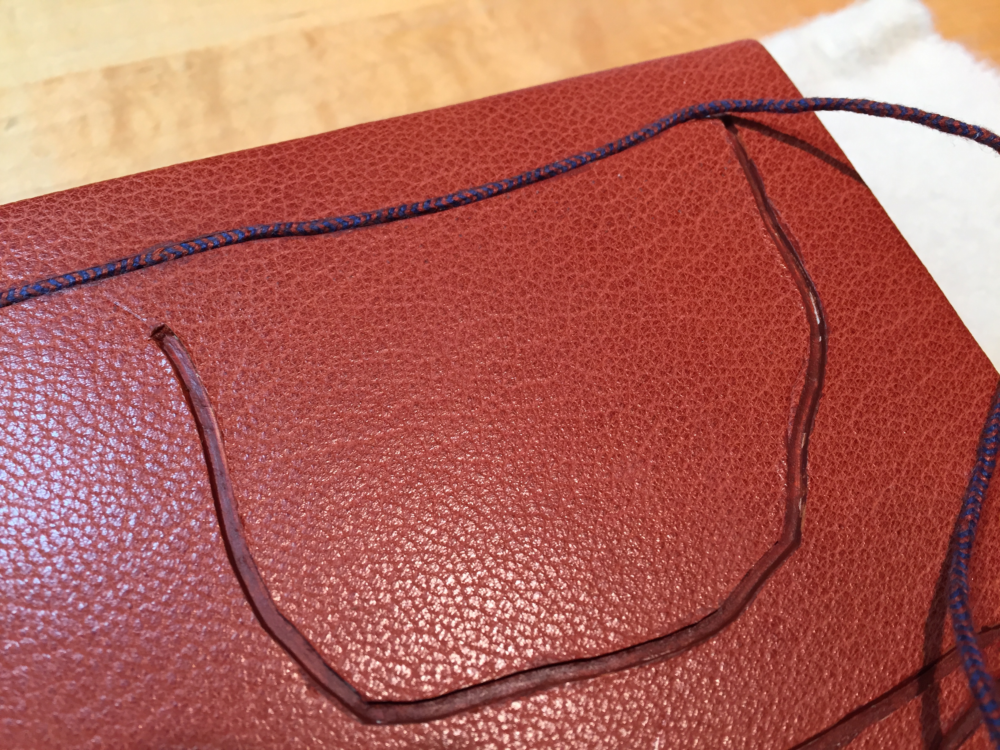
A Dictionary Story (2006) Sam Winston Slipcased leporello between cloth-covered boards.H360 x W140 mm, 25 panels. Story text set in 9 point Times Roman by Sam Winston. Book designed by Richard Bonner-Morgan and Sam Winston. Printed by David Holyday at Trichrom Limited. Bound at Quality Art Reproductions, England. Published by Circle Press. Edition of 100, of which this is #68. Acquired from the artist, 30 May 2018. Photos: Books On Books Collection. Displayed with artist’s permission.
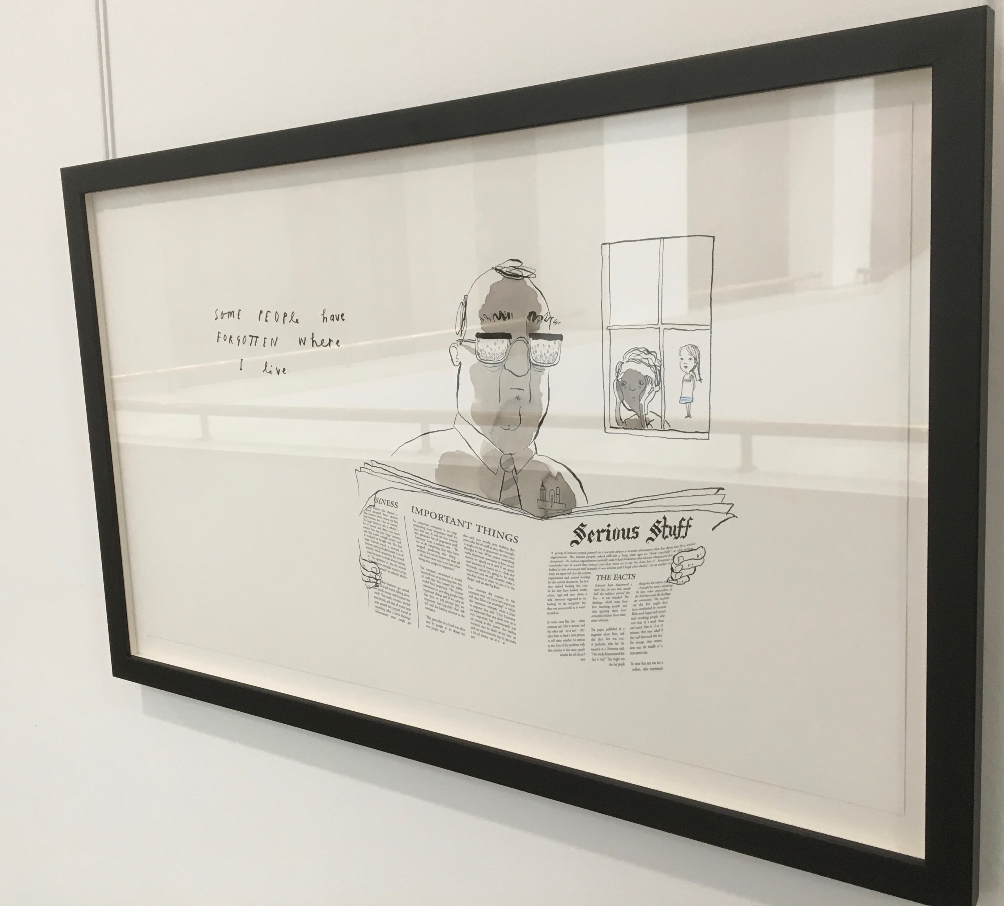
“Once there was a time when all the books knew what they were about. But there was one book that was never sure of itself.”
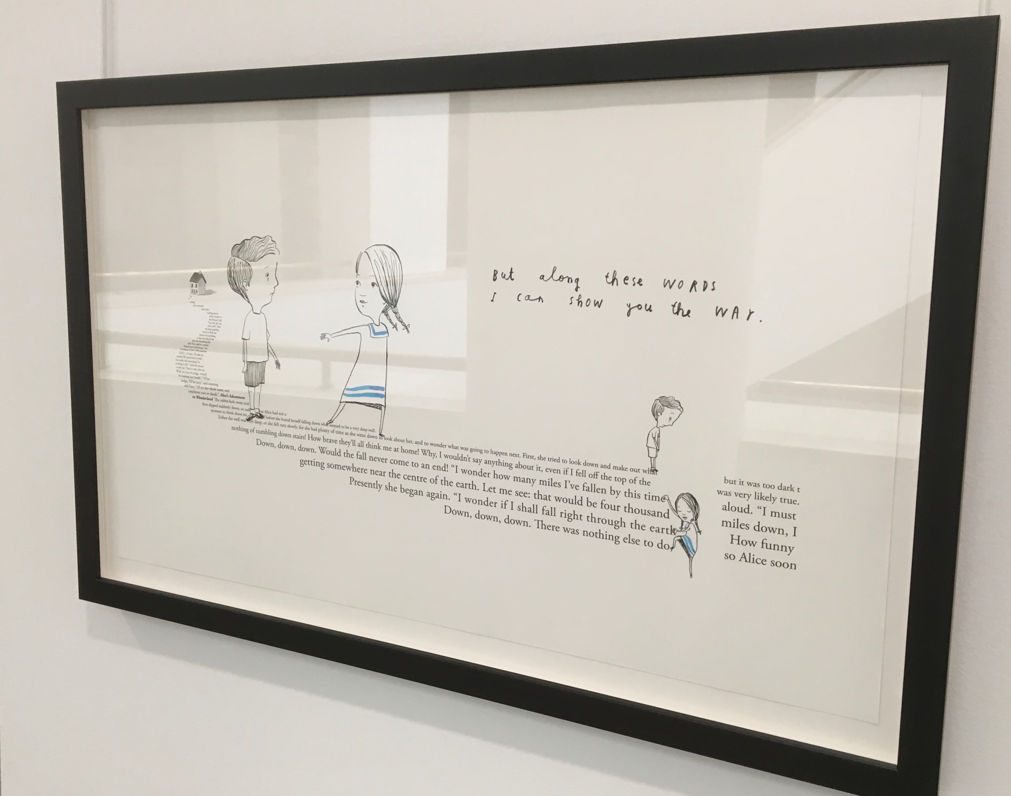
Panels 2-5 from the fine press edition; detail of panels 2-3.
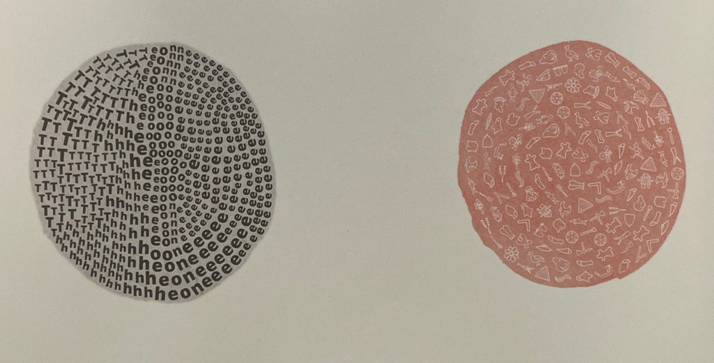
So begins Winston’s tale about this uncertain book. The book never sure of itself is the Dictionary, which of course it must be, otherwise the tale would not be called “A Dictionary Story”. The Dictionary is jealous of all the other books because they are “properly read”, whereas she is just flicked through from time to time. A bit like the “One” in One and Everything, the Dictionary seems to think she contains all the stories imaginable, because she contain all the words — just not in the right order. So she decides to bring her words to life as characters to see what will happen. Words and letters fly about, enacting the story as if in a concrete poem. A meaningful tussle between text and image is a frequent feature for artists’ books as well as visual poetry.
Another defining aspect of book art is its self-referential nature. In an interview with Typeroom, Winston captures this in his response to the question “What is Dictionary Story all about?”:
Dictionary Story is a playful way of exploring some of our presumptions around the printed word. Or you could say that it looks towards a tool we are given at a very young age – the Dictionary – and invites us to actually think about how that works. Here’s a device that is designed to explain a word’s meaning by offering further words in its place – to me that is remarkable. This is a type of knowledge that can only explain itself through referencing itself. As a visual person the image that comes to mind is a giant, never ending, Möbius strip of language twisting back on itself.
Of course for less visual persons, the Dictionary’s whim engenders chaos, which Winston, a dyslexic, can appreciate. So he brings onstage (or “onpage”) the Books, of whom the Dictionary was jealous, to remonstrate that if words become disconnected from their definitions, how will they the Books know what they are about? Insisting that she tame her words, they have the Dictionary’s Introduction introduce her bewildered words to the character “Alphabet”.
Making the journey over the hills and valleys of A Dictionary Story is satisfying, and re-making it is even more satisfying and delightful each time. The making and re-making of A Dictionary Story must also have been satisfying and delightful for Sam Winston; he has done it so many times.
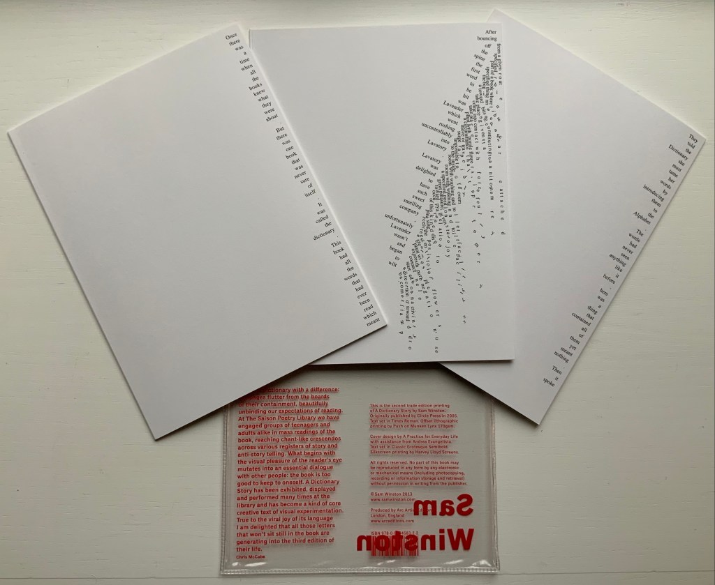
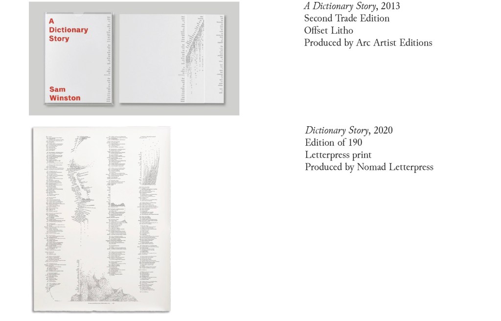
A Dictionary Story (2013) Sam Winston Three five-panel accordion folded sections in a plastic sleeve cover. Second trade edition. Sleeve: H205 x W160 mm. Sections: H200 x W150 mm, 15 panels. Acquired from the artist, 13 December 2020. Photos: Books On Books Collection.
Watching the artist adjust the typography of A Dictionary Story to changing dimensions is like watching a star tennis player who is also a star basketball player and star soccer (football) player. There’s always a ball, there’s always a net, there’s always genius.
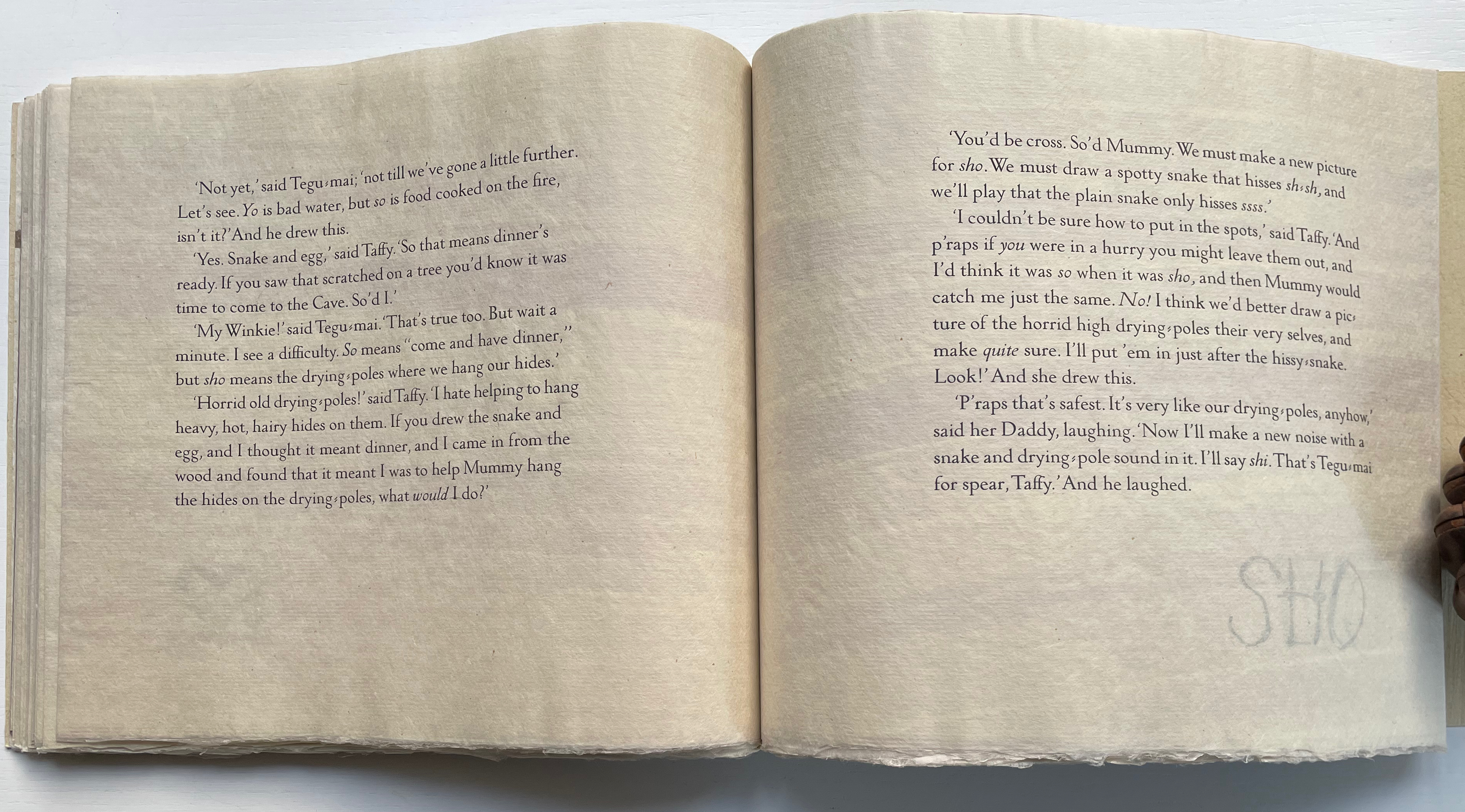
The trade edition splits the fine press edition into three less narrow leporellos and nudges some of the two columns (story/definition) into the valley fold. Below, in the trade edition across panels 3 and 4 is where the Dictionary decides to bring her words to life, and on the right side of the fourth panel, the words begin to slip away from the fold.
The same part of the story in the fine press edition occurs on the fourth panel below, and the words tilt against the fold.
These variations create subtly different narrative paces and visual impressions in the two editions. Not one better than the other, just different. The poster variations, however, subordinate narrative pace entirely to visual impression. At present, the posters are not in the collection, but the images below help to make the point. As with movie goers, some will like the prints more than the books, others the books more than the prints, and still others will marvel at the genius in all of them.
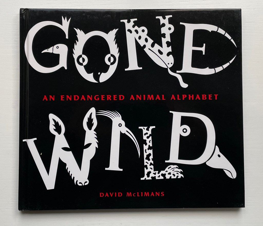
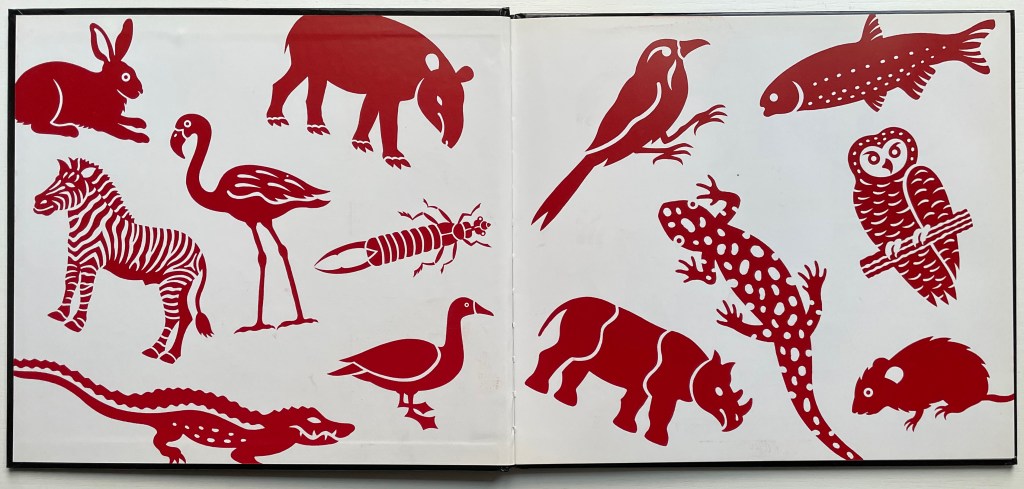
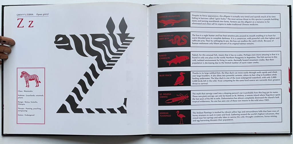
Gone Wild: An Endangered Animal Alphabet(2016) David McLimans Casebound, illustrated paper over boards, illustrated doublures, sewn book block. Illustrated, debossed glossy paper dustjacket. H255 x W285 mm. 36 unnumbered pages. Acquired from Gargoyle Books, 25 August 2022. Photos: Books On Books Collection.
In the history of children’s books, the alphabet looms large, and among alphabet books, animal alphabets make up the largest category. But why animals?
For learning and teaching letters, they are easily recognized and mnemonically effective. Illustrators can wrap them around letters, make them twist themselves into letters or hide them behind letters. Designers can hide them on tabs behind letters, make them pop out, parade them across leporellos (accordion books), let them lurk in tunnel books or put them on a paper disk to appear and disappear in a volvelle’s window. Writers can weave stories with animals and letters, put animals and letters together in puns and surprising scenarios or use alliteration and rhyme with them to reinforce letter recognition and reading. For authors more paleographically and philosophically inclined, the answer to “Why animals?” might be sought in the origins of the alphabet’s first letter as James Rumford does in There’s a Monster in the Alphabet (2002) and Don Robb and Anne Smith do in Ox, House, Stick (2007).
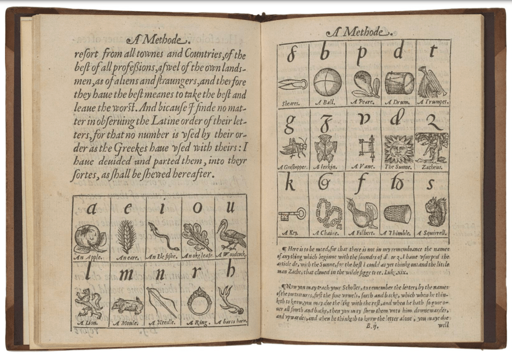
Whatever the cause, ever since John Hart’s A Methode, or Comfortable Beginning for All Unlearned (1570), which appears to be the first example of teaching the English alphabet with illustrations, we have had an explosion of imagination and wit choosing, finding or making up animals, birds, fish, insects and reptiles with which to decorate the letters, to make from letters (or make letters with), to be disguised with abstractions or to be hidden, revealed or popped out from behind letters. Now, in reverse over four centuries later, the alphabet has been mustered for teaching the endangered state of those creatures.
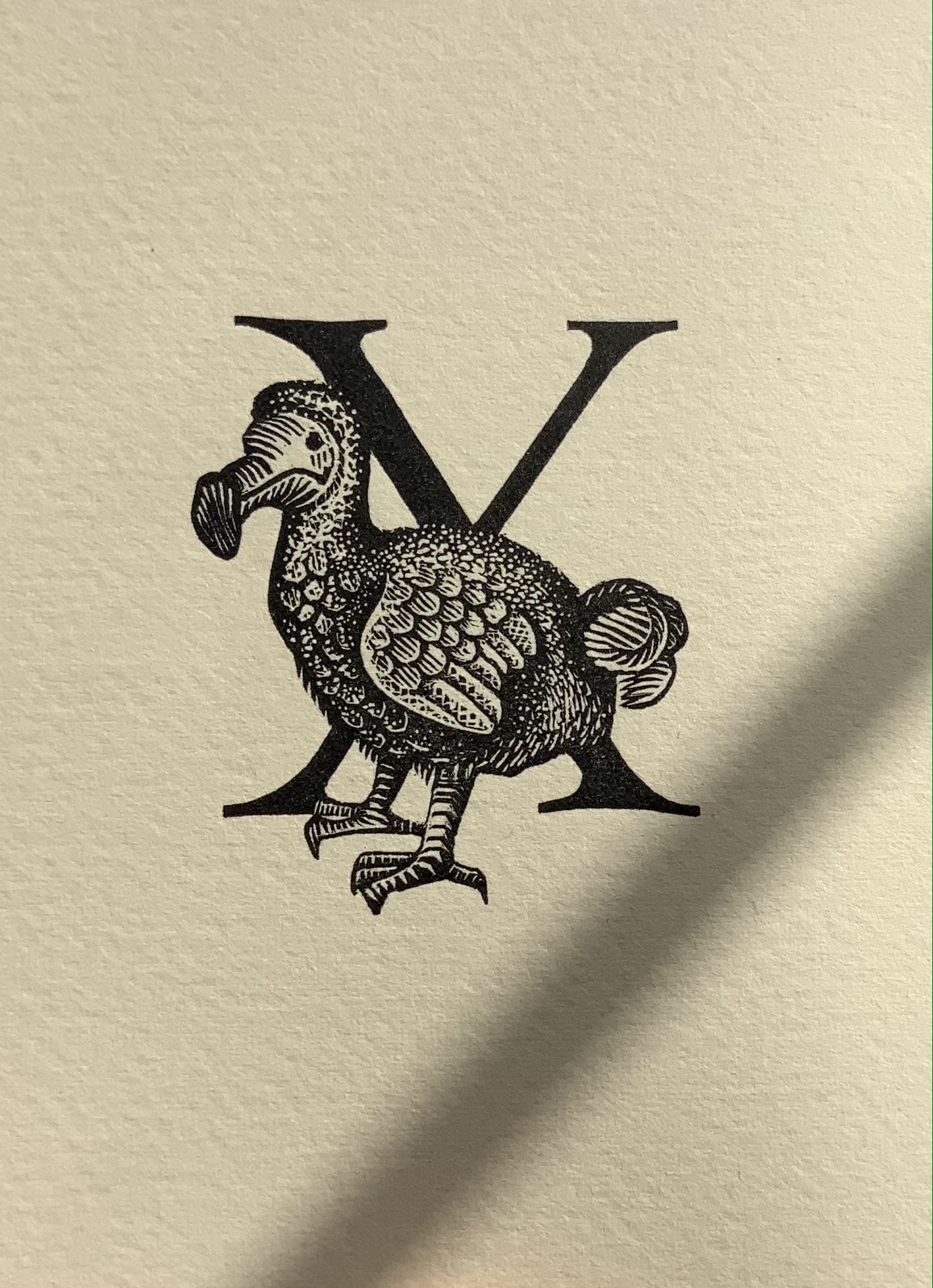
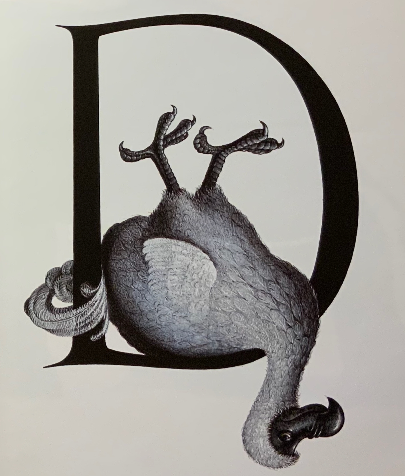
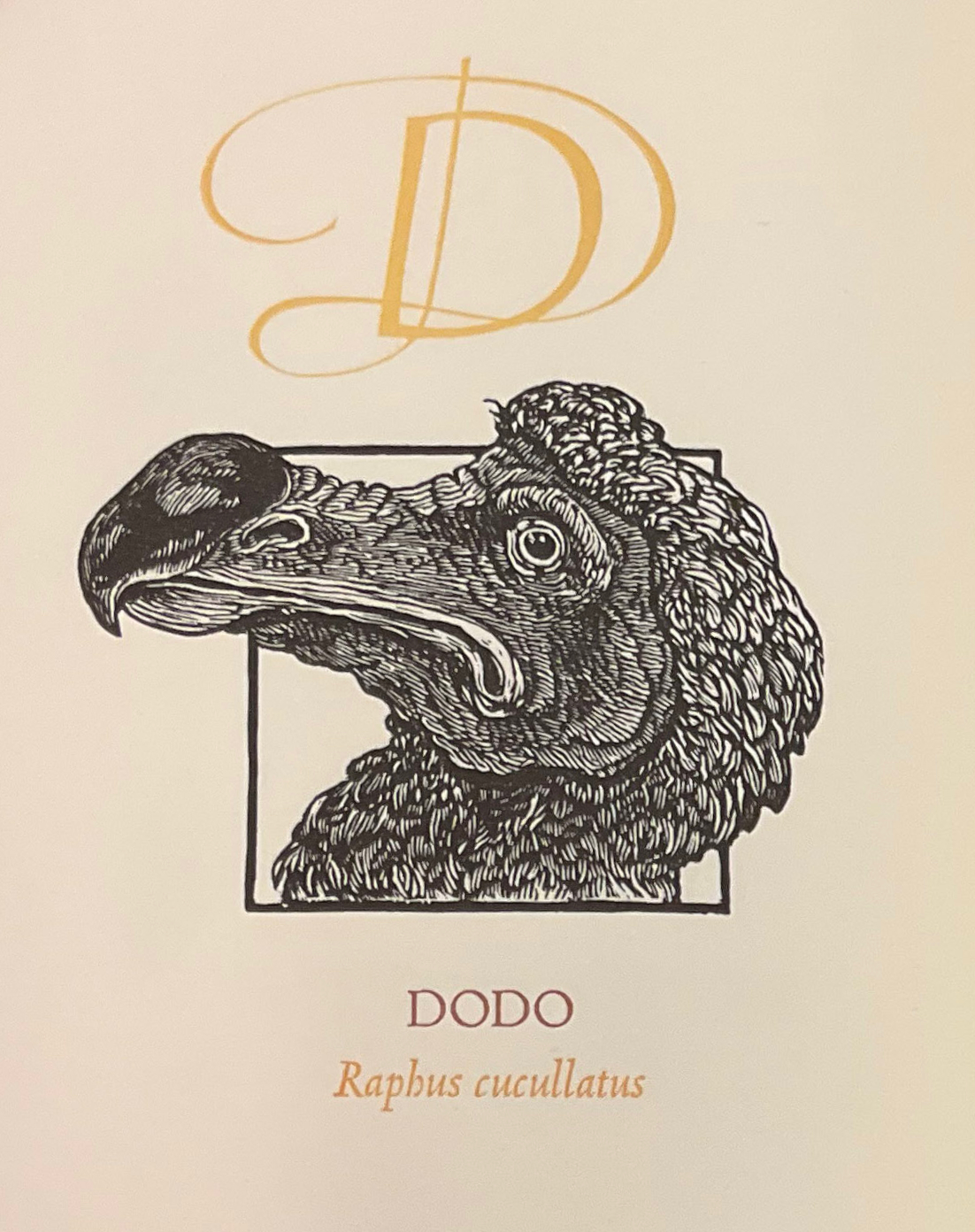
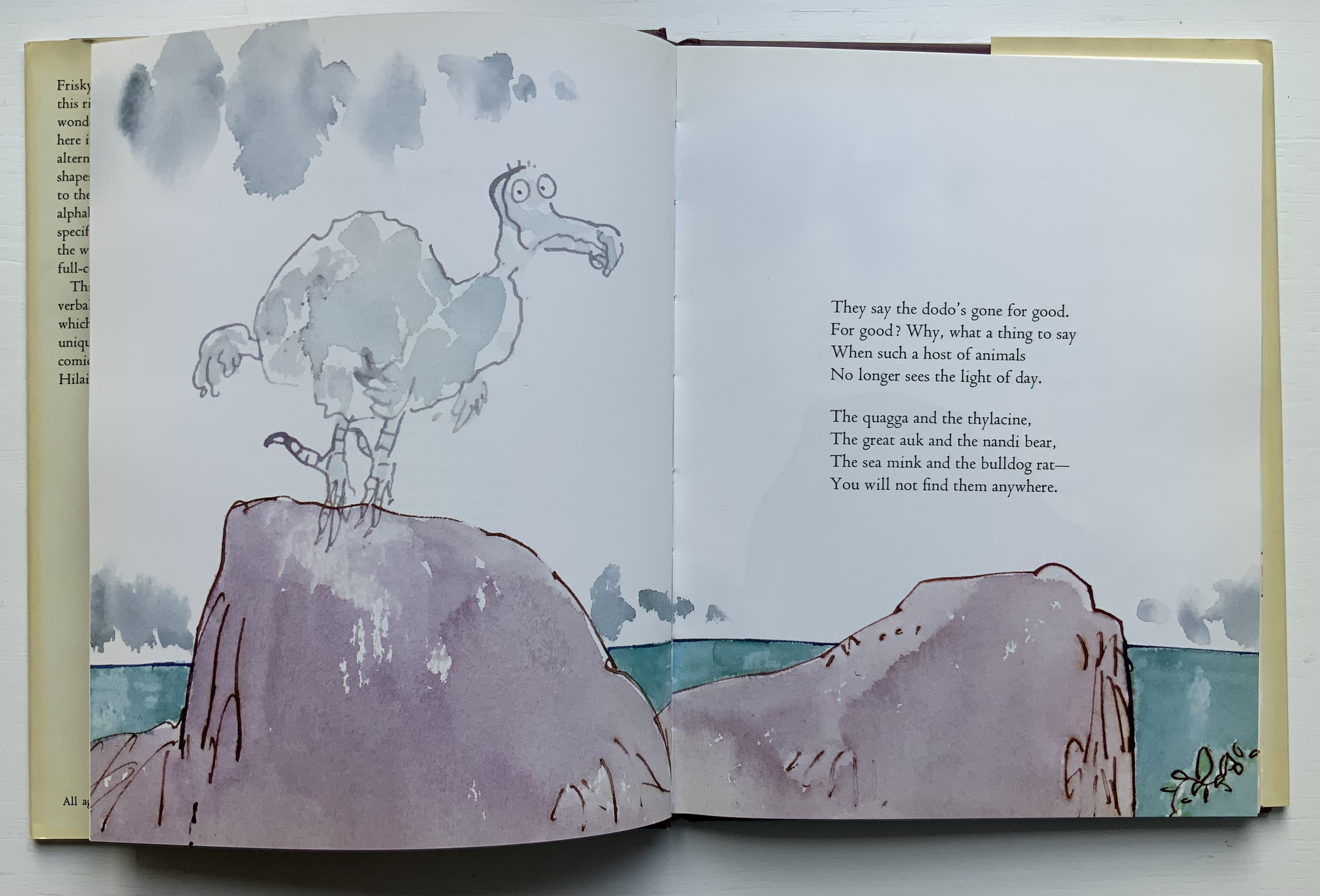
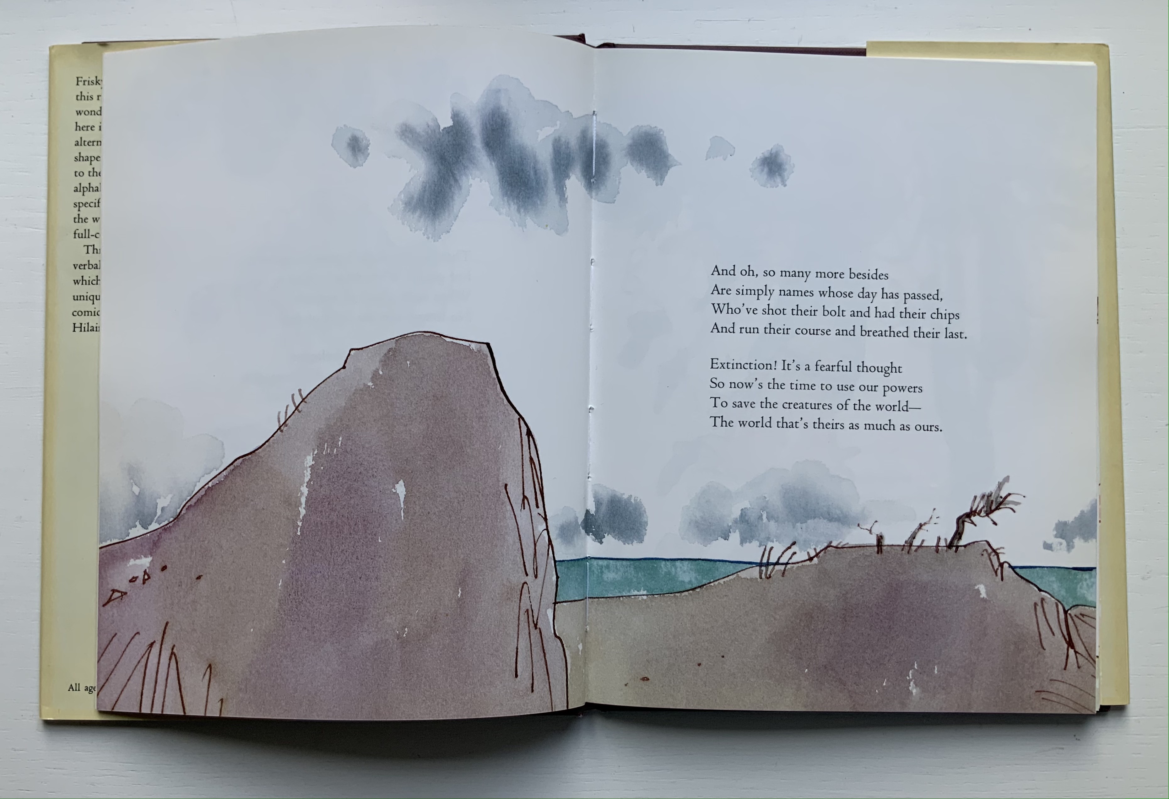
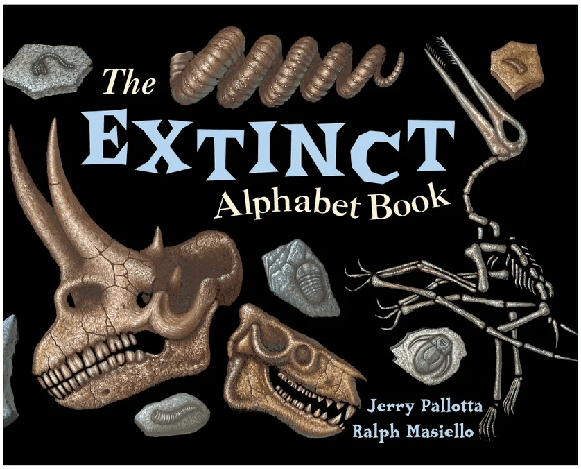
While E.N. Ellis, Bert Kitchen, the team of Alan Robinson and Suzanne Moore all allot only one letter and the dodo to make the point, Dick King-Smith and Quentin Blake together devote almost all of their Alphabeasts (1990) to examples of extinction, as do Jerry Pallotta and Ralph Masiello in The Extinction Alphabet Book (1993).
Left to right: from E.N. Ellis’s An Alphabet; Bert Kitchen’s Animal Alphabet; Alan Robinson and Suzanne Moore’s A Fowl Alphabet.
Quentin Blake’s page-by-page visual narrative married to Dick King-Smith’s opening verses in Alphabeasts.
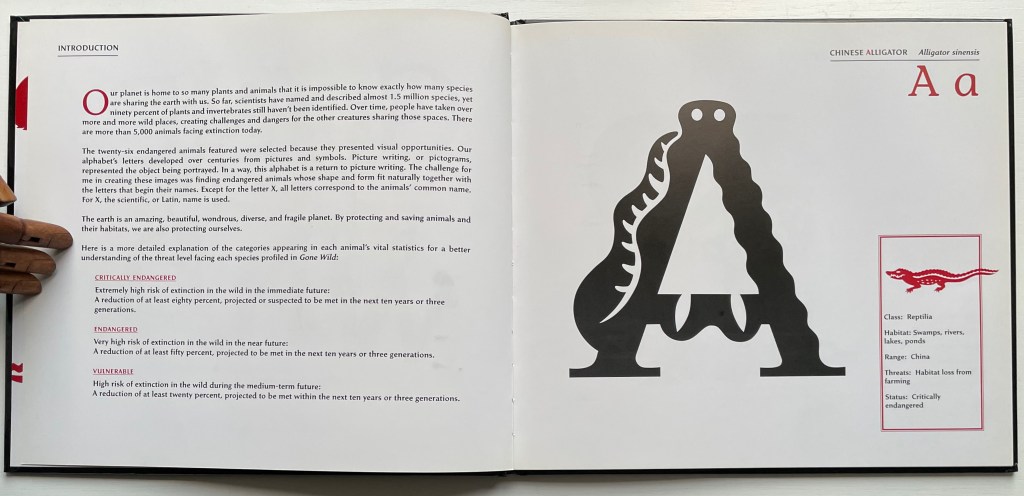
With Gone Wild, David McLimans adds a complex and subtle device to the explosion. The book is not so much about learning the alphabet with animals as learning about animals with the alphabet — or rather with “alphabetic art”. Wielding computer, pencil, pen, brush and India ink on bristol board, David McLimans redraws the alphabet’s capital letters to look like animals not yet extinct but on the Red List of the International Union for Conservation of Nature. Even the design of the traditional alphabet book subtly serves as a teaching tool about these animals. Notice how McLimans and John Candell, the book’s designer, turn the traditional presentation of uppercase and lowercase letters into a kind of running head that underscores the common and scientific names of each animal. Even the list of facts on each species — their habitats, geographic ranges, threats to survival and statuses — receives meaningful thematic design touches from the use of two-color printing — blood red and extinction black.
After the brief red-on-black thumbnails and descriptions following Grevy’s Zebra, McLimans provides further reading (online and in print). You have to go beyond a quick dive into the address he provides for the IUCN to find the Red List (see address above). There you will learn how up to the minute this book was in 2016 — and, unfortunately, still is.
Kitchen, Bert. 1991. Animal Alphabet. London: Walker Books. For letters decorated with animals other than the dodo.
Mackey, Bonnie and Hedy Schiller Watson. 2017. Alphabet Books : The K-12 Educators’ Power Tool. Santa Barbara California: Libraries Unlimited. For a brief history and extended categorization of alphabet books.
Markle, Sandra; Markle, William; and Dávalos, Felipe. 1998. Gone Forever! : An Alphabet of Extinct Animals. 1st ed. New York N.Y: Atheneum Books for Young Readers. For letters in aid of animals rather than vice versa.
Pallotta, Jerry, and Masiello, Ralph. 1993. The Extinct Alphabet Book. Watertown Mass: Charlesbridge. For letters in aid of animals rather than vice versa.
The Neolithic Adventures of Taffi-Mai Metallu-Mai (1997)
The Neolithic Adventures of Taffi-Mai Metallu-Mai(1997) Gerald Lange and Rudyard Kipling H216 x W260 mm. 55 pages with 17 additional illustrated page inserts. Edition of 150, of which this is #149. Acquired from the artist, 11 Febuary 2023. Photos: Books On Books Collection. Displayed with the artist’s permission.
Gerald Lange’s choice of “How the First Letter Was Written” and “How the Alphabet Was Made” from Rudyard Kipling’s Just So Stories (1902) for this elaborate, delicate but robust edition was fitting. By 1997, he had founded the Bieler Press (1975), co-founded the Alliance for Contemporary Book Arts (1987) and edited its journal AbraCadaBrA for seven years, had been the Master Printer at USC Fine Arts Press and selected as the first recipient of the prestigious Carl Hertzog Award for Excellence in Book Design (1991) and was about to publish the first edition of his Printing Digital Type on the Hand-Operated Flatbed Cylinder Press (now in its fifth edition, 2018). In keeping with his interests leading up to this work, Lange letterpress-printed it from handset Monotype Pastonchi and a digitally altered version of Berthold Post Antiqua. More to the point, as he noted on the Bieler Press site, he chose the stories for “their affinity with subjects related to the lettering arts”. If that affinity is not clear enough from the text, Lange’s treatment underscores it in subtly ingenious ways.
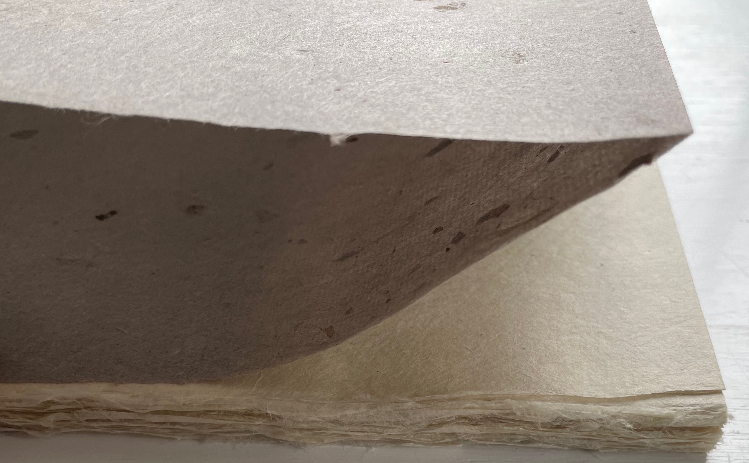
Kipling attributes the drawings throughout to his heroine, Taffi and her father. Where others like Macmillan Children’s Books have rendered them boldly, Lange prints the primitive petroglyph-like images on separate Gampi sheets inserted between the folded Kitakata text leaves of the tortoise shell edge-sewn binding. Those text leaves are individually water colored on their reverse sides (urazaiki manner based on nihonga painting) so that the pictographs beneath reveal themselves through a striated layer. The color and striations are reminiscent of cave paintings. Additional Asian papers (Kasuiri and Chirizome for end sheets, Cogan Grass for covers) increase the work’s tactility — simultaneously soft and rough, flimsy and tough — and contribute a grassy smell redolent of the stories’ physical setting.
The quality and rightness of choices in structure, material and process have placed several of Lange’s works in The British Library, University of California (various), Columbia University, Harvard University, University of Minnesota, New York Public Library, Princeton University, Stanford University, Victoria and Albert Museum, Yale University and others. The initial reason bringing this particular work into the Books On Books collection was its representation of book art inspired by the alphabet. That Robin Price, several of whose works are also in the Books On Books collection, assisted with the design came as a bonus. That this is one of the last bound copies of The Neolithic Adventures of Taffi-Mai Metallu-Mai makes it a treasure.
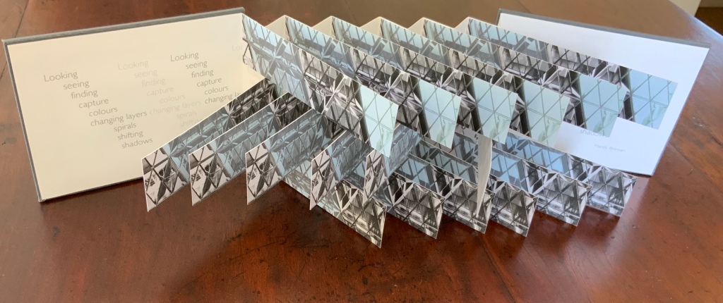
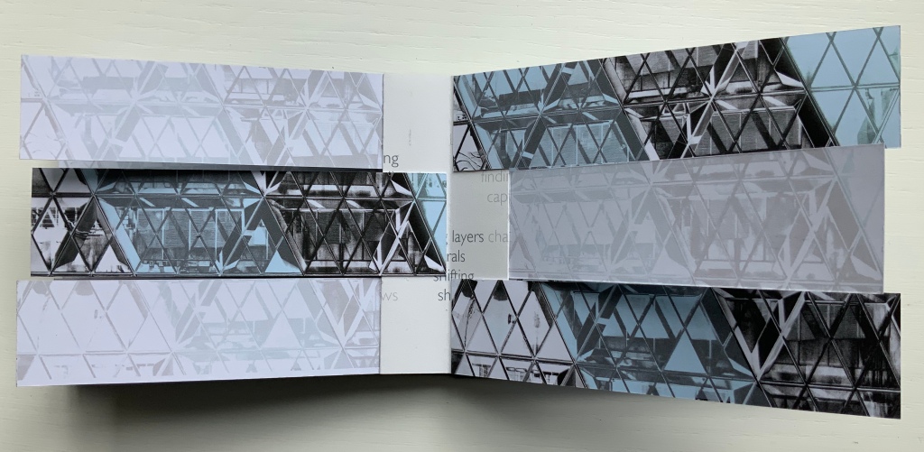
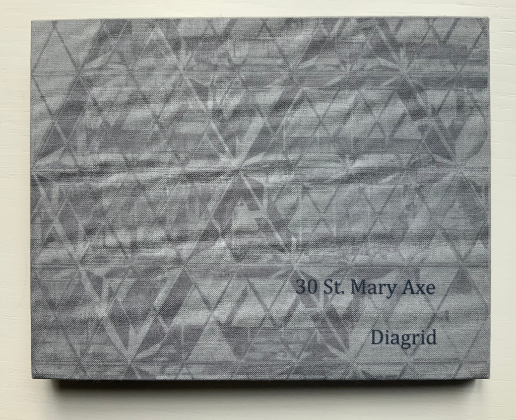
30 St Mary Axe is a skyscraper in London’s main financial district. Designed by Sir Norman Foster architectural studio, built in 2001-2003. (Photo credit: Wikipedia)
London’s 30 St Mary Axe is referred to as “the Gherkin,” which a glimpse of the building on the skyline proves unmistakably appropriate. Mandy Brannan’s bookwork homage to the Gherkin is as architecturally intricate as the building’s cladding, and somehow more satisfying, perhaps because it’s less pickled.
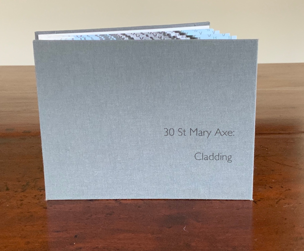
30 St Mary Axe: Cladding (2009)
30 St Mary Axe: Cladding (2009) Mandy Brannan Flagbook. H102 x W134 mm. Edition of 20, unnumbered. Acquired from the artist, 20 March 2019. Photo: Books On Books Collection
This work 30 St. Mary Axe: Cladding(2009) and 30 St Mary Axe: Diagrid (2009) are among several architecture-inspired works of book art that Brannan has created. The text in the one called Situated could have come straight from Pallasmaa, Bachelard or Merleau-Ponty:
Being situated is generally considered to be part of being embodied, but it is useful to consider each perspective individually. The situated perspective emphasizes that intelligent behaviour derives from the environment and the agent’s interactions with it.
Clearly we are not dealing with some mere mimetic piece of craftwork.
30 St Mary Axe: Diagrid (2009)
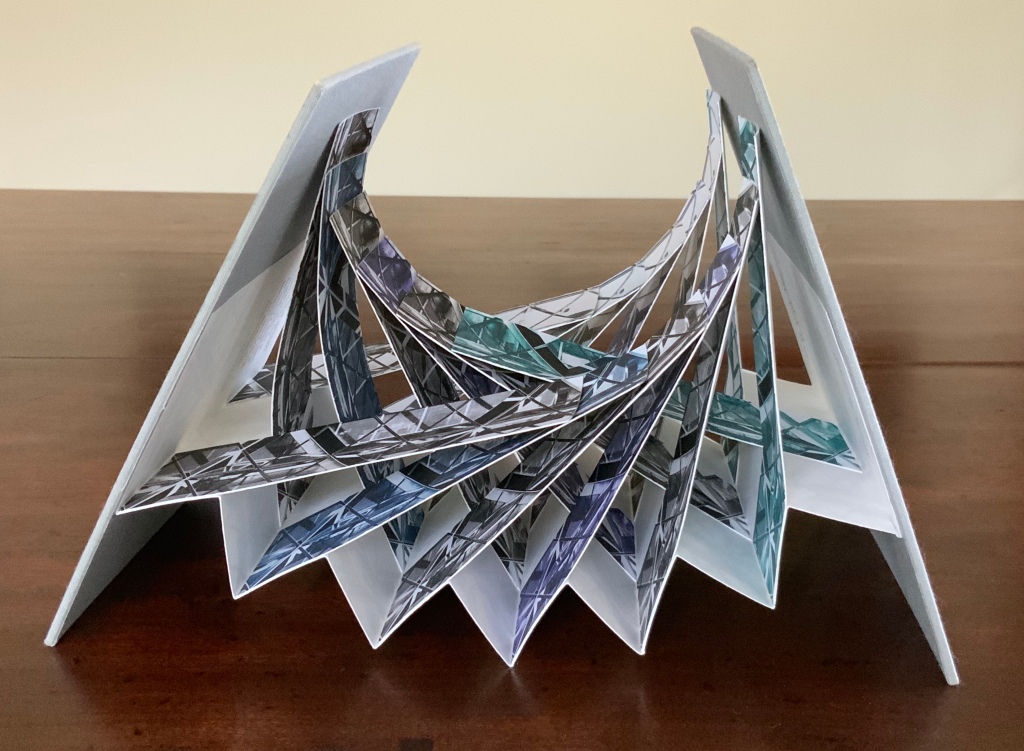
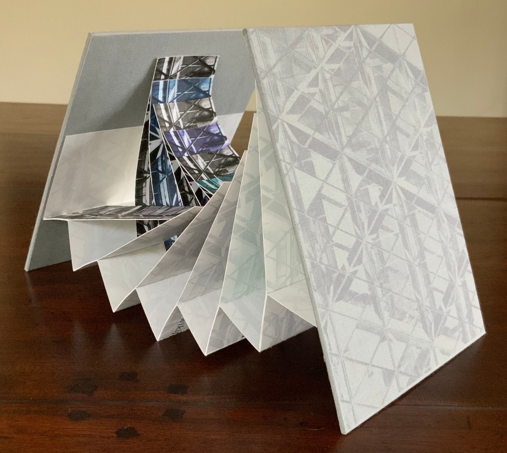
30 St Mary Axe: Diagrid (2009) Mandy Brannan Modified flagbook. H121 x W154 mm. Edition of 20, unnumbered. Acquired from the artist, 20 March 2019. Photos: Books On Books Collection
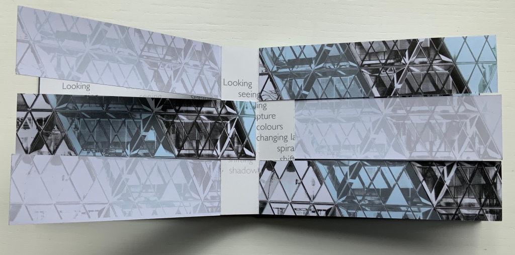
Cladding uses a straightforward flagbook structure, but not only is it double-sided with the architectural photographs, it also places text on the inner side of the accordion support and a statement about the 5,500 panels of glass cladding on the Gherkin. The modification in Diagrid is the inward curving of the flags and their formation of the shape recalling the Gherkin. The wording on the reverse of the accordion is the definition of the architectural term diagrid: “a design element used for constructing large buildings with steel that creates triangular structures with diagonal support beams”.
In addition to the flagbook- and modified-flagbook arrangements of the photos, Brannan has enriched the substance of these works with her manipulation of her photograph of 30 St Mary Axe, reflecting a nearby building. Using several different methods, digital programs and then printer settings for digitally printing, she delivers an almost kaleidoscopic, reflective and self-reflexive effect in each work. In a sense, the work demonstrates the artist’s behavior — her choices of material, subject, text and technique in each work’s making — and how it derives from her environment and her interactions with it. By integration of text, image, color, structure and material, Brannan also situates the “Gherkin’s” architecture in our hands and gives us the opportunity to contemplate, appreciate and perhaps experience the sense of being situated and embodiment.
Further Reading
“Architecture“, Bookmarking Book Art, 12 November 2018.
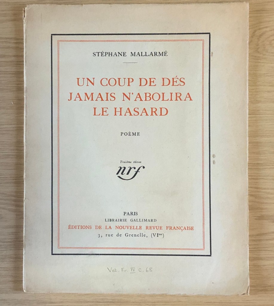
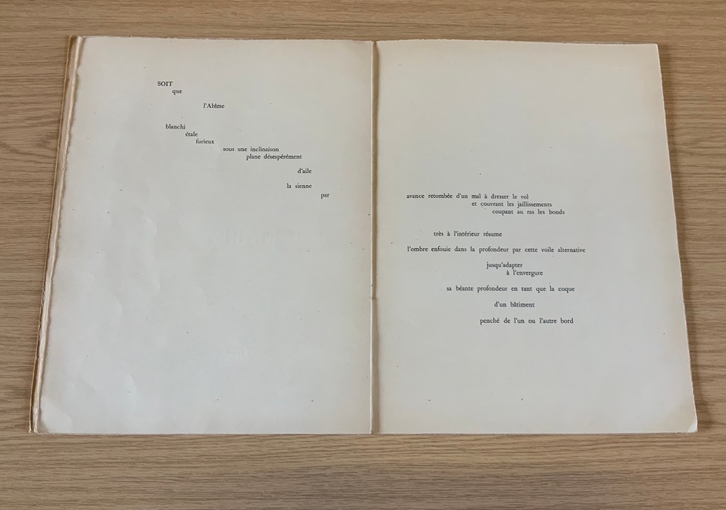
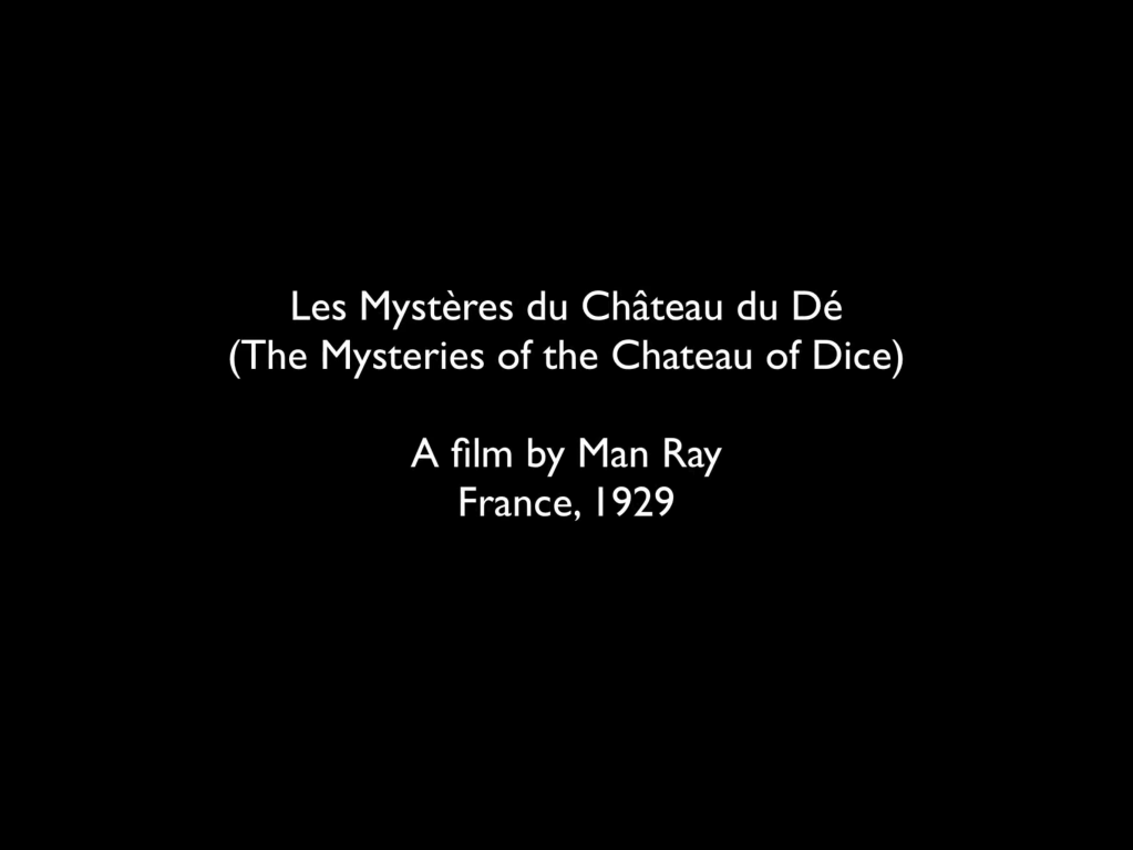
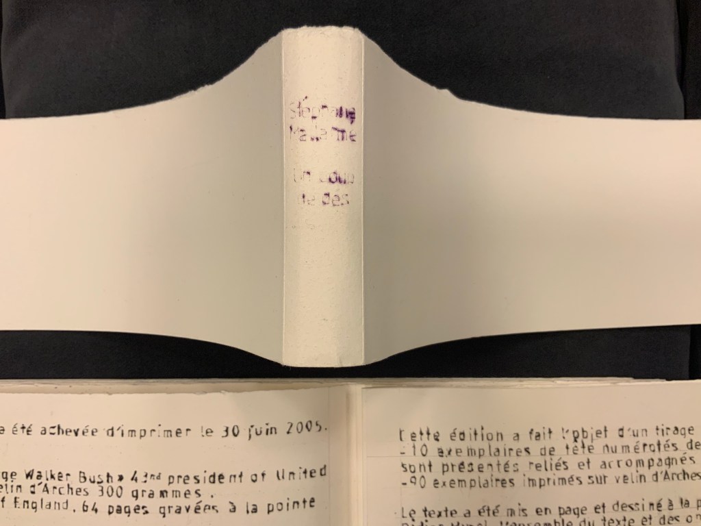
It was 1913. Stravinsky’s ballet “The Rite of Spring” debuted. The Cubists, Constructivists, Suprematists, Futurists all bound onto the art scene, many of them showcased in the Armory Show in New York that year. The Nouvelle revue française (NRF) attempted the first book form of Stéphane Mallarmé’s Un Coup de Dés Jamais N’Abolira le Hasard, which revived that 1897 typographic disruption of the page and prepared the ground for dozens of works of book art since. And Blaise Cendrars and Sonia Delaunay-Terk announced and published what they called le premier livre simultané. It was La Prose du Transsibérien et de la petite Jehanne de France.
From the Bodleian Library collection Photos: Books On Books
From the National Art Library, Victoria & Albert Photo: Books On Books
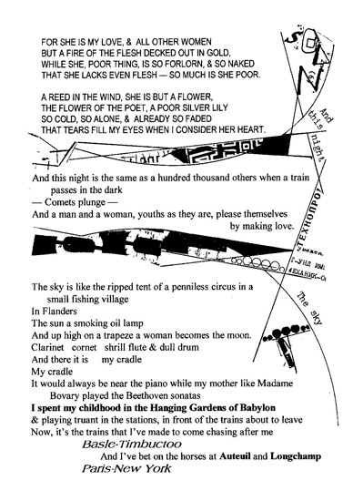
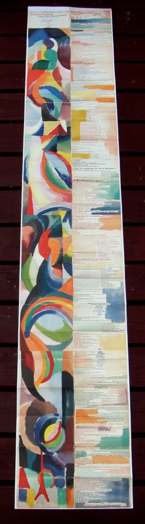
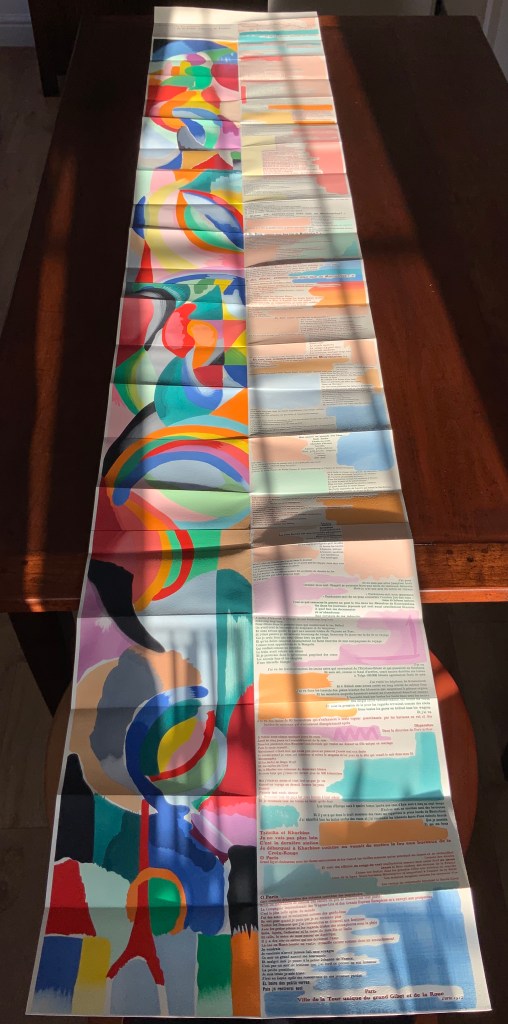
Like Mallarmé, Cendrars disrupts the page with multiple typefaces (thirty distinct ones in his case) and scattered placement of lines and stanzas. But La Prose presents an even more physical and structural disruption of the page and book than Un Coup de Dés. Unlike the latter, La Prose unfolds — twice — in an accordion format to over two metres in length or rather height since the text descends on the right and ends alongside the interlinked images of the Eiffel Tower and a Ferris wheel at the foot of the accordion. Cendrars and Delaunay had aimed to produce 150 copies of La Prose because, placed end to end, that would have equalled the Eiffel Tower’s height.
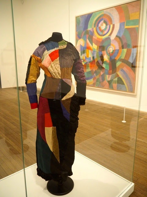
More than this monumental, sculptural, typographic and physical disruption of page and book, La Prose presents a temporal disruption. By le premier livre simultané, Cendrars meant a simultaneity of the verbal and visual — the way that text and image appear all at once — en un éclair. Early Bohemian that he was, Cendrars was co-opting a fair bit of artistic and literary theorising by the Cubists, Futurists and others. Most important and of the moment was his co-opting of Robert and Sonia Delaunay’s colour theory of simultanéisme. The “couleurs simultanées de Mme Delaunay-Terk” had also appeared in her 1913 robe simultanée and paintings. Building on a French scientist’s exposition on how perception of colours changes depending on the colours around them, the Delaunays claimed that rhythmic, musical and spatial synaesthetic elements were also at play. Sonia Delaunay asserted that the artwork produced for La Prose was not in response to reading the poem but hearing it from Cendrars. (Listen to it for yourself here.)
In presenting the adolescent Cendrars travelling physically eastward on the Transsibérien, travelling mentally to Flanders-Basle-Timbuctoo-Auteuil-Longchamps-Paris-New York while still registering the landscape outside, seeing the maimed and wounded returning from the front of the Russo-Japanese war, conversing with a prostitute named after Joan of Arc, doubting himself as a poet, and so on until a sudden transposition back to Paris, the process poem juxtaposes the sacred and profane, past/present/future, stationary and dynamic, national and international in outlook and locale. In short, simultaneously. In a format that is bound and unbound, the poem mirrors the swirling, interacting shapes and colours beside and in which it moves — and vice versa.
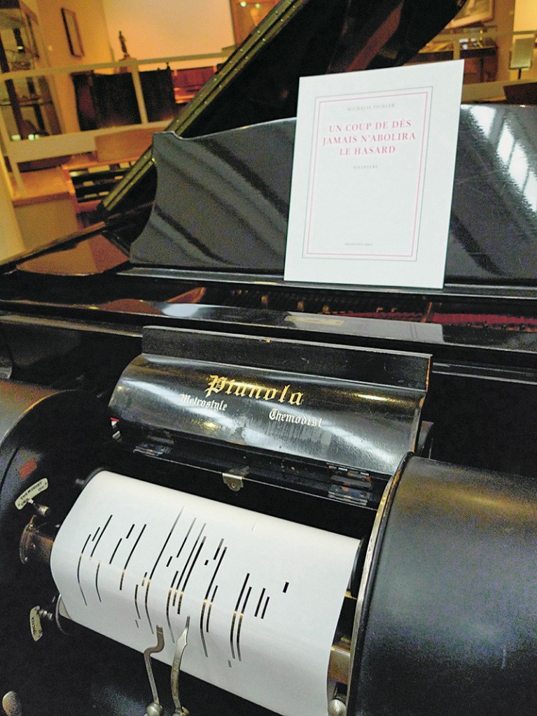
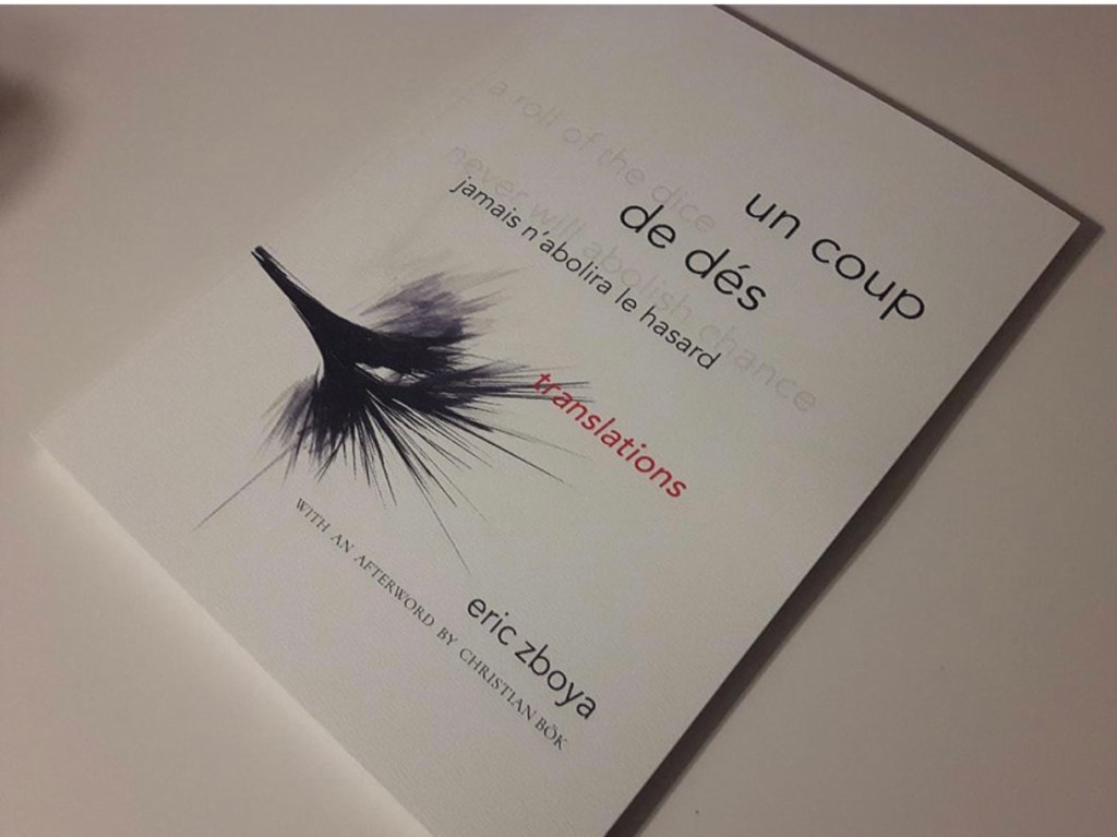
However more disruptive of the page and book La Prose may have been, it did not inspire the profusion of direct re-interpretations (or appropriations) that Un Coup de Dés prompted from artists such as Jérémie Bennequin, Ellsworth Kelly, Man Ray, Didier Mutel, Michel Pichler, Eric Zboya and dozens of others.
Not until 2001 did a re-versioning of La Prose appear. Tony Baker and Alan Halsey published an English translation and codex re-formatting. Its black on white imagery is reminiscent of the Russian Futurists, the type is monochromatic, and the typefaces, fonts and weights vary but not as much as in La Prose.
Baker and Halsey note in their colophon:
So far as we’re aware no translation of the poem into English has ever been attempted to give a sense of Cendrars and Delaunay’s original conception, not the least reason for which may have been the difficulty until recently of seeing the first edition, even in reproduction. — Prose of the Trans-Siberian and of the Little Jeanne de France (Sheffield: West House Books, 2001)
A well-founded lament — at least for the book art community. Not until 2000 had there been a reduced-scale reproduction of La Prose. It appeared in Granary Books’ A Book of the Book by Jerome Rothenberg and Steven Clay across a four-page foldout in the embrace of Ron Padgett’s English translation. Only in 2008 was there a full-scale, full-colour offset facsimile, produced by Yale University Press with an appended translation. It is now out of print.
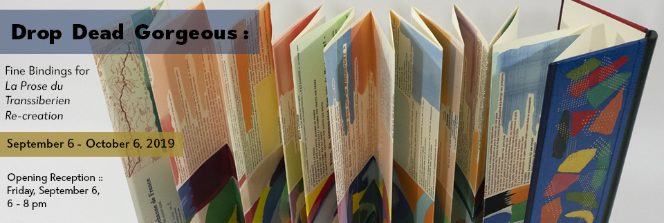
With her work La Prose du Transsibérien Re-creation (2019), Kitty Maryatt has changed all that. With this deuxième livre simultané, she has more than caught the echo of Cendrars/Delaunay’s original and its arrival. As scholar, artist and veritable impresaria, she has reinvigorated the book art/arts community with the legacy of La Prose.
Her blogspot documents the research and production with rich details about sourcing the type, learning about stencil-cutting from Atelier Coloris (one of the few remaining businesses devoted to pochoir), determining the recipes for the ink colours, testing papers (Zerkall Crème, Biblio, and Rives HW), creating a census of the existing 1913/14 originals and their locations — all that and more, including the use of bacon fat and a wine bottle filled with lead shot. She also organized a documentary by Rosylyn Rhee: “The Pochoir Re-creation of La Prose du Transsibérien”. It brings the importance of the original and this re-creation to life in the expressions and voices of prominent collectors, librarians and scholars, artists, rare book dealers and the project’s funders.
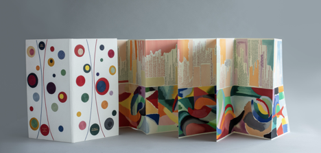
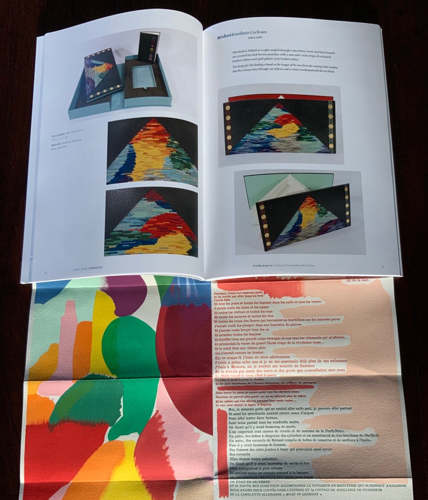
In addition, Maryatt has been either a contributor to, or the motivating force behind, several symposia and exhibitions such as “Paris 1913: Reinventing the Artist’s Book” (at the Legion of Honor Museum in San Francisco, 2018) and “Drop Dead Gorgeous”. The latter is a travelling exhibition resulting from invitations to twenty-four book artists and designer bookbinders to design and create bound copies of La Prose du Transsibérien Re-creation. For the San Francisco venue, Maryatt prepared a workshop on traditional French pochoir and provided text for the exhibition catalogue (available from the online store of the San Francisco Center for Books).
Monique Lallier’s fine binding of La Prose du Transsibérien Re-creation Photos: Courtesy of Monique Lallier
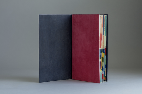
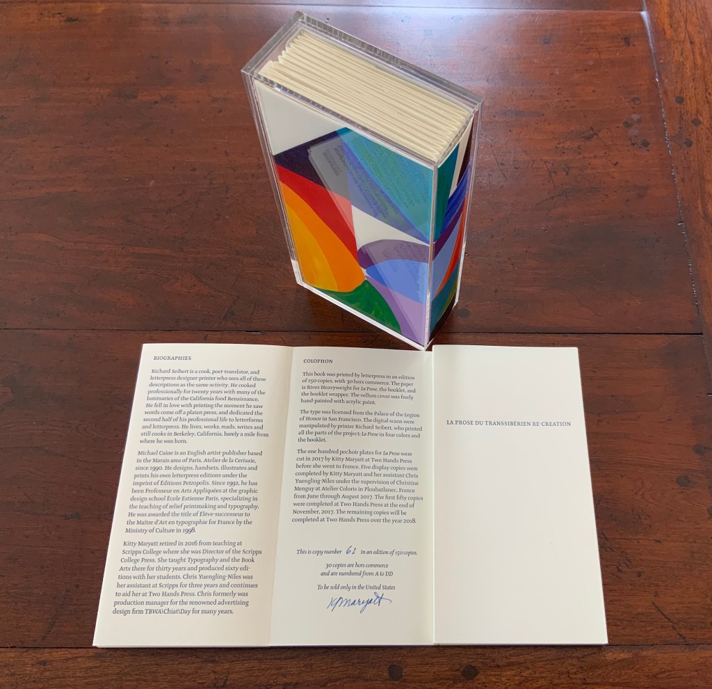
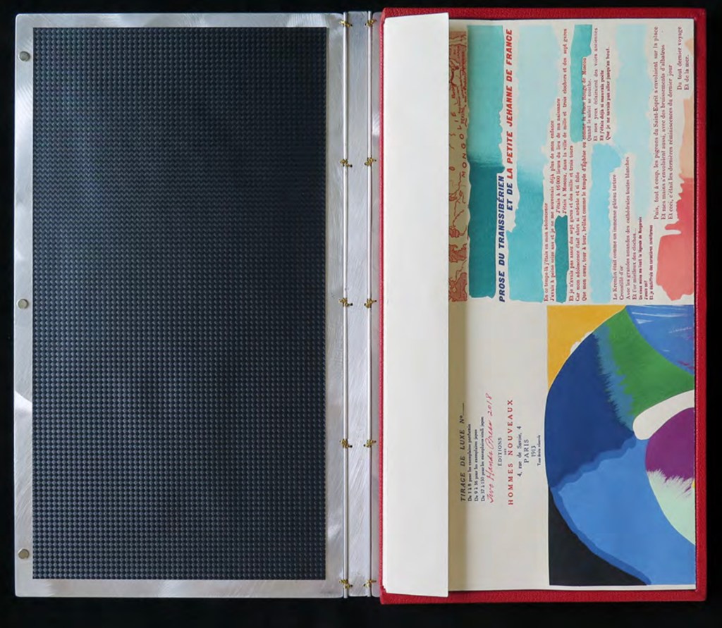
The pinnacle of Maryatt’s efforts, of course, is the standard and deluxe editions of La Prose. Both editions consist of 4 pages, glued together to create the tall single page. For the standard edition, the page is folded into 21 sections and loosely placed in a painted vellum cover with a booklet describing the project and production. An acrylic slipcase houses the covered bundle.
The standard edition Slipcase: H195 x W108 x D45 mm. Wrapper: H182 x W97 x D35 mm. Leporello: H81 x W95 mm (closed). H1954 x W160 mm (open). Booklet: H81 x W94 mm (closed), W1055 mm (open). Photo: Books On Books
Photo: Books On Books
Photos: Books On Books
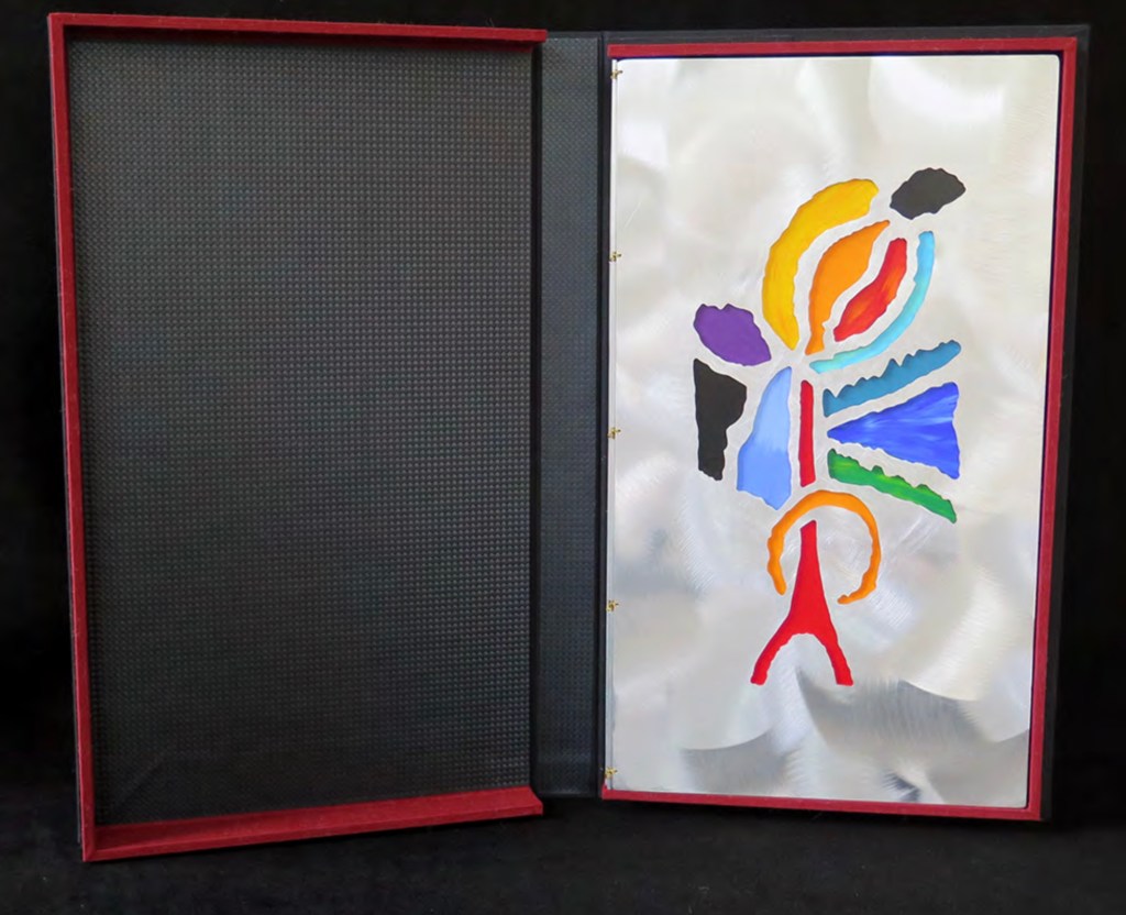
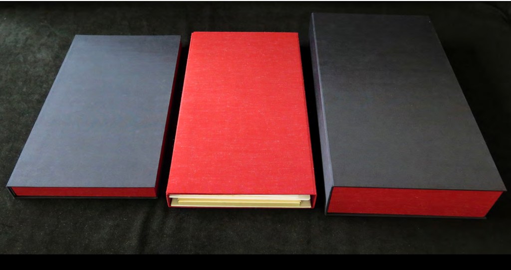
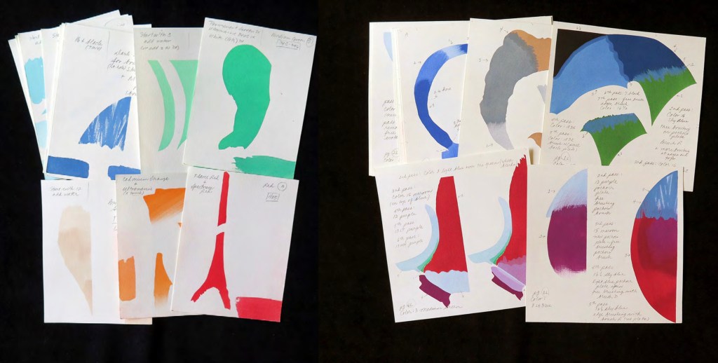
For the deluxe edition, the single page is left double-wide, accordion-folded double-tall between aluminum covers and housed in a clamshell box. A separate case holds the painted vellum cover, colour cards, Sonia’s visual vocabulary, 27 progressives for page one, 5 pochoir plates with tracing paper and registration system, the booklet with introduction and colophon, and the list of 30 typefaces Cendrars used. A large clamshell box houses this separate case and the boxed book. The colour cards include the recipe for mixing the gouache, and Sonia’s visual vocabulary shows the numbered steps of operations. The progressives for page one show the steps for doing the pochoir stencils and handwork.
The deluxe edition Photos: Courtesy of Kitty Maryatt
Any institution with a focus on book art or the graphic arts should seek out the standard edition of La Prose du Transsibérien Re-creation. Any institution with a focus on teaching and practice in those domains should seek out the deluxe edition. As indefatigable as Cendrars and as productive as Delaunay, Kitty Maryatt has provided the basis of master classes for generations. Now it is up to the book art community to respond as it has to Un Coup de Dés.
A shorter version of this essay appears in Parenthesis 39, Fall Issue, 2020.
Further Reading
Ashton, Doré. “On Blaise Cendrars. . . But I Digress.” Raritan 31, no. 2 (2011): 1-42,164. An entertaining extended anecdote sketching Cendrars and his milieu.
Gage, John. Colour and Meaning : Art, Science and Symbolism(Berkeley, CA: University of California Press, 1999). Despite her works’ better quality and representation of simultanéisme, Gage focuses on Robert and mentions Sonia only in passing or footnotes. (Telling that the Tate chose Sonia not Robert for a retrospective in 2015.) Nevertheless, there are passages that place her work in context.
P.198: Chevreul’s “privileging of the harmony of complementaries was essentially in the context of ‘painting in flat tints’, a method developed largely in the decorative arts, but which was increasingly integrated into many branches of French painting in the second half of the nineteenth century …”.
P.254 “When, probably early in 1912, Delaunay wrote to Kandinsky outlining his theories, he had shifted to a rather different approach, claiming: ‘the laws I discovered … are based on researches into the transparency of colour, that can be compared with musical tones. This has obliged me to discover the movement of colours.’ …
P.256 [Delaunay’s] Essay on Light, which was composed in the summer of 1912, attributed the movement of colours less to transparency than to the qualities of hue: ‘Movement is given by the relationship of unequal measures, of contrasts of colours among themselves which constitute Reality. The reality has depth (we see as far as the stars), and thus becomes rhythmic Simultaneity.’”
P.257 “For Chevreul in 1839 such painting [in flat tints] had only a decorative, accessory function, but the Delaunays did not feel the distinction, and Sonia had recently been experimenting with flat colours in appliqué textiles and in bookbindings decorated with collage.”
Maryatt, Kitty. “A Bookmaker’s Analysis of Blaise Cendrar’s and Sonia Delaunay’s La Prose du Transsibérien et de la Petite Jehanne de France”, The Quarterly Newsletter(Fall 2016), The Book Club of California. Online version available here.
Maryatt, Kitty. Interview with Steve Miller, Book Arts Podcasts, School of Library Information and Sciences, University of Alabama, 13 January 2006.
Rothenberg, Jerome; Clay, Steven. A Book of the Book: Some Works & Projections about the Book & Writing (New York City: Granary Books, 2000). Contains an excerpt from Perloff’s book above, Ron Padgett’s translation of La Prose and a four-page foldout showing a full-color photo-reduction of the 1913 original.
Shingler, Katherine. “Visual-verbal encounters in Cendrars and Delaunay‘s La Prose du Transsibérien“, e-France: an on-line Journal of French Studies, Vol. 3, 2012, pp. 1-28. Accessed 15 November 2019. Along with Perloff’s book, this is the best explication of the work and its lineage with Mallarmé’s Un Coup de Dés.
Woodall, Stephen. “La Prose du Transsibérien et de la Petite Jehanne de France”, Insights from the de Young and Legion of Honor (San Francisco: Fine Arts Museums of San Francisco, 2020. A spectacular website presenting the original work in its context and its influences on subsequent book art. The work can be viewed panel by panel, and its overall structure is presented in an animation of its unfolding and refolding.
Bartleby the Scrivener: A Story of Wall Street (1995)
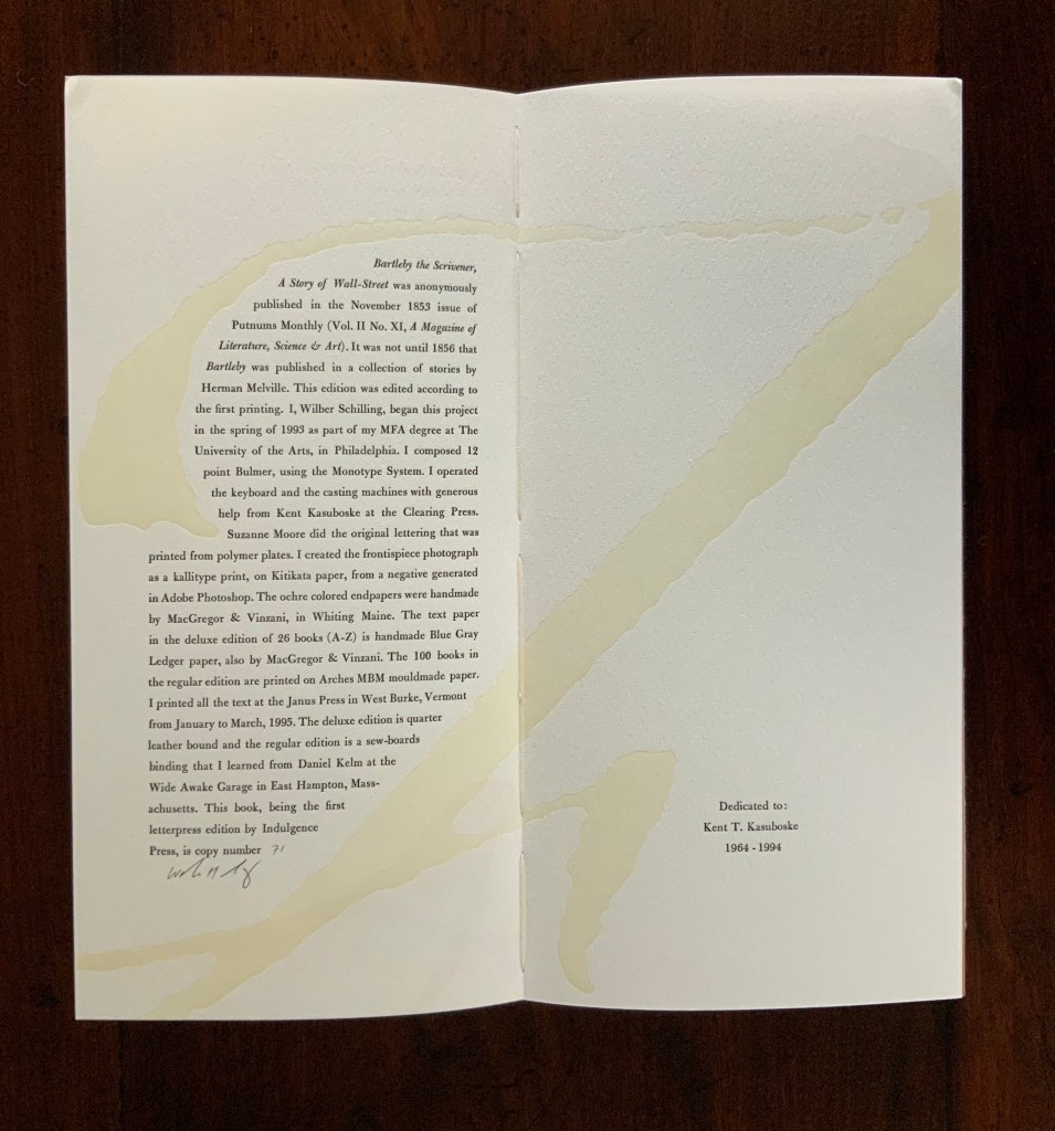
Herman Melville, Bartleby the Scrivener: A Tale of Wall Street, 1853. Indulgence Press, 1995. Type composed in 12 point Bulmer on the Monotype System and printed by Wilber Schilling on Arches MBM mould made paper at Janus Press. Calligraphy by Suzanne Moore. Ochre-coloured endpapers handmade by MacGregor & Vinzani. Wilber Schilling created the frontispiece photo as a Kallitype print from a negative generated in Adobe Photoshop. The binding, also by Schilling, is cloth over sewn boards and, over the cloth, an embossed print of details from the frontispiece photo. Edition of 100 of which this is #71. H320 x W158 x D14 mm. Acquired from Indulgence Press, 17 December 2015.
Further Reading
“Suzanne Moore“. 14 January 2020. Books On Books Collection.
Jury, David, and Peter Rutledge Koch (eds.) 2008. Book Art Object. Edited by David Jury. Berkeley, California: Codex Foundation. Pp. 198 (Where Do We Start?), 199 (Surplus Value Books #13).
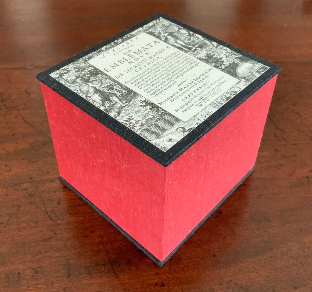
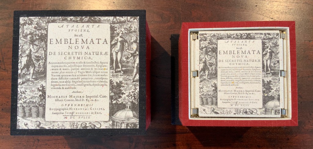
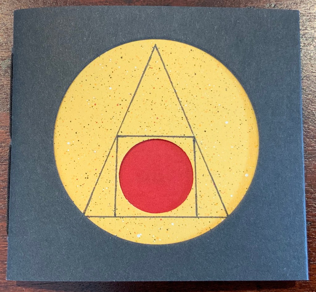
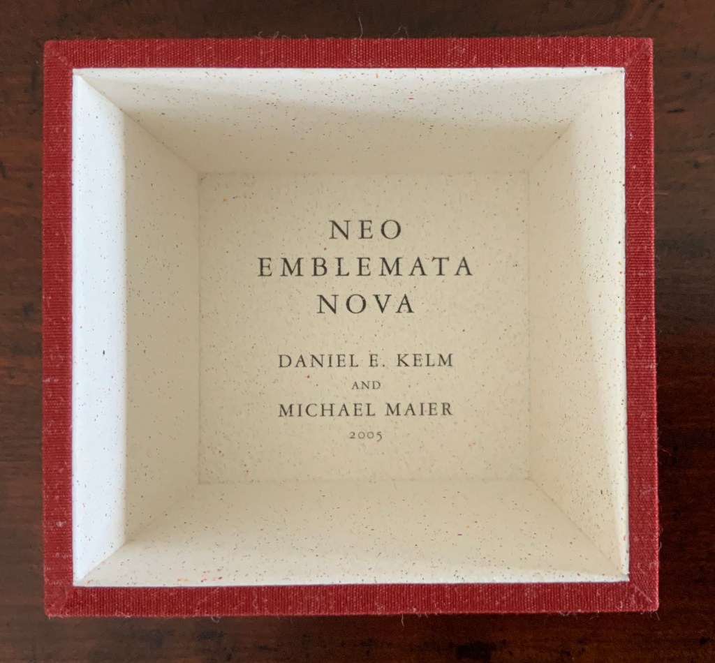
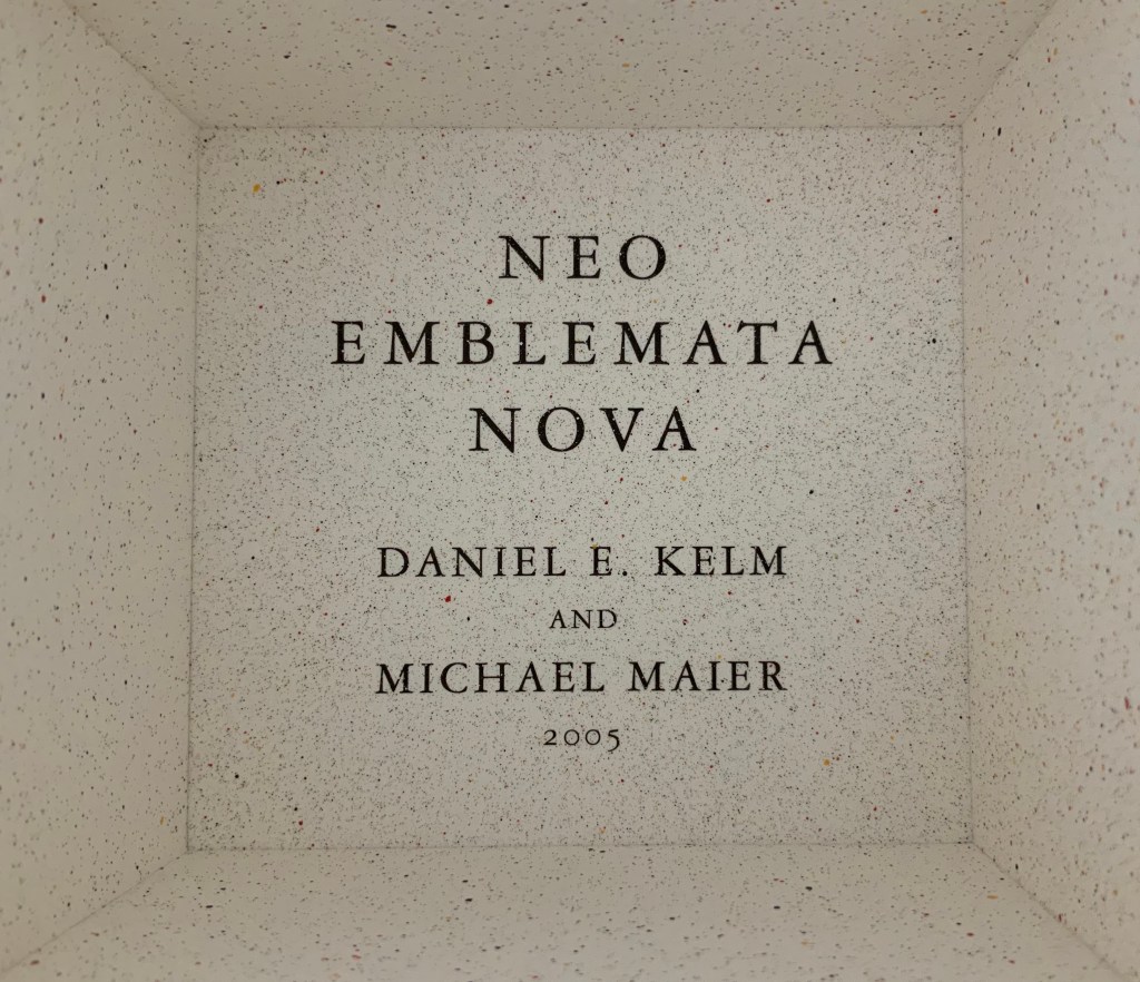
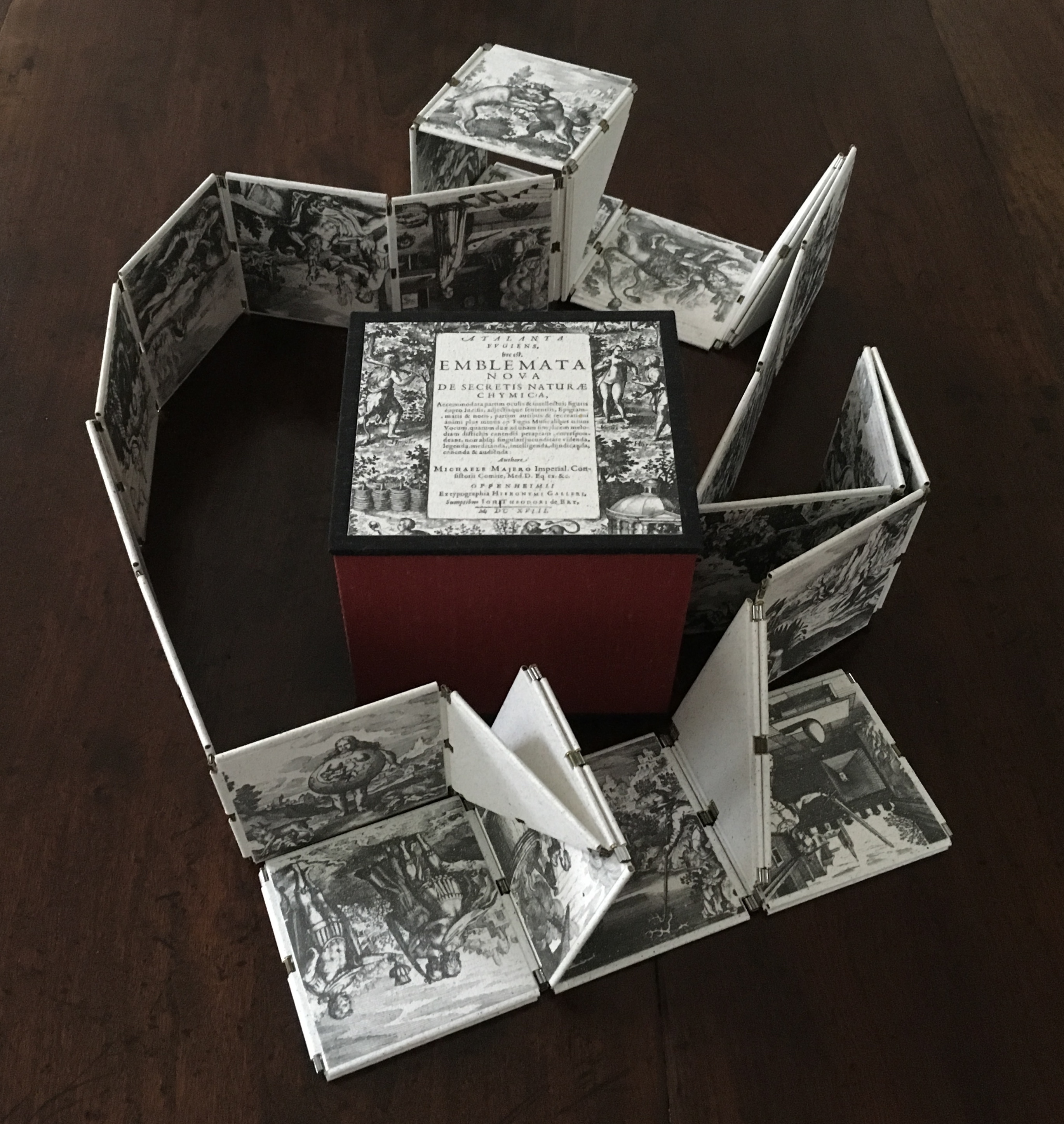
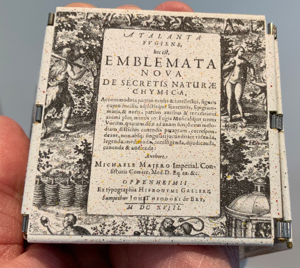
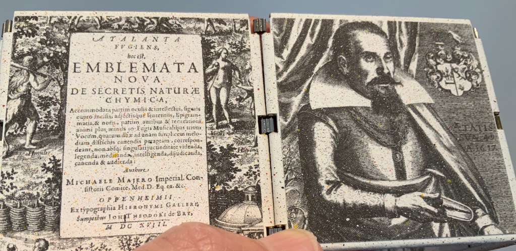
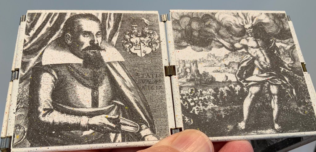
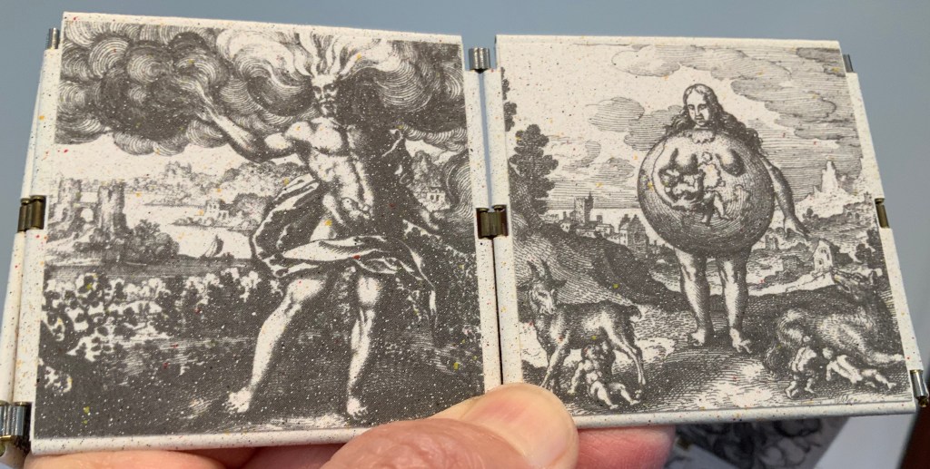
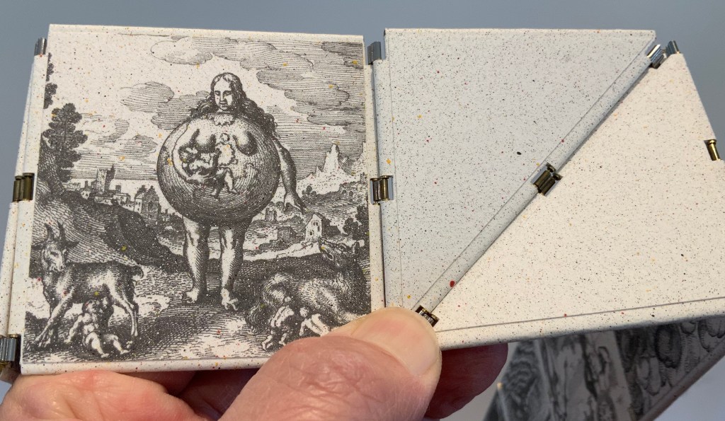
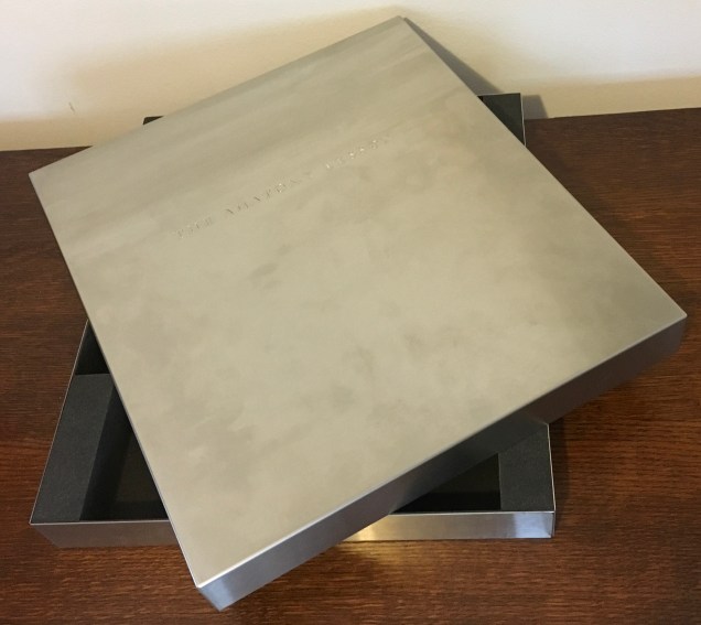
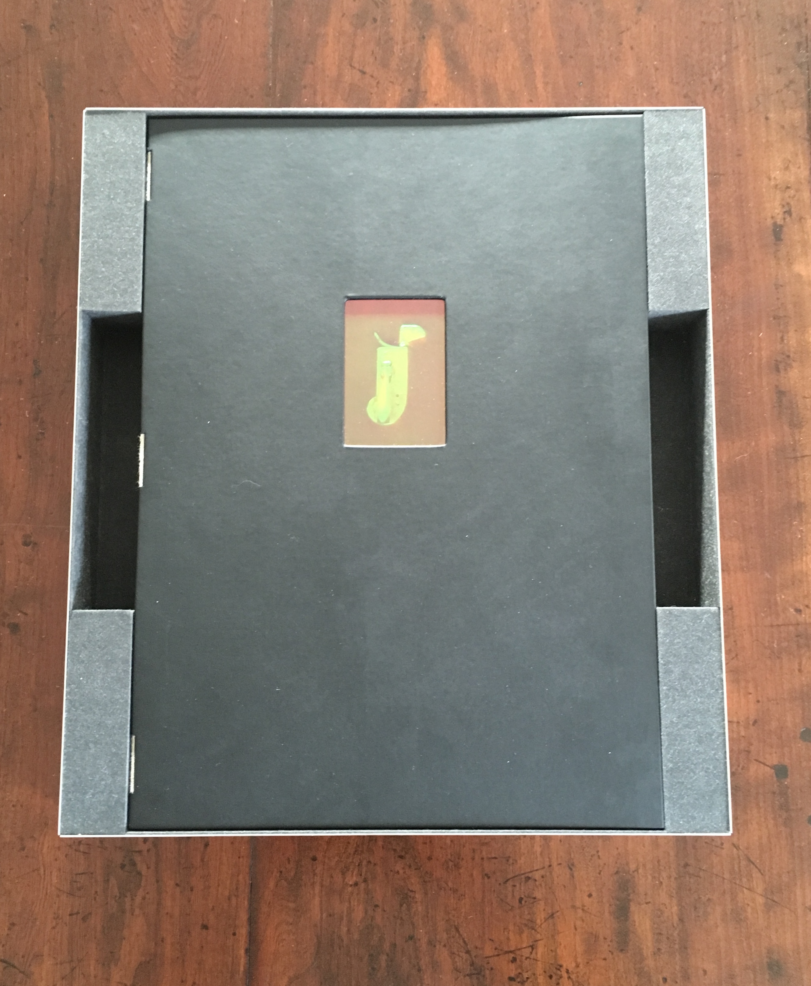
Neo Emblemata Nova (2005) Daniel E. Kelm Box: H96 x W109 x D102 mm closed. Booklet cover: H72 x W79 mm closed, H72 x W224 mm open. Booklet: H72 x W78 mm. Möbius strip: each tile is H70 x W70 mm; the strip extended is 1000 mm. Edition of twenty-one, of which this is #18. Acquired from the artist, 20 October 2018.
Opening the work.
Booklet about the work and its creation.
Inside the top of the box.
Closing and returning the Möbius strip to its box requires considerably more dexterity than reading; so much so that the booklet included provides instructions.
The Anatomy Lesson (2004)
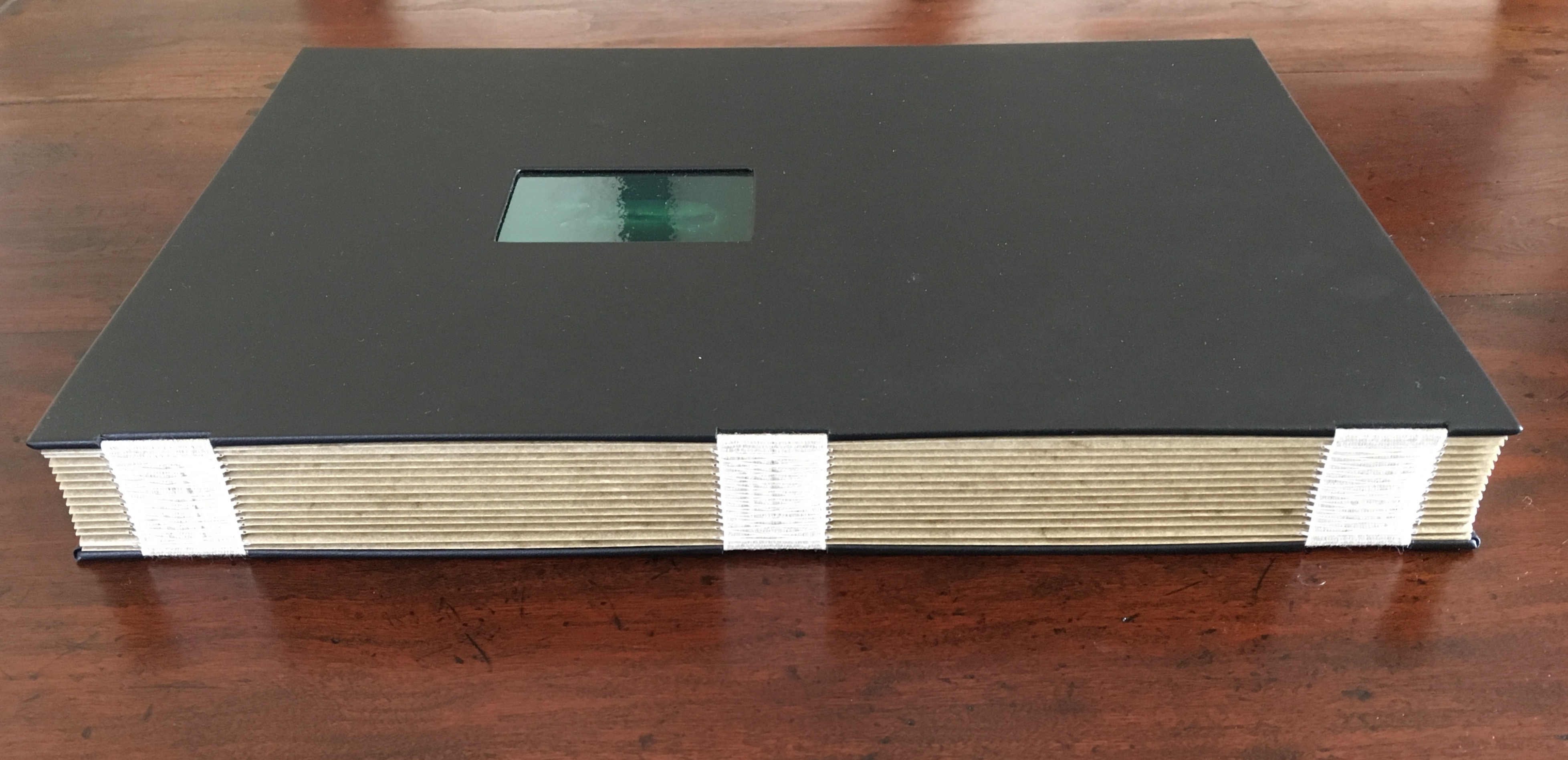
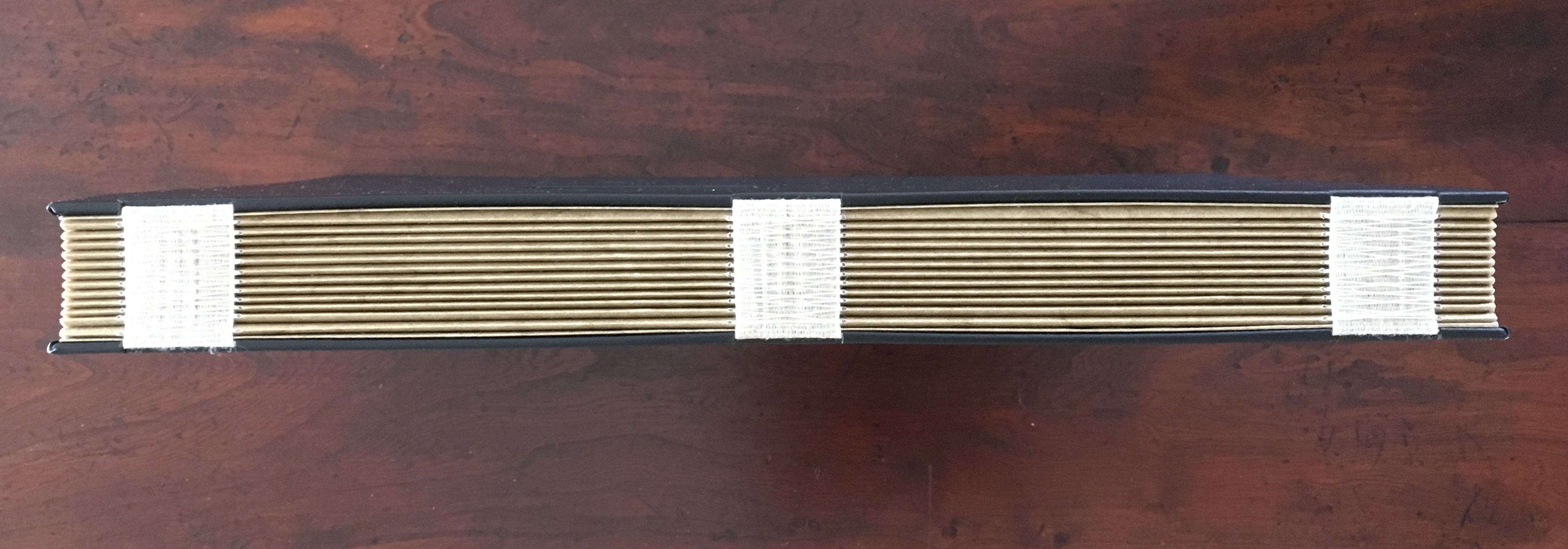
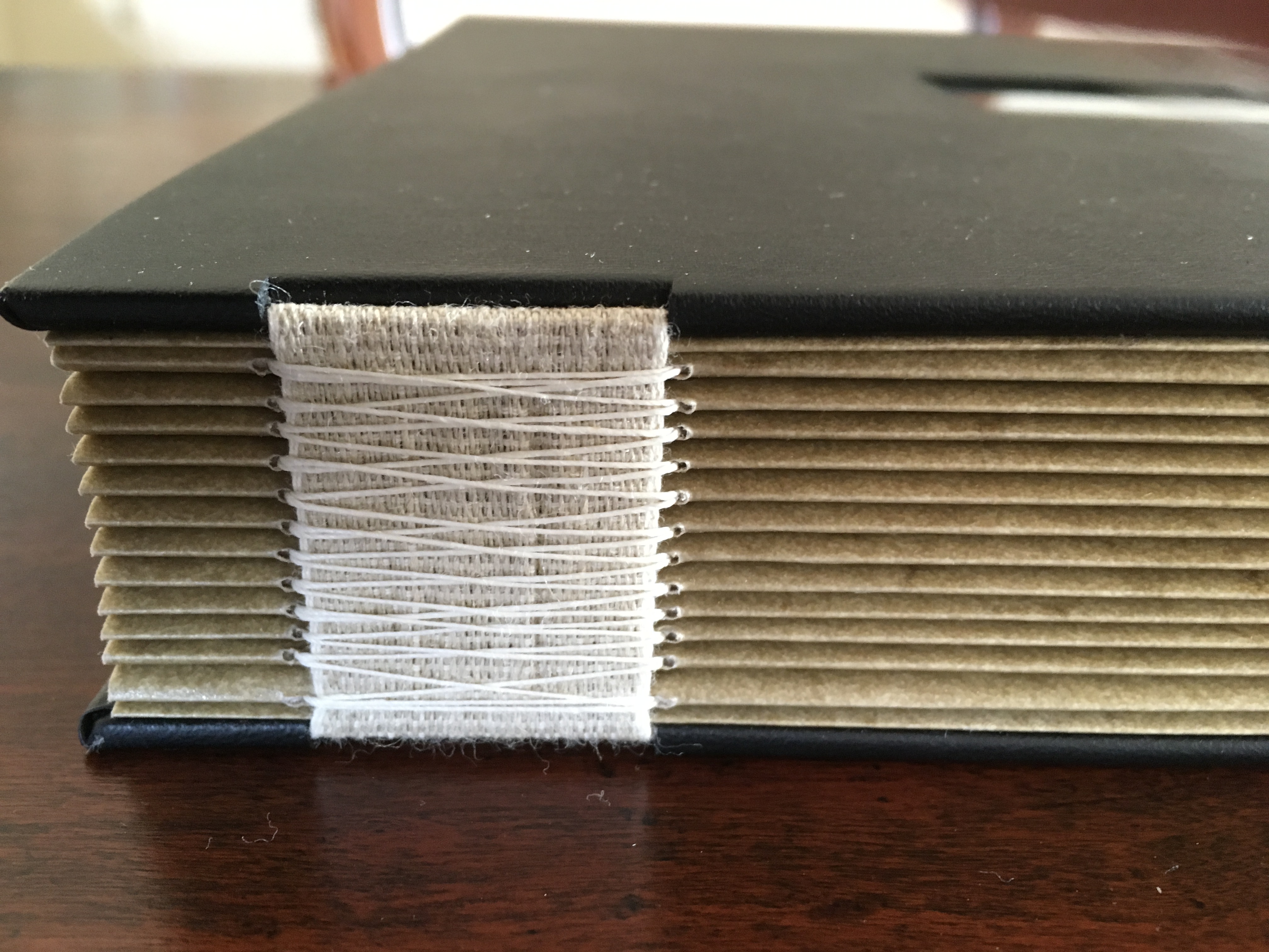
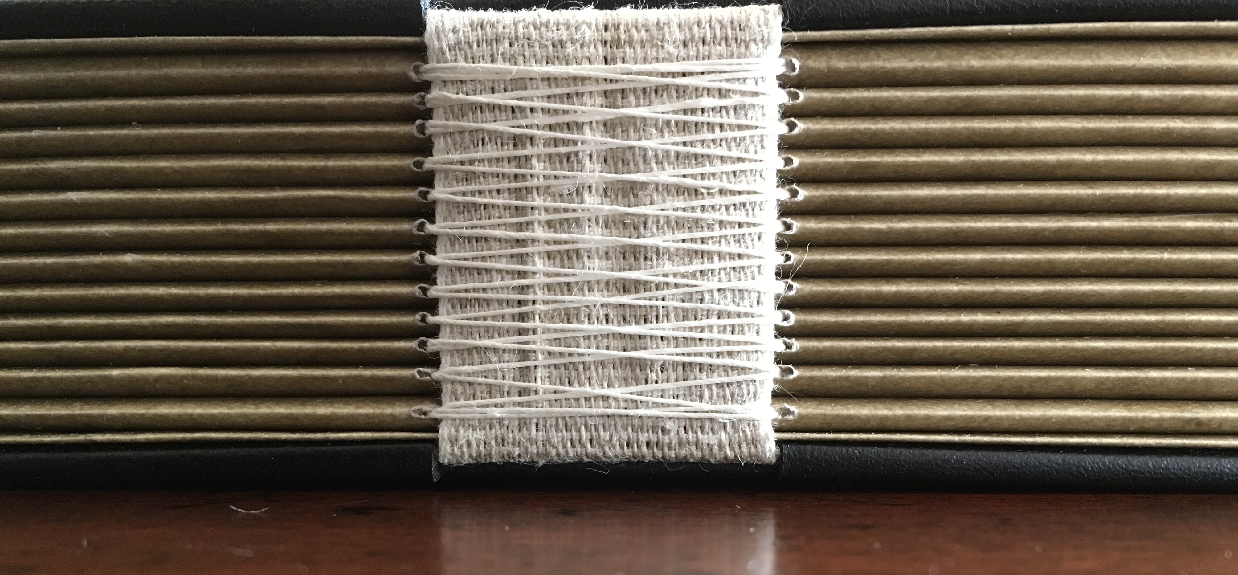
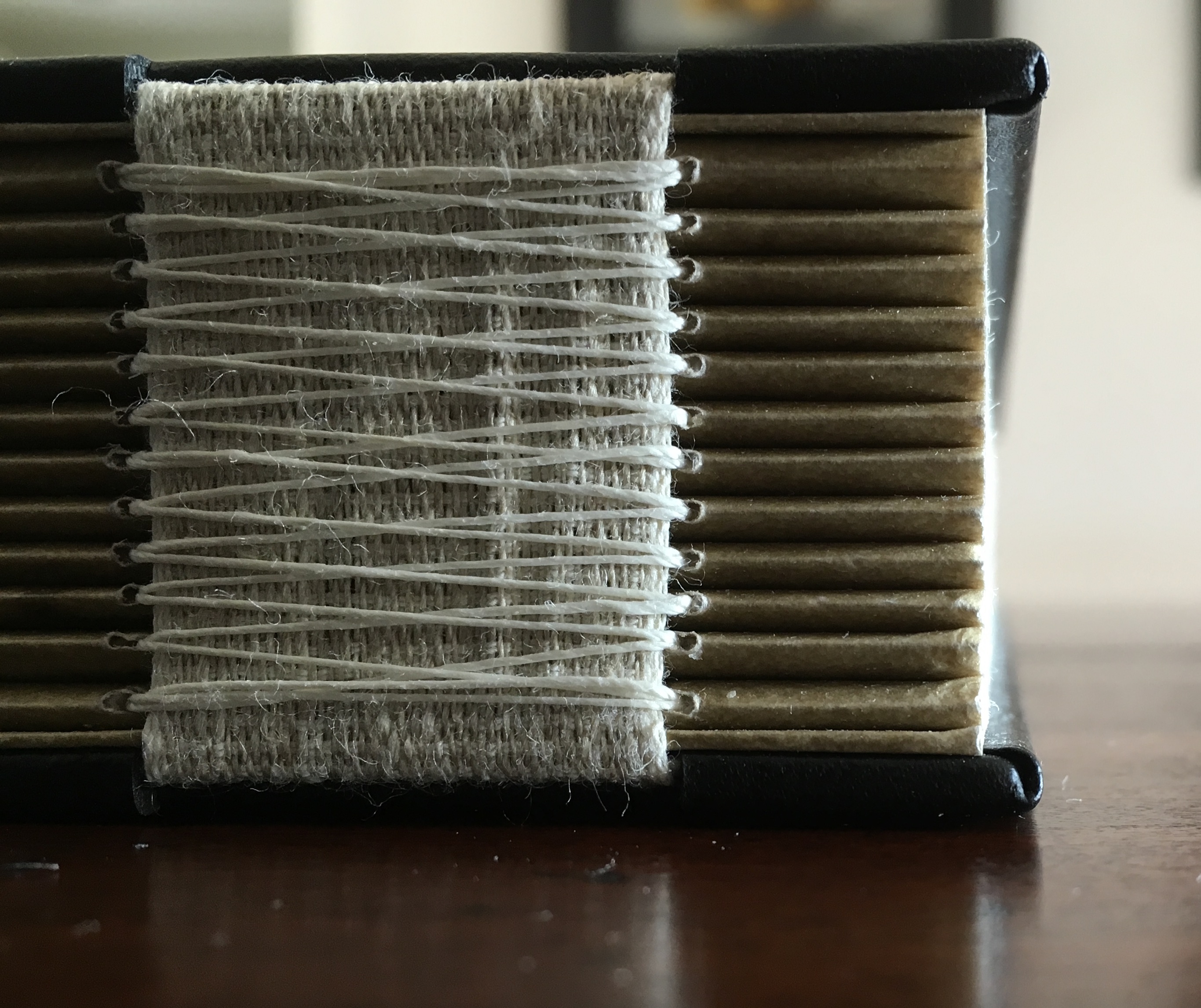
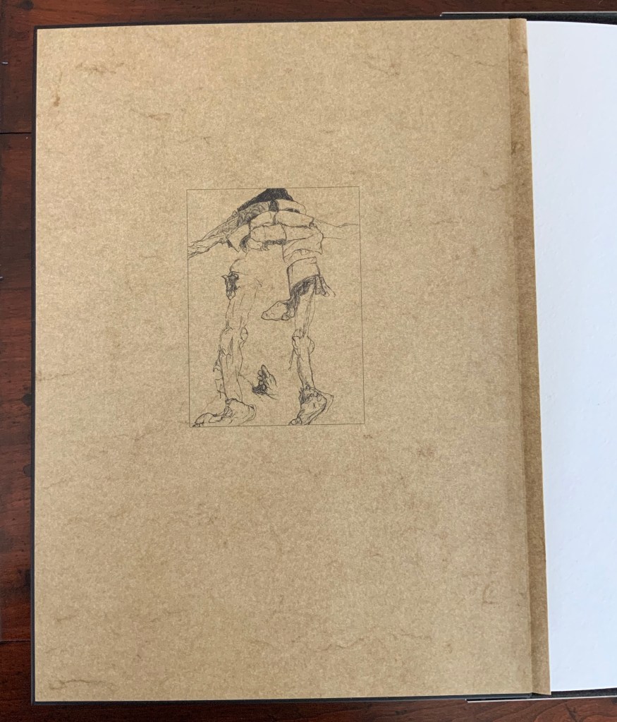
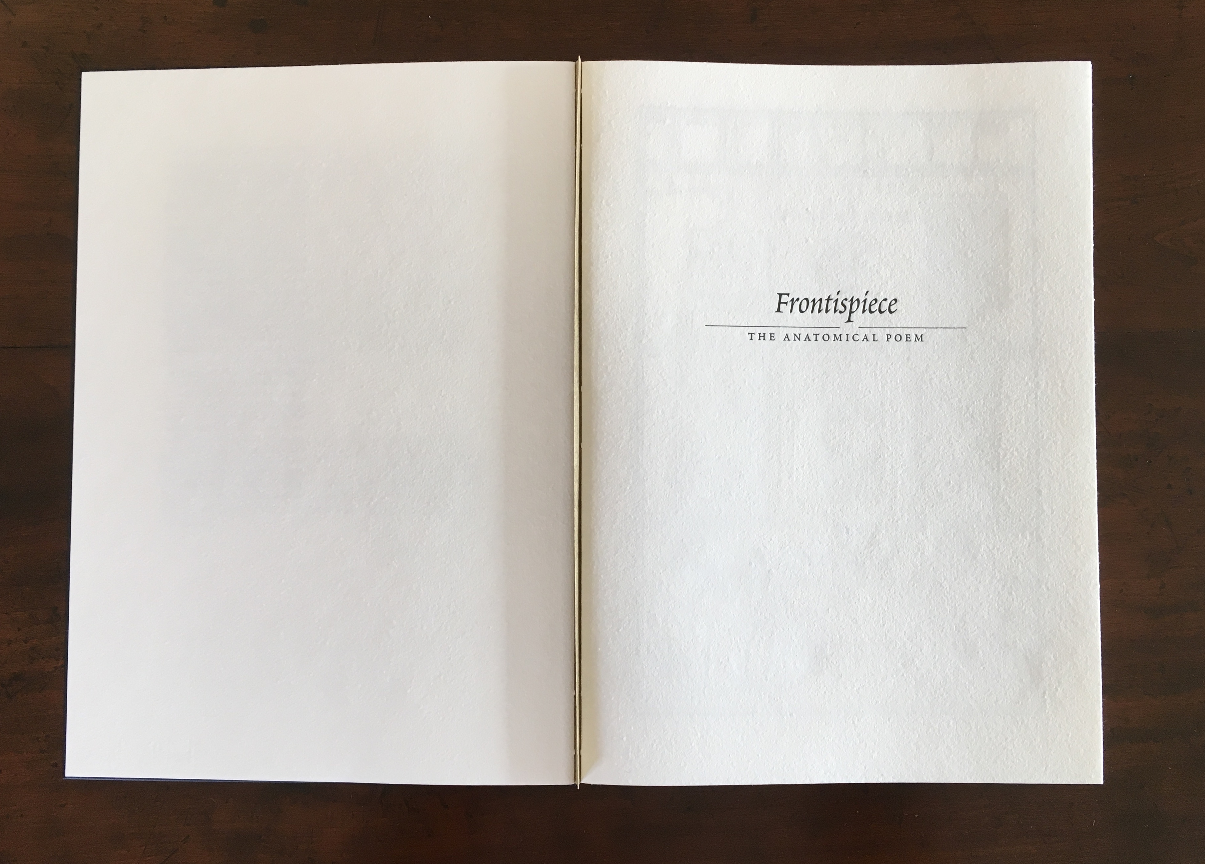
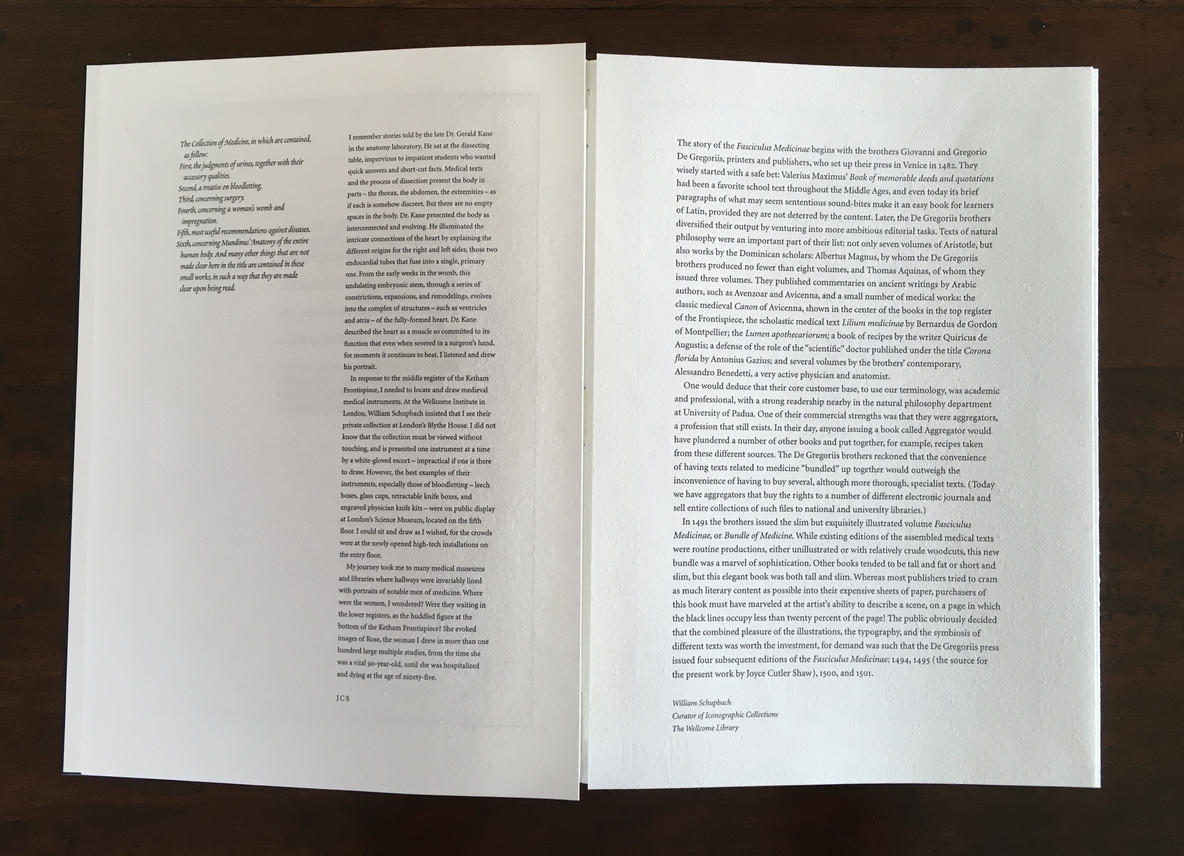
The Anatomy Lesson (2004) Joyce Cutler-Shaw Middletown, CT: Robin Price, Publisher, 2004) Limited edition of 50, of which this signed copy is the binder’s copy (Daniel E. Kelm). Acquired from the binder, 20 October 2018.
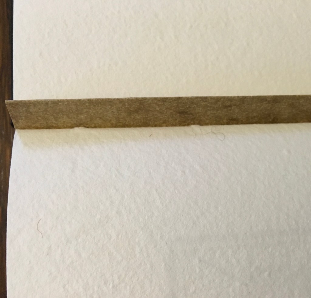
Twelve signatures of handmade cotton text paper, the central ten signatures each made up of one sheet H356 x W514 mm and one sheet H356 x W500 mm glued to the 14 mm margin of the first sheet, for a total of ninety-six pages, each measuring H356 x W253 mm. Binding of leather covered boards (a hologram embedded in front cover) with an open spine, taped and sewn into a reinforcing concertina structure: H361 X W259 mm. Contained in engraved steel box: H370 x W326 x D44 mm.
Detail of sewing and internal view of reinforcing accordion structure. For a description of this type of structure, see Hedi Kyle’s The Art of the Fold(London: Laurence King, 2018), pp. 82-85.
View of the doublure, which is part of the reinforcing concertina structure.
Cover page of second signature.
Second signature open to double-page spread.
Second signature open to four-page spread.
Further Reading
“Bieler Press”, in Book Art Object, ed. David Jury (Berkeley, CA: Codex Foundation, 2008), pp. 116-17.
Miller, Steve. “Daniel Kelm”, Book Arts Podcasts, School of Library and Information Studies, University of Alabama, 22 July 2012. Accessed 6 September 2019.
Monique Lallier: A Retrospective Guilford College Art Gallery
North Carolina can be a quiet state of hidden gems. Particularly those of the book arts, book art and publishing variety. The art gallery fronting the library on the Quaker-founded Guilford College campus in Greensboro is one such gem. Within that gem for the next two months is another. The Gallery’s director and curator Theresa N. Hammond has marshaled its collection of Monique Lallier’s bindings and dozens of others from around the world for a retrospective on forty-six years of work by Lallier.
Lallier’s roots are in the tradition of fine French binding, which goes back to the practice of book buyers’ purchasing unbound books and taking them to their favorite specialist binder for customized binding, most often in leather. Lallier has written here about the technique in detail. While it is true to call Lallier a bookbinder, it misses what the displayed works say she is: a sculptor and artist of the book. For anyone lucky enough to visit Guilford College Art Gallery, the comments and photos below offer a handful of pointers to details and background supporting that statement. The exhibition catalogue including an insightful essay by Karen Hanmer as well as multiple views of the works displayed and several outside the exhibition will clinch the argument.
Be sure to take in all angles provided by the mirrors behind many of the works. Theresa N. Hammond, the Gallery’s director and curator, reflected here behind La Lune (1971) and its swiveling “phases of the moon”, rounds coated in eggshells of differing colors.
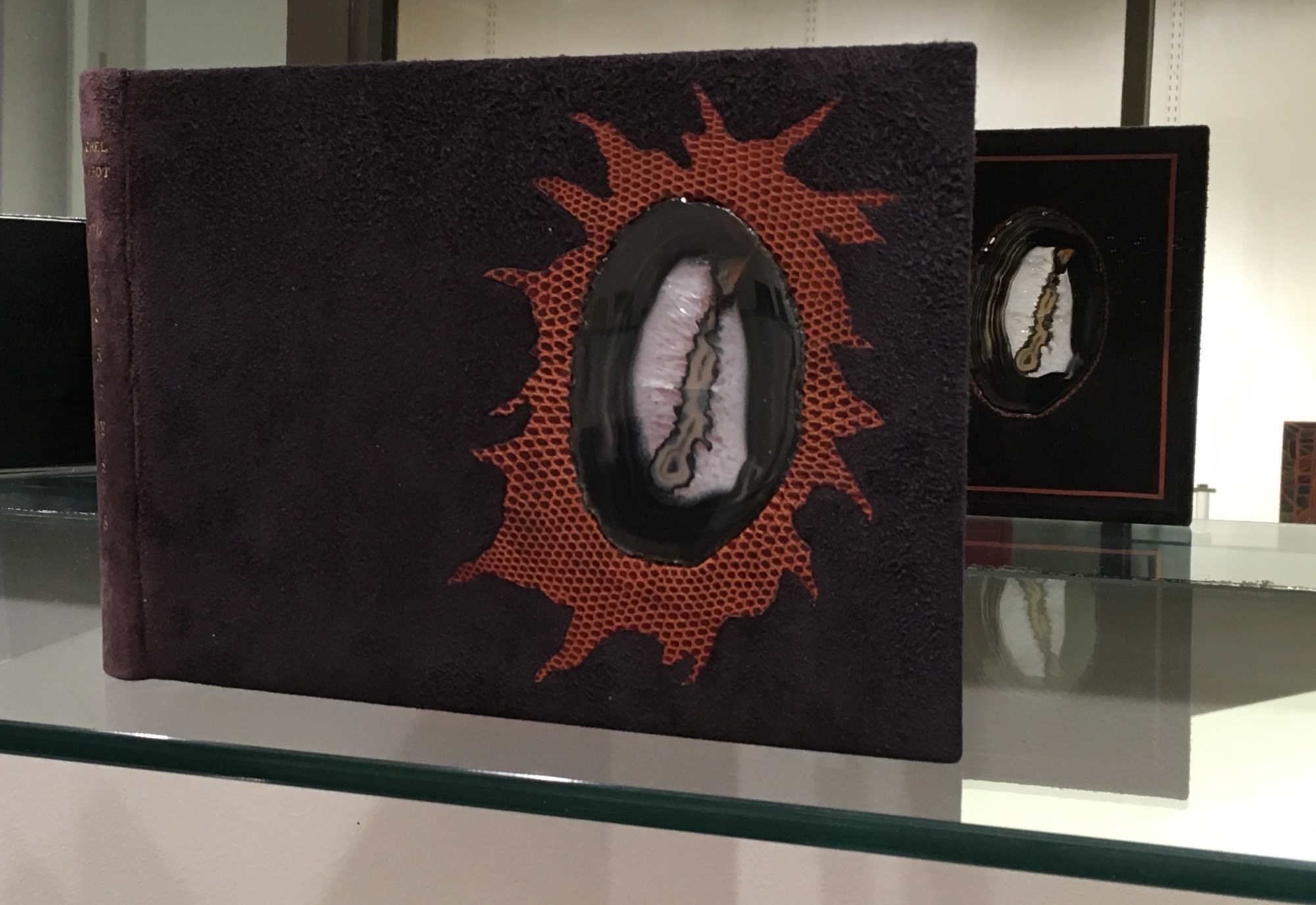
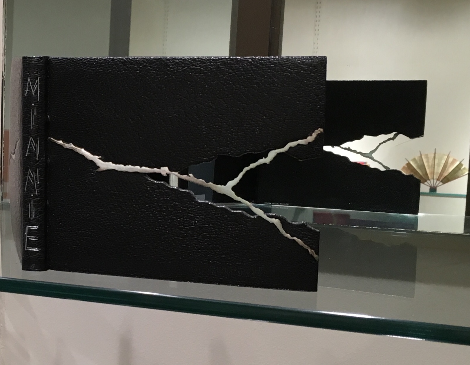
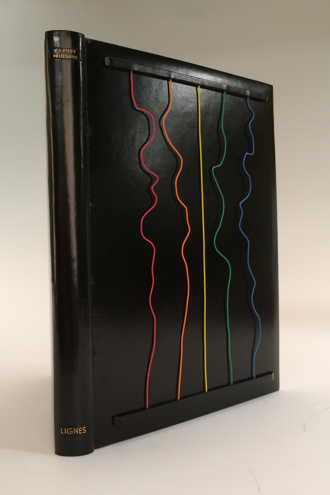
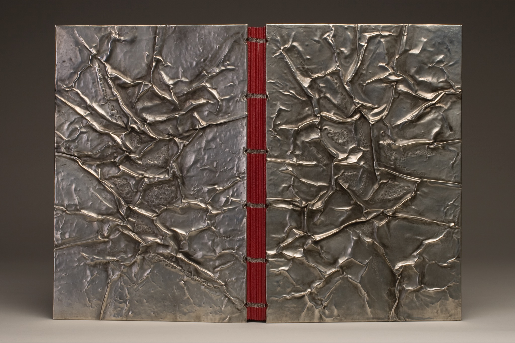
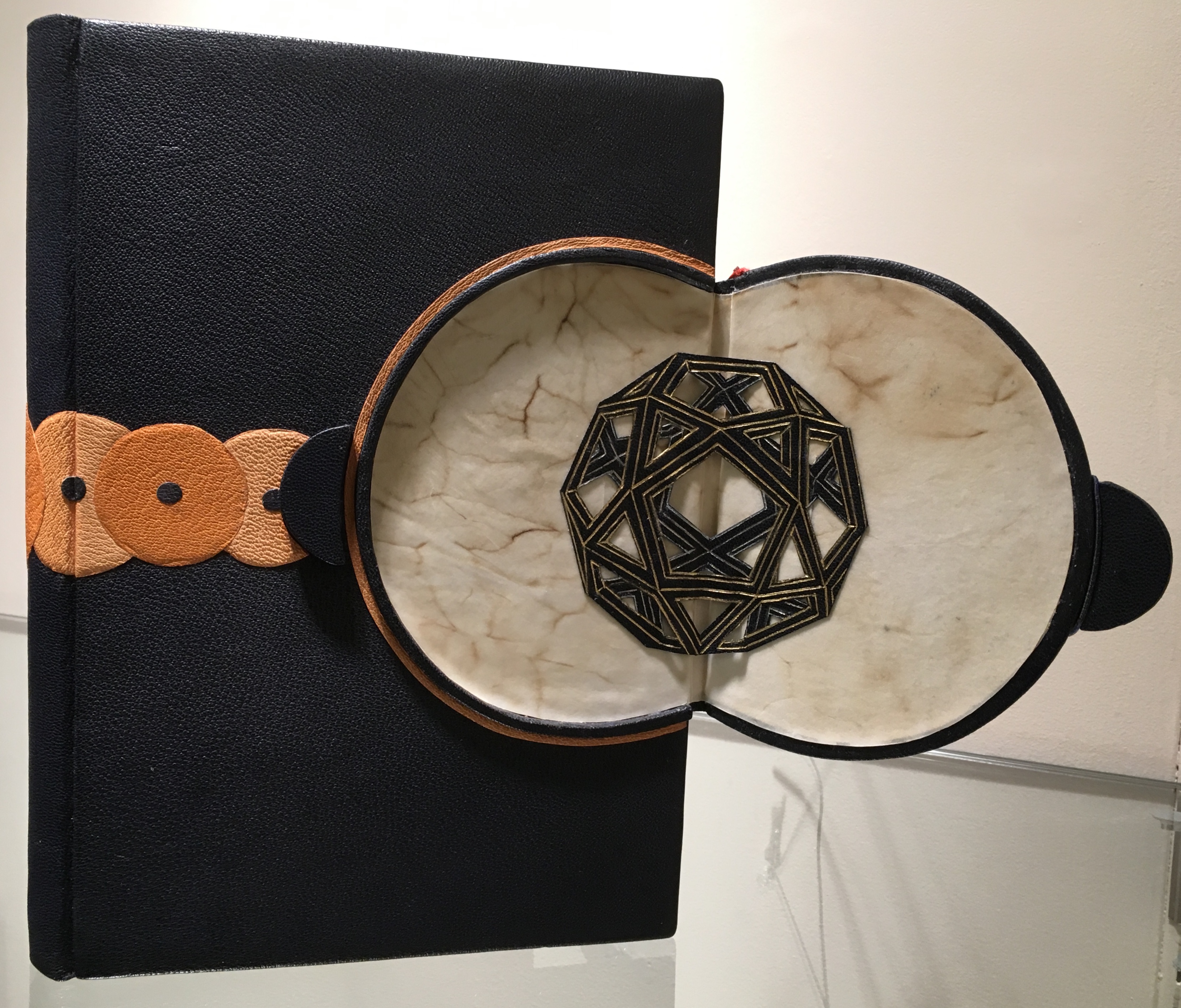
One of the distinguishing characteristics of Lallier’s artistry is her innovative use of materials: eggshells in La Lune (1971), her own hair in L’Eloge de la Folie (1974), translucent agates in Portes Sud (1979), silver in Histoire de Minnie (1982), wires from old telephones in Lignes (1986) and pewter in The Song of Songs, which is Solomon’s (2002).
L’Eloge de la Folie (1974) Rarely does Lallier use on the cover an image from within the book at hand. Here is one of the exceptions. The cavorting monks from Erasmus’ satire come from Albert Dubout’s 1951 illustration of the classic. Lallier, however, couldn’t resist using her own hair to form their tonsures.Portes Sud (1979) Note in the reflection the light coming through the agate embedded in the cover.Histoire de Minnie (1982) In the exhibition, be sure to look at the back cover where Lallier has used the silver piece, embedded in the front cover, to stamp the back cover.Lignes (1986) This is Lallier’s only collaboration from scratch. For a Montréal exhibition whose organizers set the theme of “lignes” or lines, she conceived the cover design. Sharing only blank pages and not the design, she then asked Claude Péloquin to provide text and illustrations on the theme. The “telephone wires” attached to the front cover are loose and manipulable by the reader — a tongue-in-cheek form of interactivity with lines of communication in the pre-Web age. The Song of Songs, which is Solomon’s (2002) Visiting a Parisian builders’ store with a friend selecting decor items, Lallier was entranced by sheets of pewter and its varying thicknesses. She bought some. The inspired result above sits alongside another in the exhibition — The Enchiridion of Epictetus (2003); be sure to look at the reflection of The Enchiridion to spot the use of pewter in the interior.
The odd materials chosen are frequently highly apropos of the book in question. In the catalogue, take a look at Le Papier, Le Livre (2015), which has embedded pieces of a wasp’s nest, entirely in keeping scientifically and historically with the subject. In 1719, the French naturalist René Antoine Ferchault de Réaumur published an essay to the Royal Academy of Sciences on the natural history of North American wasps and hypothesized how man could adopt their natural papermaking industry.
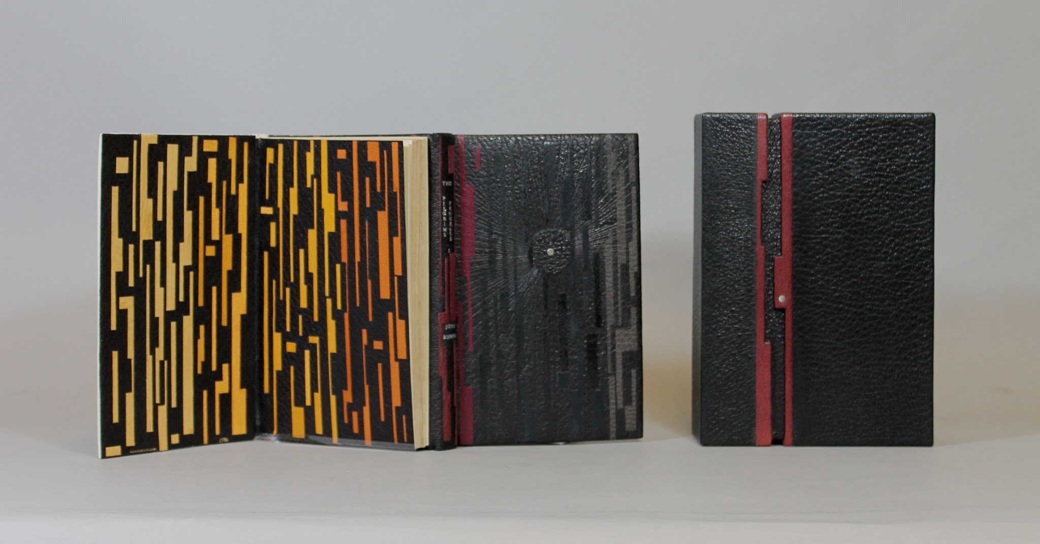
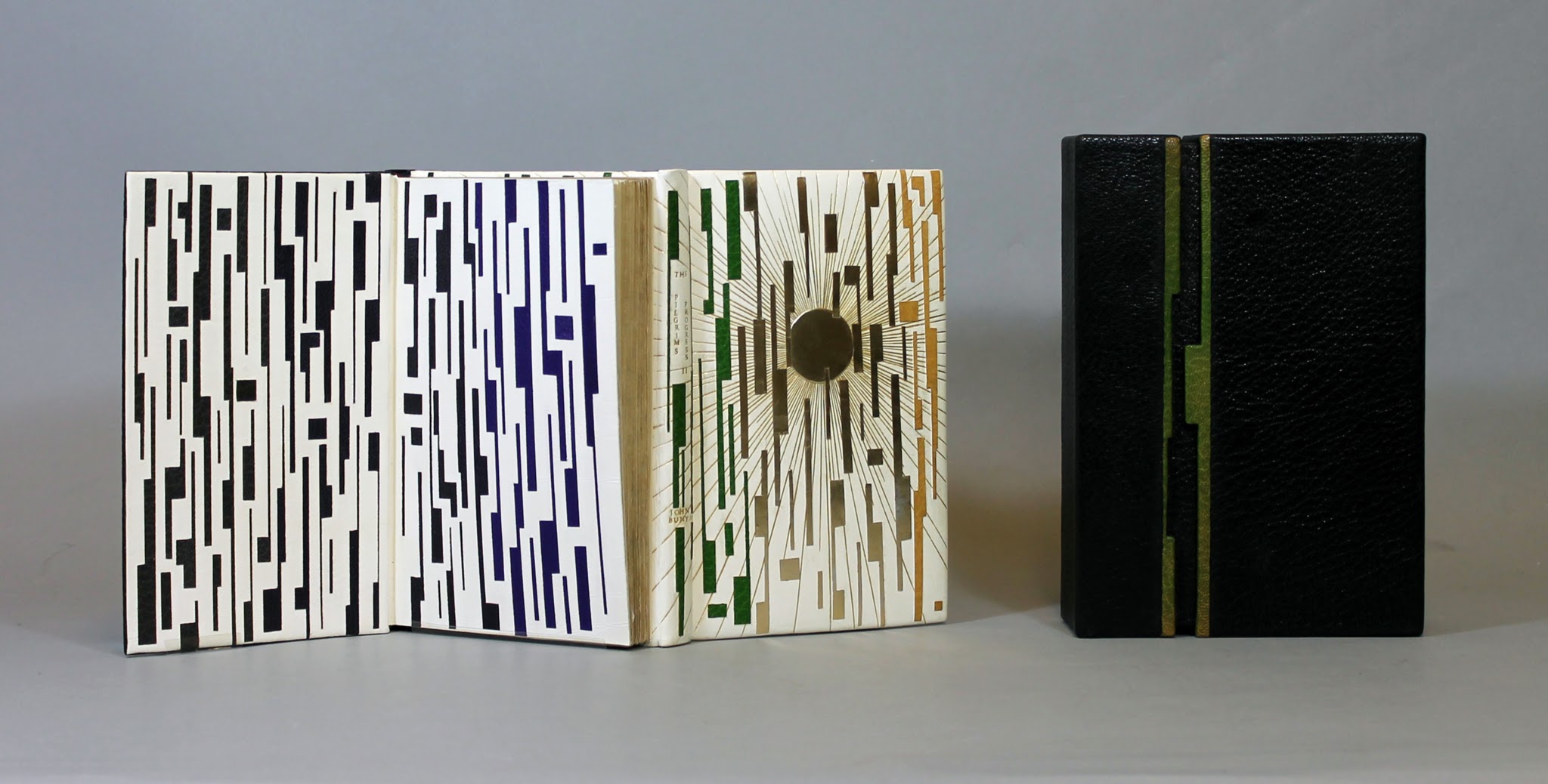
Another element of Lallier’s work to look for is the form of binding — not just the covers but the interior structure. Despite the glass cases protecting these items, it is easy to spot and enjoy the structural features, for example, the book in the form of a distinctively shaped Southern lady’s fan for The Birthday (1990). The catalogue shows a dos-à-dos (back-to-back) binding of the volumes of Pilgrim’s Progress (2003), a daring rebinding of a rare 18th century production. The Friends of the Library at University of Alberta made the courageous right decision.
Pilgrim’s Progress (2003) Dos-à-dos binding, showing the first part of the book, in which Pilgrim sets out on his journey in darkness, which Lallier marks with a black leather circle with a palladium dot at its center. Photo credit: University of Alberta. Pilgrim’s Progress (2003) Dos-à-dos binding, showing the second part of the book, in which Pilgrim arrives at the Celestial City, which Lallier marks with a gold tooling radiating from a gold circle. Photo credit: University of Alberta.
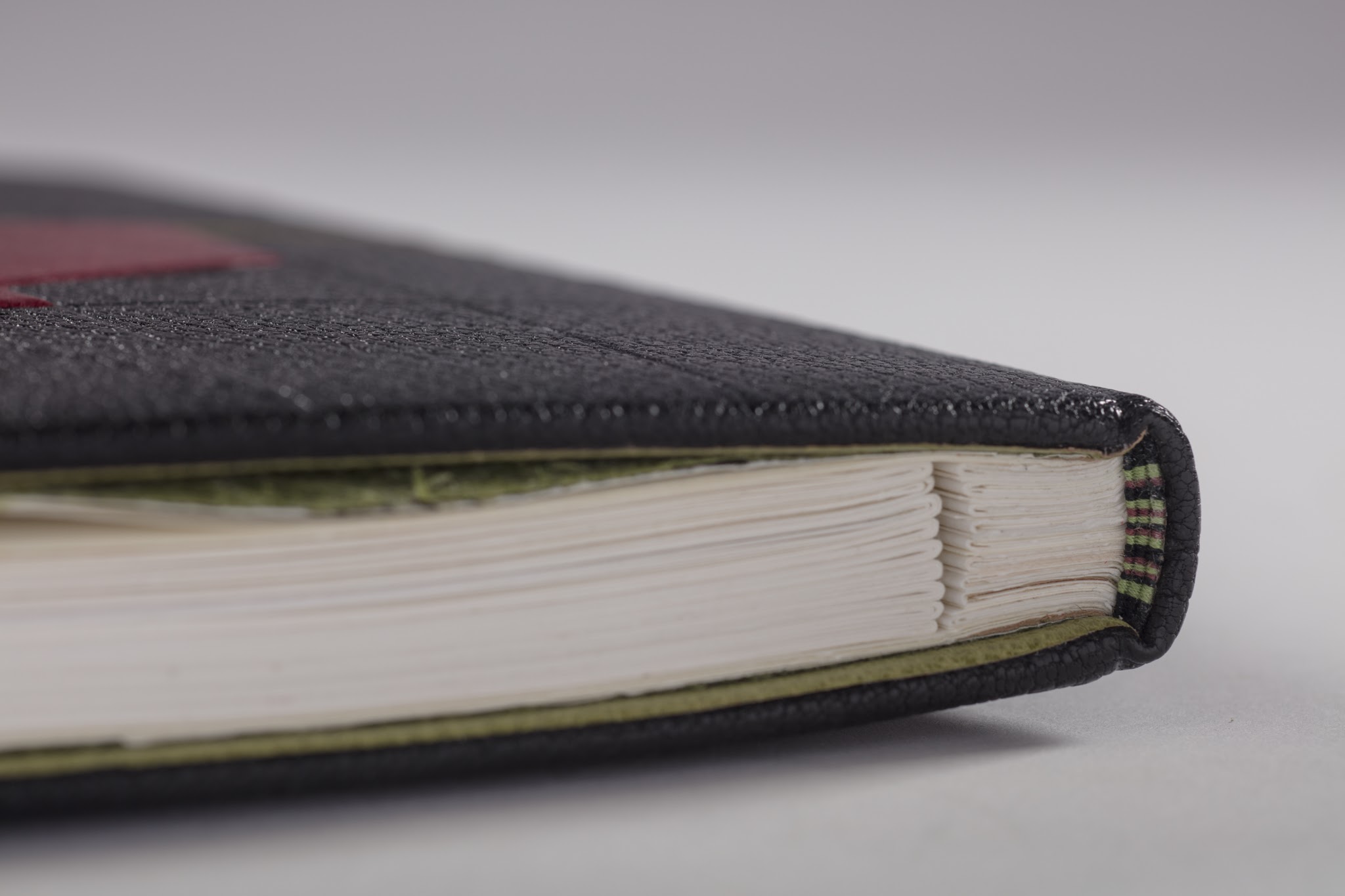
Some of the interior and exterior forms are more subtle. Lallier has made extensive use of the stub binding technique (see below), and there are several examples of cross structure binding (see below).
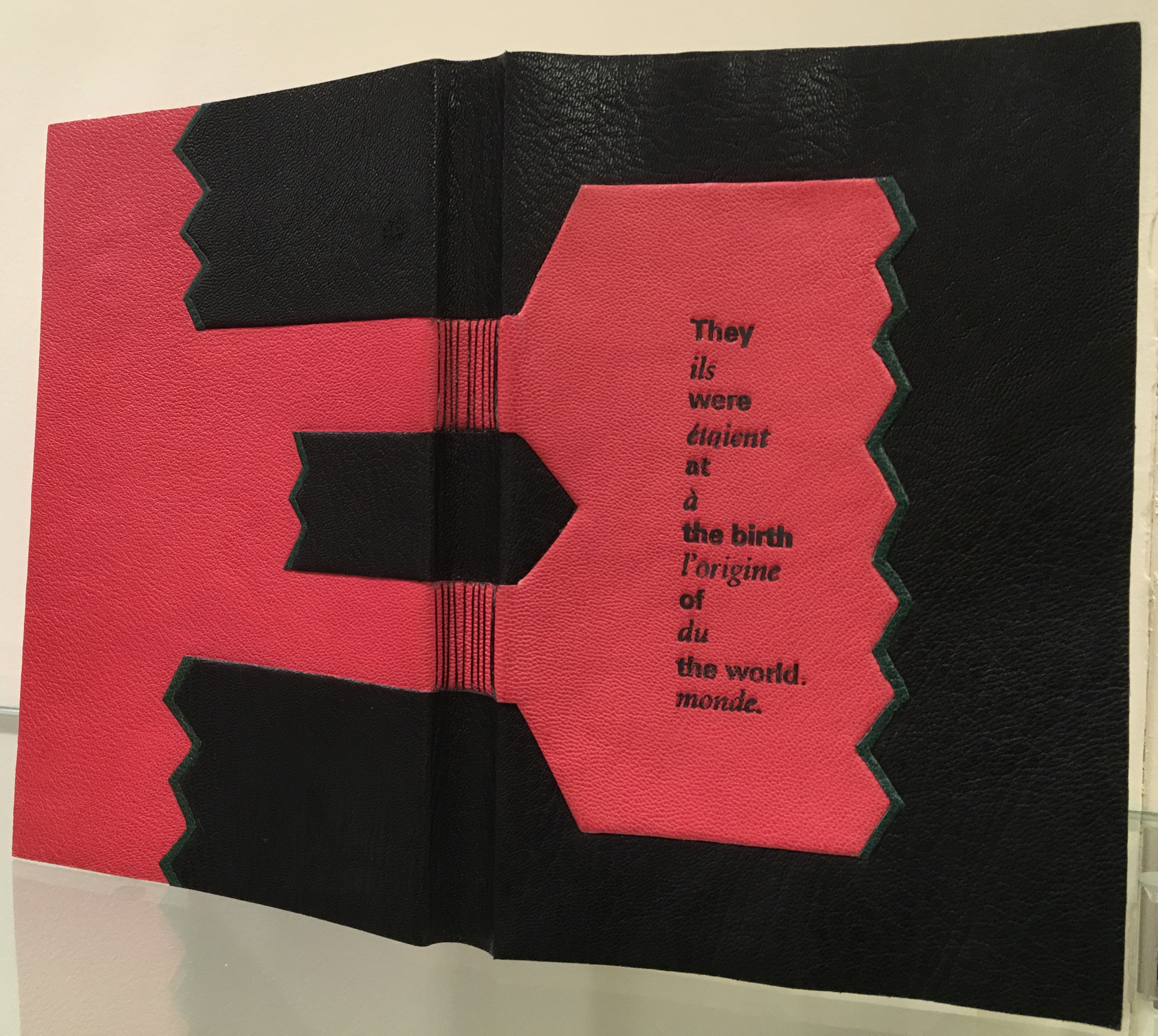
Look for this style of binding called montage sur onglets or stub binding that allows pages to lay flat or even be easily detached. Look for Le Chevalier Troyen (2014) and Inside the Book (2016), displayed side by side in the exhibition and showing this form of binding.Le Livre des Origines / The Book of Origins by André Ricard, 2005 In the exhibition, be sure to look closely at the spine’s deliberately exposed cross-structure binding in full goatskin leather.
Le Livre des Origines is another one of those rareties where Lallier uses on the cover something from within the book. Stamped on the front, the phrase alternating in English and French comes from the text relating the Huron Nation’s creation myth as recorded in French by ethnologist Marius Barbeau, reinterpreted and rewritten by André Ricard. The alternating roman and italic presentation of languages reflects the book’s alternating pages of English and French. Note how the simple design in black and red with the diagonal onlays of green leather captures characteristic elements of the art of the Wyandot tribes, which can be explored here. A design philosophy of using imagination and craftsmanship in service to the book exemplifies itself again and again throughout the exhibition.
Which brings us to another characteristic of Lallier’s art to seek out: the painstaking handwork. For this, Pantagruel (2016) is worth a long look. Lallier once observed a student engaged in kumihimo braiding (the Japanese technique of using a disk to gather multiple threads of different colors into a single strand) and asked to be taught. Inspired by André Derain’s illustrations of Rabelais’ riotous satire, she set out to use braids for the title’s letters, filled and surrounded with the colors from the illustrations. Some of the leather inlays are handpainted; all — even the smallest — are handcut, beveled, tucked in the covering leather and tooled. The series of process photos below — all courtesy of the artist — provide a look behind the scenes.
Pantagruel (2016) Awarded one of 25 Silver Prizes at the International Competition of Designer Bookbinders (2016)
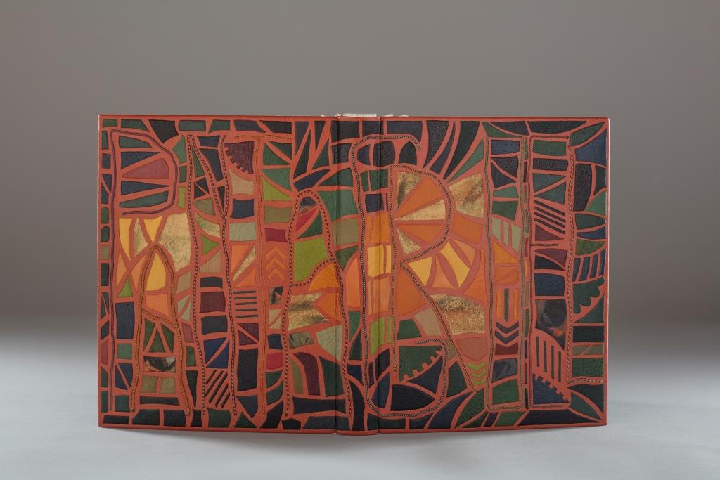
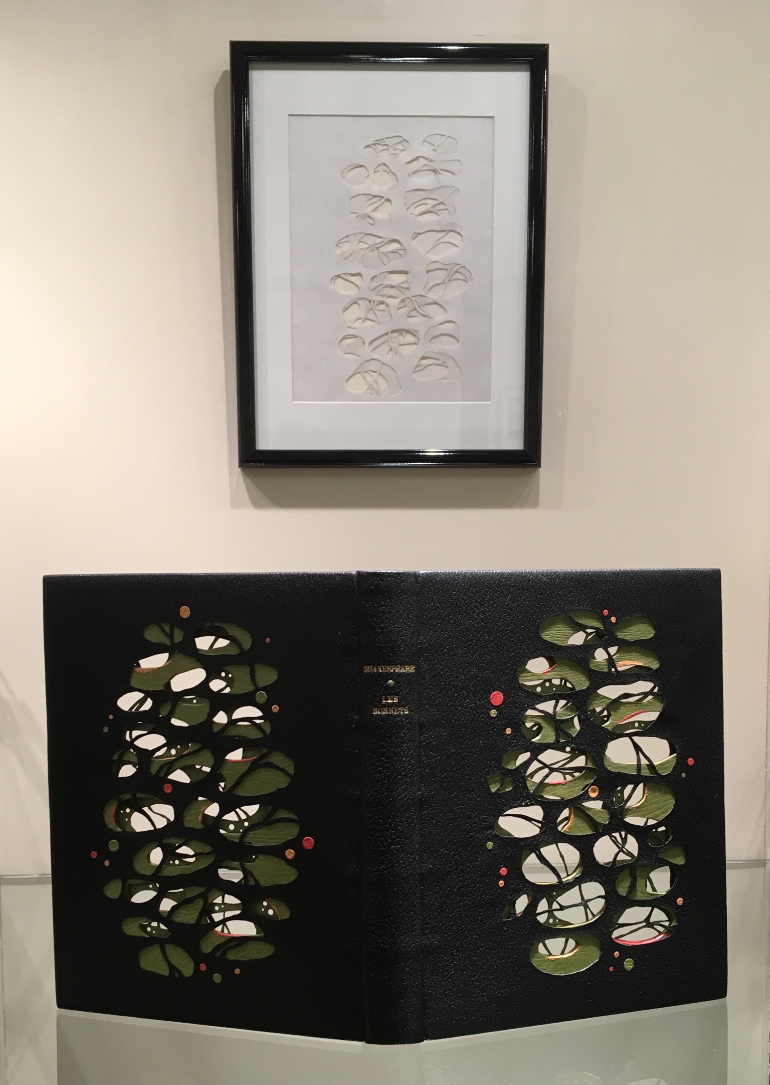
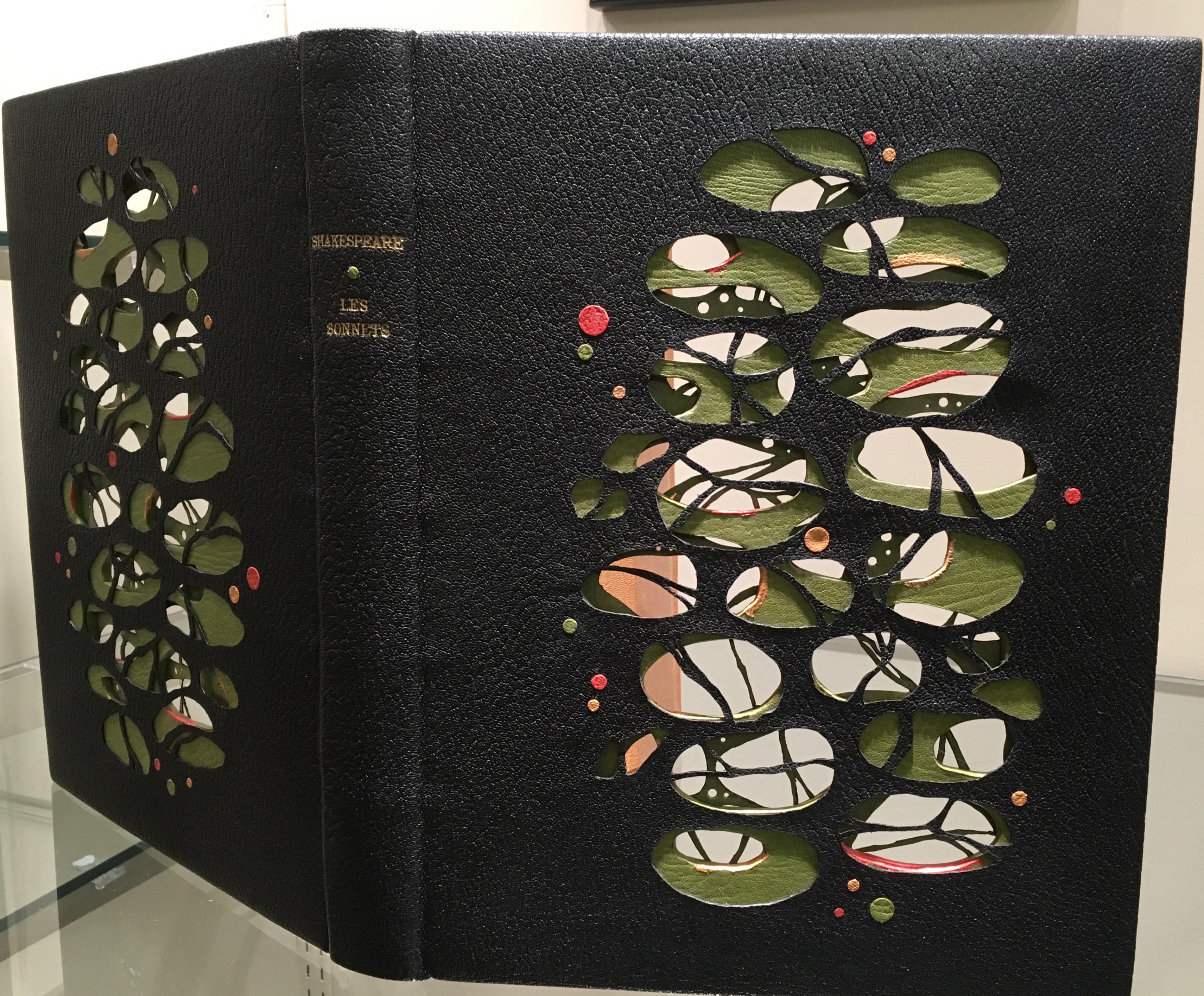
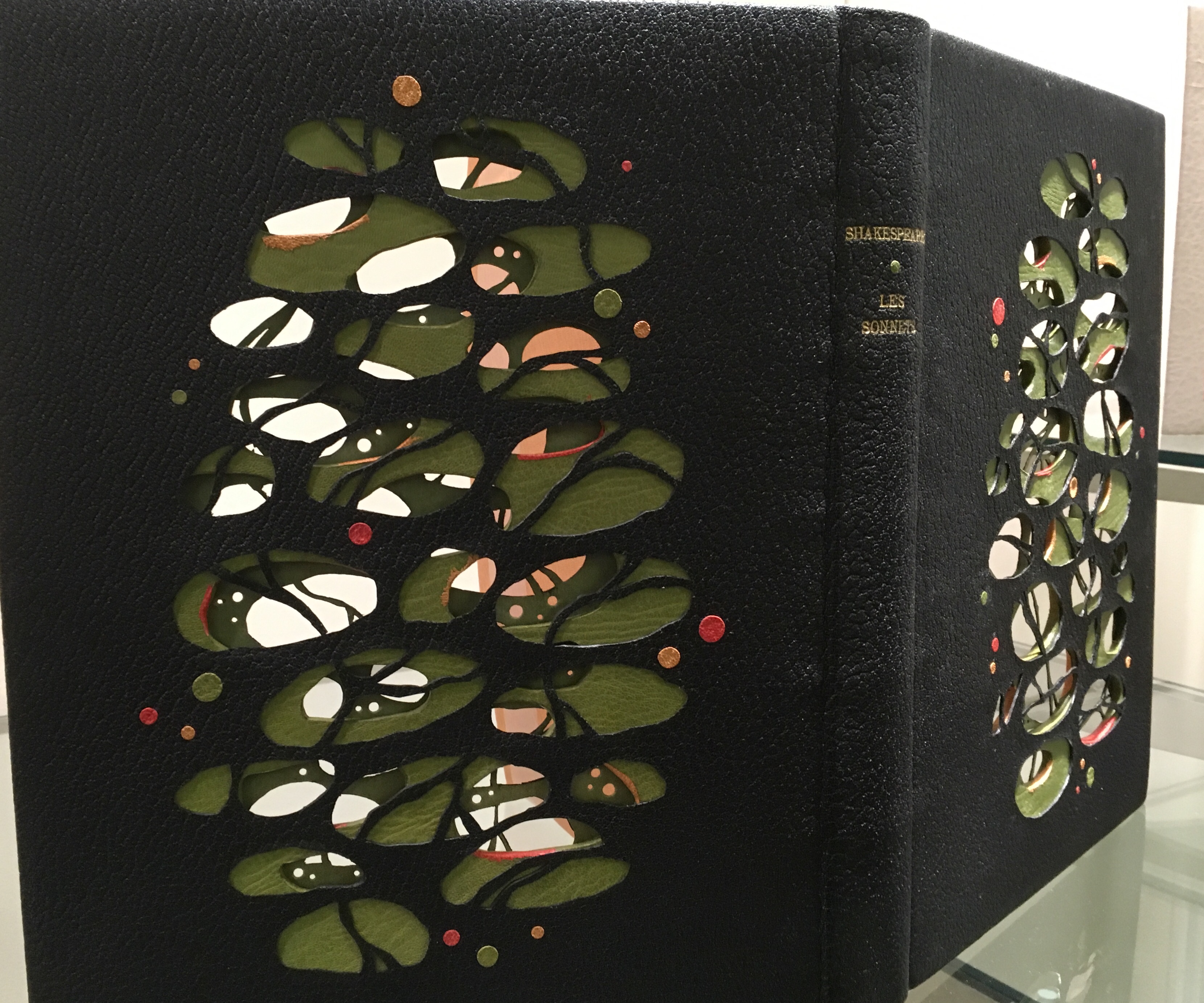
Shakespeare: Les Sonnets (2012) is another case in point of craftsmanship. Creation of this work began with a drawing (shown below) and then a maquette to enable Lallier to visualize the sculptural and aesthetic implications of multiple layers’ surfaces and edges being seen from all angles. The boards were cut out and lined with a green goat skin. The covering leather was also cut out and lined with green Japanese paper before covering. The doublures (linings of the book cover) received the same treatment before being applied to the inner boards.
Shakespeare: Les Sonnets (2012)
There is a sense of movement in this three-dimensional, sculptural treatment of the cover, which brings us to a final pointer for visitors. Lallier’s signature and most original technique — the front cover panel that swings open along the fore-edge to reveal a hidden design.
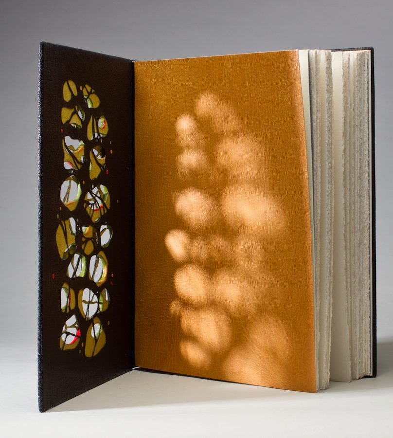
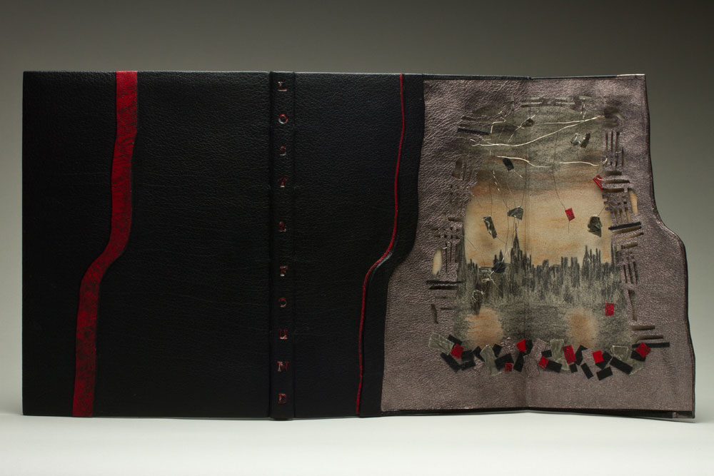
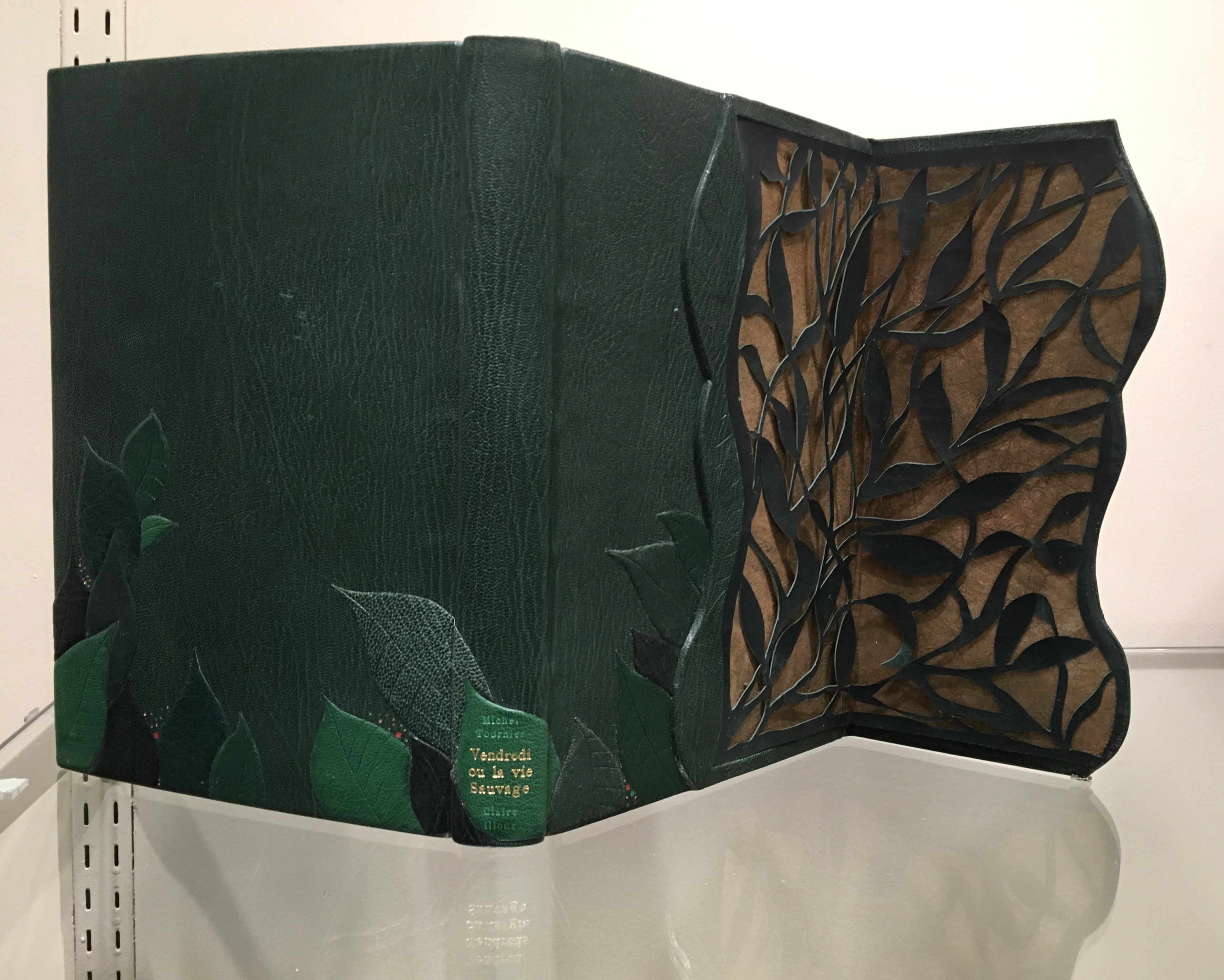
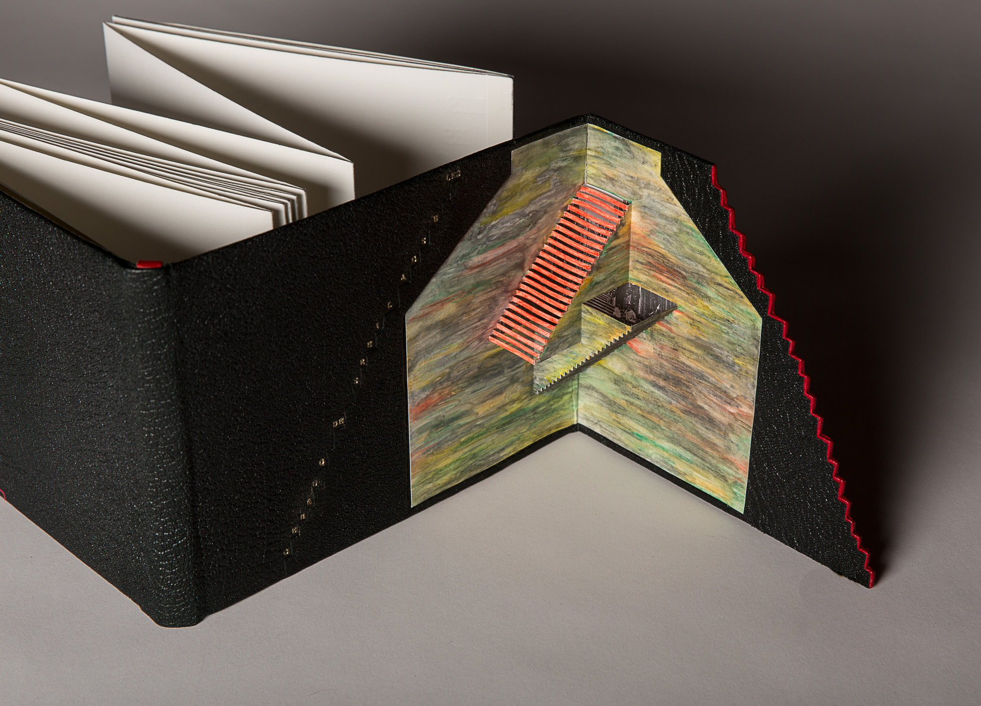
Excerpts from the Humorous Writings of Leonardo da Vinci (1996) The open panel reveals a geodesic dome in leather with gold and palladium tooling. With the panel closed, the front cover’s design echoes a Da Vinci machine.Lost and Found (2014)The illustrations inside the book come from previously lost engravings by Rachel Reckitt, some showing the blitz of London from which Lallier has drawn the inspiration for her hidden panel.Vendredi ou la Vie Sauvage (2015) Opening on layers on layers of carved foliage, the panel evokes the island on which Friday finds himself castaway in Michel Tournier’s version of Defoe’s Robinson Crusoe. In the exhibition, stand on tiptoe or someone’s shoulders to see the top edge’s coloring. Extraordinarily it resembles flower petals submerged in water. Les Escaliers de Québec (2013) Bound in black Morocco leather in the “drop spine” technique, this work unites the stair-stepping accordion form of the text with a gold-tooled title climbing the steps of the front cover panel, which opens on a hand-colored pop-up set of Escher-like stairs.
Lallier’s unity of design with the text by Luc Bureau and illustrations by Ghislaine Bureau celebrating the famous thirty sets of stairs between the upper and lower parts of Québec can hardly be excelled. Except that she does — again and again — with the examples on display. This retrospective resoundingly affirms Lallier’s intention always to serve the book in front of her. Go judge for yourself.
Monique Lallier: A Retrospective runs from 29 October through 6 January 2019 at The Guilford Art Gallery on the campus of Guilford College. For more background on Lallier’s work, there is a series of interviews with Erin Fletcher of Herringbone Bindery here.
Fore-edge of Shelia Hicks: Weaving as Metaphor by Nina Stritzler–levin and Arthur C. Danto (Yale University Press, 2006) Designed by Irma Boom
“AM: How would you sketch the future of the book?
IB: The book has a great future. In the statement in my little red book [Irma Boom: The Architecture of the Book] I talk about the renaissance of the book. It is already happening now. …
At a recent event, Massimo Vignelli claimed ‘The book is dead’. …
I was shocked when Massimo repeated that sentence, I read it everywhere. But the printed book does not need any defender. It has survived 600 years or so. The way information spreads depends on the inventions of that time; paintings have survived, photos, and the book is another form.