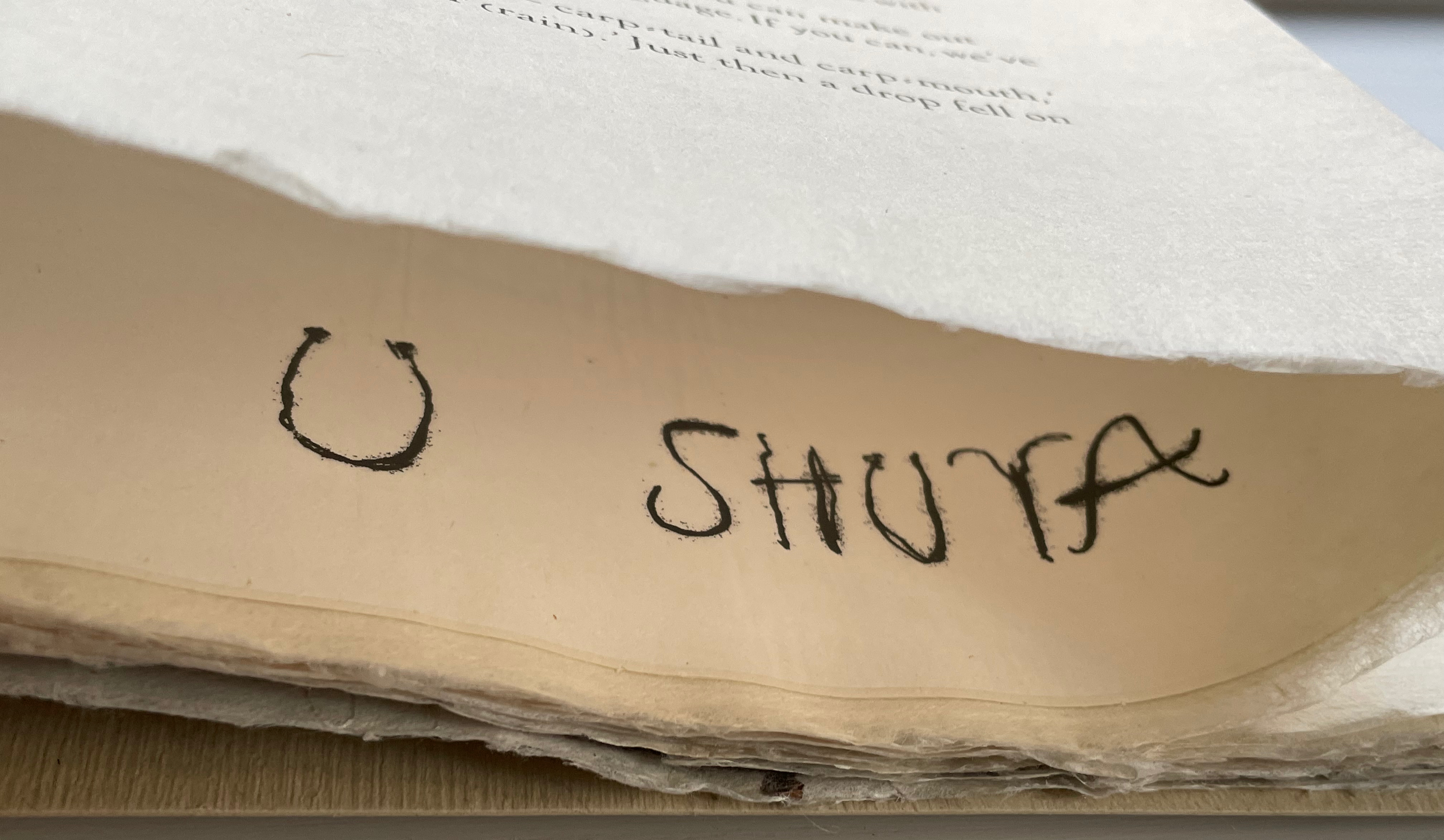
Ein rassismuskritisches Alphabet (2022) Tupoka Ogette Softcover, perfect bound with endbands. H215 x W160 mm. 124 pages. Acquired from Great Book Prices, 1 March 2023. Photos: Books On Books Collection.
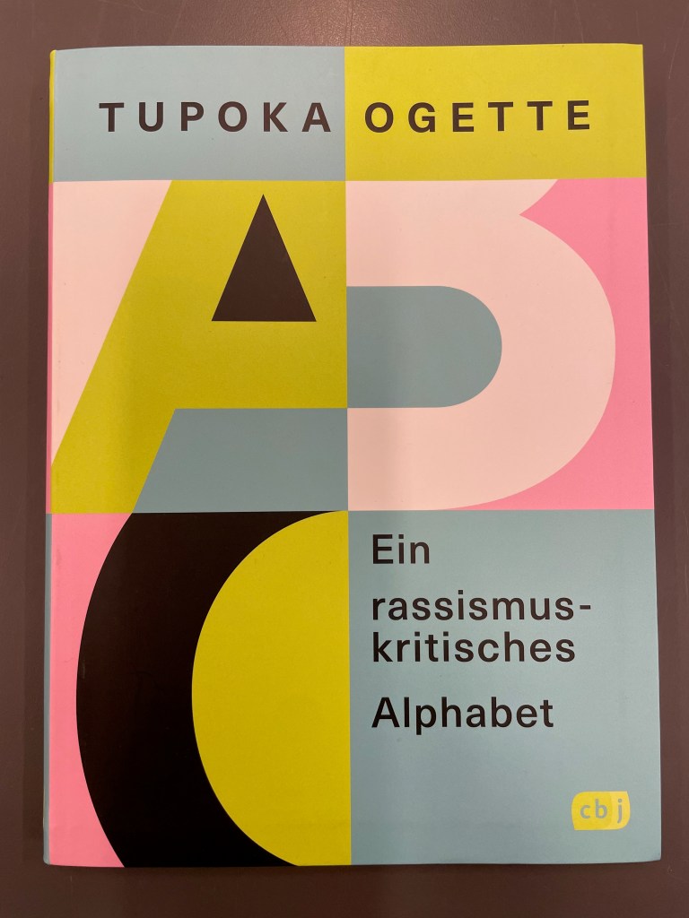
The title of Tupoka Ogette’s book translates literally as “A Racism-critical Alphabet”, but “An Anti-Racist Alphabet” seems more idiomatic. More than an alphabet book, it is a workbook arising from her consultancy for companies, organizations and associations wanting to understand how racism manifests itself and how to address it. Given the consultancy’s focus on German-speaking countries, the book relates tightly to the firm’s workshops, podcasts, etc., so it is not too surprising that it hasn’t been translated into English yet.
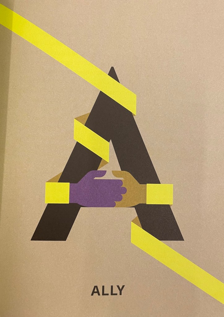
The depth of the problem in English-speaking countries, however, results in most of the terms’ being in the English language: terms like “Ally”, “Blackfacing”, “Colorism”, “Derailing”, “Emotional Tax”, “Gaslighting”, “Happyland”, “Jim Crow”, “Liberation”, “Othering”, “Queer”, “Race-based Traumatic Stress”, “Tokenism”, “White Gaze” and “Yellowfacing”. Add to those terms such cognates as Kolonialismus, N-wort and Xenophobie and it is almost a shock that the text is not in English.
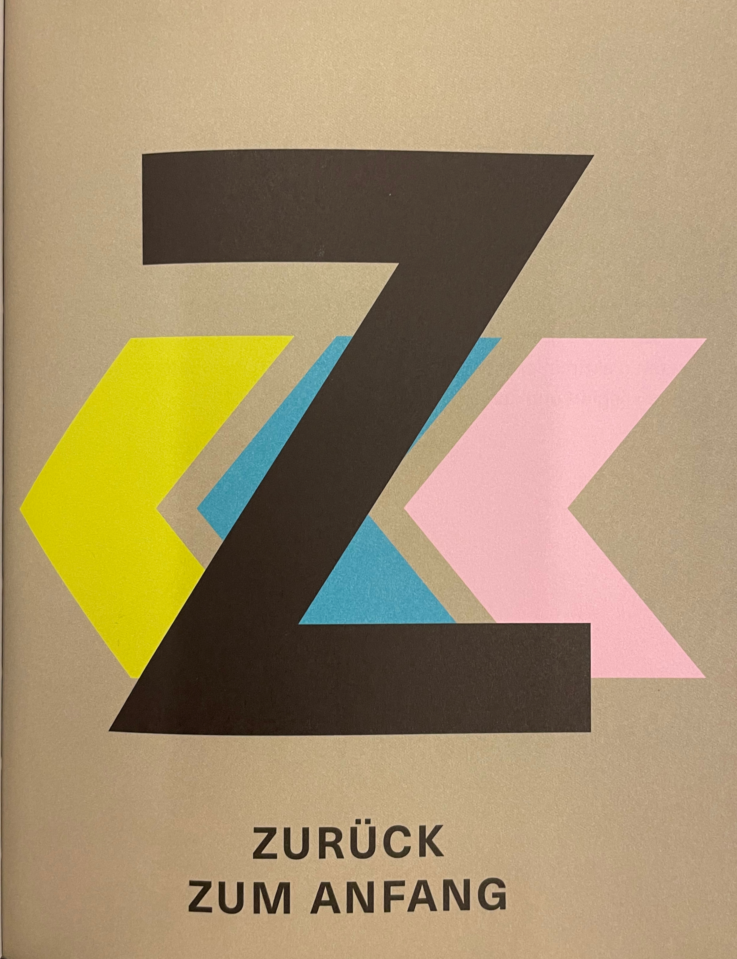
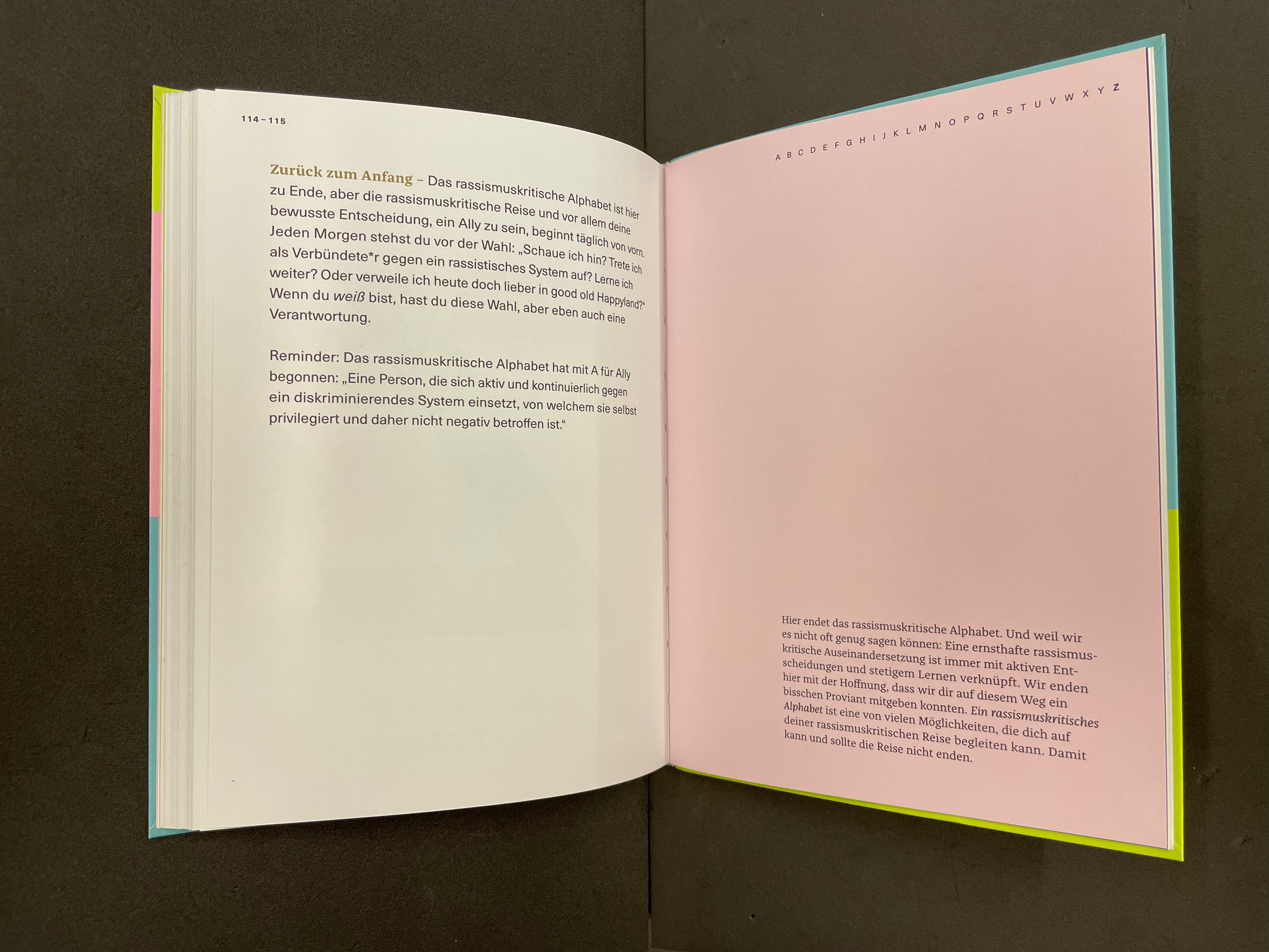
Zurück zum Anfang (“Back to the Beginning”). “The anti-racist alphabet ends here, but the anti-racist journey, and especially your conscious decision to be an Ally, begins anew every day. Every morning you face the choice: Am I looking? Do I stand up as an ally against a racist system? Do I continue to learn? Or do I stay in good old Happyland today? If you are White, you have that choice, but you also have a responsibility. Reminder: A person who actively and continuously stands up against a discriminatory system of which he himself is privileged and therefore not negatively affected.” P. 115.
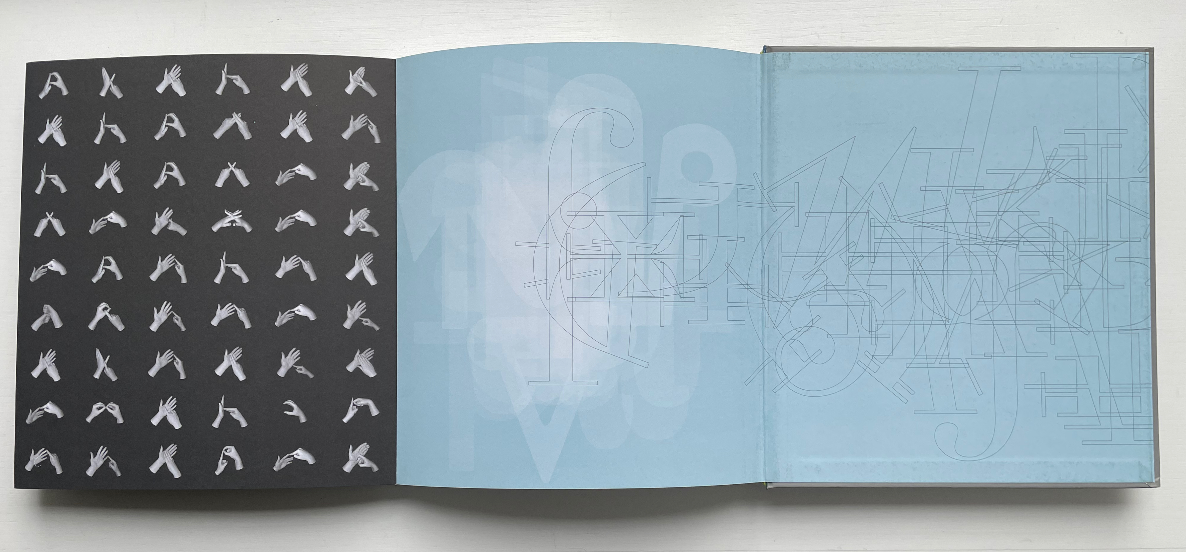
The book’s interior display pages are striking and reminiscent of Ursula Hochuli-Gamma’s 26 farbige Buchstaben (1986) / “26 Colored Letters“, but the cover and text design are very much in the vein of professional trade books for the German market. Adapting the design for the English-language market might present more of a challenge than adapting the text.
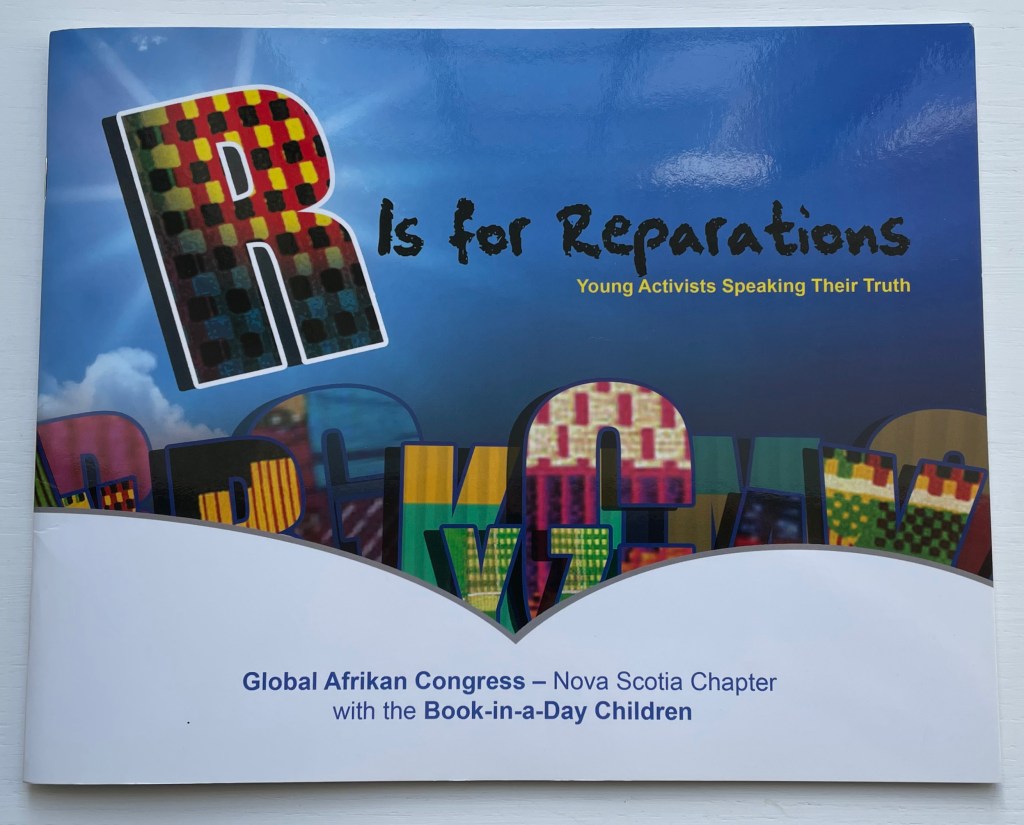
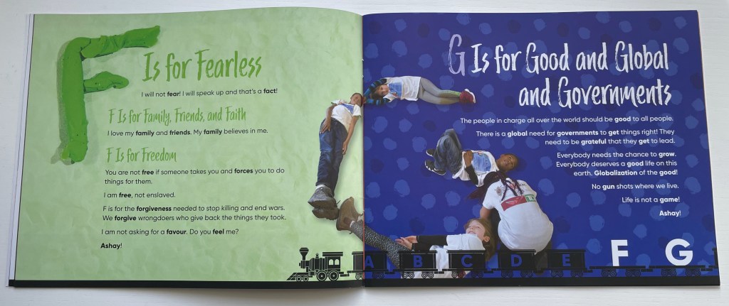
R is for Reparations (2019) Global Afrikan Congress (Nova Scotia Chapter) Denise Gillard, ed. Paperback saddlestitched with staples. H260 x W210 mm. 40 pages. Acquired from the Book Depository, 1 March 2023. Photos of the book: Books On Books Collection.
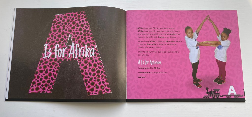
If all alphabets have a world view, can an alphabet be bent and arranged into a new world view? In 2018, the Nova Scotia Chapter of the Global Afrikan Congress facilitated a “book-in-a-day” event to help the children of Halifax create an alphabet book that answers that question. Bending and arranging the human body to make letters has a long tradition in book illustration. Drawing on that tradition, the participating children gave voice and body to create R is for Reparations, an alphabet book calling for a new world view on reparations for the damage and legacy of the Atlantic Slave Trade.
The Reparations Movement has a long history, and Halifax, Nova Scotia has played a part. In 2010, the City of Halifax issued a formal apology and $5 million in general compensation for the razing of the Black community Africville in the 1960s (see Further Reading).
Anticipating it final report in July 2023 to the state legislature, the Californian Task Force to Study and Develop Reparation Proposals for African Americans called for significant financial compensation. The governor issued a tepid if not cool response, which may be unsurprising even in the wake of his earlier signing and endorsing of legislation returning Bruce’s Beach to the Black family from whom the government appropriated it in 1924 (see Further Reading). It is an emotionally and politically complicated issue for some.
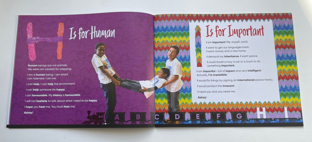
The foreword by Denise Gillard takes a less complicated view as might be expected in a children’s book, and as R is for Reparations addresses primarily Afrikans and Afrikan Descendants both on the Afrikan Continent and in the Diaspora, that view is strong and forceful. It is the sort of children’s book that would be banned in some US school libraries, but as the voices and bodies of its multi-racial cast of participants imply, it is the sort of book that those schools’ children could fearlessly manage.
Not every page is as strong as the next, but the influence of Amos Paul Kennedy Jr., Master Printer, who attended to support the children in making posters for the book launch, is evident in the colors, collage and overprinting. The book deserves comparison and contrast with the Books On Books Collection’s related holdings (see Further Reading).
Task Force to Study and Develop Reparation Proposals for African Americans. 1 June 2022. Reparations Report. State of California Department of Justice. Accessed 1 May 2023.
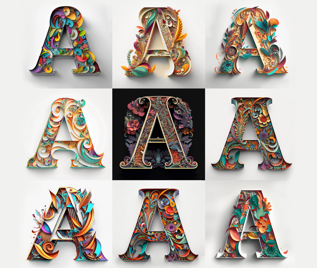
While working on the “Alphabets Alive!” exhibition with the Bodleian to open in July 2023, I came across this project site page by Yevhen Berdnikov, a calligrapher based in Kyiv, Ukraine.
Since “Alphabets Alive!” would primarily concern the creative relationship of artists’ books with alphabets and other writing systems, an AI-generated rendition of the alphabet (humankind’s second-greatest invention, language being the first) was a natural for inclusion. Given the short notice, the artist’s lack of bookmaking experience and — oh yes — the ongoing Russian invasion of Ukraine and attacks on Kyiv, a book was out of the question. Still, with one of the exhibition’s display cases being devoted to artists’ books driven by calligraphy and another to ones driven by color, some way of including these letter images prompted by Yevhen Berdnikov and generated by the text-to-image AI Midjourney from the company of the same name begged to be found.
Paper Cut Alphabet (2023)
Paper Cut Alphabet (2023) Yevhen Berdnikov Poster. H x W. Acquired from Yevhen Berdnikov, 8 March 2023. Images courtesy of Yevhen Berdnikov and reproduced with permission.
When the digital file for the poster first arrived, the treatment of letter Z was a surprise. Even without its current caption, the implication of the treatment was obvious to anyone who knew Berdnikov’s nationality and had seen news images of Russian tanks and military vehicles with Z painted on them. An AI-generated letter Z exists in the Paper Cut Alphabet Project’s files, but, in preparing the poster for a public exhibition, Berdnikov could not bring himself to prompt the AI to generate a symbol that had become intolerable and particularly loathsome on the anniversary of the invasion.
Chance is a well-known muse to many artists. Midjourney, the application, requires an extensive amount of “prompting” — detailed text describing the image it will create. As Berdnikov notes above, the same text can generate different results, which implies an element of randomization at work in the application. But how could a randomizing function yield a meaningful absence of image in response to prompting text? How could machine learning enable Midjourney on its own to compile this version of the alphabet without that particular and human creative intervention?
Even while acknowledging his intervention in Paper Cut Alphabet, Berdnikov insists that he is not the artist, but isn’t his use of Midjourney analogous to Vermeer’s presumed use of a camera obscura to achieve the detail and perspective we see in his paintings? If he did use that technology, does it warrant calling his paintings “device-generated”? Even so, this viewer “feels” the human artists behind View of Houses in Delft (c. 1658) and Paper Cut Alphabet (2023).
Berdnikov’s comments above and his demurrer at being named the “artist” of Paper Cut Alphabet reflect an inquisitive, open and thoughtful mind. Whatever its undetermined implications, the result of his wielding this new artist’s tool is decidedly art.
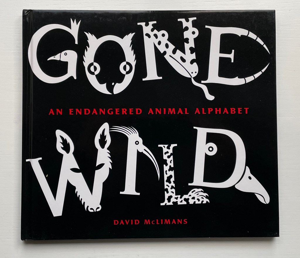
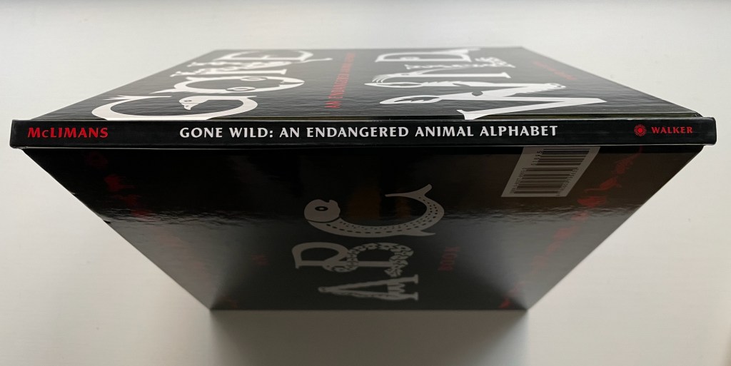
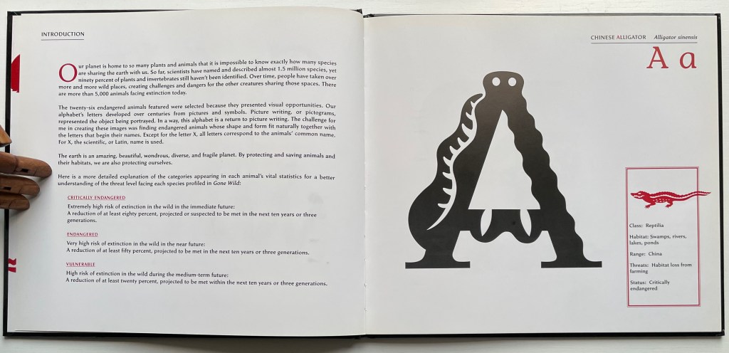
Gone Wild: An Endangered Animal Alphabet(2016) David McLimans Casebound, illustrated paper over boards, illustrated doublures, sewn book block. Illustrated, debossed glossy paper dustjacket. H255 x W285 mm. 36 unnumbered pages. Acquired from Gargoyle Books, 25 August 2022. Photos: Books On Books Collection.
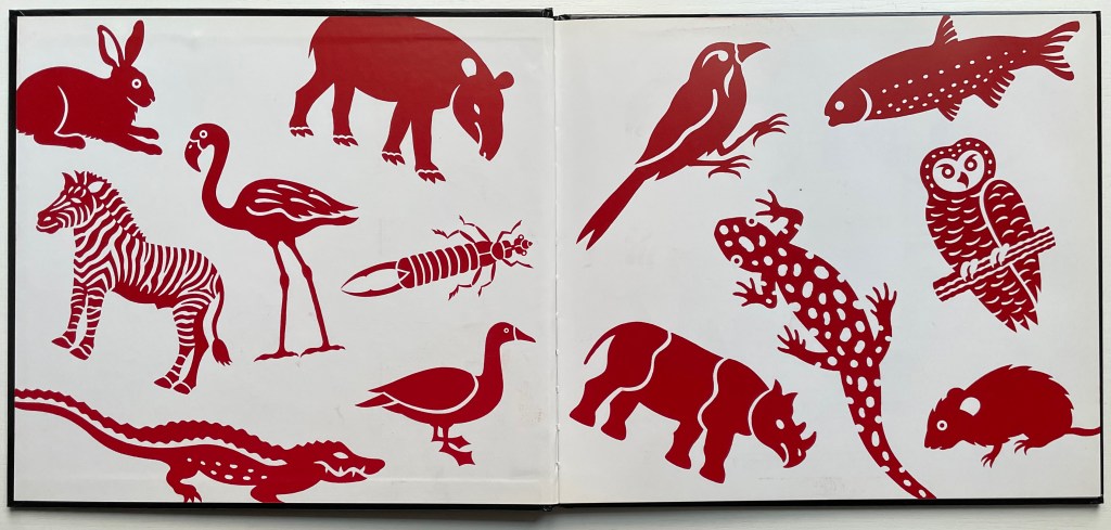
In the history of children’s books, the alphabet looms large, and among alphabet books, animal alphabets make up the largest category. But why animals?
For learning and teaching letters, they are easily recognized and mnemonically effective. Illustrators can wrap them around letters, make them twist themselves into letters or hide them behind letters. Designers can hide them on tabs behind letters, make them pop out, parade them across leporellos (accordion books), let them lurk in tunnel books or put them on a paper disk to appear and disappear in a volvelle’s window. Writers can weave stories with animals and letters, put animals and letters together in puns and surprising scenarios or use alliteration and rhyme with them to reinforce letter recognition and reading. For authors more paleographically and philosophically inclined, the answer to “Why animals?” might be sought in the origins of the alphabet’s first letter as James Rumford does in There’s a Monster in the Alphabet (2002) and Don Robb and Anne Smith do in Ox, House, Stick (2007).
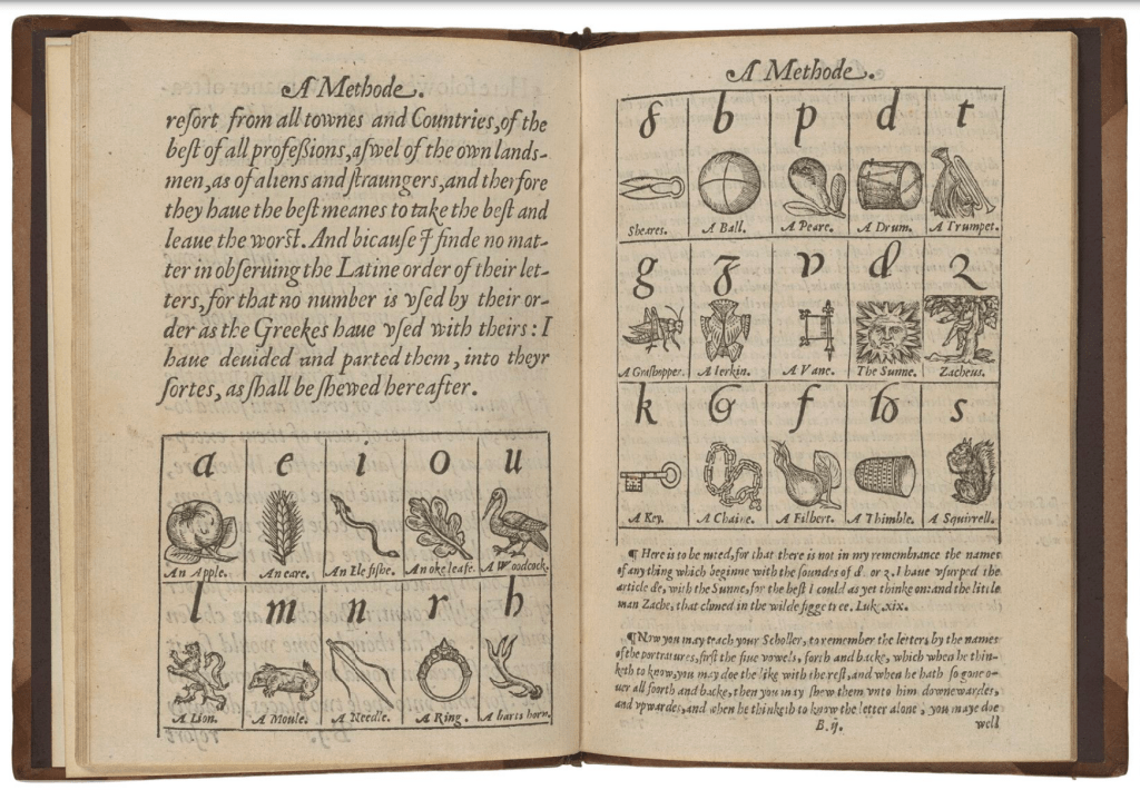
Whatever the cause, ever since John Hart’s A Methode, or Comfortable Beginning for All Unlearned (1570), which appears to be the first example of teaching the English alphabet with illustrations, we have had an explosion of imagination and wit choosing, finding or making up animals, birds, fish, insects and reptiles with which to decorate the letters, to make from letters (or make letters with), to be disguised with abstractions or to be hidden, revealed or popped out from behind letters. Now, in reverse over four centuries later, the alphabet has been mustered for teaching the endangered state of those creatures.
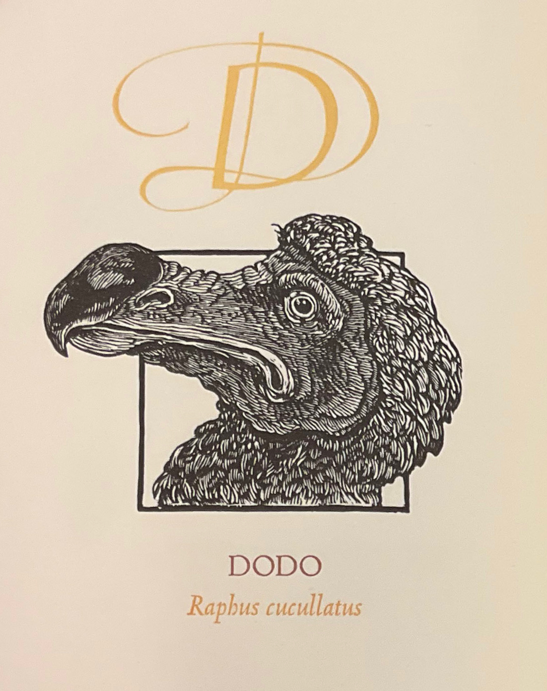
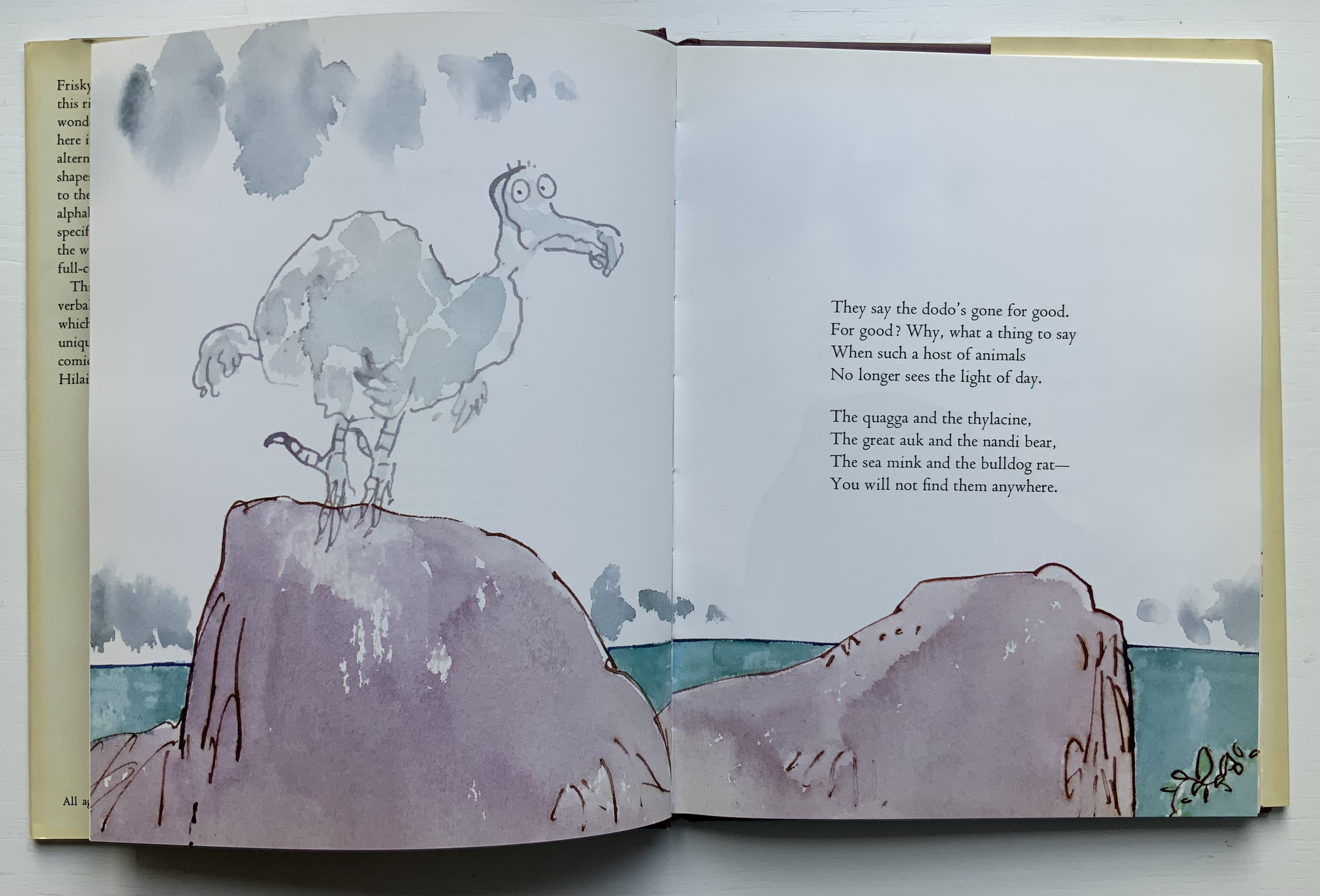
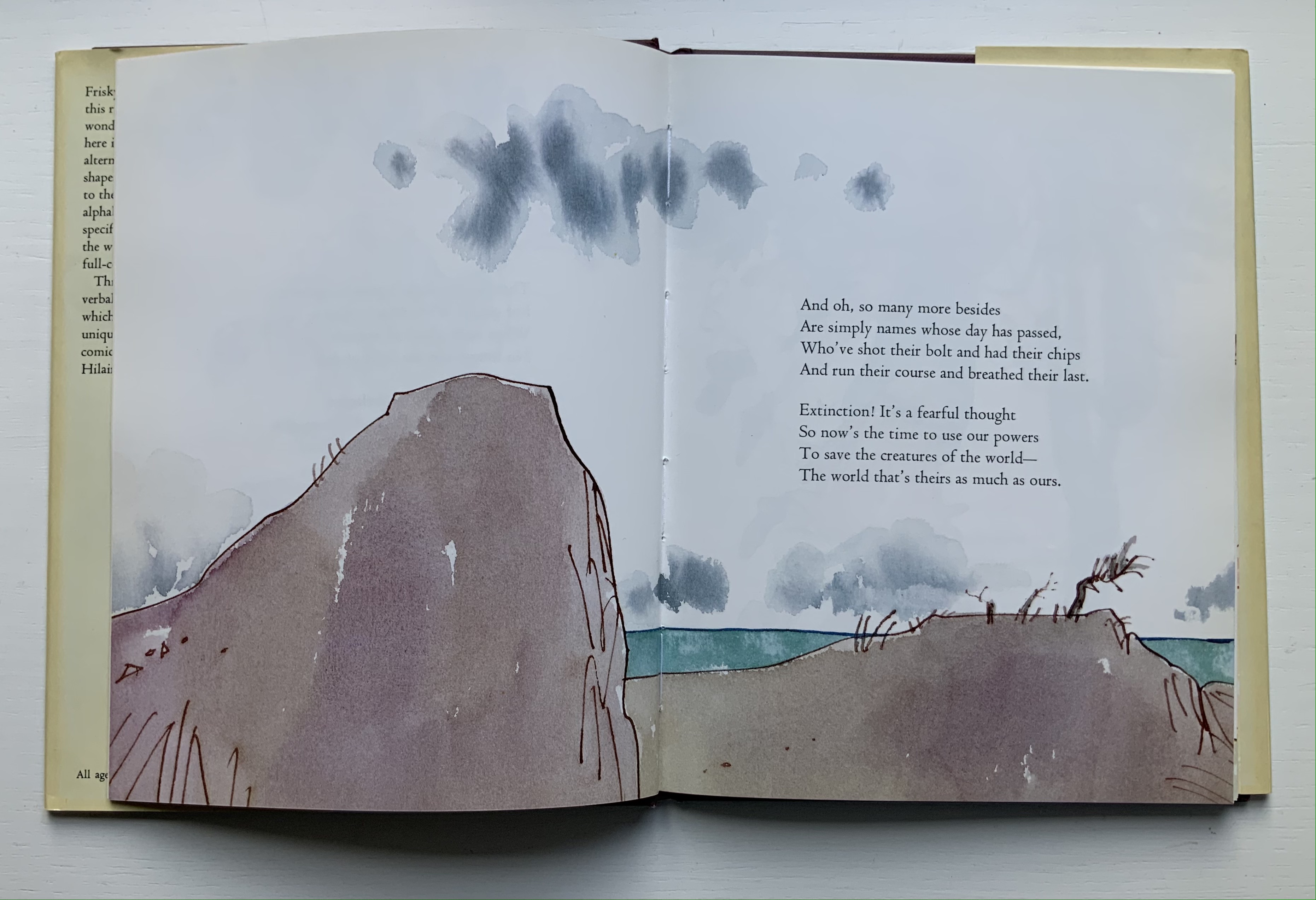
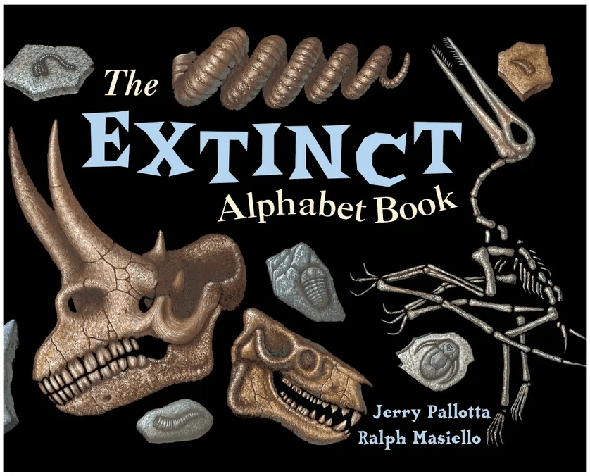
While E.N. Ellis, Bert Kitchen, the team of Alan Robinson and Suzanne Moore all allot only one letter and the dodo to make the point, Dick King-Smith and Quentin Blake together devote almost all of their Alphabeasts (1990) to examples of extinction, as do Jerry Pallotta and Ralph Masiello in The Extinction Alphabet Book (1993).
Left to right: from E.N. Ellis’s An Alphabet; Bert Kitchen’s Animal Alphabet; Alan Robinson and Suzanne Moore’s A Fowl Alphabet.
Quentin Blake’s page-by-page visual narrative married to Dick King-Smith’s opening verses in Alphabeasts.
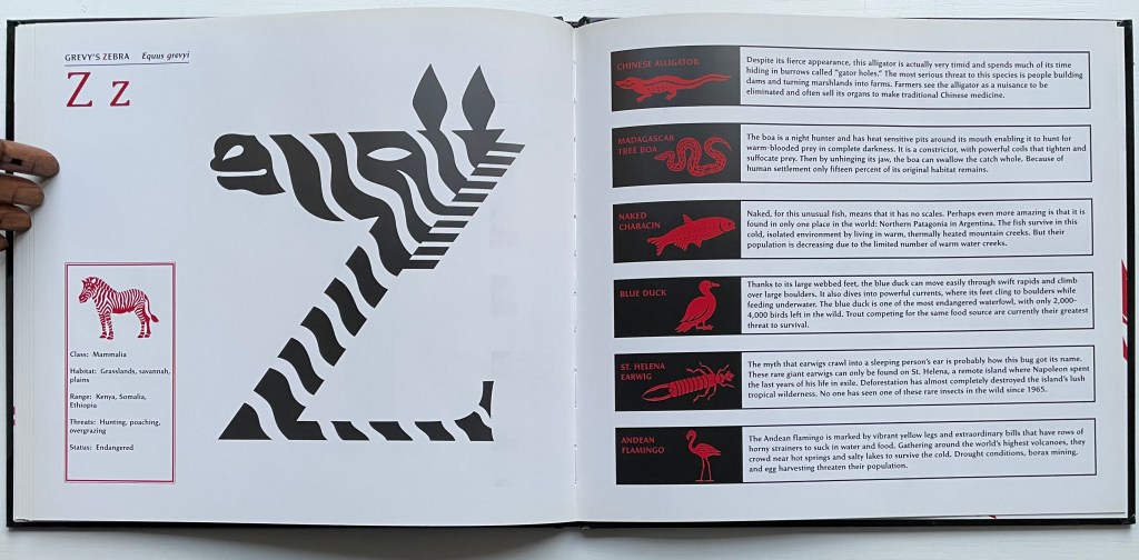
With Gone Wild, David McLimans adds a complex and subtle device to the explosion. The book is not so much about learning the alphabet with animals as learning about animals with the alphabet — or rather with “alphabetic art”. Wielding computer, pencil, pen, brush and India ink on bristol board, David McLimans redraws the alphabet’s capital letters to look like animals not yet extinct but on the Red List of the International Union for Conservation of Nature. Even the design of the traditional alphabet book subtly serves as a teaching tool about these animals. Notice how McLimans and John Candell, the book’s designer, turn the traditional presentation of uppercase and lowercase letters into a kind of running head that underscores the common and scientific names of each animal. Even the list of facts on each species — their habitats, geographic ranges, threats to survival and statuses — receives meaningful thematic design touches from the use of two-color printing — blood red and extinction black.
After the brief red-on-black thumbnails and descriptions following Grevy’s Zebra, McLimans provides further reading (online and in print). You have to go beyond a quick dive into the address he provides for the IUCN to find the Red List (see address above). There you will learn how up to the minute this book was in 2016 — and, unfortunately, still is.
Kitchen, Bert. 1991. Animal Alphabet. London: Walker Books. For letters decorated with animals other than the dodo.
Mackey, Bonnie and Hedy Schiller Watson. 2017. Alphabet Books : The K-12 Educators’ Power Tool. Santa Barbara California: Libraries Unlimited. For a brief history and extended categorization of alphabet books.
Markle, Sandra; Markle, William; and Dávalos, Felipe. 1998. Gone Forever! : An Alphabet of Extinct Animals. 1st ed. New York N.Y: Atheneum Books for Young Readers. For letters in aid of animals rather than vice versa.
Pallotta, Jerry, and Masiello, Ralph. 1993. The Extinct Alphabet Book. Watertown Mass: Charlesbridge. For letters in aid of animals rather than vice versa.
The Neolithic Adventures of Taffi-Mai Metallu-Mai (1997)
The Neolithic Adventures of Taffi-Mai Metallu-Mai(1997) Gerald Lange and Rudyard Kipling H216 x W260 mm. 55 pages with 17 additional illustrated page inserts. Edition of 150, of which this is #149. Acquired from the artist, 11 Febuary 2023. Photos: Books On Books Collection. Displayed with the artist’s permission.
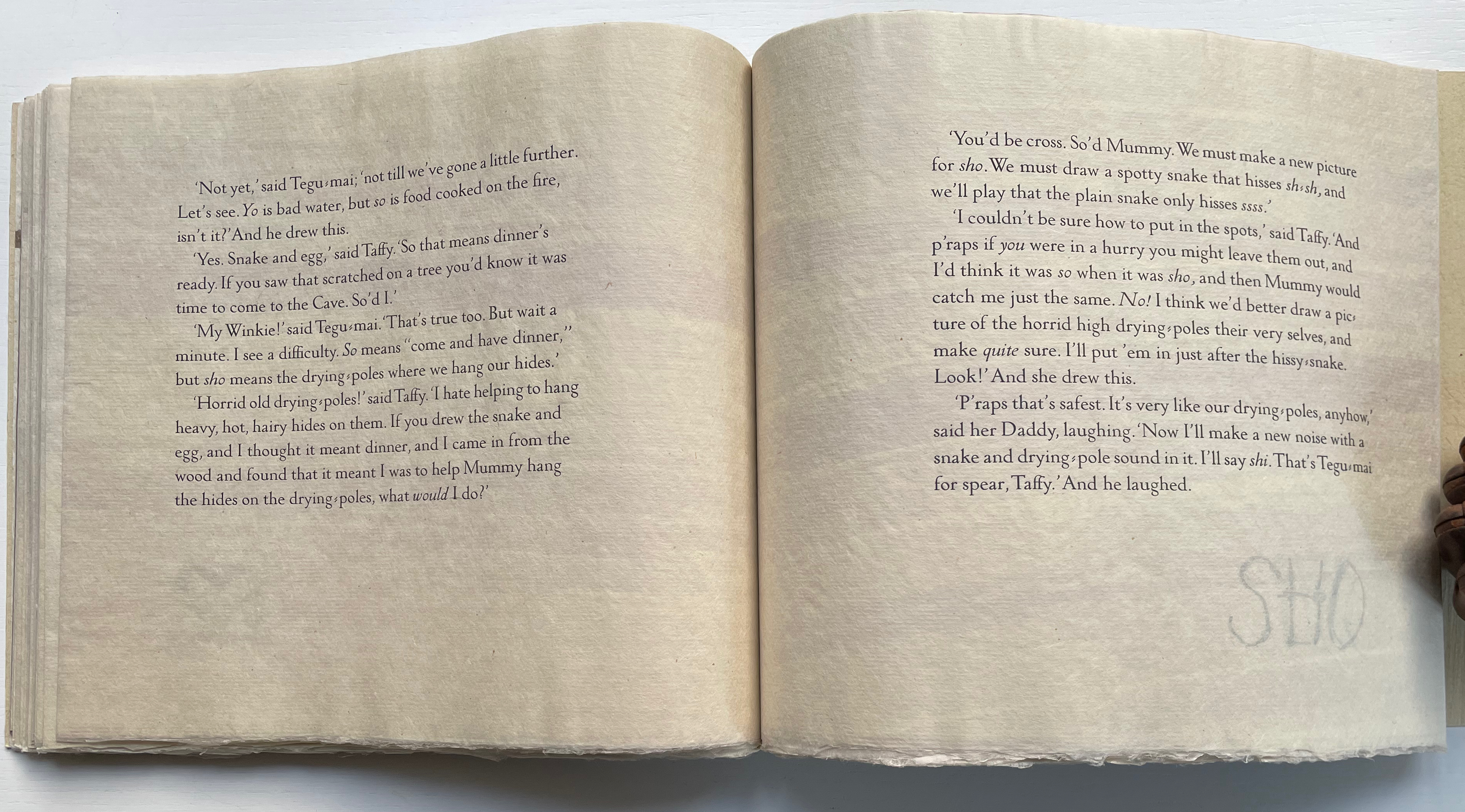
Gerald Lange’s choice of “How the First Letter Was Written” and “How the Alphabet Was Made” from Rudyard Kipling’s Just So Stories (1902) for this elaborate, delicate but robust edition was fitting. By 1997, he had founded the Bieler Press (1975), co-founded the Alliance for Contemporary Book Arts (1987) and edited its journal AbraCadaBrA for seven years, had been the Master Printer at USC Fine Arts Press and selected as the first recipient of the prestigious Carl Hertzog Award for Excellence in Book Design (1991) and was about to publish the first edition of his Printing Digital Type on the Hand-Operated Flatbed Cylinder Press (now in its fifth edition, 2018). In keeping with his interests leading up to this work, Lange letterpress-printed it from handset Monotype Pastonchi and a digitally altered version of Berthold Post Antiqua. More to the point, as he noted on the Bieler Press site, he chose the stories for “their affinity with subjects related to the lettering arts”. If that affinity is not clear enough from the text, Lange’s treatment underscores it in subtly ingenious ways.
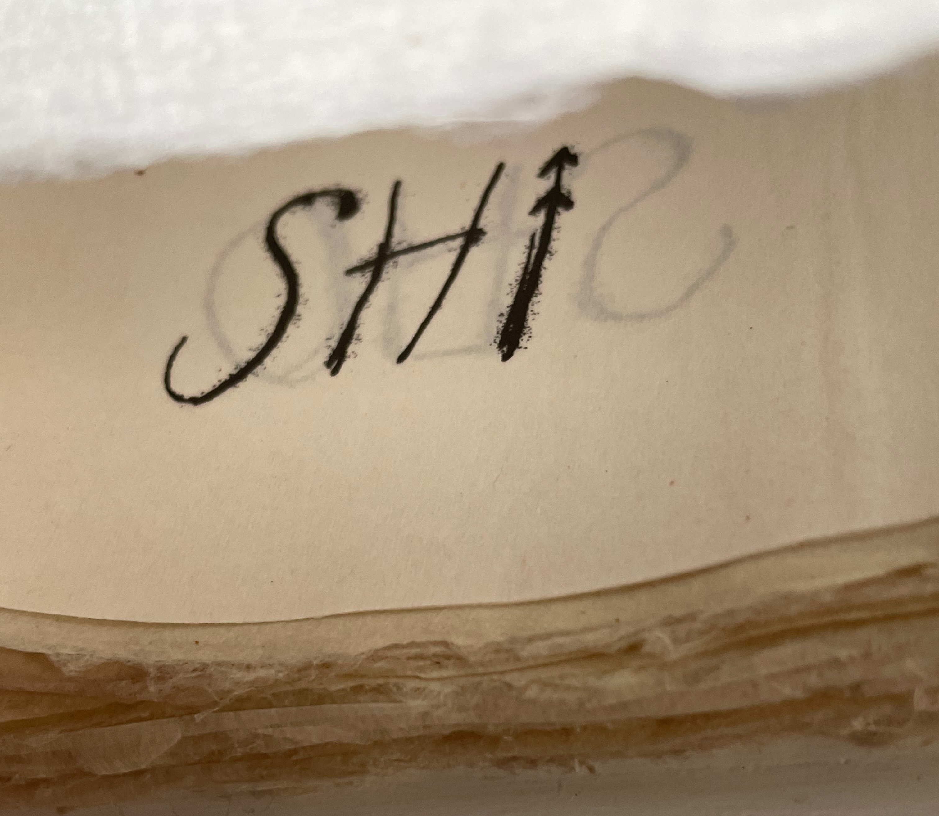
Kipling attributes the drawings throughout to his heroine, Taffi and her father. Where others like Macmillan Children’s Books have rendered them boldly, Lange prints the primitive petroglyph-like images on separate Gampi sheets inserted between the folded Kitakata text leaves of the tortoise shell edge-sewn binding. Those text leaves are individually water colored on their reverse sides (urazaiki manner based on nihonga painting) so that the pictographs beneath reveal themselves through a striated layer. The color and striations are reminiscent of cave paintings. Additional Asian papers (Kasuiri and Chirizome for end sheets, Cogan Grass for covers) increase the work’s tactility — simultaneously soft and rough, flimsy and tough — and contribute a grassy smell redolent of the stories’ physical setting.
The quality and rightness of choices in structure, material and process have placed several of Lange’s works in The British Library, University of California (various), Columbia University, Harvard University, University of Minnesota, New York Public Library, Princeton University, Stanford University, Victoria and Albert Museum, Yale University and others. The initial reason bringing this particular work into the Books On Books collection was its representation of book art inspired by the alphabet. That Robin Price, several of whose works are also in the Books On Books collection, assisted with the design came as a bonus. That this is one of the last bound copies of The Neolithic Adventures of Taffi-Mai Metallu-Mai makes it a treasure.
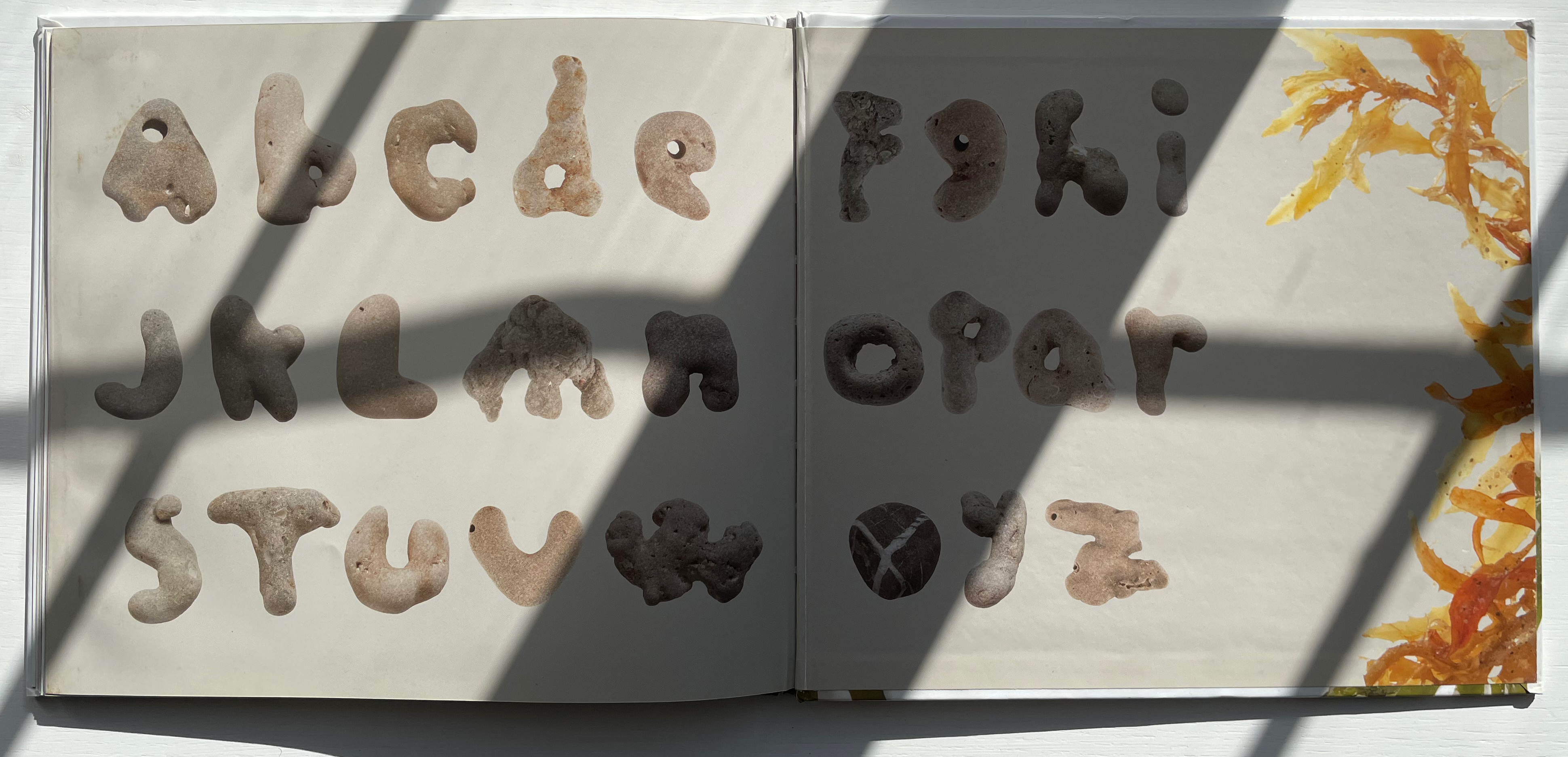
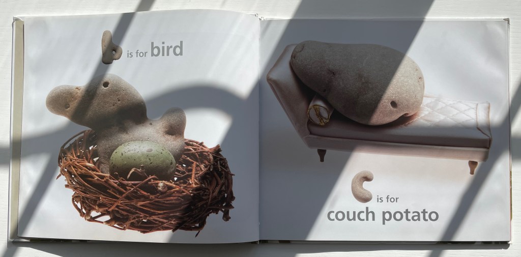
Along the Victor Hugo-esque theme of “alphabets all around”, here is a beachcomber’s eye for rock shapes with which to construct not only a complete alphabet but also the images necessary for an abecedary.
Not only a b-shaped stone, but also one shaped like a bird. Likewise a c-shaped stone, but this time a miniature sofa to accommodate the resident stone with a shape to complete the phrase.
McGuirk has spotted stones for verbs as well as adjectives and nouns — all equally astonishing in their serendipity, humor and insight. Perhaps the last is best: the match of the z-shaped stone with a word beginning with z that matches a numeral-shaped stone that, arguably, reproduces the concept at its eroded center.
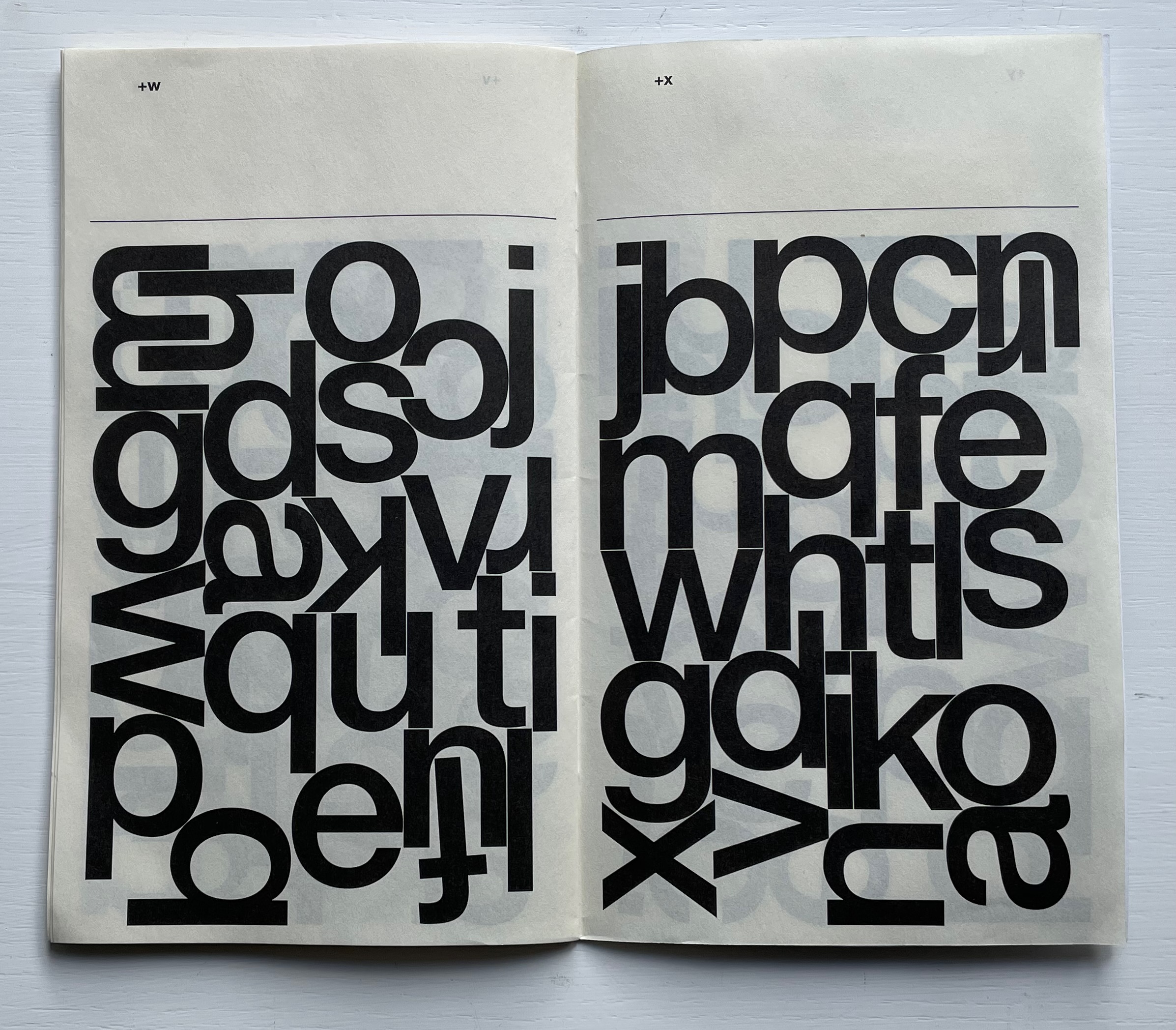
Automatically Arranged Alphabets (2015) Experimental Jetset Staple-stitched “zine” with screenprinted silver cover. H180 x W160 mm. 24 pages. Acquired from the Newbridge Project, 18 September 2022. Photos: Books On Books Collection.
On their website, the studio posted an automated gif of this typographic experiment involving software-generated compositions (archived here).
Beautiful typography meets beautiful calligraphy at the other end of the spectrum of technique in the Books On Books Collection with Francesca Lohmann’s later calligraphic work An Accumulated Alphabet (2017).
Experimental Jetset (a phrase excerpted from the title of a 1994 Sonic Youth album) is an Amsterdam-based design collective founded by Danny van den Dungen, Marieke Stolk and Erwin Brinker in 1997. New York’s MoMA, clearly a fan of the studio’s work, holds a significant collection of their work. From the studio’s description of it here, their participation in MoMA’s 2012 exhibition Ecstatic Alphabets/Heaps of Language clearly influenced Automatically Arranged Alphabets, whose series of automated sketches were made in 2014-15.
Shapes for Sounds (cowhouse) (2008) Timothy Donaldson Casebound, paper over boards, illustrated doublures with foldouts, sewn book block, endbands. H250 x W225 mm. 176 pages. Acquired from KP Enterprise, 13 September 2022. Photos: Books On Books Collection.
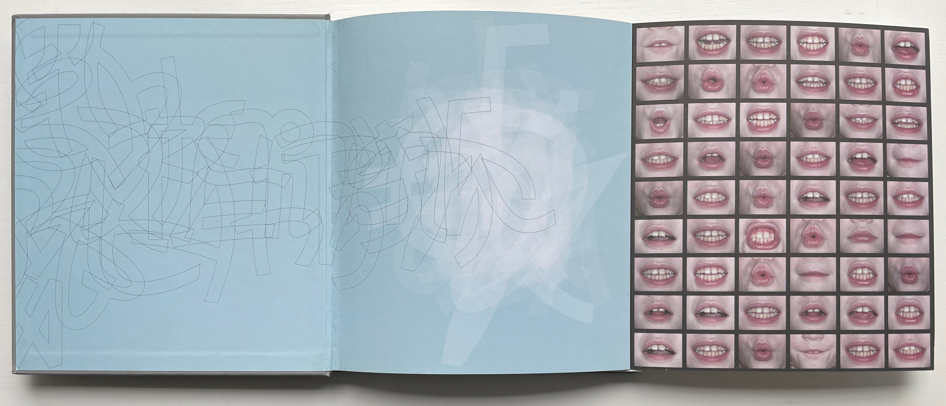
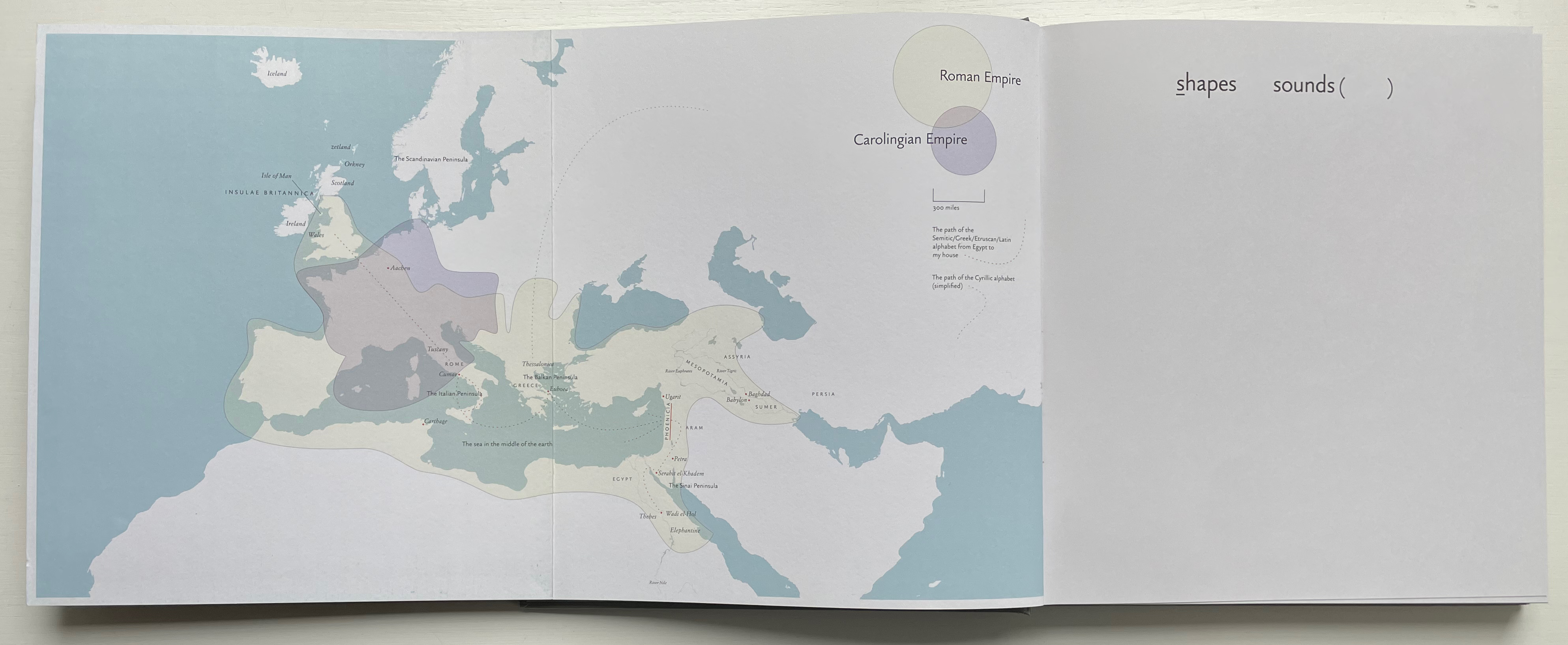
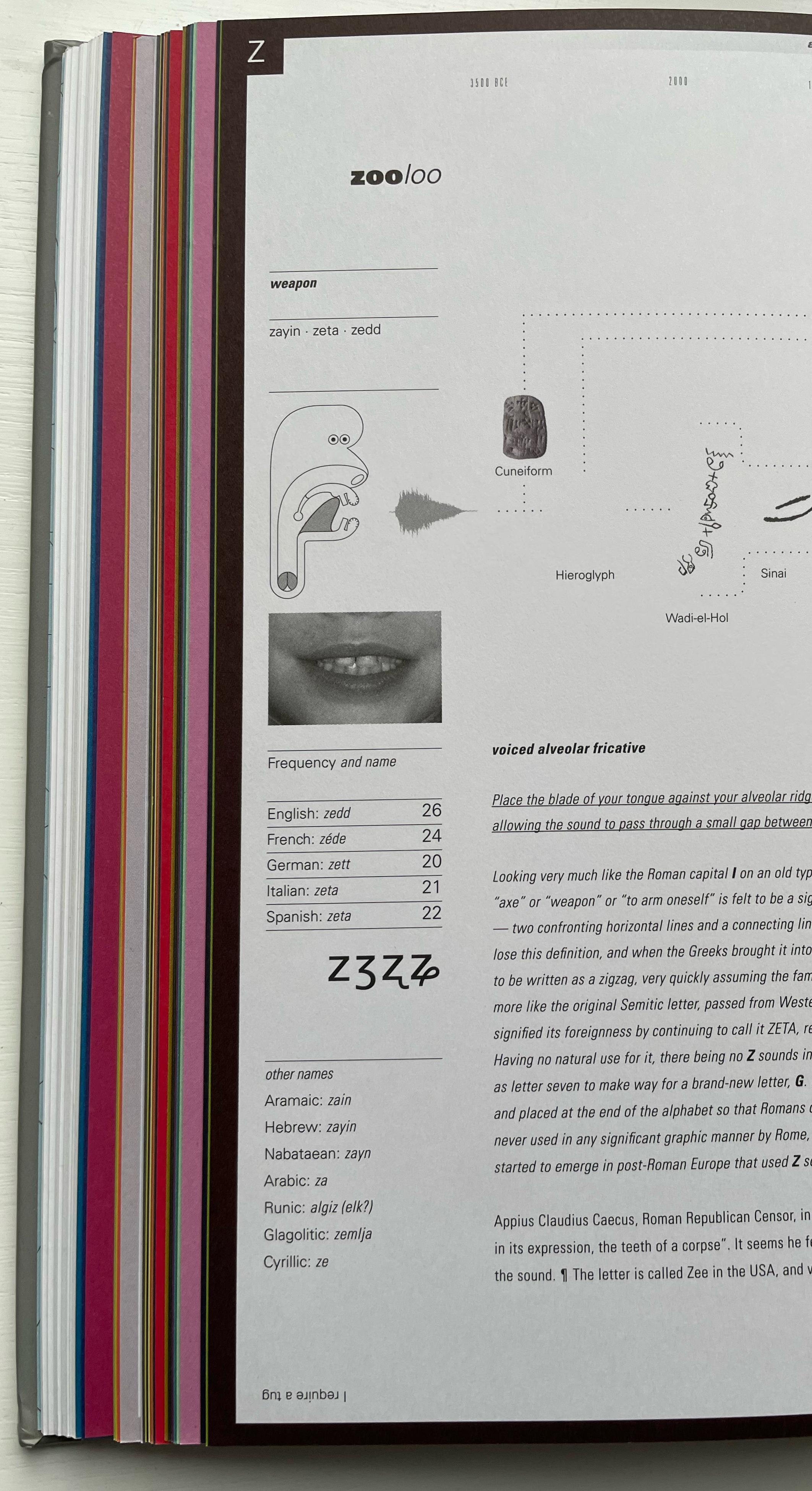
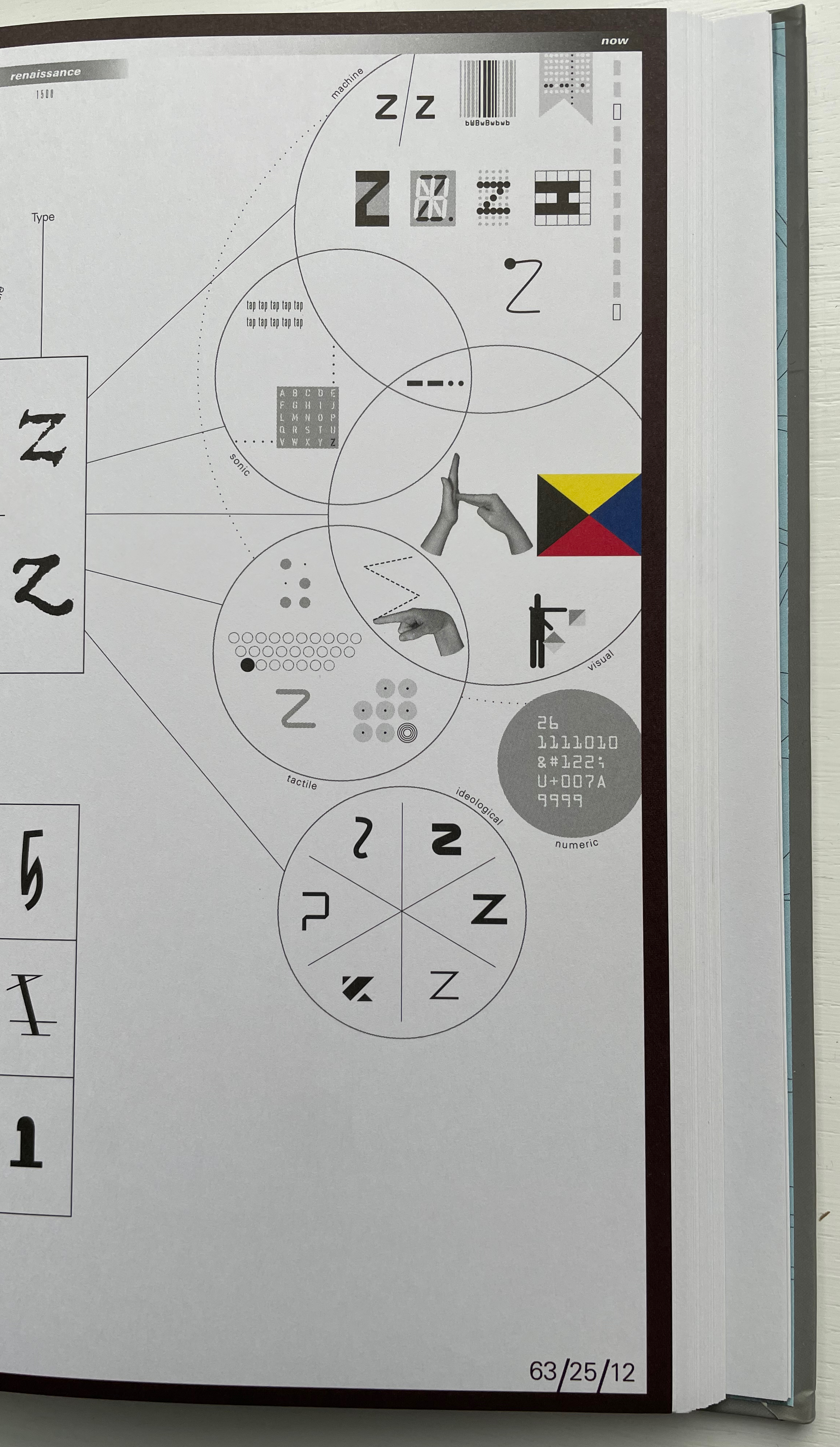
Timothy Donaldson’s Shapes for Sounds (cowhouse) gives the word infographics an amusing twist. Here the alphabet, which began in pictographs, winds up in an alpha-pictographic form of representation: twenty-six double-page spreads and thirty-seven appendices mapping almost all of the alphabet’s vast terrain. A tour de force of design (the main text is even set in a typeface of the author’s making, and the double-sided foldouts integrated with the endpapers are sheer showmanship), the book can almost be forgiven for missing out the ampersand.
Calligrapher, typographer, performer, letterworker (as he calls himself) and artist, Donaldson could rightly call Shapes for Sounds (cowhouse) an artist’s book if he wanted. Among the alphabet reference works in the Books On Books Collection (and those consulted elsewhere), it has these claims to singularity in addition to its artistry.
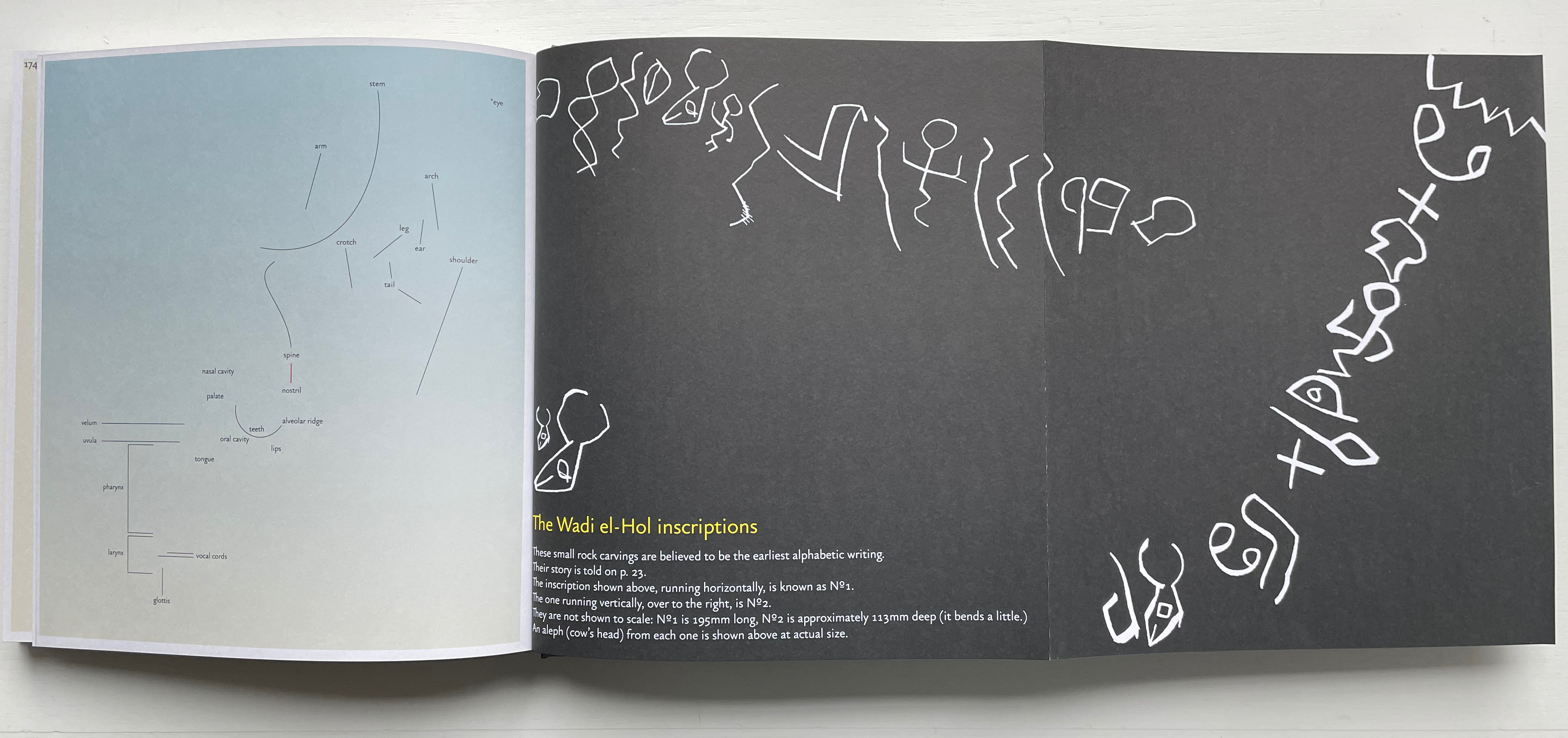
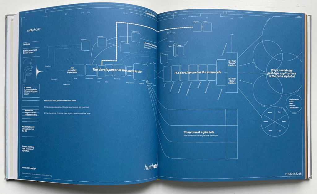
A: It uses a blueprint to create a broad and deep infographic of each letter’s historical development, features and representation in a variety of post-type systems (sonogram, sign language, maritime flags, semaphore, punch card, barcodes, dot matrix, segment display, OCR, ASCII, Unicode, HTML, Braille, prison tap code, etc.).
B: It demonstrates the interrelated historical developments of the majuscule and miniscule letterforms.
C: It makes a principled exploration of how the shapes of letters might have taken different forms from those they have today.
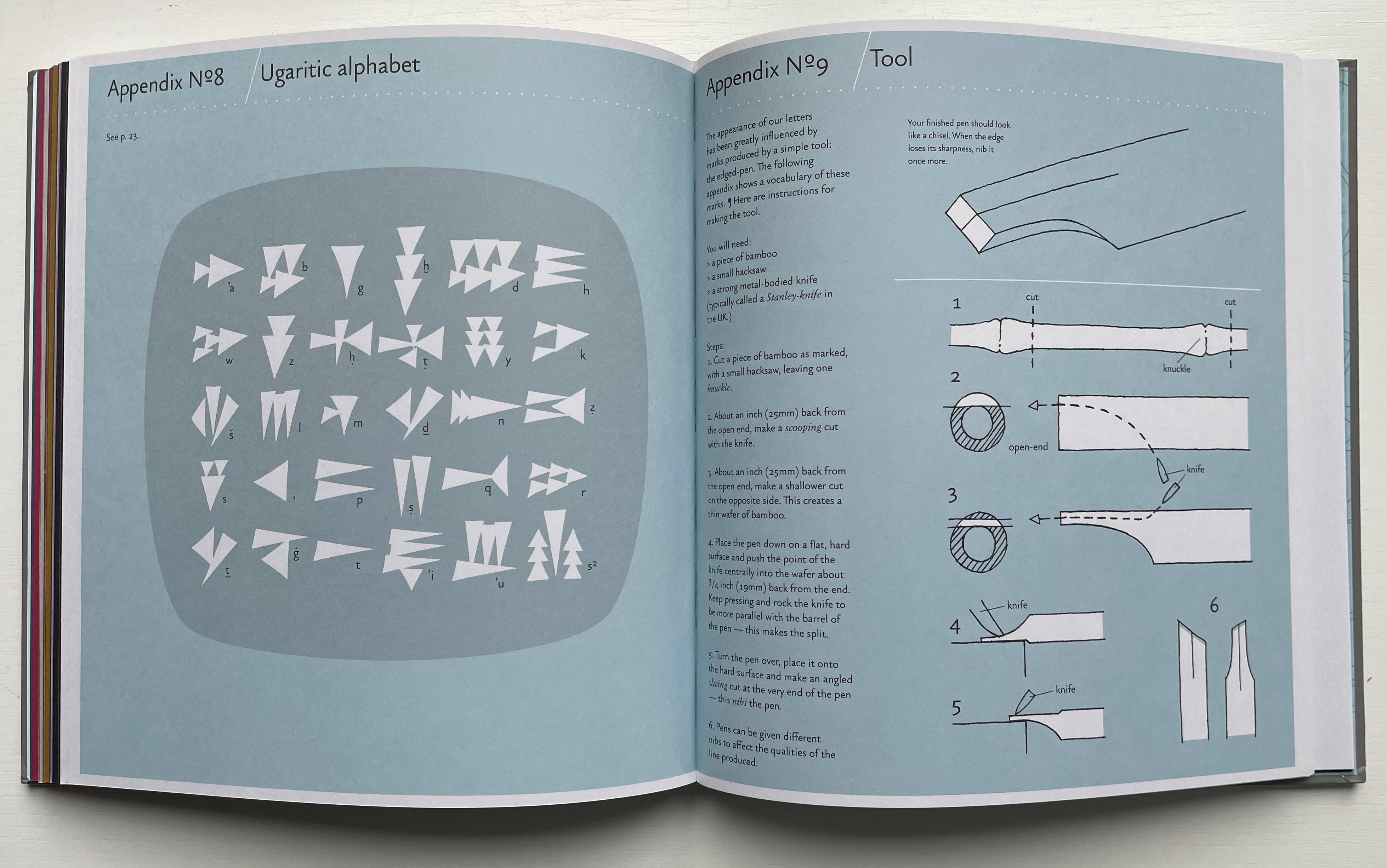
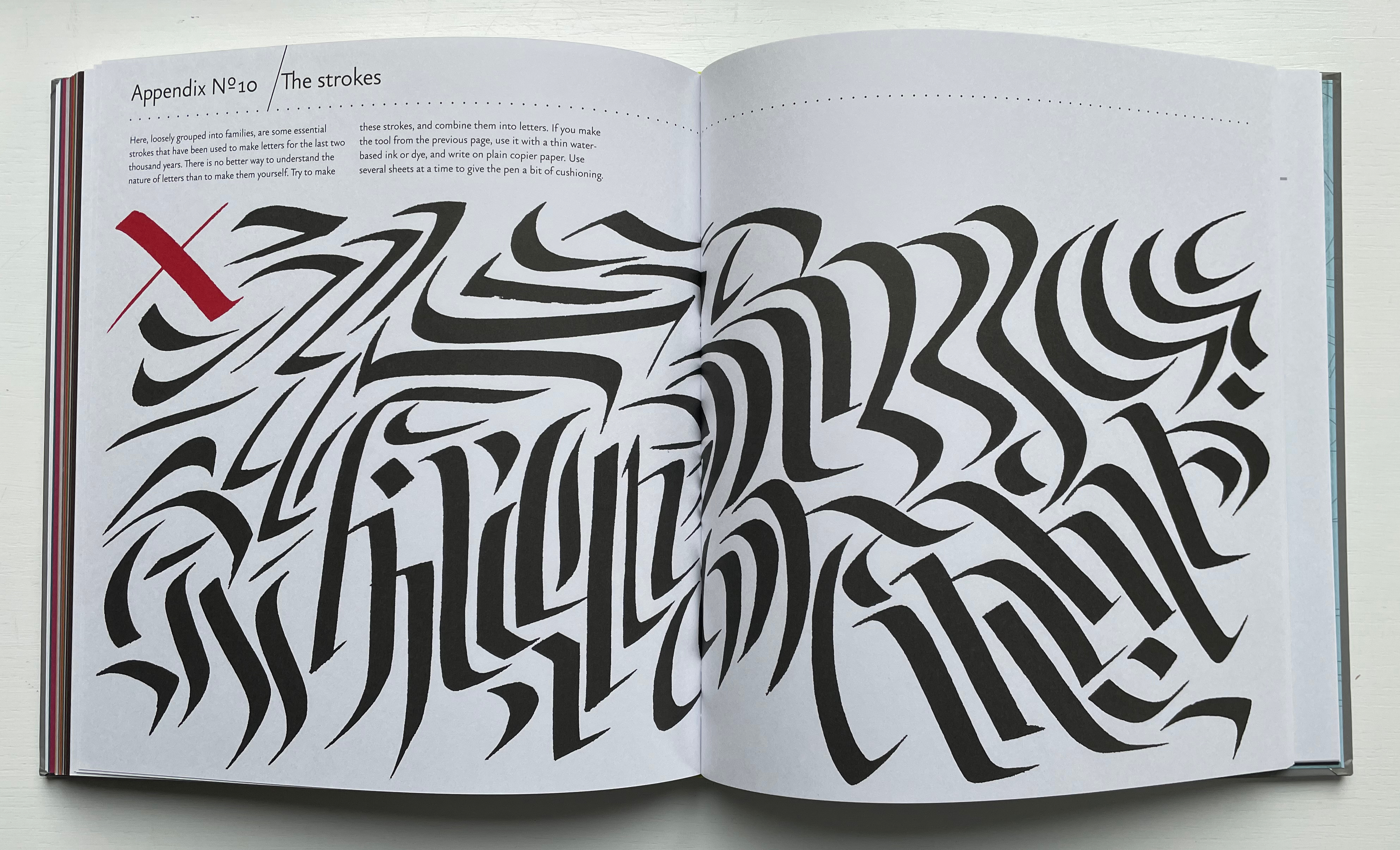
The text in the first third of the book presents discursively what the twenty-six infographics present in particular for each letter and also whet the reader’s appetite for the additional detail in the thirty-seven appendices, which delve deeper into such topics as the phonemehead (the author’s cartoon for illustrating per letter the positions of our sound-making apparatus), ductus (the order and direction of strokes for making a letter), Trajan’s column, the Ugaritic alphabet and more (including an explanation of cowhouse).
Being a tour de force of design, Shapes for Sound (cowhouse) might appeal mostly to students of design and typography, but students of the history of writing, linguistics, communications and book design in particular would be amiss to overlook it. As a reference work that enriches enjoyment of works of book art such as Lanore Cady’s Houses & Letters, Cari Ferraro’s The First Writing, Abe Kuipers’ Letters or Cathryn Miller’s L is for Lettering, it plays a valuable role in the alphabet-related subset of the Books On Books Collection.
Alphabet Everywhere (2012) Elliott Kaufman Casebound, paper over board, cutout cover. 235 x 235 mm. 62 pages. Published by Abbeville Press. Acquired from Amazon, 22 September 2022. Photos: Books On Books Collection. Displayed with permission of the artist.
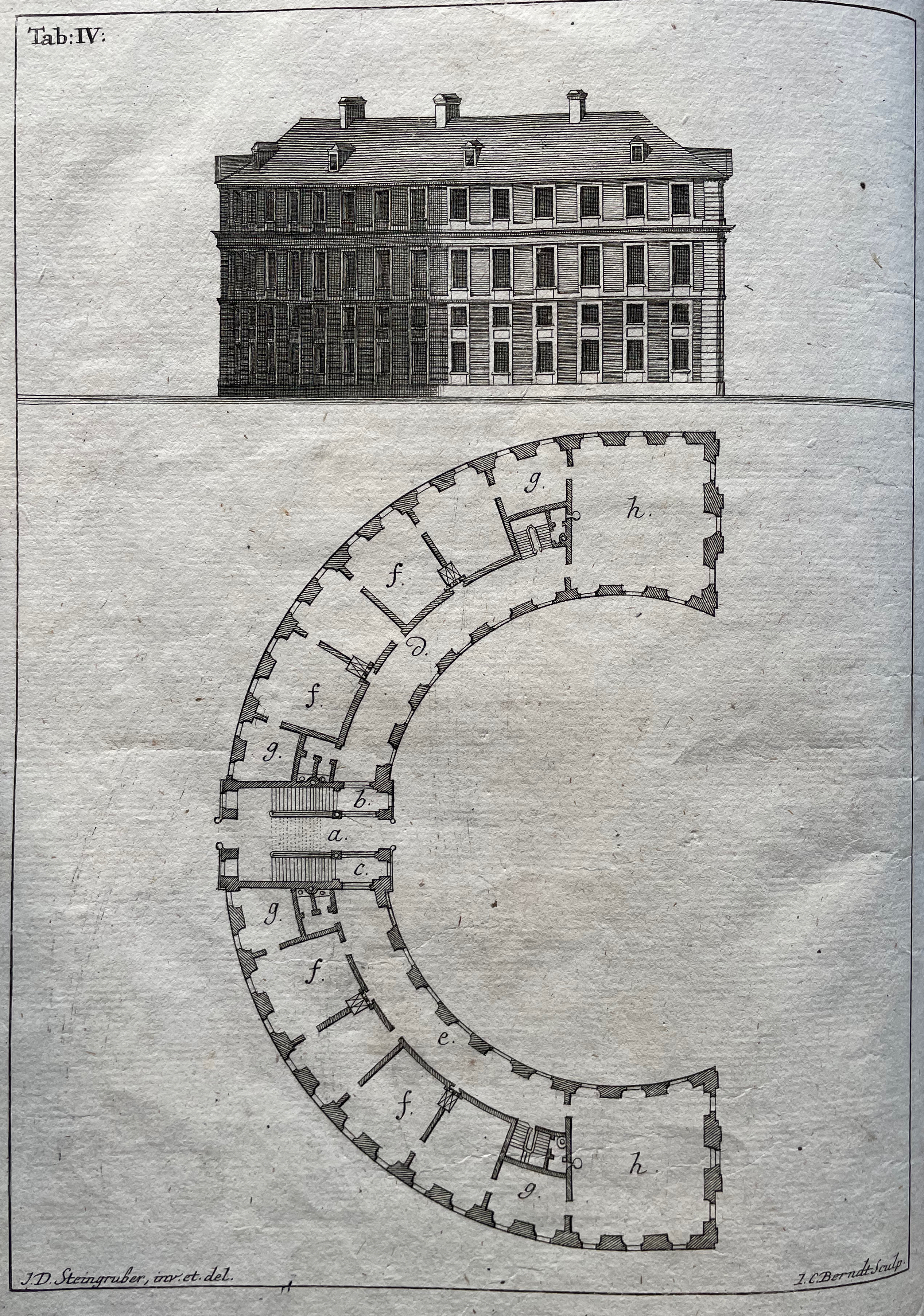
Evident across the images in his alphabet book and website, Elliott Kaufman’s work revolves around architectural motives. The Books On Books collection has found a recurrent theme in architectural alphabets. Would that Johann David Steingruber’s designs for palaces in the shape of the letters from A to Z had actually been built so that Kaufman could photograph them.
Architectonisches Alphabeth (1773) bestehend aus dreyßig Rissen wovon Jeder Buchstab nach seiner kenntlichen Anlage auf eine ansehnliche und geräumige Fürstliche Wohnung, dann auf alle Religionen, Schloß-Capellen und ein Buchstab gänzlich zu einen Closter, übrigens aber der mehreste Theil nach teutscher Landes-Art mit Einheiz-Stätte auf Oefen und nur theils mit Camins eingerichtet, wobey auch Nach den mehrest irregulairen Grund-Anlagen vielerley Arten der Haupt- und Neben-Stiegen vorgefallen, dergleichen sonsten in Architectonischen Rissen nicht gefunden werden, zu welchen auch Die Façaden mit merklich abwechslender Architectur aufgezogen sind. Johann David Steingruber Casebound. H395 x W240 mm. 71 folios. Acquired at auction from Kiefer Buch- und Kunstauktionen, 15 December 2022. Photos: Books On Books Collection.
More Romantic than romantic, Victor Hugo wrote to his wife while traveling that the alphabet is all around us in nature. Kaufman has a different view. Kaufman’s several images per letter prove the point of his book’s title but in keeping with his architectural slant: our constructions distribute our oldest construction all around us.
Ironically if inadvertently, Kaufman gives the Romantic another tweak of the nose. In his Hunchback of Nôtre Dame, Hugo has his character Archdeacon Claude Frollo point to a book in his hand and then to the cathedral outside and say, “This will kill that”, by which he meant among other things that the book’s permanence of replicability will outlast the building’s permanence of stone. If by fictional time travel we could put Kaufman’s book in the archdeacon’s hand, we could point to the cathedral and retort: “But Venerable Sir, look here how ‘that’ foretells the building blocks of ‘this’.”
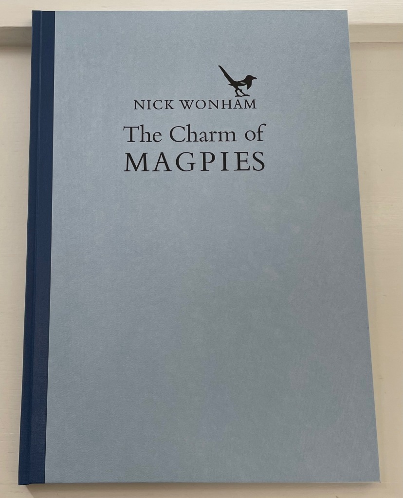
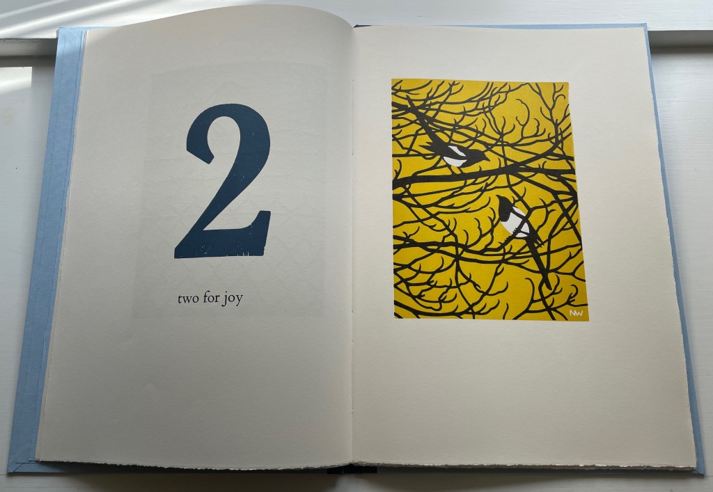
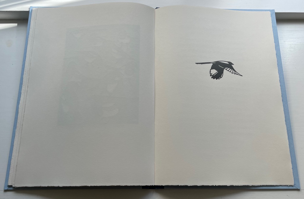
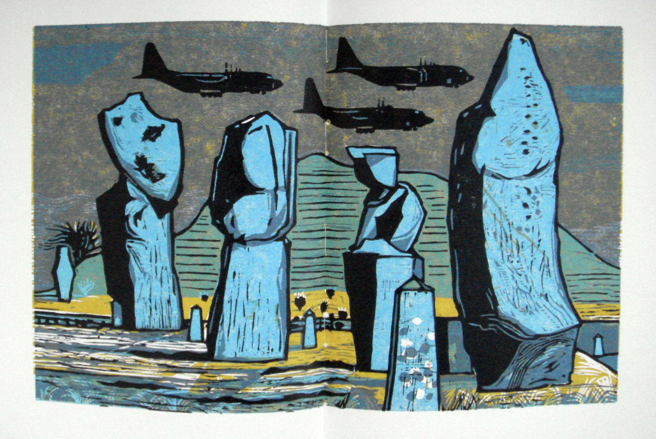
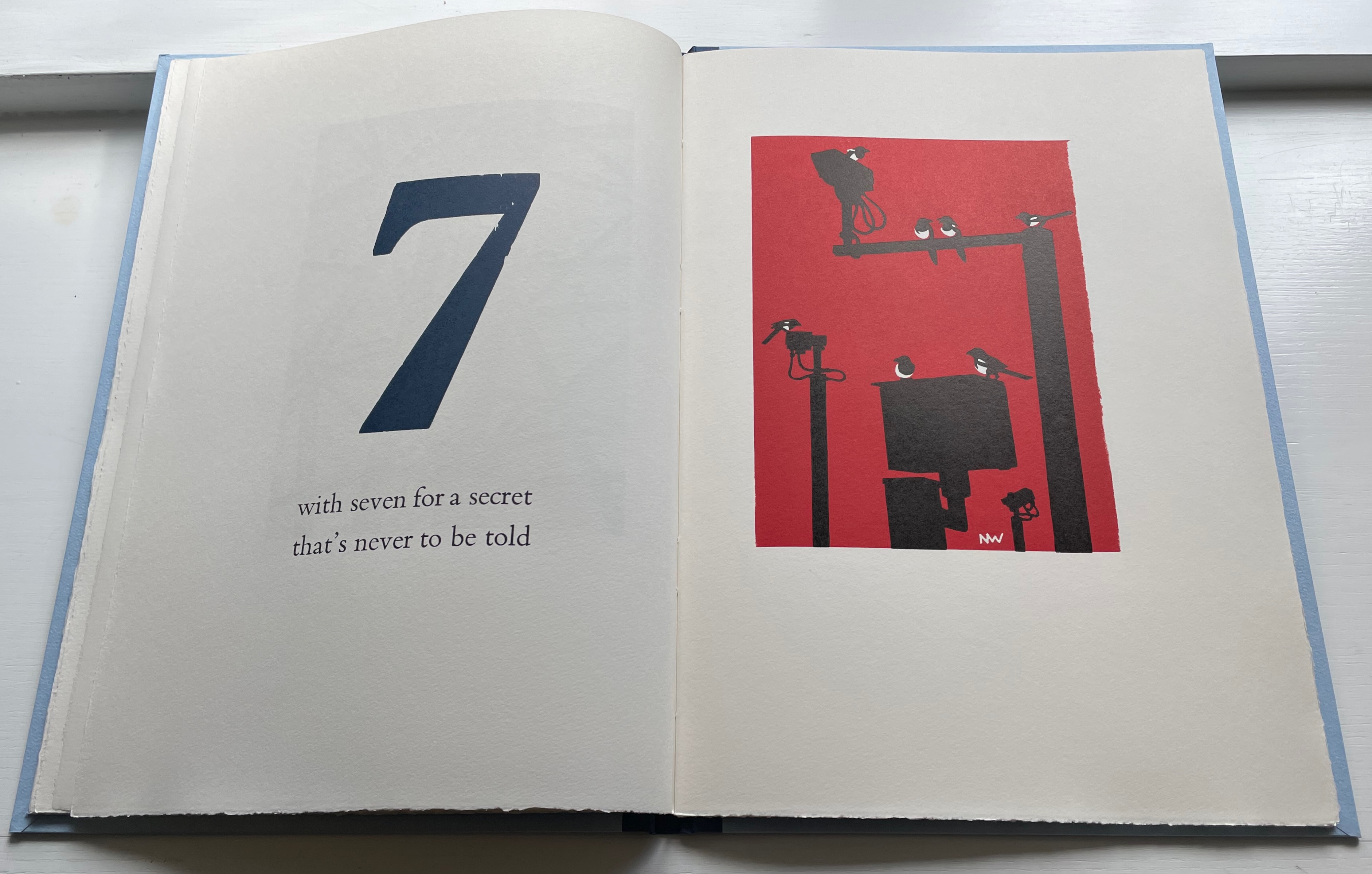
The Charm of Magpies (2018) Nick Wonham Casebound, cloth spine and paper over boards with specially printed flyleaves from Roger Grech at his Papercut Bindery. H370 x W260 mm. 27 pages unnumbered. Edition of 160 copies, of which this is #98. Acquired from Incline Press, 1 August 2022. Photos: Books On Books Collection.
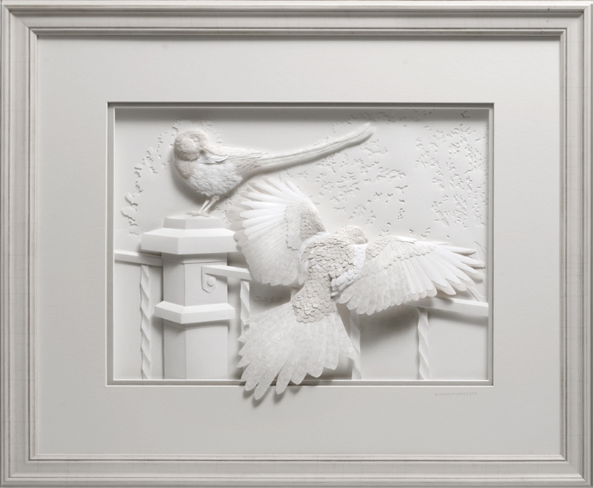
A long admiration for magpies has always threatened to crowd the Books On Books Collection beyond this beautiful work from Nick Wonham and Incline Press and the relief sculpture in paper by Calvin Nichols below. But one pair of works will have to be enough for joy.
Iridescence(2016) Calvin Nicholls Acquired from the artist, 1 September 2016. Photo: Courtesy of the artist.
On the Incline Press website, Graham Moss and his team write:
Collective nouns … A parliament of magpies has to be a favourite, especially if you’ve heard a group of them cackling together in the Springtime. But we prefer the alternative, a charm of magpies, which certainly suits this poem better. It is one version of a folk rhyme which has many local variants, all superstitiously foretelling the future through random occurrence.…
Magpies are often known a thugs in the garden, stealing eggs and chasing off their more delicate rivals. As printers, though, we have a fondness for them because of their “ink on paper” plumage and their latin name pica pica, which recalls the printshop unit of measure.
Left to right: Joseph Crawhall (1884), William Nicholson (1898), C.B. Falls (1930) and Christopher Wormell (1995).
As Moss and team point out on their site, the Oxford Dictionary of Nursery Rhymes does not include the magpies among the counting rhymes, which is odd with so many versions to be had. Birdspot, formerly British Bird Lovers, favors Nick Wonham’s chosen version. For magpies interested in shiny trivia, the site also provides a link to a BBC television program whose theme song was based on the magpie rhyme. It was “composed and played by the Spencer Davis Group under the alias The Murgatroyd Band, just after Steve Winwood had left to join the supergroup Blind Faith with Eric Clapton, Ginger Baker, and Ric Grech”.
And to note just one touch of Nick Wonham’s subtlety, here is the page before the colophon. In all the other images, the magpies are roosting. This one in flight is also the only one in black and white. A brilliant “The End”.
Postscript: In correspondence, the artist has provided further insight on influences and his handling of color:
A note on the colour – the biggest influence on this was Rigby Graham, whose work Graham Moss introduced me to through the Old Stile Press book Kippers and Sawdust. Graham had just printed my first book, which had black and white linocuts, and was trying to inspire me to try colour. It worked; I was blown away by the majestic woodcuts and aspired to create books in a similar vein. Rigby liked an unusually coloured sky, he also liked to position his illustrations through the book so that the colours of prints on adjacent pages contrasted with each other to create dynamism and visual interest, something I have attempted in my book. Correspondence with Books On Books Collection, 9 September 2022.
Wonham also adopts and owns a compositional feature from Rigby Graham’s Kippers and Sawdust: the juxtaposition of the mechanical and the natural. His ownership is particularly apparent in his setting for the rhyme’s seventh verse.