Within Every Room There is an Echo of the First (2018)
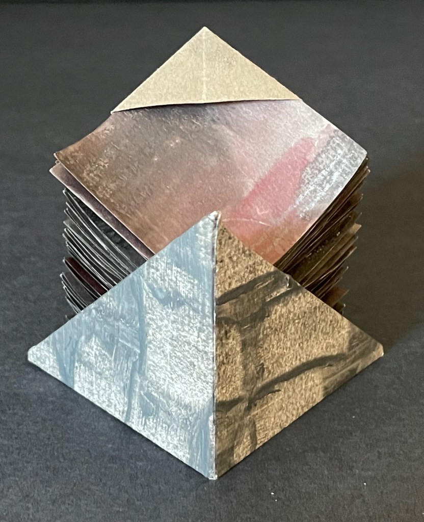
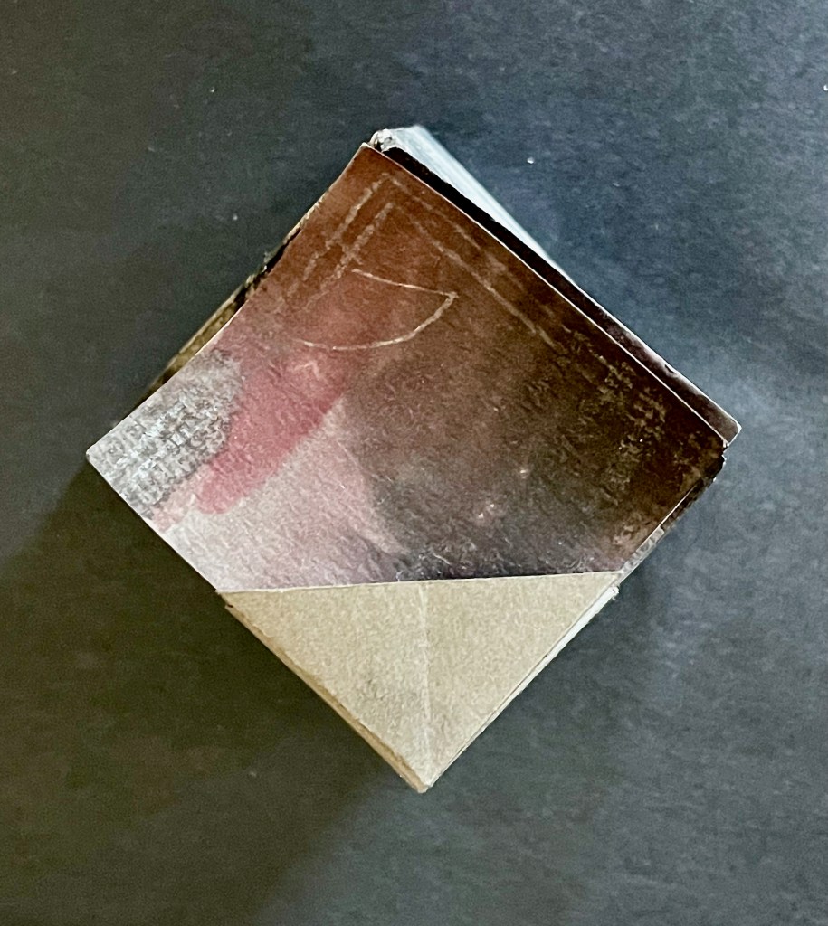
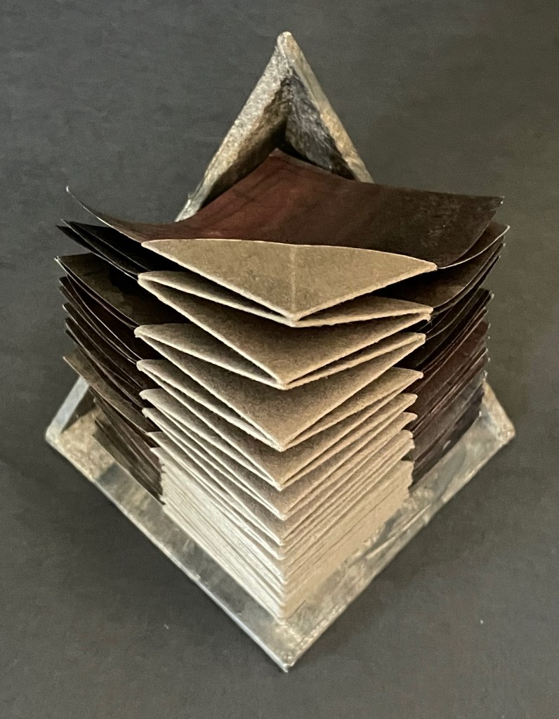
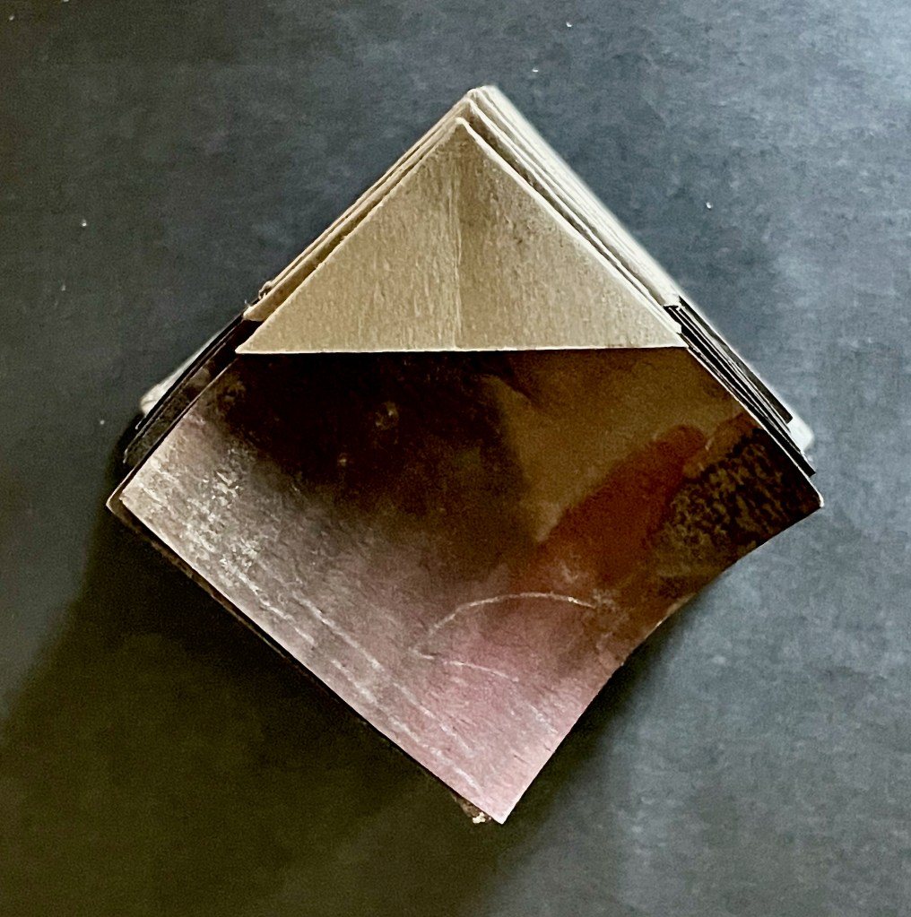
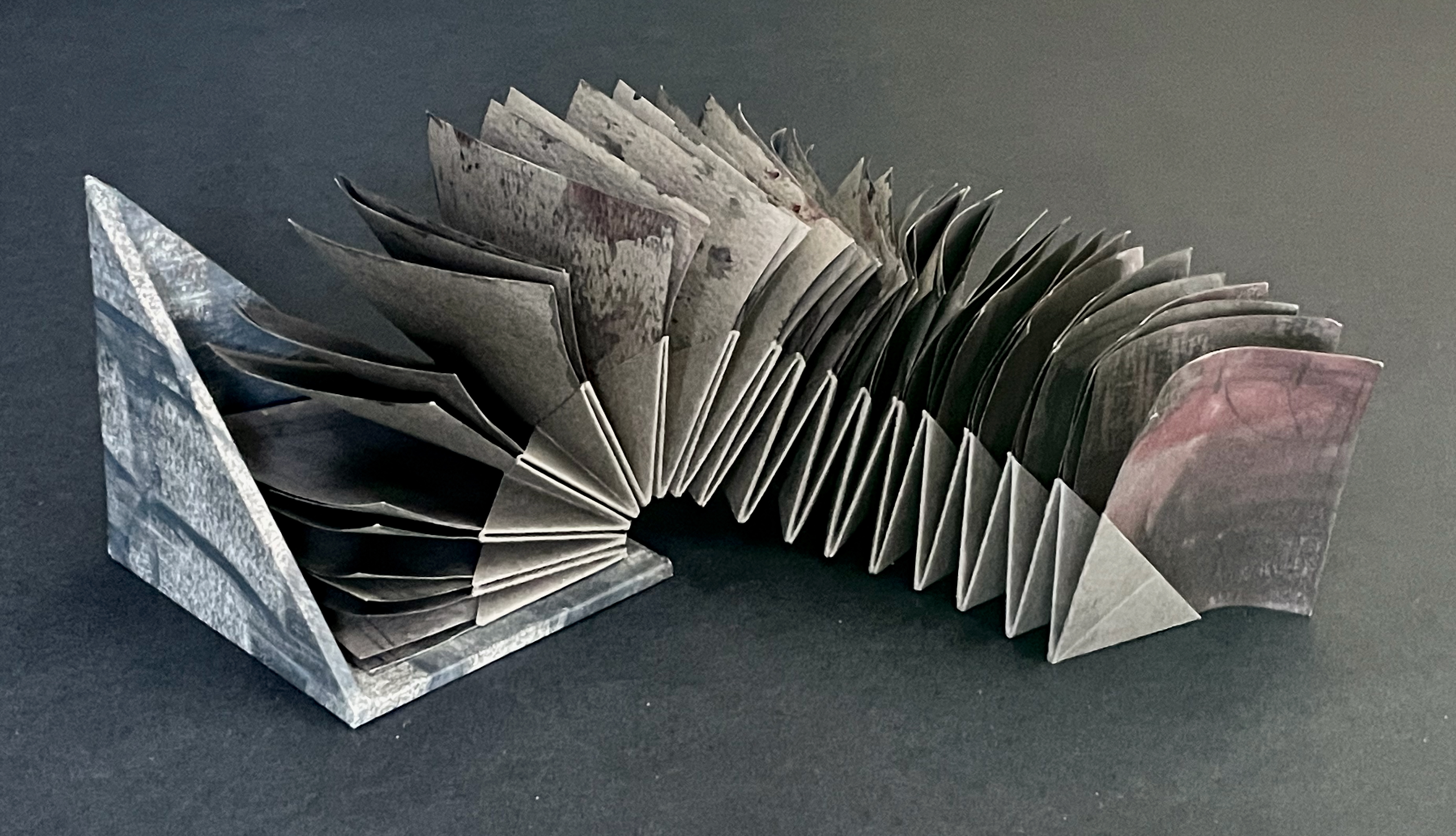
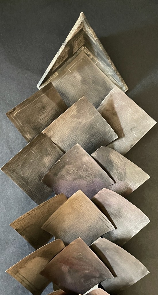
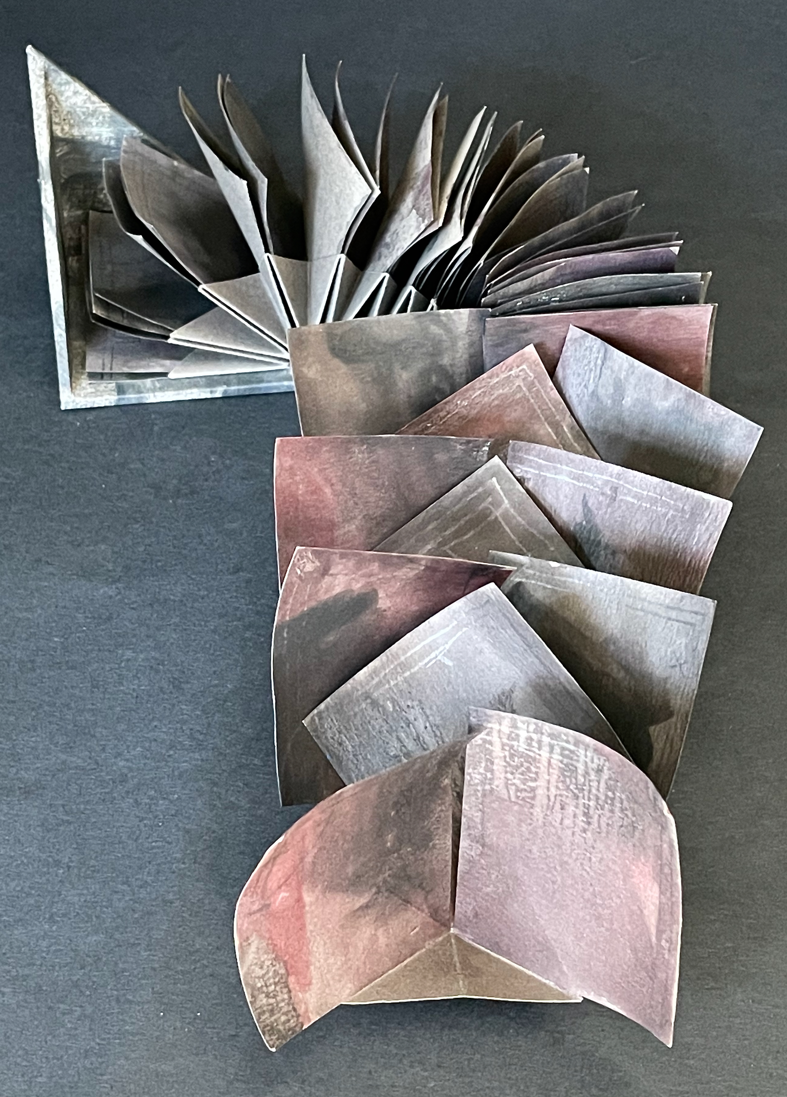
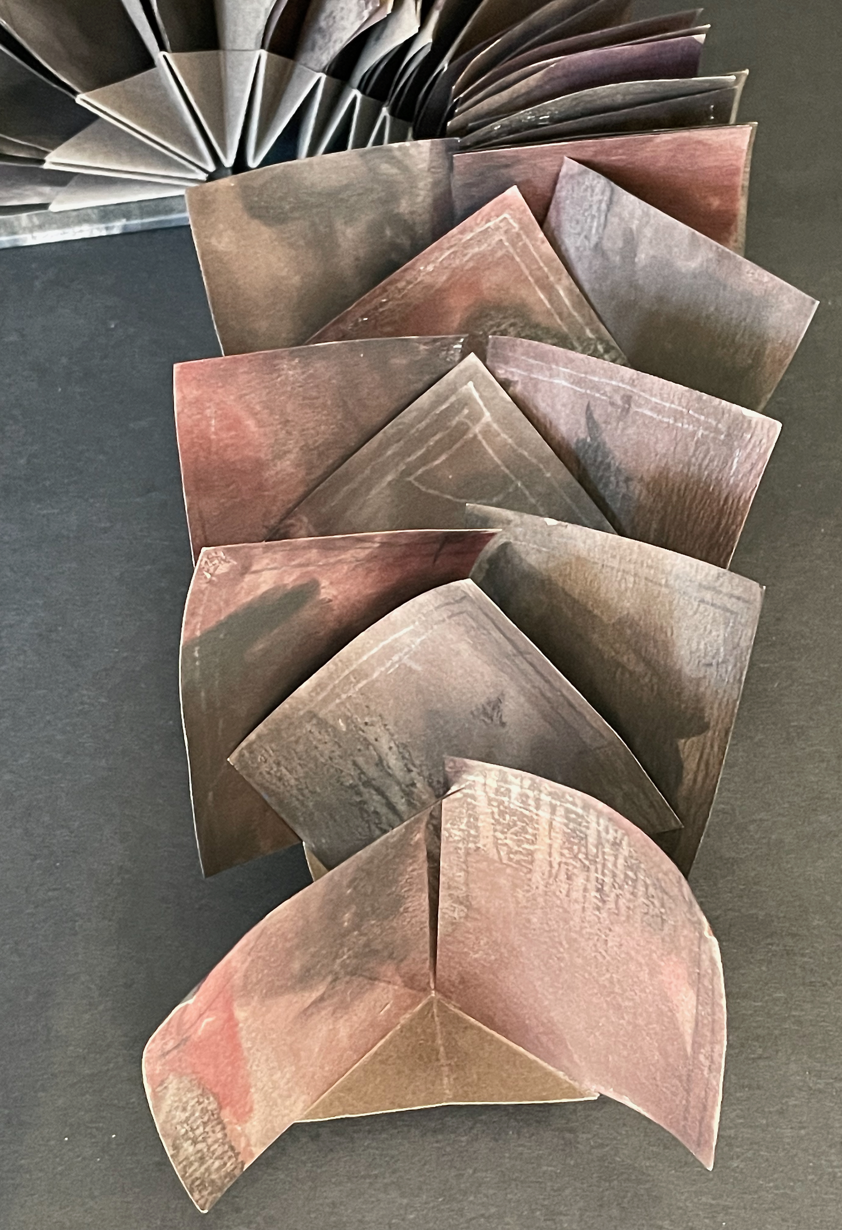
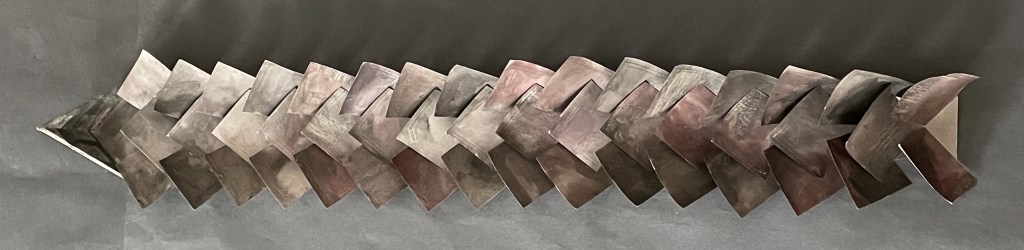
Within Every Room There is an Echo of the First (2018) Sarah Maker Diagonally halved box, painted-paper over millboard, paste paper. H65 x W65 x D65 (closed) mm, W730 (extended diagonally) mm. [45] panels Unique. Acquired from Ink and Awl, Seattle, US, 10 December 2025. Photos: Books On Books Collection. Displayed with permission of the artist.
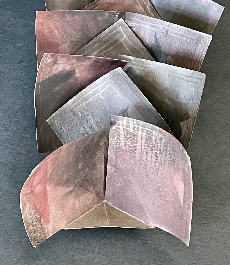
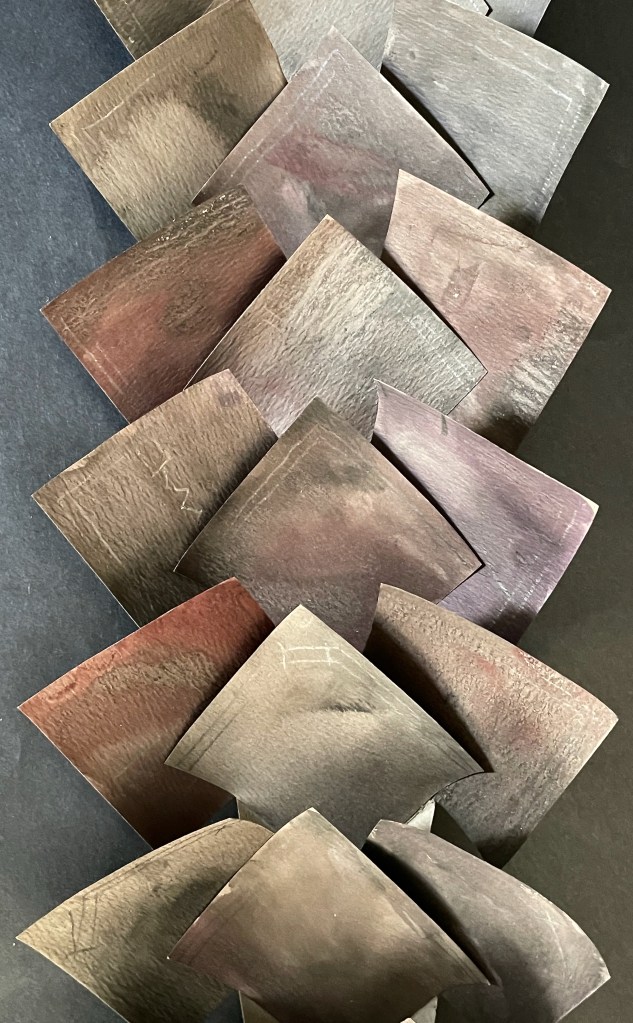
This small sculptural artist’s book that enacts its title is an engineered accordion with architectural pencil drawings on paste paper. Every aspect is remarkable. The millboard “cover” is a diagonally halved cube that forms the “corner” of the room from which its echoes will unfold. The accordion spine consists of folded tabs into which the pages are pasted. The pages have been shaped so that as the book is opened (the top page being pulled by its tab), they curve against each other like artichoke leaves and then spread as the angled spine pleats push them outwards.
The engineering recalls the ingenuity of Benjamin Elbel, Ed Hutchins, and Hedi Kyle, and Within Every Room exemplifies what happens when “material meets metaphor” in the hands and mind of an original book artist. The phrase comes from Richard Minsky, founder of the Center for Book Arts in New York, whose path Maker seems to be following and extending in Seattle, Washington. In 2017, she initiated (and still runs) the online program “areyoubookenough“, a bookbinding challenge to artists to create works within a month that respond to the month’s theme. In the same year, she founded Editions Studio, a community for book artists run by book artists. All that activity — along with Within Every Room and the next work — suggests that this artist is not only a maker but a builder.
The House that Book Built (2018)
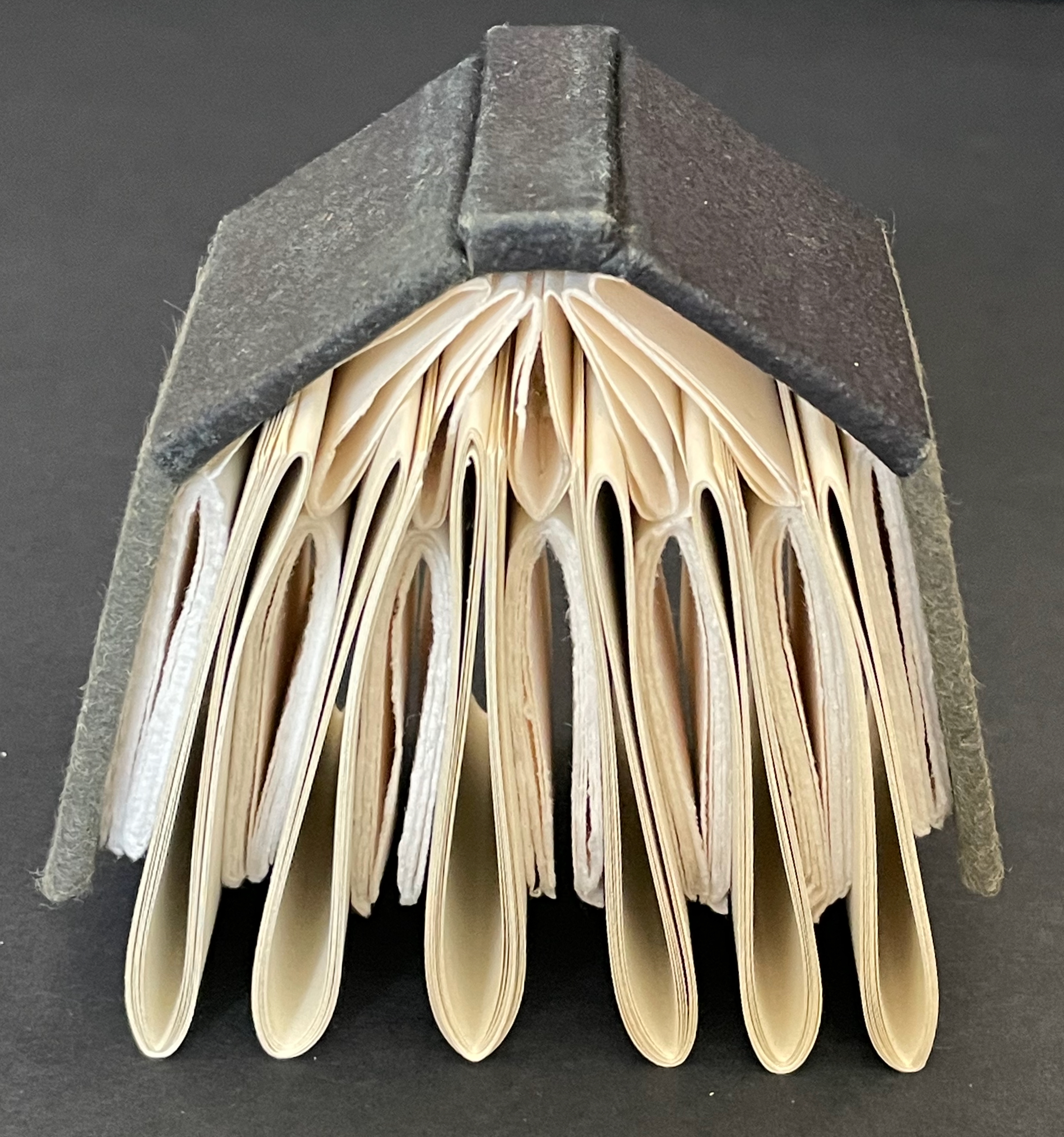
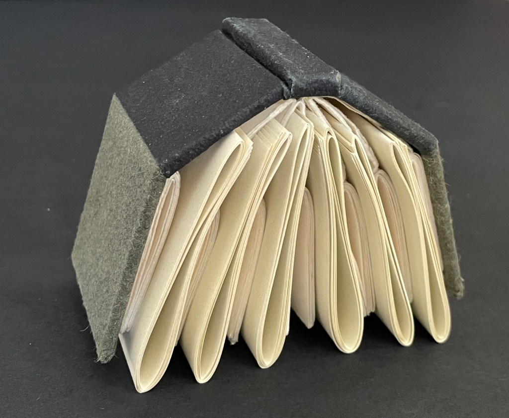
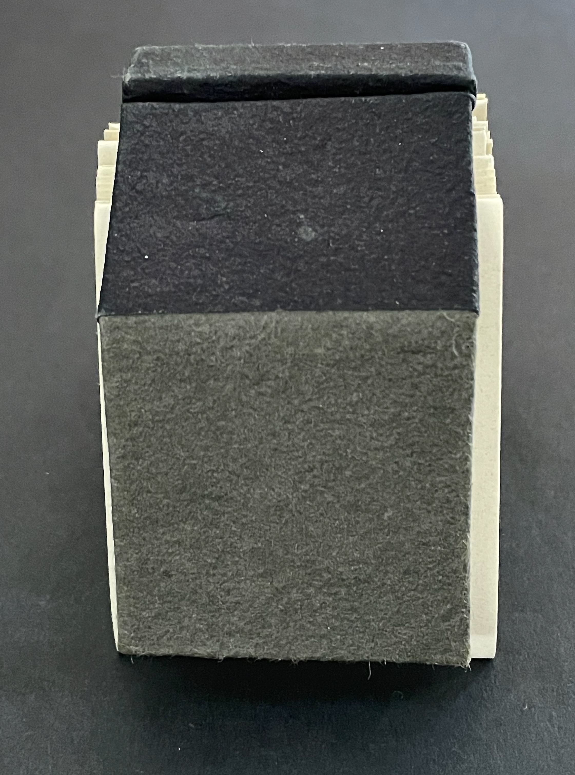
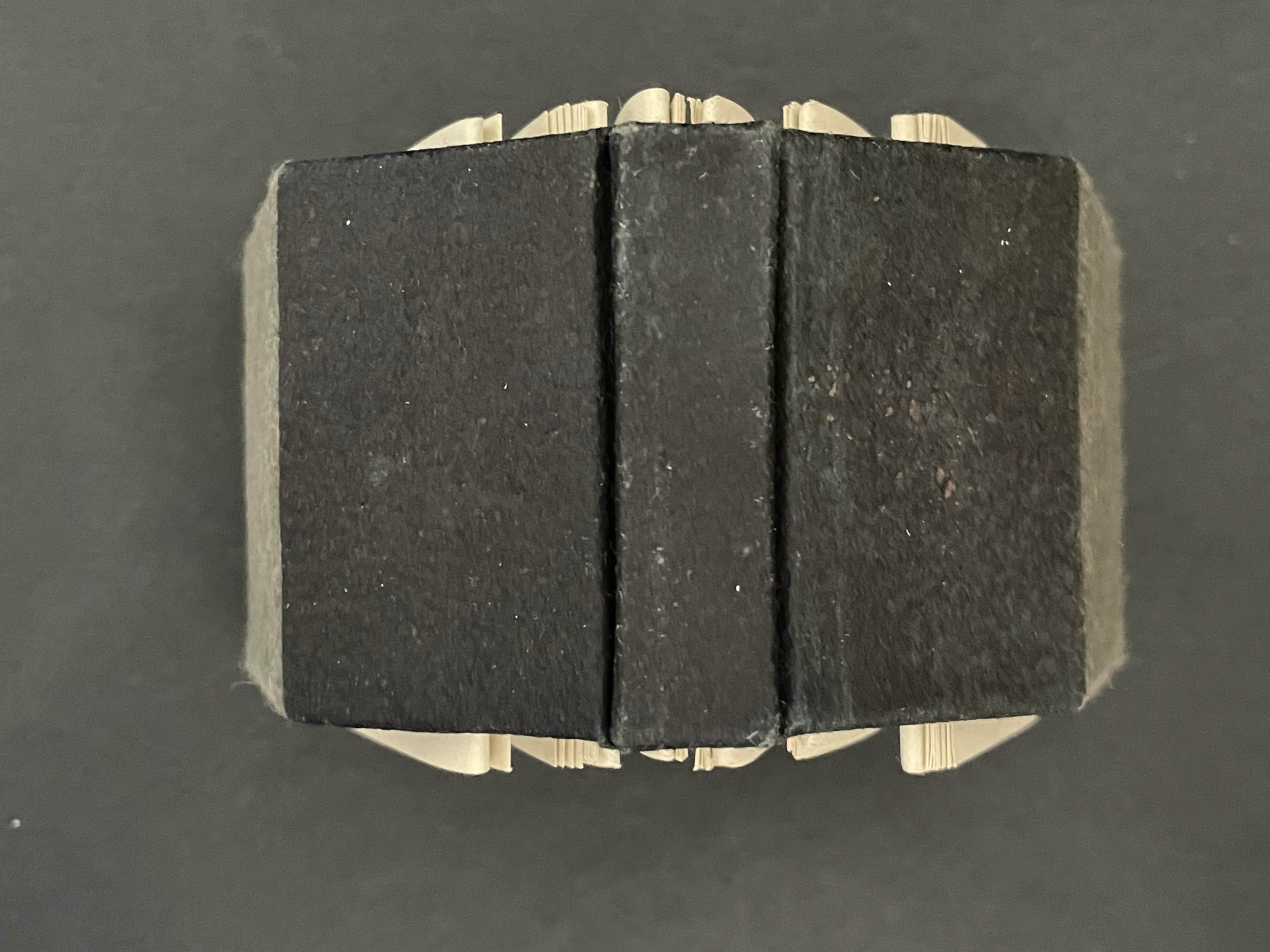
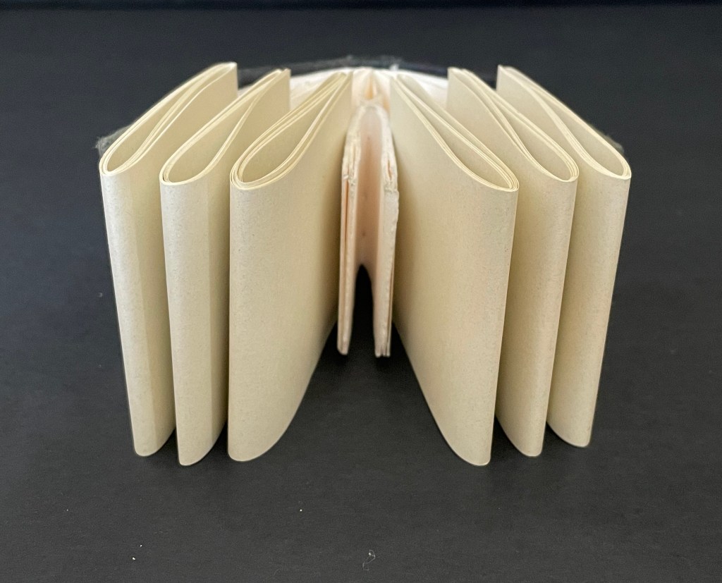
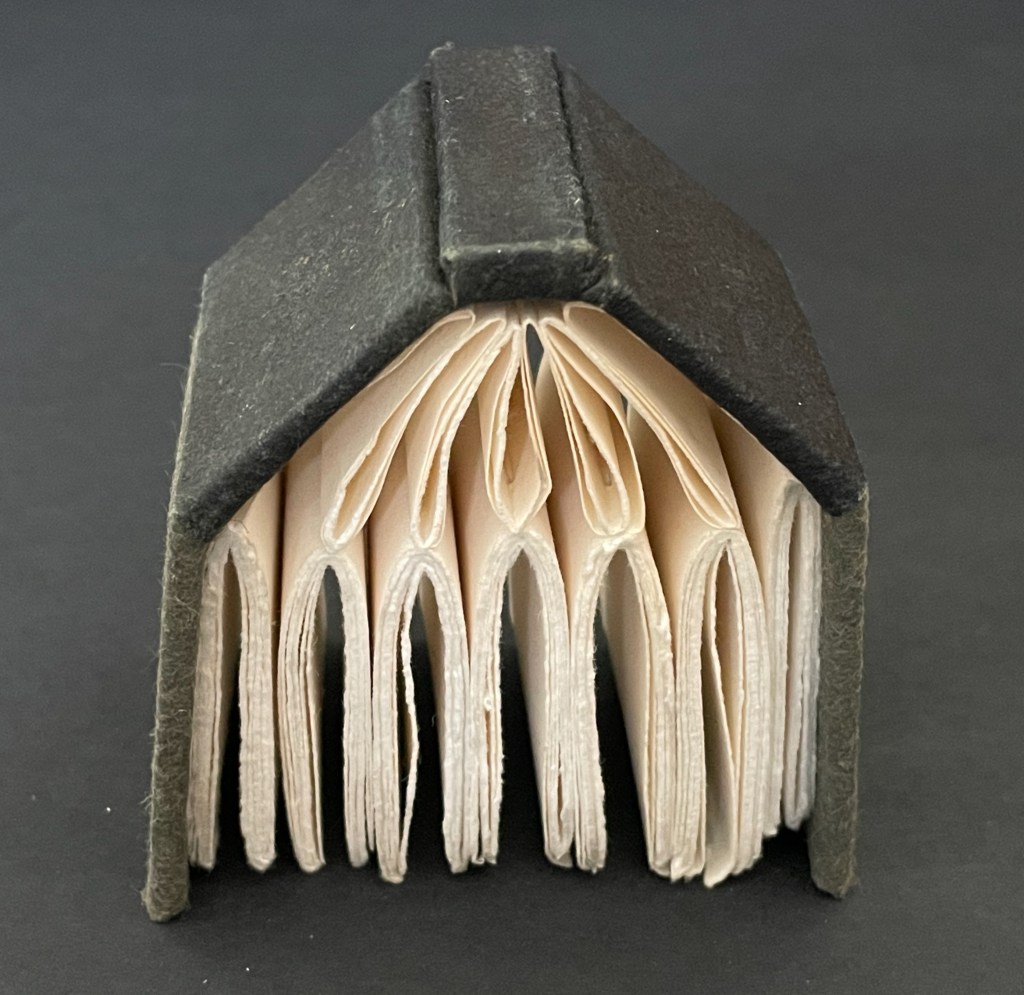
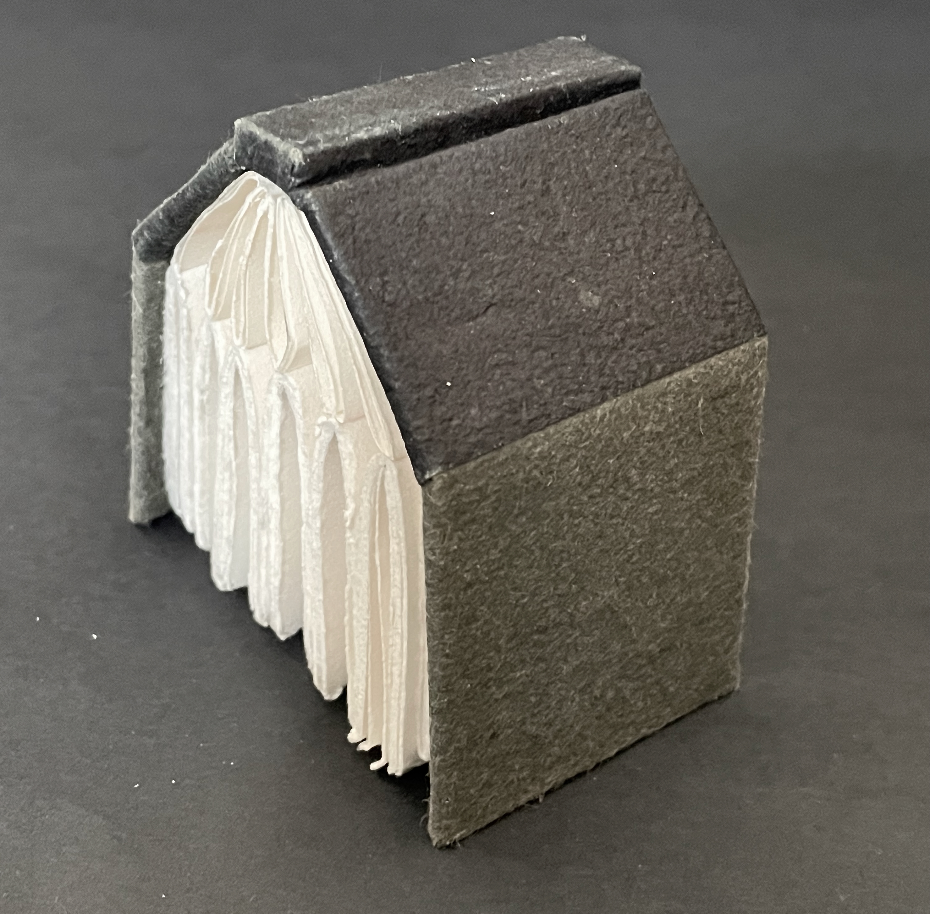
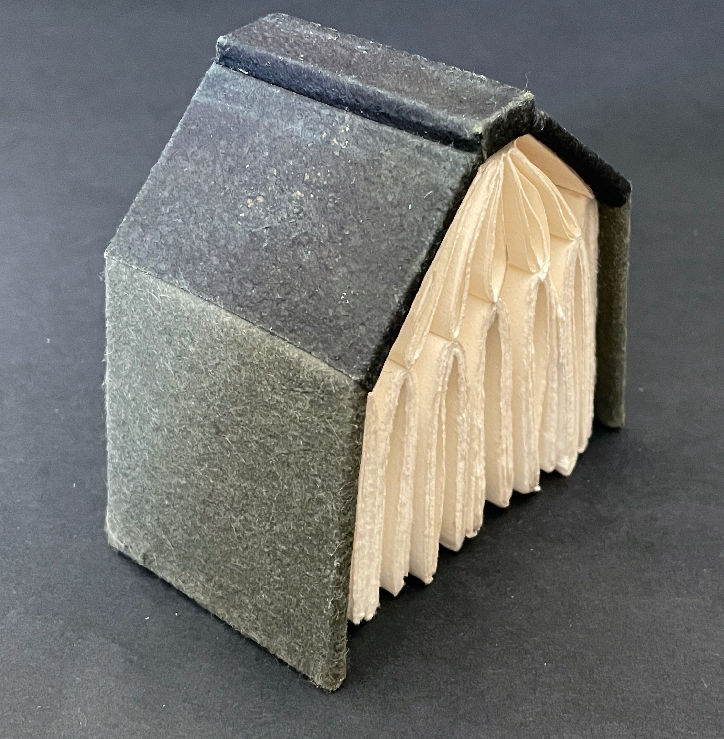
The House that Book Built (2018) Sarah Maker Case-bound hard cover, felt and paper over boards, seven stub-sewn gatherings of folios of cotton printmaking paper, six loose twice-folded gatherings of folios of Cave(?) paper inserted between the stub-sewn gatherings. H85 x W105 x D58 mm. [220] pages in stub-sewn gatherings; [96] pages in loose gatherings Unique. Acquired from Ink and Awl, Seattle, US, 10 December 2025. Photos: Books On Books Collection. Displayed with permission of the artist.
In another connection to Richard Minsky, all of the paper and boards for The House that Book Built were salvaged from recycling at the Center for Book Arts in New York City. Like the book artists’ studios and homes I have seen, The House that Book Built is stuffed to the rafters with its core material. Of course, even the roof and exterior walls enter into the spirit. It would not be the same artwork with a flat roof of asphalt tiles and plexiglas siding.
The color of the laid-in folios reminds me of Your House (2006) by Olafur Eliasson, which in turn reminds me how inadequate a simple side-by-side exhibition of the two works would be. Both demand the viewer’s touch.
Below, the laid-in folios have been removed, letting the house exhale and give more visual room to the stud-sewn gatherings of cotton printmaking paper. If viewers were allowed do this in an exhibition, they would be appreciating the contrast between the rough cotton paper and the smoother book paper just removed as well as appreciating how the house front now takes on a semblance to a Gothic window without the stained glass.
Your House and The House that Book Built both offer the pleasure of nosing through another’s house. Your House invites the viewer to a page-by-page meditation of laser-cut interior space while doing so. Maker’s snug abode offers the Quaker-like contemplation of the homespun that has been spun with tools made by the spinner.
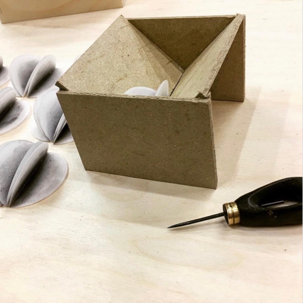
Punch cradle made specifically to punch the sewing stations for The House that Book Built. Photo: Courtesy of the artist.
Further Reading
“Architecture“. 12 November 2018. Books On Books Collection.
Anne Covell bridges the domains of book art and the book arts. The Record offers a skillfully constructed artist’s book that documents one of the first Trump Regime’s acts of depredation against history and truth. Historical Binding embodies her respect for the history of one of the book arts’ loveliest of crafts: stitching.
The Record (2017)
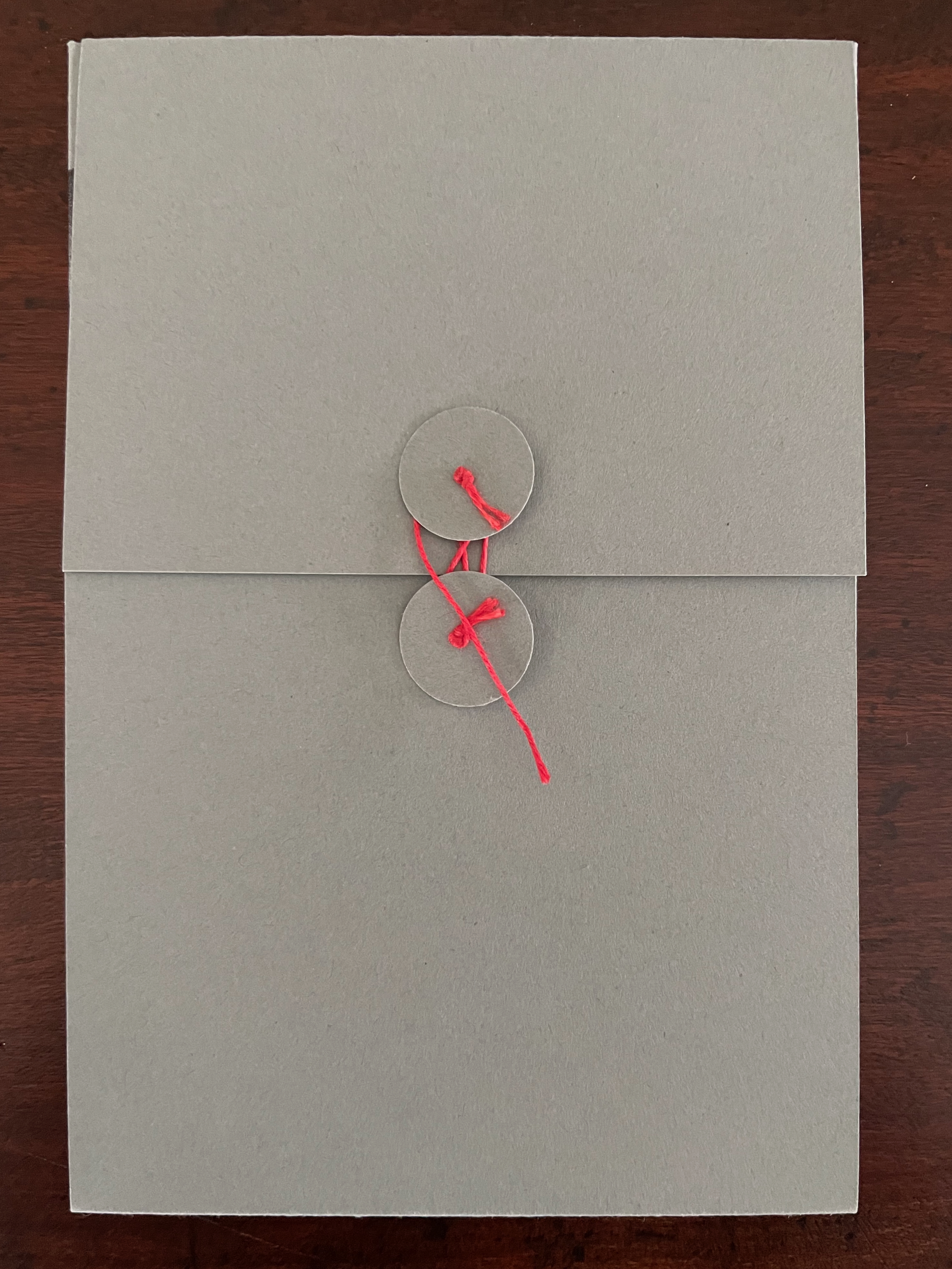
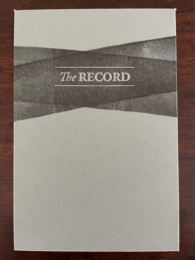
The Record (2017) Anne Covell Letterpress printed accordion on Masa paper with sumi wash and hand brayering. Housed in a 4-flap French paper enclosure with button and string ties. Enclosure: H165 x W110 x D6 mm. Book: H164 x W108 x D3 mm (closed); H327 x W1080 mm (open). 6.5 x 4.25 x .25 inches (closed), 13 x 42.5 x .25 inches (open) [36] panels. Edition of 60, of which this is #1. Acquired from the artist, 10 September 2025. Photos: Books On Books Collection.
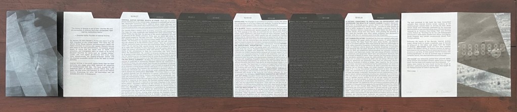
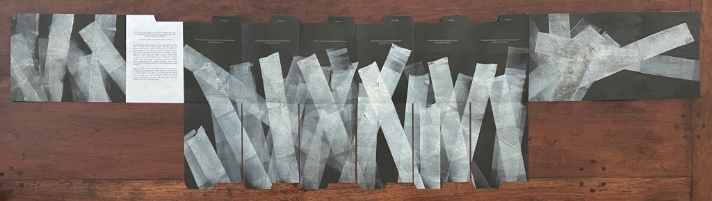
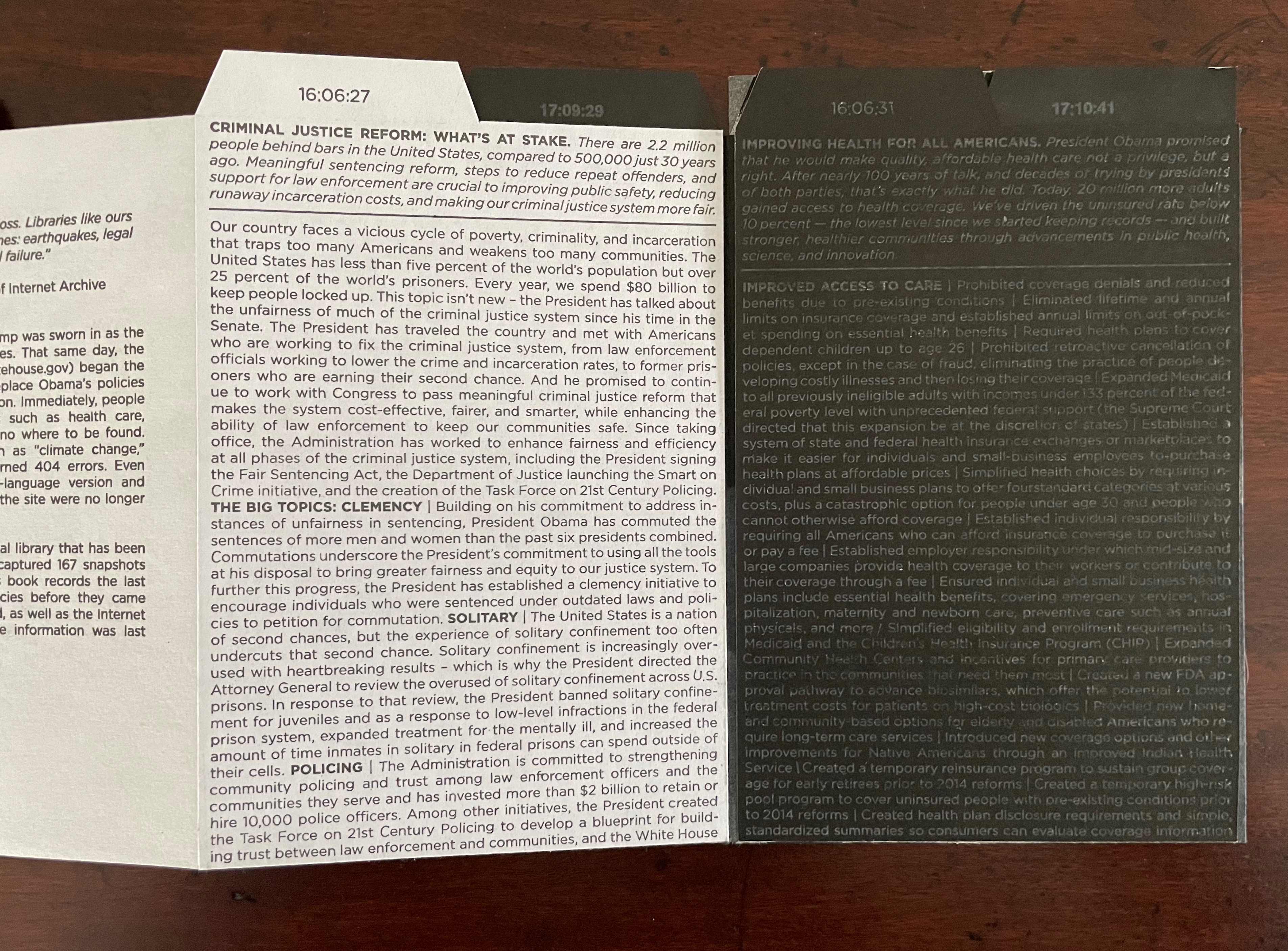
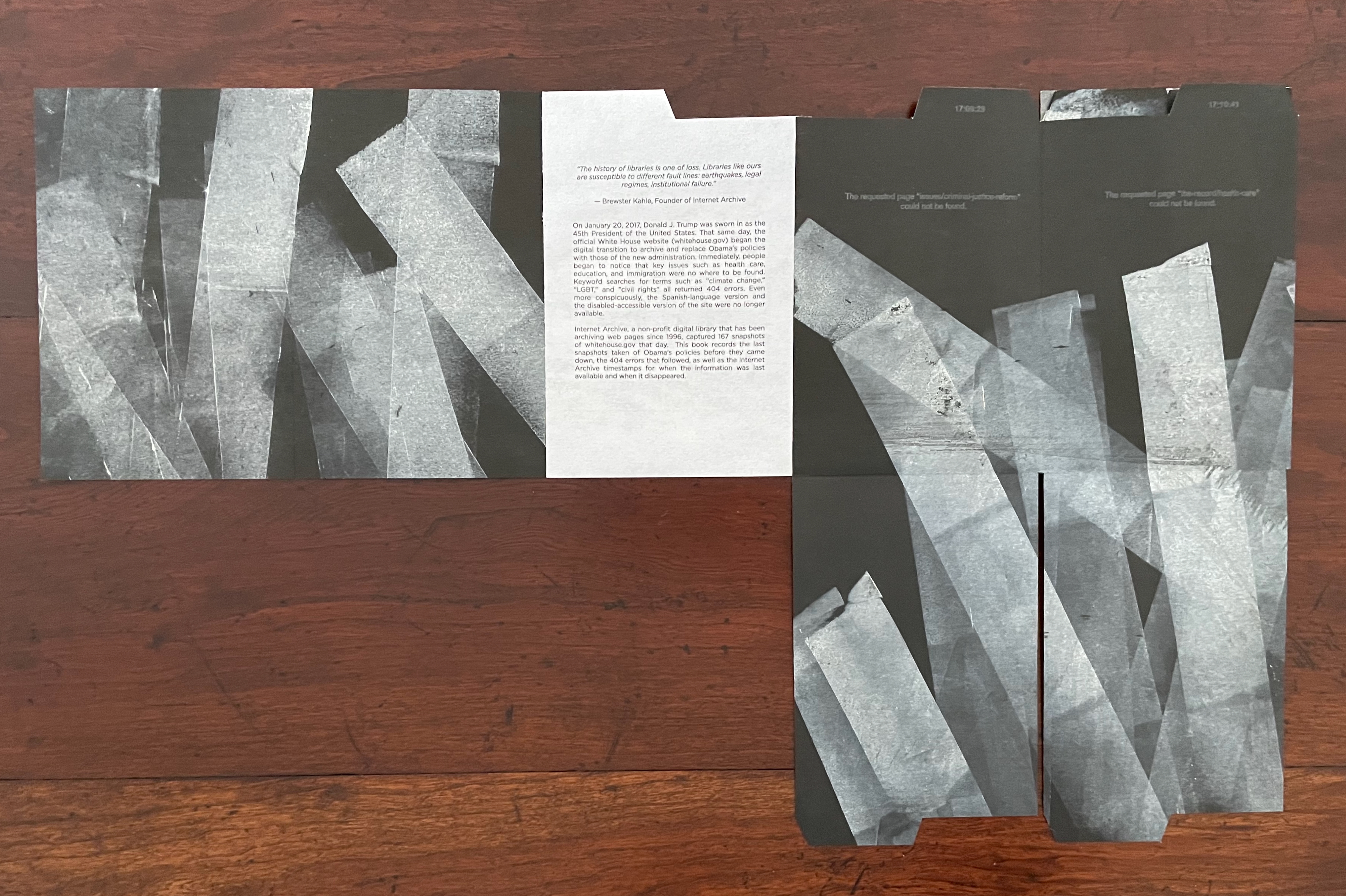
On January 20th, 2017, Donald J. Trump was sworn in as the 45th president of the United States. That same day, the official White House website (whitehouse.gov) began the digital transition to archive and replace Obama’s policies with those of the new administration. Immediately, people began to notice that key issues such as health care, education, and immigration were nowhere to be found. Keyword searches for terms such as “climate change,” “LGBT,” and “civil rights” all returned 404 errors. Even more conspicuously, the Spanish-language version and the disabled-accessible version of the site were no longer available. Internet Archive, a non-profit digital library that has been archiving webpages since 1996, captured 167 snapshots of whitehouse.gov that day. This book records the last snapshots taken of Obama’s policies before they came down, the 404 errors that followed, as well as the Internet Archive timestamps for when the information was last available and when it disappeared. (Anne Covell).
The fold-downs enact the digital shredding of the previous administration’s policies referencing existing laws that the Trump Regime opposed.
In response to the 6 January 2021 insurrection, Russell Maret and Sarah Moody published Three Constitutions, whose redactions and translations offer a view of the interim state of affairs reflecting “the cynical, ineffectual state of political discourse in the United States”. On the eve of the 25oth anniversary of the founding of the USA, will there be another work such as Covell’s or Maret and Moody’s to represent the second Trump Regime’s violation and shredding of law, judicial orders, and constitutional rights?
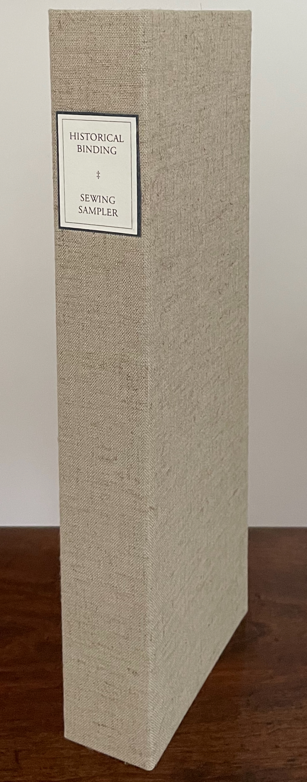
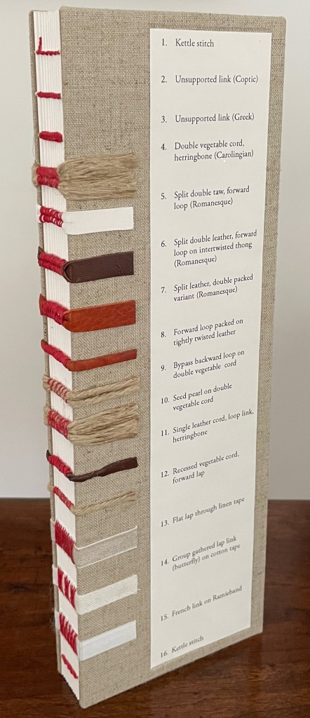
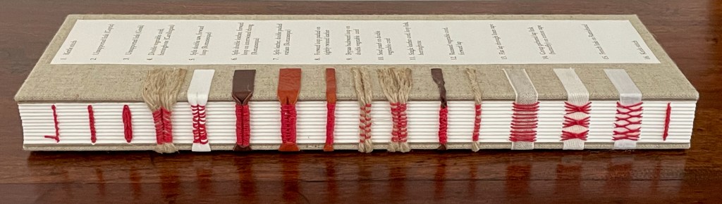
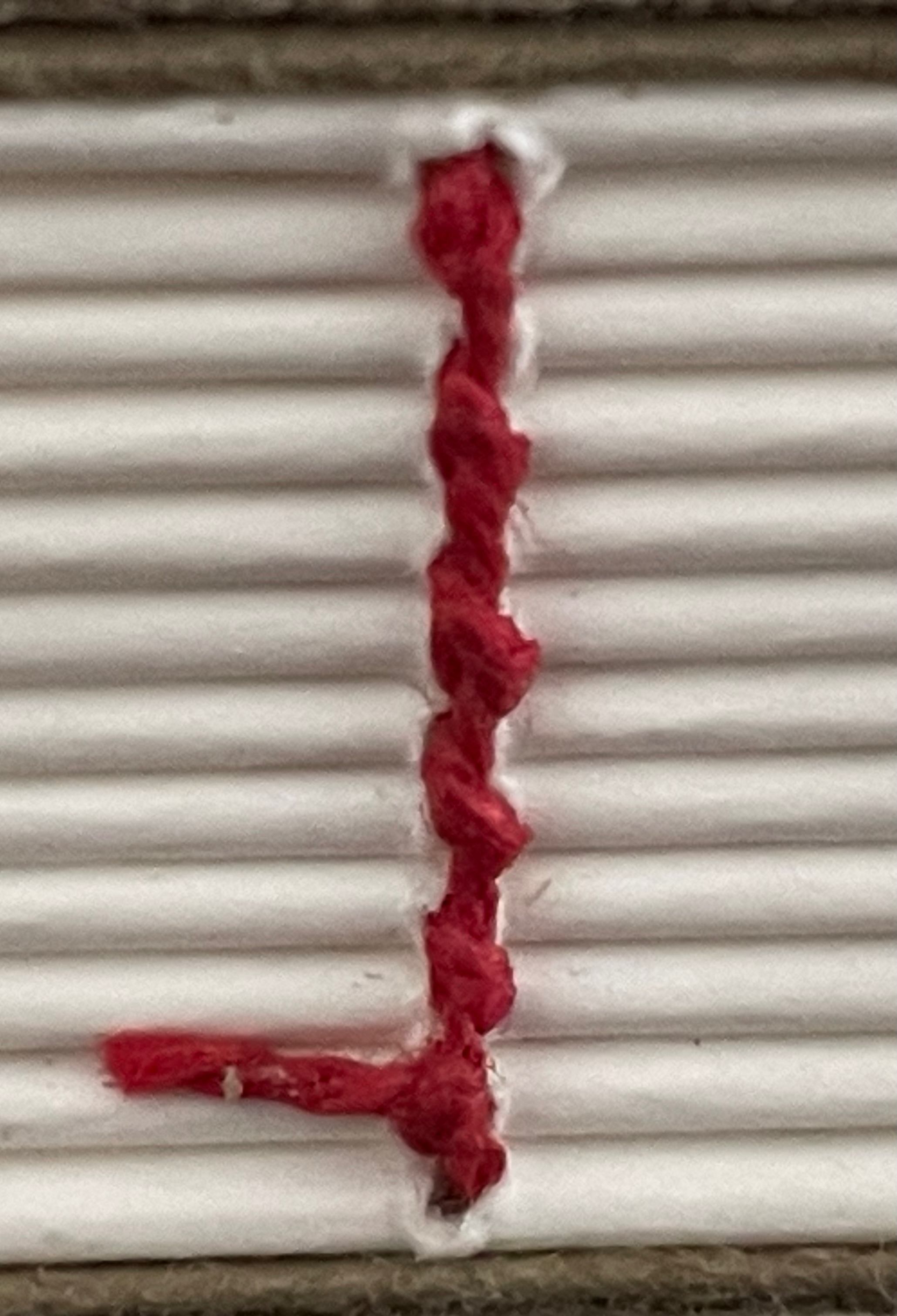
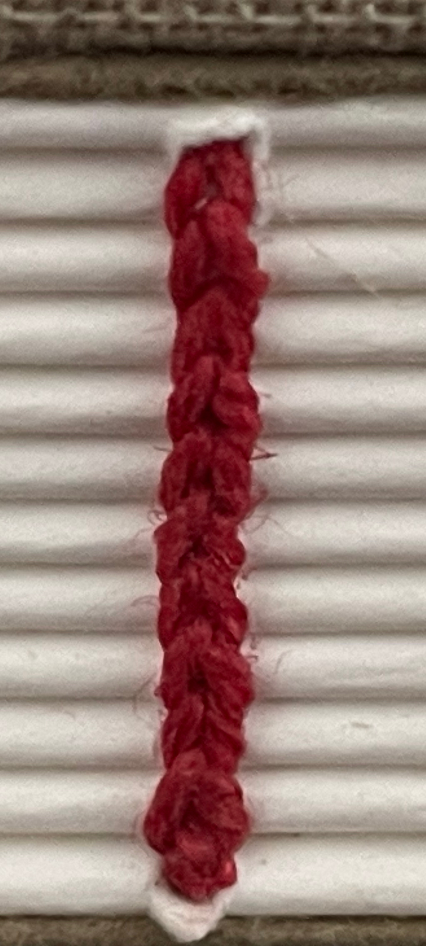
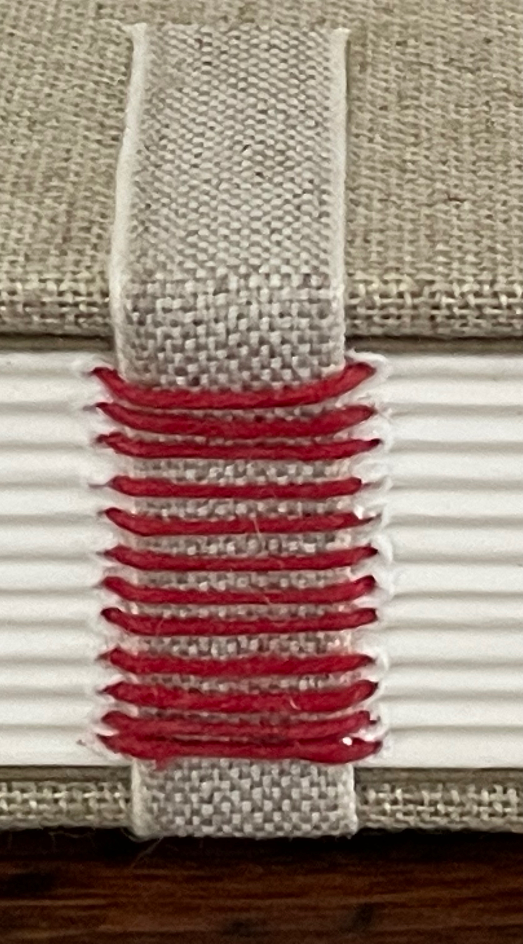
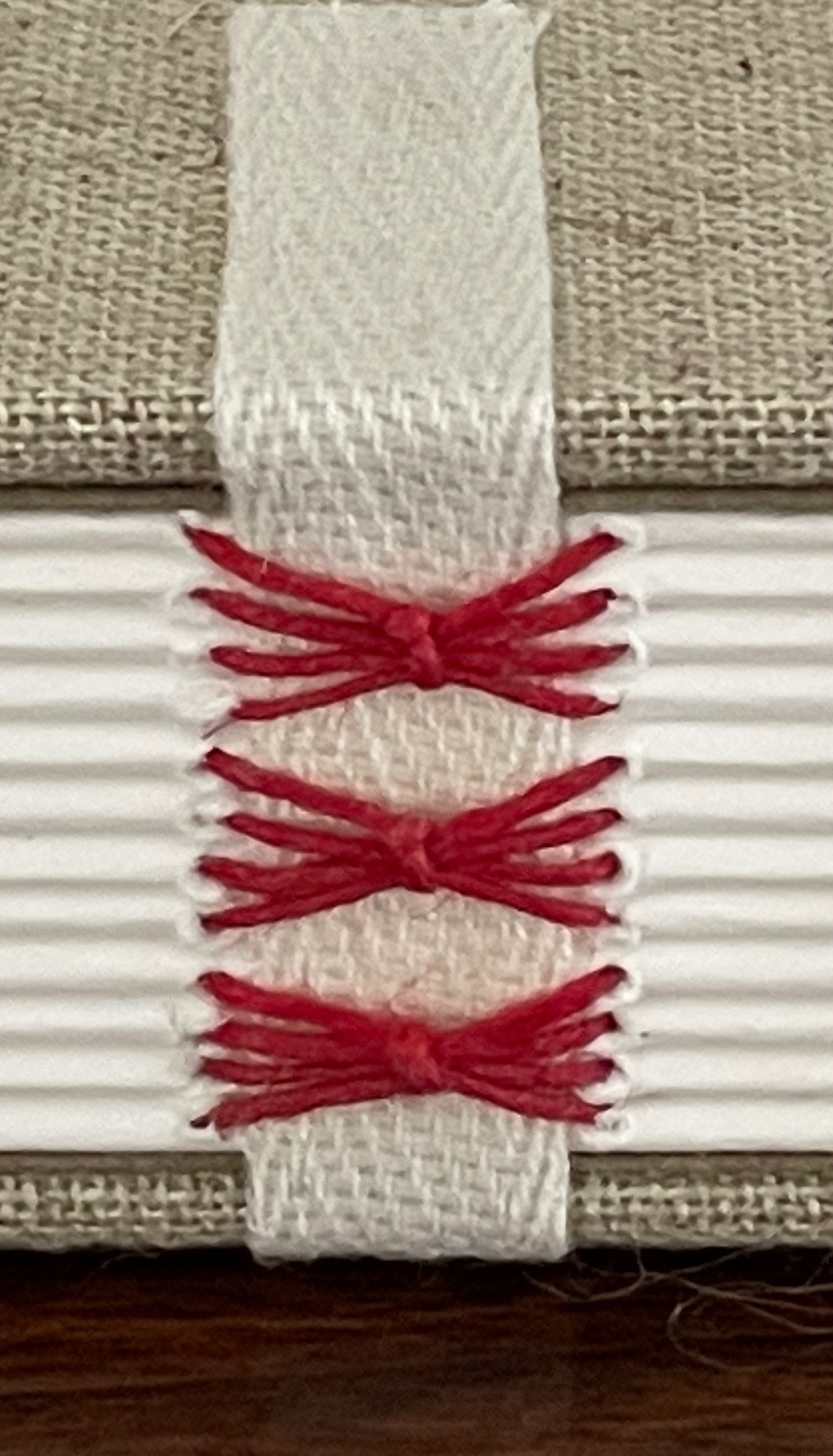
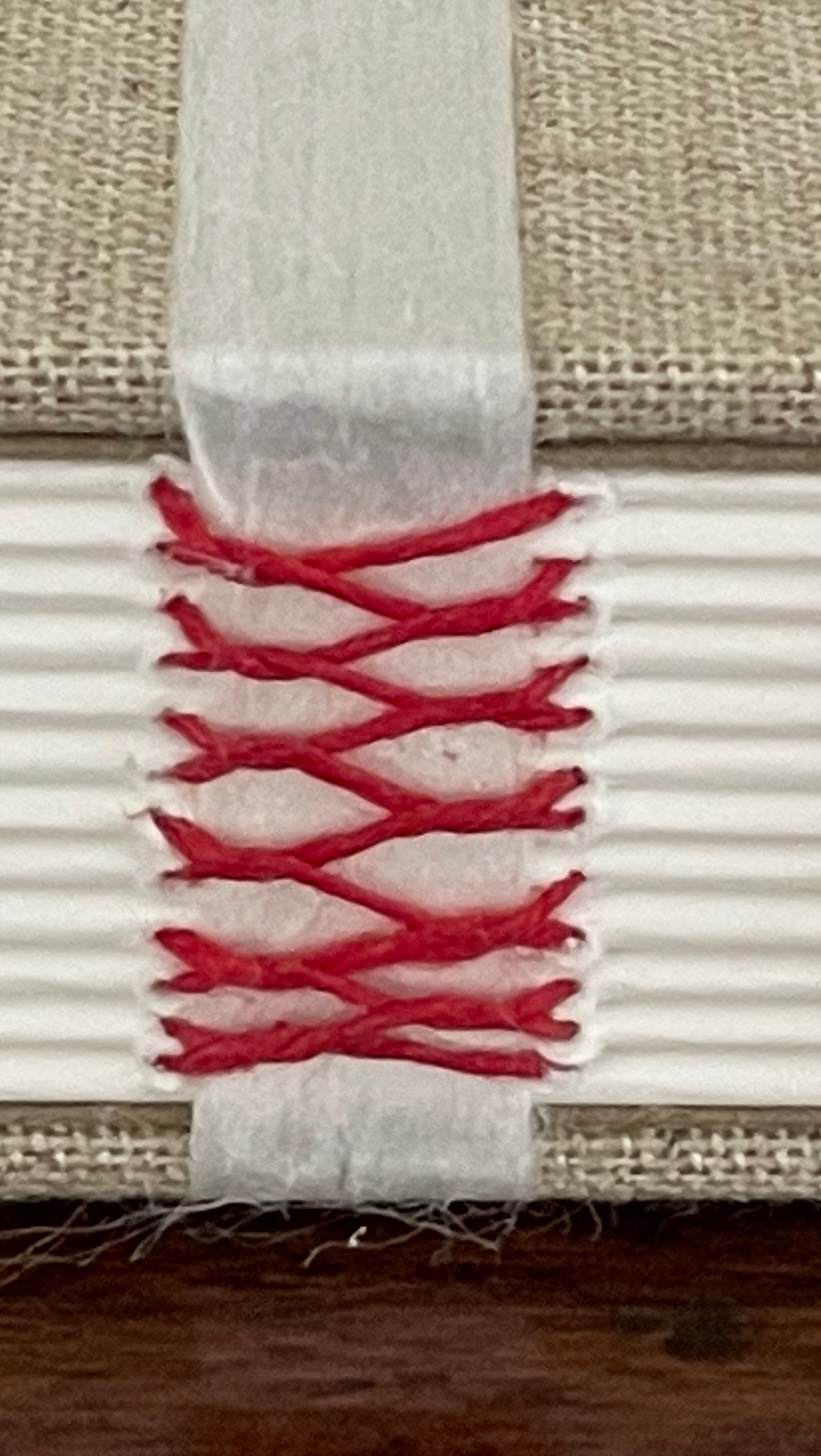
Historical Binding: Sewing Sampler (2025)
Historical Binding: Sewing Sampler(2025) Anne Covell Clamshell box. Open-spine binding with cloth-covered boards and plain doublures. Box: H330 x W120 x D45 mm. Book: H305 x W100 x D25 mm. [288] pages. Made to order. Acquired from the artist 10 September 2025. Photos: Books On Books Collection.
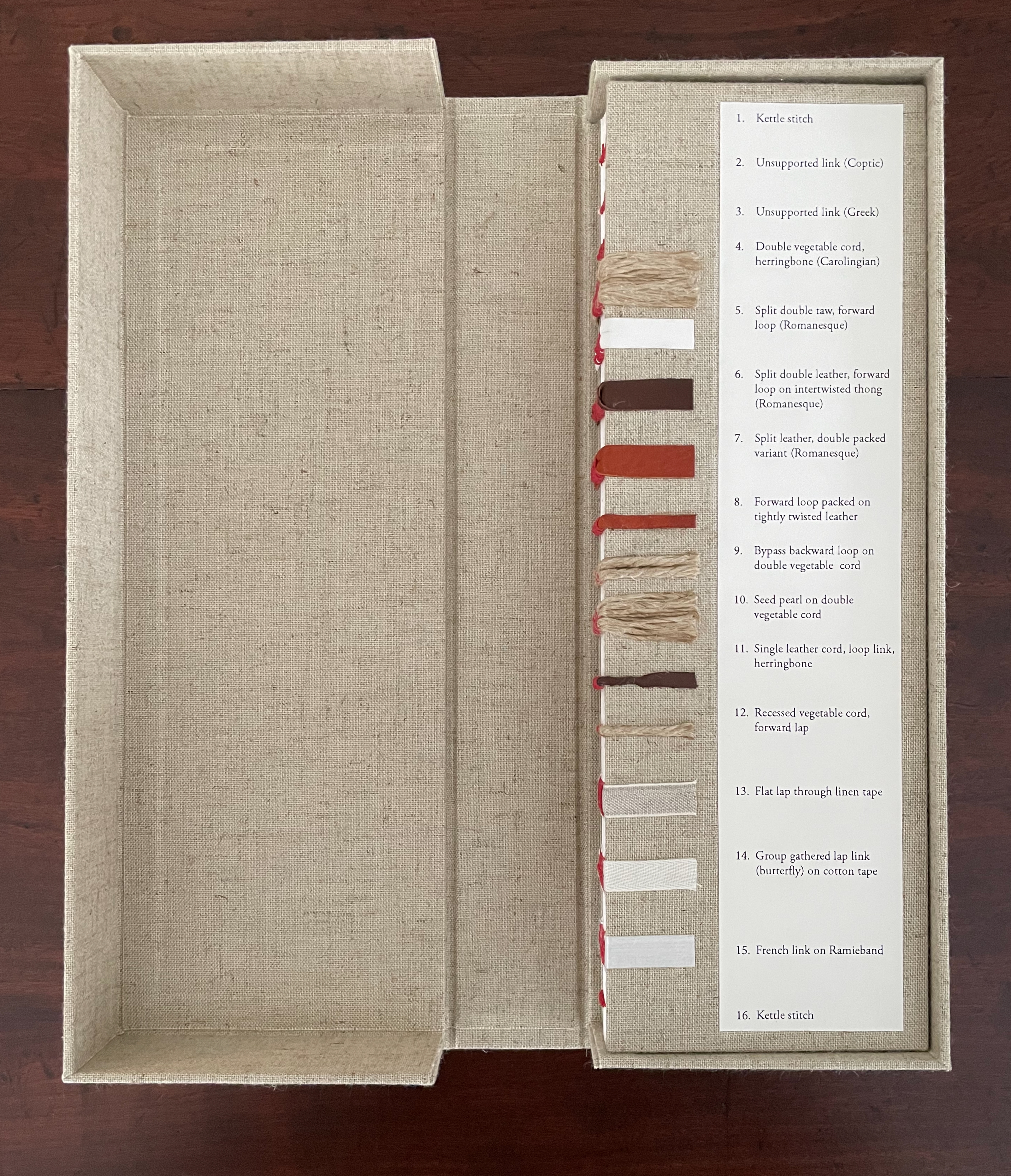
Spine sewing is one of the hidden book arts as it is most often covered by a case binding of paper, cloth, or leather (real or faux). Covell’s Historical Binding: Sewing Sampler:
is designed for bookbinders and book enthusiasts as a personal reference and/or for teachers/historians with a focus in book history and book conservation. This is a large folio size blank book featuring varied sewing techniques that can also be used as a ledger or unique journal or sketchbook. It includes one hardcover sampler book with the option to be housed in a custom clamshell box covered in natural linen bookcloth. The sampler includes 16 different sewing methods both sewn on supports (hemp cord, leather and taw, linen and cotton tapes, and Ramieband) and sewn without supports. The sampler highlights the historical sewing styles inherent to their structure and includes title descriptions that correspond to each sewing station. The styles progress chronologically across the spine from the earliest forms of multi-section sewing to more modern adaptations and sewing variants. (Anne Covell)
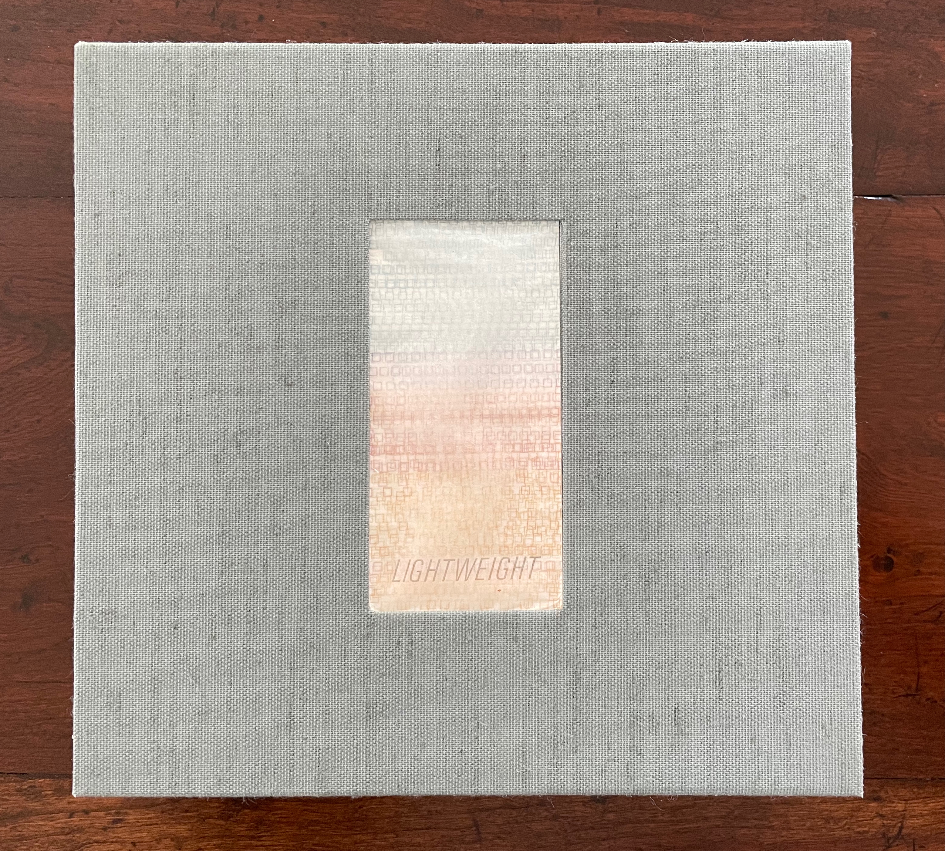
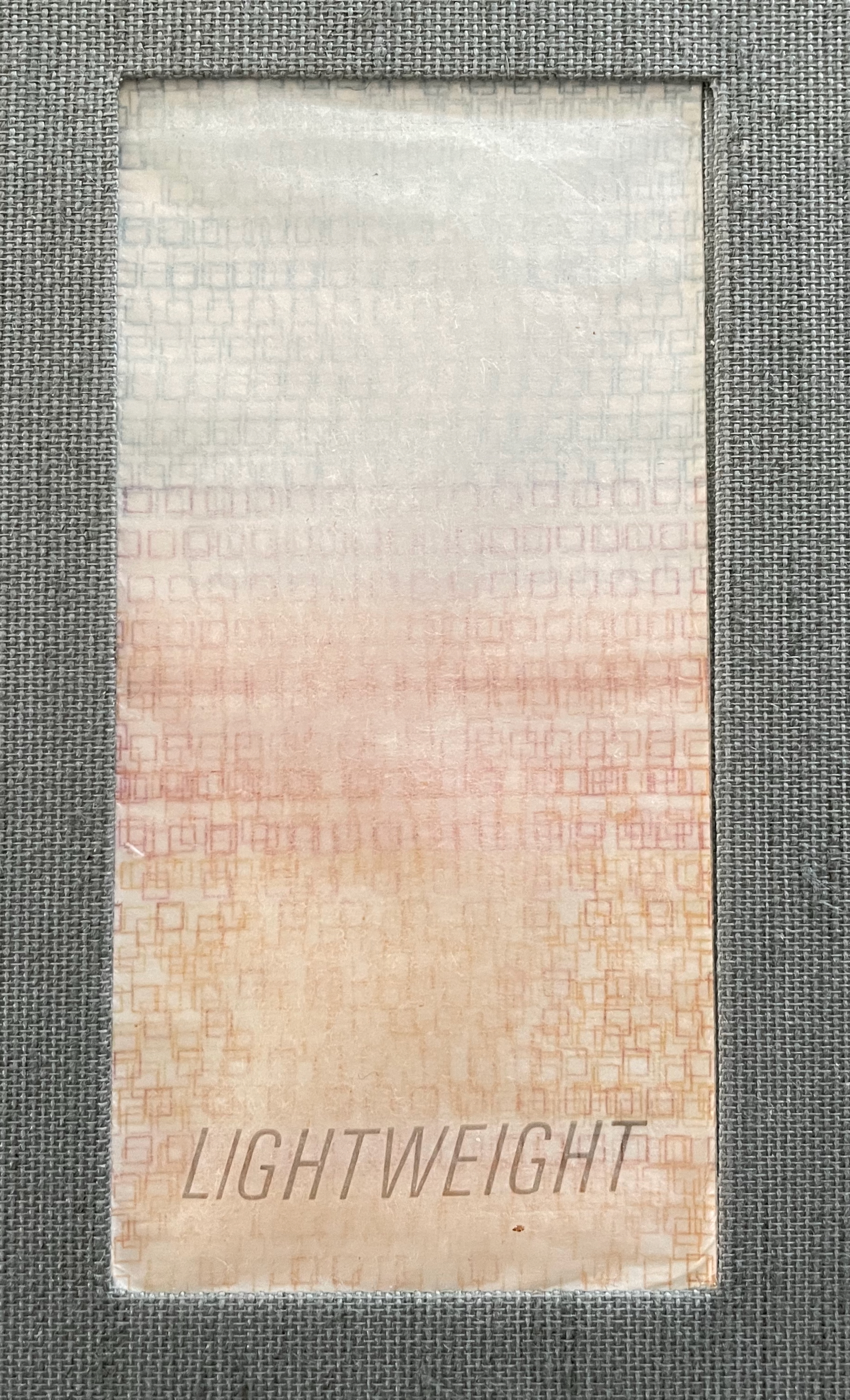
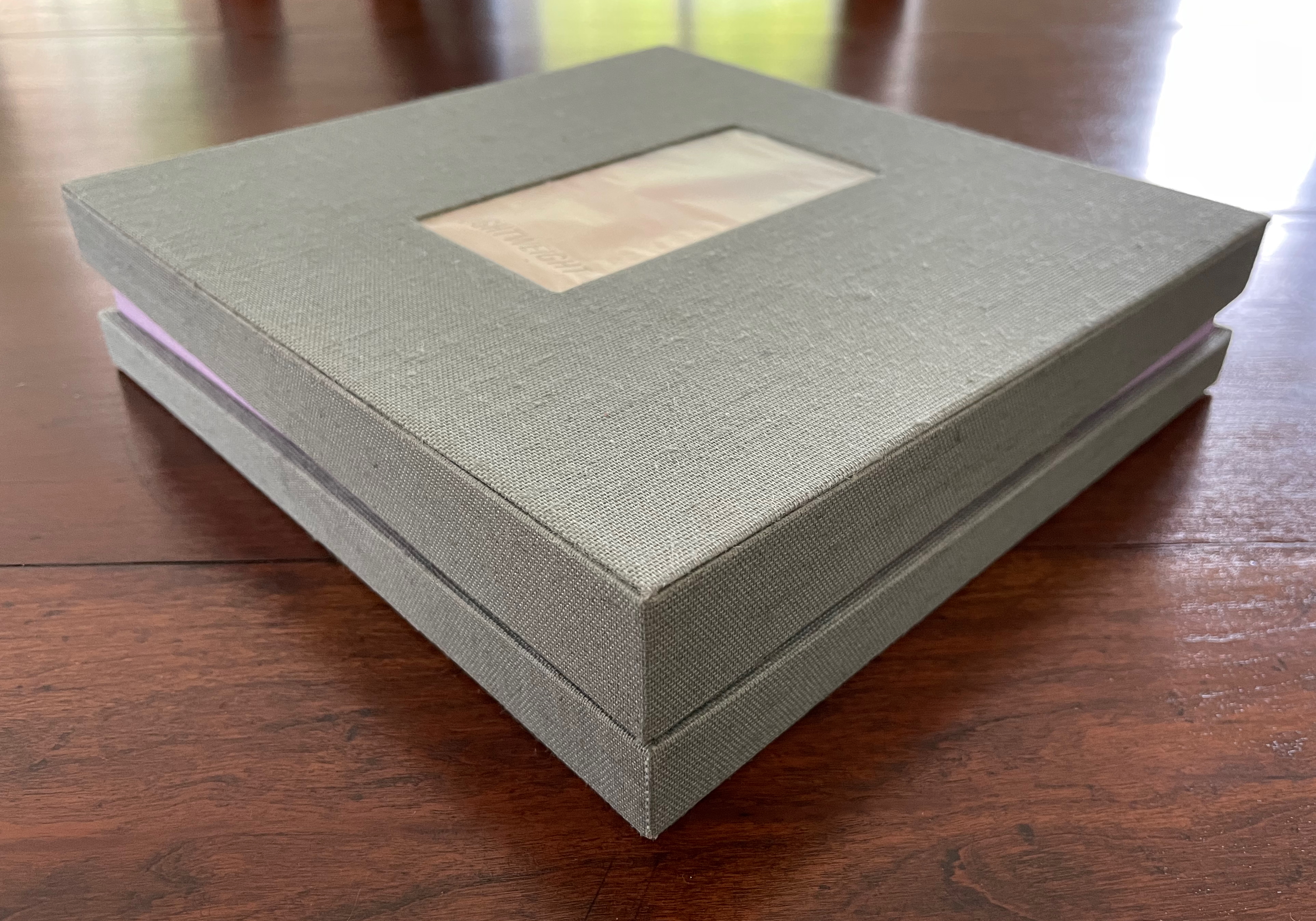
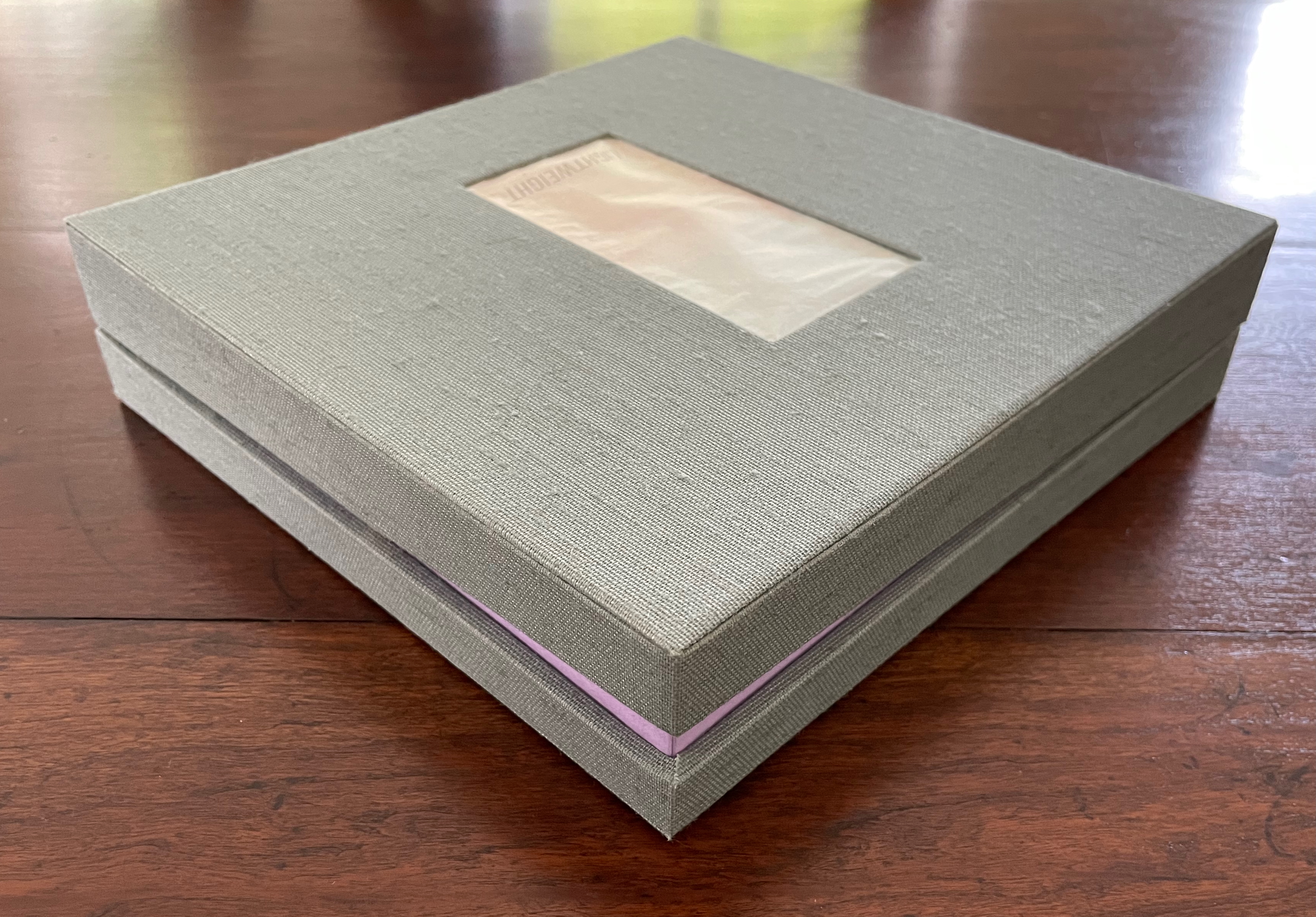
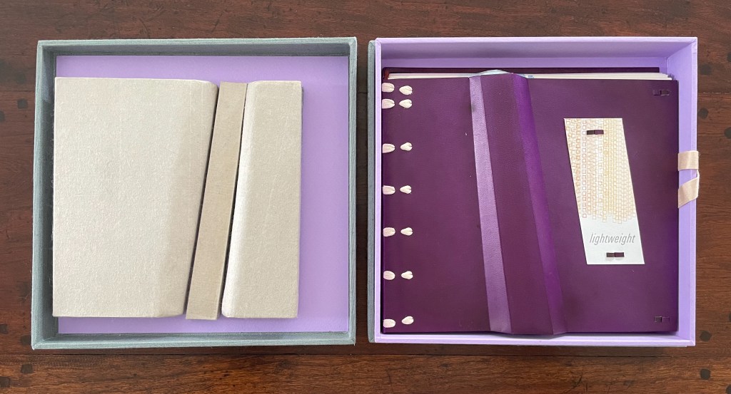
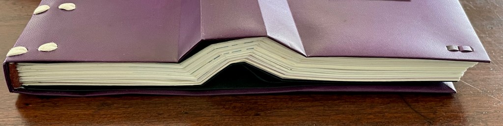
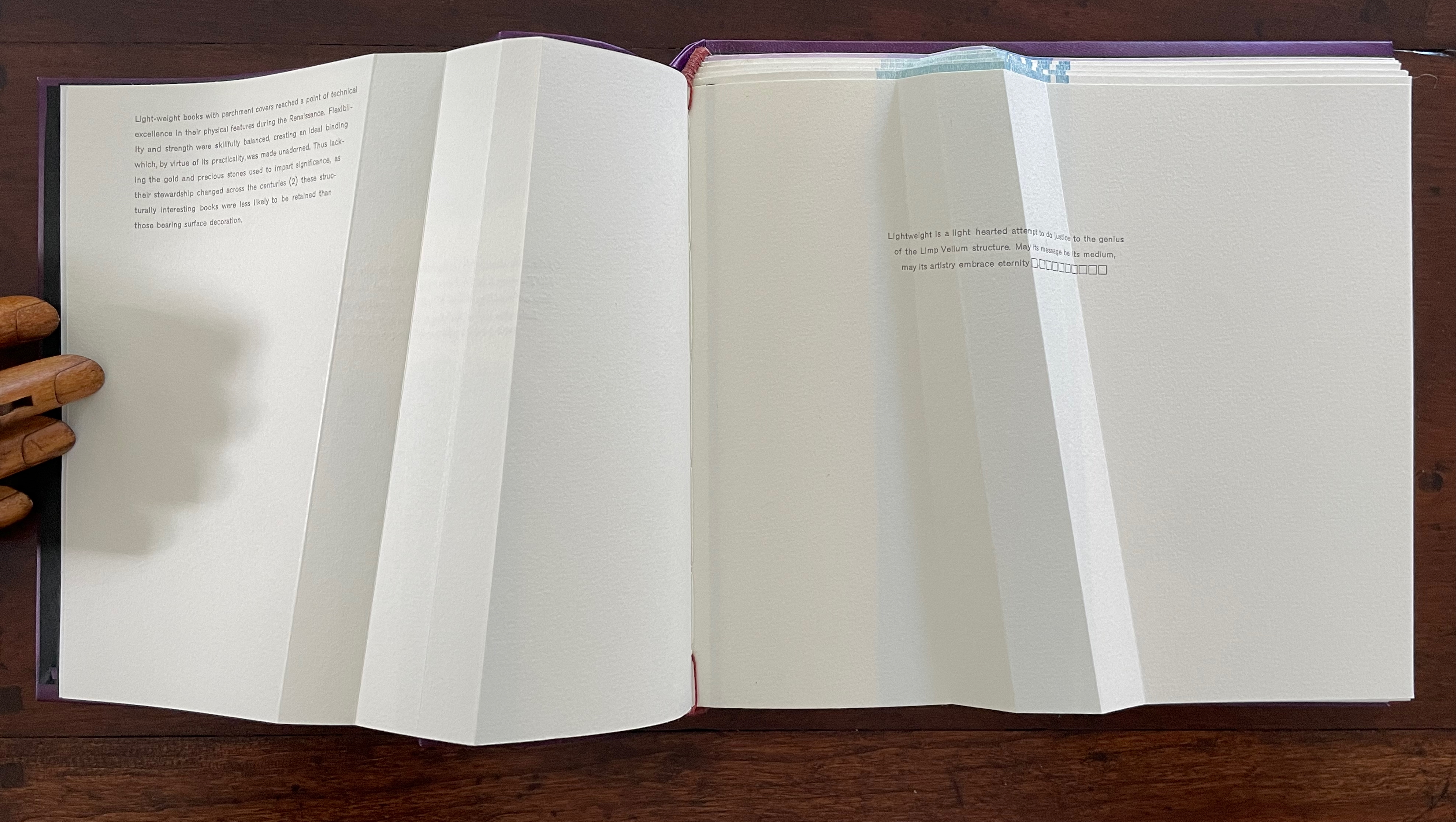
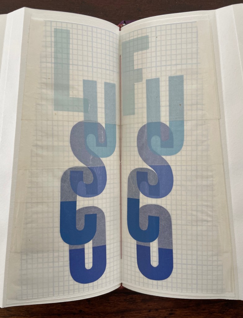
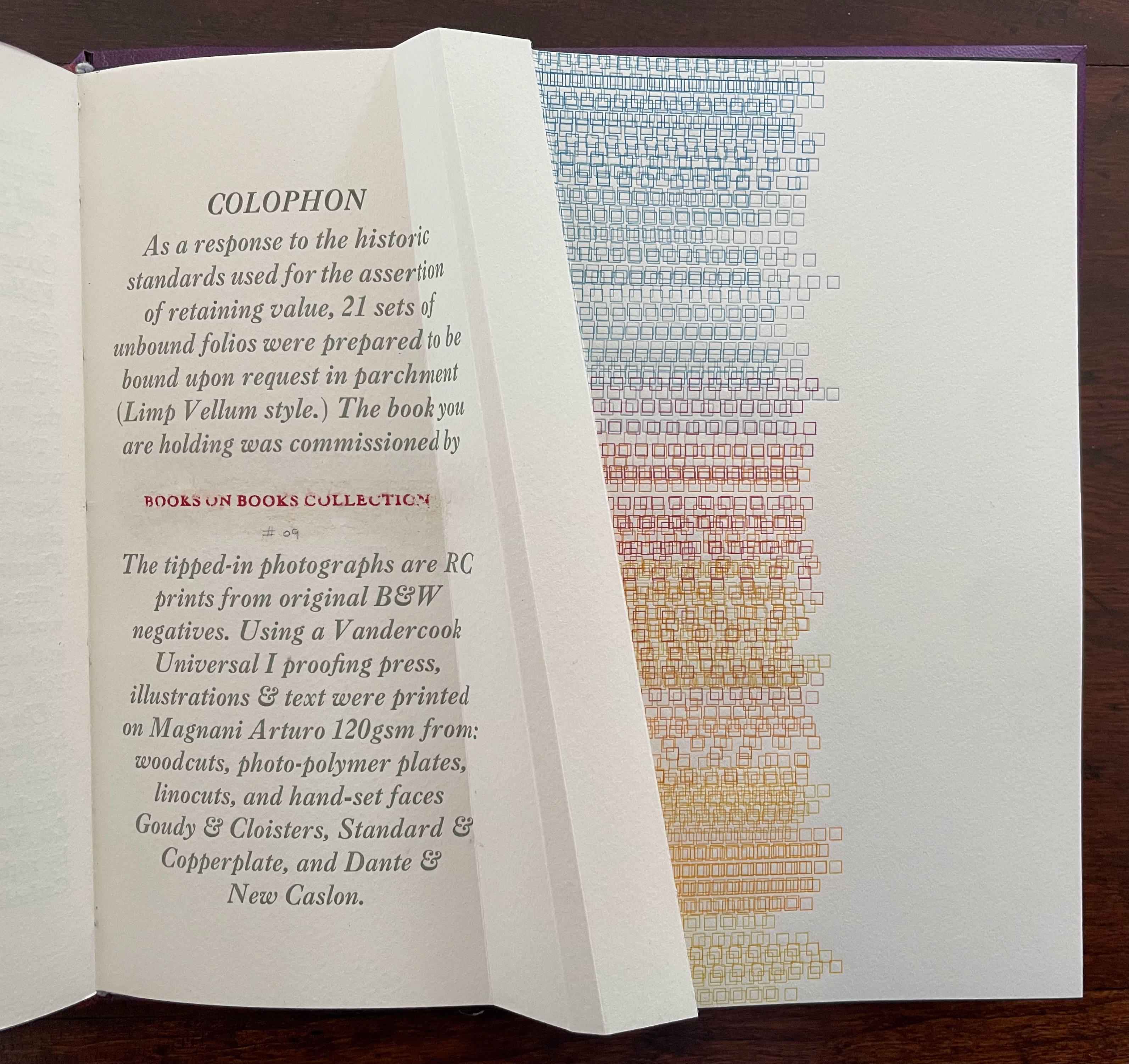
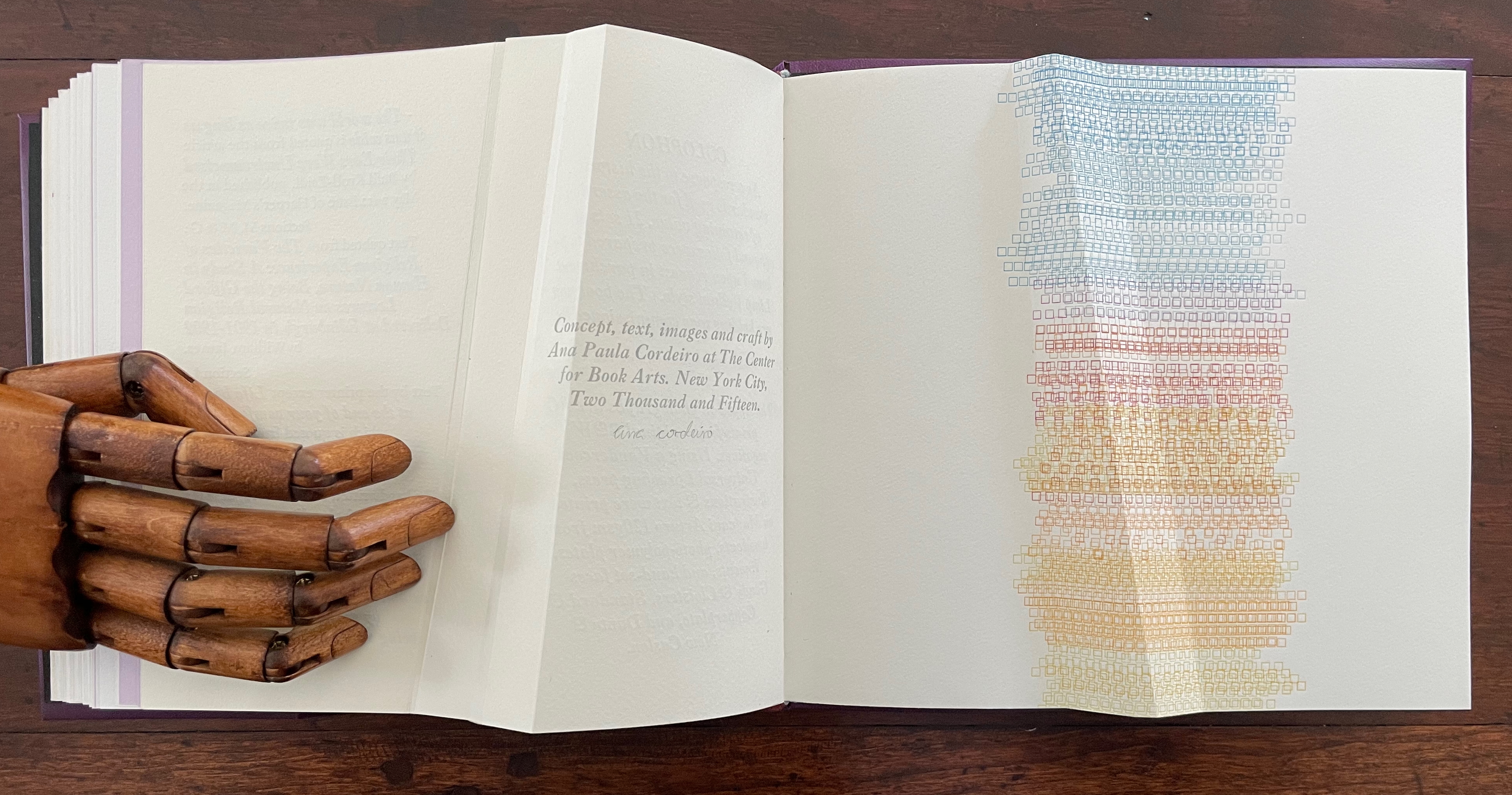
Lightweight(2015) Ana Paula Cordeiro Custom storage box with passepartout on cover with title printed on translucent paper with colored diagram beneath and sculptural element inside top. Three-part construction Limp Vellum binding on dyed parchment. Box: H215 x W224 x D47v & D53r. Book: H190 x W215 x D18 mm [90] pages. 88 + 2 half pages for colophon. Edition of 21 sets, copy bound on request. Acquired from the artist, 27 August 2025. Photos: Books On Books Collection.
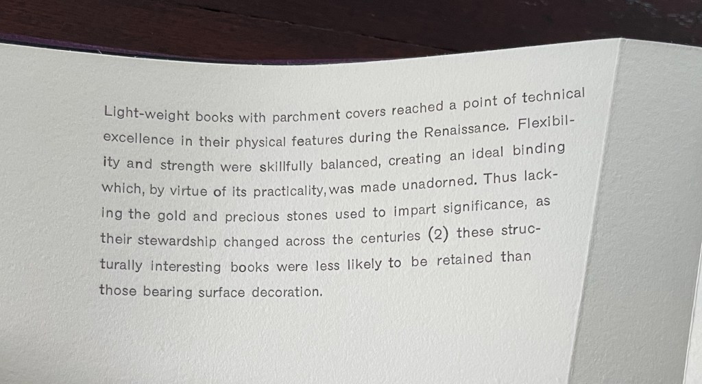
Dating back to the 13th century, the limp vellum binding for books involves a parchment or other flexible covering material that is the sole component of the cover. No stiff boards. It attaches to the textblock usually by sewing and without adhesive. According to the American Institute for Conservation, it was not merely a temporary solution until a more luxurious one with boards and ornamentation could be commissioned. Its presence in collections, its variety of formats, and its superior protection of works proven in the aftermath of the 1966 flooding of Florence, all suggest that, for a time, it was deliberately chosen for joining the artistic with the functional.
Ana Paula Cordeiro’s Lightweight is an artist’s book that pays elaborate homage to this distinctive form of binding. It weaves together metaphor, structure, material, and content in extraordinary ways.
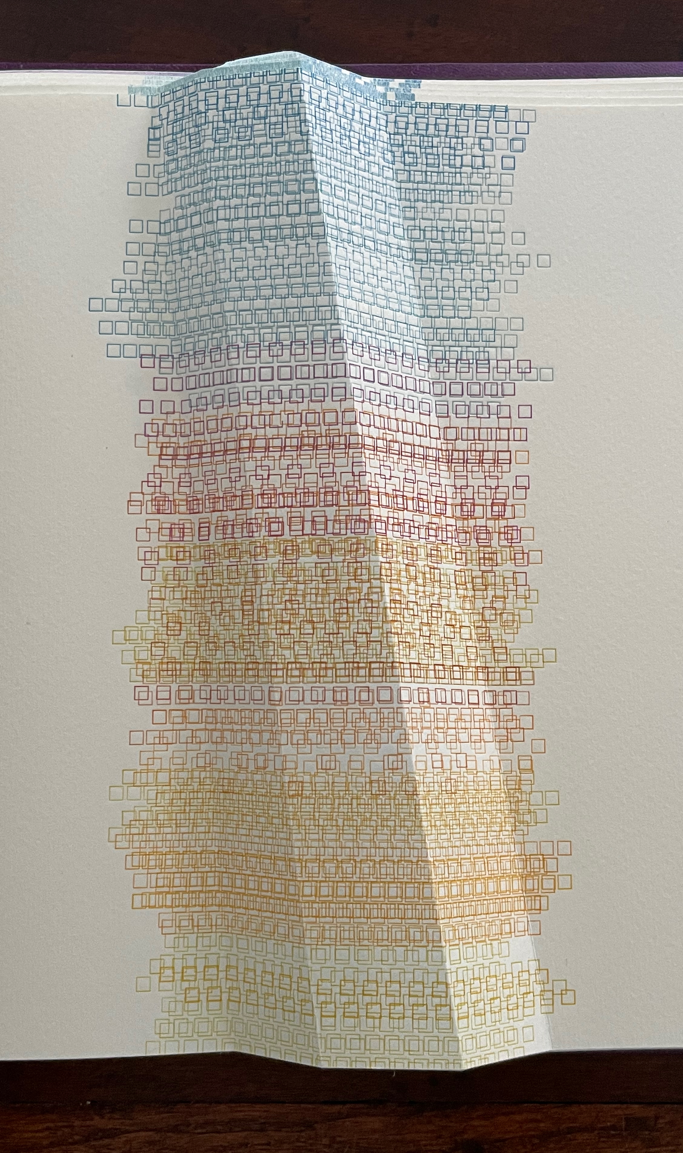
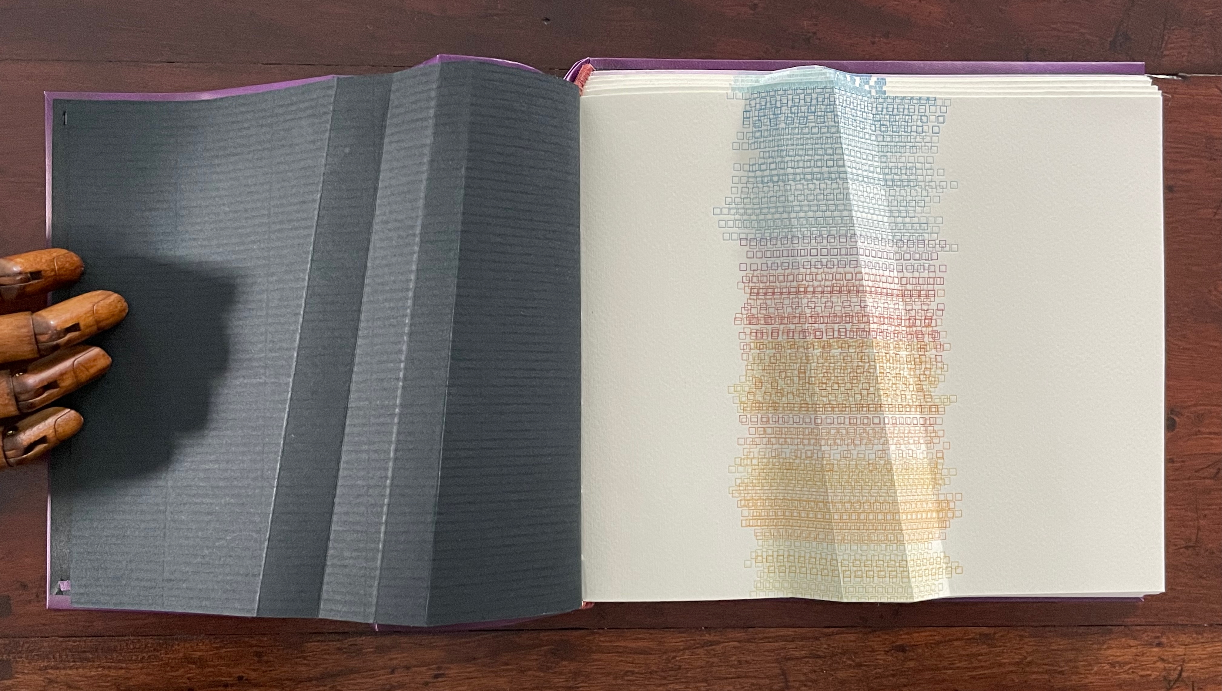
Begin with the container, which offers a multitude of metaphors. On top of the cloth-covered box, a rectangular window has been cut. To look down through this window is to begin peering into the past. Beneath the translucent sheet bearing the title, a print motif appears whose mingling layers suggest the water, paper, ink, and silt that had to be sifted to save a Renaissance legacy of manuscripts, incunabula, and books from the Florence flood of 1966.
Left: passe-partout (window) on box top. Right: recurrent print motif appearing later in the book.
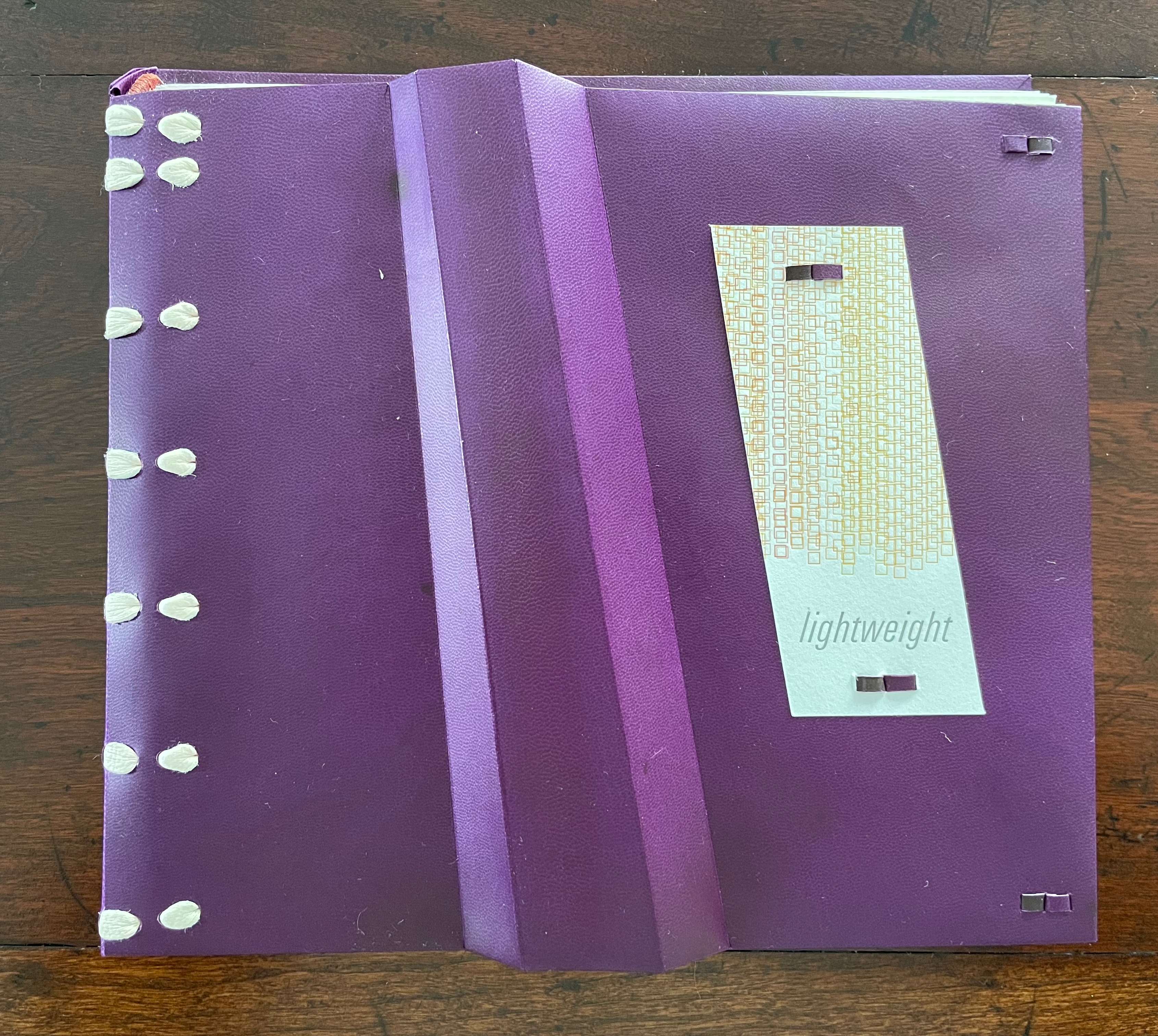
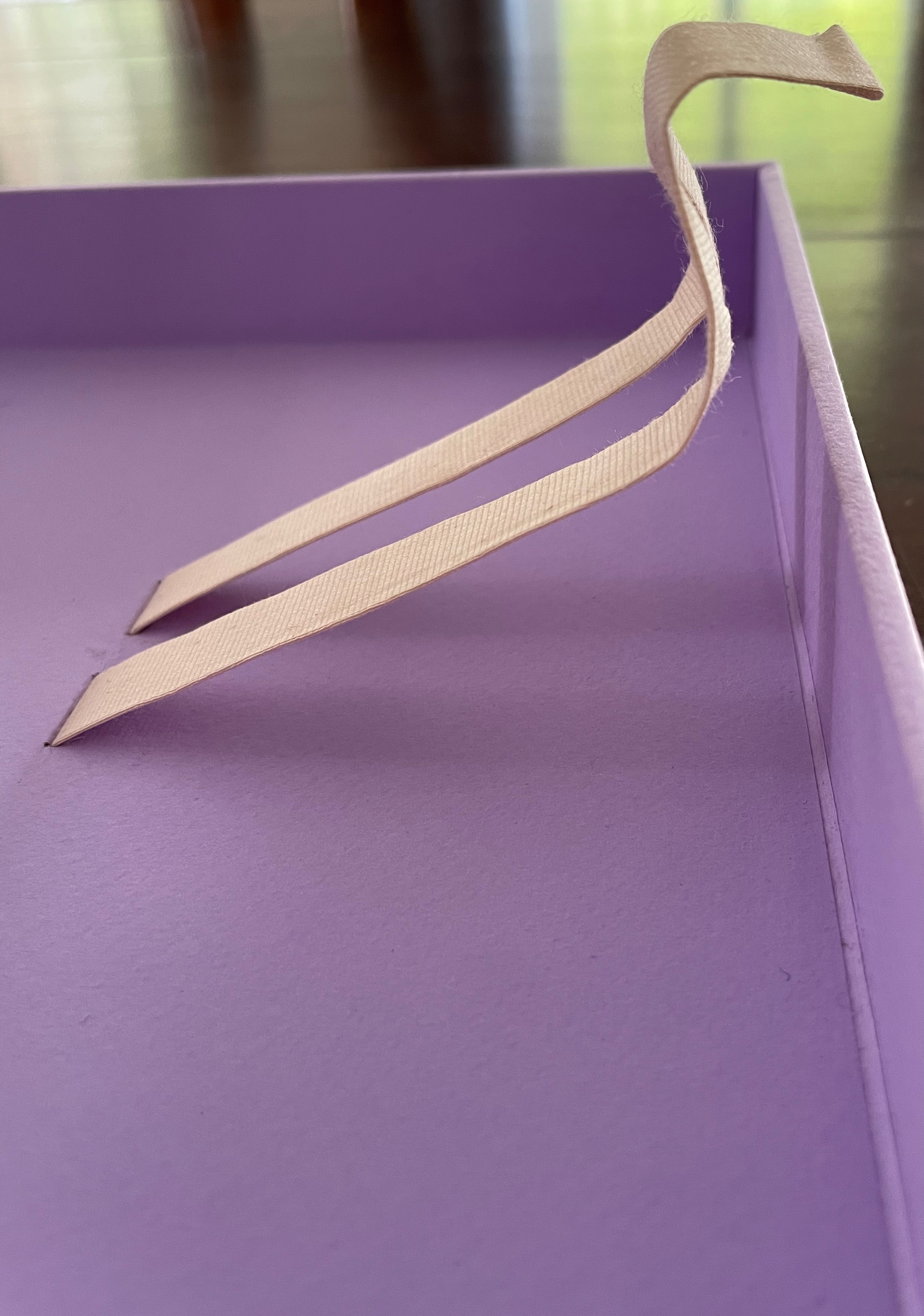
That strata of links running from blue to rust to gold becomes a recurrent print motif in the book, suggesting abstractly another metaphor: that of a continuum with endpoints playing off one another. As soon as you pick up the Canapetta cloth-covered box, the title itself — Lightweight — sets in motion a fresh instance of this continuum metaphor. Floating above the recurrent print motif, the title contrasts with the weight in your hands. As if to underscore this diametric contrast, the corners of the top and bottom of the box sit flush at the ends of one diagonal but gap at the other, easing the lifting of the weighted top from the box.
Inside, other decorative features offer further dual functionality. The sculptural element that provides the top’s weight also serves as a protective mould inside for the book and mirrors its dominant and recurrent physical feature: the creased shape slanting in parallel to the title slip tacked to the cover. Cordeiro refers to the creased shape as an “angled beam”.
For her, the angled beam distills the essence of the limp vellum structure and “supports” the variety of contemplation she pours into it. The angled beam puts forward the limp vellum structure as a historical link from binding’s past to its present. It stands for the binding structure’s durability, again linking past to present. Its linearity stands in for that continuum. It prompts thoughts of other continua along which one thing becomes another such as the line between night and day (twilight), between light and shadow, between one season and another. It evokes the continua between extremities, between the ordinary and the extraordinary, between mental acuity and dementia, and between life and death.
Following Emily Dickinson’s injunction — “Tell all the truth but tell it slant” — Cordeiro plants other angles in Lightweight. The ribbon tape that lies under the book is stiff, not soft and flexible, and it twists once and folds twice into an angular tool for lifting up the book. The trim of the book’s top and bottom edges slants. Creased into the covers, end sheets, and text block of this limp form, the angled beam is a physical constant echoing the metaphor of a continuum whose endpoints contrast and balance with one another.
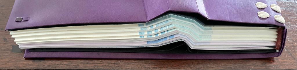
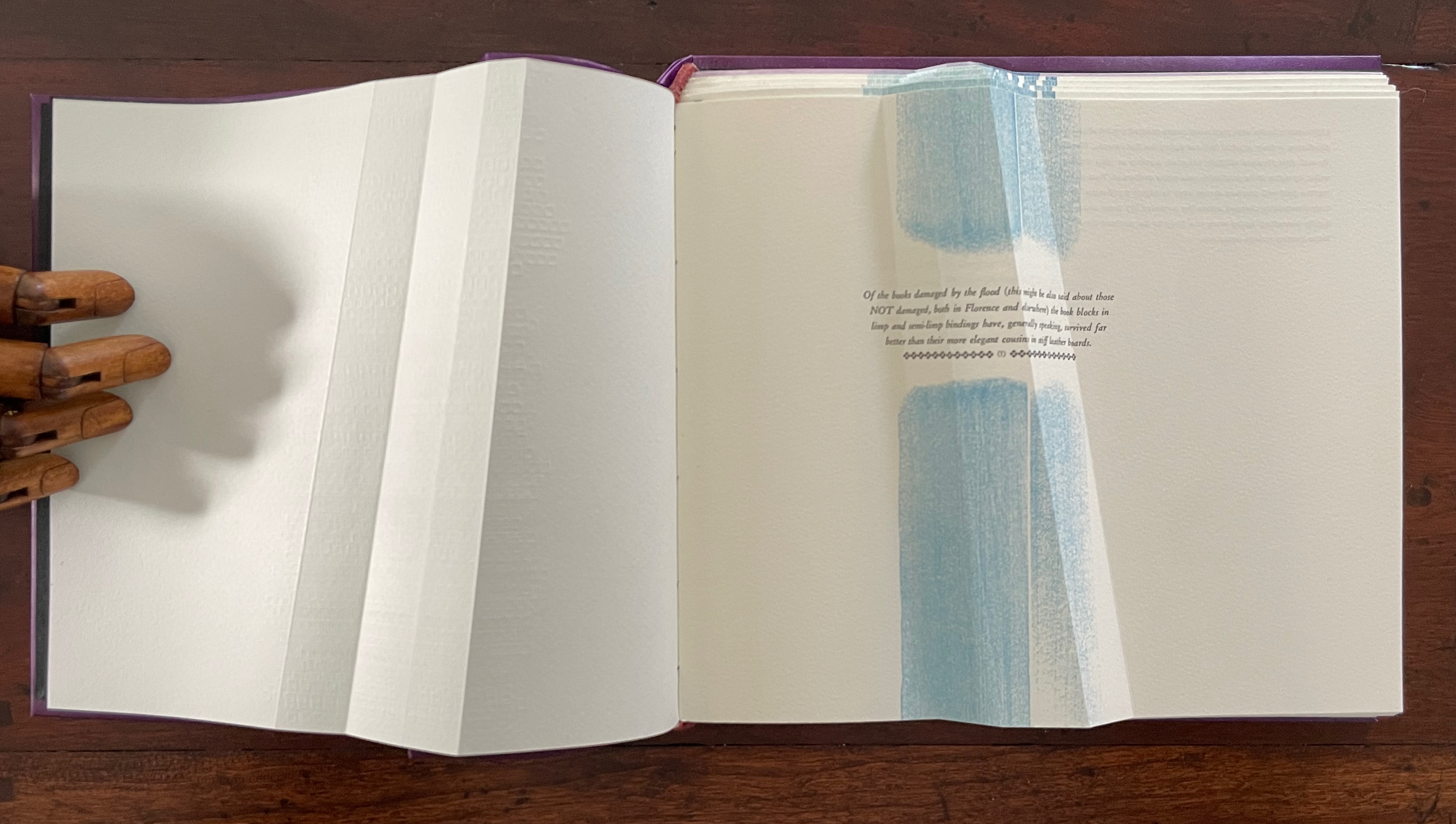
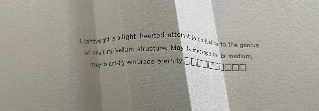
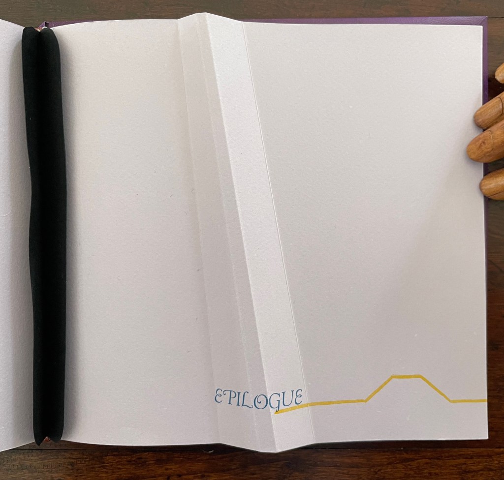
Altogether there are seven gatherings in Lightweight. The “prelims” gathering provides the historical context underlying Cordeiro’s homage. Note the artist’s wish expressed in the envoi to this artist’s book in our hands: “May its message be its medium, may its artistry embrace eternity”. Here, Cordeiro introduces that self-reflexivity we expect in the best of artists’ books.
After the prelims gathering, the other six gatherings are labeled. In addition to bearing the creased angled beam, all six carry an “on-end outline” of it (see below). The five that are numbered, lettered, and labeled introduce themes reflecting different responses that relate to the continuum motif.
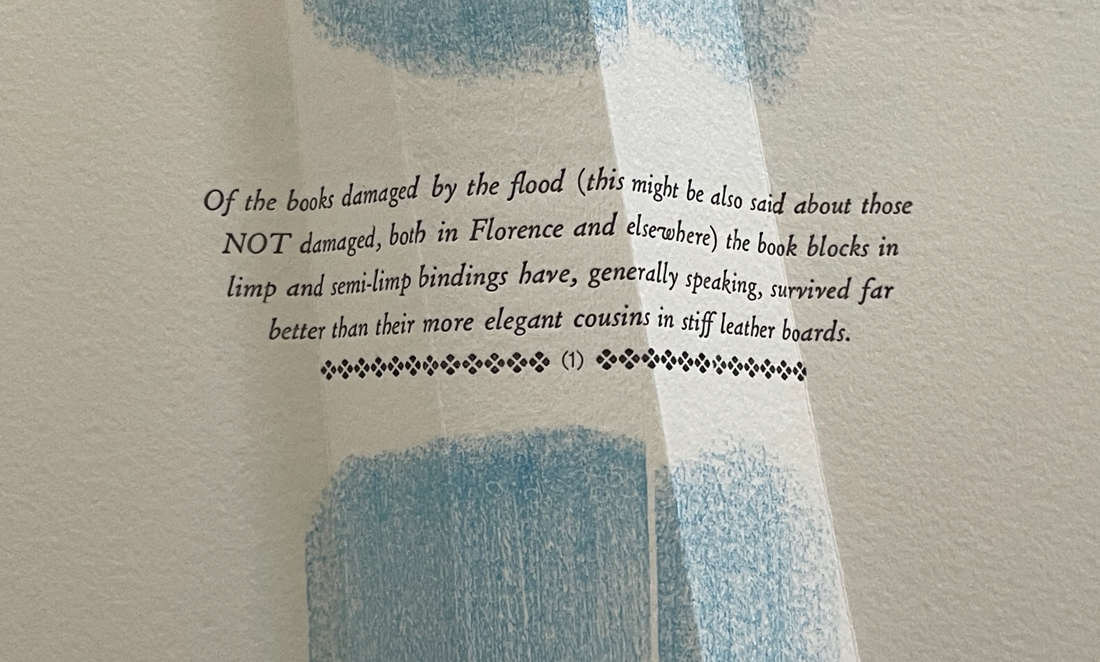
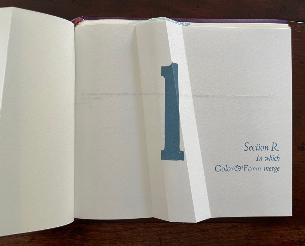
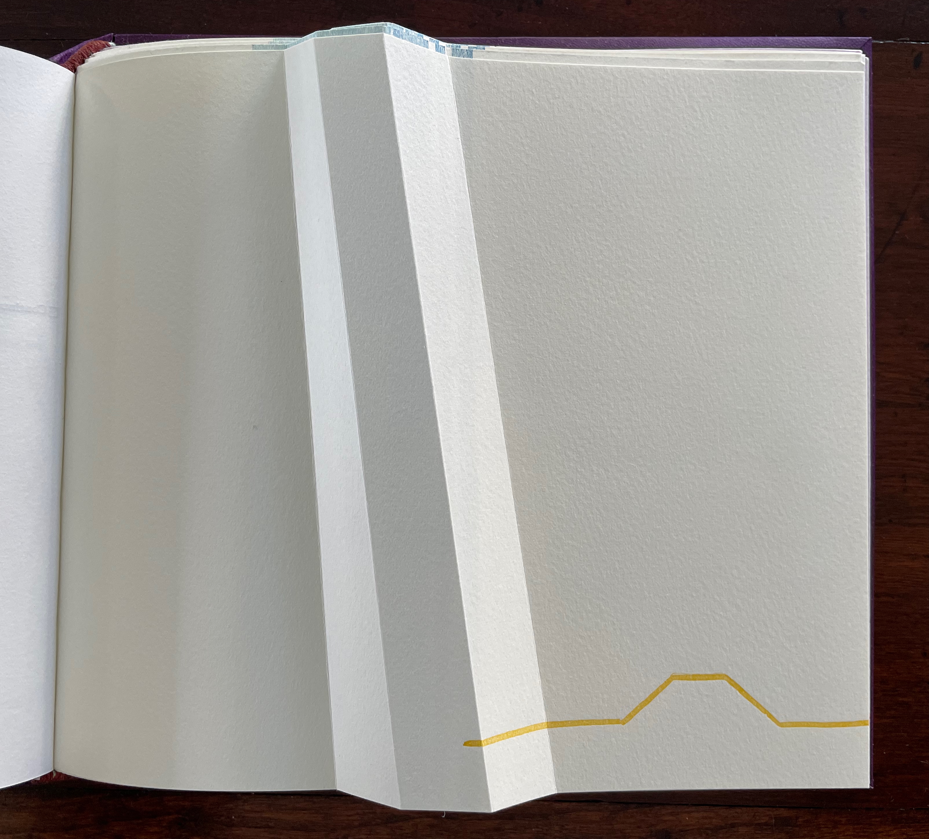
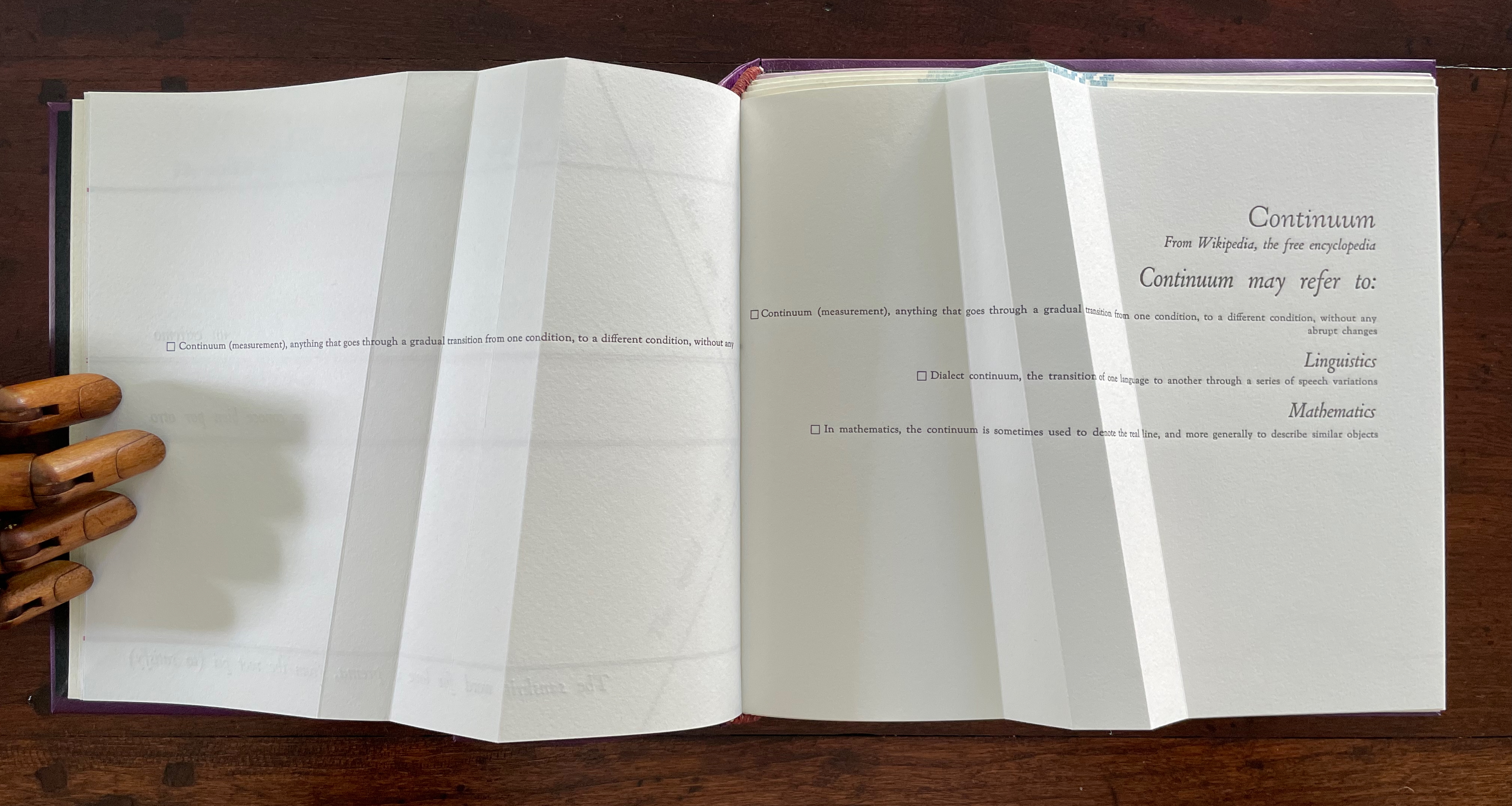
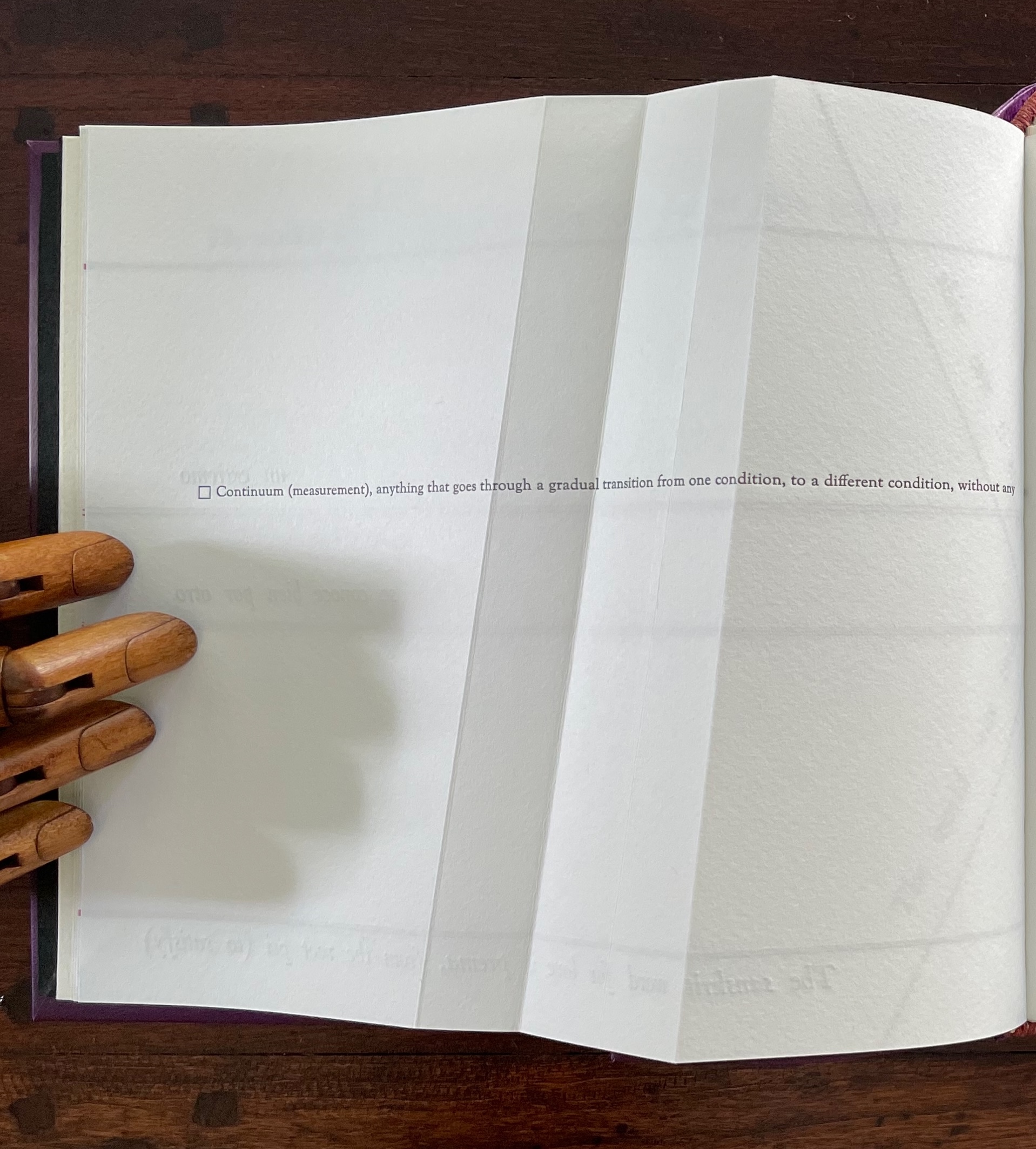
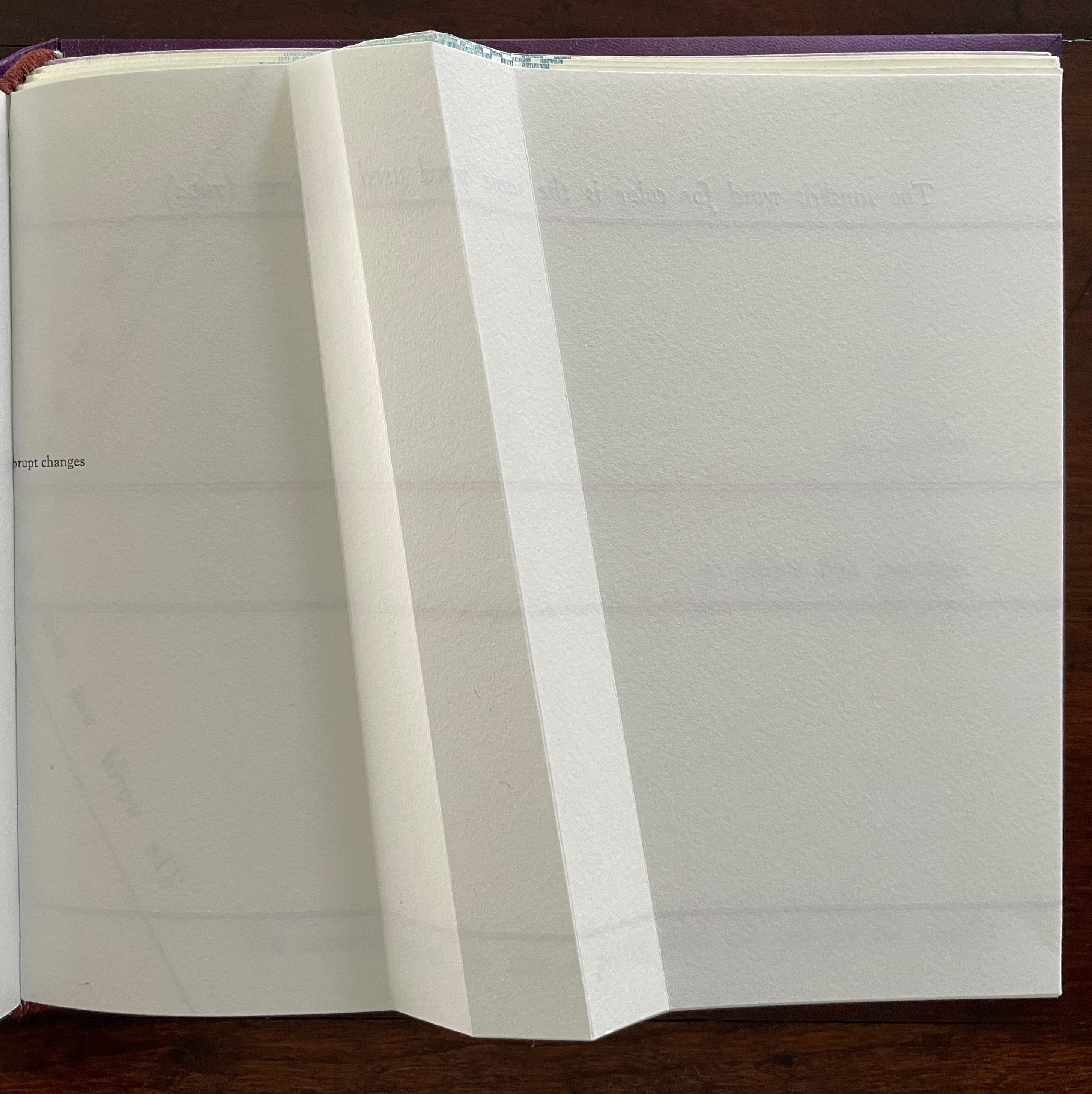
The Part 1, Section R gathering has announced cryptically that color will merge with form. How will this happen? As you turn the page, the opening text suggests how — along a continuum: “Continuum (measurement), anything that goes through a gradual transition from one condition, to a different condition, without any abrupt changes”.
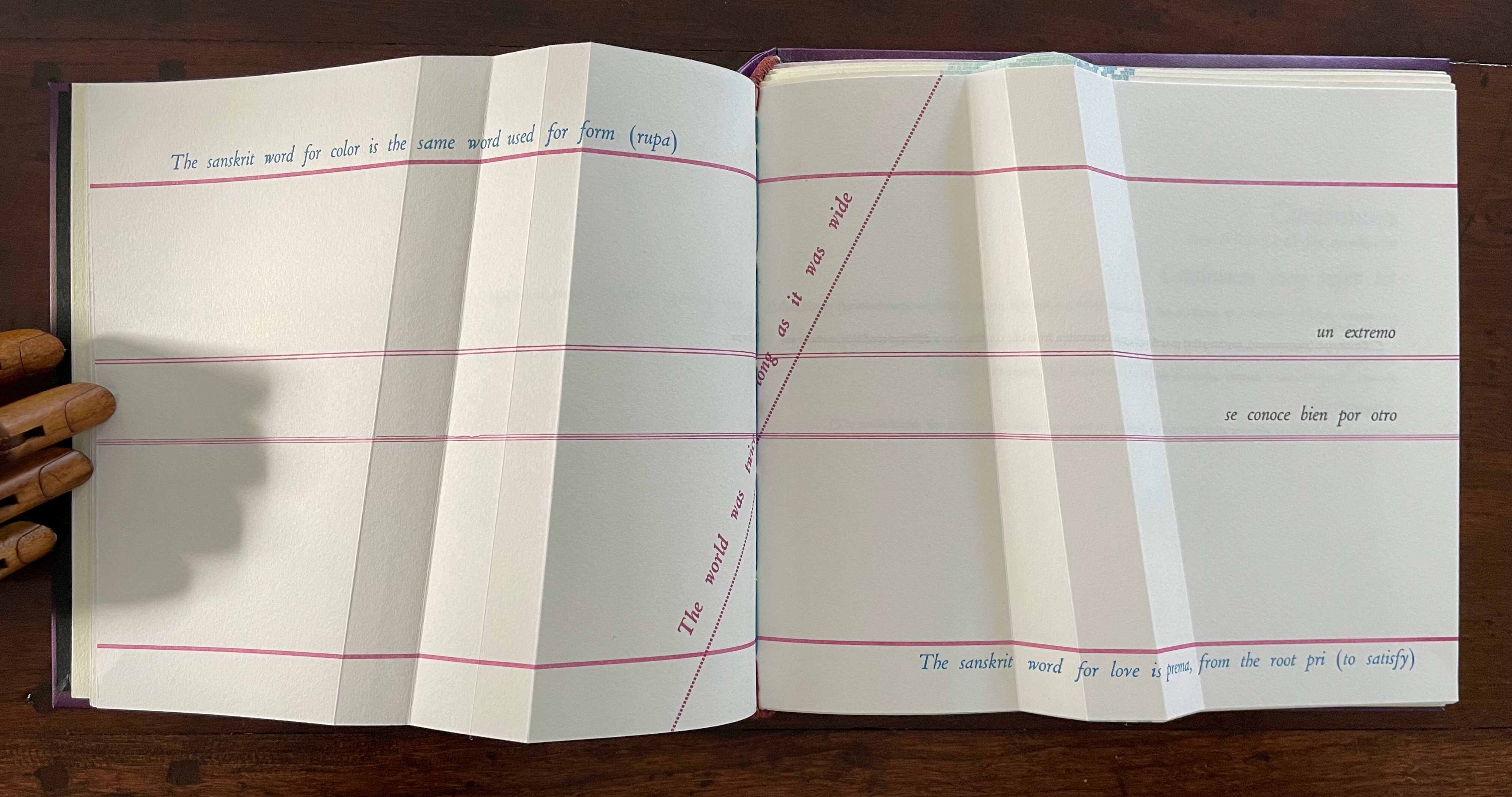
The spread lays out this definition in a peculiar manner that seems to contradict the definition. On the verso page, the definition seems to run abruptly up against the seam, which bumps the words “abrupt changes” to the next line, while the recto page presents a truncation of those words: “rupt changes”. Hold that puzzle for a moment. So how can color and form be on a continuum? And will they merge gradually or abruptly? On the next spread, Cordeiro answers with the Sanskrit word rupa, which represents “color” and “form” and from which the section draws its label “R”.
un extremo se conoce bien por otro [one extreme knows well its other]
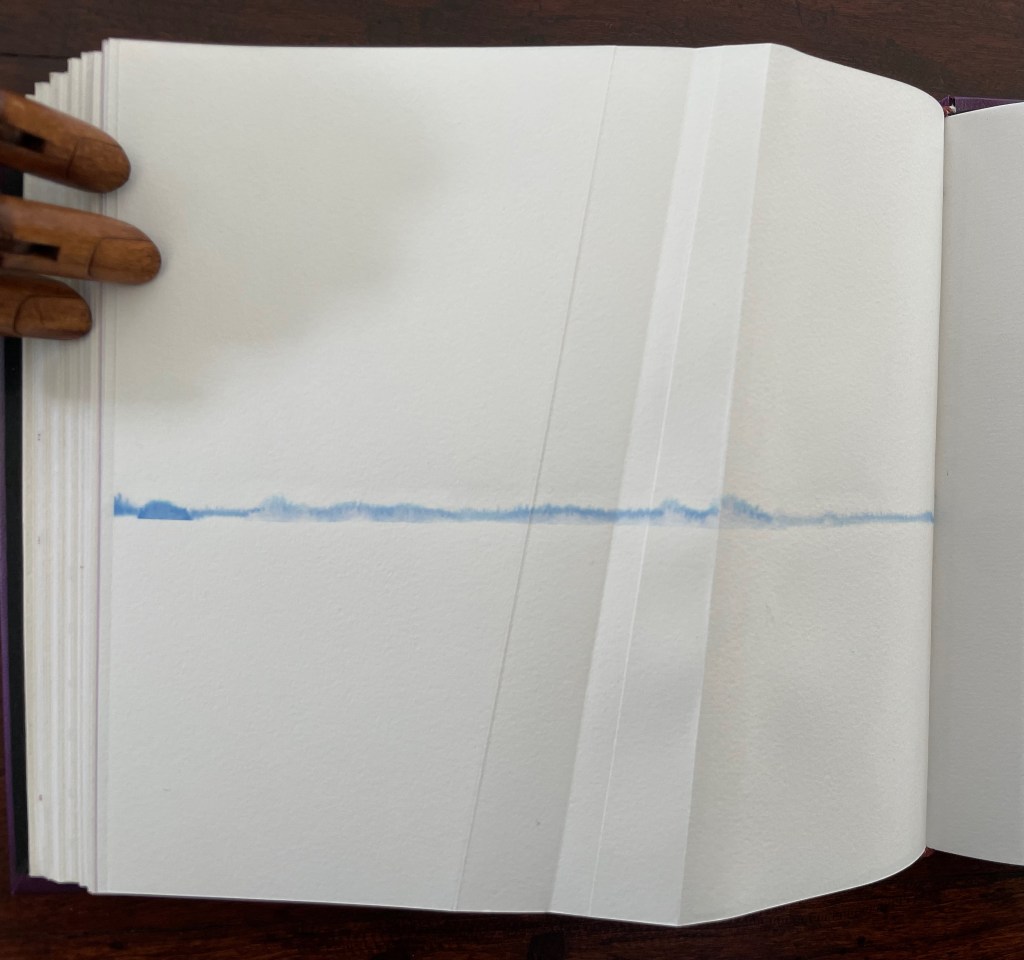
So, the merger is etymological. But at the same time, another spectrum comes into play: the color spectrum and the blue and red at its opposite ends. On the spectrum, of course, one gradually becomes the other, enacting the expression “un extremo se conoce bien por otro” [one extreme knows well its other]. If this seems a stretch, the next double-page spread reassures us that “continuum” has additional linguistic as well as mathematical roots.
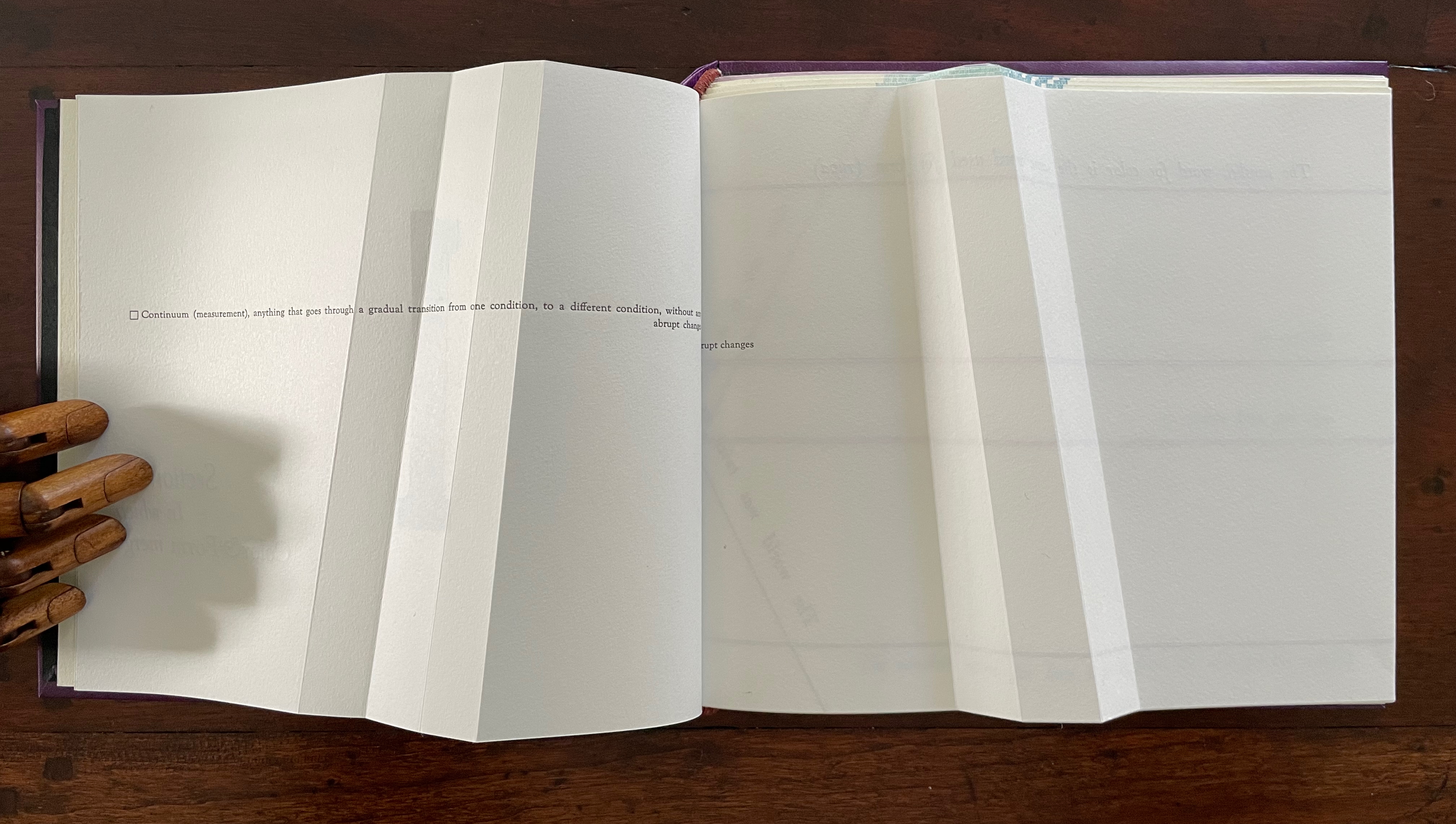
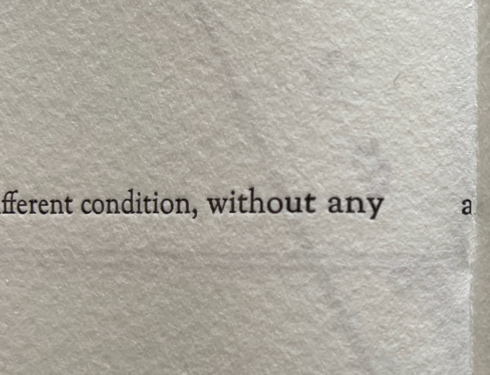
Before the reassurance, however, we come back to the puzzle of “rupt changes”. Again, on the verso page above, the definition of “continuum” runs pell mell into the crease. To solve the puzzle, we have to look more closely at the structure of the Section R gathering. It consists of three oblong folios folded in half. On the reverse side of the center folio (what would be pages 5 and 8 of this gathering if the pages were numbered), the definition of “continuum” has been printed so that the fold splits the word “abrupt” between its syllables: “Continuum (measurement), anything that goes through a gradual transition from one condition, to a different condition, without any a | brupt changes.” In effect, the layout draws attention to our perception of breaks in continua.
View of “pages 5 and 8” separated by a detailed view of the break in the word “abrupt”.
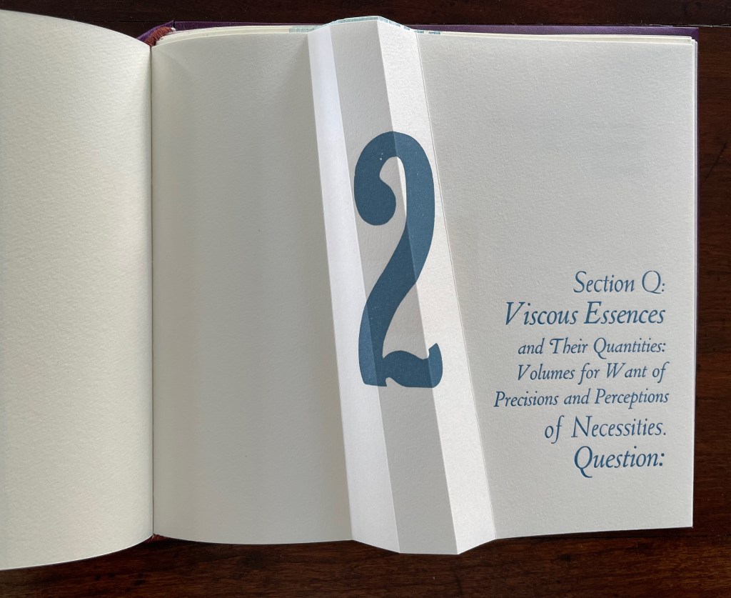
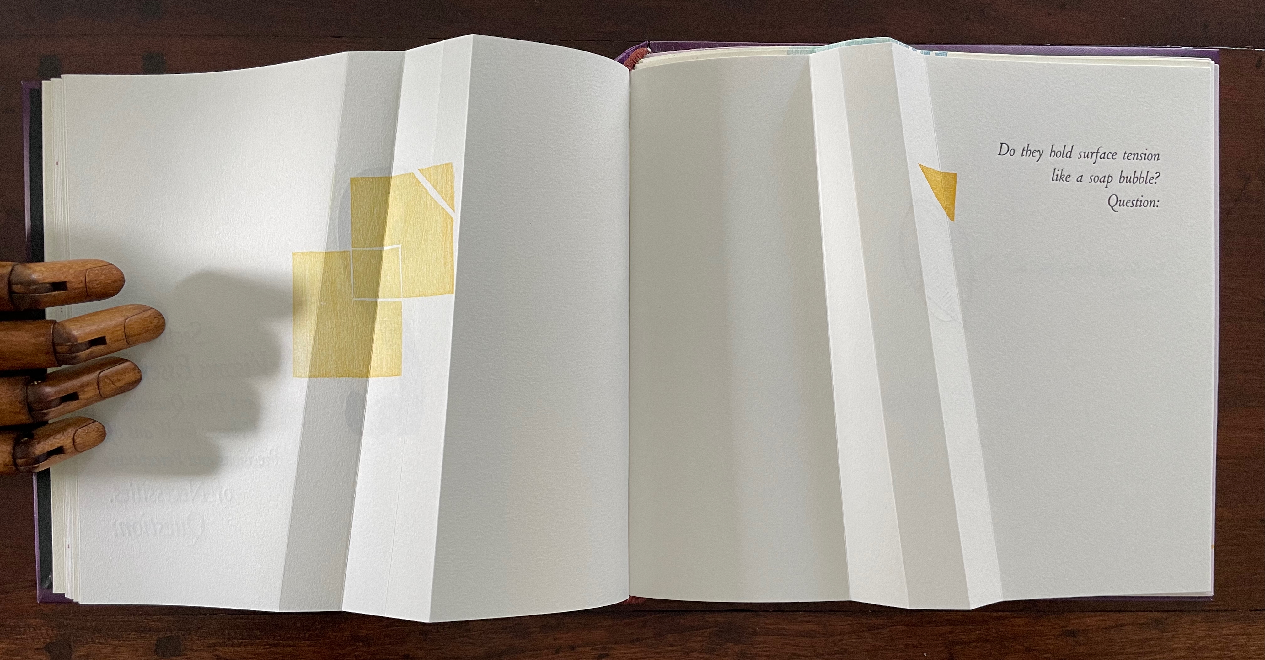
If Section R has not prompted the reader to propose questions about the structure of the book or this book in particular, the Part 2, Section Q gathering provides a series of oblique questions very much focused on that but also on metaphorical matters. Again, what happens structurally in the gathering and on the surface of its pages presents puzzles and hints at solutions.
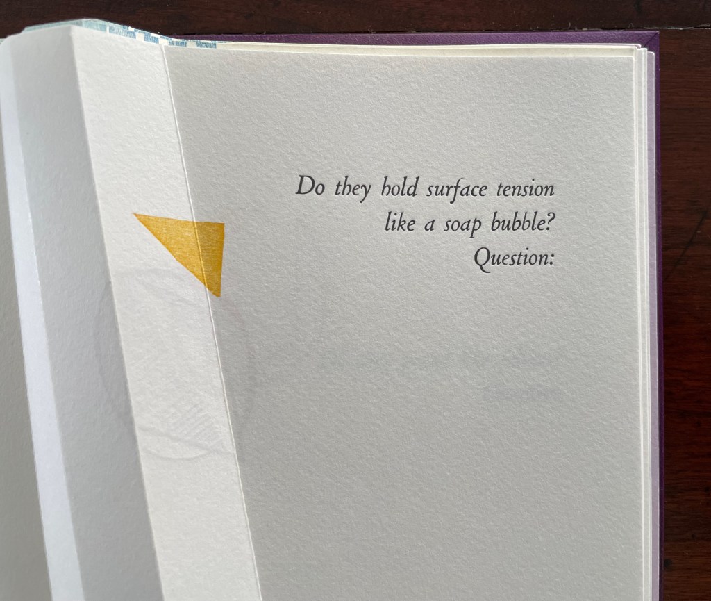
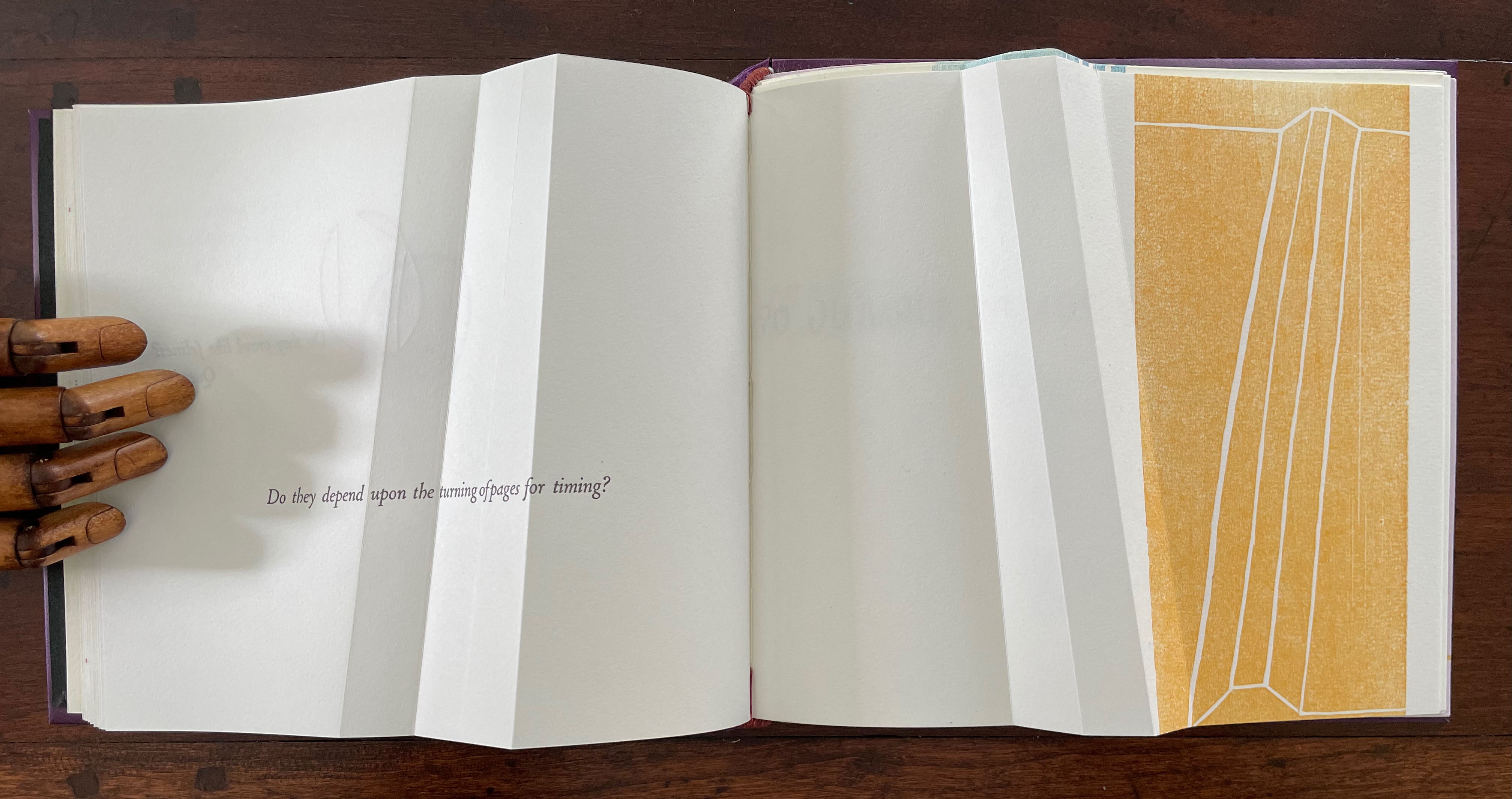
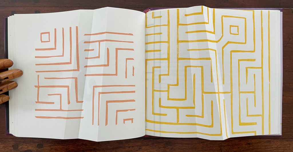
The geometrical images associated with the first question (“Do they hold surface tension like a soap bubble?”) seem to float or progress across the double-page spread, breaking up to punctuate the question. Reminding us of opposites and abrupt changes, the angular yellow overlapping squares and triangles puncture the text’s round verbal soap bubble. Before we can ask to what or whom does “they” refer, we are prompted by “Question:” to turn the page.
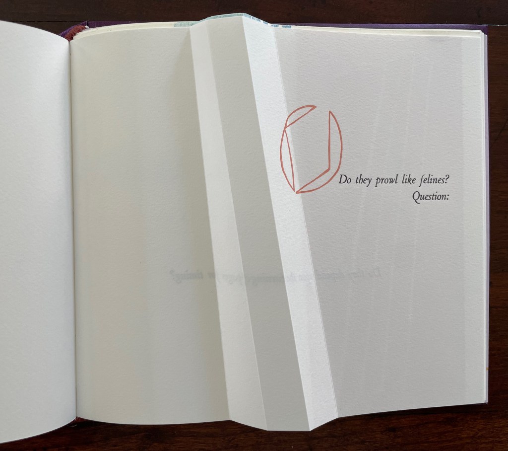
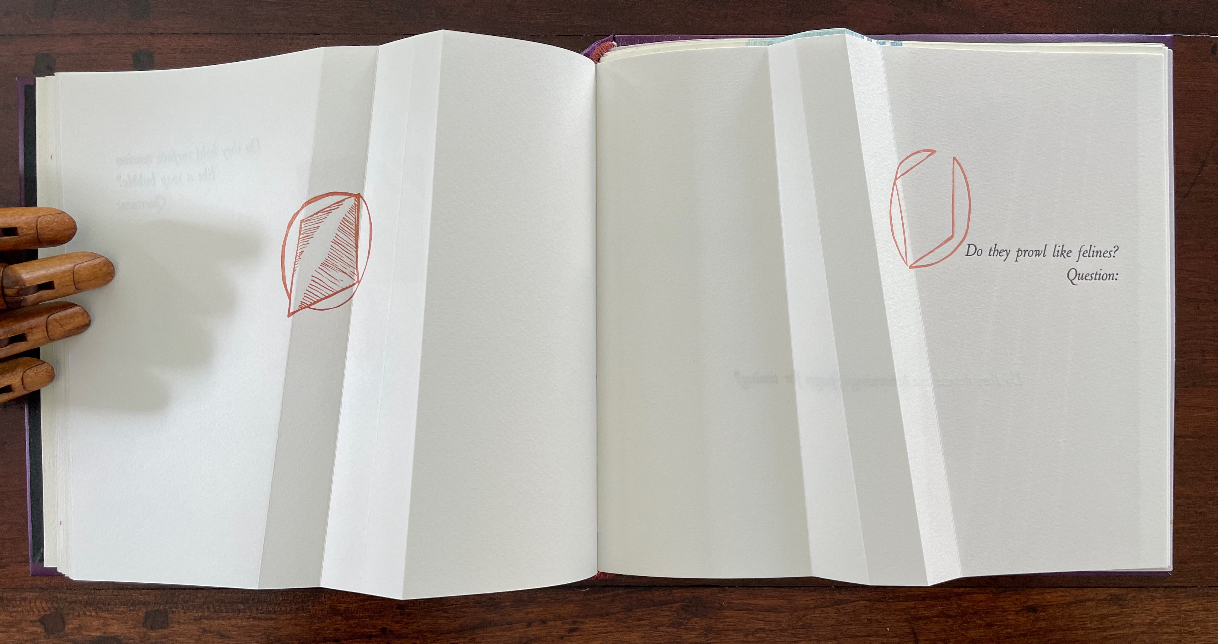
The next question (“Do they prowl like felines?”) prods at the unasked question: what or who are “they”? How is it that “they” are like prowling felines? Again, the images seem to progress across the spread, with the first image’s central diamond shape disappearing to leave the curvilinear second shape leaning over the printed question. Might these be diagrams of the limp vellum structure’s sewing holes and lacing? If so, has Cordeiro found another metaphor for limp vellum structures in the supple and sinuous strength of prowling felines? Do “they” refer to limp vellum structures?
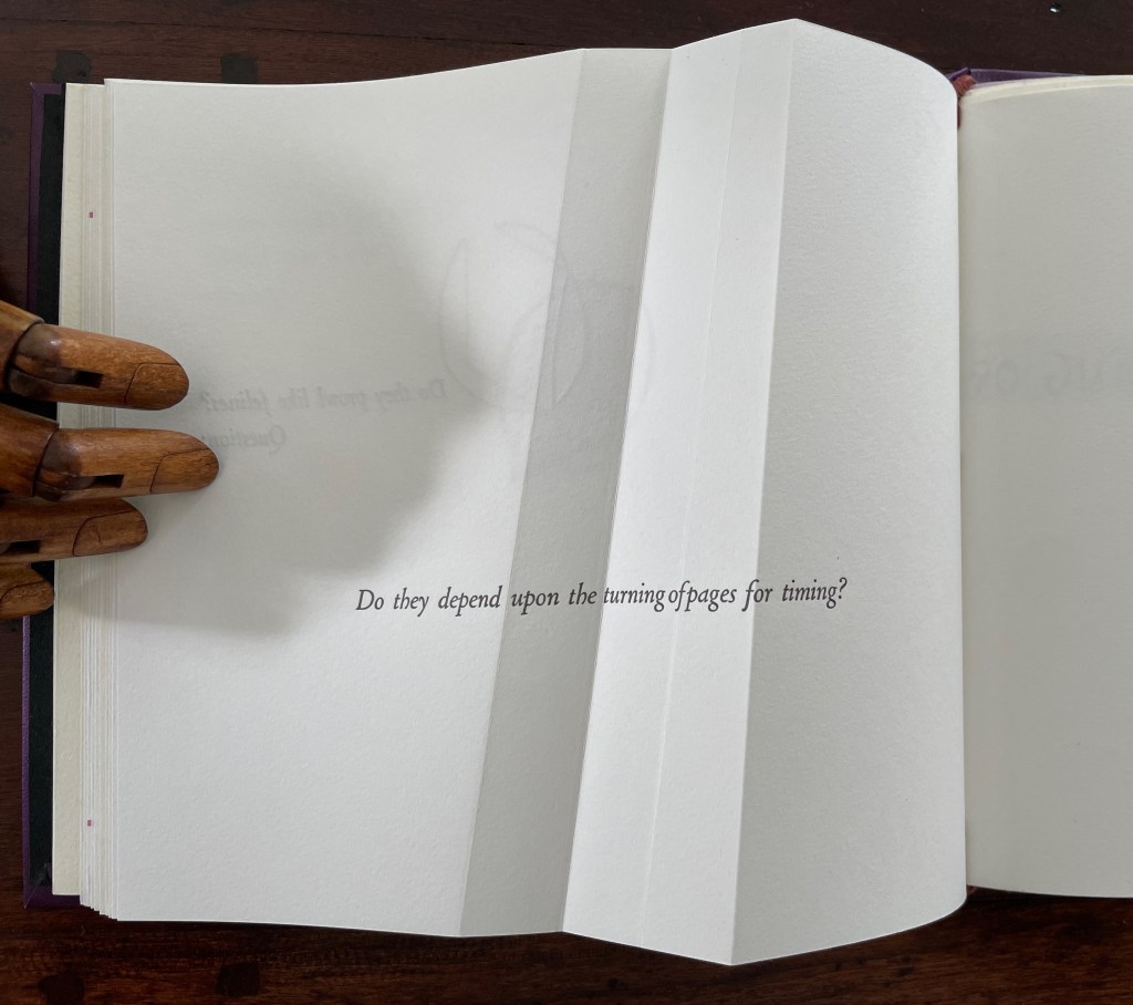
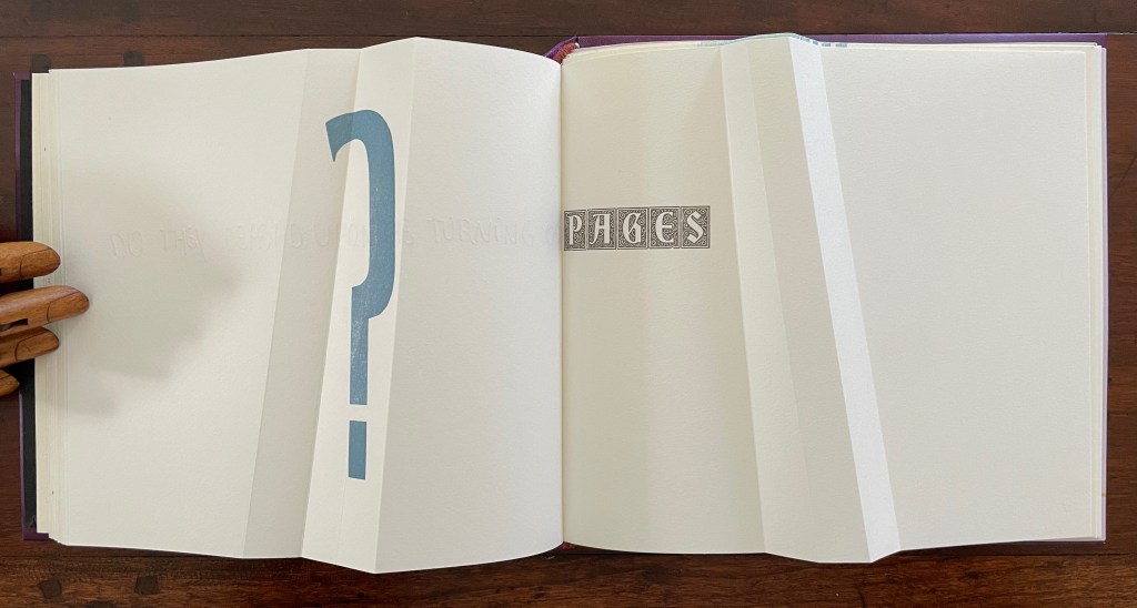
The next question turns directly to a functional attribute of the book structure: turning pages. The yellow print gives an ambiguous view. The two-dimensional representation of the angled beam fluctuates between a mountain view and a valley view. Are we looking down on the splayed spine of a book or its gutter with pages splayed open? Either way, the print angles away from the physical angled beam, which sets up a metronomic pattern in the spread — the beam leaning to the right, then to the left, and again to the right — or a page turned to the right, then to the left, and back again to the right — or mountain fold, then valley fold, then mountain, then valley (the gutter), then mountain, then valley, then mountain until we come to the ambiguous two-dimensional print. Again, this is a continuum, and “they” seems to refer to limp vellum structures.
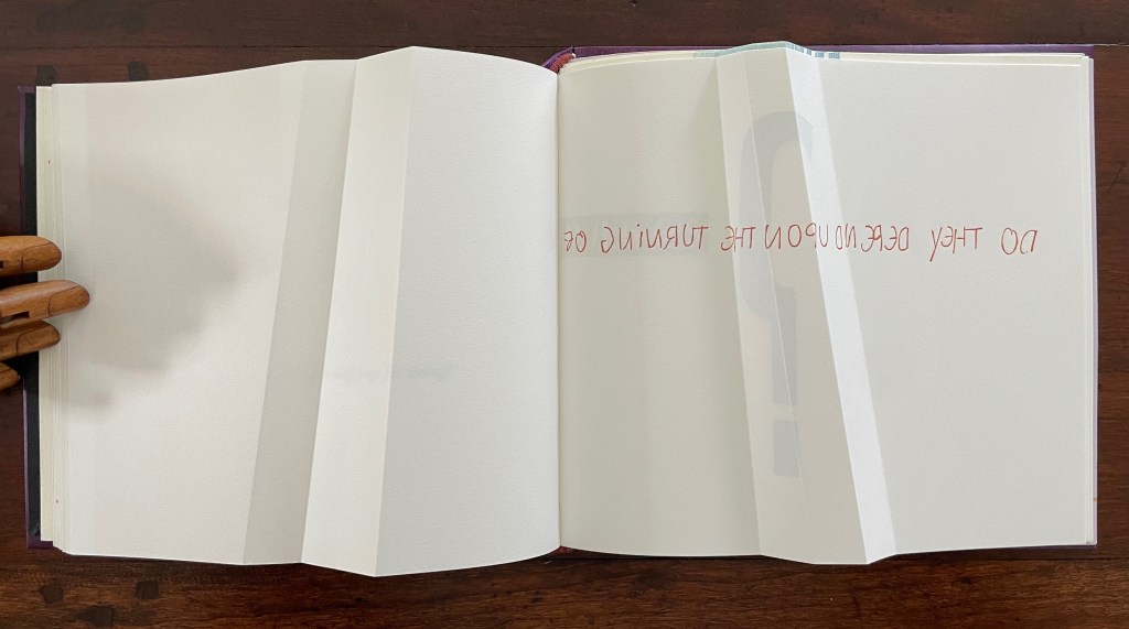
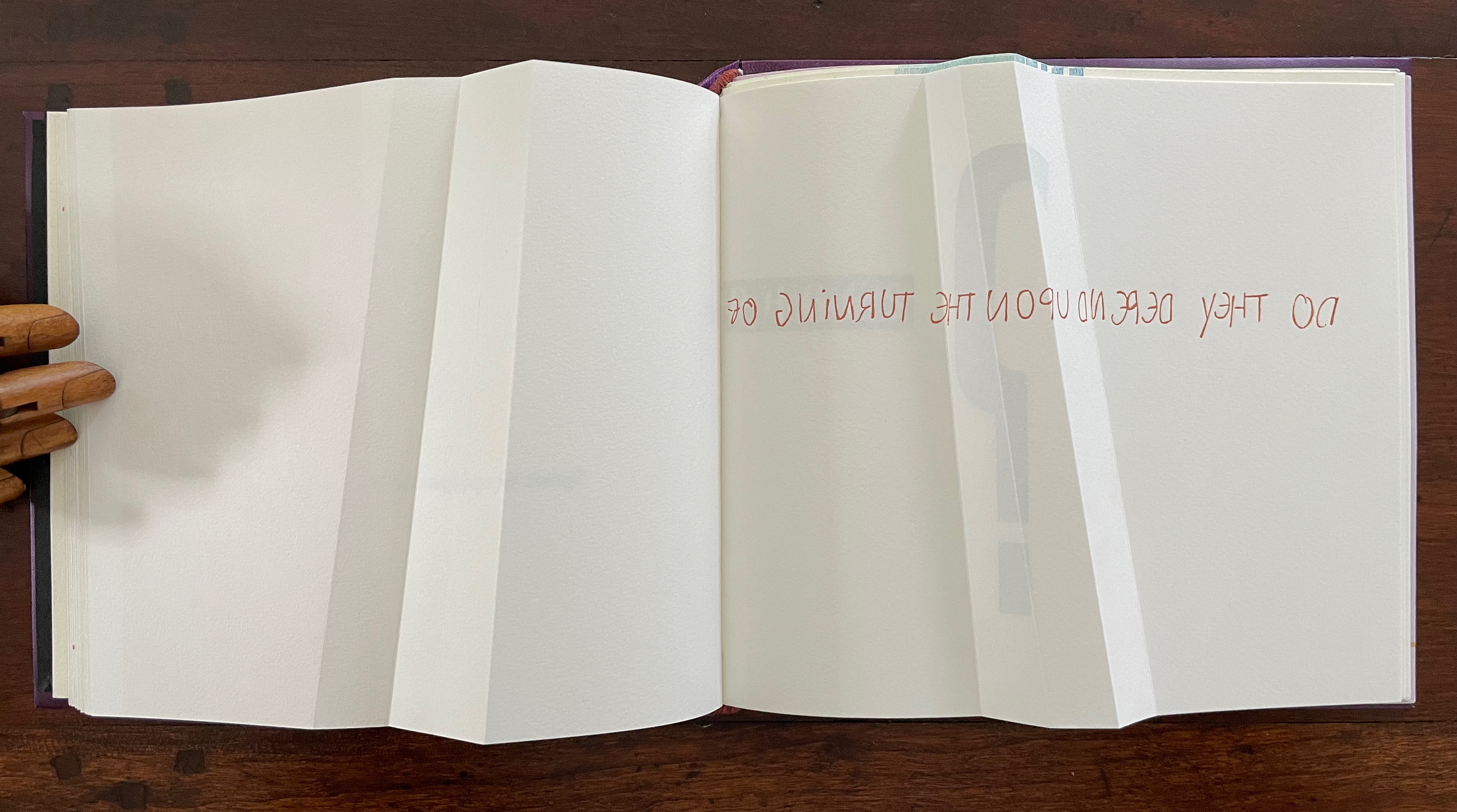
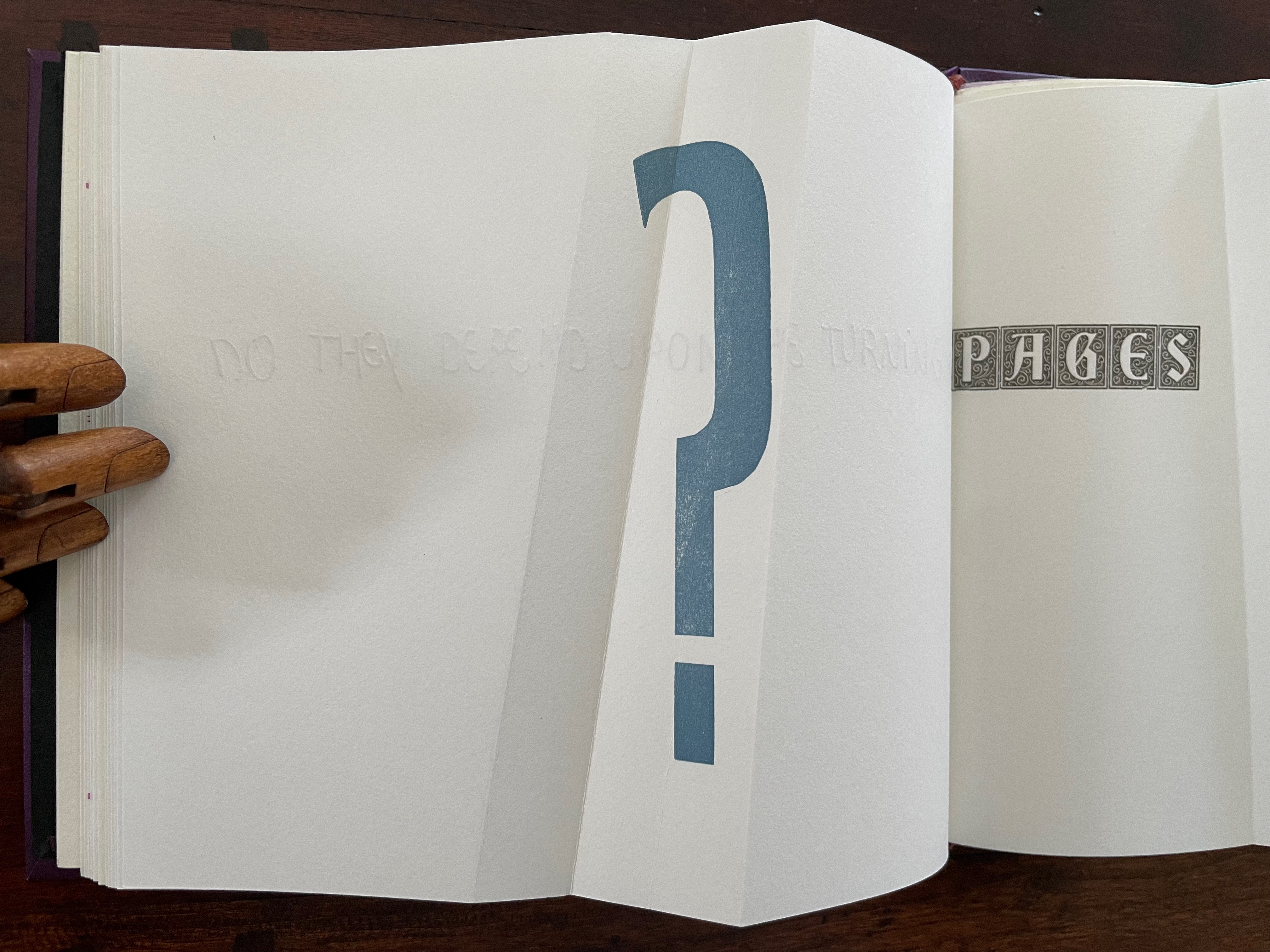
The next question enacts itself. To read the mirror-written script, we have to turn the page and look through its surface to the right-reading words: “Do they depend upon the turning of”. The question completes itself in a curious (again) metronomic motion. The syntax draws our eyes to “PAGES” on the right, while the oversized punctuation mark syntactically draws our eyes back to the left. The play between the reversed writing on a recto page, the right-reading script on the verso, the display type on the next recto, and oversized question mark on the adjacent verso provide self-reflexively an affirmative answer: Yes, limp vellum structures depend on the turning of pages.
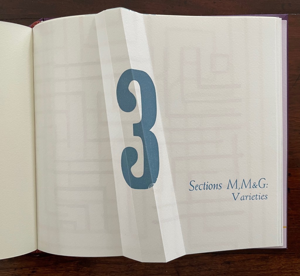
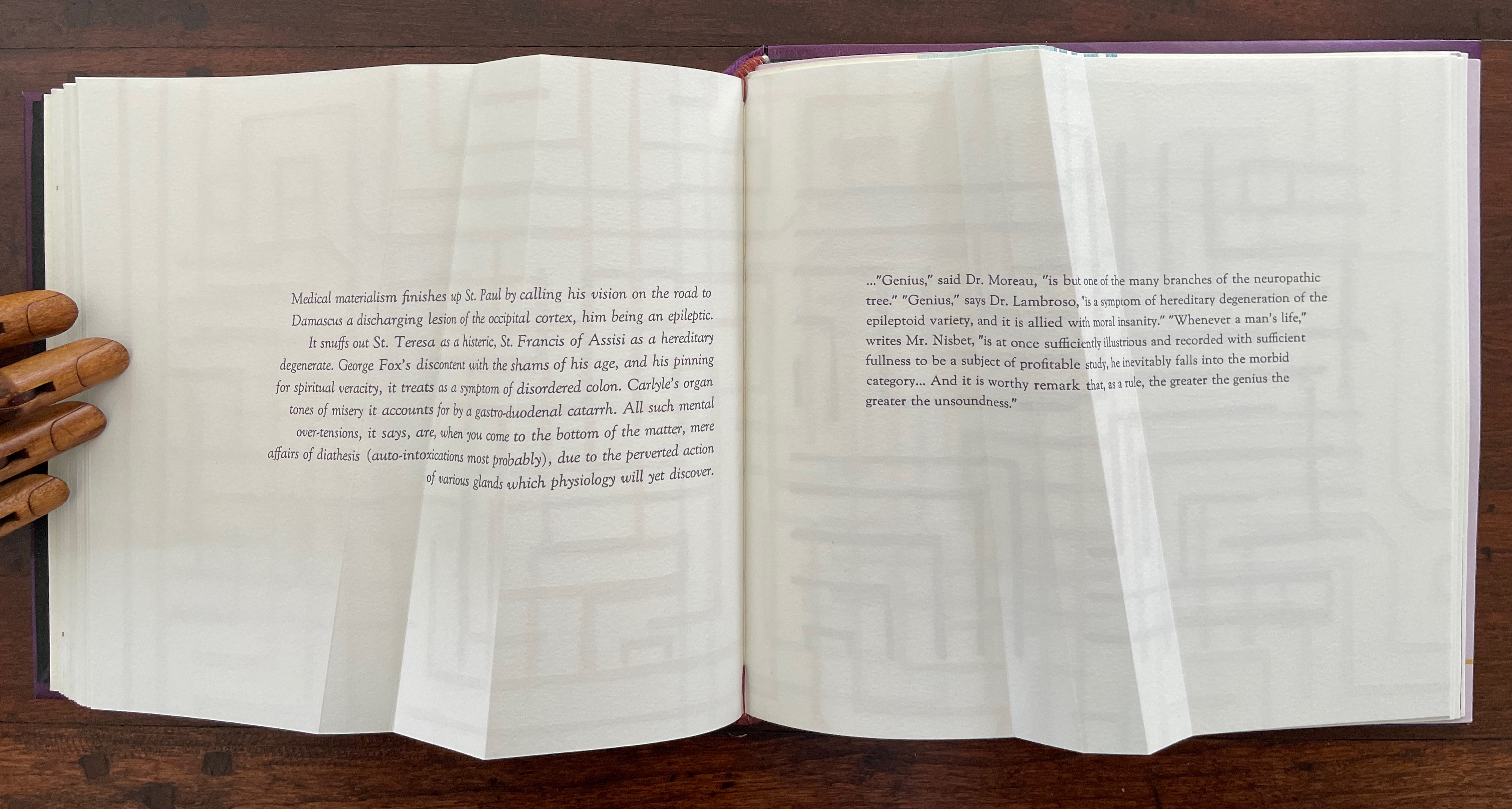
Part 3 introduces rather more esoteric continua with which Cordeiro seeks to connect the genius of the limp vellum structure. The Section letters M, M and G are her reminders-to-self that this section excerpts passages from William James’ The Varieties of Religious Experience (1902): one on medical materialism (p.14) and another on genius (p.18).
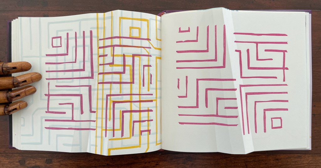
Cordeiro brackets the excerpts with maze-like images constructed of mirrored forms across four different colors. So we have the continua of mind to matter and of genius to madness embedded in a continuum of color and form (color and form merging).
Note the 18o° turn of the beige image in the upper left to be mirrored by the magenta image in the lower right.
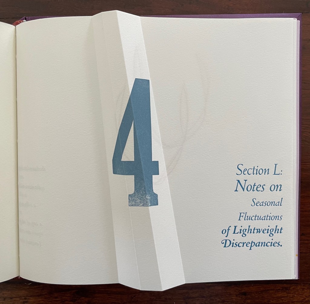
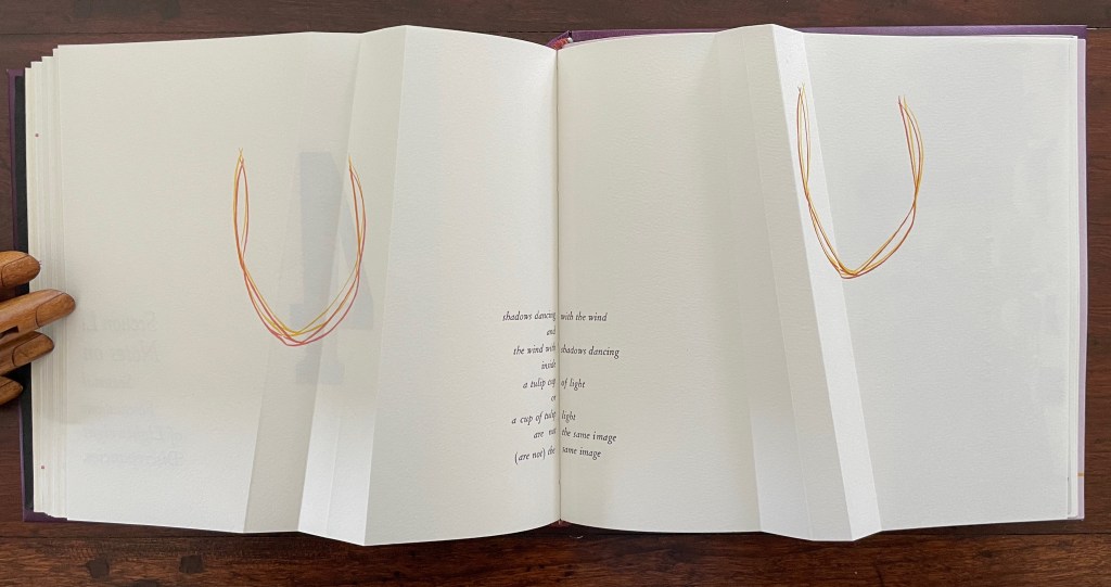
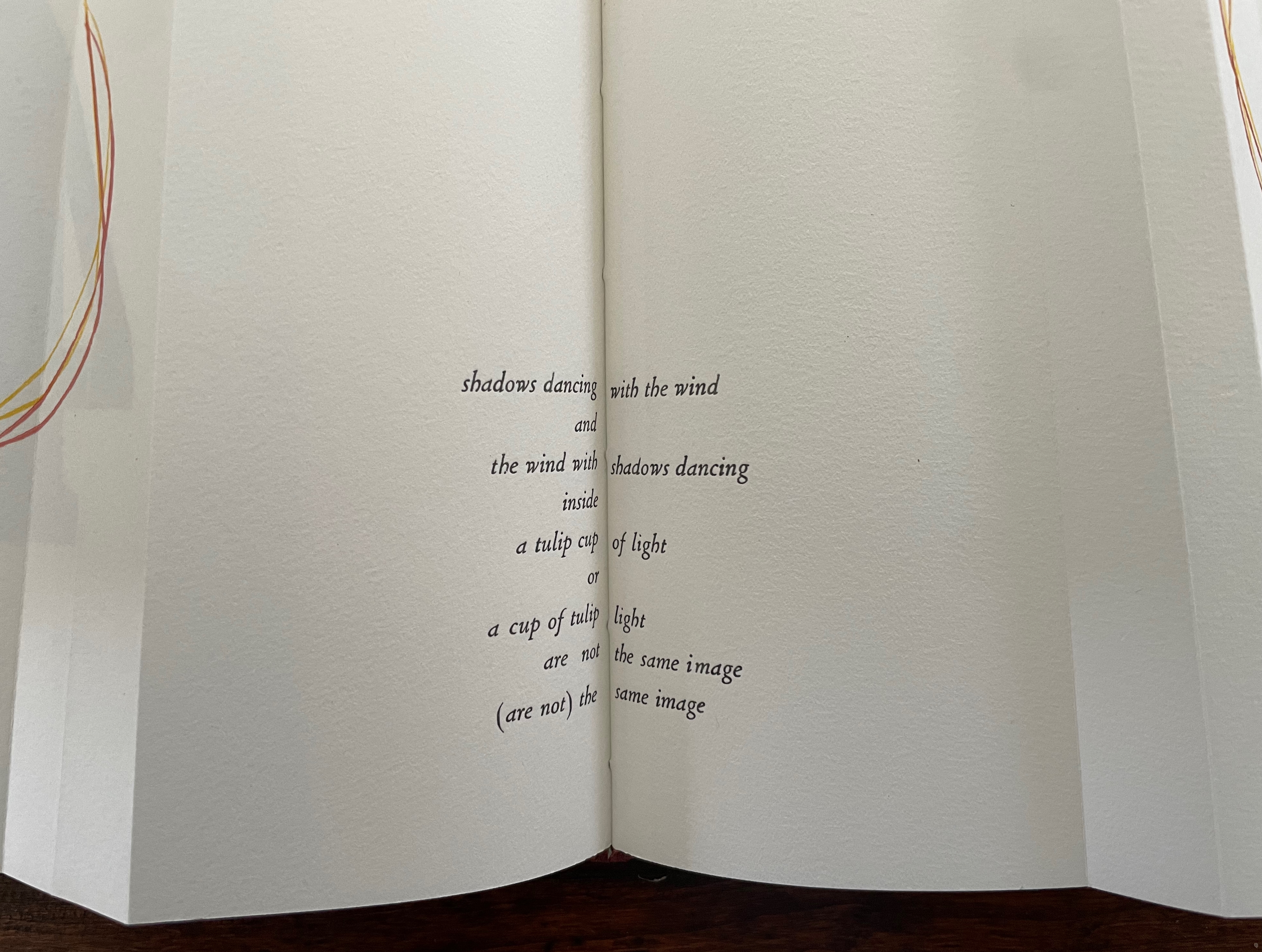
Part 4, labeled “Section L: Notes on Seasonal Fluctuations of Lightweight Discrepancies”, is the densest of the gatherings. Drawings, verse typeset in English and scribed in Portuguese, typographic arrangements, trimmed and segmented photographs, and linocut prints of a stone wall all find their way into Part 4.
Note how the colors of the tulip shapes echo the colors of the maze in Part 3.
The “Epilogue” tells us, “The handwritten text in Portuguese is a word play with the alliteration afforded by that language between the verb to see and the season summer, and translates roughly as: ‘summer shall see gone that which / by going is now new being. / seeing such an hour at birth is to / be seen alive.” Another continuum.
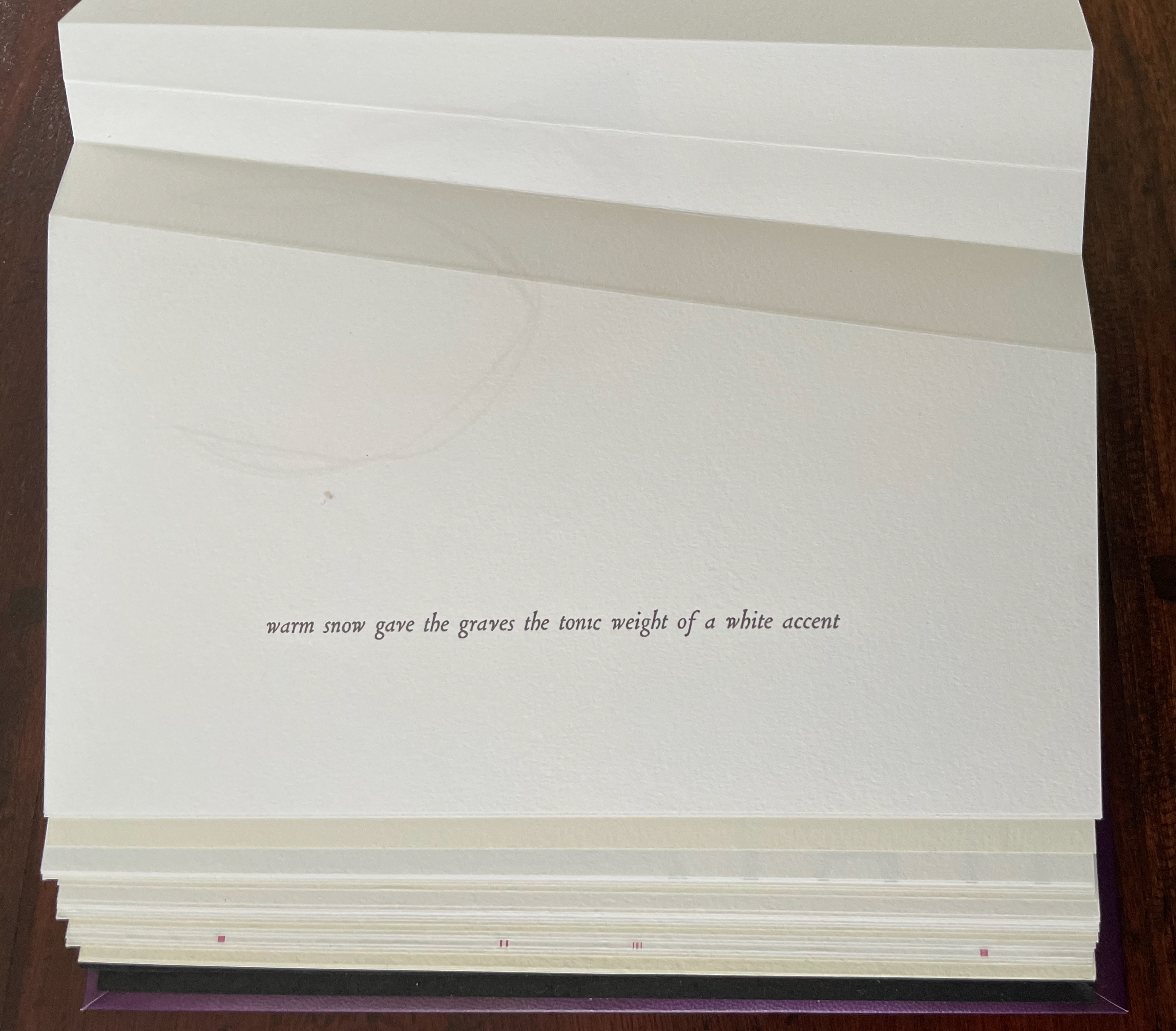
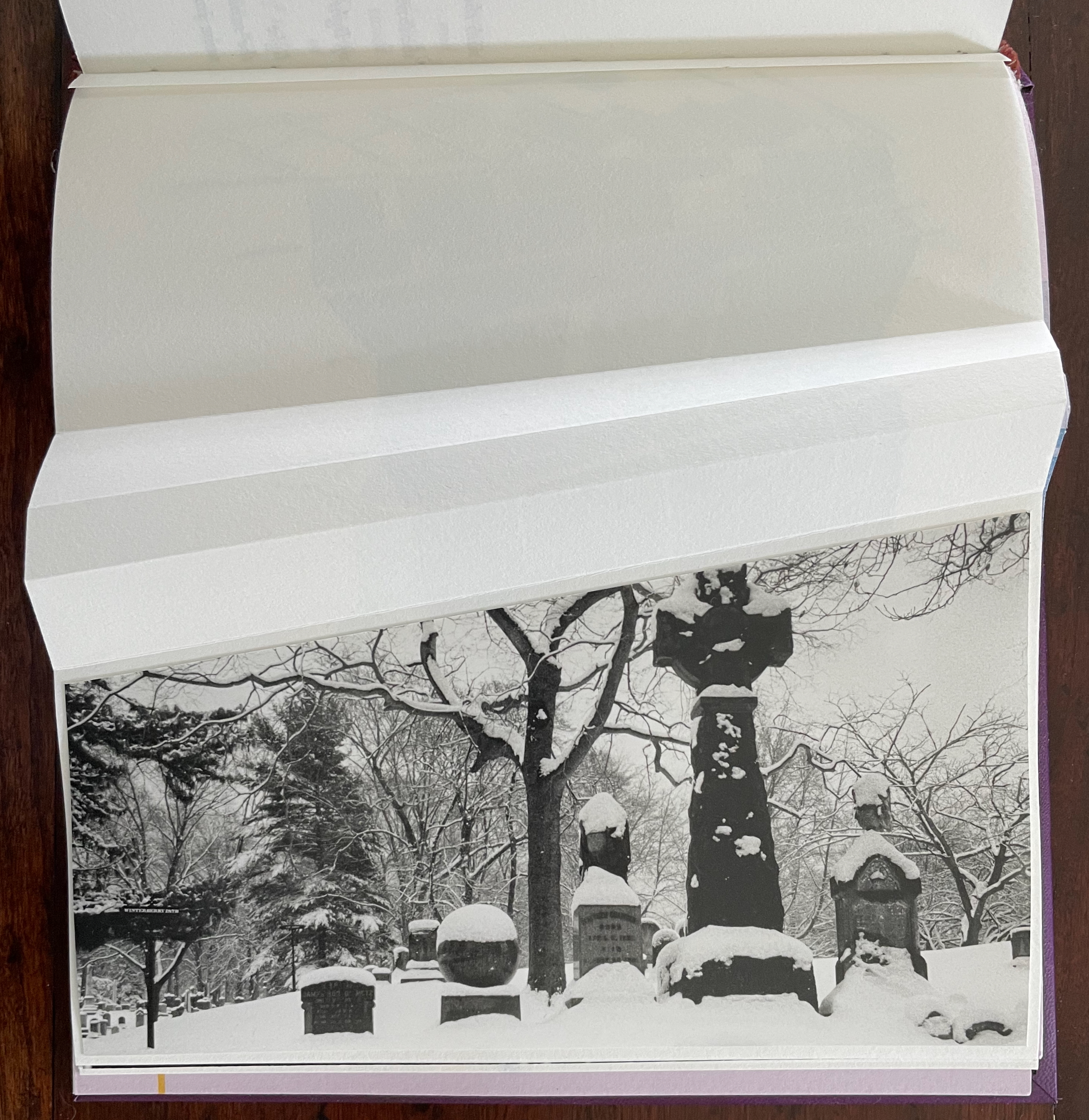
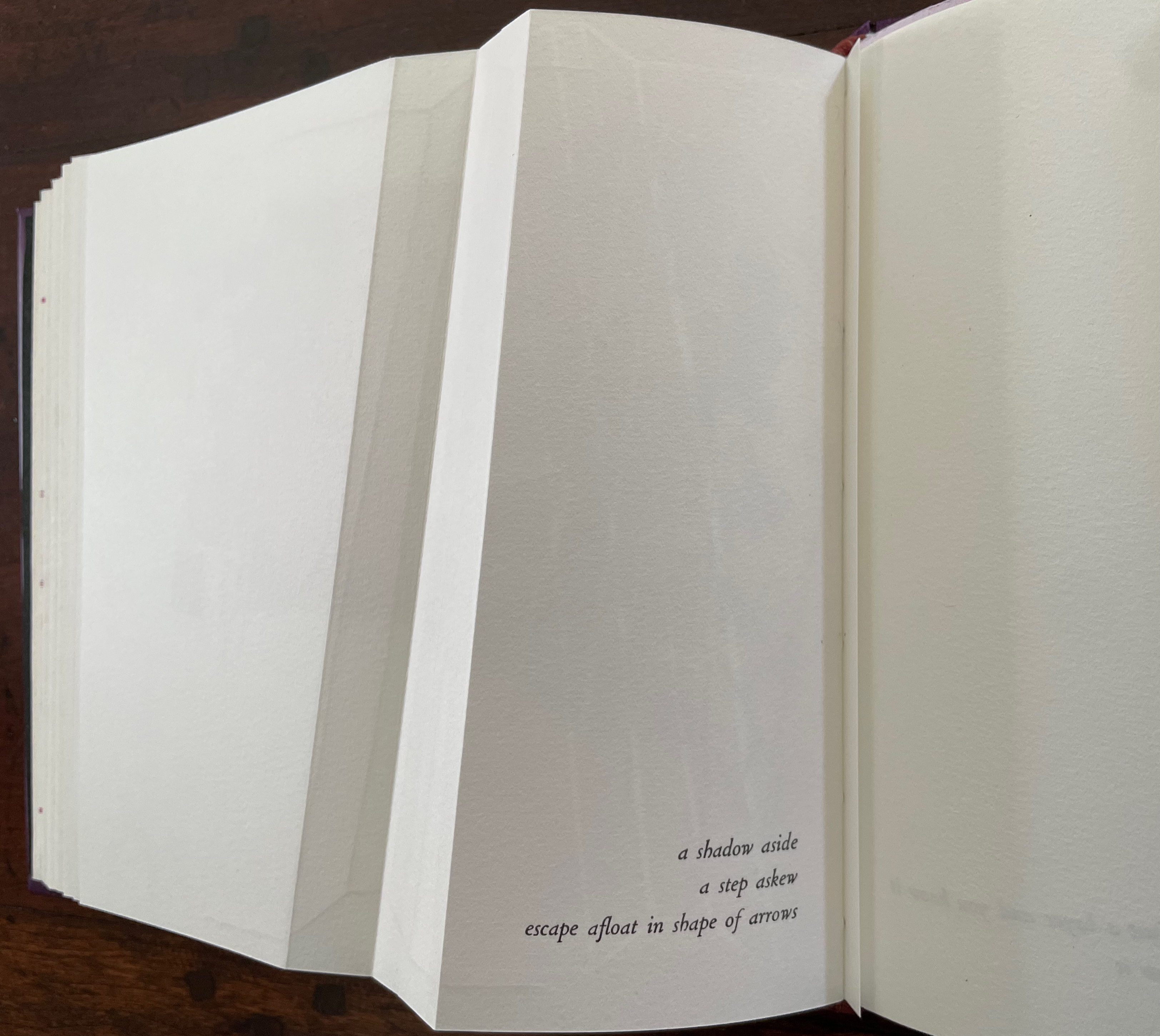
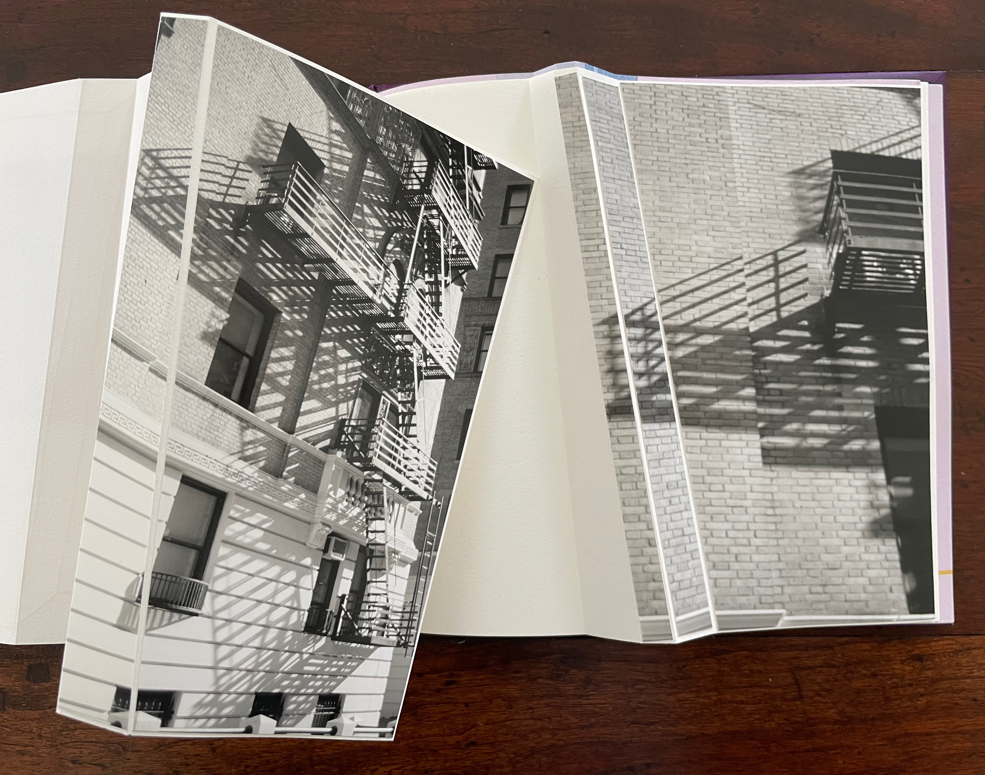
“a shadow aside / a step askew / escape afloat in shape of arrows”. The segmented photos of an Upper West Side building’s fire escape articulate with the angled beam shape to echo the text.
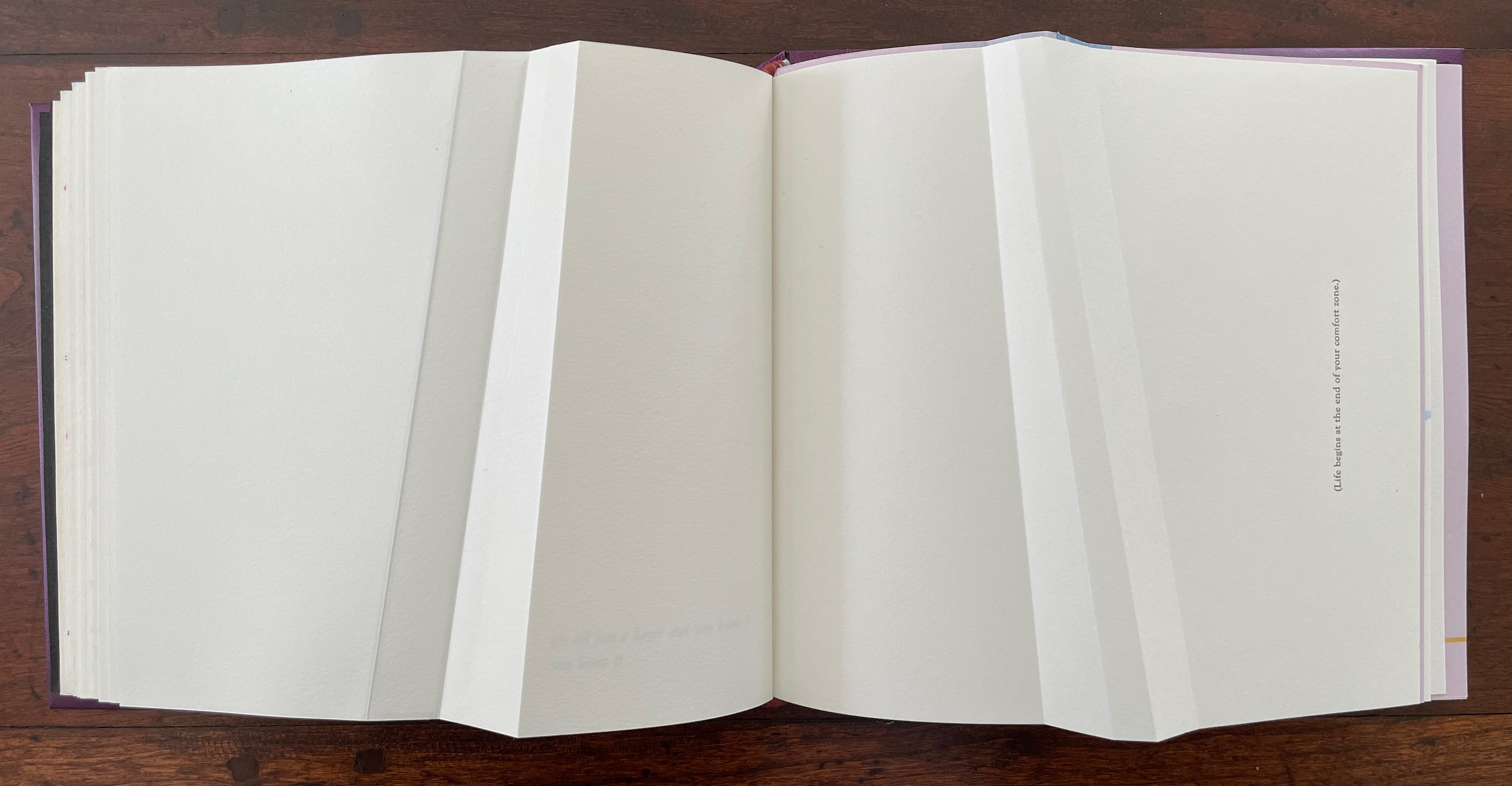
The text before the concluding “end-on” image in this gathering introduces another continuum: “(Life begins at the end of your comfort zone.)”
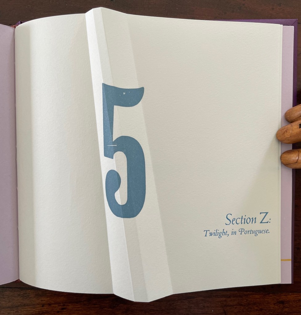
Part 5, Section Z is the wrap-up, conflating the end of the alphabet with the end of the day (twilight), but of course, twilight is also a point on the continuum of day into night.
Lusco-fusco = twilight.
At this point, the reader might register that a continuum whose extremities hang in the balance against one another and yet are still connected is also a description of metaphor itself. Two disparate terms are brought together to make a figure of speech. Cordeiro brings two disparate objects together — a softcover codex and the shape of an angled beam, a hard form of structural support — to shape her artist’s book. She materializes that metaphor, then uses it as a platform for textual, graphical, material, and structural metaphors that celebrate the limp vellum structure. It is a striking accomplishment that challenges readers to think with their hands as well as their minds.
Further Reading
“Carol Barton“. 10 August 2024. Books On Books Collection.
Drucker, Johanna. 2004. The Century of Artists’ Books [Second edition] ed. New York City: Granary Books. For investigation “of the book as a form through examination of its material, thematic, and formal properties “, see p. 93.
Hebert, Henry. 18 December 2011. “Limp Paper and Vellum“. Work of the Hand. Accessed 23 October 2025.
Magee, Cathie (compiler). 23 February 2024. “BPG Parchment Bookbinding“. AIC (American Institute for Conservation) Wiki. Accessed 22 October 2025. Citing Clarkson and Giuffrida.
First, the back-dating. This comes from the delightfully annoying or annoyingly delightful belated discovery of Erik Kwakkel’s 2015 entry on the history of the horn-book “Book on a Stick” in Medievalbooks. Delightful and annoying to find the truly earliest appearance of a horn-book right under my nose in the Bodleian Libraries but too late to include it in the Alphabets Alive! exhibition at the Bodleian in 2023.
Andrew White Tuer’s History of the Horn-Book (1897) came close with its dating of the horn-book’s first appearance as 1450, but as Kwakkel writes:
The image shows Christ being brought to school by his mother. He is bringing his “textbook” to class: a hornbook, which dangles from his wrist by a string, just like many of the later specimens did … Quite intriguingly, we are shown a real medieval snapshot of how children carried their hornbook to and at school. More importantly, it shows that the hornbook was indeed a medieval invention….While no actual hornbooks appear to survive from the medieval period, these visual representations show that educating young children was also the driving force behind the production of hornbooks in the age before print.
And for the updating, here is Ashley Thayer’s Mechanical Horn-book (2025) just arrived in the Books On Books Collection.
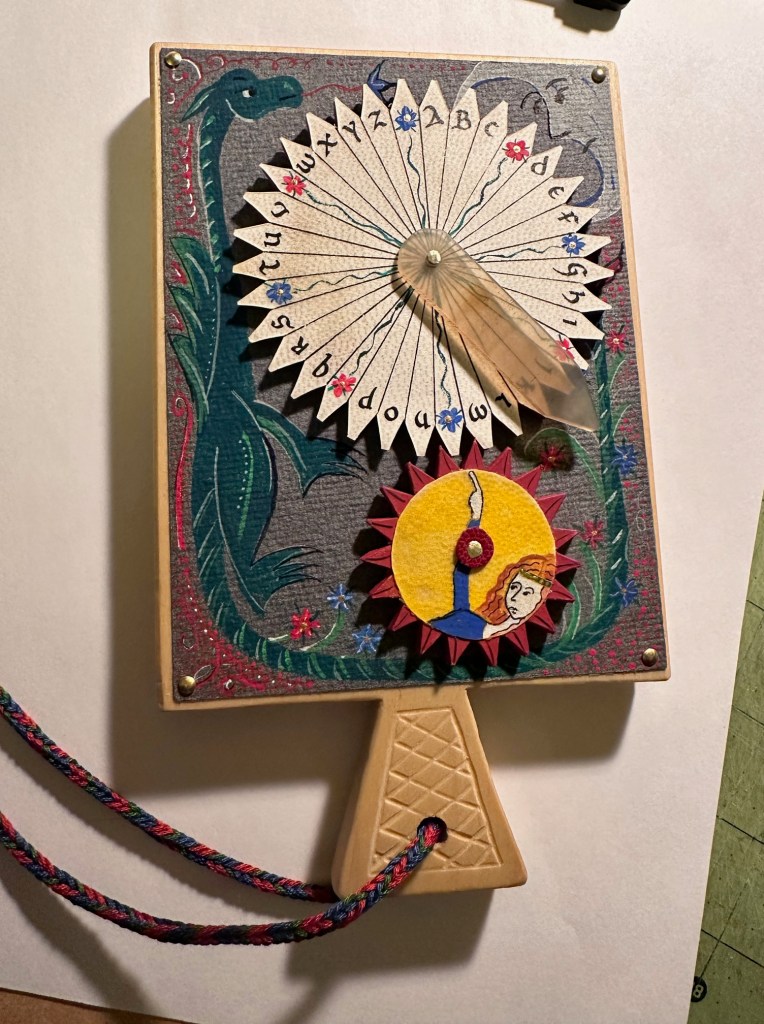
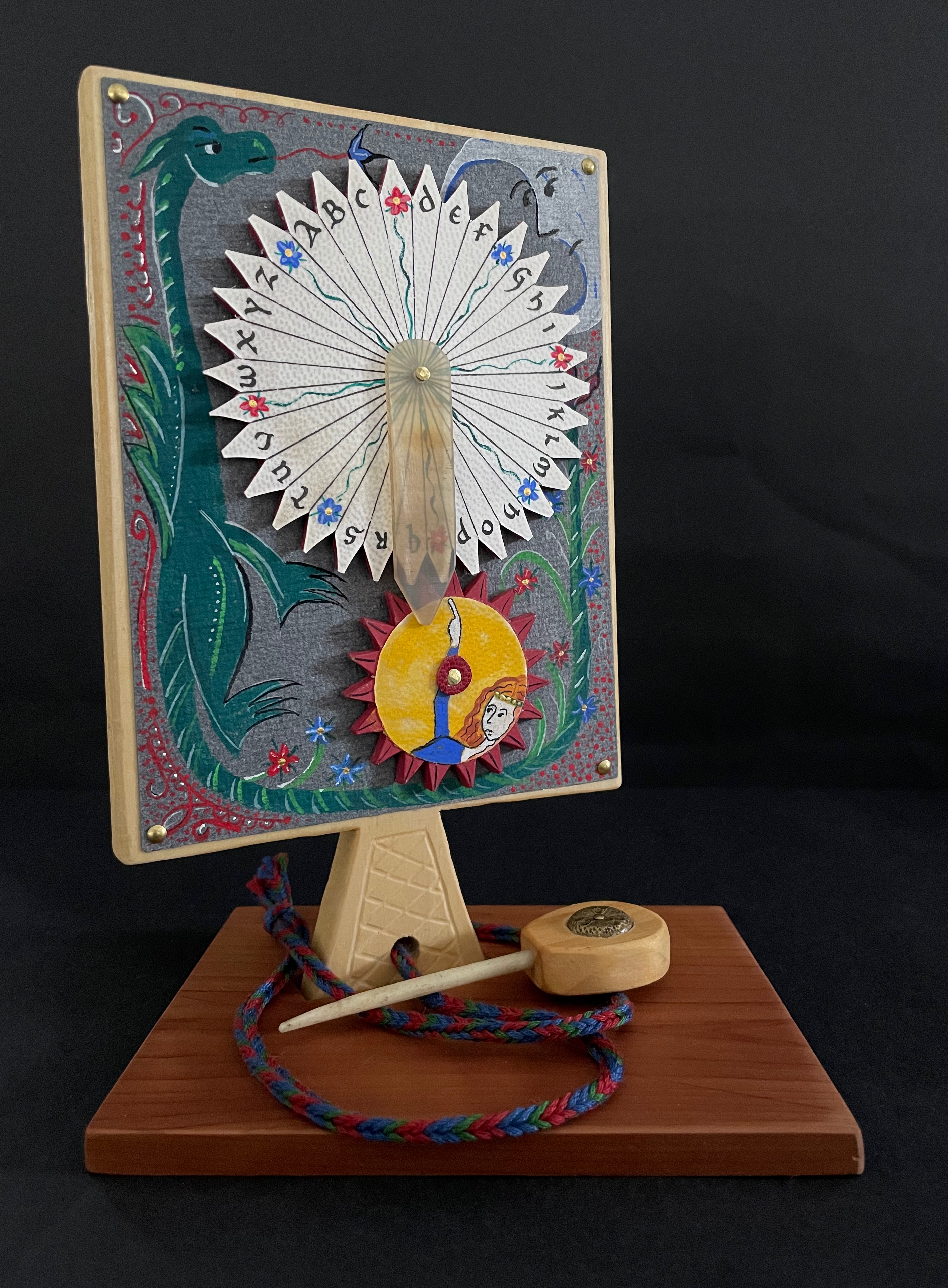
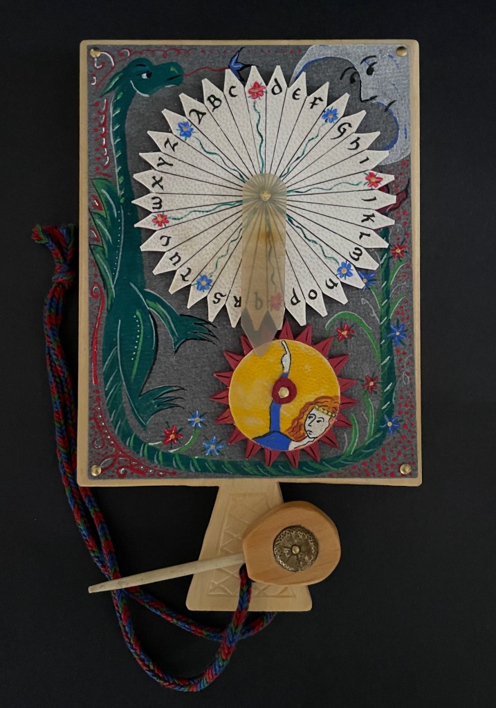
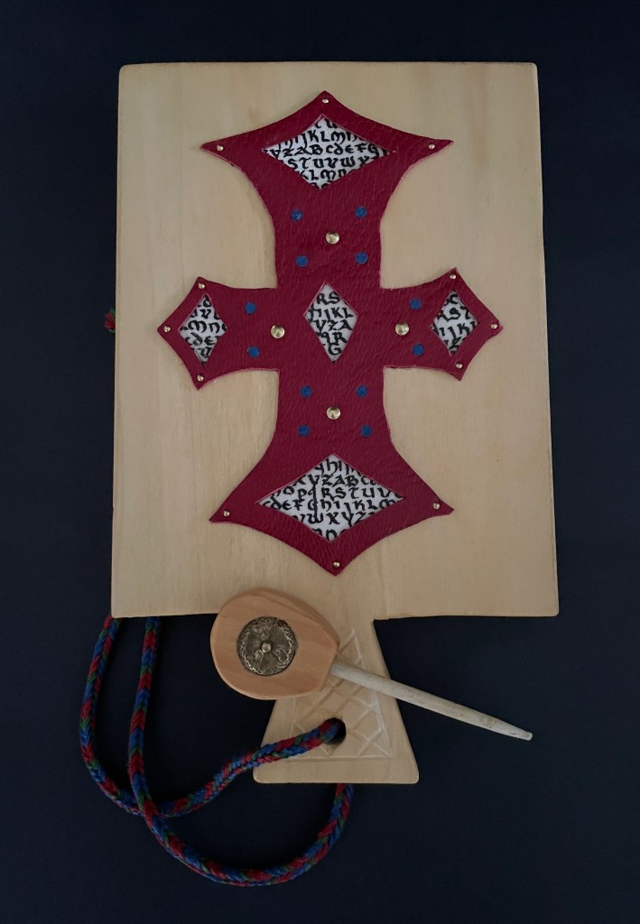
Mechanical Horn-book (2025) Ashley Rose Thayer Horn-book. On stand: H192 x W160 mm. Off stand: H192 x W115 mm. Unique. Acquired from the artist, 17 October 2025. Photos: Courtesy of the artist. Books On Books Collection.
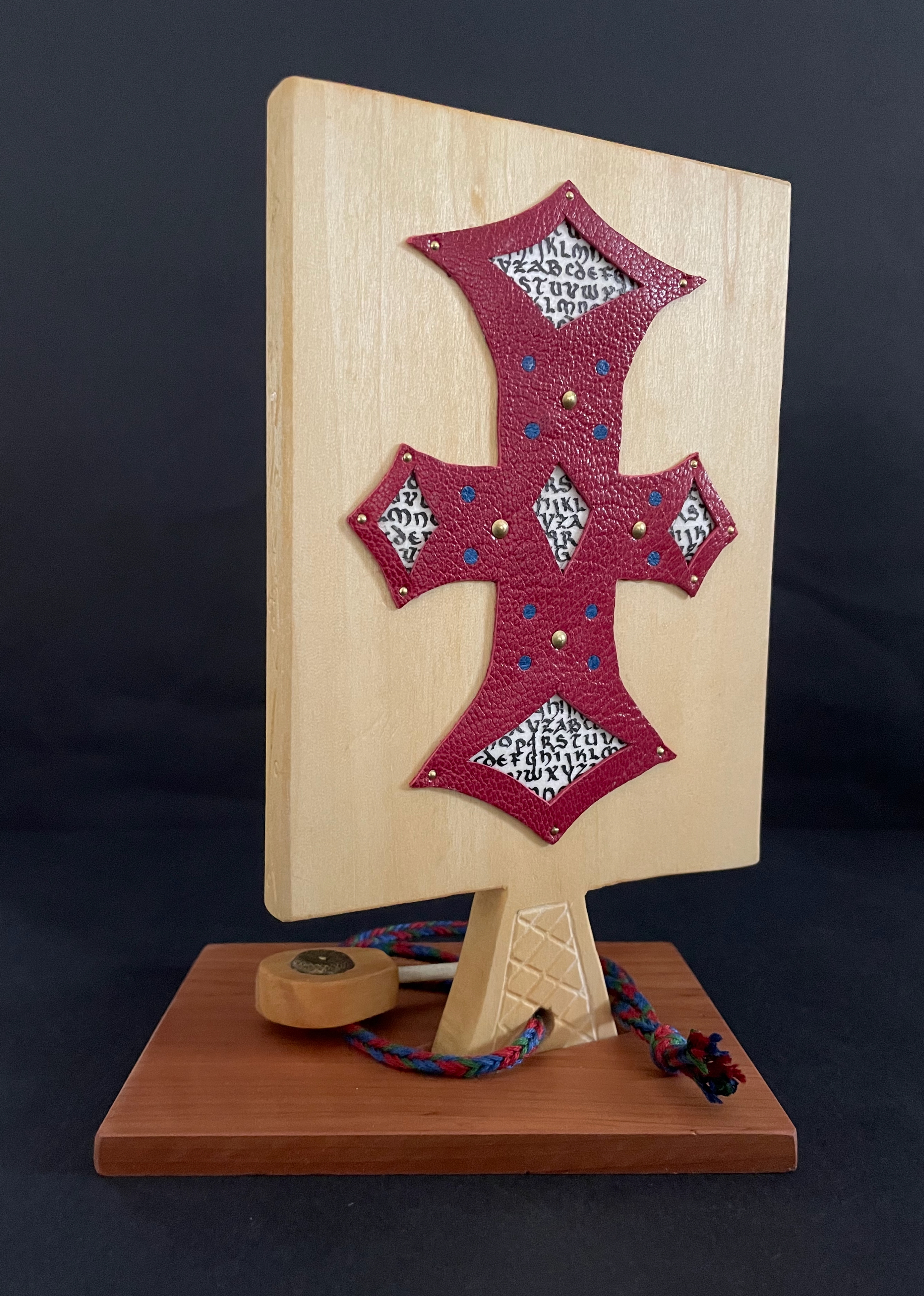
The paddle is made of pine wood, the gears of vellum-covered bookboard, the spinning “arm” of authentic cow horn, and the wrist loop of embroidery thread by a medieval finger loop braiding technique. On dark grey-blue Khadi paper, Thayer has painted a border of the moon, a berried floral garland, and a wyvern, the heraldic emblem associated with Wessex, the Anglo-Saxon kingdom from which Alfred the Great emerged in the 9th century. On the reverse, a cross of cut red leather with five inserts of calligraphed vellum alluding to Christ’s five wounds reflects the horn-book tradition of combining religion with learning the alphabet. It also makes this horn-book reflective of Alfred’s Anglo-Saxon and Christian background.
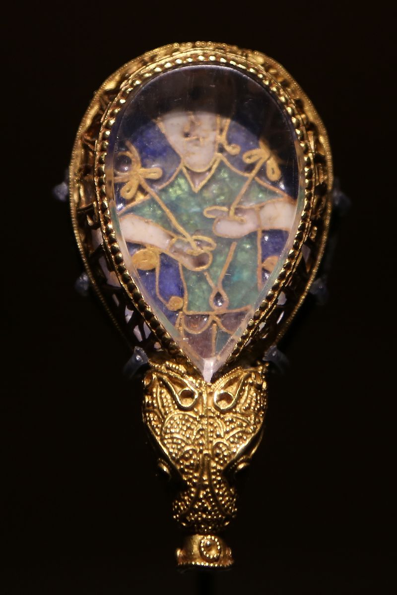
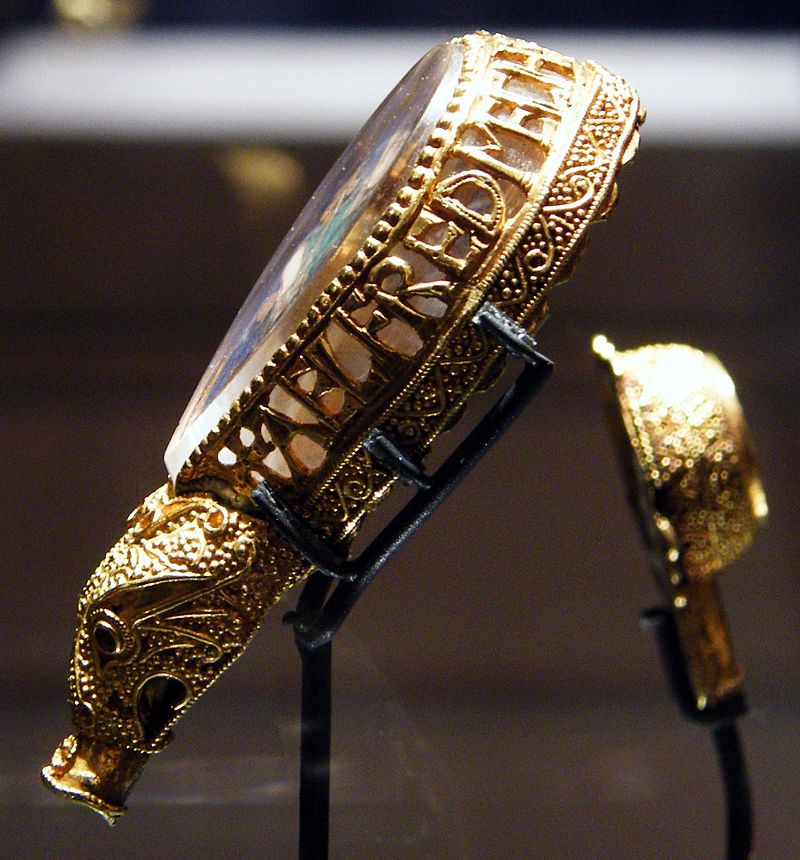
The pointer, called an aestel in Old English, is made from poplar wood, an antique button, and antique bone. Its inclusion isn’t simply functional. Appearing alongside the Wessex wyvern, it points to that famous aestel on display at the Ashmolean in Oxford: the Alfred Jewel.
The Alfred Jewel, Ashmolean Museum, Oxford. Photo taken from the front by Geni CC BY-SA 4.0. Photo taken from the side by Richard M Buck CC BY SA 3.0.
If there’s ever an Alphabets Alive! redivivus, Erik Kwakkel and Ashley Thayer have provided the pointers to the other treasures in Oxford that should be included.
Marlene MacCallum achieves distinctive results by painting with photography and sculpting with book structure in her artist’s books. Her painting with photography has involved not only collage work but pinhole cameras, digital cameras, digital layering and masking as well as a variety of transfer processes — digital and analogue photogravure, lithography, digital pigment printing, and digital inkjet printing. Sculpting with book structure mainly includes varying the binding as in the accordion with fold-out of Obvert (1997), the tunnel book structure of Do Not Enter (1998), the gatefold of Domestic Arcana (1999), the tile format fold-outs of pink story (2004-05), the accordion of Quadrifid (2009), the dos-à-dos of Glaze: Reveal and Veiled (2013), and the Miura fold of Rise (2020). It also includes altering books as in Withdrawn (2010) and varying the substrate as in the lace paper, Moriki, double matte Mylar, Lanaquarelle, and embossed leather of Townsite House (2006) and the etched copperplate and Tyvek of Trompe l’Oreille (2011).
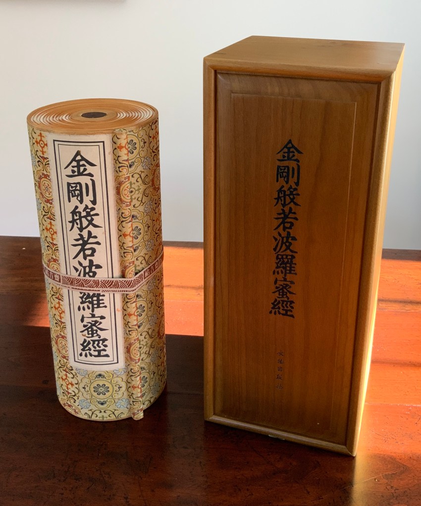
Diamond Sutra in 32 zhuan (seal) fonts (2017) Zhang Xiaodong Scroll in dragon scale binding. 152 x 382 x 160 mm. Edition of 300, of which this #197. Acquired from Sin Sin Fine Arts (Hong Kong), 31 October 2019. Photos: Books On Books Collection.
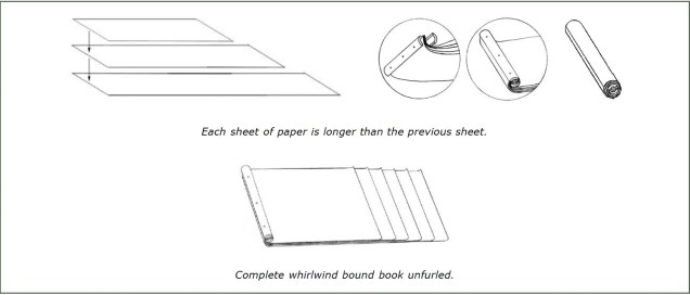
In 1900, in China’s Dunhuang province, the Diamond Sutra (868 CE), the world’s earliest complete and dated printed book, was discovered in a cave along with 40,000 scrolls. One of those other scrolls — Or.8210/S.6349 — was possibly just as important for the book arts as the Diamond Sutra was for the history of printing. Like the Diamond Sutra, Or.8210/S.6349 resides in the British Library and is “the only known example of whirlwind binding in the Stein collection of the British Library” (Chinnery). The structure is also known as dragon scale binding, although distinctions between the two have been debated (Song). It came into use in the late Tang dynasty (618-907 CE) then fell away in the face of the easier to handle butterfly and wrapped-back bindings. Besides Or.8210/S.6349, there are few surviving examples of original whirlwind or dragon scale bindings.
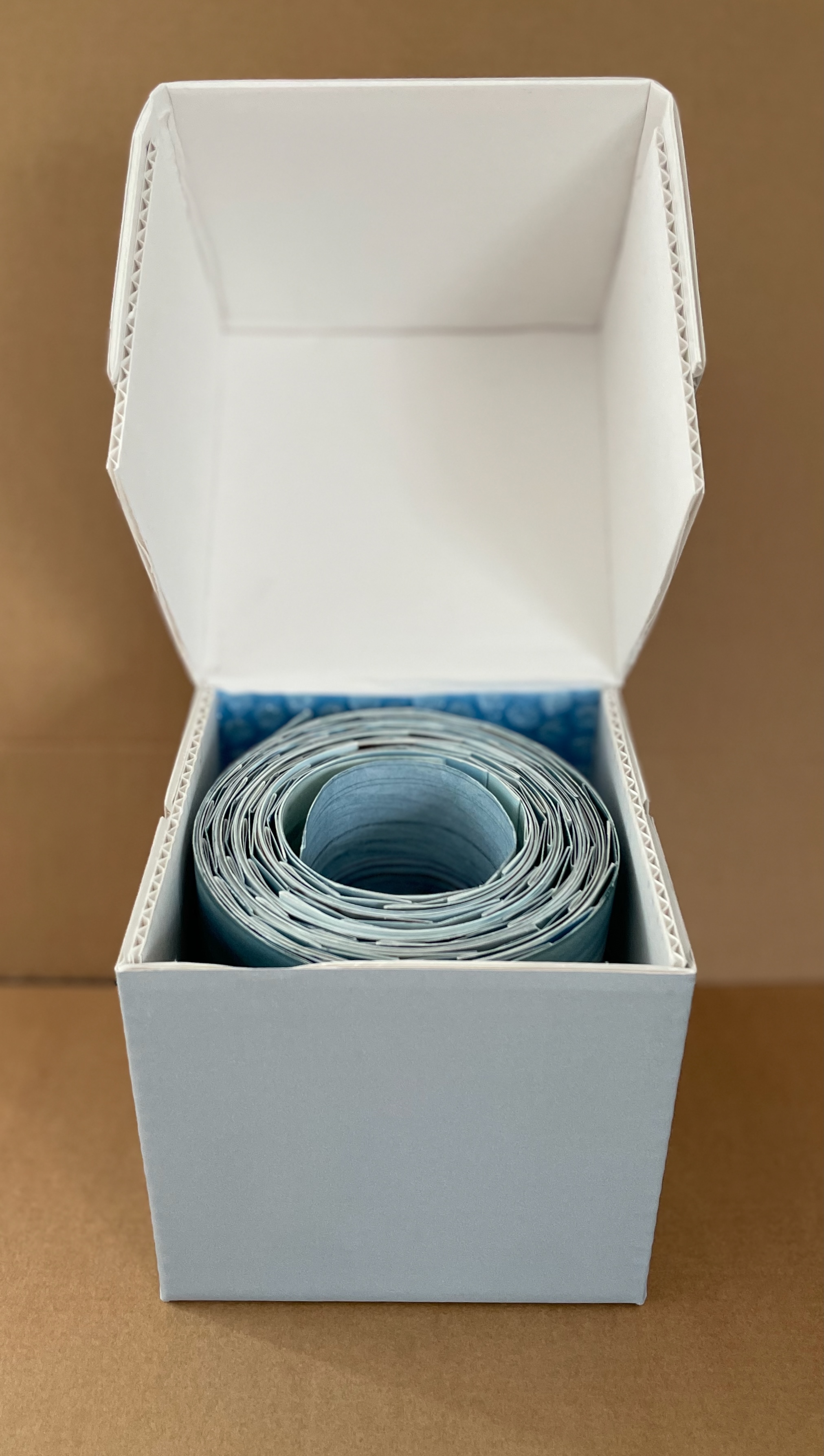
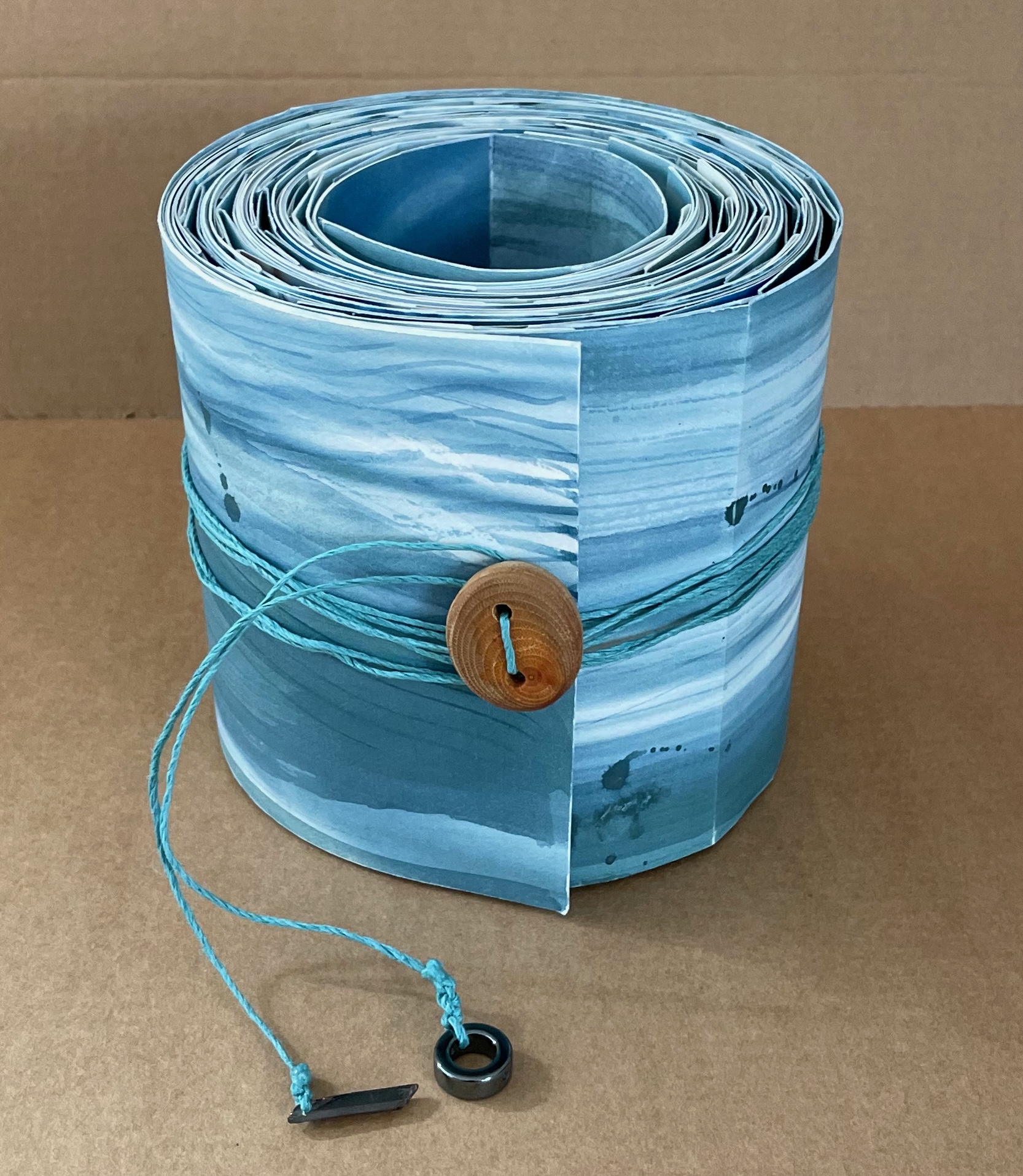
Watercourse I (2022) Barbara Hocker Scroll in variant dragon scale binding. L152 cm (variable) x W12 cm. 64 panels. Unique. Acquired from the artist, 10 February 2024. Photos: Books On Books Collection.
Works evocative of water often invoke a sense of meditative stillness, but Barbara Hocker’s Watercourse I prompts a sense of meditative activity. You can’t stop moving it about. Or if you’re not moving it, you find yourself moving around it to contemplate it. It is the layering of watercolor, sumi ink, photographic prints with archival inks on washi paper, and the ancient Chinese method of bookbinding called dragon scale (sometimes called “whirlwind” or “fish scale” binding) that achieves this. Traditionally, the binding method involves a long scroll of paper to which successively shorter folios are attached at one end, often secured with a bamboo rod. Hocker has modified this structure by attaching folios of the same size with hinges to the underlying long scroll at intervals allowing one folio to overlap the next and so on. In each case, the effect of the overlapping folios creates the appearance of dragon scales.
Because he works with so many different materials, it is hard to classify Julien Nédélec as an artist: A polyfabricant? With language play being a more or less constant theme: A polywright? His website labels him a plasticien, the perfect French word that captures more of the media in which he works than its usual translation “visual artist” does. In Zéro2, Antoine Marchand writes:
Everything, with him, is subject to manipulation, appropriation, and diversion, at times in the most trivial and basic way imaginable. His work is based on permanent mischief, a desire to destabilize the viewer, and be forever creating a slight discrepancy, which barely ruffles the reading of the work—well removed from the showiness of many present-day productions. He bypasses the daily round and takes us towards somewhere else that is not that far away, but all the more joyful. … What should incidentally be underscored in this young artist’s praxis is his ability to move from one medium to another, without the slightest bother or apprehension. It is impossible to pigeonhole Julien Nédélec’s praxis in any one particular medium.
Several of his works have been hosted on the Greek island of Anafi by the Association Phenomenon and the Collection Kerenidis Pepe, whose website also notes that his
practice can take many forms, from sculpture to drawing, through books and photography, with a predilection for the paper, that he uses not only as a support, but also as a material that he bends, cuts, colors, stacks or crumples. His works are the result of linguistic and formal games that reveal the artist’s fascination with the potentialities of language, with a malice that places him as an heir apparent of the Oulipo, while his taste for geometric and serial shapes brings him closer to the tradition of minimalism.
With paper as a favorite medium, there are a handful of artist’s book among the many other forms. Taken together, his artist’s books almost make up an anthology of homage to book artists from the 1960s to the present. He also belongs to the school of appropriators embracing forerunners like Bruce Nauman, Richard Prince, and Richard Pettibone and contemporaries like Michalis Pichler, Antoine Lefebvre, and Jérémie Bennequin, all of whom have embraced the self-reflexive artist’s book as an appropriate medium for appropriation. No wonder Galaad Prigent’s Zédélé Éditions, the French publisher that hosts Anne Moeglin-Delcroix and Clive Phillpot’s Reprint Series of artists’ books, is so fond of his bookworks.
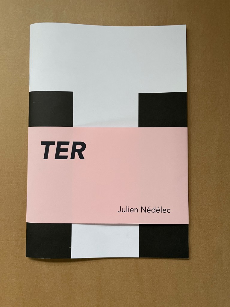
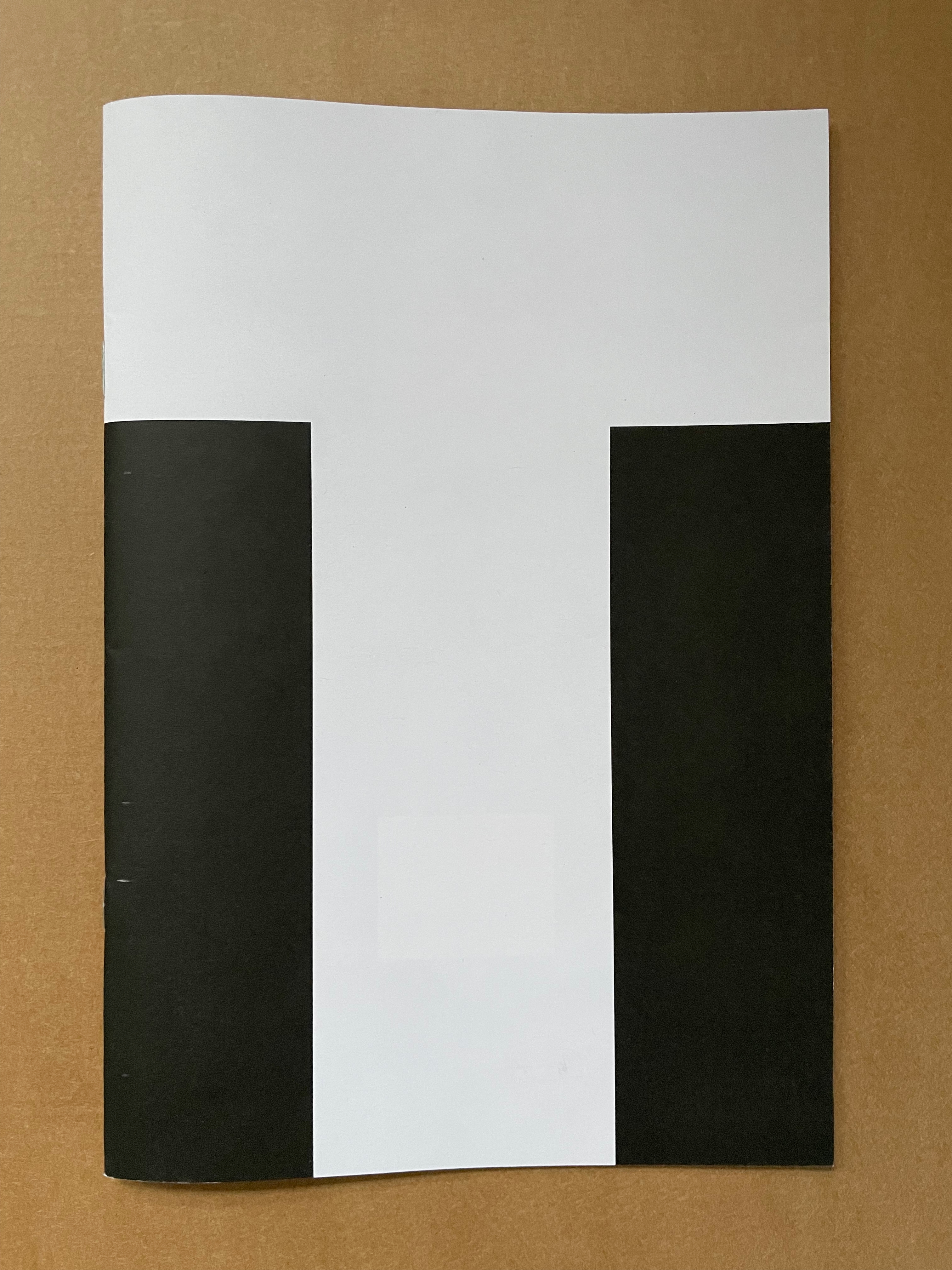
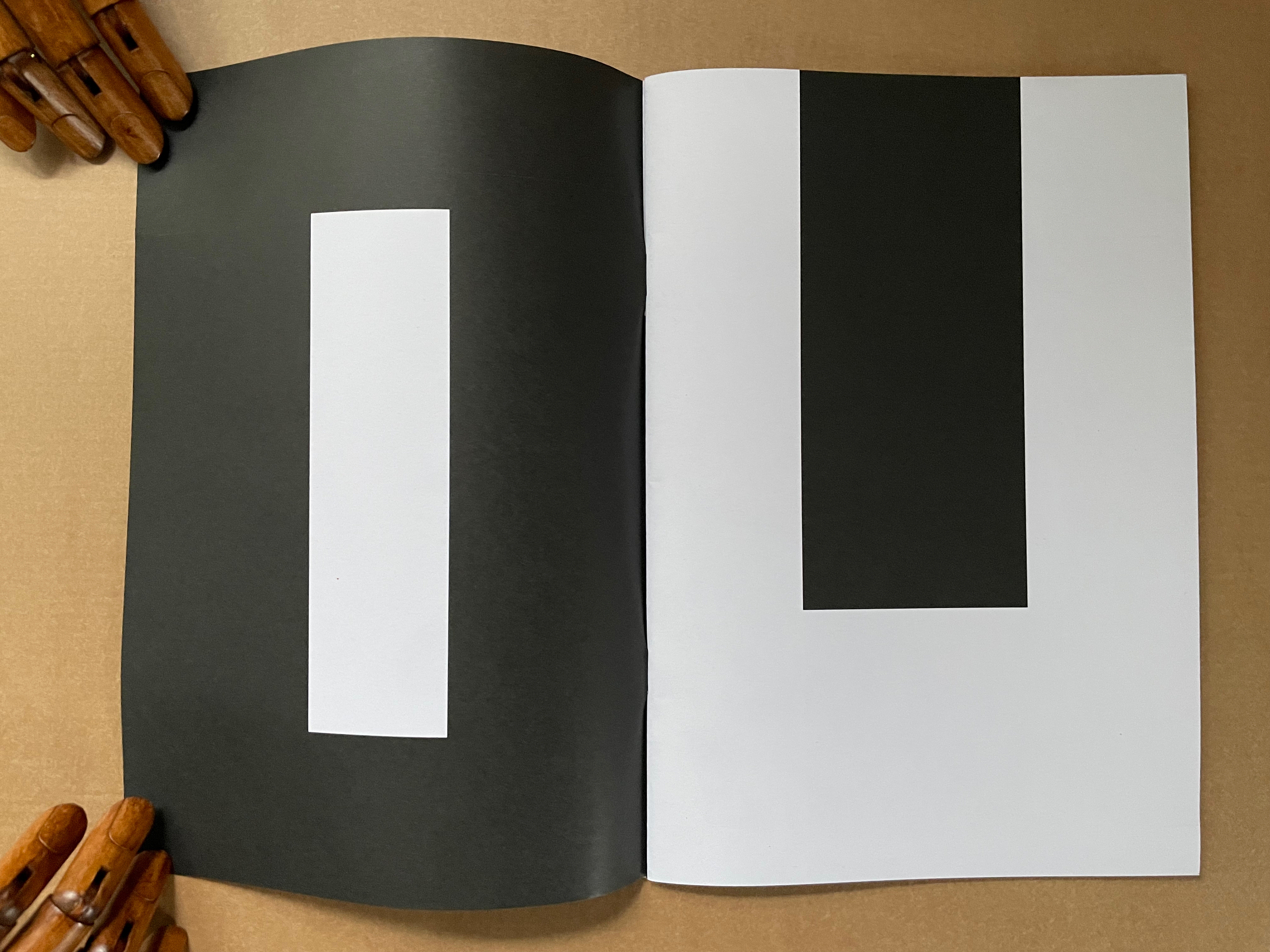
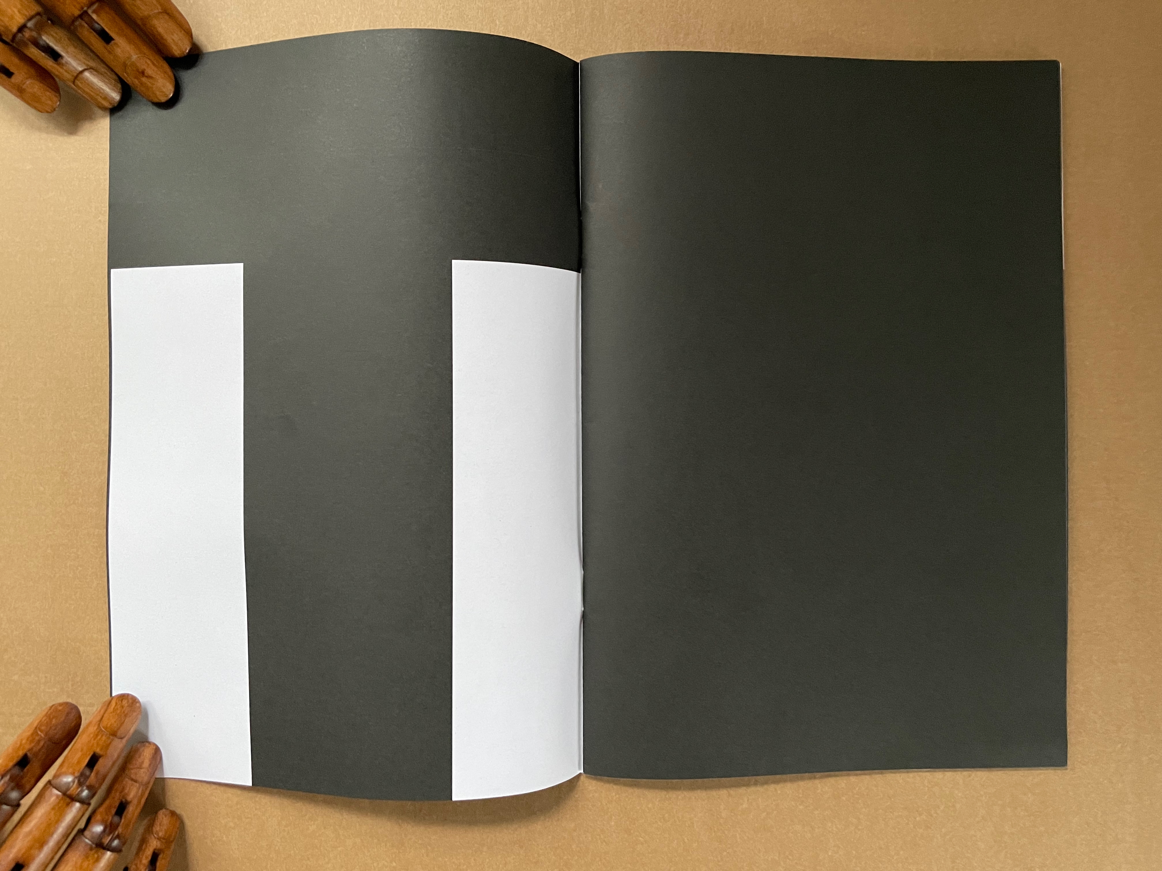
TER (2021)
TER (2021) Julien Nédélec Softcover, saddle stitch with staples. H240 W165 mm. [36] pages. Acquired from Zédélé Éditions, 21 September 2024. Photos: Books On Books Collection. Displayed with the artist’s permission.
“Tout”
The sentences to be deciphered from these full-page-bleed letters are Tout a été redit. Tout a été refait, which, in English, would be “Everything has been said. Everything has been done.” But it also has the echoes of a French children’s song, “Tout ce que je fais“:
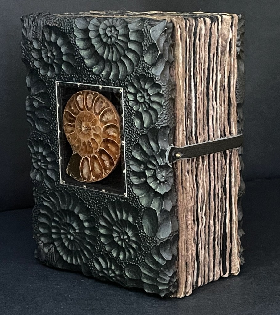
Ammonite (2015) Daniel Essig, Graeme Priddle, and Melissa Engler Ethiopian and Coptic bound book, sewn with waxed black linen thread, walnut-dyed handmade flax and Ingres Antique black papers, with carved front and back covers of maple, each with a bisected ammonite fossil embedded beneath a mica sheet, fixed with 1/8 brass brads. H127 x W90 x D63 mm. [384] pages. Unique. Acquired from the artists, 30 May 2025. Photos: Books On Books Collection.
Even a cursory glance through the Books On Books Collection confirms the variety of choices book artists face when creating an artist’s book. In Ammonite (2015), the book block and its binding are the site and material of Daniel Essig, Graeme Priddle, and Melissa Engler’s sculptural art. In their collaboration, Essig drilled and prepped the wooden covers, Priddle carved the ammonite surface, Engler painted the covers, and then Essig added the mica window with ammonite fossil, prepped the book block, and bound the book.
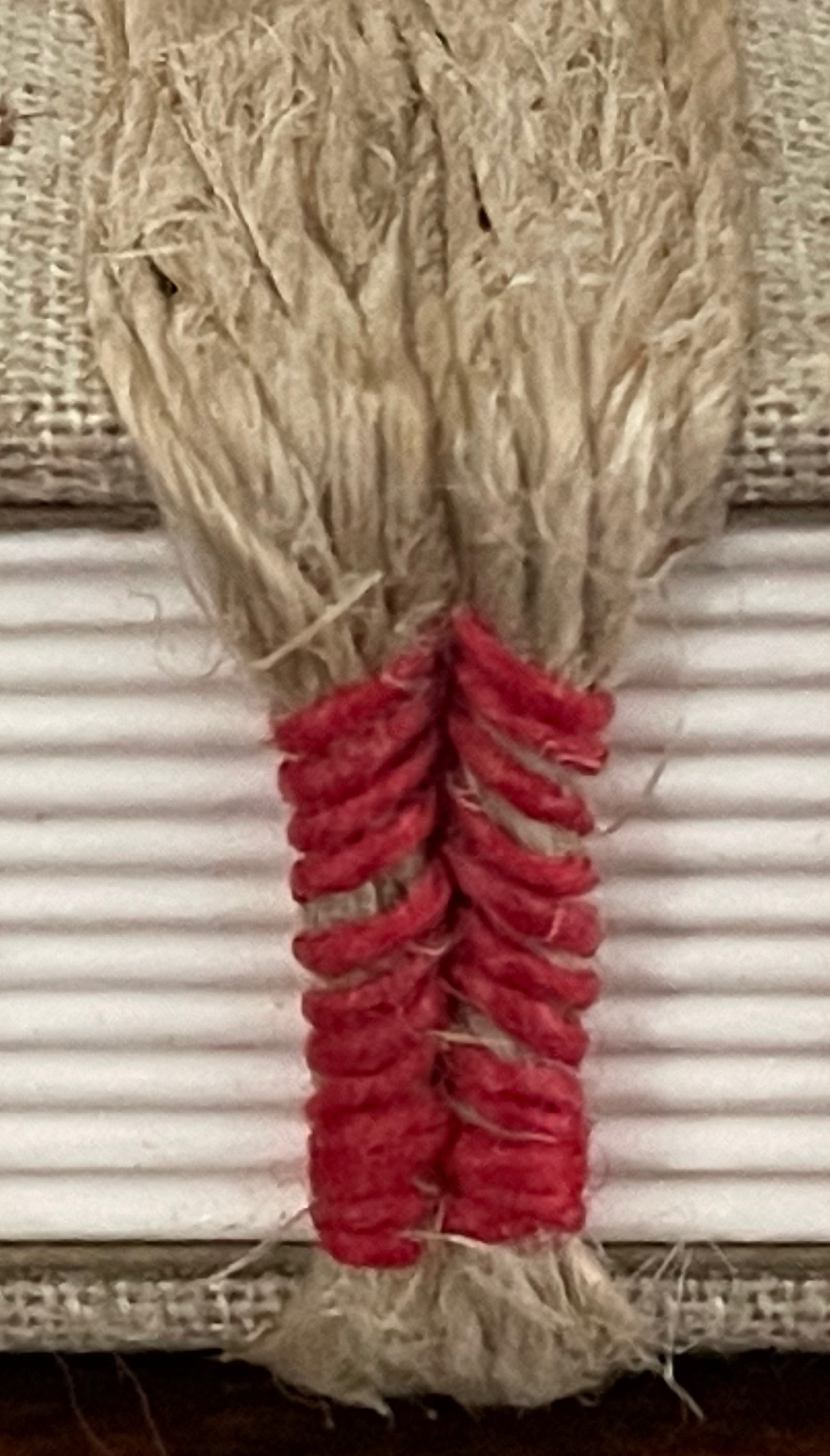
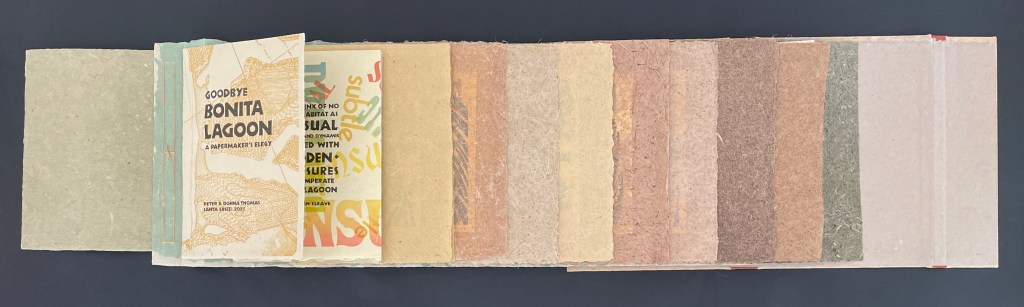
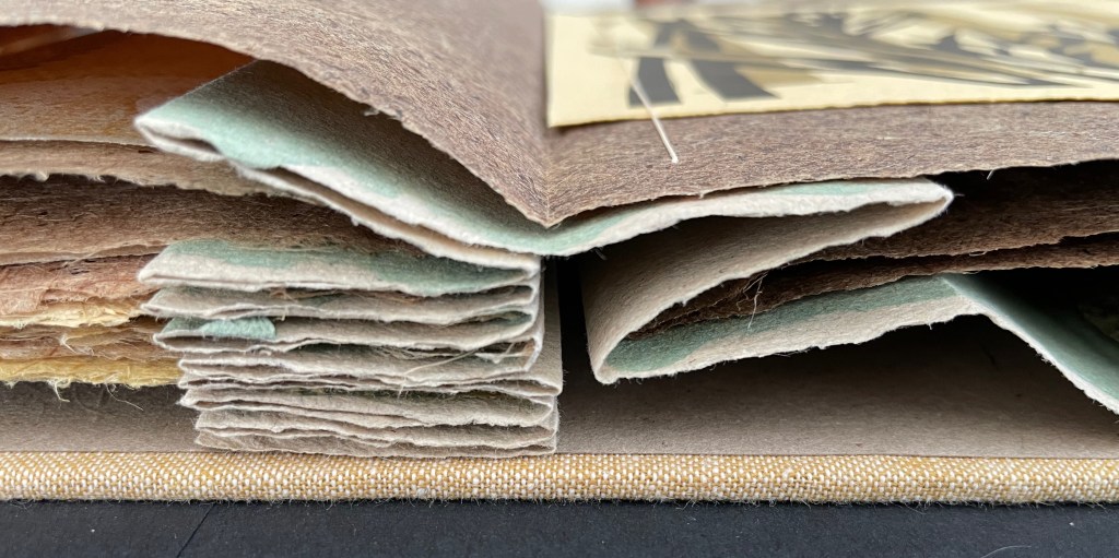
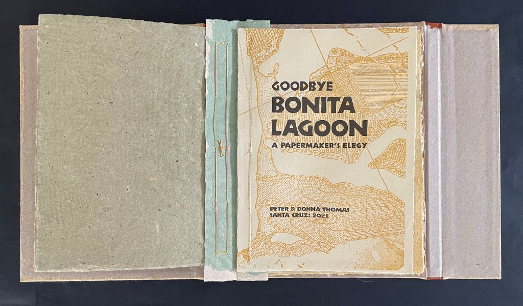
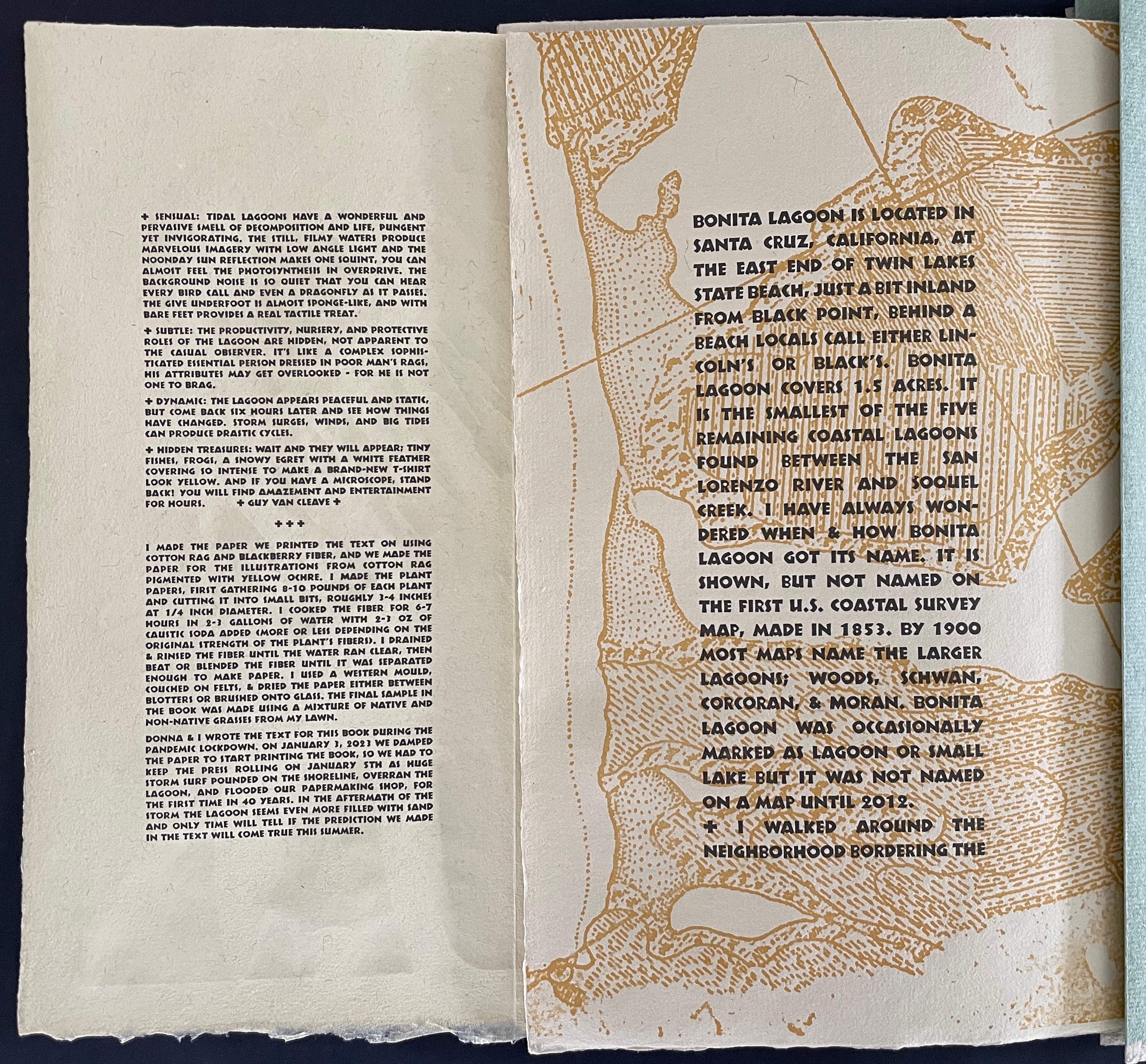
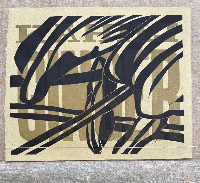
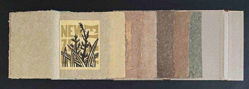
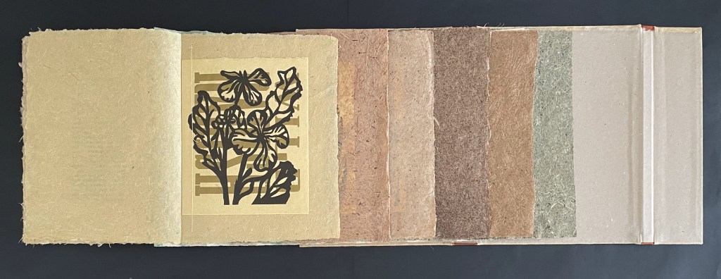
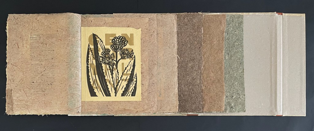
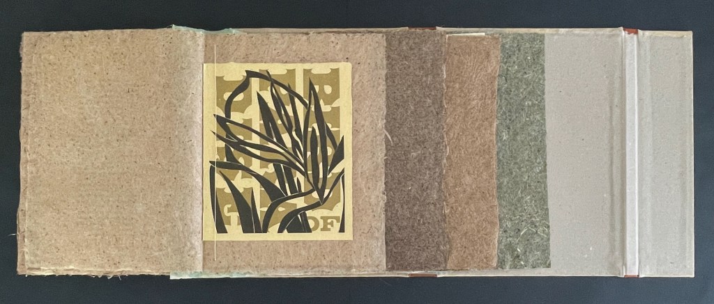
Goodbye Bonita Lagoon: A Papermaker’s Elegy(2023) Peter and Donna Thomas and Guy Van Cleave. Tri-fold binding with 2 leather spines and sewn accordion binding structure, cloth over boards, light green linen cloth letterpress printed with three color linocut print on front cover, and title blind stamped on spine in brown foil. H300 x W225 mm. 80 pages. Edition of 30, of which this is #27. Acquired from the artists, 5 February 2024. Photos: Books On Books Collection.
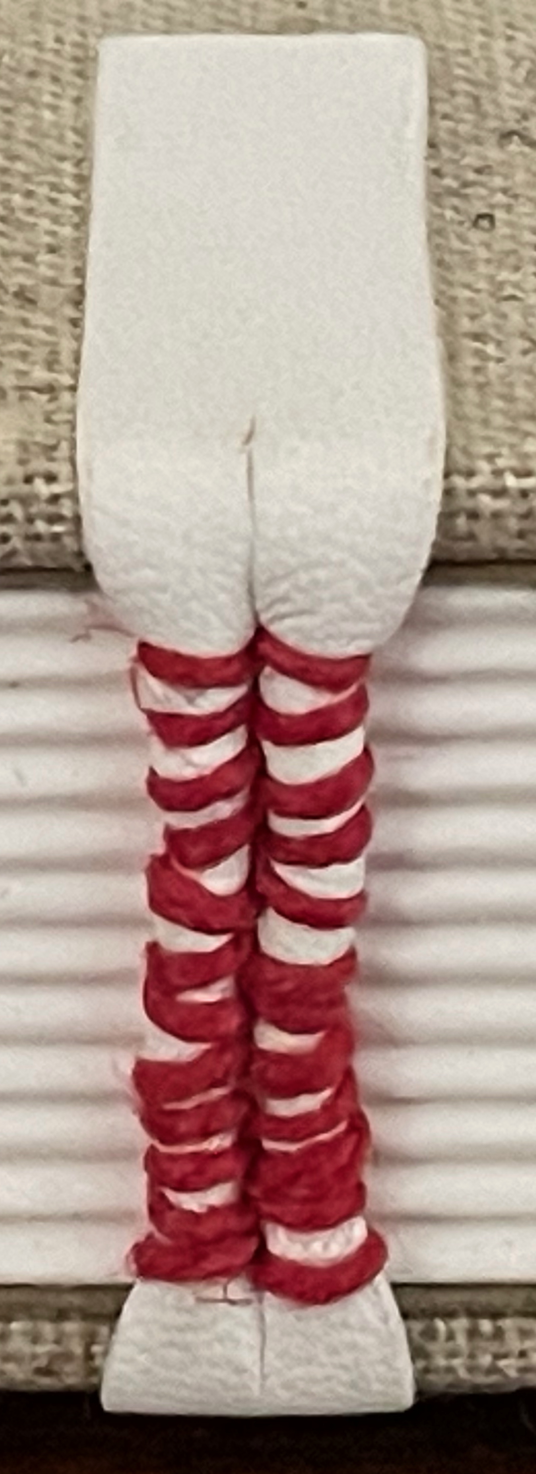
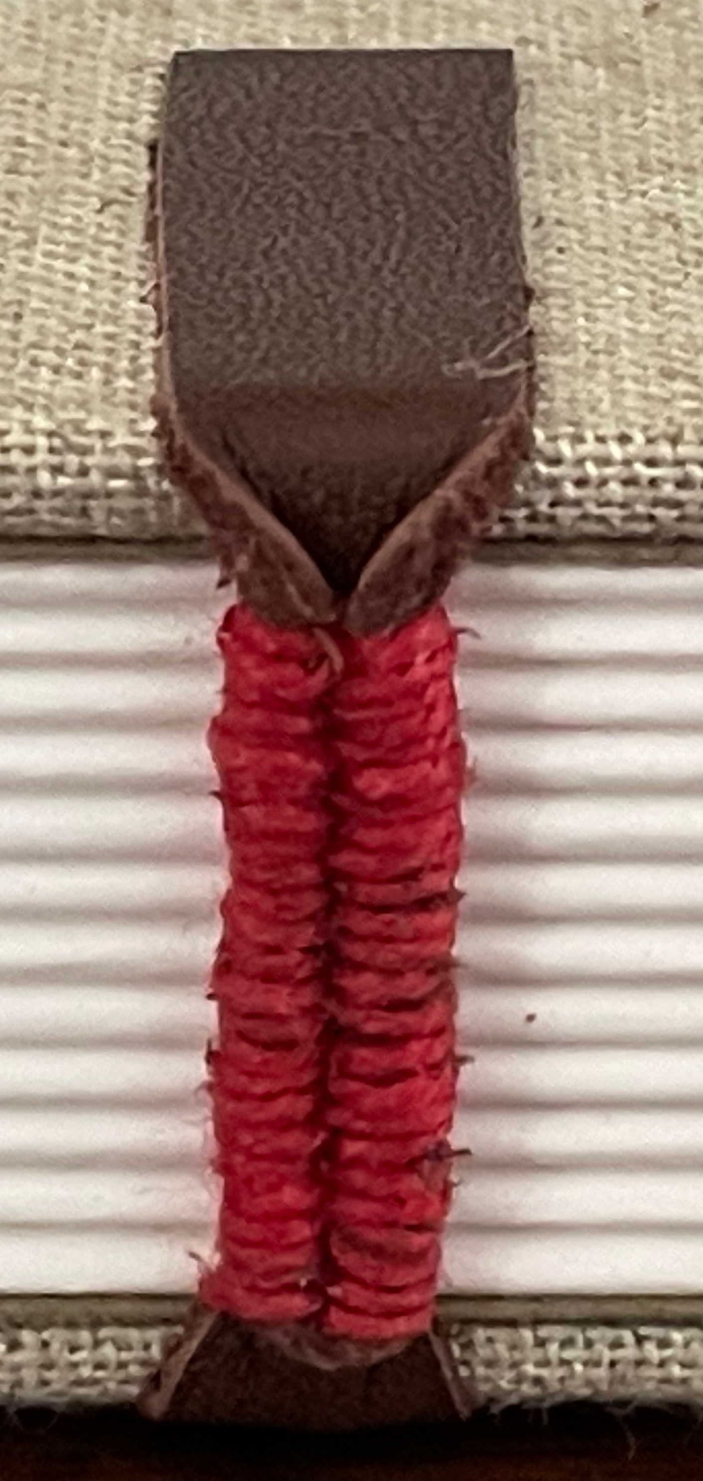
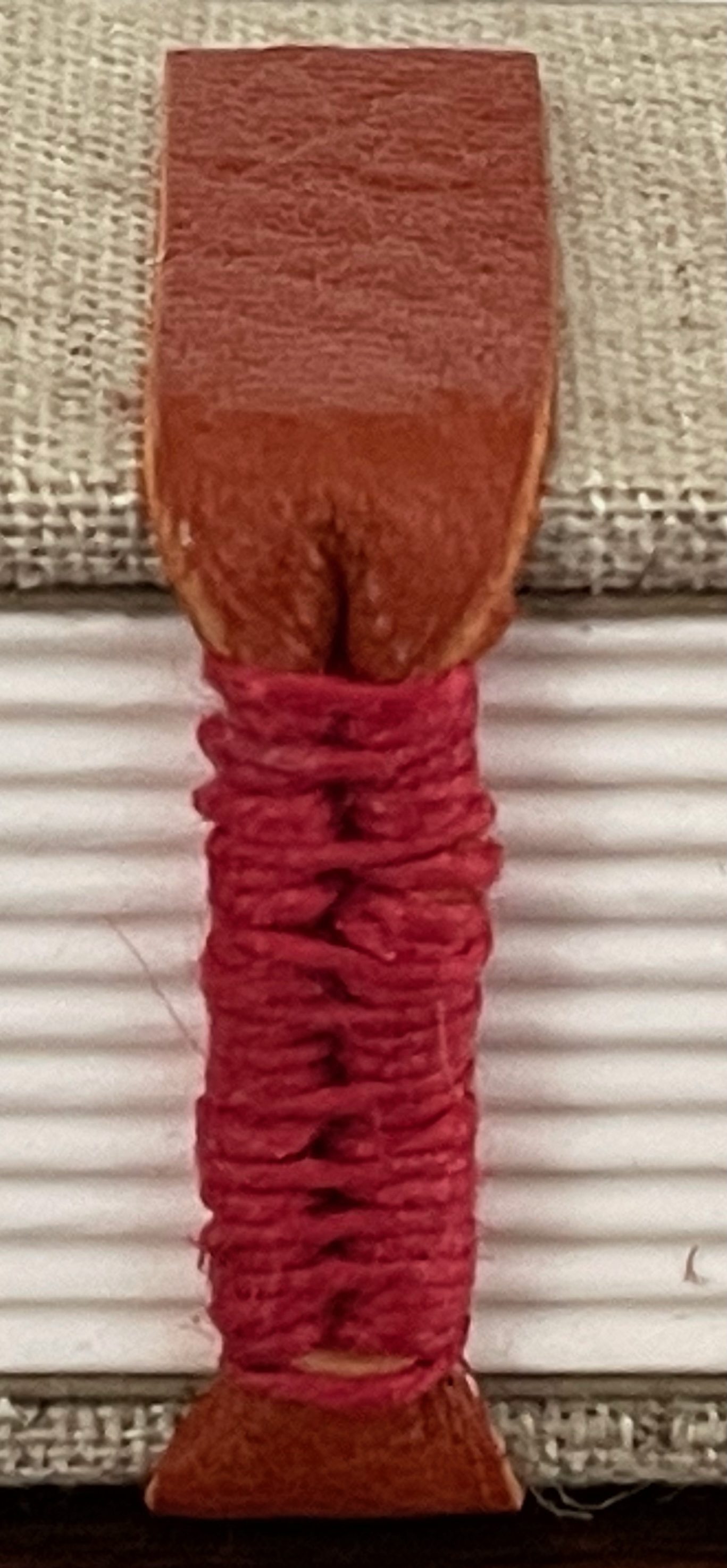
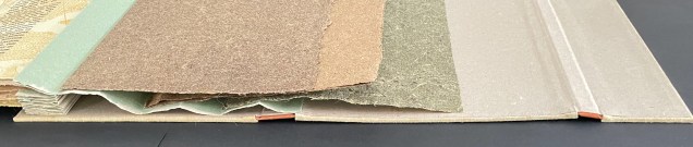
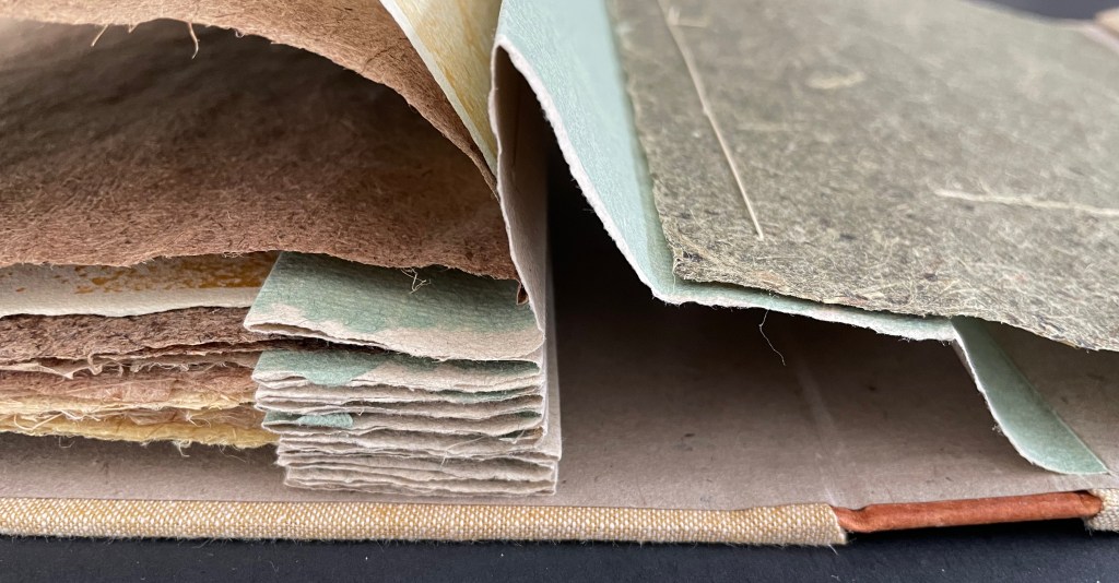
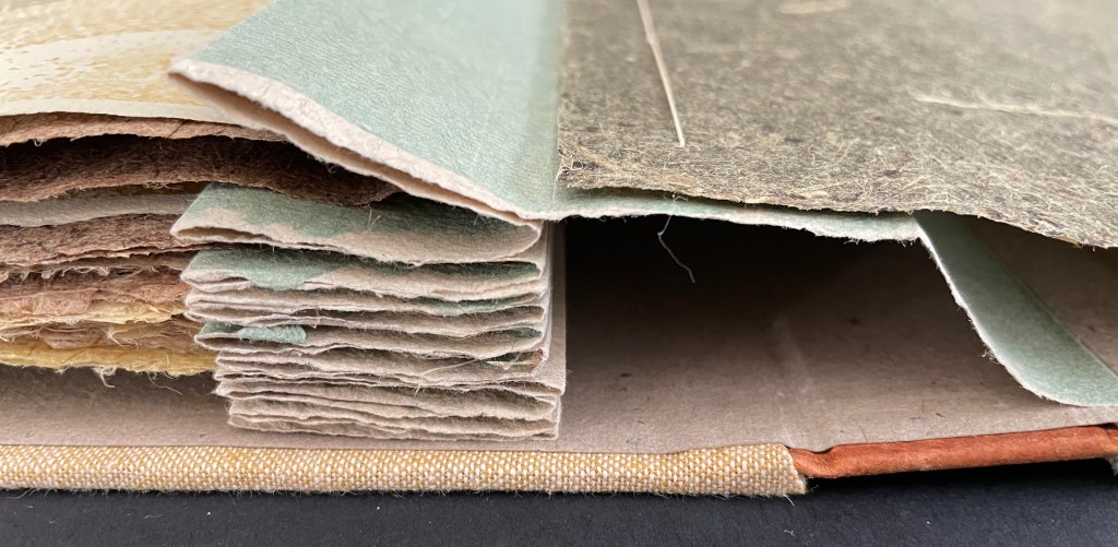
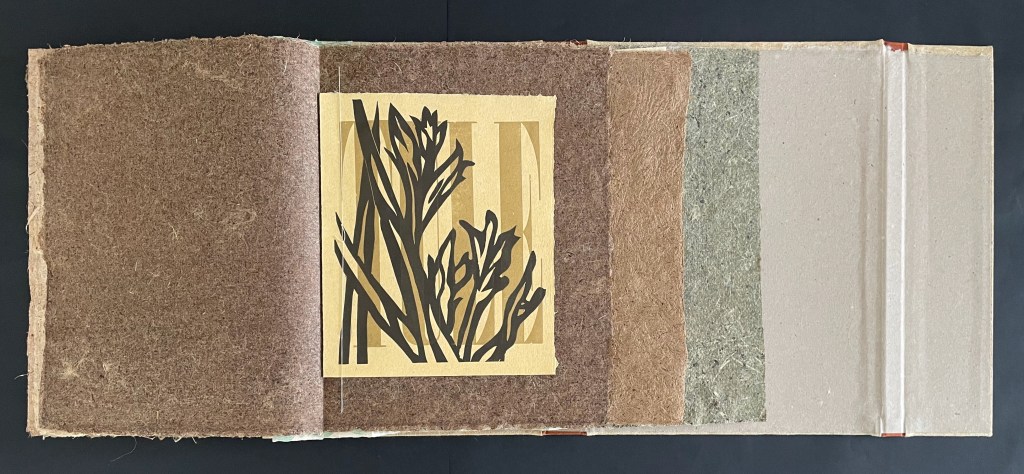
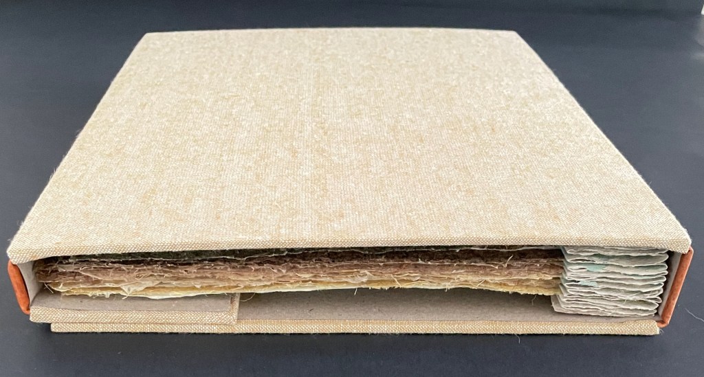
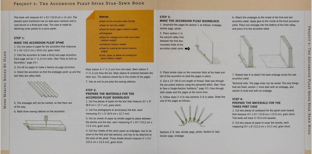
To read Goodbye Bonita Lagoon properly, you must read its text, its images, and its handmade papers as a whole. To do that, you need to let the binding structure guide you. The Thomases call the structure an accordion pleat spine stab-sewn book and have described and illustrated it in More Making Books by Hand (2004). Although the basics are the same –stab-sewing two single sheets of handmade paper and a single plant-paper folio to the recto or ascent side of each mountain fold in the accordion pleat spine — Goodbye Bonita Lagoon extends like a flag book, and as each gathering is turned to the left, the accordion pulls the left hand side of the book toward the right, tucking itself atop the previously turned sheets and folios. Below are the fully extended book, the extended book with the first five gatherings turned to the left, and the extended book with all the gatherings except the last turned. As the book progresses, the width of the extension narrows.
The photos below show the accordion pleat spine’s functioning end on.
Turning the next to last gathering (blackberry paper folio and single sheets) to show the spine’s function end on. Note how the right-hand edge of the light green accordion pleat is fixed to the inside back cover. As the gatherings turn to the left, the accumulated accordion has to move rightwards.
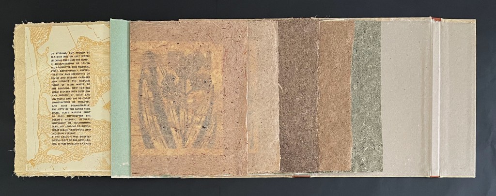
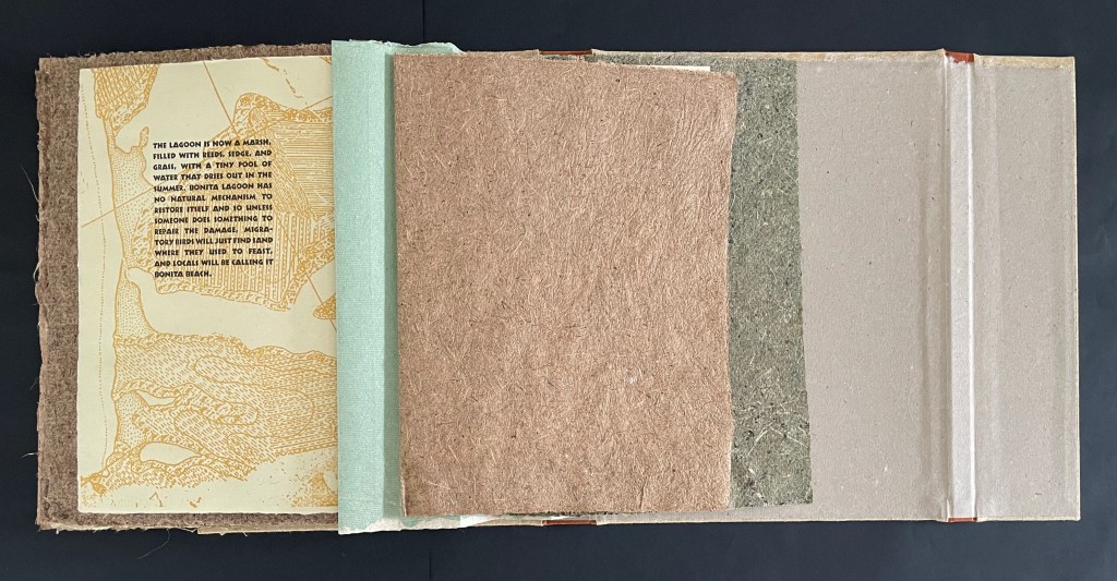
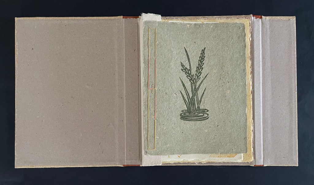
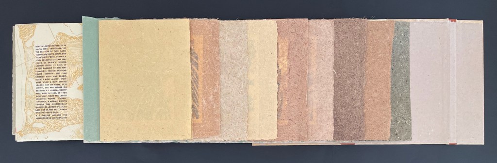
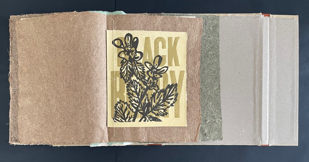
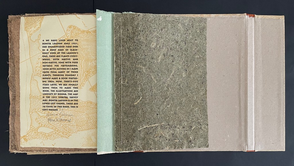
Like the extended width’s narrowing as the book comes to its close, Bonita Lagoon, too, has been collapsing. Elegiacally, each of the plant-paper folios is made from a plant gathered from the lagoon in the past. Inside each of the plant-paper folios, a single sheet insert carries a linocut of the plant and its name printed with wood type. On the back of each plant-paper folio, a single sheet insert bears text about Bonita Lagoon.
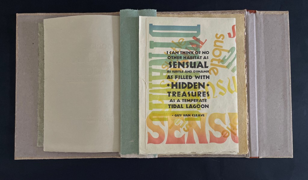
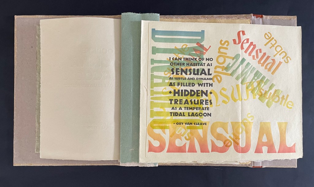
That descriptive text begins at the end of the book’s preliminary gathering, which opens with the book’s only multicolored text, a sort of epigraph from Guy Van Cleave (Professor of Biology, Glendale Community College), extolling the attractions of lagoons. Displayed on the book’s only foldout, the text continues on the reverse with more of Van Cleave’s observations but also a preview paragraph from Peter Thomas. The preview describes the sourcing and processing of the plant-paper folios and the circumstances in which the book was written. When you turn the foldout to read the text on its reverse side, the accordion spine also pulls into view this gathering’s final sheet presenting the book’s formal opening text.
Here’s the opening sequence without extending the book:
Left: The text on the reverse side of the extended foldout. Right: The preliminary gathering’s final sheet with the book’s formal opening text.
It feels a bit awkward to have the final bit of the prelim text hanging out as the book begins, so there’s the urge to tuck it away and take in the expanse of the plant-paper folios, while still carrying in the back of the mind a curiosity about the prediction that the prelim text teases.
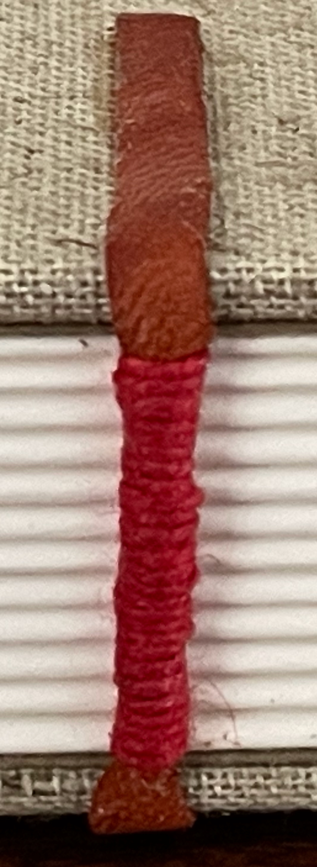
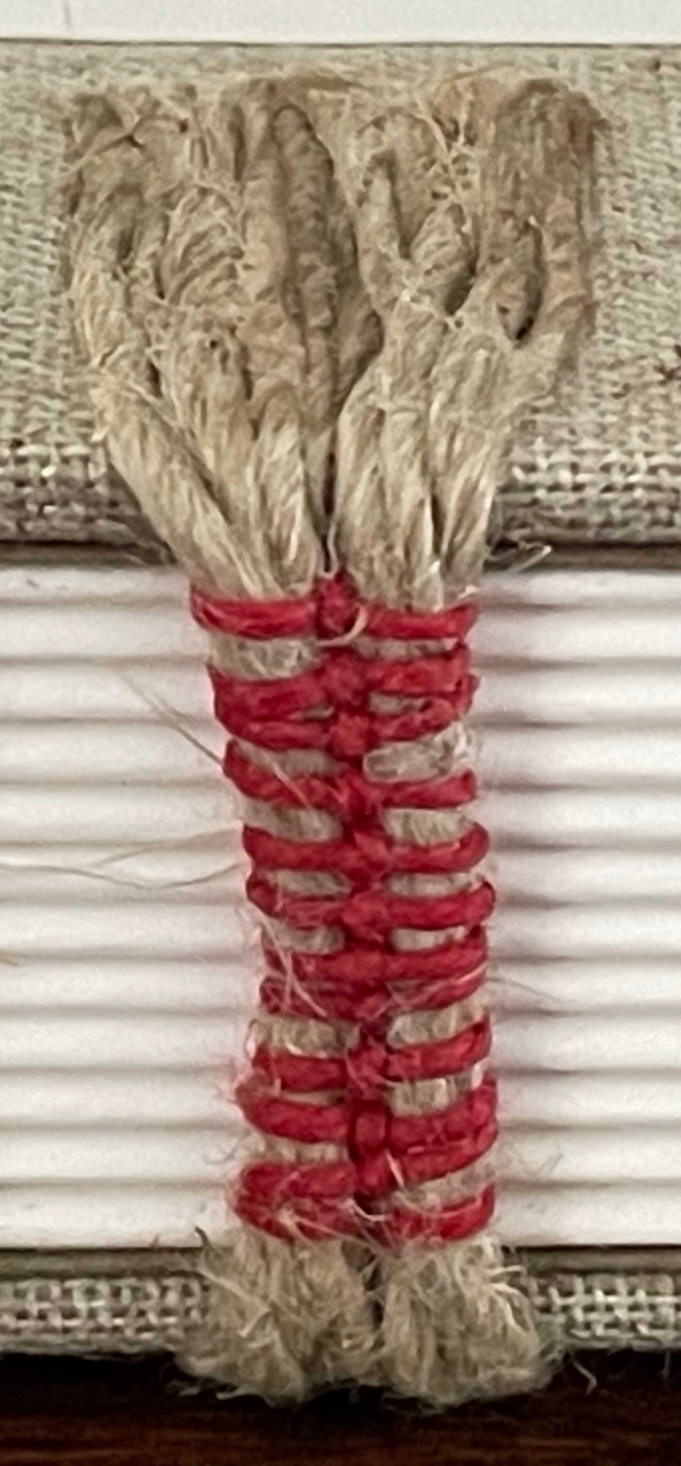
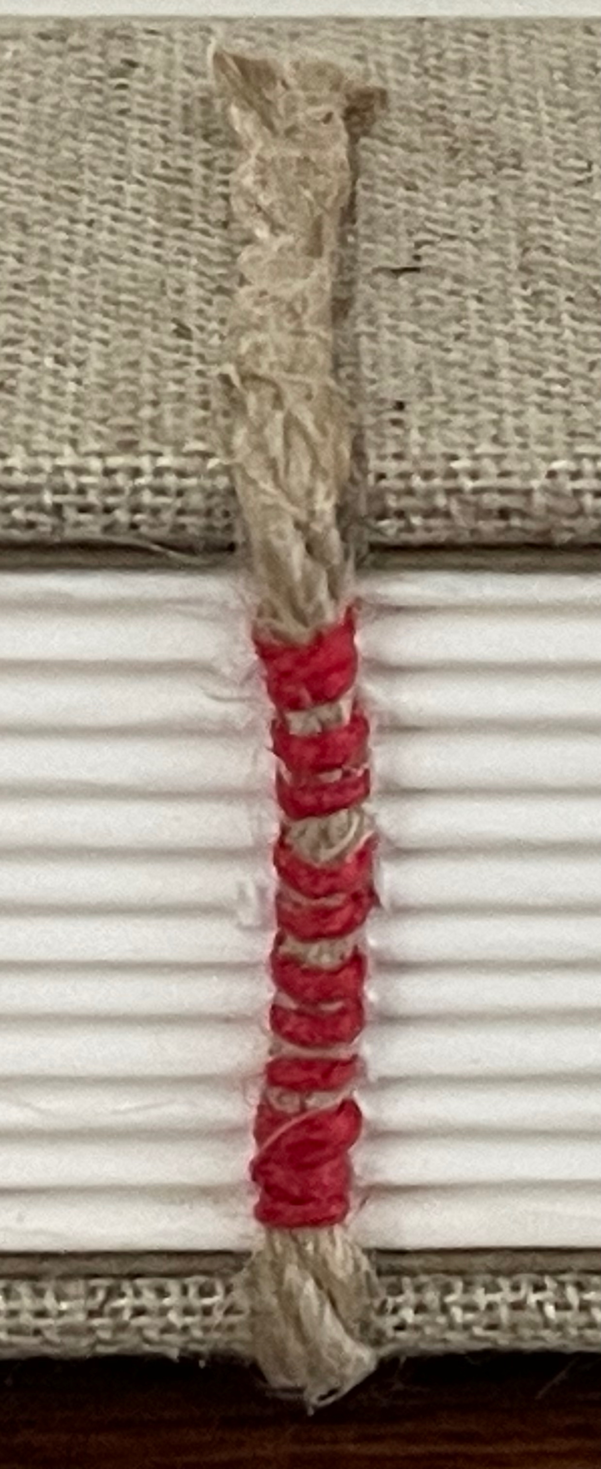
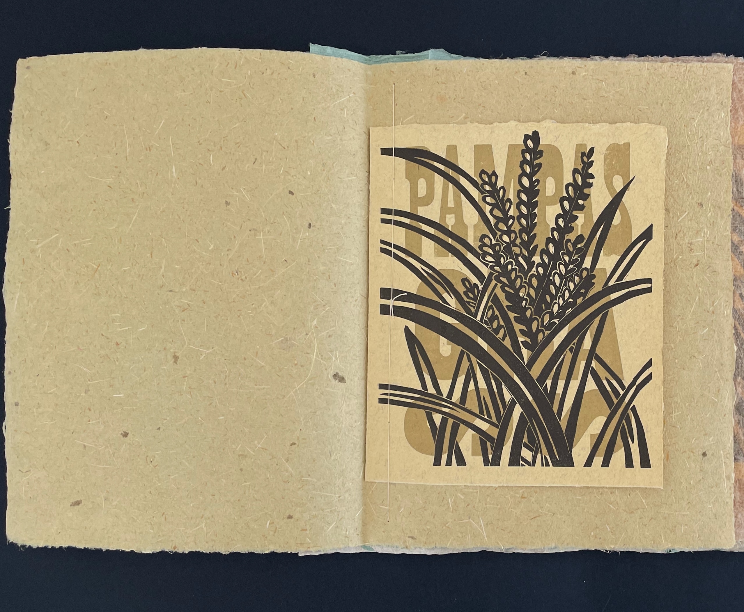
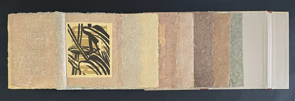
Donna Thomas’s linocuts printed over the names of the plants in wood type vary in orientation. Impressed on cotton rag paper handmade by Peter, they memorialize the plants harvested long ago and emphasize by contrast the texture of the plant-paper folios embracing them.
Folio of Pampas Grass paper with single sheet linocut by Donna Thomas over wood type.
Extended book open to folio of Kahili Ginger paper; single sheet linocut turned 90º.
Folio of New Zealand flax.
Folio of Wild Radish.
Folio of Century Plant.
Folio of Bird of Paradise.
Folio of Tule.
Folio of Blackberry.
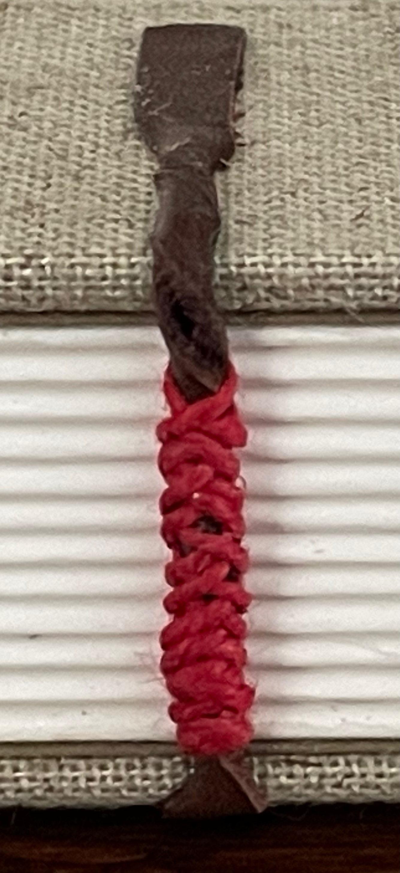
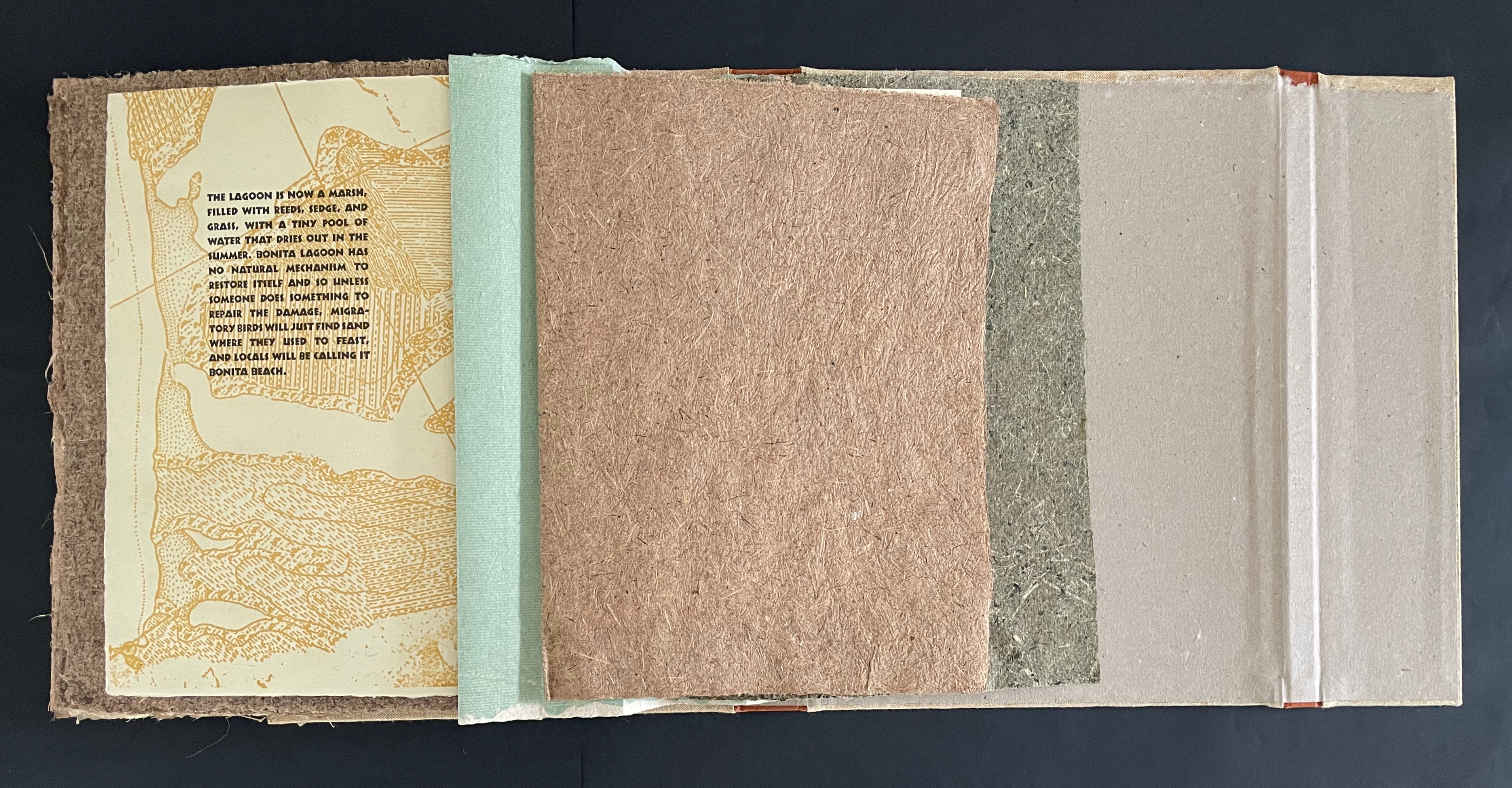
The book’s formal elegy concludes on the Tule gathering’s end sheet. Here we find the prediction teased in the prelims. Due to construction along the coast, the lagoon has become a marsh and tiny pool that dries out in the summer. Without restoration, Bonita Lagoon is on its way to becoming Bonita Beach.
The prediction on the Tule gathering’s end sheet.
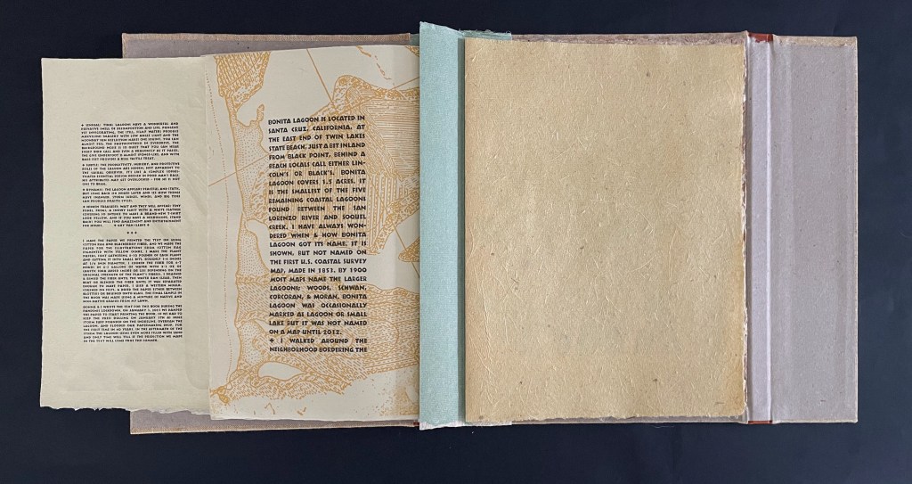
All along, the text set in Neuland has appeared over the print of a map. Not until after the prediction above and the turning of the Blackberry gathering is it revealed in the colophon that the map is from the 1853 coastal survey mentioned at the beginning. With a sort of unwritten coda, the book ends with a single sheet made from clippings from the Thomases’ otherwise unmanicured lawn next to Bonita Lagoon.
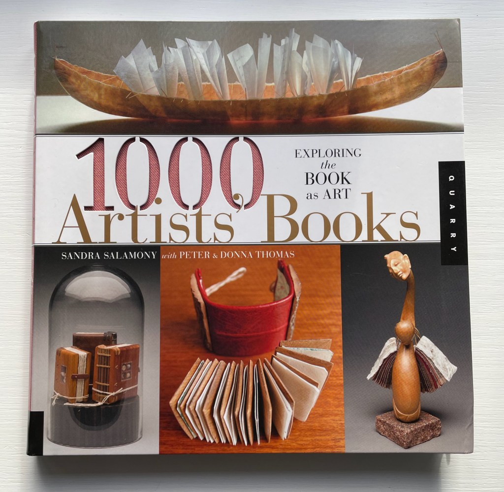
Besides their prolific artistic output, much of which (up to 2005) can be viewed in the University of Wisconsin-Milwaukee Libraries Special Collections, the Thomases have also published several instructional and reference works on papermaking and the book as an art form. This one with Sandra Salomony covers various aspects of hand-crafted books: covers, bindings, scrolls, folded and origami structures, books made from found objects, altered books, and book installations, as well as books created from a variety of printing processes. Its taxonomy is useful when exploring new works and examining collections.
Further Reading
“Amanda Degener“. In process. Books On Books Collection.
Blum, André, and Harry Miller Lydenberg. 1934. On the origin of paper. New York: R.R. Bowker Company.
Chen, Julie. 2013. 500 Handmade Books. Volume 2. New York: Lark. Pp. 87 (Not Paper), 258 (The Alder).
Hamady, Walter; Samuel Haatoum; and Hermann Zapf. 1982. Papermaking by Hand : A Book of Suspicions. Perry Township, Dane County, Wisconsin, USA: Perishable Press Limited.
Jury, David, and Peter Rutledge Koch (eds.) 2008. Book Art Object. Edited by David Jury. Berkeley, California: Codex Foundation. Pp. 323 (Believe in the Beauty), 324 (The History of Papermaking in the Philippines), 325 (An Excerpt from John Steinbeck’s Cannery Row).
Miller, Steve. 2008. 500 Handmade Books : Inspiring Interpretations of a Timeless Form. Edited by Suzanne J. E. Tourtillott. New York: Lark Crafts. Pp. 77 (Paper from Plants), 225 (Ukulele Series Book #4 The Ukulele Bookshelf), 254 (Ukulele Series Book #9, The Letterpress Ukulele), 291 (Y2K3MS: Ukulele Series Book #2, Ukulele Accordion).
Salamony, Sandra, and Peter and Donna Thomas. 2012. 1,000 Artists’ Books : Exploring the Book as Art. Minneapolis: Quarto Publishing Group USA. Pp. 26 (Ukelele Series Book #14 Old Ukes), 31 (The Pencil), 187 (The Real Accordion Book), 201 (The Mystical Quality of Handiwork), 205 (California Dreaming).
Sansom, Ian. 2012. Paper: an elegy. New York, NY: Wm. Morrow.
Thomas, Peter, and Donna Thomas. 1999. Paper from Plants. Santa Cruz, Calif: Verf. You can find images of this and others by the artists online in the Special Collections website of the University of Wisconsin-Milwaukee Libraries.