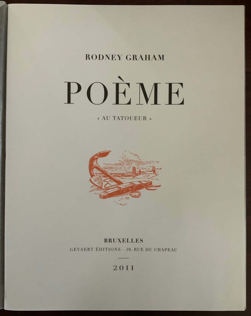
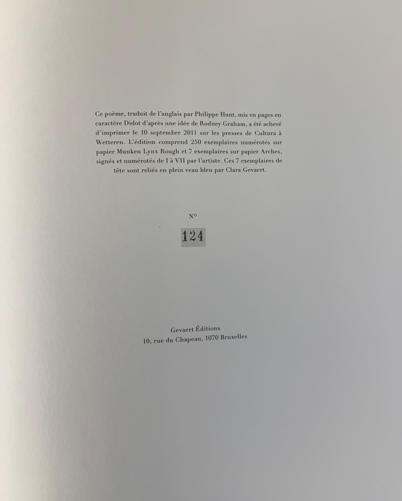
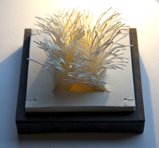
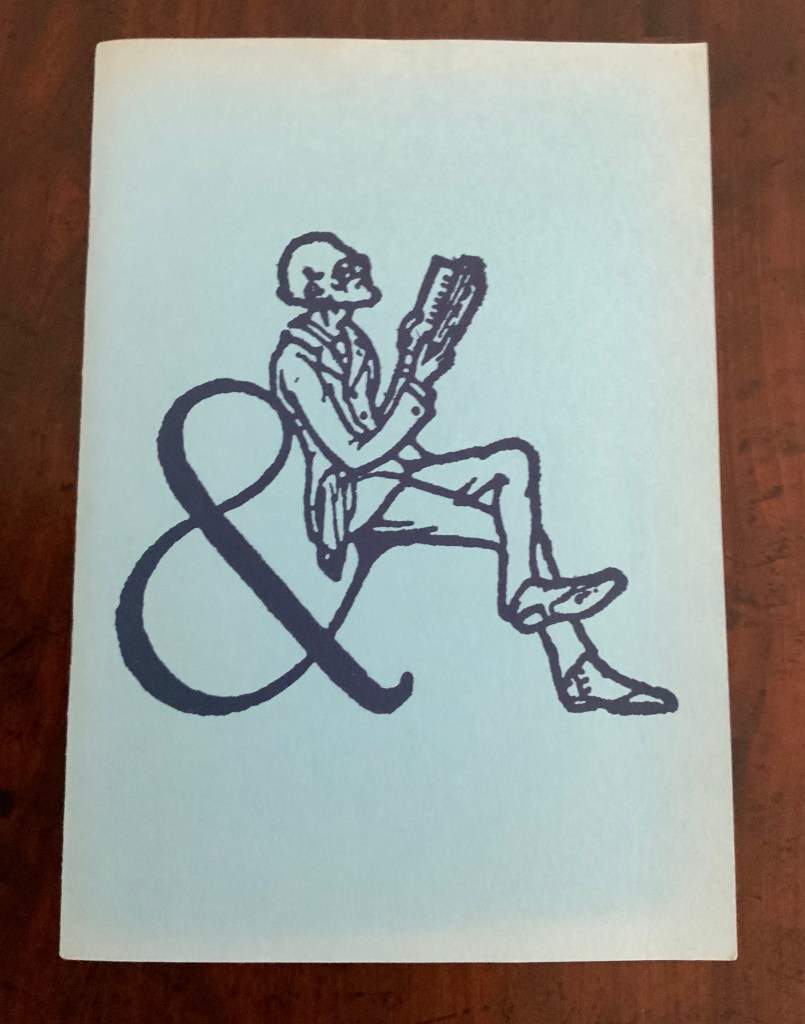
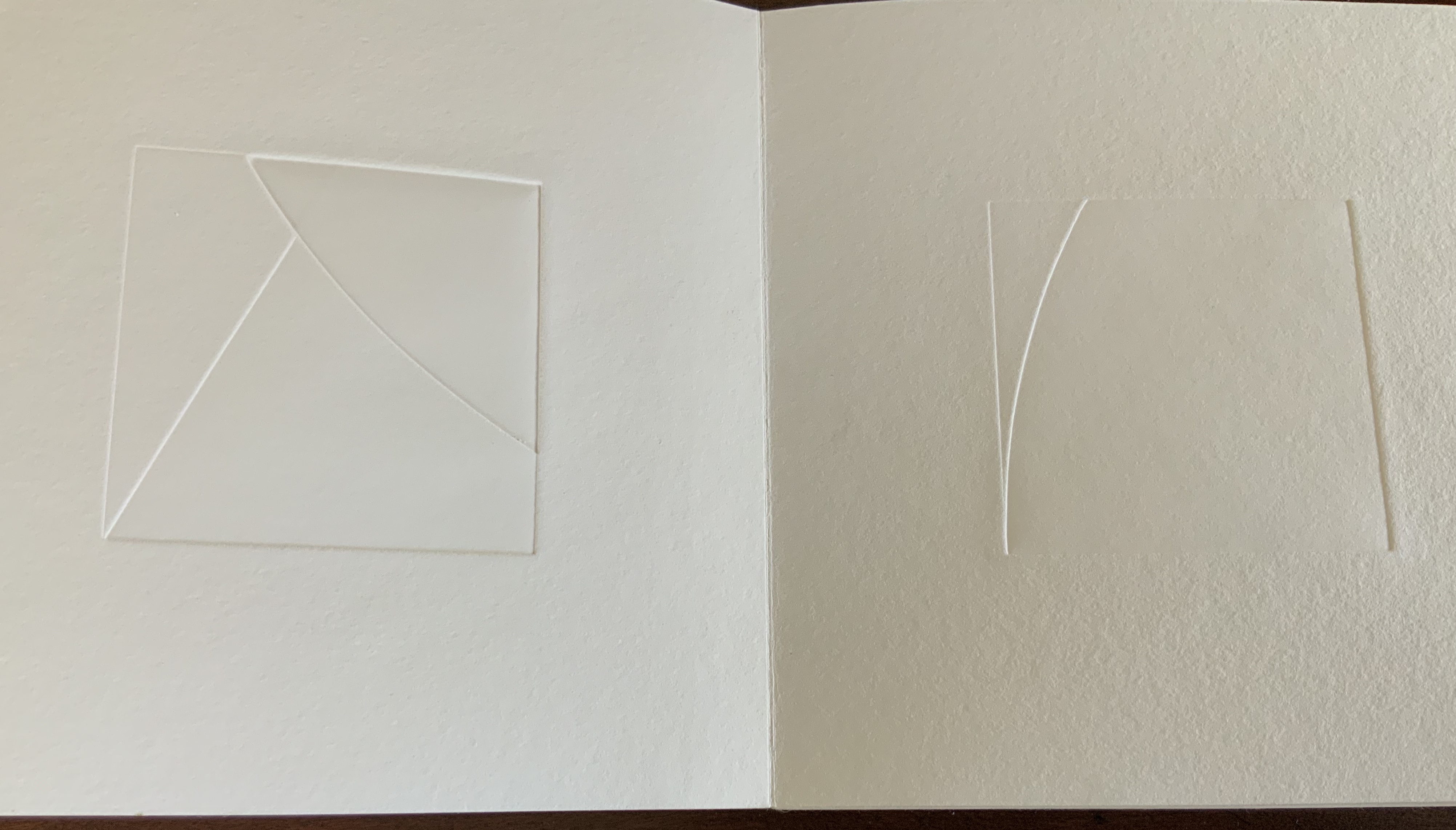
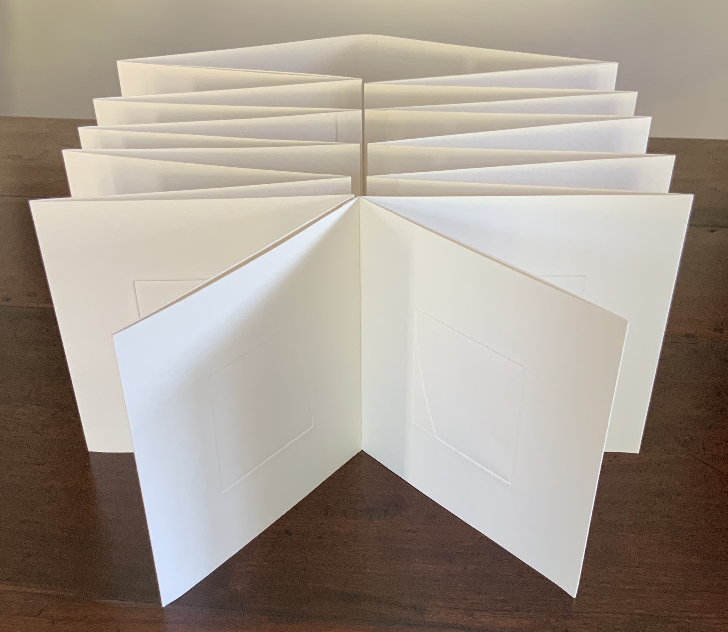
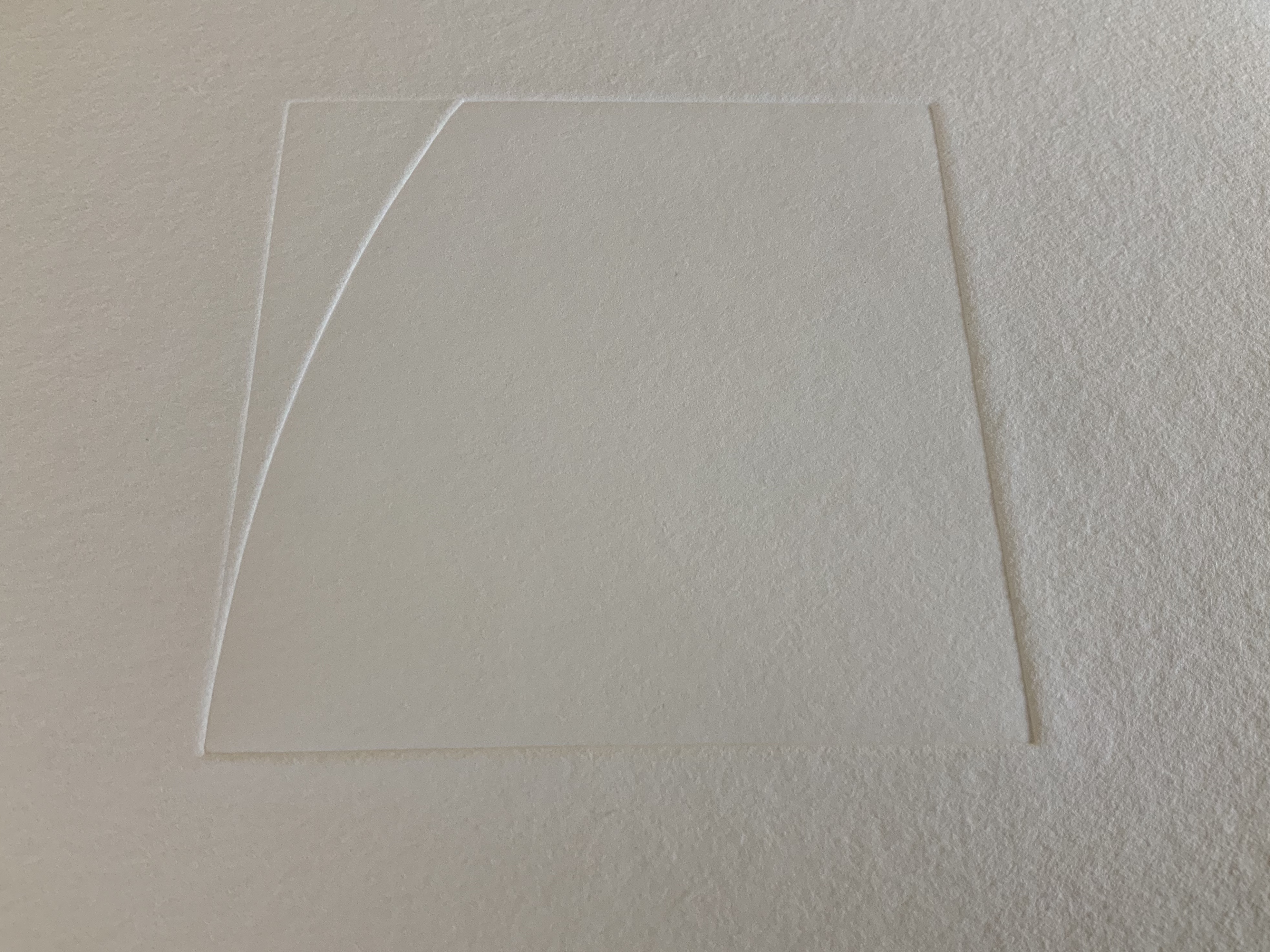
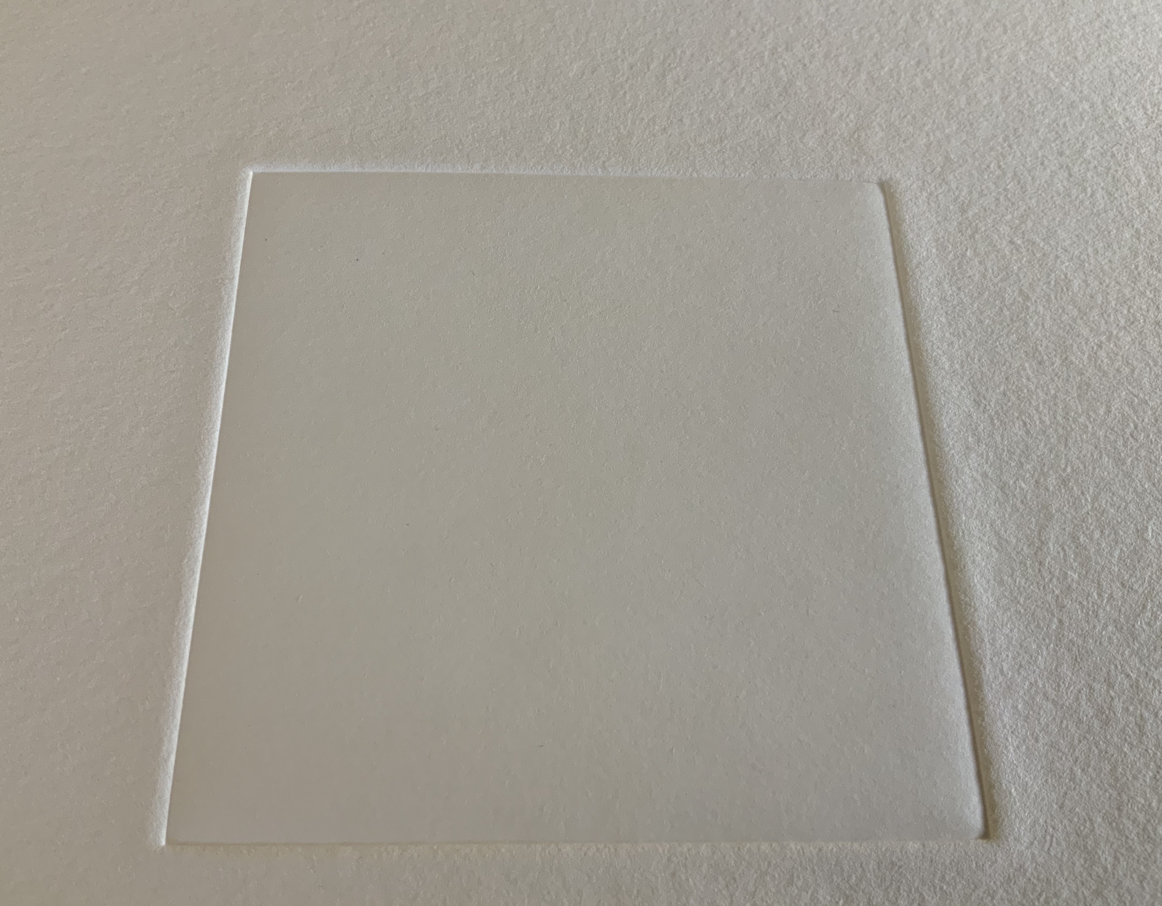
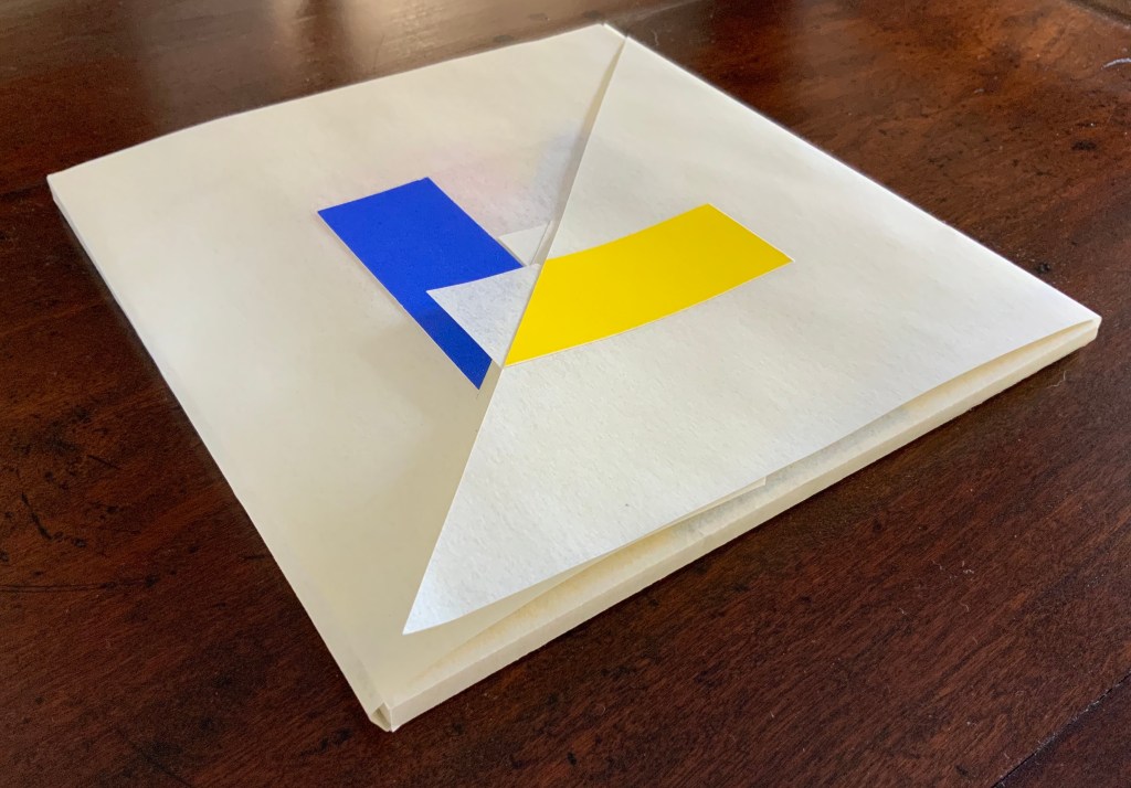
Poème : “Au Tatoueur”(2011) Rodney Graham Sewn soft cover. H320 x W250 mm, 16 pages. Translated from English by Philip Hunt. Edition of 250, of which this is #124. Acquired from Stefan Schuelke Fine Books. Photos: Books On Books Collection.
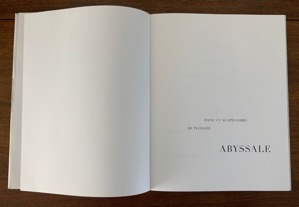
As with many of the homage to Un Coup de Dés, the subtitle here matters. For Bennequin, it was “Homage” with it missing “m” from the French; for Broodthaers, “Image”; for Engramer, “Wave”; for Pichler, “Sculpture” and “Musique”; for Zboya, “Translations”. Graham’s subtitle, being in quotation marks, indicates that what follows is a missive, not a form. The missive addressed to a local tattoo artist was arranged à la Mallarmé and described an image of Popeye that Graham wanted. But the twist that makes Graham’s version work is the translation of the instructions into French and their publication in the 1913 format of Mallarmé’s poem. This is an intricate “set-up”. In a way, it is analogous to Mallarmé’s careful attention to the positioning of words and lines, the kind of mise-en-scène that characterizes much of Graham’s photography and painting.
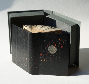
H500 x W350 mm. Edition of 200, of which this is #162. Acquired from the artist, 15 April 2019.
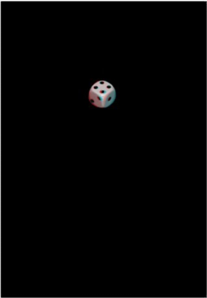
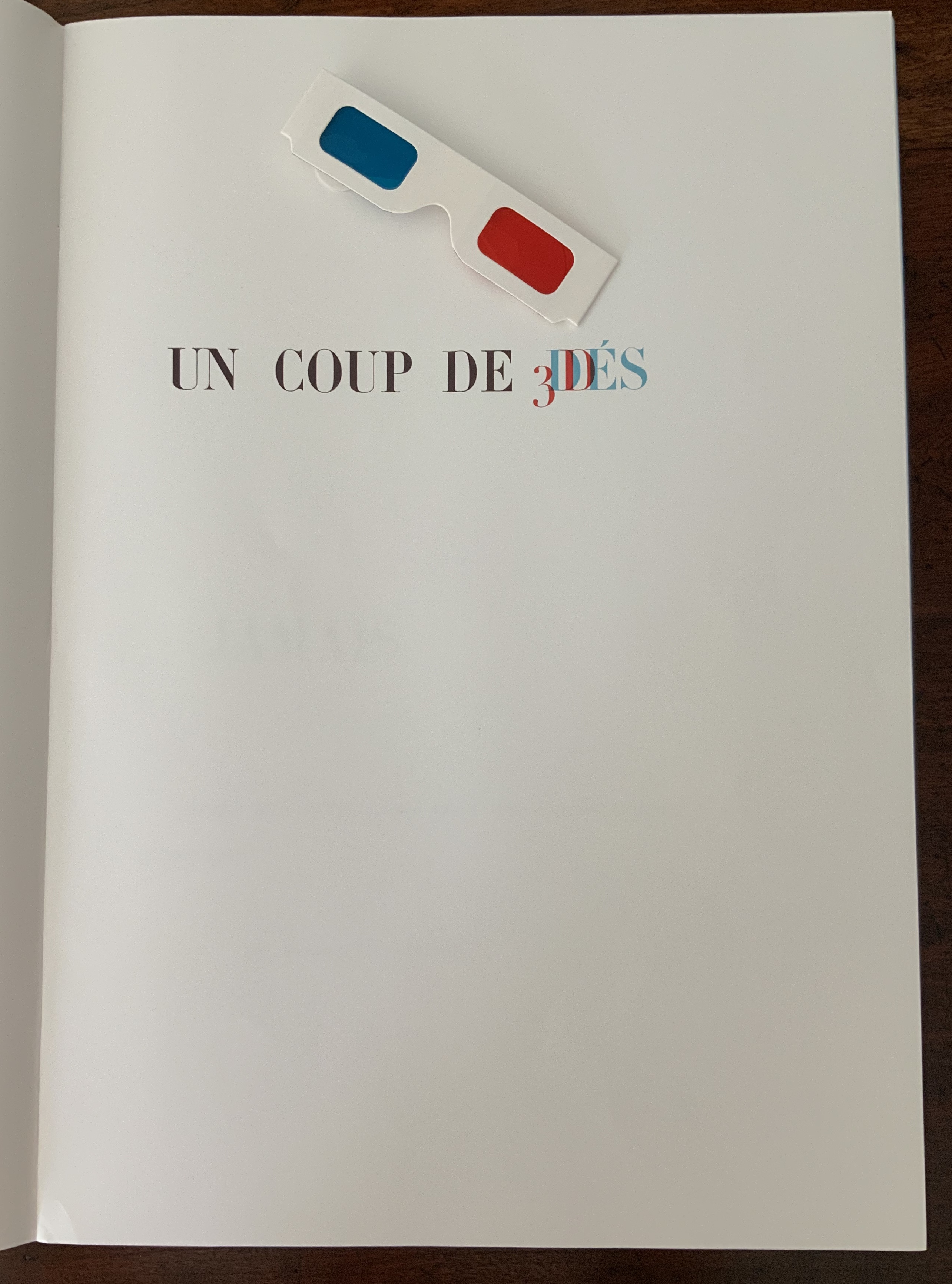
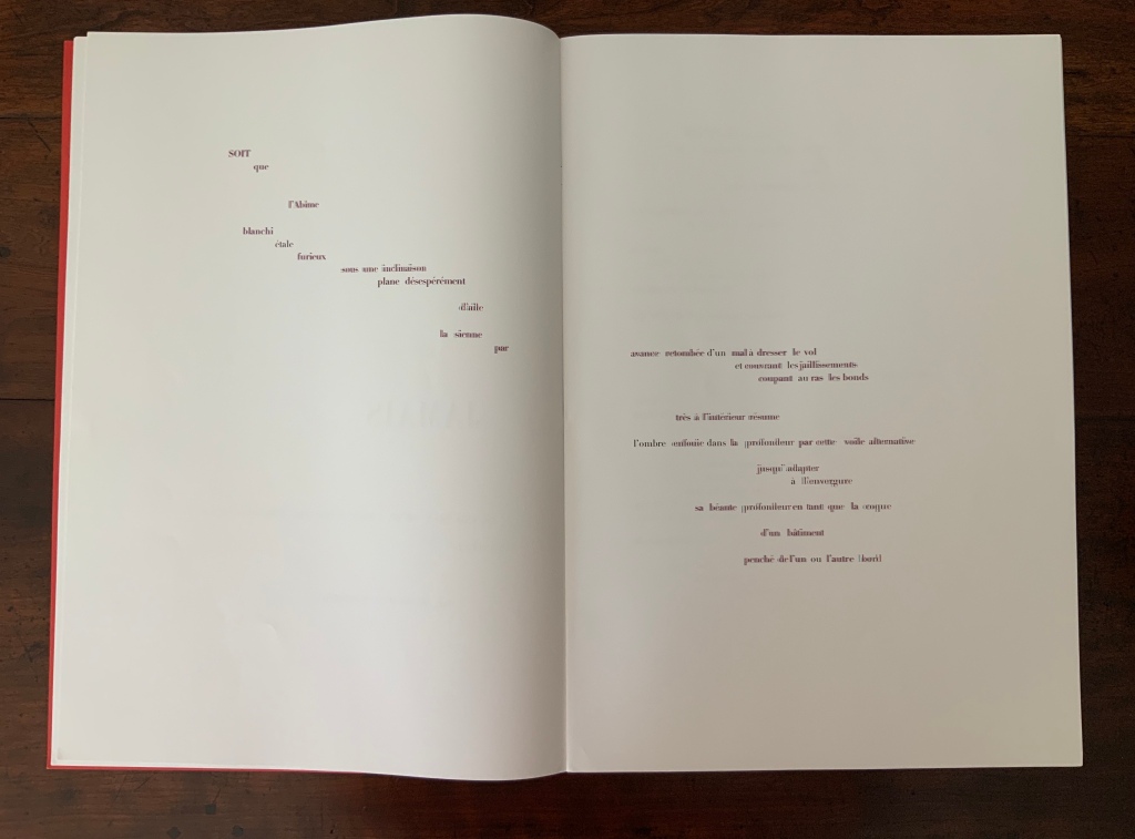
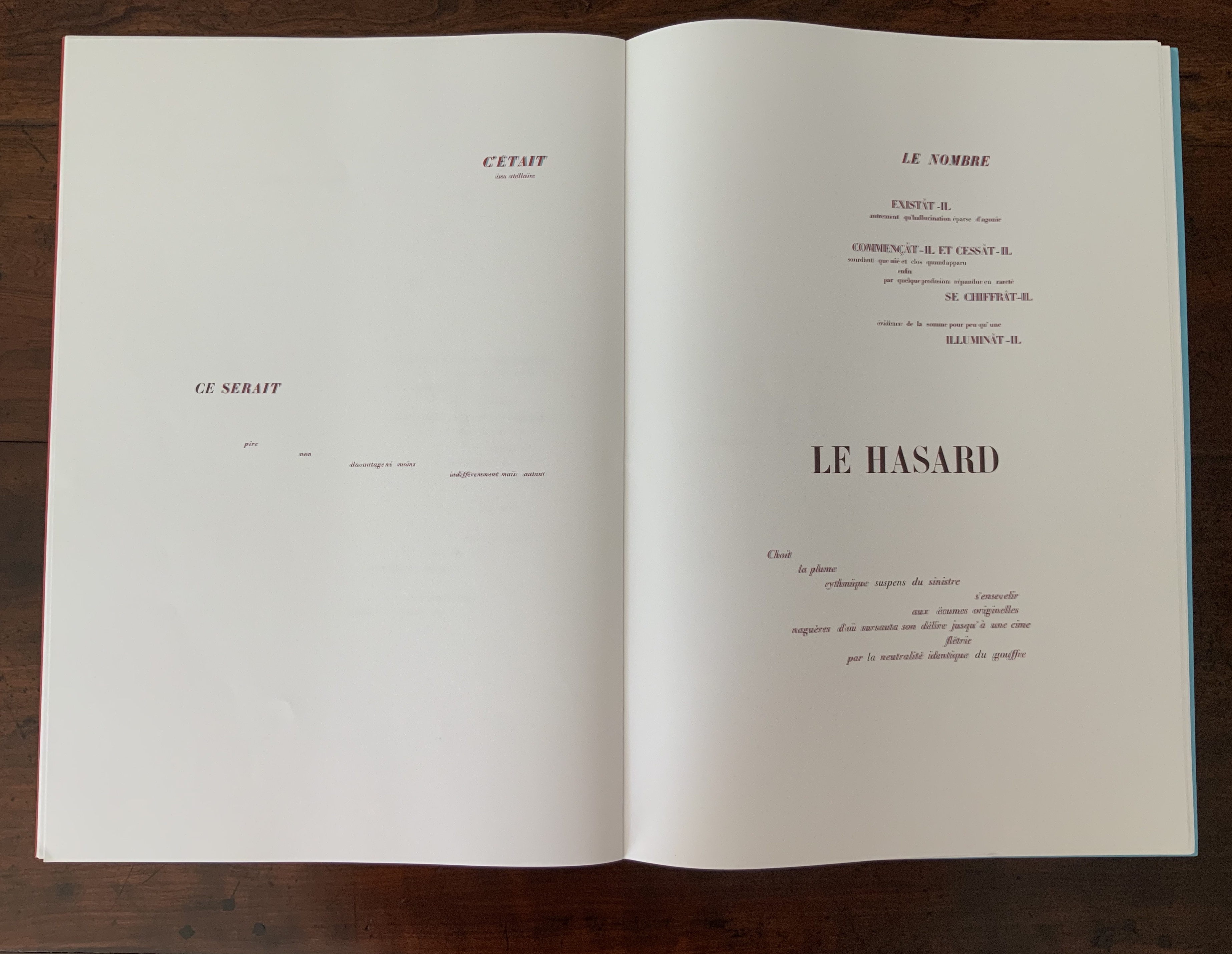
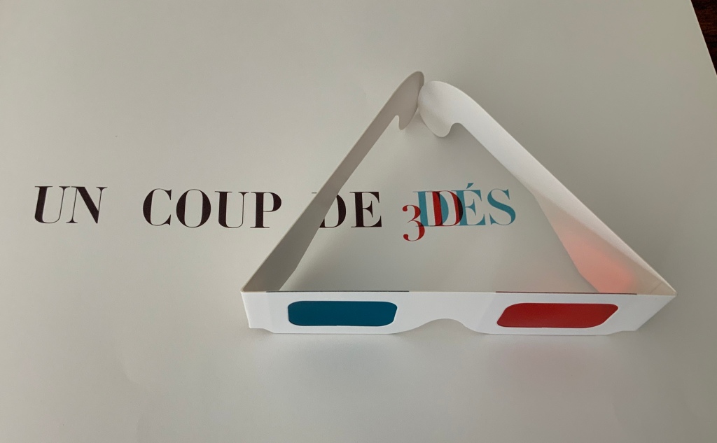
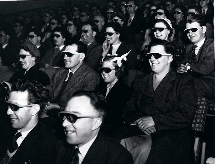
In size, Larosche’s Un Coup de Dés outdoes most other versions and homage — except those that are installations. The large black cover suggests a dark movie screen on which Larosche’s version of the poem will play out in 3D. But why 3D? Trying to read Un Coup de Dés while wearing a pair of 3D glasses challenges the eyes’ patience just as much as the poem’s ambiguities challenge the mind’s. Within the Coup de Dés genre, there is a necessary strain of strained humor. Without it, art runs the risk of taking us too seriously.
Confirming this joking intention behind his version, Larosche commented to Books On Books:
I originally handmade the book so that it was to worn on the nose like a large pair of glasses, which was another practical joke because the letters were too close to read, as in so 3D that it was literally in your face. — Brian Larosche, 2 April 2020.
Even with puns and slapstick there is often a point. The anaglyphic print technique and sheer size of Larosche’s version draw attention to Mallarmé’s sculptural play with type size and layout on a 2D surface as well as the poem’s spatial metaphors that align with it. In Mallarmé’s original, the staggering and dispersal of lines and single words on the page buttress, and are buttressed by, the word images of a roiling sea, shipwreck and constellation. Other artists with other techniques have drawn attention to that sculptural play and those spatial metaphors: Marcel Broodthaers‘ superimposed black bars, Michalis Pichler‘s and Cerith Wyn Evans‘ cut-outs, Sammy Engramer‘s sonograms sculpted in PVC and Eric Zboya‘s computer graphic “translation”.
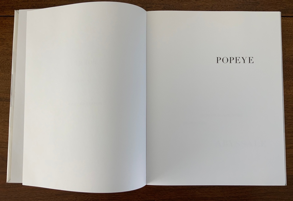
Other artists have also poked serious fun at Un Coup de Dés and each others’ homage. Jim Clinefelter teases the sonority of the poem with his A Throw of the Snore Will Surge the Potatoes (1998). With her Rubik’s cube version (2005), Aurélie Noury needles the poem’s and poet’s puzzle pose. With their piano-roll versions, Rainier Lericolais (2009) and Pichler (2016) pick on Broodthaers (1969) as well as Mallarmé (1897) for their spatial metaphors and, in Mallarme’s case, his assertions of musicality. In Rodney Graham’s version (2011), Popeye substitutes for le Maître as the ship’s captain.
Larosche’s perceptively humorous rendering of Un Coup de Dés has earned it a secure perch among the other birds of the homage feather, and the use of 3D glasses seems to invite another layer of homage from artists interested in virtual reality headgear and augmented reality devices.
Further Reading
“Sammy Engramer”, Books On Books Collection, 1 June 2020.
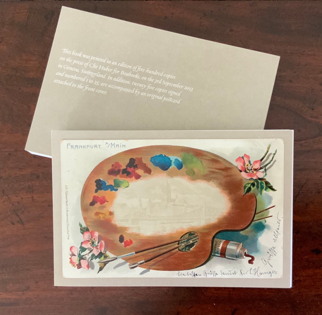
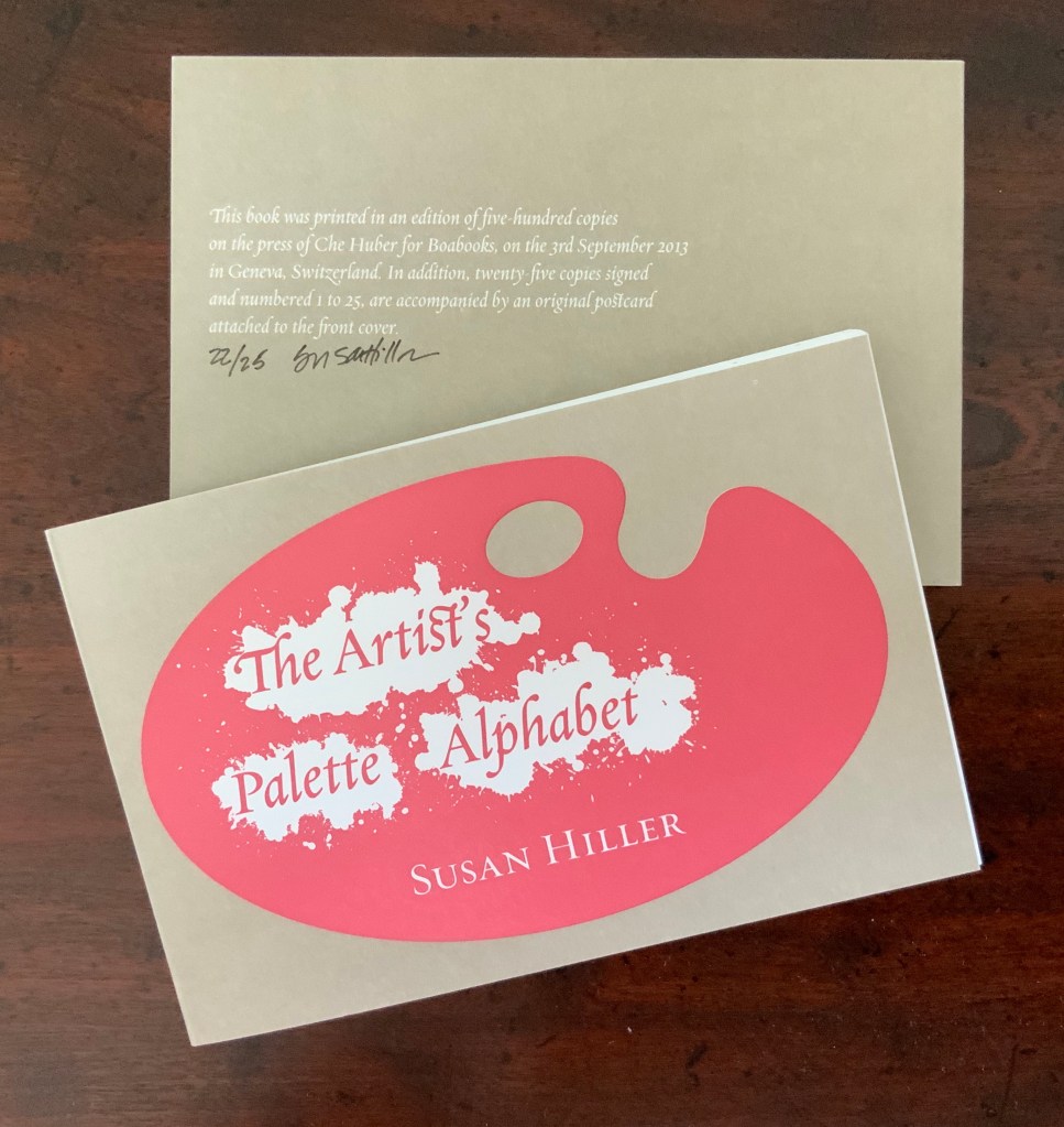
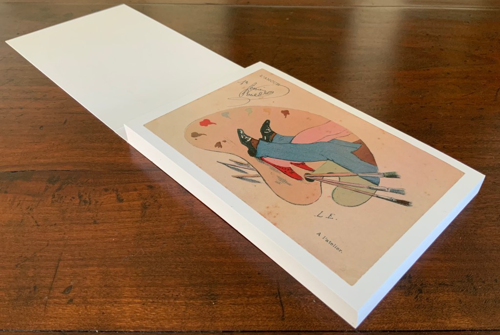
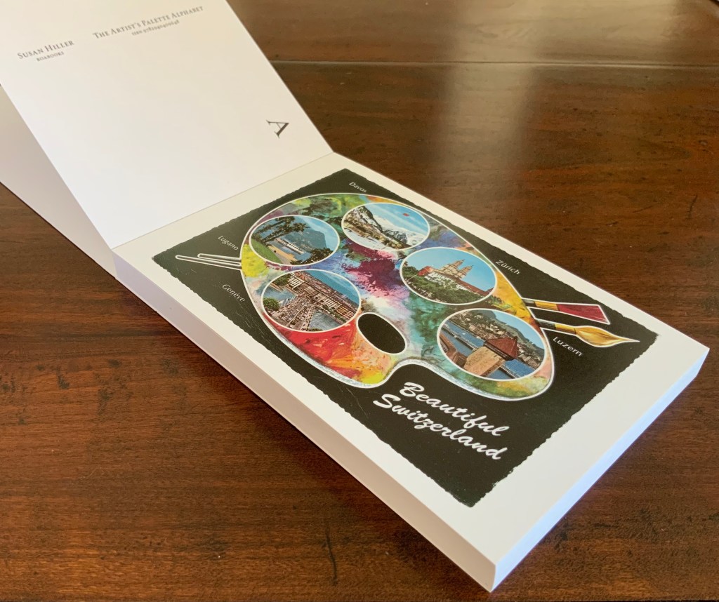
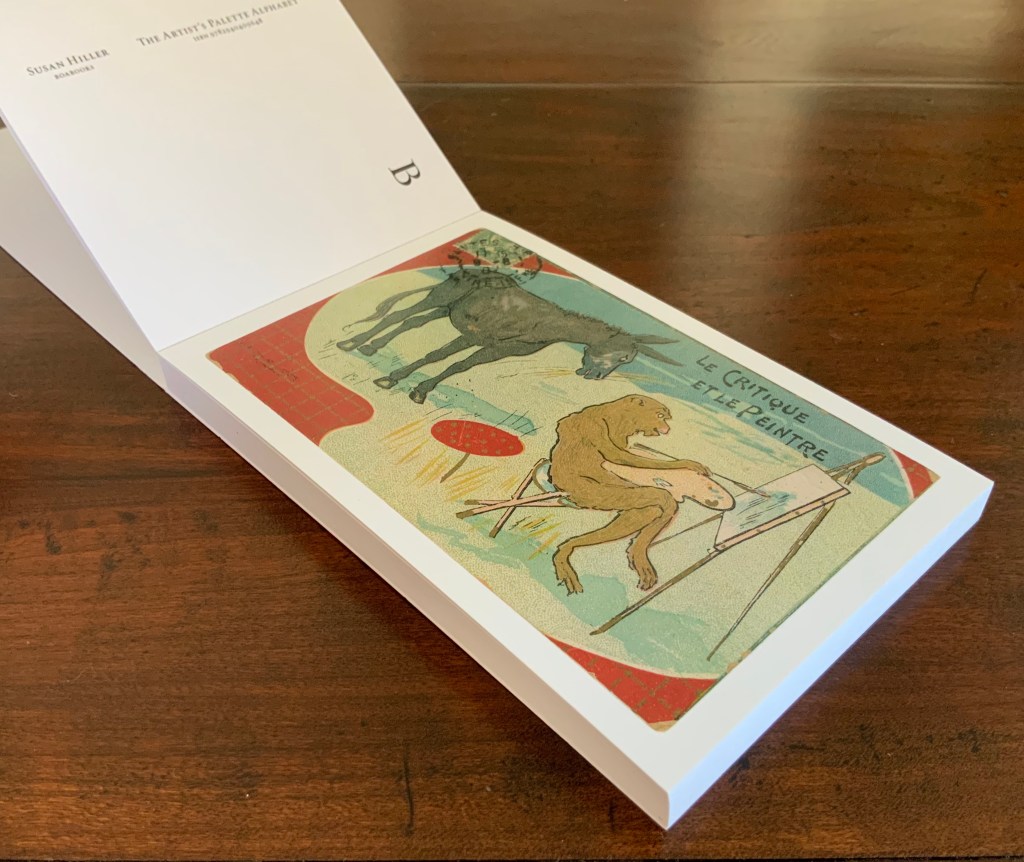
Glued board with 26 removable postcards as pages, offset and letterpress on card. H102 x W155 mm. Edition of 500 and special edition of 25 signed and numbered, with original postcard attached to the cover, of which this is #22. Photos: Books On Books Collection.
Like Hiller’s first book, Rough Sea (1976), this compilation of postcards uses the postcard as art material not only to create an artwork but also to color and shape it with this form of collective memory. By making the postcards detachable this time, she also taps into a democratic strain with artist books. Each copy of the work has the potential of being partly shared with 26 other recipients, leaving The Artist Palette Alphabet to exist only as its cover.
A for l’Amour, B for Beautiful and C for le Critique.
For a collection like Books On Books, the choice of the special edition copy showing Frankfurt-am-Main, home of the centuries-old book fair, was inevitable and lucky.
“Marion Bataille”, Books On Books Collection, 26 March 2020.
Various articles on Hiller, including a review from Harper’s Bazaar on Hiller’s posthumous solo exhibition at Frieze Masters and Matt’s Gallery in October 2019.
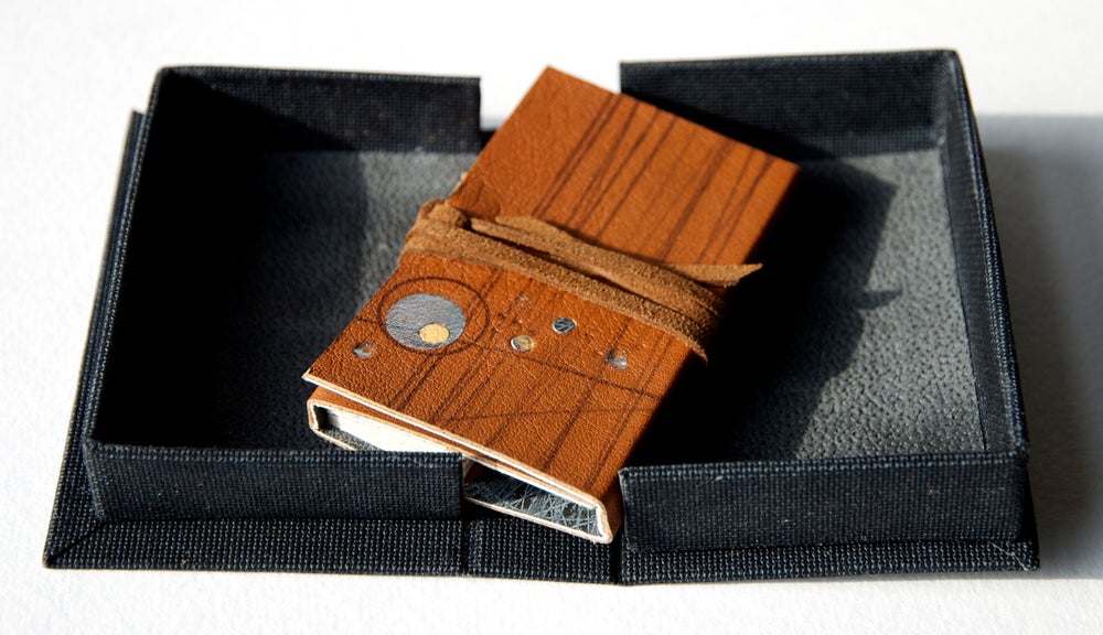
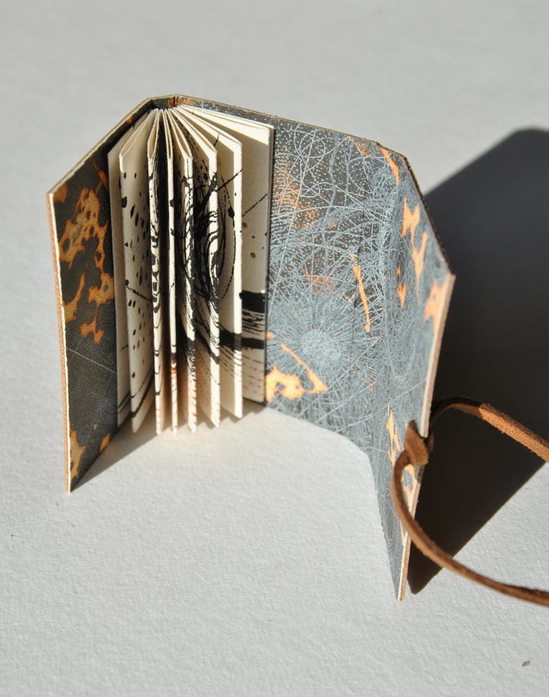
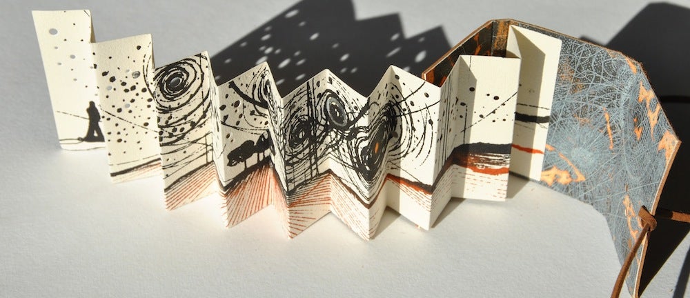
Belly band with edition details, spider style binding; eight leaves, 16 pages, 48 panels; laser printed onto 250gsm card glossy on one side. Open edition of signed copies. Acquired from AM Bruno, 9 November 2018. Photos: Books On Books Collection.
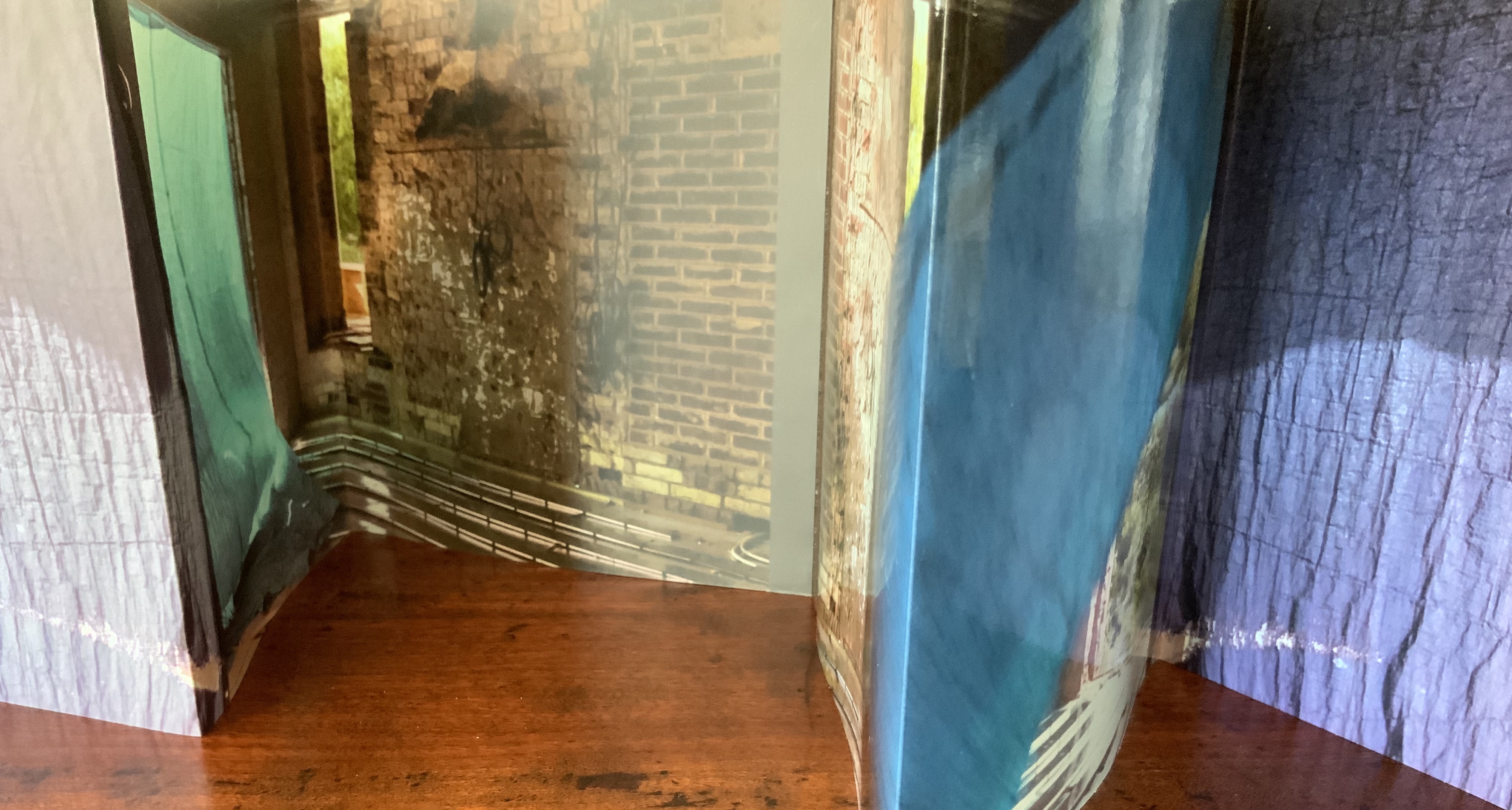
This spiral of imagery, is an allegory for breath, found in the material world, photographed in the house I was building. A variety of modalities of folds – from the fold of our material selves, our bodies – to the folding of time, or simply memory, an interiority and exteriority. — Artist’s description
The “spider style” binding here is not quite the same as that designated by Hedi Kyle as the “spider book” in The Art of the Fold (2018). It is more a cross between an accordion fold, crown fold and spider book as explained by Kyle. It also recalls the effect of the Chinese dragon fold, exemplified by the re-creation of the Diamond Sutra by Zhang Xiaodong. Whatever its source or name, the fold and binding create a prismatic bookwork that invites teasing away each sheet and fold, poring over each panel as well as setting the work up in various display aspects.
Although Spiration is not currently listed in WorldCat, several of Goldhill’s other publications are: for example, In the Beginning and Sanguine Shifts, both of which arose from projects posed to the AMBruno coalition of artists. Her work has drawn the attention of the British curator and writer David Alan Mellor.
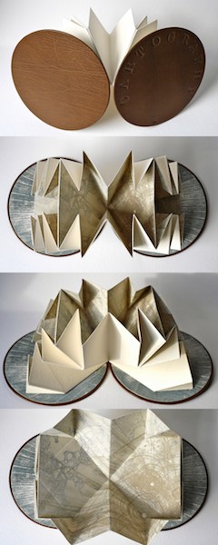
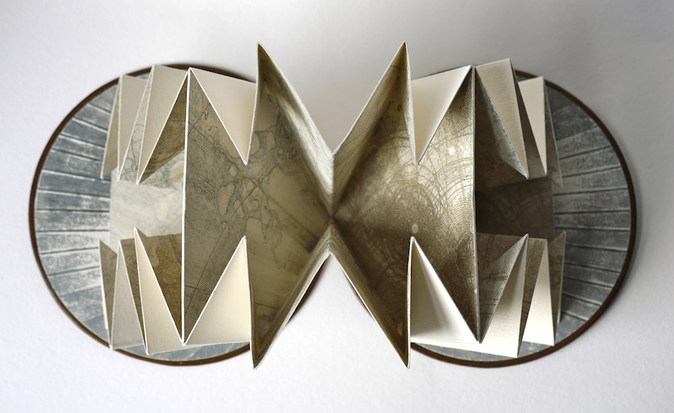
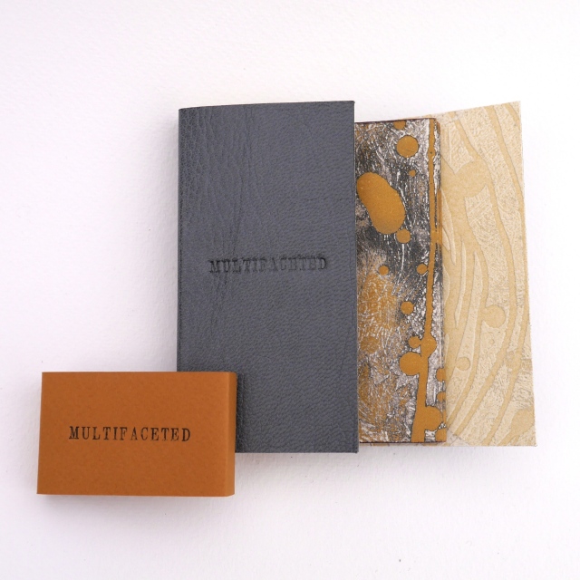
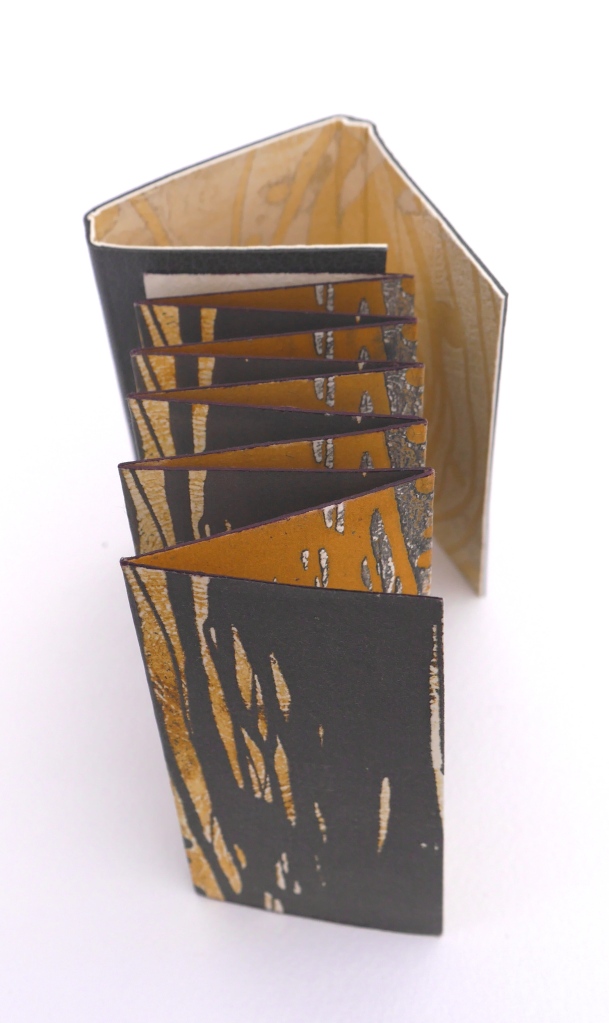
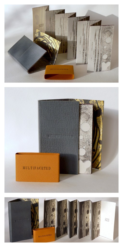
Stardust (2013) Louisa Boyd Leather bound, oil-based ink, Somerset paper, micro-fibre suede, Magnani handmade ivory wove paper, metal leaf, pencil crayon; 16 panels. Closed – H70 x W45cm x D10 mm; Open – H70 x W420 mm. Edition of 20, of which this is #10. Acquired from the artist, 28 May 2017. Photos: Courtesy of the artist.
Through abstraction and symbol, Louisa Boyd‘s art focuses on sense of place and our intrinsic connection to nature. The titles of three of her artist’s book series – Infinity, Landscape, and Mapping – and those of the book art in them – Aether (2013), A Walk (2001), and Cartography I (2014) – reflect that focus. How she manages abstract imagery and symbol across her range of material and techniques – paper (including hand-marbled paper), book structure, printmaking (block, screen, letterpress), watercolor, metalwork, leatherwork – adds to that unifying focus through a rightness of choice but also introduces a breadth of originality and variety.
In Aether, the crayon work, cutting and metalwork are applied with a three-dimensional sense wedded to an obvious understanding of the possibilities of the page and double-page spread. The stop-motion animation video tour of Aether (click on the image below) makes you wonder if Boyd conceived the work as a flipbook in the first place. There is no wondering, however, about the place of human existence in relation to the aether. In the video, look at the lower righthand fore-edge of the book.
A Walk illustrates Boyd’s skill with freestanding three-dimensional sculpture, a skill that has grown in The Flight Series (more later on two of its works from 2009) and The Paper Manipulation Series, from which the work Flare above comes.
Her use of abstract markings and the Turkish map folding technique in Cartography I demonstrates again her careful marriage of abstraction, symbol and technique.
The etching printed on each of the three internal folded pages is an abstract that nevertheless evokes mapping, which the form and fold of the pages reinforces. Each Turkish fold page can lay flat to be viewed individually, or as pictured above and below, the book may be viewed as a sculpture.
The video tours (links embedded the images of Aether and A Walk above) represent Boyd’s search for what she calls “a bridge between traditional and contemporary media”. So far, that exploration reflects the artist’s rootedness in the book arts and traditional skills and processes of drawing, printing and painting. It is intriguing to think what effect a bit of influence from Helen Douglas or Amaranth Borsuk might have on Boyd’s bridge. The use of stop-action video for Aether hints at an instinct for what Douglas calls “visual narrative”.
A professed recurrent theme in Boyd’s book art is “restriction and freedom”. Although it arises from periods of city dwelling and lack of access to the countryside, imposed by the UK’s 2001 “foot and mouth” epidemic, it manifests itself in the more “traditional” spur of constraint of form and structure that goads an artist’s imagination. Flock (2009) and A Walk bear close resemblance, but note the difference in invention whereby the former plays with the book form by placing the bird imagery at the edges, spirals the paper tearing upwards and gradates the watercolor from dark to light (like a flock dispersing) and the latter deals with the “restricted” walk by blending the watercolor with tearing and tunneling.
Although Multifaceted returns to the theme of different views that was the intent in A Walk, it tilts the theme more toward the abstract side of Boyd’s work. In this, Multifaceted is more akin to the works in The Paper Manipulation Series: Flare (2013), Whorl (2013), and Pleat (2013). It almost purely plays with the concept of differing perspectives. Again, techniques and form express concept with a simple rightness. This double-sided leporello is designed to be viewed from four different angles. The display of photos here cannot offer the intended perspective (pun intended): the viewer needs to circle the piece to view its facets. That word “facet” is tooled on the interior pages four times, the clue as to how the book should be read.
The abstract imagery evoking landscape or skyscape – whether juxtaposed vertically or horizontally – plays with viewpoint. Even the print technique on the interior pages plays with viewpoint: they are prints of an etching inked up both in relief and intaglio. Breaking free of the ultimate restriction of the book, the pages are not attached to the cover, allowing the piece to be read in four different directions. These features of the work and the seeming absence of that human figure from Aether throw it back on the viewer’s necessary engagement to establish fully the human connection: by engaging with Multifaceted – “reading” it – the viewer enacts the human place in the aether around the work.
Since graduating from Manchester Metropolitan University in 2001 and winning the Paperchase Future of Design Award (2001) and receiving a high commendation from the judges of the New Designer of the Year (2001), Boyd has exhibited in 46 venues. Her 47th is the most significant so far: inclusion in the John Ruskin Prize Shortlist Exhibition at Millennium Gallery in Sheffield, UK (21 June – 8 October, 2017). If this book artist manages to continue her sure-handed forging of concept, material and method, the Ruskin Prize Shortlist Exhibition will not be her last significant exhibition.
Further Reading
Chen, Julie. 2013. 500 Handmade Books. Volume 2. New York: Lark. Pp. 15 (Flock), 414 (Tower of Babel).
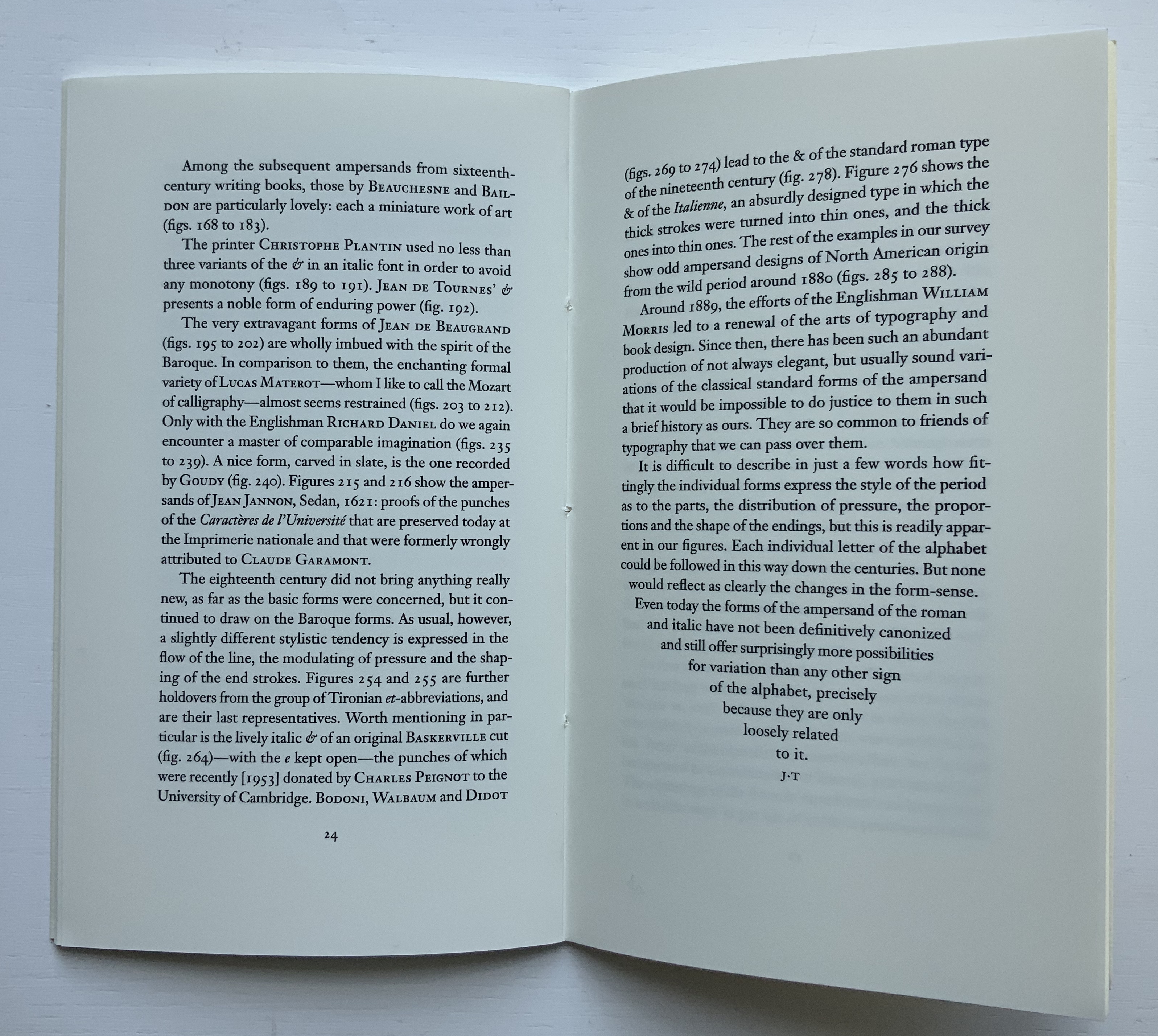
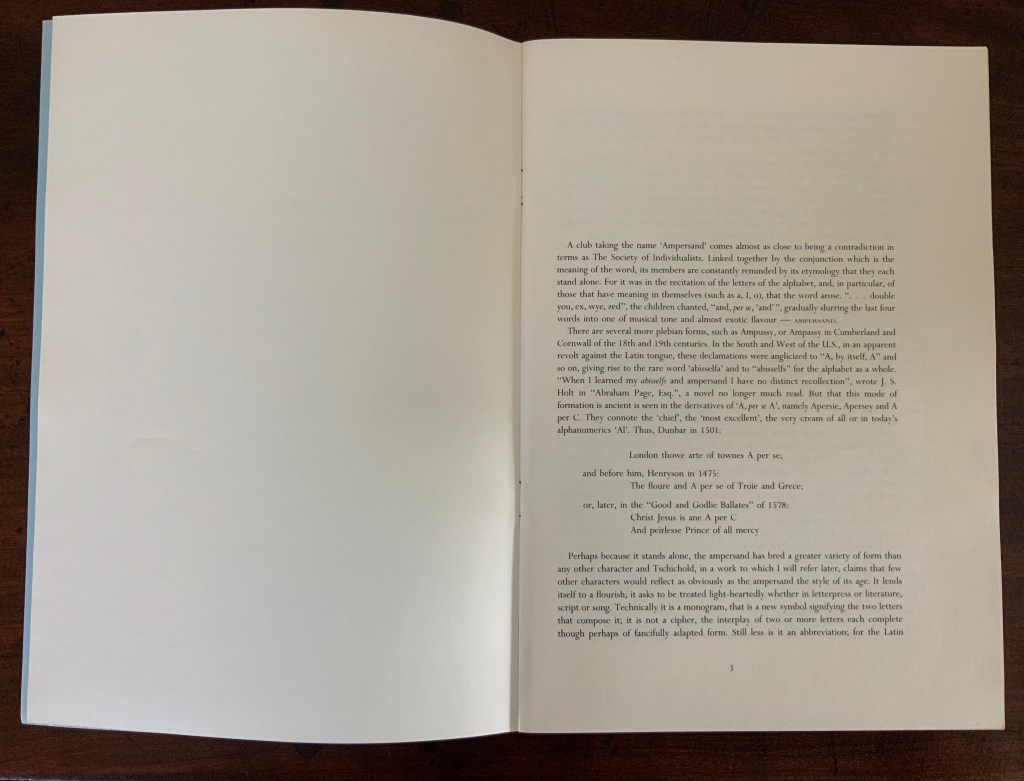
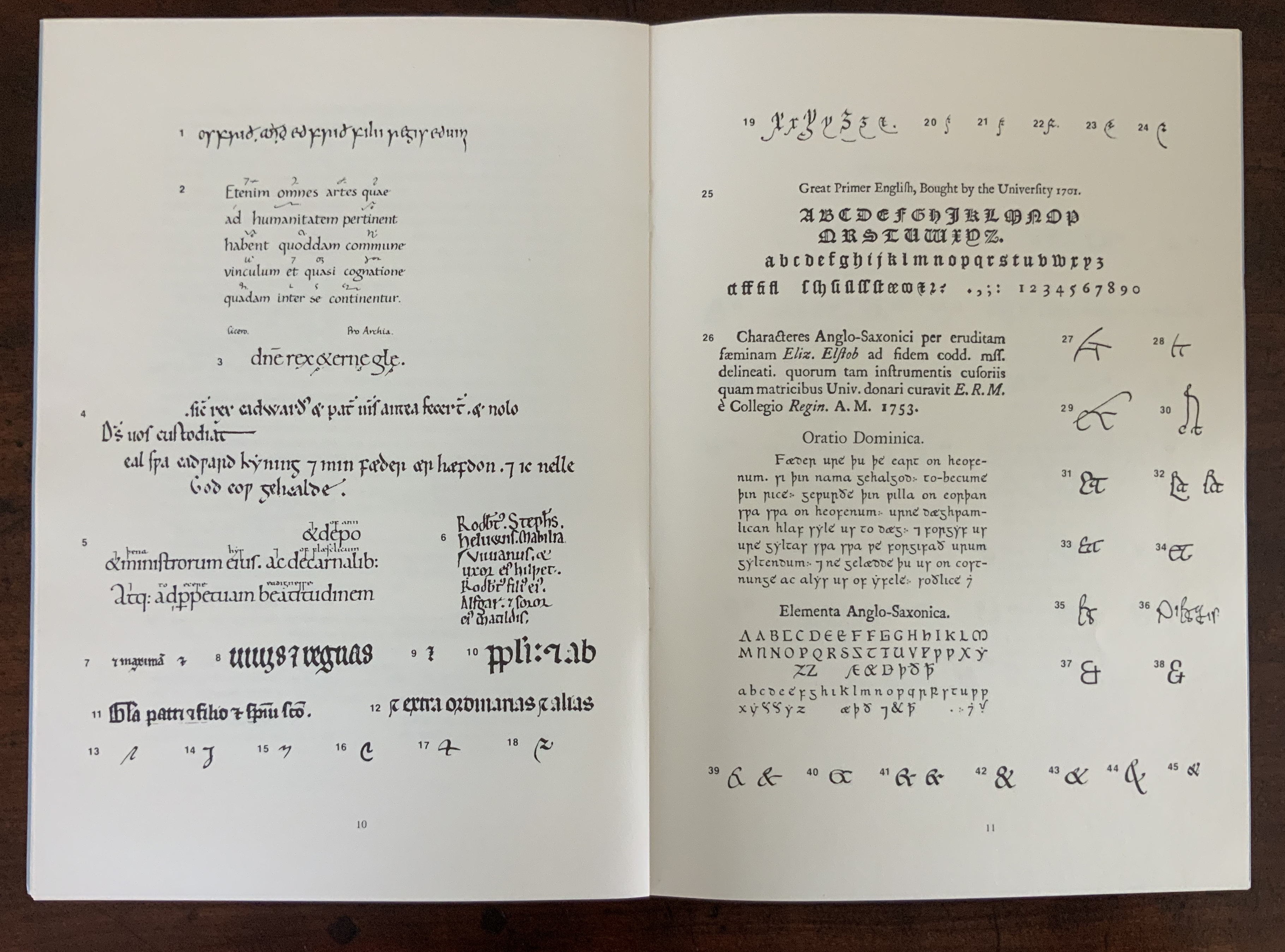
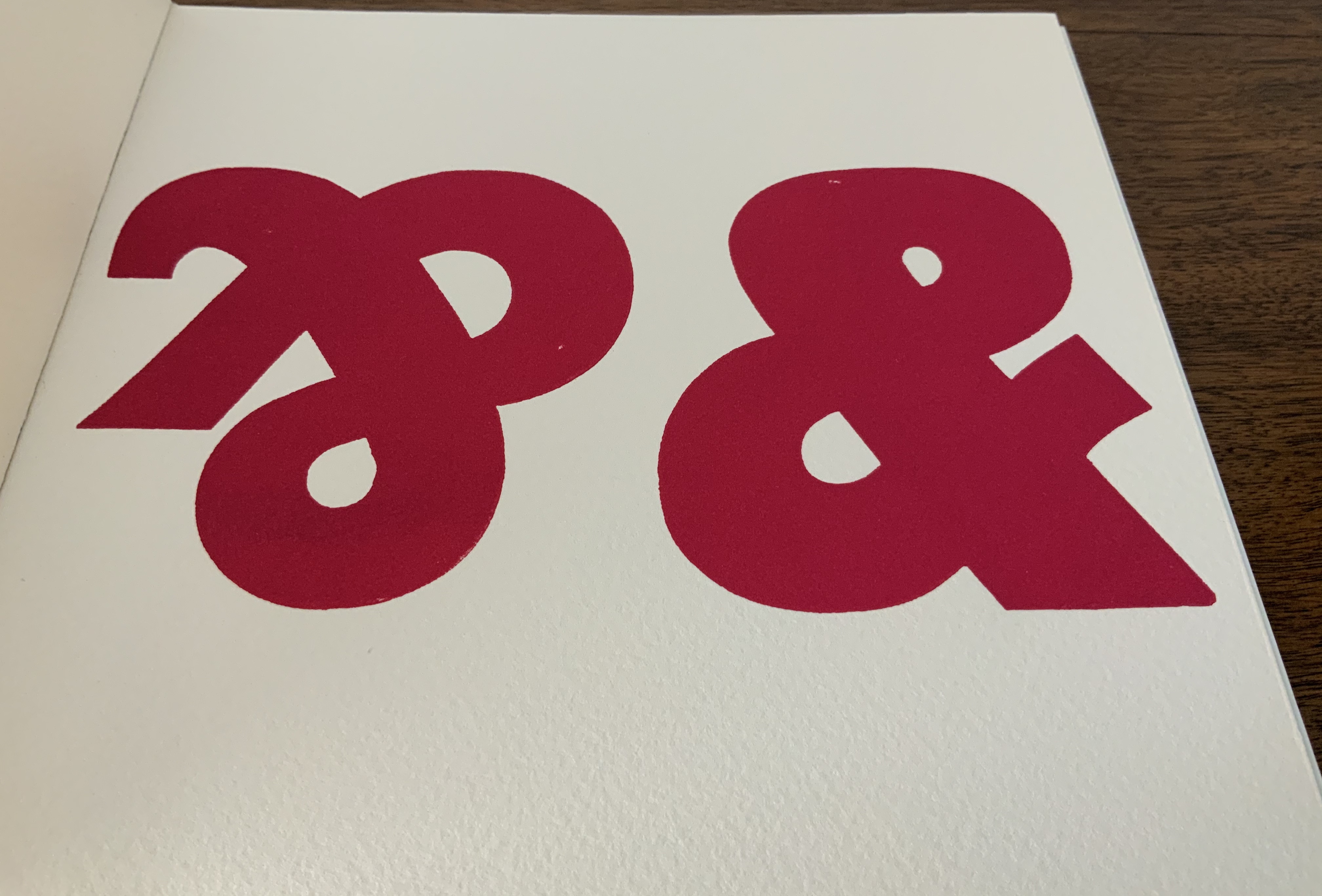
Isn’t it surprising that, given the greater frequency in human discourse of “yeah, but” over “yeah, and”, we can write “yeah, &”, but there is no logogram for “but”? No one can say that the last word has been said, written, printed or had about the ampersand. Someone will always be ready to append an & … but that has not stifled many an attempt. Apparently they have occurred every twenty years or so since 1936.
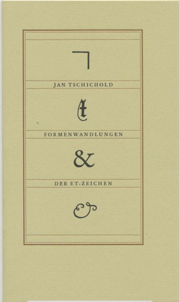
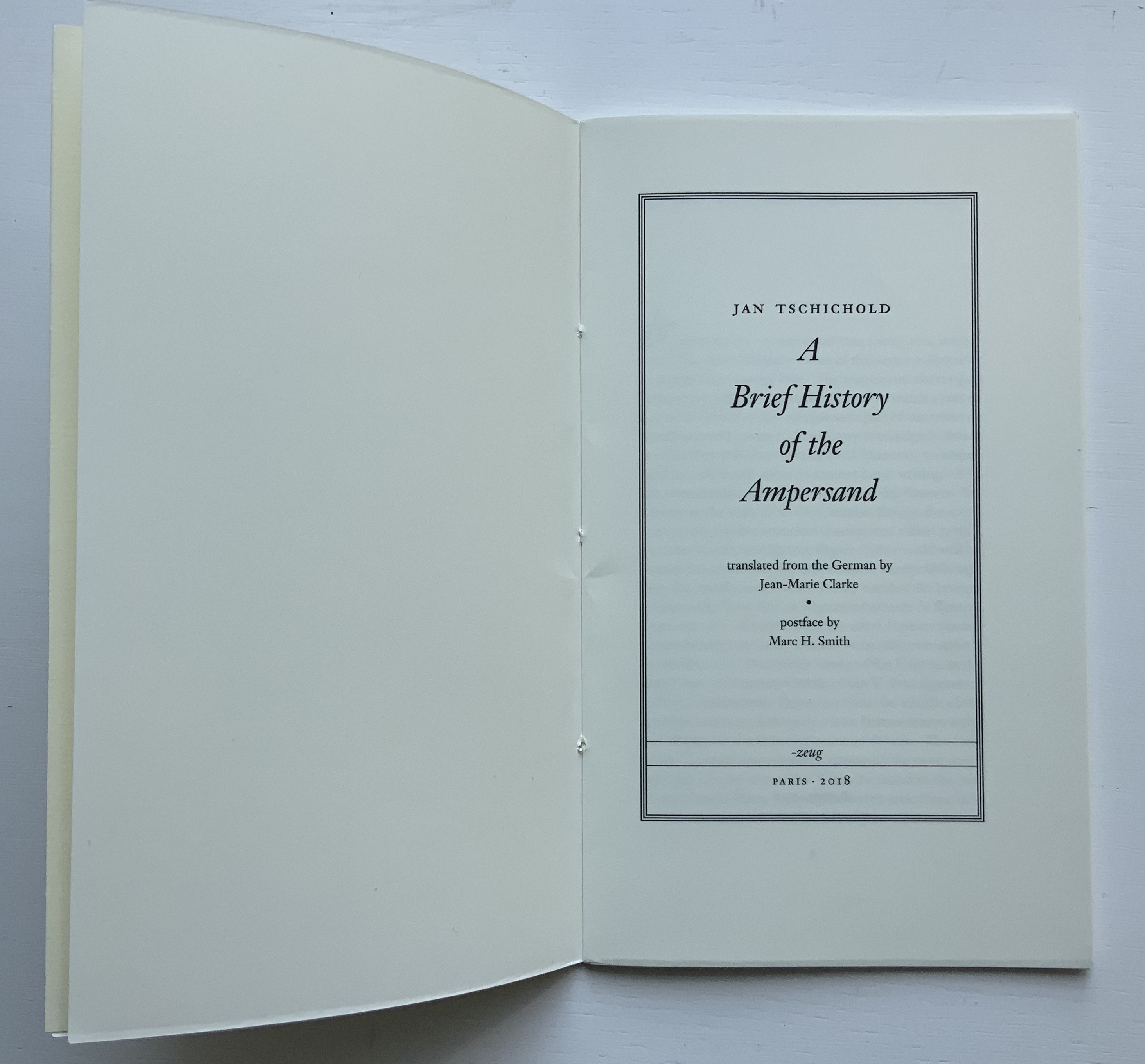
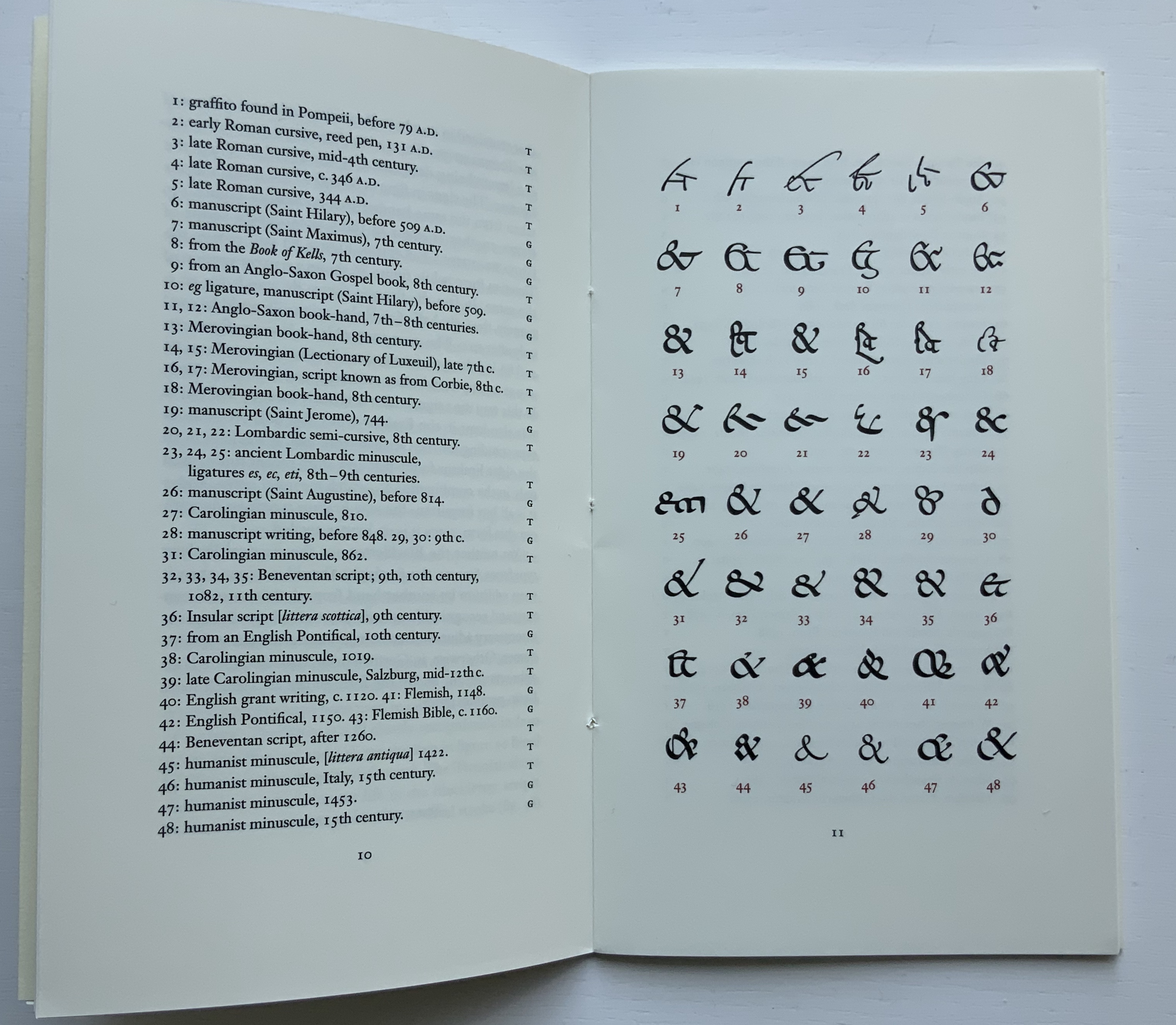
Some twenty years later along comes Jan Tschichold’s A Brief History of the Ampersand (1957), initially in German in 1953), which reproduced and updated Goudy’s set of examples and deepened the scholarship on the subject.
After Tschichold’s “last word”, The Ampersand Club (yes, there is one) invited one of its distinguished members — Rutherford Aris, Professor of Chemical Engineering (and Classics!) at the University of Minnesota — to attempt another “last word” in 1980.
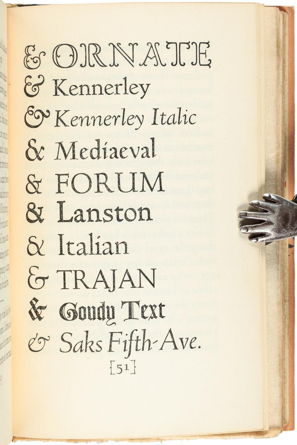
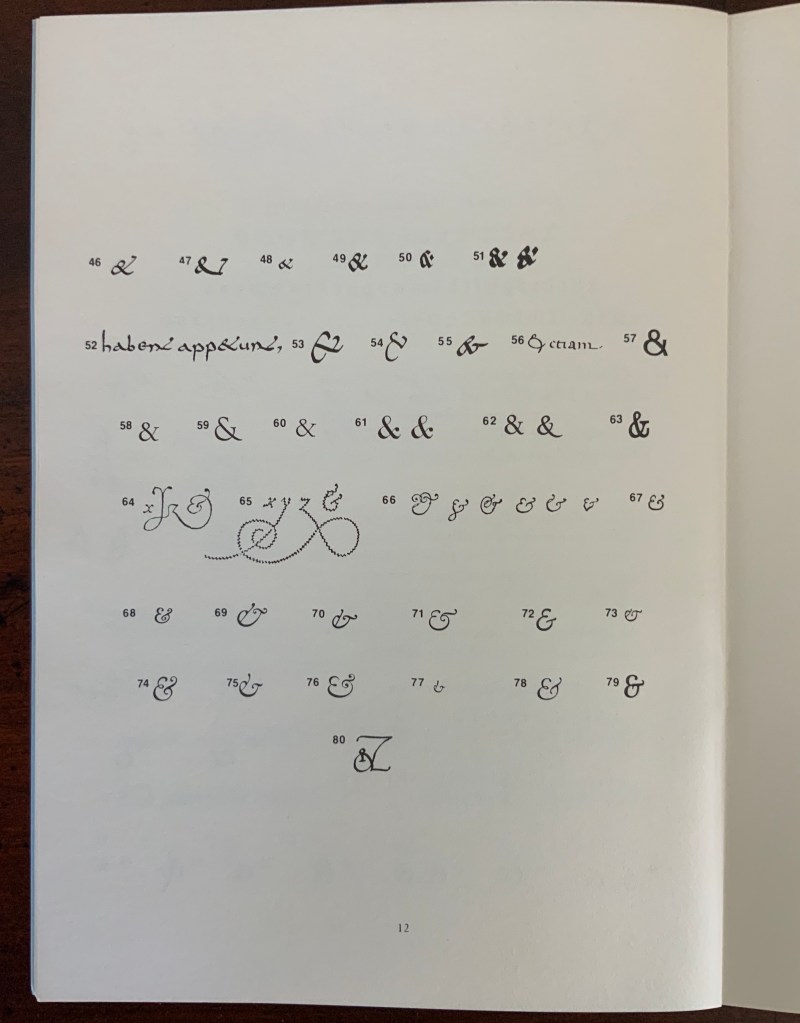
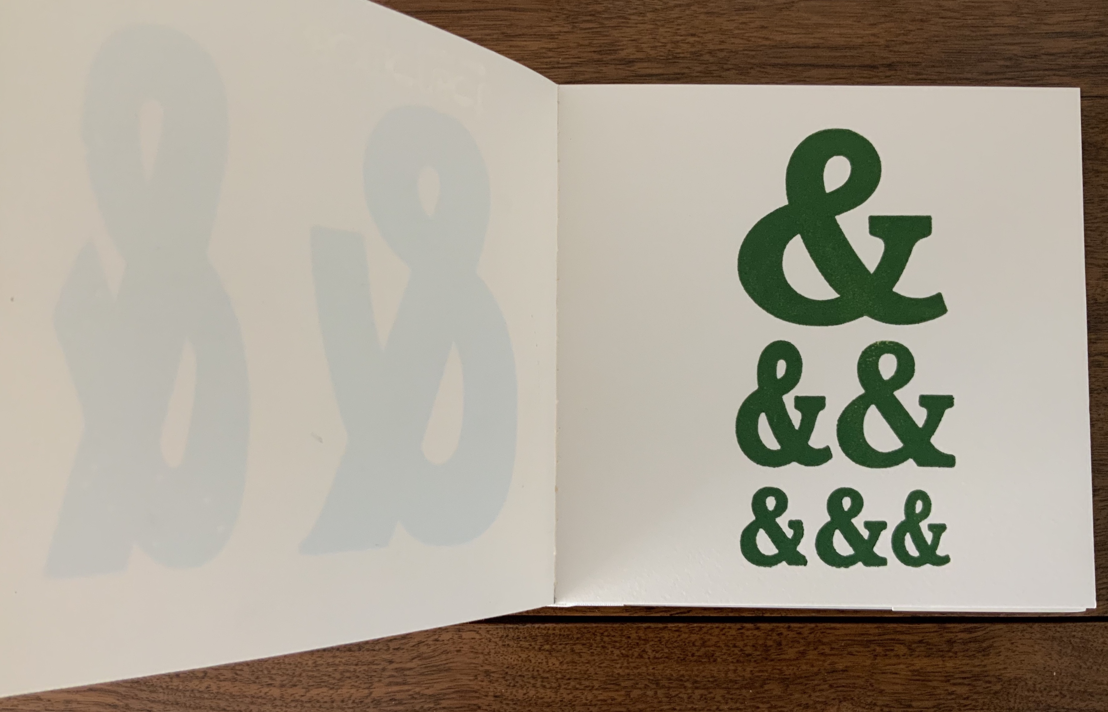
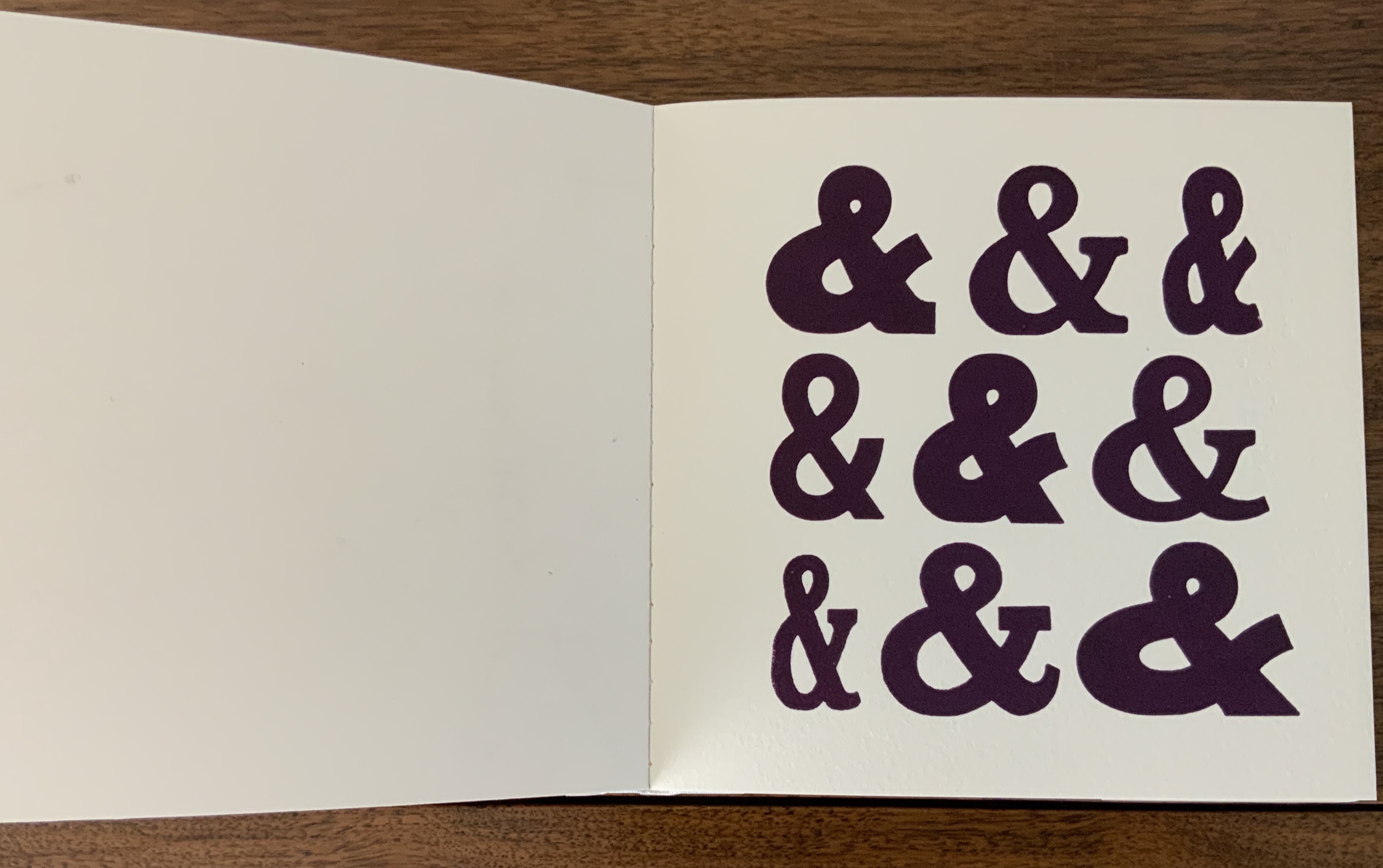
While there are a few publications falling around 1999/2000, nothing approaches the colophonic status of the Typophiles’, Tschichold’s or the Ampersanders’ efforts. It’s not as if ampersand aficionados were running out of &s. Consider Robert Slimbach’s Poetica™️ (1992), his family of type that boasts 62 different ampersands.
Robert Slimbach’s 62 ampersands in the Poetica™️ family
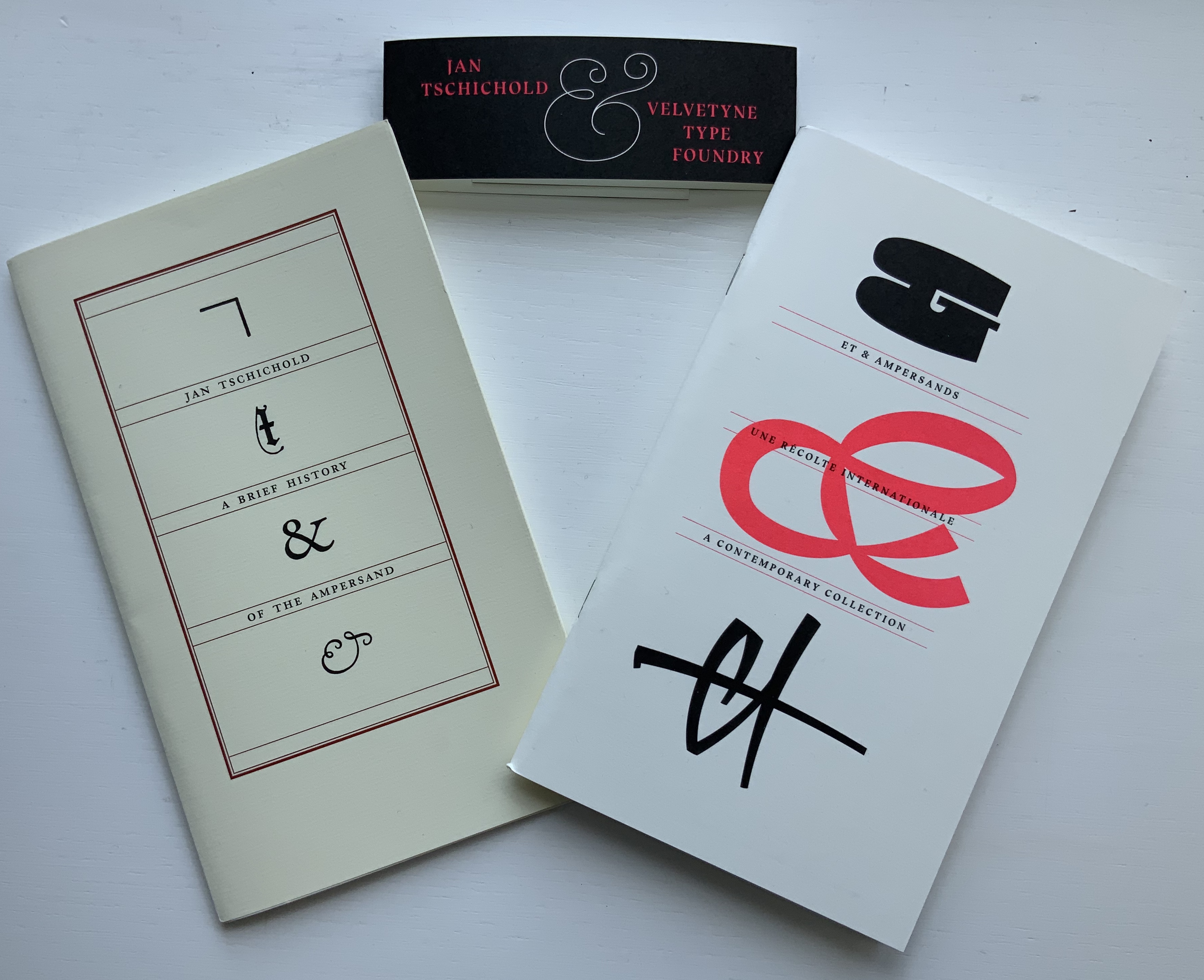
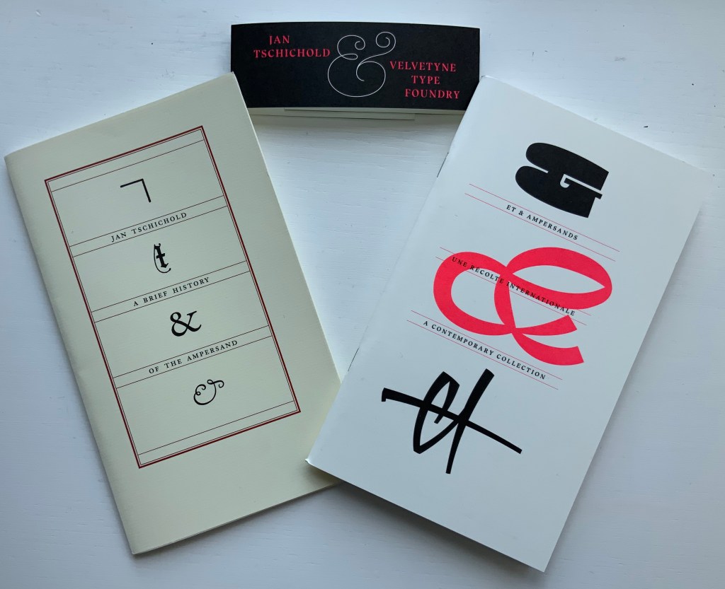
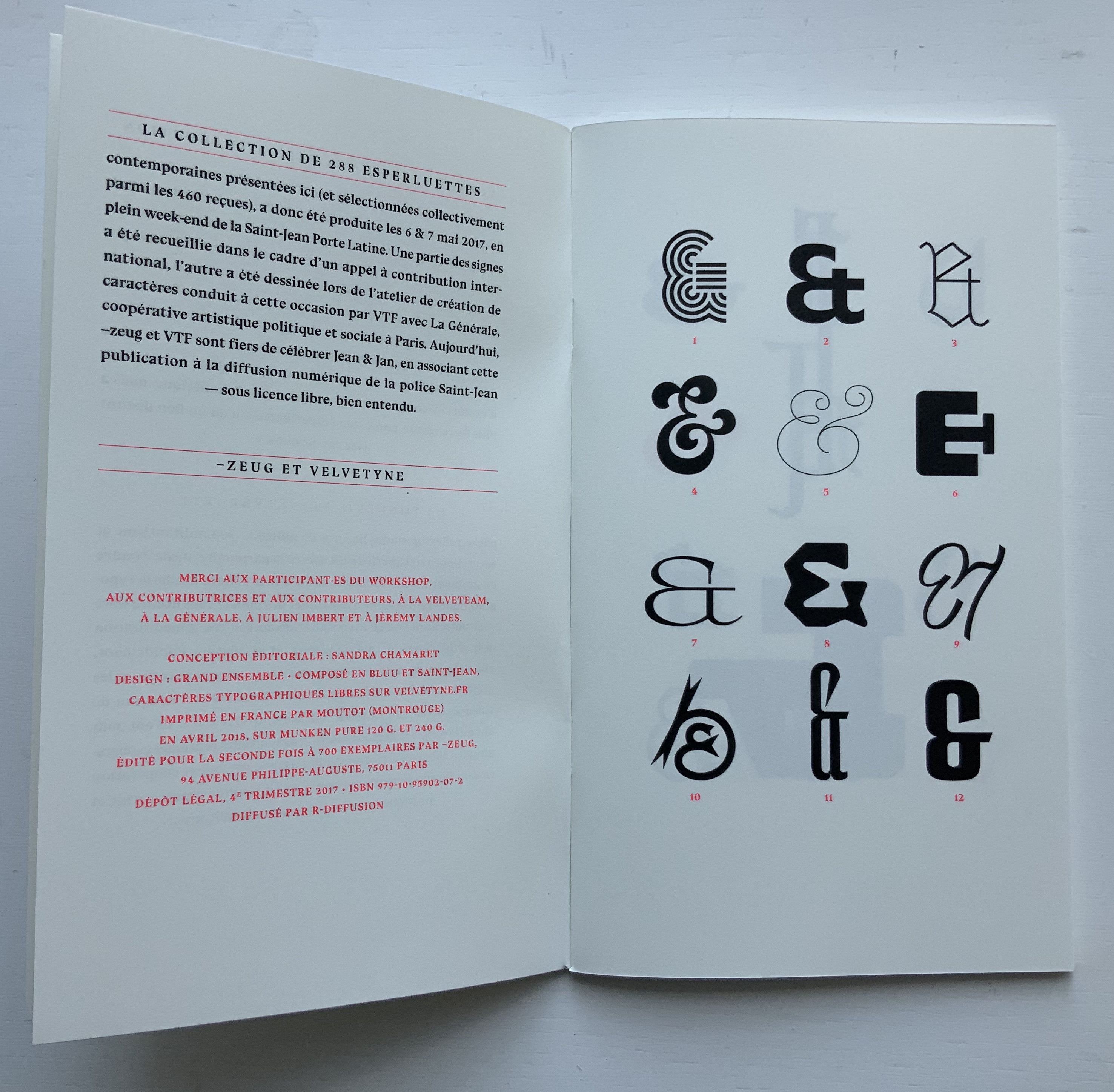
Jumping the gun on 2020, we have both the 2018 reissued edition of Tschichold’s “last word” on the subject and Ray Czapkowski‘s 2019 celebration of the Diggings of Many Ampersandhogs. It is somewhat fitting that the publisher of the reissue of Tschichold is named ~zeug, which is the German suffix appended to a verb to indicate the instrument for carrying out the verb’s activity — e.g., Spielen (to play), Spielzeug (toy). And entirely fitting, too, that ~zeug could not resist the urge to make up a deluxe version by adding Et & Ampersands: A Contemporary Collection to Tschichold’s A Brief History.
By definition, the Velvetyne/~zeug catalogue is not a last word, and its cataloging of newly designed ampersands attests to the ongoing “and-ness” of letter design, which brings us to the first item in this sub-collection within Books On Books …
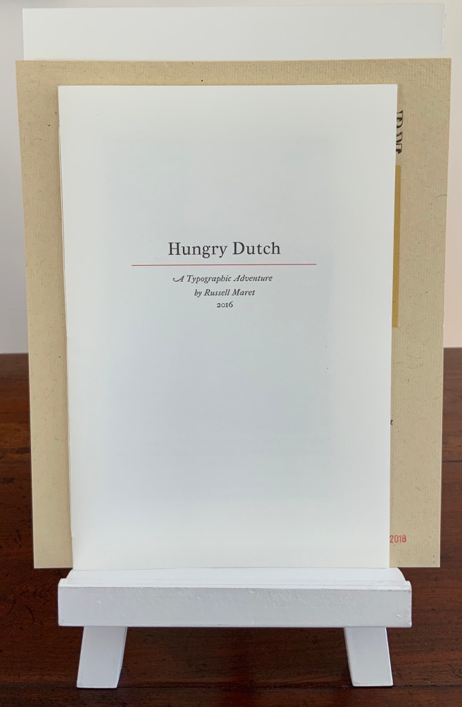
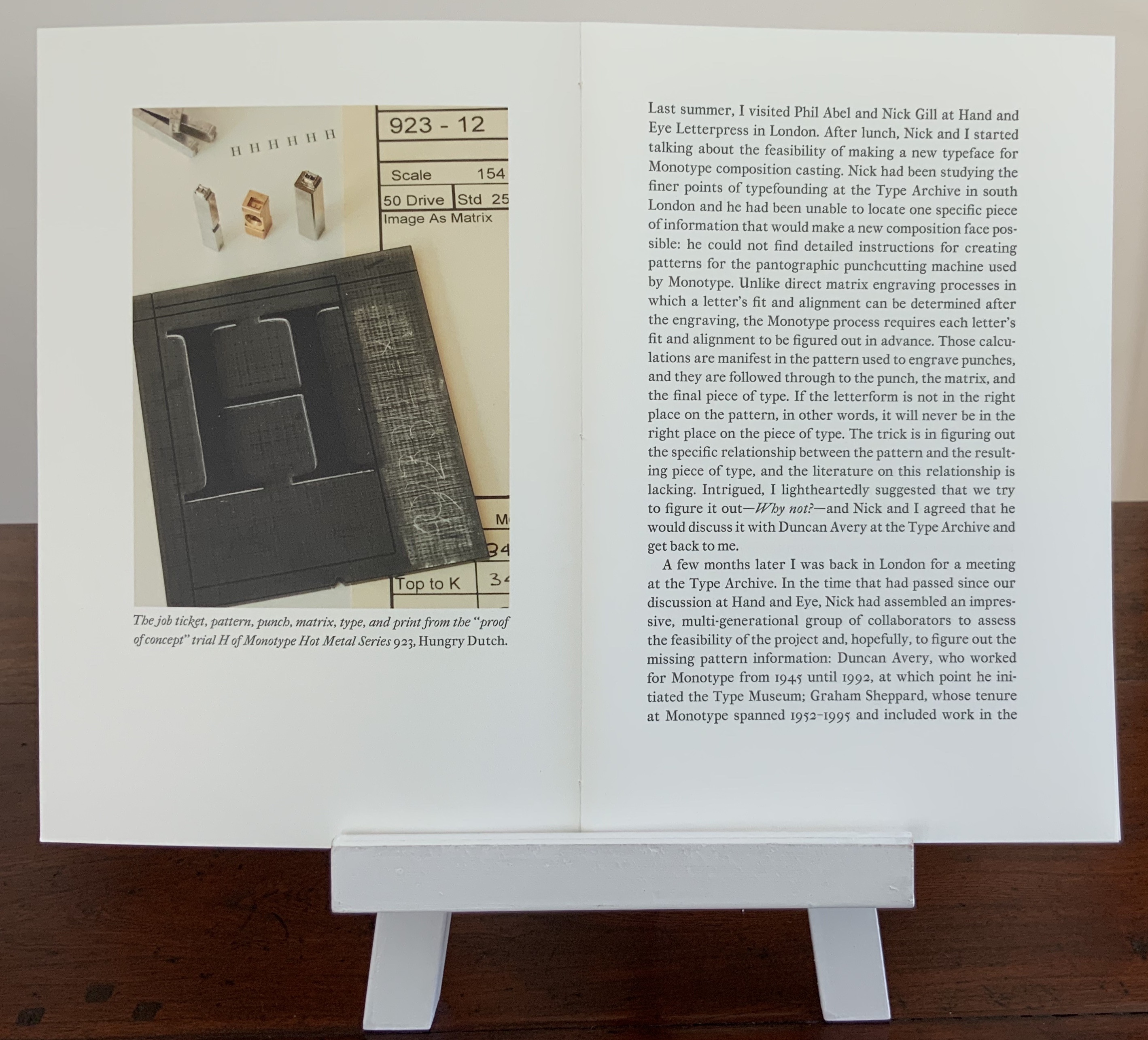
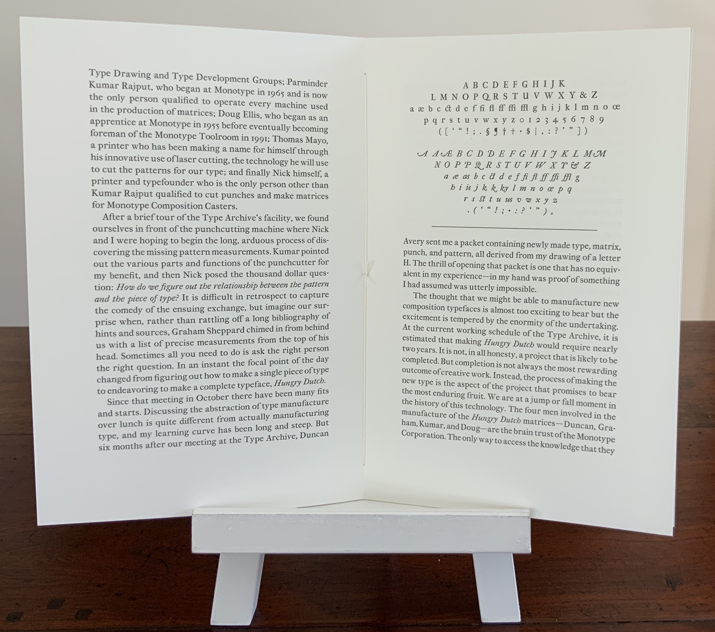
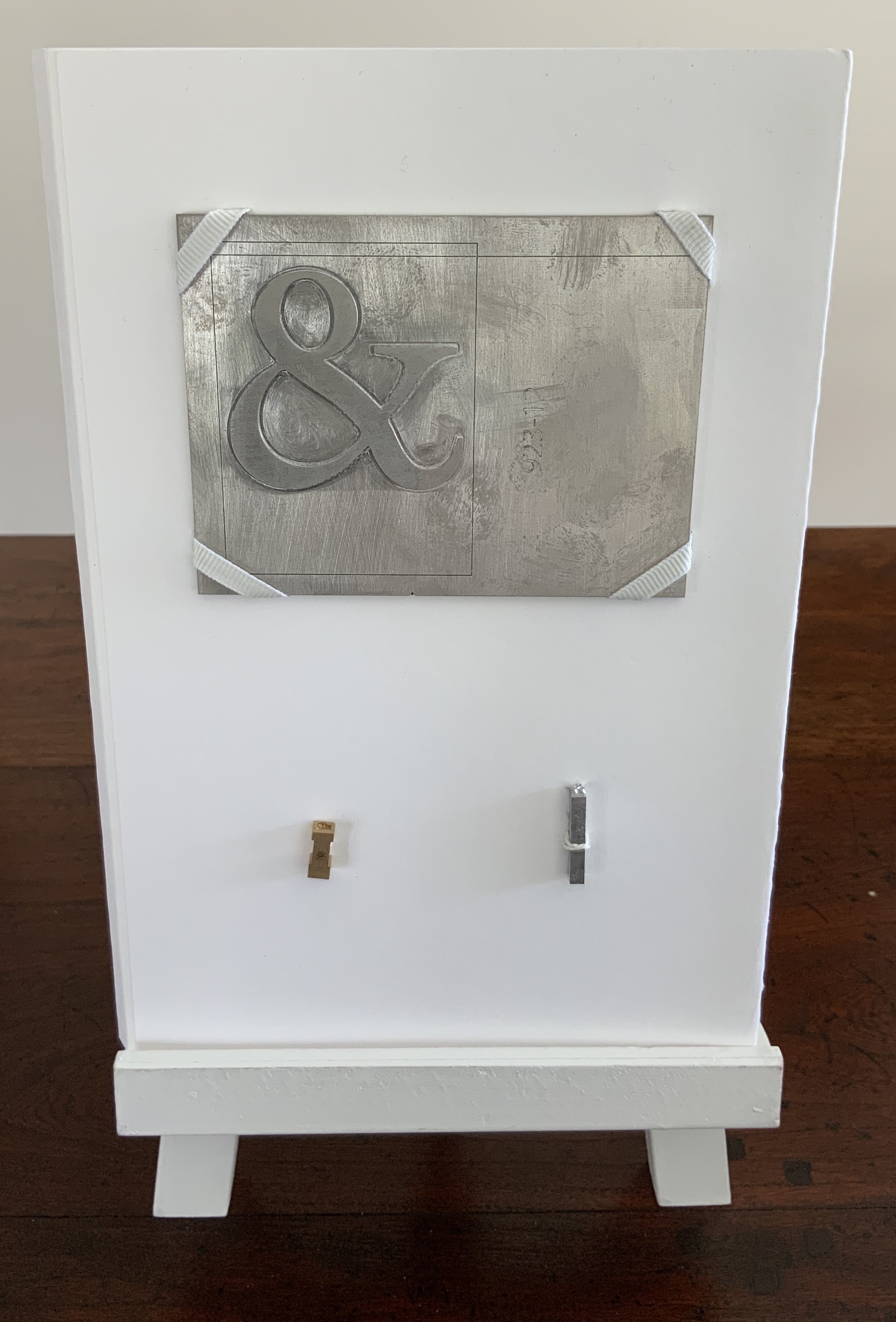
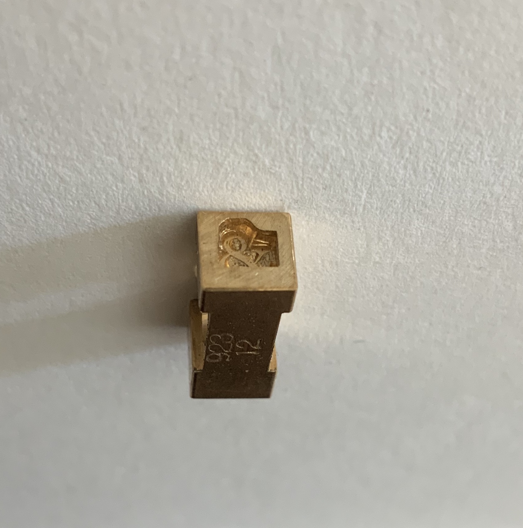
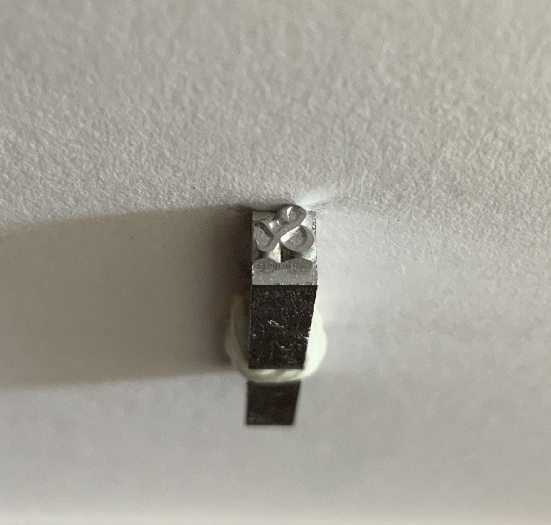
Maret’s pattern, matrix and punch for the Hungry Dutch ampersand came into the collection in 2020 as recognition of Books On Books’ contributing sponsorship of the design and manufacture of the typeface.
The endnoting to the pages displaying the numbered ampersands suits the publication of this scholarly “after-dinner” speech, which has one rocking back & forth between typographical puns and paleographical insights.
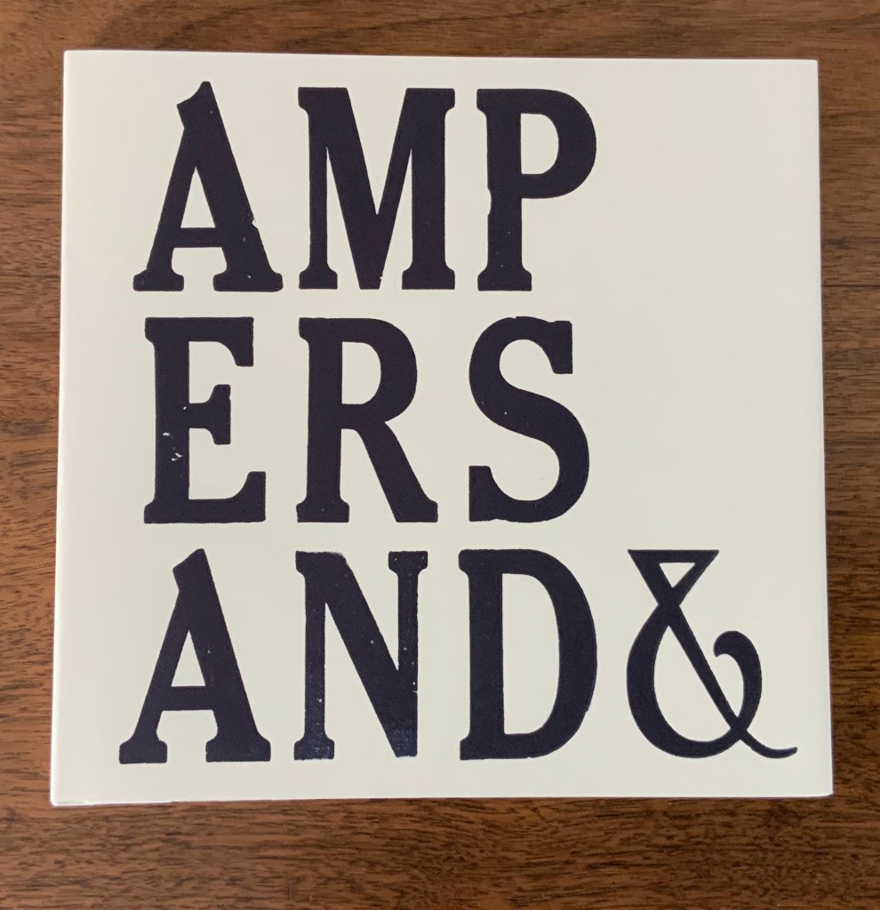
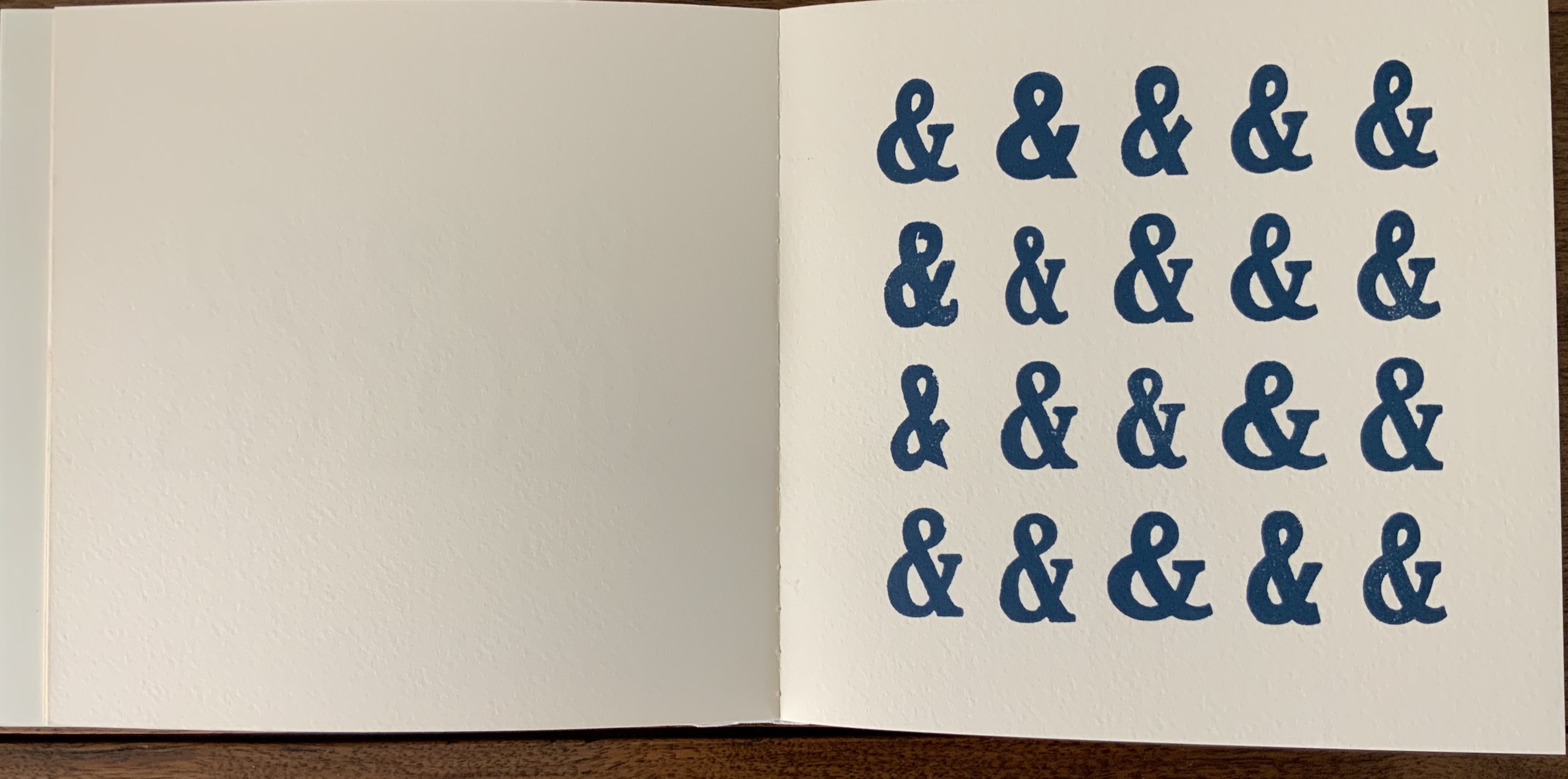
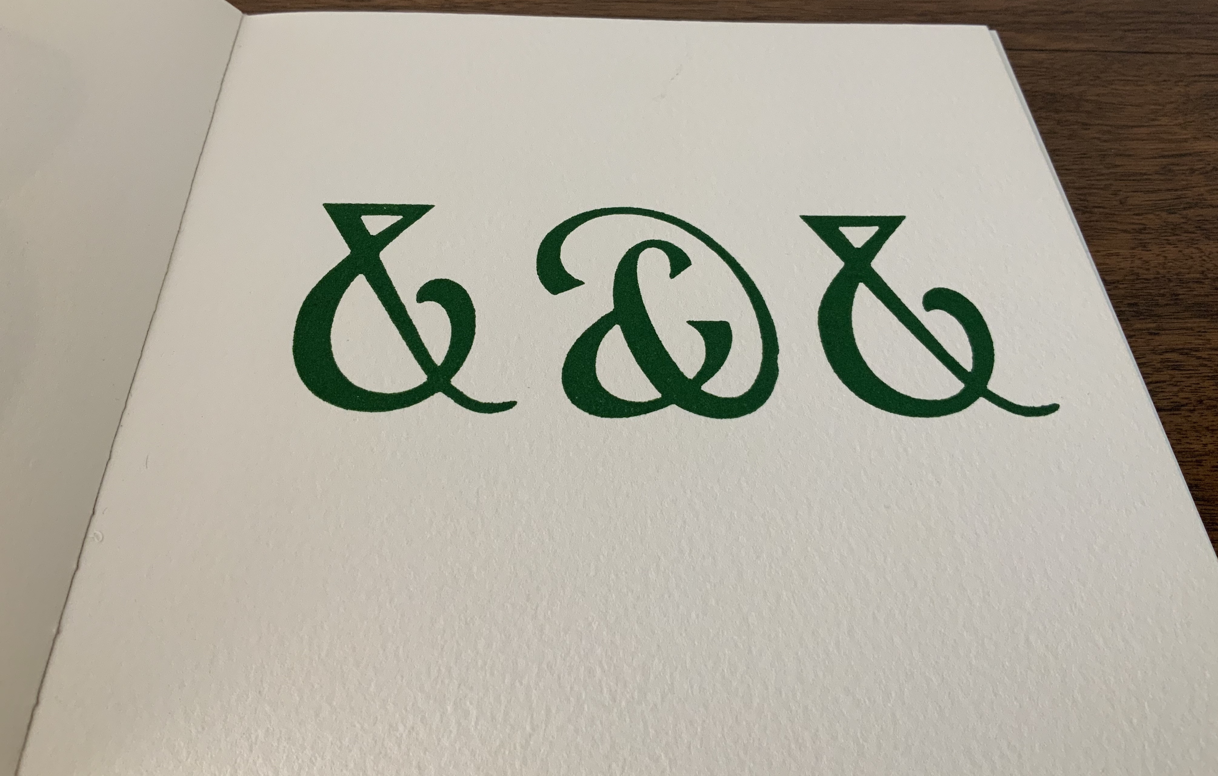
Board covers with a Caslon paper wrapper, cased over eleven linen-taped handsewn leaves of Somerset 300gsm, eleven images printed on a Vandercook proofing press. H175 x W180 mm. Acquired from the artist, 5 May 2020.
Printers have affection for the ampersand, not just because of its usefulness in shortening lines and in embellishing spaces, but also, I believe, because of its uniquely human shape; in one stroke it describes us, becomes a human pictogram. Placed together, ampersands appear endlessly various and take on human characteristics of slovenliness, arrogance, timidity and flamboyance. Ben Shahn said that the letters of the alphabet have an “austere dignity”, the ampersand in woodblock form, by contrast, is avuncular and buoyant. The book is a small celebration of the alphabet’s twenty-seventh letter and of design improvisation and characterisation within one simple symbolic form. It’s hard to identify all the fonts used as many wooden fonts are local variations of standard faces but the book includes Cheltenham, Windsor, Gill, Grotesque and Caslon as well as some ampersands hand cut for this production. The text on the final page is hand set in Albertus. — Information provided by the artist.
Book: Dustjacket and case over perfect binding of 34 pages, offset, multiple edition. 178 x 178 mm. Portfolio: Sleeve of gray French Kraftone encasing 16 prints on white French Kraftone. 305 x 305 mm. Edition of 50, of which this is #42. Acquired from the artist, 5 May 2020. Photos: Courtesy of the artist.
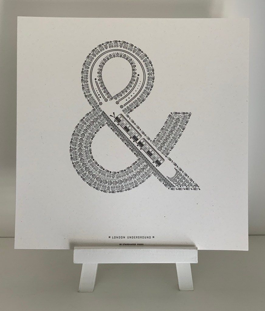
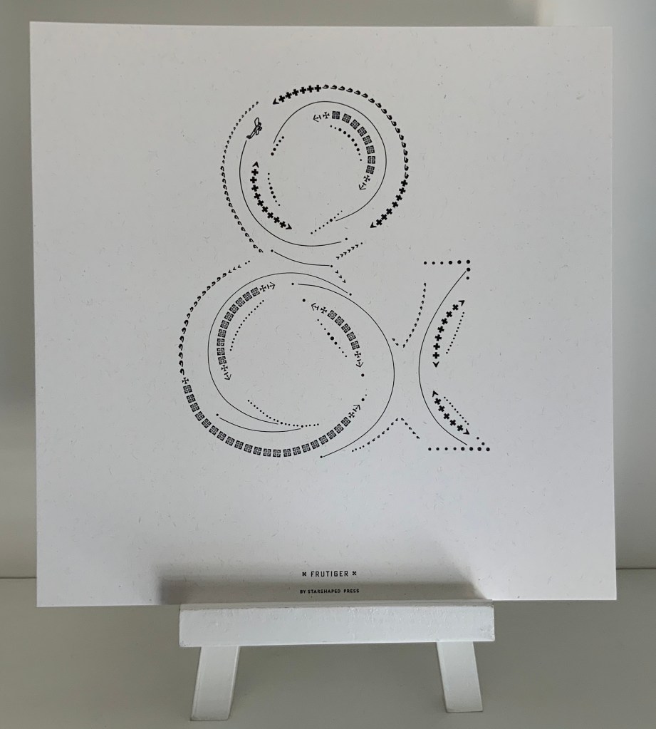
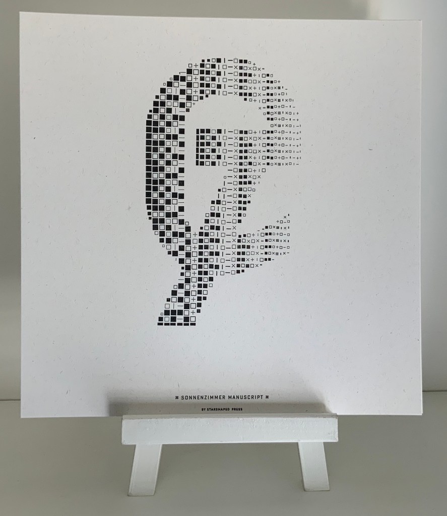
The book (2017) comes in response to interest in Farrell’s portfolio of sixteen prints of celebrated designers’ ampersands (2015-17). Farrell has constructed each designer’s ampersand with ornaments and flourishes carefully locked into shape with typesetting furniture forms. Each also contains images composed of ornaments, and each conveys the city or country associated with the original designer or typeface. The artist has provided extensive commentary and numerous photos here and here.
London: Johnston Underground (1916) Edward Johnston. Photo: Books On Books Collection.
Paris: Frutiger (1976) Adrian Frutiger. Photo: Books On Books Collection.
Switzerland: Sonnenzimmer (2015) Nick Butcher & Nadine Nakanishi. Photo: Books On Books Collection.
Further Reading (& Viewing)
“300&65 Ampersands” (NL: Ampersandampersand, ND). Accessed 19 June 2020.
Luse, Karen. An experiment in literary excavation (Portland, ME: Karen Luse, 2005). Cavity created in textblock within which sections of pages are removed to form an ampersand. book attached to painted wooden board.
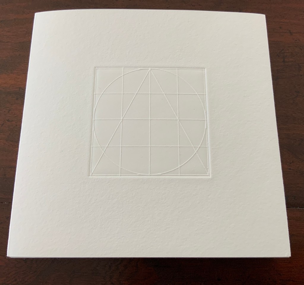
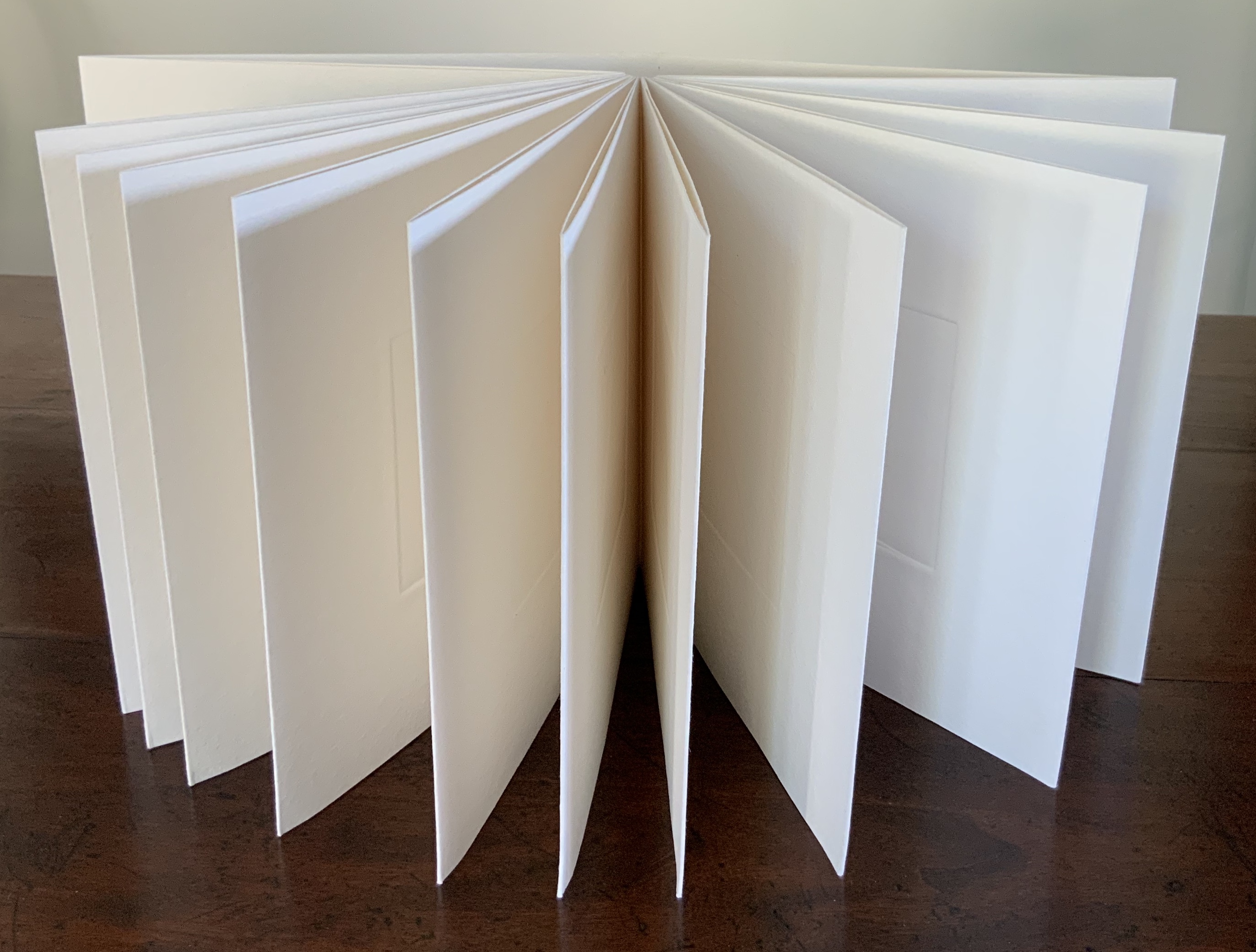
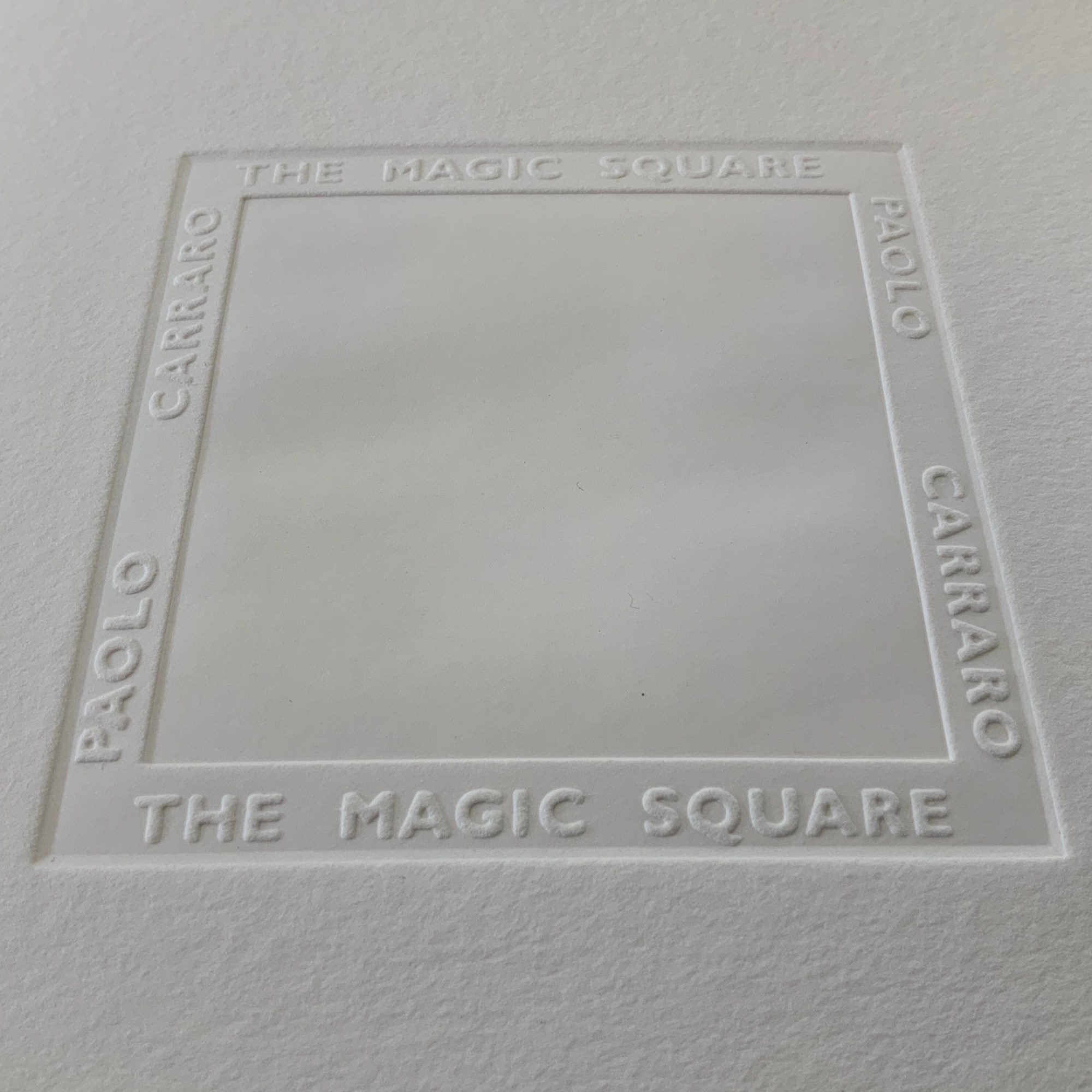
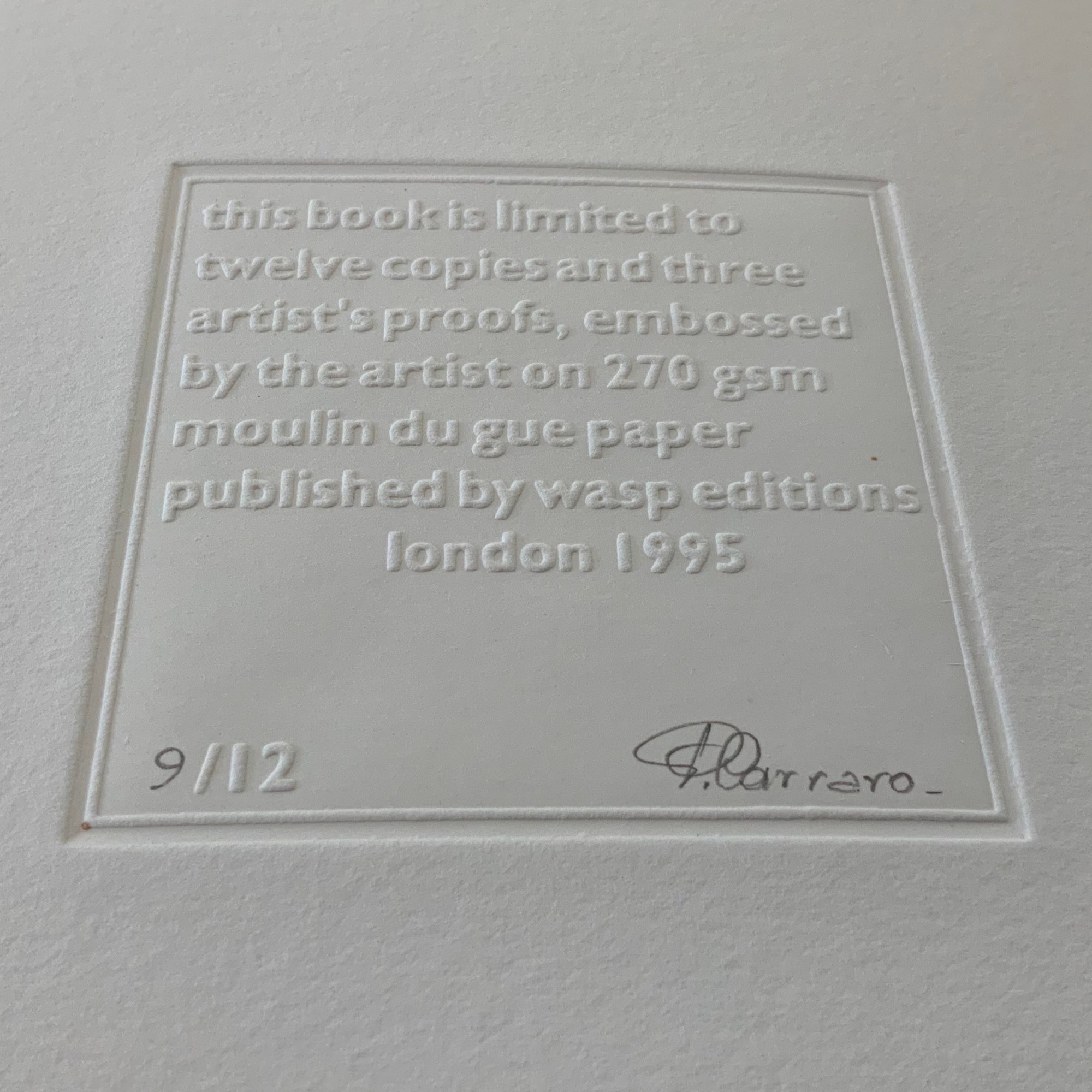
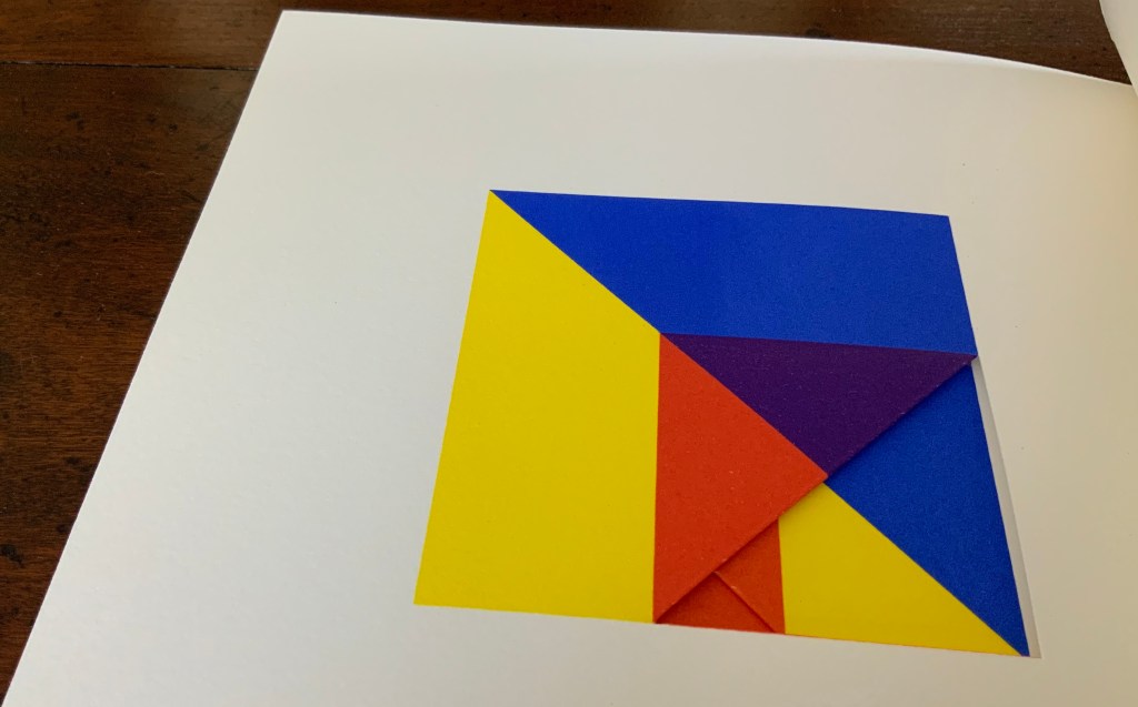
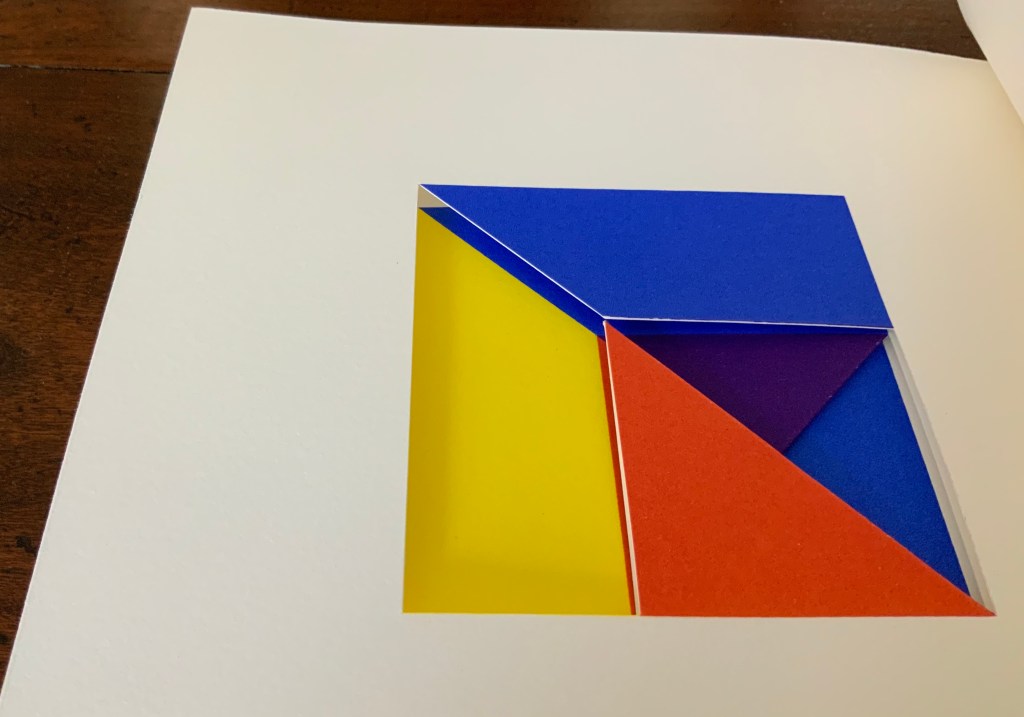
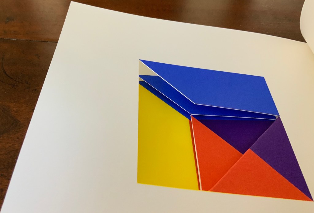
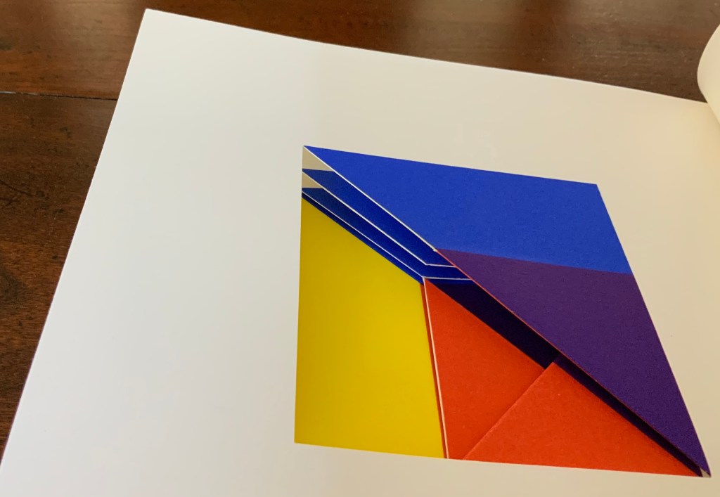
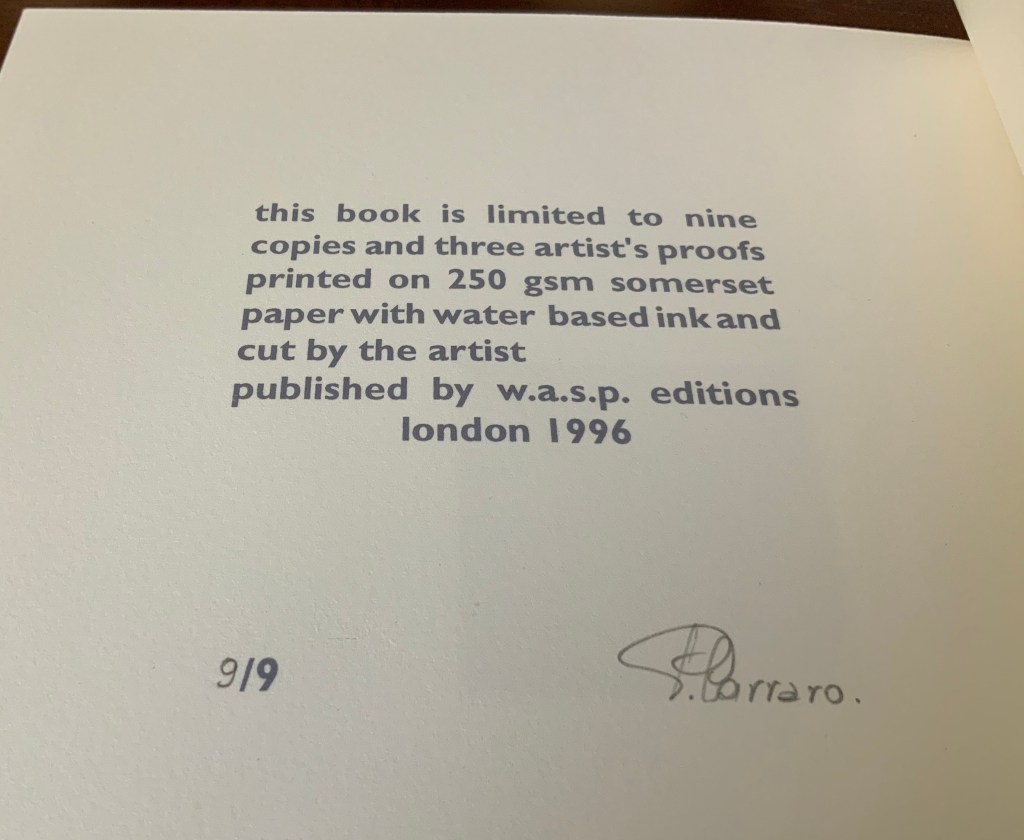
The Magic Square(1995) Paolo Carraro Leporello of 22 panels with embossed single-sheet cover, 16 embossed images on Moulin du Gue 270 gsm. 180 x 180 mm. Edition of 12, of which this is #9 and signed. Acquired from the artist, 17 June 2020. Photos: Books On Books Collection.
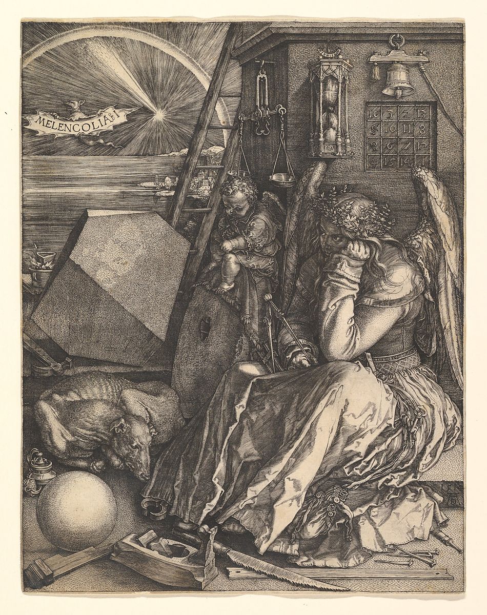
With The Magic Square, Carraro pays homage to Durer’s Melencolia I and its magic square embedded in the wall in the etching’s upper right corner. The magic square is one in which the value across any set of vertical, horizontal or diagonal cells is always the same. From the cover’s embossed magic square, Carraro has taken each of the 16 subdivisions and given it its own panel in the completely white leporello.
The Impermanent in the Permanent (1996)
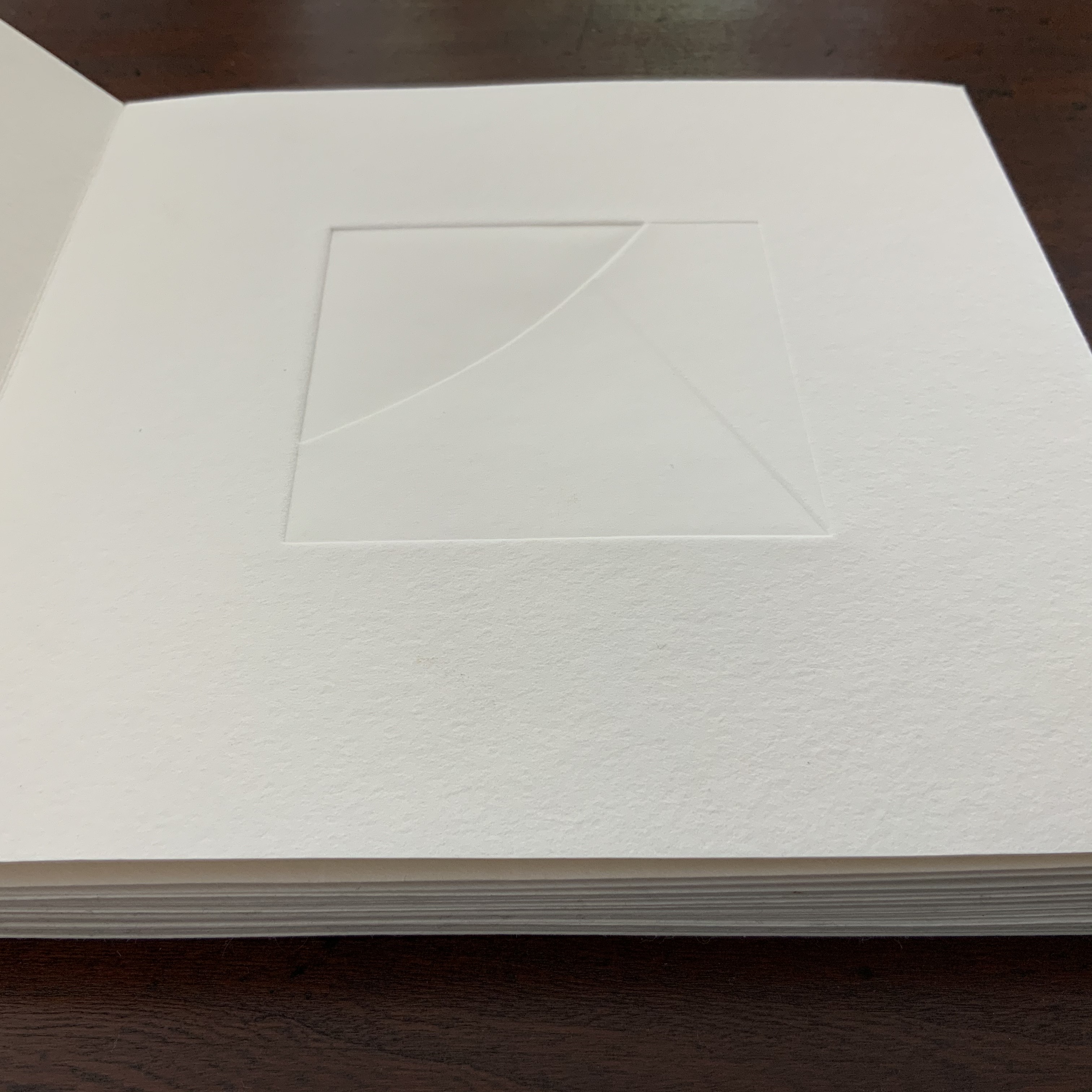
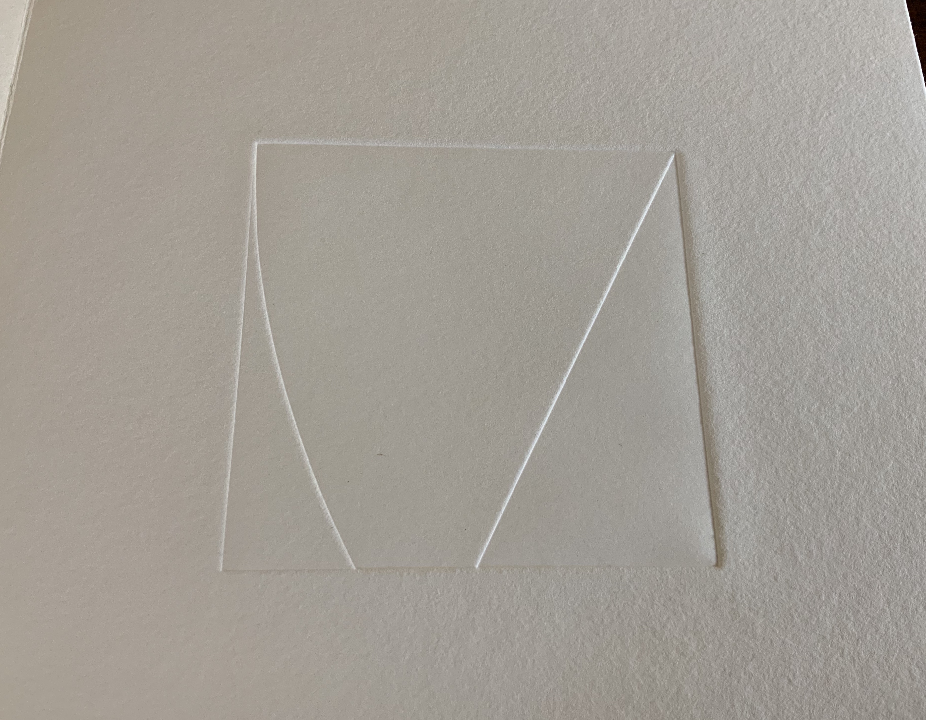
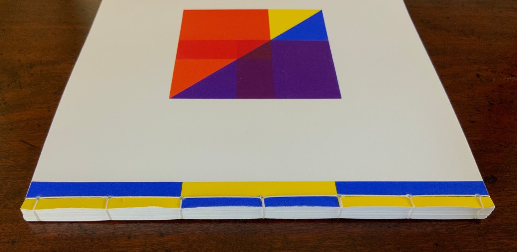
The Impermanent in the Permanent (1996) Paolo Carraro Slotted box envelope: Pergamenata 230 gsm. H205 x W215 mm. Book: Seven-hole Japanese stab binding with cotton thread; 36 pages; 16 images silk-screen printed with water based inks (cyan, yellow and magenta only) on 250 gsm Somerset paper, cut and folded, following the Fibonacci sequence or Golden Mean (1.618 ratio). H200 x W215 mm. Edition of 9, of which this is #9 and signed. Acquired from the artist, 17 June 2020. Photos: Books On Books Collection.
While there are many instances of discovering the Fibonacci sequence in nature and works of art (see below), here is an instance of generating art deliberately with the Fibonacci sequence. Using the primary colors, cut-outs, folds and rotation, Carraro creates The Impermanent in the Permanent. Peering through the cut-outs and down into the pages and slowly rotating the book, the reader/viewer can experience the Fibonacci Spiral.
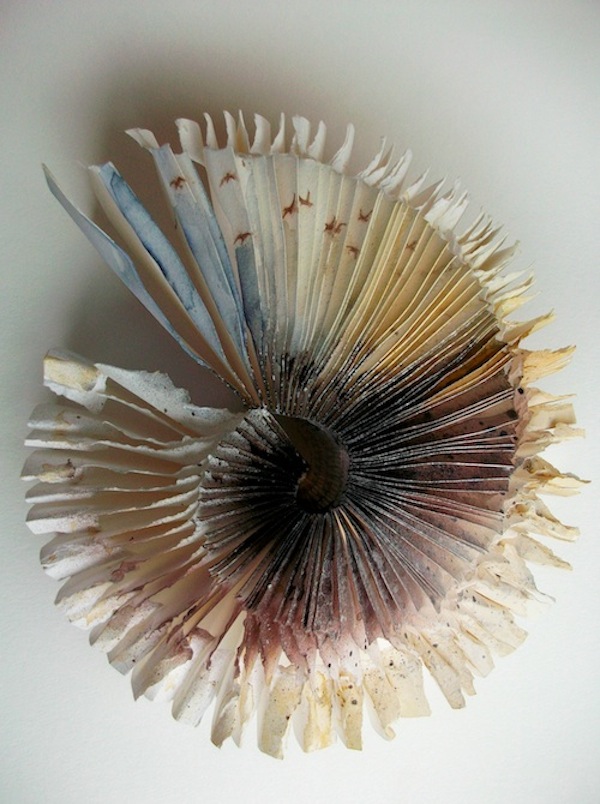
Sixfold accordion consisting of 9 image panels and 3 text panels (including cover panel) on Mohawk Superfine. Closed: H157 x W76 mm; Open: H157 x W900 mm. Edition of 55. Acquired from Boekie Woekie, 29 October 2019.
From the colophon: “This series of mathematical drawings is based on the growth patterns of conch shells and the Fibonacci sequence.”
First panel
Fourth and eighth panels
Panels 4-9 and colophon panels
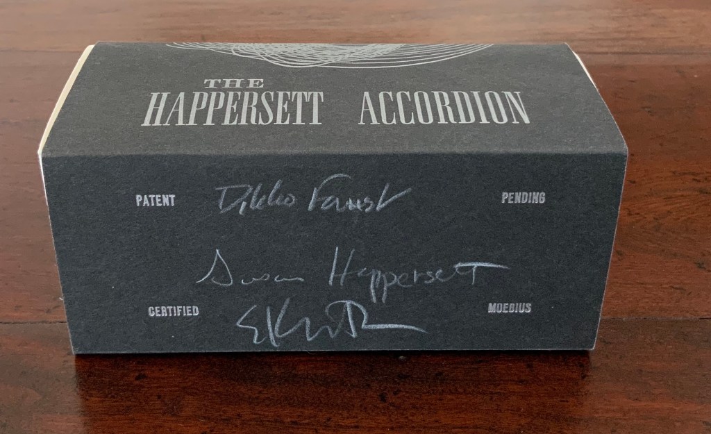
The Happersett Accordion (2001)
The Happersett Accordion (2001)
Susan Happersett & Purgatory Pie Press
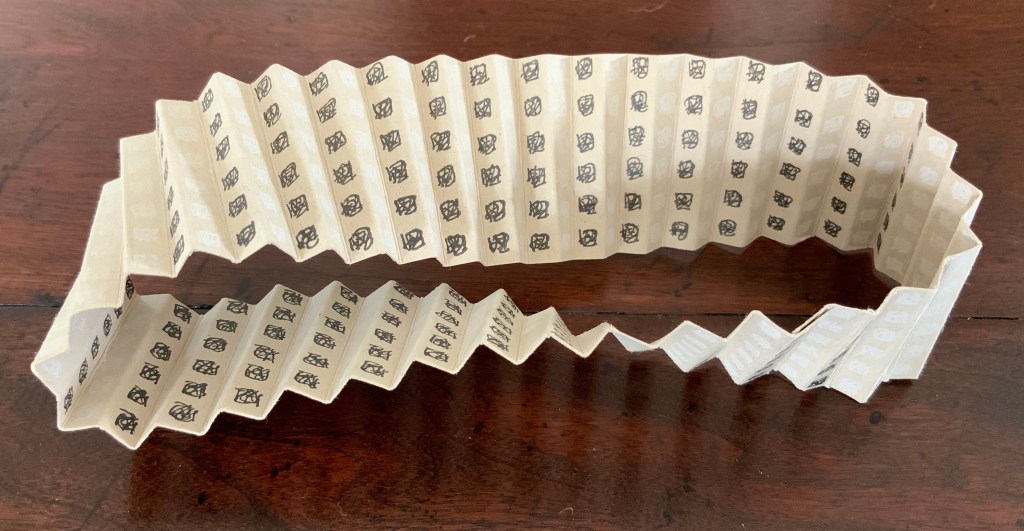
Folded white card box, letterpress in black ink, with black card sleeve, letterpress in silver-colored ink, H65 x W152 mm, enclosing an accordion-fold Möbius strip, with black- & white-ink images, each composed of 13 marks based on the “Fibonacci growth number 13”. H39 x W144 mm. Edition of 100, of which this is #41 and signed. Acquired from Kelmscott Book Shop, 2 July 2020.
The images on the Möbius strip look like Chinese language characters. According to the joke-filled certificate of authority (see below), they are composed of 13 mystical marks, based on the “Fibonacci growth number 13”. That the 13th number in the Fibonacci sequence, the number which is the sum of the 11th (55) and twelfth (89) numbers in the sequence: 144. It is also the first number in the sequence that is the square of a whole number (12), which metaphorically “squares” with the squarish images. Sans magnifying glass — even with a magnifying glass — it is hard to discern the “13 mystical marks”, much less the order and position in which they progress from image to image. No matter, it is the “idea of it” that counts, as in so many conceptual works of art.
From a book art perspective, what works so well here is the juncture of the Fibonacci sequence with the tangible mystery of the Möbius strip made by hand, printed by hand, typeset by hand and presented in a handmade box. As with Conch, this work is a collaboration with Esther K. Smith and Dikko Faust, but more so than Conch, The Happersett Accordion displays the whimsical humor as well as inventiveness so much on display in book art — in particular at Purgatory Pie Press.
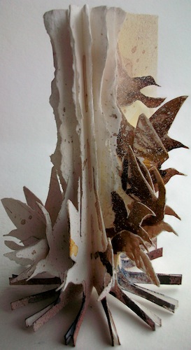
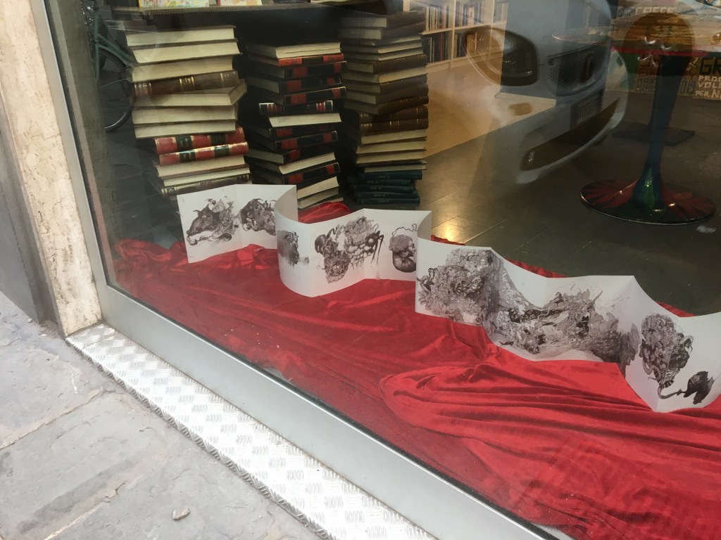
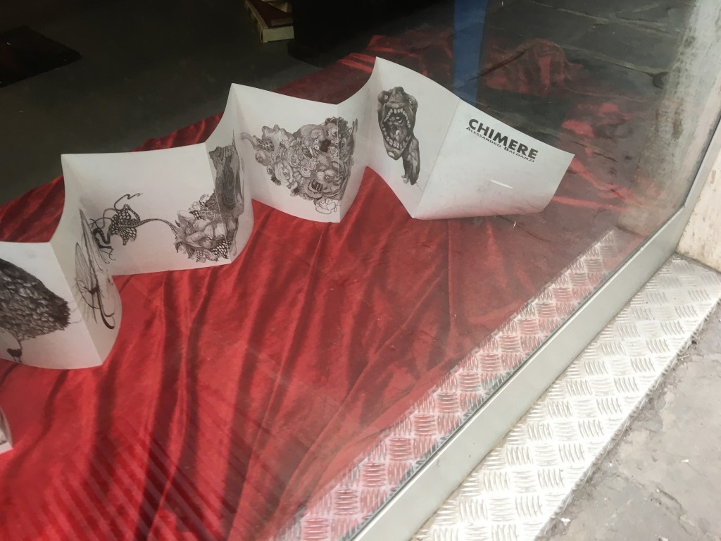
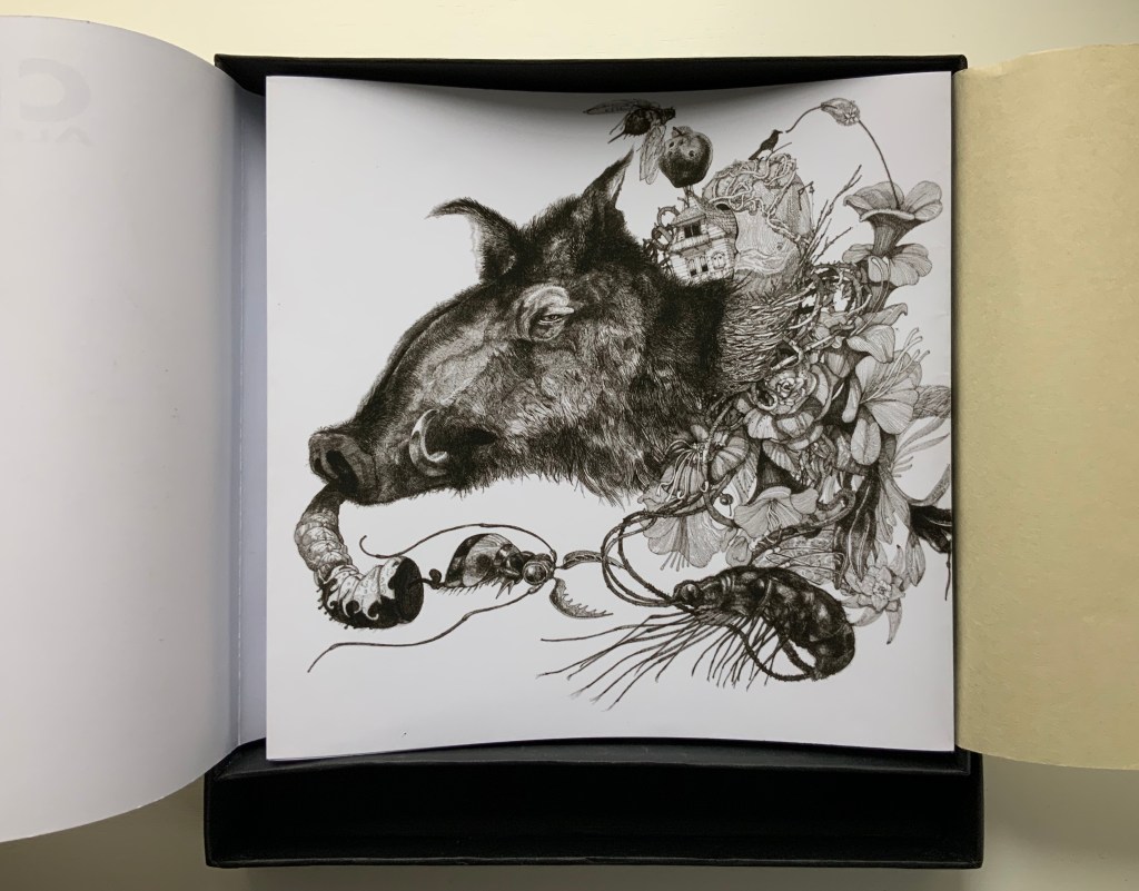
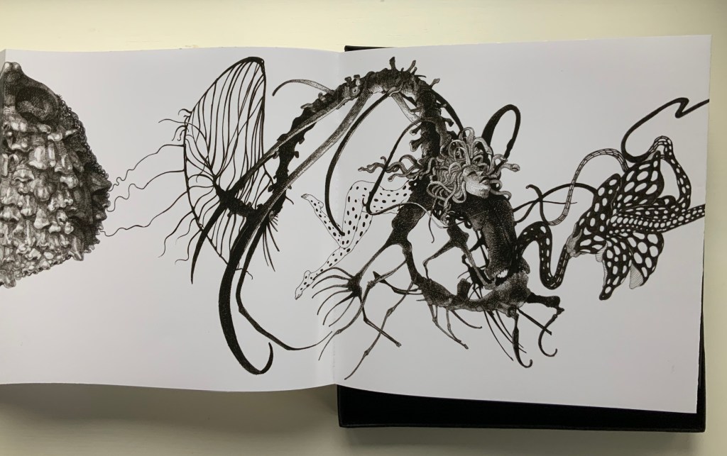
Chimere (2020) Alessandro Baldanzi Leporello: Original drawing (700 x 500 mm) made with black markers on drawing paper (Scheller Hammer), scanned and edited in PhotoShop, digitally printed on 200 gsm. H195 x W202 mm, closed; H195 x W4659 mm, open. Booklet: Bound in card with linen thread across 40 unnumbered pages, digitally printed. H148 x 102 mm. Both enclosed in a handmade box, covered and lined with black linen paper. Edition of 10, of which this is #2, signed. Acquired from the artist, 19 February 2020. Photos: Books On Books Collection.
A cross between a print portfolio and leporello. A cross between Durer, Beardsley and Ernst. A severing of image from text; though in both, one thing swallows a thing only to breathe, excrete or dream another that dreams, excretes, breathes or swallows yet another.
Chimere appeared to me on Via San Gallo. According to the myth, Chimera had three heads: a lion’s, a goat’s emerging from the lion’s back to breathe fire, and a snake’s at the end of its tail. Perhaps the serpent’s eye exerted the same fabled fascination as this leporello did, snaking along the window of Libri Liberi. Drawn closer, then inside, I could find no one to tell me anything about it, but a poster provided the artist’s name and address.
After some correspondence, divergent trips and finally a meeting in Florence at L’Hotel Orologio near Santa Maria Novella, the artist enabled Chimere‘s capture.
In the hotel lobby, the detail of the drawing and the inventiveness in linking the panels demanded close attention, making the accompanying small thread-bound booklet recede into the background. But, as I learned later, that background should not be ignored.
“Never can one be equivalent to the many” (Sophocles, King Oedipus, 430-420 BC), or Is the opposite true? What is impossible for everyone to be just one? There will be nothing strange, as Plato stated, if one proves that I myself am one and many.
The problem of duplicity of the single one occurs on several occasions in this series of multiples, combinations of lives, Chimeras formed by animal, human, plant parts. Monstrous beings in flesh and blood, three-dimensional, real but, at the same time, far from reality.
… figures that appeared to me in a dream, but children of wakefulness, don’t certainly lend themselves to living with only one part, but always with one and the other together, in the desperate identity (like the Sphinx) solving enigmas: Fusion, separation, identity, otherness, being, becoming, how can one always be identical to himself and at the same time change to be many? How can anything be generated by something else? “Introduction”, Chimere.
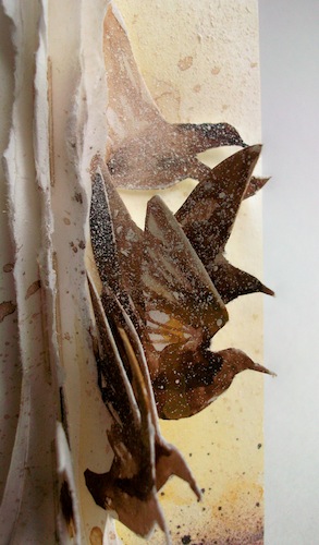
Odessa (wild boar); in Greek, the feminine of Odysseus.
In the booklet, each of the Chimeras has a sort of prose poem in Italian and English to tell its story. The first beast is “Odessa (wild boar), Birth: March 1, 2011 – Death: November 1, 2017”, whom the artist addresses alongside Oedipus:
Did you find me! You finally made it.You tore me with your wet and rough nose, with all the arrogance hatched over time.Night, day, father, son, how can a snake fly?You, clumsy riddles' solver, father and brother of your children, husband and son of your mother, legitimate usurper of the new that encompasses the many, similar to everything and equal to nothing, identical and different both with respect to himself and the other.You, devoid of education, of pedagogy, you have grown only by hurting yourself, risking and suffering.Often dying.
Turning the pages of the leporello or unfolding it to full display invokes the feel of an artist book. Consulting the separate booklet of text creates the air of a disembodied gallery. I move from Odessa to Elasmus (rhinoceros), Ecla (amberjack woman), Amutiel (Scorpionfish), Tharnos (The great mother), Boeotia (Horn of Plenty), Smyrna (Wave), Kalamata (Onda bis), Thelma (zebra lion), Elsa (Mouth eats mouth), Talpio (Bull), One (Noses), Orphestia (fish), Corinna (Cat), Soneril (tiger monkey) and Temel (mouth), but often forget to consult the booklet, which sends me back to gaze at the Chimera whose entry I missed and whose intricacy and connection to the next Chimera make me restart the journey from that point.
After many journeys, the prose poems become mostly internalized, but then there are the Italian versions. And then — over and over — at the final Chimera …
Temel (mouth); in Turkish, a masculine name and also means “fundamental, basic”.
looking at the multiracial multitude inside Temel (mouth), I see that, from Temel’s “fish nose”, a fishing line hangs, and I realize that Chimere’s “capture” is not merely its addition to a collection but its capture of me and the many.
Further Reading
“Ellen Lanyon“. 25 June 2024. Books On Books Collection. For comparison of Chimere with Transformations I (1977).
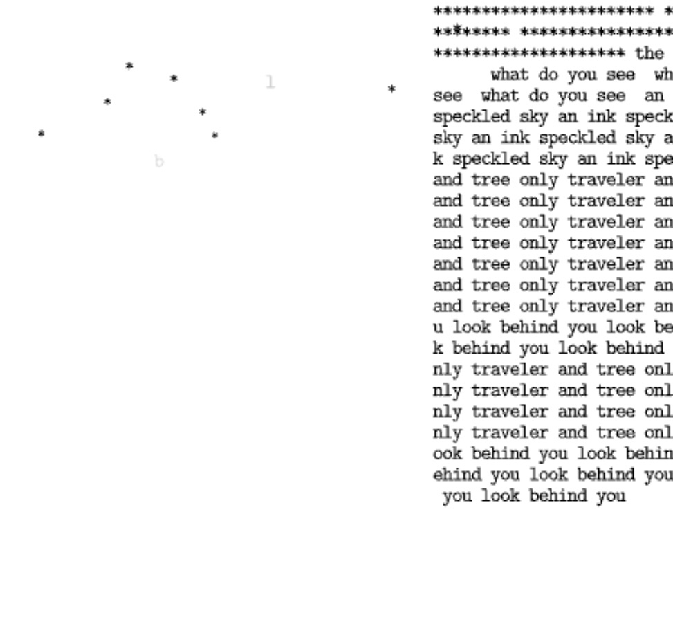
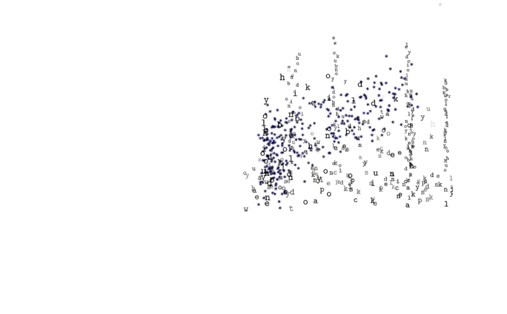
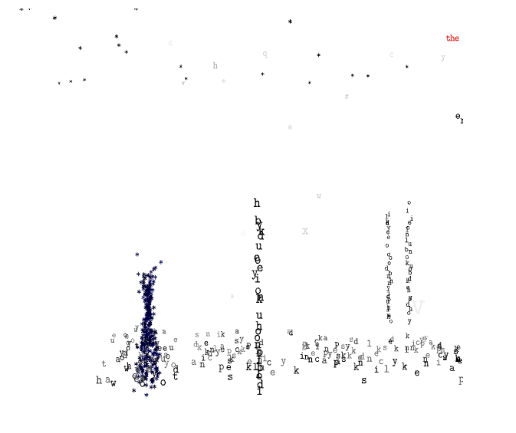
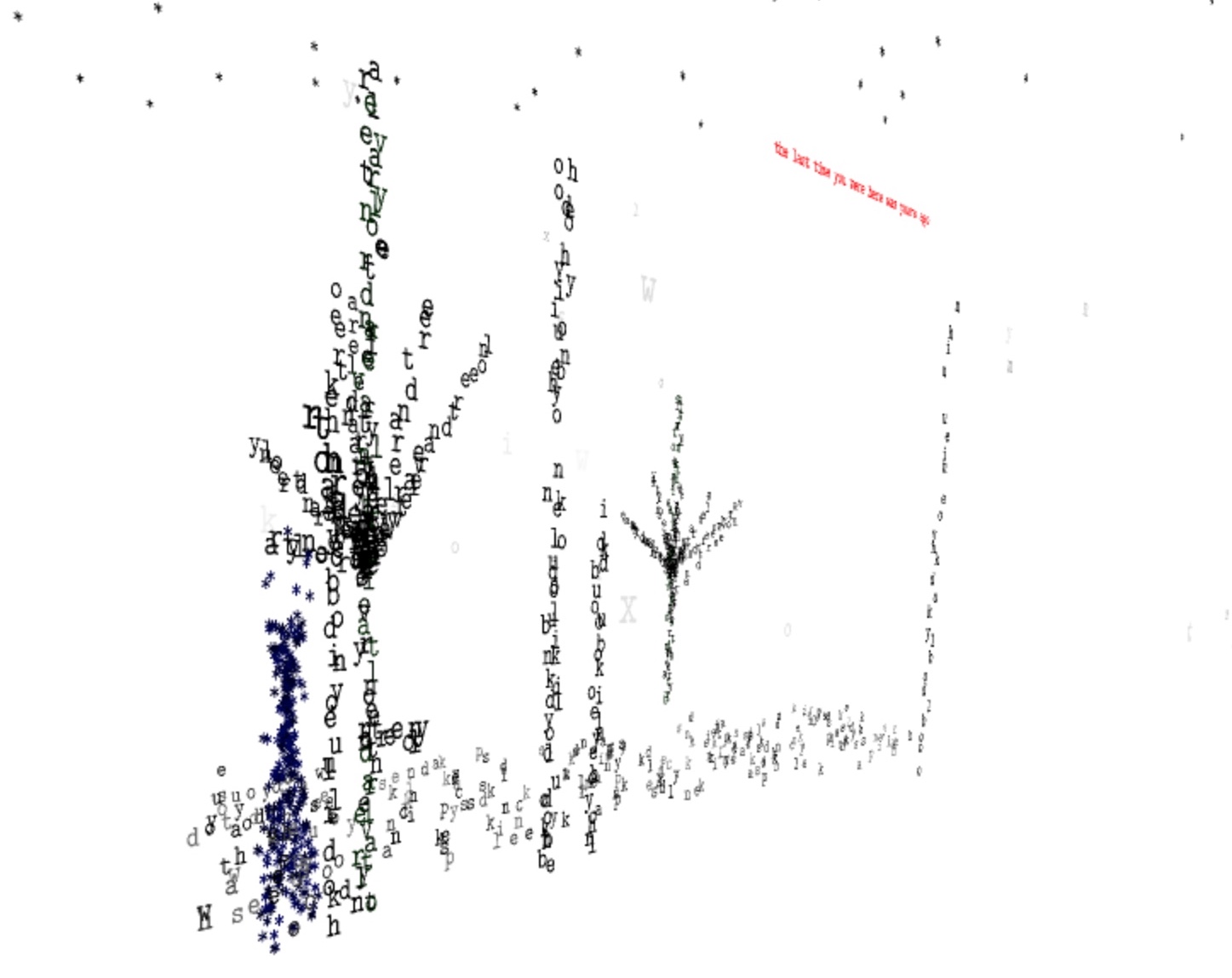
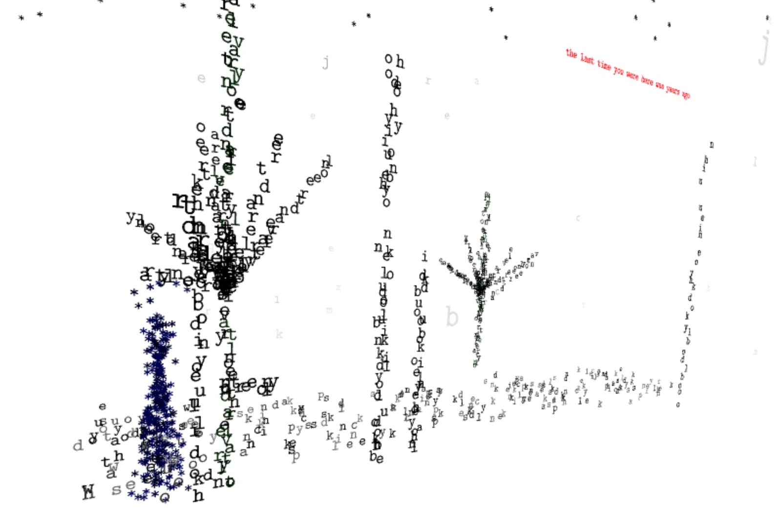
Julia Hou’s Asterisk (2019) may remind you of an E.E. Cummings’ poem or a Hasegawa Tōhaku print or the Xu Bing animationThe Character of Characters. Just as appreciation of Cummings grows with exposure to broken syntax and playful typographic layout in other poems — or of Tōhaku, as understanding of the depth effects that minimalism, size, definition and tone can have on the eye — or of Xu Bing, as his inspiration from Autumn Colors on the Qiao and Hua Mountains (c. 1296) and The Sutra on the Lotus of the Sublime Dharma (c. 1315) both by Zhao Mengfu is learned, appreciation of Asterisk grows as more is understood about how Hou made her digital artist book. Screen grabs of Asterisk, such as the sequential ones below, only hint at the work.
To read Asterisk, click here and press the letter “f” to move forward through the work. Hou’s poem reveals itself in black text that turns red as a “refrain”-like block of text over which the poem’s lines sit dissolves into characters that fly up like leaves or birds, fall down like rain, float down like snow, or coalesce into foreground or tree-like shapes.
Colored in blue, the asterisks take up a left foreground position, bubbling up and falling back like a fountain of water available to refresh the tree-like forms made of letters, but as the artist book is scrolled forward from left to right, the asterisk fountain disperses across the screen like spray, butterflies or bluebirds. Here is a transcript, as it were:
Asterisk
the last time you were here was years ago
before you were punctured by asterisks
and written into footnotes.
the night your mother read your first published story
and told you it was too sad
too linear.
she told you to let in the light
to rip away whatever fears you'd stapled to your chest
to see the forest for the trees
and you tried. you raised your voice
spoke with confidence, loud and red
but it all seemed to fade into whitespace
as if God Himself had decided to erase
and rewrite you

[Refrain - which varies in length with each forward movement or refresh]

what do you see what do you see  what do you see  what do you
see what do you see  an ink speckled sky  an ink speckled sky
an ink speckled sky  an ink speckled sky  an ink speckled sky
an  ink speckled  sky  an ink speckled  sky   an ink speckled
sky an ink speckled sky  and tree only traveler and tree only
traveler and tree only traveler and tree only traveler and tr
ee only traveler and tree  only traveler and tree only travel
er  look behind you look behind you look behind you look behi
nd you look behind you look behind you
Where appreciation on each revisiting of Cummings, Tōhaku or Xu Bing increases with the perceiver’s personal growth, Asterisk itself varies with each accessing, with access from the artist’s site or from the Carnegie Mellon University libraries’ Artists’ Book Collection, and with keyboard/screenpad interaction. As if in an online game, the reader/viewer must keep up. Hou has created her artist book with Satoru Ozaki’s created-index, a game app exploring a surreal 3D typographical world. Depending on how the reader/viewer touches the screenpad or moves the cursor and presses “f” to go forward or “b” to go back, the viewpoint tilts and pivots. It is like manipulating a sculptural bookwork such as Francisca Prieto’s The Antibook (2002).
Artist books born-digital vary wildly from one another — perhaps more so than analog artist’s books or even hybrids, or perhaps it’s just that we are not used to the artist’s “new material and tools”. Carnegie Mellon University’s acquisition and preservation of Hou’s digital artist book leads further into thinking about Asterisk‘s material status. The files can be downloaded here, but what is it that has been collected? Is its shape-shifting merely analogous to a viewer’s shifting perspective on an artist book in a physical environment? It would be interesting to have Matthew Kirschenbaum’s perspective on the preservation effort that Carnegie Mellon has put into Hou’s artist book and how that relates to his Mechanisms‘ analysis of “the textual and technical primitives of electronic writing that govern writing, inscription, and textual transmission in all media: erasure, variability, repeatability, and survivability” — in essence, the materiality of works like Hou’s.
Amaranth Borsuk’s The Book also provides a useful context here in its narrative of the book’s digital history from the Memex in Vannevar Bush‘s 1945 classic “As we may think” to T.L. Uglow‘s 100-author blockchain collaboration in 2017, A Universe Explodes from Visual Editions’ series Editions at Play. Borsuk reminds us:
Our current moment appears to be much like the first centuries of movable type, a cusp. Just as manuscript books persisted into the Gutenberg era, books currently exist in multiple forms simultaneously: as paperbacks, audiobooks, EPUB downloads, and, in rare cases, interactive digital experiences. (p. 244)
Borsuk weaves into this moment of the book’s future a reminder that print affordances such as tactility (or the haptic) and the paratextual (those peripheral elements like page numbers, running heads, ISBNs, etc., that Gary Frost argues “make the book a book”) have been finding fresh ways into the way we read digitally. The touchscreen enables us to read between the lines literally in the novella Pry (2014) by Samantha Gorman and Danny Cannizaro (2014). Breathe (2018) by Kate Pullinger, another work in the Editions at Play series, uses GPS to detect and insert the reader’s location, the time and weather, and when the reader tilts the device or rubs the screen, hidden messages from the story’s (the reader’s?) ghosts appear.
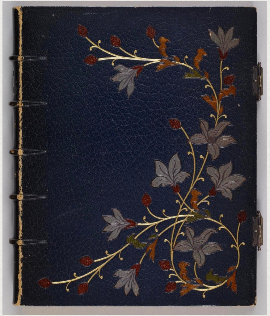
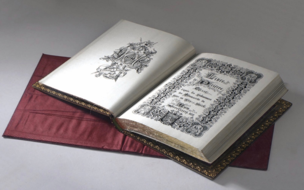
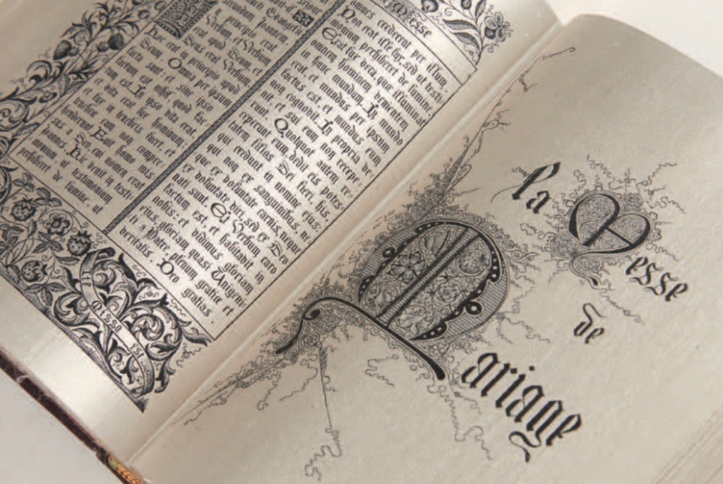
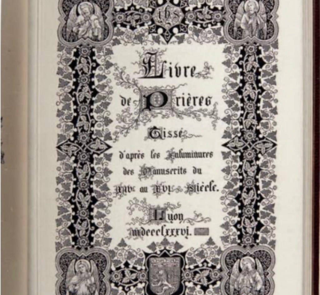
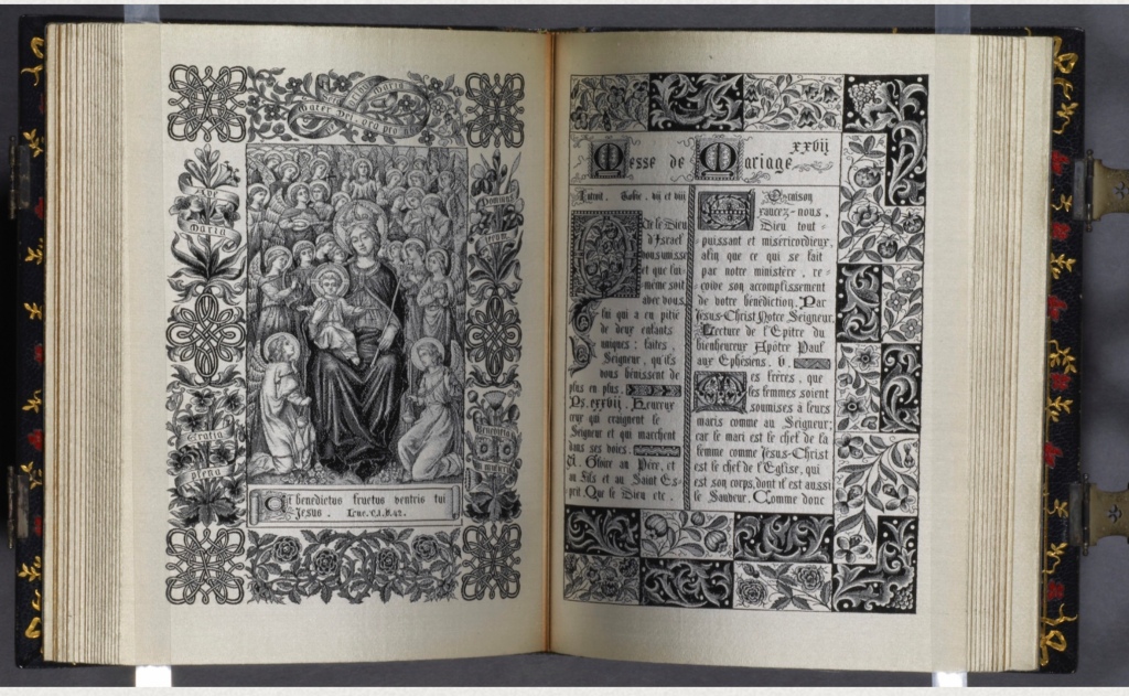
Created in Lyon, France (1886-1887), Livre de Prières Tissé presents a bridge from the illuminated books on which it is patterned to Hou’s Asterisk, driven by a set of instructions designed to be carried out by a machine. Every image, letter, ornament and page of Livre de Prières Tissé consists of silver and black silk thread woven on silk looms programmed with the punched-card system developed by Joseph-Marie Jacquard (1752-1834). Those perforated cards inspired the famous “Analytical Engine” conceived by Charles Babbage (1791-1871), which in turn inspired Ada Lovelace (1815-1852) to compose its first computer program: a set of instructions designed to be carried out by a machine.
Further Reading
Borsuk, Amaranth. The Book(Cambridge, MA: MIT Press, 2018).


