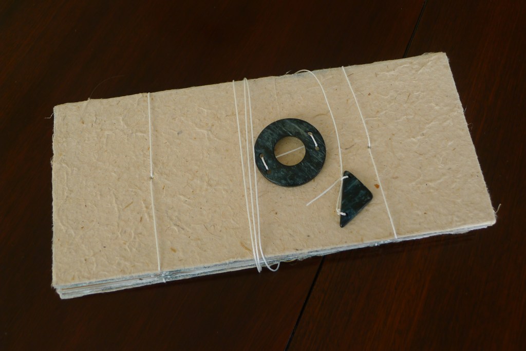
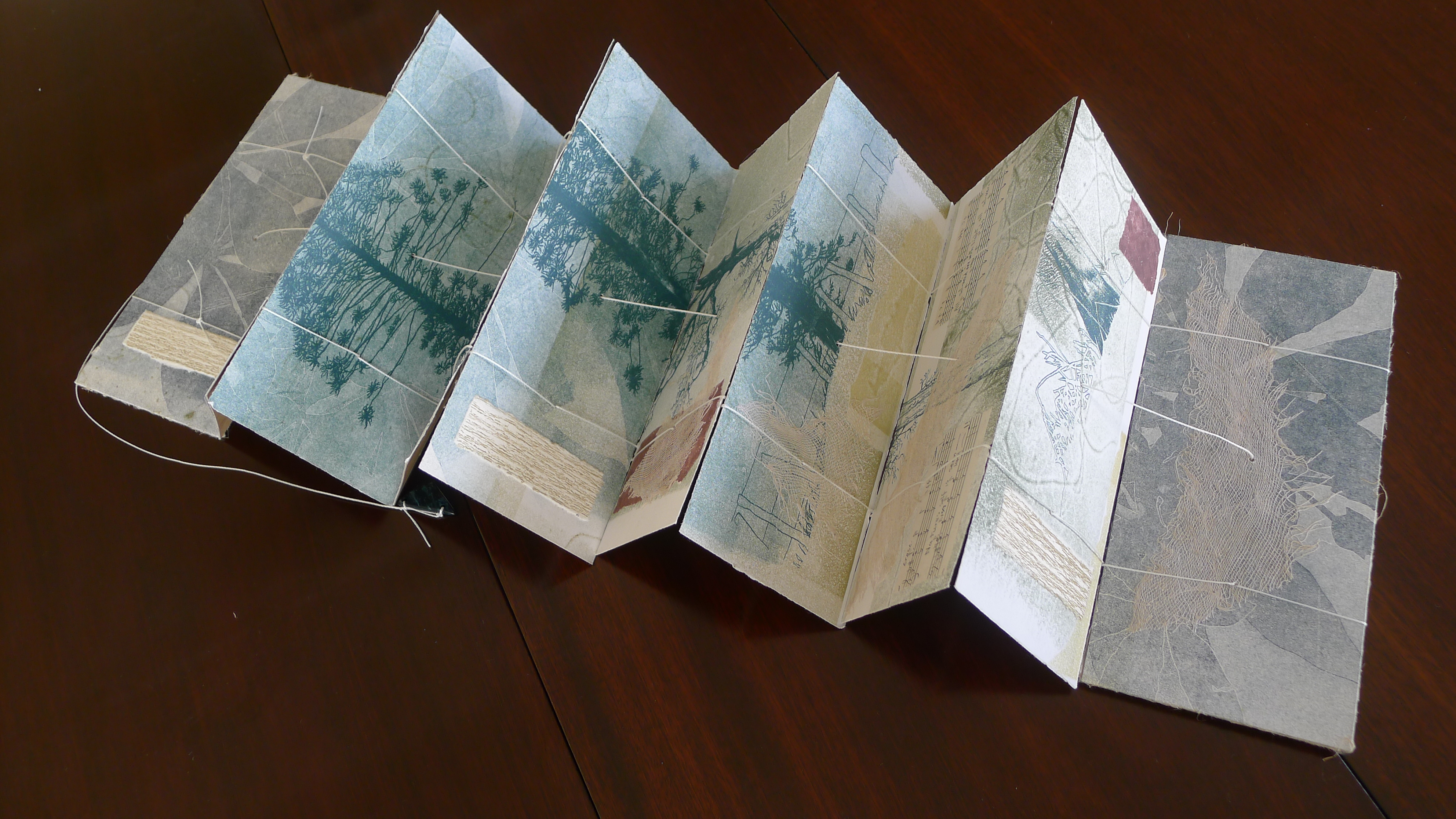
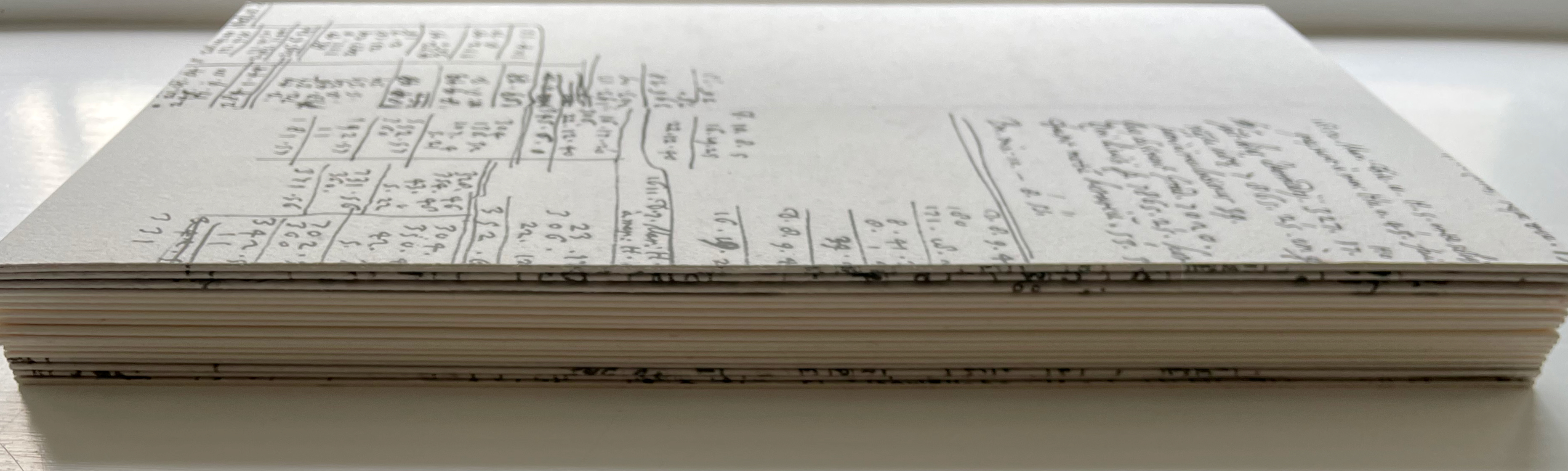
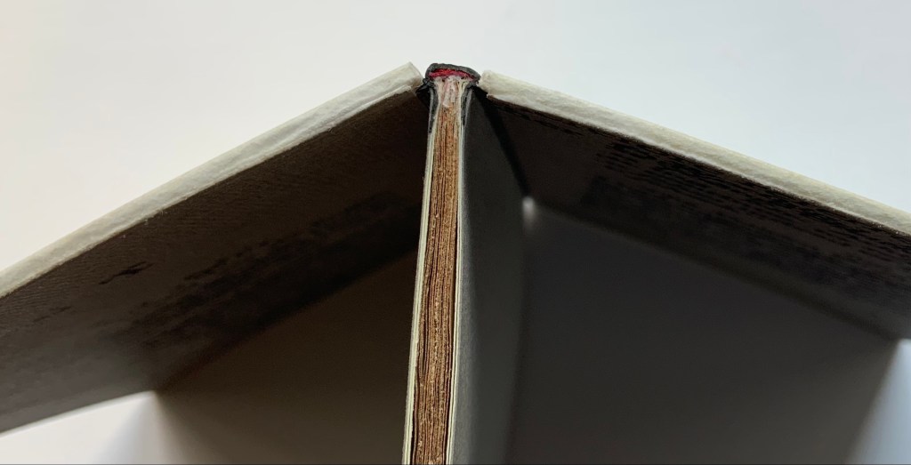
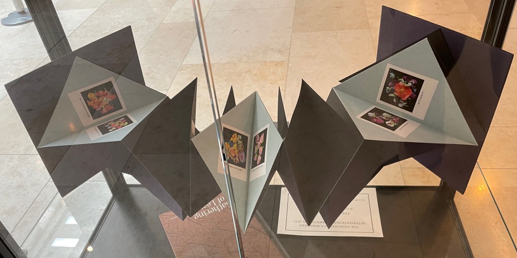
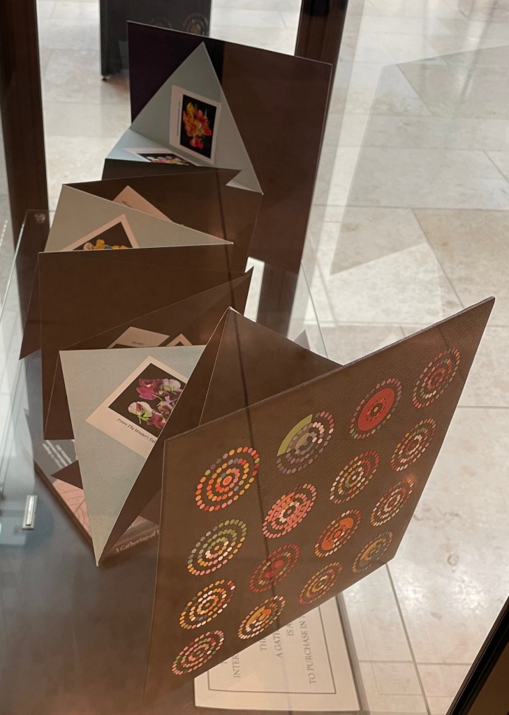
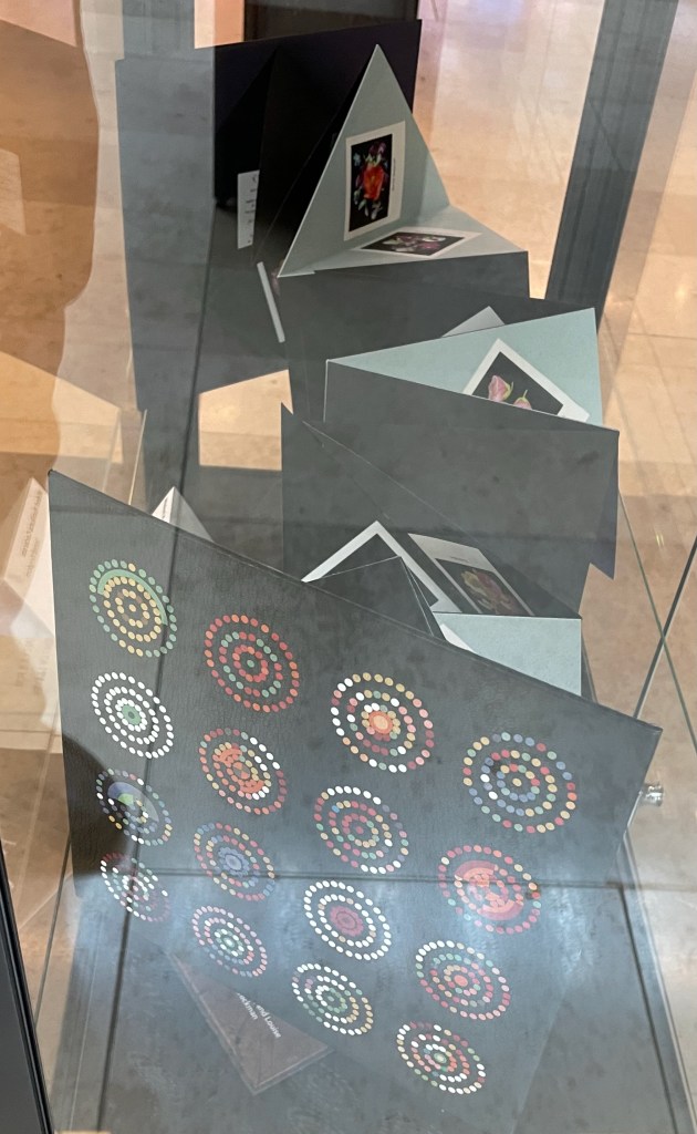
Legacy (2018) Diane Harries Venetian blind book. Monoprint, screenprint and collage. Closed: H107 x W233 x D25 mm; Open: H1000 mm. Unique. Photos: Courtesy of the artist.
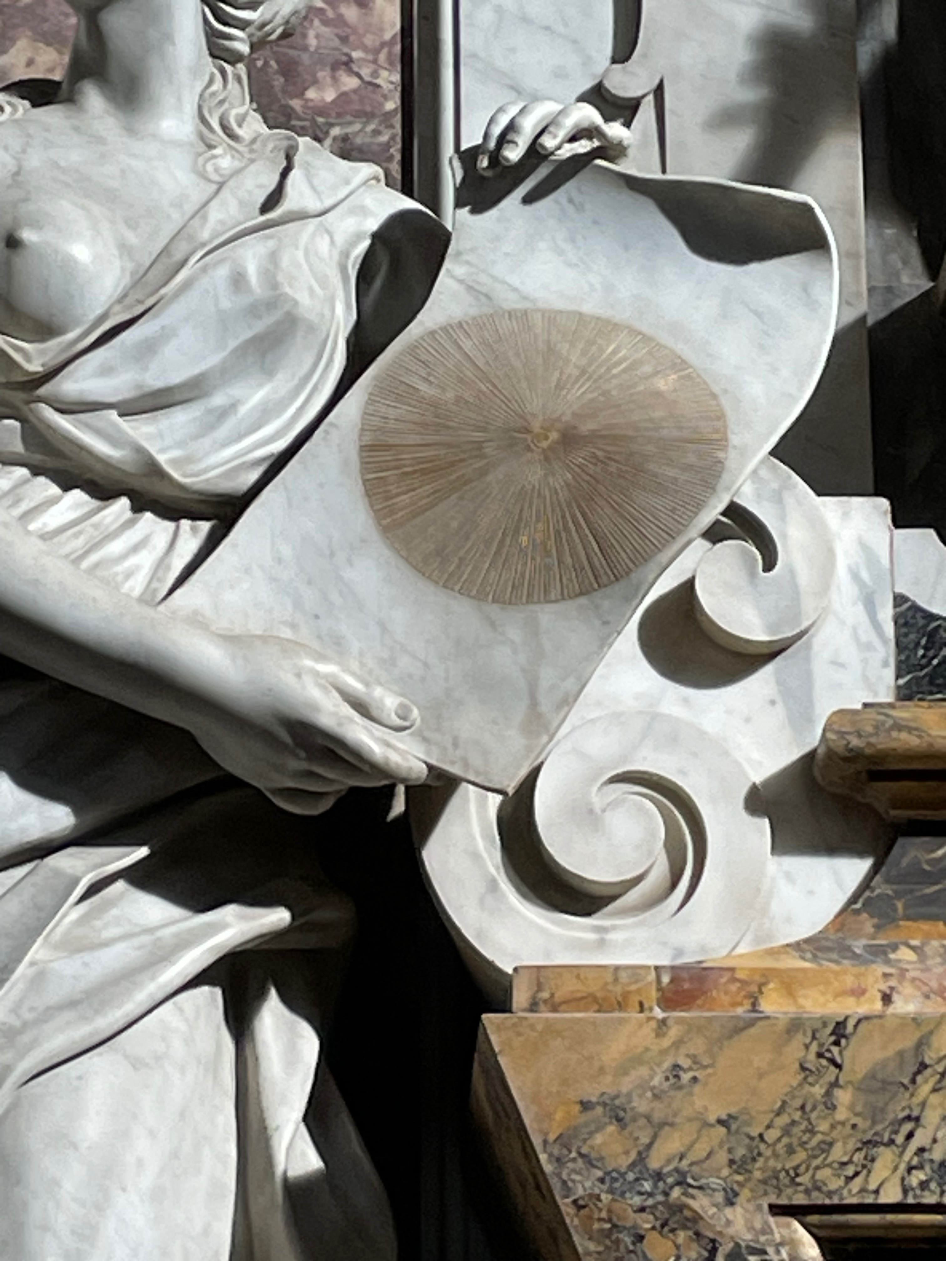
Look at the circular and triangular pieces making up the clasp for this work Legacy (2018) by Diane Harries. Don’t they appear to be made of marble or some other polished stone? They actually come from coconut husk, shaped, polished and dyed. The only indigenous plant from the palm family in New Zealand is the nīkau, and the coconut trees present on one of its islands were likely planted. “Some say that when Māori came to New Zealand, they looked in vain for a familiar tree and seeing the nīkau, compared it to the coconut tree of their Pacific homeland. One translation of ‘nīkau’ is ‘without nuts’, in remembrance of the coconut.”
The choice of material — this crafted seed — strikes a subtle note in a work inspired by Harries’ experience with the Gordon Park Scenic Reserve, a protected lowland forest once common to the Manawatu/Whanganui region of New Zealand. An expanse of land preserved by what threatened it in the first place.
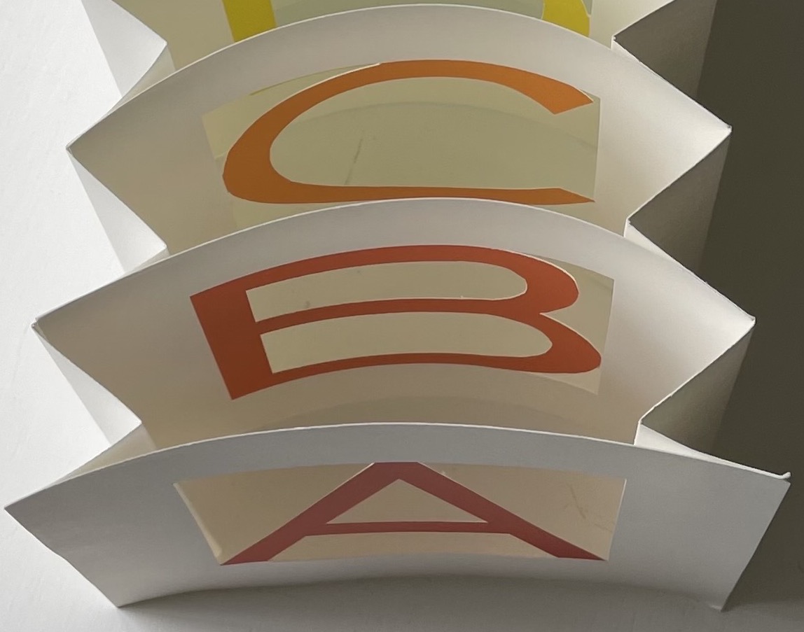
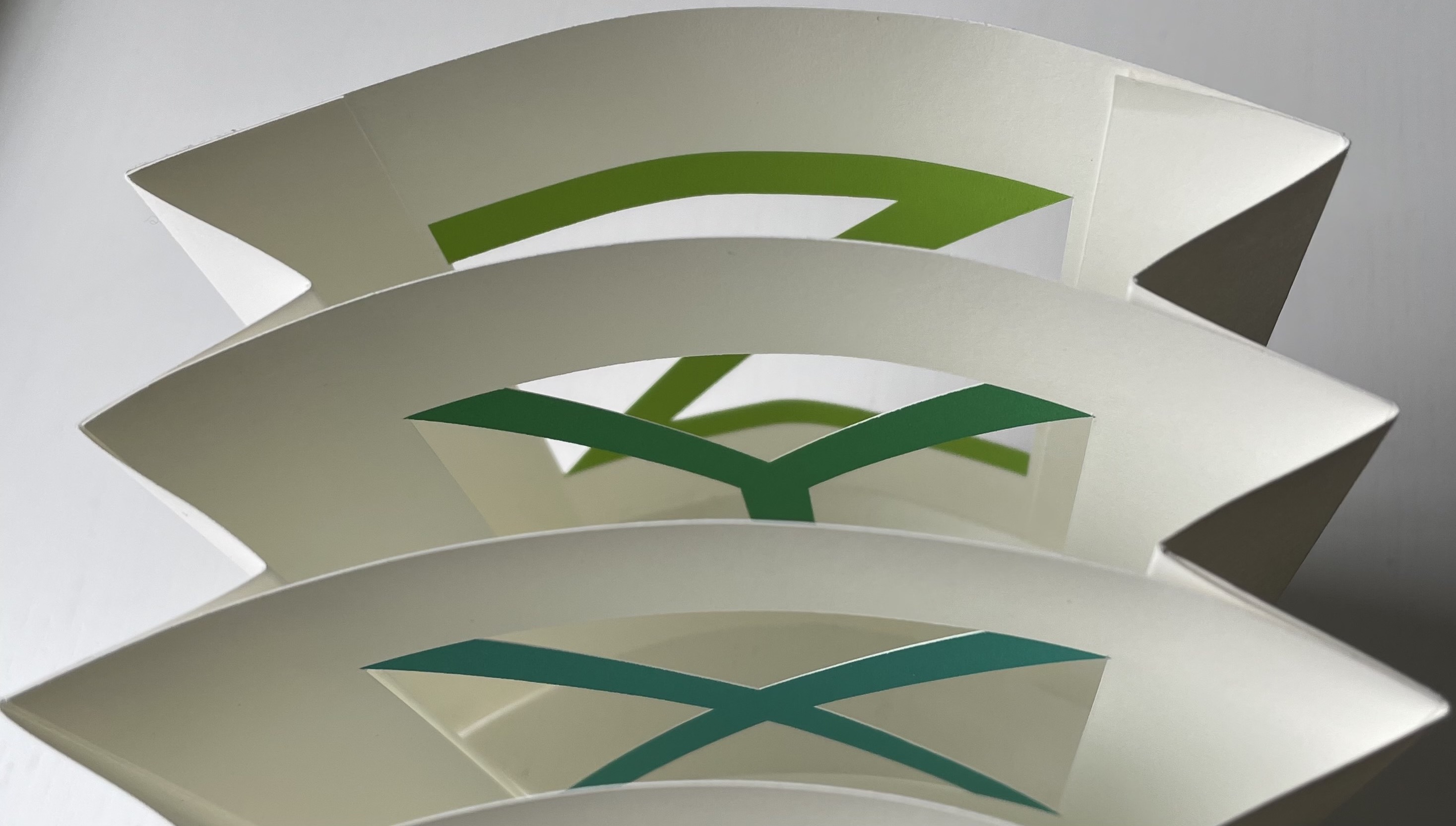
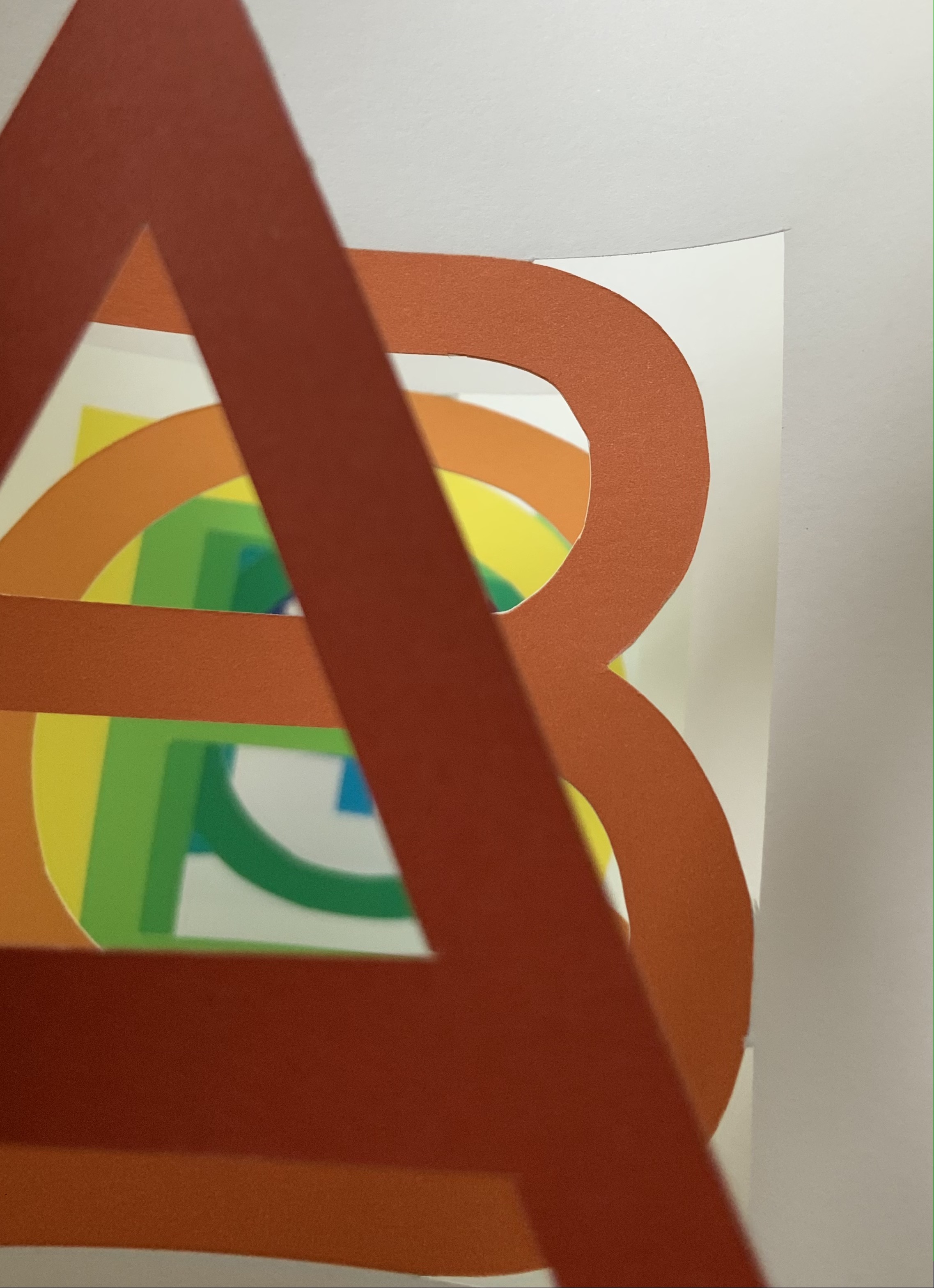
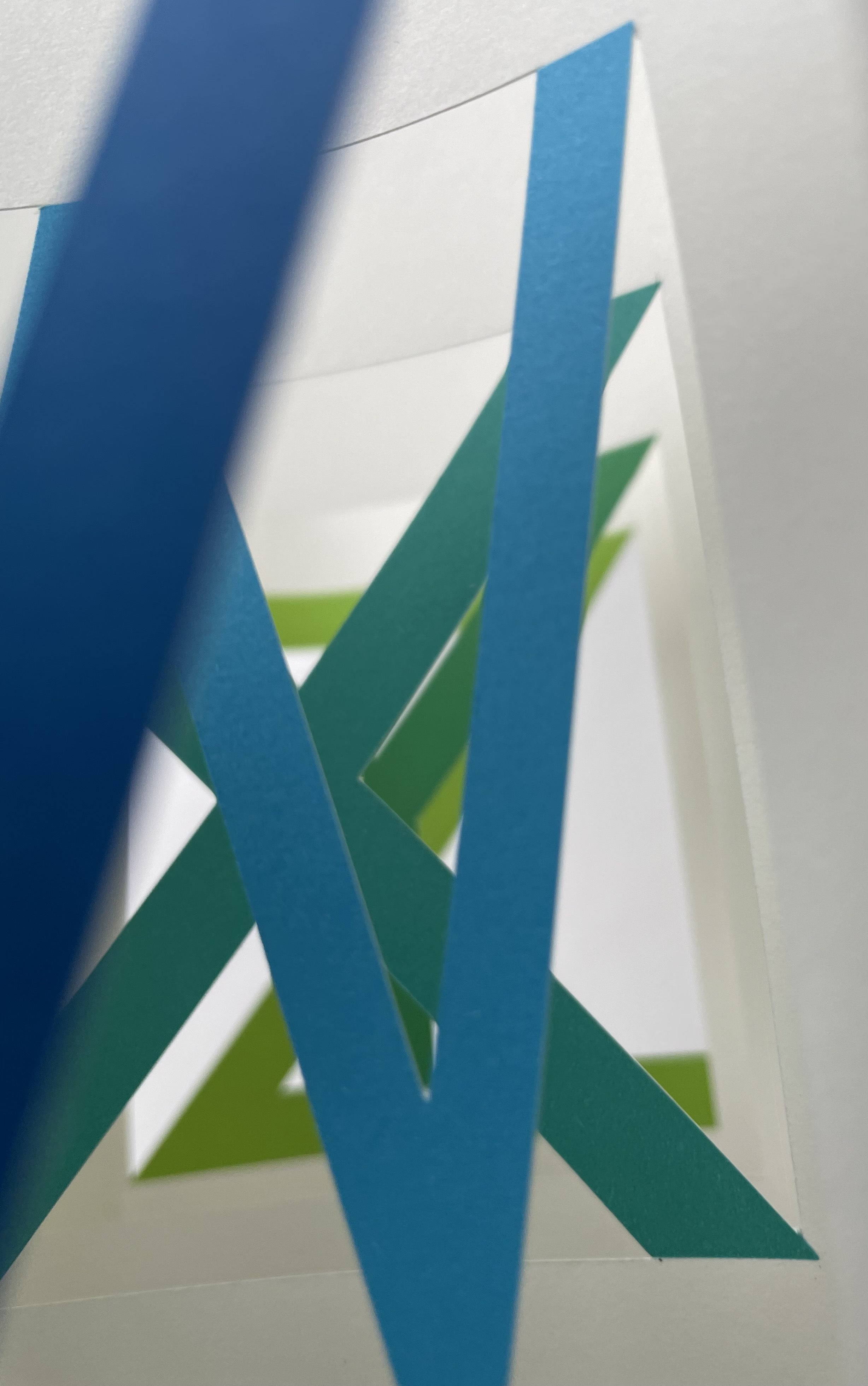
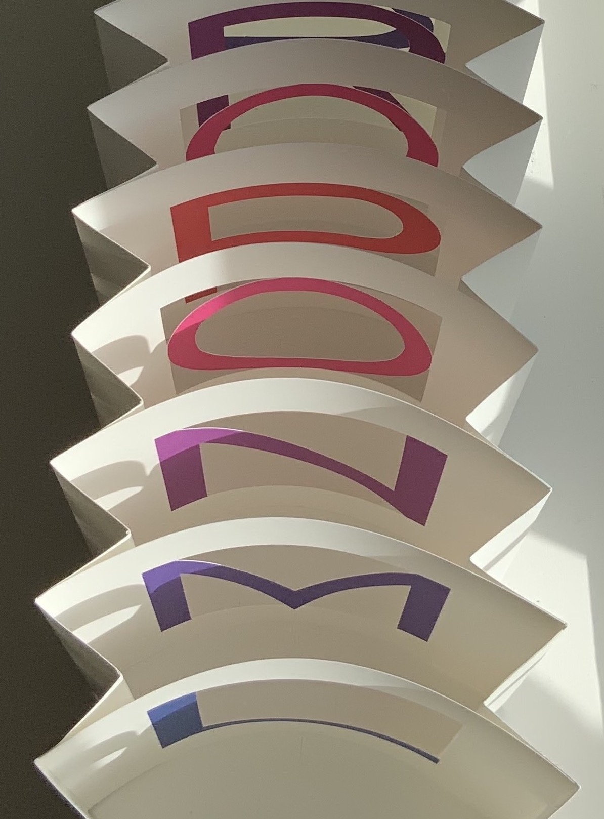
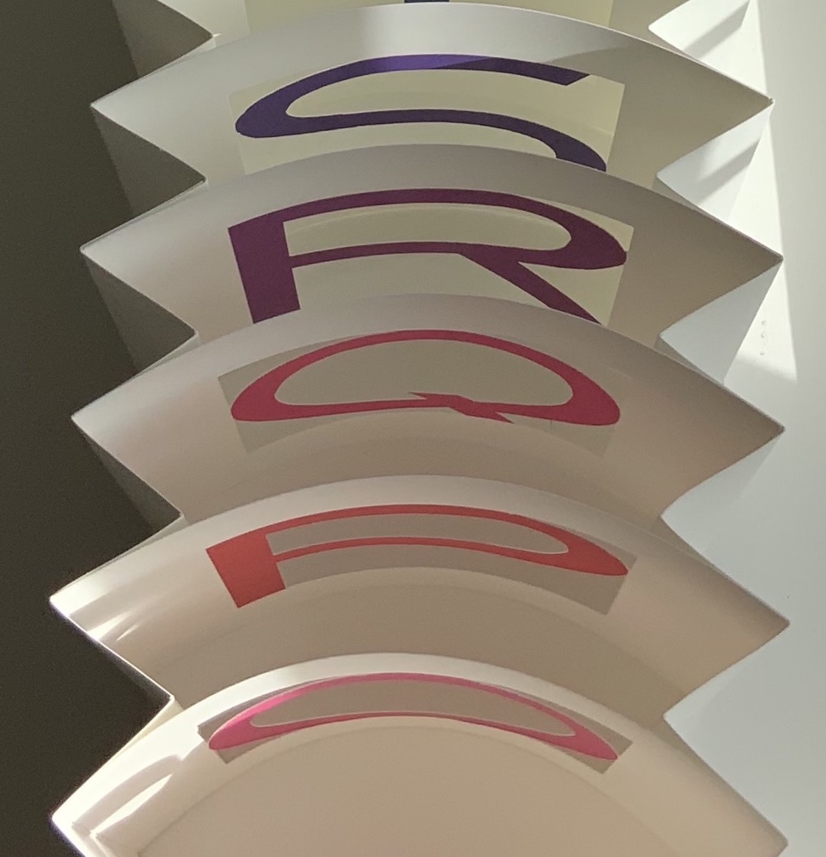
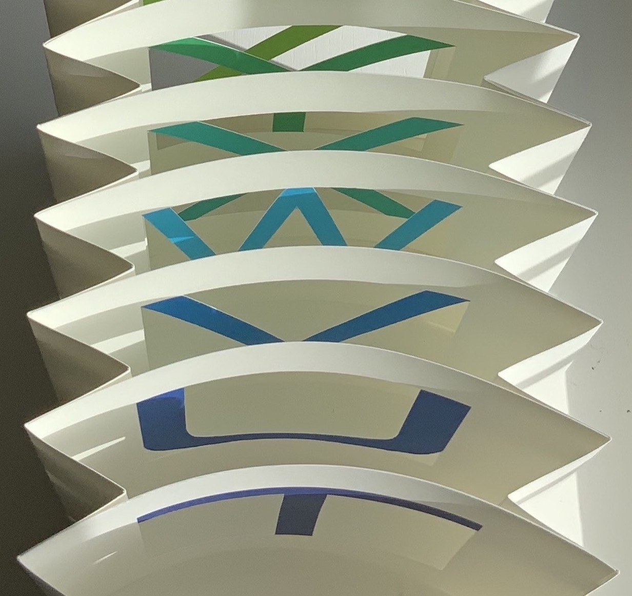
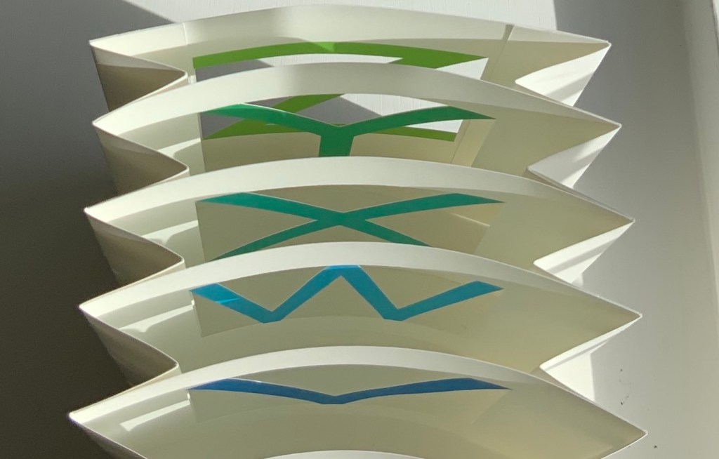
As the thread unwinds from around the circular piece of seed pod and the triangular piece is laid aside, the subtle notes grow. The fashioned clasp is the same sort used to hold up or let fall a venetian blind. But here the clasp works in reverse from that for a venetian blind: the winding holds the book closed, the unwinding opens it. The thread winds around and through what appears at first to be an accordion book, but with the first turned page or panel, it is clear that this is venetian blind structure. A structure that modulates the movement of light and air. Our artifice can be deployed “to open or close” nature.
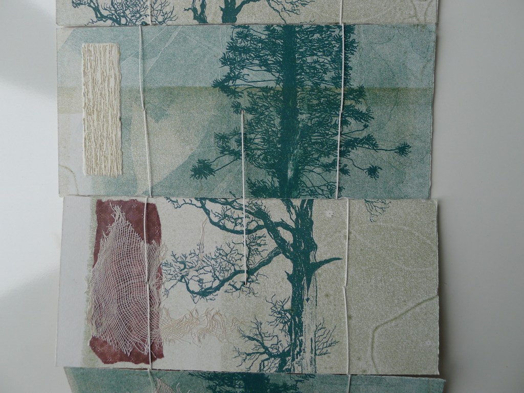
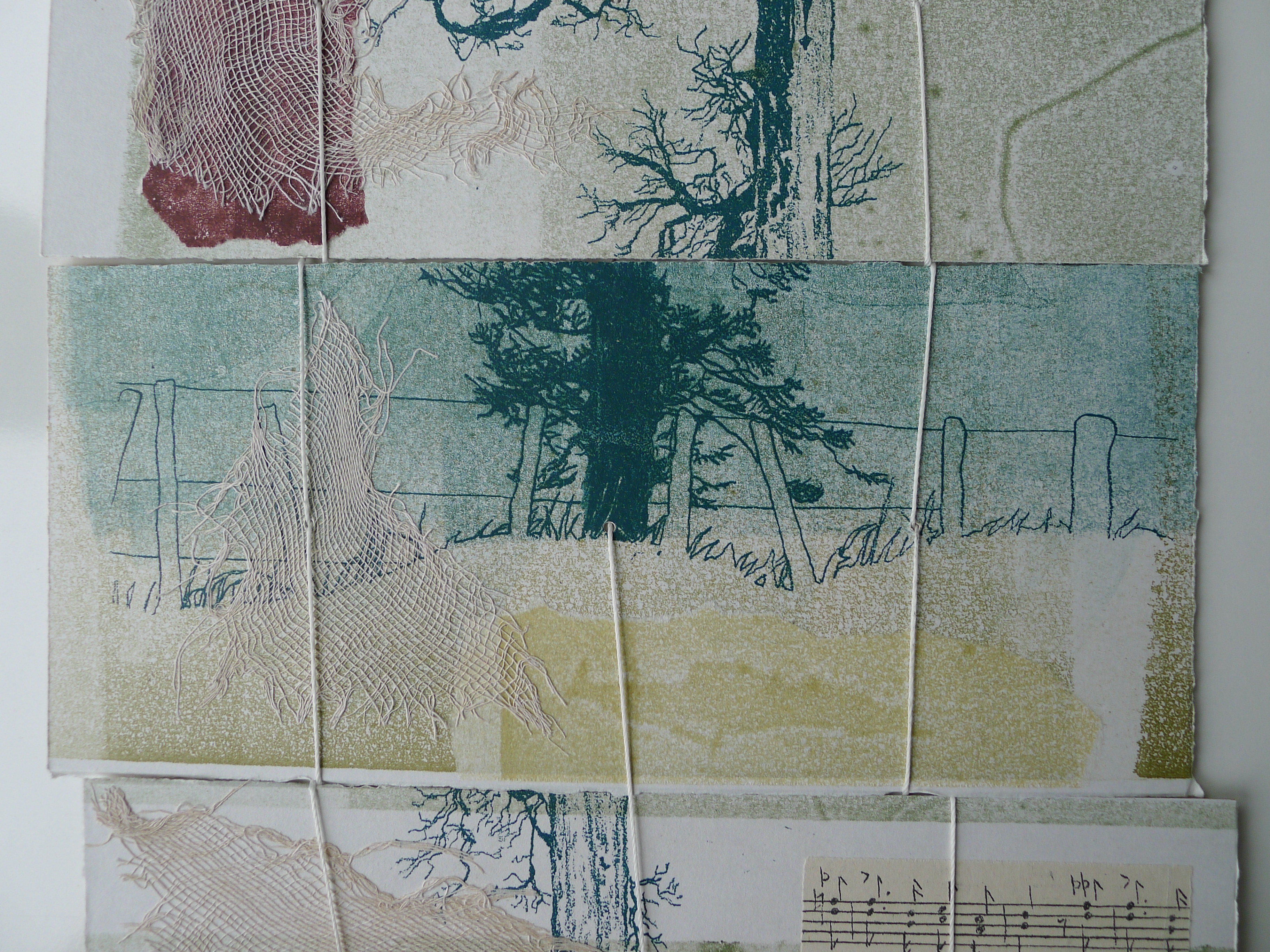
A collage of hand-printed images (monoprint and screenprint) sound the more obvious note that this work addresses our impact on nature. Images of leaves and a wire fence strung along posts. Alternating panels of living and dead trees — a healthy and exotic bunya pine and the native, dead kahikatea (white pine).
As the panels extend fully, other material and images come into play. Staves of musical notation appear — here on a panel with the living, there on a panel with the dead. Just as fickle as a pretty human artifact that in one context winds to close and in another winds to open.
Images of wandering thread contrast with the straight lines of real thread connecting the panels. Scraps of tarlatan with its loose weave constrast with densely woven rectangles of thread.
Did the venetian blind structure and seed-based material choose the images, or did the images choose the structure and material?The choice of material and structure can play an obvious or subtle role — or both, or none at all — in a work. When material, form, technique and metaphor play together like this, the work becomes art.
Artist’s Statement
The botanical history of Gordon Park Scenic Reserve provides a window on the social changes that have marked the region. European settlers cleared most of the native bush for farmland, but this tiny patch of swamp forest three kilometres east of Whanganui was saved by an enlightened landowner. Today as conservationists, we mourn the loss of native species everywhere.
The plants there today tell these stories of loss and invasion. Drainage of the area for pastureland has put native kahikatea (white pine) trees at risk during drought and some have died. Their bleached skeletons stand sentinel to this historically neglected status. Paradoxically, the exotic bunya pine (Australian native) nearby, is valued as a marker of the original homestead (now removed), and is officially recorded as Protected Tree #96. The stories are enmeshed in our history and changing values, indicated by the woven fabric in the book.
However, regardless of their social meaning, there is splendour in both of these trees, and the music is a whimsical appreciation of beauty in the face of mankind’s fickle imprints upon the earth.
Further Reading
Chinnery, Colin. “The Chinese pothi (fanjia zhuang)“. The International Dunhuang Project. Site last revised: September 2016. Accessed 30 October 2021. The venetian blind book structure derives from one of the earliest known methods of binding: the Indo-Chinese pothi or palm-leaf sutra.
Department of Conservation, New Zealand Government. Manawatu/Whanganui. Site last revised: N.D. Accessed 30 October 2021
Ernest Fraenkel should have left it at visually mapping Un Coup de Dés and offered it up as simply an artistic response to the poem. Even if it is a mapping of the condensed single-paged Cosmopolis (1897) version of the poem, think of the various renderings in handset chapbook form printed on letterpress or as lithographs, or etchings on glass, or even sculptures. It could have been the “Prometheus bound” to the “Prometheus unbound” of those who paid homage by appropriating the more expansive double-page spread book version (1914) that Mallarmé intended. Instead, it lies tucked away with 44 pages del’explication. Professor David W. Seaman (Georgia Southern University), who has engaged with Fraenkel’s analysis, puts it well:
It must be said in [Fraenkel’s] defense that the idea is tempting: to make wordless patterns of the pages of the poem in order to see the ideogrammatic shapes more clearly. In addition, Fraenkel has contributed some worthwhile insights into the use of space and text in the poem, … However, there are three major objections to his project. First, he used, for most of his research, the text of the Cosmopolis edition of the poem, an edition which nearly everyone agrees is far from the author’s intentions, especially insofar as the ideograms are concerned; the preface to that edition gives ample warning of this. … / The second objection is that Fraenkel strays too far from the text, preferring to keep in mind a general idea of the meaning of the poem, and then go off according to the feelings the designs give him. … In fact, sometimes Fraenkel recommends turning the design on its side or upside-down to see what image may present itself! / The third objection is that these designs are then used more or less like Rohrschach ink blots. (Seaman, pp. 142-43)
In his nine sets of single-sided uncut sheets, Fraenkel offers seven different diagrammatic approaches to the poem as it appeared in Cosmopolis, whose editors could not allow the poem’s lines to cross over the gutter to the next page as Mallarmé imagined the layout. The opening pages of Fraenkel’s seven approaches are laid out below in sunlight and paired with the textual opening page.
Seven different diagrammatic renderings. The one at the lower right shows Fraenkel’s sideways view.
The first rendering (above, upper left) is closest to what Mario Diacono and Marcel Broodthaers would create later in the decade.
Left: a METRICA n’aboolira (1968) by Mario Diacono (1968). Right: Image: Un coup de dés jamais n’abolira le hasard (1969) by Marcel Broodthaers (1969).
Fraenkel’s nine sets of sheets break down into eight of 8 pages and one of 4 pages. Below is the first set opened out.
The first set of eight pages
Compared with Diacono’s, Broodthaers’ and all the other works of homage to date, Fraenkel’s renderings retain a distinction and suggest other new directions not yet taken physically or digitally. Given the sculptural interpretations by Geraldo de Barros, Jorge Méndez Blake and Kathy Bruce, doesn’t Fraenkel’s first rendering call for a three-dimensional cantilevered homage constructed of slabs of blackened flotsam connected with brushed steel rods?
Given the video created by Giulio Maffei transforming the 1914 book version into Broodthaers’ and the digital legerdemain of Karen ann Donnachie and Andy Simionato and Tayyib Yavuz, why not an animated digital transformation of the Cosmopolis version into the 1914 book version?
And Professor Jed Rasula (University of Georgia), who has also explored Fraenkel’s work, suggests yet another medium:
“Fraenkel’s sixty-eight seismographic and astral diagrams (or “stylizations”) practice a truly graphic mode of literary analysis. It was Fraenkel’s conviction that “a plastic text rests hidden in the extra-conscious layers of the poet, paralleling the verbal text of the poem” (9). … In their accentuation of the visual character of Un Coup de dés, Fraenkel’s designs are like watching a movie with the sound turned off, forced to rely on gesture rather than dialogue in order to follow the action.”
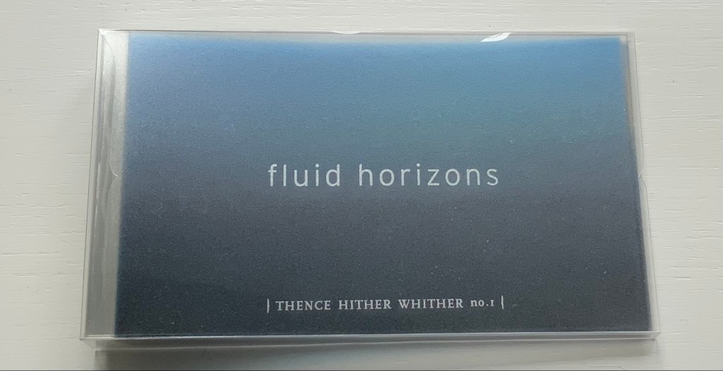
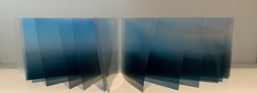
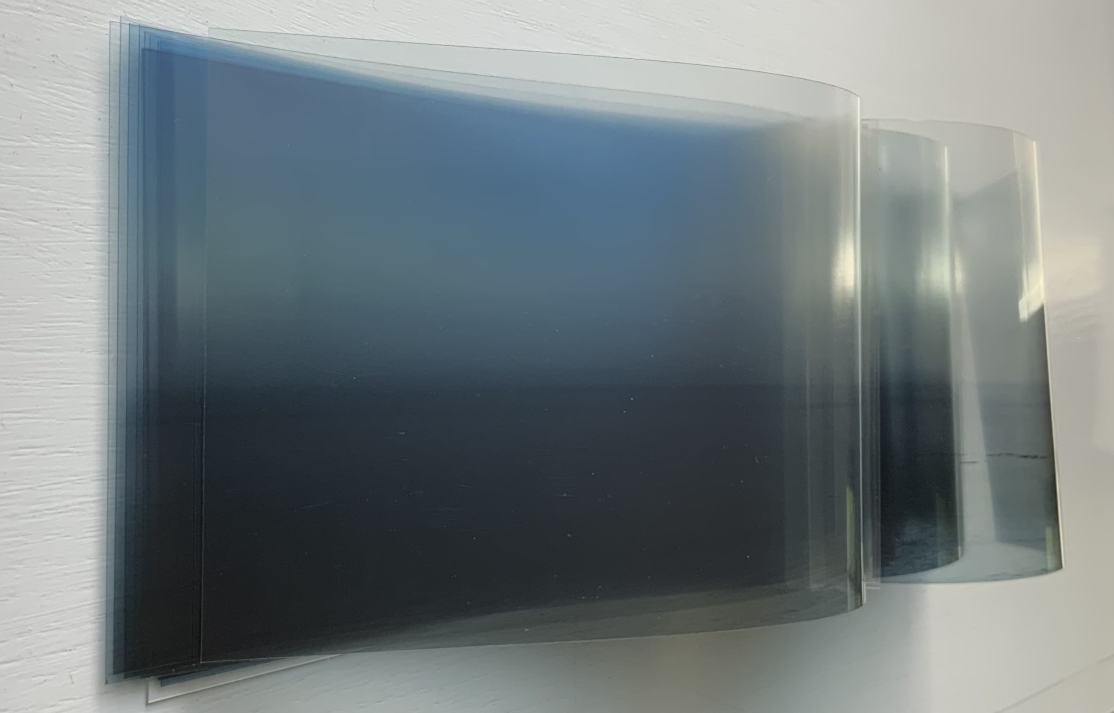
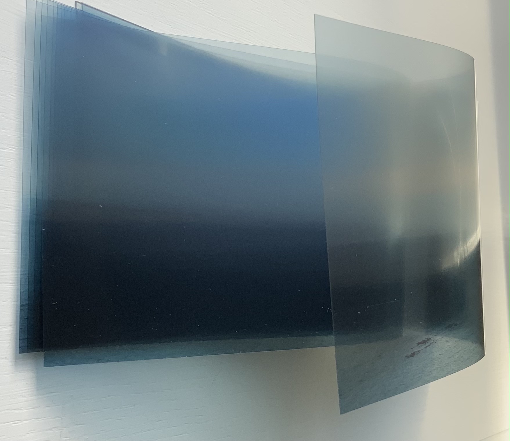
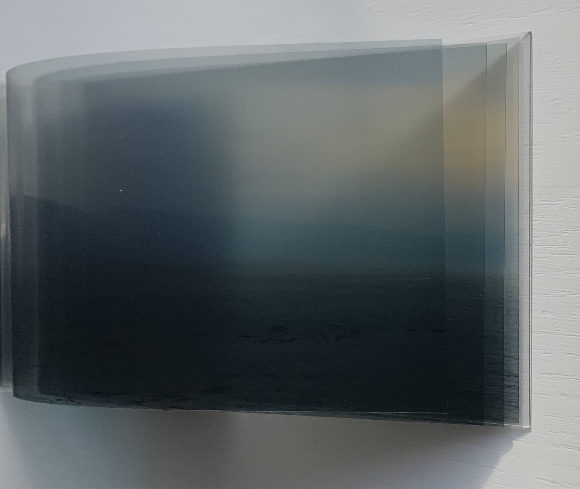
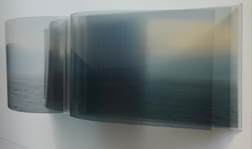
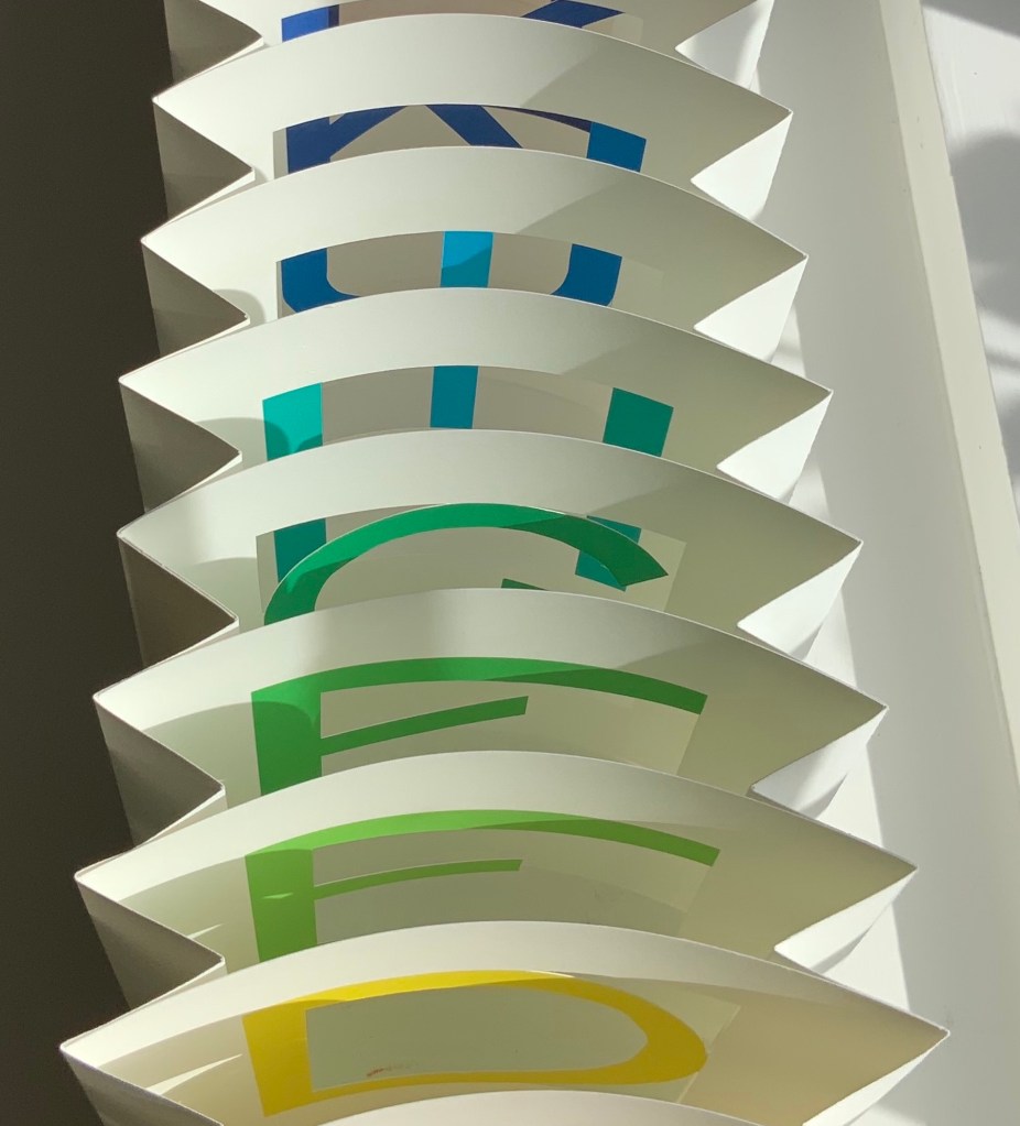
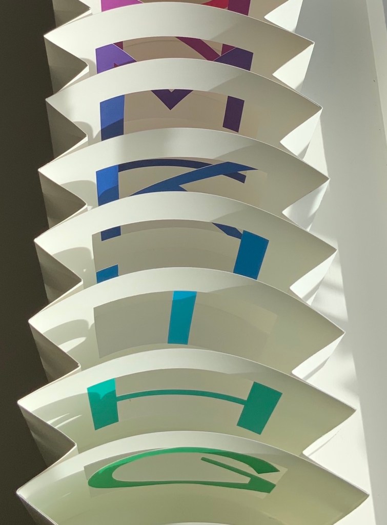
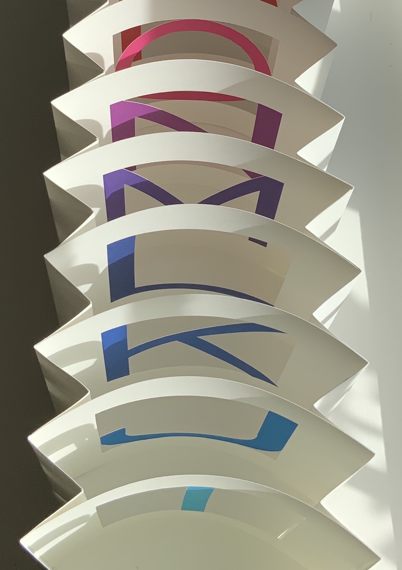
Fluid Horizons (2021) Nif Hodgson Slipcase. Modified dragon-scale concertina. Slipcase: H91 x W158 mm. Book: H90 x W156 mm, 20 panels. Variable edition of 10, of which this is #1. Acquired from 23 Sandy Gallery, 2 September 2021. Photos of the work: Books On Books Collection. Displayed with artist’s permission.
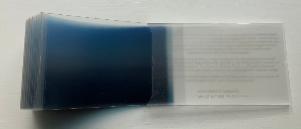
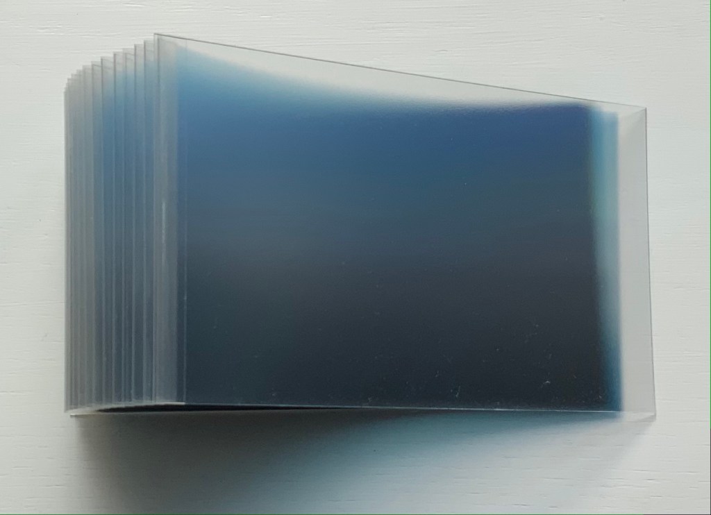
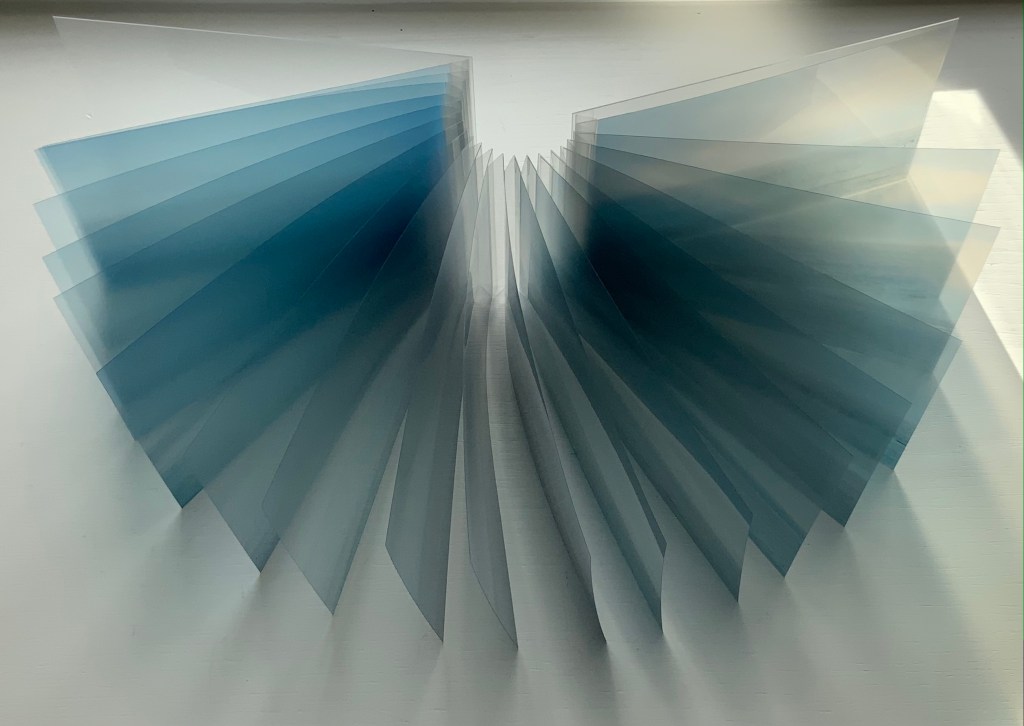
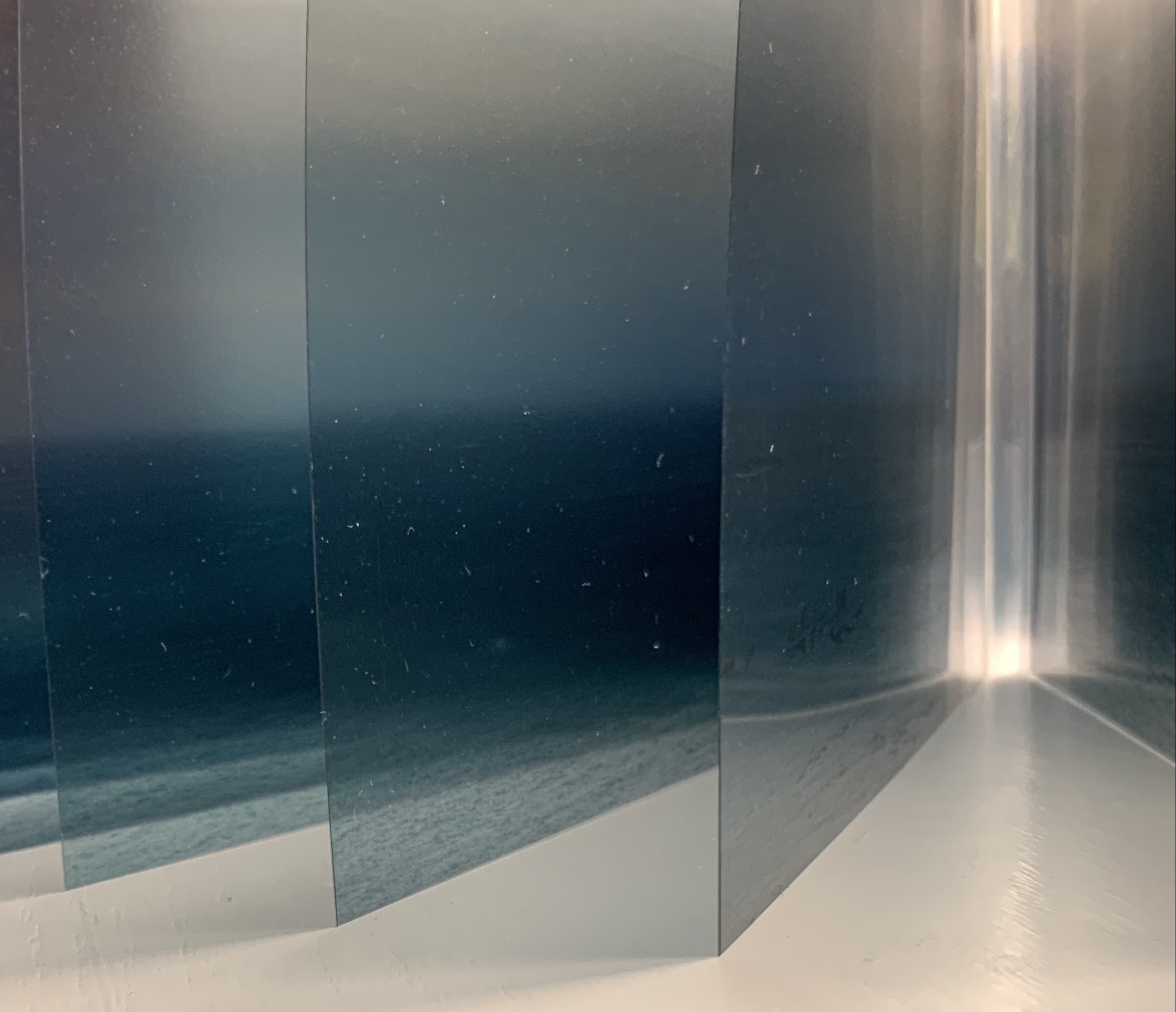
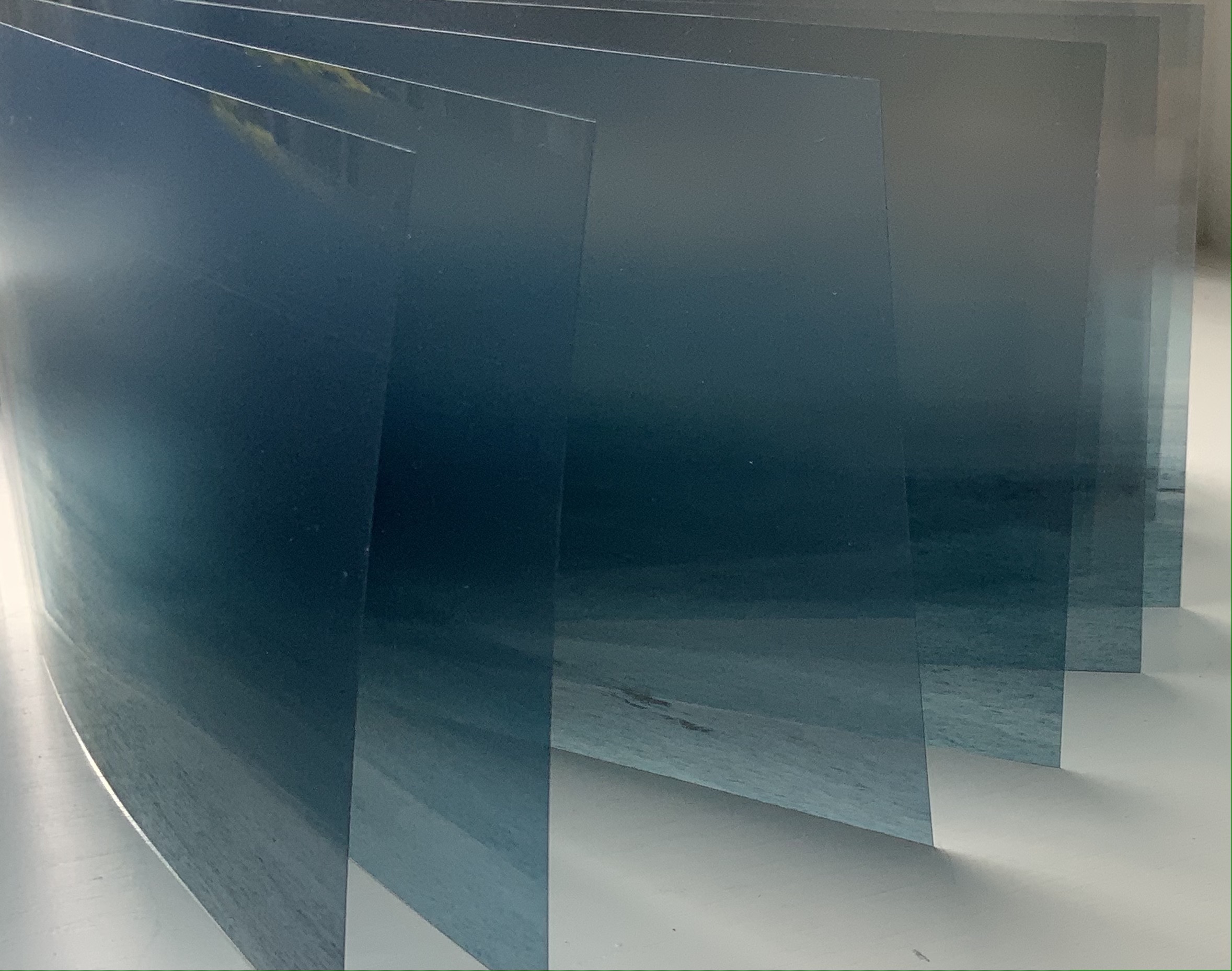
The opportunity to add another dragon-scale binding (see Rutherford Witthus and Zhang Xiaodong below) to the collection would have been incentive enough. The binding of Fluid Horizons is not, however, the usual dragon-scale binding as applied to multi-leaved scrolls. It comprises an effective accordion spine with leaves attached to the inside folds. What made Fluid Horizons irresistible is the effect the structure achieves with the unusual technique and material: screenprint and archival pigment ink on Arista II transparency film, Duralar polyester film and Lexan polycarbonate film.
Each book in an edition varies because its twenty images are selected from hundreds of photographs taken by Hodgson with the same horizon-dimension. Although not in sequence, each image influences the selection of the next, which creates a sense of progression. With the gradation of light and transparency across the selection, the sense of progression increases. But it is not a “film-like” progression of images, or snapshots taken one after another in sequence. Like memory and our sense of time, on which this work meditates, the progression is a fragile reconstruction. The transparent materials, expandable accordion spine and fluttering panels reflect the ephemeral, flexible and fragmentary way in which memory is shaped while also being affected by perception in the moment.
There is a further material ephemerality to the work. The panel surface is delicate, subject to dissolving from contact with moisture, smudging from fingers and scratching from grit. As Hodgson puts it, “the sensitive materials lightly wear with viewing and play, just as memory faintly fogs with time and recollection”. Fluid Horizons is a stunning union of form and metaphor.
“Zhang Xiaodong“. 7 August 2025. Books On Books Collection.
Chinnery, Colin. “Whirlwind binding (xuanfeng zhuang)“. The International Dunhuang Project. Site last revised: September 2016. Accessed 21 October 2021.
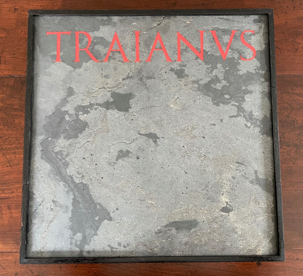
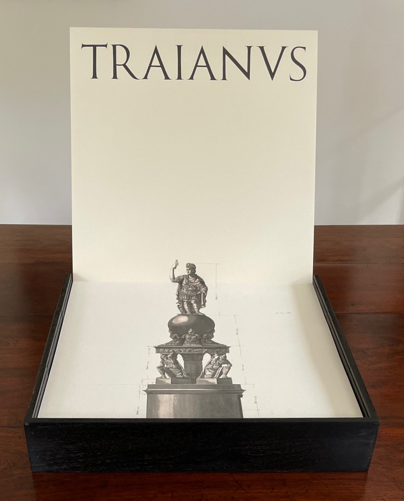
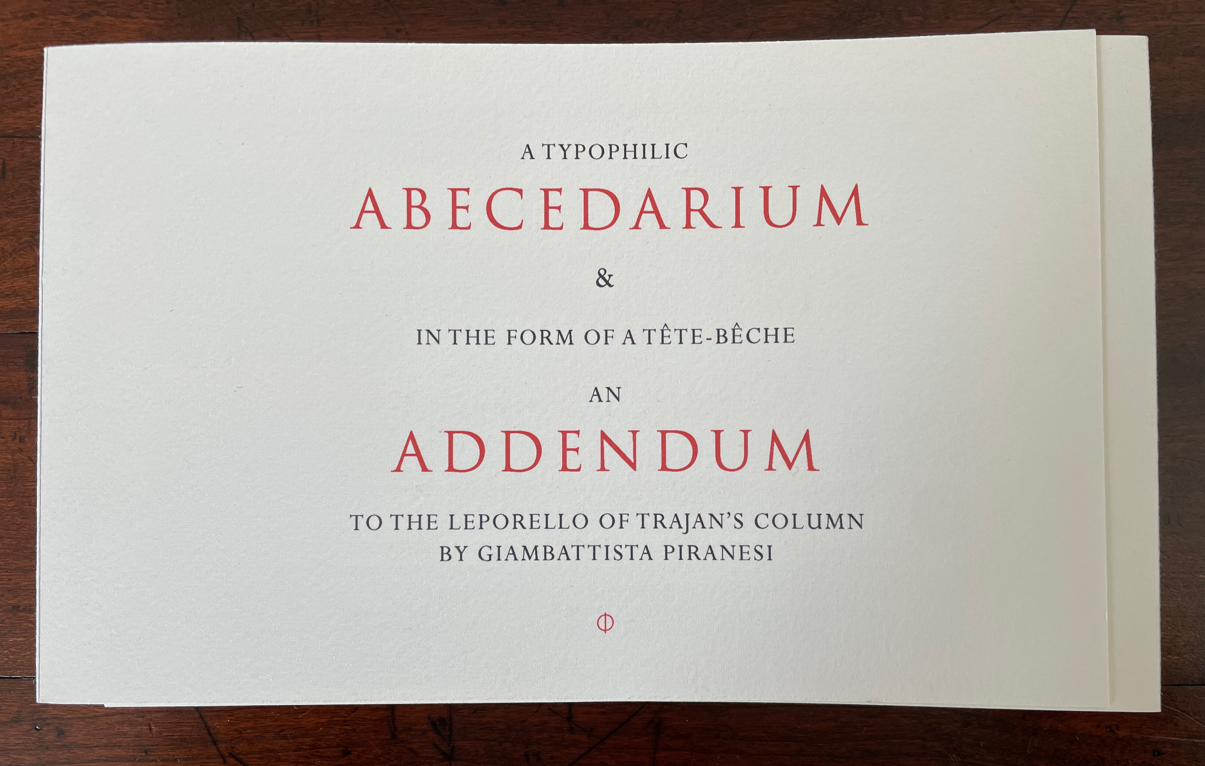
TRAIANUS (2023) A Folly for Bibliophiles celebrating the epigraphy, iconography and the architecture of the COLUMN OF TRAJAN through Giambattista Piranesi’s etchings from his Vedute di Roma in the form of a leporello with a hidden tête-bêche woven binding containing an Abecedarium that reveals the work of L.C. Evetts in his study of the letters of the inscription at the base of Trajan’s Column & a set of contemporary photographs by Dartmouth Professor of Classics Roger B. Ulrich of various scenes from Trajan’s Column correlating the Piranesi etchings with the standard identification numbers used by Conrad Cichorius in the first complete photographic documentation of the plaster casts of Trajan’s Column done for Napoleon III and published in 1896 and 1900 Rutherford Witthus Ebonized walnut box with stone-leaf covered sliding metal cover and hidden central compartment. Double leporello of 7 panels, including title, on front; 3 panels (diagrams) on back. Double-spined Abecedarium of 38 pages and double-spined Addendum of 20 pages, bound tête-bêche together. Box: 392 x 392 x D75 mm. Leporello: closed 374 x 374 mm; extended 2224 mm (7th panel appears 20 mm deep in the base. Abecedarium & Addendum: closed H147 x W245 mm; open W760 mm. Edition of 5, of which this is #1. Acquired from the artist, 1 May 2023. Photos: Books On Books Collection (and, where noted, Peter Roos; courtesy of the artist).
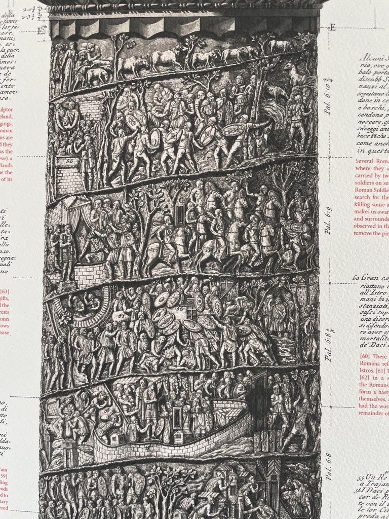
At almost 30m high with roughly 2,500 figures in a spiralling marble relief stretching 200 meters long, Trajan’s Column celebrates the Roman emperor’s military campaigns in Dacia (southern Romania). The story circles up the column from the bottom, but you’d need wings to read it. Just as important (and easier to reach) is the inscription at the base of the column. Here, the letter forms are said to show the Roman alphabet’s height of perfection. These letters may have had greater impact than all Trajan’s campaigns, and certainly influenced artists and typographers down to the present day.
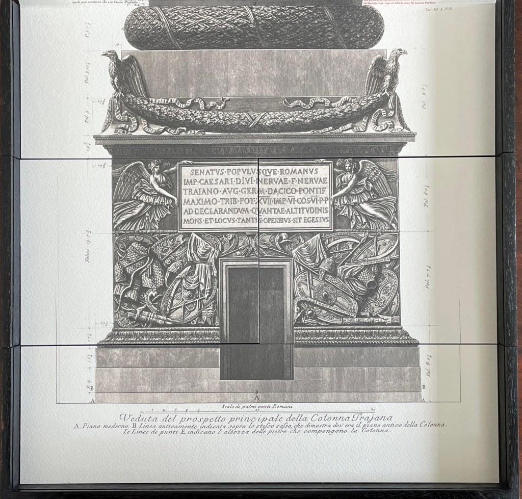
One such artist was 18th-century artist, architect and archaeologist Giambattista Piranesi. Making the column more accessible, he created an etching — Veduta del prospetto principale della Colonna Trajana / View of the main elevation of Trajan’s Column (1774/79) — over six sheets and 2.6 meters tall with marginalia spelling out the panels’ story. Piranesi also included a smaller prospect in his Vedute di Roma / Views of Rome (1750/59), which help to start the Grand Tour phenomenon of the 18th century.
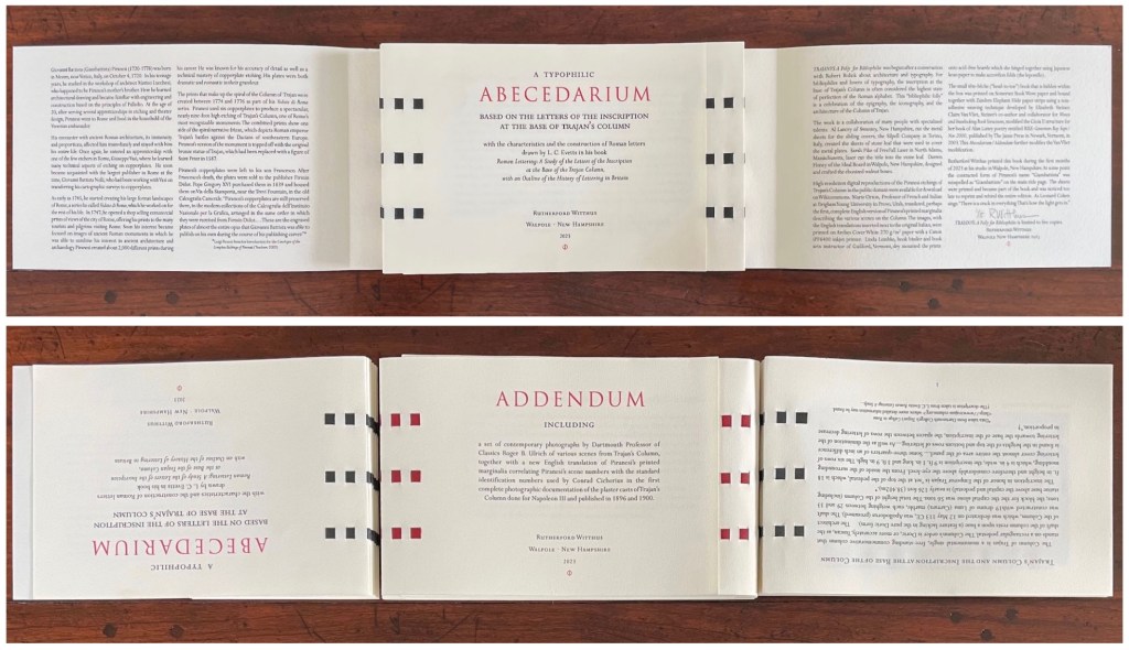
In the 21st century, we have Rutherford Witthus, professional librarian and, now, book artist. In TRAIANUS, his intricate “folly for bibliophiles”, Witthus pays homage to the column, the etching and the Roman alphabet.
At the dedication in 113 CE, the inscription would likely have been painted red, to which Witthus nods with the box’s slate cover. The leporello beneath that cover extends upwards, reproducing Piranesi’s etching and enriching it with Dr. Marie Orton’s new English translation of Piranesi’s marginalia.
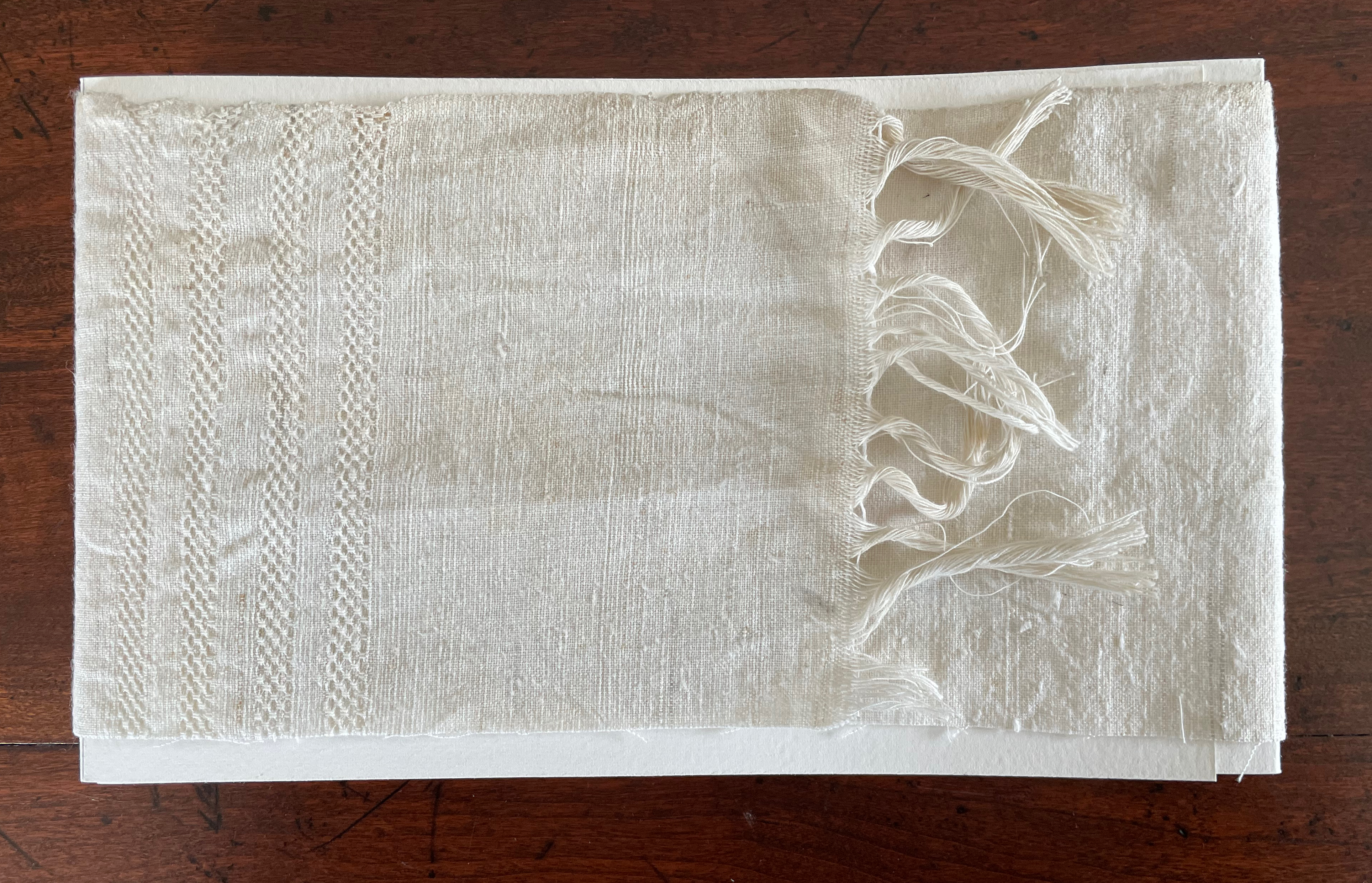
In a compartment beneath the base’s etching, Witthus deposits two books bound together in the unusual structure called tête-bêche and swathed in a fringed linen cloth. A tête-bêche attaches two books in dos-à-dos fashion but turns the books 180º to each other. These books individually have the equally unusual structure of a double-spined gate-fold (the pages overlap, meeting in the middle, and page turning proceeds with a turn to the left, a turn to right and so on).
While researching the column, Witthus found in L. C. Evetts’ Roman Lettering a ready-made Latin alphabet book, including Evetts’ “magnificent drawings of the letters, along with his charming and informative descriptions”. Witthus reproduces this alphabet book in the first side of the tête-bêche under the title A Typophilic Abecedarium.
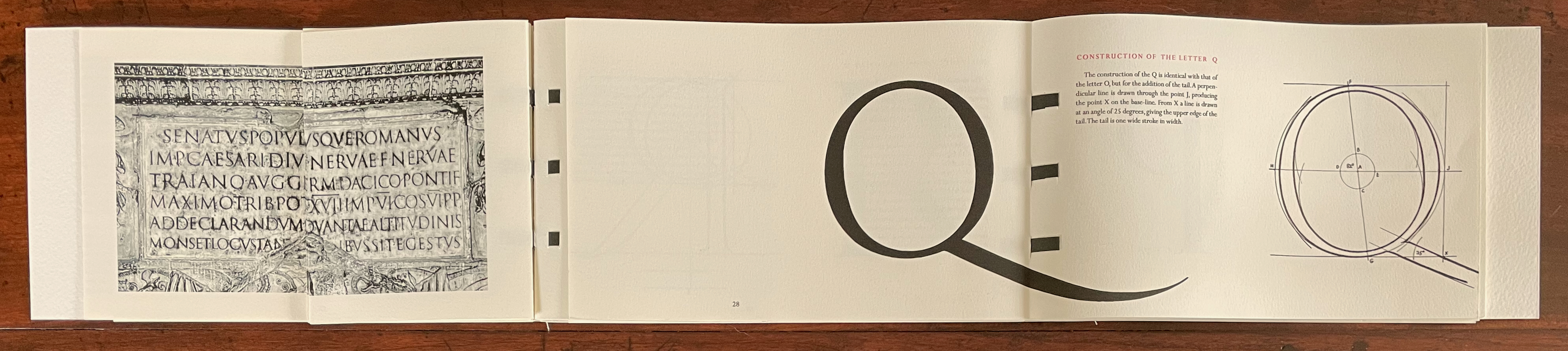
A Typophilic Abecedarium performs a variation on the gate-fold structure that brilliantly serves the homage Witthus is paying. A recurring image of the column’s inscription runs on the left alongside Evetts’ drawings and description of the Roman letters. This is achieved with a half page that turns to the left. Below, when the half page bearing the description of A’s characteristics turns to the left, its reverse side will repeat the side of the inscription it covers up. When the full page bearing the letter A turns to the right, it reveals the half page bearing the description of B’s characteristics, the letter B itself and the full page on the right explaining the construction of the letter B.
Just for its swash’s daring cross over the gutter and the registration needed to align the image of the inscription, here’s the letter Q before and after the turning of the half page to the left and just before turning the page bearing the letter Q to the right to reveal the letter R.
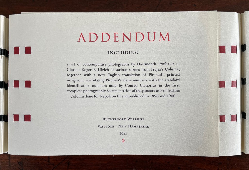
On the other side of the tête-bêche lies An Addendum to the Leporello of Trajan’s Column by Giambattista Piranesi. Professor Roger B. Ulrich‘s photographs of the column expand from Turkish map folds alongside a reprise of Dr. Orton’s translation of Piranesi’s marginalia.
Photos: Peter Roos. Courtesy of the artist.
With all these features, TRAIANUS the artist’s book nods elegantly to a monumental marker in history, art and the alphabet’s journey to its Roman letter shapes. Professional photographer Peter Roos has created several images of the work. They can be found on the Witthus site. Here are just a few.
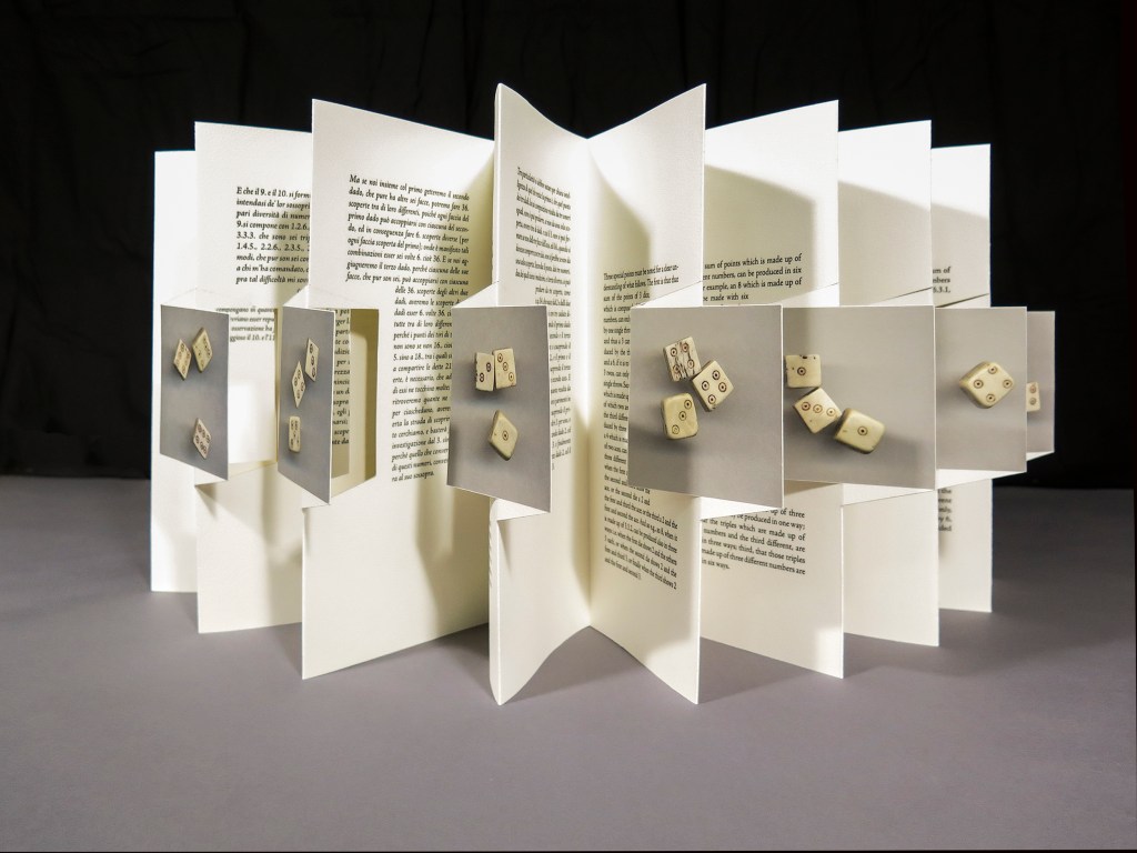
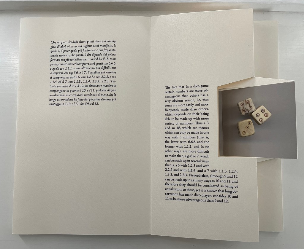
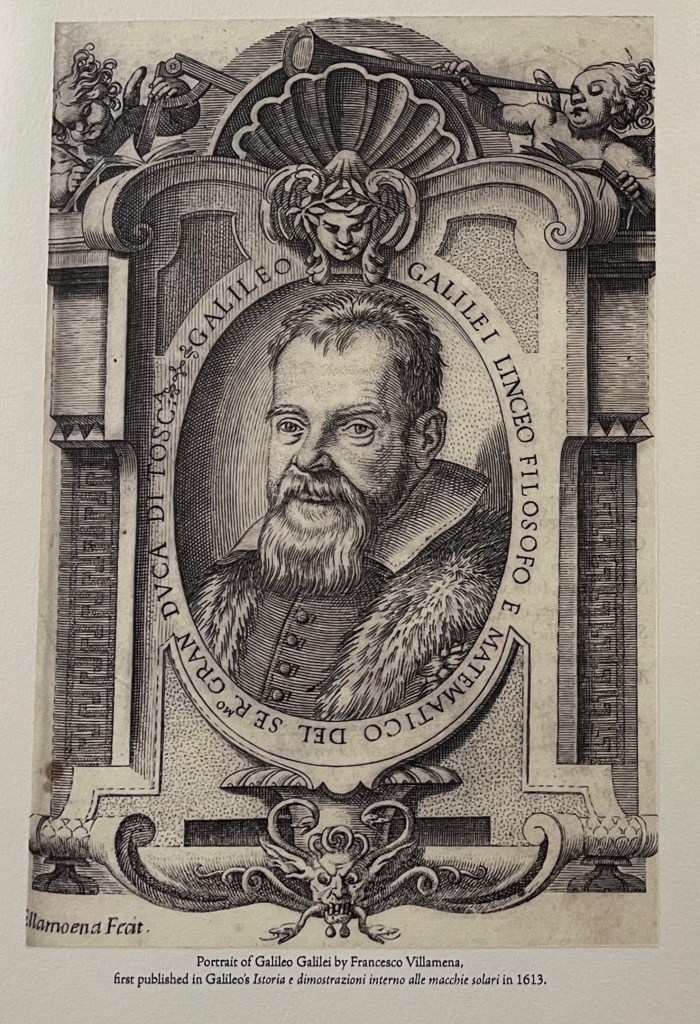
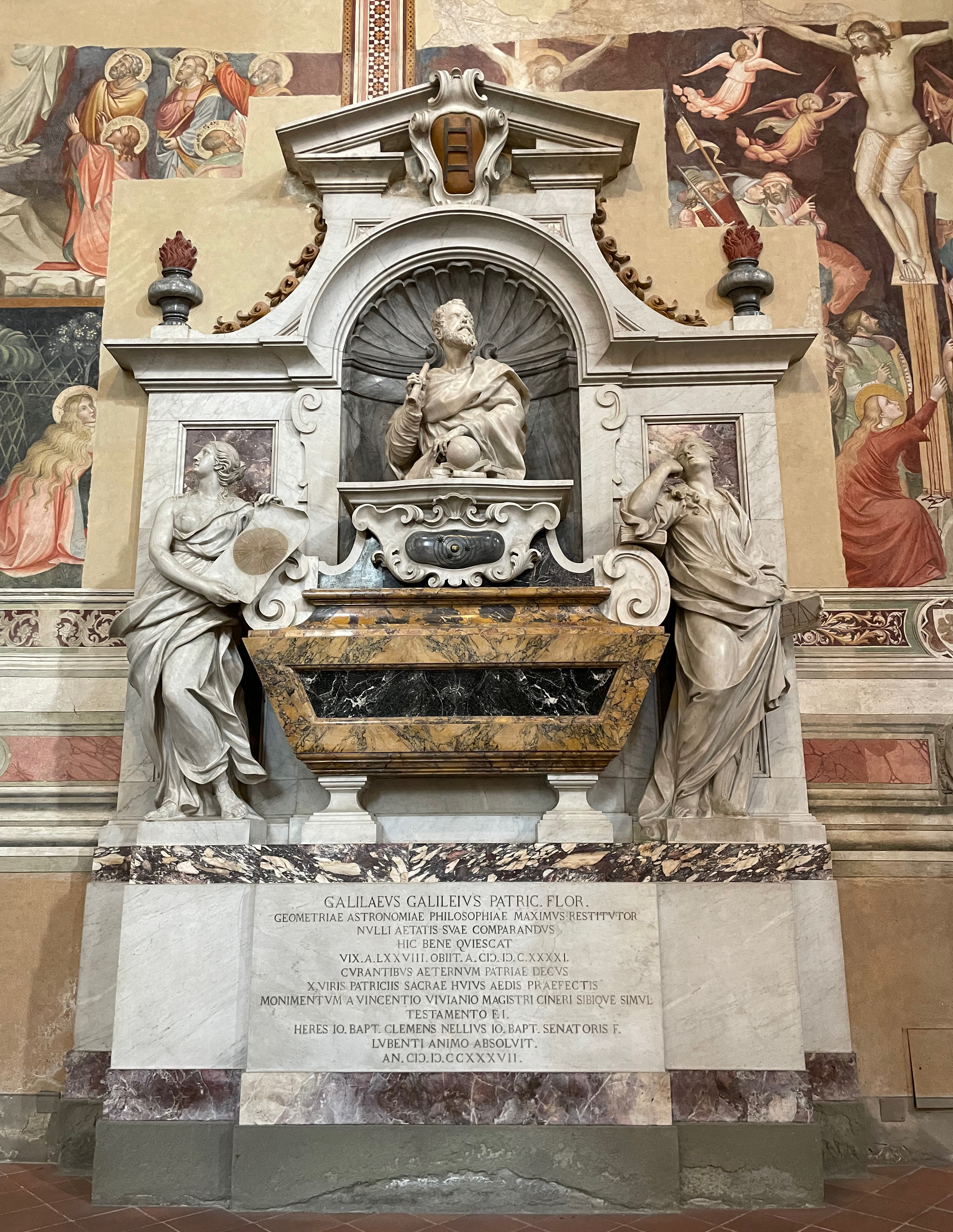
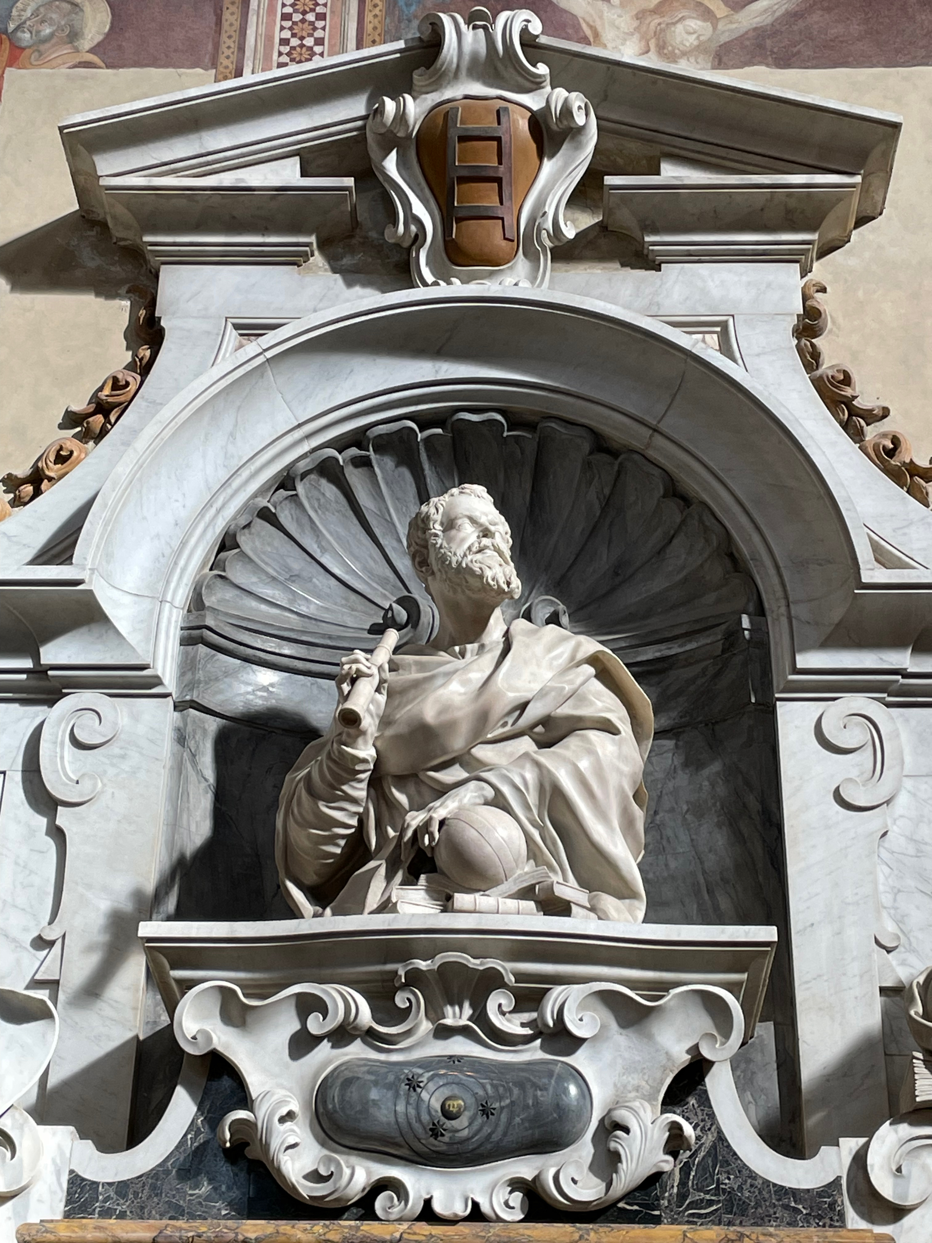
Forget about “artist’s book”, “bookwork”, “book art” and all that terminological fol de rol. Rutherford Witthus offers a new categorical puzzle: scholarship as art, art as scholarship. Like TRAIANUS (2023), this homage to Galileo finds a form that not only reproduces an image of his writing but also recapitulates, annotates and explores the historical artifact and its substance and, in doing so, becomes a work of art itself.
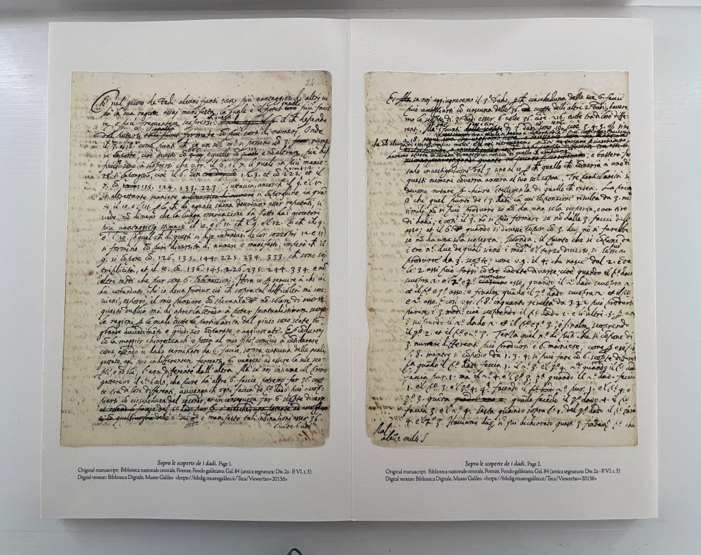
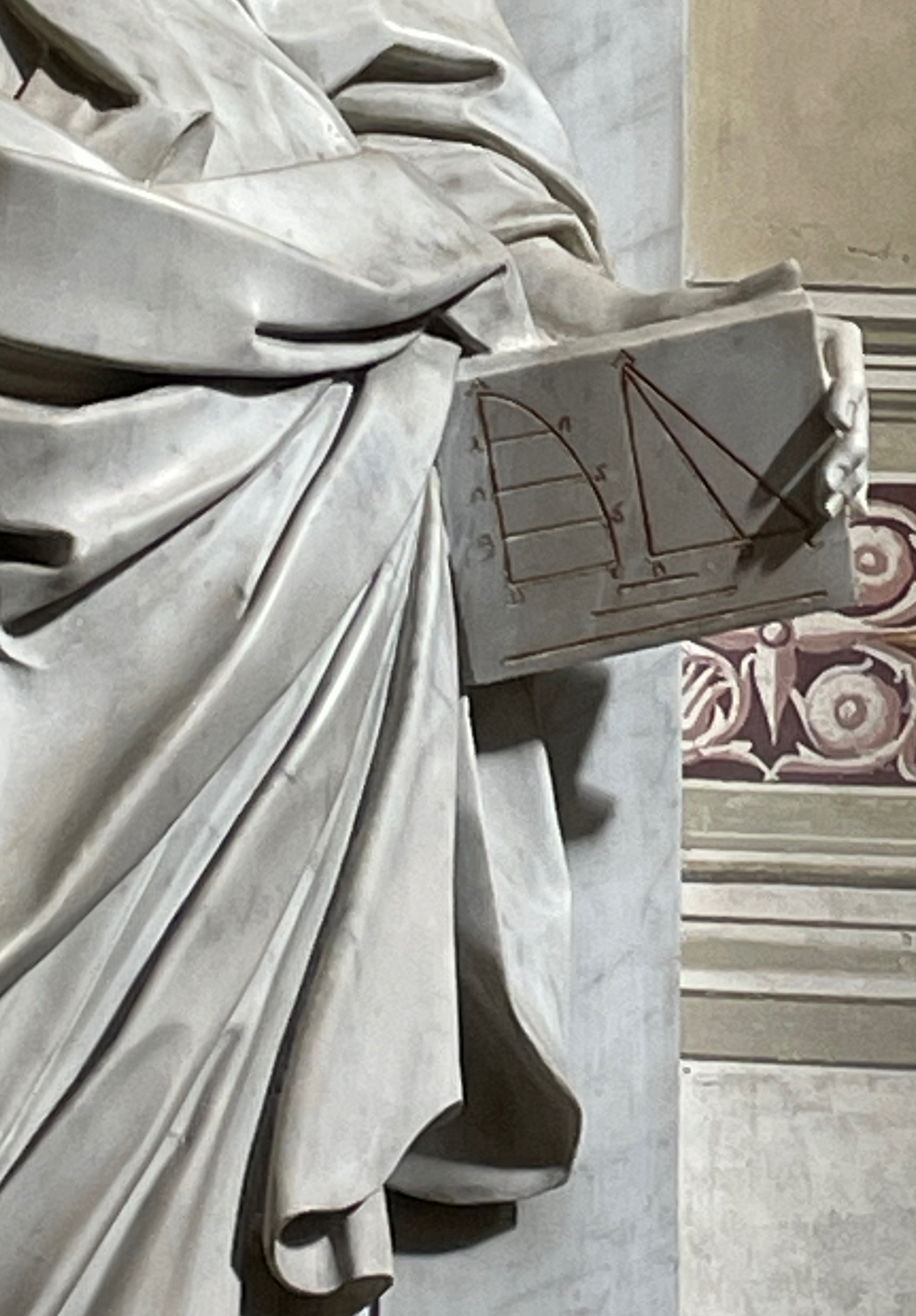
In 1612, Cosimo II, Grand Duke of Tuscany, had a burning question: since, in the three-die game Zara, there were the same number of possible combinations to throw a 9 or an 11 as there were to throw a 10 or 12, why did the 9 and 12 come up less often? Who better to answer than his former tutor Galileo Galilei? It took Galileo only four pages to give the probabilistic rationale, four pages that now reside in the Bibilioteca nazionale centrale, Firenze. A less thorough answer might have sufficed. A 9 can be rolled with a 3.3.3 triple, and 12 with a 4.4.4, but across all the possible outcomes of rolling three dice, rolling a triple is rarer than combinations of a double and one other number or of three different numbers. In fact, there are only six potential triples — 3, 6, 9, 12, 15 and 18. Since 10 and 11 have no possible triples, they are not lumbered with that rarity and so have the advantage over 9 and 12.
But fewer pages might have left the duke dissatisfied, and it would certainly have hampered the creative results of Rutherford Witthus. The multipage sculptural structure he has chosen is an innovation associated with Hedi Kyle called a panorama concertina. Notice how he uses it to illustrate one of Galileo’s key points and to suggest a bouncing roll of the dice. Arising from throwing the bone dice repeatedly and photographing the more aesthetically pleasing results, the eight images show the three types of possible combinations: 1) three different numbers, 2) a double and another number and 3) a triple. The static photos are dry mounted to floating panels aligned on one level, but the text around them rises and falls to generate a sense of motion additional to the pivoting of the floating panels.
Photo: Peter Roos.
Here is a closer horizontal look at one of the pivoting panels and, below it, four of them stretched out for a different view of the text’s motion around them. Notice how the diagonal cuts that form the floating panels create a tilt around the square photos, increasing the impression of a tumbling motion.
Views of the spine edge and the fore edge tight and slightly open offer another angle on the engineering.
Witthus further enriches the document with relevant layers of history from other periods: a 14th-century psaltery’s illumination showing two apes playing dice, an image of 15th century bone dice, a thumbnail of a 17th-century oil painting of soldiers playing dice over Christ’s tunic, and an excerpt on medieval gambling from William Heywood’s The “Ensamples” of Fra Filippo (1901).
When the colophon relates that the images of Galileo’s manuscript and the individual dice throws were printed on Asuka paper, or that the typeface used throughout is Adobe Jenson Pro, drawn by Adobe’s chief type designer Robert Slimbach from a face cut by Nicolas Jenson in Venice around 1470, or that astronomical calculations from Galileo notebooks appear on the verso of the sheets — Witthus brings present and past together. He is making Galileo’s document tangible — not in the sense of handling the treatise in the Biblioteca but in the tactility afforded by the tools and techniques of book art.
Galileo’s tomb, Santa Croce, Florence. Photos: Books On Books.
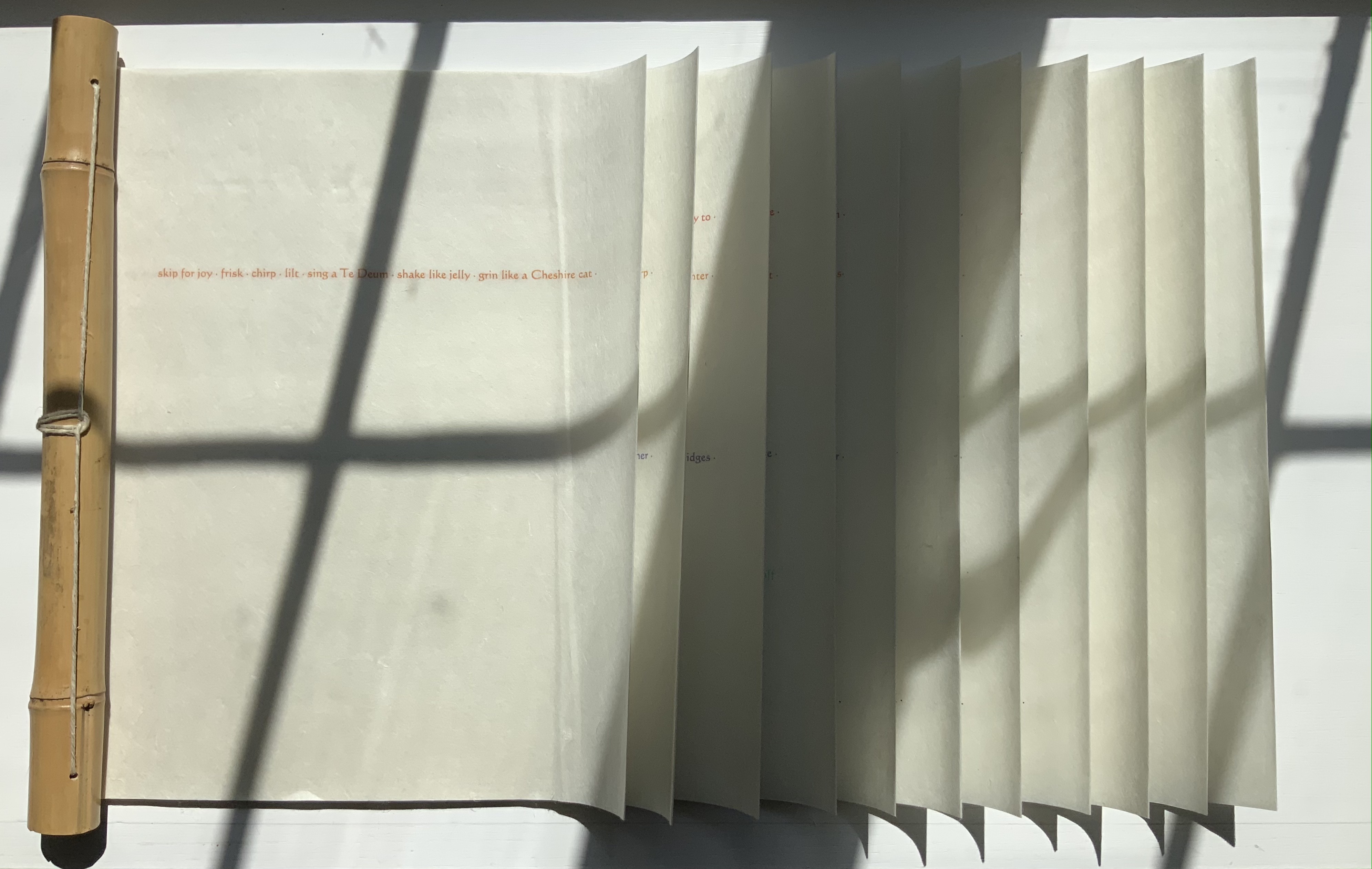
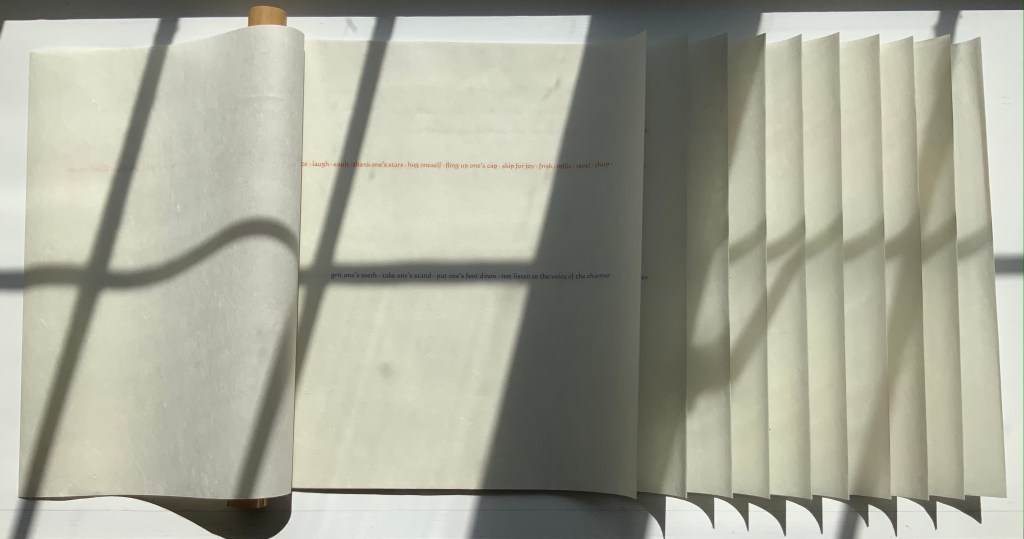
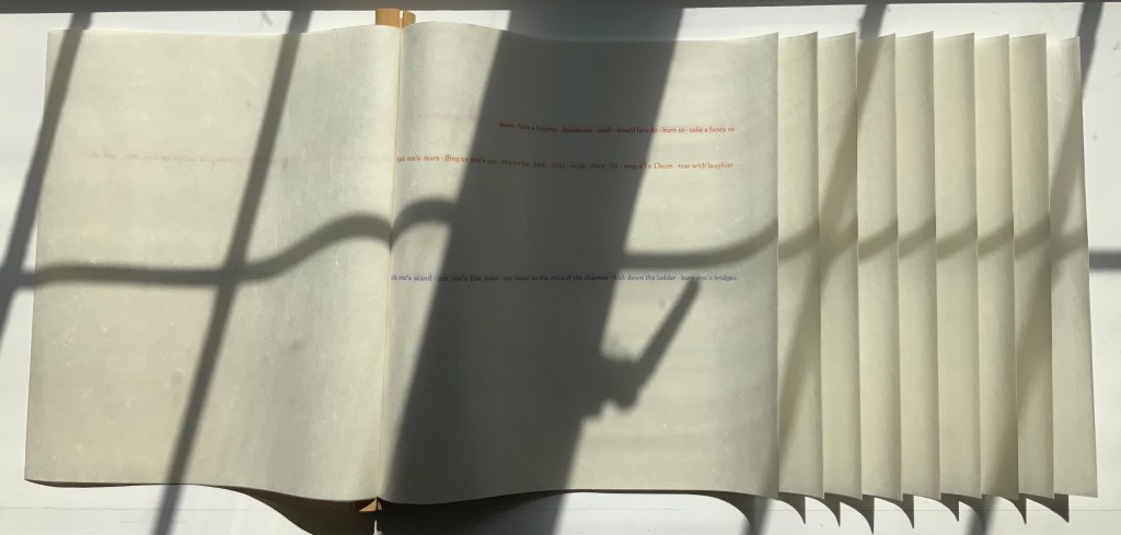
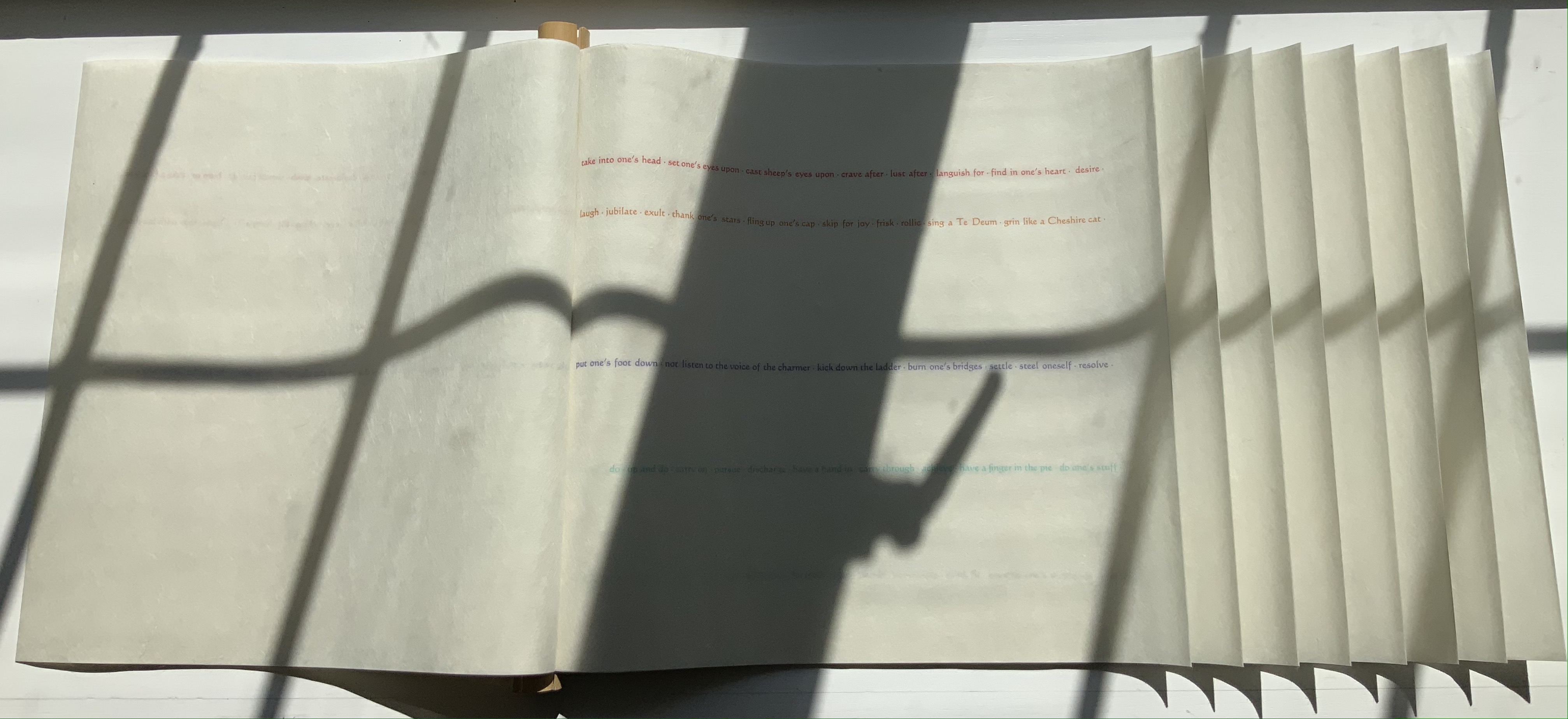
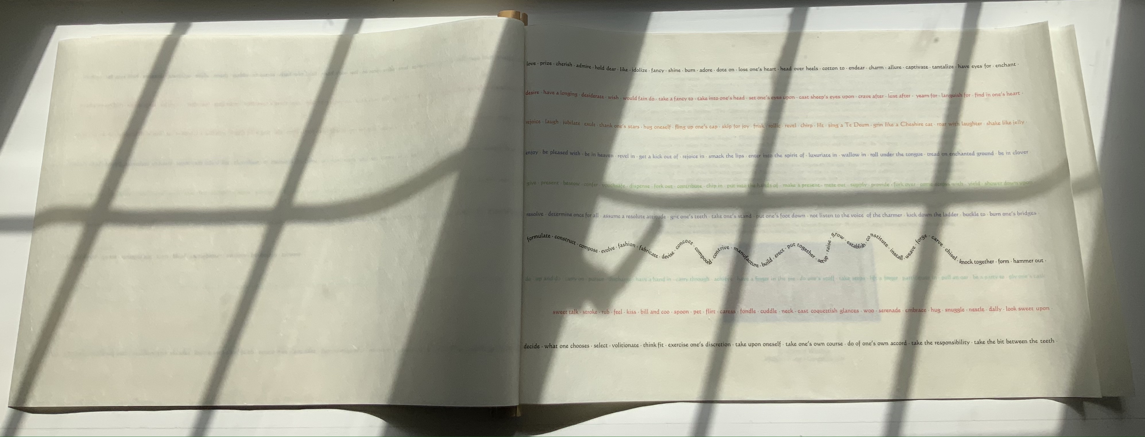
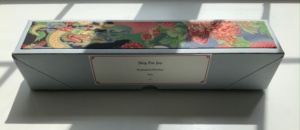
Skip for Joy (2021)
Skip for Joy (2021) Rutherford Witthus Dragon-scale scroll bound to bamboo rod. H306 x W477 mm, 11 panels. Edition of 5, of which this is #1. Acquired from the artist, 18 August 2021. Photos of the work: Books On Books Collection. Displayed with permission of the artist.
Rutherford Witthus’ work is strong, quiet, broad and distinctive. It blends Eastern and Western traditions of the book arts. It joins the blackletter fonts of the Cistercian monks with the typography of Hermann Zapf. It joins John Cage’s chance-determined selection in the creation of art with a group of physicists’ fascination with the crumpling of paper. It experiments with abstract art and Japanese fore-edge illustration and binding. It offers a meditation on Gilles Deleuze’s The Fold: Leibniz and the Baroque through an intricately folded reprinting. The artist’s eclectic appreciation of the work of Sappho, Walt Whitman, St. Francis, Gilles Deleuze, Søren Kierkegaard, Ernst Haeckel, Robert Herrick, Miguel de Unamuno and others finds an impressive unity across his body of work. Skip for Joy is the first of his works to be added to the Books On Books Collection.
Compounding its compelling structure, Skip for Joy displays accumulating lines of text one by one until there are ten lines of text on the tenth panel. For each line, Witthus draws its words and expressions from an entry in Roget’s Thesaurus. As each panel grows in width to play its part in the dragon-scale binding, each line grows, too, repeating words and adding more synonyms from its entry in Roget’s. Compounding the scaling of structure and text, Witthus varies his lines in color and position. Starting with the phrase “skip for joy” in orange on the first panel, he then adds the phrase “grit one’s teeth” in violet on the second panel beneath the orange line; then “desire” in red on the third above the orange line; then “do up and do” in turquoise on the fourth; and so on.
Second panel
Third panel
Fourth panel
What does Roget’s Thesaurus have to do with dragon-scale binding? The scroll’s first phrase and title provide a clue: an imperative to play. Anyone interested in playing with the dragon-scale (or whirlwind) binding usually goes to the site of the International Dunhuang Project: The Silk Road Online. Among its descriptions so far of the forty thousand works found in the Buddhist cave library near China’s Dunhuang on the western edge of the Gobi desert in 1900, there is this passage:
Old Chinese accounts of whirlwind binding are very rare. However, there was a trail of clues left by a Tang dynasty (AD 618-907) rhyme dictionary called Kanmiu buque qieyun (Corrected rhymes), by Wang Renxu. … From the earliest accounts from the Song dynasty up to the Qing dynasty (AD 1644-1911), references to whirlwind bound books have always been connected with this text. … / Several examples of what is believed to be whirlwind binding have now been discovered in the Dunhuang collections of the Bibliothèque nationale de France and the British Library. Most of these have not been rebound, so it is possible to get a clear impression how these manuscripts were bound and why they were bound in this manner. — IDP
Where Western reference works are organized alphabetically, the Qièyùn rhyming dictionary is organized phonologically. But that phonological organization is complex: starting first by grouping characters according to the five tones, then grouping them into rhyming groups according to a character’s initial consonant, and then into groups according to the rhyme of a character’s final consonant. And determining those rhymes requires instructions — the fanqie method that explains via other characters how a character entry should be pronounced. In short, organization by phonological similarities — of tone, initial rhyming consonant and final rhyming consonant.
So to follow the lead of the dragon-scale bound Qièyùn, Witthus picks an English-language reference work whose entries offer plenty of content based on similarities — such as synonyms. Skip for Joy is playful art. Its “rhymes” are the repetitions and synonyms in a line of text. Its lines of text jump into the panels where they will and in whatever color that suits. In the tenth panel, the seventh line even breaks into a dragon-like undulation.
Tenth panel
As the dragon-scale scroll returns to its archival box, its colors and undulating line unite with the dragon in the box’s silk onlay.
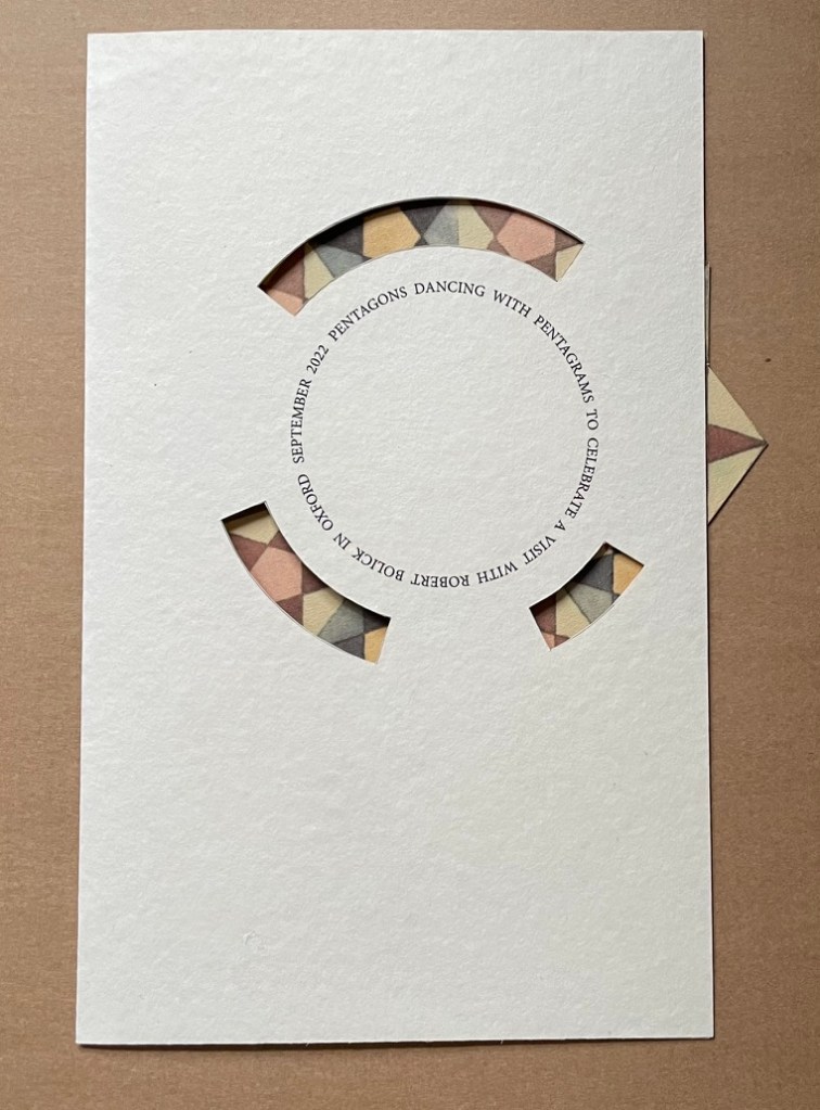
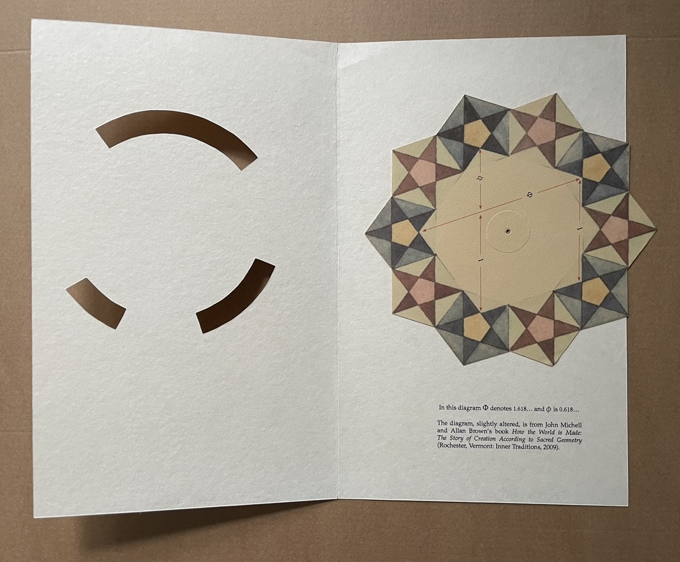
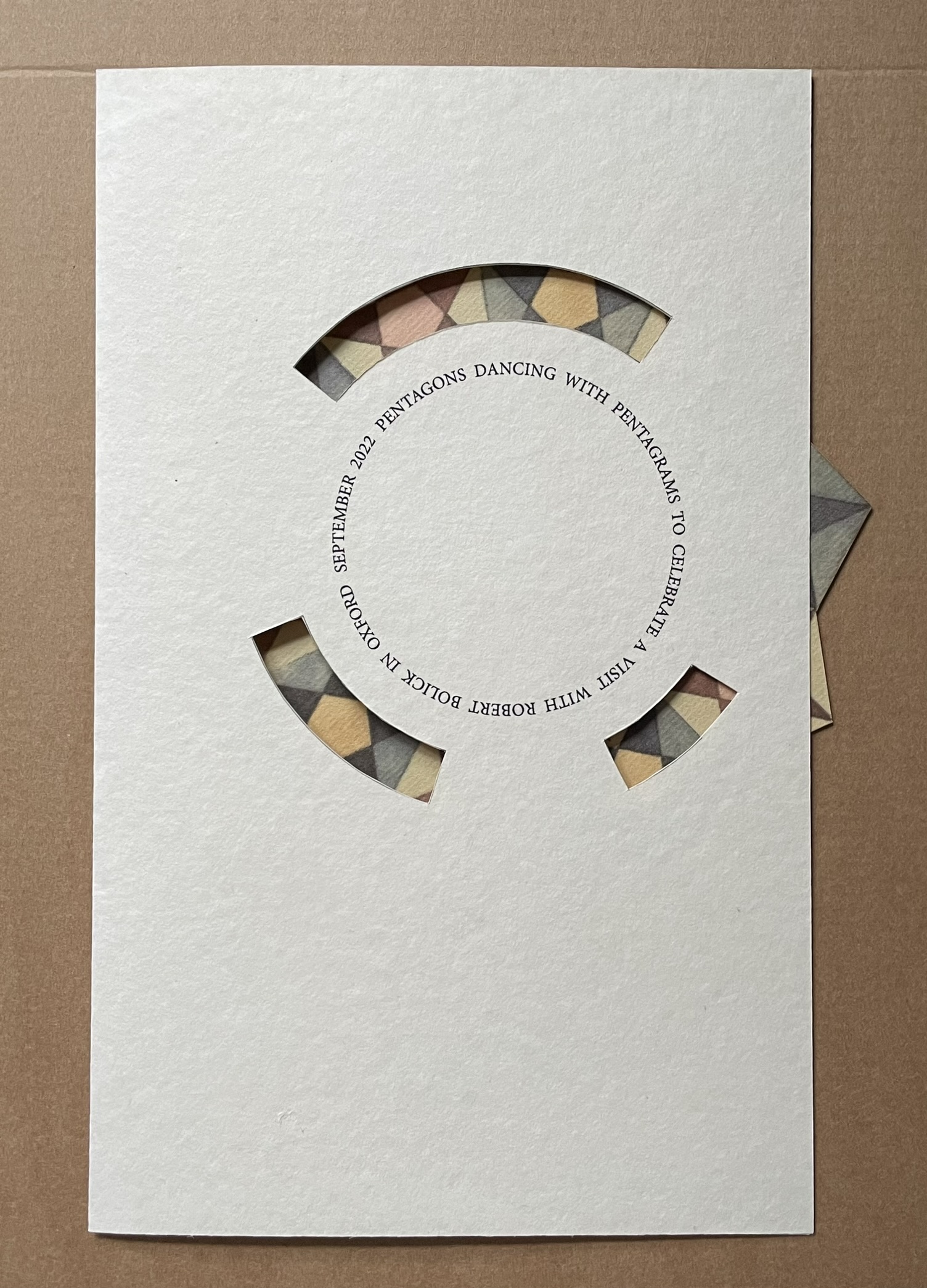
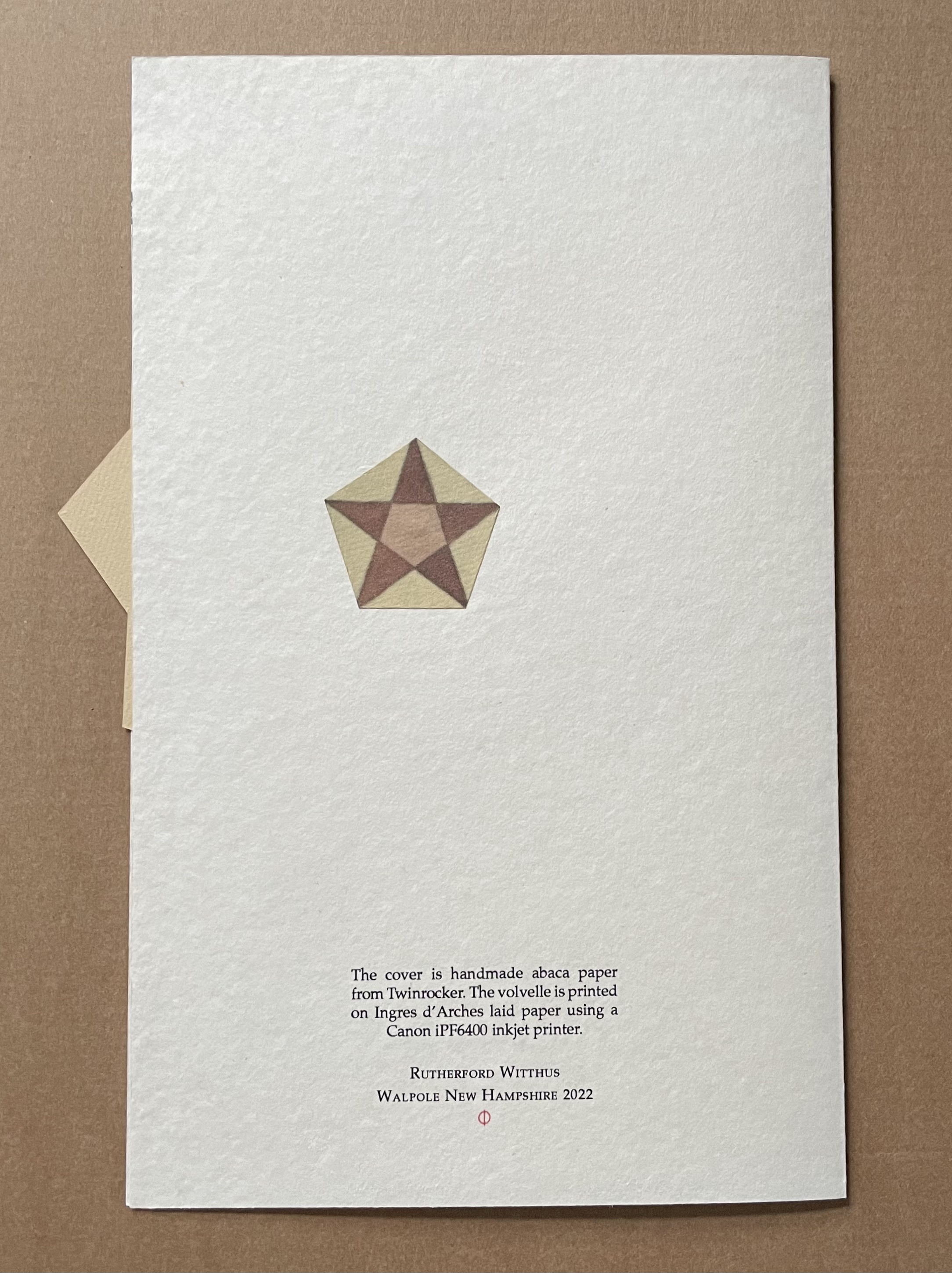
Pentagons Dancing with Pentagrams (2022)
Pentagons Dancing with Pentagrams (2022) Rutherford Witthus Single-fold die-cut card with volvelle. H266 x W180 mm. Unique. Acquired from the artist, 2022. Photos: Books On Books Collection.
“Zhang Xiaodong“. 7 August 2025. Books On Books Collection.
Chinnery, Colin. “Whirlwind binding (xuanfeng zhuang)“. The International Dunhuang Project. Site last revised: September 2016. Accessed 21 October 2021.
Nash, John R. nd. “In Defence of the Roman Letter”. EJF Journal, 11. The Edward Johnston Foundation, Ditchling, West Sussex. pp. 11-31.
Swetz, Frank J. 1996. “The Mathematical Quest for the Perfect Letter,” Humanistic Mathematics Network Journal. No. 13, Article 3. Accessed 10 June 2023.
Victoria & Albert Museum. n.d. “Trajan’s Column“. Website. Accessed 10 June 2023. Article on the column and its 1864 plaster cast now in the center of the V&A Cast Courts.
The Spectrum A to Z (2003) Karen Hanmer Tunnel book. 5 x 5 x 18 inches. Pigment inkjet prints. Edition of 20, of which this is #17. Acquired from Vamp & Tramp, 3 September 2021. Photos: Books On Books Collection. Displayed with the artist’s permission.
The Spectrum A-Z is a satisfying addition to the Books On Books Collection for several reasons. Accordion book, flip-book and pop-up book treatments of the alphabet abound, but this may be the only tunnel book treatment. If not, surely the blending of the the alphabet with tunnel book structure and the color spectrum secures its uniqueness. Also, the springiness achieved in this tunnel book makes it alive and special.
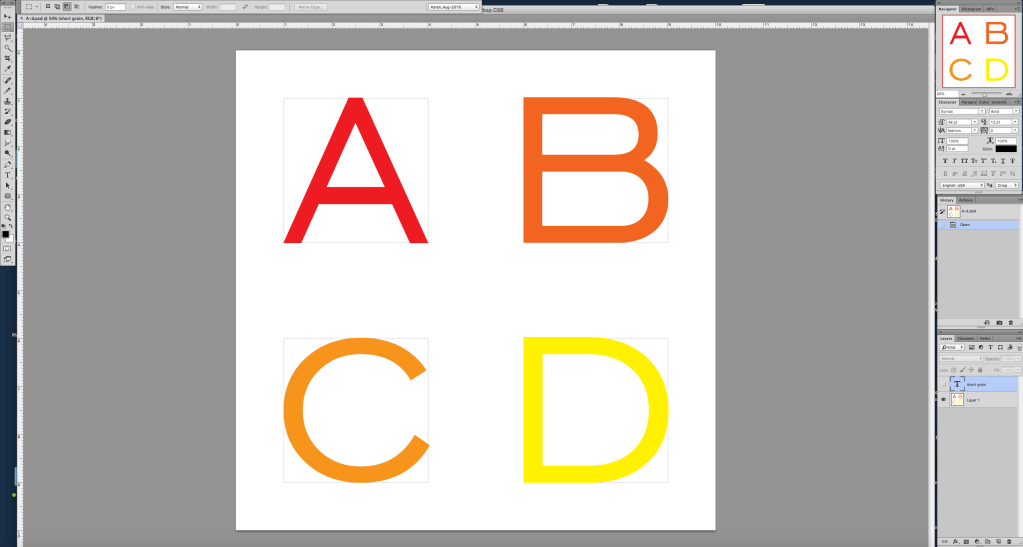
In response to questions about the work, Hanmer commented on the work’s creation and sent along the screen shot below of the Photoshop files from which she printed the letters A-D:
A screen shot of the Photoshop files used for printing. Courtesy of the artist.
I print them with crop marks, cut the larger thing out and into quarters, and then cut around the individual letters (used to use a Havels #11, now I use a Swann Morton #10A scalpel blade, and a 6” ruler with sandpaper on the back so it does not slip for the straight bits, freehand for the curves). Years go by when I don’t need to make another, so I have a non-printing comment reminding me of the grain direction. If the letters were long grain, the structure would be limp and unsatisfying. … Assembly with 1/4″ 3M 415 tape. PVA would make it wrinkly. Mohawk Superfine Cover, I think 80#. Whatever printer I have at the time, now an Epson SureColor P5000. (Correspondence with Books On Books. 19 October 2021)
The Havels #11 and Swann Morton #10A.
The color spectrum followed out and part way back by the book comes eclectically from the order of the default RGB swatch palette in Adobe’s version of Photoshop prior to Creative Suite in 2003. As for the structure’s springiness, Hanmer comments that she is not wild about it,
but 20 years ago I did not know that I could cut several little tabs with a woodworking gouge out of the accordion for each letter and attach the letters to the tabs to relieve the tension, and 2021 Karen does not feel like adding several more hours to the process of assembling these. She also likes the security of having each panel adhered for its full length. And now that you mention it, the springiness would make it a lot more fun to play with, so maybe it is not so bad after all. (Correspondence with Books On Books. 19 October 2021)
The Spectrum A-Z was made in response to a call from the Chicago Hand Bookbinders, which thrived from 1978/9 through 2009. The Biographical/Historical Note for the CHB archives mentions that, “Among its notable projects was a series of fifteen collaborative artist’s alphabet books in varying formats, created between 1987 and 2004”. Of course, from time to time, other “organizations of the book” have issued calls for artist alphabet books. But with the infinite gradations in Roy G. Biv‘s spectrum and the customizability within Creative Suite, surely now another call is bound to result in a rainbow of followers of Hanmer’s innovation.
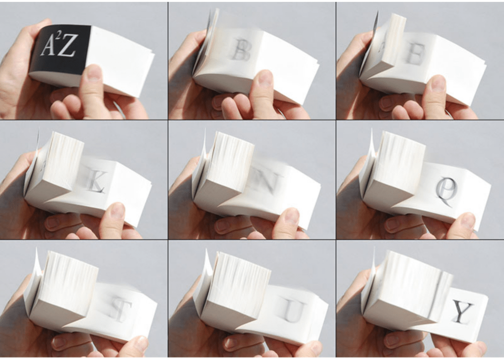
A²Z (2013)
A²Z(2013) Karen Hanmer Flip book: inkjet prints, double-fan adhesive binding. H51 x W121 x D51 mm (2 x 4.75 x 2 in). Acquired from the artist, 30 October 2021. Photo: Courtesy of the artist.
Salamony, Sandra, and Peter and Donna Thomas. 2012. 1,000 Artists’ Books : Exploring the Book as Art. Minneapolis: Quarto Publishing Group USA. Pp. 101 (Over the Edge: Death in the Grand Canyon), 111 (Destination Moon), 206 (Beaut.e Code), 291 (Famopily).
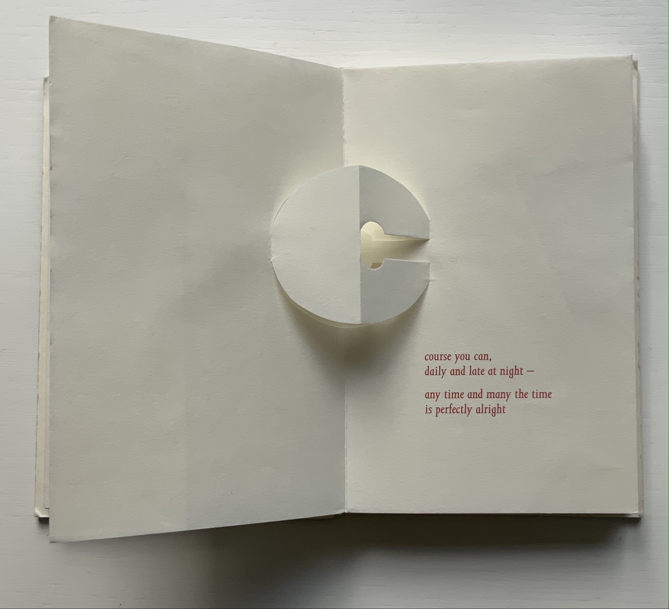
Richard Price’s lines recall the inventiveness of Emily Dickinson‘s and compression of Samuel Menashe‘s. For Dickinson, we have the artistry of Jen Bervin; for Menashe, we have that of Julie Johnstone; and for Price, we have his full-on collaboration with Ron King.
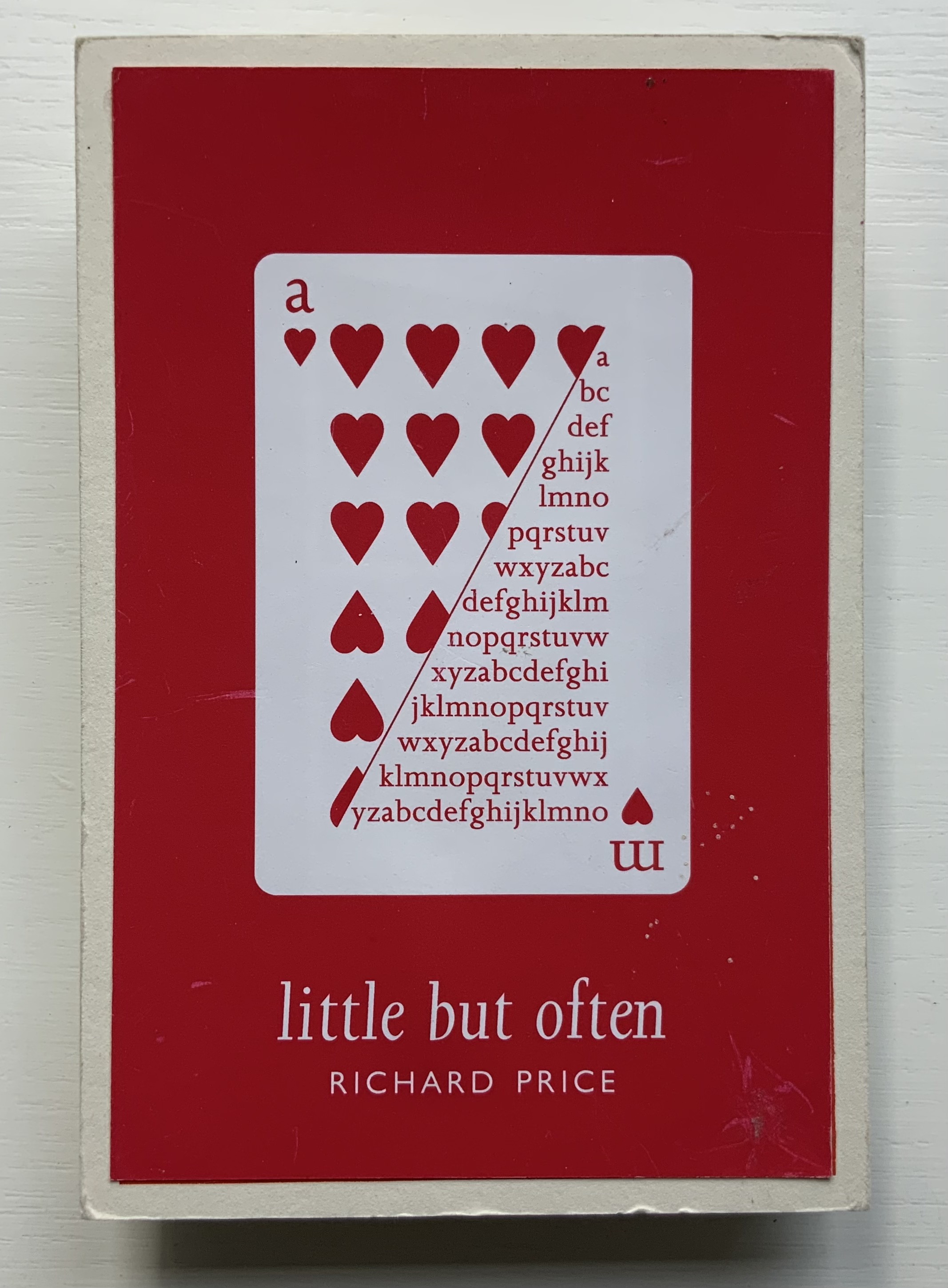
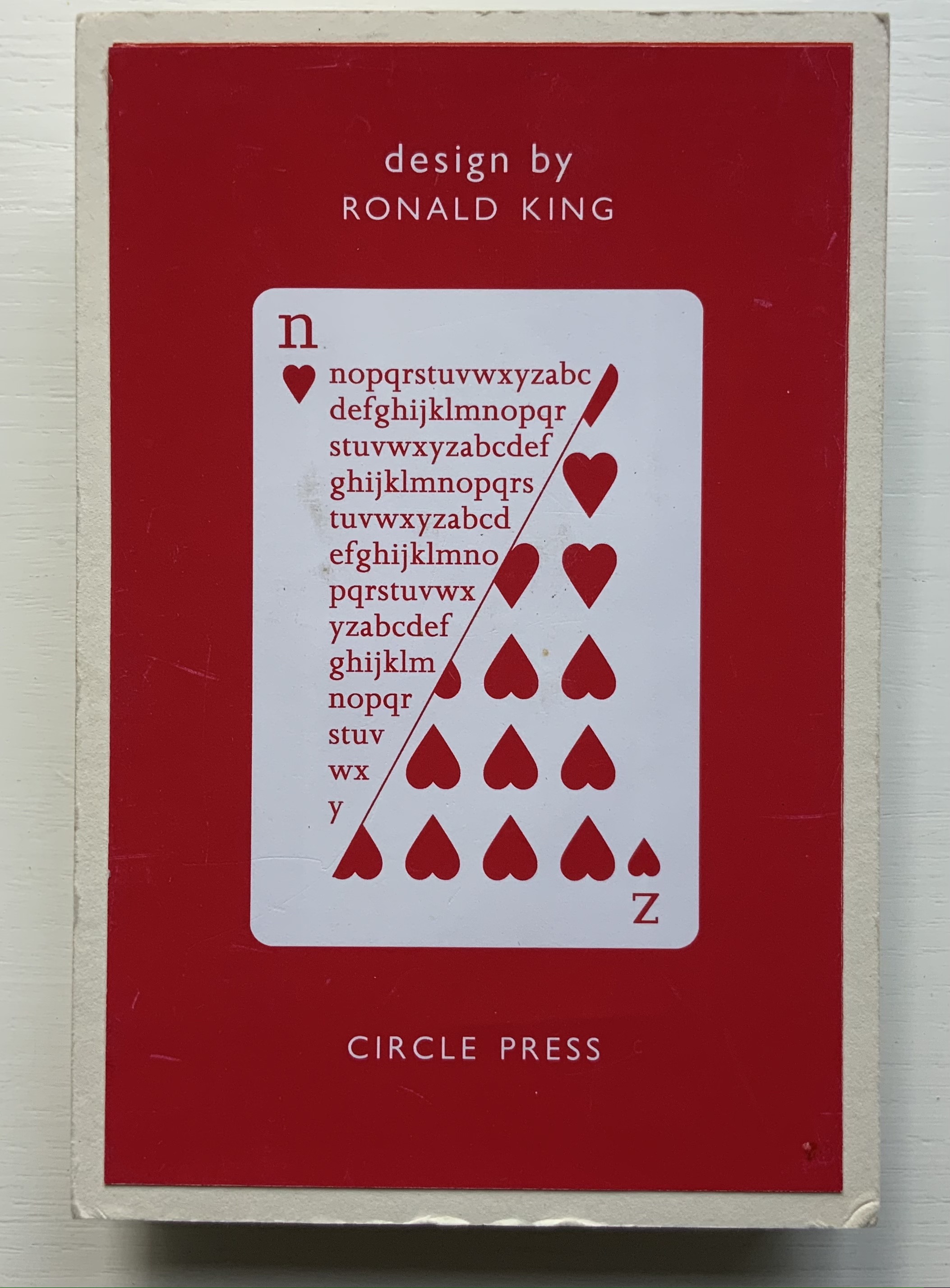
Harking back to The Half-Year Letters (1983), little but often pairs King’s lowercase pop-up alphabet with Price’s verses, just as its predecessor paired the uppercase with Roy Fisher‘s alphabet-inspired evocations of the 26 weeks from April through September. Also like its predecessor, little but often plays on the 52 weeks of the year, this time with its front and back covers illustrated with a playing-card suit of hearts, “numbered” a-m and n-z, and with two pages allotted to each week, each letter and each brief poem — as the title says, little but often. While The Half-Year Letters explores the forward movement of the letters alongside the movement of the year, this is love poetry in a book of back and forth. Text and design converse — and not merely by the letter.
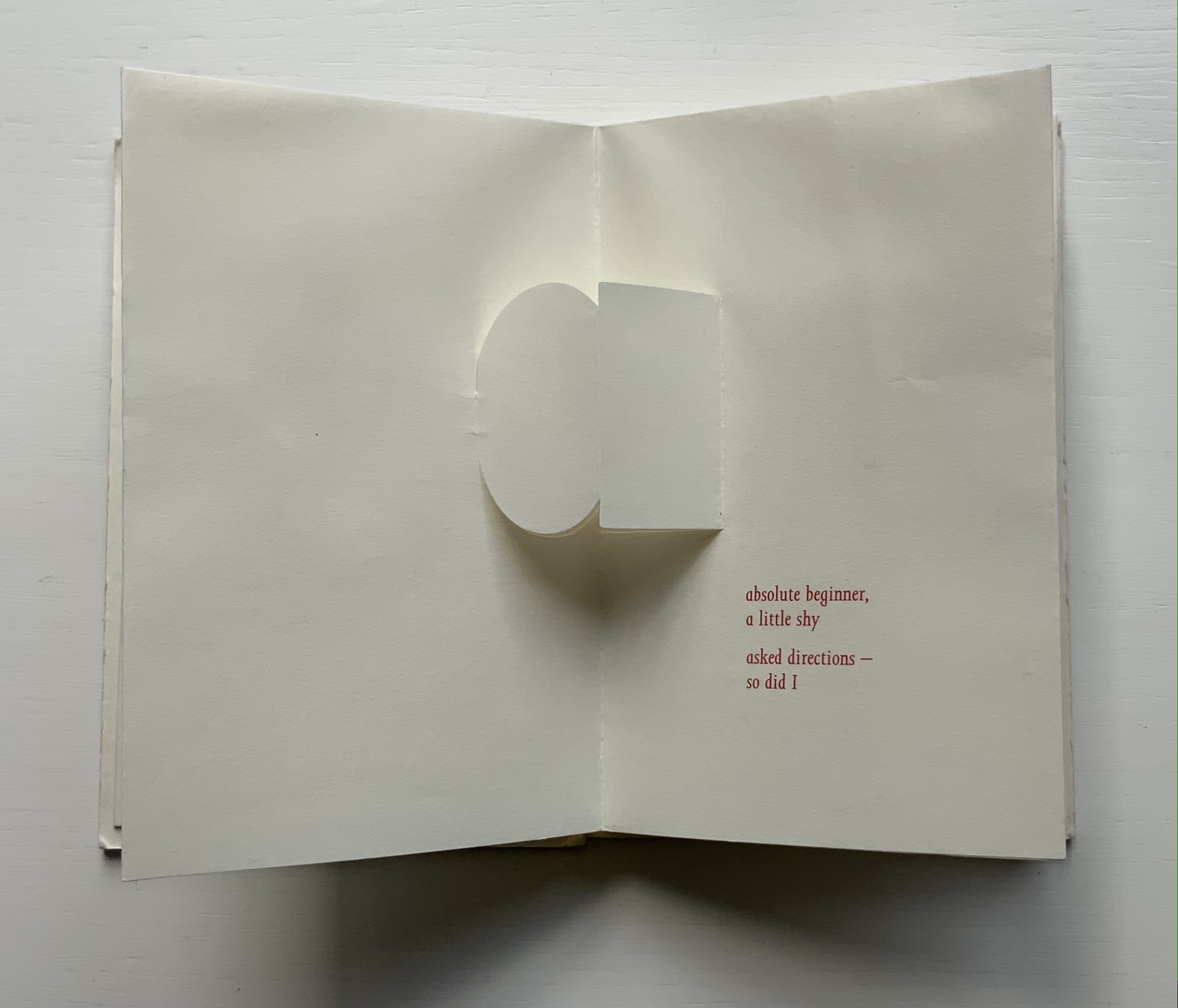
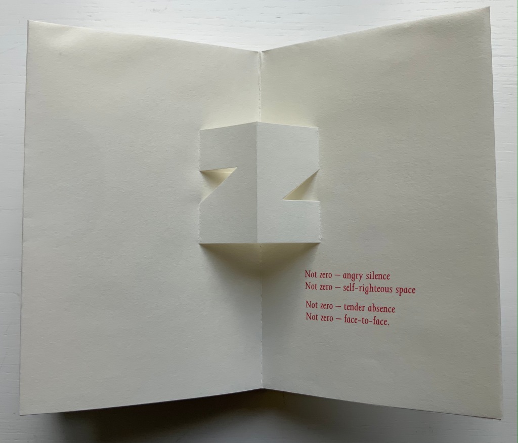
The last letter and lines in the book exemplify this to perfection.
Of the few other pairs of couplets in the book, none is as back and forth as the letter z’s. Paired against one another, rhyming abab, each line beginning alike with its N-z phrase, the two couplets echo the back-to-backness and balance of the dos-à-dos structure. The phrases self-righteous space and tender absence can be read as allusions to the cut-out space around the letters. Or vice versa. Again, back and forth. “Angry” and “tender” bat each other back and forth, just as the final phrase turns the dos-à-dos sweetly back on itself.
Together, Price and King make the concertina book “smile brighter”.†
“Ronald King“. 1 March 2021. Books On Books Collection.
Clark, Caroline. 23 January 2013. “Clark on Price“. Eyewear, the blog.
†Dante Alighieri. 1320. Purgatorio (Canto XI, 82). Hollander, Robert, Stephen Campbell, and Simone Marchesi. 1988. Dartmouth Dante project. When Dante meets and praises the illuminator Oderisi da Gubbio in purgatory, Oderisi directs the praise to his pupil Franco Bolognese as the one who really made “the pages smile brighter”.
Price, Richard. 2018. Digital. Essence Press. Collaboration with Julie Johnstone.
___________. 2008. folded. Essence Press. Collaboration with Julie Johnstone.
Abstract Alphabet: A Book of Animals(2001) Paul Cox Casebound, sewn to doublures. H288 xW238 mm, 52 pages with single foldout. Acquired from Amazon, 1 July 2021. Photos of the work: Books On Books Collection. Displayed with permission of Chronicle Books.
Not that the alphabet and writing happened chronologically step by step or in one place, but the theory is that they started with pictograms (one sign, one object), ideograms (one sign, one idea), logograms (one sign, one word); added the rebus principle and phonograms (one sign, an object or its sound as in bee the object or the sound of “bee” for use in a word with that sound); added marks for pronunciation or contextualization to distinguish one homonymic phonogram from another; and finally arrived at syllabaries and the even more efficient alphabets (one sign, one sound). Alphabetic letters acquired their non-pictorial shapes as all these signs became more simple and abstract through the tools used to inscribe them (a wedge-shaped stick, a reed, a brush, etc.).
The tools used to make signs in Abstract Alphabet are stencils and ink, or rather a knife and paper or die and metal to cut the stencils to be used with ink. The result is certainly abstract albeit less simple and yet perhaps more artful — and not simply because of its inspiration from the works of Jean Arp. In its artful way, Abstract Alphabet challenges us to think about the alphabet, how it works and how we learn to work it.
Cox’s alphabet skips the pictogram and goes straight to these Arp-ian abstract shapes. His abecedary (“a book of animals”) even skips the images of the animals whose names his signs “spell out”. His signs turn every which way, shrink or expand to fill the double-page spread, which makes the codex also a tool playing into how the signs look and how we read the words they make. The foldout key and the animal name’s initial letter are essential to identifying these animals. But what if there were no foldout key (another element of the Swiss-Army-knife codex’s performing its tool function)?
What if the initial Latin letter of the animal name did not appear in the upper left corner of each double-page spread? What if the animal name ran over to a third or fourth page? What if the Abstract Alphabet were delivered on a scroll? Or a set of 26 clay containers, each inscribed with the signs composing an animal’s name and inside each container a number of tokens each marked with the signs making up the animal’s name? Would the relative frequency of signs in just 26 words make deciphering possible? It would be what archaeologists and paleographers have faced and still face in figuring out where the alphabet came from.
In its visual abstraction, Cox’s alphabet also prompts puzzling over how reading is learned. Without figurative images of the animals to associate with the sets of shapes, how would the brain proceed? What ape looks like a combination of an orange dumbbell, gray egg and green chocolate drop?
Enciphering the alphabet with shapes reverses the alphabet’s historical movement away from the pictorial to the symbolic — but only partly, the shapes are abstract after all. Also the foldout key supplies alphabetic readers with their childhood phonemic clues. But if there were no foldout key, we would have to backtrack and learn what sounds a yellow half-circle, a set of red stairs and so on make. Could we have learned to associate sounds with these abstract shapes instead? Non-alphabetic written languages such as Kanji and Chinese have semantic and phonetic clues embedded in their characters. Cox’s Arp-ian shapes would have to evolve such clues. If it were not for color-blindness, the different colors might be useful in such an evolution; beyond some assistance in distinguishing D from U and F from V, they are not over-labored.
Still this is book art that makes us think. If only the animal below, which was pictographically the source of the first letter in the Greek and Latin alphabets, were the last association of sign and animal in Abstract Alphabet, the book would end on a deserved note of genius.
“Paul Cox, AGI Open, Seoul 2016“. 9 February 2017. Alliance Graphique Internationale. Accessed 7 August 2021. Cox describes Abstract Alphabet at the 17’02” mark in the video.
Augustin. 25 January 2015. “Paul Cox“. Index Grafik. Accessed 7 August 2021.
Why does the alphabet begin with the letter A? The long-held speculation that its origin from a sign designating “ox” made it the first in line because of the ox’s meeting the first of our survival needs — food — seems a stretch. Beyond B for beth meaning “house” (shelter) and C for gimel meaning “hunting stick” (in case we run out of oxen), what needs do the other twenty-three letters represent? Especially the letter Z.
Z began its life in seventh place with the Phoenician and Greek alphabets. With Abraham Maslow’s “hierarchy of needs” extending only to five levels in the twentieth century, Z has had no identified need to represent — even after the fact. In Phoenician and Hebrew, the letter’s name is zayin, in Greek, zeta, and both mean “seven”. Now there is a credible rationale for a letter’s position in the alphabetical order. But then came Spurius Carvilius Ruga, a Roman headmaster who came up with the letter G, displacing Z, and then Appius Claudius Caecus, the developer of the Appian Way and “censor” with the influence in 312 BC to decide that Latin had no need of Z and its sound anyway and so banished it. After the Romans conquered Greece and began importing Greek words like zephyros, the letter Z returned and settled meaninglessly into last place.
Until the twenty-first century.
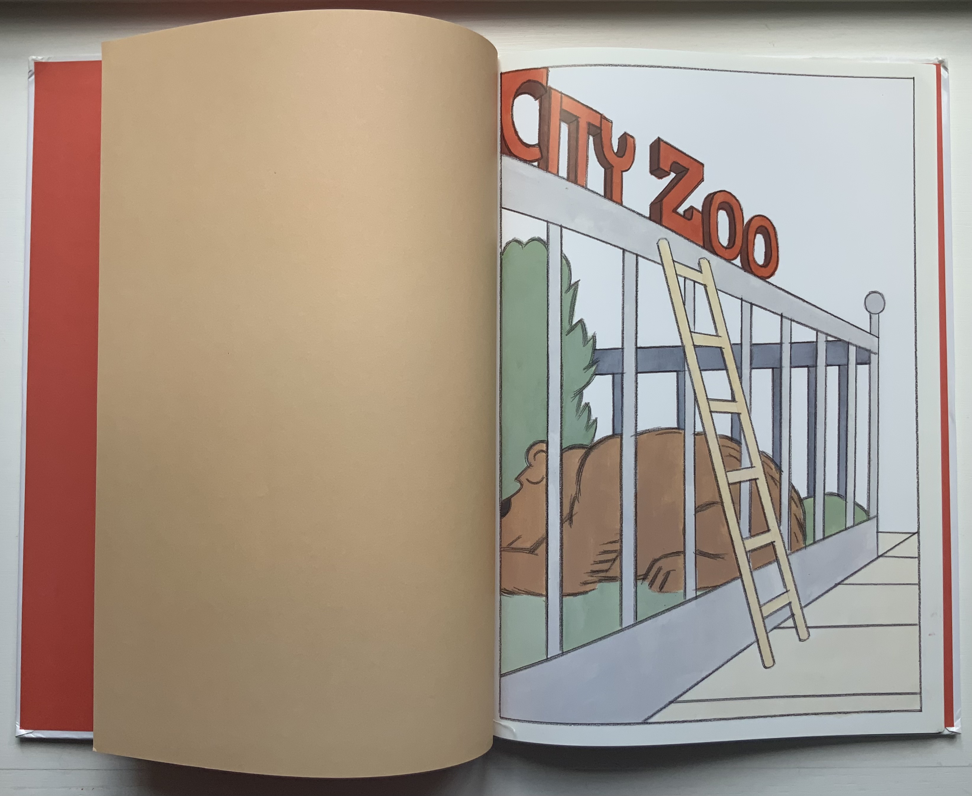
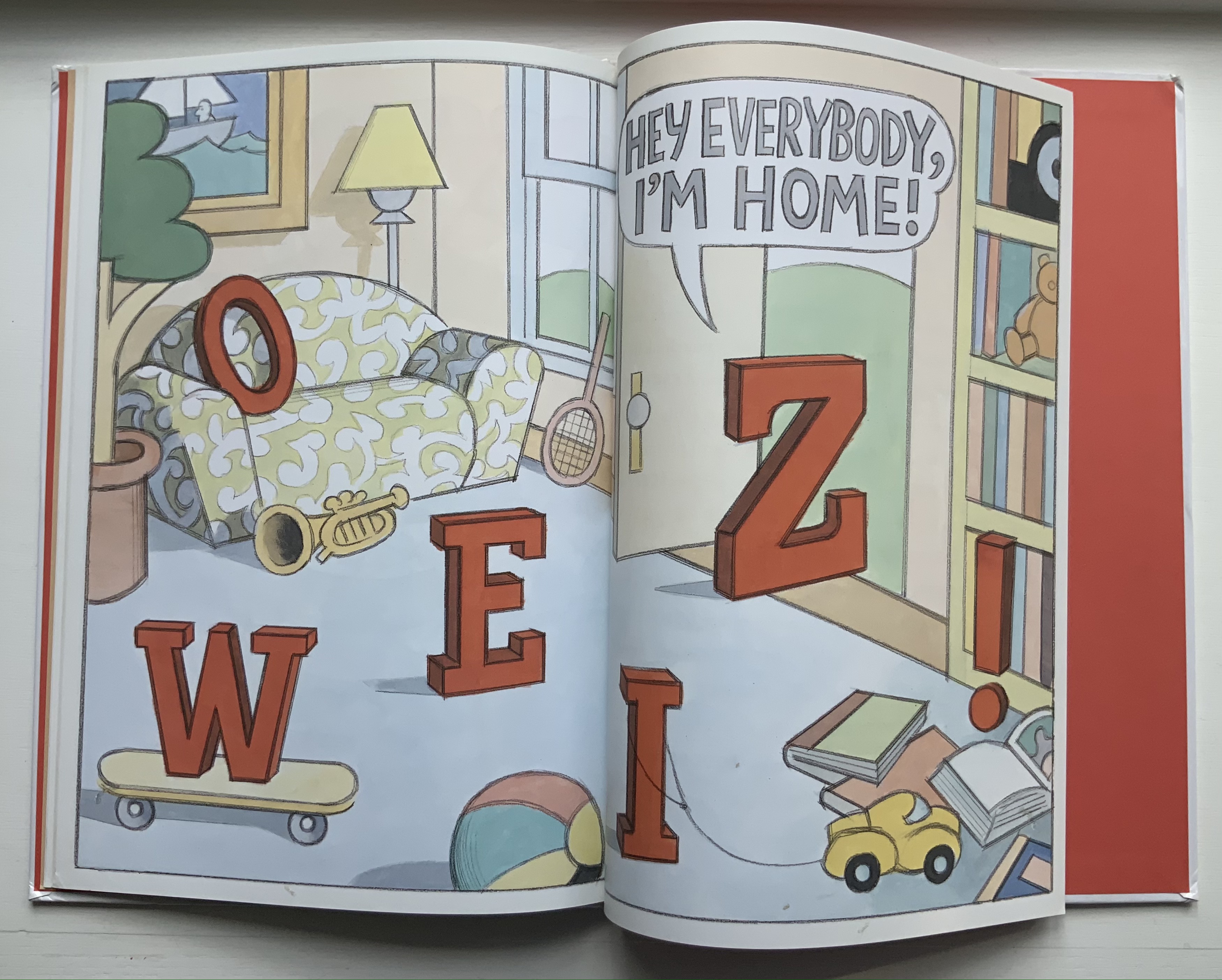
Z Goes Home (2006)
Z Goes Home (2006) Jon Agee Casebound, paper pasted on boards, sewn. H320 x W223 mm, 30 Pages. Acquired from Amazon, 1 July 2021. Photos of the work: Books On Books Collection.
In this first of four imaginative books bringing Z to life, the letter begins to take on real character, quietly descending a ladder from its day job at the city zoo, making its way home across a Bridge, stopping for a Cake and Doughnut snack, admiring itself in a Mirror, and so on until reaching its home at the end.
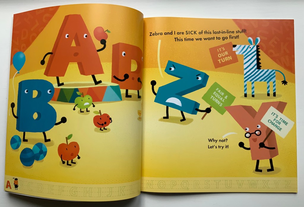
AlphaOops: The Day Z Went First (2012)
AlphaOops: The Day Z Went First (2012) Alethea Kontis & Bob Kolar Paperback, sewn. H270 x W245 mm, 48 pages. Acquired from Altair Books, 1 July 2021. Photos of the work: Books On Books Collection. Displayed with permission of the author and artist.
Kontis and Kolar give the letter a zestier, feistier temperament in AlphaOops. Z and Zebra start off well enough, followed by Y and X, but then P and the Penguins show up out of order and Z finds that keeping everyone in reverse alphabetical order is harder than it looks.
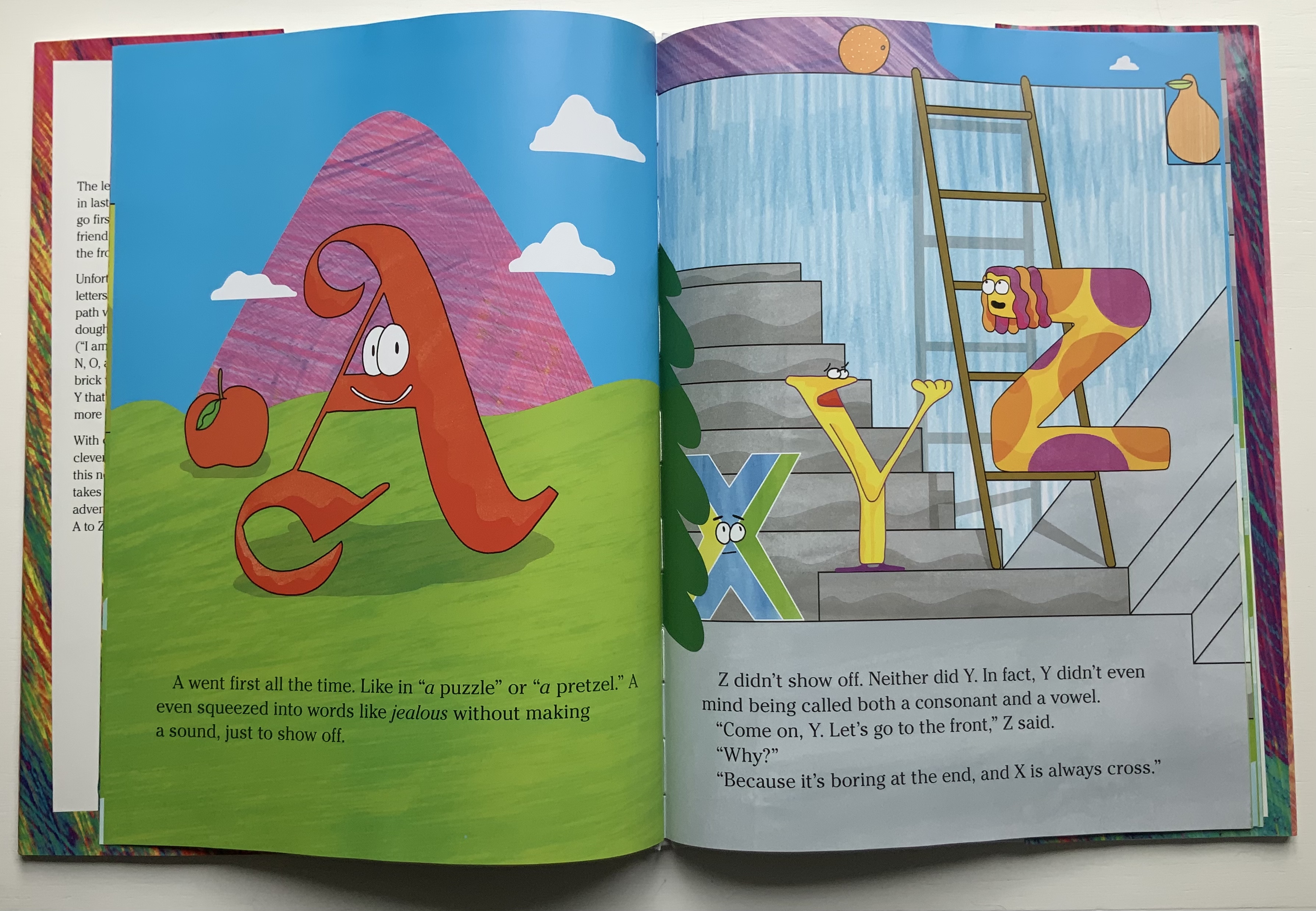
Z Goes First (2018)
Z Goes First (2018) Sean Lamb & Mike Perry H286 x W205 mm, 26 pages. Acquired from Amazon, 1 July 2021. Photos of the work: Books On Books Collection. Photos of the work: Books On Books Collection. Displayed with permission of the author and artist.
Lamb and Perry introduce a generally milder Z, accompanied by a helpful Y always ready to ask why and why not when the other letters are less than cooperative with Z’s going first.
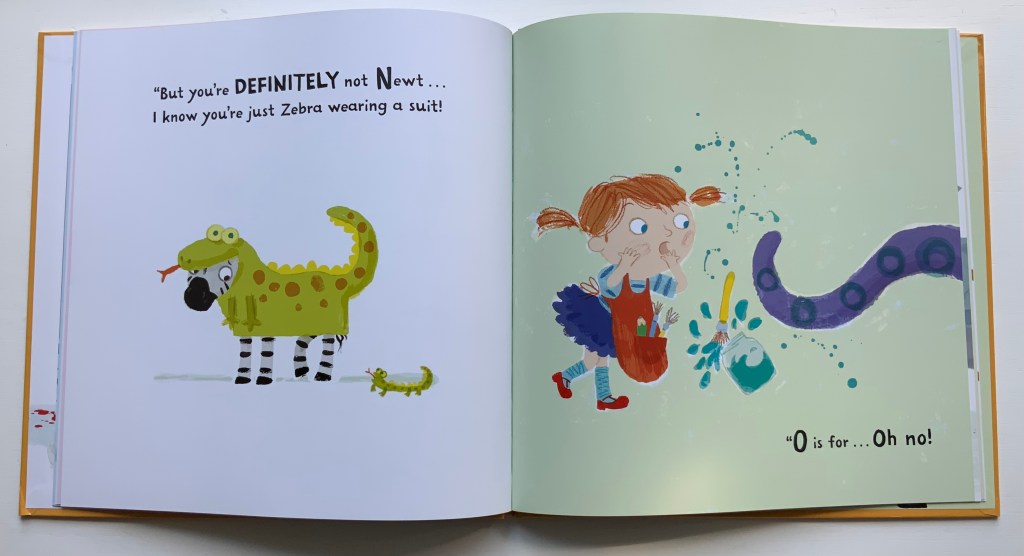
Not Yet Zebra! (2018)
Not Yet Zebra!(2018) Lou Kuenzler & Julia Woolf Hardback, paper pasted on board. H256 x W256 mm, 28 pages. Acquired from The Saint Bookstore, 1 August 2021. Photos of the work: Books On Books Collection. Displayed with permission of the author and artist.
Kuenzler and Woolf let Z’s inner Zebra loose on poor Annie who just wants to paint her alphabet in the right order.
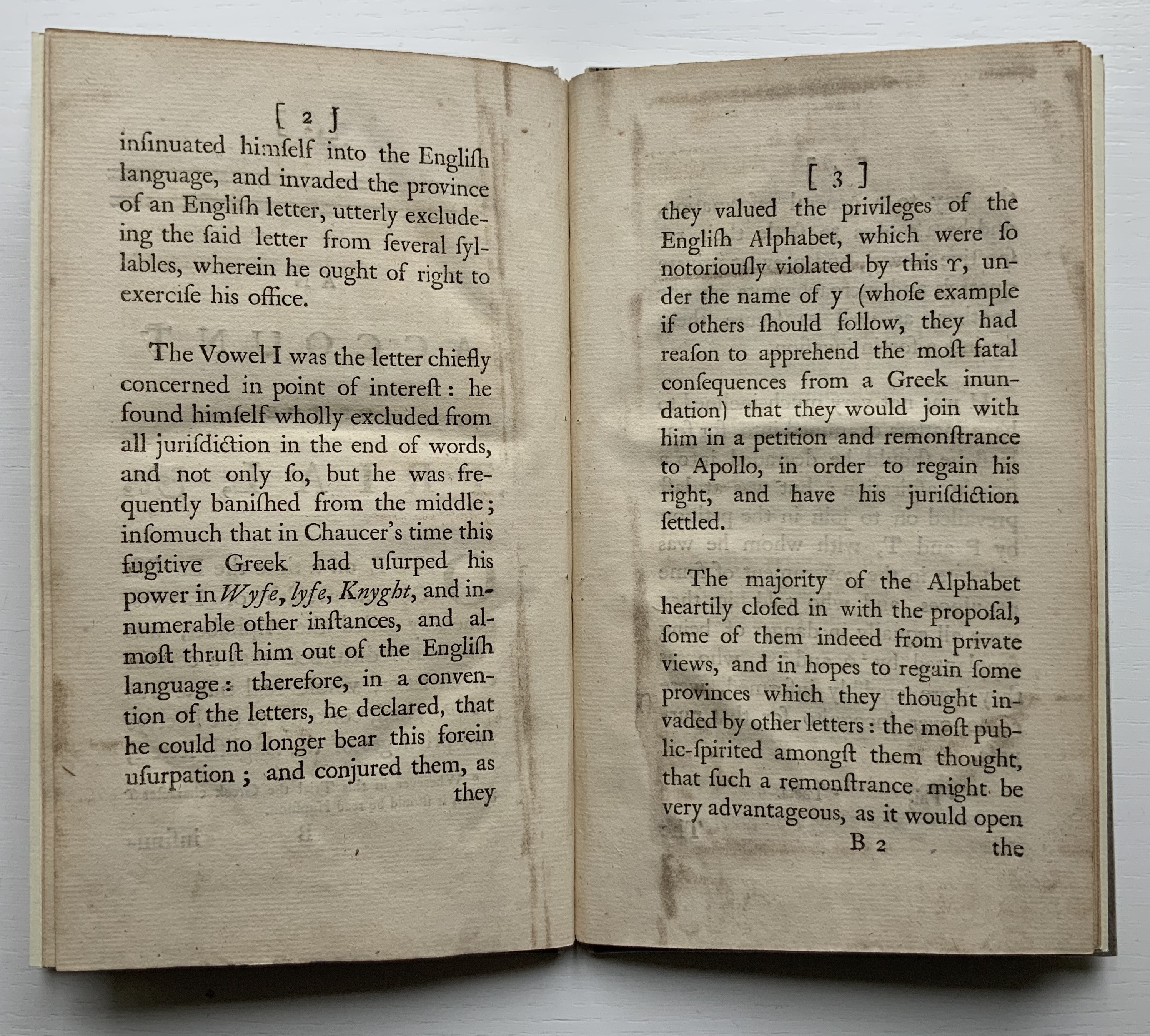
What has taken Z so long to find its raizon d’être?
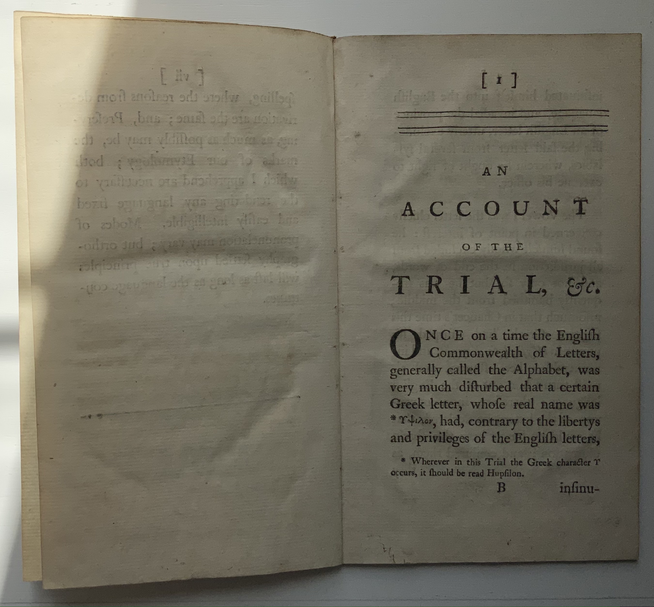
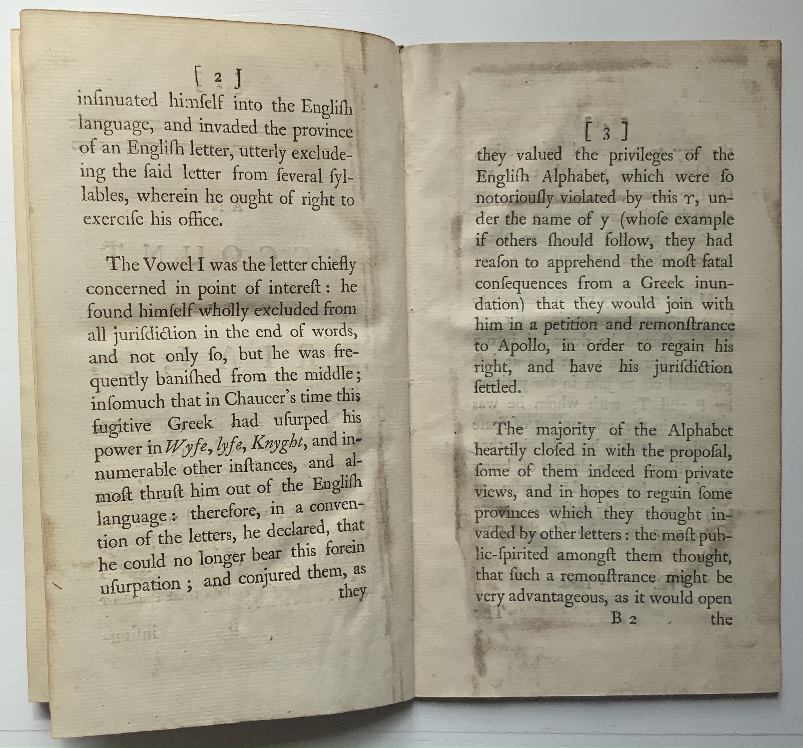
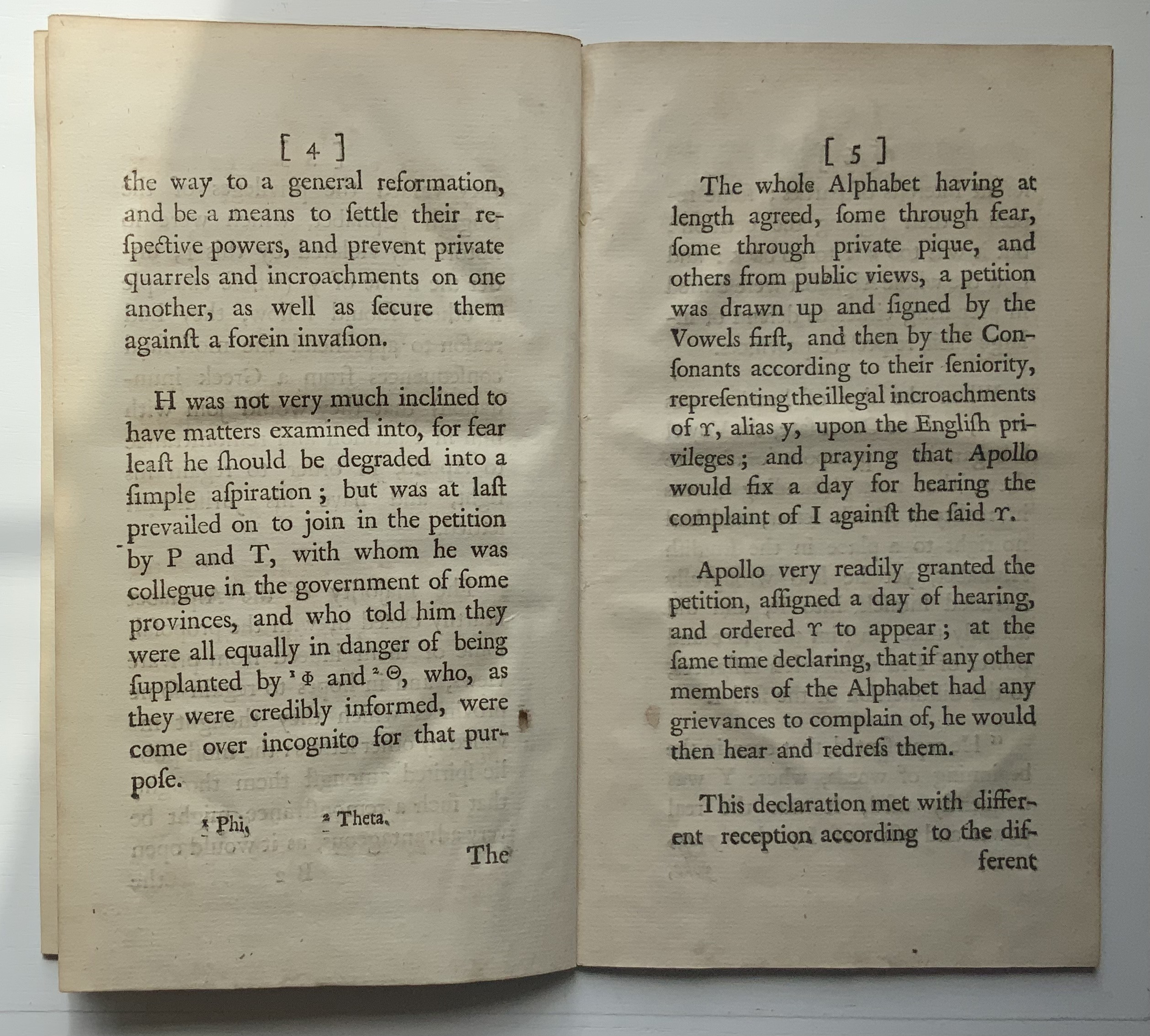
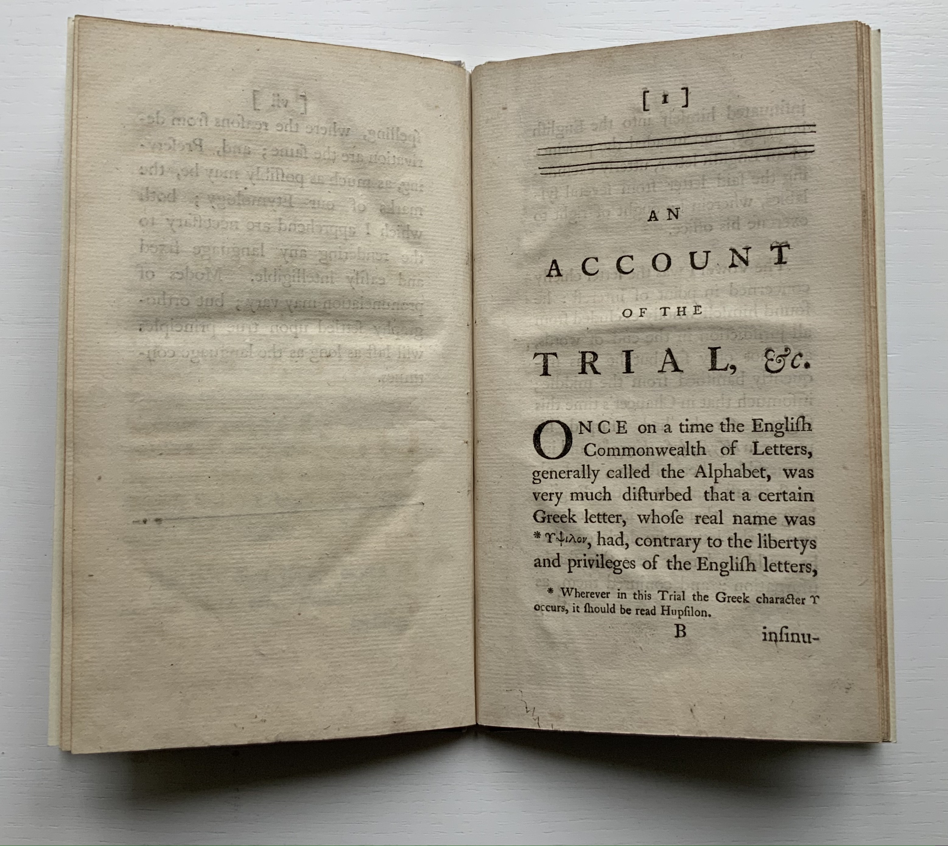
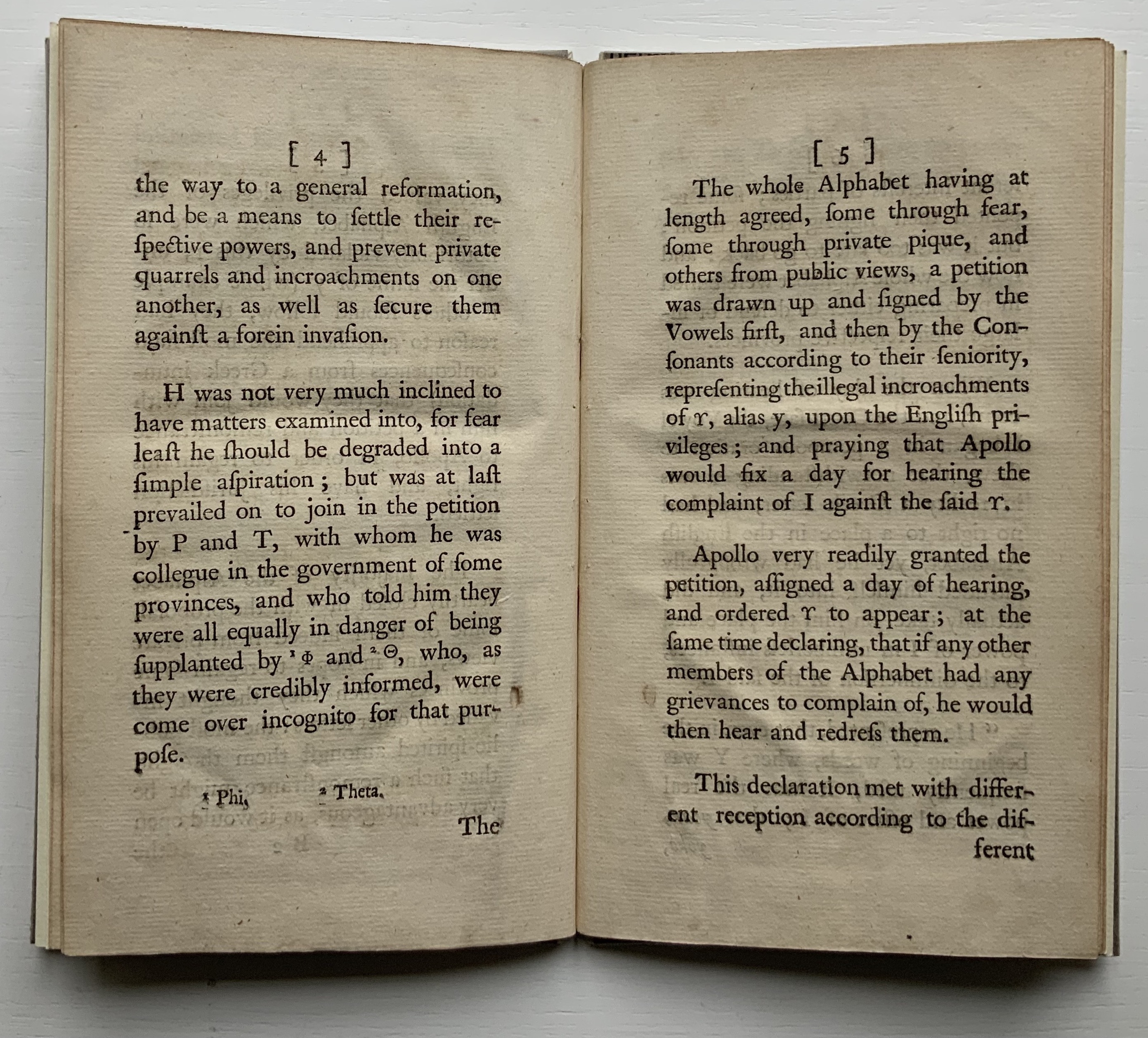
Like the Hebrew fable in which the letters of the alphabet argue their cases for the position of first letter, this short eighteenth century fantasy has the English Commonwealth of Letters rounding on the letter y as a Greek interloper, usurping their brother i’s rightful position at the end and even middle and beginning of words. Why the letters choose Apollo to judge the case is an irony lost on all the characters. But this is no surprise. After Apollo rules in y’s favor, their witless lack of self-awareness explodes into the internecine warfare of a roomful of Brexiteers. The letters d and th come to blows over murder and murther; the letters ugh demand reinstatement at the end of tho and thro; the letters s and c row over defense/defence and pretense/pretence; and so on.
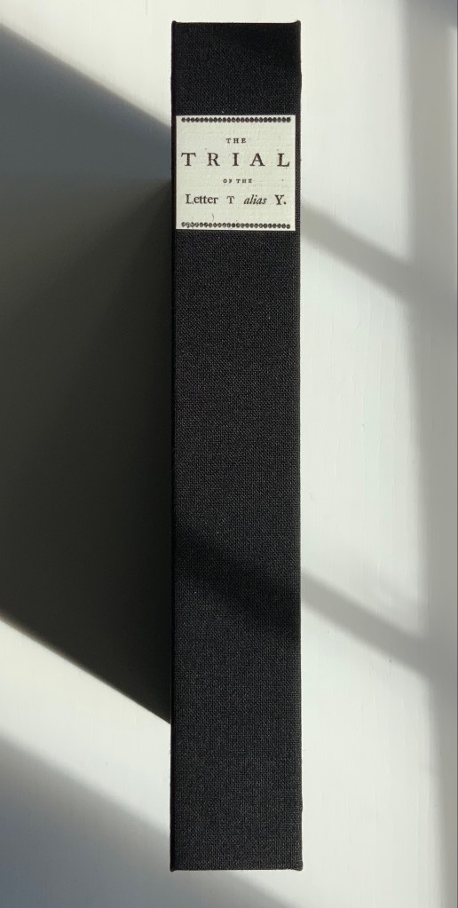
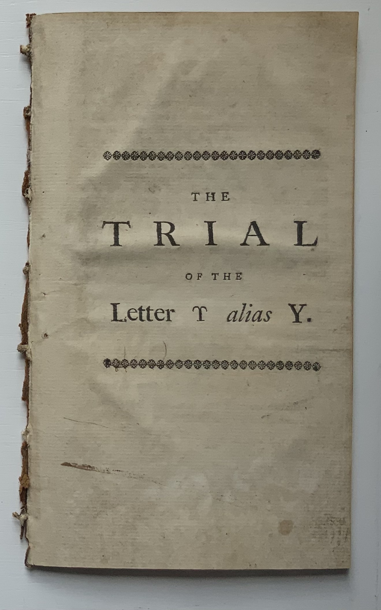
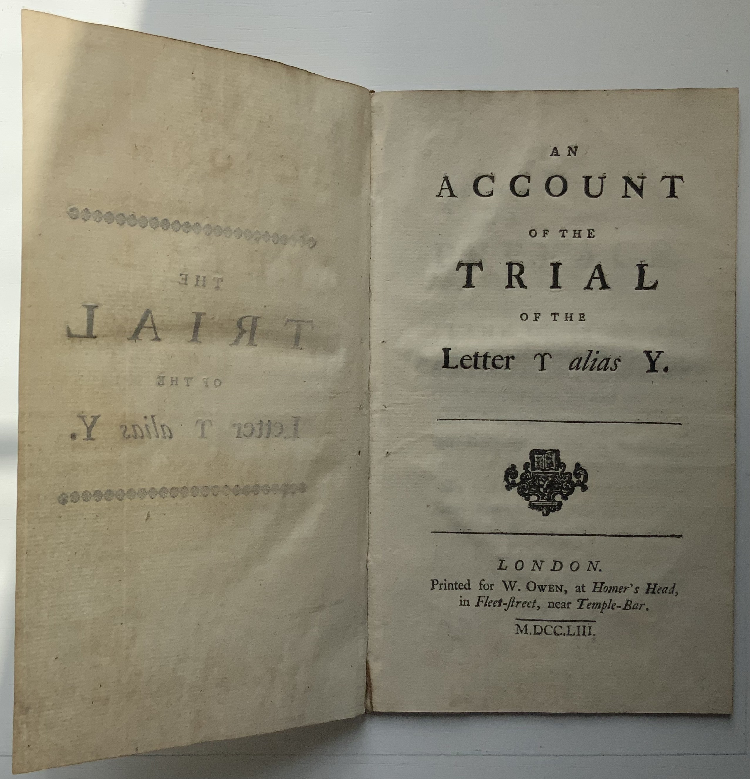
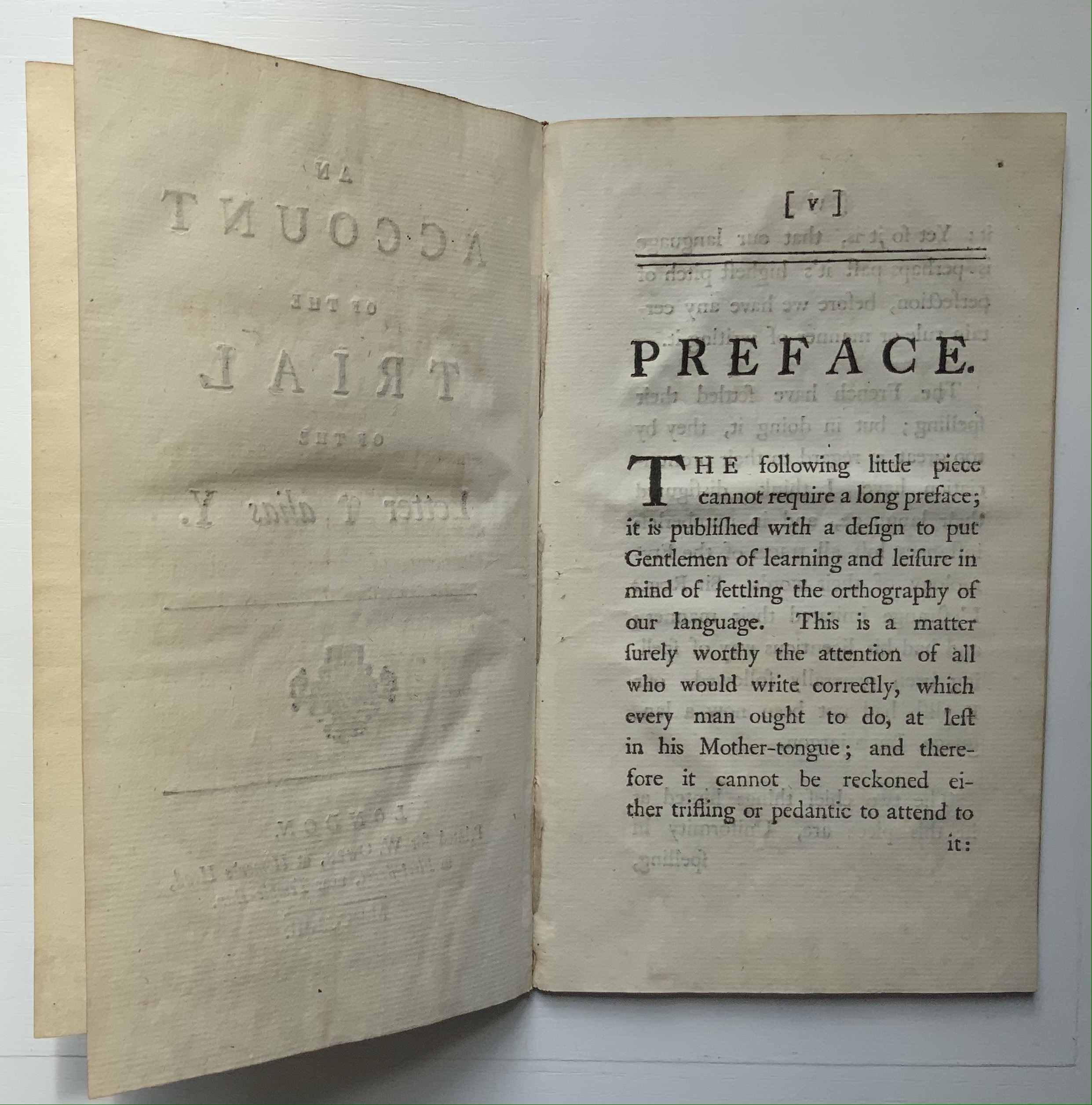
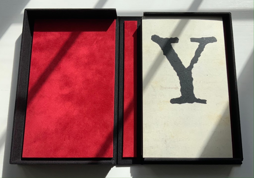
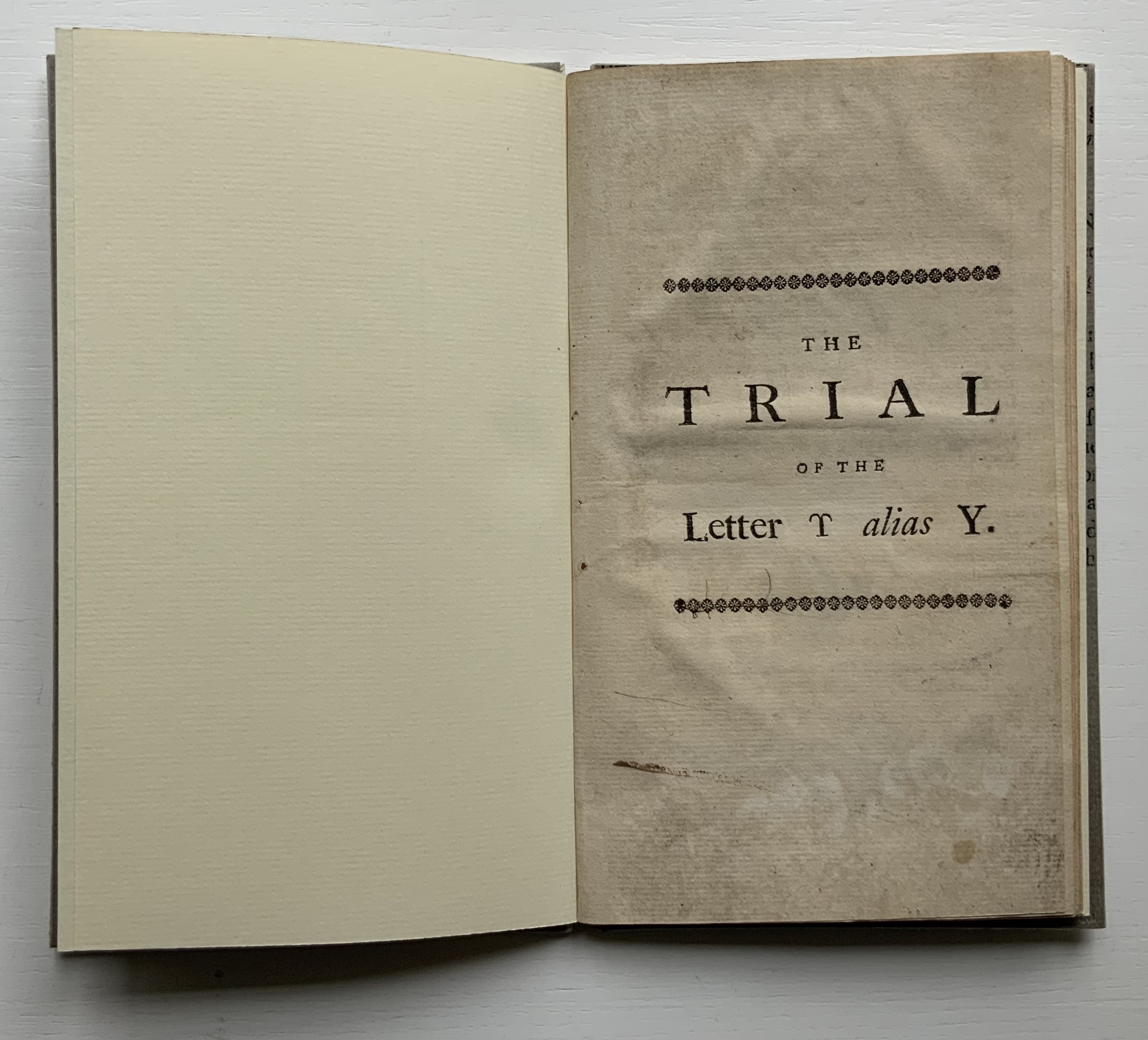
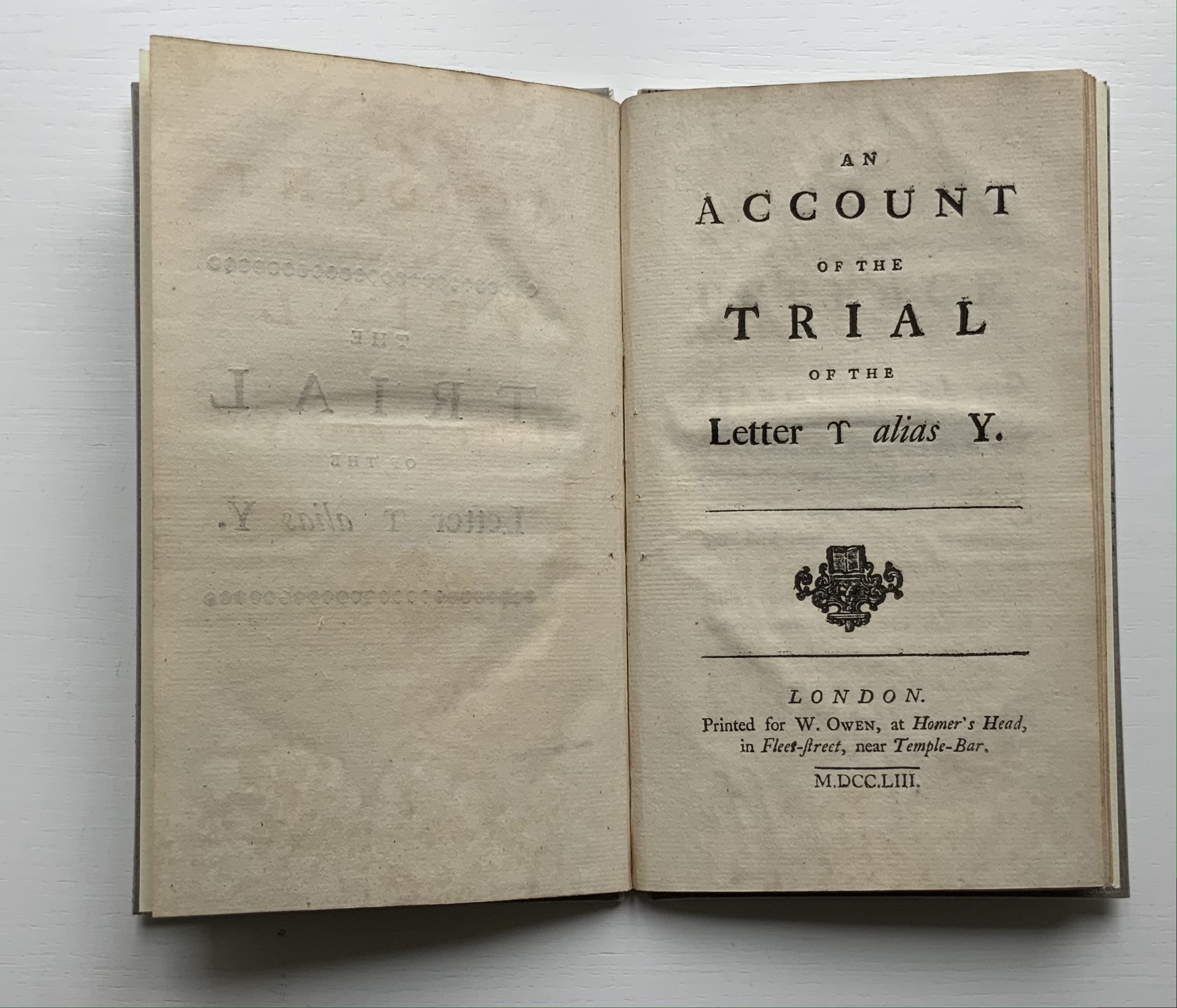
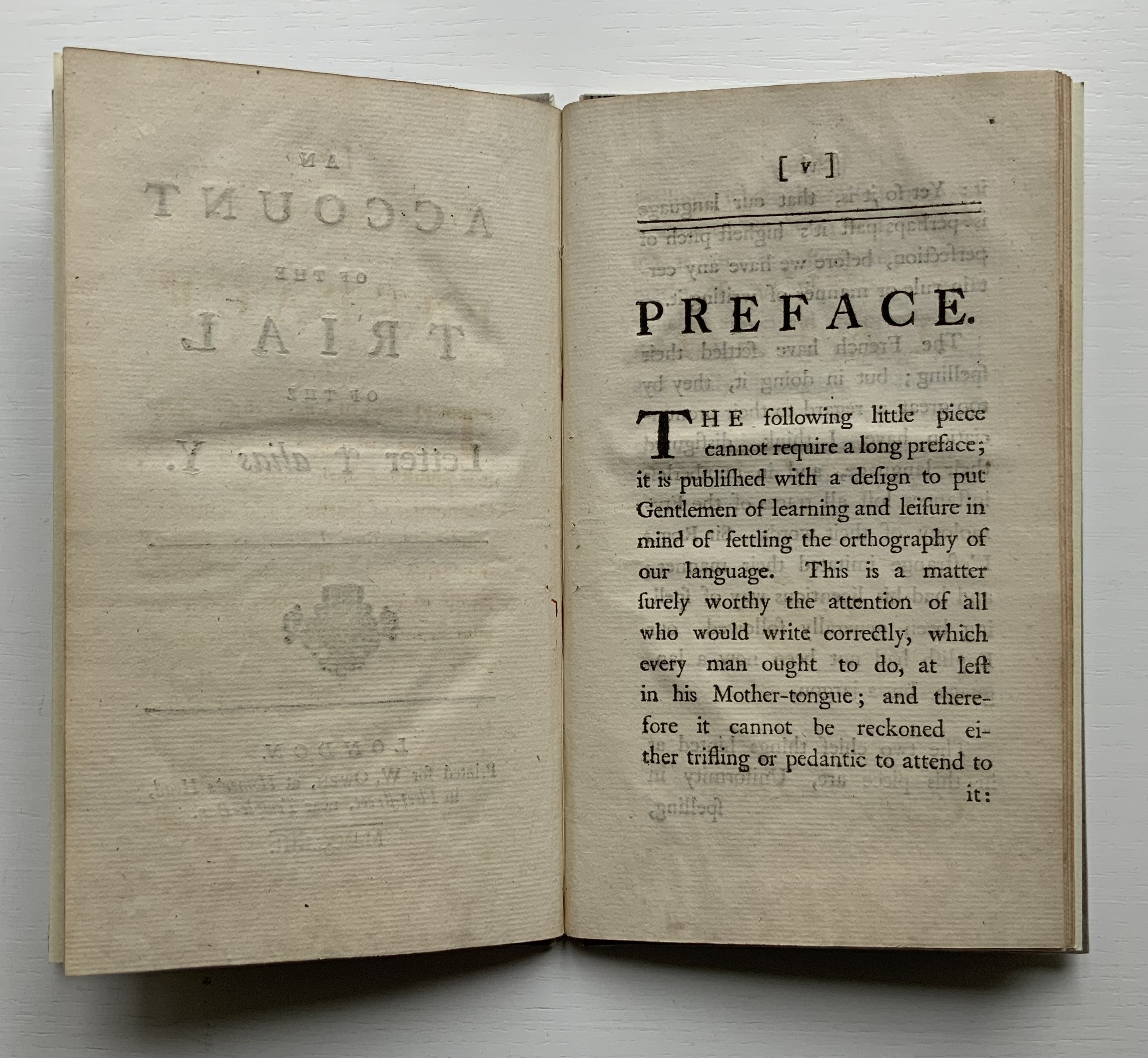
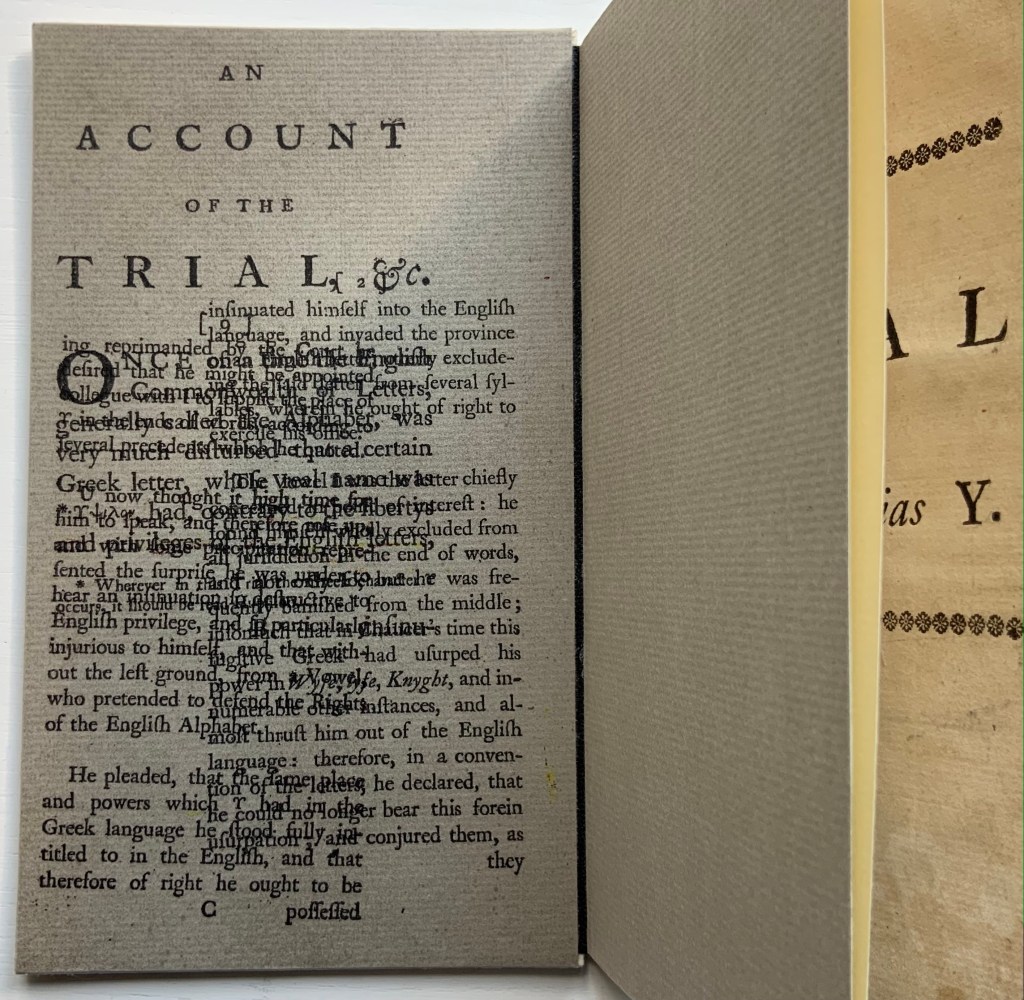
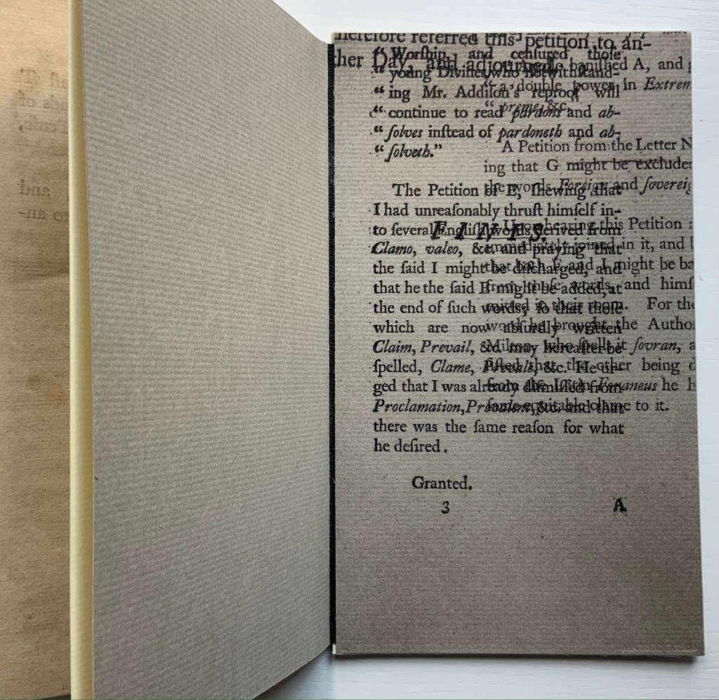
Thomas Edwards (1699-1757) was an English critic and poet. According to the Oxford Dictionary of National Biography, his friend the printer and novelist Samuel Richardson encouraged him to write a book on spelling, which resulted in An Account of the Trial of the Letter ϒ [Upsilon], alias Y. The silliness first appeared in 1753 in two forms: one in the fifth edition of Edwards’ Canons of Criticism printed for the bookseller C. Bathurst (over-against St. Dunstan’s Church in Fleetstreet) and the other as a pamphlet for the bookseller W. Owen (at Homer’s Head, in Fleet-Street, near Temple-Bar).
The quarrelsomeness among the letters reflects the same among the not-so-gentlemanly scholars of the period. Edwards’ Canons of Criticism sets out principles for editing in the guise of a stiff critique of William Warburton’s edition of Shakespeare’s plays. Priest and later bishop of Gloucester, Warburton replied ad hominem, and the feud was on. Even the pompous bully Samuel Johnson joined in, disparaging both (presumably with an eye on elevating his own judgement if not his future edition of Shakespeare):
Soon after Edwards’s ‘Canons of Criticism’ <1748> came out, Johnson was dining at Tonson the Bookseller’s, with Hayman the Painter and some more company. Hayman related to Sir Joshua Reynolds, that the conversation having turned upon Edwards’s book, the gentleman praised it much, and Johnson allowed its merit. But when they went farther, and appeared to put that authour upon a level with Warburton, ‘Nay, (said Johnson,) he has given him some smart hits to be sure; but there is no proportion between the two men; they must not be named together. A fly, Sir, may sting a stately horse and make him wince; but one is but an insect, and the other is a horse still.'” (Dussinger, “Johnson’s unacknowledged debt”)
The version in the Books On Books Collection is the pamphlet: ”First and only edition, vii, [1], 23, [1]pp., with half-title, disbound”, as it is described in the British Library’s English Short Title Catalogue. Human petulance aside, the letters’ speechifying and Edwards’ observations about the alphabet’s history place The Trial squarely in the collection between letterpress works and the more trade-oriented alphabet books. As can be seen in the “before” pictures, though, the pamphlet required some attention before joining. That attention, however, would have to suit the nature of the collection.
Before
From a coincidental meeting at a Maggs Brothers exhibition in London, Mark Cockram sprang to mind, and his words here confirmed him as the right choice:
This brings us to the world of book arts. As I progress with my work and life I have begun to engage with this genre in the book making world. I admit that in the past I was a bit of a book snob. Though I produced a number of book works I was unable to cut free of the shackles of the finely bound book, working towards the mastering the complexity of the book… dare I say I was blinkered? In retrospect it is only over the last 15 or so years that I have been able to bring together the various disciplines of the book with the art of the book (though I am sure many who will argue I have neither) It has taken time for me to be able to engage and combine. However I feel that working in this way I am able to be honest with my work, to reflect the now as opposed to rebinding the past. It is a personal journey. Please note there are other ways of doing things and opinions….. spelling and grammar. Please further note, the opinion of the author may change at any moment. This is due to having an open mind… of sorts. (Mark Cockram, Studio 5 Book Arts, 30 December 2019. Accessed 4 January 2020.)
After
The paper-labelled cloth box has an unusual heft, implying weighty content but opening to reveal the humorously modest-sized pamphlet.
The artist’s binding solution involves two paper-covered boards. These additional “before and after” pictures show further how the artist’s “lay flat” binding solution preserves as full a view as possible of the original’s gutter.
Before
After
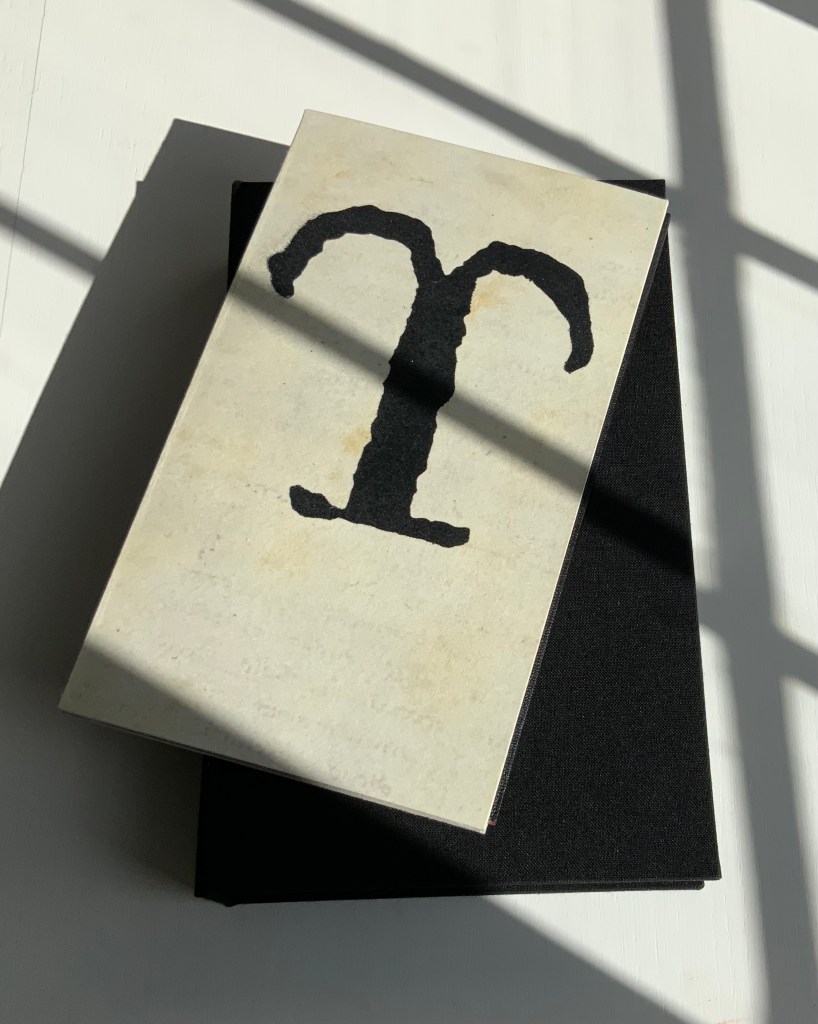
Note also how, inside and out, the front and back boards comment on the contents. The pamphlet’s title is echoed by the enlarged letters Y and ϒ. The faint palimpsest-like printing on the front and back covers (see above and below) and the overprinted inside covers echo the sourcing, disbound from an original binding.
And there is no missing Cockram’s fine press touch in the handling of the end papers and the spine’s red inner backing echoing the interior of the storage box.
Further Reading
“Kintsugi“. 20 February 2019. Bookmarking Book Art.
Special thanks to William Laywood of Forest Books ABA-ILAB for explaining the notation from the English Short Title Catalogue pointing me down the road to discovering the Canons of Criticism and Professor Dussinger’s insights.
Dussinger, John A. 23 September 2004. “Thomas Edwards“, Oxford Dictionary of National Biography. Accessed 9 October 2021.
Dussinger, John A. 1 January 2016. “Johnson’s unacknowledged debt to Thomas Edwards in the 1765 edition of Shakespeare.” Philological Quarterly. In The Free Library, University of Iowa. Accessed 9 October 2021. Dussinger is quoting James Boswell’s Life of Johnson, ed. G. B. Hill, rev. L. F. Powell, 6 vols. (Oxford U. Press, 1934-1964), l:263n3.
And Viewing
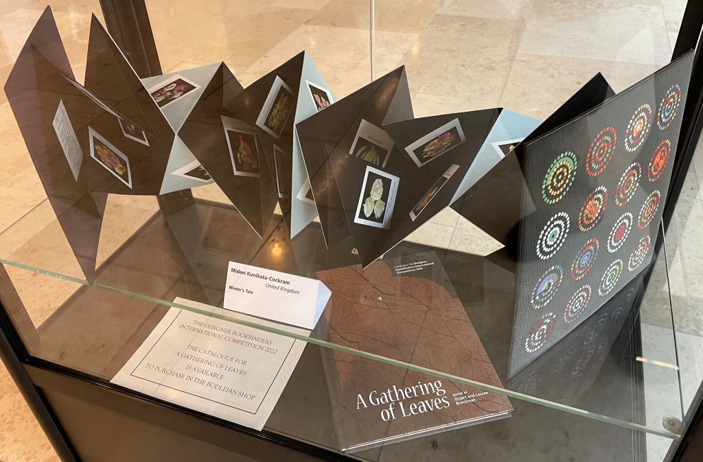
Imre Flores. Showcased at the Weston Library, Oxford University, July – September 2022.
Winter’s Tale. Showcased at the Weston Library, Oxford University, July – September 2022.
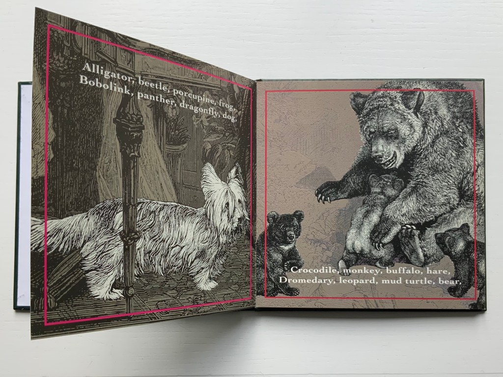
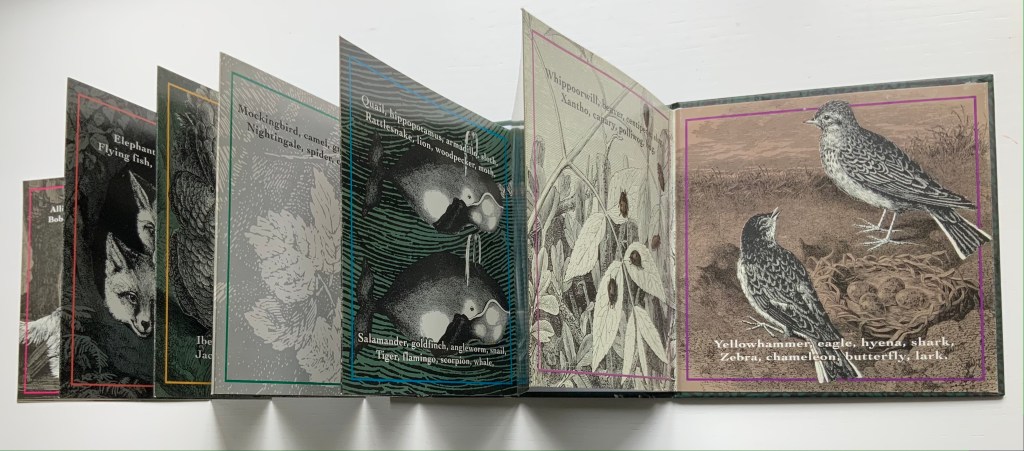
Perhaps better known for her earlier series of detective stories about a toy bear named Ophelia, Michele Durkson Clise’s accordion book stands out among alphabet books for its text, graphic art and twist on the genre’s usual categories.
Animals are the most frequent topic of alphabet books, and the most usual text structure is a single letter to a page, accompanied or followed by an animal (or animals) whose name begins with the letter. Another common text structure is the hidden letter, where the letter has to be guessed from the image or is hidden in the image.
In Clise’s Animal Alphabet, instead of the single letter, we have a single animal corresponding not to a letter but to the animal’s name at the end of a rhyming couplet. Where are the letters? There is no D for dog on the first page normally belonging to A, but the page normally belonging to B does show a bear. Was something missed on the first page; might the dog might be a Lhasa Apso? Not with those ears and that tail. And back to the bear; where is the letter B?
The disconnect between alphabetical order and the animals depicted is distracting and enjoyable. The pauses and stumbles it causes lead to looking closely at the images, perhaps postponing discovery of the letters. From where did these striking images come with their black and white engravings of the animals against varied backgrounds of light or dark green, light or dark brown and light gray on glossy card stock? The fine lines in the animal images suggest etching. Several of the backgrounds appear to be wood engravings. In a trade book, the printing is surely offset, from which the technique of drawing is hard to tell. Perhaps the answer resides in the artist archive at the Dorothy Stimson Bullitt Library in the Seattle Art Museum. Or in someone’s encyclopedic eye for antique prints.
Despite the “distractions” of the accordion fold, the pull of the anapest (tum-ti-tum) rhythm and the animals aligned with rhyme not the letters, the somewhat hidden letters eventually emerge. For the reader not attuned to acrostics, there they are at the start of each couplet’s lines: Alligator, Bobolink, Crocodile, Dromedary … Yellowhammer, Zebra.
Which is it — “necessity, the mother of invention” or ”invention, the mother of necessity”? Whichever, with Clise’s Animal Alphabet, we have the necessary and right letters, words, lines, rhyme, rhythm, textual, graphic and material structure.