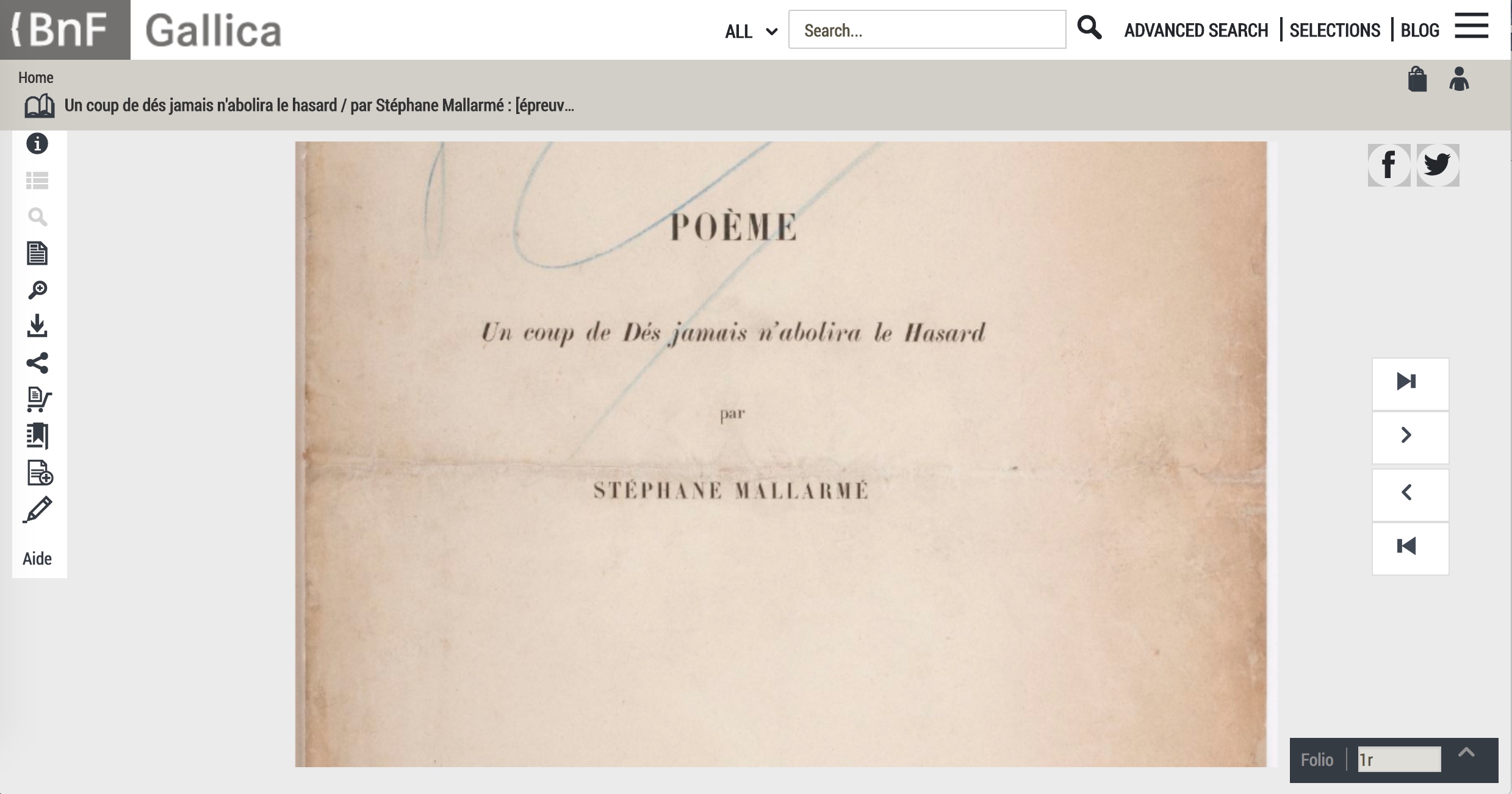
Nicholas Dames’s readable New Yorker piece presents telling episodes in the history of authors’ use of the chapter in non-fictional and fictional works — from Cato the Elder, Pliny, the Venerable Bede, Caxton, Fielding, Gissing and others.
Latin capitulum, Spanish capítulo, French chapitre, Czech kapitola, German Kapitel, Romanian capitol, Italian capitolo, English chapter: is it anything different in the digital age? The page can “disappear”, scrolling down a window, replaced by a percentage of book completed. What about the chapter?
The following paragraph from Dames is telling when juxtaposed with the final chapters of Amaranth Borsuk’s The Book (MIT Press, 2018), which brings to bear on the history of the book and its elements the perspective of an artist; reviewed here.
Like the momentary lifting of a pianist’s fingers while a chord still resonates, the classic novelistic chapter evokes time by dwelling in a pause rather than a strong ending. We feel time in the novel by marking it out into bits, but only bits that have no strong shape, that fade or blur into one another in the recollection. The greatest practitioners of the chapter have preferred to cast their divisions as fleeting caesuras with lingering aftereffects, scarcely memorable in their specifics but tenacious in the feeling they evoke. (italics added) Situations yielding silently to new configurations, feelings fading imperceptibly or stealing upon us, shifts in the atmosphere around us: time in the novel is made up of these chromatic transitions, and the usual name for them in the history of the form is the chapter.
The [artists’ book] movement had its beginnings with a few individuals (conceptual artists Dieter Roth, Hansjörg Mayer, and Ed Ruscha immediately come to mind), but in the area of structural experiment and invention only one person seems to have been markedly influential (albeit seriously ignored): Hedi Kyle.
Alastair Johnston, “Visible Shivers Running Down My Spine”, Parenthesis, Fall 2013, Number 25.
While Alastair Johnston’s 2013 interview with Hedi Kyle is a rich one and welcome, it is inaccurate to say Hedi Kyle has been seriously ignored. After all, in 2005, the Guild of Book Workers awarded her an honorary membership, and Syracuse University’s Library invited her to deliver that year’s Brodsky Series lecture. In 2008, the Philadelphia Senior Artists Initiative recorded her oral history and posted her artist’s statement along with an extensive list of prior exhibitions, honors, professional roles and board memberships stretching back to 1965.
If, however, Johnston’s assessment is accurate, subsequent events have rectified the situation. In 2015, Kyle delivered the keynote address “Four Decades under the Spell of the Book” for the Focus on Book Arts annual conference. In the same year, the 23 Sandy Gallery held a successful international juried exhibition entitled “Hello Hedi“, an echo of the 1993 exhibition organized by the New York Center for Book Arts entitled Hedi Kyle and Her Influence, 1973-1993. In 2016, the San Francisco Center for the Book held a solo exhibition for Kyle: “The World of Hedi Kyle: Codex Curios and Bibli’objets“.
And now, in 2018, Laurence King Publishers has brought out the eagerly awaited The Art of the Fold by Kyle and daughter Ulla Warchol, which is the immediate impetus for this essay. The authors aim their book at artists and craftworkers, but there is a secondary audience: anyone interested in book art or artists’ books or origami — and learning how better to appreciate them.
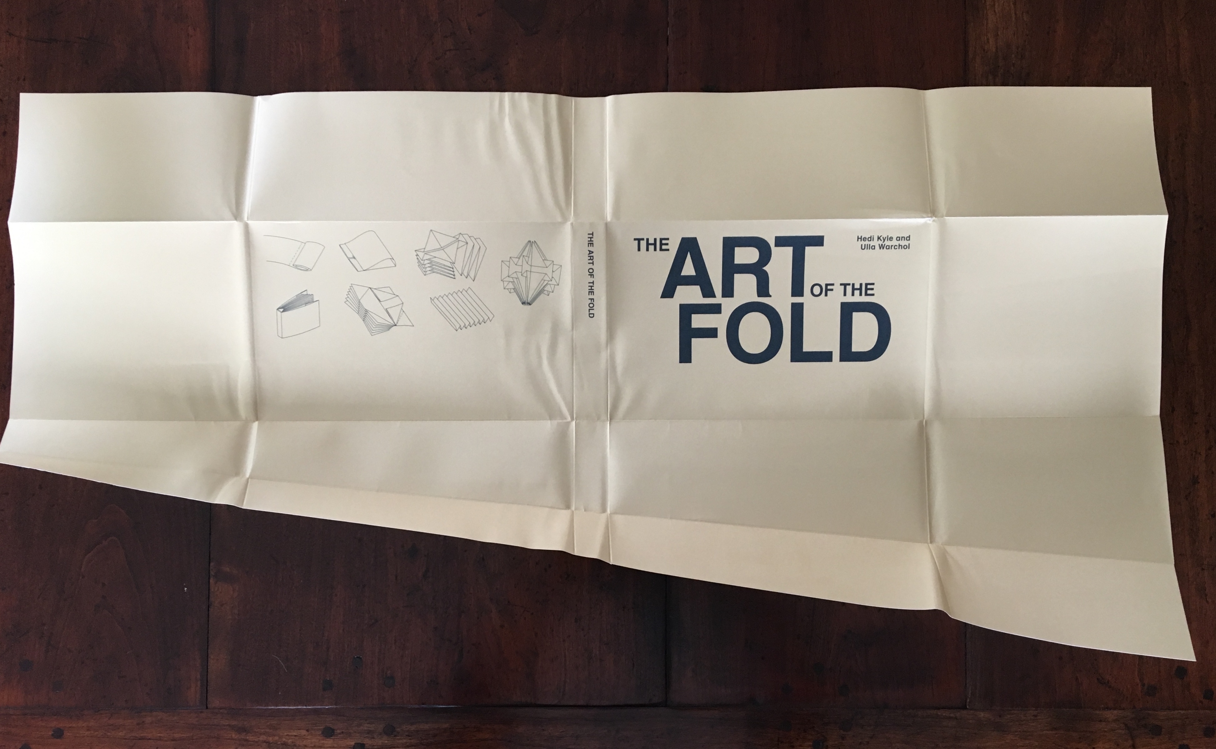
On picking up the book, the first thing its primary and secondary audiences should notice is the folded “dust jacket”. Why the quotation marks? Just look:
“Dust jacket” unfolded, side 1
“Dust jacket” unfolded, side 2
This innovative, subject-appropriate cut, fold and print can set the reader on a hunt for precursors such as Peter and Pat Gentenaar-Torley’s Paper Takes Flight/Papier op de Vlucht, designed by Loes Schepens, where the multilayered dust jacket has small envelopes attached to hold paper samples from the contributing artists, or Doug Beube’s Breaking the Codex, designed by Linda Florio, where the dust jacket includes a perforated bookmark, whose removal implicates the reader in a bit of biblioclasm and challenges Western parochialism.
Paper Takes Flight/Papier op de Vlucht (2006) Peter and Pat Gentenaar-Torley Note how the book’s title is revealed on the second dust jacket from the bottom.
The five opened dust jackets displayed beneath the title page
Bottom-most dust jacket folded from the backboard to the right revealing the airmail envelope, which contains a blank sheet of airmail stationery
The Art of the Fold‘s clean, balanced design (Alexandre Coco) and excellent diagrams (authors) mesh well with the text. While this integrated clarity in the introductory section on Tools, Materials, Terminology, Symbols and Techniques will be appreciated most by artists and paper engineers, the secondary audience of library/gallery curators, aficionados and collectors will benefit from the description and comments in particular on materials, terminology and techniques. Knowing these points about an object of book art enhances appreciation of it and improves its handling, presentation and preservation.
Following this introduction, Kyle and Warchol provide 36 sets of detailed instructions across 5 sections:
The Accordion
Blizzards
One-Sheet Books
Albums
Enclosures
This double-page spread introducing the accordion structure shows off the the diagrams’ clarity, a feature throughout the book. Also in this spread are two important statements in the verso page’s final paragraph:
The accordion fold as an independent component is our focus point in this book…. Let us start with a brief visual display of a variety of folding styles. Hopefully they will inspire you to grab some paper and start folding. (p .28)
The focus on structure “as an independent component” is a strength and weakness. The strength is self-evident in the thoroughness and attention to detail. The weakness? More than occasionally, the authors make asides about the meaningful interaction of structure with content and, occasionally, with other components (type, color, printing technique, etc.). Some exemplars selected by the authors would have been welcome. The artist’s and reader’s challenge is to provide their own examples of how the structural component might work with different types of content, mixed media and other components that combine to deliver the artistic object.
The second statement — the exhortation “to grab some paper and start folding” — illustrates an unalloyed strength of this book. As towering an authority and figure in the book arts and book art as Hedi Kyle is, she and her co-author go out of their way again and again to keep readers open to playing with the techniques and structures and finding their own inventiveness and creativity. For those content to collect or curate, both statements push them to look for or revisit outstanding examples and inventive variants of the structures elucidated. After this section, a browse of Stephen Perkins’ accordion publications, a site running since 2010, would be a good start.
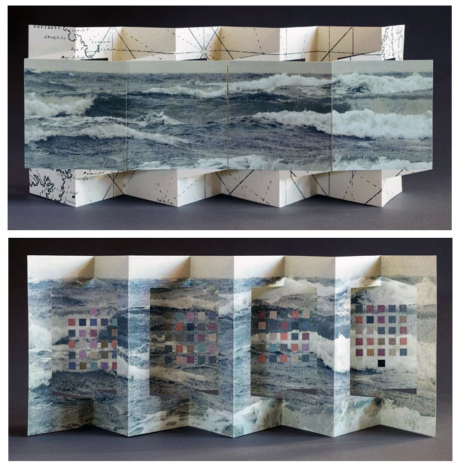
This double-page spread introducing the section on Blizzard structures delivers that blend of the anecdotal with essential engineering-like detail that is characteristic of the authors’ style throughout. Having explained how this family of folded structures that bind themselves got its name (a fold discovered in a daylong fold-a-thon due to a blizzard’s shutting everything down), the authors dive into the proportionality so key to getting them right. Perhaps because of its non-adhesive, origami-centric nature, the blizzard book structure generates more than its fair share of kitsch exemplars. When blizzard books do come along that rise to the level of art — integrating structure, content, printing, typography, color and other components of bookmaking in an artistically meaningful way — they stand out all the more. One such work took first place in the 23 Sandy Gallery’s juried exhibition in 2015, “Hello Hedi”:
Next to The Accordion section, the One-Sheet Books section has the most models. It is also the section that most addresses that challenge mentioned above:
A book folded from a single sheet of paper, including covers, offers a unique opportunity to consider the content and cover as one comprehensive design exercise. We explore the coming together of printing, layout and folding. (P. 94)
Given this opportunity, some treatment of imposition would have been useful, especially for the Franklin Fold and the Booklet Fold Variations. For the Booklet Fold Variations, one could lightly pencil into the book’s clear diagrams the usual markings and enumerations as below.
Again, a few selected photographs of examples of One-Sheet Books that achieve the coming together of content, design, printing, layout and folding would have been welcome.
The double-page spread above with which the Albums section begins exemplifies the book’s quality of photography (by Paul Warchol, Ulla’s husband). Like the “dust jacket”, the crisply photographed Panorama Book structure (upper right) and the pages that explain it will send readers on a quest to make their own or hunt for outstanding examples such as these by Cathryn Miller and Cor Aerssens, a long-time friend and correspondent with Kyle.
Westron Wynde (2016) Cathryn Miller Author’s statement: “This book presents the poem ‘Westron Wynde’ in a purely visual form. Letters become colours, and are used as graphic elements. The book manifests the essence, if not the sense, of the poem.” Westron wynde when wyll thou blow, The smalle rayne down can rayne – Cryst, yf my love wer in my armys And I yn my bed agayne!
Memories (2012) Cor Aerssens
Memories (2012) Cor Aerssens
Memories (2012) Cor Aerssens
A cautionary, or perhaps encouraging, note though: the fact that some structures can enfold others will frustrate readers with strict classificatory minds and exhilarate the more freewheeling. The Phelps’ Blizzard Book highlighted above includes in its sections items exemplifying the Flag Book and Fishbone structures. Aerssens’ Memories is even more so an integrated variant of the Panorama Book structure, featuring as it does panels within panels, two 8-leaf booklets bound into front and back with paper hinges, and mylar folders holding pressed flora from Aerssen’s northern Dutch environs.
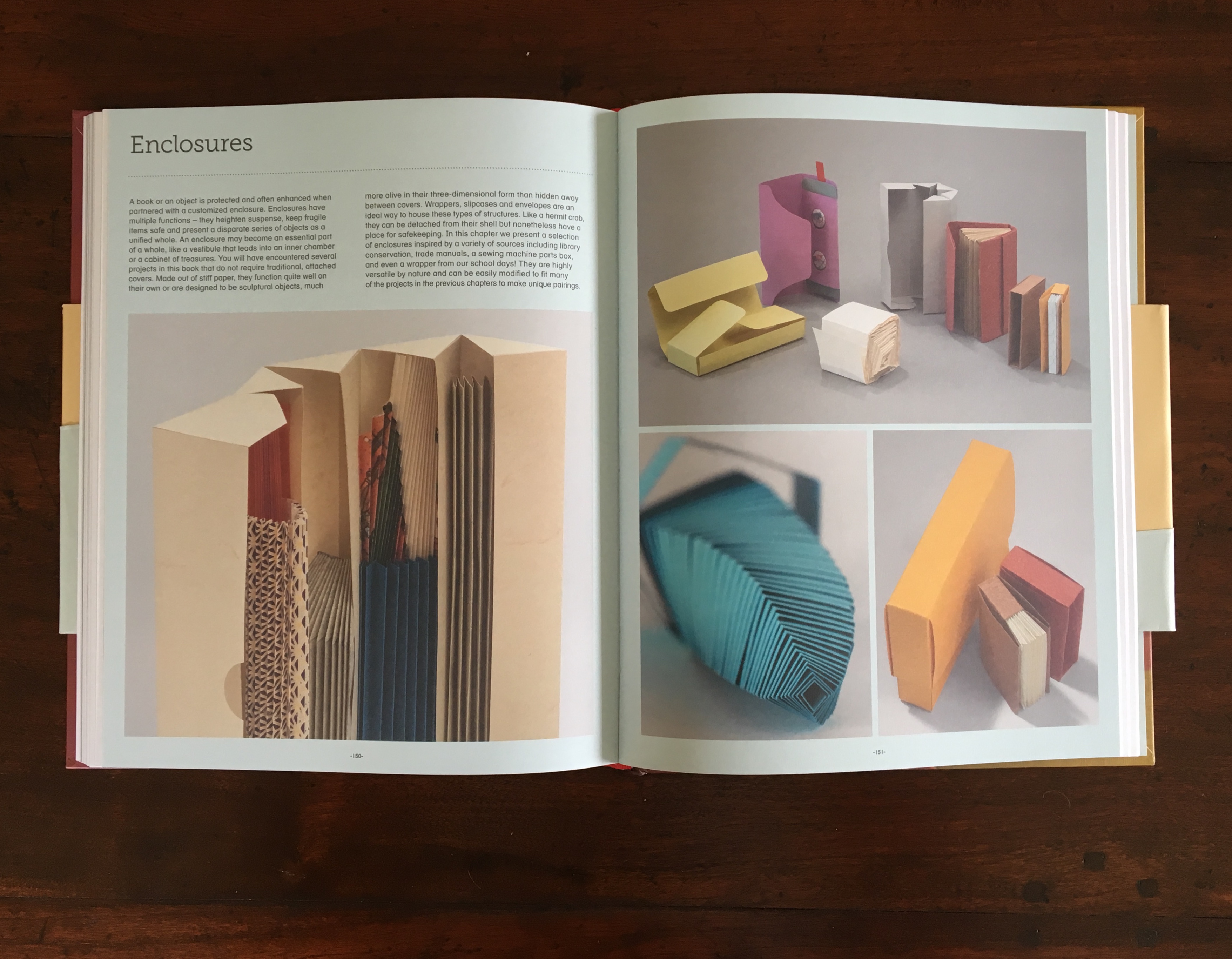
The Enclosures section presents fascinating structures, not all of which are suited “to fit many of the projects in the previous chapters”. For example, the second-most fascinating form — the Telescoping Ziggurat, shown in the lower left corner of the recto page above — looks incapable of enclosing any of the other 35 structures. The authors acknowledge it is “less of a book and more of a toy — a stimulating and curious object whose inherent mathematical quality mesmerizes as it spirals inward and outward”. The most fascinating form, however, is as much a book as stimulating and curious object: the Sling Fold structure.
This structure looks suited to enclosing scrolls or narrow, collapsed accordion books of diminishing height, and its mechanics invite playful integration with content and variations of color, typography or calligraphy, printing method and materials.
It would not do to conclude a review of this book without touching on the Flag Book structure, for which Kyle is so well-known. It is found in The Accordion section. The outstanding works implementing this structure are legion. Here it is below in all its glory, which is exceeded only by the Two-Sided Flag book in the pages following it.
The Art of the Fold should become an instant classic. If readers are tempted to “grangerize” their copies with photos and clippings of favorite examples and variants, they would do well instead to create one of the authors’ album structures in which to keep them. There could be many editions of this classic to come.
Update: for more on Kyle and Warchol, see their interview with Helen Hiebert in her series Paper Talk.
Julia Chatfield, a young Englishwoman, brought the scrapbook in question to Ohio in 1845. Over 170 years later, Cincinnati bookbinder and conservationist Gabrielle Fox restored the centerpiece with fine wheat starch paste and reassembled the binding with goatskin leather. It is housed in the archives of the Ursulines of Brown County, founded by Chatfield. If the craft and artistry exhibited in the original is more than outstanding, it is then a reminder that the book art of the 20th and 21st century has its hidden traditions.
Daniel Knorr’s Expiration Movement (2017), an installation work for Documenta 14 held in Kassel, Germany and Athens, Greece, received good coverage in The Art Newspaper:
Knorr’s work in Greece, meanwhile, entails collecting discarded objects from the streets of Athens, then inserting and pressing them into books. They will be sold during the show and will finance the production of the smoke in the Fridericianum in Kassel.
Romanian Knorr is known for his eyebrow-raising political installations such as STASI Stones (made of Stasi documents pulped à la Dieter Roth, mixed with water and oil, and then displayed in Berlin). Those “litter press” books sold to finance the smoke machine atop the Fridericianum, built in 1779, one of the oldest public museums in the world, and host to documenta since 1955) further secure the added accolade “book artist”.
Like the many layers of meaning that book art can convey, smoke billowing from a chimney in Europe, in particular Germany, evokes several responses: concentration camps, book burning, a pope’s election. Also, books incorporating Athens’ litter allude to the protracted socioeconomic difficulties Greece has had in its relationship with the EU, again in particular Germany (both the debt and refugee crises). Knorr’s work has much in common with the atmospherics of the work of another eyebrow-raising artist, Anselm Kiefer, well-known for his book art.
Daniel Knorr: Materialization / Documenta 14 Athens. Installation and performance with found objects and video at Athens Conservatoire (Odeion), Athens (Greece). April 6, 2017. In his performance, Daniel Knorr pastes pieces of scrap materials to the pages of his artist book, which he sells at EUR 80 a piece, to fund his work Expiration Movement Manifest.
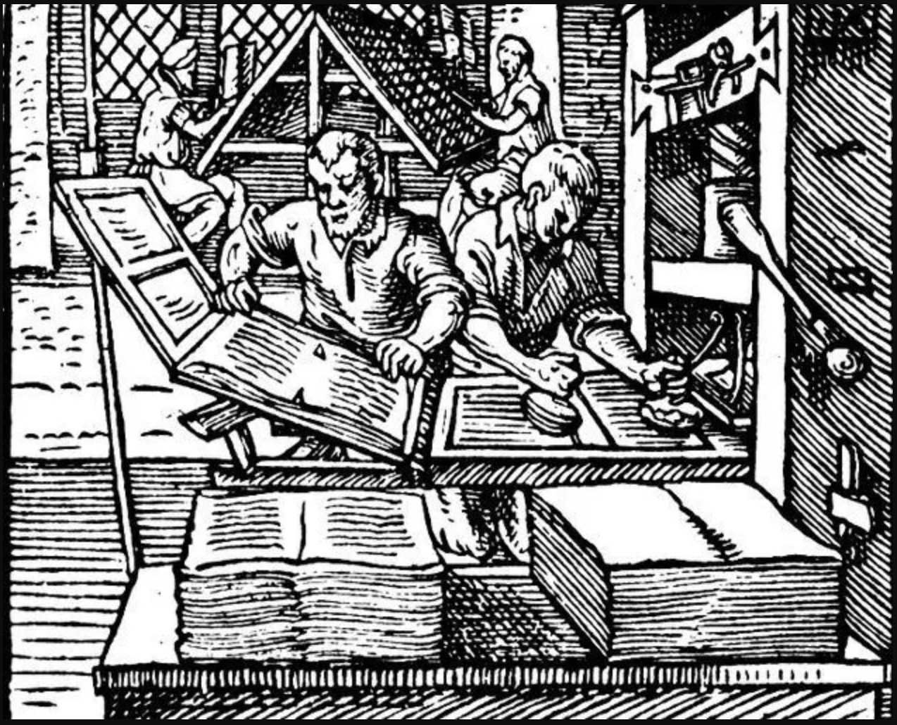
Knorr’s production line creating the “litter press” books makes for quite a contrast with that over 500 years ago.
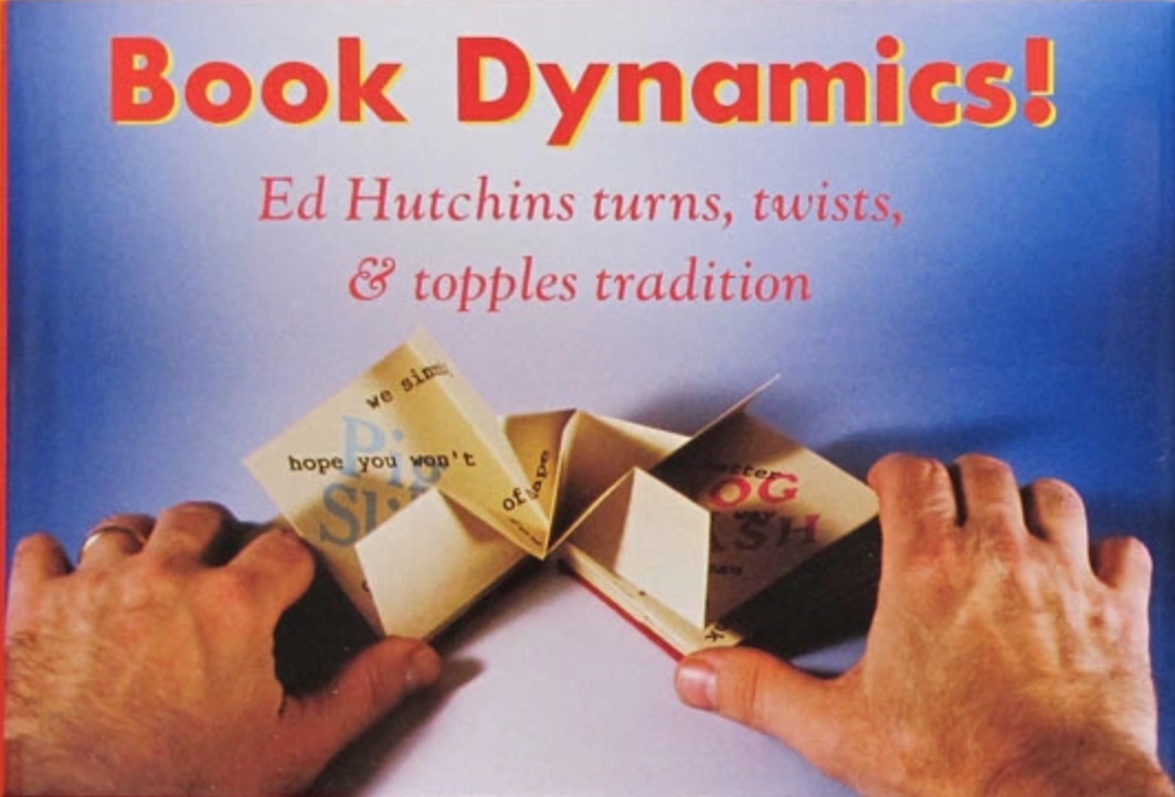
Ed’s books are a delight: witty and/or thoughtful ideas cleverly presented in unusual structures. Ed is a great believer in designing the form to suit the content, so no two books are alike. Some basic forms re-occur, but there are tweaks to the basic structures that individualize them for each version.
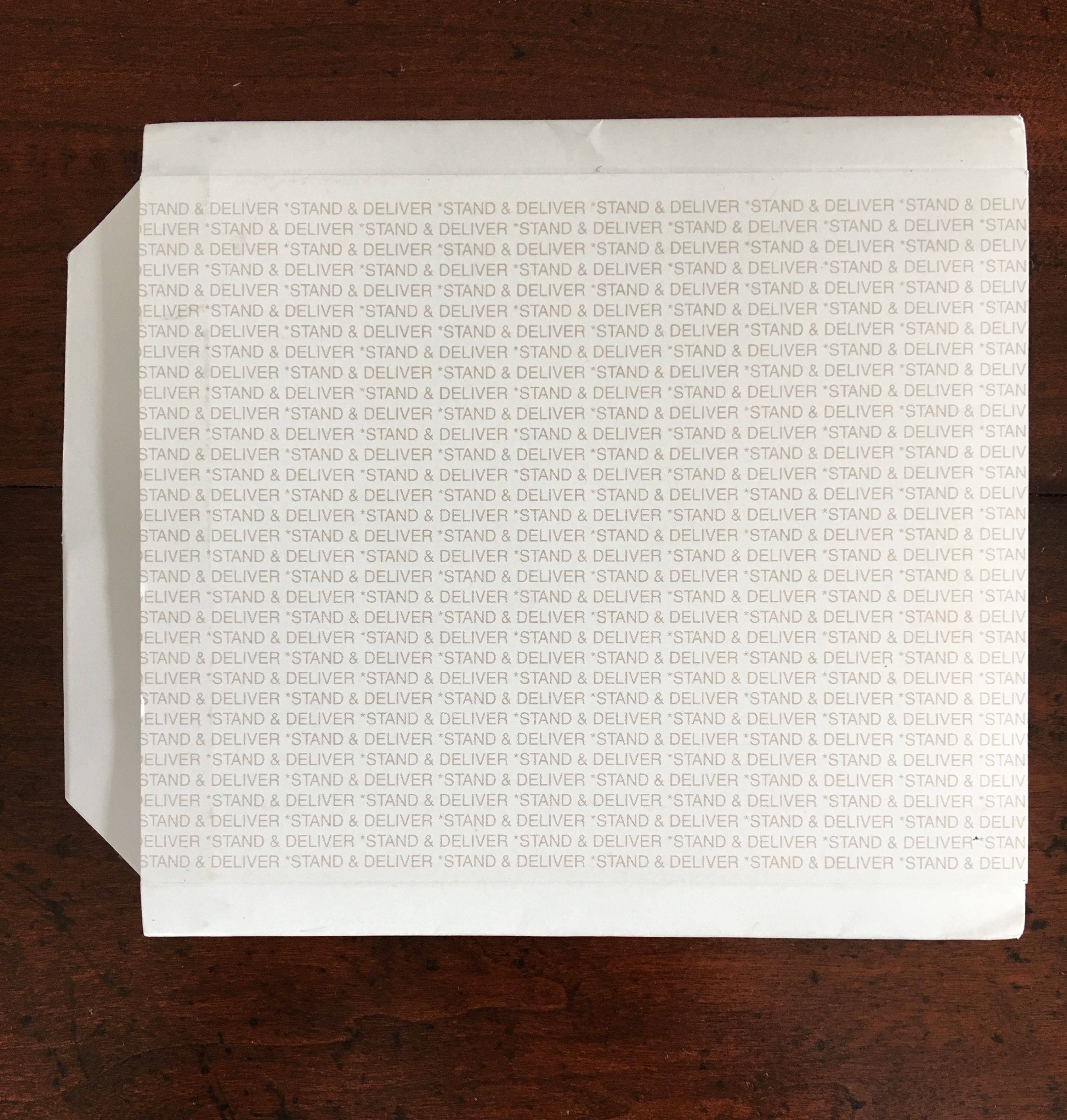
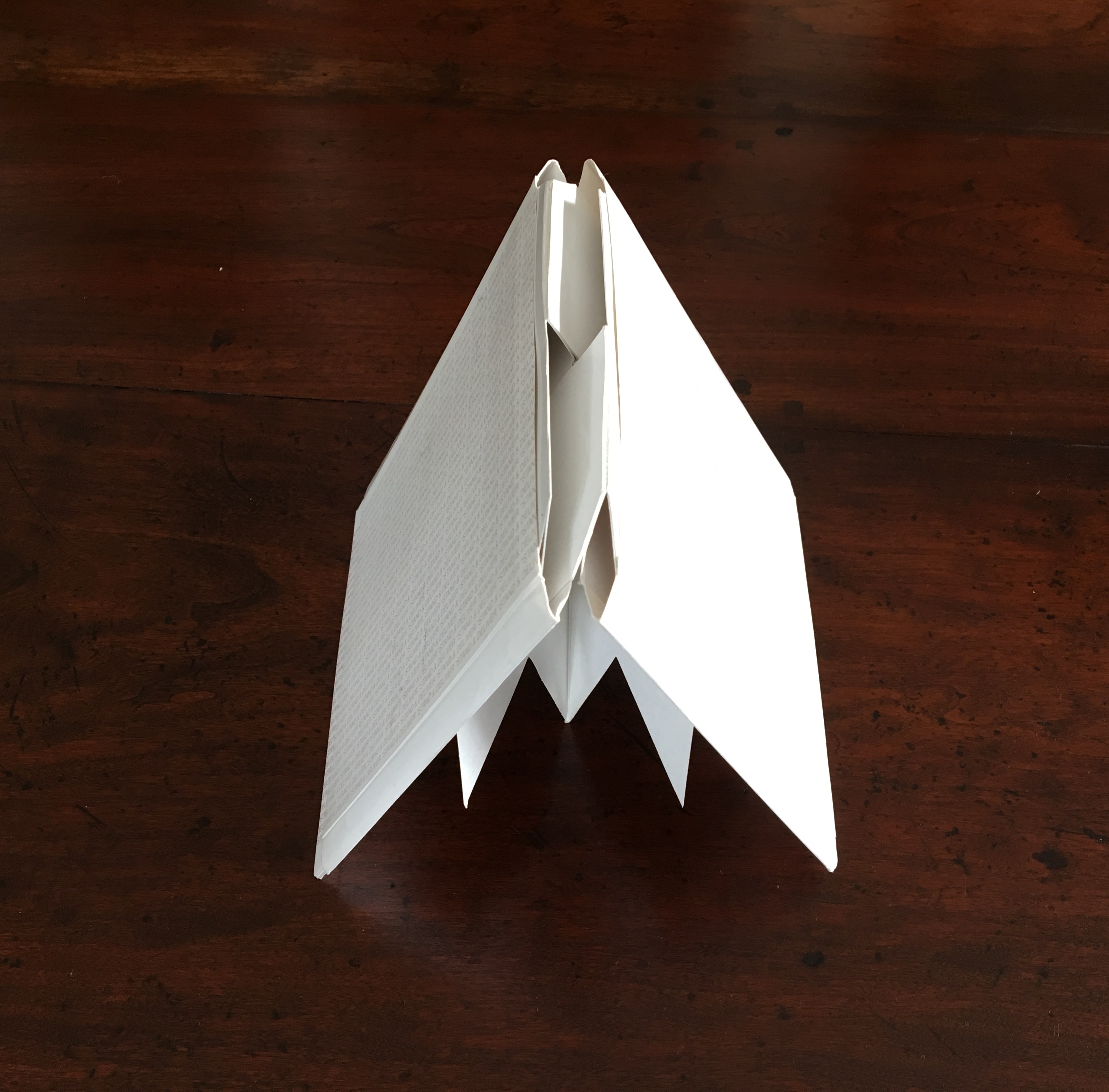
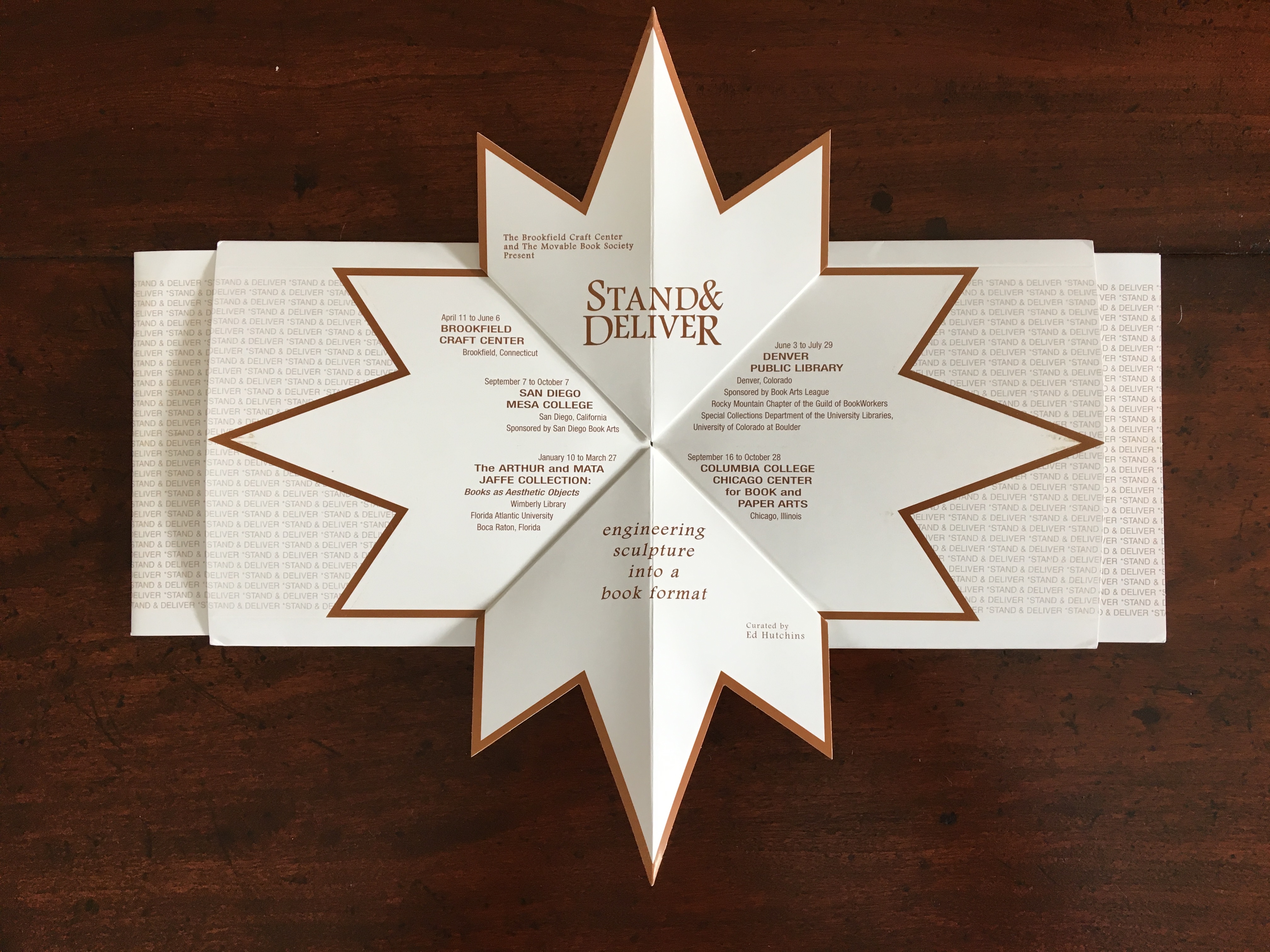
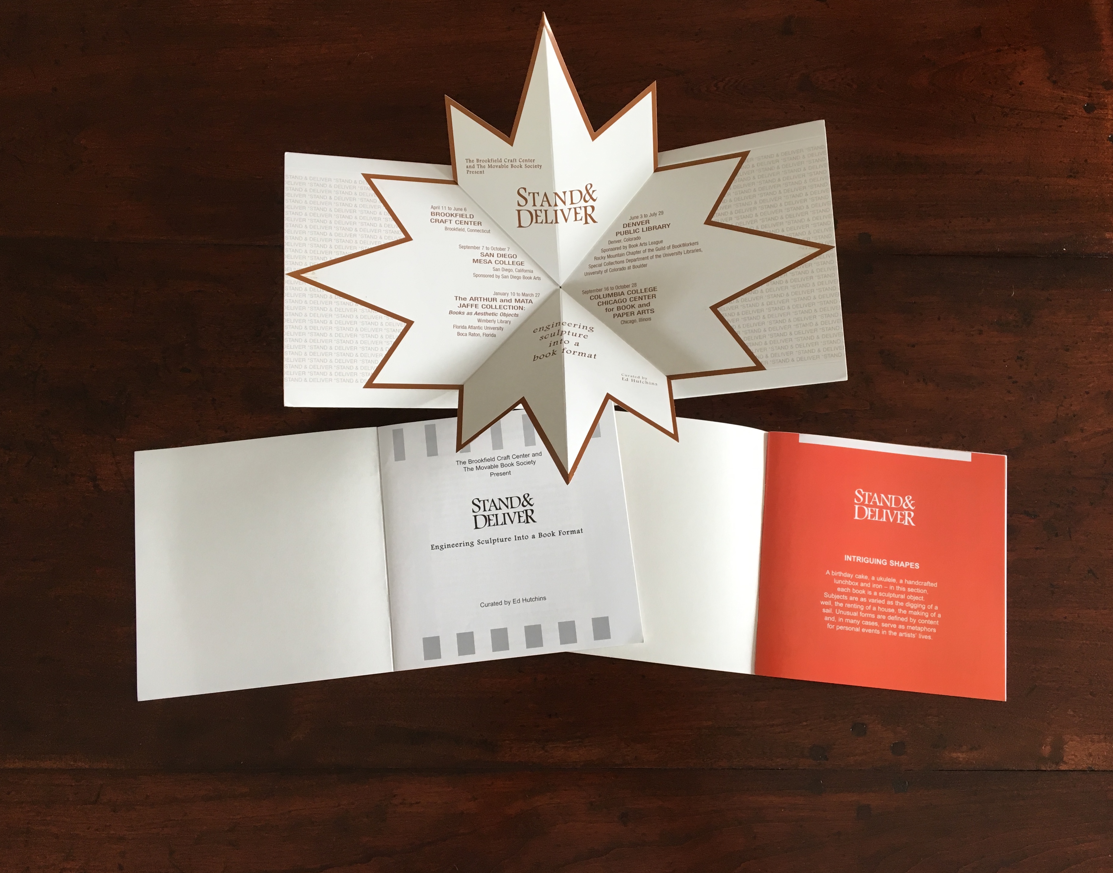
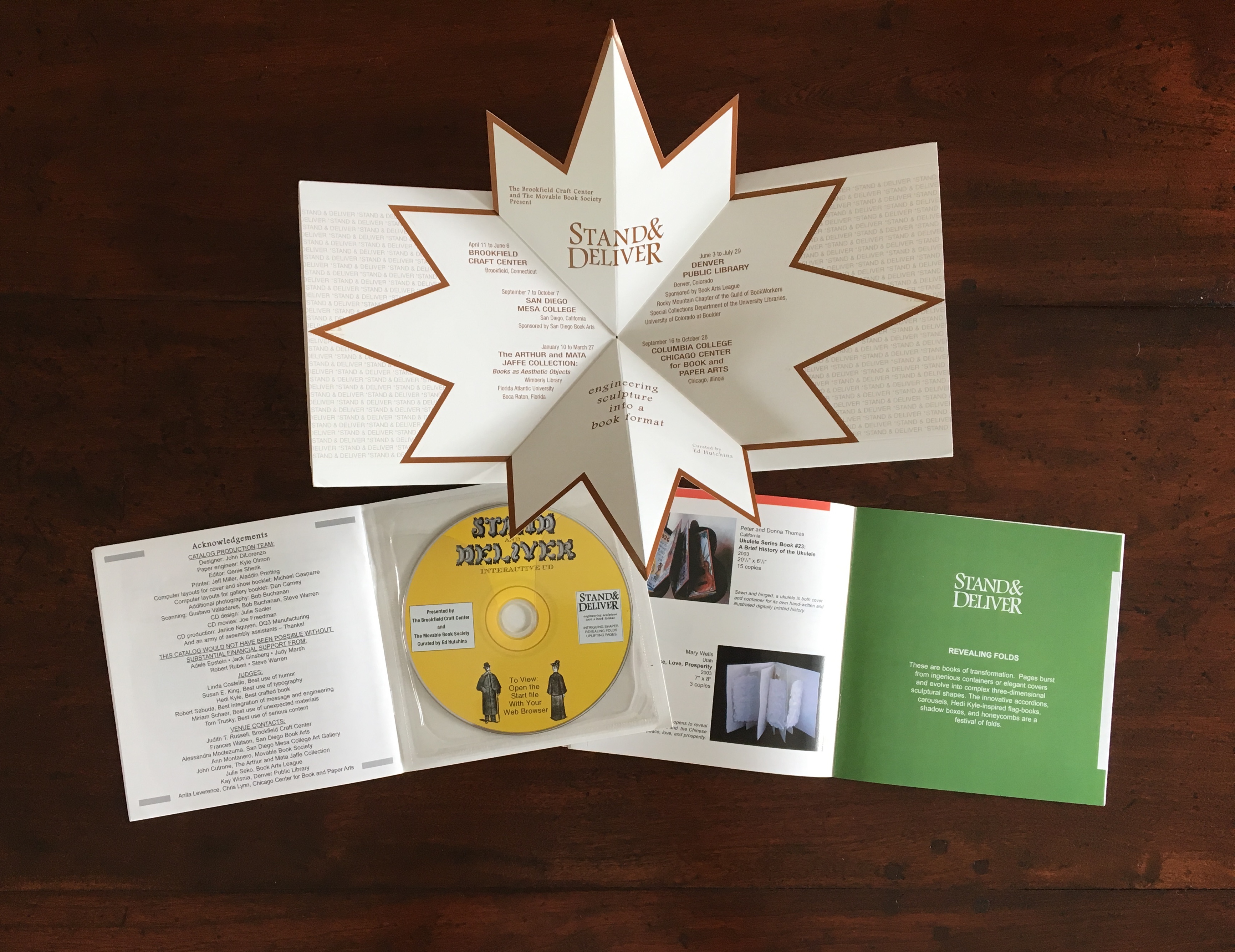
Miller’s review in Byopia Press is also a delight, providing multiple links and routes to information about Ed Hutchins as well as to other reviews of his work. Below are images of the catalog for Stand & Deliver, curated by Hutchins in 2003.
Engineered by Kyle Olmon and designed by John DiLorenzo, the catalog demonstrates great inventiveness in the pop-up structure and mechanism that nudges the two booklets from the left and right sleeves as the catalog is opened. Note also the use of colors to demarcate its sections that follow the themes Hutchins used to organize this exhibition: Intriguing Shapes, Revealing Folds, Uplifting Pages. And note the distinctive and subtle shifting placement of colors in the right-hand booklet: at the top on the orange page, a white bar that shifts to the right on the green page as an orange bar marks the end of the previous section on the facing verso page. For an exhibition that traveled to five different locations, a more appropriately and intricately mobile catalog could hardly have been devised.
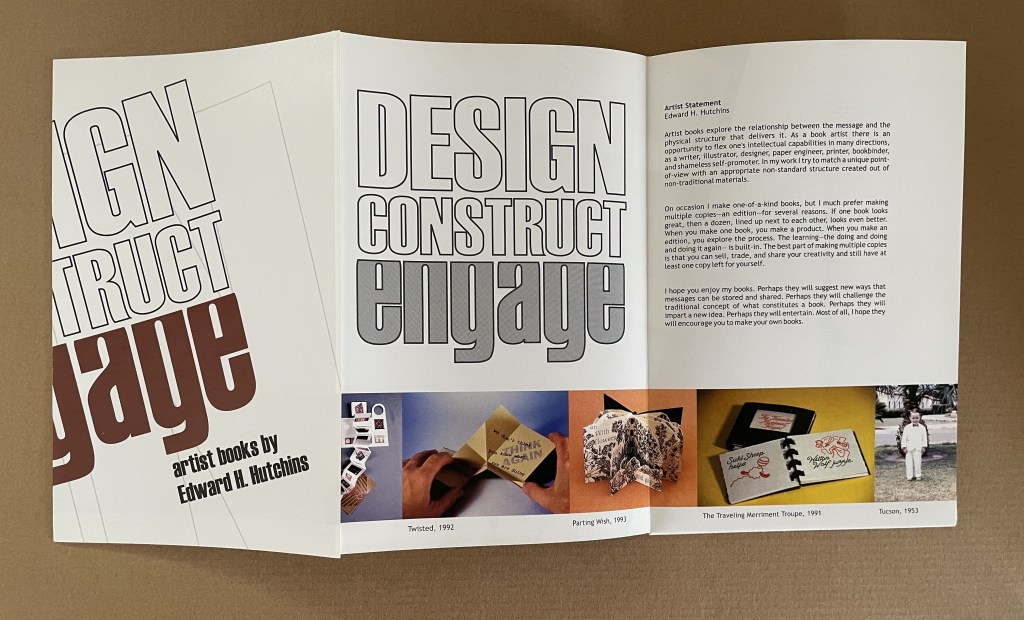
Design, Construct, Engage (2002)
Design, Construct, Engage (2002) Booklet-poster-catalogue in meander cut and fold. Closed: H220 x W140 mm. Acquired from Ed Hutchins, 26 January 2022.
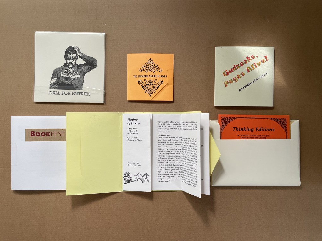
Ephemera (1996 – 2003)
Flights of Fancy (1996) Envelope with tab, trifold, center-cut single sheet forming booklet H145 x W116 mm. Acquired from Ed Hutchins, 20 May 2014.
Gadzooks, Pages Alive (2002) Velcro-fastened trifold cover glued to 18 pages, fixed spinner inside cover. 107 x107 mm. [18] pages. Acquired from Ed Hutchins, 20 May 2014.
The Unfolding Nature of Books (1993) Envelope with tab, trifold, with split Turkish map in center. Self-enclosing evelope with split Turkish map construction exhibition list in center Closed: 85 x 85 mm. Acquired from Ed Hutchins, 20 May 2014.
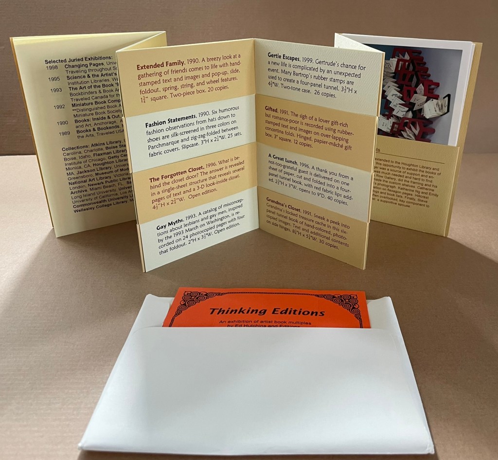
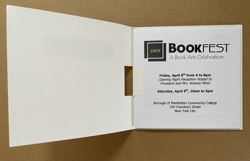
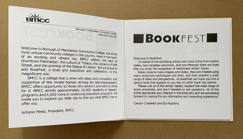
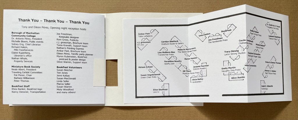
Thinking Editions (1999) Accordion fold booklet with 16-page gathering saddle-stitched with single staple to first fold, four panels of accordion slit to receive four cards to create 8 interleaved pages, final panel has pocket holding 3 color postcards. H155 x W110. 28 pages. Acquired from Ed Hutchins, 20 May 2014.
Thinking Editions card (1999) Four-card construction displaying 7 views. 126 x 126 mm. Acquired from Ed Hutchins, 20 May 2014.
Call for Entries, Stand & Deliver (2002/3) Pop-up invitation with entry cards. Acquired from Ed Hutchins, 20 May 2014.
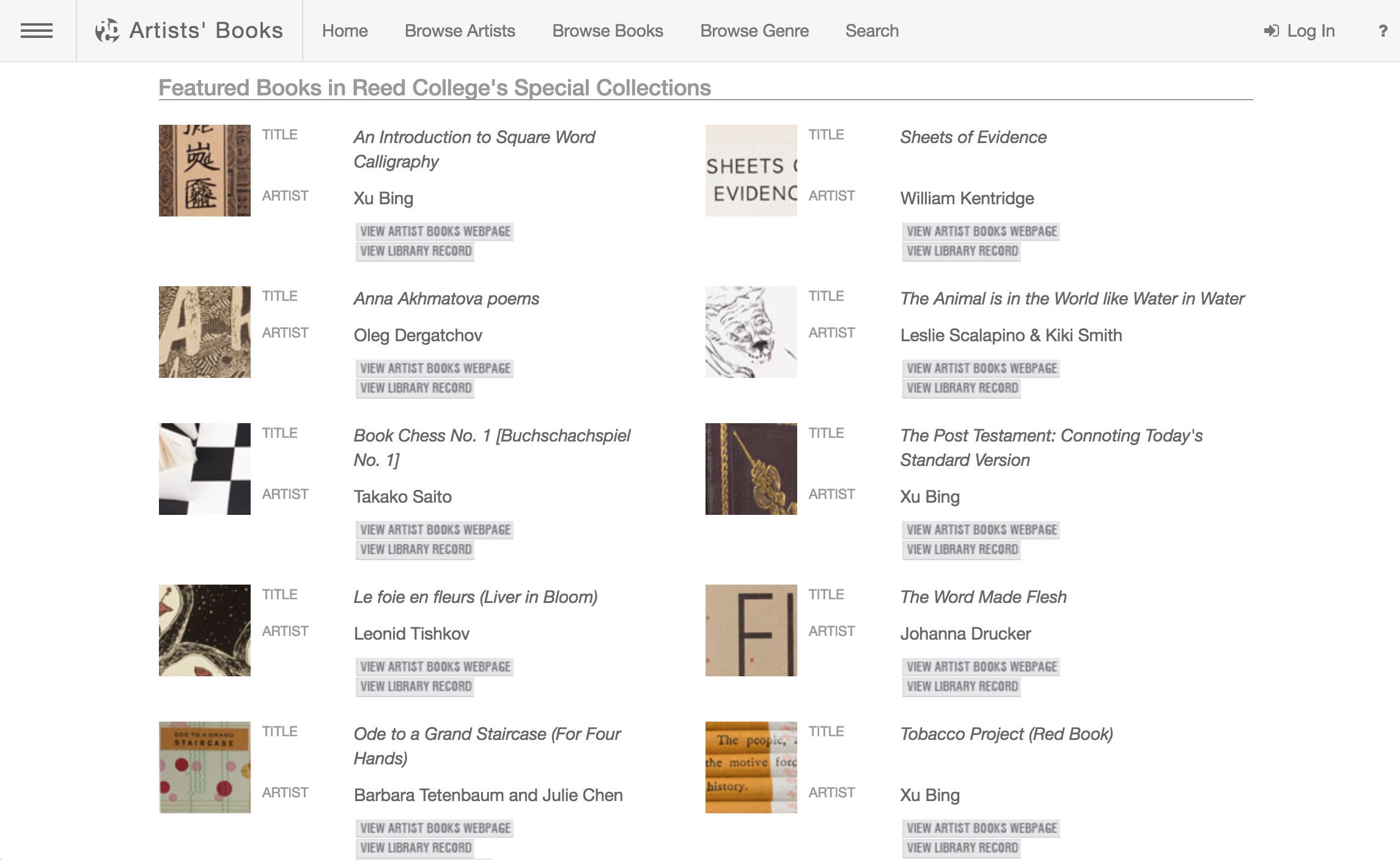
The spectrum of modern and contemporary Artists’ Books in Reed College’s Special Collections and collected on this website include traditional letterpress printed books of poetry, conceptual book works, sculptural and visual works, concrete poetry, and magazine works. This unique collection, which holds significant 20th century and contemporary artists’ books, gives students and the broader population insight into the significant role artist’s books have played among the avant-garde of Eastern and Western Europe, Asia and the United States, from the turn of the last century to the present. This includes livre d’artiste works by David Hockney, avant-garde works by Sonia Delaunay, conceptualist works by Sol LeWitt, and contemporary works by Xu Bing.
A search of the general library catalog with the term “artists’ books collection” yields over 1700 items, not all of which are in the Special Collection. This website offers visitors an organized way to browse the collection and enjoy access to individual sites for select items as shown here:
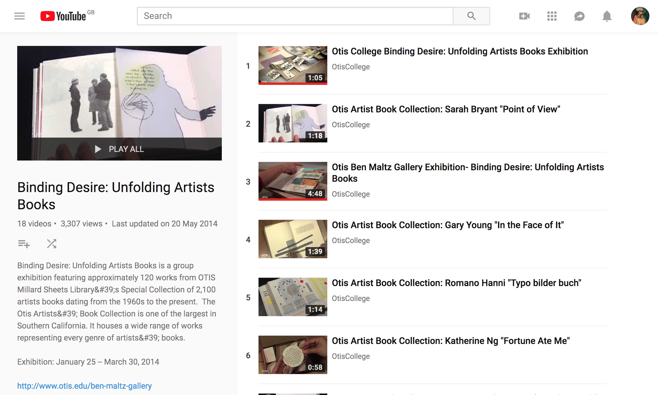
This 18-video playlist at the Otis College of Art and Design covers a 2014 exhibition highlighting around 120 works in the Artists Book Collection. The playlist contributes to the collection’s goal:
The goal of the Otis Artists’ Book Collection is not to create a comprehensive archive, but rather to provide a valuable teaching resource available to artists and students. Since the collection is available on only a limited basis, providing access to the books via an online image database is a continuing project, one that we hope will assist those with interest in researching our collection as well as the medium in general.
Some videos are better than others, and all benefit from viewing without the background music. Having handled both Susan E. King’s Lessons from the South and J. Meejin Moon’s Absence, I can vouch for the corresponding videos’ effectiveness.
The Lessons video could be closer to the experience of handling the work if the transitional zooming were replaced with a 360 circumferential shot or angled stills to reveal more of the work’s intricacies — for example, this overhead shot taken at the old Corcoran Gallery in Washington, DC:
The Absence video comes much closer to a hands-on experience, but the exchange in the Comments section highlights how inclusion of some description by voiceover or bibliographic entry would aid viewers’ appreciation.
Vesper Von Lichtenstein 10 months ago It’s a memorial to 9/11, and the cut out parts are the Two Towers going from the top down…at the end of the book you see the placement of the two towers within the context of the rest of the buildings on a city block. The music seems a bit… upbeat for such a somber book.
Critiques aside, the playlist and site warrant multiple revisits and a thanks to Otis College.
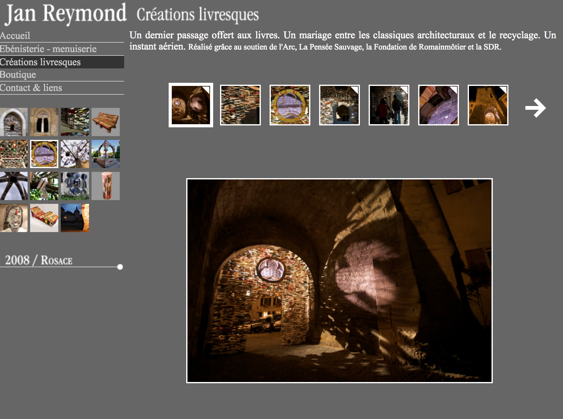
Since 2005 Reymond has created book art installations associated with the annual used book fair held in Romainmôtier, Switzerland.
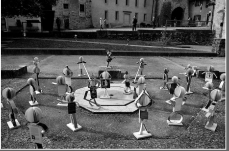
The installation Rosace, highlighted above, enhances the architectural features of the village. (For commentary to accompany your visit to Rosace, see My Modern Met.) Another, more surreal installation Livritins populates the village with book-citizens (the “livritins”) engaged in exercise, descending from the church spire by umbrella gondolas, listening to a sermon, fishing, dancing and much more. That year, tourists would be forgiven for believing that all of the bookstore and library bookshelves in the village and canton stood empty.
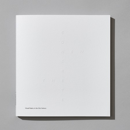
The New Concrete: Visual Poetry in the 21st Century is a testament on where this art made of letters has been and where it goes. We have put a sharp focus on the word ‘new’ in our title, exploring how image manipulation, cut and paste, digital text and the internet have all influenced work in this area. One of the most exciting strands can be seen in the work of James Hoff and Eric Zboya who use algorithms and viruses to form work in which text is in the back – rather than foreground; the ghost of the machine of visual poetics. This isn’t a book that could have been made through simply surfing the web. We asked all 106 contributors to suggest names of poets or artists that we should consider for the book. Visual poets spiralled into more visual poets. We have looked at well over 500 possible candidates. Enjoy the knowledge with us.
Among the Books On Books favorites included in this volume are Sam Winston, Julie Johnstone, Ian Hamilton Finlay and Vito Acconci. For a related MoMA exhibition of artists engaged in the material use of letters, words and language (Ecstatic Alphabets, Heaps of Language), click here.
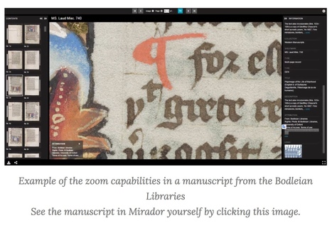
From Sexy Codicology (well, they must have thought the name would increase traffic). Accessed May 1, 2017 11:17 PM.
Scholars and programmers from all over the world are working together on providing a technology that give researchers, and heritage enthusiasts, a rich and uniform experience when viewing digitized heritage. Most of all, they want to make it possible that as many digital collections as possible all work in the same way, so that any image from any museum or library can be seen in any viewer online, together with any other manuscript or artwork that is IIIF compliant! Side-by-side!
The International Image Interoperability Framework (“triple I eff“) began its efforts in 2011. As of September 2018, over 100 universities, libraries, cultural heritage institutions and open source software companies are participating.
space
Some of those organizations hold book art collections. Imagine being able to examine an artist’s book “in the round”, to zoom in, to compare one artist’s flag book with another’s side by side. A query about whether any of those organizations plan to apply the technology to those collections has been sent.