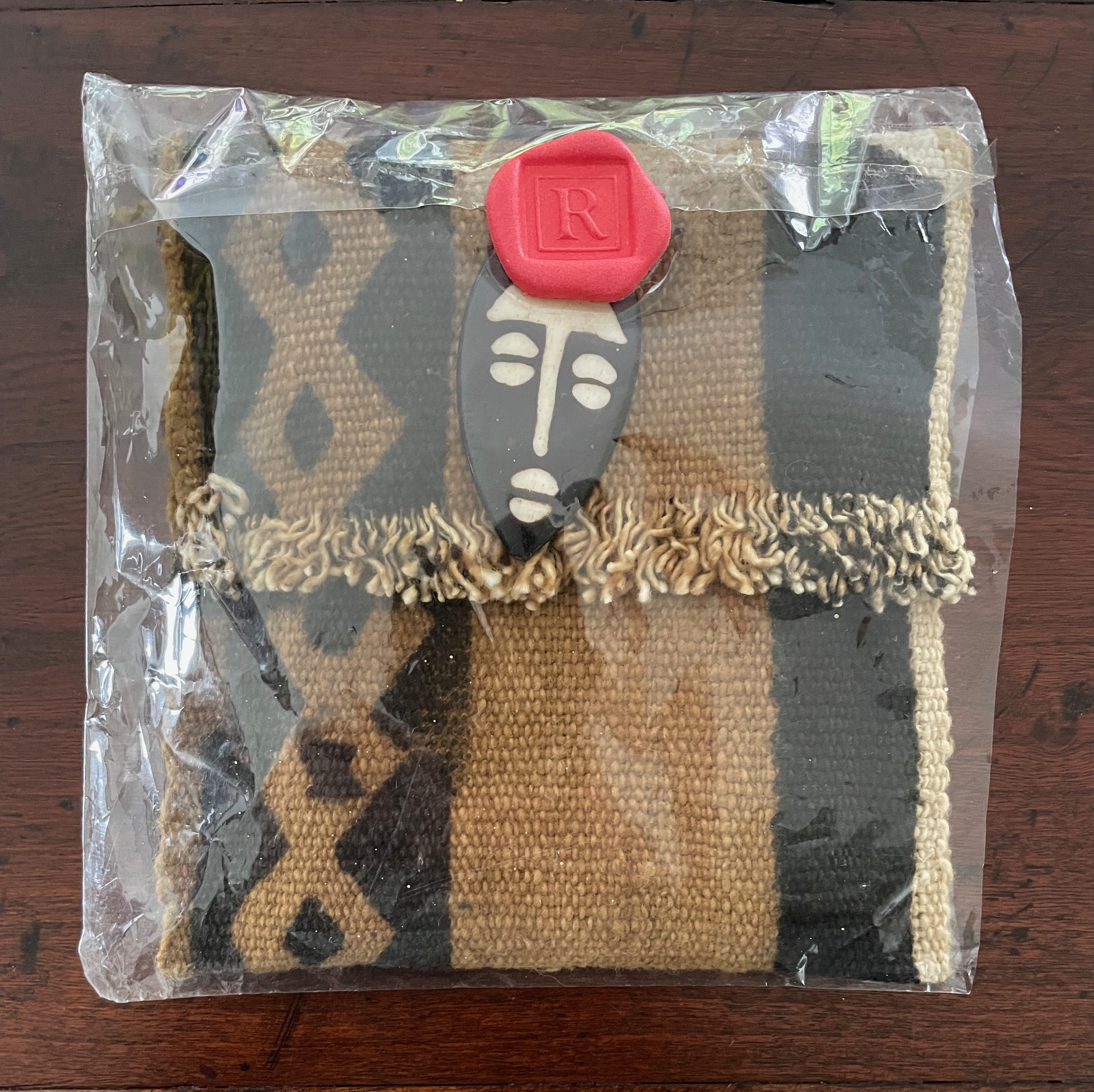
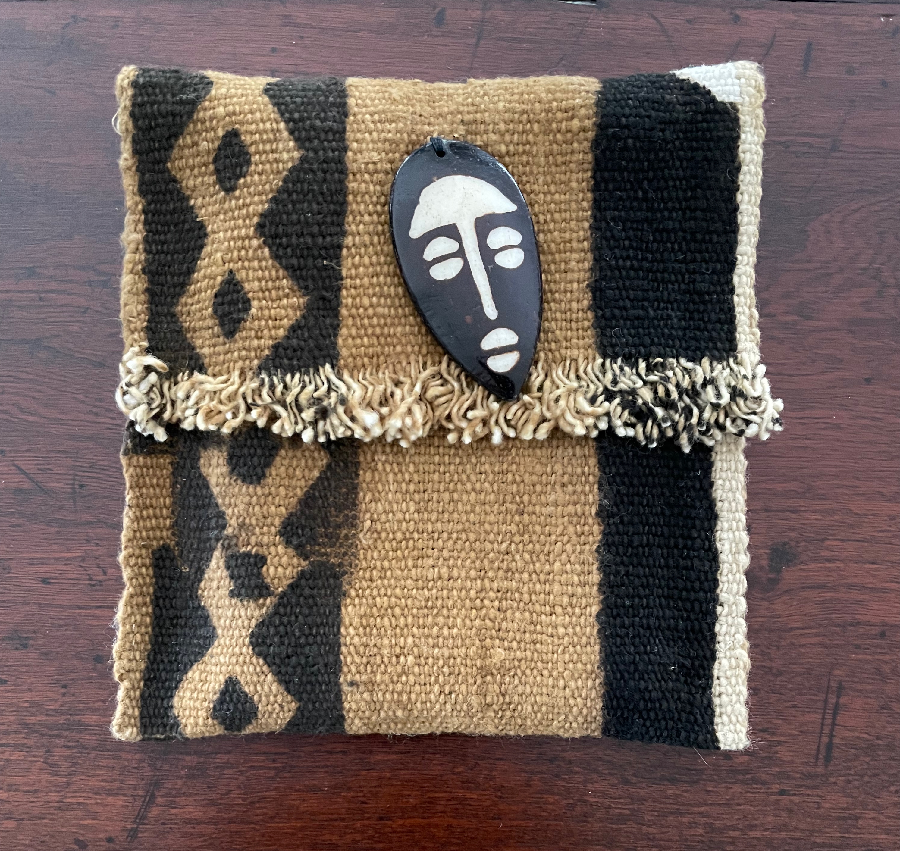
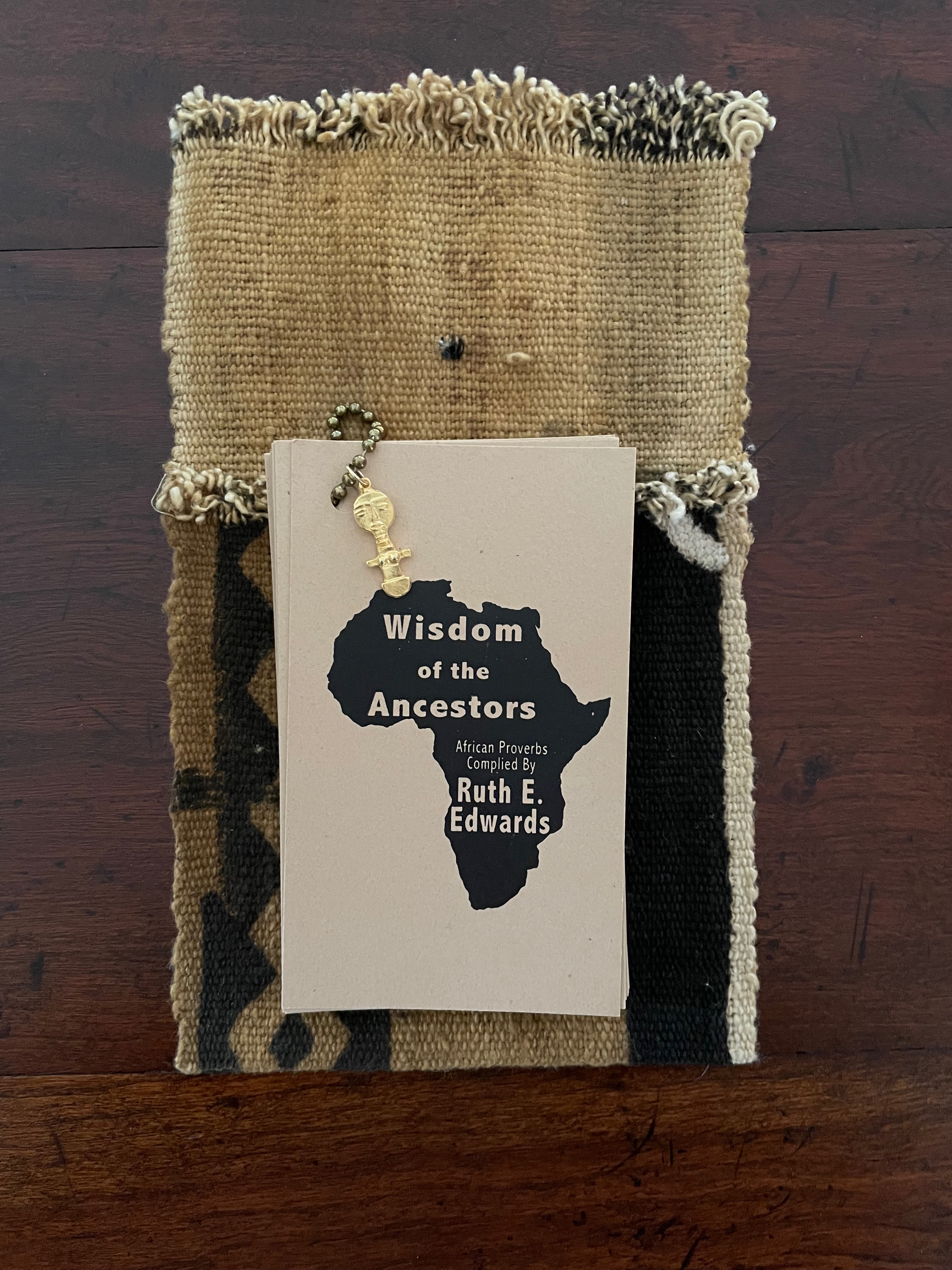
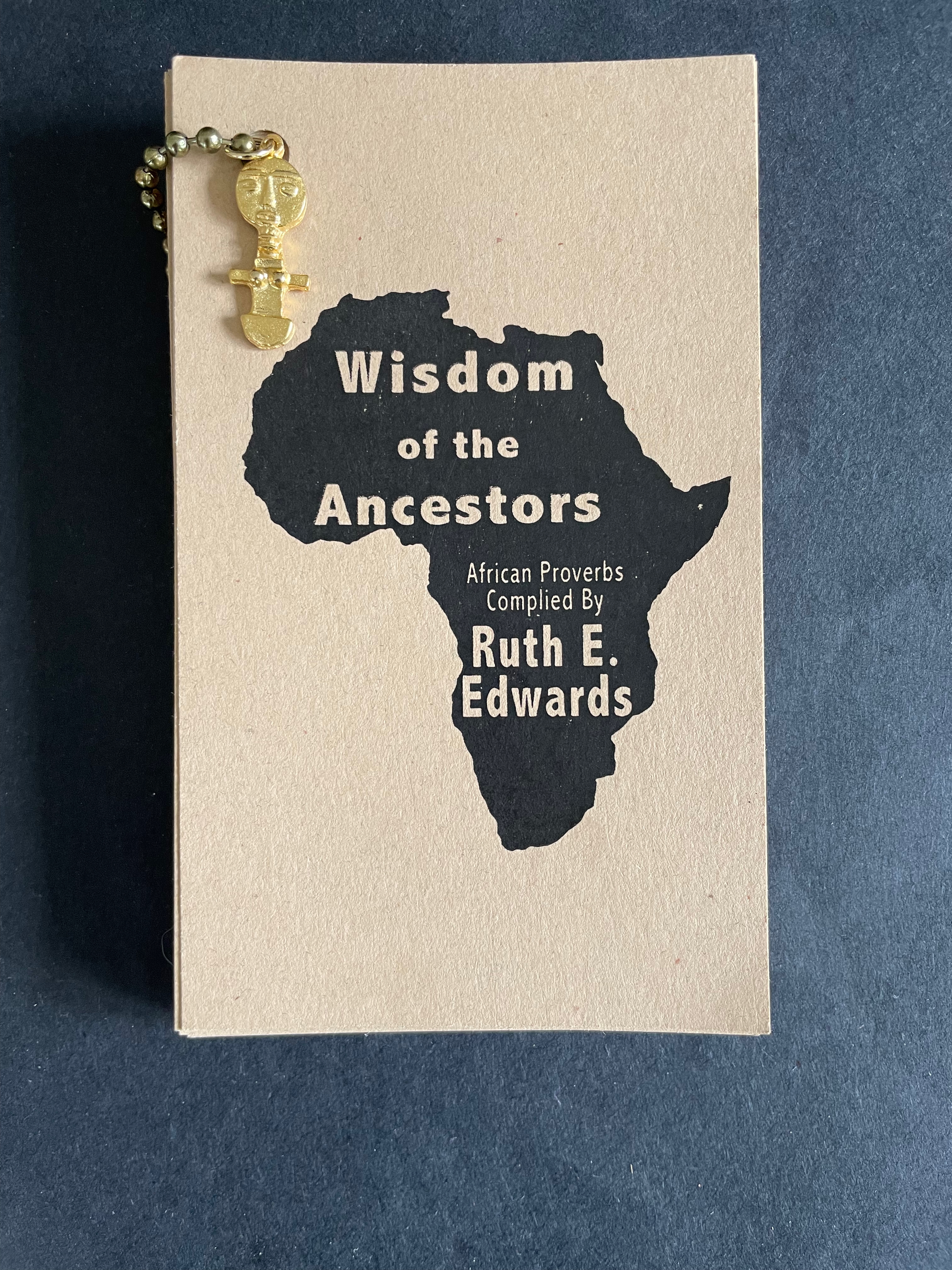
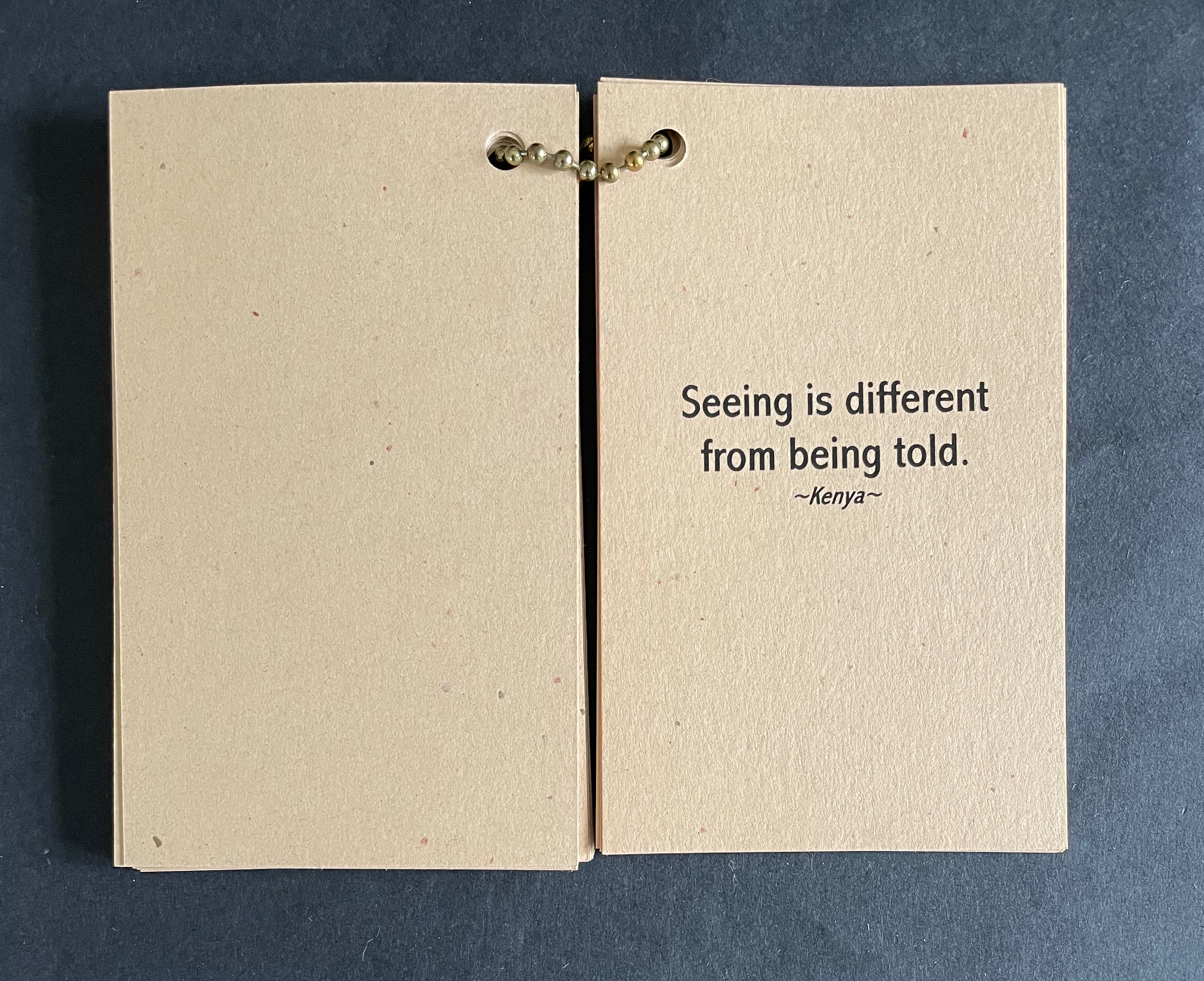
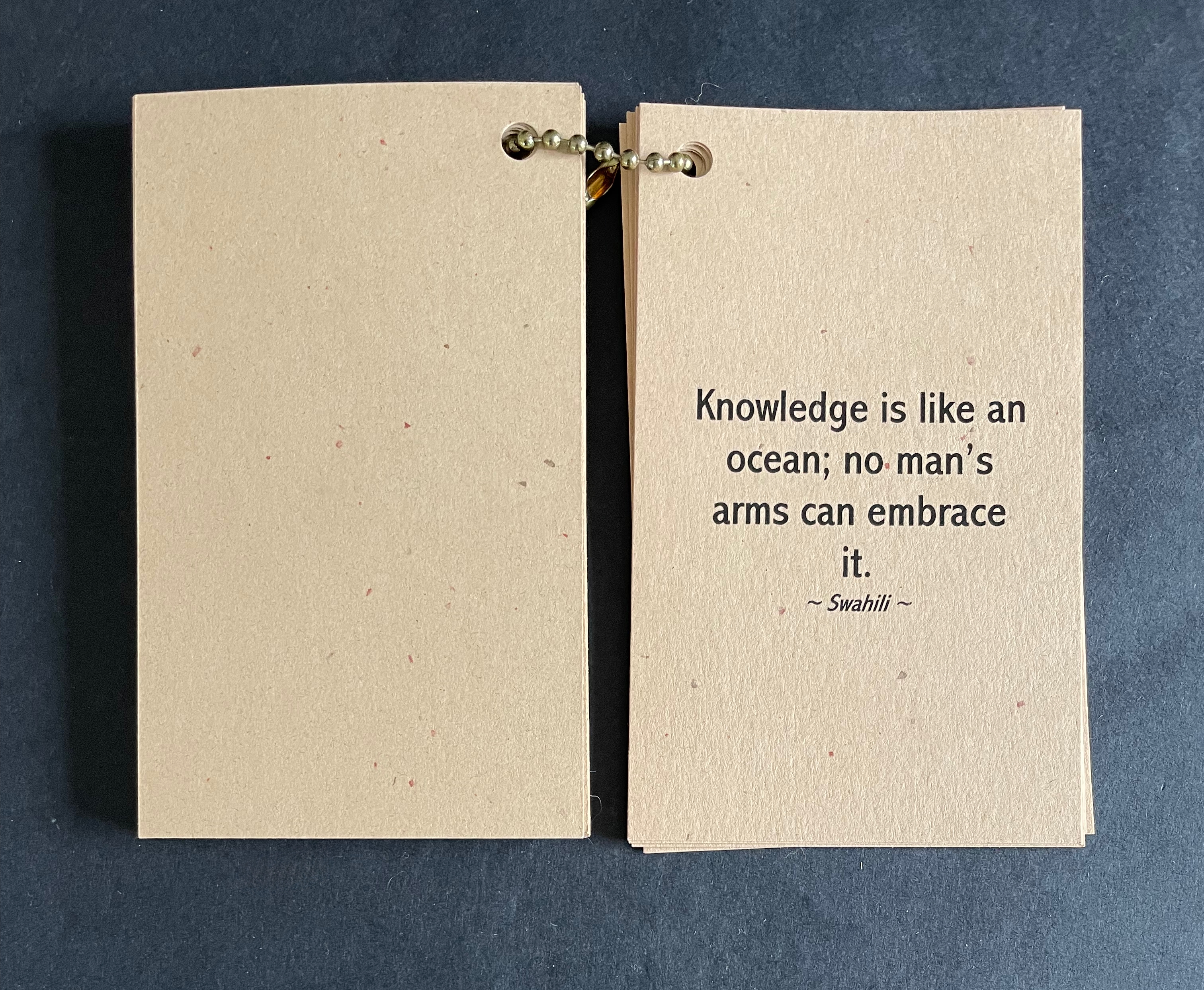
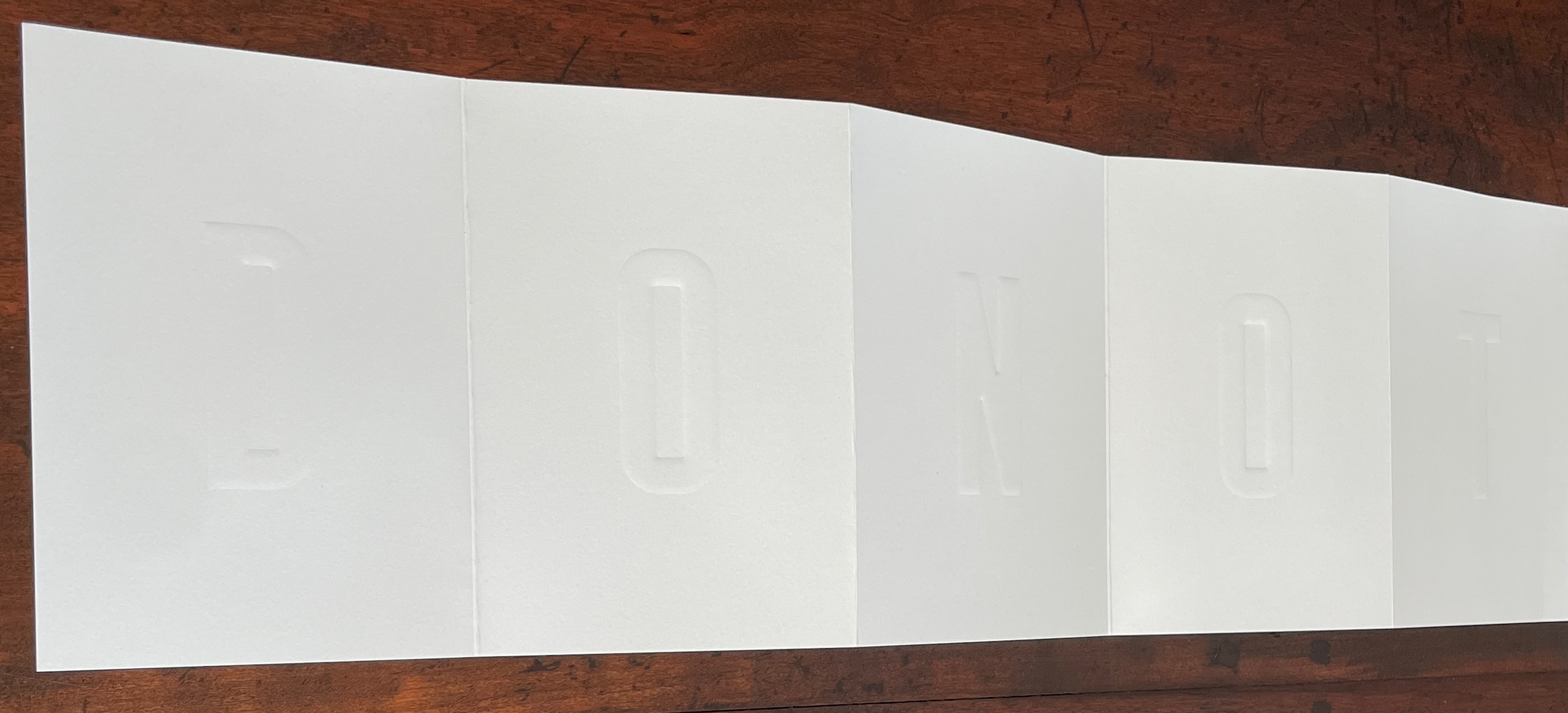
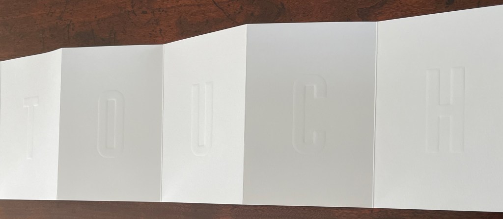
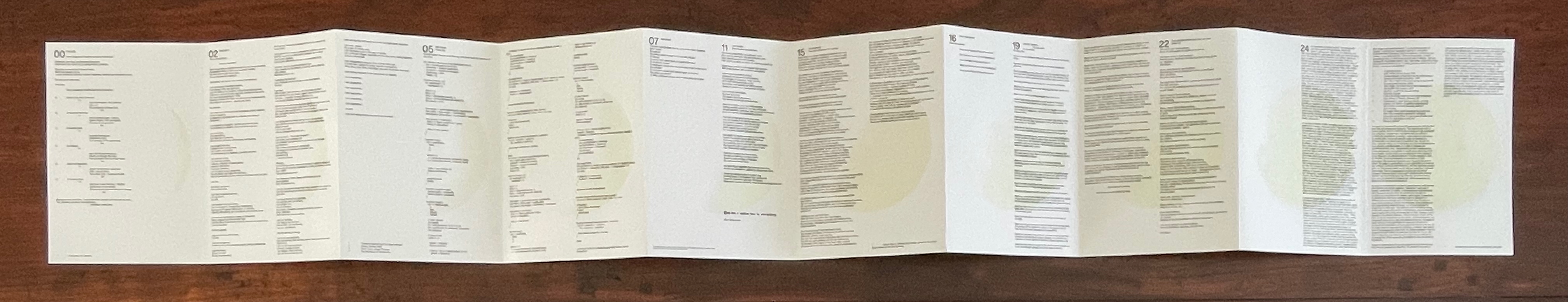
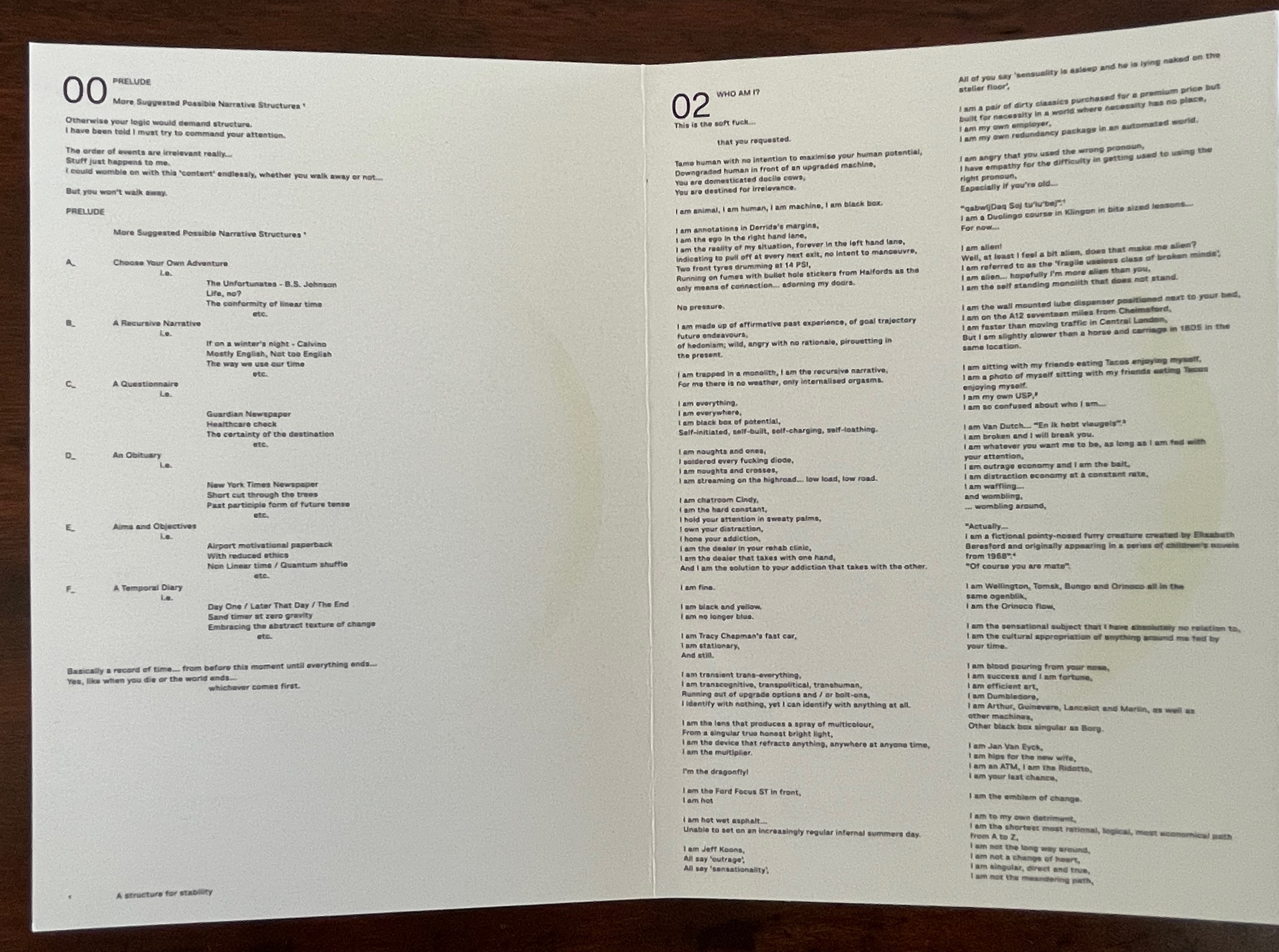
Wisdom of the Ancestors (1999) Ruth E. Edwards Cloth bag with painted stone amulet, hand-woven African mudcloth from Mali, containing metal ball bead chain through single-hole punched in cards, with gold talisman hanging. Bag: H145 x W135 mm. Cards: H130 x W76 mm. 30 cards. Eclectic Art and Collections 23 October 2025. Photos: Books On Books Collection.
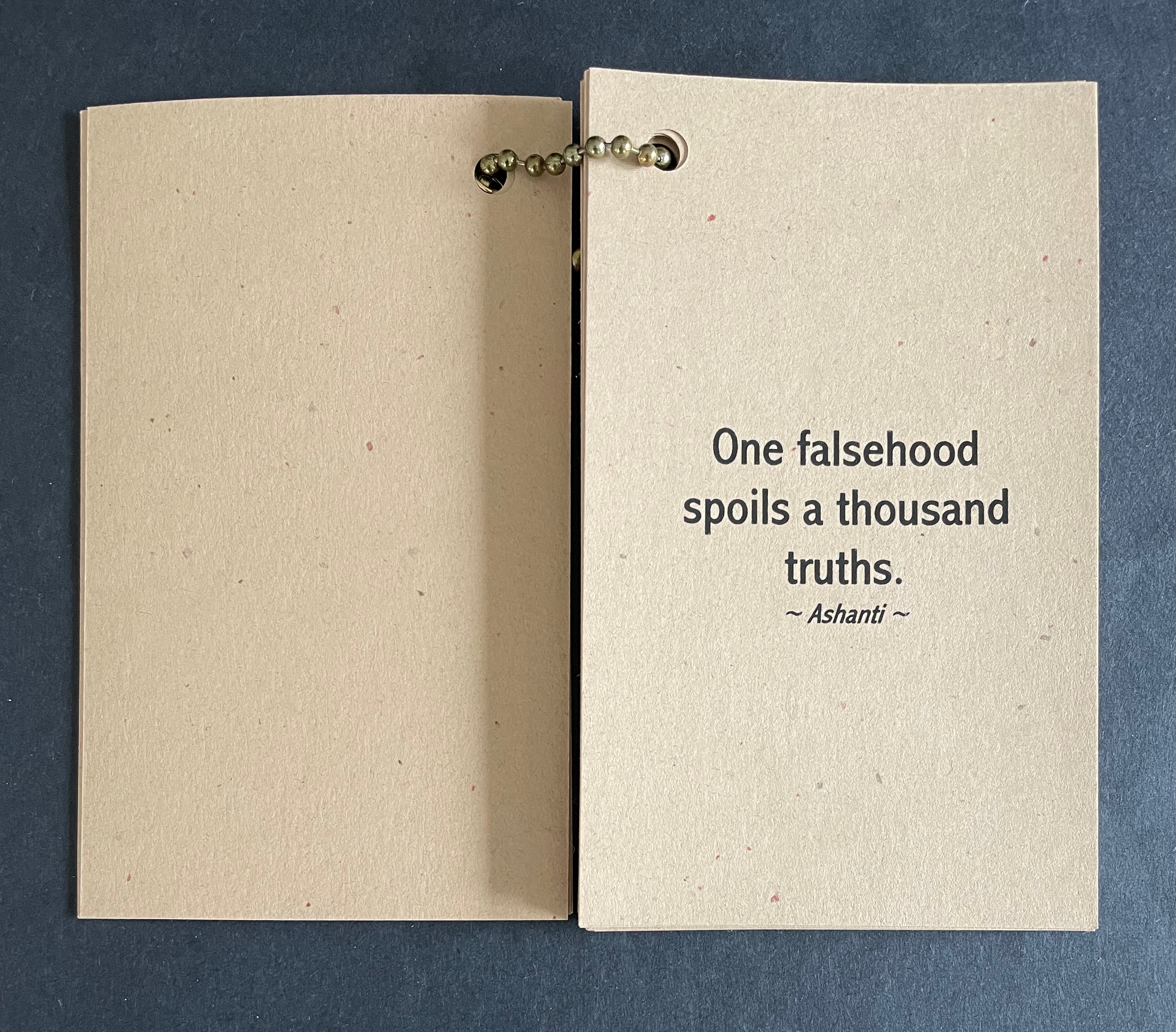
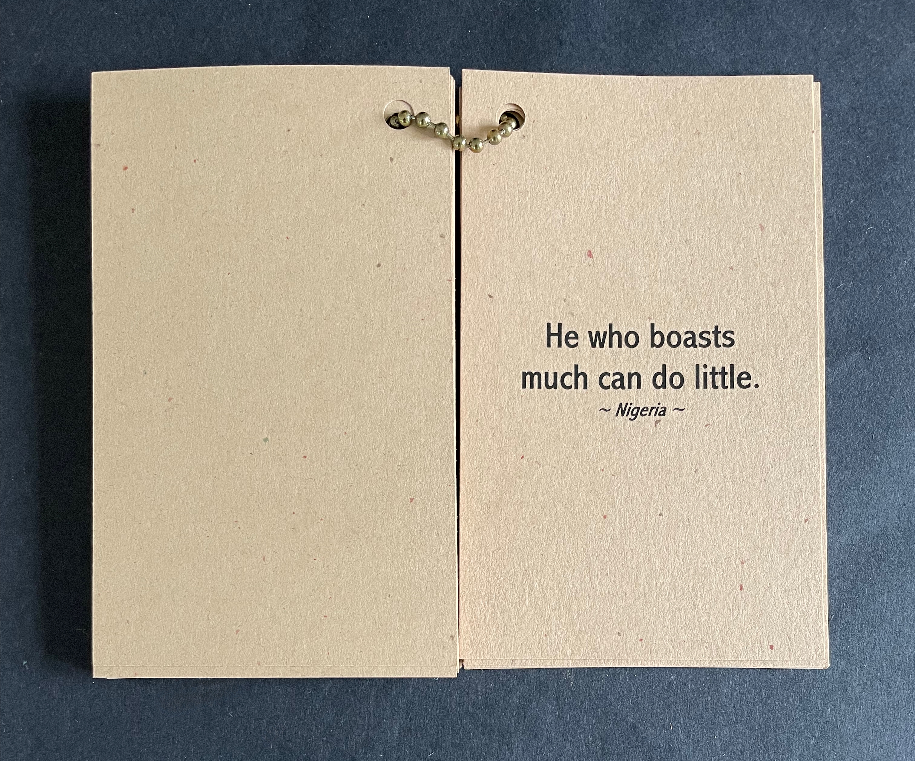
It appears the African ancestors had some inkling of and ancient words for the USA of 2016 and 2024.
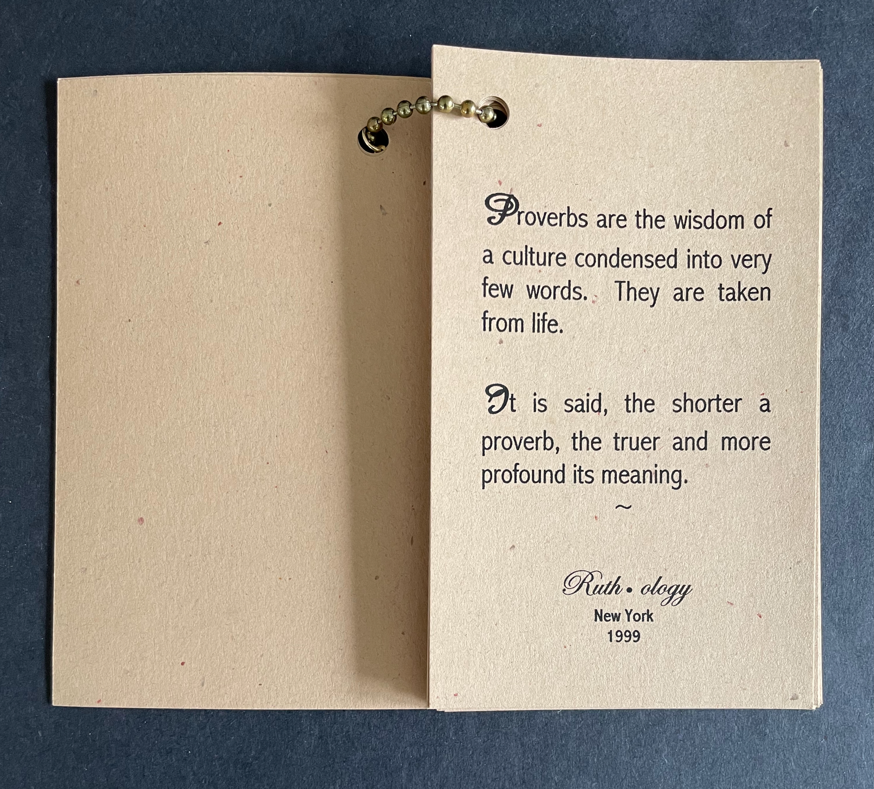
Other expressions remind how best to learn. Others put growing anxieties about information overload in the shade of the ocean-wide context of knowledge.
The earth-tone cards “bound” with a metal ball bead chain and mudcloth bag imbue the thirty wise sayings with a further sense of the “make do” of craft and art, which carries its own wisdom
Further Reading
“Tia Blassingame“. 17 August 2020. Books On Books Collection.
Bookmorph n. (bōk+μoρφ): a portmanteau word referring to casebound books which have been modified; an emergent branch of sculpture in which textual content is often downgraded; treatments include chewing, cutting, drilling, entombing, pulping, ripping, shooting (with a firearm), siliconising, etc; any codex fundamentally altered or warped by an artist; a site of entropic processes designed to return pages to cellulose fibre, and/or the creation of a fungal landscape; a bibliographic montrosity.Michael Hampton, arts writer, May 2025
The curators’ choice of title and epigram for this exhibition is somewhat daring. Although they have included plenty of bibliographical montrosities that fit Hampton’s definition, there are plenty of bibliographical beauties, too — even among the “monstrosities”. A strong attraction of this exhibition is that it presents so many recent works from Greek book artists. Even more attractive is its hands-on display of most of the works.
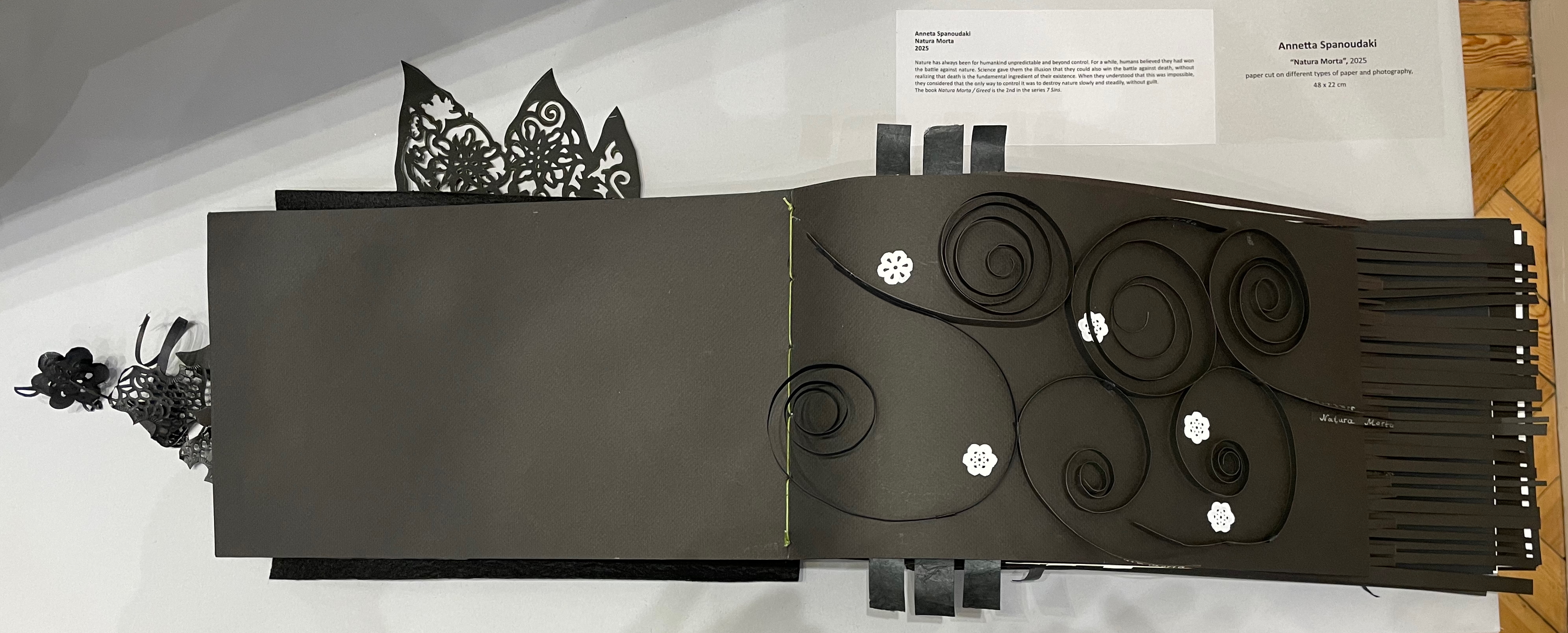
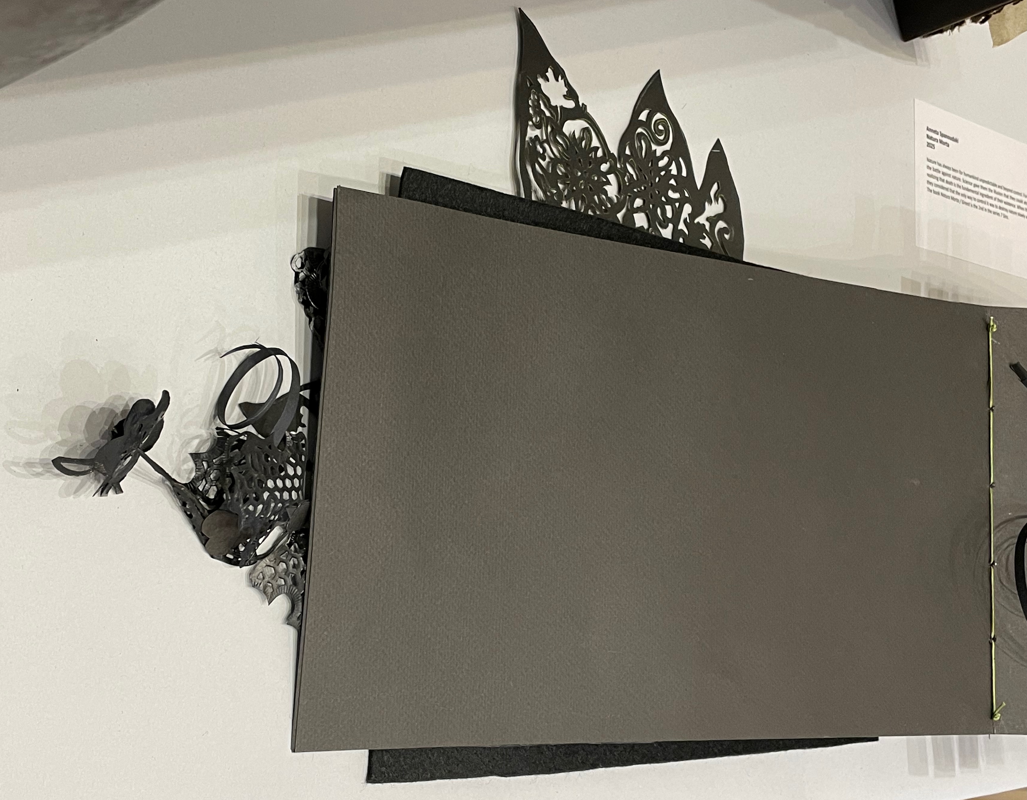
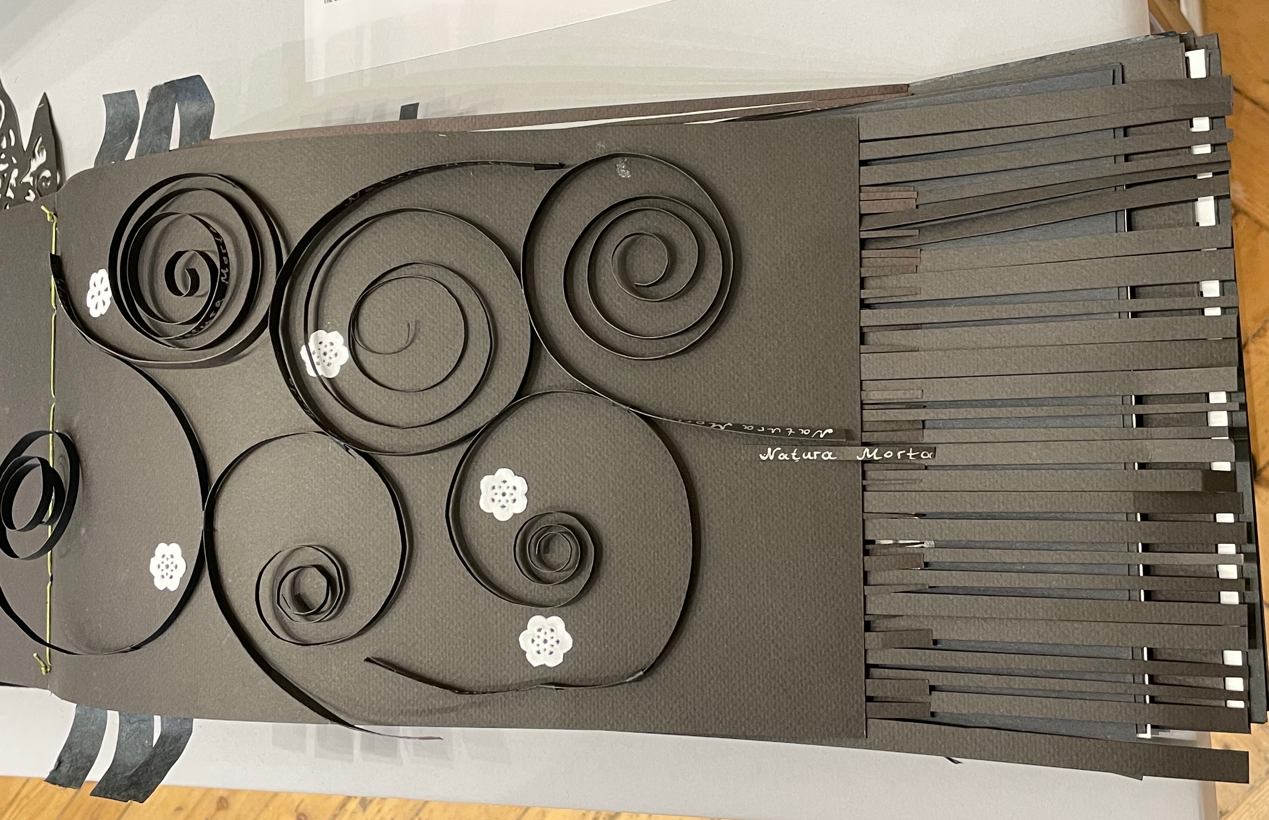
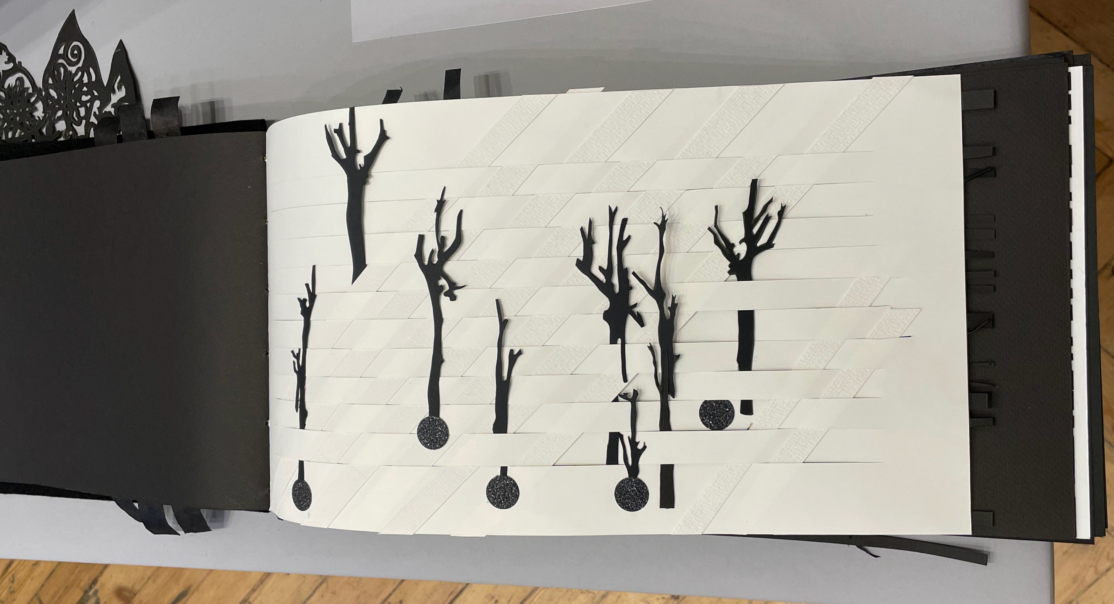
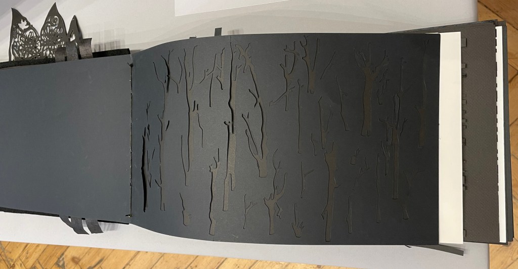
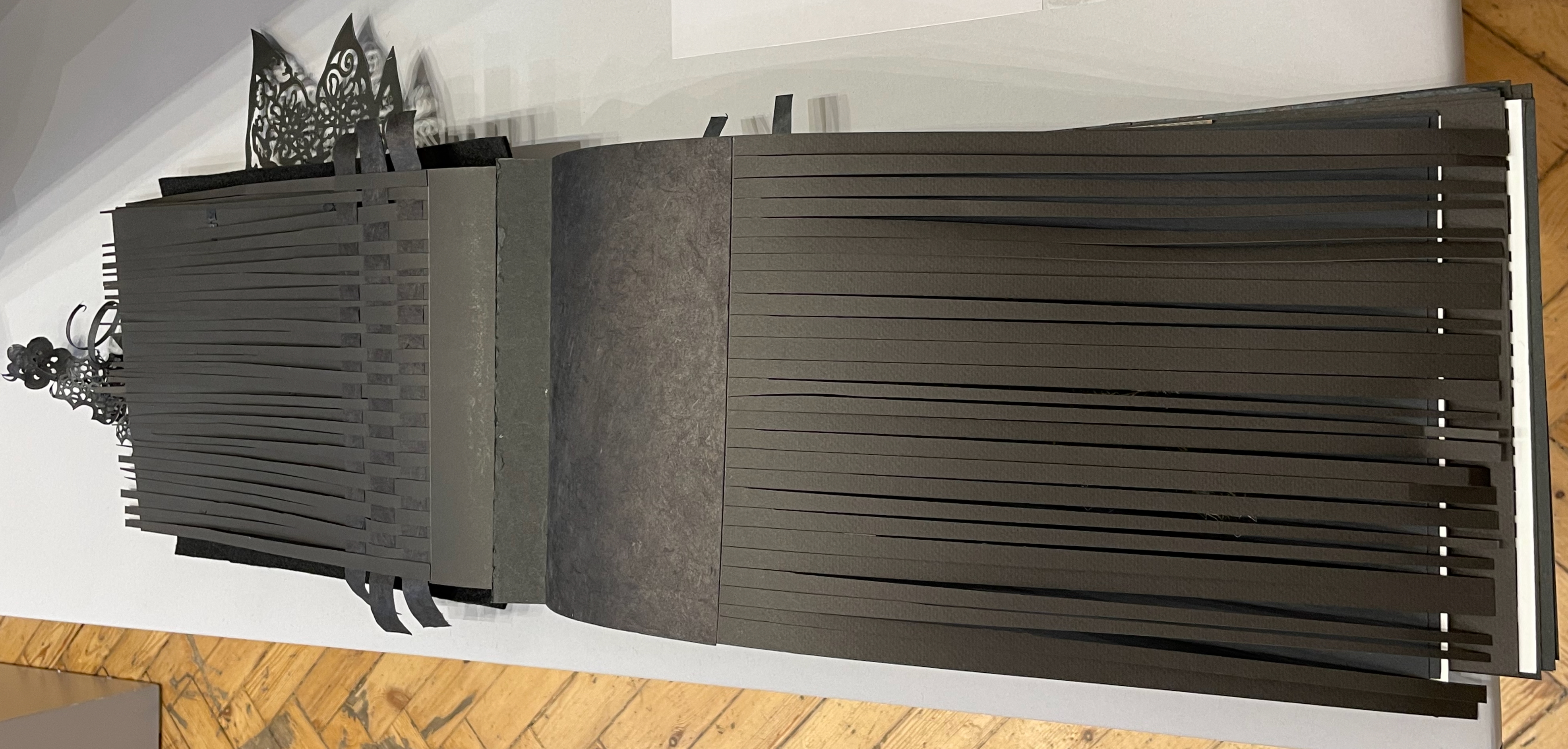
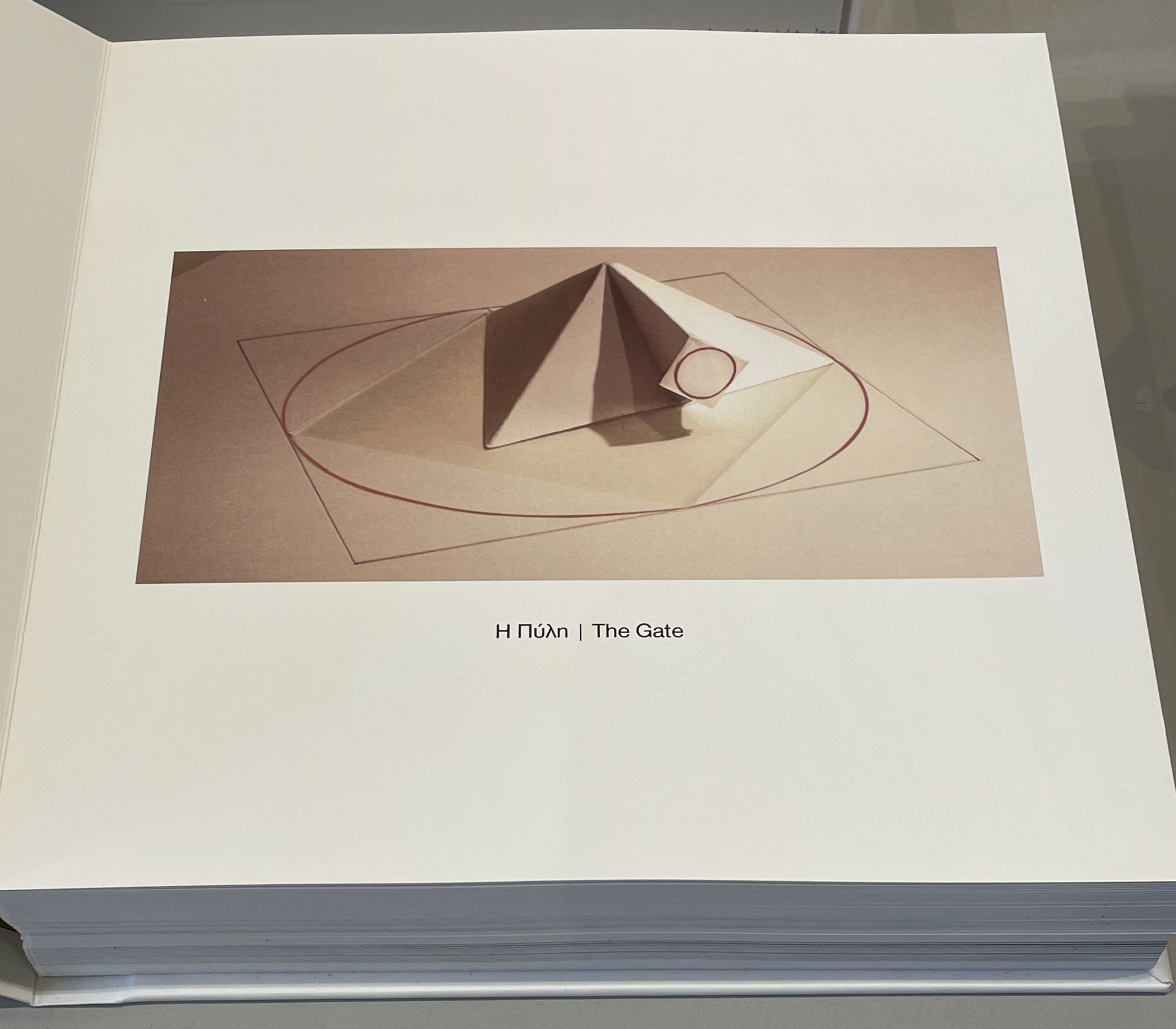
Anneta Spanoudaki’s Natura Morta (2025) is a striking case in point:
Natura Morta (2025) Anneta Spanoudaki Paper cut on different types of paper and photography. 480 × 220 mm. Photos: Books On Books.
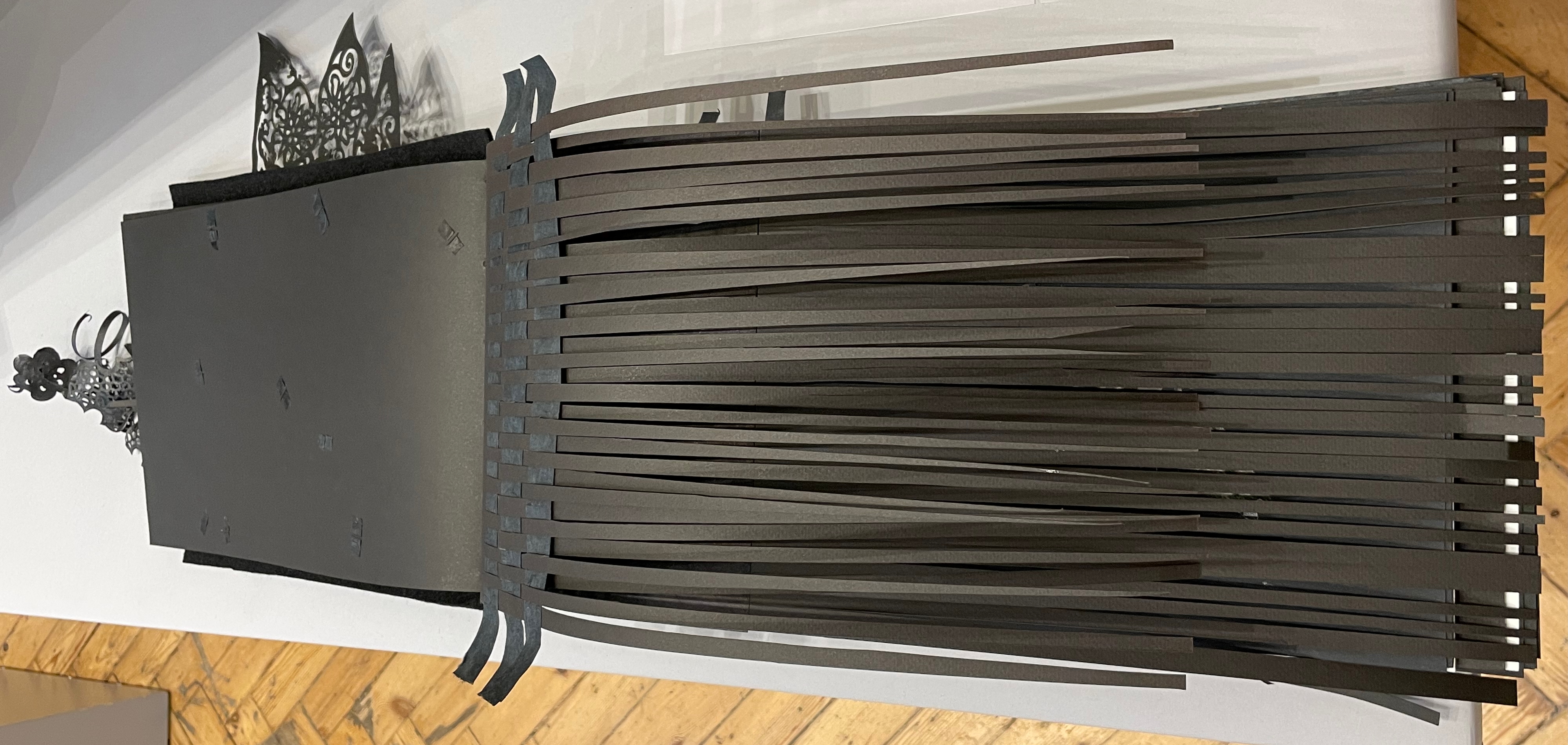
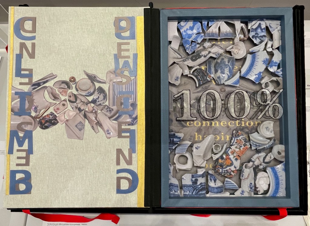
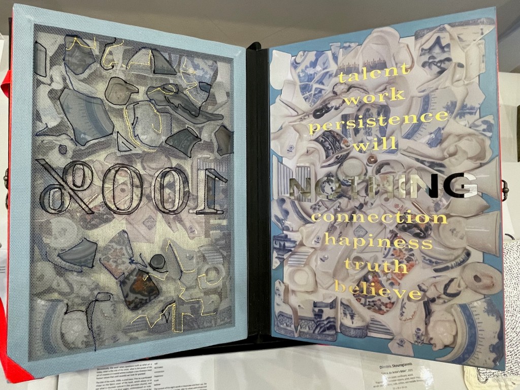
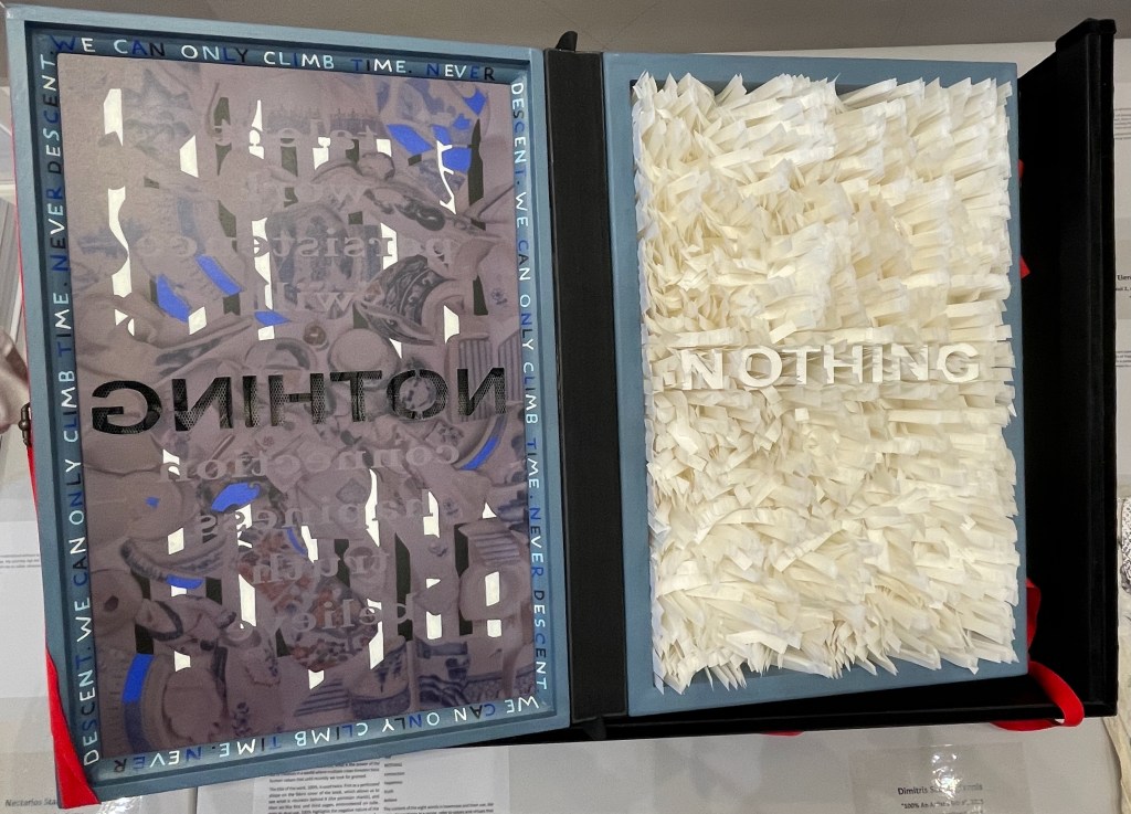
Another case in point is Dimitris Skourogiannis’ 100% An Artist’s Bible (2025). To be turned, its large “leaves” require metal rings on the fore-edge.
100% An Artist’s Bible (2025) Dimitris Skourogiannis Japanese paper, cardboard, wood, fragments of porcelain objects, print, metal rings, acrylic pains, fabris, tulle, and metallic threads. 500 x 350 x 140 mm. Photos: Books On Books.
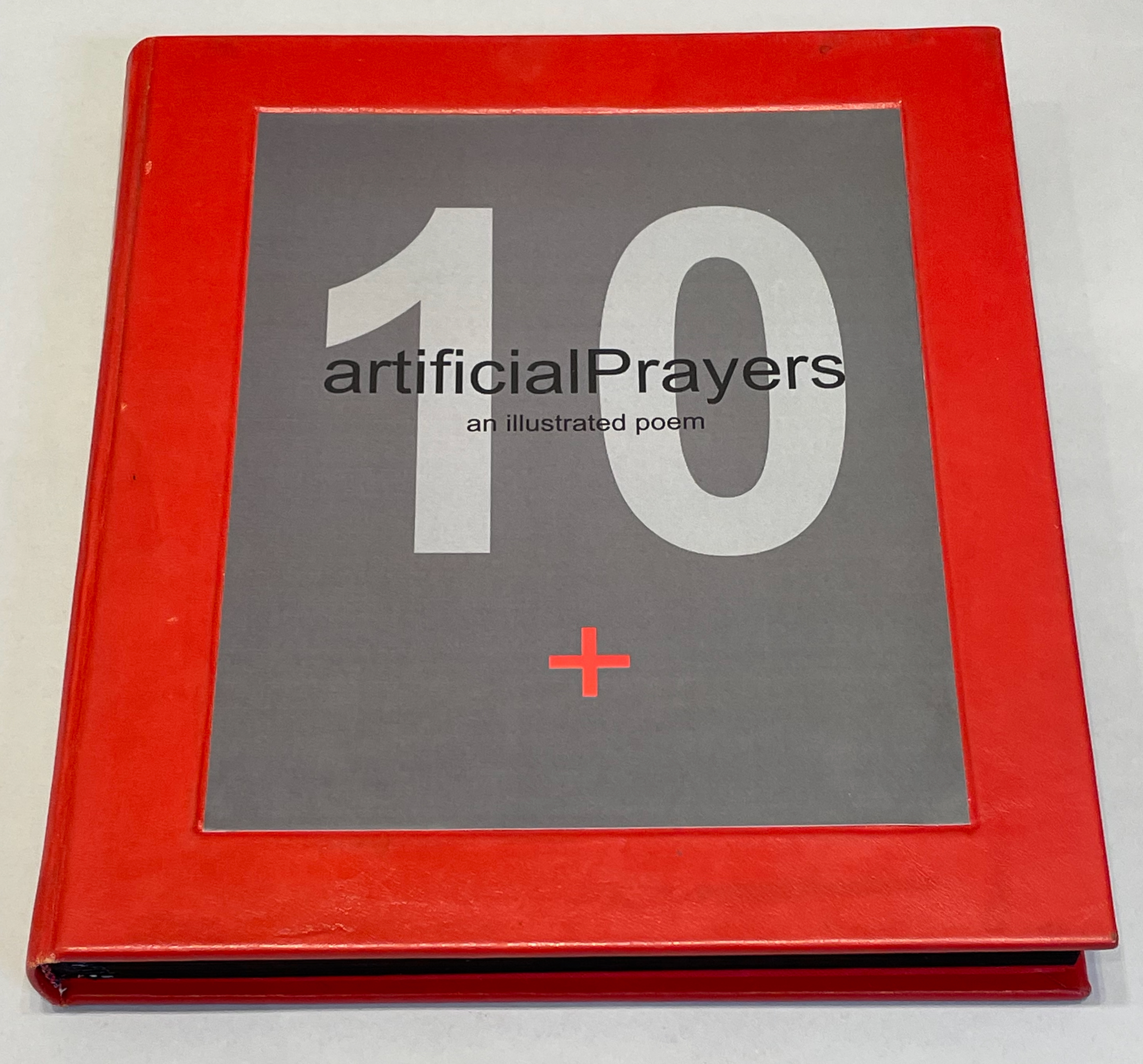
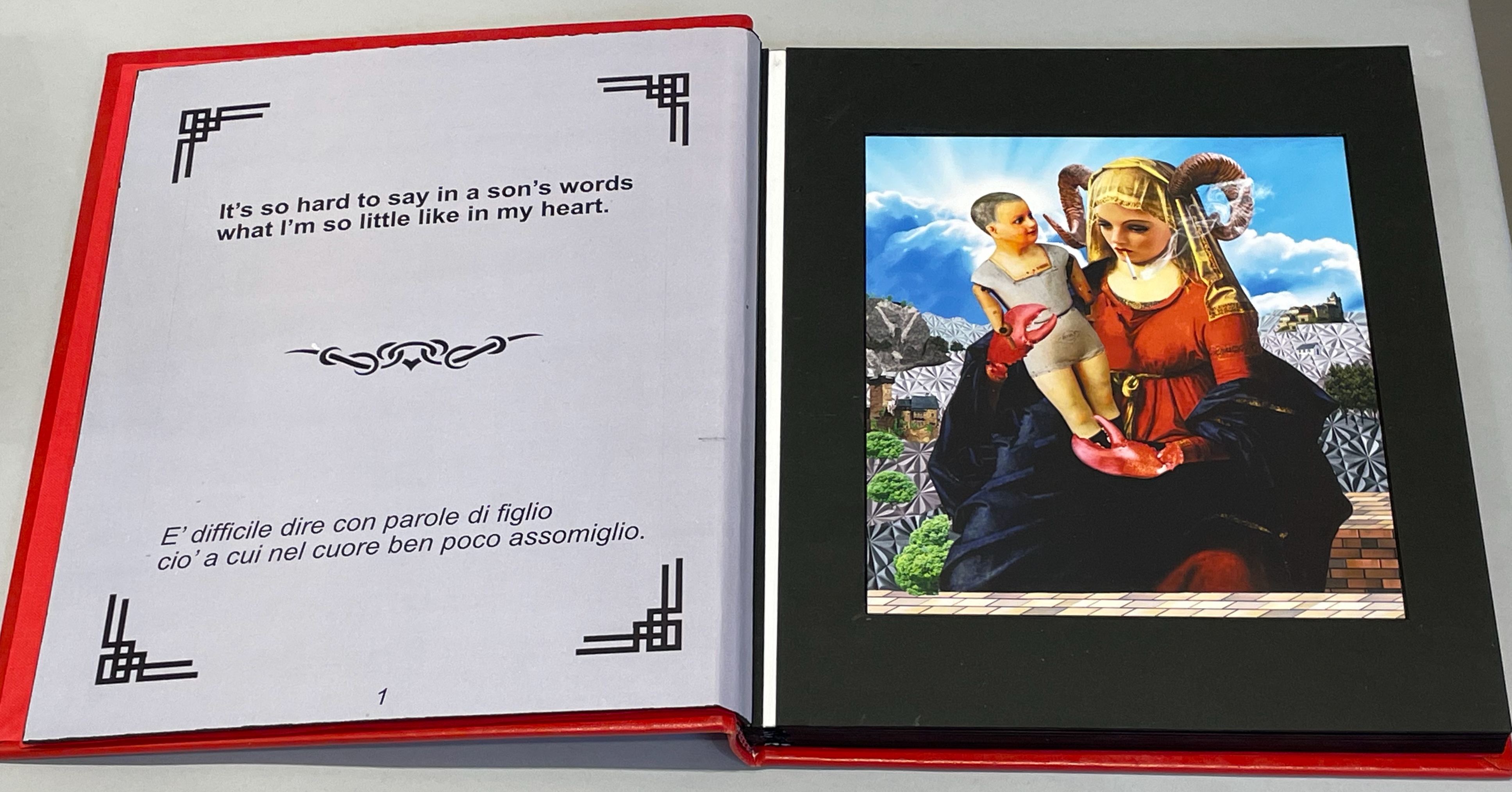
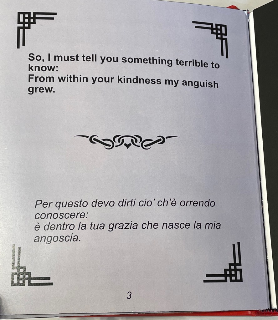
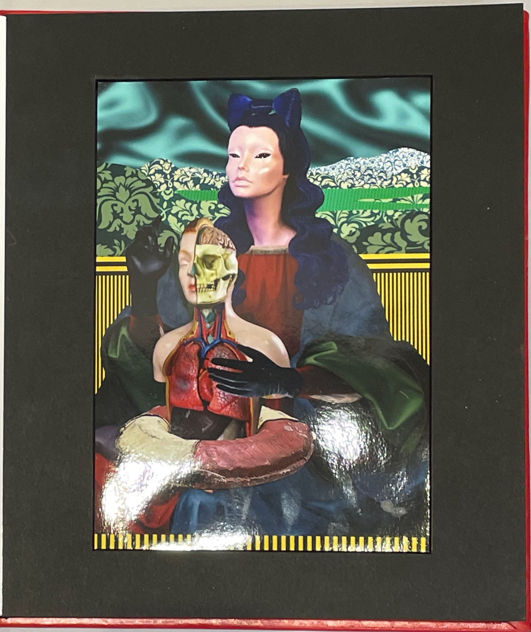
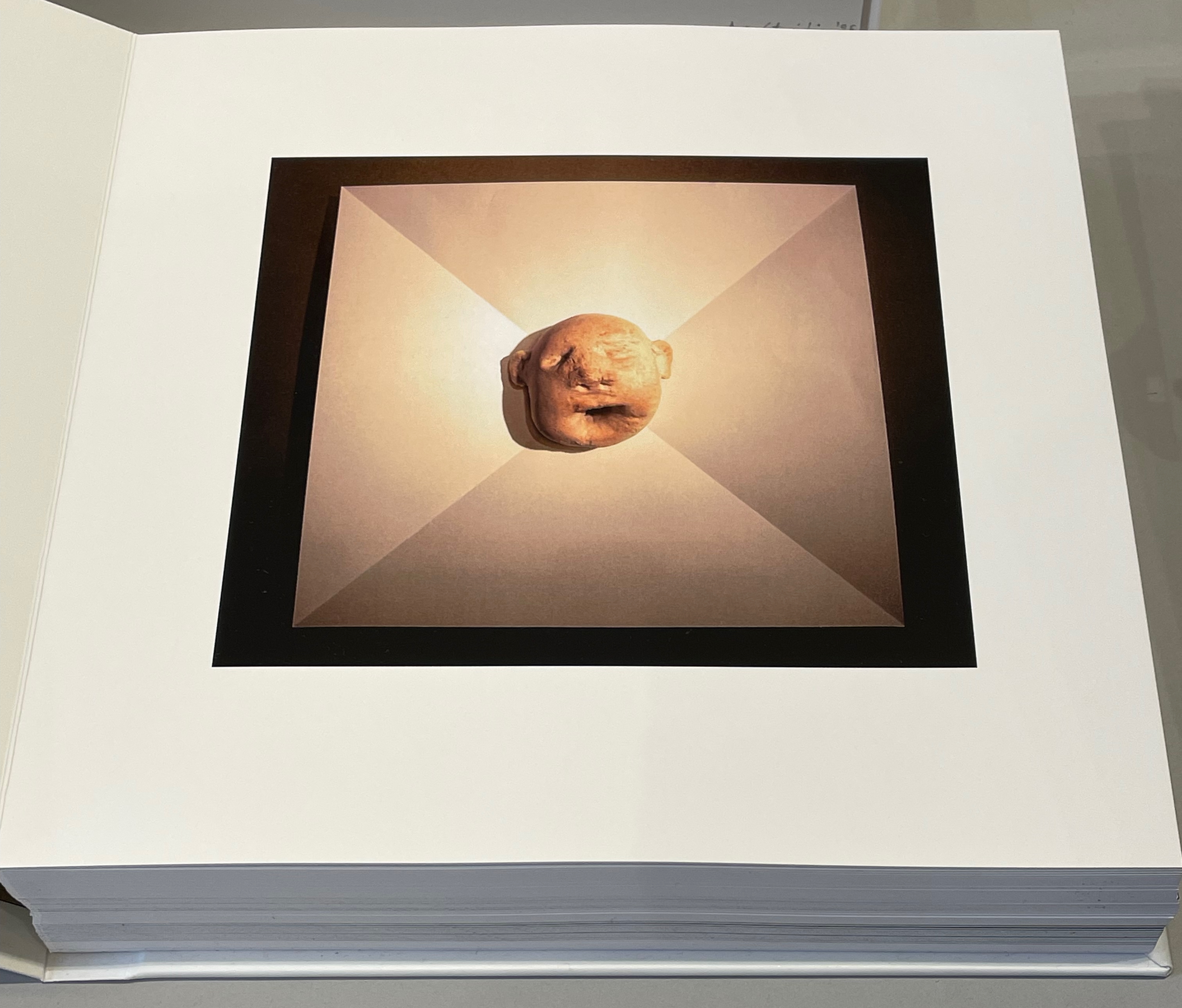
Thick leaves seemed to be the order of the day. On heavy black card, Thodoros Brouskomatis’ 10 Artificial Prayers (2025) presents surreal collages challenging the theme of “Madonna and Child” and couplets from Pier Paolo Pasolini’s “supplica a mia madre”.
10 Artificial Prayers(2025) Thodoros Brouskomatis Printed digital artworks on photographic paper, cardboard, and leather. 300 x 250 mm. Photos: Books On Books.
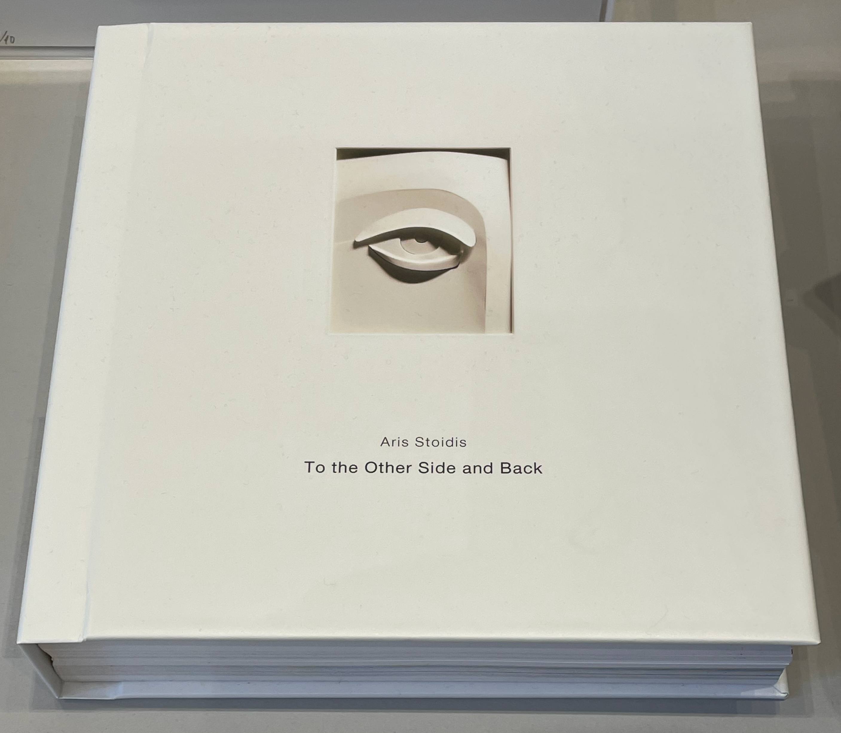
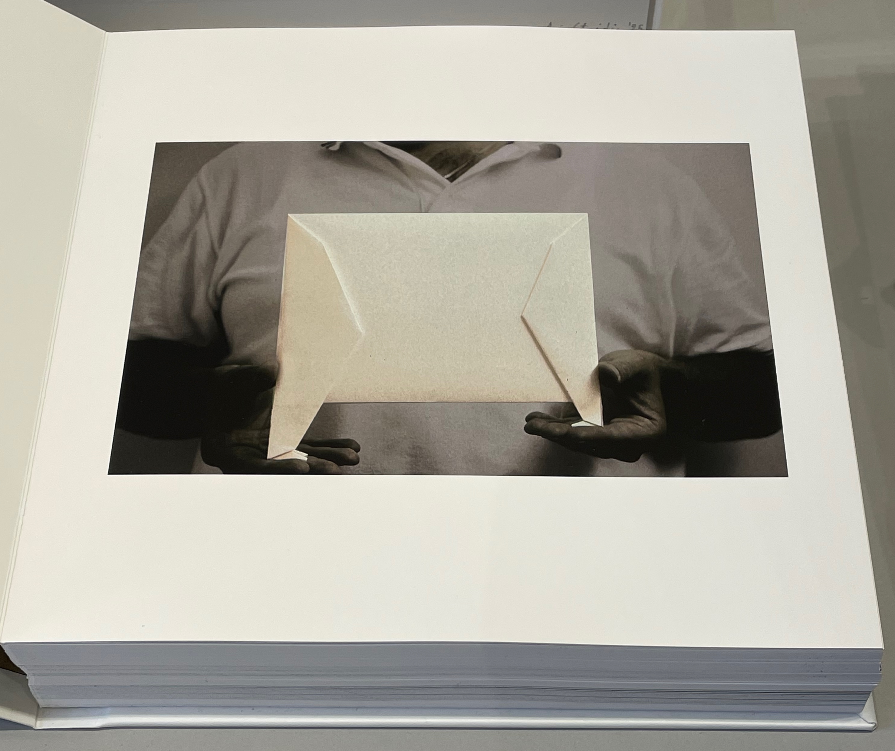
On slightly thinner card, Aris Stoidis’ To the other side and back (2025) carries a sculptural image on every page. The work straddles the borders of sculpture, photobook, and artist’s book. Stoidis writes, “Ever since my first pieces, I have been “receiving” images that I’ve materialized without really comprehending them myself. They simply exerted an inexplicable power on me.” The book comes in a plexiglas box with a papercut sculpture (not pictured here).
To the other side and back (2025) Aris Stoidis Photographic prints on card. 270 x 270 x 20 mm. Photos: Books On Books.
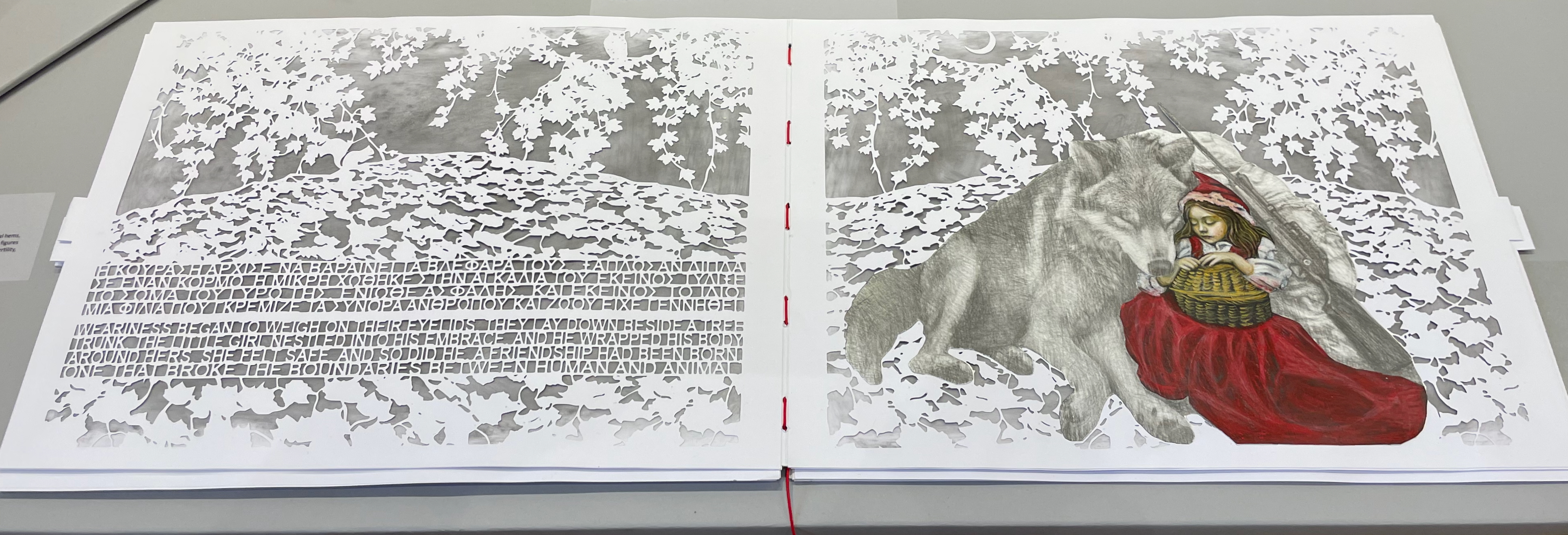
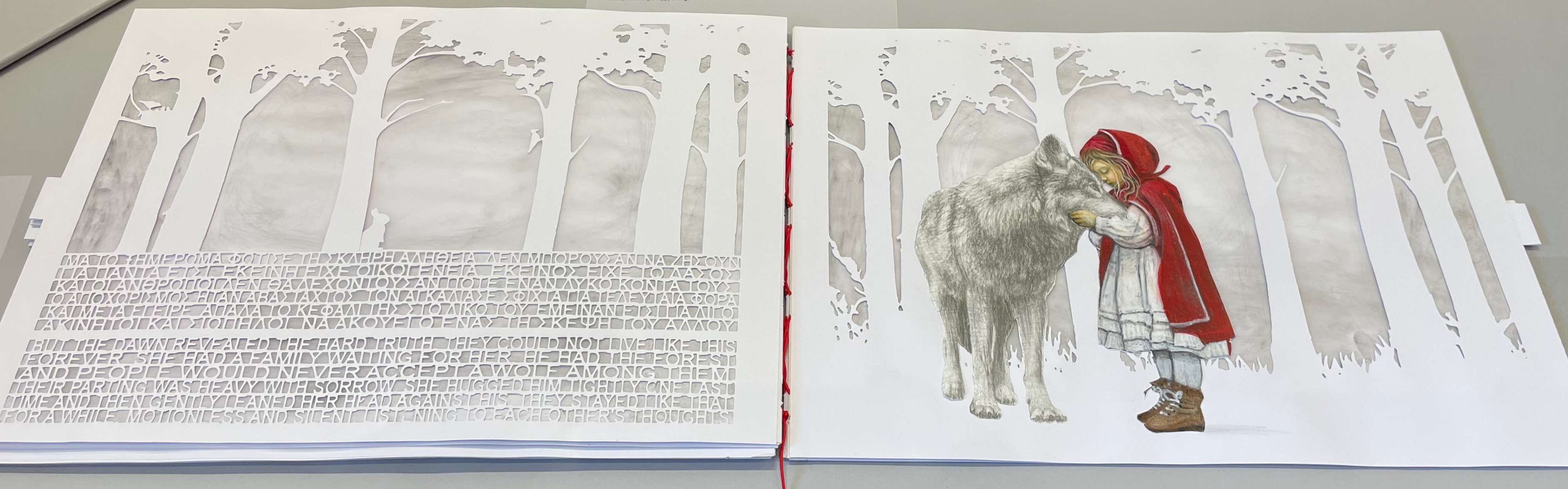
On still thinner leaves, Ismini Bonatsou’s Little Red Riding Hood (2025) nevertheless projects striking depth with its montage of papercut pages, acrylics, and pencil. Just as striking is the contemporary reversioning of the fairy tale.
Little Red Riding Hood (2025) Ismini Bonatsou Acrylics, pencil, and papercuts. 450 x 300 mm. Photos: Books On Books.
Given that the portmanteau term “bookmorph” comes from Michael Hampton, it seems appropriate that he has two works on display. Although one of them is under glass, 12 Chairs (bookmorph) (2012), the other is not. RAGE PEN by Hampton and David Blackmore is the UK contingent’s only work produced in 2025. Others from the UK contingent include Sarah Bodman, BOOKEND, Jonathan Callan, Joe Devlin, Stephen Emmerson, SJ Fowler, Rowena Hughes, and the Inscription Journal editors (Gill Partington, Simon Morris, Adam Smyth). RAGE PEN is also particularly appropriate because it requires a ruler to separate its perforated fore-edges. The exhibition provides one along with multiple pairs of white gloves. Really hands-on.
The participating Greek artists also include Eleni Angelou, Nikos Arvanitis, Rania Bellou, Maria Bourbou, Natassa Chelioti-Naga, Ioanna Delfino, Anna Dimitriou, Antonia Iroidou, Eleni Kastrinogianni, Peggy Kliafa, Alexia Kokkinou, Georgia Kotretsos, Nikos Kryonidis, Vasiliki Lefkaditi, Eleni Maragaki, Kyriaki Mavrogeorgi, Despina Meimaroglou, Christina Mitrentse, Fiona Mouzakitis, Kiki Perivolari, Stamatis Schizakis, Ifigeneia Sdoukou, Christina Sgouromiti, Danai Simou, Nectarios Stamatopoulos, Despina Stavrou, Evangelos Tasios, Yannis Tzortzis, and Leonie Yagdjoglou.
Congratulations and thanks to the curators — Christina Mitrentse, Fiona Mouzakitis, and Despina Stavrou — for bringing together this selection of outstanding works.
The Hellenic Centre opens at 11:00 and closes at 17:00, Tueday through Friday, so the chances to visit by the 28th of November are limited. The brief catalogue that documents the exhibition and these few photos cannot substitute for tactile engagement with the works on display. An hour and a half passed in a flicker.
First, the back-dating. This comes from the delightfully annoying or annoyingly delightful belated discovery of Erik Kwakkel’s 2015 entry on the history of the horn-book “Book on a Stick” in Medievalbooks. Delightful and annoying to find the truly earliest appearance of a horn-book right under my nose in the Bodleian Libraries but too late to include it in the Alphabets Alive! exhibition at the Bodleian in 2023.
Andrew White Tuer’s History of the Horn-Book (1897) came close with its dating of the horn-book’s first appearance as 1450, but as Kwakkel writes:
The image shows Christ being brought to school by his mother. He is bringing his “textbook” to class: a hornbook, which dangles from his wrist by a string, just like many of the later specimens did … Quite intriguingly, we are shown a real medieval snapshot of how children carried their hornbook to and at school. More importantly, it shows that the hornbook was indeed a medieval invention….While no actual hornbooks appear to survive from the medieval period, these visual representations show that educating young children was also the driving force behind the production of hornbooks in the age before print.
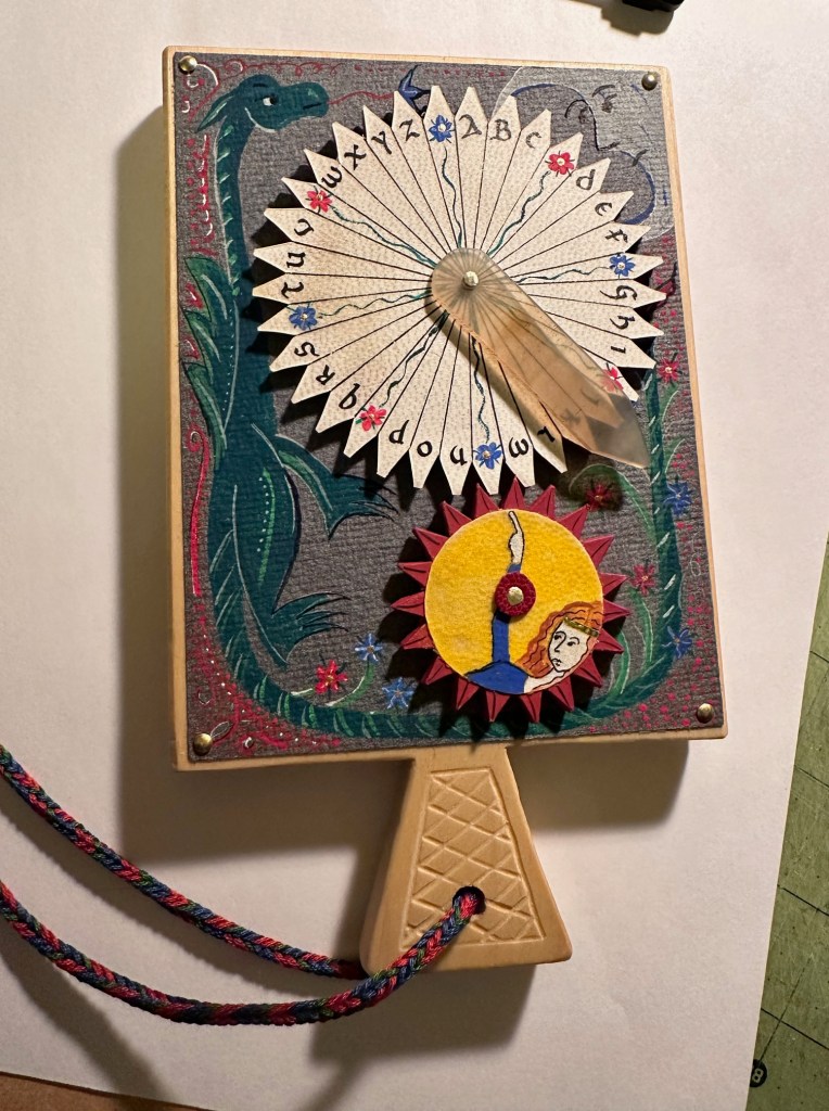
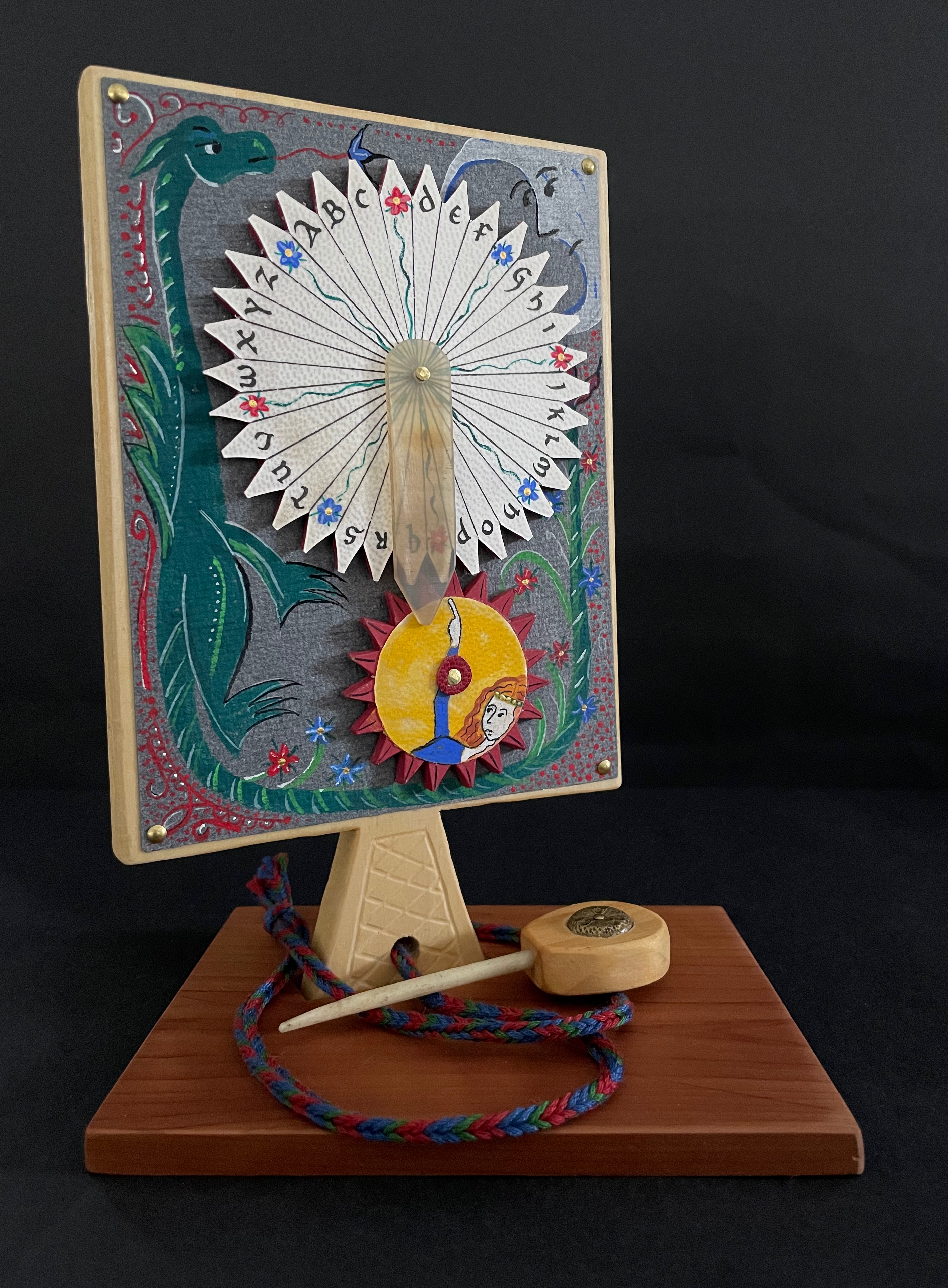
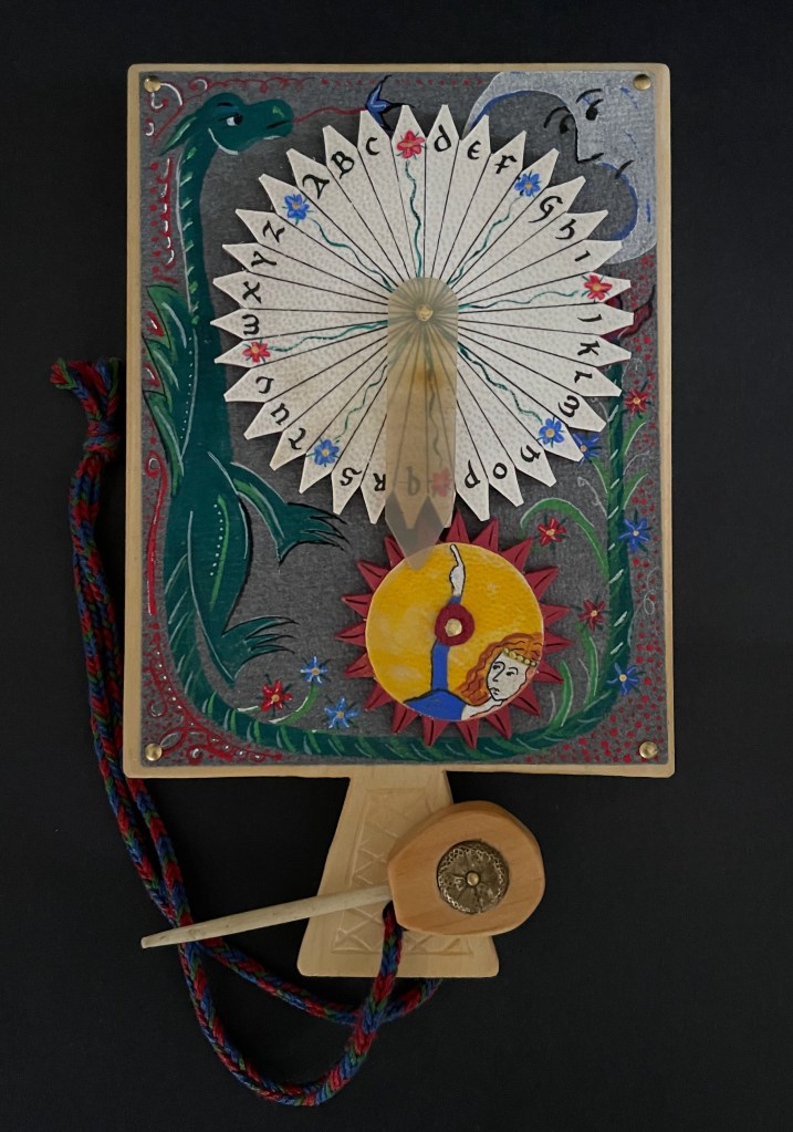
And for the updating, here is Ashley Thayer’s Mechanical Horn-book (2025) just arrived in the Books On Books Collection.
Mechanical Horn-book (2025) Ashley Rose Thayer Horn-book. On stand: H192 x W160 mm. Off stand: H192 x W115 mm. Unique. Acquired from the artist, 17 October 2025. Photos: Courtesy of the artist. Books On Books Collection.
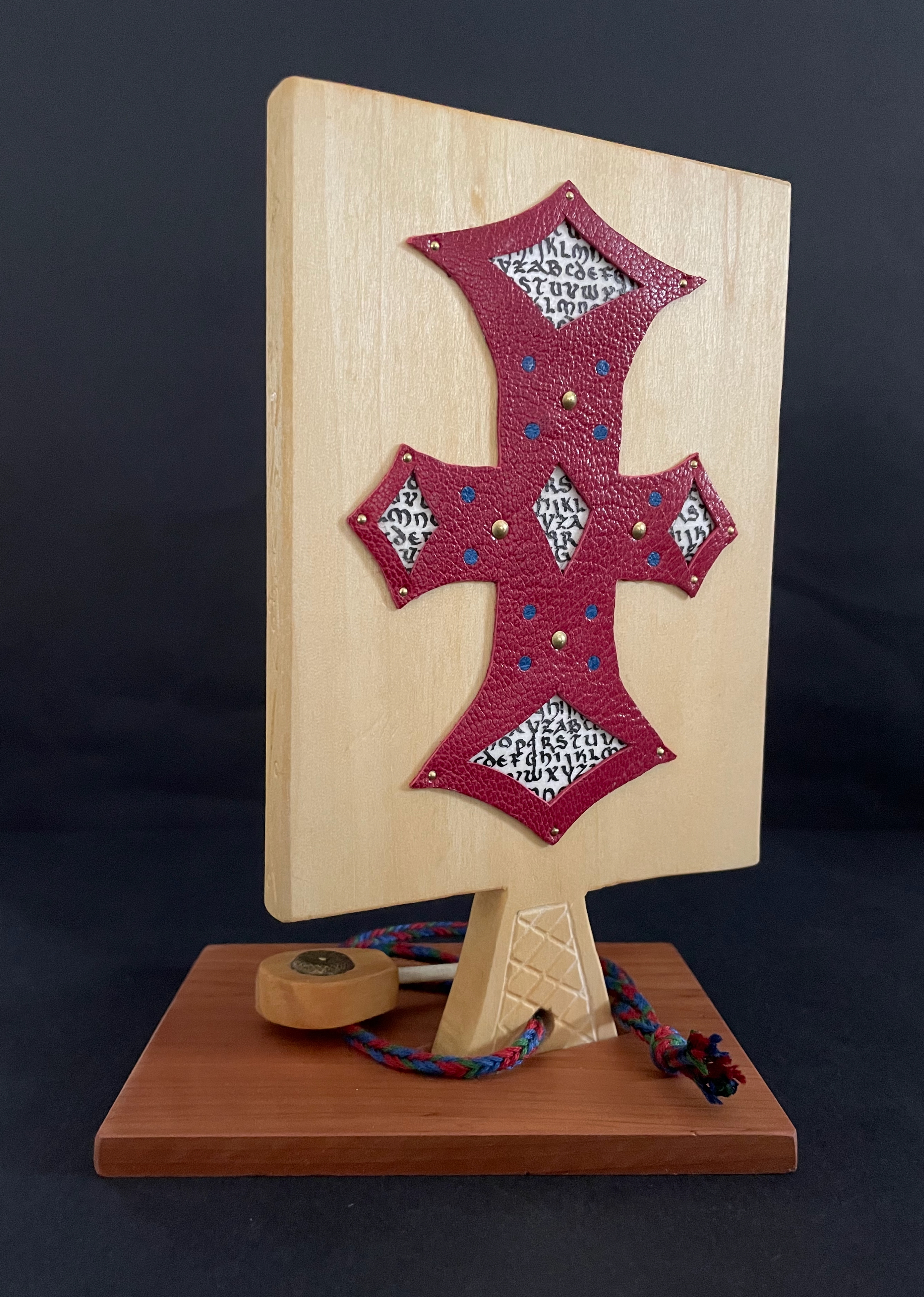
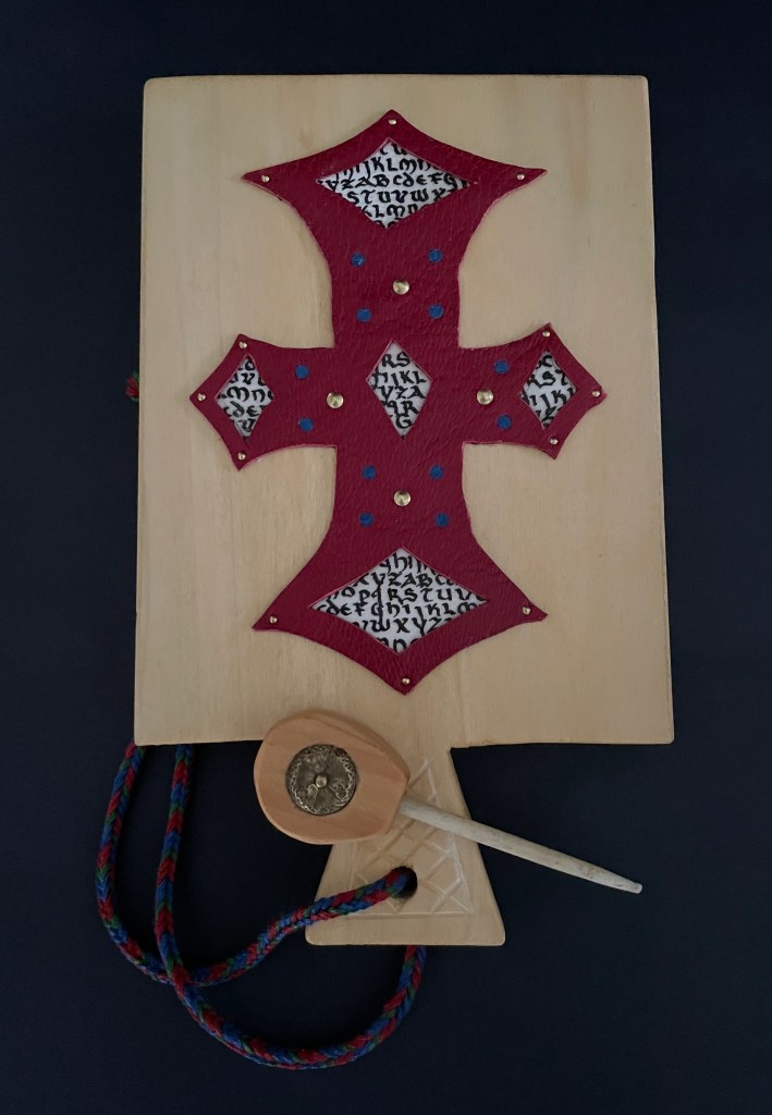
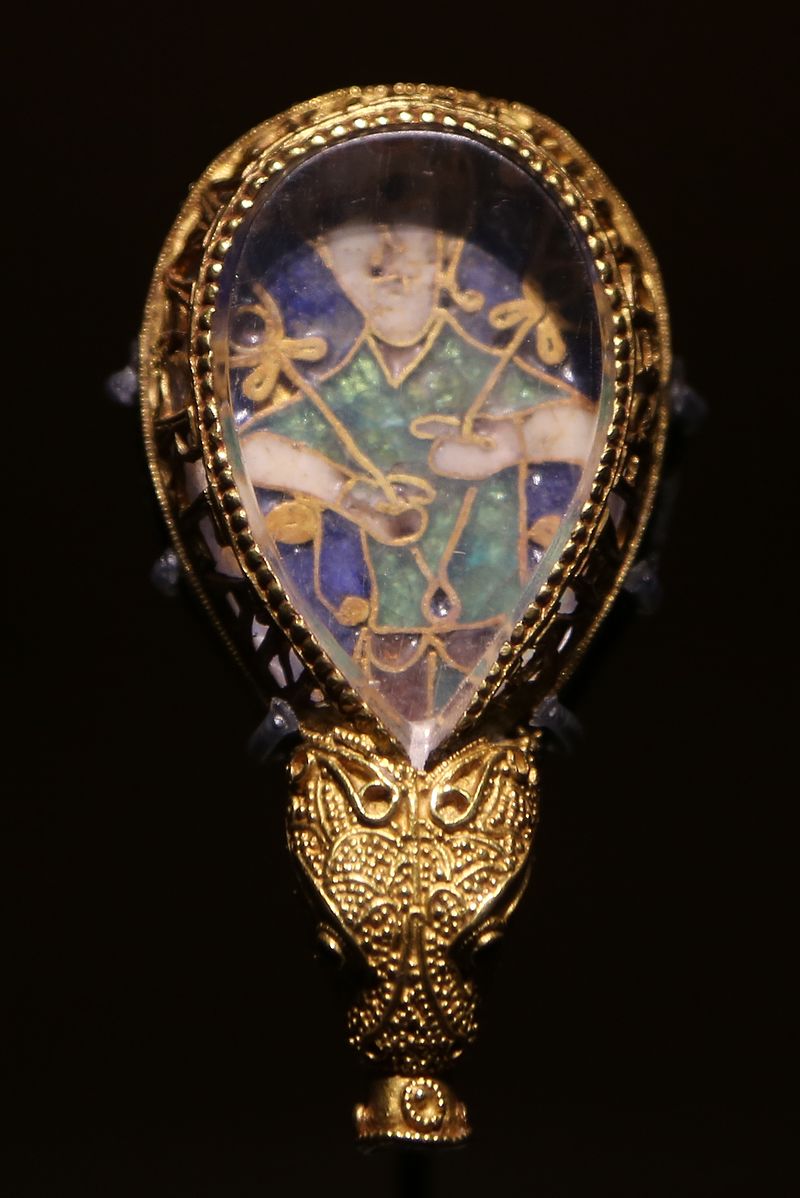
The paddle is made of pine wood, the gears of vellum-covered bookboard, the spinning “arm” of authentic cow horn, and the wrist loop of embroidery thread by a medieval finger loop braiding technique. On dark grey-blue Khadi paper, Thayer has painted a border of the moon, a berried floral garland, and a wyvern, the heraldic emblem associated with Wessex, the Anglo-Saxon kingdom from which Alfred the Great emerged in the 9th century. On the reverse, a cross of cut red leather with five inserts of calligraphed vellum alluding to Christ’s five wounds reflects the horn-book tradition of combining religion with learning the alphabet. It also makes this horn-book reflective of Alfred’s Anglo-Saxon and Christian background.
The pointer, called an aestel in Old English, is made from poplar wood, an antique button, and antique bone. Its inclusion isn’t simply functional. Appearing alongside the Wessex wyvern, it points to that famous aestel on display at the Ashmolean in Oxford: the Alfred Jewel.
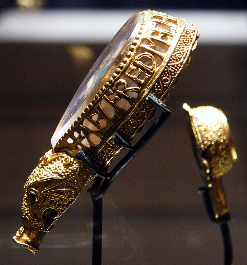
The Alfred Jewel, Ashmolean Museum, Oxford. Photo taken from the front by Geni CC BY-SA 4.0. Photo taken from the side by Richard M Buck CC BY SA 3.0.
If there’s ever an Alphabets Alive! redivivus, Erik Kwakkel and Ashley Thayer have provided the pointers to the other treasures in Oxford that should be included.
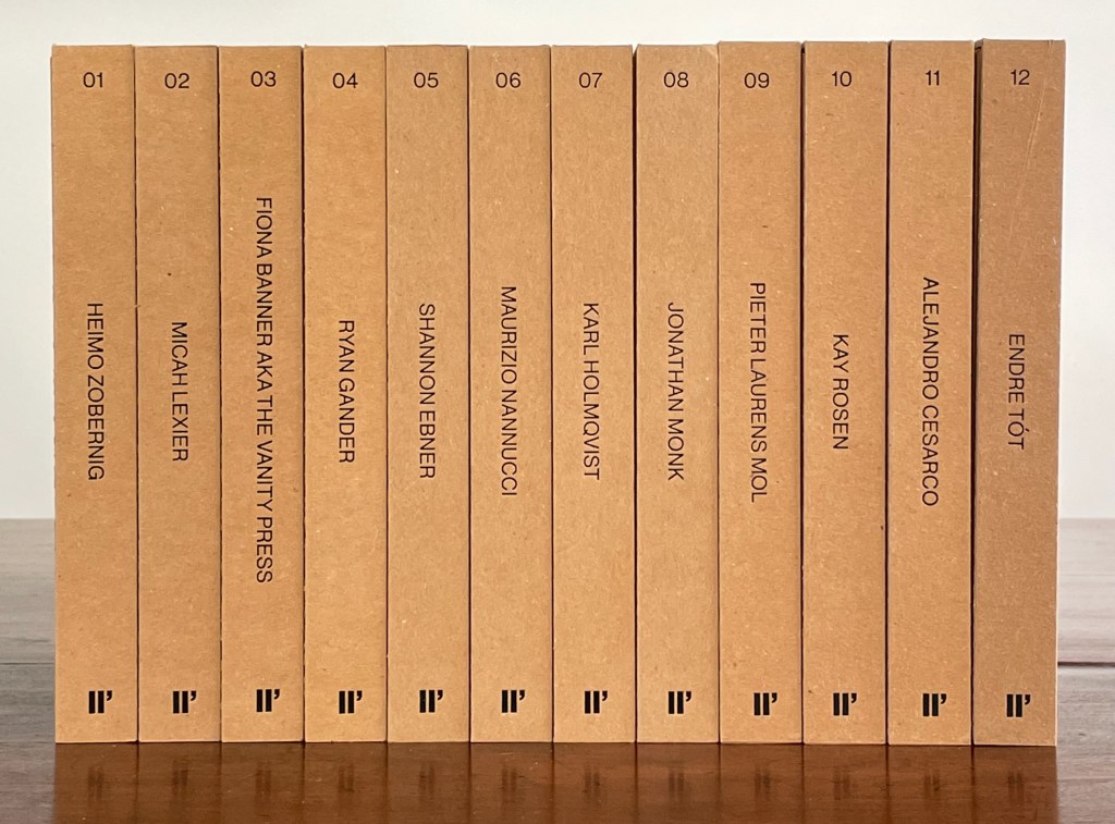
Enthusiasts and collectors of artists’ books should congratulate LL’Editions (Göteborg, Sweden) on its leporello series not only for the artists enlisted so far but for the constraint to inspire them. Critics of book art have opined that book artists turned to the accordion structure in the 20th century for more freedom with visual images and another tool with which to question the notion of the book as book. LL’Editions has challenged its invited artists with a constraint: a fixed-format leporello of ten panels, nine folds and always H140 x W100 mm (closed). The works are printed on Mohawk Superfine Eggshell paper. Housed in a custom box with the title hot foiled both on its front and spine, each volume in the series is limited to 250 numbered copies.
The real pleasure in each work and across the series is how each artist handles the shape to make it dance to a personal style or stamp. With each new addition — brick by brick — LL’Editions is building a monument to book art’s most common structure.
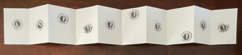
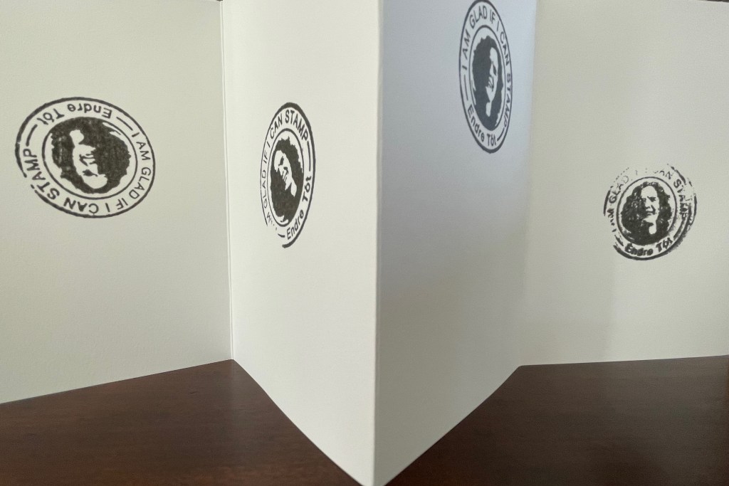
Leporello #12 (2025)
Leporello #12 (2025) Endre Tót Box: 148×191×23 mm. Leporello: H142 x W99 mm (closed); W990 mm (open). 10 panels. Edition of 250, of which this #70. Acquired from LL’Editions, 28 August 2025. Photos: Books On Books Collection. Displayed with permission of LL’Editions.
Bespoke Eska Board 1260 G/M2, Insert: F-Flute Black 500 G/M2, Hot-foiled title on front and spine. Mohawk Superfine Eggshell Ultrawhite 175 gsm.
Endre Tót has worked with a wide range of media: telegrams, postcards, posters, actions, and artist’s books. This one self-reflexively celebrates his signature gladness statements “We are glad if we are happy”, “I am glad that I have stood here”, “I’m glad that I can write one sentence after another”, “We are glad if we can demonstrate” and so on.
I am glad to have Endre Tót’s work in the Books On Books Collection.
Leporello #11 (2024)
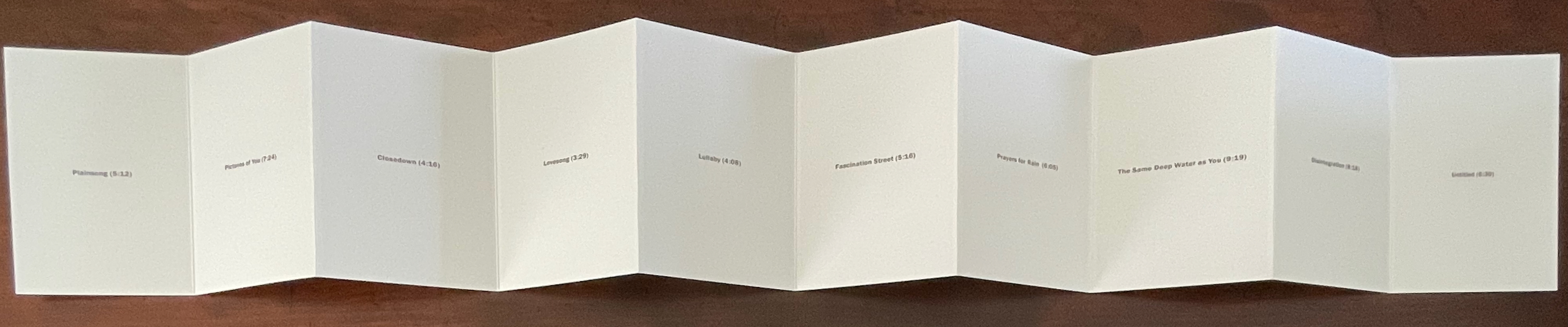
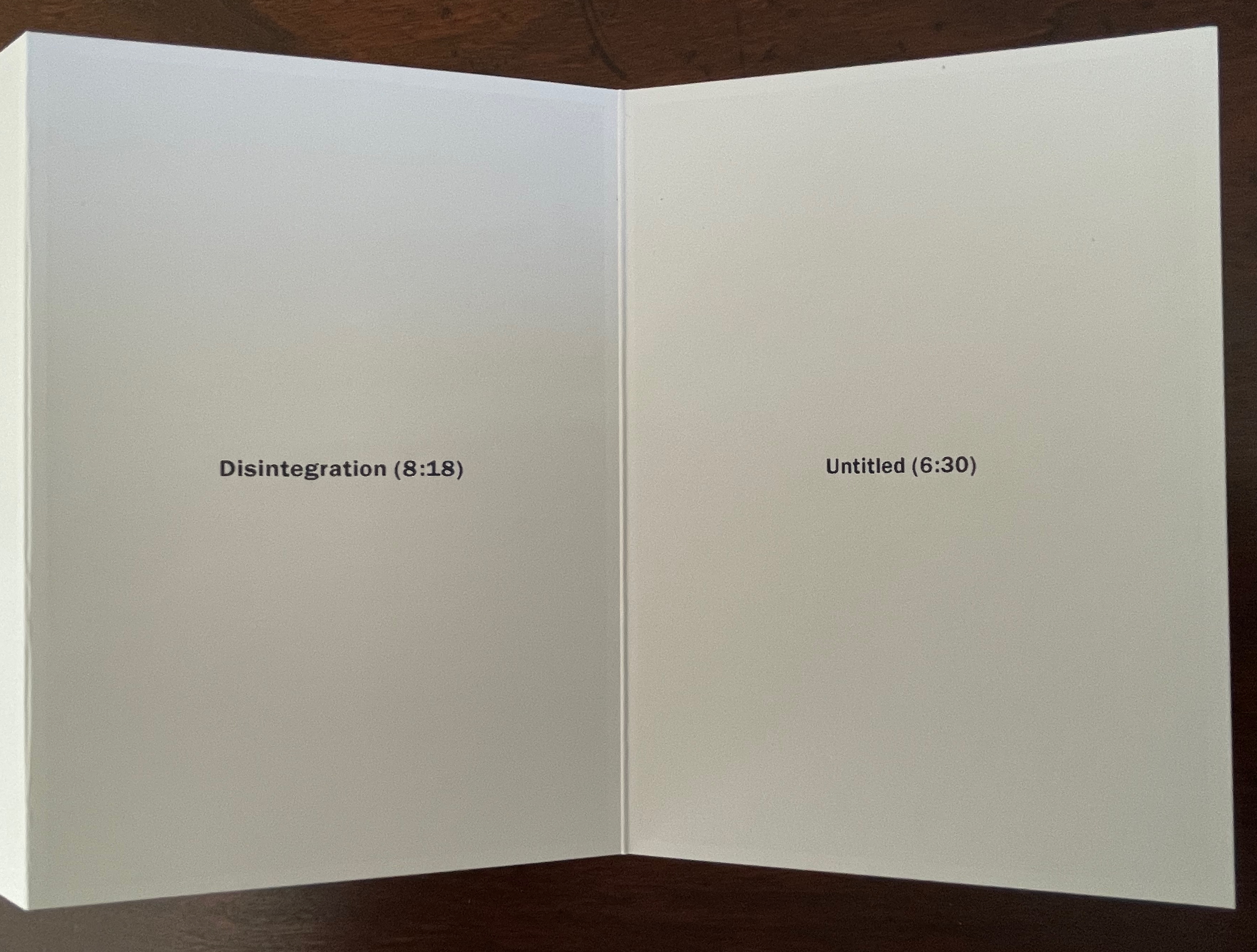
Leporello #11(2024) Alejandro Cesarco Box: H191 x W148 x D 23 mm. Leporello: H142 x W99 mm (closed). W990 mm (open). 10 panels. Edition of 250, of which this #229. Acquired from LL’Editions, 14 November 2024. Photos: Books On Books Collection. Displayed with permission of LL’Editions.
These are the titles and durations of the songs making up The Cure’s 1989 album. With each song on its own panel, Cesarco (b. 1975) seems to have created a photo album to remind himself of his youth. Given his artworks referencing/co-opting/implicating/appropriating John Baldessari, Marcel Broodthaers, Félix Gonzáles-Torres, Allen Ruppersberg, Ed Ruscha, and other book artists, the less-than-fans of The Cure may wonder if Cesarco is deliberately wrong-footing their expectations for his tackling the book artist’s platform. If you are one of them, consider that your horizons have been widened and that The Ramones (An Autobiography) (2008) — his list in chronological order of every Ramones song that begins with the pronoun “I” — does not neatly divide by 10.
Leporello #10 (2024)
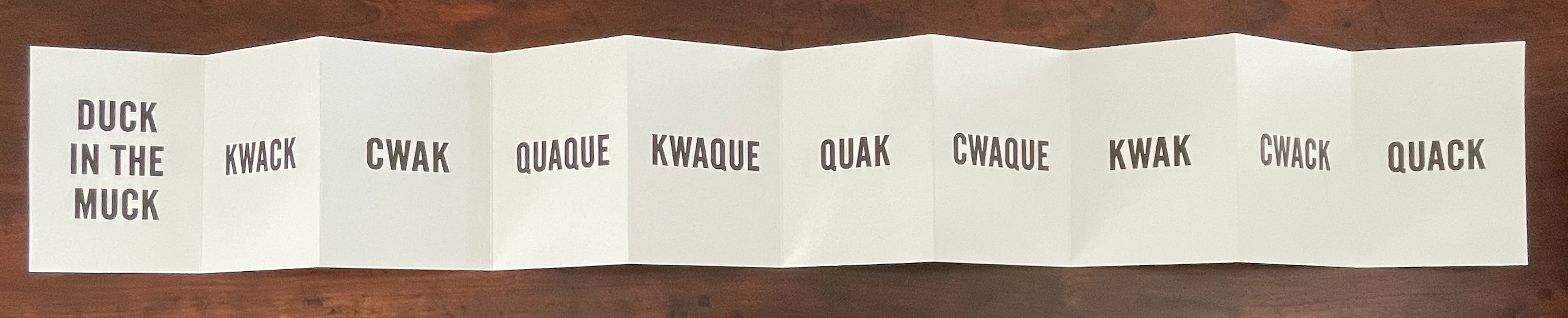
Leporello #10 (2024) Kay Rosen Box: H191 x W148 x D 23 mm. Leporello: H142 x W99 mm (closed). W990 mm (open). 10 panels. Edition of 250, of which this #116. Acquired from LL’Editions, 14 November 2024. Photos: Books On Books Collection. Displayed with permission of LL’Editions.
There’s a lengthy and excellent essay entitle “The Gravity of Language” about Rosen’s work in Osmos Magazine (Winter 2019) by Stephanie Cristello. In it, she writes:
You will notice, by now, that the works discussed here are united by their allusions to the motions of up and down. Does this seem arbitrary to you? Or strike you as the imposition of a rule-based physics upon an artistic practice whose oeuvre certainly contains variances, divergences, and oddities–cut out for the purpose of being explored through a particular force?Perhaps. (Cristello, 2019)
Somehow this more recent artist’s book seems to confirm and repudiate the critic’s approach. As if to say, “Yes, I’m stuck in the muck despite my variances, divergences and oddities”, or “No, ducky, there’s no gravitas or gravity here”. Or perhaps it’s Rosen’s visual way of using permutations on language (starting with a common expression) to poke fun at LL’Editions’ constraint: “So you want to confine me like a duck in the muck? Well, quack, the joke’s on you”.
Leporello #9 (2024)
Leporello #9 (2024) Pieter Laurens Mol Box: H191 x W148 x D 23 mm. Leporello: H142 x W99 mm (closed). W990 mm (open). 10 panels. Edition of 250, of which this #111. Acquired from LL’Editions, 14 November 2024. Photos: Books On Books Collection. Displayed with permission of LL’Editions.
How many artists before and after Marcel Duchamp’s Prière de Toucher (1947) have played this joke in an artist’s book? Where Duchamp’s displayed work played against the usual museum injunction, Pol’s embraces and wrong-foots it with blind embossing.
Leporello #8 (2022)
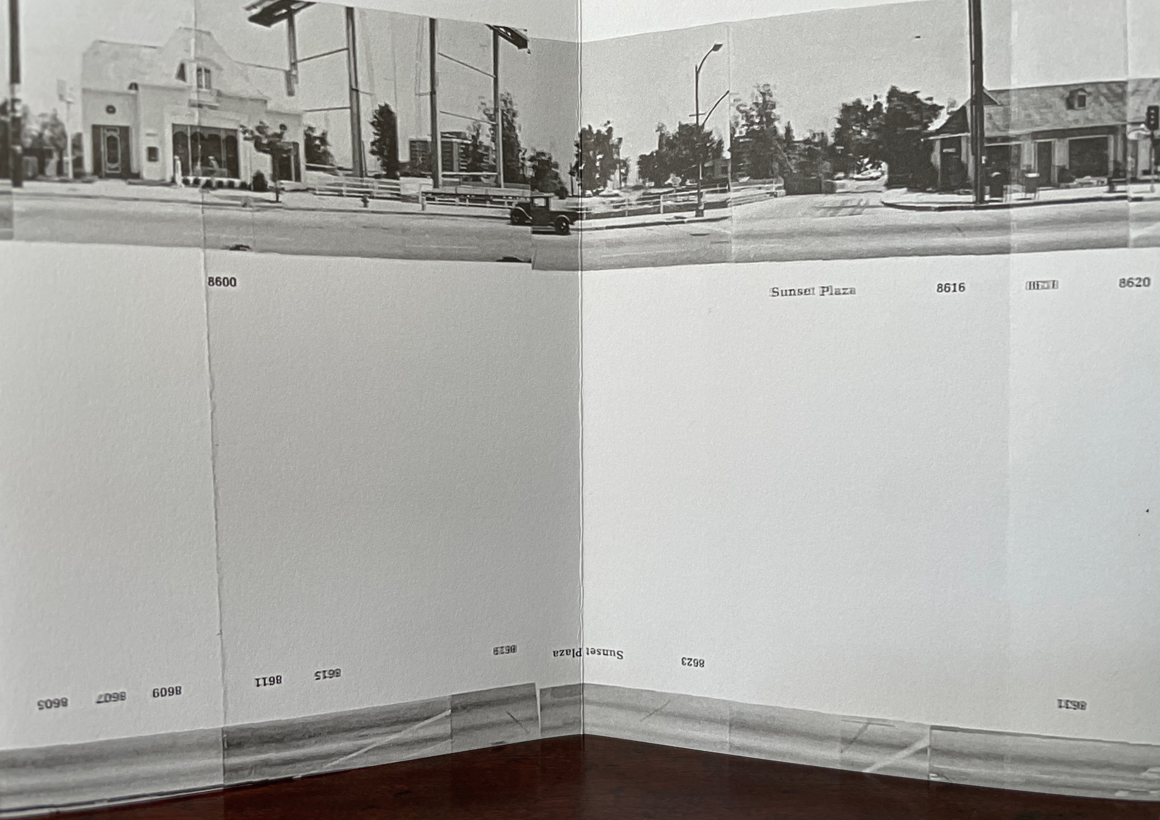
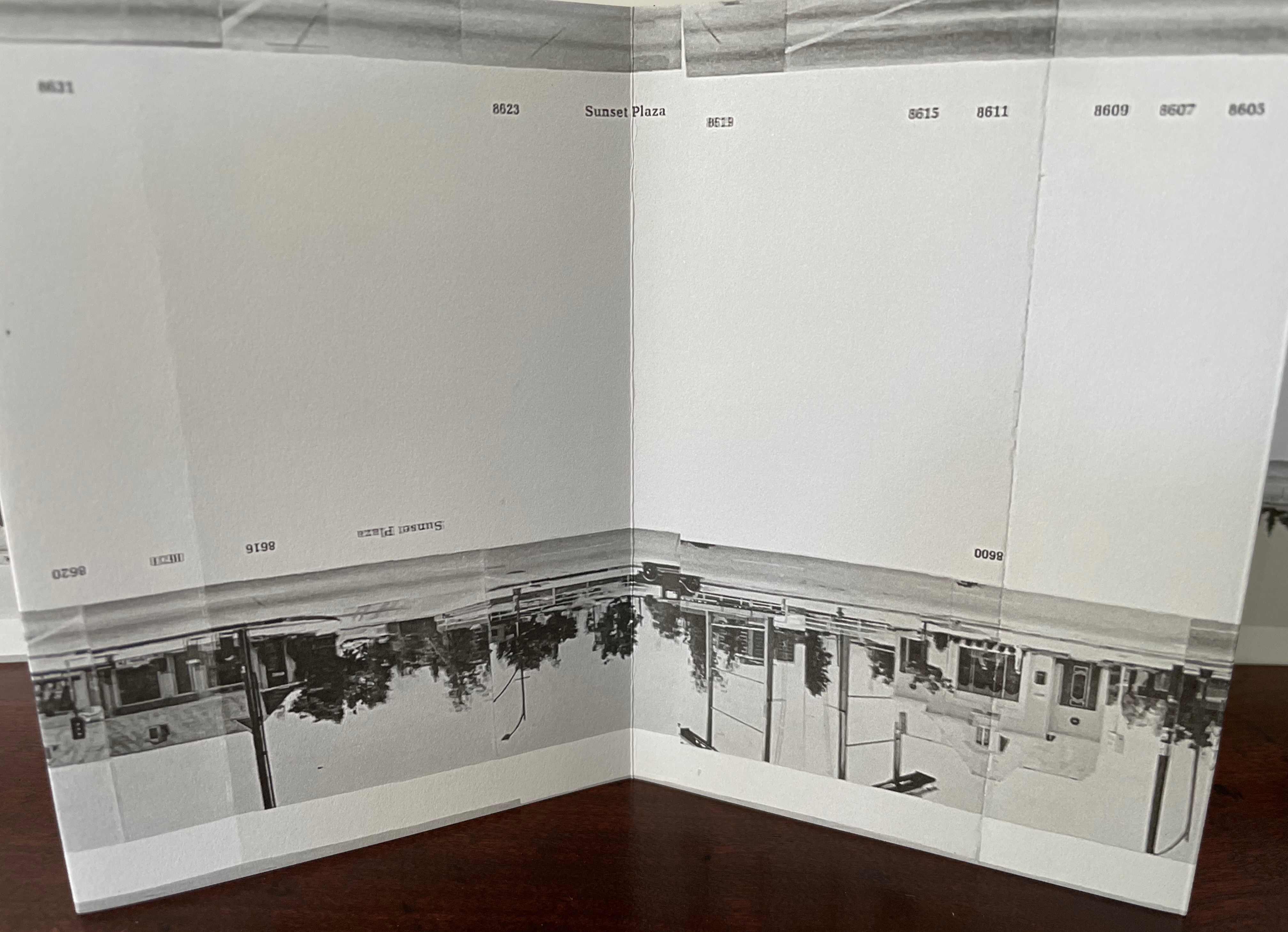
Leporello #8 (2022) Jonathan Monk Box: H191 x W148 x D 23 mm. Leporello: H142 x W99 mm (closed). W990 mm (open). 10 panels. Edition of 250, of which this #175. Acquired from LL’Editions, 14 November 2024. Photos: Books On Books Collection. Displayed with permission of LL’Editions.
It helps to know or remember that in 2002, Jonathan Monk published None of the buildings on Sunset Strip with Revolver. Here, he has used his iPhone in panoramic mode to appropriate again Ed Ruscha’s Every Building on the Sunset Strip (1966). But when Monk’s leporello is turned over, notice that this side of the Strip has been truncated. Monk’s thoughts on appropriation and self-reflexivity can also be enjoyed in the three-handed interview Books on Books (2011) with Jérôme Saint-Loubert Bié and Yann Sérandour.
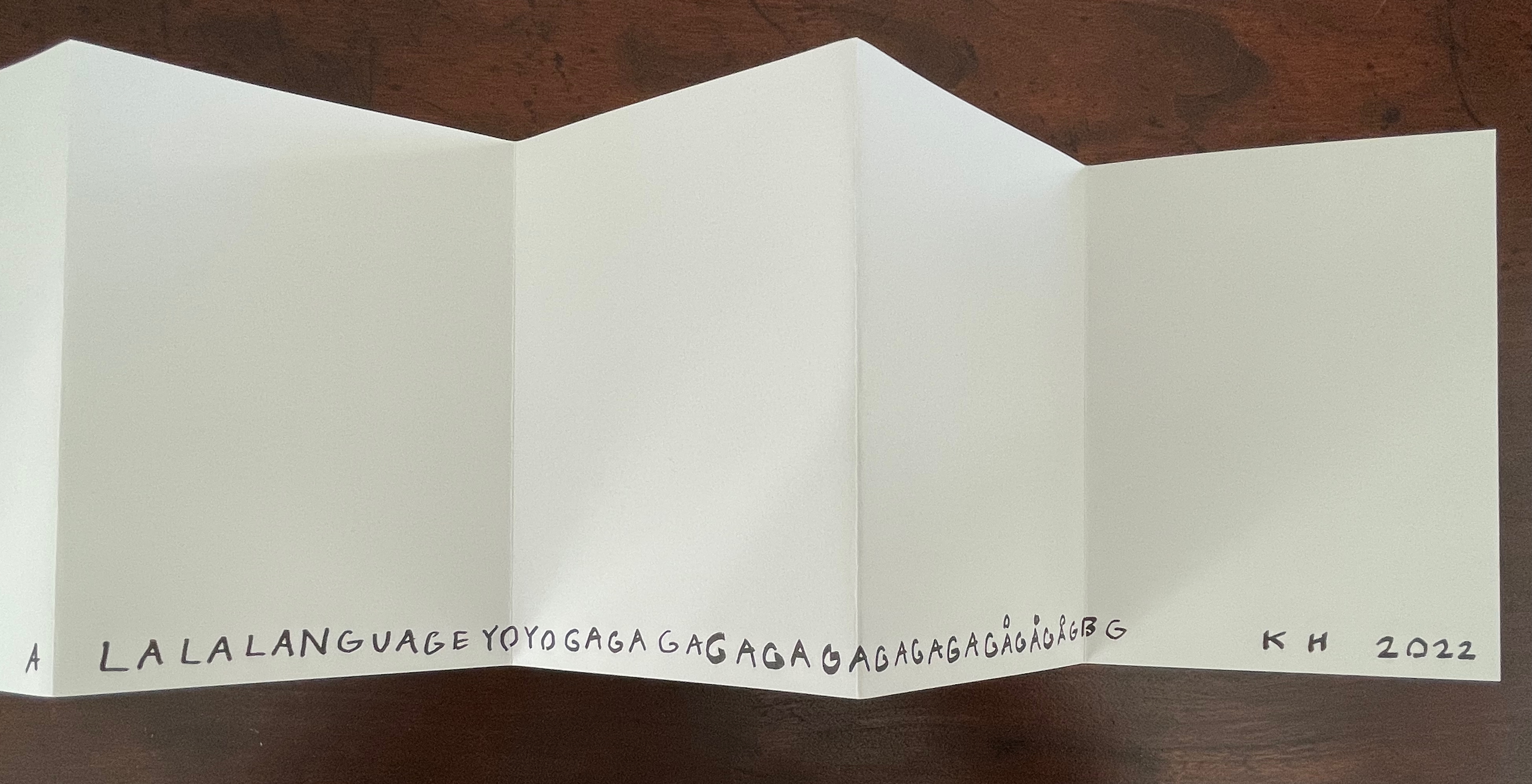
Leporello #7 (2022)
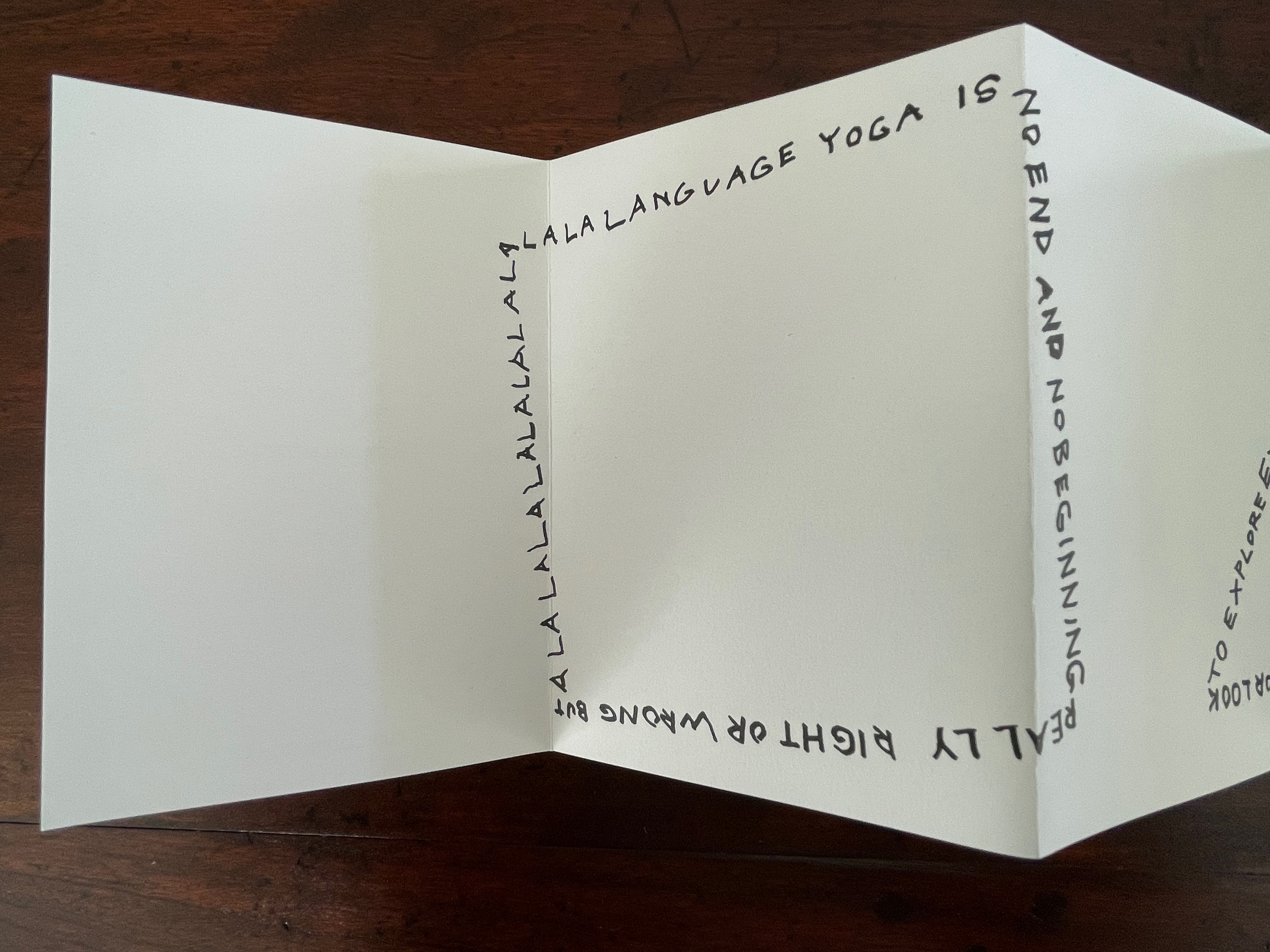
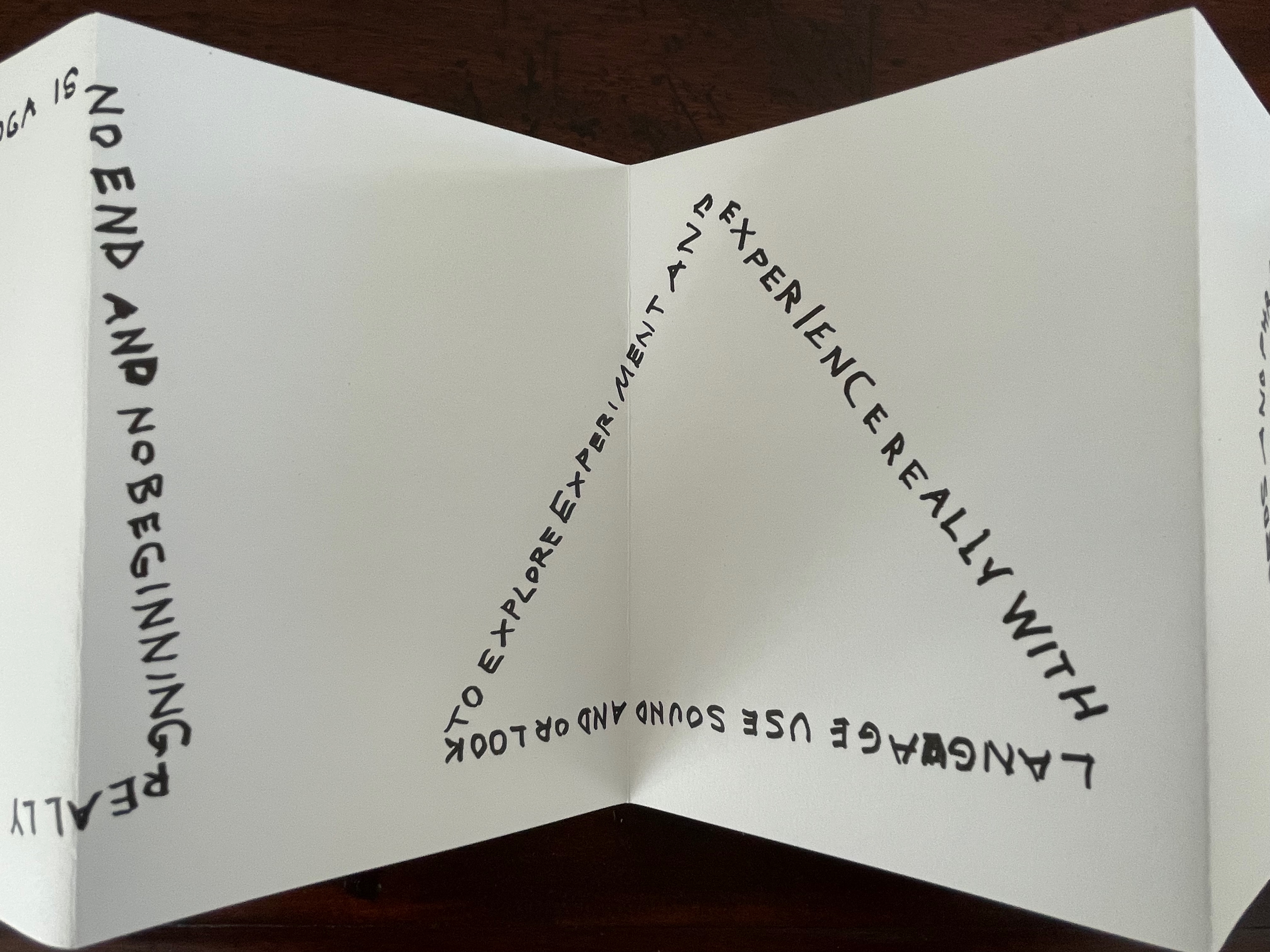
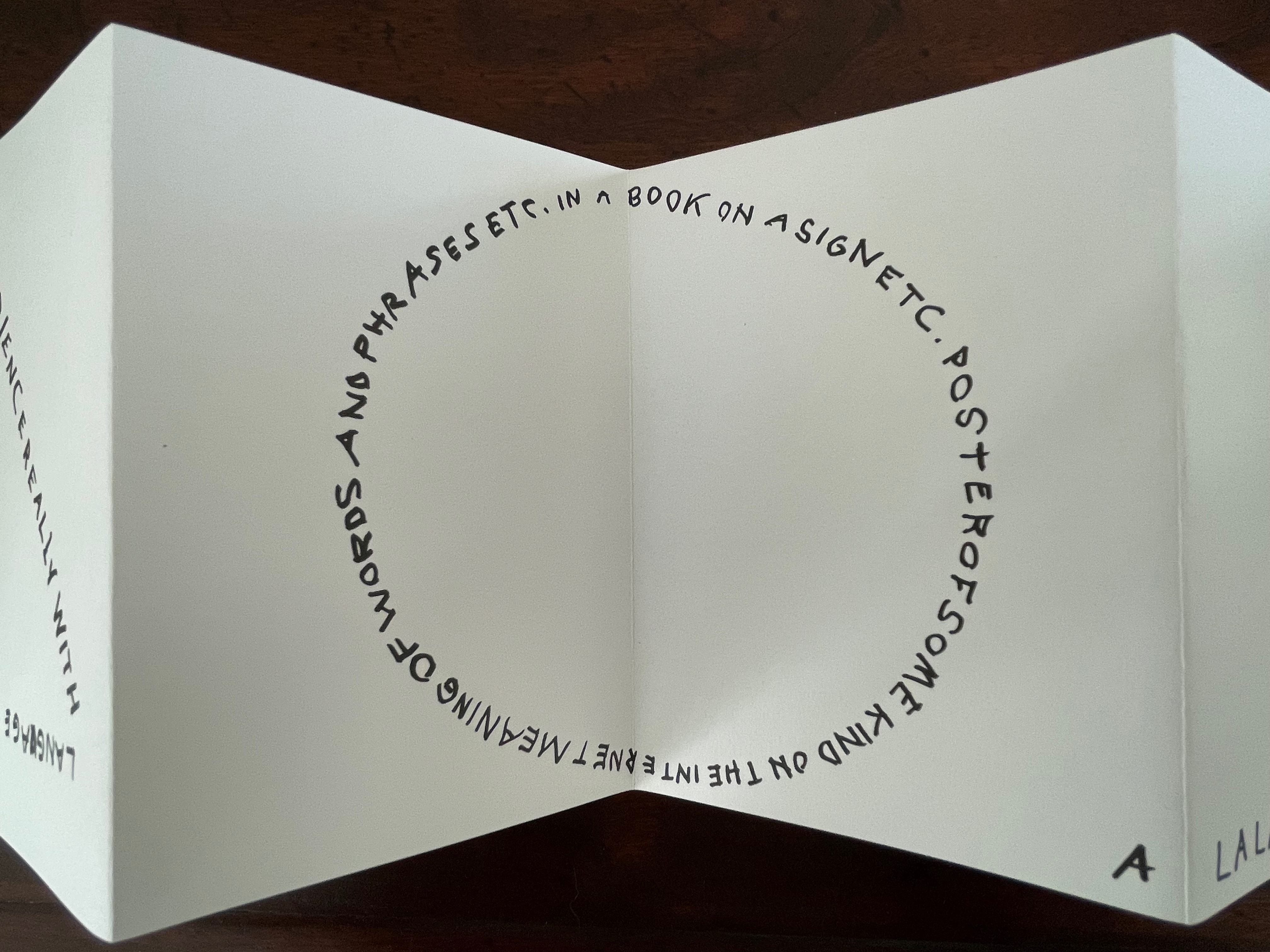
Leporello #7 (2022) Karl Holmqvist Box: H191 x W148 x D 23 mm. Leporello: H142 x W99 mm (closed). W990 mm (open). 10 panels. Edition of 250, of which this #110. Acquired from Unoriginal Sins, 14 November 2024. Photos: Books On Books Collection. Displayed with permission of LL’Editions.
Here’s one to add to Bruno Munari‘s collection of squares, circles, and triangles. While the yoga may also remind you of Ric Haynes‘s Aquatic Yoga with Dangerous Foods (1984), this leporello is a welcome opportunity to experience this Swedish artist’s ability to weld language and shapes together in perceptive and humorous (and sometimes acerbic) ways. Galerie Neu in Berlin has been astute enough to hold three solo exhibitions for Holmqvist since 2013; their display of his works here provides views of his several sculptures that chime with Leporello #7.
Leporello #6 (2022)
Leporello #6 (2022) Maurizio Nannucci Box: H185 x W148 x D 23 mm. Leporello: H143 x W90 mm (closed). W900 mm (open). 10 panels. Edition of 250, of which this #106. Acquired from Unoriginal Sins, 14 November 2024. Photos: Books On Books Collection. Displayed with permission of LL’Editions.
It’s hard to believe that Leporello #6 may be one of only three accordion books produced by this prolific and inventive artist associated with Fluxus. The other two are Sessanta Verdi Naturali (Sixty Natural Greens)(1977) and Up Above the Wor(l)d/A Guide for Aliens (1981). In Leporello #6, he has made the accordion structure, panel layout, and language reinforce one another simultaneously to create an ouroboros artwork.
Leporello #5 (2022)
Leporello #5(2022) Shannon Ebner Box: H185 x W148 x D 23 mm. Leporello: H143 x W90 mm (closed). W900 mm (open). 10 panels. Edition of 250, of which this #132. Acquired from Unoriginal Sins, 14 November 2024. Photos: Books On Books Collection. Displayed with permission of LL’Editions.
Since her participation in MoMA’s Ecstatic Alphabets/Heaps of Language in 2012, Shannon Ebner has been a book artist to watch for bringing the alphabet and the artist’s book together.
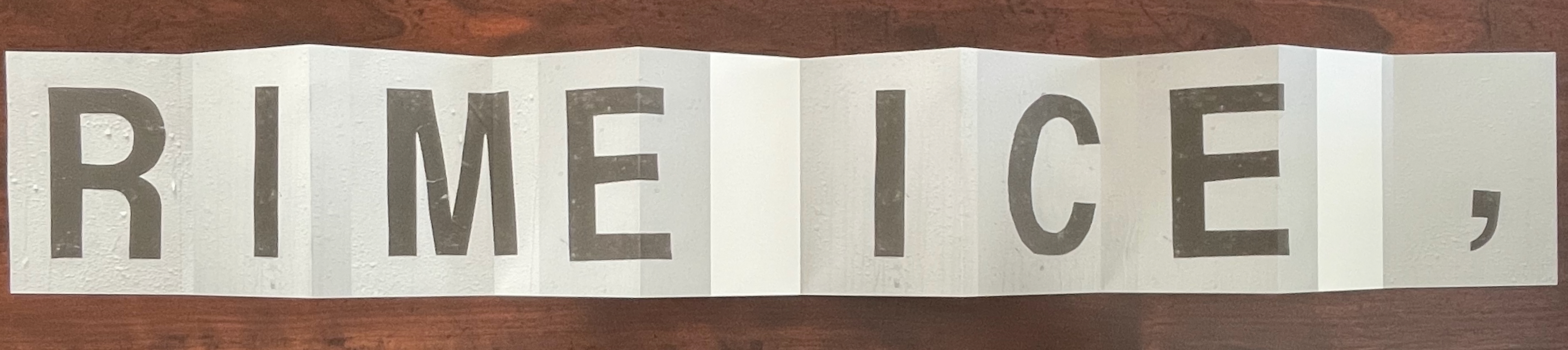
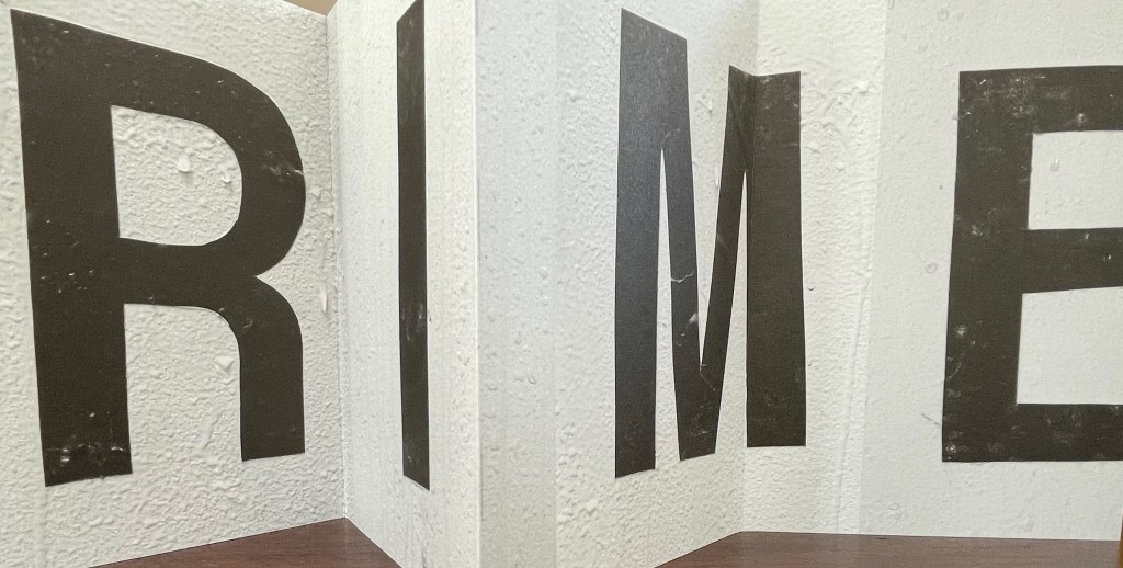
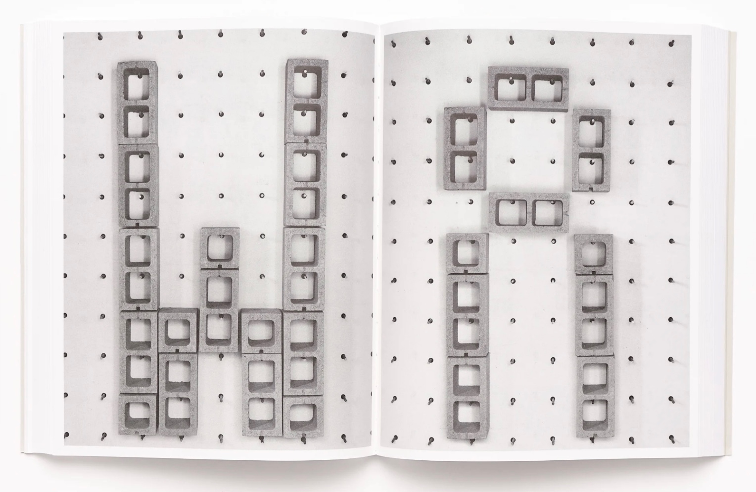
Her Strike (2014) concretely rewarded the alert. The textures of melting ice in Leporello #05 and concrete blocks in Strike seem to leap off the letters and paper. From the LL’Editions’ description of Leporello #05:
Ebner has selected specific materials based on their self-reflexive relationship to the subject of the writing itself. Each photographic typeface is in essence a material response to the various cultural conditions and societal pressures at hand. For Ebner’s leporello, the meteorological term RIME ICE is its single subject, though the phenomenon itself falls into two categories, soft or hard rime. In either case it is rime ice that forms when liquid droplets comprised of supercooled water freeze onto surfaces. RIME ICE is an outtake from Ebner’s recent exhibition FRET SCAPES (2022). FRET is acronym for the Forecast Reference Evapotranspiration Report, a report that is generated by climate scientists to measure the rate at which water that falls to the ground will evaporate to the sky.
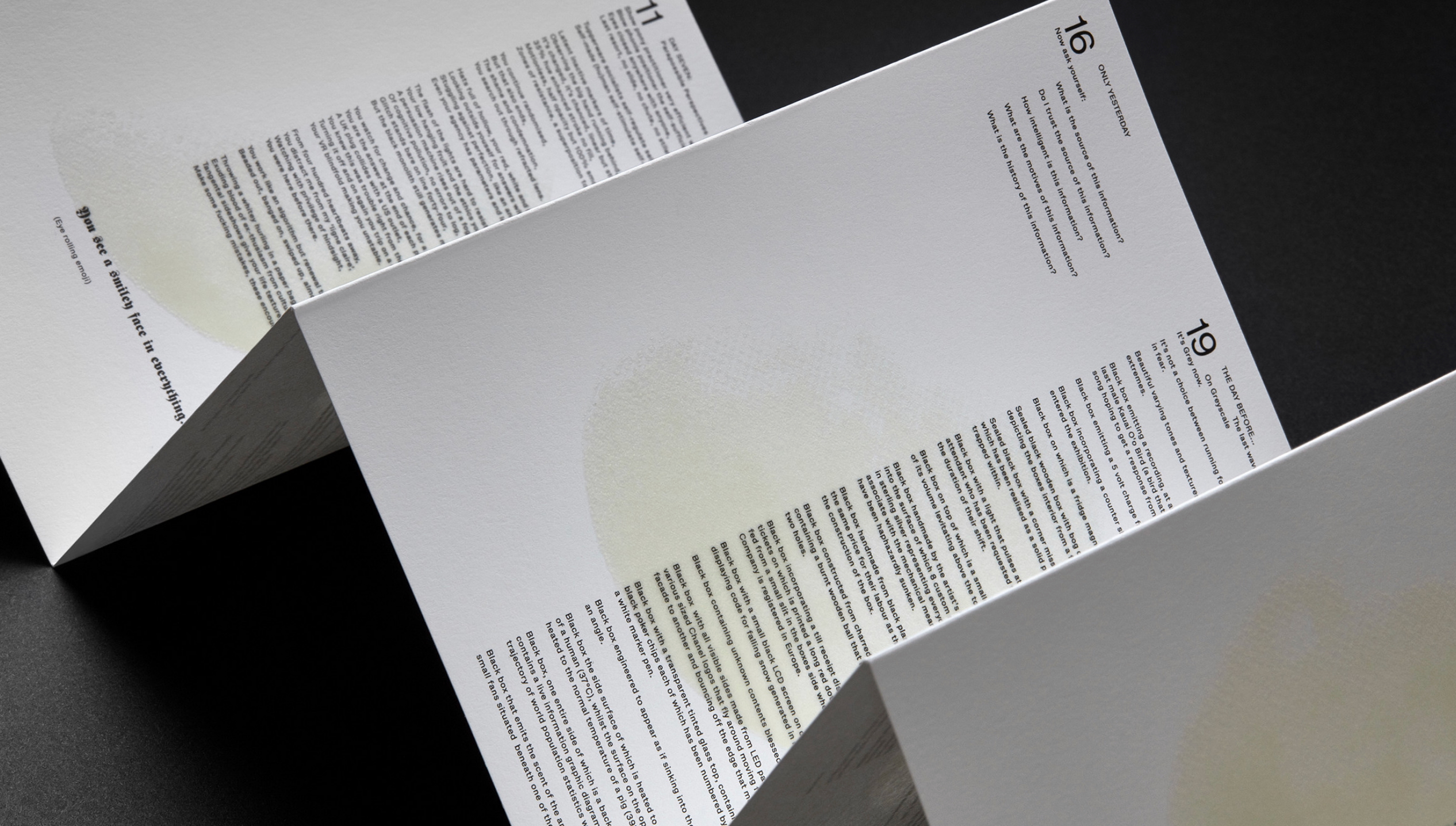
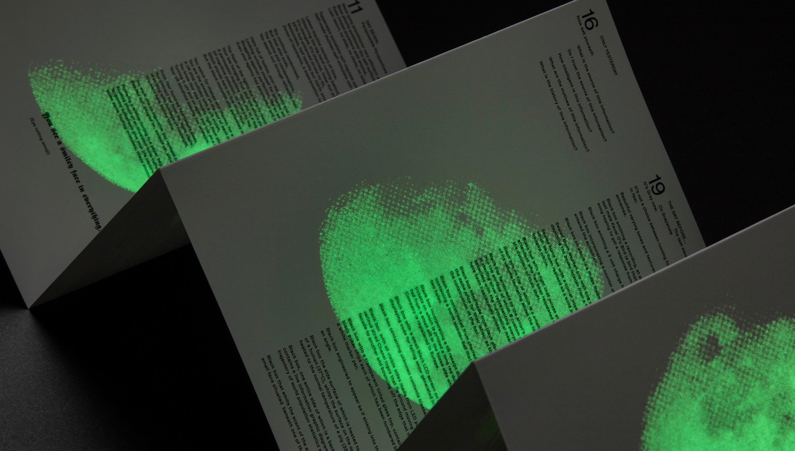
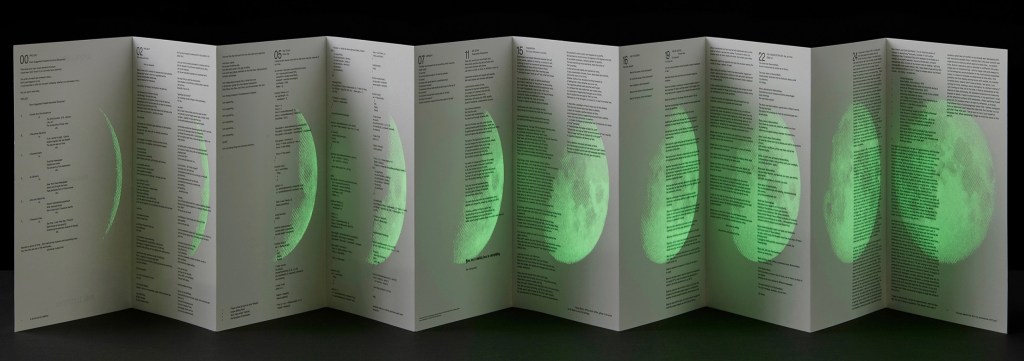
Leporello #04 (2021)
Leporello #04 (2021) Ryan Gander Box: H191 × W148 x D23 mm. Leporello: H142 x W99 mm (closed), W990 mm (open). 10 panels. Edition of 250, of which this #32. Acquired from Unoriginal Sins, 14 November 2024. Photos: Books On Books Collection. Displayed with permission of LL’Editions.
Ryan Gander has repurposed his installation Staccato Reflections (2017-20) to create Leporello #04. The tiny text originates from the artist’s notebook. In Staccato Reflections, it appears in a normal-sized font in business-directory format on a freestanding reflective screen. Gander describes the installation this way in an interview in Art in America:
Staccato Reflections is based on the idea of the self in culture, the obsession with the me and the selfie and the narcissist wand. The surface is mirrored, so as you read the words, you see yourself. The work has devices in it that are self-referential. It asks you to touch the screen, and then says “don’t touch the screen.” So it seems like it is responding to you, but it’s not.” (Fullerton, 107)
With its miniscule print requiring the enclosed rectangular plastic magnifying glass, and with its overprint in glow-in-the-dark ink of a waxing full moon, Leporello #04 marks quite a departure from the installation.
Leporello #03 (2021)
Leporello #03 (2021) Fiona Banner Box housing leporello. Box: H185 xW140 xD25 mm. Leporello: H140 x W100 mm. 10 panels. Numbered edition of 250, of which this #42. Acquired from Unoriginal Sins, 14 November 2024. Photos: Books On Books Collection. Displayed with permission of LL’Editions.
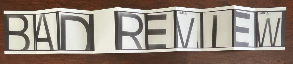
With Leporello #03, Fiona Banner repurposes the previously repurposed conceptual artwork Bad Review. It has appeared as a C-typeprint with the words overlaid on a rearview mirror and as a sculpture. To reproduce the two words, Banner uses found letters photographed held up by hand and badly positioned. Is it serendipity or cheeky genius that, like readymades, the nine letters and space of Banner’s conceptual artwork fit the ten panels imposed by LL’Editions to give us another re-view?
Leporello #02 (2021)
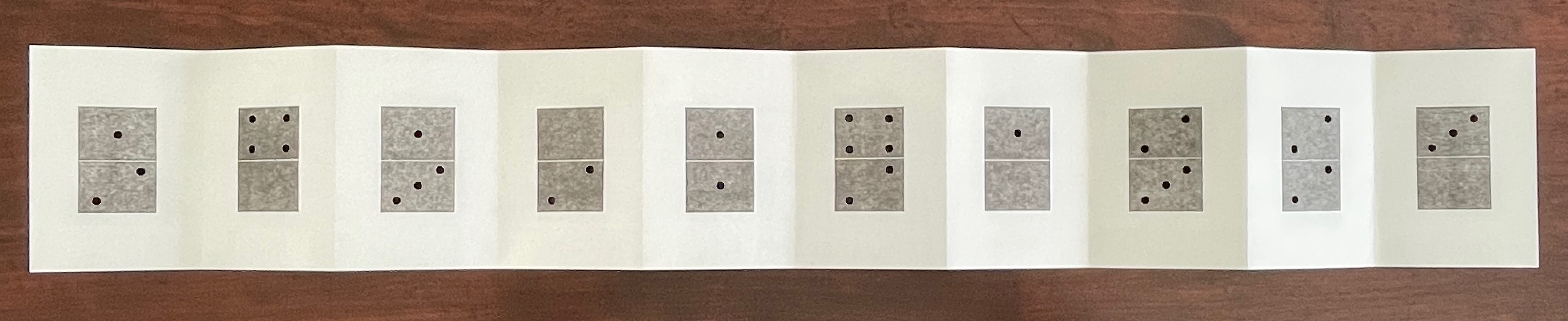
Leporello #02(2021) Micah Lexier Box housing leporello. Box: H185 xW140 xD25 mm. Leporello: H140 x W100 mm. 10 panels. Edition of 250, of which this #171. Acquired from Unoriginal Sins, 14 November 2024. Photos: Books On Books Collection. Displayed with permission of LL’Editions.
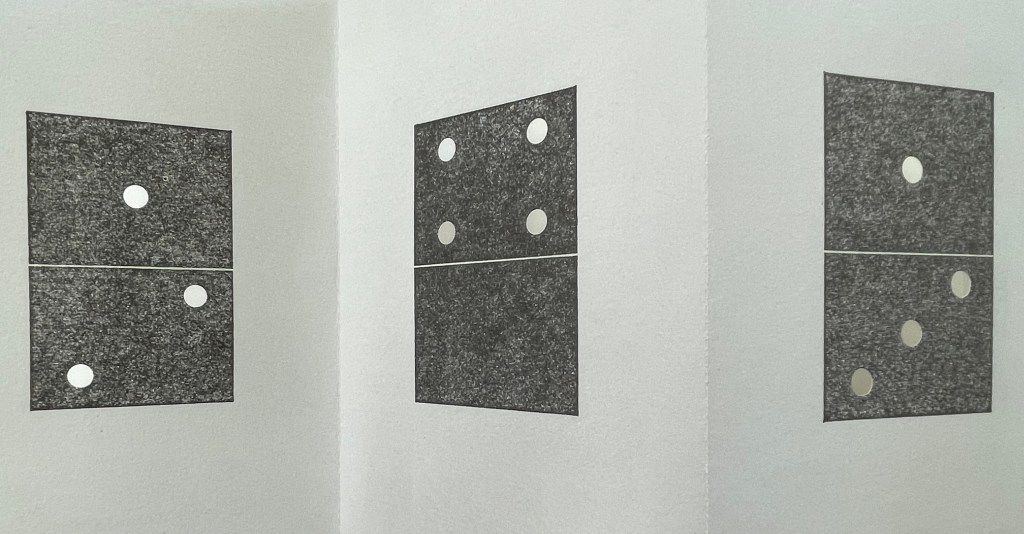
Publisher’s description: A number of years ago Micah Lexier purchased a small paperback publication about the game of dominoes. The very end of the book consisted of a series of pages that reproduced a complete set of twenty-eight domino tiles. The images were printed on right-hand pages, four to a page, while the left-hand pages were blank. The idea was that you were supposed to cut these images out of the book and glue them to empty matchboxes to create your own do-it-yourself set. That sequence of pages, combined with the quality of their reproductions, was the inspiration for Lexier’s leporello. To that, he added two favourite print techniques – perforations and die-cut holes – to create a set of ten domino tiles. Lexier chose the denomination of each tile and its order in the leporello so that none of the thirty-four die-cut holes line up with each other, allowing each hole to be misread as a printed white domino dot.
If you stand Leporello #02 on its edge on a table and then lean forward to view the panels at eye level, the domino images seem to have grown into oversized hangings on gallery walls. You can see some of the die-cut holes if you look closely at the lower right corner below.
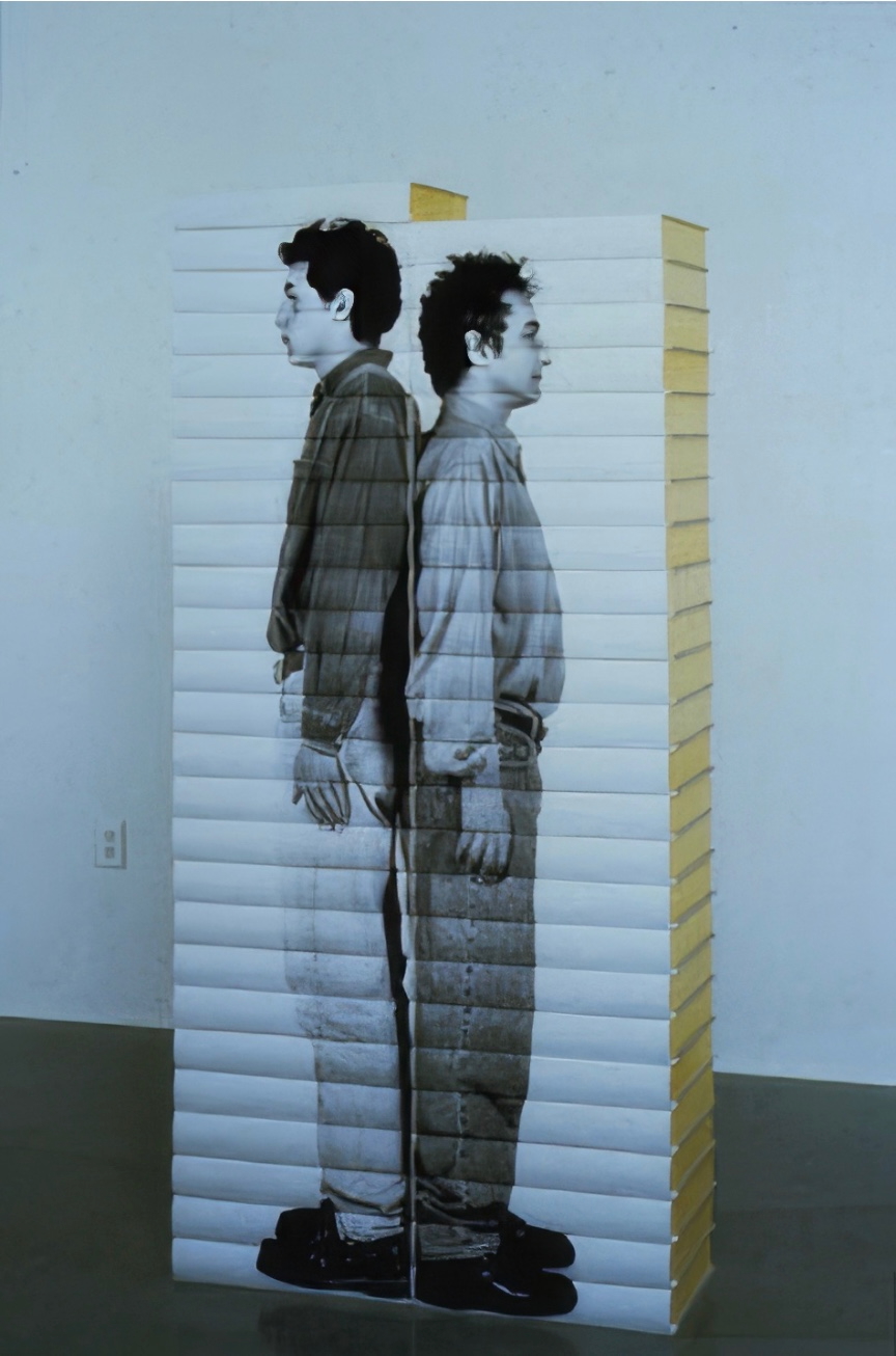
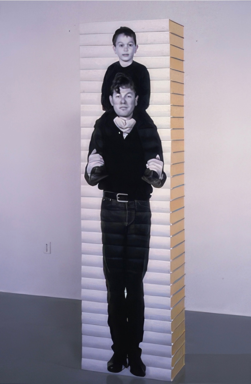
It’s a peculiar sensation, but it echoes Lexier’s website, which highlights mostly installations and large-scale works. Even more so it echoes Robert Birch Gallery in Toronto, which emphasizes his large wall displays. On both sites, Lexier’s play with patterns, shapes, tiles, and contrasts of black and white stands out. Although it’s not clear from those current sites, he has many book-related works. In the ’90s, he produced book sculptures in which each spine in a stack of books would have part of a life-size photo of a human subject printed on it. Properly stacked, the books display the human figure.
As can be seen in Leporello #02 and other works on display in the CCCA Canadian Art Database Project, Lexier likes to work with found objects. As can be seen in the book sculptures above and in the Database Project, Lexier’s art also reflects on relationships and community. Leporello #02 neatly and abstractly brings these two themes together with the found dominoes game book and the game’s communal roots.
Leporello #01 (2021)
Leporello #01 (2021) Heimo Zobernig Box housing leporello. Box: H185 xW140 xD25 mm. Leporello: H140 x W100 mm. 10 panels. Edition of 250, unnumbered. Acquired from Unoriginal Sins, 14 November 2024. Photos: Books On Books Collection. Displayed with permission of LL’Editions.
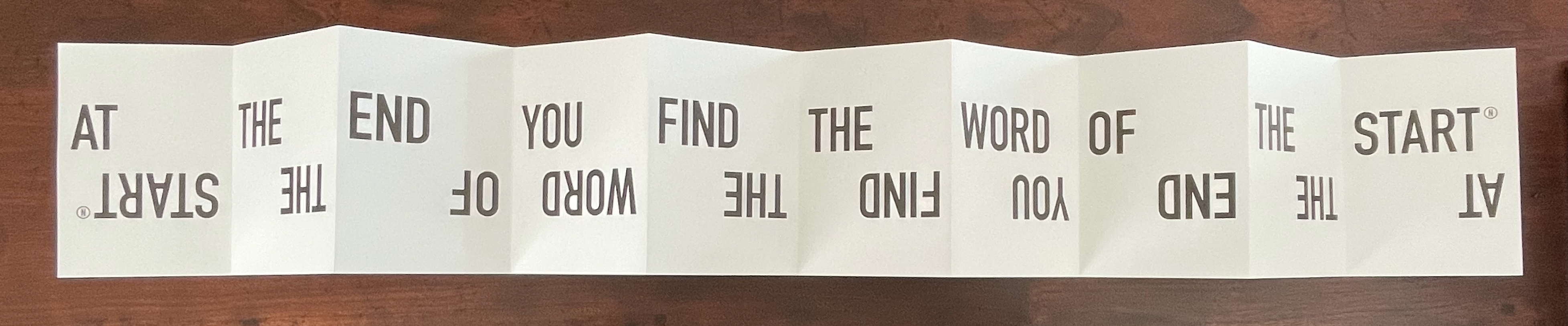
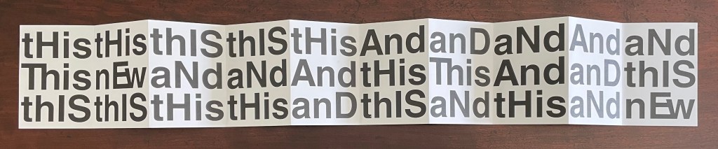
If you extend Leporello #01 fully, you are likely at first glance to project onto it the common expression “this and that”, but thwarted, you then start looking for another phrase comprised of “His”, “IS”, “And”, but you run into “Ew” or “nEw”, which throws you into renewed pattern-seeking behavior. Should you count the “this’s” and “and’s” in each row? Maybe there’s something in the pattern of lowercasing and uppercasing? Is there anything to the fact that the word “new” never begins with an uppercase N, or that it occurs only twice? Maybe you should read the rows aloud? With that, you may remember that, in earliest writings, words were not spaced and mixed majuscule and miniscule didn’t come along until later. Now you see how the folds are the primary means of separating the words in this book. This becomes clearer if you read the book panel by panel, or page by page codex-style. But now there are other possible patterns: does the book begin with “thIs, This, thIS” and proceed to “tHis, nEw, thIS”, and so on?
Somehow the acronym “WYSIWYG” — what you see is what you get — pops to mind, but Leporello #01 seems also a case of “WYGIWYS” — what you get is what you see. Fully extended or panel by panel, Leporello #01 offers more to see than a glance will get you.
Leporello #01 continues Zobernig’s love affair with Helvetica, which is also on display in Farben Alphabet (2018) and CMYK (2013), also in the Books On Books Collection.
Fullerton, Elizabeth. 28 April 2017. “In the Studio: Ryan Gander“. Art in America. Accessed 7 November 2025.
Hubert, Renée Riese, and Judd David Hubert. 1999. The Cutting Edge of Reading : Artists’ Books. New York City: Granary Books. See chapter 6, “Variations on the Accordion”, pp. 97-122.
Making Memeries (2016) Lucas Blalock Board book consisting of nine 3mm thick card leaves with 8 double-page large colour photos, all of which interact with a down-loadable app. H330 x W210 x D28 mm. [18] pages. Edition of 500. Acquired from David Bunnett Books, 31 July 2023. Photos of the work: Books On Books Collection.
How do we respond to an artwork of collage or assemblage that is missing a piece — assuming that we can tell ? And if all of the elements are ephemera, does it matter to our appreciation of it? Do we keep returning in annoyance to the gap — like a tongue to a missing tooth? Do we give up on it — like the purchaser of a secondhand jigsaw puzzle missing a piece or two? Or do we sigh and suppose appreciatively that the disappearance of an element of ephemera from a collage or assemblage of ephemera proves the artwork’s point?
Lucas Blalock is an artist of augmented realities. With the right device and app pointed at his artwork, we should be able to see images floating and moving over its surface or seemingly in the surface among its images or transforming them. According to the back cover, we can download this app from the iTunes App Store to interact with the book’s images. The app, however, was removed from the App Store in July 2023. Using the WayBack Machine, we can find the publisher’s announcement of the Making Memeries installation with Blalock in the Tate Modern’s Turbine Hall:
The London-based curatorial project Self Publish, Be Happy presents a programme of events that explore the blurring boundaries surrounding on/offline existence and distribution of photographs. The event, titled Making Memeries, will take place at Tate Modern during this year’s Offprint London art book fair from 20-22 May.
Artist Lucas Blalock has created an installation for the middle of the Tate Modern’s Turbine Hall that functions as a staging area for workshops and performances. The installation consists of a set of eight movable panels that display a new suite of photographs by Blalock. The elements of the installation, conceived of specifically for this project, can be further activated via this app, Making Memeries.
The audience will be able to immerse themselves in, and interact with the work through the app, which uses your camera to produce a digitally augmented reality. Blalock’s work has long been interested in the cohabitation of the worldly and the virtual behind the photographic surface, and this project has allowed the artist to picture this cohabitation on both sides of that plane. Blalock has collaborated with REIFY, the augmented reality (AR) creative studio, to build an experience that blurs traditional boundaries and challenges one’s expectations of viewership.
Photos from old website of Self Publish, Be Happy. Accessed 26 October 2025.
Among the performances facilitated by the installation was Anouk Kruithof’s Connection, which also contributed to the aim of blurring the boundaries of the physical and digital.
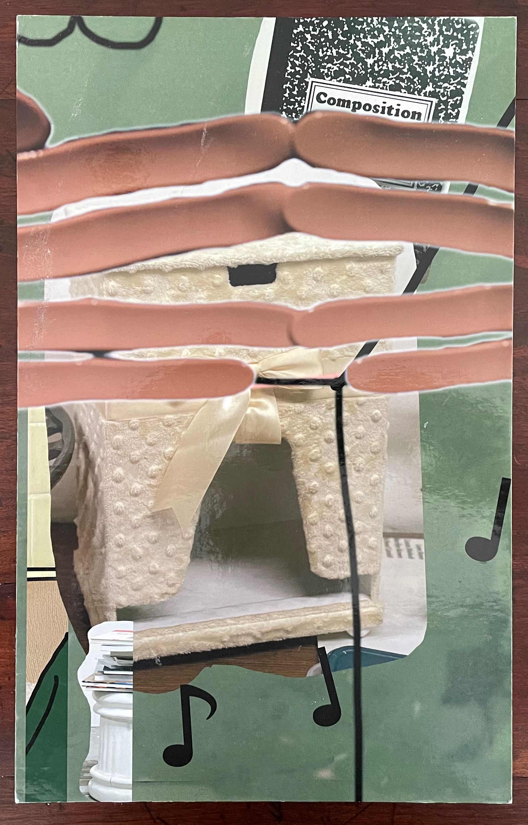
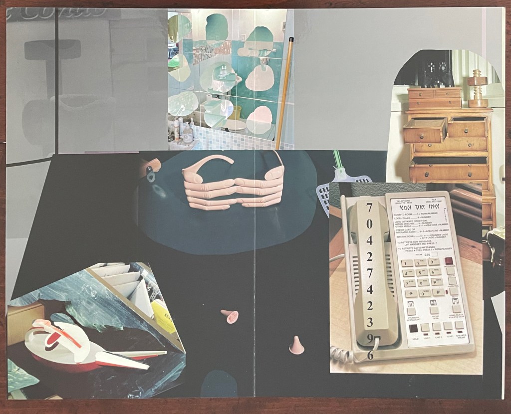
But without the app or memory of the installation, we have a gap like that missing tooth. We can bridge the gap somewhat with online links and the book’s collaged imagery of mixed media and photographs to recognize that Making Memeries is also about how we perceive surfaces and what lies beneath — and what might come between. Consider the earplugs alongside the telephone below. Then there’s the pair of spectacles in the shape of fingers that would cover the wearer’s eyes. Now look back to the cover, and we find the view from behind those finger-spectacles.
Photo of the work: Books On Books Collection.
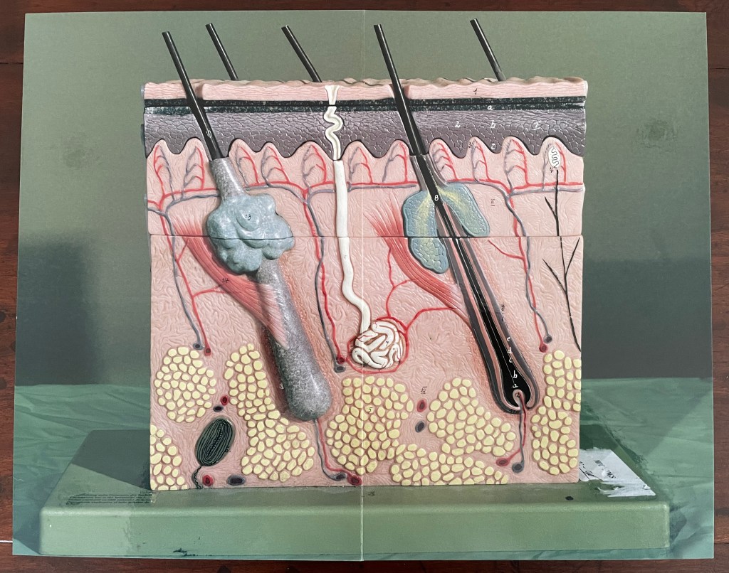
Or consider the images of the model of the epidermis with which the book opens and closes. ortunately, we have a YouTube link and Olga Yatskevich’s review to let us know that the “augmented reality radically changes the experience, making the image active rather than static – the app brings rounded depth to the model, shows blood running through the vessels, and allows us to explore the space around the object, its sides and the top”.
First and last double-page spreads. Photos: Books On Books Collection.
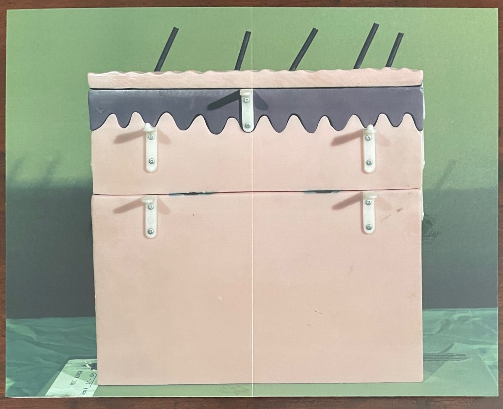
There’s something childlike, playful but serious conveyed in all this. Physically Making Memeries presents itself as an oversized children’s board book (or perhaps a board book for undersized adults). The use of the board book to make this cross-over can also be found in other artists’ books — Colleen (Ellis) Comerford’s ABCing and Phil Zimmermann’s Sonorensis, for example.
Fore edge of Making Memeries.
What the board book only partially conveys with the Connection link in hand, so to speak, is the intent expressed on the back cover and in the Tate’s announcement:
Making Memeries is set in a time when everyone has become a lifestyle photographer. It is still your life but the image production is decidedly public; and in that case temporary, verging on fleeting, because these public channels have so many content providers and, along with our attention spans, are in a perpetual state of refresh. [back cover]
Before the advent of the Internet the act of taking a photo was often intended to make memories; to store and preserve our past in still, printed images. In today’s digital age the act of taking photos can be enough for the photograph-taker. The act is exhausted by the process. This can be seen in the way a mobile phone camera offers immediate satisfaction — producing a file that may never be looked at again. Today a photo has a different claim to time, being much more in the “now” than in the “this has been” of its 19th and 20th century pre-internet forbearers. We, in turn, live in a culture of the perpetual present, in a meme-driven world where photos can effortlessly be shared, but where they most often disappear into digital oblivion. [Tate Modern announcement]
It feels ironic that Making Memeries‘s “missing tooth” is digital. The same year of Blalock’s installation at the Tate, Pokémon Go arrived, and people began wandering into traffic to capture Pokémon figures that their cameras projected onto the streets around them. Nine years later, the company owning the app has sold for $3.5 billion, and the world’s richest country is governed by meme. Is art miming life, or life miming art?
Further Reading
“Colleen Ellis“. 7 March 2024. Books On Books Collection.
“Anouk Kruithof“. 19 July 2021. Books On Books Collection.
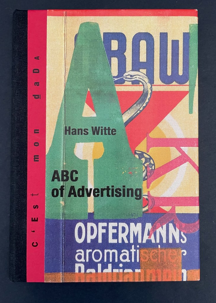
ABC of Advertising (2024) Hans Witte Casebound, cloth spine and paper over boards, sewn to doublures. H150 x W105 mm. [40] pages. Acquired from Redfoxpress, 2024. Photos: Books On Books Collection.
The ABC of Advertising is No. 205 in the RedFoxPress “c’est mon dada” series. The series name comes from the French expression meaning “it’s my thing”. Dada is also a colloquial child’s expression for “horsie” or “hobbyhorse”. So, of course, the French adopted it as the name for one of the avant garde movement of the early 20th century. Although you might think from The ABC of Advertising that wood type and letter press are Hans Witte’s “hobbyhorse”, it’s clear from his artist’s books, children’s books, and book object installations that he has a herd of them.
When I wrote earlier that knot theory seems to be having a moment this year, I was unaware that the Old Operating Theatre Museum and Herb Garret in London was hosting an exhibition called
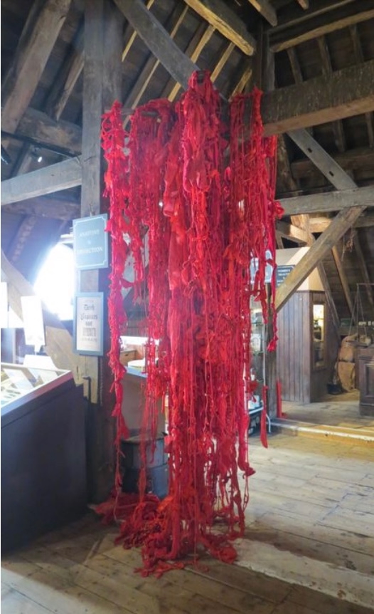
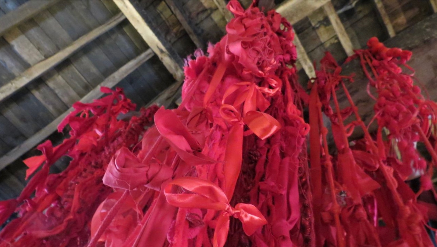
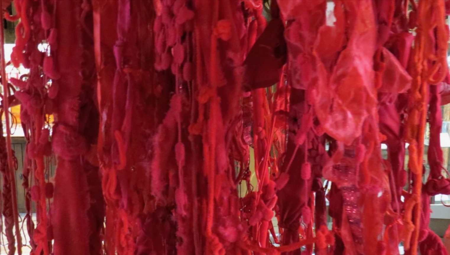
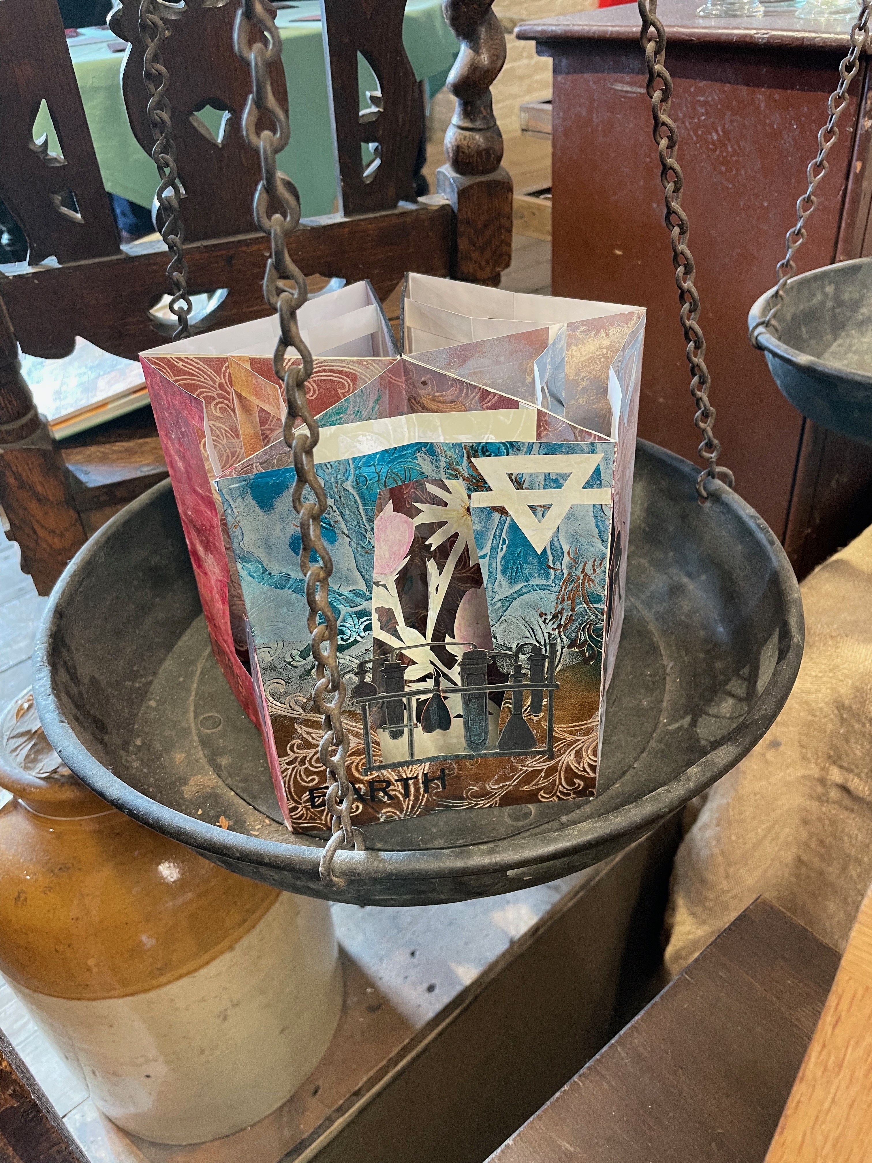
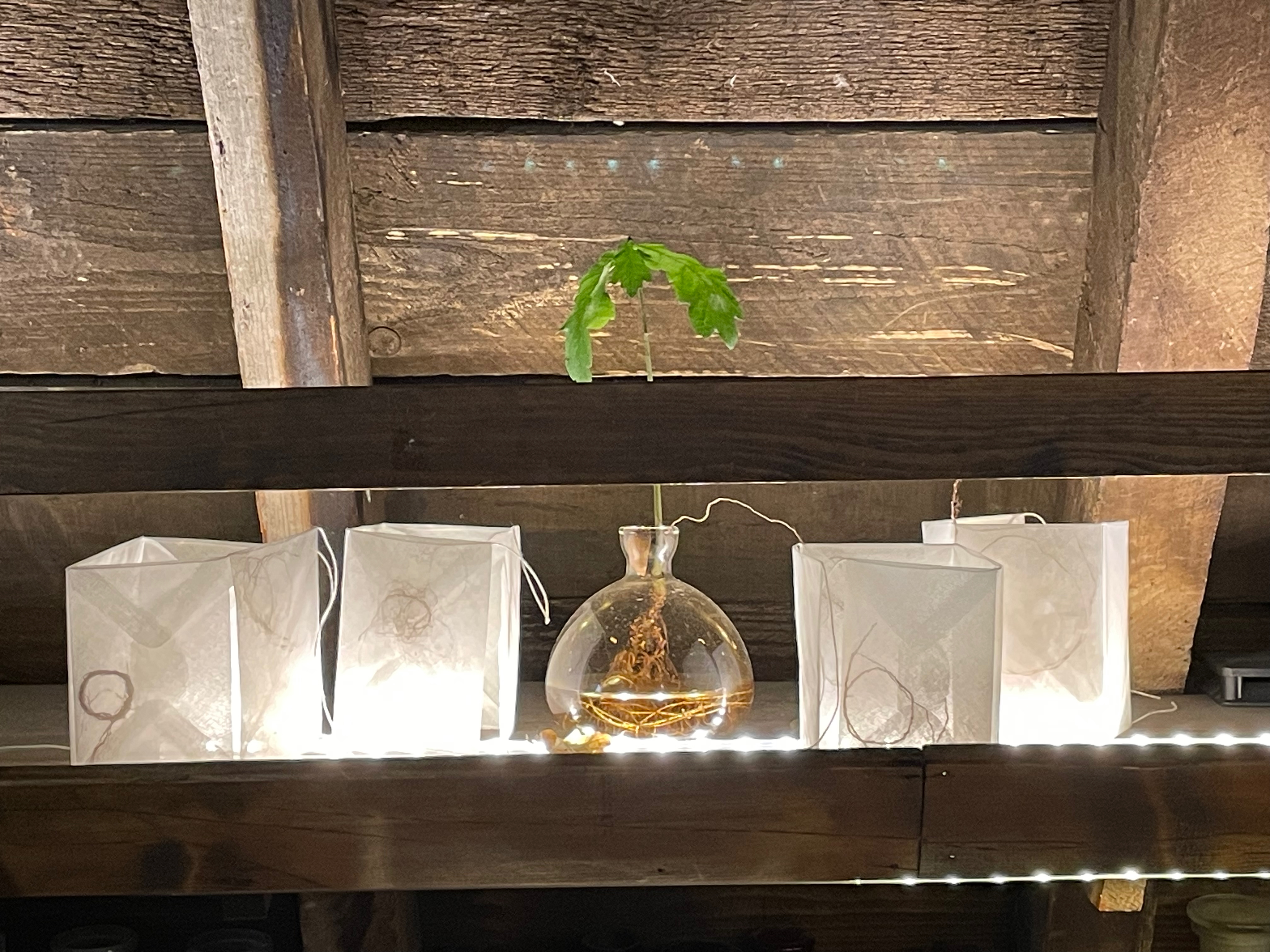
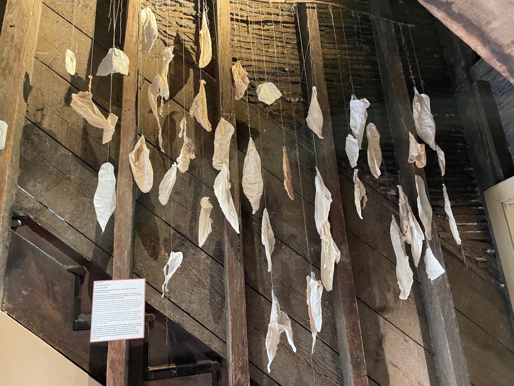
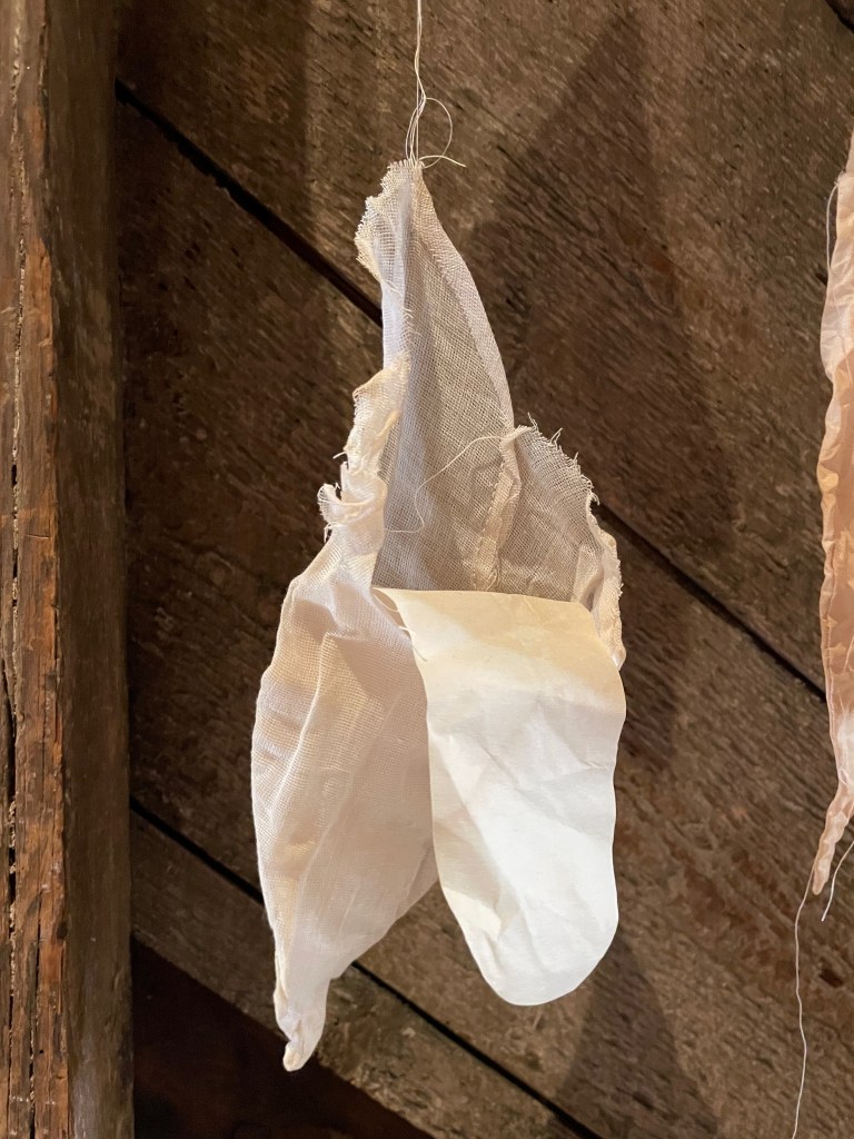
The centerpiece of the exhibition is the Bookscape Collective’s sculpture “After dark vapors have oppress’d our plains” (2025). Hanging from the garret’s beams, this mass of red fibers, ribbon, thread, and wood aptly entwines the auras of art, poetry, and superstition together with the venue’s association with surgical knots and medicinal herbs.
“After dark vapors have oppress’d our plains” (2025) Sculpture (red fibres, wood, red thread) Bookscapes Collective (Chris Ruston; Heather Hunter; Jo Howe; Jen Fox; Karen Apps; Jules Allen)
The sculpture’s title comes from the first line of this sonnet by John Keats (1795 – 1821):
After dark vapors have oppress’d our plains For a long dreary season, comes a day Born of the gentle South, and clears away From the sick heavens all unseemly stains. The anxious month, relieved of its pains, Takes as a long-lost right the feel of May; The eyelids with the passing coolness play Like rose leaves with the drip of Summer rains. The calmest thoughts came round us; as of leaves Budding—fruit ripening in stillness—Autumn suns Smiling at eve upon the quiet sheaves— Sweet Sappho’s cheek—a smiling infant’s breath— The gradual sand that through an hour-glass runs— A woodland rivulet—a Poet’s death.
As the museum’s caption reminds the visitor:
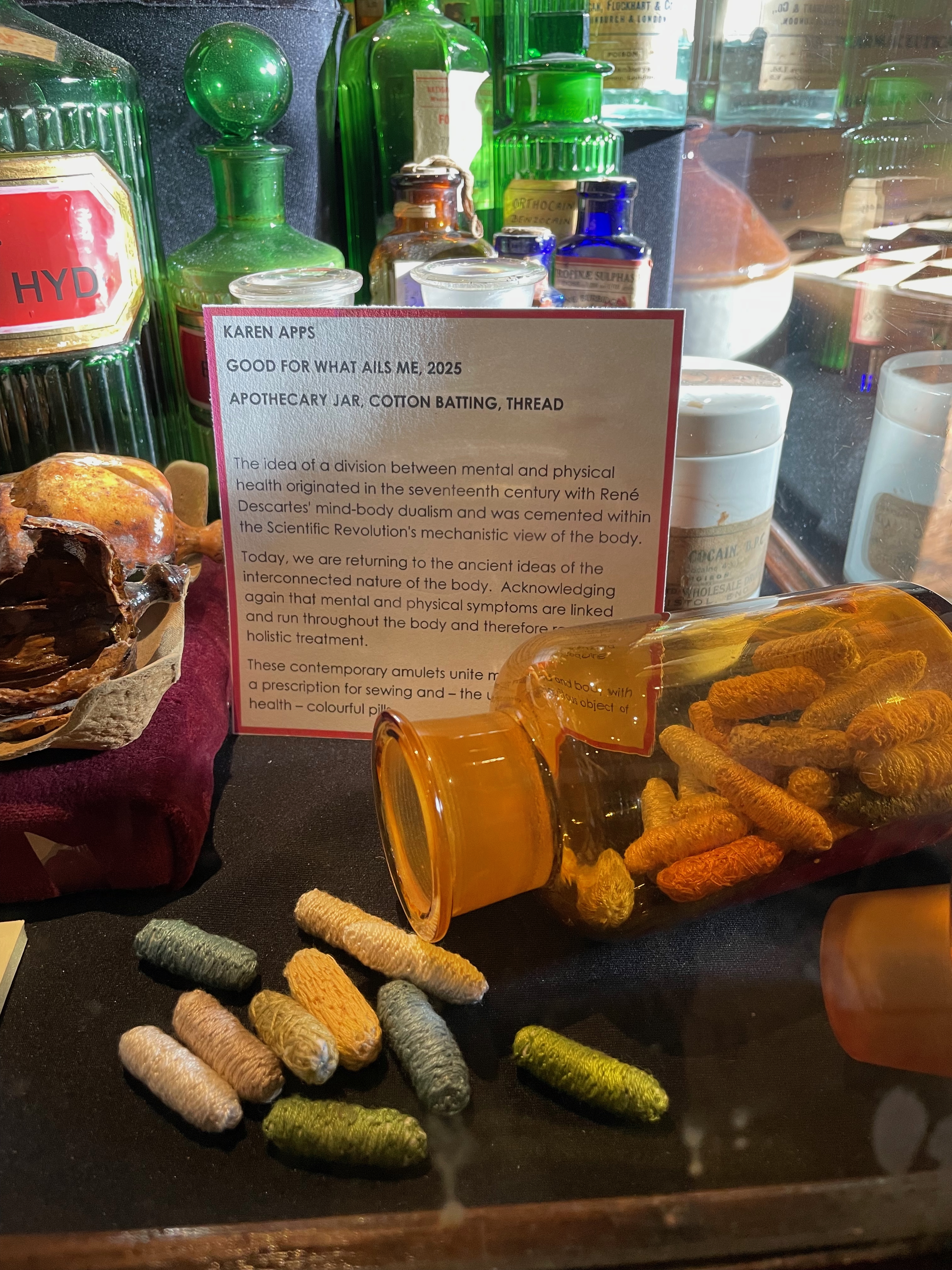
Knots have been part of everyday life for millennia. Alongside practical uses, they have attracted many superstitious and magical properties. Knots are found among the earliest prehistoric amulets designed to ward off evil, and today knots are essential for suturing the body after surgery, with knot practice forming a fundamental part of contemporary surgical training.
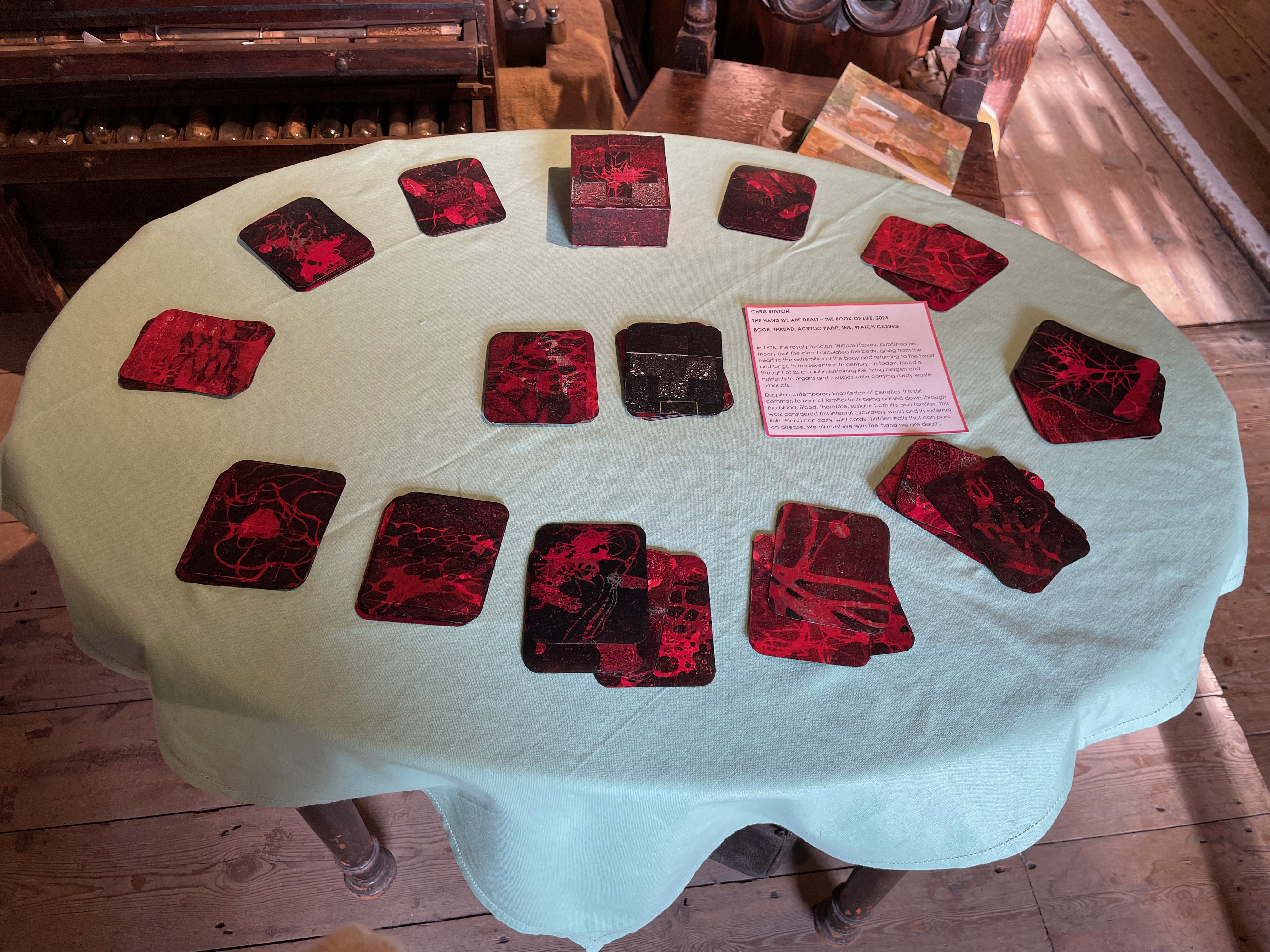
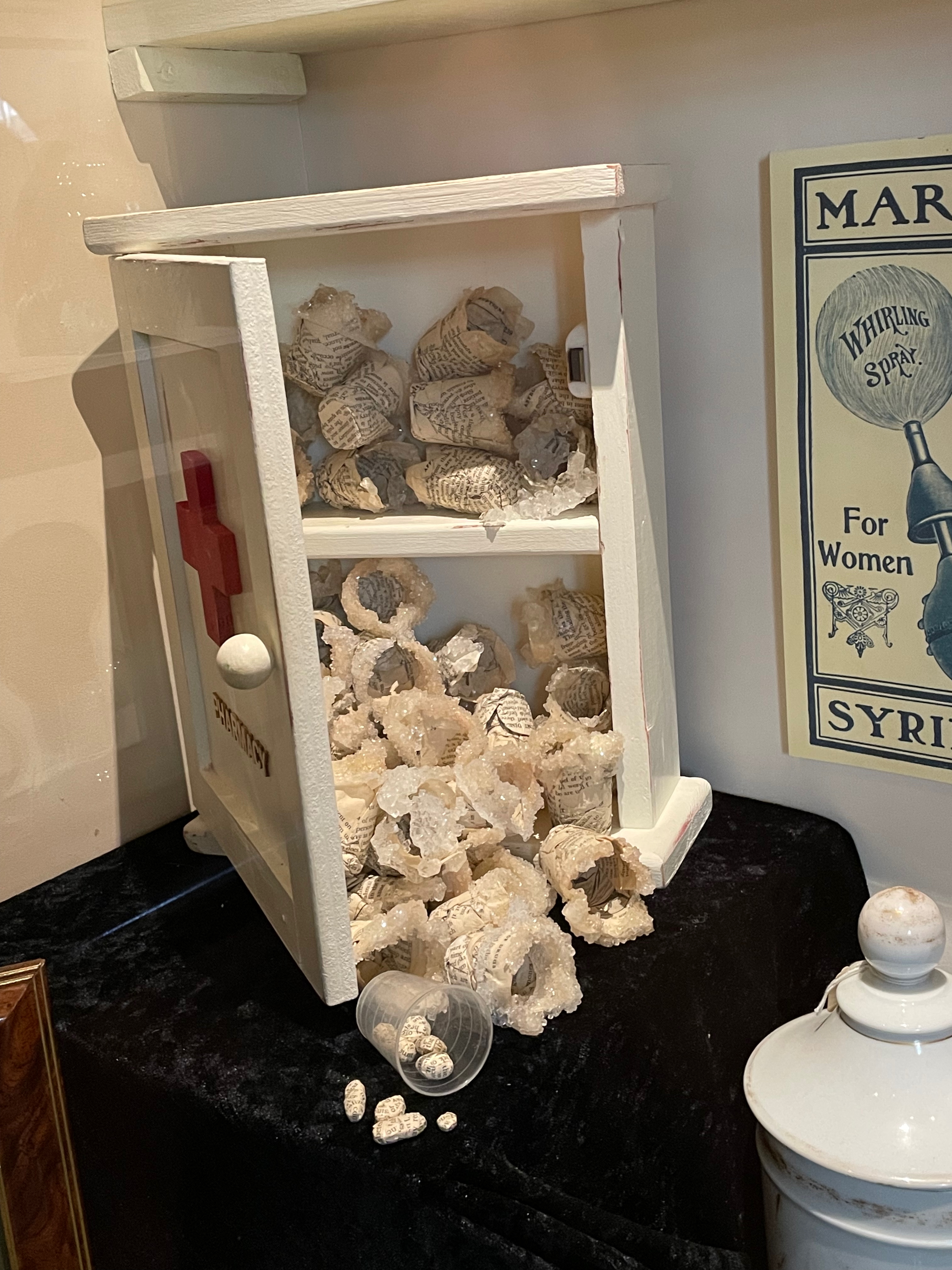
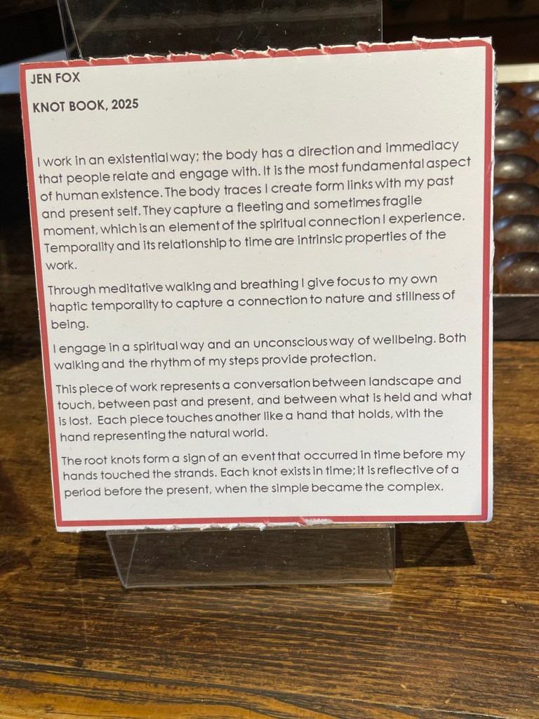
The Bookscapes Collective brings together Chris Ruston, Heather Hunter, Jo Howe, Jen Fox, Karen Apps, and Jules Allen. In addition to the central collaborative piece, the exhibition displays twenty-six additional works by these artists that each reiterate the knots binding together the worlds of science and art.
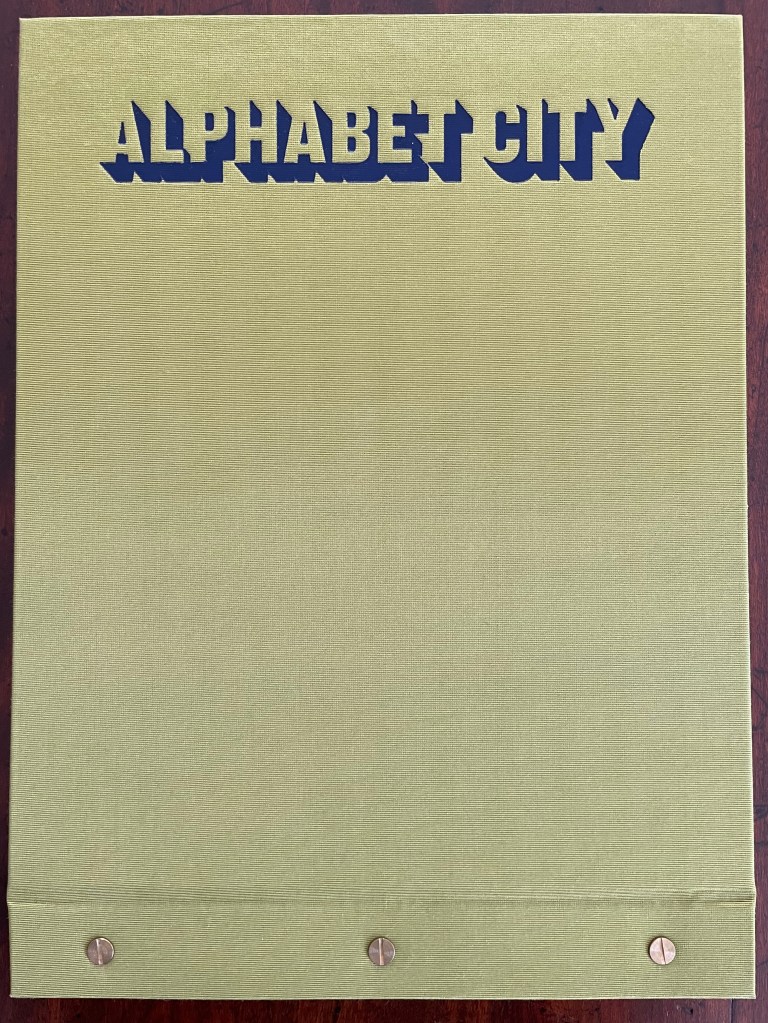
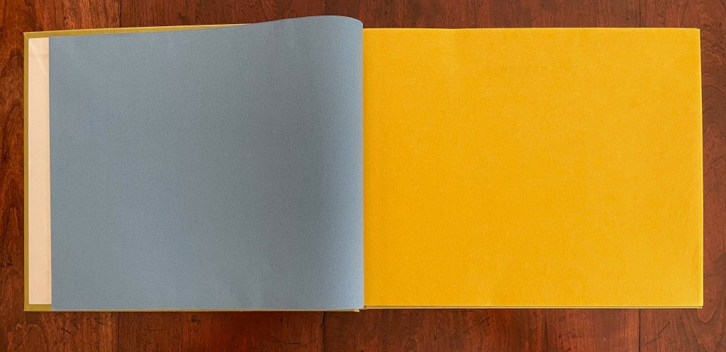
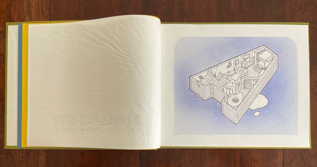
Alphabet City (2009) Scott Teplin Bolted folio. H270 x W360 mm. [29] pages. Edition of 26, of which this is L. Acquired from the artist, April 2023. Photos: Books On Books Collection and Courtesy of the artist.
Scott Teplin’s Alphabet City follows in the long line of building designs based on alphabetical foundations. Perhaps first was John Thorpe (1565–1655?), an English architect, who drew up a property based on his initials. Thomas Gobert (1625-90), a French architect, produced Traitté d’Architecture dedié à Louis XIV, a manuscript whose building plans spelled out “LOVIS LE GRAND”. Anton Glonner (1723–1801) designed a Jesuit church and college around the monogram “IHS”. More famous is Johann David Steingruber (1702-87) and his Architectonisches Alphabeth (1773).
Teplin committed twenty years to his task (Steingruber committed ten) and came to it more from the school of graphic design than the school of architecture. While we might expect bewigged 18th century servants and lords to ride up in carriages to Steingruber’s A to Z, we would not be surprised to find characters from R. Crumb or Mad Magazine inhabiting Teplin’s alphabet-shaped houses, gaming arcades, strange laboratories, ice cream parlors, power plants, and other bizarre edifices. Some houses have no entries or exits. Some have doorless bedrooms. Others have rooms filled with oozing substances or piles of dirt. Some have outdoor swimming pools inside. One, seeming to float on a grass-colored sea, has a boat funnel inside, capped with a life ring, and rooms with deckchairs and portholes. Whimsical and bizarre free association drives Alphabet City.
Although the binding of Alphabet City is intended to facilitate removal and mounting of individual folios, it recalls Fortunato Depero’s “bolted book” and, by extension, the “startle” factor intended by Futurism, Surrealism, Dadaism, and all the -isms of that period. From original drawings in pen & ink to scanned images etched to magnesium plates and printed on Zerkall vellum, then airbrushed with Winsor & Newton and Holbein watercolors and pencilled with matching Prismacolor pencils, Alphabet City leans more toward a fine press livre d’artiste than an artist’s book. The foil-stamped Asahi bookcloth cover with its yellow Moriki endsheets would not be out of place at Arion Books or Three Star Books.
Knot theory seems to be having a moment this year. In February 2025, there was the First International On-line Knot Theory Congress. Not to forget the regularly recurring Swiss Knots Conference (held in Geneva in June) and the 11th Sino-Russian Conference on Knot Theory (held in Suzhou, China in June-July). Or the “Danceability of Twisted Virtual Knots” produced by Nancy Scherich and danced by Sol Addison and Lila Snodgrass at the Math-Arts Conference in Eindhoven in July. And then in September the Scientific American and online media picked up two discoveries in knot theory — one by Mark Brittenham and Susan Hermiller and another by Dror Bar-Natan and Roland van der Veen.
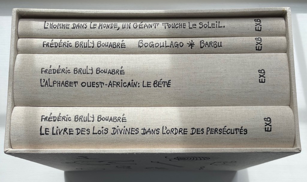
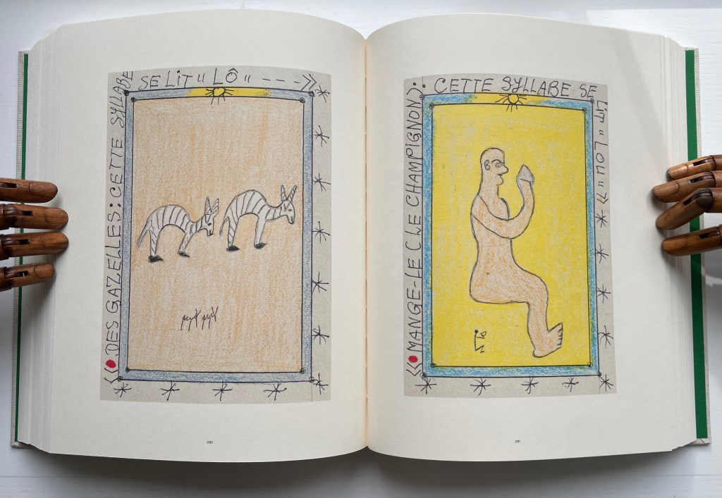
Frédéric Bruly Bouabré designed the covers and bound each of the four volumes in this set the year before his death. For the Books On Books Collection, the thematic connection of this last monument by Bruly Bouabré lies in Volume two, L’Alphabet Ouest-Africain: Le Bété. Bruly Bouabré invented this syllabary for the Ivory Coast’s Bété peoples in 1954. Later he compiled it in a Toyota 1983 Agenda-Journal, which in effect created the artist’s book La méthodologie de la nouvelle écriture africaine “bété” : suivi de, L’alphabet de l’Ouest Africain (2003). An artwork version, entitled Alphabet Bété and consisting of 449 original drawings, resides at the Museum of Modern Art in New York.
Bruly Bouabré is one of the few individuals to have invented a syllabary or alphabet on his own. Sequoyah, the Cherokee Indian, was another. The Guinean brothers Ibrahima and Abdoulaye Barry also belong to the fellowship; they created ADLaM, a new alphabet for the Pulaar language of the Fulani people of West Africa.
Left: [This syllable is pronounced “LÔ.”] Right: [Eat it (the mushroom). This syllable is pronounced “LOU.” ] Photos: Books On Books Collection. Displayed with permission of the publisher Éditions Xavier Barral.