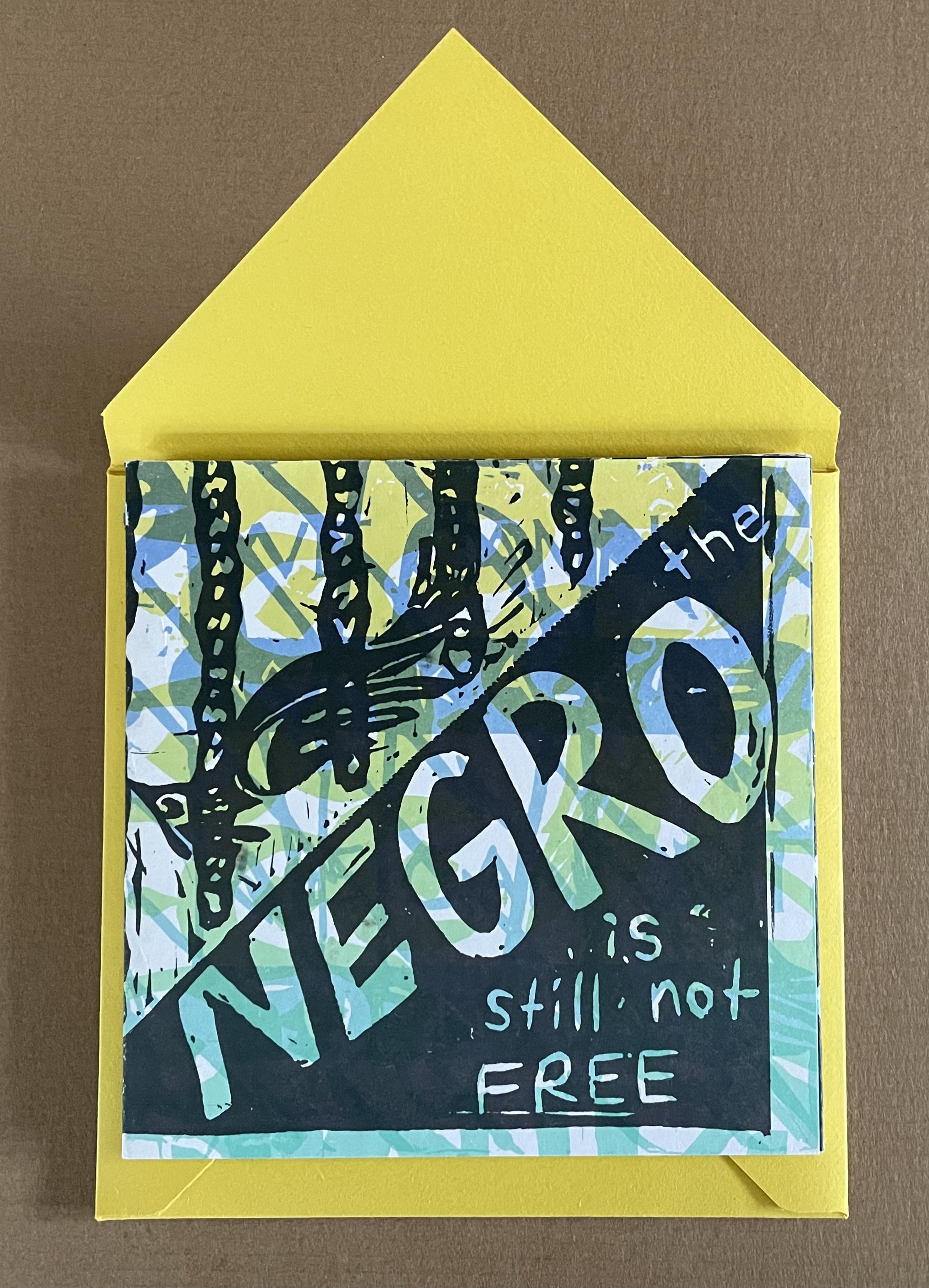
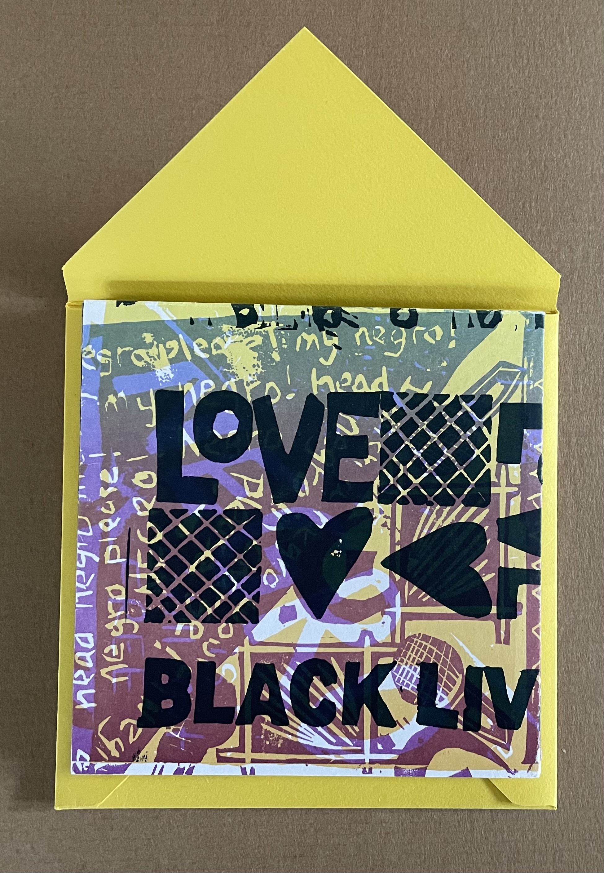
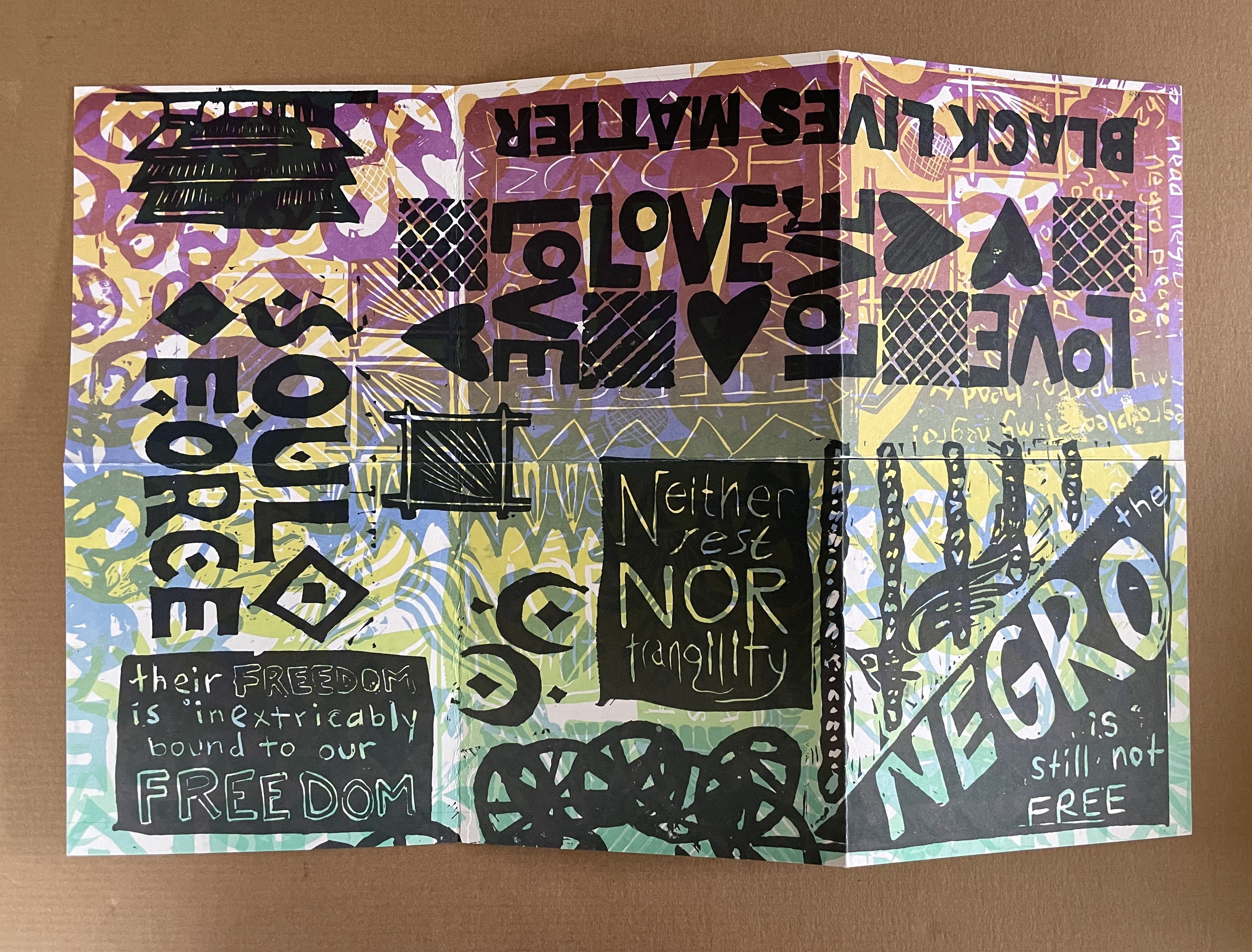
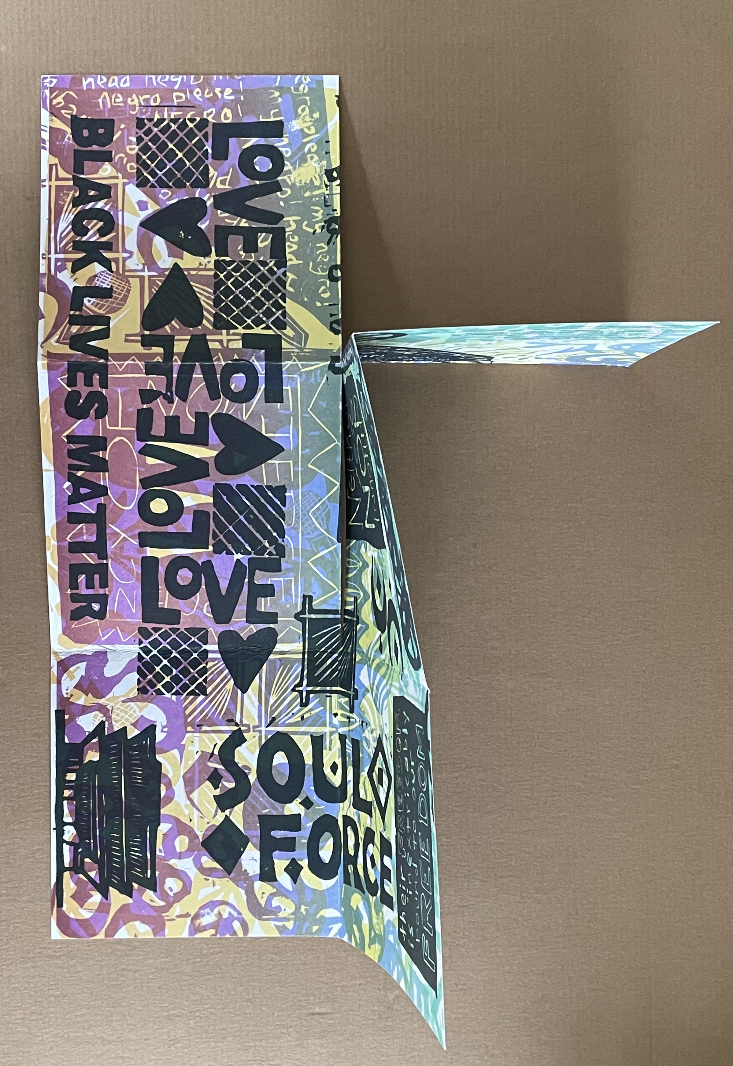
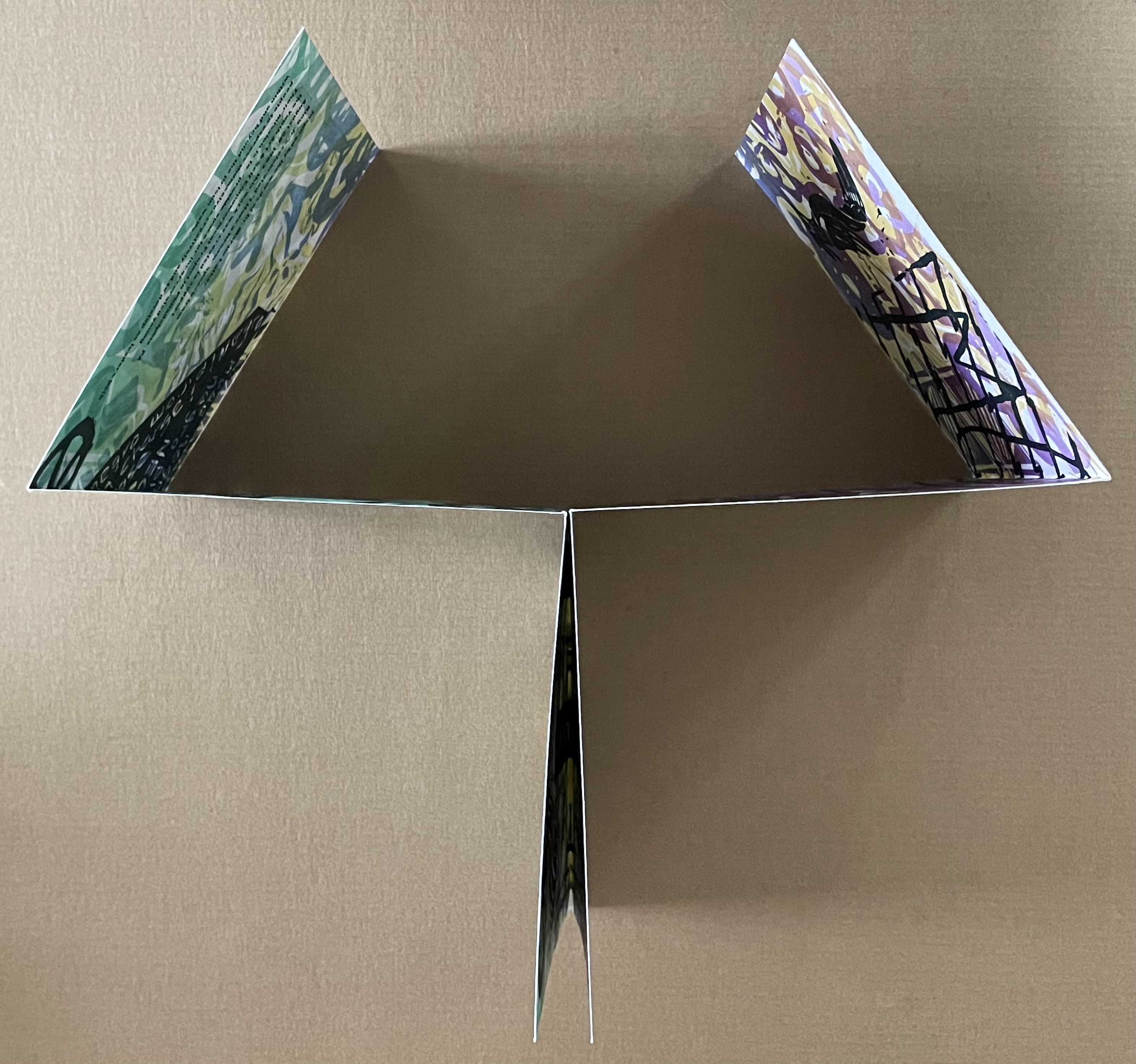
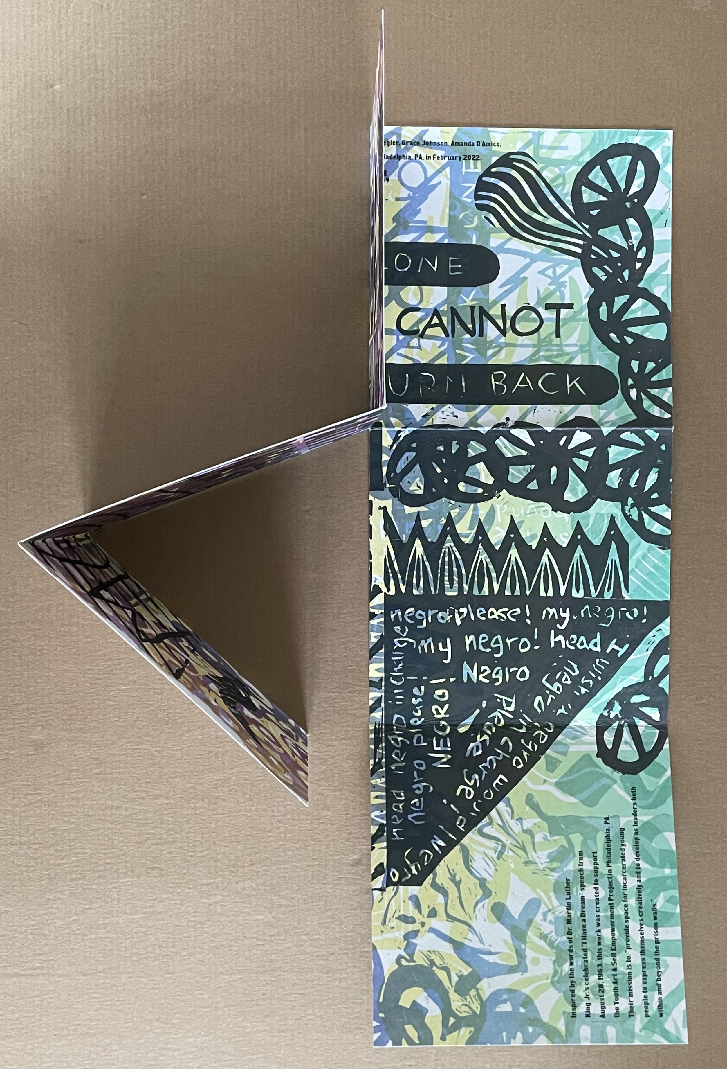
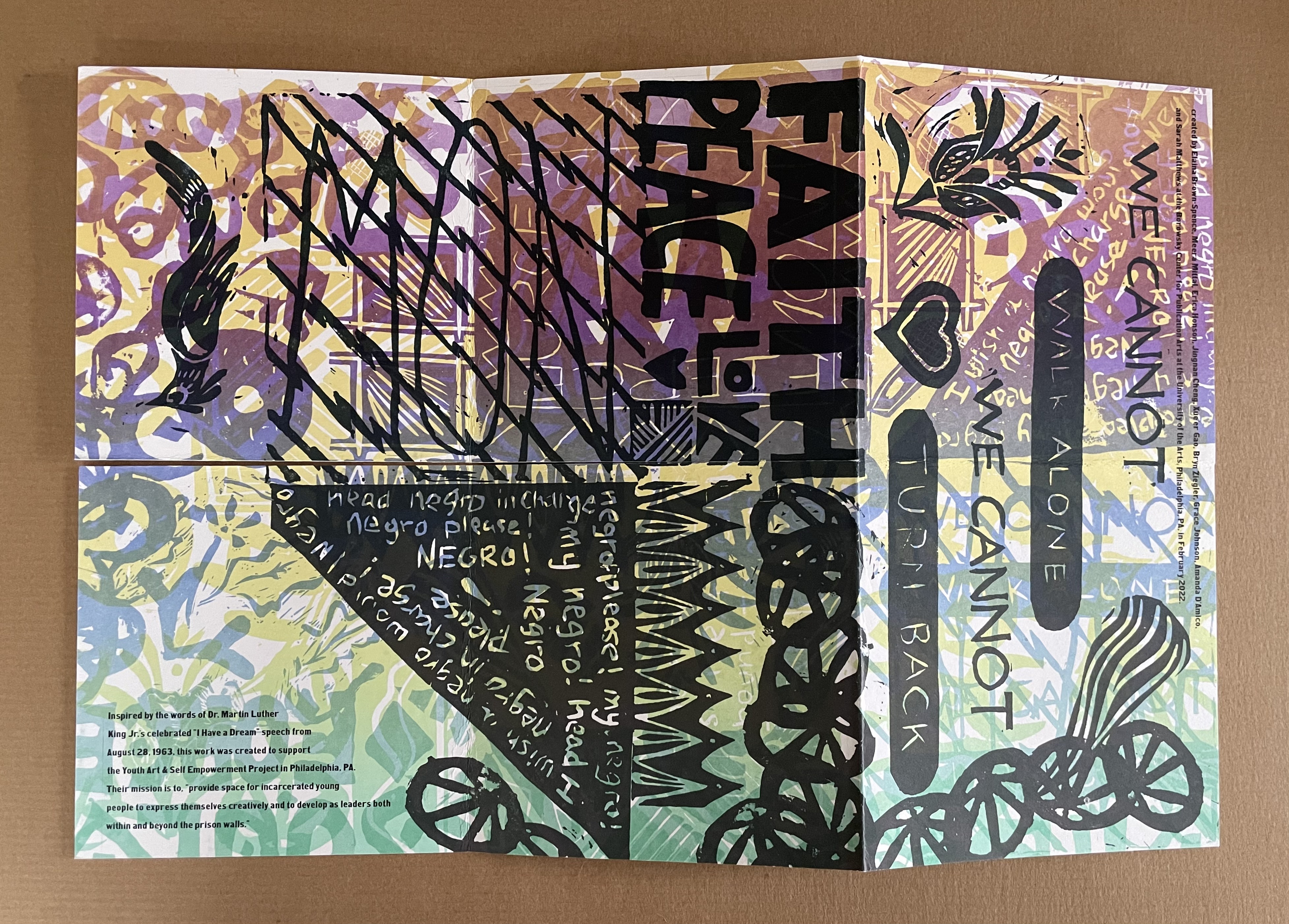
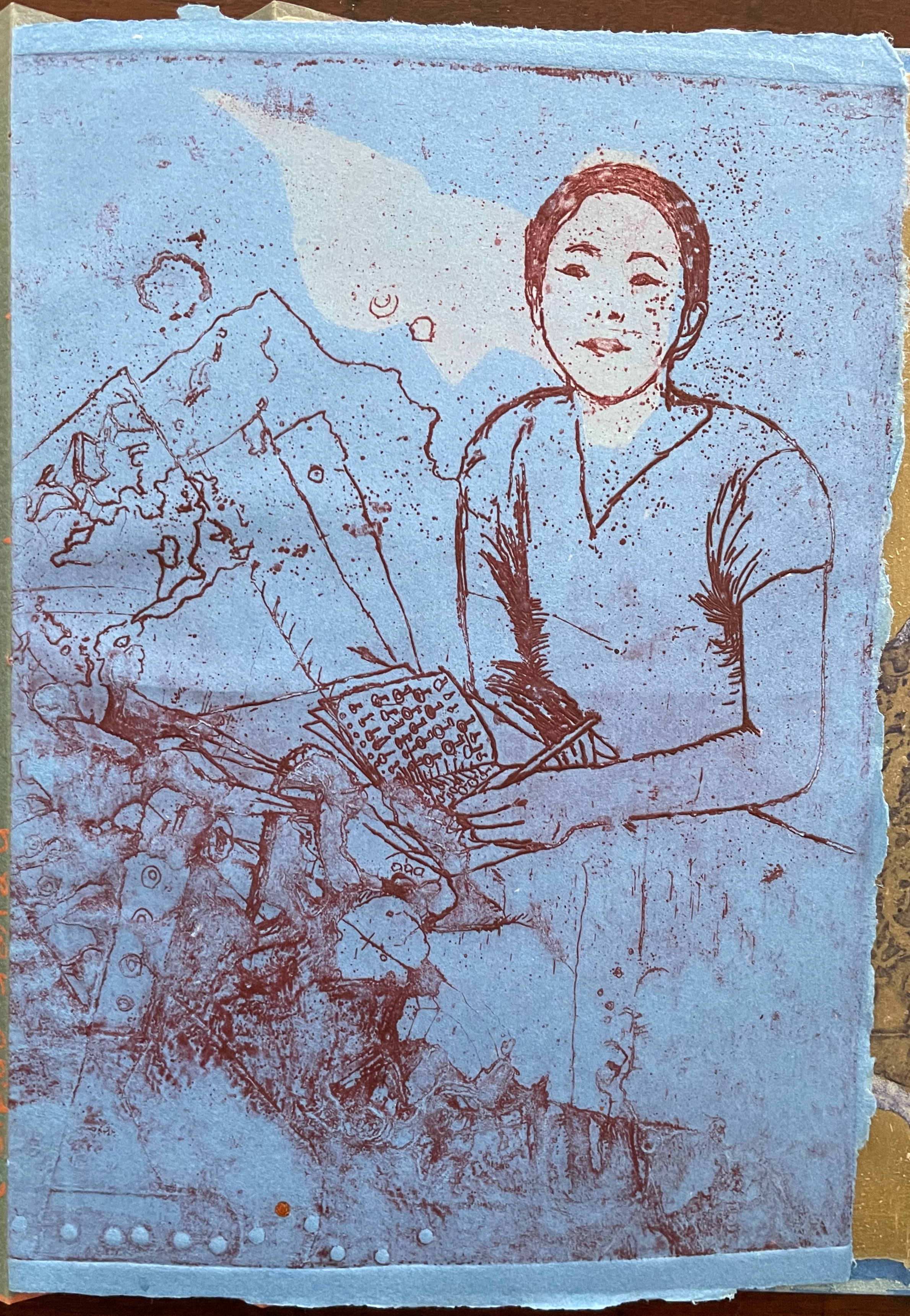
The Negro Is Still Not Free (2022) Elaina Brown-Spence, Meera Mittari, Erica Honson, Jingnan Cheng, Xue’er Goo, Bryn Ziegler, Grace Johnson, Amanda D’Amico, and Sarah Matthews Double-sided single-page book in a pants fold. 152 x 152 mm. Acquired from Sarah Mathews, 6 August 2024. Photos: Books On Books Collection
The Negro is Still Not Free was created by Elaina Brown-Spence, Meera Mittari, Erica Honson, Jingnan Cheng, Xue’er Goo, Bryn Ziegler, Grace Johnson, Amanda D’Amico, and Sarah Matthews at the Borowsky Center for Publication Arts at the University of Arts in Philadelphia, PA during the month of February 2022. In its color and style, it reflects the influence of Amos Paul Kennedy, Jr. Its double-sided single-sheet pants-fold book structure, cleverly fuses the traditions of poster and book (or zine).
Inspired by the words of Dr. Martin Luther King, Jr’s celebrated “I Have A Dream” speech from August 28, 1963, the work was created to support the Youth Art & Self Empowerment Project in Philadelphia, PA. Their mission is to “provide space for incarcerated young people to express themselves creatively and to develop as leaders both within and beyond prison walls.”
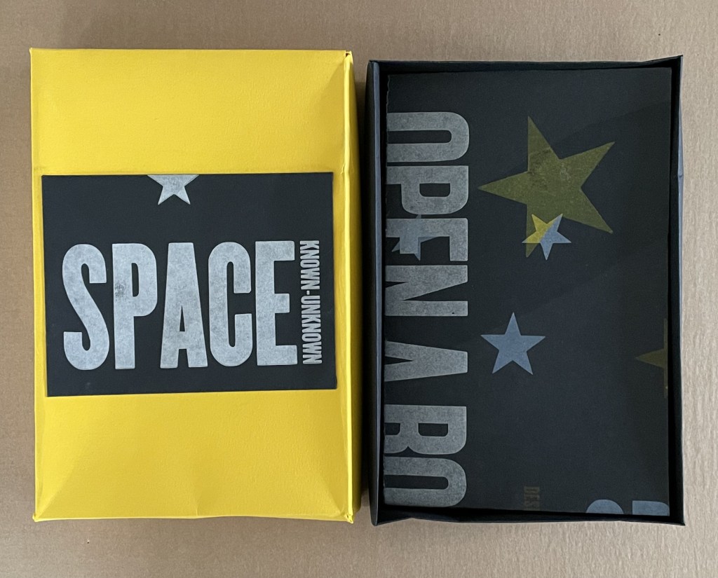
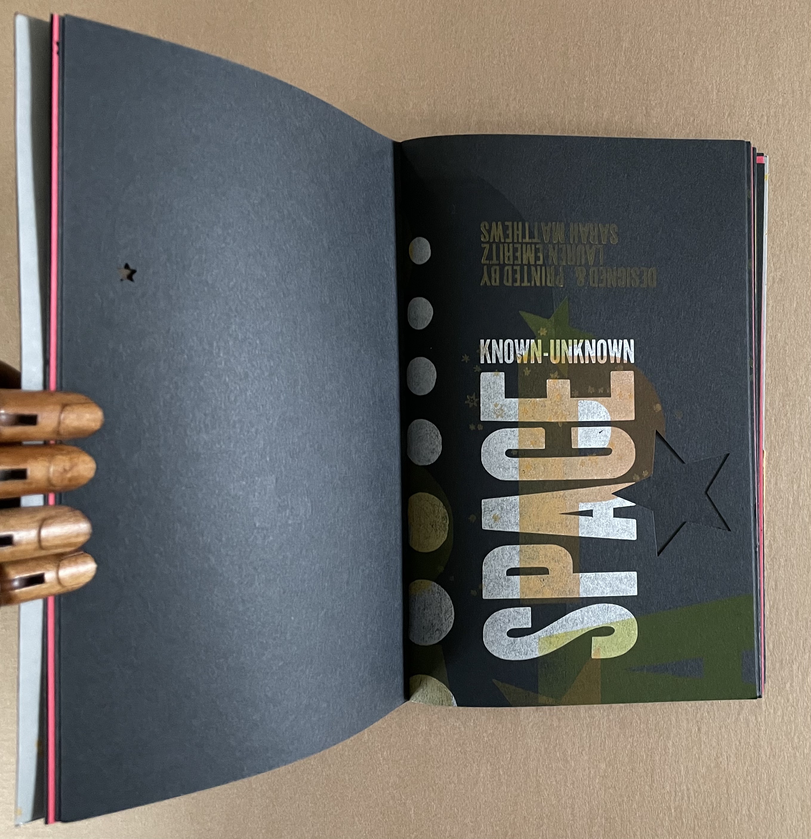
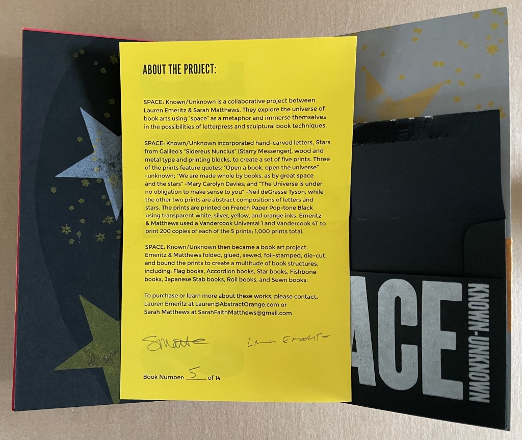
SPACE: Known/Unknown (2022)
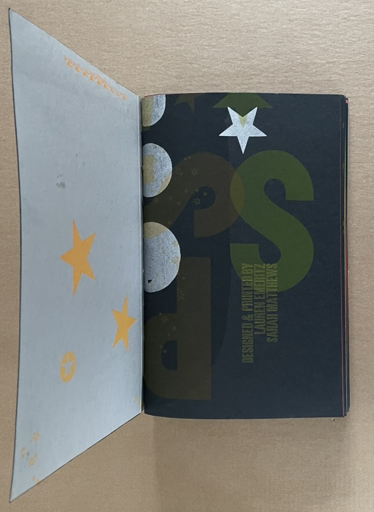
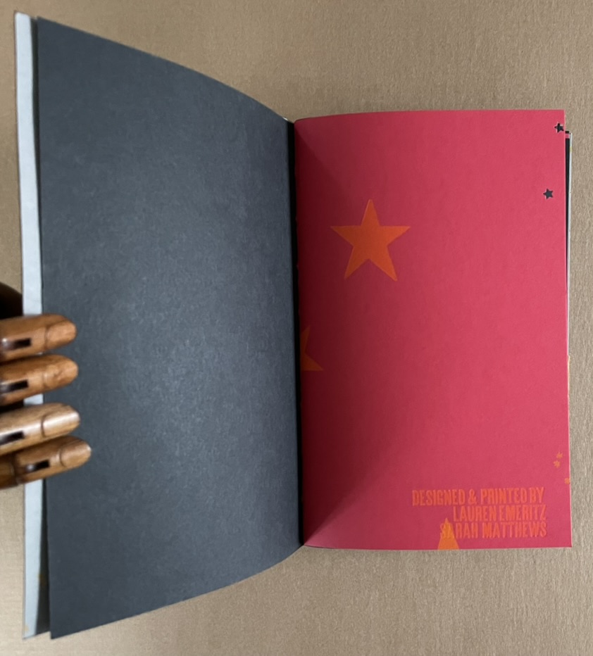
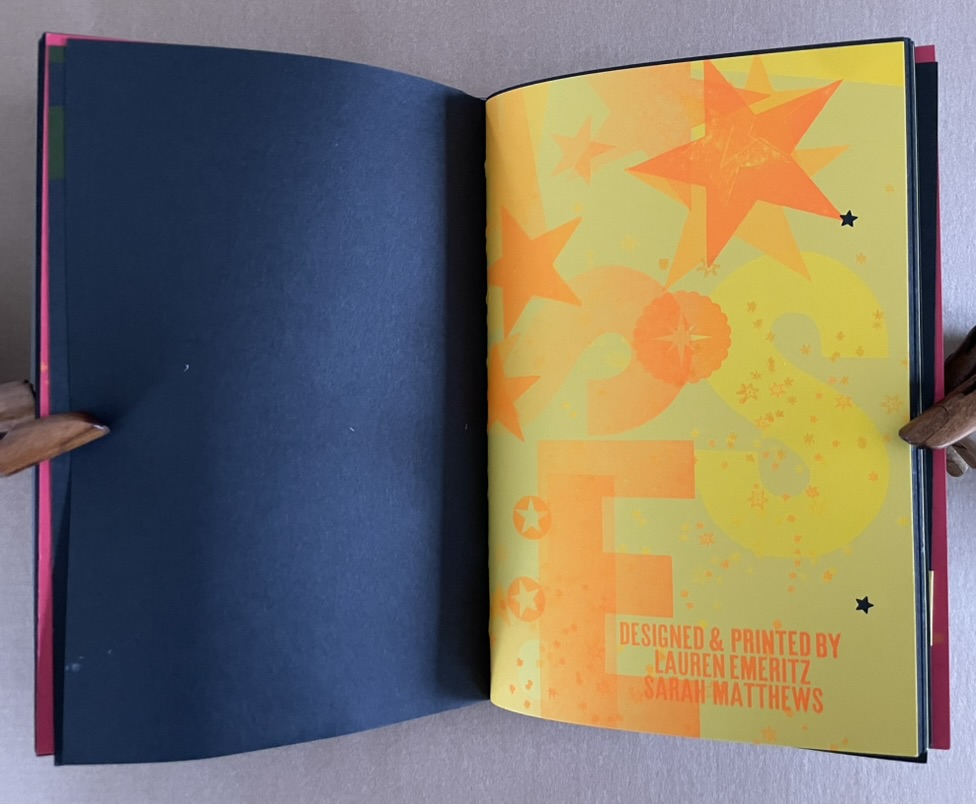
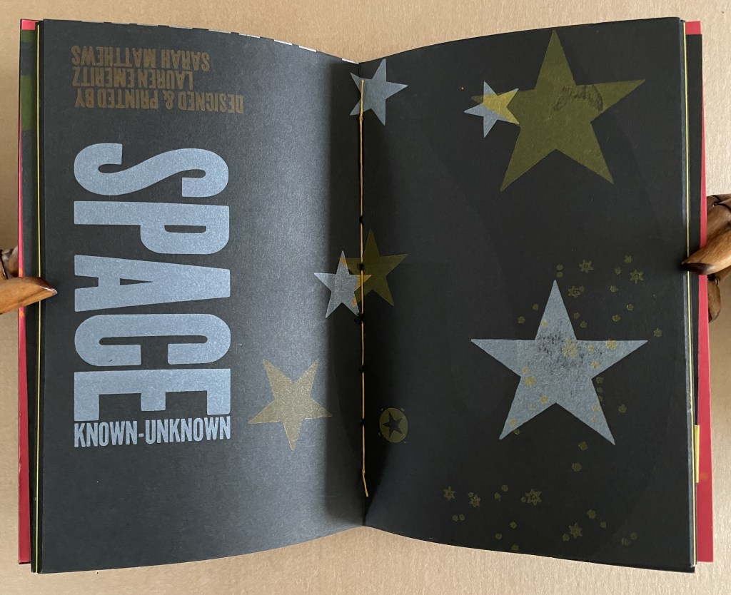
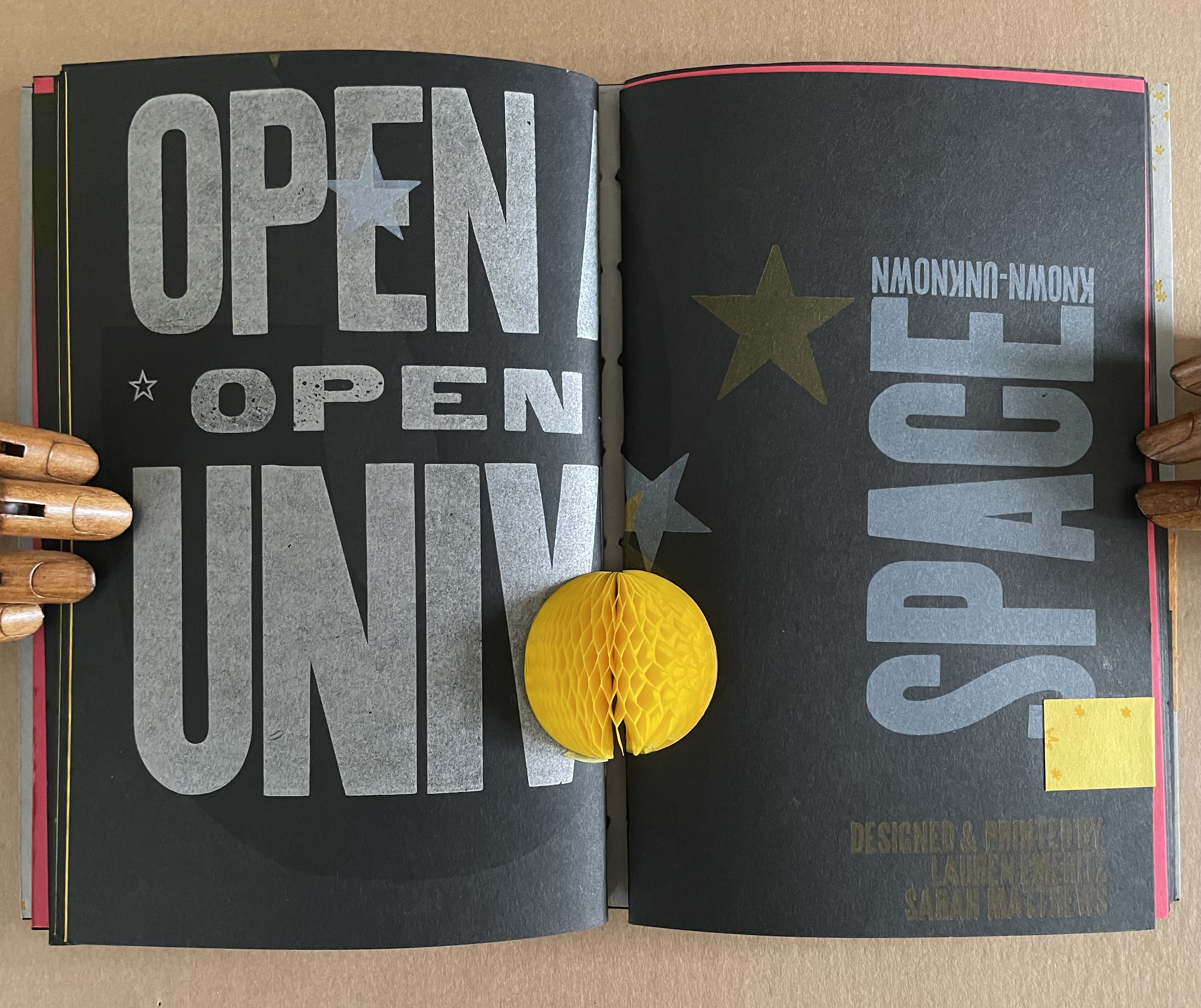
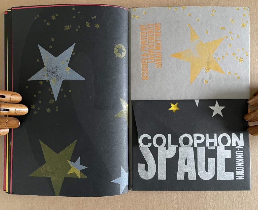
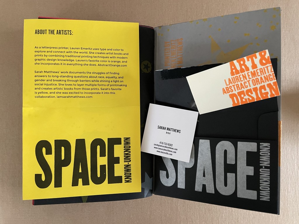
SPACE: Known / Unknown Lauren Emeritz & Sarah Matthews Box with pastedown title enclosing softcover book. Box: 237 x W157 x D50 mm. Book: H230 x W150 x D25 mm. 48 pages and loose 4-page colophon in envelope attached to inside back cover. Edition of 15, of which this is #5. Acquired from Sarah Mathews, 6 August 2024. Photos: Books On Books Collection.
A collaborative project between Lauren Emeritz & Sarah Matthews, SPACE: Known/Unknown features three telling quotations:
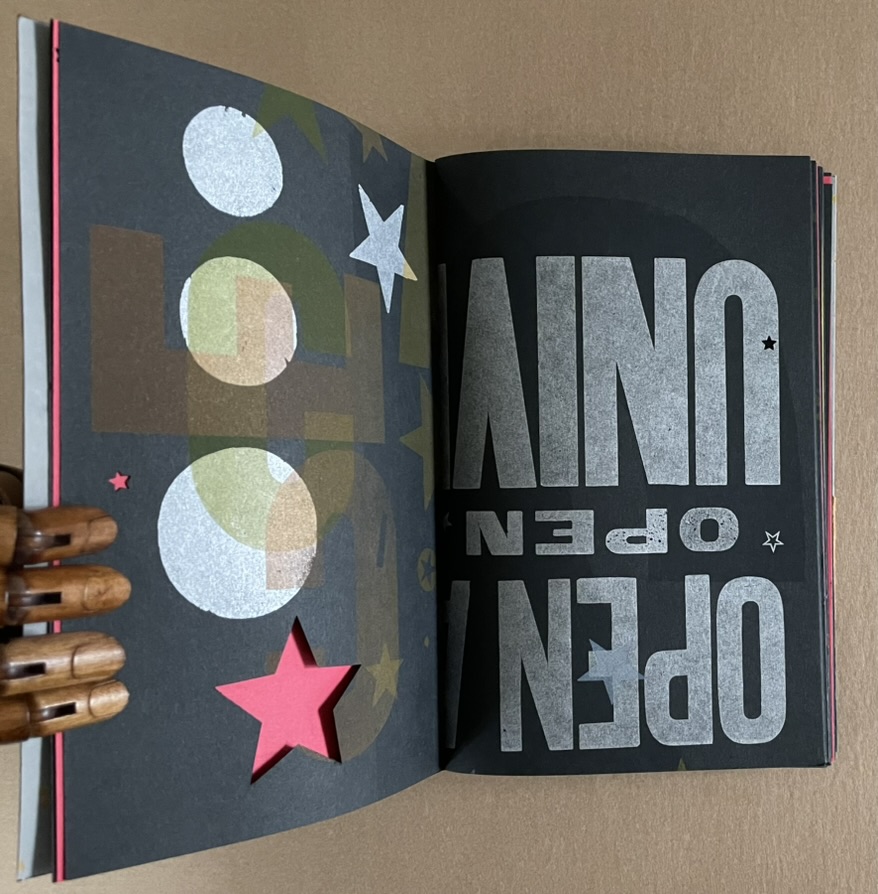
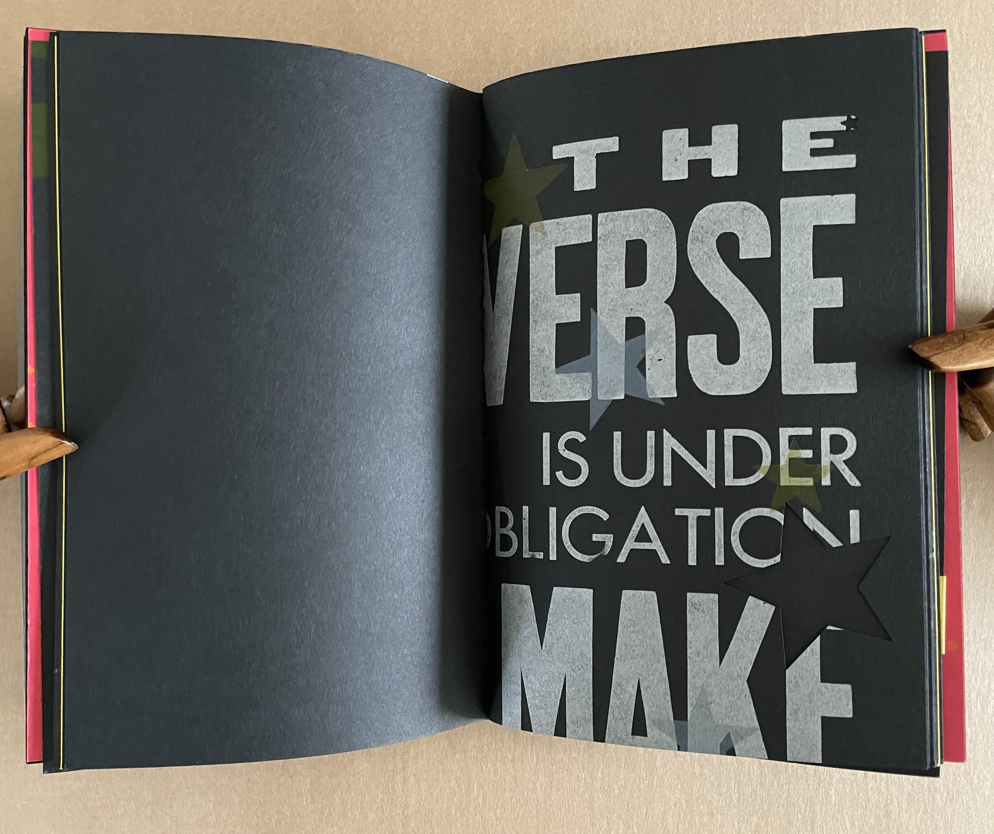
“Open a book, open the universe”– Unknown “We are made whole by books, as by great space and the stars” — Mary Carolyn Davies “The Universe is under no obligation to make sense to you” — Neil deGrasse Tyson
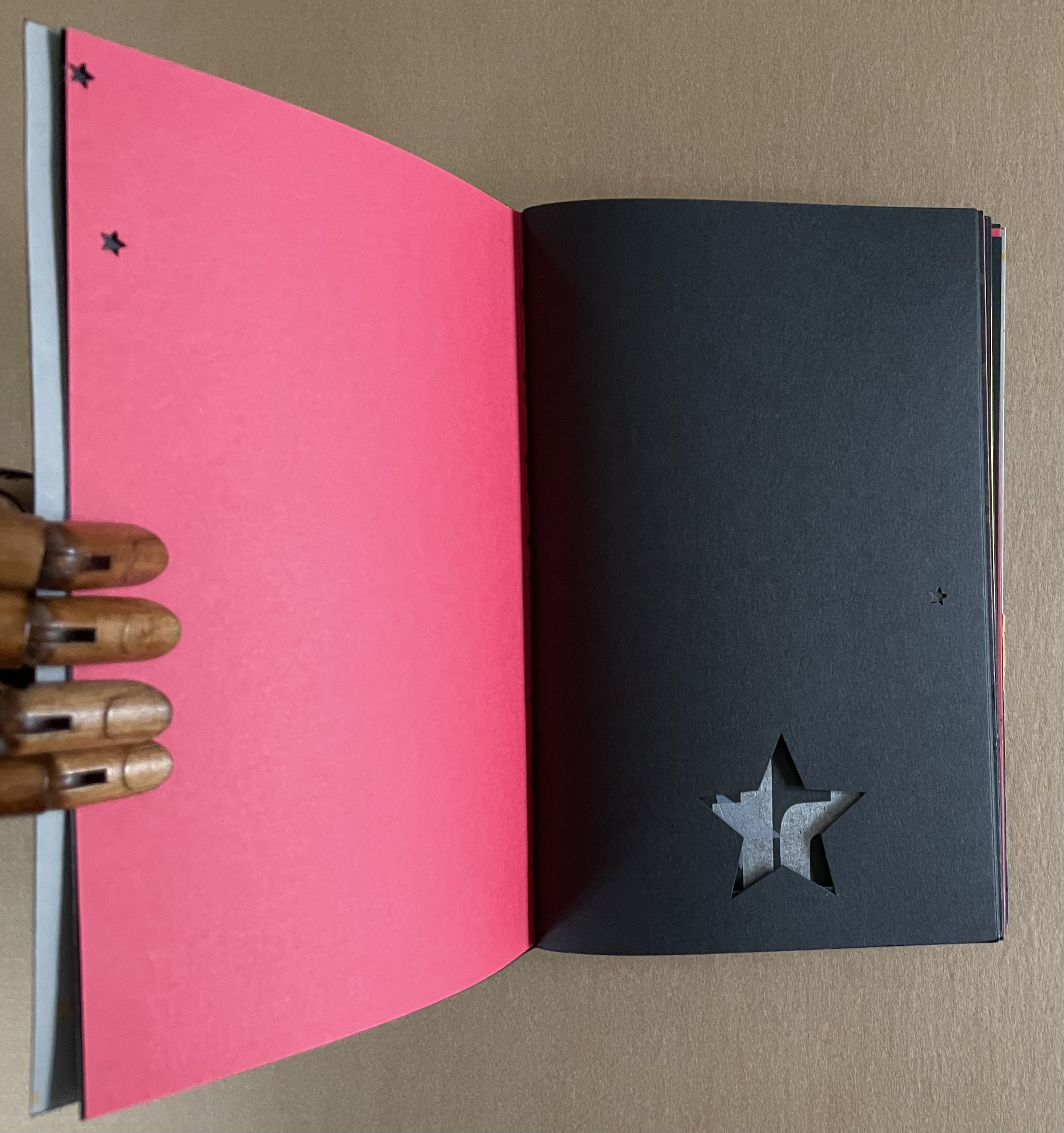
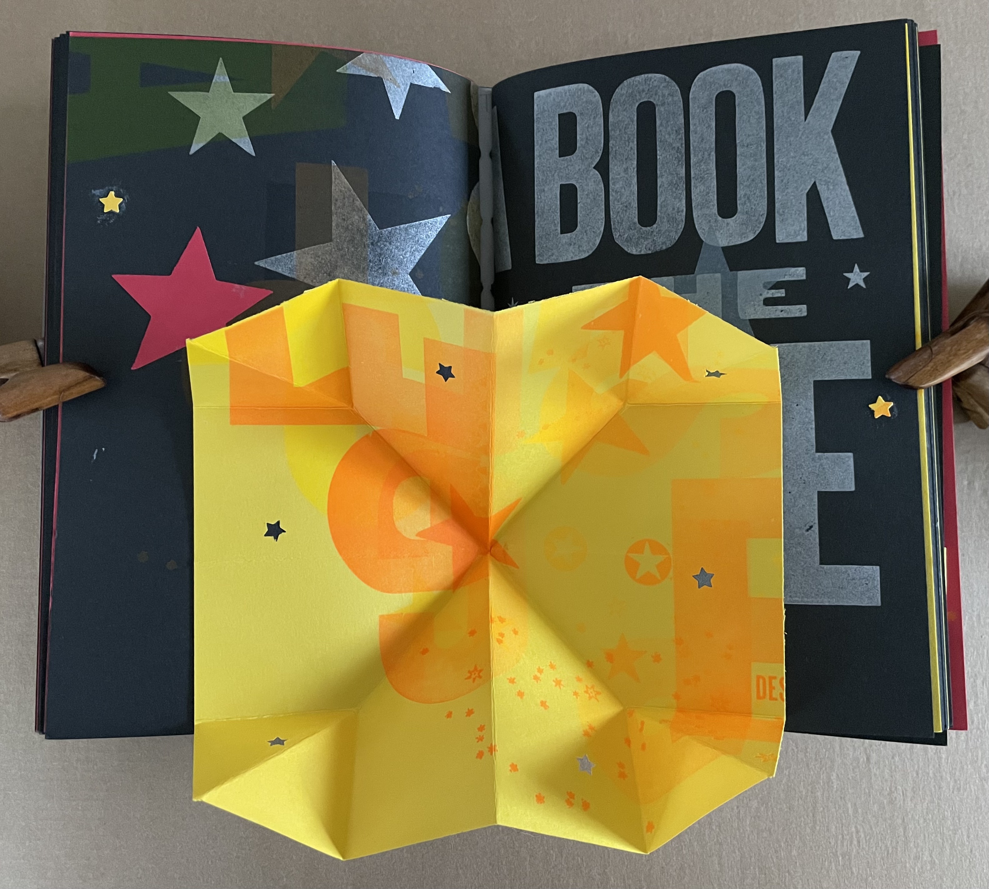
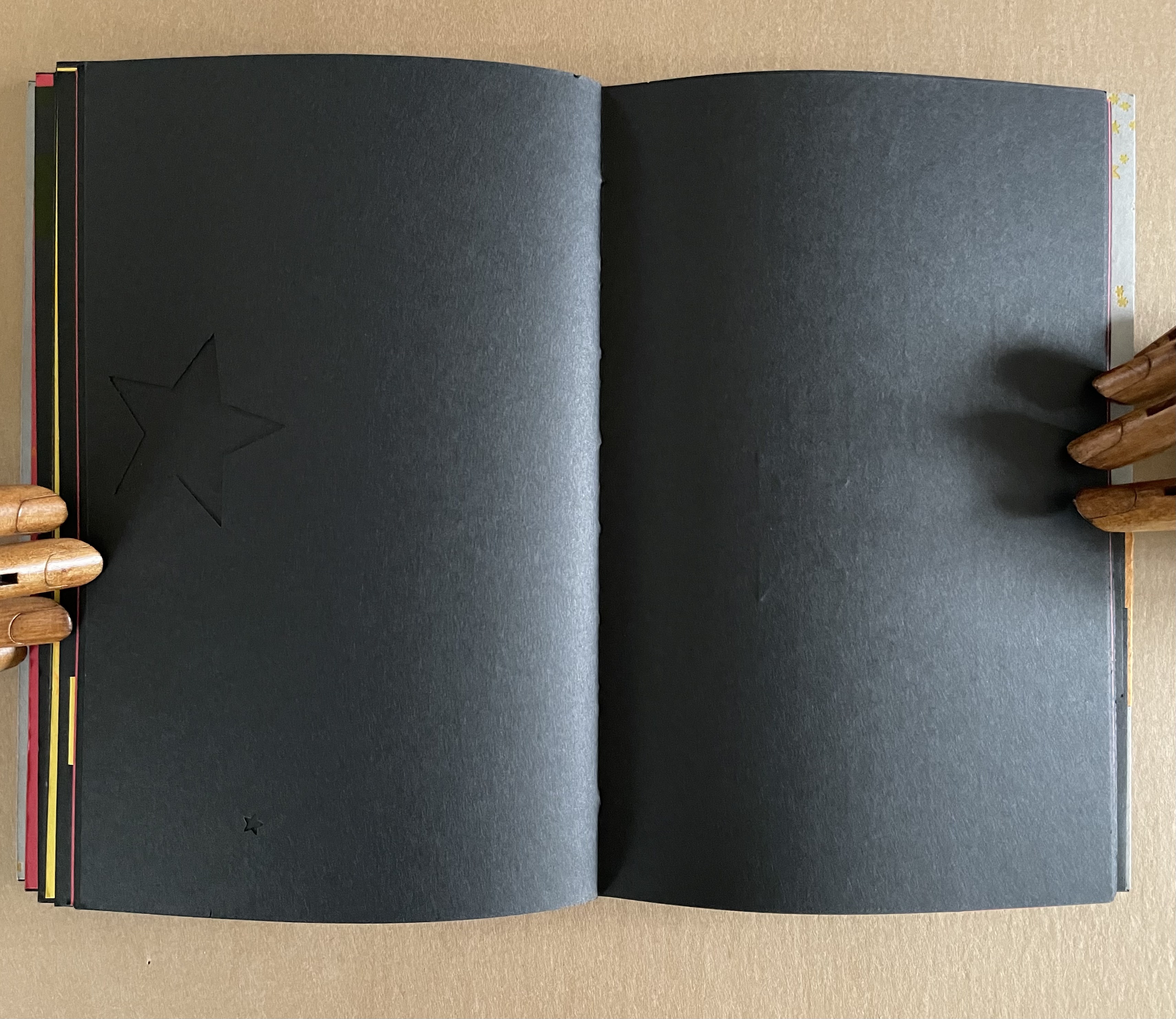
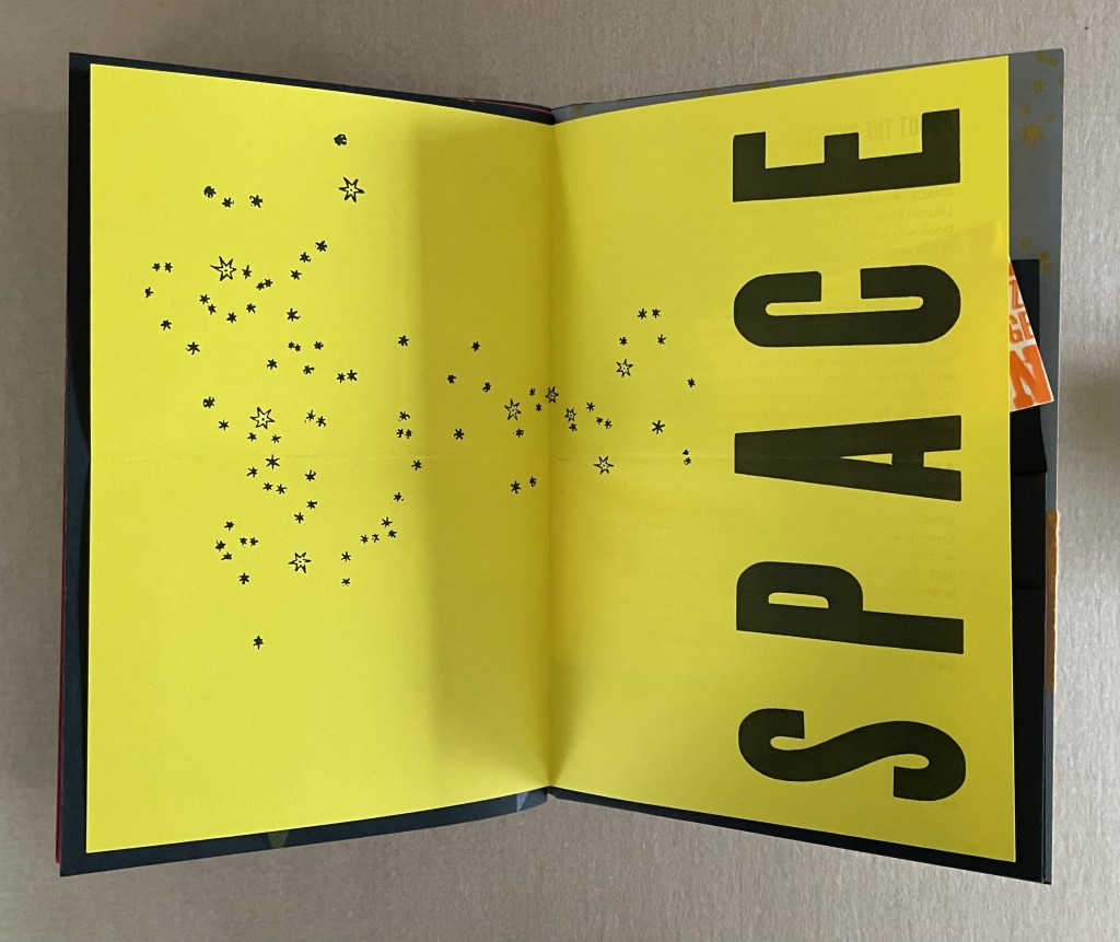
The universe of this artist’s book is that of letterpress, handcarved letters, wood and metal type, embossed printer labels, multiple inks and foil stamping, die cuts, paper engineering, and multiple binding structures. This and its crazy quilt imposition make it a lively universe to explore, and it certainly lives up to deGrasse Tyson’s quip.
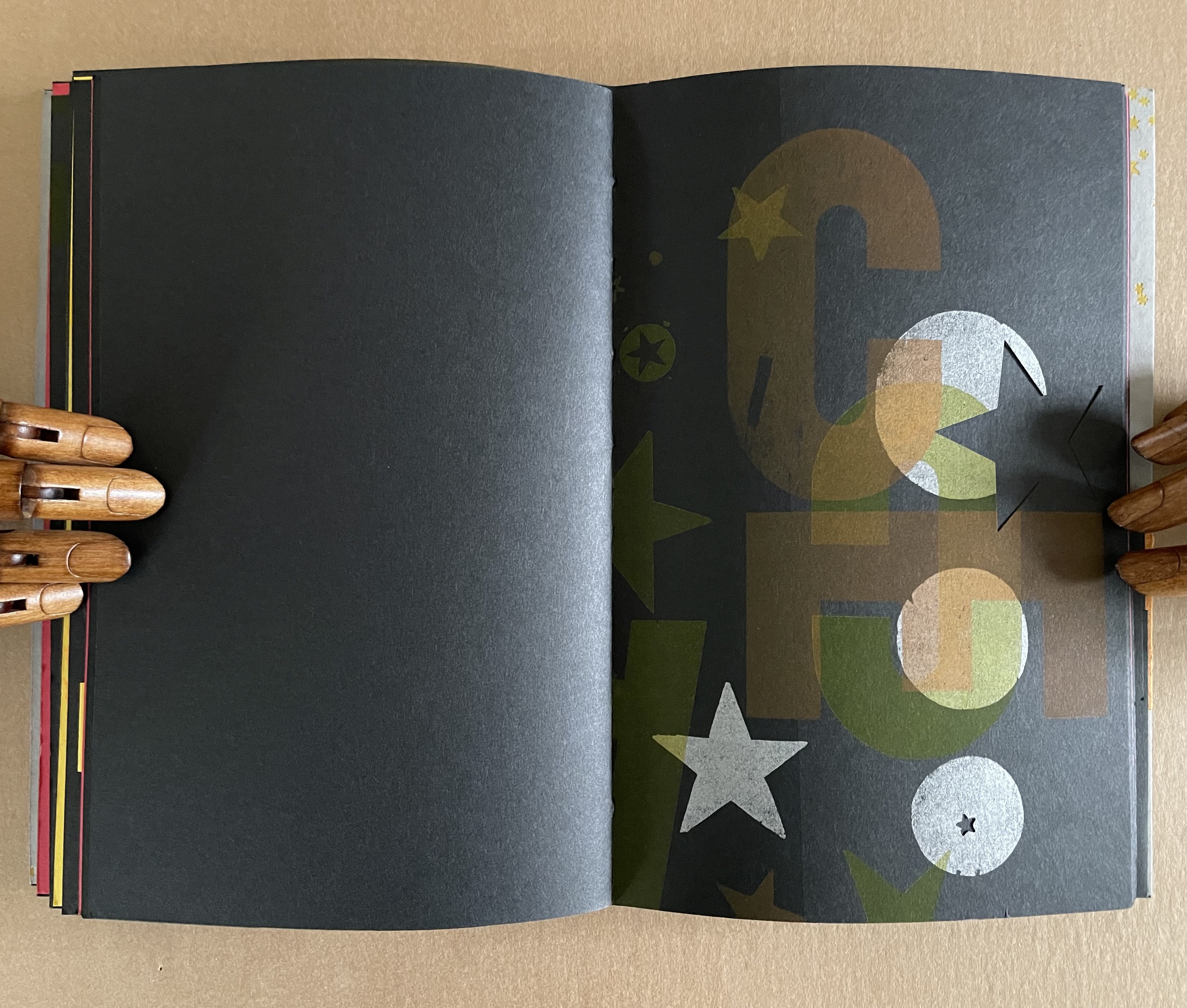
Does this book subscribe to the “argument by design” made by Socrates and St. Thomas Aquinas?
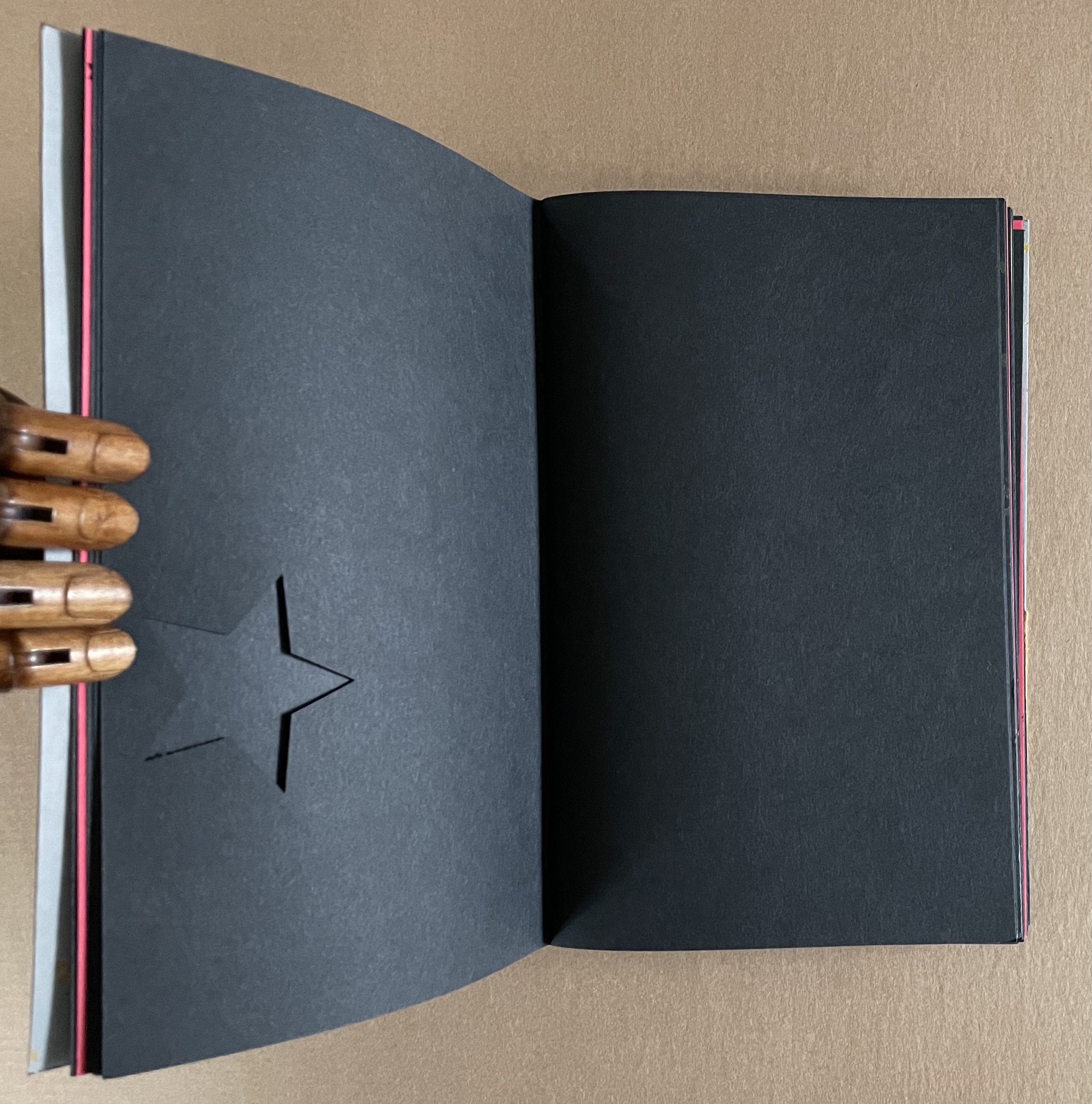
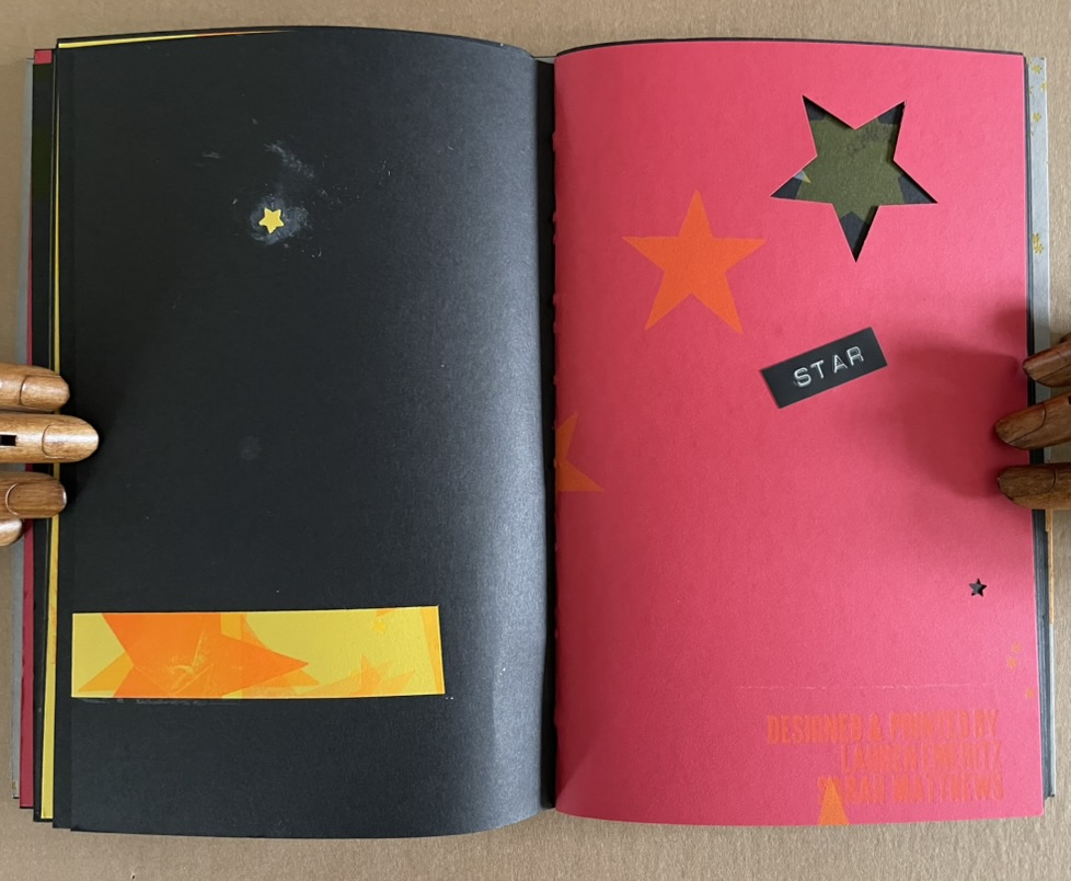
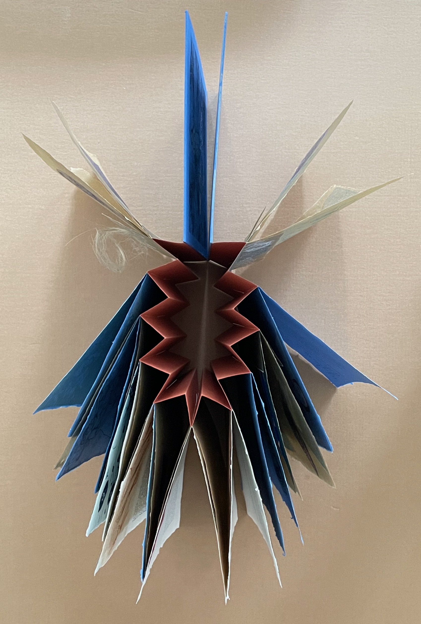
A universe in which page layout turns one way and then another is under no obligation to make sense.
A Turkish fold of constellations.
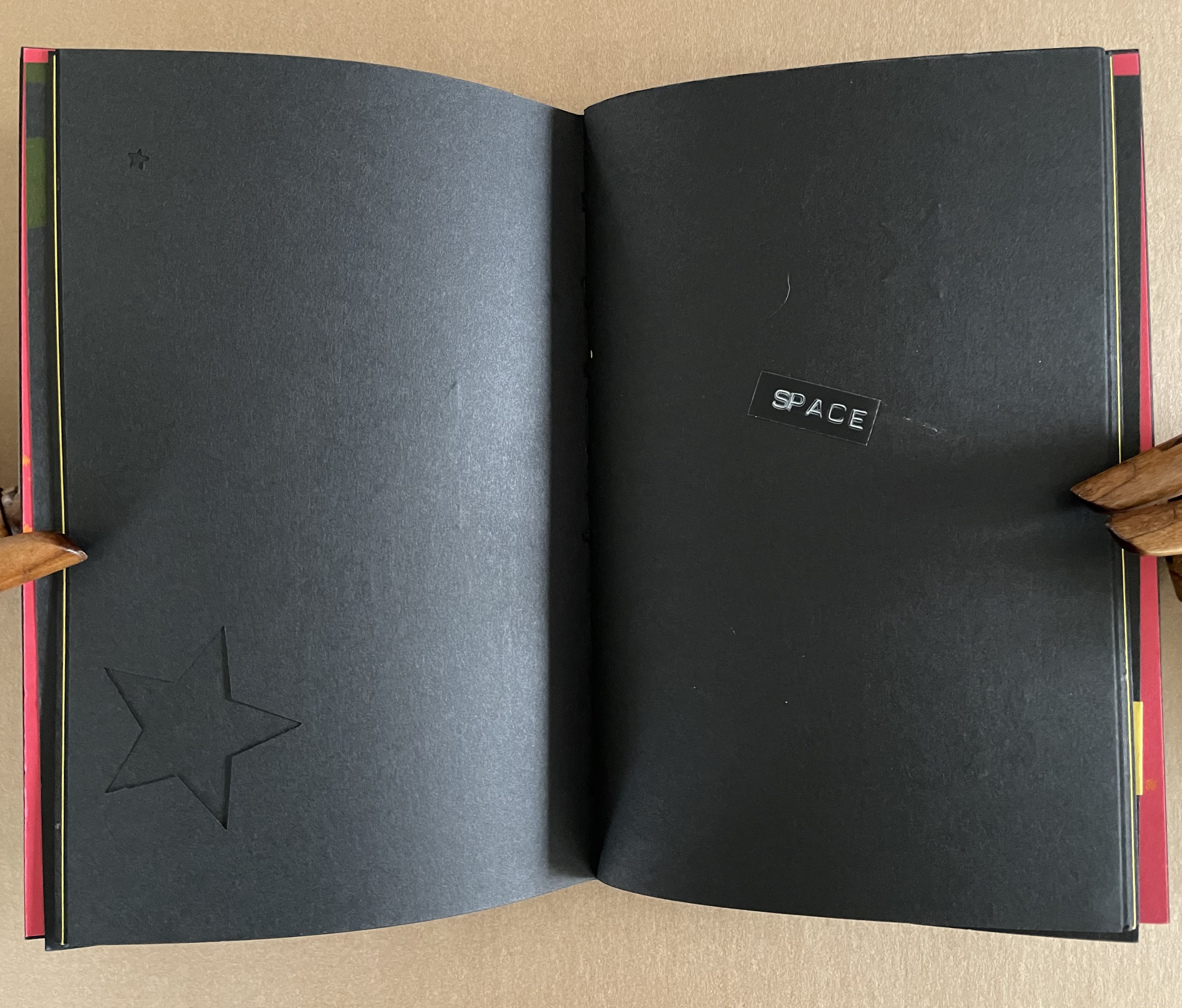
The artists must have traveled back in time to include one of these embossed sticky labels.
The universe and title page can appear in multiple places — even in the middle.
A sunburst — and then star label in case we missed it?
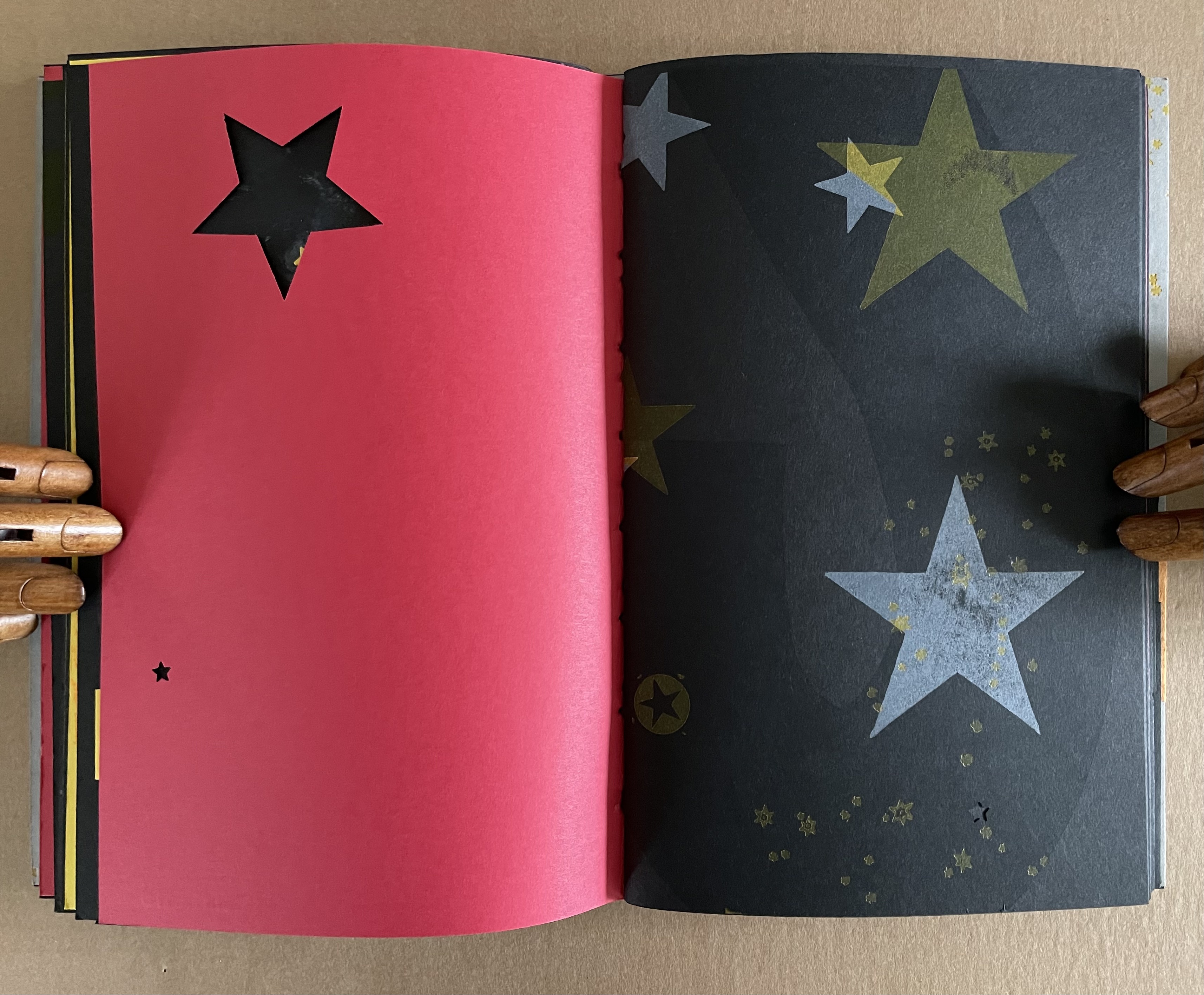
A multi-color galaxy of ink leads to die-cut black stars (or holes?).
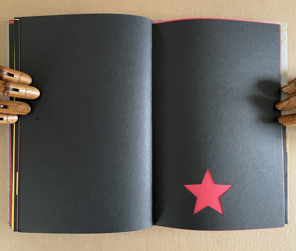
Not exactly a dwarf red star, but it’s the artists’ universe, they get to decide.
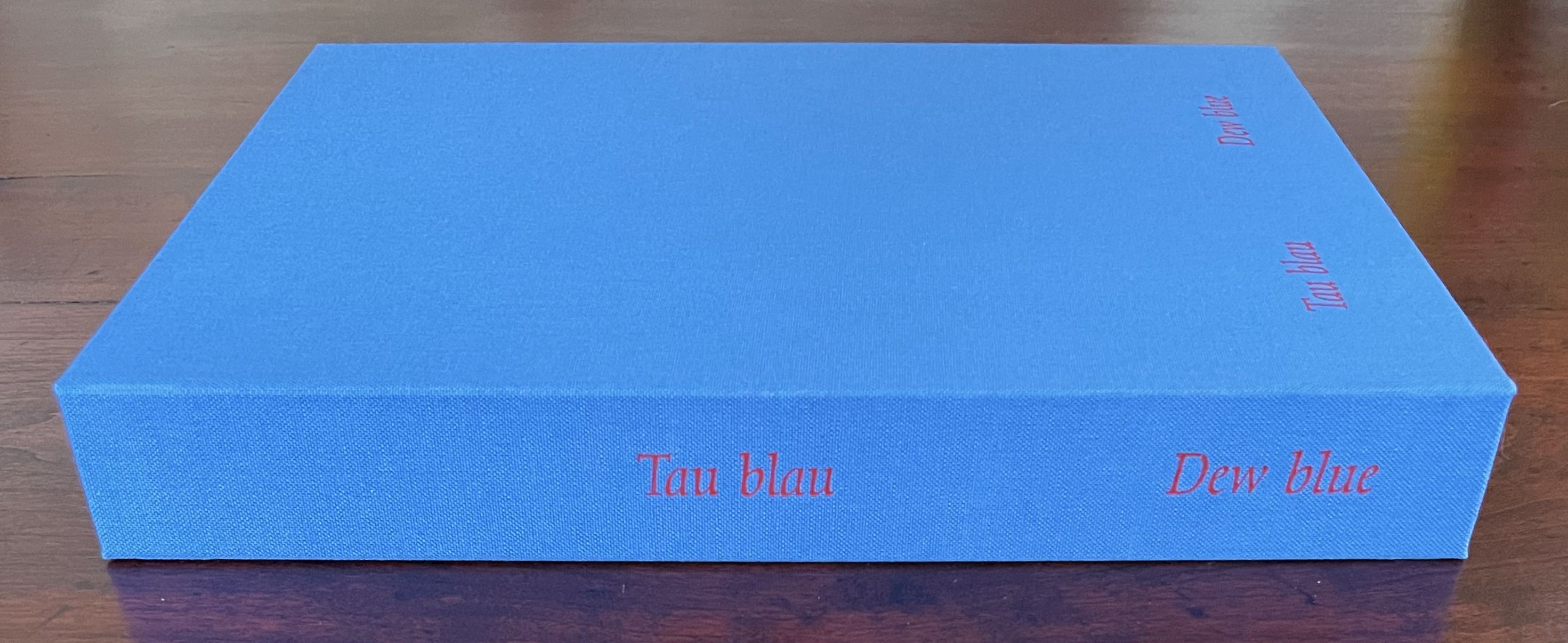
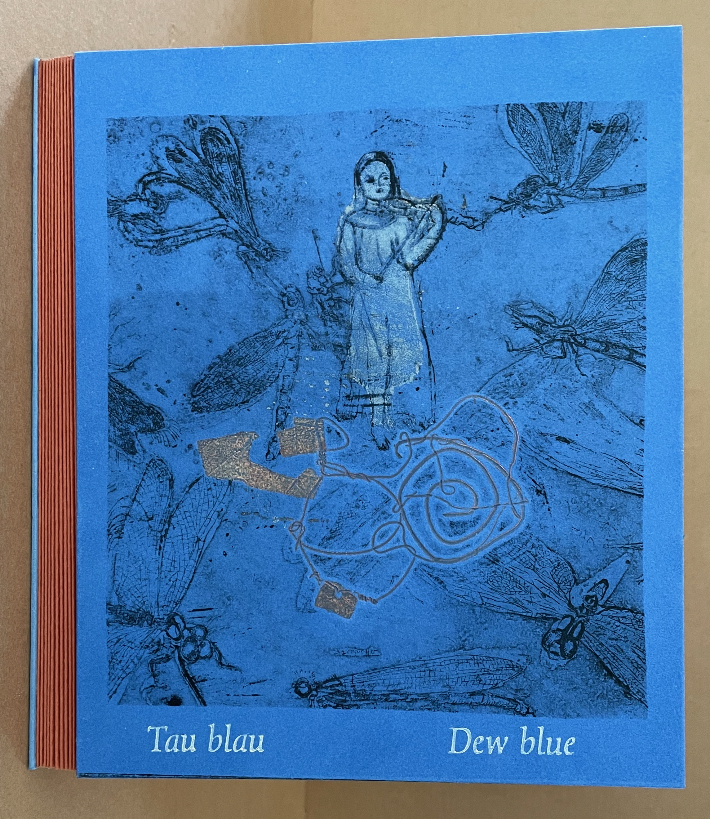
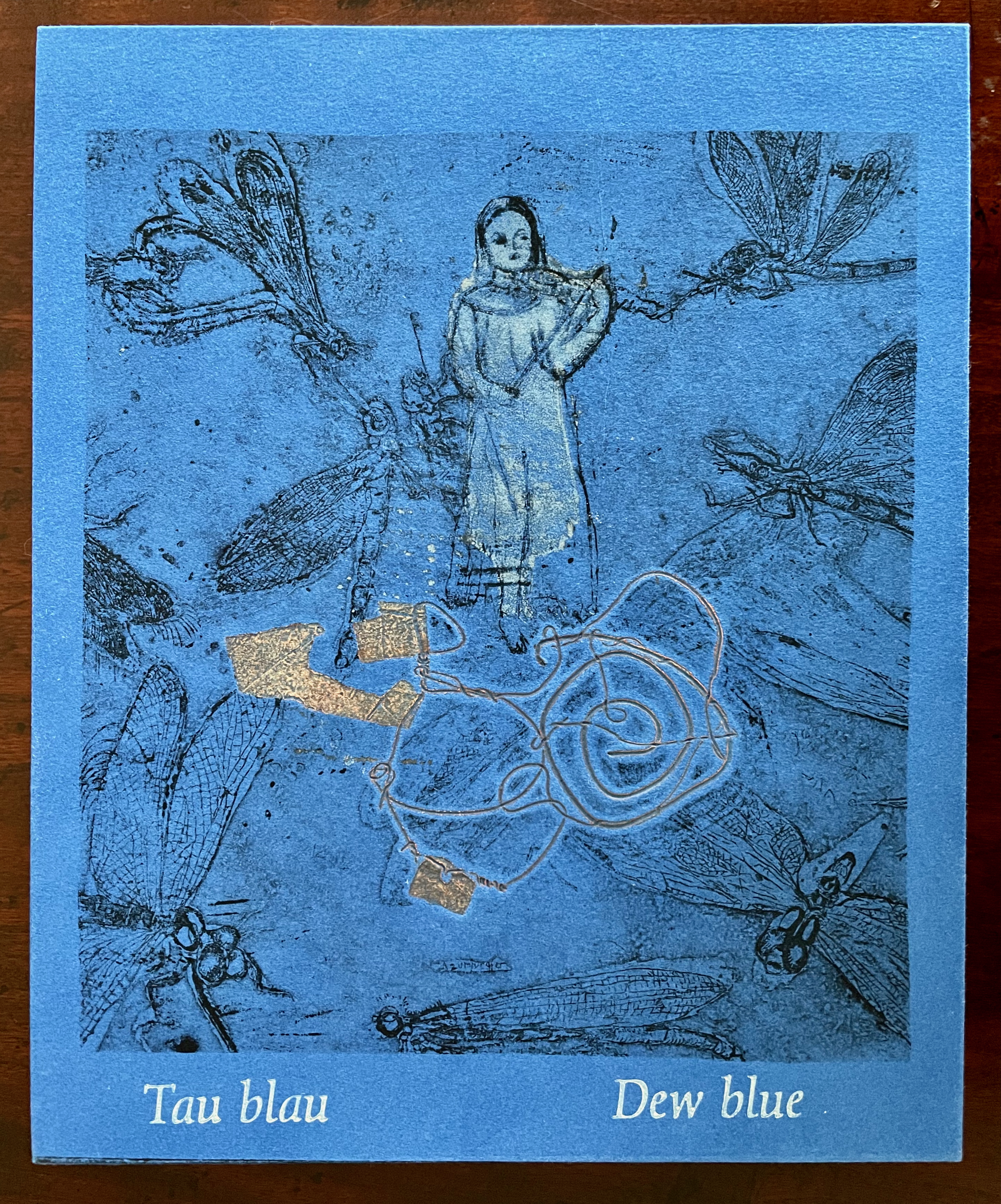
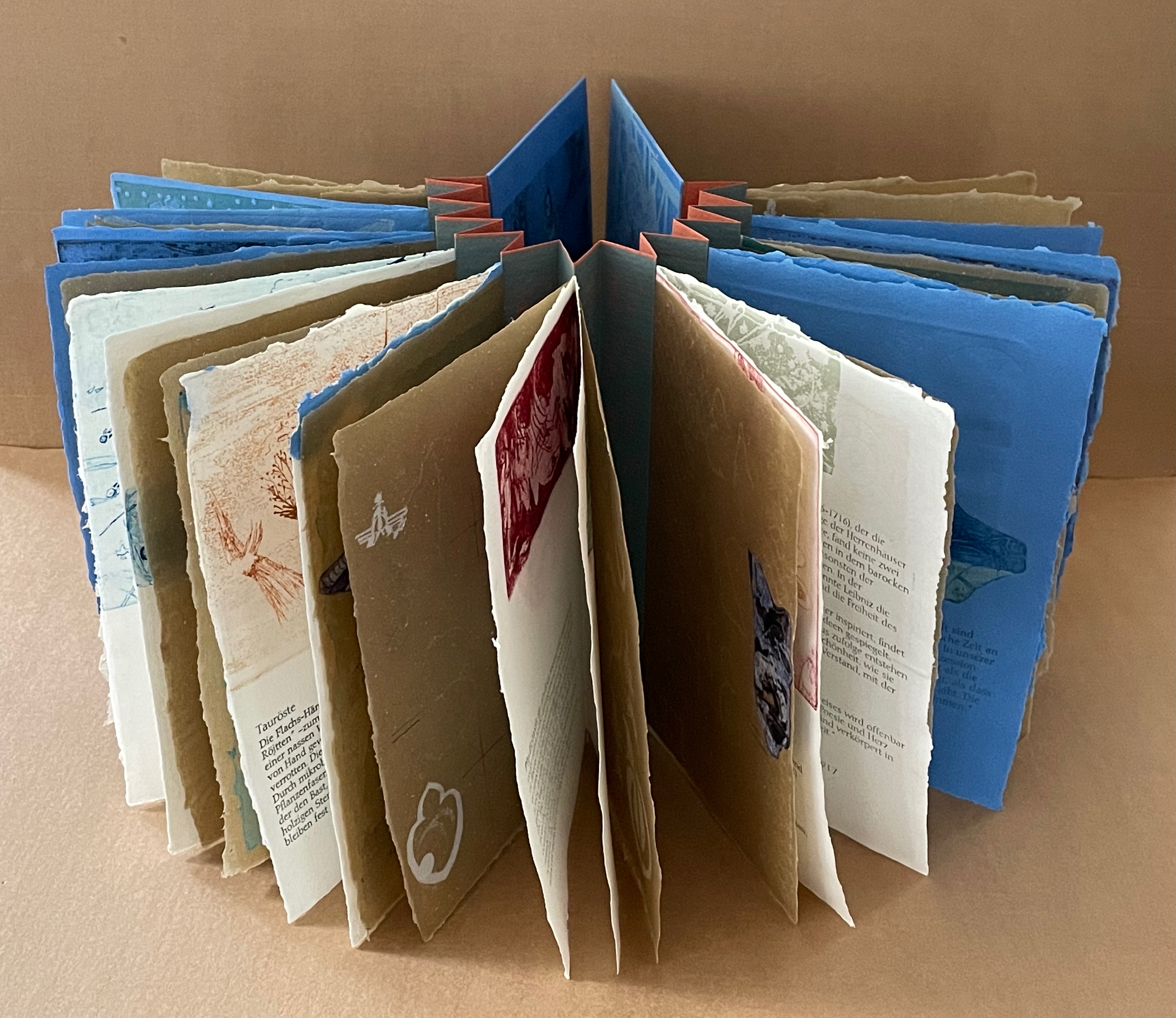
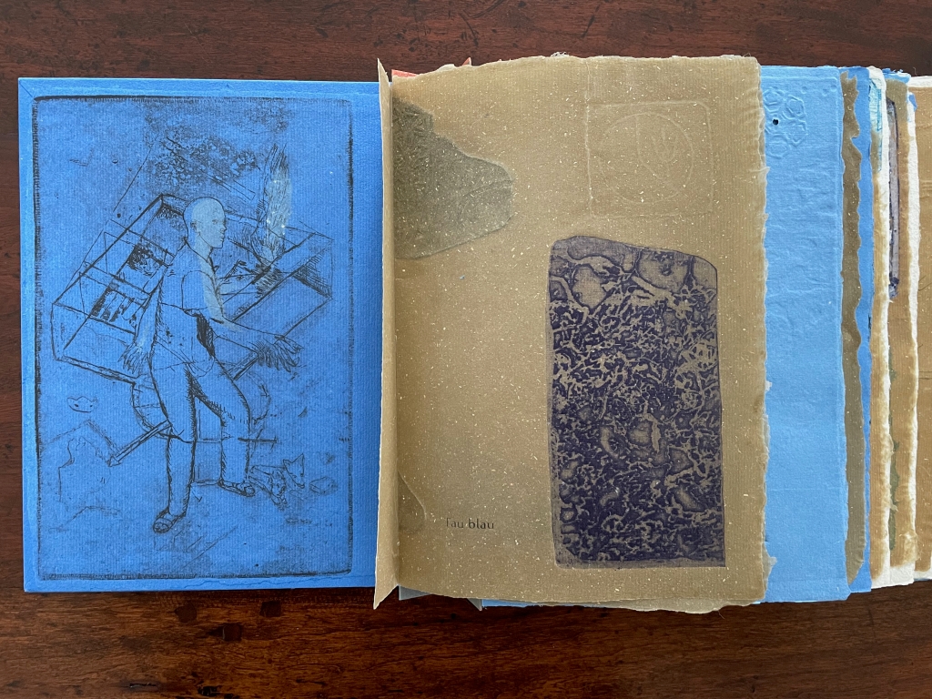
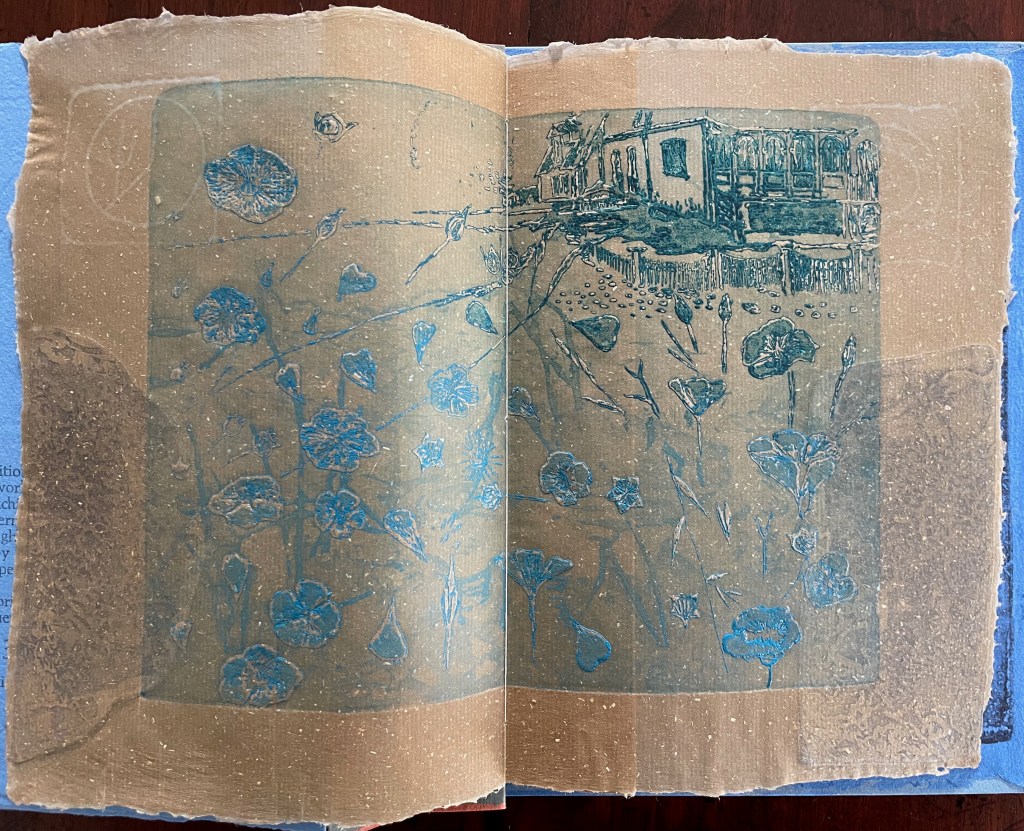
Tau blau / Dew Blue (2013) Barbara Beisinghoff ; Solander box in linen, handbound Vera Schollemann; Flax paper, handmade by John Gerard. Solander box: H240 x W200 x D32 mm. Flagbook: H220 x W180 mm. Edition of 38, of which this is #22. Acquired from the artist, 30 December 2024. Photos: Books On Books Collection.
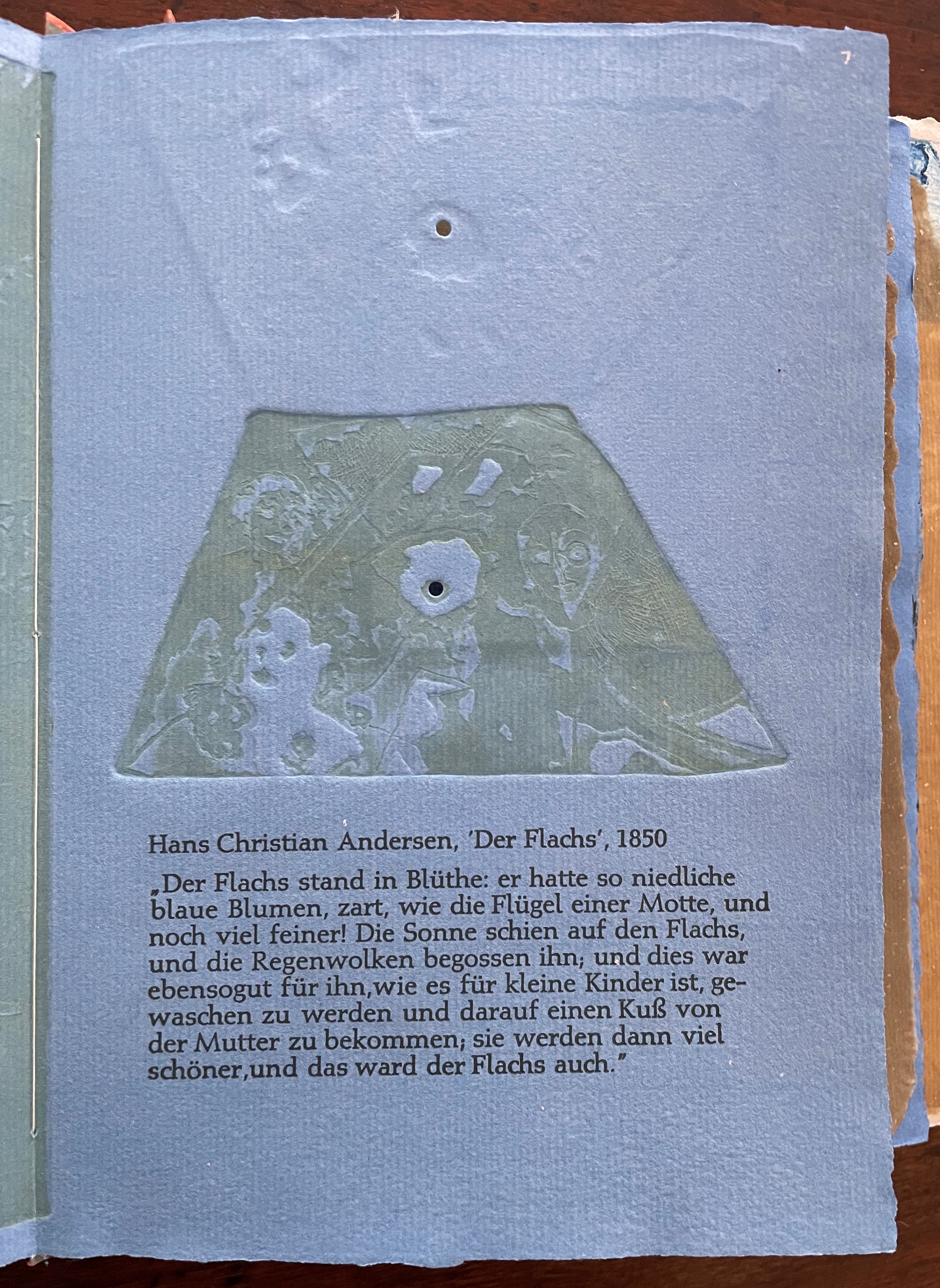
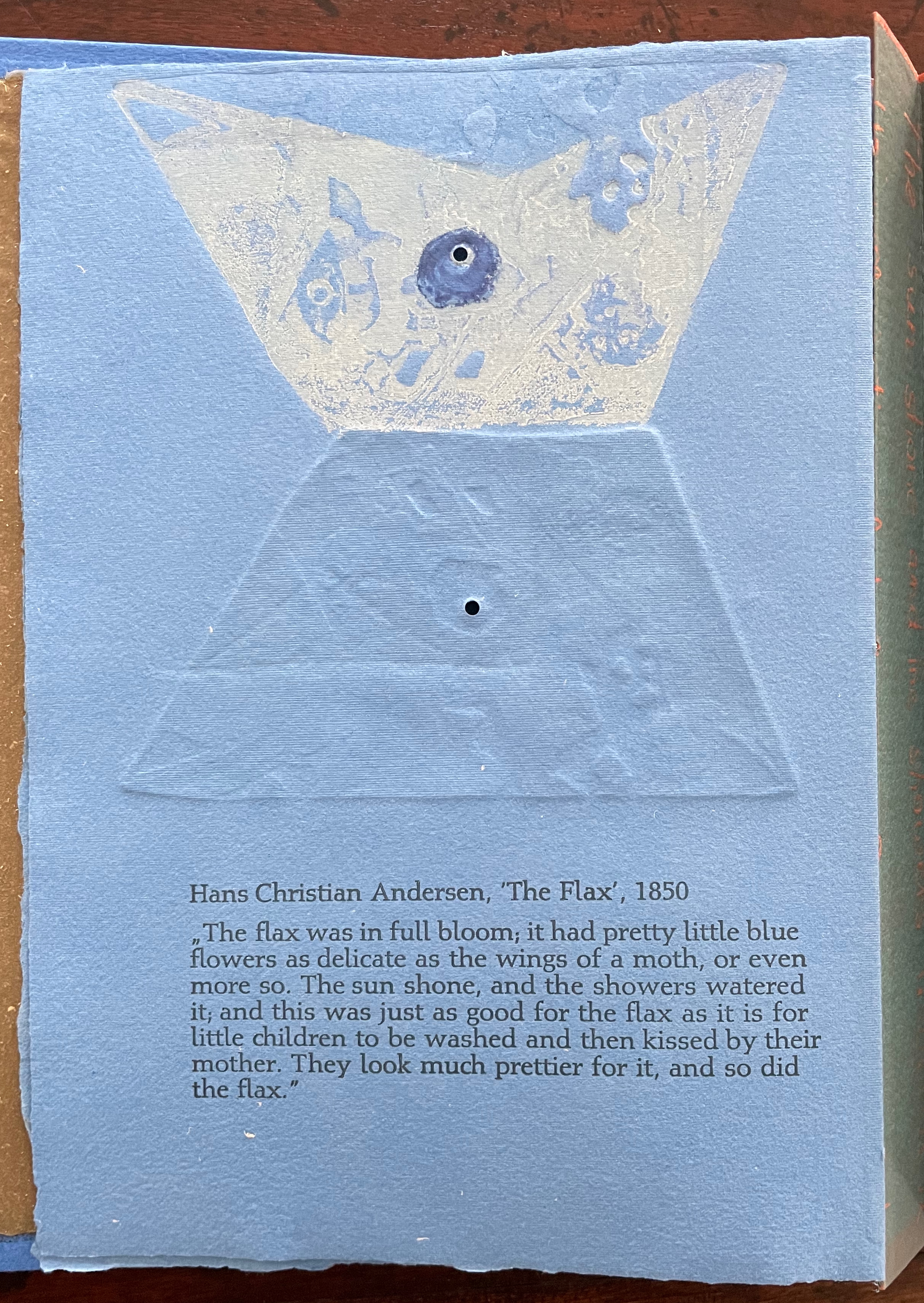
Familiarity with Hans Christian Andersen’s fairy tale Hørren /The Flax enhances appreciation of Barbara Beisinghoff’s Tau blau / Dew Blue. Andersen gives a voice to the plant that expresses its joy, pain, hope and observations at each stage of its blooming, being harvested, turned into linen and clothing then paper, and finally consigned to flames. The H.C. Andersen Centre offers Jean Hersholt’s translation of it here.
Only the opening paragraph of the story appears in Tau blau / Dew Blue, but Beisinghoff documents and illustrates the stages from her own cultivation of flax, observation of its growth and preparation of its processing. And with the etching, drawing, watermarking, handmade papers, linen cloth and thread, and binding structure, Beisinghoff suffuses the spirit of the tale’s metamorphosizing plant throughout the whole of Tau blau / Dew Blue.
From the blue of the plant’s blossoms to the white of its change into linen and paper to the red, burnt orange and black of its sparks and ash when it is consumed by fire in the end, all of the story’s colors are replayed across Tau blau / Dew Blue from its Solander box to its covers and spine like motives in a Baroque musical piece.
In a concerto, motives play off one another and develop. In Tau blau / Dew Blue, the motif of nature (the plant) plays off the motif of artifice and the manmade (the fairy tale, music, linen, paper, etc.). On the front cover (above), a young girl, surrounded by large damselflies, plays a fiddle or violin and seems to hover above a silver foil image of flax thread and tools for making it. In the spread above alongside the front cover, the specks rising over the staves and musical notes (a recurring motif in itself) recall the tale’s final passage in which the bundle of papers (made from linen rags) is cast into a fire:
“I’m going straight up to the sun!” said a voice in the flame. It was as if a thousand voices cried this together, as the flames burst through the chimney and out at the top. And brighter than the flames, but still invisible to mortal eyes, little tiny beings hovered, just as many as there had been blossoms on the flax long ago. They were lighter even than the flame which gave them birth, and when that flame had died away and nothing was left of the paper but black ashes, they danced over the embers again. Wherever their feet touched, their footprints, the tiny red sparks, could be seen.
Images of tools — whether for preparing flax or for making the products from it — also recur on the inside of the front and back covers and throughout the book. The human figures alongside the tools, however, appear engaged in more than manufacturing. Elsewhere in the book, they dance, they sit and meditate or write, they row on ponds beside the growing flax. The fairy tale, too, has these Romantic juxtapositions of nature, art and craft. So, again, the spirit of Andersen’s tale finds another way into Tau blau / Dew Blue.
Inside front and inside back covers.
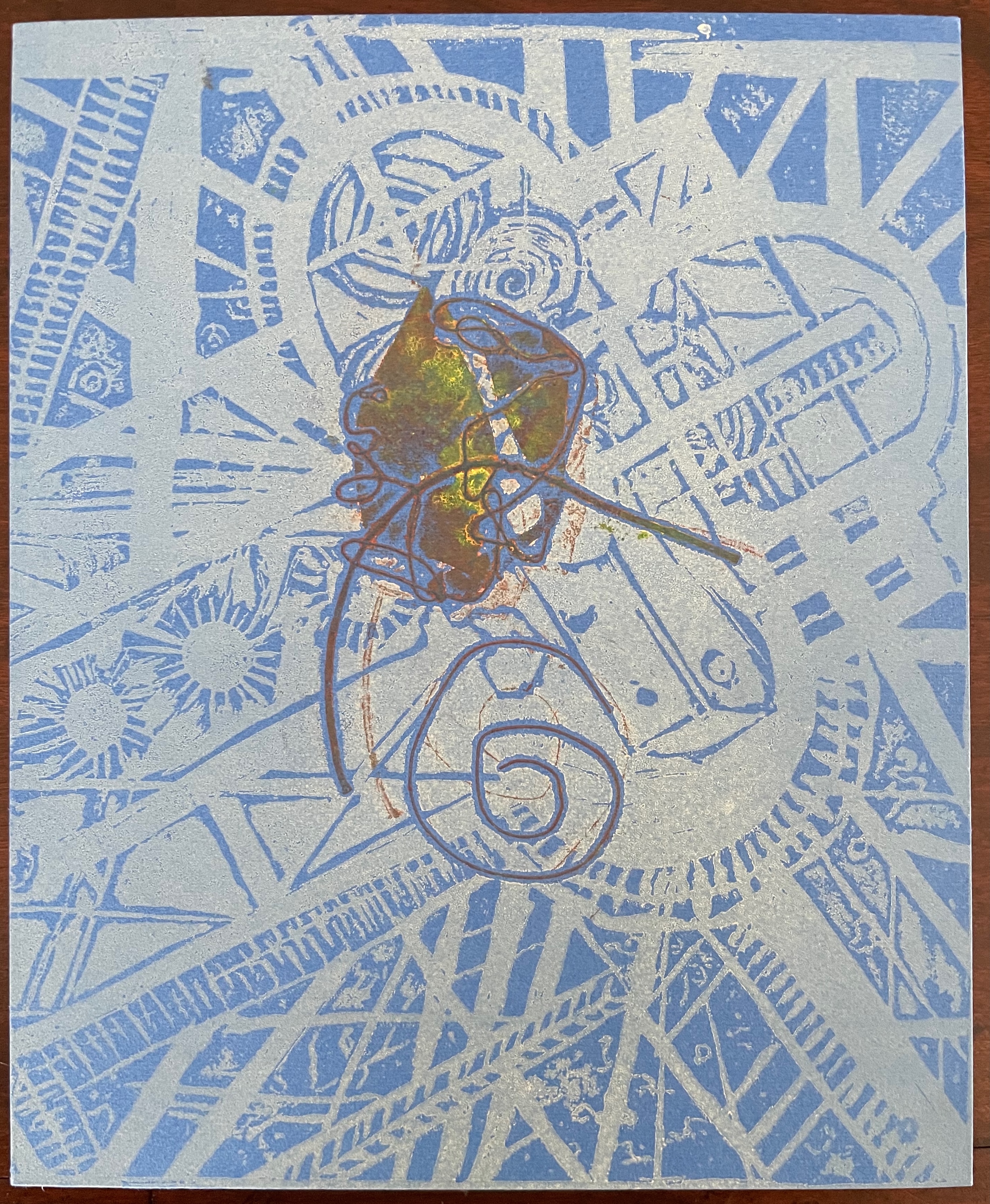
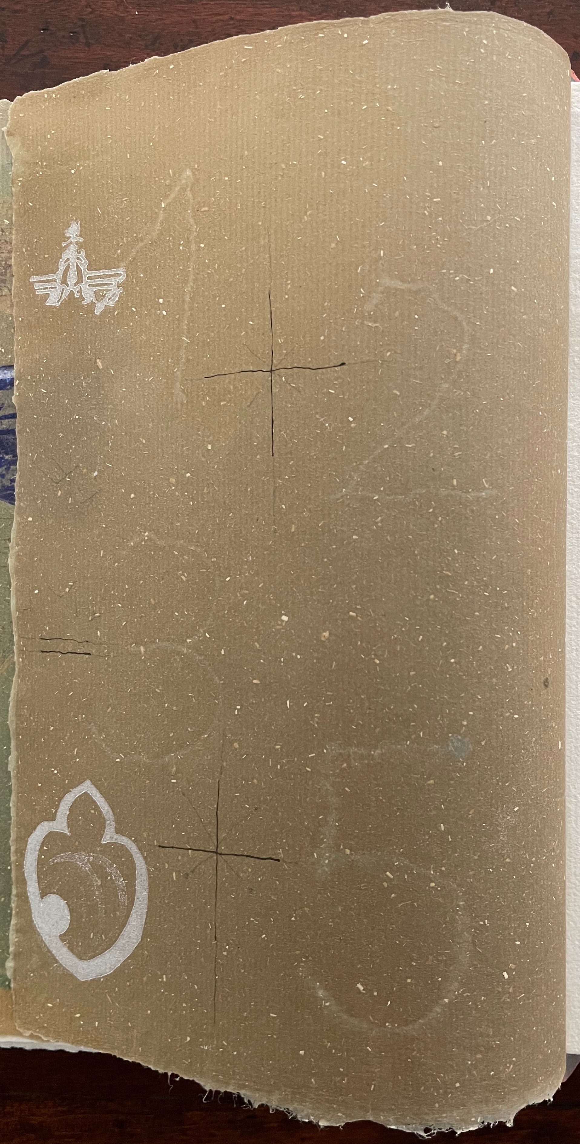
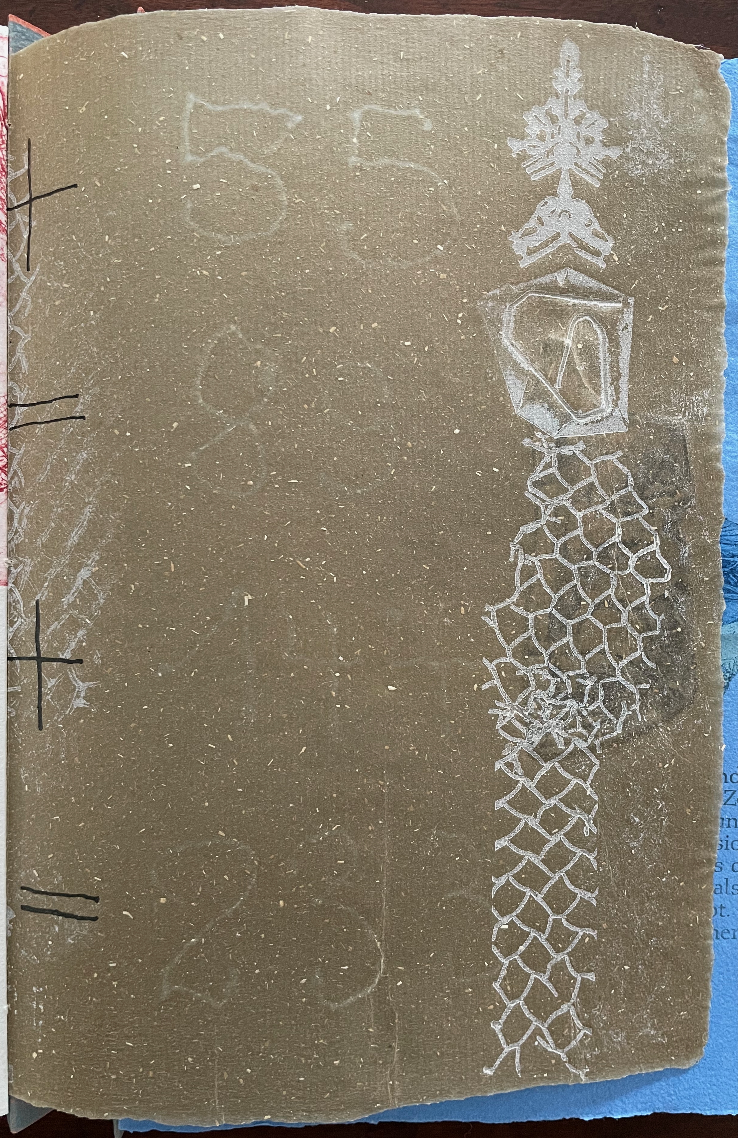
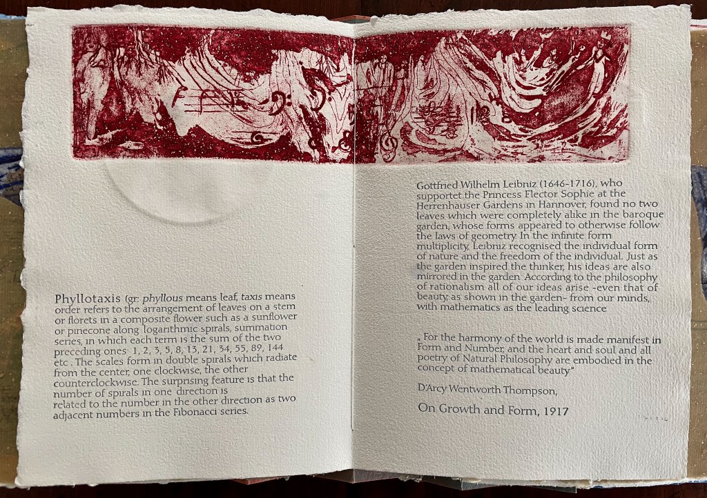
The front cover also announces another motif in those coils of thread below the young girl’s feet. Within the coils is the image of a Fibonacci spiral, which appears on the back cover and throughout the book in different ways. It can be found drawn and printed. It can be found in watermarks in the handmade paper. It can be found in the arrangement of florets in flax. Being a composite flower, flax blossoms display the spiral based on the Fibonacci sequence 1, 2, 3, 5 … 233, and so on. These numbers are waterjet-drawn on the pure flax paper below and explained in an entry printed on the adjacent plain handmade paper folio. By appearing on the book’s front and back covers, the spiral echoes the beginning and ending cycles of birth and rebirth the flax goes through in the folktale.
The Fibonacci spiral on the front and back covers.
The sequence of Fibonacci numbers 1, 2, 3, 5 … 55, 89, 144, 233 … watermarked on handmade flax paper with a water jet.
Description of the Fibonacci spiral side by side with quotation from Thompson’s On Growth and Form (1917), drawing on Leibniz’s Rationalist philosophy.
To organize and weave her motives together, Beisinghoff uses an accordion spine to whose peaks eleven sets of folios are sewn with linen thread. Three of the eleven are 4-page folios consisting of blue handmade paper. Another three 4-page folios consist of pure flax paper (handmade by John Gerard). The remaining five gatherings have 8-page folios, each consisting of a pure flax paper folio around a blue or plain one.
Side and top views of the accordion spine.
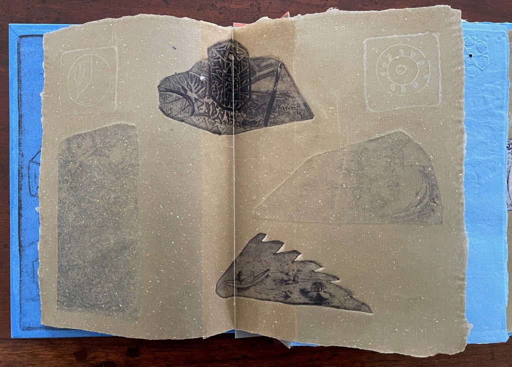
The first pure flax folio begins the book, displaying two title pages (German and English) and two etchings on its first and last pages. In the center spread, two more etchings appear. A watermark symbolizing phyllotaxis shows through in the upper left, balanced by a watermark with a cross section of a flax stalk in the upper right of the center spread. The texture and weight of the flax paper allows the impress and shadow of the etchings to stand out on both sides against the inking and watermarks.
Inside front cover and Tau blau title page and etching.
Center spread of first flax paper folio. Note the watermarks in the upper left and right corners.
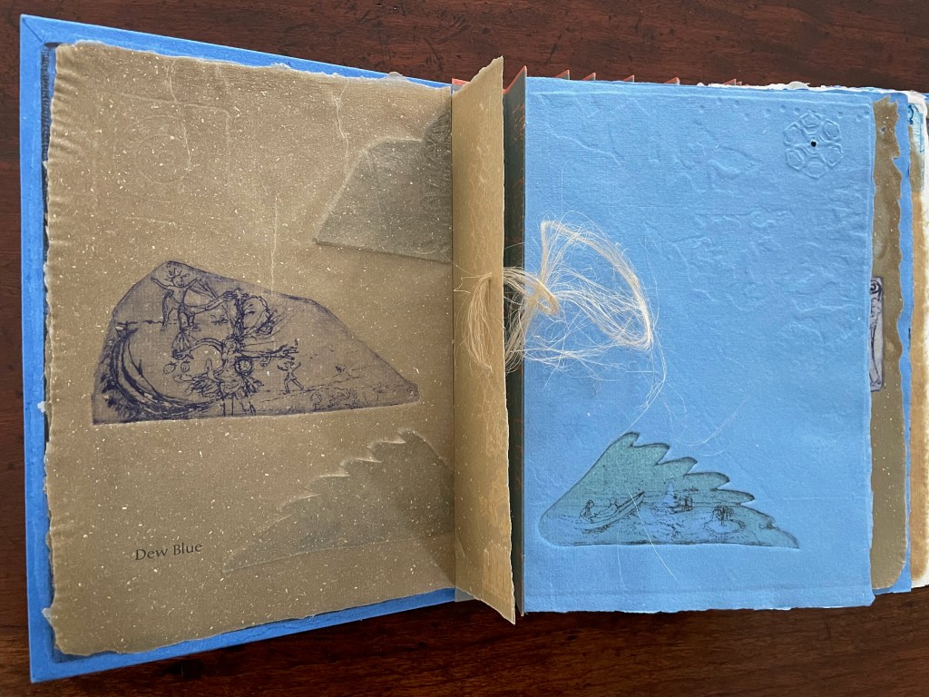
Dew Blue title page and etching, loop of flax fibers, first page of blue handmade paper folio; note its boating image repeated from the prior center spread.
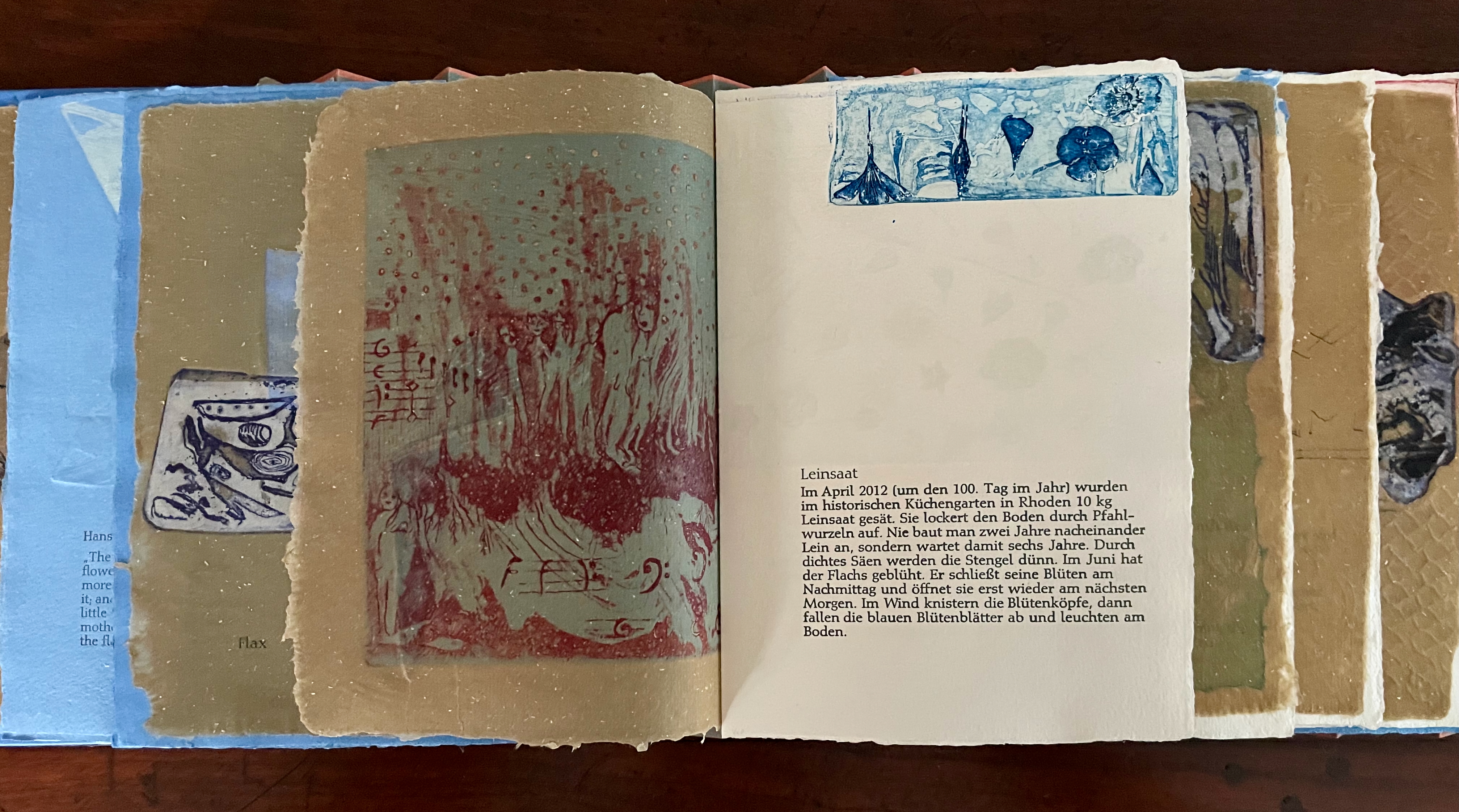
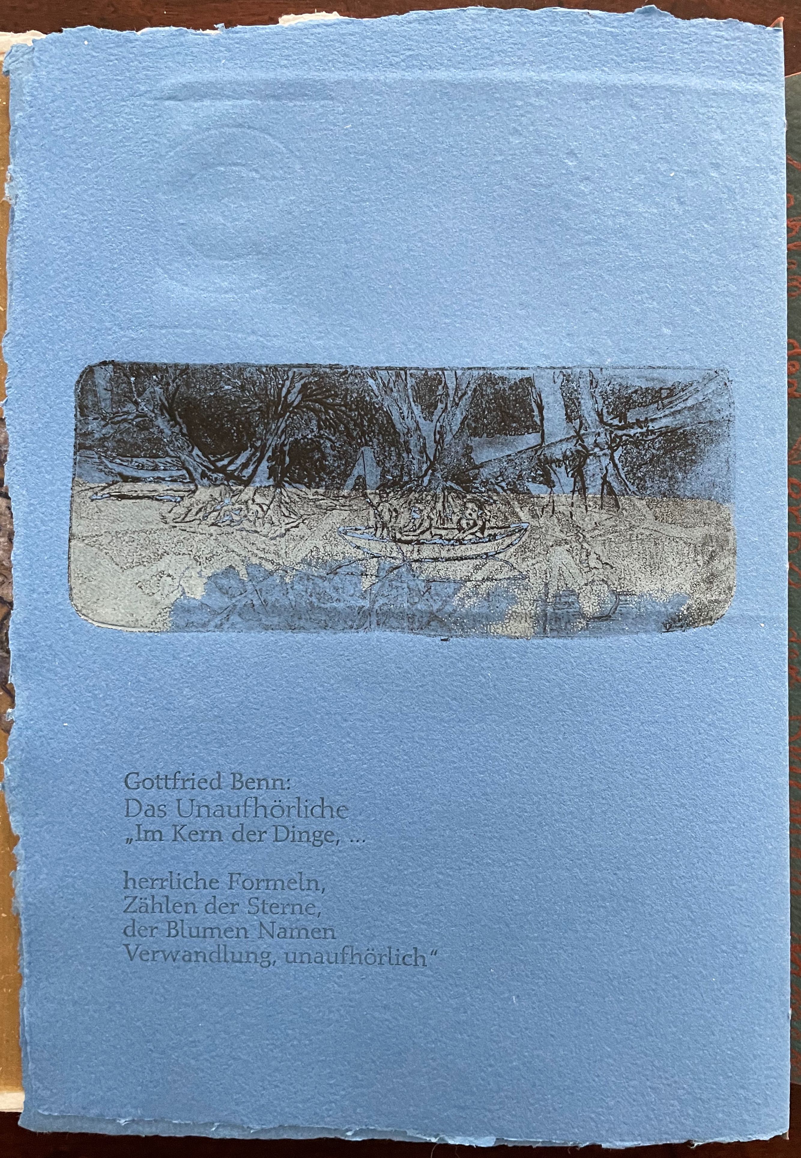
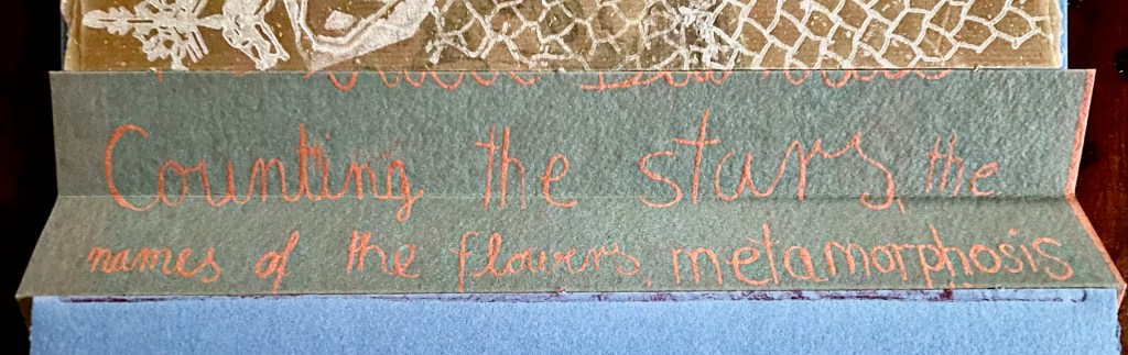
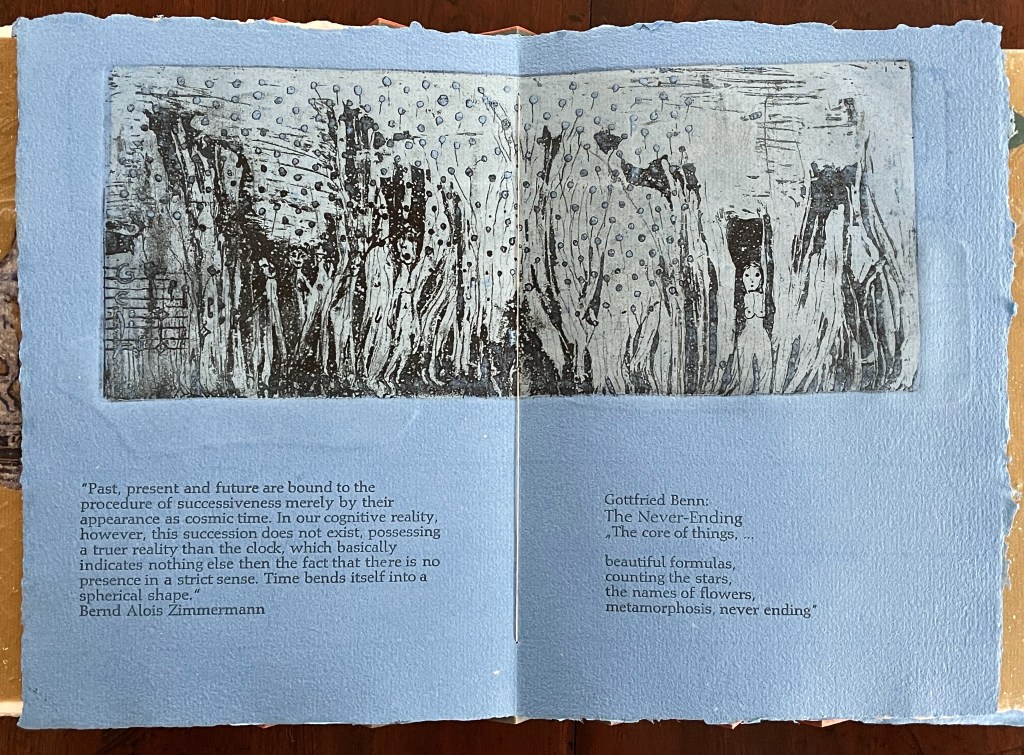
Following the pure flax folio, the first all blue folio gives us that introductory excerpt from Andersen’s fairy tale. Next comes a description of flax comes from Leonhart Fuchs’ Book of Herbs (1543), then the series of planting and harvesting observations from Beisinghoff, then the refrain from Clemens Brentano’s poem “Ich darf wohl von den Sternen singen” (1835), then philosophical observations drawing on G.W. Leibniz from D’Arcy Wentworth Thompson’s On Growth and Form (1917), a much-quoted theorem of musical composition from Bernd Alois Zimmermann’s Intervall und Zeit (1974), and finally (below) a passage of text by Gottfried Benn from the Hindemith oratorio Das Unaufhörliche / The Neverending (1936). In the valleys of the accordion spine, some of the lines from Andersen, Fuchs, Beisinghoff and Been appears handwritten in orange paint.
Translated fragment of Benn’s lyrics for Paul Hindemith’s oratorio Das Unaufhörliche / The Neverending (1936).
Even with these additional texts, Andersen’s fairy tale remains the most central text in Tau blau / Dew Blue, despite the brevity of its excerpt. Brentano’s Romantic/religious expostulations (“O Star and Bloom, Garb and Soul, Love, Hurt and Time for evermore”) sound like those of the plant in the story’s final passage. The occurrence of Fibonacci’s spiral in the plant may be a physical fact, but Beisinghoff turns it into something more mystical by placing the description of phyllotaxis next to Leibniz’ and Thompson’s transcendental view of mathematical science and natural philosophy. Likewise she links the texts from Bernd Alois Zimmermann and Gottfried Benn to the fairy tale by placing them beneath the etching that captures the flax plant’s singing and dancing into its transformation by fire.
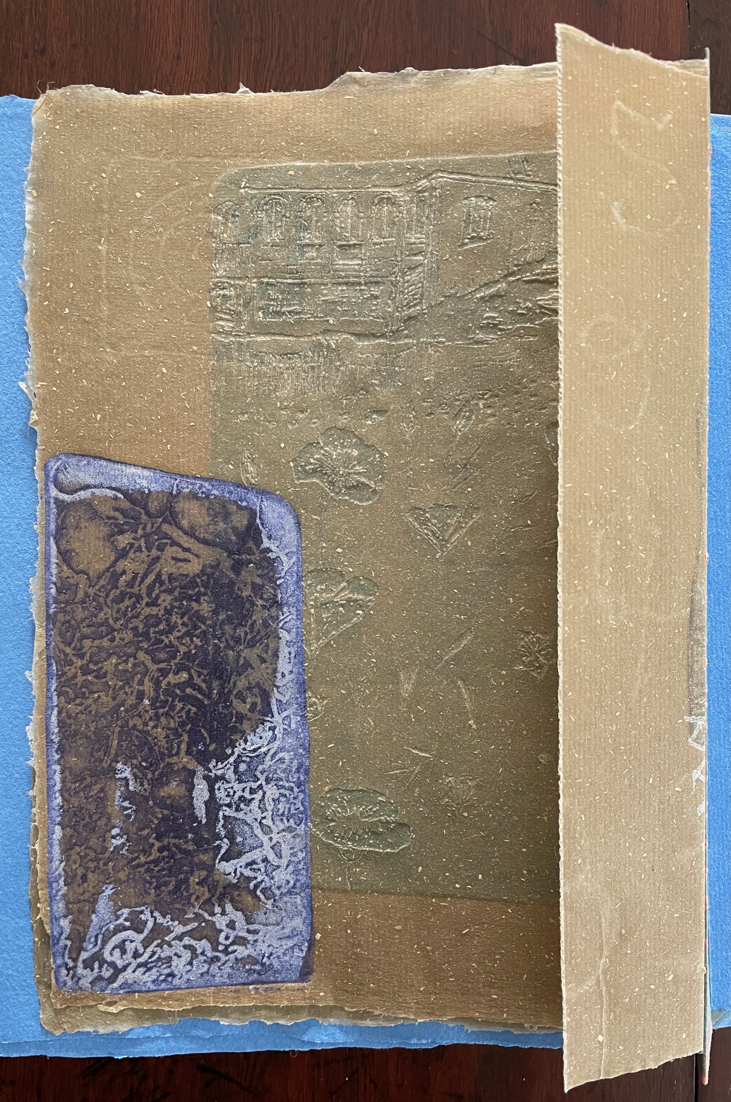
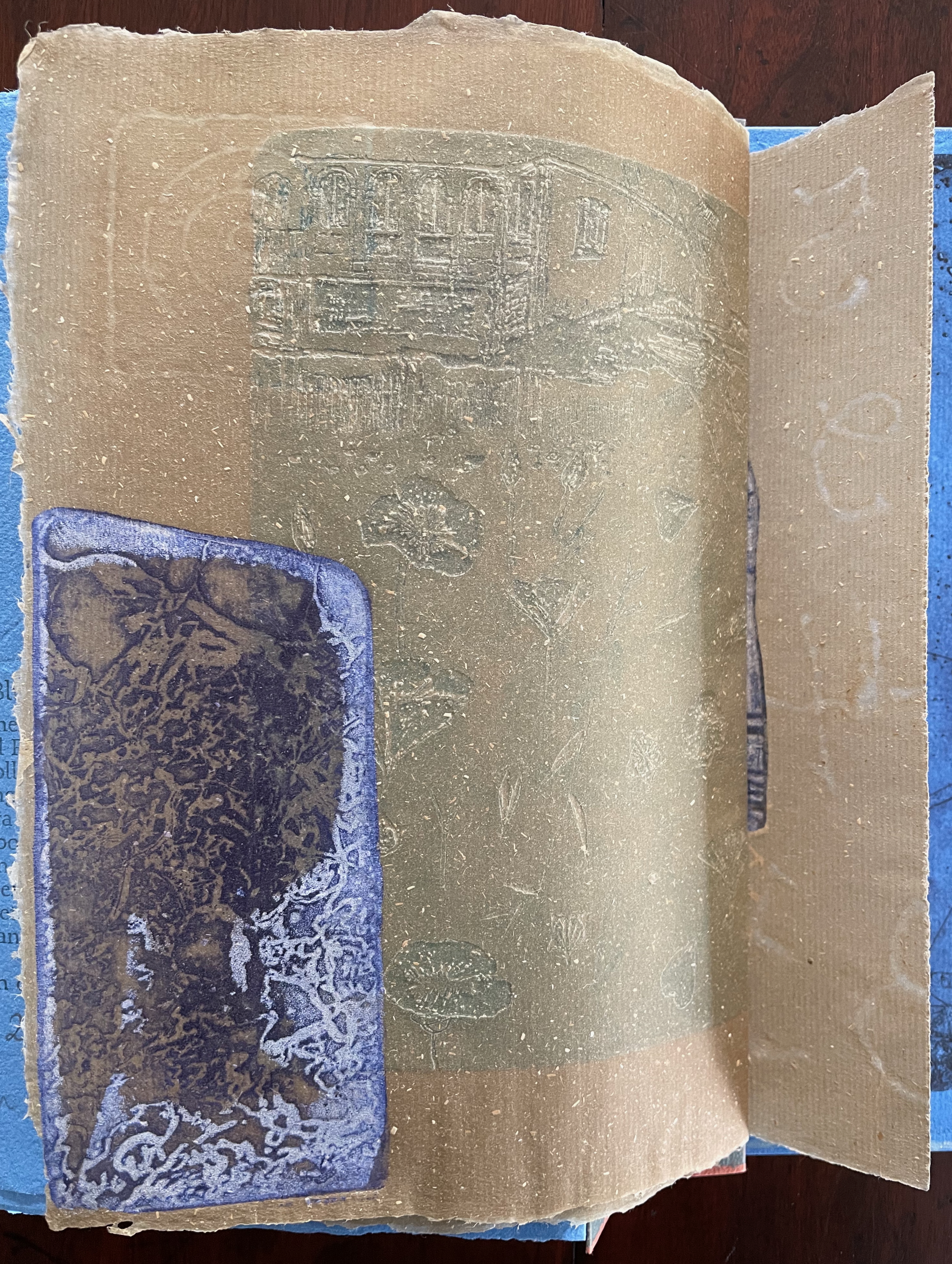
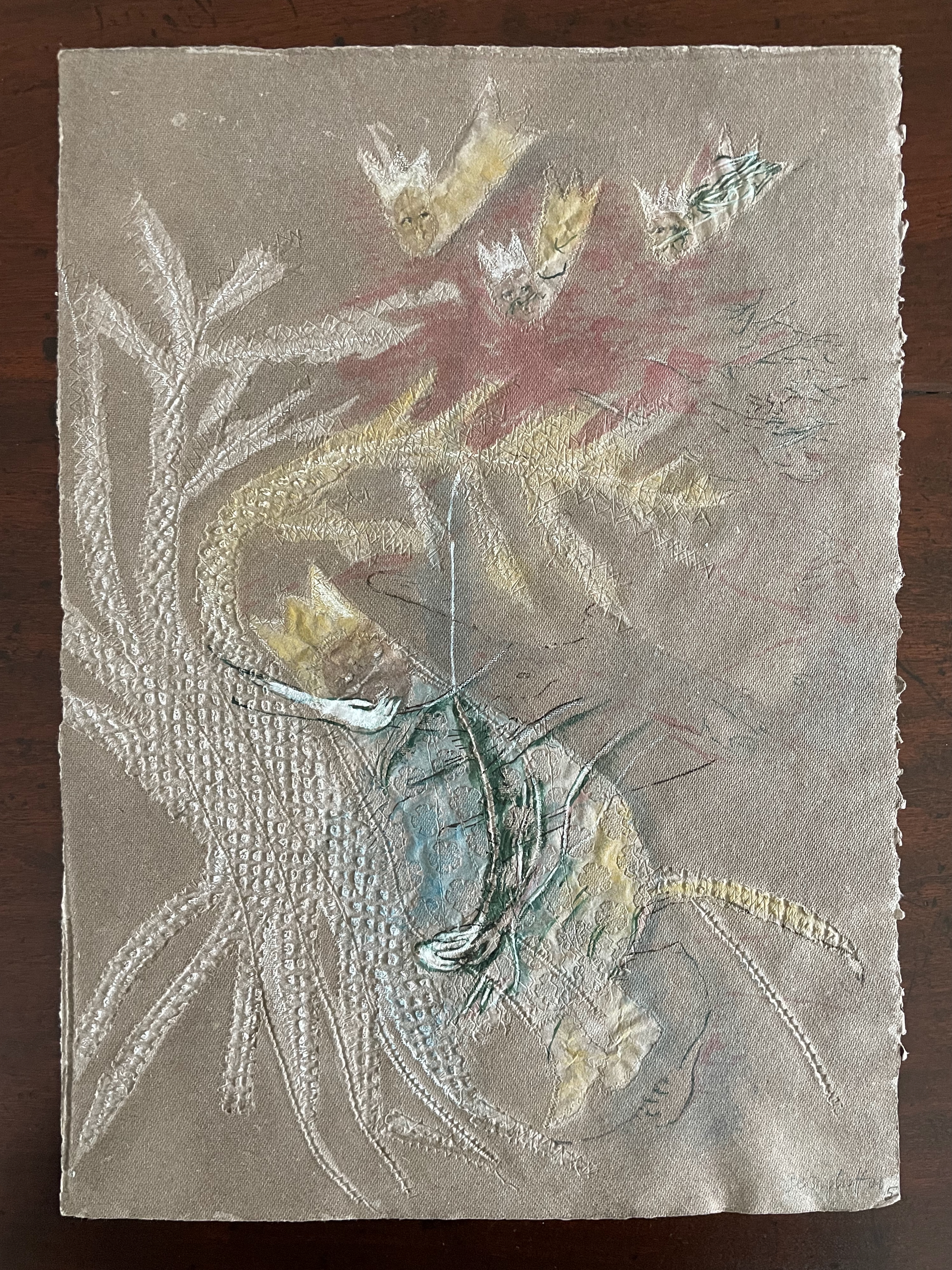
Below is the final folio of the work. Like the first, it is made completely of flax paper, but its center spread offers a fuller image: flax blossoms and stalks float in the foreground, and in the background is a sketch of Beisinghoff’s residence where she grows her flax. Like the Fibonacci spiral on the front and back covers, the first and last flax folios round out the work. But go back and listen for the hidden sound installations accompanying Dew Blue. Noticing Beisinghoff’s abstract musical notation, indulge yourself with recordings of a Swedish folk song (“Today is supposed to be the big flax harvest” here or here) to which the notation and phrases allude, and as the flax papers turn and wave on their accordion peaks, listen carefully for their musical rustle.
The final pure flax paper folio.
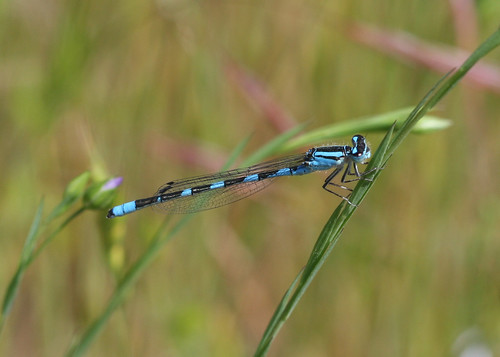
Tule Bluet damselfly perched on flax leaf. Photo: John Riutta, The Well-Read Naturalist (2009). Displayed with permission.
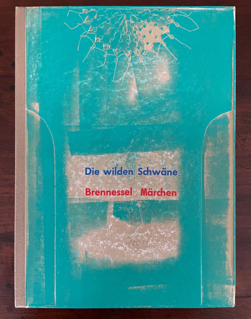
Die wilden Schwäne (2001)
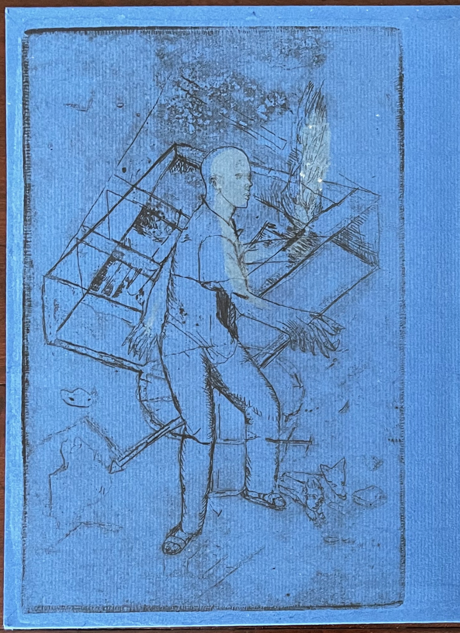
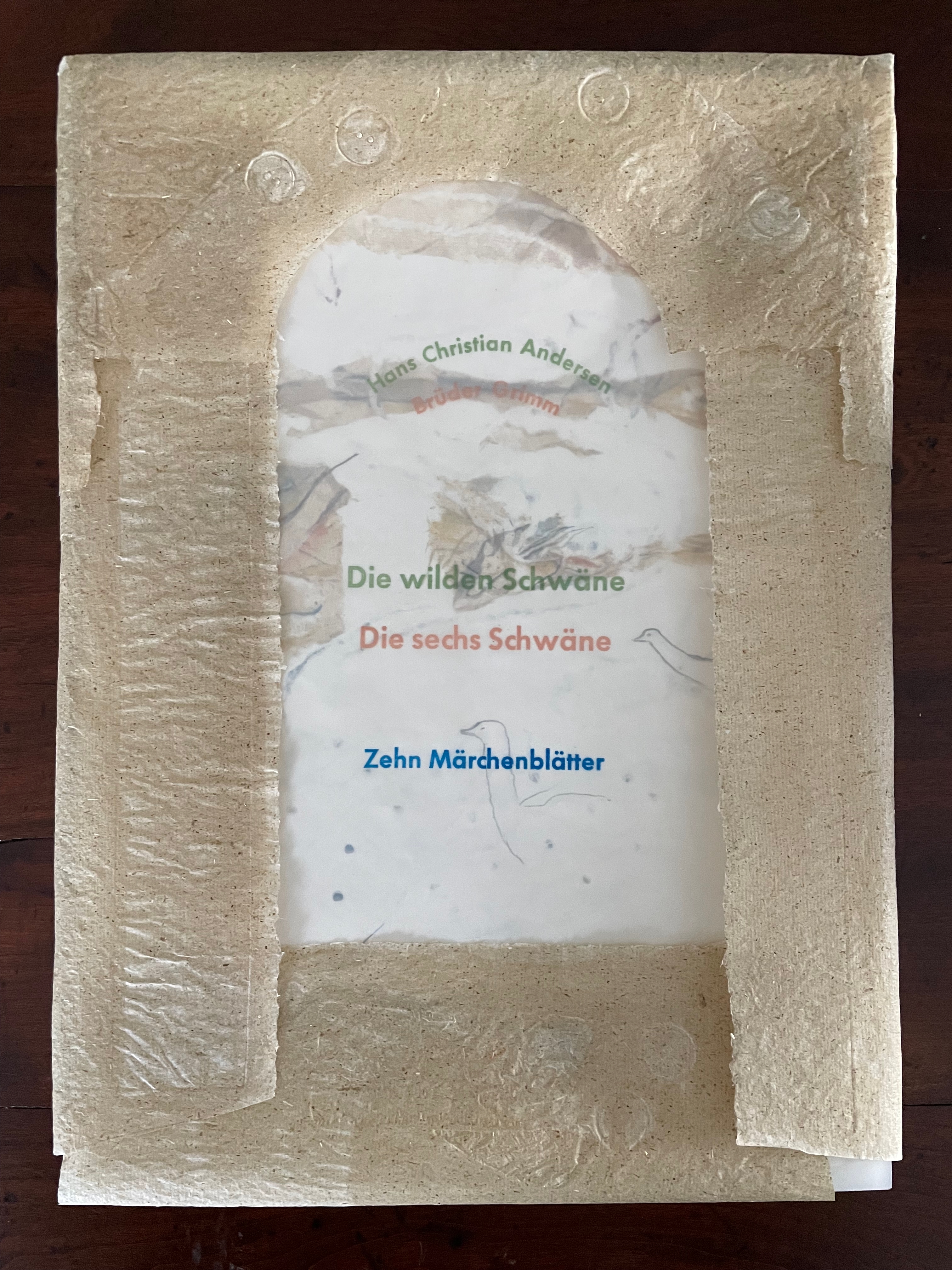
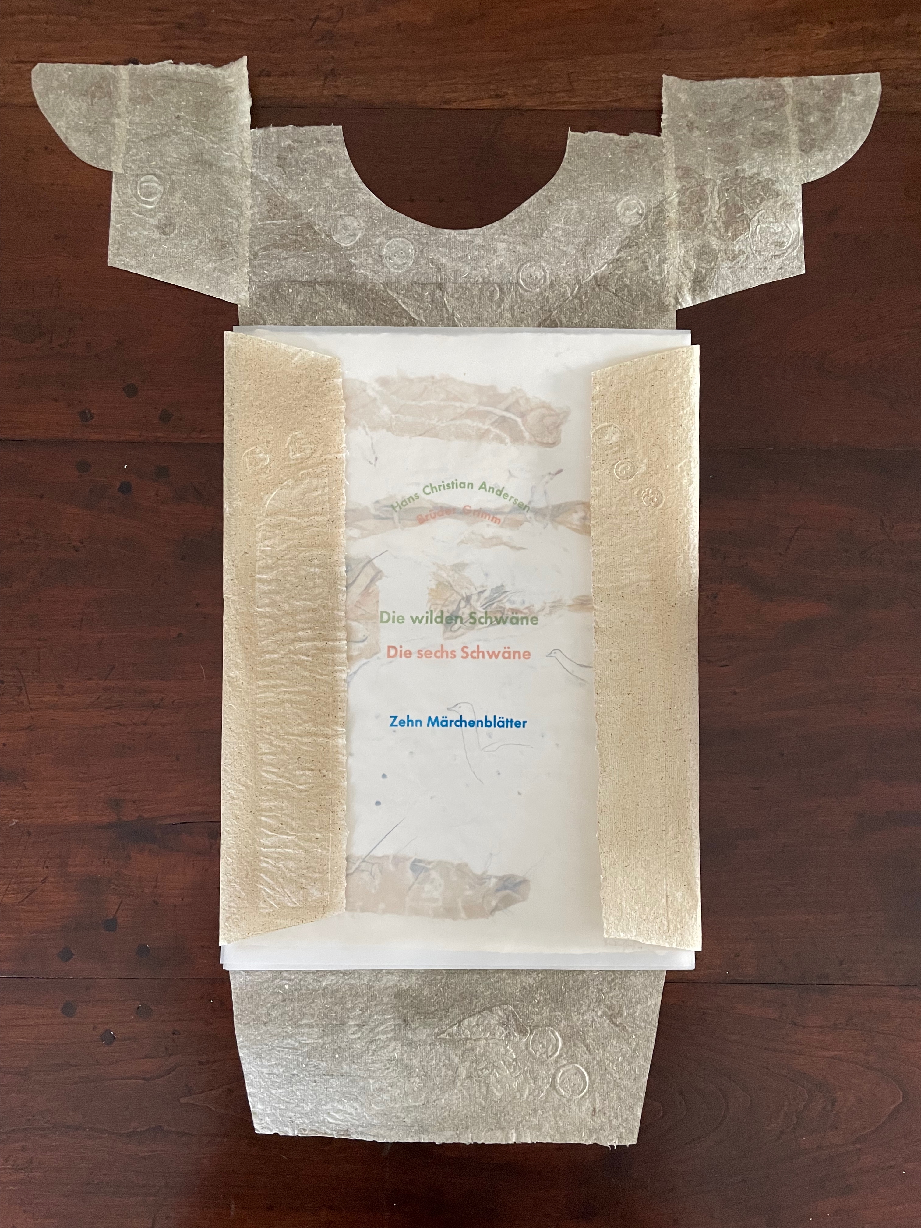
Die wilden Schwäne (2001) Barbara Beisinghoff Box with embossed cover holding folios wrapped in chemise. H35o x W250 mm. 18 folios. Edition of 25, of which this is #6. Acquired from the artist, 20 December 2024. Photos: Books On Books Collection.
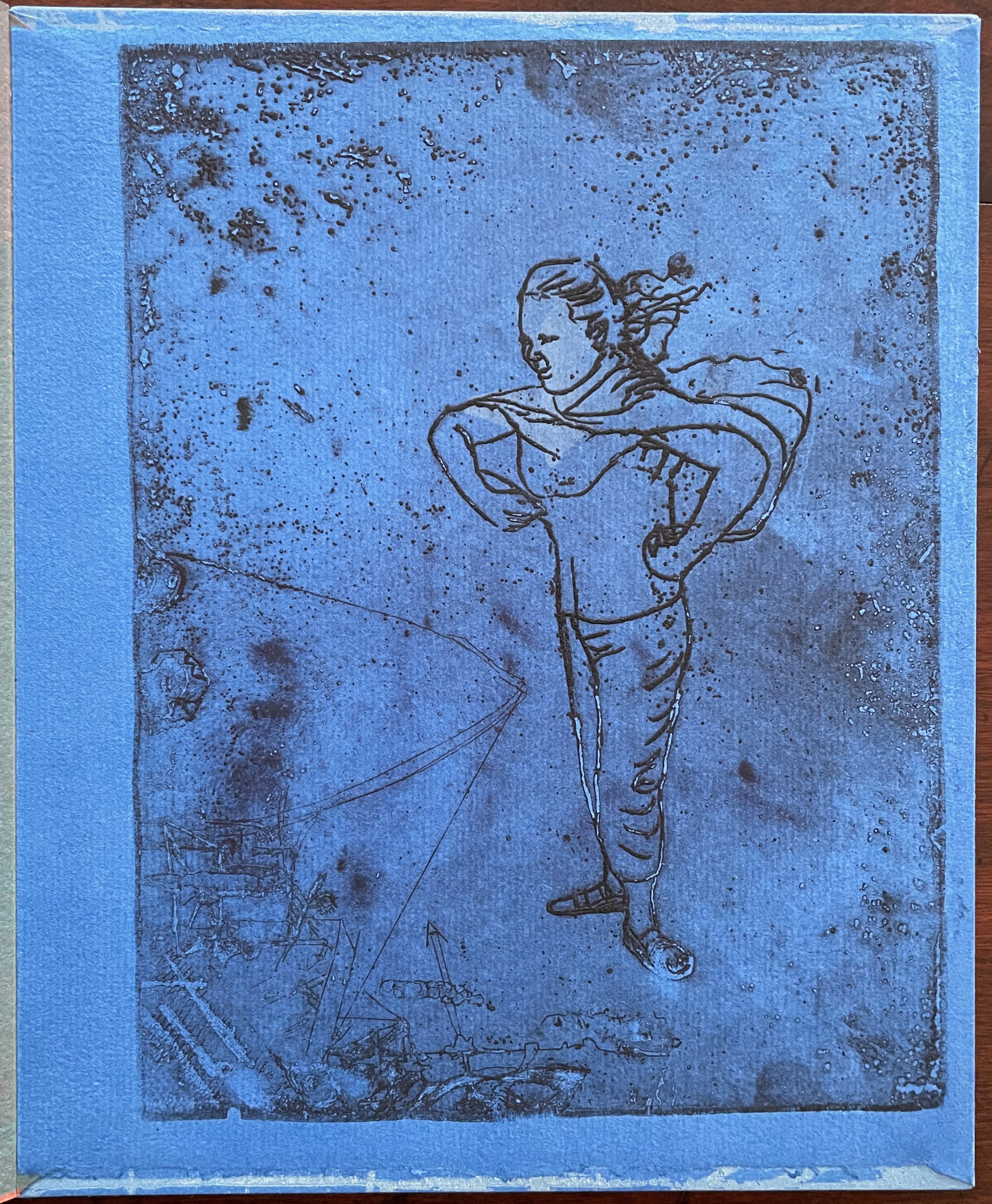
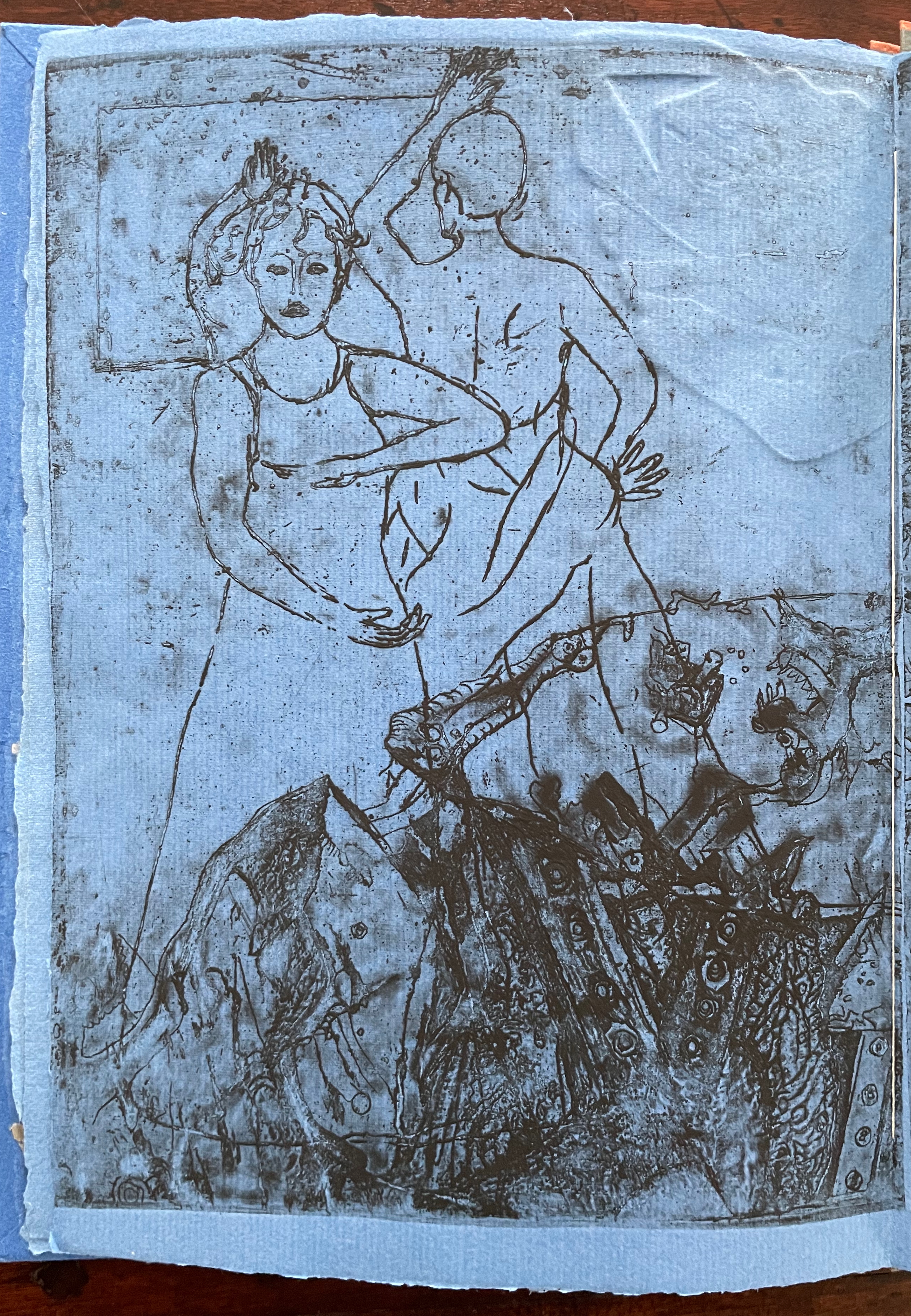
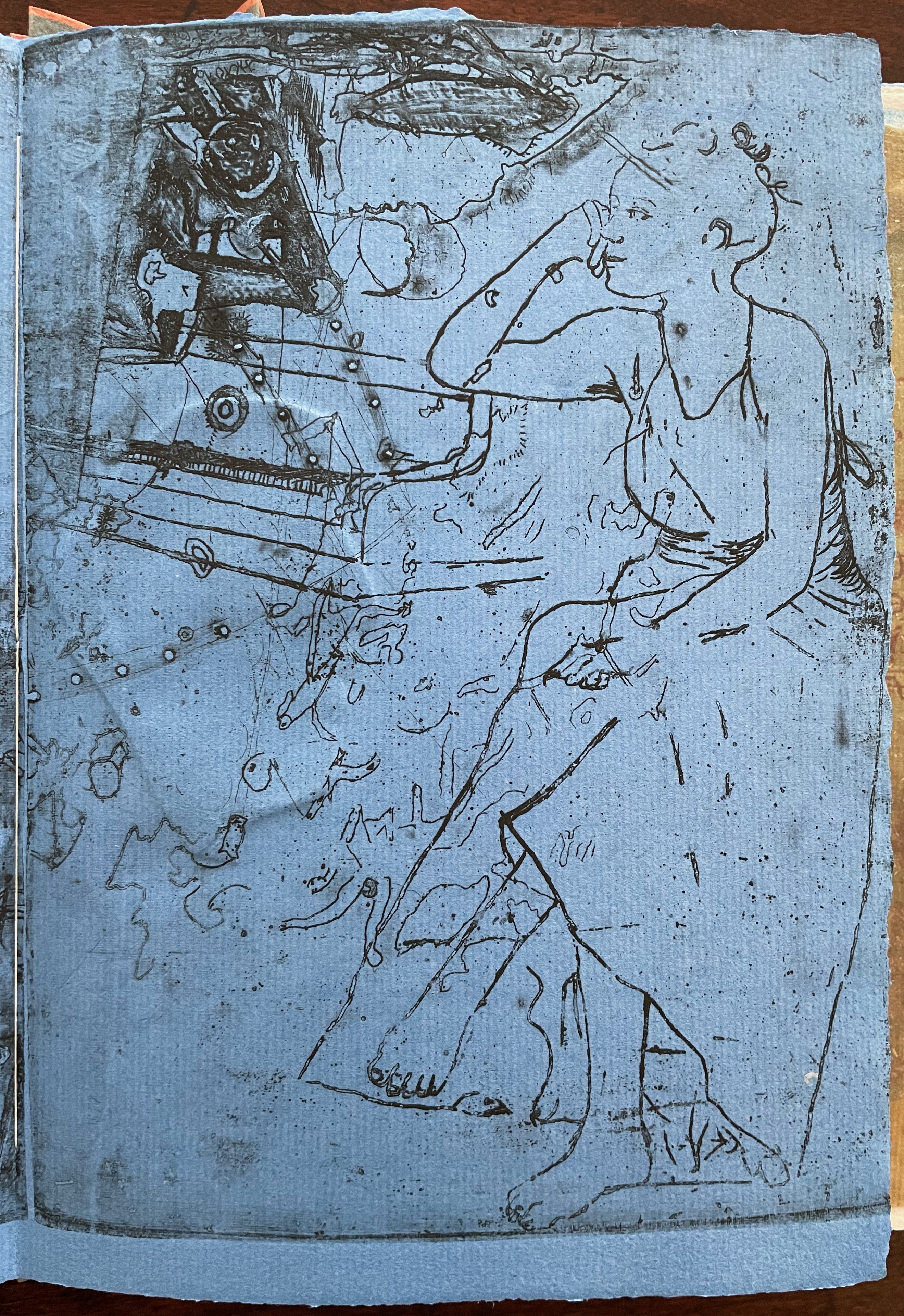
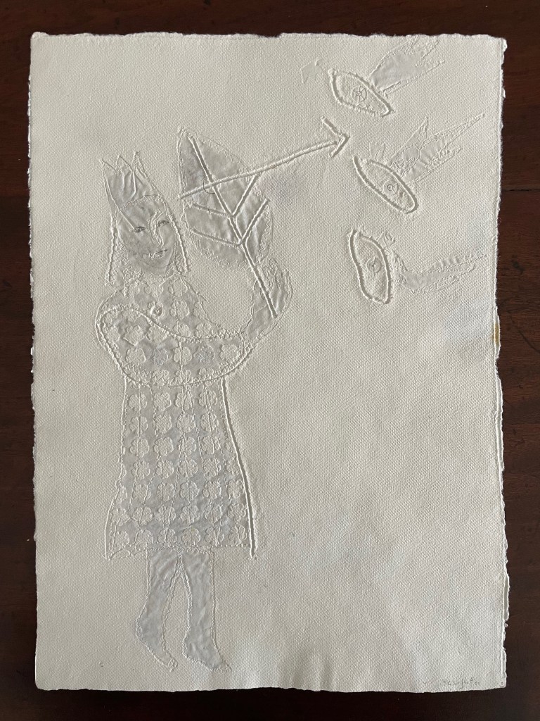
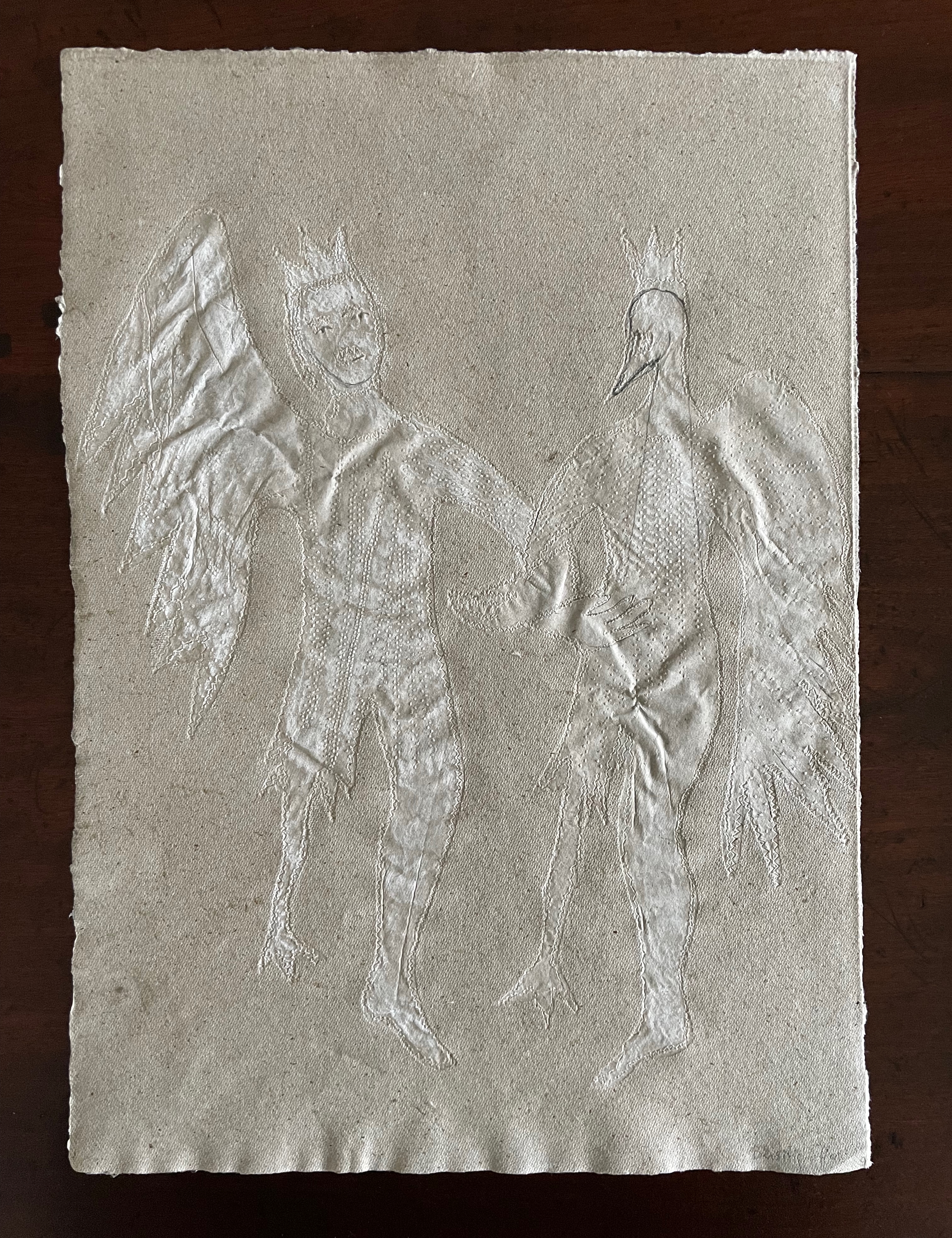
Barbara Beisinghoff’s Die wilden Schwäne is an exemplar of collaboration and craft. In it, she even requires collaboration between Hans Christian Andersen and the Brothers Grimm. Andersen’s Die wilden Schwäne and the Grimms’ Die sechs Schwäne are based on the same tale of brothers turned into swans who are saved by their sister Elisa’s diligent and mute harvesting, pulping, spinning and sewing of stinging nettles into shirts that break the spell when donned. H.C. Andersen, however, is verbose and elaborate in his telling (even including vampires!), and Beisinghoff has done a bit of nipping and tucking with the more succinct Brothers Grimm to create a version more suited to the artist’s book she creates.
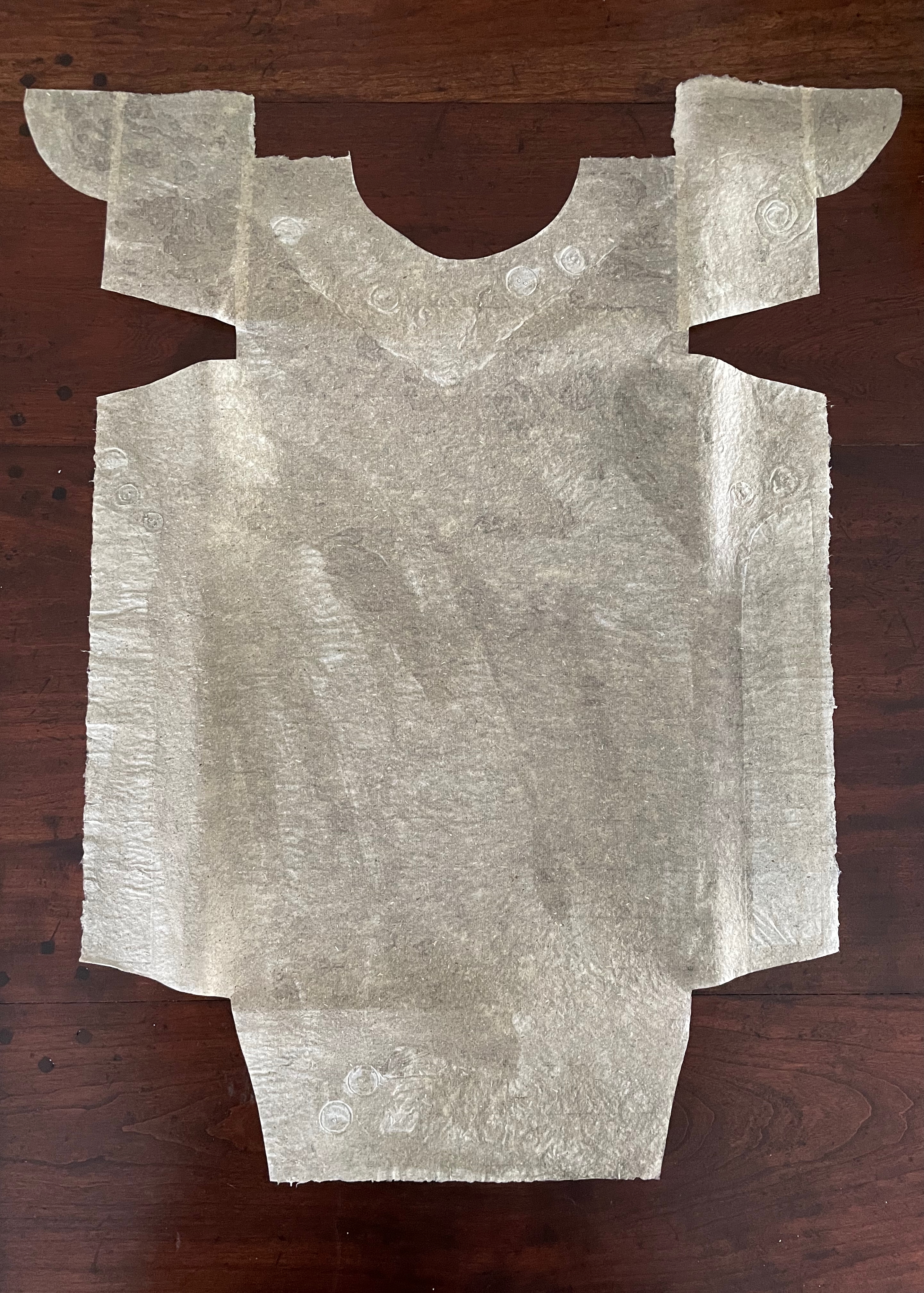
To match Elisa’s effort with stinging nettles, Beisinghoff enlisted the collaboration of Johannes Follmer, the owner of a paper mill. Together they obtained cultivated stinging nettles from the Institute for Applied Botany in Hamburg, cut the fibers, left them to rot, boiled them into a pulp, mixed that with water in a vat, scooped up layers in a sieve embroidered with illustrations, couched the sheets, then pressed and dried them into paper. Beisinghoff applied further drawings with a water jet, watercolor and pencil to the watermark-embossed sheets to illustrate aspects of the tale. To present the Andersen/Grimm “collage”, Beisinghoff had the type set and printed at the Gutenberg Museum. Andersen is printed in light green and Grimm in light red on seven numbered translucent sheets and interleaved with the nine folios of paper art (two more translucent sheets carry the cover page and colophon). To wrap the folios together, Beisinghoff made an embossed chemise or “feather dress” of pure nettle fiber, which could represent Andersen’s description of the brothers’ blowing off each other’s feathers every evening when the sun has set or one of the shirts that their sister makes to break their spell.
The “feather dress” of stinging nettle fiber.
“The King’s little daughter was standing in the cottage room, playing with a green leaf, for she had no other toys. She pricked a hole right through the leaf, looked up at the sun, and there it was, she saw the clear eyes of her brothers, but every time the warm rays of the sun shone on her cheeks, she thought of all their kisses.” Translation with DeepL.
“When she had fallen asleep, it seemed to her as if she were flying high through the air, and she met a fairy, beautiful and radiant, yet she looked very much like the old woman who had given her berries in the forest and told her about the swans with gold crowns on their heads.” Translation with DeepL.
“The swans swooped down to her and lowered themselves so that she could throw the shirts over them: and as she touched them, the swan skins fell off, and her brothers stood before her in the flesh, fresh and beautiful.” Translation with DeepL.
“Barbara Beisinghoff (head in the background) covers the frame with this transparent, embroidered and sewn gauze, which is used to scoop and emboss her nettle papers. This is how her large-format watermark illustrations end up on the sheets.” Translation with DeepL. Peter Holle. 30 August 2001. Frankfurter Rundschau. Photo: Oliver Weiner.
This art by watermarking recalls that of other artists in the collection: Fred Siegenthaler and Gangolf Ulbricht, in particular. The technique of pulp painting also finds other practitioners in the collection: Pat Gentenaar-Torley, John Gerard, Helen Hiebert, Tim Mosely, Maria G. Pisano, Taller Leñateros, Claire Van Vliet and Maria Welch. Beisinghoff’s blend of embroidered watermarks, waterjet marking and pulp painting, however, creates a bas relief effect that is echoed only in the collection’s works by Mosely, Taller Leñateros and Van Vliet, albeit achieved differently. These workings of the substrate — as material, color, surface, and even narrative — with the workings of book structure is one of the more magical locations of book art. It is perfect for Beisinghoff’s metamorphical interpretation of the Andersen/Grimm fairy tale.
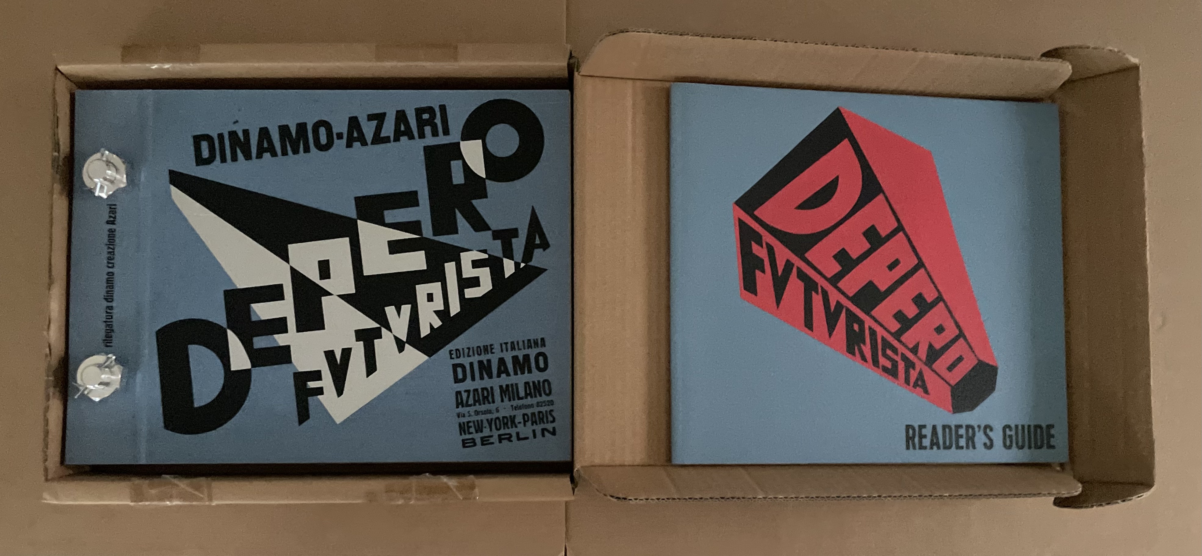
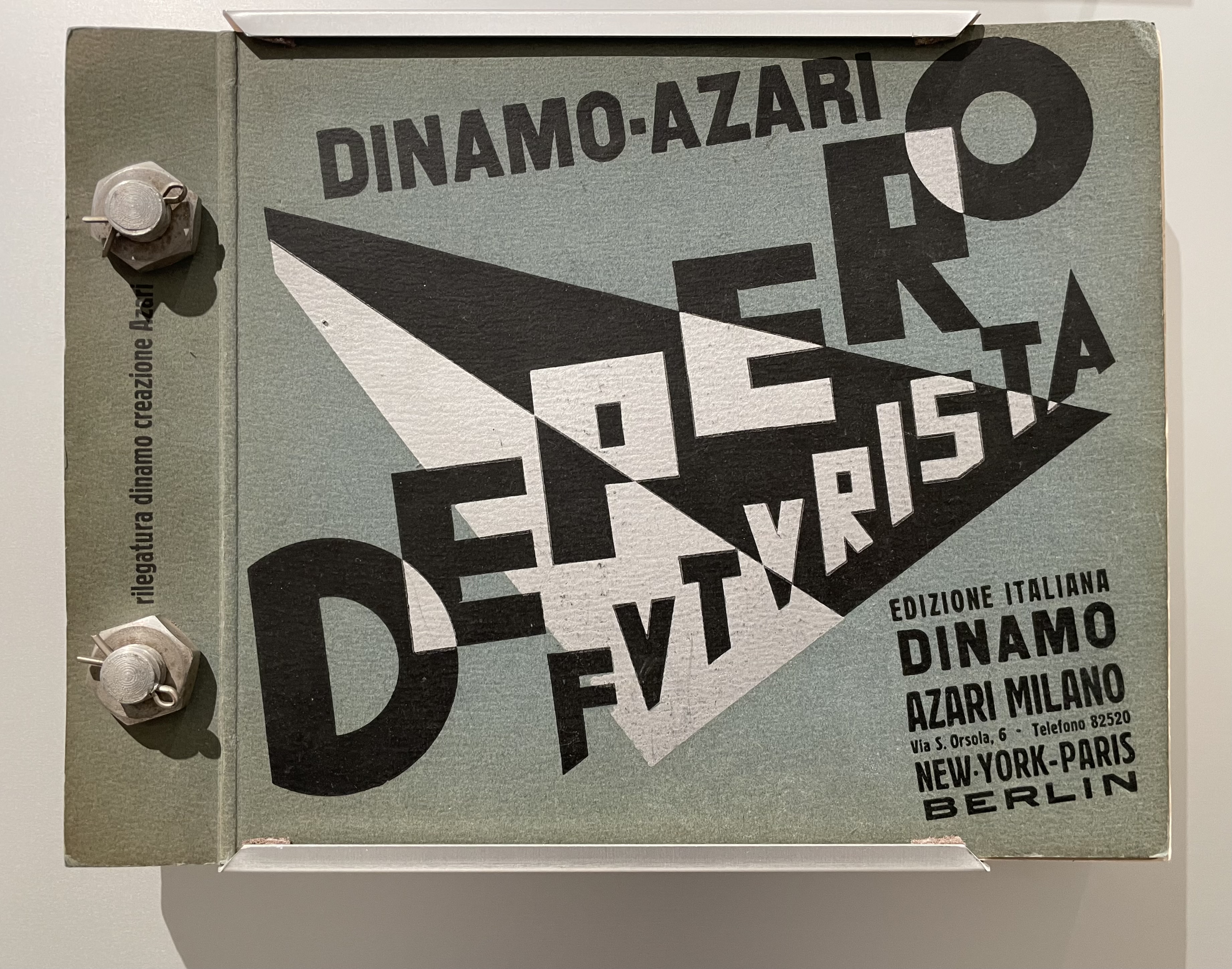
Fortunato Depero’s Depero Futurista: Imbullonato (the “Bolted Book”) stands at the center of an uneasy off-rhyming of history. Where Depero and the avant-garde Futurists of the early 20th century rode the waves with Benito Mussolini and fascism, this 2016/17 facsimile edition of Depero Futurista coincided with the emergence of America’s “Tangerine Mussolini” and his MAGA movement.
In 2024, the original and facsimile editions of Depero Futurista appeared in an exhibition at the American Academy in Rome just as Trump was elected as the first Convict-in-Chief. And five days before he was sworn in, the Estorick Collection of Modern Italian Art in London presented its copy of the original edition in an exhibition devoted to the poet Filippo Tommaso Marinetti, leader of the Futurist movement, good friend of Depero, and peripatetic pal to Mussolini.
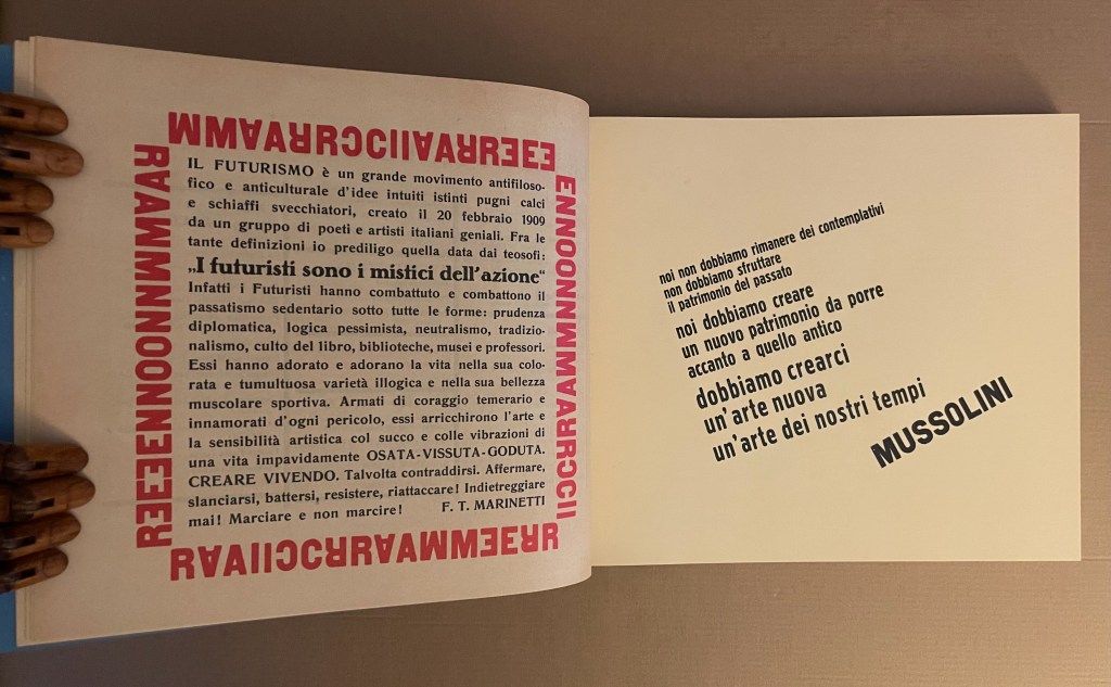
Depero Futurista’s peculiar off-rhymings in history prompt questions about the intersection of art and our social contract. How is it that fascism weighs on Depero’s art but has not suffocated it, even when the association peeps out as it does in Imbullonato? How is it that communism weighs on El Lissitzky’s About Two Squares (1922) but has not buried it?
Günter Berghaus’ Futurism and Politics provides a nuanced view of Futurism, Marinetti, Depero and their links with fascism. Fabio Belloni traces the rise, fall and rise of Depero in his essay “The Critical Fortune and Artistic Recognition of the Work of Depero“, which appeared in the journal of the now defunct Center for Italian Modern Art. Gianluca Camillini’s 2020 doctoral thesis traces the disconnects and remaining connections with fascism in Depero Futurista after the 1924 break between Futurism and Mussolini.
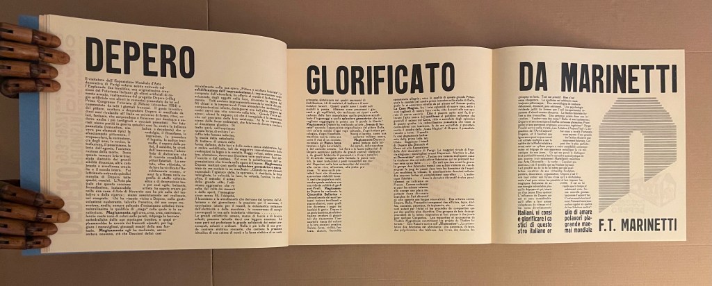
Perhaps Depero’s case contrasts helpfully with that of Ezra Pound. Like Depero, Pound was an enthusiastic supporter of Mussolini. Pound coopted Marinetti’s and Depero’s Futurism into his and Wyndham Lewis’ Vorticism. Unlike Depero Futurista, however, Pound’s poetry — especially the Cantos –foregrounds that enthusiasm. The frequency of its appearance in Pound’s poetry and its ugliness weigh more heavily than the few mentions of Mussolini in Depero Futurista. Depero’s and Marinetti’s hero-worship appears mostly in their poetry and prose but without Pound’s anti-semitism. The connection with fascism that remains in Depero Futurista, however, appears in the bellicosity and glorification of war by this “book machine”.
In the American Academy’s exhibition, Depero Futurista sits alongside the anti-racism of William Kentridge’s Portage (2000) and Kara Walker’s Five Poems Rainmaker (2002). How does (can?) art deliberately associated with fascist, statist or authoritarian movements rise above them to be celebrated and fruitfully juxtaposed with the works of today’s artists more associated with progressive causes?
For the Books On Books Collection, Depero is also an important figure in the overlap of typography and the alphabet with architecture and the artist’s book. Depero defined typographic architecture as
that special architectural form suggested by typographie types which has been used with great efficacy in advertising artistic constructions, in pavilions, kiosks and advertising plastics of national and international exhibitions of decorative art and in industrial and commercial exhibitions. The painter Depero created, in 1927, the book pavilion of the Bestetti- Tumminelli and Treves publishing house at the international exhibition of decorative art at Monza, inspiring his work to this conception of typographie architecture.(p. 18)
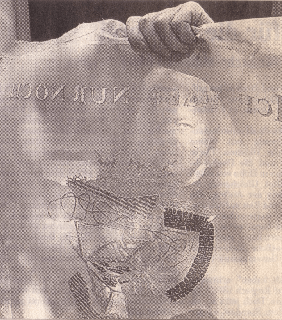
And he reproduced an image of it in Depero Futurista.
From Depero Futurista: “Padiglione del Libro” (1927).
The book pavilion is not bellicose. It is bombastic as is much of what is in Imbullonato. The blast of its typography has much in common with that in Kurt Schwitters’ Die Scheuche Märchen (1925) and other artists’ works not associated with fascism, authoritarianism or statism. To focus on Imbullonato‘s innovation, technique, typography or cross-fertilization with architecture and compare and contrast them with that of other artists is not to forget its entanglements. In fact, the difficulty in focusing is a reminder of how art, too, can be bolted to the shameful.
Camillini, Gianluca. 2020. “Fortunato Depero and Depero futurista 1913–1927“. Dissertation thesis. Reading: University of Reading. “In the two reprints of Depero futurista 1913–1927 (1978 and 1987 by SPES Firenze), Luciano Caruso also repeatedly writes ‘libromacchina imbullonato’ (bolted machine-book, Caruso, 1987, 36).” (p. 14).
Caruso, Luciano (ed.) and Fortunato Depero. 1987. Depero Futurista. Firenze: Studio per Edizioni Scelte Salembeni.
Caruso, Luciano (ed.) and Fortunato Depero. 1978. Fortunato Depero Futurista. Firenze: Studio per Edizioni Scelte Salembeni.
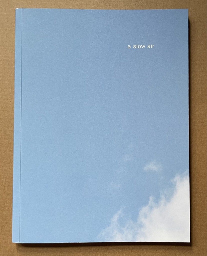
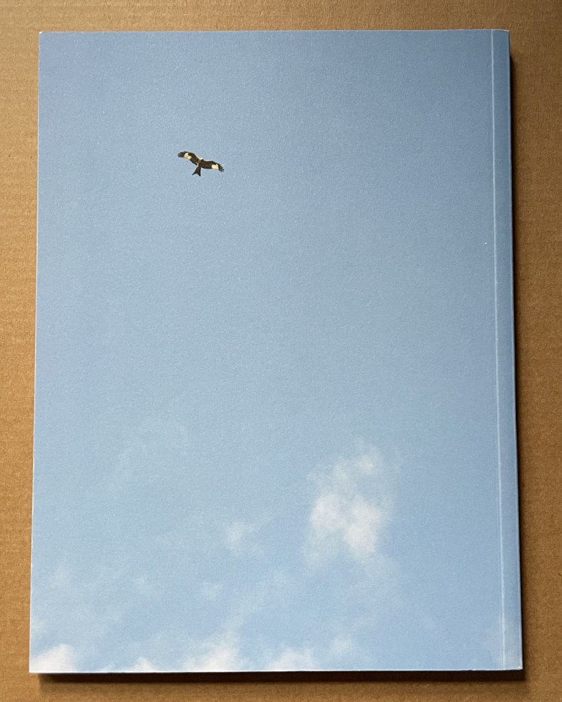
A Slow Air (2016) Thomas A. Clark and Diane Howse Perfect bound softcover. H200 x W150 mm. 64 pages. Edition of 750. Acquired at the Small Publishers Book Fair, London, in 2018. Photos of the work: Books On Books Collection.
If you live where red kites thrive, you will see them most often singly, in pairs or threes. If you are lucky, you may see as many as eight or ten at a time. Near Harewood House in West Yorkshire where red kites were reintroduced in 1999, there are hundreds. In 2016, photographer/artist Diane Howse (Countess of Harewood) and poet/artist Thomas A. Clark collaborated on an exhibition at Harewood House: the grove of delight. Using objects, words and images, the exhibition turned the house’s Terrace Gallery into a symbolic grove; also displayed was a series of 15 photographs by Howse of red kites over Harewood. For the exhibition and under the direction of Peter Foolen, the diligent Dutch publisher of herman de vries, Peter Liversidge and others, A Slow Air (the book) was produced and published by Harewood House. Foolen and the artists have assembled and manipulated the photos in a sequence of color and image that exerts a forward movement like a film or narrative. Like a real sighting of these birds circling and banking as if to a slow musical air, the book mesmerizes.
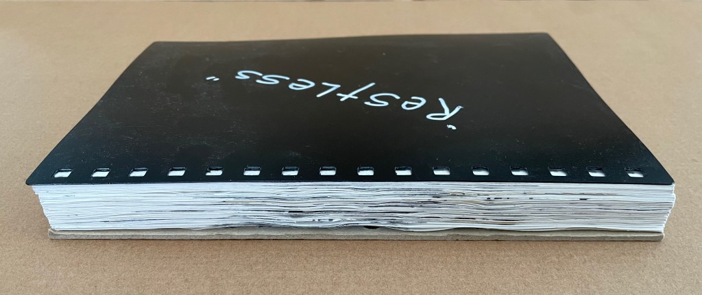
Restless (2020) Jacobus Oudyn Loose sheets from plastic comb bound notebook in a clamshell box covered in Japanese paper. Box: H240 x W170 x D40 mm. 60 pages. Unique. Acquired from the artist, 2 January 2024. Photos: Books On Books Collection. Displayed with permission of Jacobus Oudyn.
Restless consists of a continuous drawing with graphite and collage across sixty loose sheets of 120gsm cartridge paper removed from a plastic comb bound notebook. Like Oudyn’s earlier work Out of Breath (2019), meant to represent the medical conditions of mesothelioma and black lung, Restless aims to evoke chronic restless leg syndrome.
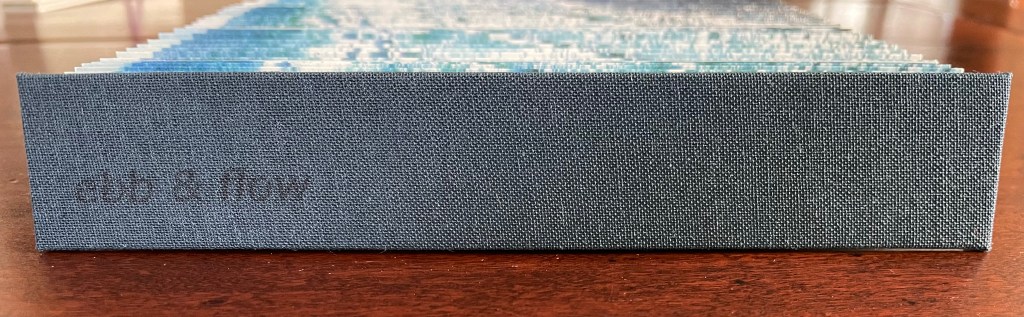
Ebb and Flow (2023) Jane Cradock-Watson Concertina book with cloth hard bound covers. H155 x W27 mm (closed), W680 mm (open). 64 panels. Edition of 20. Acquired from the artist, 21 January 2024. Photos: Books On Books Collection. Displayed with artist’s permission.
An exploration, both visually and physically, the ‘edge’ of the sea where it meets the land, with its continuous ebb and flow of the breaking waves, rhythmically rolling back and forth onto the sand. (Artist’s description)
With the binding and her photography in Ebb and Flow, Jane Cradock-Watson has sculpted and painted the sea’s edge. Four digital photographs printed on Zerkal paper have been spliced together between two cloth-covered boards. The flexibility and extent of the concertinaed paper create an undulating structure that turns seascape stills into mesmerising cinema.
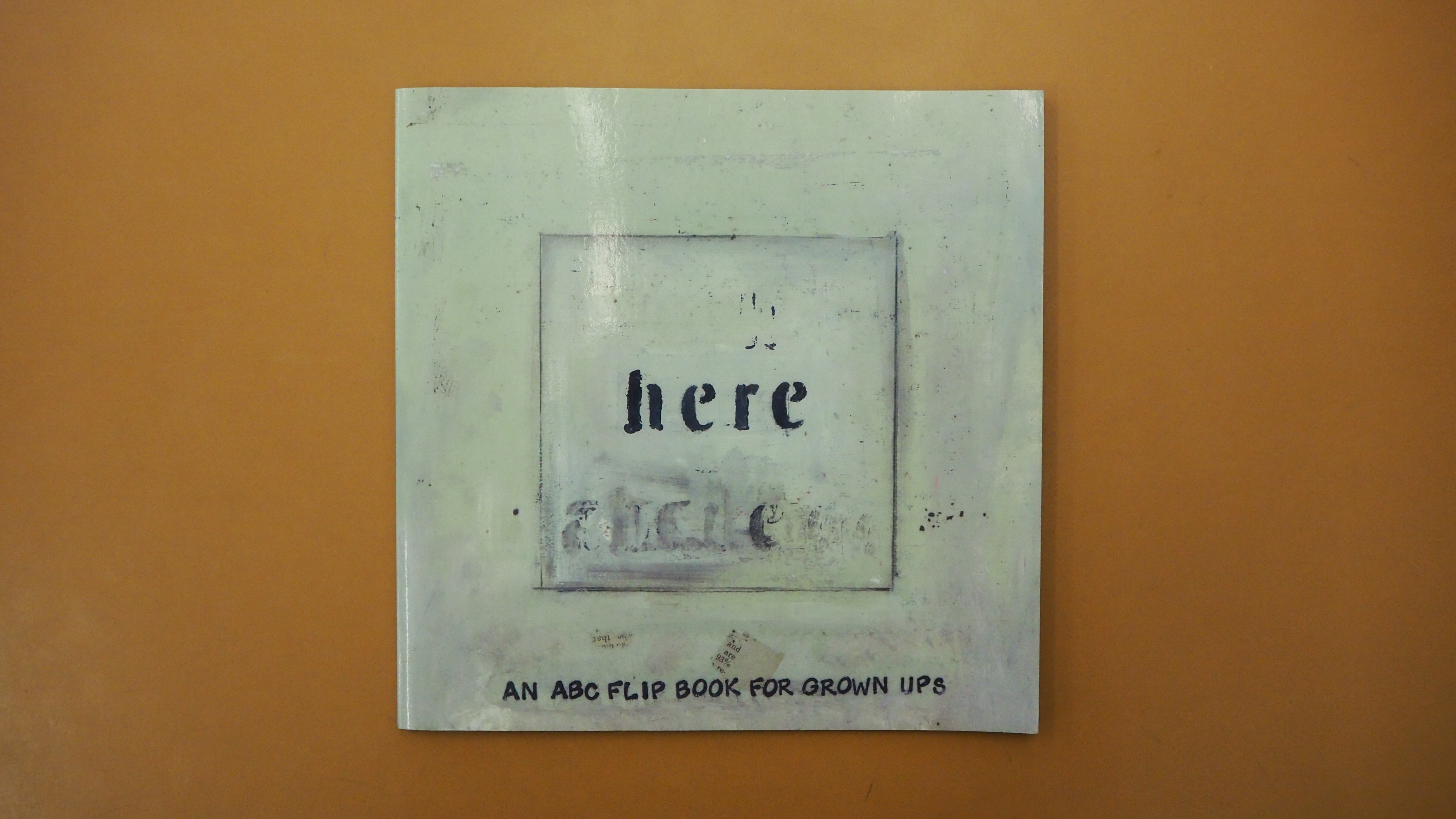
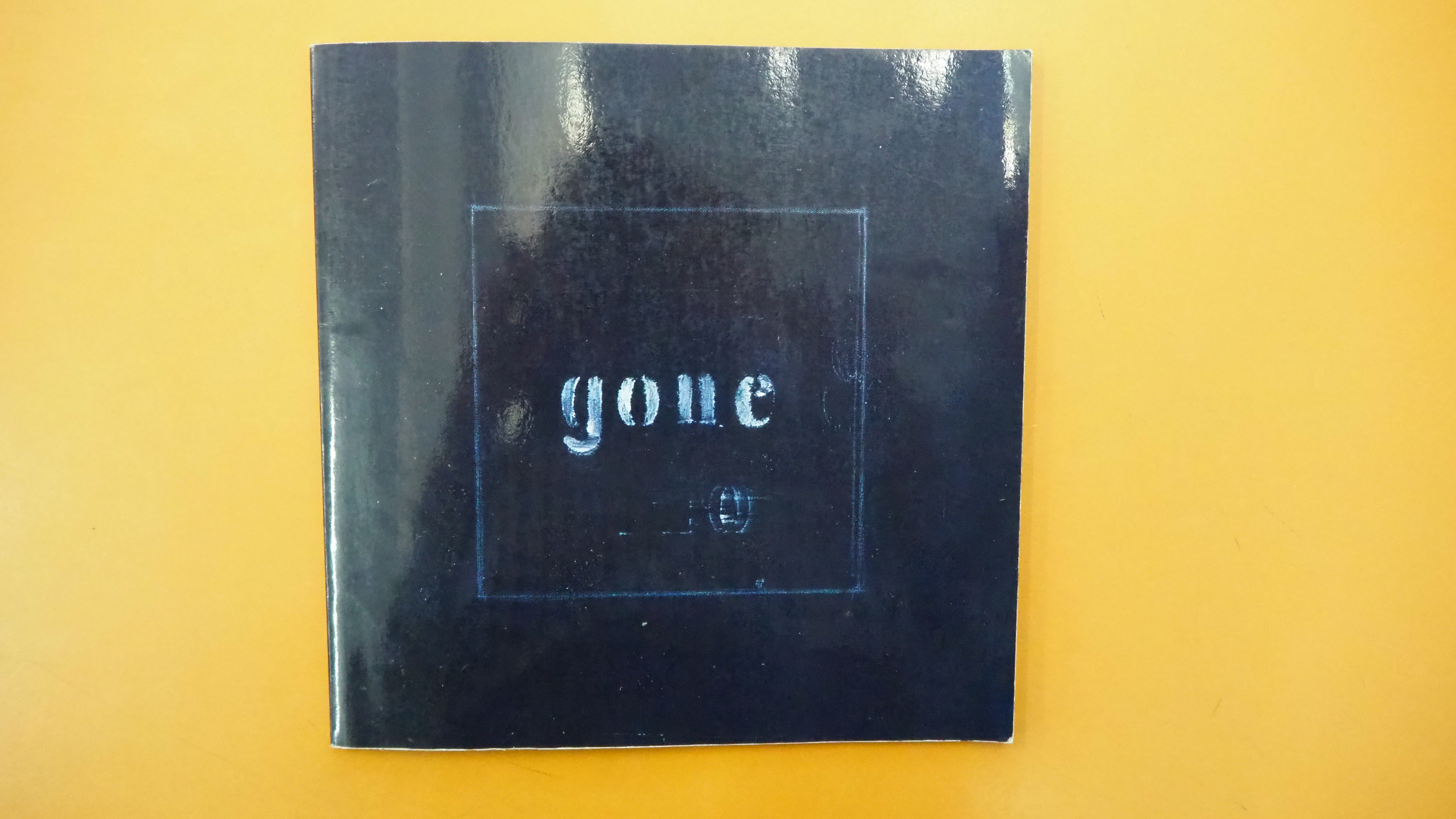
Here/Gone: An ABC Flip Book for Grown Ups (2008) Karen Green Perfect bound, invertible flipbook. 215 x 215 mm. [56] pages. Acquired from AbeBooks, 14 March 2019. Photos: Emilia Osztafi*. Displayed with the author/artist’s permission.
here/gone is a story of two parts, the arrival of love and its departure. “Zipping and unzipping the alphabet in a narrative of love and unlove” as the Spineless Books website describes it, here/gone tells its story with mixed media paintings and minimal text across the right hand pages of its invertible flip book structure, each page’s text beginning with a letter of the alphabet. The flipping pages of here enact love’s zipping together two characters, the flipping pages of gone enact “unlove’s” unzipping them apart.
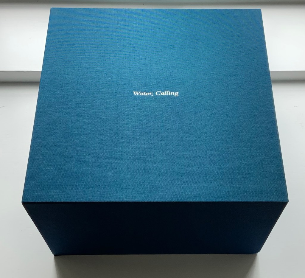
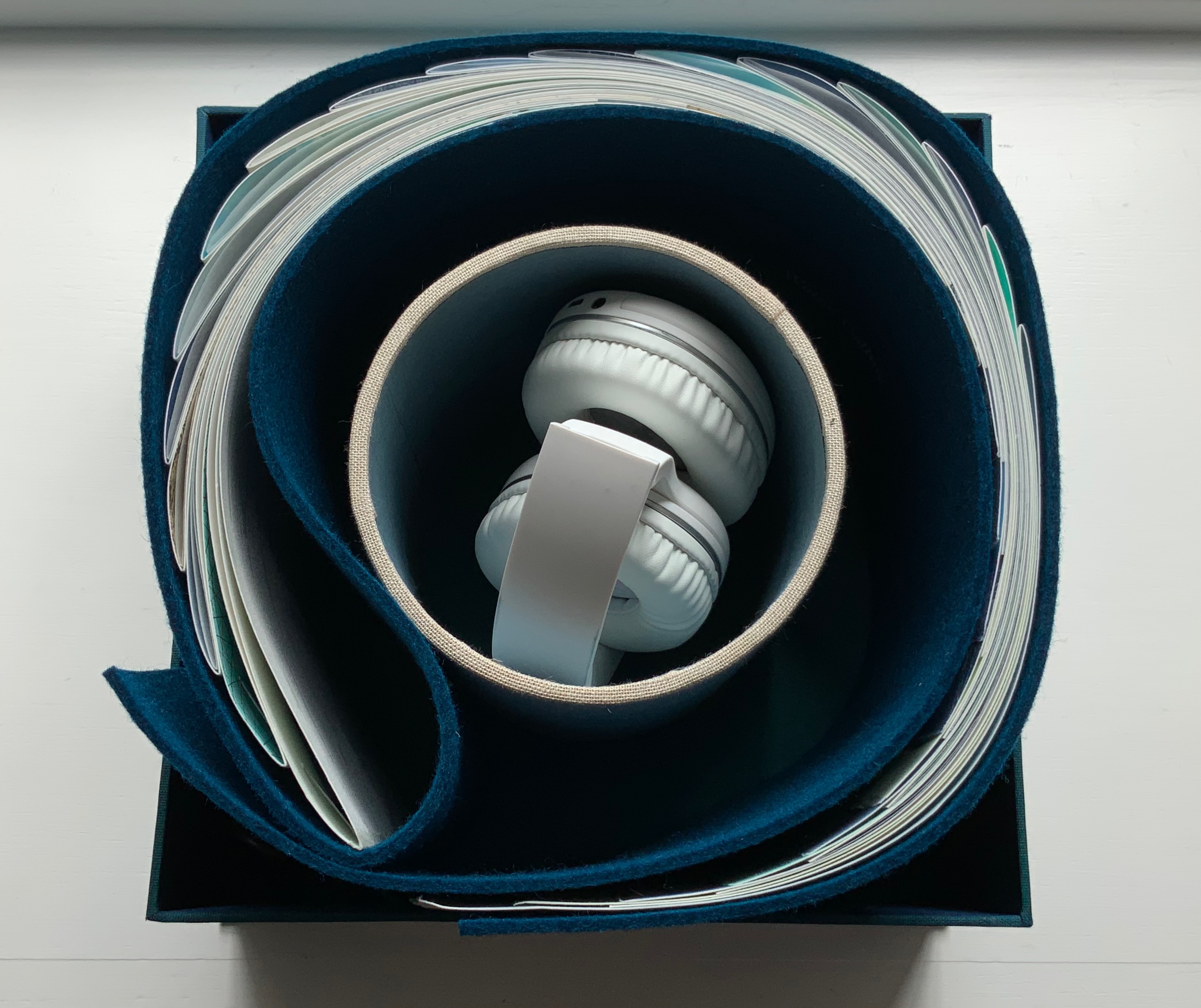
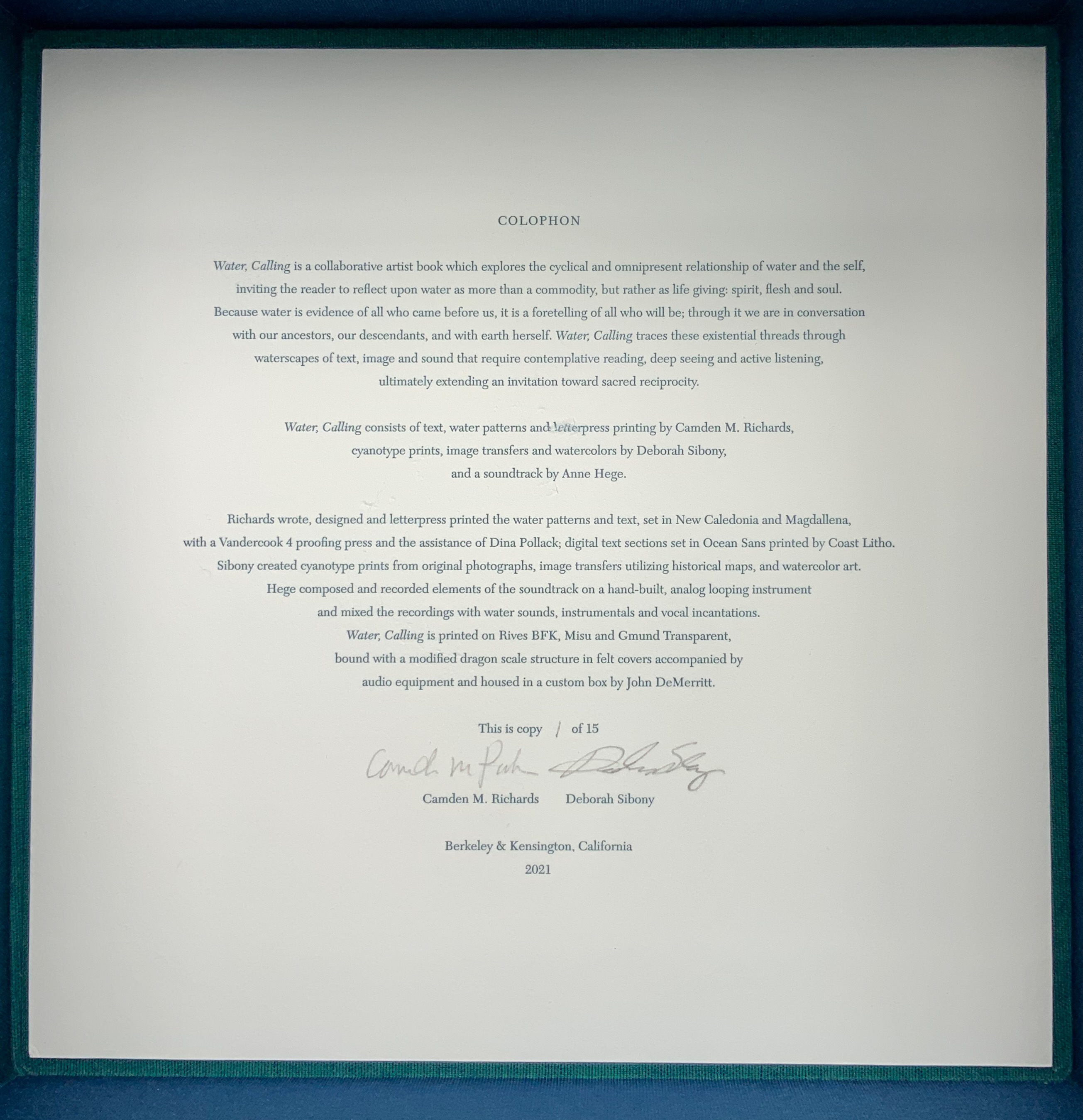
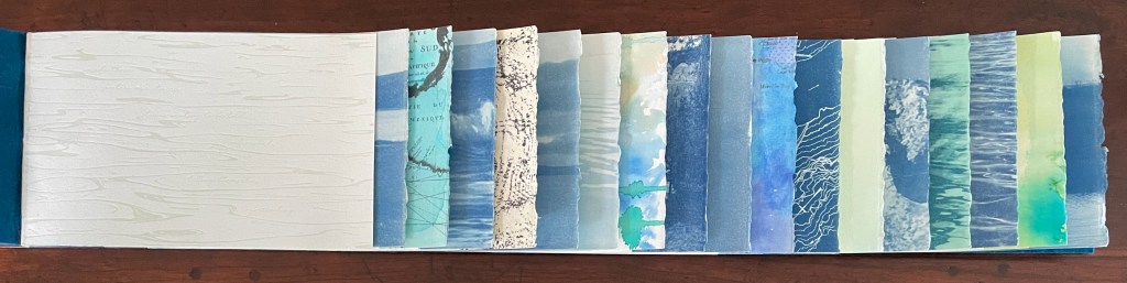
Water, Calling (2021) Camden Richards & Deborah Sibony Felt-covered, modified dragon-scale bound artists’ book, accompanied by audio equipment in custom box. Box: 262 x 262 x D170 mm. Book: H155 x W775 mm (closed). 110 pages. Edition of 15, of which this is #1. Acquired from the artists, 5 October 2022. Photos: Books On Books Collection. Displayed with artists’ permission.
Colophon “Water, Calling is a collaborative artist book which explores the cyclical and omnipresent relationship of water and the self, inviting the reader to reflect upon water as more than a commodity, but rather as life giving: spirit, flesh and soul. Because water is evidence of all who came before us, it is a foretelling of all who will be; through it we are in conversation with our ancestors, our descendants, and with earth herself. Water, Calling traces these existential threads through waterscapes of text, image and sound, extending an invitation to enter more fully into a dialogue composed of acts requiring active listening, contemplative reading and deep seeing with the hope of inspiring sacred reciprocity.”