John Eric Broaddus (1943 1990) was perhaps one of the most inventive and creative artists to approach the book form. He was a prominent figure in the New York City art scene in the 1970s and 1980s, creating books before the book form even had a suggestion of acceptance in the art world. He also created one-of-a-kind costumes that he wore out on the streets of New York and in iconic places like Studio 54. He was vibrant, outlandish, and did much to contribute to the world of artistic interplay in New York City of that time. His inspired life was cut short by AIDS in 1990. but his legacy lives on in the work he left behind, a muse in itself for book artists even twenty years later.” Visual AIDS
Since first seeing references to and images of John Broaddus’ artist’s books in 2012, I have watched for opportunities to add his work to the Books On Books Collection. So many of his artist’s books were unique works and already in institutional collections or private hands, it would be a long watch. In late 2025, this appeared: “Achingly scarce work from a major figure in the early book arts movement. Minimal shelf/edge wear, else tight, bright, and unmarred. Shape book (human hand), grey painted boards, black ink lettering, cut paper forms.”
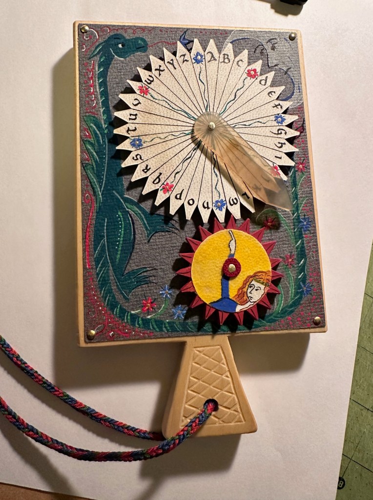
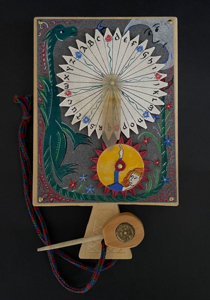
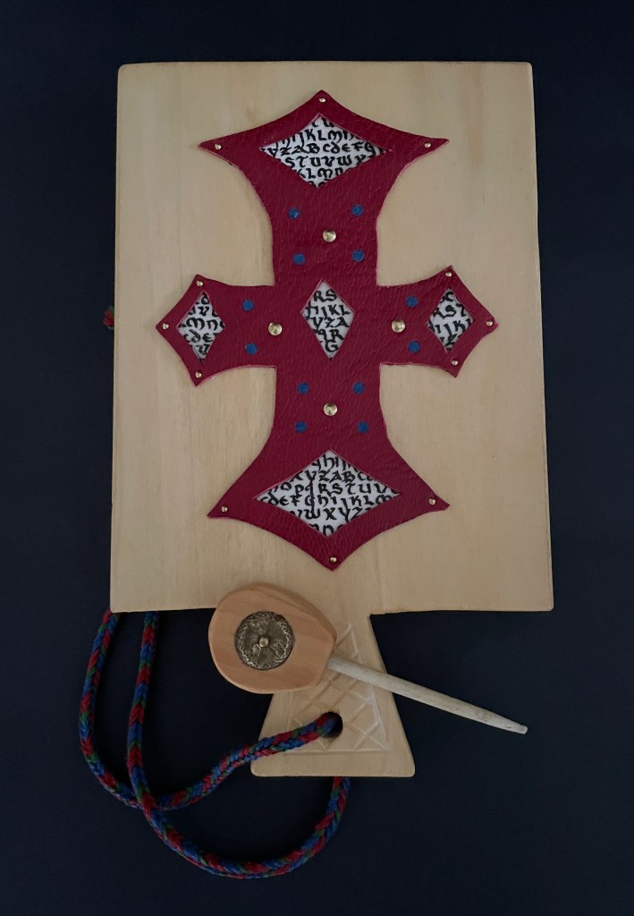
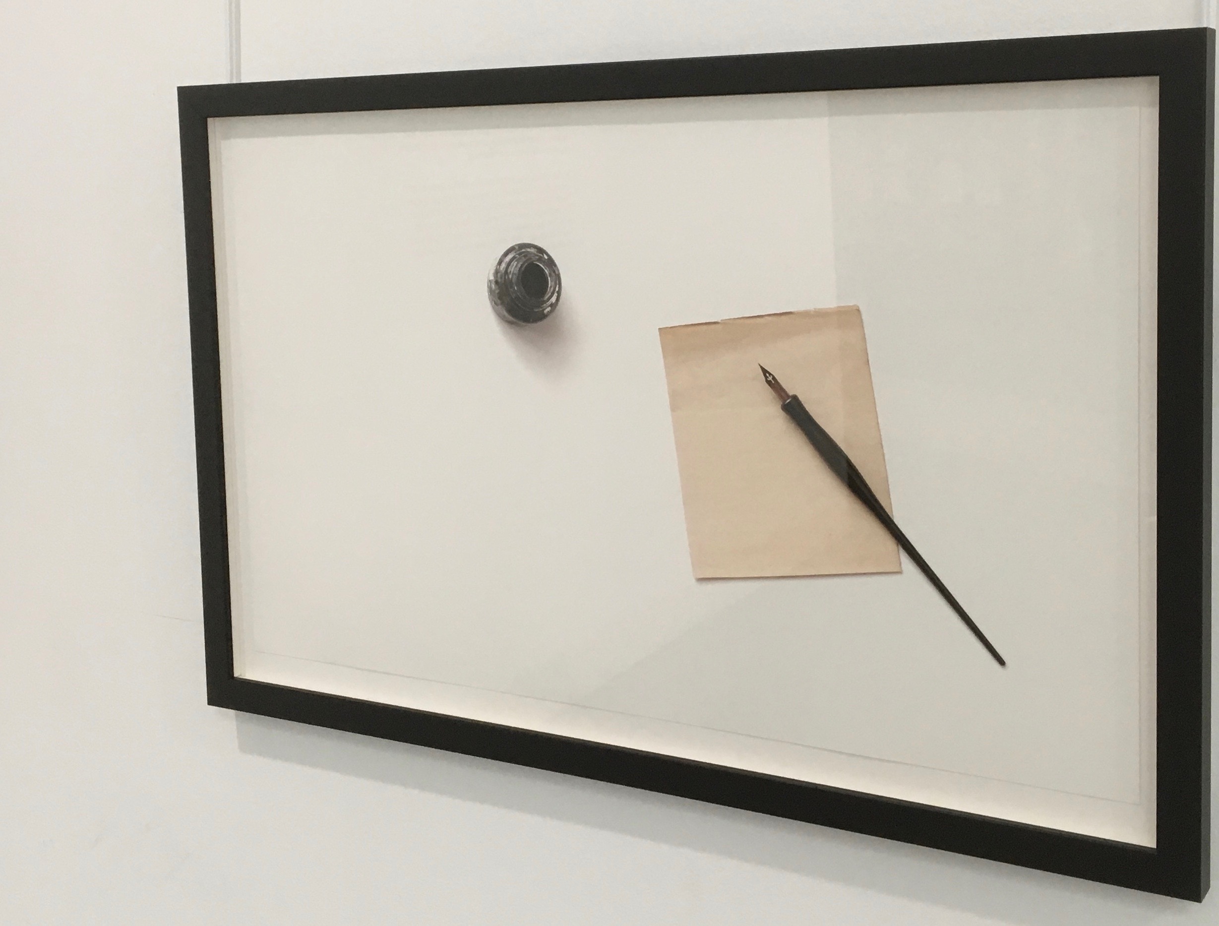
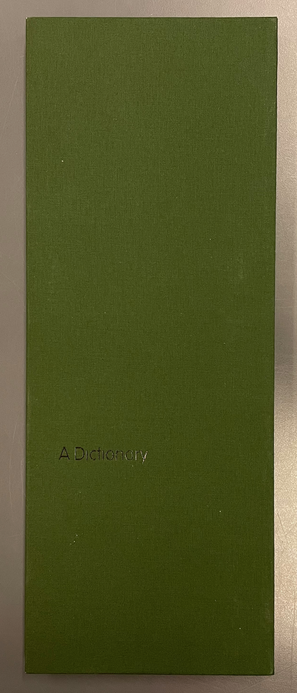
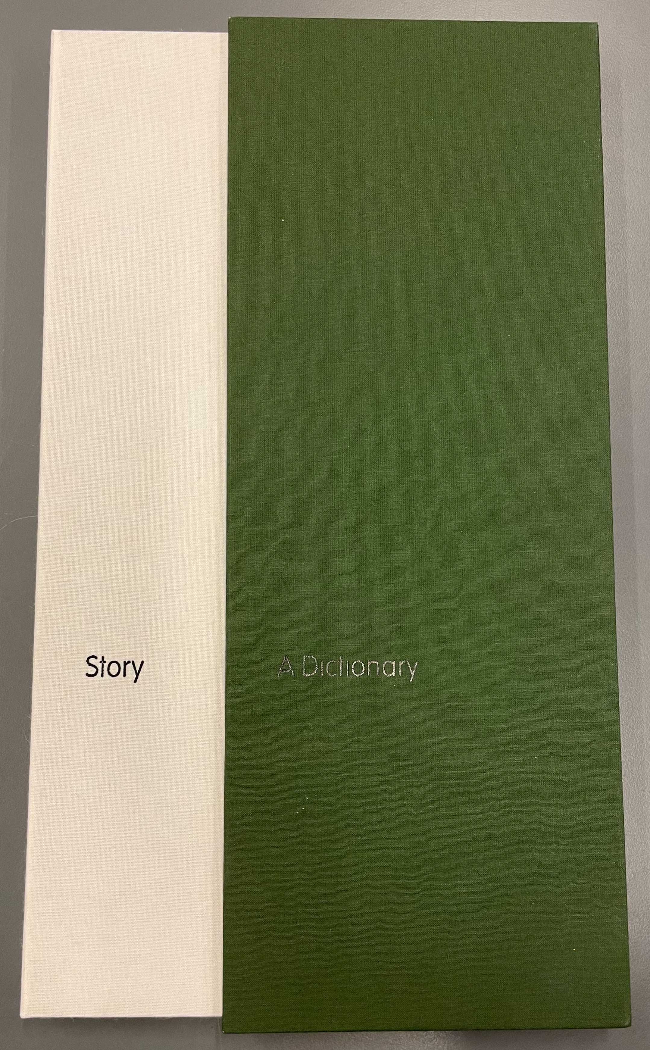
Handbook (1980)
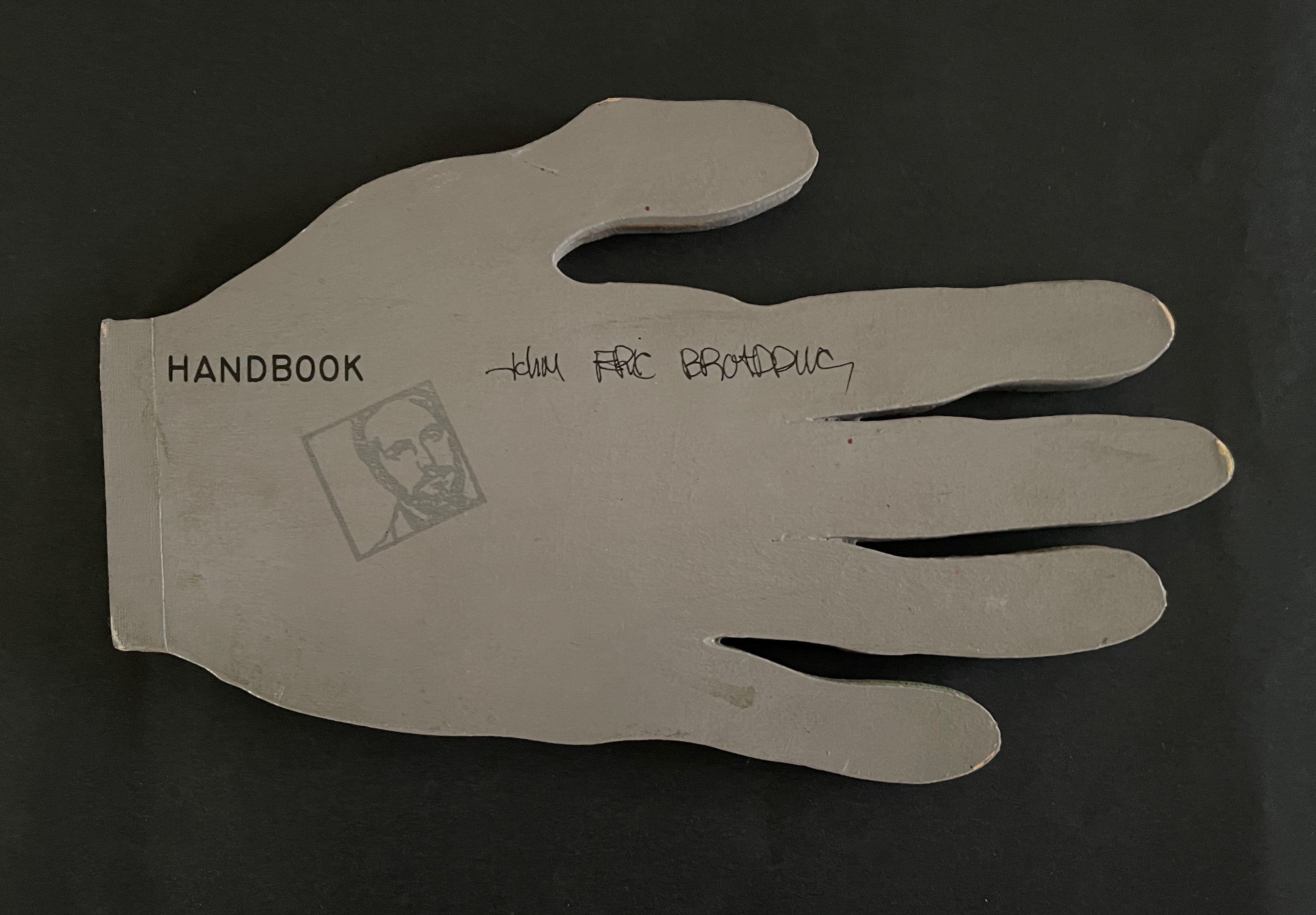
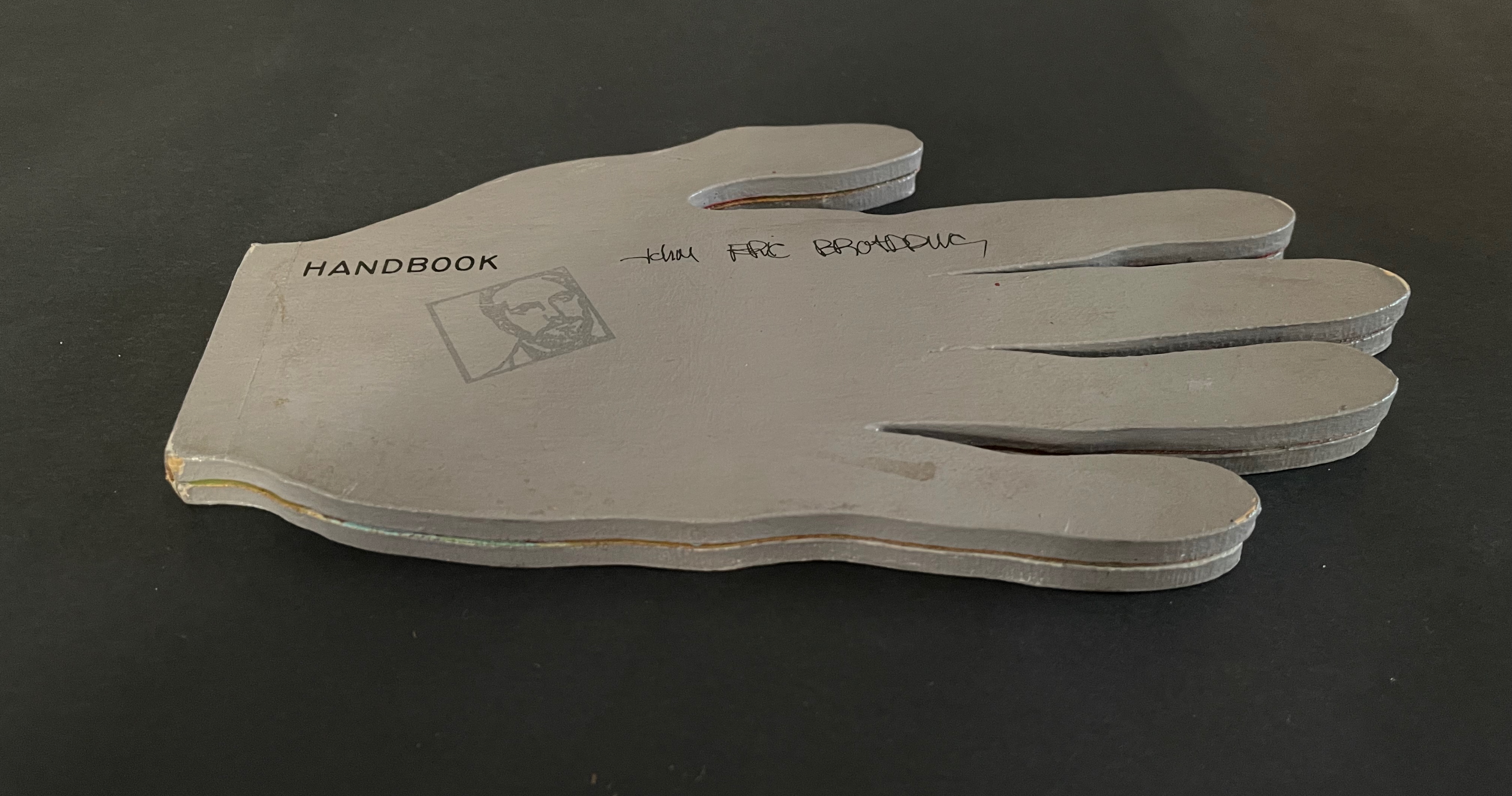
Handbook (1980)
John Eric Broaddus
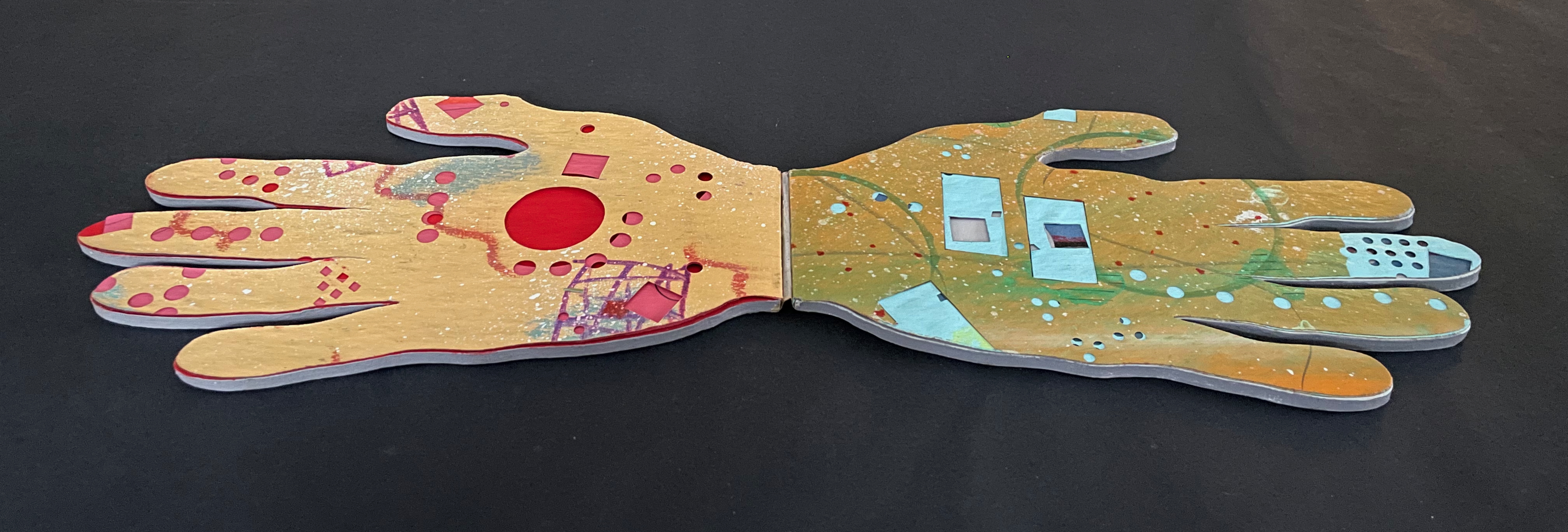
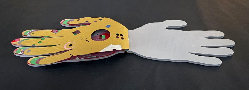
Hand-shaped boards over hand-shaped painted and cut pages, nailed tape hinge. Variable: H123 x W205 mm. [10] pages. Limited edition, unknown quantity. Acquired from Lux Mentis, 3 December 2025.
Photos: Books On Books Collection.
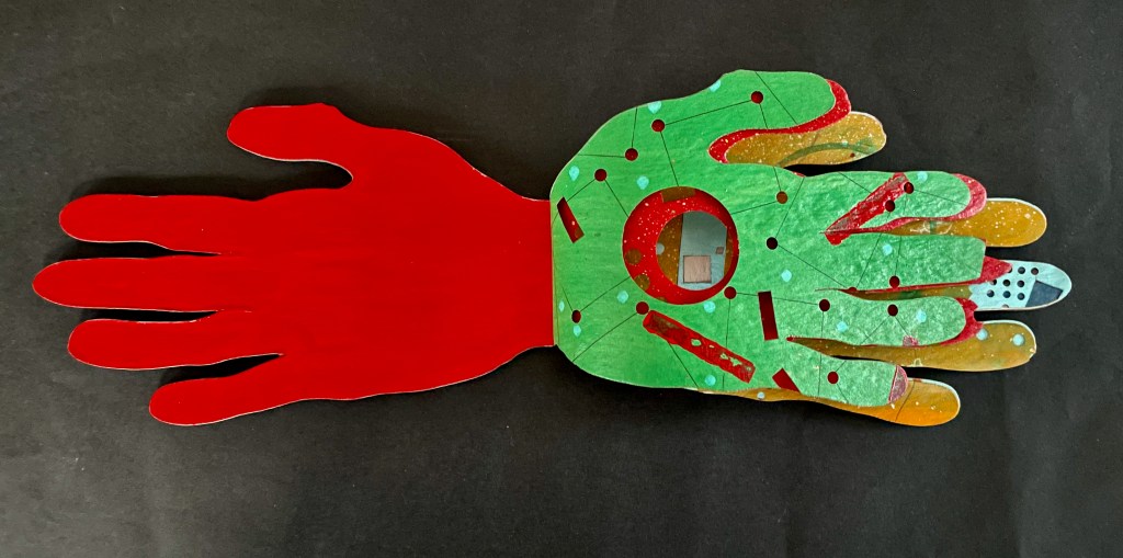
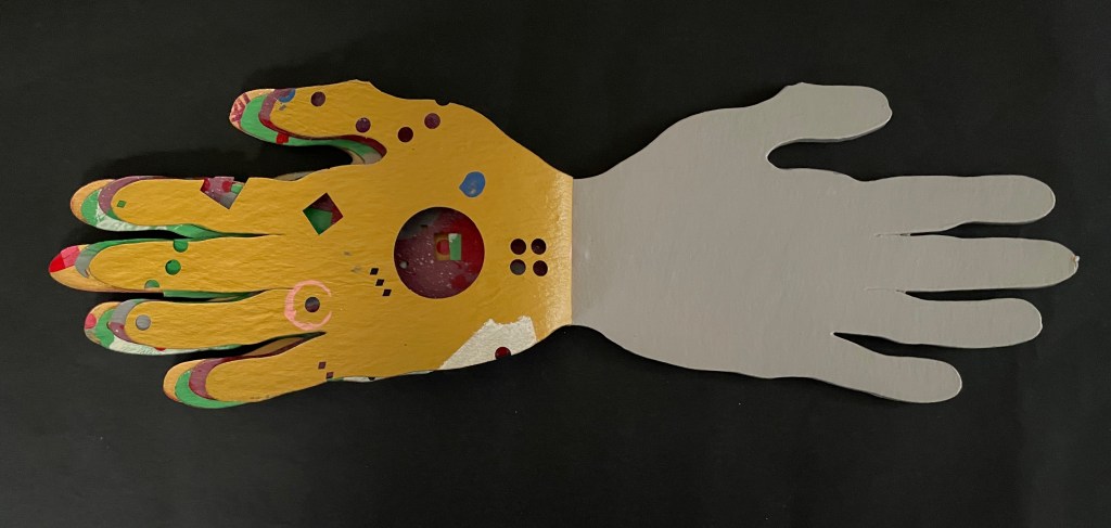
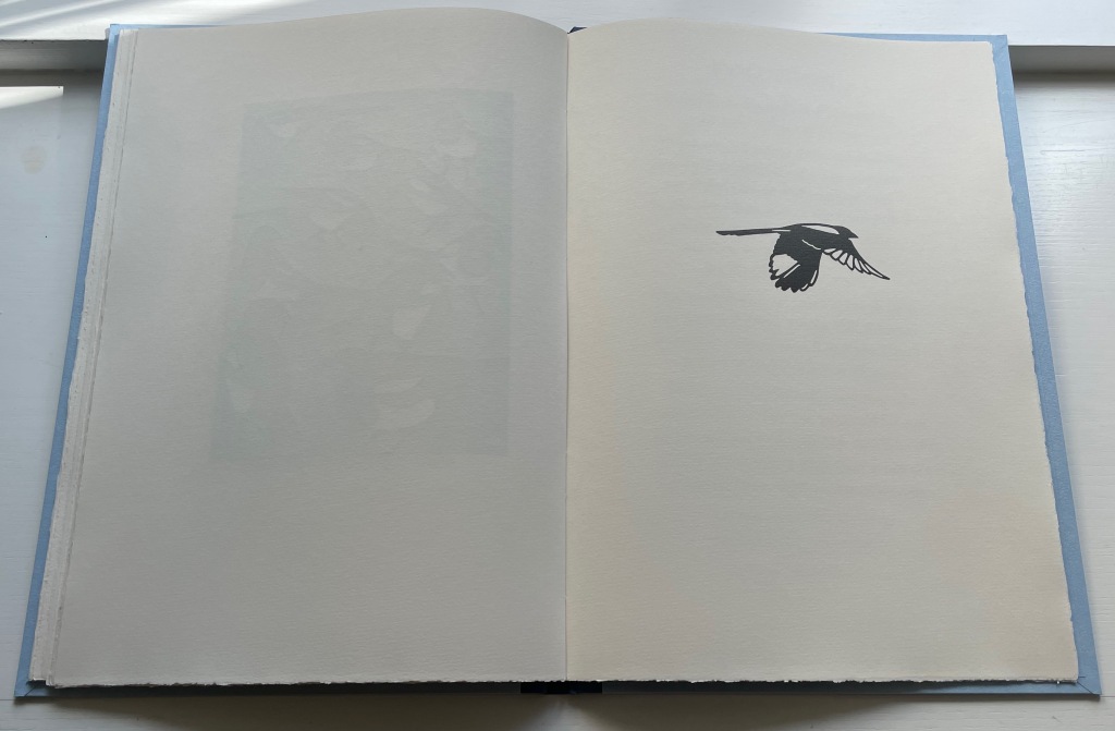
Inside front cover, first page. Last page, inside back cover.
Hand stencils may be the oldest art form. Those below from the Cuevas de las Manos in Argentina are 9,300 years old. More recent discoveries in Indonesia go back 67,800 years (Oktaviana). So no surprise that kindergarteners and book artists have carried on the tradition.
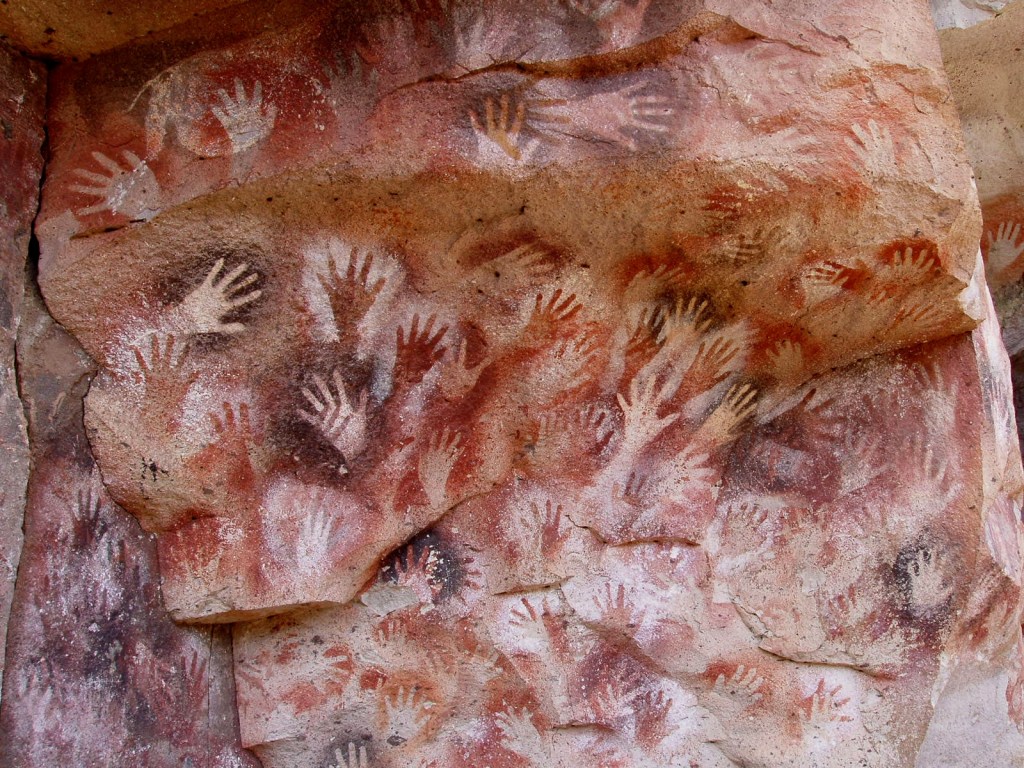
Drawings at the Cuevas de las Manos in Santa Cruz Province, Argentina.
Photo: Mariano – Own work, Public Domain.
From Keith Smith’s Structure of the Visual Book (1994).
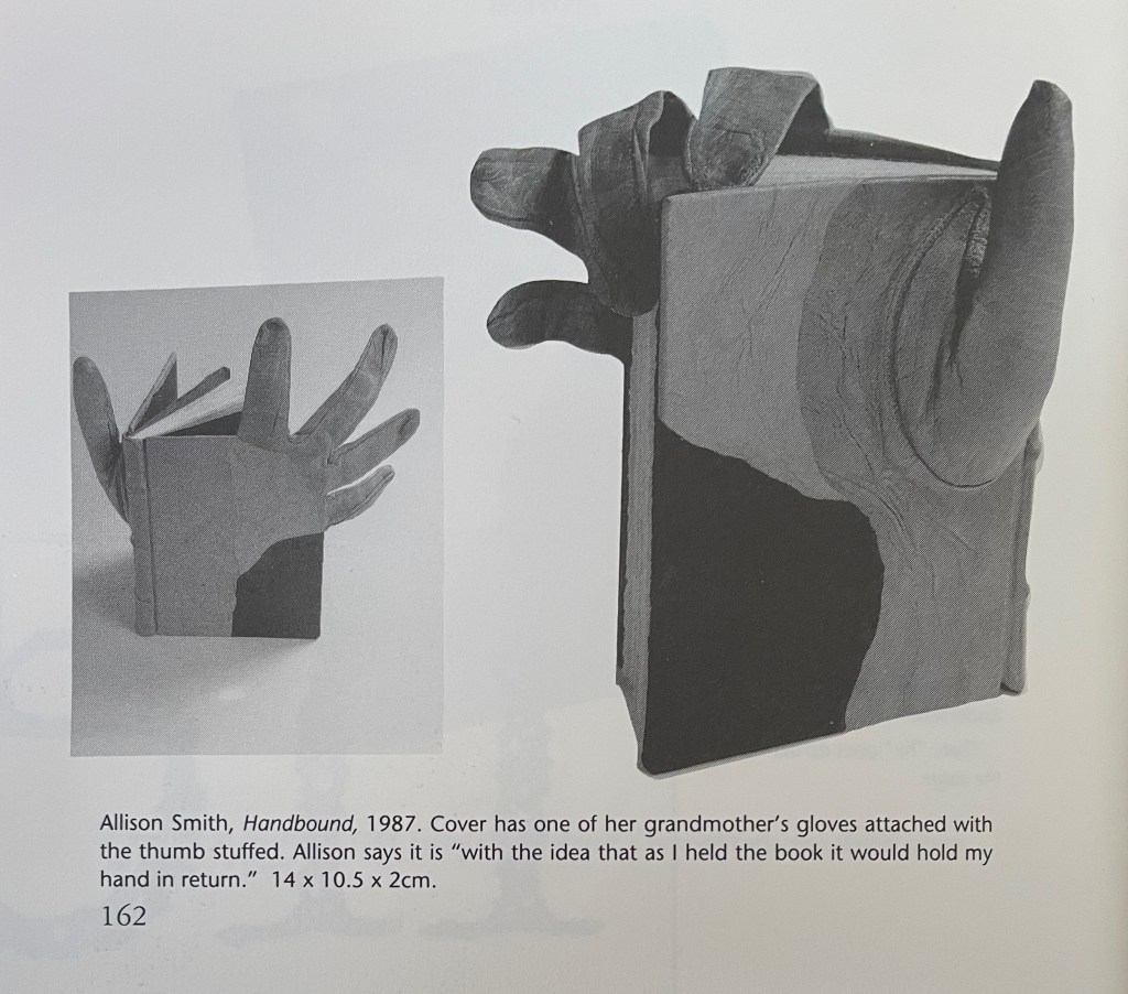
Miriam Schaer’s Book of Common Prayer (1996); Jules Allen’s The Book of White (2020?); Mary Kritz’s A Show of Hands (2023?).
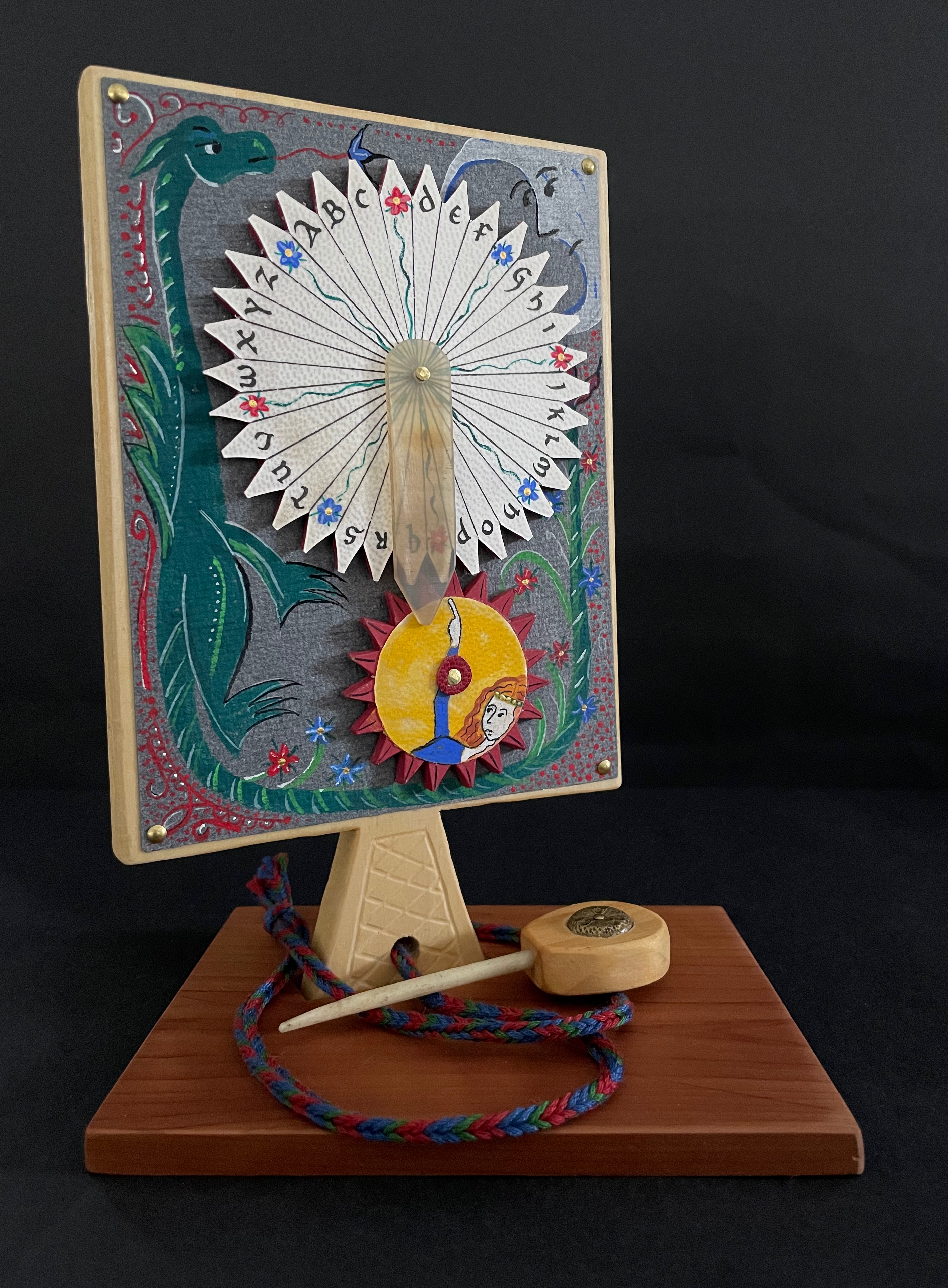
Broaddus’ Handbook (1983) joined the tradition “before the book form even had a suggestion of acceptance in the art world”, as the dealer’s announcement points out. He produced this as one of a limited edition, but the number is uncertain. What is certain, given the painted pages and their various perforations, each copy must be unique. Two of them reside with John Cutrone (Florida Atlantic University) and others with the Jack Ginsberg Center, the University of Southern California, and the University of California at Santa Barbara.
I noticed in my copy that the third out of five folios was missing the third digit’s tip. Was it a faulty copy? Was I due a discount from the dealer? Or was it deliberate? Was the third digit’s treatment common to all the copies, making a flippant flipping off by the artist?
With Broaddus’ penchant for the outré, I liked that last interpretation, but having misinterpreted an artist’s book on more than one occasion, I asked the other collections for comparisons. John Cutrone kindly provided images of his copies so that I could check for myself. Disappointed to say, but the bird fingers in Cutrone’s copies were intact. Still, I might warm to the interpretation that my copy with its unique and precisely placed gesture is the culmination of the edition.
The Books On Books Collection copy
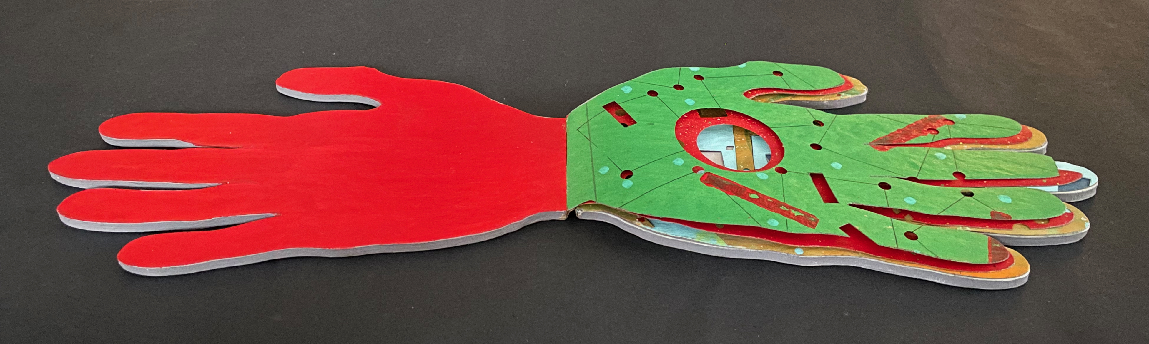
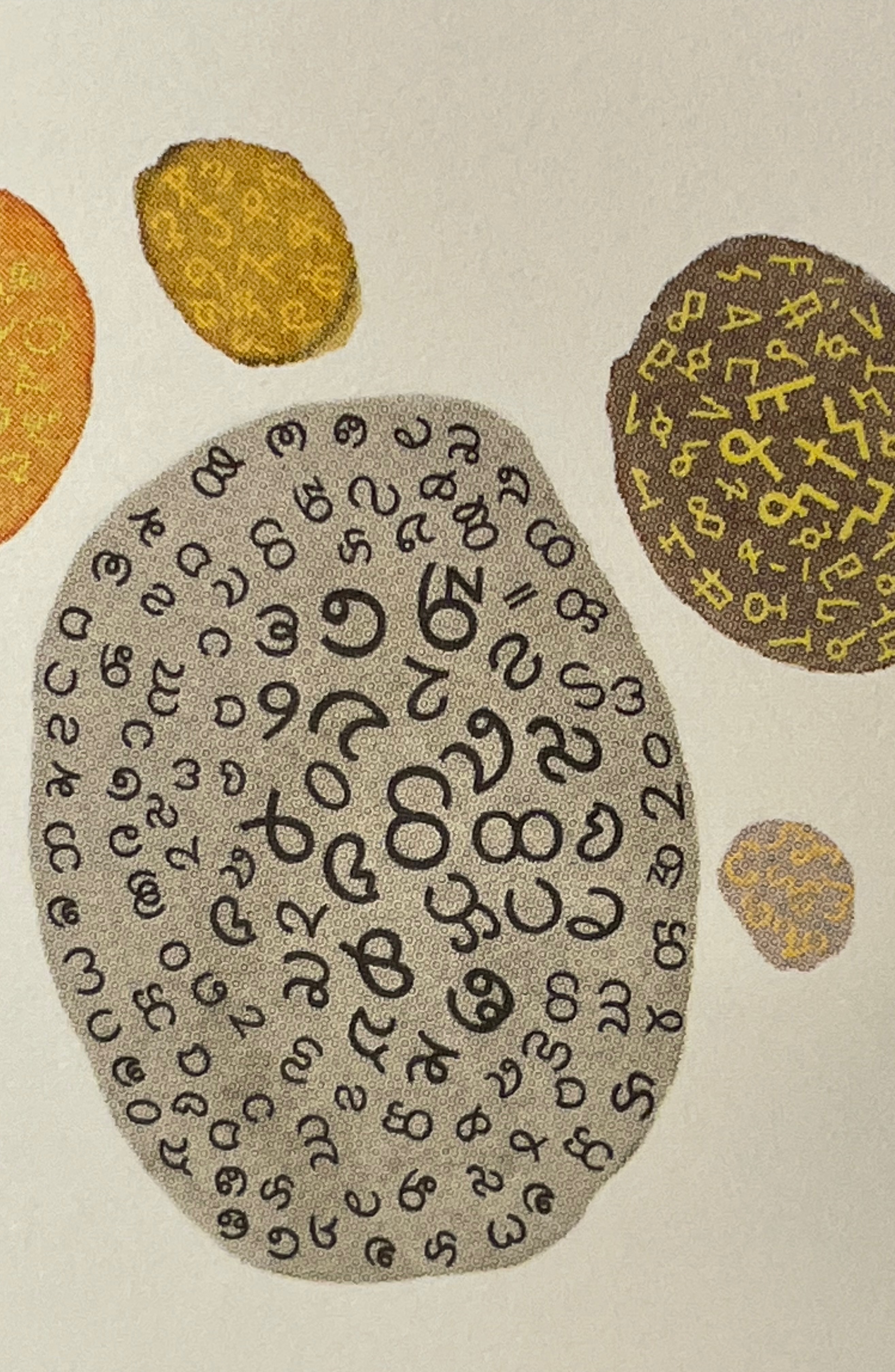
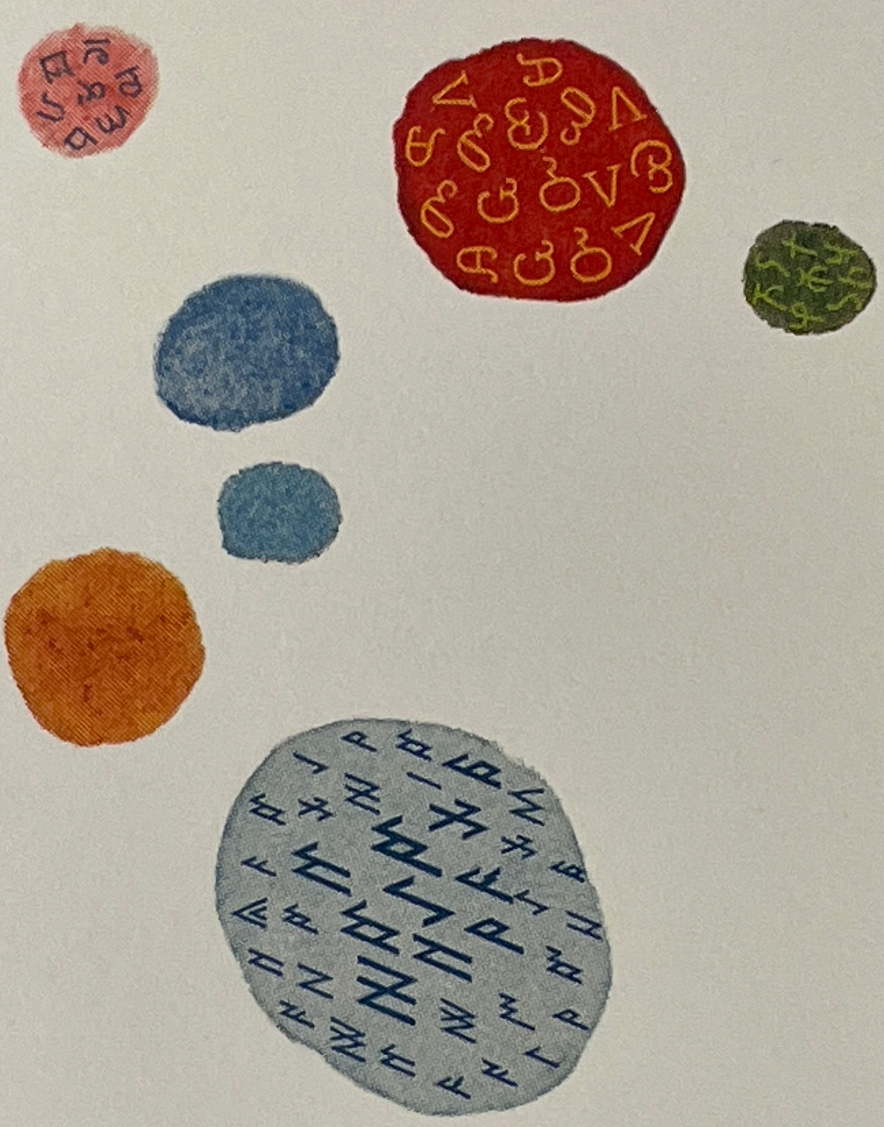
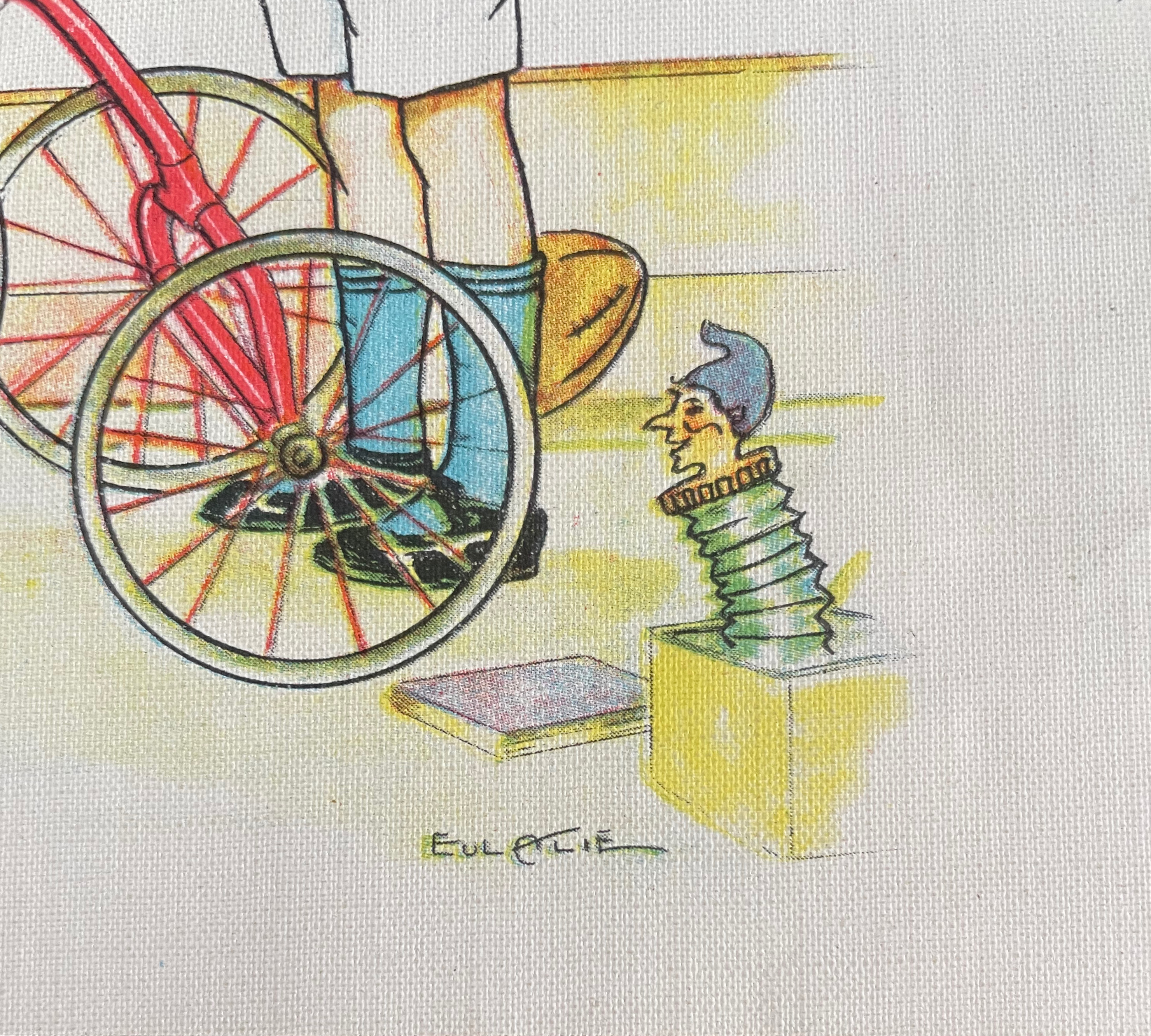
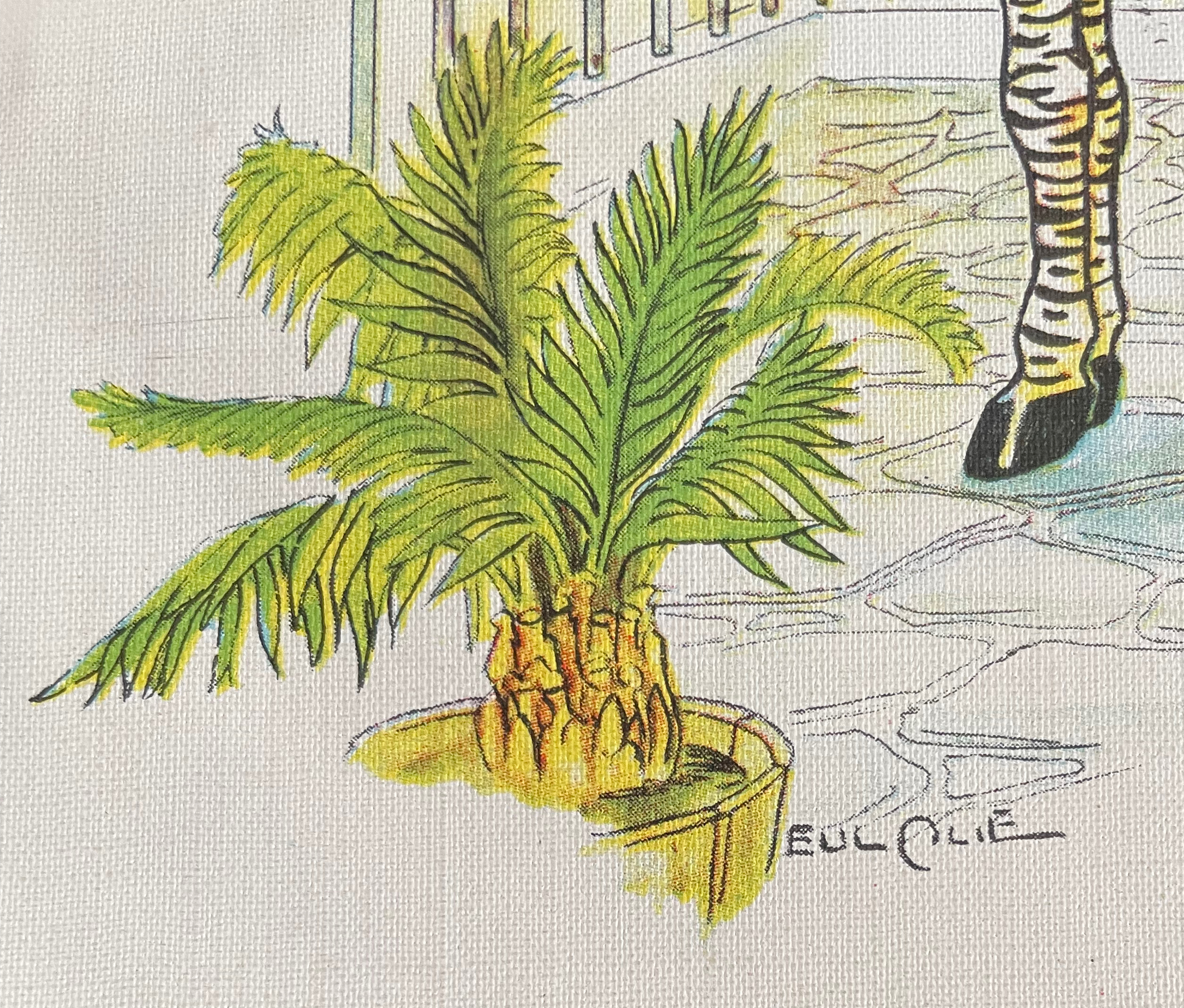
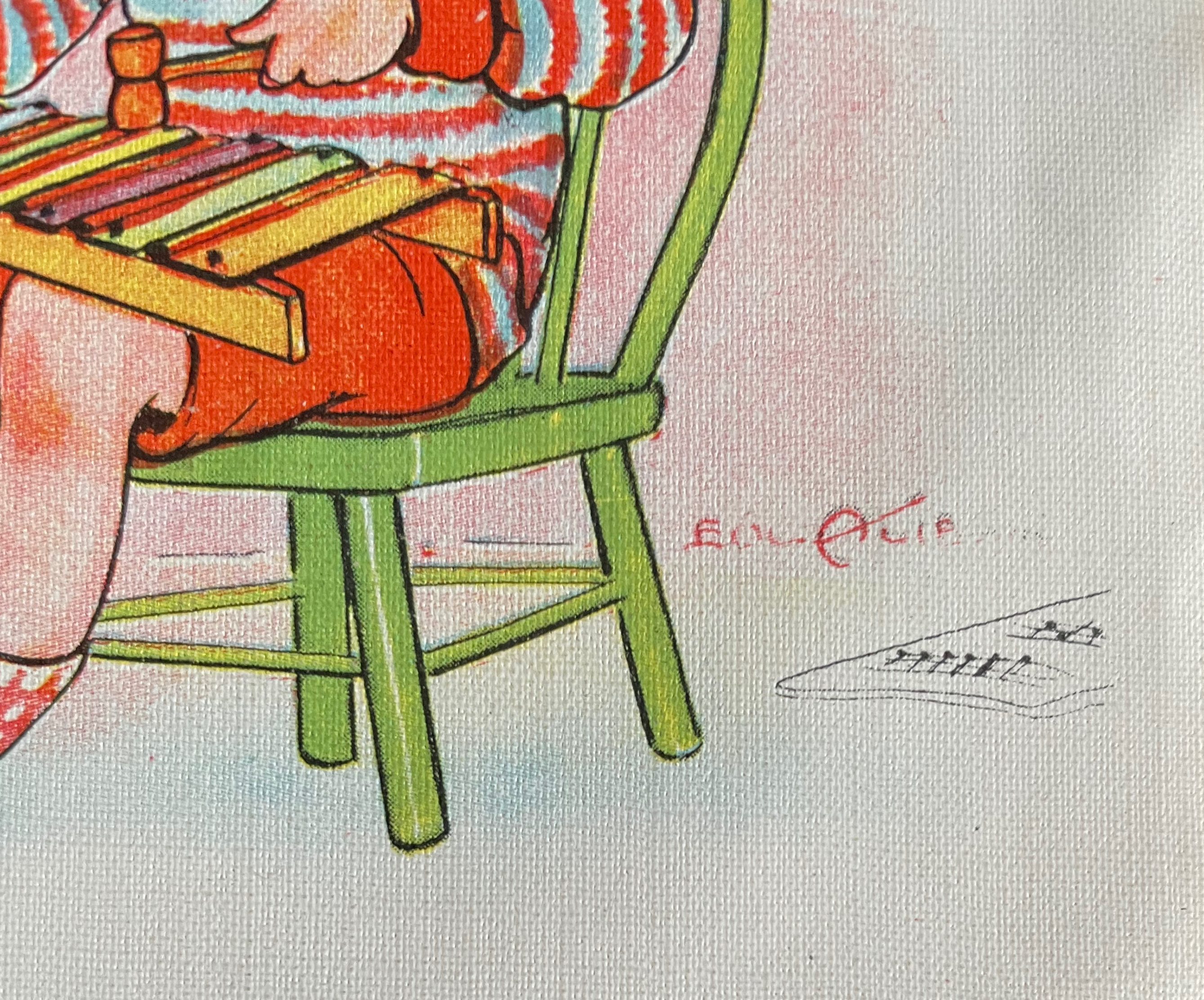
As a glance at FAU’s videos of Broaddus’ The Jell-O Book (1973) and Sphinx and the Bird of Paradise (1981-91) will confirm, his color palette is distinctive. Handbook is an enthusiastic celebration of it.
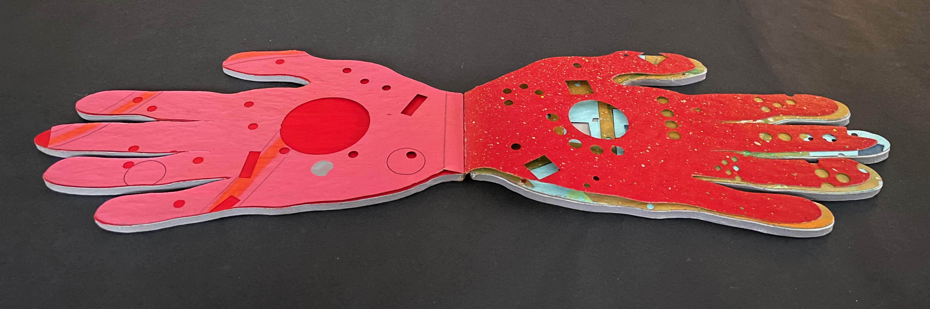
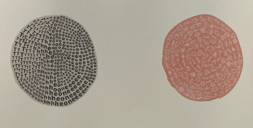
The circular, square, and rectangular perforations may have been created with an eXacto knife, one of Broaddus’ frequently used tools. The missing one-third of the middle digit on the recto page, however, appears to have been torn away.
Recto page missing one-third of middle digit.
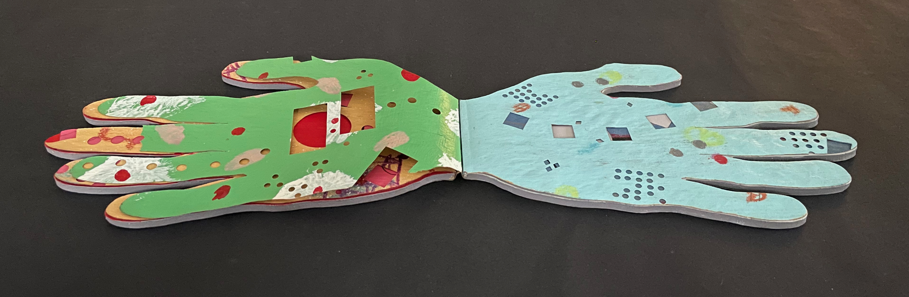
Verso page missing one-third of middle digit.
The close patterns of circular perforations on several of the pages suggest band-aids (plasters). Perhaps he was indeed using an eXacto knife.
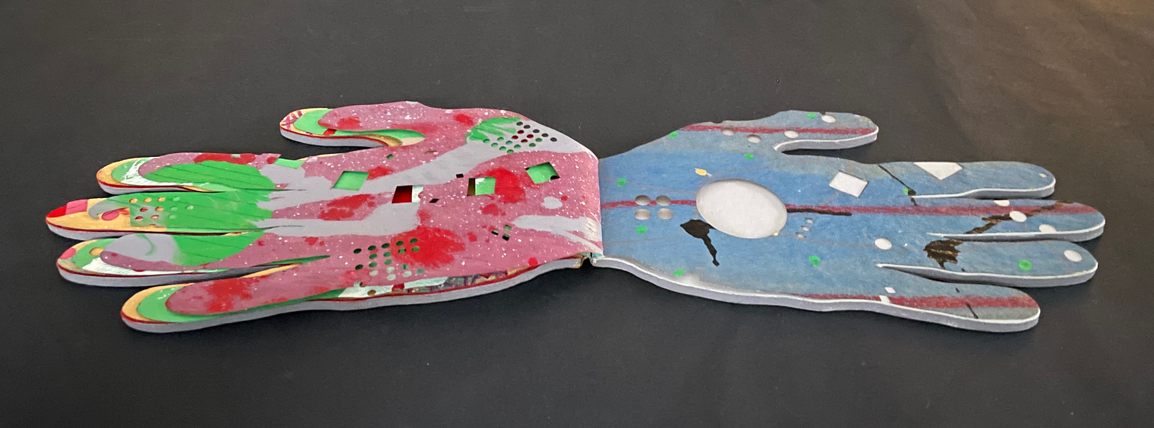
Throughout, the painted and cut patterns combine to create a kaleidoscope. There is no “on the one hand” or “on the other hand” thought process here but rather Broaddus’ many-handed guide to the fun an artist’s handbook can be.
“The Tongue and Heart th’intention oft divide:
The Hand and Meaning ever are ally’de”.
(Guil. Diconson, from Bulwer’s Chirologia)
[t]he hand does not only grasp and catch, or push and pull. The hand reaches and extends, receives and welcomes — and not just things: the hand extends itself, and receives its own welcome in the hands of others. The hand holds. The hand carries … [e]very motion of the hand in every one of its works carries itself through the element of thinking, every bearing of the hand bears itself in that element. All the work of the hand is rooted in thinking.
(Martin Heidegger from What is Called Thinking?)
… what the artist’s hand, the craftsman’s hand, the poet or scholar’s hand, and the lover’s hand has always been: a means of marking, touching, selecting, interacting, molding, expressing, and refusing that remains essential to human thinking …
(Tyrus Miller from CrossPollenBlog)
Further Reading and Viewing
Diconson, Guil. 1644. “To his ingenious Friend the Authour; on his CHIROLOGIA“ in John Bulwer, Chirologia, or The Natural Language of the Hand.
Drucker, Johanna. 2010. “Alterations and Transformations in Book Space“. Lecture on John Eric Broaddus at Florida Atlantic University.
Heidegger, Martin. 1968. What Is Called Thinking? Trans. J. Glenn Gray. New York: Harper Perennial. P. 16.
Miller, Tyrus. 2013. ”Rethinking the Digital Hand”, CrossPollenBlog. Accessed 15 September 2019.
Mirabelli, Gabriella. 2000. Books of Survival: The Art of John Eric Broaddus. Documentary.
Oktaviana, A.A., Joannes-Boyau, R., Hakim, B. et al. 2026. “Rock art from at least 67,800 years ago in Sulawesi“. Nature.
Rochmyaningsih, Dyna. 2026. “The world’s oldest rock art discovered in Indonesia“. National Geographic.
Smith, Keith A. 1994. Structure of the Visual Book. 3rd ed. Rochester, NY: Keith A. Smith Books.