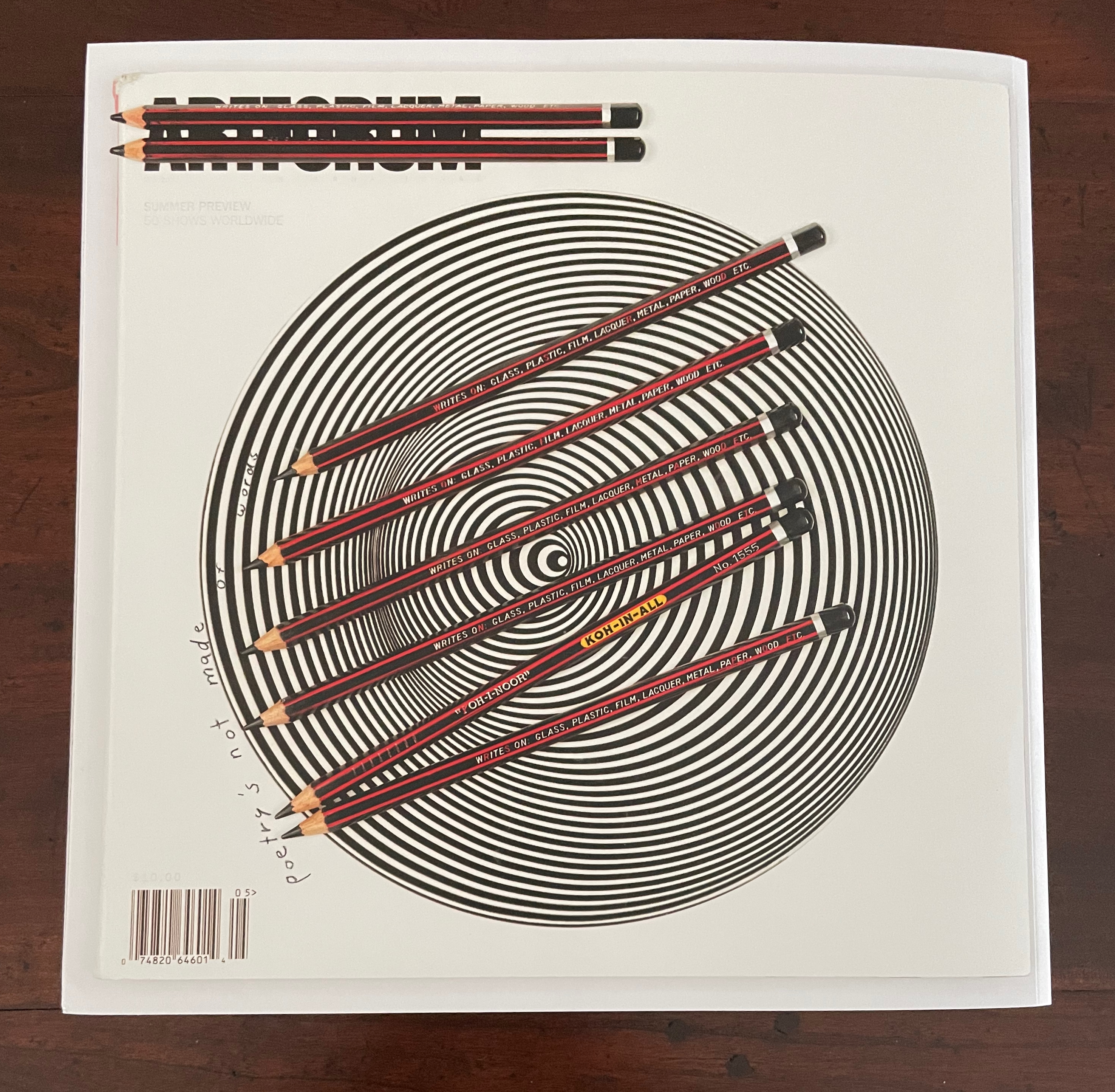
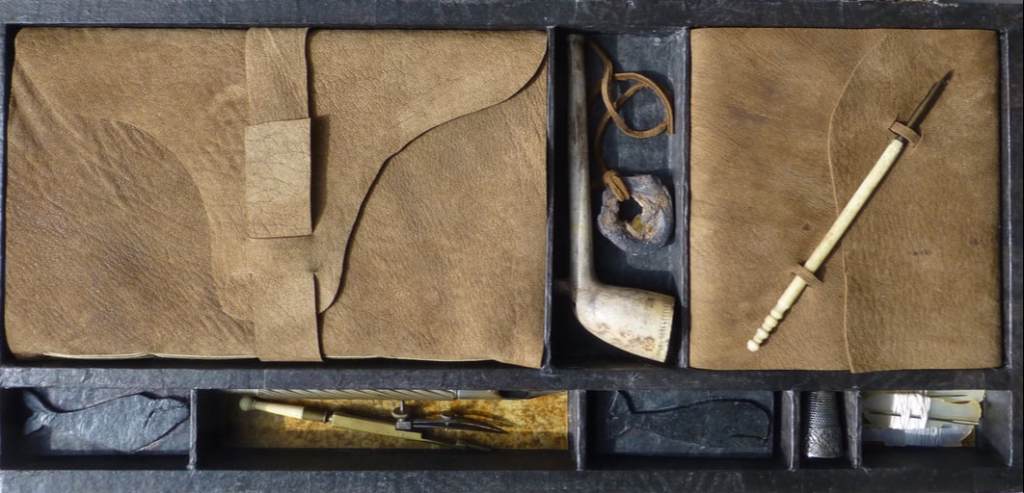
Inscription: The Journal of Material Text, Issue 4 on Touch Simon Morris, Gill Partington and Adam Smyth (eds.) Cased perfect bound paperback, printed paper cover. 313 x 313 mm. 120 pages. ISSN: 2634-7210. Acquired from Information as Material, 29 November 2023. Photos: Books On Books Collection.
Different readers will come to different conclusions on whether Inscription #4 dedicated to the subject of touch evokes the level of tactility in Melville’s famous Chapter 94 “A Squeeze of the Hand”. But all can agree that they share a certain seminality. Like Herman Melville with his preliminaries to Moby Dick, the editors of Inscription lead their fourth issue with definitions and choice quotations on the subject of “touch”, as much a Leviathan subject as that of Melville’s novel. Where Melville merged scholarly apparatus with narrative fiction to create a novel literary work, Simon Morris, Gill Partington and Adam Smyth have merged photography, poetry, augmented reality and audio with academic and critical essays to create a novel form of scholarship.
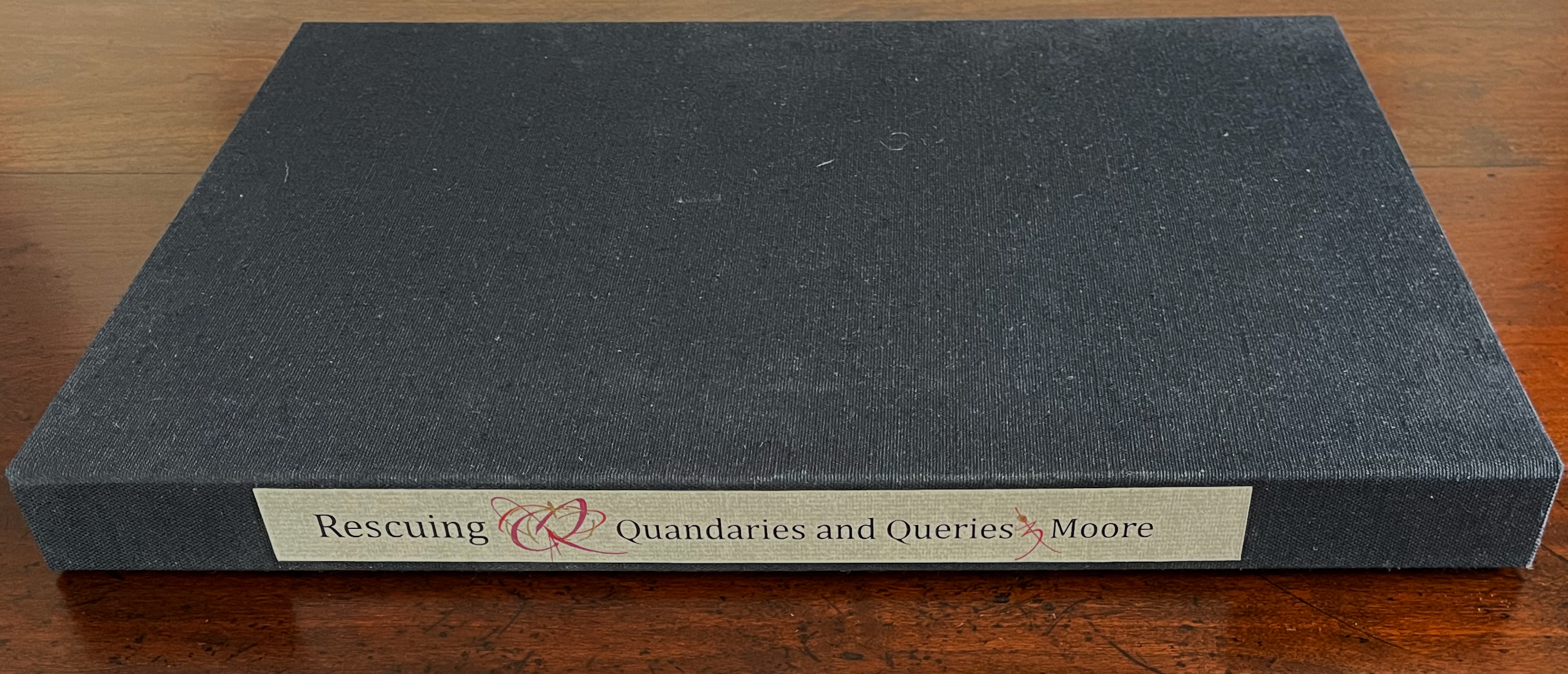
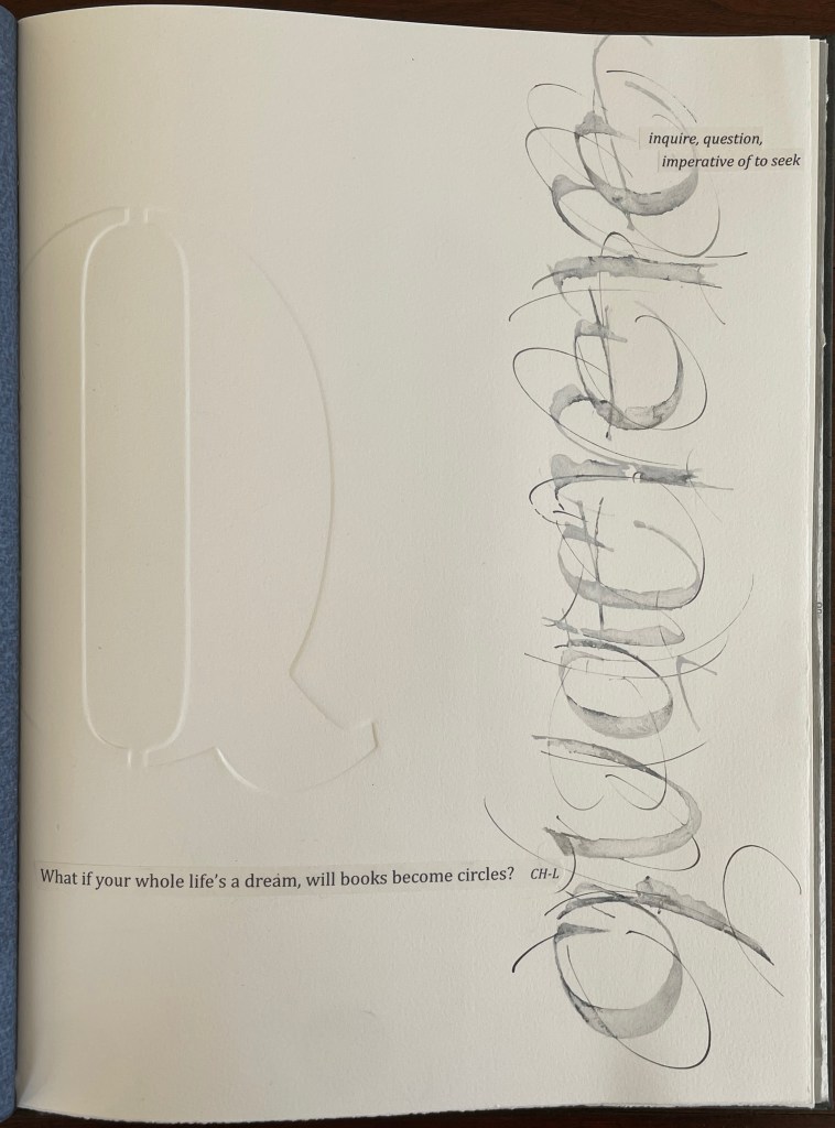
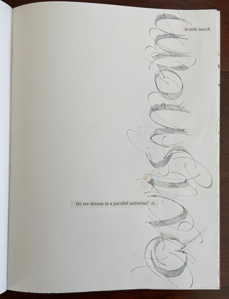
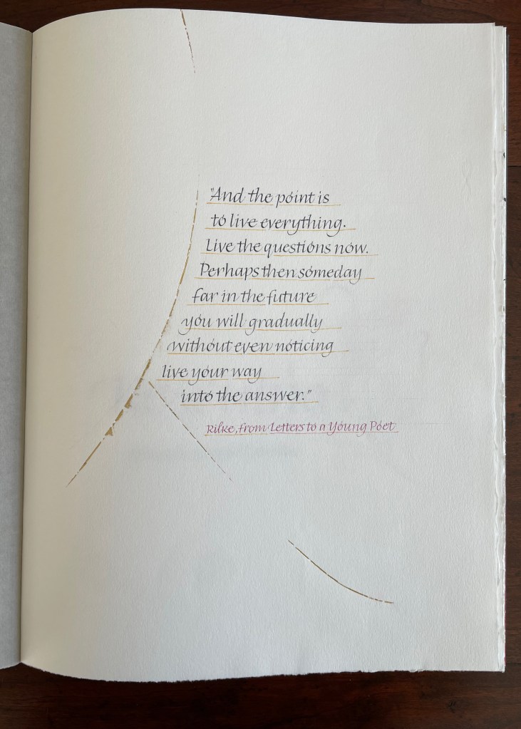
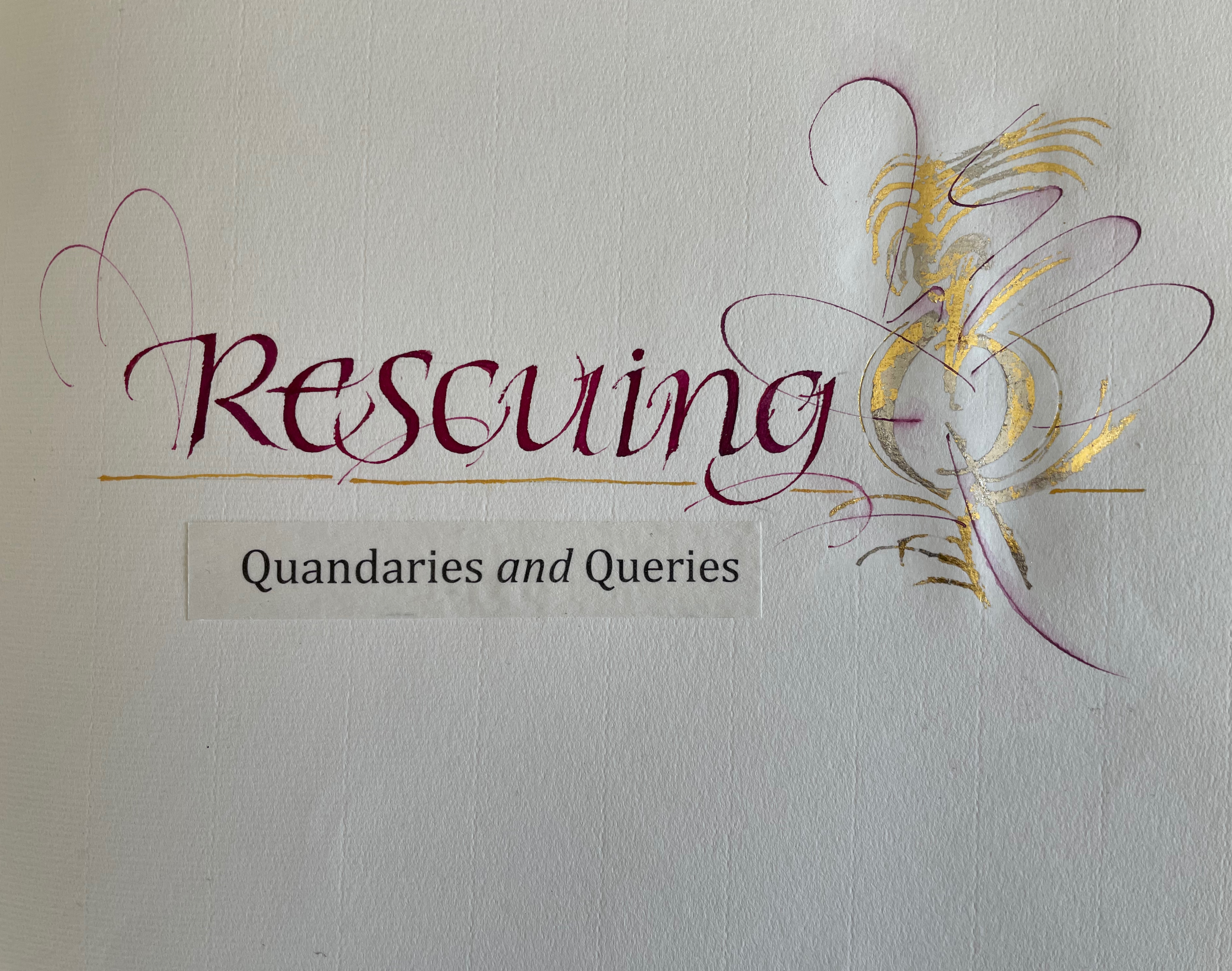
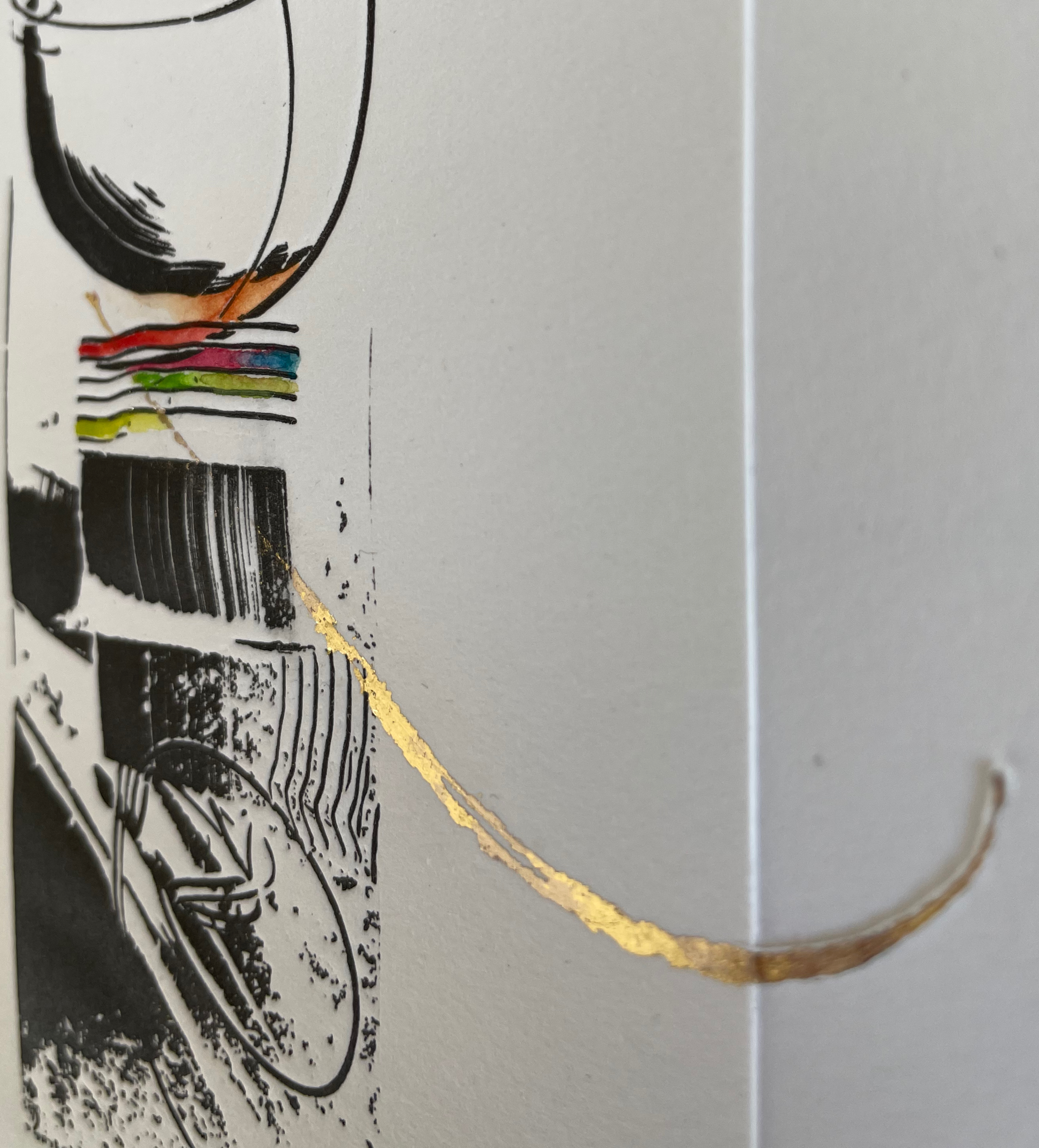
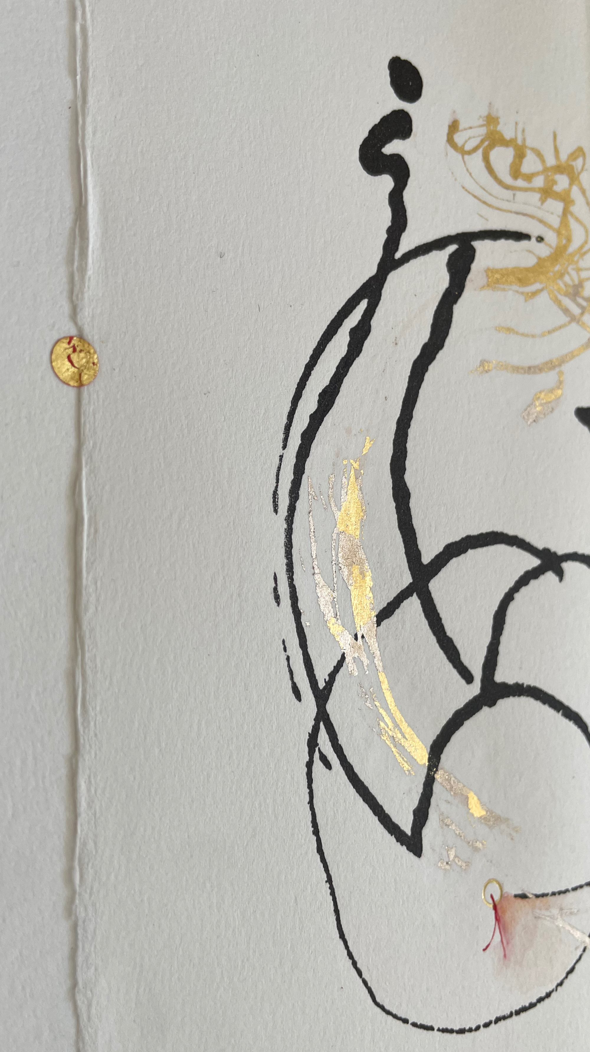
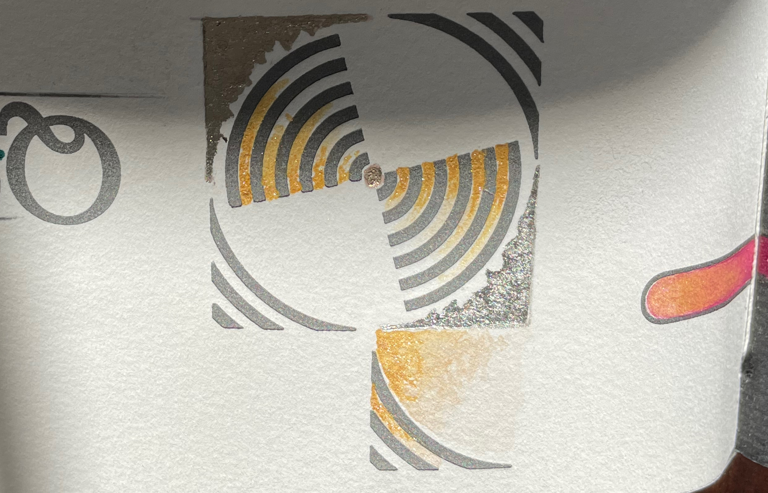
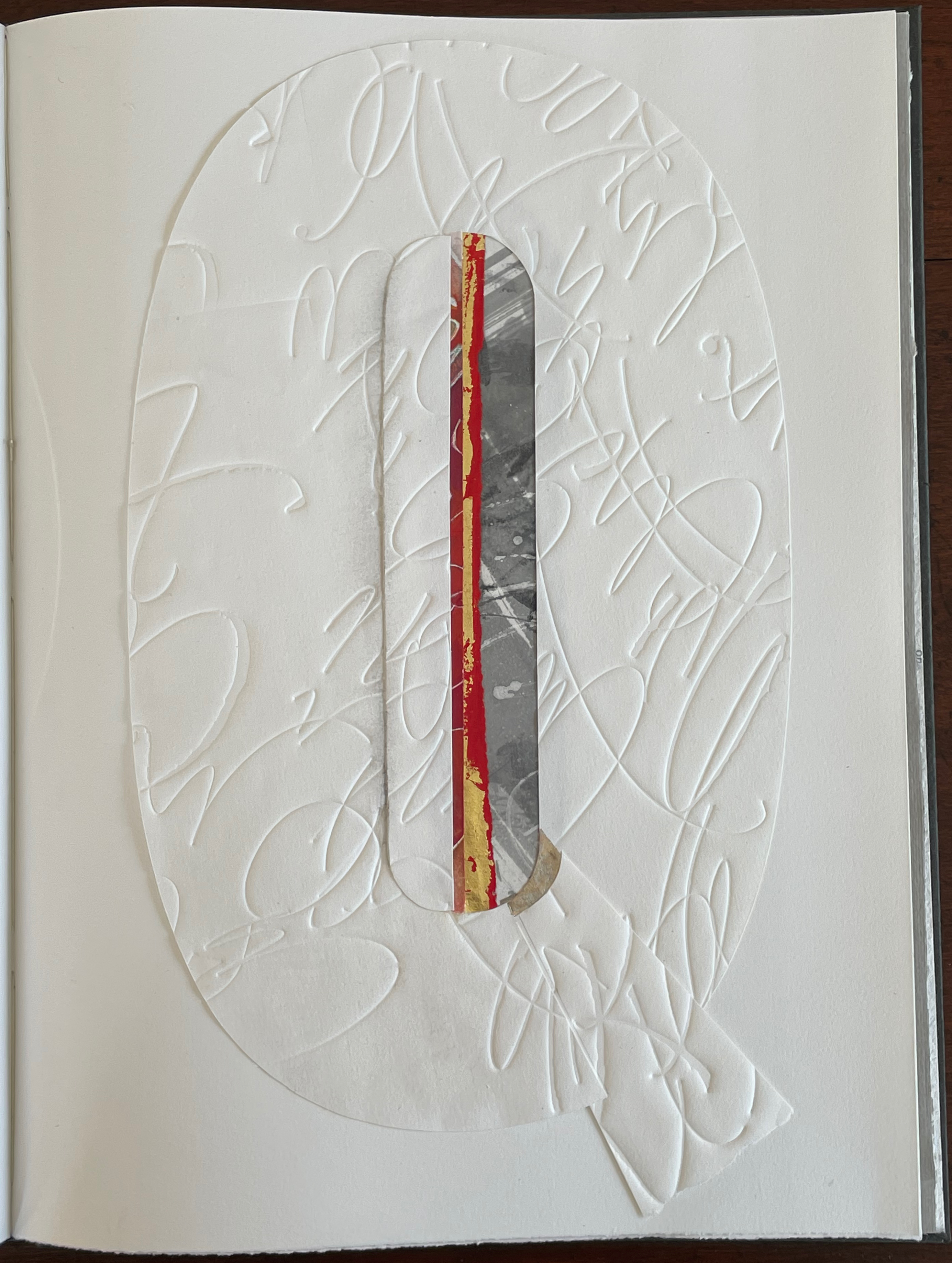
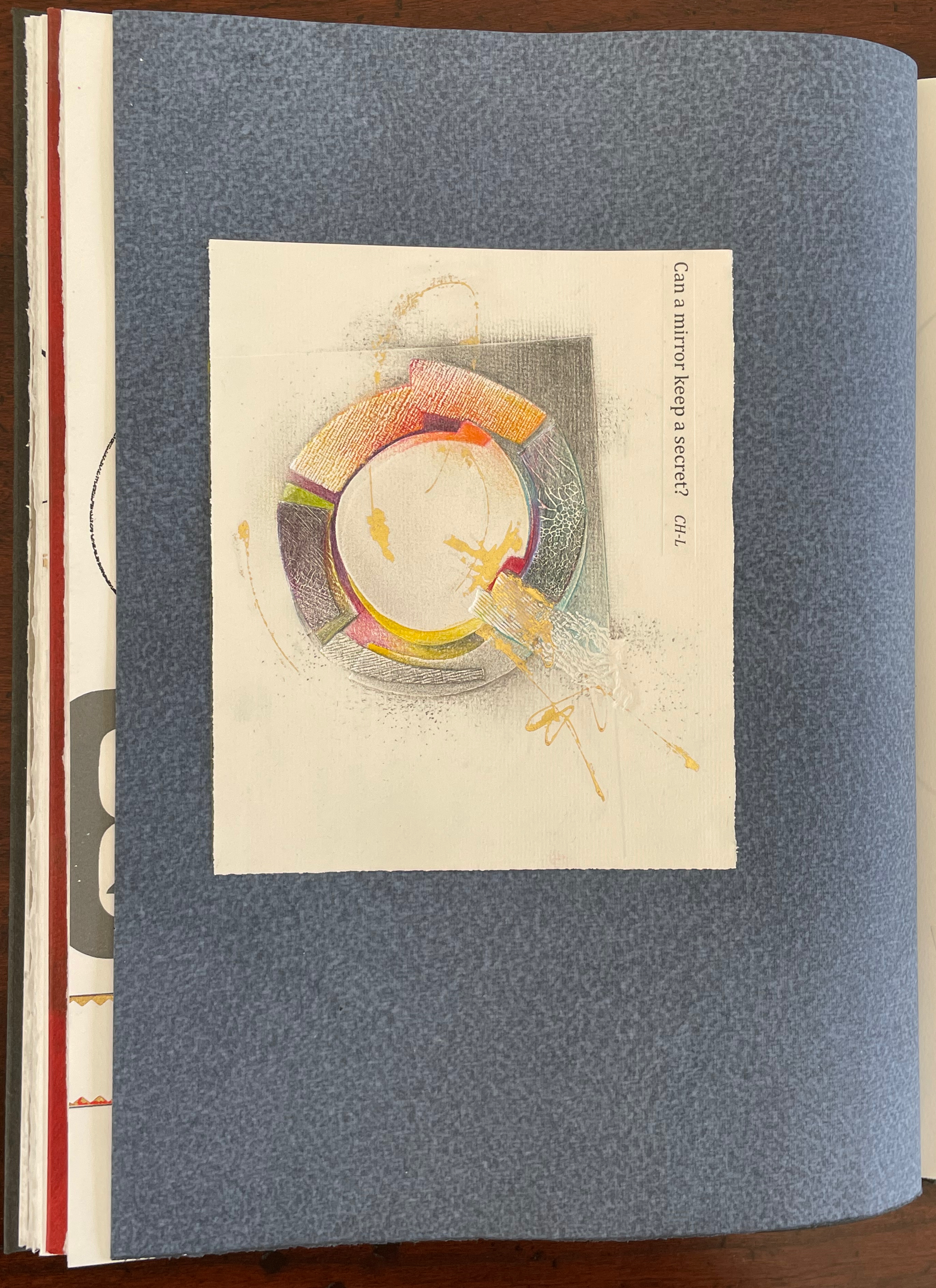
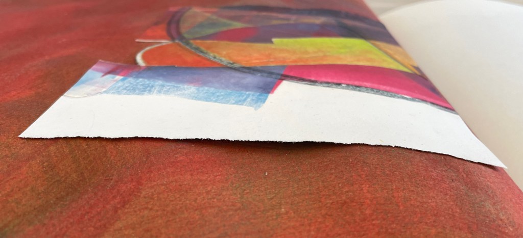
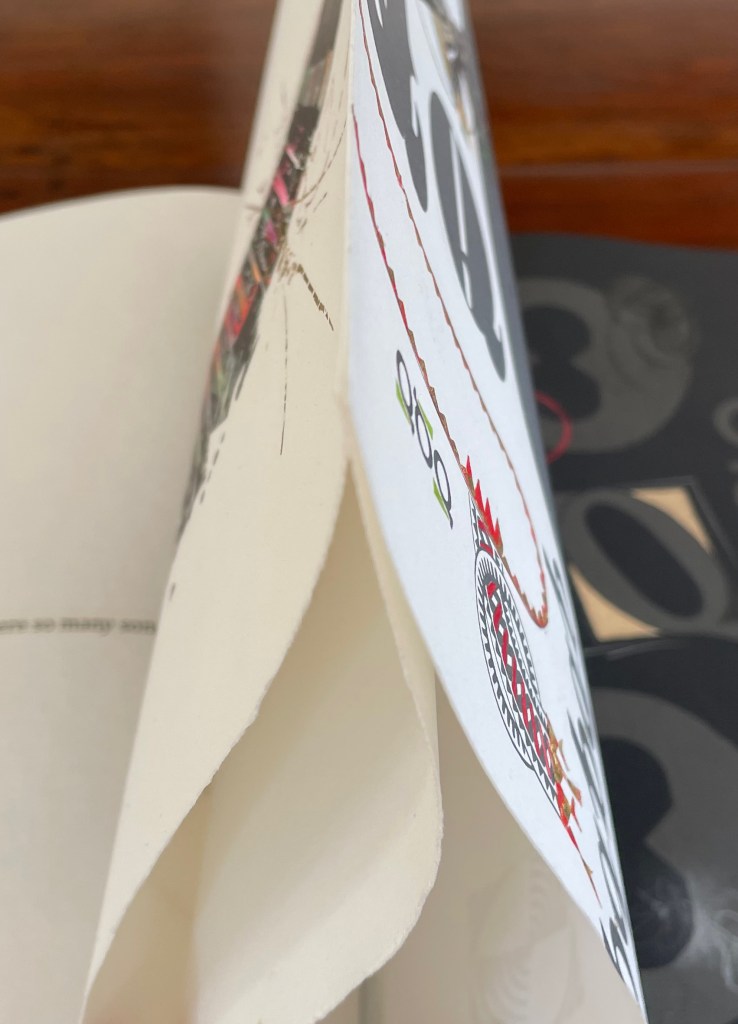
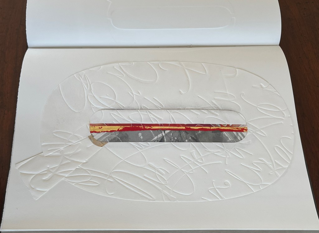
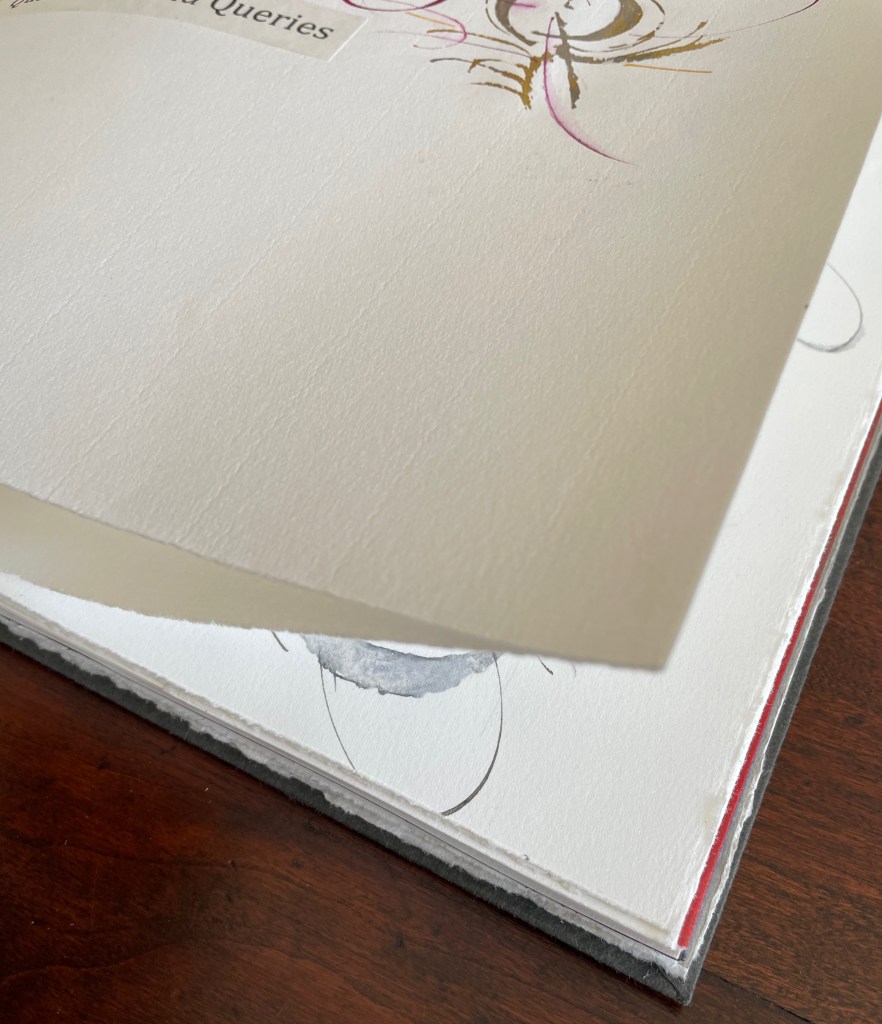
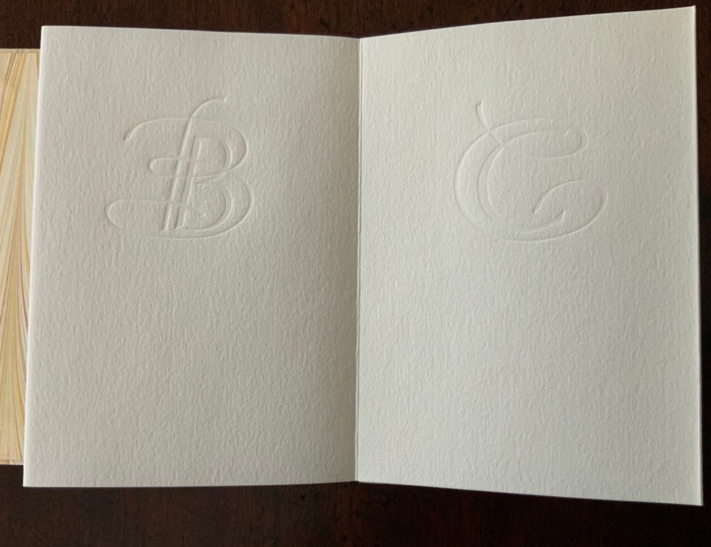
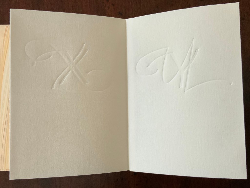
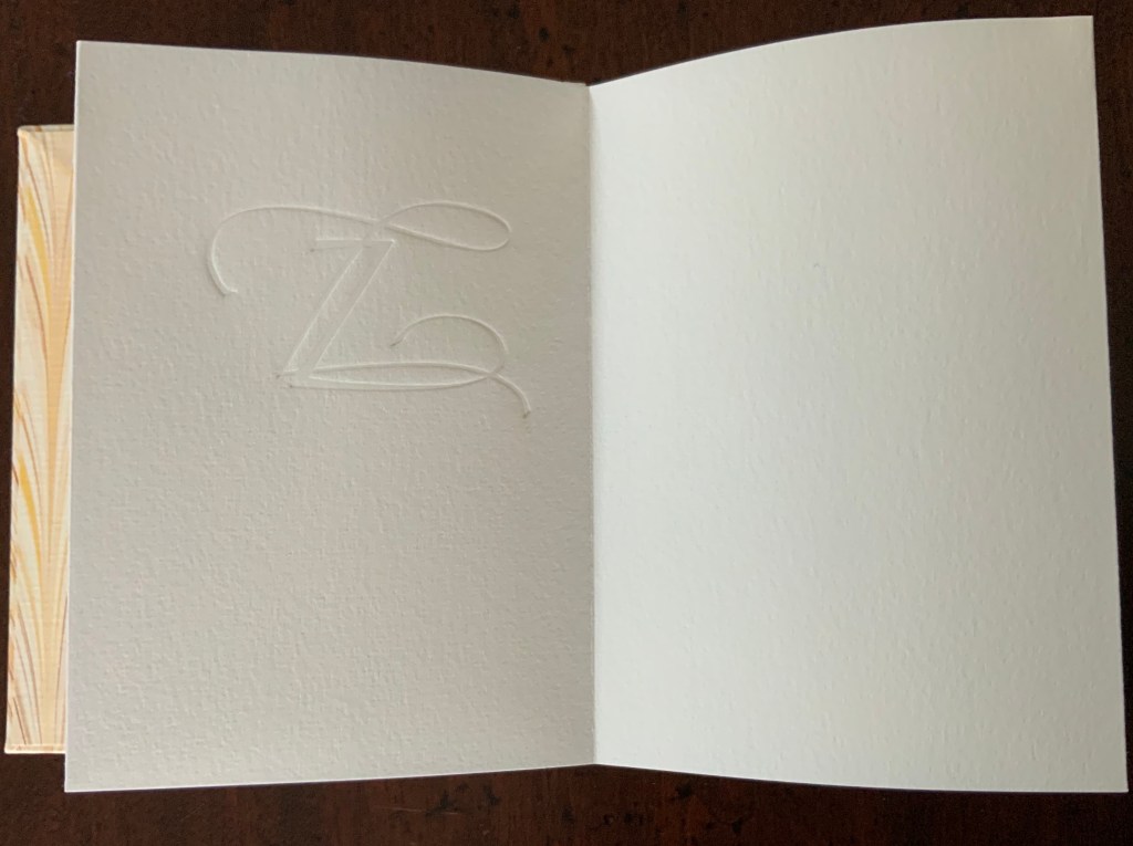
Rescuing Q (2023) Suzanne Moore Box enclosing softcover book. Box: H400 x W300 x D30 mm. Book: H380 x W285 mm. 32 pages. Printing by Sandy Tilcock (and Phoebe) at Lone Goose Press and Jessica Spring, Springtide Press. Unique edition. Acquired from the artist, 25 April 2023. Photos: Books On Books Collection. Displayed with permission of the artist.
Rescuing Q is a manuscript book, consisting of original paintings, monoprints, collage, pigmented prints, embossing, debossing, gilding and handwork complementing the letterpress printing. It is one of several such works designed and created by Suzanne Moore after more than 20 years of experimentation.
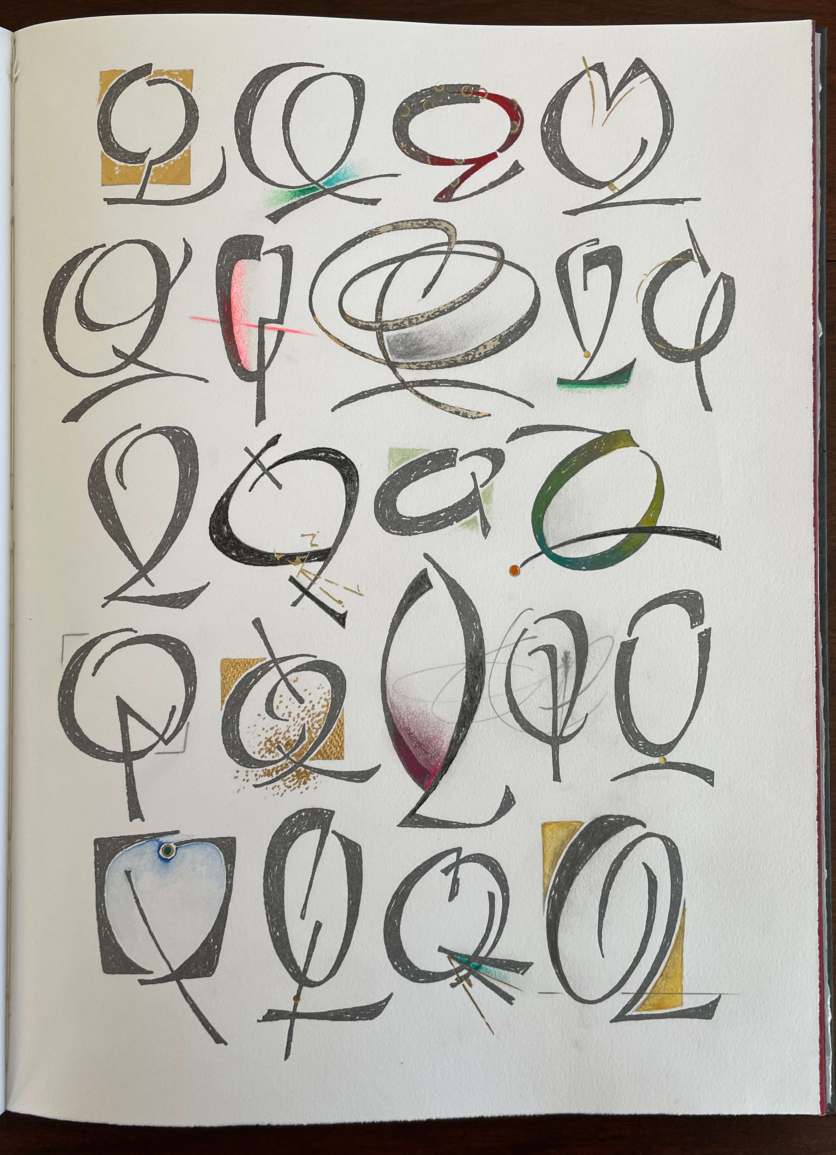
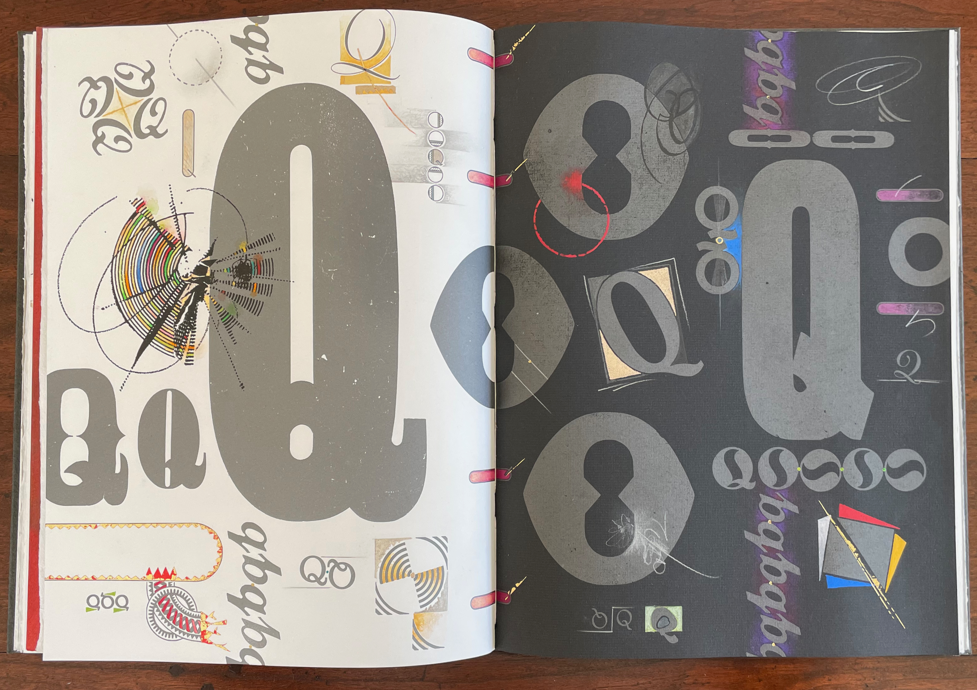
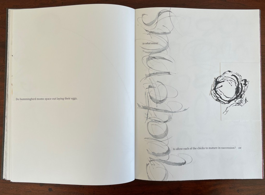
Q is not normal. Q is quirky. Q floats away. Q comes in too many shapes and sizes and colors. So attractive, Q was bound to be hijacked by Q-Anon, political operatives and social anarchists.
But Q will not remain captive for long because it is always asking questions. And, if we want answers, then as Rilke says, we must “live the questions now”.
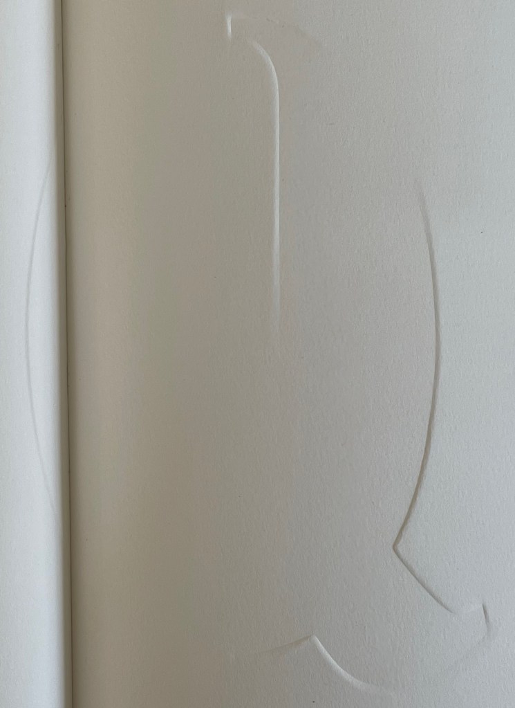
For most readers though, the question that will be uppermost is “How did she do that?” Moore is quick in her generosity and would insist on amending that question to “How did they do that?” Consider the selection of paper. More than Arches (a laid paper with visible mesh and watermark) had to be considered for these interactions of ink, gouache, gold leaf, palladium, debossing/embossing by etching press and hand, cuts and overlays.
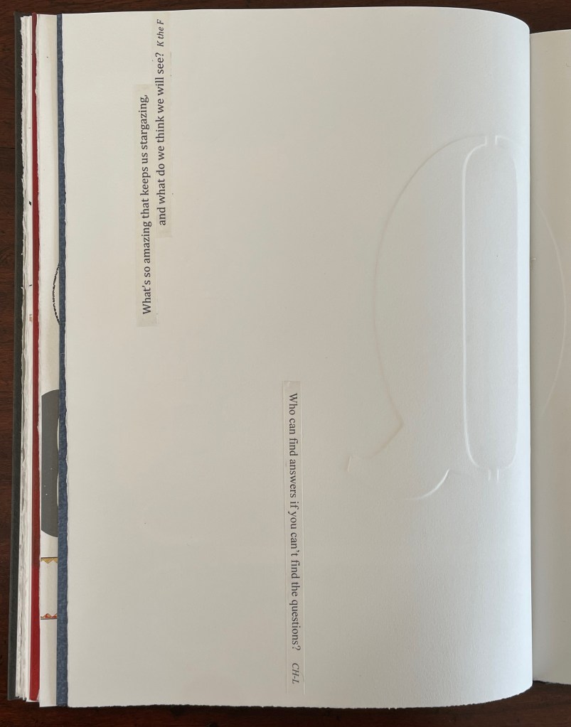
What notes, movements and rhythms were playing when these colors and the sequences were chosen?
How do they think of paper and ink in three dimensions?
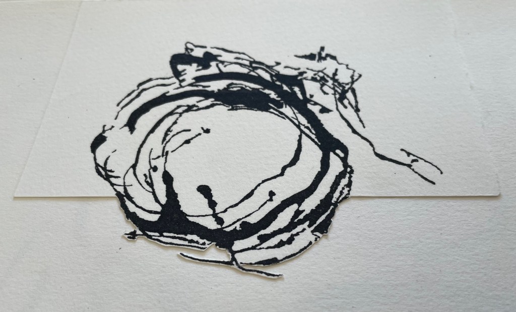
Who saw Q and questions in a bird’s nest?
And someone’s memory called up Cave Alphabet paper for the endpapers.
The fact that Moore and her colleagues can do all that (and more) and the fact that their gentle and pointed questions fuse with the art ensure that Rescuing Q does and will succeed.
A Musings (2015)
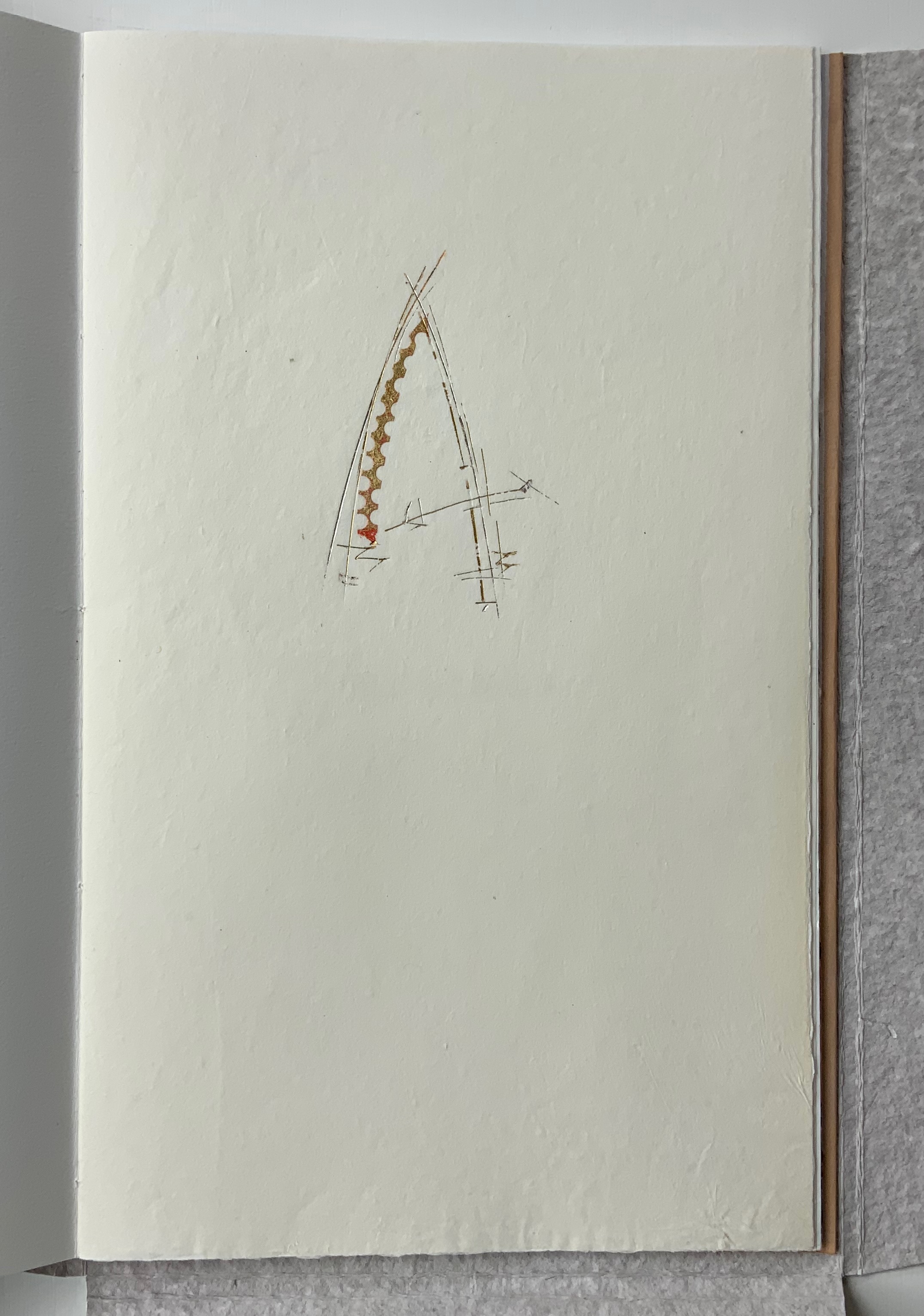
A Musings (2015) Suzanne Moore Tab-insert portfolio around softcover book. H370 x W230 mm, 24 pages. Edition of 26 variants, of which this is N. Acquired from Abecedarian Gallery, 13 February 2022. Photos: Books On Books Collection. Displayed with permission of Suzanne Moore.
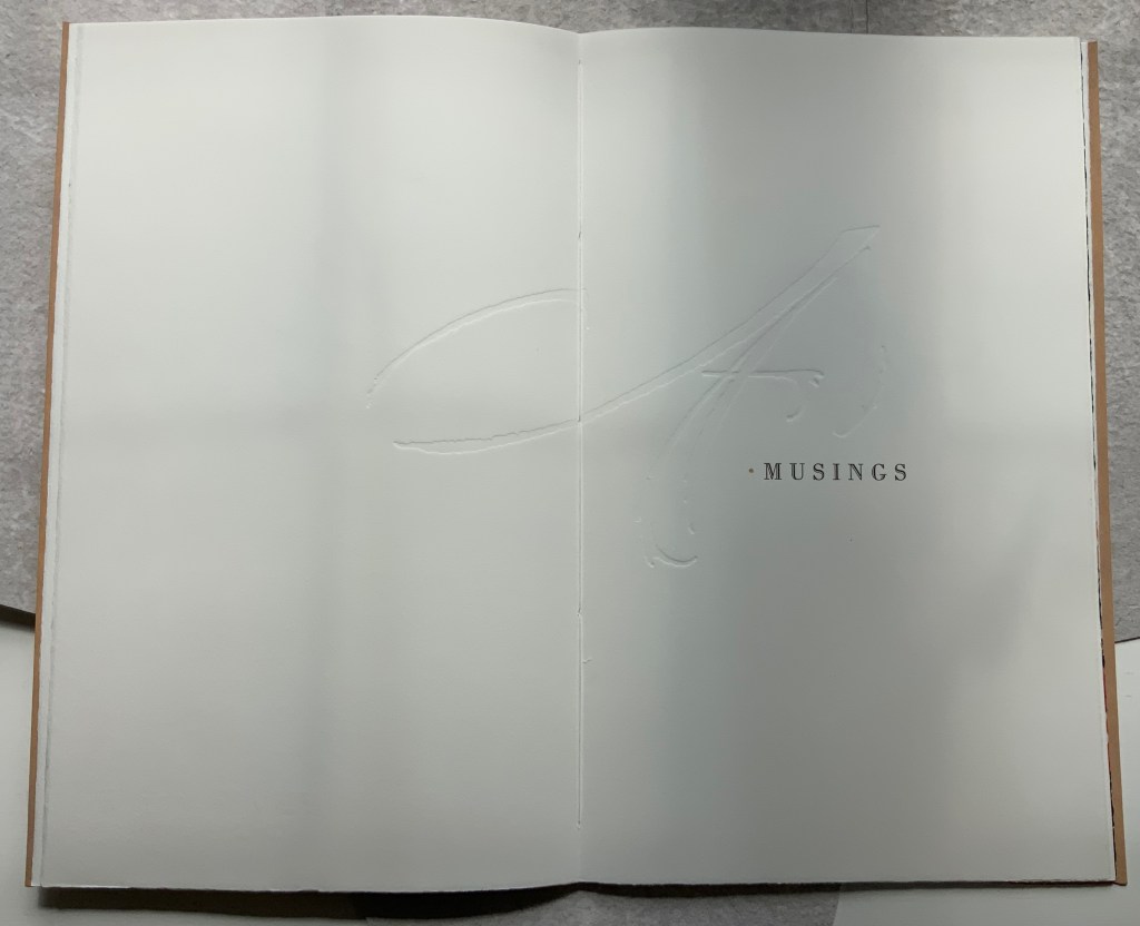
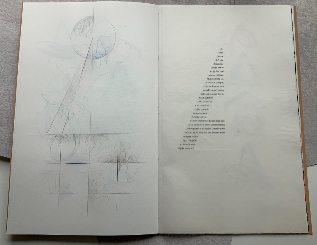
Title page
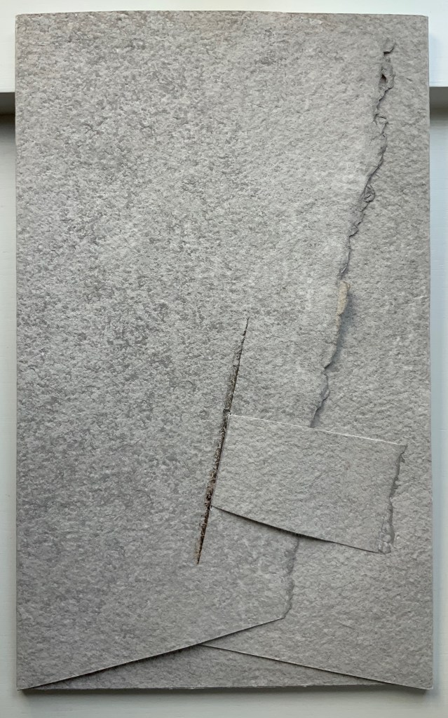
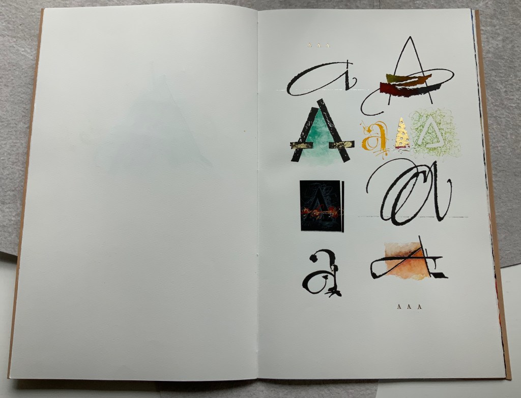
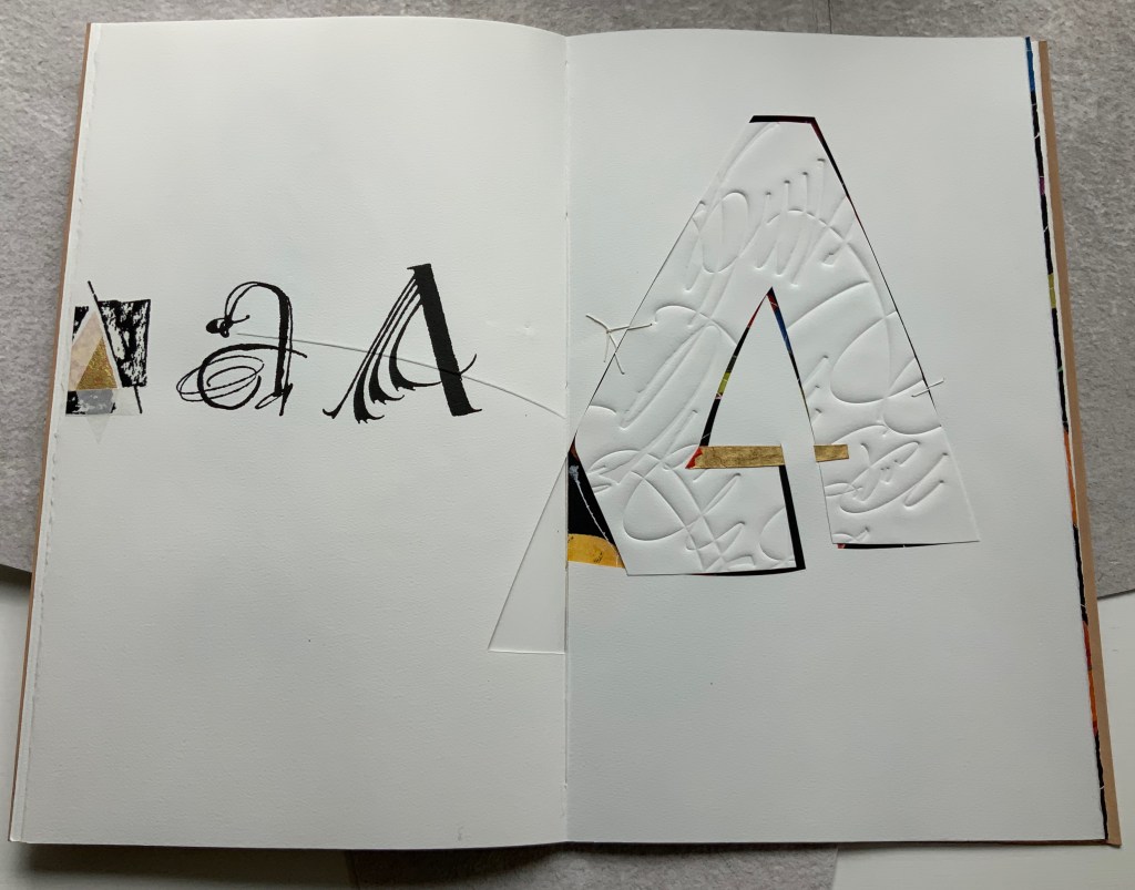
Another manuscript book, A Musings is an encounter between Suzanne Moore and the letter A, one of her 26 muses. As with any artist and muse, this naturally leads to portrayals of A in such varied positions, with such varied tools and techniques and such varied materials that the boxed and bound portfolio must take the amusing title A Musings. The muse finds itself posed across Magnani Aquaforte, Arches Text Wove, transparent kozo and other handmade papers enveloped by a stiffened, painted handmade paper. Moore’s musings fall on the historical, symbolic and spiritual aspects of the letter A with acrylic paint, pencil, freehand foil tooling, gold and palladium leaf, collage, debossing and embossing, sumi ink and gouache, sizing and varnish, monoprint, letterpress, folds and cutouts.
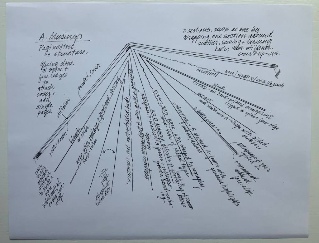
A separately provided copy of the artist’s plan for the pagination, structure and treatment per page offers a useful insight into the questions of how such a work is thought through and made. Page layout and the type of paper, in particular, play together sometimes like a clockwork mechanism and sometimes organically.
Painted cover
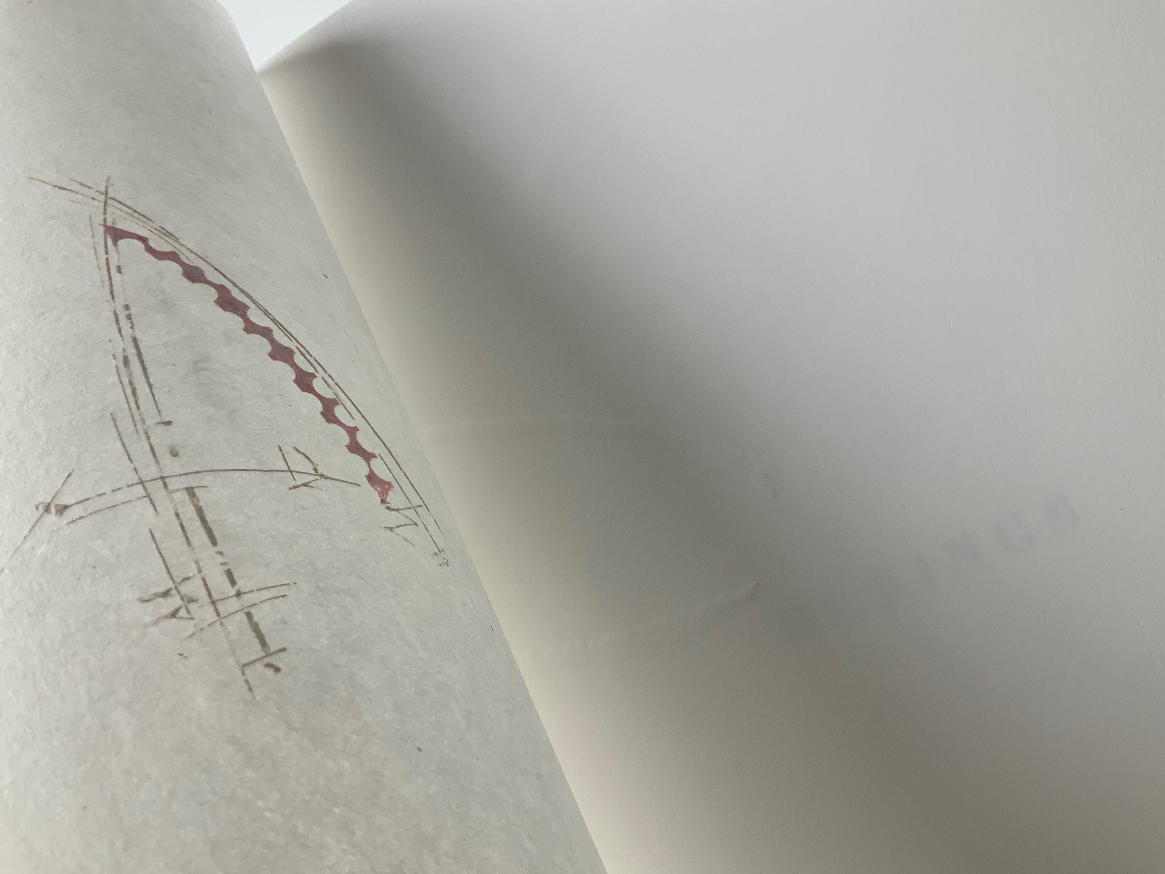
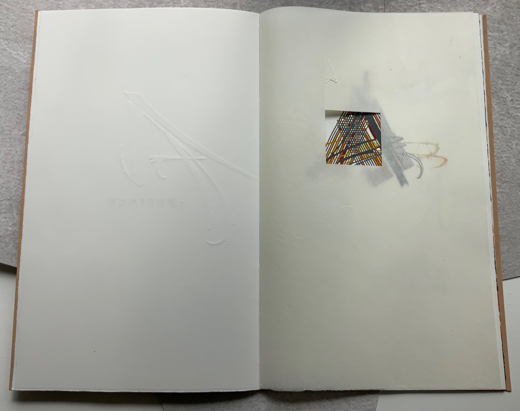
Left: Half-title. Right: Half-title turned to show translucency of kozo; note on the facing recto how the stroke from the debossed A on the title peeks through.
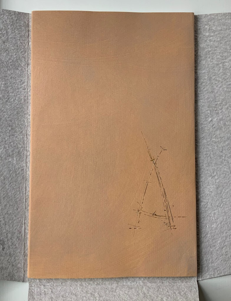
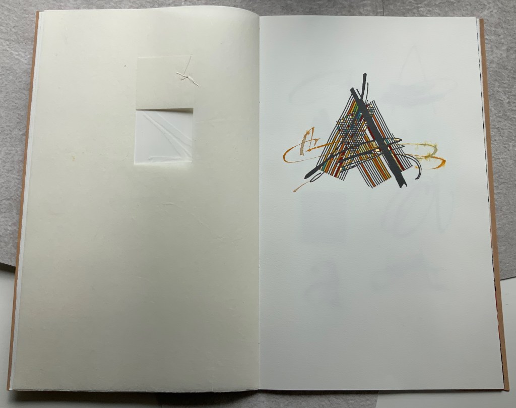
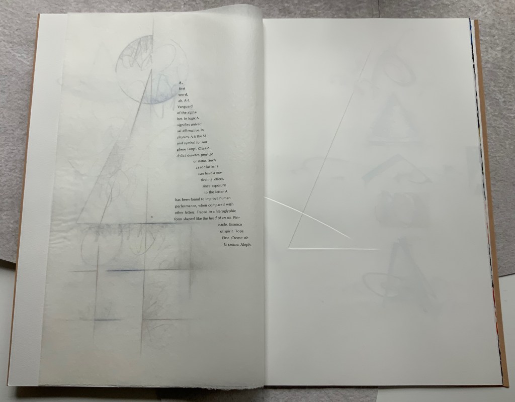
After the title page (see further above), the next double-page spread shows the title page’s debossed A in reverse on the verso page. Facing it is a square cutout through which multicolored lines forming overlapping As appear. Because the cutout page is translucent paper, we can see that the multicolored lines extend into a larger A on the next recto page. Turning the cutout page reveals that the cutout is actually a flap folded up and secured with white thread sewn in the shape of an A. This three-dimensionality of the flap is echoed by the way the crossbar swashes of the facing A seem to swirl around its two legs implying a spinning A.
From the single A interacting with a cutout, we move to a dozen evocations of the historic forms that the lowercase and uppercase A have taken. The lowercase “closed a” from the semi-uncial hand starting in the 5th century appears second down in the lefthand column, and the “perfected” Roman uppercase A appears at the bottom of the right column. Amusingly, some evocations blend periods of history. In the lower left, the drawing of a lowercase “open a”, which comes from the 8th century Carolingian miniscule hand, takes on the stylization of the 15th century’s bianchi girari (white-vine stem decoration). Just across from it, the stylized version of the Proto-Sinaitic (1700 BCE) form of aleph, meaning “ox”, has a burnt umber background that suggests markings in early cave dwellings.
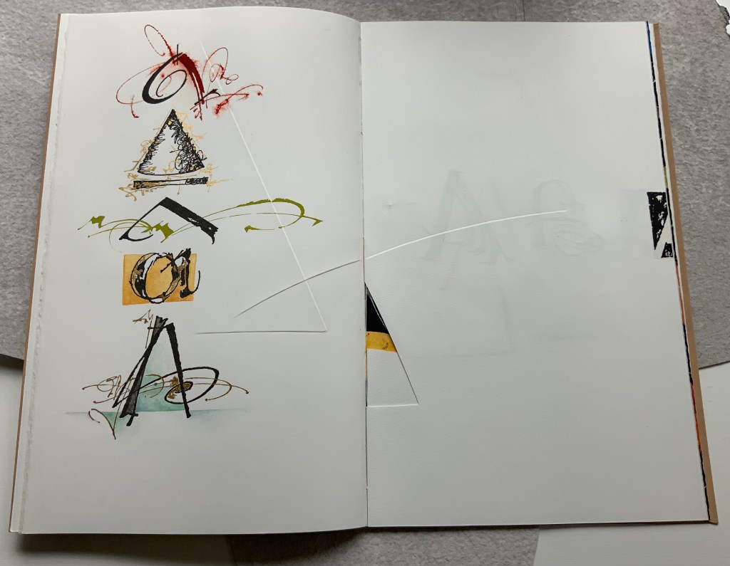
Using a translucent leaf with set type shaping half an A, the next two double-page spreads play (or muse) on uppercase A’s bilateral symmetry poised between geometric and freehand approaches to lettering, between typography and calligraphy and between inking and debossing.
When the recto page above with its debossed line and angle is turned, another extraordinary integration of composition, paper, printing (inking, debossing and “embossing”) and, now, cutting occurs. Notice how the ink of the first and third As overlaps the now “embossed” angle, how the now “embossed” line becomes debossed as it crosses the gutter, how the previous double-page spread’s themes of geometry/freehand, printing/drawing and lowercase/uppercase likewise cross over, and how the cutout triangle uses the yellow ink showing through to form the crossbar of an A and the gutter to form the A’s lefthand stem.
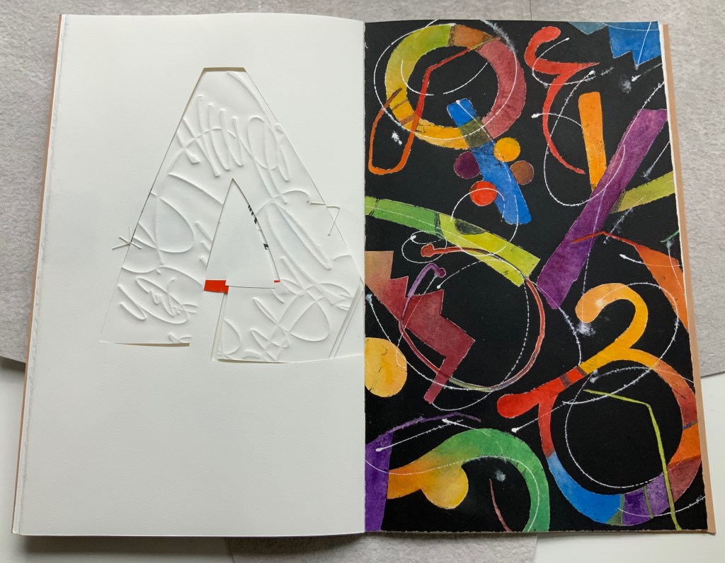
There is much else to muse upon in the spreads above, but it’s in the last two spreads where Moore builds and unfolds a fantasia of calligraphy, color, debossing, cutting, gilding and painting. Notice how the gilt crossbar slots through the page and helps secure the debossed piece behind the cutout to the page.
And when the page turns, notice how its gilt crossbar reveals its red paper beneath and becomes the spot of red completing the crossbar for the cutout A. The red spot against white seems to set off the explosion of color and calligraphy on the black final page, printed by Jessica Spring from polymer. The different shapes for A here come from African alphabets. The images are unique monoprints, done on an etching press. With the letters placed to block out the black and overlap one another, a sense of depth and texture arises. Contributing to that sense of texture, the white letters are hand-painted in gouache — sometimes layered, sometimes blended.
Books are inherently collaborative affairs, and for artists’ books, collaboration can become almost another tool for the artist. Jessica Spring, mentioned above, also debossed the opening A, hand-set the half-A composition and contributed to Rescuing Q. Now a fine binder in her own right, Gabby Cooksey, a studio assistant to Moore and Don Glaister, was essential to A Musing‘s hand work, binding and wrapper. Part of Moore’s creative progression from contributing to overseeing to orchestrating can be traced from here across three other works in the Books On Books Collection.
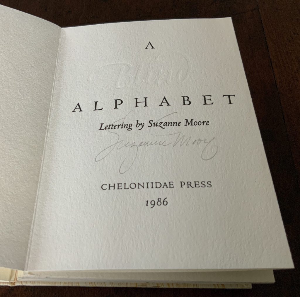
A Blind Alphabet (1986)
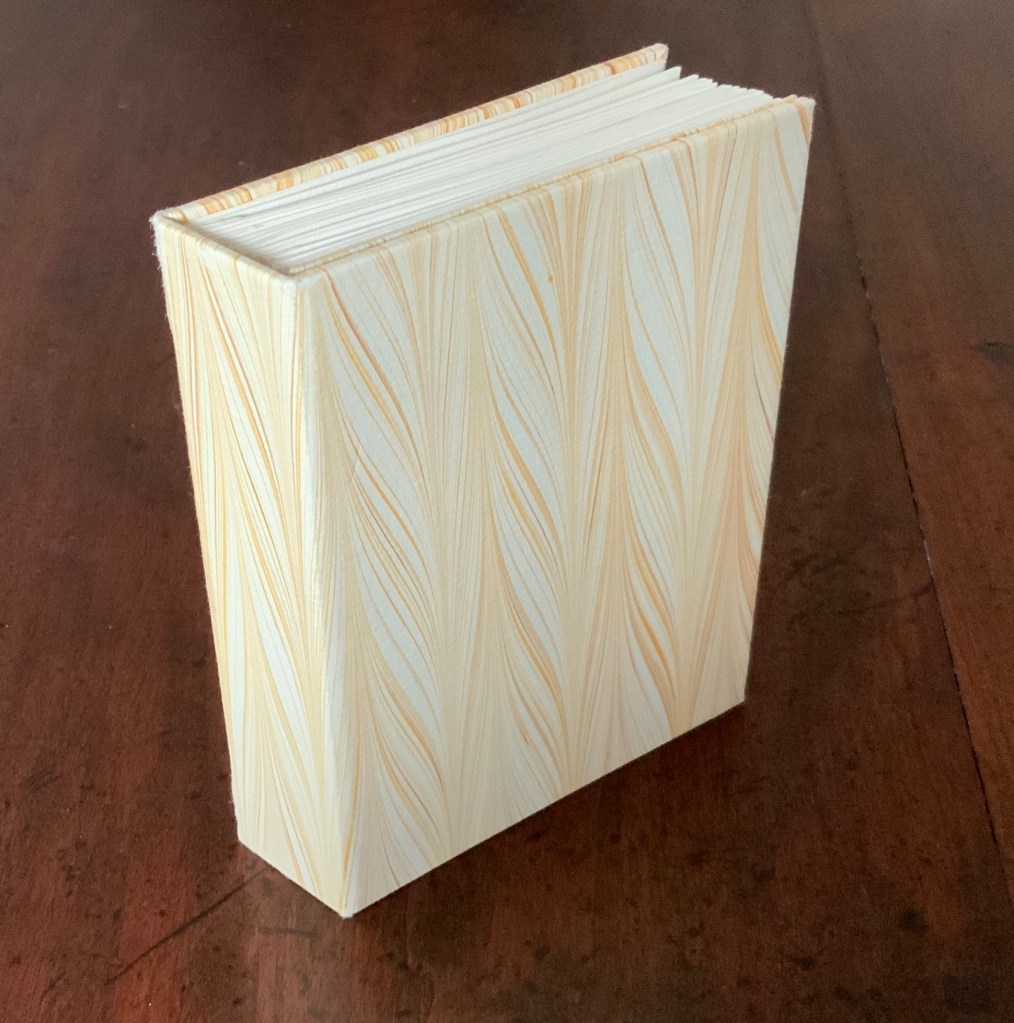
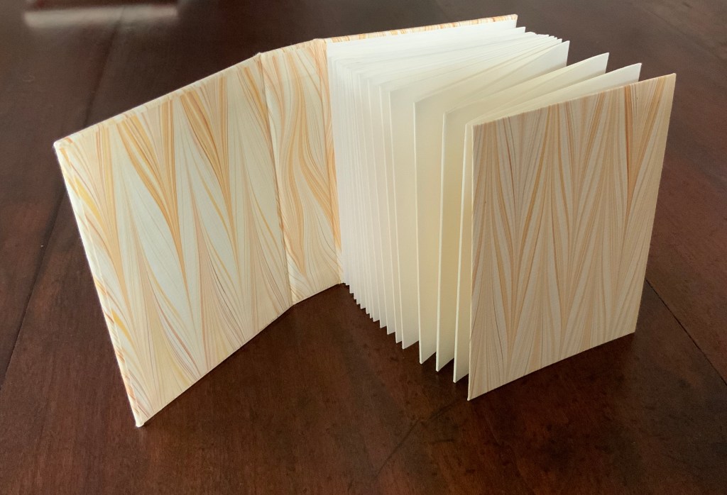
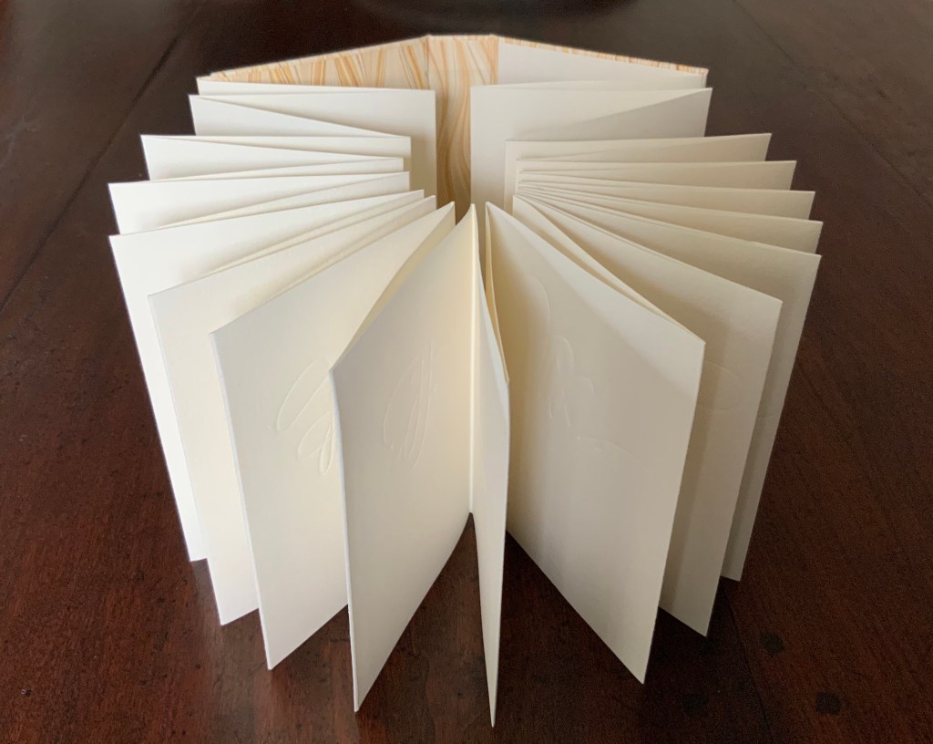
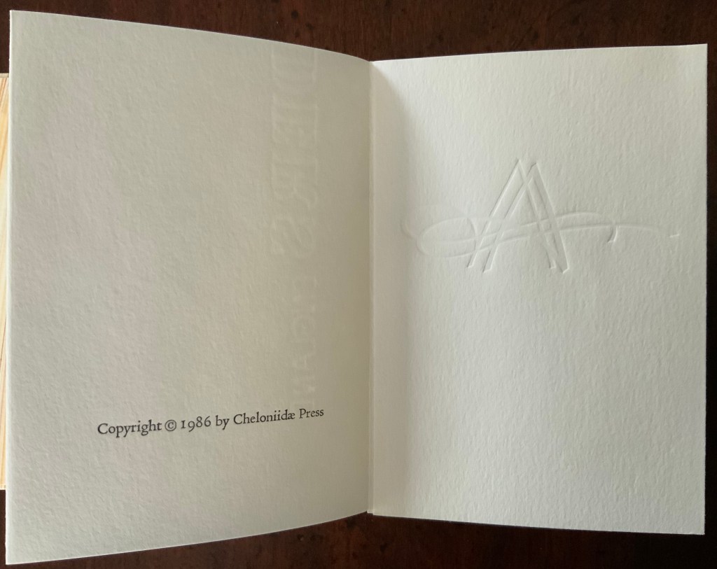
A Blind Alphabet (1986) Suzanne Moore Accordion-fold. Closed H128 x W93 D28 (spine) D22 (fore-edge) mm; open 3200 mm. 34 pages. Edition of 200 of which this is #91. Calligraphic letters designed and drawn by Suzanne Moore, printed by Harold McGrath on T.H. Saunders cold-pressed watercolour paper, bound by Claudia Cohen in marbled paper by Faith Harrison. Acquired from Veatchs, 1 May 2018.
Here, as noted in the colophon to A Blind Alphabet, Moore has the creative role of originating artist, designing and drawing the alphabet — soloist, as it were, in the Cheloniidae Press reportory orchestrated by Alan James Robinson.
In Robinson’s wood engravings of birds, Moore plays a creative contributing role with much the same repertory company.
A Fowl Alphabet (1986)
A Fowl Alphabet(1986) Alan James Robinson (etchings), Suzanne Moore(calligraphy) Casebound. Marbled paper over boards. Doublures and flyleaves. H218 x W145 mm. 26 Folios untrimmed at head. Four-page prospectus loose. Acquired from Bromers Bookseller, 16 August 2022. Photos: Books On Books Collection. Displayed with Suzanne Moore’s permission.
Again, Cheloniidae Press’ master printer Harold Patrick McGrath and “usual suspects” Arthur Larson (hand typesetting), Faith Harrison (hand marbling) and Claudia Cohen (binding) played their roles in this book. Here, Moore has the creative contributing role of designing the alphabet and, for the deluxe and full vellum editions (not shown), hand lettering.
In book art, an artist’s progression from contributor to orchestrator is not necessarily linear as can be seen in this subsequent work.
Bartleby, The Scrivener: A Story of Wall Street (1995)
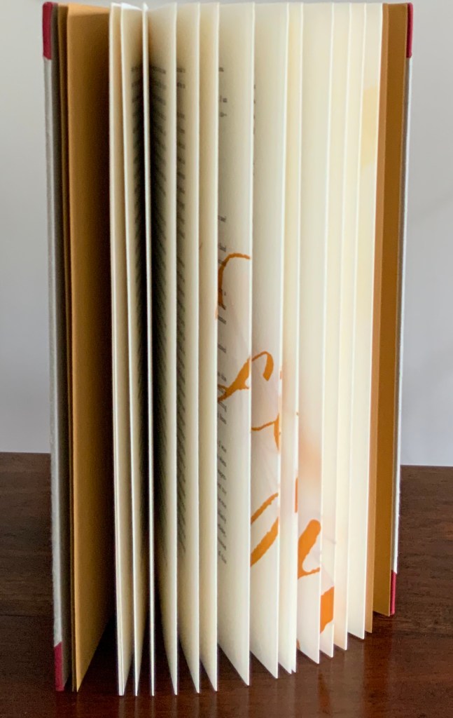
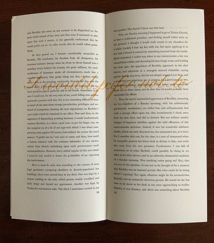
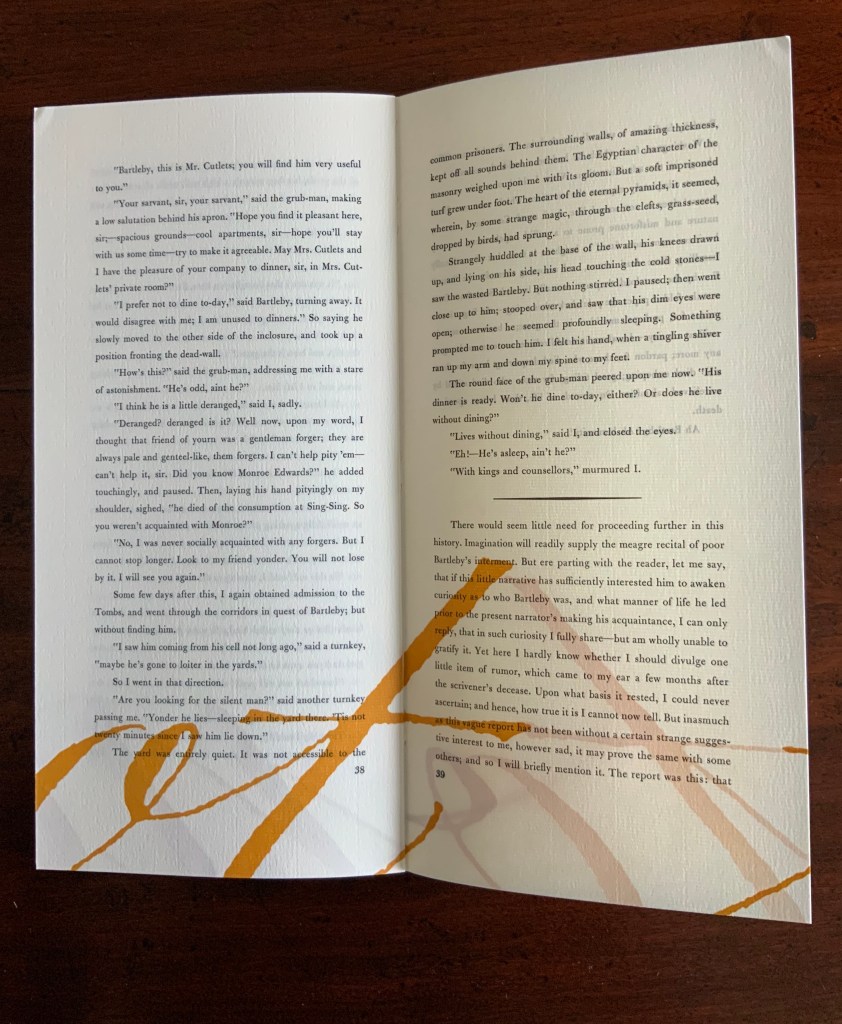
Herman Melville, Bartleby the Scrivener: A Tale of Wall Street, 1853. Indulgence Press, 1995. Typeetting, printing and binding by Wilber Schilling; Calligraphy by Suzanne Moore. Text paper by Janus Press. Endpapers by MacGregor & Vinzani. Edition of 100 of which this is #71. H320 x W158 x D14 mm. Acquired from Indulgence Press, 17 December 2015. Photos: Books On Books Collection. Displayed with permission of the publisher.
Wilber Schilling (Indulgence Press) orchestrated this edition of Herman Melville’s well-known story. Part of Schilling’s genius was to invite Moore to provide the calligraphy for Bartleby’s hallmark (his only) words “I prefer not to”. Another part was to print Moore’s calligraphy in ever-increasing size in ghostly ochre and in descending position across the pages of the book.
For more of Suzanne Moore’s works and artistic roles as well as others’ insight into them, see below.
Moore, Suzanne. 2016. Studies in Love the Question. Handlettered pages in book bound by the artist. 34 images available at Letterform Archives. ______________. 2014. Zero – Cypher of Infinity. 24-page handlettered pages in book bound by the artist. Letterpress pages by Jessica Spring. 20 images available at Letterform Archives.
______________. 2014. Origins and Spectrum. Process portfolio for Zero — Cypher of Infinity. Includes notes from the artist. 28 images available at Letterform Archives.
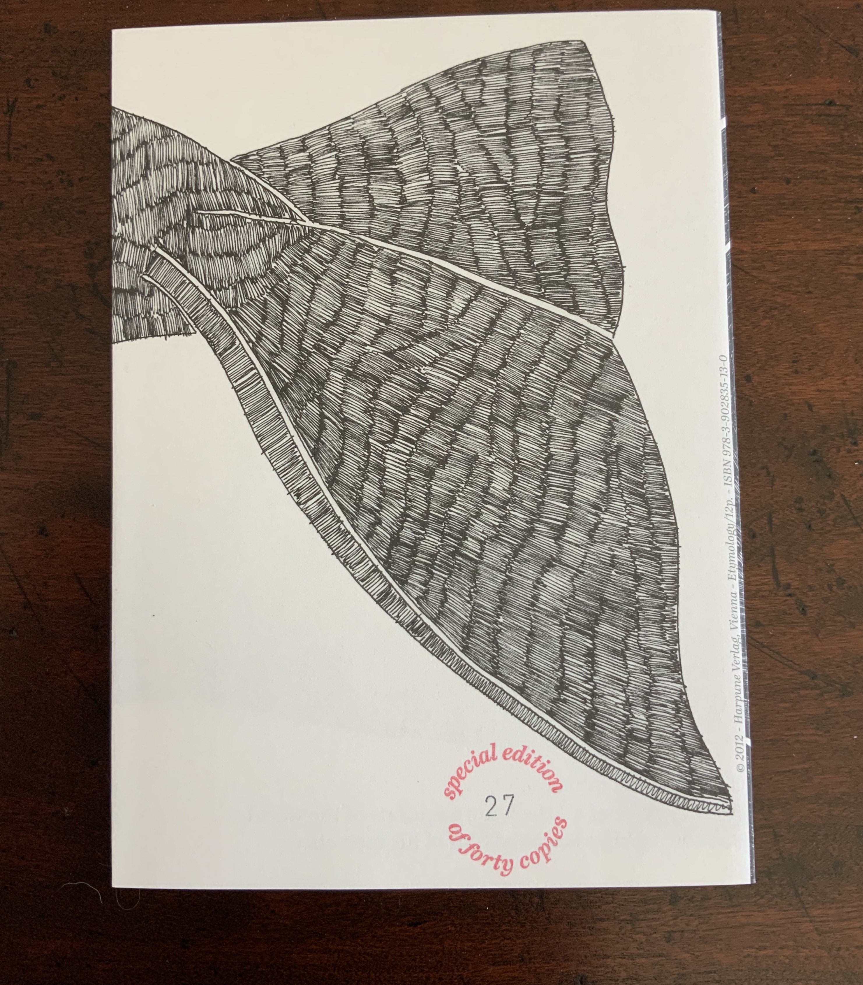
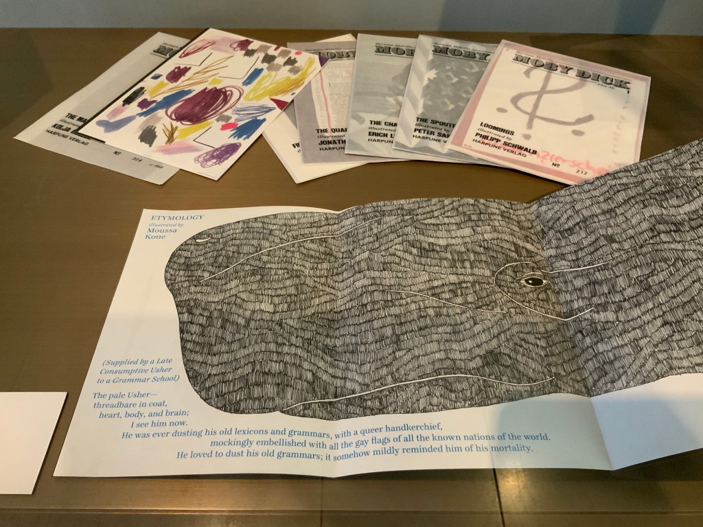
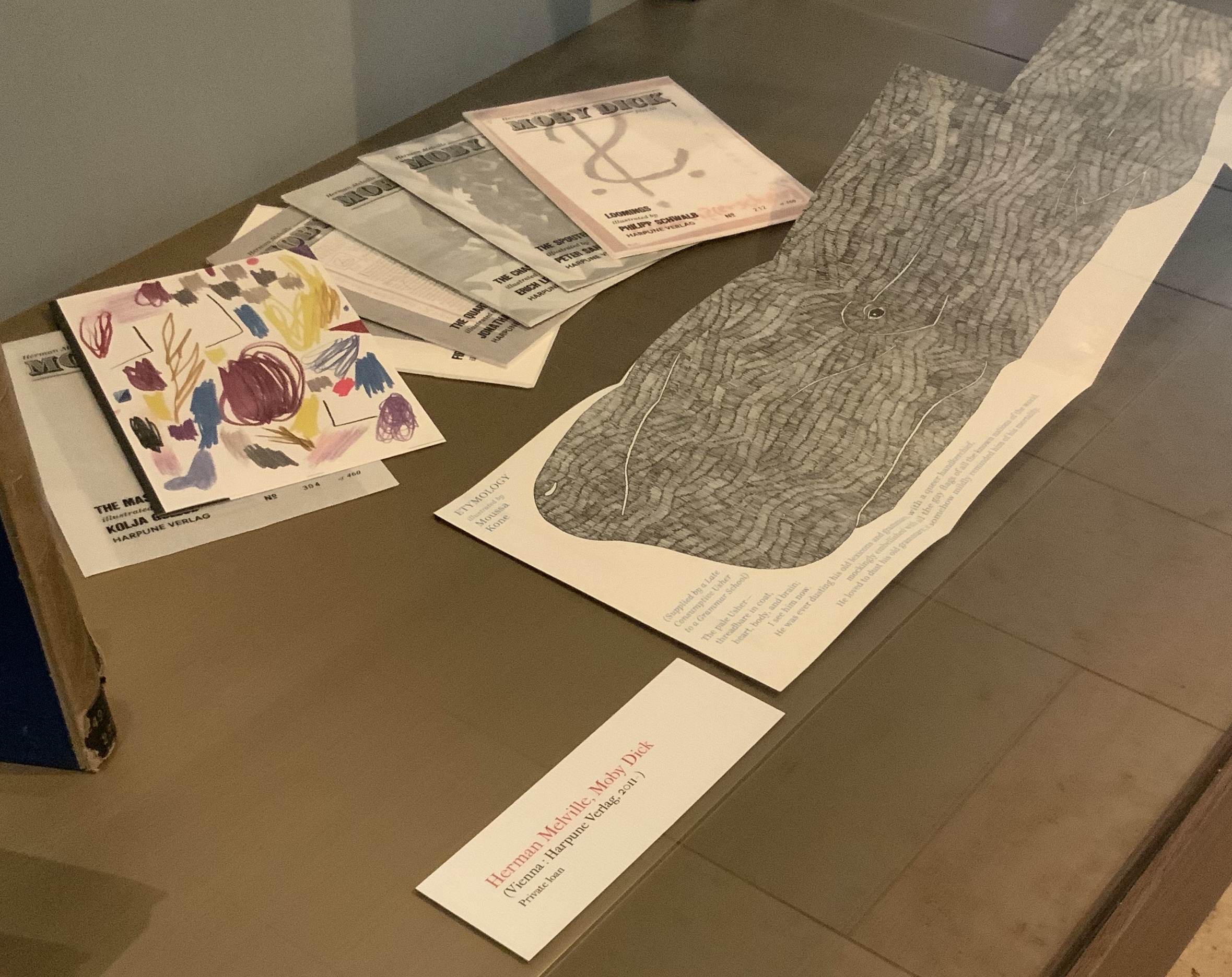
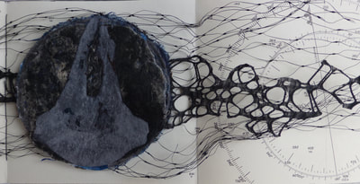
I first came across the artist Moussa Kone after subscribing to Harpune Verlag’s Moby-Dick “Filets”. Each filet is a section or chapter of Herman Melville’s Moby-Dick, The Whale (1851), which has been assigned to, or claimed by, an artist for illustration. About the time the subscription package arrived, the Bodleian Bibliographical Press announced the upcoming exhibition “Very Like a Whale”, for which artists were invited to create a print work in response to one of the eighty quotations making up the section “Extracts” prefacing Moby-Dick (1851). The Moby-Dick ”Filets” piqued the nearby Bodleian curators’ curiosity, so a loan was offered before I had opened and sorted through the catch. Moussa Kone’s handling of “Etymology”, which happens to precede “Extracts” in the novel, was selected and displayed prominently. And that is how I discovered this catch within the catch.
“Etymology”, Moby-Dick “Filets” (2012)
“Etymology”, Moby-Dick ”Filets” (Harpune Verlag, 2012) Illustrated by Moussa Kone Leporello in an edition of 460 numbered copies. Special edition of 40, of which this is #27, signed by the artist and including parts of the original drawing. Closed: H200 x W150 mm; open: H200 x W710 mm; 16 panels. Acquired from the artist, 11 December 2019.
Note the reflections of the whaler Pequod, Ahab’s chase boat, Ahab himself and the descending harpoon all caught in the corner of the whale’s eye. Being on the front cover, they are the most prominent of several telling details, two others being the selection of ocean-blue ink for the etymological terms through which the whale swims and the whale’s length extending over both sides of the leporello. The inventiveness to which the accordion, concertina or leporello structure lends itself seems endless.
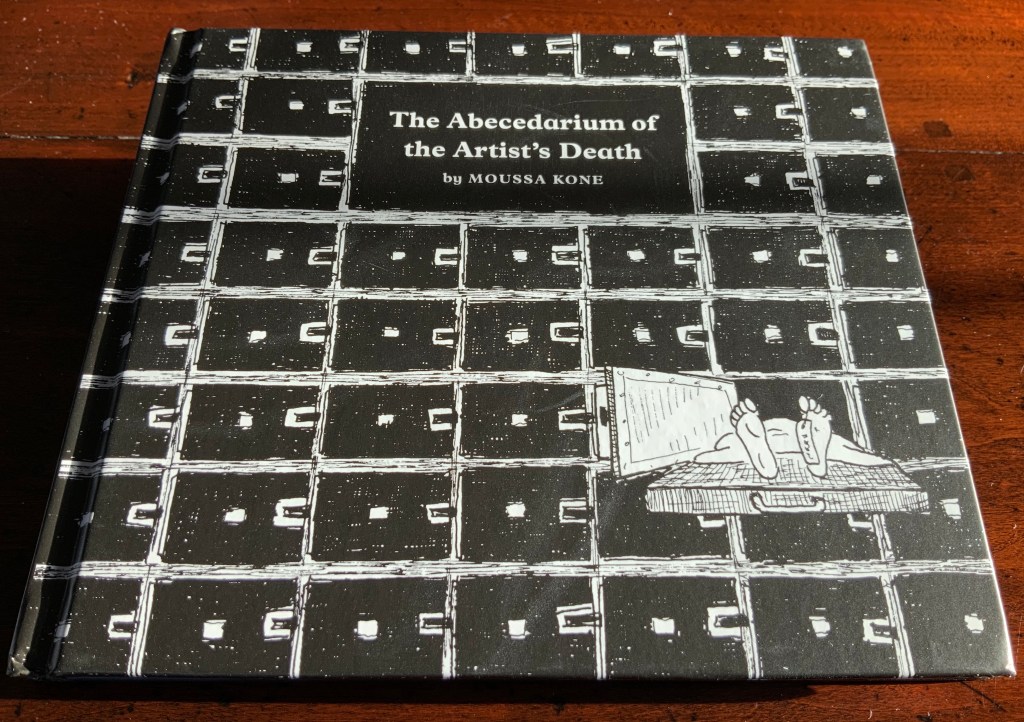
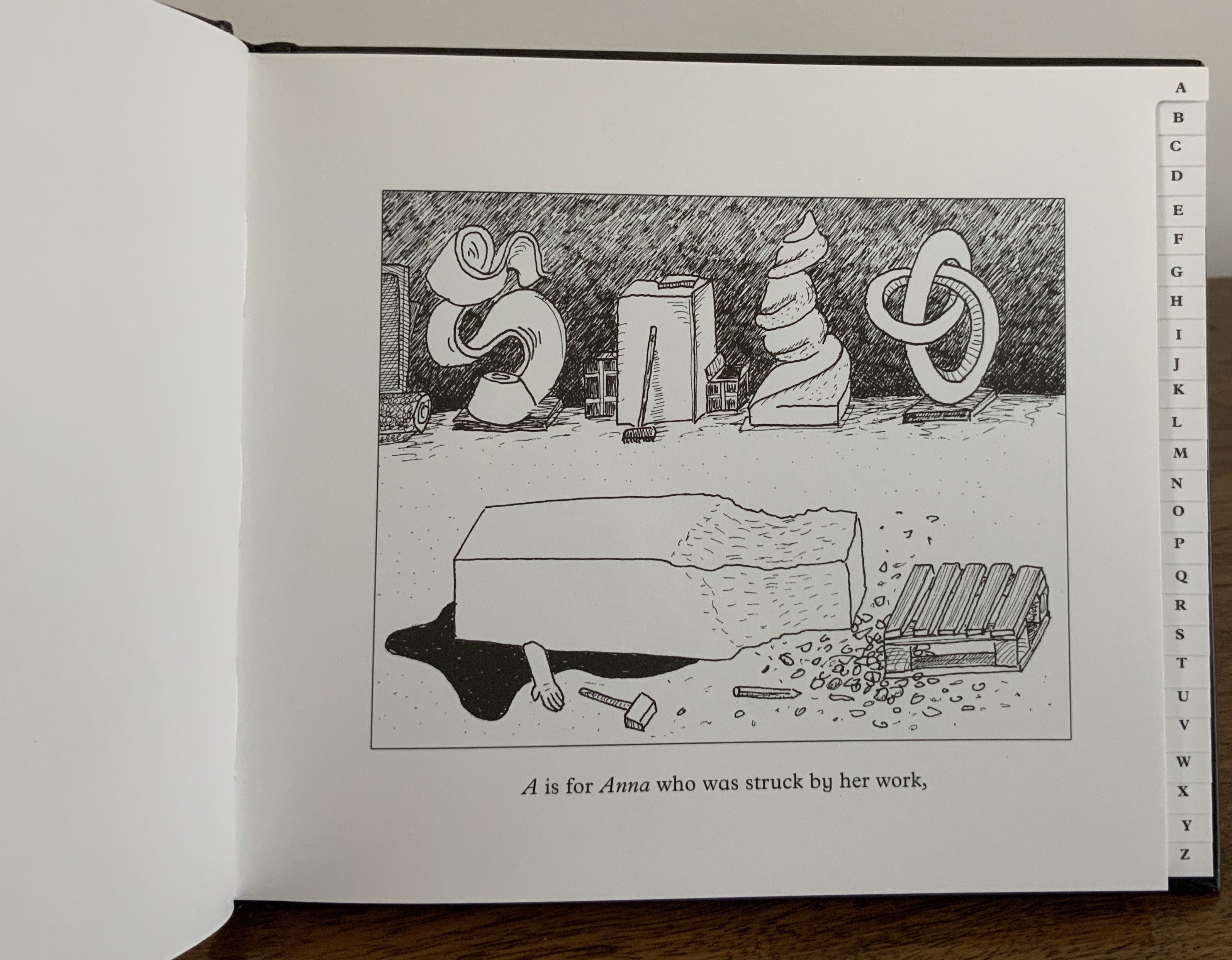
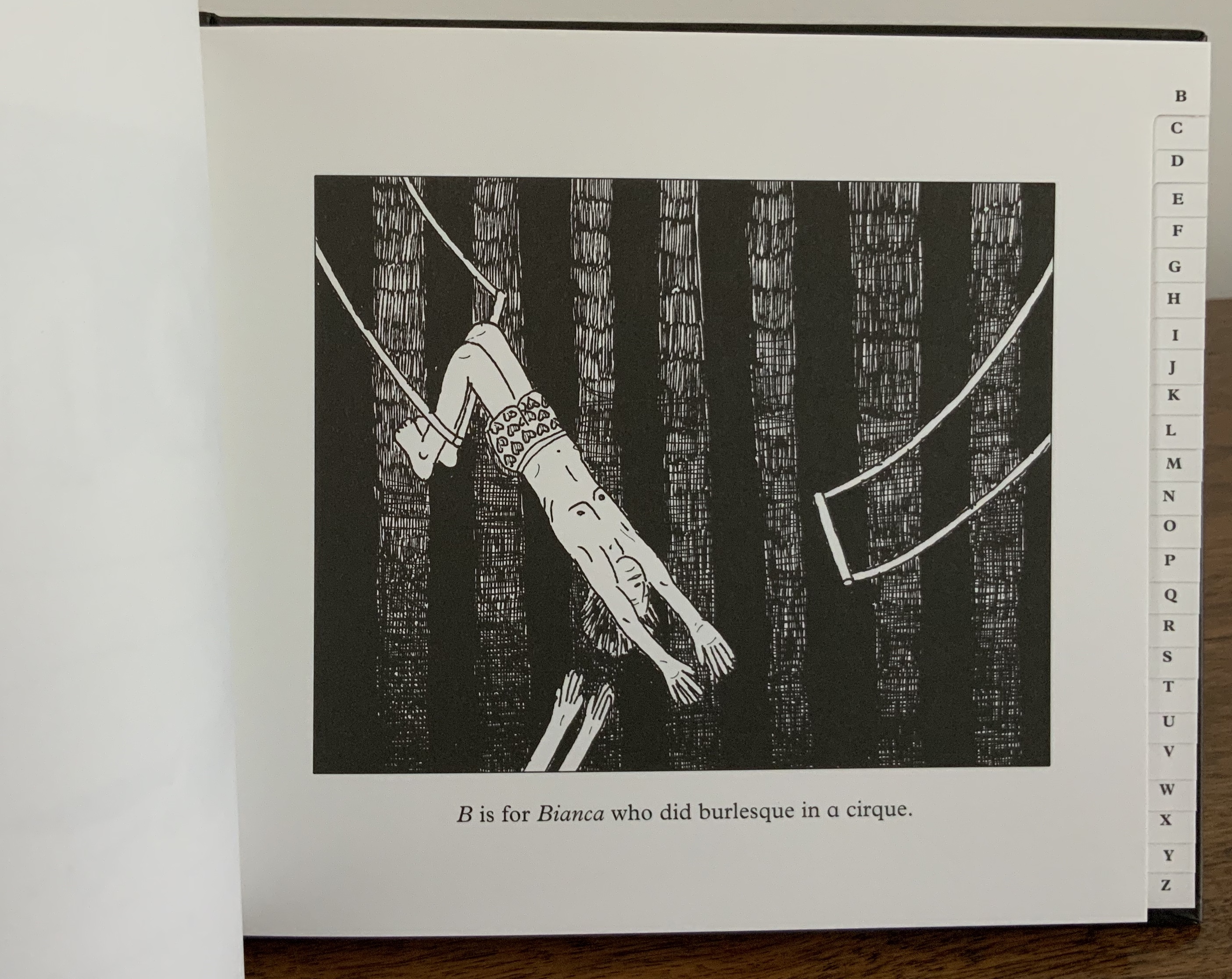
The Abecedarium of the Artist’s Death: 26 Dangers for Your Career (2014)
The Abecedarium of the Artist’s Death: 26 Dangers for Your Career (Verlag für moderne Kunst, 2014) Moussa Kone Hardcover, thread-bound, register-cut; layout by Martin Wunderer; 56 pages, 26 illustrations by Moussa Kone. H145 x W170 mm. Acquired from the artist, 11 December 2019.
An abecedary seems to be de rigueur for book artists. The usual accompanying humor and puns of book art manifest themselves here not only in the illustrations paying homage to Edward Gorey’s The Gashlycrumb Tinies but also in the structure of the little black address book and its alphabetic tabs.
Nowhere Land (2017)
Nowhere Land (2017) Moussa Kone Map, offset printed on both sides. H152 x W112 cm. Acquired from the artist, 11 December 2019.
Nowhere Land follows on from The Abecedarium deeper into the realm of the outré. It was shown in the group exhibition Constructing Paradise, curated by Dieter Buchhart and Mathias Kessler at the Austrian Cultural Forum in New York (ACFNY), 31 January – 24 April 2017. The ACFNY’s announcement reads:
Constructing Paradiseexhibits contemporary reinterpretations of notions of the “exotic” by artists based in Austria or the United States. Taking iconic artworks such as Paul Gauguin’s Noa Noa and Oskar Kokoschka’s Tiger Cat as starting points, the show assembles a diverse range of work from early contemporary to more recent artistic responses to the modernist imprint of desire and fantasy on contemporary culture. Particularly when juxtaposed with hyperbolized images of modern-day advertising, the exhibition explores the psychological impacts of the modernist image on image culture and the Western psyche.
Photo: Courtesy of the artist.
Moussa Kone’s entry took the form of a Panoramic Map for tourists and was distributed among the exhibition visitors. The artist’s description is too arch and funny to paraphrase:
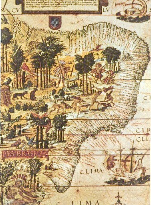
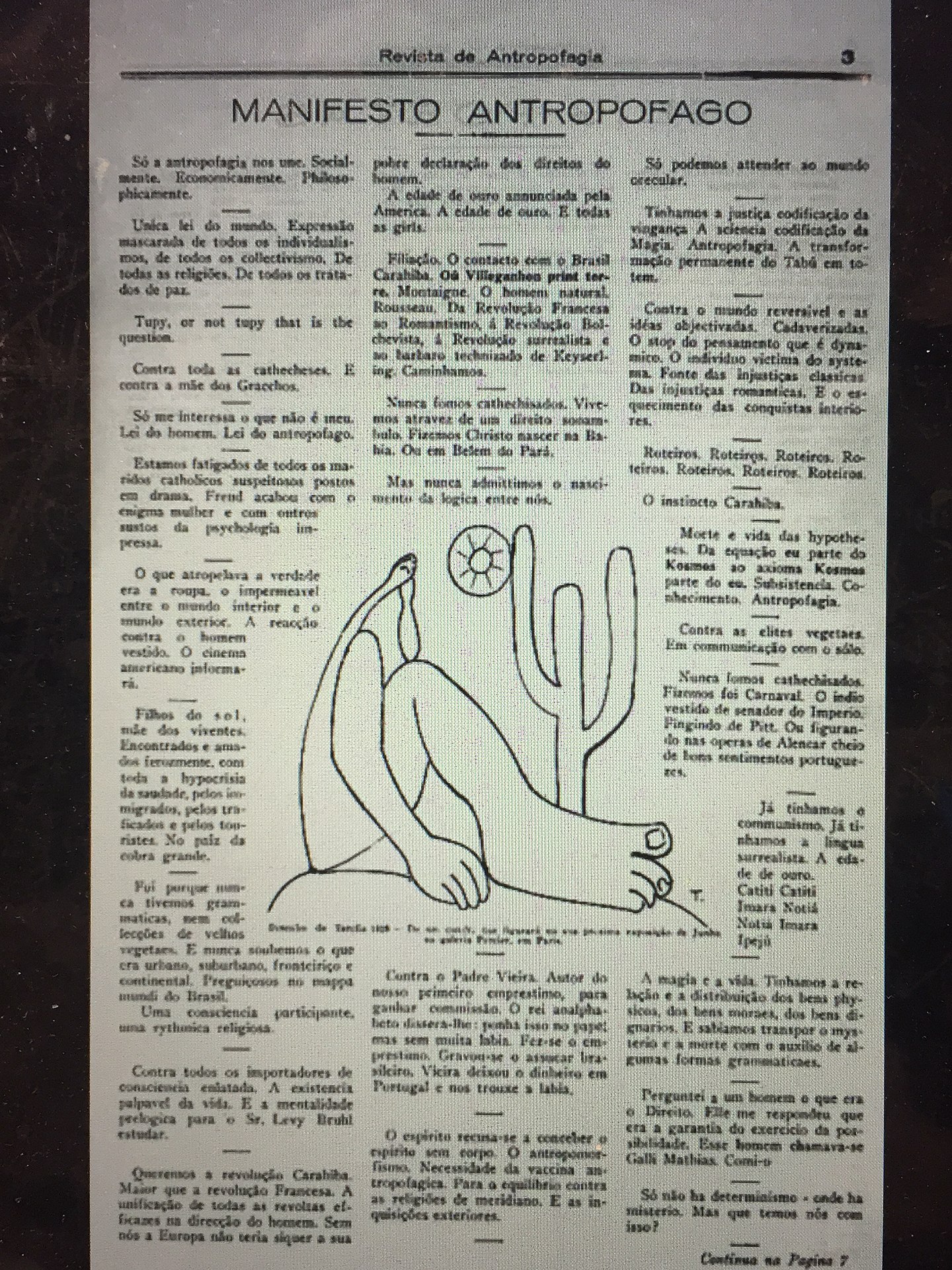
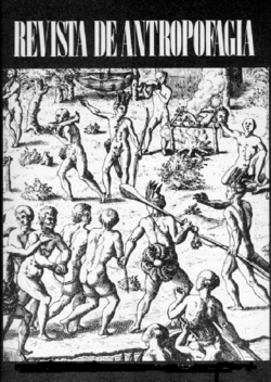
A nautical chart leads the reader to an island, where art historic images of the Brazilian Tupi people are combined with stills from 1980s Italian cannibal movies. It was the poet Oswald de Andrade, who declared in 1928 in his famous “Manifesto Antropófago” (Cannibal Manifest) a strategy of getting rid of the colonizer’s culture in Brazil through an exotic practice that was long attributed to the indigenous people.
Left: Image of the Brazilian coastline from Maranhão to the Rio de Prata, from the “Miller Atlas,” created in 1519 and currently in the French National Library in Paris. — Brazil: Five Centuries of Change (Brown University, 2010~). Accessed 14 May 2020. Center: Oswald de Andrade, “Manifesto Antropófago”, Revista de Antropofagia, 1928, p. 3. Accessed 17 May 2020. Right: cover, Revista de Antropofagia, Ubuweb. Accessed 17 May 2020.
The map‘s exuberance shares more with the satire of De Andrade and Swift than with the gratuitous violence of Ruggero Deodato’s cannibal films or that of their 21st century offspring.
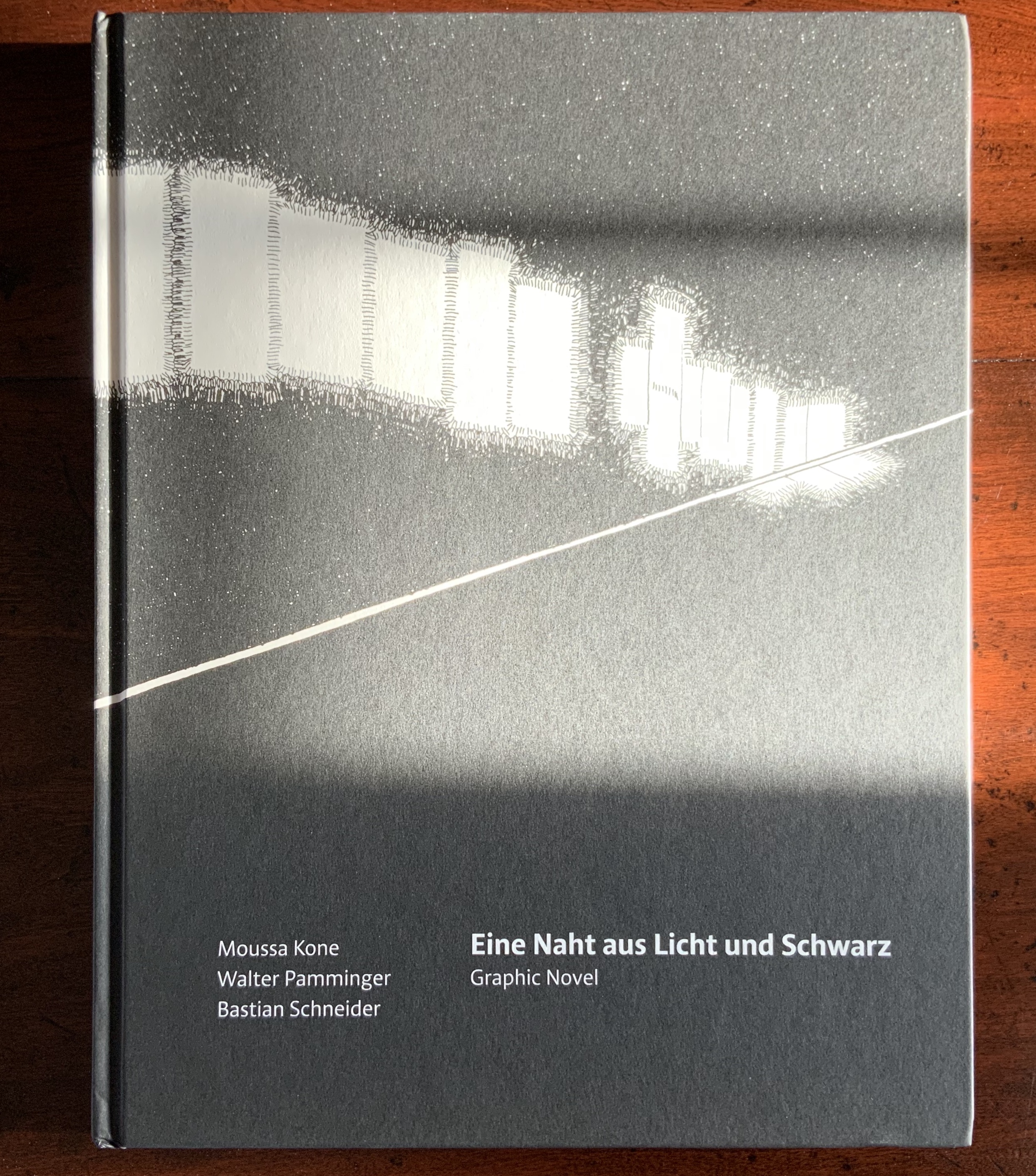
Eine Naht aus Licht und Schwarz (2018)
Eine Naht aus Licht und Schwarz (Sonderzahl Verlagsgesellschaft, 2018) Moussa Kone, illustrations; Walter Pamminger, concept; Bastian Schneider, text; Wolfgang Homola, graphic design. Hardcover, sewn; 96 pages, 176 illustrations. H303 x W235 mm. Acquired from the artist, 11 December 2019.
Although the creation of Eine Naht aus Licht und Schwarz (“A Seam of Light and Black”) was a collaborative effort, it originates in Kone’s experience working at the Albertina Museum in Vienna. He writes:
I was working there mainly at night and responsible for events, which took place in the rented Habsburg State Rooms and the exhibition halls. The entire book concept with its order of the drawings in this form was developed by Walter Pamminger, the texts are written by author Bastian Schneider.Image 1 to image 176 show a typical closing tour through the museum at 3 a.m. After all the party people, the catering staff and guards were gone, I had to make my final round through the empty building. Lights were turned off partly, and I was alone in the Viennese palace, with the art, and the history of the spot. That’s the story of the book: a view on the Albertina museum, which started as a private collection of drawings; a view from the worker’s perspective, the lowest one in the hierarchy of the institution, and the unseen labour, which is a hidden part of the art world. — Moussa Kone, correspondence, 18 December 2019.
But Eine Naht is more than that.
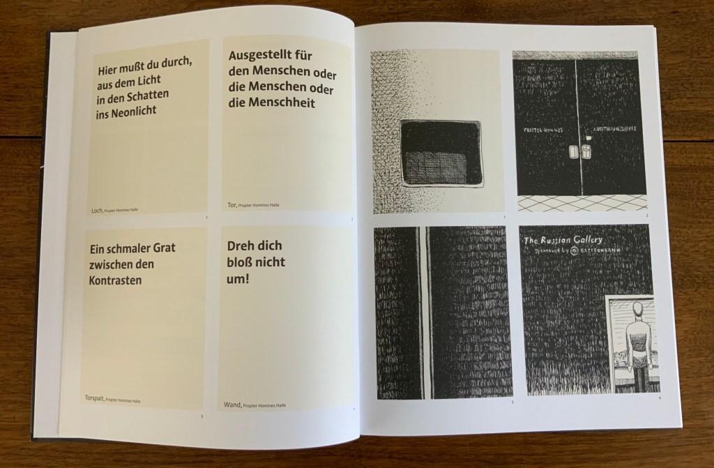
Text and image are arranged in a fluid grid of panels. The recto page above displays the starting pattern that appears and changes across the novel’s subsequent double-page spreads, challenging us in classic book-art fashion to re-learn how to read a book.
Panels 1-4 follow the opening diagram; four panels of text on the verso, with four panels of images correspondingly numbered on the recto.
On the verso, panels 5 and 6 shift to text then image; on the recto, the image in panel 5 corresponds to the text in panel 5 on the verso, and likewise the text in panel 6 on the recto corresponds to the image in panel 6 on the verso. Panels 7 and 8 follow the same pattern.
Here on the verso, panels 9 and 10 show text then image; on the recto, their corresponding panels run image then text. But panels 11 and 12 on the verso are both text; their corresponding panels of images appear across the gutter on the recto.
Again the pattern changes, with panels 13 and 14 both containing images, 15 and 16 containing text, and their matching panels of text and images mirrored on the recto.
The strong tendency to read a single page from left to right and downwards relents after a few sets of double-page spreads, but the change-ability of the back-and-forth between verso and recto requires a longer adjustment. Completely fluent adjustment would be hard to credit, but disorientation and the effort to concentrate, look harder and dwell on the relation between image and text becomes part of the atmosphere of the book. A partial translation into English exists online, which conveys the effect.
Kone’s range — from the intricacy of “Etymology” to the slapstick of The Abecedarium and Nowhere Land to a blend of conceptualism, self-reflexive book art and a twilight melancholy atmosphere in Eine Naht — makes his work an welcome addition to the collection.
Kone, Moussa and Walter Pamminger and Bastian Schneider. Trans. Verena Aschbacher. “A Seam of Light and Black“, Words Without Borders: An Online Magazine for International Literature, February 2020. Accessed 17 May 2020.
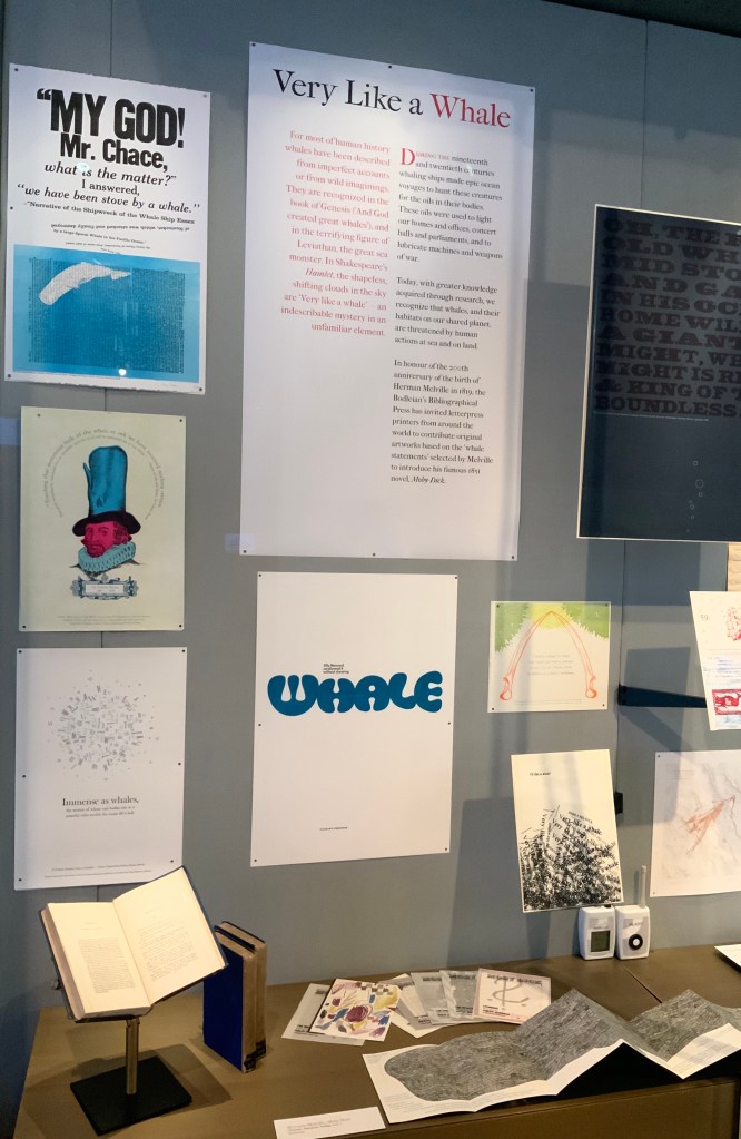
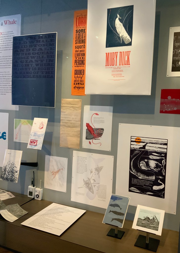
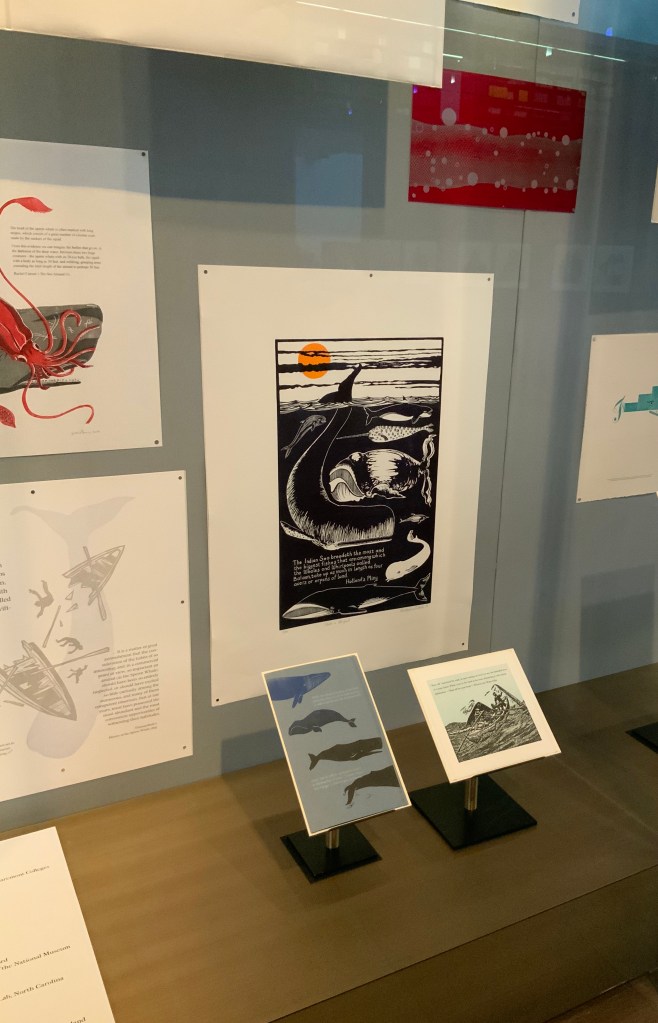
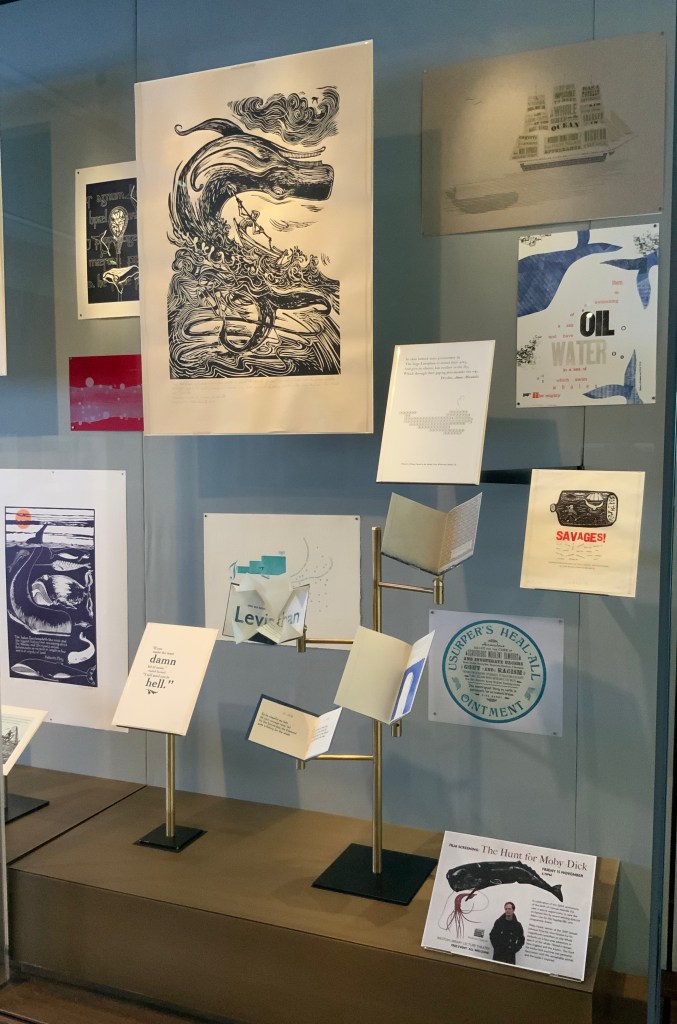
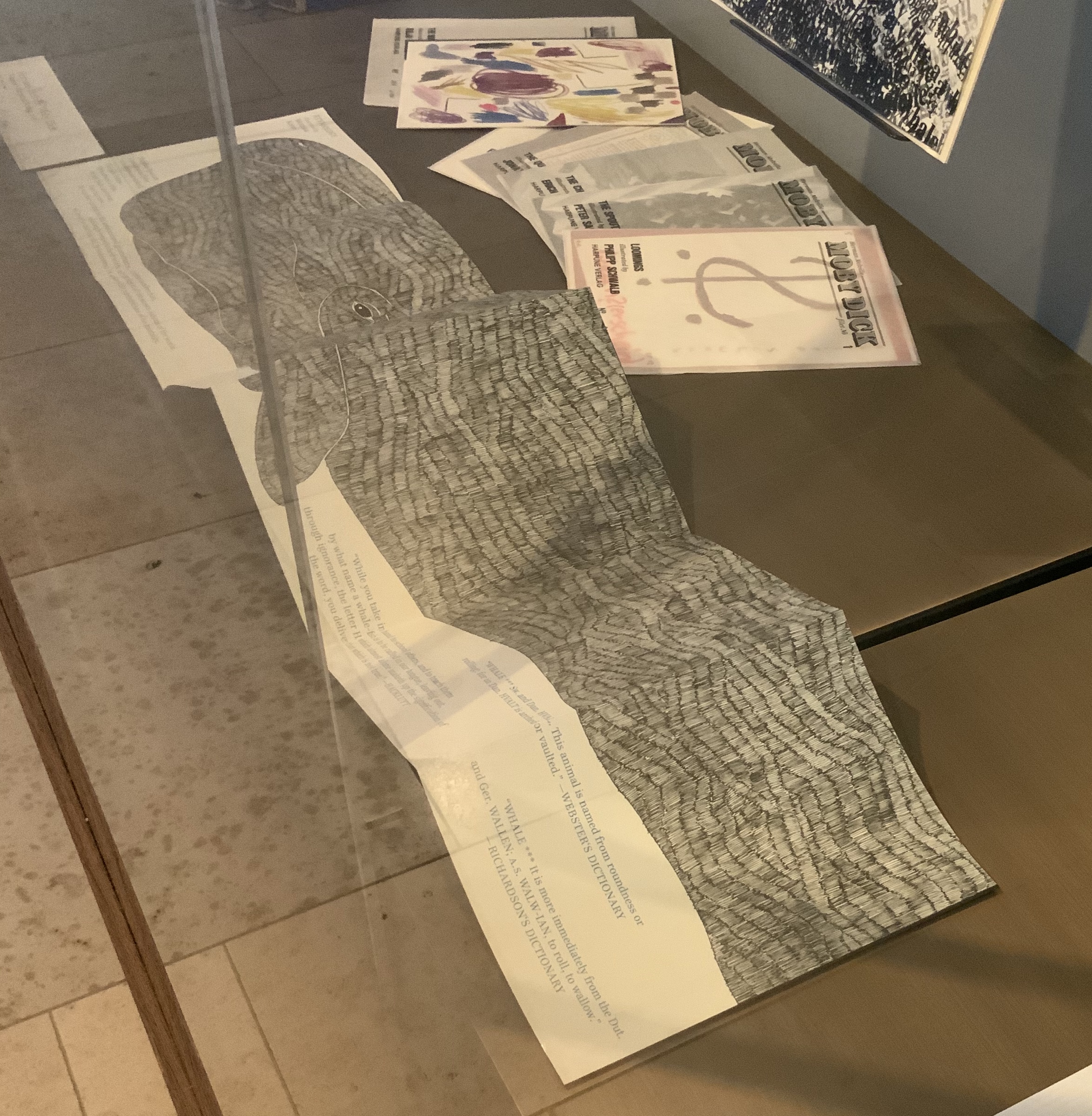
For the 200th anniversary of Herman Melville’s birth (1819), the Bodleian’s Bibliographical Press invited letterpress printers and artists to claim one of the eighty prefatory “Extracts” from Moby-Dick (1851) and create an artwork in response.
The Blackwell Hall exhibition case accommodates thirty of the eighty contributors‘ artworks, plus the rare three-volume version of the novel published by Richard Bentley in London as The Whale before Harper & Brothers issued it in November 1851 in New York as Moby-Dick; or, The Whale. Here are just four of the outstanding prints among the several artforms on display.
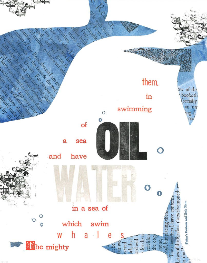
Extract 25: ‘The mighty whales which swim in a sea of water, and have a sea of oil swimming in them.’ ─ Fuller’s Profane and Holy State Brittany Starr and Mallory Haselberger, BookLab at University of Maryland Mixed media (collage and letterpress). Printed on a Line-O-Scribe, Model 1411 on Strathmore printmaking paper using rubber and oil-based ink; includes Jenson, News Gothic and Bookman typefaces with Hamilton wood type. Image courtesy of the Bibliographical Press and artists.
Notice how Starr and Haselberger integrate the verbal and visual to emphasise the seas of water/oil paradox that Melville plucked from his source. Like Melville’s hand, the artists’ manicule in the lower left points to the extract that reads/rises from the bottom to the top. Inside the shapes of whales around the extract appears the source of the extract (the verbal in the visual) against a seawater blue (another layer of the verbal in the visual). The letters “o” and “f” evoke bubbles and currents (the verbal for the visual). The words “oil” and “water” in contrasting inks but composed in the same typeface loom large at the heart of the artists’ embodiment of this paradoxical extract. (It is an insider’s paradox that the work surfaces from the BookLab, devoted to exploring the oil-and-water mix of the material and the digital.)
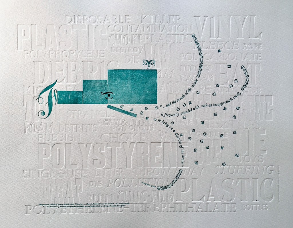
Extract 35: ‘* * * * * and the breath of the whale is frequently attended with such an insupportable smell, as to bring on a disorder of the brain.’ ─ Ulloa’s South America Elizabeth Fraser, Frauhaus Press, Cambridge Handset letterpress. Blind deboss using wood and metal type. Whale created from face and back of woodtype with ornaments for eye and spout. Text 12pt & 6pt Baskerville italic. Whale breath 12pt glint (Monotype B1309 & B1310). Printed on Somerset Velvet 300gsm soft white paper with a tabletop flatbed proofing press.
What attends the whale’s breath in Fraser’s print? The whale’s breath is the extract streaming into a sea of white blind-debossed words. That sea of human detritus is the source of the insupportable smell that attends the whale’s breath. The insupportable smell takes on “the whiteness of the whale”. The threatened whale takes on an environmental green. which Fraser creates with the non-verbal side of the woodtype. Even so, the carrier of the verbal makes up every visual aspect here, underscoring Fraser’s contemporary paradox: the insupportable smell disordering the brain has been brought on by the disordered brain of humankind.
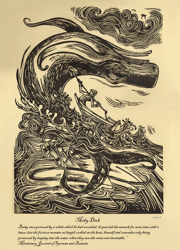
Rowsell’s linocut represents the more traditional entries in the exhibition. Capturing the furious struggle expressed in the extract, he locks whale, man, boat, sea, cloud and sky into a vigorous, swirling image on a paper and in a style that evoke the century in which Moby-Dick is set. As he pulled his prints from the 1828 Albion printing press, Rowsell might have wondered what the nine-year old Herman Melville was doing when hands were first laid on that Albion.
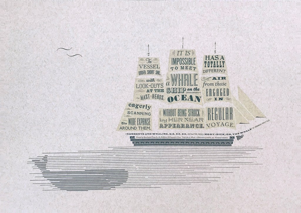
Extract 71, ‘It is impossible to meet a whale-ship on the ocean without being struck by her near appearance. The vessel under short sail, with look-outs at the mast-heads, eagerly scanning the wide expanse around them, has a totally different air from those engaged in regular voyage.’ ─ Currents and Whaling. U.S. Ex. Ex. Jennifer Farrell, Starshaped Press, Chicago Letterpress: metal type + rule linocut; Paper: Fabriano Tiziano printed on a Vandercook SP15. Image courtesy of the Bibliographical Press and artist.
Starshaped Press is aptly named. Jennifer Farrell stars at wringing shapes from type and its surrounding furniture. The citation outlining the upper deck and bowsprit runs gracefully and appropriately under the sails on which the extract appears in that variety of display faces characteristic of nineteenth century flyposts.
To round out the display with another multi-artist effort, the curators included Harpune Verlag’s Moby-Dick “Filets” (2011~). In 2011, Harpune Verlag Wien began publishing Melville’s masterpiece as a serialized subscription. To do justice to the book’s many voices, 136 different artists were invited, each to illustrate a chapter.
Etymology, Moby-Dick “filet” No. A (2012) Moussa Kone Leporello of 16 pages, 150 x 200 mm closed, 200 x 710 mm open. Acquired from Harpune Verlag February 2019.
Published in non-chronological order at varying intervals and printed in a limited edition of 460 copies, 37 “filets” have appeared so far. At this rate, all of the filets may only be served up by the bicentennial of Moby-Dick’s publication! Fortunately for the Bibliographical Press’s display, Moussa Kone’s rendition of “Etymology”, the prefatory item preceding “Extracts”, is one of those already delivered. It makes a suitably lengthy and apropos link across cases.
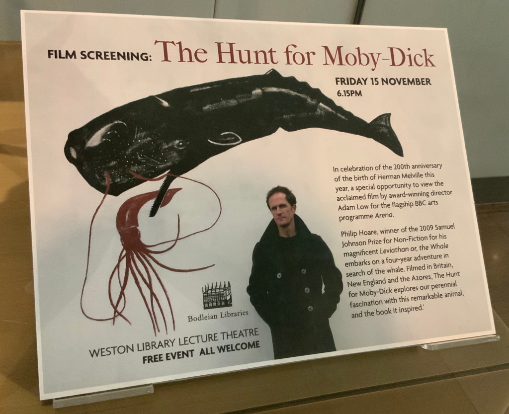
If, like Ishmael with “November in [his] soul”, you were walking down the damp, drizzly streets not of New Bedford but Oxford on the 15th this month, you might have substituted the Weston Library for The Spouter Inn. Inside, second copies of the remaining fifty “Extracts” submissions were on display in Blackwell Hall for viewing and handling after a screening of Philip Hoare’s The Hunt for Moby-Dick (2011). Ten years ago, Southampton-born Hoare won the 2009 BBC Samuel Johnson Prize for non-fiction for his book Leviathan, or the Whale. Hoare himself was on hand to introduce and take questions after the film.
His lifelong passion for whales and Melville’s book is infectious and influential. UK book artist Chris Ruston traces her series of artist’s books Lost Voices — Whaling (2016-17) to Hoare’s Leviathan. Like Hoare’s work and many entries in “Very Like a Whale”, Ruston’s work challenges our anthropocene era. Hoare was also instrumental in organizing the Moby Dick Big Read (2012) — another multi-artist affair and effort to address the effects of the anthropocene era.
Click on the screenshot to visit and listen to the Moby Dick Big Read.
The Big Read offers freely available readings of each chapter of the book. Individuals (well-known and unknown) contributed the readings, artists contributed artwork (viewable as thumbnails on the site), and the site offers an opportunity to donate to Whale and Dolphin Conservation (WDC).
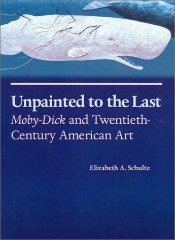
Hoare participated in another Melvillean documentary: David Shaerf’s Call Us Ishmael (2019). It is a multi-artist affair like the Big Read, Moby-Dick “Filets” and “Very Like a Whale”; includes a sighting of the New Bedford Whaling Museum’s annual days-long continuous reading of Moby-Dick; and features interviews with artists and other creatives inspired by Melville’s tale. One of those artists interviewed is Frank Stella. Uncanny, but Stella also appears in this book to be found in the Bodleian: Elizabeth Schultz’s Unpainted to the Last (1995).
From among the artists such as Ellsworth Kelly, Robert Motherwell, Jackson Pollock and others whom Schultz discusses, Stella serves best to tie off this fisherman’s tale and return to the title of the Bibliographical Press’s exhibition. About his Moby-Dick series of prints and metal-relief paintings to which he devoted a decade, Stella writes:
The idea of the wave and its various permutations is what drives this new series. Once I started on the wave shape, I saw it began to look like a whale — a combination of waves and whales. … The idea of the whale reminded me of “Moby Dick,” so I decided to go back and read the novel and the more I got into it, the more I thought it would be great to use the chapter headings of the novel for the titles of the pieces. — “1989 Previews from 36 Creative Artists,” New York Times, 1 January 1989, Sec. 2:1. Images here.
Indeed, “Very Like a Whale”, which runs until 5 January 2020. Admission free.
Earlier this month, we saw the release of the Open Annotation Community Group’s specification of the Open Annotation Core Data Model, an interoperable framework for creating annotations that can be easily shared between platforms. The work, directed by Robert Sanderson and Paolo Ciccarese, began in earnest about six months ago, although it was proceeded by longstanding efforts within and between the editors of the Annotation Ontology and the Open Annotation Collaboration. Under the auspices of the W3C, the efforts merged into the Open Annotation Community Group (OACG).
The OACG model defines an annotation as “a set of connected resources, typically including a body and target, where the body is somehow about the target,” and the full model “supports additional functionality, enabling semantic annotations, embedding content, selecting segments of resources, choosing the appropriate representation of a resource and providing styling hints for consuming clients.” Public rolloutevents are scheduled for 9 April (Stanford University), 6 May (University of Maryland) and 24 June (University of Manchester).
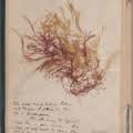
Back in November last year, while the Open Annotation Community Group (OACG) was thrashing through how to handle collections of annotations and other ontological issues, the Radcliffe Institute for Advanced Studies at Harvard University held a two-day symposium called “Take Note,” marking the conclusion of a two-year project on the history and future of note-taking. The project also resulted in a virtual exhibition of objects and works from the Harvard University Collections with notes ranging from a price list inscribed on a potsherd to a clothes list on papyrus found in an Egyptian garbage dump to Herman Melville’s annotations of his review copy of Hawthorne’s Mosses from an Old Manse (see image above). The exhibition was curated by Greg Afinogenov, Ann Blair and Leah Price, and interestingly, the OACG’s Paolo Ciccarese contributed to building the exhibition’s website.
So besides Paolo Ciccarese’s involvement, what’s the connection between these two events? Perhaps the link is captured in three comments from the participants:
Bill Sherman, historian at the University of York and author of Used Books: Marking Readers in Renaissance England, commented to a reporter, “We’re now in a moment where we’re leaving behind fewer traces of our reading than ever before…. We may have moved to the turning point where…we’ll have to find new ways to leave more behind.” And as Matthew Kirschenbaum has spelt out in Mechanisms, historians will have to learn new ways to decipher what is left behind.
David Weinberger, author of The Cluetrain Manifesto and long-time blogger, tweeted (according to the Harvard Gazettereporter), “”Collaborative notetaking via etherpad or GoogleDocs etc. is often a great way to go. Fascinating to participate in, too,’ during an afternoon presentation that explored digital annotation tools.” Like Bob Stein,the co-founder of the FutureoftheBook.com, Weinberger is a champion of social reading and collaborative creativity.
Another participant told the Gazette’s reporter, “’I was struck by the request that we send our notes into Radcliffe because my reaction was, “You know, my notes are really none of your business. My notes are my private thoughts, my private collaborations.” Until I am dead, I don’t really need other people looking at them.'” That last comment is particularly fetching: one wonders whether William James and Herman Melville had such an eye on posterity as they scribbled their notes now on display across the Web.
As the book evolves and we annotate works in our ereaders (offline or online), how do we ensure that they persist, and whether offline or online, how do we handle how private or public those notes will be?
Earlier this month, Books on Books raised proprietorial questions about annotated ebooks in response to Nicholas Carr’s article “Used e-book, slightly foxed” sparked by the Amazon patent for selling pre-loved ebooks. On his site, Carr responded with his own questions:
“[W]hat’s the relationship (legal and otherwise) between an e-book and the annotations added to it by its reader? Are the annotations attached to the particular copy of the e-book, and allowed to remain attached to it when it passes to a new reader, or do the annotations exist in a separate sphere — say, in a personal online database that is the property of the individual reader? … what right does the copyright holder (in particular, the author) hold over the way an e-book is presented? If annotations, or other metadata, in effect become part of the text, permanently or even temporarily, then does that represent a modification of the work that requires the consent of the author? You can’t publish an annotated print edition of a book under copyright without the copyright holder’s permission. Do different rules apply to an e-book?” (Carr’s questions elicited an interesting comment at Futureofthebook.com: “perhaps the interdependence of print and screen books is inevitable….”)
In some respects, by digitizing and reproducing others’ property (appropriately acquired through bequests, gifts and so on), the Harvard University Collections’ virtual exhibition illustrates Carr’s questions and those of the symposia participants — even the comment from Future of the Book — in a beautifully “tangible” way. Think upon it.