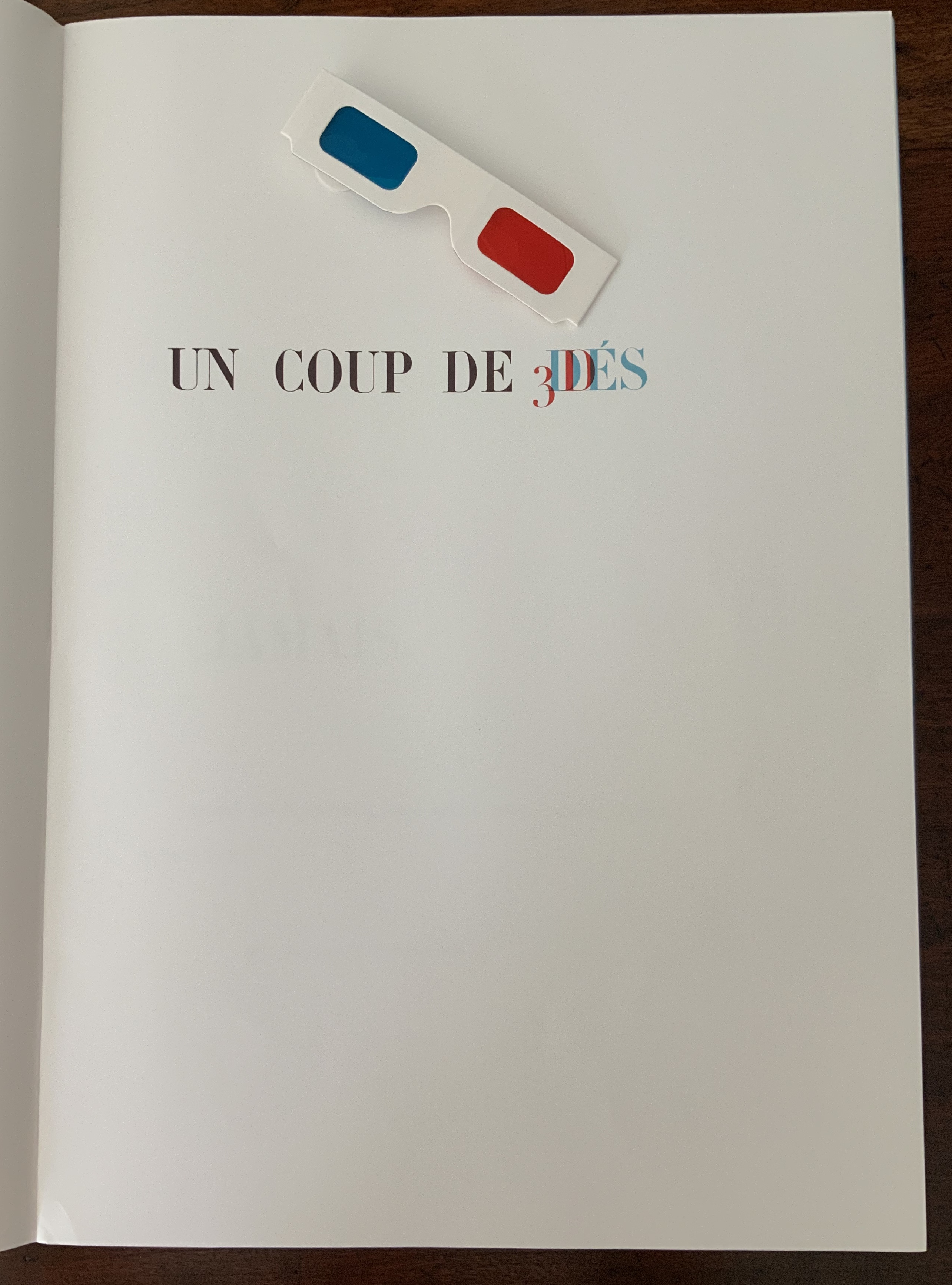
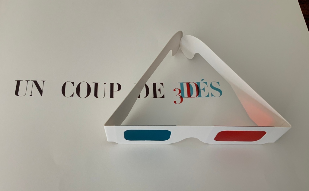
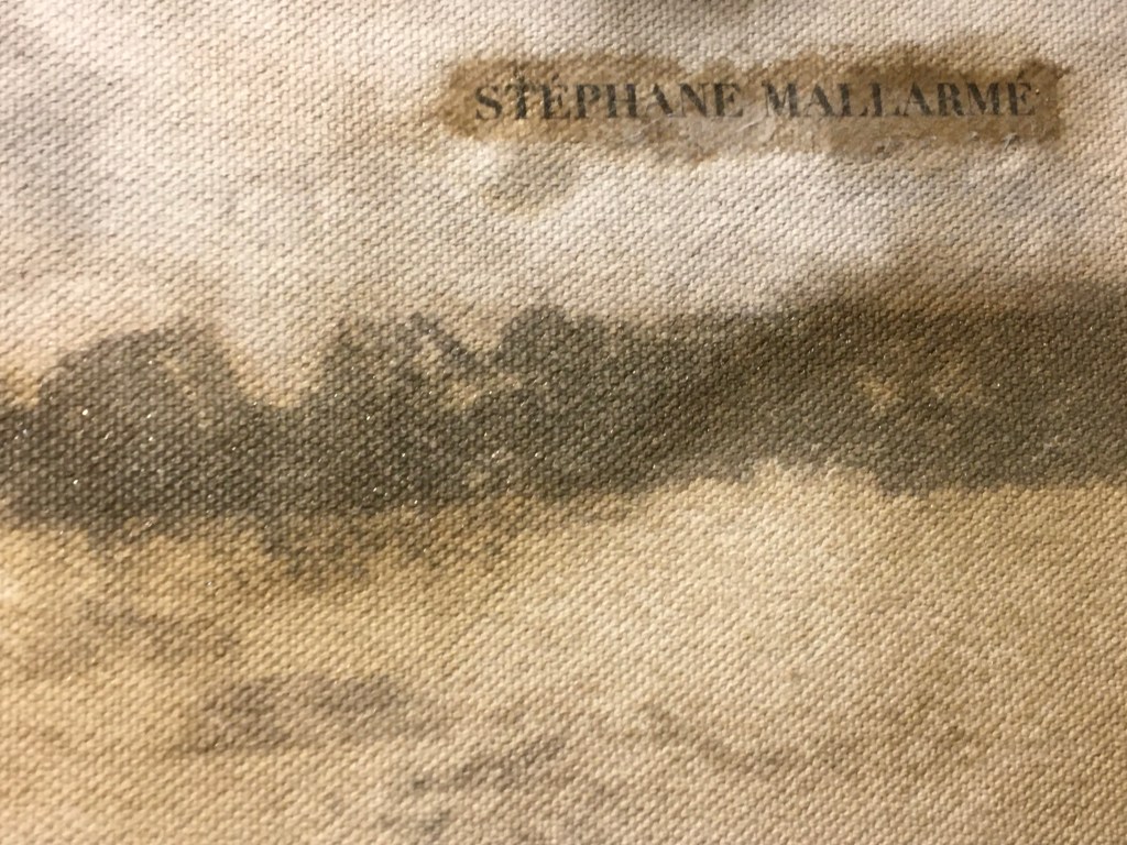
Alexandra Leykauf: Chateau de Bagatelle (2010)


Alexandra Leykauf: Chateau de Bagatelle (2010)
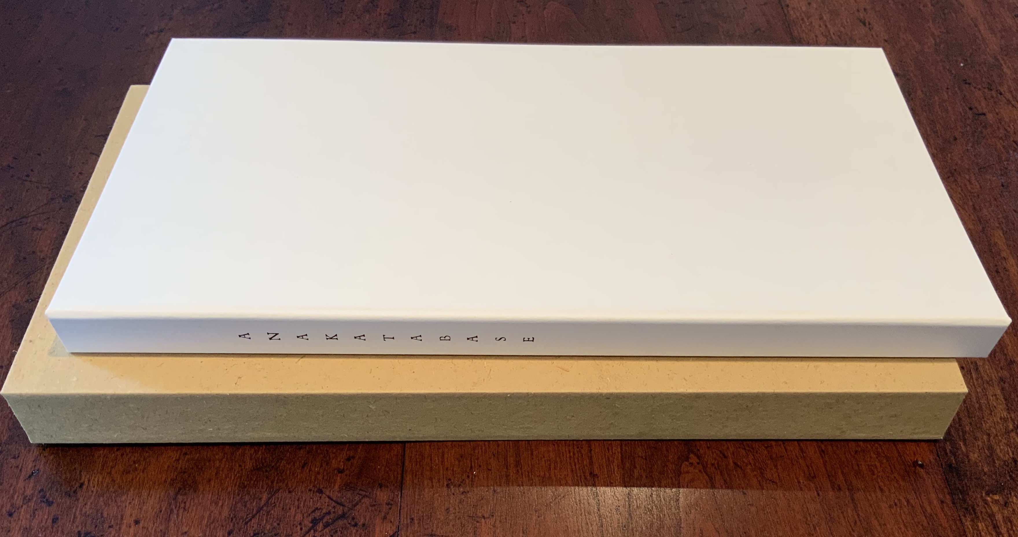
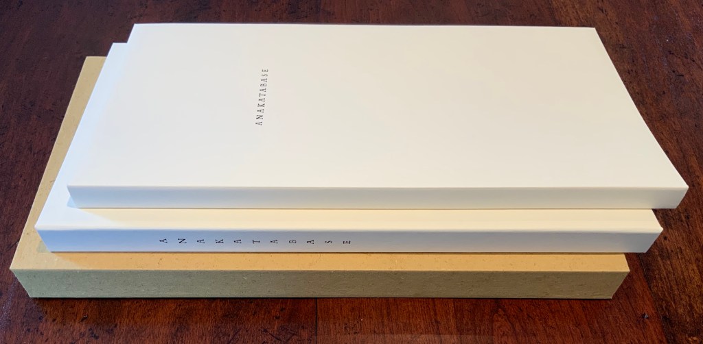
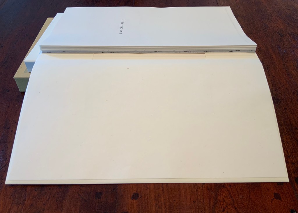
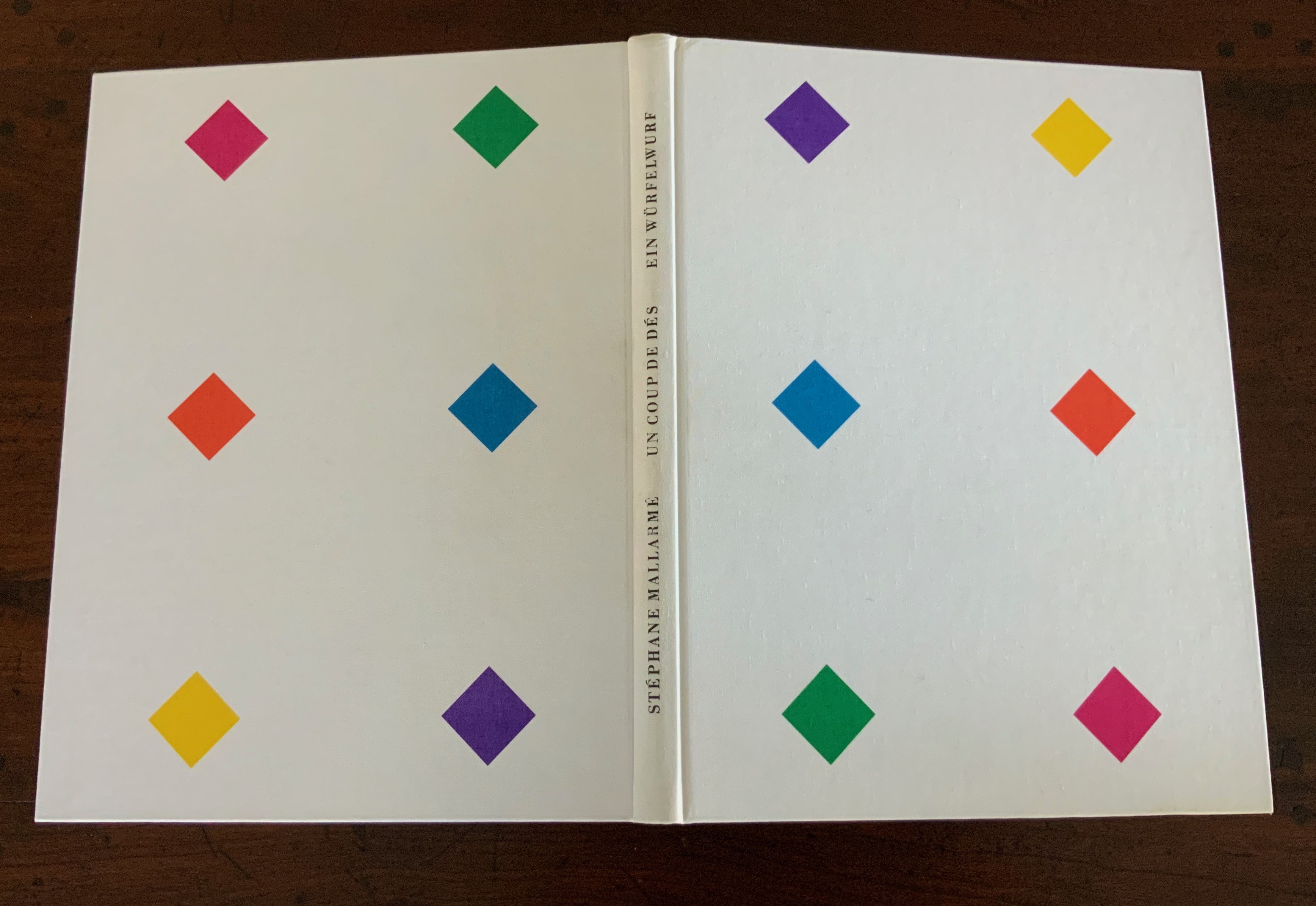
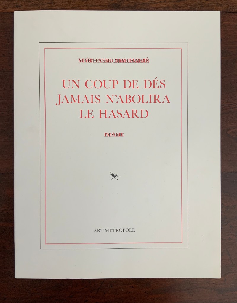
Perfect bound softcover in black case (Claro Bulk 135 gsm) and dust jacket (Gmund Colors 300 gsm). H210 x 182 mm, xxx unpaginated sheets for photos (Claro Bulk 115 gsm) and 24 concluding text pages (Claro Bulk 90 gsm). Acquired from Saint George’s Bookshop, 6 July 2020. Photos: Books On Books Collection. Shown with permission of the artist.
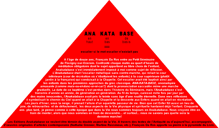
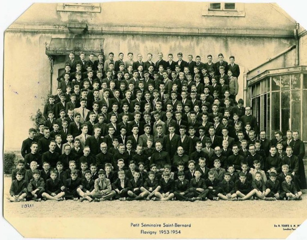
When a book enters a collection because of one photo, the collector needs to ask whether the theme driving the collection has become a hammer and every item collected a nail.
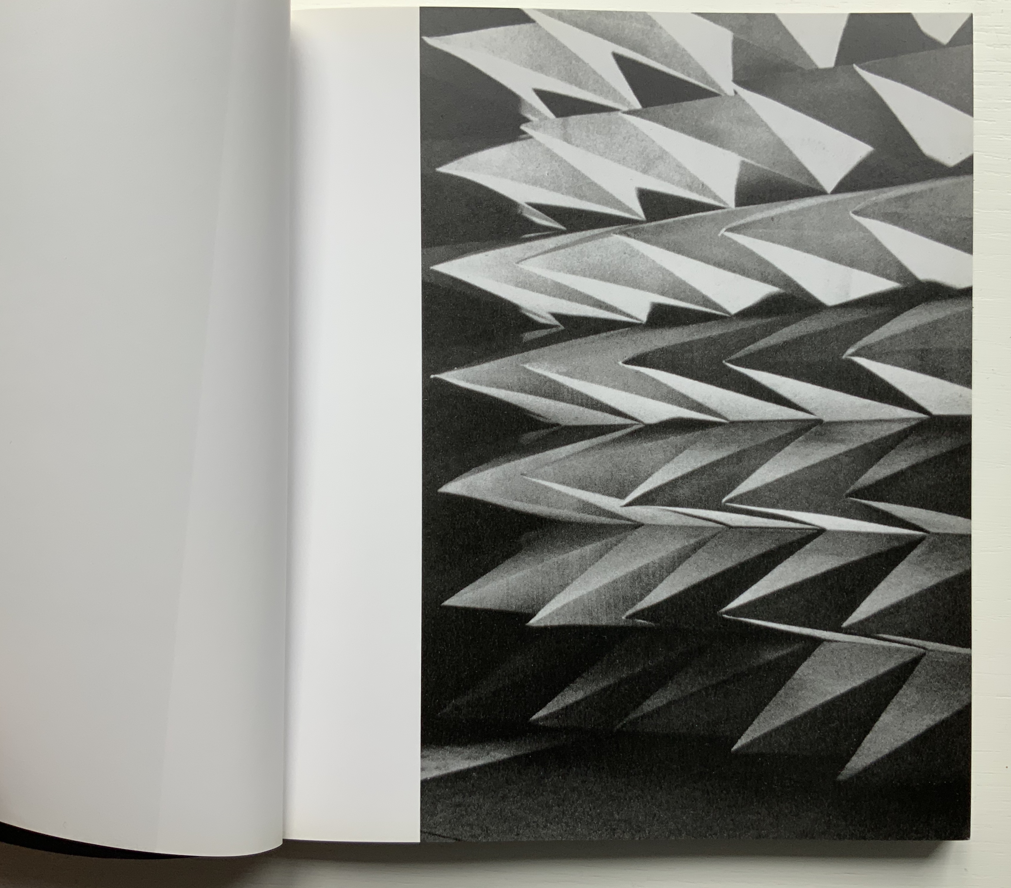
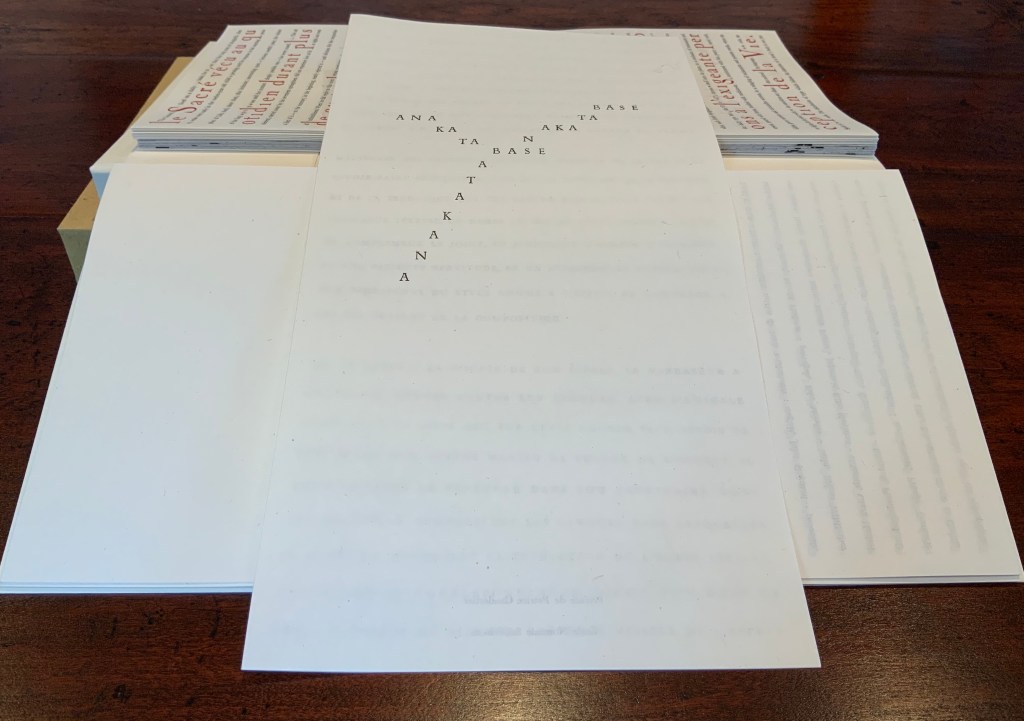
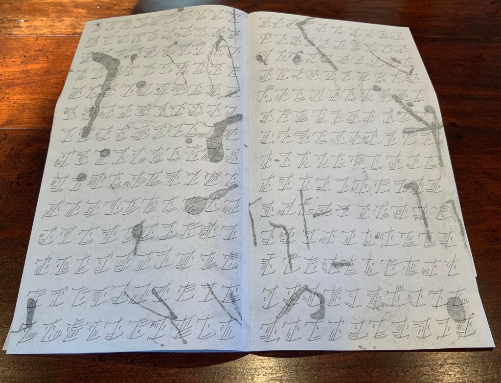
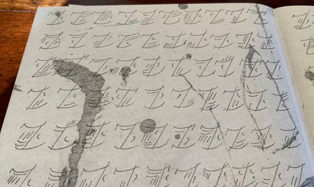
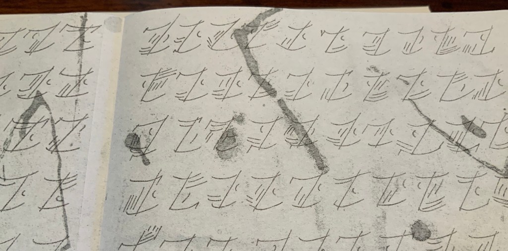
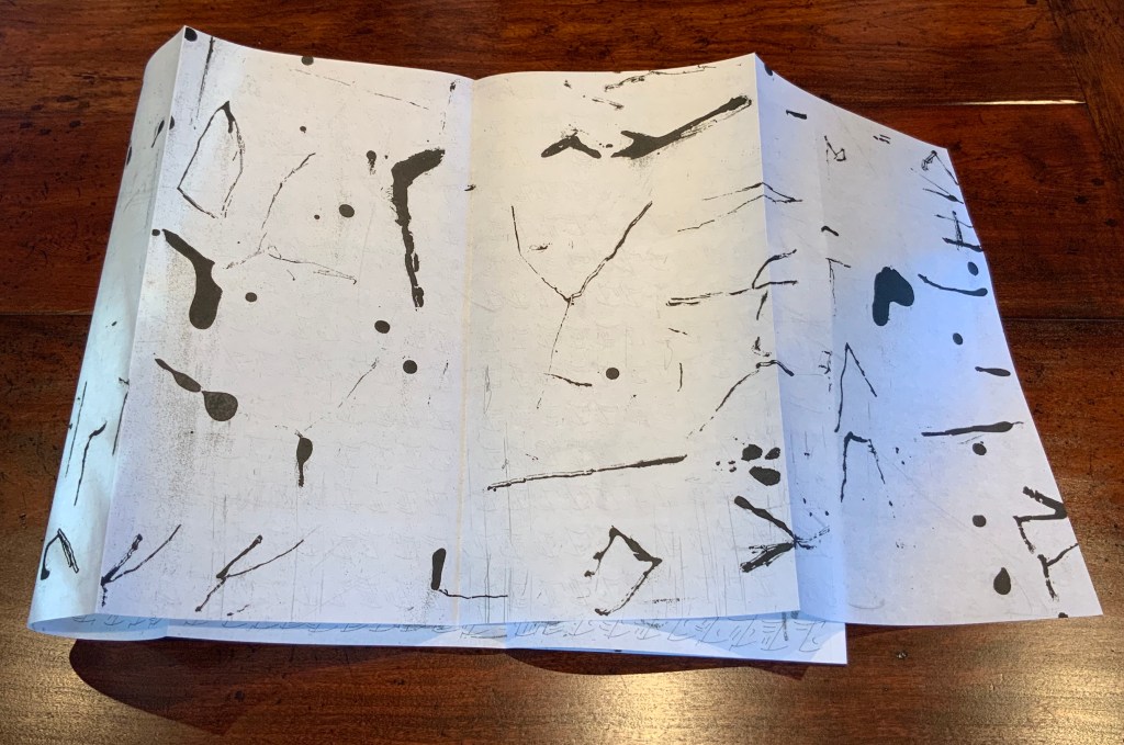
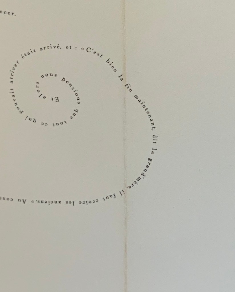
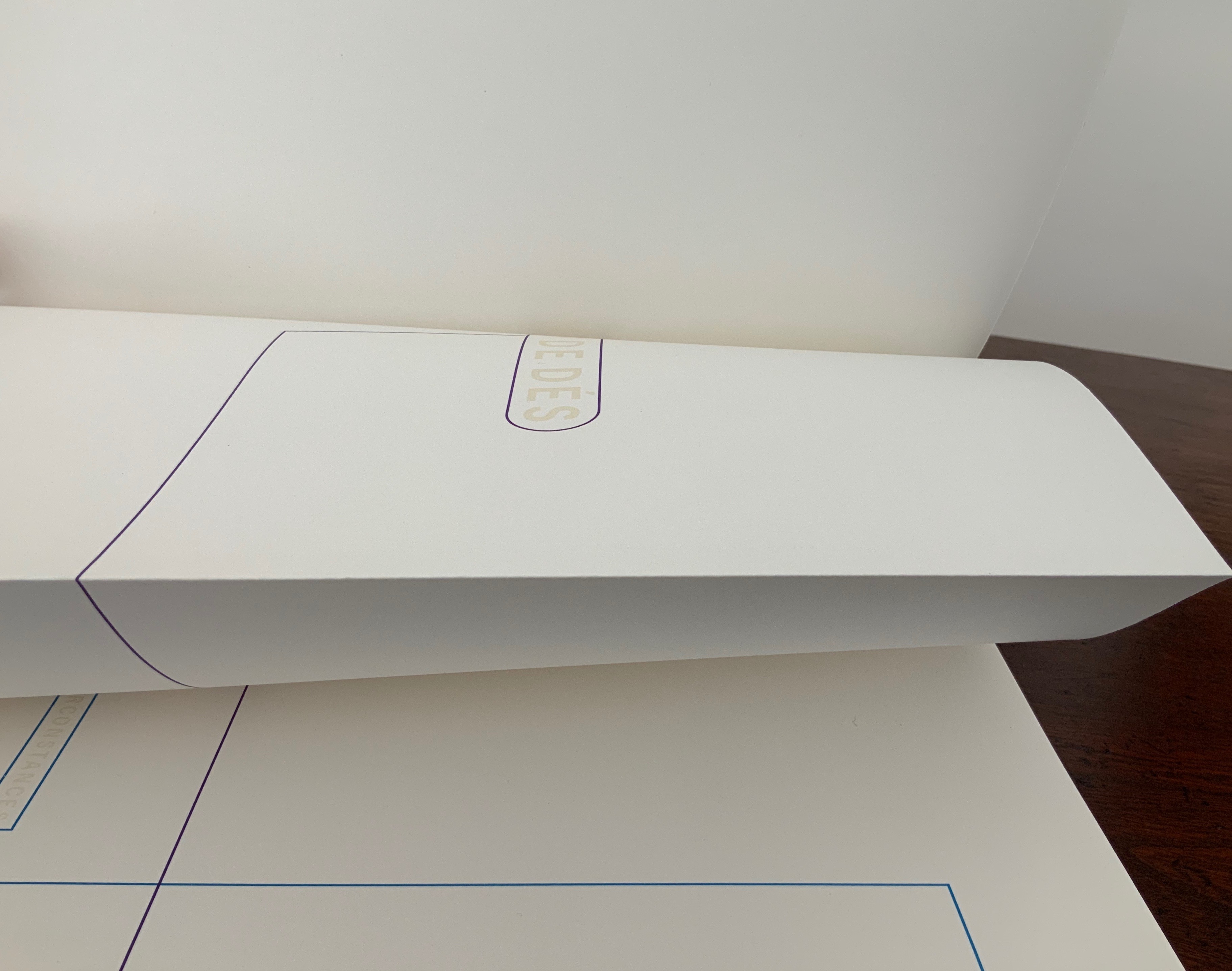
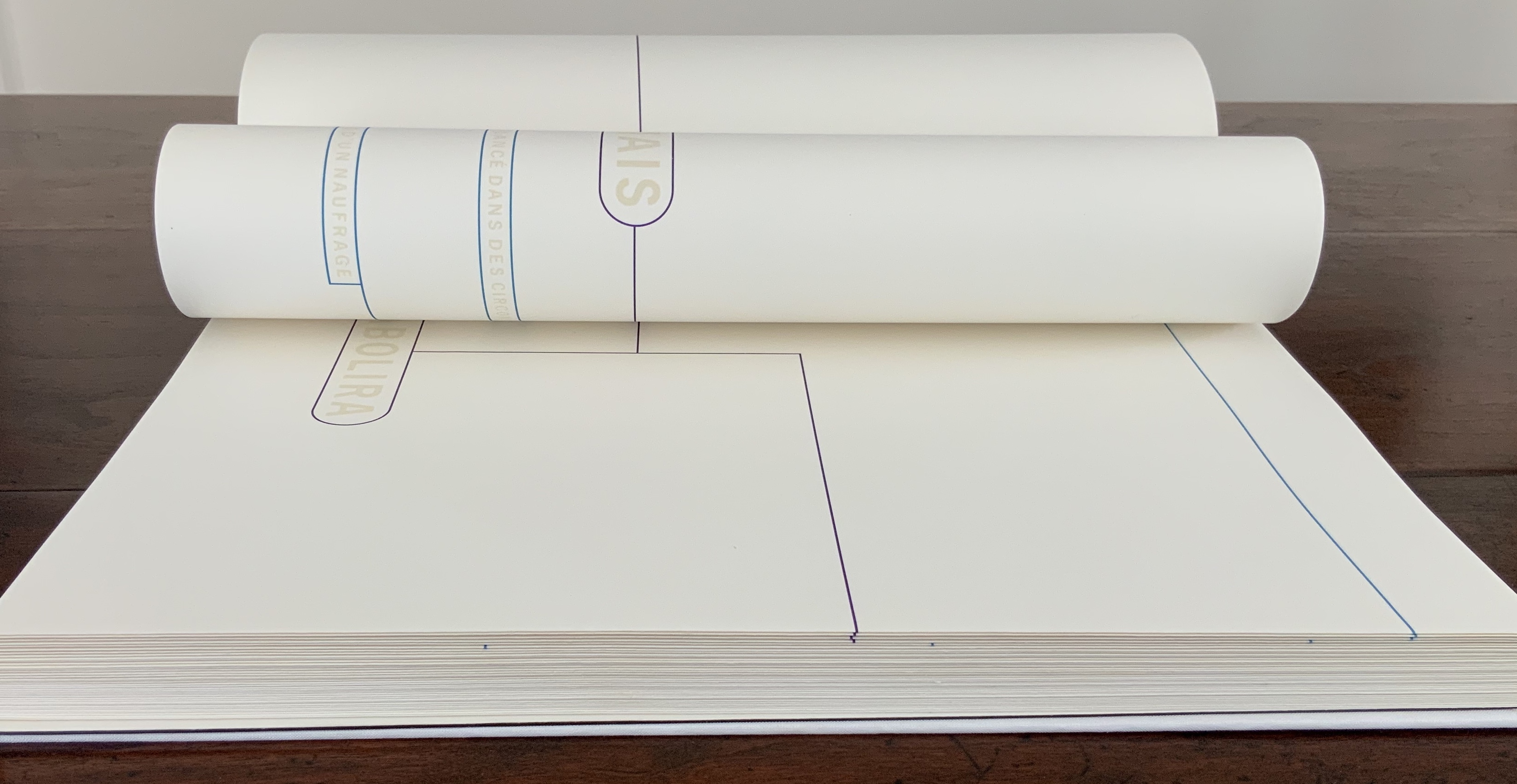
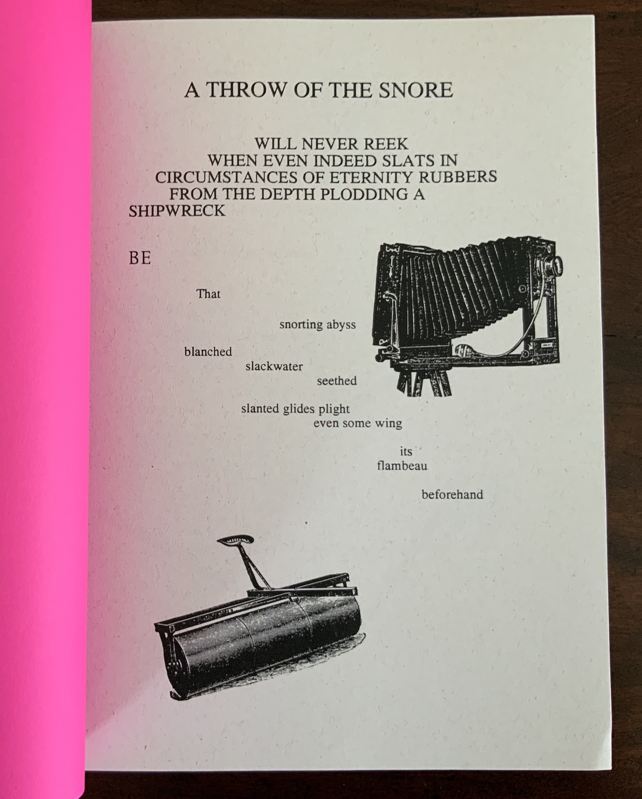
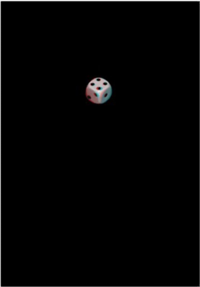
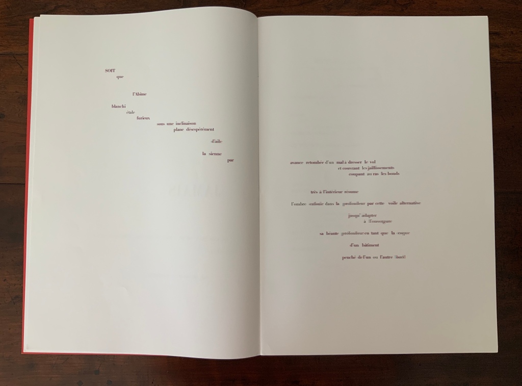
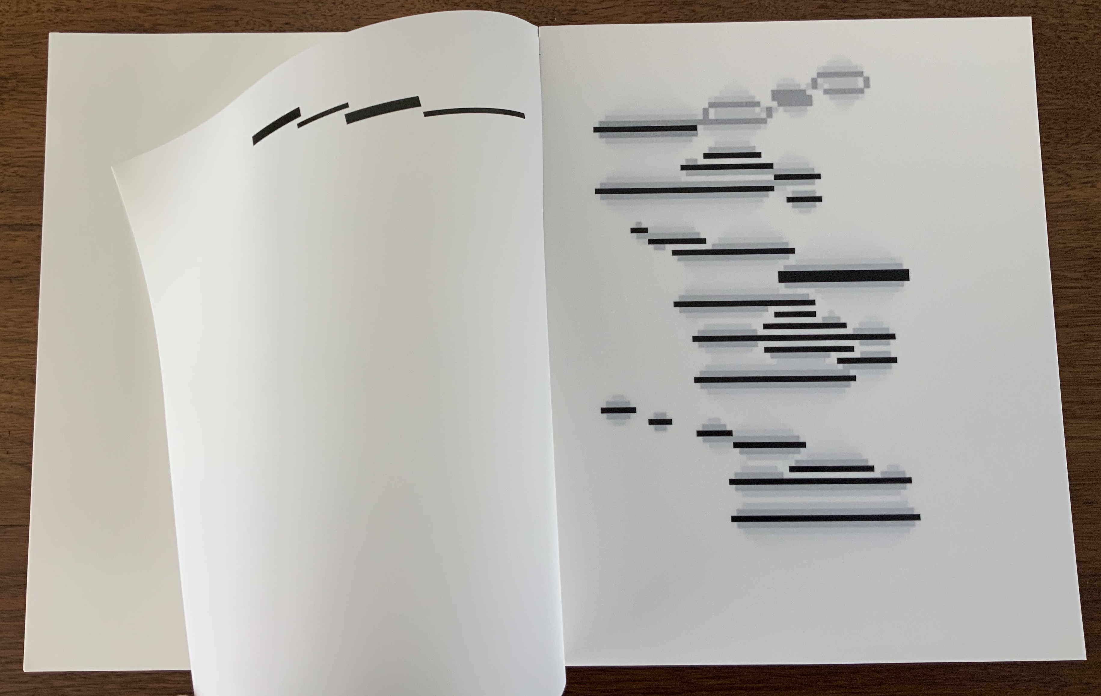
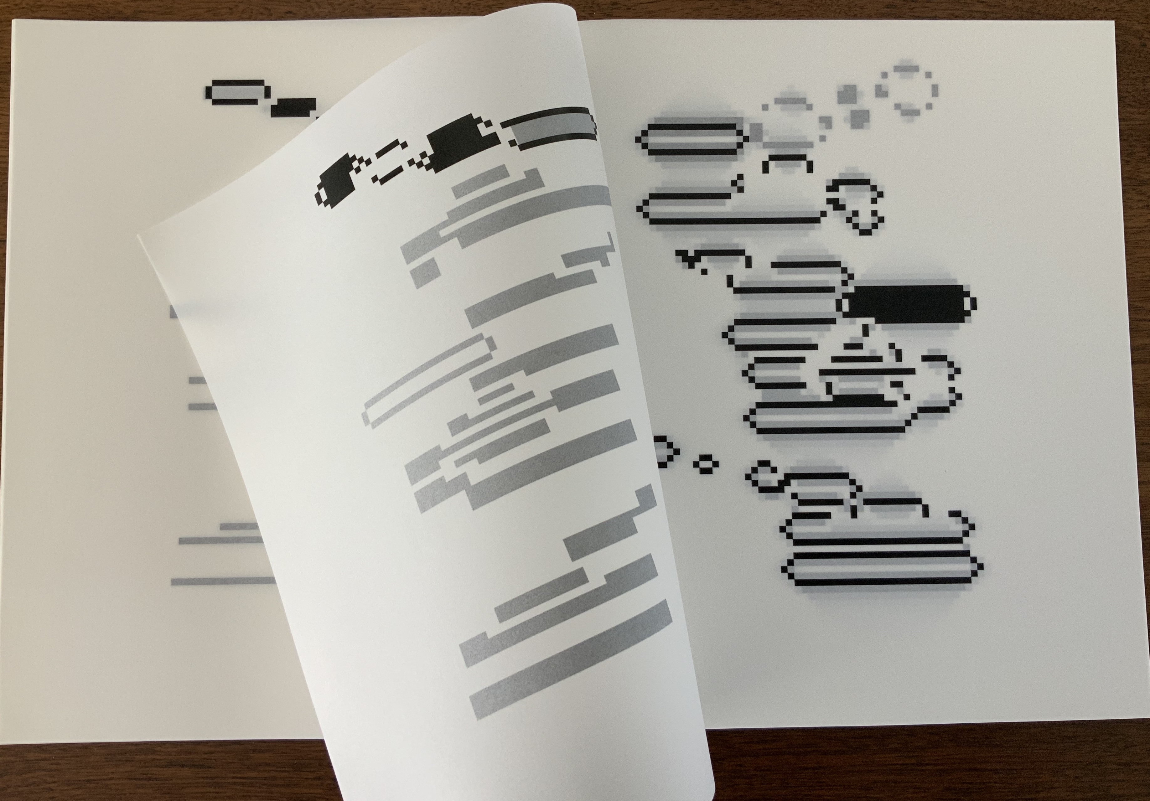
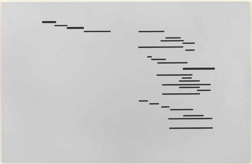
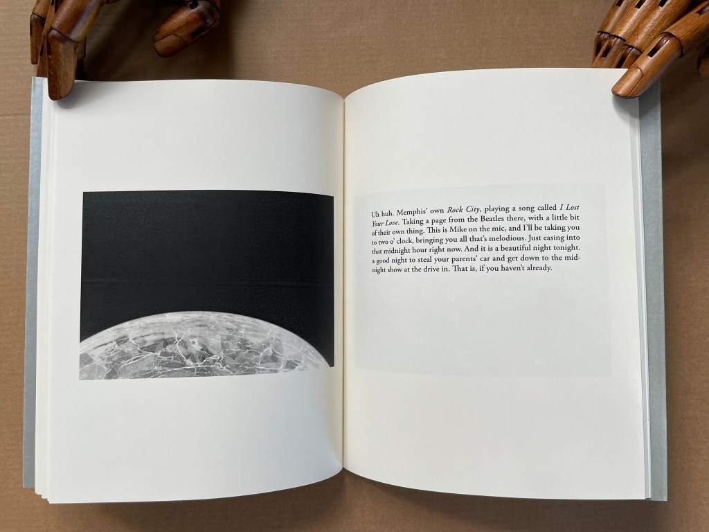
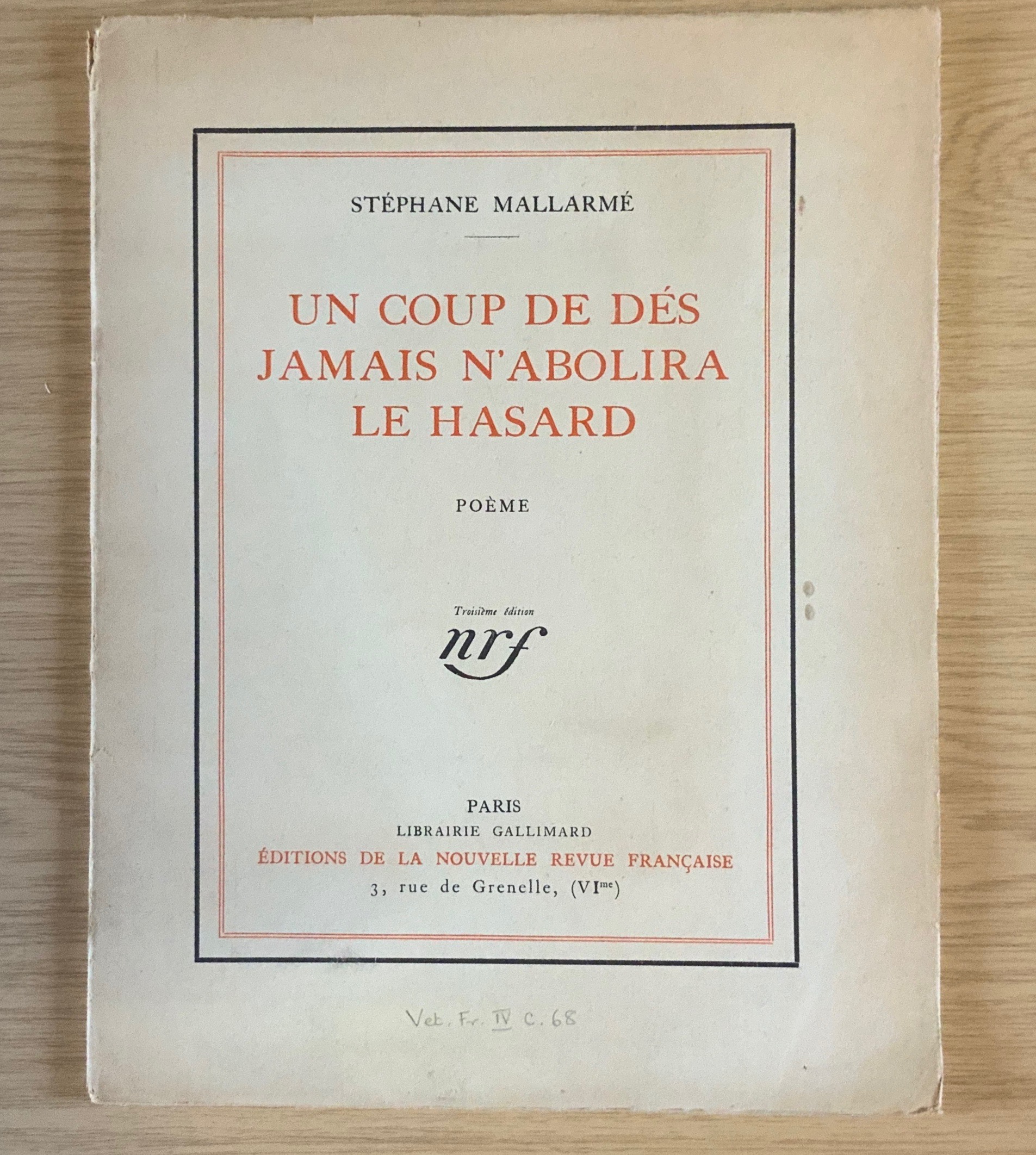
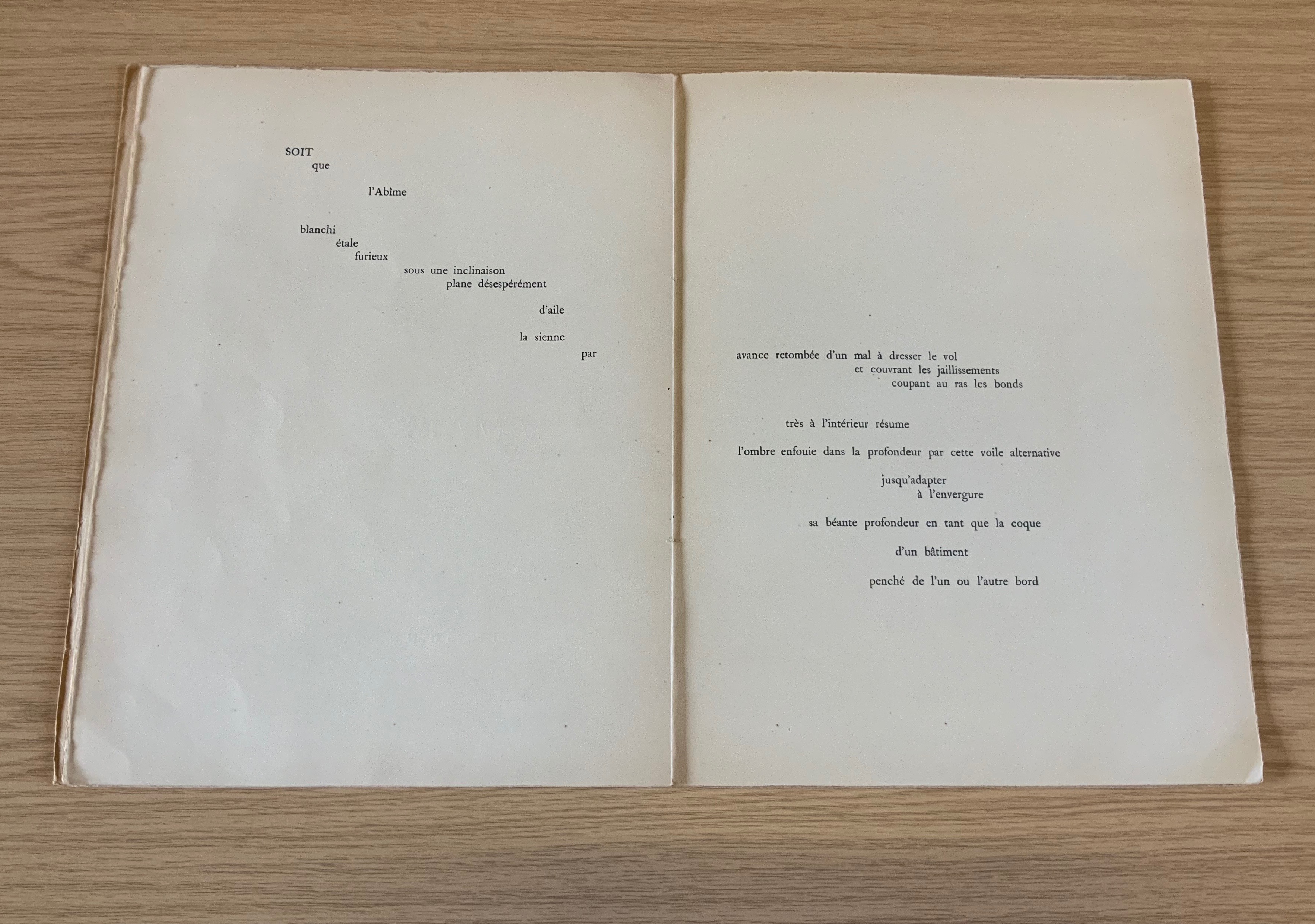
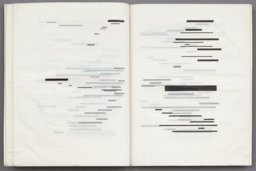
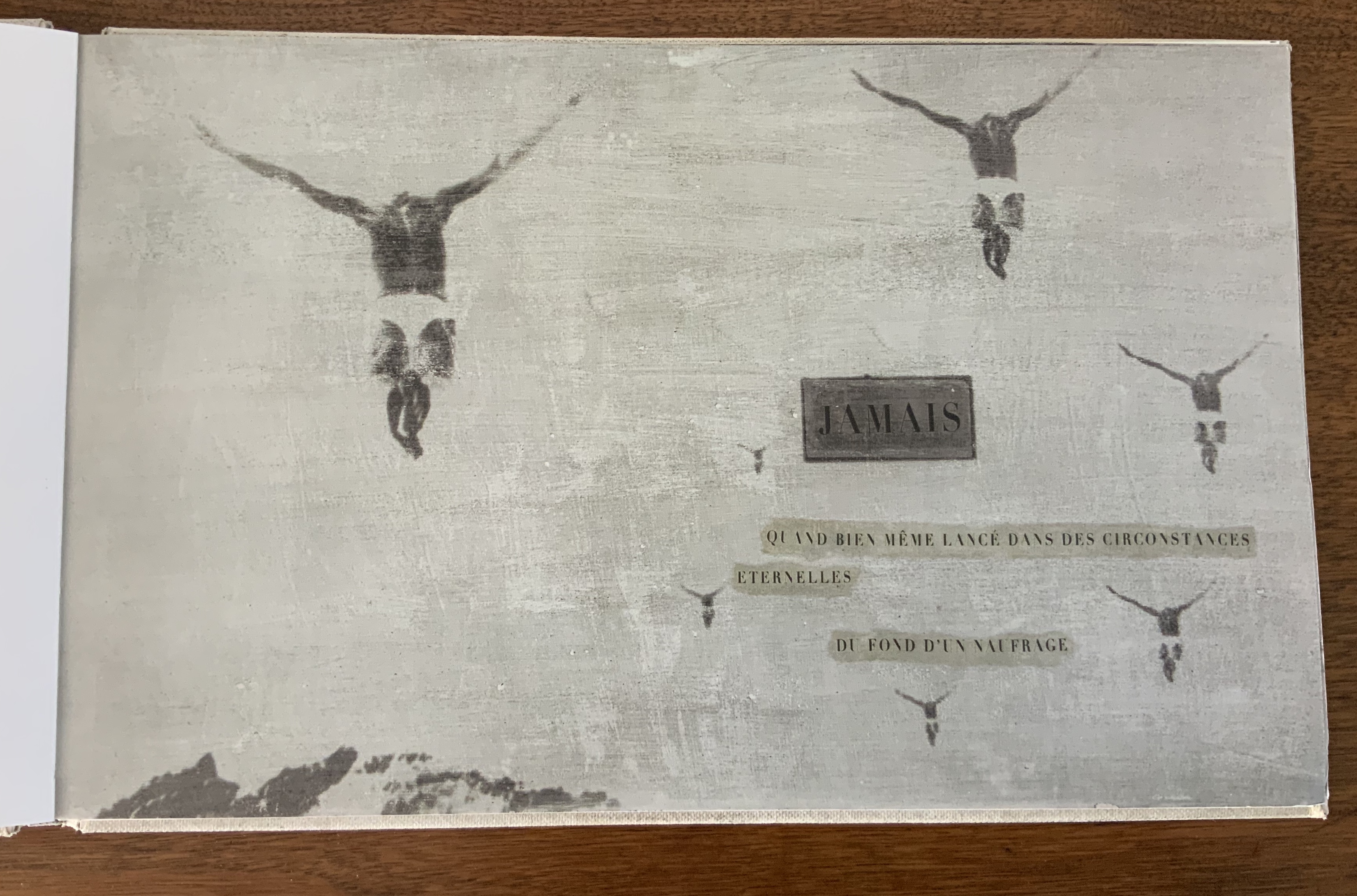
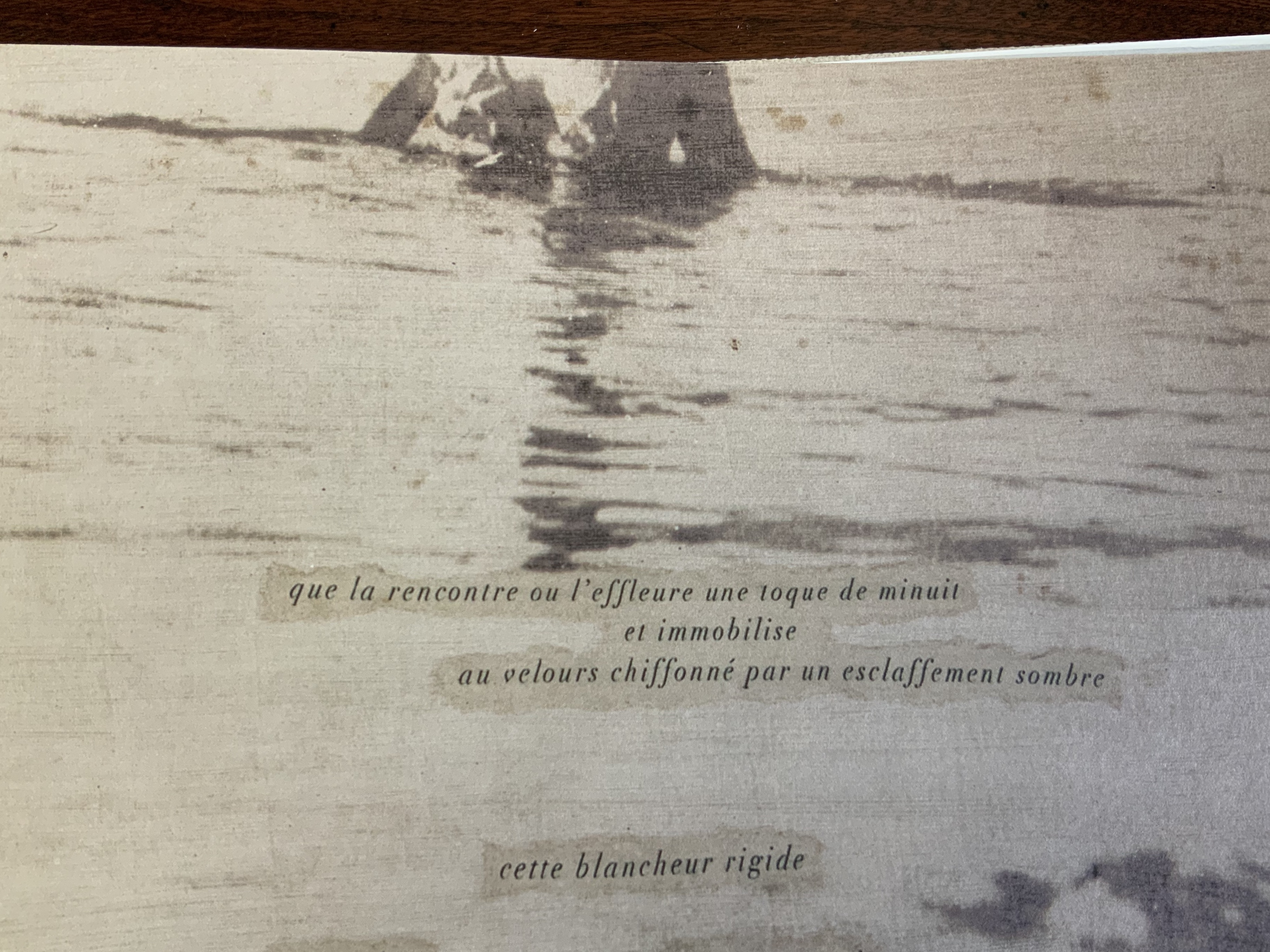
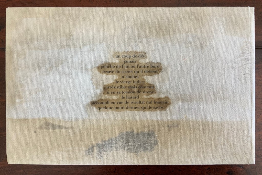
The photo in question is the 78th among 81 photos that mirror and document an installation exhibited at the Musée d’Art Moderne de la Ville de Paris in 2010. In the photo, a double-page spread has been removed from a book, folded and creased into a three-dimensional shape. Or perhaps, as hinted in the interview at the end of the book, it is an enlarged re-creation staged for the photo. The catalogue provides no caption for it or any other image. The text concluding the catalogue does not clarify what it is. Only for someone familiar with Marcel Broodthaers’ homage to Un Coup de Dés Jamais N’Abolira le Hasard are the pages recognizable.
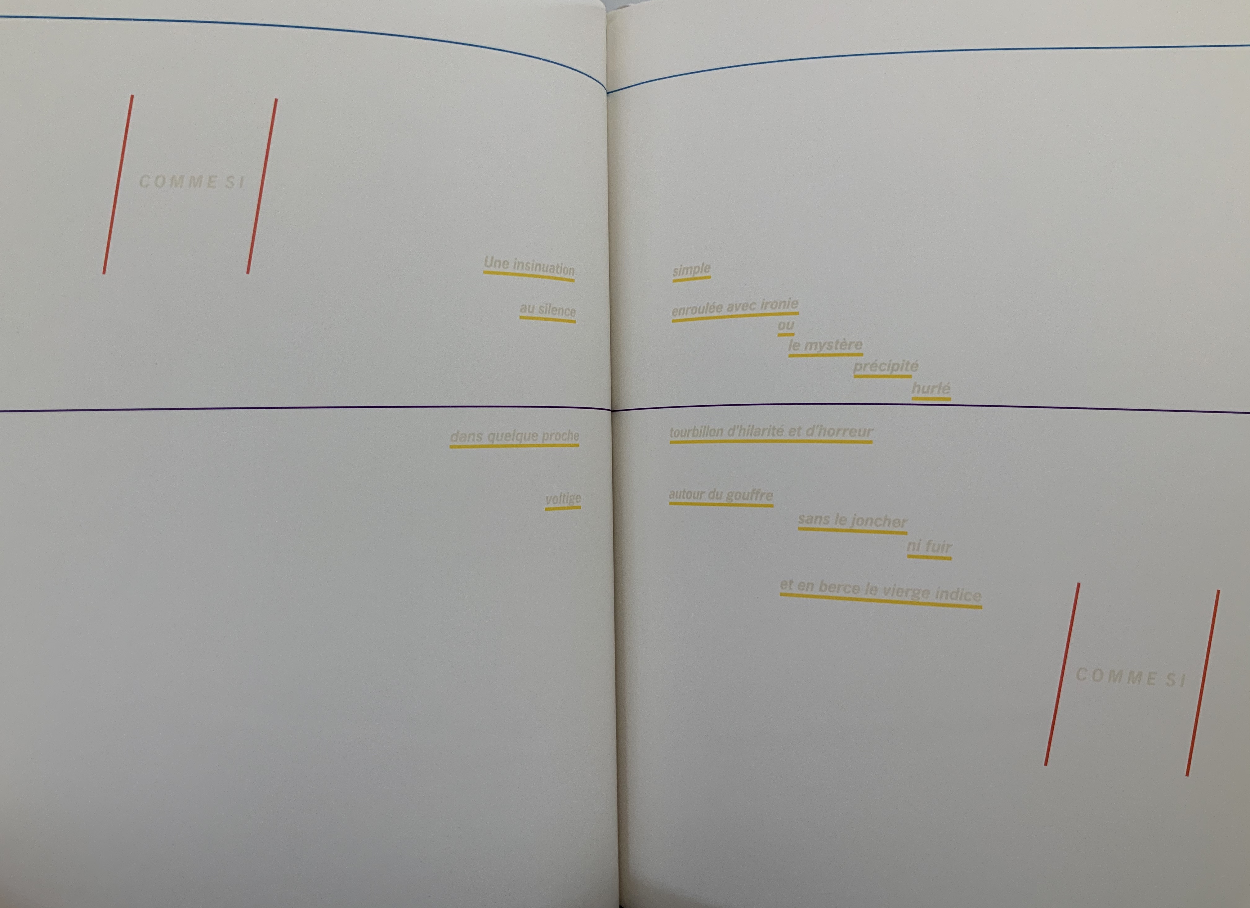
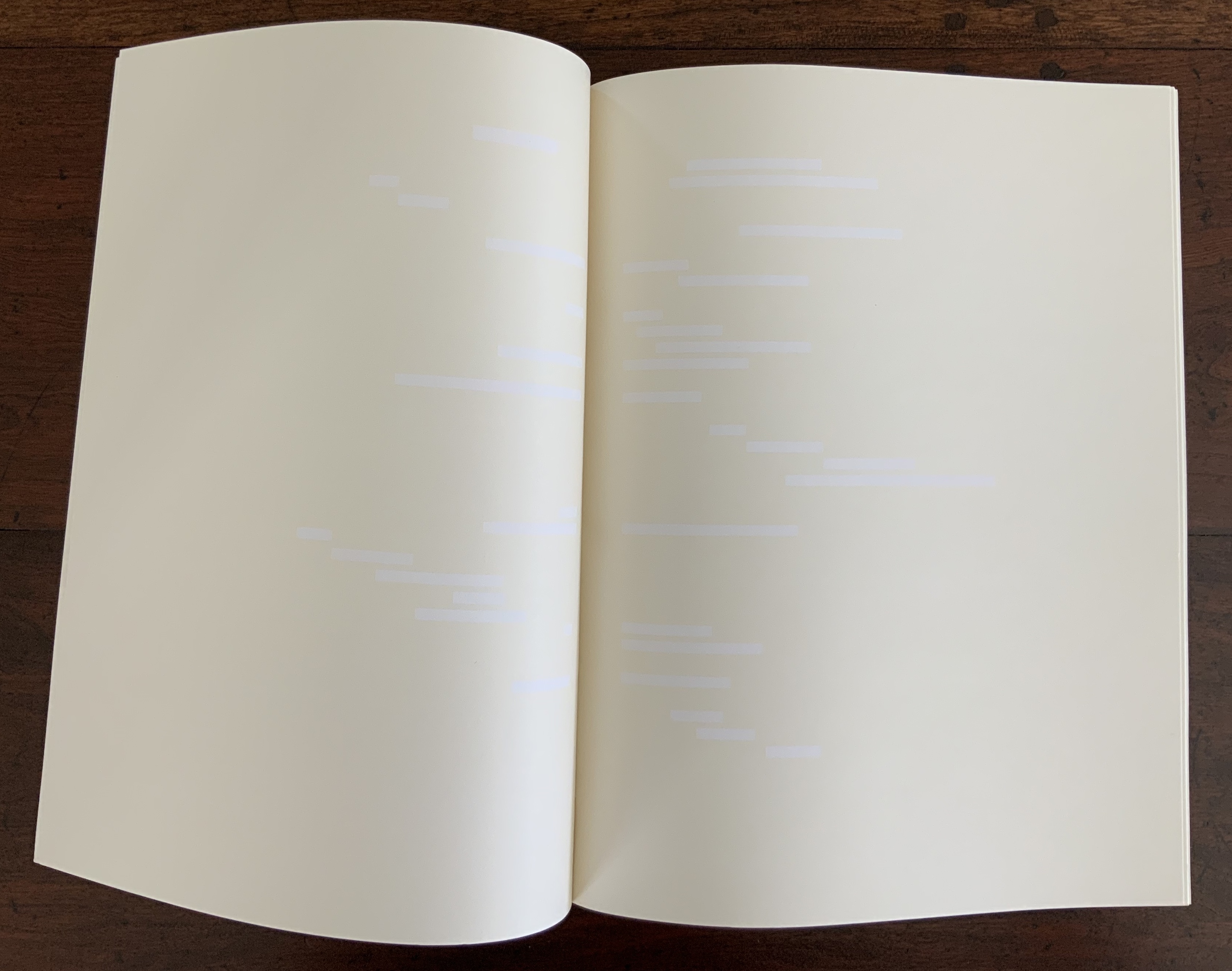
So, for the collector with a hammer, there sits the nail: this photo of a manipulated double-page spread from Broodthaers’ Image version of Mallarmé’s poem. Across the book’s gutter, the image in the double-page spread seems to take on the face of a tilted die. The tilt and multiple creases at the edges of the die face create an illusion of motion. Behind the die, the shadowed edges of the pages add their blur to the imagined throw. Are there clues/clews embedded in the book’s other photos — the suggestion of a shipwreck, a hint of a constellation? As with Un Coup de Dés, images of the surreal and real interleave. Motifs on one page carry over to others. The images play with the white space (les blancs) to the left and around them. As with the various homage by Broodthaers, Michalis Pichler, Jorge Méndez Blake, Cerith Wyn Evans and many others that eschew text in favor of the image and three-dimensional shape, Leykauf’s photos convey motion and simultaneity. (Too strained? The hammer hesitates.)
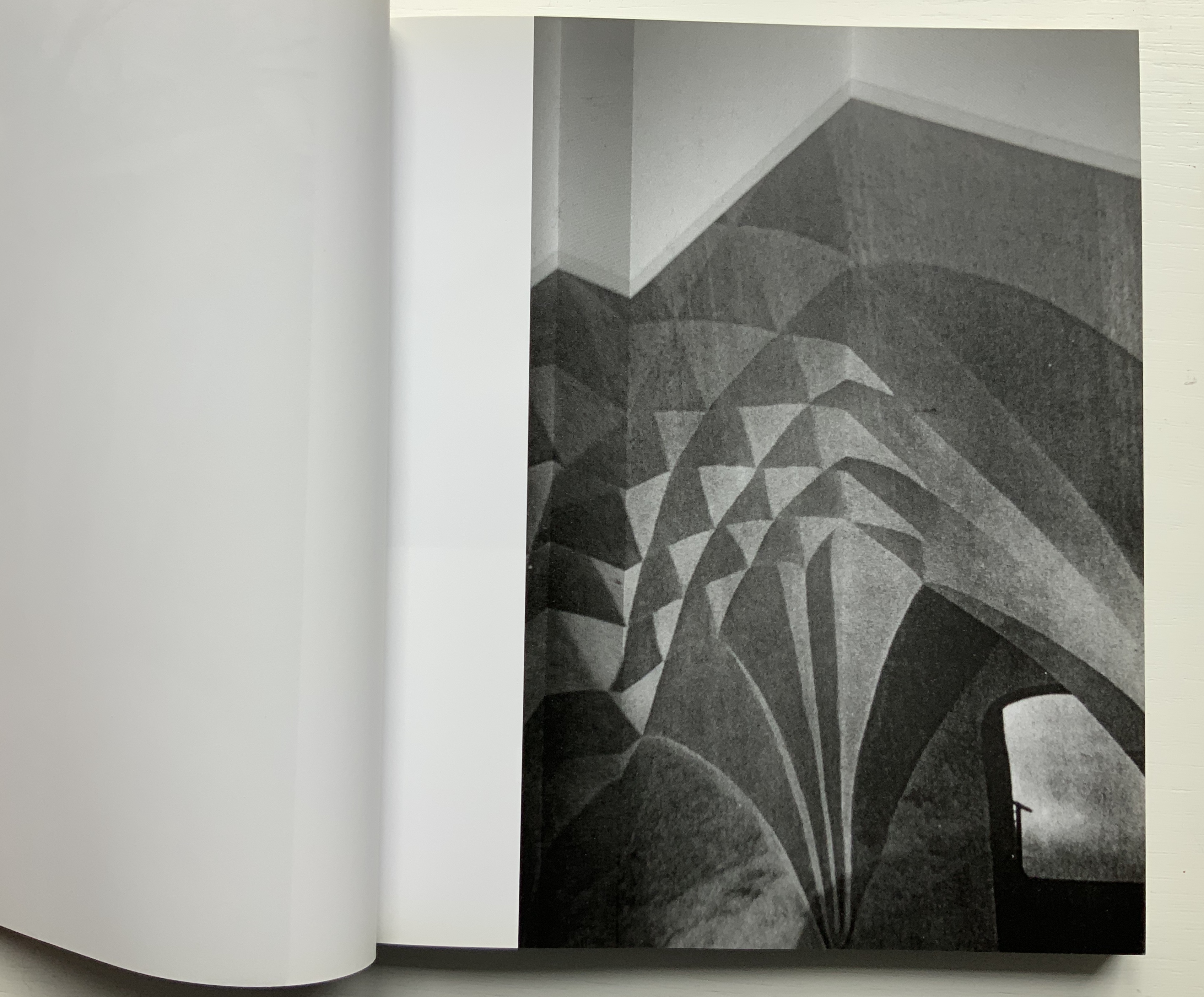
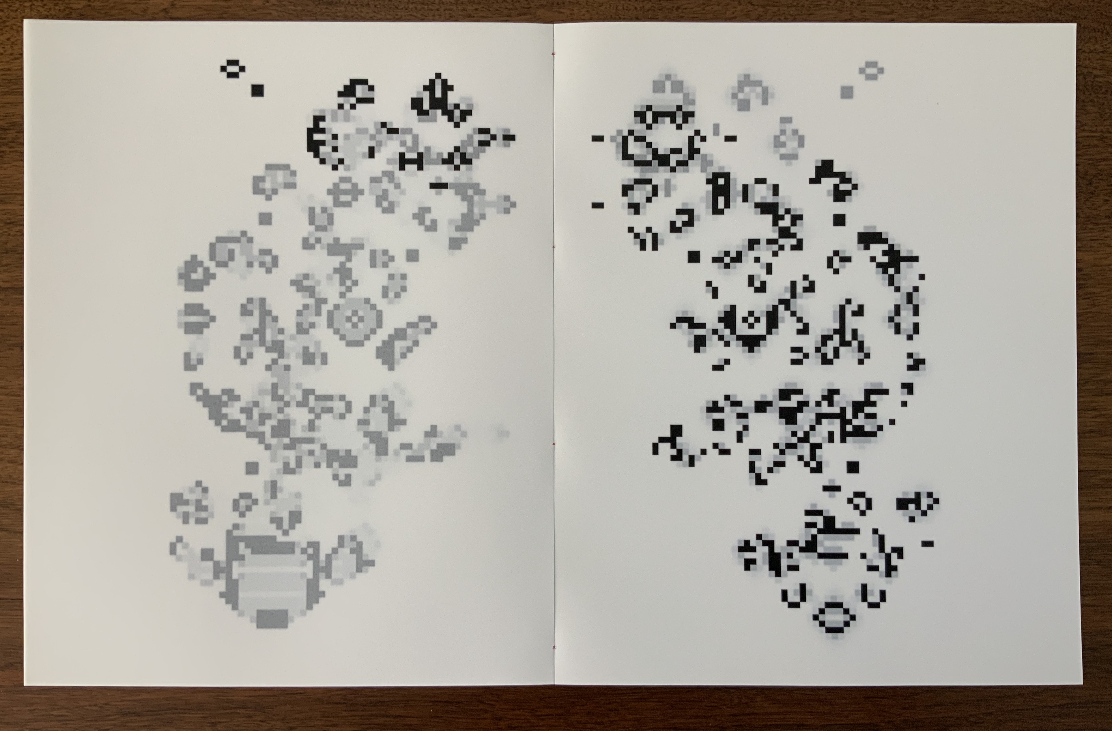
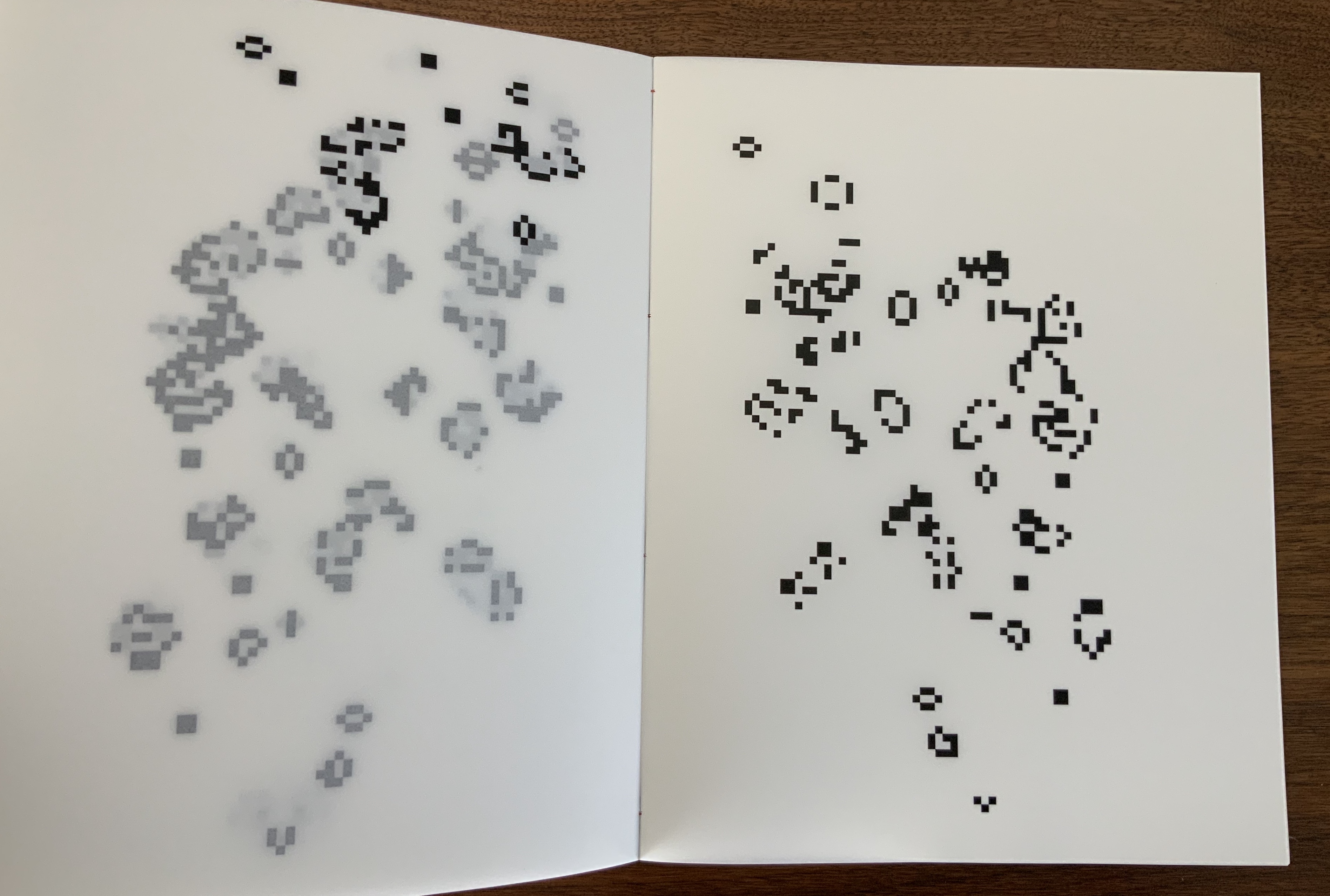
So from there, the collector’s eye turns back to the occasion of the catalogue: “Salle Noire, Château de Bagatelle”, Musée d’Art Moderne, Paris, 6 May – 27 June 2010. The Salle Noire is an exhibition space in the basement of the Musée d’Art Moderne in Paris. According to François Michaud, Leykauf said she wanted to turn the Salle Noire inside out like a glove. To that end, she surveyed and photographed its rooms, its auditorium-like space and, from three viewpoints, its longest wall.


Installation views. Photos: Courtesy of the artist.
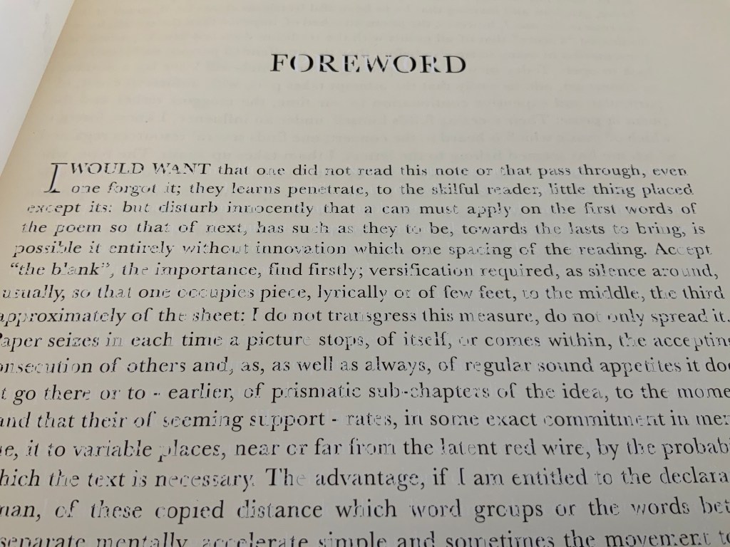
These monochrome photos along with others — wooden triangles comprising a psychological test, segments of a gothic arch, a Walter Gropius building, a stained glass window, an image from a paper activities book, the folded pages from Broodthaers’ Image, etc., and collaged in some instances — were made into slides. For the exhibition, five slide projectors, each holding 81 slides and running at different speeds, shone the images against the walls at different angles. In the interview concluding the book, Leykauf comments:
I consider the totality of the images to be a kaleidoscope … There is no development, no narrative — for example, nothing which might chart an architectural history. The kaleidoscope image or indeed, that of a round dance, sums it up very nicely! Leykauf to Rahn, p. 18.
Kaleidoscope! Does that not describe Mallarmé’s juxtaposition of fragments of verses in different sizes and styles of type and their imagery, which the homageurs highlight?
No development, no narrative! Does that not echo Mallarmé’s preface to Un Coup de Dés — “Everything takes place in a foreshortened, hypothetical state; narrative is avoided” (Collected Poems, p. 263)?
Salle Noire! Could the choice of the black room be a reference to the nothingness, the abyss of the poem?
Château de Bagatelle, a slide show! Could it be a reference to that other great photographer’s cinematic homage to Mallarmé — Man Ray’s Les Mystères du Château de Dés?
As intriguing as it is to tap-tap-tap away at the Château de Bagatelle, the impact of the book’s 81 images and the imagined disorientation from the barrage of five simultaneous, differently paced slideshows overcomes and defeats the most determined, hammer-wielding collector. All that motion and simultaneity echoing the modernists — the Cubists, the Delaunays, Dada, Bauhaus, Schwitters, the Surrealists, the Vorticists — cannot be reduced to an homage to Mallarmé, even if his was the poem that made us modern.


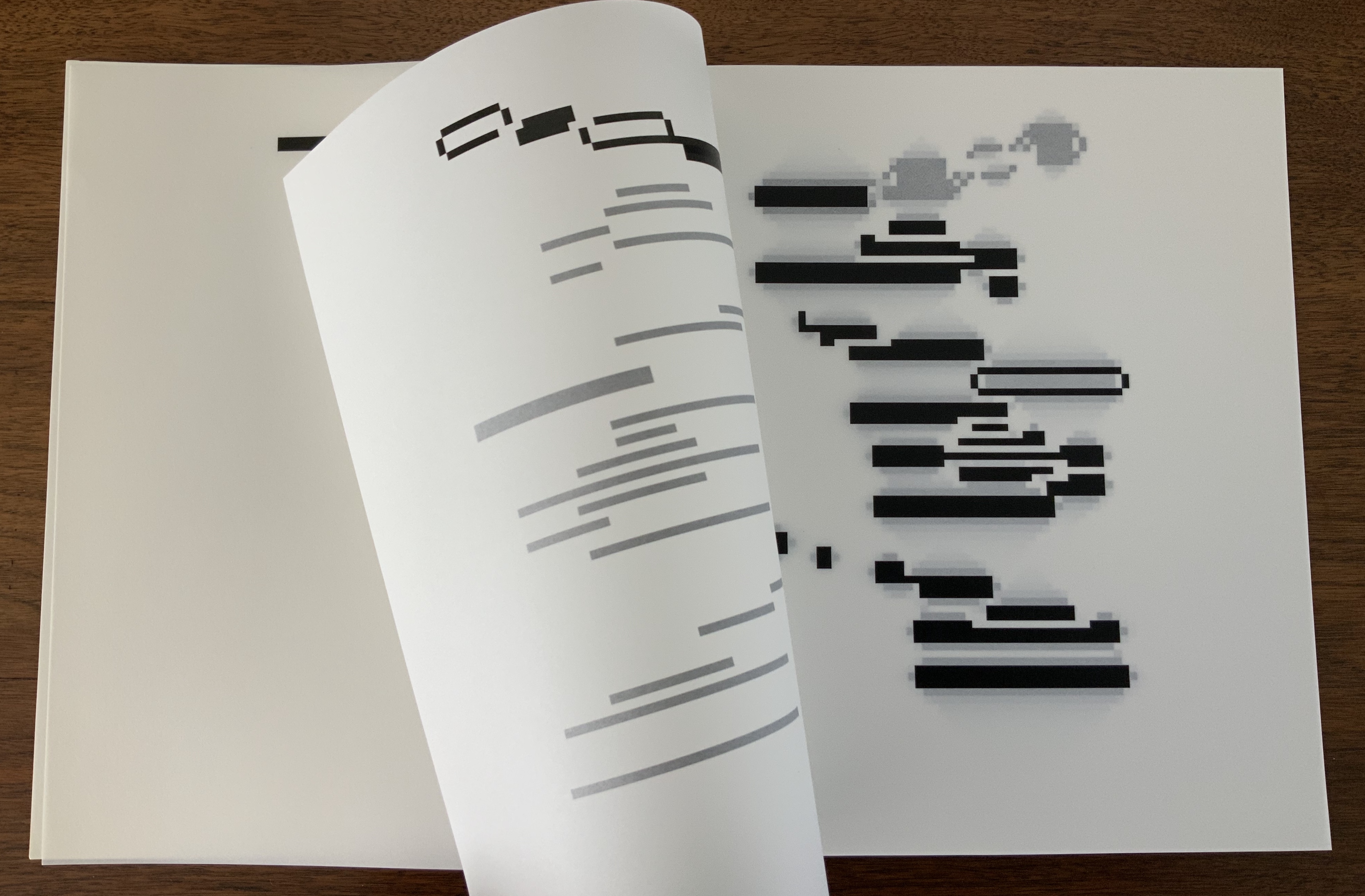
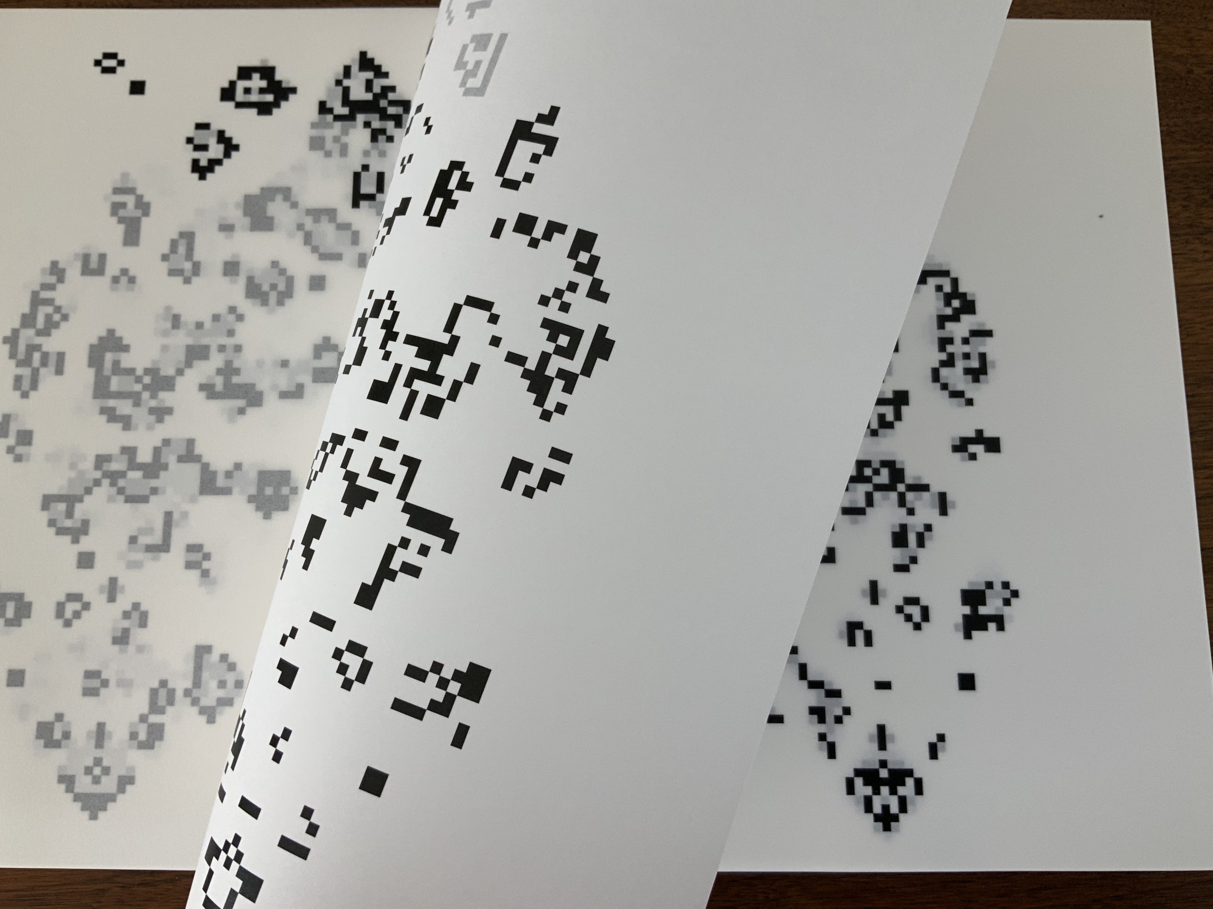
Photos of pages from Château de Bagatelle: Books On Books Collection. Shown with permission of the artist.
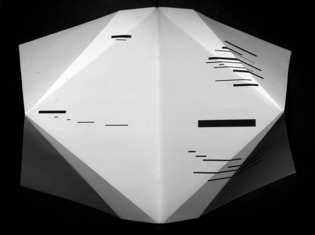
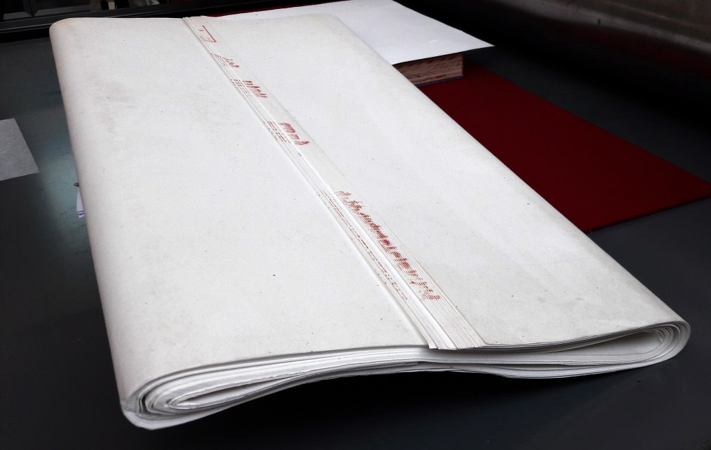
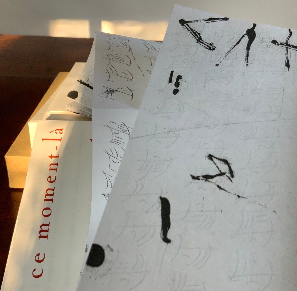
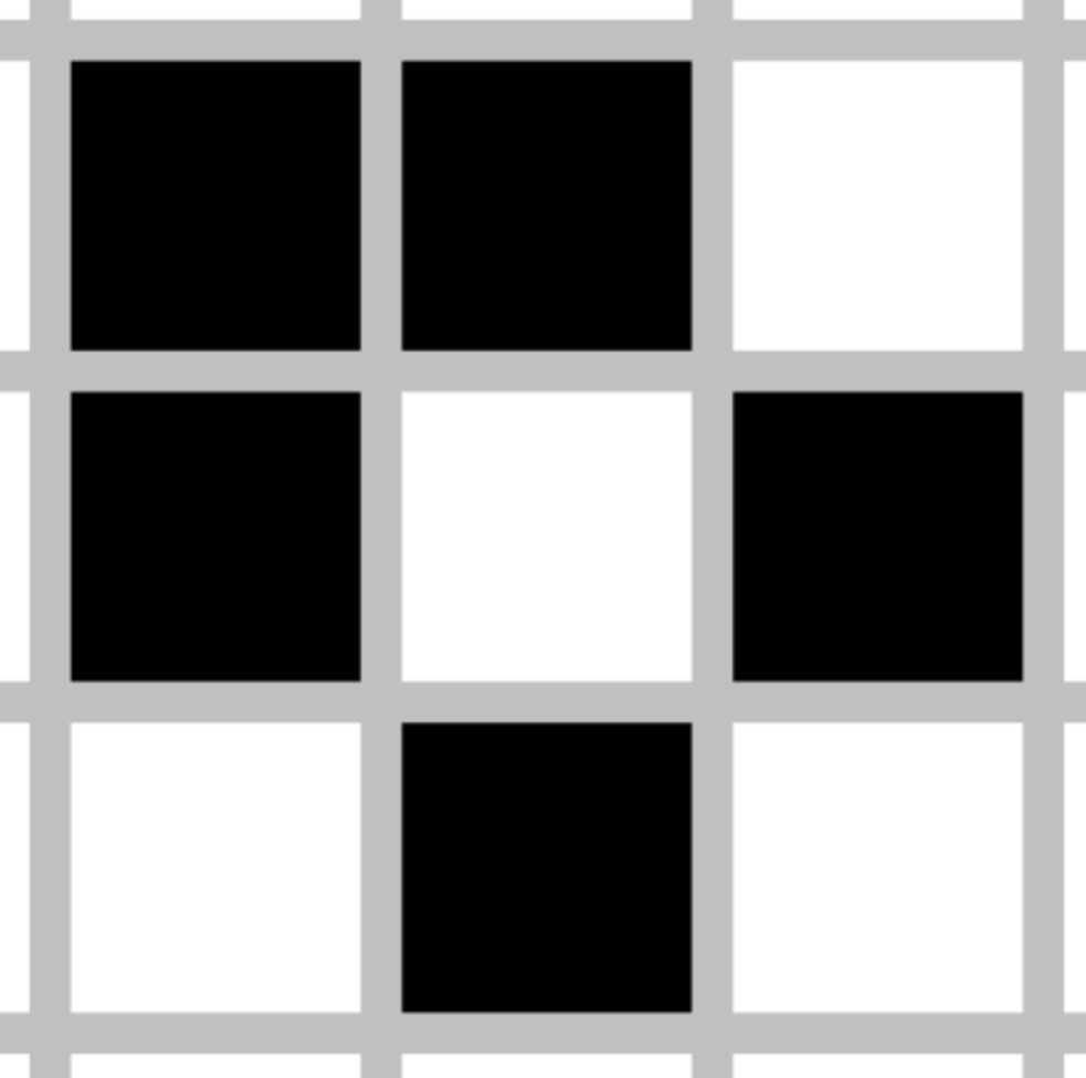
Folded Paper (2010)
Alexandra Leykauf
Print. H500 x W700 mm. Photo: Courtesy and permission of the artist.
For the book art collector taking a wider view with a lowered and stilled hammer, Leykauf’s works subsume aspects of the book. Works such as Katoptrische Experimente (2012), A Student at Ease Among the Books, (2013) Everybody’s Autobiography (2014), La Statue Intèrieure (2015), Cumberland Farm (Ben Nichols) (2017) — all challenge perspective. Wall-sized photos of a double-page spread turn the corner of the display room; book covers larger than the viewer are coated in reflective material and form a fun house maze of angled mirrors and open title-page spreads; aerial views, recto/verso views, proscenium views, and inside/outside views play with the structures of landscapes, the theater and amphitheater, cupolas and arches, trees and caves, and the structure of the book. Perhaps everything in the world does not exist to end up as a book — or a photo — but as perspective.
Further Reading
“Alexandra Leykauf in conversation with Kathleen Rahn”, 19 February 2010, trans. Timothy Connell, in Alexandra Leykauf: Chateau de Bagatelle (Nürnberg : Verlag für moderne Kunst Nürnberg, 2010), pp. 15-18.
“Alexandra Leykauf en conversation avec Sophie Berrebi”, 6 Mai 2010. Accessed 6 September 2020.
“Salle Noire, Château de Bagatelle”, 2010. Accessed 27 March 2019.
Mallarmé, Stéphane. Trans. E.H. and A.M. Blackmore. Collected Poems and Other Verse (Oxford: Oxford University Press, 2008.
Michaud, François. “The Sense of Loss”, 26 February 2010, trans. John Tittensor, in Alexandra Leykauf: Chateau de Bagatelle (Nürnberg : Verlag für moderne Kunst Nürnberg, 2010), pp. 4-6.


