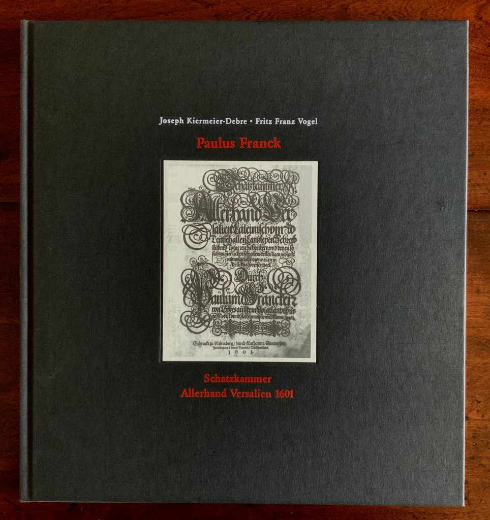
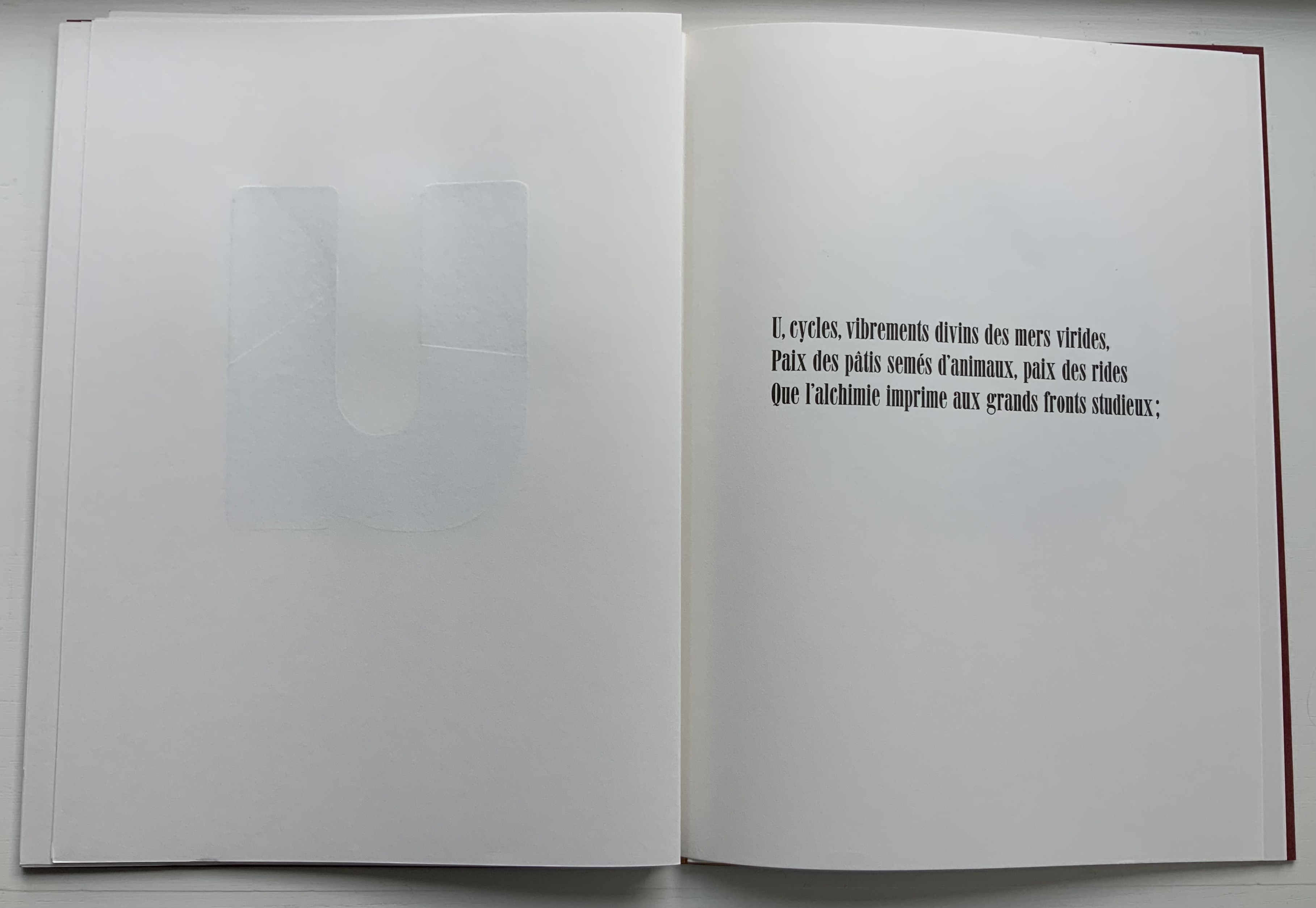
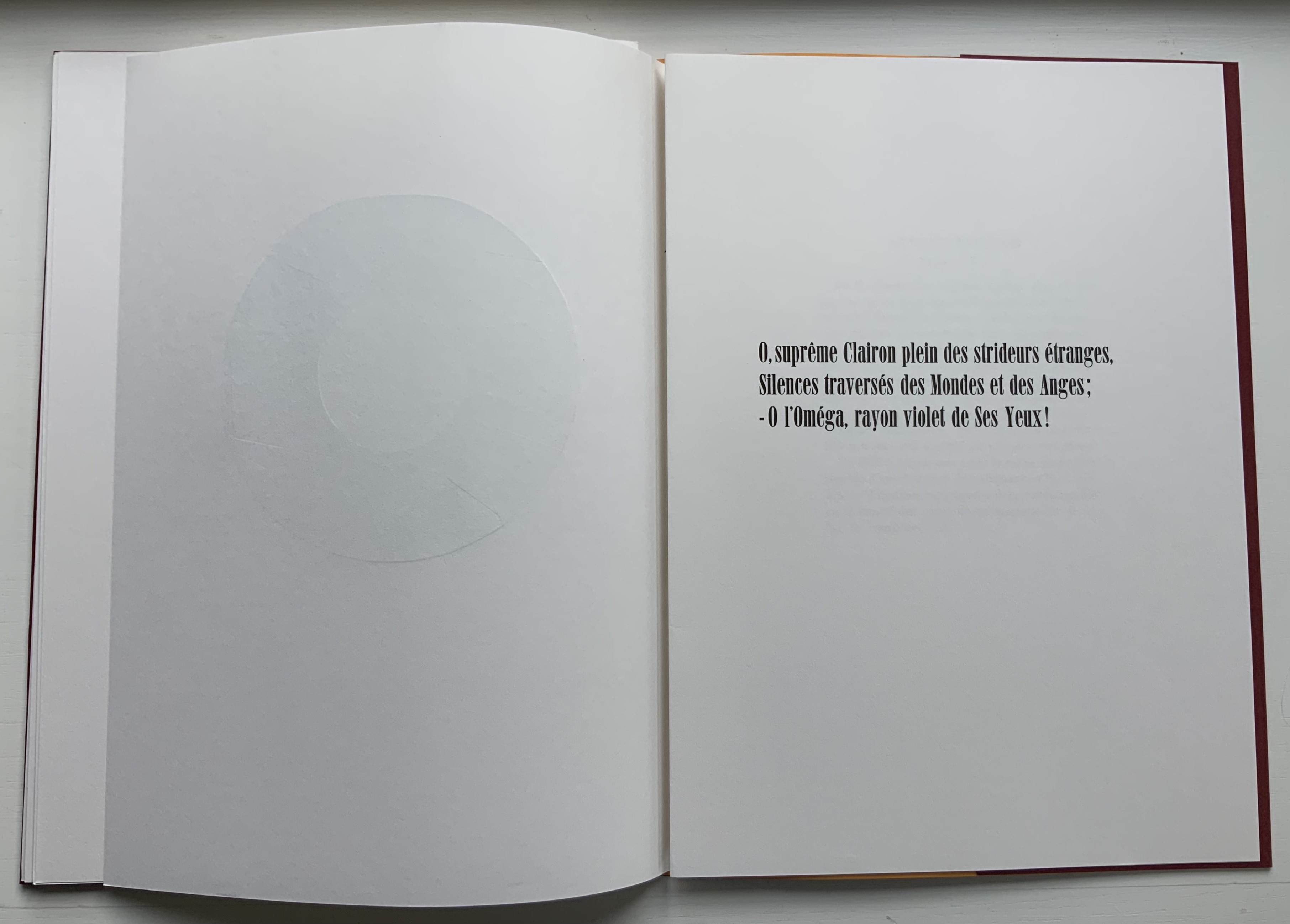
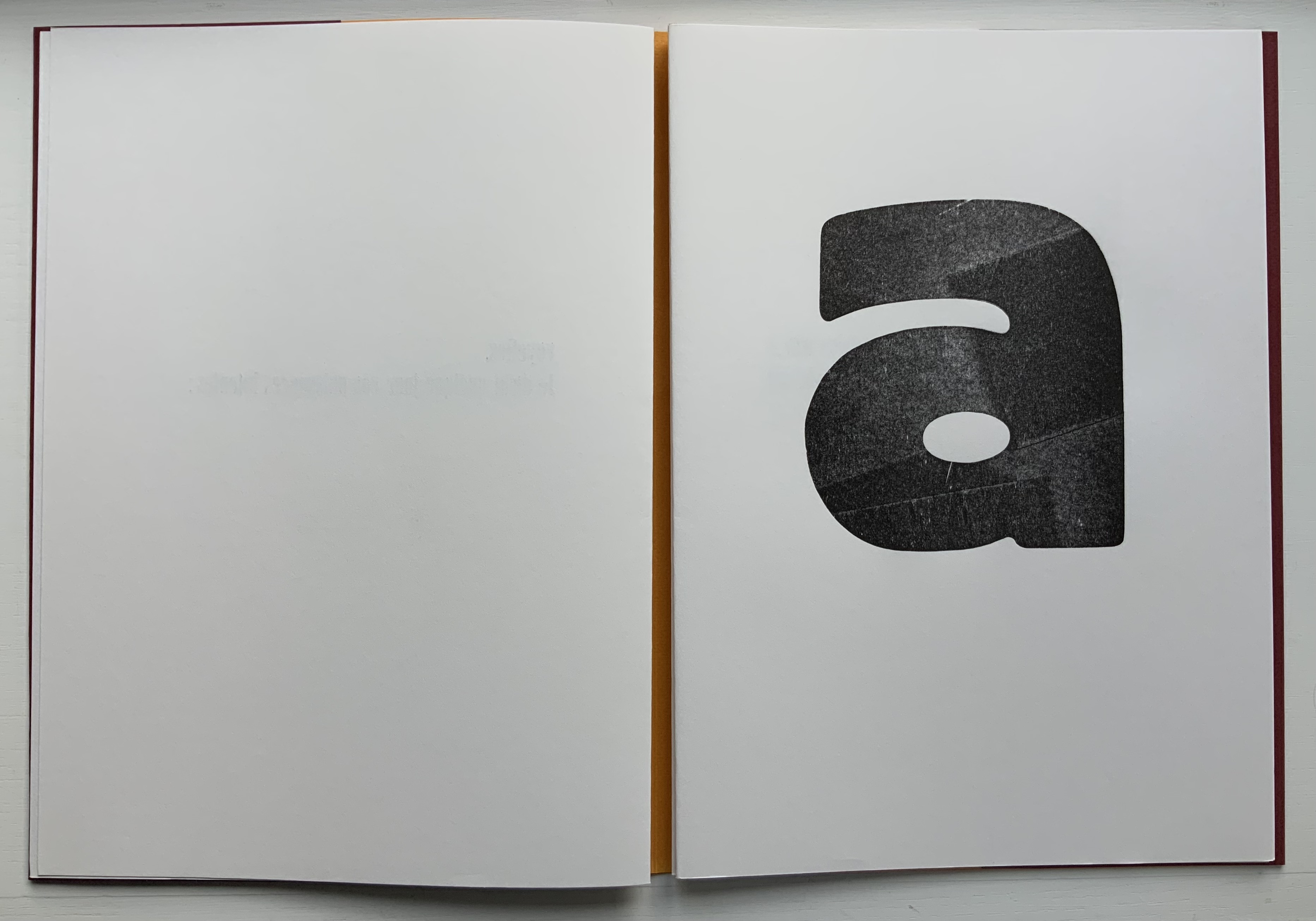
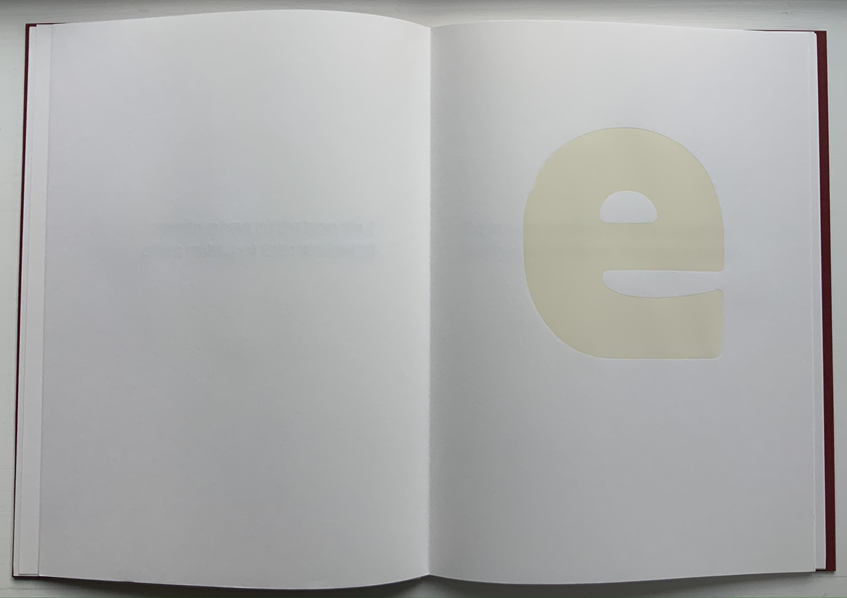
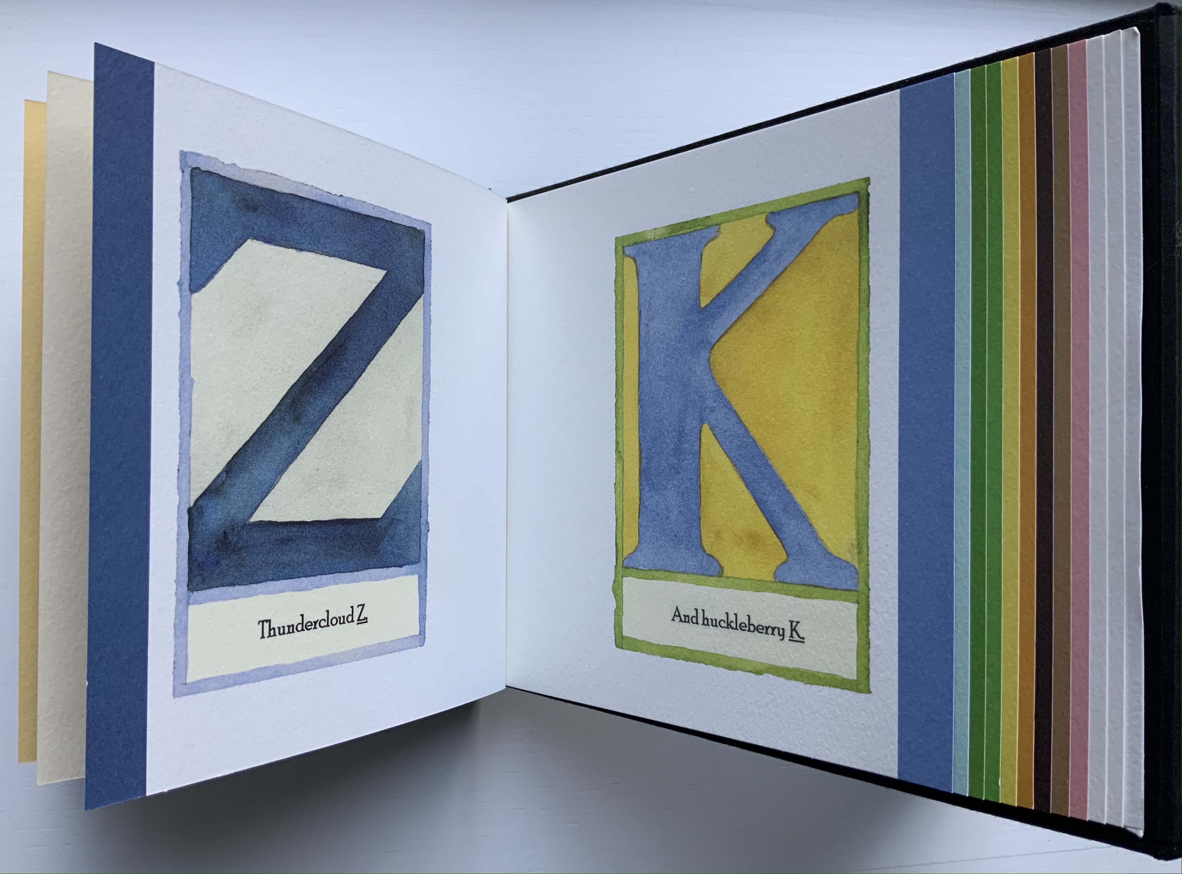
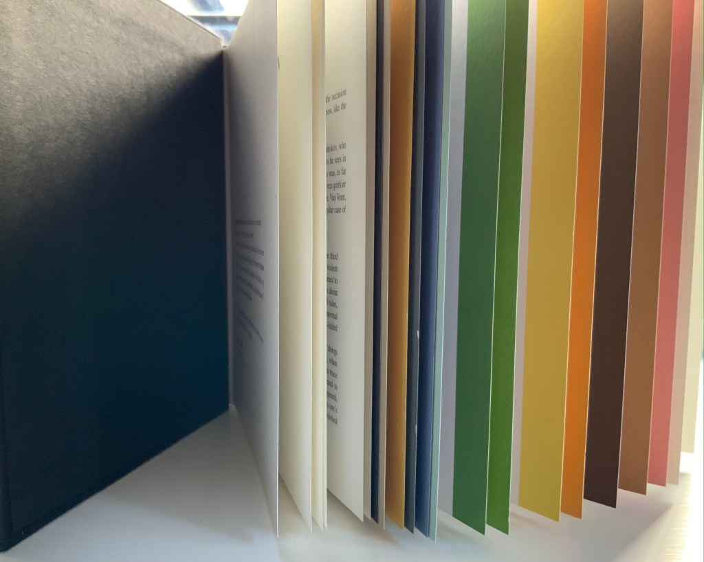
Schatzkammer Allerhand Versalien (1601/1995) Paulus Franck Facsimile edition created by Joseph Kiermeier-Debre and Fritz Franz Vogel as part of the boxed set Alphabets Buchstaben Calligraphy, published by Ravensburger Buchverlag (1998). Hardback. H275 x W255 mm, 80 pages. Acquired from Antiquariat Terrahe & Oswald, 14 March 2021. Photos: Books On Books Collection.
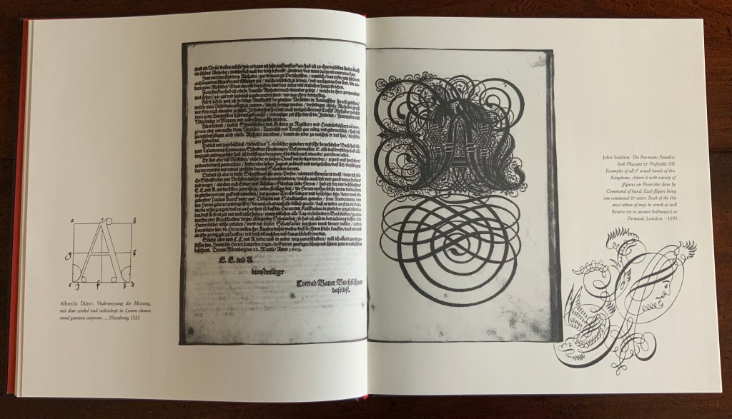
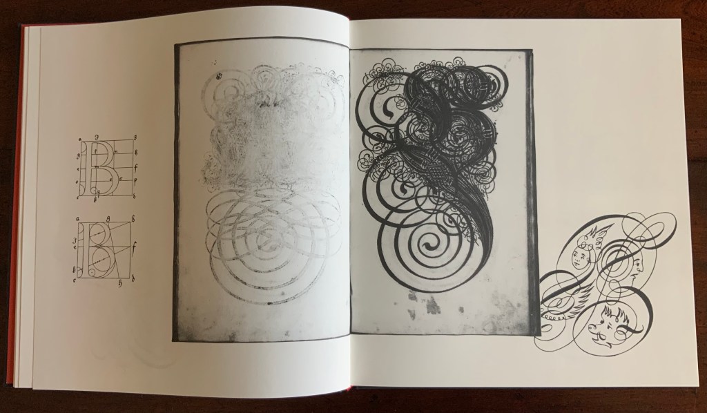
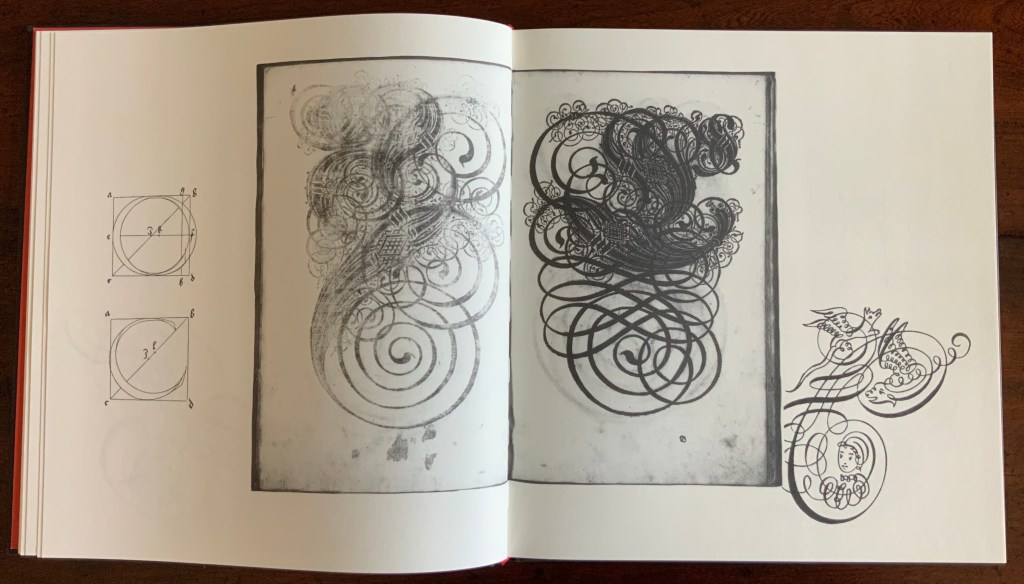
Little is known of Paulus Franck himself (although the editors reveal a Caravaggesque manslaughter charge in his home town of Memmingen), so the focus rests mainly on Schatzkammer, Allerhand Versalien Lateinisch vnnd Teutsch: allen Cantzleyen Schreibstuben Notaren Schreibern vnd denen so sich des zierlichen schreibens befleissigen zudienst vnd wolgefallen von neüen in Druckh also verferttiget (as the full title goes). The editors position Franck’s Treasury in the context of the phenomena of the writing master, penmanship and calligraphy from 1500 to 1800, even regaling the reader with tales of poor Franck’s castigation by Nuremberg’s calligraphic dynasty the Neudörffers. The editors neatly use the margins of their book to add to the historical context. Below, on the verso page, they have the geometrically controlled design of Albrecht Durer (1525), and on the recto, the exuberance of John Seddon (1695).
One element not extolled by the editors is the printing from woodcuts. The quality of the woodcuts can be better appreciated by looking at the scanned original available from the Bayerische Staats Bibliothek (BSB). Conveniently, the site BibliOdyssey has downloaded the letters and provided additional links. At his Type Design Information Page, Luc Devroye also reproduces Franck’s ornate letters from the 1601 manual as well as from a later volume produced by Paul Fürst (better known for his print “Der Doctor Schnabel von Rom“) and printed by Christoph Gerhard in 1655.
This facsimile of Franck’s Treasury makes up one of four volumes in a box set, edited by Joseph Kiermeier-Debre and Fritz Franz Vogel. The other three present works by Antonio Basoli, Johann Theodor de Bry and Johann David Steingruber. To see Franck’s continuing influence, visit the collection entry on Tauba Auerbach.
Further Reading
“Tauba Auerbach“, Books On Books Collection, 23 March 2021.
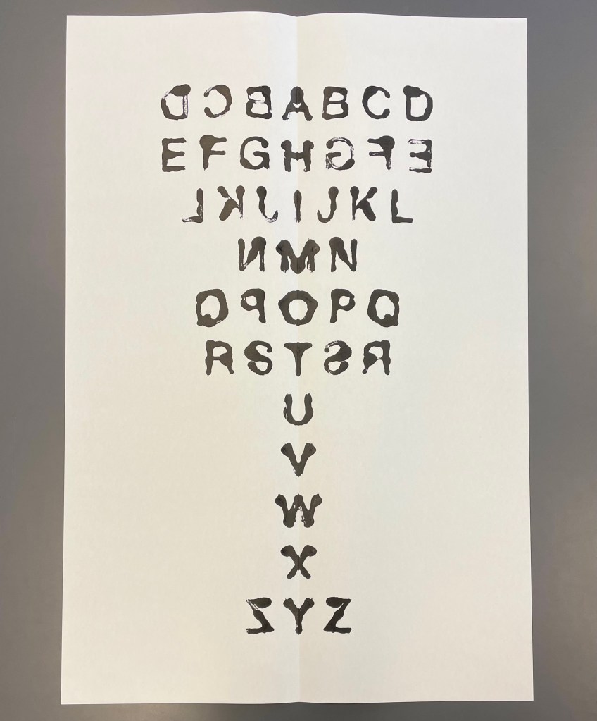
Mis en pli(2016) Étienne Pressager Monotype, inked, folded in half lengthwise and unfolded. H840 xW570. Edition of 16, of which this is #12. Acquired from the artist, 22 April 2022. Photos: Books On Books Collection, and courtesy of the artist. Displayed with permission of the artist.
The alphabet loves a mirror, and like many artists’ books that comment on themselves or the Book, Étienne Pressager’s monotype is self-regarding — in its process, its result and its title. A large sheet is folded lengthwise and unfolded. Ink is arranged just so in the center and to the right. The sheet is folded, pressed and unfolded to reveal the mirrored alphabet. Voilá, a single-fold book. Mis en pli or “Set in fold”.
Quelques îles en formation (2007)
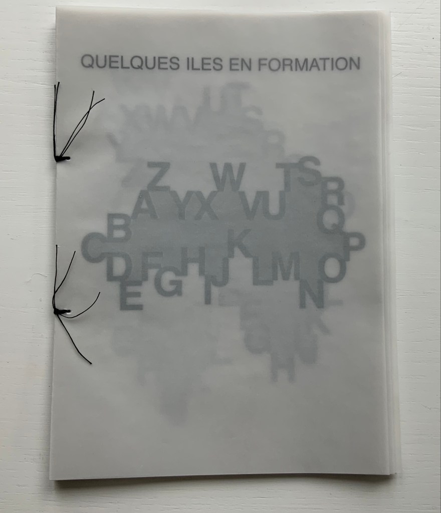
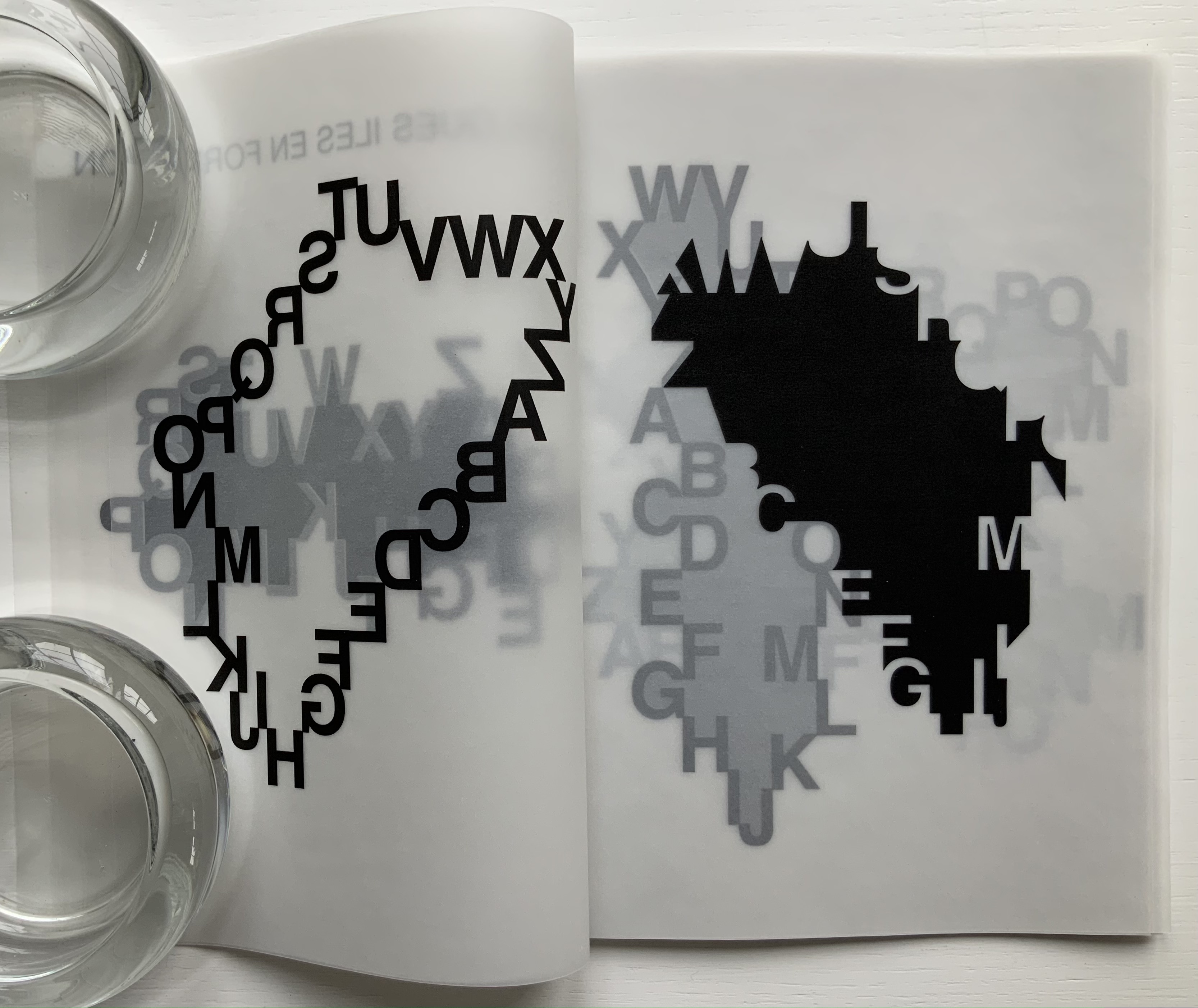
Quelques îles en formation (2007) Étienne Pressager Handsewn booklet. H210 x W170 mm, 30 pages. Edition of 10, of which this is #9. Acquired from the artist, 8 March 2022. Photos: Books On Books Collection.
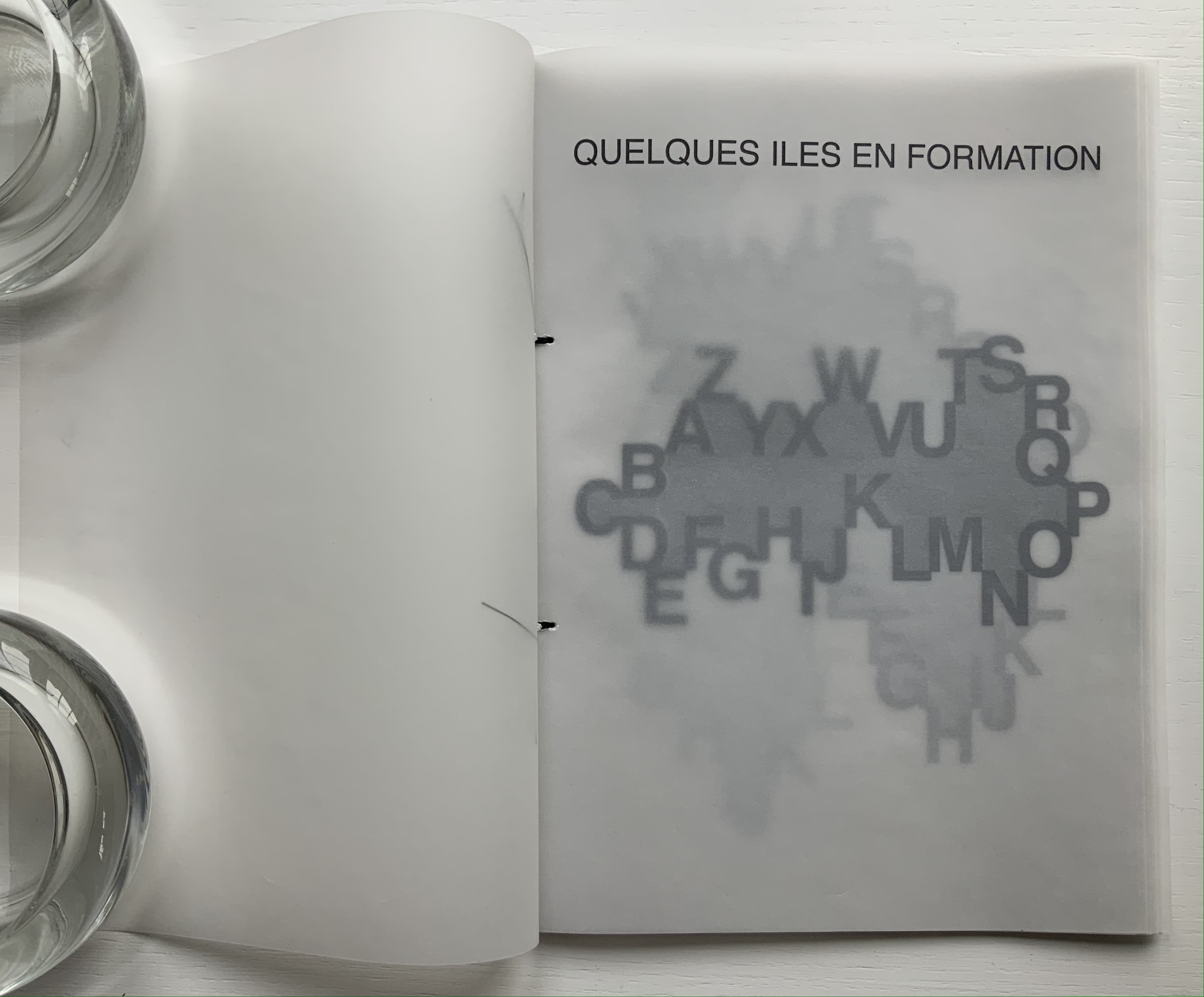
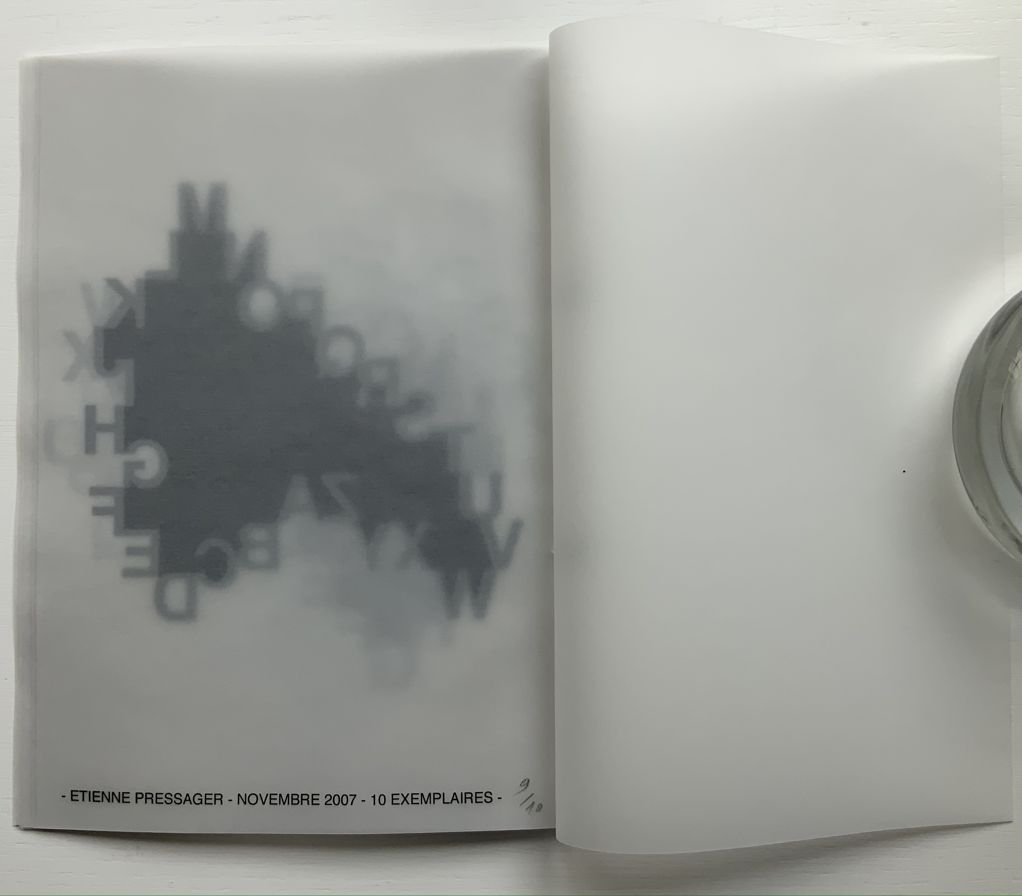
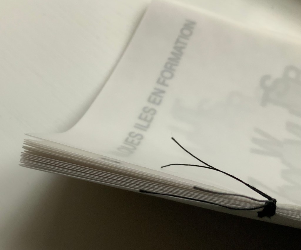
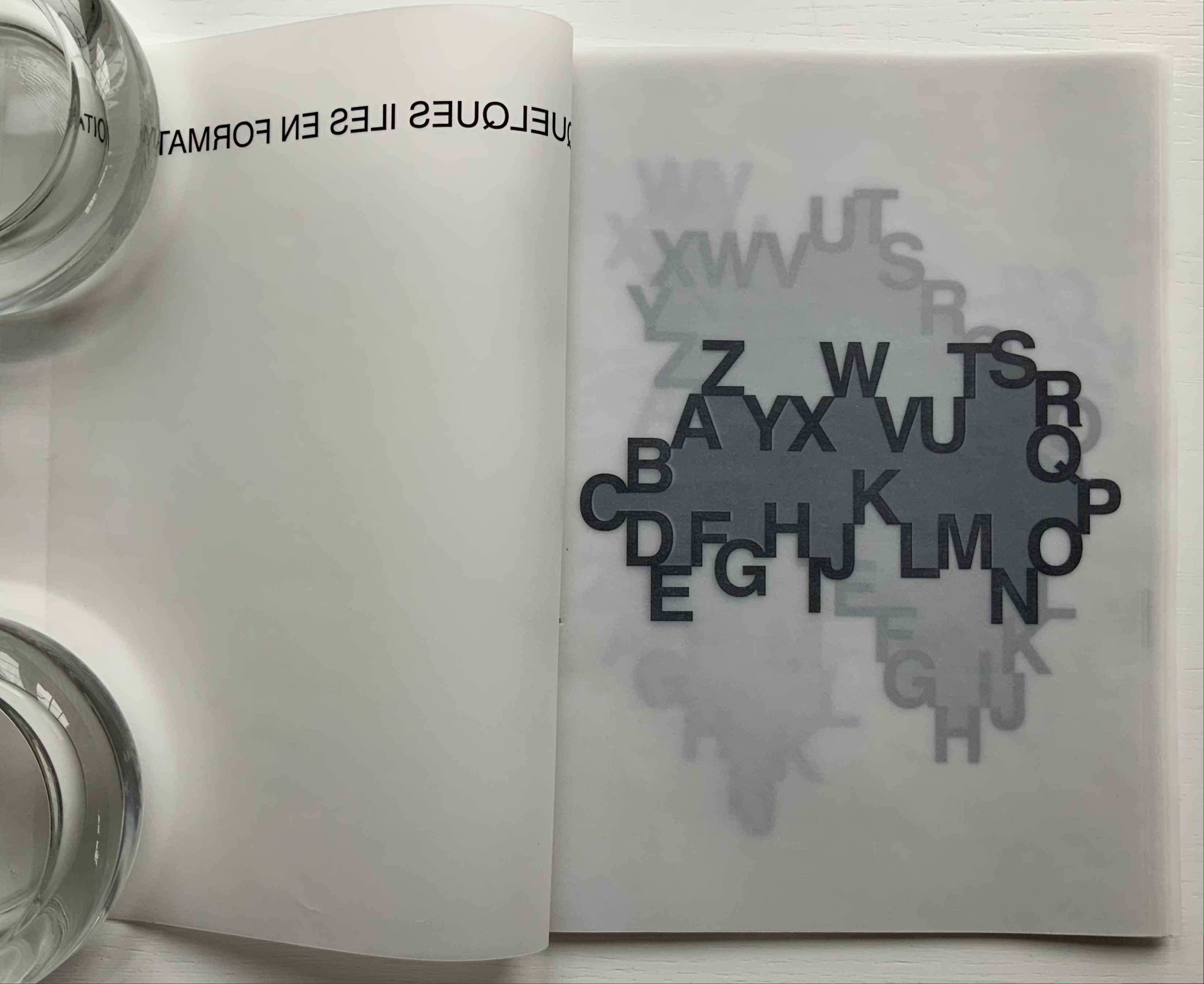
Quelques îles en formation consists of fifteen single-fold folios handsewn with black thread. The first and last folios serve for the front cover/title page and colophon/back cover, respectively. The thirteen folios between them constitute the îles/”islands” being formed by the encircling letters of the alphabet and the encircled masses laser-printed on the translucent paper. But why “some islands”/quelques îles and not just thirteen? As the reader/viewer moves through this work, it dawns that there are far more than thirteen ways of looking at these blackbirds.
Spine, showing the single-fold folios.
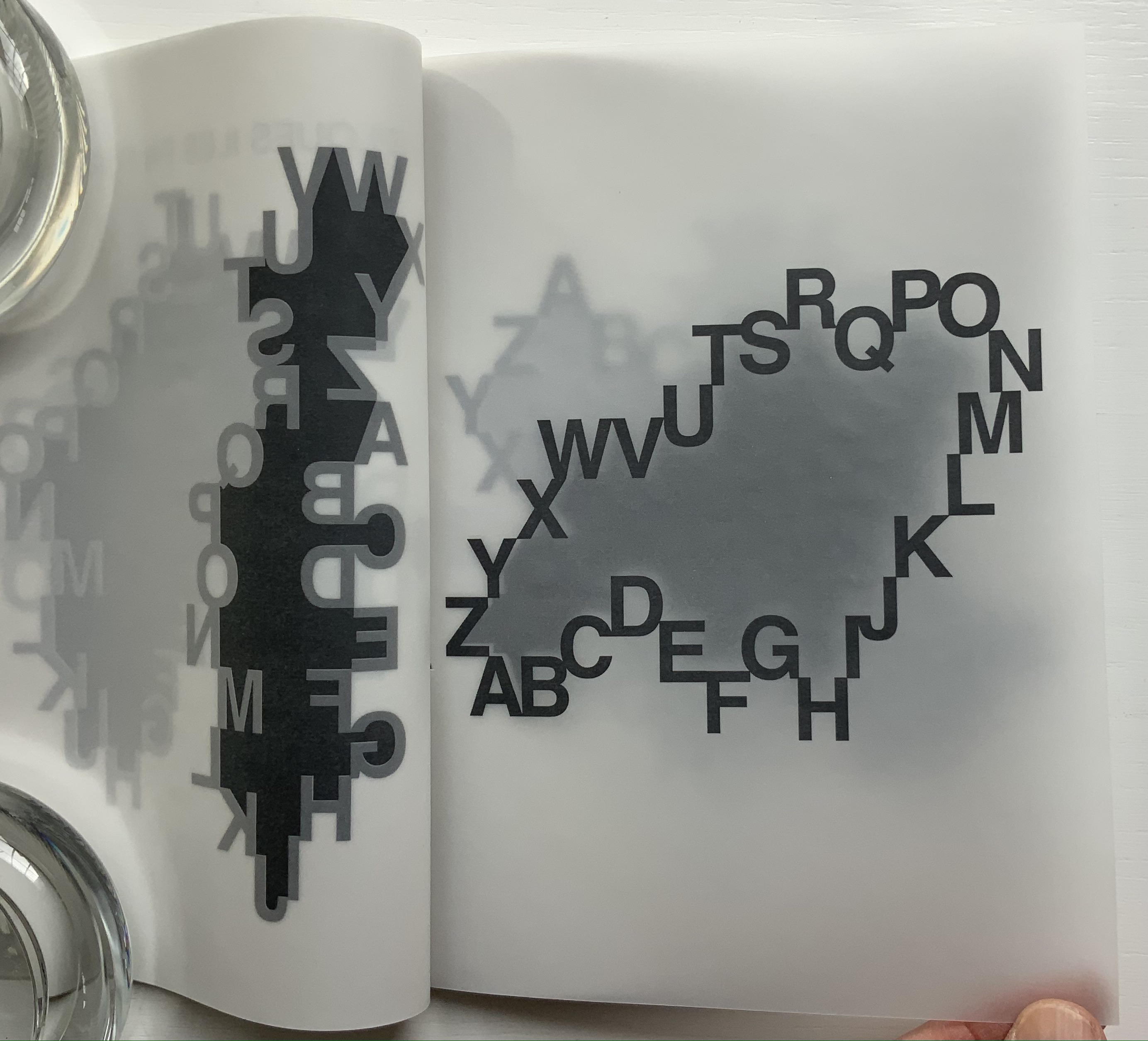
To talk about the folios (and since the pages are unnumbered), let’s name them “Island AB”, “Island CD” and so on. So the work’s second folio would be Island AB (below). If we go round the island clockwise from Z, we are reading the alphabet in reverse. This doesn’t seem right (although we are reading à droite/”to the right”). But to follow the Latin alphabet aright, we are forced into reading right to left. Once we reach letter C, the Western norm of left-to-right reading asserts itself — even if bumpily so — but with letter P, we are back to the Middle/Far East direction of reading. At least, in either direction, the dark gray body of land is clear enough. Or is it?
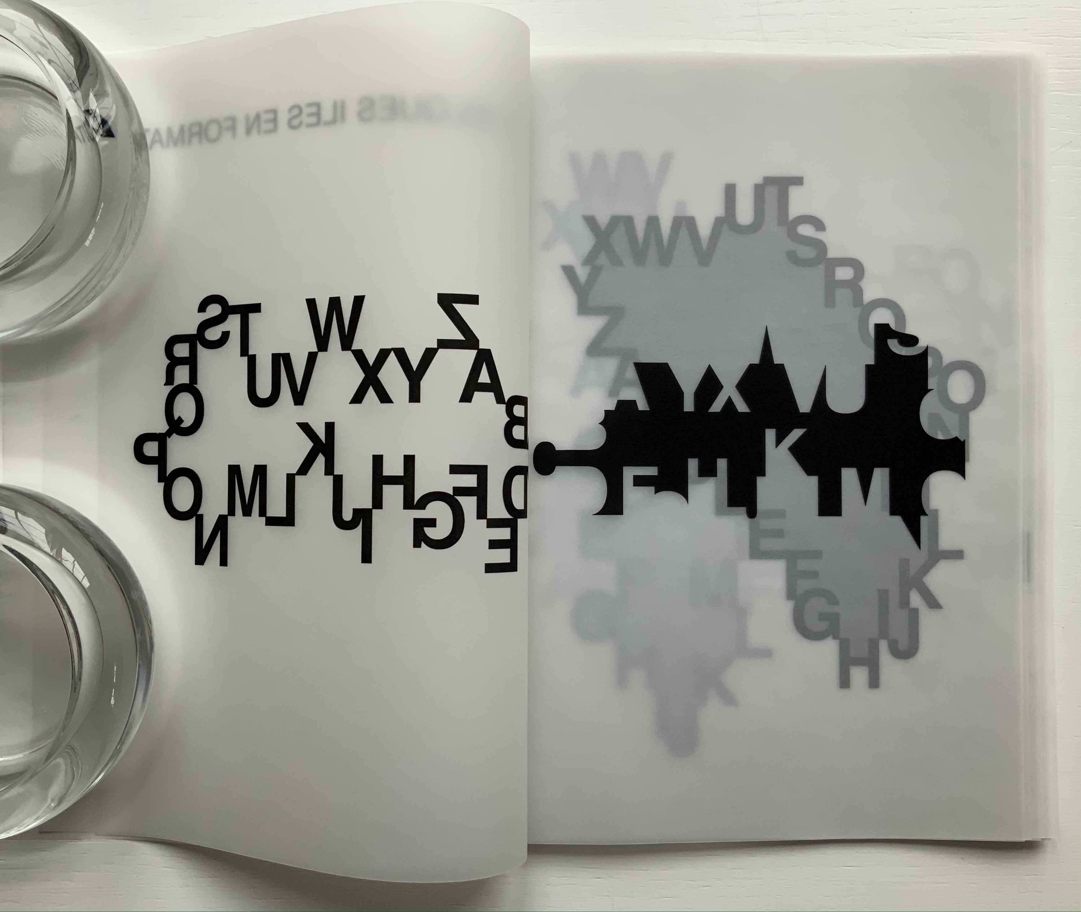
Folio “Island AB”: first, second and third pages displayed. The fourth page appears below.
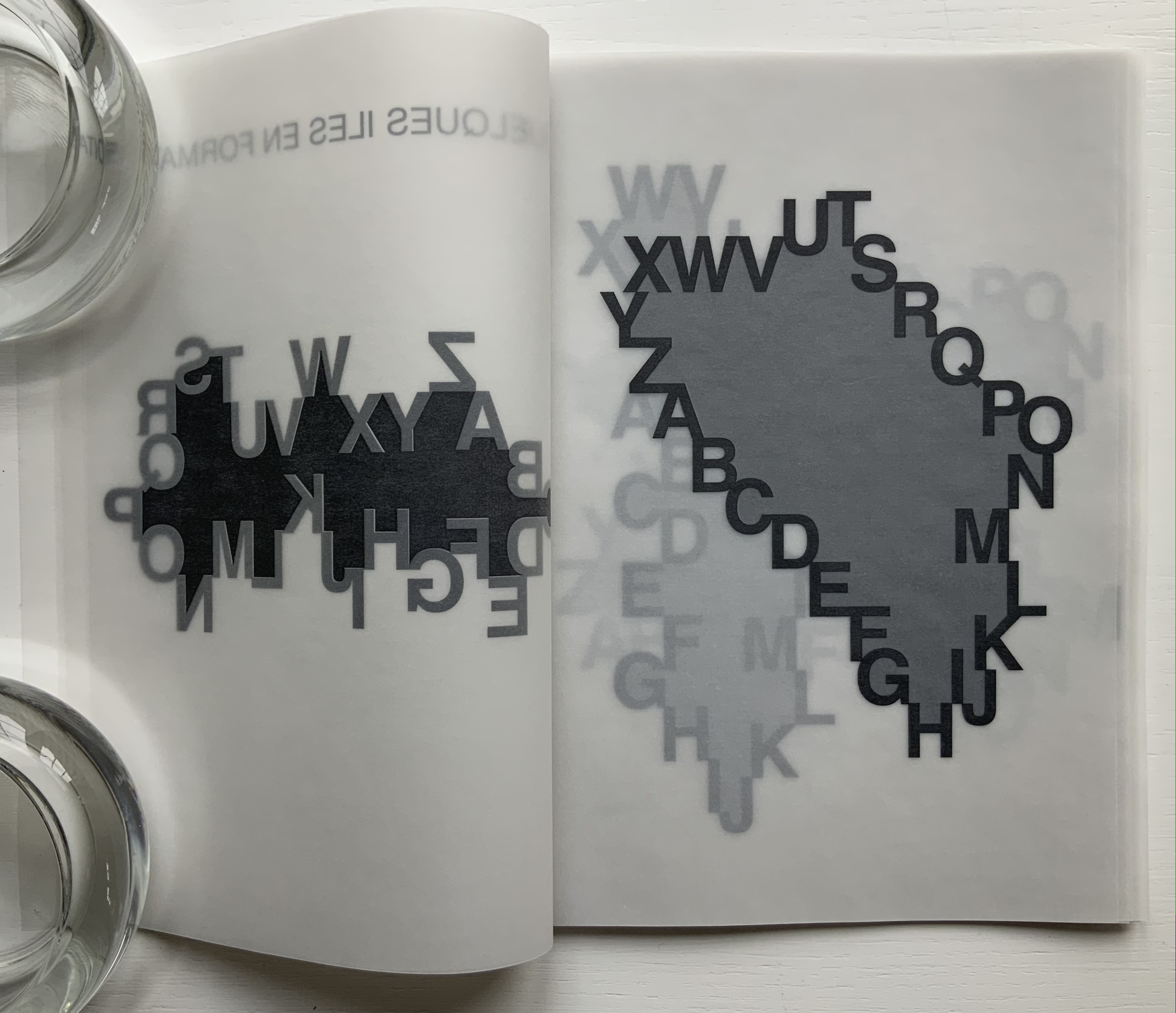
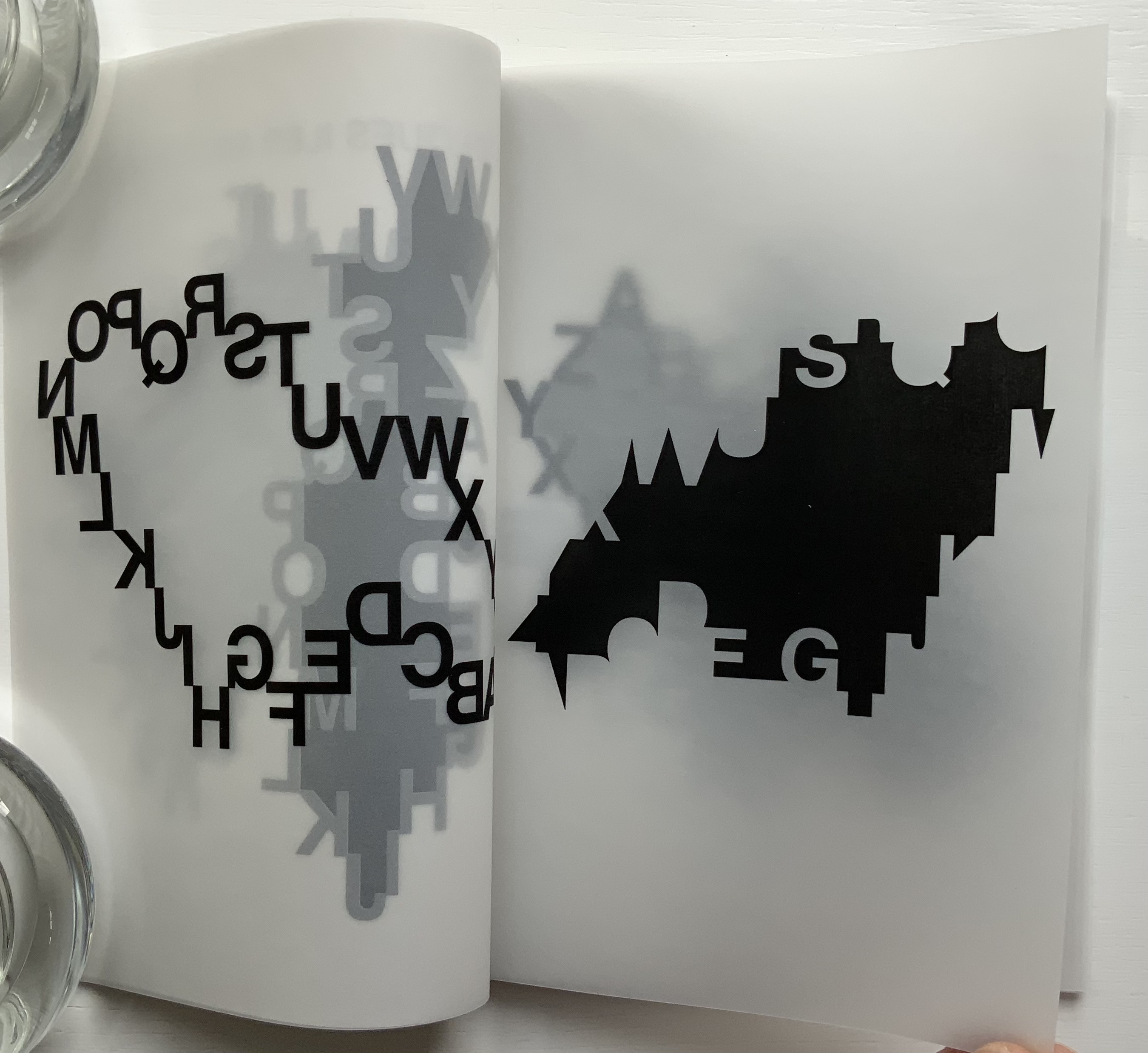
When Island AB’s first page turns, the black letters separate from the body they define. They float in reverse on the second page (above) even more black. The dark gray body now becomes a separated mass of black on the third page (above). It looks like an abstract image or a skyline, but here and there, the island’s contour shows just enough parts of the absent island-forming letters to make out the Y, X, F, K and M. When the third page turns, Island AB’s “underside” appears on the fourth page of the folio (below). The reversed black letters on the second page lighten to gray as the translucent paper falls over them, but the black abstract or skyline or island printed on the third page shows through just as black as before.
Island AB’s fourth page; Island CD’s first, second and third pages.
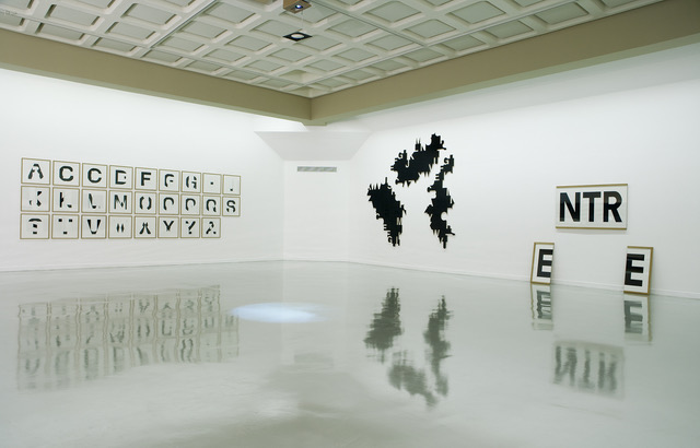
In an installation setting, three of these bodies of black become the work Îles capitales, a standalone large-scale hanging made from industrial plywood covered with thin black melamine. In contrast, the book form layers the islands, adding yet another layer in the process of îles en formation. The islands beneath cast shadowy outcroppings upwards around the island covering them. Indeed, as pages turn, outcroppings disappear, replaced by others from islands further underneath. Look again at Islands AB and CD above.
Gallery view of Îles capitales (center) in “Bertrand Gadenne/Étienne Pressager: A,B,C,D, Etcaetera”, a joint exhibition at Lieu d’Art et Action Contemporaine (LAAC), Musée de France, Musée de la Ville de Dunkerque, 2007. Photo: Courtesy of Étienne Pressager.
Another element of the layering comes into play as pages turn. It comes just as a page is lifted. Below, on the left, the letters around Island GH lift away leaving a blurred outline of the island beneath; on the right, the island becomes more sharply defined as the page begins to turn. Calling further attention to the layering, each folio is folded offset, the first and second pages always being wider than the third and fourth, which facilitates turning the slippery translucent pages but highlights the work’s in-betweenness, its gradations of gray, black and white.
Island GH: with its first and third pages being turned.
Each island is shaped by the same 26 letters, but the contours of each island differ. An infinite number of varied archipelagoes could be derived from Pressager’s ourobouros-like alphabet, just as an infinite number of words can be generated from the alphabet, which in turn can be used to define, delineate and bridge domains or islands limited only by our imaginations. Confronted by such infinities, what can a finite human do but offer up quelques îles en formation?
L’Après-midi d’un Phonème(2019) Pierre di Sciullo Greyboard on drawn-on-solid paper wrapper. H240 x W150 mm, 256 pages. Special edition of 40, of which this is #40. Acquired from ~zeug, 25 March 2020. Photos: Books On Books Collection.
The pun on Mallarmé’s L’Après-Midi d’un Faune certainly captures Pierre de Sciullo and his endeavors. He plays with typography as a medium, delving into letter forms and phonemes — drawing, writing and piping them into posters, signs, building façades, apps, stage designs and this book. The book is an extended and illustrated interview with di Sciullo, as faun of design, conducted by its publisher’s founders Sandra Chamaret and Julien Gineste (~zeug). The colophon credits the book’s design to Grand Ensemble, the design studio managed by Chameret and Gineste. Simon Renaud, author of the introduction and previously a student of di Sciullo, is also credited with involvement in the typography.
Physically this work’s first gesture toward playfulness is di Sciullo’s design for the jacket, which unfolds to a poster in two-color printing on Hahnemühle Natural 120 gsm. Then comes the binding (see above): embossed and inked text on greyboard glued to a drawn-on-solid wrapper of Munken Pure 300 gsm to which the sewn folios are glued.
Dust cover unfolding to poster
The colors blue and gold play a unifying role across the structure of the book and the text of the interviews that took place from July 2016 through July 2019. The colors of the paper and type play off each other and draw together the shift of double and single columns of text and the mix of full-color bled-off photos, single- and multi-color illustrations placed in the inner and outer margins, and single- and multi-color half-tones appearing in a variety of positions, nevertheless balanced.
The interviews roughly follow the chronology of di Sciullo’s career and naturally refer throughout to his serial publication Qui? Résiste, now in its 14th number. The discussion and illustrations demonstrate how his talents apply across numerous media, but always in the service of type and an offbeat representation of sound. Most of his experimental typefaces are covered: Minimum (1986), made of vertical and horizontal lines only; Quantange (1989), the phonetic alphabet named after the question Qu’entends-je? (“What do I hear?”); followed by Épelle-moi/Spell me (1998), in which each letter’s pronunciation is spelled out; in turn followed by Kouije (2005), “a flexible tool to embody the voice in writing” — to name but a few.
The phonetic is by no means the only note that the faun of design plays. “Visually haptic” describes this book as well as his sculptural typography. The eye feels the Bing/Bong versions of Minimum’s letters dancing in the signage of the Centre national de la Danse. “Semantically haptic” may be the best way to describe Floating Words, where the signage interacts with its surroundings to convey the meaning of the sign (which may, in fact, only allude to the place to which it points).
The Afternoon of a Phoneme also provokes socially and politically. It airs di Sciullo’s reactions to Chernobyl, the first Iraq war and the war in Bosnia-Herzegovina — reactions expressed in his publications or typography: Qui? Résiste No. 7, Qui? Résiste No. 8 and Sintétik. Of the latter, he says in one interview, “So since the world tolerates ethnic cleansing, I am going to conceive of an alphabetic cleansing. I am going to shoot off a part of the letters, which will allow me to shoot away a part of the words …. It is a purification of the language, with abuse of the language at every level!” (p. 105). A less futile gesture (though not addressed at any length) are his typefaces based on the Tifinagh script of the Tuareg — Aligourane (1995) and Amanar (2003) providing access to printed matter and the screen.
And in the end, L’Après-midi d’un Phonème embodies di Sciullo’s typographic reaction to the world. In that same interview he says,”My aim is to create a writing style that is made to be read if one is very very patient, …” (p. 107). The reader/viewer/holder of this book might be reminded of that experience of learning to read — or perhaps the experience of tending to a child. What you have in your hands squirms, turns this way and that, makes you laugh and cry out, hurts your head and warms your heart.
Sciullo, Pierre di. 1 July 2016. TPTalks. Accessed 3 February 2022. In French, but easily followed visually. Go to the 50’02” mark to see Floating Words and hear his audience’s gasp of wonder.
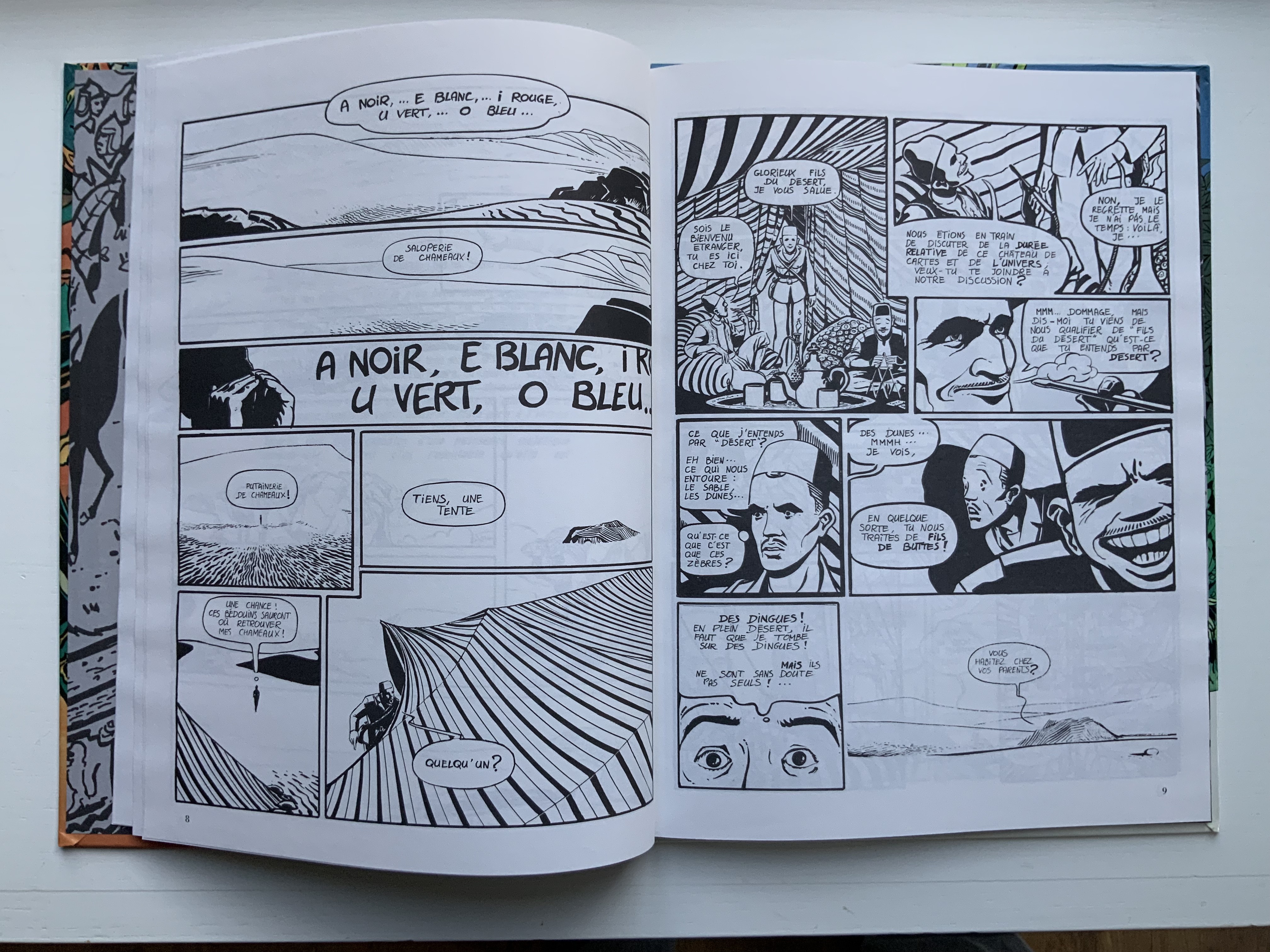
Arthur R./Promenade pour 5 Chameaux (1987) Chiavelli Bande Dessinée. H298 xW226 mm, 48 pages. Acquired from Librarie de l’Université, 28 October 2021. Photo: Books On Books Collection.
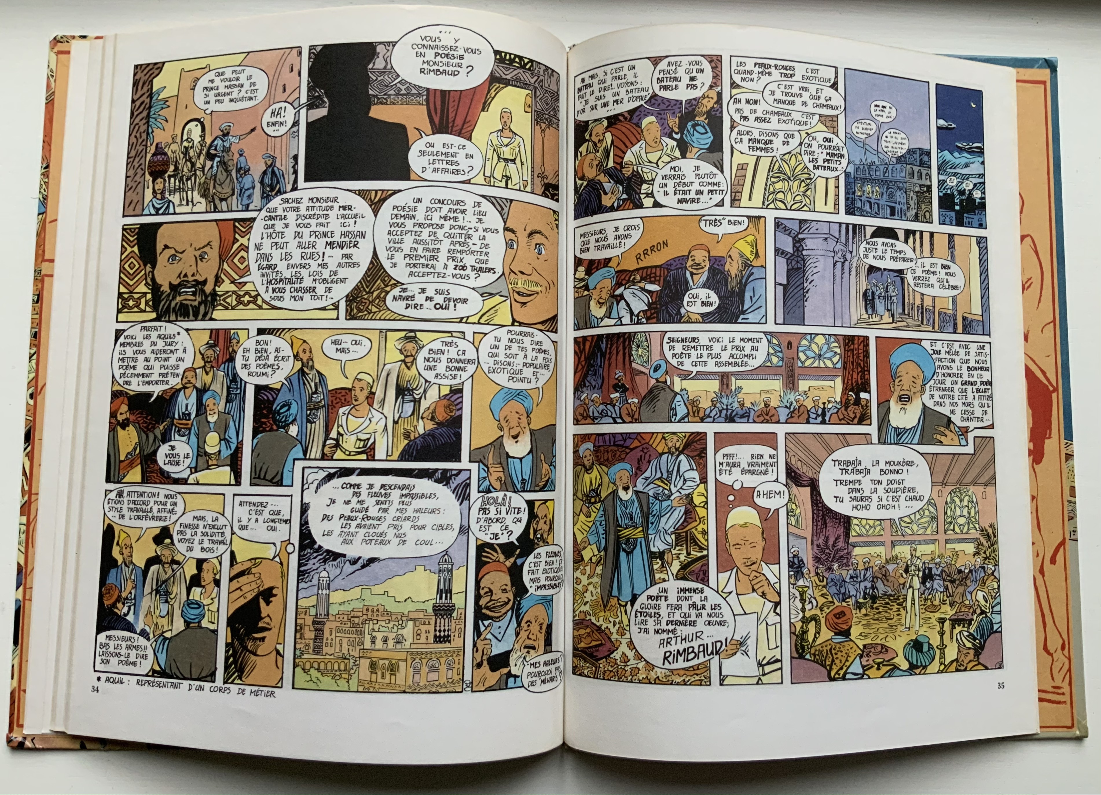
It is curious — given that Stéphane Mallarmé had only ever seen Arthur Rimbaud once and wrote about him only on commission — that Chiavelli assigns Un Coup de Dés as the subtitle of his second volume in a series of three graphic novels following the adventures of “Arthur R.”, a Tin Tin-like version of Arthur Rimbaud. Chiavelli weaves his imagined adventures of Rimbaud on the Horn of Africa (1880-91) into a three-volume graphic novel whose plot lines, scenes and dialogue balloons are stuffed with arch allusions to Rimbaud’s abandoned literary life and postmodern literary criticism.
In this first volume, Chiavelli gives his hero a favorite curse — the mild Bon sang! (“damn!”), probably uncharacteristic for the Rimbaud who killed a worker in Cyprus with a rock, but characteristic for Chiavelli making a tongue-in-cheek reference to Mauvais sang (“Bad Blood”, the second and longest poem in Une saison en enfer, 1873). The five camels of the title are named A,E, I, U and O, after the letters of his sonnet Les Voyelles (1871), which has been rendered in multiple livres d’artiste, one of which is in the Books On Books Collection. As the sonnet associates each vowel with a color, Chiavelli can be suspected of being tongue-in-cheek in delivering his comic completely in black and white. Certainly the invitation to a philosophical discussion of time that segues into a French pun “sons of the desert” into “sons of bitches” (fils de buttes for fils de putes) sets the tone to come.
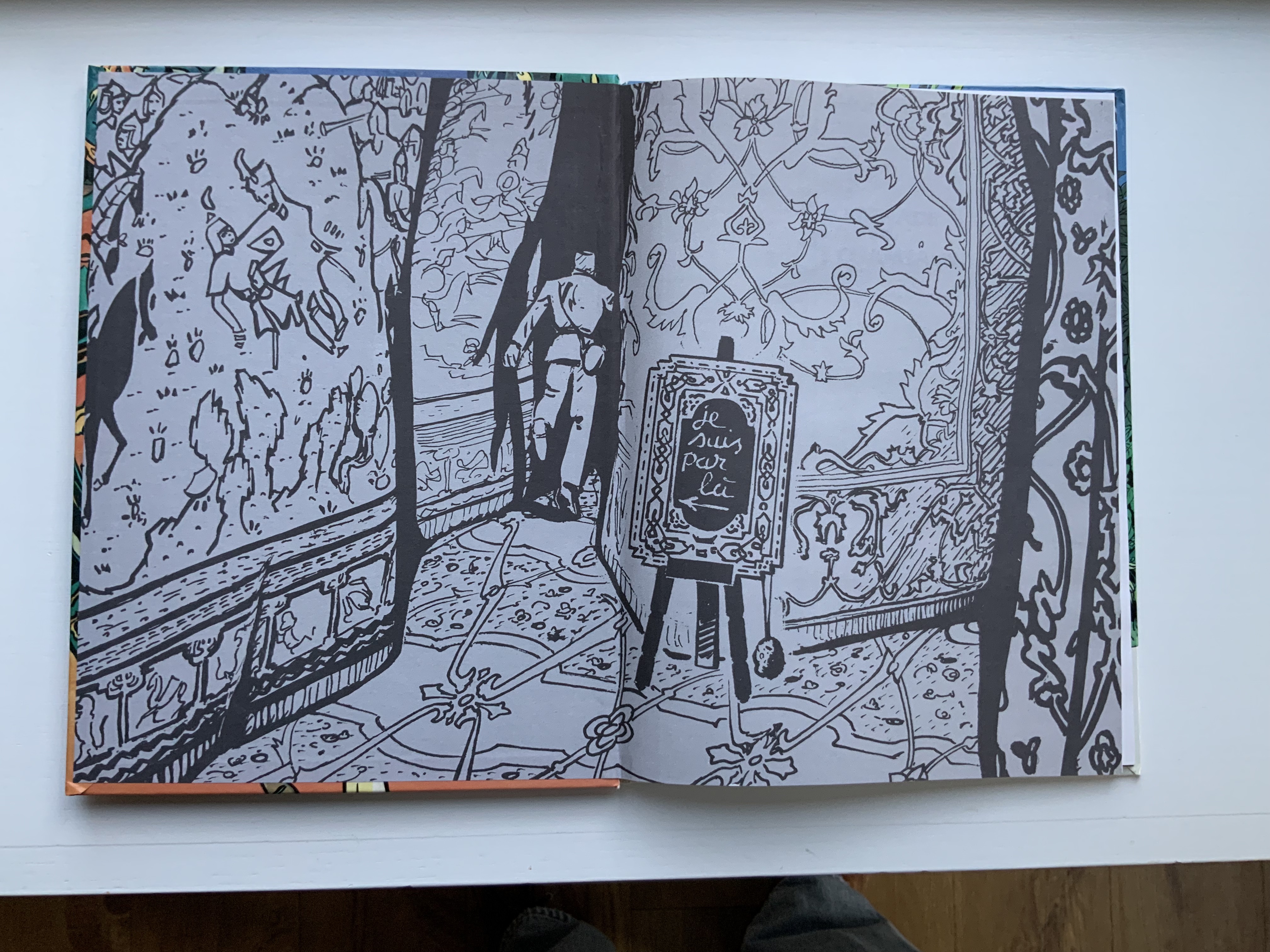
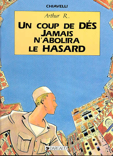
Arthur R./Un Coup de DÉS Jamais N’Abolira le HASARD (1988)
With its title, this four-color volume marks a shift in its joking allusiveness from Rimbaud alone to a conflation with Stéphane Mallarmé’s poem of the same title: an opening game of dice and a search for the city of “Azar” (homonym for hasard, meaning chance and also a game of dice). Still though, Rimbaud/Tin Tin is never far away; see the second double-page spread in which he recalls to himself the opening lines to Le Bateau Ivre/”The Drunken Boat” but then delivers to his Arab audience a racist, misogynistic ditty concocted by French legionnaires in Algeria.
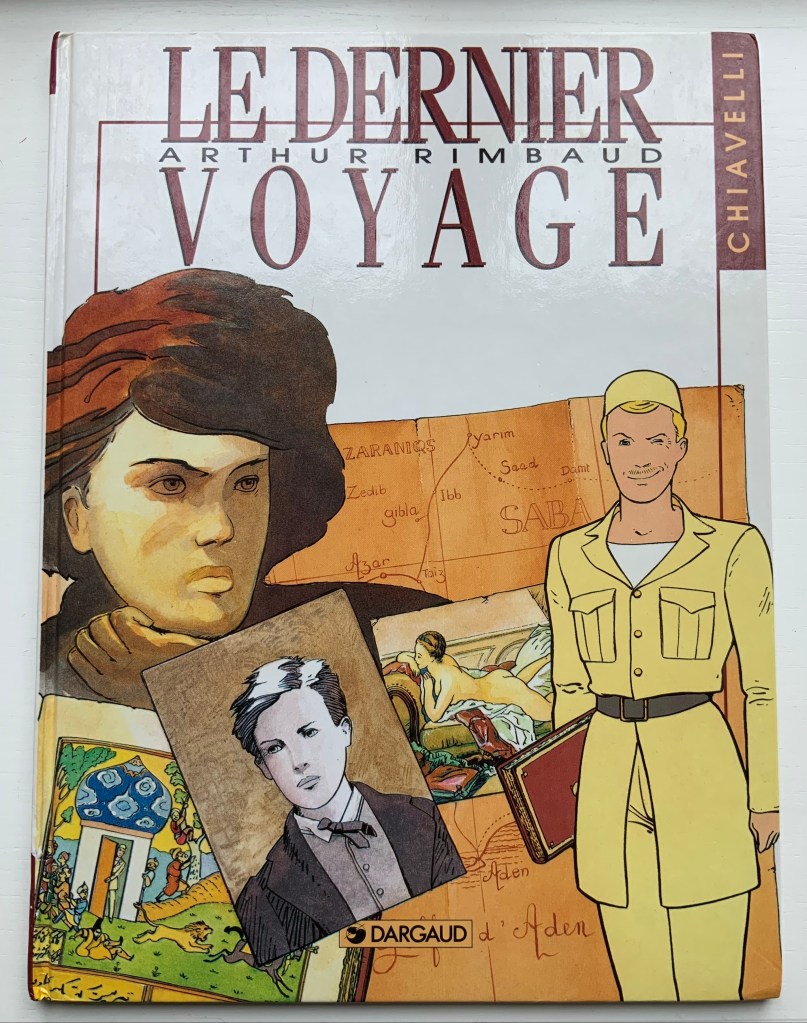
Arthur Rimbaud/ Le Dernier Voyage (1992)
Arthur Rimbaud/ Le Dernier Voyage (1992) Chiavelli Bande Dessinée H320 x W240 mm, 52 pages. Acquired from EV Asset, 29 October 2021. Photo: Books On Books Collection.
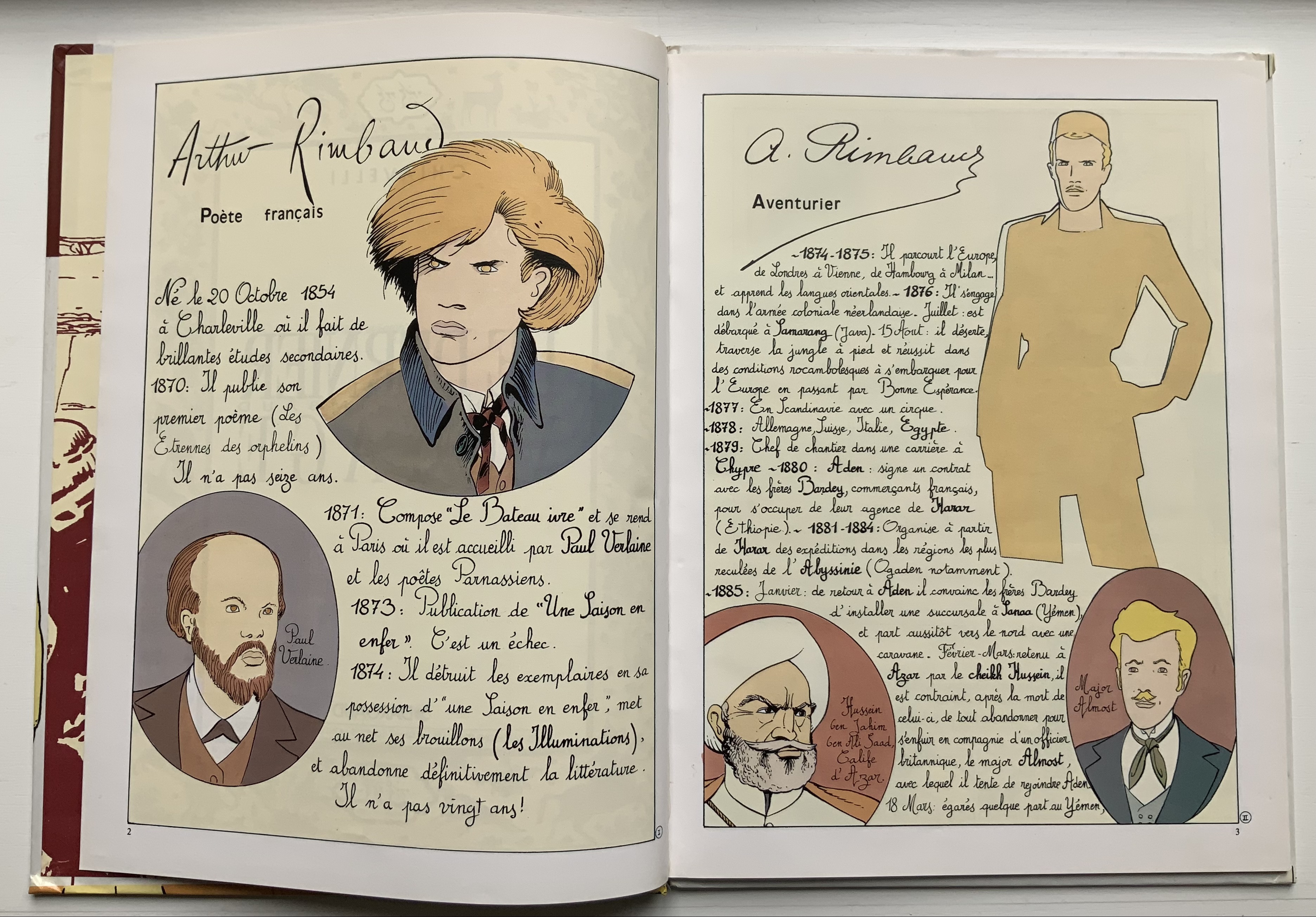
Spelling out Arthur R. on the cover of the last of the trilogy somewhat spoils the already scant Tin Tin camouflage. The inclusion of Rimbaud’s capsule biography at the start and epitaph at the end also gives this volume the feel of the earnest American comic book series “Classics Illustrated”. But its “One Thousand and One Nights” leap into the hero’s pursuit of le livre in this last voyage (a double allusion to Mallarmé?) and his amorous involvement with a femme fatale (and others) raise the trilogy to such a comic level of narrative, philosophical and literary self-reference (and such groan-inducing puns as Chipizade for Scheherezade) that the cover title and earnestness might be forgiven — depending on the reader’s age, sex and race.
In the Books On Books Collection, there are livres d’artiste of Un Coup de Dés in French, English and German — even Arabic. Edizioni Ampersand brings an Italian edition into the fold. Alessandro Zanella founded Edizioni Ampersand in the early 1980s in Verona, and its second publication was UN COLPO DI DADI. Zanella had beenintrigued by the revolutionary typographic layout of the poem and borrowed a first edition copy from Leo Lionni, the children’s book author and illustrator. Presumably for the future flexibility of his printing house, Zanella purchased a set of Caslon type rather than Bodoni in which to set the poem.
The 1914 edition of the poem has no title page laid out as a double-page spread. Why the title is split into four lines for the French and five for the Italian is not clear. The French layout gives a more expected left to right reading across the spread, whereas the Italian jumps back and forth (perhaps more in keeping with Mallarmé’s syntax later in the poem). Otherwise, as seen in the pairing of the “Comme si … comme si/ come se … come se” spreads, Zanella follows the 1914 edition’s layout.
The French printer/artist Jacques Vernière may have destined himself to contribute the artwork to UN COLPO DI DADI. He had introduced Zanella to American expatriate printer Richard-Gabriel Rummonds, proprietor of The Plain Wrapper Press, then also in Verona. Some years after working with Rummonds, Zanella struck out on his own and established Edizioni Ampersand. Whether by research or intuition, Zanella
Although not following Mallarmé’s choice of typeface, Zanella did follow Ambroise Vollard’s instinct that a livre d’artiste edition would sell better than a text-only edition. He also followed Mallarmé’s concern that Vollard should not let the prints and paper used for them detract from the visual impact of the text. Zanella separates Vernière’s wood engravings from the text, placing two after the French version and two after the Italian version of Mallarmé’s preface. Their evocation of the storm, shipwreck, waves and the abyss is unmistakable, as is the folio cover’s image of foam on the surface of waves.
Spread of French preface and image; spread of Italian preface and image.
Close-up of images after the prefaces.
Spread with second image in the French section; spread with second image in the Italian section.
Close-up of second images in the French and Italian sections, respectively.
The watermark in the handmade paper seems extraneous: Veronica’s Veil, the relic capturing Christ’s image, might have interested the otherwise non-religious author of Herodiade, but its bearing on this poem is unclear. A mermaid or siren would have been more suitable. But such a subtle discrepancy or missed opportunity does not sway the balance of text, image, ink and paper that Zanella has achieved here.
Logo of Edizioni Ampersand
Further Reading
Nicolini, Chiara. Summer 2012. “Lines in the Ampersand“, Illustration. Accessed 5 February 2022.
Shaw, Paul. “Alessandro Zanella: In Memoriam“, Special Collections, Marriott Library, University of Utah. Accessed 5 February 2022.
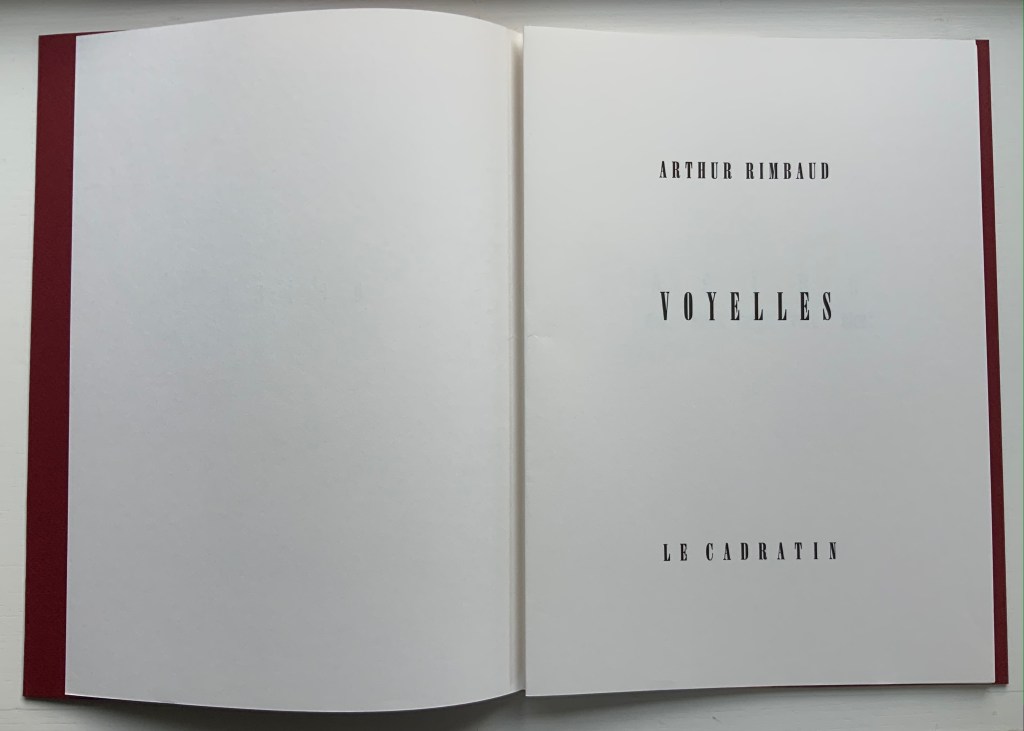
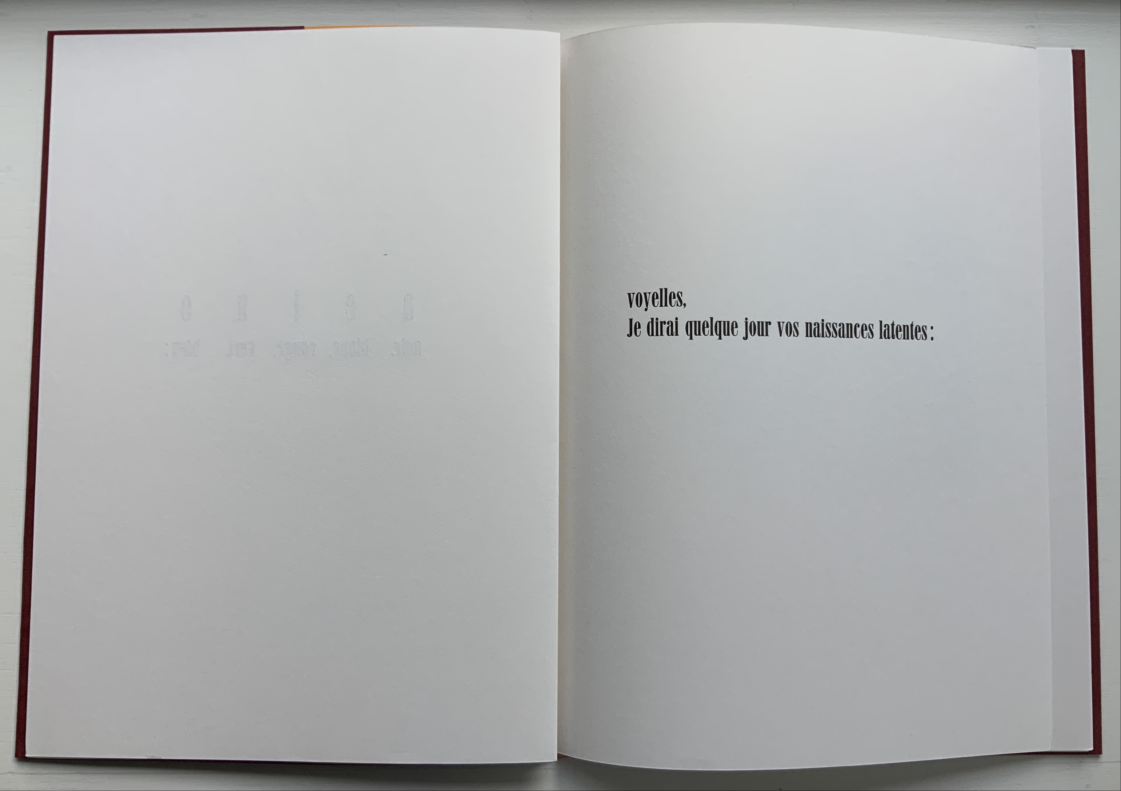
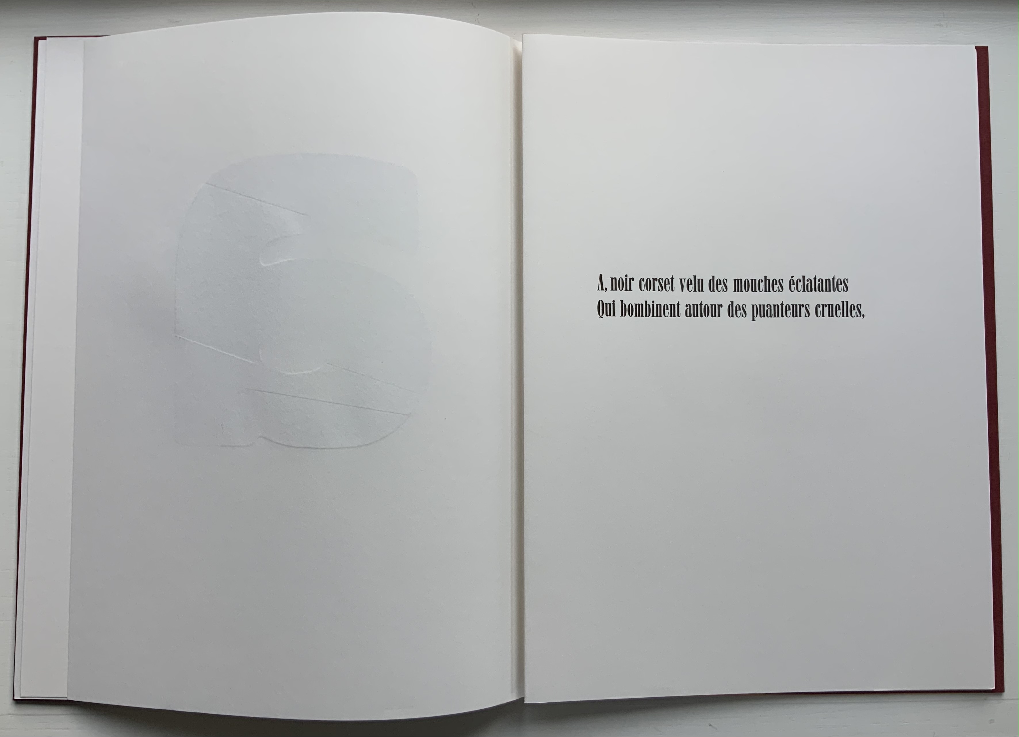
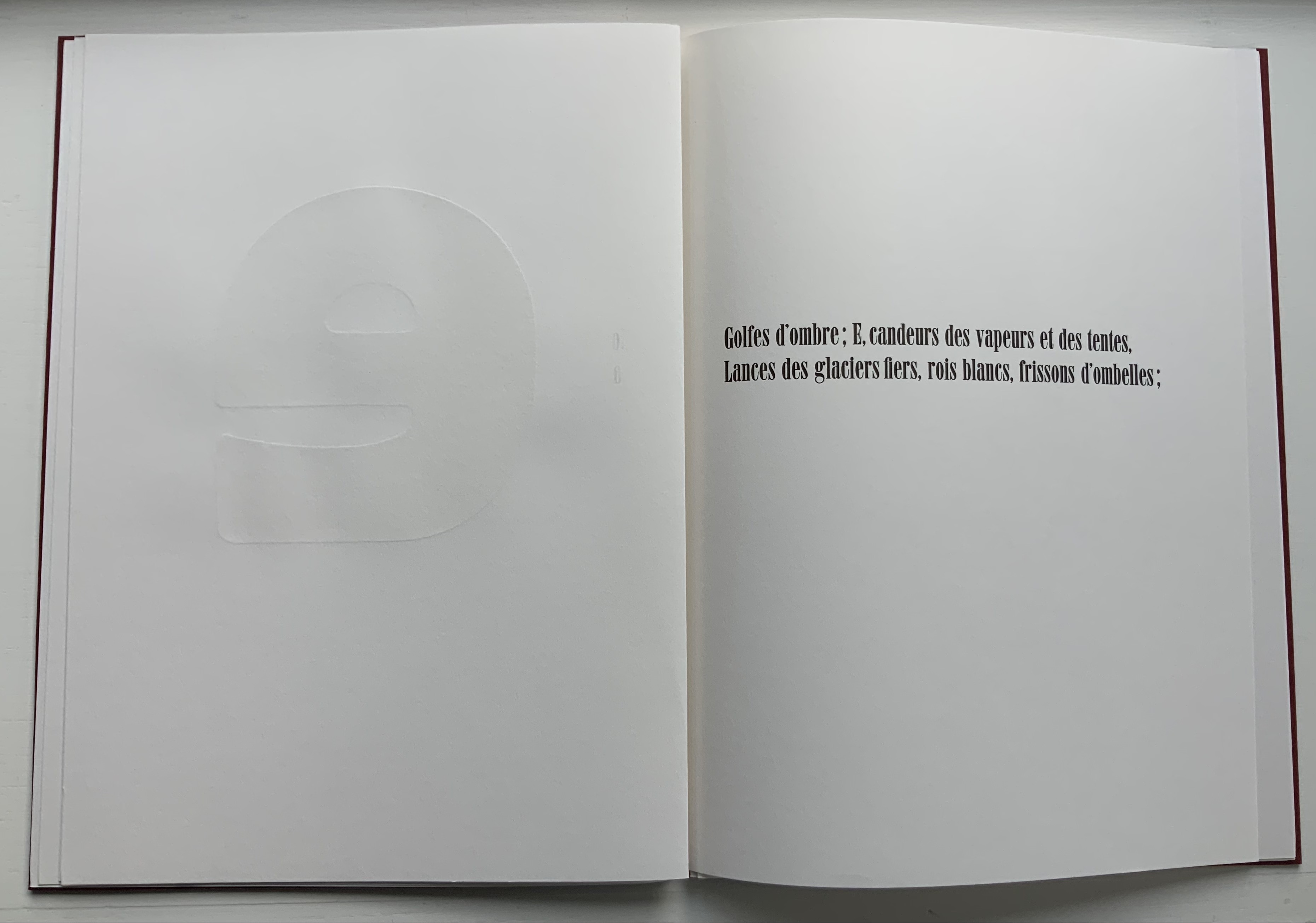
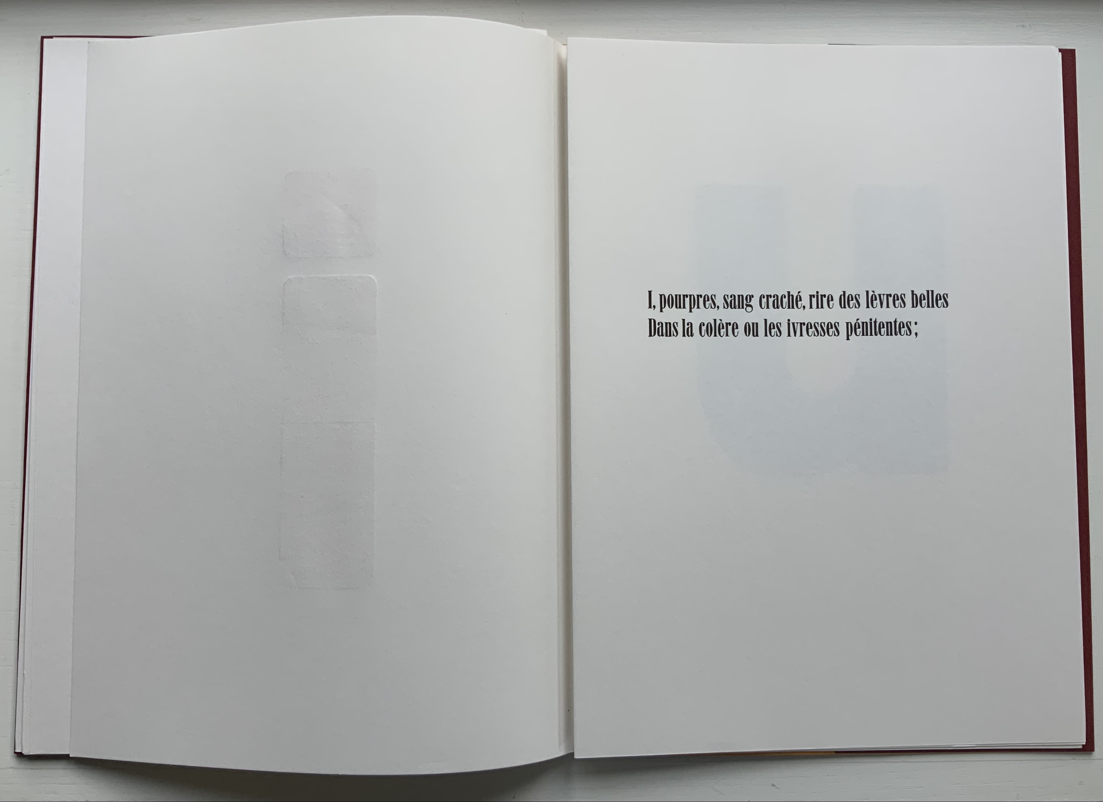
Voyelles (1871/1883/2012) Arthur Rimbaud Design and direction: Jean-Renaud Dagon H325 x W235 mm, 32 unnumbered pages. Edition of 200, of which this is #67. Acquired from Le Cadratin, 6 November 2021. Photos: Books On Books Collection.
Le Cadratin is more than a typesetting and printing house or fine press. An atelier-typographique, founded by Jean-Renaud Dagon, its artists perform tightrope acts in typography, ink, paper and form. Under Dagon’s direction, Joanne Bantick, Hugues Eynard, Nicolas Regamey and Roger Jaunin have composed and printed a rendition of Arthur Rimbaud’s sonnet “Les Voyelles” that deserves applause.
Written in 1871 by Rimbaud and first published in 1883 by Paul Verlaine, the sonnet is one of the better known historic literary examples of graphemic-color synesthesia — strongly associating a color with a letter — and in Rimbaud’s case with strong tones of eroticism. Le Cadratin’s artists leave Rimbaud’s eroticism bound to his text, handset in 28pt Roman Idéal, but deliver their own exuberance with subtle tactility and visual texture in large format wooden type using Heidelberg and Vandercook presses.
Voyelles contributes to other themes in the Books On Books Collection besides the alphabet motif. The handling of wooden type echoes David Clifford’s Letterpress Printing ABC and Andrew Morrison’s Ampersand& (2005) and Two Wood Press A-Z (2013). The synesthesia of letters is shared with Jean Holabird’s Vladimir Nabokov: AlphaBet in Color (2005)
Further Reading
“David Clifford“. 15 September 2021. Books On Books Collection.
“Jean Holabird“. 8 February 2022. Books On Books Collection. For a look at Vladimir Nabokov’s synesthetic alphabet.
“William Joyce“. 18 June 2021. Books On Books Collection. For the more innocent end of literary synesthesia where the cold gray-black of numbers gives way to an alphabet of jelly bean colors.”William Joyce”. 202 Books On Books Collection.
“Andrew Morrison“.15 September 2021. Books On Books Collection.
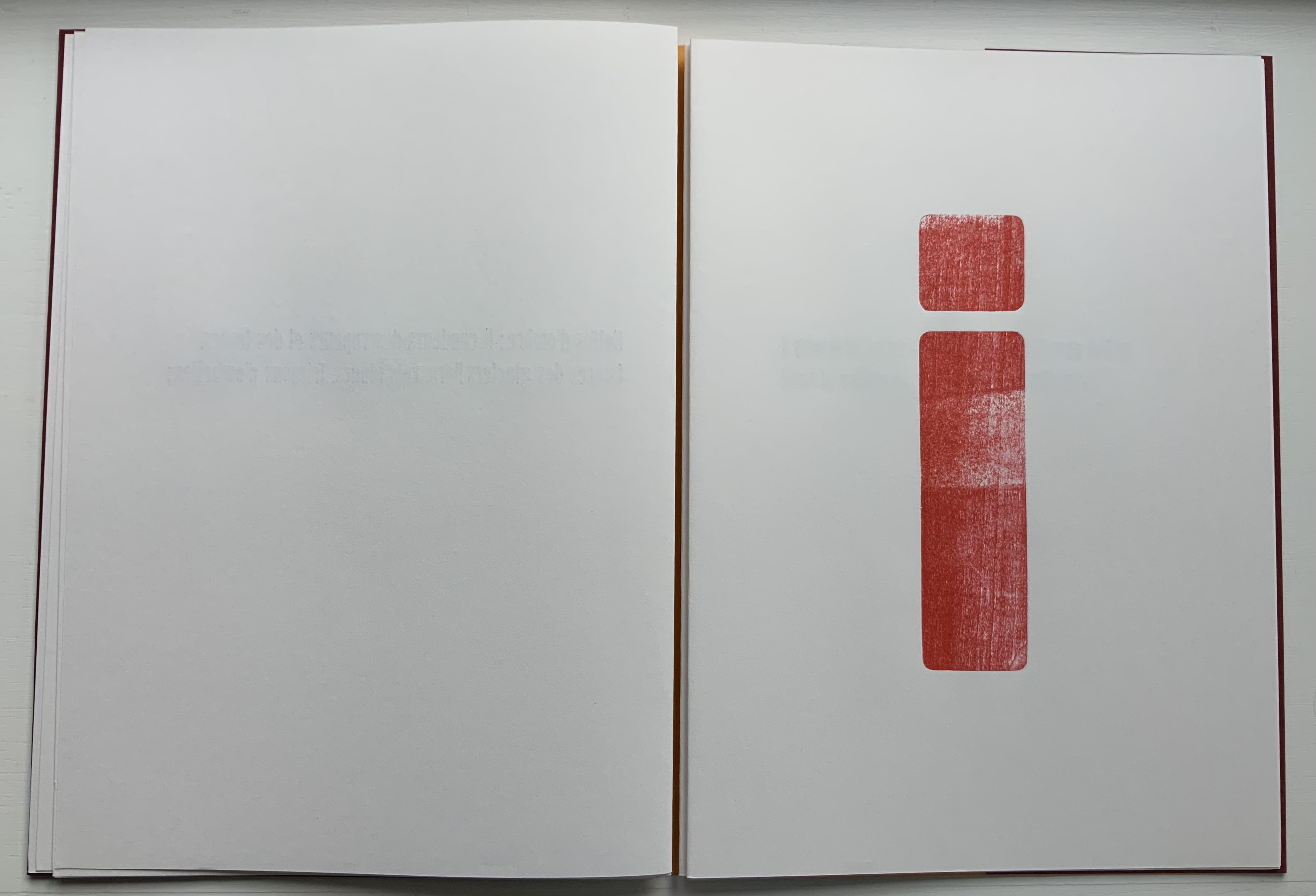
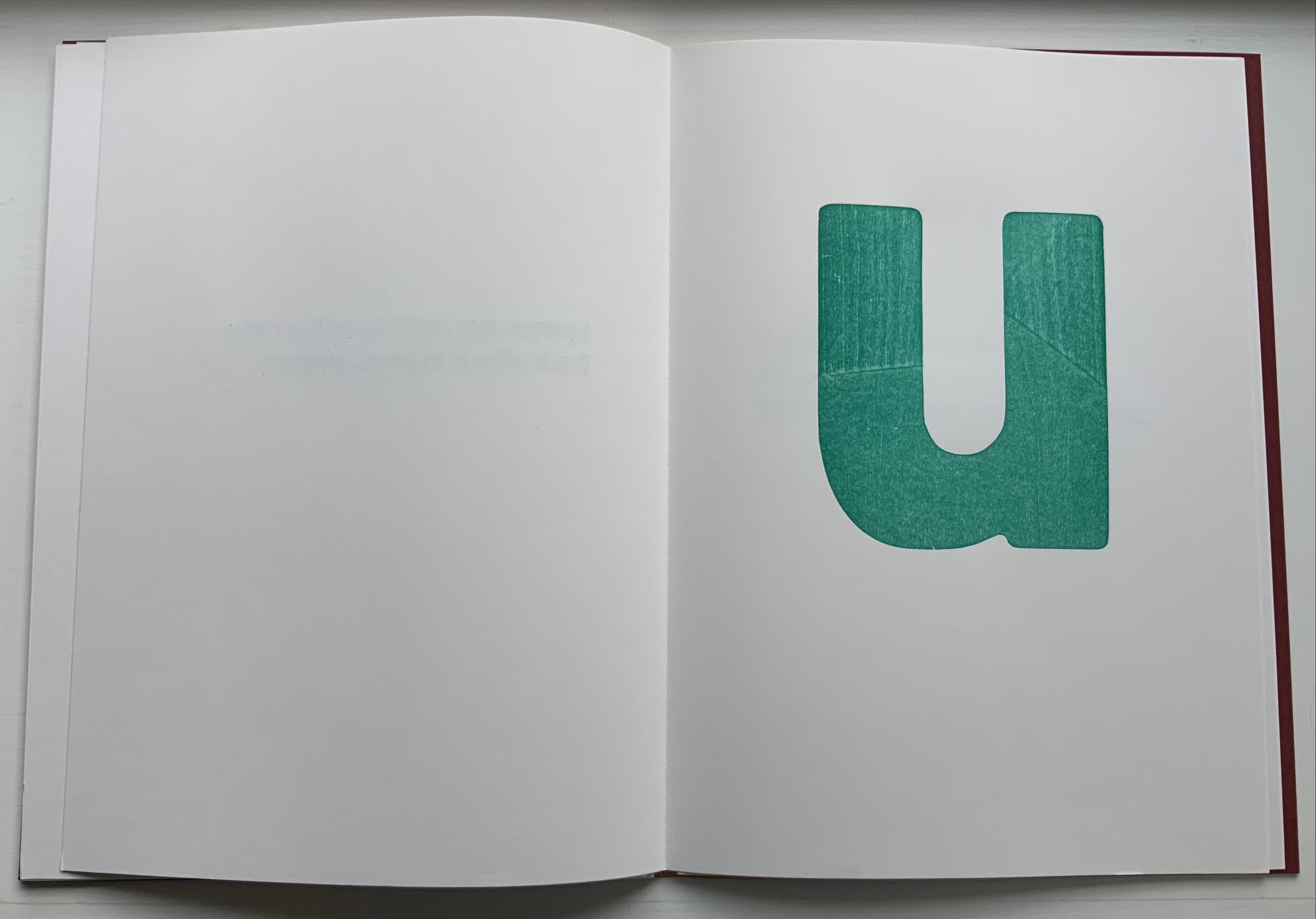
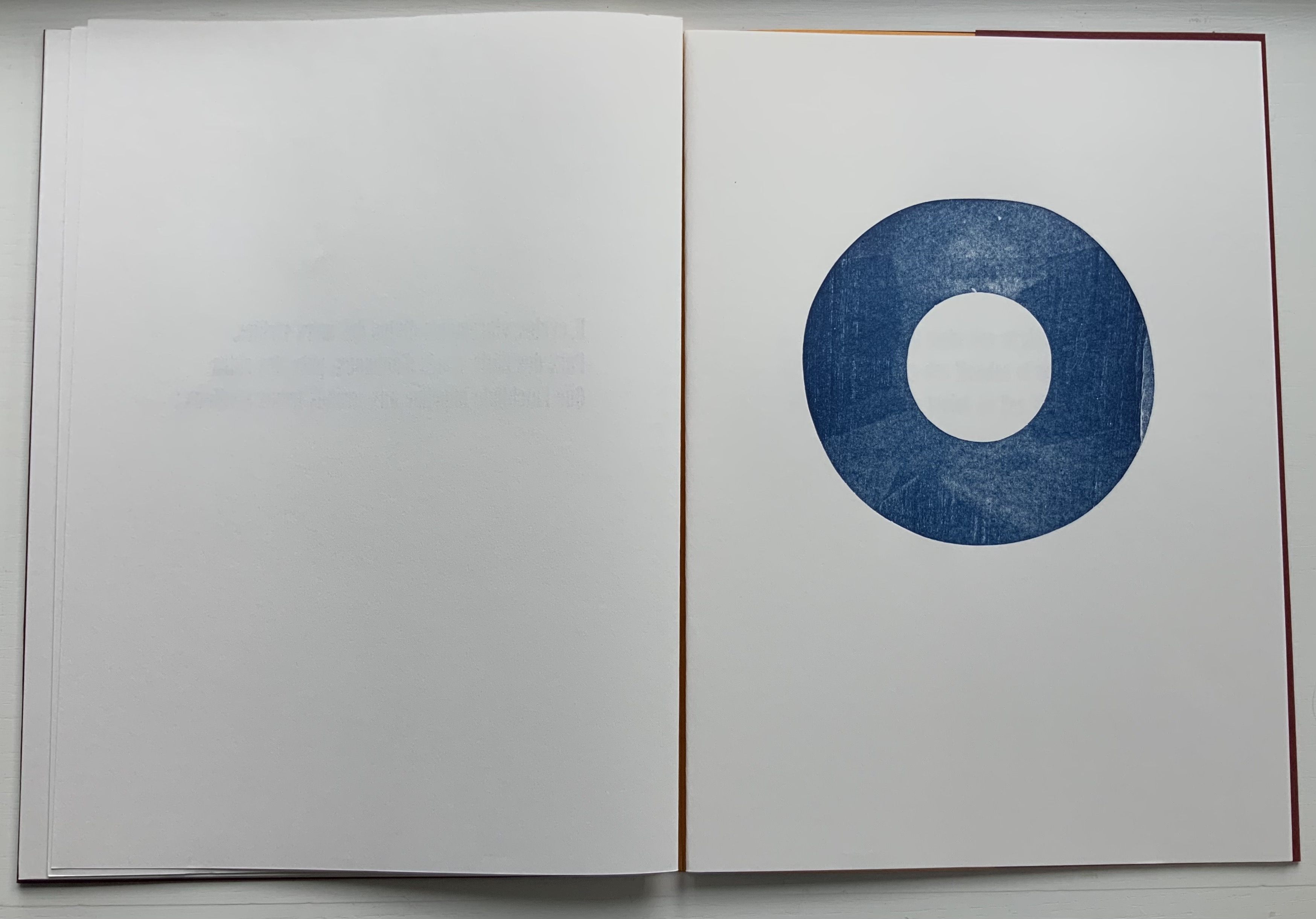
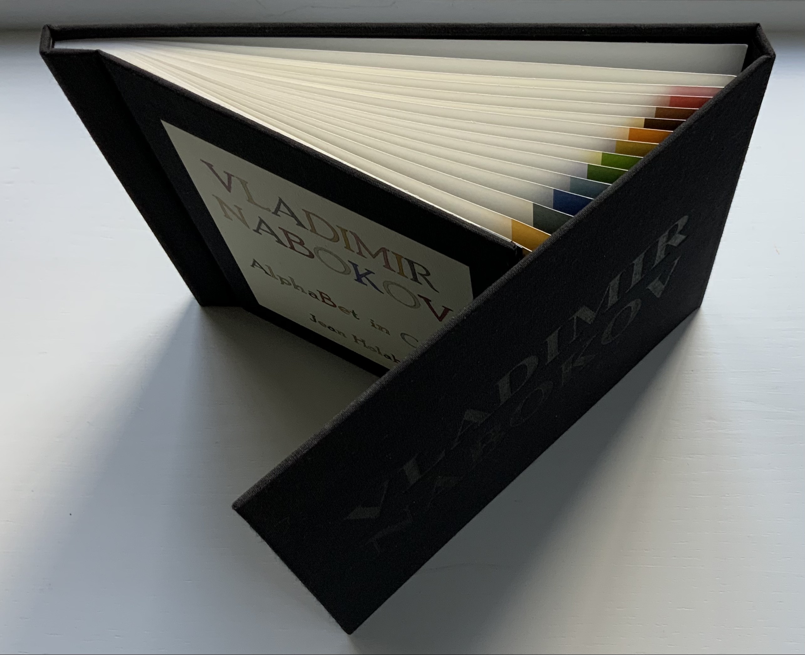
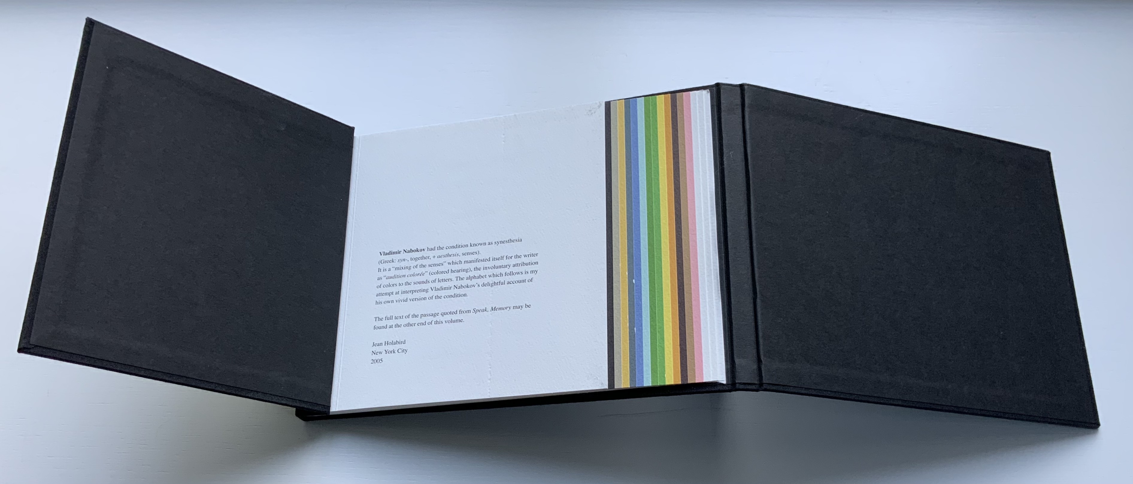
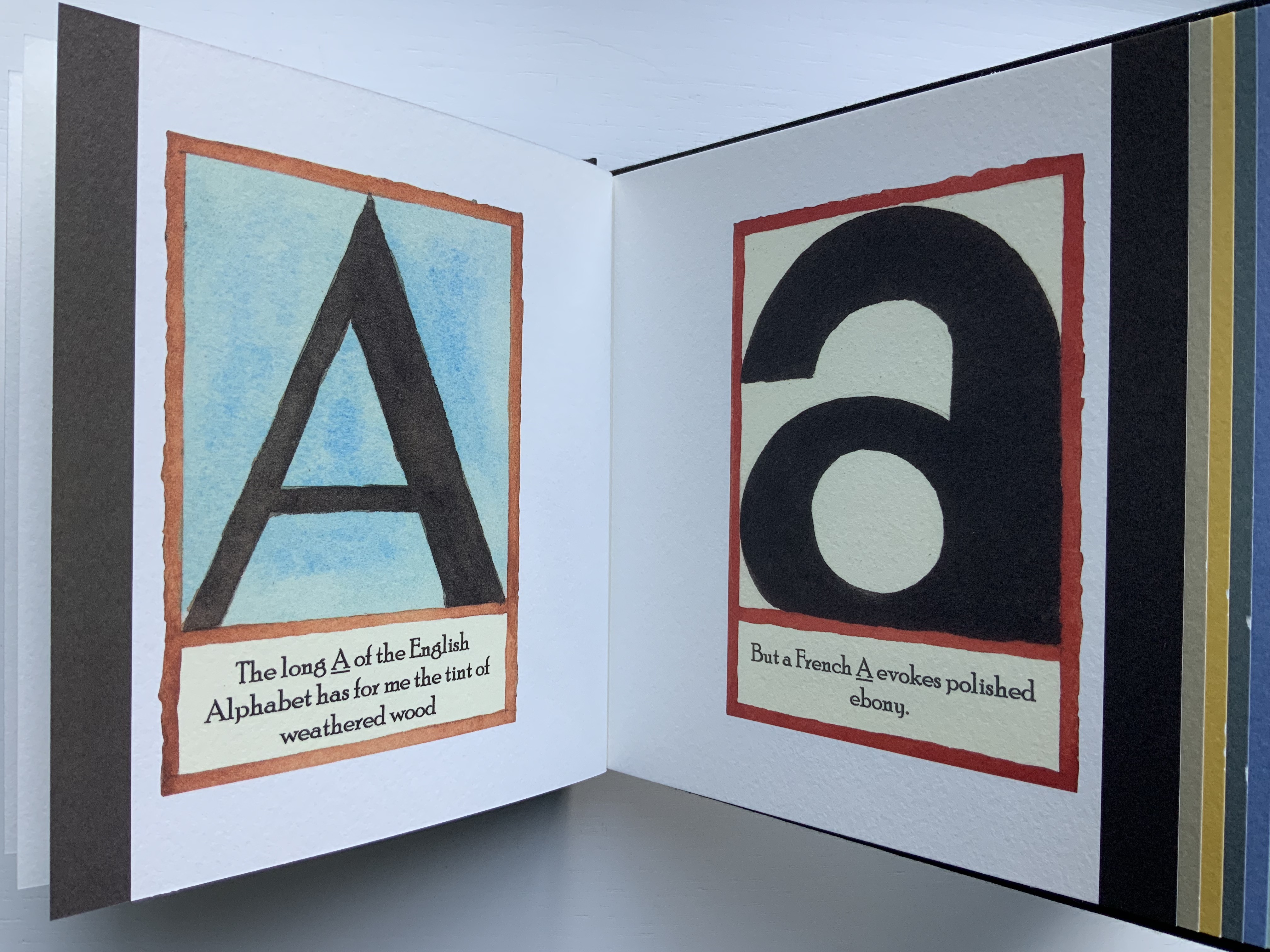
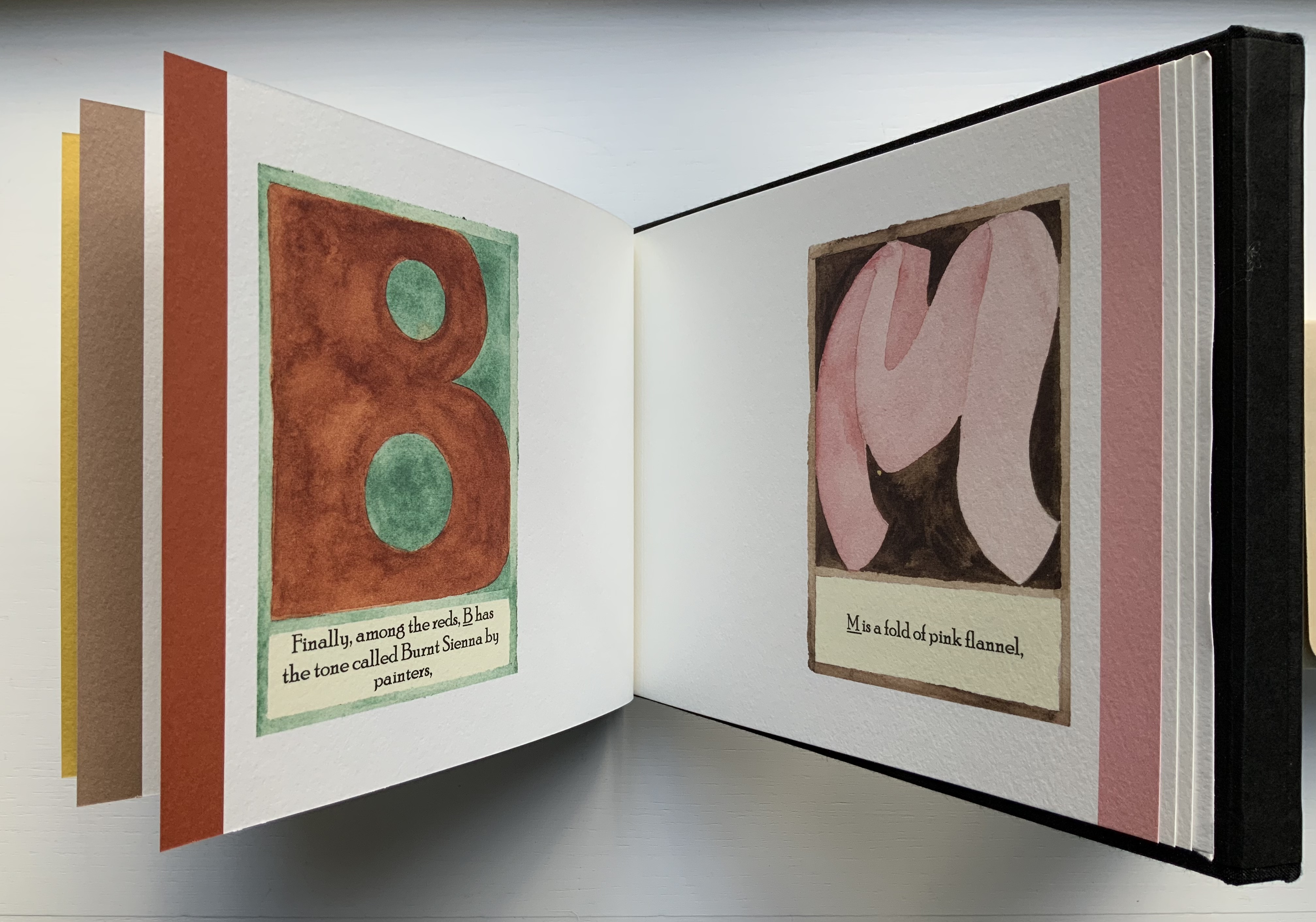
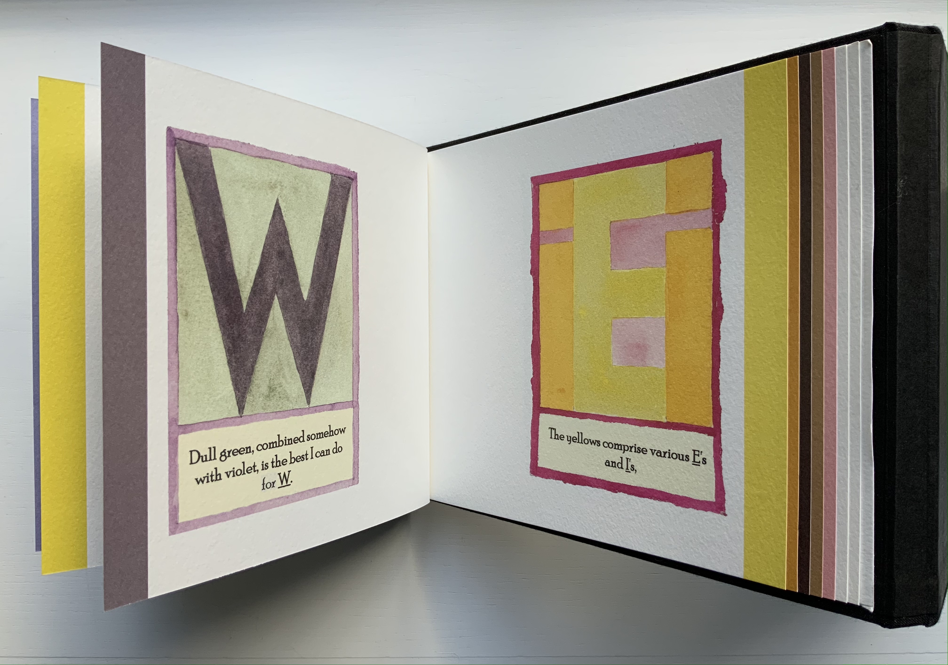
Vladimir Nabokov: AlphaBet in Color(2005) Jean Holabird Black cloth boards, silver lettering to spine, blind stamped lettering to front board, illustrated title label to inner board; internally bound in the Japanese style with opening overlapping boards and staggered colored pages. H175 W235 mm, 40 pages. Acquired from Klondyke (Almere NL), 11 November 2021. Photos of the book: Books On Books.
Publisher’s statement:
Vladimir Nabokov saw rich colors in letters and sounds and noted the deficiency of color in literature, praising Gogol as the first Russian writer to truly appreciate yellow and violet. He saw q as browner than k, and s as not the light blue of c, but a curious mixture of azure and mother-of-pearl. For anyone who has ever wondered how the colors Nabokov heard might manifest themselves visually, Alphabet in Color is a remarkable journey of discovery. Jean Holabird’s interpretation of the colored alphabets of one of the twentieth century’s literary greats is a revelation. The book masterfully brings to life the charming and vibrant synesthetic colored letters that until now existed only in Nabokov’s mind. In Alphabet in Color Jean Holabird’s grasp of form and space blends perfectly with Nabokov’s idea that a subtle interaction exists between sound and shape.
As puzzling as the phenomenon of synesthesia is, Holabird’s depictions and the book’s architecture are more engaging in their own right. The lapping pages and binding make this work awkward to handle, which might be thought of as a complement to the book’s non-alphabetical and non-spectral order of letters and colors. It is a warm complement to Le Cadratin’s cool rendition of Rimbaud’s sonnet “Les Voyelles“.
As Mitsou Ronat and Tibor Papp were preparing their mise-en-page edition of Mallarmé’s Un Coup de Dés Jamais N’Abolira le Hasard(1897/1980) following Mallarmé’s corrected proofs, Neil Crawford came across a copy of Robert Cohn’s Mallarmé’s Masterwork and was struck by its reproduction of the set of proofs sold by Pierre Berès to an American collector – the so-called Lahure proofs. Crawford, too, was determined to prepare a “typographic translation” of the proofs — but in English. In an essay providing a rich background to the poem, his meeting with Tyson and the publishing of their homage, Crawford explains how he went about his typographic translation.
First, using Cohn’s reference to the original’s size, he enlarged the reproductions photographically and then began puzzling over how to squeeze an English version taking up 10% more space than the French into Mallarmé’s careful layout. Compromising on the use of Bodoni in place of Didot as the typeface (the latter was not available to English typesetters when the poem was first pubIished anyway), it would take Crawford seven years of evenings in tracing letters, translation, transcription, adjustment, retranslation and retranscription to generate hand-crafted layouts that could be stored away until the day that photocomposition would be sufficiently advanced to accommodate the word and character spacing necessary to follow them. The original of Crawford’s typographic layout resides at the University of San Diego. Below are iterations toward the double-page spread that completes the appearance of the poem’s title within the poem.
Courtesy of Neil Crawford.
When Crawford and Tyson met in the early Eighties, Tyson had already established Tetrad Press and was planning his own livre d’artiste version of the poem. His aquatints in a separate folio cover would occupy the position Mallarmé expected for Odilon Redon’s prints in the abortive limited edition in train at the time of his death in 1898. In an ironic reversal of Mallarmé’s concern that the Redon prints might undermine the typography, Tyson and Crawford were concerned that anything less than letterpress printing would not ensure the density of black on the page that would complement Tyson’s aquatints. This led to phototypesetting output as patch setting, then hand pasting according to Crawford’s layouts, and then creation of process line blocks for the relief printing in letterpress.
At a glance, Tyson’s aquatints present a puzzling juxtaposition with the poem, but we can thank Crawford’s essay for a clue to the puzzle.
The poem’s reference to LE NOMBRE (“THE NUMBER”) has sent plenty of scholars on the hunt for its identity. Mitsou Ronat had argued that the magical number has to be 12. After all the classic Alexandrine line of French poetry numbers 12 syllables, and the larger type sizes that Mallarmé chose for the poem are 36, 48 and 60. Unconvinced “typographically”, Crawford points out that “at the time of composition – faces above 24 point were cut in multiples of twelve as standard”. Nevertheless, he also writes, “It would appear that the number 12 (the number of feet in the classic Alexandrine verse form) had great symbolism for Mallarmé” and notes that Tyson’s images
reflect the undertones of the Poème’s symbolism with a composition based on a duodecic permutation corresponding to the measures within the Alexandrine metre, referring in an oblique way to Mallarmé’s recurring imagery ….
Duodecic refers to the Base 12 system, which has the arithmetic advantage over Base 10 of making fractions easier as can be seen from the following image. To apply that image’s Base 12 grid to Tyson’s permutations, however, requires modifying it from 3×4 to 4×6. In other words, there are 24 small squares underlying Tyson’s images, not 12. Mallarmé intended the double-page spread, not the single page, to be the unit for page layout. So perhaps Tyson’s oblique reference to the Alexandrine is also “doubly oblique” (2×12), referring to Mallarmé’s preferred canvas.
Valise for Mallarmé(1997) Kathy Bruce Valise, altered book, X-ray film, wood, glass, die, collage. H8.5″ x W10.5″ x D5″. Unique. Acquired from the artist, 3 November 2021. Photos of the work: Books On Books Collection.
Any artist who flirts with surreality is likely to begin or end up carryingMarcel Duchamp‘s bags or bearing Joseph Cornell‘s boxes. Cornell himself was influenced by Duchamp. He assisted Duchamp with the latter’s Boîte-en-Valise series, 1935-41, and assembled a few of his own suitcase- or valise-based works, such asUntitled (The Life of Ludwig II of Bavaria), 1941-52, and Untitled (The Crystal Cage: Portrait of Berenice), 1934-67. Boxes though became his forté. Although Cornell sourced a substantial amount of collage material from books, he did not frequently use altered books (especially excavated ones) as an object within an object, a container of objects or object in itself. One excavation example is his Object (glass, dust and plastic spoon), 1939. Another, which however embodies all the permutations, is Untitled (To Marguerite Blachas), c.1939, a thorough-going alteration of the Journal d’Agriculture Practique (Volume 22, 1911). A variation with Volume 21 was discovered after his death in 1972.
So, since 1972, how to make anything not merely derivative? Hefting the influences lightly, Kathy Bruce takes Duchamp and Cornell in an original direction and replaces their mysterious surreality with the mysteries of Stéphane Mallarmé’s poem Un Coup de Dés Jamais N’Abolira le Hasard (1897) and with her own surreality arising from chance-found objects and chosen juxtaposition. Cornell remarked that his boxes “are life’s experiences aesthetically expressed”. Valise for Mallarmé and the four other of Bruce’s works described below are aesthetic expressions of her experiences of the poem that “made us modern”.
This Duchampian valise opens to show that it has been pressed into a Mallarméan voyage. In the deeper compartment sits a Cornellesque glass-covered wooden box. It contains a red die; collage of an engraving of penguins, a spouting whale, a ship under sail against towering glaciers and a flight of birds; scraps of paper marked with Chinese ideograms and handwritten numbers and symbols; and mechanical diagrams. A reflective, smoky blue sheet surrounds the glass-covered “raft”. It is a piece of X-ray film discarded from Gramercy Hospital in New York City. The film is face down and affixed to a sheet of paper that later developed ripples. The artist “liked the way it looked– like waves in the water, so it stayed” (correspondence with the artist, 11 December 2021).
On the shallow side of Valise for Mallarmé is an altered book, excavated to fit around the “raft” and show a passage from Un Coup de Dés pasted at the bottom of the excavation and covered with translucent paper. The book is John L. Stoddard’s Lectures (Ireland, Denmark, Sweden, Supplementary Vol 1). Stoddard was a prolific writer (16 volumes in his lecture and photograph series) and prodigious traveller (26 countries and multiple states in the US visited). The lecture series appeared 1897 to 1898, haply coinciding with Mallarmé’s poem and death. Strangely enough, where Mallarmé ended his spiritual voyage from Catholicism to atheism, Stoddard ended his from atheism to Catholicism. The combination of coincidence and divergence from this found readymade no doubt confirmed it to Bruce as the right choice of color, shape and material to echo the poem’s last line — Toute pensée émet un Coup de Dés (All thought emits a roll of the dice).
Conmoción, Contución y Compresión Cerebrales (1998)
Conmoción, Contución y Compresión Cerebrales (1998) Kathy Bruce Framed, altered book, surrounded by white cloth and containing an embedded box containing another box with dice and collage. H15″ x W12″ x D3″. Unique. Acquired from the artist, 3 November 2021. Photos of the work: Books On Books Collection.
Were it not for the preceding work, the presence of dice and and the image of a ship pasted to the back of the glass-covered box embedded in the altered book framed here, we might miss that Mallarmé’s poem inspired Conmoción, Contución y Compresión Cerebrales. The altered book’s title, difficult to make out on the spine, is Patología y clínica quirúrgicas (1873), a medical manual by Joseph-Auguste Fort, a French contemporary of Mallarmé. Fort had travelled in Spain, voyaged to South America and studied medical education and practice in several countries there, hence the Spanish of his book.
The shredded book pages packed around the box within the box embedded in the medical manual could be compared to The Wasteland‘s “fragments I have shored against my ruins”, but T.S. Eliot’s fragments are snippets of civilisation (lines from a nursery rhyme, Dante’s Purgatorio, a Latin poem, etc.) that his speaker uses to shore against his contemporary wasteland. Bruce’s snippets come from that medical manual and serve a dual purpose. First, to provide the title of her work. Second, to insulate and secure the box containing the dice and print of the ships under sail. The title appears in the bottom space between the boxes and comes from a section heading in the book, a phrase that “speaks to the chaos and confusion of the wrecked ship at sea” (correspondence with the artist, 12 December 2021).
So, from what is the packing insulating that inner box? Loose in the tilted embedded box, the dice can still roll; tilted in the box, the ships are continually bound to founder. How can conmoción, contución y compresión cerebrales (cerebral concussion, contusion and compression) be avoided? What can protect against Chance that any roll of the dice can never abolish or against the “bookwreck” in which they are embedded? What surrounds the altered book implies that they cannot. The crumpled white cloth (from the poem’s velours chiffonné) evokes not only a fallen sail but also a coffin’s lining in which the book lies. How appropriate then that Mallarmé’s poem confronting le néant (nothingness) and inspiring this work of book art is here but not here.
Solitary Plume Lost(1998 or 2000)
Solitary Plume Lost(1998 or 2000) Kathy Bruce Small cigar box, feather, pine wood, collage, cloth. Closed H1.5″ x W6.5″ x D3.5″. Unique. Acquired from the artist, 3 November 2021. Photos of the work: Books On Books Collection.
Inside the box:
Lining the cigar box, a piece of white crumpled velvet, which refers to the poem’s velours chiffonné.
A scrap of stiff, dark blue, glittering felt, a kind from which a toque de minuit (a hat or cap the color of midnight) might be made.
A triangular block of pine wood on which three translated lines of the poem are pasted along the hypotenuse surface, a 1998 commemorative stamp with Mallarmé’s likeness is pasted on the top surface, an image of the Aquila constellation with its main stars Altair, Tarazed and Alshain is pasted on the bottom surface, and constellation markings for the hypergiant stars of Draco are pasted along the two remaining sides.
A white feather, which refers to (plume solitaire éperdue/solitary lost plume), attached to the inside surface of the box’s top.
Among the best known images of Mallarmé is the portrait by Edouard Manet in 1876. Cross-legged in an armchair, the poet leans toward his right hand resting on a side table and holding a cigar from which smoke curls. It is so well known that, after puzzling over the constellations and text on the other sides of the block, it is a surprise that the image on the stamp has not somehow changed into it.
Navigating the Abyss I (1998)
Navigating the Abyss I (1998) Kathy Bruce Altered book, wood, lenses, collage, thread. H7.5″ x W5″ x D3″. Unique. Acquired from the artist, 3 November 2021. Photos of the work: Books On Books Collection.
Bruce brings her sculpture outside any enclosure with Navigating the Abyss I. Rigging-like thread wraps around a copy of Intermediate Reader, a relic from a series of readers compiled between 1867 and 1927 for the Brothers of the Christian Schools, headquartered in Montreal, which recalls Mallarmé’s school-teaching days. Three triangles of wood panelling are attached to the book’s back cover, a deft choice of material for the sail-like seams and shape. A glossy piece of postcard or a cut from the cover of an art book depicting a gilded hand, open as if having just rolled the dice, occupies one corner of the cover. It’s impossible to say whether it is the lower or upper, left or right, as the book has been turned upside down and back to front in its altering (note the photos above). The three loose lenses add to this effect of shipwreck detritus, as does the convex lens embedded like a porthole in the book and revealing a torn page and part of a handwritten letter presumably left in the book. Across from the convex lens, the pasted-down diagram is a scaled drawing of a template for what appears to be a rigging pulley with a diameter of 9 and 3/4 inches. The collaged precision diagram alludes not only to the ship but also to the poem’s reference to anciens calculs. It adds to the artifice and abstraction of poem, book, ship and flotsam that Bruce has created.
The paragraph pasted on the book’s front cover (the artwork’s “back cover”) comes from the Intermediate Reader. The content is uncannily apt:
Far in the horizon, they thought they saw a beautiful lake, with branching palm-trees. They longed for the water and the cool shade; but their ____ guide told them there was no lake in the place where it seemed to be; that it was only the mirage — a seductive illusion floating in the air.
The small rectangle excised from this passage is pasted face down among the other detritus on the opposite side. It is another bit of controlled artifice that not only alludes to the use of empty space (les blancs) in Un Coup de Dés but contributes to the work’s surreality.
Navigating the Abyss II (1999)
Navigating the Abyss II (1999) Kathy Bruce Altered book, camera lens, collage, thread. H9″ x W7″ x D5″. Unique. Acquired from the artist, 3 November 2021. Photos of the work: Books On Books Collection.
A withdrawn library copy of Jean-Jacques Rousseau’s 18th century bestseller Julie, ou la nouvelle Heloïse, with one-sixth leather binding over marbled boards, provides Bruce with the raw “stone” for her second sculpted version of Navigating the Abyss. Headed for the graveyard of pulping or burying in landfills, this culled copy, stamped WITHDRAWN in black on all of its faded marbled edges, is destined never to be opened again, a point underscored by the tangle of black thread holding it closed. The inaccessible content is the epistolary tale of Julie d’Étange, an aristocrat who falls in love with her tutor Saint-Preux, is married off to the tolerant atheist Lord von Wolmar, becomes devout to overcome her attraction to Saint-Preux, and dies of hypothermia after plunging into water to save her child. The inauthenticity into which Rousseau throws religious belief makes Bruce’s choice of this marbled stone appropriate for paying homage to Mallarmé who chose to navigate the abyss without God.
Although both versions of Navigating the Abyss have a similarity, somehow this second version is bleaker than the first. Looked at on edge, the black lens and marbled book appear to be a funerary sculpture on a plinth. Unlike the embedded lens in the first version, a single Cyclopean camera lens sits atop the book into which a hole has been bored. The darkness at the lens’ center evokes the idea of an abyss or whirlpool, especially as the words and letters from the torn pages circle around the edges like detritus being pulled down. A black-and-white version of Goya’s Saturn Devouring his Son provides the ghostly image floating in the lens. While it isn’t necessary to know the source of the image or that the series from which Goya’s mural painting comes is called The Black Paintings, the details add to the funereality evoked by the black thread, the black stamp and decayed state of the book.
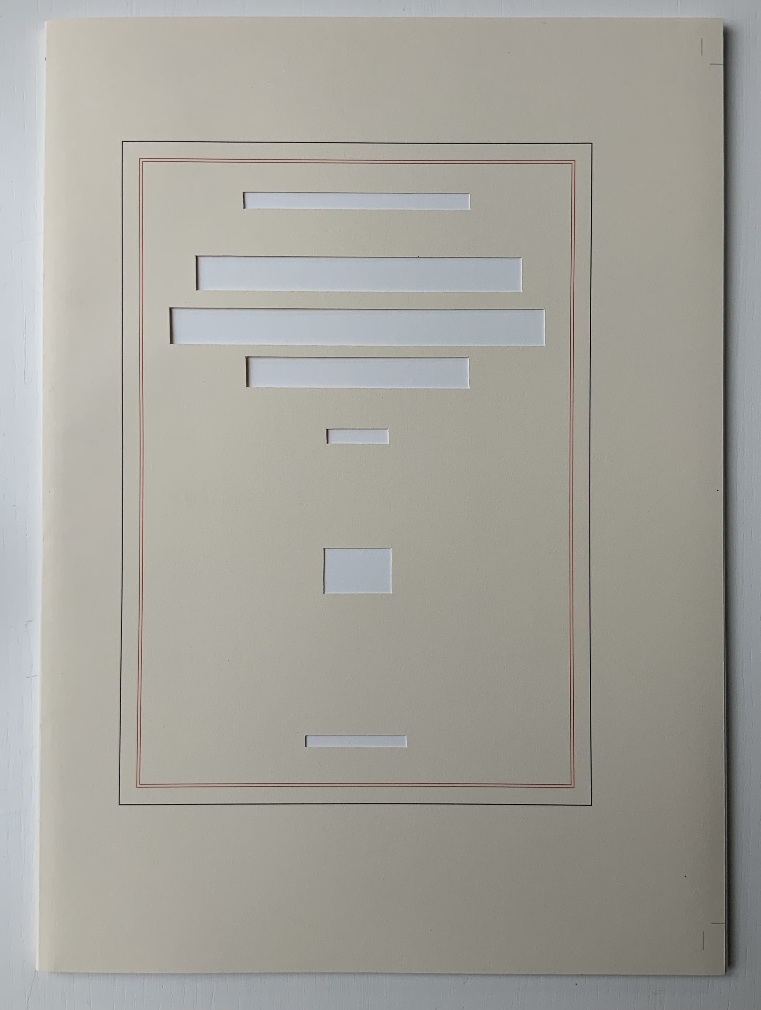
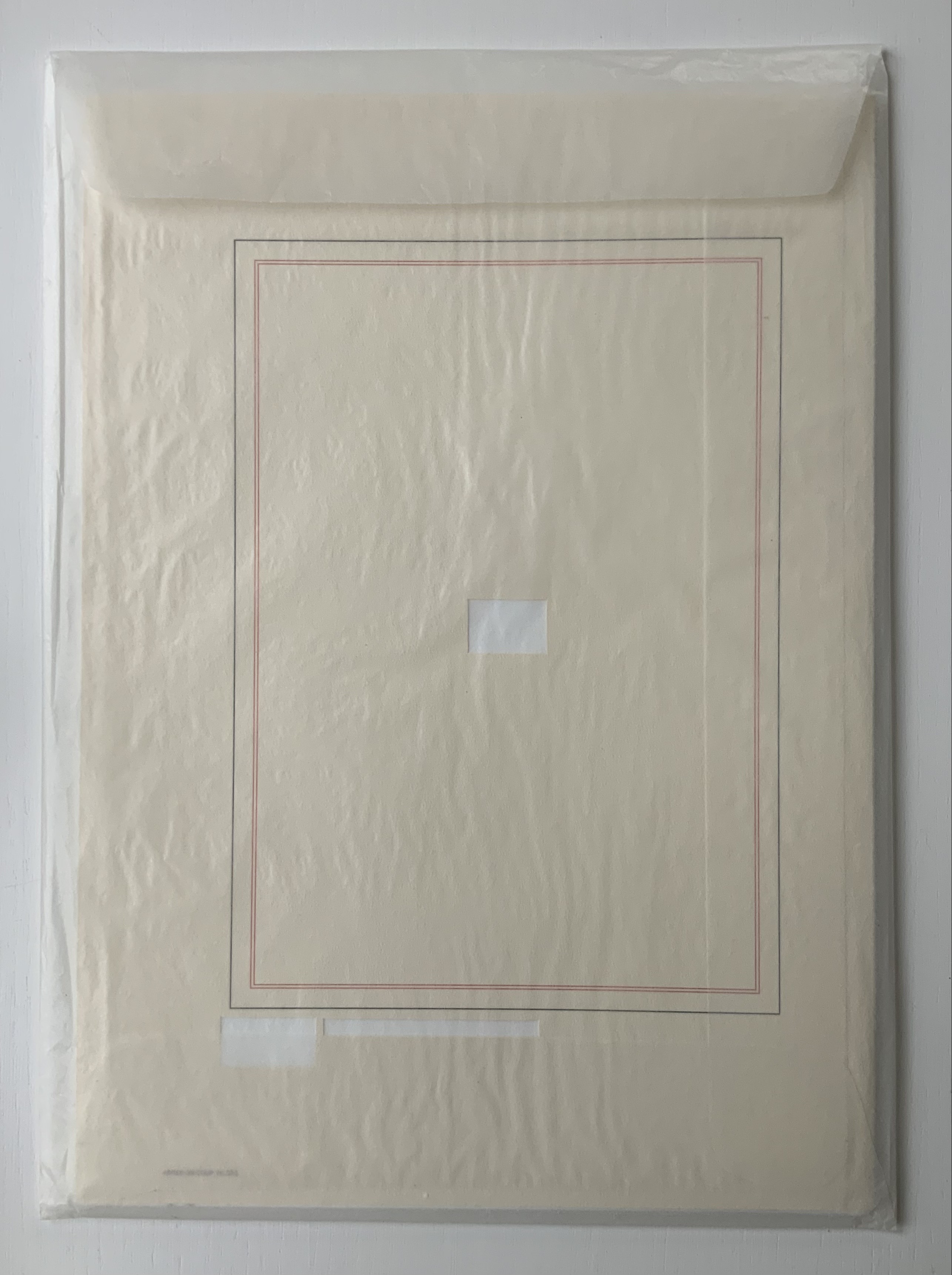
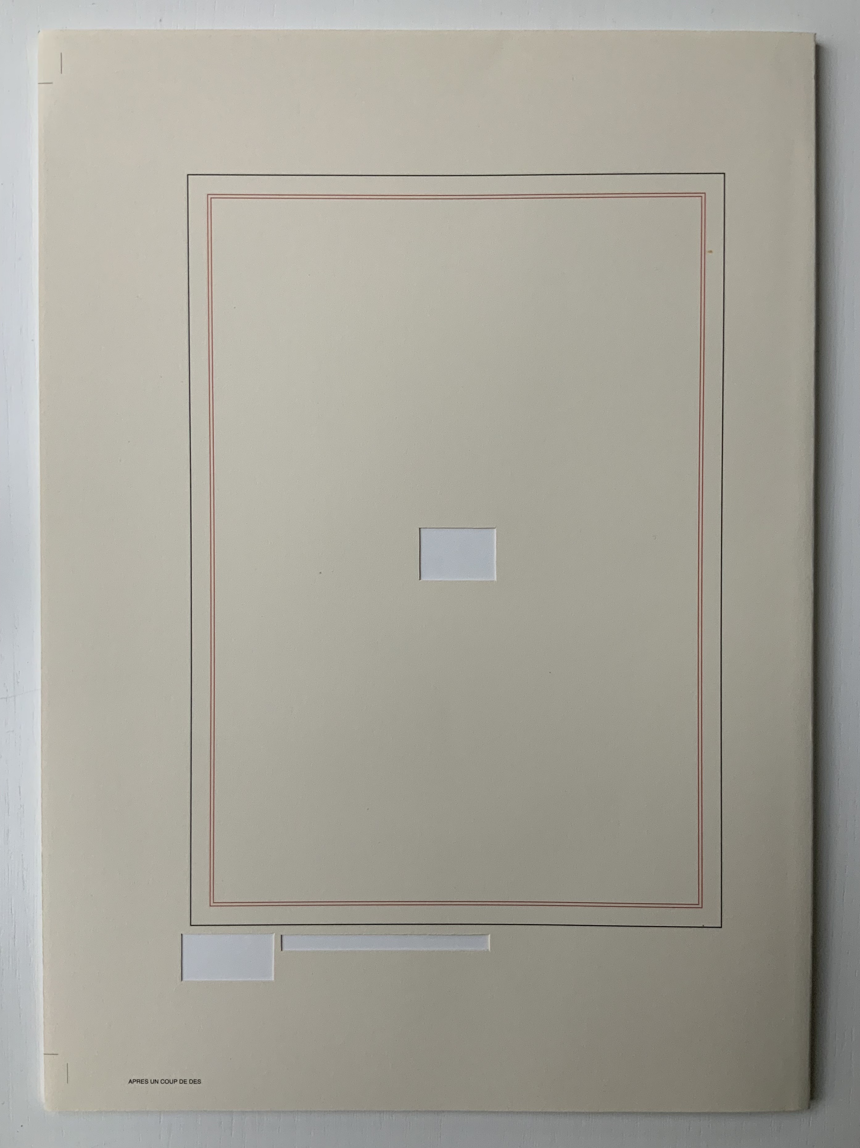
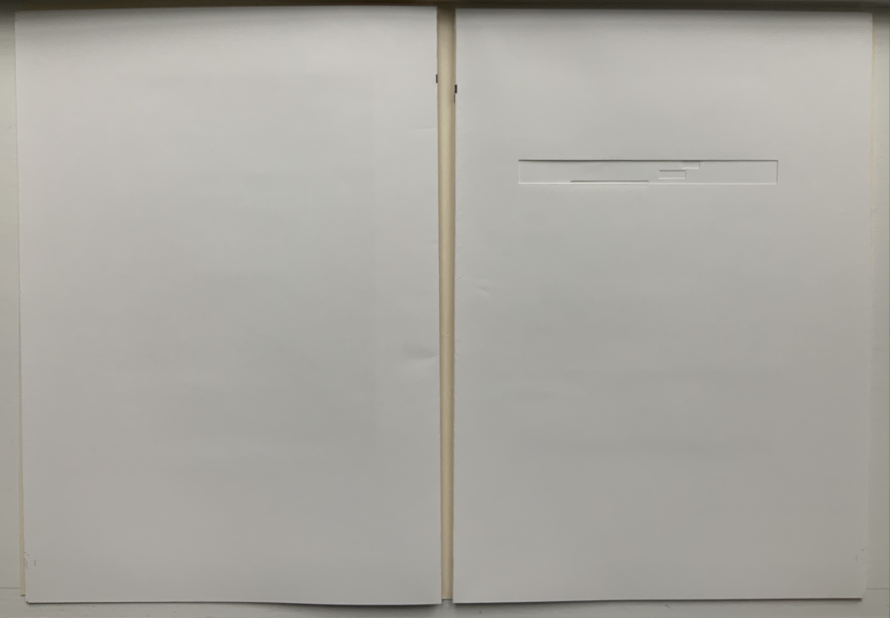
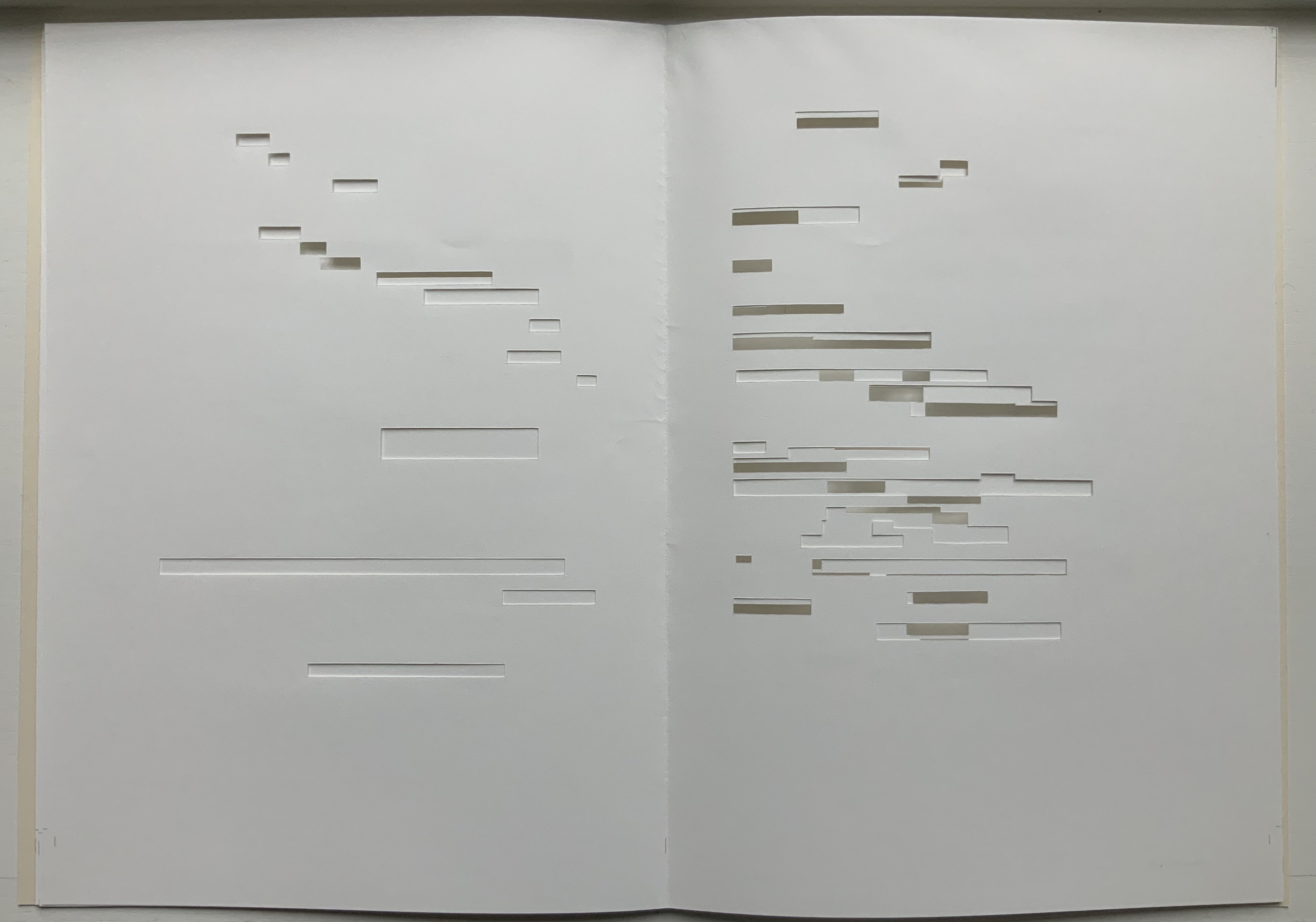
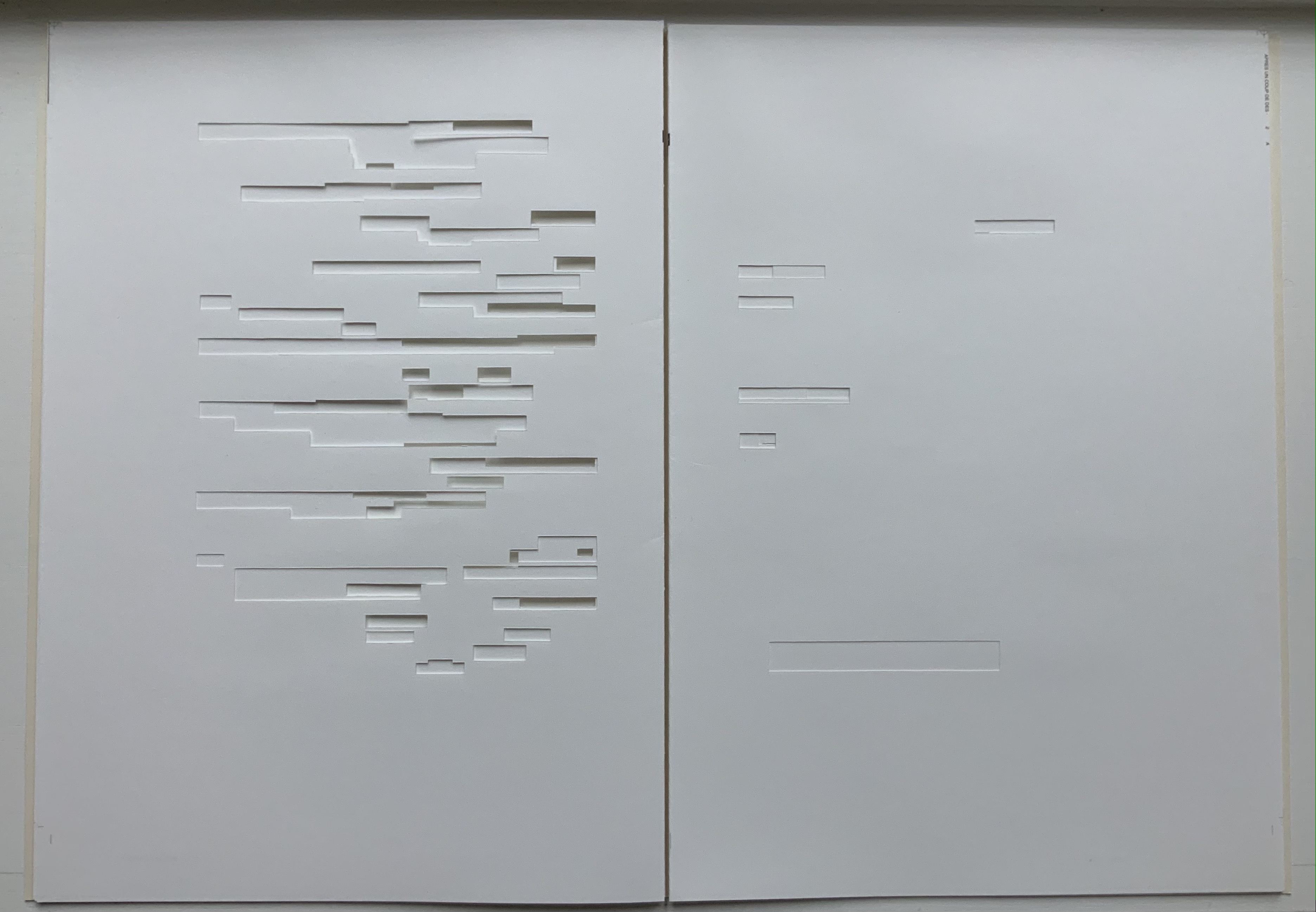
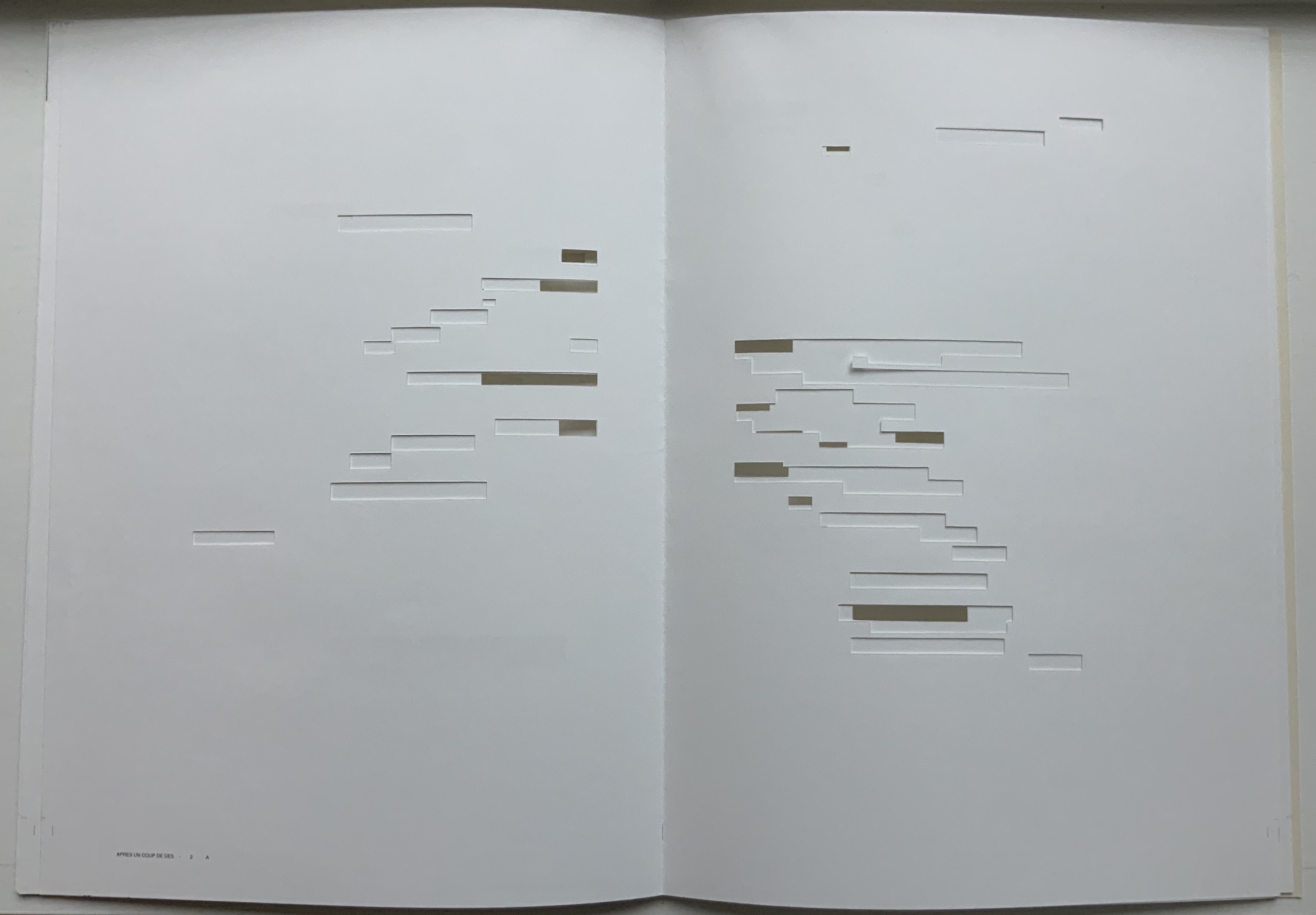
Après Un Coup de Dés (2015) Michel Lorand Cover and gatherings, untrimmed and unbound, in glassine envelope. Cover: H362 x W260; gatherings: H362 x W256 mm; 32 unnumbered pages. Edition of 50, of which this is #19. Acquired from the artist, 22 October 2021. Photos: Books On Books Collection. Displayed with the artist’s permission.
Since the 1960s when Ernest Fraenkel, Mario Diacono and Marcel Broodthaers blotted out the text of Mallarmé’s poem Un Coup de Dés Jamais N’Abolira le Hasard (1897) to create their works of homage, numerous others have expanded on the technique: substituting images of sonograms (Sammy Engramer, 2009) or algorithmically generated abstractions (Eric Zboya, 2018, and Benjamin Lord, 2019), or excising the text (Michalis Pichler, 2008, and Cerith Wyn Evans, 2008) or algorithmically erasing it (Jérémie Bennequin, 2009) — just to name a few.
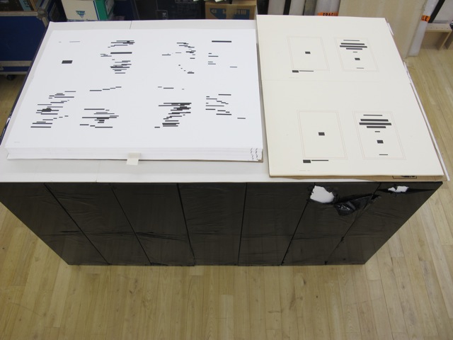
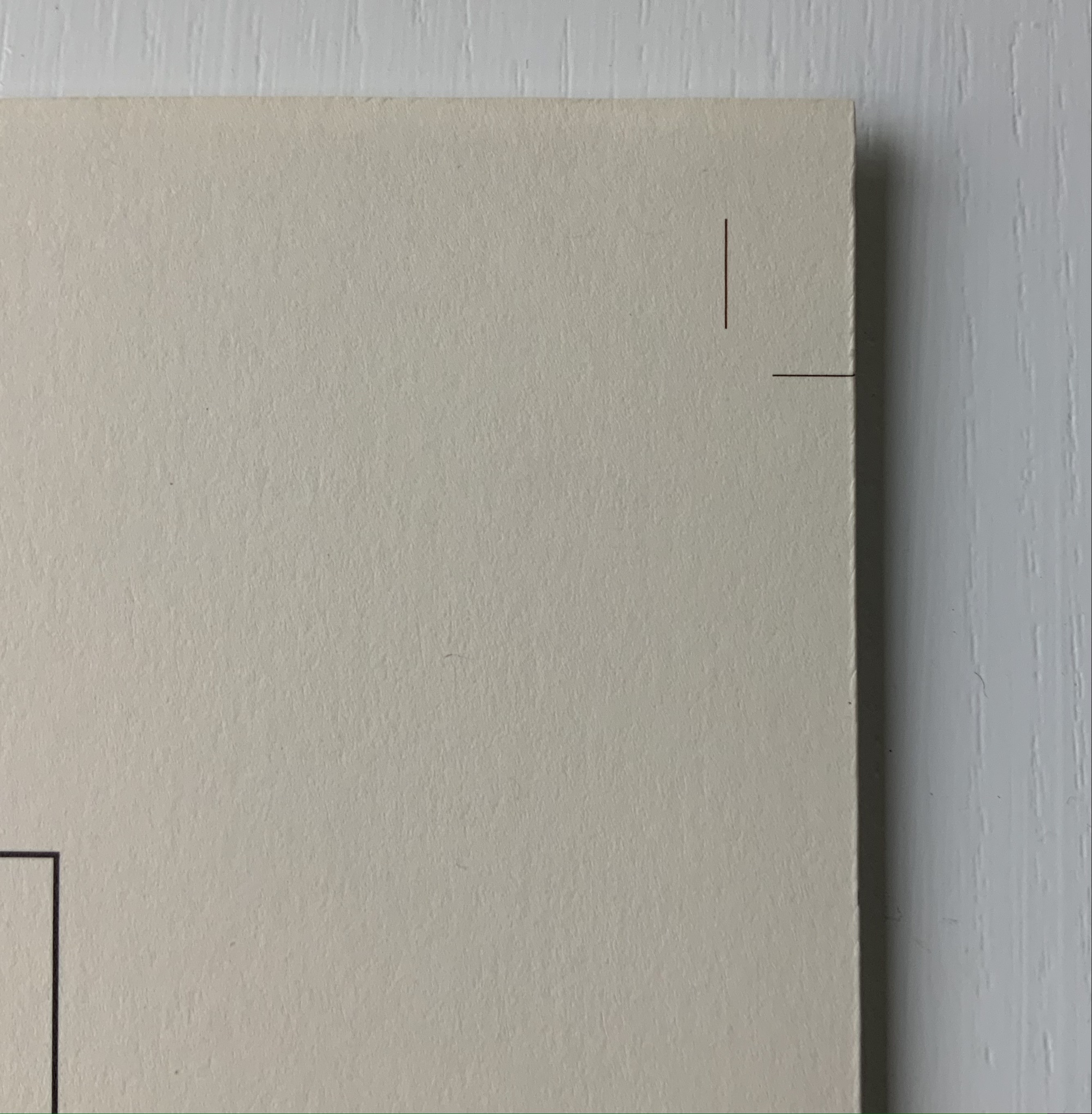
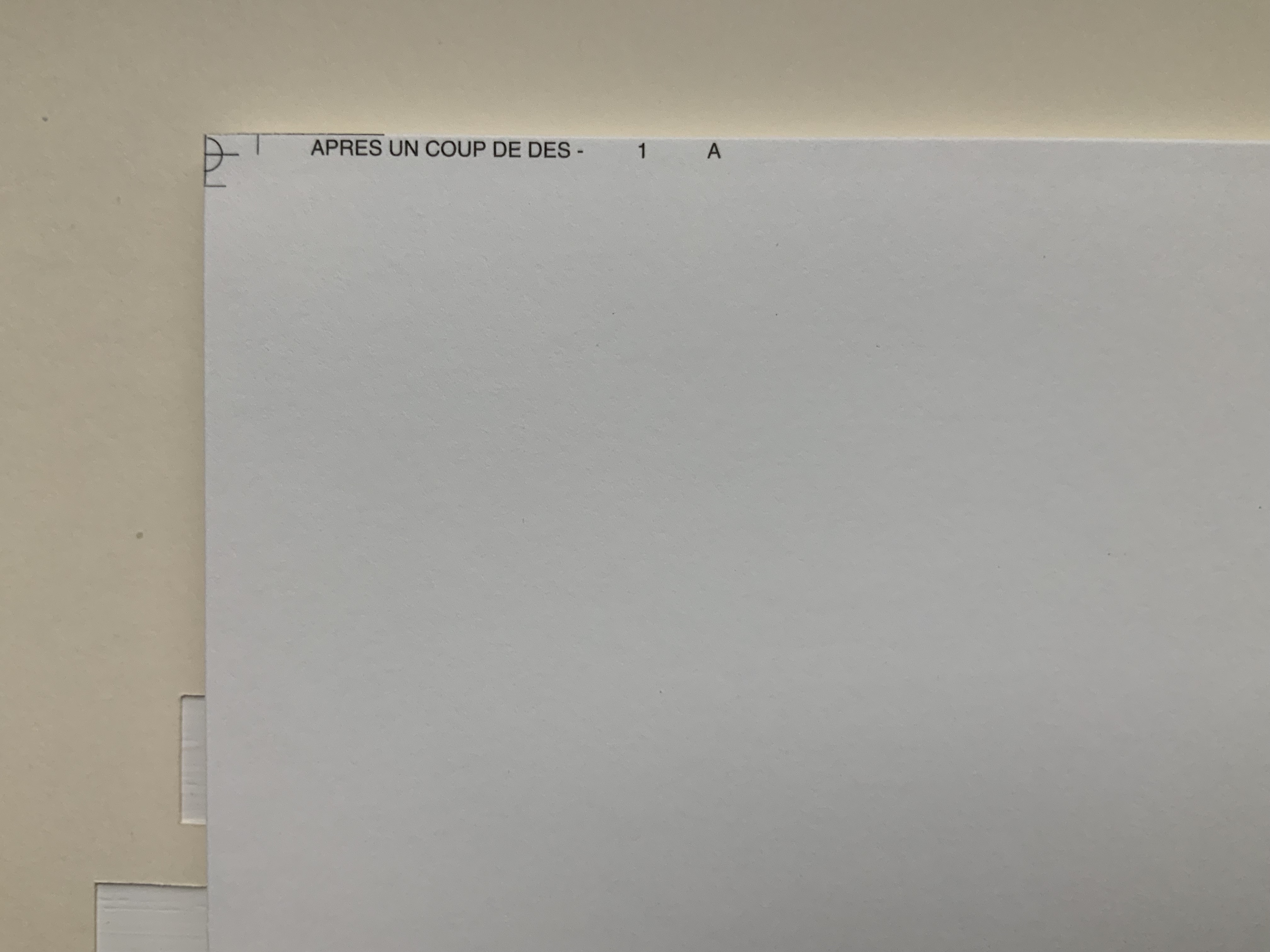
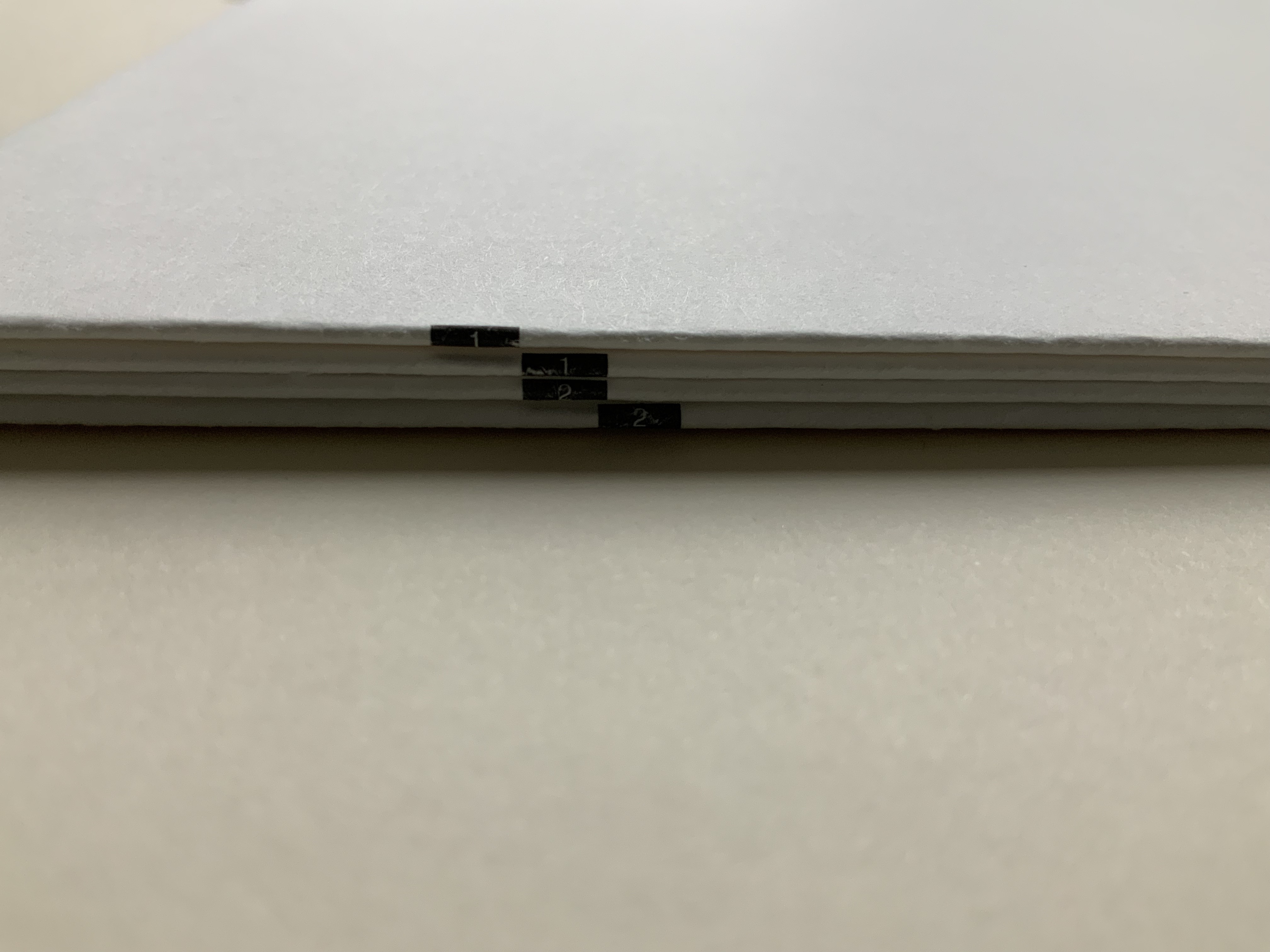
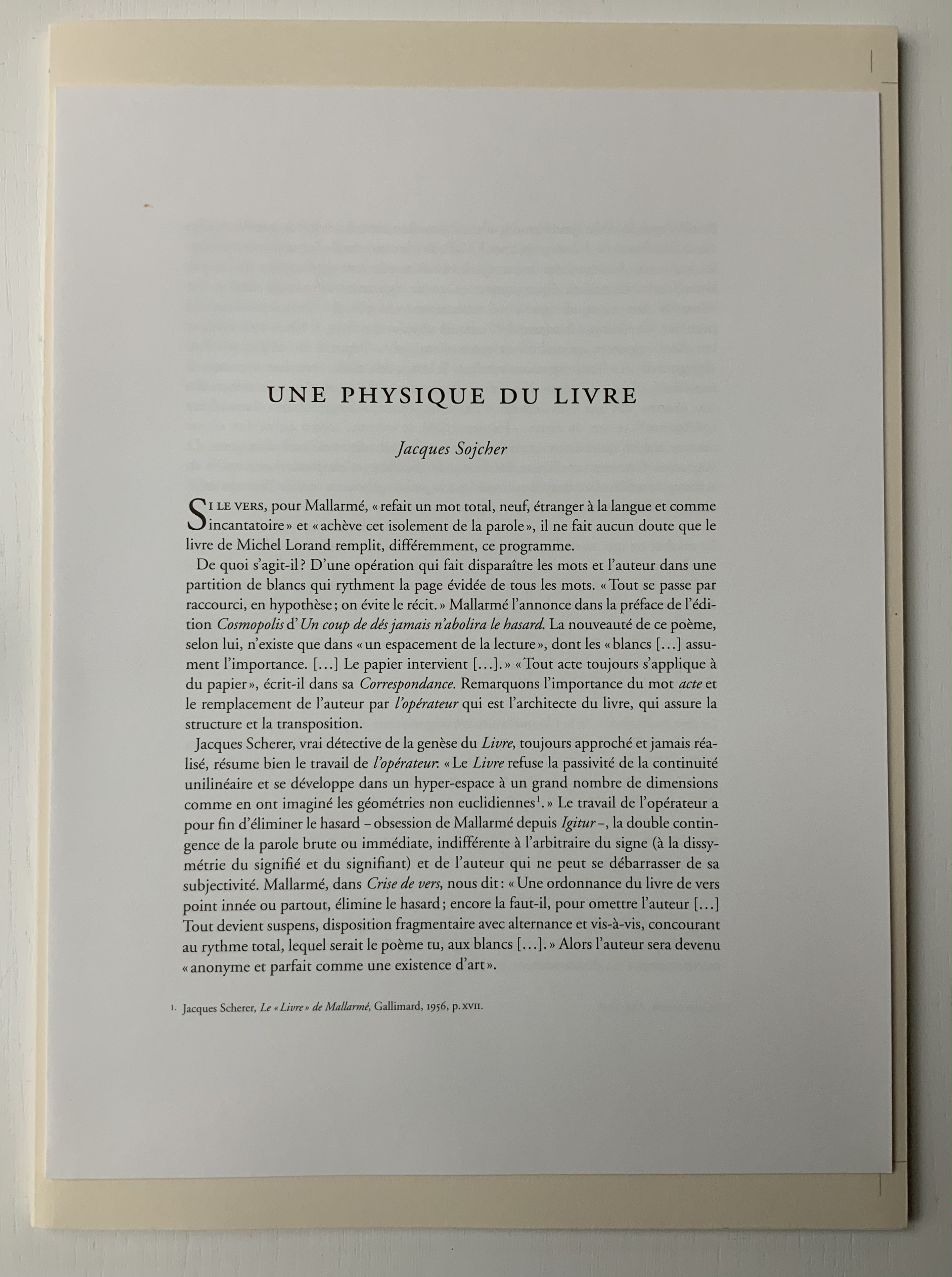
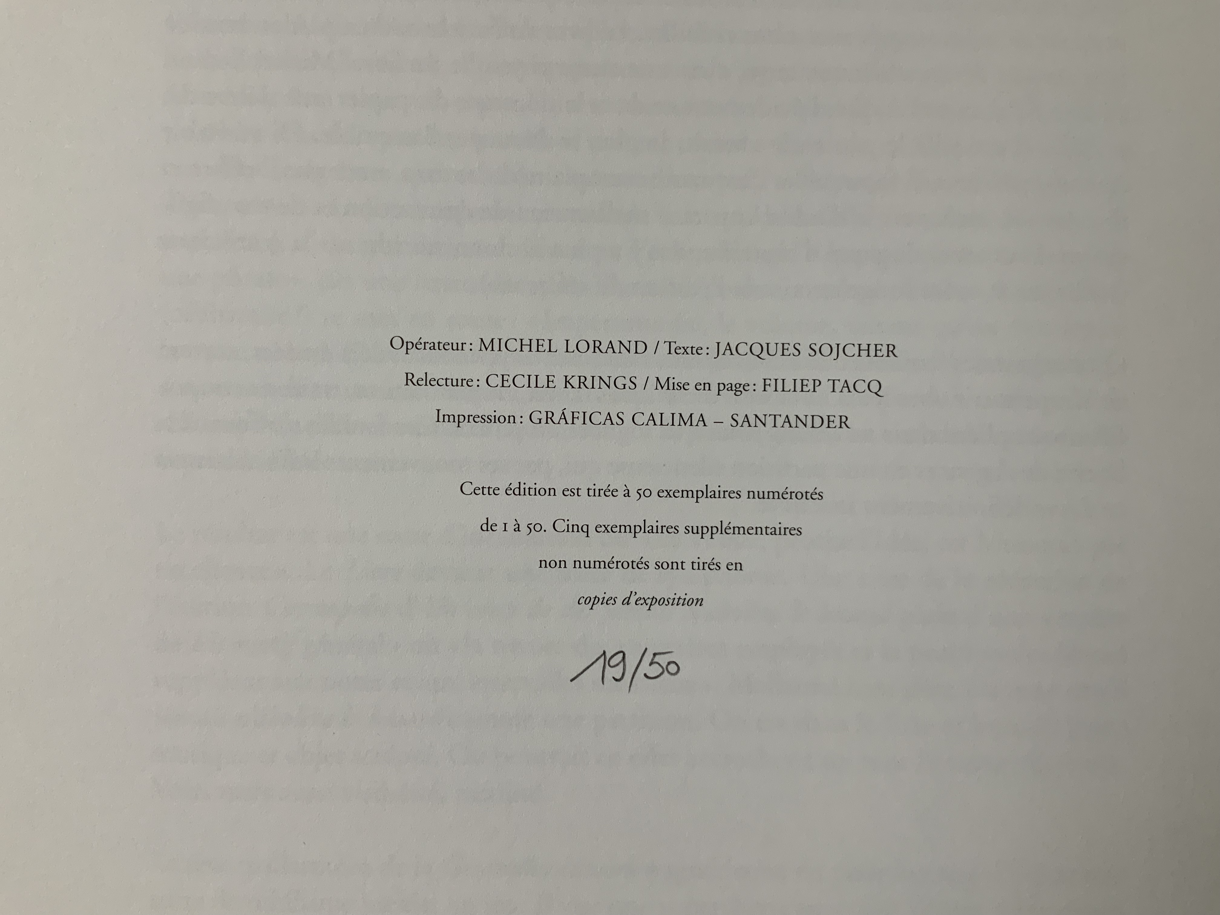
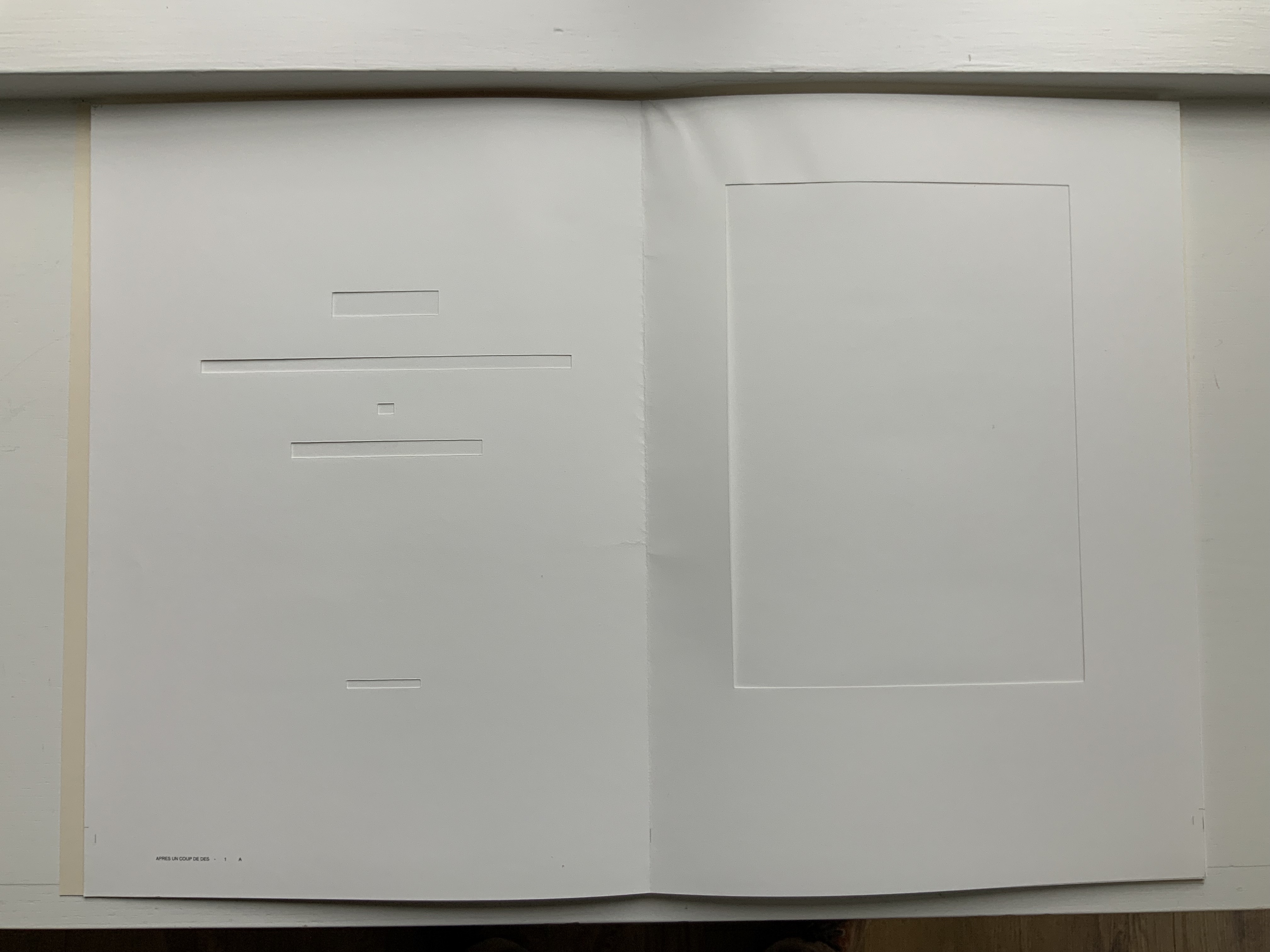
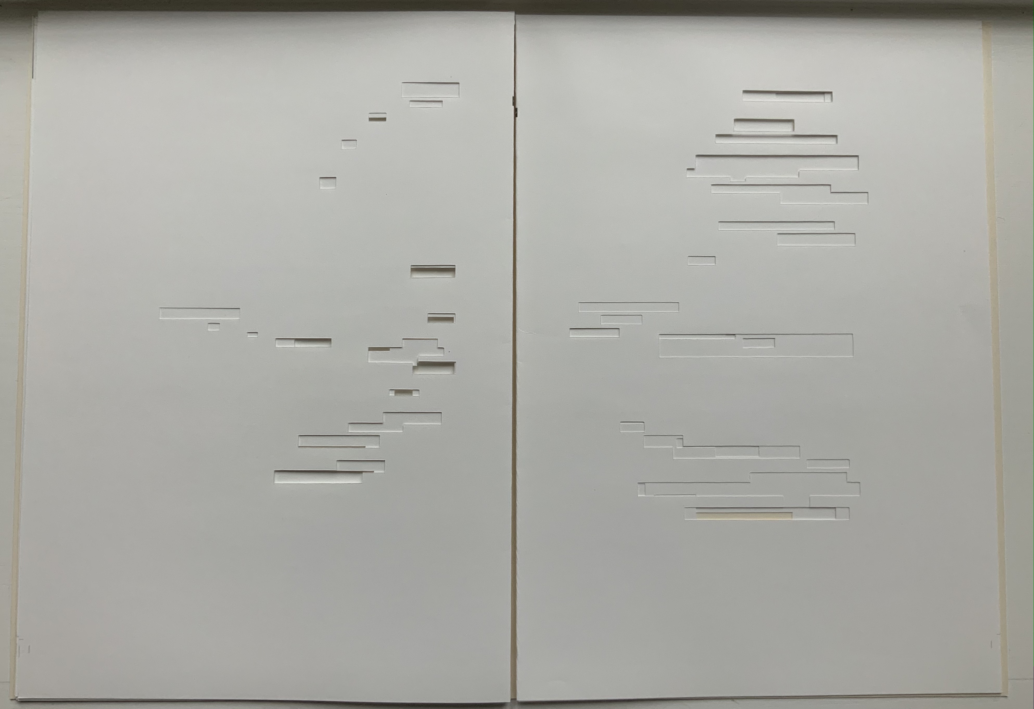
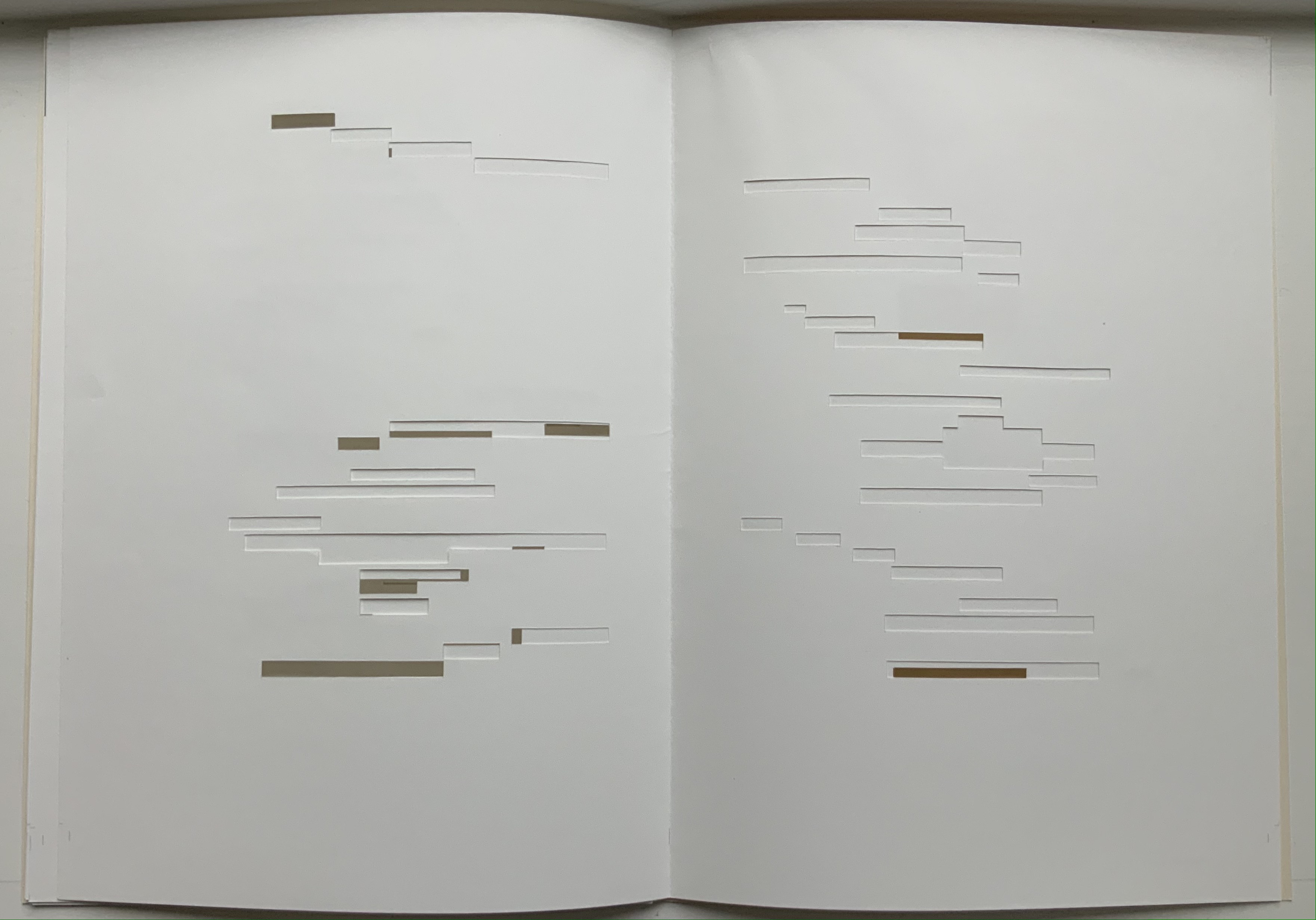
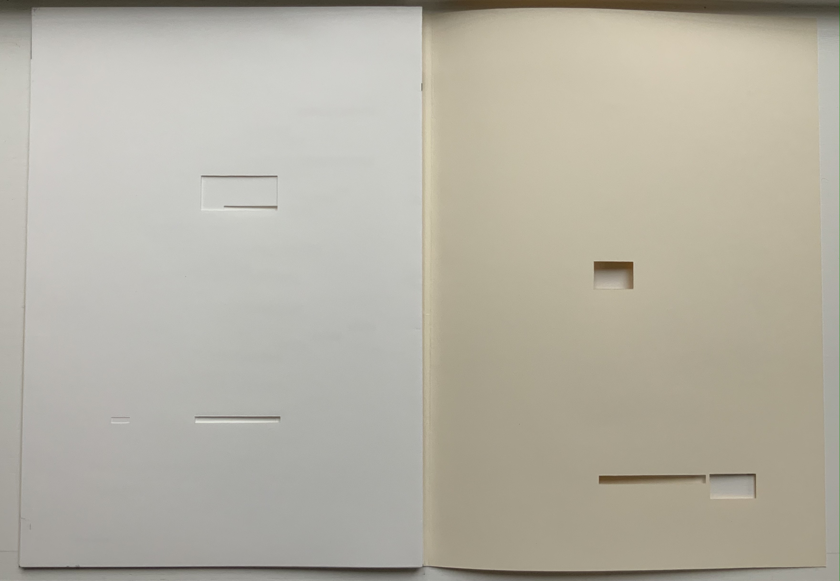
In Après Un Coup de Dés (2015), the only printed marks are the cover’s traditional black and red borders and the printer’s registration and gathering marks on the sheets. Wherever else Mallarmé’s text would have been printed has been excised. In reply to a question about the process involved, Lorand explains that he had asked the designer Filiep Tacq to create a layout that would cover in black exactly the blocks of text as it appears in the current Gallimard book edition of Mallarmé’s poem, including the front and back covers (correspondence with the artist, 1 November 2021). Lorand took a scalpel to the offset printed sheets, removed the blackened blocks, folded the sheets by hand into the four gatherings, assembled them in the correct order and laid them untrimmed and loose inside the cover. Each of fifty copies was placed inside its own handmade glassine envelope along with a flyer including introductory text by Jacques Sojcher (emeritus professor, University of Brussels) and the colophon for the work. It is a book that is not-yet a book.
Lorand’s and all of these other works of homage give us inverse ekphrasis. They are the visual, tactile and conceptual works of art that come after Mallarmé’s text. We are more used to ekphrasis where the object, painting or sculpture comes before the text — like Achilles’ shield before Homer’s description, or the Grecian urn before Keats’ ode, or Brueghel’s Fall of Icarus before Auden’s Musée des Beaux Arts. Homer, Keats and Auden vie with the art of the crafted object to put that object (and more) in front of us with words. With the inverse, the crafted objects vie without the words to put Mallarmé’s poem (and more — and sometimes less!) in front of us.
Many of the hommageurs hint at the “and more” with a subtitle to Un Coup de Dés Jamais N’Abolira le Hasard. With Broodthaers, it is Image; with Pichler, Sculpture; with Engramer, Onde (Wave as in soundwave); and with Bennequin, Omage (as in hommage with the “h” and “m” missing). With Lorand, there is no subtitle. Instead, we have the word après prefacing the truncated title of the poem. But, “after” Mallarmé’s poem, what is Lorand proposing? An homage in the form of something that restates, reproduces the poem but without the words? An homage in the form of something else presented in the manner of Un Coup de Dés but without the words? Or something else that simply occurs after the poem’s roll of the dice? As it turns out, all that and more.
Paul Valèry was probably the first of Mallarmé’s circle to see and hear Un Coup de Dés. His reaction picks out one of the themes that make up Lorand’s “and more”:
It seemed to me that I was looking at the form and pattern of a thought, placed for the first time in a finite space. Here space itself truly spoke, dreamed, and gave birth to temporal forms. Expectancy, doubt, concentration, all were visible things. With my own eye I could see silences that had assumed bodily shapes. Inappreciable instants became clearly visible: the fraction of a second during which an idea flashes into being and dies away; atoms of time that serve as the germs of infinite consequences lasting through psychological centuries — at last these appeared as beings, each surrounded with a palpable emptiness…. there in the same void with them, like some new form of matter arranged in systems or masses or trailing lines, coexisted the Word! — Paul Valéry, Collected Works of Paul Valery, Volume 8: Leonardo, Poe, Mallarmé (1972).
Lorand writes:
My <<Après un Coup de Dés>> introduces a corpus of approaches to what might be “the movement” that constitutes speech: “A language that speaks” as Martin Heidegger calls it (Unterwegs zur Sprache, Verlag Günther Jeske, Pfullingen, FRG, 1959).
How can we think, how can we imagine this movement within language itself? What path to take to allow us to experience this movement, the one that constitutes the word itself. This word is sound. The object of all my work is the identification of what could be the image of this movement, of this word. This exploration attempts to approach the nature of this movement: a word beyond language when the latter is silent. (Correspondence with the artist, 1 November 2021.)
Like his others, Heidegger’s On the Way to Language is a dense book; more than the others, it is poetical, an invitation to experience language. In it is a series of lectures entitled “The Nature of Language” in which Heidegger uses two poems, one by Stefan George and one by Gottfried Benn, to question language about its nature. Although George’s poem is the one that Heidegger deeply explicates, Benn’s is the one that, echoing Valèry, sheds the most light on Lorand’s Après Un Coup de Dés — especially with its last two lines.
A Word
A word, a phrase –: from cyphers rise Life recognized, a sudden sense, The sun stands still, mute are the skies, And compacts it, stark and dense.
A word — a gleam, a light, a spark, A thrust of flames, a stellar trace — And then again — immense — the dark Round world and I in empty space.
Après Un Coup de Dés seems to be a wordless invitation to experience language. But in a sense, Mallarmé’s words have not disappeared, not entirely. Their shapes — embodied in the voids — move silently and rhythmically across the unfolded sheets; in the gatherings, they cascade over one another much as they do syntactically and typographically in print. And even though the text is not before (in front of) us, Lorand’s artwork delivers a wordless experience of a key paradox of language with which Mallarmé sought to imbue his poem: the language of the void or abyss — the void or abyss of language. One of the ways in which the poem presents this self-enveloping paradox is that it begins and ends with the words un coup de dés, the act that can never abolish chance and the act that all thought emits. Similarly, Après un Coup de Dés displays the presence of language by displaying the absence of language, or les blancs defined by and defining empty space.
Mallarmé’s invitation in Un Coup de Dés, however, beckons us to a slightly different concept of language than that articulated by Heidegger. For Mallarmé, chance plays a prominent role in what Heidegger would call the “neighborhood of poetry and thought”. But chance, hazard or a roll of the dice plays a much less prominent role for Heidegger, and in Lorand’s work of art, with its registration and gathering marks and glassine enclosure, there seems little allusion to it — perhaps naturally so since Lorand’s work comes after the dice have been rolled.
Even though it comes after Mallarmé’s completed poem and after the Gallimard book edition, Après presents as an unfinished work, a book not yet trimmed and bound, which reflects not only Mallarmé’s unfinished realization of the poem as a book but also his unfinished life’s pursuit: le Livre, the thing in which everything in the world would end up — the thing that, by virtue of a spacious mobility of typographic layout and the interplay of its elements, would be “the total expansion of the letter”. Lorand’s attention and manual precision in excising the blackened blocks where the text would otherwise appear evoke Mallarmé’s attention to the minute details of typeface, size and font shown in his handwritten mark-up of the proofs for the book edition he was planning before he died.
Après also comes after the efforts of Broodthaers and Pichler, both of whom organized exhibitions for their works of homage. In fact, Pichler paid homage to Broodthaers by naming his exhibition “Pichler: Exposition Littéraire autour de Mallarmé” (Milan, December 2016) after “Broodthaers: Exposition littéraire autour de Mallarmé” (Antwerp, December 1969). Pichler’s exhibition was also daring in its exposure of the works to the visitors.
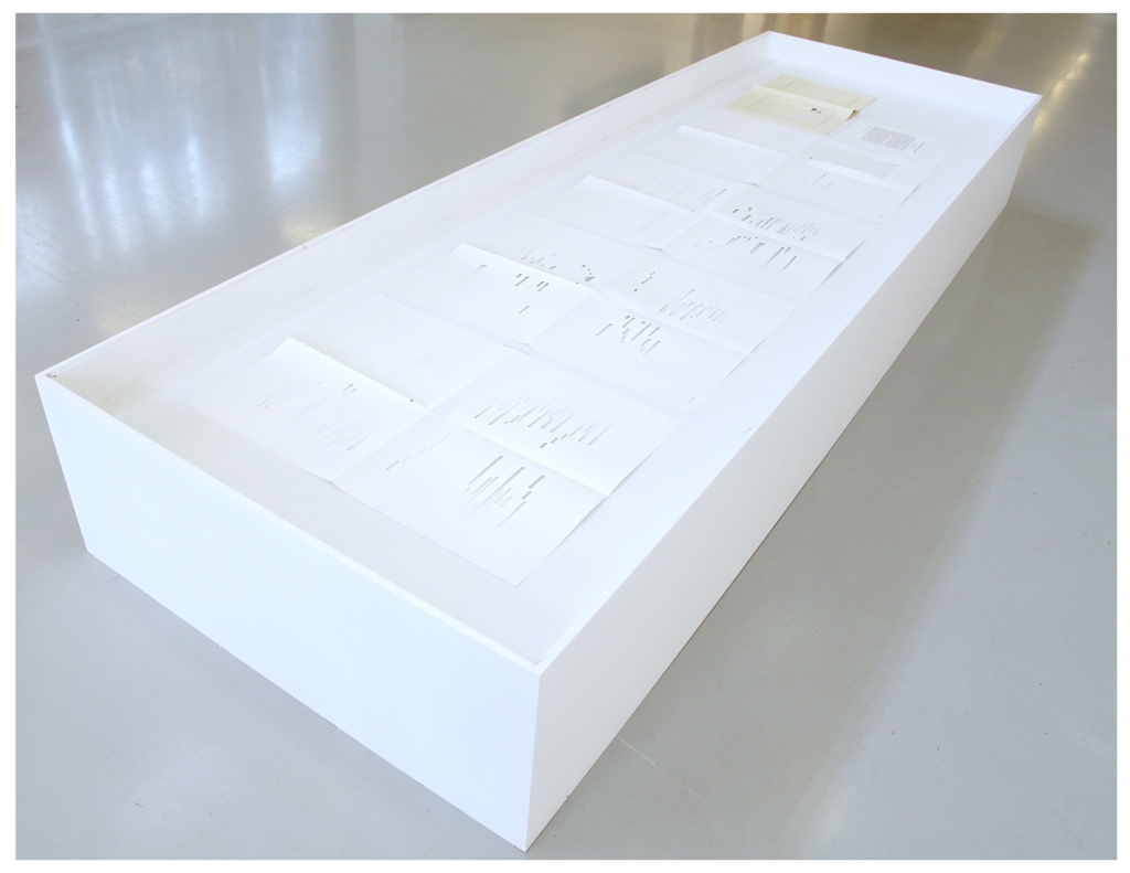
In the 2018 display of Après Un Coup de Dés, the previously gathered but now unfolded sheets and cover lie side by side under glass. Often this is cause for complaint about the distanced display of artist books. In the case of Après Un Coup de Dés, the distance effectively draws point-blank attention to what the privileged reader gradually discovers in handling the work. The unprivileged reader may have to imagine the making, unmaking and remaking of the book but, confronted with the gestalt of the undone gatherings and their registration marks, that reader immediately sees/witnesses the void defined by a void.
Après Un Coup de Dés in the group exhibition Reading Hand Writing Bodies at Les Abattoirs de Bomel, Centre d’art de Namur, Belgium, 8 February – 11 March 2018. Photo: Courtesy of the artist.
In relation to Broodthaer’s Image and Pichler’s Sculpture, Après comes both before and after. The positioning of the words après, image and sculpture vis à vis the poem’s title has been noted already. Of all three visual, tactile and conceptual works, Lorand’s stands as the chronologically “after” yet unfinished “before” to Broodthaers’ and Pichler’s finished works. In yet another “afterness” to Mallarmé’s poem, Lorand likens Après to a silent score of music or a piano roll (correspondence with the artist, 1 November 2021). This echoes — if that is not too perverse a verb — Mallarmé’s reference to “score” in his preface to Un Coup de Dés. In premonitory, if not coincidental, irony, Lorand’s piano-roll-like 2015 work precedes a work that Michalis Pichler created for his 2016 Milan exhibition: a piano roll playable on a foot-pumped pianola and entitled Un Coup de Dés Jamais N’Abolira le Hasard: Musique (see video above).
The interplay of its philosophical roots with its mechanically produced print and its manual cuts makes Lorand’s AprèsUn Coup de Dés one of the more challenging works of homage to Mallarmé’s poem. To “hear” it side by side with the others in the Books On Books Collection (see below) is rewarding.
Further Reading
“Derek Beaulieu“. Books On Books Collection. 19 June 2020.
“Eric Zboya“. Books On Books Collection. 01 June 2020.
Heidegger, Martin, and Peter D. Hertz, trans. 1959/2009. On the Way to Language. San Francisco: HarperOne. Reprint. “No matter how we put our questions to language about its nature, first of all it is needful that language vouchsafe itself to us. If it does, the nature of language becomes the grant of its essential being, that is, the being of language becomes the language of being” (p. 72).