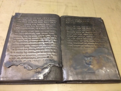
Henry James, The Beast in the Jungle, 1903. Allen Press, 1963. The copy shown is one of only 15 copies with an extra suite of 16 artist’s proofs, each titled, numbered 9/15 and signed by the artist in a separate portfolio. Displayed online at Sophie Schneideman – Rare Books and Prints.
In his Books and Vines essays, Chris T. Adamson provides fresh, personal and insightful comments on fine book productions and their content such as Henry James’ “The Beast in the Jungle” from the Lewis and Dorothy Allen Press in 1963, pictured above. An oenophile, as the title of his series suggests, Adamson also occasionally offers tips on the best wines with which to decant and read these works.
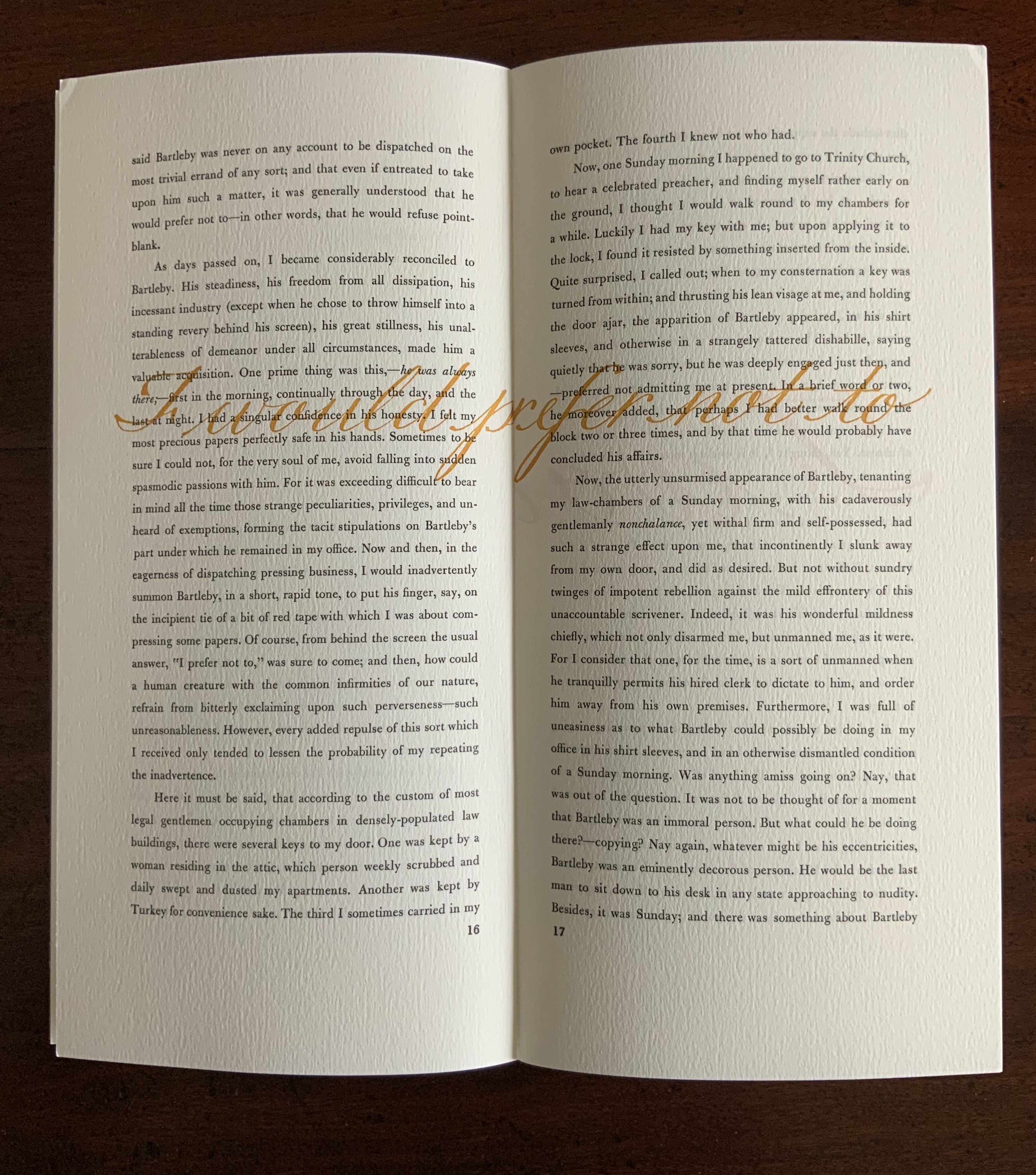
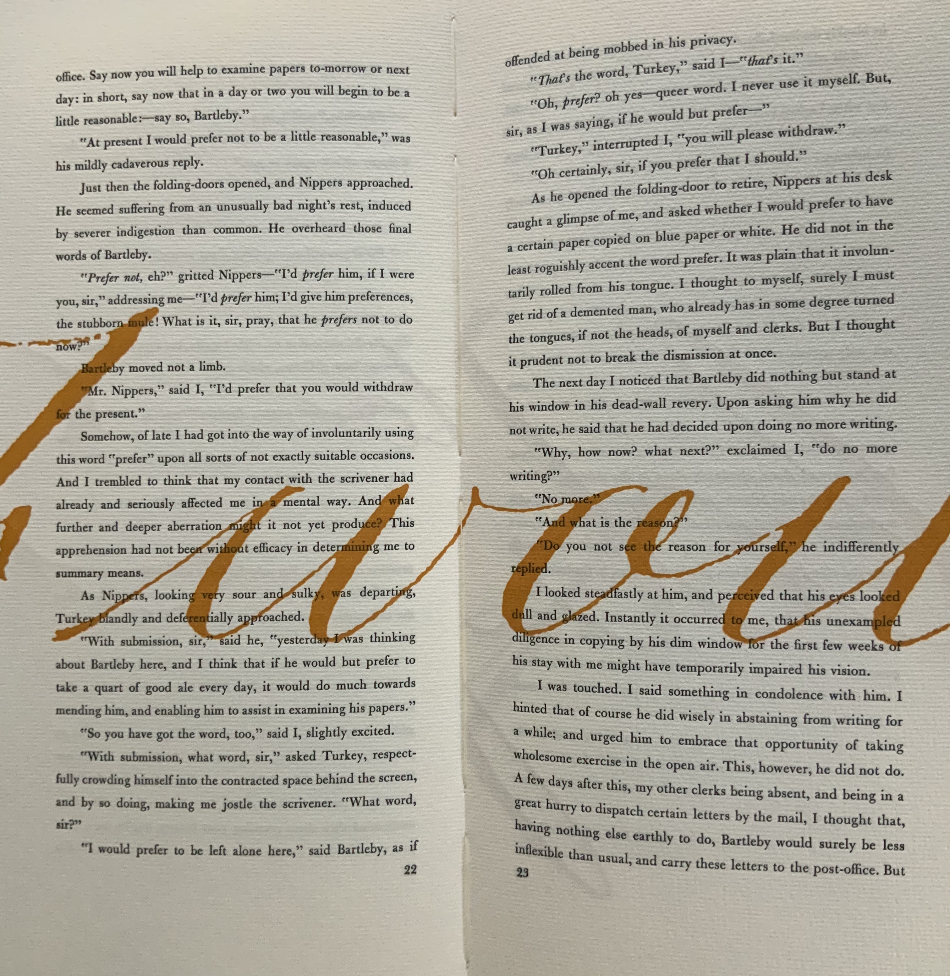
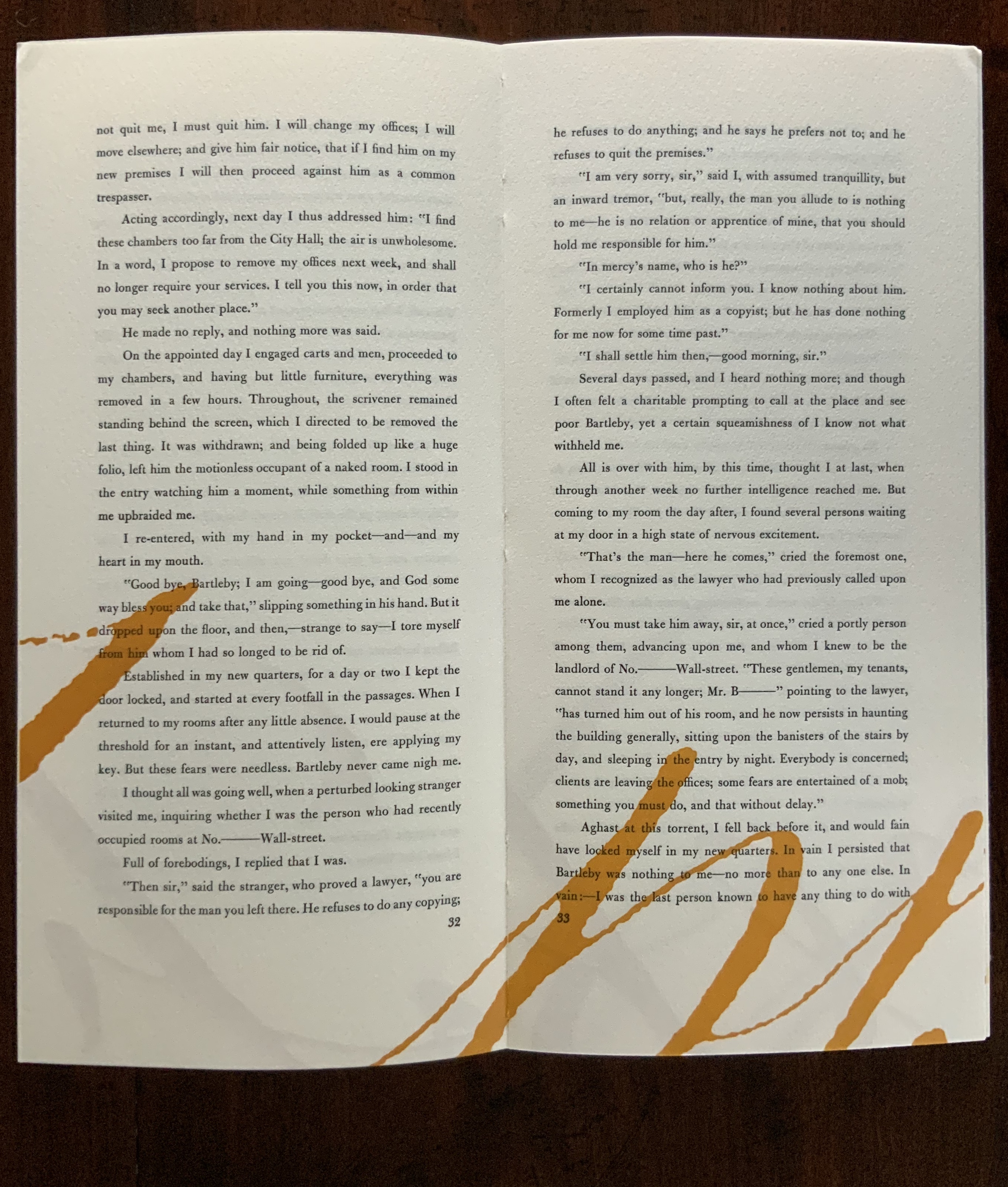
James is a favorite author at Books On Books as is Herman Melville. Indulge the punning coincidence of Adamson’s introducing us to Wilber Schilling’s Indulgence Press and his edition of Melville’s “Bartleby the Scrivener: A Story of Wall Street“. Schilling’s edition of “Bartleby” – with Suzanne Moore’s original hand lettering of Bartleby’s classic statement “I would prefer not to” first appearing fully legible then becoming larger until it literally falls off the bottom of the final page – was an early career statement of an interest in more than fine press work but in book art as well.
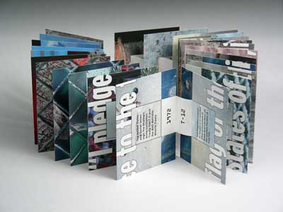
Consider Schilling’s Half-Life/Full-Life and its binding a variation on the accordion/flag structure of Hedi Kyle and Claire Van Vliet. The complexity of the form marries well with that of the intertwining, interleaving text and photos along the timelines of the Doomsday Clock and global warming.
Half Life/Full Life Wilber Schilling, 2009 ISBN: 0-9742191-5-0 Cover
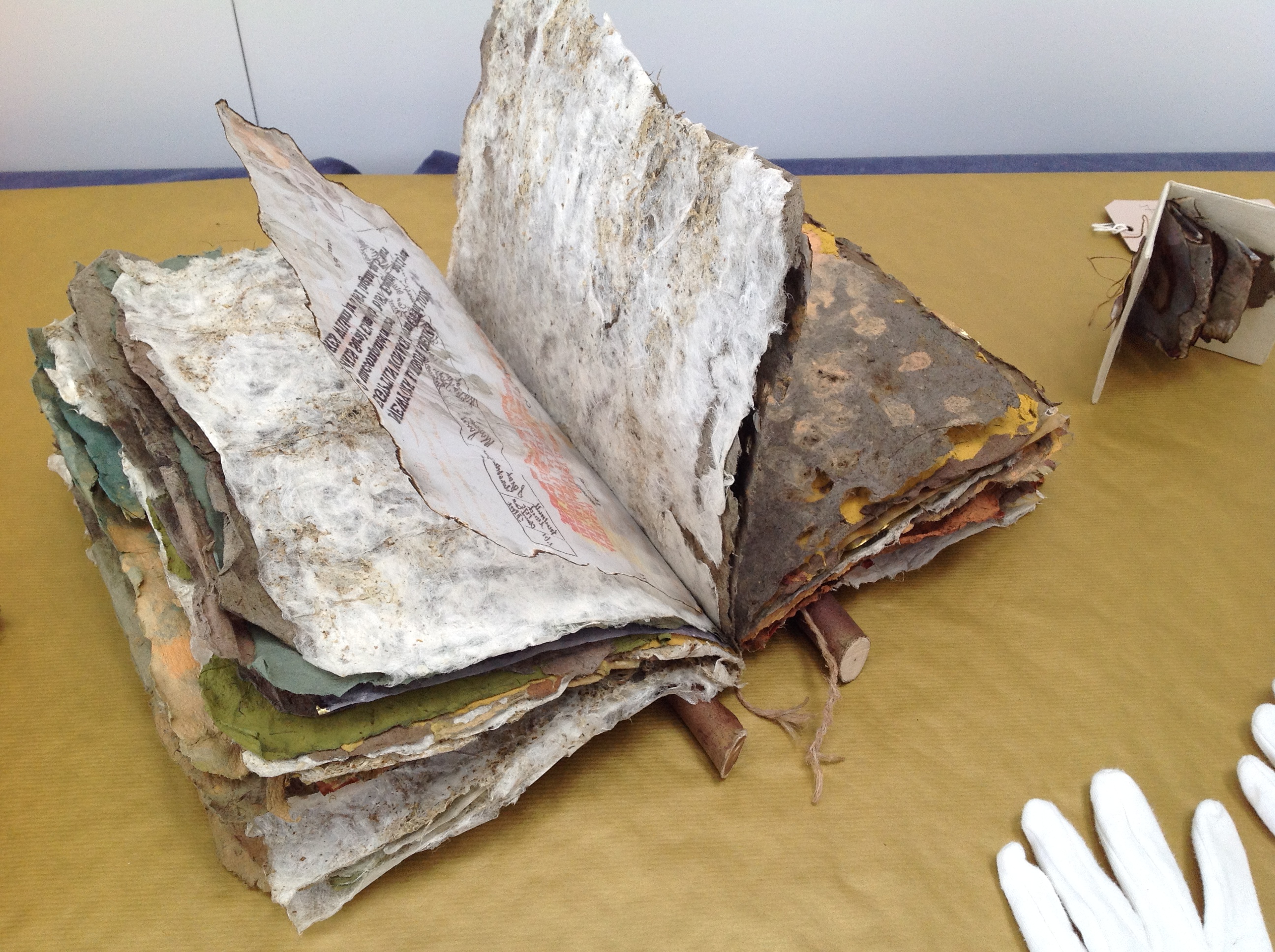
Schilling’s photography in Half Life/Full Life speaks to the importance of that craft in his overall portfolio. His photos of aging, decayed and unbound books are haunting and remind me of the found art of M.L Van Nice.
Schilling has collaborated with Thomas Rose (visual artist and professor at the University of Minnesota), Michael Dennis Browne (poet and librettist), Rick Moody (author of The Ice Storm) and Patricia Hampl (MacArthur Fellow poet and novelist). He has collaborated with Daniel E. Kelm (book artist, founder of the Garage Annex School for Book Arts and a collaborator with Suzanne Moore).
Given the influence of Marcel Duchamp and Joseph Cornell on works such as Arthur & Barbara (Arthur Danto and Barbara Westman) or Surplus Value Books: Catalog Number 13, you might say that Schilling has attempted to collaborate with them as well. The danger in that, of course, is highly derivative artwork. That early-career whiff of genius in commissioning the now famous calligrapher Suzanne Moore to hand letter “I would prefer not to” and spreading it in ever larger size across the pages might be what takes Schilling’s work beyond the derivative. His work is worth examining with that anticipation.
Postscript
The Books On Books Collection now holds a copy of Schilling’s edition of Bartleby as well as works by Suzanne Moore.
In “The Scholarly Kitchen“, Joseph Esposito writes: “I suspect that the multiple narratives of Pears’s fiction will someday find an analogue in expository writing that enables intersections of one theme or thread with another, which would provide, as it were, a new form of discovery.”
Perhaps that “analogue” is already here for the scholarly article in Elsevier’s “Article of the Future” and Wiley’s “Anywhere Article“. In scholarly expository writing, the intersections are often those of “conversations” among articles, for which the Digital Object Identifier (DOI) has performed and continues to perform an innovatory spark. Consider the activity and ten aims of the Linked Content Coalition.
All of this has been a long time coming. The DOI has its roots in the Handle System, whose roots weave back beyond the Web to the Internet Protocol (IP) itself. Esposito notes Iain Pears’s print antecedents in the experimental ’60s fiction of John Barth and the creator of Scheherazade, and he could have added the 1987 digital precursor Afternoon, A Story by Michael Joyce.
A long time coming, and to the kids in the backseat reading Pears’s Arcadia on their iPads, “No, we’re not there yet … keep reading!”
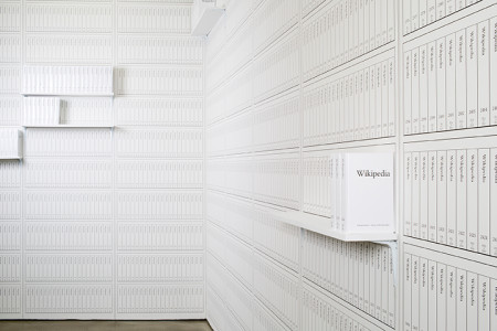
Michael Mandiberg, Print Wikipedia, 2015 Exhibition “From Aaaaa! to ZZZap!” by the Denny Gallery, 261 Broome Street in New York City, 18 June through 11 July, 2015.
Print Wikipedia is a both a utilitarian visualization of the largest accumulation of human knowledge and a poetic gesture towards the futility of the scale of big data. Mandiberg has written software that parses the entirety of the English-language Wikipedia database and programmatically lays out thousands of volumes, complete with covers, and then uploads them for print-on-demand. Built on what is likely the largest appropriation ever made, it is also a work of found poetry that draws attention to the sheer size of the encyclopedia’s content and the impossibility of rendering Wikipedia as a material object in fixed form: Once a volume is printed it is already out of date. The work is also a reflection on the actual transparency or completeness of knowledge containers and history. (Denny Gallery)
Mandiberg echoes a conceptual framework initiated by John F. Simon, Jr. and his “Every Icon” in 1996-97. Every Icon is a grid of 32 x 32 empty squares underpinned by a Java applet that explores successively every combination of black and white squares that could occur within the confines of that grid. Changing from light to dark and back again, the black or white boxes “hop” progressively to the right. Over time (say a trillion years), the grid will will populate itself with shapes. Simon’s algorithmically driven “artist’s proof” speaks to the ephemerality, futility and power of art, which is the unavoidable, underlying theme of “Every Icon” and, for that matter, any instance of installation or performance art.
As Simon puts it,
While Every Icon is resolved conceptually, it is unresolvable in practice.
In some ways the theoretical possibilities outdistance
the time scales of both evolution and imagination.
It posits a representational system where computational
promise is intricately linked to extraordinary duration and momentary sensation.
In Mandiberg’s case – whether it is the complete set or a print-on-demand segment – the realized print element of the Print Wikipedia demonstrates the work’s unresolvability in practice. Even if I hold out hope that the “art” (the algorithmic techne/craft) of Print Wikipedia lasts long, any artifact “resolved” by Print Wikipedia will always be out of date until the “final moment” of Wikipedia (whatever that might look like). Warning: the links from previous reviews of Every Icon are often dead, which is doubly ironic: the technical community always speaks of “links resolving to a resource”, so with those dead links, there is a further, unintended “unresolvability”.
Mandiberg’s work also echoes the conceptual framework initiated by Paul Soulellis and Library of the Printed Web. Like the volumes in Mandiberg’s Printed Wikipedia, those in the LotPW are created by print on demand.
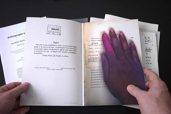
Special Collection (2009), by Benjamin Shaykin. Photo by the Library of the Printed Web.
In Soulellis’ words,
Library of the Printed Web is a collection of works by artists who use screen capture, image grab, site scrape and search query to create printed matter from content found on the web. LotPW includes self-published artists’ books, photo books, texts and other print works gathered around the casual concept of “search, compile and publish“.
The content in Benjamin Shaykin’s Special Collection consists of found pages in which a scanner’s hand was accidentally captured by the Google scanning system during the Google Book Project . This is truly “manually” found content. The content of Mandiberg’s work is algorithmically “found content” on a massive scale. While it may be that Print Wikipedia represents the “futility of the scale of big data”, I prefer the irrational hope that its print element, however tied to the digital, and the physical book art of the LotPW secure the consolation of “ars longa, vita brevis”.
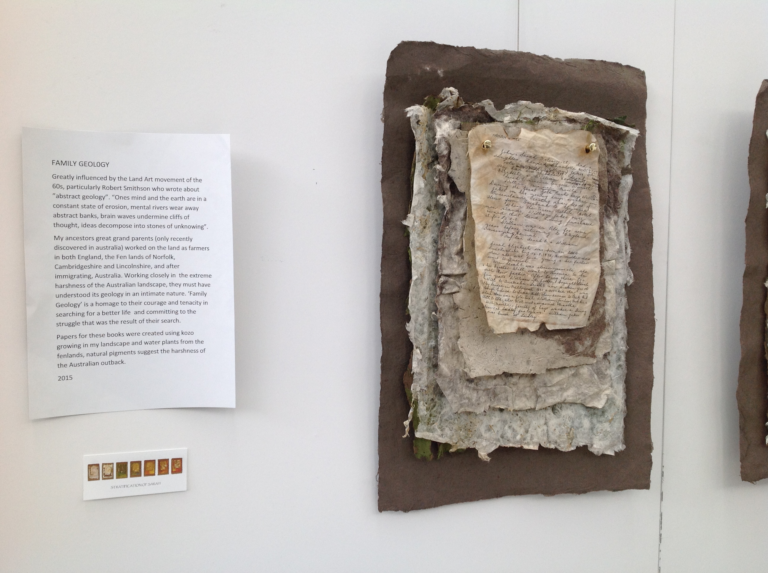
Family Geology by Jan Fairbairn-Edwards consists of multiple related works to create the visual narrative of her Victorian era family’s emigration from the Norfolk fens to Australia. One of the central characters is her great aunt Sarah, who is the focus of the work Stratification of Sarah shown below.
Stratification of Sarah, 2015 Jan Fairbairn-Edwards
Stratification of Sarah, 2015 Jan Fairbairn-Edwards
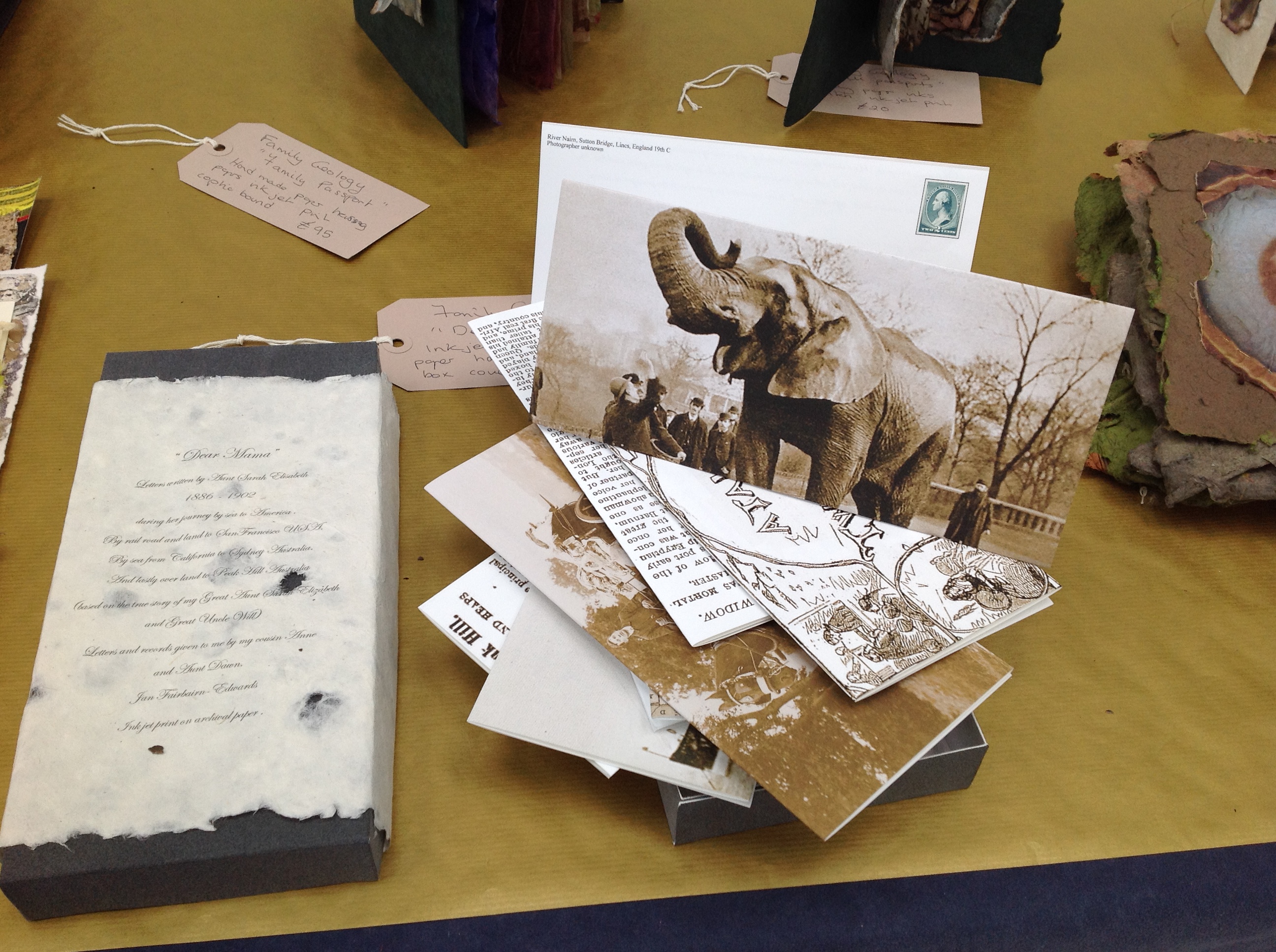
Symbolically, the six hanging “chapters” of Sarah’s journey move from the dun colors of the English fens to the hotter colors of Australia. The artist uses sheets of paper handmade from plants native to the Norfolk fens as well as traditional clothing fabric. The “geological” layers of the journey’s story are reflected in the stratified sheets that diminish in size from back to front. The weathered documents appearing in each hanging are copies of found items from the family’s possessions or allusive artifacts, such as the article about Alice, “Jumbo’s widow“.
Alice was the African elephant being shipped aboard the HMSS Egyptian Monarch to join P.T. Barnum’s Jumbo in the US. Also on board the Monarch was Sarah, 10 years old when she embarked for the first sea leg of the journey to Australia. In another work in Family Geology called “Dear Mama”, the artist has invented a series of letters from Sarah, several of which tell of Sarah’s searching the ship for Alice.
“Dear Mama”, 2015 Jan Fairbairn-Edwards
The other related works feature only fens-originated material, with the exception of a few pieces whose spines are branches of eucalyptus trees. Those spines and the hot Australian colors are the main physical manifestation of the Australian destination. As seen below, the stamps from the officialdom of the empire on which the sun never set provide another of the numerous unifying threads in the narrative.
William’s Story, 2015 Jan Fairbairn-Edwards Handmade papers with kozo and fenland plants, natural pigments, ink jet print (archival quality) on tracing paper, inks, string and eucalyptus wood binding
The artist suggested that I call this an installation. It is, but with the difference that there is this multi-threaded, narrative unity across and among the individual works that I have not noticed before in other installations. That unity makes me stumble a bit over the fact that the constituent works are purchasable individually, which casts the “installation” in something of a contrasting light. The work as a whole is one of remembrance and restoration. Doesn’t the removal of pieces of Family Geology undermine that?
Remember the 2014 installation Blood Swept Lands and Seas of Red created by artists Paul Cummins and Tom Piper at the Tower of London: 888,246 ceramic poppies progressively filling the Tower’s famous moat between 17 July and 11 November? Each red bloom represented a British military fatality in the First World War. The installation as installation resides only in the memories of its viewers and can be experienced only partially in photos, video clips or the website. The poppies sold individually over the web (I am one of the lucky owners of one of them). When I look at this single ceramic poppy, sometimes there is a failure of metonymic power – the ability of the part to stand for the whole. Other times, it starts the image of a cascade of blood from a stone window into a moat of red. And so, what of a single work plucked from Family Geology?
The full impact of the installation– a family speaking to one another in and across time, from across seas and continents – something on which the viewer eavesdrops – rises like the musk from the back of an inherited chest’s bottom drawer full of old letters, curled newspaper clippings, fading photographs, pressed leaves and flowers. At first, you think it is the volume of this manufactured memorabilia and their semi-invented, semi-found connectedness that is the source of that impact. But then you pick up William’s Story. The texture of its papers, the rough, dry sound of the leaves turning and the ash that flakes to the table from their edges take you deep into that musk through the one work.
You can sift through the several pieces of Fairbairn-Edwards’ Family Geology, and some will take you to the same place on their own, others lean much more on the presence of the installation. The thought of taking away from the whole one of its stronger parts leaves me hoping for an institutional white knight to purchase the “installation”. Yet the scent of William’s Story on some visitor’s fingers is probably making him or her reach for a checkbook or credit card right now.
See also Turn the Page 2015, where Family Geology had its debut and was one of the eight finalists.
Family Geology will next be on show at Art & Papiers, Vézénobres (Gard), France, this month (June 2015).
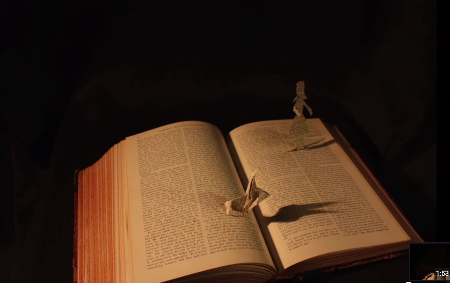
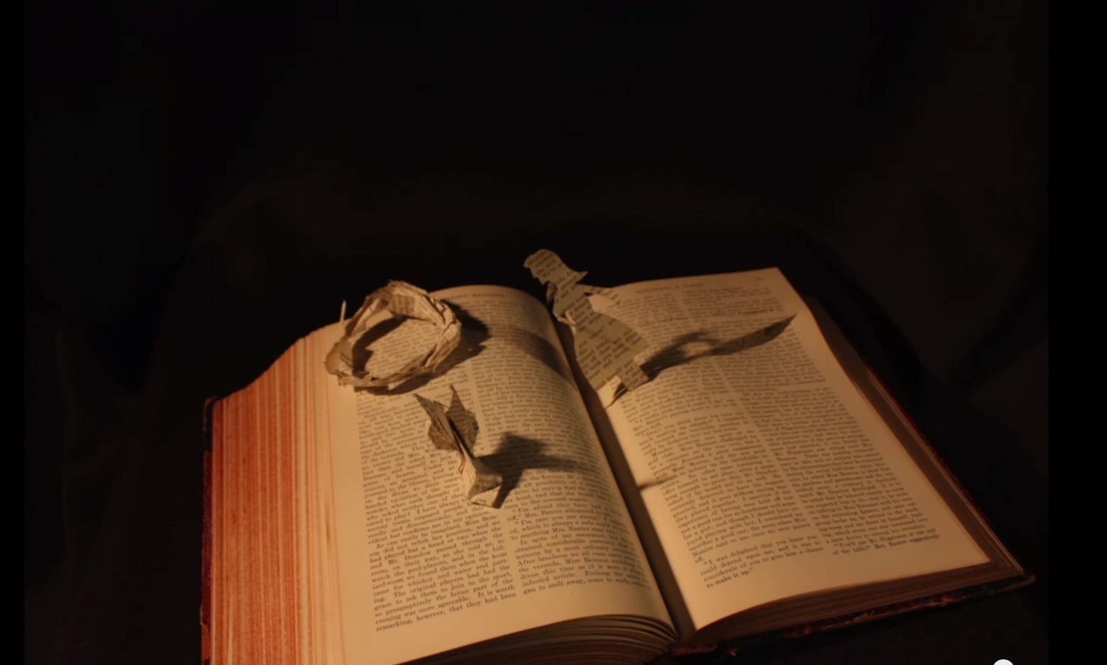
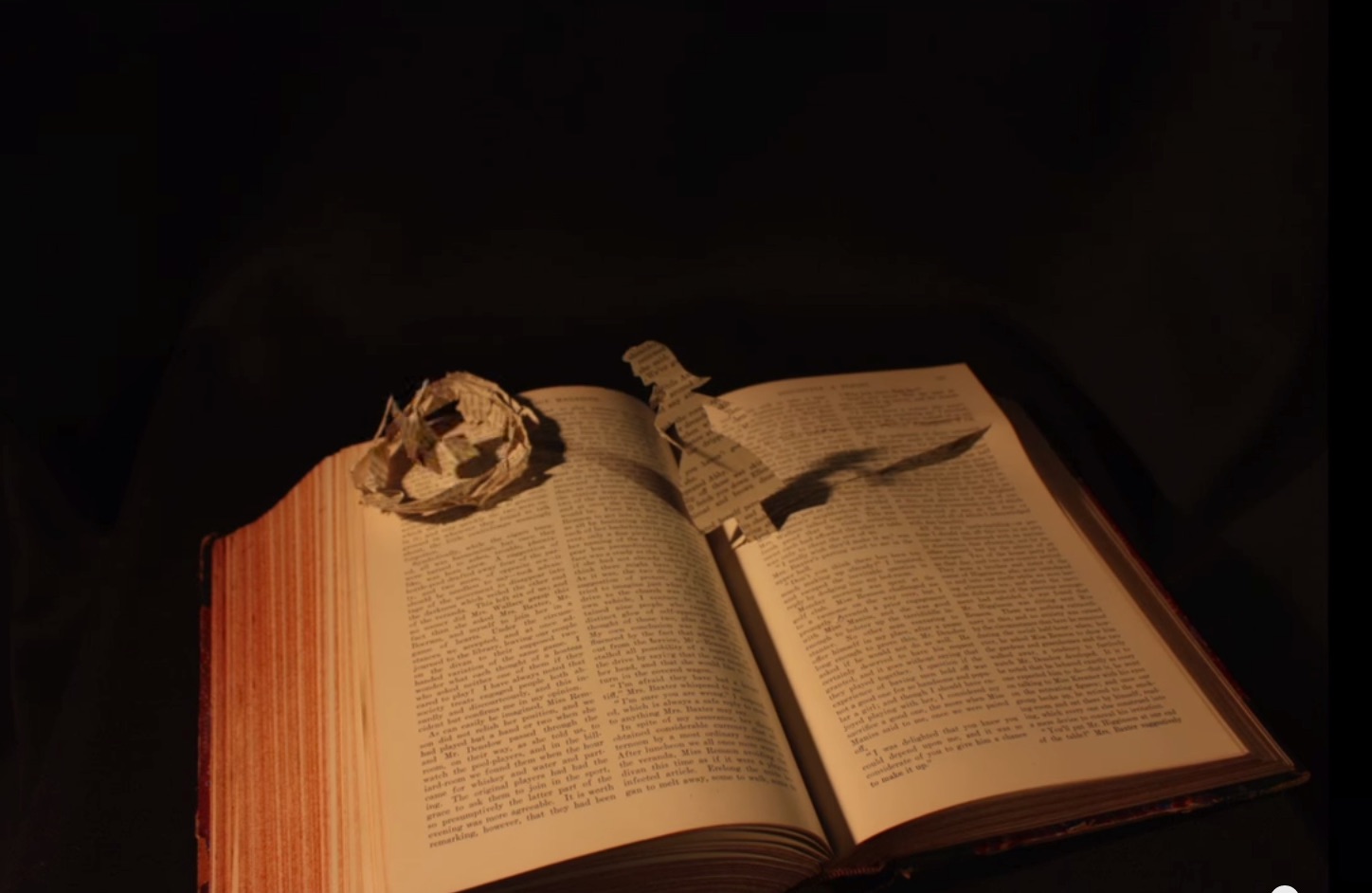
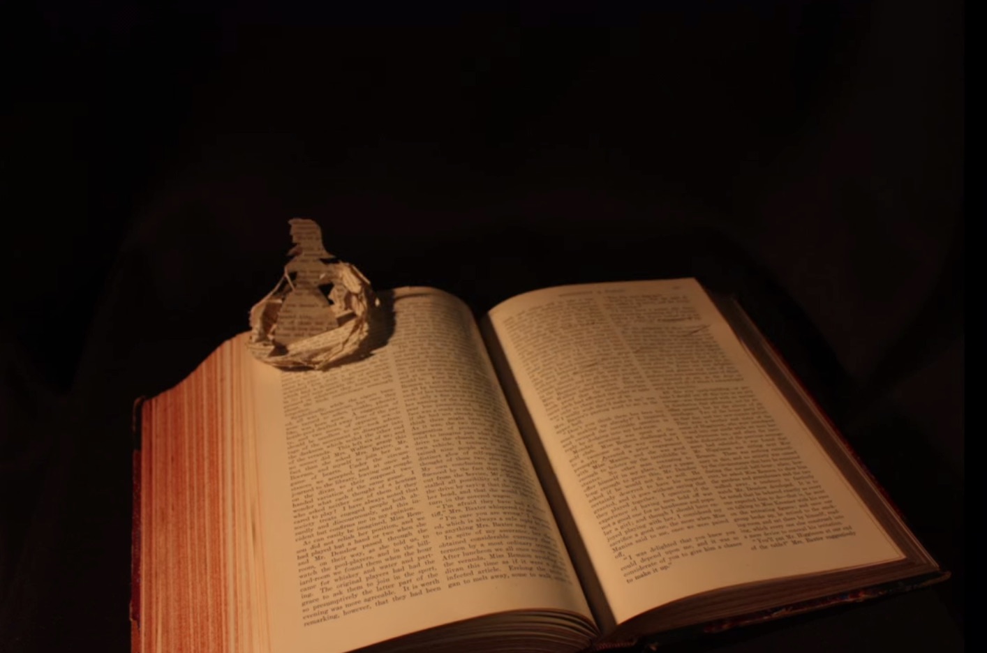
John Cheever’s short story “The Swimmer” is an all-time favorite. After seeing the short film of it with Burt Lancaster, I can’t imagine Ned Merrill’s appearance any other way. Even in Michelle Ku’s animated book art version, I see Burt Lancaster’s big grin and its sorrow.
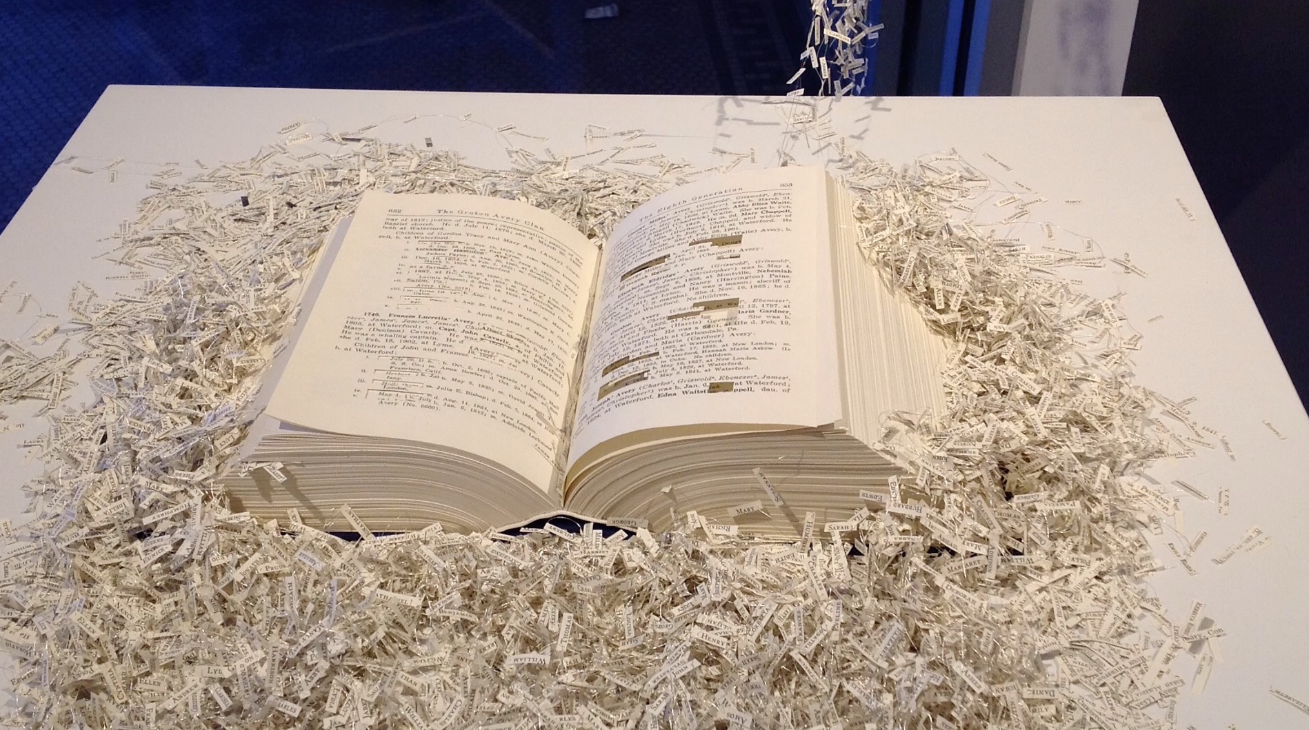
Before seeing Ku’s work, which has planted the urge to seek even more examples of animated book art, I had enjoyed Regan Avery’s The Groton Avery Clan at the CT(un)Bound exhibition in New Haven, Connecticut. The work consists of a handmade book, metallic thread, motor and an Arduino microcontroller. The Avery clan has inhabited the state since the 1600s. Regan Avery’s handmade book is a copy of the family history published over 100 years ago. From it, the name of each descendant of Christopher Avery, the original immigrant, has been excised and the ten thousand names handwritten on miniscule scraps of yellowed paper that emerge from the book along interconnected threads put into motion by the motor and microcontroller.
Regan Avery, The Groton Avery Clan, 2015
When the motor engages, the name slips become “a teeming mass of humanity”.
In 2011, Saara Tuulia posted City and Snow Book on YouTube, which is a simple stop motion animation comparable to Ku’s more complex The Swimmer.
Saara Tuulia, City and Snow Book, 2011
In 2013, Danielle Lathrop posted Book Art, whose stop motion animation highlighted the figurative and origami-based vein of the art form and its practitioners’ obsession with Alice in Wonderland.
Danielle Lathrop, Book Art, 2013 The White Rabbit and Alice sequence
Danielle Lathrop, Book Art, 2013 The White Rabbit and Alice sequence
Danielle Lathrop, Book Art, 2013 The White Rabbit and Alice sequence
Danielle Lathrop, Book Art, 2013 The White Rabbit and Alice sequence
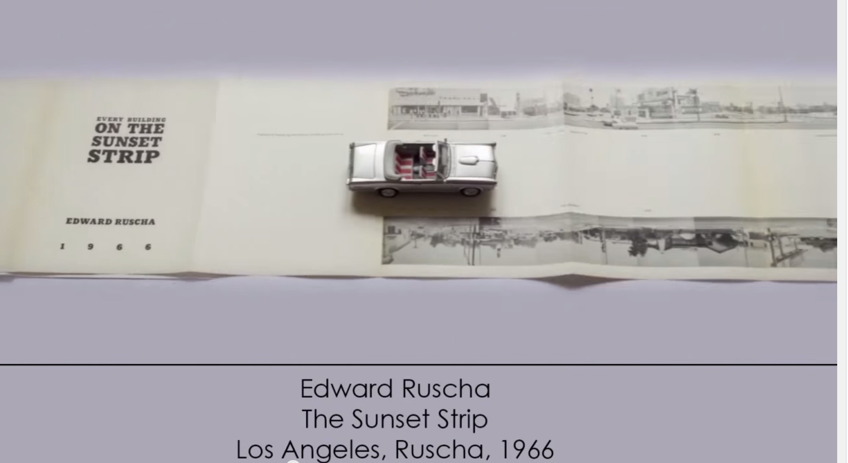
More recently, and posted here, another example of animated book art – Giulio Maffei’s series Le Vite dei Libri (The Lives of Books) – demonstrates the increasing engagement and sophistication in this variant form of book art.
Giulio Maffei, Edward Ruscha’s The Sunset Strip, 1966, 2015
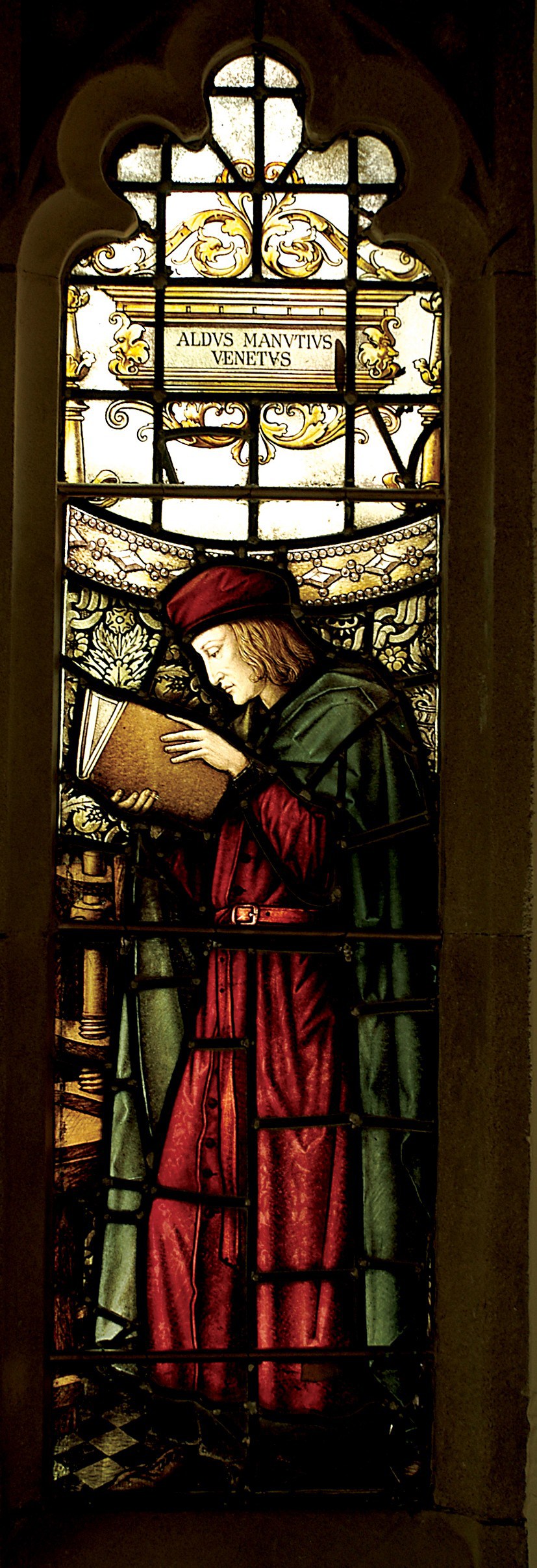
Aldus Manutius, John Rylands Library, University of Manchester
Merchants of Print from Venice to Manchester, 29 January to 21 June 2015, John Rylands Library, University of Manchester, UK:
This exhibition celebrates the legacy of Aldus Manutius (1449 – 1515), an Italian humanist scholar who founded the Aldine Press at Venice. His publishing legacy includes scholarly editions of classical authors, the introduction of italic type, and the development of books in small formats that were read much like modern paperbacks. The firm was continued after his death by his son and grandson until 1598. John Rylands Library, University of Manchester website, accessed 17 May 2015
Back in February as I enjoyed Oxford’s recognition of the 500th anniversary of the death of Teobaldo Manucci, the Manchester exhibition was already running. Where the Oxford event focused on the more architectural motifs distinguishing early Venetian from Roman printing, the Manchester event dwelt more on the educational thrust, technical and business aspects of the Aldine legacy and provenance of the Manchester collection.
The Manchester focus on provenance wends its way back through the library’s donors dedicated to the cause of education (if not to impressing its practitioners with the importance of the woolen industry’s contribution to it) to the Renaissance circle on which Manutius depended:
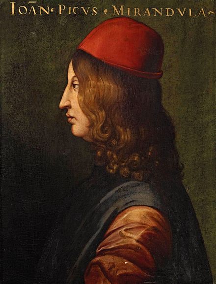
Giovanni Pico della Mirandola, 1463-1494 Uffizi Gallery, Florence
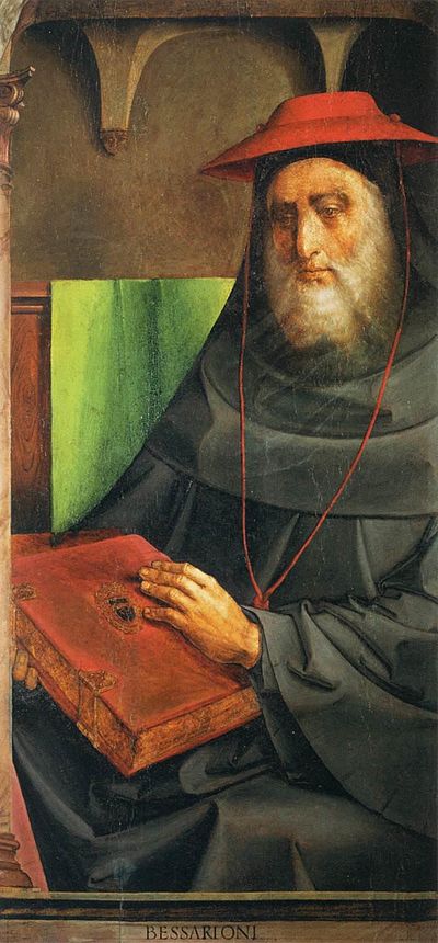
In 1482 Manutius lived with Pico della Mirandola and served as tutor to his nephews, the sons of the Princess of Carpi. Like the later, beneficent Manchester merchants, Pico’s family contributed financially to the cause: they funded the opening of the Aldine printing office in Venice in 1494. Of course, Pico made more than a patron’s financial contribution to the cause. Along with Cardinal Bessarion, Marsilio Ficino, Leon Battista Alberti and Erasmus – all known intimately to Manutius – Pico drove the revival of learning embodied in the output of the Aldines and numerous other printers (John Addington Symonds, Renaissance in Italy, Volume 2 (of 7): The Revival of Learning, John Murray, 1914).
Cardinal Bessarion, Justus van Gent and Pedro Berruguete , (Les Hommes Illustres)
Marsilio Ficino, Duomo, Florence
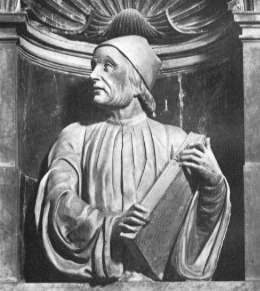
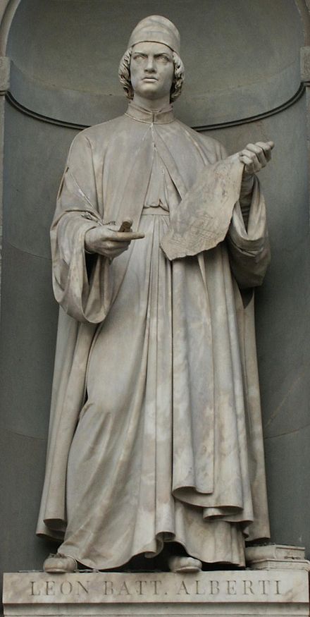
Leon Battista Alberti, Piazza degli Uffizi, Florence
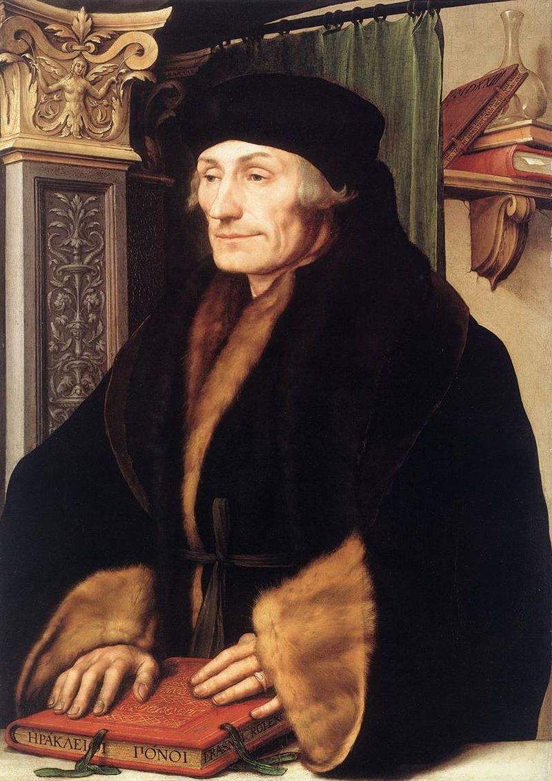
Desiderius Erasmus, 1523?, Hans Holbein the YoungerThe Manchester exhibition closes this month.
The next major Aldine event is the summer school hosted by The Catholic University in Siena (31 August – 3 September) and jointly organized by the Centro di ricerca europeo libro editoria biblioteca (CRELEB). Other events with dates still to be confirmed are planned in Brighton, Treviso, Milan and Arezzo.
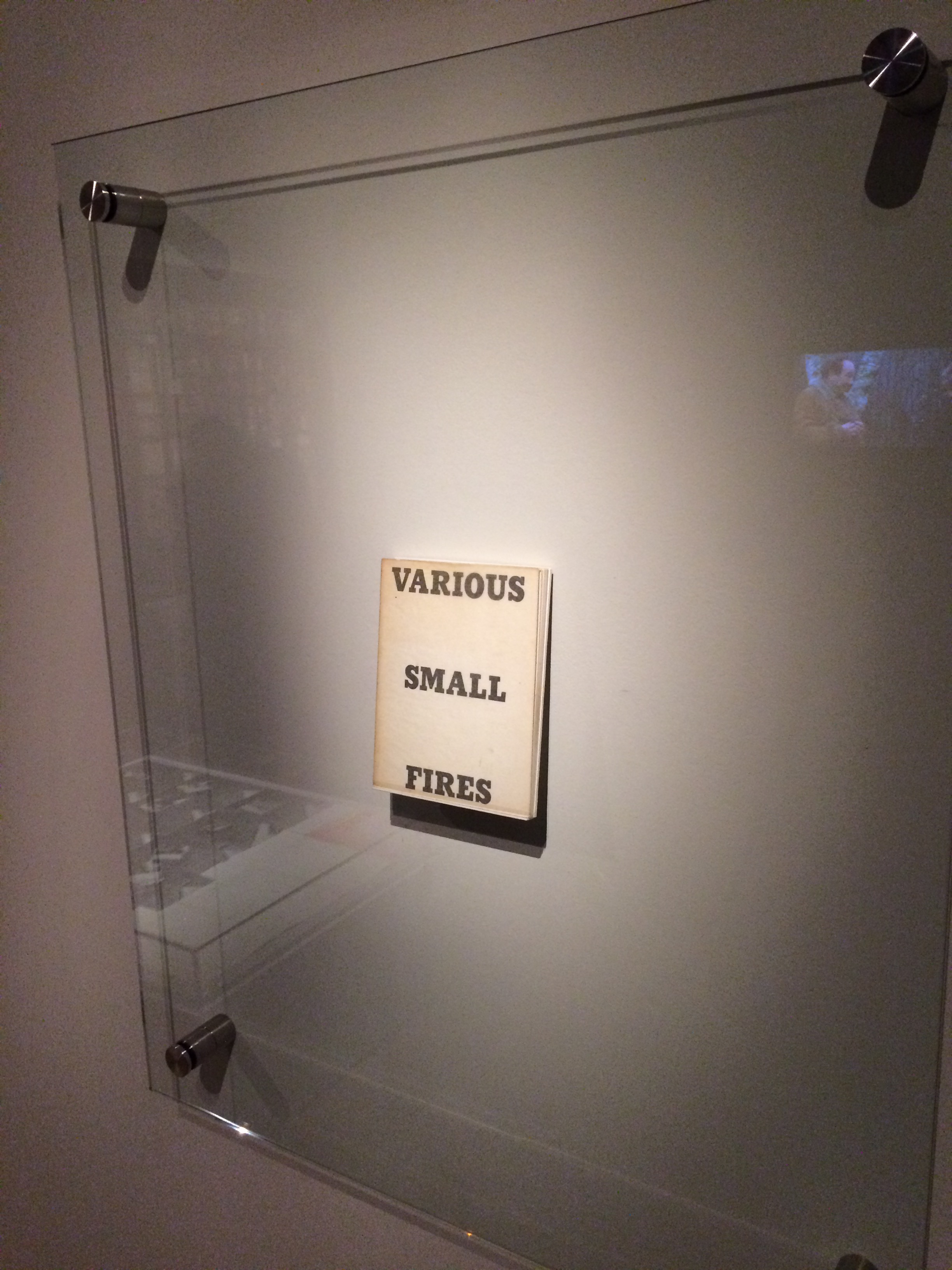
Display of Ed Ruscha’s Various Small Fires and Milk, 1964 Pliure: La Part du Feu, 2 February – 12 April 2015, Paris, Fondation Calouste-Gulbenkian. Photo by Robert Bolick, 11 April 2015. Reflected in the lower left hand corner is the display of Bruce Nauman’s Burning Small Fires, 1968; in the upper right corner, the film clip of Truffaut’s 1966 Fahrenheit 451; and in the upper left, Maria Helena Vieira da Silva’s La bibliotheque en feu, 1974.
The Studio Bibliografico Giorgio Maffei specializes in original texts and book art by twentieth century visual and literary avant-garde artists such Baldessari, Lewitt, Munari, Man Ray, Ruscha and Warhol among others. Recently the owner’s son – Giulio Maffei – “started making film as a side activity” and introduced a series of short animations “to put on the social networks and reach new potential customers”. An anonymous pair of hands displays a variety of the books and book art in stock.
But Giulio’s videos are not always the straightforward marketing effort intended. They provide an experience of book art or artists’ books that most of us will never hold or touch. And that may be Maffei’s point in his series “Le Vite dei Libri” (The Lives of Books) in which these usually glassed-off works are playfully handled, gently made fun of and still honored.
Some of the videos are derivative artworks in their own right in the same vein as Bruce Nauman’s Burning Small Fires, 1968. Nauman poked fun at Ed Ruscha’s Various Small Fires and Milk, 1964, by composing a book of photos recording the burning of a copy of Various Small Fires. Maffei’s Nauman-esque handling of Various Small Fires and Milk involves flash paper or its Photoshop equivalent. His celebration of Ruscha’s The Sunset Strip is still more endearing with its soundtrack and toy convertible. His cheeky animations of the pop-ups in Warhol’s Index (Book) and the ironically daring destruction of Papa Maffei’s copy of Some/Thing No.3 are even better. In the latter, the plastering of a Banksy-like mural with Warhol’s “Bomb Hanoi” stickers torn from the perforated cover is a sharp-edged example of the arch, reflective commentaries throughout Maffei’s videos.
Most of the films’ credits pay typographical homage to the work at hand, which is a nice self-deprecating and affectionate touch. At my last viewing, there were twenty-two works in the Lives series. They are listed below, but once you reach one on YouTube, the others follow. Giulio Maffei has also created a longer video catalogue for his father’s enterprise: Tra Libro e Oggetto (Between Book and Object). The Maffeis are a knowing team. The catalog title can be read as the beginning of a statement displayed on the cover.
BETWEEN BOOK AND OBJECT
The artists’ book, the multiple and the object
become an artwork
A statement that refers not only to the works in the catalog but to the video catalog itself and to the elder Maffei’s lifework of collecting, selling and writing about book art.
Lost Fight, 2014 Encyclopedia volume, lead, metal paint
The passage here, rendered by blind embossing on lead and metal paint, comes from Primo Levi’s essay on lead in his book The Periodic Table.
It reminds me of Anselm Kiefer’s lead books with wings (The Language of the Birds, 2013), which you can read about here: http://wp.me/p2AYQg-Lu. It’s a curious, leaden but uplifting, fitting but outrageous conjunction: Van Zanten’s personal grappling with depression, the concentration-camp survivor who ultimately succumbed to depression and suicide, and the Nazi-saluting artist who asserts that history is a weight that must be borne and embraced and lead is the only substance that is weighty, “alchemical” and mutable enough to bear it.
Van Zanten’s appropriation of Levi for her project “Depression” is somewhat less outré than Sylvia Plath’s appropriation of Jewishness in “Daddy”, which is barely less outré than Kiefer’s Nazi salutes. But all three are essential, outrageous and shocking appropriations, just as the appropriation of books as “just another material” with which to create art is essential, outrageous and shocking.
When Andrew Hayes told me it was e.e. cummings’ 100 poems he had found in the middle of the stacks of books awaiting a bookshelf he planned to build, I winced. Cummings has always been hard for me to figure. I was hoping for a more accessible book as a pretext to kick off our interview.
If you have not encountered one of these interviews on Books On Books, I should explain. The idea is that the book artist selects a book from the middle of the home or studio bookshelf, opens it to the middle, and tells me the author, title and page number. After tracking down the book, I send off some questions and so the interview begins.
It turned out that cummings was hard to access for Andrew as well. He wrote:
As I took the book from its place in the middle I had to take care, as you can see this is not the most efficient way to retrieve a book. I was able to carefully remove the book with out the top half toppling down, this time…
Just like extracting the meaning from the poem that just happened to be bookmarked in the middle of the cummings volume. The poem begins:
Just like extracting the meaning from the poem that just happened to be bookmarked in the middle of the cummings volume. The poem begins:
kind)
YM&WC

(of sort of)

A soursweet bedtime
and ends:
iSt

ep

into the not

merely immeasurable into
the mightily alive the
dear beautiful eternal night
Until Andrew carefully pulled out this volume bookmarked by his partner Kreh Mellick, he had not read it. “To be honest, I do not read as much as I would like, ….” Still, I wonder if, as his eyes moved through the broken-up layers of syntax and the juxtaposition of the “soursweet bedtime” story with “the mightily alive the/ dear beautiful eternal night”, he recognized something of his own?
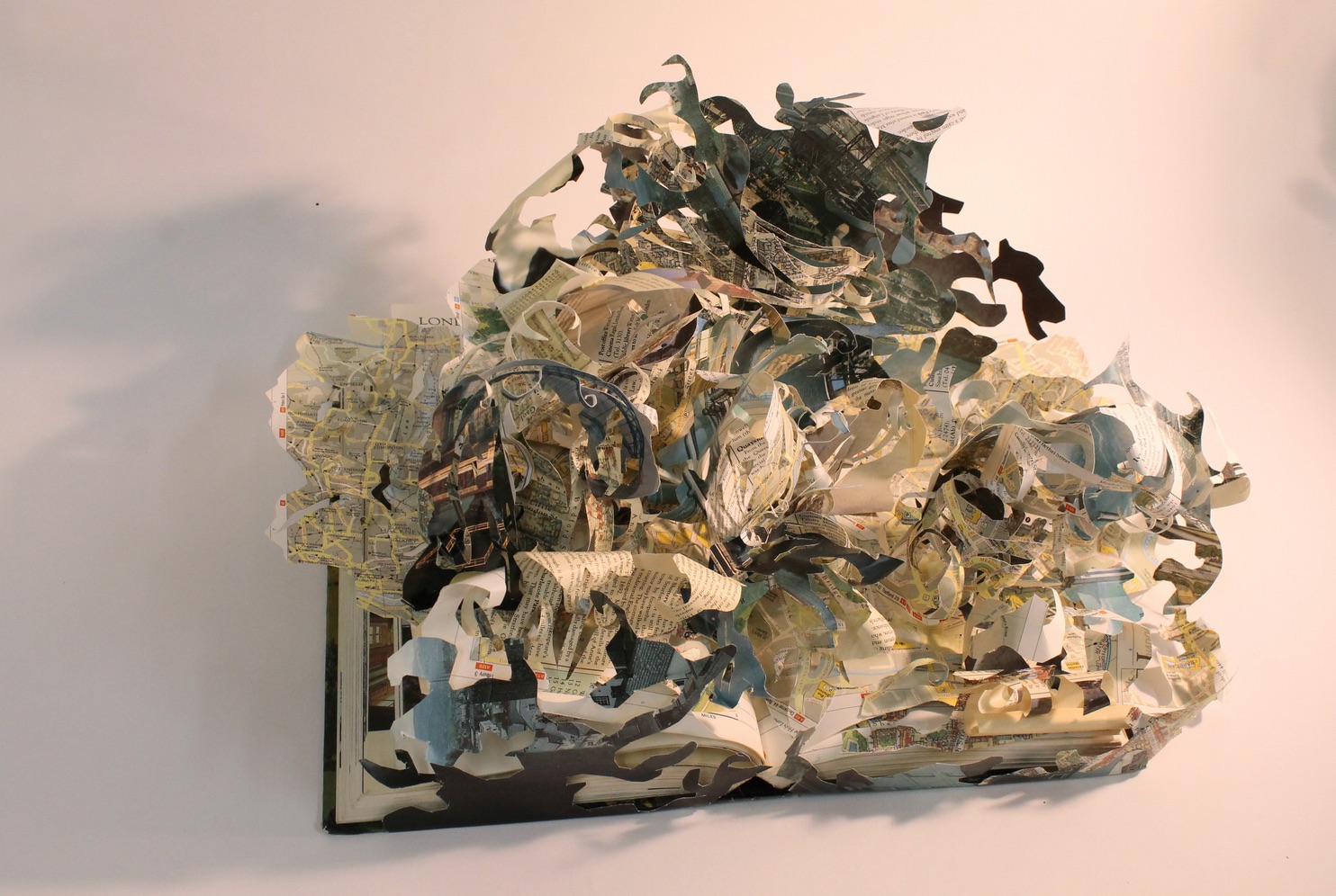
The title of this piece is Hade. “Hade” is a geological term, like Placer and Lode (titles of these other striking sculptures).
Hade, 2013 Steel, book pages, and copper 16” x 6” x 3” Reproduced with permission of the artist. Photo credit: Steve Mann, Black Box Photography
Placer, 2013 Steel, book pages, and brass 10” x 7” x 9” Reproduced with permission of the artist Photo credit: Steve Mann, Black Box Photography
Hade refers to “the angle of inclination from the vertical of a vein (geology), fault, or lode”. In Hade the yellowed pages slip between the parenthesis of steel plates like the sense lode through the fractured syntax of e.e. cummings’ poem. This is book art for the sensualist, much as most of cummings’ better poems are words for the sensualist. It exudes appreciation and care for the material of which it is made. That comes through clearly in Andrew’s response to my question “As an artist whose work has an intimate relationship to ‘the book’, could you describe the effect this has on you when you are reading books in general?”:
… as I read a book I love watching it wear and change as I pass through the pages. I’m sure this happens with everyone’s books, but I love this transformation. I find it happens best in shoes and books. I have a hard time keeping my hands clean so my books take a beating, I almost don’t need a book marker because I can just turn to the first clean page. It is funny I don’t like to dog ear pages I feel like that is almost disrespectful in a way, but I just like seeing what happens to the book as it serves its function. … for me finding a book that has been seasoned is like finding two stories. I like figuring out who read the book before and reading the notes and things I find in the books I end up using for sculpture.
An e.e. cummings poem can amuse like a Rube Goldberg or Heath Robinson contraption, but always with a sting at the end. Andrew clearly has a love of contraptions, words and paradox as well.
Lode, 2013 Steel and book pages 16” x 7” x 2.5” Reproduced with permission of the artist. Photo credit: Steve Mann, Black Box Photography
… as I read a book I love watching it wear and change as I pass through the pages. I’m sure this happens with everyone’s books, but I love this transformation. I find it happens best in shoes and books. I have a hard time keeping my hands clean so my books take a beating, I almost don’t need a book marker because I can just turn to the first clean page. It is funny I don’t like to dog ear pages I feel like that is almost disrespectful in a way, but I just like seeing what happens to the book as it serves its function. … for me finding a book that has been seasoned is like finding two stories. I like figuring out who read the book before and reading the notes and things I find in the books I end up using for sculpture.
An e.e. cummings poem can amuse like a Rube Goldberg or Heath Robinson contraption, but always with a sting at the end. Andrew clearly has a love of contraptions, words and paradox as well.
Balastae, 2013 Steel and book pages 16” x 8” x 3” Reproduced with permission of the artist Photo credit: Steve Mann, Black Box Photography
“Balastae” is an ancient variant on “ballistae”– the oversized Roman crossbow, comparable to a catapult or trebuchet. Its kinetic energy is captured here in the potential energy of the pages of words poised to fly over the steel. The contrast and tension between the kinetic and potential, between noun/verb and tool/rest, between paper and metal, characterize many of Andrew’s titles and works, for example, Kedge and Plow. My favorite works are Shift, Waver, Swarm and Kedge. The latter, in particular, captures the paradoxes in Andrew’s works; the word is noun and verb (transitive and intransitive) all in one: a nautical term for a light anchor, also the term for the act of warping a vessel and the term for moving a vessel by pulling on the anchor. Shift and Waver capture the kinetic energy of his works and beg to be circled and viewed from every angle like any of the dynamic figures of Giambologna.
Kedge, 2013 Steel, book pages, and brass 9.5” x 18” x 9” Reproduced with permission of the artist. Photo credit: Steve Mann, Black Box Photography
Shift, 2013 Steel, book pages, and brass 11” x 5” x 2” Reproduced with permission of the artist. Photo credit: Steve Mann, Black Box Photography
Waver, 2013 Steel, book pages, and brass, 16” x 9” x 9” Reproduced with permission of the artist. Photo credit: Steve Mann, Black Box Photography
And Swarm – ah, yes – like swarming bees, words have gathered across the splayed edges of the pages, whirling up framed by brass-riveted metal. Swarm is one of the biologically allusive pieces along with Divaricate, reflecting how Andrew’s imagination ranges over the words, objects and concepts in so many domains:
Swarm, 2013 Steel, book pages, and brass 13” x 14” x 3” Reproduced with permission of the artist. Photo credit: Steve Mann, Black Box Photography
the architectural (Prohedria, Mullion),nautical (Helm, Kedge), agricultural (Harrow, Plow) and military (Sentry, Citadel) as well as others ripe for verbal and visual puns. Witty as well as sensual, there is almost something of the Metaphysical poets about his work. One such work of metaphysical visual and verbal punning is Wry. Definitions of the word invariably include “twisted”, “distorted”, “lopsided” and apply it to facial features such as “a wry grin” or “wry mouth”. Now take a look at Wry:
Wry, 2013 Steel, book pages, and brass 7” x 8” x 3” Reproduced with permission of the artist. Photo credit: Steve Mann, Black Box Photography
Book art can easily fall off into mere craftwork. On the one hand, the book artist requires the freight that the book’s content and form carry, requires it somewhat analogously to the way Eric Gill required Hopton-Wood Stone for his sculpture. But the degree to which the freight weighs down the treatment, or the handling does not take the material beyond itself, that is the degree by which the work is closer to handicraft than to art. From the way that Andrew writes of his perspective on the freight that his found material carries with it, you can understand why each of his works — solid and dense as they are — translates the raw material beyond itself:
Book art can easily fall off into mere craftwork. On the one hand, the book artist requires the freight that the book’s content and form carry, requires it somewhat analogously to the way Eric Gill required Hopton-Wood Stone for his sculpture. But the degree to which the freight weighs down the treatment, or the handling does not take the material beyond itself, that is the degree by which the work is closer to handicraft than to art. From the way that Andrew writes of his perspective on the freight that his found material carries with it, you can understand why each of his works — solid and dense as they are — translates the raw material beyond itself:
When making work I take my love for the used book and search for pages that I can use in my sculpture. The book pages are a loaded found material. Other materials I use like steel that I find at the scrap yard come with built in history as well but it may not be as universal as the book pages. The books I am drawn to are usually worn or rich with color or deckled edges, but that is just the beginning. It is always a surprise when I cut the pages from their binding. This is when I try to find a way that I can compose the pages into a new shape in combination with steel.
To find a union of metal and the printed page as rich and tactile as that created by Andrew, we would have to hark back to the days of hot metal typesetting or farther still to the chained library. But, while the titles of Andrew’s works may evoke the historical or archaeological, the works themselves do not assume the printed book’s demise; they emphasize and celebrate the material of the book.
It is strange how these objects – books and scraps of metal that have their own individual logic and structural coherence, both material and semantic – become an object of art. In each – book or scrap steel – raw material has been amassed and wrought (words, paper, ink and cloth; or iron, carbon, manganese and nickel) to make a finished thing whose physicality inheres and obtrudes. The ways in which those raw materials are amassed and wrought into objects such as dictionaries or kitchen sinks create meaning and accumulate meanings by use and context. Then along comes Andrew Hayes. Drawing on his experience as a welder, his work as a student with fabricated steel and his time as a Fellow at the Penland School of Crafts in North Carolina, Andrew takes these found objects with their own logic and transforms them into this realm we call art.
Michael Yonan, “Toward a Fusion of Art History and Material Culture Studies”, West 86th: A Journal of Decorative Arts, Design History, and Material Culture, 20 September 2011, accessed 11 January 2014:http://www.west86th.bgc.bard.edu/articles/yonan.html#. Yonan notes the discomfort of art historians in addressing art as I have addressed Andrew Hayes’ work: ‘… fore- grounding the idea exalts art history into a philosophical endeavor, whereas emphasizing matter renders the discipline subject to what could be called “the fear of the tchotchke.” … the trinketization of art.’
 Consider Schilling’s Half-Life/Full-Life and its binding a variation on the accordion/flag structure of Hedi Kyle and Claire Van Vliet. The complexity of the form marries well with that of the intertwining, interleaving text and photos along the timelines of the Doomsday Clock and global warming.