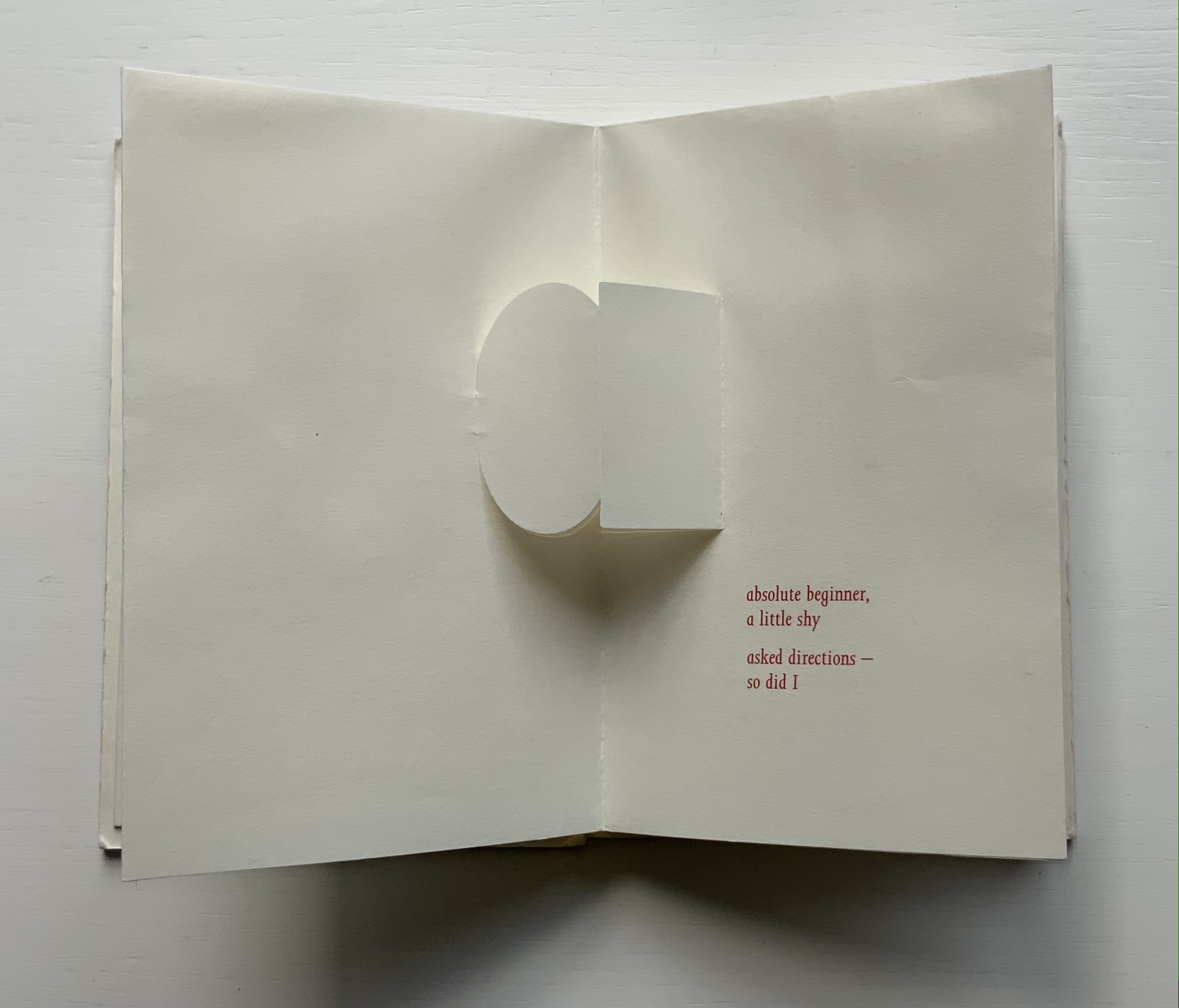
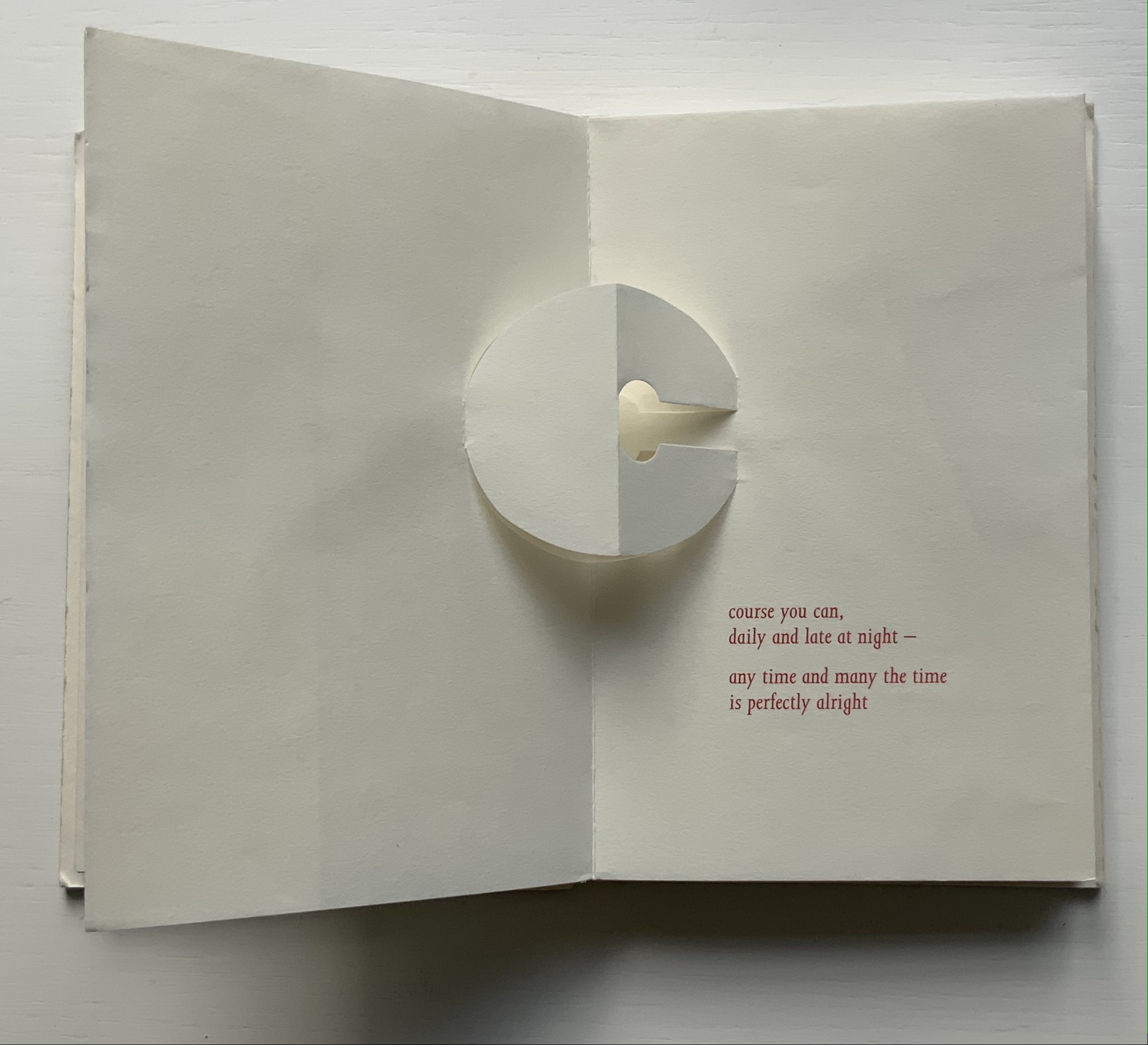
Richard Price’s lines recall the inventiveness of Emily Dickinson‘s and compression of Samuel Menashe‘s. For Dickinson, we have the artistry of Jen Bervin; for Menashe, we have that of Julie Johnstone; and for Price, we have his full-on collaboration with Ron King.
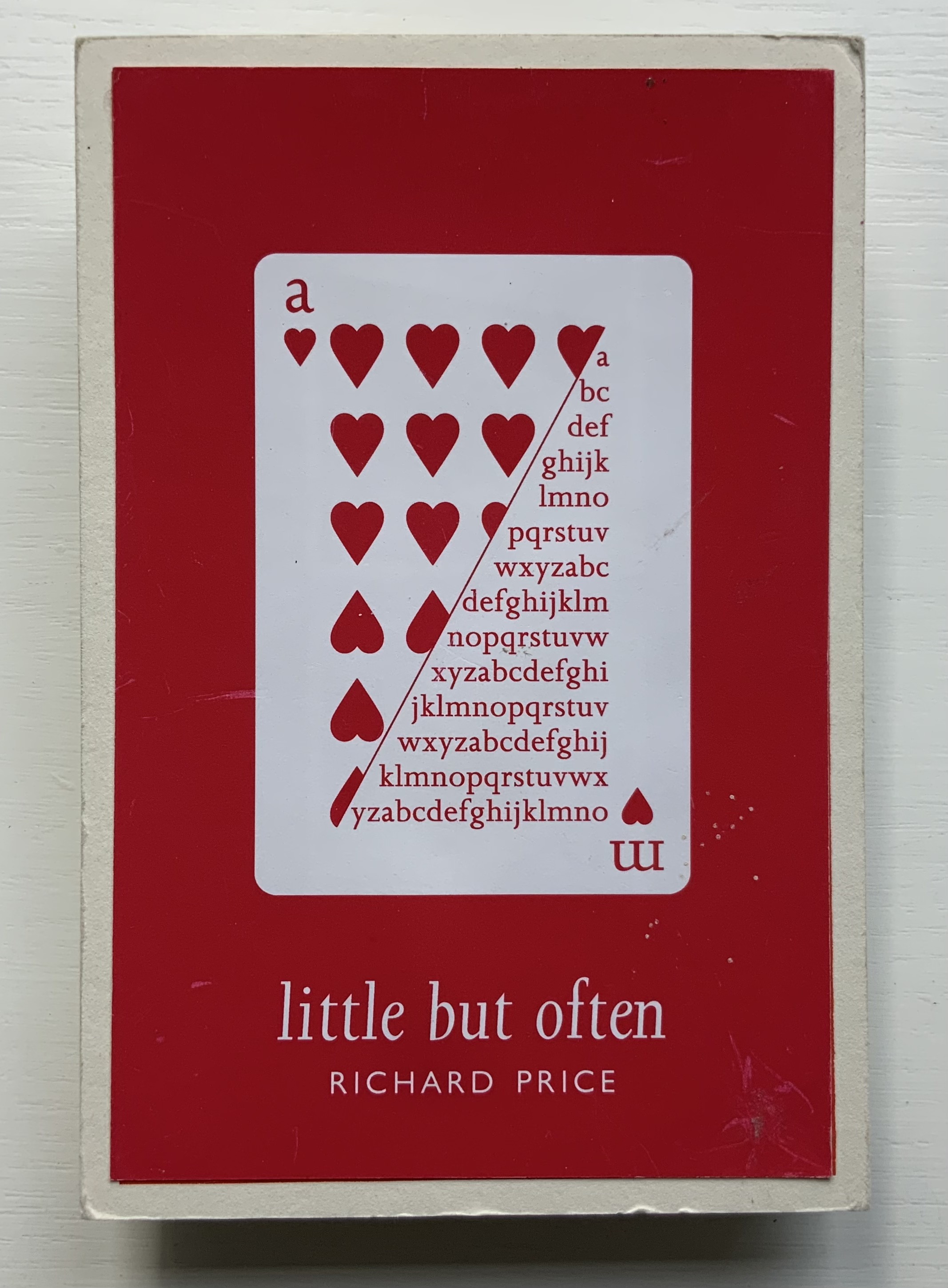
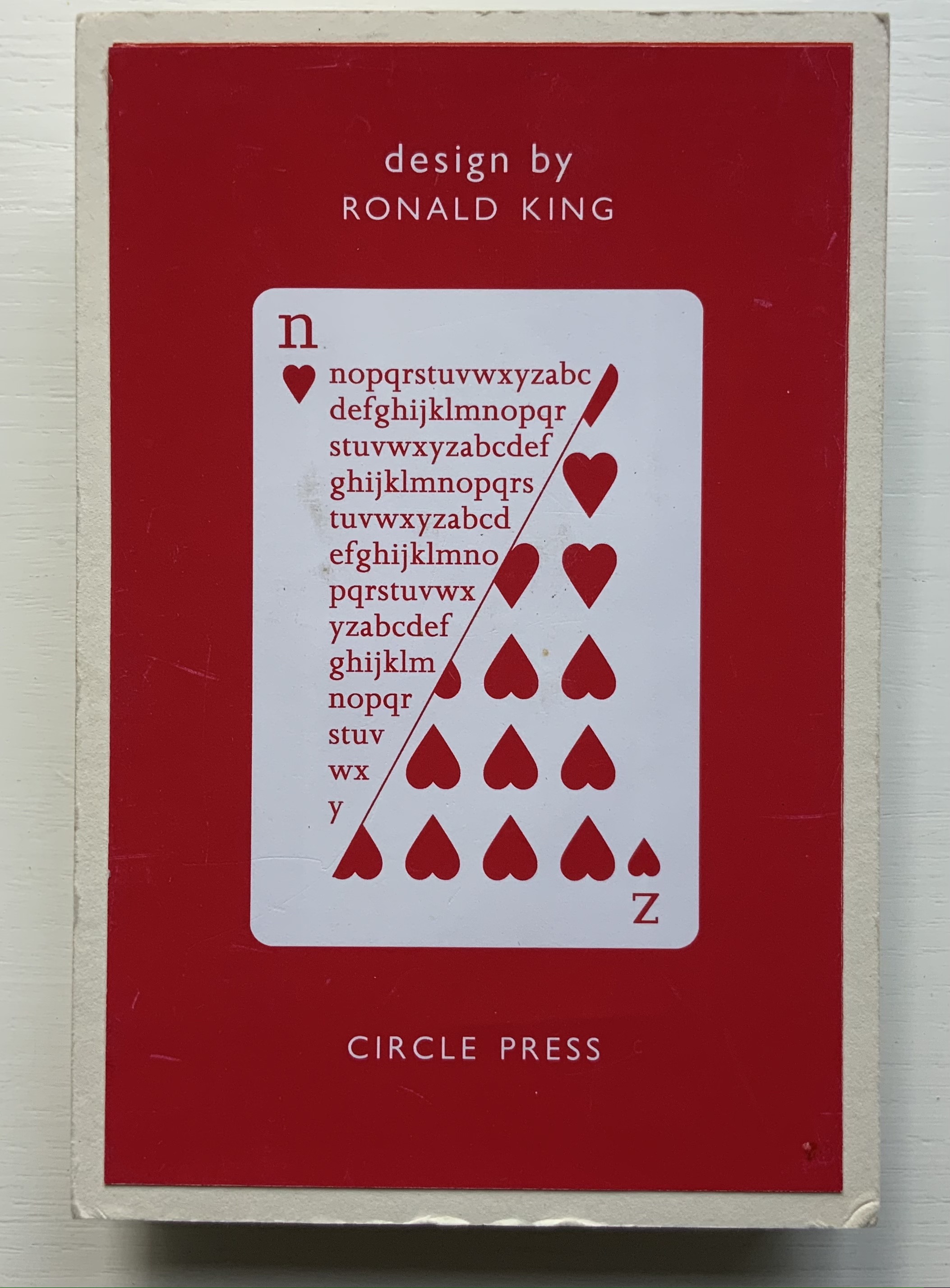
Harking back to The Half-Year Letters (1983), little but often pairs King’s lowercase pop-up alphabet with Price’s verses, just as its predecessor paired the uppercase with Roy Fisher‘s alphabet-inspired evocations of the 26 weeks from April through September. Also like its predecessor, little but often plays on the 52 weeks of the year, this time with its front and back covers illustrated with a playing-card suit of hearts, “numbered” a-m and n-z, and with two pages allotted to each week, each letter and each brief poem — as the title says, little but often. While The Half-Year Letters explores the forward movement of the letters alongside the movement of the year, this is love poetry in a book of back and forth. Text and design converse — and not merely by the letter.
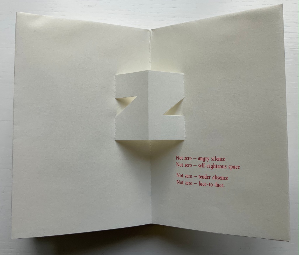
The last letter and lines in the book exemplify this to perfection.
Of the few other pairs of couplets in the book, none is as back and forth as the letter z’s. Paired against one another, rhyming abab, each line beginning alike with its N-z phrase, the two couplets echo the back-to-backness and balance of the dos-à-dos structure. The phrases self-righteous space and tender absence can be read as allusions to the cut-out space around the letters. Or vice versa. Again, back and forth. “Angry” and “tender” bat each other back and forth, just as the final phrase turns the dos-à-dos sweetly back on itself.
Together, Price and King make the concertina book “smile brighter”.†
“Ronald King“. 1 March 2021. Books On Books Collection.
Clark, Caroline. 23 January 2013. “Clark on Price“. Eyewear, the blog.
†Dante Alighieri. 1320. Purgatorio (Canto XI, 82). Hollander, Robert, Stephen Campbell, and Simone Marchesi. 1988. Dartmouth Dante project. When Dante meets and praises the illuminator Oderisi da Gubbio in purgatory, Oderisi directs the praise to his pupil Franco Bolognese as the one who really made “the pages smile brighter”.
Price, Richard. 2018. Digital. Essence Press. Collaboration with Julie Johnstone.
___________. 2008. folded. Essence Press. Collaboration with Julie Johnstone.
Abstract Alphabet: A Book of Animals(2001) Paul Cox Casebound, sewn to doublures. H288 xW238 mm, 52 pages with single foldout. Acquired from Amazon, 1 July 2021. Photos of the work: Books On Books Collection. Displayed with permission of Chronicle Books.
Not that the alphabet and writing happened chronologically step by step or in one place, but the theory is that they started with pictograms (one sign, one object), ideograms (one sign, one idea), logograms (one sign, one word); added the rebus principle and phonograms (one sign, an object or its sound as in bee the object or the sound of “bee” for use in a word with that sound); added marks for pronunciation or contextualization to distinguish one homonymic phonogram from another; and finally arrived at syllabaries and the even more efficient alphabets (one sign, one sound). Alphabetic letters acquired their non-pictorial shapes as all these signs became more simple and abstract through the tools used to inscribe them (a wedge-shaped stick, a reed, a brush, etc.).
The tools used to make signs in Abstract Alphabet are stencils and ink, or rather a knife and paper or die and metal to cut the stencils to be used with ink. The result is certainly abstract albeit less simple and yet perhaps more artful — and not simply because of its inspiration from the works of Jean Arp. In its artful way, Abstract Alphabet challenges us to think about the alphabet, how it works and how we learn to work it.
Cox’s alphabet skips the pictogram and goes straight to these Arp-ian abstract shapes. His abecedary (“a book of animals”) even skips the images of the animals whose names his signs “spell out”. His signs turn every which way, shrink or expand to fill the double-page spread, which makes the codex also a tool playing into how the signs look and how we read the words they make. The foldout key and the animal name’s initial letter are essential to identifying these animals. But what if there were no foldout key (another element of the Swiss-Army-knife codex’s performing its tool function)?
What if the initial Latin letter of the animal name did not appear in the upper left corner of each double-page spread? What if the animal name ran over to a third or fourth page? What if the Abstract Alphabet were delivered on a scroll? Or a set of 26 clay containers, each inscribed with the signs composing an animal’s name and inside each container a number of tokens each marked with the signs making up the animal’s name? Would the relative frequency of signs in just 26 words make deciphering possible? It would be what archaeologists and paleographers have faced and still face in figuring out where the alphabet came from.
In its visual abstraction, Cox’s alphabet also prompts puzzling over how reading is learned. Without figurative images of the animals to associate with the sets of shapes, how would the brain proceed? What ape looks like a combination of an orange dumbbell, gray egg and green chocolate drop?
Enciphering the alphabet with shapes reverses the alphabet’s historical movement away from the pictorial to the symbolic — but only partly, the shapes are abstract after all. Also the foldout key supplies alphabetic readers with their childhood phonemic clues. But if there were no foldout key, we would have to backtrack and learn what sounds a yellow half-circle, a set of red stairs and so on make. Could we have learned to associate sounds with these abstract shapes instead? Non-alphabetic written languages such as Kanji and Chinese have semantic and phonetic clues embedded in their characters. Cox’s Arp-ian shapes would have to evolve such clues. If it were not for color-blindness, the different colors might be useful in such an evolution; beyond some assistance in distinguishing D from U and F from V, they are not over-labored.
Still this is book art that makes us think. If only the animal below, which was pictographically the source of the first letter in the Greek and Latin alphabets, were the last association of sign and animal in Abstract Alphabet, the book would end on a deserved note of genius.
“Paul Cox, AGI Open, Seoul 2016“. 9 February 2017. Alliance Graphique Internationale. Accessed 7 August 2021. Cox describes Abstract Alphabet at the 17’02” mark in the video.
Augustin. 25 January 2015. “Paul Cox“. Index Grafik. Accessed 7 August 2021.
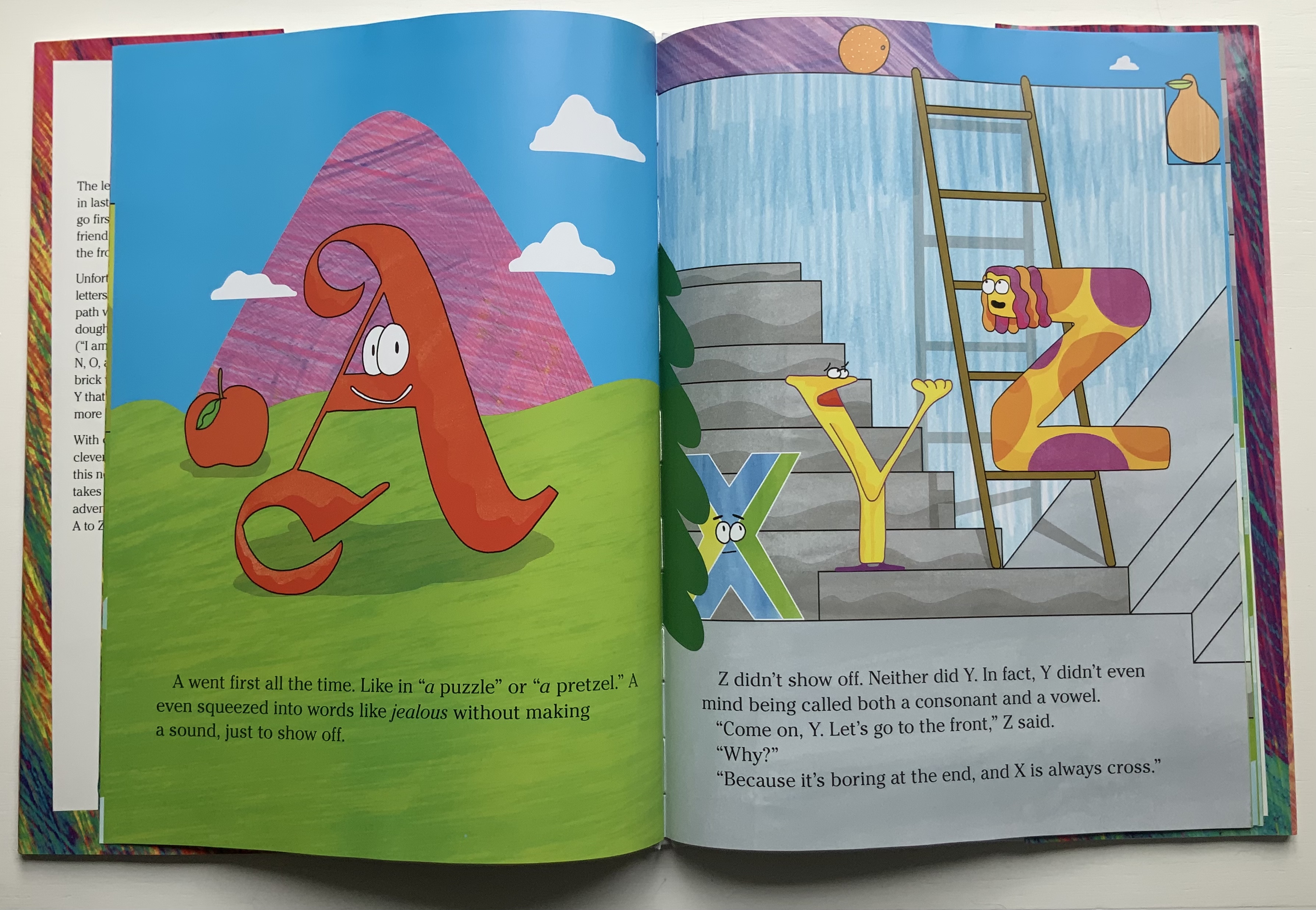
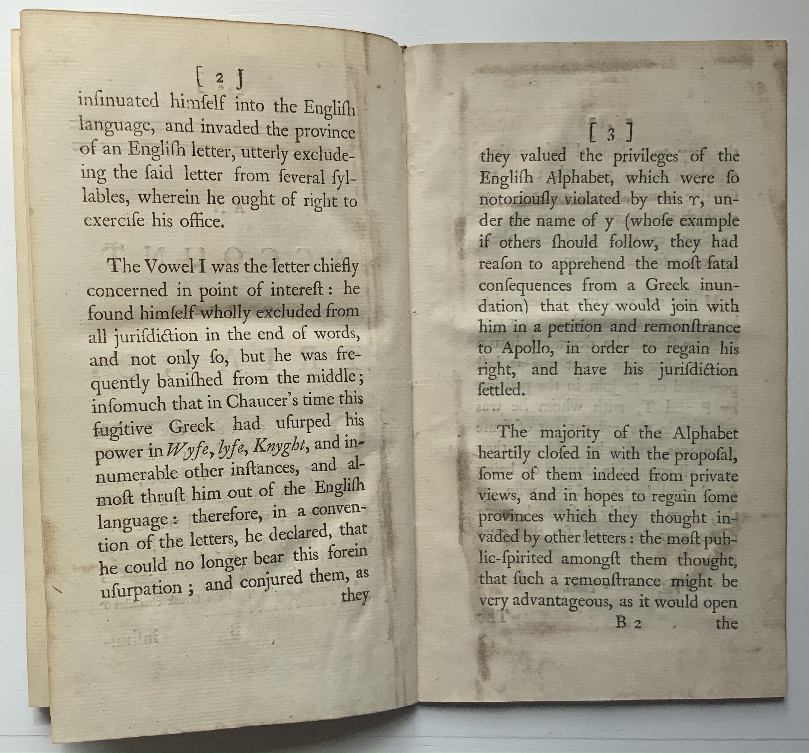
Why does the alphabet begin with the letter A? The long-held speculation that its origin from a sign designating “ox” made it the first in line because of the ox’s meeting the first of our survival needs — food — seems a stretch. Beyond B for beth meaning “house” (shelter) and C for gimel meaning “hunting stick” (in case we run out of oxen), what needs do the other twenty-three letters represent? Especially the letter Z.
Z began its life in seventh place with the Phoenician and Greek alphabets. With Abraham Maslow’s “hierarchy of needs” extending only to five levels in the twentieth century, Z has had no identified need to represent — even after the fact. In Phoenician and Hebrew, the letter’s name is zayin, in Greek, zeta, and both mean “seven”. Now there is a credible rationale for a letter’s position in the alphabetical order. But then came Spurius Carvilius Ruga, a Roman headmaster who came up with the letter G, displacing Z, and then Appius Claudius Caecus, the developer of the Appian Way and “censor” with the influence in 312 BC to decide that Latin had no need of Z and its sound anyway and so banished it. After the Romans conquered Greece and began importing Greek words like zephyros, the letter Z returned and settled meaninglessly into last place.
Until the twenty-first century.
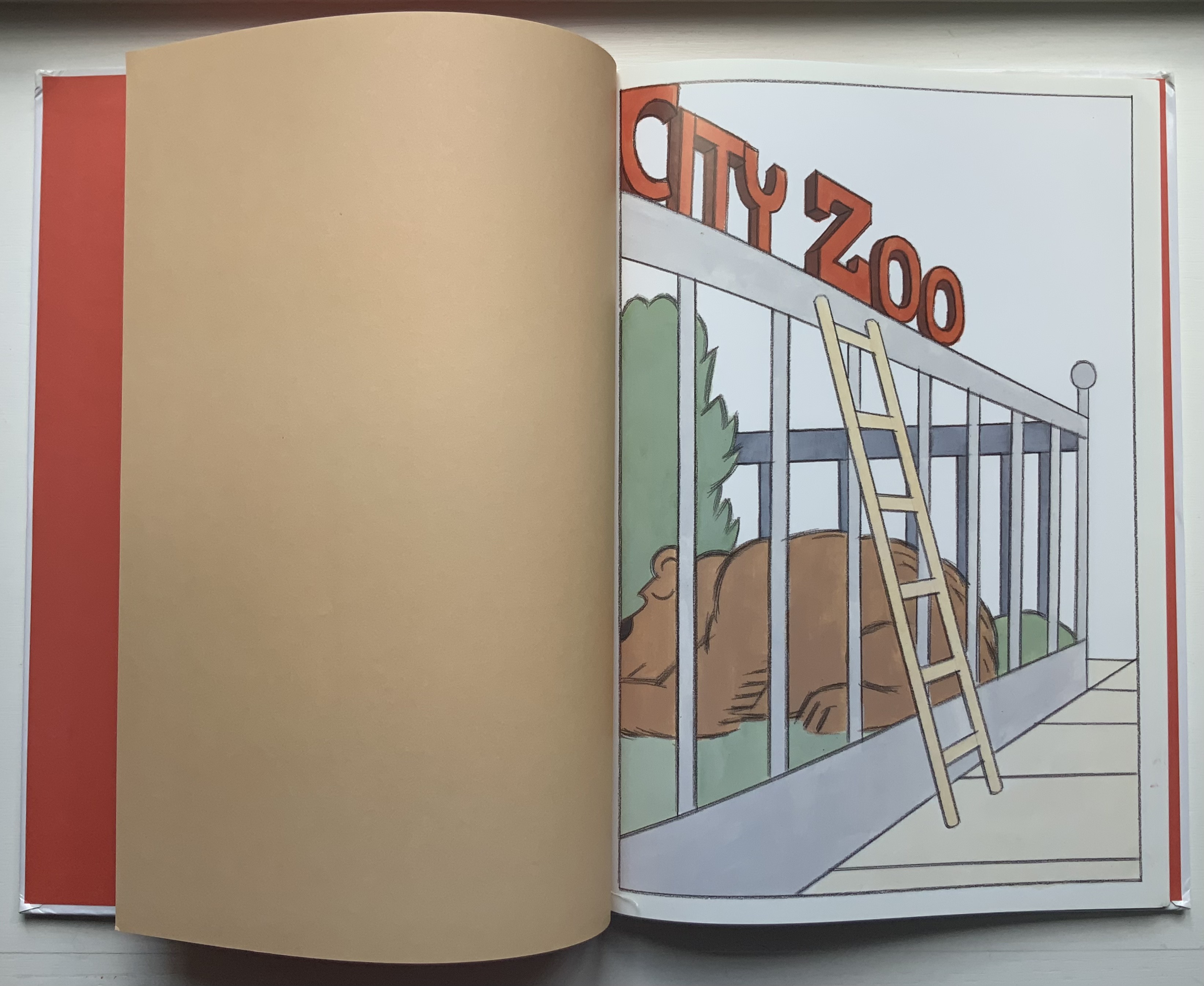
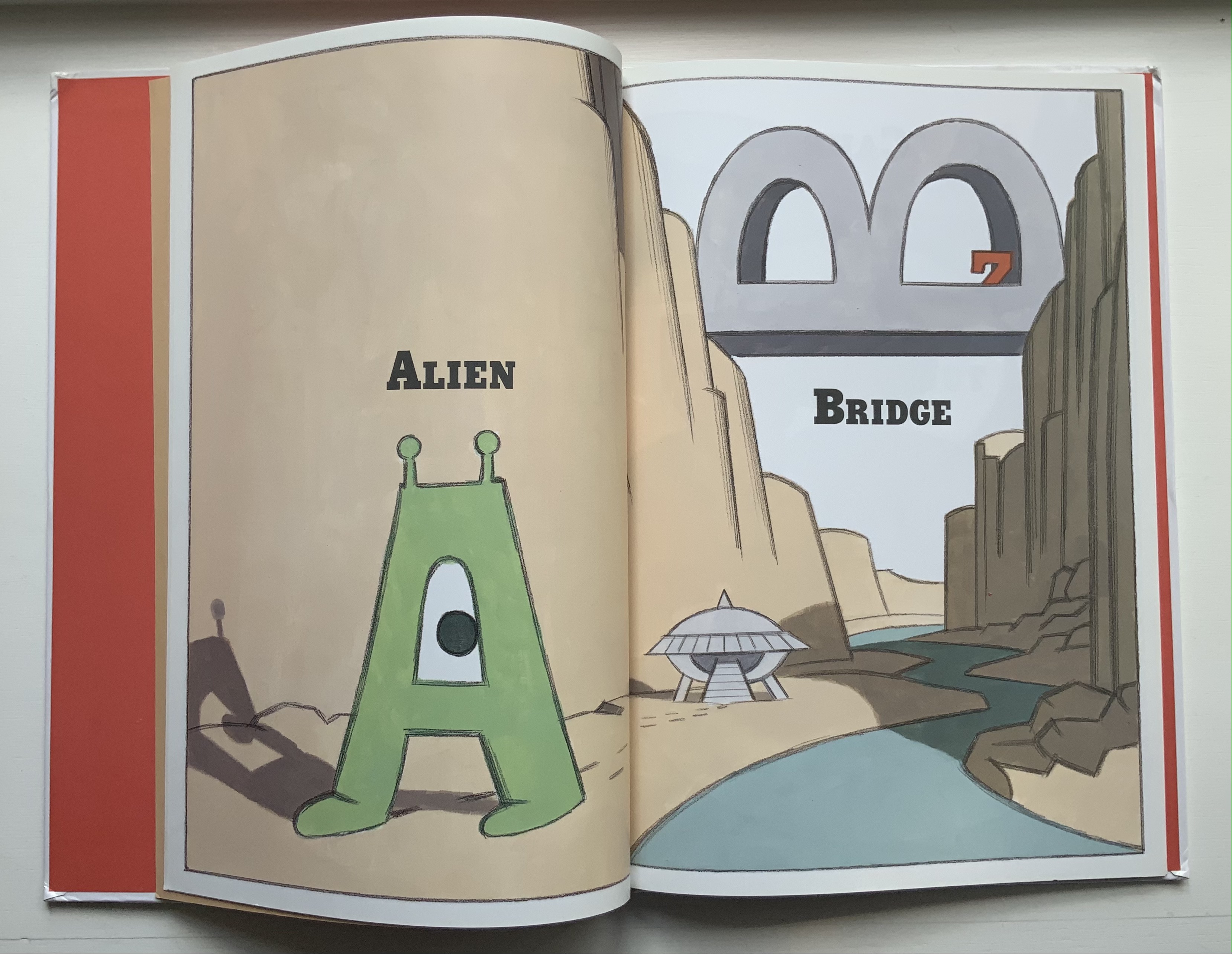
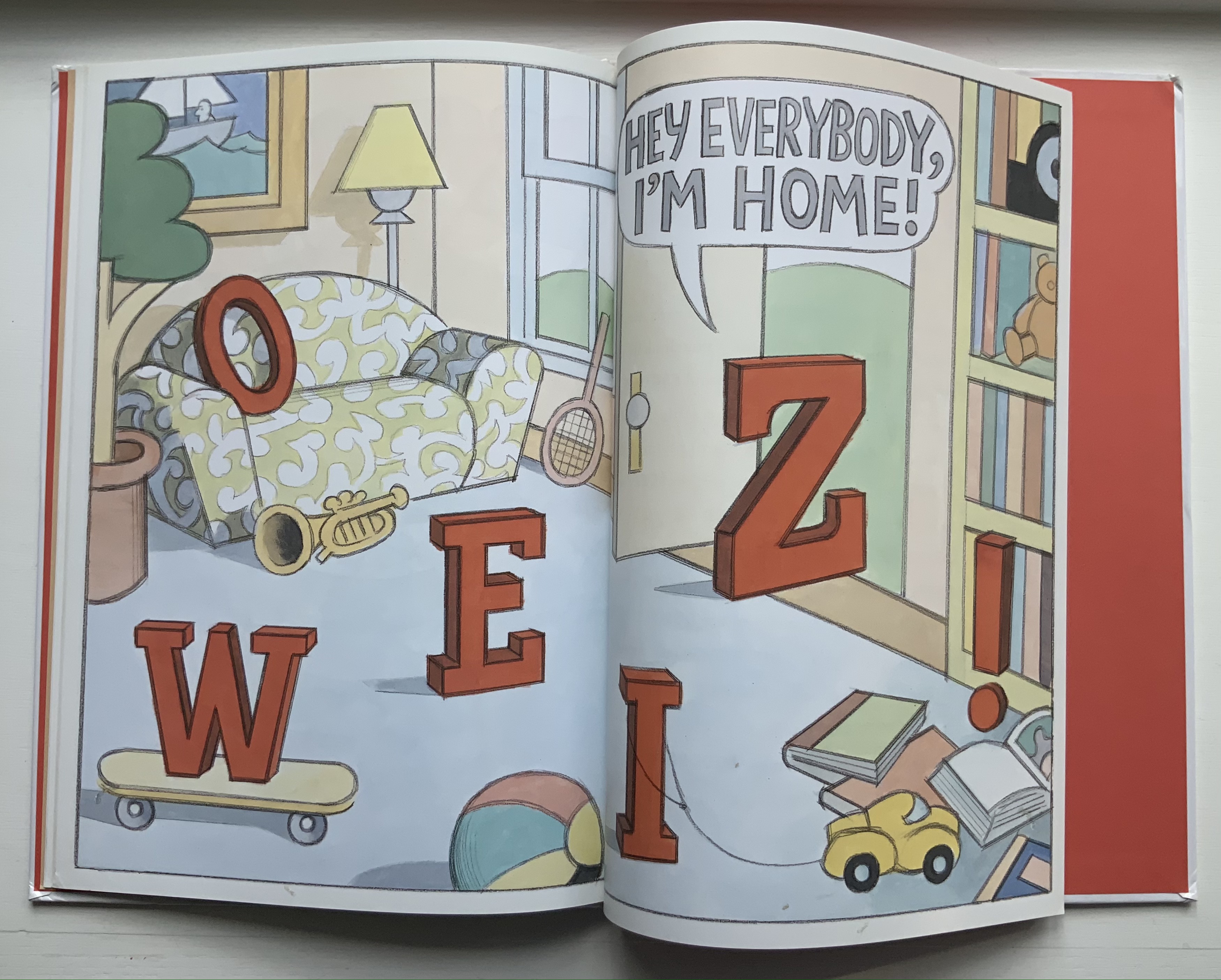
Z Goes Home (2006)
Z Goes Home (2006) Jon Agee Casebound, paper pasted on boards, sewn. H320 x W223 mm, 30 Pages. Acquired from Amazon, 1 July 2021. Photos of the work: Books On Books Collection.
In this first of four imaginative books bringing Z to life, the letter begins to take on real character, quietly descending a ladder from its day job at the city zoo, making its way home across a Bridge, stopping for a Cake and Doughnut snack, admiring itself in a Mirror, and so on until reaching its home at the end.
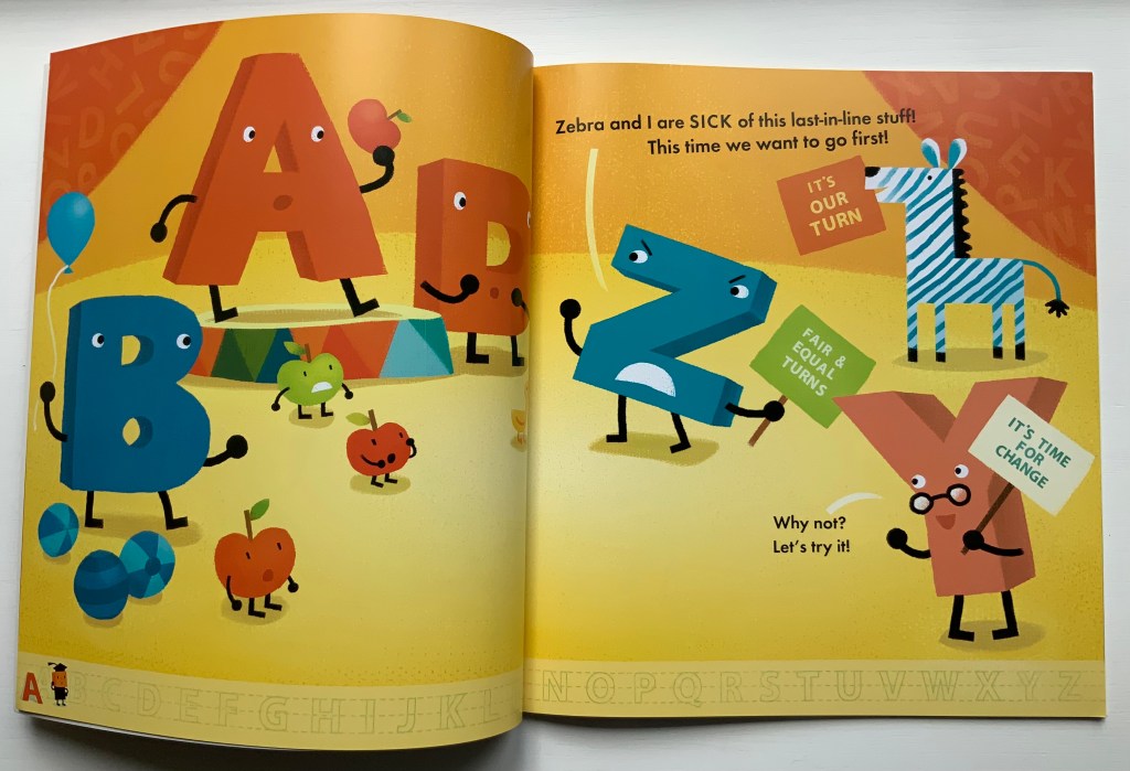
AlphaOops: The Day Z Went First (2012)
AlphaOops: The Day Z Went First (2012) Alethea Kontis & Bob Kolar Paperback, sewn. H270 x W245 mm, 48 pages. Acquired from Altair Books, 1 July 2021. Photos of the work: Books On Books Collection. Displayed with permission of the author and artist.
Kontis and Kolar give the letter a zestier, feistier temperament in AlphaOops. Z and Zebra start off well enough, followed by Y and X, but then P and the Penguins show up out of order and Z finds that keeping everyone in reverse alphabetical order is harder than it looks.
Z Goes First (2018)
Z Goes First (2018) Sean Lamb & Mike Perry H286 x W205 mm, 26 pages. Acquired from Amazon, 1 July 2021. Photos of the work: Books On Books Collection. Photos of the work: Books On Books Collection. Displayed with permission of the author and artist.
Lamb and Perry introduce a generally milder Z, accompanied by a helpful Y always ready to ask why and why not when the other letters are less than cooperative with Z’s going first.
Not Yet Zebra! (2018)
Not Yet Zebra!(2018) Lou Kuenzler & Julia Woolf Hardback, paper pasted on board. H256 x W256 mm, 28 pages. Acquired from The Saint Bookstore, 1 August 2021. Photos of the work: Books On Books Collection. Displayed with permission of the author and artist.
Kuenzler and Woolf let Z’s inner Zebra loose on poor Annie who just wants to paint her alphabet in the right order.
What has taken Z so long to find its raizon d’être?
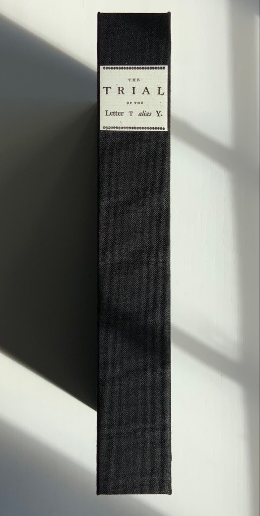
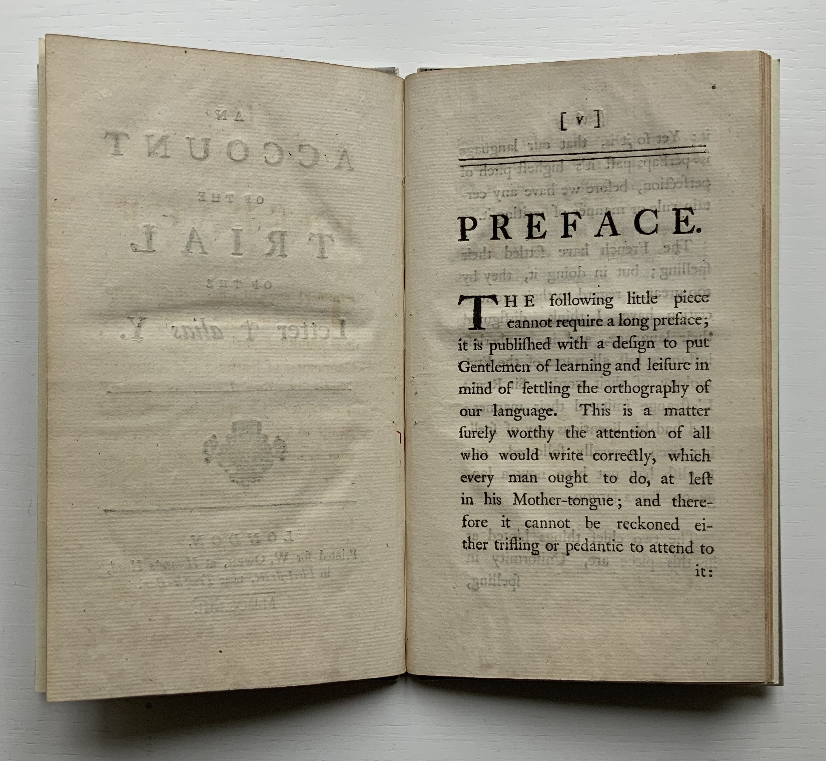
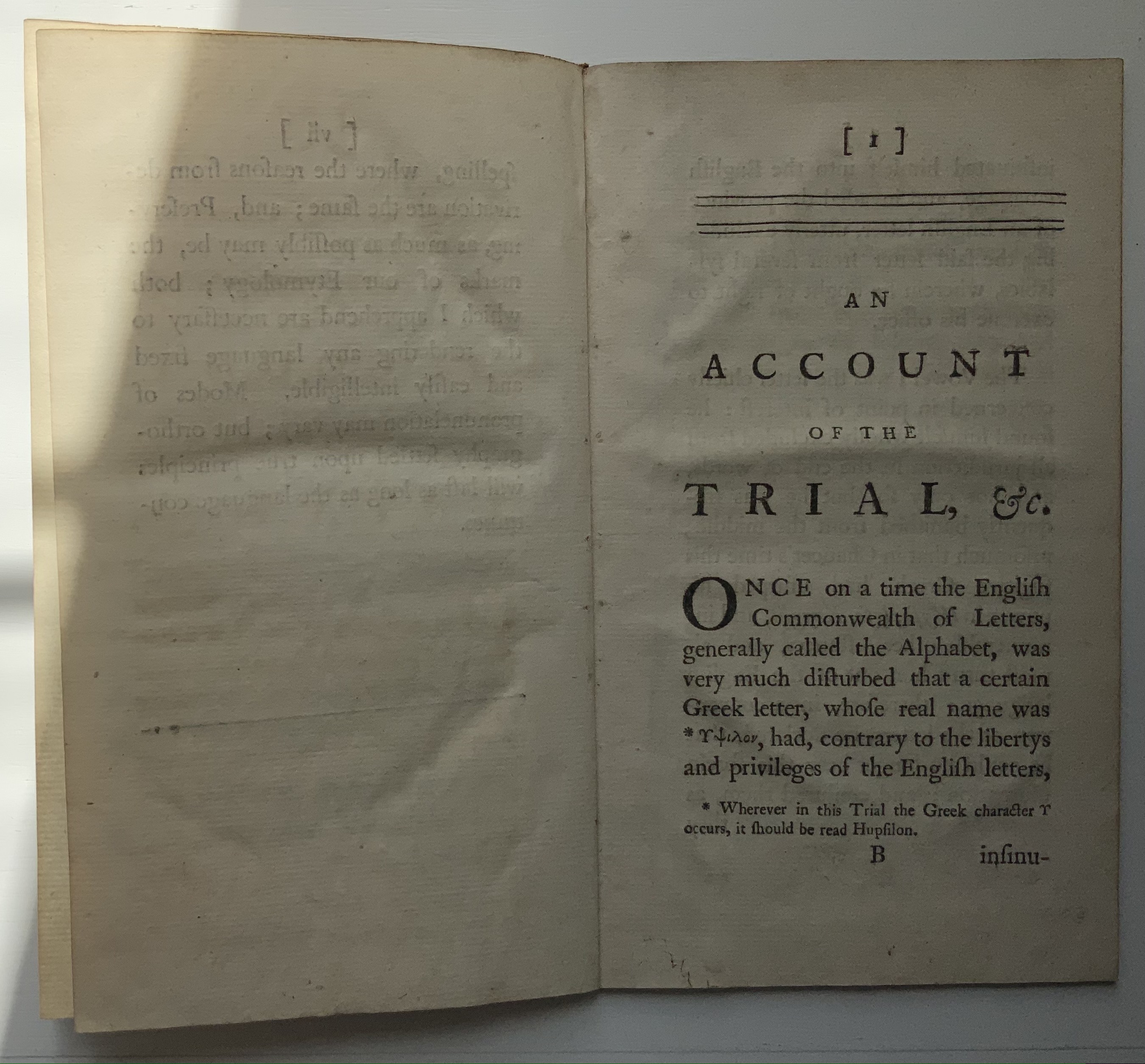
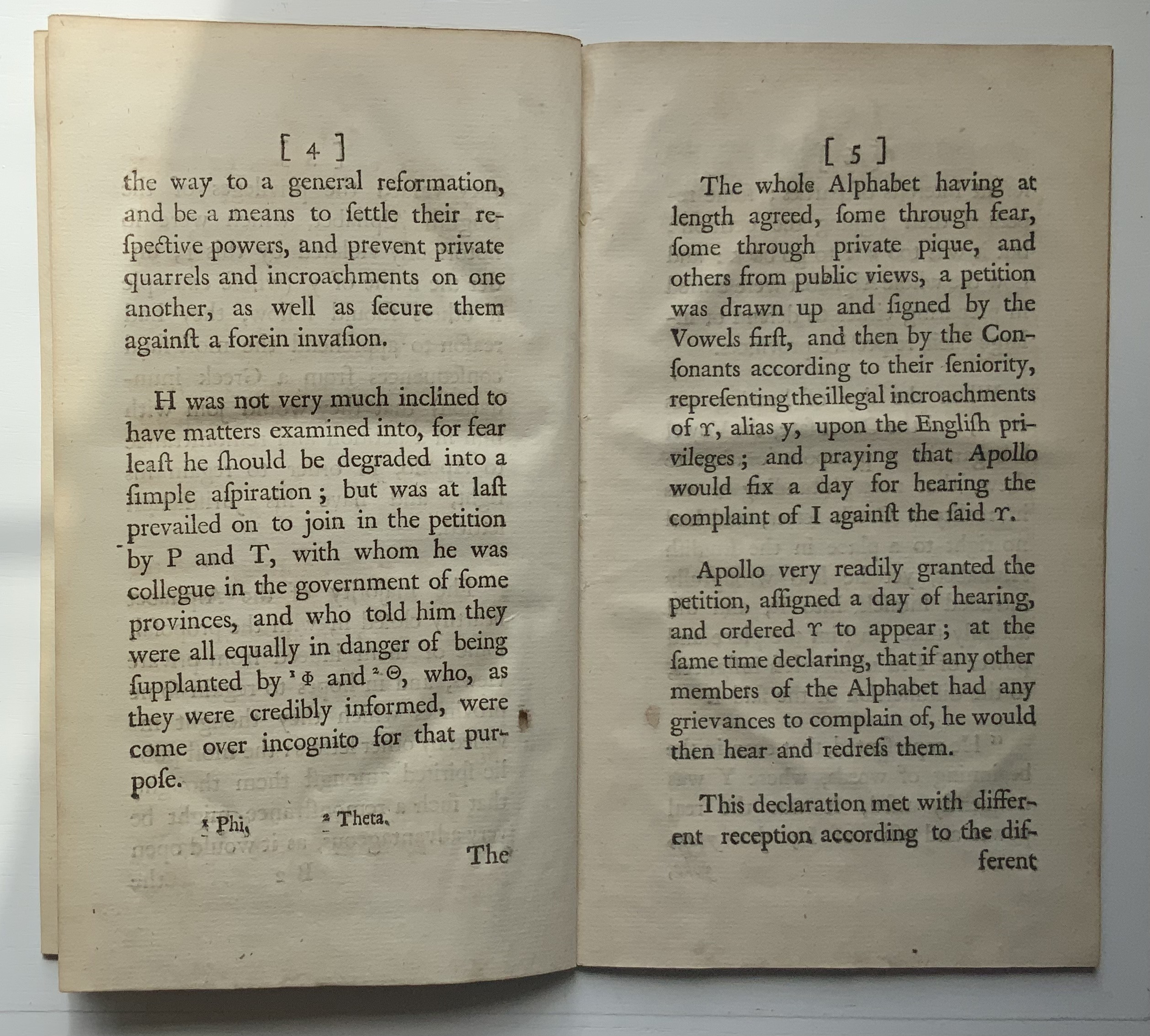
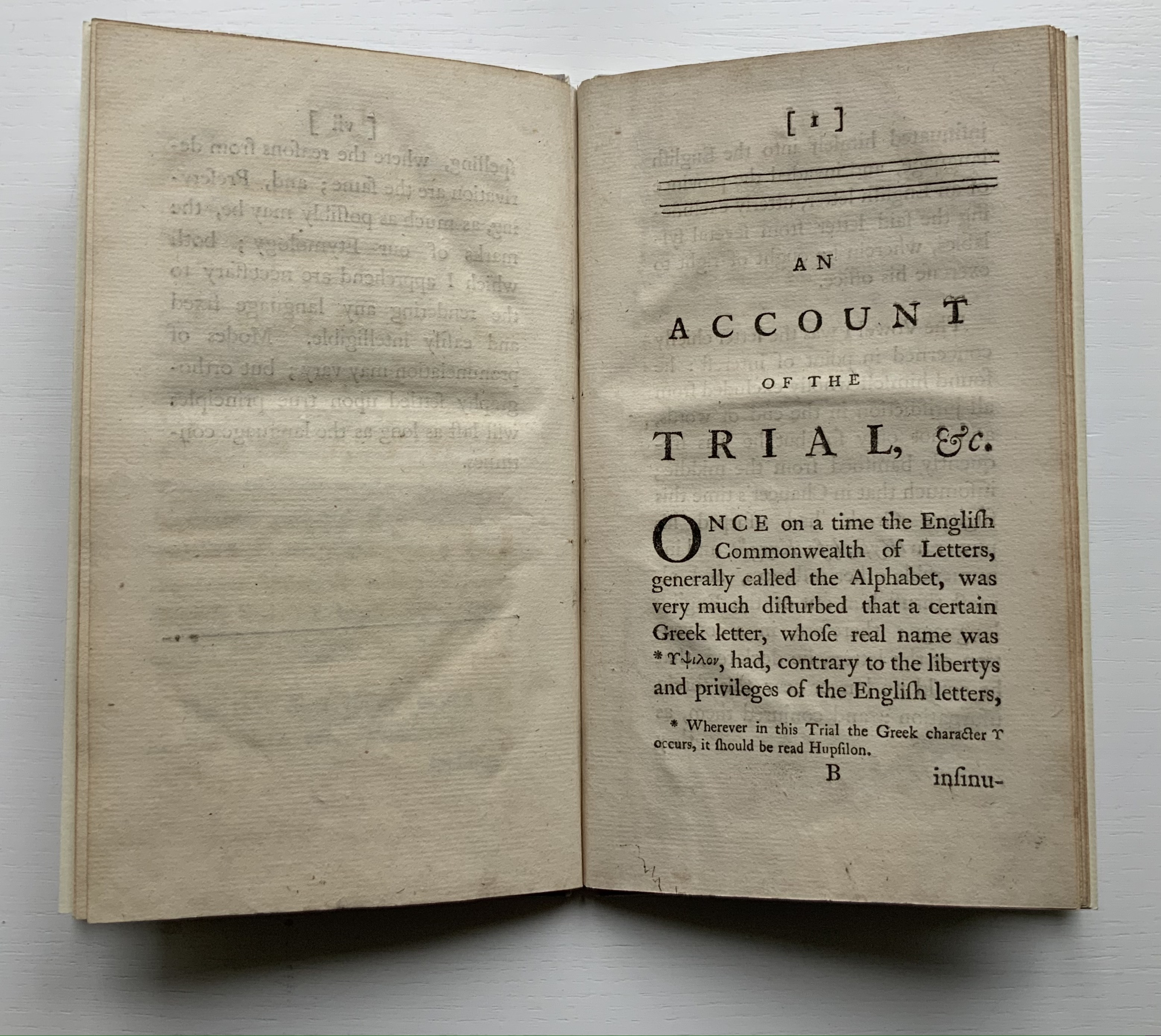
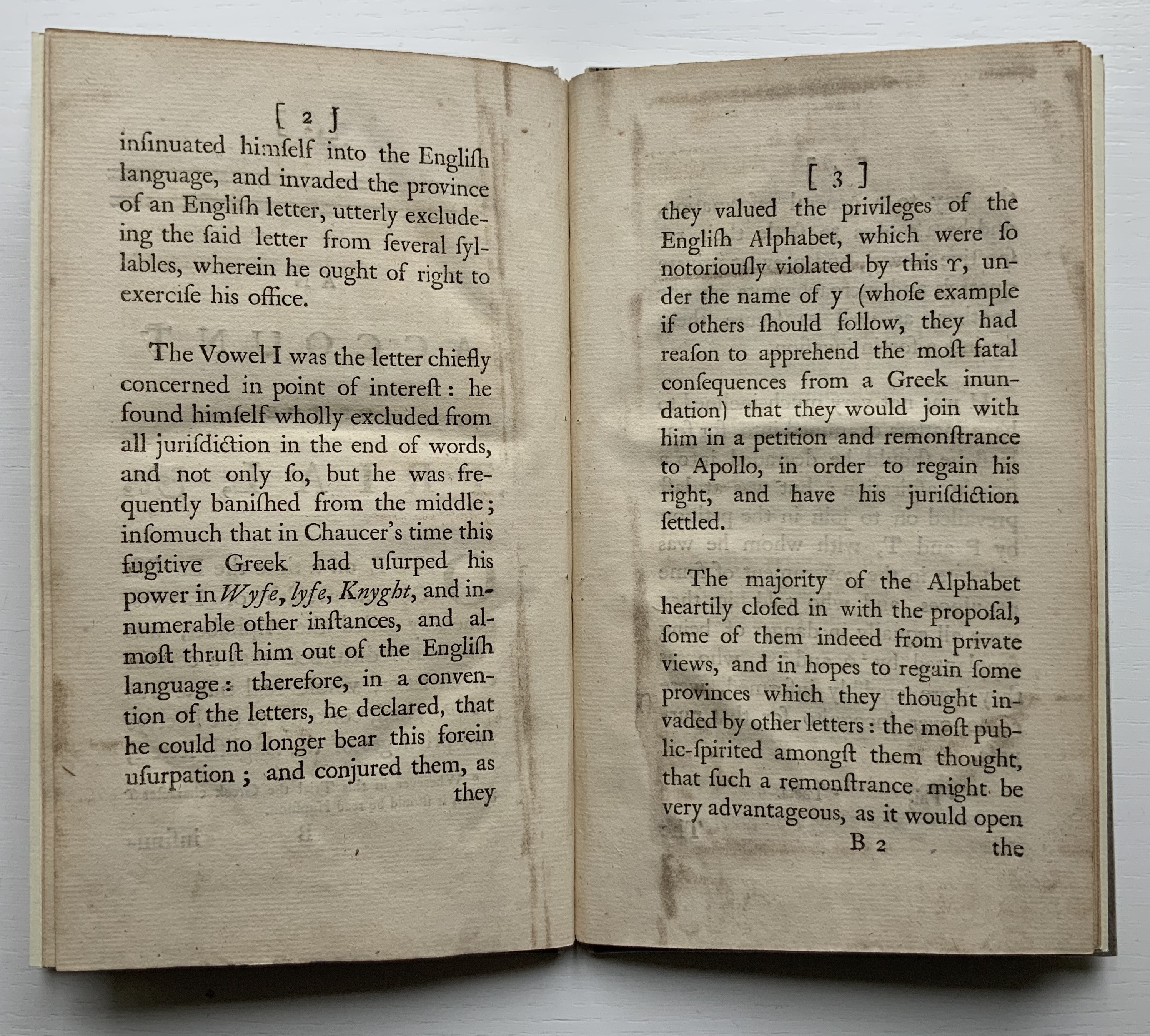
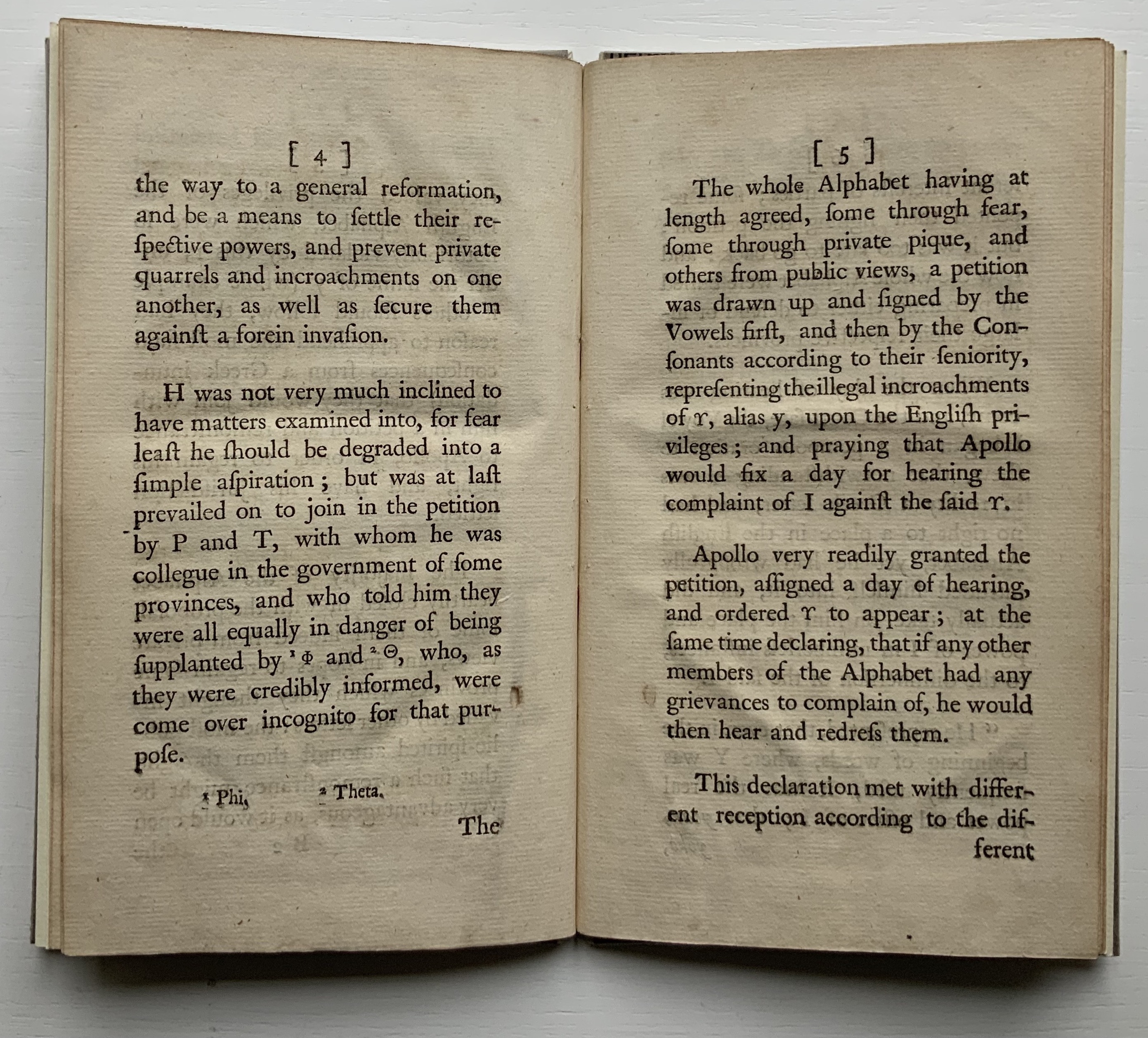
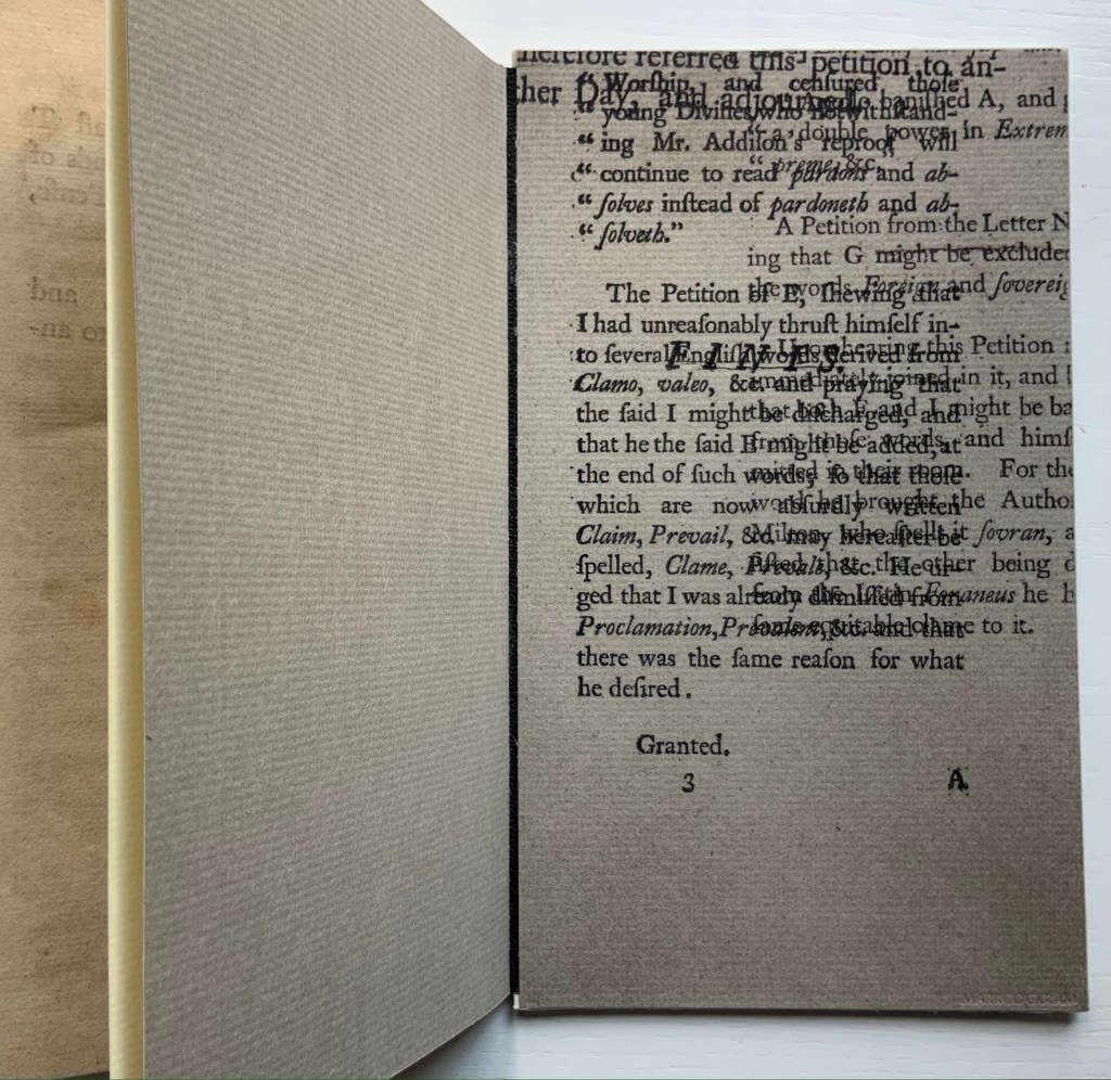
Like the Hebrew fable in which the letters of the alphabet argue their cases for the position of first letter, this short eighteenth century fantasy has the English Commonwealth of Letters rounding on the letter y as a Greek interloper, usurping their brother i’s rightful position at the end and even middle and beginning of words. Why the letters choose Apollo to judge the case is an irony lost on all the characters. But this is no surprise. After Apollo rules in y’s favor, their witless lack of self-awareness explodes into the internecine warfare of a roomful of Brexiteers. The letters d and th come to blows over murder and murther; the letters ugh demand reinstatement at the end of tho and thro; the letters s and c row over defense/defence and pretense/pretence; and so on.
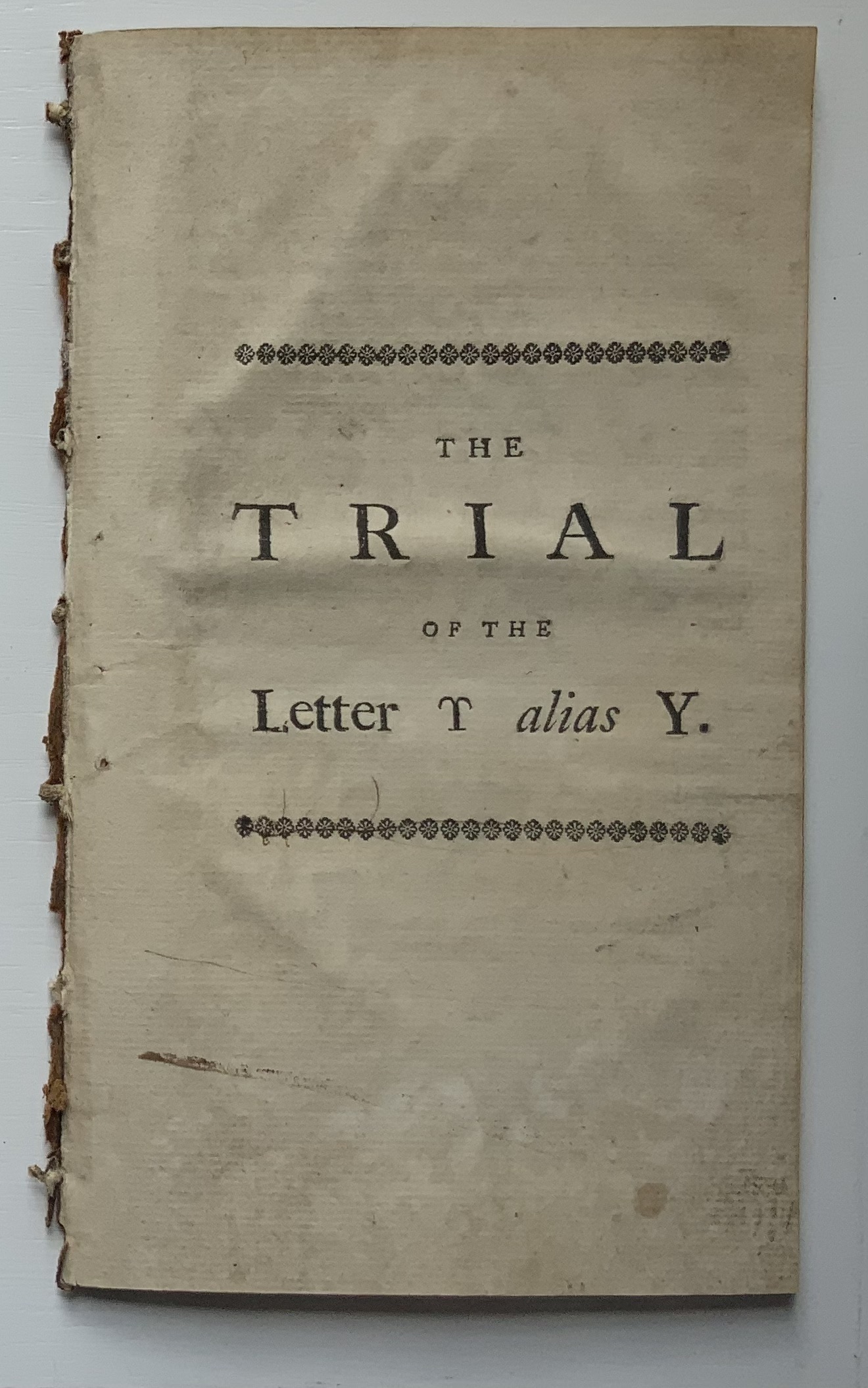
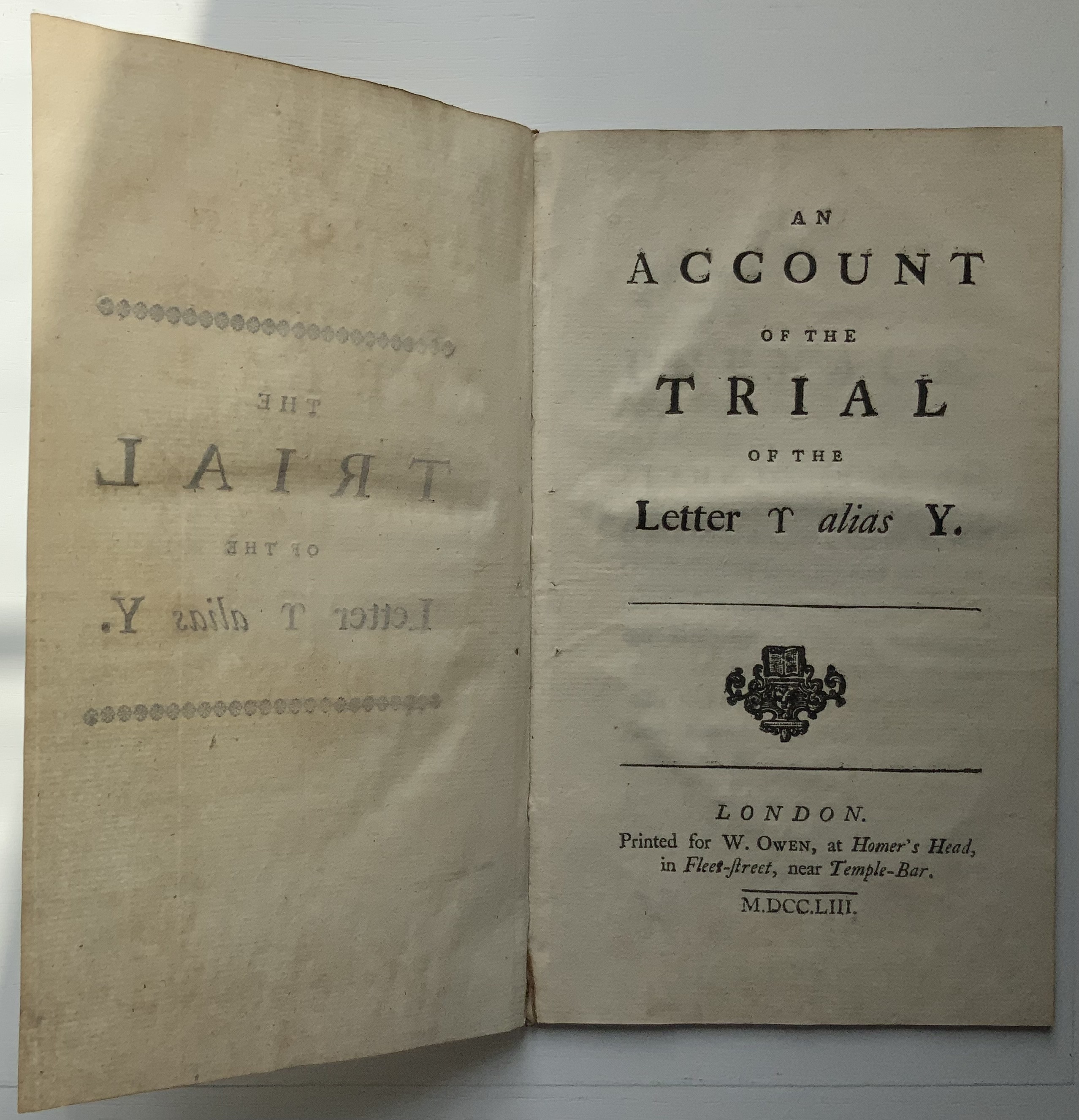
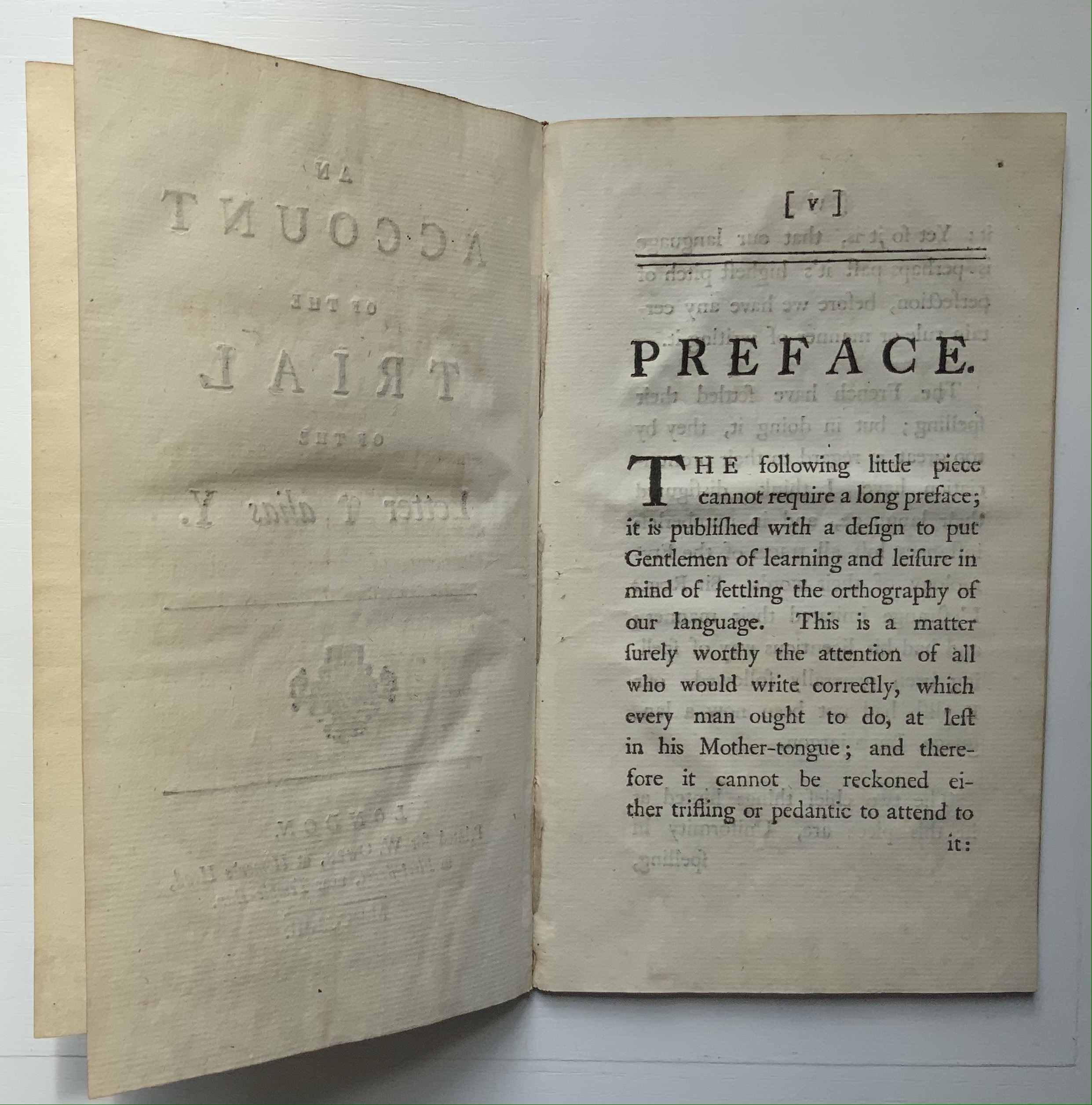
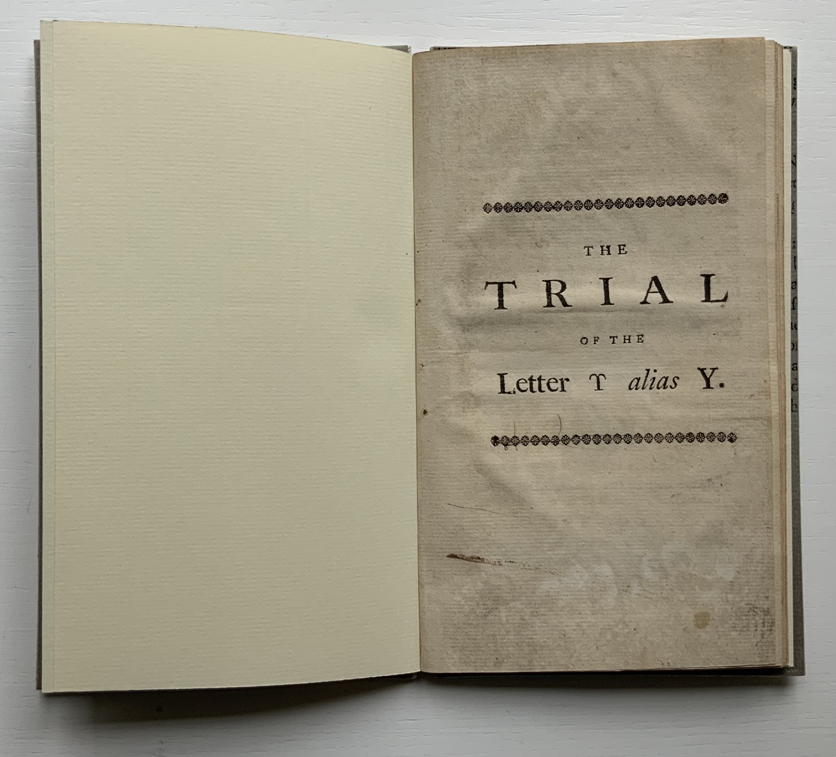
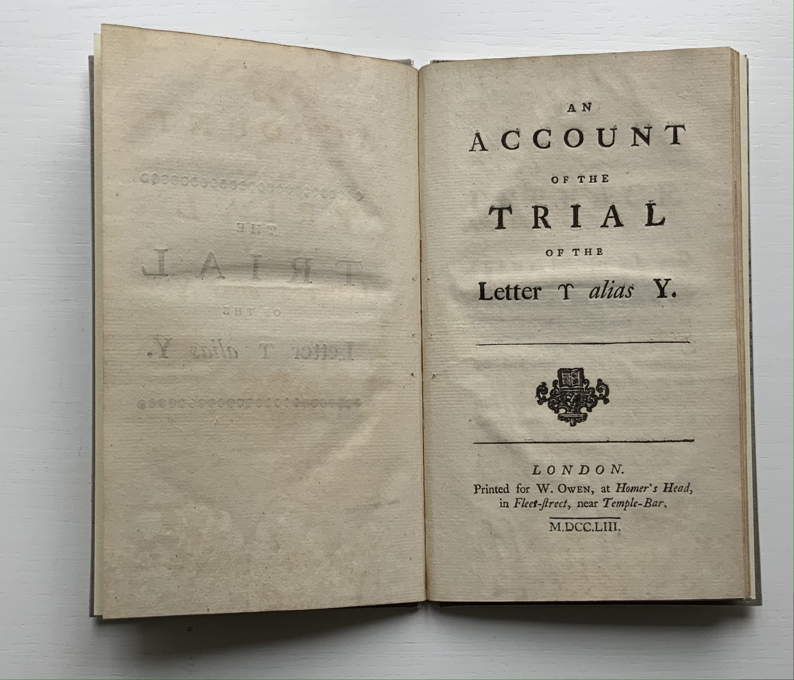
Thomas Edwards (1699-1757) was an English critic and poet. According to the Oxford Dictionary of National Biography, his friend the printer and novelist Samuel Richardson encouraged him to write a book on spelling, which resulted in An Account of the Trial of the Letter ϒ [Upsilon], alias Y. The silliness first appeared in 1753 in two forms: one in the fifth edition of Edwards’ Canons of Criticism printed for the bookseller C. Bathurst (over-against St. Dunstan’s Church in Fleetstreet) and the other as a pamphlet for the bookseller W. Owen (at Homer’s Head, in Fleet-Street, near Temple-Bar).
The quarrelsomeness among the letters reflects the same among the not-so-gentlemanly scholars of the period. Edwards’ Canons of Criticism sets out principles for editing in the guise of a stiff critique of William Warburton’s edition of Shakespeare’s plays. Priest and later bishop of Gloucester, Warburton replied ad hominem, and the feud was on. Even the pompous bully Samuel Johnson joined in, disparaging both (presumably with an eye on elevating his own judgement if not his future edition of Shakespeare):
Soon after Edwards’s ‘Canons of Criticism’ <1748> came out, Johnson was dining at Tonson the Bookseller’s, with Hayman the Painter and some more company. Hayman related to Sir Joshua Reynolds, that the conversation having turned upon Edwards’s book, the gentleman praised it much, and Johnson allowed its merit. But when they went farther, and appeared to put that authour upon a level with Warburton, ‘Nay, (said Johnson,) he has given him some smart hits to be sure; but there is no proportion between the two men; they must not be named together. A fly, Sir, may sting a stately horse and make him wince; but one is but an insect, and the other is a horse still.'” (Dussinger, “Johnson’s unacknowledged debt”)
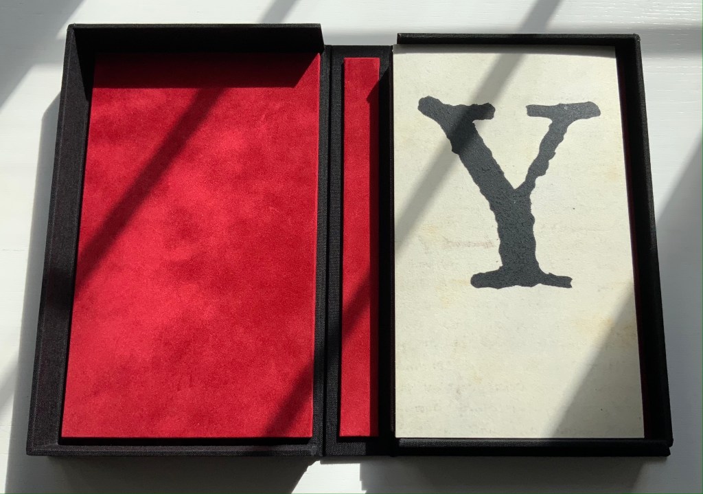
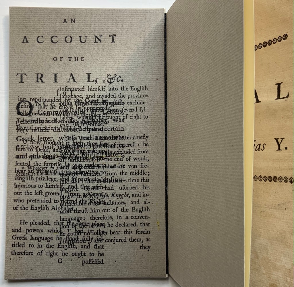
The version in the Books On Books Collection is the pamphlet: ”First and only edition, vii, [1], 23, [1]pp., with half-title, disbound”, as it is described in the British Library’s English Short Title Catalogue. Human petulance aside, the letters’ speechifying and Edwards’ observations about the alphabet’s history place The Trial squarely in the collection between letterpress works and the more trade-oriented alphabet books. As can be seen in the “before” pictures, though, the pamphlet required some attention before joining. That attention, however, would have to suit the nature of the collection.
Before
From a coincidental meeting at a Maggs Brothers exhibition in London, Mark Cockram sprang to mind, and his words here confirmed him as the right choice:
This brings us to the world of book arts. As I progress with my work and life I have begun to engage with this genre in the book making world. I admit that in the past I was a bit of a book snob. Though I produced a number of book works I was unable to cut free of the shackles of the finely bound book, working towards the mastering the complexity of the book… dare I say I was blinkered? In retrospect it is only over the last 15 or so years that I have been able to bring together the various disciplines of the book with the art of the book (though I am sure many who will argue I have neither) It has taken time for me to be able to engage and combine. However I feel that working in this way I am able to be honest with my work, to reflect the now as opposed to rebinding the past. It is a personal journey. Please note there are other ways of doing things and opinions….. spelling and grammar. Please further note, the opinion of the author may change at any moment. This is due to having an open mind… of sorts. (Mark Cockram, Studio 5 Book Arts, 30 December 2019. Accessed 4 January 2020.)
After
The paper-labelled cloth box has an unusual heft, implying weighty content but opening to reveal the humorously modest-sized pamphlet.
The artist’s binding solution involves two paper-covered boards. These additional “before and after” pictures show further how the artist’s “lay flat” binding solution preserves as full a view as possible of the original’s gutter.
Before
After
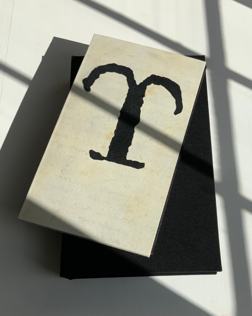
Note also how, inside and out, the front and back boards comment on the contents. The pamphlet’s title is echoed by the enlarged letters Y and ϒ. The faint palimpsest-like printing on the front and back covers (see above and below) and the overprinted inside covers echo the sourcing, disbound from an original binding.
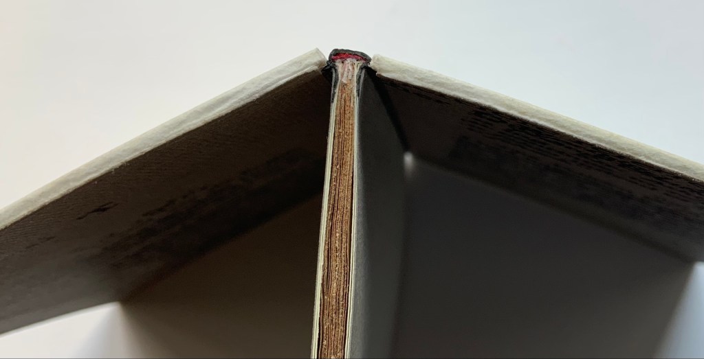
And there is no missing Cockram’s fine press touch in the handling of the end papers and the spine’s red inner backing echoing the interior of the storage box.
Further Reading
“Kintsugi“. 20 February 2019. Bookmarking Book Art.
Special thanks to William Laywood of Forest Books ABA-ILAB for explaining the notation from the English Short Title Catalogue pointing me down the road to discovering the Canons of Criticism and Professor Dussinger’s insights.
Dussinger, John A. 23 September 2004. “Thomas Edwards“, Oxford Dictionary of National Biography. Accessed 9 October 2021.
Dussinger, John A. 1 January 2016. “Johnson’s unacknowledged debt to Thomas Edwards in the 1765 edition of Shakespeare.” Philological Quarterly. In The Free Library, University of Iowa. Accessed 9 October 2021. Dussinger is quoting James Boswell’s Life of Johnson, ed. G. B. Hill, rev. L. F. Powell, 6 vols. (Oxford U. Press, 1934-1964), l:263n3.
And Viewing
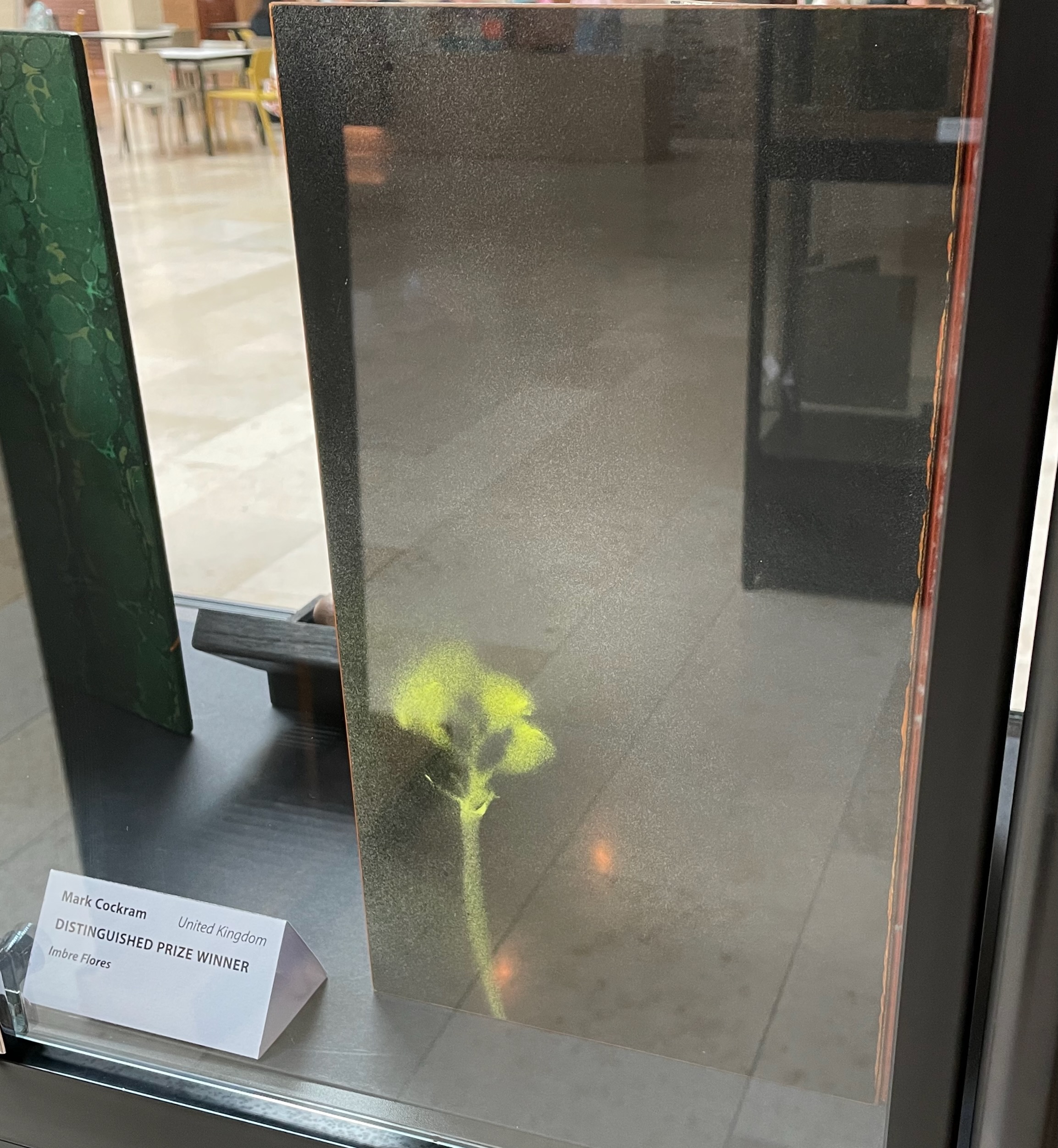
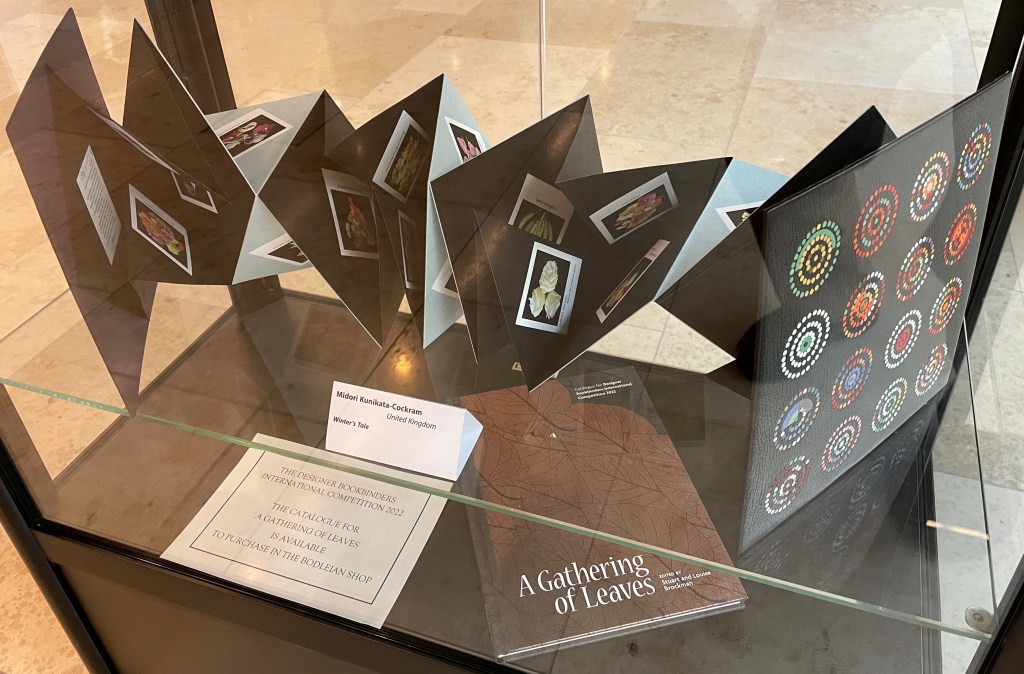
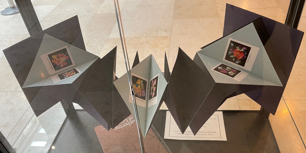
Imre Flores. Showcased at the Weston Library, Oxford University, July – September 2022.
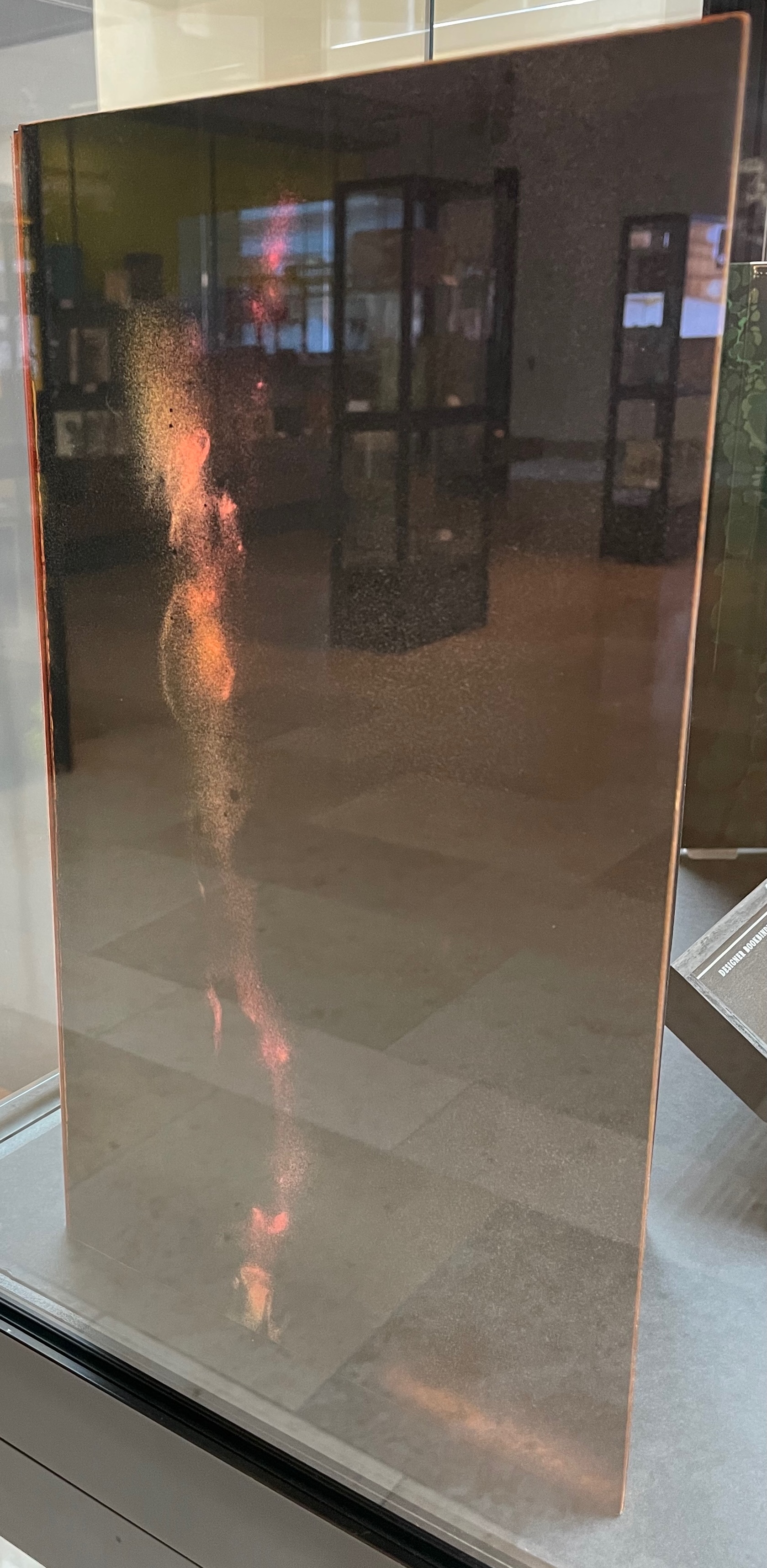
Winter’s Tale. Showcased at the Weston Library, Oxford University, July – September 2022.
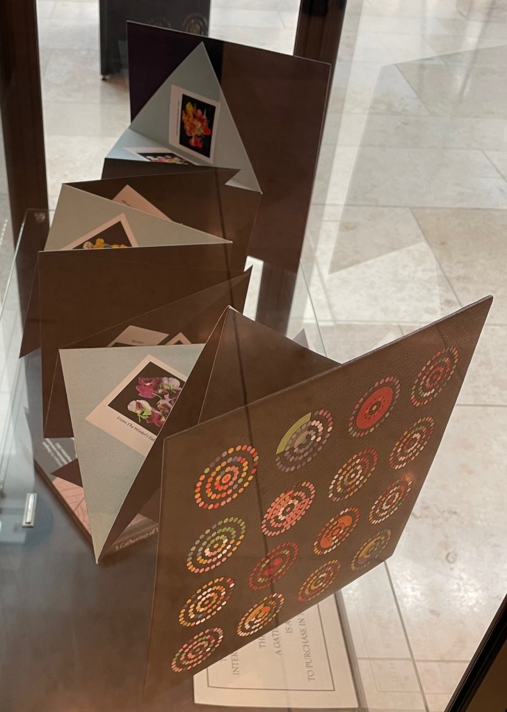
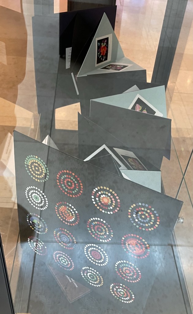
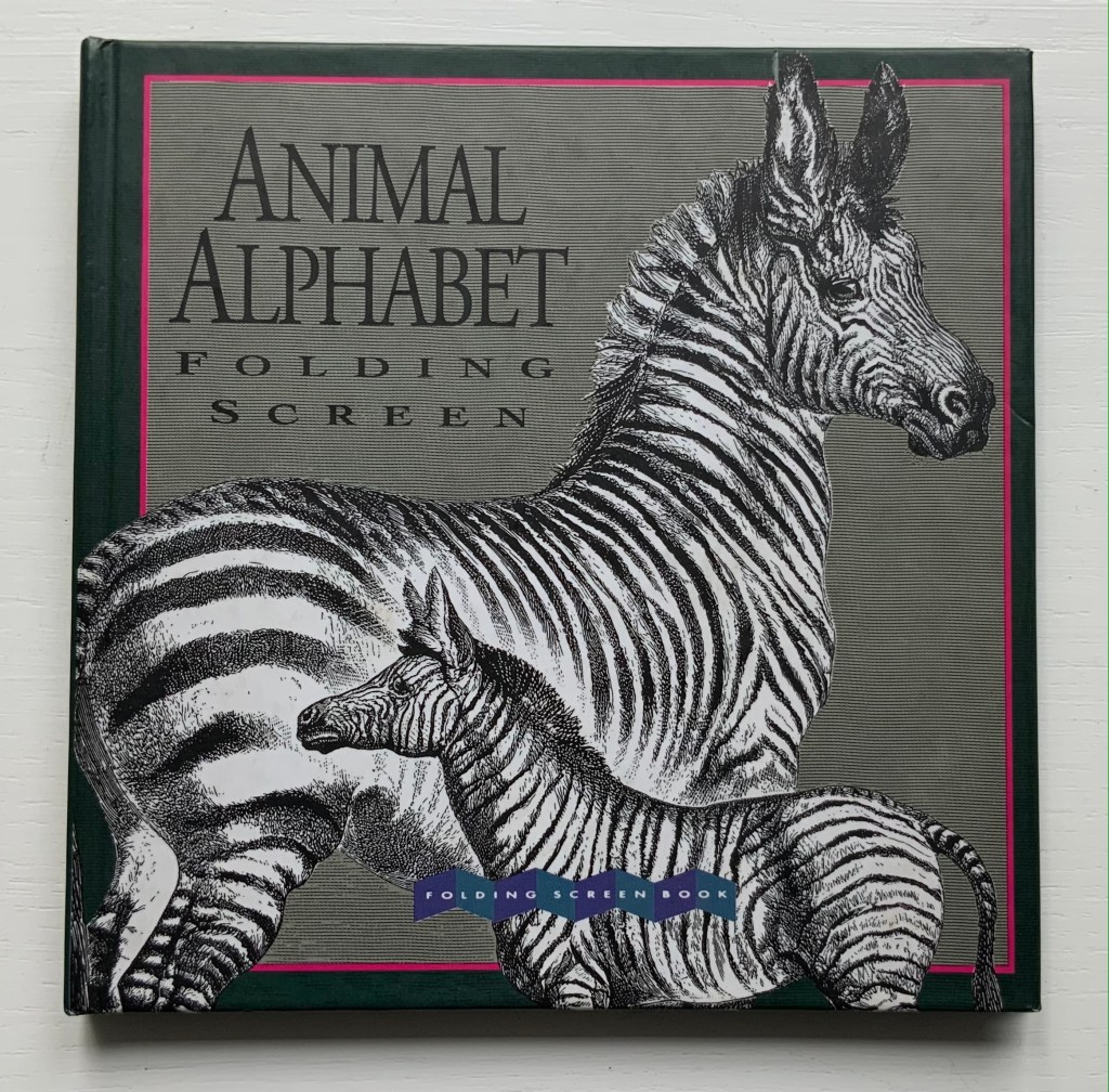
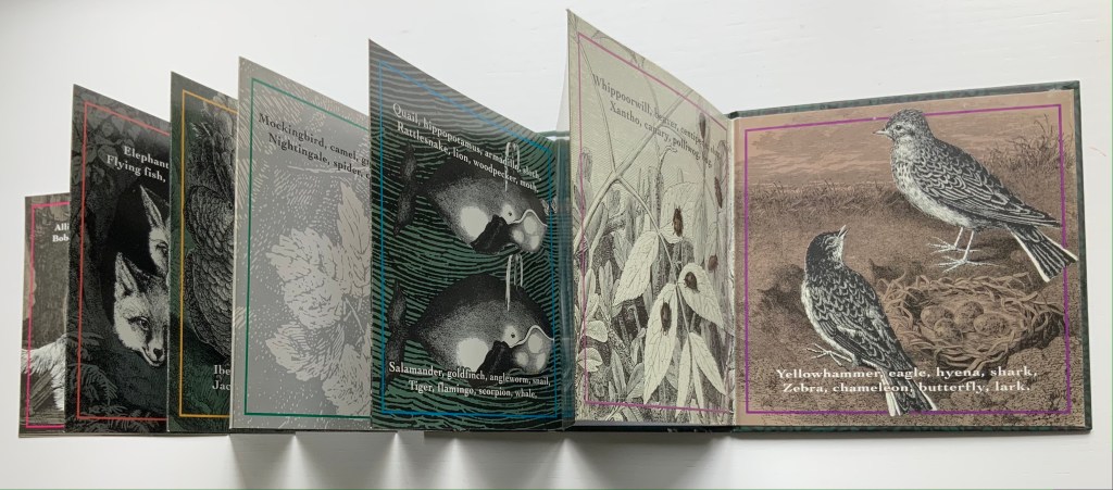
Perhaps better known for her earlier series of detective stories about a toy bear named Ophelia, Michele Durkson Clise’s accordion book stands out among alphabet books for its text, graphic art and twist on the genre’s usual categories.
Animals are the most frequent topic of alphabet books, and the most usual text structure is a single letter to a page, accompanied or followed by an animal (or animals) whose name begins with the letter. Another common text structure is the hidden letter, where the letter has to be guessed from the image or is hidden in the image.
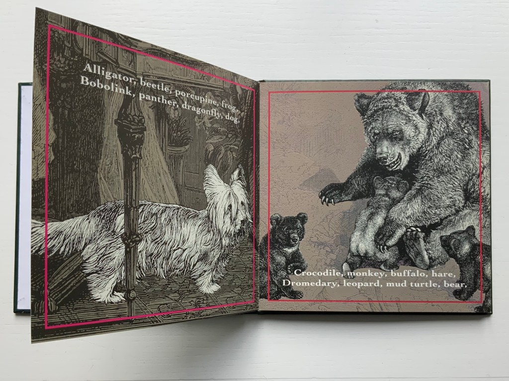
In Clise’s Animal Alphabet, instead of the single letter, we have a single animal corresponding not to a letter but to the animal’s name at the end of a rhyming couplet. Where are the letters? There is no D for dog on the first page normally belonging to A, but the page normally belonging to B does show a bear. Was something missed on the first page; might the dog might be a Lhasa Apso? Not with those ears and that tail. And back to the bear; where is the letter B?
The disconnect between alphabetical order and the animals depicted is distracting and enjoyable. The pauses and stumbles it causes lead to looking closely at the images, perhaps postponing discovery of the letters. From where did these striking images come with their black and white engravings of the animals against varied backgrounds of light or dark green, light or dark brown and light gray on glossy card stock? The fine lines in the animal images suggest etching. Several of the backgrounds appear to be wood engravings. In a trade book, the printing is surely offset, from which the technique of drawing is hard to tell. Perhaps the answer resides in the artist archive at the Dorothy Stimson Bullitt Library in the Seattle Art Museum. Or in someone’s encyclopedic eye for antique prints.
Despite the “distractions” of the accordion fold, the pull of the anapest (tum-ti-tum) rhythm and the animals aligned with rhyme not the letters, the somewhat hidden letters eventually emerge. For the reader not attuned to acrostics, there they are at the start of each couplet’s lines: Alligator, Bobolink, Crocodile, Dromedary … Yellowhammer, Zebra.
Which is it — “necessity, the mother of invention” or ”invention, the mother of necessity”? Whichever, with Clise’s Animal Alphabet, we have the necessary and right letters, words, lines, rhyme, rhythm, textual, graphic and material structure.
With the exception of Unpacking my Library and Between the Sheets, Spector’s works in the Books On Books Collection fall into the category of ephemera. More than most book artists’ ephemera such as invitations, broadsides and the like, however, Buzz Spector’s ephemera have that self-reflexiveness so characteristic of book art.
Artist, curator and historian Jeffrey Abt wrote that the “irresistible” idea of placing an exhibition of artists’ books alongside the University of Chicago Library’s collection “broadly representative of the history of the book” started with a visit to famed art dealer Tony Zwicker‘s studio. It was also, however, almost as if he were taking a cue from this statement by artist-printers Betsy Davids and Jim Petrillo just the year before:
A representative collection of artists’ books often does not seem visually remarkable in a gallery, where a wide range of visual experience is the norm. The same collection, installed in a library or bookstore, can seem visually startling almost beyond the limits of decorum. — “The Artist as Book Printer: Four Short Courses”).
While Abt’s introductory essay rings the historical changes on the roots of book art — once there was Mallarmé’s Un Coup de Dés Jamais N’Abolira Le Hasard, but before Mallarmé, there was William Blake — the works included and the catalogue’s design ring some chimes of their own about book art. One way or another, all book art self-consciously draws attention to some particularly bookish element. For the most part, the 49 works listed in this catalogue ring true. The catalogue’s design itself, however, not only chimes to that notion of self-reflexiveness but also to wider notions about the nature of book art within contemporary art.
Not long after this exhibition, Spector wrote of “the language of the book” and all its parts — pages, signatures, cover, letter forms and their placement on the page, etc. — as having a syntax (“Going Over the Books”). With its pencil-circled numbers, alignment guides, pastedowns and other designer’s marks appearing throughout — as if a printer’s devil had run amok and let the marked-up proofs go to press unchanged — the catalogue draws attention to that syntax, the underlying processes of bookmaking and, therefore, this object’s “bookness”. The colophon’s note initialed by Jeffrey Abt to Buzz Spector and “pasted” on the last page jokingly rings the self-reflexive chime of the markings throughout the catalogue.
The second chime comes in the catalogue’s verbal and visual punning. Like book art, punning is self-reflexive, words playing on words. The title ”the book made art” can be read with different meanings: “the book made into art”, “art that is bookish” and so on. The catalogue’s trim and two-dimensional representation of three-dimensions create the visual pun of a glass or white cube. The verbal and visual puns also play with Abt’s “irresistible” context. Here in the Joseph Regenstein Library was an exhibition catalogue, teasing the viewer with a reminder that vitrines separated them from the bookworks. Reviewing two other exhibitions of book art, Spector elaborated explicitly on his visual tongue-in-cheek irony:
The dilemma in staging exhibitions of books as art objects is the denial of access to the work that conservation necessarily demands. … and it is a morethan passing irony that implications of hermeticism and elitism should surround books shown to a public using the library as a means of gaining access to texts. — “Art Readings”.
The catalogue also teases with its title and design by suggesting that once books have been placed on display like this, the setting is no longer a library but a “white cube gallery“. As the catalogue progresses, black-and-white photos of items from the exhibition appear on the verso page in frames that appear to be hanging on the trompe l’oeil cube’s rear wall.
Poster distributed on the University of Chicago campus. The image combines Michael Kostiuk’s Airplane Shadow Book (1981/82) with a variation of the catalogue cover. Photo: Courtesy of the artist.
But a viewer standing in the “brutalist” construct of the Regenstein Library and holding the finished catalogue might have asked, “What makes these objects I cannot touch — or, in some cases even if I could, cannot read — art?” There is the catalogue’s third chime. From the start, book art has faced a constant definitional or identity crisis and even the challenge “but is it art?” The catalogue’s title echoes Lucy Lippard’s Duchampian proposition: “It’s an artist book if an artist made it, or if an artist says it is”. The catalogue’s design says, “This is the gallery, these are the objects on display in it, they are art”.
The “white cube gallery” brings on a fourth and final ironic chime. In the 1970s and early ‘80s, artists’ books were pitched as a “democratic” medium and means by which art could escape the clutches of the gallery and reach a wider public. In another catalogue — the one for the 1973 Moore College exhibition, nominated as the first of book art — John Perreault writes:
Books as art, from the artist’s point of view and the viewer’s point of view, are practical and democratic. They do not cost as much as prints. They are portable, personal, and, if need be, disposable. Because books are easily mailed, books as art are aiding in the decentralisation of the art system. — “Some Thoughts on Books as Art”.
By the mid-80s, lo and behold, The Book Made Art’s catalogue-cum-gallery jokingly recaptures “books as art”. And in a further irony, by the mid-80s and since, the increased rareness and price of such bookworks have made them into galleries‘ and museums’ expensive objects of desire. Including this catalogue.
The Library of Babel (1991)
The Library of Babel Curated and edited by Todd Alden; catalogue designed by Buzz Spector. Dos-à-dos binding, offset. H241 x 177 mm Buffalo, NY: Hallwalls Contemporary Art Center, Hallwalls Inc., 1991. Photo of the work: Books On Books Collection.
As with The Book Made Art, Spector uses the cover (this time with a photograph of The Library of Babel) to introduce the self-reflexivity so characteristic of book art, but he does not stop there. Pagination and the back-to-back binding structure work together to evoke a mirror’s reflection; the last page of the first half “faces” the last page of the second half.
Photo of the work: Books On Books Collection.
The first half contains Todd Alden’s essay “The Library of Babel: Books to Infinity”, Paul Holdengräber’s “Unpacking Benjamin’s Library: Bibliomania in Dark Times”, and a checklist of the 34 works by their 10 artists.
Photo of the work: Books On Books Collection.
The second half contains half-tones of selected works and brief CVs of the artists. Among the half-tones are also photographs of works referenced by Alden (one by Jasper Johns, two by Marcel Broodthaers). Notice how the rules change position in the footers of the two halves, again evoking the back-to-front theme of the dos-à-dos binding.
Photo of the work: Books On Books Collection.
As in The Book Made Art, Spector had an entry in “The Library of Babel“ exhibition. With its torn pages, North Sea (for M.B.) (1990) echoes Altered LeWitt (1985), further below, but it is instead a work 10 feet long and presented on a table appropriately jutting out from the wall like a pier. “M.B.” is Marcel Broodthaers, to whose works there are multiple and layered references. The eleven “waves” of torn pages placed in a row on top of the steel shelf are the excised material from another of Spector’s works: Marcel Broodthaers, made from eleven copies of the Walker Art Center’s 1987 catalogue to Broodthaers’s first U.S. retrospective. Spector painted all the pages in each copy with white gesso before excising them and leaving behind his 1990 “altered Broodthaers”.
Marcel Broodthaers (1990) Buzz Spector An altered copy of: Marcel Broodthaers (Minneapolis/New York: Walker Art Center/Rizzoli, 1989). Photos: Courtesy of Buzz Spector.
He saved the excised “wedges” and bound them at the fore edges. Because the gesso does not completely obscure the text and images from the catalogues, viewers who come close to the work can see slivers of some of Broodthaers’ works along with the word fragments typical of Spector’s altered books.
North Sea (for M.B.) (1990) Buzz Spector Books, steel, gesso, 25 x 96 x 10 inches Collection Orange County Museum of Art,CA; Museum purchase with additional funds provided by Peter and Eileen Norton and the National Endowment for the Arts, a federal agency. Photo: Courtesy Orange County Museum of Art.
Spector’s library contains a copy of Broodthaers’ 1974 artist book, A Voyage on the North Sea. These layered references and self-references — direct references to Broodthaers’ A Voyage, indirect references through the self-reference to Spector’s Marcel Broodthaers (1990) — bring into sparkling focus two features of book art and, in particular, late 20th century book art: reverse ekphrasis and bookworks in conversation with one another.
When a visual work of art inspires poetry or prose, the literary result is called ekphrastic: “the verbal representation of visual representation”. But where the poets Keats, Auden and Jarrell, for example, use words to “recreate”, re-present, evoke or respond to works of art — an antique urn, a painting by Brueghel and Donatello’s sculpture of “David” — book artists have in turn used the letter, words, actual books, the physical materials of the book or even the shape of books, their functions or processes of making them to create works of art. A kind of ekphrasis in reverse.
Not only does Spector perform this reverse ekphrasis with exhibition catalogues in North Sea (M.B.), he does it in conversation with a multimedia work by Broodthaers. Works in conversation with one another is also a common occurrence in poetry. An entire anthology showcases these poems that talk to other poems. The later work not only evokes the earlier work, it illuminates and adds to it. In book art, other instances include Bruce Nauman’s Burning Small Fires (1968), a one-sheet folded book of photos of Ed Ruscha’s Various Small Fires and Milk (1964) being set on fire and burning to ash, and Dennis Oppenheim’s Flower Arrangement for Bruce Nauman (1970), a leporello which refers to Nauman’s Flour Arrangements (1967), a video in which the artist pours over 50 pounds of flour on a mock talk-show studio floor and then sculpts it into ephemeral shapes. Nauman’s shift to an ingenious folded single-sheet structure and Oppenheim’s shift (and pun) to an accordion view of flowers are part of the addition to their conversations with their very structurally different counterparts. Spector’s shift to the sculptural is part of the addition to his conversation with Broodthaers’ book and video. Consider not only Spector’s gessoed sea of pages and the pier, but also those two 19th century black bronze sailing ship bookends evoking the 19th century nautical painting that Broodthaers appropriated in A Voyage on the North Sea.
North Sea (for M.B.) (1990) Buzz Spector Books, steel, gesso, 25 x 96 x 10 inches Collection Orange County Museum of Art,CA; Museum purchase with additional funds provided by Peter and Eileen Norton and the National Endowment for the Arts, a federal agency. Photo: Courtesy Orange County Museum of Art.
Unpacking my Library (1994-95) Buzz Spector Leporello full-colour offset printed; folded H100 x W155 mm, unfolded W3600 mm; Cleveland Center for Contemporary Art. Installation exhibited at the San Diego State University Art Gallery, 1-31 October 1994. Photo of the work: Books On Books Collection.
Clearly from his entry in The Library of Babel, Spector’s artistic output extends beyond altered books and catalogue design to larger scale installations. One of the more well-known, Unpacking my Library imposes multiple orders on what Walter Benjamin called “the chaos of memories”. How “multiple orders”? First, because of its subtleties; second, because of its several forms.
From the start at the San Diego State University Art Gallery, 1-31 October 1994, the installation imposed the order of “descending height” on Spector’s library, unpacked and displayed across one shelf attached along the white walls of a room in the gallery. The single shelf ran 188 feet.
Although Spector is rejecting the library’s traditional method of making sense of a collection of books — ordering by academic category — in favor of a physical criterion, the title imposes another method of making sense — allusion. The installation makes “more” sense if you have read Walter Benjamin’s essay “Unpacking My Library — A Talk on Collecting” (1931). If you haven’t, then, on the reverse of the leporello produced with the Cleveland Center for Contemporary Art, are these two sentences from the essay:
This or any other procedure is merely a dam against the spring tide of memories which surges toward any collector as he contemplates his possessions. Every passion borders on the chaotic, but the collector’s passion borders on the chaos of memories.
So what has ordering by height to do with the chaos of memories? Well, if the order of the personal library had been chronological by acquisition, that would be an assertion against chaos, a kind of aide- mèmoire. If the order had been by the library’s traditional method, again that would be an assertion against chaos. Benjamin and Spector embrace the chaos. Spector’s at-first amusing and puzzling organization of his library prods the viewer into the chance to do somewhat the same — to wander along the shelf with that phrase of process hovering in the mind and be reminded of books once read (when? where?), familiar and almost-familiar names and places (from when or where?) and subjects studied (what did that cover?). But the viewer also experiences a surge of unknown names, places and subjects, and spines that mystify.
The allusion to Benjamin’s essay offers another way of making sense of this experience into which the viewer is prodded. If a personal library is a kind of self portrait you can detect from the clues that its usual groupings into fiction, biographies, history, science, etc., give us about the owner, then here the order by height washes them and the portrait away. And if the viewer knows the essay, Benjamin’s last sentence may come to mind:
So I have erected one of [the real collector’s] dwellings, with books as the building stones, before you, and now he going to disappear inside, as is fitting. — Walter Benjamin, “Unpacking My Library”
Spector mentions this disappearance in a video record of the making and showing of the installation. Whether or not the installation’s spectator knows Benjamin’s essay, the installation’s title is a clue to the imposition of a fictional order. “Unpacking my library” is a phrase implying an activity that is just getting going. For his essay, Benjamin created the fiction of the reader’s being present as the library is being unpacked. Likewise for Spector’s installation, any spectator walking into it has entered a fiction. Spector’s library has already been unpacked, sorted on the floor and placed on the single shelf running around the room.
Of course, however, the owner of the leporello form of Unpacking my Library does not experience this fiction as directly. The opening and arranging of the leporello is a hands-on activity; the unpacking of Spector’s library occurs panel by panel in the reader’s hands. The library’s arrangement by height appears more gradually than in the gallery. Once the bookwork is fully extended, the installation’s fiction then becomes more readily available to the leporello’ s reader/viewer.
Photo of the work: Books On Books Collection.
As fictions, Benjamin’s essay and Spector’s installation need an ending. Benjamin’s technique is to disappear into his collection. Spector chooses a different technique. In correspondence with Books On Books, he writes:
The length of all the publications in my library was 165 feet; the single shelf, at the UCSD Art Gallery, on which they were placed ran 188 feet. That additional space implied a future, and life-affirming, growth of my collection. — Buzz Spector, 26 March 2020.
Photo of the work: Books On Books Collection.
Whether it is leporello or installation, the reader/viewer of Unpacking my Library is launching and launched on this open-ended ending.
The Book Maker’s Desire (1995)
The Book Maker’s Desire: Writings on the Art of the Book Buzz Spector Pasadena, CA: Umbrella Editions, 1995. 2nd printing. Cover design by Buzz Spector. Image: History of Europe (1983) by Buzz Spector; plaster over found book, 10.5 x 12 x 15 inches. Photo of the work: Books On Books Collection.
Spector’s essays are tonic. His comments on Margaret Wharton’s bookworks could refresh any reader and viewer lucky enough to see her works (Union League Club-Chicago or Yale) or remind the viewer of them when looking at works by later artists such as Thomas Wightman or the “Mystery Book Artist of Edinburgh”. In the past few months, Walter Hamady and John Baldessari have died, and Spector’s essays on them bring them both and particular works of theirs to present life. His essay and letter on Broodthaers would enhance any reading of the artists who have stood on Broodthaers’ shoulders to address Mallarmé’s Un Coup de Dés: Bennequin, Mutel, Pichler, Wyn Evans, Zboya. The essay “Going Over the Books” may have inspired Alden’s curation of ‘The Library of Babel” exhibition.
The essays are not entirely the point of having The Book Maker’s Desire in the Books On Books Collection. What completes the point is the cover design. The object on the book’s front cover is Spector’s own work History of Europe (1983), which pays homage to Broodthaers’ Pense-Bête (1964). But look closer. The cover stock has elements of text and colour seeping through, almost as if it were made of shredded books. The aptness and artistry of the cover design make The Book Maker’s Desire an object of desire in and of itself.
Detail of cover: Books On Books Collection.
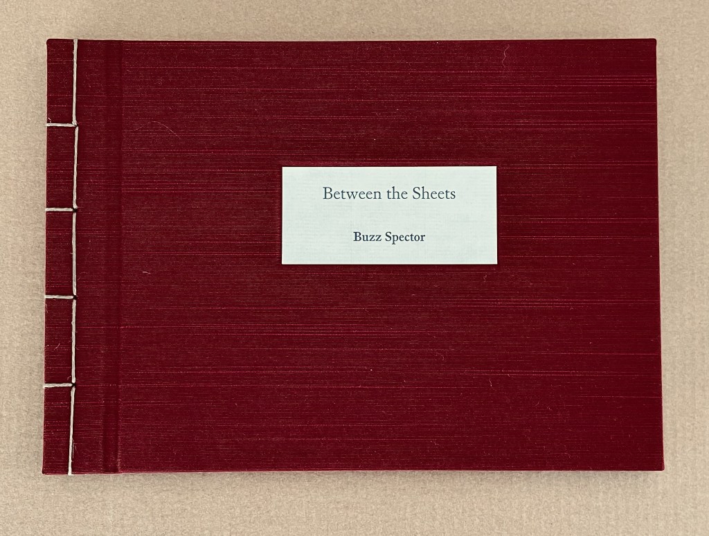
Along with Unpacking my Library, Between the Sheets (2003) is the only other of Spector’s limited edition artist’s books in the Books On Books Collection. It is the solo exhibition to the joint exhibition of The Book Made Art (1986), described at the outset of this entry. In Between the Sheets, Spector again shows the self-reflexiveness of book art but also demonstrates how originality can spring from it.
Between the Sheets (2003)
Between the Sheets (2003) Buzz Spector Cloth over boards, Japanese stab binding, 15 folded sheets, outer sides offset printed with enlarged “authors’ photos” clipped from dust jackets of art books repurposed by Spector for his bookworks, inner side printed (recto only) with text by and selected by Spector. H157.5 x W216 x D12.7 mm. Edition of 40, of which this is #40. Acquired from Olive Branch Press, 26 June 2020. Photos of the work: Books On Books Collection.
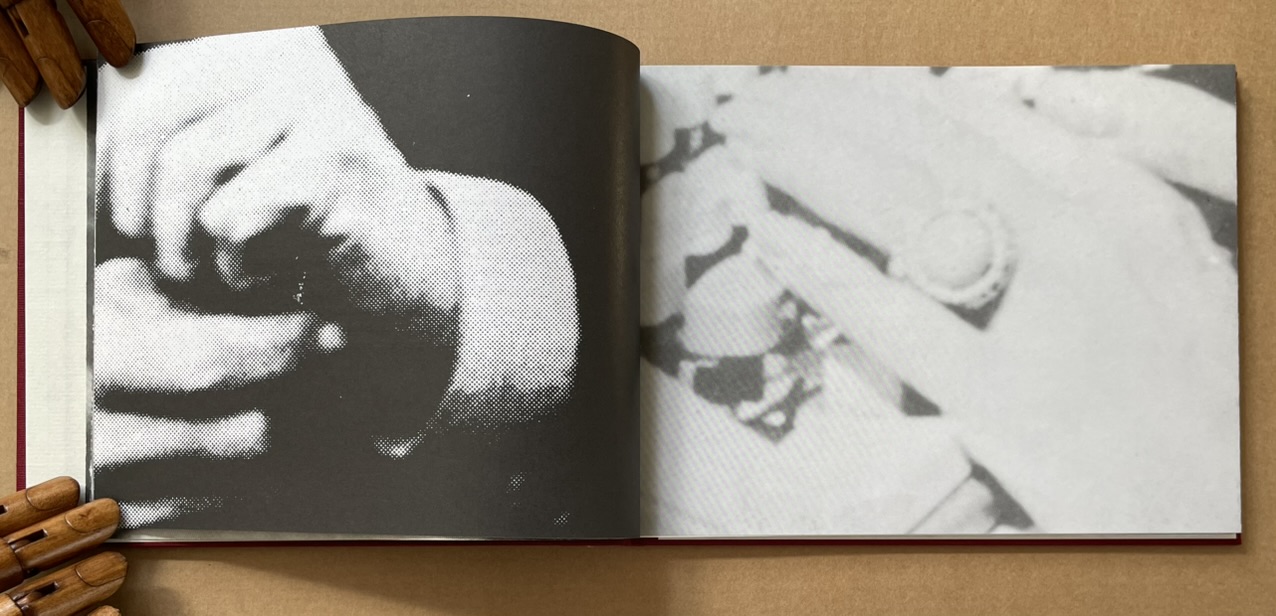
Unlike Altered Lewitt (1985) and North Sea (for M.B.) (1990), which appropriate and alter named works, Between the Sheets is made at two or three removes from its source material. In the first instance, Spector clipped authors’ photos from the dust jackets of their books (unnamed), then rephotographed and printed them at enlarged scale in offset editions. These prints were then bound together to make books. As with Altered Lewitt and other works, Spector then tore strips in a sequence of decreasing increments from the spreads so as to form a wedge-shaped cross section of the image block. In the next remove, this process left a pile of torn strips, and from these torn strips, Spector has proceeded to create Between the Sheets. With images on one side and text imposed on the reverse, these folios are folded and bound at their open ends with Japanese stab binding.
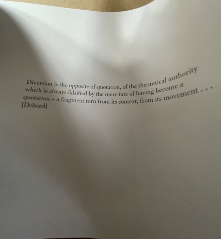
The work’s main thrust is philosophically, artistically and self-reflexively aesthetic. It quotes from the French philosopher Guy Debord, the Belgian artist Marcel Broodthaers and Spector himself. The quotation from Debord comes early on, the first after the title page and two of prefatory explanation, and very much sets the tone.
Diversion is the opposite of quotation, of the theoretical authority which is always falsified by the mere fate of having become a quotation — a fragment torn from its context, from its movement … [Debord]
With Between the Sheets, we have on our hands a decidedly multi-layered diversion. At one layer, it diverts by questioning Debord’s own words, consigning their “theoretical authority” to a fate of falsification by “having become a quotation — a fragment torn from its context”. Like a fun-house mirror, the page bows to give this distorted reflection of Debord’s words.
But is it a diversion? After all, the “truth” of Between the Sheets rests at least in part in its composition from fragments. At this other layer, Between the Sheets “quotes” the fragments torn from the context of another of Spector’s artwork. In turn, that other artwork was composed of prints of photographic “quotations”, the fragments torn from authors’ images on dust jackets (the coverlets for the source books and their sheets). It is no accident that, when the sheets of Between the Sheets are bowed to permit a look inside, the images bracket the text pages like single quotation marks.
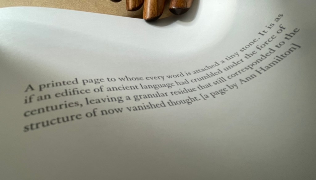
Another quotation resting between the sheets comes from Spector’s own essay on Ann Hamilton in The Book Maker’s Desire (p.63):
A printed page to whose every word is attached a tiny stone. It is as if an edifice of ancient language had crumbled under the force of centuries, leaving a granular residue that still corresponded to the structure of now vanished thought. [a page by Ann Hamilton]
Spector runs the risk of “Debord-ing” himself here with his self-quotation, but he only succeeds in diverting this reader back to the essay on Hamilton’s work and specifically the four works commissioned to benefit The New Museum of Contemporary Art in New York:
The artist chose a total of fifty four volumes (40 in the edition, plus 14 artist’ proofs) for the untitled project. These found books, mostly old novels or poetry, were selected for a variety of physical characteristics –size, wear, and paper quality — and for their typographic layout. Each book was opened to its middle, where six or eight pages were cut from the text block and reattached, edge-to-edge, to the right-hand side of the opened page spread, making an accordian-fold [sic] extension from the book. The eight pages thus displayed were meticulously rendered unreadable by Hamilton and several attendants who glued tiny stones over every word on the visible side. (p. 63)
Is it a coincidence that Between the Sheets also consists of 40 in the edition just like Hamilton’s commission? Spector quotes not only images and words from others’ works and his own, he quotes the details of their production and form. It is certainly no coincidence that Between the Sheets quotes the stab bound structure of Marcel Broodthaers’ A Voyage on the North Sea. After all, in his hidden prefatory explanation, Spector makes no bones about the fact that Between the Sheets arose in part from his astonishment at finding the page numbers hidden within the bound edge of A Voyage. But how did he find them? In the process of creating his own North Sea (for M.B.) (1990). So yet another self-quotation of production process.
Spector’s forthright quotations are divertingly sly. When he cites Broodthaers between these sheets,
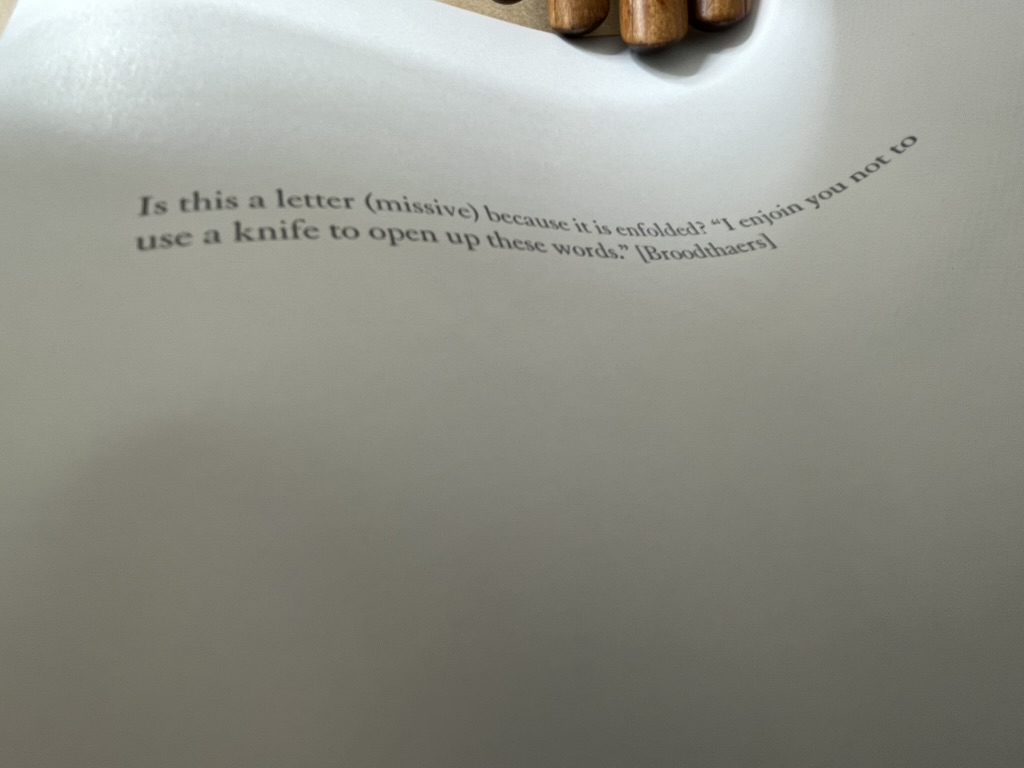
he is also echoing Broodthaers’ injunctions in A Voyage on the North Sea:
Before cutting the pages the reader had better beware of the knife he will be wielding for the purpose. Sooner than make such a gesture, I would prefer him to hold back that weapon, dagger, piece of office equipment which, swift as lightning, might turn into an indefinite sky. … These pages must not be cut.
Of course, Spector did not cut the pages; he tore them.
Another sly diversion is sex. By using photos of male and female authors and by interposing suggestive phrases inside the folds (“a movement of bodies together as one body” and “peek between the sheets”), Spector spices up the obvious diversion of sex in his work’s title. But the slyness re-diverts via Broodthaers to Mallarmé, whose poem Un Coup de Dés Jamais N’Abolira le Hasard (1897) Broodthaers “knifed up” at the very level of the words and whose contemplations of the letter, the page and the fold have taken on an erotic tone that Spector embraces in A Book Maker’s Desire:
When Stéphane Mallarmé described the folded and uncut signatures of books as “virginal,” awaiting the penetration of the “paper knife,” he identified an erotics of reading. (p.15)
The topography of an open book is explicit in its erotic associations: sumptuous twin paper curves that meet in a recessed seam. Page turning is a series of gentle, sweeping gestures, like the brush of fingers on a naked back. Indeed, the behavior of readers has more in common with the play of intimacy than with the public decorum of art viewing or music listening. Most of us read lying down or seated and most of us read at least partially unclothed. We dress up to go out and look at art; undressed, in bed, we read. We seek greater comfort while reading than the furnishings of museums or concert halls will ever grant us. When we read — the conventional distance between eye and page is around fourteen inches — we often become the lectern that receives the book: chest, arms, lap, or thighs. This proximity is the territory of embrace, of possession; not to be entered without permission. (p.17)
There is much more between the sheets of Between the Sheets. I wish that the 40 copies could find many more readers/lovers to embrace its diversions.
Buzz Spector: Alterations (2020)
Buzz Spector: Alterations (2020) Buzz Spector Gretchen L. Wagner; Elizabeth Wyckoff; Andrea Ferber Brochure. H254 x W256 mm, 4 unnumbered pages. Acquired from the artist, 23 June 2020. Photos of the work: Books On Books Collection.
Three items of ephemera conclude this entry. The first is a pristine copy of the announcement for Spector’s retrospective at the Saint Louis Art Museum, held 20 November 2020 through 31 May 31 2021, along with a copy of it with the front cover hand torn by the artist. The second is the catalogue from his show in 2021 Between the Lines. With both, Spector makes an ephemeral piece echo the works in the exhibition. The third item is a hand torn postcard reproducing his drawing Torn Flag (2022).
Between the Lines (2021)
Between the Lines (2021) Buzz Spector Elizabeth Wyckoff, Gretchen L. Wagner, Meredith Malone, Michael Garzel, Jane E. Neidhardt Perfect bound paperback. H268 x W 230 mm, 81 pages. Acquired from the artist, 10 March 2021. Photo of the work: Books On Books Collection.
The Zolla/Lieberman Gallery, which has supported Spector’s work since 1995, sponsored this monograph following 2020/21 retrospective held at the Saint Louis Art Museum. As a slightly less ephemeral item, it neatly rounds off this entry. Its cover image shows one of Spector’s well-known alterations: Altered LeWitt (1985), one of five of the found and hand-torn catalogue: Sol LeWitt, Drawing Series I, II, III, IIII A & B (Turin, Italy, at the Galleria Sperone, 1974). Compare it with North Sea (for M.B), above, which Spector created five years after Altered LeWitt. Spector extends the technique and concept across the two works in distinctive ways to echo two distinctive artists and yet also speak to commonalities and originality among the three artists.
Photo of Between the Lines (pp. 12-13): Books On Books Collection.
Between the Lines‘ presentation of the works is spectacular. Recalling the effect in The Book Made Art (above), they seem to float three dimensionally on the page. The detail photo of Unpacking my Library across a double-page spread offers a good example, especially when compared with the images above.
Photo of Between the Lines (pp.16-17): Books On Books Collection.
Between the Lines also provides the opportunity to end this entry with an image of the work incorporating an image of the author and his generosity toward his fellow bookworkers. Note in particular the reference to Michael Garzel, the monograph’s designer and creator of the typeface used so strikingly on the cover, for chapter titles and here in the heading “Acknowledgments”.
Photo of Between the Lines (pp. 4-5): Books On Books Collection.
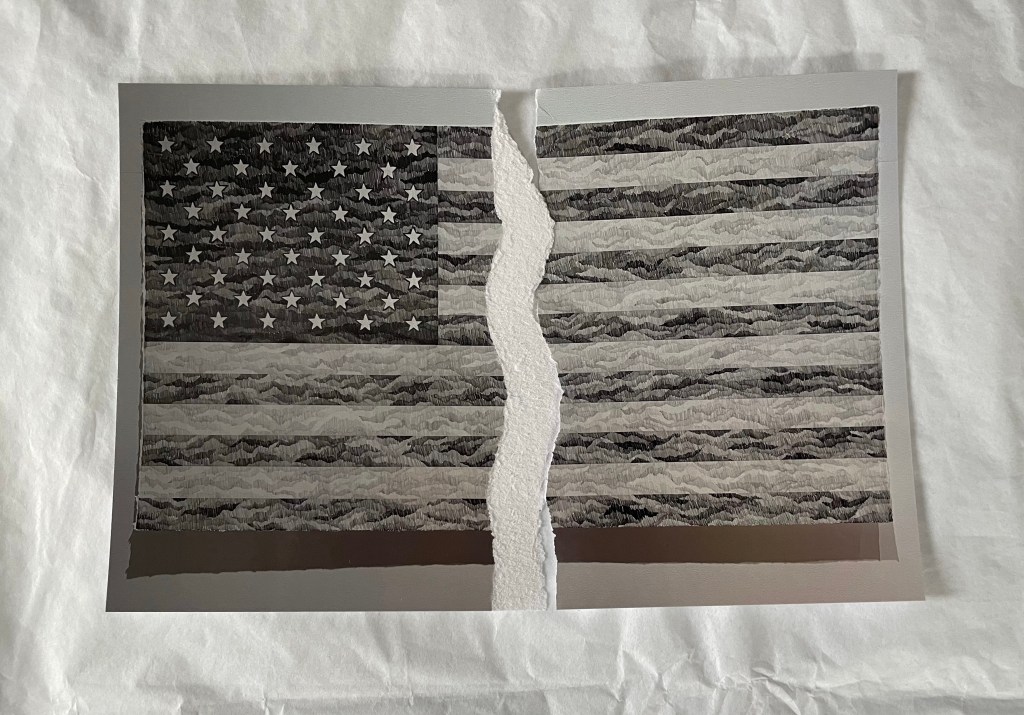
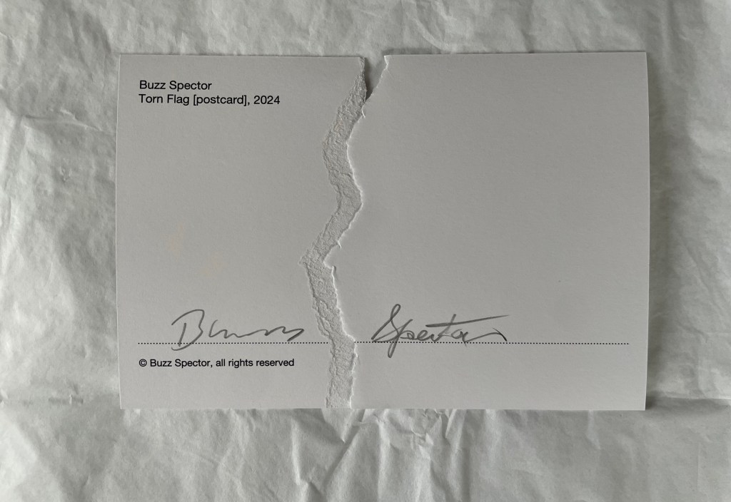
Torn Flag (2024)
Torn Flag(2024) Buzz Spector Postcard. Acquired from the artist, 26 February 2024. Photos: Books On Books Collection.
Revisiting Spector’s works this time was prompted by an invitation from the Center for Book Arts to “BookTalk: Full Dress or Half Dress, Not Casual with Buzz Spector” on 8 October 2024. The postcard reproduces the drawing Torn Flag (2022), a 565 × 1118 mm drawing (graphite on paper) that appeared in the Zolla/Lieberman Gallery. Spector describes the postcard as an “(informal) edition … Elegy to the Divided States”. Ephemeral though the postcard may be, its tearing makes a self-reflexive artistic gesture. But it also serves as an injunction: Vote. Always.
Revised entry: 7 October 2024; 24 September 2021; original entry, 31 March 2020.
Further Reading
“Buzz Spector“, Bookmarking Book Art, 12 March 2016.
Davids, Betsy, and Jim Petrillo. “The Artist as Book Printer: Four Short Courses” in Artists’ Books: A Critical Anthology and Sourcebook, edited by Joan Lyons (Rochester, NY: Visual Studies Workshop Press, 1985), p. 160.
Drucker, Johanna. 2004. The Century of Artists’ Books [Second edition] ed. New York City: Granary Books. See pages 118-19 for perceptive comments on Spector’s A Passage (1994) and his method of torn pages.
Lippard, Lucy. “New Artist’s Books” in Artists’ Books. A Critical Anthology and Sourcebook, edited by Joan Lyons (Rochester, NY: Visual Studies Workshop Press,1985), p. 53.
Mathews, Emily, and Sylvia Page. “Off the Shelf and Into the Gallery: Librarians on Spector”, Buzz Spector: Off the Shelf, Grunwald Gallery of Art, October 19 — November 16, 2012 (Bloomington, IN: Grunwald Gallery of Art, Indiana University, 2012), pp. 9-15.
Otten, Liam. “A sea of torn pages“, The Source, Washington University in St. Louis, 26 February 2010. Accessed 26 March 2020.
Perloff, Nancy. 2016. Explodity : Sound, Image, and Word in Russian Futurist Book Art. Los Angeles, California: Getty Research Institute. See pages 179-81 for perceptive comments on Spector’s A Passage (1994), a variant on biblioclasm and example of what Spector calls “a ‘conceptual purity’ because it engages completely with the book as a book.” (p.180)
Perrault, John. “Some Thoughts on Books as Art” in Artists Books, Moore College of Art, 23 March – 20 April 1973, curated by Dianne Perry Vanderlip (Philadelphia, PA: Moore College of Art, 1973), p. 21.
Schlesinger, Kyle. “The Missing Book”, Buzz Spector: Off the Shelf, Grunwald Gallery of Art, October 19 — November 16, 2012 (Bloomington, IN: Grunwald Gallery of Art, Indiana University, 2012), pp. 17-25.
Spector, Buzz. “Going Over the Books” in The Book Maker’s Desire (Pasadena, CA: Umbrella Editions, 1995), p. 8.
Spector, Buzz. “Art Readings” in The Book Maker’s Desire (Pasadena, CA: Umbrella Editions, 1995), p. 13.
Spector, Buzz. “I stack things. I tear stuff up”, Buzz Spector: Shelf Life: selected works, Bruno David Gallery, January 22 — March 6, 2010 (Saint Louis, MO: Bruno David Gallery, 2010).
Spector, Buzz. 25 March 2021. “Art Speaks“. Saint Louis Art Museum. Video series of artists’ talks. Accessed 23 August 2021.
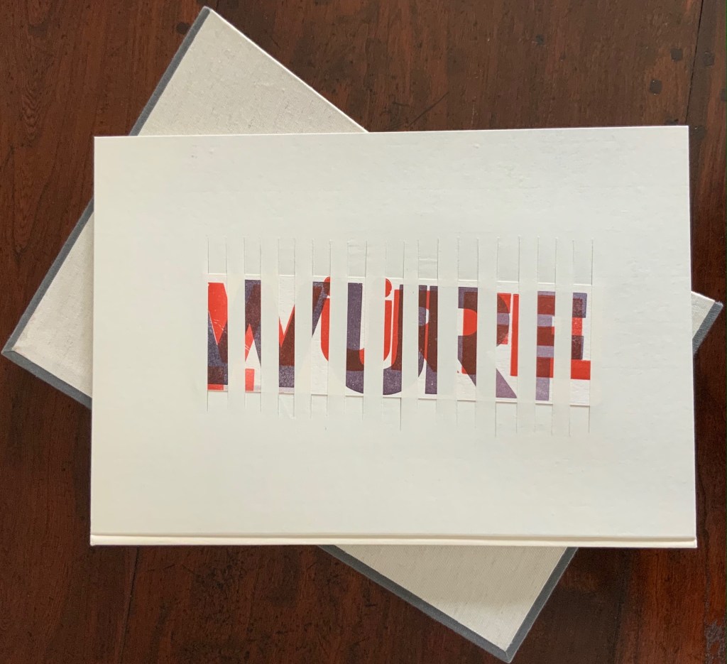
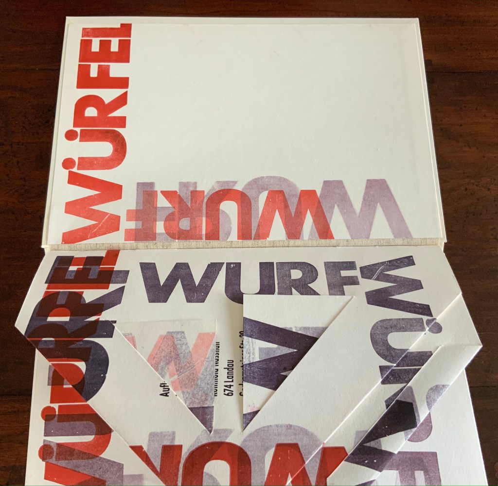
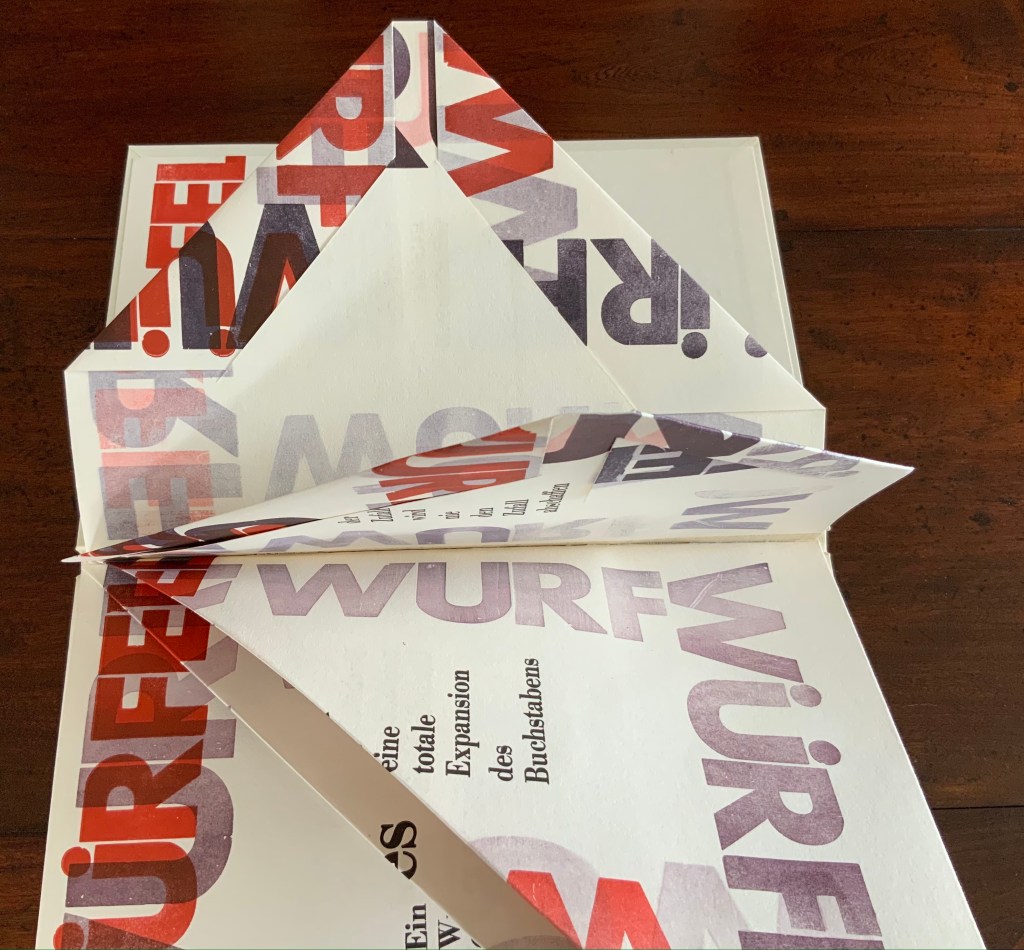
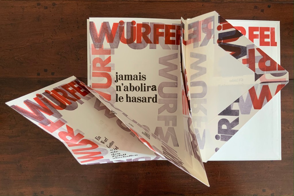
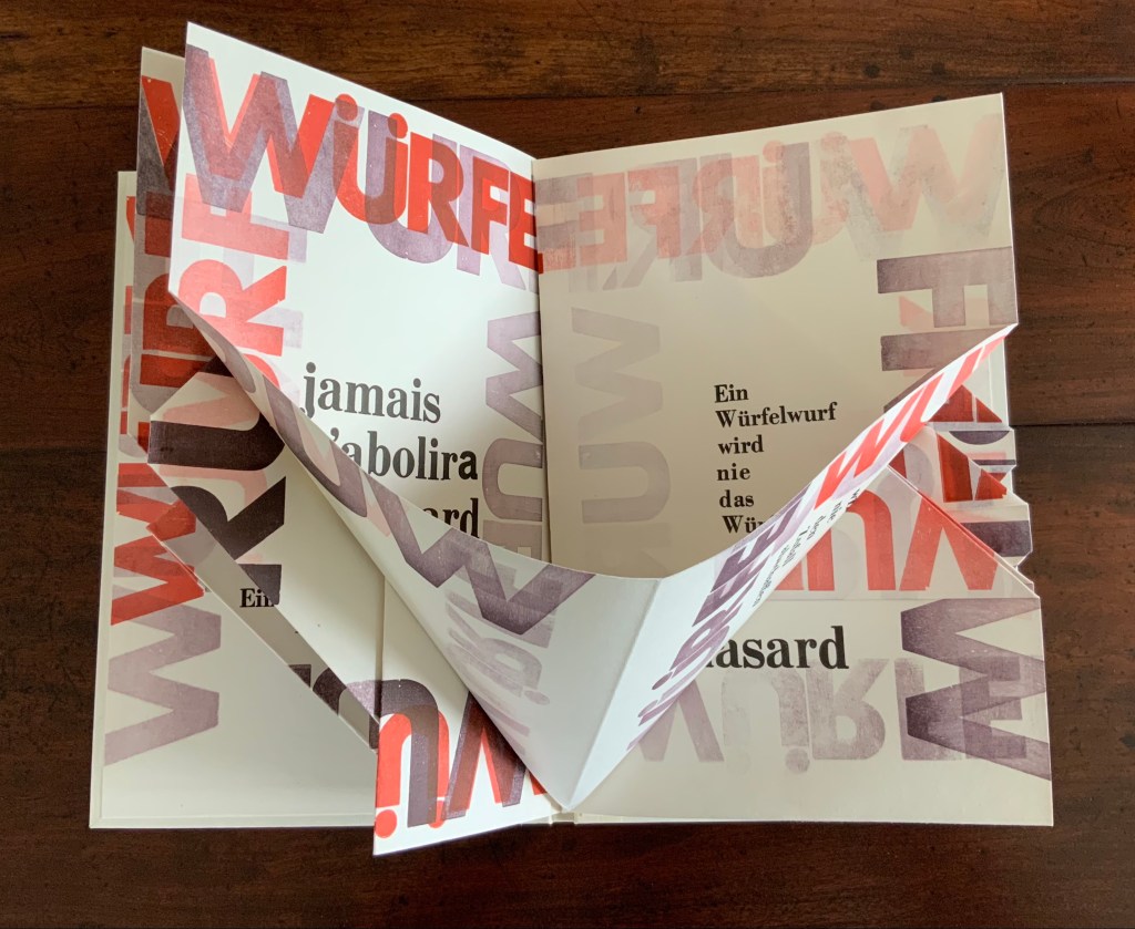
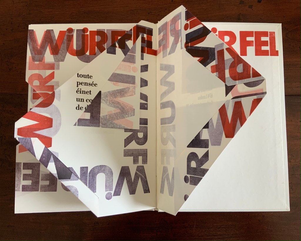
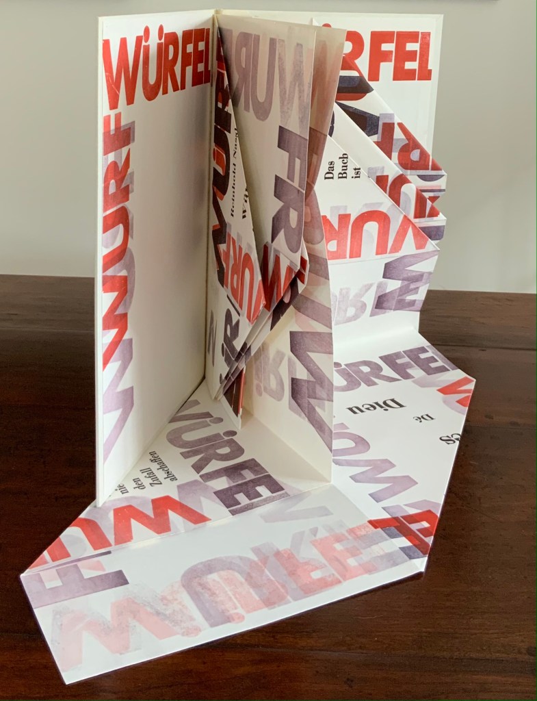
Würfelwurf: fragmentarische Annäherung an Stéphan Mallarmé (1992) Reinhold Nasshan Slipcase, embossed spine, casebound in paper-covered boards, front cover decorated with title set on slip of paper woven into the cover, block sewn and glued, with relief prints as pastedowns. Slipcase: H360 x W248 mm; Book: 351 x 243 mm, 4 gatherings of folios of varying size cut, tucked or folded to fit within the binding’s dimensions. Unique. Acquired from the artist, 24 February 2021. Photos of the work: Books On Books Collection. Displayed with artist’s permission.
“Throw of the dice”, “dice throw” or “throwing dice” are all reasonable translations of Würfelwurf, but not “a throw of the dice”, which most German translators render as ein Würfelwurf when tackling Mallarmé’s Un Coup de Dés. But then Reinhold Nasshan is not translating the poem. As the subtitle indicates, he is making “a fragmentary approach”, an approximation.
The very structure and working of Nasshan’s Würfelwurf underscore his title’s distinction between a single act and repetition of the act. On its front cover, the word würfelwurf splits in two, one half printed over the other on the slip woven into the slits in the front cover. The slip angles downward from left to right suggesting action, which comes aplenty inside the book.
Some pages are cut, their corners folded and tucked in. One gathering consists of a sheet 688 x 470 mm that is creased with mountain- and valley-folds and untrimmed at the bottom edge so that it unfolds into a base that spills out beyond the covers. Pages take on dice-shaped edges and planes that seem to roll from within and against the book. The achieved effect of motion recalls Marcel Duchamp’s Nude Descending a Staircase (No. 2) or Umberto Boccioni’s Unique Forms of Continuity in Space.
Although the title of Mallarmé’s poem appears, most of the text scattered across the surfaces comes from his other writings; for example, peindre, non la chose, mais l’effet qu’elle produit (“to paint, not the thing, but the effect it produces”); tout, au monde, existe pour aboutir à un livre (“everything in the world exists to end up in a book”); and Das Buch ist eine totale Expansion des Buchstabens (“The book is a total expansion of the letter”). When that large folded gathering comes, though, the Mallarmé’s words begin to be jumbled: Ein Würfelwurf wird nie das Würfelspiel abschaffen (“A throw of the dice will never abolish the game of dice”) and Ein Wurf Gottes wird nie den Zufall abschaffen (“A throw from God will never abolish chance”).
Strangest of all is the mangling of émet from the poem’s final line Toute pensée émet un coup de dés (“All thought emits a throw of the dice”). The word becomes éinet. Not French, not German. Perhaps a typo of “in” for “m”? As it turns out, according to the artist, it is a fluke that the letter “m” available in the font on hand printed poorly, so “i” and “n” provided an alternative three vertical strokes.
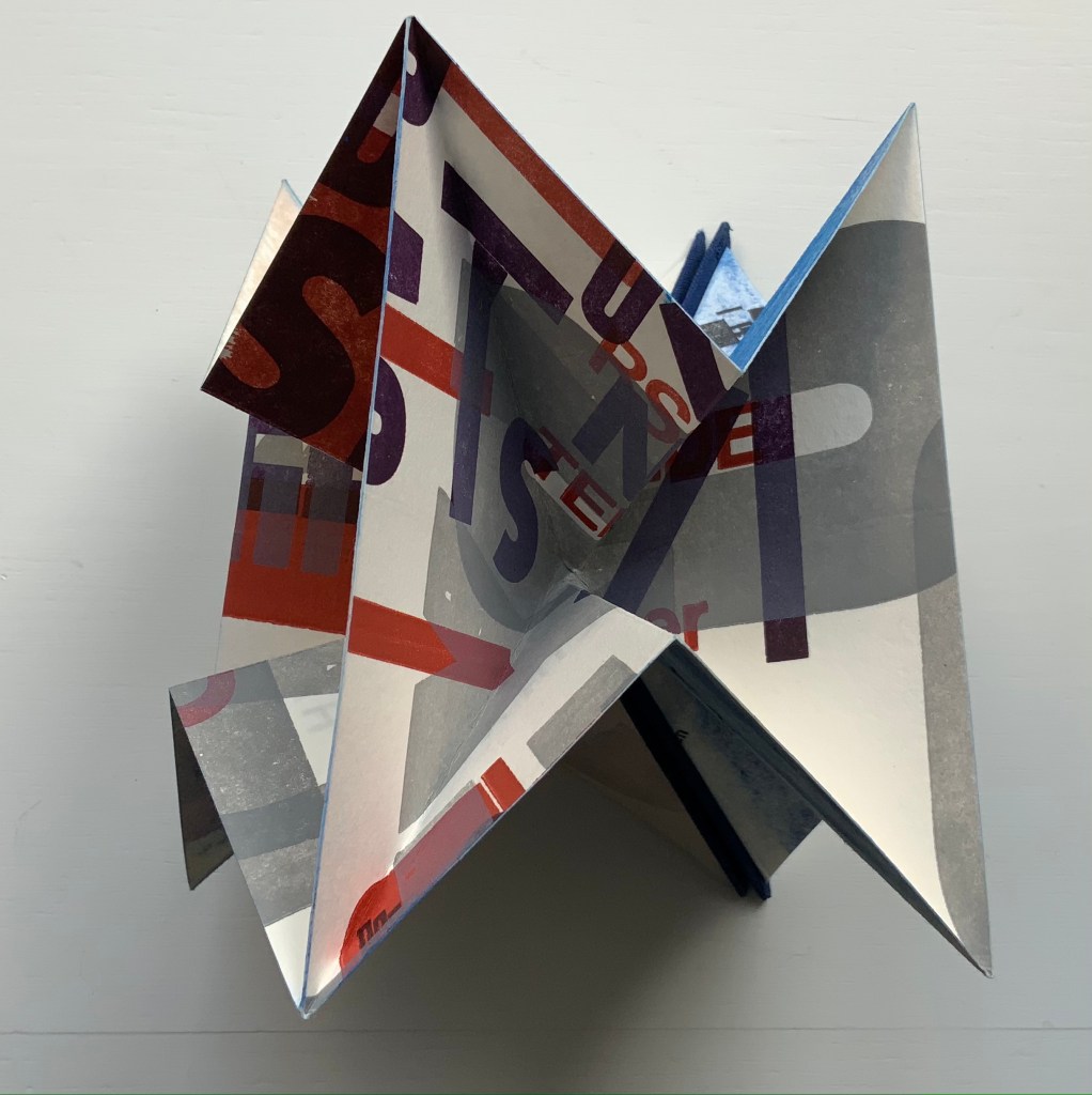
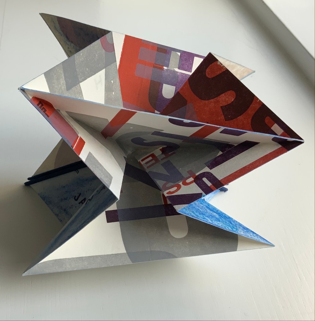
Un Coup: Stéphane Mallarmé (1997)
Un Coup: Stéphane Mallarmé (1997) Reinhold Nasshan Flexible triangular cloth-covered book boards, 4 cotton paper squares folded into origami water bomb base and glued. Triangle: 127 x 127 x 179 mm; Square “pages”: 166 x 166 mm. Acquired from the artist, 24 February 2021. Photos of the work: Books On Books Collection. Displayed with artist’s permission.
Nasshan also refers to this as a “letter sculpture”. Inviting the reconfiguring as with the works of Eleonora Cumer or Bruno Munari, or simply constant fiddling as with a paper fortune teller, Un Coup is more three-dimensional than Würfelwurf. As with Würfelwurf, this work lets the “moment of movement itself, the transition between the throw and the impact of the dice, emerge graphically” (moment der bewegung selbst den ubergang zwischen dem werfen und dem auftreffen der wurfel, graphisch hervortreten zu lassen). With less surface than Würfelwurf, though, it has fewer extracts from Mallarmé’s writings. Indeed, along with the physical shape shifting, the enlarged letters overprinted at multiple angles to one another combine to make this work more abstract than extract. But because text and book are material from which, on which and with which Nasshan creates, the abstract retains its links to the book.
Also a painter, Nasshan’s works fall into two categories or surfaces — painted books and painted canvases. Though lacking the shape of a book, his abstract paintings retain that link to “the world of Letters” in shapes and figures that evoke hieroglyphics, Chinese characters, typography and even cave paintings. His influences appear equally eclectic — though more Kandinsky, Klee and Miró than Pollock or Rothko — which matches up with his choice of substrates in fiction and nonfiction. When not choosing works from the ancient, classical or Romantic periods (from Gilgamesh to Seneca to Hölderlin), he chooses Apollinaire, Beckett, Celan, Joyce or Wittgenstein among others from the Modern period.
A wider audience would profit from Nasshan’s works. At least these two and others that might enter the Books On Books Collection will be available in the 2022 exhibitions celebrating the 125th anniversary of the publication of Un Coup de Dés in Cosmopolis (May 1897).
Chroma Numerica (2019) Andrew Morrison Perfect bound cased in quarter-hinged paper-on-board binding. H143 x W145 mm, 60 pages, printed on one side. Edition of 30, of which this is #17. Acquired from the artist, 2 September 2021. Photos of the work: Books On Books Collection. Displayed with artist’s permission.
In the children’s book tradition, counting books and alphabet books often come paired. Chroma Numerica‘s partner appears with the same binding earlier in Andrew Morrison’s work below, and in both cases, the printing process is the real subject — not the learning of numbers or letters. From his wood type, Morrison rolls out oversized numbers 1-30 printed in a chromatic scale on Somerset Book 200gsm paper.
Provenance (2018)
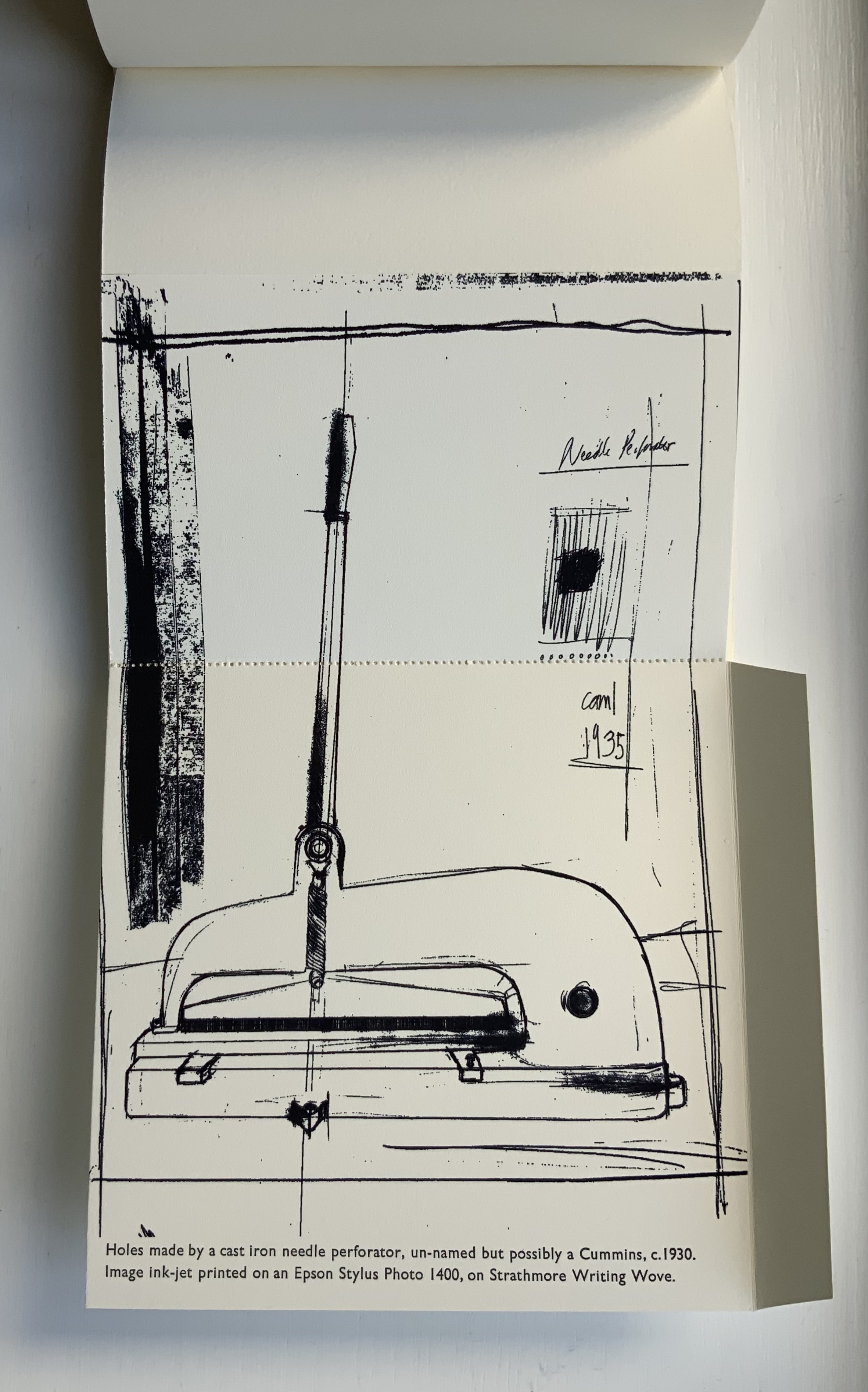
Provenance (2018) Andrew Morrison Casebound with dustjacket. H152 x W155 mm, 9 foldouts, 6 leaves (including 1 trimmed short), 2 end leaves. Edition of 30, of which this is #28. Acquired from the artist, 2 September 2021. Photos of the work: Books On Books Collection. Displayed with artist’s permission.
While Chroma Numerica and A-Z use printing processes to count and spell out their subjects, Provenance uses folds and stitching to conceal texts and images that reveal the making of the book itself. More than the other two books, Provenance requires “reading with the hands”. The two sequences below show the result and process — or the effect then cause — of needle perforation and wire stitching. In the first, the perforation can be seen along the right-hand edge, then along the left, and then in the middle of the unfolded image, which is annotated with a description of the printing process and paper. In the second sequence, the wire stitch can be seen in the gutter; then, with the two tabs pushed back, the German stitching machine comes in view, again annotated with a description of the printing process.
Provenance recalls those sets of binding models produced by Gary Frost, Karen Hanmer and others, but it may be too fragile for the constant reading with the hands that it would undergo as a teaching tool. It is more to be carefully and gently admired — a beautiful peacock admiring itself in the mirror of itself.
Two Wood Press A-Z (2013)
Two Wood Press A-Z (2013) Andrew Morrison Hardcover. Casebound glued. H180 x W155 mm, 56 pages. Edition of 30, of which this is an A/P. Acquired from the artist, 5 May 2020. Photos: Books On Books Collection. Displayed with artist’s permission.
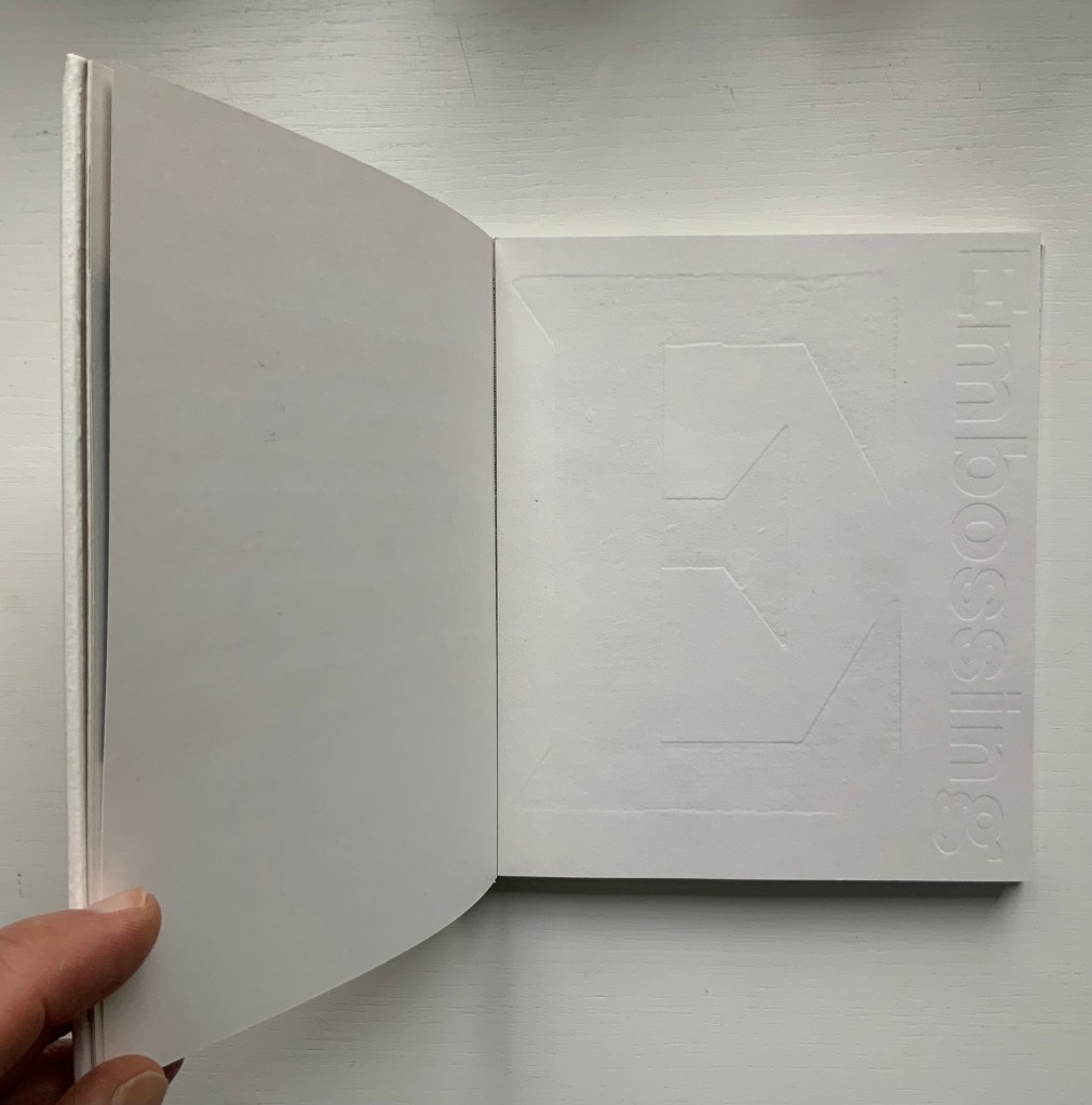
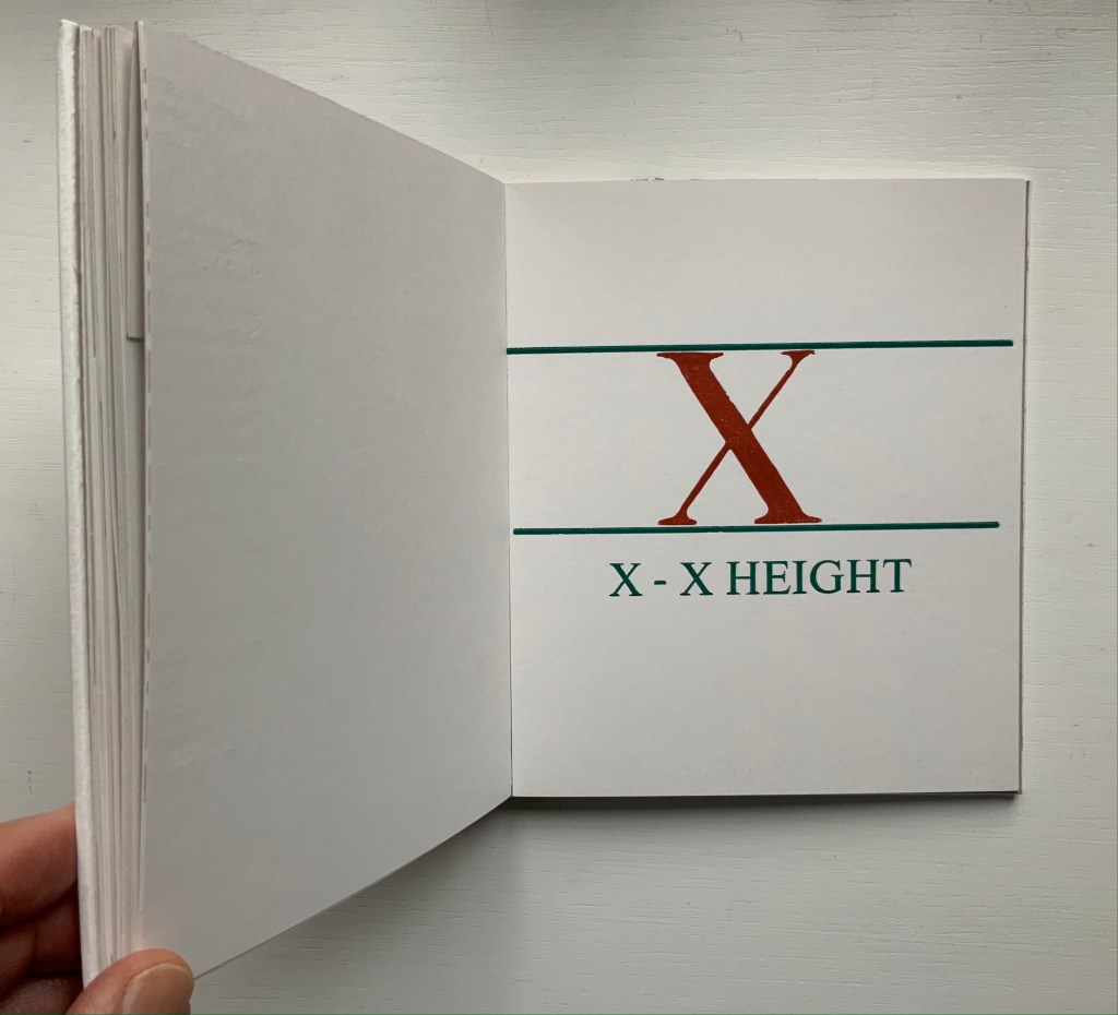
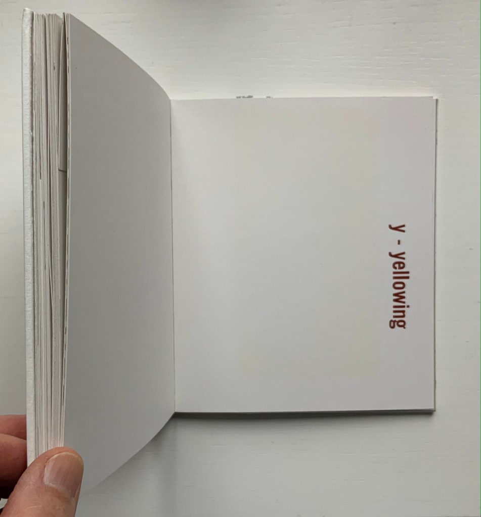
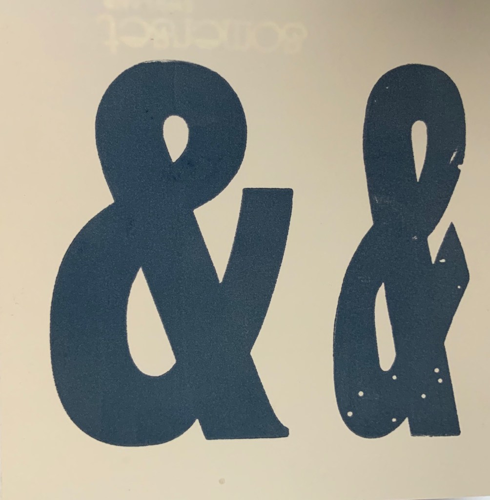
An inspired A-to-Z, with tongue in cheek evident in the material form as well as the text. At first, there seems to be no letter A, but closer inspection reveals the ampersand sneakily placed at the start of the alphabet on a page glued halfway up the pastedown. For the letter C, we have “chase” — the heavy steel frame used to hold type in a letterpress. Of course, the type held in a chase would read as in a mirror, and so “C. WADE.” and “HALIFAX.” do just that in their “paper” chase. E for embossing is, of course, embossed. The usually difficult search for a word or term beginning with X is not a problem for typophile and provides a self-defining demonstration as does “yellowing” for Y. For the letter Z, we have to take it on trust that the images are the result from “an etched letterpress printing plate made of zinc”.
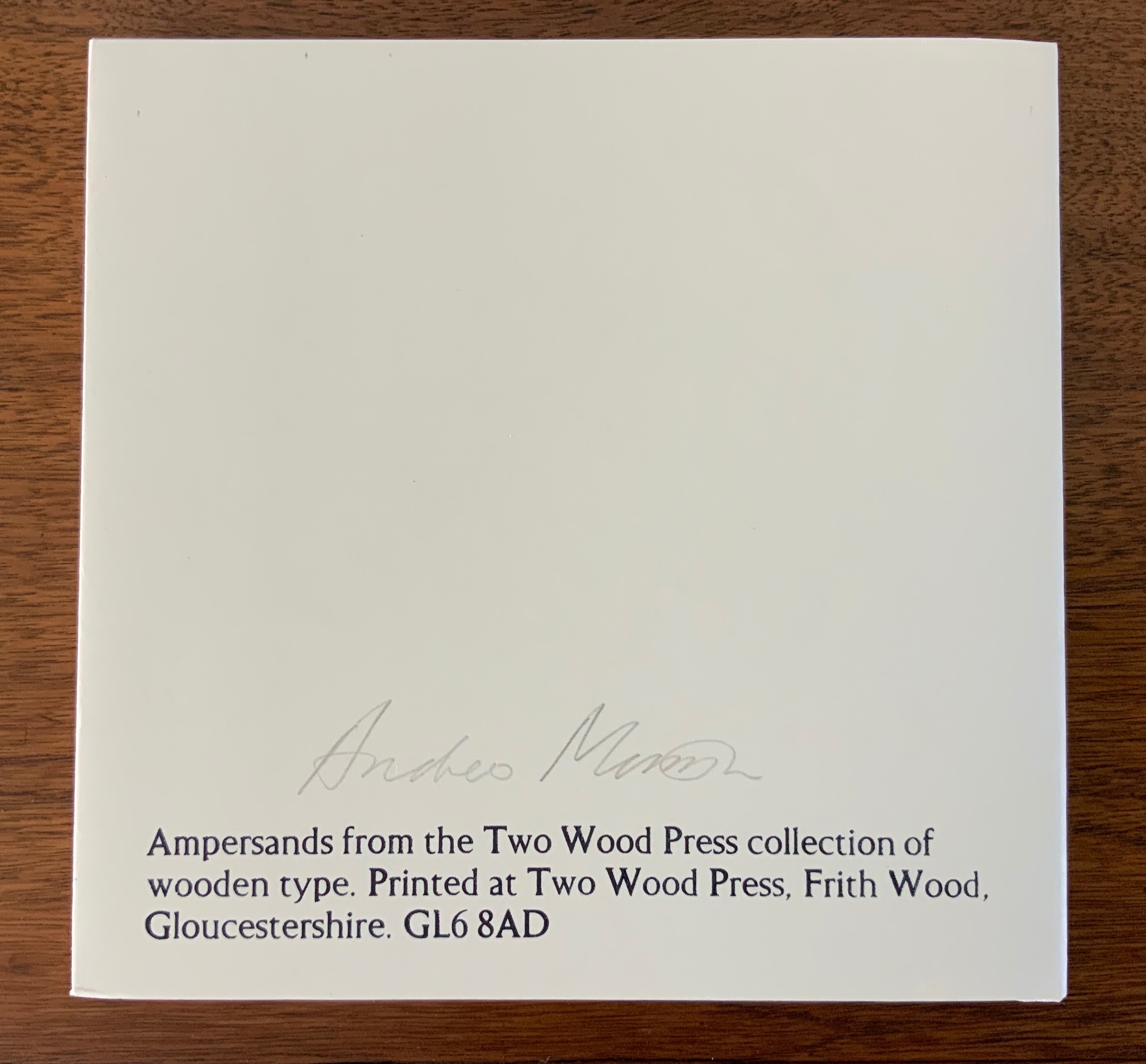
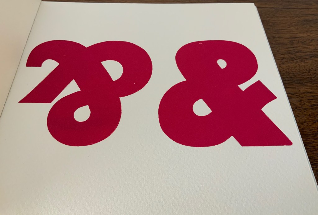
Ampersand& (2007)
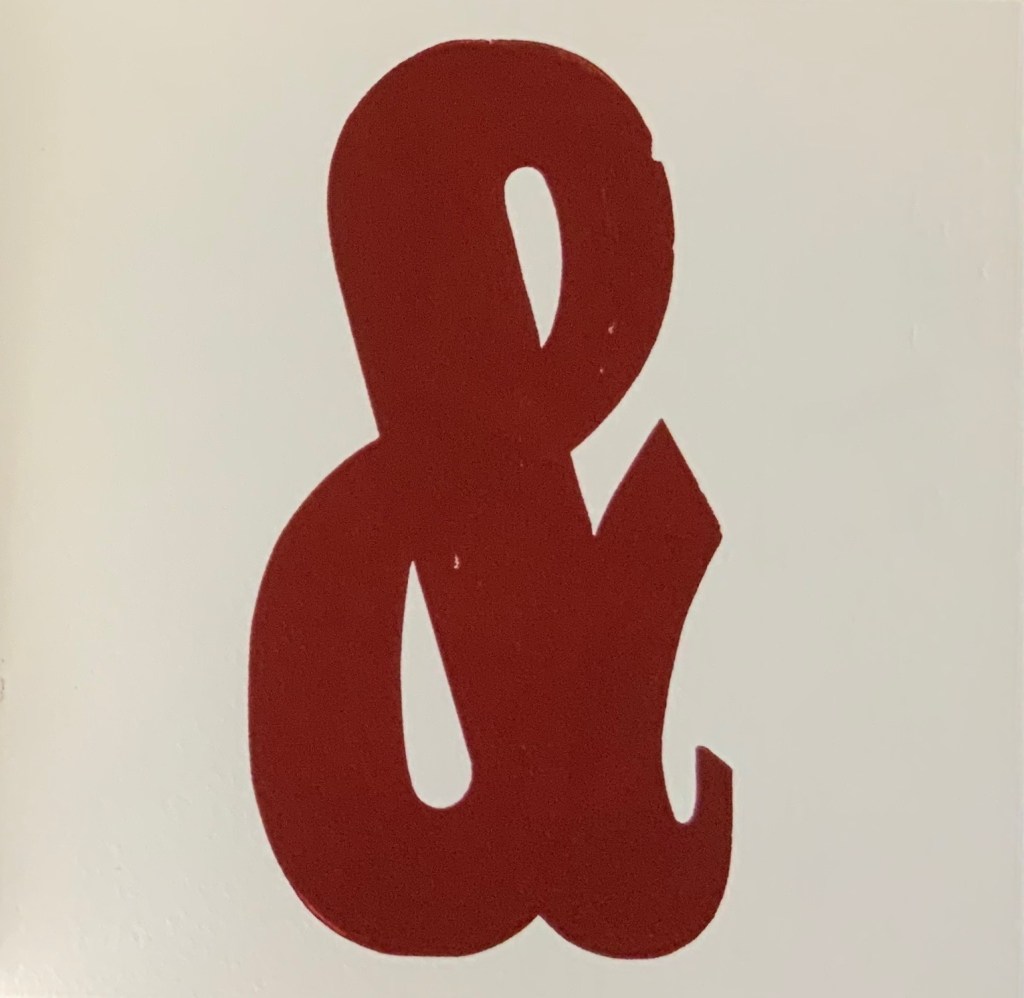
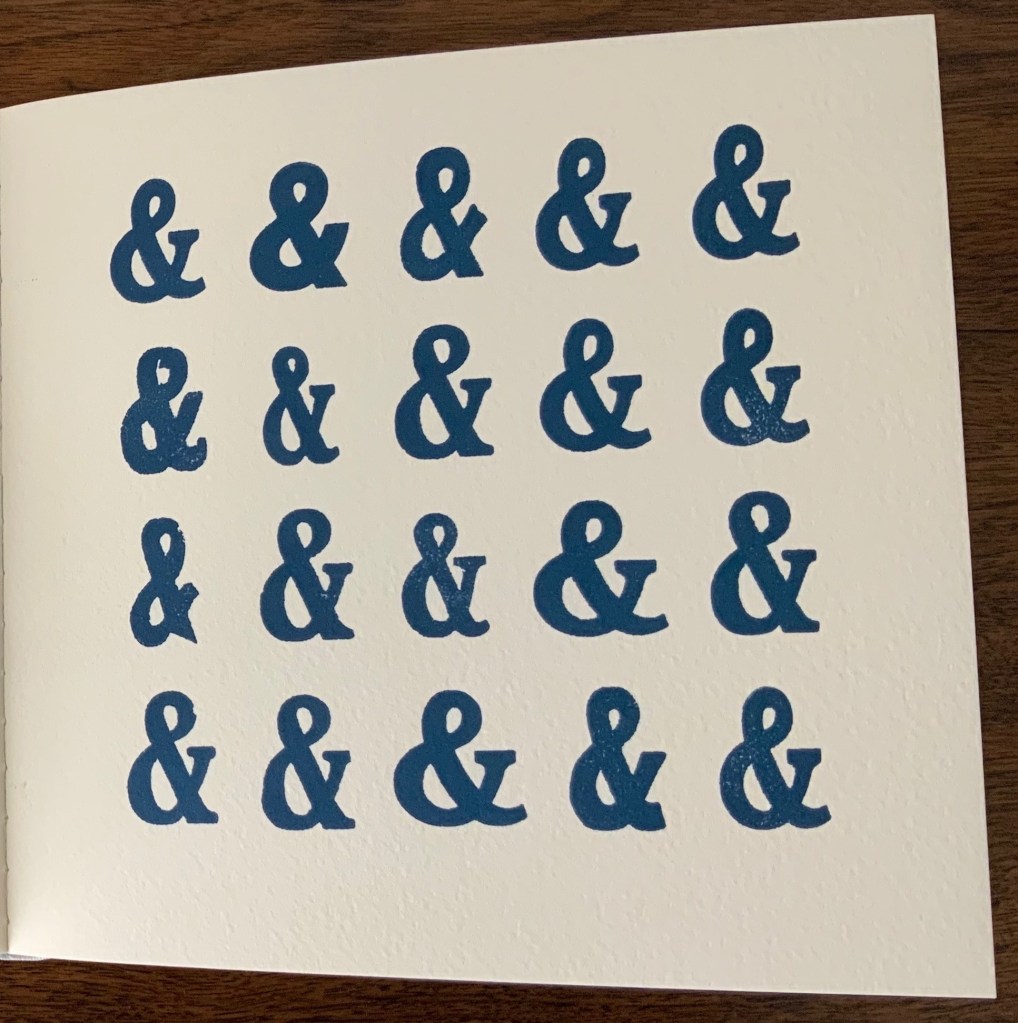
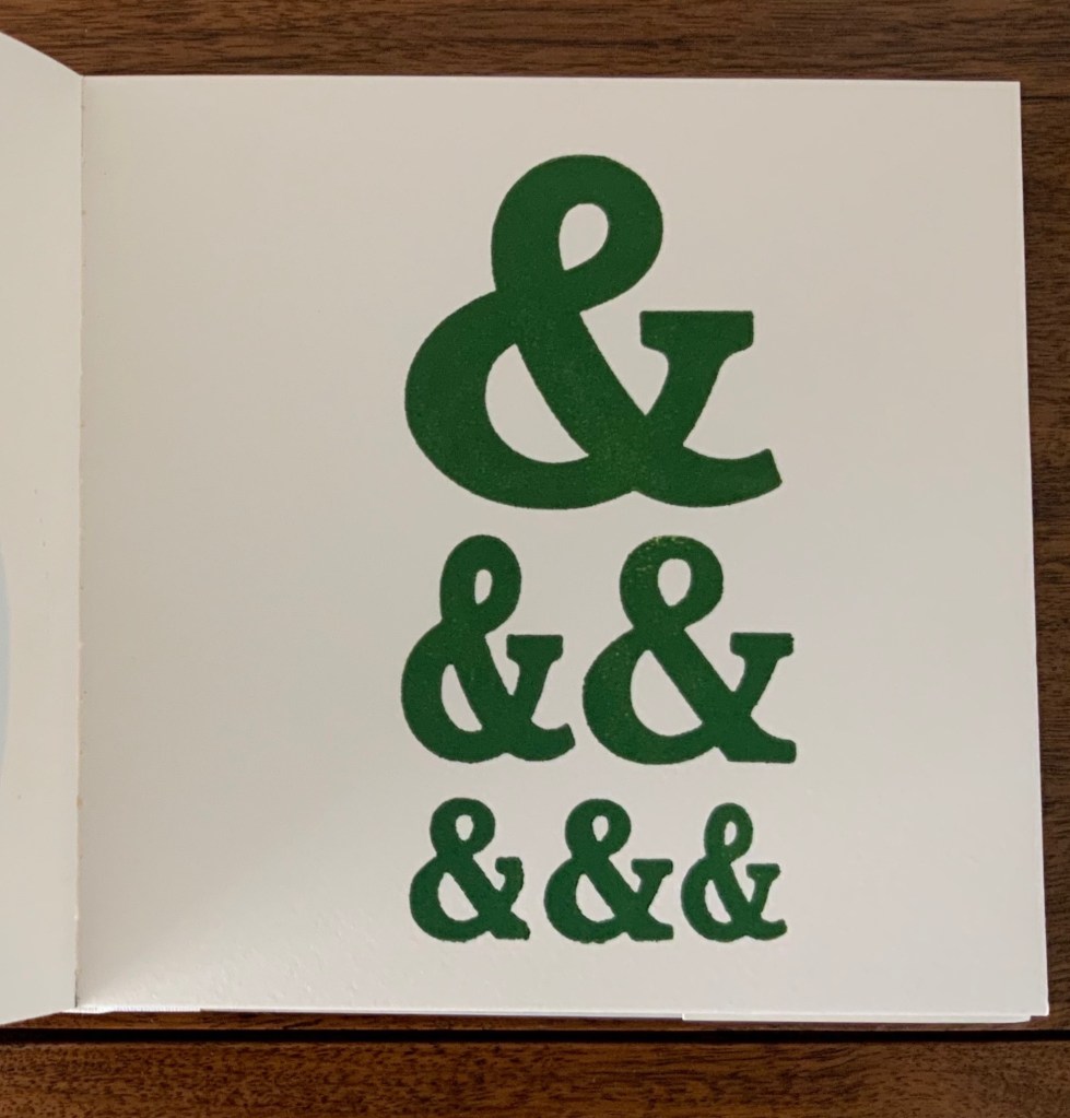
Ampersand& (2007) Andrew Morrison Board cover, perfect bound. H180 x W180 mm, 22 pages. Acquired from the artist, 5 May 2020. Photos: Books On Books Collection. Displayed with artist’s permission.
The sneaky ampersand at the beginning of Two Hand Press A-Z may have escaped from Ampersand& — or given the density and evenness of the possible escapee’s color, perhaps not. Any collection of wooden type will have “character”-giving flaws — nicks, nocks and abrasions. So it is with this … what is the collective noun for ampersands? The variation in shape of these ampersands and Morrison’s flaunty display of them deliver even more character. And note the watermark in the Somerset paper peeking through the third image below.
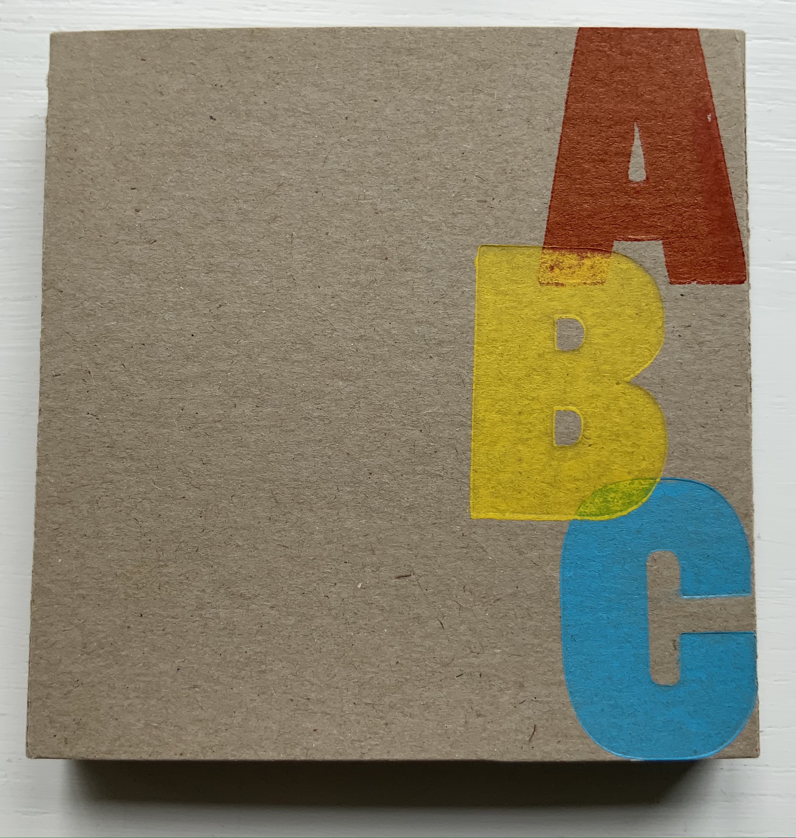
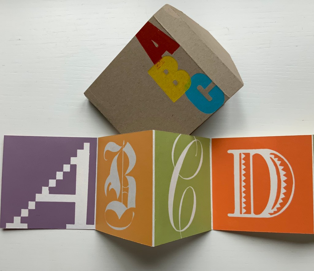
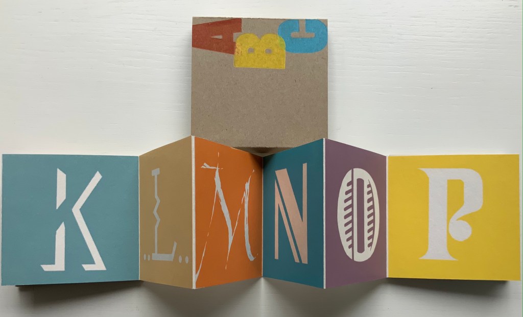
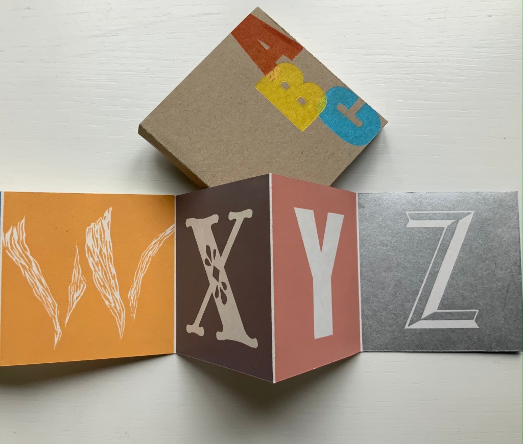
You think the beginner’s ABC, the primary colors and the humble linocut are so simple? That’s the challenge posed by this accordion wrapper’s overlap of a red A with a yellow B and its overlap with a blue C.
ABC (2015) Tara McLeod Miniature accordion book. Wrapper: H90 x W90 mm; Acccordion closed: H85 x W85 mm; 26 hand cut multi-color lino block letters printed on 200gsm Lana Desin Blanc. Acquired from National Library of New Zealand, 1 August 2021. Photos of the work: Books On Books Collection. Displayed with the artist’s permission.
With each letter’s stylistic shift in shape …
with each panel’s chromatic shift around the shifting shapes …
Tara McLeod’s artistry shows how these 26 signs, 3 colors, blade, block and surface are both anything but simple and everything that is simple.
Letterpress Printing ABC (2004) David Clifford Miniature. H78 x W78 mm, 62 pages. Edition of 50 numbered copies, of which this is #48. Acquired from Bromer Booksellers, 1 August 2021. Photos of the work: Books On Books Collection. Displayed with permission of the publisher.
Among the several outstanding production features of Clifford’s miniature is its variation on Claire Van Vliet’s binding structure in The Gospel of Mary (2006). It first becomes apparent in the double-page spread below. As with most of the structures demonstrated in Woven and Interlocking Book Structures (2002), the binding structure consists of woven strips of paper to hold the folios together and attach the cover. The top-down view of Letterpress ABC shows the gathered folios and, if enlarged in a browser, also shows the paper tape running from the cover and across the gathers.
Staking his claim over Andrew Morrison as first past the post, Clifford starts his A-Z with the last symbol of the alphabet (“Ampersand”) and closes with the same Z term (“zinco”). There are other overlaps in terms, but the two efforts differ so rewardingly — Clifford’s woven binding, typeset definitions, miniature trim size and handmade paper versus Morrison’s children’s board book hinged binding, demonstrated definitions, larger trim and Somerset paper — that one cannot be chosen over the other.
An additional pleasure from Clifford’s book is its complement to two other Heavenly Monkey publications in the Books On Books Collection: Francesca Lohmann’s An Alphabetical Accumulation (2017) and Rollin Milroy’s Francesco Griffo da Bologna: Fragments and Glimpses (2020). If it were not for Rollin Milroy, the attentive reader and I would forever struggle with the puzzle of how Clifford’s 2004 binding came to be influenced by Van Vliet’s 2006 binding. Milroy writes:
Claire came to Vancouver in ’04 and gave a day-long class, which David (& his daughter Yasmine) attended. The project was already in development (probably even printed), and D showed Claire a dummy and got some pointers. I didn’t realize ABC preceded her own Gospel.
And here is the entry for Letterpress extracted from proofs for Heavenly Monkey’s checklist to be published in 2022: