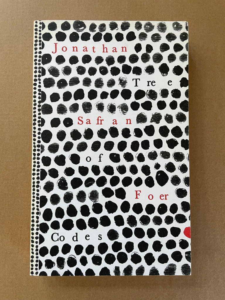
Tree of Codes (2010) Jonathan Safran Foer Perfect bound paperback of die-cut pages. H220 x W135 mm. 284 pages. Acquired from Visual Editions, 30 January 2014. Photos: Books On Books Collection.
The artist’s book “tradition” of excising words from the page goes back at least to Marcel Broodthaers’ and Mario Diacono’s renderings of Un Coup de Dés Jamais N’Abolira le Hasard by Stéphane Mallarmé. Jonathan Safran Foer’s Tree of Codes (2010) takes that tradition to the more complex plane that Tom Phillips reached with A Humument (1980-2016). In the hands of Foer and his publisher Visual Editions, the treatment becomes simultaneously more personal and mechanical. The more personal aspect is best expressed in Foer’s afterword (see below). The mechanical aspect is the use of die cutting for production and the reader’s use of a blank sheet to enable reading the text left over from Bruno Schulz’s The Street of Crocodiles (1934, trans. 1963) that forms the new narrative of Tree of Codes.
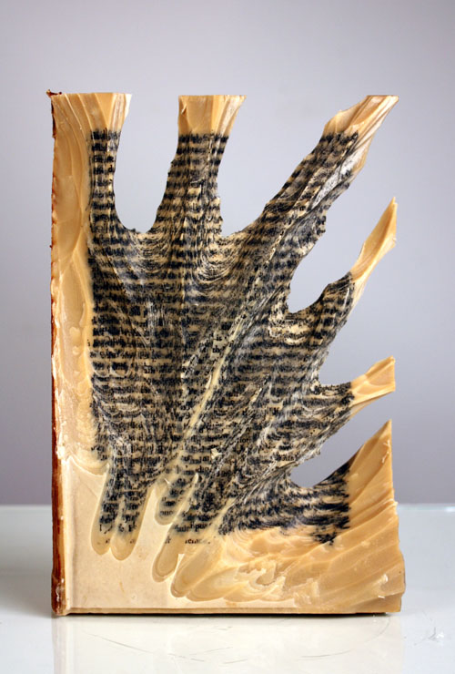
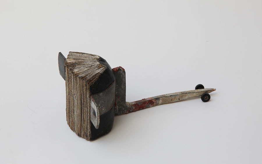
Carving 9 (2012) Jessica Drenk Altered book and wax. H203 x W152 x D38 mm. Unique. Acquired from the Seager Gray Gallery, 10 February 2019. Photo: Courtesy of the gallery.
Once a book becomes another material from which art can be made, the rectangular block offers itself up to an unbounded variety of treatments. It can be folded into something else. Or macerated and squeezed out, or into, something else. Or shot, burnt, frozen, soaked, coated or buried and dug up. Or torn, shredded and reconstituted or scattered. Or carved with any number of implements into any number of shapes.
But that oblong of material just lying there and the techniques of altering it are not usually sufficient starting points for the artist. In Jessica Drenk’s case, a visit to a botanic garden’s “large greenhouse full of hundreds of different succulent species” provided the necessary catalyst. As she explained in an interview with Patron: “It blew me away to see so much slight variety within the same category of plant and this experience sent me down a path of experimenting with books in the studio; I wanted to see how many different shapes and objects I could make out of the one material.”
Why should an obscure poem like Stéphane Mallarmé’s groundbreaking Un Coup de Dés Jamais N’Abolira le Hasard: Poème (1897) have become the cornerstone of an art-industrial complex of literary, critical and artistic responses ranging from essays, books, edited collections, countless editions, and appropriations in the form of fine press livres d’artiste, book art and sculptures, films and theater, ballets and fado, musical compositions, digital programs and installations, and even pavement art?
Penguin’s 2007 series “Great Loves” is a twenty-book set of short paperbacks with selections from the usual suspects (D. H. Lawrence) and the unusual (Søren Kierkegaard). The selection of eleven tales from Giovanni Boccaccio’s Decameron provides Carolyn Thompson with the opportunity to create a work of altered book art enjoyable on several levels.
The unaltered cover promises one thing. Its “under-the-cover” title page delivers another.
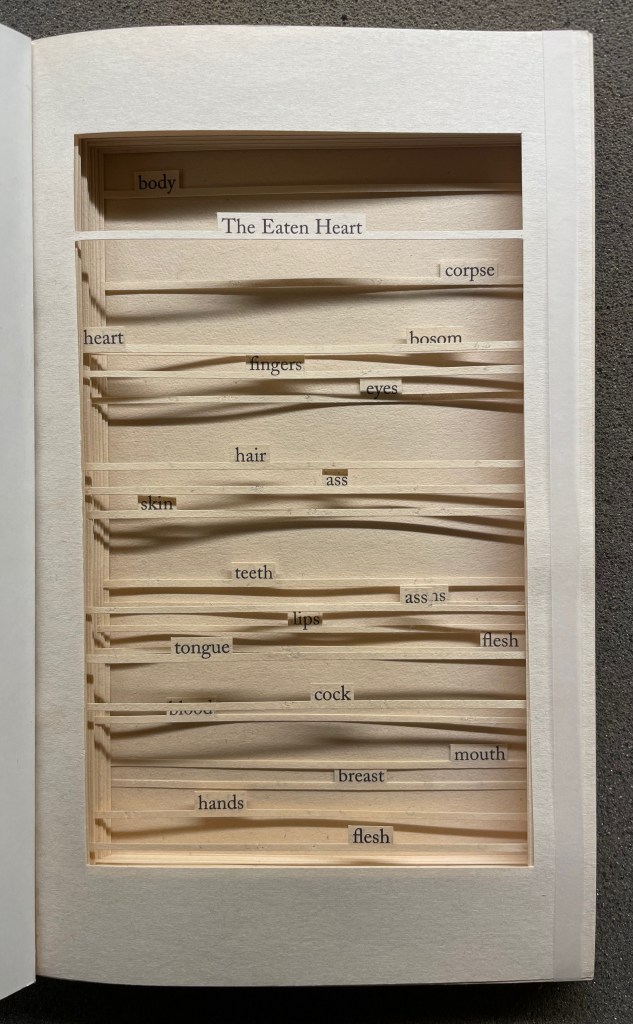
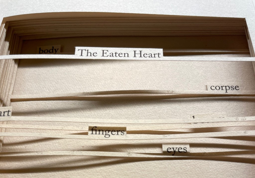
The Eaten Heart (2013)
The Eaten Heart(2013) Carolyn Thompson Altered perfect bound paperback. H180 x W111 mm. 124 pages. Edition of 3, of which this is #2. Acquired from Eagle Gallery, 7 October 2023. Photos: Books On Books Collection. Displayed with artist’s permission.
Thompson’s chosen technique of removing text with a scalpel enacts one of the paradoxical meanings of the revealed tell-tale title it presents: the scalpel has eaten away all the text on this title page except for the text chosen as the title. Boccaccio’s text is there but not there, and the “under-the-cover ” title nods toward his missing content. Leaving only words referring to the body, Thompson’s work of book art celebrates the raunchy “under the covers” innuendo in Boccaccio’s text.
The transparent tape that holds the body of cut pages together (just detectable in the image of the title page above) can be removed and the pages turned (carefully!). Below is page 11 “in motion”.
The sequence of pages 116 to 119 below shows that, while the verso pages do not play a role in the work, the movement of words on the recto side away from those that follow them, revealing the blank sheet at the end, invites musing about their possible relationship as well as marvelling at the artist’s delicate patience applied to the indelicate.
Later on, using the 50 books in the Penguin Modern Box Set (2018), Thompson created text pieces, drawings, embroideries, prints and additional altered books in the spirit of The Eaten Heart. The Laurence Sterne Trust exhibited the full set of works at Shandy Hall, York, in 2019. Eagle Gallery hosted them again in London in February 2020, and the same year, After Capote: When Truman met Marlon, her altered version of Truman Capote’s The Duke and His Domain in the series, won the Minnesota Center for Book Arts Prize People’s Book Art Award.
The more wide-ranging but more consolidating work that follows demonstrates Thompson’s indefatigable originality and insatiableness as a re-purposing artist.
The Beast in Me (2021)
The Beast in Me (2021) Carolyn Thompson Print. 130 x 130 cm. Acquired from Information as Material, October 2021. Photos: Books On Books Collection. Displayed with artist’s permission.
Although The Beast in Me has a previous iteration from 2014, this one commissioned for the second issue of Inscription: The Journal of Material Text (the “holes issue”) expands to over 500 snippets of text beginning with ‘I’ from eight different novels. Its manner of doing so makes The Beast in Me simultaneously centrifugal and centripetal in its effect — perhaps more emblematic of Inscription‘s coverage in its “holes issue” than the impressive work chosen for the covers.
Here is Thompson’s description of the commissioned work:
The statements (over five hundred of them) are presented one after another in a circular narrative with no natural beginning or ending and can therefore be read from any point. When removed from their original context, they become ham-fisted stabs at self-revelation and blurted snapshots of confession. They contradict one another, and the narrator. The piece explores the power struggle within all of us, where different aspects of our personalities vie for dominance over one another at any given moment, while others yearn for internal balance. The narrative, whilst light and frivolous in places, descends into a sinister and uncontrollable rant in others.
If we accept the print’s invitation as we would a book’s invitation to read — to engage in narrative — we find that human identity’s ever precarious balance — between inward and outward forces, its introverted and extroverted elements, the being apart and the being a part of, and integration vs disintegration — is captured sharply. A blank center, a void or hole — there but not there — defined by fragments simultaneously flying outward and pressing inward.
ABC of Typography (2019) David Rault Casebound, sewn, illustrated paper-over-boards cover, endbands, sewn, red doublures. H265 x W195 mm. 128 pages. London: Self Made Hero [Translated from French (Gallimard, 2018)]. Acquired from The Saint Bookstore, 29 June 2023. Photos: Books On Books Collection.
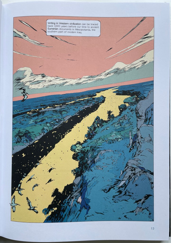
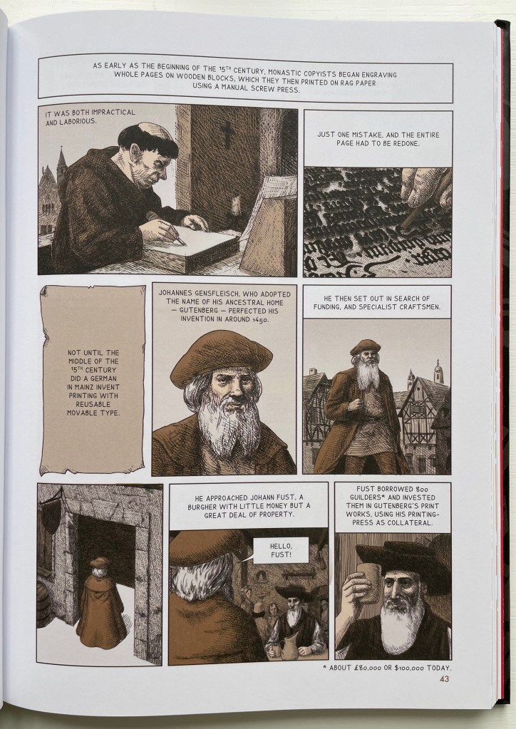
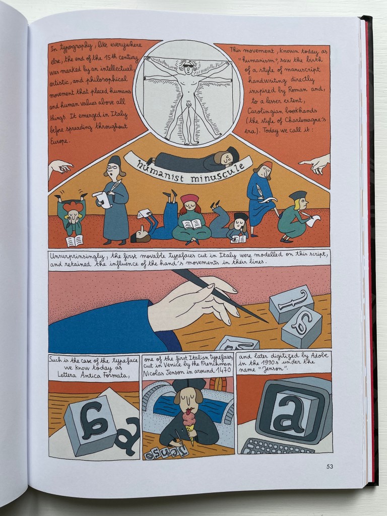
David Rault’s ABC of Typography traces 3,500 years of letters and type from pictographs and cuneiform through Roman lettering and Gutenberg to the Bauhaus and beyond. For the Books On Books Collection, it enriches the focus on the alphabet, typography and artists’ books — in particular, that subset of illustrated histories of the alphabet and type. These include Tommy Thompson’s The ABC of Our Alphabet (1952), William Dugan’s How Our Alphabet Grew (1972), Tiphaine Samoyault’s Alphabetical Order (1998), James Rumford’s There’s a Monster in the Alphabet (2002), Ada Yardeni’s A-dventure-Z’ (2003), Don Robb and Ann Smith’s Ox, House, Stick (2007) and Renzo Rossi’s The Revolution of the Alphabet (2009).
While enhancing that subset of illustrated reference works, ABC of Typography also highlights a gap in the collection. Rault and his team of invited artists hail from the Franco-Belgian tradition of lesbandes dessinées (BDs), which the French and Belgians call laNeuvième Art (“the Ninth Art”). English-language readers will likely be familiar with BDs from seeing Hergé’s Tintin or René Goscinny’s Asterix. Other than Chiavelli’s Arthur R./Un Coup de DÉS Jamais N’Abolira le HASARD (1988) and its two companion volumes, the collection has no BDs. The Rault volume does, however, deliver a mini-survey of styles among contemporary bandes dessinateurs with its assignment of chapters to eleven different artists.
The book’s overall design by Jean-Christophe Menu simultaneously embraces and sets off the individual styles of drawing and lettering. Menu’s consistent use of a slab serif font (Lubalin Graph Std?) for chapter titles alongside oversized chapter numbers that bleed off the facing page signals his intent and success.
The variety of “strip” layouts pushes the boundaries of unity. Some, like Libon’s and Clérisse’s, float on the page. Others, like Singeon’s and Simon’s, are ruled off. Within the strip layouts, panels vary in shape, and the images within them tilt at different angles, all creating as much of a sense of movement as any action comic. Even where a strip is ruled off, sketches sometimes encroach across panels as well as the book’s margins or gutter to give depth and perspective as well as movement. as happens with the gulls in flight below from Aseyn’s chapter.
Note how the gulls in flight in Aseyn’s chapter appear within panels but also cross them and the gutter.
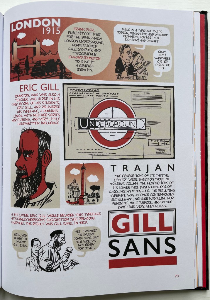
Evident from Clérisse’s recounting of “Les Rencontres internationale de Lure” (an influential annual forum in Provence), Simon’s homage to the typologist Maximilien Vox (one of the forum’s founders) and Ayroles’ positioning of the typeface DIN, the volume’s European roots are never far from the surface, which also makes ABC of Typography a useful and necessary addition to this collection or any shelf of Anglo-centric works about the alphabet, type or design. It’s interesting that, while the French have categorized BDs as the ninth among the ten officially designated arts, typography and design do not yet rate a category. Neither does the livre d’artiste for that matter, which raises a question:
Between the traditional BD and livres d’artistes by graphic artists, is there fertile ground for artists’ books that blend subject, material, form and metaphor into innovative works of book art? The above-mentioned BD by Chiavelli, paying homage to Mallarmé’s Un Coup de Dés, represents one end of that spectrum. Hervé di Rosa, part of the Figuration libre movement, associated with Keith Haring and graffiti artists, can provide the other end of the spectrum with his Un Coup de Dés jamais n’abolira le Hasard (2021), published by Virgile Legrand. For the work of book art between them, Nanette Wylde’s Babar Redacted: ABC Free (2020) might be a case in point. Likewise, Catherine Labio’s curated exhibition in 2013 — “From Bande Dessinée to Artist’s Book” — finds earlier exemplars in the works of Lars Arrhenius, Felicia Rice, Omar Olivera and Mamiko Ikeda.
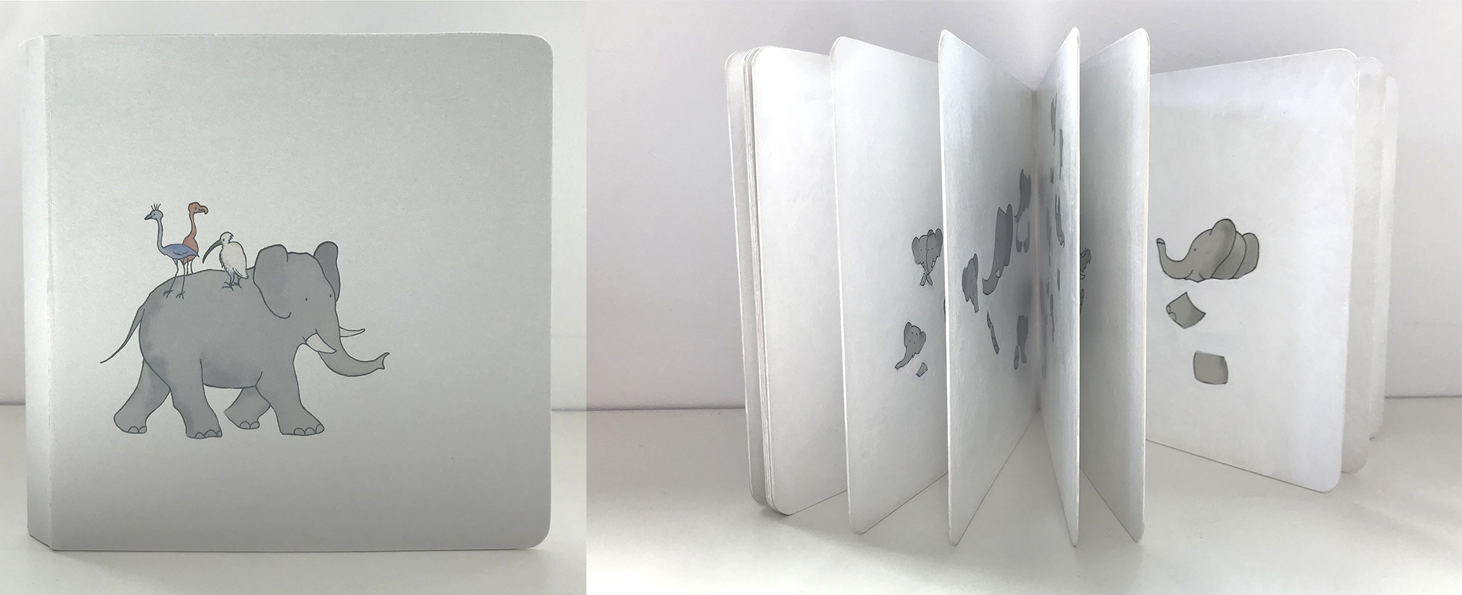
Babar Redacted: ABC Free (2020) Nanette Wylde Based on an altered copy of the board book B is for Babar: An alphabet book by Laurent de Brunhoff. French link exposed spine on tapes. 9″ x 9″ x .5″ closed. Edition of 3. Photos: Courtesy of the artist.
“Richard Niessen“. 23 April 2021. Books On Books Collection.
Library of Congress. “Bande Dessinée: Comics & Graphic Novels“, in “Reading in French: A Student’s Guide to Francophone Literature & Language Learning”. Library of Congress Research Guides. Accessed 11 August 2023.
Danish artist Hanne Stochholm Exe‘s “assemblages”, which garnered first prize in the 7th International Artist’s Book Triennial Vilnius 2015, have cousins far afield — geographically and chronologically.
Remake (2015) Hanne Stochholm Exe Reproduced with permission of the artistTalks (2005) Hanne Stochholm Exe Reproduced with permission of the artistSmall Talk (2005) Hanne Stochholm Exe Reproduced with permission of the artist
Geographically, this merging of book and metal finds common cause in the US (see Andrew Hayes’ works) and Israel (see the work of Neil Nenner and Avihai Mizrahi, represented — as is Hayes — by the Seager/Gray Gallery).
Offset (2013) Andrew HayesCover Story #4 (2017) Neil Nenner and Avihai Mizrahi
Chronologically, the hold that books and metal have had on one another reaches far past the moveable type of Gutenberg’s Bible and Master Baegun‘s earlier Jikji.
Of course, those 11th century metal fittings probably passed unnoticed by studious readers. Not so with these studious artists in the 21st century whose imaginations have seized on the contrast of materials to recast the book object as an art object.
Julia Chatfield, a young Englishwoman, brought the scrapbook in question to Ohio in 1845. Over 170 years later, Cincinnati bookbinder and conservationist Gabrielle Fox restored the centerpiece with fine wheat starch paste and reassembled the binding with goatskin leather. It is housed in the archives of the Ursulines of Brown County, founded by Chatfield. If the craft and artistry exhibited in the original is more than outstanding, it is then a reminder that the book art of the 20th and 21st century has its hidden traditions.
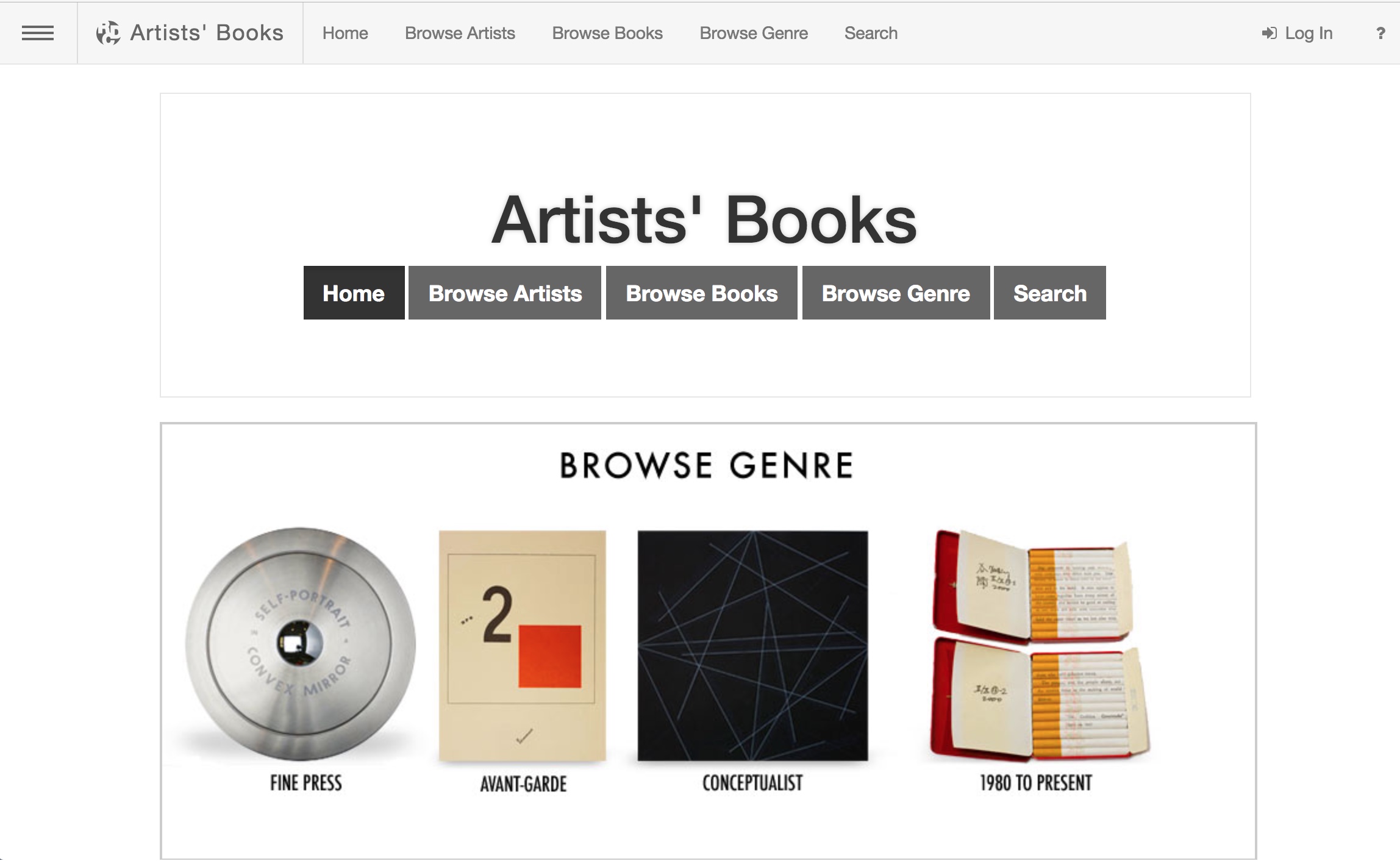
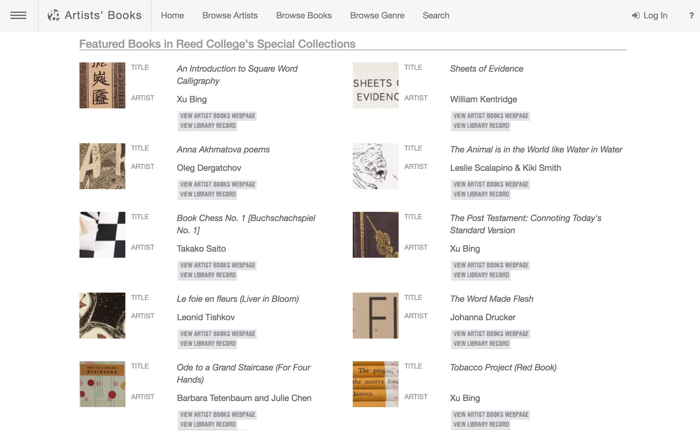
The spectrum of modern and contemporary Artists’ Books in Reed College’s Special Collections and collected on this website include traditional letterpress printed books of poetry, conceptual book works, sculptural and visual works, concrete poetry, and magazine works. This unique collection, which holds significant 20th century and contemporary artists’ books, gives students and the broader population insight into the significant role artist’s books have played among the avant-garde of Eastern and Western Europe, Asia and the United States, from the turn of the last century to the present. This includes livre d’artiste works by David Hockney, avant-garde works by Sonia Delaunay, conceptualist works by Sol LeWitt, and contemporary works by Xu Bing.
A search of the general library catalog with the term “artists’ books collection” yields over 1700 items, not all of which are in the Special Collection. This website offers visitors an organized way to browse the collection and enjoy access to individual sites for select items as shown here:
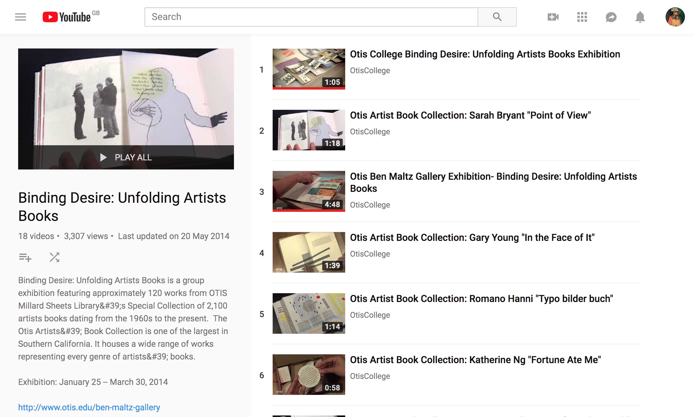
This 18-video playlist at the Otis College of Art and Design covers a 2014 exhibition highlighting around 120 works in the Artists Book Collection. The playlist contributes to the collection’s goal:
The goal of the Otis Artists’ Book Collection is not to create a comprehensive archive, but rather to provide a valuable teaching resource available to artists and students. Since the collection is available on only a limited basis, providing access to the books via an online image database is a continuing project, one that we hope will assist those with interest in researching our collection as well as the medium in general.
Some videos are better than others, and all benefit from viewing without the background music. Having handled both Susan E. King’s Lessons from the South and J. Meejin Moon’s Absence, I can vouch for the corresponding videos’ effectiveness.
The Lessons video could be closer to the experience of handling the work if the transitional zooming were replaced with a 360 circumferential shot or angled stills to reveal more of the work’s intricacies — for example, this overhead shot taken at the old Corcoran Gallery in Washington, DC:
The Absence video comes much closer to a hands-on experience, but the exchange in the Comments section highlights how inclusion of some description by voiceover or bibliographic entry would aid viewers’ appreciation.
Vesper Von Lichtenstein 10 months ago It’s a memorial to 9/11, and the cut out parts are the Two Towers going from the top down…at the end of the book you see the placement of the two towers within the context of the rest of the buildings on a city block. The music seems a bit… upbeat for such a somber book.
Critiques aside, the playlist and site warrant multiple revisits and a thanks to Otis College.
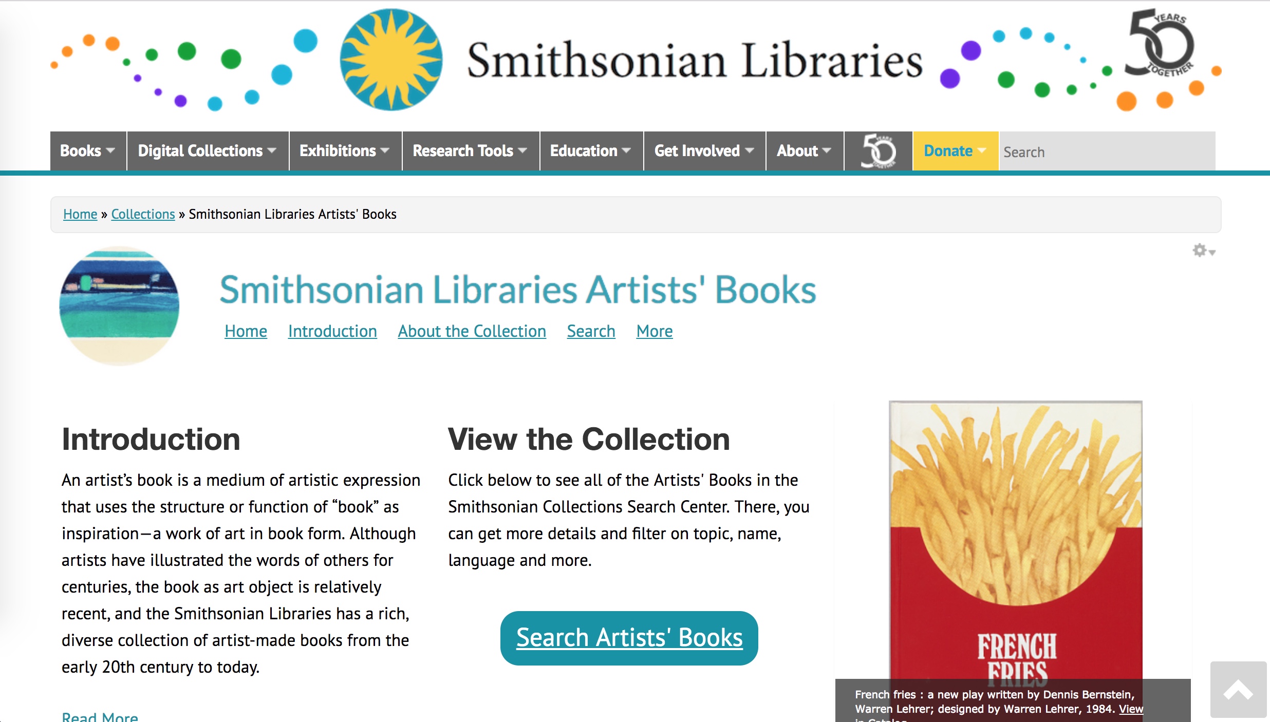
An easily searchable source. The carousel of images in the home page‘s lower right-hand corner highlights some of the favorite artists at Books on Books:


 An easily searchable source. The carousel of images in the