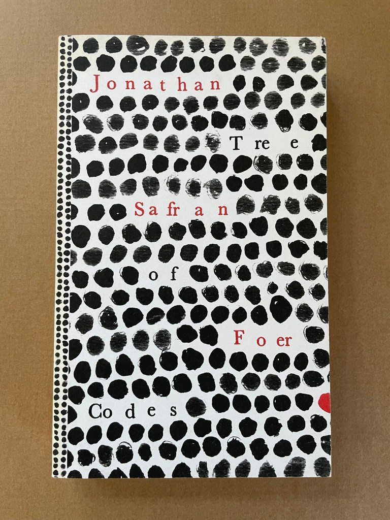
Tree of Codes (2010) Jonathan Safran Foer Perfect bound paperback of die-cut pages. H220 x W135 mm. 284 pages. Acquired from Visual Editions, 30 January 2014. Photos: Books On Books Collection.
The artist’s book “tradition” of excising words from the page goes back at least to Marcel Broodthaers’ and Mario Diacono’s renderings of Un Coup de Dés Jamais N’Abolira le Hasard by Stéphane Mallarmé. Jonathan Safran Foer’s Tree of Codes (2010) takes that tradition to the more complex plane that Tom Phillips reached with A Humument (1980-2016). In the hands of Foer and his publisher Visual Editions, the treatment becomes simultaneously more personal and mechanical. The more personal aspect is best expressed in Foer’s afterword (see below). The mechanical aspect is the use of die cutting for production and the reader’s use of a blank sheet to enable reading the text left over from Bruno Schulz’s The Street of Crocodiles (1934, trans. 1963) that forms the new narrative of Tree of Codes.
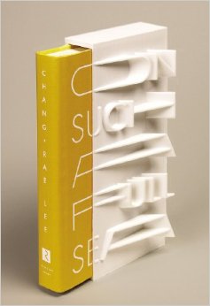
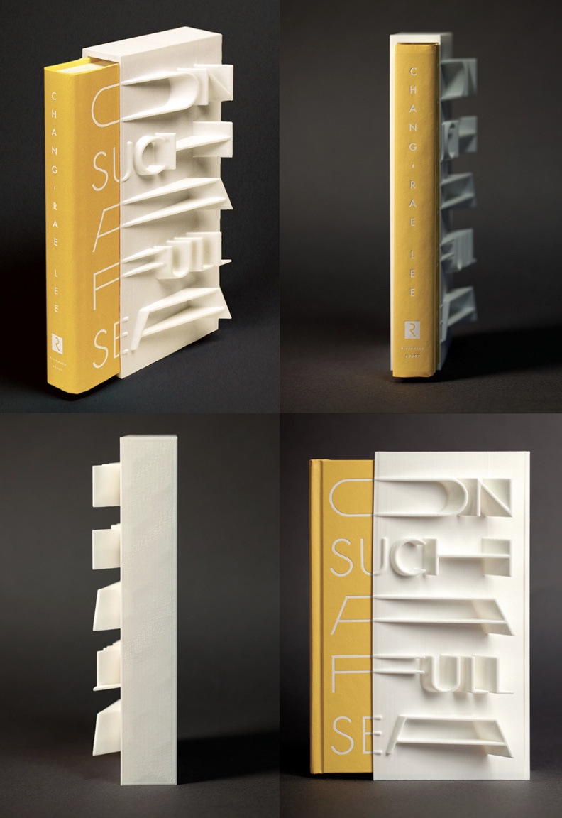
On Such a Full Sea (2013) Chang-rae Lee Jacket and slipcase design Helen Yentus Book in slipcase. H23o x W150 mm; slipcase only, W110 mm. 368 pages. Edition of 500, of which this is #178. Acquired 1 October 2018. Photo: Riverhead Books and AIGA.
Riverhead art director Helen Yentus and members of the MakerBot team designed this slipcase for Lee’s novel. An edition of 500, made with the MakerBot® Replicator® 2 Desktop 3D Printer with MakerBot PLA filament, a bioplastic made of corn and fabricated by MakerBot in Brooklyn, New York, appeared in 2013 just before the trade edition in 2014.
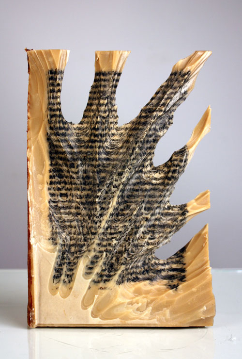
Carving 9 (2012) Jessica Drenk Altered book and wax. H203 x W152 x D38 mm. Unique. Acquired from the Seager Gray Gallery, 10 February 2019. Photo: Courtesy of the gallery.
Once a book becomes another material from which art can be made, the rectangular block offers itself up to an unbounded variety of treatments. It can be folded into something else. Or macerated and squeezed out, or into, something else. Or shot, burnt, frozen, soaked, coated or buried and dug up. Or torn, shredded and reconstituted or scattered. Or carved with any number of implements into any number of shapes.
But that oblong of material just lying there and the techniques of altering it are not usually sufficient starting points for the artist. In Jessica Drenk’s case, a visit to a botanic garden’s “large greenhouse full of hundreds of different succulent species” provided the necessary catalyst. As she explained in an interview with Patron: “It blew me away to see so much slight variety within the same category of plant and this experience sent me down a path of experimenting with books in the studio; I wanted to see how many different shapes and objects I could make out of the one material.”
Why should an obscure poem like Stéphane Mallarmé’s groundbreaking Un Coup de Dés Jamais N’Abolira le Hasard: Poème (1897) have become the cornerstone of an art-industrial complex of literary, critical and artistic responses ranging from essays, books, edited collections, countless editions, and appropriations in the form of fine press livres d’artiste, book art and sculptures, films and theater, ballets and fado, musical compositions, digital programs and installations, and even pavement art?
Breaking Waves (2023) Emmy van Eijk Sculptural book. 140 x 140 x 40 mm (closed). Unique work. Acquired from Papertrail Handmade Books, 22 January 2024. Photos: Books On Books Collection.
Breaking Waves spills over at least three categories of bookmaking: the bound blank book, designer bookbinding and sculpture. It would take a bold owner, however, to use the work in its first category. Fortunately that invitation quickly yields to another.
This is the rare first edition as published by the late Jan Middendorp through his Druk Editions. It bears all the hallmarks of his eye for design — the black coated wired binding, the heavy embossed card cover, the use of color to underscore the text’s theme, the embedded booklet — all nevertheless centering and providing a platform for the art and design of Clotilde Olyff.
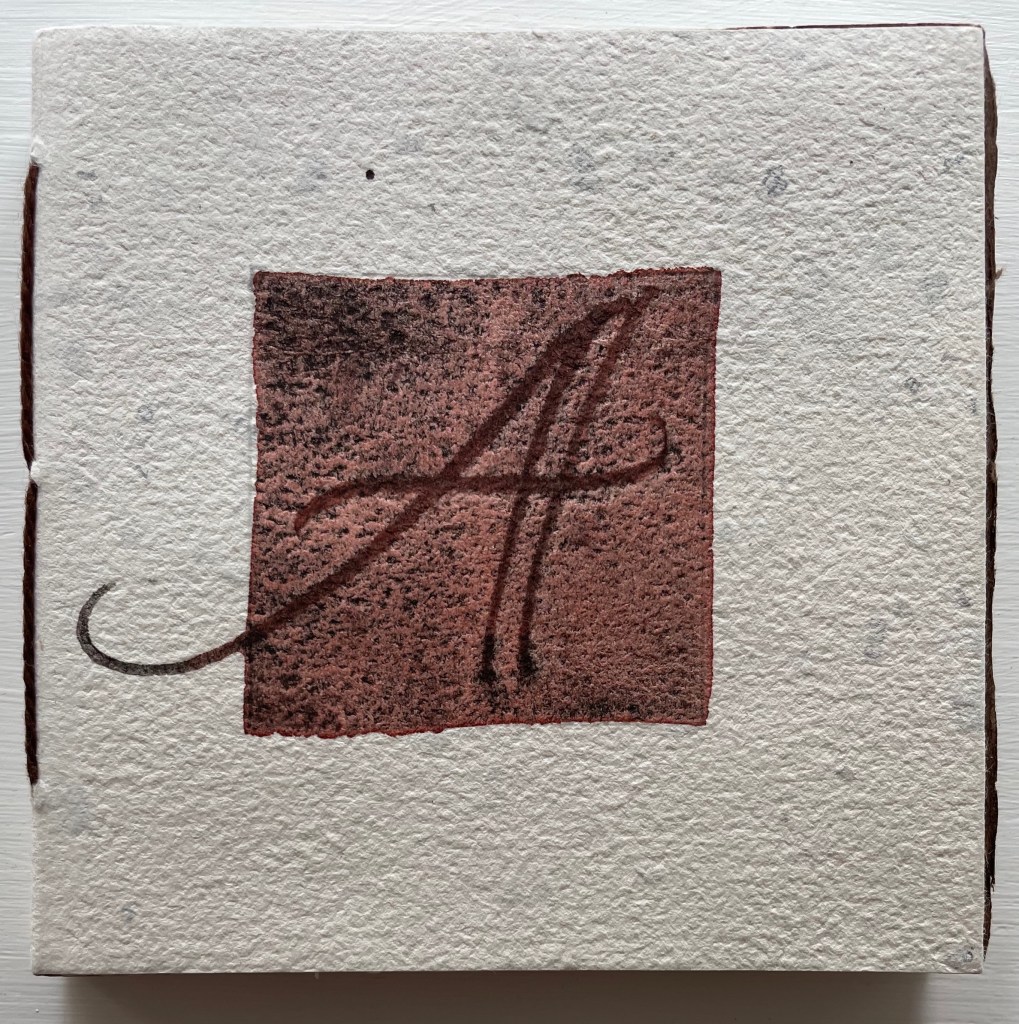
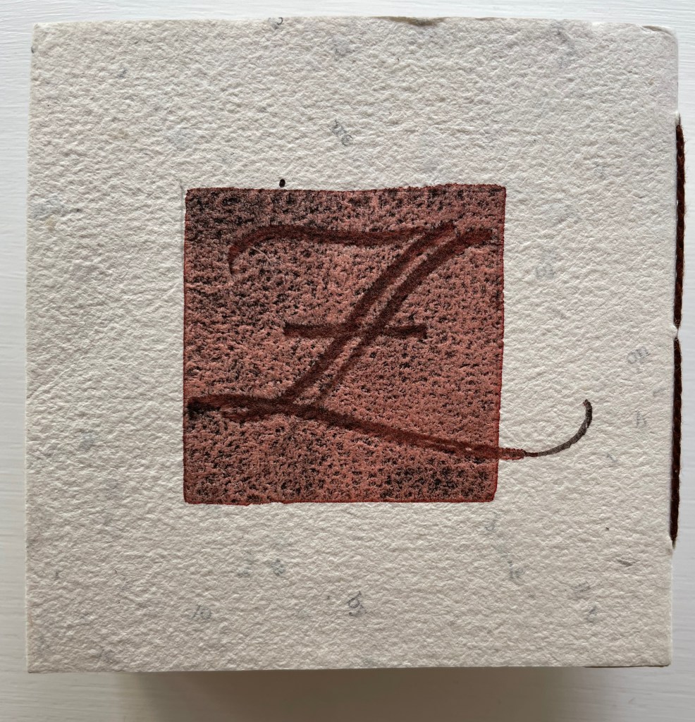
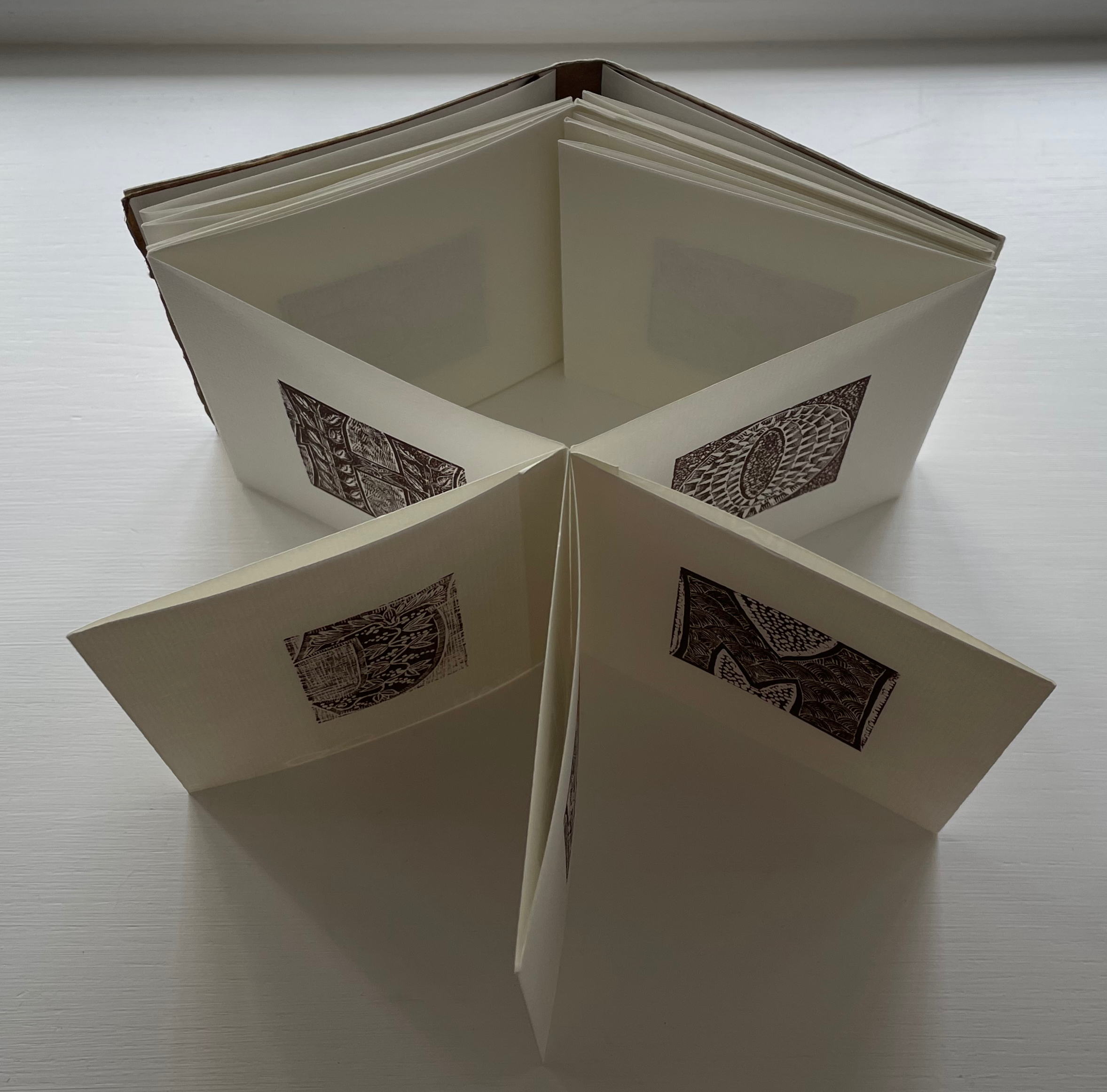
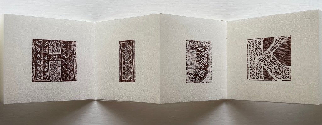
Patterned Alphabet (2013) Annie Cicale Sewn, casebound leporello. H104 x W104 mm. 34 panels. Edition of 41, of which this 26. Artist 4 July 2023. Photos: Books On Books Collection.
Patterned Alphabet could well have been entitled Textured Alphabet. The number of different textures almost equals that of the patterns. It is the textures’ interaction with each other as well as with the patterns that particularly appeals. The cover, appropriately made of Cave Paper’s Alphabet Heavyweight, initiates the interplay. While the calligraphic style and patterned background of the copperplate engravings of A and Z do not vary, the textures around and beneath them multiply, mirror and contrast. The surface of the Cave Alphabet paper echoes that of the copperplate’s stippled background. The softness of the thick cotton string, binding the cover, contrasts with the roughness of the paper.
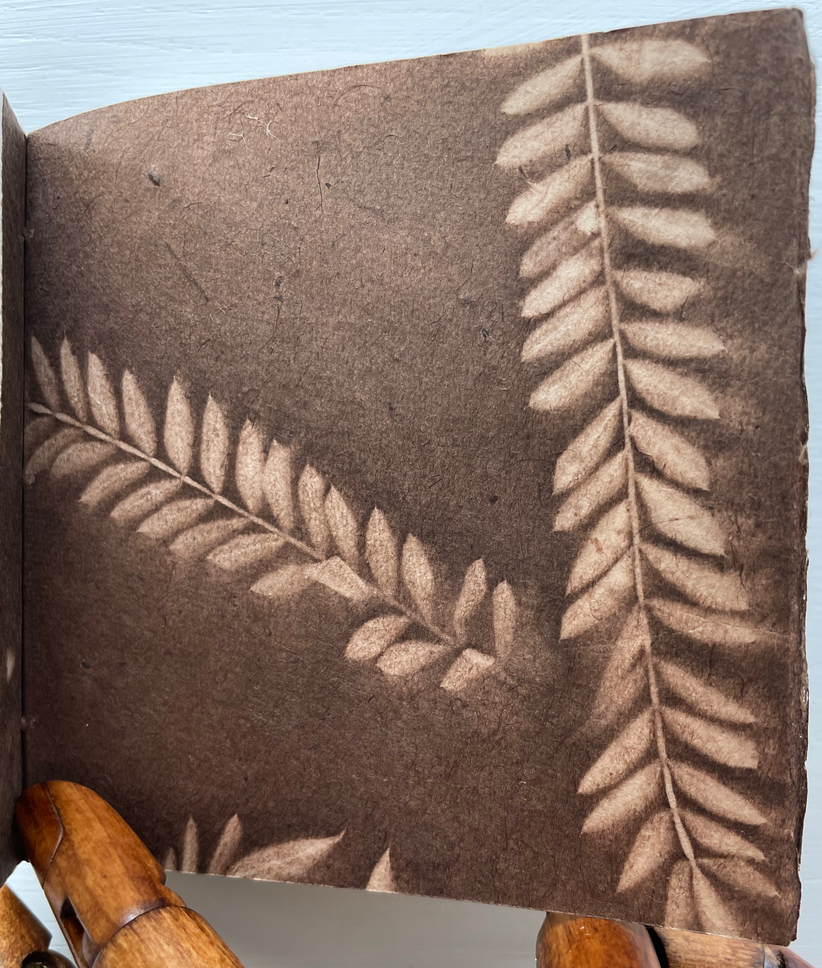
Before coming to the leporello, hand and eye are slowed by another texture. Like the self-referential Cave Alphabet paper cover, the flyleaf refers to itself with a leaf print. It contrasts with the cover, however, in its lightness, surface and color. While that dance of contrasting textures goes on, the flyleaf’s embedded image strikes up its own contrast with the relief technique and letters on the covers.
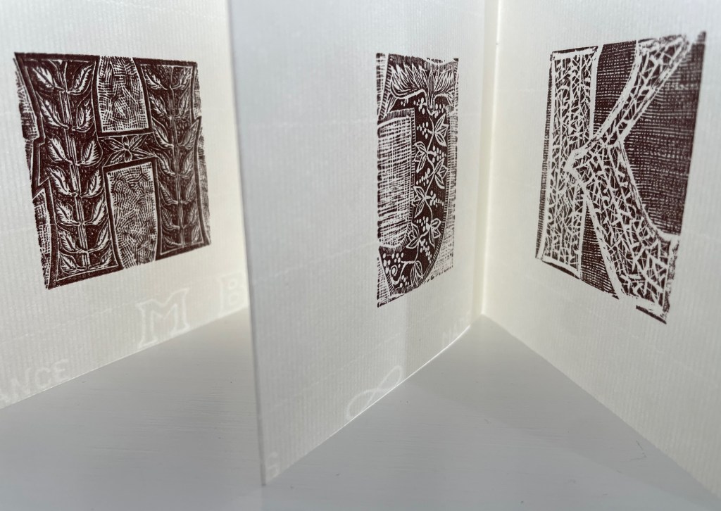
When the leporello comes on stage, the print pattern and paper texture exchange the roles they played at the beginning. Before, the print pattern held the stillpoint around which the cover, binding string, flyleaf and copperplate danced. Now, the smoother laid texture of the Ingres d’Arches paper becomes the stillpoint. Its weight, surface and color — very different from those of the cover and flyleaf — serve that constancy well. For each letterform (including the ampersand), different patterns make up the anatomy and background, which adds quite a number of dancers around the stillpoint.
The printing technique for all those dancers — Resingrave engraving — contributes to their variety of pattern. Invented by Richard Woodman, Resingrave is a synthetic substitute for boxwood. It consists of a thin layer of resin atop a block of MDF wood and, since the ’90s, was famously used by Barry Moser (e.g., the Pennyroyal Caxton Bible). More than lino or blocks for woodcuts, it allows for the thin lines necessary for close and fine patterns. Standing the leporello against the light offers a chance to enjoy the interaction of the “texture” of those patterns with the texture of the paper.
Like Moser, Cicale has engaged with watercolors as well as prints and embraced the abstract as well as the figurative, as can be seen in the next work.
Detritus No. 30 (2020)
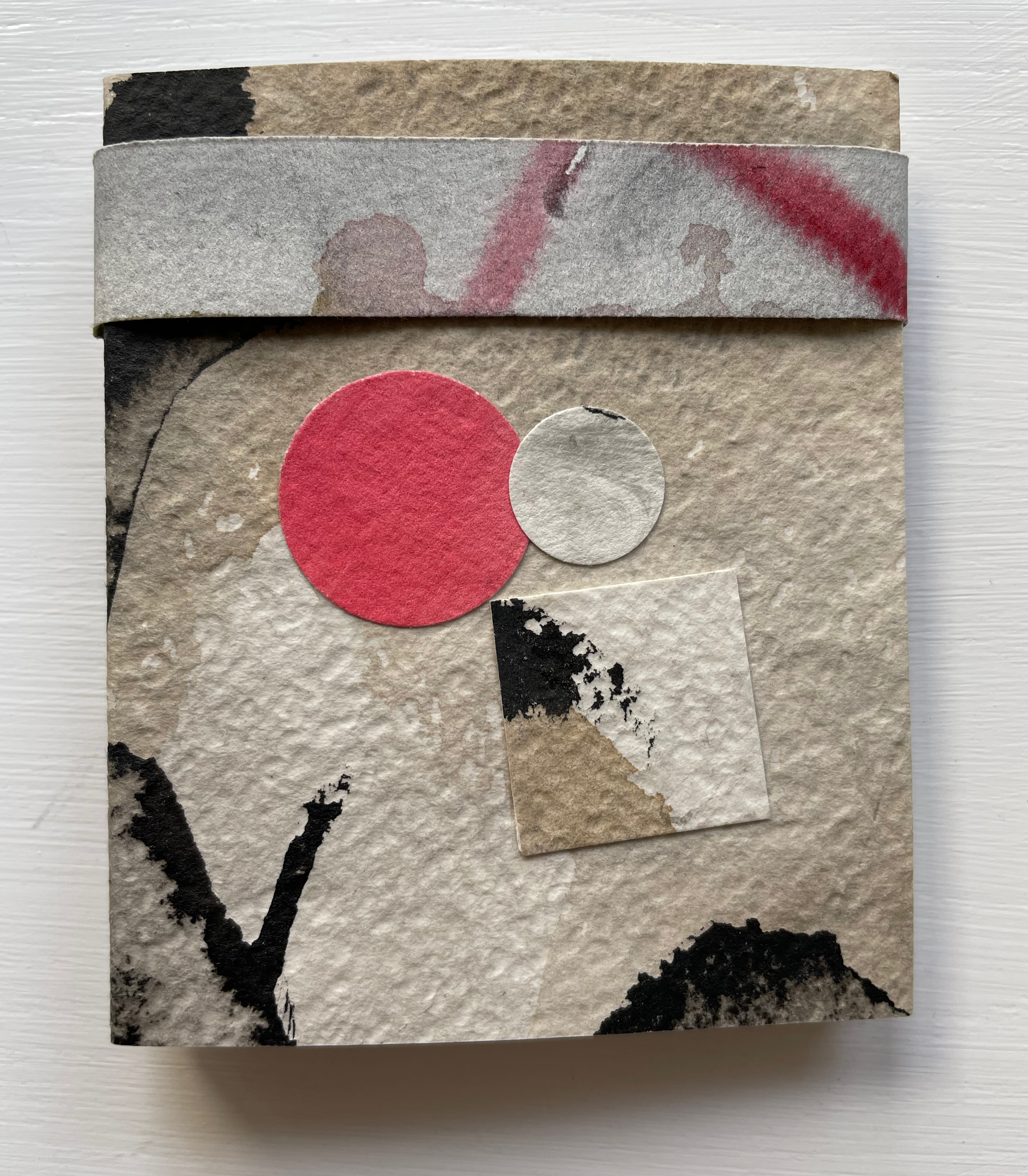
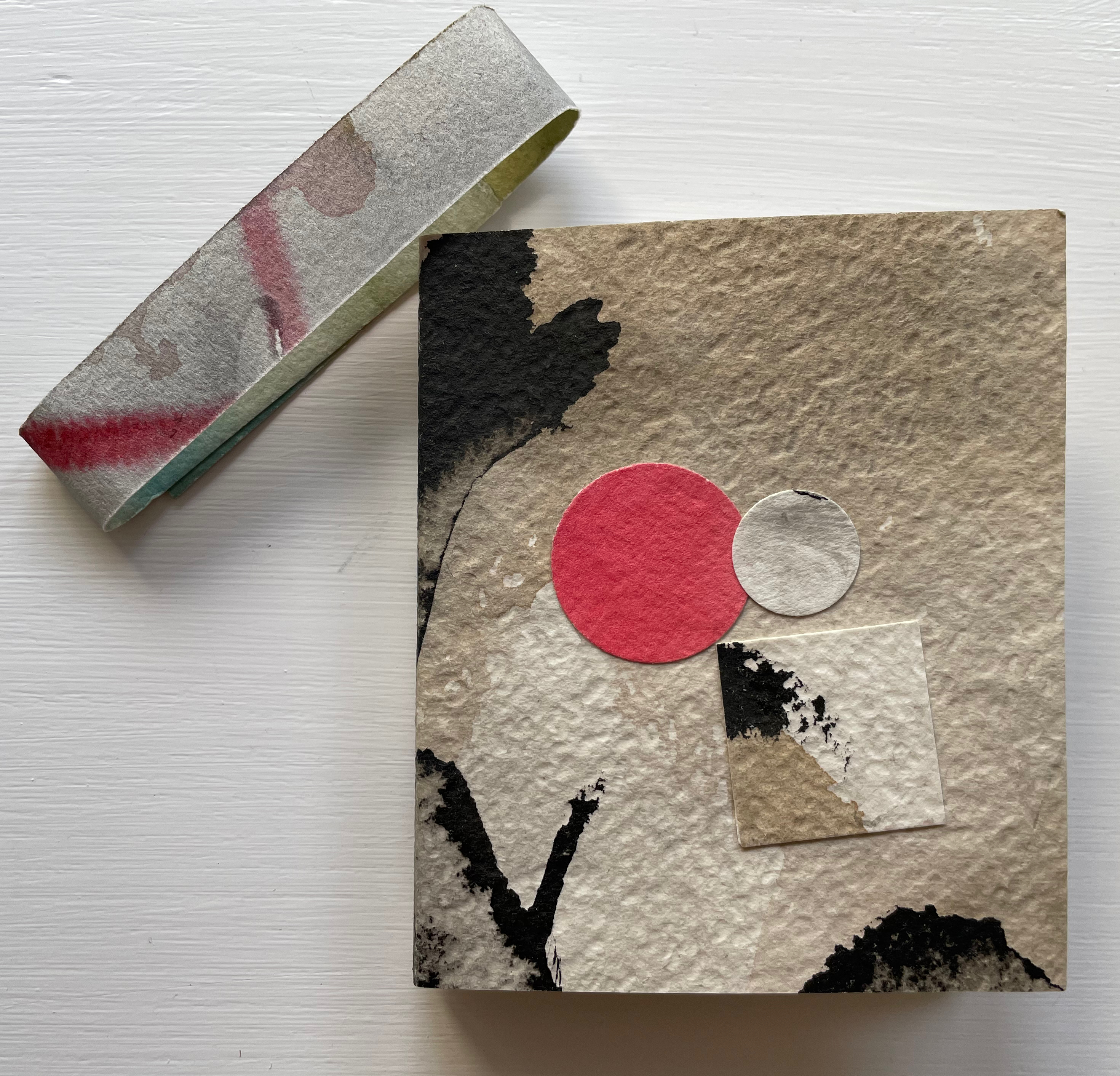
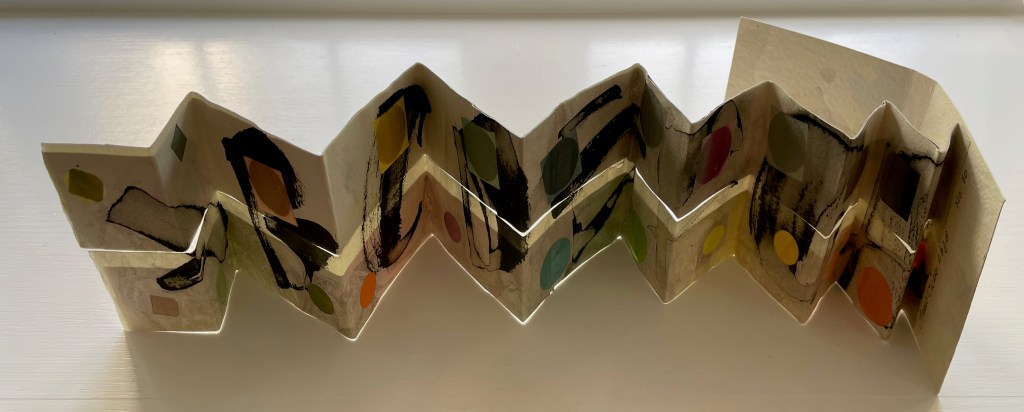
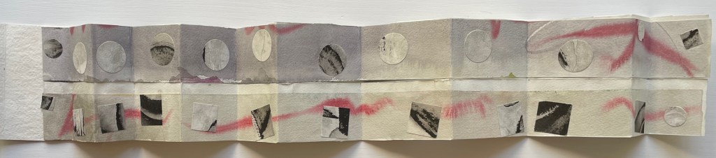
Detritus No. 30: Floppy Alphabet, Brush Alphabet (2020) Annie Cicale Modified leporello, pasted to paper cover, bellyband closure. Closed: H95 x W80; Open: W750. 12 panels. Acquired from the artist, 4 July 2023. Photos: Books On Books Collection.
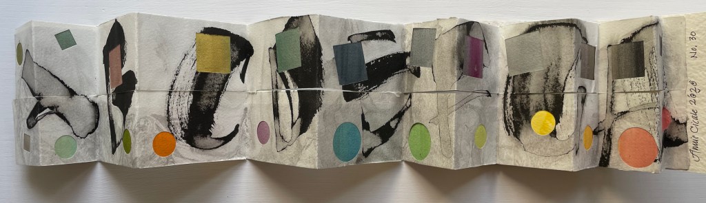
Here, Cicale has compiled and collaged cast off letters, ornaments and marks from completed works to create a modified double-sided leporello bound in painted and inked watercolor paper, held together with a belly band. The leporello’s two modifications are its variation in panel size and the cut across the mountain folds. Except for a reversal on the first panel, the upper row’s panels bear square cutouts, and the lower row’s bear circular ones. Although constant in shape and distribution, the recurrent squares and circles vary in their color and size, highlighting the variation in size of panels. With their constant black and gray, the ink-brushed letters A-H contrast with the variance of color and size of the circles and squares.
On the reverse side of the leporello, the circles and squares exchange position. They are, in fact, circular and square patches, black and white on this side of the leporello and colored on the other, supplying the color to the other side’s square and circular cutouts. The circular patches are generally consistent in size, as are the square patches, which contrasts with the varied sizes of the cutouts on the other side. The reverse side of the leporello is more muted, and with its black and white patches, it seems more abstract, but is it? Letters themselves are abstract, which may the tongue-in-cheek point of the underlying patches.
Experiment No. 2 (2023)
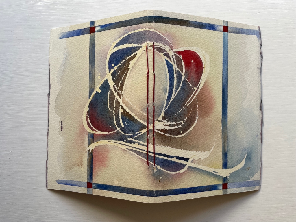
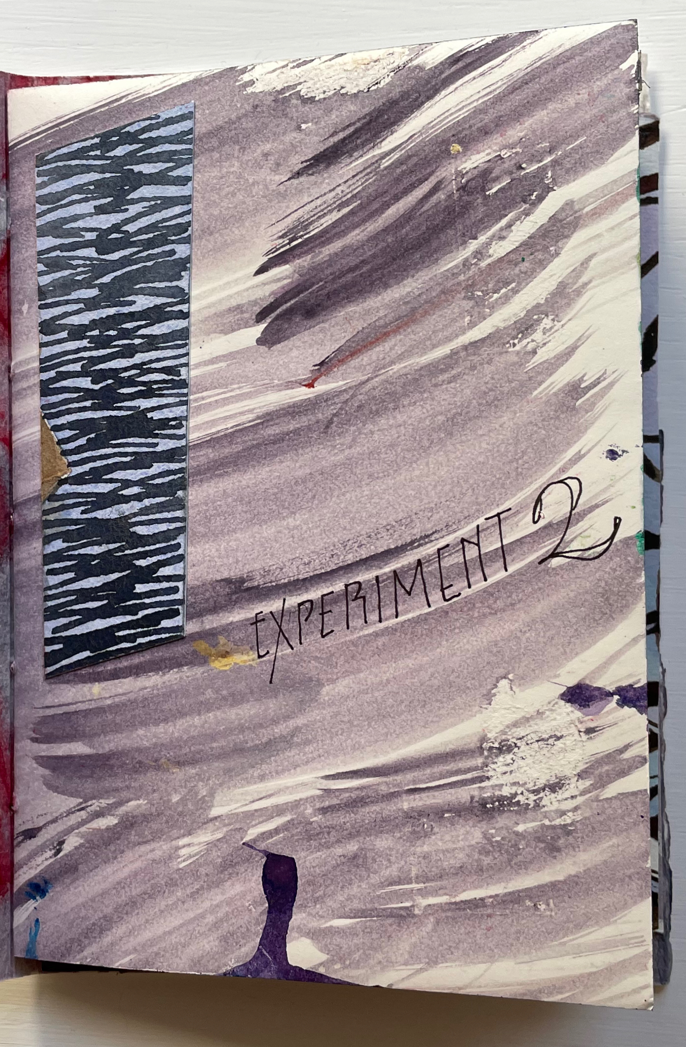
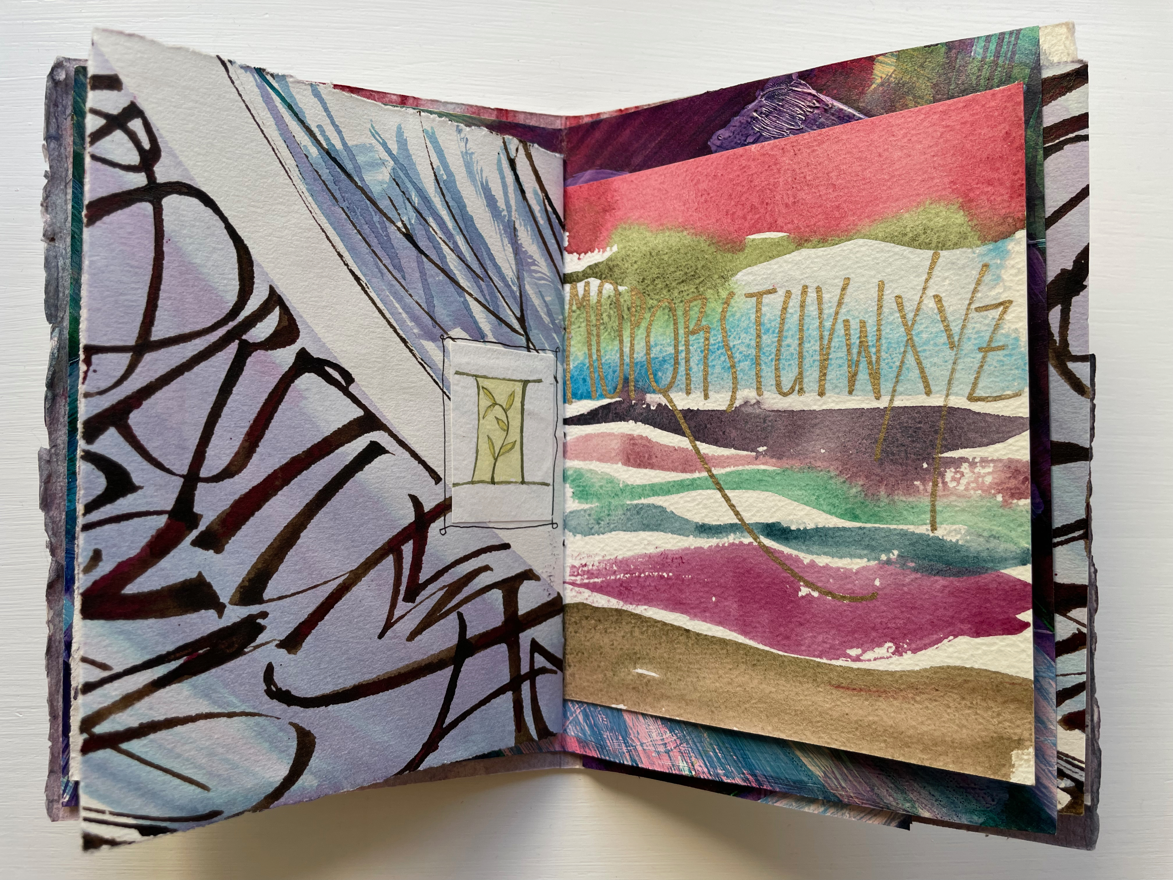
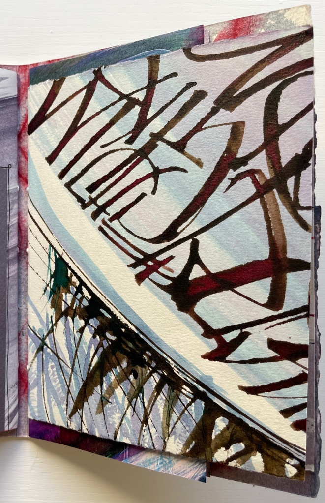
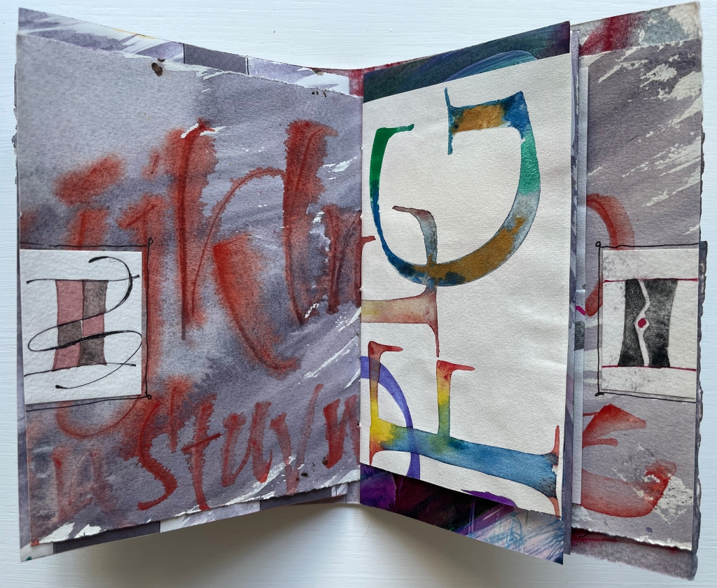
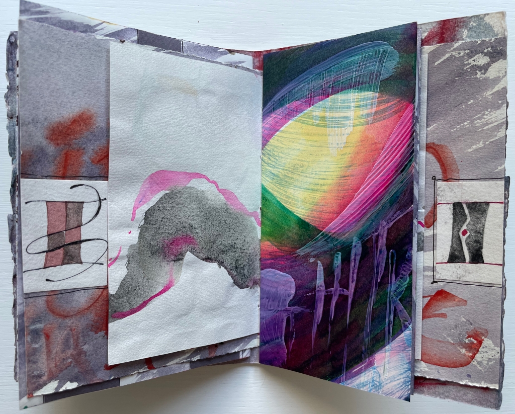
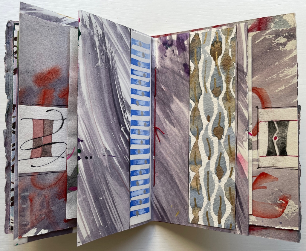
Experiment No. 2: Step by Step (2023) Annie Cicale Pamphlet stitch book. H185 x W 130 mm. Seven folios of varying trim size and papers, one set of four folios gathered and sewn to upper fold of spine, one set of three folios gathered and sewn to lower fold of spine. Acquired from the artist, 4 July 2023. Photos: Books On Books Collection. Displayed with permission.
Cicale continues her dance of contrasts and similarities with Experiment No. 2 (2023). Here are some of her comments on process and material:
Teaching watercolor for many years has allowed me to try many exuberant techniques, using good rag paper and a wide gamut of colors, shapes and techniques.… An alphabet written on another sheet of paper has been collaged on these pages. I’ve used walnut ink, watercolor and iridescent pigments, which create an interesting series of contrasts as you move through the book.
Another experimental aspect of this pamphlet stitch book is the gathering of the folios into two separate gathers and the variation in size of the folios. The exterior image of the spine above and its interior below show the attachment of the gatherings to the right and left folds of the spine. Two pamphlets in one.
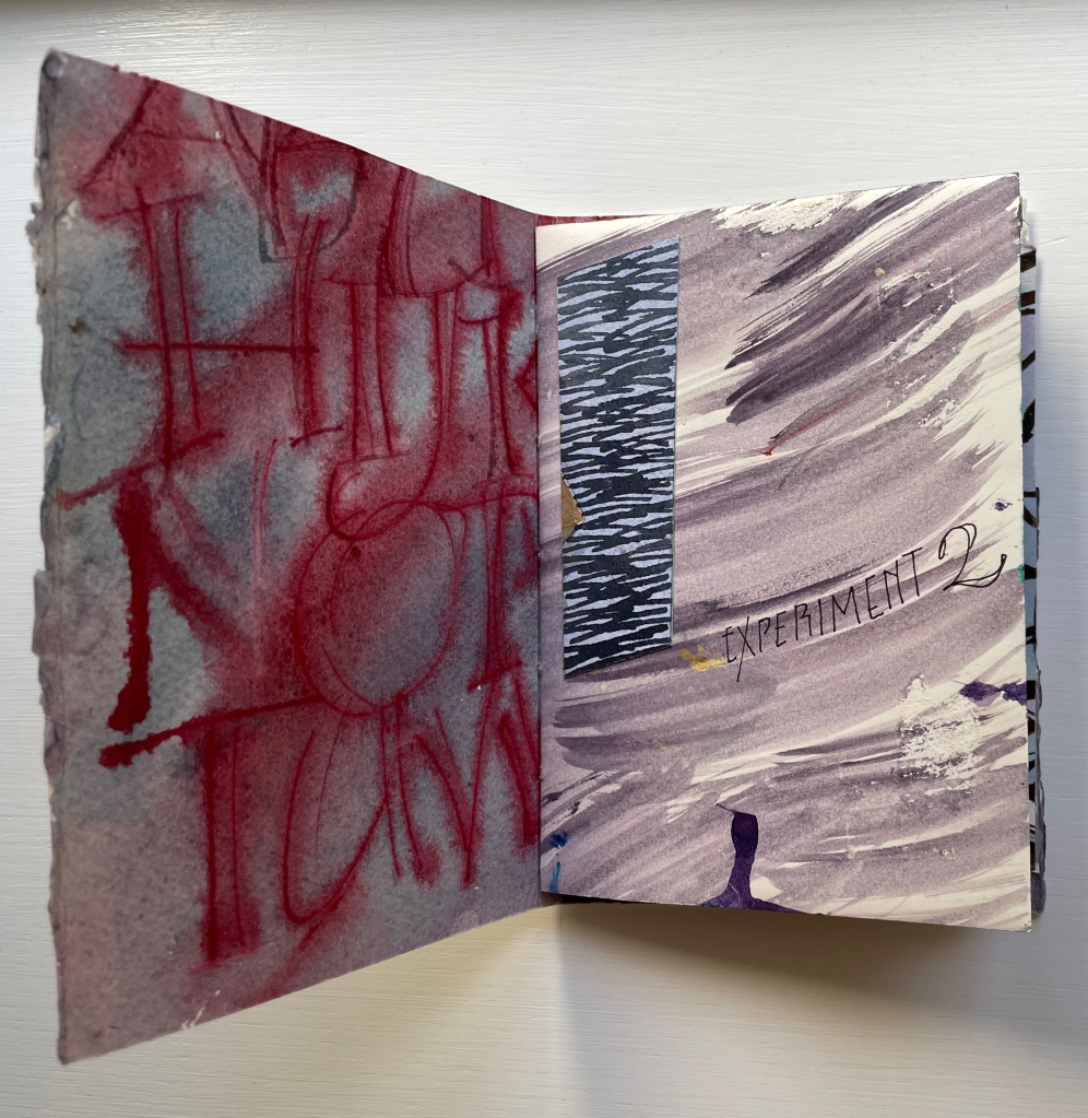
The first gathering’s title-bearing folio measures H176 x W246 mm when spread out fully. On its title-bearing page, there is one of the collage elements that Cicale mentions; three others appear on the other half, which is the final page of the first gathering.
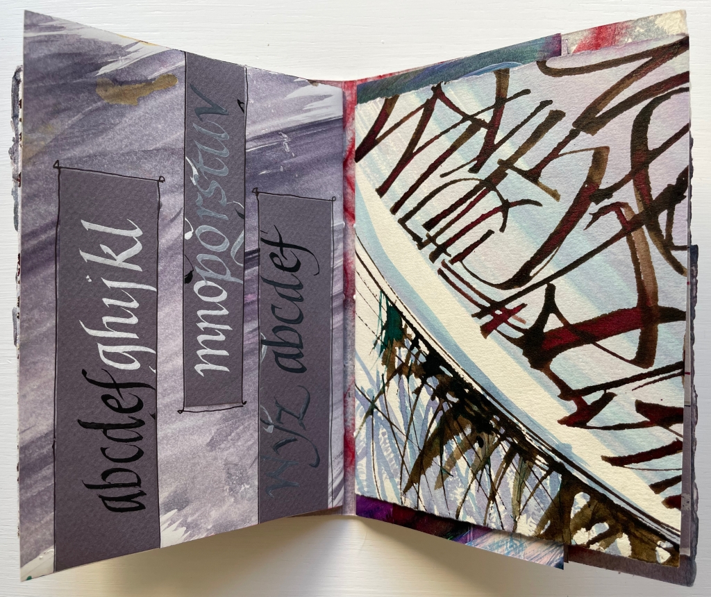
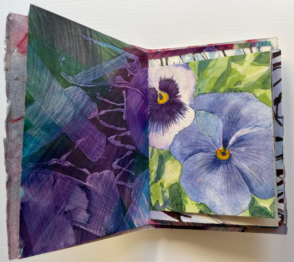
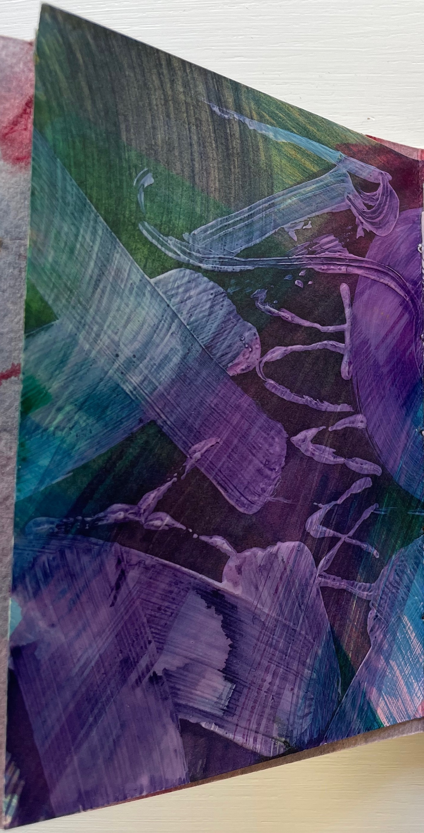
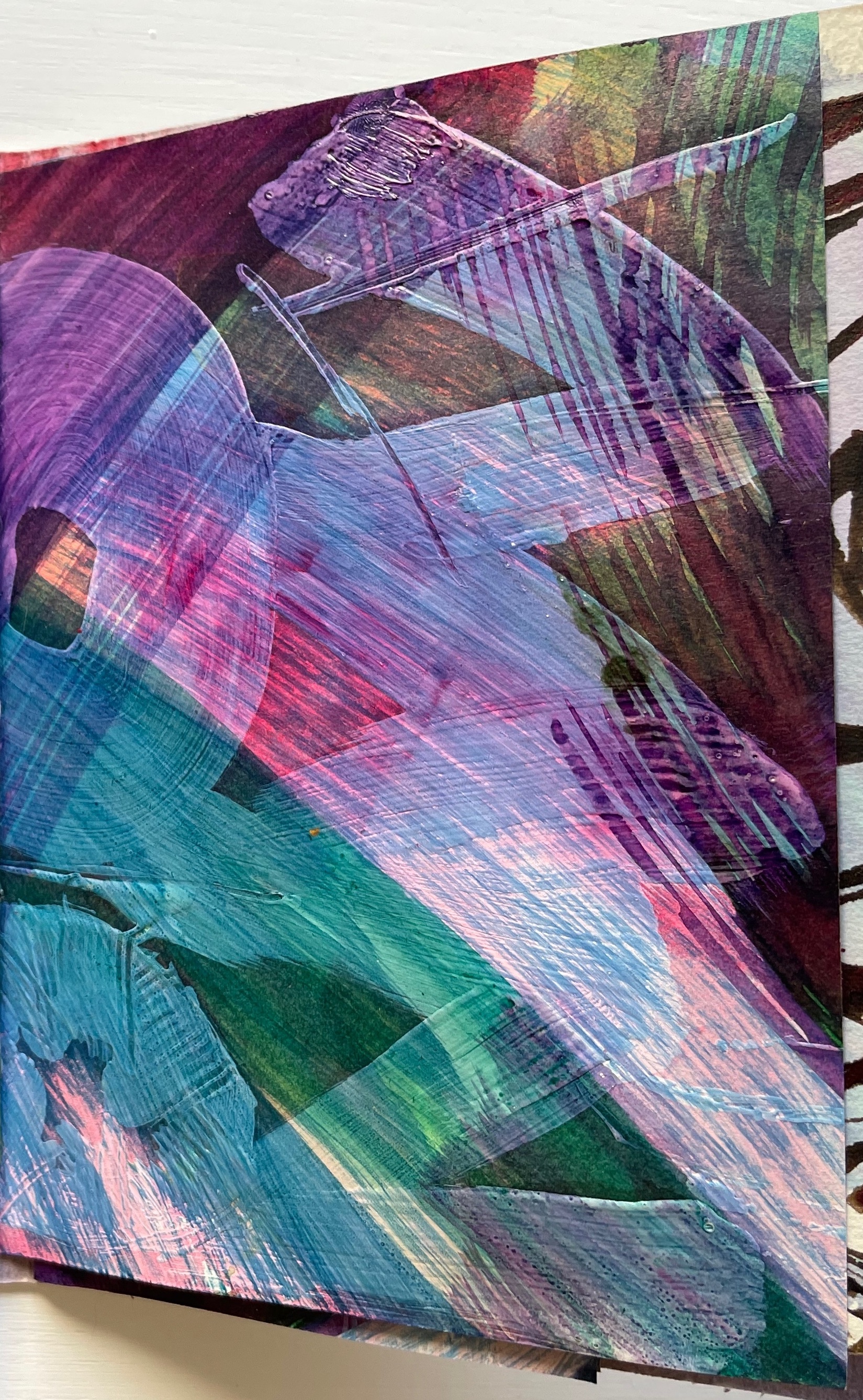
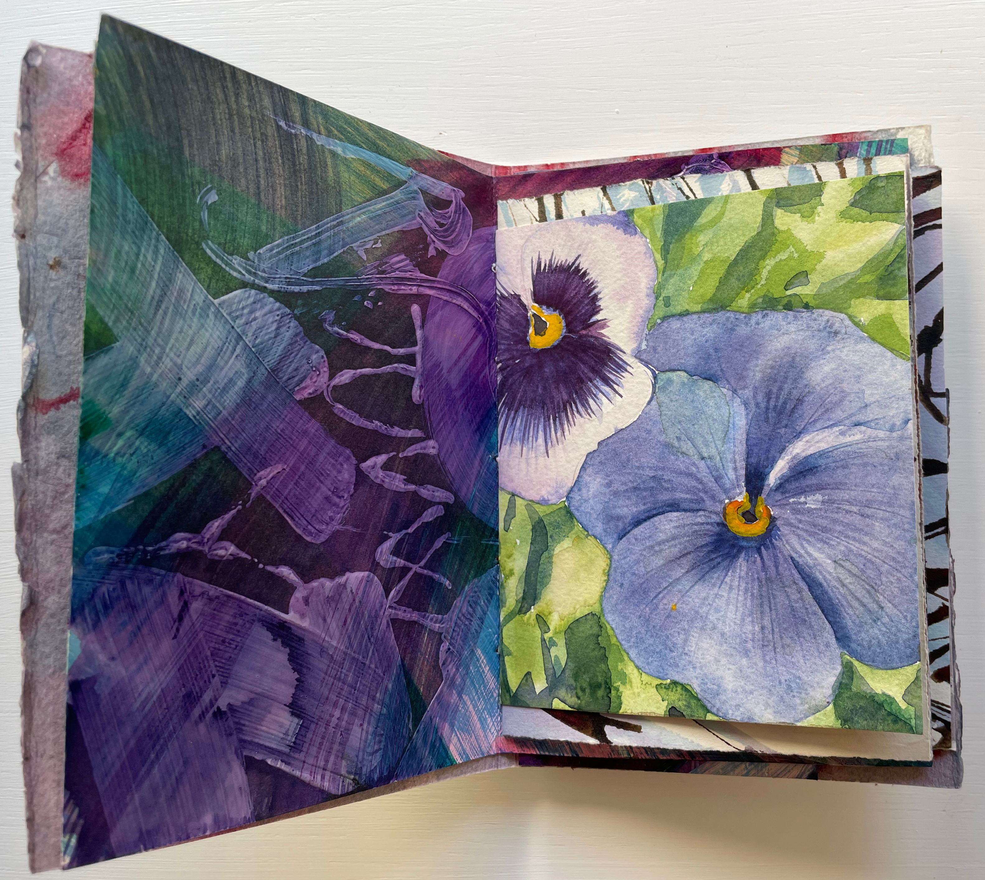
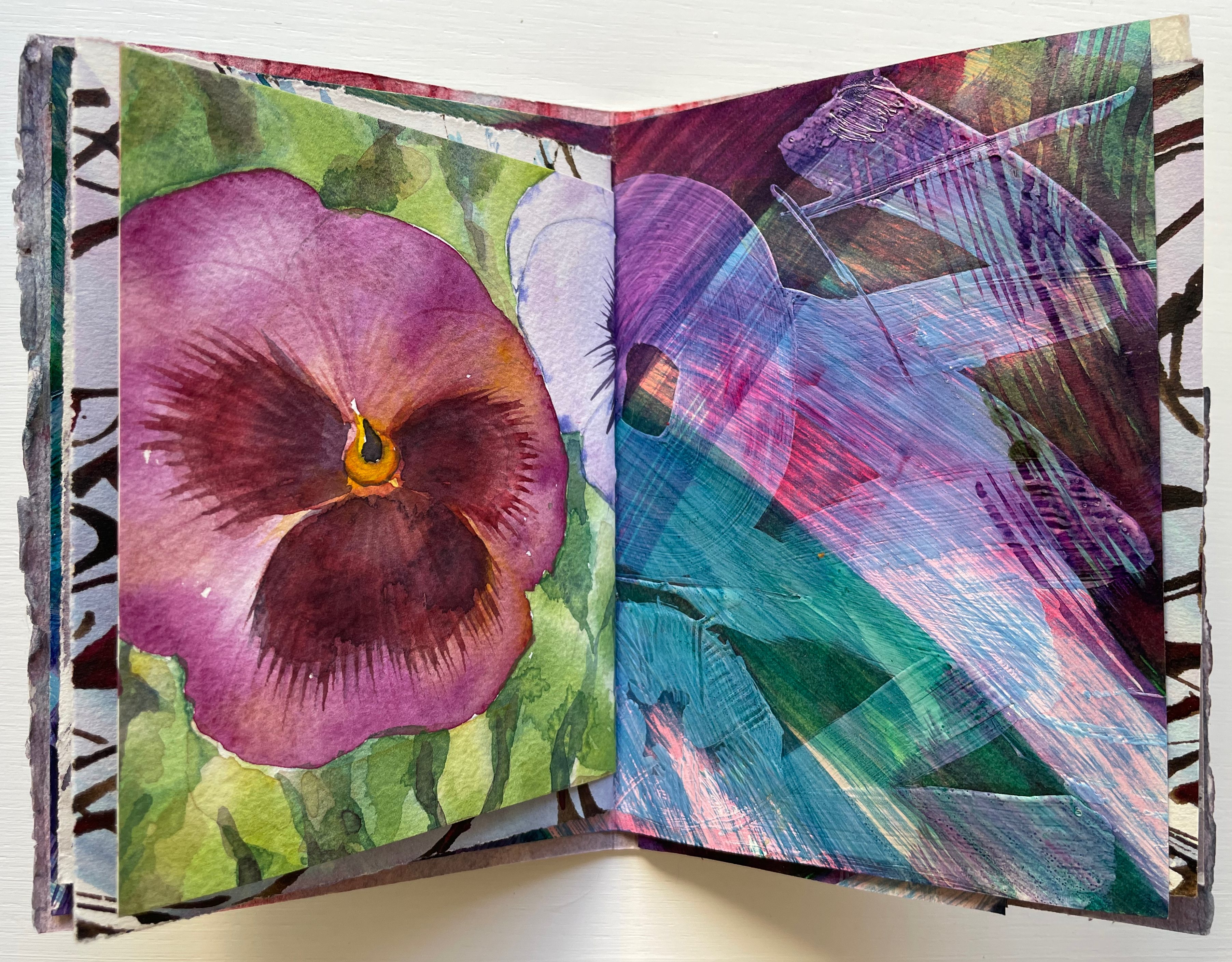
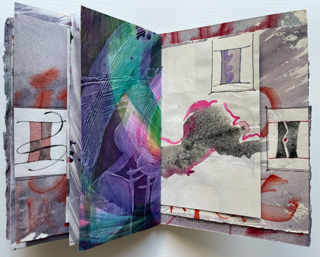
Of course, the full images on either side of the title-bearing folio cannot be seen all at once because of the intervening, contrasting and differently sized folded folios. It’s those different sizes and contrasts that somehow urge the reader/viewer to jump forward then back not only to see those full images for every folio but also to enjoy the magic of the contrasts and similarities. Two of the more effective spreads prompting this jumping forward and backward are these below. On the reverse side of the title-bearing folio is a colorful impasto painting of letters, some in sequence, some overlapping.
Perhaps it’s the impasto of the verso page that prompts the jump forward to find its recto mate, but once there, the mirrored colors of the pansy and letters surely prompt a jump back to enjoy again the different colors mirrored before.
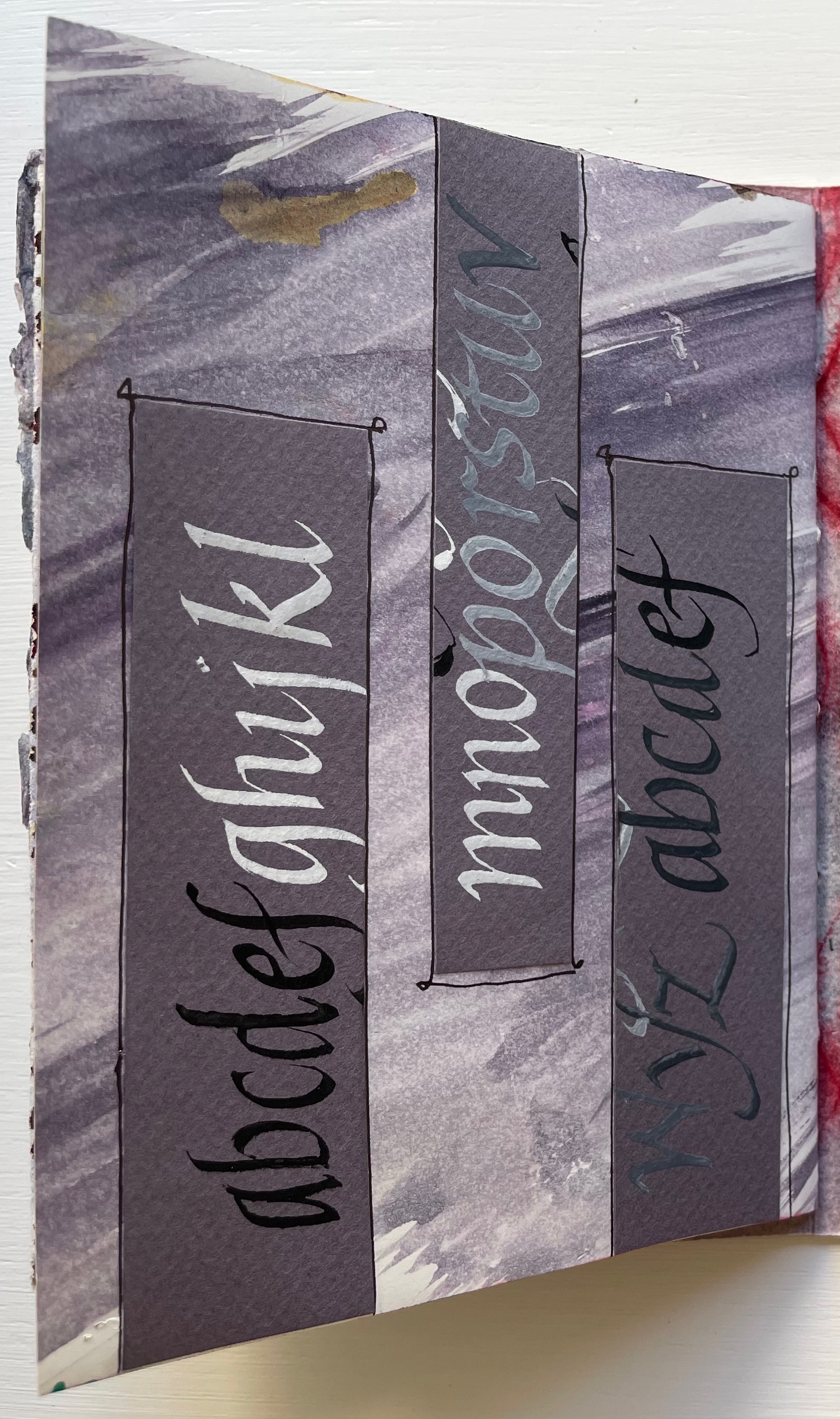
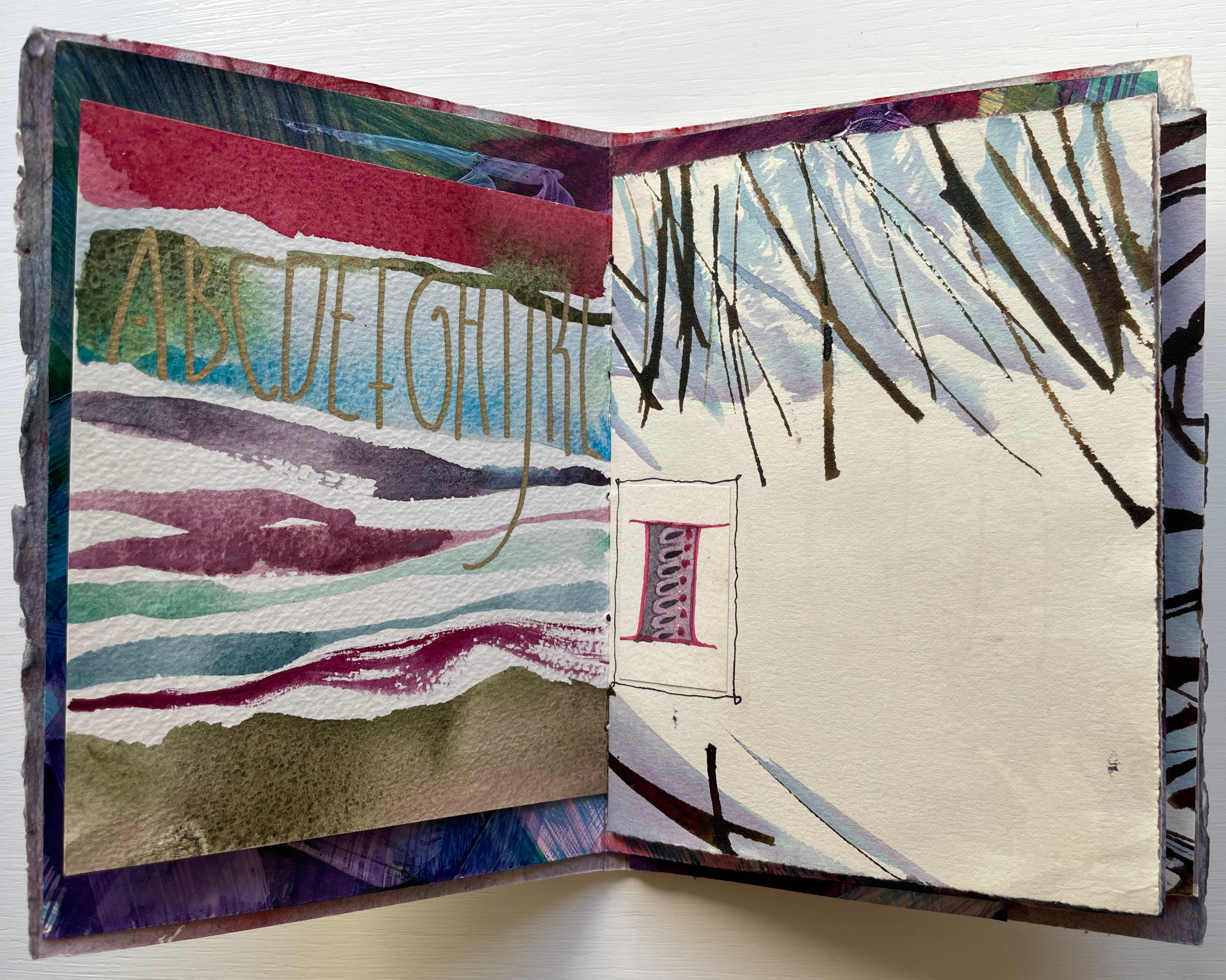
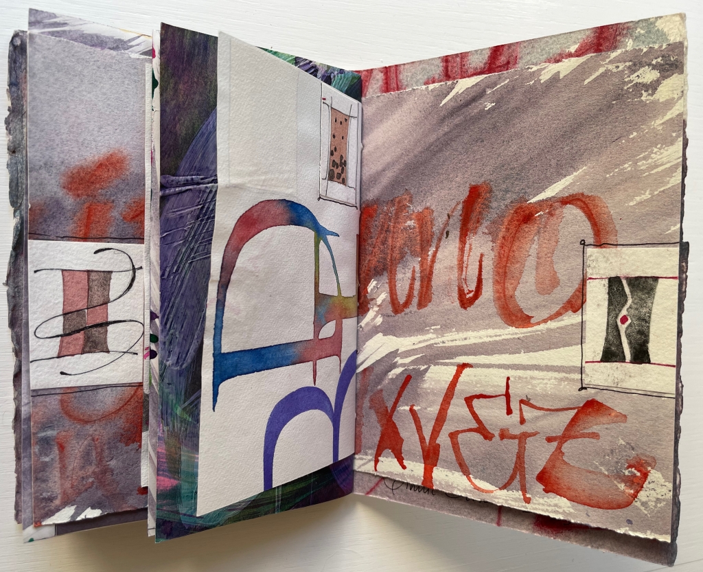
Below, the truncated alphabet prompts the leap forward to find its other half, and the contrasting wintry calligraphy facing M through Z sends us back to its other half to puzzle over those collaged thumbnail letter I’s.
Mind that all of this has occurred in just the first gathering.
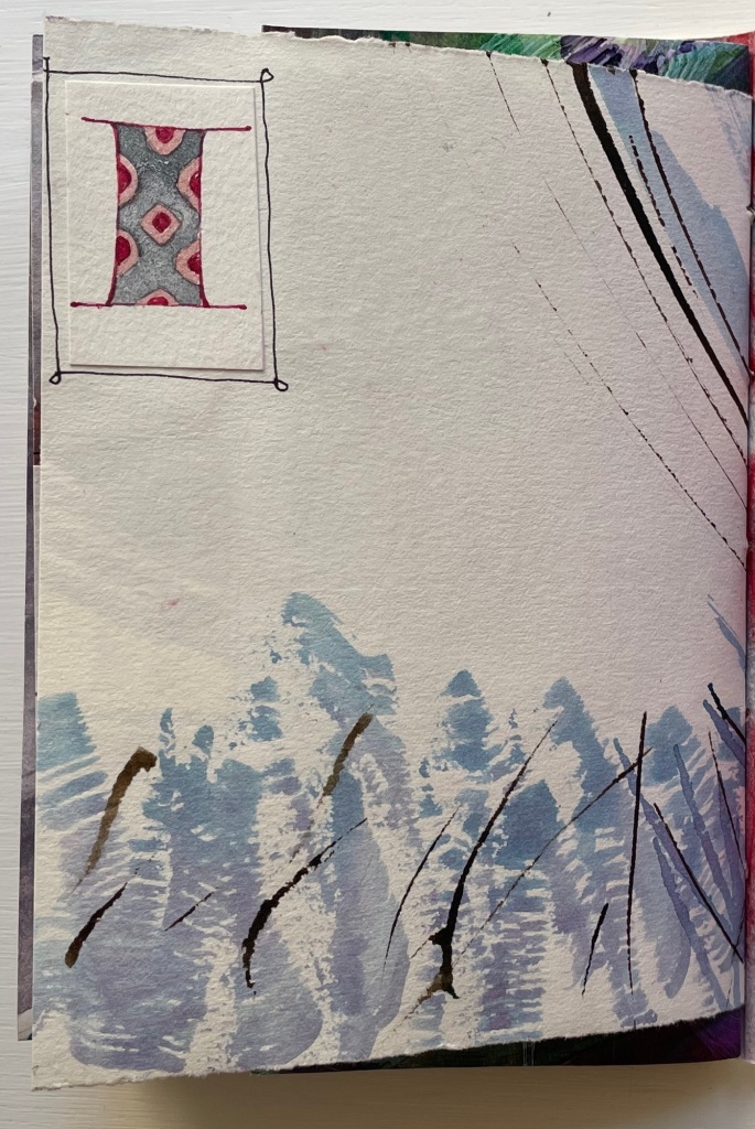
The second gathering has fewer folios and perhaps fewer prompts to jump forward and back, but there is at least one prompt to jump back to the first gathering. The first page of the second gathering recalls from the first gathering the folio of wintry calligraphy — the one above with the two puzzling thumbnail letter I’s.
Curiously, the second gathering has several more of those thumbnail letter I’s than the first gathering has. In fact, due to the narrowness of the inner folios, the collaged thumbnails are also more constantly present to the eye. In general, the thumbnails and narrow inner folios make the second gathering more about the collage effect and strong contrasts across the differently sized pages and less about jumping forward and back.
When we reach the final page of the second gathering, there sits the thumbnail, almost as if it were the illuminated initial of “Incipit” — except, of course, this is the end.
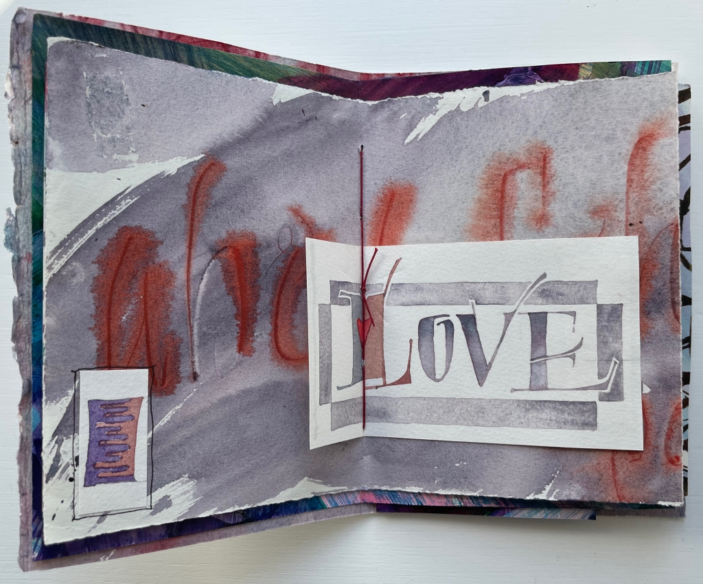
Tantalizing and enchanting as those thumbnail letter I’s are, they also draw attention to the experiment’s one jarring folio. It appears in the center of the first gathering and is quirkily the only off-center folio in the whole book. It is also the folio that, with an explicit message, forecloses the surrounding incipience. With that twee red heart beneath the red thread, out the window goes the structural and material subtlety so enjoyable in the rest of the book.
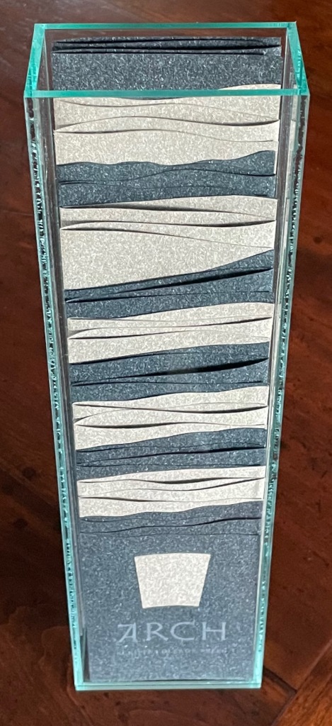
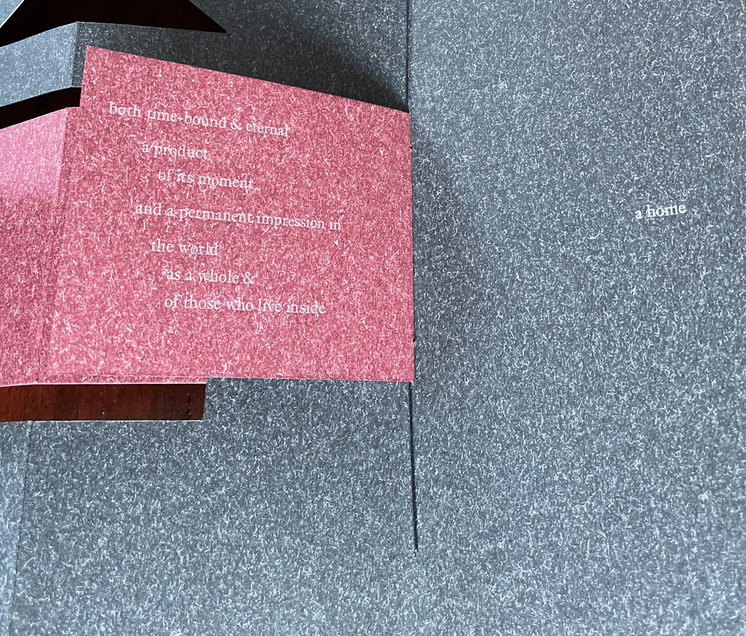
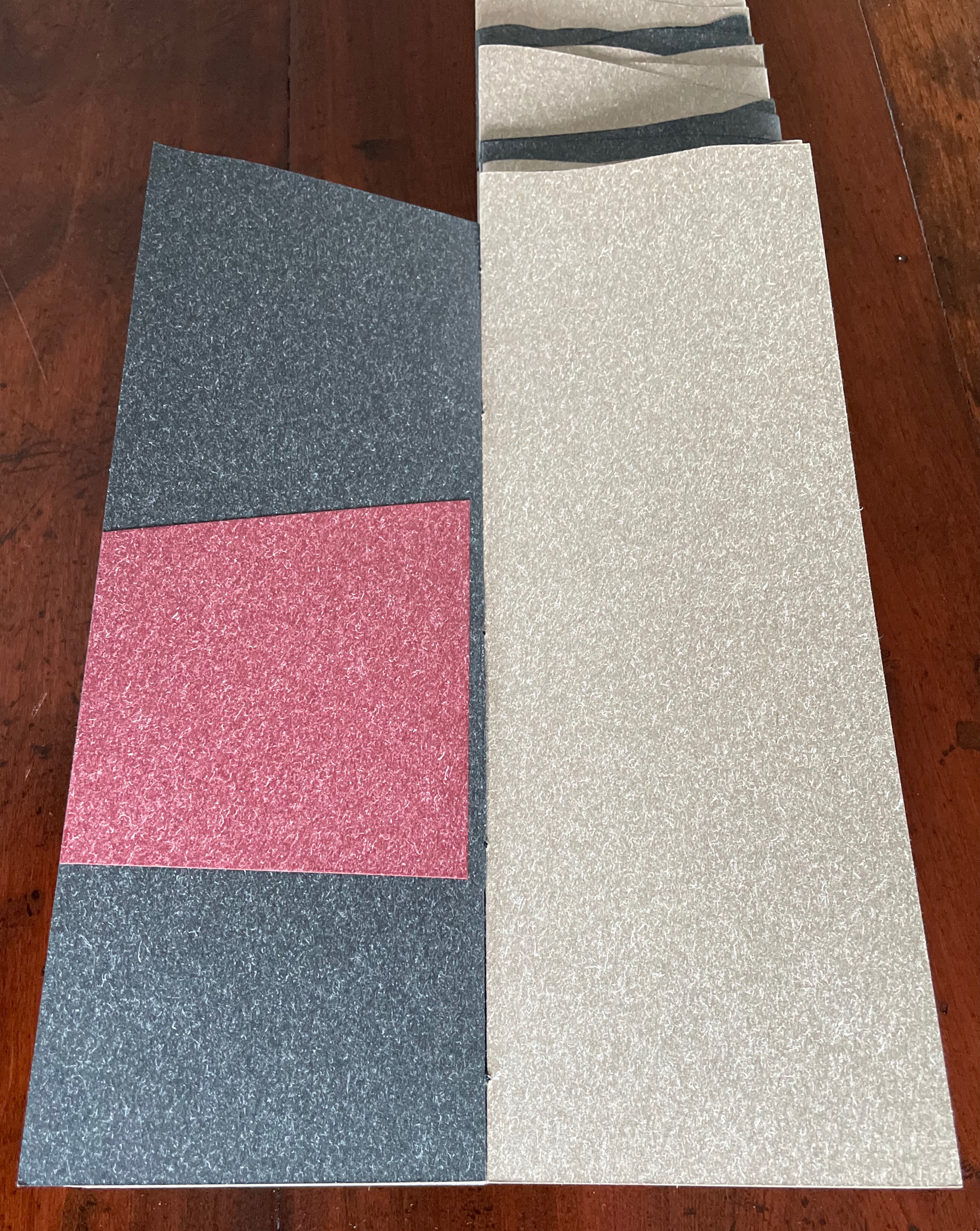
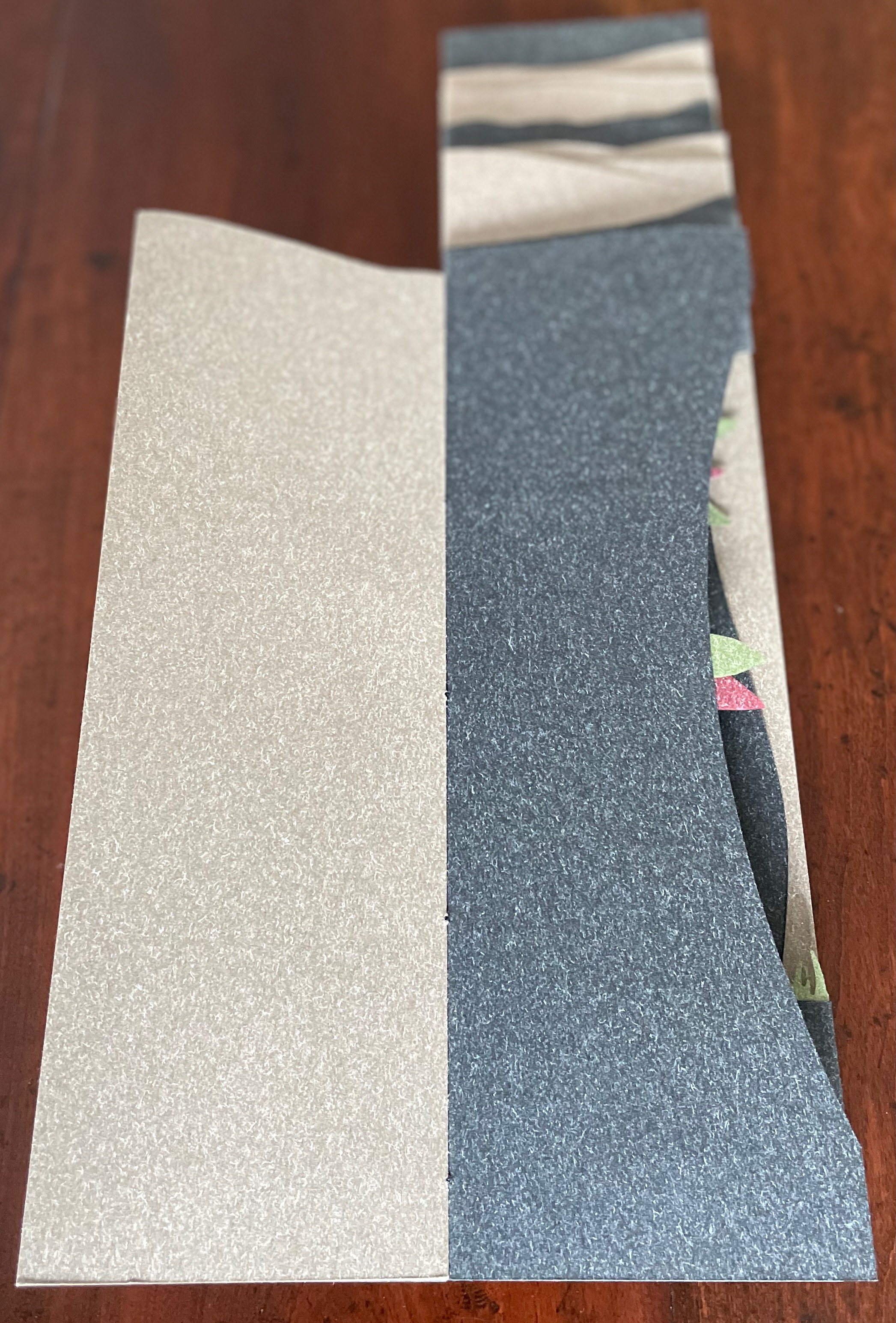
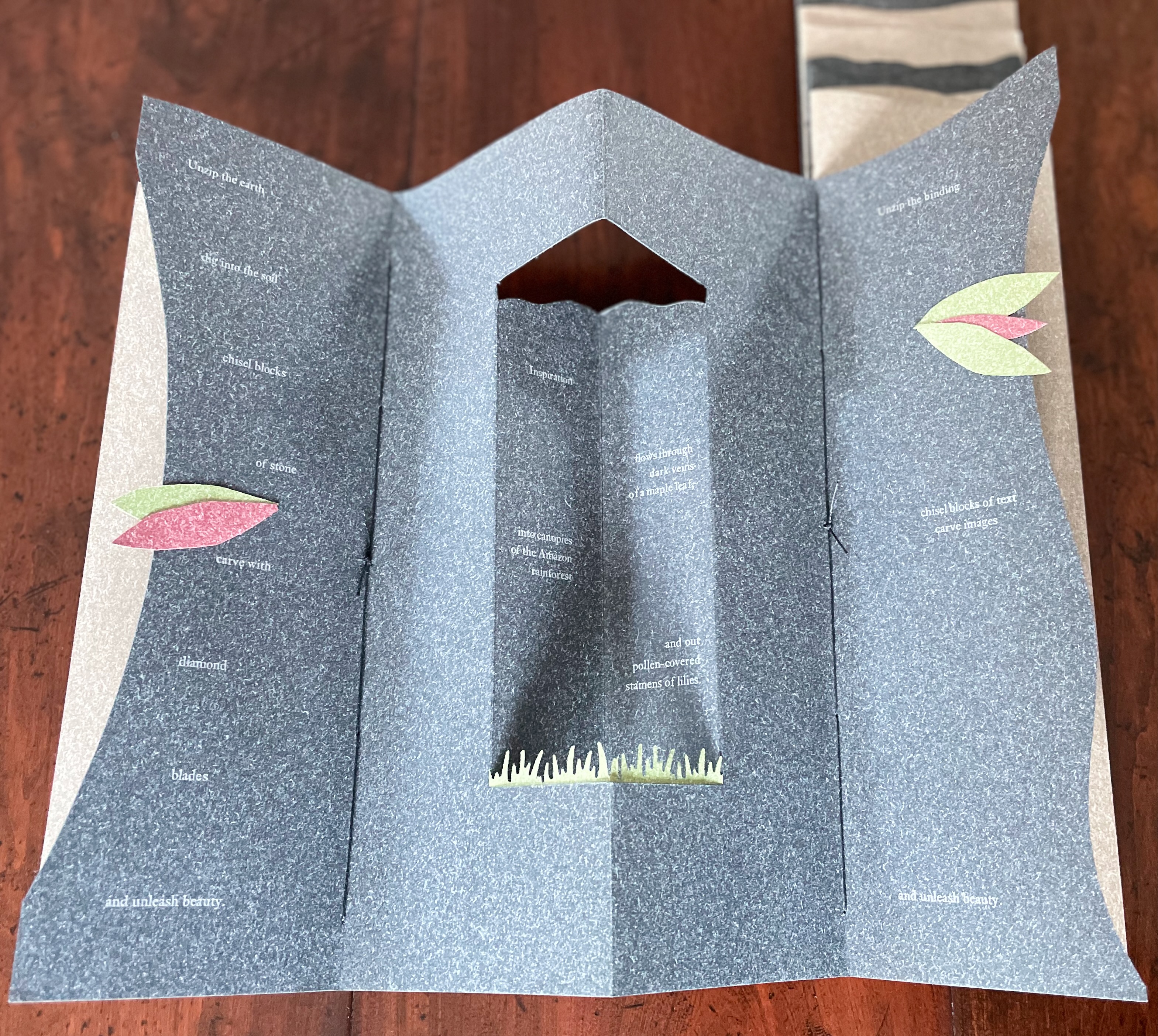
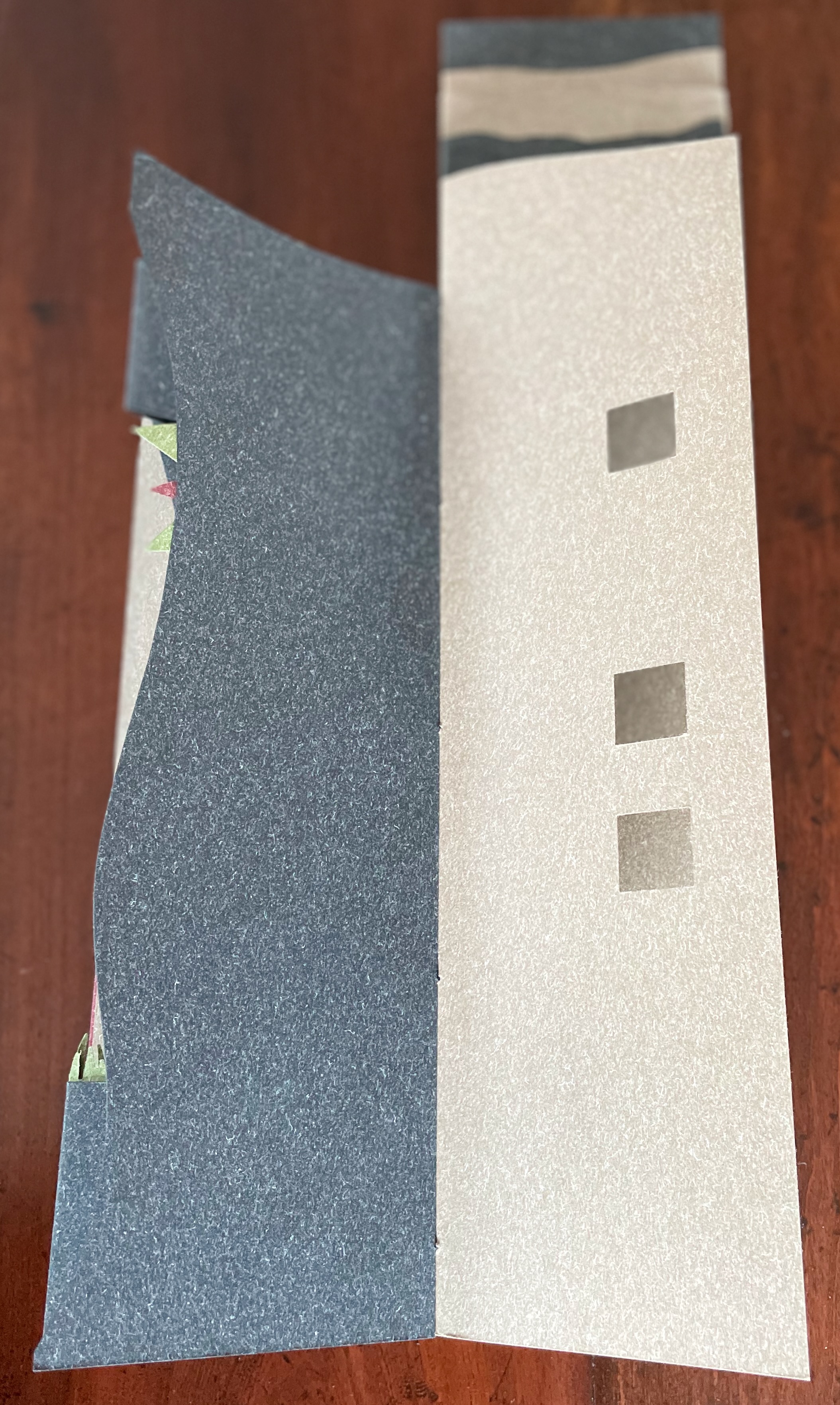
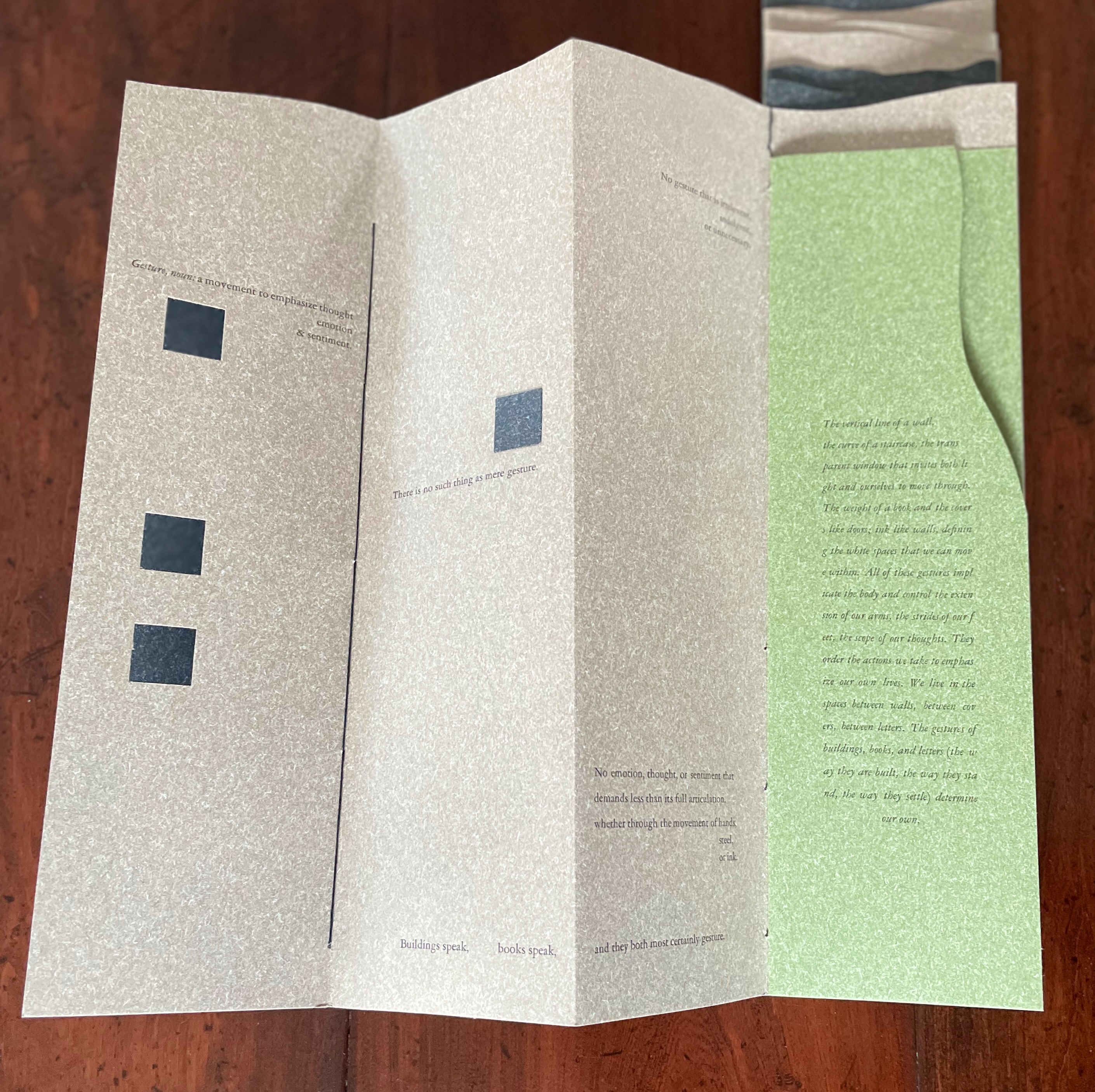
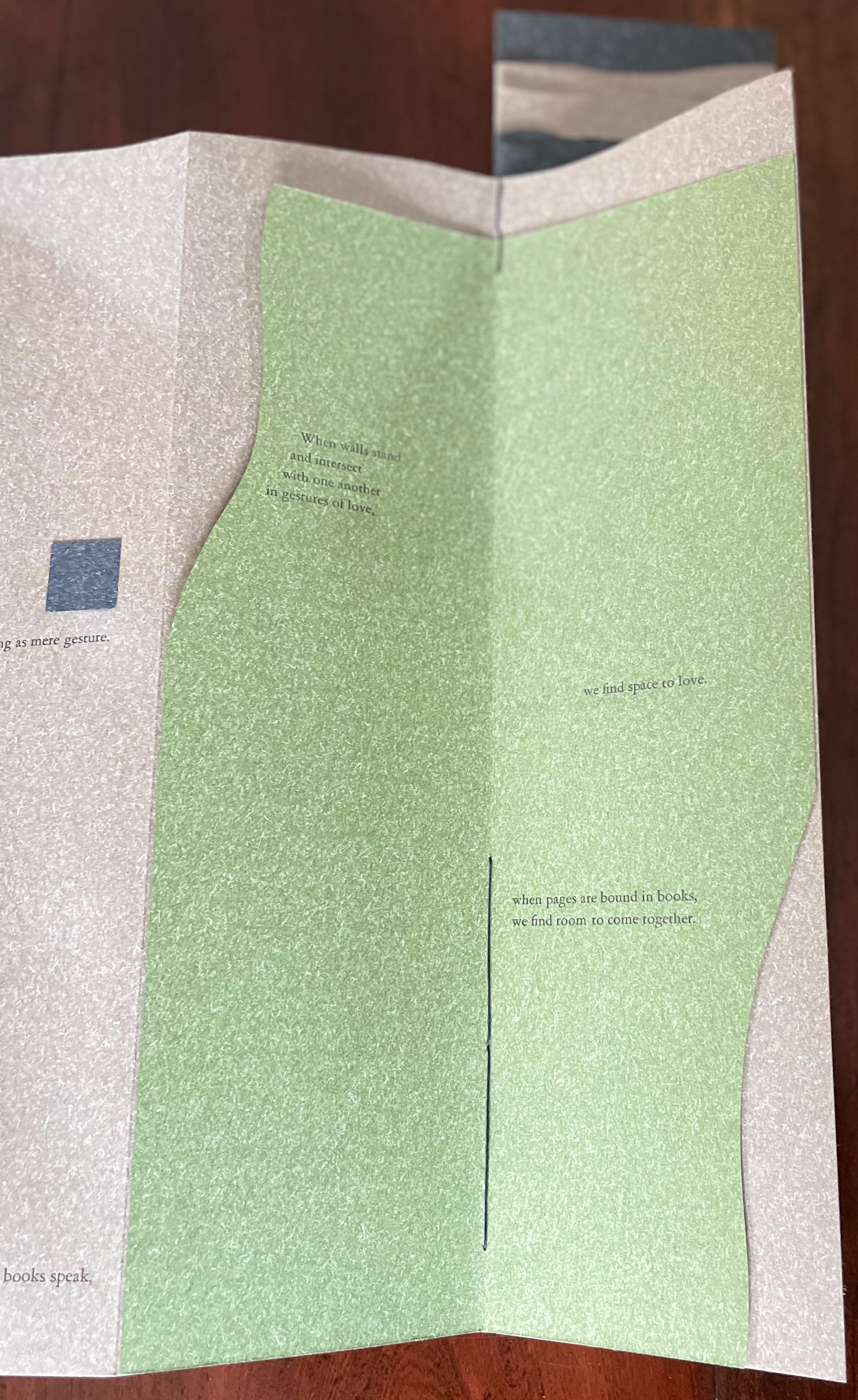
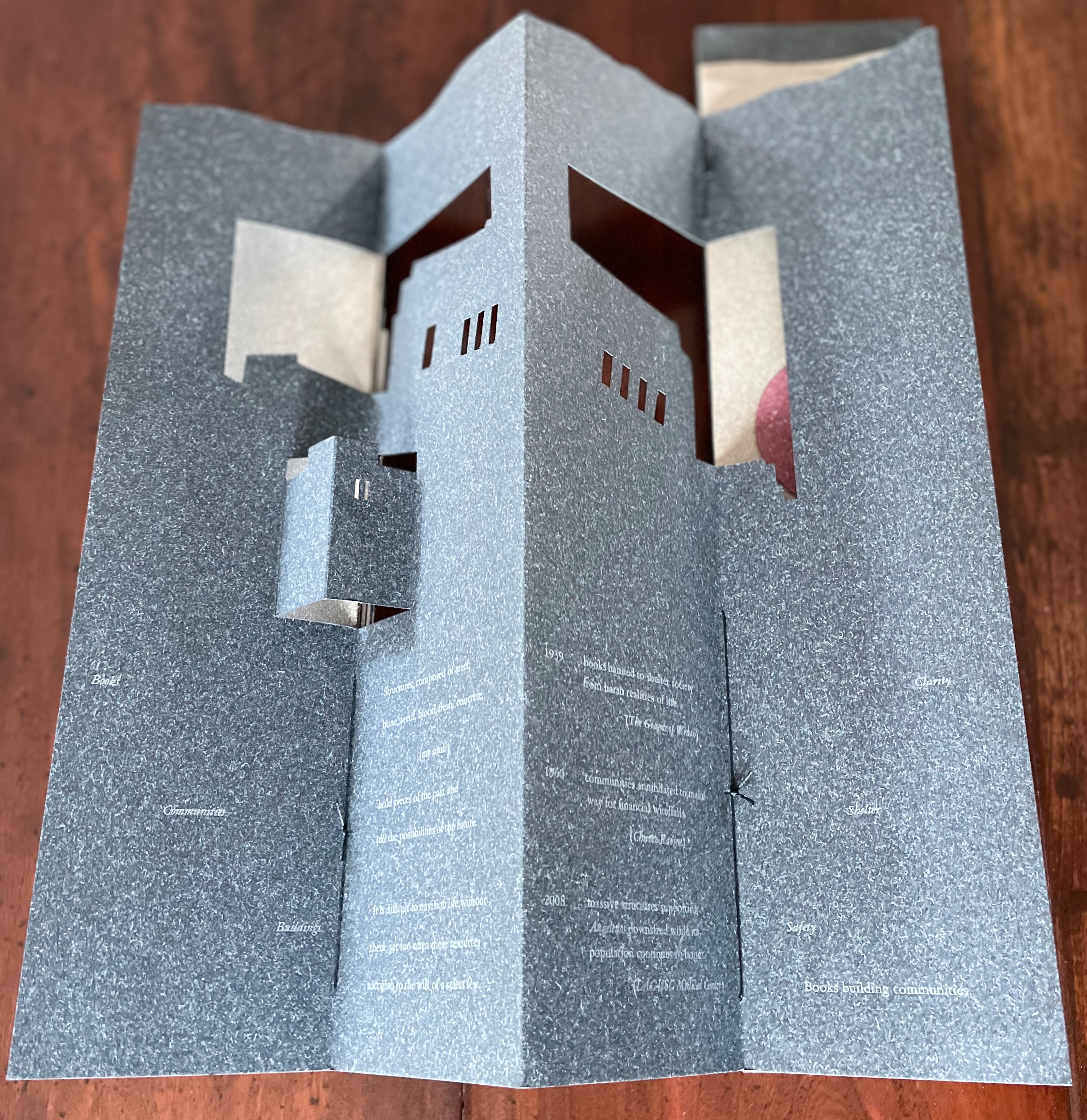
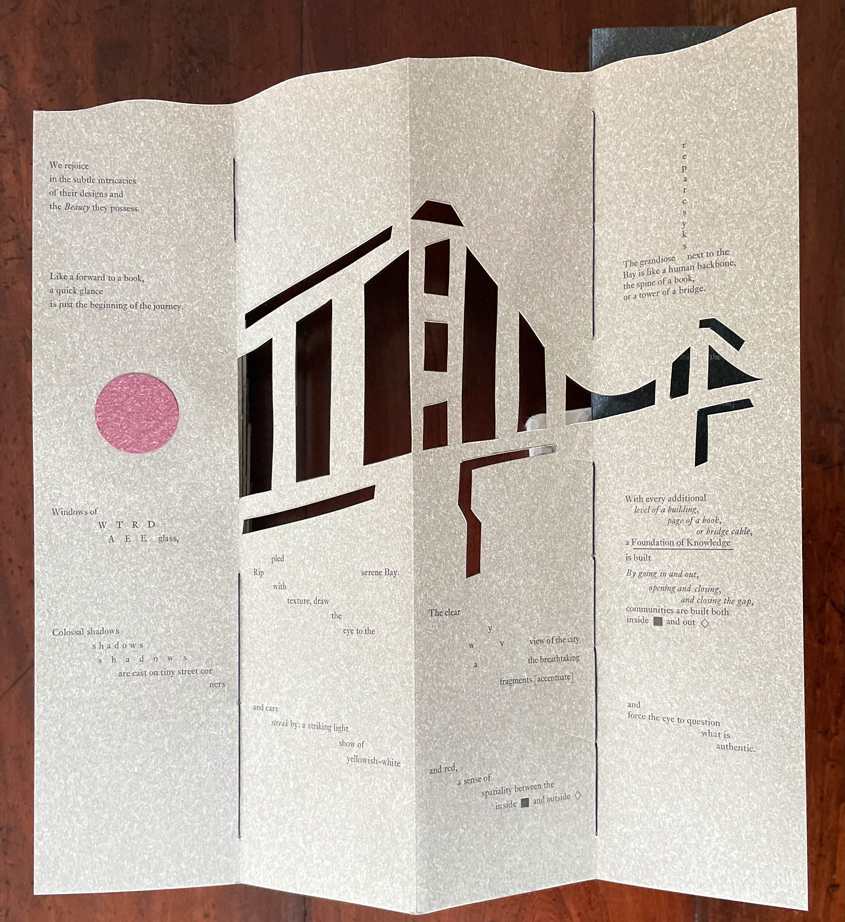
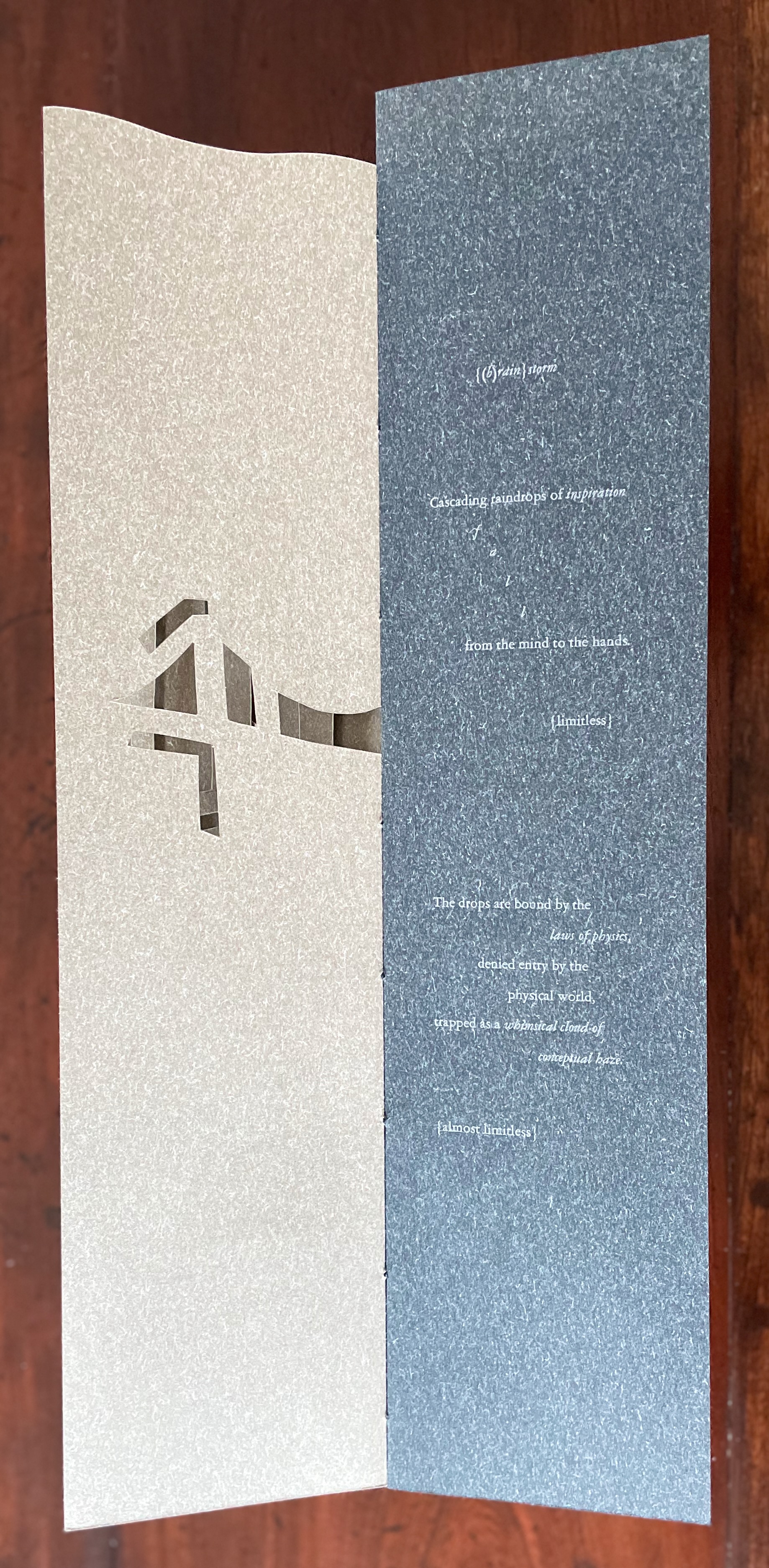
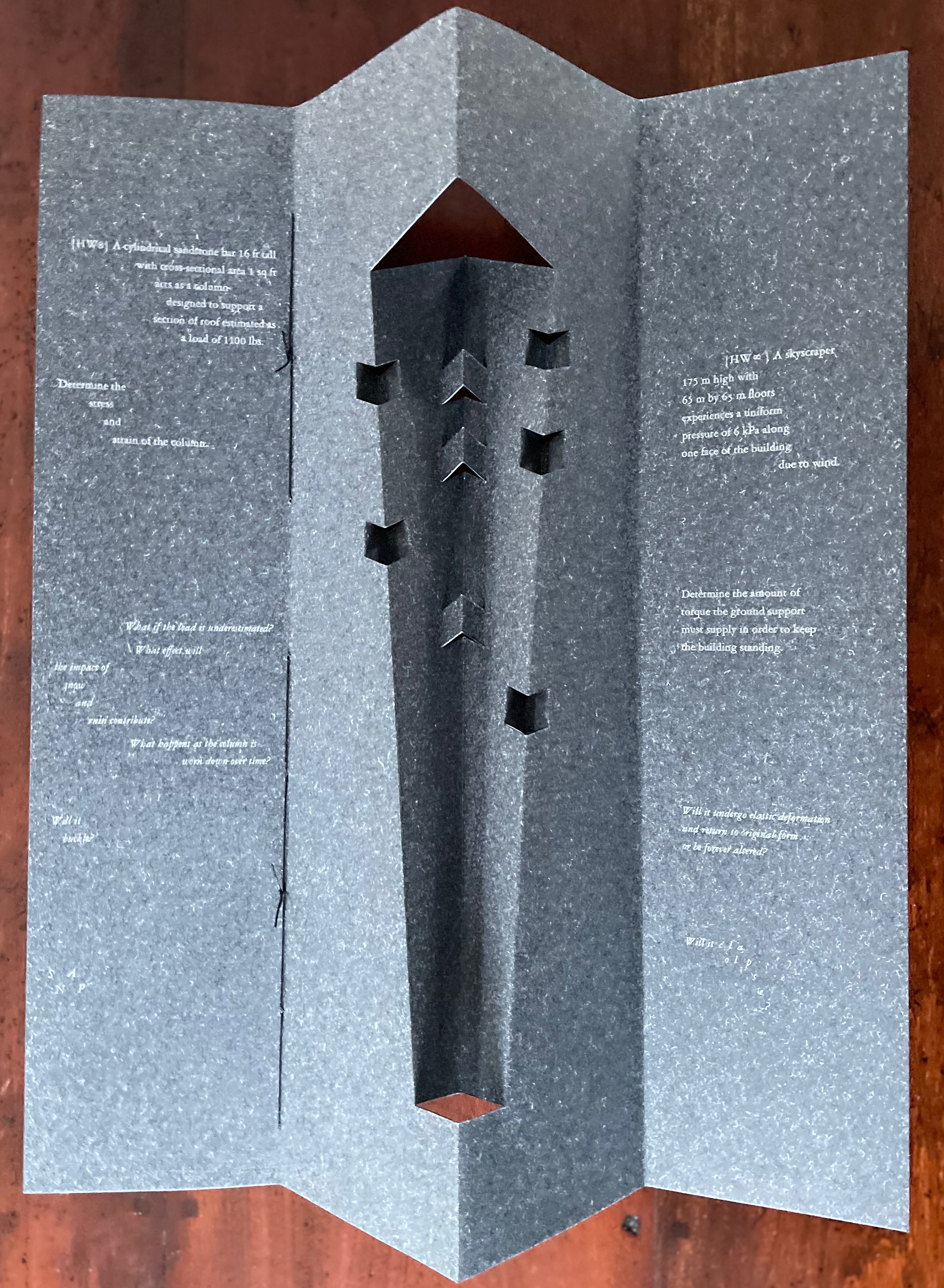
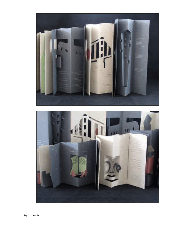
Arch (2010) Kitty Maryatt, Jenny Karin Morrill, Ali Standish, Alycia Lang, Jennifer Wineke, Mandesha Marcus, Catherine Wang, Kathryn Hunt, Ilse Wogau, Jennifer Cohen and Winnie Ding Acrylic slipcase, leporello formed of self-covering booklets sewn together. Slipcase: H410 x W110 x D50. Leporello: H400 x W 90 mm (closed). 64 pages. Unnumbered copy from edition of 109. Acquired from Bromer Booksellers, 7 December 2022. Photos: Books On Books Collection
Nôtre-Dame de Paris (1831), Archdeacon Claude Frollo points to the book in his hand and then to the cathedral and says, “This will kill that”. It is ironic that Hugo’s book (popularly known now by its English title The Hunchback of Nôtre-Dame) was written in large part to save the then-decaying cathedral (post-Revolution, it served as a warehouse), and it succeeded. It is also ironic that, while the fictional character’s metaphor has a point about the book’s permanence of replicability outlasting the building’s permanence of stone, it misses the collaborative foundations of both.
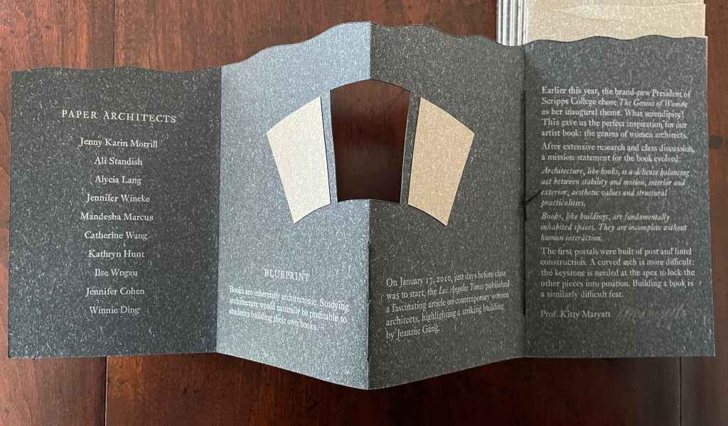
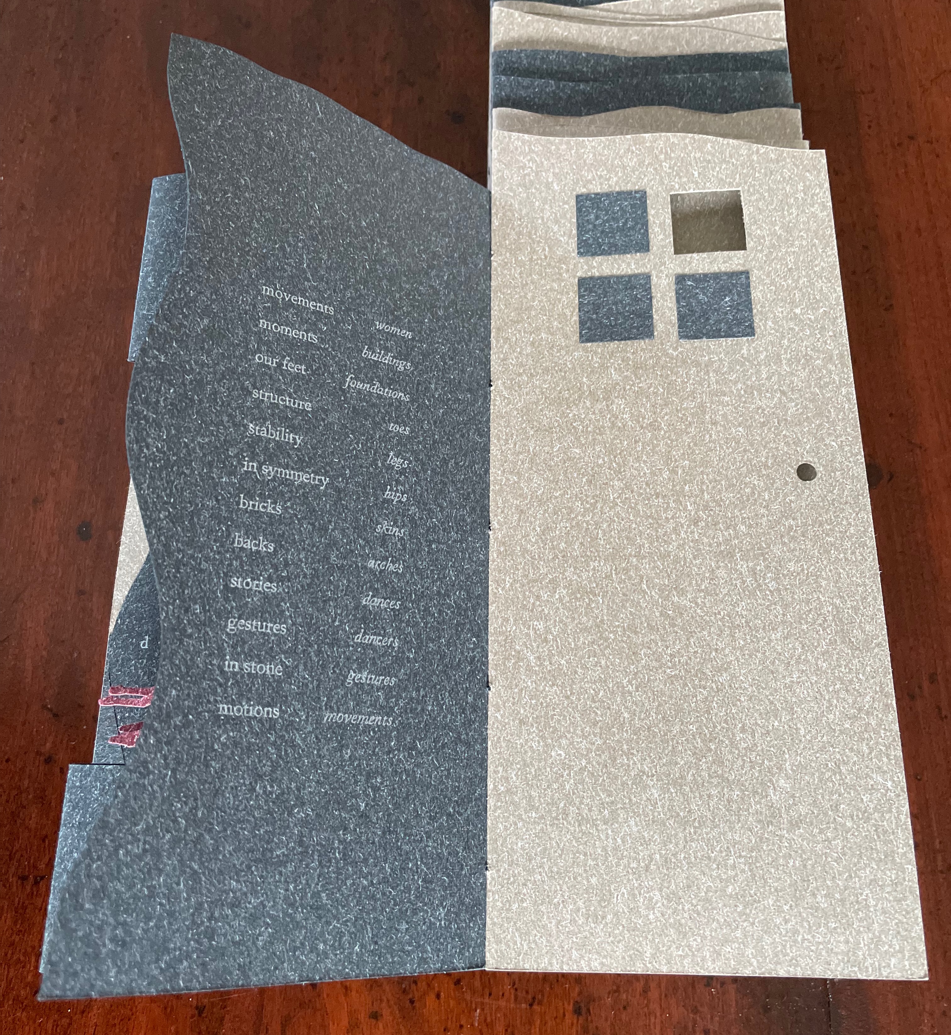
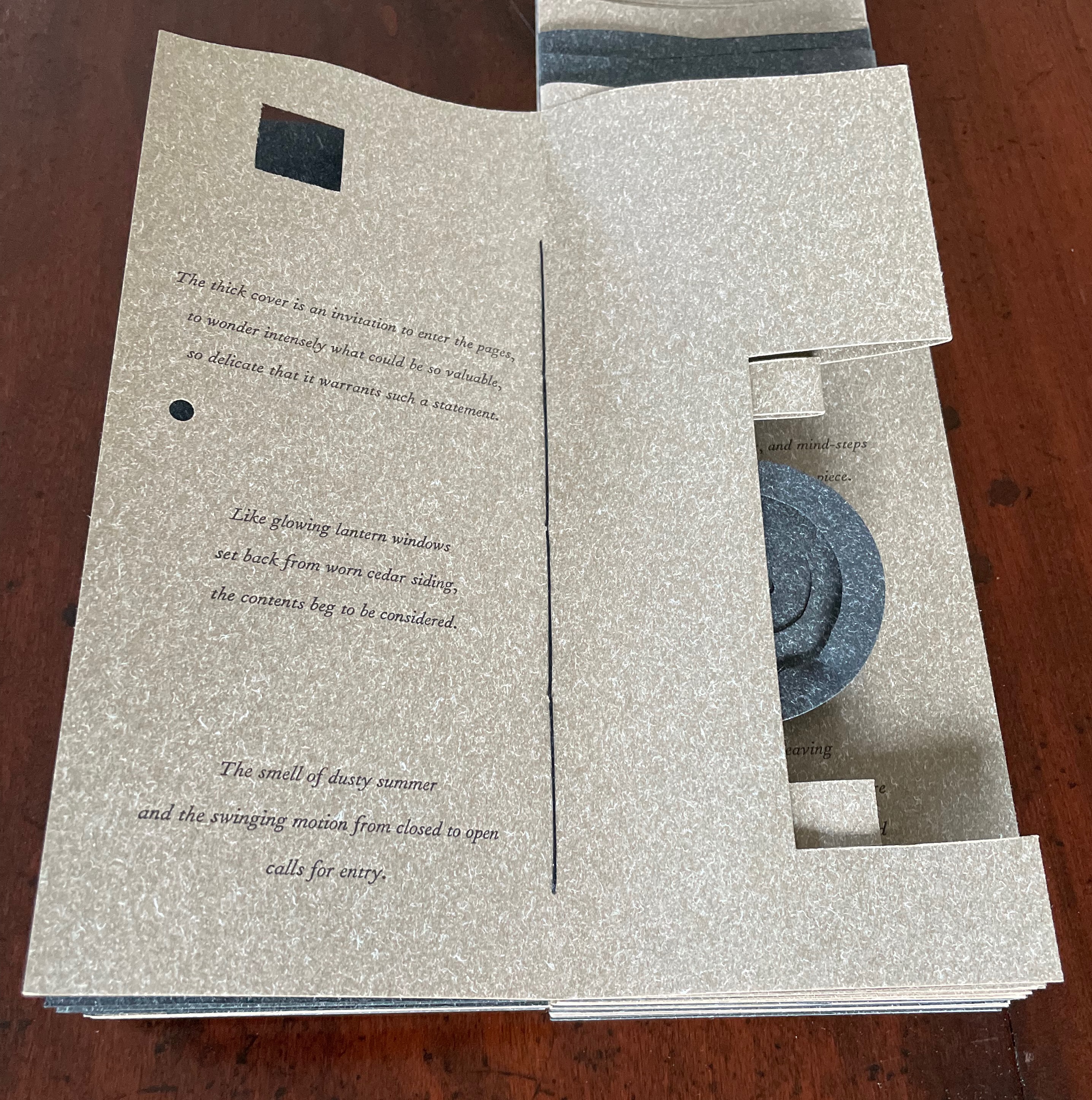
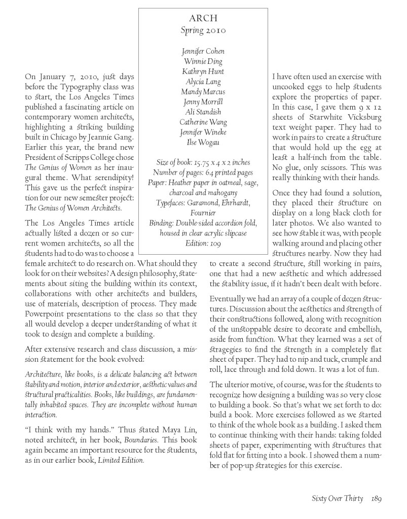
Arch (2010), created by ten students at Scripps College under the direction of Kitty Maryatt, reminds us that the creation of a book — even a work of book art — is a collaborative effort. All the students involved in the design, planning and production were women, a happenstance serendipitously blessed ahead of time by a Los Angeles Times article celebrating women architects. Drawing on that article and Maya Lin’s Boundaries (2000) as well as other research, the students agreed on a mission statement for the work: “Architecture, like books, is a deliberate balancing act between stability and motion, interior and exterior, aesthetic values and practicalities. Books, like buildings, are fundamentally inhabited spaces. They are incomplete without human interaction.”
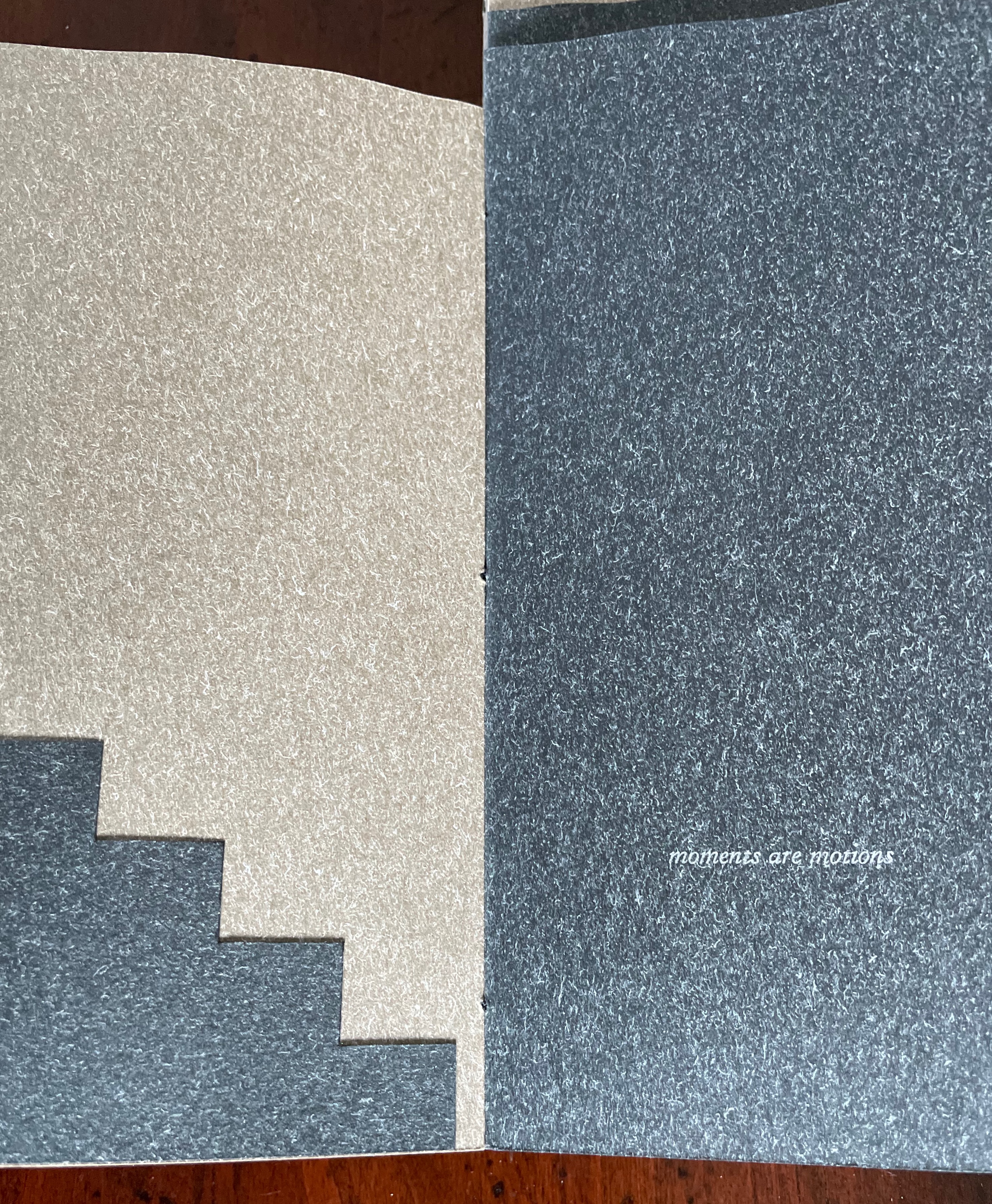
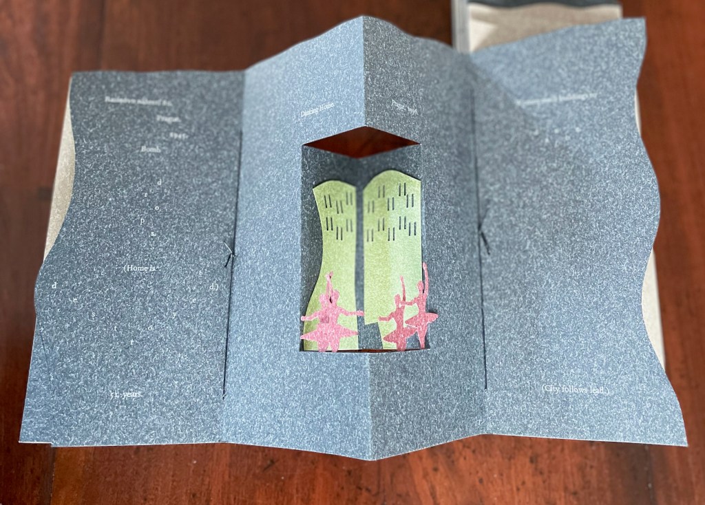
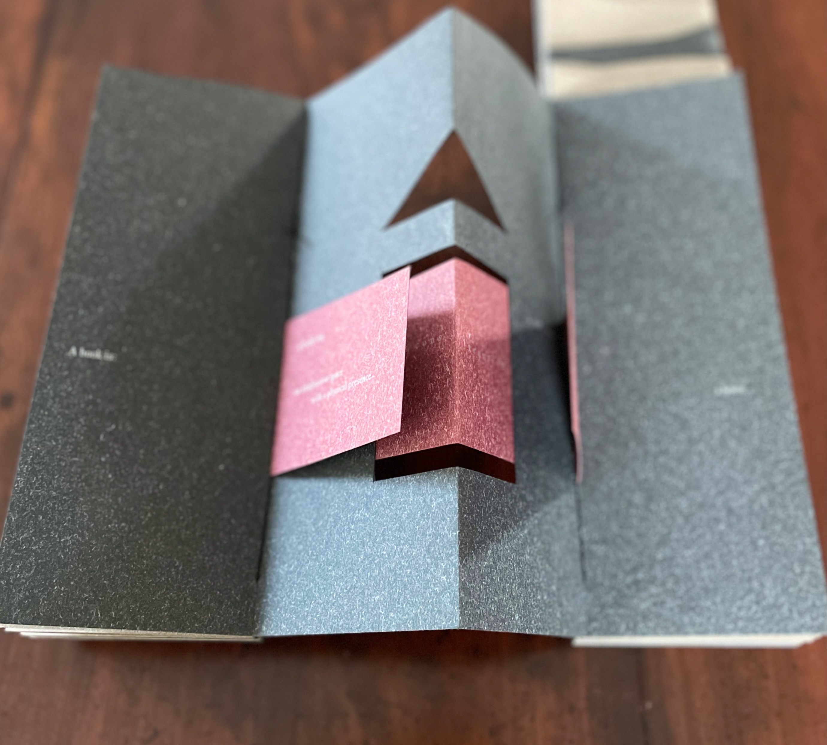
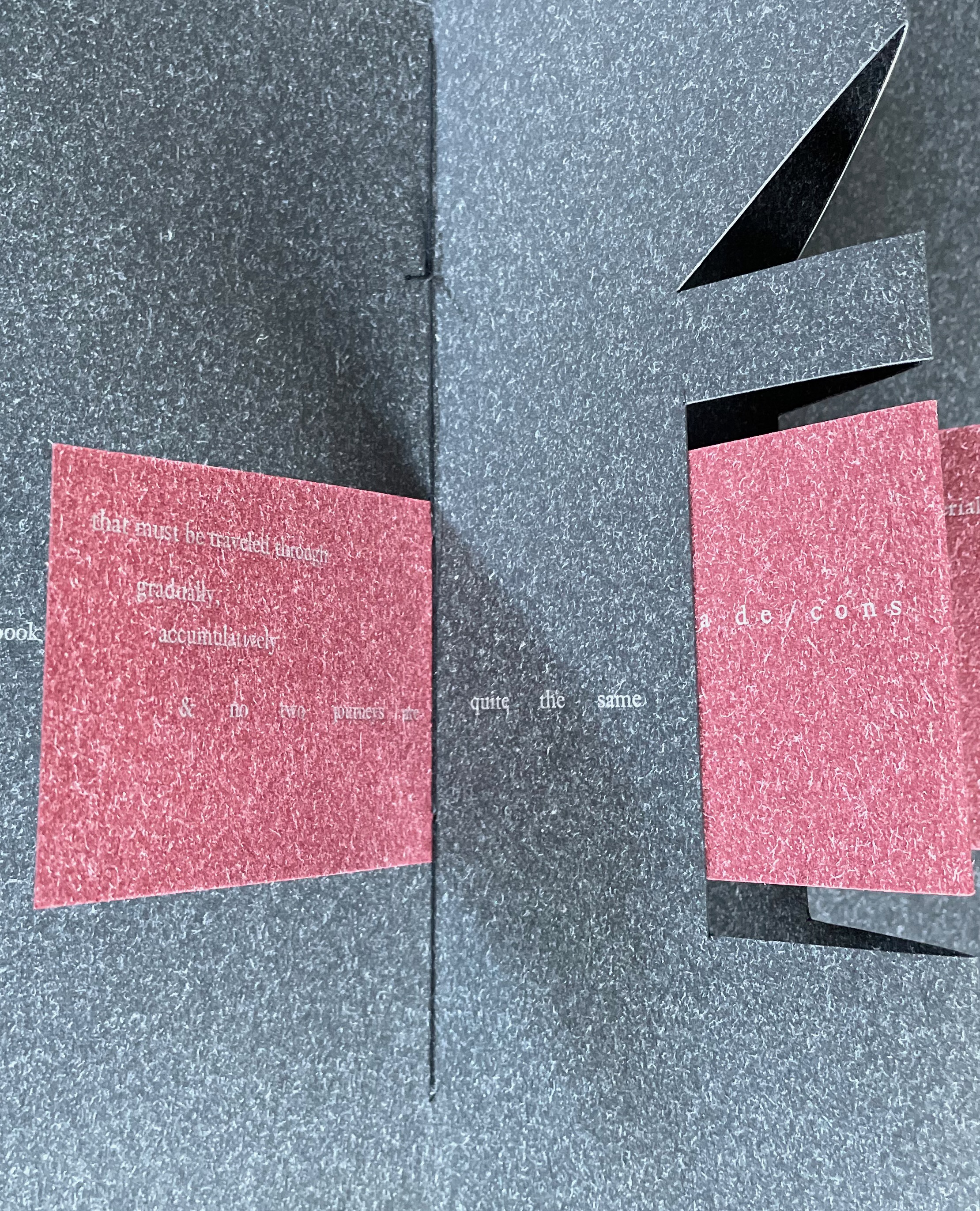
Clever structural use of paper with a stone-like appearance, paired with apt choices of text matched with equally judicious choices in typography, evoke the similarities between books and buildings. Each architect/bookmaker’s contribution is a self-covering booklet in leporello format. Of different heights, the booklets are sewn together to create a tiered tower to be housed in an acrylic slipcase.
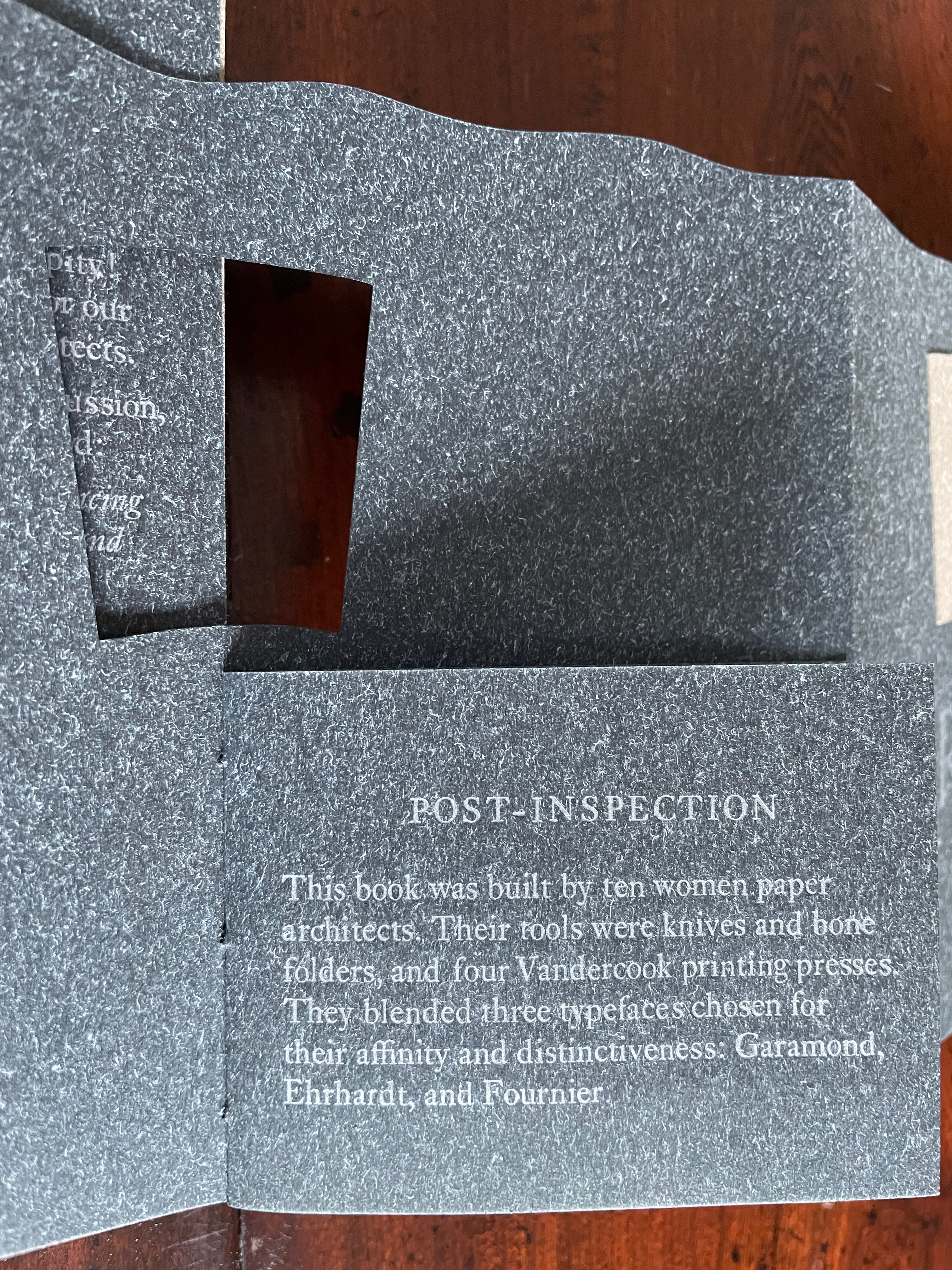
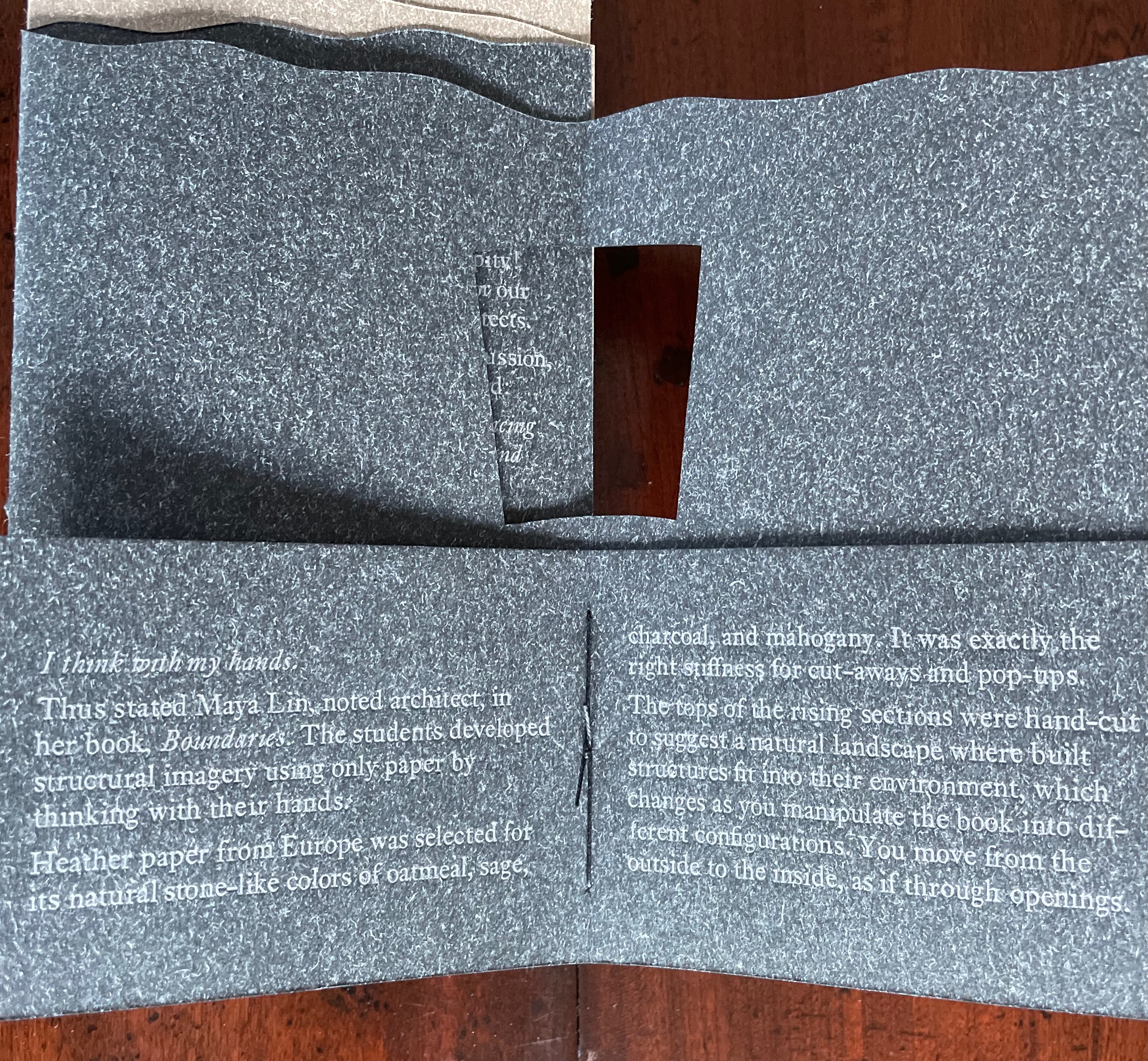
The first booklet, open below, incorporates Maryatt’s introduction, entitled “Blueprint”, all of which appears in the work’s entry in the publication Sixty over Thirty: Bibliography of Books Printed Since 1986 at the Scripps College Press (2016). The entry is reproduced in full further below.
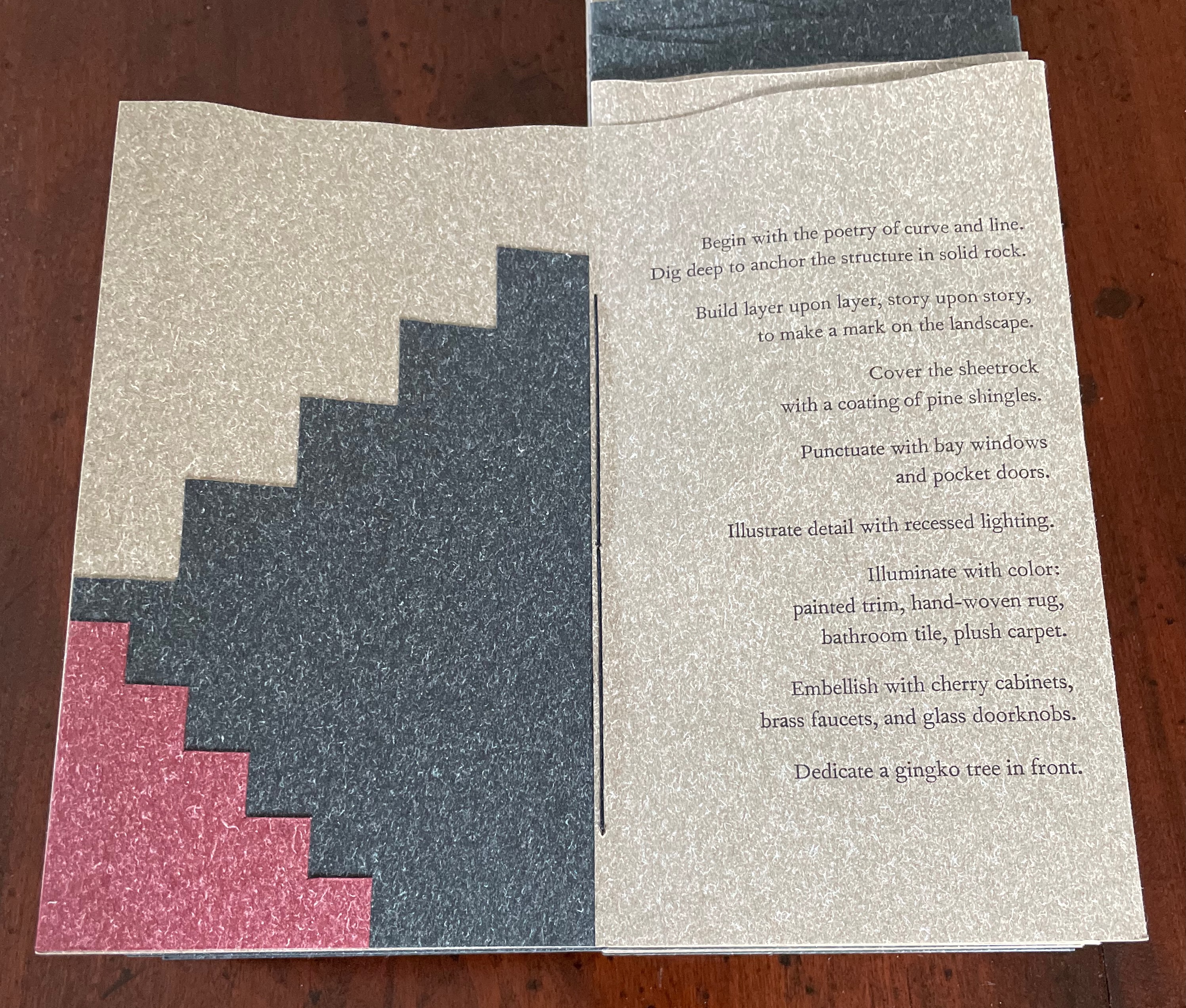
The next booklet lists the sources of architectural inspiration, and as the lattice door on the list’s facing page turns, two sets of stairs, cutouts in contrasting colors, ascend on the verso page to the text that begins at the top of the recto page and ends at the foot of descending stairs on the next double-panel spread. Like Maya Lin, Maryatt’s students built their works by learning to think with their hands. The reader, too, has to think with the hands to experience fully this booklet and those that follow. The whole work conjures up the titles of Juhani Pallasmaa’s books — The Thinking Hand and The Embodied Image. Readers of this online entry will have to expand the images below, enjoy the words and imagine their way through with the title of another of his books — The Eyes of the Skin.
Lynn, Greg. 2004. Folding in Architecture Rev. ed. Chichester, West Sussex: Wiley-Academy. See for references to Mario Carpo, Gilles Deleuze and Peter Eisenman.
Macken, Marian. Binding Space: The Book as Spatial Practice (London: Taylor and Francis, 2018). A trained architect and book artist, Macken articulates and illustrates the how and why of the overlap between architecture and book art.
Padberg, Susanne (curator). 7 May – 26 June 2026. “Book. Space. House. Space of Movement“. Exhibition at Galerie Druck & Buch, Vienna, Austria. Accessed 22 May 2026. “The artist’s book as a three-dimensional space: forming a house, outlining, remembering, mimicking—thinking the human being within space. Between object and narrative, books unfold as architectural structures, as inhabitable thought-spaces, as reflections of individual and collective experience. The exhibition brings together artistic positions that expand the book as a spatial body.”
Williams, Elizabeth. 1989. “Architects Books: An Investigation in Binding and Building”, The Guild of Book Workers Journal. 27, 2: 21-31. This essay not only pursues the topic of architecture-inspired book art but turns it on its head. An adjunct professor at the time, Williams set her students the task of reading Ulises Carrión’s The New Art of Making Books (Nicosia: Aegean Editions, 2001) then, after touring a bindery, “to design the studio and dwelling spaces for a hand bookbinder on an urban site in Ann Arbor, Michigan”. But before producing the design, the students were asked “to assemble the pages [of the design brief and project statement] in a way that explored or challenged the concept of binding”. In other words, they had to create bookworks and then, inspired by that, create their building designs. Williams illustrates the essay with photos of the students’ bookworks. [Special thanks to Peter Verheyen for this reference.]