Ed’s books are a delight: witty and/or thoughtful ideas cleverly presented in unusual structures. Ed is a great believer in designing the form to suit the content, so no two books are alike. Some basic forms re-occur, but there are tweaks to the basic structures that individualize them for each version.
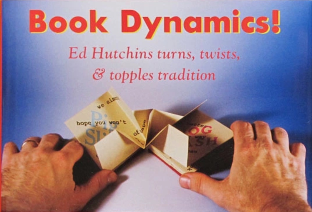
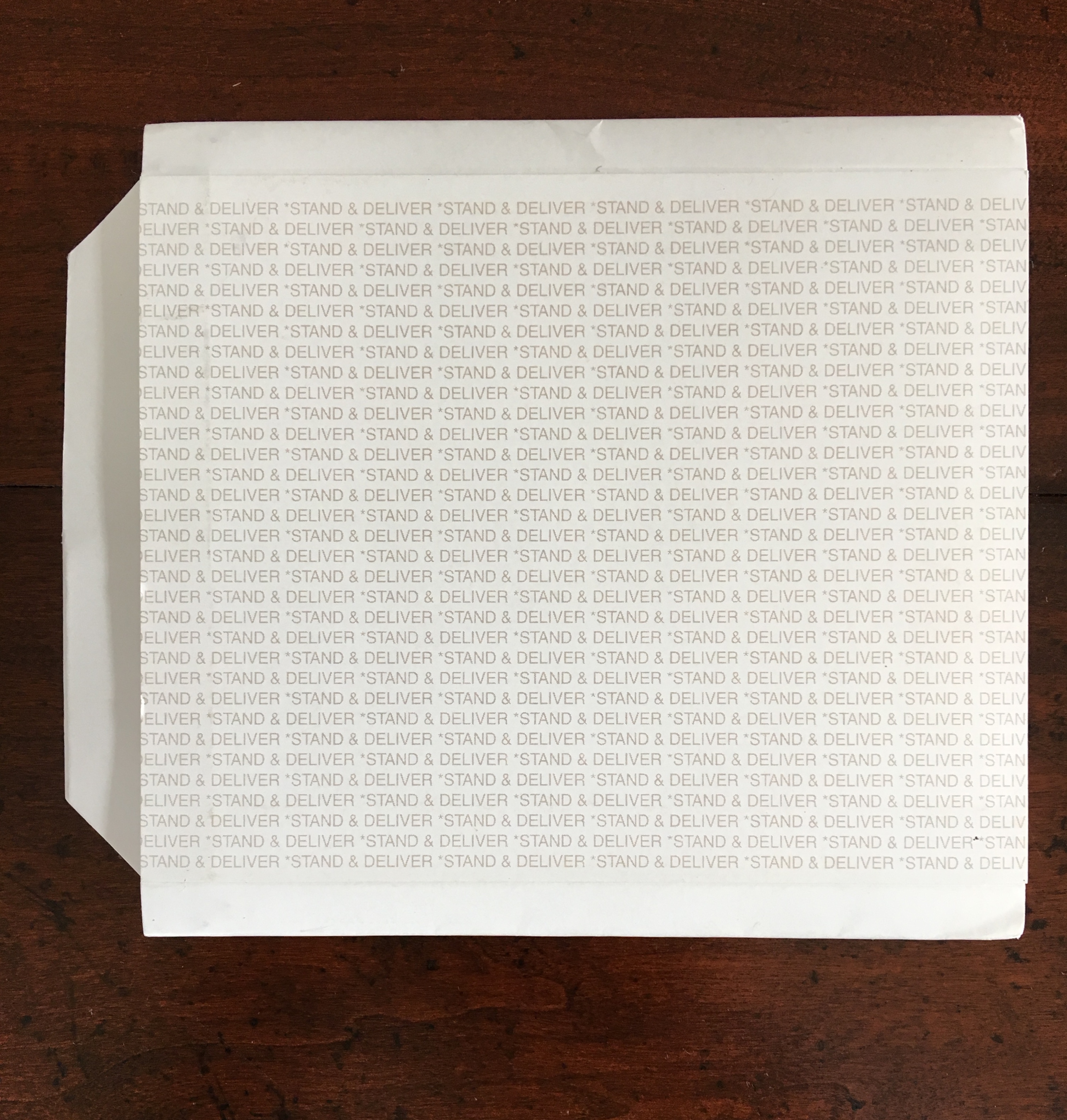
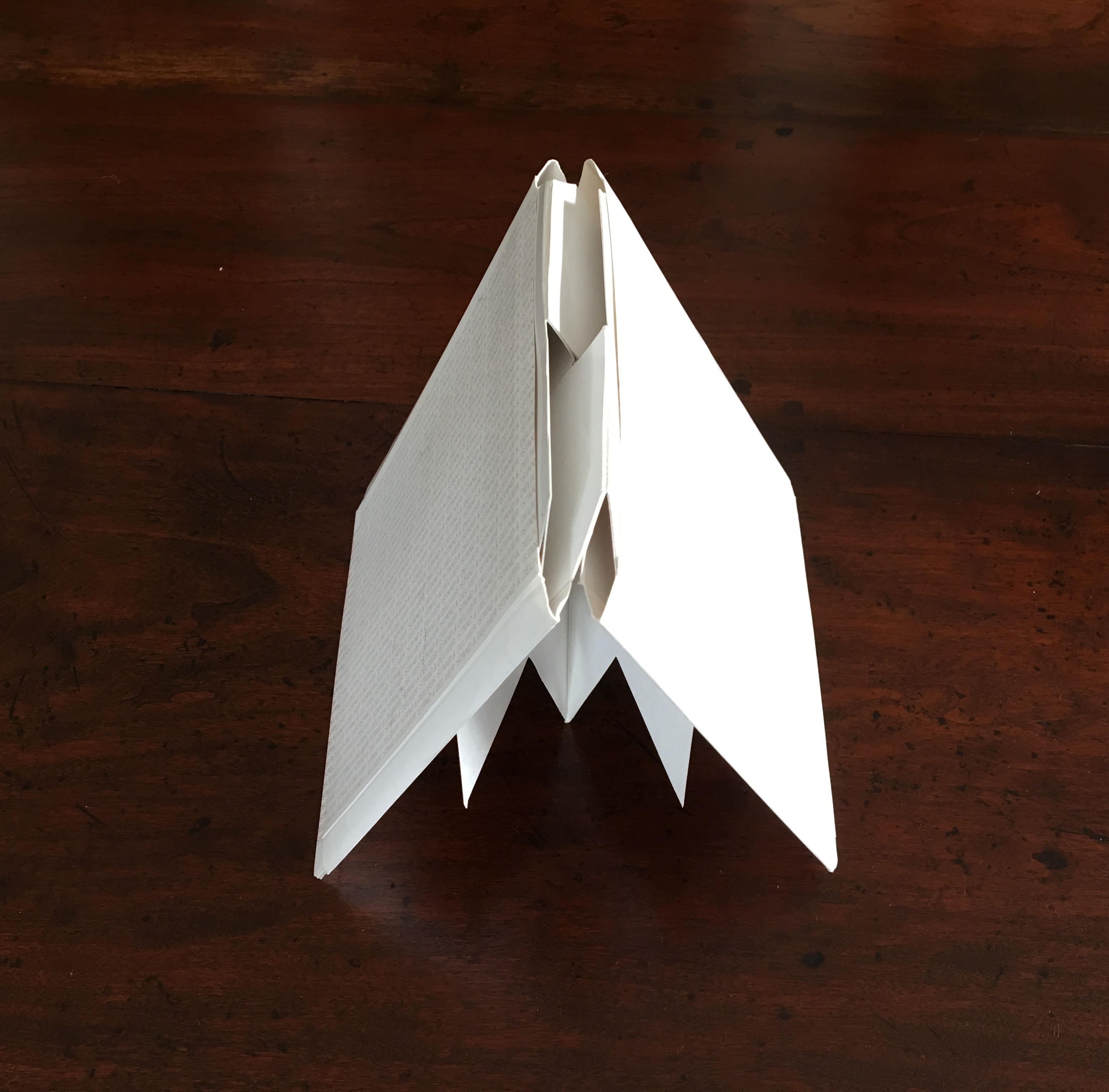
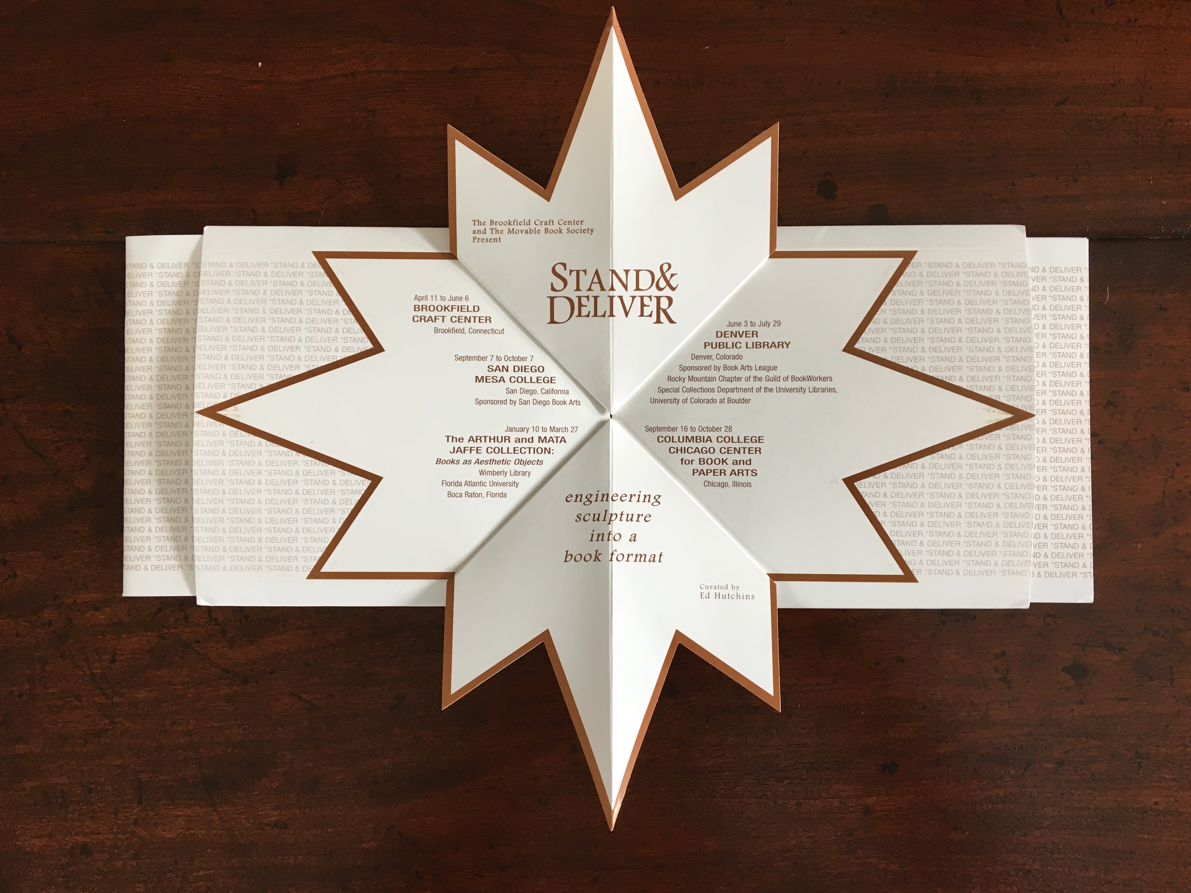
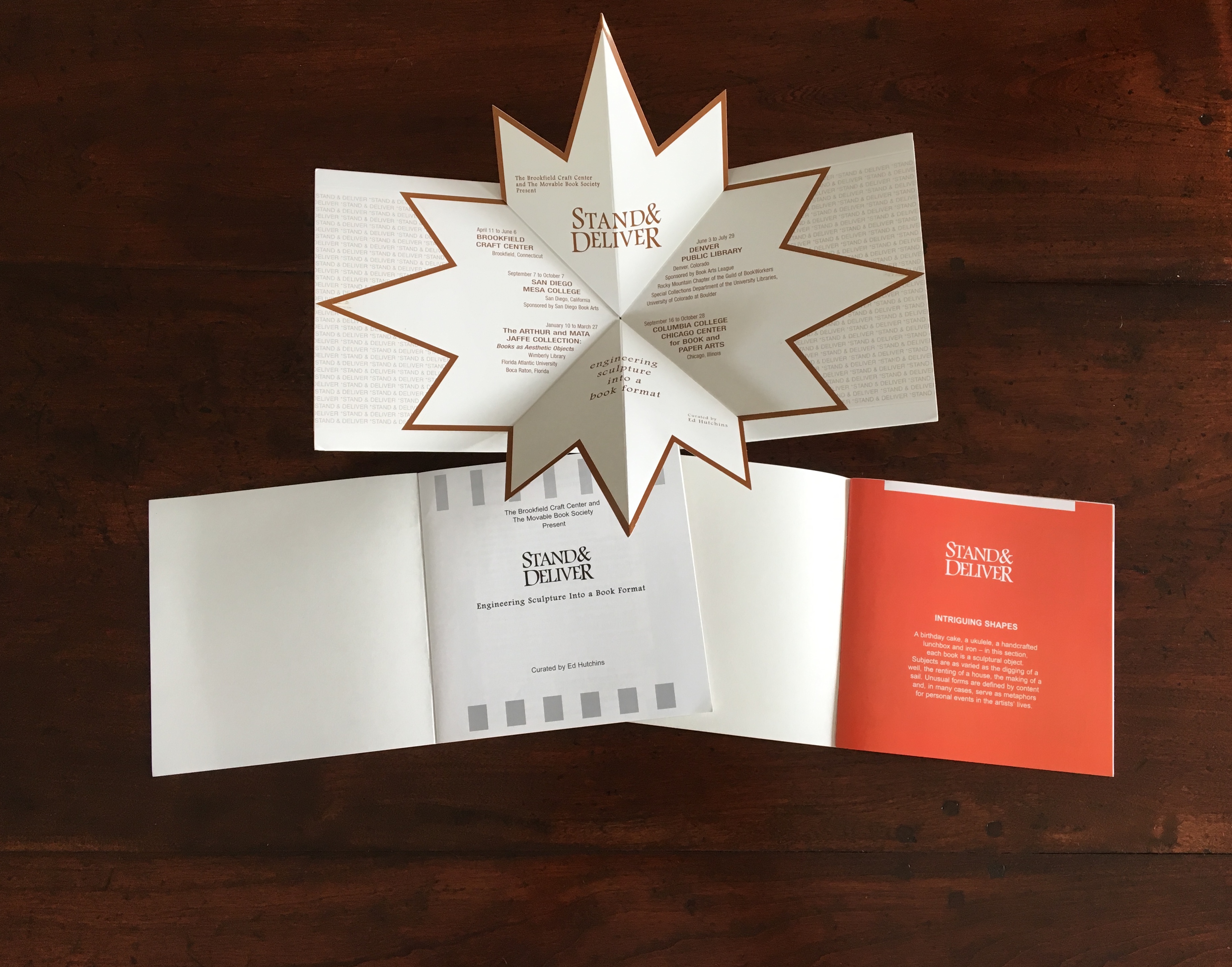
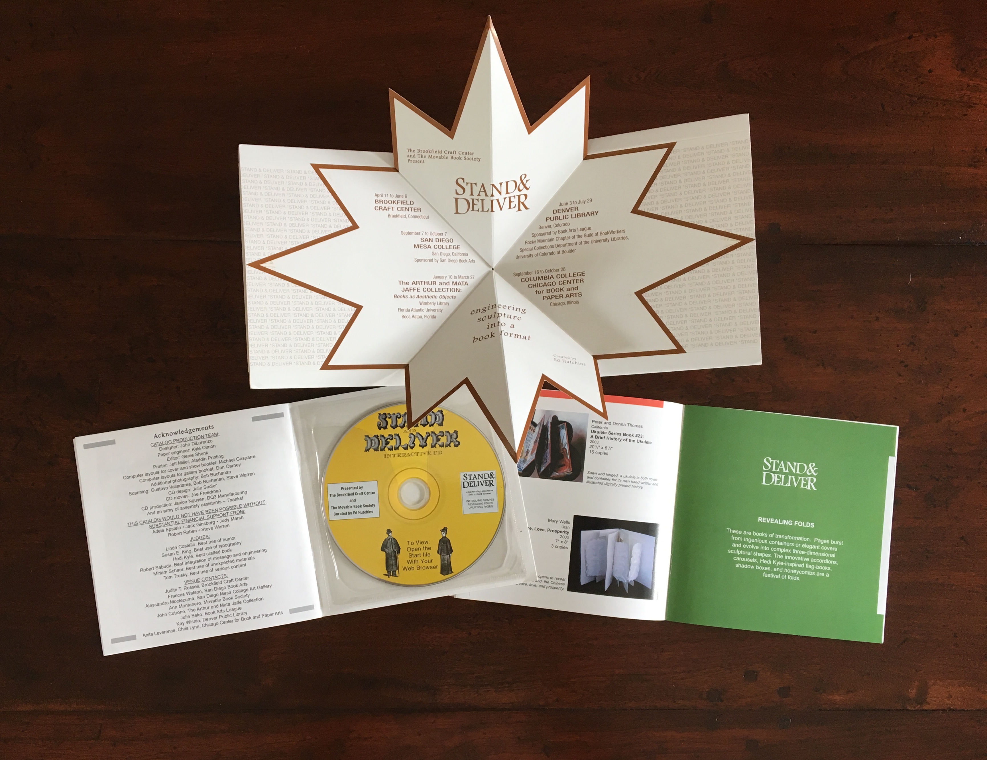
Miller’s review in Byopia Press is also a delight, providing multiple links and routes to information about Ed Hutchins as well as to other reviews of his work. Below are images of the catalog for Stand & Deliver, curated by Hutchins in 2003.
Engineered by Kyle Olmon and designed by John DiLorenzo, the catalog demonstrates great inventiveness in the pop-up structure and mechanism that nudges the two booklets from the left and right sleeves as the catalog is opened. Note also the use of colors to demarcate its sections that follow the themes Hutchins used to organize this exhibition: Intriguing Shapes, Revealing Folds, Uplifting Pages. And note the distinctive and subtle shifting placement of colors in the right-hand booklet: at the top on the orange page, a white bar that shifts to the right on the green page as an orange bar marks the end of the previous section on the facing verso page. For an exhibition that traveled to five different locations, a more appropriately and intricately mobile catalog could hardly have been devised.
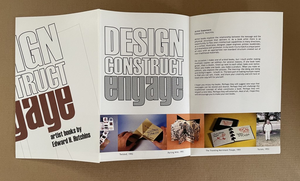
Design, Construct, Engage (2002)
Design, Construct, Engage (2002) Booklet-poster-catalogue in meander cut and fold. Closed: H220 x W140 mm. Acquired from Ed Hutchins, 26 January 2022.
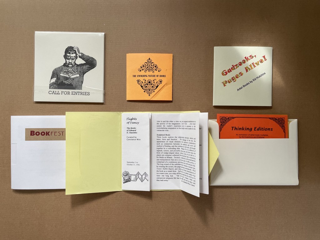
Ephemera (1996 – 2003)
Flights of Fancy (1996) Envelope with tab, trifold, center-cut single sheet forming booklet H145 x W116 mm. Acquired from Ed Hutchins, 20 May 2014.
Gadzooks, Pages Alive (2002) Velcro-fastened trifold cover glued to 18 pages, fixed spinner inside cover. 107 x107 mm. [18] pages. Acquired from Ed Hutchins, 20 May 2014.
The Unfolding Nature of Books (1993) Envelope with tab, trifold, with split Turkish map in center. Self-enclosing evelope with split Turkish map construction exhibition list in center Closed: 85 x 85 mm. Acquired from Ed Hutchins, 20 May 2014.
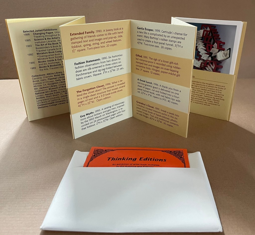
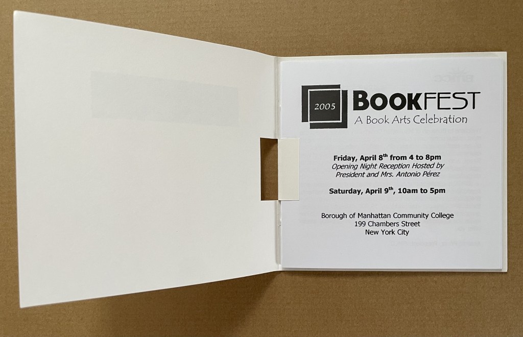
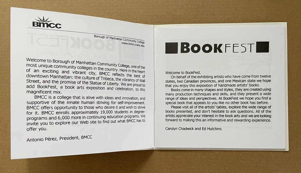
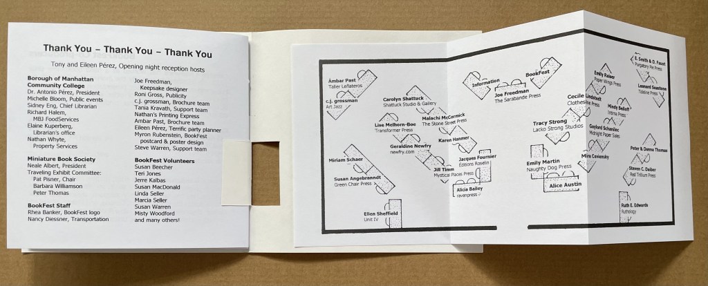
Thinking Editions (1999) Accordion fold booklet with 16-page gathering saddle-stitched with single staple to first fold, four panels of accordion slit to receive four cards to create 8 interleaved pages, final panel has pocket holding 3 color postcards. H155 x W110. 28 pages. Acquired from Ed Hutchins, 20 May 2014.
Thinking Editions card (1999) Four-card construction displaying 7 views. 126 x 126 mm. Acquired from Ed Hutchins, 20 May 2014.
Call for Entries, Stand & Deliver (2002/3) Pop-up invitation with entry cards. Acquired from Ed Hutchins, 20 May 2014.
A “monument” to the Absence of the Twin Towers, this is a poignant work of book art by J. Meejin Yoon, architect, designer, educator, Professor and Head of the Department of Architecture at the Massachusetts Institute of Technology. A simple video demonstrating the work appears here at the site of the Otis College of Art and Design. This book|object was published by Printed Matter, Inc. and the Whitney Museum of Art in 2004 when Yoon was an Assistant Professor at MIT.
Artist’s description: “Both a book and a sculptural object, Absence is a memorial to the Twin Towers of the World Trade Center. It is a non-architectural, non-site-specific, space of remembrance: a portable personal memorial in the form of a book. A solid white block of thick stock cardboard pages, the book’s only “text” consists of the void of the tower’s footprints cut form the 110 pages – one for each floor of the towers.”
As you hold this small white brick of paper and turn its thick pages, a small pinhole appears on the page. Then two larger square holes emerge, one of which falls over the pinhole. Page after page — 110 pages for each floor of the towers — the two square holes repeat, creating two small dark wells in the field of white, until on the last page they take their place in the cut-out schematic footprint of the city blocks and buildings surrounding the Twin Towers. What you hold in your hands at the end is an object of art and book of memorial prayer.
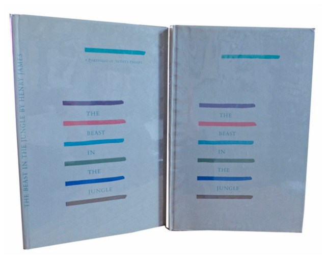
Henry James, The Beast in the Jungle, 1903. Allen Press, 1963. The copy shown is one of only 15 copies with an extra suite of 16 artist’s proofs, each titled, numbered 9/15 and signed by the artist in a separate portfolio. Displayed online at Sophie Schneideman – Rare Books and Prints.
In his Books and Vines essays, Chris T. Adamson provides fresh, personal and insightful comments on fine book productions and their content such as Henry James’ “The Beast in the Jungle” from the Lewis and Dorothy Allen Press in 1963, pictured above. An oenophile, as the title of his series suggests, Adamson also occasionally offers tips on the best wines with which to decant and read these works.
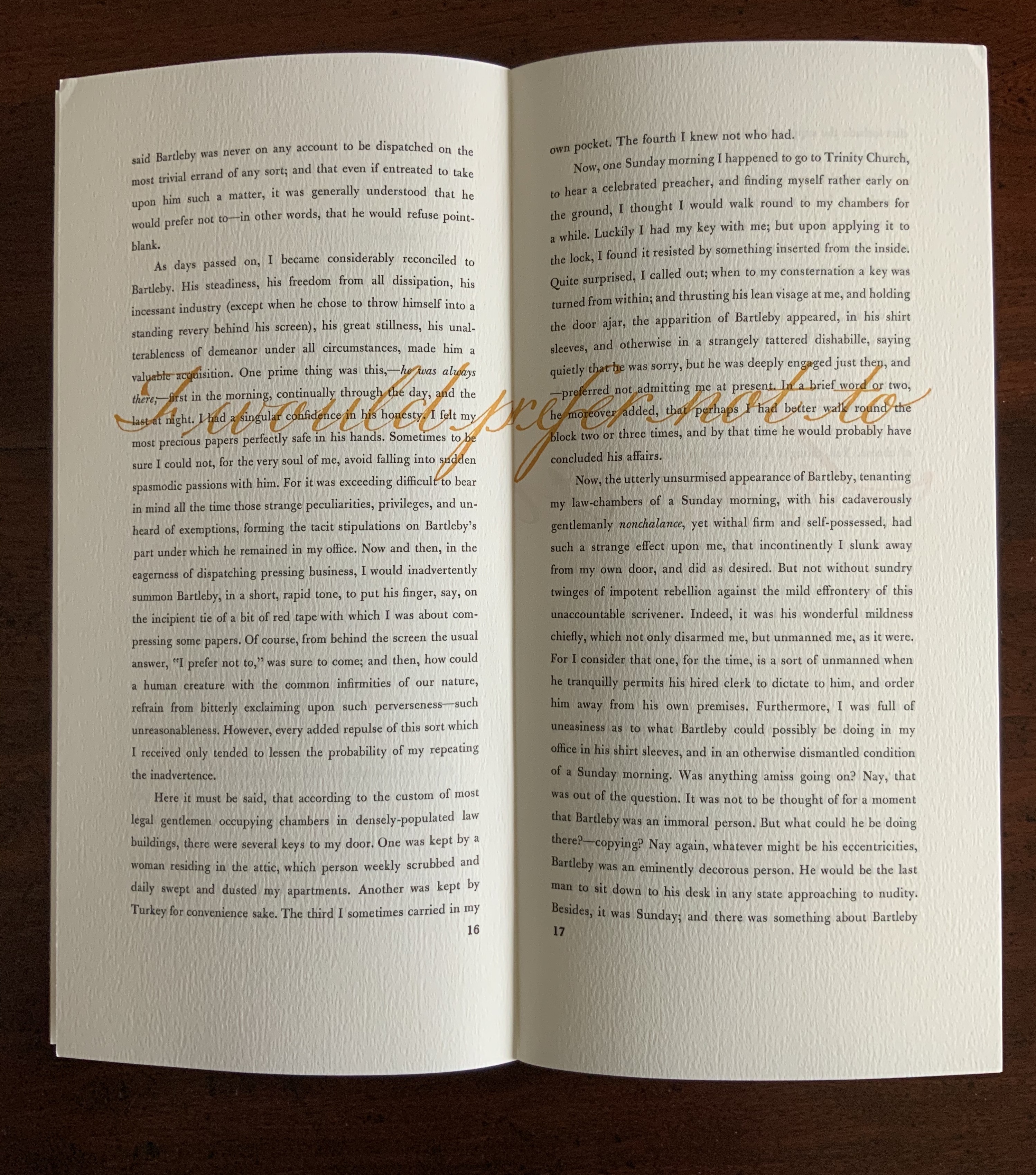
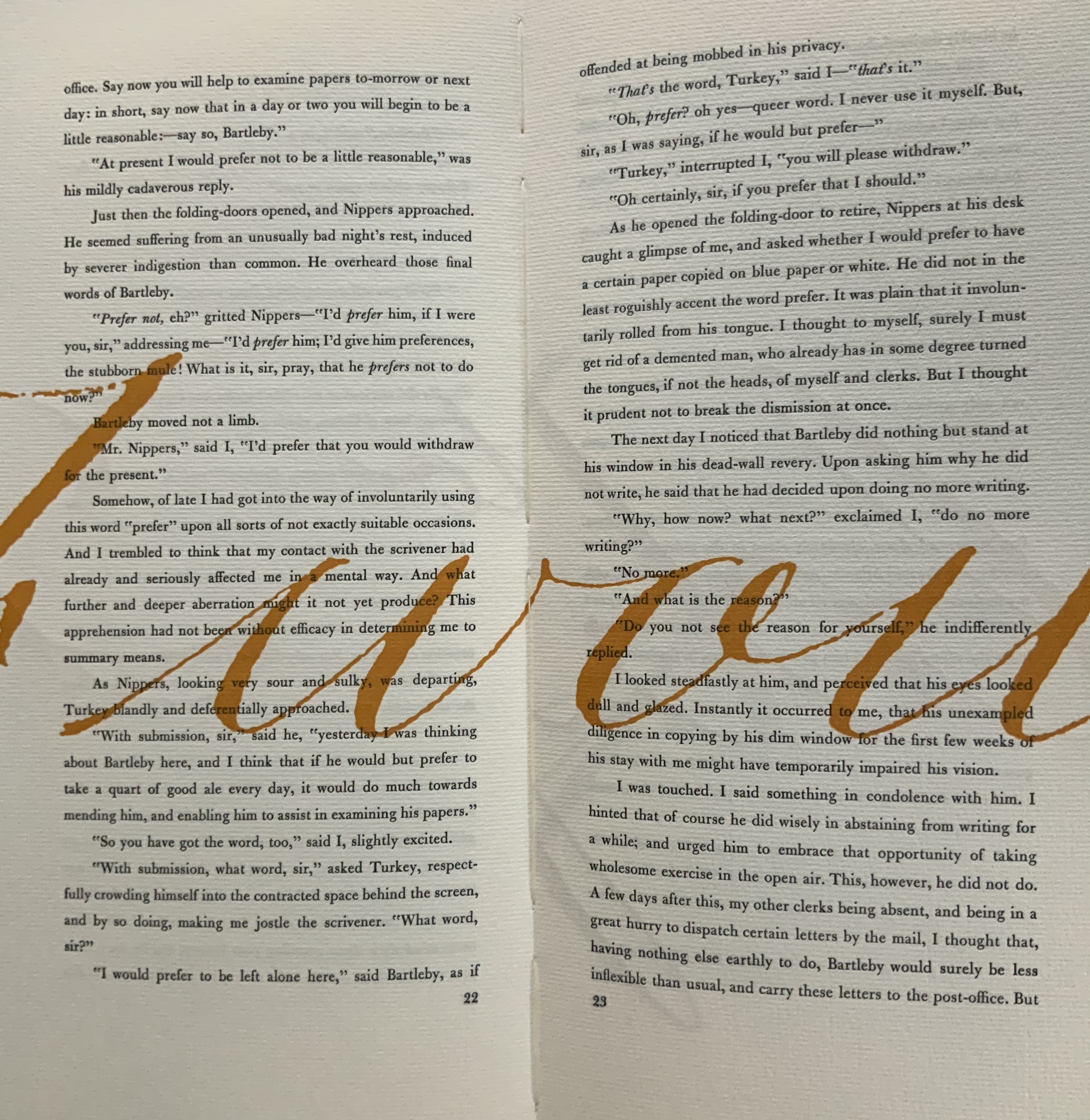
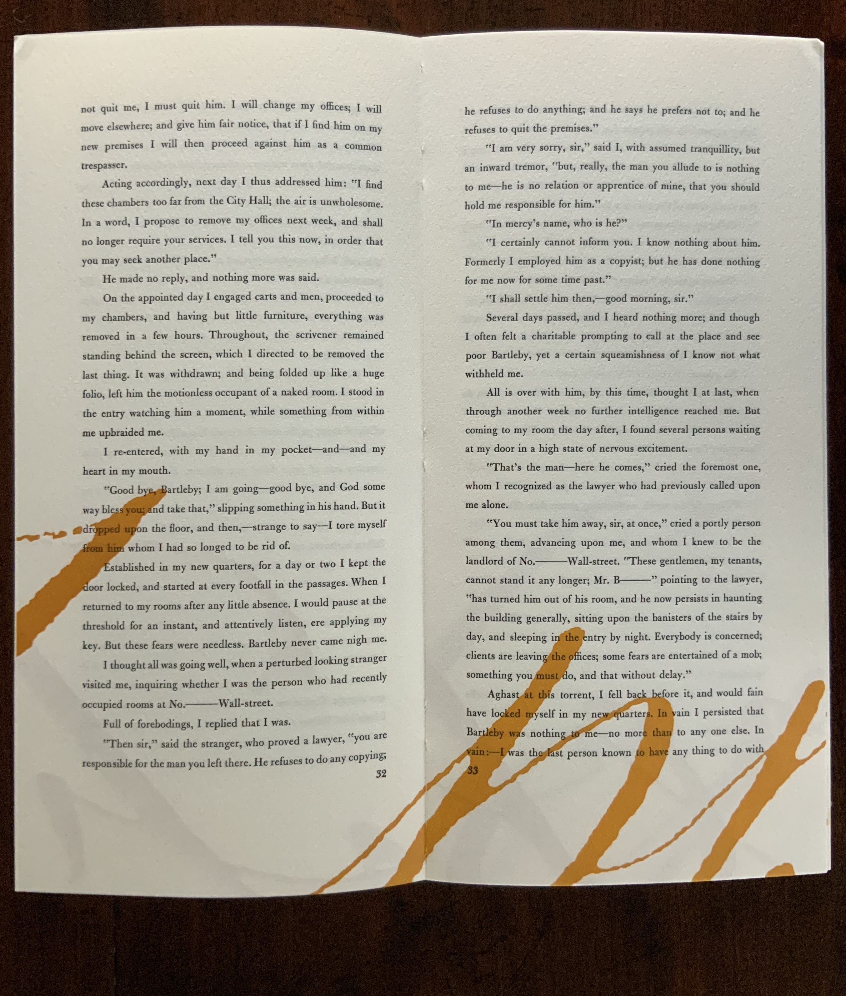
James is a favorite author at Books On Books as is Herman Melville. Indulge the punning coincidence of Adamson’s introducing us to Wilber Schilling’s Indulgence Press and his edition of Melville’s “Bartleby the Scrivener: A Story of Wall Street“. Schilling’s edition of “Bartleby” – with Suzanne Moore’s original hand lettering of Bartleby’s classic statement “I would prefer not to” first appearing fully legible then becoming larger until it literally falls off the bottom of the final page – was an early career statement of an interest in more than fine press work but in book art as well.
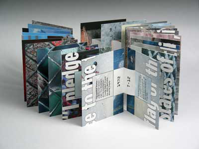
Consider Schilling’s Half-Life/Full-Life and its binding a variation on the accordion/flag structure of Hedi Kyle and Claire Van Vliet. The complexity of the form marries well with that of the intertwining, interleaving text and photos along the timelines of the Doomsday Clock and global warming.
Half Life/Full Life Wilber Schilling, 2009 ISBN: 0-9742191-5-0 Cover
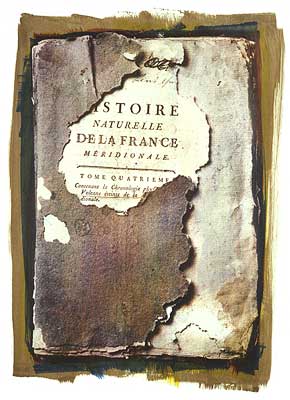
Schilling’s photography in Half Life/Full Life speaks to the importance of that craft in his overall portfolio. His photos of aging, decayed and unbound books are haunting and remind me of the found art of M.L Van Nice.
Schilling has collaborated with Thomas Rose (visual artist and professor at the University of Minnesota), Michael Dennis Browne (poet and librettist), Rick Moody (author of The Ice Storm) and Patricia Hampl (MacArthur Fellow poet and novelist). He has collaborated with Daniel E. Kelm (book artist, founder of the Garage Annex School for Book Arts and a collaborator with Suzanne Moore).
Given the influence of Marcel Duchamp and Joseph Cornell on works such as Arthur & Barbara (Arthur Danto and Barbara Westman) or Surplus Value Books: Catalog Number 13, you might say that Schilling has attempted to collaborate with them as well. The danger in that, of course, is highly derivative artwork. That early-career whiff of genius in commissioning the now famous calligrapher Suzanne Moore to hand letter “I would prefer not to” and spreading it in ever larger size across the pages might be what takes Schilling’s work beyond the derivative. His work is worth examining with that anticipation.
Postscript
The Books On Books Collection now holds a copy of Schilling’s edition of Bartleby as well as works by Suzanne Moore.
For 2014-15, the New England Guild of Book Workers have organized a traveling exhibition: Geographies: New England Book Work, its itinerary covering each of the 6 New England states. Last year, the Rhode Island School of Design (RISD), the Wishcamper Center at the University of Southern Maine and the Bailey Howe Library at the University of Vermont hosted it. This year, the show has appeared at Williams College Library and is scheduled for Dartmouth College Library and the Creative Arts Workshop in New Haven, CT. Criss-crossing geographical boundaries as well as those of book art and the book arts, Geographies calls to mind the last line of Elizabeth Bishop’s “The Map“:
More delicate than the historians’ are the map-makers’ colors.
Or, in this case:
More delicate than the historians’ are the [book-artists’] colors.
Although born in Nova Scotia, Elizabeth Bishop grew up as a New Englander in Massachusetts with her paternal grandparents. As a far-traveller and visual artist as well as poet, she would have enjoyed this exhibition and found it fitting if it had included a broadside of “The Map”.
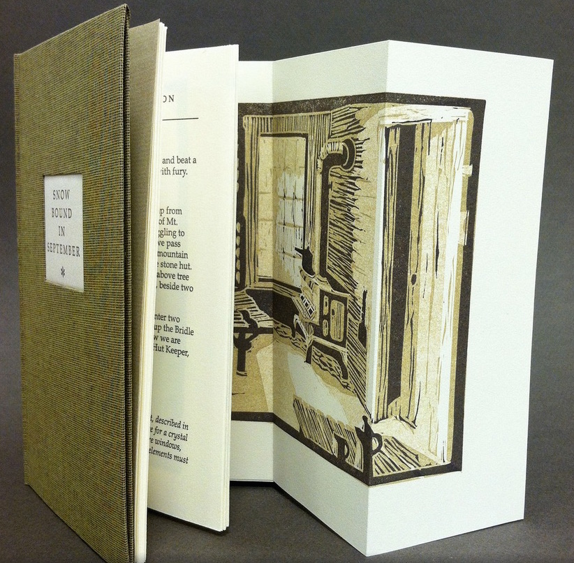
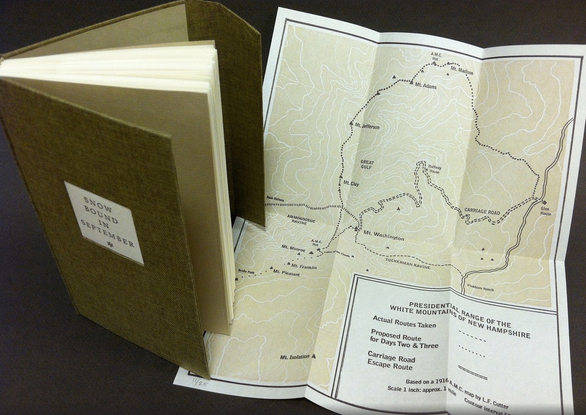
Nevertheless, what a range of “colors” from all the New England states and beyond – from historic to modern, from fine and design bindings to traditional and creative bookbinding, from artist books to calligraphic manuscripts, from masters to apprentices and from object to narrative. The latter finds a wintry exemplar in Snow Bound in September: A Re-Imagining by Laurie Whitehill Chong, retired Special Collections librarian and curator of Artists’ Books at RISD.
The artist made this book the same size as her grandfather’s Appalachian Mountain Club hiking guide. Snow Bound is an invented ancestral narrative, in which the artist uses a surviving photograph and her grandfather’s notes about being stranded with his wife for five days on Mount Washington by a hurricane-driven snowstorm in September 1915 to re-imagine the ordeal from her grandmother’s perspective. Note the slotted front cover into which the flap extending from the back cover fits to keep the book closed, snug against the elements.
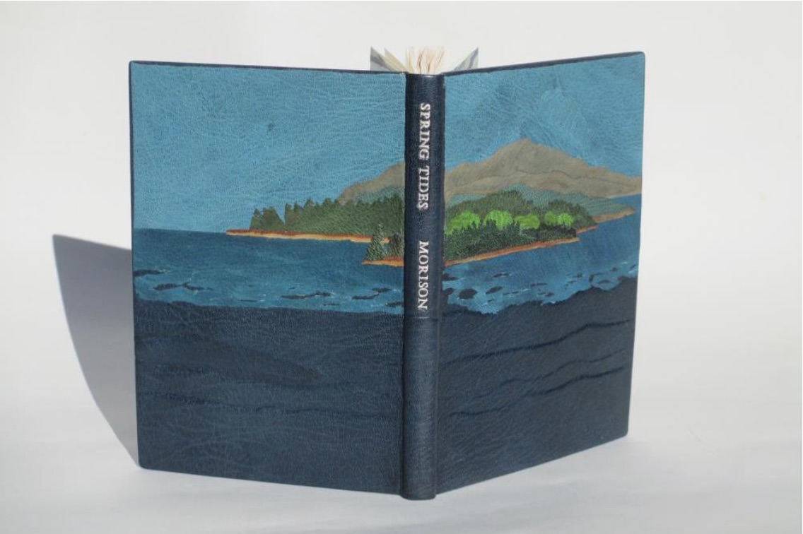
Julie B. Stackpole’s creative re-binding of Samuel Eliot Morison’s Spring Tides takes us from the New England mountains to the shore as can be seen from the layered binding.
Spring Tides by Samuel Eliot Morison Boston: Houghton-Mifflin Co., 1965. Julia B. Stackpole, Design binding 21.8 x1 5.0 x 1.6 cm January 2014
In Stackpole’s words:
The traditional tight-joint binding is covered in navy blue Niger goatskin with waves in the lower parts created by paring before covering. Cut-outs in the onlays of the lighter blue leather of the water help it transition from the dark of the navy to the sky’s azure. Onlays of other leathers create the forested landscape of the shoreline and hills. These blues were chosen because the only blue leather in a large enough piece to cover the whole binding was the dark navy, while I only had scraps of the water and sky’s blue. The endpapers are a Cockerell marbled paper over-painted with blue, with leather hinges.
Pictures of the works in the catalog (and others not) can also be found at the Williams College Flickr site (for now). I say “for now” because they will be pushed downstream inevitably in the way of today’s digital flow. They may even disappear; although as Matthew Kirschenbaum has explained in Mechanisms, something digitally forensic will remain. That boundary of the tangible and the digital, the haptic and the virtual, is only lightly but evocatively touched in this collection.
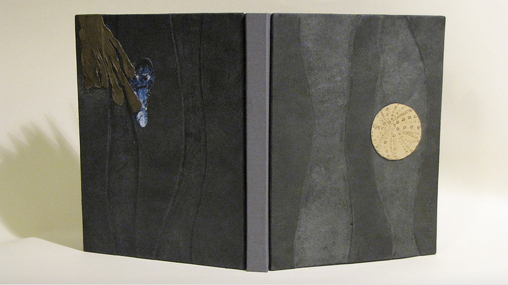
When Julia Stackpole writes in the online catalog about that Cockerell marbled paper that it “felt to me like the waves and the shoals and ledges of Maine waters”, you long to lay hands on the Spring Tide. Anne McClain’s Place includes photographs taken digitally of places on Maine’s midcoast that have been special to her her “entire life and will continue to be a constant as other things change and move on”. What is captured digitally is reproduced physically to fix those places that will “continue to be a constant”. But places do change.
Anne McClain, Place Drum Leaf Binding 19 x 15 x 1.8 cm February 2014
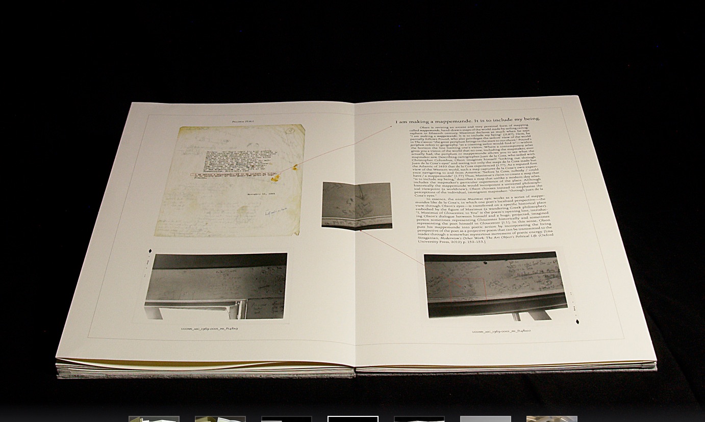
Rutherford Witthus’ contribution touches the boundary between the digital and physical most directly. His artist’s book is entitled 28 Fort Square: What Charles Olson wrote on the window casings of his apartment in Gloucester, Massachusetts, of which there are eleven copies.
Rutherford Witthus, 28 Fort Square: What Charles Olson wrote on the window casings of his apartment in Gloucester, Massachusetts, 2014
In these 11 copies, Witthus digitally reconstructs the windows of Charles Olson’s apartment at 28 Fort Square where he wrote his main work, The Maximus Poems, and covered the window casings with meteorological data. The artist book “presents for the first time all of the images of the window casings”.
Rutherford Witthus 28 Fort Square: What Charles Olson wrote on the window casings of his apartment in Gloucester, Massachusetts Artist book 42 x 28 x 2.5 cm 2014 Edition of 11
Athena Moore, chapter secretary of The New England Guild of Bookworkers, produced the catalog for this itinerant exhibition organized by Stephanie Wolff, Exhibitions Coordinator and Todd Pattison, Chapter Chair. If you have the chance to see the exhibition in its next venue, take it.
Just as Elizabeth Bishop questioned the depiction of the boundary between land and water on her map – “Shadows or are they shallows at its edges …”, you will find the juxtaposition of these works reminds you that the boundary between book art and the book arts can be shadowy or shallow indeed.
Late afternoon before the long worn wooden benches in the Bodleian’s Convocation Hall, 500 years after the death of Aldus Manutius, Oren Margolis served his audience well, providing them with a richer appreciation of the “finest printed book of the entire Renaissance”* – the Hypnerotomachia Poliphili – and of its publisher Aldus Manutius.
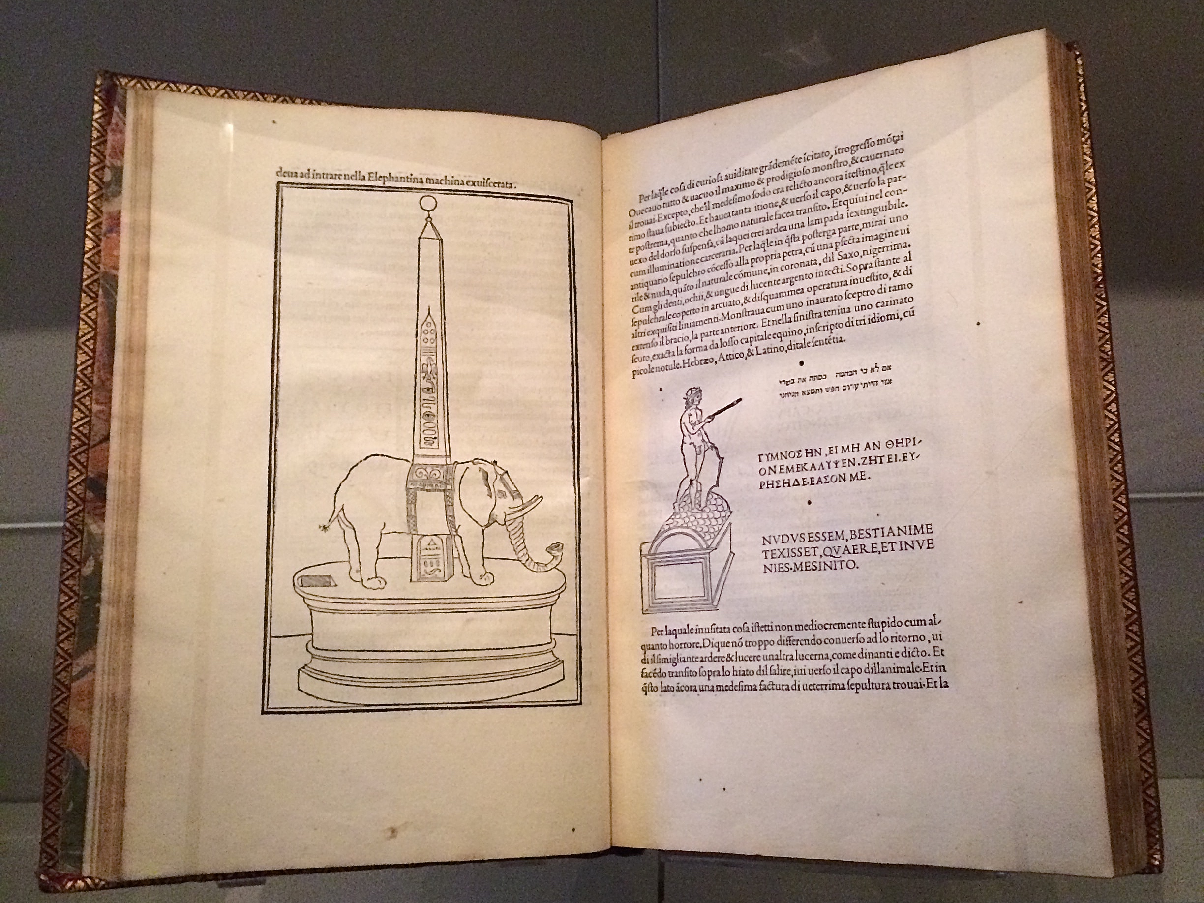
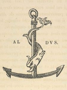
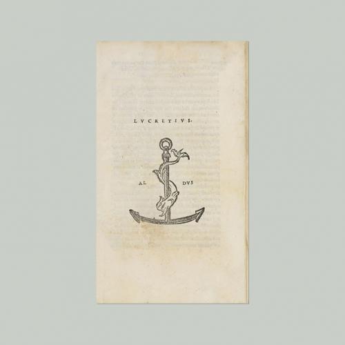
Drawing our attention to the more sculptural qualities of Venetian Renaissance printed books over the Florentine and to the evidence of the humanist agenda that drove Manutius, he led us to the page where Poliphilo (lover of all things, but in particular Polia, the ideal woman pursued to the end of the book) stands before a carving that foreshadows the Aldine Press device: a dolphin entwined around the shank of an anchor. The Aldine Press device was inspired by a similar image on an ancient Roman coin given by Pietro Bembo to Aldus, who wrongly associated it with Augustus and his proverb Festina lente (“Make haste slowly”) and adopted both for his printing and publishing business.
Erasmus praised Aldus, saying that he was “building a library which knows no walls save those of the world itself”.
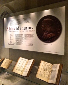
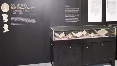
For all of 2015, the world enjoyed a multitude of celebrations of the contribution of Aldus Manutius to publishing, printing and the book. After Gutenberg, Fust and Schoeffer, Aldus Manutius was perhaps the most important printer of the Renaissance. His portable books are still here, although locked away or displayed under glass, no longer so portable. Until now.
The Manutius Network 2015 provides a running list, links for some of which are provided below, including the online exhibition associated with Margolis’s talk. See also below, added in May 2016, the belated exhibition “Aldo Manutius: The Renaissance in Venice” at the Gallerie dell’Accademia in Venice.
From Crispin Elsted’s review of the Thames & Hudson facsimile edition of the Hypnerotomachia Poliphili. Parenthesis, December 2000, No. 5:
I once spent three hours in a library with a copy of the Aldine edition of Hypnerotomachia Poliphili, and I have never known a book take my breath away so consistently. Every page is a masterpiece: the dance of text with the more than 170 woodcuts; the firm, male stature of the typeface; the crisp spring of the impression; the elegant proportion of the page — all combine to an end in which the craft of printing and design carry the text into an atmosphere not of its own making. This new edition has the appearance of a fine actor in a part lately played by a great one. Here are the signs of the grace that greatness lent the commonplace five centuries ago; and in these signs, the commonplace finds here another advocate for its small claims to our time.
Timelines are, of course, for looking further back as well as forward. Earlier this year, April 2012 marked the fifteenth anniversary of the publication of Liane Lefaivre’sLeon Battista Alberti’sHypnerotomachia Poliphili: Re-Configuring the Architectural Body in the Early Italian Renaissance (Cambridge, MA: MIT Press, 1997) and the online publication of The Electronic Hypnerotomachia, which contains the facsimile text and illustrations. The online publication of extracts from Lefaivre’s book illustrates the linking prefigured by the “card stack” approach of HyperCard. What MIT Press and TU Delft, Lefaivre’s affiliation, host on their servers are not ebooks or even e-incunabula of the sort we experience today, but they are clearly forerunners to them.
In twenty-eight more months, December 2014, we will see the 515th anniversary of the original work’s publication by Aldine Press (Venice, December 1499). The founder Aldus Manutius did not normally publish heavily illustrated books. The Hypnerotomachia Poliphili was the exception and the only commissioned work that Manutius undertook. The exception reflects favorably on the overall success of his business and supports the view that Venice had become the capital of printing and publishing very shortly after the invention of printing by moveable type.
The book unveils an inscrutable, almost comic-book-illustrated story, glittering with made-up words in Greek, Latin, Hebrew and Arabic (including proto-Greek, -Hebrew and -Arabic fonts). In addition to the page displays sculpted into shapes such as goblets, this one volume displayed the technological mastery of and improvement on the new Roman (as opposed to the heavy Gothic) typeface Bembo. According to Norma Levarie in The Art & History of Books (New York, 1968), this singular volume revolutionized typography in France in less than twenty-five years.
Somewhat like software releases, though, the 1499 edition came with bugs. The colophon to the Hypnerotomachia Poliphili falls at the end of a full page of errata.
“Venice Month December. 1499. in the house of Aldus Manutius, most accurately done.”
Initiated in 2015 in celebration of the anniversary and acknowledgement of the more than 100 Aldine editions in the Wosk McDonald Collection, Simon Fraser University’s Aldus@SFU is the digitization of 21 Aldine volumes published between 15011 and 1515. The image above is the edition of Lucretius’ De rerum naturam, published just after Manutius’ death in 1515.
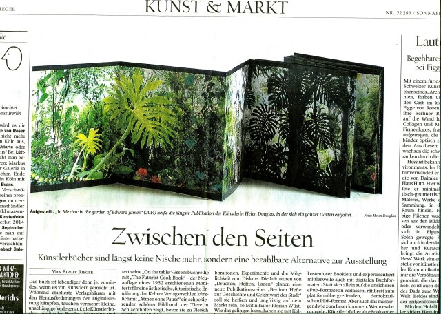
Helen Douglas, In Mexico: in the garden of Edward James (2014). Reviewed in Der Tagesspeigel
Helen Douglas has been kind enough to forward the notice above of her most recent work — In Mexico: in the garden of Edward James. Based on her invited residency in Mexico City, this concertina book takes the viewer through Edward James’ jungle garden Las Pozas, its buildings and staircases, James’s surreal imagination and, best of all, Douglas’s own imaginative experience of them. See the interview at BookArtBookBlogthat preceded the work’s unveiling at the London Art Book Fair at the Whitechapel Gallery and Berlin Art Book Fair.
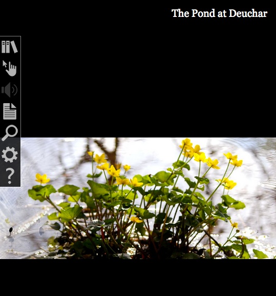
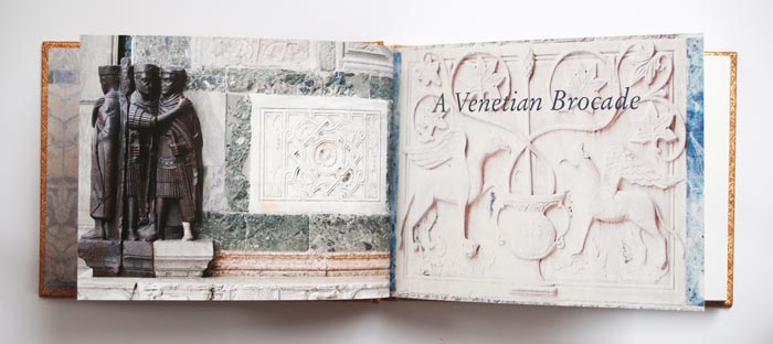
When I go to Weproductions, the website of founding partners, Telfer Stokes and Helen Douglas, it is like taking a walk in Yarrow, Scotland, or taking the measure of paper samples between forefinger and thumb, or browsing in a bookstore, or lingering in an art gallery. Two of Helen Douglas’s works in particular elicit this: The Pond at Deuchar(2013) and A Venetian Brocade(2010).
Was it London Book Fair where I first saw this bookwork, appwork, scrollwork … this work of art? What you see above leads you to the app. Clive Philpott’s postscript to this work, featured on Weproductions and published by the Tate, offers all the background and appreciation of the work you need to read. Read it, then go to The Pond at Deuchar*, lean forward and trail your fingers through its waters.
Helen Douglas and Marina Warner. A Venetian Brocade (Weproductions, 2010)
A Venetian Brocade equally makes the “act of looking” tactile and the “act of touching” insightful. The work reminds me of this passage from Joseph Brodsky’s Watermark (New York: Farrar Straus Giroux, 1992):
… bipeds go ape about shopping and dressing-up in Venice for reasons not exactly practical; they do so because the city, as it were, challenges them. We all harbor all sorts of misgivings about the flaws in our appearance, anatomy, about the imperfection of our very features. What one sees in this city at every steep, turn, perspective, and dead end worsens one’s complexes and insecurities. That’s why one—a woman especially, but a man also—hits the stores as soon as one arrives here, and with a vengeance. The surrounding beauty is such that one instantly conceives of an incoherent animal desire to match it, to be on par. This has nothing to do with vanity or with the natural surplus of mirrors here, the main one being the very water. It is simply that the city offers bipeds a notion of visual superiority absent in their natural lairs, in their habitual surroundings. That’s why furs fly here, as do suede, silk, linen, wool, and every other kind of fabric.
If you are lucky enough to buy one of the few remaining copies of A Venetian Brocade, you will see and feel how it leads to In Mexico: in the garden of Edward James. Appreciation of that double-sided leporello work’s extension of the Douglas’s concept of Visual Narrative and its kinship with James’s surrealism can only be enhanced by viewing The Secret Life of Edward James, George Melly’s documentary film from 1975.
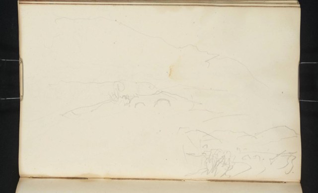
But having indulged the surreal elements, think back to the pond at Deuchar, think back to the Tate’s association with Douglas’s work, then consider this work also held at the Tate:
Joseph Mallard William Turner, “Deuchar Old Bridge, near Yarrow, Selkirkshire”, 1834, in The Edinburgh Sketchbook 1831-34, graphite on paper, 111×181 mm. Reference: D26161 Turner Bequest CCLXVIII 34 a
Here is a narrative of art across time and place to touch by looking and, by looking, to be touched by.
*Deuchar is pronounced “dew-ker”, the “k” as in “loch”.
Published by Impact Press at the Centre for Fine Print Research, UWE Bristol, this newsletter is an important tool, kept honed by Sarah Bodman. The link will take you to the June 2013 issue.
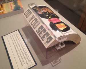
Chip Kidd’s novel The Cheese Monkeys, designed as well by him, sports a printed fore-edge. When the book is closed, the fore-edge is blank. Fanned in one direction, it shows the sentence as seen in the photo below.
Chip Kidd, The Cheese Monkeys: A Novel in Two Semesters, 2008, from the Chip Kidd Archives, on display Jan. 12 through April 24, 2015, in The Eberly Family Special Collections Library, Penn State University. Reproduced with permission of the Library
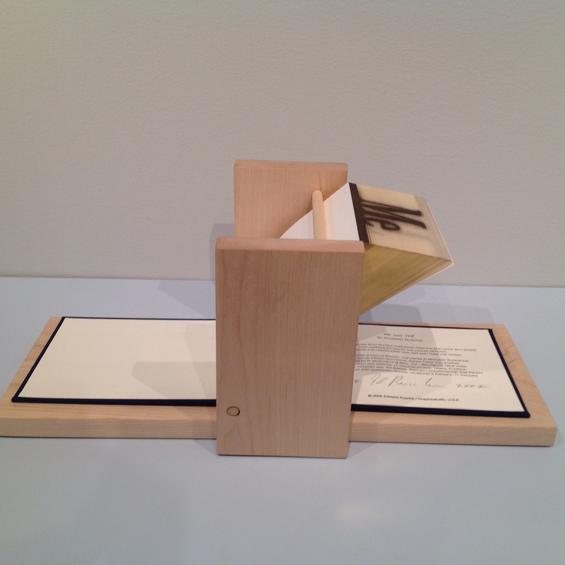
Fanned in the opposite direction, the fore-edge displays another phrase: “Good Is Dead”. The printing process is well described in a 2004 video by Graphics Studio|Institute for Research in Art, prepared about the making of Ed Ruscha’s fore-edge book Me and The.
Ed Ruscha, Me and The, 2002 Allan Chasanoff Collection, Yale University Art Gallery
This is similar to traditional fore-edge painting. Much of what is worth knowing about fore-edge painting can be learned from Martin Frost’s QuickTime Movie-rich website, but if you are a fan of the Folger Shakespeare Library, its holdings yield some outstanding examples under the hand of Erin Blake.
Jeff Weber’s bookAnnotated Dictionary of Fore-edge Painting Artists & Binders is probably the lengthiest treatment available on the subject. Hear him discuss his work here. Weber, who commissioned artwork from Frost, Margaret Allport (Costa) and Clare Brooksbank, has a particularly well-written article at the International League of Antiquarian Booksellers’ site.
Phillip J. Pirages, an antiquarian bookseller, provides an enlightening and entertaining talkon fore-edge painting of the 18th century and shows a superb example of the London binders Taylor & Hessey’s work — a two-volume set of the works of Alexander Pope, bound in red morocco leather and decorated on the fore-edges with scenes of Twickenham and Windsor.
The point of this bookmark is not merely to share a curiosity but to use that narrow, hidden curiosity as an illustration of the boundaries of book art and the book arts.
Updates
Thanks to Ann Kronenberg for this link to a 1940s film on the topic.
Thanks to Merike van Zanten of DoubleDutch-Design.com for this link from 4GIFS.com showing what appear to be biblical scenes painted on the fore-edge of a book.
Thanks to Peter Verheyen for this link to a history of decorating book edges with examples from the Maurits Sabbe Library and other Leuven and Belgian collections.
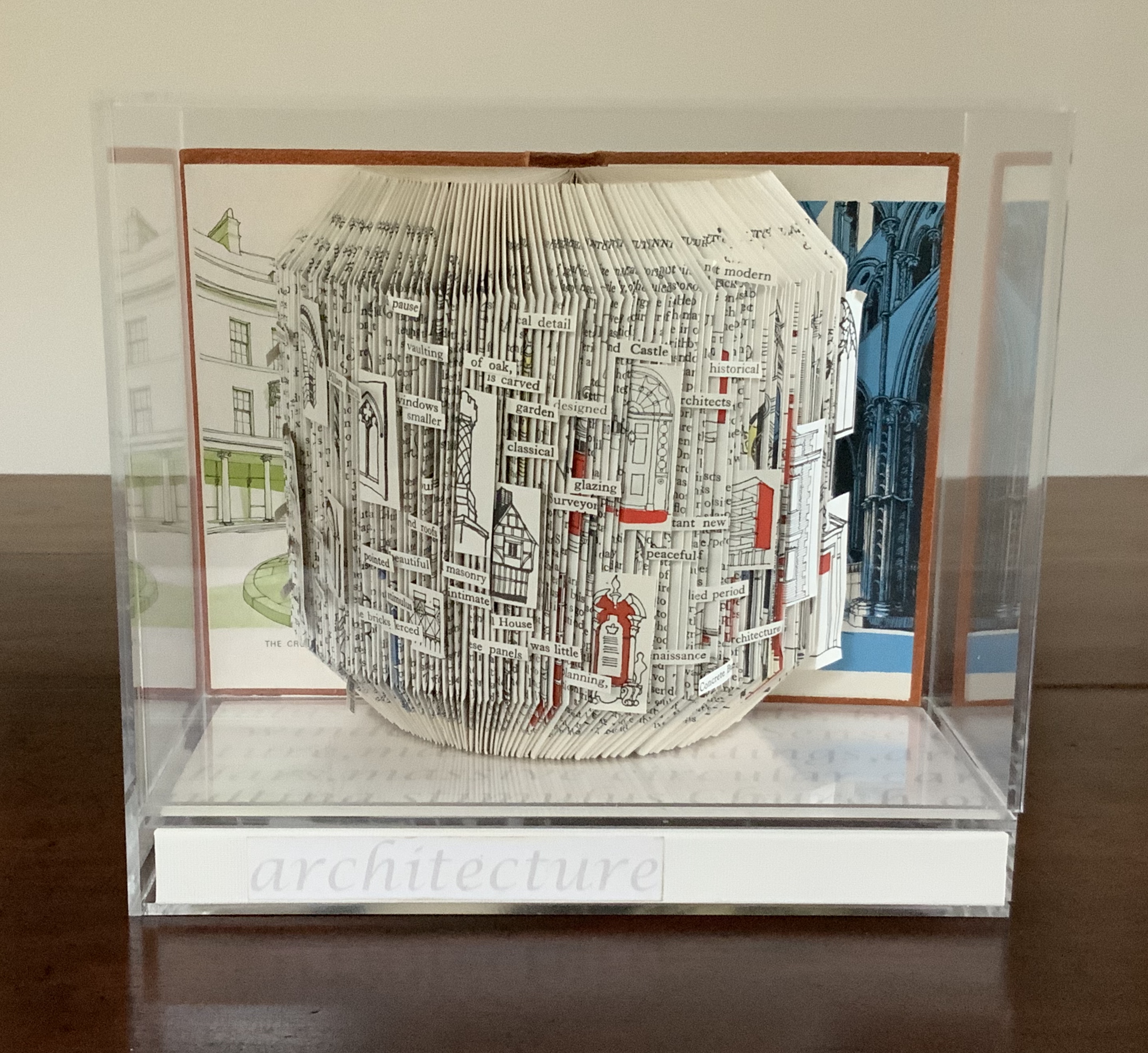
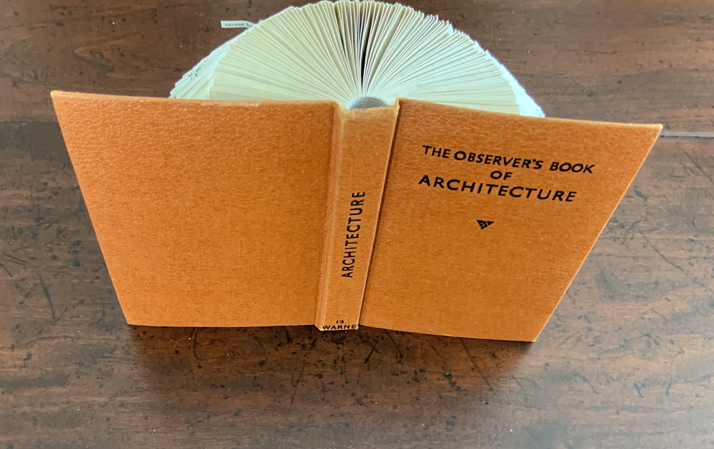
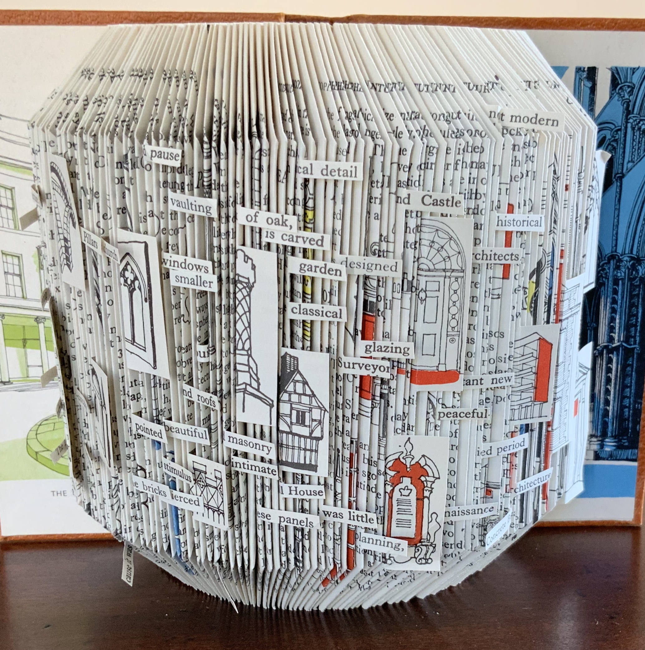
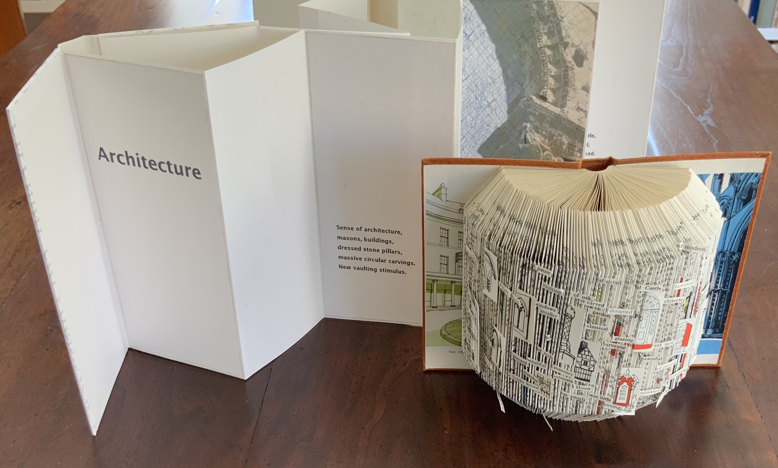
Folded book pages rarely generate a work that rises above mere craft. Heather Hunter’s Observer Series: Architecture (2009) achieves the necessary height. It combines the altered book with an accordion book that incorporates a found poem composed of the words excised and folded outwards from the folded pages of The Observer’s Book of Architecture.
Observer Series: Architecture (2009) Heather Hunter Box: H180 x W205 x D100 mm. Concertina book: H191 x W93 (closed), variable width ca. 850 (open) mm. Sculpture: H145 x W195 x D80 mm. Photos: Books On Books Collection
The very fact of a found poem made of excised words that happen to fall at the folds shaping a column from a book on architecture chimes with the title of Bachelard’s The Poetics of Space.
Another work in the collection is Foldable Sculpture No. 1.
“Environmental memories,” not just of places but of cherished objects held in the hand, are Hunter’s chief inspiration, and the design of her bookworks is intended through touch, reading and exploration to evoke in the reader “unique feelings that become the reader’s own environmental memory.” Her artistic and literary influences and inspirations are an interesting blend of the 20th century Neo-Concrete and the 19th century Romantic movements. Links to illustrations of those sources of influence are embedded in the caption to Snowdrop.
Snowdrop ()
Hunter has regularly exhibited and demonstrated her work at Turn End Studios in Haddenham, Buckinghamshire.
The British Library‘s “Medieval and Earlier Manuscripts” blog is a reliable source of visual delight and provocation to think about the interplay of the print and digital worlds. It also prompts the application of Ezra Pound’s critical technique of juxtaposing works, demonstrated so well in his The ABC of Reading.
I have read A Degree of Mastery from cover to cover twice. Once in New York between 2002 and 2005 when I was teaching “Professional Book and Information Publishing” at NYU and wanted readings to help provide students with a sense of the history, art and craft of the book. The second time here and now in Windsor looking for the “right something” to include in “Books On Books.”
On both occasions ebooks and digital publishing pervaded my thoughts, but only on the second time around did these questions and observations I want to raise now shape themselves as they have.
Annie Tremmel Wilcox weaves a memoir of her apprenticeship under the renowned bookbinder and conservator William Anthony. She weaves it with her diary entries, excerpts from an exhibit brochure “Saving Our Books and Words: The Conservation and Preservation of Books,” newspaper articles, correspondence, passages from “Japanese Woodworking Tools: Their Tradition, Spirit and Use” by Toshio Odate, step by step descriptions of mending torn pages and crumbling leather spines and plainspoken observation of fellow workers, conference attendees, librarians, government officials posing with restored documents, children making “books” from striped computer paper with wallpaper sewn on for covers and, of course, Bill Anthony, the “Johnny Appleseed of bookbinding.”
“Weaves” is the precise word for the structure of her book’s narrative, and it would be the right word for her ebook, if there were one. As I re-read it, this game of word substitution yielded questions that make this memoir a useful means to bookmark the evolution of the book.
Writing about some of the tools she learns to use — lifting knives, translucent bone folders, the spokeshave and others — she says of Anthony’s, “His tools were smarter than mine. They knew the correct way to cut paper or pare leather. By using them I could feel in my hands how the tools were supposed to work.” (48) For Wilcox and her reader, Bill Anthony is the master “shokunin,” craftsman or artisan. And when she quotes from Odate “For the ‘shokunin,’ utility and appearance must be enhanced by the tool’s ‘presence,’ that is its refinement and dignity….,” this reader asks,
What are the tools of the ebook maker? From whence comes their refinement and dignity — their “presence” — with which the “shokunin” imbues his creation as a result of his commitment to his craft? In what tools of the ebookmaker does “the spirit of the tool that records the ‘shokunin’s’ ability through the years to face the uncertainties of life, to overcome them, and to master the art of living” reside?
Too Zen? Perhaps.
An English grad student, Wilcox relished handling the University of Iowa‘s Sir Walter Scott Collection, its Leigh Hunt Collection and The Works of Rudyard Kipling. Confronted with earlier slapdash and botched work on certain volumes of the Kipling, she writes, “Certainly these volumes of Kipling are found on the shelves of numerous libraries across the country, but the integrity of ‘these’ volumes as a complete set has been lost.” (179) What constitutes the “integrity” of an ebook or its constituents? Are ebooks so “immaterial” that such a question is nonsensical?
The author’s apprenticeship included collaboration on the exhibit “Saving Our Books and Words.” In addition to coauthoring the exhibit’s brochure, Wilcox contributed to completing Anthony’s special project of developing for the exhibit a unique collection of models demonstrating “the evolution of the codex – the form of the book as we know it.”(181) In the brochure she touches on the immateriality and materiality of the Center’s work: “Simply defined, preservation is the attempt to save the intellectual content of books while conservation is the attempt to save both the intellectual content and its vehicle — the covers, paper, endbands, etc. The former is concerned with saving what the human record contains without regard to the forms it winds up in. The latter focuses on the artifact itself, attempts to save this book, this sheet.” (192)
What is the “form” of the ebook as we know it? Is the ebook as much “vehicle” as “content”? What are its equivalencies to the page or to what “binds” the “text block”? What does it mean to “conserve” an ebook? Of a digital copy, what are the materials; what is the artifact to be conserved?
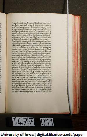
Wilcox ends her memoir with the completion of her “masterpiece,” the restoration of the incunabulum that Bill Anthony assigned her before his death and which she completed after it with the help of “The Restoration of Leather Bindings” by Bernard Middleton, author of the standard text “A History of English Craft Bookbinding Technique.” The work assigned was Pope Pius II’s “Historia Rerum Ubique Gestarum,” printed by Johannes De Colonia and Johannes Manthen in Venice in 1477, which when restored was “not a deluxe edition, but … had great integrity.” In the year 2547, of what will the preservation and conservation of today’s e-incunabula consist? Will some apprentice conservator understand the “form” of these ebooks “in the cradle” and, master of smart tools, restore them to their integrity?
With Ann Tomalak’s essay, perhaps we can see that future through her present lense on the past. Give it a read.

 Consider Schilling’s Half-Life/Full-Life and its binding a variation on the accordion/flag structure of Hedi Kyle and Claire Van Vliet. The complexity of the form marries well with that of the intertwining, interleaving text and photos along the timelines of the Doomsday Clock and global warming.