Bookmarking Book Art – Learning to read Shirley Sharoff’s “La grande muraille”

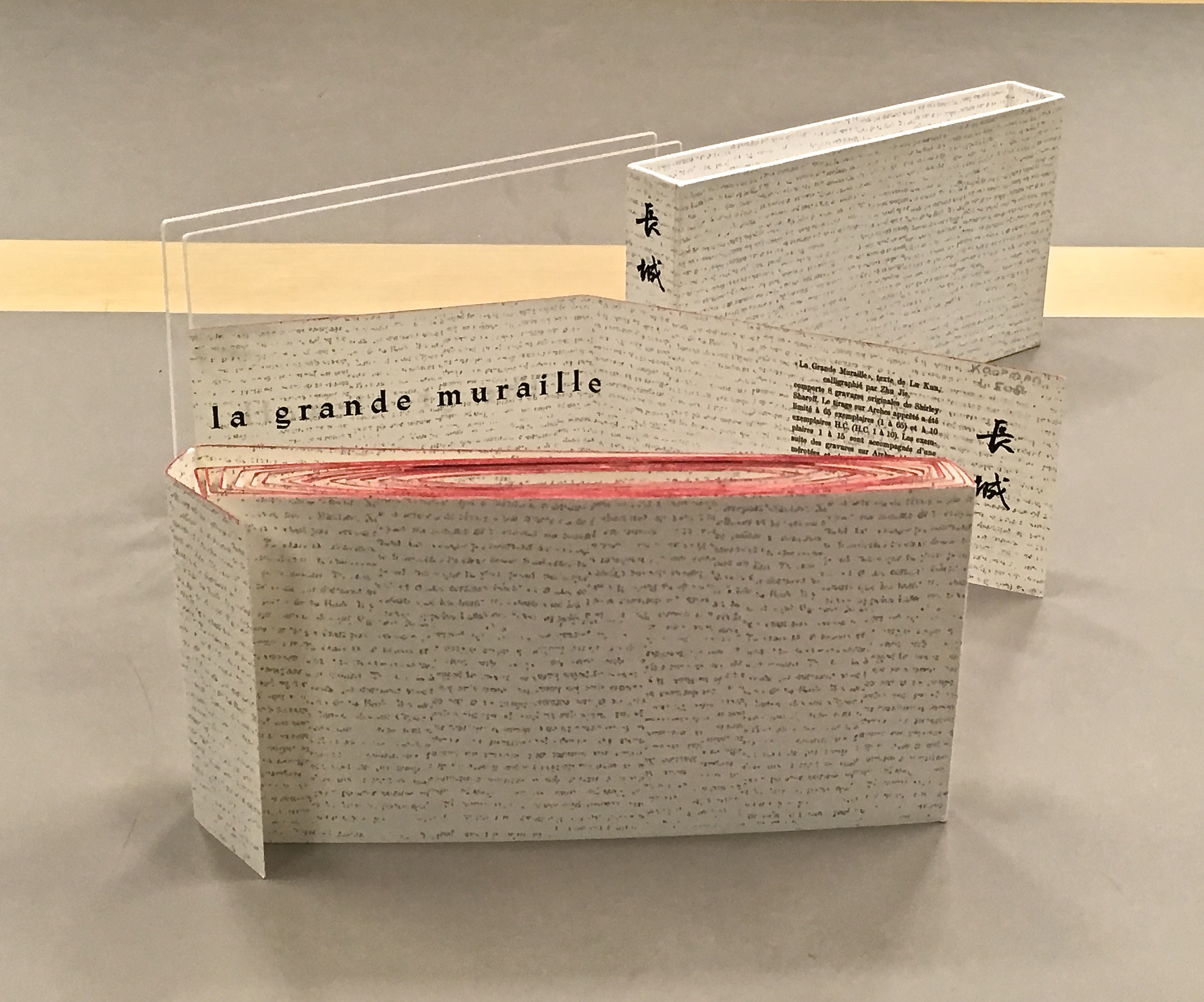
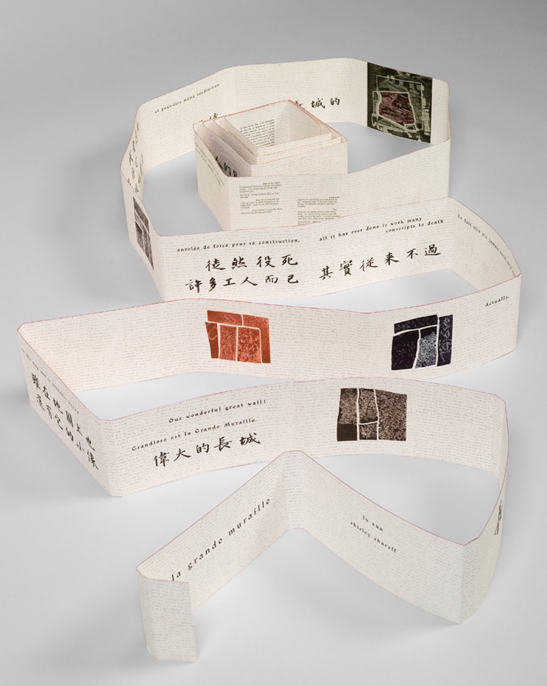
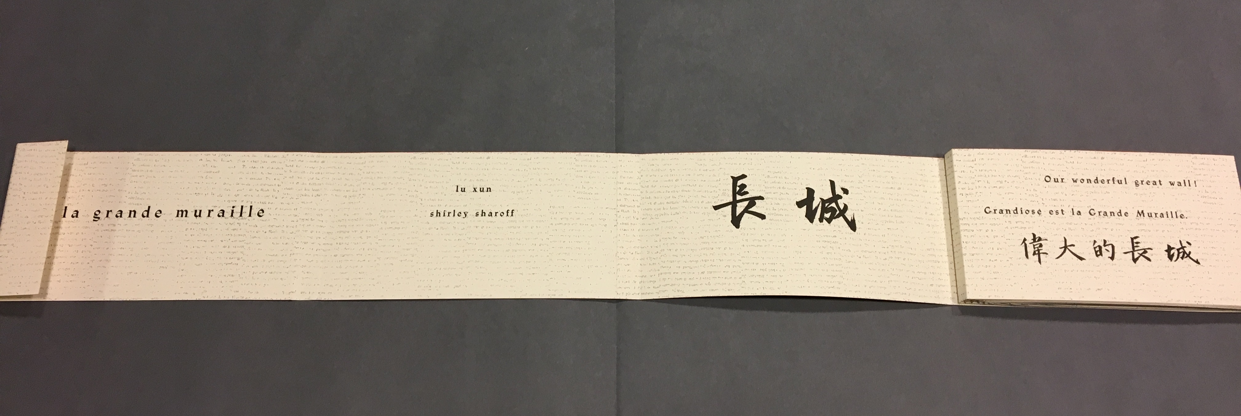
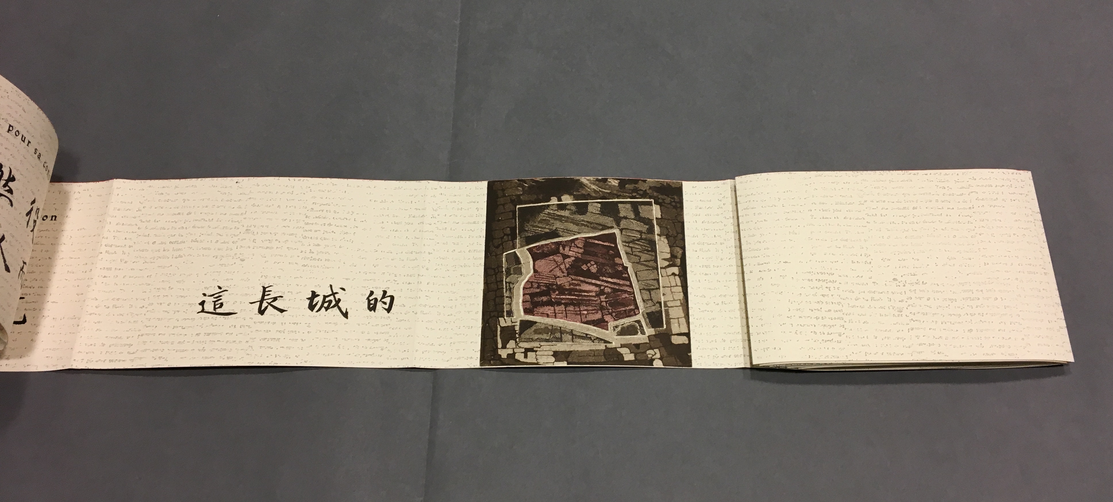
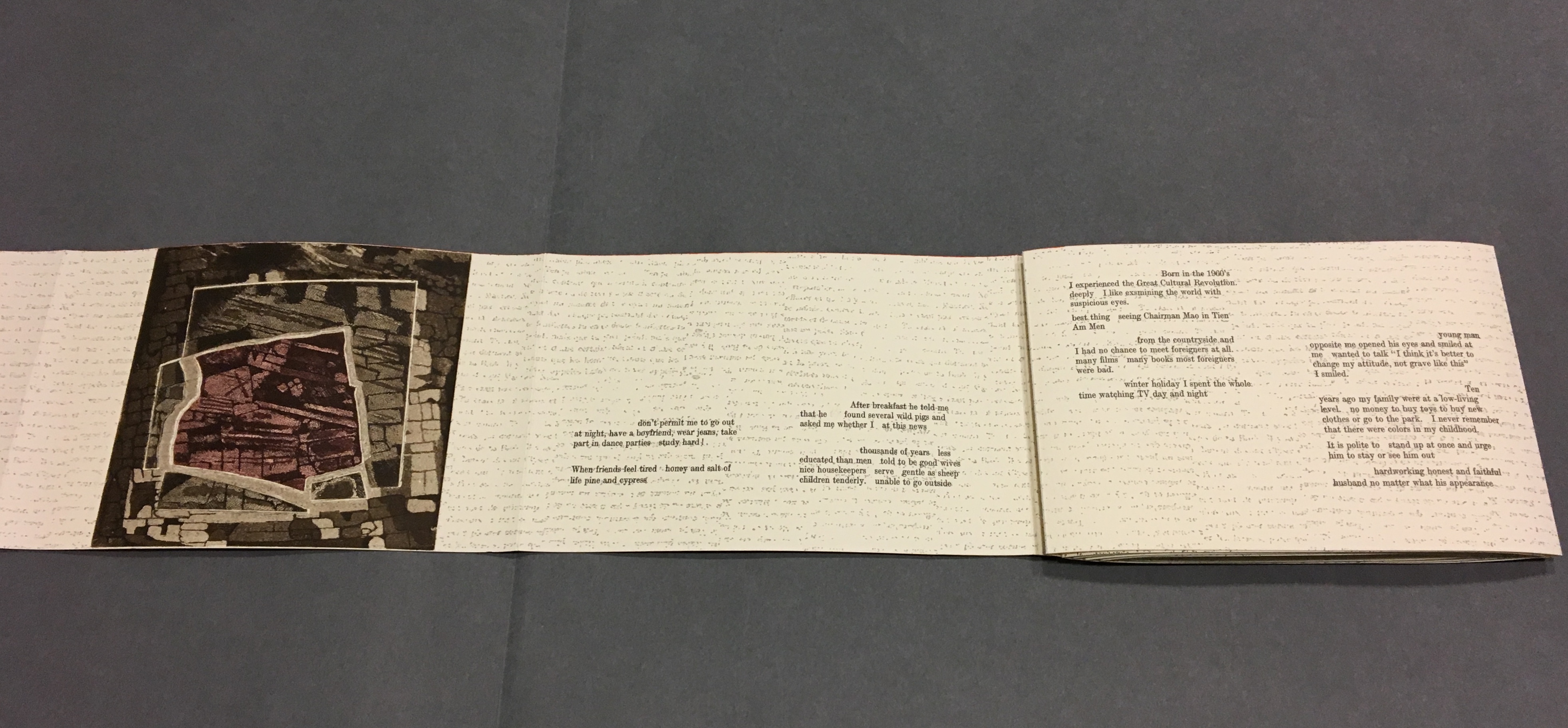
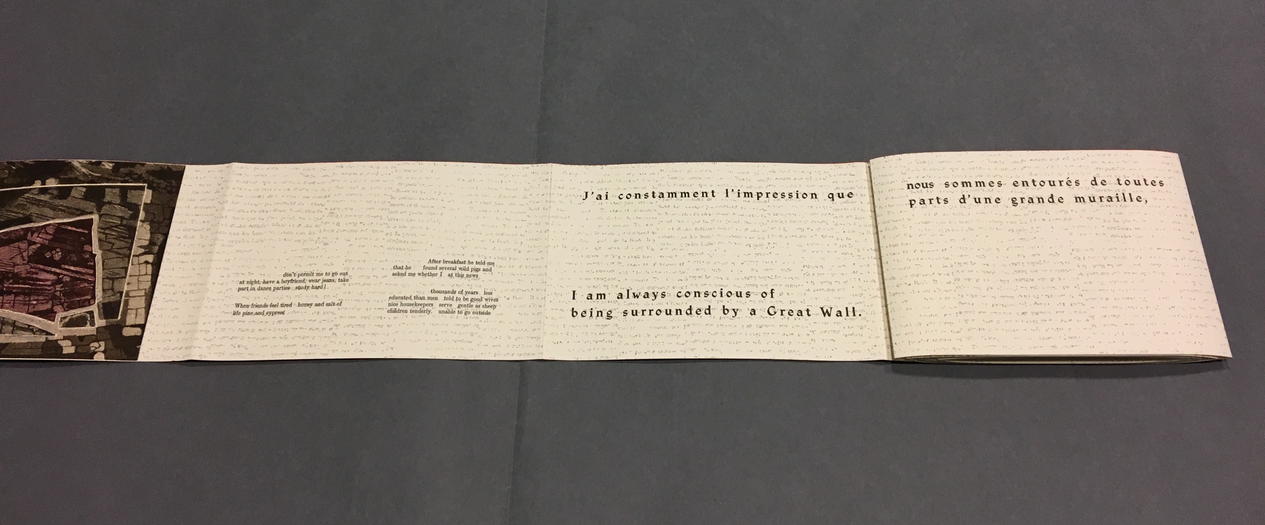
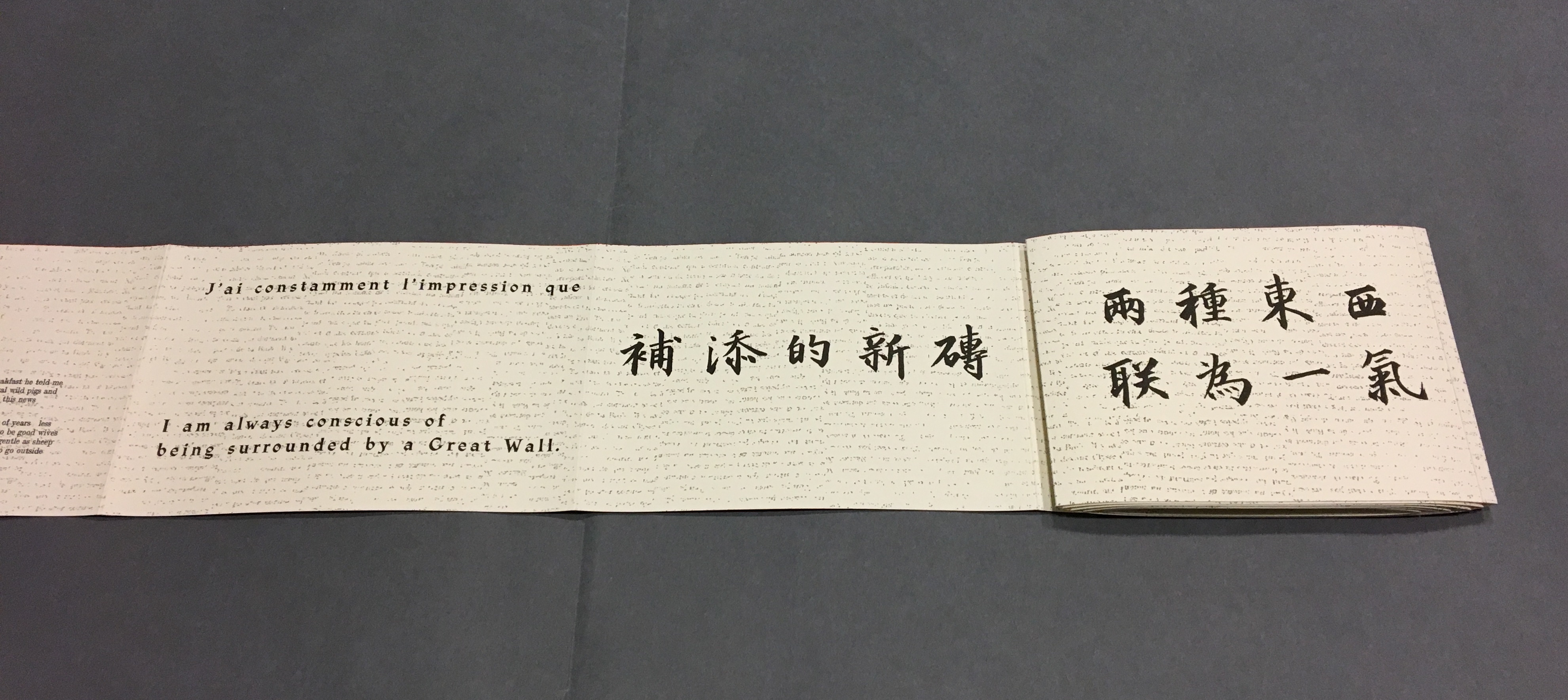
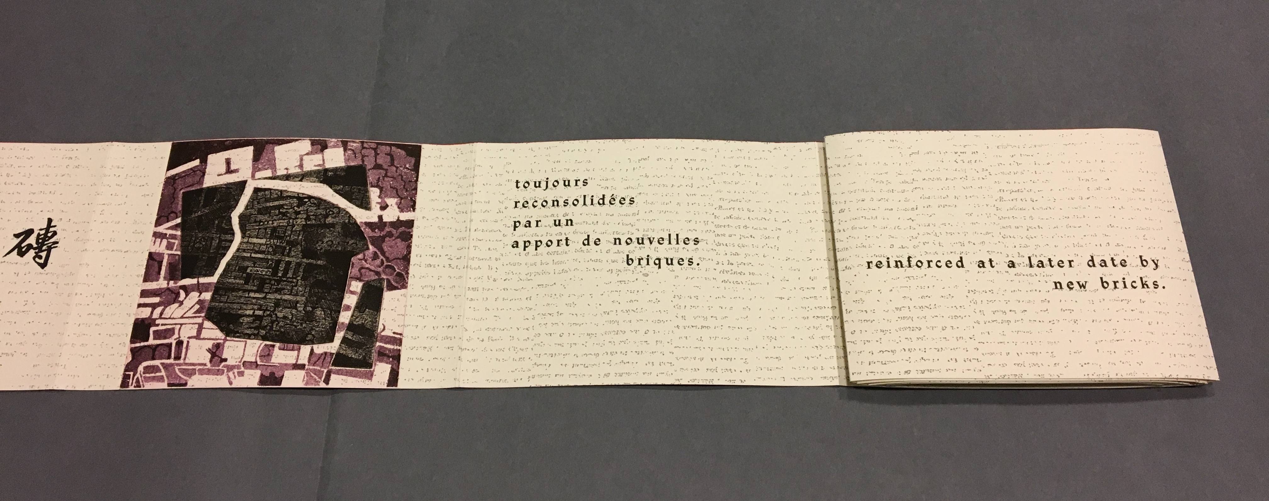
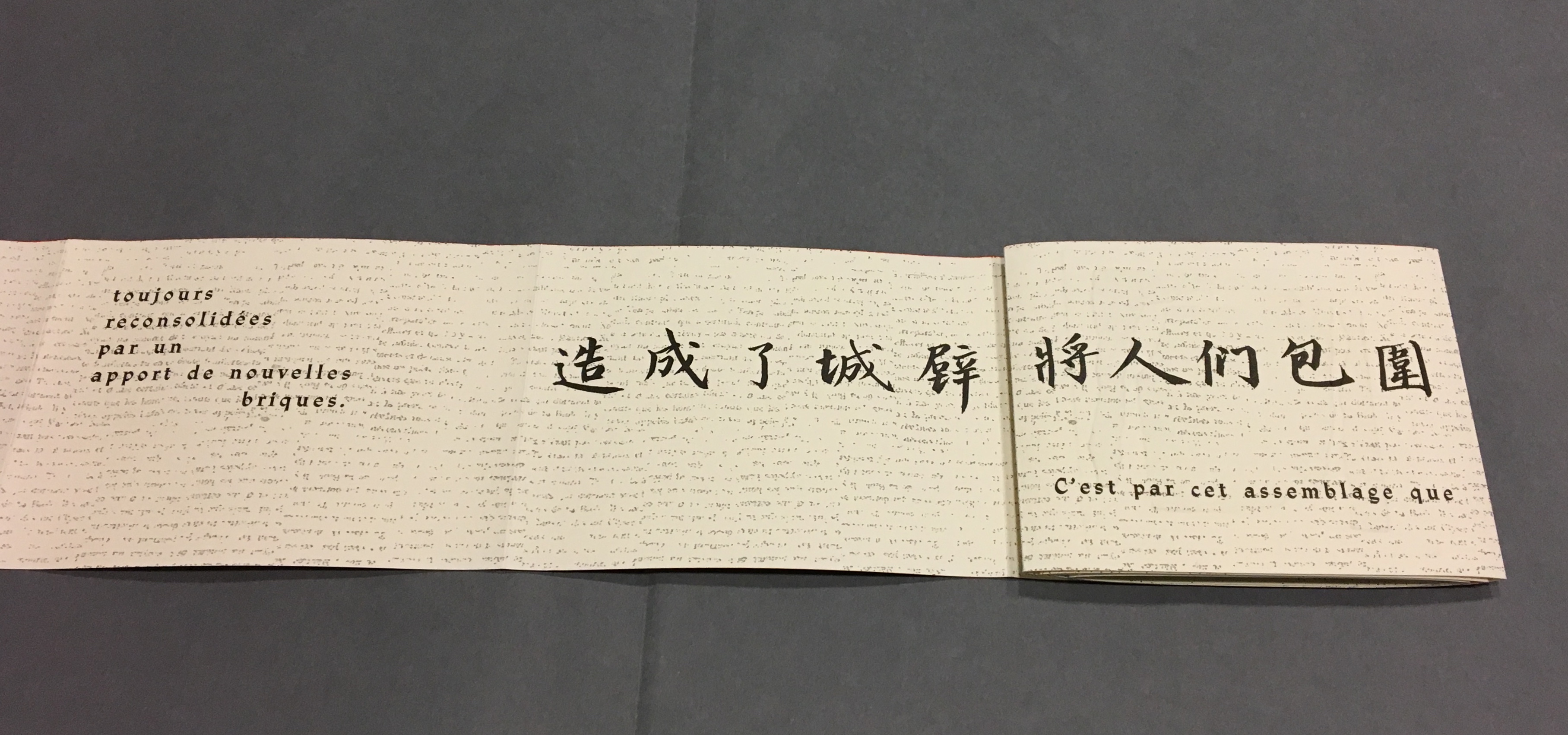
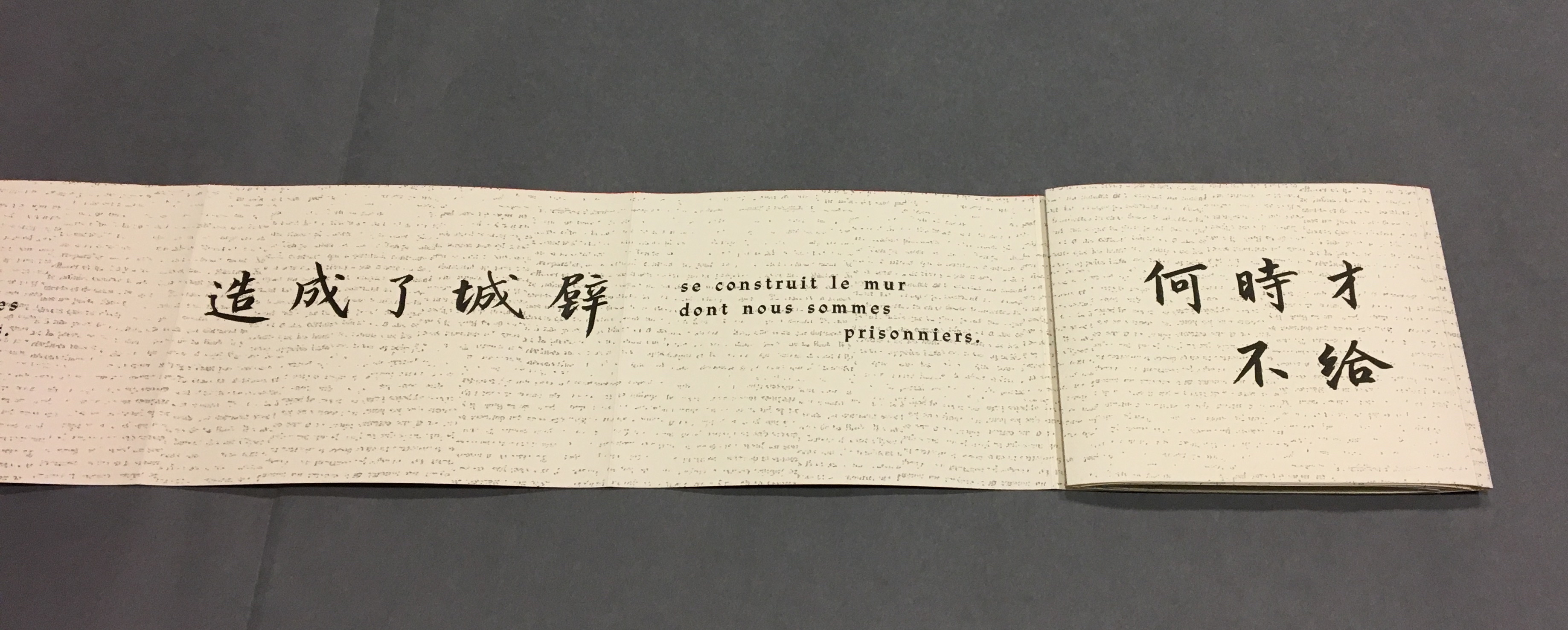
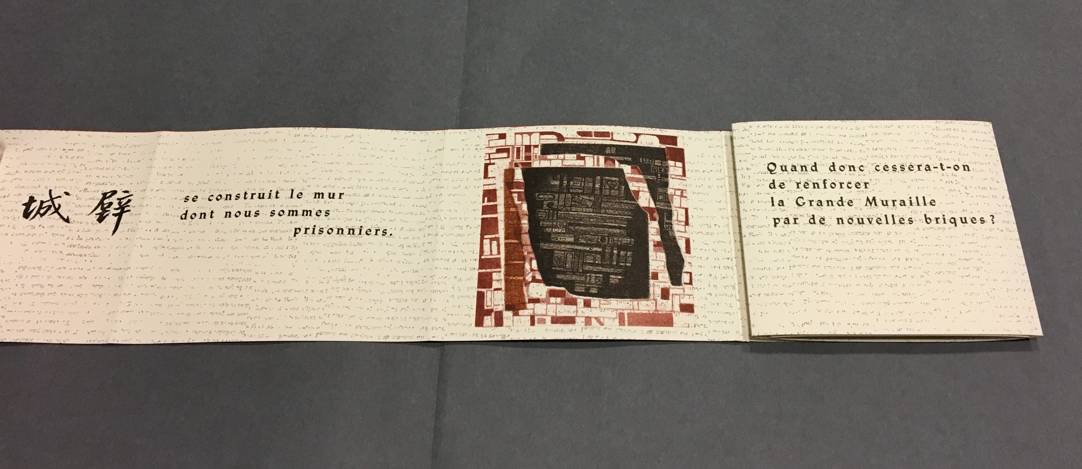
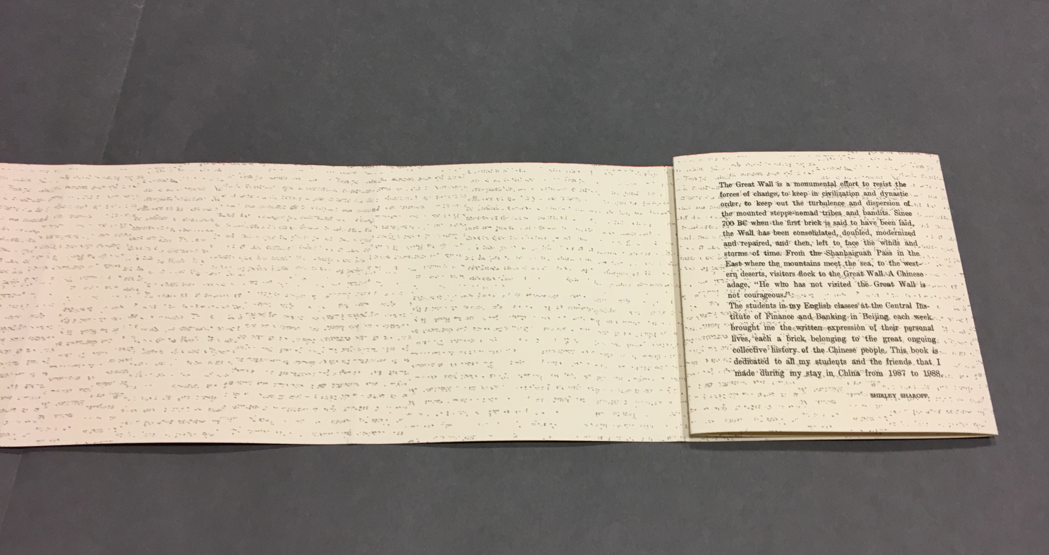
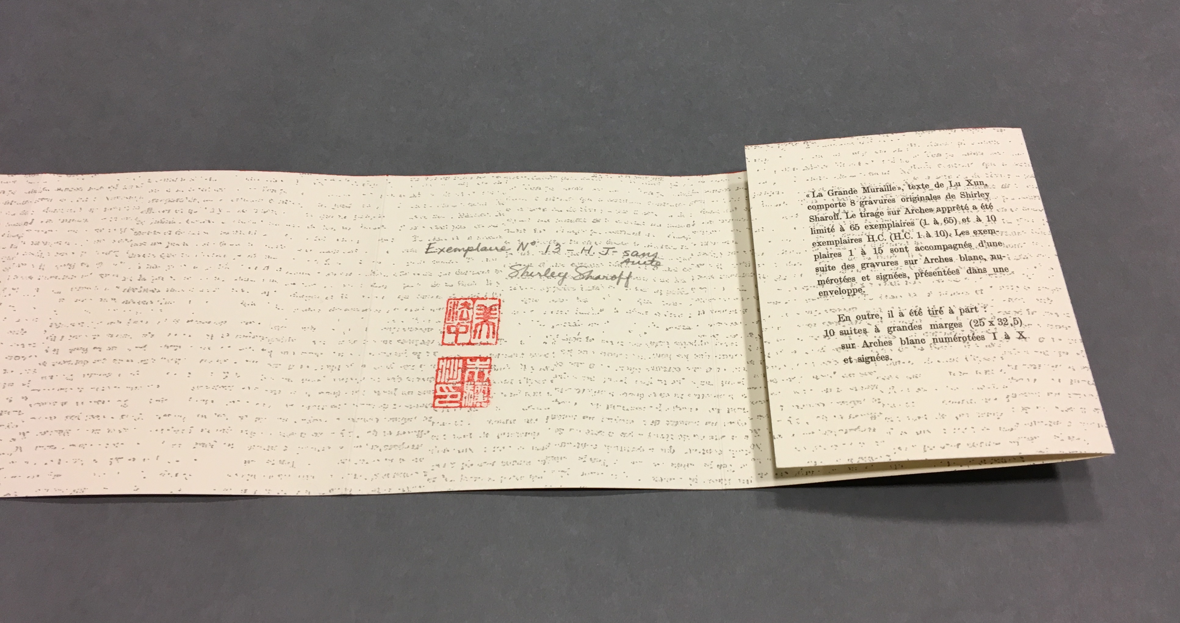
La grande muraille/The Great Wall (1991), Shirley Sharoff
All Books On Books photos are reproduced here with permission of the artist.
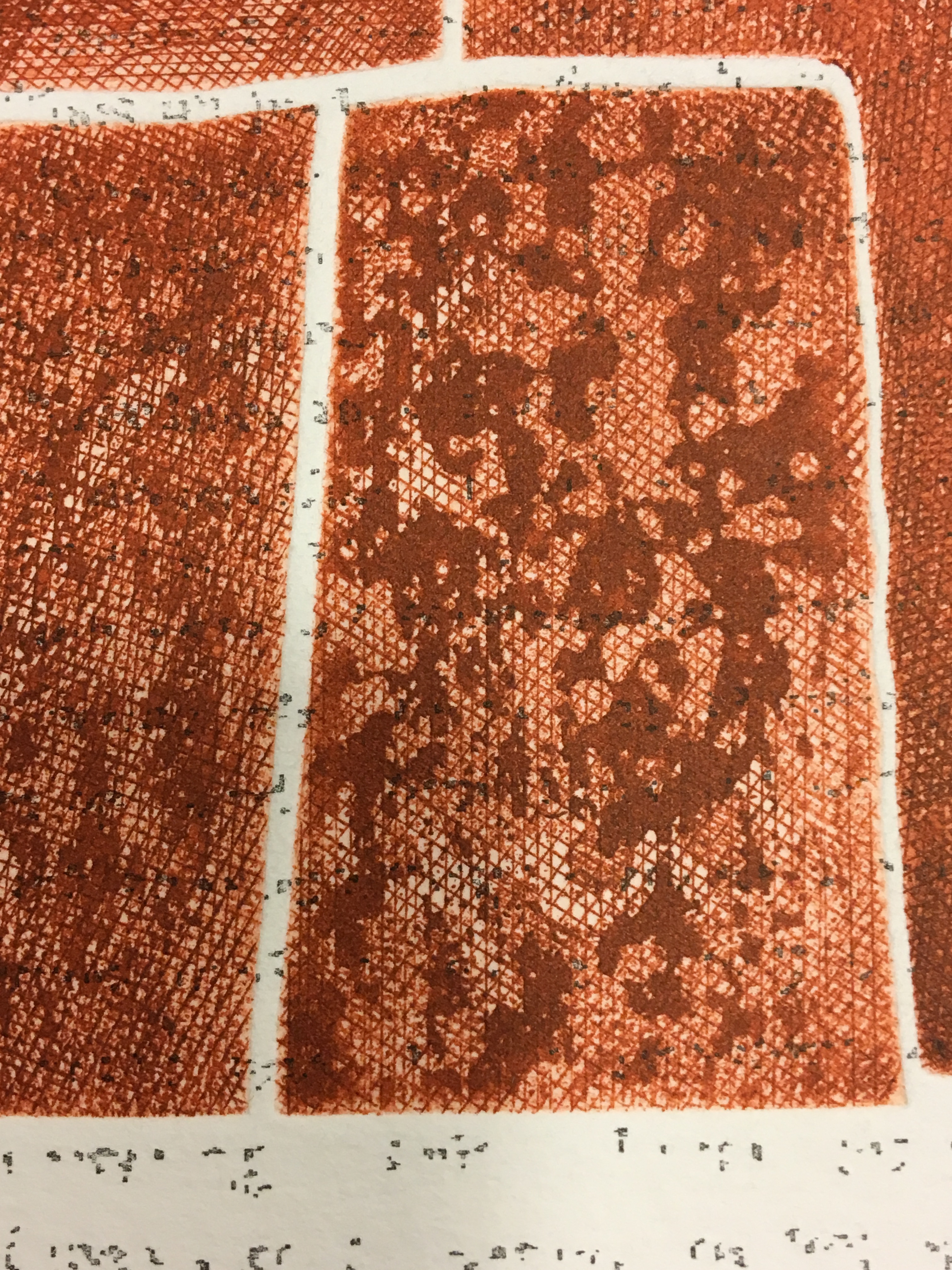
Detail, La grande muraille/The Great Wall (1991)
Typeface: Athenaeum, designed by Alessandro Butti and Aldo Novarese in 1945

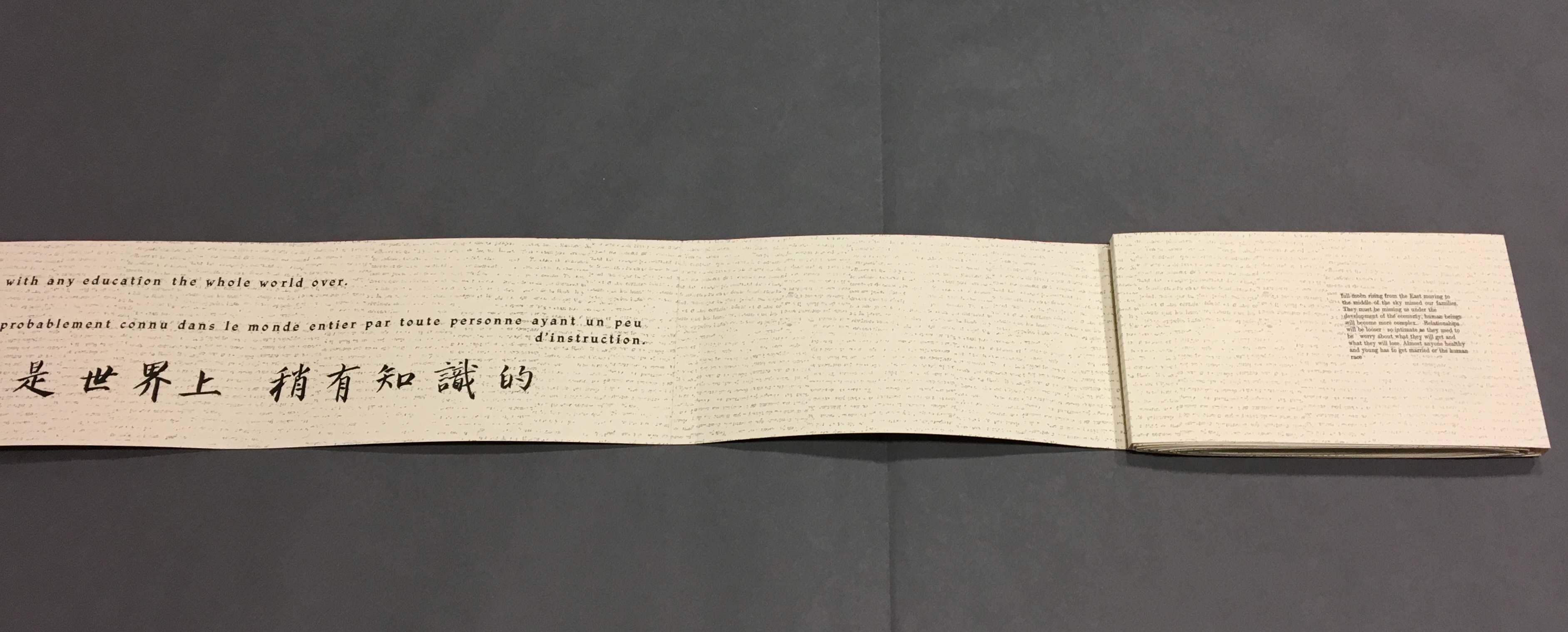
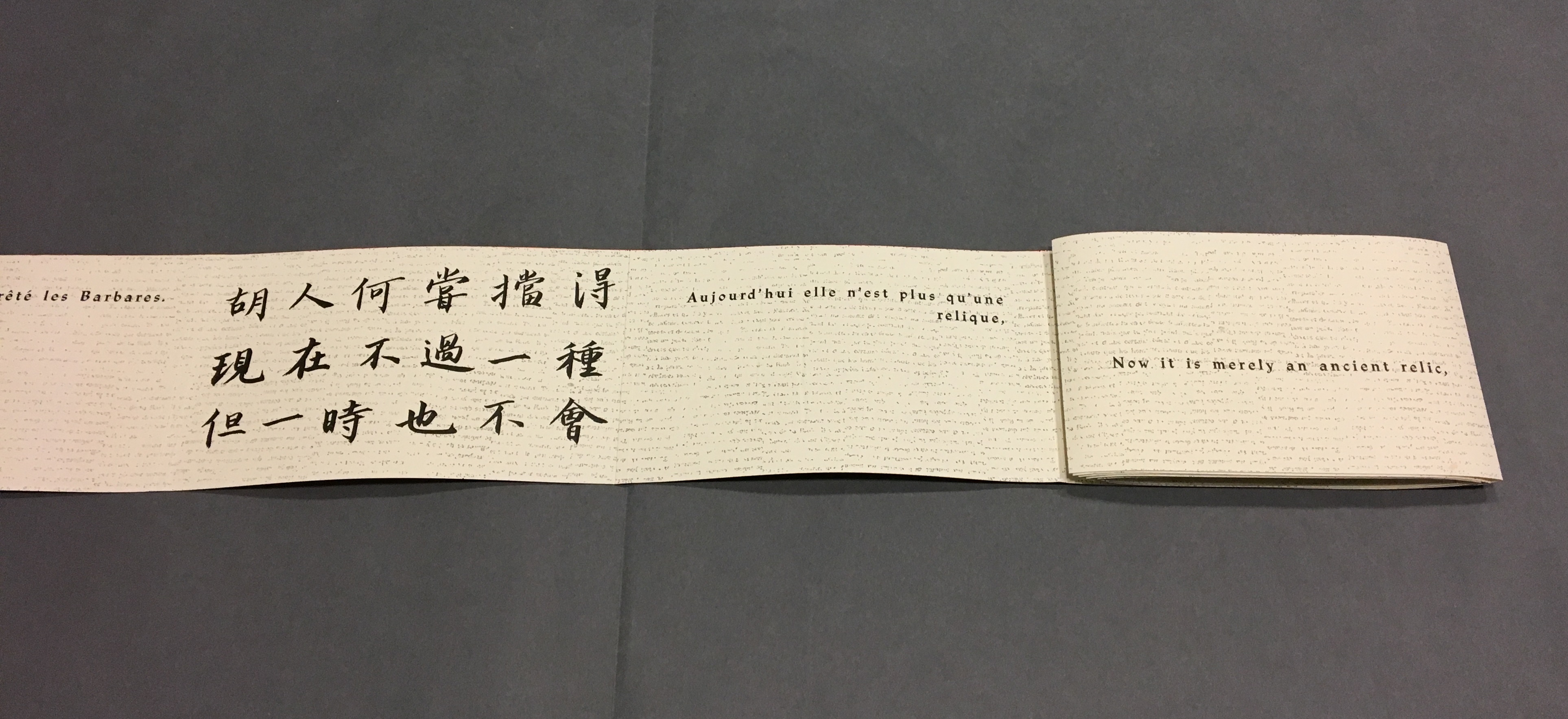
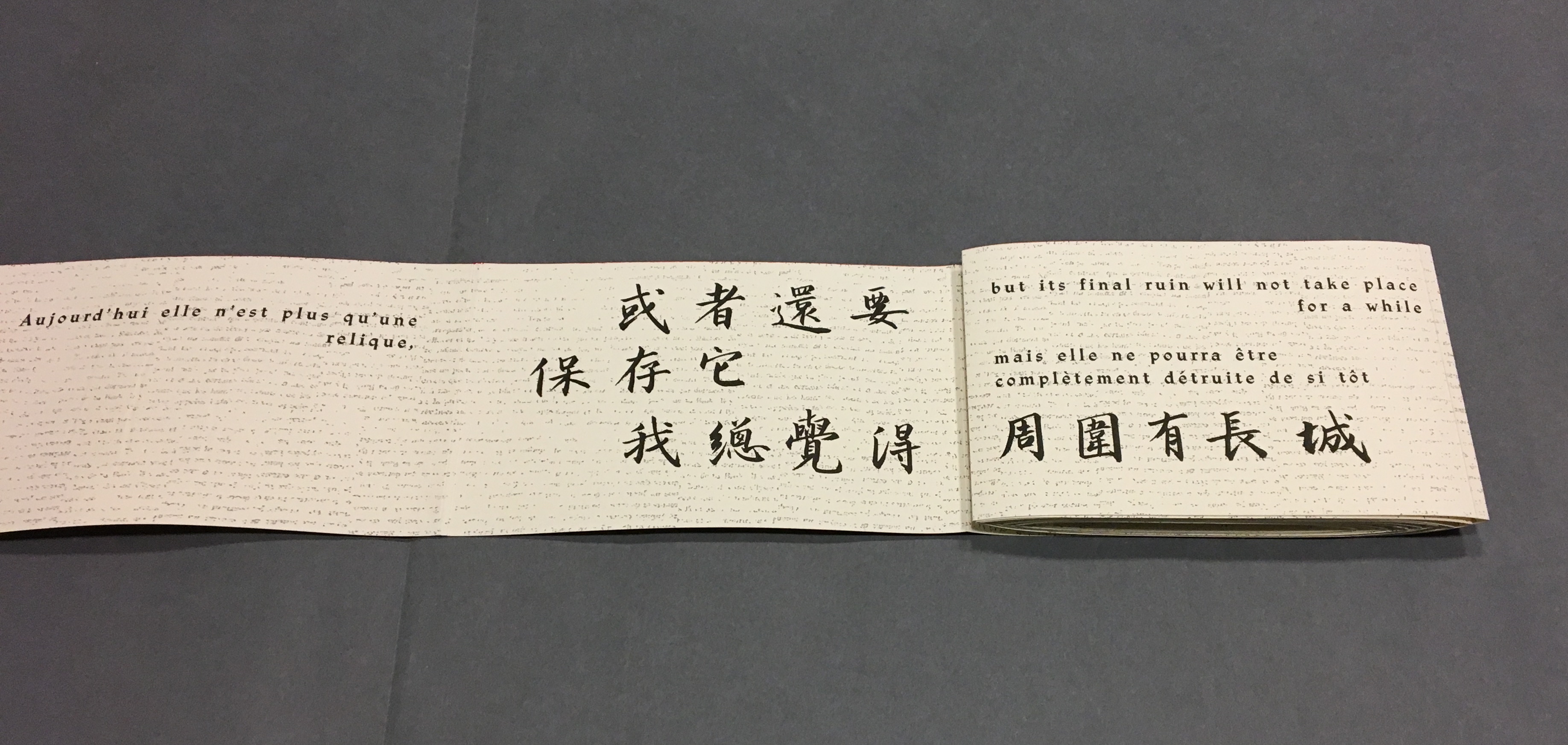
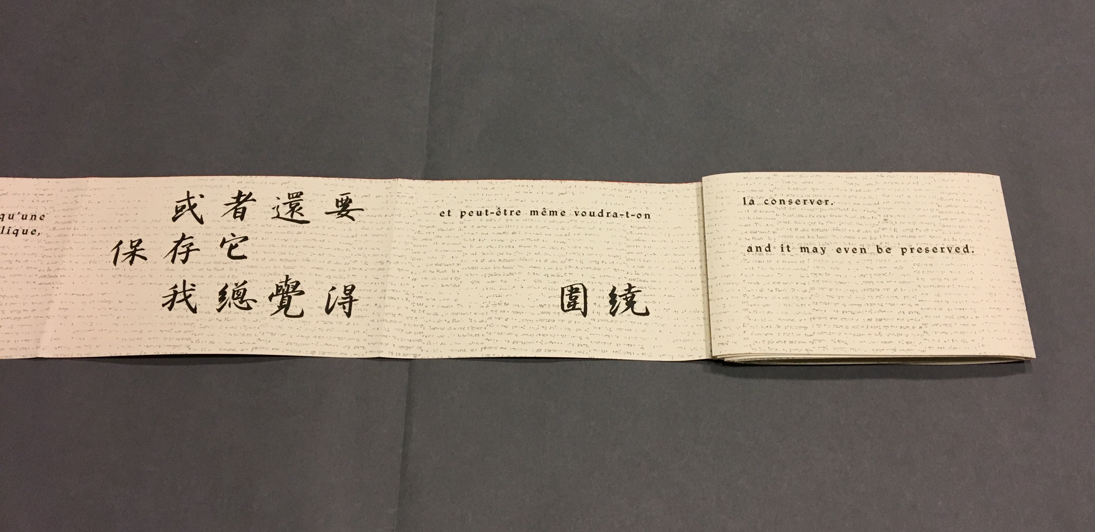
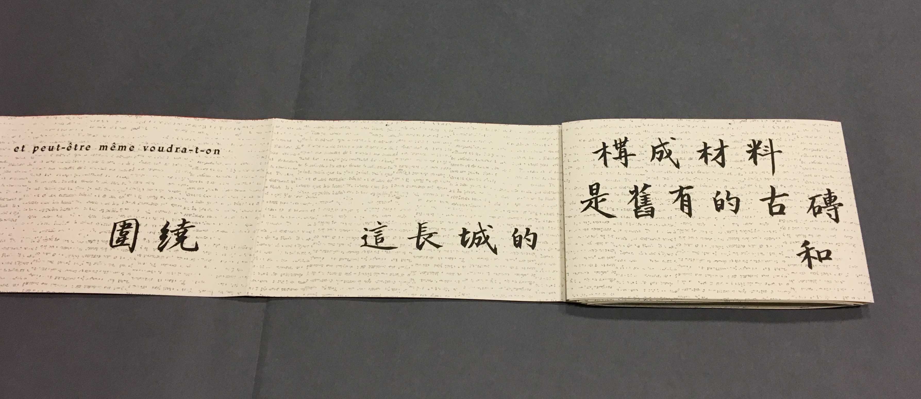
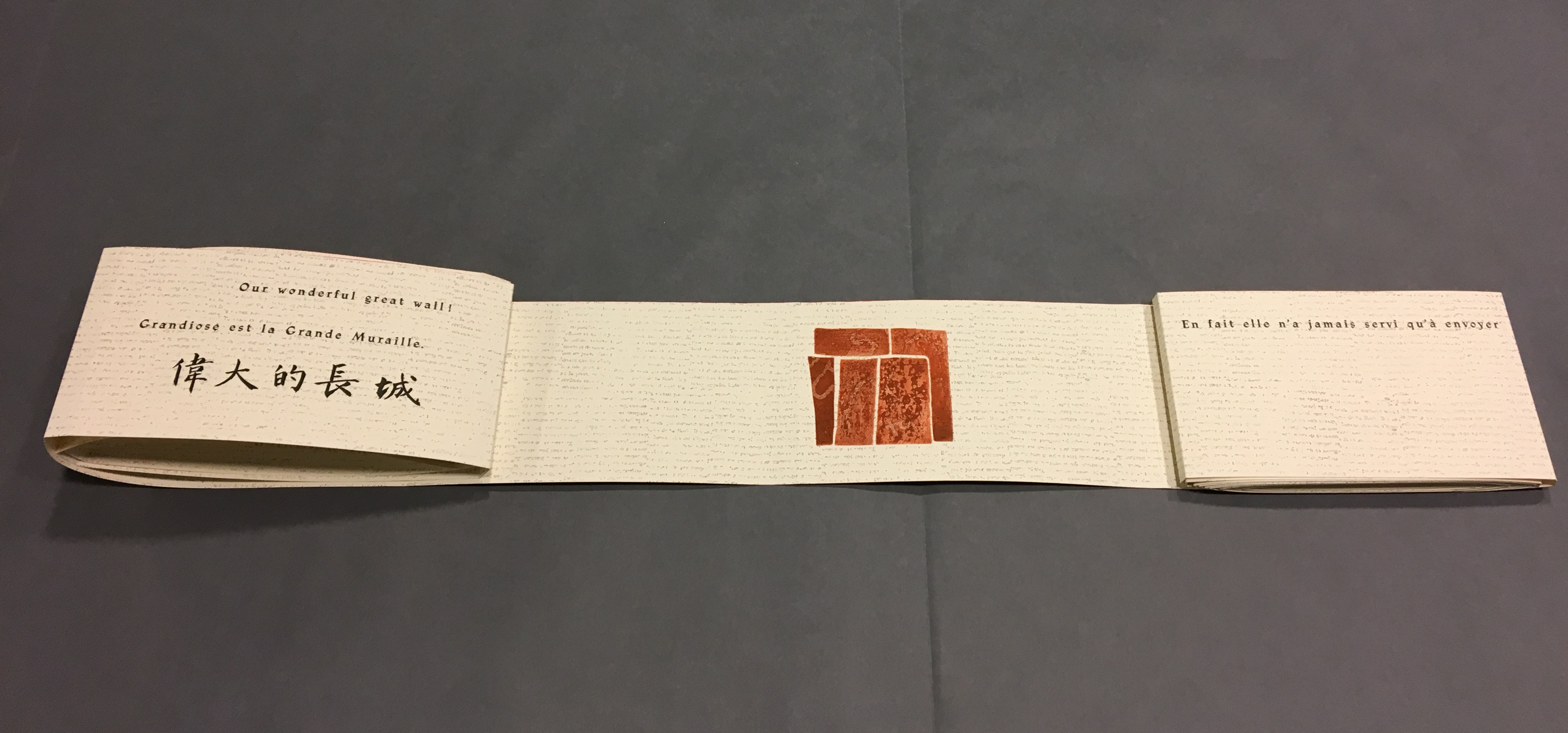
The National Library of the Netherlands advises, “for [Shirley Sharoff’s La grande muraille/The Great Wall (1991)] to be read, the book first must be rolled out”.  And that is what I did, using the large table in the Special Collection’s seminar room. 

Enjoyable as that was, enjoying it again with the video afterward, something seemed awry. As the Chinese poem by Lu Xun, its French and English translations and text from Sharoff’s language students unrolled, interpersed with her prints, the text seemed to have gaps, or so I thought. So I returned a second time. Perhaps if I re-shot the video. Perhaps if I took more stills and close-ups. Perhaps if I shot the rolling up as well as the unrolling.

No doubt, the second effort added to the pleasure. Looking at the videos and stills, I can again feel between my fingers the Arches paper and engravings’ impressions on it. But still I detected gaps, seeming mismatches between the French and English. I wondered to what degree they

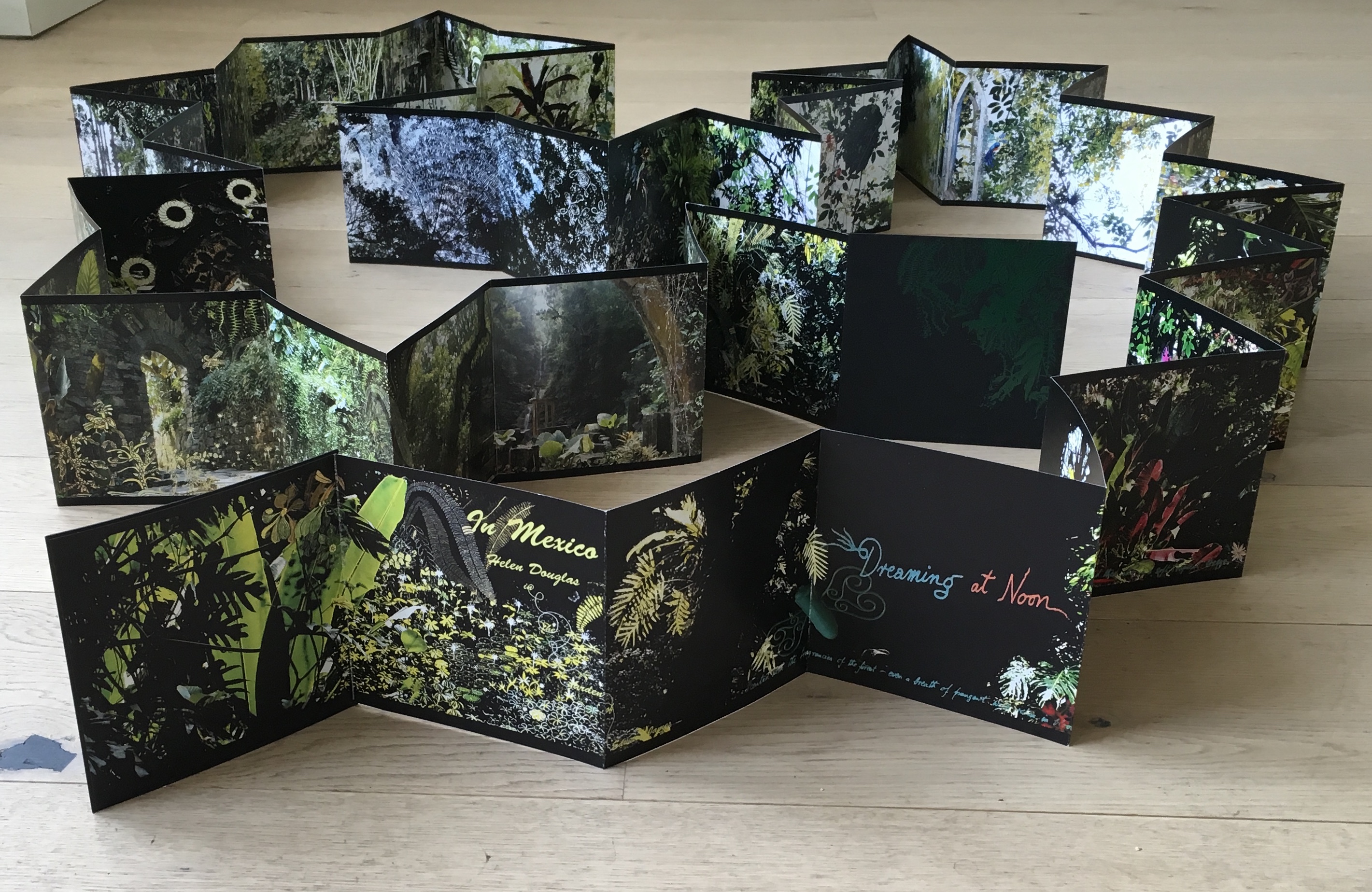
followed the Chinese text or whether some of Lu’s text had been omitted.  So, I returned a third time, and then came my “ah hah” moment. Unrolled, La grande muraille looks like a double-sided leporello or accordion book like this one: In Mexico by Helen Douglas.

In Mexico: in the garden of Edward James (2014)
Helen Douglas
La grande muraille/The Great Wall (1991)
Shirley Sharoff
Photo credit: © Koopman Collection. National Library of the Netherlands/Jos Uljee

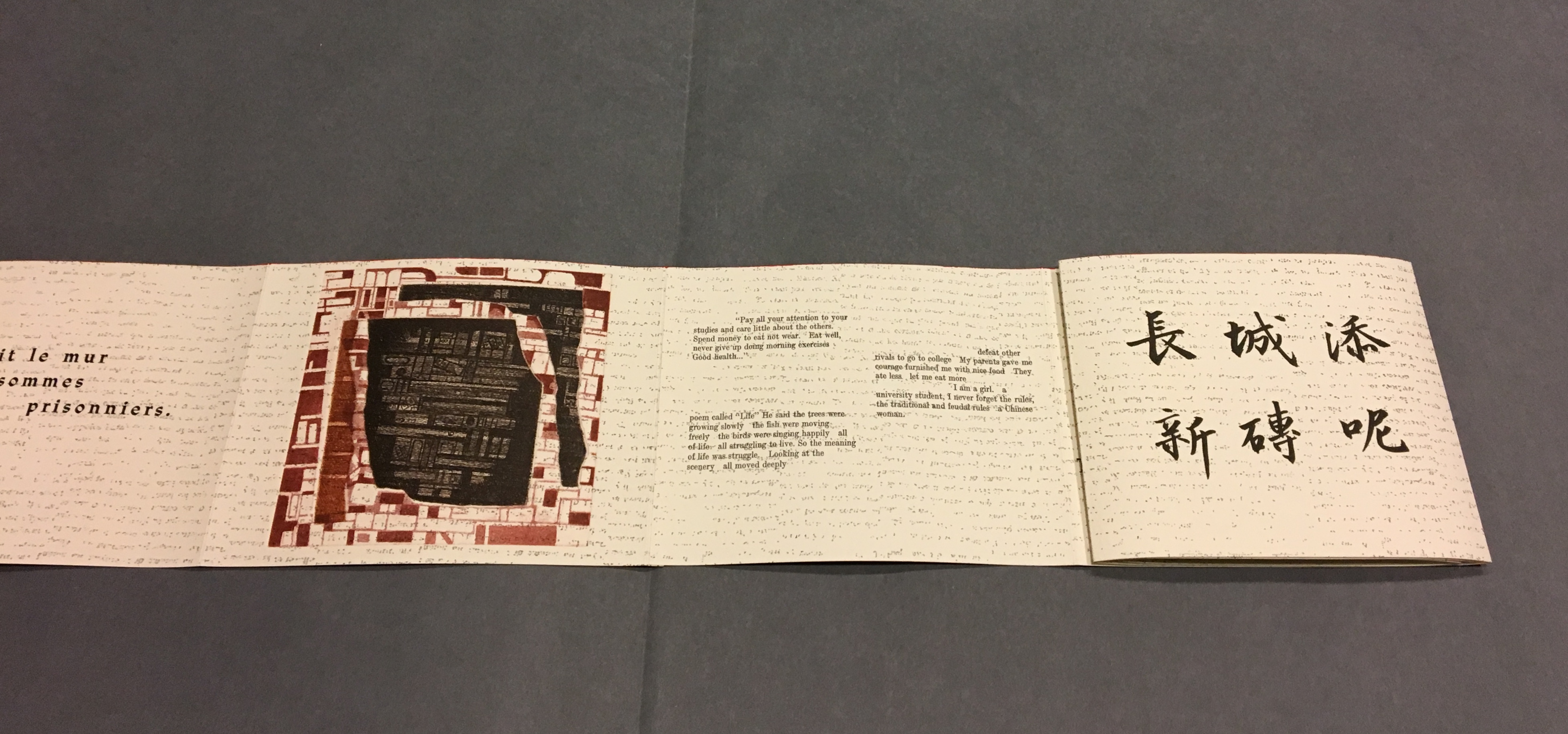
To read La grande muraille as the double-sided leporello it appears to be, however, is to overlook the multi-page spreads that Sharoff conceived with François Da Ros (her typography and print collaborator) in putting together this forme en escargot (snail-shell form as she calls it). The snail-shell form, its multi-page spreads and the text demand that you read La grande muraille as you unroll it, or rather, as you unfold it.

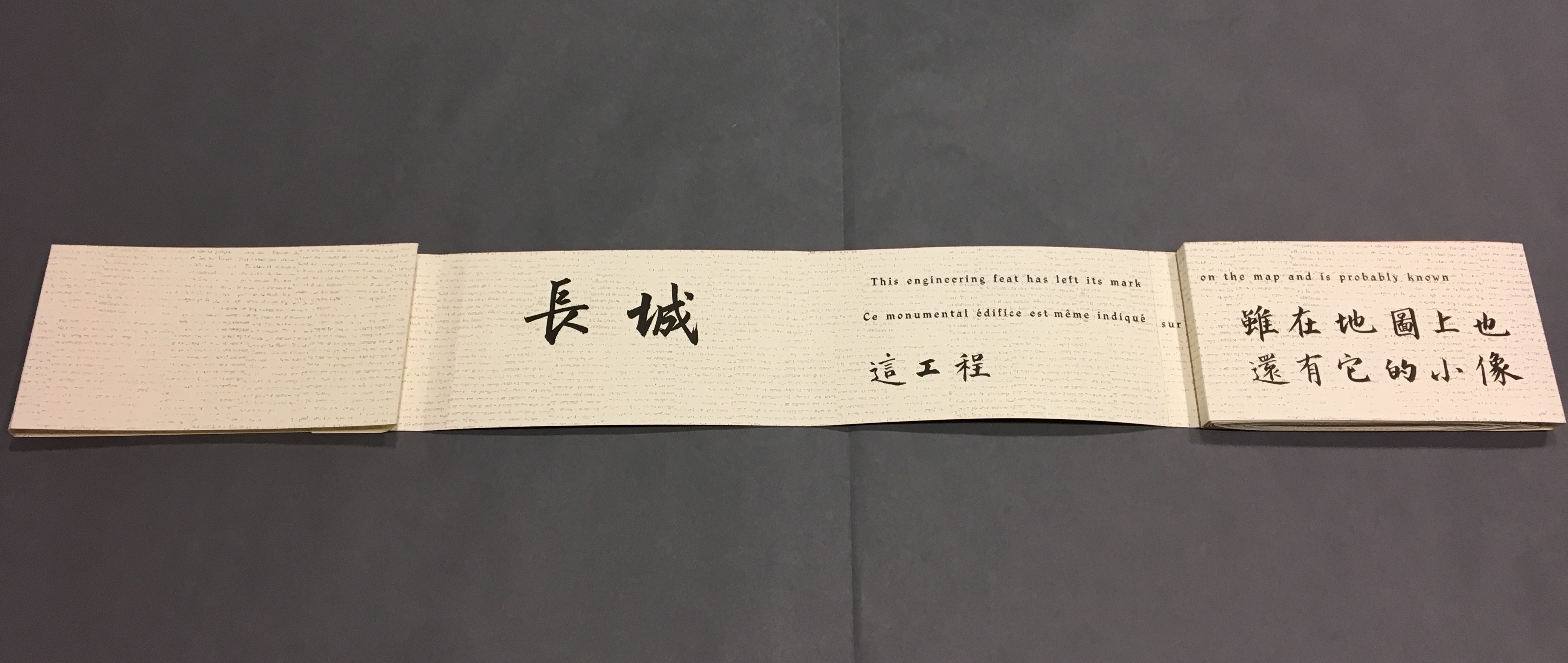
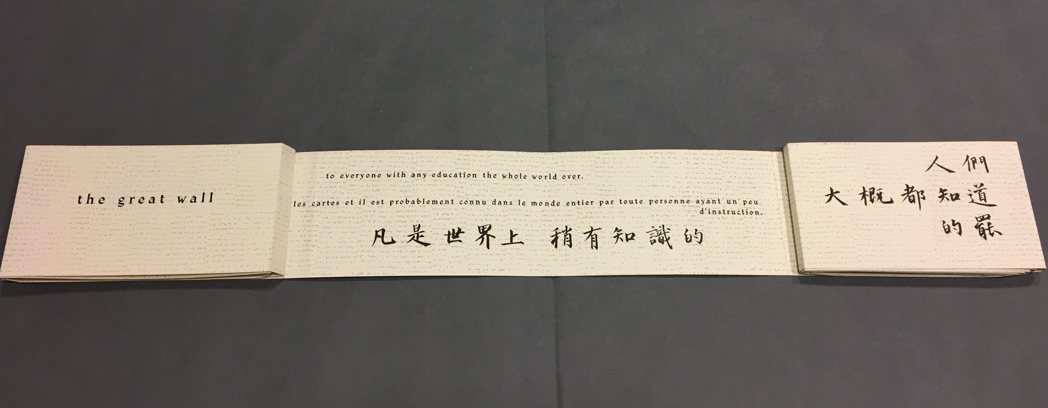
With the book laid flat, the “page spreads” are easier to recognize, the text is easier to read, and the forethought needed for the “imposition” of text and images to deliver the sequential text, easier to marvel at. As each recto page is turned to the right, two new pages appear to the right. This unfolding approach to reading the book offers several intriguing “double- and multi-page spreads” and an experience of the texts and eight prints in the sequence driven by the text. When you have finished reading in this sequence, you will have read both sides of the scroll. 

Reading the text

Front cover
La grande muraille/The Great Wall (1991), Shirley Sharoff
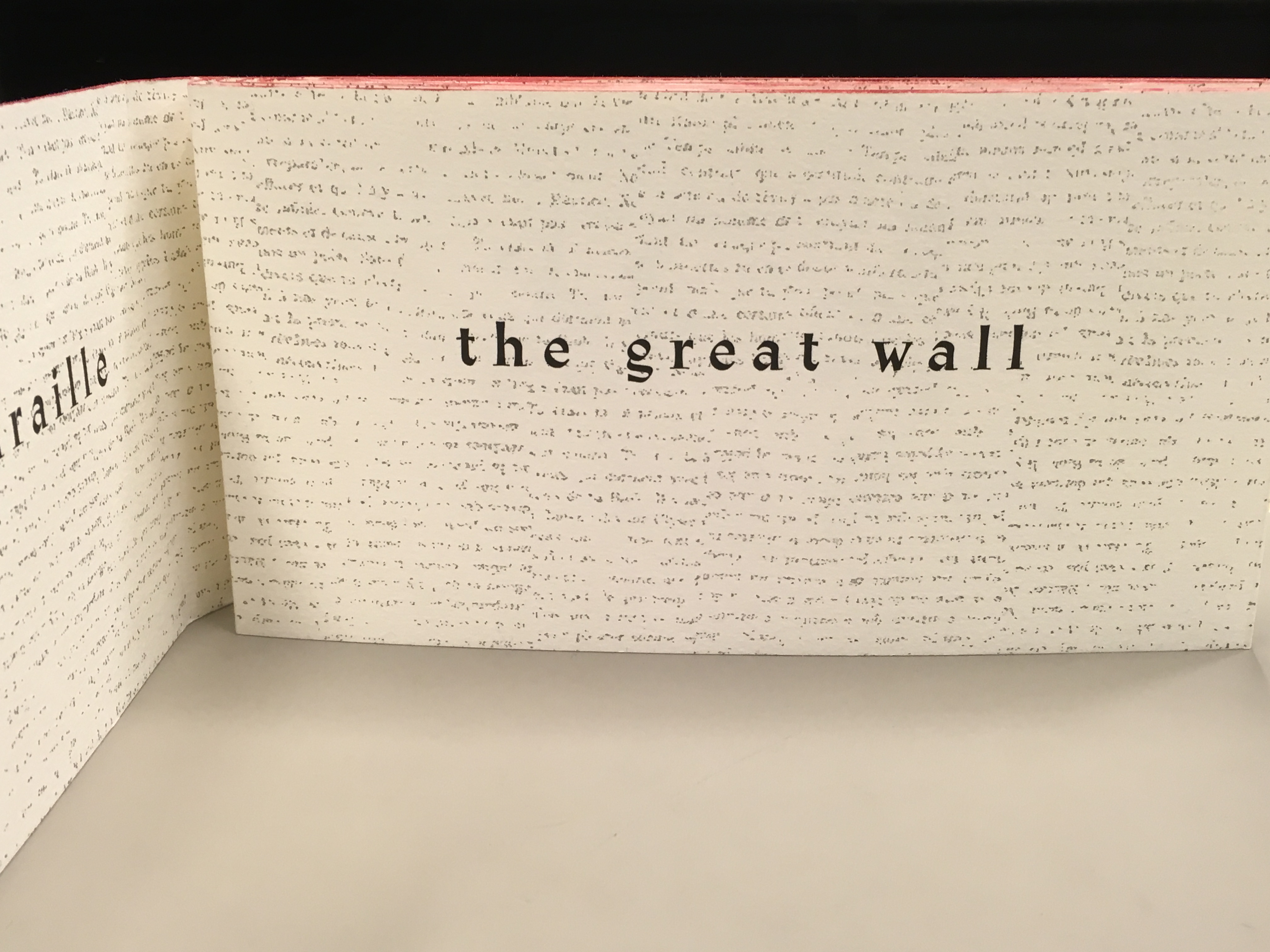
“Pages 1 and 2”
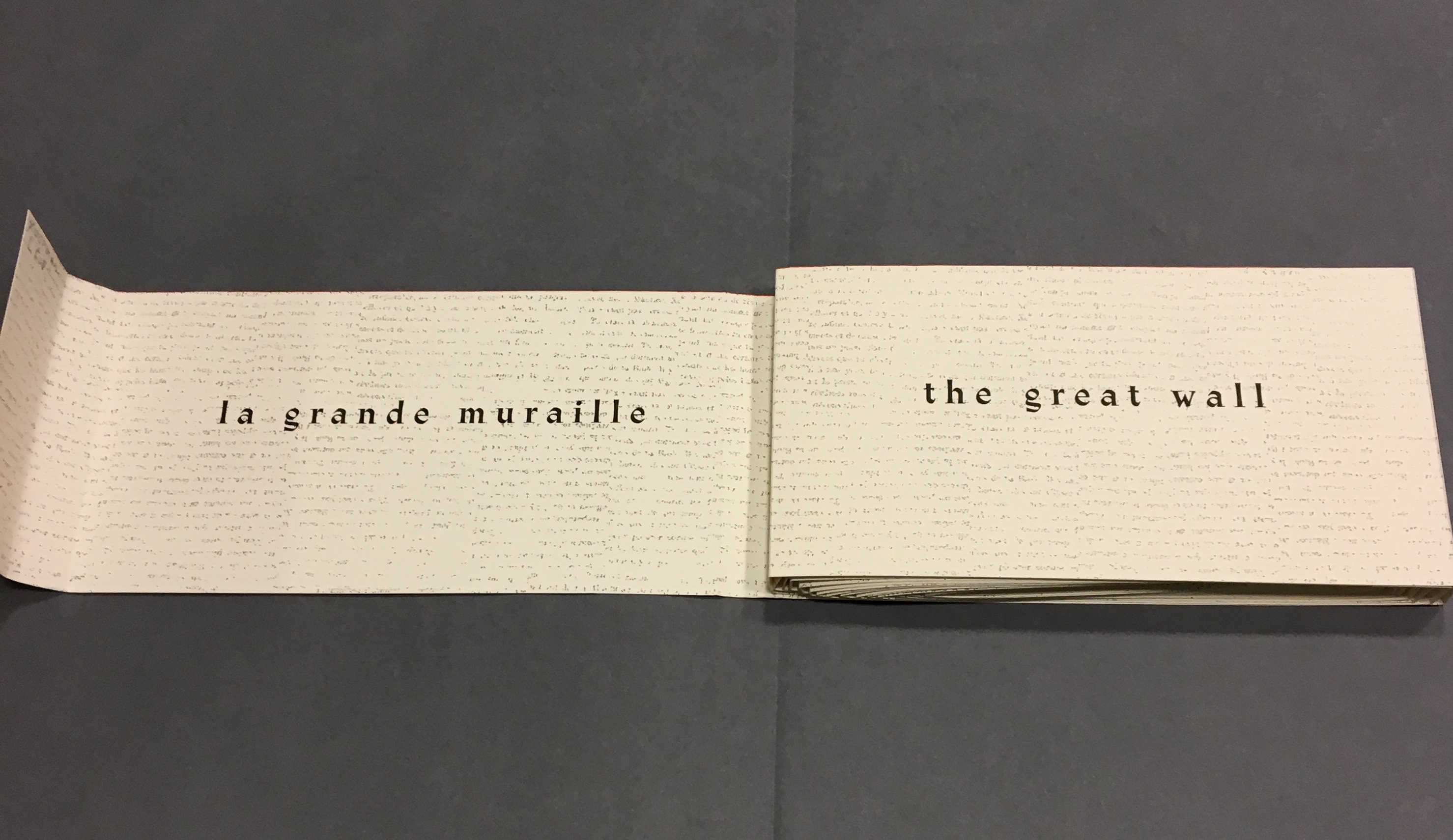
As “page 2” is turned to the right and the English title of the work disappears, “pages 3 and 4” come into view.
“Pages 1, 3 and 4”
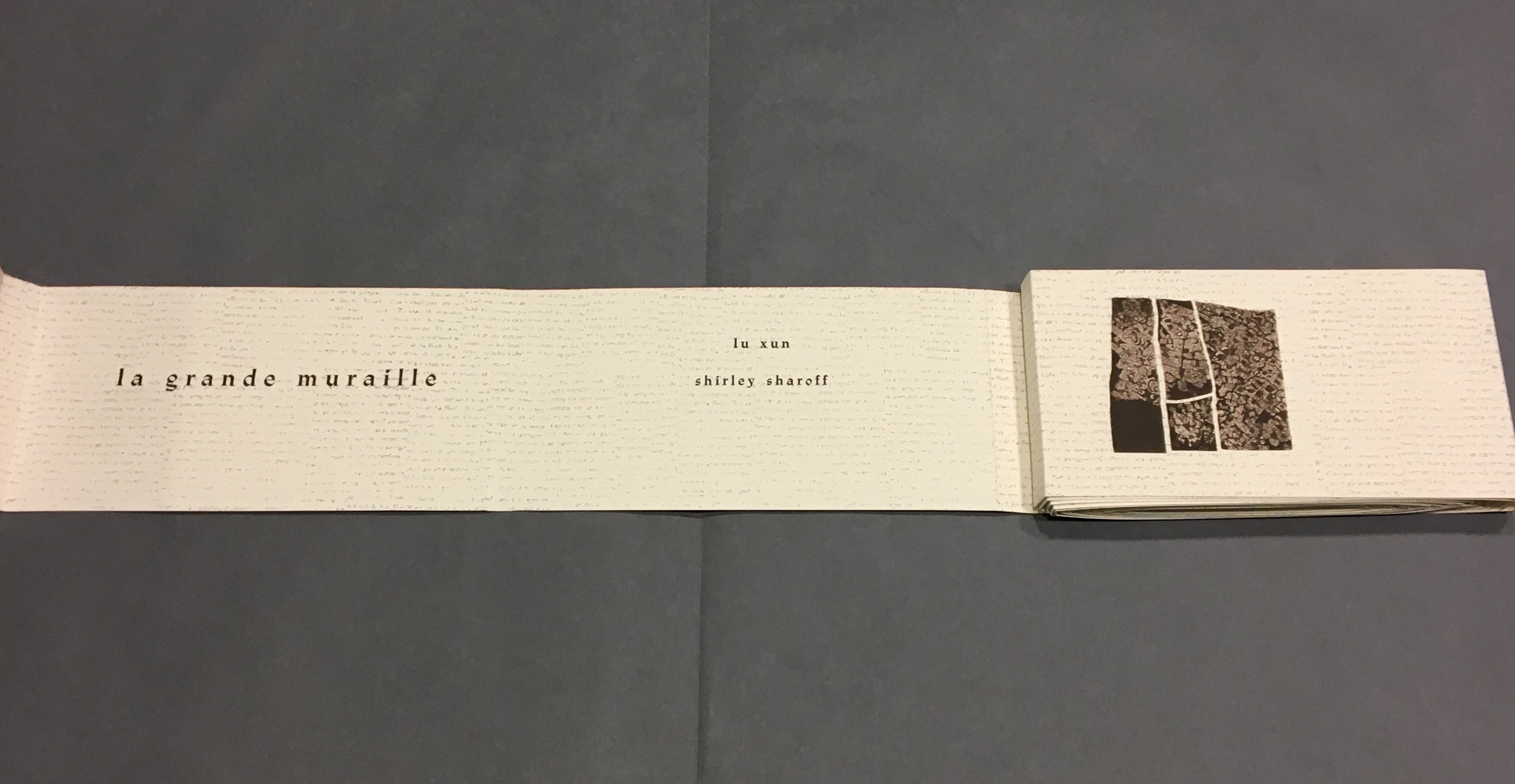
“Page 3” displays the authors names, and “page 4” displays the first of eight prints in the book. As “page 4” is turned to the right and disappears, “pages 5 and 6” appear.
“Pages 1, 3, 5 and 6”
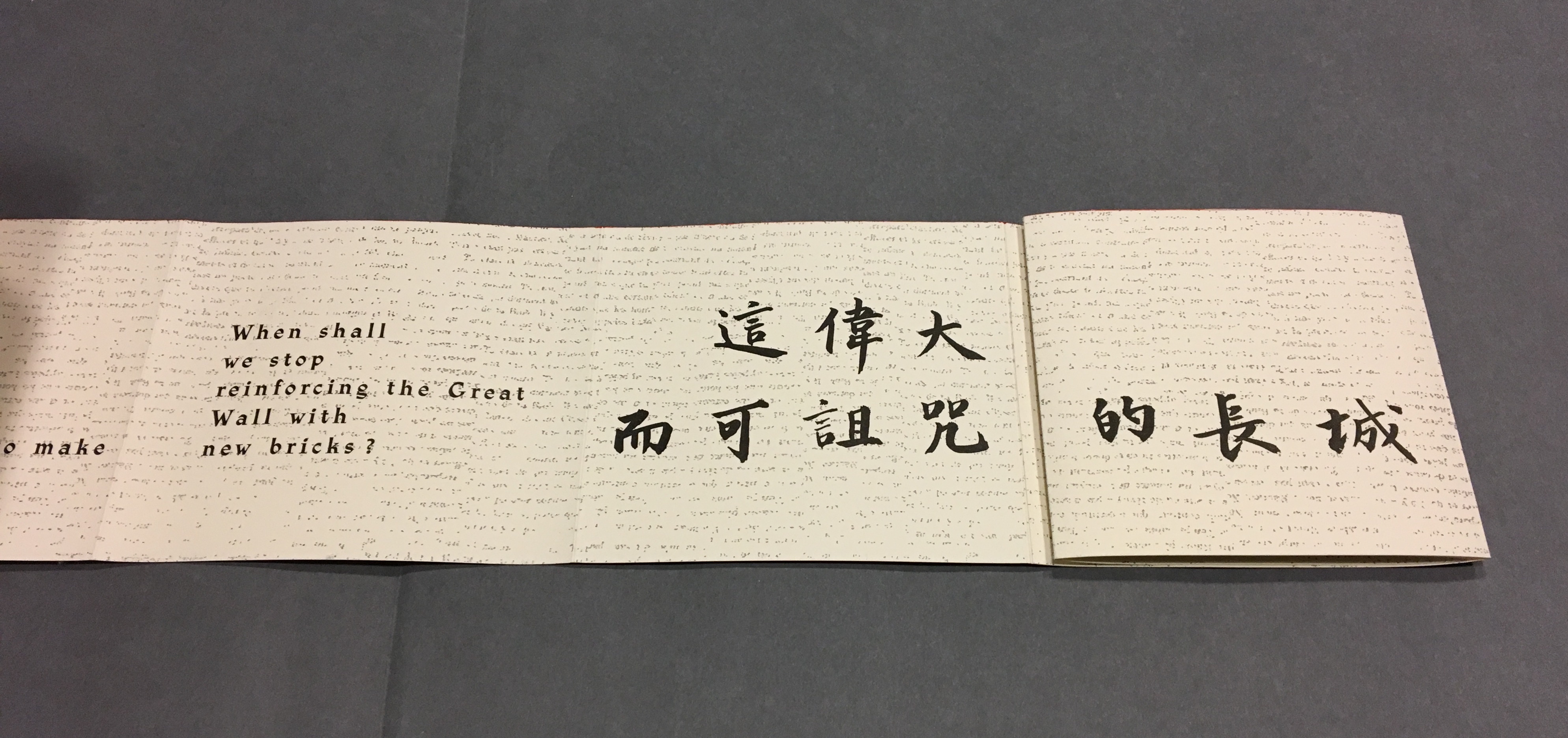
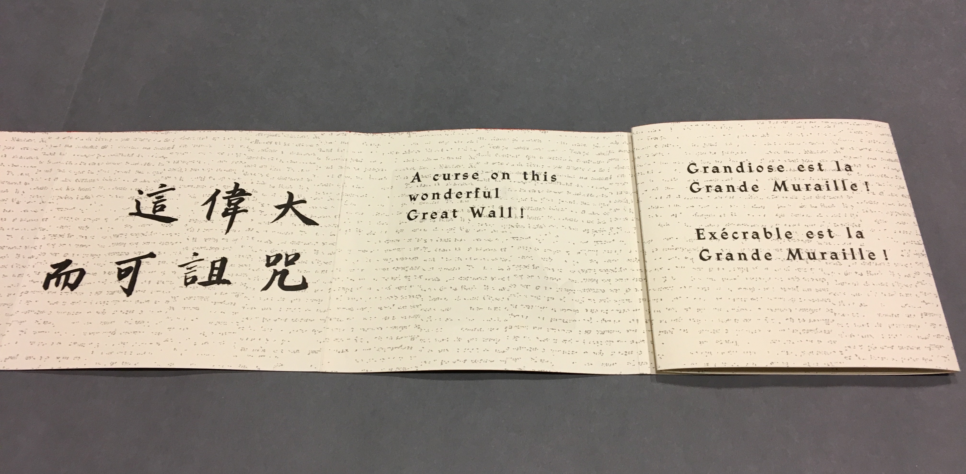
“Page 5” gives the title of the book in Chinese calligraphy. On “page 6”,  the opening line of Lu Xun’s text appears in English, French and Chinese.
Turning “page 1” to the right will cover the authors’ names on “page 3”, and turning “page 6” to the right will yield the next four-page view.
“Back cover, pages 5, 7 -8”
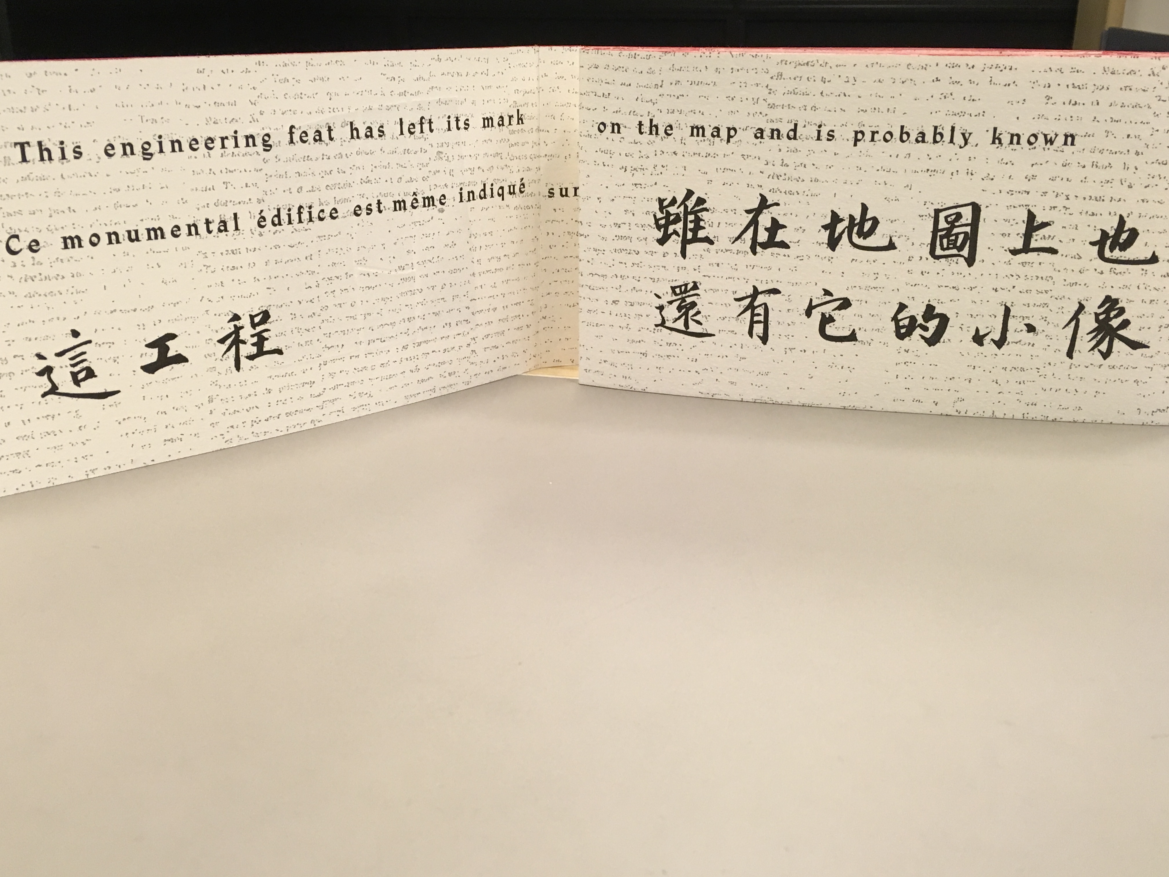
The next lines of Lu Xun’s disquisition run in English, French and Chinese across “pages 7-8”.
Detail, “Pages 7 and 8”.
Notice how the English text on “page 7” runs across to “page 8”, but the French text disappears under “page 8”, effectively running on to what will be revealed as “page 9” in the next view.
“Pages 2, 9-11”
This view results from two page turns inward on the left and two outward on the right. “Page 2” has come back into view on the left.  The English text on pages 9-10 completes the sentence interrupted on “page 8”. The French text on “pages 9 and 10” completes the sentence that began on “page 7” and ran behind “page 8”.
Pages 9-10, 12-13
Pages 6, 12, 14-15
Pages 12, 14, 16-17
Pages 16, 18-19
Pages 16, 18, 20-21
Pages 20, 22-23
Pages 20, 22, 24-25
Pages 24, 26-27
Pages 24, 26, 28-29
Pages 28, 30-31
Pages 30, 32-33
Pages 32, 34-35
Pages 32, 34, 36-37
Pages 34, 38-39
Pages 38, 40-41
Pages 40, 42-43
Pages 42, 44-45
Pages 44, 46-47
Pages 44, 46, 48-49
Pages 46, 48, 50-51
Pages 48, 50, 52-53
Pages 50, 54-55
Pages 54, 56-57, the latter displaying the last ten characters of Lu Xun’s text.

這偉大而可詛咒的長城)

Pages 56, 58-59
Pages 58, 60-61
Pages 60, 62-63
Pages 62, 64-65
pages 64, 66-67

Now that the so-called gaps in the English and French texts were resolved, I wanted to understand how the English and French matched up to the Chinese text. For that, I asked help from two acquaintances in The Hague: Bee Leng Bee and Yingxian Song.  They obtained a copy of Lu Xun’s text, traced it through the photos I had taken and found that the three languages run almost in parallel as the work unfolds.

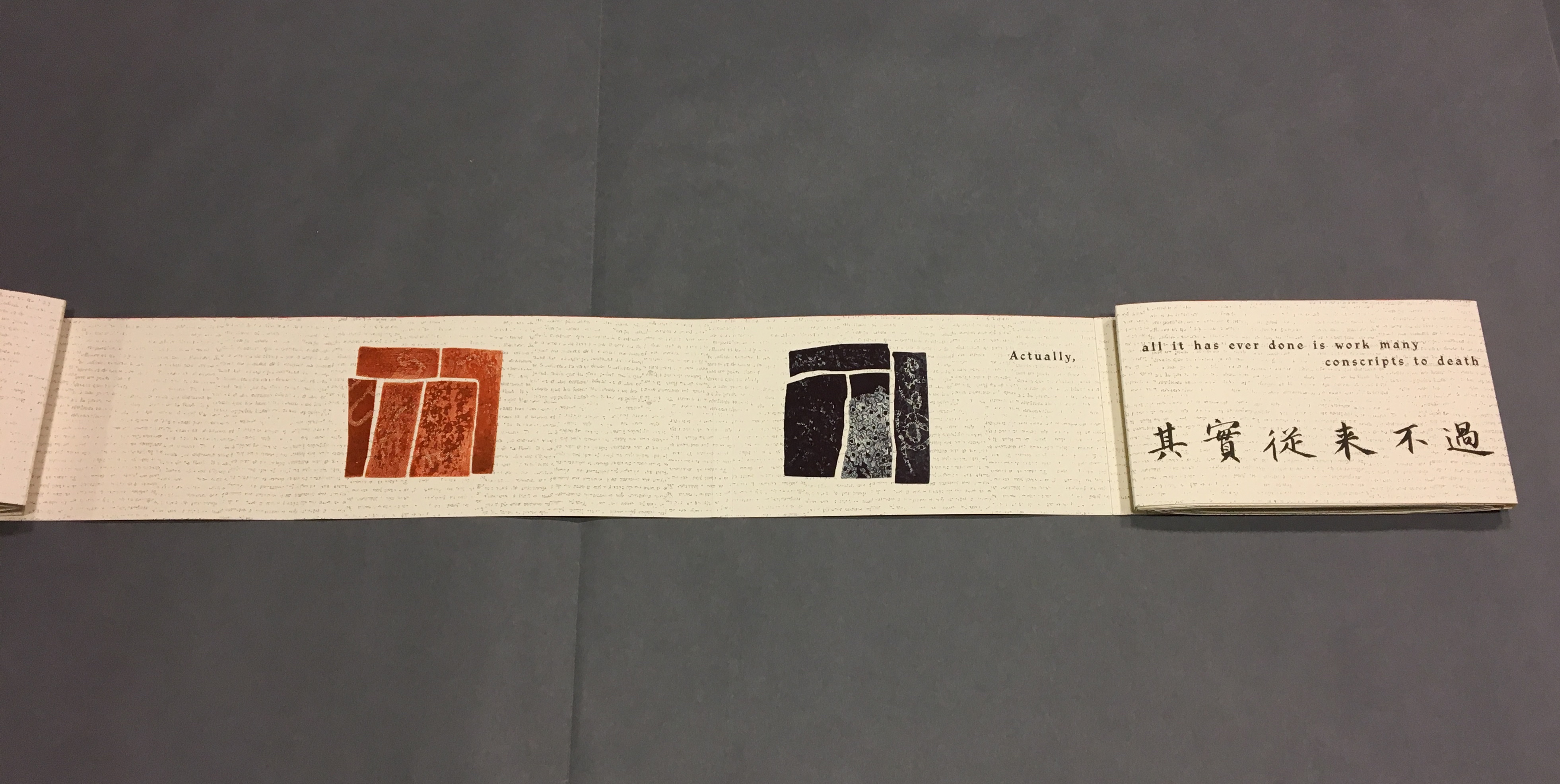
“Almost” because the order of the languages is not alway the same. On pages one and two, we see the French and English titles but must wait until page five before the Chinese title appears. Then, on page six the order changes: English first, then French, then the corresponding ten Chinese characters. On pages seven and eight, this order is maintained. Later, with the turning of page fifteen, the French comes before the English and Chinese; the first Chinese character aligning to the French and English (其) appears on page seventeen. Then, as page seventeen is turned to the right, the order changes back to French then English on page eighteen, but on page nineteen, it moves to French first then Chinese. The book’s textual conclusion on pages fifty-six through fifty-nine runs Chinese, English, then French. 

The juxtaposition and weaving of the three languages often seems painterly as if intended to evoke the layering of the bricks and the intertwining vines and foliage along stretches of The Great Wall. Here is the uninterrupted Chinese text:

偉大的長城!

這工程,雖在地圖上也還有它的小像,凡是世界上稍有知識的人們,大概都知道的罷。

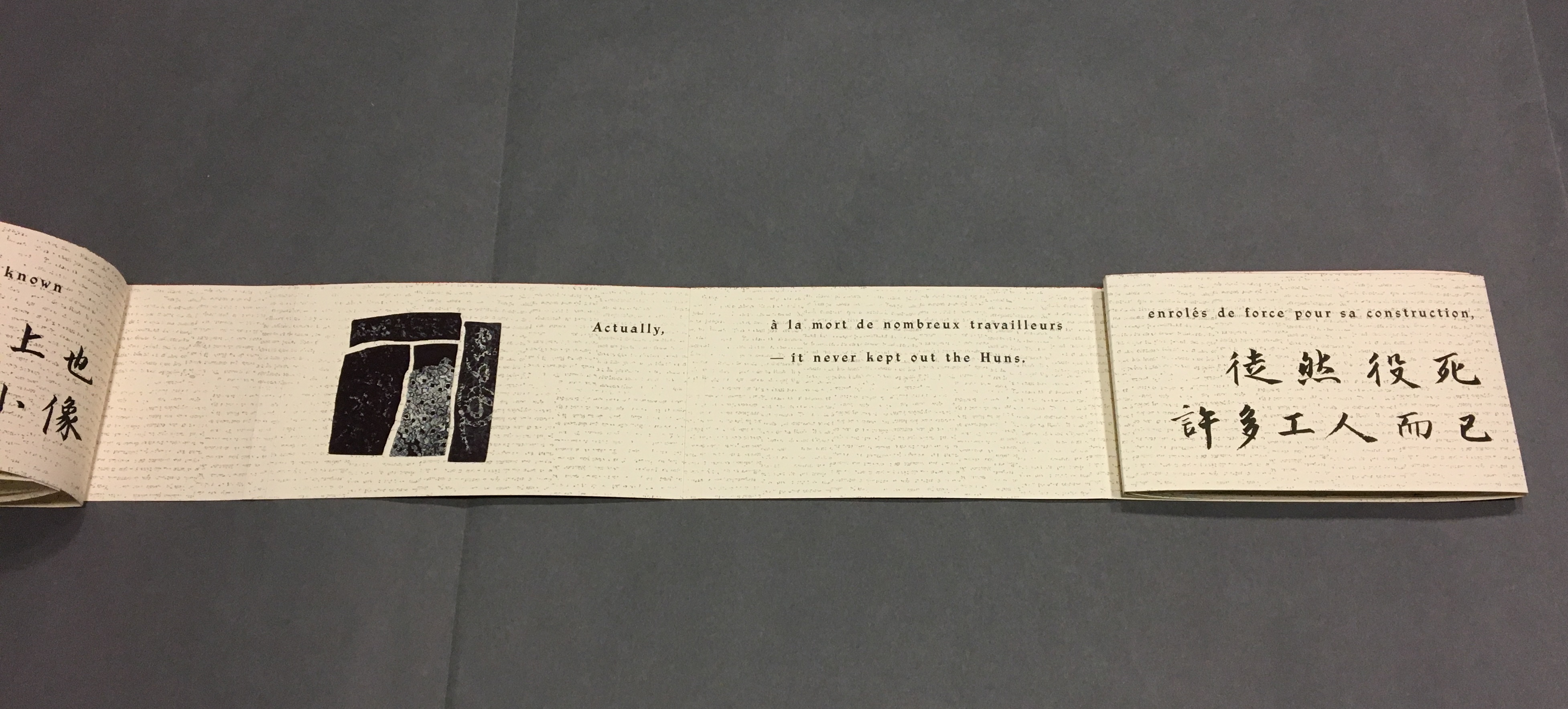
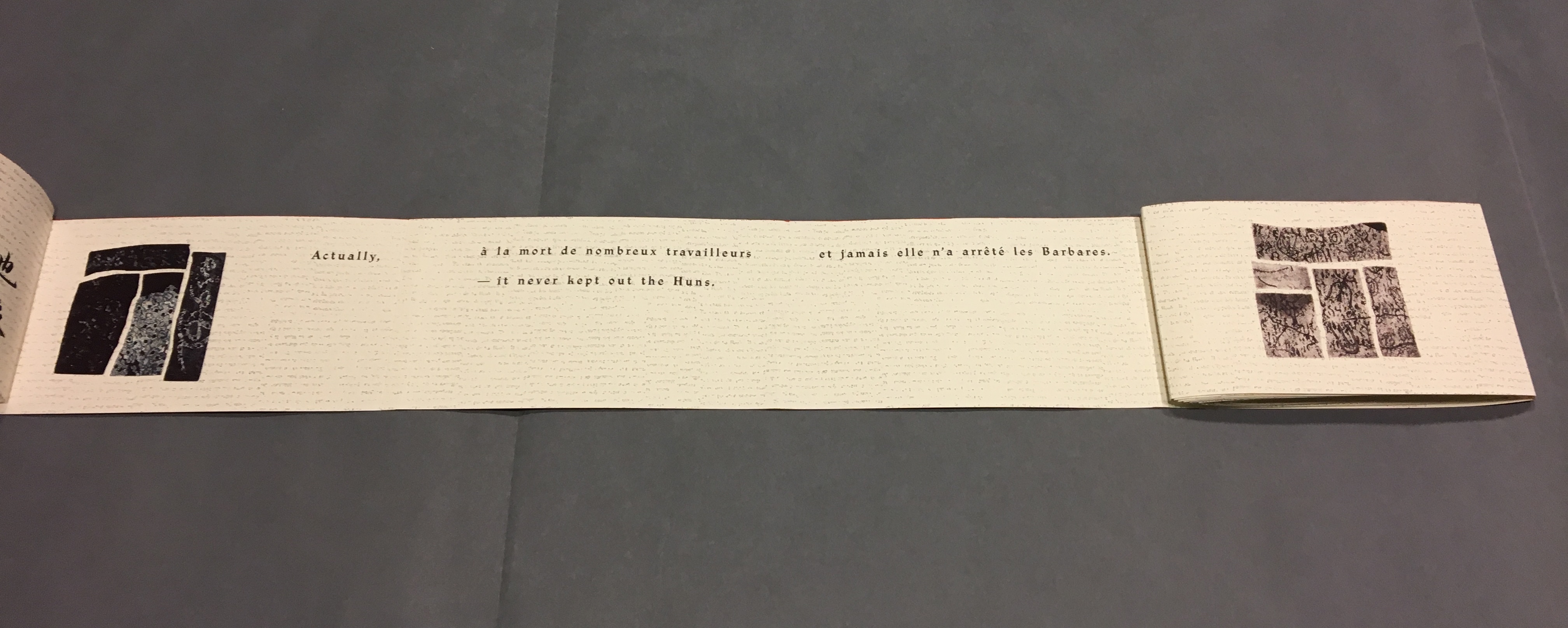
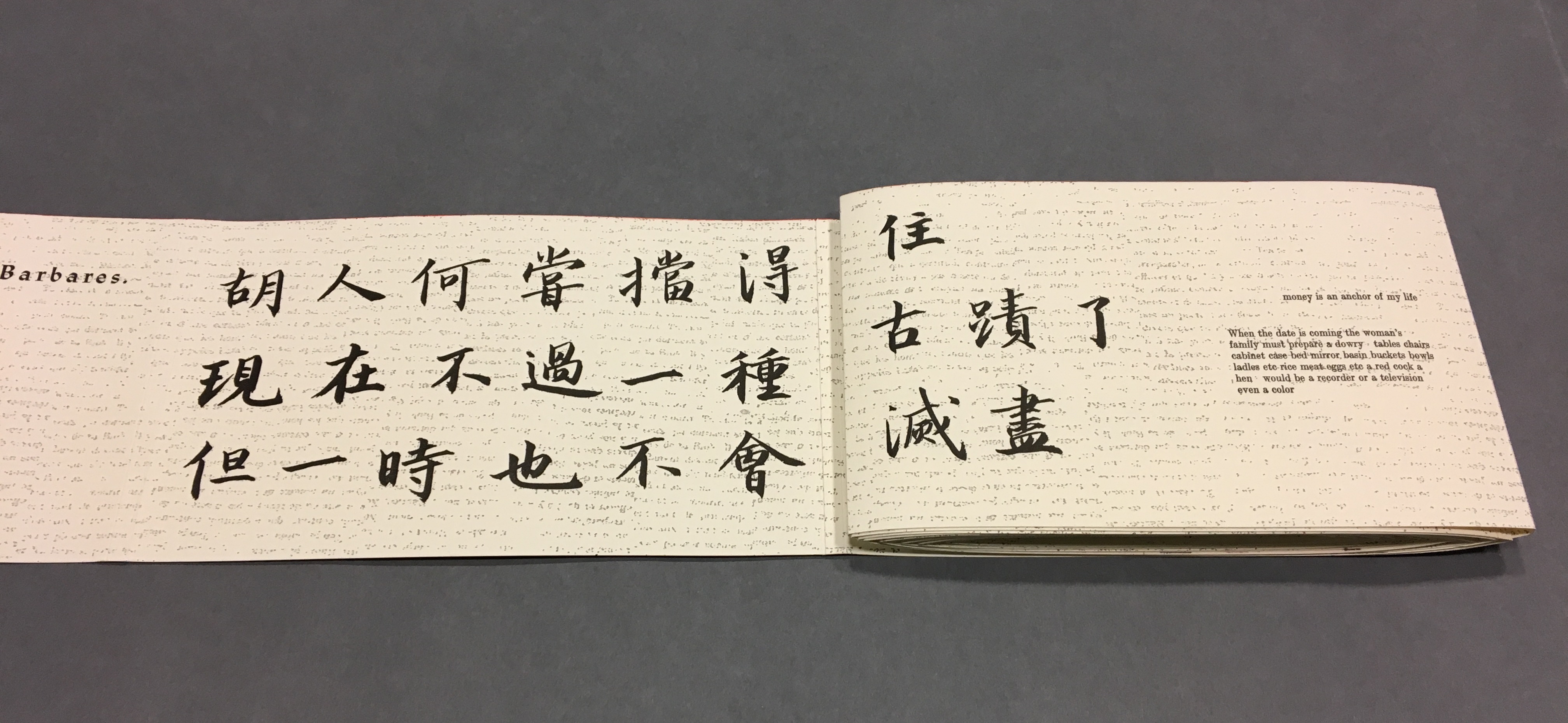
其實,從來不過徒然役死許多工人而已,胡人何嘗擋得住。現在不過一種古跡了,但一時也不會滅盡,或者還要保存它。

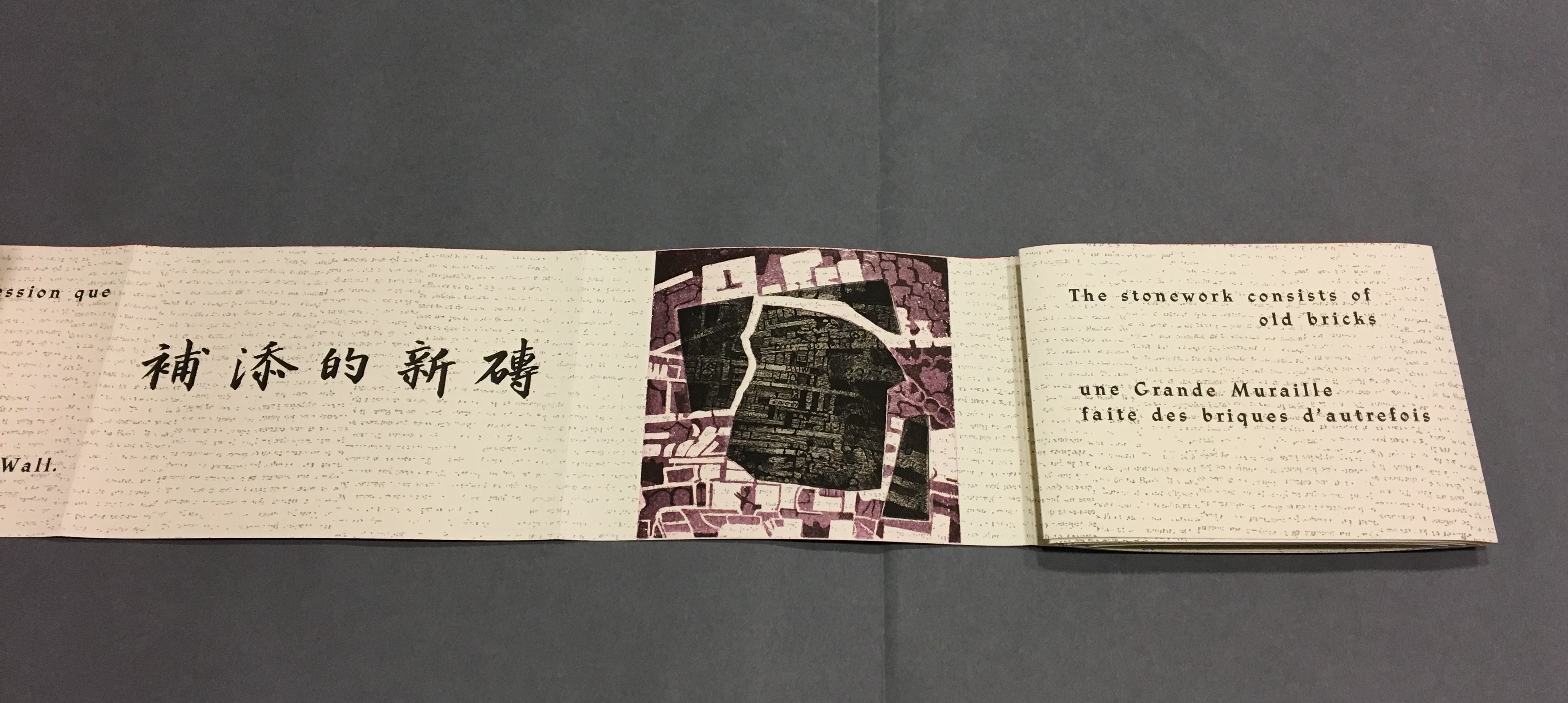
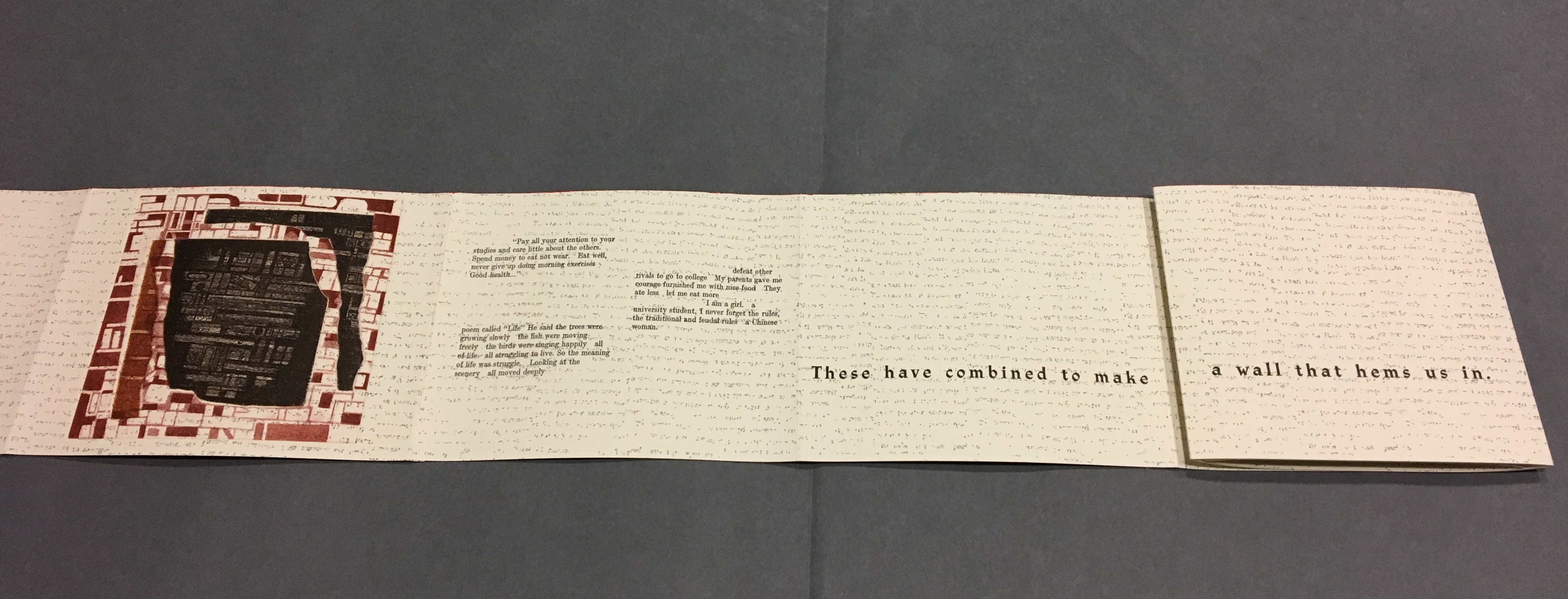
我總覺得周圍有長城圍繞。這長城的構成材料,是舊有的古磚和補添的新磚。兩種東西聯為一氣造成了城壁,將人們包圍。

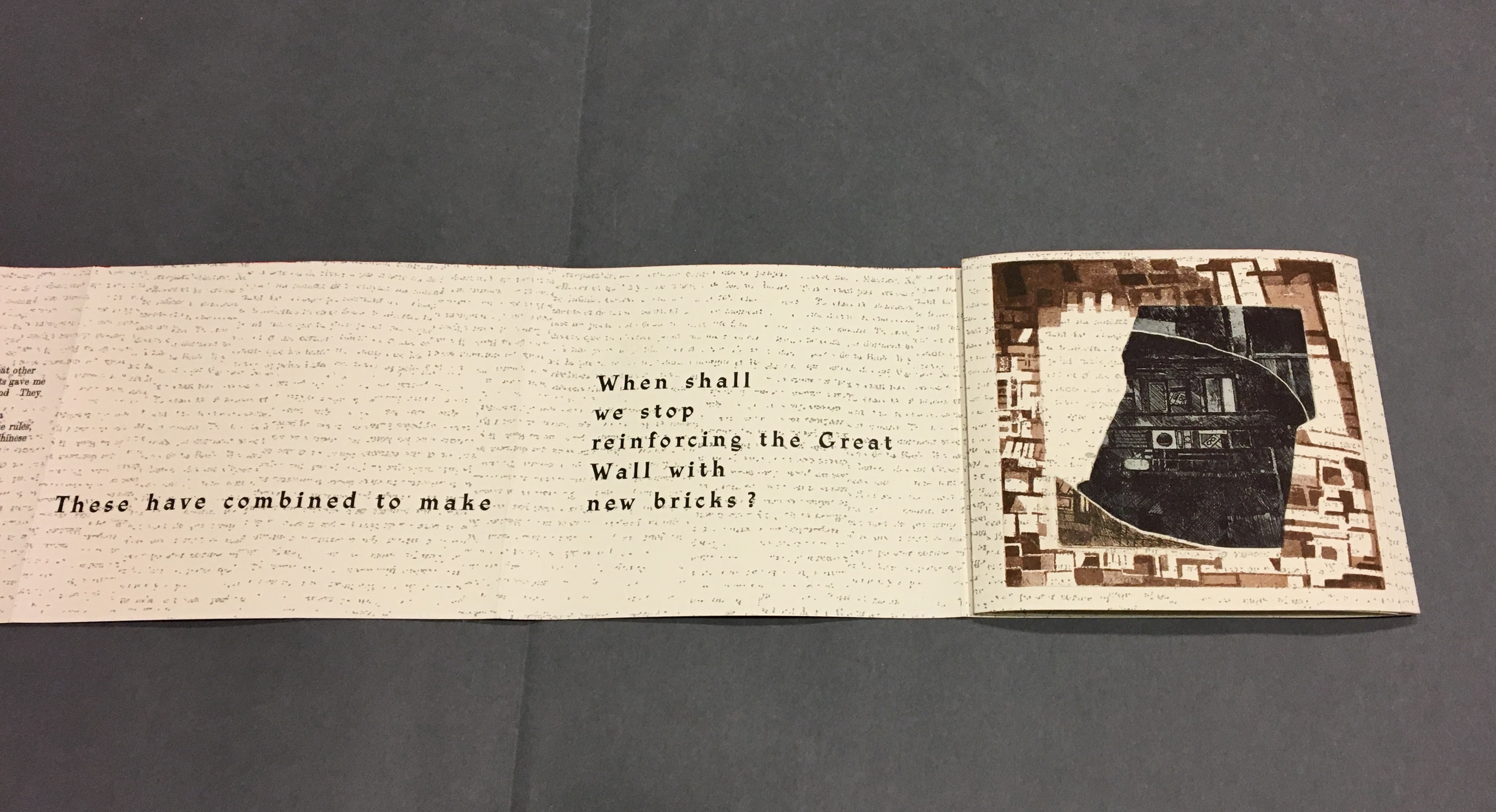
何時才不給長城添新磚呢?

這偉大而可詛咒的長城!

Reading the images

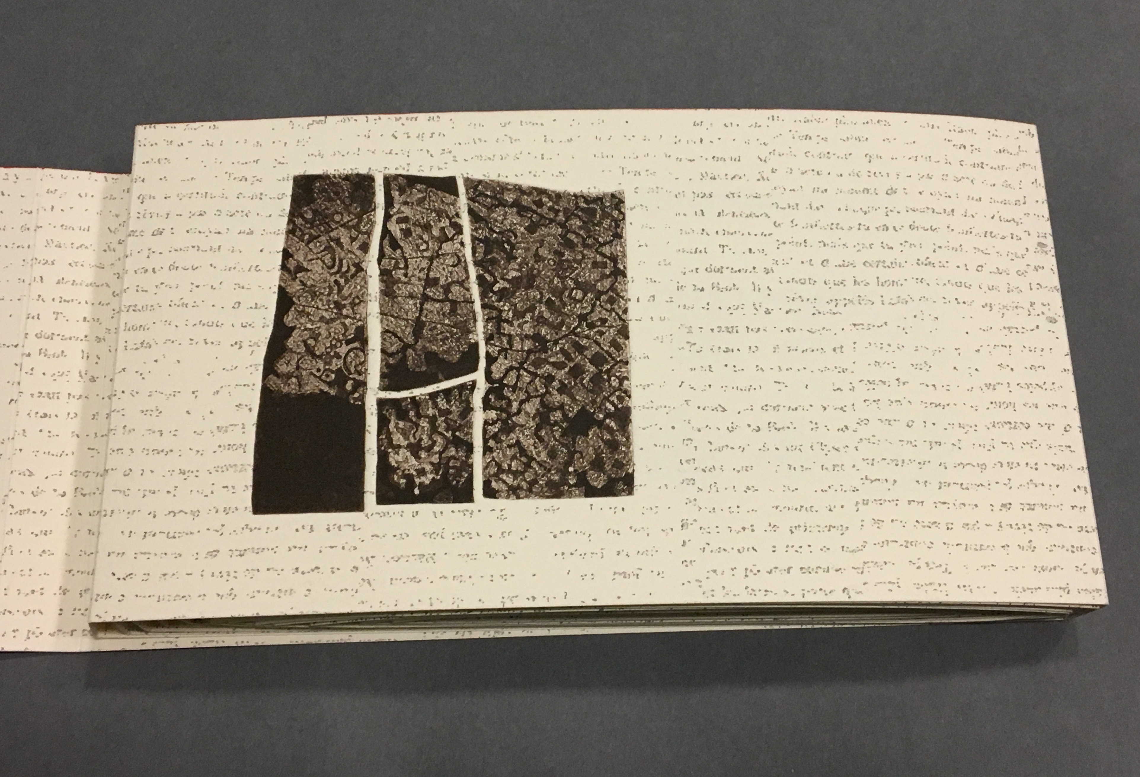
Even though following the forme en escargot results in having reading both sides of the scroll in the end, Sharoff also uses it to play with the notion of intended sequence. Completely unrolled and standing on its edge, the work echoes the Great Wall.  The tint of red along the top edge recalls the blood spilled in the Great Wall’s construction. The prints echo the Great Wall’s bricks, the vegetation in its crumbling gaps, even the gates. The completely unrolled work is an intended sequence, also — an invitation to walk the wall. Coming upon each of the eight copperplate engravings in the unfolding sequence is a different experience than walking up and down the “outer wall” and then the “inner wall” to see them. Five are on the outer wall, three on the inner.

The print first to be seen as the book unfolds, but one of the three on the “inner wall” with the book unrolled.

The second print comes into view on “page 14”, the second of Lu Xun’s statements begins in French on “page 15”,
and with the rolling up on the left, “page 4” has reappeared.
With the turning of “page 15”, the third print comes into view on “page 16”, and the sentence begun with “Actually” on “page 16” continues on “page 17” above the Chinese.
“Pages 16, 18-19”
The French at the top of “pages 18-19” is continuing the sentence from “page 15”, and the English beneath on “page 18” is continuing the sentence from “page 17”.
With this spread — “pages 16, 18, 20-21” — the fourth print comes into view on the right, and the French and English sentences conclude together in the middle.
“Pages 30, 32-33” and the fifth print comes into view.
“Pages 38, 40-41” and the sixth print comes into view.
“Pages 44, 46, 48-49” and the seventh print comes into view.
Pages 50, 54-55 and the eighth and final print comes into view.

Reading the form “in time”

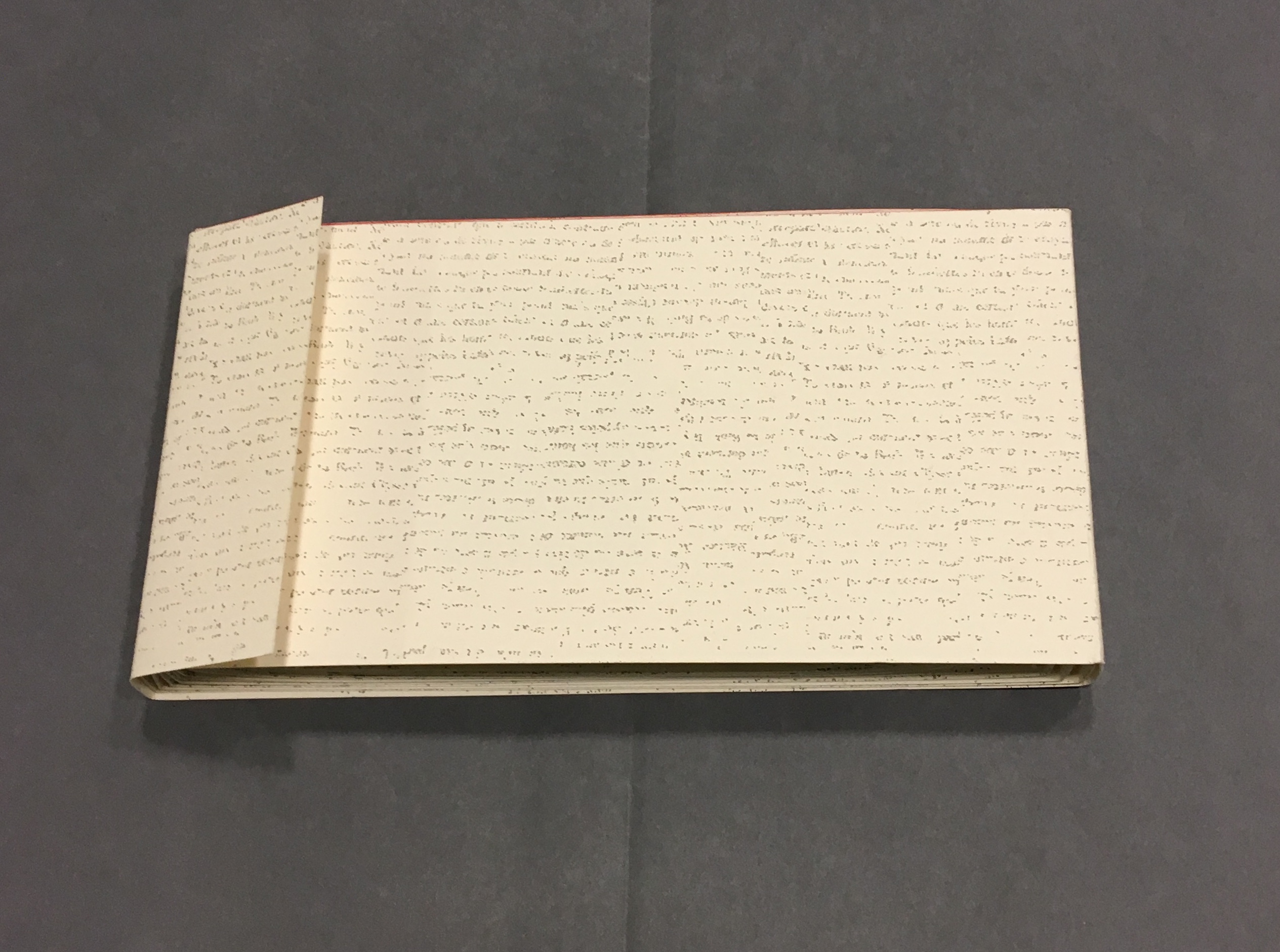
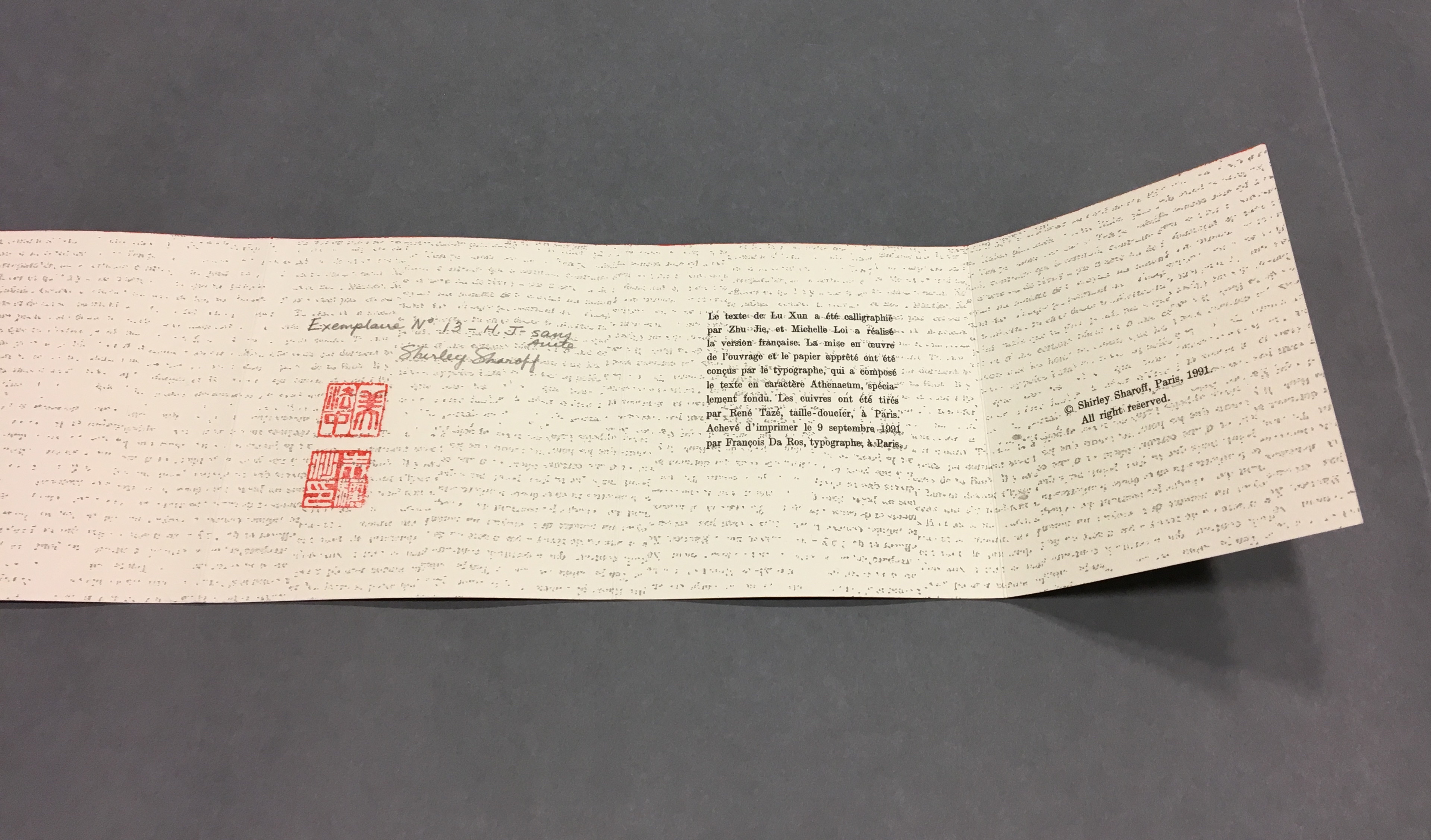
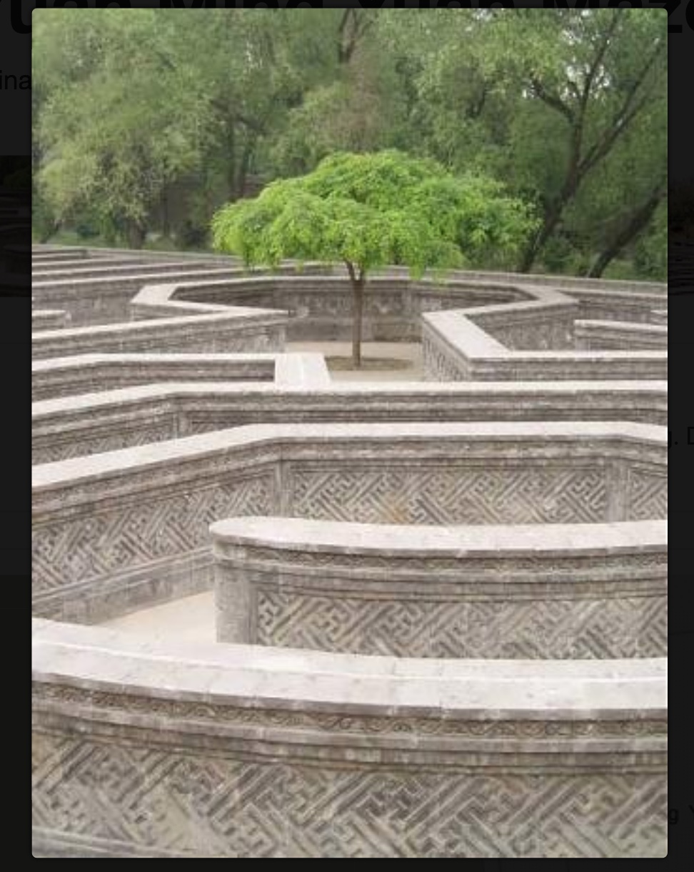
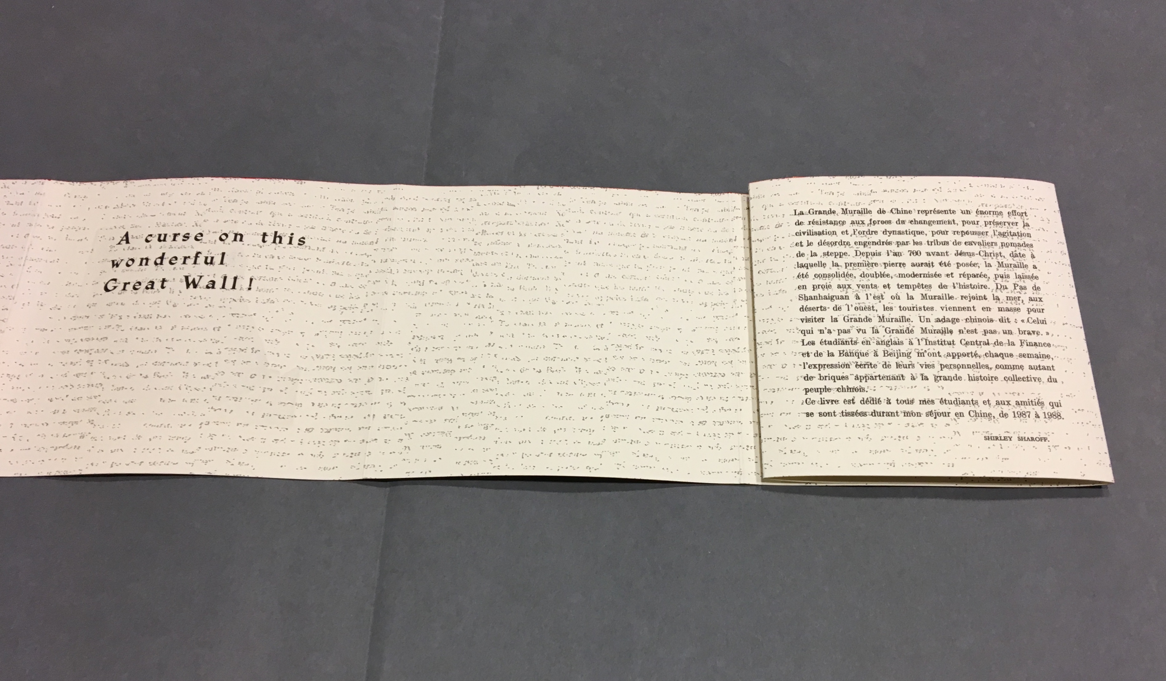
As the force of the snail-shell binding resists the unscrolling and pulls the standing pages inward, the work has another echo: the eroding maze in the Ancient Summer Palace (Yuan Ming Yuan) outside Beijing. The faint markings on the paper, created by printing the results of repeated photocopies of a manuscript, amplify the echo.

La grande muraille/The Great Wall (1991)
Shirley Sharoff
Photo credit: © Koopman Collection. National Library of the Netherlands/Jos Uljee
Arches paper printed with the results of multiple photocopies of a manuscript.

Although Lu’s text does not mention the maze, Sharoff introduces contemporary text that, alongside the interweaving Chinese, English and French of Lu’s text, evokes a maze-like, time-travelling effect. The autobiographical texts from the English-language students she taught at the Central Institute of Finance and Banking (1987-88) reflect on their childhood and adolescence in the Maoist era and their recollection of representations of  foreigners in books and television. These “new bricks” in their modernness and fracturedness interrupt the flow of Lu’s prose praising and cursing the Great Wall.  Yet, in their segmentation and placement, they also physically echo the prints and reinforce Lu’s expression of the paradox in the construction, fragmentation, reconstruction and erosion of the real Wall.

“Pages 32, 34-35”

Sharoff’s La grande muraille is a treasure that rewards repeated visits and contemplation: not only for itself but also as a parallel or forerunner.

La grande muraille’s physical impetus (The Great Wall), the seemingly decipherable/indecipherable characters on the Arches paper, the wry paradox of Lu Xun’s observations, the socio-political-cultural implications of the “new bricks”, the work’s innovative form and the pulling of past and present together parallels the work of Xu Bing and his play with language across East and West. His Book from the Sky first appeared in 1988.

Sharoff’s use of Lu’s contemplation on The Great Wall also foreshadows Jorge Méndez Blake‘s Capítulo XXXVIII: Un mensaje del emperador / A Message from the Emperor (2017?). The title refers to an anecdote in the story “The Great Wall of China” by Franz Kafka, a contemporary of Lu Xun.  The narrator tells the reader how the emperor has dispatched from his deathbed a message to the reader, entrusted to a herald who, struggling as he might, cannot escape from the confines of the palace to deliver the message — yet which we the reader await hopelessly and with hope.

What more should we expect from art?

____________________________

*For help and permissions, thanks to Paul van Capelleveen and the staff at Koninklijke Bibliotheek, Den Haag, and Shirley Sharoff, Paris. For help with the Chinese and calligraphy, thanks to Bee Leng Bee and Yingxian Song.

Further Reading

Shirley Sharoff (1). Books On Books Collection.

Shirley Sharoff (2) “. 1 August 2020. Books On Books Collection.

Hubert, Renée Riese, and Judd David Hubert. 1999. The Cutting Edge of Reading : Artists’ Books. New York City: Granary Books. See pp. 24-27 for the Huberts’ reading La grande muraille.

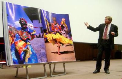
Bookmarking Book Art – “Bhutan: A Visual Odyssey Across the Last Himalayan Kingdom”

Standing open at 7 foot by 5 foot, is it the world’s largest bound book? The result of Michael Hawley‘s research and field expeditions out of the Media Lab at the Massachusetts Institute of Technology, it is certainly the iMax of books.

Bhutan book presentation
Book Arts Collection, University of Washington Libraries

News coverage:

Compare and contrast:

  • Yale’s Beinecke Library’s double elephant folio of Audubon’s Birds of America.
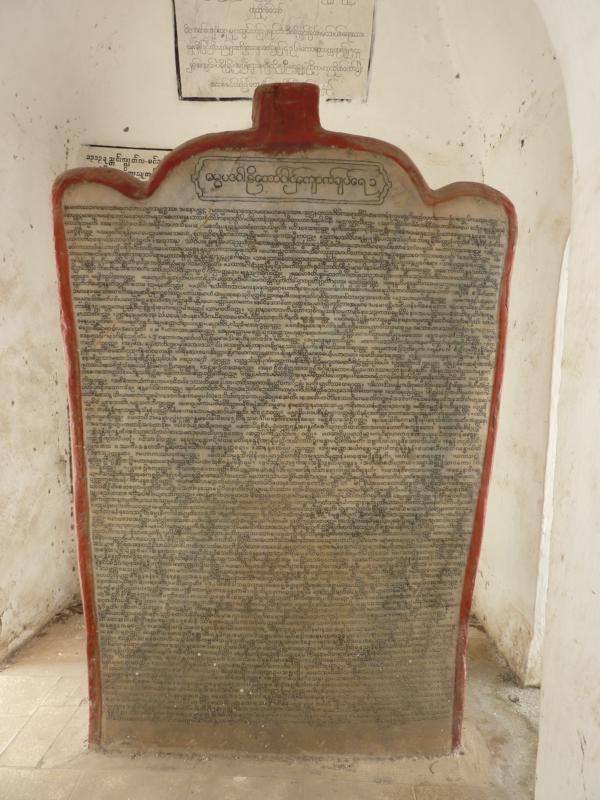
  • The Marble Books at Kuthodaw and Sandamuni, Mandalay, Myanmar.
Dhammapada Page 1/4, Kuthodaw (1868)
Photographs by Anandajoti Bhikkhu
  • Other forms of large-scale book art can be found here.

Bookmarking Book Art – Ioana Stoian

It took a long look at the development of Ioana Stoian’s work to show me the relationship of trompe l’oeil to book art — and to appreciate how an artist can invent herself.

Stoian’s apprenticeship as an artist began with the decorative arts in 2004 in Lower Normandy, France, and has taken her to New York (MoMA), Cologne, Vienna, Salzburg, Minneapolis, Ostende (Belgium), Kadoide (Japan), Amsterdam (the Stedlijk) and, as of 2015, back to Minneapolis, where she is a Jerome Foundation fellow at the Minnesota Center for the Book Arts.

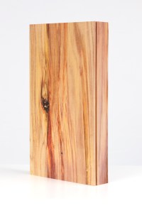
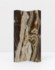
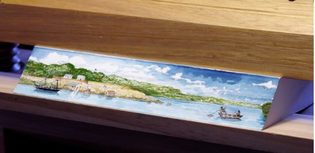
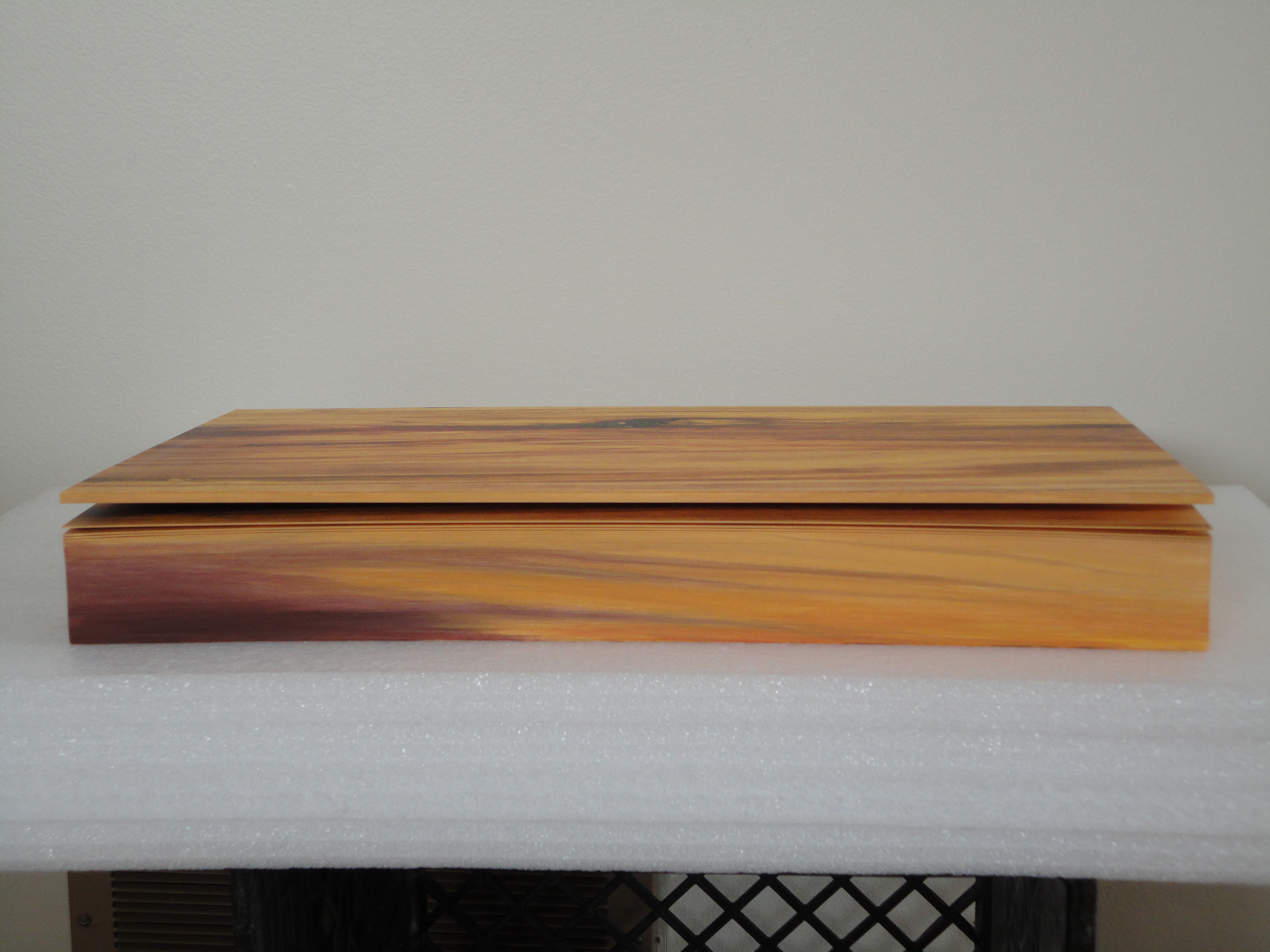
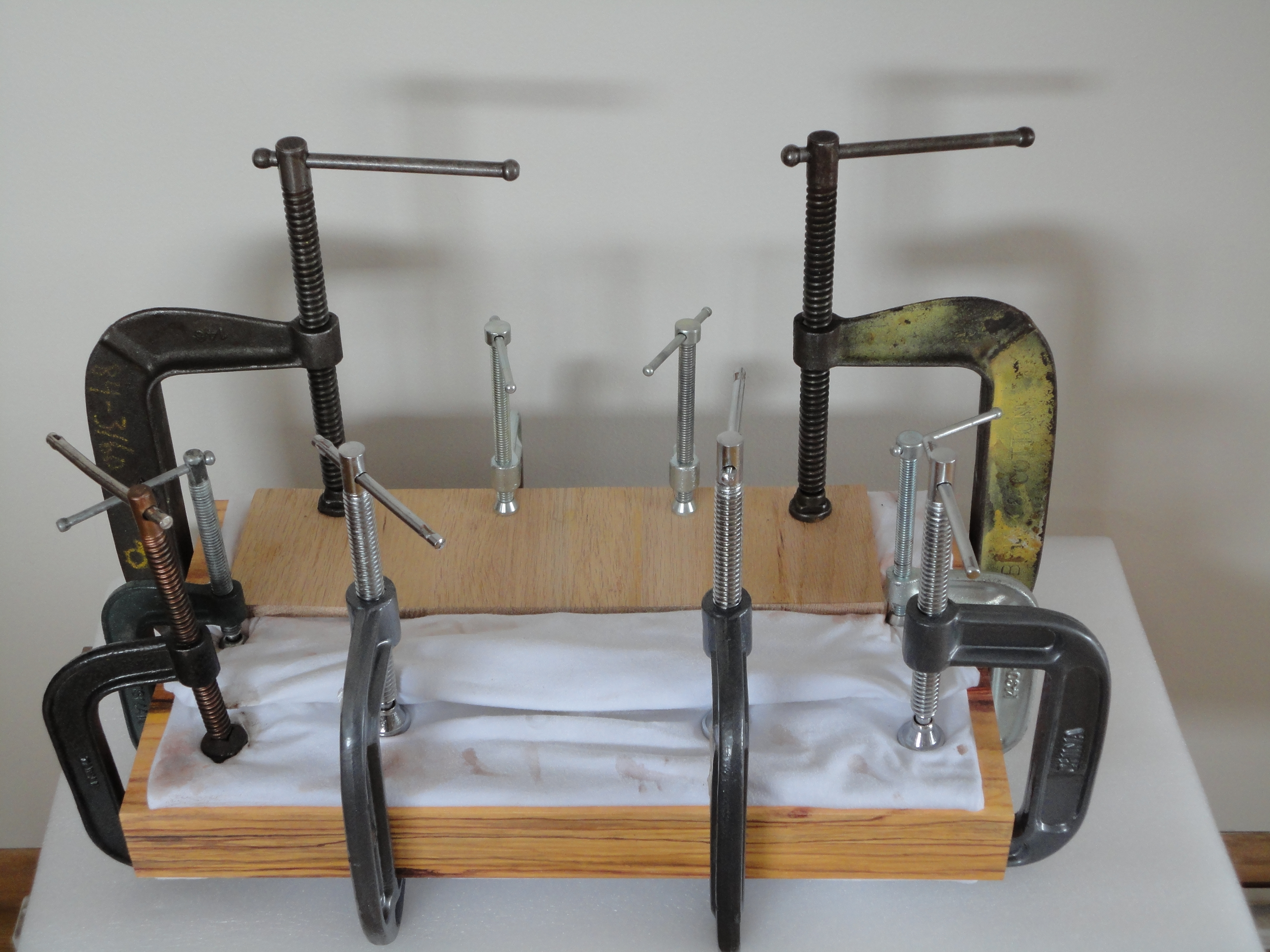
Stoian’s time as an assistant artist with the Scottish painter Lucy McKenzie, starting in 2008, honed her skills in deceiving the eye with faux woodgrain and faux marbling. For example, see McKenzie’s 2008 installation at MoMA, 2009 installation at the Ludwig (Cologne), 2011 installation at the Galerie Buchholz and 2013 installation at the Stedelijk. One may wonder whether Daniel Buchholz’s roots in antiquarian books or the Stedelijk’s in artists’ books prepared the ground for Stoian’s artistic direction toward book art and paper art, but book art and trompe l’oeil joined spectacularly in 2014 when Stoian had the chance to work with Tauba Auerbach in 2014 on the completion of Auerbach’s Wood and Bent Onyx. Stoian handpainted the fore, top and bottom edges of the book blocks in watercolor pencil and paints to match the color and grain of the prints of wood and marble digitally offset on pages of Mohawk superfine paper. As a technique, fore edge painting dates to the 16th century, and the “vanishing” variety, where the painting appears only when the pages are pressed and fanned out, dates to the 17th century. Over time, a standard type of press developed to hold the “canvas” of page edges evenly fanned to accept the painting.

Wood (2011)
Tauba Auerbach
Digital offset printing, Mohawk superfine paper, 55 pages,
hand painted edges 
closed: 43.2 x 24.1 x 5.1 cm
© Tauba Auerbach. Courtesy Paula Cooper Gallery, New York.
Photo: Steve Probert
Bent Onyx (2012)
Tauba Auerbach
Digital offset printing, Mohawk superfine paper, Japanese tissue,
hand painted edges
closed: 43.2 x 16.5 x 16.5 cm
© Tauba Auerbach. Courtesy Paula Cooper Gallery, New York.
Photo: Steven Probert.
Still from “Fantastically Fast Fore-edge Painting by Stephen Bowers
Friends of the State Library of Australia
18 February 2013
Stephen Bowers’ fore-edge painting on a copy of A Narrative of a Survey of the Inter-tropical and Western Coasts of Australia by Phillip Parker King, son of the third governor of New South Wales
Still from “Fantastically Fast Fore-edge Painting by Stephen Bowers
Friends of the State Library of Australia, 18 February 2013

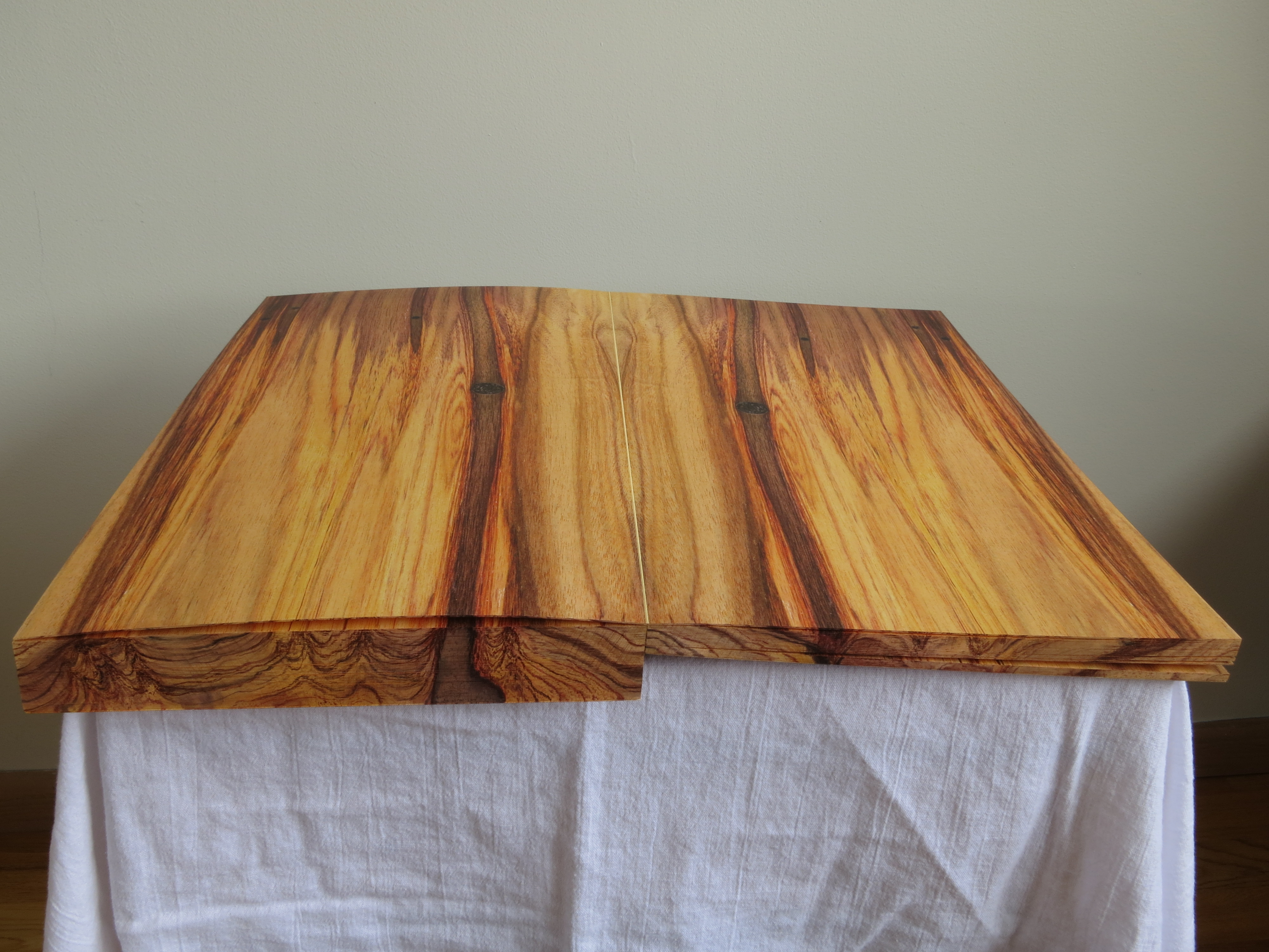
Despite this established history of fore-edge painting, Stoian had to fall back on a mastery and technique that come from her apprenticeship work, inventiveness and meticulousness. These books were very heavy and the pages were very thick …. There was absolutely no way to fan the pages.  I went through the book, page by page, and made marks of where the wood/ marble veins were located.

Before Stoian started work on Wood

Then I clamped the book so that water wouldn’t seep in and using my ‘map’, I recreated the wood/ marble. As you can imagine, it was challenging to match the inside spreads. I had to constantly unclamp, verify that I was matching the spreads, re-clamp, paint, wait…

I used both watercolour pencils and paints. Needless to say, it’s very hard to erase watercolour without using lots of water and saturating the page. I had to be careful with every single brush stroke I made.  

Finished

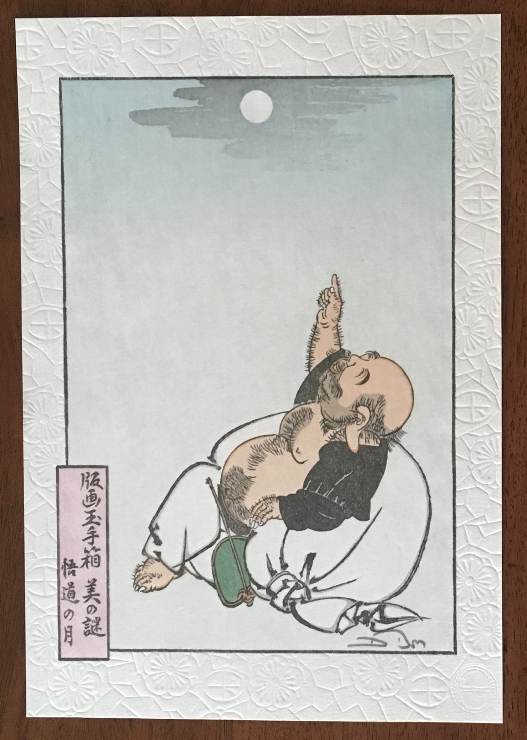
There is something Zen-like about trompe l’oeil in the attentiveness to detail, to material, to execution.  But there is more. To mangle a Zen saying:  Trompe l’oeil is more than a pointing at the moon; those who gaze only at the pointing will never see beyond — never see the beauty of the moon, never see the beauty of the pointing. With the best of trompe l’oeil, that moment in which the eye is fooled recurs again and again for the attentive viewer. In its recurrence, the work of art alternates between the self-referential (the mind drawn to the pointing) and the mimetic (the mind drawn to the pointed at).

Moon of Enlightenment (2010)
David Bull
From a design by Tsukioka Yoshitoshi (1839-92) in his series “One Hundred Aspects of the Moon”.
The Zen saying is “All instruction is but a finger pointing to the moon; and those whose gaze is fixed upon the pointer will never see beyond. Even let him catch sight of the moon, and still he cannot see its beauty.”

So it is not surprising that Stoian has “always been interested in Japanese art and culture”. As early as 2008, origami appears in her commercial decorative work. She is the author of two books: Origami for All with her partner Eric Gjerde (2013) and The Origami Garden (2016). In reviewing both books for The Fold , Jane Rosemarin commented:

… as I paged through her first book, “Origami for All,” I eventually began to understand that Stoian is an artist who has chosen origami as her medium. Her work is not hard to fold, but it has a consistency of style and a real beauty.

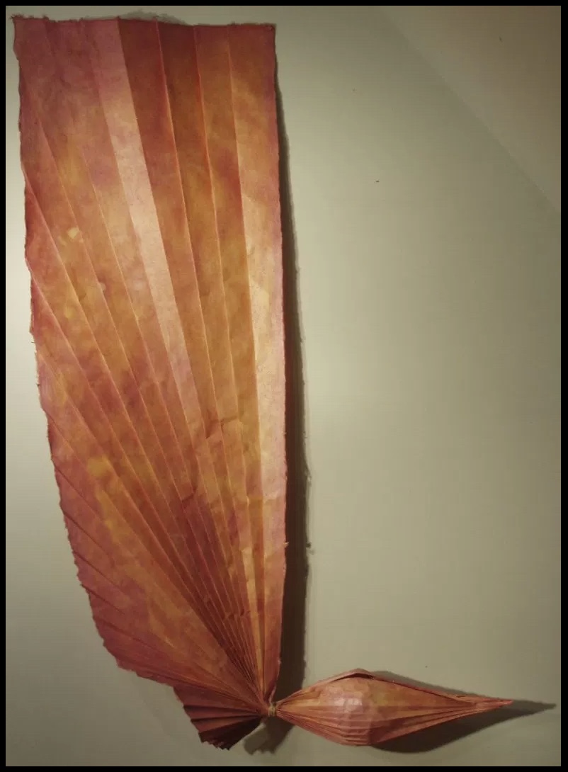
Recognized not only for their origami, Stoian and Gjerde were invited in 2013 to exhibit their paper art at the prestigious Salon des Artisans et Métiers d’Art, held at La Propriété Caillebotte in the village of Yerres outside Paris. While Gjerde’s folds explicitly explore the mathematical (for example, Voronoi tessellations and hyperbolic paraboloids), Stoian’s explore shapes more suggestive of the oriental: cranes and flowers as in Strelizia (2010).

Strelizia (2010)
Ioana Stoian
Pigment on handmade flax and abaca paper
165cm x 59cm
Strelizia (Strelitzia reginae) is a South African plant, known as the “bird of paradise” or “crane” flower.

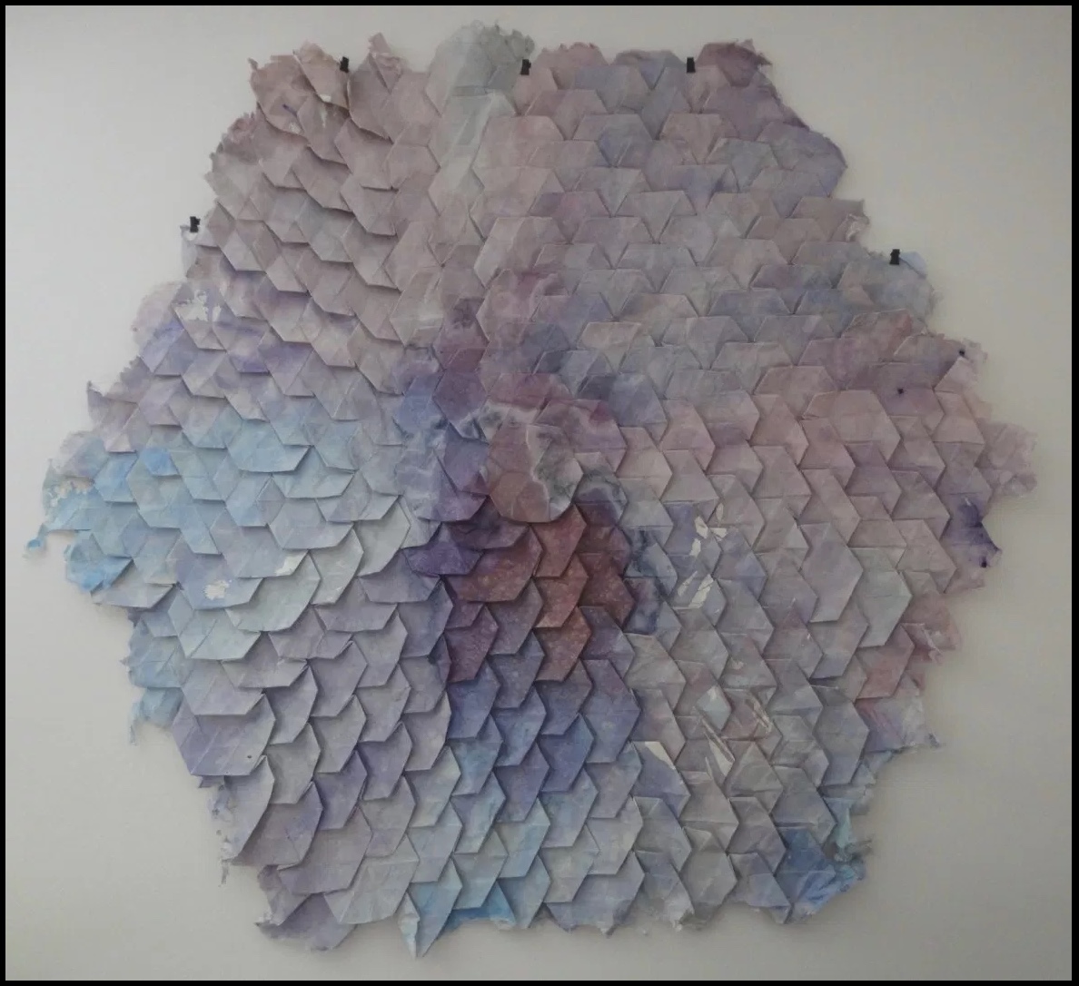
Where Gjerde’s interest in his material has led him to bio-art (paper grown from bacterial cellulose), Stoian’s has hewed to traditional papermaking, which figures consistently in her work: for example, Hidden Within (2010). In 2012, that interest in traditional

Hidden Within (2010)
Ioana Stoian
Hand-made flax and abaca paper
1.3m x 1.3m

western papermaking had turned eastward:

After discovering western papermaking, I became fascinated with thin, strong sheets, which obviously led me to washi – the Japanese paper made from mulberry. I naturally had the desire to go to Japan and see how this paper was made.

It so happens that a friend of mine, Tomoko Fuse (a very talented and well-known female origami artist and perhaps the most published origami author in the world), was at a paper folding event in France. I casually mentioned that I wanted to go to Japan to learn papermaking. Next thing I know, she had very kindly organised for me to spend a month with Yasuo Kobayashi, master paper maker and owner of Kadoide Washi – an offer I could not refuse.

I spent a magical month in the mountains, during the Kozo harvest (December) and had an amazing time learning from a great master.

Yasuo Kobayashi is a fifth-generation papermaker but also a writer and philosopher, whose unique views on papermaking warranted his inclusion in the American Folklore Society’s sponsored report on apprenticeship and papermaking. Yasuo Kobayashi told the report’s author, Aimee Lee: “I wanted the kozo to tell me what kind of paper it wants to become, not to force it to be what I want. This is not typical for papermakers. I want kozo to be my teacher.” When asked to elaborate,

… Kobayashi compared bunka (culture) and bunmei (civilization). “Bunka is what you think from your heart.” In contrast, bunmei’s goal is to develop constantly, exemplified by the western desire for progress: people do not want today and tomorrow to be the same—they want things to be less difficult and more convenient. This mindset cannot translate to making real paper. His grandfather’s and father’s lives were not very different. His father’s and his lives were a little different. But his son’s and his lives are so different that it is hard to relate across that rift. He sees two roots for the future of paper: growers and makers. Real kozo goes with the heart but is inconvenient and does not follow progress. Kigami [paper] comes from the root “to be born,” and this word also relates to breathing. When born, paper is like a child: weak, but growing stronger over time until it dies. He knows that his point of view is rare, but also said people must balance bunka and bunmei, rather than to go absolutely one way or another. Today, the balance is too heavy on the professional side, so he tries to balance this by leaning towards the growing side.

Stoian’s jump at the chance to learn from him is consonant with her “journeyman’s” approach to her artistic development. Note that the visit to Kadoide Washi precedes the work on Wood and Bent Onyx for Tauba Auerbach in 2014. The methodical diligence required in making washi and the resulting appreciation of the properties of paper re-present themselves in Stoian’s mapping of the grain and perceiving what the works and the paper “wanted”. The impressive fore-edge work with Wood and Bent Onyx now seems inevitable, rising from a combination of technique and deep appreciation of color, material, form and structure in the service of illusion. In her own work, Stoian strives toward bunka, which is evident in works like Strelizia and Hidden Within, where the form and color her handmade paper takes combine to convey feeling — or “heart” as Kobayashi might put it. Her aim has become even clearer during the Jerome Foundation stage of her “journeyman’s” journey.

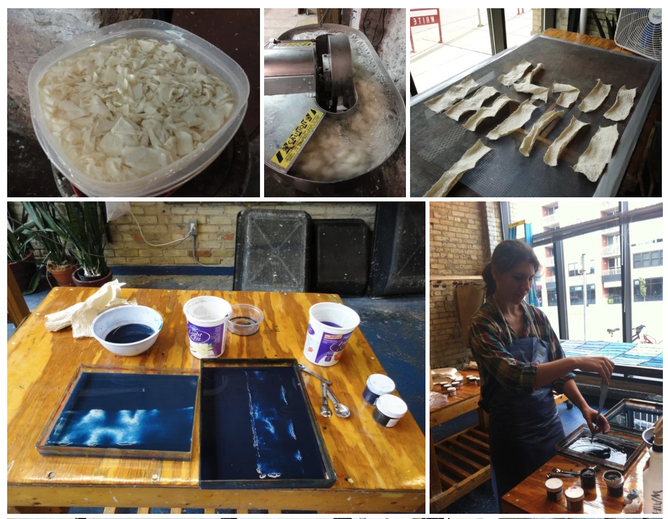
Stoian received the Jerome Foundation Mentorship grant for 2014/15 at the Minnesota Center for Book Arts to create an artist book — an extraordinary artist book. The mentorship program  offers emerging artists the resources to create a book, fusing together newly acquired skills with aspects of their own artistic practice. The grant provided one year of 24-hour access to the Center’s facilities, a mentor, and a series of introductory workshops on paper making, letterpress printing, and book binding.
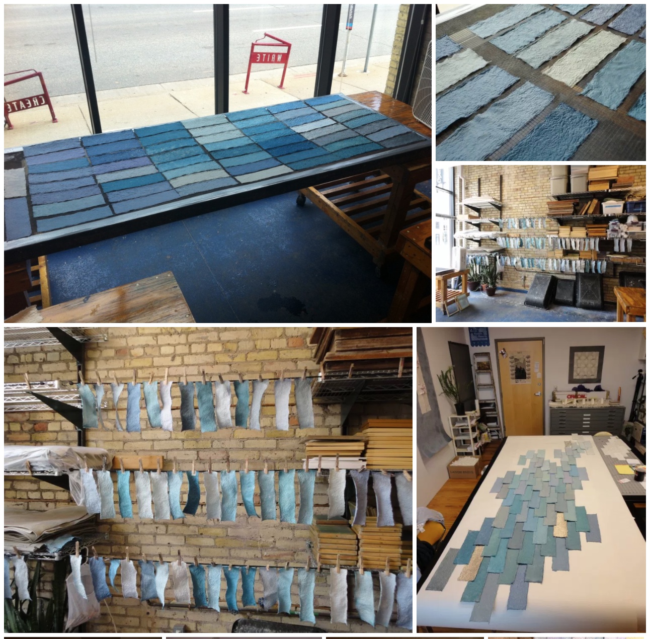
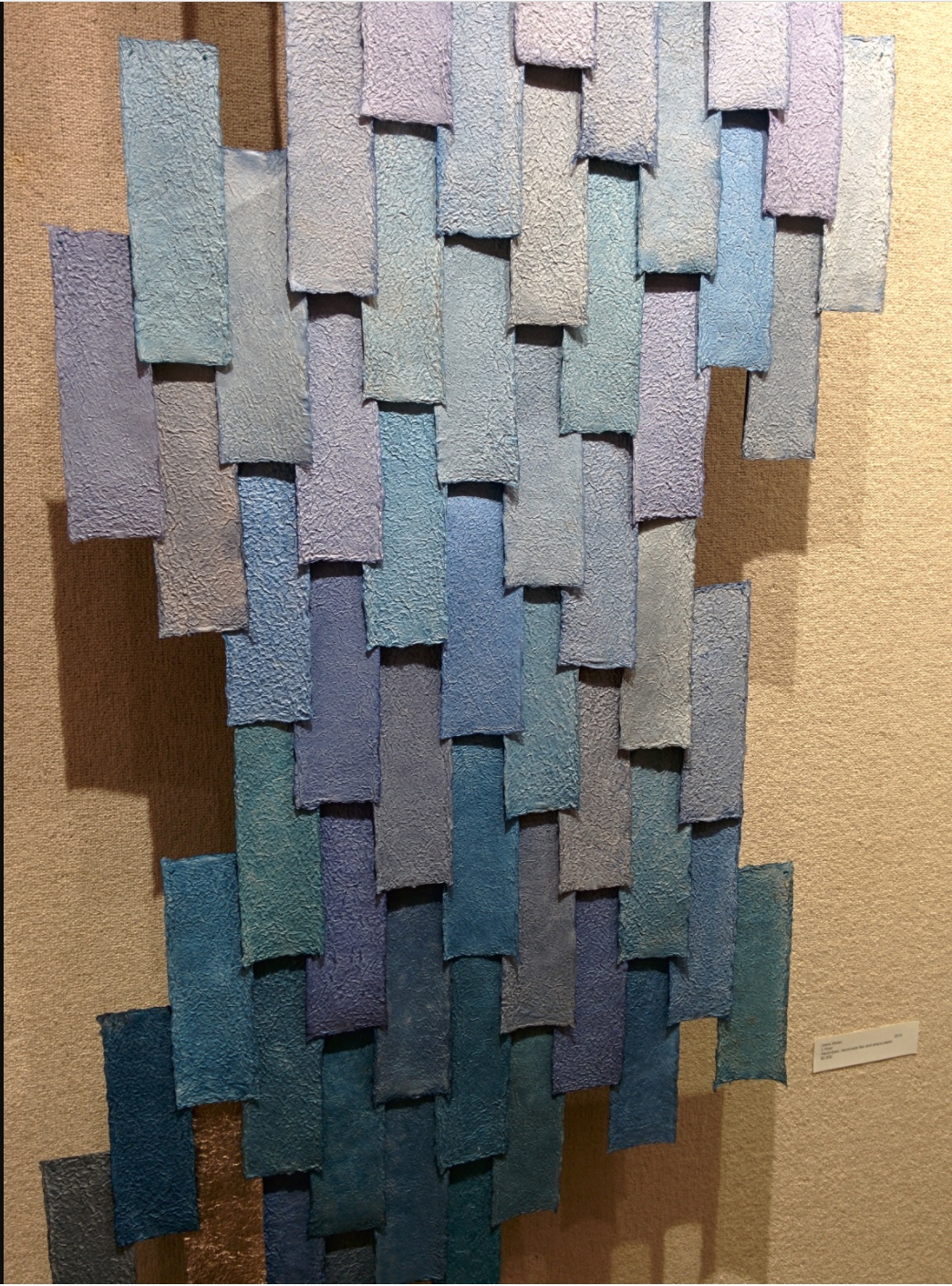
Responding to her new wintry environment, Stoian embarked on l’hiver (2014), a new work consisting of 80+ individually hand-made and dyed pieces of paper. L’hiver is reminiscent of Hidden Within (2010) in its pursuit of a harmony of color, structure, and form. The former is perhaps more open than the latter and lets each part’s snowflake-like uniqueness assert itself.

l’hiver (2104)
Ioana Stoian
Hand dyed, handmade flax and abaca paper
3m x 1m

The congruence and continuity of those two works do nothing to prepare the viewer for Nous Sommes (2015), the artist’s book that follows them. While Nous Sommes continues Stoian’s aim of harmony among color, structure and form, while its intensity of colors harks back to the stencil work for Lucy McKenzie’s Stedelijk exhibition in 2013, the structure and form Stoian chose marks a bold departure.

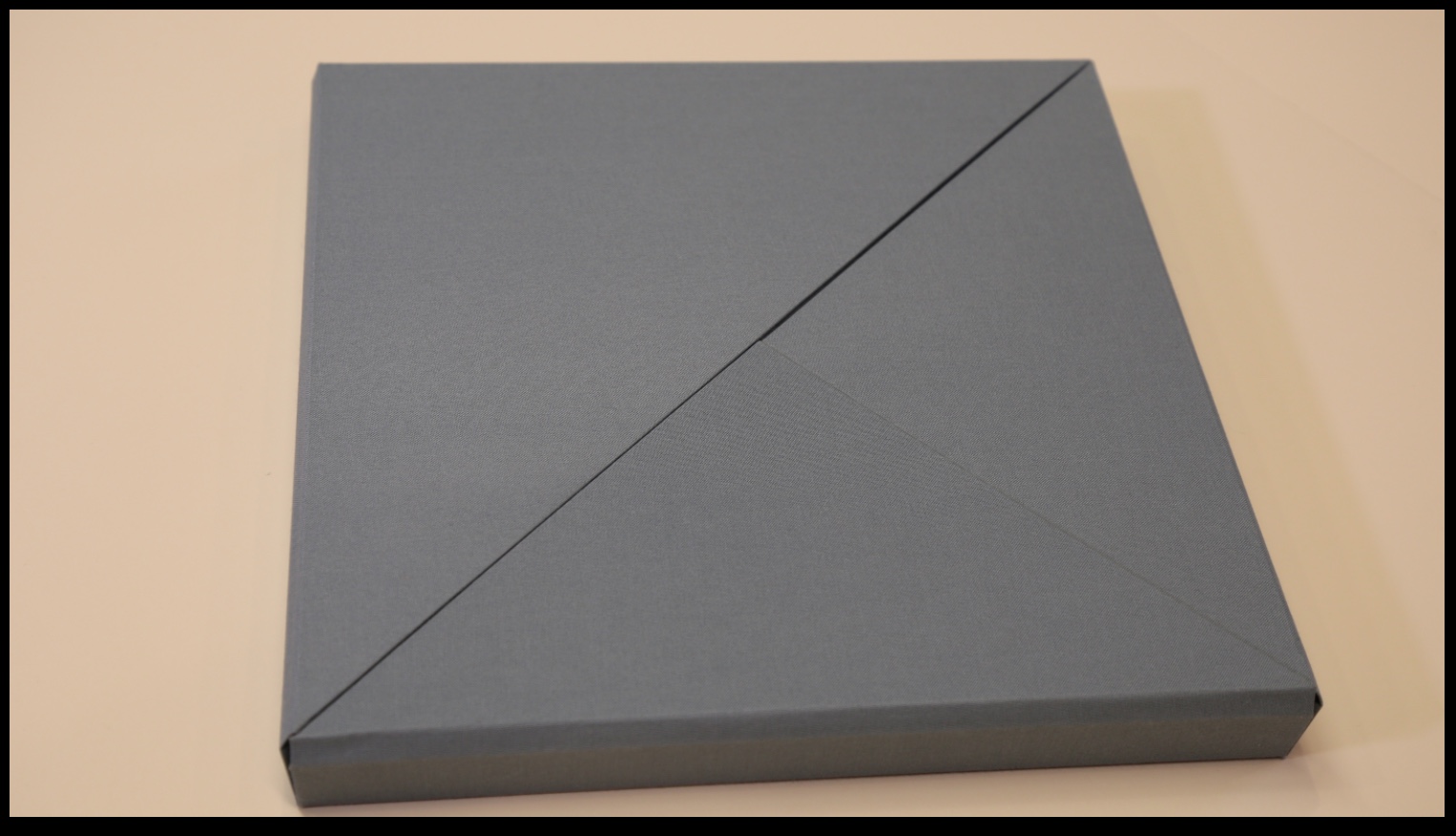
The cover and binding of Nous Sommes has the feel of a Solander box.  The book opens in a particular order of lifting the triangular flaps, one of which displays the “Table of Contents” and another the colophon. 

Nous Sommes (2015)
Ioana Stoian

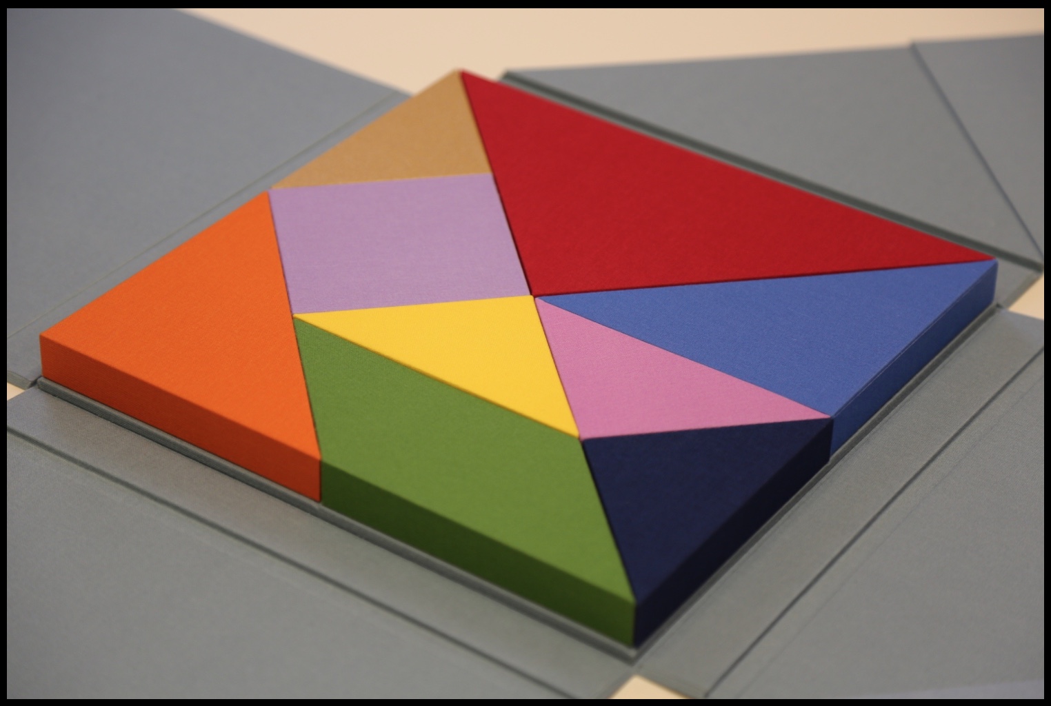
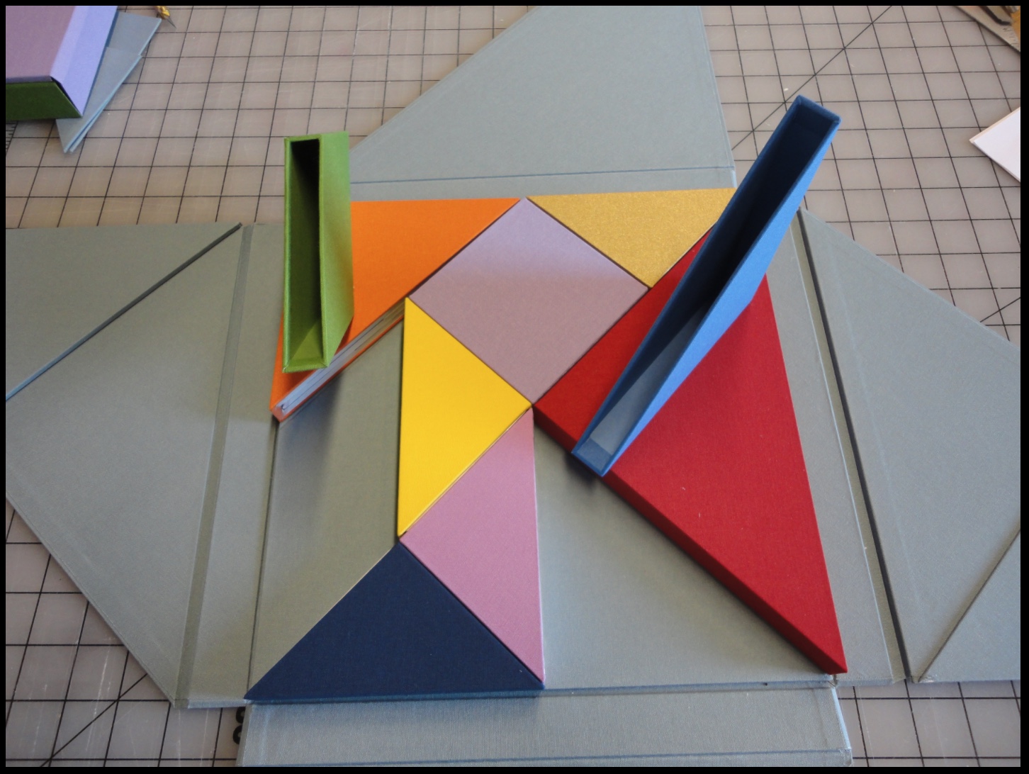
Nous Sommes has nine “chapters” or differently sized, shaped and colored slipcases whose material matches that of the cover and binding. The chapters fit precisely together (tangram-like), but the order of their reading lies with the reader’s choice of color, shape or size. The video provided by Stoian and Gjerde offers one of many readings of the work.

Nous Sommes (2015)
Ioana Stoian
Empty “chapters”
Nous Sommes (2015)
Ioana Stoian

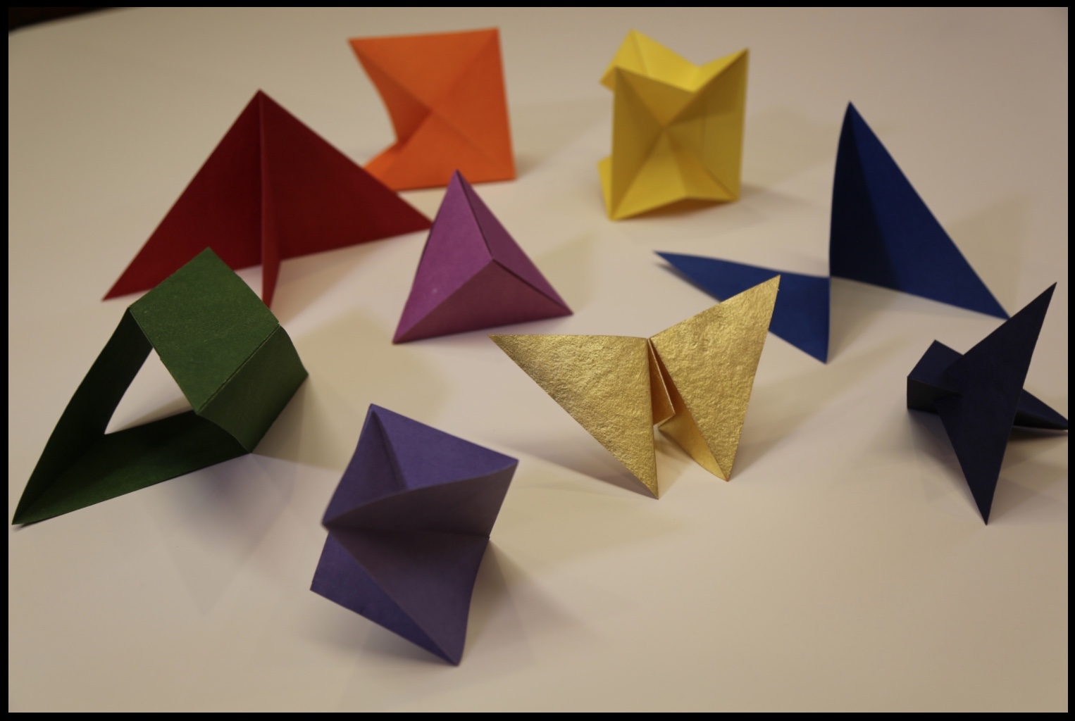
Within each chapter is a precisely fitted paper structure to be “read” by unfolding, positioning, displaying, contemplating and, in conclusion, returning it to its chapter/slipcase.

“Contents” of nine chapters/slipcases
Nous Sommes (2015)
Ioana Stoian 

Commenting on Strelizia, shown earlier, Stoian writes,

I am interested in intuitive color experiments; this work represents the flow from mood to colour, with the final form of the paper manifesting itself from these captured emotions.

In Kandinsky’s footsteps, perhaps, this artist finds and aims to offer the spiritual in art. The title Nous Sommes suggests so. Whether the expression “we are” applies to the art object (self-referentially) or to its audience (individually or collectively), form, structure and colors assert community, inclusion and a fitting together. 

We can look forward to Stoian’s next chapter as she has received a follow-on appointment from the Minnesota Center for the Book Arts: the 2017/18 Jerome Foundation Fellowship.

Bookmarking Book Art – Eric Gjerde

Specimens, 2016 Close-up of finished pressed page. Laser cut text pressed within 5 layers of bio-paper to form one large single sheet. © Eric Gjerde
Specimens, 2016
Close-up of finished pressed page. Laser cut text pressed within 5 layers of bio-paper to form one large single sheet.
© Eric Gjerde

Specimens is the first of its kind: a book created with a new bio-paper medium made entirely from bacterial cellulose. Its pages were once alive.

The quality of this new paper, which I developed over the past seven years, is its unparalleled strength and transparency. Each sheet is grown in a vat and harvested after several weeks. After processing, many layers — five or more — are laid on top of one another with the text block carefully placed within. Then the entire stack is pressed. The act of pressing these sheets is what gives them their strength.

Trapped forever within the thin lamina of Specimens’ pages is the poetry of e.e. cummings. The challenge of retaining the poet’s complex typographic wordplay required a new approach for placing text. Drawing upon my fascination with Voronoi tessellations — the natural pattern of cell structures in all living things — I created custom software to generate a Voronoi framework that would hold the text in place. The text block was then laser-cut from Korean hanji.

I would like to thank the Jerome Foundation and Minnesota Center for Book Arts for the opportunity and support to explore this exciting new medium. (Artist’s statement)

Gjerde’s Specimens exhibition — November 2016 through February 2017 —  continues in the new tradition of bio art.  One of the earliest and abiding proponents has been George Gessert. Since the 1980s, Gessert and artists/theorists such as Suzanne Anker, Eduardo Kac, Marta De Menezes, the Harrisons and Sonya Rapoport have constituted the bio art and eco art movements.  A collection of his essays appeared as Green Light: Toward an Art of Evolution in the Leonardo Book Series, published by The MIT Press in 2010.

More recently Dr. Simon F. Park’s  The Origin of Species was touted as  perhaps “the first book to be grown and produced using just bacteria”. Presented at the Edinburgh International Science Festival, the small book has pages made of bacterial cellulose, produced by the bacterium Gluconoacetobacter xylinus (GXCELL). Its cover is even printed with naturally pigmented bacteria.

Artist: Dr. Simon F Park The Origin of Species "The small book shown here was grown from and made entirely from bacteria. Not only is the fabric of its pages (GXCELL) produced by bacteria, but the book is also printed and illustrated with naturally pigmented bacteria. " Posted 27 March 2016 Photo credit: Dr. Simon F. Park
The Origin of Species
Posted 27 March 2016
Photo credit: Dr. Simon F. Park

The process underlying Gjerde’s work and its material inspiration — the bio-paper, e.e.cummings’ poetry, Voronoi tessellations and the software-driven Voronoi framework to hold the text block in place — are beautifully explored on his site.

The Voronoi framework is evocative of traditional papermaking technology. Here instead of the “deckle” — the wooden frame holding the mesh on which fibers are caught up from the soupy mash to form a sheet of paper — the Voronoi framework holds the text block between the laminations of the bio-paper.

The union of concept, process and the quality of the work make Specimens an outstanding work.

Books On Books Collection – J. Meejin Yoon

Absence (2004)

A “monument” to the Absence of the Twin Towers, this is a poignant work of book art by J. Meejin Yoon, architect, designer, educator, Professor and Head of the Department of Architecture at the Massachusetts Institute of Technology.  A simple video demonstrating the work appears here at the site of the Otis College of Art and Design. This book|object was published by Printed Matter, Inc. and the Whitney Museum of Art in 2004 when Yoon was an Assistant Professor at MIT.

Absence © J. Meejin Yoon, 2004
Absence
© J. Meejin Yoon, 2004

As you hold this small white brick of paper and turn its thick pages, a small pinhole appears on the page. Then two larger square holes emerge, one of which falls over the pinhole. Page after page — 110 pages for each floor of the towers — the two square holes repeat, creating two small dark wells in the field of white, until on the last page they take their place in the cut-out schematic footprint of the city blocks and buildings surrounding the Twin Towers. What you hold in your hands at the end is an object of art and book of memorial prayer.

Bookmarking Book Art – Xu Bing

I count myself “magpie lucky”.

Bird Swallowing a Fish, 1913-14 Henri Gaudier-Brzeska Kettle's Yard exhibition, 2015
Henri Gaudier-Brzeska, Bird Swallowing a Fish, 1913-14
Kettle’s Yard exhibition, 2015

The Gaudier-Brzeska exhibition, the finale before Kettle’s Yard would close for years, had drawn me to Cambridge. I spent hours there. Exhausted, I was walking back to the train past the Fitzwilliam Museum. I had read somewhere that Xu Bing would have a small solo exhibition at the Fitzwilliam.

from Xu Bing, Book from the Ground: From Point to Point (MIT Press, 2014)

I own a copy of Xu Bing’s Book from the Ground: From Point to Point – a pictographic account of twenty-four hours in the life of “Mr. Black,” a typical urban white-collar worker – and I had seen Book from the Sky at the Odd Volumes exhibition of Yale’s Allan Chasanoff Collection. So I took a chance.

Book from the Sky, 1991 Xu Bing The Allan Chasanoff Collection, Yale University Museum of Modern Art Photograph taken 31 January 2015
Xu Bing, Book from the Sky, 1991
The Allan Chasanoff Collection, Yale University Art Gallery

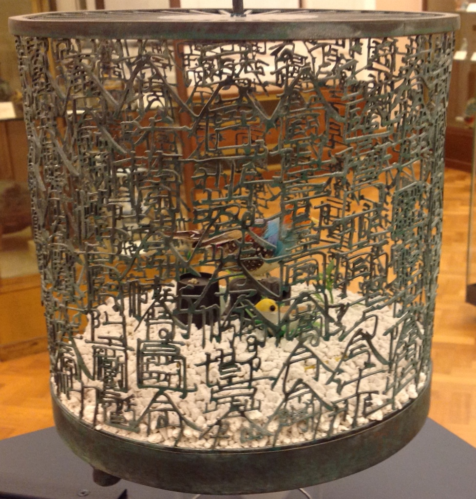
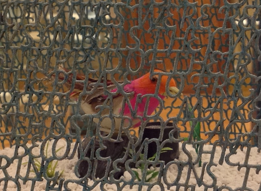
After first not recognizing my mispronunciation of Xu Bing and then hunting through some brochures, the attendants at the information desk directed me downstairs to a room of Chinese porcelain just outside the museum shop.  Among the glass cases of blue and white: Bird Language (2003), four brass and copper birdcages, containing toy birds that sing at the clap of your hands.  The mesh of two of the cages are composed of words in the Latin alphabet, the other two in Xu Bing’s faux Chinese calligraphy. According to his site, “The words are questions that people have asked Xu Bing about art, and his answers.”

Xu Bing, Bird Language, 2003 Four brass and copper birdcages containing sound-activated toy birds, the cage mesh composed of English and "square word calligraphy", gravel.
Xu Bing, Bird Language, 2003
Four brass and copper birdcages containing sound-activated toy birds, the cage mesh composed of English and “square word calligraphy”, gravel.
Detail. Xu Bing, Bird Language, 2003 Four brass and copper birdcages containing sound-activated toy birds, the cage mesh composed of English and "square word calligraphy", gravel.
Detail. Xu Bing, Bird Language, 2003

They remind me of Gaudier-Brzeska’s Bird Swallowing a Fish, just a question of timing and the juxtaposition of two artists fascinated with a union of the animistic and mechanistic? Maybe it is these few other degrees of separation: Gaudier-Brzeska’s catalyzing effect on Ezra Pound in 1913, Pound’s creative misunderstanding of Chinese calligraphy, Pound’s disputably indisputable influence on the author of “Sailing to Byzantium” (1927), whose birds are “Of hammered gold and gold enamelling … set upon a golden bough to sing ….”, and now Xu Bing’s toy birds that require the body not the “Soul [to] clap its hands” and let the birds do the singing.
Xu Bing’s Book from the Sky must have been even more impressive in its Metropolitan Museum display (2013/14) than its partial form at the Yale Gallery (2015) as shown above, but that’s part of the pleasure of conceptual art. Whether billowing overhead on scrolls suspended from the ceiling and walls or juxtaposed in their bound book form with their wooden case, these hand-bound deliberately indecipherable, meaningless Chinese calligraphic forms printed from hand-carved wood blocks sing in the mind and soul. But what is that song? We have the impression of meaning, an impression conveyed by graphic gesture and the traditional containers of meaning. But there is a slippage between the impression of meaning and grasp of meaning.  Perhaps that is Xu Bing’s song.

The Khan Academy’s socio-political take on Xu Bing’s Book from the Sky — comparing it to Ai WeiWei’s performance art of smashing a Han dynasty vase — may usefully decipher the song for some. I think it misses a more profound point that Charlie Bennett approaches in his Aesthetica review of Xu Bing’s installation version of Book from the Ground (just closed on 28 February 2016 at the Centre for Chinese Contemporary Arts in Manchester, UK). The interactive mixed-media installation recreated Xu Bing’s art studio, including double-page spreads of the book pinned up on a wall, over-sized blow-ups of the pictographs from the book and two computers for visitors’ use.

Book from the Ground is also the name of Xu’s language-learning software program, which attendees can access on PCs in the gallery space. When words are typed into the tool, they are transformed into Xu’s pictographic language. It recalls a previous work of Xu’s, Introduction to [New] English Calligraphy (1994), which combines installation and interactive art, as visitors of a simulated classroom attempt to write what seems to be traditional Chinese calligraphy. But in the act of copying out the symbols on display, they realise the characters are reconfigured Roman letters that spell out words in legible English. Book from the Ground goes further in questioning transcultural communication; it instigates dialogue across borders only by negating all cultural differences in a de-localised set of coded representations.

With its English and Chinese birdcages, Bird Language, too, echoes Introduction to New English Calligraphy. But in the viewer’s interaction with the latter, the meaning that emerges is not what the viewer “intends” by copying out pretty lines. The experience of “communicated meaning” or “almost communicated meaning” seems accidental or magical. Likewise in Bird Language, we know that the sensor activates the toy bird and suspect a connection between the “magically activated” songs and the word-mesh cages. We suspect meaning.  We know the artist’s hand formed metal letters to form metal words in two different languages.  We suspect that each cage forms a narrative. We suspect there are differences in the narratives from the difference in round and square cage, English and Chinese cage. For some, that experience of suspicion might be frustrating; for others, delighting.

On further reflection, I think Xu Bing’s art challenges that modernist “union” of the animistic and mechanistic. With the sound-activation of digital birdsong and software-translation of words into pictographs, Bird Language and Book from the Ground (the installation) offer the slippery  intersection of the animistic, the mechanistic and the digital. Intersection is not always union, if by “union” we mean equivalence, meaning and clarity. “Made in China” birds are not swallowing or regurgitating brass symbols. Animistic and mechanistic input to digital translation or replication do not always yield union — equivalence, meaning or clarity. But in Xu Bing’s hands and mind — in their intersection with our hands and minds — they yield a suspicion of union. They yield art.

Detail. Xu Bing Bird Language, 2003
Detail. Xu Bing, Bird Language, 2003

Further reading:

Wang, Sue. “‘Xu Bing’: The Art View and Action Logic of a Fatalist”, 12 January 2018.  A lengthy piece on the occasion of the Xu Bing retrospective in Wuhan, his first large-scale solo exhibition in China since returning ten years ago. Beitler, Daniel. “Xu Bing Tests the Limits of Language in Unique Exhibition“, Macau Daily Times, 20 November 2017. From www.youtube.com May 25, 2017 1:55 PM This video recounting Xu Bing’s life and work so far (from his start in China to the 90s in New York then back again to Beijing) broadens the appreciation of each work and the connections among them across time and place.
Bookmarking Book Art – Wilber Schilling

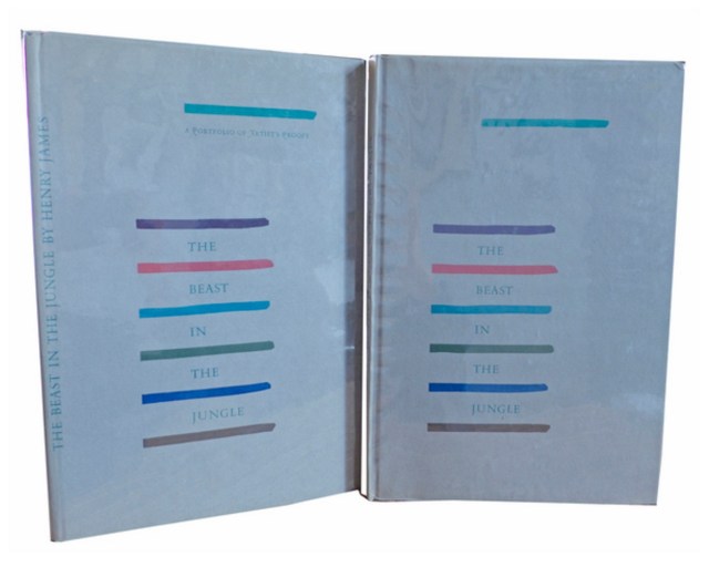
Henry James, The Beast in the Jungle, 1903. Allen Press, 1963. The copy shown is one of only 15 copies with an extra suite of 16 artist’s proofs, each titled, numbered 9/15 and signed by the artist in a separate portfolio.  Displayed online at Sophie Schneideman – Rare Books and Prints.

In his Books and Vines essays, Chris T. Adamson provides fresh, personal and insightful comments on fine book productions and their content such as Henry James’ “The Beast in the Jungle” from the Lewis and Dorothy Allen Press in 1963, pictured above.  An oenophile, as the title of his series suggests, Adamson also occasionally offers tips on the best wines with which to decant and read these works.

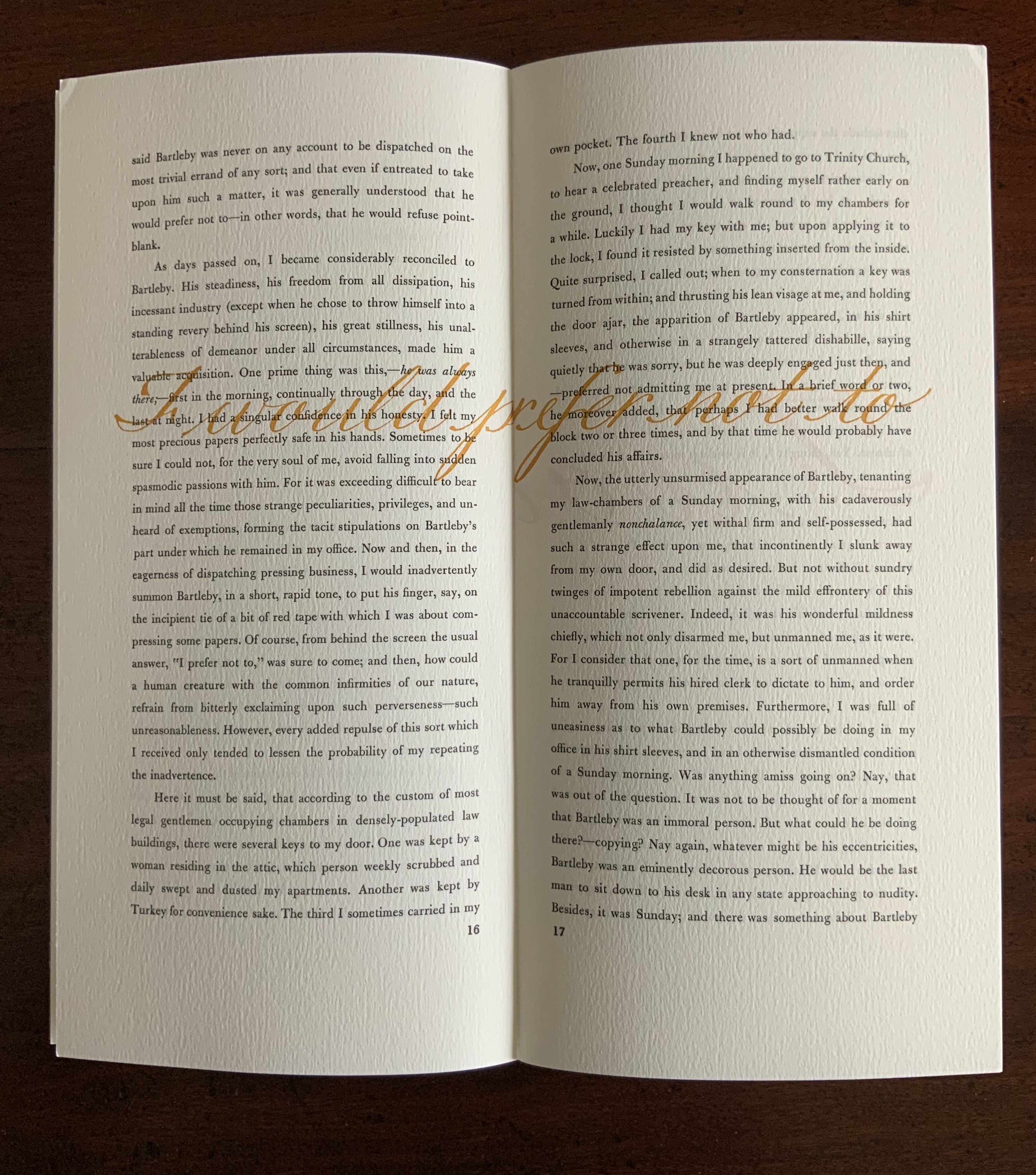
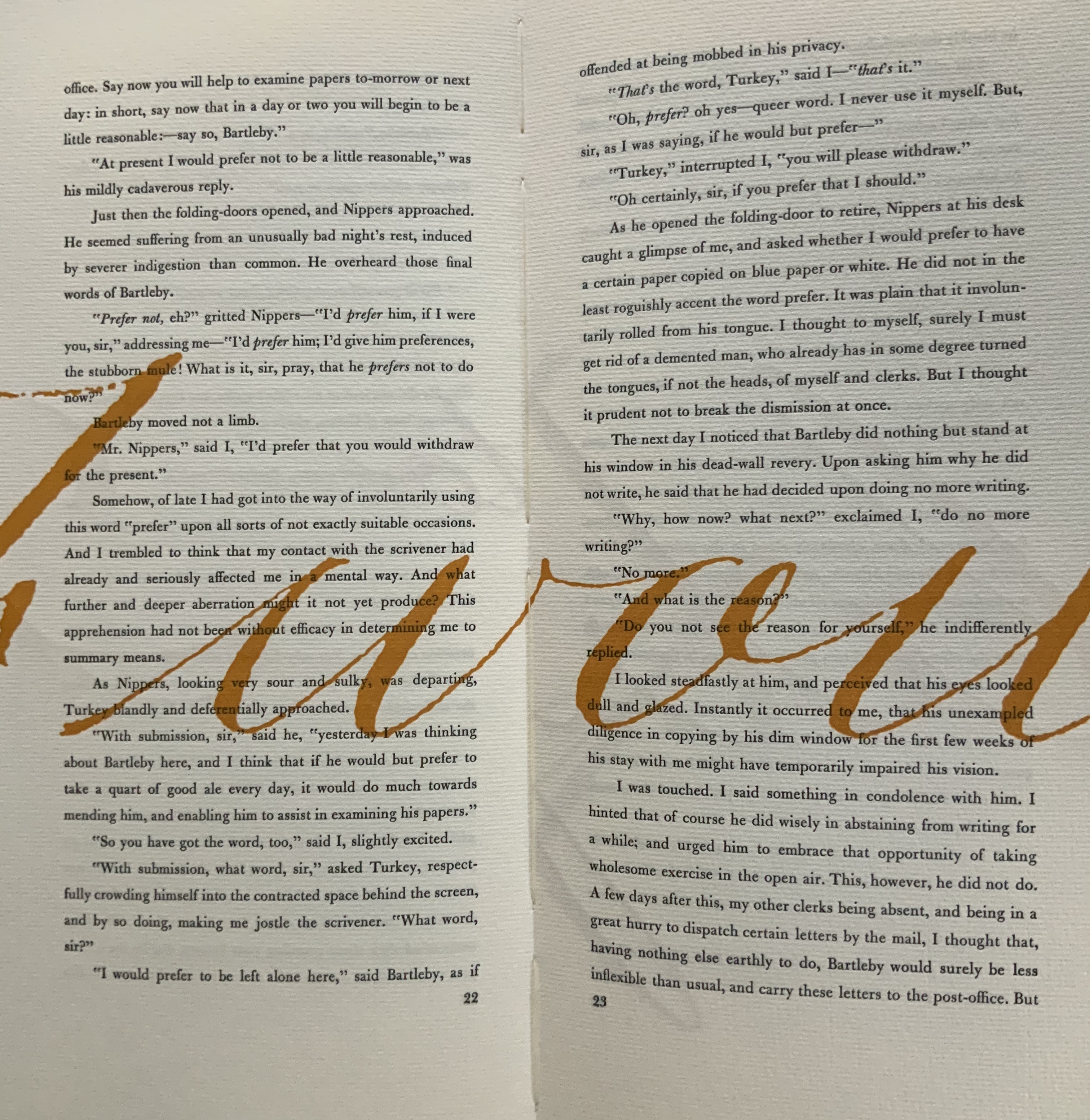
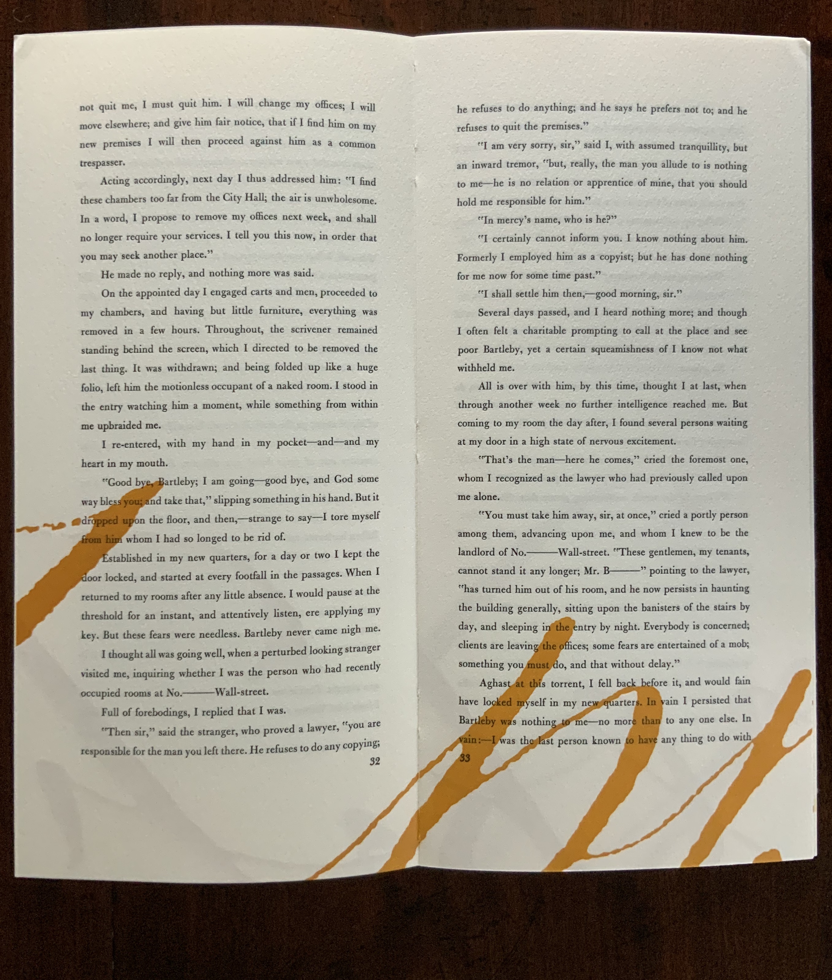
James is a favorite author at Books On Books as is Herman Melville. Indulge the punning coincidence of Adamson’s introducing us to Wilber Schilling’s Indulgence Press and his edition of Melville’s “Bartleby the Scrivener: A Story of Wall Street“.  Schilling’s edition of “Bartleby” – with Suzanne Moore’s original hand lettering of Bartleby’s classic statement “I would prefer not to” first appearing fully legible then becoming larger until it literally falls off the bottom of the final page – was an early career statement of an interest in more than fine press work but in book art as well.

Consider Schilling’s Half-Life/Full-Life and its binding a variation on the accordion/flag structure of Hedi Kyle and Claire Van Vliet.  The complexity of the form marries well with that of the intertwining, interleaving text and photos along the timelines of the Doomsday Clock and global warming.
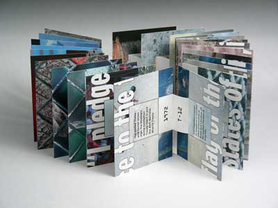
Half Life/Full Life Wilber Schilling, 2009 ISBN: 0-9742191-5-0 Cover
Half Life/Full Life
Wilber Schilling, 2009
ISBN: 0-9742191-5-0
Cover

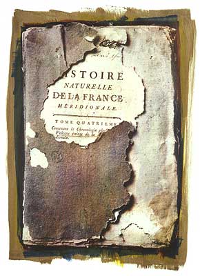
Schilling’s photography in Half Life/Full Life speaks to the importance of that craft in his overall portfolio. His photos of aging, decayed and unbound books are haunting and remind me of the found art of M.L Van Nice.

Natural History Multi-layered gum bichromate print 30" x 22" on Rives BFK 2004 Copyright © Wilber H. Schilling
Natural History
Multi-layered gum bichromate print
30″ x 22″ on Rives BFK
2004
Copyright © Wilber H. Schilling

Schilling has collaborated with Thomas Rose (visual artist and professor at the University of Minnesota),   Michael Dennis Browne (poet and librettist), Rick Moody (author of The Ice Storm) and Patricia Hampl (MacArthur Fellow poet and novelist). He has collaborated with Daniel E. Kelm (book artist, founder of the Garage Annex School for Book Arts and a collaborator with Suzanne Moore).

Given the influence of Marcel Duchamp and Joseph Cornell on works such as Arthur & Barbara (Arthur Danto and Barbara Westman) or Surplus Value Books: Catalog Number 13, you might say that Schilling has attempted to collaborate with them as well. The danger in that, of course, is highly derivative artwork. That early-career whiff of genius in commissioning the now famous calligrapher Suzanne Moore to hand letter “I would prefer not to” and spreading it in ever larger size across the pages might be what takes Schilling’s work beyond the derivative. His work is worth examining with that anticipation.

Postscript

The Books On Books Collection now holds a copy of Schilling’s edition of Bartleby as well as works by Suzanne Moore.

Bookmarking Book Art – More Manutius in Manchester and More to Come

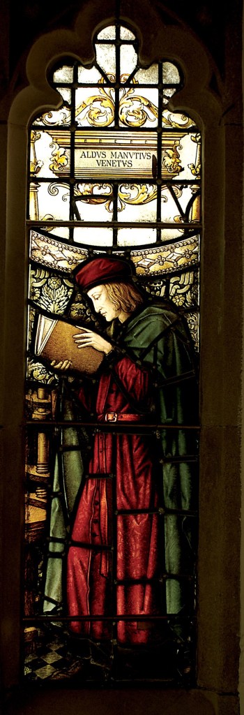
Aldus Manutius, John Rylands Library, University of Manchester

Merchants of Print from Venice to Manchester, 29 January to 21 June 2015, John Rylands Library, University of Manchester, UK:

‌This exhibition celebrates the legacy of Aldus Manutius (1449 – 1515), an Italian humanist scholar who founded the Aldine Press at Venice. His publishing legacy includes scholarly editions of classical authors, the introduction of italic type, and the development of books in small formats that were read much like modern paperbacks. The firm was continued after his death by his son and grandson until 1598.  John Rylands Library, University of Manchester website, accessed 17 May 2015

Back in February as I enjoyed Oxford’s recognition of the 500th anniversary of the death of Teobaldo Manucci, the Manchester exhibition was already running. Where the Oxford event focused on the more architectural motifs distinguishing early Venetian from Roman printing, the Manchester event dwelt more on the educational thrust, technical and business aspects of the Aldine legacy and provenance of the Manchester collection.

The Manchester focus on provenance wends its way back through the library’s donors dedicated to the cause of education (if not to impressing its practitioners with the importance of  the woolen industry’s contribution to it) to the Renaissance circle on which Manutius depended:

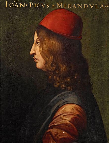
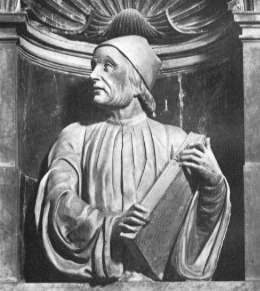
Giovanni Pico della Miradola, 1463-1494 Uffizi Gallery, Florence
Giovanni Pico della Mirandola, 1463-1494
Uffizi Gallery, Florence

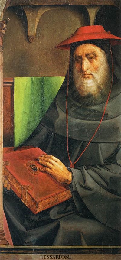
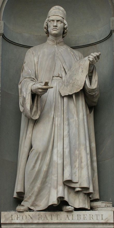
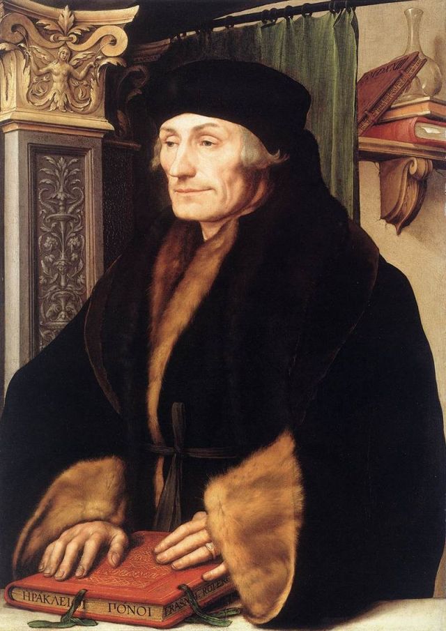
In 1482 Manutius lived with Pico della Mirandola and served as tutor to his nephews, the sons of the Princess of Carpi. Like the later, beneficent Manchester merchants, Pico’s family contributed financially to the cause:  they funded the opening of the Aldine printing office in Venice in 1494. Of course, Pico made more than a patron’s financial contribution to the cause.  Along with Cardinal Bessarion, Marsilio Ficino, Leon Battista Alberti and Erasmus – all known intimately to Manutius –  Pico drove the revival of learning embodied in the output of the Aldines and numerous other printers (John Addington Symonds, Renaissance in Italy, Volume 2 (of 7): The Revival of Learning, John Murray, 1914).

Justus van Gent and Pedro Berruguete , Le Cardinal Bessarion (Les Hommes Illustres)
Cardinal Bessarion, Justus van Gent and Pedro Berruguete , (Les Hommes Illustres)
Marsilio Ficino, Duomo, Florence
Leon Battista Alberti, Piazza degli Uffizi, Florence
Desiderius Erasmus, 1523?, Hans Holbein the Younger
Desiderius Erasmus, 1523?, Hans Holbein the YoungerThe Manchester exhibition closes this month.

The next major Aldine event is the summer school hosted by The Catholic University in Siena (31 August – 3 September) and jointly organized by the Centro di ricerca europeo libro editoria biblioteca (CRELEB). Other events with dates still to be confirmed are planned in Brighton, Treviso, Milan and Arezzo.

See also “Aldus Manutius, 6 February 1515 – 6 February 2015“, Bookmarking Book Art, 8 February 2015.

Bookmarking Book Art – New England Guild of Book Workers

For 2014-15, the New England Guild of Book Workers have organized a traveling exhibition: Geographies: New England Book Workits itinerary covering each of the 6 New England states.  Last year, the Rhode Island School of Design (RISD), the Wishcamper Center at the University of Southern Maine and the Bailey Howe Library at the University of Vermont hosted it. This year, the show has appeared at Williams College Library and is scheduled for Dartmouth College Library and the Creative Arts Workshop in New Haven, CT. Criss-crossing geographical boundaries as well as those of book art and the book arts, Geographies calls to mind the last line of Elizabeth Bishop’s “The Map“:

More delicate than the historians’ are the map-makers’ colors.

Or, in this case:

More delicate than the historians’ are the [book-artists’] colors. 

Although born in Nova Scotia, Elizabeth Bishop grew up as a New Englander in Massachusetts with her paternal grandparents. As a far-traveller and visual artist as well as poet, she would have enjoyed this exhibition and found it fitting if it had included a broadside of “The Map”.

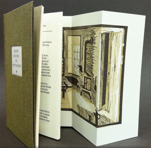
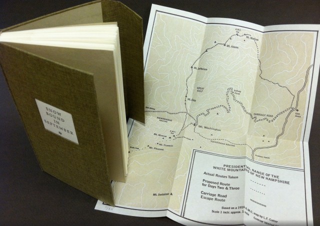
Nevertheless, what a range of “colors” from all the New England states and beyond – from historic to modern, from fine and design bindings to traditional and creative bookbinding, from artist books to calligraphic manuscripts, from masters to apprentices and from object to narrative. The latter finds a wintry exemplar in Snow Bound in September: A Re-Imagining by Laurie Whitehill Chong, retired Special Collections librarian and curator of Artists’ Books at RISD.

Snow Bound in September: A Re-Imagining © Laurie Whitehill Chong Artist Book, Text in Book Antiqua letterpress printed on Rives Lightweight paper using polymer plates, with 13 fold-out two and three-color linocut illustrations. Folded map in inside back cover pocket, letterpress printed using polymer plate and linocut; edition of 25 15.24 x 8.89 x 2.54 cm
Snow Bound in September: A Re-Imagining © Laurie Whitehill Chong Artist Book, Text in Book Antiqua letterpress printed on Rives Lightweight paper using polymer plates, with 13 fold-out two and three-color linocut illustrations. Folded map in inside back cover pocket, letterpress printed using polymer plate and linocut; edition of 25 15.24 x 8.89 x 2.54 cm Snow Bound in September: A Re-Imagining © Laurie Whitehill Chong
Cloth covered binding with flap and front pocket, smythe sewn.
Text in book Antiqua letterpress printed on Rives Lightweight paper using polymer plates, with 13 fold-out
two and three-color linocut illustrations. Folded map in inside back cover pocket, letterpress
printed using polymer plate and linocut. 
15.24 x 8.89 x 2.54 cm 
Edition of 25

The artist made this book the same size as her grandfather’s Appalachian Mountain Club hiking guide. Snow Bound is an invented ancestral narrative, in which the artist uses a surviving photograph and her grandfather’s notes about being stranded with his wife for five days on Mount Washington by a hurricane-driven snowstorm in September 1915 to re-imagine the ordeal from her grandmother’s perspective. Note the slotted front cover into which the flap extending from the back cover fits to keep the book closed, snug against the elements.

Snow Bound in September: A Re-Imagining © Laurie Whitehill Chong
Snow Bound in September: A Re-Imagining © Laurie Whitehill Chong Snow Bound in September: A Re-Imagining © Laurie Whitehill Chong

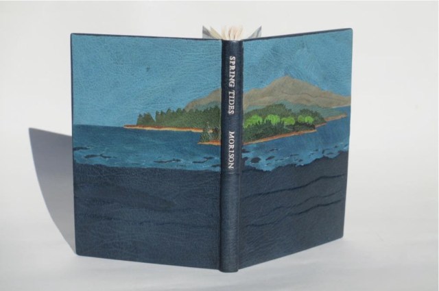
Julie B. Stackpole’s creative re-binding of Samuel Eliot Morison’s Spring Tides takes us from the New England mountains to the shore as can be seen from the layered binding.

Spring Tides by Samuel Eliot Morison Boston: Houghton-Mifflin Co., 1965. Julia B. Stackpole, Design binding  21.8 x1 5.0 x 1.6 cm  January 2014
Spring Tides by Samuel Eliot Morison Boston: Houghton-Mifflin Co., 1965. Julia B. Stackpole, Design binding  21.8 x1 5.0 x 1.6 cm  January 2014 Spring Tides
by Samuel Eliot Morison
Boston: Houghton-Mifflin Co., 1965.
Julia B. Stackpole, Design binding
21.8 x1 5.0 x 1.6 cm
January 2014

In Stackpole’s words:

The traditional tight-joint binding is covered in navy blue Niger goatskin with waves in the lower parts created by paring before covering. Cut-outs in the onlays of the lighter blue leather of the water help it transition from the dark of the navy to the sky’s azure. Onlays of other leathers create the forested landscape of the shoreline and hills. These blues were chosen because the only blue leather in a large enough piece to cover the whole binding was the dark navy, while I only had scraps of the water and sky’s blue. The endpapers are a Cockerell marbled paper over-painted with blue, with leather hinges.

Pictures of the works in the catalog (and others not) can also be found at the Williams College Flickr site (for now). I say “for now” because they will be  pushed downstream inevitably in the way of today’s digital flow.  They may even disappear; although as Matthew Kirschenbaum has explained in Mechanisms, something digitally forensic will remain. That boundary of the tangible and the digital, the haptic and the virtual, is only lightly but evocatively touched in this collection.

When Julia Stackpole writes in the online catalog about that Cockerell marbled paper that it “felt to me like the waves and the shoals and ledges of Maine waters”, you long to lay hands on the Spring Tide. Anne McClain’s Place includes photographs taken digitally of places on Maine’s midcoast that have been special to her her “entire life and will continue to be a constant as other things change and move on”. What is captured digitally is reproduced physically to fix those places that will “continue to be a constant”. But places do change.

Anne McClain, Place Drum Leaf Binding  19 x 15 x 1.8 cm  February 2014
Anne McClain, Place Drum Leaf Binding  19 x 15 x 1.8 cm  February 2014 Anne McClain, Place
Drum Leaf Binding
19 x 15 x 1.8 cm
February 2014

Rutherford Witthus’ contribution touches the boundary between the digital and physical most directly. His artist’s book is entitled 28 Fort Square: What Charles Olson wrote on the window casings of his apartment in Gloucester, Massachusetts, of which there are eleven copies.

Rutherford Witthus, 28 Fort Square: What Charles Olson wrote on the window casings of his apartment in Gloucester, Massachusetts, 2014
Rutherford Witthus, 28 Fort Square: What Charles Olson wrote on the window casings of his apartment in Gloucester, Massachusetts, 2014 Rutherford Witthus, 28 Fort Square: What Charles Olson wrote on the window
casings of his apartment in Gloucester, Massachusetts, 2014

In these 11 copies, Witthus digitally reconstructs the windows of Charles Olson’s apartment at 28 Fort Square where he wrote his main work, The Maximus Poems, and covered the window casings with meteorological data. The artist book “presents for the first time all of the images of the window casings”.

Rutherford Witthus 28 Fort Square: What Charles Olson wrote on the window casings of his apartment in Gloucester, Massachusetts Artist book Edition of 11 42 x 28 x 2.5 cm 2014
Rutherford Witthus 28 Fort Square: What Charles Olson wrote on the window casings of his apartment in Gloucester, Massachusetts Artist book Edition of 11 42 x 28 x 2.5 cm 2014 Rutherford Witthus
28 Fort Square: What Charles Olson wrote on the window casings of his apartment in Gloucester, Massachusetts
Artist book
42 x 28 x 2.5 cm
2014
Edition of 11

Athena Moore, chapter secretary of The New England Guild of Bookworkers, produced the catalog for this itinerant exhibition organized by Stephanie Wolff, Exhibitions Coordinator and Todd Pattison, Chapter Chair. If you have the chance to see the exhibition in its next venue, take it.

Just as Elizabeth Bishop questioned the depiction of the boundary between land and water on her map – “Shadows or are they shallows at its edges …”, you will find the juxtaposition of these works reminds you that the boundary between book art and the book arts can be shadowy or shallow indeed.

Bookmarking Book Art – Mending Pages

M4qPagG - Imgur
R6fTbxT
mpG4XVO - Imgur
Dreamcatcher
Kintsugi

William Dean Minter, Senior Book Conservator in the Digitization and Preservation Department at Pennsylvania State University drew my attention to these images. At first, they reminded me of passages in Annie Tremmel Wilcox’s A Degree of Mastery, in which she describes mending rare books with kozo paper under the hawkeye of the late Bill Anthony. Then, dreamcatchers sprang to mind. What were the images, sounds and thoughts caught in words now missing on these pages, words slipped from the dreamcatching pages? But book artist Esther Kibby, who teaches photography, graphic design and web design at the Art Institute of Dallas in Texas, came up with the most telling association: kintsugi

Kintsugi (or kintsukuroi) is a Japanese method for repairing broken ceramics with a special lacquer mixed with gold, silver, or platinum. The philosophy behind the technique is to recognize the history of the object and to visibly incorporate the repair into the new piece instead of disguising it. The mastery of the book restorer is to invisibly repair the book. Our “dreamcatcher” restorer seems to have in mind the kintsugi philosophy and lets the repair draw attention to itself and creates “a new piece”.

In the hands of a book artist, such a technique could generate ironic expressions of biblioclasm: the restored book that is no longer a book? Or echoes of Walter Benjamin’s presumption of and preoccupation with the modern world’s fragmentary nature? Or the pain and sorrow of Al-Mutanabbi Street?

Bettina Pauly, The Sun that Rises, 2013
Bettina Pauly, The Sun that Rises, 2013 Bettina Pauly, The Sun that Rises, 2013.  Made for An Inventory of Al-Mutanabbi Street.

Or a tongue-in-cheek answer to those horrified by the destruction of “the book”?

When the Japanese mend broken objects, they aggrandize the damage by filling the cracks with gold. They believe that when something’s suffered damage and has a history it becomes more beautiful. —Barbara Bloom