Bookmarking Book Art – Eric Gjerde

Specimens, 2016 Close-up of finished pressed page. Laser cut text pressed within 5 layers of bio-paper to form one large single sheet. © Eric Gjerde
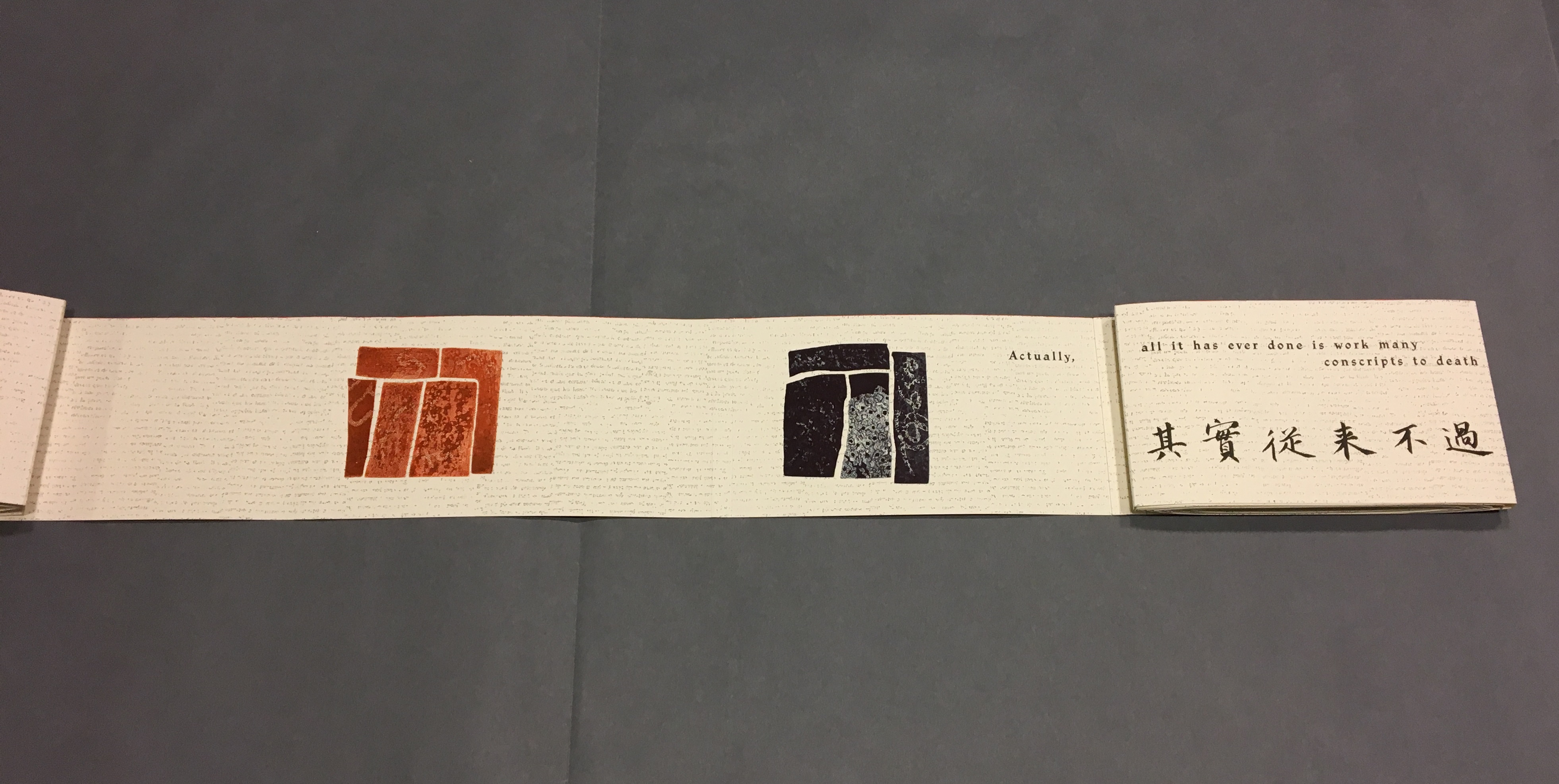
Specimens, 2016
Close-up of finished pressed page. Laser cut text pressed within 5 layers of bio-paper to form one large single sheet.
© Eric Gjerde

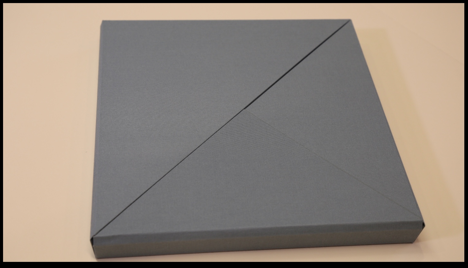
Specimens is the first of its kind: a book created with a new bio-paper medium made entirely from bacterial cellulose. Its pages were once alive.

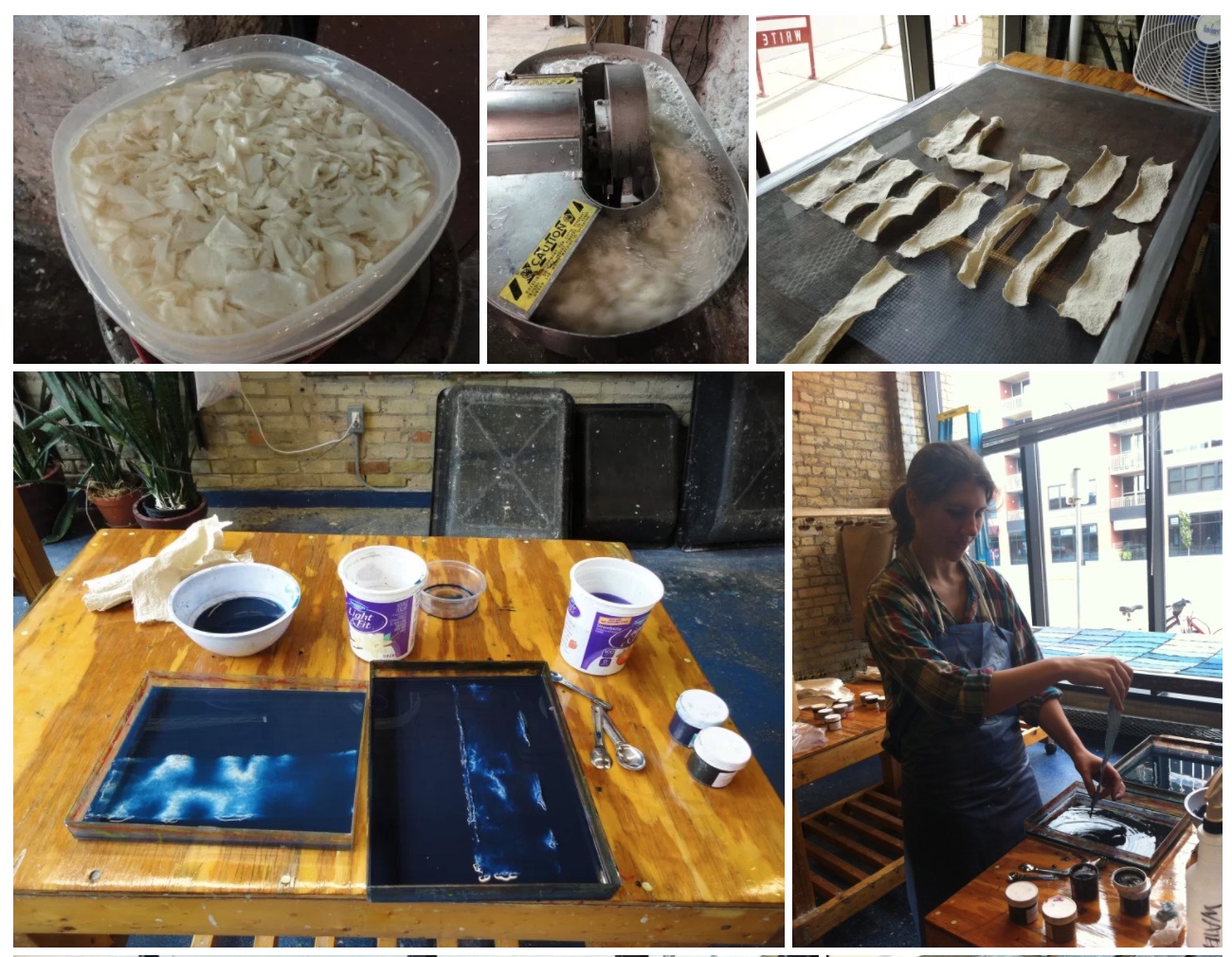
The quality of this new paper, which I developed over the past seven years, is its unparalleled strength and transparency. Each sheet is grown in a vat and harvested after several weeks. After processing, many layers — five or more — are laid on top of one another with the text block carefully placed within. Then the entire stack is pressed. The act of pressing these sheets is what gives them their strength.

Trapped forever within the thin lamina of Specimens’ pages is the poetry of e.e. cummings. The challenge of retaining the poet’s complex typographic wordplay required a new approach for placing text. Drawing upon my fascination with Voronoi tessellations — the natural pattern of cell structures in all living things — I created custom software to generate a Voronoi framework that would hold the text in place. The text block was then laser-cut from Korean hanji.

I would like to thank the Jerome Foundation and Minnesota Center for Book Arts for the opportunity and support to explore this exciting new medium. (Artist’s statement)

Gjerde’s Specimens exhibition — November 2016 through February 2017 —  continues in the new tradition of bio art.  One of the earliest and abiding proponents has been George Gessert. Since the 1980s, Gessert and artists/theorists such as Suzanne Anker, Eduardo Kac, Marta De Menezes, the Harrisons and Sonya Rapoport have constituted the bio art and eco art movements.  A collection of his essays appeared as Green Light: Toward an Art of Evolution in the Leonardo Book Series, published by The MIT Press in 2010.

More recently Dr. Simon F. Park’s  The Origin of Species was touted as  perhaps “the first book to be grown and produced using just bacteria”. Presented at the Edinburgh International Science Festival, the small book has pages made of bacterial cellulose, produced by the bacterium Gluconoacetobacter xylinus (GXCELL). Its cover is even printed with naturally pigmented bacteria.

Artist: Dr. Simon F Park The Origin of Species "The small book shown here was grown from and made entirely from bacteria. Not only is the fabric of its pages (GXCELL) produced by bacteria, but the book is also printed and illustrated with naturally pigmented bacteria. " Posted 27 March 2016 Photo credit: Dr. Simon F. Park
The Origin of Species
Posted 27 March 2016
Photo credit: Dr. Simon F. Park

The process underlying Gjerde’s work and its material inspiration — the bio-paper, e.e.cummings’ poetry, Voronoi tessellations and the software-driven Voronoi framework to hold the text block in place — are beautifully explored on his site.

The Voronoi framework is evocative of traditional papermaking technology. Here instead of the “deckle” — the wooden frame holding the mesh on which fibers are caught up from the soupy mash to form a sheet of paper — the Voronoi framework holds the text block between the laminations of the bio-paper.

The union of concept, process and the quality of the work make Specimens an outstanding work.

Bookmarking Book Art – Wilber Schilling

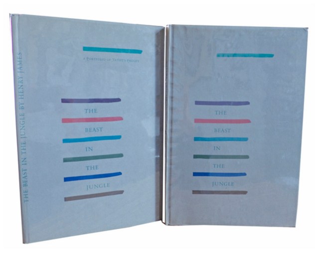
Henry James, The Beast in the Jungle, 1903. Allen Press, 1963. The copy shown is one of only 15 copies with an extra suite of 16 artist’s proofs, each titled, numbered 9/15 and signed by the artist in a separate portfolio.  Displayed online at Sophie Schneideman – Rare Books and Prints.

In his Books and Vines essays, Chris T. Adamson provides fresh, personal and insightful comments on fine book productions and their content such as Henry James’ “The Beast in the Jungle” from the Lewis and Dorothy Allen Press in 1963, pictured above.  An oenophile, as the title of his series suggests, Adamson also occasionally offers tips on the best wines with which to decant and read these works.

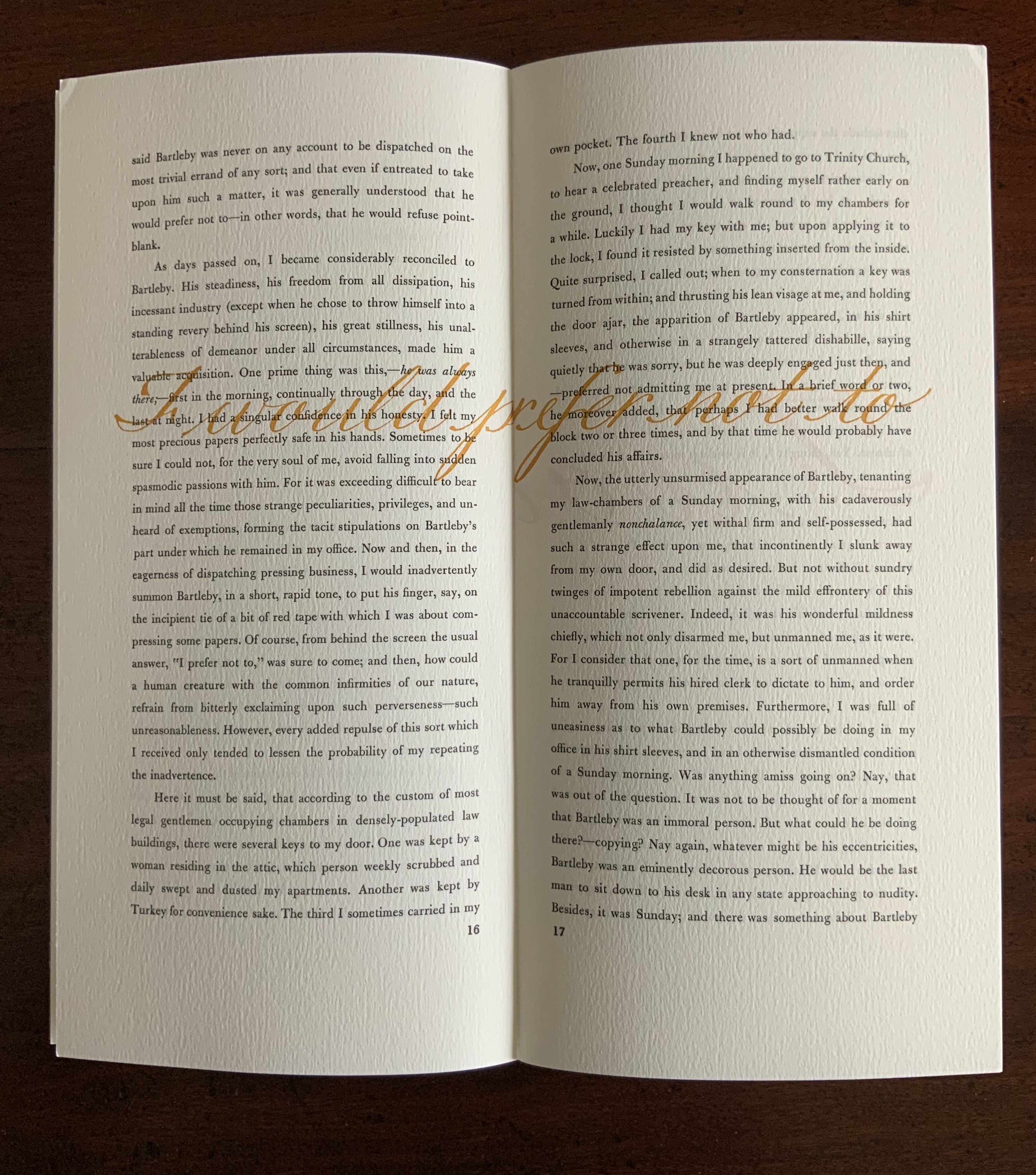
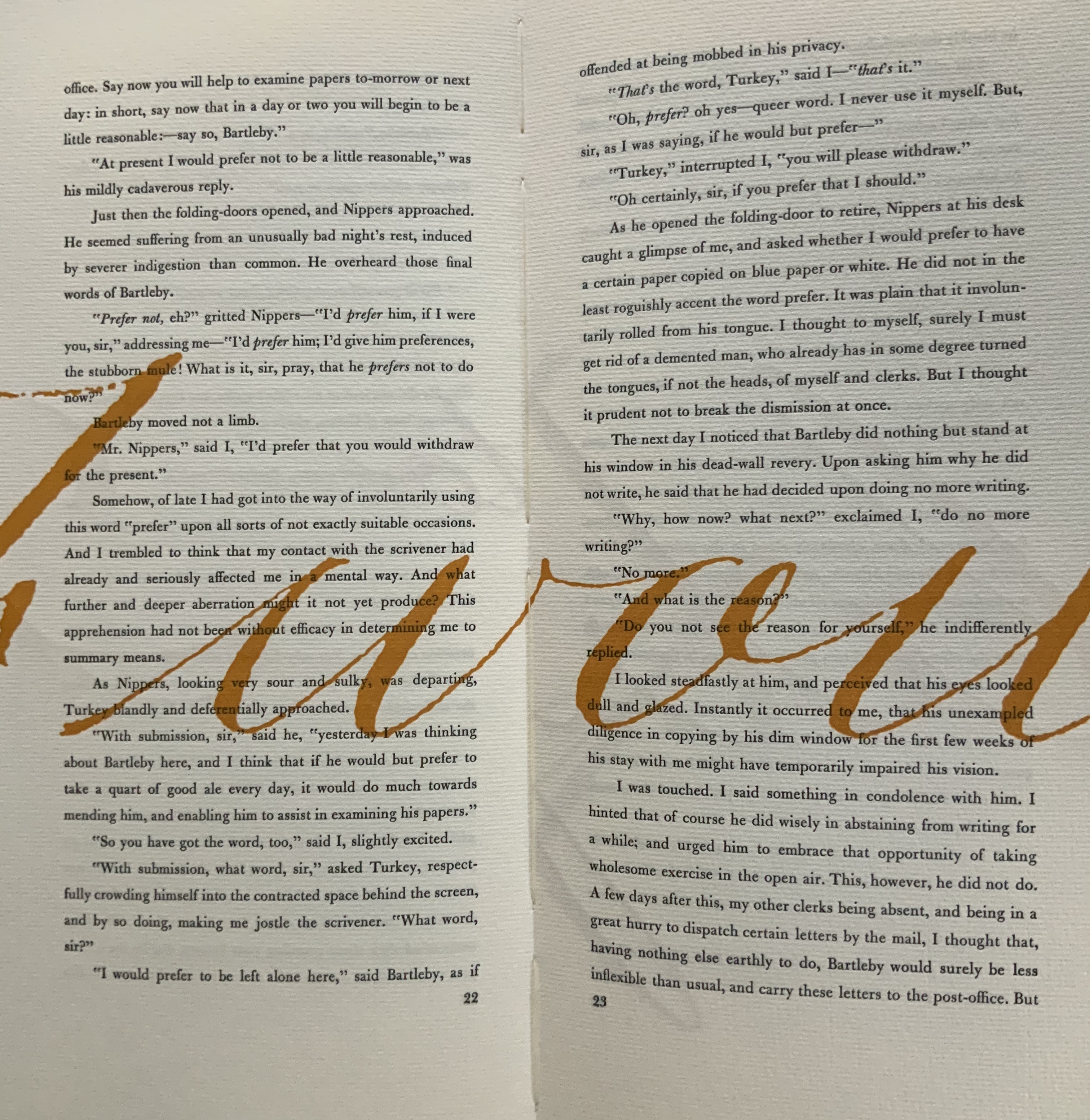
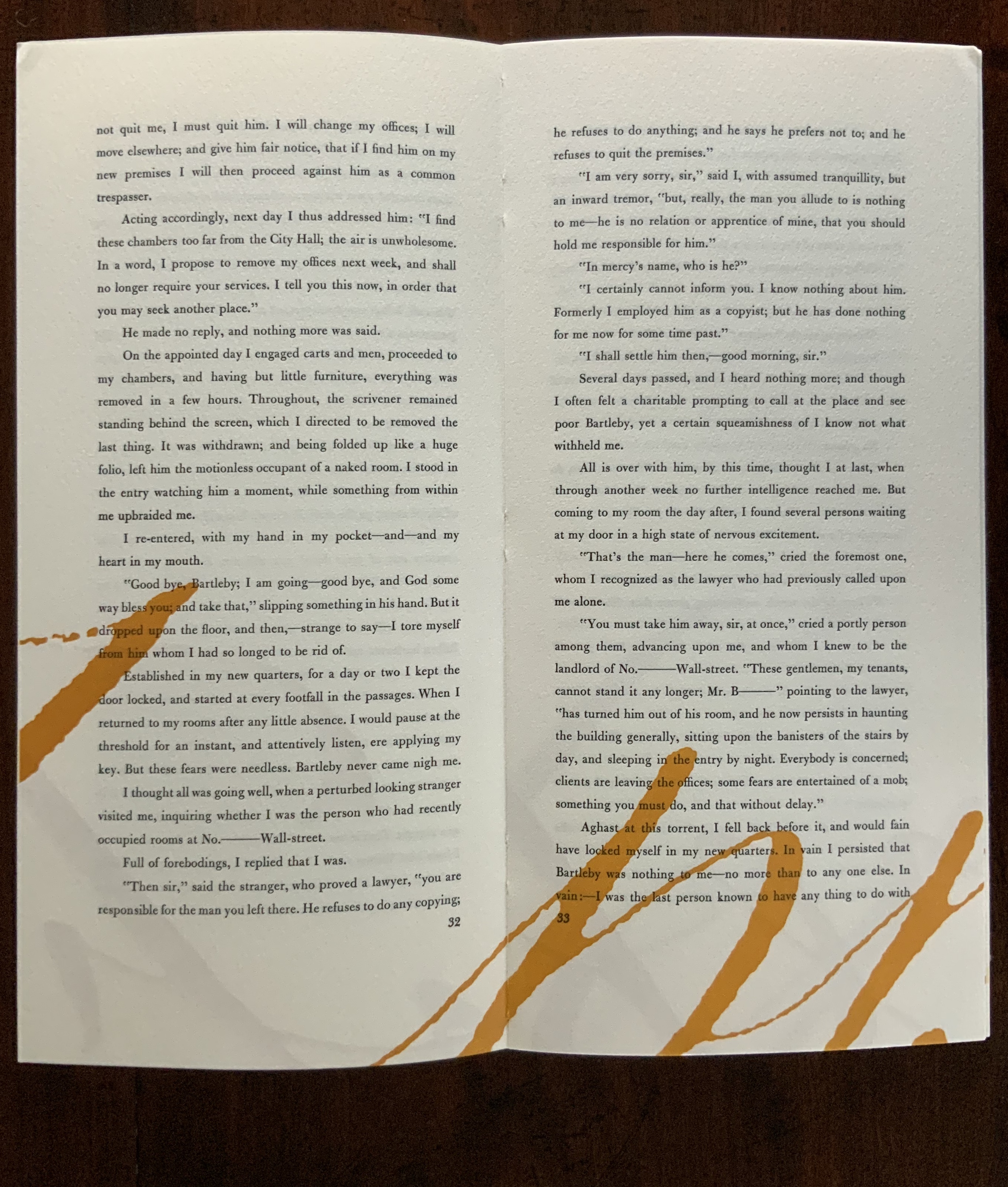
James is a favorite author at Books On Books as is Herman Melville. Indulge the punning coincidence of Adamson’s introducing us to Wilber Schilling’s Indulgence Press and his edition of Melville’s “Bartleby the Scrivener: A Story of Wall Street“.  Schilling’s edition of “Bartleby” – with Suzanne Moore’s original hand lettering of Bartleby’s classic statement “I would prefer not to” first appearing fully legible then becoming larger until it literally falls off the bottom of the final page – was an early career statement of an interest in more than fine press work but in book art as well.

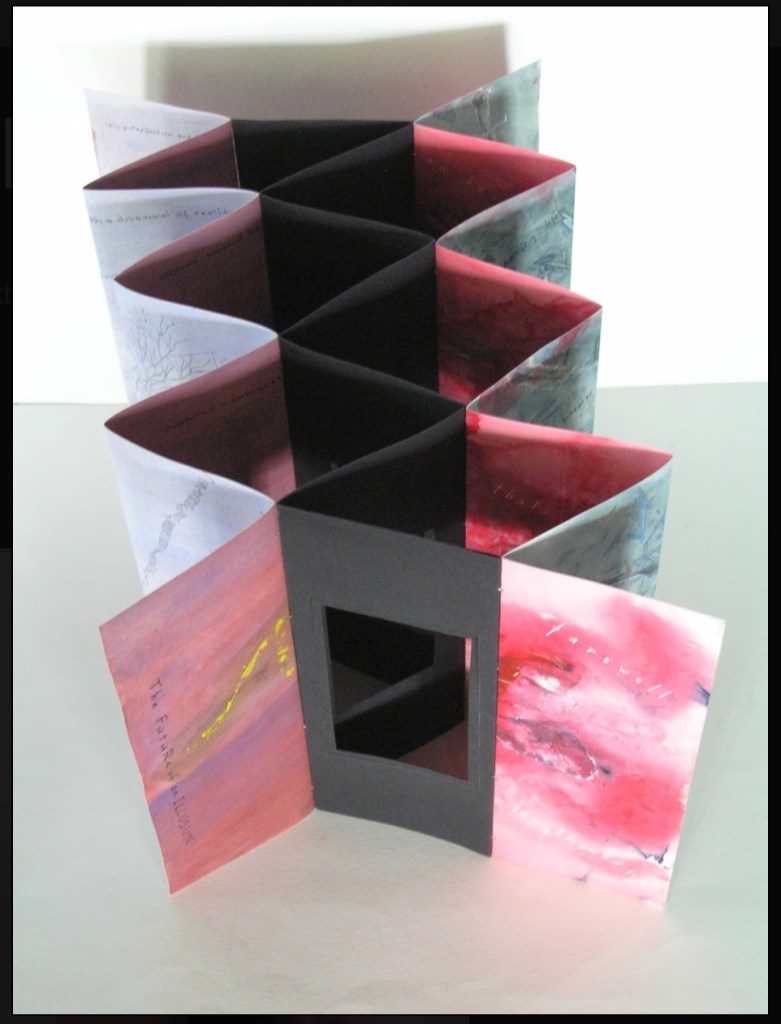
Consider Schilling’s Half-Life/Full-Life and its binding a variation on the accordion/flag structure of Hedi Kyle and Claire Van Vliet.  The complexity of the form marries well with that of the intertwining, interleaving text and photos along the timelines of the Doomsday Clock and global warming.
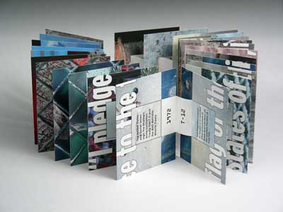
Half Life/Full Life Wilber Schilling, 2009 ISBN: 0-9742191-5-0 Cover
Half Life/Full Life
Wilber Schilling, 2009
ISBN: 0-9742191-5-0
Cover

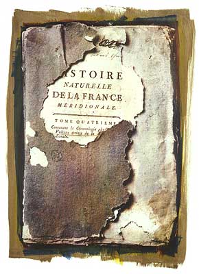
Schilling’s photography in Half Life/Full Life speaks to the importance of that craft in his overall portfolio. His photos of aging, decayed and unbound books are haunting and remind me of the found art of M.L Van Nice.

Natural History Multi-layered gum bichromate print 30" x 22" on Rives BFK 2004 Copyright © Wilber H. Schilling
Natural History
Multi-layered gum bichromate print
30″ x 22″ on Rives BFK
2004
Copyright © Wilber H. Schilling

Schilling has collaborated with Thomas Rose (visual artist and professor at the University of Minnesota),   Michael Dennis Browne (poet and librettist), Rick Moody (author of The Ice Storm) and Patricia Hampl (MacArthur Fellow poet and novelist). He has collaborated with Daniel E. Kelm (book artist, founder of the Garage Annex School for Book Arts and a collaborator with Suzanne Moore).

Given the influence of Marcel Duchamp and Joseph Cornell on works such as Arthur & Barbara (Arthur Danto and Barbara Westman) or Surplus Value Books: Catalog Number 13, you might say that Schilling has attempted to collaborate with them as well. The danger in that, of course, is highly derivative artwork. That early-career whiff of genius in commissioning the now famous calligrapher Suzanne Moore to hand letter “I would prefer not to” and spreading it in ever larger size across the pages might be what takes Schilling’s work beyond the derivative. His work is worth examining with that anticipation.

Postscript

The Books On Books Collection now holds a copy of Schilling’s edition of Bartleby as well as works by Suzanne Moore.

Bookmarking Book Art – Mending Pages

M4qPagG - Imgur
R6fTbxT
mpG4XVO - Imgur
Dreamcatcher
Kintsugi

William Dean Minter, Senior Book Conservator in the Digitization and Preservation Department at Pennsylvania State University drew my attention to these images. At first, they reminded me of passages in Annie Tremmel Wilcox’s A Degree of Mastery, in which she describes mending rare books with kozo paper under the hawkeye of the late Bill Anthony. Then, dreamcatchers sprang to mind. What were the images, sounds and thoughts caught in words now missing on these pages, words slipped from the dreamcatching pages? But book artist Esther Kibby, who teaches photography, graphic design and web design at the Art Institute of Dallas in Texas, came up with the most telling association: kintsugi

Kintsugi (or kintsukuroi) is a Japanese method for repairing broken ceramics with a special lacquer mixed with gold, silver, or platinum. The philosophy behind the technique is to recognize the history of the object and to visibly incorporate the repair into the new piece instead of disguising it. The mastery of the book restorer is to invisibly repair the book. Our “dreamcatcher” restorer seems to have in mind the kintsugi philosophy and lets the repair draw attention to itself and creates “a new piece”.

In the hands of a book artist, such a technique could generate ironic expressions of biblioclasm: the restored book that is no longer a book? Or echoes of Walter Benjamin’s presumption of and preoccupation with the modern world’s fragmentary nature? Or the pain and sorrow of Al-Mutanabbi Street?

Bettina Pauly, The Sun that Rises, 2013
Bettina Pauly, The Sun that Rises, 2013 Bettina Pauly, The Sun that Rises, 2013.  Made for An Inventory of Al-Mutanabbi Street.

Or a tongue-in-cheek answer to those horrified by the destruction of “the book”?

When the Japanese mend broken objects, they aggrandize the damage by filling the cracks with gold. They believe that when something’s suffered damage and has a history it becomes more beautiful. —Barbara Bloom

Bookmarking Book Art – Aldus Manutius, 6 February 1515 – 6 February 2015

Hypnerotomachia Poliphili, Venice: Aldine Press, 1499.
Hypnerotomachia Poliphili. Venice: Aldine Press, 1499.

Late afternoon before the long worn wooden benches in the Bodleian’s Convocation Hall, 500 years after the death of Aldus Manutius, Oren Margolis served his audience well, providing them with a richer appreciation of the “finest printed book of the entire Renaissance”* – the Hypnerotomachia Poliphili – and of its publisher Aldus Manutius.

Drawing our attention to the more sculptural qualities of Venetian Renaissance printed books over the Florentine and to the  evidence of the humanist agenda that drove Manutius, he led us to the page where Poliphilo (lover of all things, but in particular Polia, the ideal woman pursued to the end of the book) stands before a carving that foreshadows the Aldine Press device: a dolphin entwined around the shank of an anchor. The Aldine Press device was inspired by a similar image on an ancient Roman coin given by Pietro Bembo to Aldus, who wrongly associated it with Augustus and his proverb Festina lente (“Make haste slowly”) and adopted both for his printing and publishing business.

Erasmus praised Aldus, saying that he was “building a library which knows no walls save those of the world itself”.

For all of 2015, the world enjoyed a multitude of celebrations of the contribution of Aldus Manutius to publishing, printing and the book. After Gutenberg, Fust and Schoeffer, Aldus Manutius was perhaps the most important printer of the Renaissance. His portable books are still here, although locked away or displayed under glass, no longer so portable. Until now.

The Manutius Network 2015 provides a running list, links for some of which are provided below, including the online exhibition associated with Margolis’s talk.  See also below, added in May 2016, the belated exhibition “Aldo Manutius: The Renaissance in Venice” at the Gallerie dell’Accademia in Venice.

IMG_1604

In the Proscholium, The Bodleian Library   Oxford

Invitation from the Biblioteca Nazionale Marciana

Invitation from the Biblioteca Nazionale Marciana

The British Library

The British Library

The Grolier Club exhibition. See the New York Times coverage here.

In aedibus Aldi The Brigham Young University's Harold B. Lee Library

In aedibus Aldi
The Brigham Young University’s Harold B. Lee Library

John Rylands Library University of Manchester

John Rylands Library
University of Manchester

The afterlife of Aldus : posthumous fame, collectors and the book trade
Edited by Jill Kraye and Paolo Sachet.
London : The Warburg Institute, 2018.

from Hypnerotomachia Poliphili, 1499 University of Glasgow

from Hypnerotomachia Poliphili, 1499
University of Glasgow

International Conference Celebrating Aldu Manutius University of California, Los Angeles

International Conference
Celebrating Aldus Manutius
University of California, Los Angeles

Aldo Manutius: The Renaissance in Venice http://www.mostraaldomanuzio.it/exhibition Exhibition poster containing detail of ‘Portrait of a Woman as Flora’ (c1520), by Bartolomeo Veneto © Eton College

Aldo Manutius: The Renaissance in Venice
Exhibition poster containing detail of ‘Portrait of a Woman as Flora’ (c1520), by Bartolomeo Veneto © Eton College

From Crispin Elsted’s review of the Thames & Hudson facsimile edition of the Hypnerotomachia Poliphili. Parenthesis, December 2000, No. 5:

I once spent three hours in a library with a copy of the Aldine edition of Hypnerotomachia Poliphili, and I have never known a book take my breath away so consistently. Every page is a masterpiece: the dance of text with the more than 170 woodcuts; the firm, male stature of the typeface; the crisp spring of the impression; the elegant proportion of the page — all combine to an end in which the craft of printing and design carry the text into an atmosphere not of its own making. This new edition has the appearance of a fine actor in a part lately played by a great one. Here are the signs of the grace that greatness lent the commonplace five centuries ago; and in these signs, the commonplace finds here another advocate for its small claims to our time. 

Timelines are, of course, for looking further back as well as forward.   Earlier this year, April 2012 marked the fifteenth anniversary of the publication of Liane Lefaivre’s Leon Battista Alberti’s Hypnerotomachia PoliphiliRe-Configuring the Architectural Body in the Early Italian Renaissance (Cambridge, MA: MIT Press, 1997) and the online publication of The Electronic Hypnerotomachia, which contains the facsimile text and illustrations.   The online publication of extracts from Lefaivre’s book illustrates the linking prefigured by the “card stack” approach of HyperCard.  What MIT Press and TU Delft,  Lefaivre’s affiliation, host on their servers are not ebooks or even e-incunabula of the sort we experience today, but they are clearly forerunners to them.

In twenty-eight more months, December 2014, we will see the 515th anniversary of the original work’s publication by Aldine Press (Venice, December 1499).   The founder Aldus Manutius did not normally publish heavily illustrated books.  The Hypnerotomachia Poliphili was the exception and the only commissioned work that Manutius undertook.   The exception reflects favorably on the overall success of his business and supports the view that Venice had become the capital of printing and publishing very shortly after the invention of printing by moveable type.

The book unveils an inscrutable, almost comic-book-illustrated story, glittering with made-up words in Greek, Latin, Hebrew and Arabic (including proto-Greek, -Hebrew and -Arabic fonts).  In addition to the page displays sculpted into shapes such as goblets, this one volume displayed the technological mastery of and improvement on the new Roman (as opposed to the heavy Gothic) typeface Bembo.  According to Norma Levarie in The Art & History of Books (New York, 1968), this singular volume revolutionized typography in France in less than twenty-five years.

Somewhat like software releases, though, the 1499 edition came with bugs.  The colophon to the Hypnerotomachia Poliphili falls at the end of a full page of errata.

“Venice Month December. 1499. in the house of Aldus Manutius, most accurately done.”

Initiated in 2015 in celebration of the anniversary and acknowledgement of the more than 100 Aldine editions in the Wosk McDonald Collection, Simon Fraser University’s Aldus@SFU is the digitization of 21 Aldine volumes published between 15011 and 1515. The image above is the edition of Lucretius’ De rerum naturam, published just after Manutius’ death in 1515.

See also “More Manutius in Manchester and More to Come“, Bookmarking Book Art, 1 June 2015.

Bookmarking Book Art – Helen Douglas

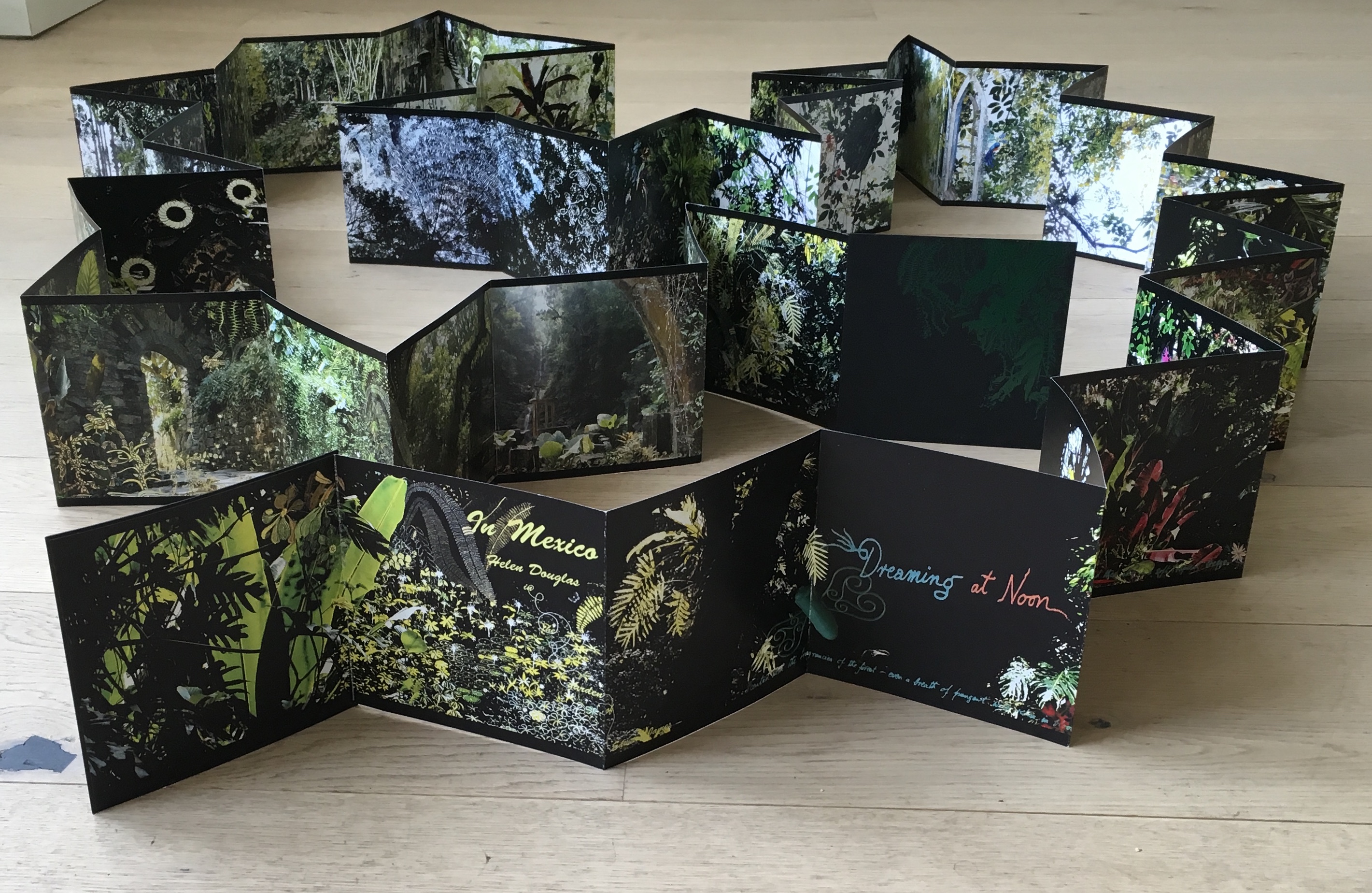
Helen Douglas, In Mexico: in the garden of Edward James (2014). Reviewed in Der Tagesspeigel

Helen Douglas has been kind enough to forward the notice above of her most recent work — In Mexico: in the garden of Edward James Based on her invited residency in Mexico City, this concertina book takes the viewer through Edward James’ jungle garden Las Pozas, its buildings and staircases, James’s surreal imagination and, best of all, Douglas’s own imaginative experience of them. See the interview at BookArtBookBlog that preceded the work’s unveiling at the London Art Book Fair at the Whitechapel Gallery and Berlin Art Book Fair.

When I go to Weproductions, the website of founding partners, Telfer Stokes and Helen Douglas, it is like taking a walk in Yarrow, Scotland, or taking the measure of paper samples between forefinger and thumb, or browsing in a bookstore, or lingering in an art gallery. Two of Helen Douglas’s works in particular elicit this: The Pond at Deuchar (2013) and A Venetian Brocade (2010).

The Pond at Deuchar (2012)
“The Pond at Deuchar” E-Scroll artwork ©Helen Douglas
Application “Turning the Pages” © Armadillo Systems

Was it London Book Fair where I first saw this bookwork, appwork, scrollwork … this work of art?  What you see above leads you to the app. Clive Philpott’s postscript to this work, featured on Weproductions and published by the Tate, offers all the background and appreciation of the work you need to read. Read it, then go to The Pond at Deuchar*, lean forward and trail your fingers through its waters.

Helen Douglas and Marina Warner. A Venetian Brocade (Weproductions, 2010)

A Venetian Brocade equally makes the “act of looking” tactile and the “act of touching” insightful. The work reminds me of this passage from Joseph Brodsky’s Watermark (New York: Farrar Straus Giroux, 1992):

… bipeds go ape about shopping and dressing-up in Venice for reasons not exactly practical; they do so because the city, as it were, challenges them. We all harbor all sorts of misgivings about the flaws in our appearance, anatomy, about the imperfection of our very features. What one sees in this city at every steep, turn, perspective, and dead end worsens one’s complexes and insecurities. That’s why one—a woman especially, but a man also—hits the stores as soon as one arrives here, and with a vengeance. The surrounding beauty is such that one instantly conceives of an incoherent animal desire to match it, to be on par. This has nothing to do with vanity or with the natural surplus of mirrors here, the main one being the very water. It is simply that the city offers bipeds a notion of visual superiority absent in their natural lairs, in their habitual surroundings. That’s why furs fly here, as do suede, silk, linen, wool, and every other kind of fabric.

If you are lucky enough to buy one of the few remaining copies of A Venetian Brocade, you will see and feel how it leads to In Mexico: in the garden of Edward James. Appreciation of that double-sided leporello work’s extension of the Douglas’s concept of Visual Narrative and its kinship with James’s surrealism can only be enhanced by viewing The Secret Life of Edward JamesGeorge Melly’s documentary film from 1975.

But having indulged the surreal elements, think back to the pond at Deuchar, think back to the Tate’s association with Douglas’s work, then consider this work also held at the Tate:

Joseph Mallard William Turner, “Deuchar Old Bridge, near Yarrow, Selkirkshire”, 1834, in The Edinburgh Sketchbook 1831-34, graphite on paper, 111×181 mm. Reference: D26161
Turner Bequest CCLXVIII 34 a

Here is a narrative of art across time and place to touch by looking and, by looking, to be touched by.

*Deuchar is pronounced “dew-ker”, the “k” as in “loch”.

Bookmarking Book Art – Margins and making objects that live forever

Craig Mod modulates on margins here in Medium (18 August 2014).

Text printed on the best paper with no margins or unbalanced margins is vile. Or, if we’re being empathetic, sad. (For no book begins life aspiring to bad margins.) I know that sounds harsh. But a book with poorly set margins is as useful as a hammer with a one inch handle. Sure, you can pound nails, but it ain’t fun. A book with crass margins will never make a reader comfortable. Such a book feels cramped, claustrophobic. It doesn’t draw you in, certainly doesn’t make you want to spend time with the text….

On the other hand, cheap, rough paper with a beautifully set textblock hanging just so on the page makes those in the know, smile (and those who don’t, feel welcome). It says: We may not have had the money to print on better paper, but man, we give a shit. Giving a shit does not require capital, simply attention and humility and diligence. Giving a shit is the best feeling you can imbue craft with. Giving a shit in book design manifests in many ways, but it manifests perhaps most in the margins.

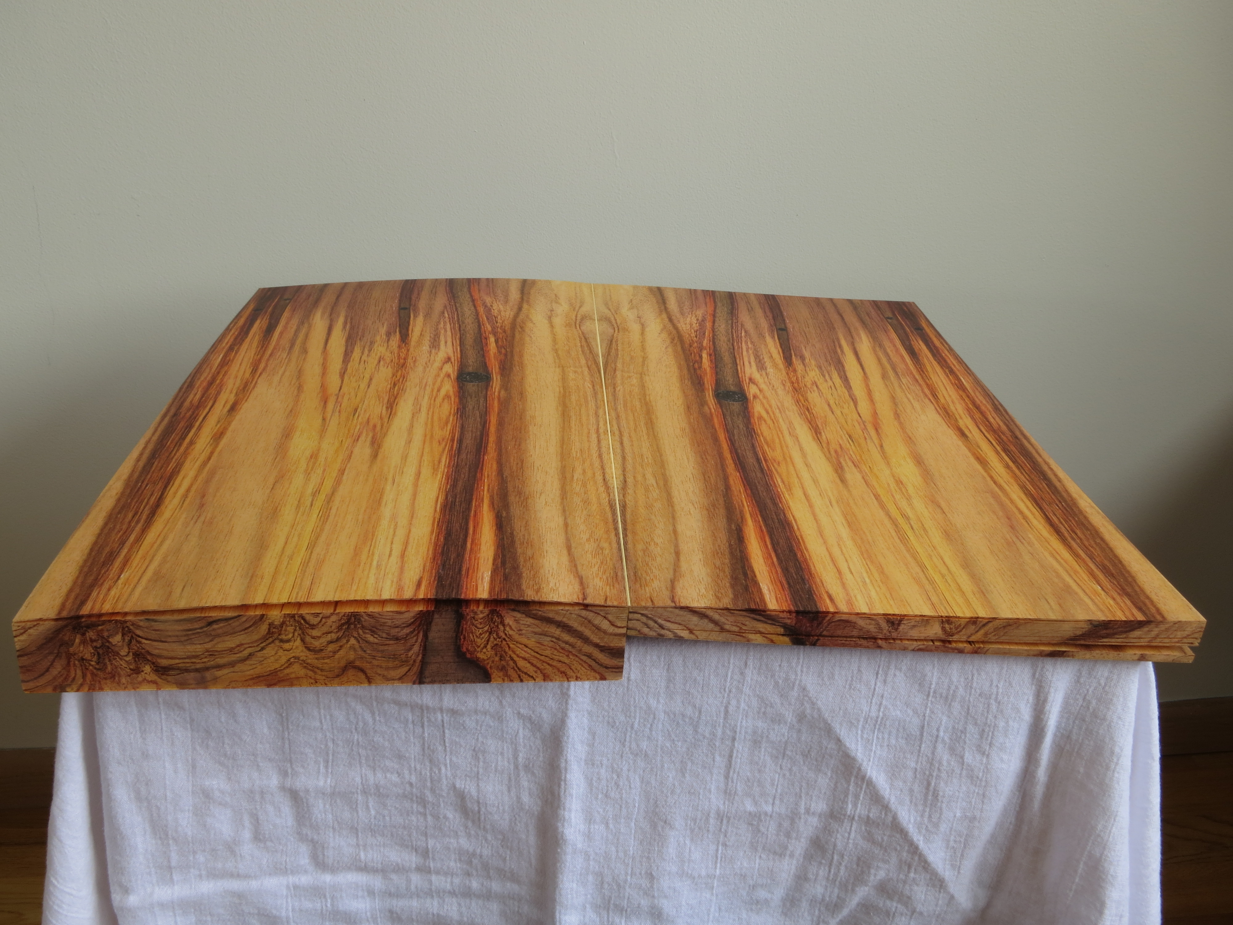
Reiterating his point by analogy, Mod channels the late designer George Nakashima:  “in order to produce a fine piece of furniture, the spirit of the tree must live on. You give it a second life … You can make an object that lives forever, if used properly.

For the fundamentals underlying Mod’s scatologically and poetically emphatic truth, you cannot find much better than Alexander Ross Charchar’s essay on the craft and calculations of “page canons” by Villard de Honnecourt (13th century!) , J.A. Van de Graaf, Raúl Rosarivo and Jan Tschichold:  “The Secret Law of Page Harmony“. Most delightful is Charchar’s dynamic diagram “The Dance of the Four Canons” illustrating the workings of each page canon:

Copyright 2010, Alexander Ross Charchar.

The Further Reading suggested by Charchar and his commenters is excellent, and I would only add Marshall Lee’s Bookmaking. For those who are irritated with the imposition of the print paradigm on the digital reading experience, there is a useful pointer to applying the page canons to website design that will cause a rethink of that irritation and equally make the imposers think harder as well.

For those who care about the book, what it is evolving into and the role that heart, mind and design still play in that process, read Charchar’s”The Secret Law of Page Harmony” –again and again.

Bookmark – Who Owns the Findability Function?

Pompeii_300
Now where did we last see that book?

The Repository of Primary Sources has been running since 1995 at the University of Idaho. Under the wing of Terry Abraham, it lists “over 5000 websites describing holdings of manuscripts, archives, rare books, historical photographs, and other primary sources for the research scholar”, and “[all] links have been tested for correctness and appropriateness”.

So what has this to do with the evolution of the book? Well, in the world of book publishing, whose job has it been to make sure that a book is known about and can be found — not only on publication but after? Marketing, Promotion and Publicity, undoubtedly, but they would be among the first to shout if Editorial or someone had not registered the book’s metadata with Bowker or the equivalent local ISBN registry.

According to Google, there are 129,864,880 books in the entire world (as of 5 August 2010, 8:26AM), but that is a semi-statistical estimate for the modern era drawn from sources such as ISBN registrars and OCLC’s WorldCat. Bookfinder/JustBooks, launched in 1997 by Anirvan Chatterjee, claims that through its network, it searches over 150 million books for sale. With the great hoohah over Hugh Howey’s Amazonian extrapolation, we can safely assume that there are many, many more books out there probably without ISBNs, which after all only came into effect in the 1970s and, even so, now there are vociferous opponents to the ISBN calling it an offline anachronism.

There is no question to beg about the usefulness of metadata. So is there a Terry Abraham and cohort out there to whom publishers and self-publishing authors can turn to deposit metadata whose links will be “tested for correctness and appropriateness”? Of course, that begs the question of whether there should be someone or organizations out there to perform that function. Why not leave it to the power of the Internet or the power of the market? Even if a book goes unnoticed or after a time becomes an “orphan work“, the power has spoken.

Let’s leave the power politics for another bookmark. Whoever performs the function, what exactly is it? Let’s call it the “findability” function.  It goes beyond the usual social media marketing of a book or ebook that most publishers assign to Marketing.  It goes beyond the usual search engine optimization (SEO), although it is arguably a part of it.

It goes to making the book as locatable an object as it can be, endowing it with “ambient findability.” See Peter Morville’s book of that title and judge for yourself whether “endowing something with ambient findability” misconstrues what he is saying or how the Web works.  Nevertheless, …

Superfluous as they are claimed to be becoming, should publishers leave findability to the ISBN registries and librarians (until they become superfluous as well) or to the technorati?

As the book evolves, this “findability” function currently falls between the stools of Commissioning (where the editor discovers the author and pumps him or her not only for the ms but for connections leading to sales/marketing opportunities and further editorial opportunities), Editorial/Production (where the copyeditor, designer and production editor ensure that metadata is assigned and link-checks are run and the work is registered with the Library of Congress), Sales/Marketing (where marketeers scour the author’s questionnaire if it has arrived, create lists of mailing and emailing lists, compile the list of offline and online reviewers/bloggers and design the social media campaign and where a sales account manager with responsiblity for Amazon and other online accounts worries whether IT has included the work in the scheduled ONIX, EDI and customized catalog feeds) and Operations/Finance (where an accountant, analyst or inventory controller assigns the ISBN usually upon receipt of contract approval).

Who assigns and maintains the Digital Object Identifier (DOI) is a related beggarly question.

So if you are self-publishing or publishing books/ebooks, who attends to the ambient findability of what you are publishing?   As more and more books go online, isn’t this part of the new craft and art of the book?

By the way, I found Morville’s book one rainy Saturday afternoon while shelving books at the local Oxfam bookstore.   I bought it instead of shelving it.

Bookmarking Book Art – A Good Book

What is “A Good Book“?

A hard question? A trick question? Yes and no. Since 2011, Bernd Kuchenbeiser, the Munich-based book designer, has been attempting an answer. He began by posting entries to a database on Twitter. With the demise of Twitter’s gallery function, Kuchenbeiser migrated the diary-like collection of photos and comments to A Good Book site with help from Simon Zirkunow. Below is a screenshot of part of the 232nd entry.

A Good Book
Screenshot of Méthodes, cover designed by Manuela Dechamps Otamendi, Entry #232 in A Good Book.

Until recently, the entries were Kuchenbeiser’s alone. The entries started on a daily basis, but as with many diary projects, the execution flagged. With 349 entries of his own (plus 3 from friends), he is now inviting entries from far and wide. Notice “Submit” in the upper righthand corner of the screenshot. Behind it lie the instructions and requirements for submission. Kuchenbeiser’s own entries are often brief, but his choices and comments are interesting because Kuchenbeiser and his oeuvre are interesting. See Michael Cina’s interview with him in The New Graphic (15 August 2011). For this venture to reward constant revisiting beyond that interest, however, Kuchenbeiser wisely holds potential contributors to the following standard:

Here’s what you need in order to submit a book:

– A short description of your book or the aspect that makes it ‘good’. From 140 characters to a maximum of 560, including spaces.

– The bibliographic details: author, title, year of publication, publisher, designer (if known). A questionnaire is already set up within the email that opens when you click ‘Submit now’.

– One to five photos of your book (at least 1400 pixels wide for landscape format and 1200 pixels high for portrait format).

Think of Pinterest or Flickr with serious feeling and intellectual rigor behind them. Kuchenbeiser’s design work and his own words exude that feeling:

Books have personalities. They can be our companions and friends. A good book doesn’t deserve to languish on a bookshelf; it wants to be opened, read, savoured, displayed, recommended. That’s why this website exists.

This site is like a message in a bottle hoping to be discovered. It will work only if it manages to generate communication.

The London Centre for Book Arts must have picked up the bottle from one of the Thames overswellings last week and placed a notice on its home page about the website. Although Kuchenbeiser does not promote it as such, if A Good Book thrives, it could generate a rich database worth semantic analysis for the book art and book arts community. All materials on A Good Book are being made available for noncommercial and educational use only.

Bernd Kuchenbeiser Projects, Schwanthalerstraße 7780336 München (Germany)

Bookmark – Education for the Future of Publishing

The Elements, Theodore Gray

When it comes to acquiring skills and professional training in book publishing, from the early days of the printing press onwards, learning by doing has been book publishing’s order of the day.  Consider the following interview exchange between Mac Slocum (Tools of Change) and Theodore Gray (The Elements):

.

MS: What skills — or people with those skills — must be incorporated into the editorial process to produce something like the iPad/iPhone editions?

TG: Specifically in the case of “The Elements,” the skills required were writing, commercial-style stills photography, Objective-C programming, and a whole, whole lot of Mathematica programming to create the design and layout tool and image processing software we used to create all the media assets that went into the ebook.

Other ebooks might well require different skills. My next one, for example, is going to include a lot more video, so we’re gearing up to produce high-grade stereo 3D video. That’s one of the challenges in producing interesting ebooks: You need a wider range of skills than to produce a conventional print book.

Starting out in book publishing late in the last century, a novice would have consulted Marshall Lee’s Bookmaking and the Chicago Manual of Style to learn the basics of design, editorial and production.  If it were Trade publishing that beckoned, a familiarity with A. Scott Berg’s biography of Maxwell Perkins (“Editor of Genius”) would have been likely.

Maxwell Perkins, half-length portrait, seated ...
Maxwell Perkins, half-length portrait, seated at desk, facing slightly right / World Telegram & Sun photo by Al Ravenna. (Photo credit: Wikipedia)

If scholarly book publishing, then Harman’s The Thesis and the Book, Turabian’s A Manual for Writers and maybe Bailey’s The Art & Science of Book Publishing.

But as with the acquisition of print publishing skills through learning by commissioning, designing, editing, printing, marketing and selling, the acquisition of the skills required for ebook publishing could use a hand up from appropriate resources.   People like Joshua Tallent, Joel Friedlander, Liz Castro, Craig Mod, Matthew Diener are those resources — either by example or authoring — and novices today would do well to start bookmarking their output.

For notes on the availability of formal training and career conditions in publishing, see Thad McIlroy’s The Future of Publishing.

Related sources:

“Joshua Tallent of Ebook Architects on the State of Digital Publishing,” Bill Crawford, Publishing Perspectives

“Understanding Fonts & Typography,” Joel Friedlander, The Book Designer

html, xhtml, and css: 6th edition, Elizabeth Castro

“Our Future Book,” Craig Mod

“Resources,” Matthew Diener, David Blatner and Anne-Marie Concepcion, ePUBSecrets

The Chicago Manual of Style Online

English: Image of the cover of the 1906, 1st E...
English: Image of the cover of the 1906, 1st Edition of the Chicago Manual of Style (Photo credit: Wikipedia)