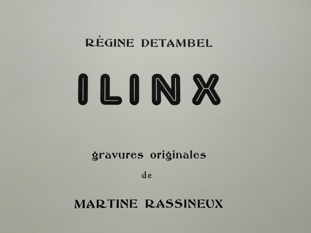
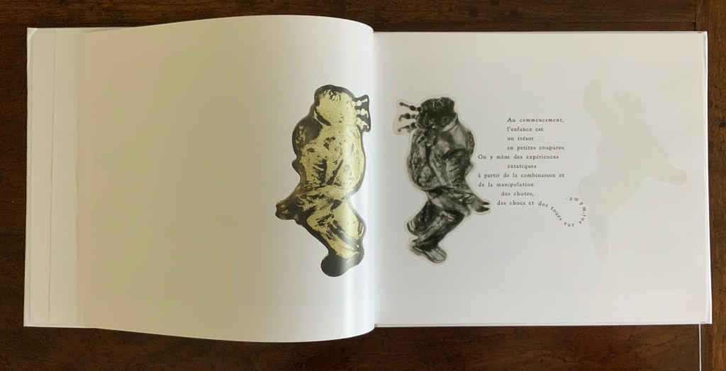
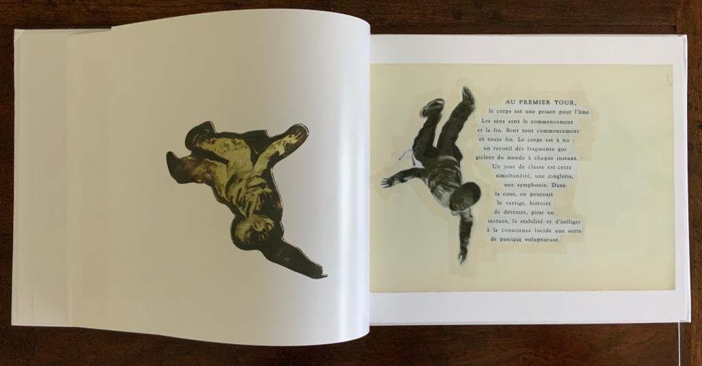
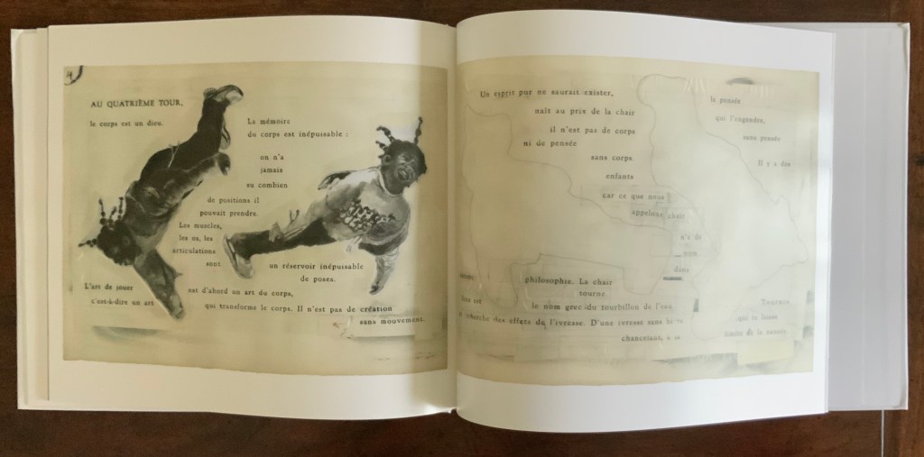
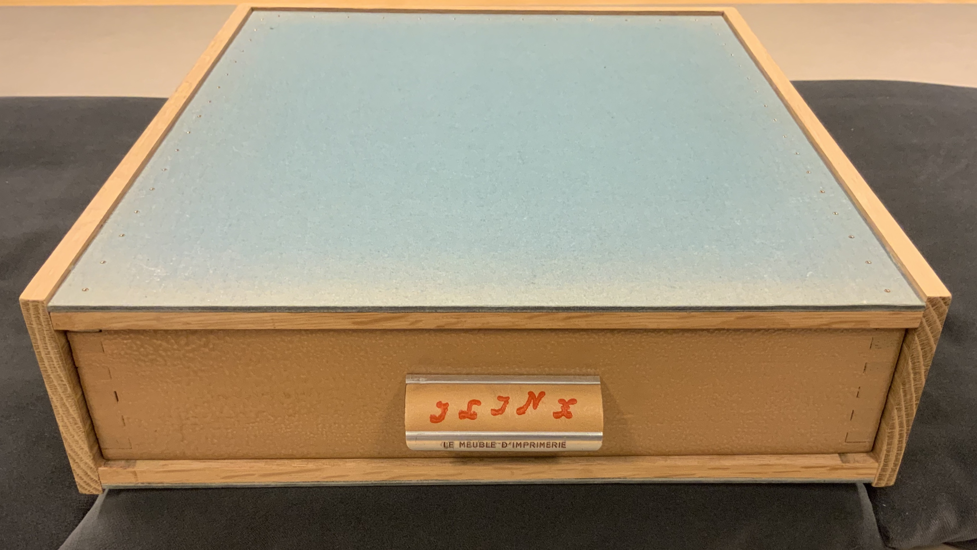
LINE UP (2020)
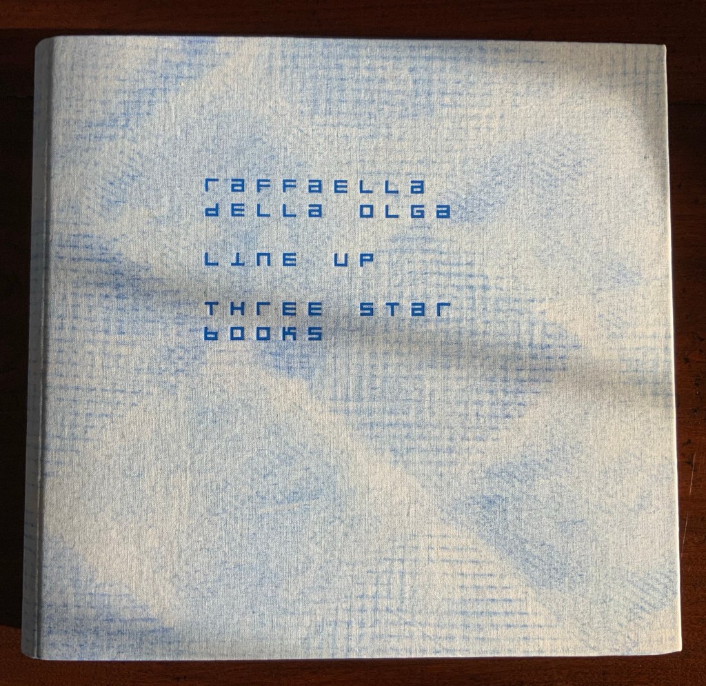
LINE UP (2020)
Raffaella della Olga
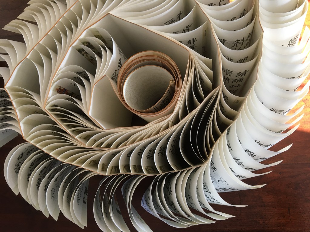
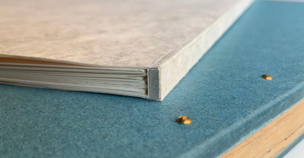
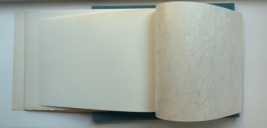
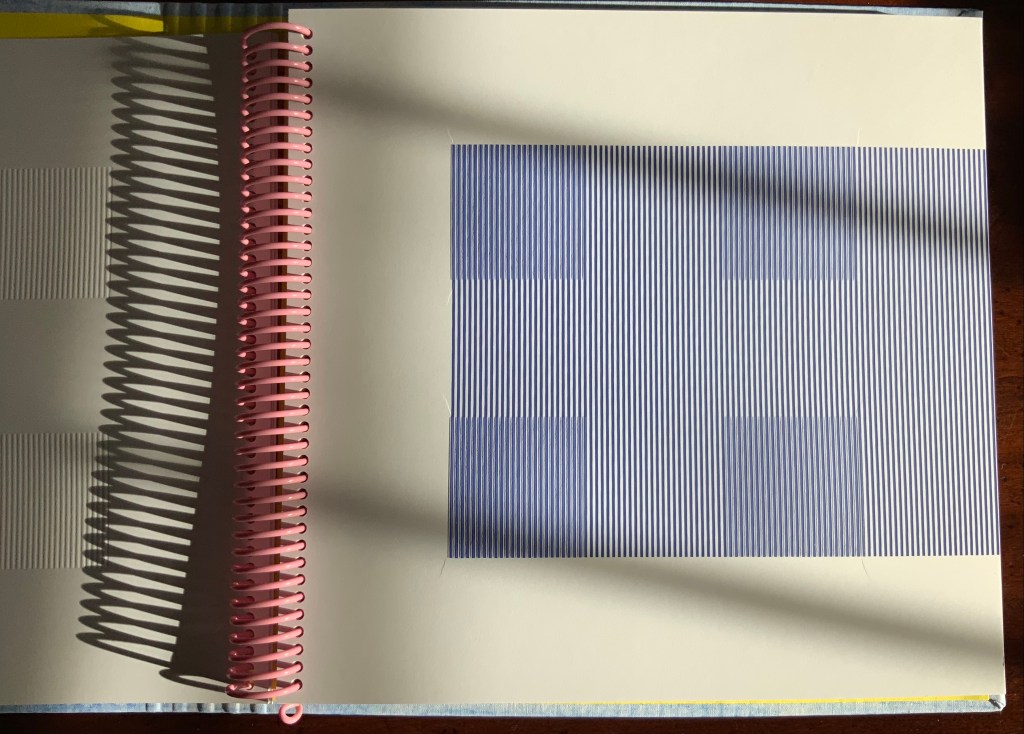
Cloth on board with spiral binding of 28 card folios. H270 x W290 mm (closed). Edition of twenty-six, of which this is #8. Acquired from Three Star Books, 4 November 2020. Photo: Books On Books Collection, displayed with the artist’s permission.
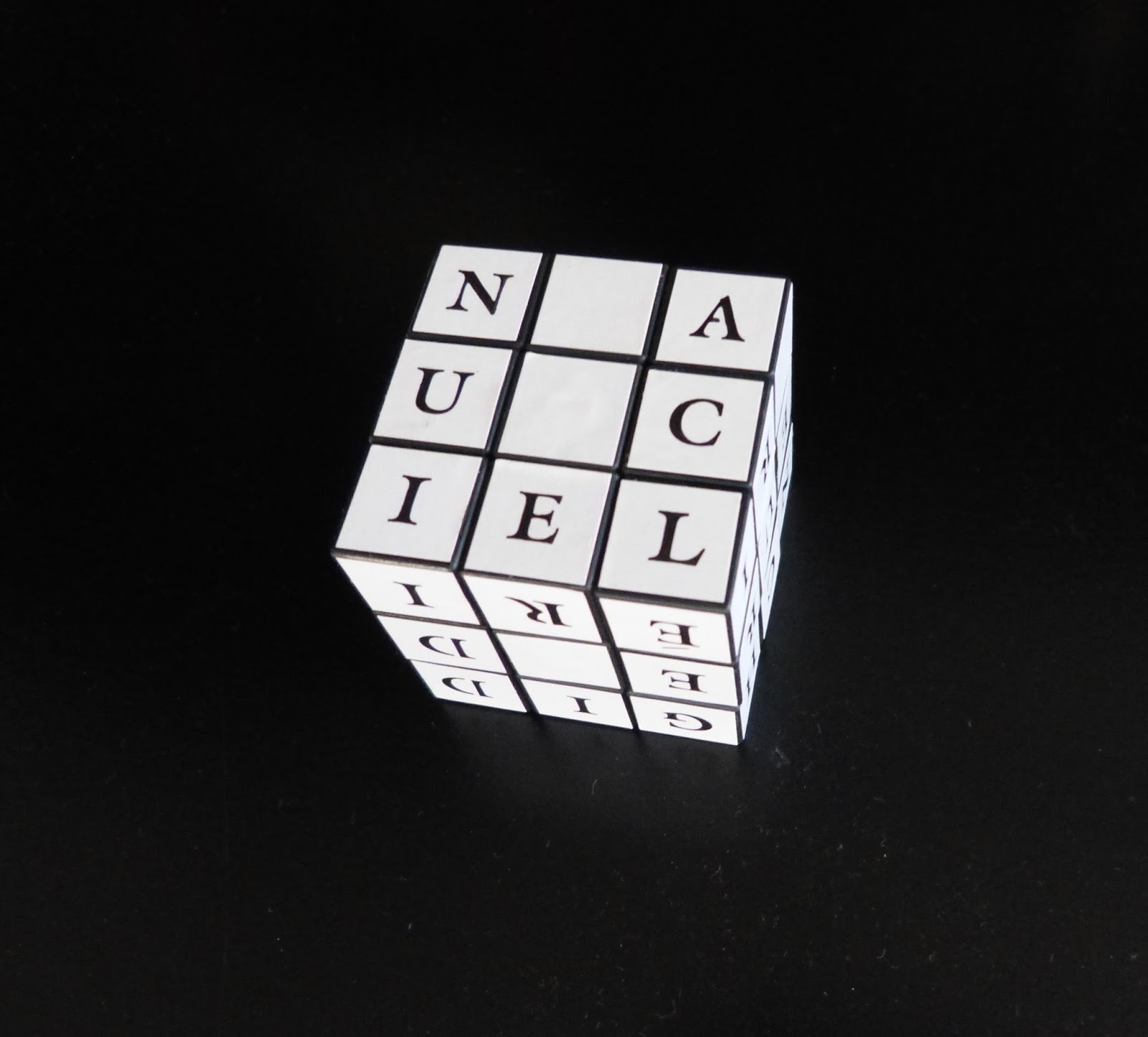
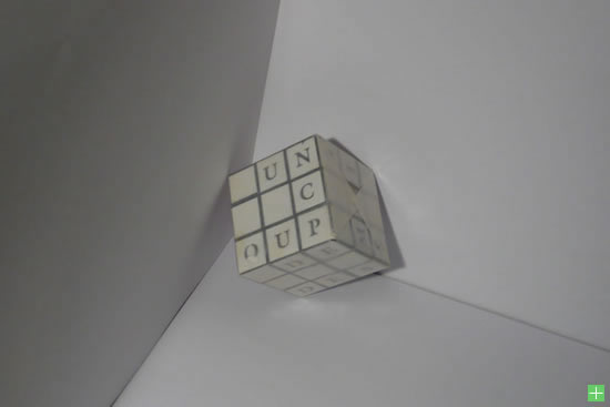
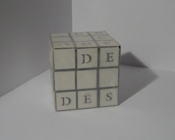
Formerly a lawyer, Raffaella della Olga turned from the manipulation of legal text to the artistry of the letter and its “total expansion” — the book — as well as its manifestation in light and textiles. Her chief tool of art is a set of customized typewriters. The output she calls “tapuscripts”. Most of her works are unique pieces, each entitled with the emblematic letter T followed by the ordinal number of its creation — up to T28 as of this writing.
T28 Alphabet (2019/2020)
Raffaella dell Olga
Typewritten on paper and silk paper with carbon paper 485 x 435 mm. Image:
© Raffaella della Olga and reproduced with the artist’s permission.
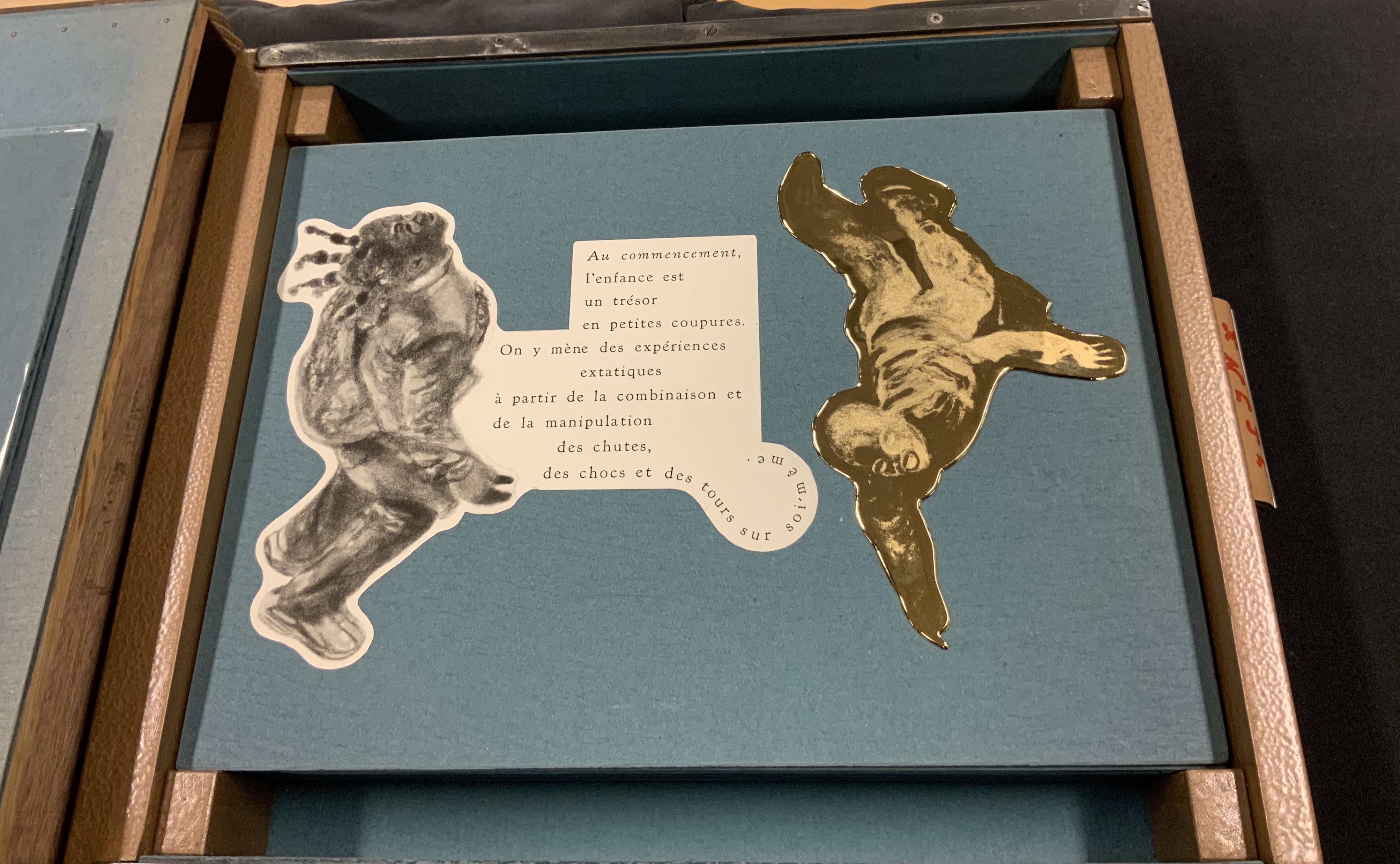
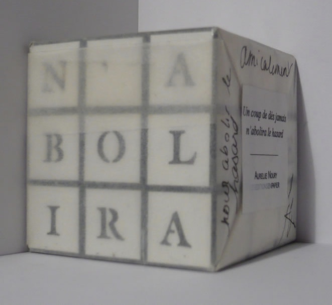
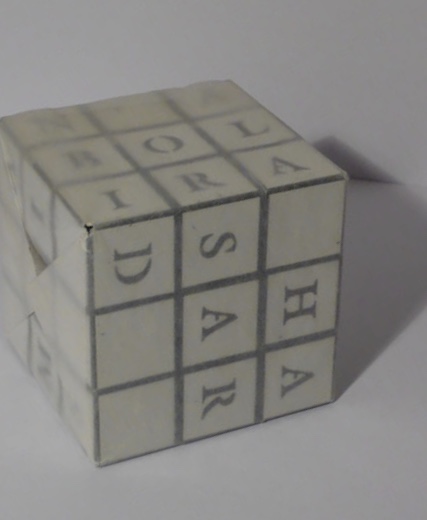
The limited edition of LINE UP offered an unusual opportunity to add to the Books On Books collection a work that resonates with its subset of abecedaries and one by an artist who shares a deep interest in another theme in the collection: Un coup de Dés jamais n’abolira le Hasard. Since 2009, she has created bookworks that reveal an artist’s and careful reader’s appreciation of the poem.
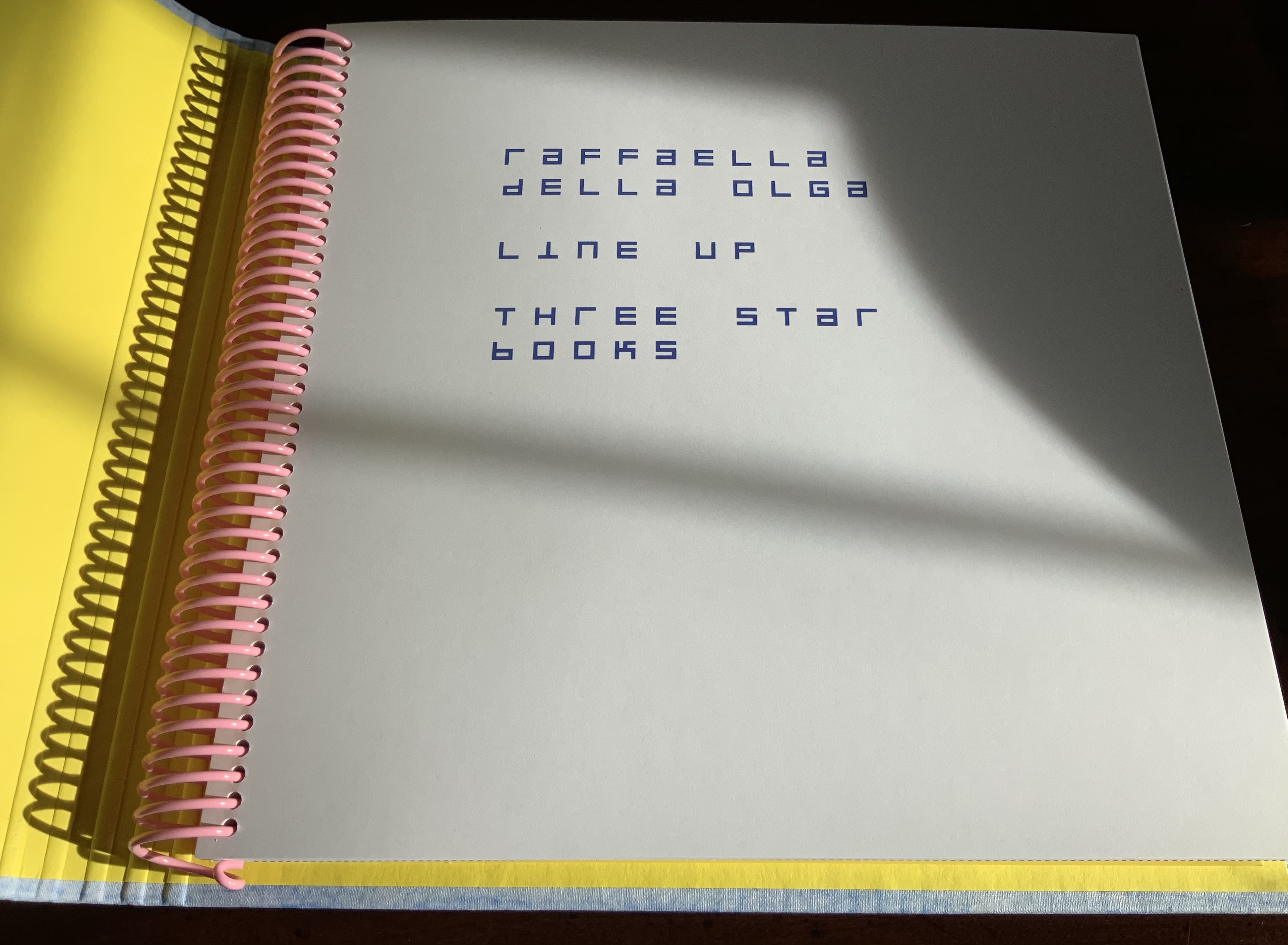
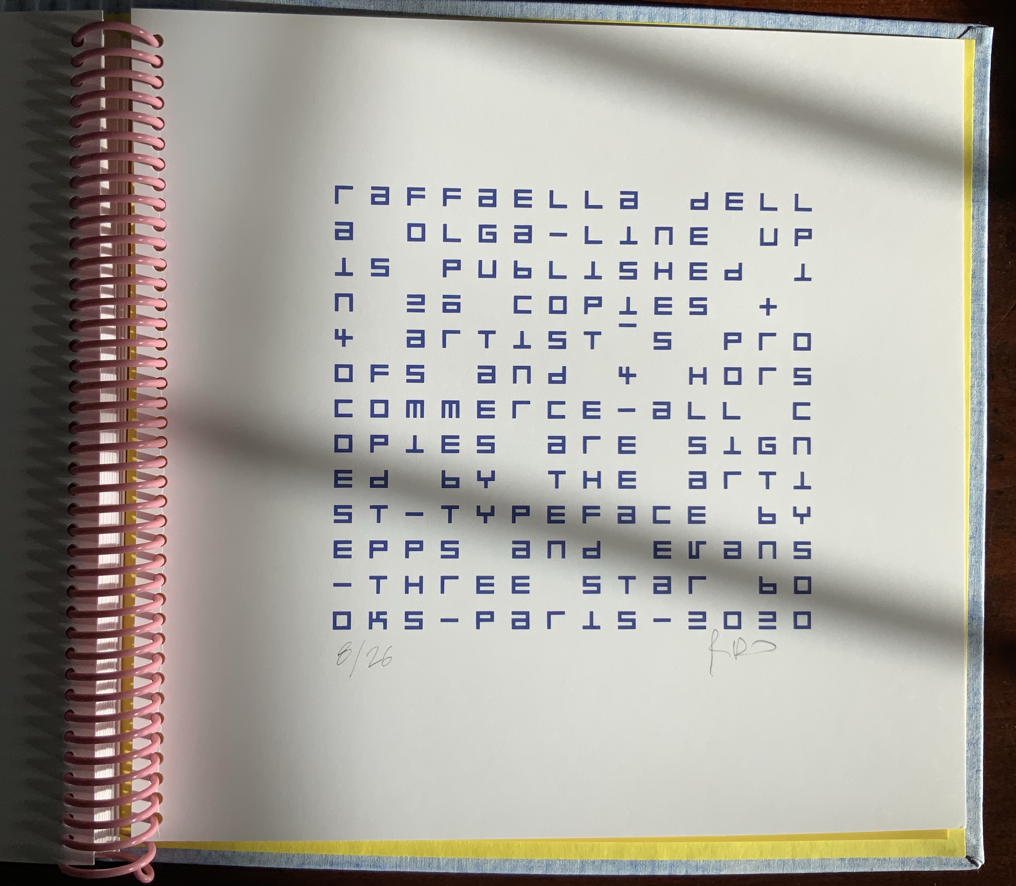
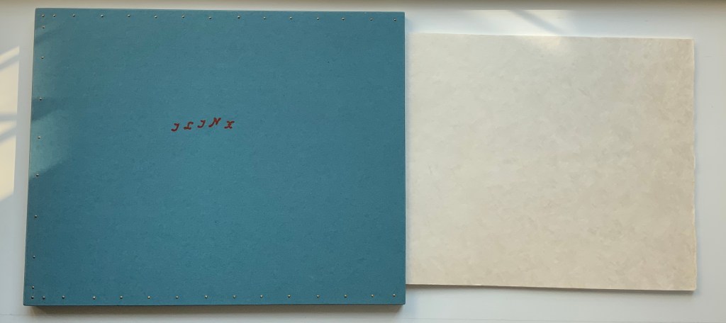
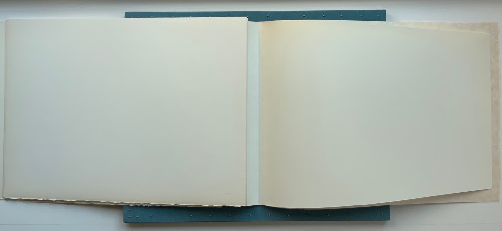
Title page and colophon from LINE UP. Photos: Books On Books Collection, displayed with the artist’s permission.
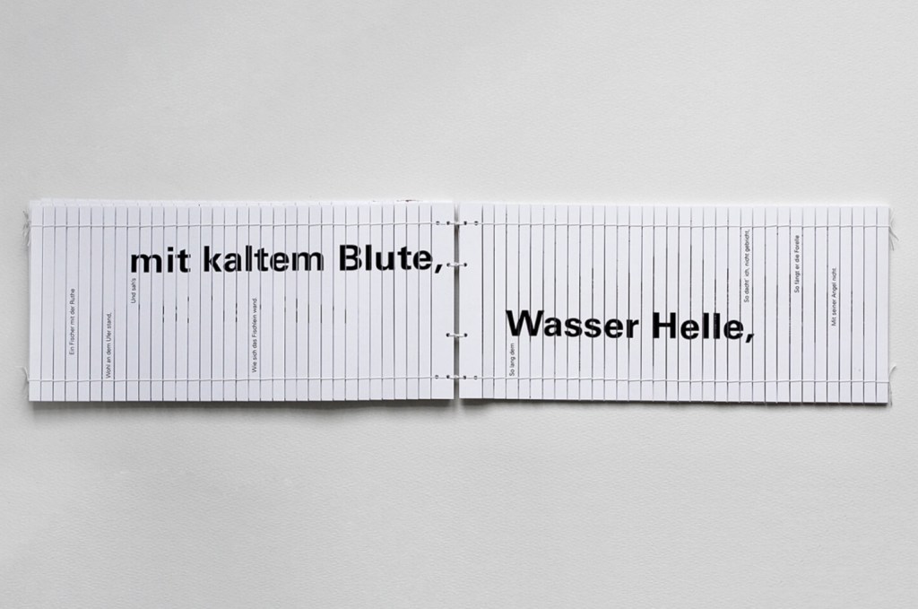
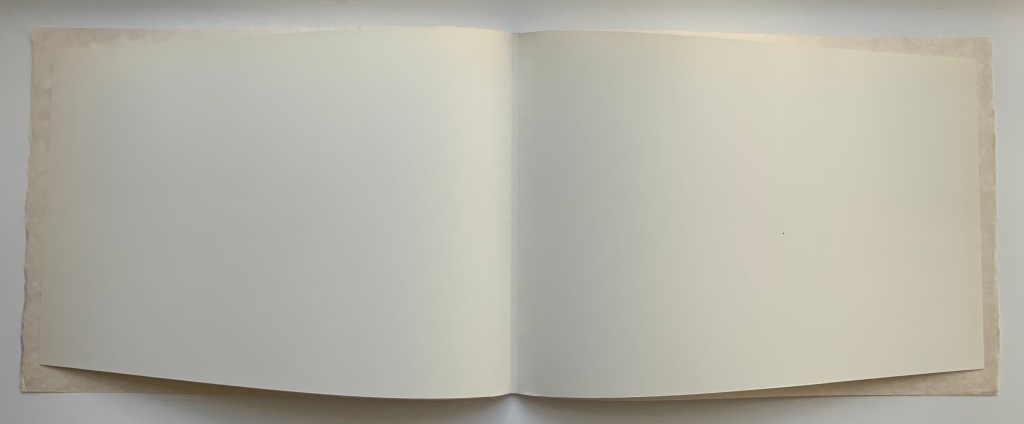
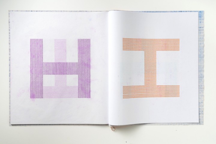
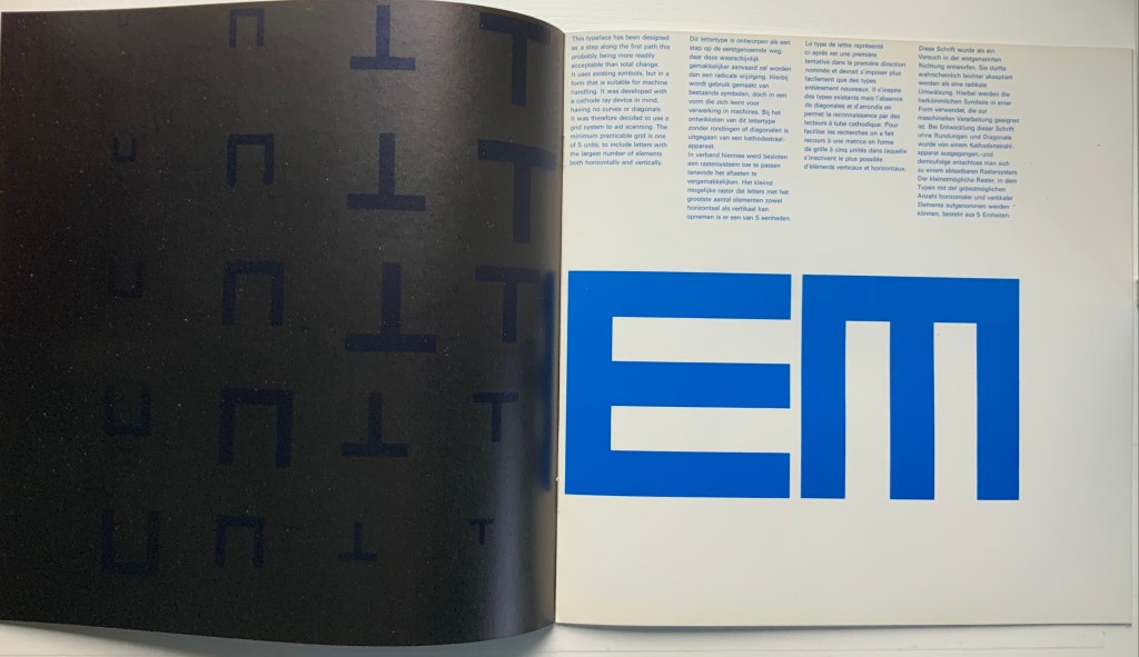
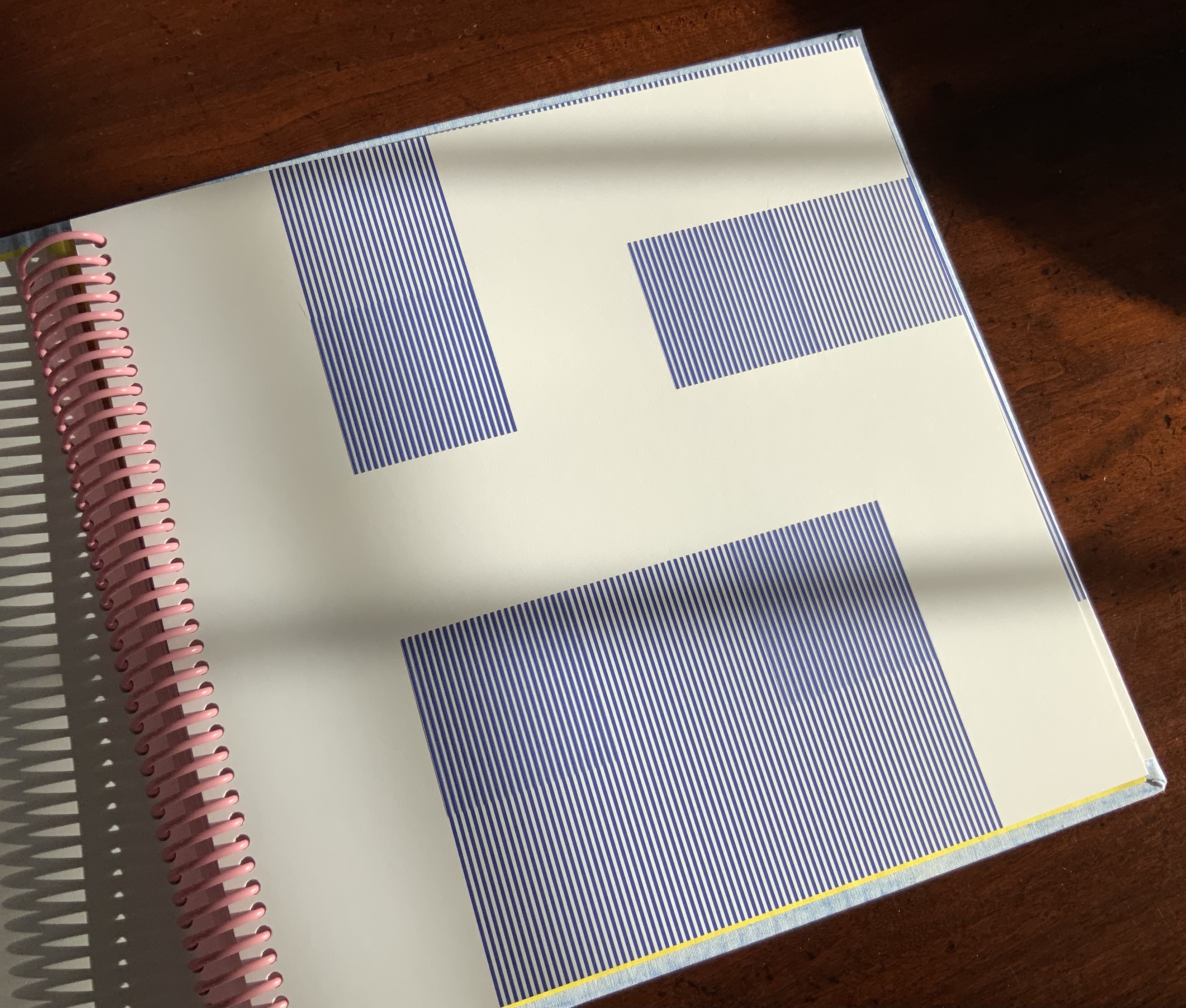
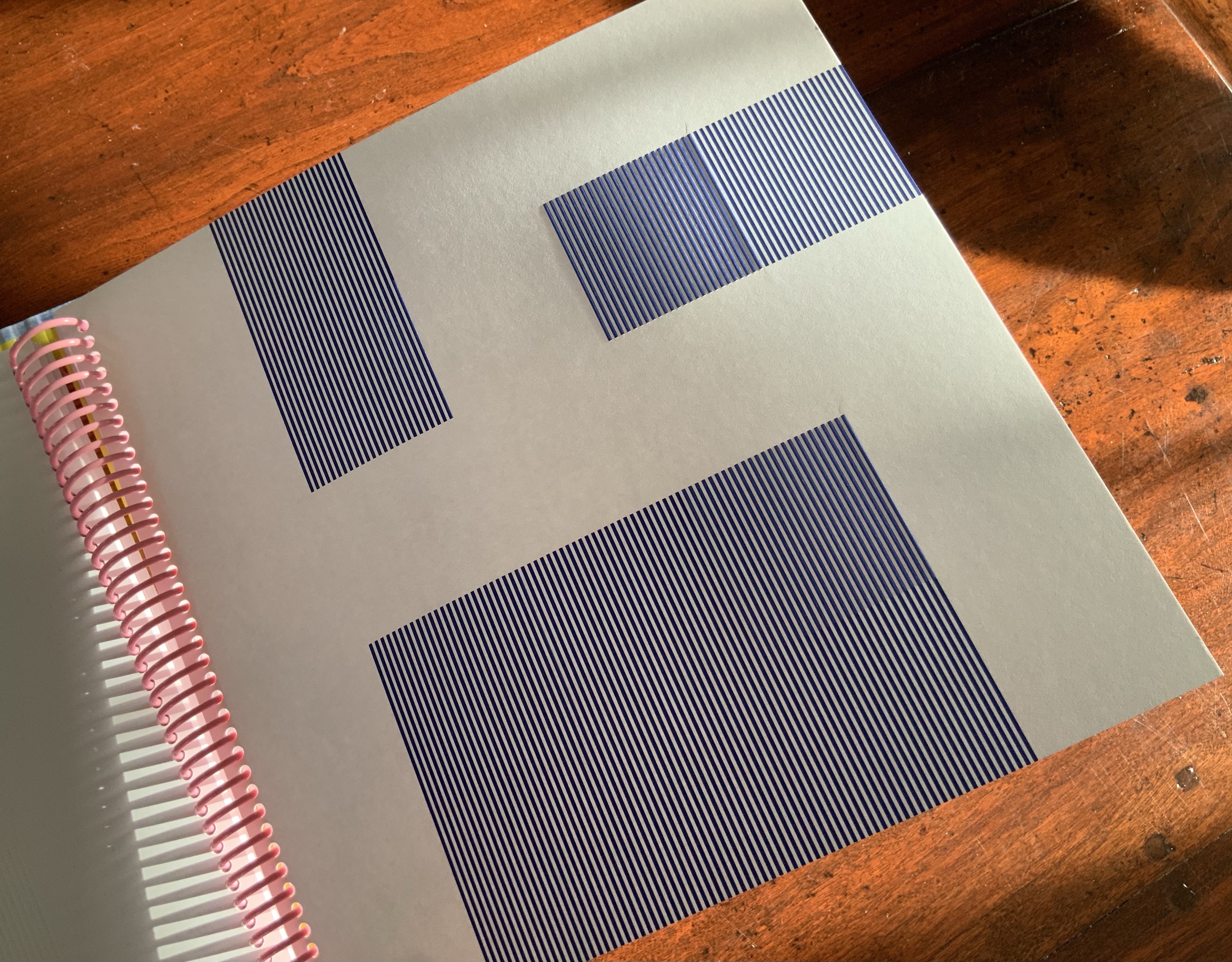
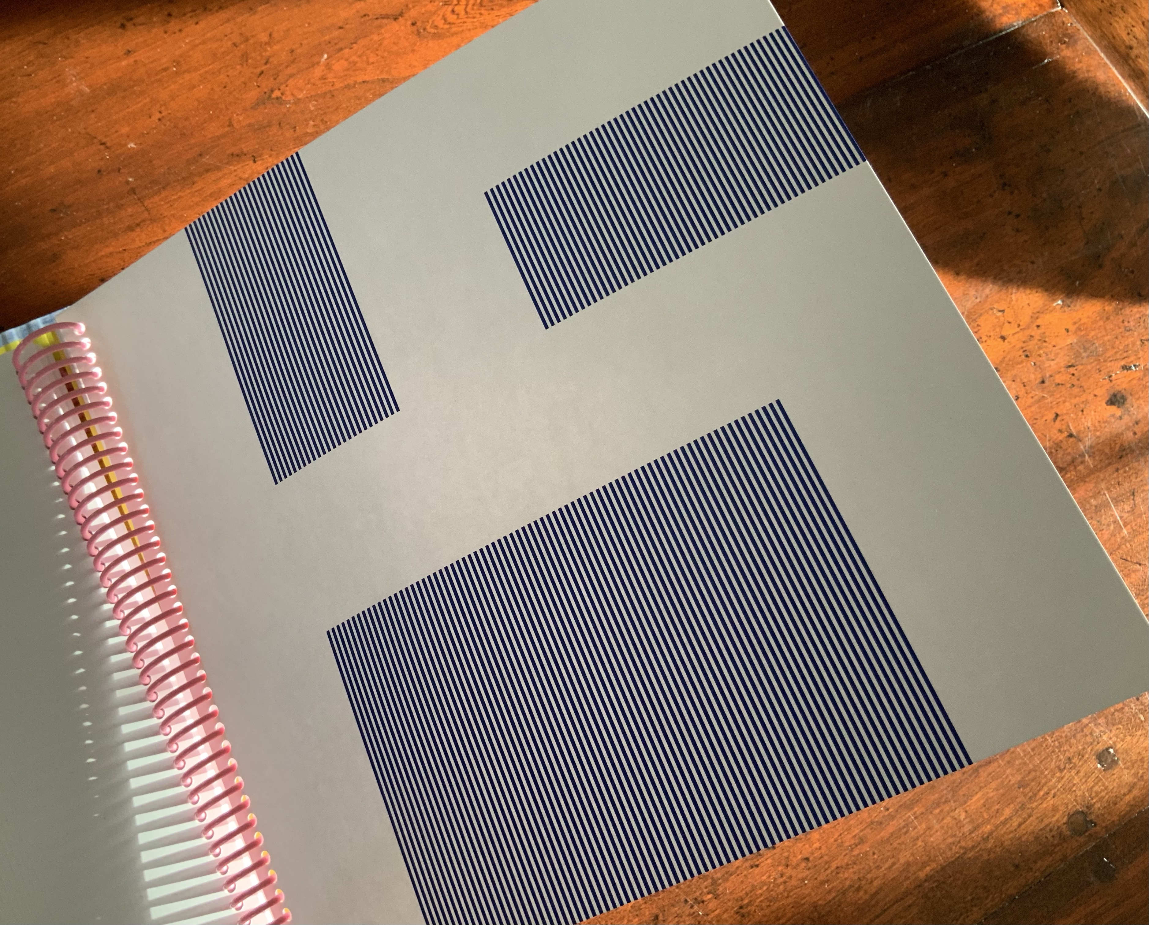
LINE UP is very much a collaborative work between Raffaella della Olga and Three Star Books, founded in 2007 by Christophe Boutin and Mélanie Scarciglia with Cornelia Lauf (2007-2015). The edition consists of twenty-six spiral-bound copies, each with a unique cover produced by rubbings on canvas and differently colored. The title page and colophon take up two of the card folios in the volume, which leaves twenty-six for the printed content. Blocks of vertical blue lines turn the pages into letters based on the Epps-Evans alphabet, designed in the 1960s with only horizontal and vertical strokes in an attempt at machine readability.
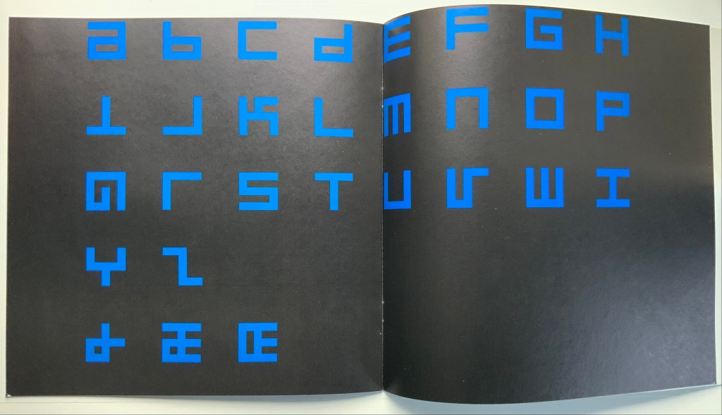
Alphabet (1970)
Timothy Epps and Dr. Christopher Evans
Hilversum: de Jong & Co., 1970. Photos: Books On Books Collection.
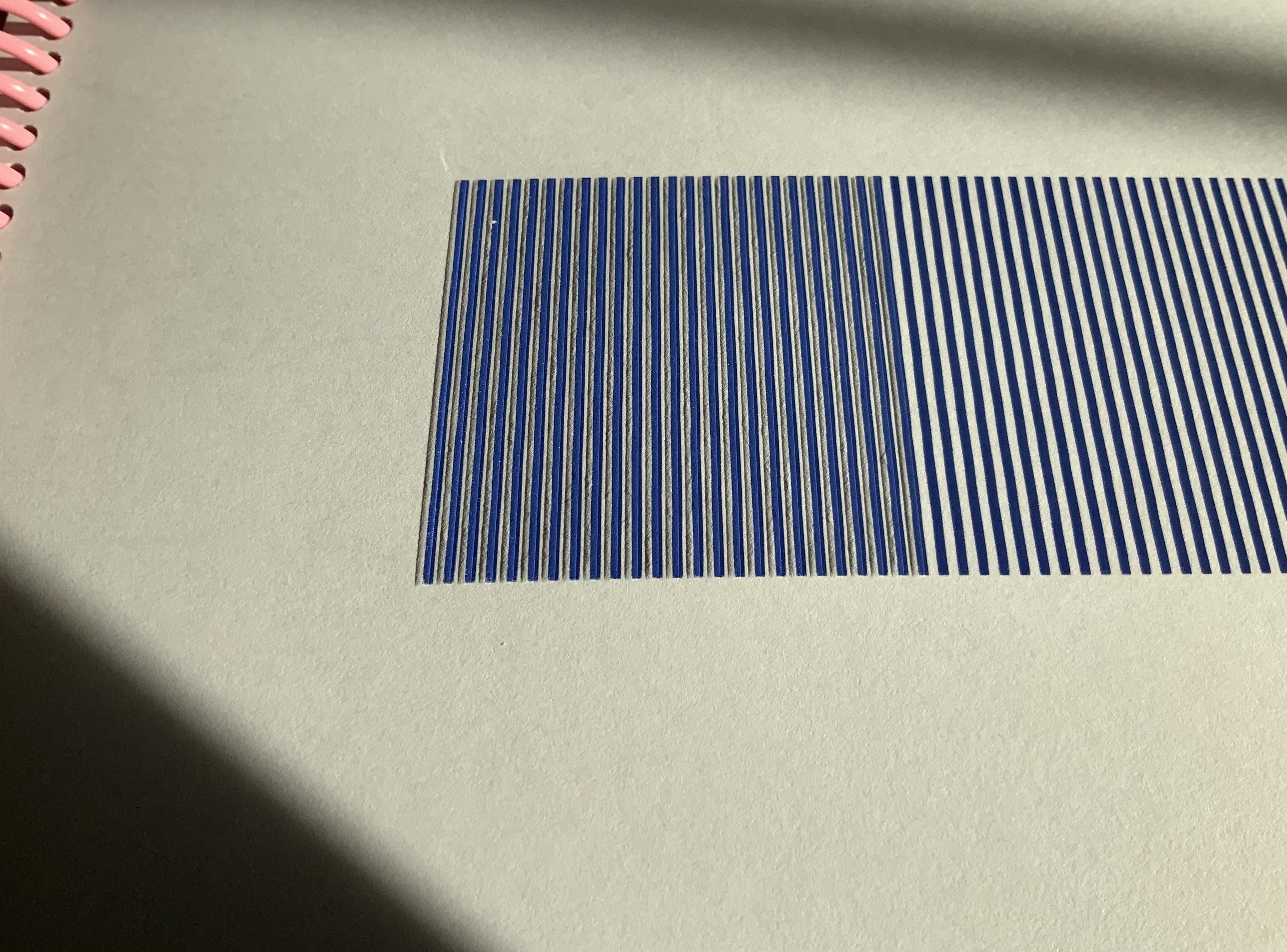
Discerning the letters in LINE UP feels sometimes like squinting one’s way through an optical illusion. The eye is bewitched by a color-shifting, almost stroboscopic effect created by four squares of embossed lines printed from the reverse side, always in the same position. Della Olga credits Christophe Boutin (Three Star Press) with introducing this effect.
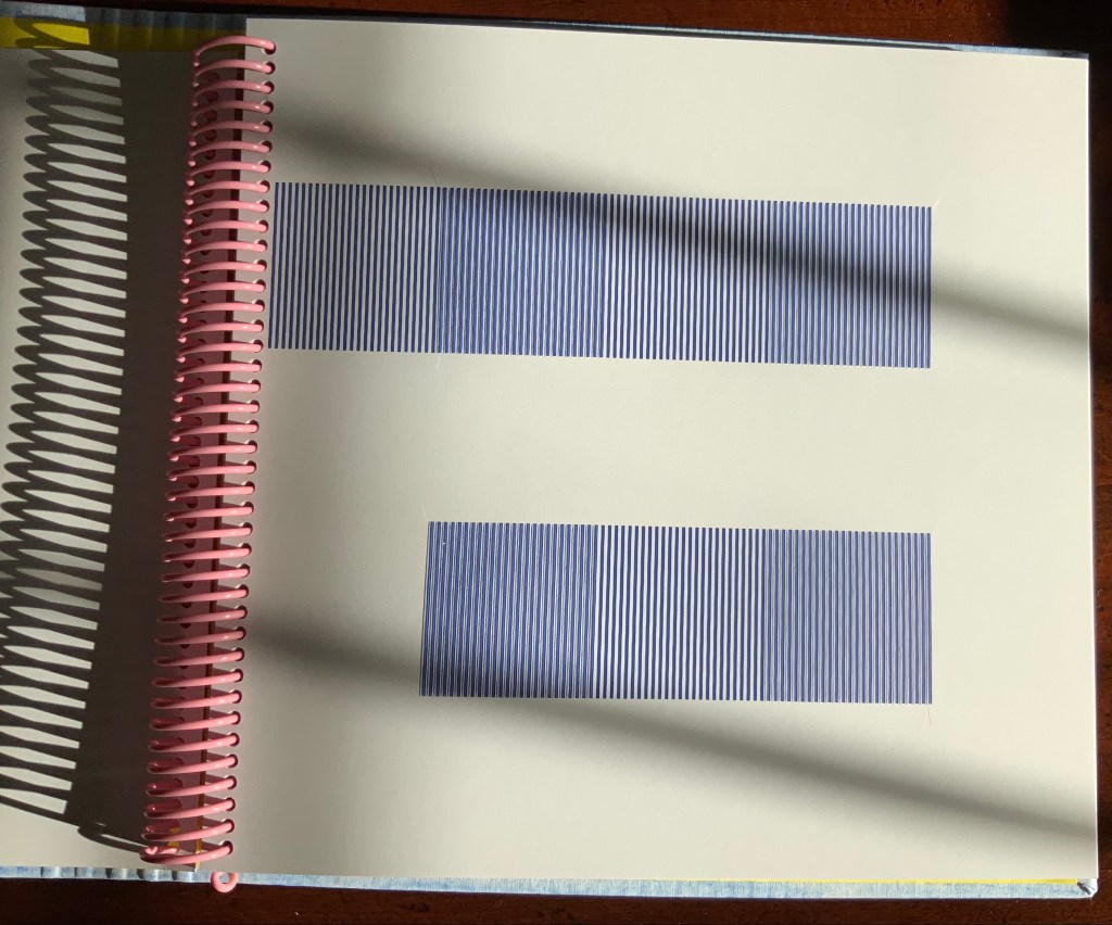
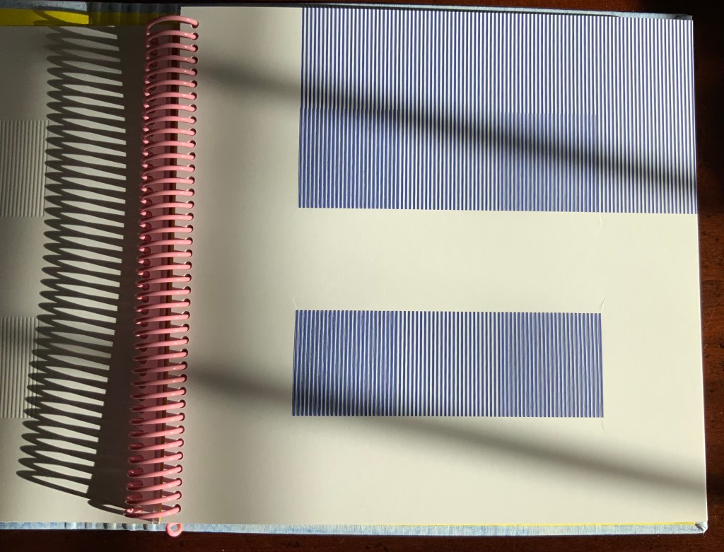
The letters “a”, “b” and “c”.
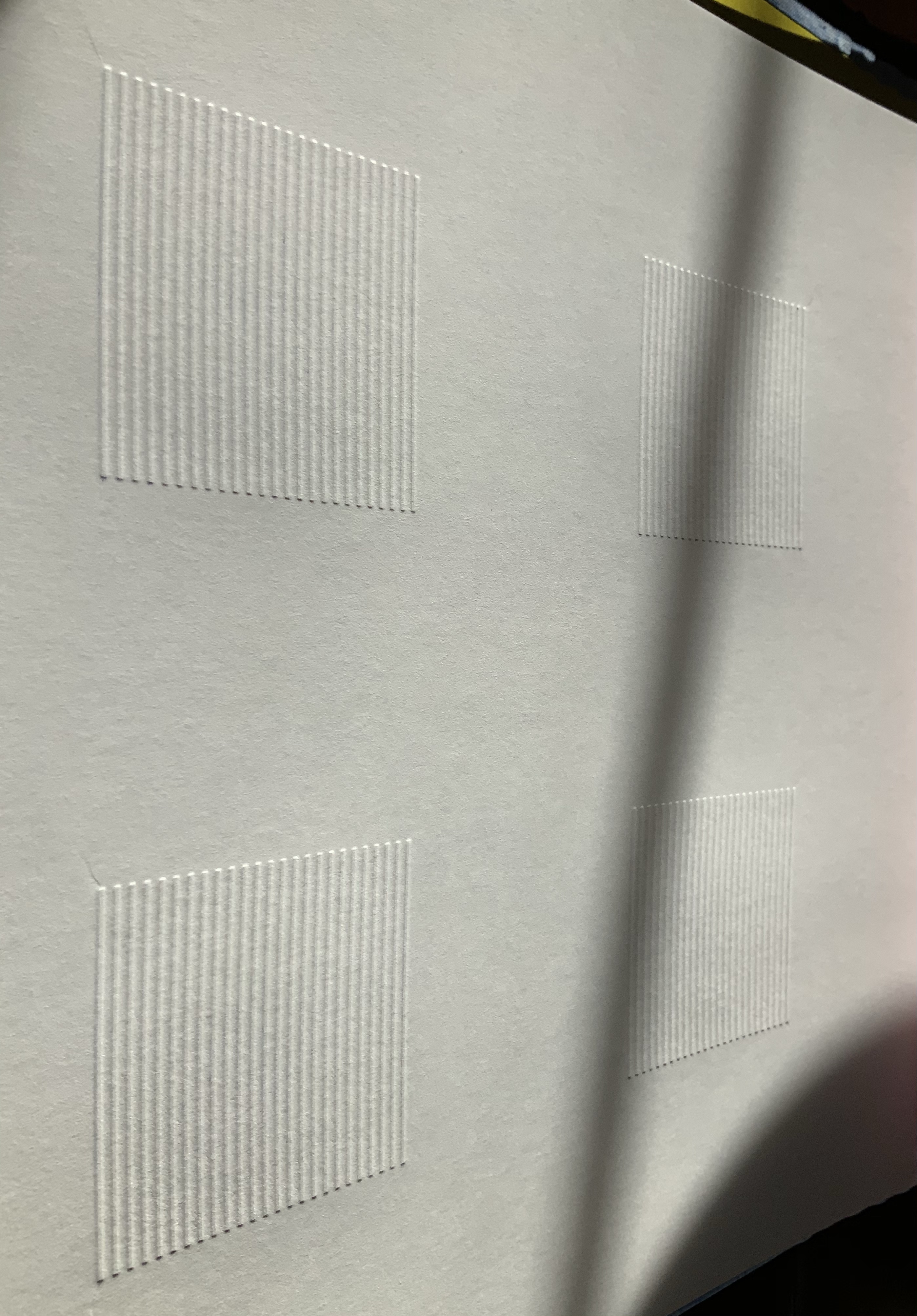
Left: The four embossed squares seen from the verso. Right: The color shift between the embossed and flat squares.
The letter “k” at different angles of light.
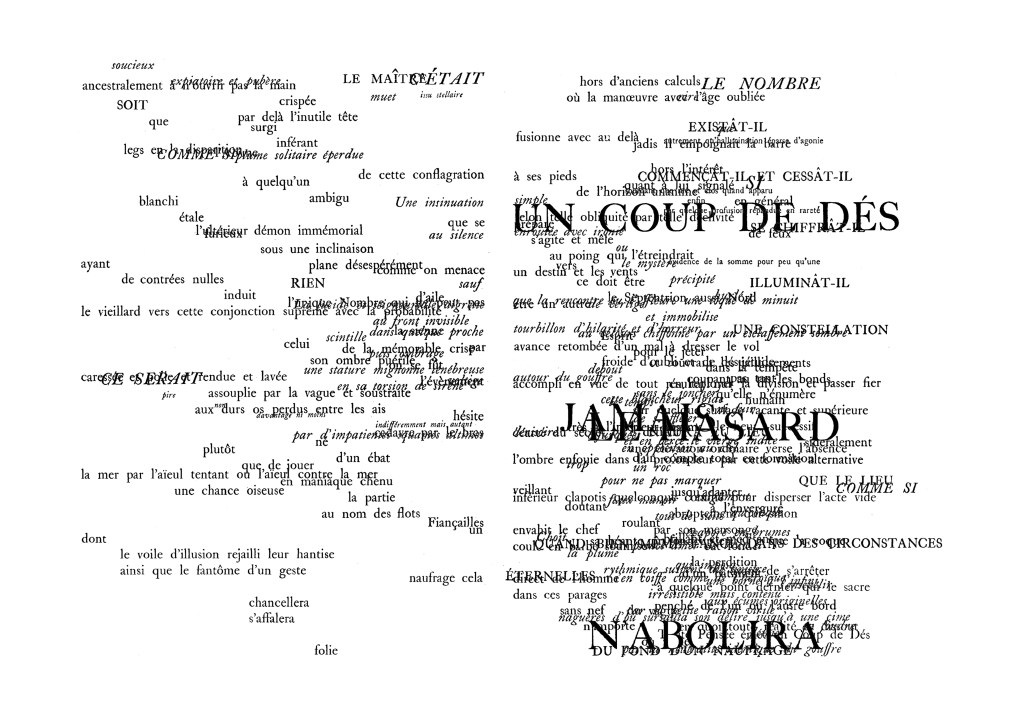
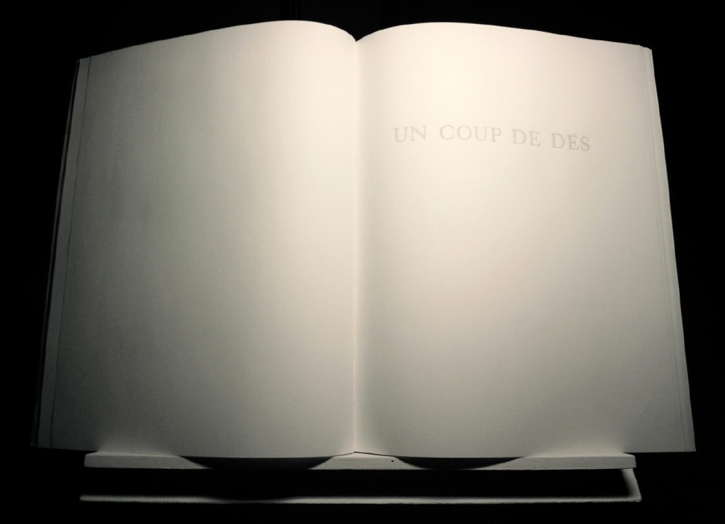
The first of della Olga’s works reflecting the influence of Mallarmé’s poem was Un Coup De Dés Jamais N’abolira Le Hasard – Constellation (2009), which was shown in the Gulbenkian’s “Pliure” exhibition in Paris in 2015. In a darkened room with an attendant turning the pages, the poem’s words, painted in phosphorescent powder, flickered into existence.
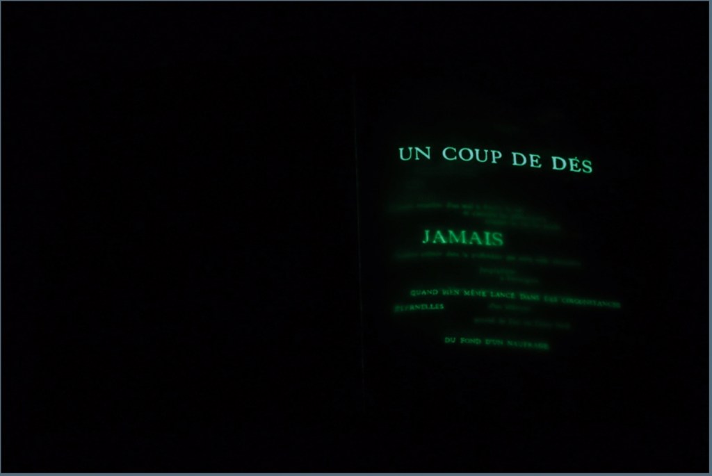
Un Coup De Dés Jamais N’abolira Le Hasard – Constellation (2009)
Raffaella della Olga
Hand made work, white acrylic paint, phosphorescent powder, glue. H320 × 500 mm. Photos: © Raffaella della Olga, reproduced with permission of the artist.
A year later came this rendition: Jamais Le Hasard N’abolira Un Coup De Dés – Permutation (2010). Although the link goes to an online presentation, the work is analogue and unique. In correspondence (9 December 2020), Della Olga writes, “I took apart the book the Gallimard edition as a whole, without the paratext. I folded the double pages and deleted with white paint the part of the poem that appear.” A close look at the framed pages reveals the faint shadows of the painted-over text. On the wall, the permutation arises in the changeable order of hanging, which the online algorithm permits the viewer to perform.
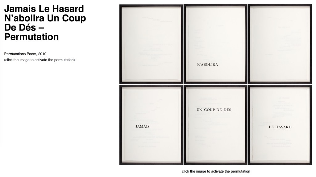
Jamais Le Hasard N’abolira Un Coup De Dés – Permutation (2010)
Raffaella della Olga
Randomly generated computer graphic.
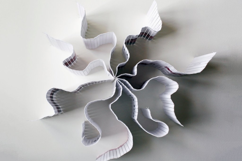
Her most recent homage to Mallarmé’s poem is Un Coup de Dés – Trame (2018). Like Constellation with its reference to and enacting of the poem’s constellation metaphor, and like Permutation with its reference to and enacting of chance, Trame well reflects della Olga’s penetration of the poem and transformation of it into artwork that stands strongly on its own and in comparison with other works of homage by Marcel Broodthaers, Michalis Pichler and Cerith Wyn Evans.
Un Coup de Dés – Trame (2018)
Raffaella della Olga
Unique. Typewritten on tracing paper with fabric and carbon paper, 320 × 500 mm. Image: © Raffaella della Olga, reproduced with permission of the artist.
The word trame is le mot juste in its application to the work and its referent. Its meanings — frame, woof, weft and weaving — shift across the work’s technique and material and evoke the poem’s typographical weaving as a framework with which to realize the “total expansion of the letter”.
Here’s hoping for further expansion into limited editions.
Further Reading and Viewing
“Total Expansion of the Letter, Trevor Stark (MIT Press, 2020): Review“, Books On Books, 19 October 2020.
Epps, Timothy, and Christopher Evans. 1970. Alphabet (Typeface … designed by Timothy Epps in collaboration with Dr. Christopher Evans). Hilversum: Steendrukkerij de Jong & Co.
Owens, Sarah. “Electrifying the alphabet“, Eye, no. 62, vol. 16, 2006. Accessed 23 November 2020.
Spencer, Herbert, and Colin Forbes. New Alphabets A to Z (New York: Watson-Guptill Publications, 1974). Source of the artist’s first encounter with the Epps-Evans alphabet. (Correspondence with Books On Books, 6 December 2020)