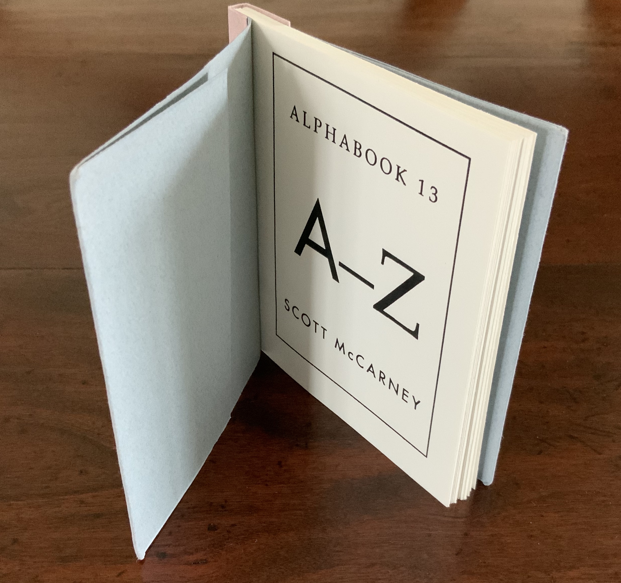
Books On Books Collection – Ioana Stoian

Nous Sommes (2015)

Nous Sommes (2015)
Ioana Stoian
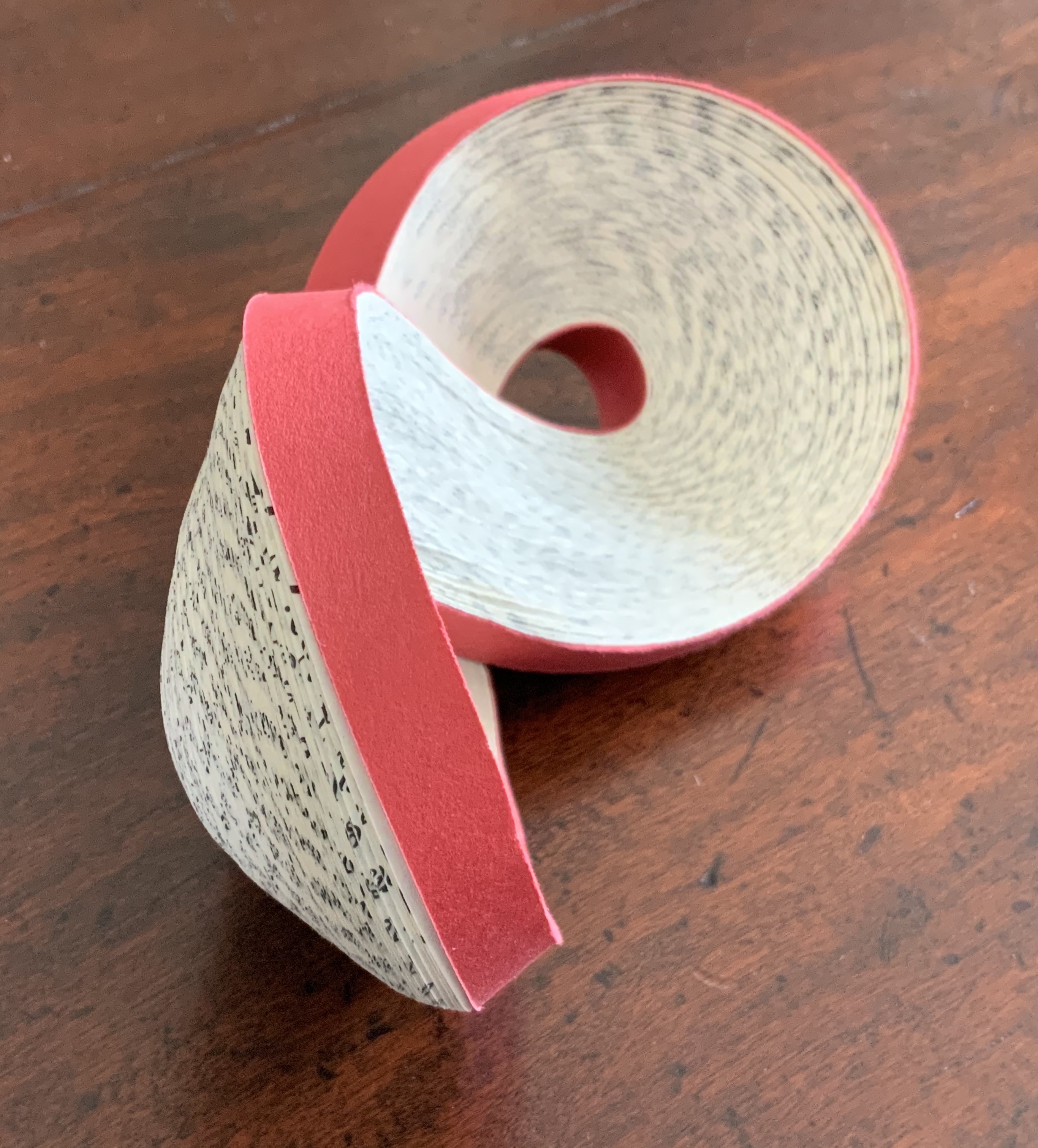
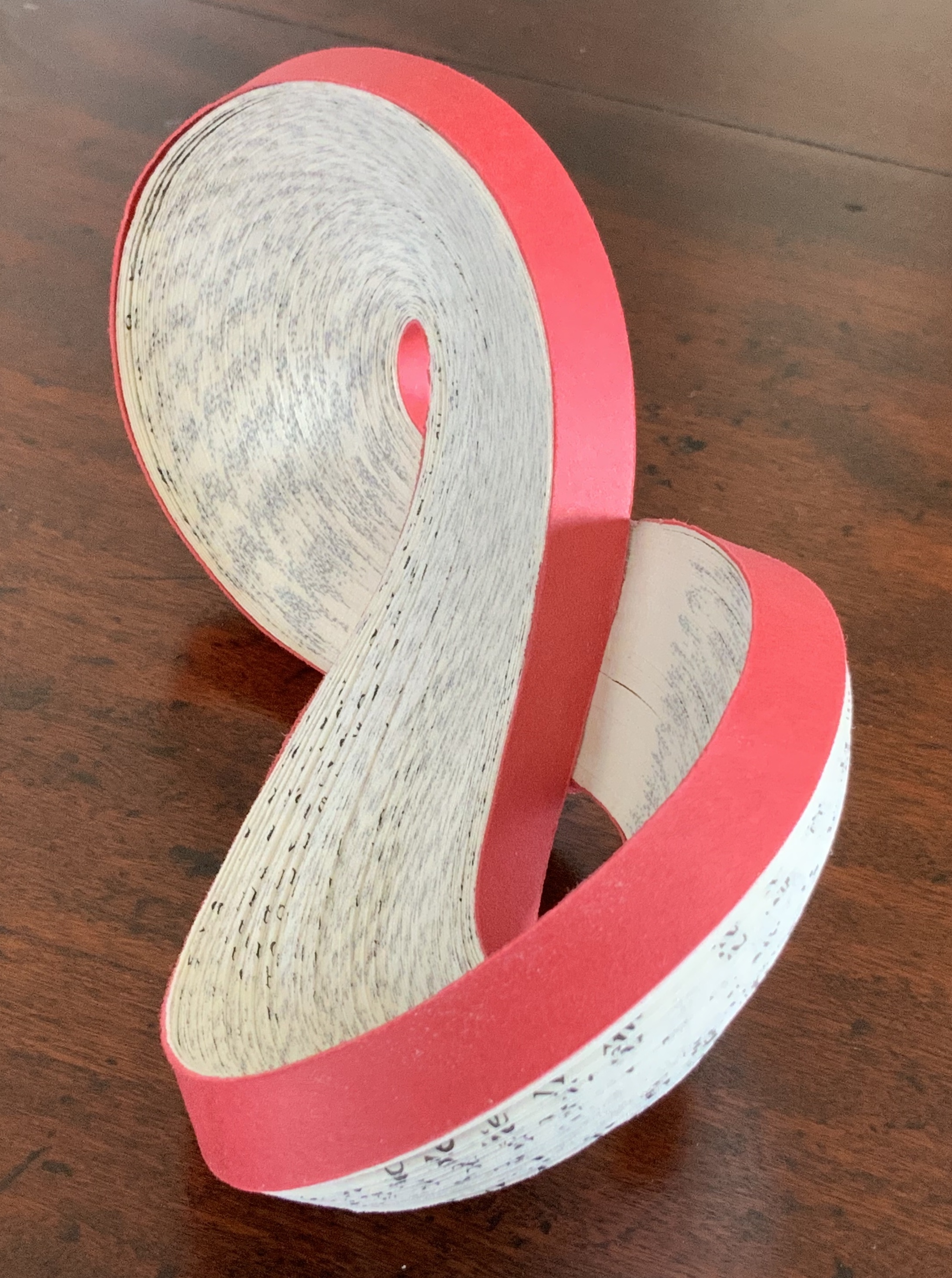
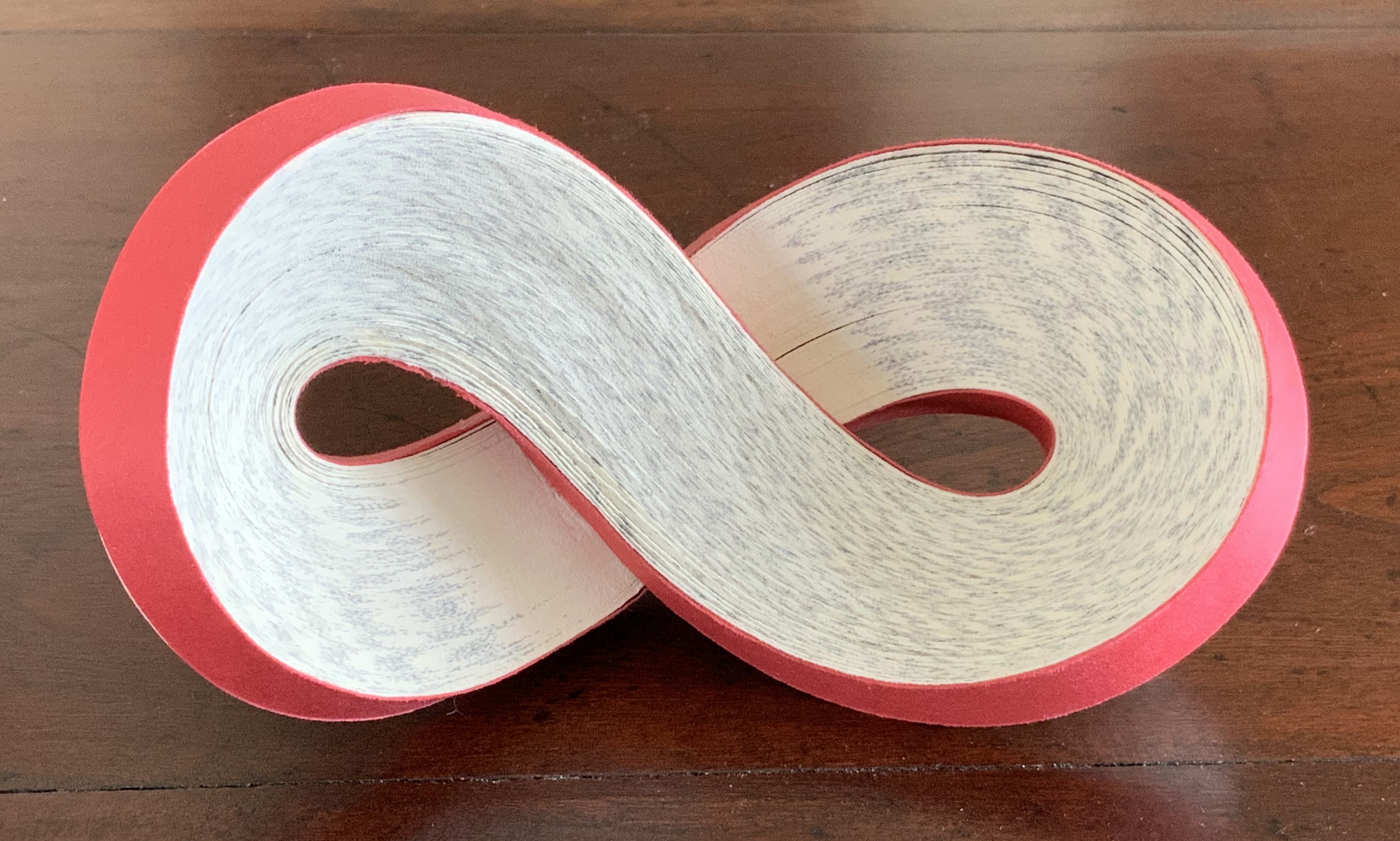
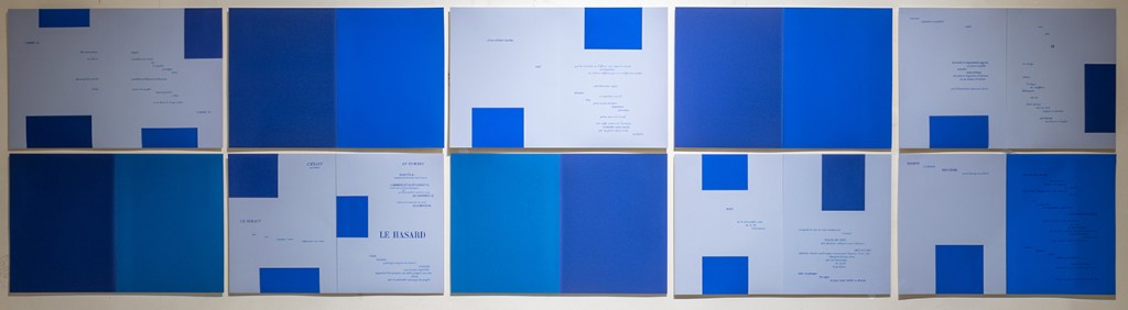
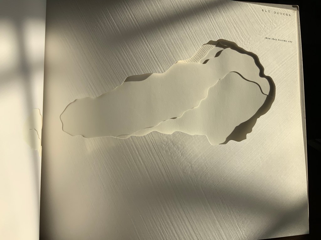
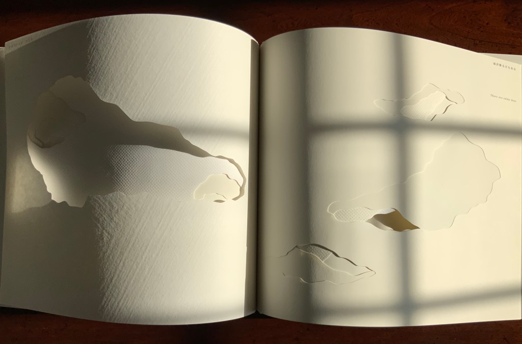
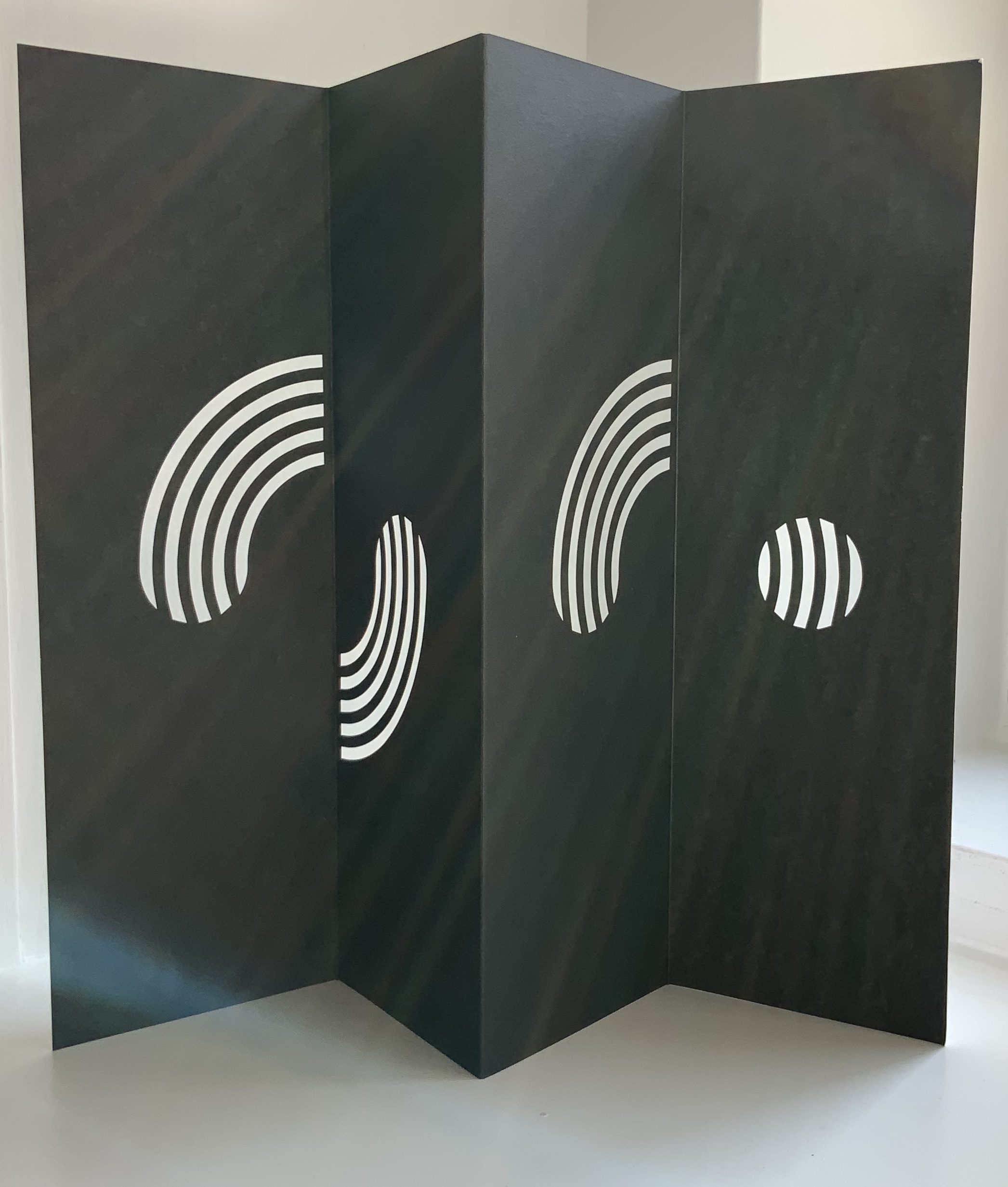
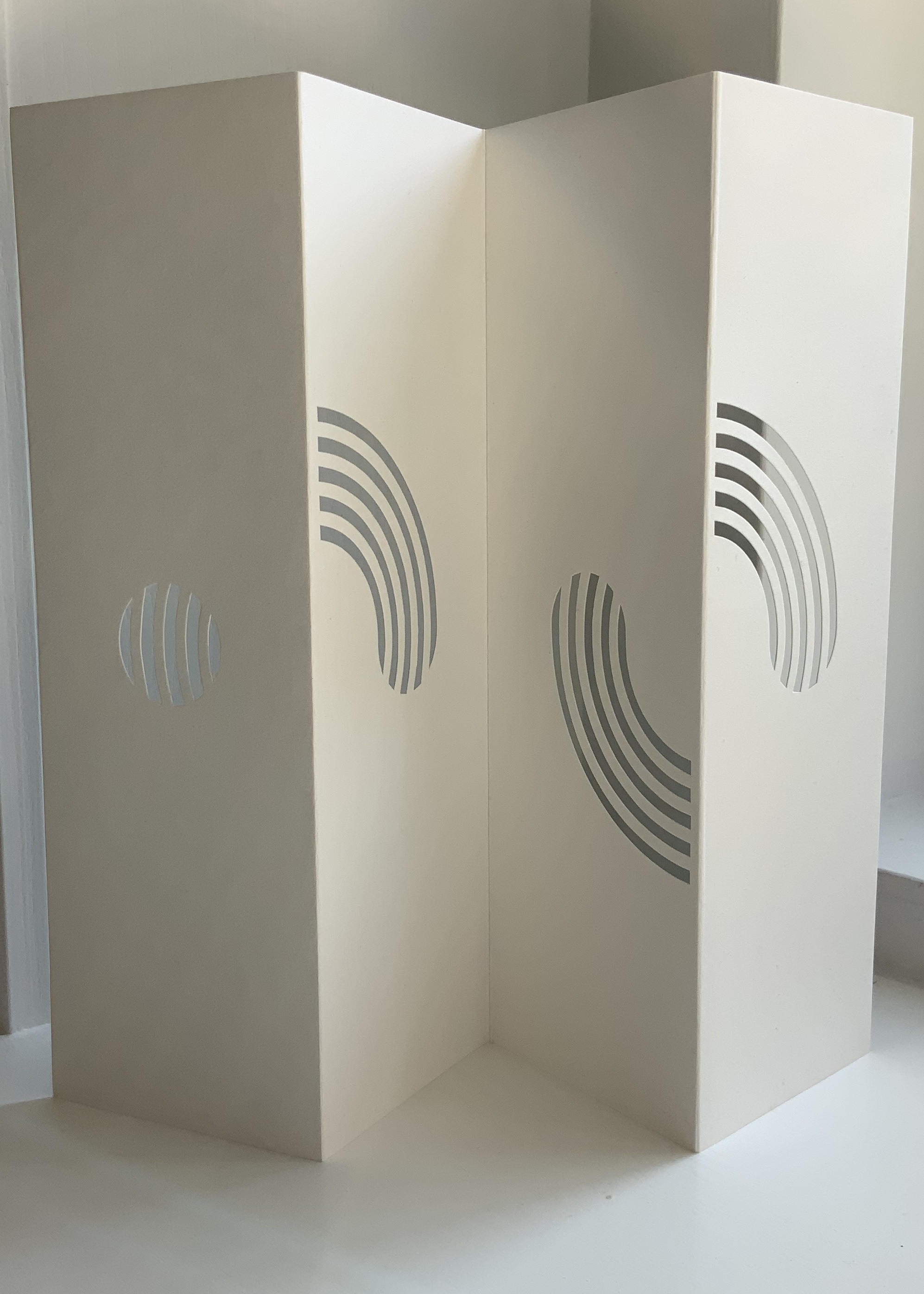
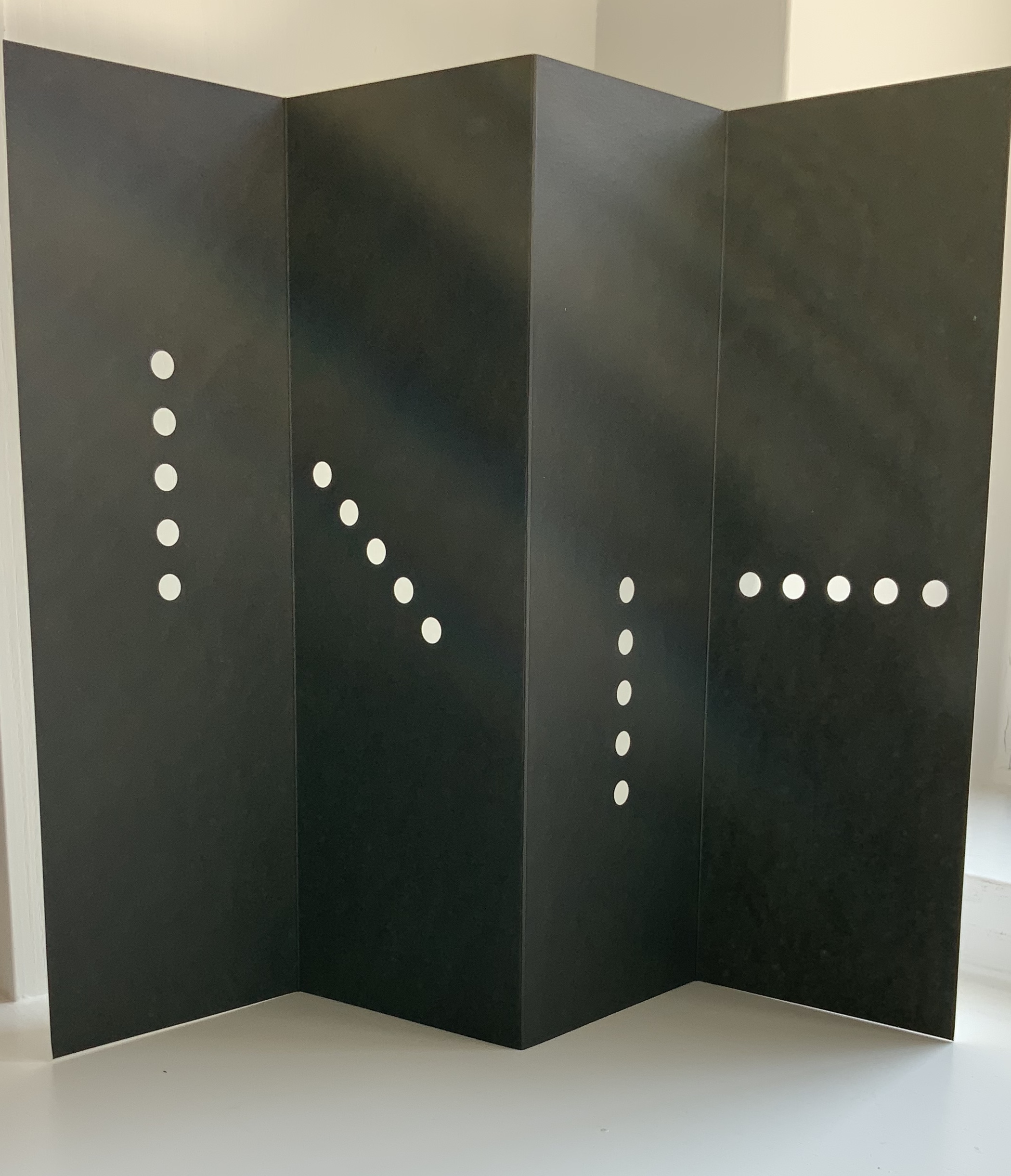
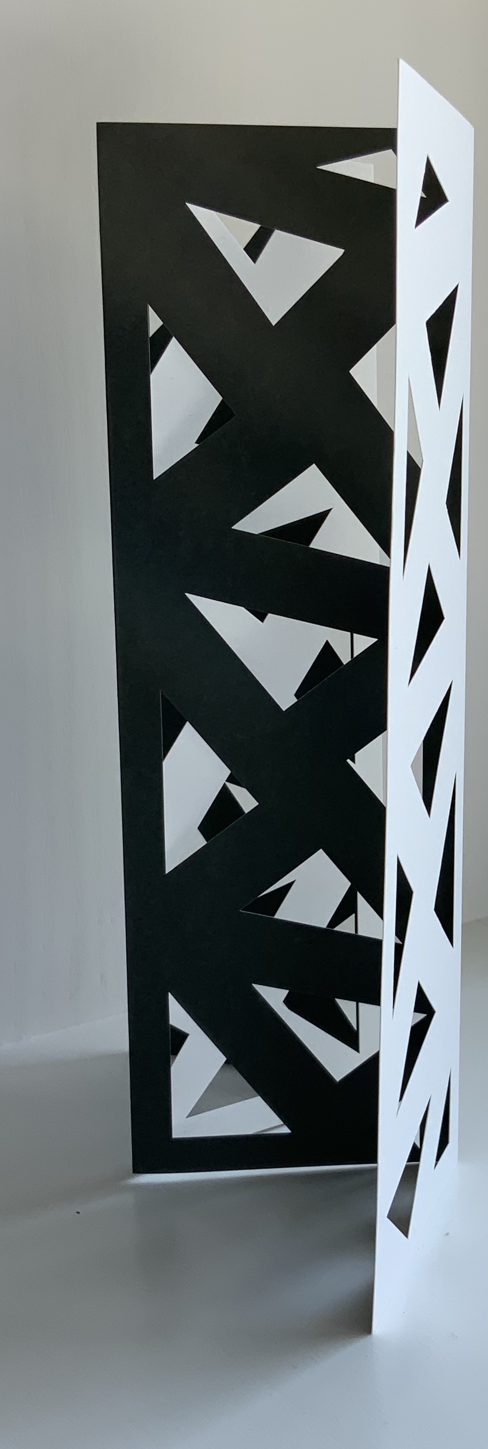
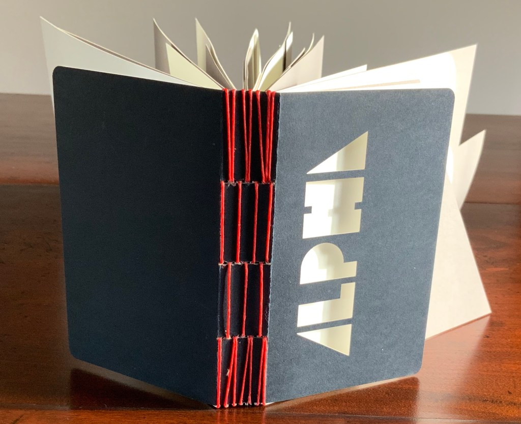
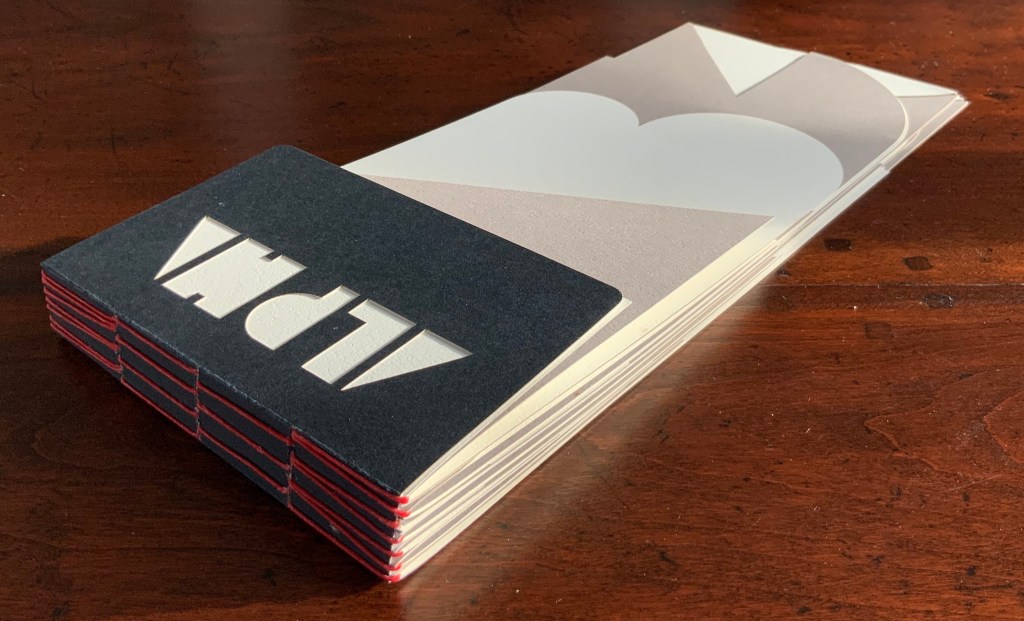
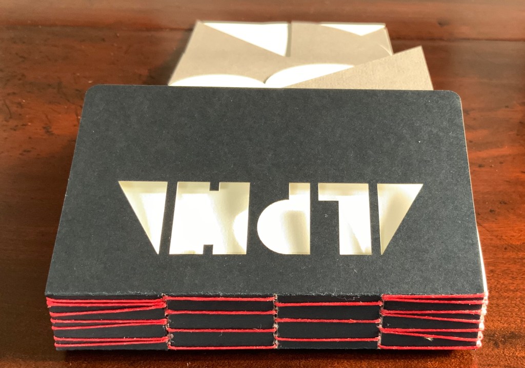
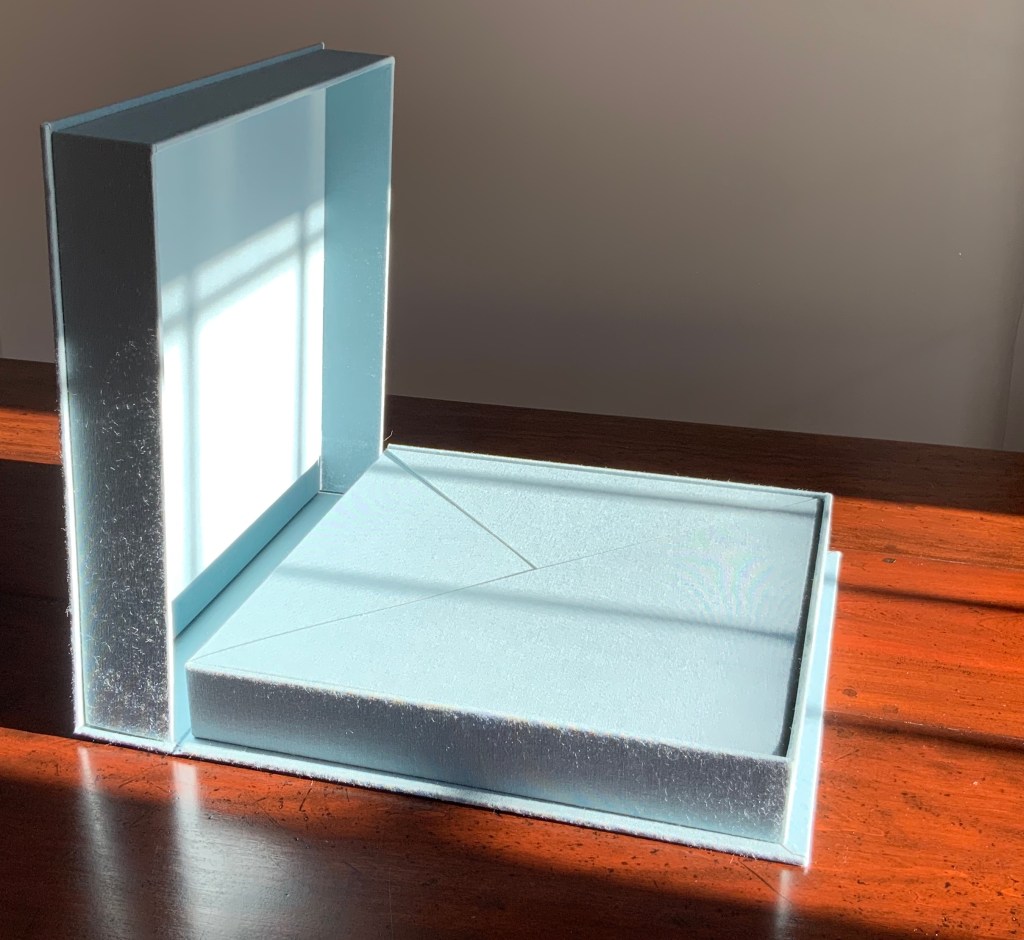
Nine handmade-paper forms in handmade cloth-covered boxes, fitted to flapped container with magnetic seals, enclosed in cloth-covered Solander box. H310 x W305 x D54 mm. Acquired from the artist, 4 July 2017. Photos: Books On Books.

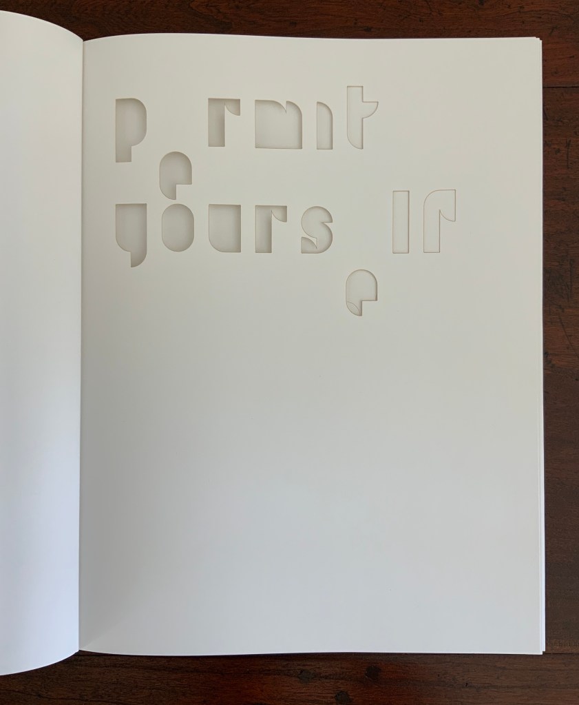
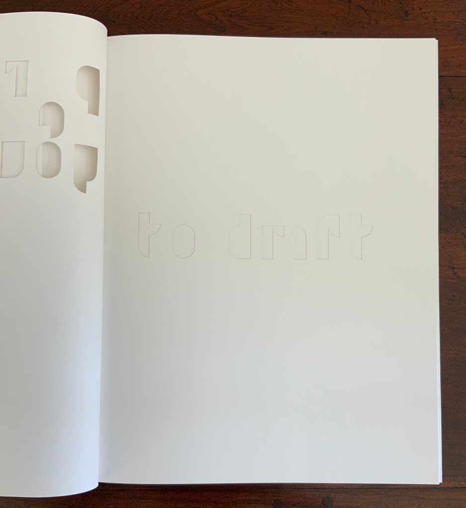
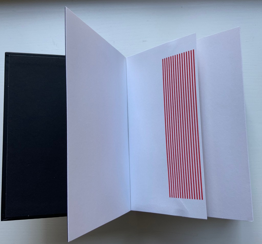
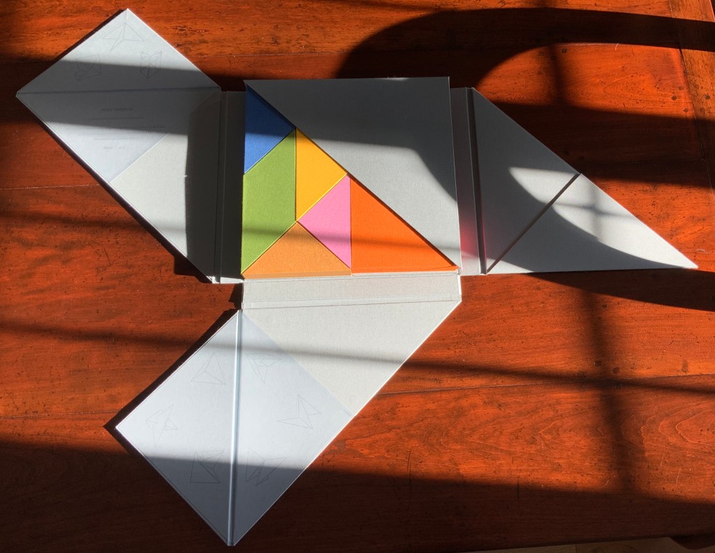
“Nous sommes”, the French for “we are”. But who is “we” here? Opening the first two flaps inside the blue-grey Solander box, I see that my first question should have been: What is Nous Sommes? The answer on the title page: “A physical manifestation of the human soul”. So, a book or sculpture then.

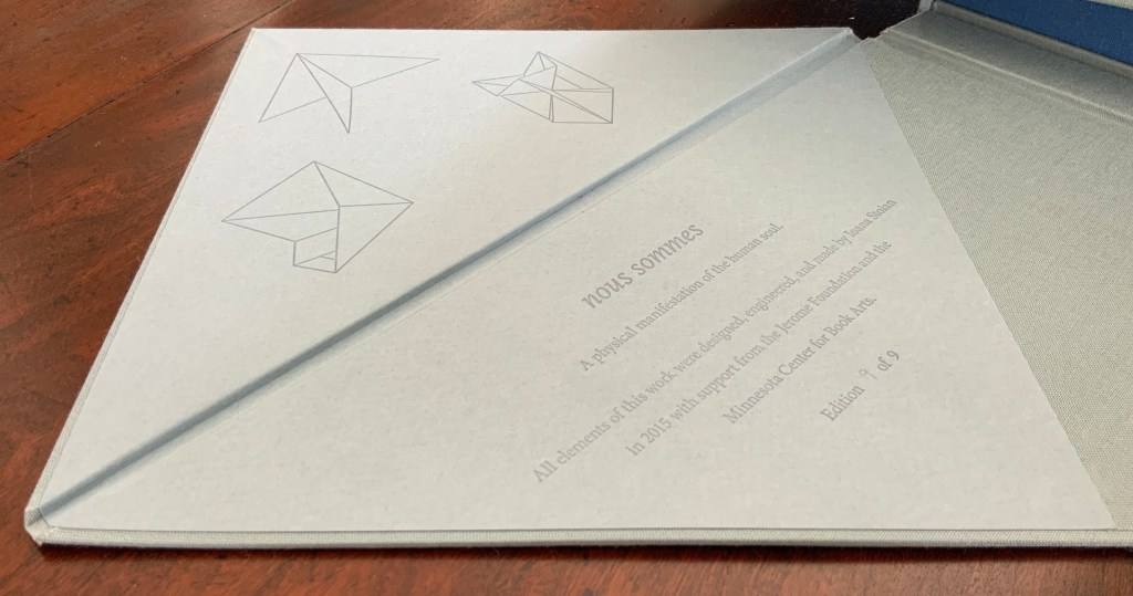
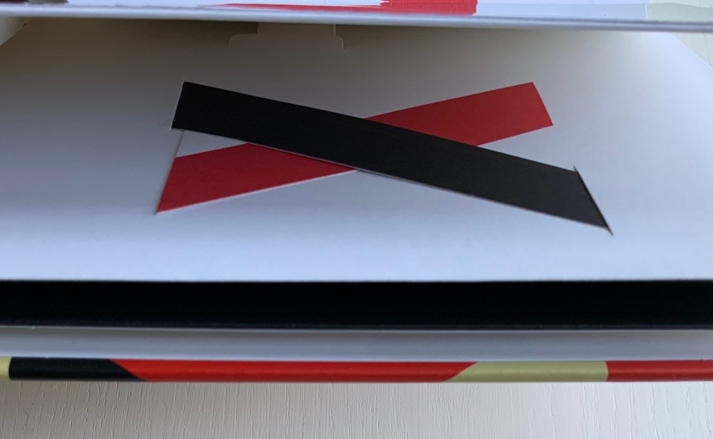
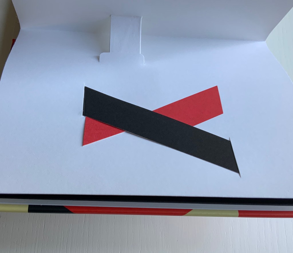
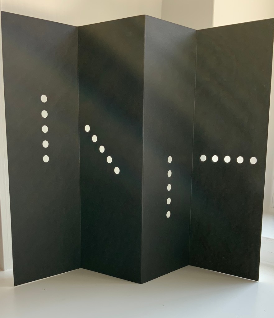
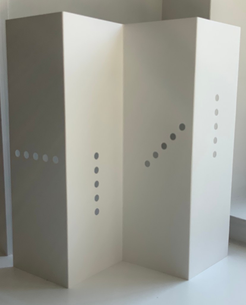
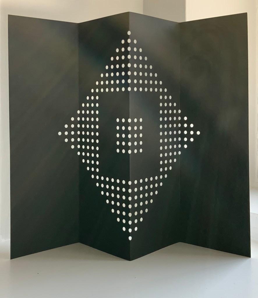
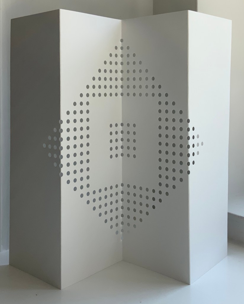
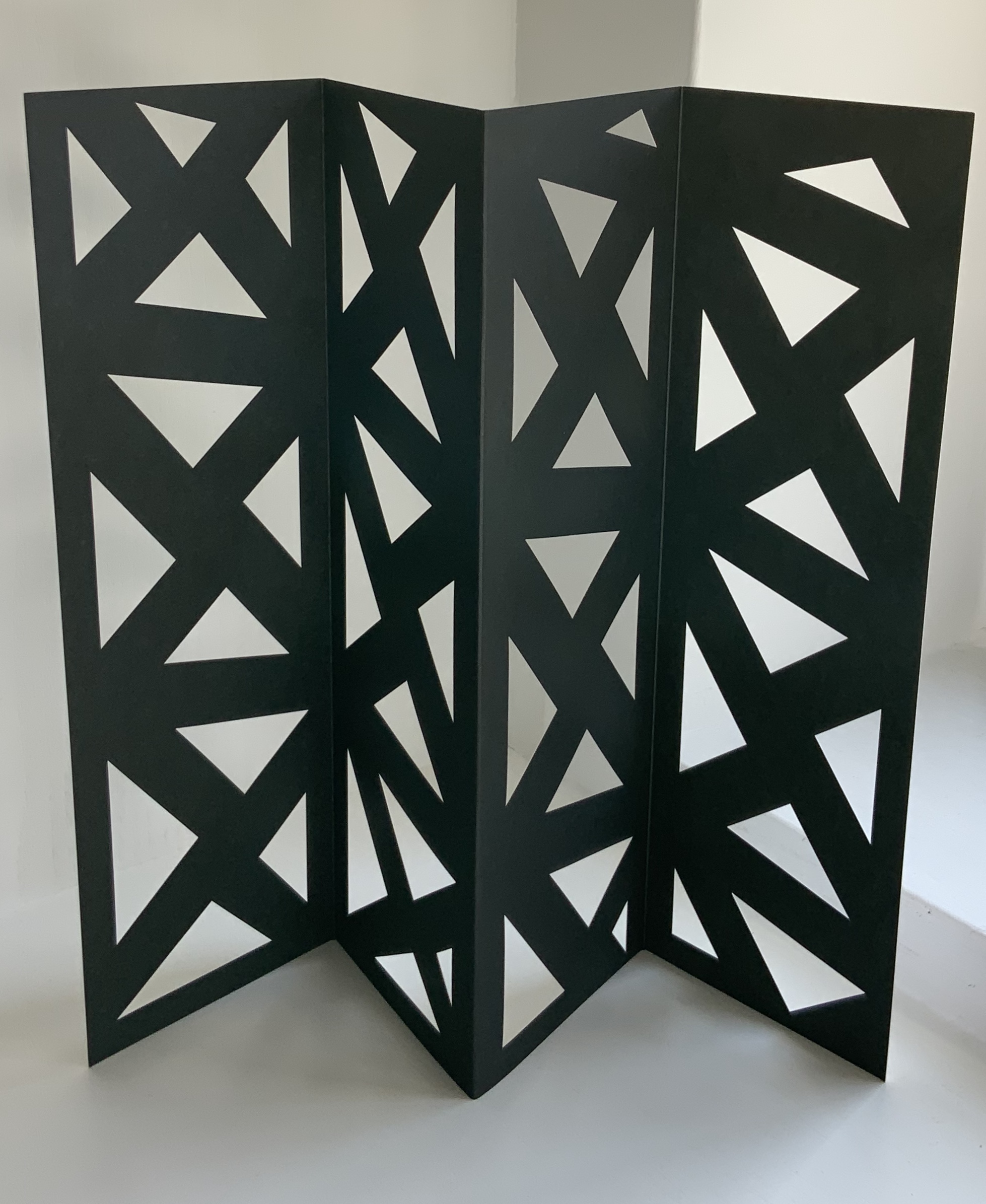
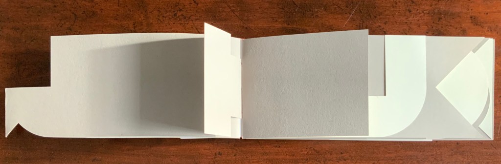
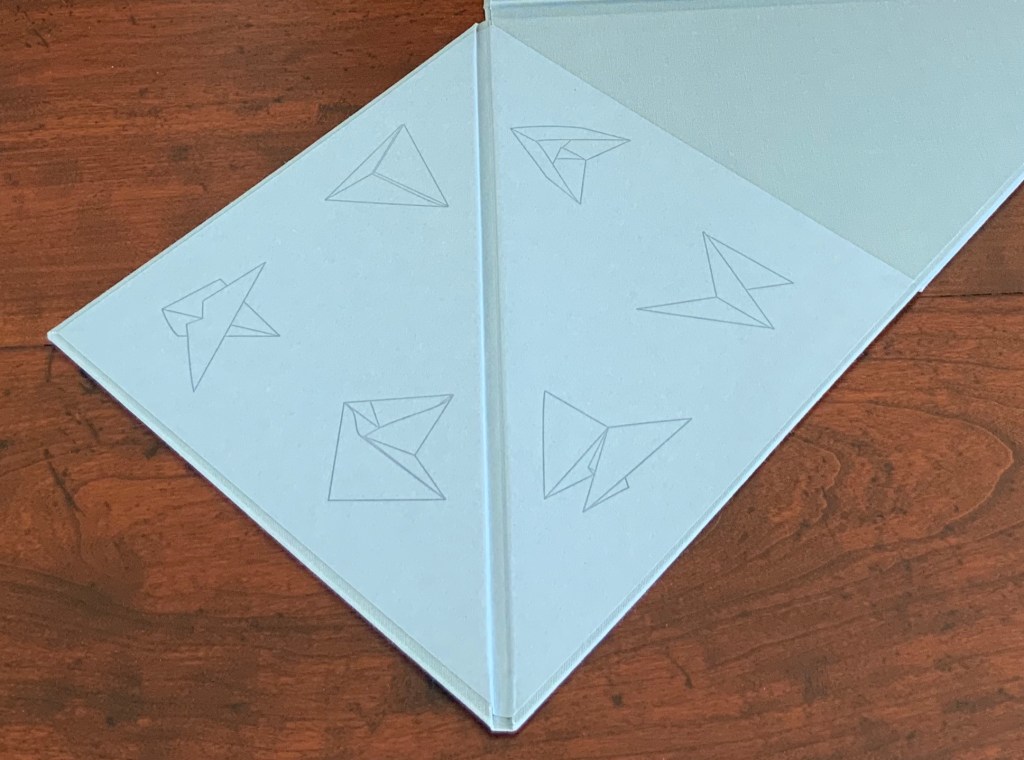
The third and fourth flaps reveal six diagrams to add to the three above the title page: a table of contents?

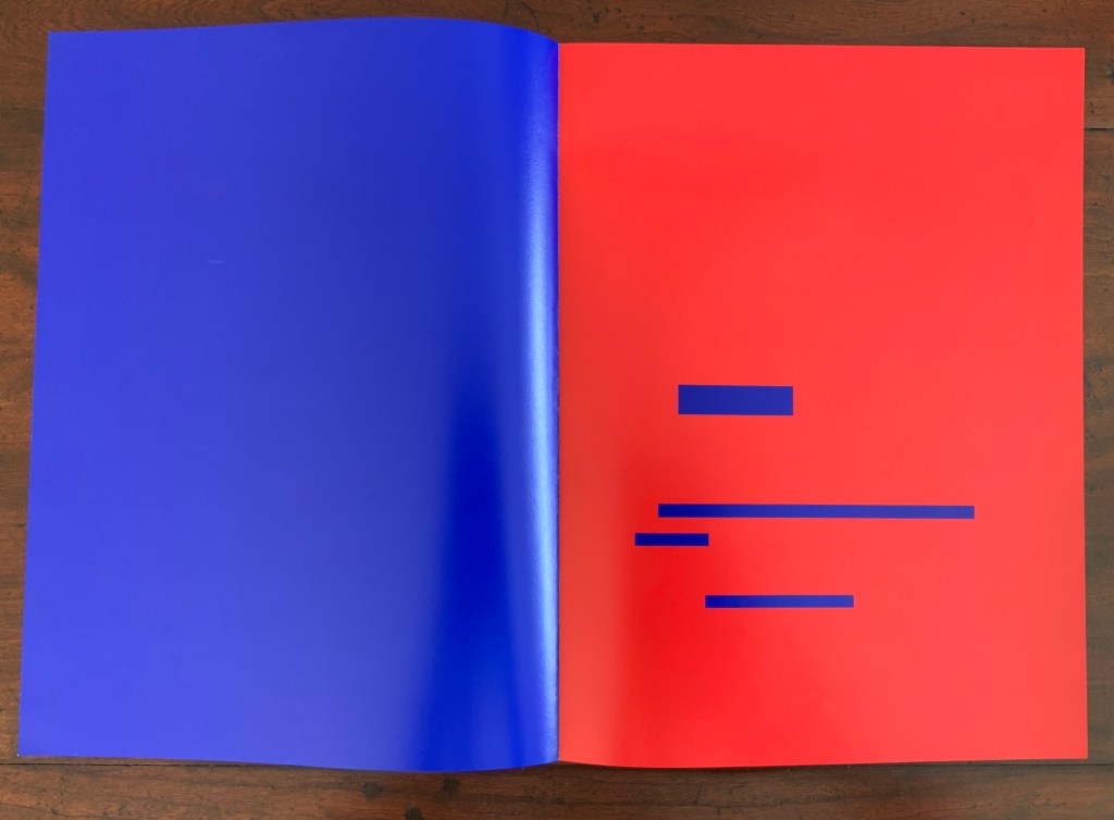
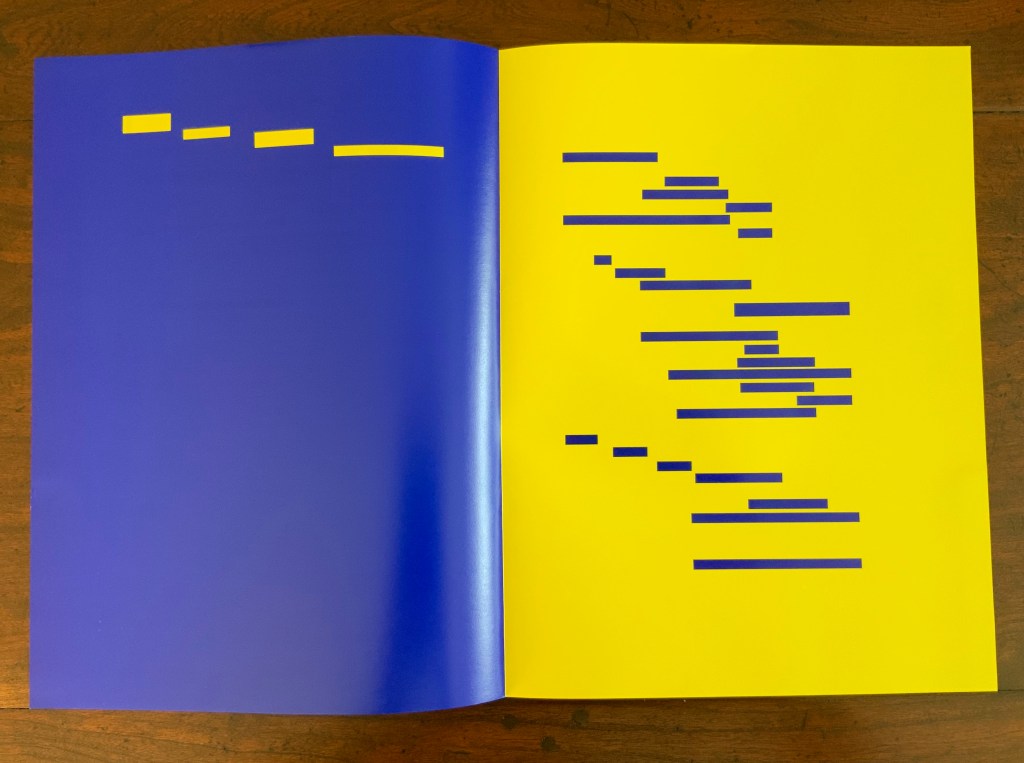
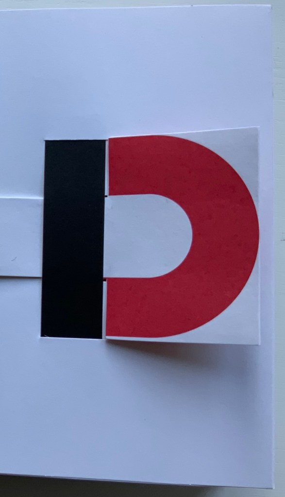
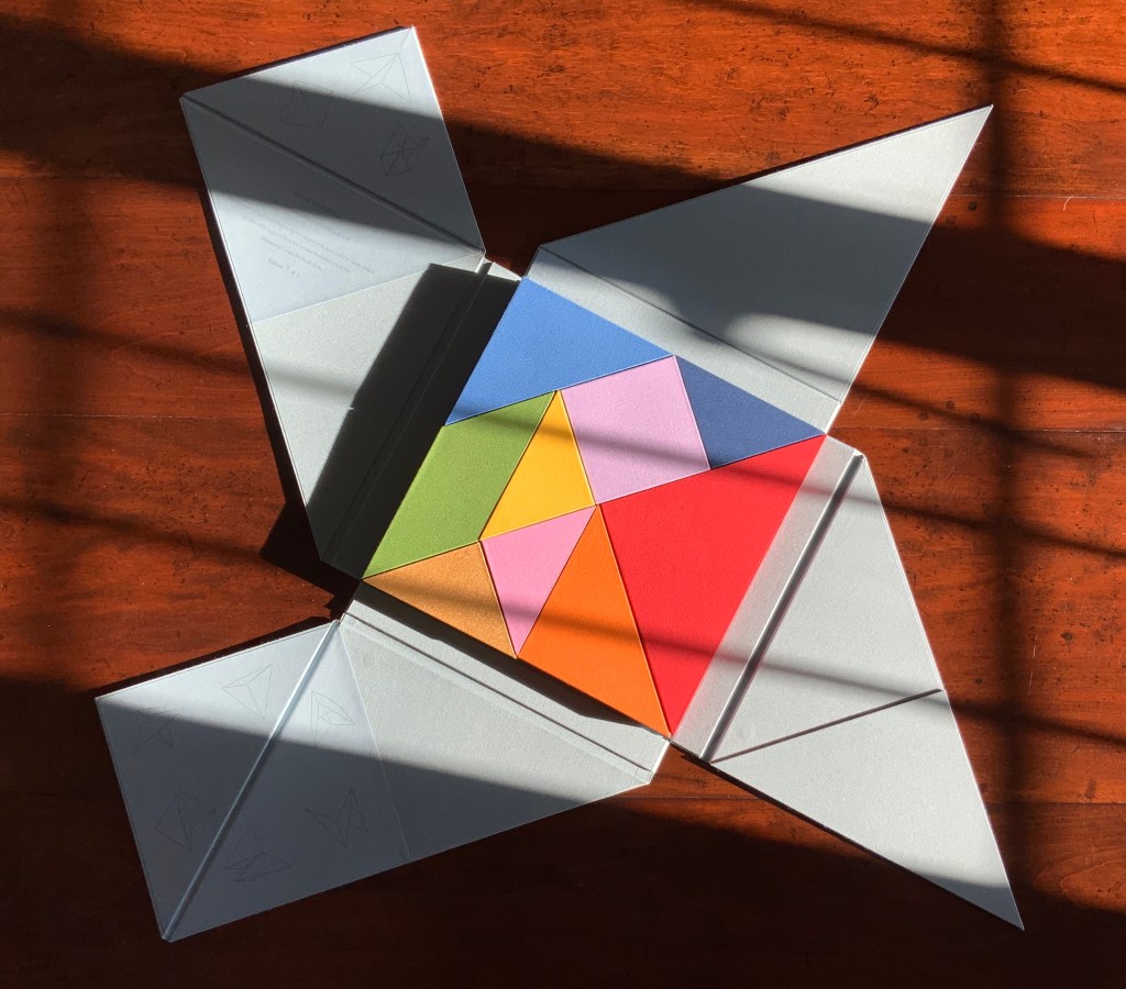
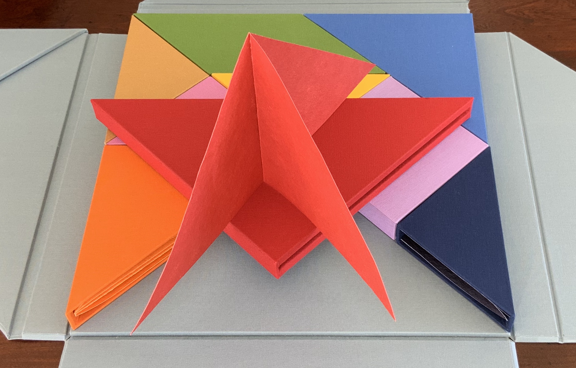
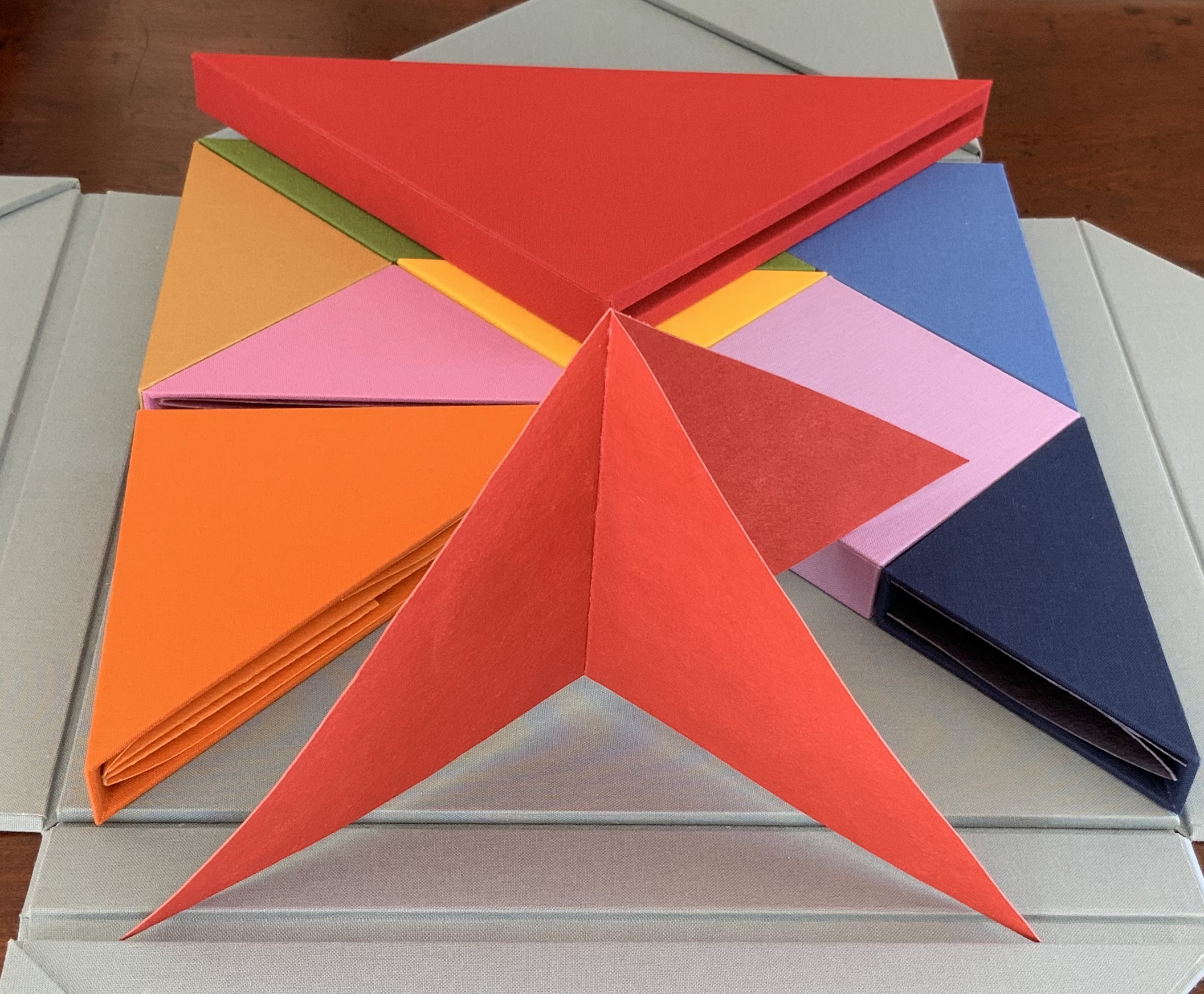
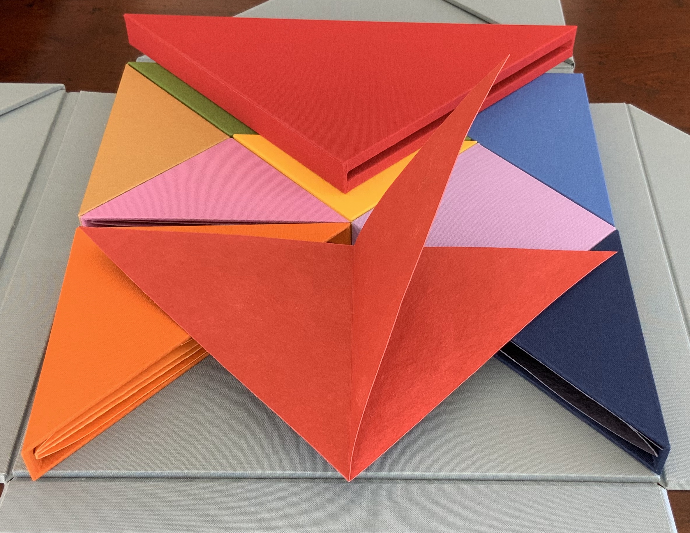
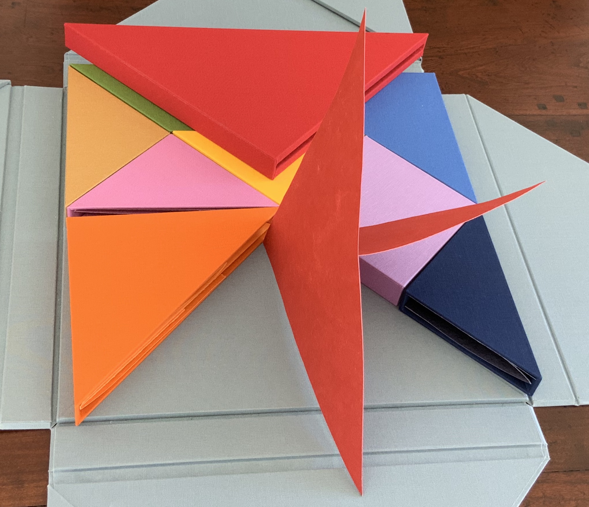
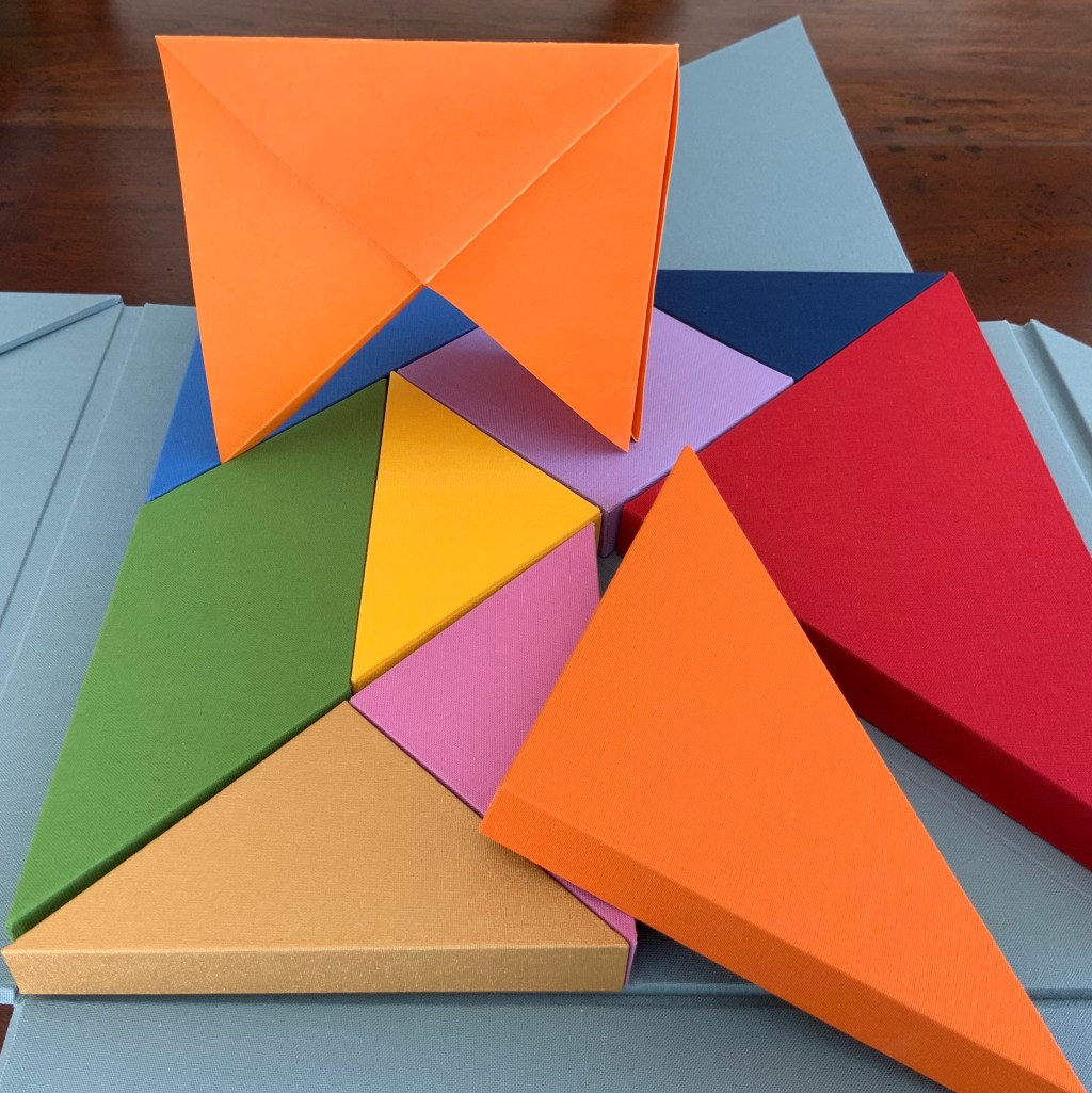
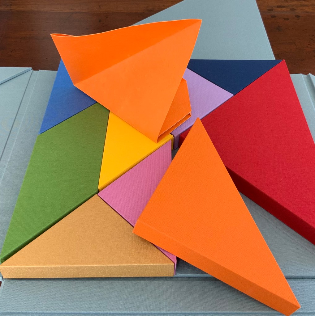
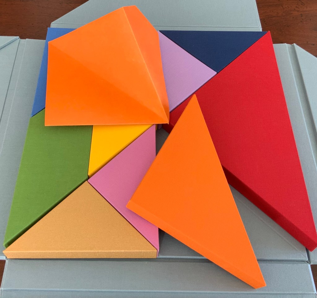
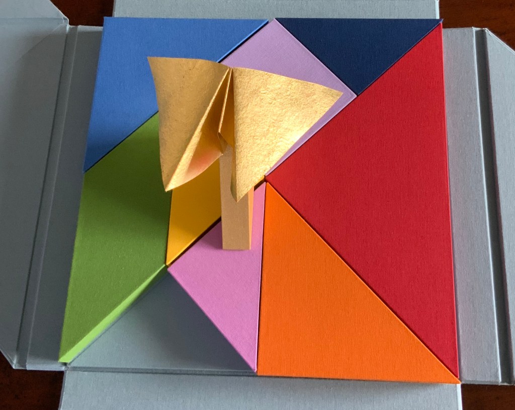
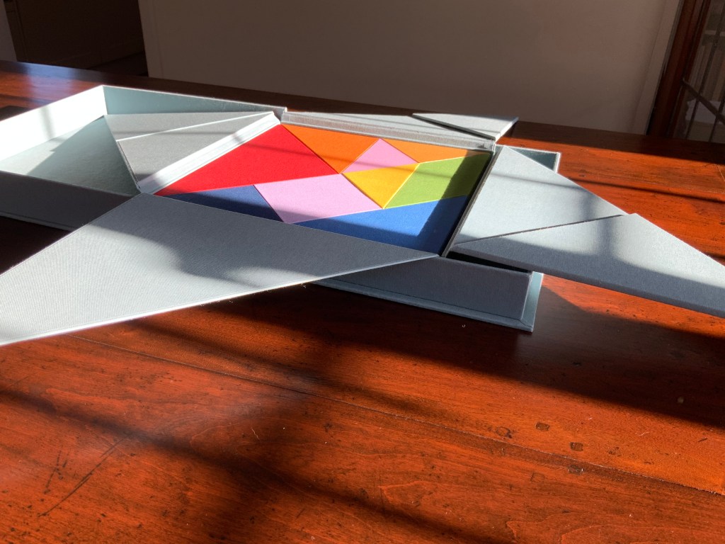
There are three brightly coloured boxes showing and fitting snugly together: the first three chapters or objects? Two are triangular, one is a parallelogram.

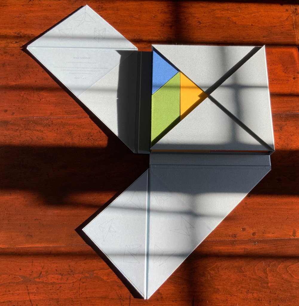
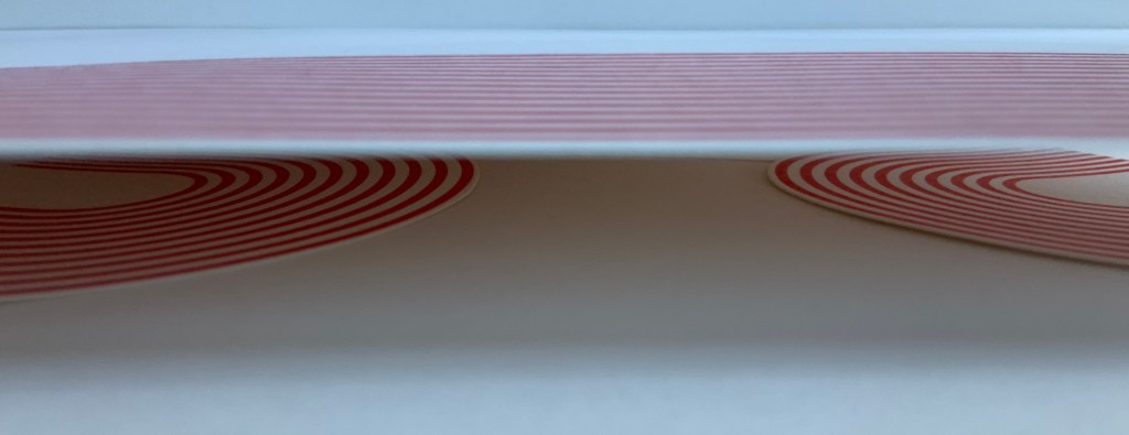
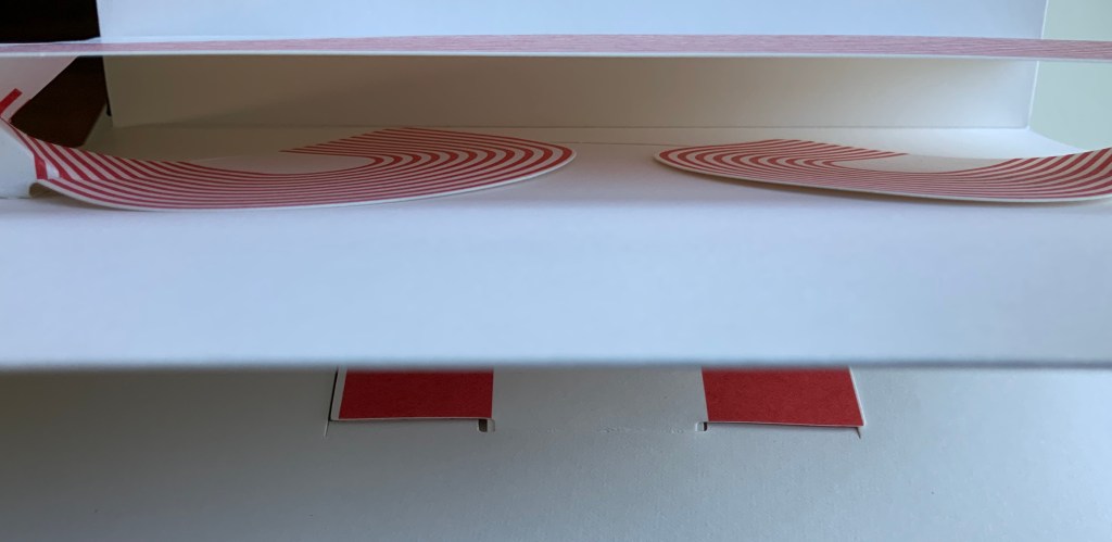
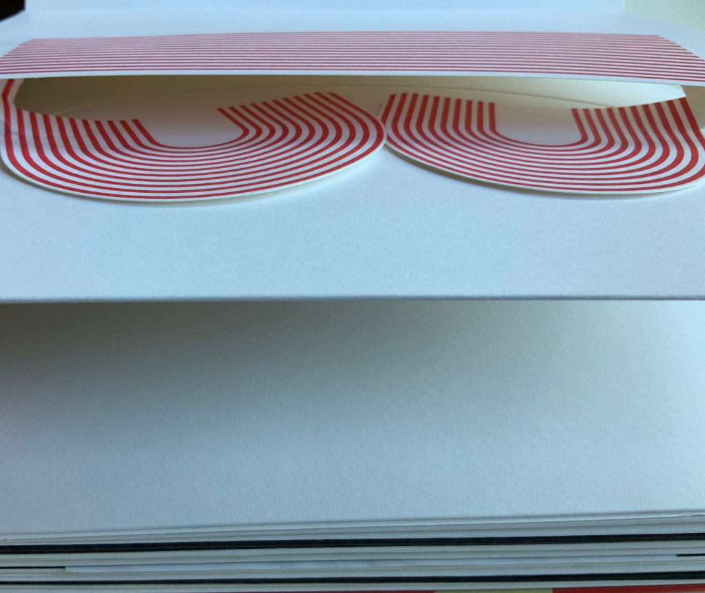
The next flap up gives another three boxes, all triangular and each a different color; and under the final flap, three more boxes, three more colors and a square among the triangles. Nine boxes making a tightly fitted square; six of them easily grasped because each has an edge at the perimeter.

The diagrammed shapes on the “table of contents” don’t correspond to the shapes of the nine boxes. The diagrammed shapes must be inside the boxes.

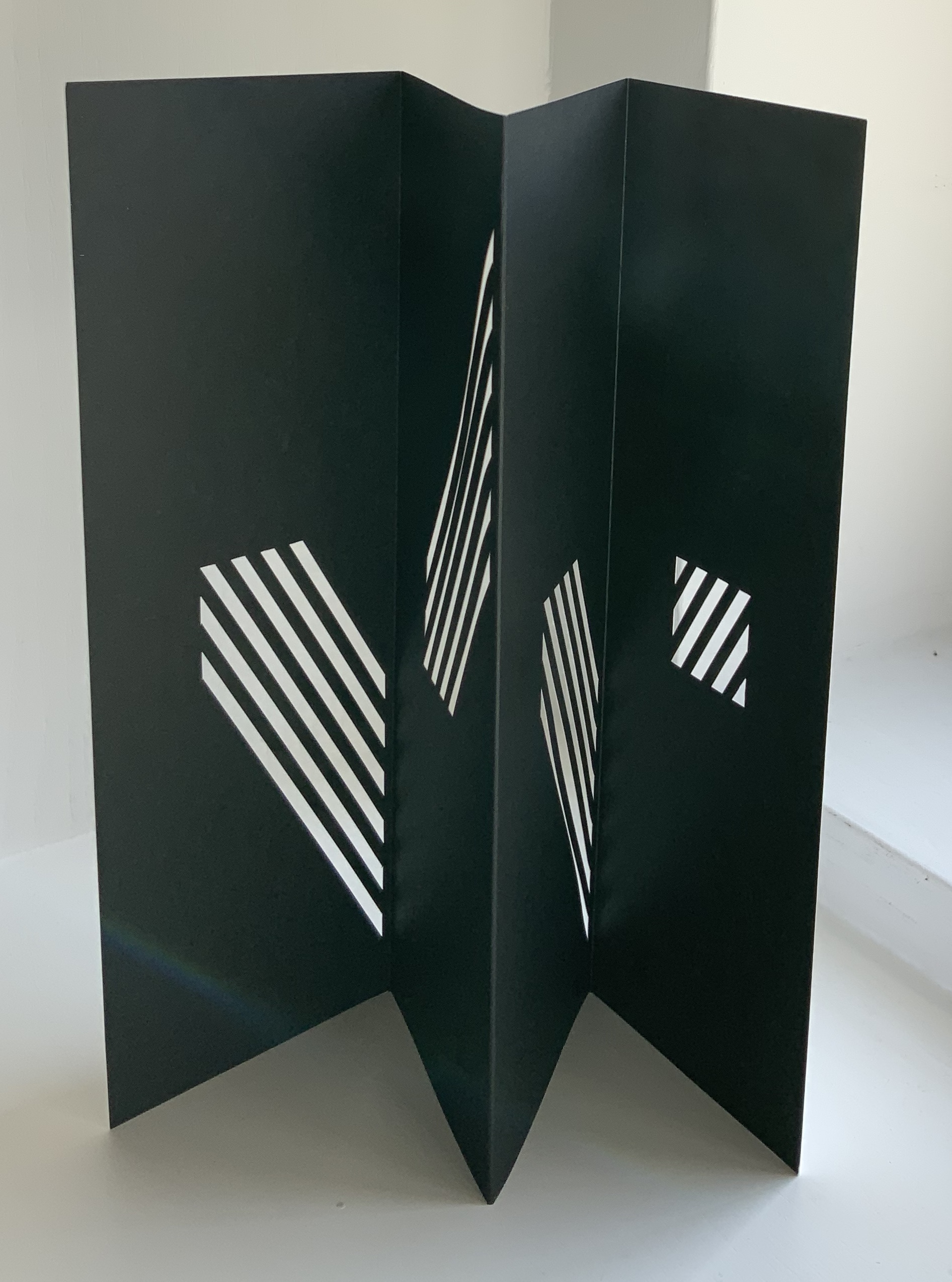
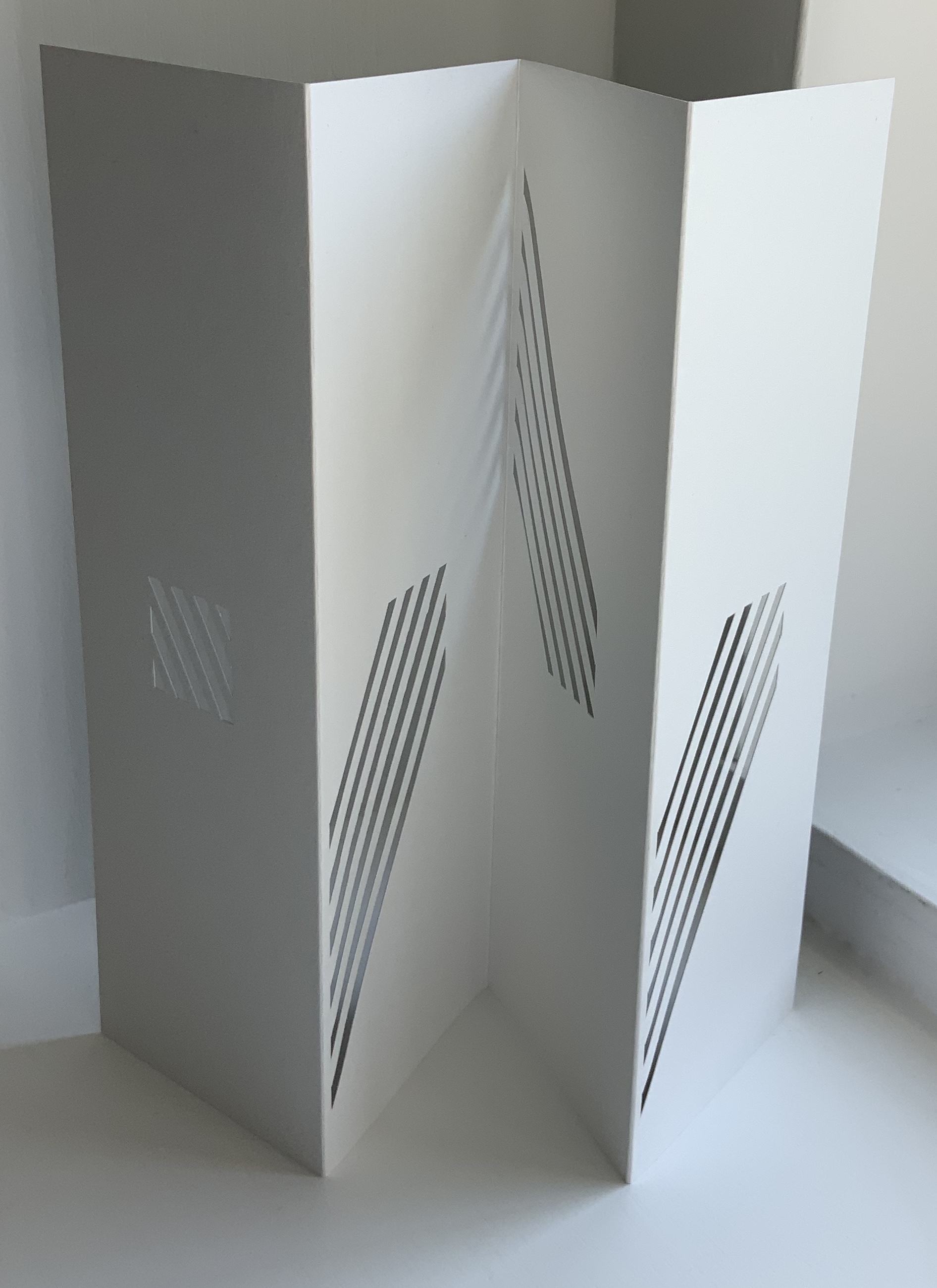
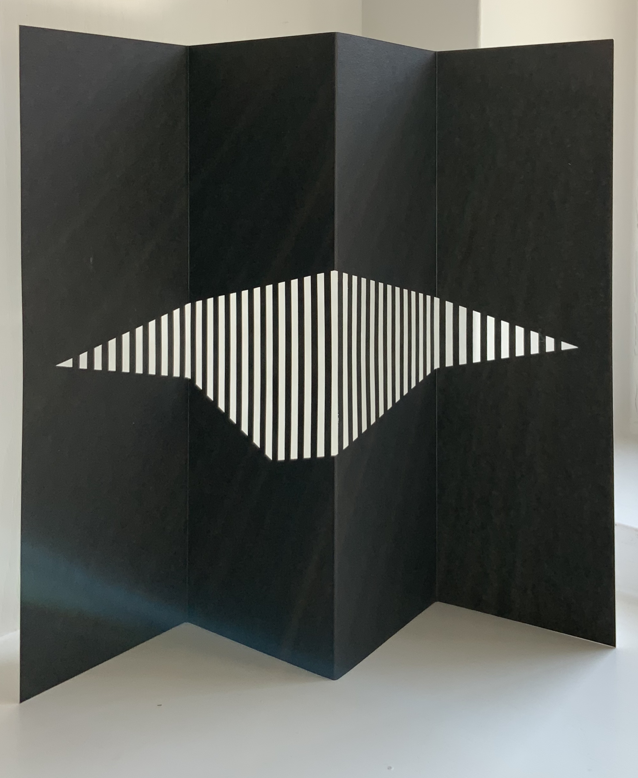
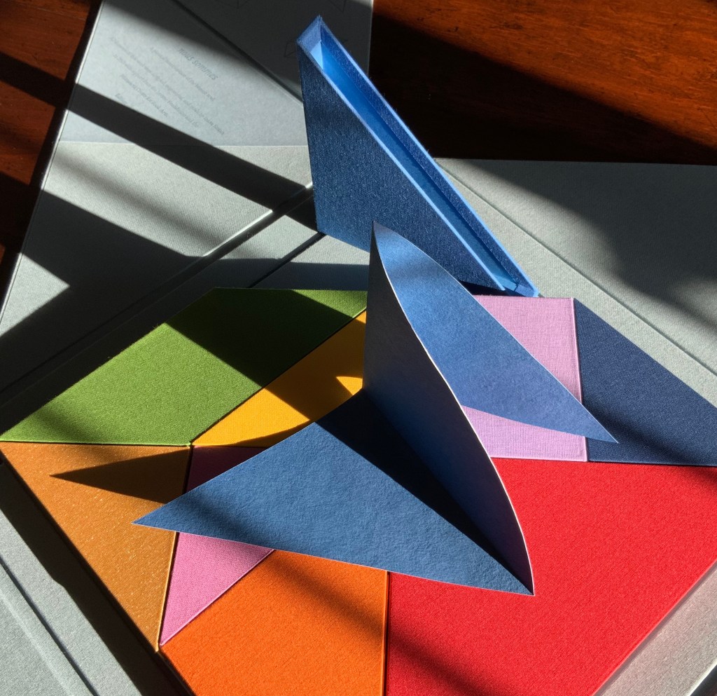
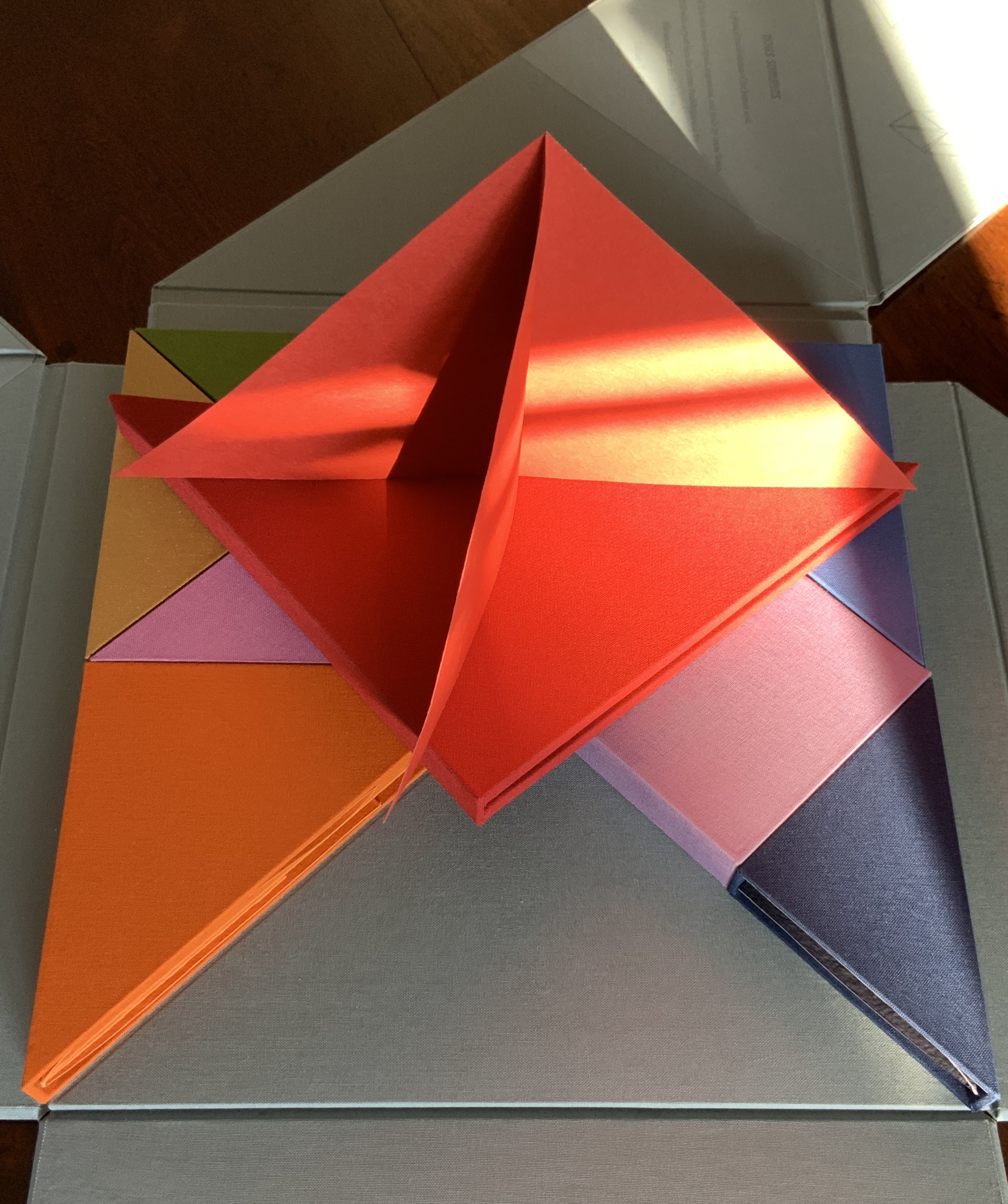
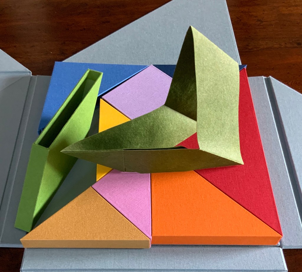
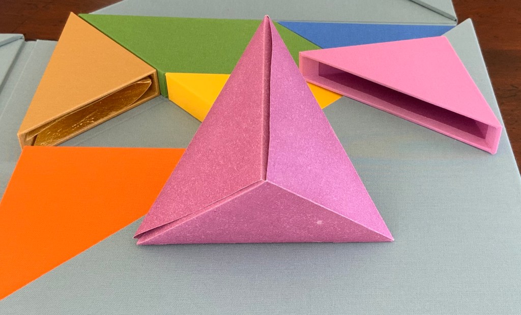
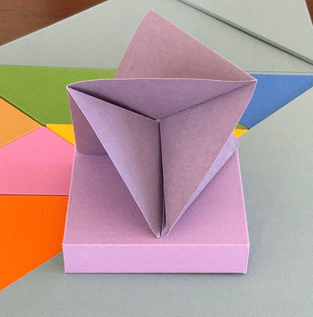
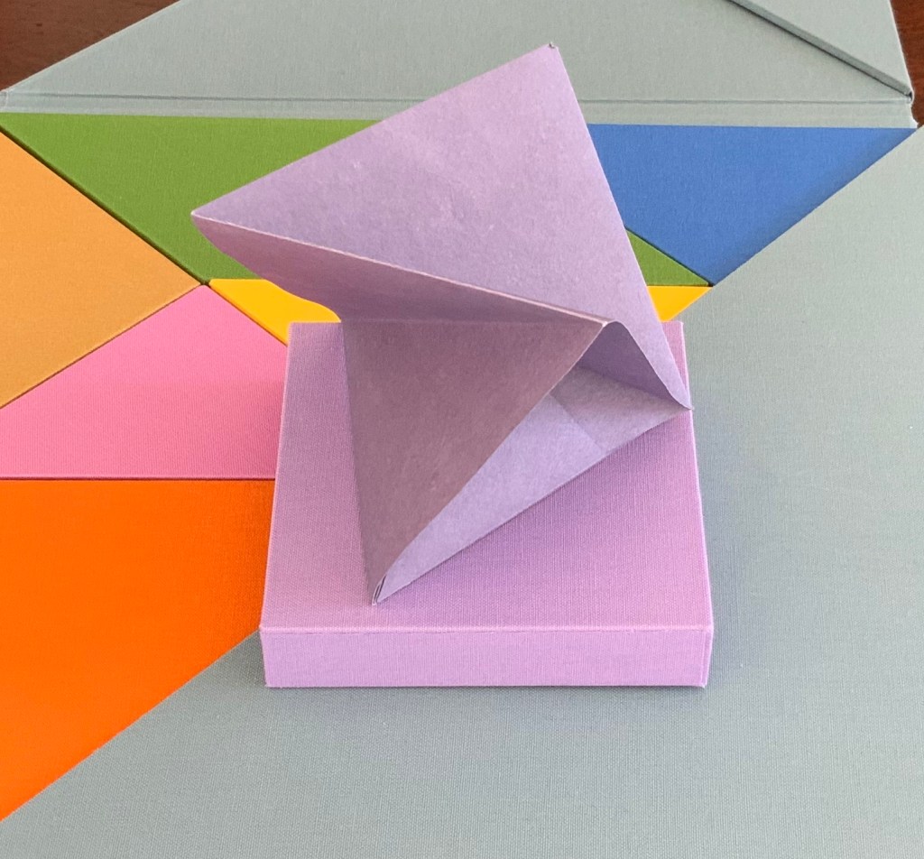
So I begin with the larger, lighter blue box. A sharp tap on the box, and a stiff, folded paper the same color as the box emerges. No words, no glyphs, but this is one of the shapes printed on the “table of contents”. It invites manipulation: stand me this way, now that, now this. With each turn, the light brings out different shades from the form’s valleys and mountains, and the form throws different shadows. Next the smaller, darker blue box houses a two-piece “chapter”, one piece to slot into the other. Again, different shades, different shadows.

The red box also offers up a two-piece chapter, but the pieces are glued together. So much larger a shape than the one before, but so much simpler.

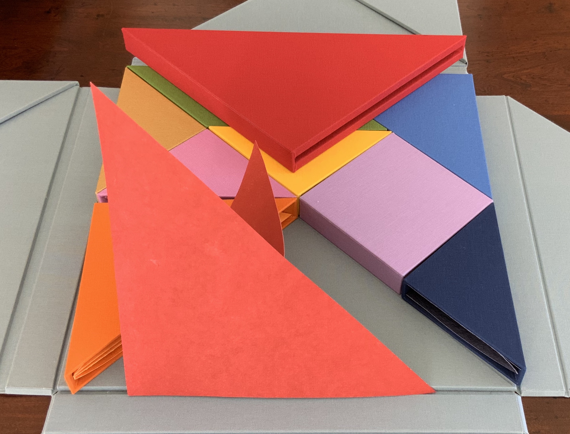
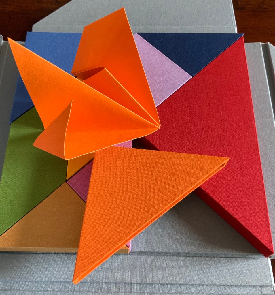
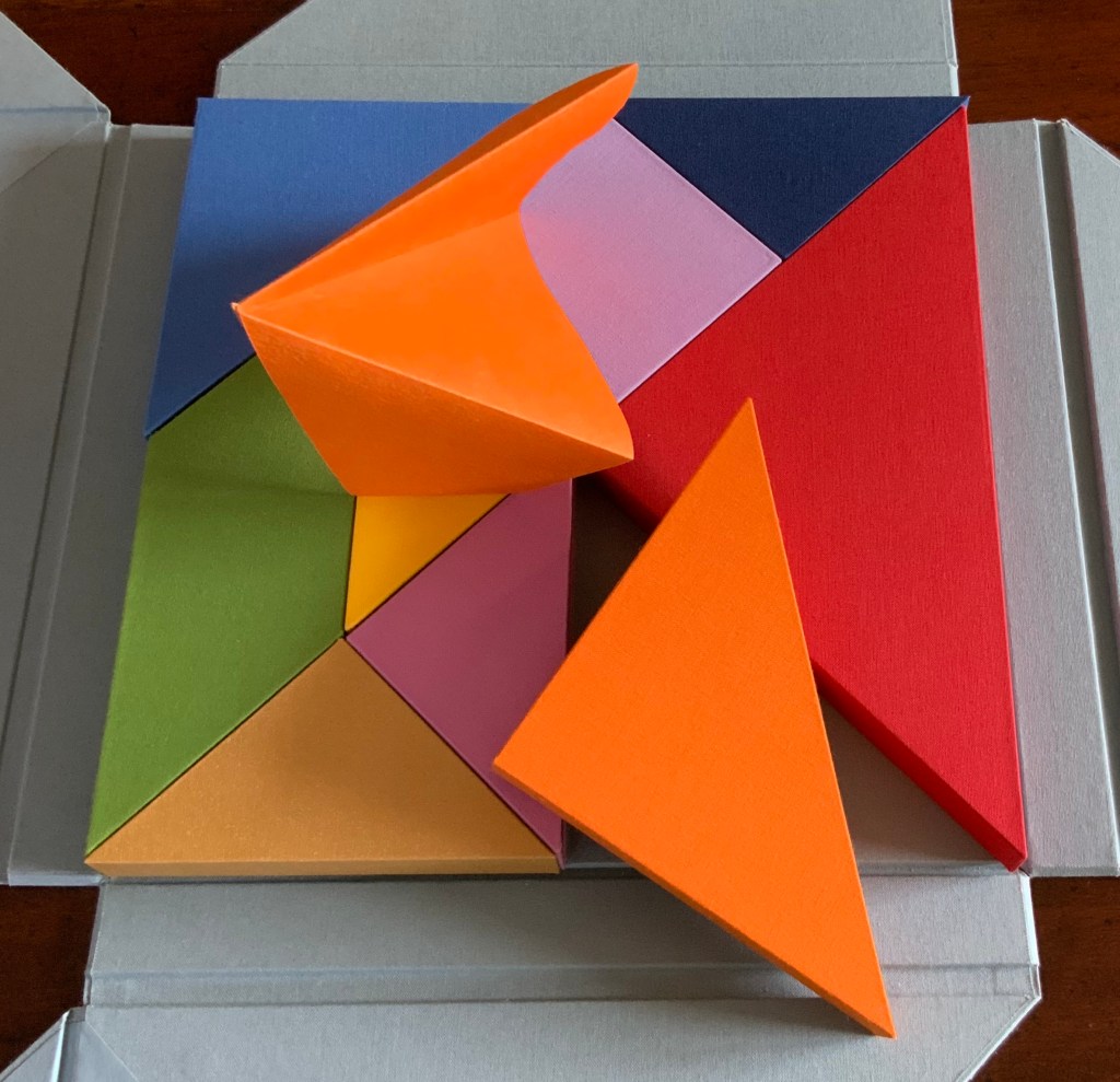
The single piece from the orange box asks to be unfolded and one tip to be slipped into an awaiting slot; the resulting object is strange.

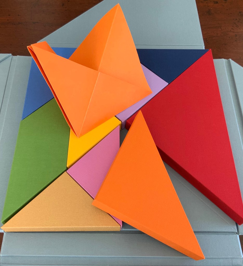
From the gold box, a butterfly emerges. The light glints off the gilt ink, and the upright box seems the perfect perch. From the green box, a glued and folded strip of paper unfolds into a hat, a collar, an open-mouthed bird or frog?

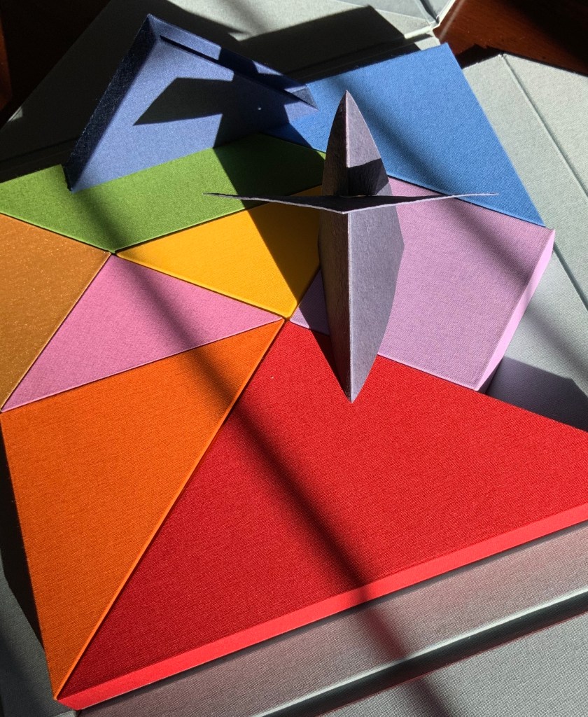
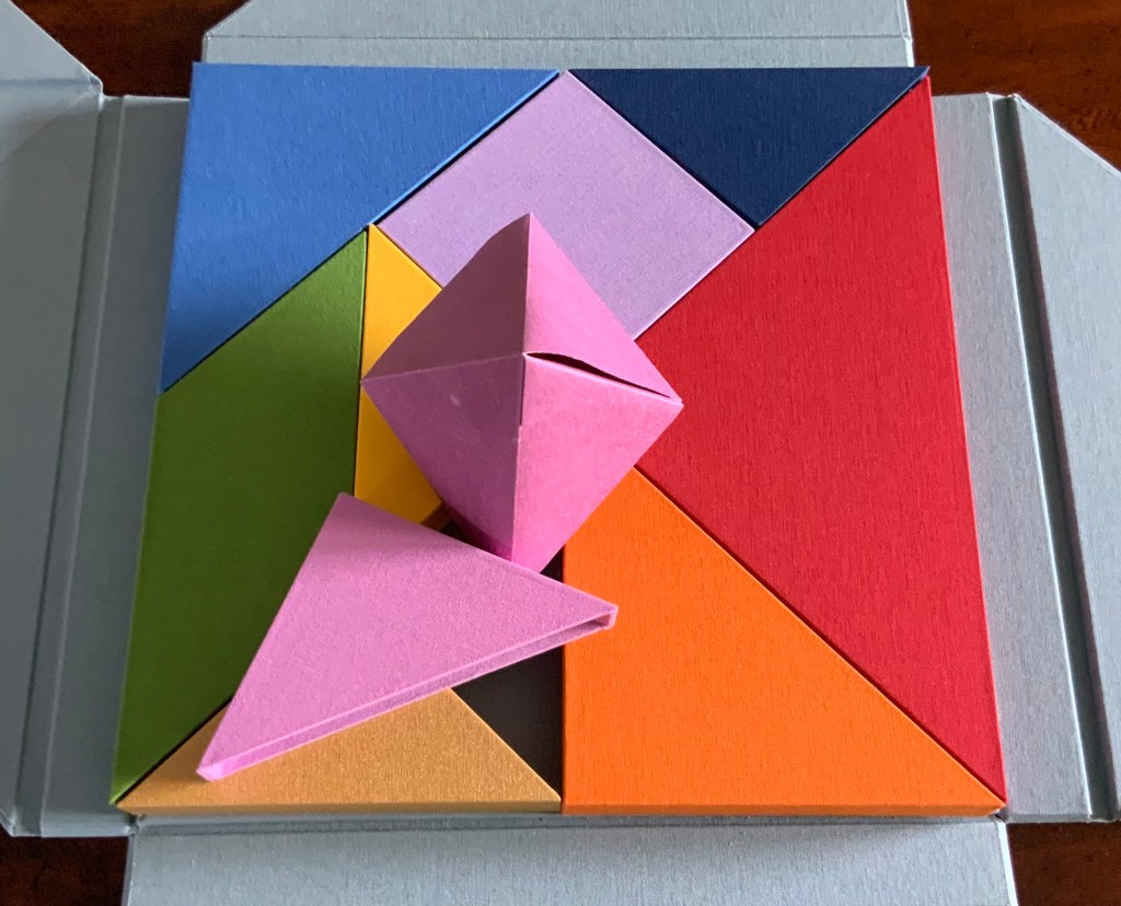
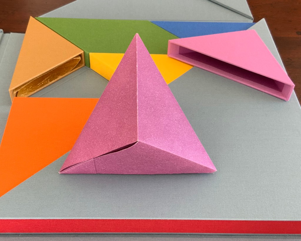
Inside the inner pink triangular box is the only solid — an irregular hexahedron. The contents of the violet square box unfolds and slots into itself to form a flower, the head of a mace?

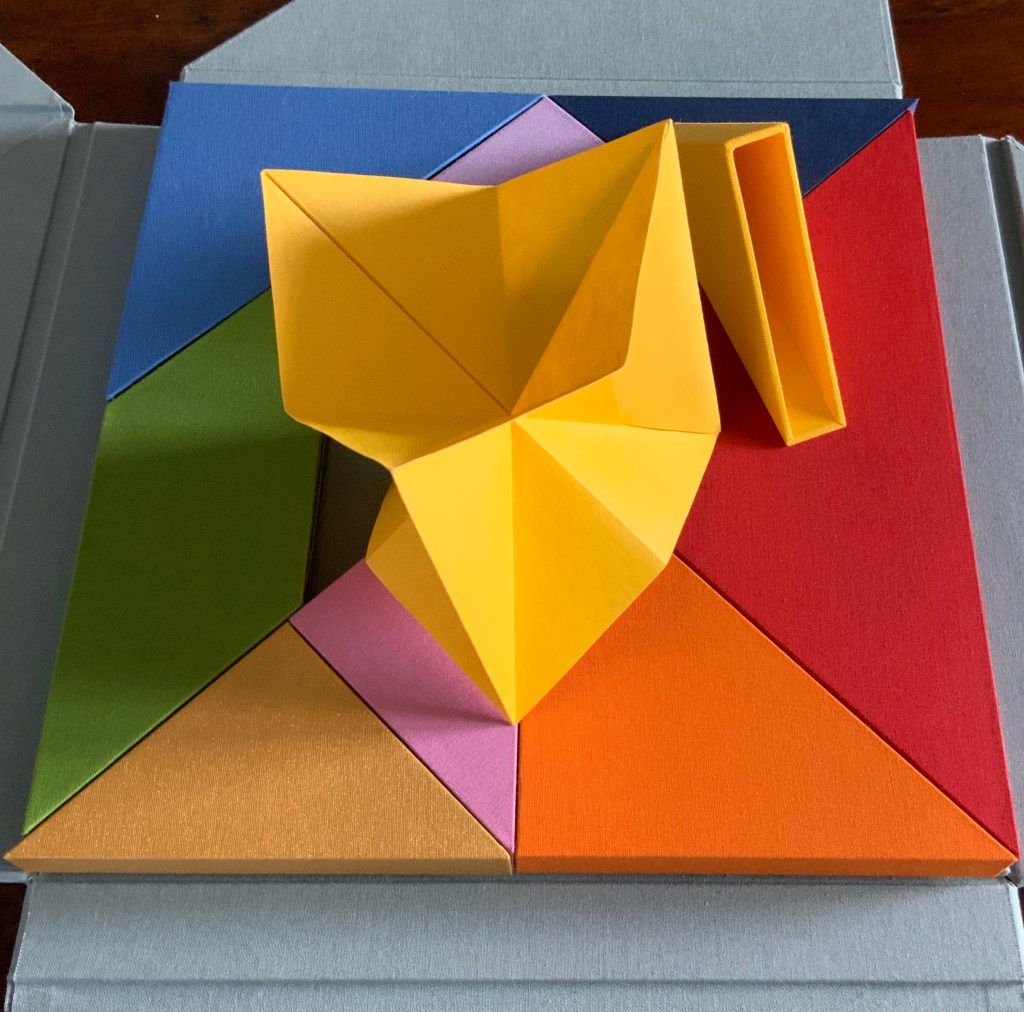
The form that emerges from the small yellow box seems the most multi-faceted of all.

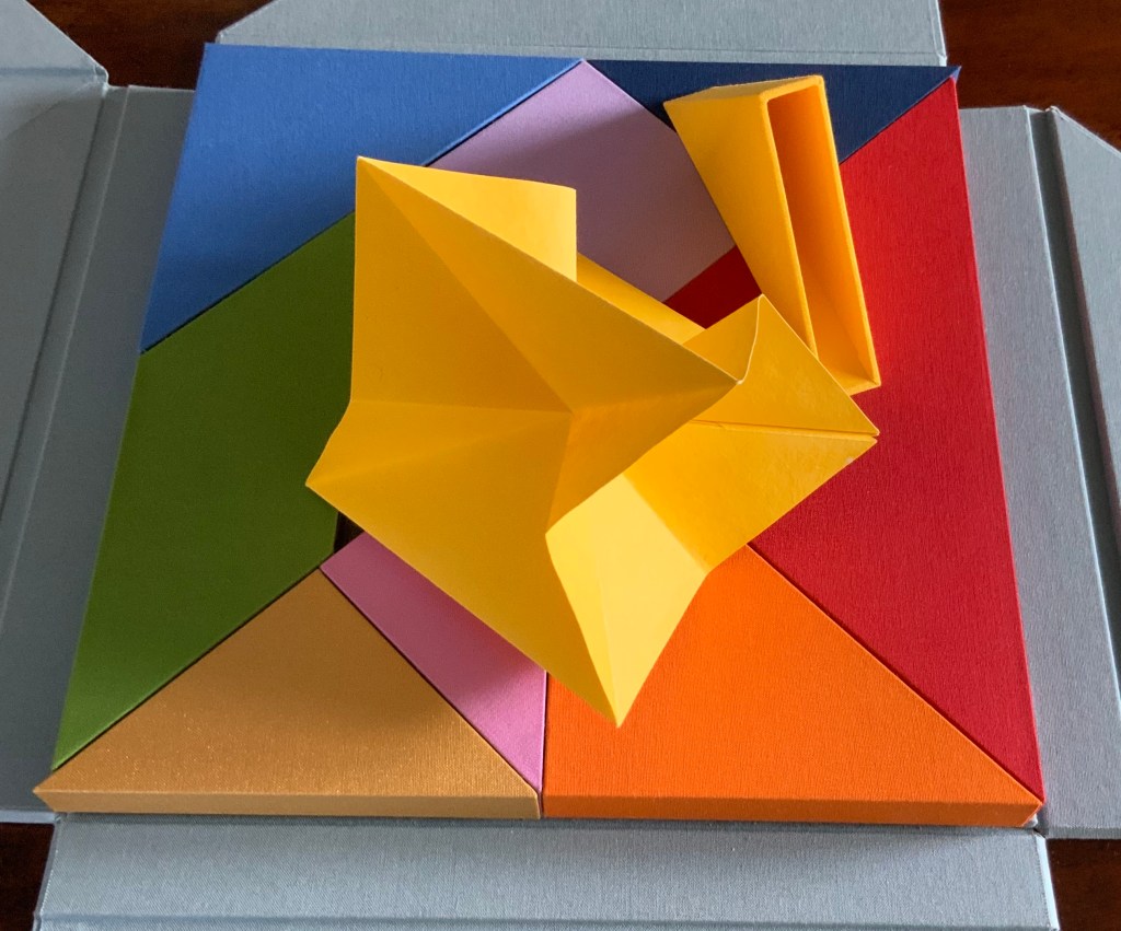
But where is the human soul manifest among these colors and forms?According to Neo-Pythagorean philosophers numbers, string vibrations, musical notes, colours and form have fundamental, metaphysical relationships. Pythagoras himself is thought to have said “colour is form, and form is colour”. Then there is Pythagorean Numerology that holds that a person’s date of birth can be distilled into one number (a root number) between 1-9, that each number is associated to a colour, and that each colour aligns with certain inner traits and life purposes. So within a box of grey (the color of universality), there are the nine colours of humanity: We are, making Nous Sommes a startling integration of book art, Pythagoras, numerology, tangrams, origami, papermaking, boxmaking, binding and printing.

Tap the image above or title for the video Nous Sommes — An Artist Book by Ioana Stoian. Produced by Eric Gjerde.

On the title page, the work is designated as “Edition 9 of 9“. Yet, as of this writing, the work is unique. Of course, 9/9 = 1. And the chapter with which I started was blue, the colour associated with the number 5, the root number of my birth date. So many coincidences of sums, Nous Sommes must have been bound for the Books On Books Collection.

Further Reading and Listening

A Match Made in Paper”, Arctic Paper, 4 July 2019. Accessed 23 September 2019.

Bookmarking Book Art – Ioana Stoian”, Books On Books, 8 February 2018.

Hiebert, Helen. “Ioana Stoian“, podcast interview, Paper Talk, 16 April 2020. Accessed 19 April 2020.

Huffman, Carl. “Pythagoreanism“, The Stanford Encyclopedia of Philosophy (Fall 2019 Edition), Edward N. Zalta (ed.) Accessed 1 April 2020.

Lawlor, Robert. “Pythagorean Number as Form, Color, and Light”, in Homage to Pythagoras: Rediscovering Sacred Science, ed. Christopher Bamford (SteinerBooks, 1994), pp. 187-212.

Stoian, Ioana. Origami for all : elegant designs from simple folds (London: Busy Hands Books, 2013).

Stoian, Ioana. “Nous Sommes, My 2015 Artist Book”, 31 December 2015. Accessed 20 January 2017.

Stoian, Ioana. The origami garden : amazing flowers, leaves, bugs, and other backyard critters (New York: St. Martins Griffin, 2016).

Stoian, Ioana. Always be you (London: Busy Hands Books, 2019).

Books On Books Collection – Doug Beube

Breaking the Codex (2011)

Doug Beube: Breaking the Codex
Marian Cohn, ed. (New York: Etc. Etc. The Iconoclastic Museum Press, 2011). Acquired from the artist, 15 February 2014. Photo: Books On Books Collection

Jacket, outer and inner. Photos: Courtesy of the artist.

Back and front covers. Photo: Courtesy of the artist.

In an interview with Judith Hoffberg, Doug Beube spoke of experiencing

the whole book as an entity in itself, which can’t be done by reading line by line. The book’s not made to do that. Readers experience the totality of the book by building up linear movement, word by word, sentence by sentence, etc. and I’m interested in the book as a simultaneous experience.UmbrellaVol 25, No 3-4 (2002)

Doug Beube: Breaking the Codex (2011) documents the impression that, in pursuit of that experience, Beube has foreshadowed and/or echoed nearly every variation of book art in play from the 1980s to the early twenty-first century. Beube has been extraordinarily inventive with the book as raw artistic material but not only for the sake of that experience. Beube is a biblioclast and an ideoclast. His works have altered the codex form and deployed its “syntax” and its metaphoric identities to address recurring political, social and philosophical themes. The two small works in the Books On Books Collection lean more toward the aesthetic and philosophical themes, but the presence of Doug Beube: Breaking the Codex makes a handy reminder of the artist’s substantial body of larger ideoclastic works.

Empty Talk (2016)

Empty Talk (2016)
Doug Beube
Altered book, plexi glass, acrylic box, wood. Framed, H286 x W232 x D51 mm.
Acquired from Kaller Fine Arts, 20 July 2017. Photo: Books On Books Collection.

Views of Empty Talk. Photos: Courtesy of the artist.

Empty Talk is part of the Speechless series, which derives from the work Cut ‘Shortcomings’ (2015). Beube describes the origin of the works:

Shortcomings’ is the original title of the graphic novel by cartoonist Adrian Tomine. It was published by Drawn and Quarterly in Montreal, Canada in 2007. The genre of this art form with seven to nine cells per page, in a gridded format, is drawn in black and white with ‘speech bubbles’ floating overhead of the characters in the book. In the Speechless series, an ongoing collage project, is the removal and outlining of the drawings and speech bubbles using an surgeon’s knife. Reducing the content to line drawings, the pages become veiled layers, a dissected essence of the story that the brain comprehends as both linear and abstract. Between the two, narrative and abstraction, it invites the viewer to literally read between the lines and pages. The final artwork is presented as four pages deep separated by 3/16th inch foam core. The backing of the meticulously cut mash-up of the collage is another version of ‘Shortcomings’ that is sliced into strips then stacked on top of one another. — Dougbeube.com. Accessed 16 April 2020.

Photo: Books On Books Collection.

Hanging on a wall in the collection, Empty Talk mesmerizes. It balances an abstract figure resulting from excision and collage against its pun and linguistic/visual jigsaw puzzle. That tension between abstraction and linearity harks back to Beube’s stated pursuit of “the book as a simultaneous experience” in tension with the reader’s linear experience of it. A kind of cross-eyed, twisted brain state.

Red Infinity #4 (2017)

Red Infinity #4 (2017)
Doug Beube
Altered book. 152 x 83 x 57 mm. Acquired from SeagerGray Gallery, 7 April 2020. Photo: Books On Books Collection.

Photos: Books On Books Collection.

Red Infinity #4. Photo: Courtesy of the artist.

The book from which Red Infinity is formed is The Word: A Look at the Vocabulary of English by Charlton Laird (New York: Simon and Schuster, 1981). At play are at least three interlocking puns: “in the beginning was The Word”; the Möbius strip, a secular never-ending Alpha and Omega; and the symbol of infinity, a secular “world without end”. And the bonus fourth: take The Word as “red/read”. The surfaces of Red Infinity invite touch, but its fragility forbids it. Its weight less than a small bird’s nest, Red Infinity belies its weighty allusions. Here is infinity from the finite.

Looking Outside the Collection

Since Doug Beube: Breaking the Codex (2011), the artist has continued to create large numbers of individual bookworks, but another type of work has come to the fore: large dynamic multimedia installations: Melt (2014), Dis/Solve (2018) and Wash (2020). The first two still incorporate the book as artistic material, but the third moves away from it. Variously requiring participation or observation in the moment as with a performance, these works ironically remind us of Beube’s observation that

The codex is intractable as a technology; restricted from interacting with it by not altering its inevitable course, you read linearly from beginning to end. It is essentially inflexible. That is its built-in personality flaw; that is its elegance.Dougbeube.com. Accessed 18 April 2020.

Melt (2104)
Doug Beube
“… an environmentally sensitive sculpture that involves six selected books physically carved according to their theme. Once frozen, the ice functions to animate messages for social and political conditions, cultures of power or violence both physical and psychological, and those structures existing to support the inverse of the latter. Because Melt is subject to the weather, the anachronistic technology of the book is leveraged into the environment directly.”
Photos: Courtesy of artist.

Dis/Solve (2018)
Doug Beube
“… an environmentally sensitive sculpture that presents two books that have been physically carved and frozen into blocks of ice. …One book is Arab and Jew; Wounded Spirits in a Promised Land by David K. Shipler and the other is The High Walls of Jerusalem by Roland Sanders. The word ABRAHAM is carved into the books A-B-R on the left side and A-H-A-M, on the other. As the ice melts, the water is captured by two steel plinths that drain into one tank. The water is dispensed into bottles with labels that read dis/SOLUTION.”
Photos: Courtesy of artist.

Wash (2020)
Doug Beube
“…a collection of specially crafted soap bars etched with racial slurs and epithets. Carefully set onto a wall of soap dishes, this arrangement invites participants to wash their hands with a bar, letting the ink flow from the letters and mix with the white suds and lather.”
Photos: Courtesy of artist.

Fully experiencing either his dynamic or interactive installations re-enacts this linearity, this “built-in personality flaw” of the codex. Even accessing them by still image (online or offline in a book) or by moving image reminds us secondhand of this flaw. Perhaps the flaw belongs not only to the codex technology (there is no book present in Wash) but to any work of art “bound” by linear process and time. Whether caught by the experiencing, the image or merely the concept, we stand then to be implicated in what these three installations address: religious, environmental and political conflict and “othering” slurs — things of which we cannot wash our hands.

Further Reading

Barry, Rebecca. “Doug Beube’s Frozen Books Installation in Brooklyn Tackles Climate Change and Geopolitics“, Fine Books Magazine, 2 October 2018. Accessed 19 April 2020. Commentary on Dis/Solve.

Cohn, Marian (ed.). Doug Beube: Breaking the Codex (New York: Etc. Etc. The Iconoclastic Museum Press, 2011). “Etc. Etc. The Iconoclastic Museum” is a fictional mueseum invented by Beube in 1981 and curated by the equally fictional Art Gossip. This additional bit of evidence of Beube’s wide-ranging creativity is mentioned in the interview with Judith Hoffberg, entitled “A Cut Up and a Book Artist”, originally published in the journal Umbrella and included as a chapter in this book.

Frost, Gary. The Future of the Book (2000-2009). Available through the Wayback Machine. Accessed 19 April 2020.

In the Hoffberg interview, Beube mentions Gary Frost’s influence via his deep-seated knowledge of the history of the book. There is that, but there is also Frost’s ongoing exploration of the haptic nature of the book. Both strands of influence can be seen throughout Doug Beube: Breaking the Codex. But where Frost would seek the possibility of an ongoing link between the print and the digital — “In place of simplistic displacements a complex interaction of book formats surrounds us and continues to challenge our reading skills” (February 2006) — Beube finds a more sardonic and acerbic humorous split. A twisted phonebook dangled before his face in the photo entitled Facebook to create a self-portrait “both acknowledges and satirizes the intended community of computer users.”

Roalf, Peggy. “Doug Beube on Reading Art“, DART: Design Arts Daily, 8 July 2015. Accessed 19 April 2020. Interview in which Beube discusses the larger work Cut “Shortcomings” from which Empty Talk is derived.

Smith, Keith. The New Structure of the Visual Book (2003)

____________. The New Text in the Book Format (2004)

Beube’s aim at an experience of the wholeness of the book plays off a major theme in Smith’s two books: Composing the book, as well as the pictures it contains, creates pacing in turning pages. Just as poetry and cinema are conceived in time, so is a book.”  Both Smith and Beube are interested in the structure of the book, “the mechanical aspects of the book as  a technology, and how it functions as a container of  information,” as Beube puts it. But where Smith pushes the traditional form of the book to enhance the book experience that “Events depicted in writing unfold through time in space, alongside the physical act of turning pages,” Beube is “trying to solve the problem of experiencing the content of the book as a visual phenomenon, layering it and transforming it into a visual object.”

Books On Books Collection – Cerith Wyn Evans

“…” Delay (2009)

“…” Delay (2009)
Cerith Wyn Evans, Moritz Küng and Armand Mevis
Perfect bound, with laser-cut dust cover. Paper: Munken Lynx 80 (Küng essay and colophon), 170 gms (laser-cut pages), 300 gms (cover). H325 x W250 mm, 32 pages.
Acquired from Taschenbuch, 16 March 2020.

ellipsis: marks or a mark (such as … ) indicating an omission (as of words) or a pause

Merriam-Webster.com

As many bookworks do, Wyn Evans’ “…” offers a puzzle. In this case: What has been omitted? What is coming after the pause or delay?

In his brief essay at the end of the book, Moritz Küng describes this work as a catalogue for Wyn Evans’ exhibition (15 October 2009 – 10 January 2010, deSingel, International arts campus, Antwerp) and characterizes it as “a reciprocate hypertext”, recalling the “trilogy of Un coup de dés by Mallarmé [1914], Broodthaers [1969] and Wyn Evans [2008]”.

The work “…” (2009) alludes to those other three works by form and materiality, not actual text. It uses the same trim size of the 1914, 1969 and 2008 works. The 2009’s laser cut text is positioned in a way to imply the placement of text in the 1914 work, the placement of black strips in the 1969 work and the positioning of excised blocks in the 2008 work. The 2009 work’s subtitle — DELAY — is even positioned exactly where the subtitle is displayed in the three earlier works. Of course, the title page and subtitle in Wyn Evans’ 2008 version of Un Coup de Dés went along with the rest of his variation on Broodthaers’ 1969 work: the pages are framed and hung, allowing the pebbled wall behind the excisions to show through.

From “Cerith Wyn Evans, 15 October 2008 – 10 January 2009, deSingel, International arts campus, Antwerp
Photos: © Jan Kempenaers

But where the 2008 work excises text, “…” excises paper to create text. The actual text in “…” comes from Stephan Pfohl’s review of Guy Debord’s filmscript In Girum Imus Nocte Et Consumimur Igni: A Film (1991). (The Latin is a palindrome — reads the same backwards as forwards — written by Terenziano Màuro, a grammarian and poet of the late second century CE.)

Permit yourself to drift from what you are reading at this very moment into another situation … Imagine a situation that, in all likelihood, you’ve never been in.

Photos: Books On Books Collection

Without knowing the text in question, deciphering the laser cut is a bit difficult, especially also until it becomes apparent that the letter “e” systematically falls below the line. Notice how this happens with “permit” and “yourself” above. Is it a reference to George Perec’s novel La Disparution (1969), written entirely without the letter “e”? Is it an interruption to delay the reader in following an instruction not yet deciphered and read? There is something more going on here than meets the eye — which is, of course, what an omission or pause implies.

If another display in Wyn Evans’ 2009 deSingel exhibition is taken into account, and if Pfohl’s review is explored further, the laser cutting of the letters offers something else not immediately obvious to the eye. Wyn Evans could have chosen die cutting for the letters but chose (or at least approved) laser cutting instead. The signature singeing from the laser comes with the choice. To what is the choice alluding?

Details of “…”
Photos: Books On Books Collection

Is it alluding to the firework display that spelled out Debord’s 1978 film title, which translates “We go round and round at night and are consumed by fire”? As Pfohl explicates the filmscript and highlights Debord’s anti-consumerist, anti-capitalist and near-nihilist point of view informing it, he quips, “Look out for the flames”. Is the singeing alluding to that?

Still from fireworks display of In Girum Imus Nocte Et Consumimur Igni
© CC BY-SA 4.0 deSingel 2009
Click here to see the video.

How does the reader/viewer of “…” know to make these connections, to fill in the omissions? Well, after the pause/delay of “ellipsis” come Küng’s essay and the colophon, which provide many but not all of the clues with which to make the connections.

Knowledge of — or the presence of — the 1914 edition of Un coup de Dés, Broodthaers’ 1969 version and Wyn Evans’ 2008 re-version seems essential. Attendance at the fireworks display — or finding the images in the deSingel archive — would seem necessary to make sense of Küng’s reference to the artist’s “fireworks texts”. For the reader/viewer ignorant of Debord’s last and autobiographical film, access to Pfohl’s essay is essential to connect that particular film with Küng’s reference. Also, access to Pfohl’s essay is essential to see the context of the sentences Wyn Evans extracts, essential to find the Latin title of Debord’s film, and essential to pick up Pfohl’s quip.

Does the burden of the elusive, multi-layered allusiveness and self-referencing placed on the reader/viewer diminish and interfere with the work or enhance and help it? Depends on the reader/viewer. Or as Terenziano put it, Pro captu lectoris habent sua fata libelli (The fate of books lies in the capability of their readers).

The colophon also provides a set of details that can shape the reader/viewer’s appreciation of “…” — DELAY. It assigns the concept to Wyn Evans, Armand Mevis and Moritz Küng, the overall graphic design to Mevis & van Deursen and the layout design to Paul Elliman, whose Albernaut font was used for the excised text. Collaboration as recorded in a colophon grounds this work in a lineage that extends far beyond Mallarmé and Vollard. Even before the printed codex, the colophon, or finishing touch, to a scroll or manuscript book recorded how collaborative the effort to make a book actually is. Although book art is leavened with Blakean works of individual creation, the works of artists such as Cerith Wyn Evans remind us how this object is so often the result of multiple talents going round and round and catching fire.

Further Reading, Viewing and Listening

“Cerith Wyn Evans”, desingel.be. Accessed 15 March 2020.

“Cerith Wyn Evans”, Mariangoodman.com. Accessed 15 March 2020.

“Cerith Wyn Evans”, Whitecube.com. Accessed 15 March 2020.

Other works inspired by Terenziano Màuro:

— Architectural installation: Didier Fiuza Faustino

— Choreography: Roberto Castello

— Music: Anders Brødsgaard

Books On Books Collection – Guido Molinari

Équivalence : un coup de dés jamais n’abolira le hasard (2003)

Équivalence: Un coup de Dés jamais n’abolira le Hasard (2003)
Stéphane Mallarmé, Guido Molinari; preface, Jocelyne Légaré; interview, Julia Duchastel.
Portfolio of 26 loose folded leaves. Portfolio: H339 x W256 mm. Leaves: H336 x W250 mm.
Les Éditions du Passage, Montréal. Acquired from Reynaud-Bray, March 2019. © Guido Molinari. Photos: Books On Books Collection. Displayed with permission of Fondation Guido Molinari.

Molinari’s rendition of Un coup de Dés sings among the versions by Marcel Broodthaers (1969), Geraldo de Barros (1986) and Ellsworth Kelly (1992).

In the first three minutes of this extract from the film Molinari: la couleur chante (2005), Molinari walks through an exhibition of Équivalence, discussing it with Roald Nasgaard and commenting on Un coup de Dés, its visual musicality and his transformation of it into his colourful geometric abstractions. The opportunity to see all of the poem ranged along one wall and all of Molinari’s abstractions along a facing wall is a pleasure. A pleasure enhanced by leafing through the portfolio and juxtaposing each double-page spread of the poem with Molinari’s “equivalent” abstraction.

Update

At the Guido Molinari Foundation’s exhibition Sophie Lanctôt, Mallarmé, Molinari: Mots Croisés (6 June – 25 August 2024), a previously undiscovered artist’s book by Molinari appeared for the first time in thirty years:

Continuum pour Mallarmé (1994)

Images courtesy of Fondation Guido Molinari. Photos: Michael Patten. Especial thanks to artist Sophie Lanctôt and curator Monic Robillard.

Note in this earlier work how the text is integrated with artwork, omitting the later work’s intermediate homage to Broodthaers.

Continuum pour Mallarmé was created for a group show of 47 books by renowned artists such as Louise Robert, Michel Goulet, Irene F. Whittome and Rober Racine, presented at AXENÉO-7 in Gatineau from March 27 to April 24, 1994, under the title De causis et tractatibus. Each artist was free to choose his or her subject. Molinari chose Mallarmé’s poem. 

“The idea of a fictional encyclopedic project arose during a conversation between Marie-Jeanne Musiol and Richard Gagnier about the creation of artist’s books. Each of the artists received an identically crafted book with a closed dimension of 33.8 x 26.5 x 1.4 cm (13 ¼ x 10 ½ x ½ in.). The interior consists of six sheets of white BFK Reeves paper folded in quarters and sewn together. (…) The title of the encyclopedia and the volume’s serial number, in Roman numerals, are pressed into the cover and repeated in the same way on the inside title page,” writes Richard Gagnier in 3 manières d’instruire l’inventaire, published by Le Sabord in 1998. Continuum pour Mallarmé by Guido Molinari is number 44. — Exhibition notes provided by Monic Robillard.

Further Reading

Molinari, Guido, Gilles Daigneault, Patrick Lafontaine. Nul mot: les livres d’artiste de Guido Molinari (Montréal, Québec: Éditions du Noroît, 2017).

Nasgaard, Roald. Abstract Painting in Canada (D&M Publishers Inc., 2008).

Bénichou, Anne, Olivier Asselin, Camille Bouchi, and Axe Néo-7 art contemporain. 1998. 3 Manières D’instruire L’inventaire : En Hommage À Un Cadeau D’eva Hesse À Sol Lewitt : De Causis Et Tractatibus : En Cause, Brancusi. Trois-Rivières, Québec: Le Sabord.

Books On Books Collection – Abecedaries I (in progress)

Jon Agee, Z Goes Home (entry in progress)

Islam Aly, 28 Letters

Marie Angel, An Animated Alphabet, Angel’s Alphabet, An Alphabet of Flowers

Anonymous, Picture ABC (n.d.) — from Barbara Raheb’s collection (entry in progress)

Annesas Appel, Ruiten Alfabet (2006) in progress

Rutherford Aris, The Ampersand in Script & Print: An Essay in Honour of the Ampersand Club on the Occasion of its Semicentenary

Tauba Auerbach, How to Spell the Alphabet

Federico Babina, Archibet

Cristina Balbiano d’Aramengo, Flag Book Alphabet

Leonard Baskin, Hosie’s Alphabet

Antonio Basoli, Alfabeto Pittorico

Marion Bataille, ABC3D

Anthon Beeke, Alphabet

Rebecca Bingham, Golden Alphabet

Alberto Blanco & “El Nacho”, The Book of Equis (entry in progress)

Tia Blassingame, Mourning/Warning: An Abecedarian; Mourning/Warning: Numbers and Repeaters

Frédéric Bruly Bouabré, Frédéric Bruly Bouabré (2013) in progress

Leonard Brett, A Surrealist Alphabet (2014)

Johann Theodor de Bry, Neiw Kunstliches Alphabet

Ken Campbell, AbaB

Pramod Chavan, The Voice of the Yarn (2023)

William Cheney, ABC for Tiny Schools (1975)

Henri Chopin, Alphabet pour Gratte-Ciel 1970-1985 (1991)

Annie Cicale, Patterned Alphabet (2013) and Detritus No. 30: Floppy Alphabet, Brush Alphabet (2020)

Roman Cieślewicz, Guide de la France Mystérieuse (Les Guides Noirs) (1964) (entry in progress)

David Clifford, Letterpress ABC

Michele Durkson Clise, Animal Alphabet

Mark Cockram, The Trial of the Letter ϒ alias Y by Thomas Edwards (binding)

Aaron Cohick, Alphabet One

Colleen (Ellis) Comerford, ABCing (2010)

Menena Cottin, Las Letras (2008/2018)

Robert Cottingham, A-Z: Robert Cottingham: An American Alphabet

Paul Cox, Abstract Alphabet

Nerma Prnjavorac Cridge, Sarajevska Abeceda

John Crosbie, ABC in a maze (1987)

Wim Crouwel, A New Alphabet

Roberto de Vicq de Cumptich, Bembo’s Zoo

Carol Cunningham, Alphabet Alfresco (1985)

Joyce Cutler-Shaw, Alphabet of Bones

Jason D’Aquino, Jason D’Aquino’s Circus ABC (2010)

François Da Ros, Anakatabase

Jean-Renaud Dagon (Le Cadratin), Voyelles by Arthur Rimbaud

Lyn Davies, A is for Ox

The Three Delevines, A Human Alphabet (1897)

Raffaella della Olga, LINE UP

Sonia Delaunay, Alphabet (1972)

Klaus Peter Dencker, Dero Abecedarius! (2001)

William Dugan, How Our Alphabet Grew (1972)

Thomas Edwards, An Account of the Trial of the Letter ϒ [upsilon] alias Y, binding by Mark Cockram

Timothy Epps and Christopher Evans, Alphabet

Jennifer Farrell, The Well-Travelled Ampersand

Leonard Everett Fisher, Alphabet Art (1978), The ABC Exhibit (1991)

Edmund Fry, Pantographia (1799/2022)

Neil Gaiman & Gris Grimly, The Dangerous Alphabet (entry in progress)

John Gerard, Alpha Beta

Julien Gineste, Alphabet

Edward Gorey, Thoughtful Alphabets: The Just Dessert / the Deadly Blotter, The Eclectic Abecedarium

Raj Haldar, Chris Carpenter & Maria Tina Beddia, P is for Pterodactyl: The Worst Alphabet Book Ever (2018)

Karen Hanmer, The Spectrum A-Z; A2

Steven Heller & Gail Anderson, The Typographic Universe

Christopher Hicks, A Bookbinder’s ABC (2003)

Helen Hiebert, Alpha Beta …

Susan Hiller, The Artist’s Palette Alphabet

Tana Hoban, A,B, See!

Richard J. Hoffman, “Don’t Nobody Care about Zeds” (1987) and The Story of the Alphabet (1988)

Jean Holabird, Vladimir Nabokov: AlphaBet in Color

Hans Holbein the Younger, Der Totentanz (entry in progress)

Erwin Huebner, Alphabeta Concertina Majuscule (2015) and alphabet concertina miniscule (2022)

Takenobu Igarashi, Igarashi Alphabets

Nayla Romanos Ilya, The Phoenician Alphabet (2022)

Bård Ionson, Battledore (2019)

Stephen T. Johnson, Alphabet City; A is for Art; Alphabet School

William Joyce and Christina Ellis, The Numberlys

Karl Kempton, 26 Voices

Ines von Ketelhodt, Alpha Beta

Ronald King, Alphabet II, Alphabeta Concertina, alphabeta concertina miniscule, The White Alphabet (in progress)

Margo Klass, Takeover (2023)

Moussa Kone: The Abecedarium of the Artist’s Death: 26 Dangers for Your Career

Alethea Kontis, AlphaOops: The Day Z Went First (entry in progress)

Lou Kuenzler & Julia Woolf, Not Yet Zebra (entry in progress)

Sean Lamb & Mike Perry, Z Goes First (entry in progress)

Amy Lapidow, Spiralbet

Ji Lee, Univers Revolved: A Three-Dimensional Alphabet

Francesca Lohmann, An Alphabetical Accumulation

Catherine Macorol, A is for Axolotl (2022)

Helen Malone, Alphabetic Codes

Russell Maret, Hungry Dutch

Enid Marx, Marco’s Animal Alphabet

Scott McCarney, ​Alphabook 3, Alphabook 10 and Alphabook 13

Tara McLeod, ABC

Clément Mériguet, ABCDead

Lisa Merkin, Bodies Making Letters (entry in progress)

Miarko (Edmond Bouchard), ABC d’Art (c. 1920)

Cathryn Miller, L is for Lettering

Patrice Miller, The Eclectic Abecedarium by Edward Gorey (binding)

Suzanne Moore, A Blind Alphabet

Dave Morice, A Visit from St. Alphabet

Jeffrey Morin & Steven Ferlauto, Sacred Space; The Sacred Abecedarium (entry in progress)

Andrew Morrison, Ampersands&; Two Wood Press A-Z

Movable Books Society, A to Z: Marvels in Paper Engineering

Bruno Munari, ABC con fantasia

Museum of Metropolitan Art, Animalphabet (1996)

Lloyd. L. Neilson, An Alphabet Coloring Book by Theodore Menten (1997)

Vítězslav Nezval, Abeceda/Alphabet

Richard Niessen, The Palace of Typographic Masonry

Paul Noble, Nobsons Newton

Clotilde Olyff, Lettered Typefaces and Alphabets by Clotilde Olyff (2000)

Květa Pacovská, À l’infini (2007)

Molly Peacock & Kara Kosaka, Alphabetique

Antonio & Giovanni Battista de Pian, Alphabetto Latino Schizzato and Alphabetto Pittoresque, respectively

Maria Pisano, XYZ

Étienne Pressager, Quelques îles en formation

Richard Price & Ronald King, little but often

Francisca Prieto, Printed Matter series

Alice & Martin Provensen, A Peaceable Kingdom (1978) in progress

David Rault, ABC of Typography (2019)

Bruce Rogers, Champ Rosé

Renzo Rossi, The Revolution of the Alphabet (2009), A Gift from the Gods (2009) and How Writing Began (2009)

Ornan Rotem, A Typographic Abecedarium (2015)

Sybil Rubottom & Jim Jim Machacek, Spice Market

Tiphaine Samoyault, Alphabetical Order (1998)

Claude Sarasas, The ABC’s of Origami

Claire Jeanine Satin, Alphabet Cordenons

Rowland Scherman, Love Letters (2008)

Judy Fairclough Sgantas, ABC of Bugs and Plants in a Northern Garden (2012)

Ben Shahn, The Alphabet of Creation

Levi Sherman, Frequency: An Abecedarian (entry in progress)

Jana Sim, Both but Between (2021)

Paul Standard, Diggings of Many Ampersandhogs

Kevin M. Steele, The Movable Book of Letterforms (2009)

Johann David Steingruber, Architectonisches Alphabeth

Connie Stricks, A Cuneiform Hornbook (2023)

Borje Svennsson & James Diaz, Letters

Ashley Rose Thayer, Runic Alphabet (2023)

Geofroy Tory, Champ Fleury

Nancy Anderson Trottier, The Alphabet Effect (2013)

Jan Tschichold, A Brief History of the Ampersand

Gerard Unger, A Counterproposal

Claire Van Vliet, Tumbling Blocks for Pris and Bruce

Sharon Werner & Sharon Forss, Alphabeasties and Other Amazing Types

Teagan White, Adventures with Barefoot Critters (entry in progress)

Emmett Williams, abcdefghijklmnopqrstuvwxyz (1963)

Ada Yardeni, A- dventure- Z’ (2003)

Edward Andrew Zega & Bernd H. Dams, An Architectural Alphabet

Ludwig Zeller, Alphacollage

~zeug, Et & Ampersands: A Contemporary Collection

Heimo Zobernig, Farben Alphabet

Further Reading

Tien-Min Liao, Handmade Type. Compare/contrast with Tauba Auerbach’s Stacking (2007), which is covered in How to Spell the Alphabet (see above).

Poul Webb, “Alphabet Books — Parts 1-8” on Art & Artists. Google has designated this site “A Blog of Note”, well deserved for its historical breadth in examples, clarity of images and insight.

Books On Books Collection – A to Z: Marvels in Paper Engineering

A to Z: Marvels in Paper Engineering (2018)
Movable Books Society
Box 8.75” wide x 6.75” deep x 4” tall, 26 cards 6” x 8”

Intro page designed by Bruce Foster

Letter A by Simon Arizpe and Letter B by Camille Magaud

Letter C by Peter Dahmen and Letter D by Dorothy Yule

LetterDesigner
ASimon Arizpe
BCamille Magaud
CPeter Dahmen
DDorothy Yule
EEric Broekhuis
FYoojin Kim
GJess Tice-Gilbert
HAngelo Ferrari
ILena Ignestam
JHiromi Takeda
KRob Kelly
LCourtney McCarthy
MWai-Yin Kwan
NKelli Anderson
OKyle Olmon
PMaike Biederstaedt
QAurore Le Vilain
RJulie Charvet
SIsabel Uria
TSheila Hirata
UShelby Arnold
VDamien Prud’homme
WShawn Sheehy
XKatherine Belsey
YTina Yeung
ZYevgeniya Yeretskaya
List of contributors from Movable Books Society site.

Published to commemorate the Movable Books Society’s 25th anniversary, A to Z: Marvels in Paper Engineering is aptly subtitled. A video created by Christopher Helkey gives 26 brief cameos to the artists above in which they demonstrate those marvels.

Further Reading

ABCs“, Bookmarking Book Art, 29 November 2015.

Abecedaries I (in progress)“, Books On Books Collection, 29 March 2020.

Books On Books Collection – Marion Bataille

ABC3D (2008)

ABC3D (2008)
Marion Bataille
Hardcover, paper on board, with holograph on front cover; H187 x W147 x D44 mm; 36 pop-up or movable pages. Acquired from Amazon.de, 31 May 2018.

“A” to “Z”

Becoming a “B”

“C” revealing a “D”

“X” sliding to “Y”

Although this book is available at retail, it is a delicate work. With small removable protective slips of paper inserted at points of friction, it is not a work to pull off the shelf, flip through and replace casually. “Flipping through” misses too much anyway. These are pages to tease apart, peer between, draw taut with fingers and thumbs holding the opposite edges tight, and work back and forth gently to appreciate the engineering.

VUES/LUES: Un Abécédaire de Marion Bataille (2018)

VUES/LUES (2018)
Marion Bataille
Leporello: H150 × W110 mm. Stitched card: H:110 x W250 mm. Acquired from Éditions ~zeug, 13 April 2020.

Vue means “view, sight, vision/eyesight or outlook”. “Picture postcard views” in French would be vues de carte postale. Lues is the past participle of the verb lire (“to read”) in the feminine plural. So, to say in French “Marion’s picture postcard views can be easily read as an abecedary” would be “Les vues de cartes postale de Marion peuvent être lues facilement comme une abécédaire“.

Facilement (“easily”), of course, depends on reading this leporello laterally in book fashion, not laterally in landscape postcard fashion. But is it “O” for bull ring or bull ring for “O”?

Further Reading and Viewing

ABCs: Bookmarking Book Art”, Books On Books, 29 November 2015.

ABC3D video from the publisher Albin Michel/Roaring Brook Press.

Books by Marion Bataille and Complete Book Reviews”, Publishers Weekly, 18 August 2008. Accessed 25 March 2020.

Bataille, Marion. 10 (Paris: Albin Michel, 2010).

Bataille, Marion. AOZ (Paris: Le Trois Ourses, 2016).

Bataille, Marion. Bruits (Paris: Thierry Magnier, 2016).

Bataille, Marion. Numéro (Paris: Albin Michel, 2013).

Perkins, Stephen. 13 January 2022. Marion Bataille, Vues/Lues [Seen/Read], Zeug, France, 2018, ed. 1000. Accordionbooks.com.

Books On Books Collection – Ludwig Zeller

Alphacollage (1979)

Alphacollage (1979)
Ludwig Zeller
Casebound in Holliston Sailcloth with foil stamping on the front and the spine, printed in two colours on Strathmore Grandee, composed in VIP Trump Medieval, in an edition of 200, of which this is #93.
H316 x W230 x D15 mm. Acquired from Atticus Books, 9 January 2020.

In 1980, Alphacollage received a certificate of merit from the Art Directors’ Club of New York. Its publishers (Tim and Elke Inkster of The Porcupine’s Quill) were invited to New York to accept the award. The tale of that event (as told by Tim Inkster) along with an introduction to Zeller and his work is as amusing (if not as surreal) as Alphacollage itself.

In his preface to the work, Zeller calls the inspiring vision that inspired Alphacollage an “alphabestiary [that] surrounds me”. In it, he sees

a unique alphabet in which the flute and the letter F prolong into an unending melody, … Botanical remnants, electrical apparati or bones, tools from catalogues or exotic customs are coupled with animals till they take on all the shapes of the metamorphosis and clamour for their place here, like beasts in heat. Ludwig Zeller, “Cutting Letters Out Means …”

Born in the desert of Atacama in the north of Chile, Zeller had an alphabet of 27 characters, including Ñ. Even this and Zeller’s lack of any English were not the chief challenge that the Inksters faced.

The main production difficulty encountered with the book was that some of Zeller’s raw material, his collection of nineteenth-century steel engravings, had been printed on coated stock, while others were originally printed on matte paper which had yellowed with age. The challenge (with the encouragement of Stan Bevington of Coach House) would be to colour-separate the two, which of course, could be achieved by no known photo-mechanical process. I spent the better part of three weeks during the summer of 1979, artwork in front of me, hunched over Elke’s negatives at the light table, cutting, with an X-acto knife, elaborate and intricate rubylith overlays. Tim Inkster, “Chapter Two: Stars and Stripes“, The Porcupine’s Quill. Posted on 27 September 2010. Accessed 12 January 2020.

All of the images except one appear on a recto page. The sole image appearing on a verso page — in fact, the last page of the book — is the image above, which is also the first to appear in the book. Not surprising, given the penultimate sentence of Zeller’s preface: “The circular edge of these images has twenty-seven eyes to decipher the name that contains within itself all the names of the universe.” In Spanish, the word for eye is ojo.

Further Reading

“ABCs: Bookmarking Book Art”, Books On Books, 29 November 2015.

Abecedaries I (in progress)“. Books On Books Collection.

Jim Avignon & Anja Lutz 29 October 2022. Books On Books Collection.

Leonard Brett“. Books On Books Collection. In progress.

Roman Cieslewicz“. Books On Books Collection. In progress.

Leslie Haines 4 November 2022. Books On Books Collection.

Lynn Hatzius“. 2 December 2022. Books On Books Collection.

Peter Hutchinson“. Books On Books Collection. In progress.

Peter Malutzki“. Books On Books Collection. In progress.

Clément Meriguet 13 November 2021. Books On Books Collection.

Paul Noble“. 20 April 2021. Books On Books Collection.

Judy Pelikan“. 2 June 2023. Books On Books Collection.

Rose Sanderson“. 30 May 2023. Books On Books Collection.

Pat Sweet“. 18 January 2023. Books On Books Collection.

Balakian, Anna. “The surrealist optic of Ludwig Zeller“, Review: Literature and Arts of the Americas, 1977, Volume 11, Issue 21-22, pp. 161-66. Published online, 11 May 2012. Accessed 23 March 2020.

Van Huijstee, Pieter, and NTR. 2016. Interactive Documentary, Jheronimus Bosch, The Garden of Earthly Delights. Amsterdam: Pieter van Huystee Film, NTR. Accessed 26 May 2023.

Zeller, Beatriz. Focus on Ludwig Zeller: Poet and Artist (Oakville, Ontario, Canada: Mosaic Press, 1991).

Books On Books Collection – Katsumi Komagata (I)

Les Livres de … Katsumi Komagata (2013)
Jean Widmer
Paperback, 170 x 225 mm, 176 pages. Paris: Les Trois Ourses, 2013. Photos: Books On Books Collection.

A catalog raisonné from Komagata’s early employer. Its photography captures the subtle layers and shadows of Komagata’s cutouts and his brilliant handling of colours and typography. Given the ongoing output of Komagata’s firm One Stroke, another catalogue will be needed in a few more years.

A Cloud (2007)

A Cloud (2007)
Katsumi Komagata
Perfect bound within hinged whiteboard; H250 x W310 mm; 26 pages.
Tokyo: One Stroke, 2007. Photos: Books On Books Collection.

Komagata presents both a narrative and a cloudscape by combining a choice of different papers for each page with carefully placed die cuts of cloud shapes to match the French, English and Japanese texts.

Little tree/petit arbre (2008)

Little Tree/Petit arbre (2008)
Katsumi Komagata
Perfect bound in greyboard covers, gold-colored ink within hole-punched tree shape on front cover; card paper in various colours and textures; H210 x W210 mm; 28 pages.
Tokyo: One Stroke, 2008. Photos: Books On Books Collection.

The pop-up is a key part of Komagata’s signature techniques, which include the masterful use of different coloured and textured papers, ink and typography. While this video and the collection photos here may provide a balanced view of those elements, they do not convey the integral trilingual text that is far more than a narrative of this little tree’s appearance and disappearance.

Ichigu」(2015)

Ichigu」(2015)
Katsumi Komagata
Eight 4-panel cards in a box. H235 x 77 x 28 mm. Acquired from One Stroke, 26 March 2020. Photo: Books On Books Collection.

In Buddhism, the word Ichigu is associated with a particular saying from the monk Saicho (767-822): 隅を照らす Ichigu wo terasu, which means “Light up one corner”. The word can also denote “landscape”.

One side of each card is screen printed black; the other remains white. The cards offer a wealth of views — individually and combined — landscapes that change with the light and from one juxtaposition to another. Komagata’s works have a philosophical and emotional profundity that makes them cherished and frequently revisited items in this collection.

Further Reading

Huang, Honglan. “Komagata’s “Paperscapes”: Theatricality and Materiality in Blue to Blue“, Libri & Liberi, 2019, Vol.8 (2). Accessed 22 March 2020.

Kember, Pamela, Ed. “Katsumi Komagata“, Benezit Dictionary of Asian Artists. Oxford: Oxford University Press, 2013. Accessed 22 March 2020.

Komagata, Katsumi. “Los libros nacieron” / “The books were born“, at Ilustratour 2014. Accessed 22 March 2020. (Komagata reads A Cloud at mark 7’02” and comments on Little Tree at mark 9’19”.)

Komagata, Katsumi. 26 April 2016. “When the Sun Rises.” Entry at Picturebook Makers. Ed. Pictus. Accessed 30 July 2023.

Books On Books Collection – Scott McCarney

Abecedaries have a long lineage among calligraphers, typographers, children’s book authors and designers (including those of online books), fine press impresarios and book artists. From the world of libraries and museums, we have had abecedary lists and exhibitions such as Favorite Alphabets, (Library of Congress), Primers, etc. Post-1850 (Bodleian), Artists’ Alphabets and Ecstatic Alphabets/Heaps of Language (New York MoMA).

Since 1981, Scott McCarney has diligently extended the lineage through a series of alphabets designed in book form, where the letterforms depend upon the materiality of the book. The limits and possibilities of the book — its material, form and processes by which both can be handled — have inspired McCarney’s Alphabook series. According to the artist, all the Alphabooks (with the exception of numbers 3, 10 and 13) “are one-of-a-kind, and have not been shown much (if at all), so I’m not aware of them being illustrated anywhere“. Fortunately, Alphabook 1 (1981) appears in The Penland Book of Handmade Books: Master Classes in Bookmaking Techniques (2004), p.134, and Alphabook 9 (1985), which McCarney produced as a one-of-a-kind book of photograms in a residency at Light Work in 1985, appears in the Light Work Collection. McCarney describes his inspired manipulation of material, form and process in creating Alphabook 9:

I folded pop-up letterforms with unexposed photo paper in the darkroom and exposed it to directional light then developed, fixed, dried and flattened the prints.  I made a book for Light Work for their collection that spelled out “LIGHTWORK” in the photogram alphabet, which can be seen in their database here: Light Work Collection / Artwork / Photogram Letter book [1133]. — Correspondence with Books On Books, 7 February 2020.

And WorldCat shows that Alphabook 13 (1991) can be found in at least three institutions. It was produced in an edition of 25 and consists of one volume (110 x 100 mm) in which the letter A gradually morphs into the letter Z.

With three of the series works now in the Books On Books Collection, the lack of illustration can be somewhat remedied.

Alphabook 3 (1986)

Alphabook 3 (1986)
Scott McCarney
Two volumes, each of 26 unnumbered die-cut pages and wrapped in translucent belly band. Edition of 300, signed but not numbered. Each volume, closed: H151 x W104 mm; open: H151 x W2195. Acquired from the artist, 14 August 2017.
Photos: Books On Books.

Photos: Books On Books.

Unlike most others in the series, Alphabook 3 is a multiple of 300 copies.

Alphabook 10 (2015)

Alphabook 10 (2015)
Scott McCarney
Laser cut duplex papers hand bound with long stitch through slotted cover; housed in archival box. 56 unnumbered pages. 130 x 310 mm; in box 140 x 310 x 30 mm.
Edition of 14, of which this is #11.
Acquired from the artist, 23 January 2020.
Photos: Courtesy of the artist

The codex form receives McCarney’s playfulness in Alphabook 10. The artist writes:

The fore edge of each page is cut into geometric forms from black, white and cream toned duplex stock (two sheets of different colored paper laminated together). … Produced during a residency at The Institute for Electronic Arts, a high technology research studio facility within the School of Art and Design, NYSCC, Alfred University, New York, committed to developing cultural interactions spurred by technological experimentation and artistic investigations.

Scott McCarney, Visual Books. Accessed 9 February 2020.

The handling of the cover and first page draw attention to the role that empty space, light and stock color will play throughout the book.

Photos: Books On Books.

The binding warrants a closer look as well. Outside and inside, the red thread, its pattern and function stand out.

Photos: Books On Books.

And notice how the thread calls out the textured surface of the paper.

Alphabook 13 (1991)

Alphabook 13 (1991)
Scott McCarney
Flipbook, created with a Macintosh IIcx running Aldus® FreeHand™️ software.
H100 x W92 mm. 32 pages. Acquired from the artist, 15 February 2020.
Photo: Books On Books Collection.

Photos: Books On Books Collection.

Photo: Books On Books Collection.

In correspondence with Books On Books, McCarney explains that the Alphabooks’ mismatch of numbering and chronology stems from discrepancies between dates of conception and opportunities to execute. This little flipbook was conceived and executed as a photocopy edition of 25 in 1991; of more importance here though is the coming together of computer-based typesetting, book structure and pun. As we know, the shortest distance between A and Z is not B to Y, but the points in A reconfigured into Z across 24 flipping pages. It is interesting to compare this transformation with Claude Closky’s calligraphic version De A à Z (1991).

Various Small Books (2019/20)

Various Small Books (2019/20)
Scott McCarney
Photo: Books On Books.

Various Small Books (2019)
Scott McCarney
Photo: Courtesy of the artist.

The 2019 edition was conceived for a fundraising exhibition at Artspace in Richmond, VA. Both the 2019 and 2019/20 editions consist of 35mm slides documenting various of McCarney’s bookworks. Consisting of different slides, the two editions of Various Small Books are unique, and since the slides are bound together and cannot be projected, the images of the books appear small indeed.

Various Small Books (2019/20)
Scott McCarney
Photo: Books On Books

Courtesy of the artist, the inclusion in Various Small Books (2019/20) of slides documenting Alphabook 4, Alphabook 6 and Alphabook 10 makes the 2019/20 edition particularly apropos for the Books On Books Collection.

Further Reading and Viewing

ABCs, Bookmarking Book Art, 29 November 2015.

Alphabook 1. See The Penland Book of Handmade Books: Master Classes in Bookmaking Techniques (2004), p.134.

Alphabook 3”, Artists’ Books Database, Otis College of Art and Design, n.d. Accessed 25 January 2020.

Alphabook 9 (1986). Light Work Collection.

Reversing the Catastrophe of Fixed Meaning: The Bookworks of Scott McCarney”, Brochure for exhibition, 18 May – 9 July 2012, Visual Studies Workshop, Rochester, NY.

Photos: Books On Books Collection

Scott McCarney | Alphabook 3”, Artists’ Books and Multiples, 20 February 2013. Accessed 25 January 2020.

Scott McCarney, Special Edition”, Contact Sheet, No. 164 (Syracuse, NY: Light Work, 2011). Exhibition catalog, which kicked off the conference “Photographers + Publishing”, 3-5 November 2011, Light Work and Syracuse University.

Home Sweet Home (1985)

Home Sweet Home (1985) [Not in collection]
Scott McCarney
Paper in accordion binding with decorative and marbled paper-covered boards and paper-covered slip case.
11 5/8” x 9 1/2” x 1 3/4”