Marlene MacCallum often applies unusual folds in her works. They appear in sleep walk (2024) and The Shadow Quartet (2018-25). With the two works below, however, — as with Chicago Octet (2014) — the fold becomes central to the whole work. Any other structural presentation would not deliver the precise fusion of image, text, and material to deliver the metaphor embodied by the work.
Send (2020)
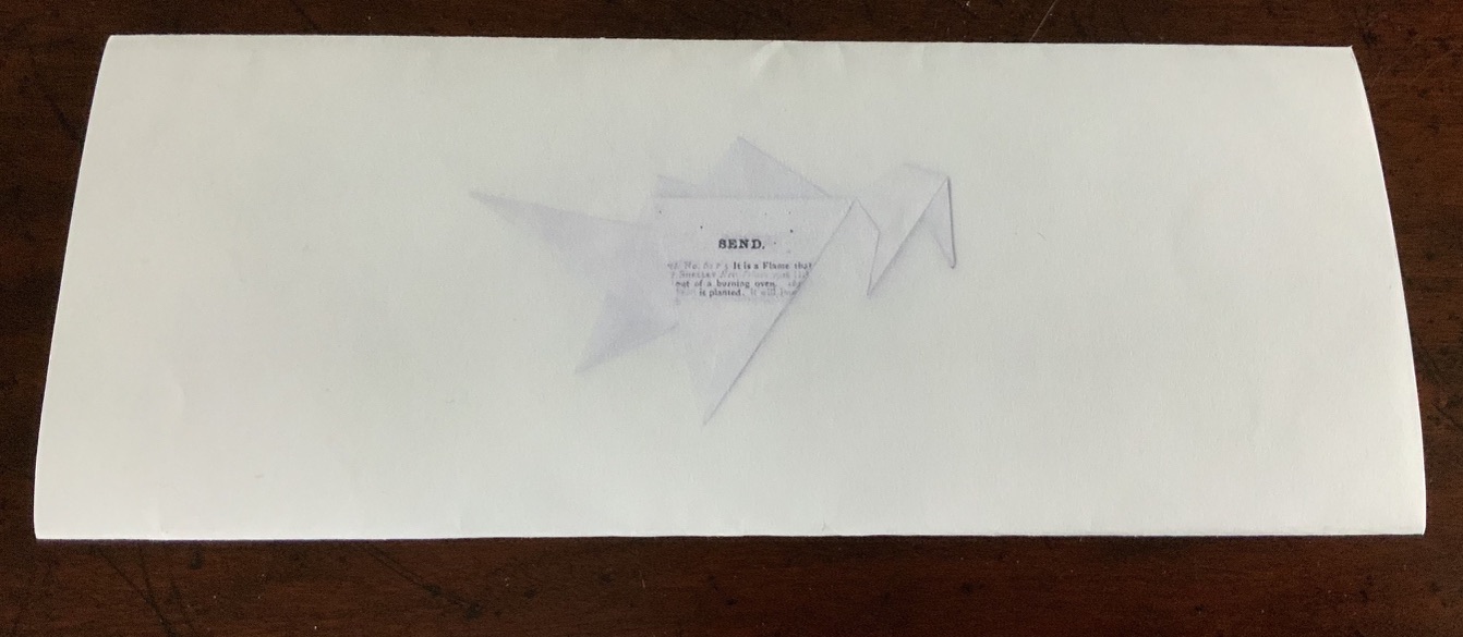
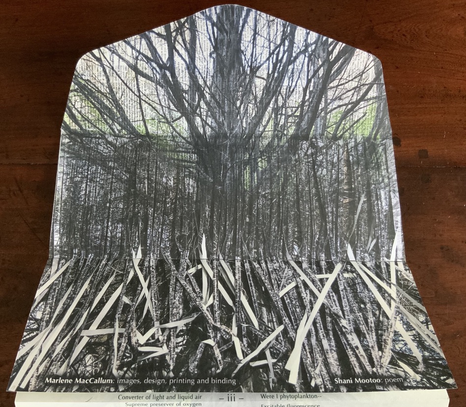
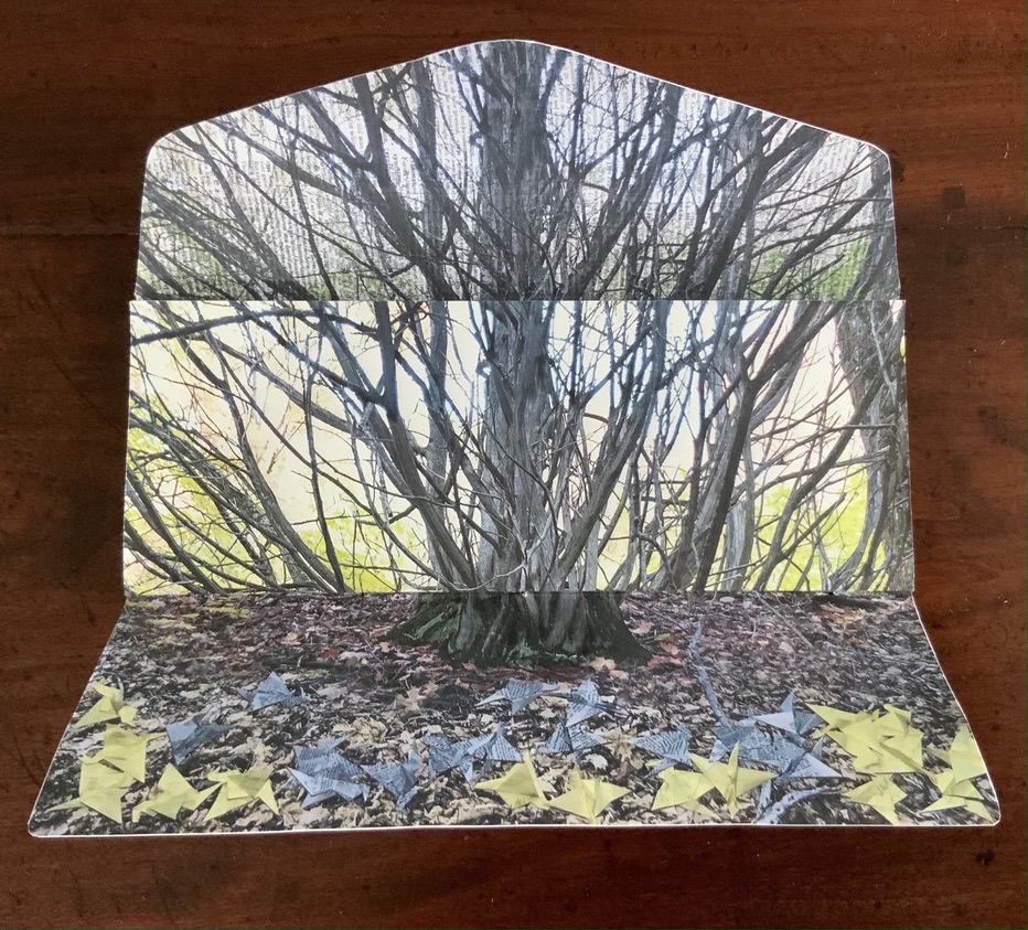
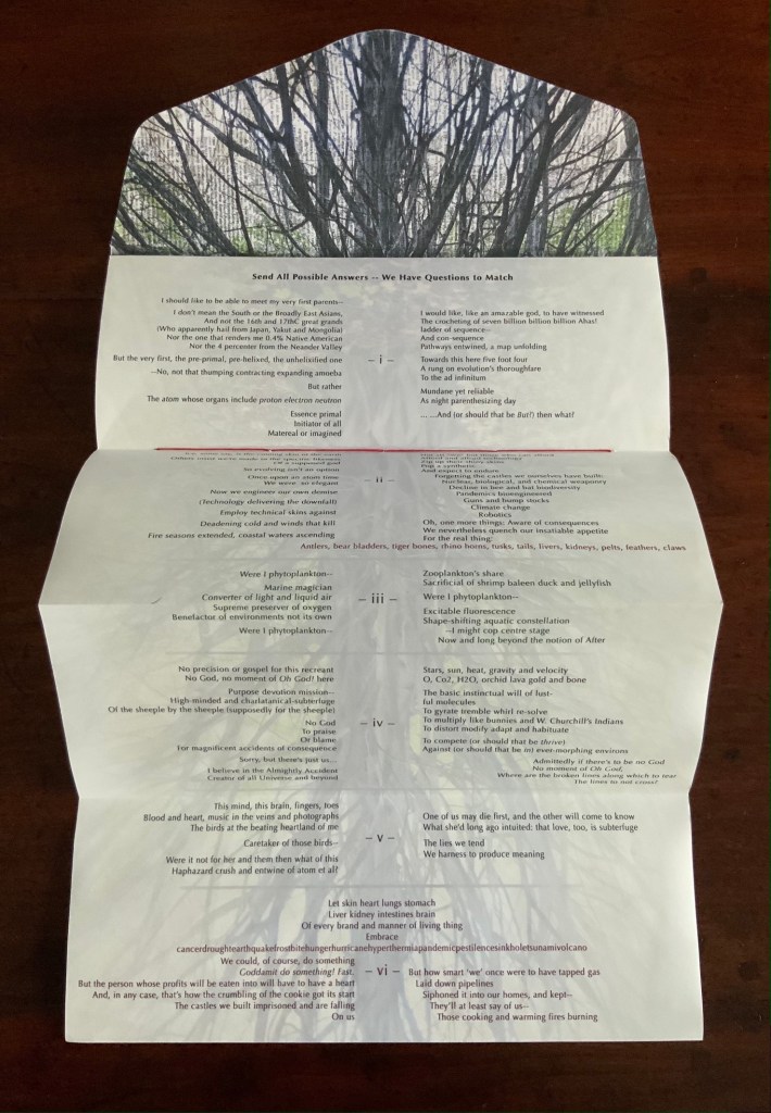
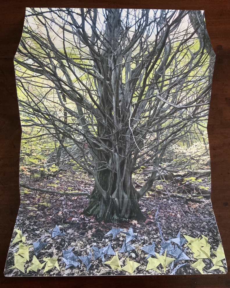
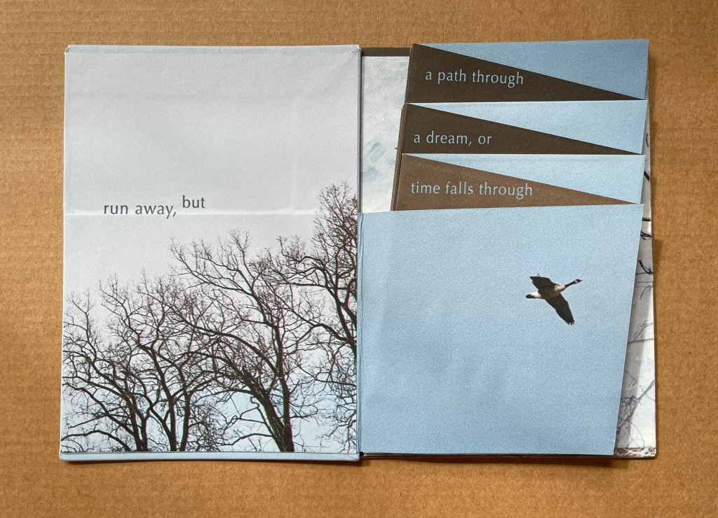
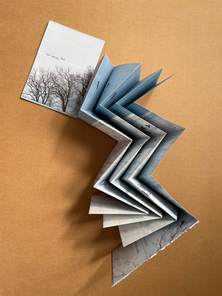
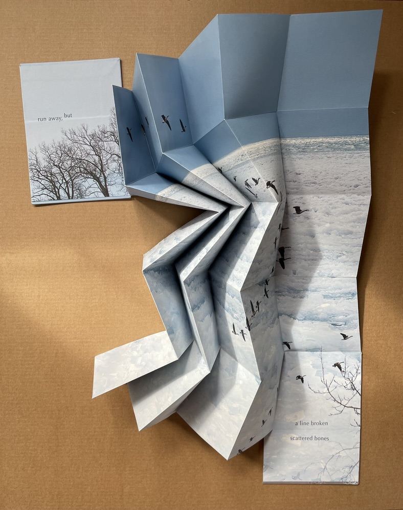
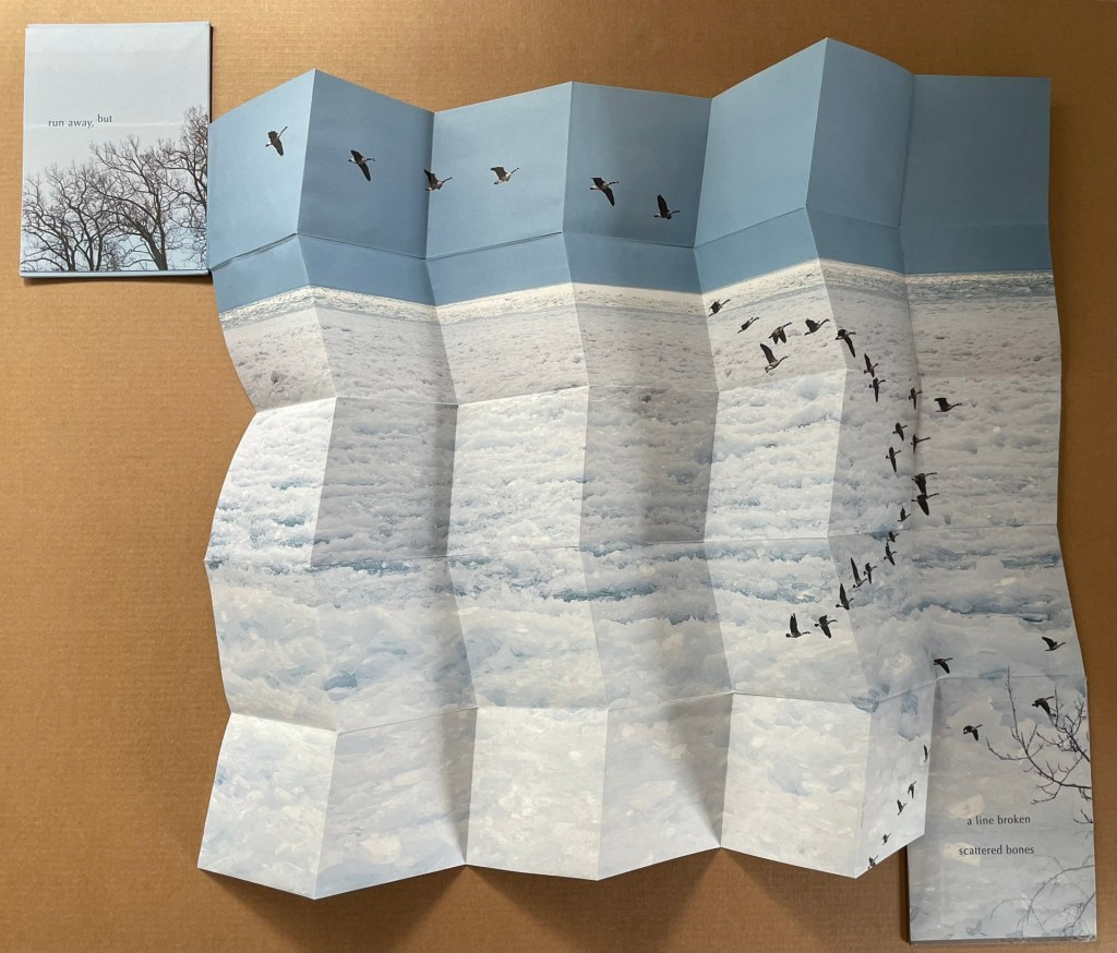
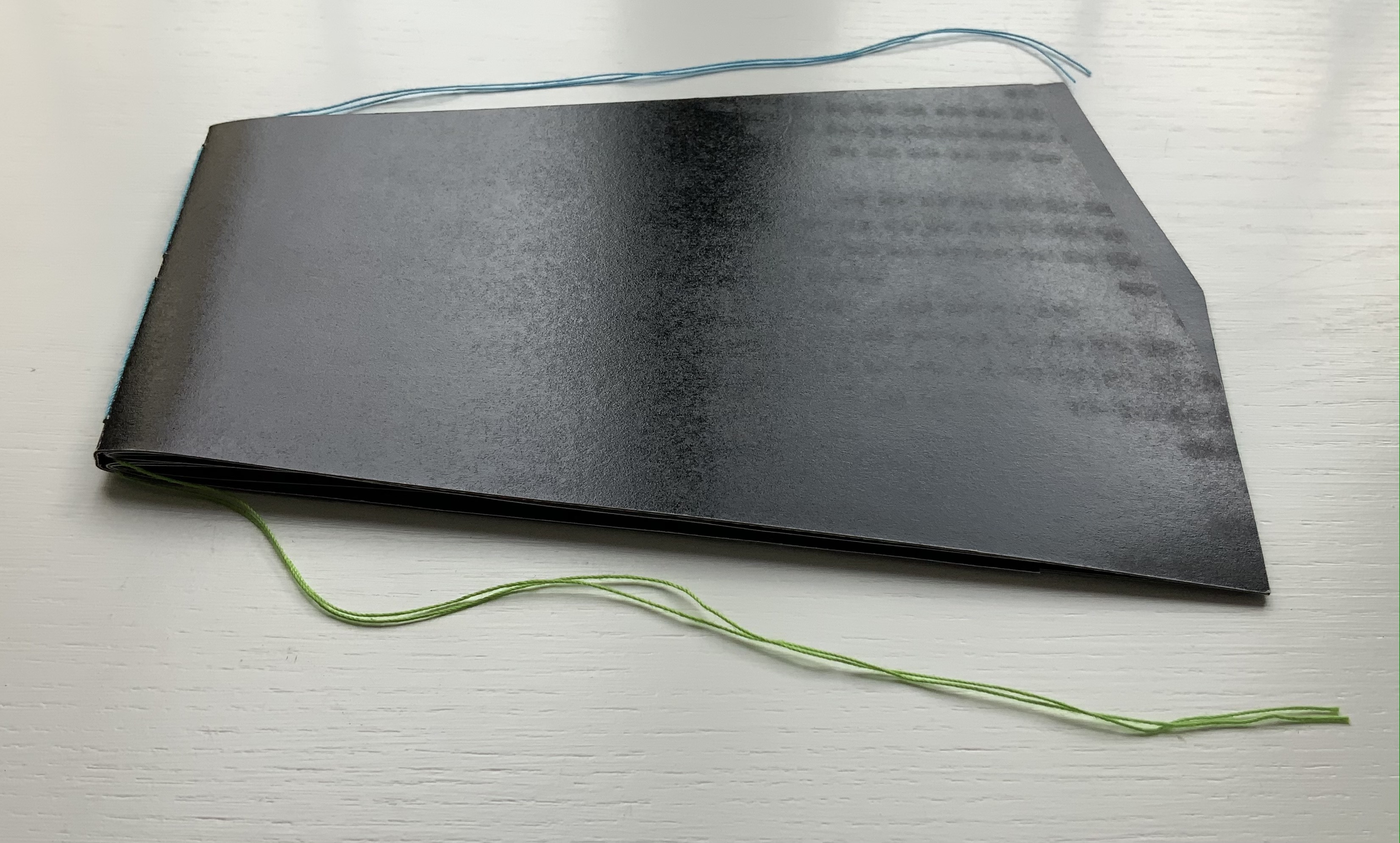
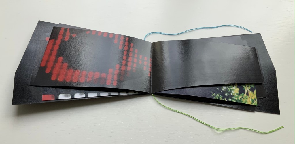
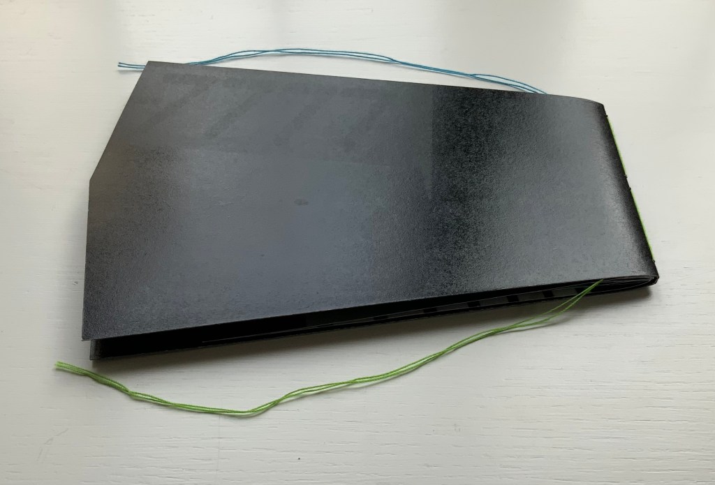
Send(2020) Marlene MacCallum and Shani Mootoo A double-sided archival digital pigment print on paper, folded and pamphlet bound in an envelope enclosure. Images, design, printing and binding by Marlene MacCallum, poem by Shani Mootoo. Dimension: 10 × 25.4 cm (closed) and 47.5 × 10 cm (expanded). #11. Acquired from Marlene MacCallum, 26 October 2022. Photo of the work: Books On Books Collection.
Author’s statement: Send is a correspondence piece; a conversation between my images and structural concept and Shani Mootoo’s poem “Send All Possible Answers – We Have Questions To Match”. Shani Mootoo, writer and artist, gave me the gift of this poem to use in a piece as I saw fit, and together we send this letter to the world.
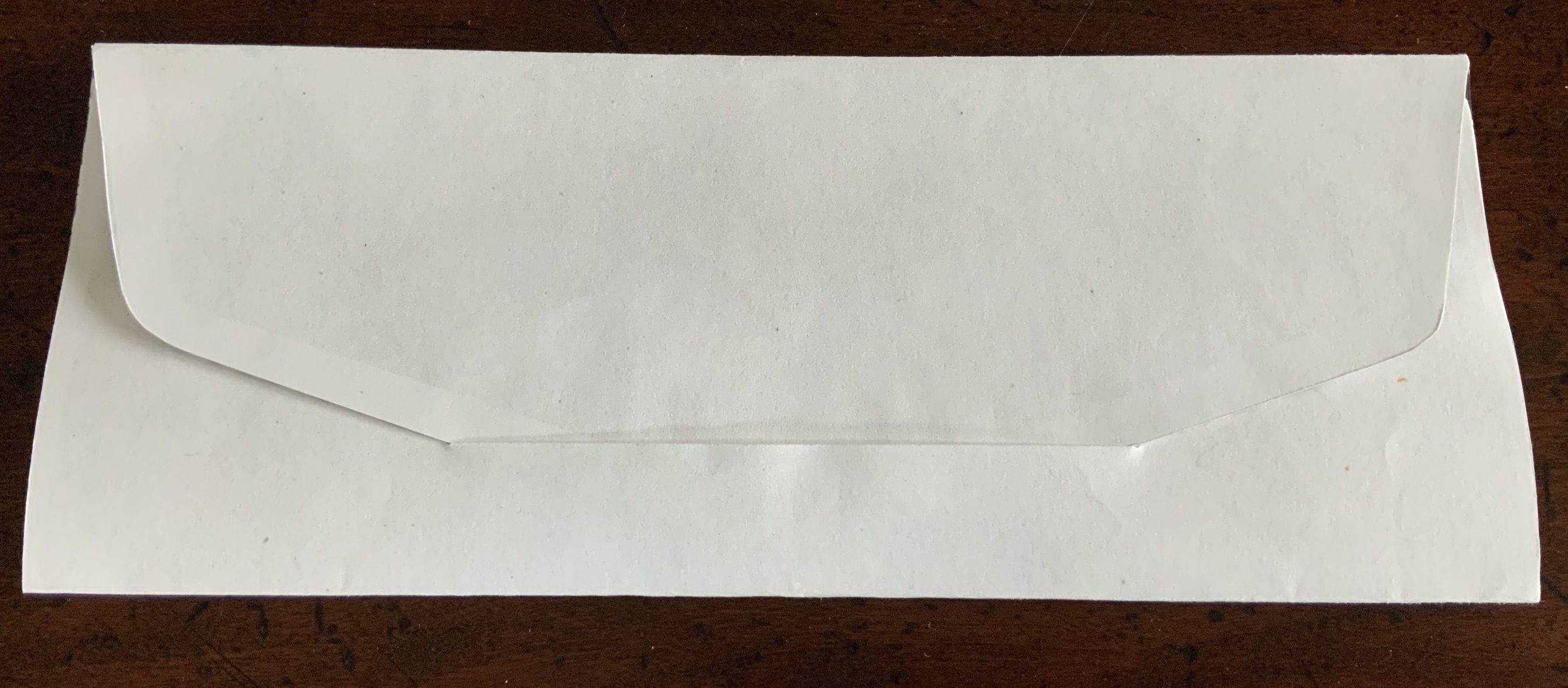
Opening envelope; inside of envelope.
First opening and unfolding.
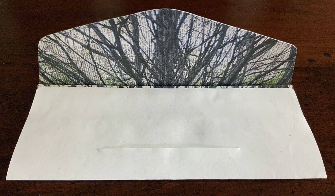
Fully open view of poem.
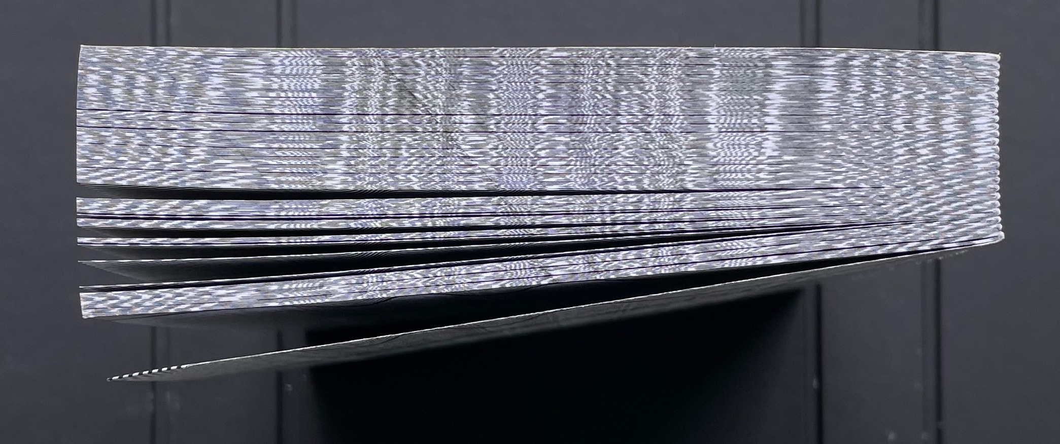
Fully open view of image.
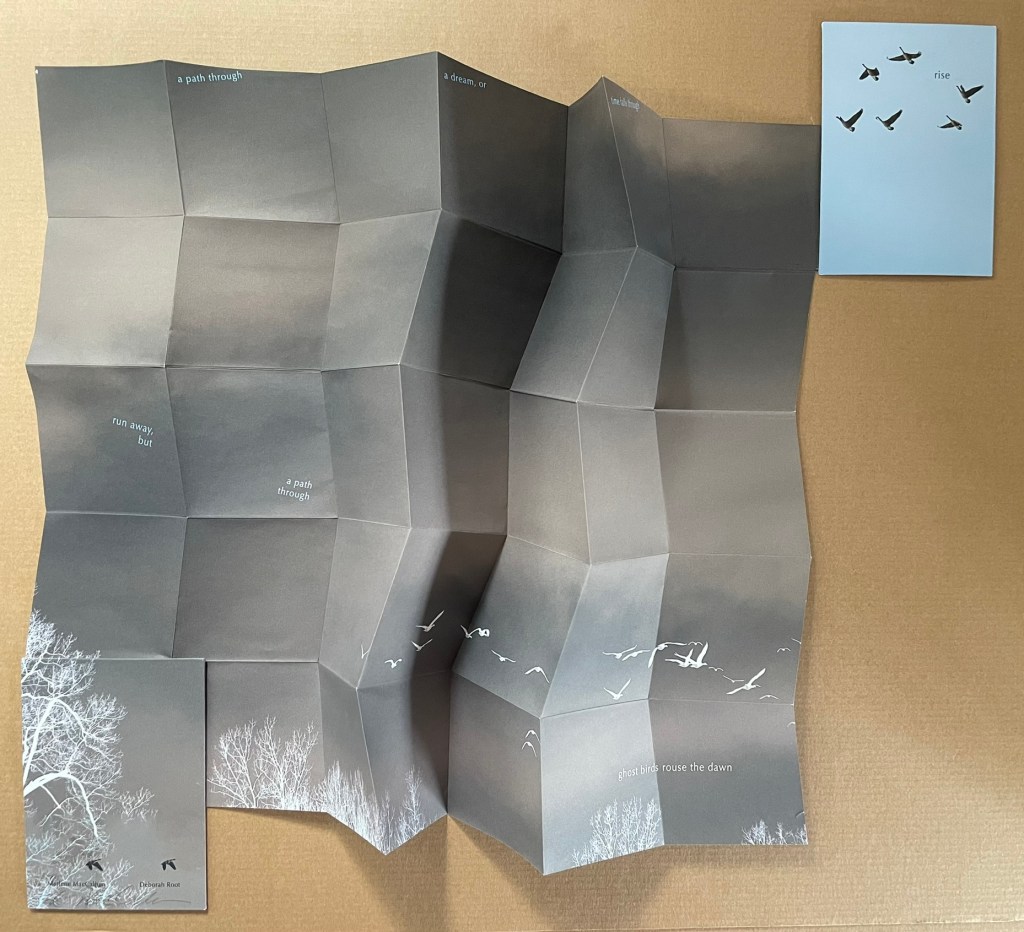
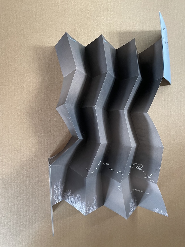
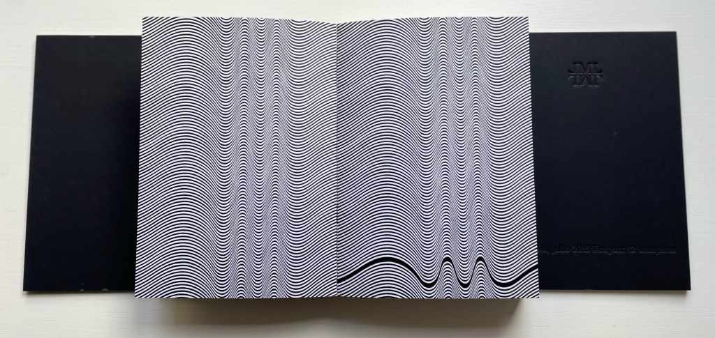
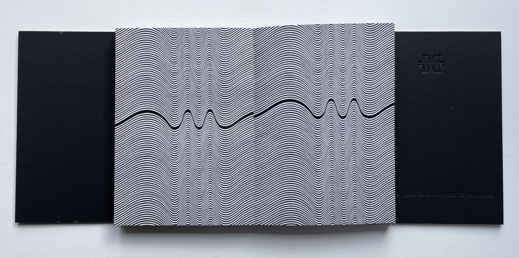
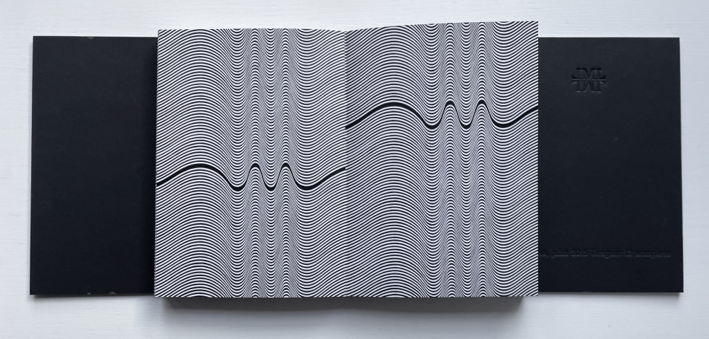
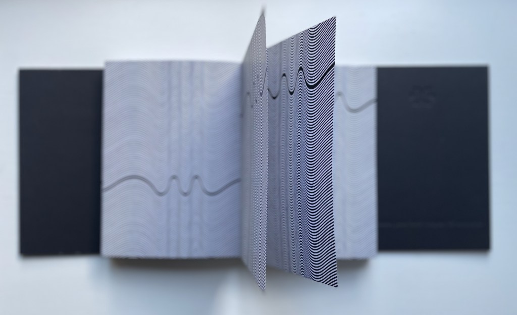
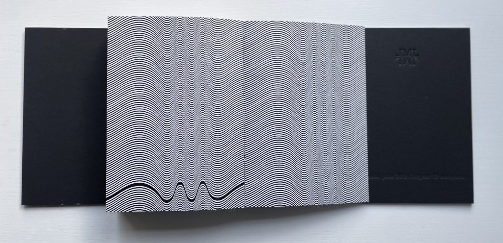
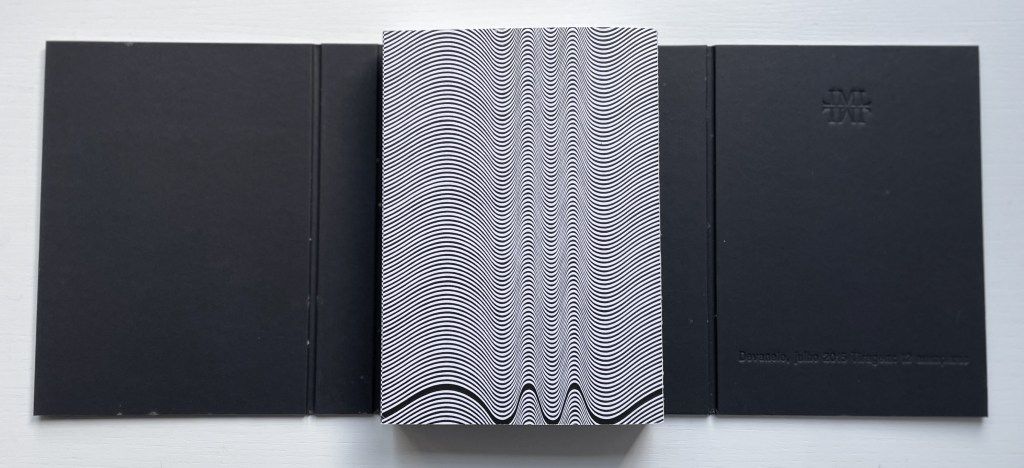
Rise (2020)
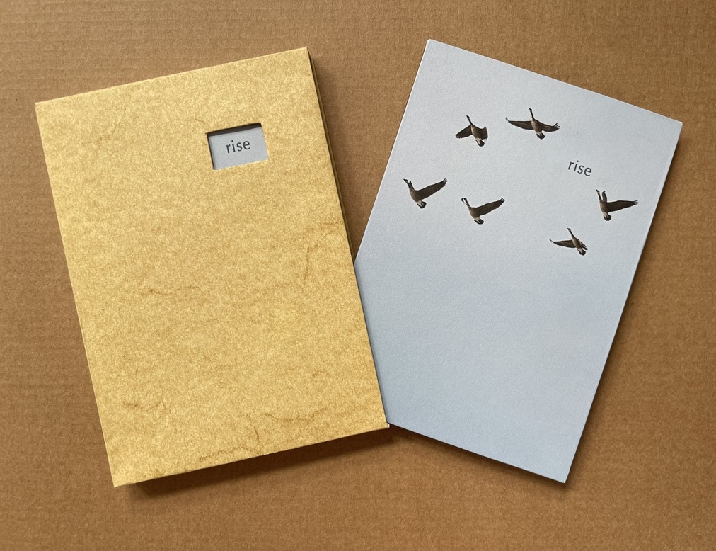
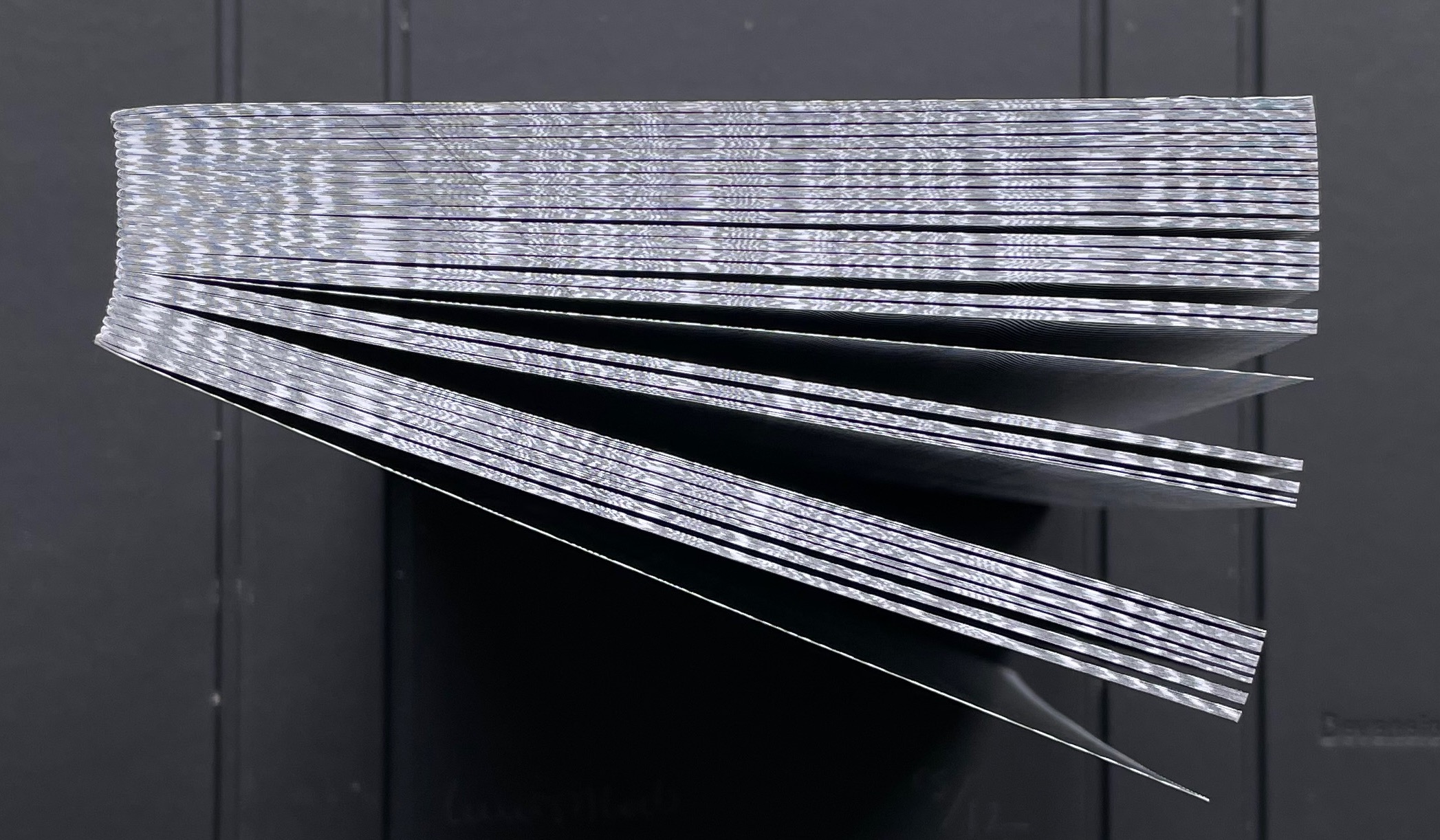
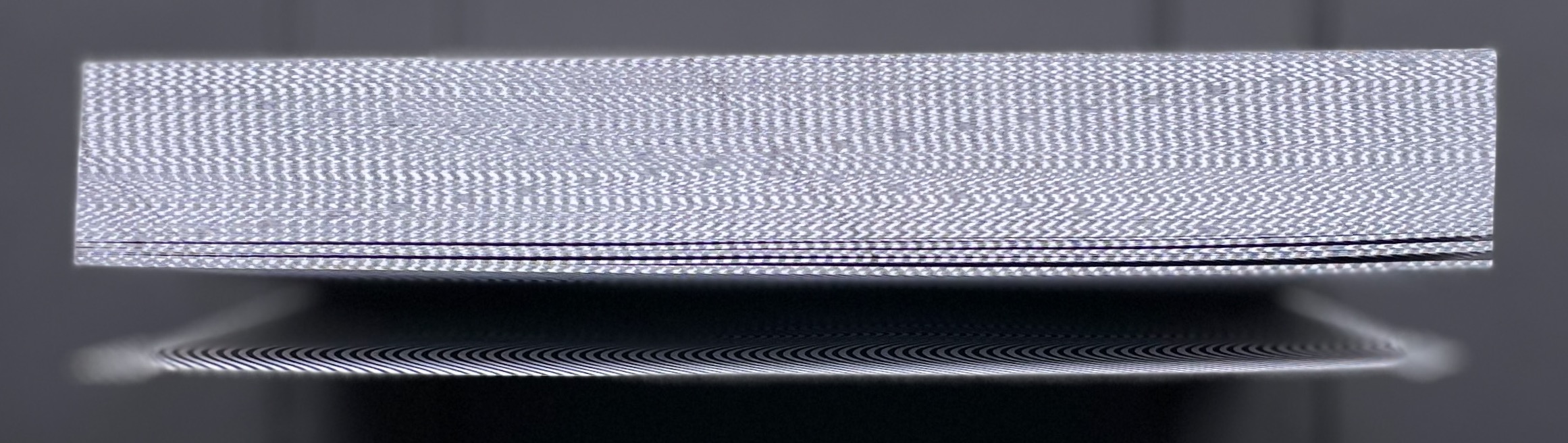
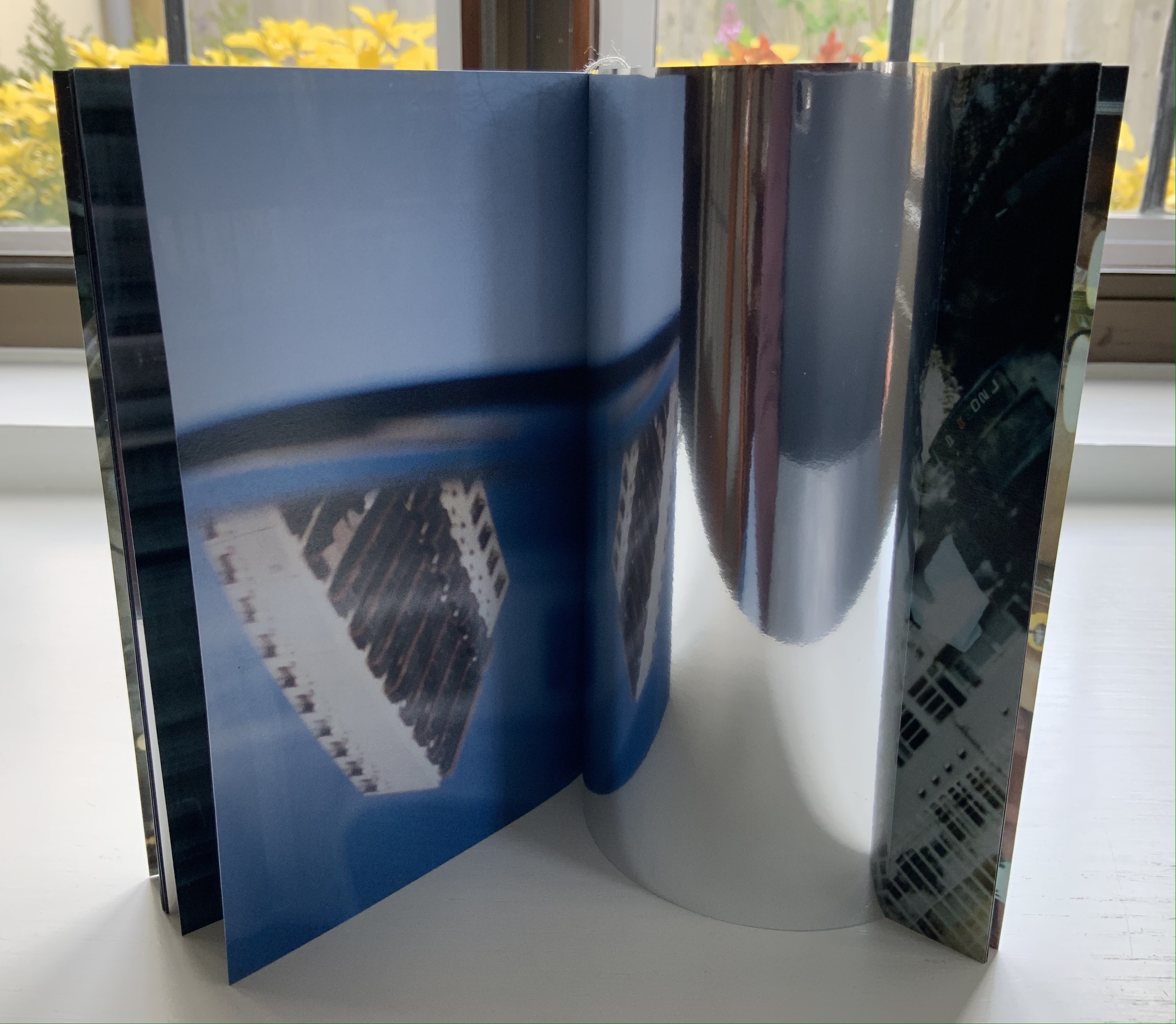
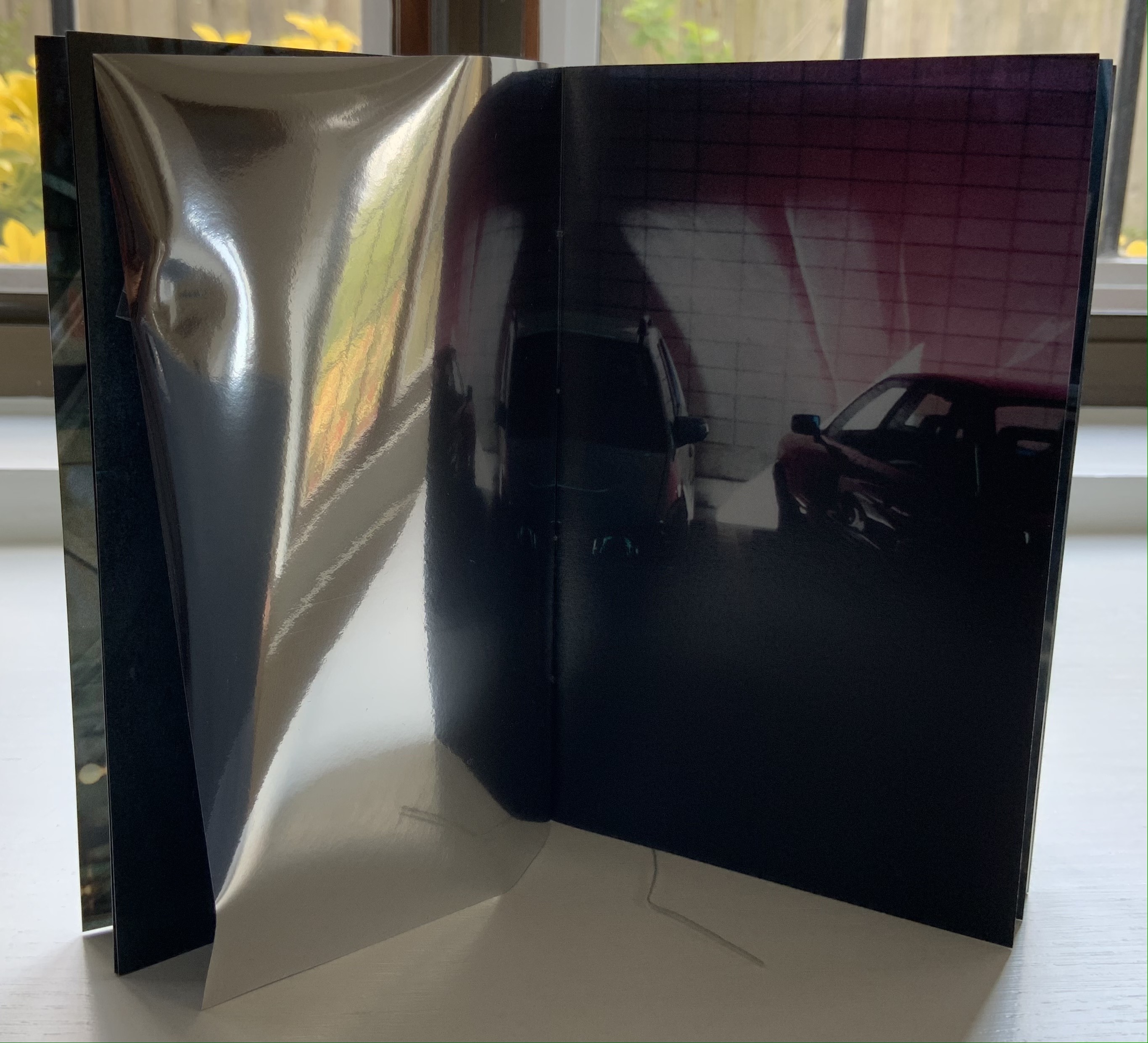
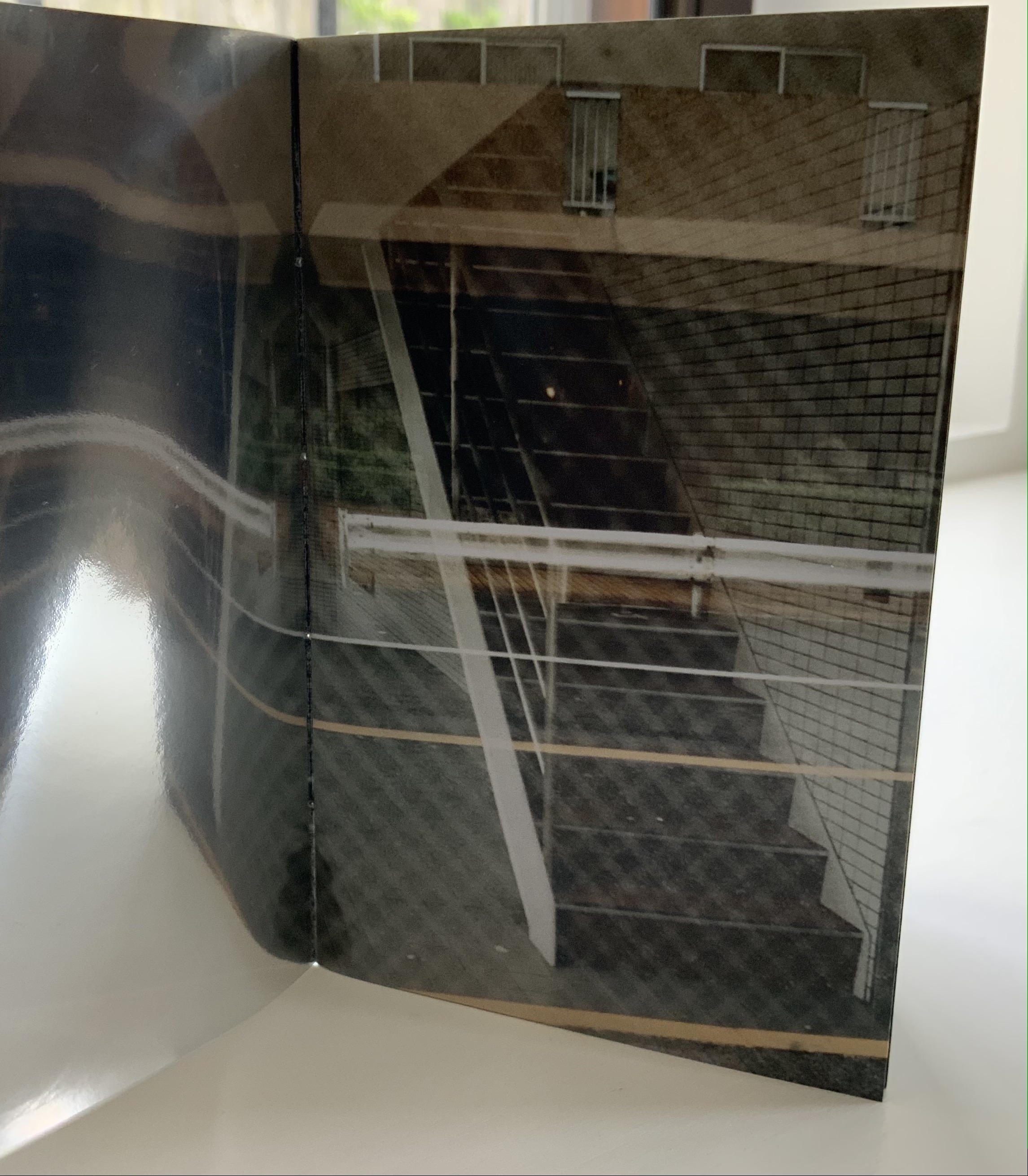
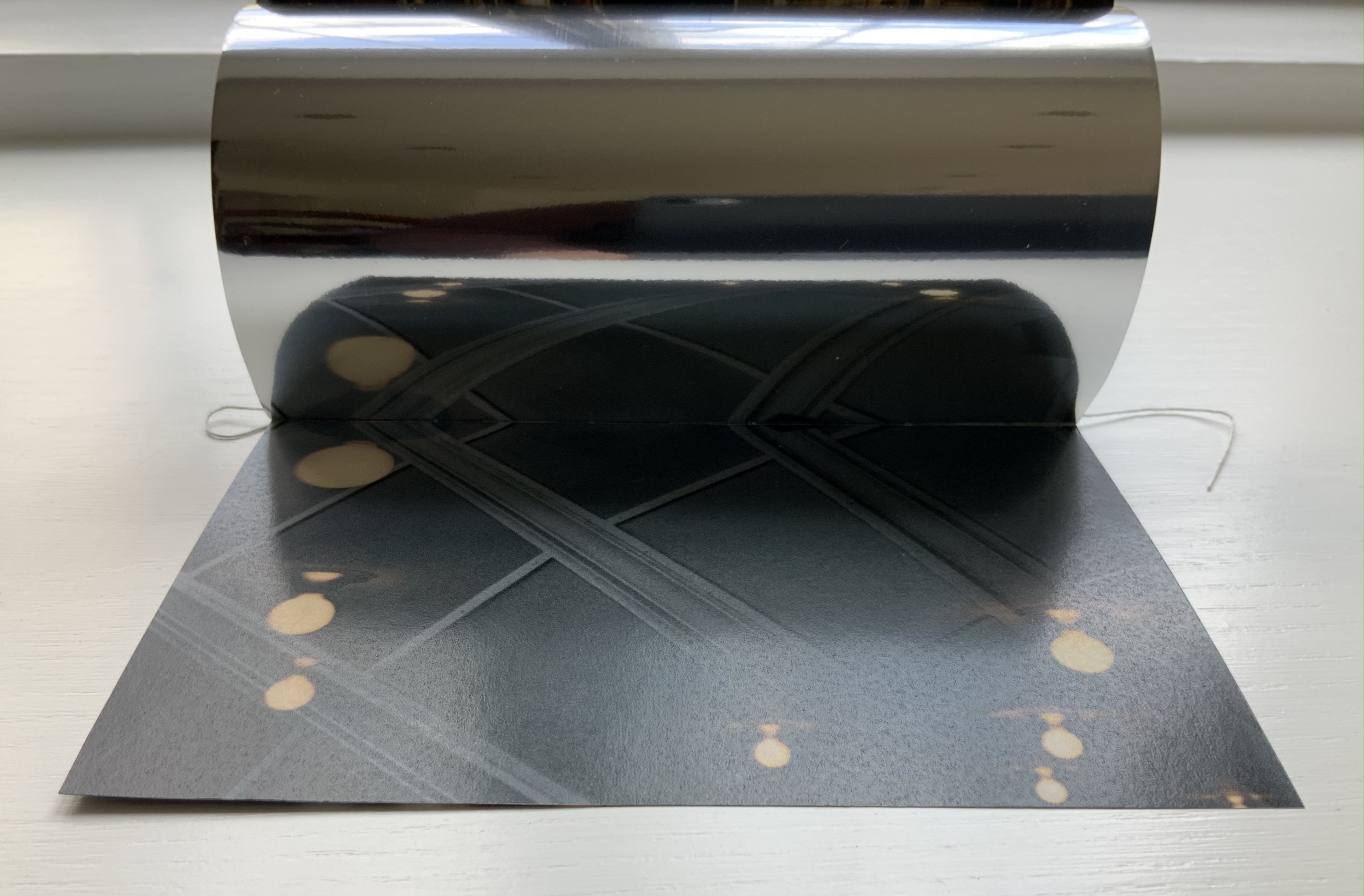
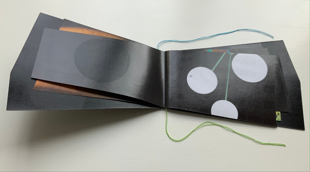
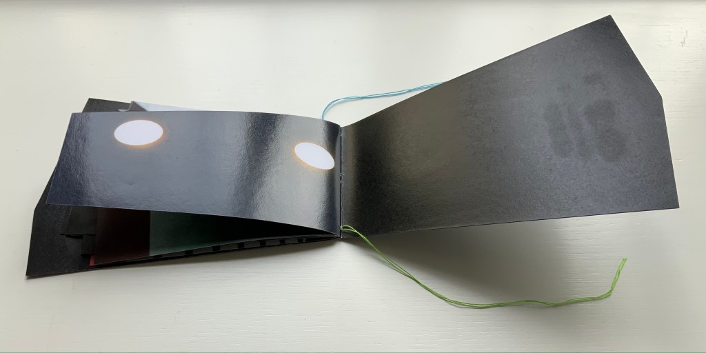
Rise(2020) Marlene MacCallum and Deborah Root Slipcase enclosure with passe-partout showing title. Double-sided folio in miura fold between two boards. Printed paper over boards. Slipcase H135 x W97 mm. Double-sided folio H133 x W93 mm (closed), W483 × H633 mm (open). Acquired from Marlene MacCallum, 26 October 2022. Photos of the work: Books On Books Collection.
Artists’ statement: Rise is a collaborative artwork by Marlene MacCallum and Deborah Root. This piece grew out of discussions about our shared fascination with the implications and meanings of the fold. The images and poem evolved through a call and response process, sharing them back and forth. The miura fold structure was selected early on for its structural strength and the way it allowed us to take a seemingly small object that expanded quite surprisingly to reveal a large field of imagery and poetry.
The fold is named for its inventor, Japanese astrophysicist Kōryō Miura.
Marlene MacCallum achieves distinctive results by painting with photography and sculpting with book structure in her artist’s books. Her painting with photography has involved not only collage work but pinhole cameras, digital cameras, digital layering and masking as well as a variety of transfer processes — digital and analogue photogravure, lithography, digital pigment printing, and digital inkjet printing. Sculpting with book structure mainly includes varying the binding as in the accordion with fold-out of Obvert (1997), the tunnel book structure of Do Not Enter (1998), the gatefold of Domestic Arcana (1999), the tile format fold-outs of pink story (2004-05), the accordion of Quadrifid (2009), the dos-à-dos of Glaze: Reveal and Veiled (2013), and the Miura fold of Rise (2020). It also includes altering books as in Withdrawn (2010) and varying the substrate as in the lace paper, Moriki, double matte Mylar, Lanaquarelle, and embossed leather of Townsite House (2006) and the etched copperplate and Tyvek of Trompe l’Oreille (2011).
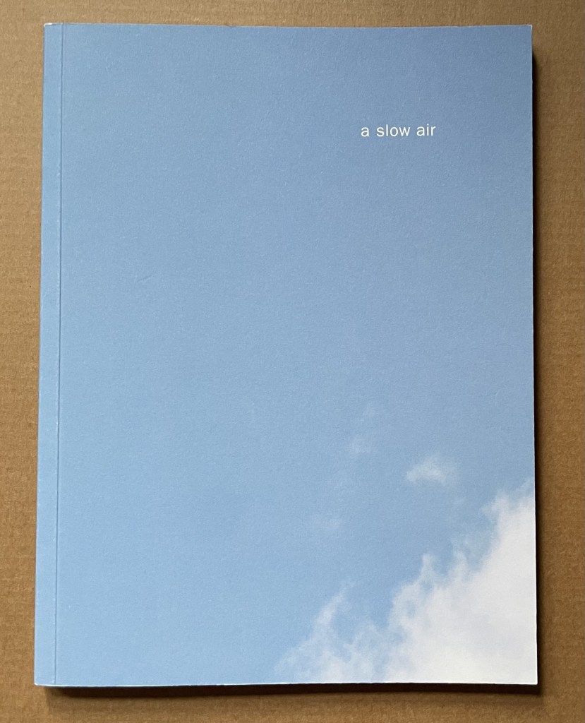
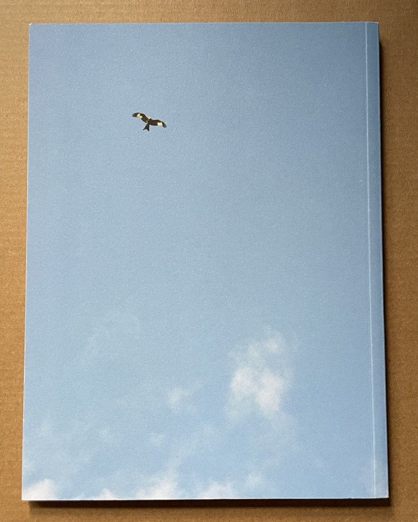
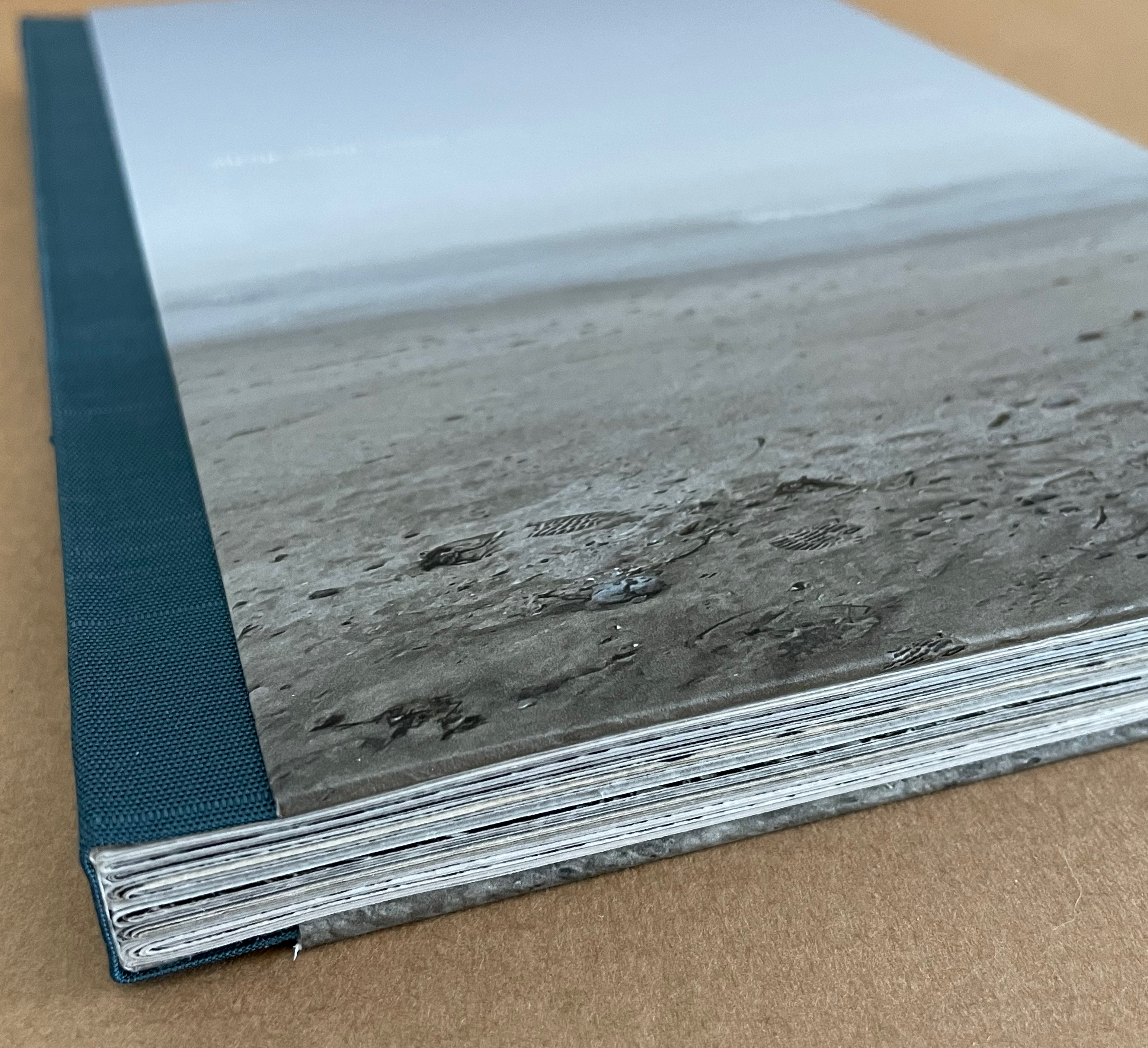
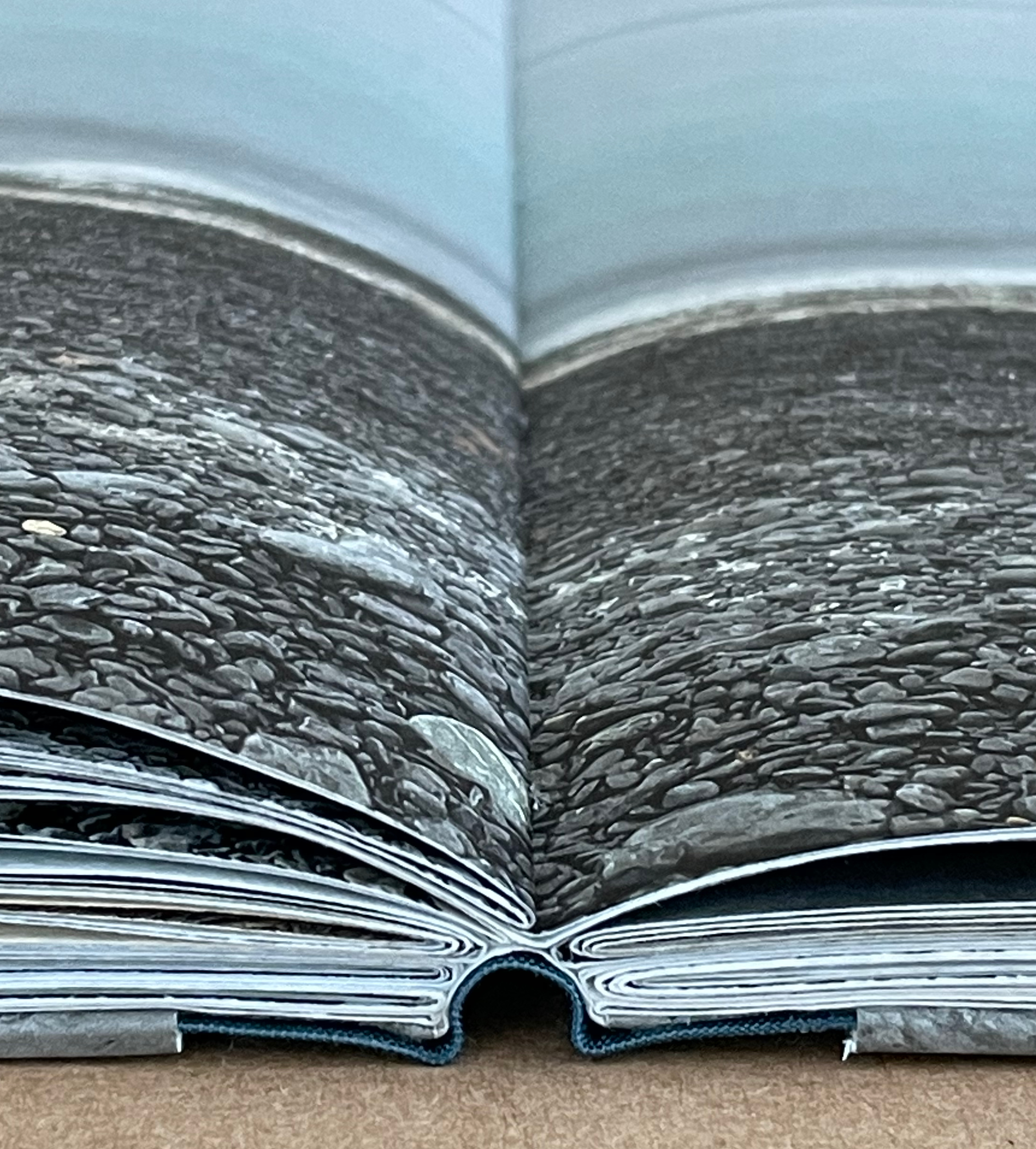
A Slow Air (2016) Thomas A. Clark and Diane Howse Perfect bound softcover. H200 x W150 mm. 64 pages. Edition of 750. Acquired at the Small Publishers Book Fair, London, in 2018. Photos of the work: Books On Books Collection.
If you live where red kites thrive, you will see them most often singly, in pairs or threes. If you are lucky, you may see as many as eight or ten at a time. Near Harewood House in West Yorkshire where red kites were reintroduced in 1999, there are hundreds. In 2016, photographer/artist Diane Howse (Countess of Harewood) and poet/artist Thomas A. Clark collaborated on an exhibition at Harewood House: the grove of delight. Using objects, words and images, the exhibition turned the house’s Terrace Gallery into a symbolic grove; also displayed was a series of 15 photographs by Howse of red kites over Harewood. For the exhibition and under the direction of Peter Foolen, the diligent Dutch publisher of herman de vries, Peter Liversidge and others, A Slow Air (the book) was produced and published by Harewood House. Foolen and the artists have assembled and manipulated the photos in a sequence of color and image that exerts a forward movement like a film or narrative. Like a real sighting of these birds circling and banking as if to a slow musical air, the book mesmerizes.
Marlene MacCallum’s latest artist’s books remind me of Claude Monet’s two series of paintings of the Rouen Cathedral’s façade and a field of haystacks. The series were influenced by Japanese ukiyo-e prints (“pictures of the floating world”). Rather than changing vantage points on Mt. Fuji, Monet used one perspective on one façade and sought to capture the instants of light and atmosphere on its surface at several different hours of the day. He rendered his vision of them with thick layers of paint, brushstrokes, and colors. MacCallum, too, has chosen a fixed-viewpoint: in her case, of Lake Ontario. She, too, follows different hours and, also, different seasons as Monet did with his haystacks. She, however, renders her vision with an intricate verbal-visual dance of metaphor, book structure, registration, photographic filters, print technique and paper.
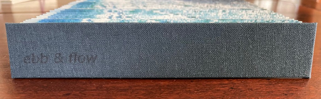
Ebb and Flow (2023) Jane Cradock-Watson Concertina book with cloth hard bound covers. H155 x W27 mm (closed), W680 mm (open). 64 panels. Edition of 20. Acquired from the artist, 21 January 2024. Photos: Books On Books Collection. Displayed with artist’s permission.
An exploration, both visually and physically, the ‘edge’ of the sea where it meets the land, with its continuous ebb and flow of the breaking waves, rhythmically rolling back and forth onto the sand. (Artist’s description)
With the binding and her photography in Ebb and Flow, Jane Cradock-Watson has sculpted and painted the sea’s edge. Four digital photographs printed on Zerkal paper have been spliced together between two cloth-covered boards. The flexibility and extent of the concertinaed paper create an undulating structure that turns seascape stills into mesmerising cinema.
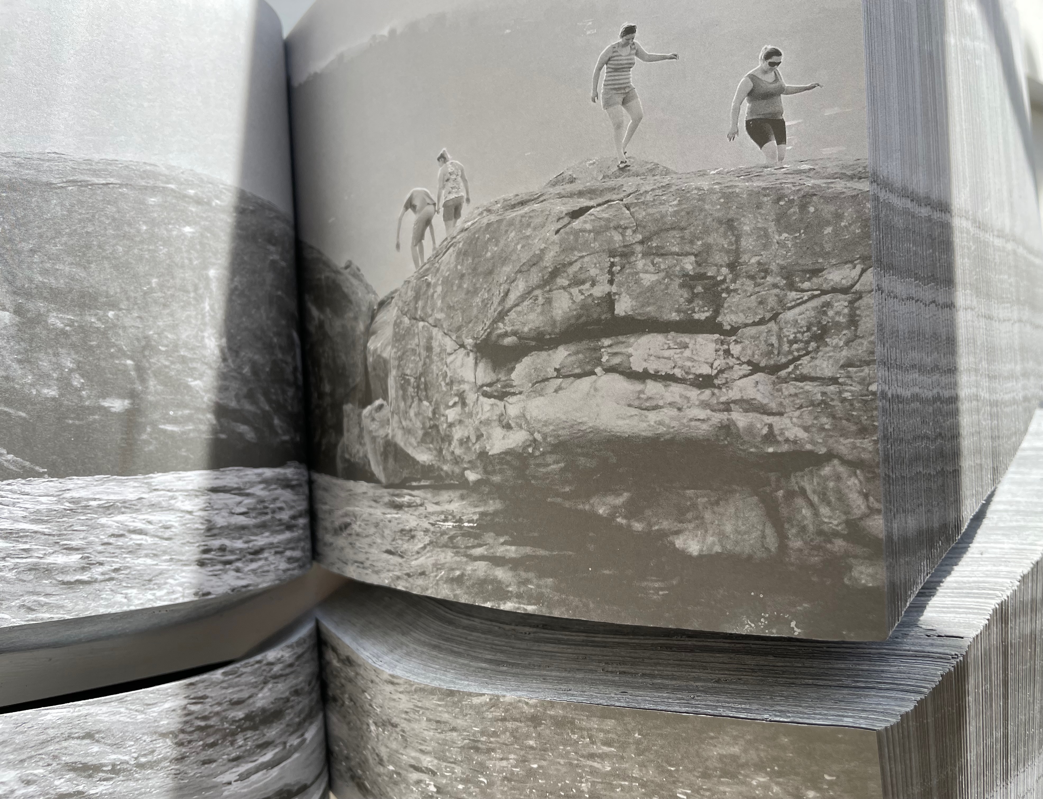
A photographer since 1991, Brazilian Lucia Mindlin Loeb turned to the book as the surface and form for her art. Works such as Livro sobre Livros (“Book about Books“), Entre páginas (“Between Pages”) and Biblioteca (“Library“) speak to an academic fascination with the structural elements of the book — especially its volume, edges, pages and spine. Along with Memória fotográfica (“Photographic memory”), they explore what photography and the book can tell us about time, space, memory, the world we see and a familial experience of it. The works below from the Books On Books Collection show only a fraction of how far beyond the photobook Loeb has gone.
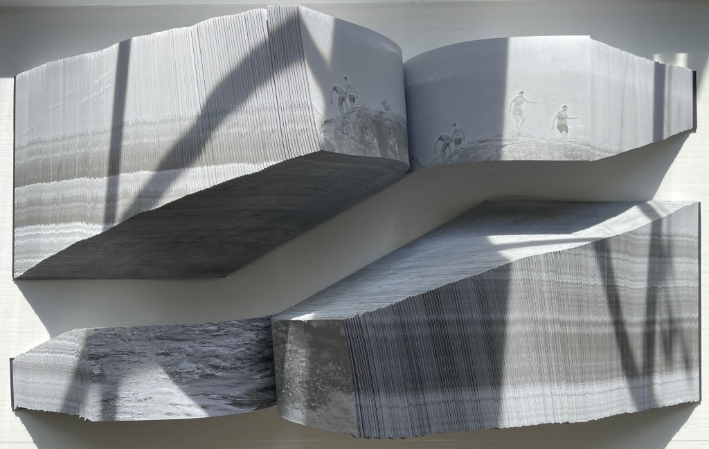
Abismo (2012)
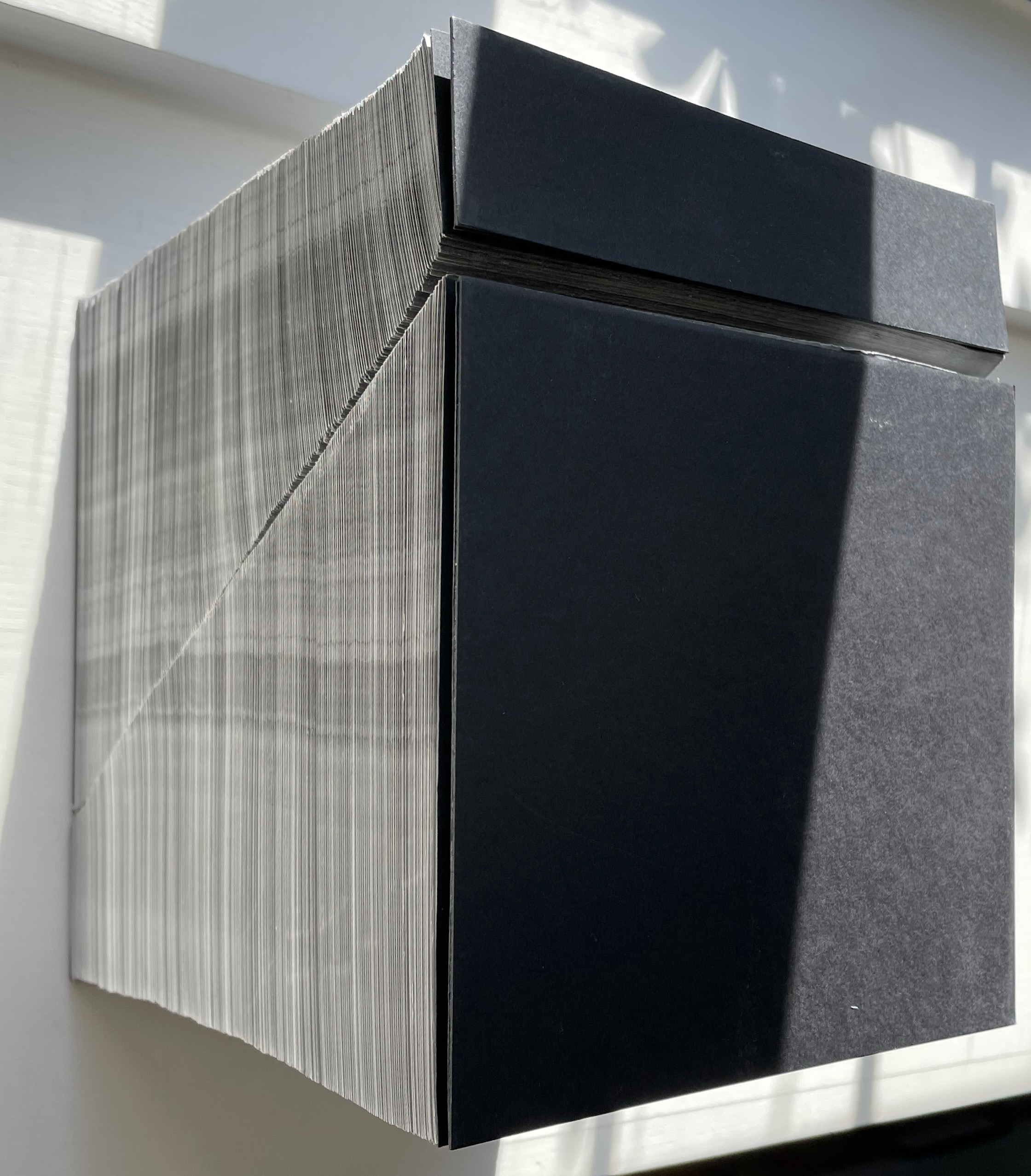
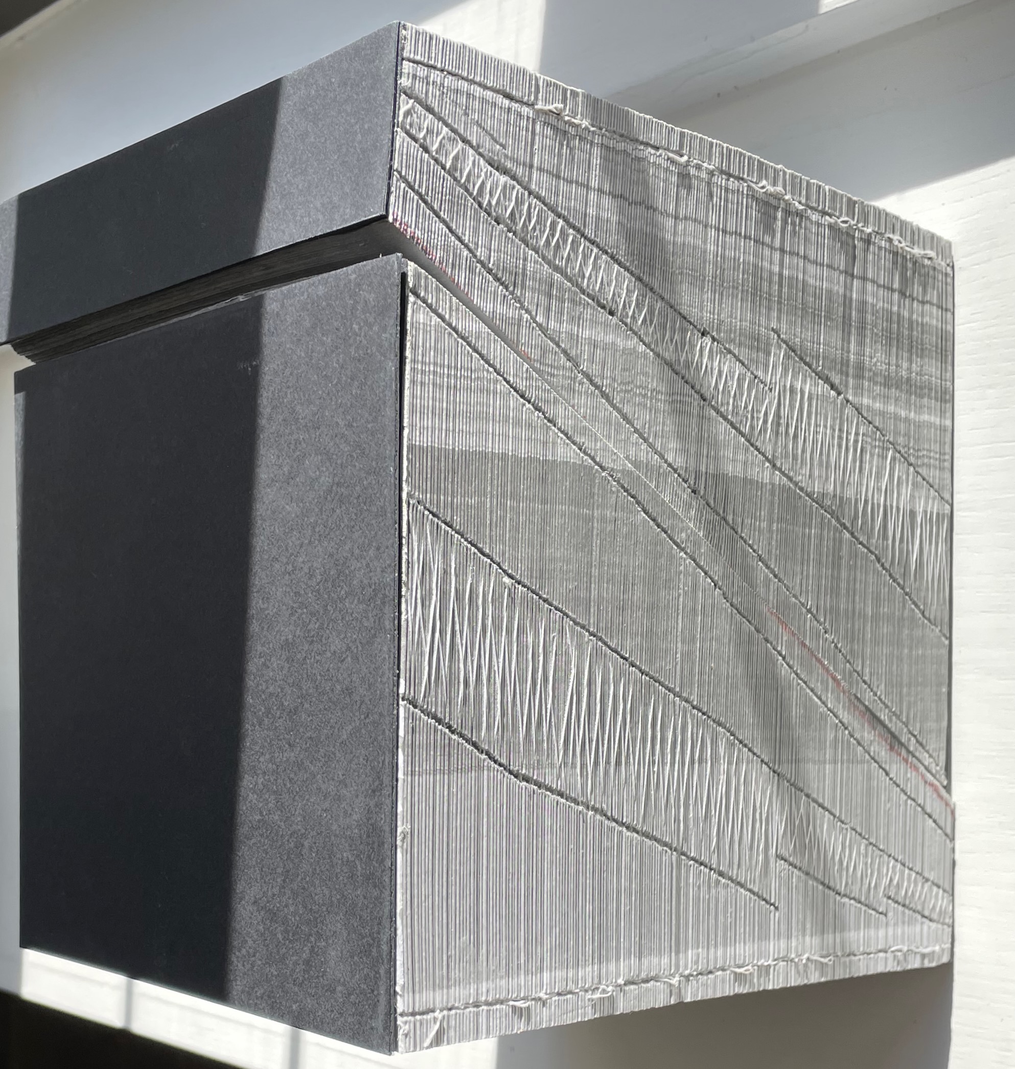
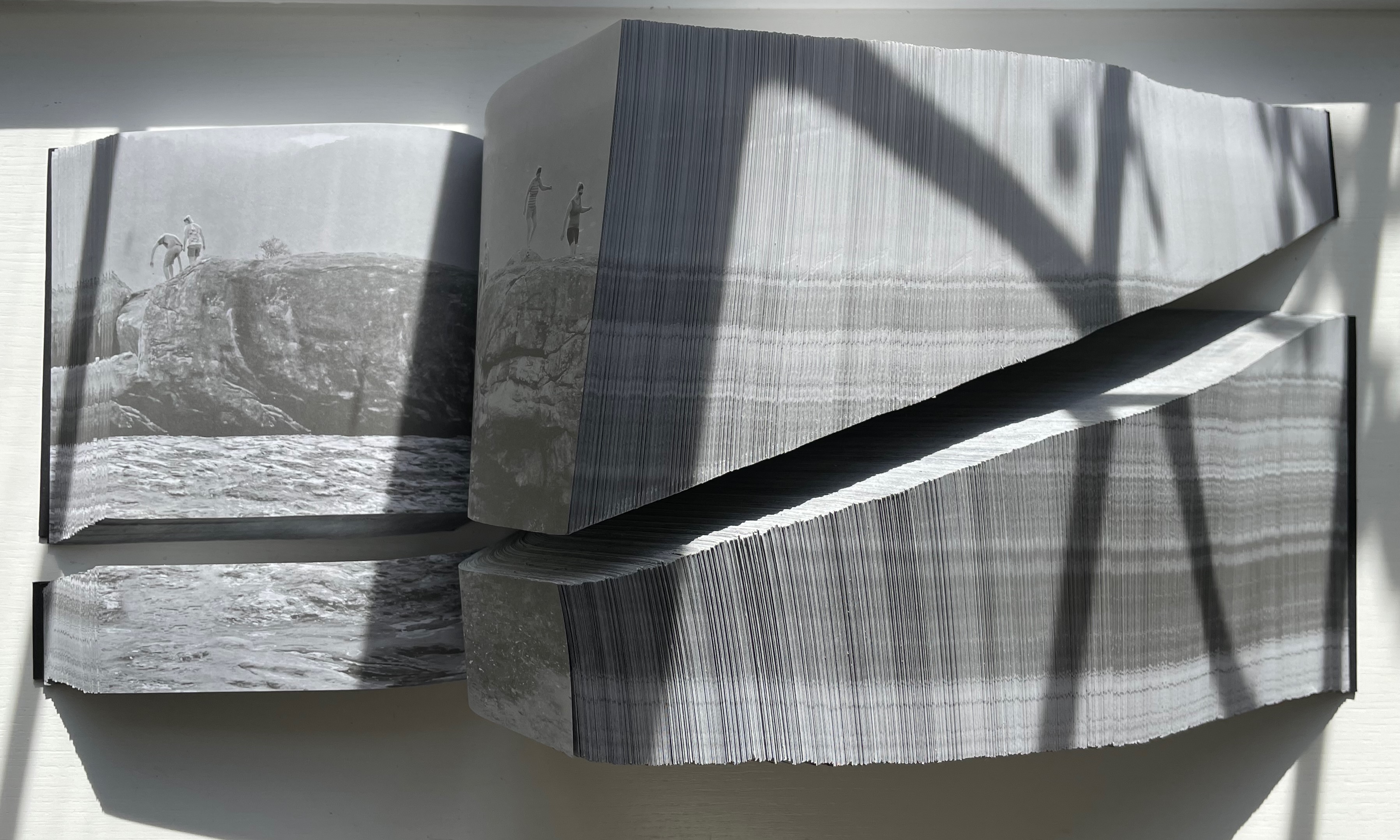
Abismo (2012) Lucia Mindlin Loeb Front and back card covers on a sewn, exposed-spine book block cut diagonally into two volumes, each housed in a custom archival box. H210 x W210 x D175 cm. Edition of 5 and 2 artist’s proofs, of which this is A/P #2. Acquired from the artist, 5 October 2022. Photos: Books On Books Collection.
Fore-edge view (L) and spine view (R) of the cut halves resting against each other.
Close up of spine.
With the two halves open and positioned properly, their parallel opening and page turning soon creates a disorientation. The top half thickens and narrows, while the bottom half thickens and deepens.
Below, a close-up view of the abyss and the cliffwalkers evokes a sense of precariousness and vertigo.
Few books allow views of double-page spreads simultaneously from two different places in the book, and varying the position of the two halves can widen the abyss.
The brief clip below conveys more of the disorienting effects that “reading” this work offers. Perhaps the same feelings the cliffwalkers experienced.
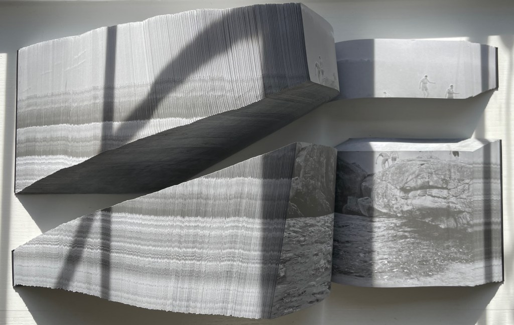
Devaneio (2015)
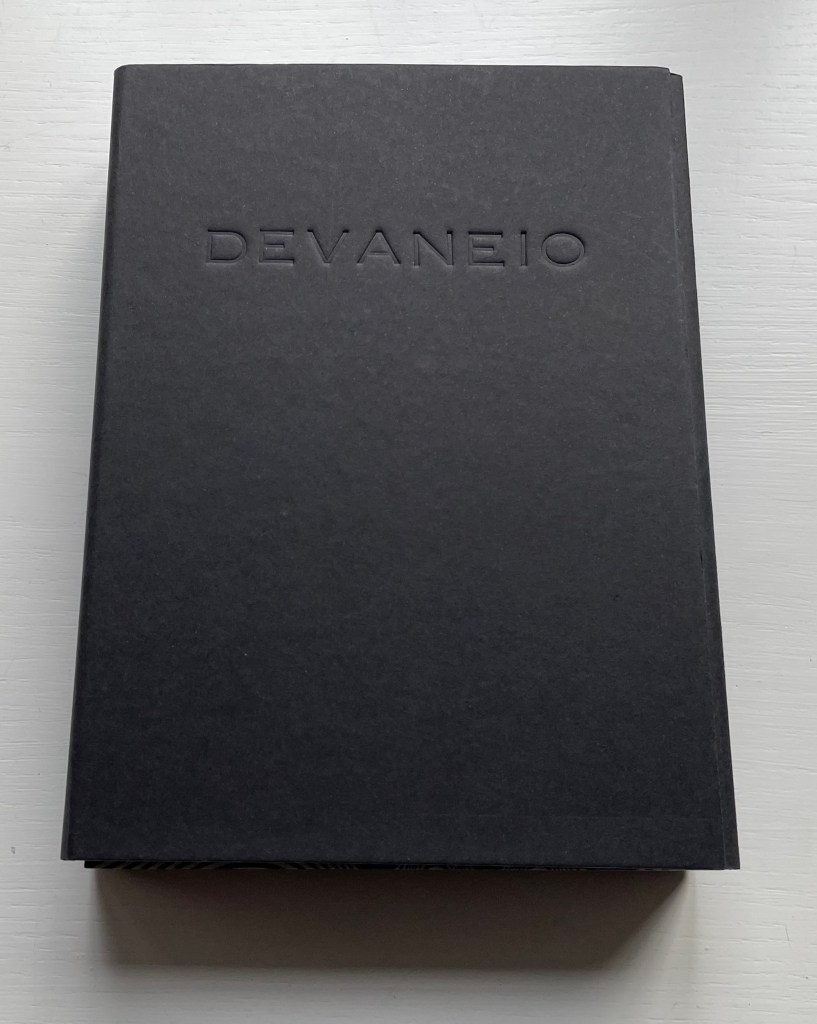
Devaneio (2015) Lucia Mindlin Loeb Exposed spine book block, handsewn and glued, loose in trifold case. H180 x W130 x D3 mm. 384 pages. Edition of 12, of which this is #5. Acquired from the artist, 5 October 2022. Photos: Books On Books Collection.
Devaneio means “daydream”, which is certainly elicited by the thick black line undulating over the hills and valleys optically created by the thinner lines parallel to each other and the thicker line. Over the first seventeen pages, the thick line appears only at the bottom of the recto page, but almost imperceptibly rises up the page.
First recto page
Seventeenth recto page
As the seventeenth recto page turns, another thick line begins its descent seemingly from outside the top edge of the eighteenth verso page. From here on, in their respective downward and upward movements, the thick lines on the verso and recto pages appear headed for convergence. The stroboscopic effect of the background of tightly packed thinner lines enhances this appearance of downward and upward motion. Although they converge, the thick lines skip over any direct intersection and continue their journeys toward the bottom edge of the verso page and top edge of the recto page.
The thick line on the verso page makes its appearance.
The lines begin to converge,
but do not intersect.
The lines diverge, the verso continuing downwards and the recto, upwards.
As the daydream begins to end, the upward bound thick line has almost disappeared at the top of its recto page. As the page turns, only the downward bound thick line remains to finish its journey at the bottom of the last verso page, the last page of the book. Of course, the the thick line’s end position on the last verso page is the same as its start position on the first recto page.
The upward bound thick line almost gone on the recto page.
The thick line has gone from the recto page.
The thick line at rest on the last verso page.
The crossover of the verso and recto thick lines can be observed on the book’s fore edge, and the thinner lines’ stroboscopic effect shows up even on the top and bottom edges.
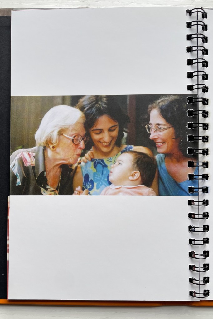
Devised by Robert Sayer (1756), “harlequinade” was a form of children’s book. Also called a “metamorphosis” or “turn-up” book, its pages were cut horizontally so that their parts could turn independently of one another and generate amusing mix-and-mismatch images. Book artists such as Emily Martin have seized on the form to great satirical effect.
Loeb’s “Memories of You” maintains the form’s comic nature but blends it with the forms of the photobook and family photograph album to deliver a whimsical and sentimental celebration of four generations. Loeb plays her title’s deliberate ambiguity out with the form’s interchange of resemblances in faces, poses and costumes and lifts her work out of mere sentimentality. The video below provides a better view of the work than would photos of the book.
The sculptural mastery in Loeb’s works makes for intriguing and enjoyable comparison with that of Doug Beube, Andrew Hayes and Guy Laramée in the Books On Books Collection, while the photographic mastery calls up Scott Kernan, Marlene MacCallum and Michael Snow for similar revisits.
Further Reading
“Doug Beube“. 21 April 2020. Books On Books Collection.
“Andrew Hayes“. 4 September 2019. Books On Books Collection.
“Guy Laramée“. 18 September 2019. Books On Books Collection.
“Scott Kernan“. 22 February 2019. Books On Books Collection.
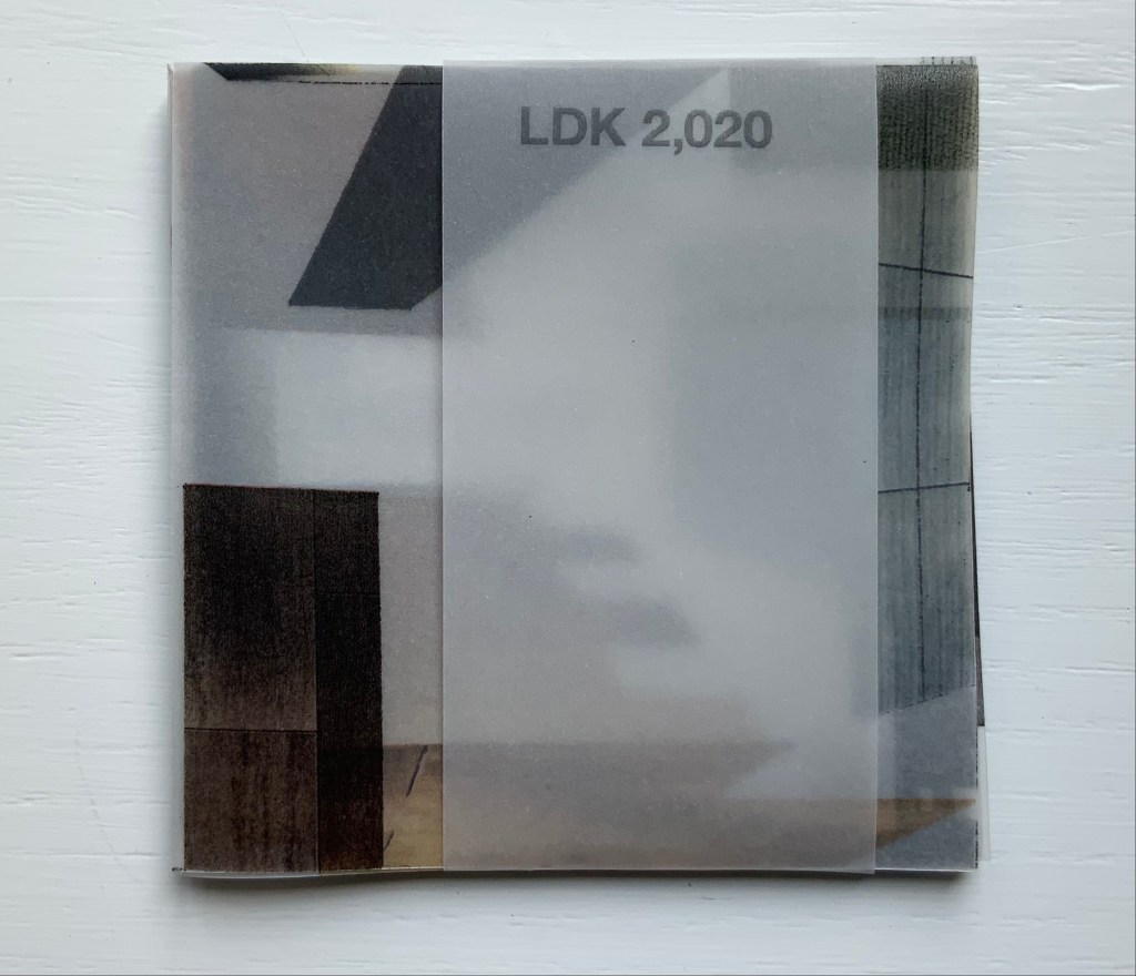
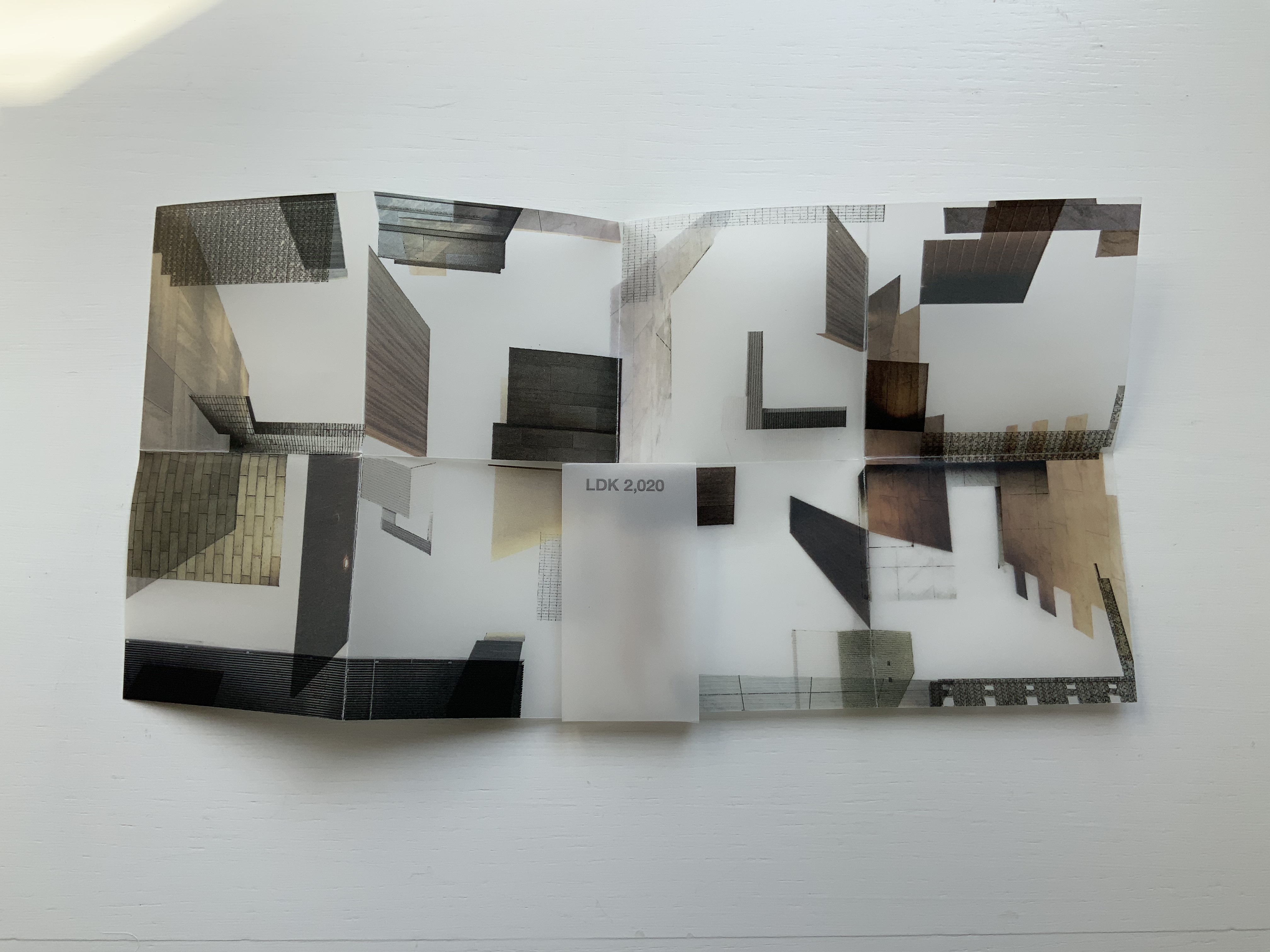
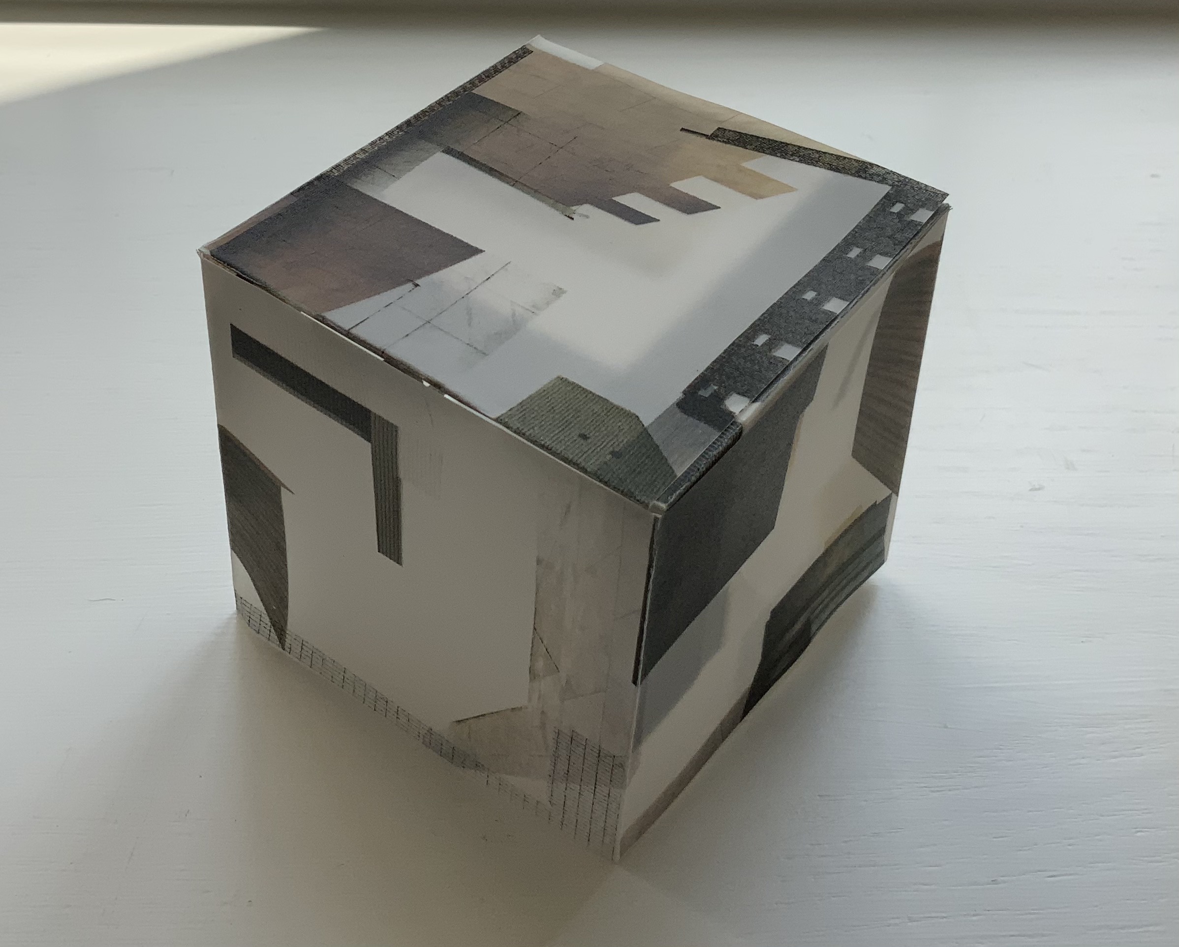
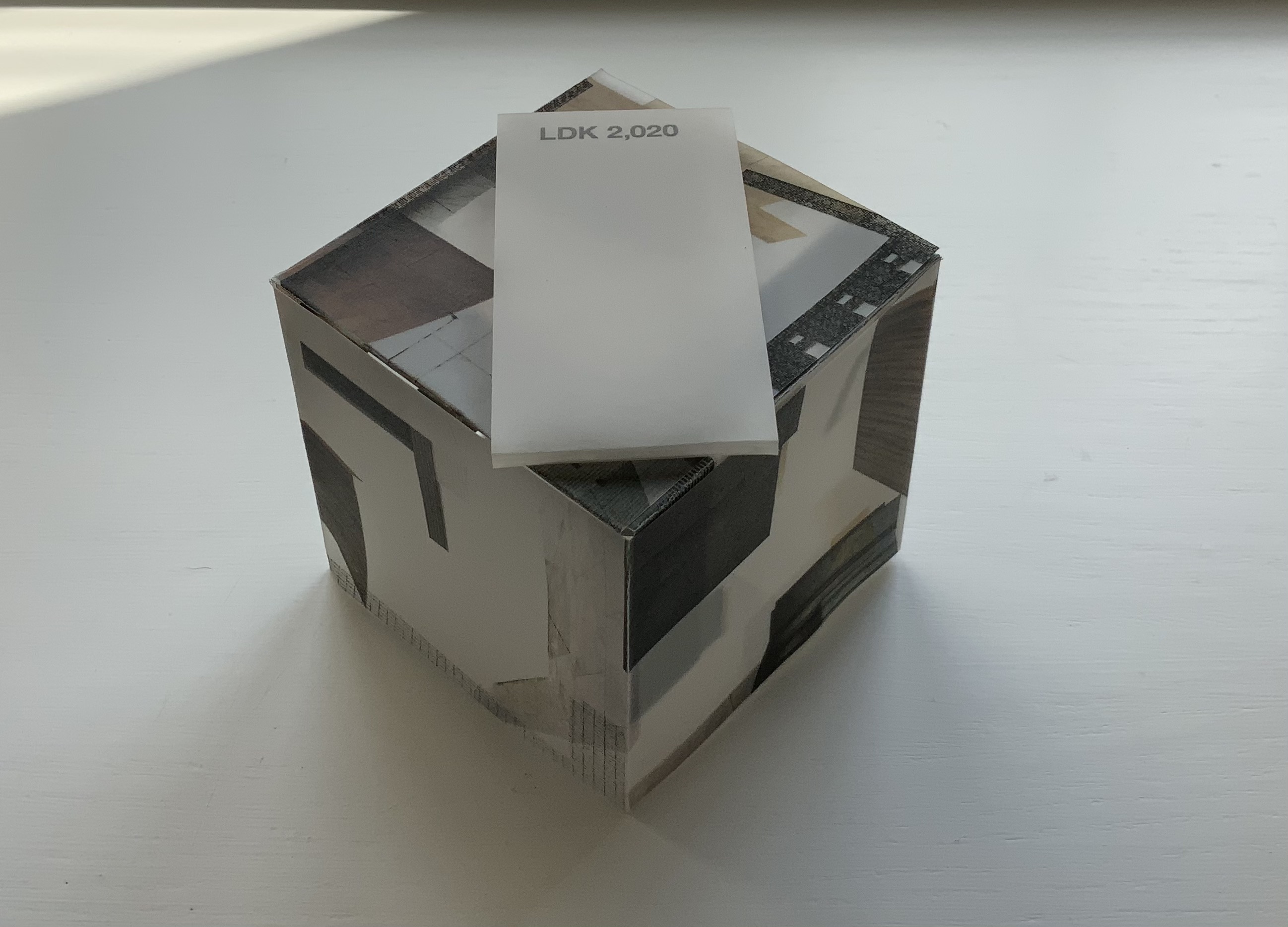
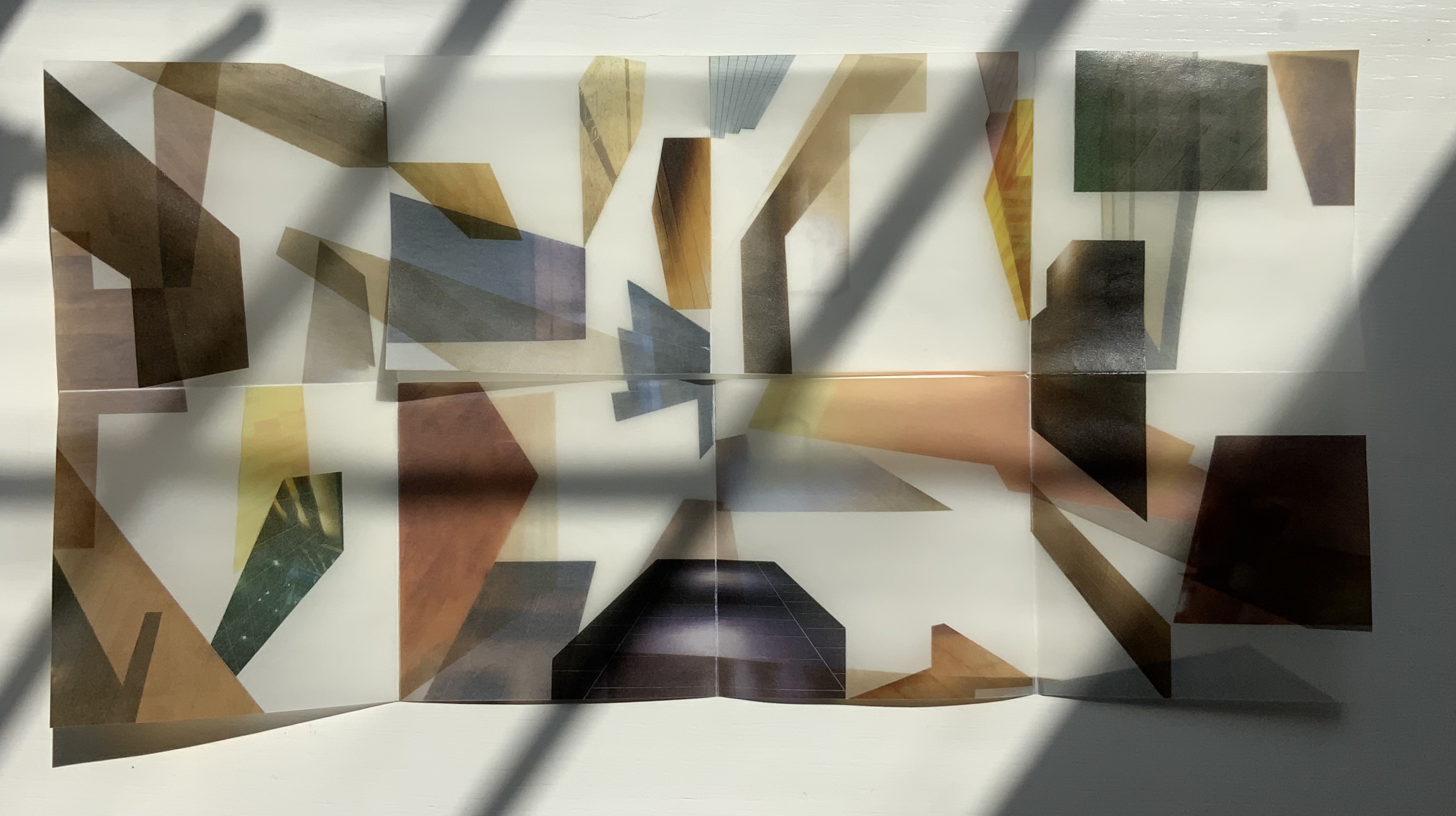
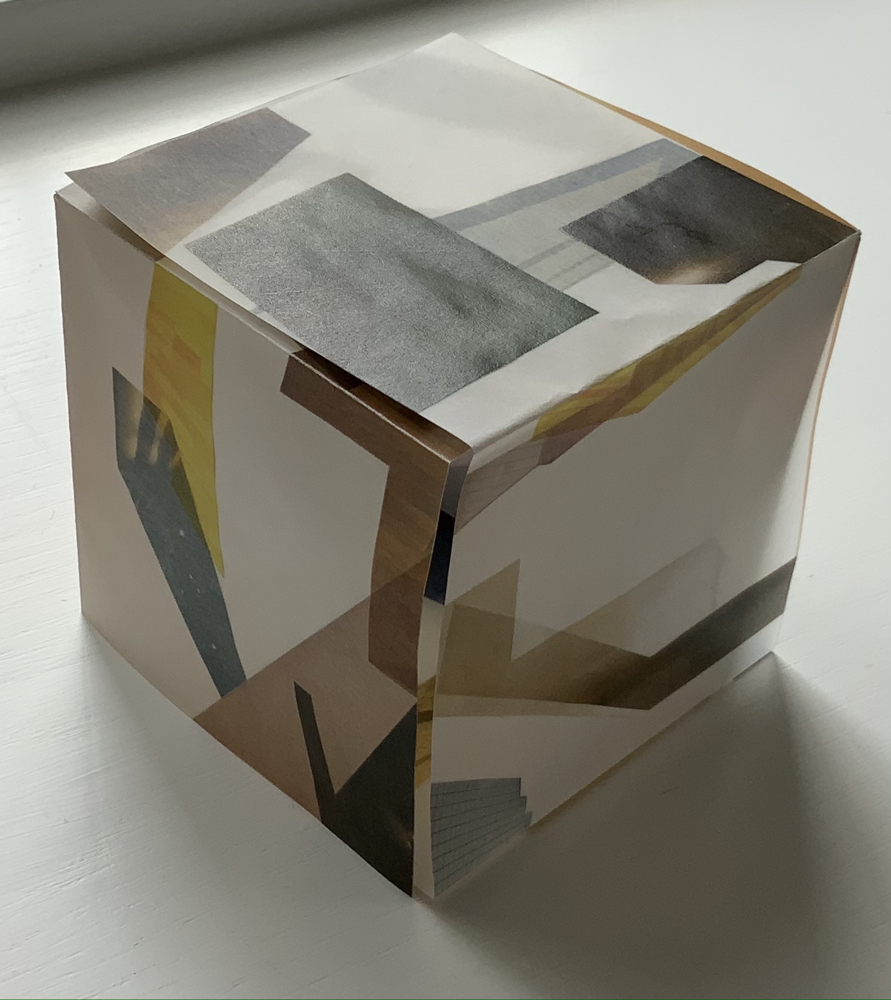
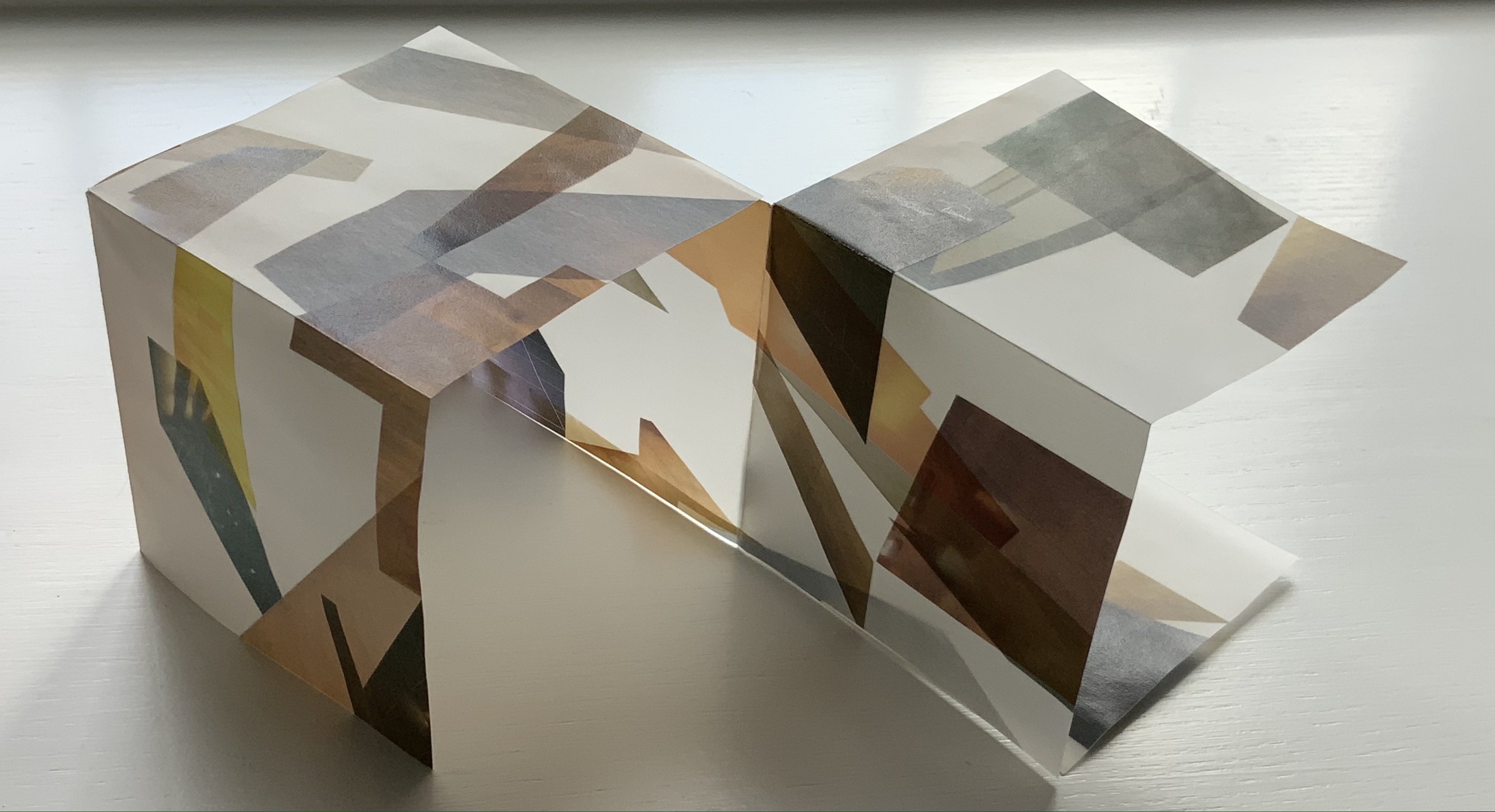
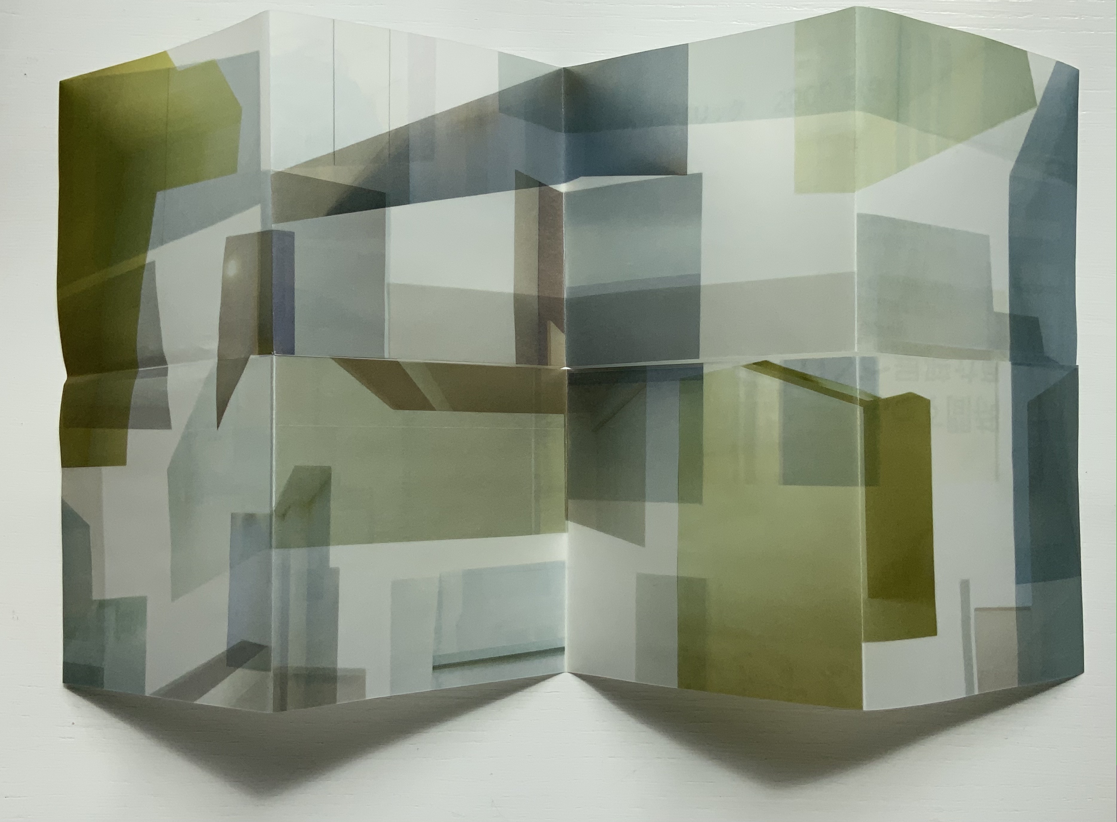
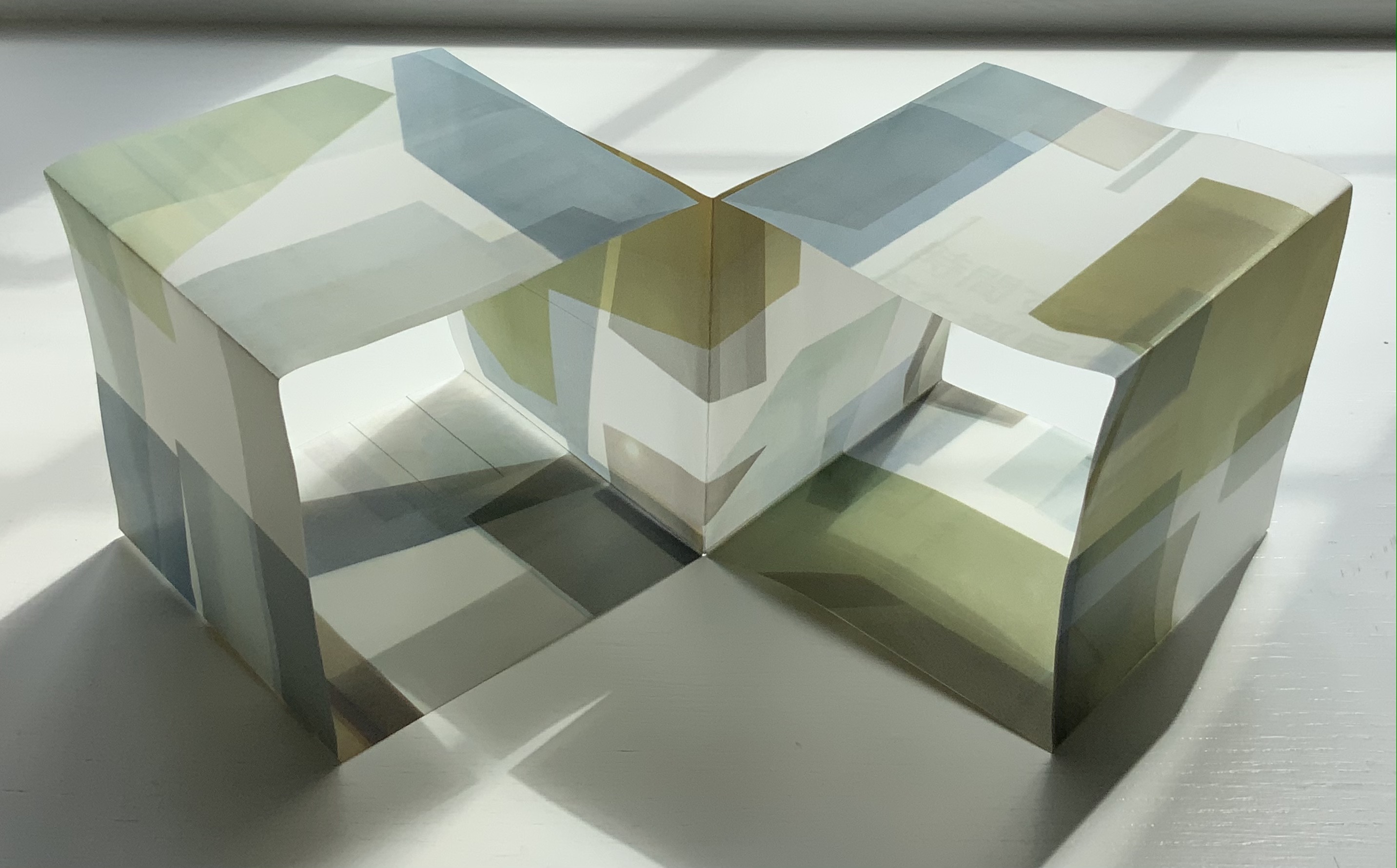
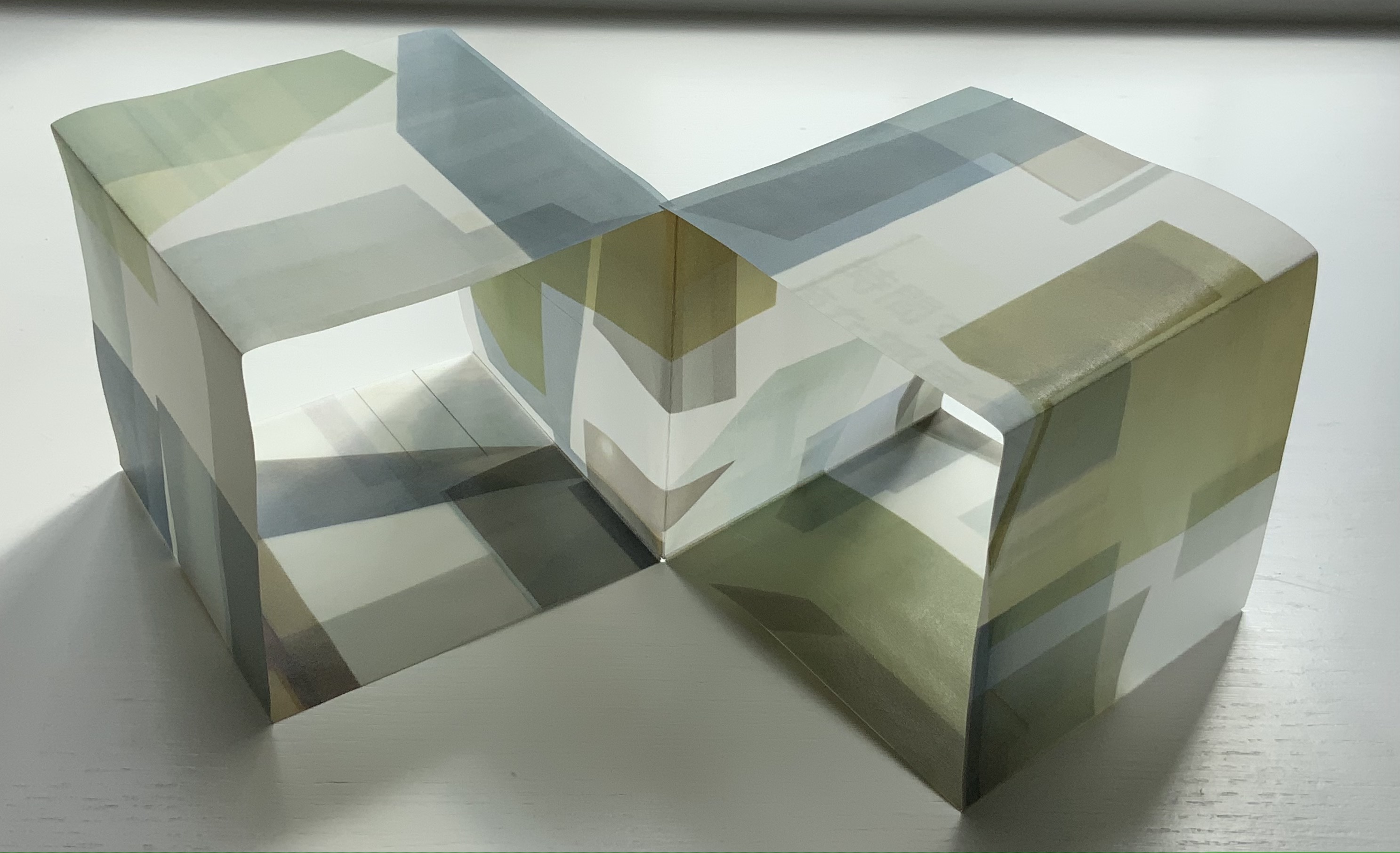
LDK 2,020 (2020) Yasushi Cho Banderole bound, single sheet cut and folded accordion style. 75 x 75 mm. Edition of 45, of which this is #7. Acquired from the artist 10 April 2021. Photos: Books On Books Collection.
LDK 2,020, LDK FL00R and LDK 2,009 make up part of a series. Their letters L, D and K stand for Living, Dining and Kitchen and are the usual abbreviations in Japanese apartment/flat sales leaflets. Every day they arrive or can be picked up on the street, and Cho creates collages from them, digitally printing them on stiff translucent paper to be cut and creased, then folded into an accordion-style booklet. For the reader, the folds and cuts of the stiff translucent paper make a tricky “assembly and disassembly” — or reading — of the work to make it into a cube or other three-dimensional shape.
In the process of flattening the booklets into a single sheet, then folding and creasing and re-creasing, the reader wonders how the aspects of LDK may have fit together before their abstraction into the collage. Eventually though, the assembly creates objects whose interiors are their exteriors — and vice versa — and inevitably recall the shoji screens still used in traditional houses and even apartments.
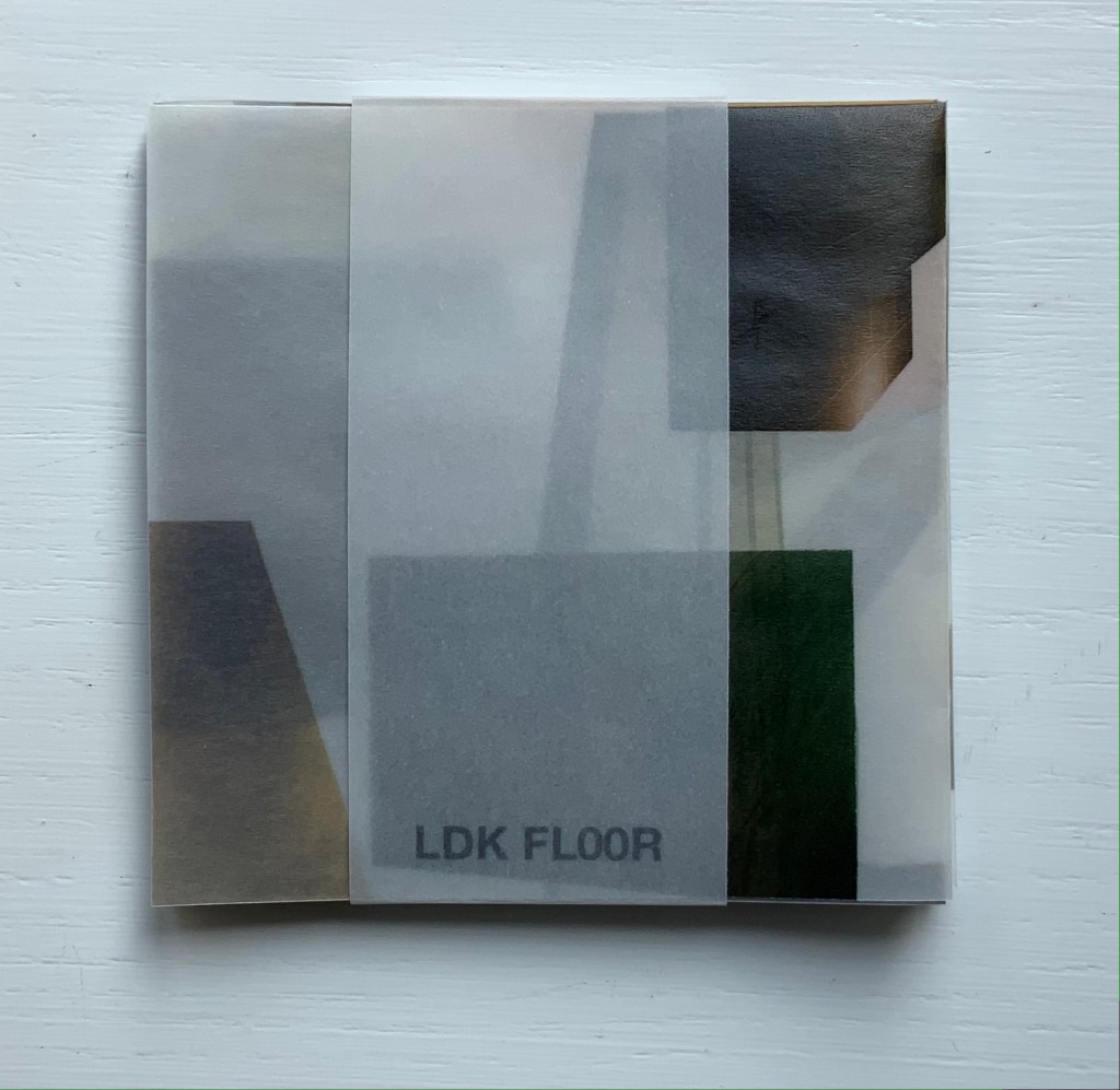
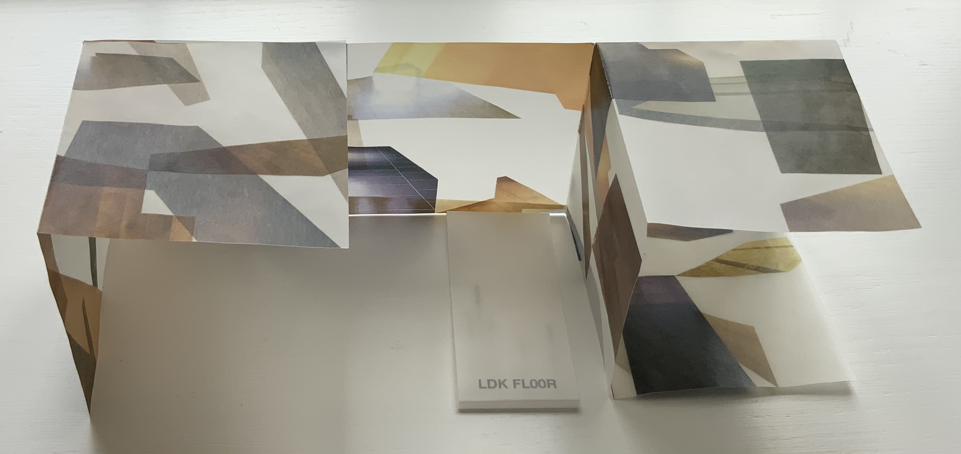
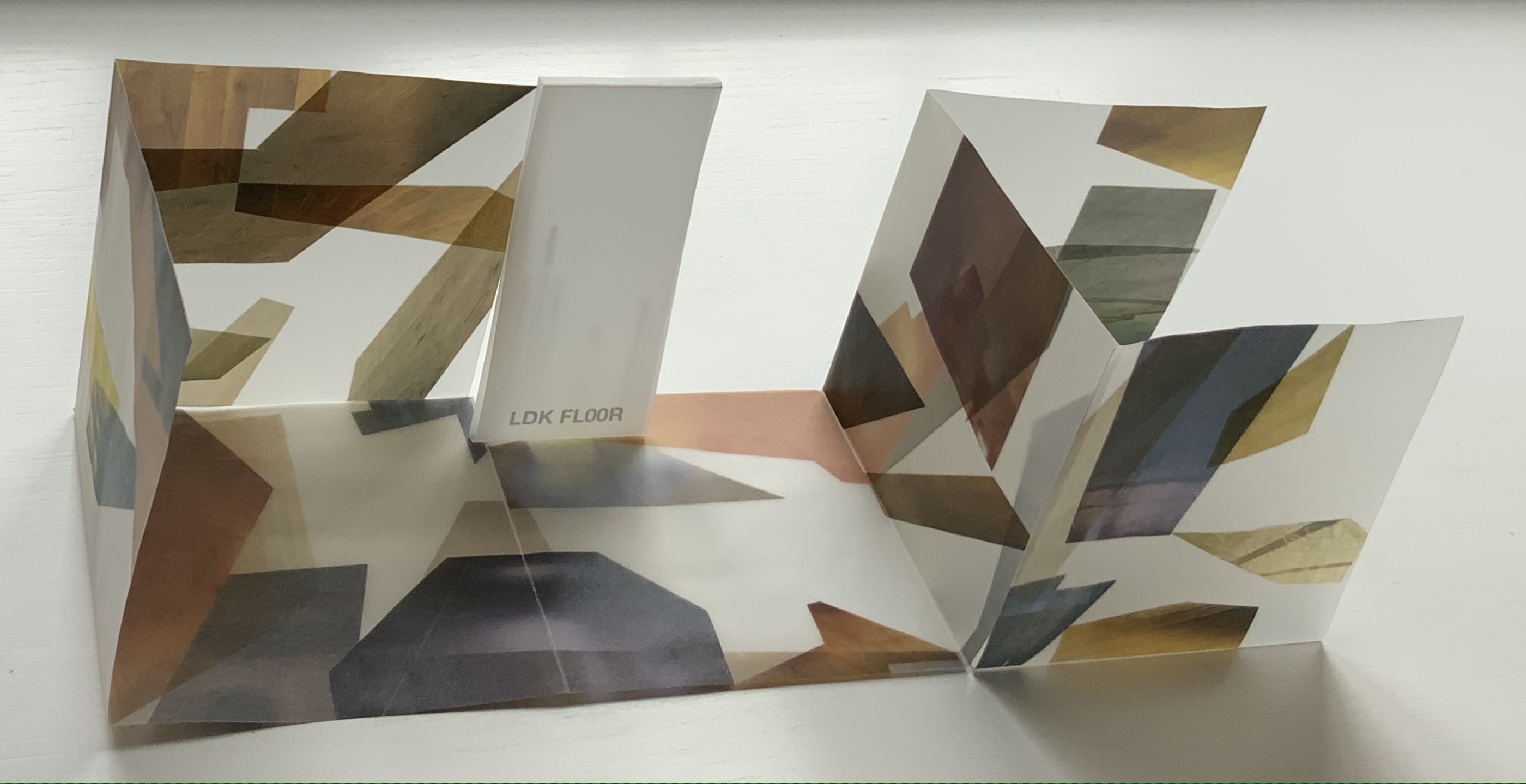
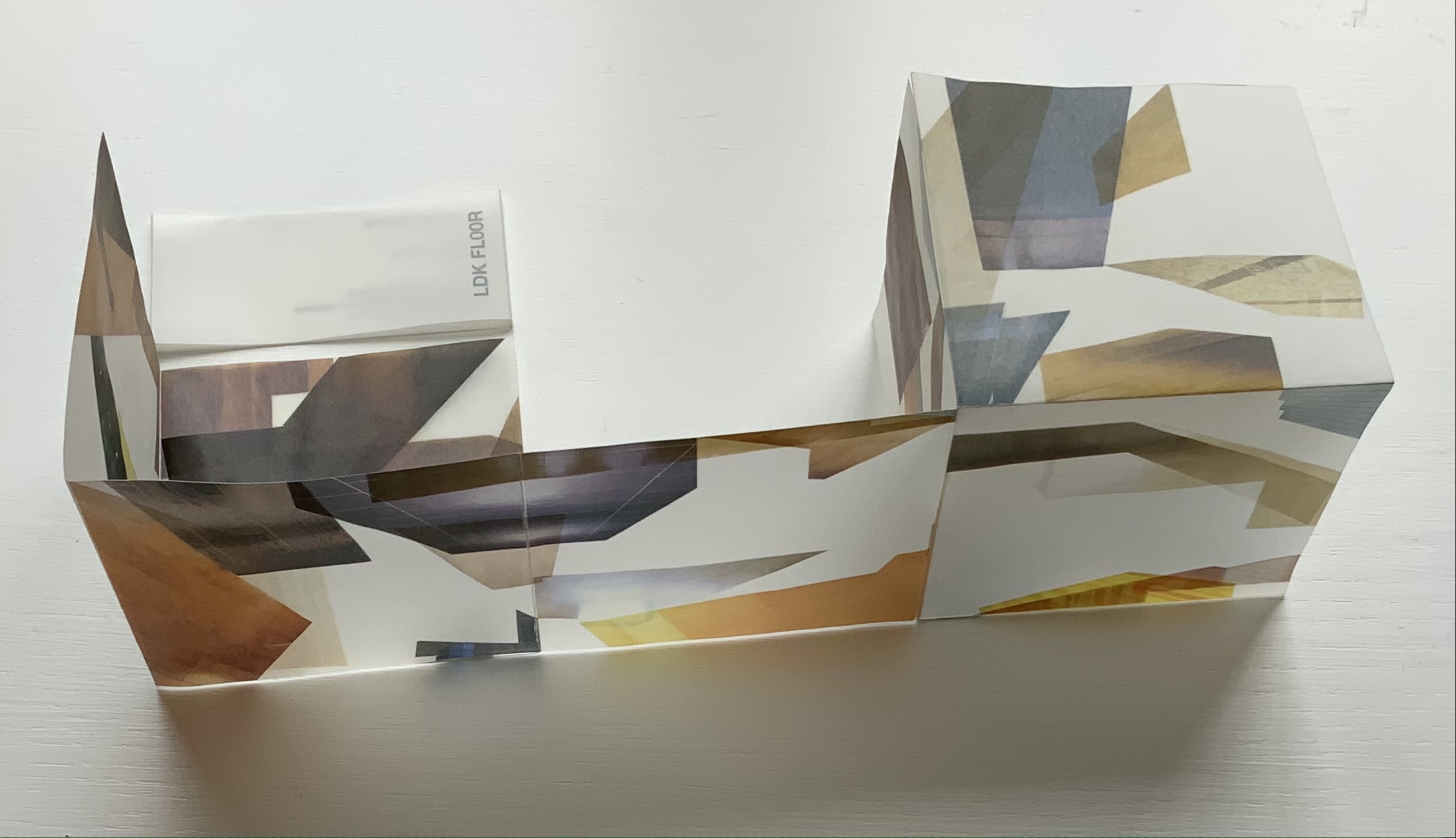
LDK FL00R (2010)
LDK FL00R (2010) Yasushi Cho Banderole bound, single sheet cut and folded accordion style. 85 x 85 mm. Edition of 45, of which this is #3. Acquired from the artist, 10 April 2021. Photos: Books On Books Collection.
Like the commas in LDK 2,020 (above) and LDK 2,009 (below), the zeroes in LDK FL00R play on the apartment prices listed in the sales leaflets, but also allude to the apartments’ floor numbers. The wordplay of the titles echoes the playful multiple shapes that the sheets can take and the resulting multiple views of the collages. The collaged images in LDK FL00R, however, are of the floor surfaces only.
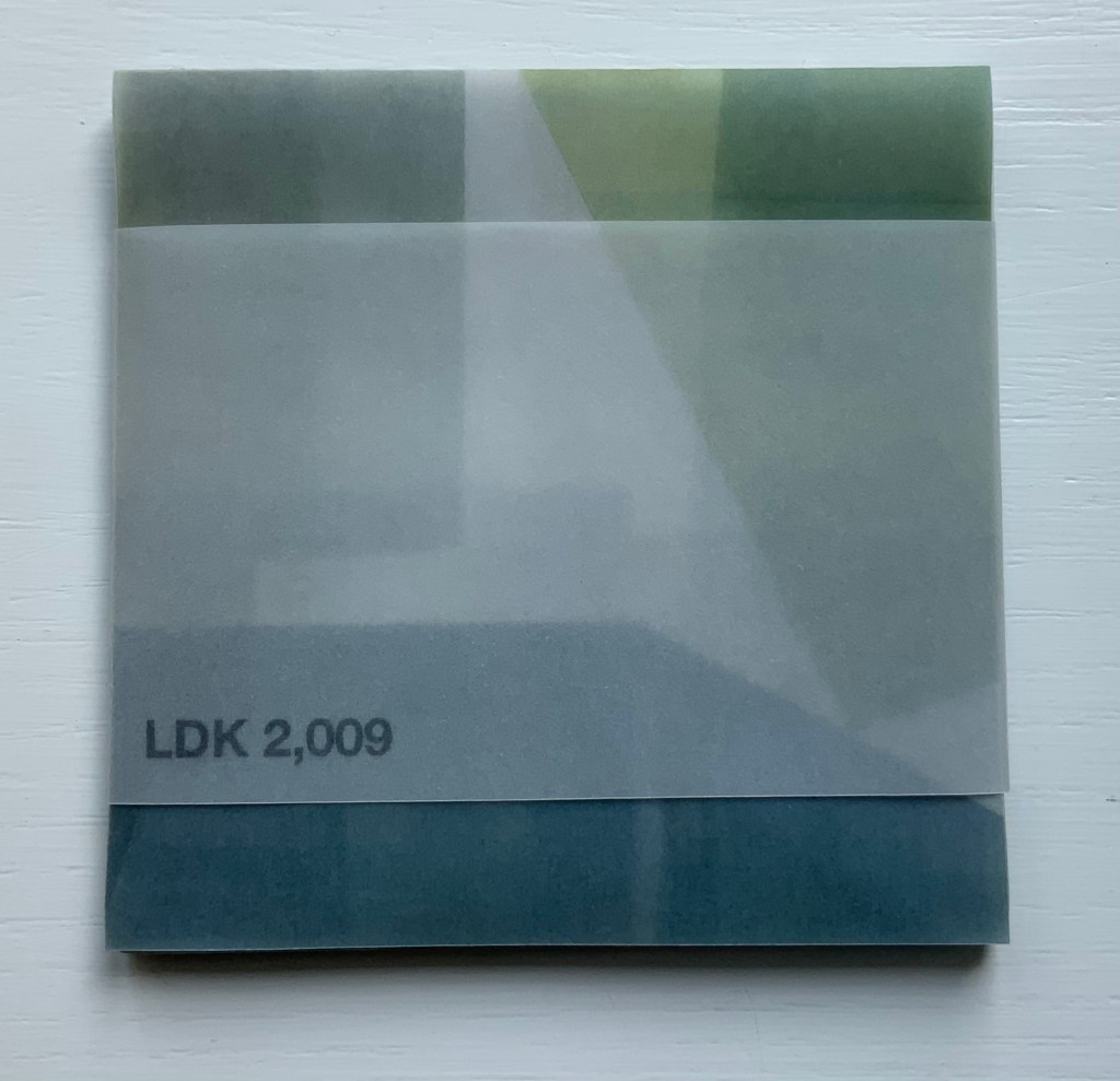
LDK 2,009 (2009)
LDK 2,009 (2009) Yasushi Cho Banderole bound, single sheet cut and folded accordion style. 75 x 75 mm. Edition of 45, of which this is #36. Acquired from the artist, 10 April 2021. Photos: Books On Books Collection
With smaller works of book art, size can disguise their depth and impact. In “reading” LDK 2,009 and its companions, an extraordinary depth and impact emerge. As the opened books assume their shapes and take their place in display, another element of the artful choice of material and printing technique emerges: the resulting play of light. This is a theme that Cho explores in two very different ways in the next works.
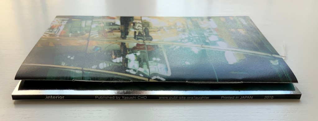
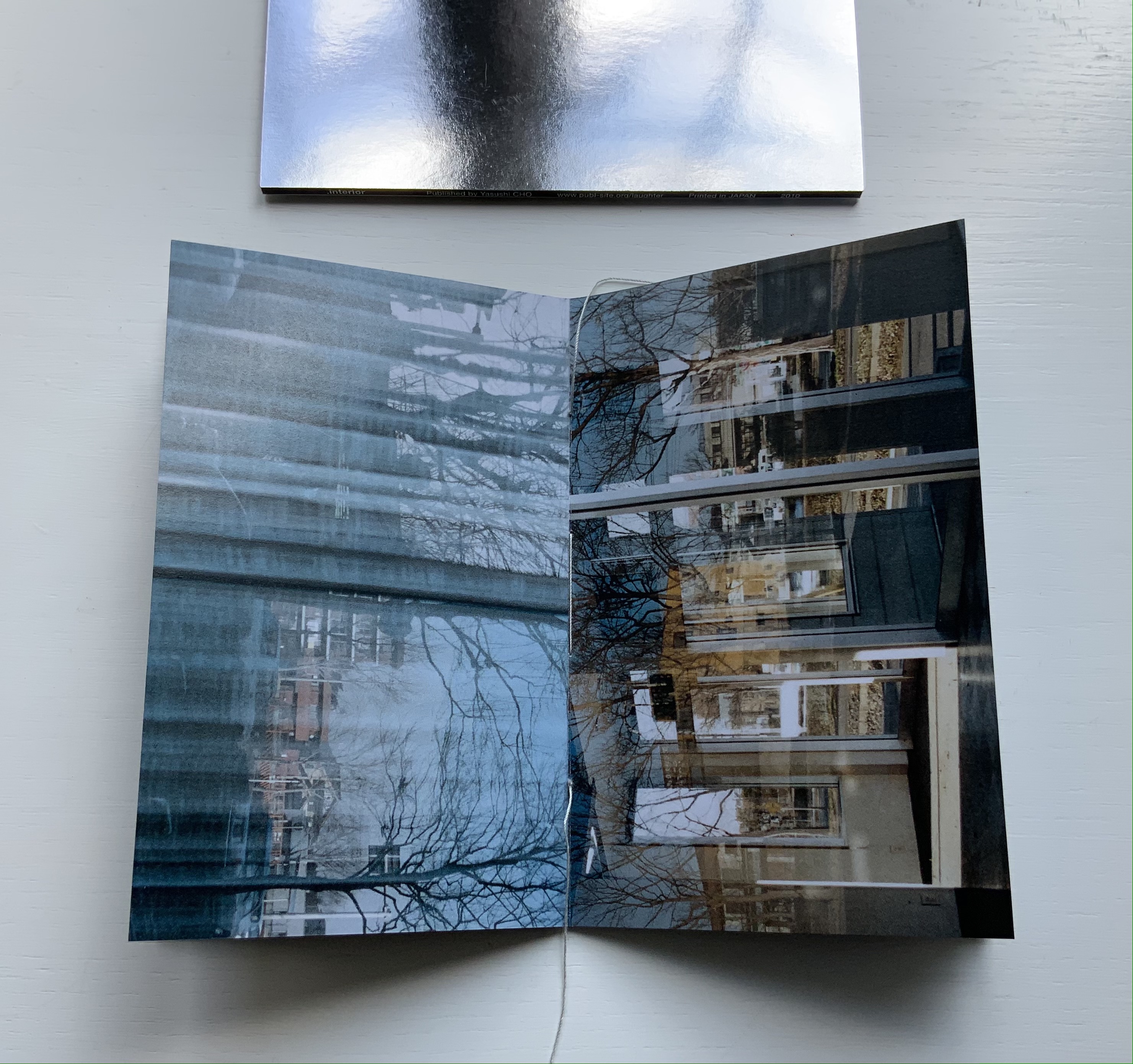
.interior (2010)
.interior (2010) Yasushi Cho Slipcase. Booklet, sewn. H150 x W98 mm, 24 pages. Edition of 30, of which this is #4. Acquired from the artist, 10 April 2021. Photos: Books On Books Collection.
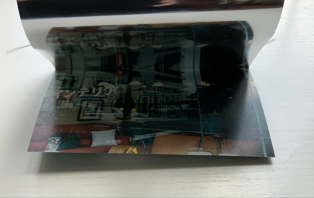
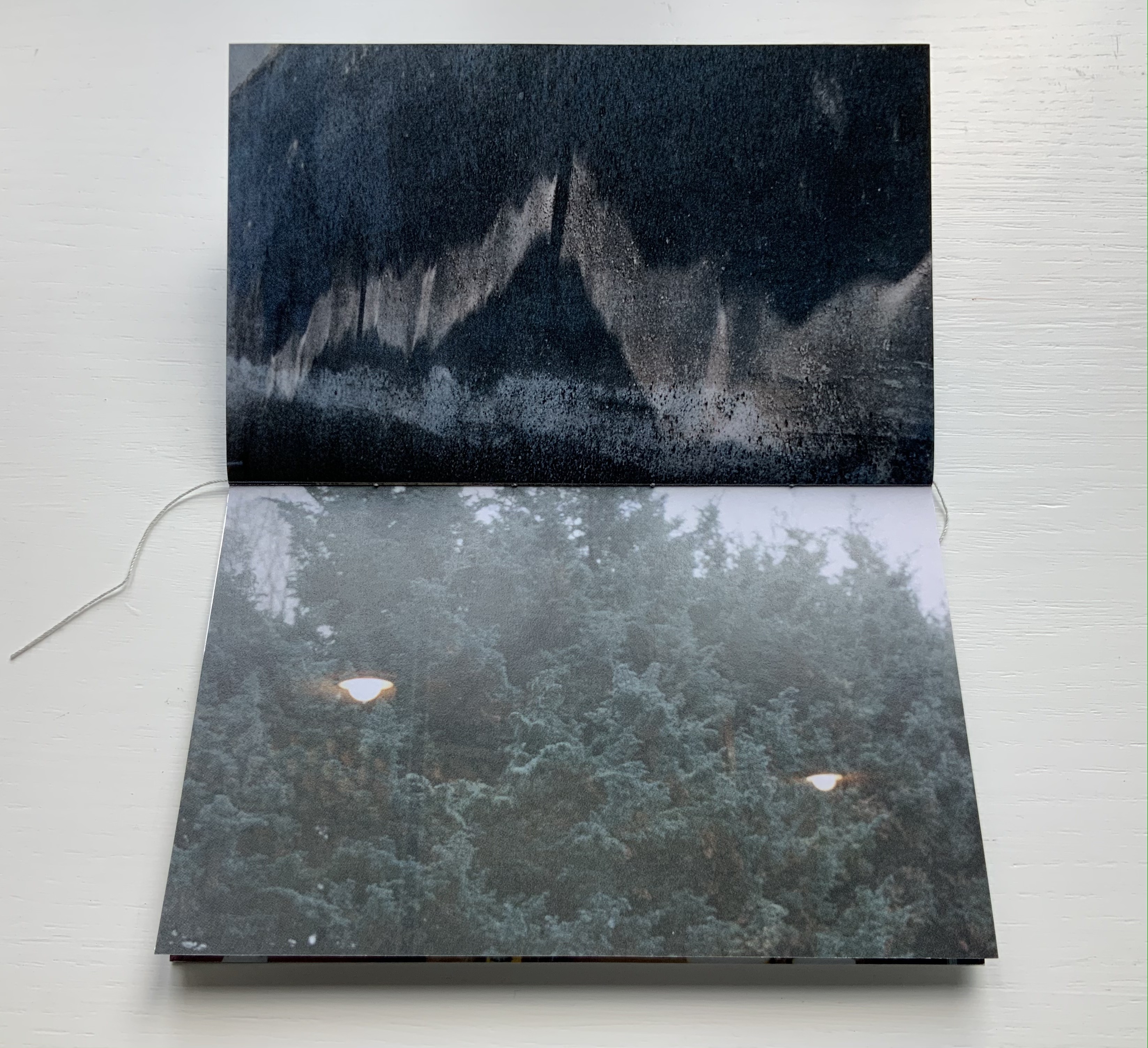
The photos in Cho’s book display views of the outside world, some of which appear to have been taken from inside an apartment whose interior is reflected in its window. Other photos display interiors — a café, an empty store — taken from an exterior vantage, resulting in reflections from the establishments’ window fronts. Some — a carpark, a walkway — seem unmediated. The playful title .interior, taken from the transposition of ・インテリア printed in the window below, and displayed on the spine of the mirrored slipcase above, confirms the artist’s theme of exploring the paradox of interior vs exterior, reflection and the mediation of vantage points.
The work’s theme of reflection is also compounded by the flimsy mirrored paper interpersed between some (not all) of the recto and verso pages. Depending on the image reflected and how the mirrored paper is turned, the reader may find a simple duplicate or an extension of a pattern. Above, the shop’s interior duplicates itself upside down; below, the high rise against a blue sky duplicates itself.
Above, the staircase seems to curve behind itself, the reflected car extends the row of parked cars, and below, the ceiling and light fixtures extend their pattern into the mirror.
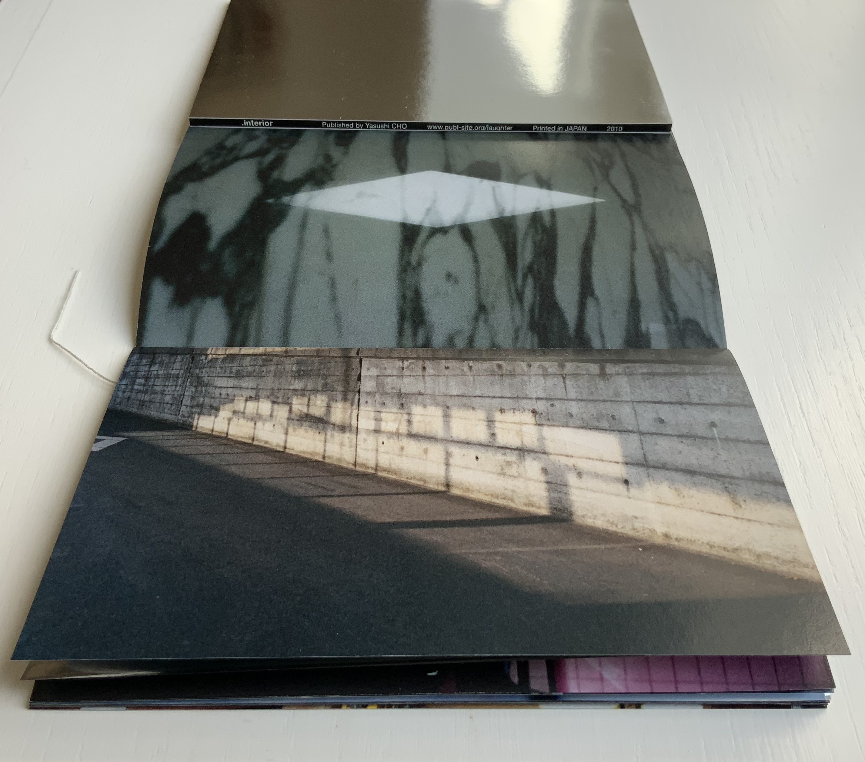
Where the recto and verso are not divided by the mirrored paper, other permutations on the theme of reflection occur. Below, in the center of the book, the window in the recto page seems to reflect the vantage point from which the verso page’s photo was taken. The virtuosity in manipulating vantage points here recalls that of Michael Snow’s Cover to Cover (1975) and Marlene MacCallum’s Theme and Permutations (2012) or Shadow Cantos(2018-19).
In its composition, the photography fascinates the eye, and Cho’s use of the book and mirrored paper to present and transform the photos fascinates the mind, provoking contemplation of the paradoxes of interior, exterior and their reflections. No doubt, a gallery show could deliver similar fascination, but as a book, .interior is more than a gallery of artwork: it is a work of art.
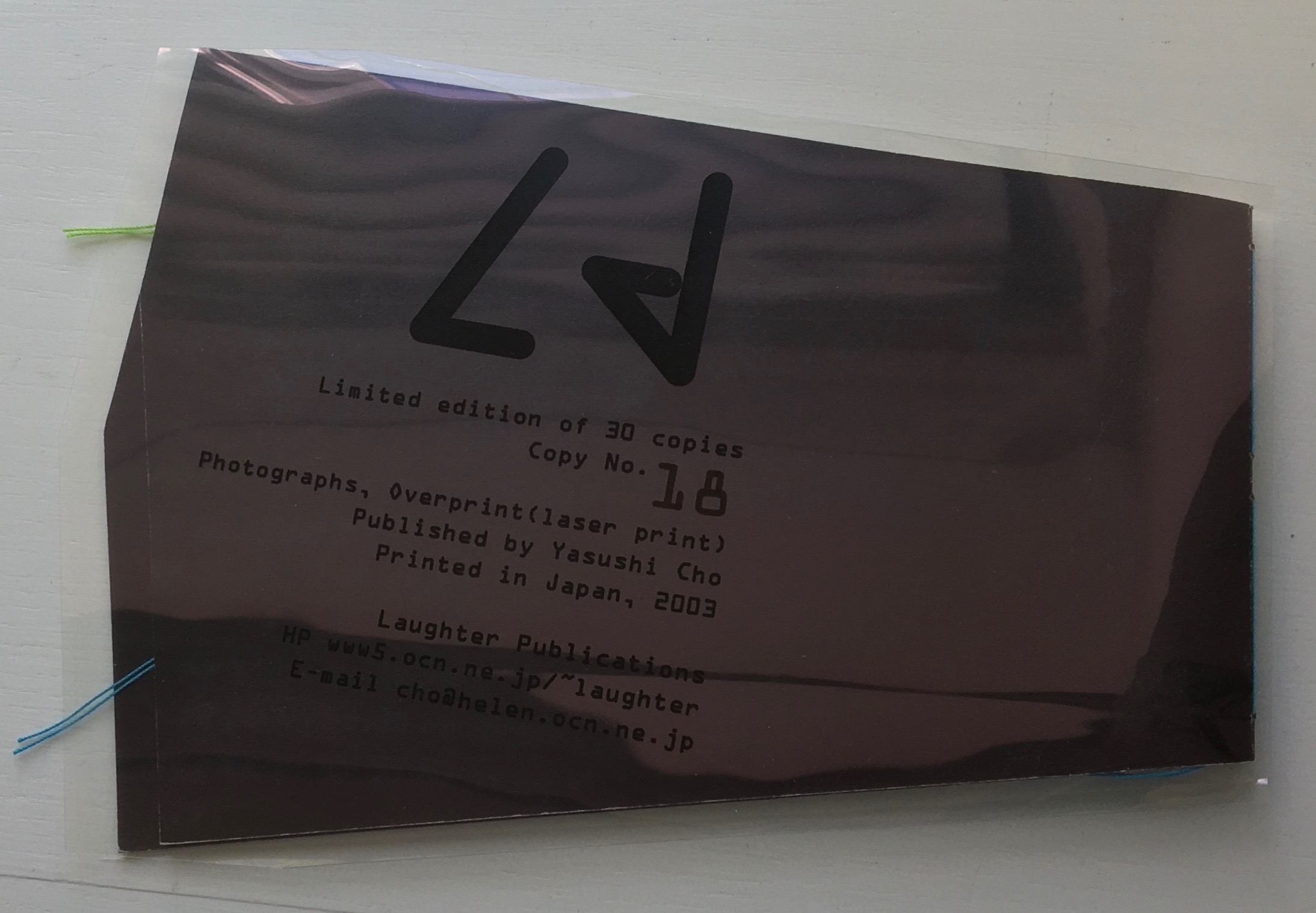
Ld (2003)
Ld (2003) Yasushi Cho Acetate sleeve. Booklet, handsewn. A5 nonstandard trim, 32 pages. Edition of 30, of which this is #18. Acquired from the artist, 10 April 2021. Photos of the work: Books On Books Collection.
If the stylized letters “L” and “d” do not suffice to distinguish this work from the LDK series, its shape, content and source certainly do. The way the images, surfaces and shapes play off one another suggests that “L” stands for light, and “d” for dark. The very different source from which the work arises — a night-time walk and shoot in Tokyo — confirms it.
On the black pages, the artist has overprinted in black to give a shadowy depth to the images and surface. The images in the dark sometimes reflect the images in the light — sometimes from the facing page, other times from previous pages. Below, for instance, the film-sprocket shapes just visible on a previous verso page’s lower edge reappear faintly, enlarged and in black over the red lights. The red lights, in turn, reappear faintly, also enlarged and in black on the lower half of the narrowing recto page.
These reflections begin to suggest those retinal images that appear after a flash of light or when eyes are held too tightly closed — both of which conjure up a night-time photo shoot in an environment of contrasts between neon lights or spotlights and the shadows they cast. By staring at the bright images on one page (below), the reader may also experience additional retinal images on the facing page.
The irregularly shaped pages recall Philip Zimmermann’s High Tension (1993) or Helmut Lohr’s Visual Poetry (1995). Cho’s pages alternate at angles, narrow or widen. With the flashes between light and dark, they evoke the photographer’s searching eye, focusing lens and movement through night-time Tokyo.
Both .interior and Ld are sophisticated — materially, conceptually and in execution. With the LDK series, they make a strong addition to the Books On Books Collection.
I tried to “define the book” when I designed (one of my books) Cover to Cover hoping that the “reader” would have a multi-sensory experience of the nature of what she/he held in her/his hands. (from The Book: 101 Definitions)
Cover to Cover (1975)
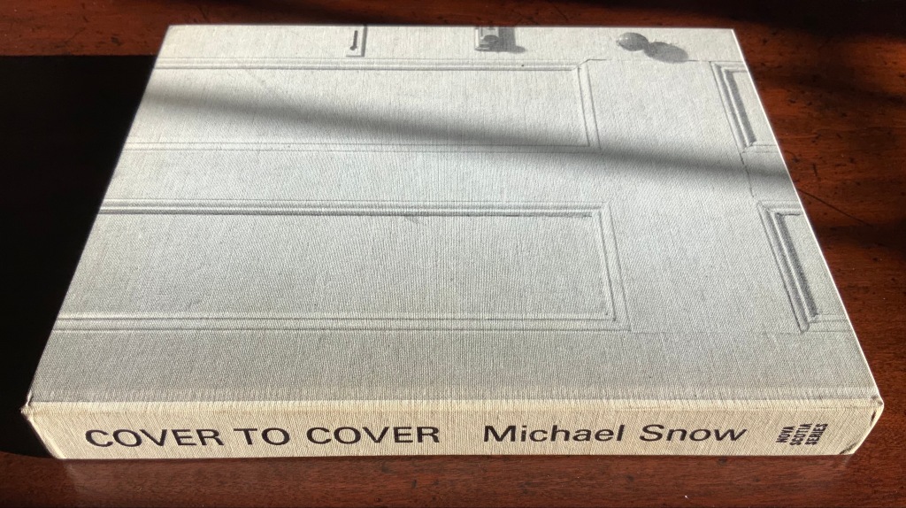
Cover to Cover (1975) Michael Snow Cloth on board, sewn and casebound. H230 x W180 mm. 310 unnumbered pages. Published by Nova Scotia College of Art and Design. Unnumbered edition of 300. Acquired from Mast Books, 10 December 2020. Photos of the work: Books On Books Collection.
After a long search since first sight of it in 2016 at Washington, D.C.’s now defunct Corcoran Gallery library, the original hardback edition of Michael Snow’s Cover to Cover (1975) finally joins the Books On Books Collection. Thanks to Philip Zimmermann, more readers/viewers have the chance to experience Cover to Cover — if only through the screen — than the original’s 300 copies and Primary Information’s 1000 facsimile paperback copies will allow.
Amaranth Borsuk describes the work and experience of it in The Book(2018), as do Martha Langford in Michael Snow (2014), Marian Macken in Binding Spaces (2017) and Zimmermann in his comments for the exhibition “Book Show: Fifty Years of Photographic Books, 1968–2018” (for all, see links below). Like Chinese Whispers by Telfer Stokes and Helen Douglas and Theme and Permutation by Marlene MacCallum, Michael Snow’s Cover to Cover evokes an urge to articulate what is going, how the bookwork is re-imagining visual narrative, how it is making us look, and how it makes us think about our interaction with our environs and the structure of the book.
The already existing commentary about Cover to Cover sets a high hurdle for worthwhile additional words. One thing going on in the book, though, seems to have gone unremarked. Some critics have asserted that, other than its title on the spine, the book has no text. There is text, however. It occurs within what I would call the preliminaries, and they show us how to read the book.
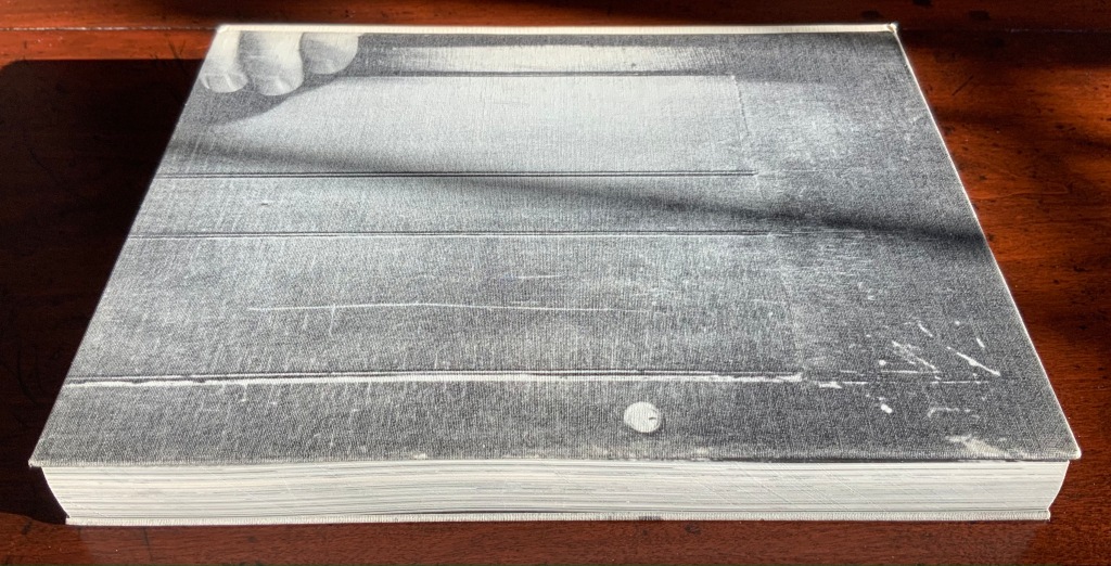
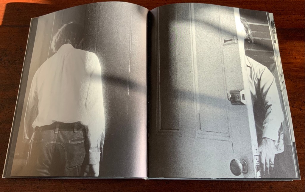
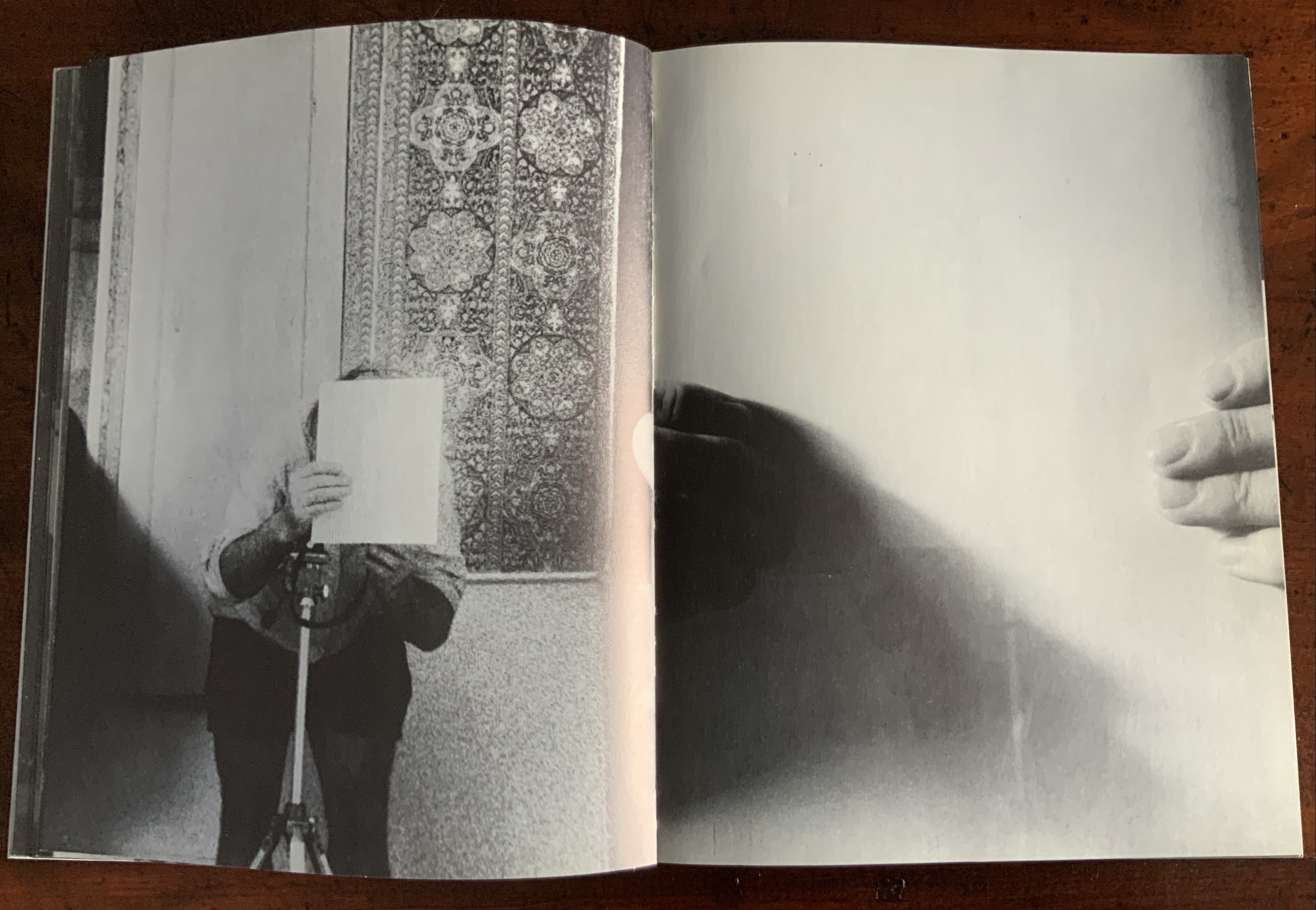
On the front cover, we see a door from the inside. Then, on its pastedown endpaper, the author outside the door with his back to us.
Front cover; pastedown end paper and page “1”.
On turning the “inside door” (page “1” of the preliminaries), we see in small type a copyright assertion and the Library of Congress catalogue number appearing vertically along the gutter of pages “2-3” (a tiny clue as to what is going on).
Pages “2-3”
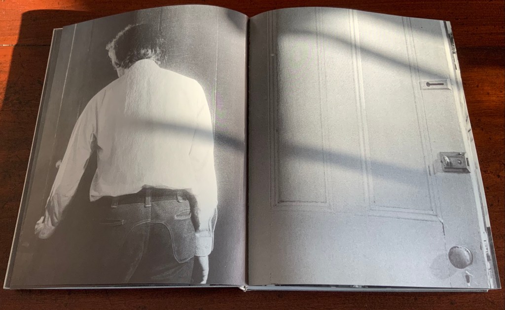
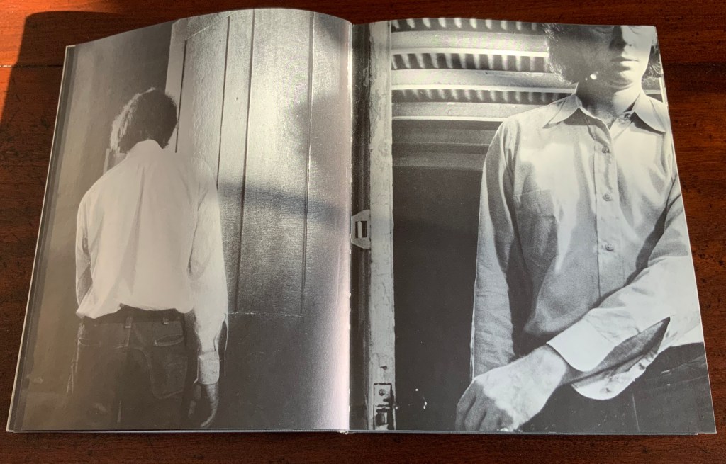
Over pages “4” through “14” from the same alternating viewpoints, the author reaches for the door handle, the door is seen opening from the inside, and the artist is seen walking through the door (from the outside) and into the room (from the inside). But who is recording these views?
Pages “10-11”, “12-13”, “14-15”
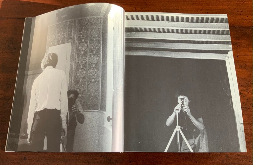
Over pages “16” through “24”, two photographers appear. Facing us, they are bent over their cameras — the one outside, clean shaven and wearing a short-sleeved shirt, is behind the author, and the one inside, bearded and wearing shorts, is in front of the author. As the author moves out of the frame, we see that the photographer inside is holding a piece of paper in his right hand. All of this occurs through the same alternating viewpoints. At page “21”, the corner of that paper descends into the frame of the inside photographer’s view of the outside photographer, and after the next switch in viewpoint that confirms what the inside photographer is doing, we see a completely white page “23”, presumably the blank sheet that is blocking the inside photographer’s camera aperture. Page “24” is the outside photographer’s view of the inside photographer whose face and camera are blocked by the piece of paper.
Pages “16-17”, pages “20-21” and pages “24-25”
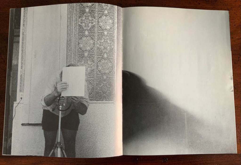
After the sequence above, something stranger still happens: on the left, a photo of the inside photographer holding the blank paper in front of his face appears. We can tell it is a photo by the tip of the thumb holding it (look in the gutter) between pages “26 and 27”. It is the developed photo the outside photographer just took of the inside photographer with his face and camera hidden by the sheet of paper. The image on page “27” is the reverse of that photograph. We can tell by the fingers on the right holding it.
Pages “26-27”
We are looking at images of images. But on pages “30-31”, whose fingers are holding the image of images?
Pages “30-31”
From there on, we see images of this piece of paper being manipulated by one pair of hands. The thumbs appear on the verso (the view from the outside photographer’s perspective), the fingers on the recto (the view seen by the inside photographer). By page “34”, it has been flipped upside down (the inside photographer is standing on his head), and on page “35”, we see a close up of the blank reverse side of the paper being held between the two photographers. By page “37”, we can see the blank side of the photo paper being fed into a manual typewriter. The pair of hands feeding the paper into the typewriter cannot belong to one of the photographers. Who is the typist — the author?
Pages “34-35” and pages “36-37”
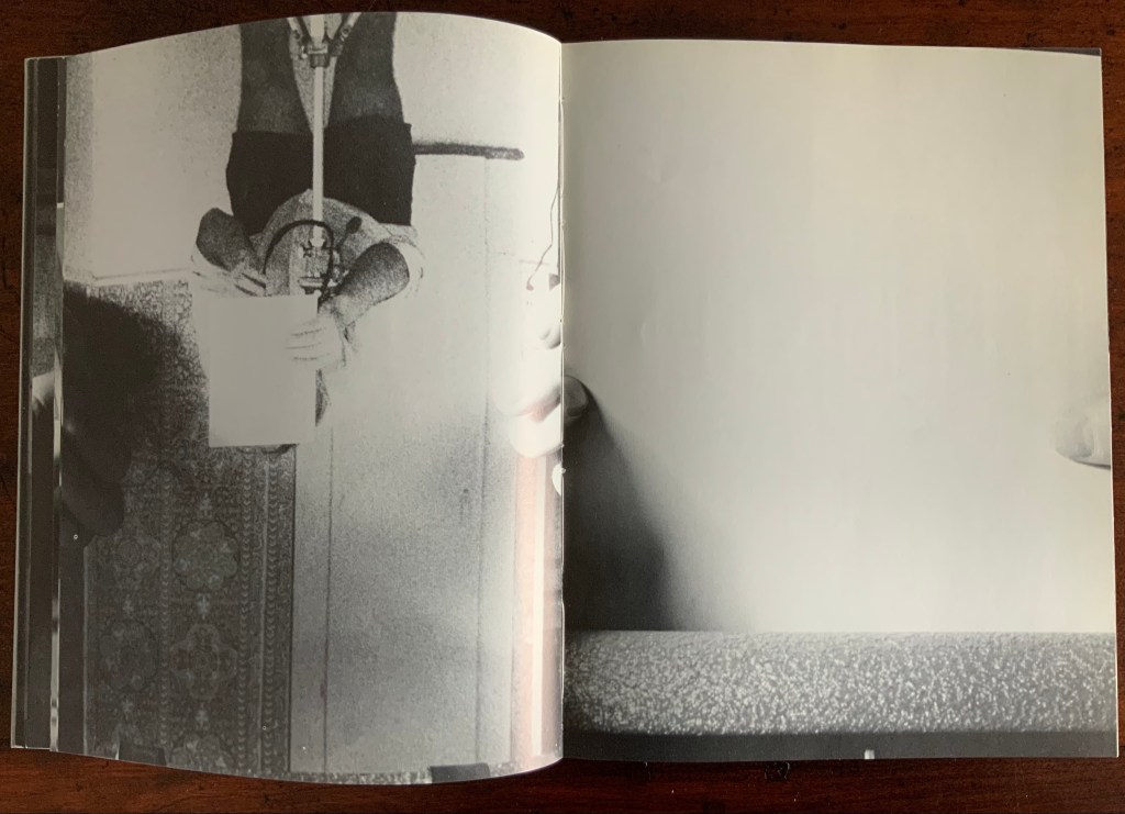
For both pages “42” and “43”, the perspective is that of a typist advancing the photo paper and typing the title page of the book. On both pages, we can see the ribbon holder in the same position. As it progresses, more and more of the outside photographer’s camera appears above the typed page. Page “45” presents itself as the full text of the book’s title page, curling away from the typist and revealing the inside photographer on the other side of the typewriter. Page “46” shows the upside-down view of the title page as it moves toward the inside photographer and reveals the outside photographer on the other side of the typewriter. Not only are we seeing images of images, we are witnessing the making of the book’s preliminaries.
Pages “42-43”, “44-45”, and “46-47”.
From page “48” through page “54”, the photographers alternate views of blank paper advancing through the typewriter. By pages “55” and “56”, the typewriter has moved out of the frame. Look carefully at page “56”, however, and you can see the impression of the typewriter’s rubber holders on the paper. As a book’s preliminaries come to a close, there is often a blank verso page before the start of the book. If Cover to Cover is following that tradition, page “56” is that blank page at the end of the preliminaries, and page “57”, showing a record player, is the start of the book.
Pages “56-57”.
Zimmermann notes that, at somewhere near the book’s midpoint, the images turn upside down, and that readers who then happen to “flip the book over and start paging from the back soon realize that they are looking at images of images produced by the two-sided system, and indeed the very book that they are holding in their hands”. He notes this as another mind-bender added to the puzzlement of the two-sided system with which the book begins. Yet the long set of preliminaries foretold us that the upside-downness, back-to-frontness and self-reflexivity of images of images were on their way. Without doubt, Cover to Cover is an iconic work of book art.
Further Reading
Afterimage (1970). No. 11, 1982/83. On the occasion of an exhibition of his films at Canada House in London, an entire issue on Snow’s work.
… Cover to Cover is the result of another distanced use of self in the course of art-making. Snow is subject/participant as he and his actions are observed and analyzed by two 35 mm cameras… simulataneously recording front and back, the images then placed recto-verso on the page… Snow is subject observed in the book at the same time that he is also choosing and making decisions about images. Cover to Cover in 360 pages, [sic] becomes a full circle — front door to back door or the reverse. The book is designed so that it can be read front to back and in such a way that one is forced to turn it around at its centre in order to carry on. Regina Cornwell in Snow Seen and “Posting Snow”, Luzern catalogue.
But as the scene “progresses,” an action is not completed within the spread, but loops back in the next one, so that the minimal “progress” extracted from reading left to right is systematically stalled each time a page is turned, and the verso page recapitulates the photographic event printed on the recto side from the opposite angle. This is the disorienting part: to be denied “progress” as one turns the page seems oddly like flashback, which it patently is not; it might be called “extreme simultaneity.” Two versions of the same thing (two sides of the story) are happening at the same time. Zimmerman.
Theme and Permutation (2012) Marlene MacCallum Hand sewn pamphlet, images custom-printed in offset lithography on Mohawk Superfine, text printed in inkjet, covers inkjet printed on translucent Glama. H235 × W216 mm Edition of 100, of which this is #54. Acquired 5 October 2018.
Photos: Books On Books Collection.
Theme and Permutationis one of a series of artist’s books inspired by the experience of living in Corner Brook’s Townsite area on the west coast of the island of Newfoundland. Between 1924-34 the pulp mill built 150 homes to house the mill management and skilled labourers. Over a period of 10 years, I have photographed in several homes, all the same type-4 model as the one I live in. These homes vary in condition from close to original in design and décor to highly renovated. This project gave me the rare opportunity to record the evolution of interior aspects of these homes. It has been the context to explore the paradoxical phenomena of conformity and individualization that occurs in a company town. Having grown up in a suburban housing development, my earliest memories of home is that of living in a space that is reminiscent of my neighbors’. Each artist’s book explores a distinct facet of image memory, multiplicity, sequence and offers the viewer a visual equivalence of the uncanny. Theme and Permutation is a response to the permutations and variations of the type-4 Townsite House. Digital tools were used to translate the original film source of eight different window images from five houses. The sixteen offset lithographic plates were custom printed in twenty-nine separate press runs. Each image is the result of a different combination of plates. The structure is a sewn pamphlet with translucent covers. The viewer enters the body of the book with a tritone image of a single Townsite window. As one moves into the piece, new window images appear and layer over each other. The images become darker and more heavily layered towards the mid-point. The center spread has an inkjet layer of two text blocks printed over the offset litho images. The text speaks of the history of the homes, the architectural permutations and economic shifts within the Townsite area. The ensuing pages continue to provide new combinations of window layers, gradually lightening in tonality and allowing the individual windows to become more distinct. A third text block provides a personal narrative. The piece concludes with a tritone image of one of the Townsite windows in original condition.(From artist’s website. Accessed 1 September 2019.)
*From the artist’s description of Wall Stories (2014).
Chicago Octet (2014)
Chicago Octet (2014) Marlene MacCallum Hand bound artist’s book with folded paper structure, letterpress and inkjet printing, H166 × W78 mm closed, H443 x W293 mm open Unique. Acquired 5 October 2018.
Photos: Books On Books Collection
Chicago Octet is a work of visual poetry by eight masters of book art. If they were performing music (and you can almost hear the music of Michigan Avenue), MacCallum would be their performing conductor.
The piece I created, Chicago Octet, had several collaborative components. The letterpress printing consisted of a word selected by each participant printed on one of Scott [McCarney]’s folded structures. The images were a digital layering of every cityscape photograph that I made and then inkjet printed on top of the letterpress. The final folded structure was designed by Mary Clare Butler. The case was designed and built by Scott McCarney, the front cover embossment was by David Morrish and Clifton Meador. (From artist’s website. Accessed 31 August 2017.)
Update: With funding from the Canada Council for the Arts Digital Originals Grant and assistance of Matthew Hollett and David Morrish during the Covid pandemic, the artist created Shadows Cast and Present, a digital re-imagining of her three most recent book works. The three cantos into which the work is divided also enrich one’s appreciation of Theme and Permutation and Chicago Octet. MacCallum orchestrates the various media — text; sound from music, voice and the noise of city and nature; video — with a touch as light as paper and light.
Further Reading
Books On Books. “Architecture”. Books On Books, 12 November 2018.
MacCallum, Marlene. 2014. Wall Stories. Website. For the text cited in the epigraph for this entry, go to the last linked image in the series of thumbnails displayed.
Otis Artist Book Collection. “Conrad Gleber ‘Chicago Sky Line’”, 27 January 2014. Gleber’s work is an interesting one to compare with Chicago Octet. Chicago Sky Line (1977) is a fan book of photographs secured at a single point by the binding and, when spread clockwise, reveals the sky above Chicago and, when spread counterclockwise, shows the Chicago “skyline” below clouds and sky.
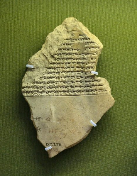
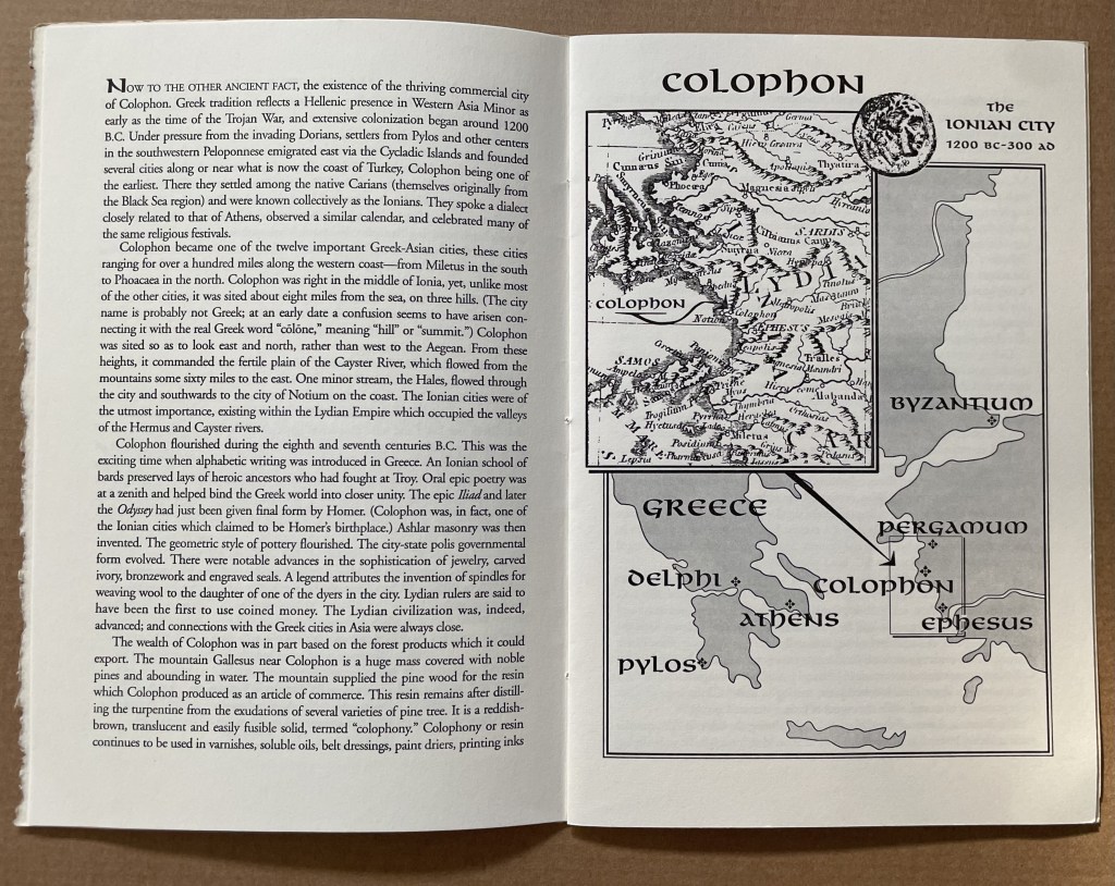
This tale comes from J. S. Kennard’s short 1901 tome on the colophon — that last page at the end of a manuscript or book. The colophon has served many purposes: giving the title of the work, identifying the scribe or printer, naming the place and date of completion or imprint, thanking and praising the patron, bragging, blaming, apologizing, entreating, praying and much more. Examples can be traced back to clay tablets and forward to websites.
Cuneiform tablet from the Library of Ashurbanipal, British Museum. Interesting that the colophon was added in ink after the clay had dried.
Its presence on websites may be one of those decried skeuomorphic hangovers from book publishing, but perhaps the colophon has an underlying value or purpose to serve in both the analogue and digital worlds. The late Bill Hill, who wrote the 1999 Microsoft white paper “The Magic of Reading” and was an early contributor to online typography, suggested making colophons a compulsory standard for website design and asked:
Why not introduce the venerable concept of the colophon to the Web? Could it be used to drive a new business model for fonts which would benefit the font industry, web developers and designers – and the people who visit their sites? [Sadly this page at the Bill Hill’s site is no longer available.]
Fanciful? Perhaps, but not much more fanciful than Erasmus’ proffered explanation of the word “colophon”. His expanded edition of Adagia printed by Manutius in 1508 includes this adage:
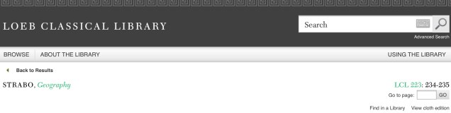
Colophonemaddidit He added the colophon. This came to be used when the finishing touch is added to something, or when some addition is made without which a piece of business cannot be concluded. The origin of the adage is pointed out by Strabo in … his Geography, …
And here is Strabo from the Loeb Classical Library online; scroll down to paragraph 28:
As venerable a publishing custom as the colophon may be, it is more honoured in the breach than the observance. Book artists tend to be more observant, but not religiously so, and of course some works of book art might be disfigured by a colophon. Still, there are sound reasons why book artists should bother themselves with a colophon — even if it stands apart from the work. In her review of Book Artists and Artists Who Make Books (2017), India Johnson gives one of those sound reasons:
It’s probably impossible to include every detail of production in a colophon—but some give it their best stab, exhaustively listing everyone that took part in a project. More concise colophons recap only the most relevant details of making—perhaps those the primary creator feels will factor saliently into making meaning of the book.
The convention of the colophon in our field exposes an assumption that the meaning of an artwork is informed not only by the finished product, but by the specifics of artistic labor. “Book Artists and Artists Who Make Books“, CBAA, 1 October 2018. Accessed 3 October 2018.
If craft does figure in a work’s meaning, then the more we can see how it figures, the greater our ability to appreciate and understand the work. For conveying insight — what materials and from what sources, what processes, what tools, who contributed, where and when the work occurred — the colophon stands ready. But where does it stand?
A contemporary of Kennard, A.W. Pollard declared that, to be a proper colophon, it had to appear at the conclusion or summit of the work. Artful as are some of the manuscripts and books that Kennard and Pollard cite, none push the envelope in the manner that works of contemporary book art do. Which brings us to another reason for book artists to consider the colophon: inspiration from history or tradition.
The last page of the codex may be a rightful spot for placing the codex, but what if the bookwork’s shape is challenging or musing about the shape of the book? Finishing touches might go anywhere. Think of Van Eyck’s self-portrait hidden in a reflection in The Arnolfini Portrait, or that of Vélazquez in Las Meninas.
Historians’ diligent cataloging of the “hands” of the scribes has enriched the self-identifications in colophons and connected those craftspersons with additional manuscripts. Book artists who use calligraphy or involve calligraphers should ponder the implications of this tool historians use to identify scribes by the style of their “hands”.
What potential, meaningful “tells” in a work’s colophon might the book artist or calligrapher leave to enrich the work — and provide insights for historians and connoisseurs poring over the finishing touch?
The colophon’s underlying value or purpose warrants book artists’ thinking about recording it offline and online, though this might be stretching the definition of the colophon. Our enjoyment of Kitty Maryatt’s 2018 reconstruction of La prose du Transsibérien et de la Petite Jehanne de France (1913) by Blaise Cendrars and Sonia Delaunay is certainly enhanced by the “colophonic” booklet she included with the work and the “About” page online.
Perhaps the story of the little “i” left over – the colophon – will prod the future historians of book art to examine bookworks and their artists’ websites for those finishing touches and stir artists to bestow that last finishing touch for the sake of the work’s soul if not their own.
A Prospect of Colophons
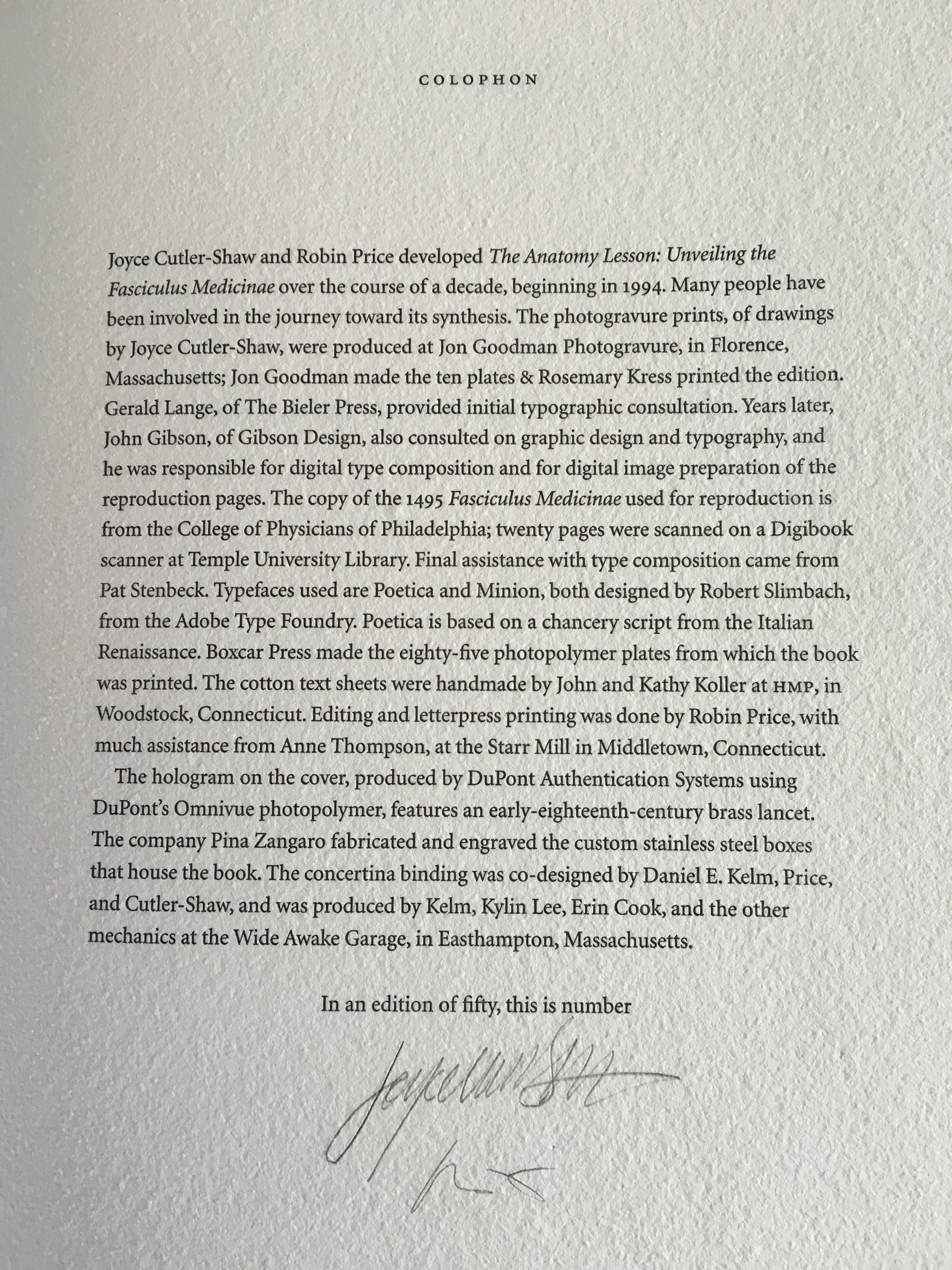
The Anatomy Lesson: Unveiling the Fasciculus Medicinae (2004) Joyce Cutler-Shaw The careful reader will notice that the edition number is missing. This instance of the work is one of the binder’s signed but unnumbered copies, having been acquired directly from Daniel E. Kelm.
Lyn Dillin, The Ballad of the Self Same Thing (2019) Can this be the first rhyming colophon?
Finding Home (2016) Louise Levergneux This may not be the first bilingual colophon I have seen, but its being inside the top of the box enclosing the work makes it the first to occupy the physical summit a work.
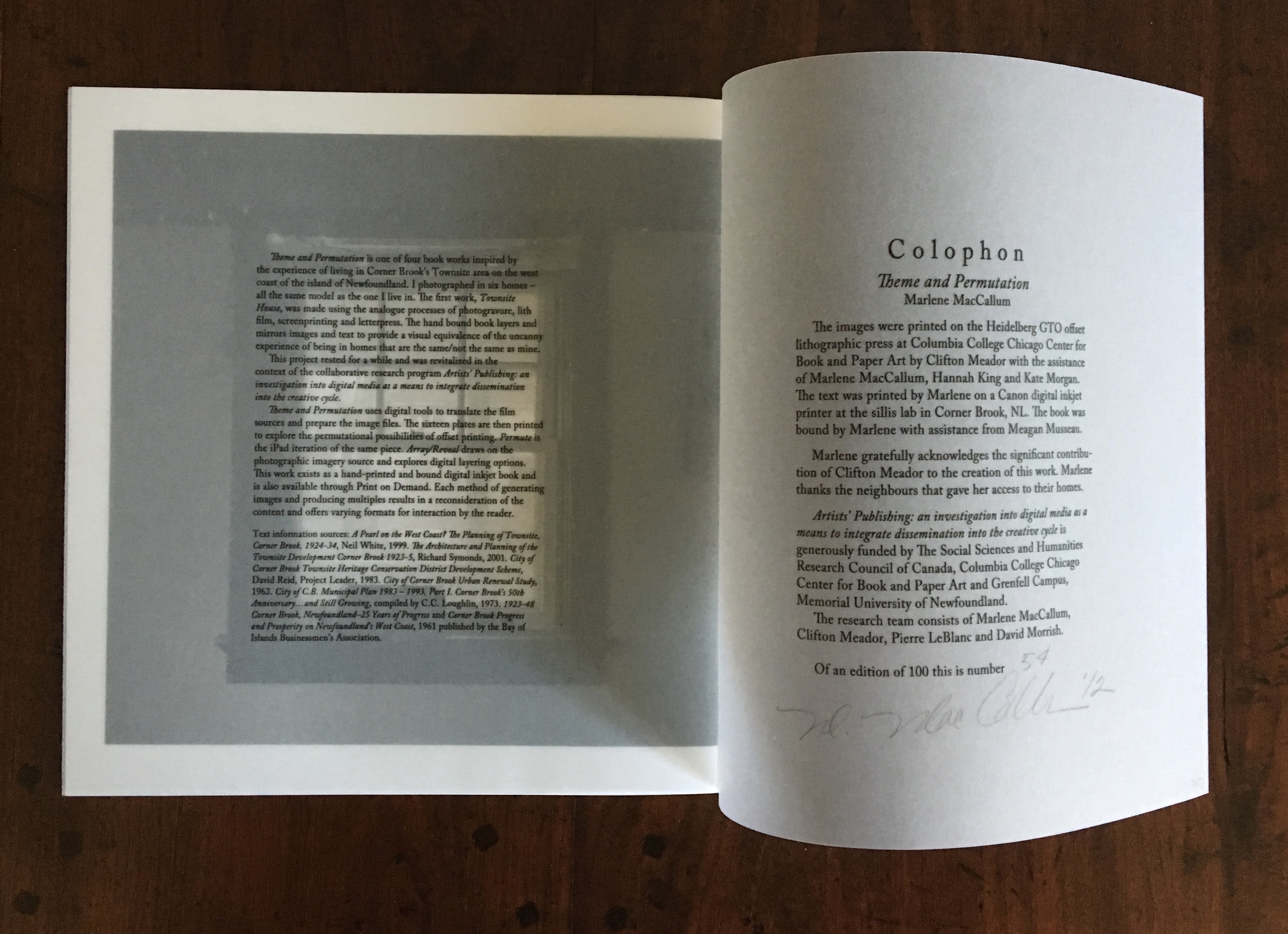
Theme and Permutation (2012) Marlene MacCallum This double-page spread reveals process information about the work that adds to the reader/viewer’s appreciation of the themes and permutations occurring in the pages.
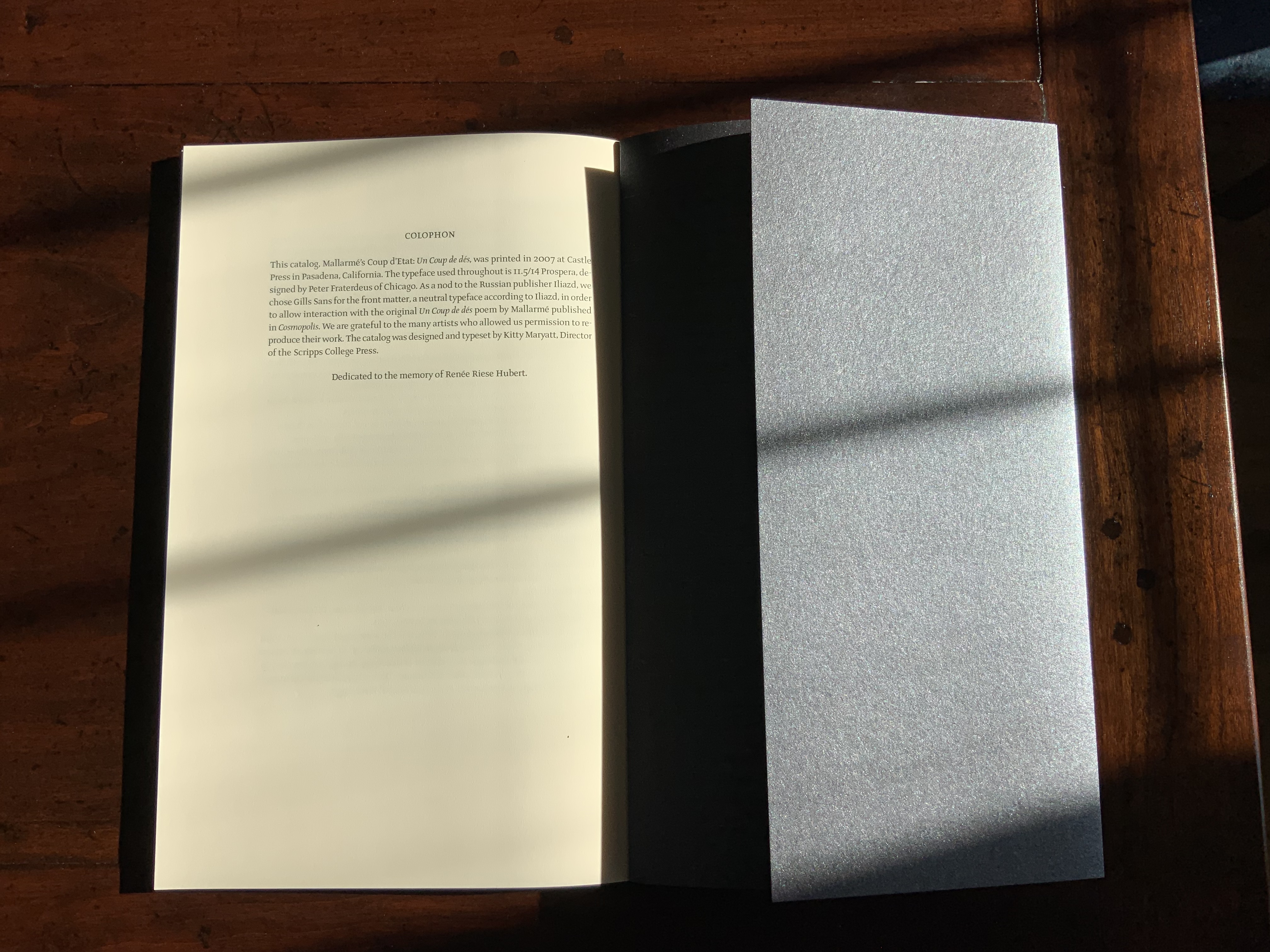
Mallarmé’s Coup d’État (2007) Kitty Maryatt The colophon’s nod to Iliazd sends the reader/viewer back to the start of this catalogue that is a bookwork in its own right.
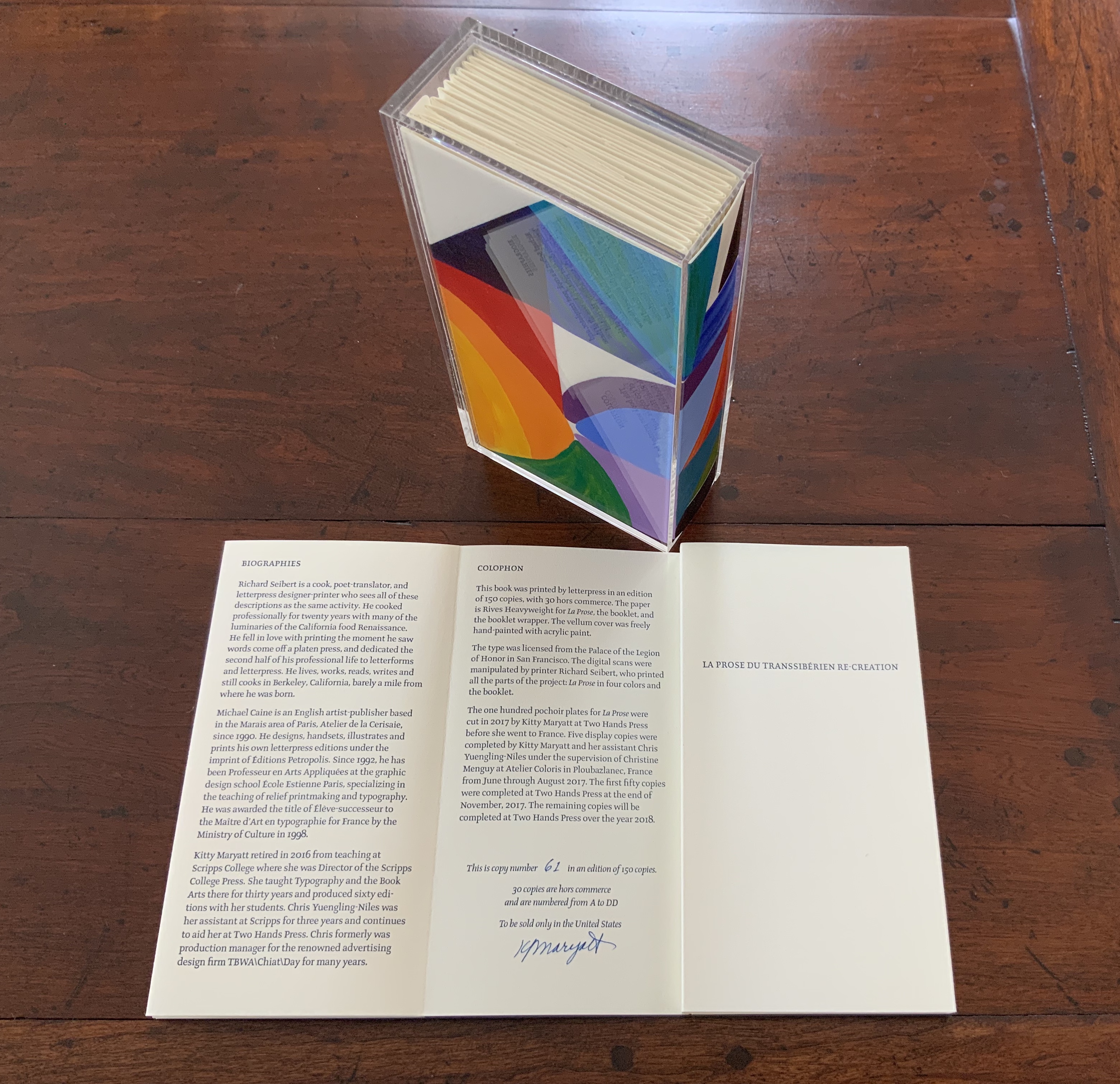
La prose du Transsibérien Re-Creation (2019) Kitty Maryatt A “colophon within a colophon”. The booklet providing details about the original work and Maryatt’s re-creation has an accordion structure and collapses into its own tri-fold wallet, which fits within the cover of the main work, seen here in its acetate holder.
L is for Lettering (2011) Cathryn Miller This hilarious and touching abecedary parades as a marked work handed in for a course, a portrait of the artist within a contemplation of the past and future of typography and letterpress. This colophon embodies the finishing touch.
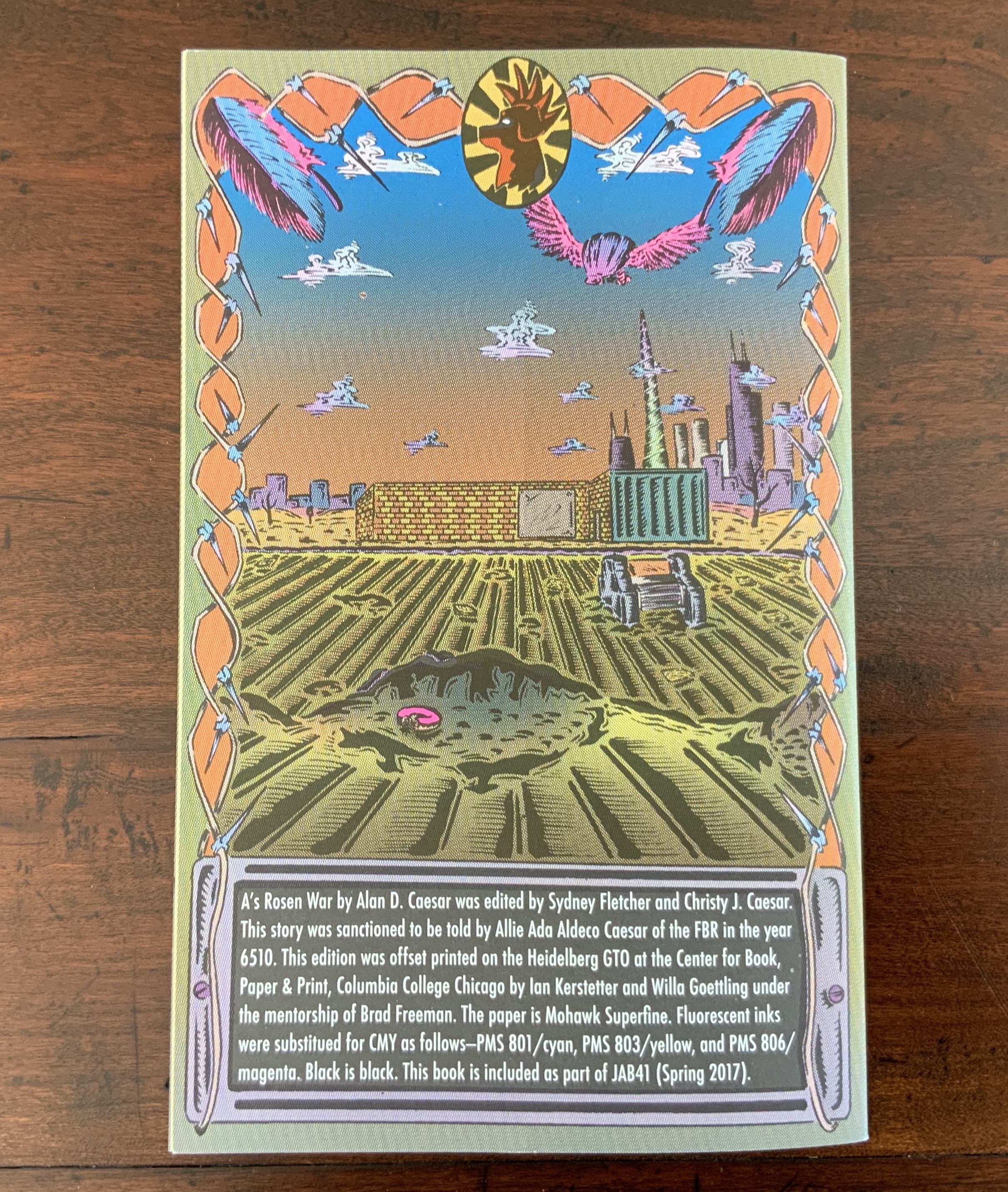
A’s Rosen War (2017) Alan Caesar This colophon continues the premised date with which this work of science fiction book art begins.
Richard Gameson. The Scribe Speaks? Colophons in Early English Manuscripts. Cambridge: Cambridge University Press, 2001. (See for the human interest: “I, Aelfric, wrote this book in the monastery of Bath”; “Pray for Wigbald”; “Just as the port is welcome to sailors, so is the final verse to scribes”.)
Hurtig, Alain. “Les colophons“. L’outil typographique. Accessed 26 January 2022. (Seventeen brilliantly designed and shaped colophons.)
Joseph Spencer Kennard. Some early printers and their colophons. Philadelphia : G.W. Jacobs and Co., 1902. (Less academic but just as interesting and typographically more fun than Gameson.)
Ming-Sun Poon, “The Printer’s Colophon in Sung China, 960-1279”, The Library Quarterly,43:1 (January 1973). (See for the 34 calligraphic inscriptions and the colophon to the Diamond Sutra: “On the 15th of the 4th moon of the 9th year of Hsien-t’ung [May 11, 868], Wang Chiek on behalf of his two parents reverently made this for universal free distribution.”)
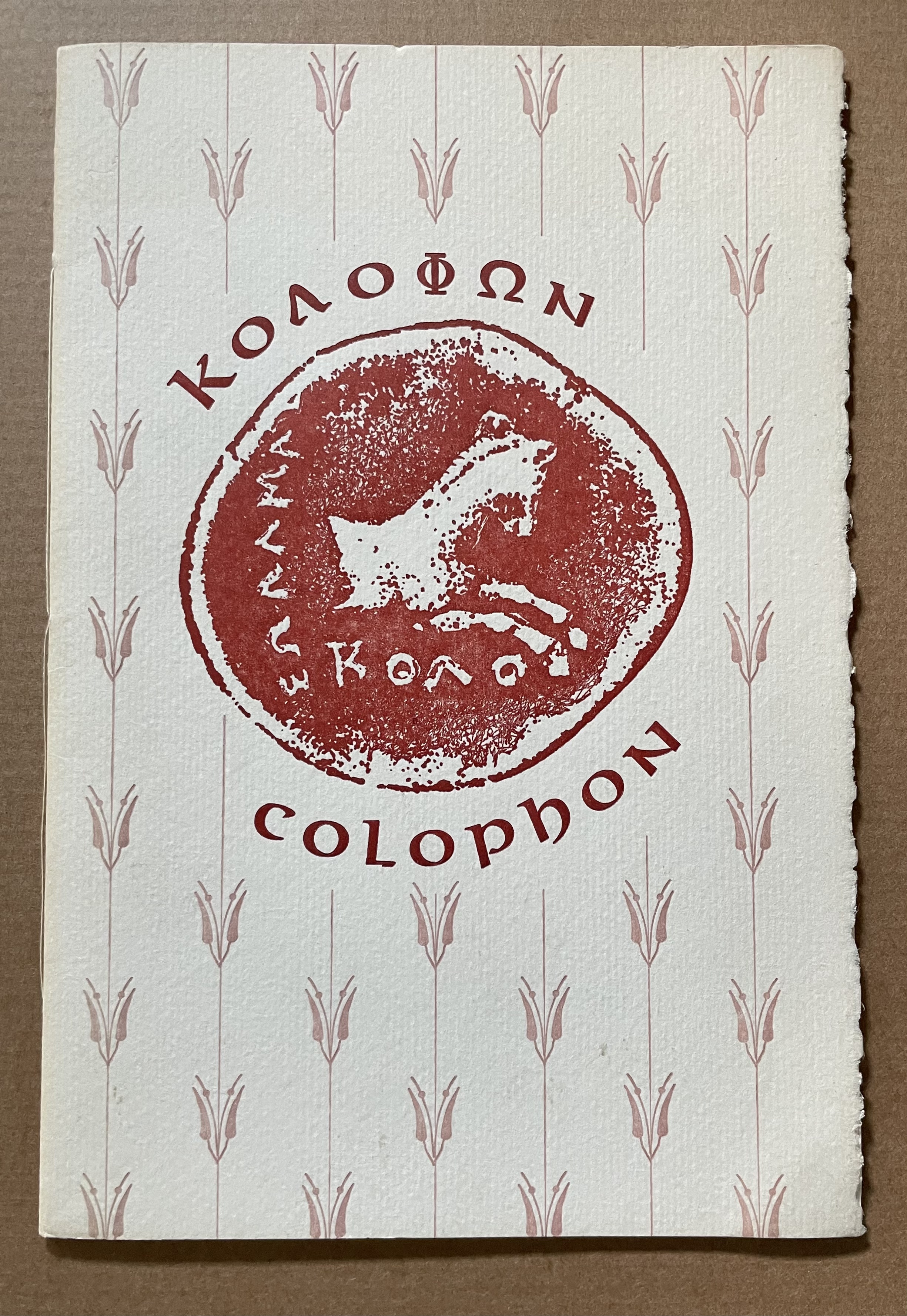
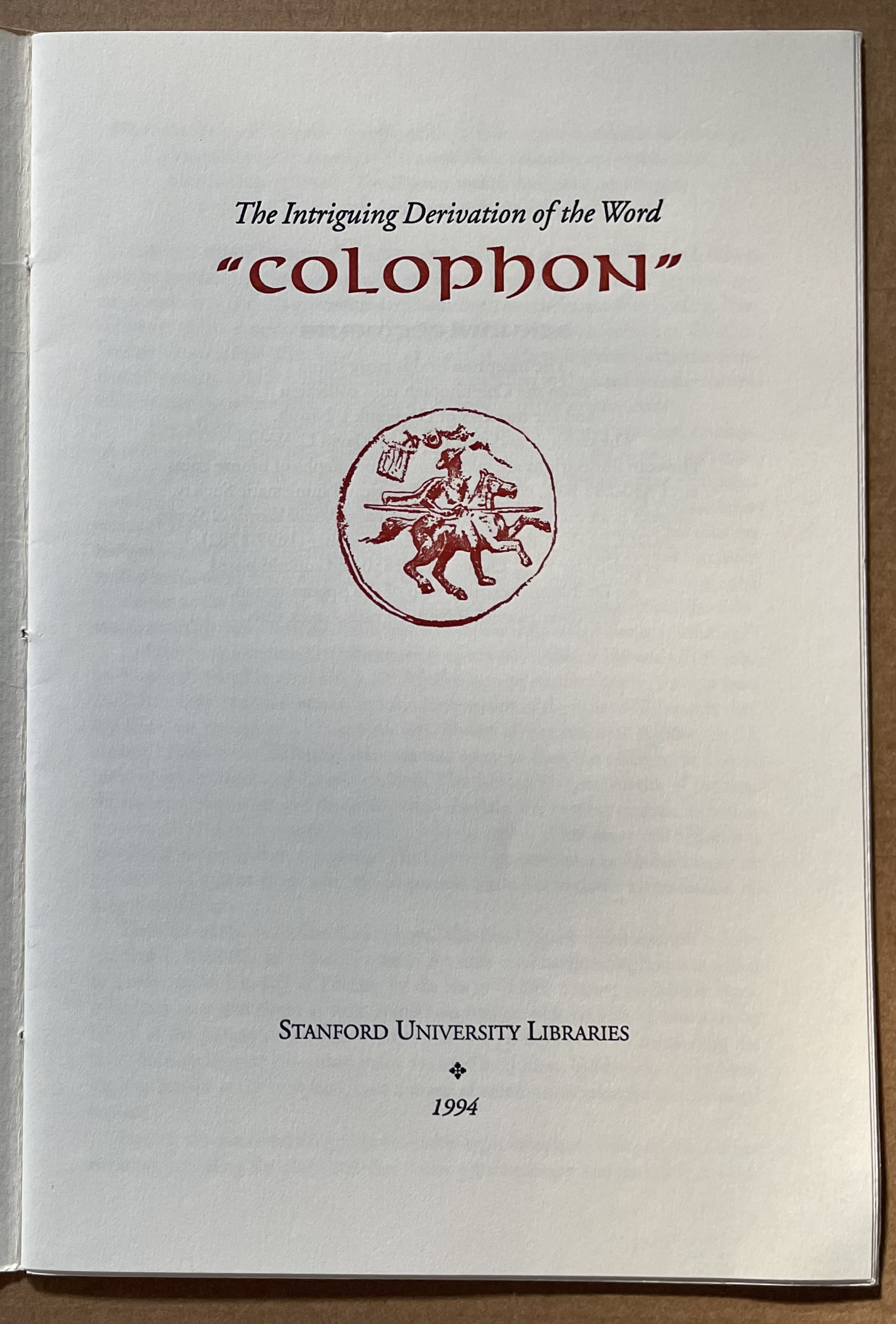
The intriguing derivation of the word “Colophon” (1994) David C. Weber Sewn booklet. H230 x W155 mm. [16] pages. Acquired from Cotswold Internet Books, 7 May 2023. Photos: Books On Books Collection.
Pollard, Alfred W. Last Words on the History of the Title-Page, with Notes on Some Colophons and Twenty-Seven Fac-Similes of Title-Pages. Burt Franklin Research & Source Works Series, 668. B. Franklin, 1971. Pollard, Alfred W. 1859-1944. Last Words on the History of the Title-Page, with Notes on Some Colophons and Twenty-Seven Fac-Similes of Title-Pages, by Alfred W. Pollard. J.C. Nimmo, 1891. Pollard, Alfred W. 1859-1944. An Essay on Colophons, with Specimens and Translations, by Alfred W. Pollard, and an Introduction by Richard Garnett. The Caxton Club, 1905. Pollard, Alfred W., and Richard Garnett. An Essay on Colophons : With Specimens and Translations. Burt Franklin Bibliography and Reference Series ; #142. Burt Franklin, 1968. Van Elverdinghe, Emmanuel. “Modèles et Copies : Étude d’une Formule Des Colophons de Manuscrits Arméniens (VIIIe – XVIIIe Siècles).” Dissertation, 2017.