For the Enlightenment, everything that existed was meant to be in an encyclopedia. For Dr. Edmund Fry, scholar, typographer and owner of The Polyglot Foundry, this notion (and the spur of profit) led to his Pantographia (1799). Extraordinarily, Fry made the matrix for each of the roughly 5,000 characters for the 405 alphabet specimens, then handcast each — a monumental sixteen-year accomplishment in craftsmanship. Quite a type sampler for a printer specializing in foreign languages.
Fry was also driven by the importance of the subject: the origin of speech, its being made visible and the varieties of doing so. “The art of drawing ideas into vision, or of exhibiting the conceptions of the mind, by legible characters, may justly be deemed the noblest and most beneficial invention of which human ingenuity can boast — an invention which has contributed, more than all the others, to the improvement of mankind.” (xviii)
Fry is even handed in presenting the arguments and evidence for and against the two possible origins of speech he identifies — divine gift or human invention. He is unequivocal though “that all languages … that have been conveyed in alphabetical characters, have been those of people connected ultimately or immediately with the Hebrews, to whom we are indebted for the earliest specimens of the communication of ideas by writing” and “that there was but one truly original language, from which all others are derivations variously modified”. (xxxviii, xliii)
Plenty has been written about Fry’s accomplishment. Johanna Drucker has explored it in her Alphabetic Labyrinth and more recent Inventing the Alphabet. Even more recently, Hunter Dukes, editor of The Public Domain Review, posted a brief celebration, citing Drucker. Jan Düsterhöft, a German academic now affiliated with the Georg Eckert Institute, provides the publisher’s preface to the Black Letter Press edition shown above. All three identify the two features of Pantographia that echo two other works in the Books On Books Collection: Sam Winston’s One & Everything (2023) and Claire Jeanine Satin’s The Hebrew Alphabet Expressing the Celestial Constellations (2017).
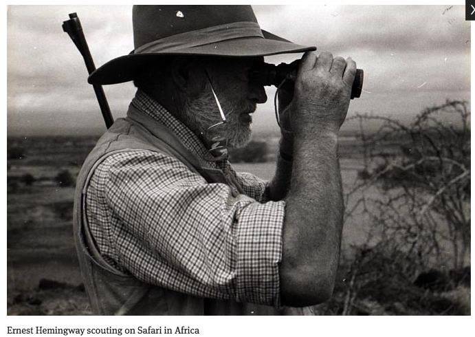
Original at Mansfield College Library, Oxford University
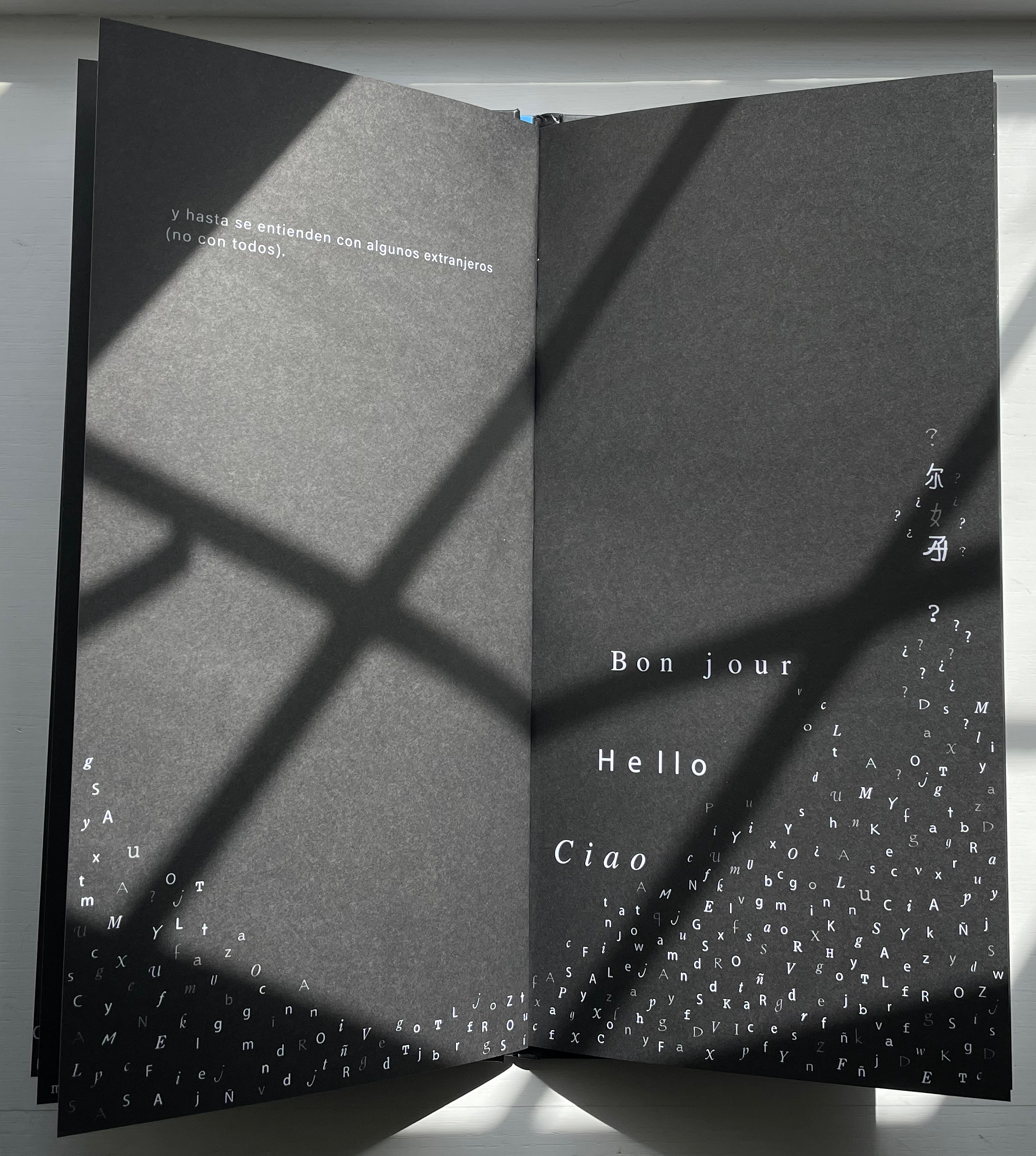
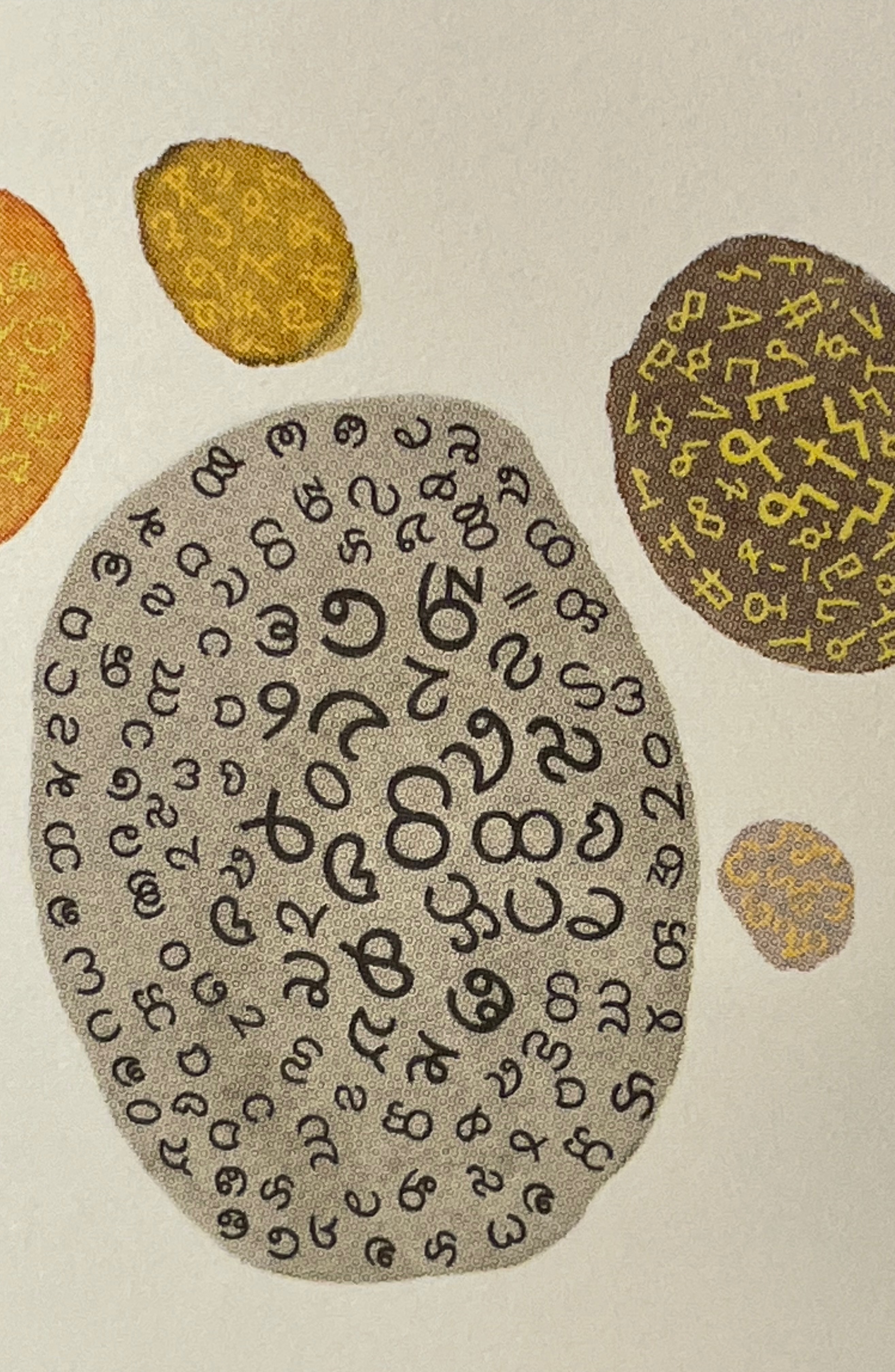
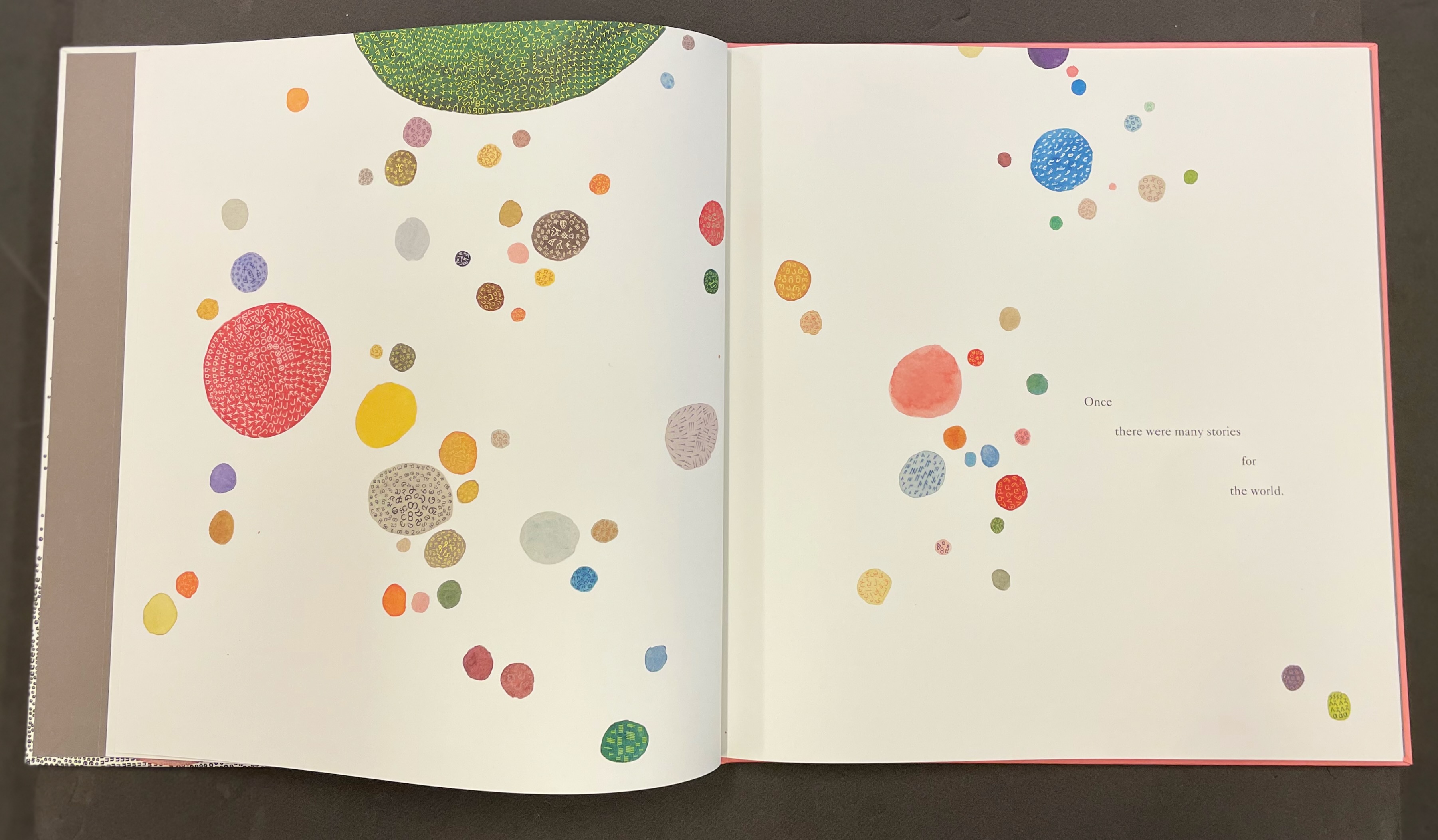
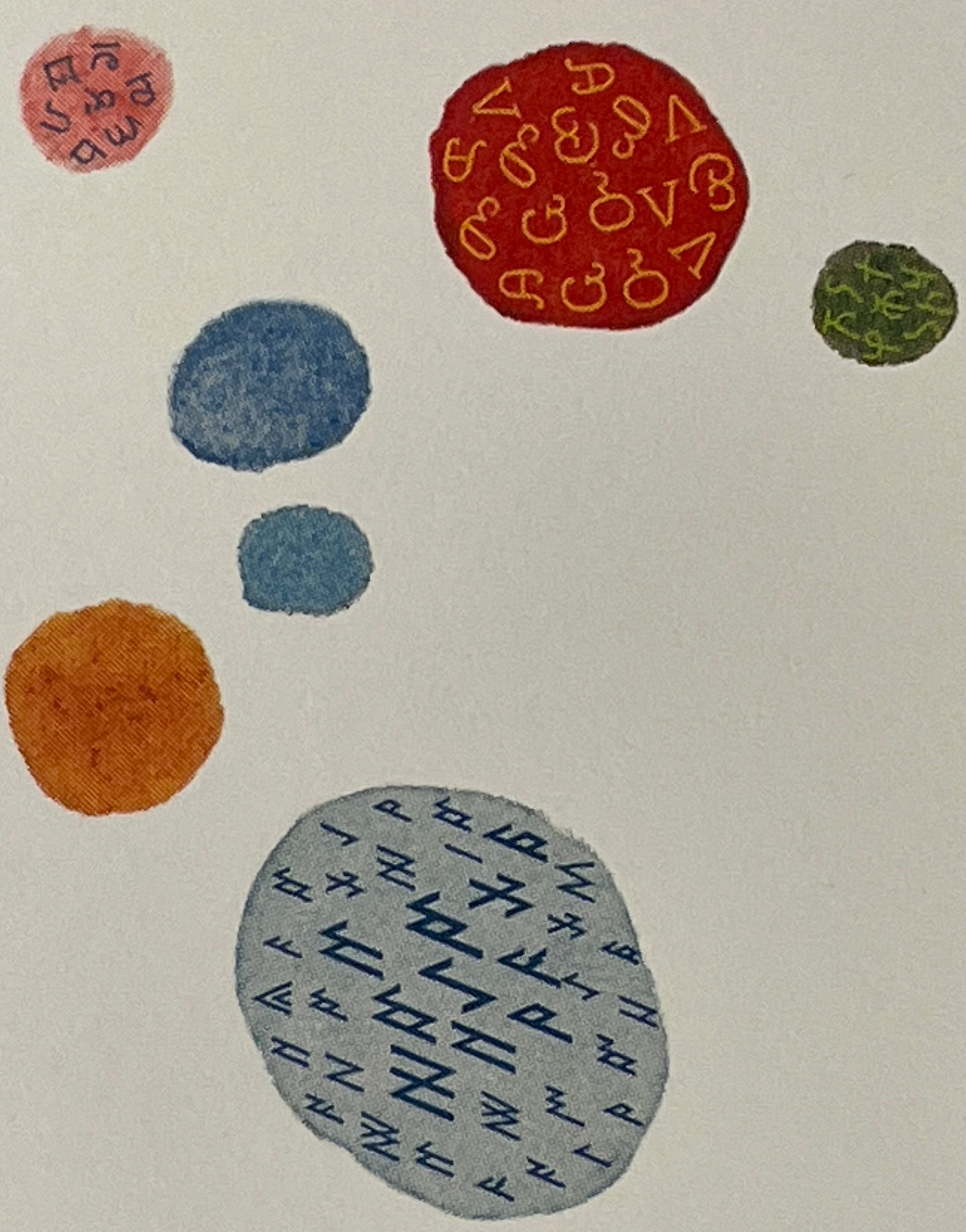
Even in 1799 several of the alphabets displayed by Fry represented extinct languages. Today the Endangered Alphabets Project initiated by Tim Brookes aims rescue languages and their alphabets from that fate. Brookes’ project inspired Sam Winston’s story. More forcibly than Drucker and Dukes, Düsterhöft identifies the imperialist and Western perspective in Fry’s endeavor. Winston’s fable is populated with “story characters”, drawn as various sized and colored blobs, each filled with its distinguishing alphabet. Some are filled with hieroglyphic dogs (presumably for Egyptian shaggy-dog stories), others with Greek, Cherokee and so on. The one story that decides it is the “One and Only story” is filled with the English (Latin or Roman) alphabet and proceeds to eat up all the others.
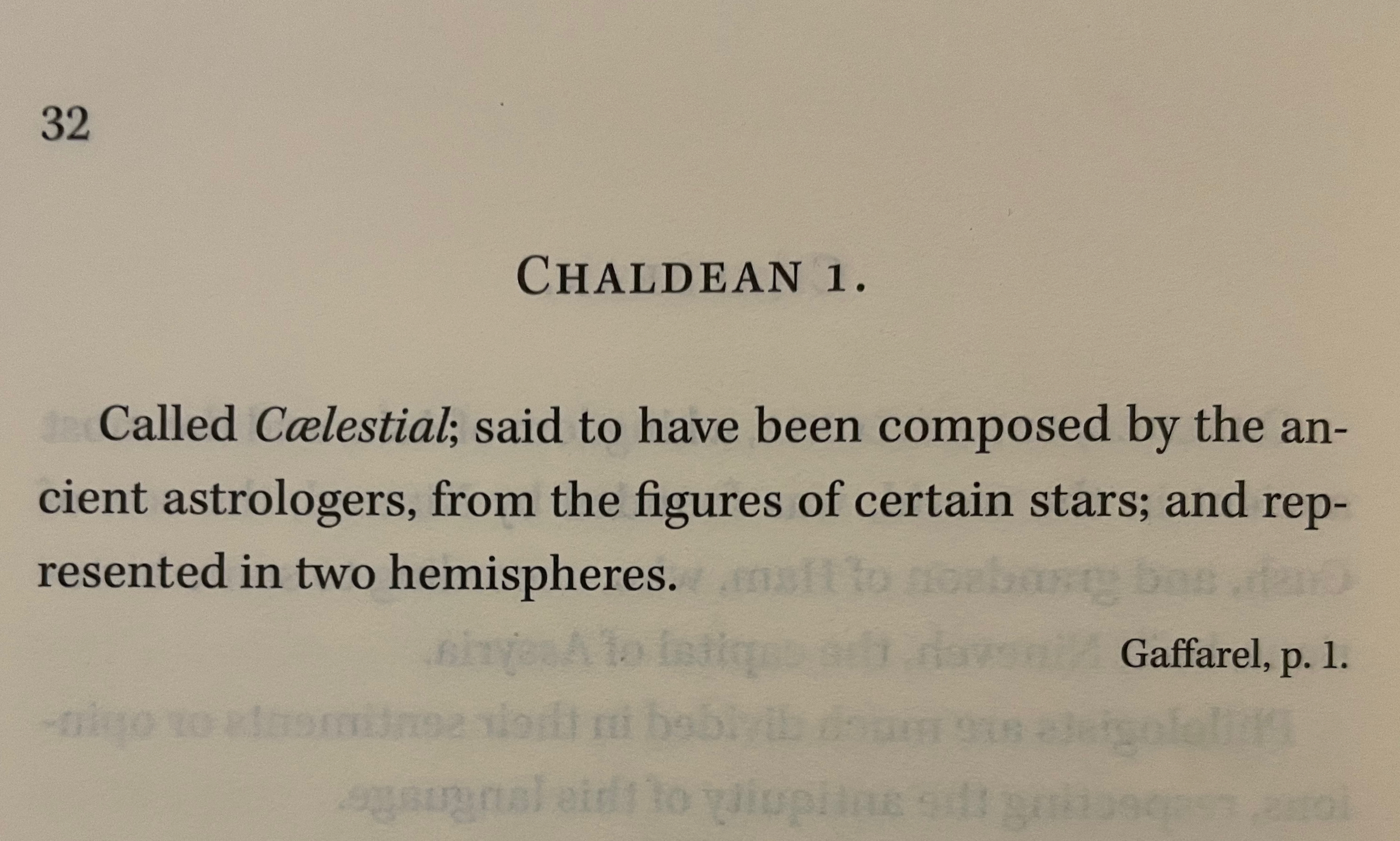
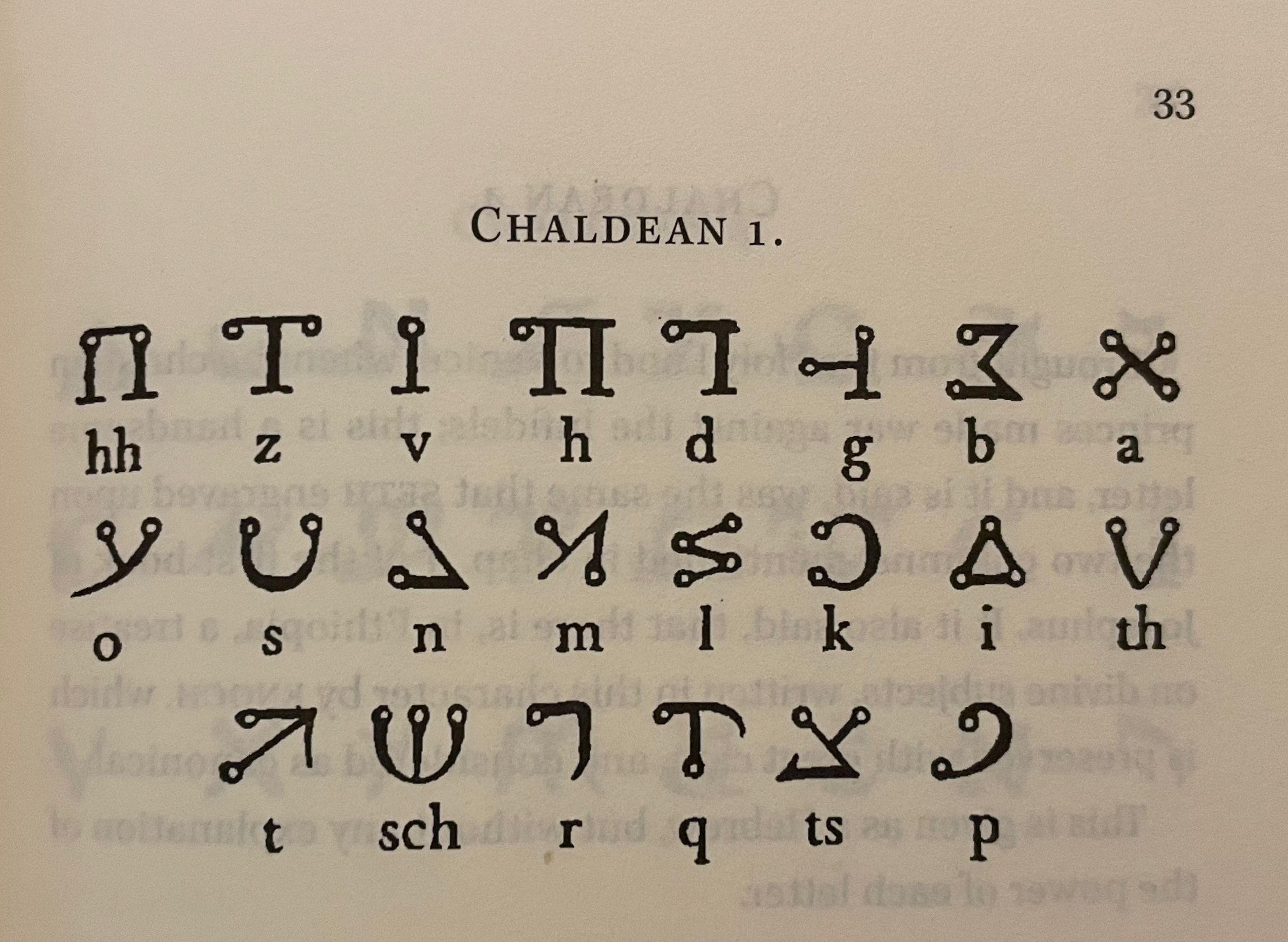
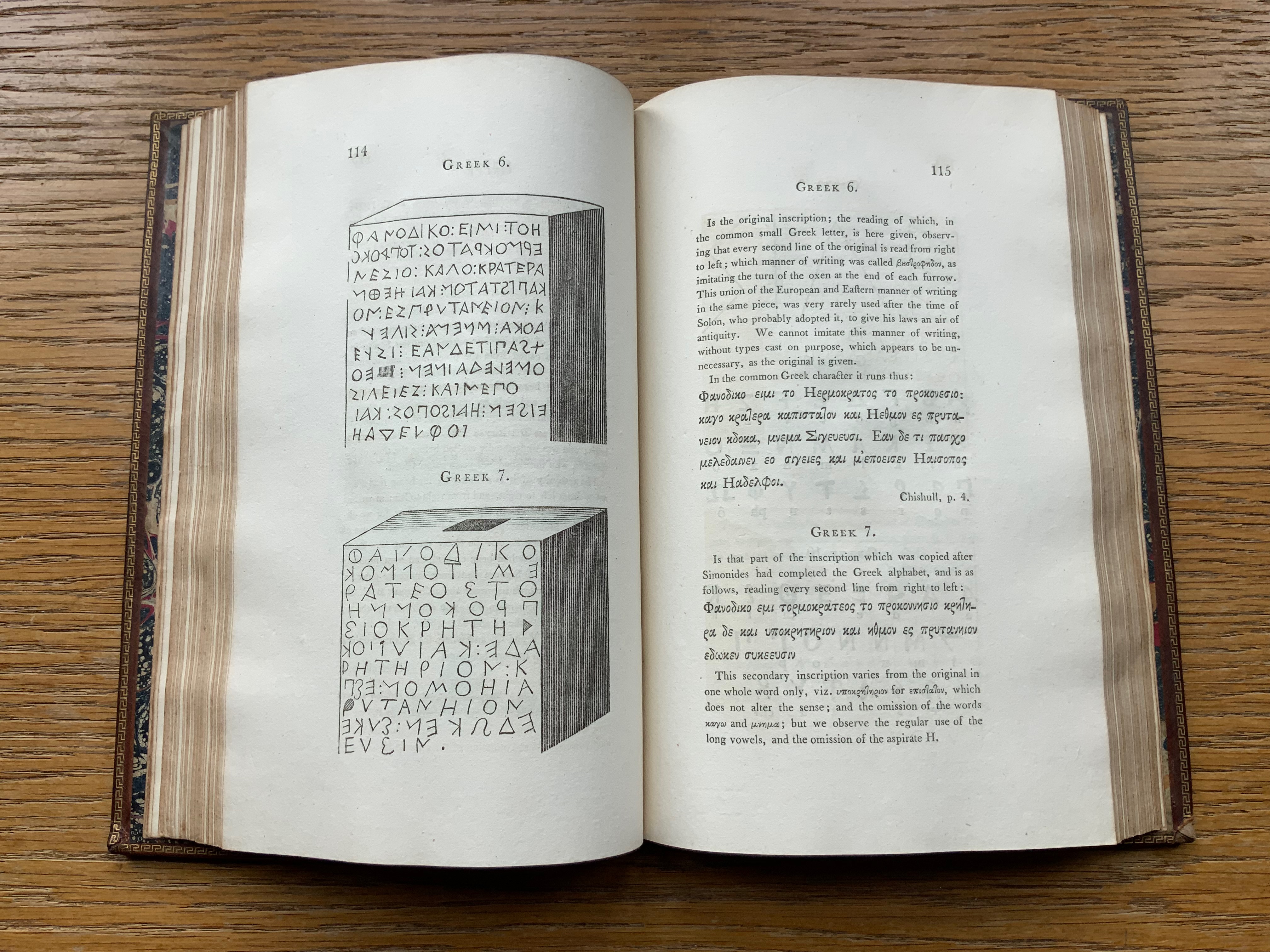
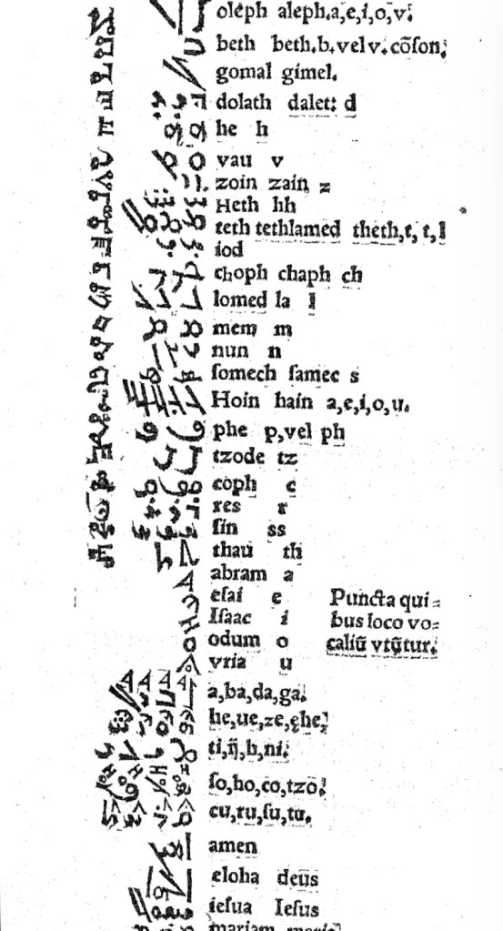
In Pantographia, Chaldean, one of the extinct languages, is a special case, not because Fry includes 20 variant specimens (Greek has 39) but because it is reportedly celestial. The first of Fry’s cited sources for this alphabet is Jacques Gaffarel (1601–1681), a French scholar and astrologer. A bit of digging reveals the source to be more precisely a woodcut from a 1650 translation of Gaffarel’s Curiositez inouyes sur la sculpture talismanique des Persans, horoscope des Patriarches et lecture des estoiles (1629).
In addition to its astrological character, Gaffarel’s work sits in the traditions of gematria, the Kabbalah and alchemy, which Johanna Drucker has thoroughly explored in Alphabetical Labyrinth (1999) and Inventing the Alphabet (2022). Among the earlier contributors to these traditions is Heinrich Cornelius Agrippa. Like his mentor Johannes Trithemius, Agrippa was a polymath, occultist and theologian as well as physician, legal scholar and soldier. The Latinized Hebrew letters and their corresponding characters in the celestial alphabet seen below come from Agrippa’s De occulta philosophia (1533), which is more legible than Gaffarel’s above.
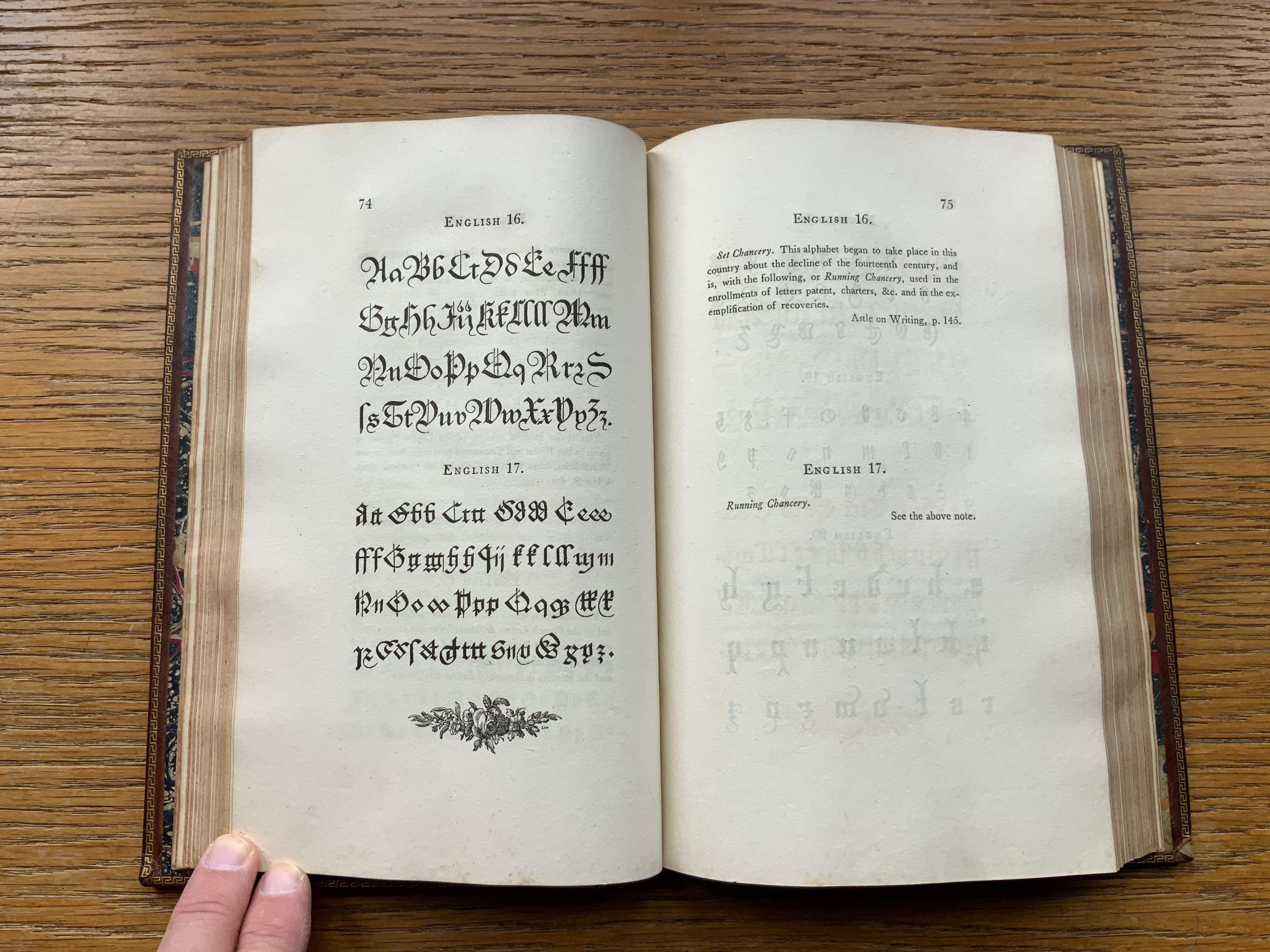
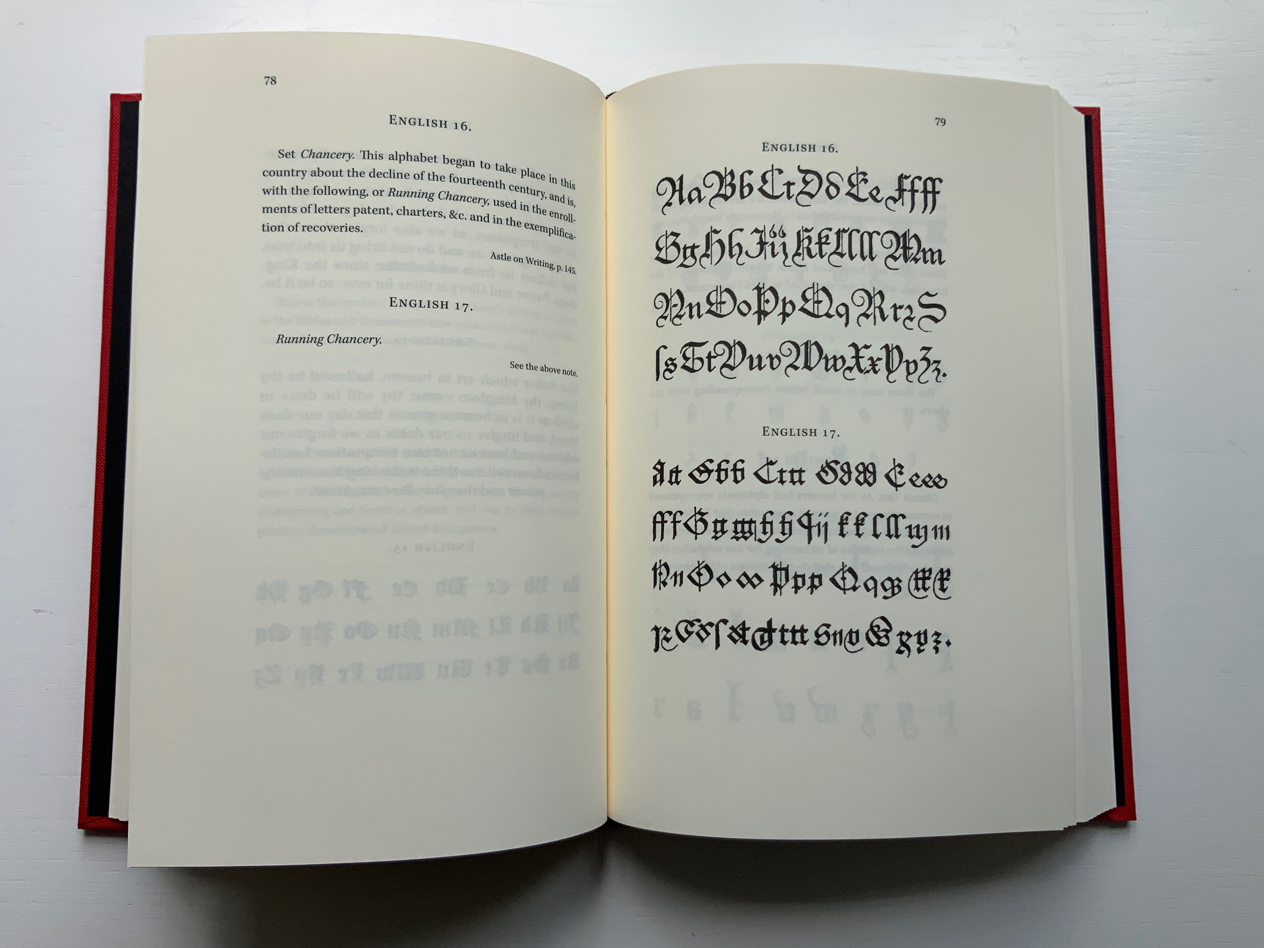
Black Letter Press issued this edition in 2022. As indicated in the caption at the head of this entry, considerable attention to materials was given, including blind debossing and hotfoil printing on the front and spine. The edition is not a photographic facsimile; rather it has been scanned and phototypeset. Scanning in lieu of resetting does not eliminate errors, even if the scan is reviewed carefully. Aside from occurrences of “mod” instead of “most”, “mall” instead of “shall”, and “2ist” instead of “first”, though, the most unusual variation from the original is the deliberate movement of openings on the verso to openings on the recto and, in the specimen section, the reversal of all verso and recto pages. On his verso pages, Fry placed the specimen, and on the recto pages, he placed comments, explanations and sources. For Black Letter Press, the reverse seems to have made more sense. Below are comparisons of pages from the original (left) and the Black Letter Press edition (right).
Left: 1799 original. Right: Black Letter Press facsimile.
Most uncaught scanning errors leap out, so despite the niggling worry about accuracy, the greater legibility and probable accessibility of the 2022 edition is welcome for explorers of alphabets and alphabet-related works. For the Books On Books Collection, its enhancement of the pleasure in Winston’s and Satin’s works and others such as Golnar Adili’s BaaBaa Aab Dad, Islam Aly’s 26 Letters and Ben Shahn’s The Alphabet of Creation (1954), it is more than welcome.
Another 25 images of Fry’s original edition can be found here, courtesy of The Letterform Archive.
Drucker Johanna. 2022. Inventing the Alphabet : The Origins of Letters from Antiquity to the Present. Chicago: University of Chicago Press. Not just another in the long line of histories of the alphabet, rather it explores “Who knew what when about the alphabet?” How did the way they knew it affect how they imagined its identity and origin? For Drucker, Pantographia marks an endpoint and transition. These printed compendia of alphabetic scripts began in 1518 with Johannes Trithemius. Initially spurred by interest in the occult as well as exotic and ancient scripts and a search for the “original” alphabet, compendia gradually became more secular but still eclectic. By 1799, Fry ‘s was an exception by still including the Celestial Alphabet and citing sources in trackable ways. Simultaneously an investment in imagination and a significant step forward for scholarship.
Dukes, Hunter. 10 October 2023. “Pantographia: A Specimen Book of All the Alphabets Known on Earth (1799)“. Public Domain Review. Dukes, editor of the Review, celebrates Pantographia‘s iconic presence in the public domain. In his celebrating, Dukes also notes the presence of the Celestial Alphabet in Pantographia and Drucker’s singling out Fry for taking the antiquarian compendium of alphabets to the earliest stage of specialized, professional research. He also surrounds Fry’s effort with other interesting direct and indirect contexts: the discovery of the Rosetta stone in the same year as Pantographia’s publication and the extinction of several of the languages that Fry’s alphabet represents.
Düsterhöft, Jan. 2022. “Foreword”. In Fry, Edmund. 1799. Pantographia, Containing accurate Copies of all the known Alphabets in the World.Turin, Ialy: Black Letter Press. A German academic now affiliated with the Georg Eckert Institute, Düsterhöft also raises the point about extinction and relates it to the West’s imperial colonial perspective, which Fry displays in his omissions and dismissal of the Chinese mind’s intellectual and rational capacity “as evidenced” by the lack of an alphabet. Düsterhöft also identifies Gaffarel’s source for the celestial alphabet: Guillaume Postel ‘s Linguarum Duodecim Characteribus Differentium Alphabetum Introductio [An Introduction to the Alphabetic Characters of Twelve Different Languages] (1538). Postel (1510 – 1581) was a polyglot French linguist, astronomer, Christian Cabalist, and diplomat.
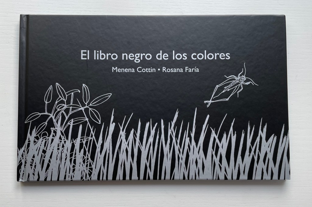
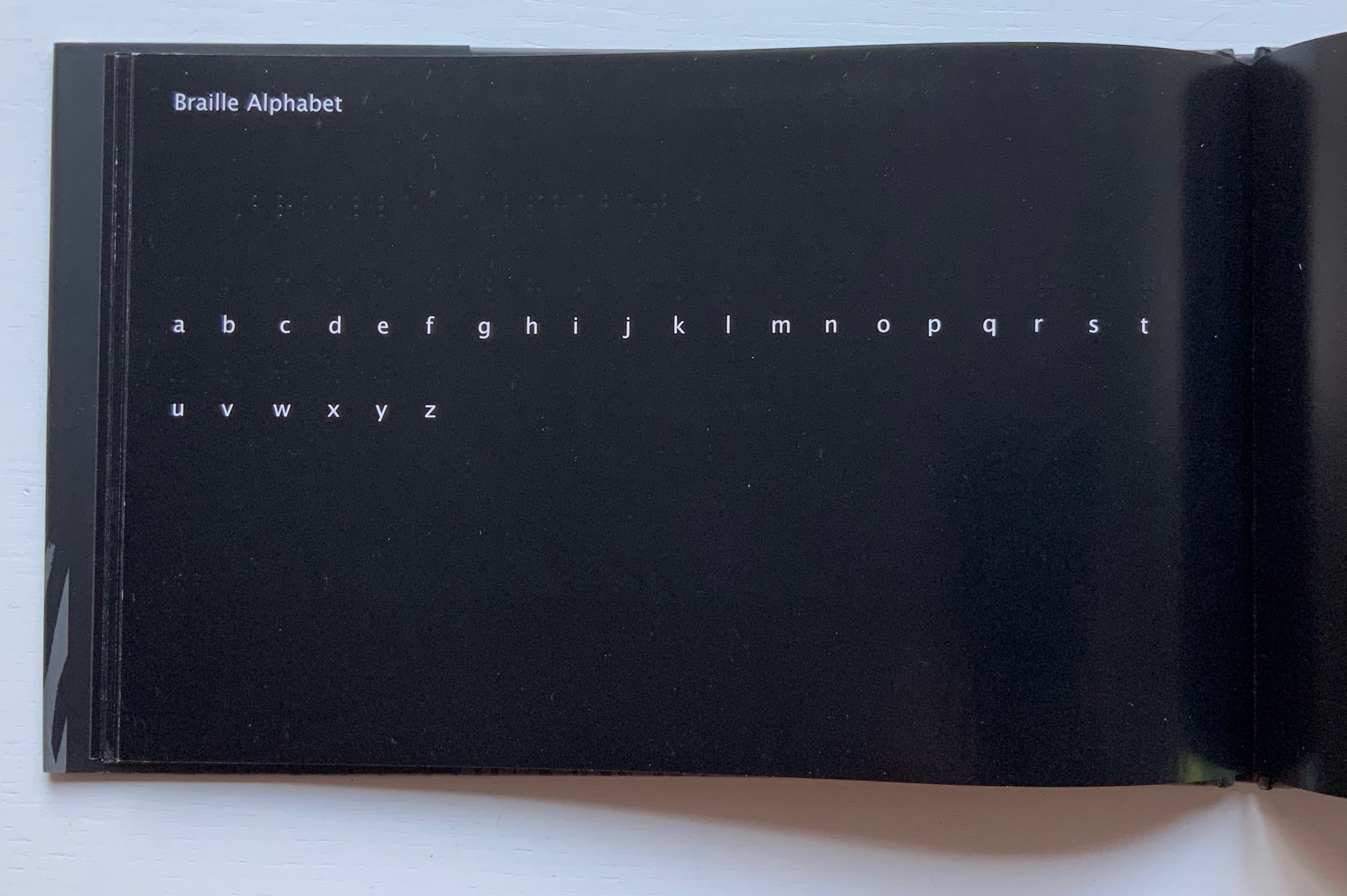
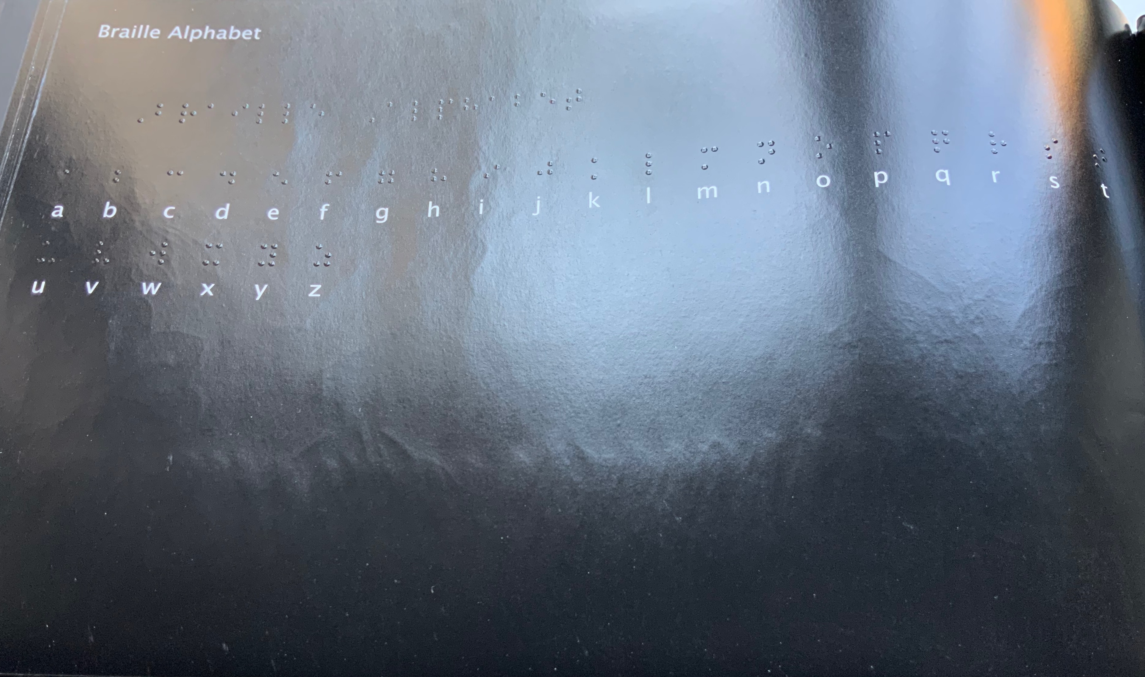
Menena Cottin refers to her works as “concept books”, and there are multiple concepts at work in The Black Book of Colors. Generically, it is a children’s book introducing the reader to colors — but by the absence of color. In white on black, it addresses sighted readers. In Braille, it addresses unsighted readers. With Thomas, who “likes all the colors because he can hear them and smell them and touch and taste them”, the book introduces to sighted and unsighted readers who are not synesthetic the concept of synesthesia and, through it, a new sense of empathy and imagination. The sighted encounter someone with a sensory anomaly, not a disadvantage. In the company of their imagined unsighted co-readers, the sighted may come to empathize with those with sensory differences. The unsighted encounter someone whose sensory anomaly is an advantage. especially as the book favors their own heightened sense of touch.
Thomas says that yellow tastes like mustard, but is as soft as a baby chick’s feathers.
Thomas likes all the colors because he can hear them and smell them and touch and taste them.
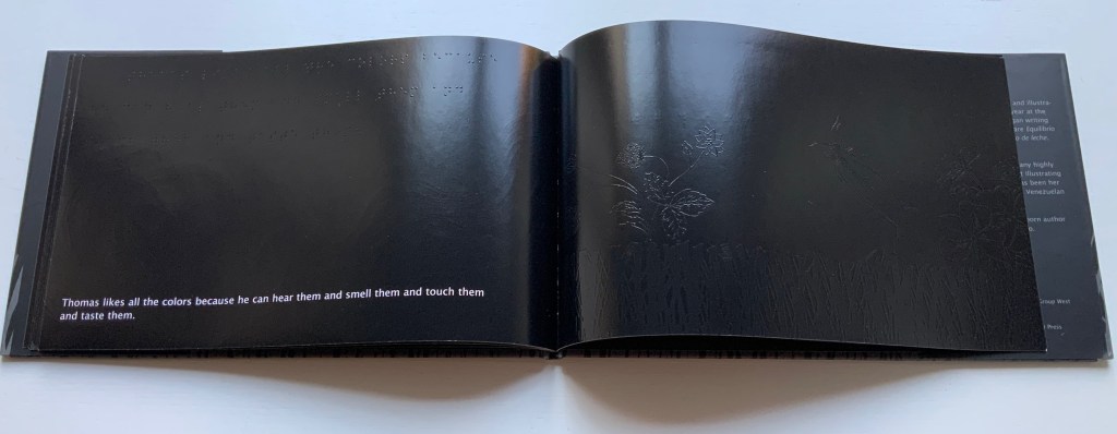
Breaking boundaries in ways similar to those employed by book artists, Cottin manipulates character and narration, also the picturebook’s genres of color recognition and letter recognition (Braille in this case) as well as some of the basic elements of the book (layout, printing in reverse-out and debossed printing). In one of the most sophisticated examples of this, double-page spreads fuse concepts by turning a rainbow into a gathering of raised images of the synaesthetic objects with which colors have already been associated in the book (chick’s feathers, strawberries, leaves).
And when the sun peeks through the falling water, all the colors come out, and that’s a rainbow.
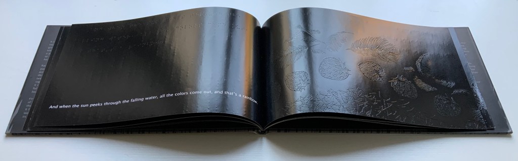
The Black Book uses synesthesia to go beyond the color recognition genre to introduce more complex concepts: the nature of light and water’s lack of color, taste and smell. This stepping outside the genre is another example of the boundary-breaking that artists’ books often perform.
Thomas thinks that without the sun, water doesn’t amount to much. It has no color, no taste, no smell.
The book ends by asserting its membership in the alphabet book genre by presenting the alphabet in lowercase white on black and in Braille. Across from this verso page, there is no set of raised images on the recto page as there has been so far throughout the book. Knowing from touch that this is the end of the book and noting the absence of any image, sighted and unsighted readers might find this coda a prompt to return to the beginning and “re-read” the images with a greater reliance on touch.
Other books in the Books On Books Collection worth comparing with The Black Book of Colors are
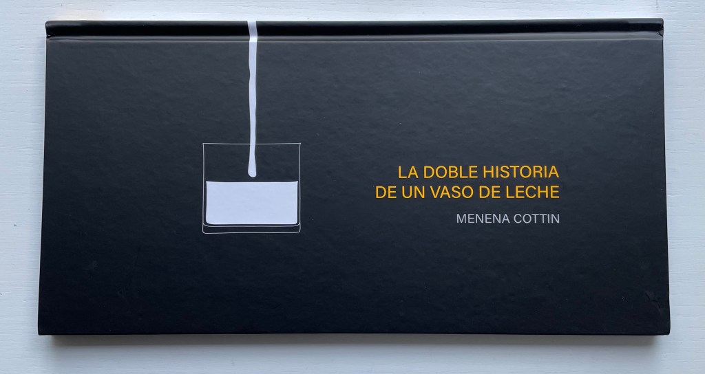
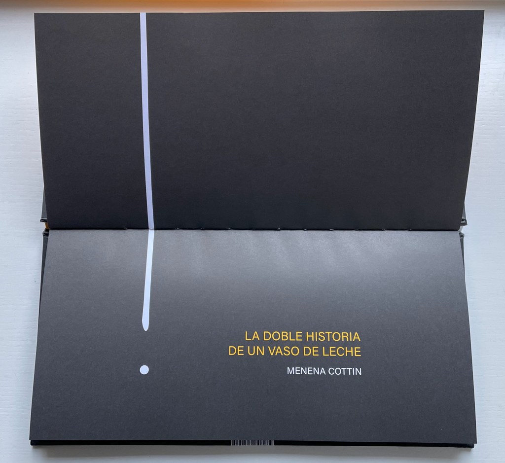
La Doble Historia de un Vaso de Leche(2019) Menena Cottin Casebound landscape, paper over boards, with orange-yellow doublures, sewn. H160 x W310 mm. 24 unnumbered pages. Acquired from the artist, 2022. Photos: Books On Books Collection.
The Double Story of a Glass of Milk opens and closes with a line that echoes the start of William Carlos Williams’ “The Red Wheelbarrow” but is at once more straightforward and just as surprising — as the visual story spills out.
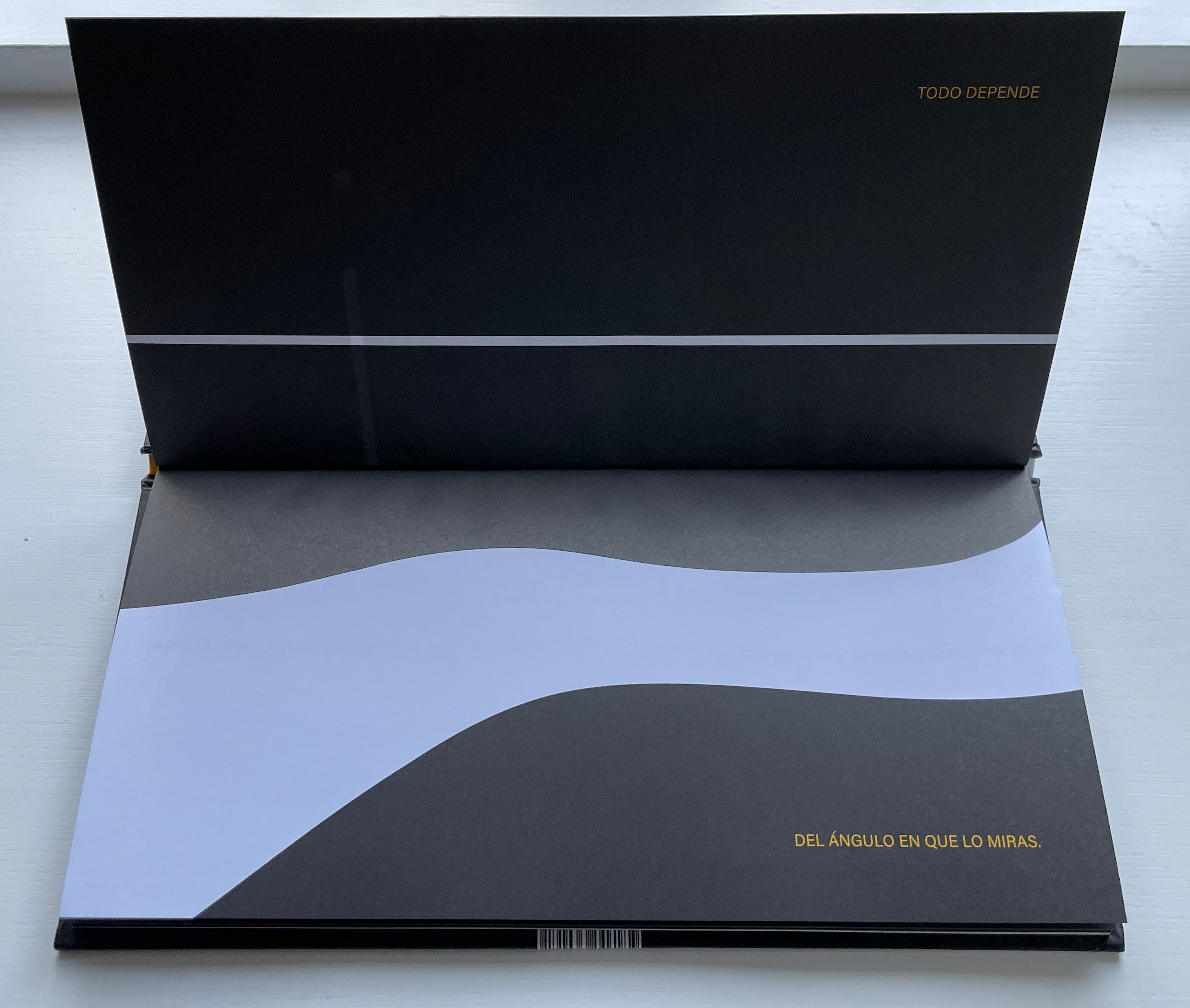
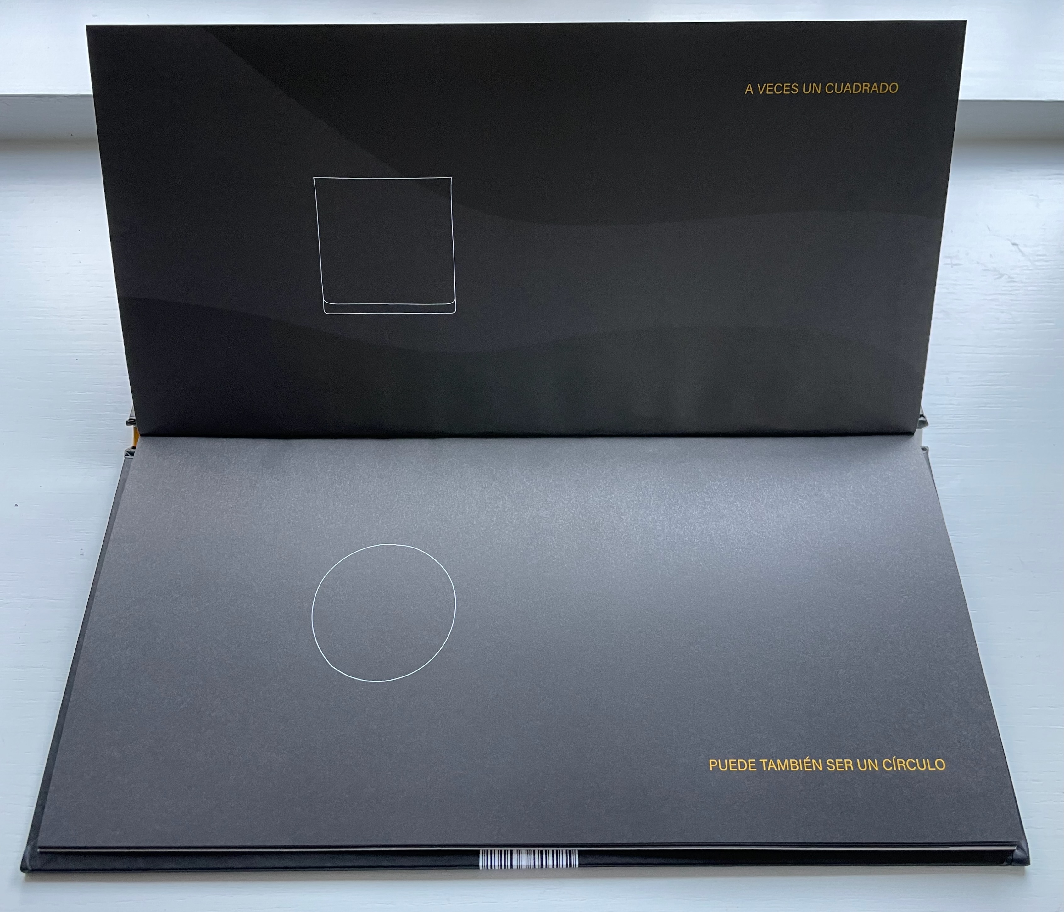
Todo depende del ángulo en que lo miras. A veces un cuadrado puede también ser un circulo y una larga linéa luce como un punto y algo que está solo a medias parece que está lleno. Un mismo cuerpo tiene diferentes caras per a veces te confunde mostrándote una misma forma. Solo si miras a su alrededor descubres que … eso que de frente parece tan discreto desde arriba luce muy escandaloso. Todo depende del ángulo en que lo miras.
“Everything depends on the angle from which you look at it. Sometimes a square can also be a circle and a long line looks like a dot and something only half full looks full. The same body has different faces but sometimes it confuses you by showing you a different shape. Only if you look you discover that … what from the side looks so innocent looks shocking from above. Everything depends on the angle from which you look at it.”
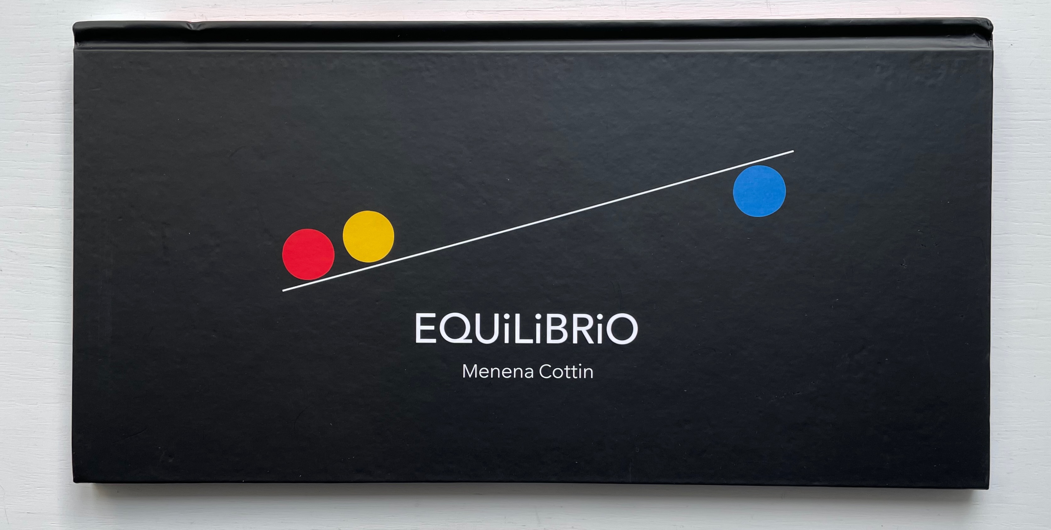
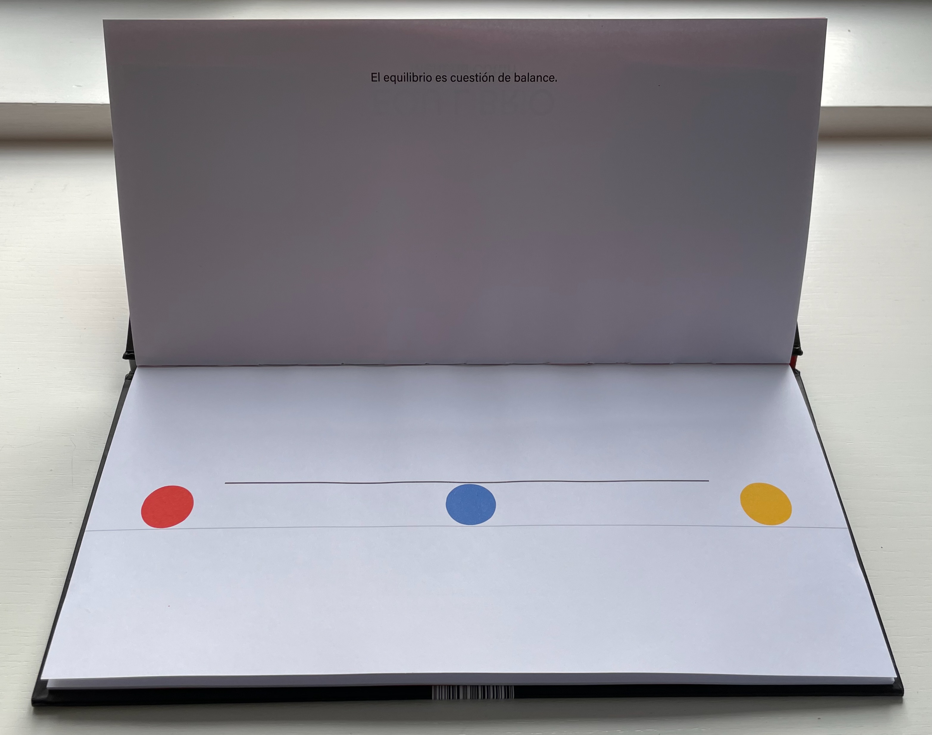
Equilibrio (2019)
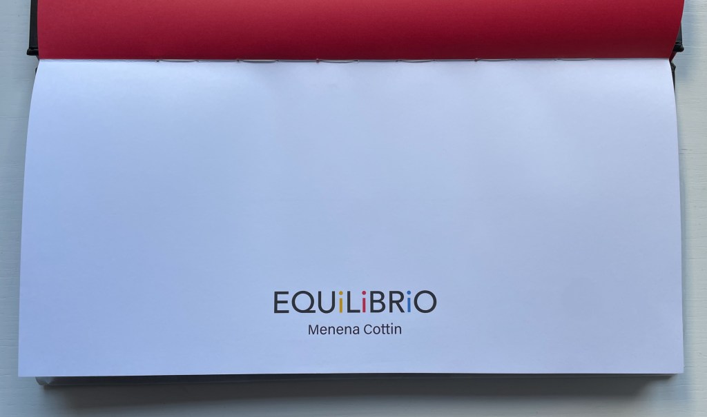
Equilibrio(2019) Menena Cottin Casebound landscape, paper over boards, with red doublures, sewn. H160 x W310 mm. 25 unnumbered pages, last page on inside of flyleaf. Acquired from the artist, 23 August 2022. Photos: Books On Books Collection. Displayed with the author’s permission.
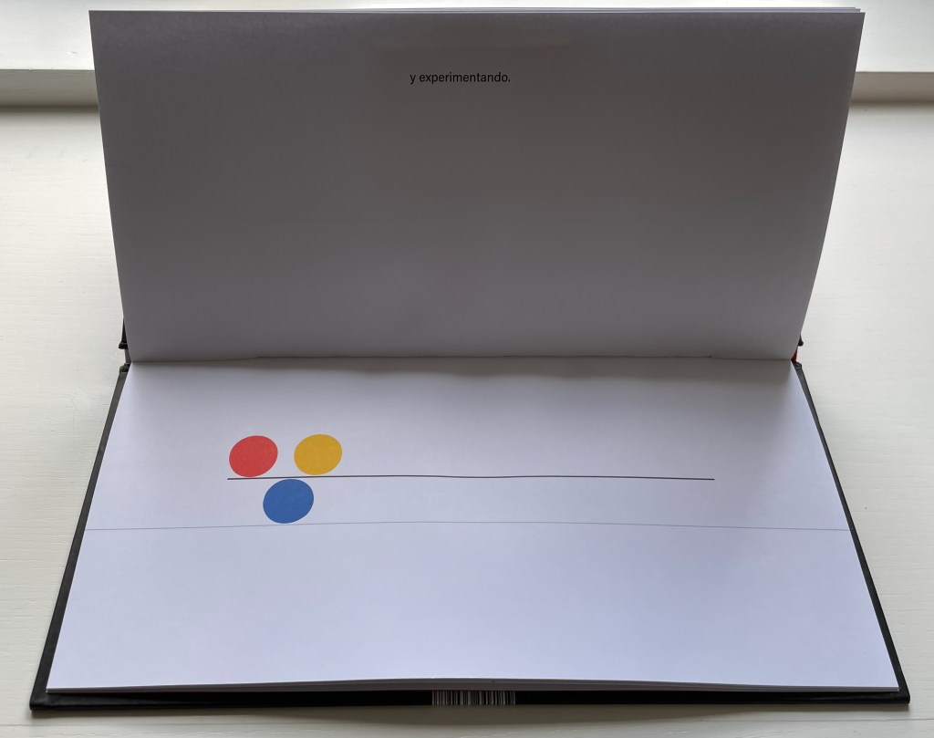
The three colored balls on the cover give their colors to the three i’s in Equilibrio on the title page, announcing the statement to come: El equilibrio es cuestión de balance (“Equilibrium is a question of balance”).
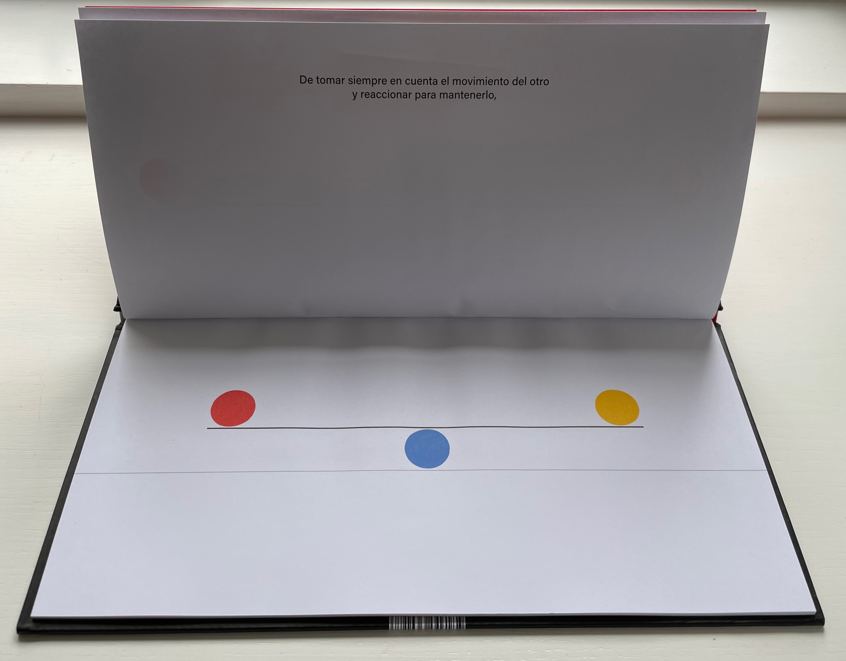
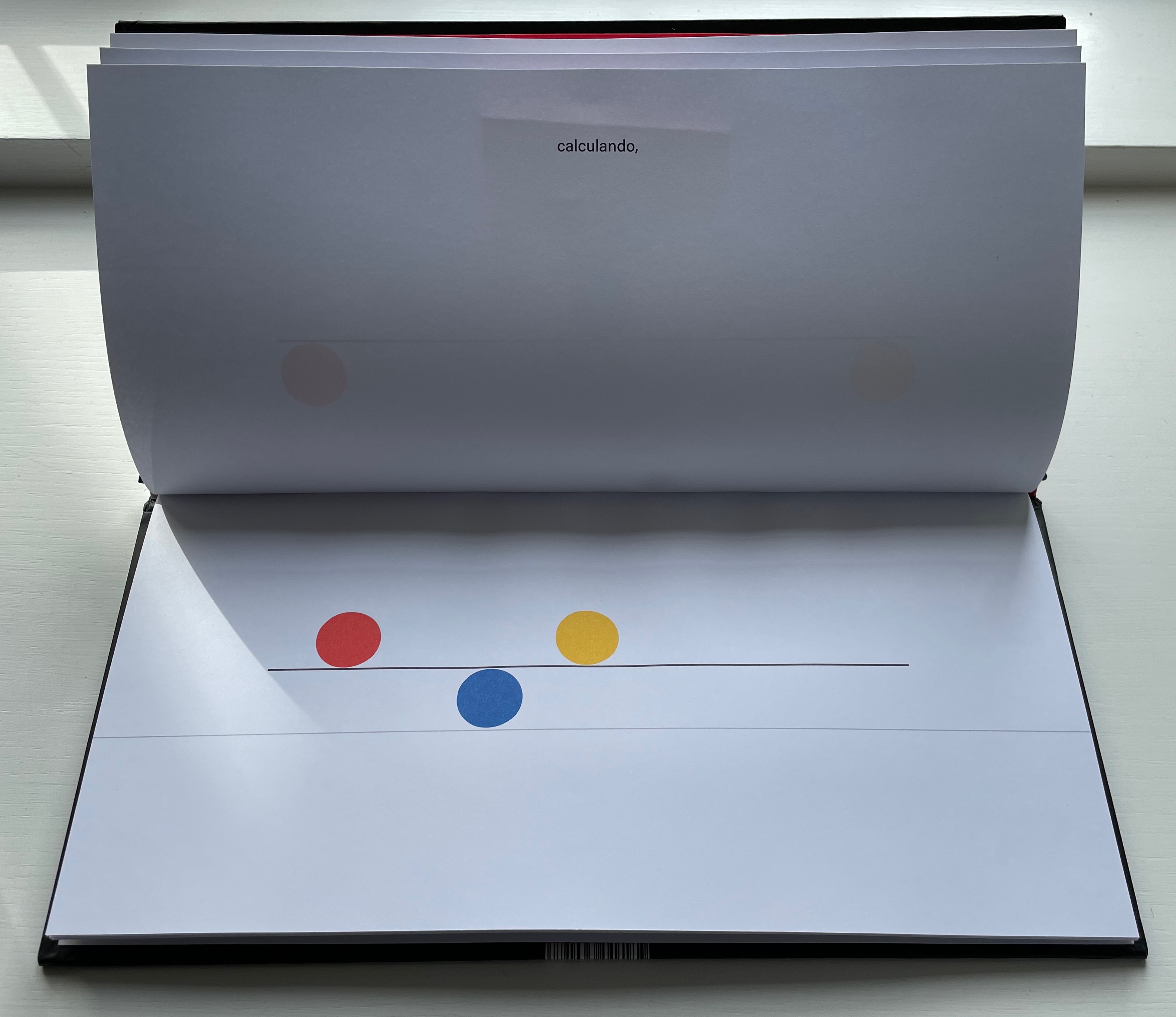
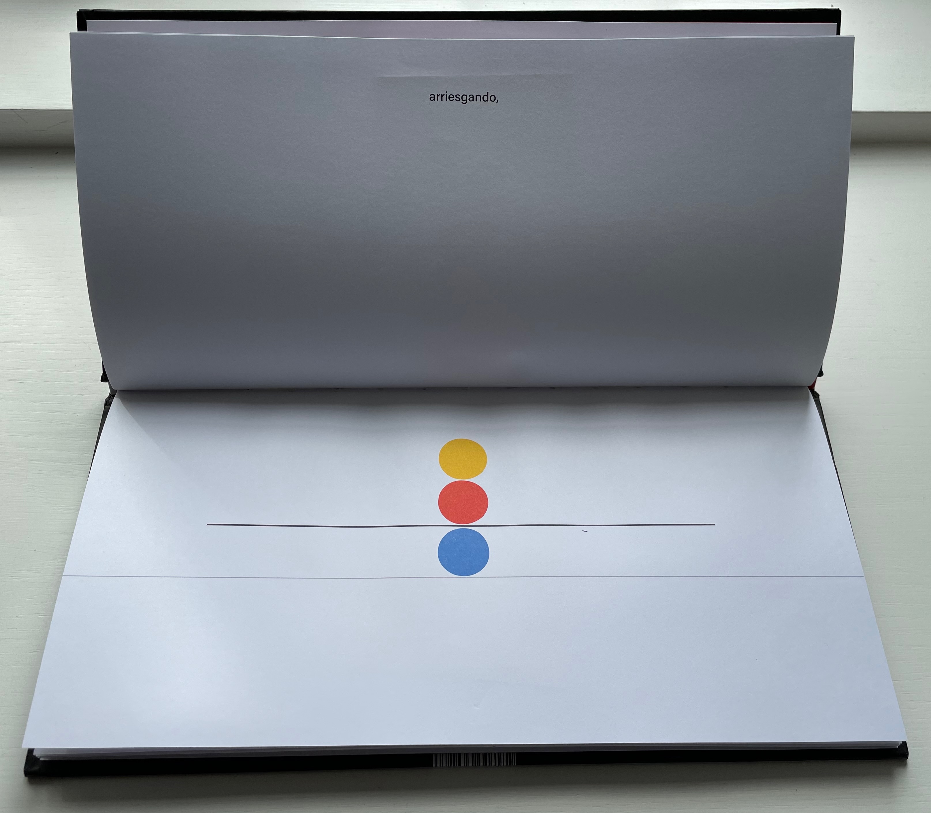
El equilibrio es cuestión de balance. De tomar siempre en cuenta el movimiento del otro y reaccionar para mantenerlo, calculando, arriesgando, y experimentado. Algunos se ponen a jugar sin pensar en las consecuencias entonces se rompe el equilibrio y cada quien hace lo que quiere … pero luego sienten deseos de regresar y cada quien busca su lugar.
“Equilbrium is a question of balance. Of always taking into account the movement of the other and reacting to maintain it, calculating, risking, and experimenting. Some people start to play without thinking about the consequences, then the balance is broken and everyone does what they want … but then they feel the desire to return and everyone looks for their place.”.
As in The Black Book of Colors, there is more than one concept at play, the lesson of equilibrium coming with lessons in community and relationships.
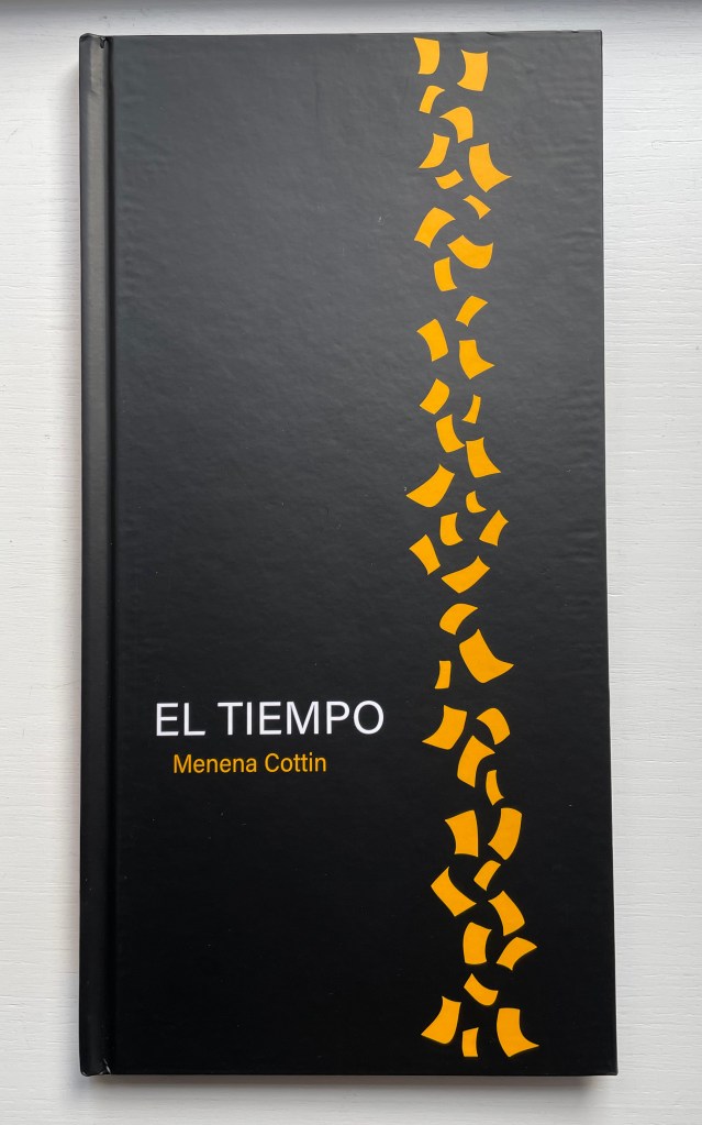
El Tiempo (2018)
El Tiempo (2018) Menena Cottin Casebound portrait, paper over boards, with orange-yellow doublure at front, orange-yellow/black at back, sewn. H310 x W160 mm. 24 unnumbered pages. Acquired from the artist, 23 August 2022. Photos: Books On Books Collection. Displayed with author’s permission.
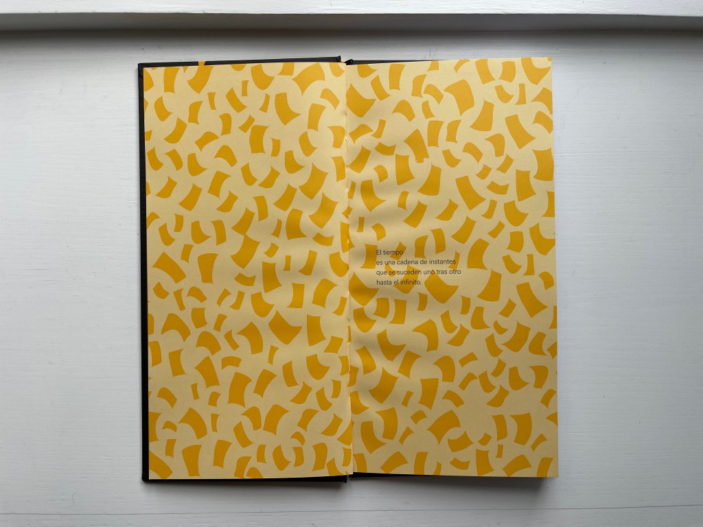
Cottin introduces the concept of Time with two metaphors — one verbal, one visual.
Verbally: El tiempo es una cadena de instantes que se suceden uno tras otro hasta el infinito. [Time is a chain of instants one following another until infinity.] Visually: Instants of time are like pages, pages from a diary.
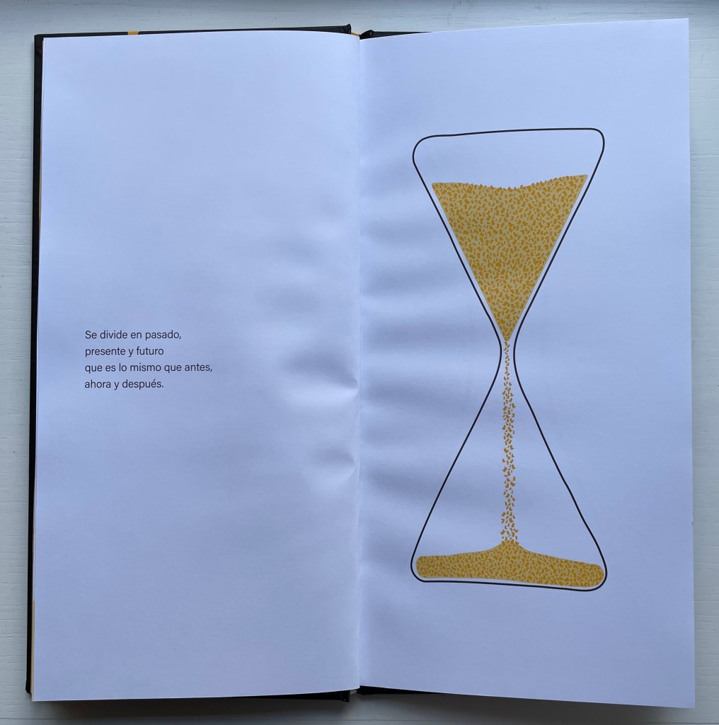
Even in an hour glass, the instants of time are golden pages — Se divide en pasado, presente y futuro que es lo mismo que antes, ahora y después. — [dividing the past, present and future which is the same as before, now and after].
When the future runs out, that is of course when the pages run out, visually and tactilely.
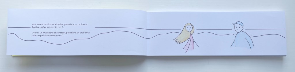
Ana con A, Otto con O (2015)
Ana con A, Otto con O (2015) [Ana with an A, Otto with an O] Menena Cottin Bradel binding with cloth spine, paper over boards, yellow doublures, leaves in Chinese fold. H85 x W260 mm. 42 unnumbered pages. Acquired from the artist, 23 August 2022. Photos: Books On Books Collection. Displayed with author’s permission.
With this little book, Menena Cottin has secured a place among the Oulipians. Where Georges Perec wrote a novel without the letter E, Cottin has written and created an artist’s book in which the characters have a somewhat opposite challenge.
Ana es una muchacha adorable, pero tiene un problema: habla español solamente con A. Otto es un muchacho encantado, pero tiene un problema: habla español solamente con O. Un domingo por la mañana, en isla de Margarita, Ana sale a caminar por la playa. Otto sale a caminar por la playa. De repente, Ana se tropieza con alguien … –Aah! –Oh!
[Ana is a lovely girl, but she has a problem: she speaks Spanish only with words that have an A. Otto is a lovely boy, but he has a problem: he speaks Spanish only with words that have an O. One Sunday morning, on Margarita Island, Ana goes for a walk on the beach. Otto goes for a walk on the beach. Suddenly, Ana bumps into someone … –Aah! –Oh!]
When they make small talk about the weather, Ana says, Clara mañana [Clear tomorrow] with which Otto agrees, Con sol [With sun]. Ana tries again with a leading Gran playa, la mar calmada … agradar andar acá. [Great beach, calm sea… it’s nice to walk here.], but Otto can only come up with ¡Como, no! [Of course!].
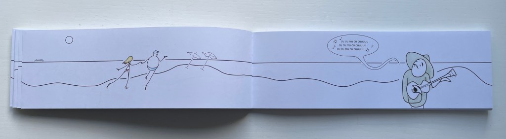
Eventually Otto catches on and proposes they go for a swim. After, as they walk along the beach being serenaded by a guitar-playing singer whose nonsense refrain is with syllables that have only U, Otto invites Ana to lunch at the beachside restaurant El Pez [The Fish]. There they meet the friendly waiter Pepe, who likewise has a problem: he speaks Spanish only with words that have an E. When their meal ends and Otto sees the bill, he grows pale, suspiciously throws himself to the ground, cries out he’s been poisoned, and then runs off with Pepe in pursuit of payment. Poor Ana wanders back down the beach, but bumps into another character, more handsomely drawn and simpatico: Allan with an A. Colorín colorado, as the Spanish say [And that’s the end of this story], but not until the last page where the character who has been lounging in a beach chair all along now stands, revealing her name on her chair — Iris — and holding a sign that reads Fin.
The rule-abiding dialogue strings the reader along as effectively as the horizon line that runs from page to page over the Chinese folded folios from the beginning to the end. It is a design feature that will be much easier to reproduce than will a translation into English or any other non-Romance language that is as delightful as — or as “consonant” with — Ana, Pepe, Iris, Otto and the singer singing
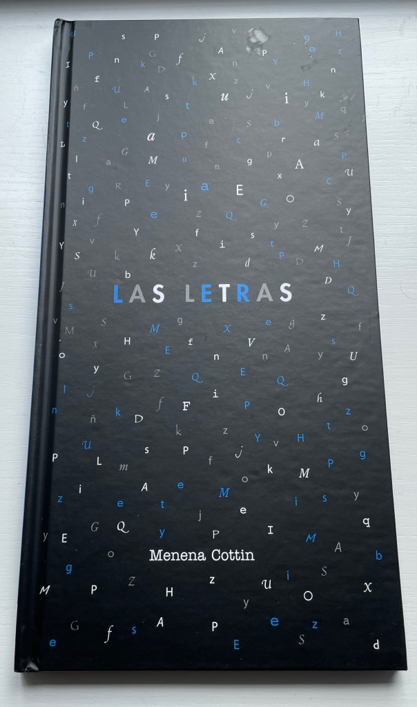
Las Letras (2008/2018)
Las Letras (2018) [Letters] Menena Cottin Casebound portrait, illustrated paper over boards, endpapers. H200 x W205 mm. 24 unnumbered. Acquired from the artist, 23 August 2022. Photos: Books On Books Collection. Displayed with author’s permission.
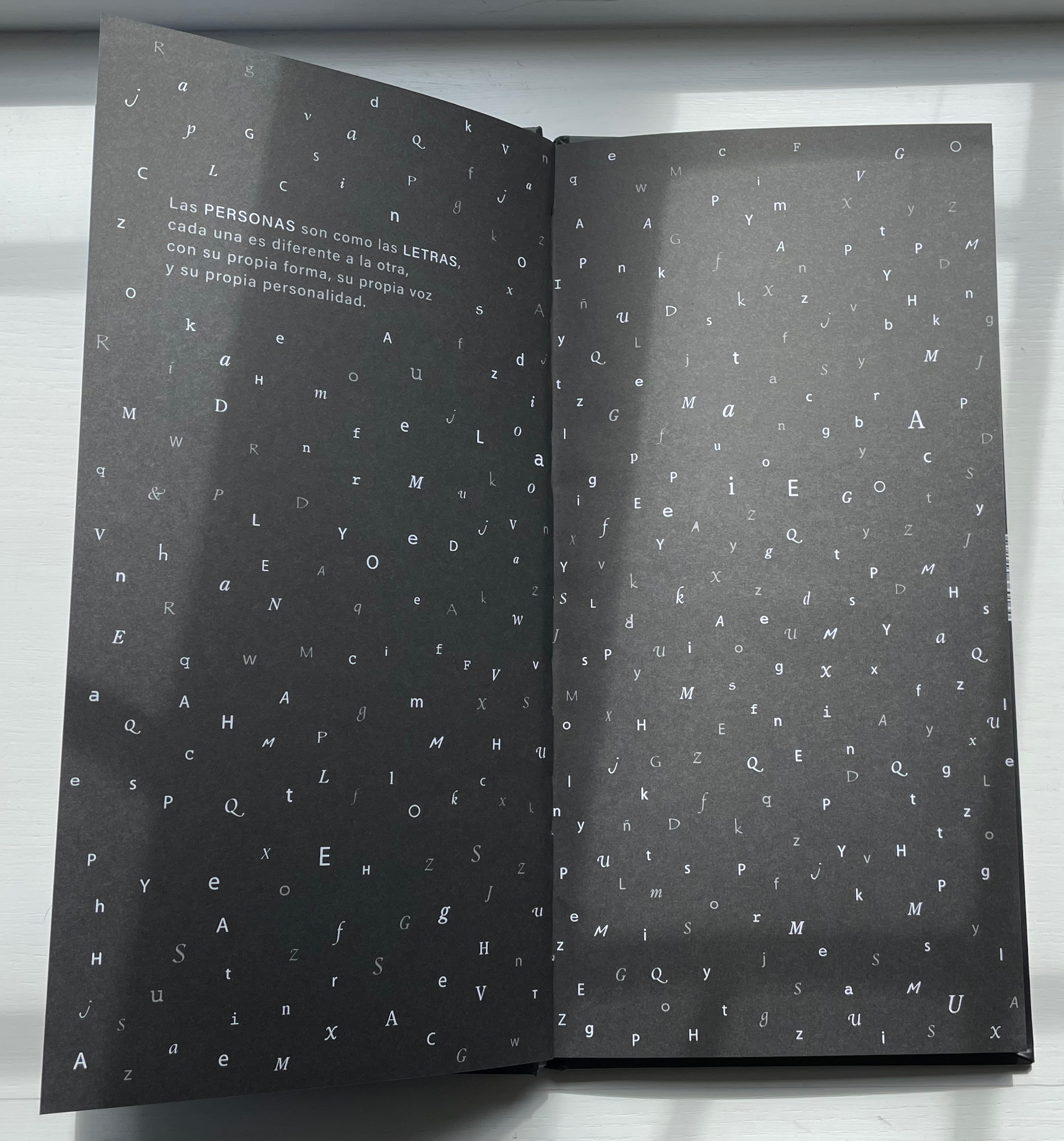
Las Letras has appeared in two editions (2008 and 2018). There are slight grammatical differences, but the meaning remains unchanged. As in Equilbrio, where Cottin finds in an abstract concept a metaphor for interdependence in human relationships, in Las Letras Cottin finds a metaphor for tolerance and communication in the alphabet. Even letters themselves celebrate our differences.
Las personas son como las letras, cada una es diferente a la otra, con su propia forma, su propia forma, su propia voz y su personalidad. Pueden ser gordas, flacas, sencillas o complicados. Algunas son muy populares y se les ve por todas partes, en cambio, a las más tímidas les gusta salir poco. …
[People are like letters, each one is different from the other, with its own form, its own shape, its own voice and its own personality. They can be fat, skinny, simple or complicated. Some are very popular and are seen everywhere, while the shyer ones don’t like to go out much. …]
Other children’s/artists’ books in the Books On Books Collection worth comparing with Las Letras are:
Nikolajeva, Maria, and Carole Scott. 2007. How picturebooks work. New York: Routledge Taylor & Francis Group.
Outlaw, Christopher. 17 April 2017. “FILBo 2017“. The Bogotá Post. Accessed 30 October 2011.
Scott, Carole. 2014. “Artists’ books, Altered books, and Picturebooks”. In: B. Kümmerling‐Meibauer, ed.,Picturebooks: Representation and Narration. London, New York: Routledge.
With 260 illustrated books to his name and 90 of them authored by him, Leonard Everett Fisher would have been remiss not to have contributed works to the category of alphabets and artists’ books.
Leonard Everett Fisher offers thirteen non-English languages — Arabic, Cherokee, Chinese, Cyrillic, Eskimo, Gaelic, German, Greek, Hebrew, Japanese, Sanskrit, Thai and Tibetan — each with an illustrative image alongside a page of background text followed by a double-page spread of hand-drawn characters of the writing system. Unlike Tommy Thompson’s The ABC of Our Alphabet (1952) and William Dugan’s How Our Alphabet Grew (1972), Fisher’s book does not focus on the development of the Latin alphabet, but unusually aims instead to interest the children’s market in the variety of non-Latin alphabets. In this, it is a precursor to Sam Winston’s One & Everything (2022).
The book has no bibliography or indication of sources, and the background text’s few slightly off-center assertions (e.g., that the Chinese writing system is a syllabary) create a slight unease about the accuracy of the character sets. Nevertheless, for calligraphic inspiration, the double-page presentation of consistent hand-drawn character sets delivers strong impressions of the differences in the look and feel among the languages’ writing systems.
The ABC Exhibit (1991)
The ABC Exhibit(1991) Leonard Everett Fisher Dustjacket. Casebound, one-eighth cloth and paper over board. Doublures. Sewn binding. H287 x W225 mm. 32 pages. Acquired from Books End, 28 August 2022. Photos: Books On Books Collection.
The ABC Exhibit emphasizes image more than letter or text. Forgoing other usual features of a children’s alphabet book (such as presenting upper and lowercase letters), the book steers more toward an artist’s book or catalogue of the artist’s style of illustration and art. The colophon even specifies that the original artwork was prepared as acrylics on board. While the image of the elephant and several others can be easily imagined in a children’s book, the rendering of the Brooklyn Bridge in fog stands out as do a sailboat in motion and a still life of oranges.
The book features around the 24′ mark in this interview with the Hennepin County Library in 1991.
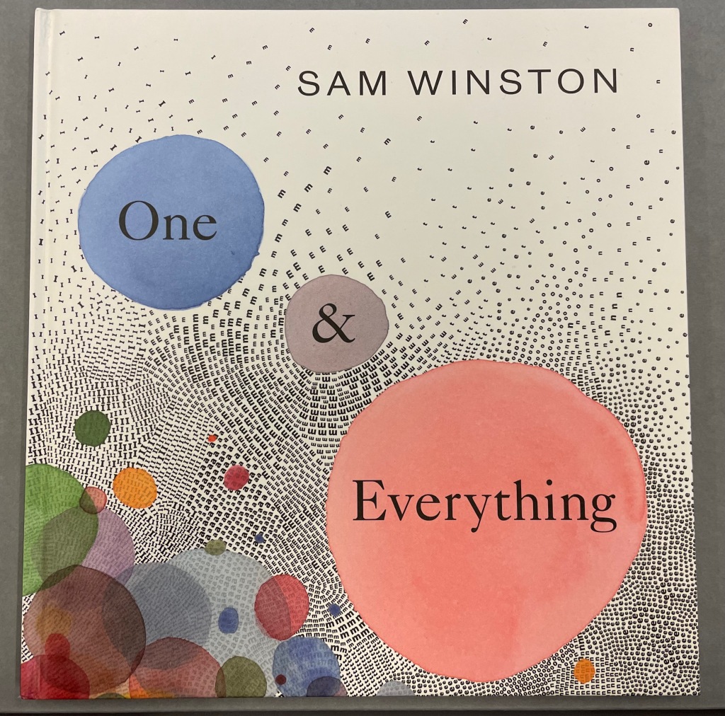
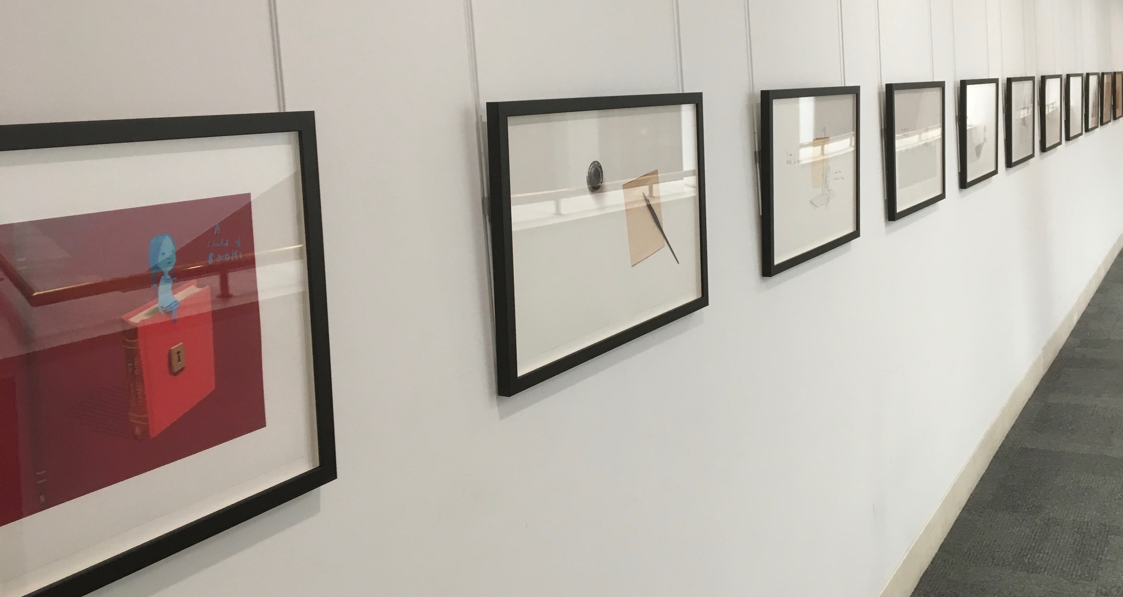
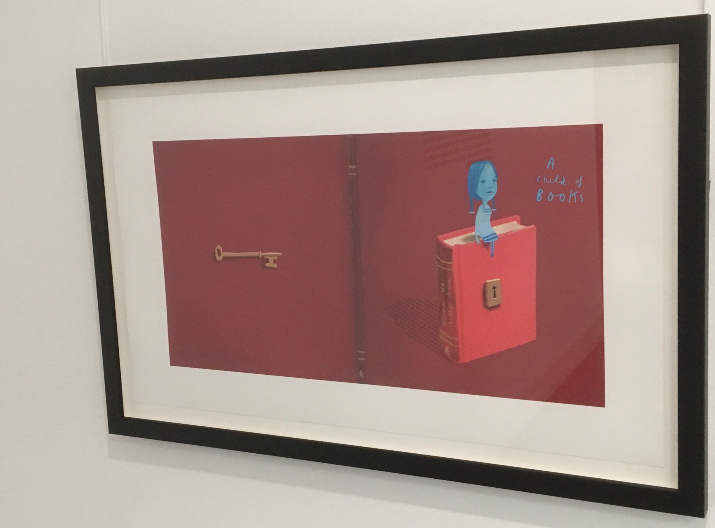
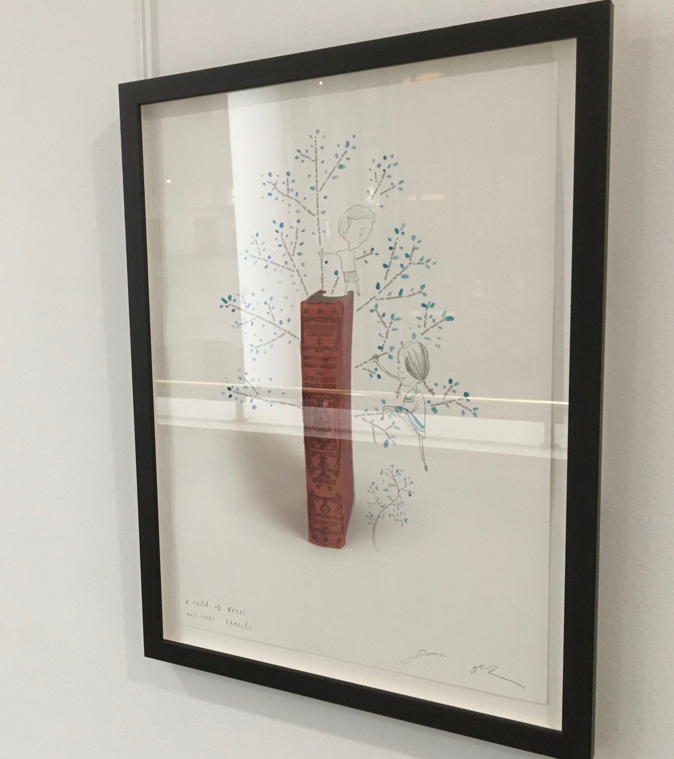
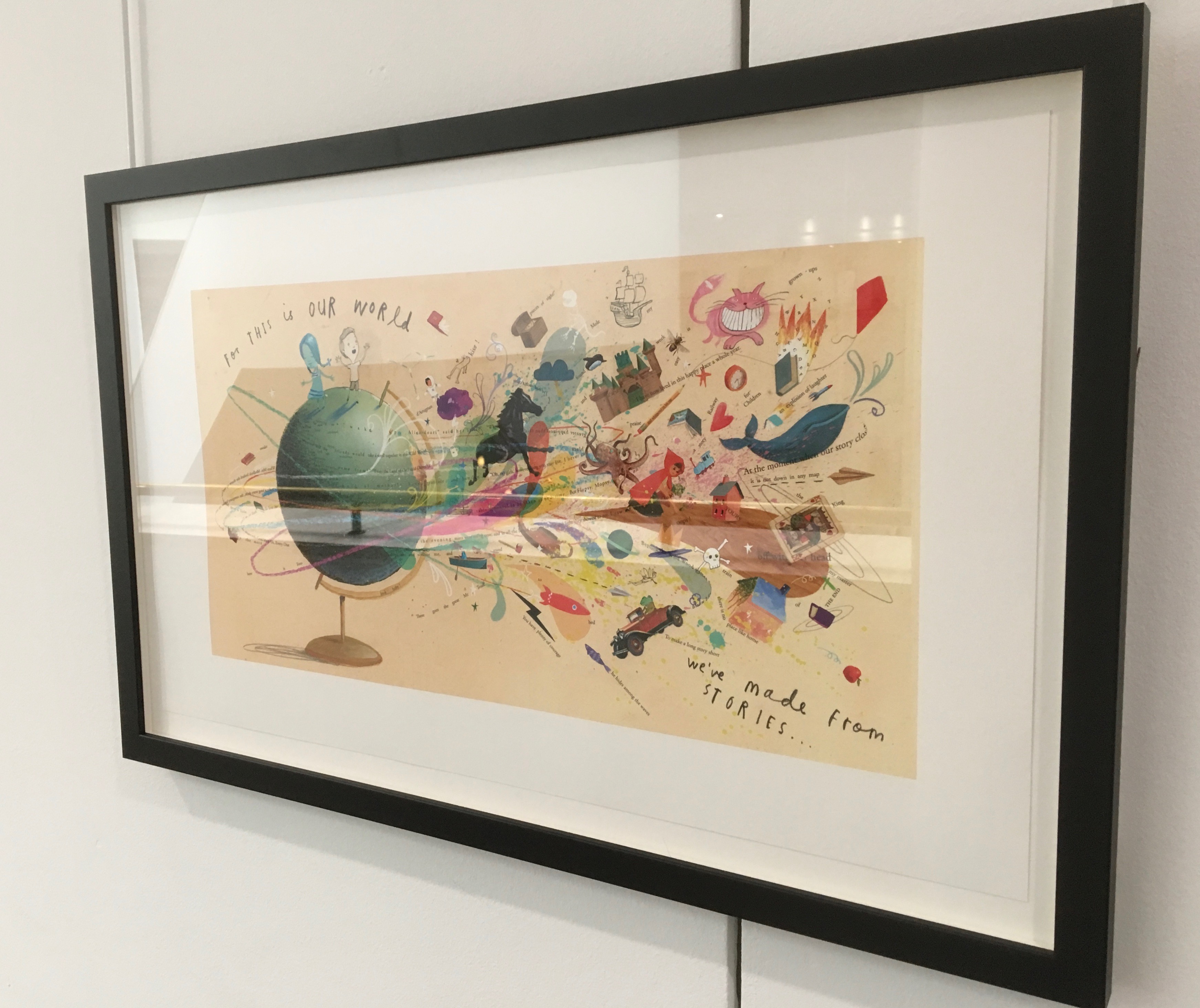
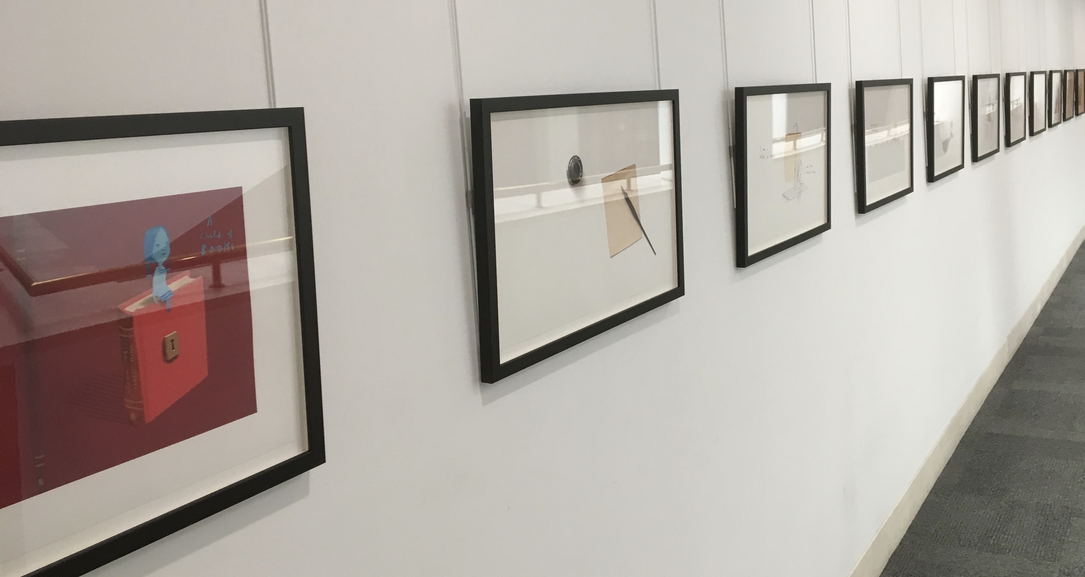
One & Everything(2022) Sam Winston Casebound with illustrated paper over boards. H265 x W255 mm. 48 unnumbered pages. Acquired 23 November 2022. Photos: Books On Books Collection. Displayed with artist’s permission.
Sometimes you just know that you have read a classic. This is one of those times. Winston and Candlewick Press (Walker Books in the UK) have worked a fresh tale, tone and meaning together with image, color, design and production values to an extraordinary level. Inspired by Tim Brookes’ “Endangered Alphabets Project“, Winston uses the striking shapes of letters and scripts from the Latin, Ogham, Cherokee, Armenian, Hebrew, Tibetan and dozens more alphabets and syllabaries to create the characters in his fable about the story that decides one day that it is the One and Only story.
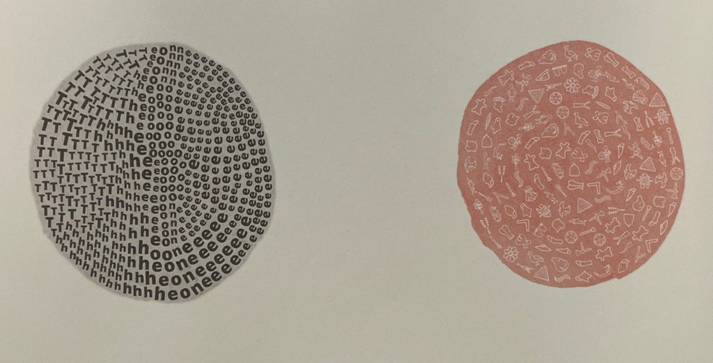
Shapes like single-celled creatures (each filled with a different alphabet) represent the many stories existing before “The One” arrives.
“The One” is made of the English (i.e., Latin or Roman) alphabet. Will it listen to and make sense of all these other stories?
The fable of One & Everything does more than support the notion that alphabets and languages can be endangered. Implicit in the fate of the “One & Everything” story” is the message that Babel was more of a blessing than a curse.
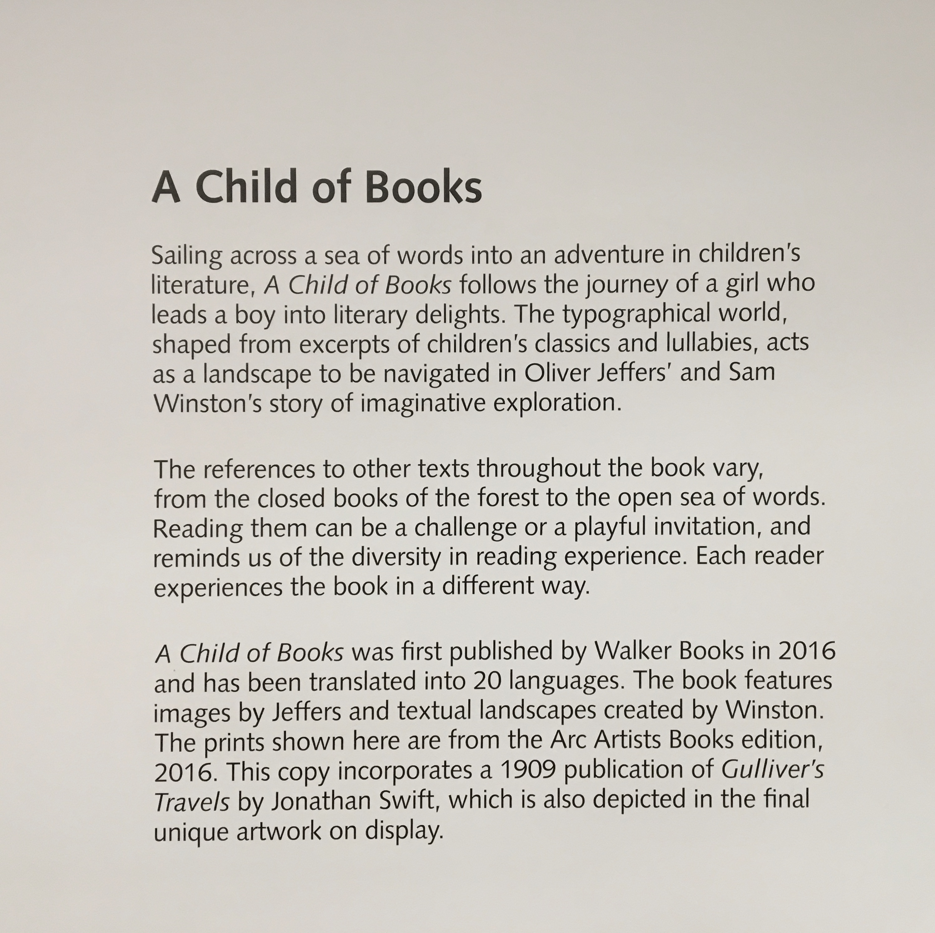
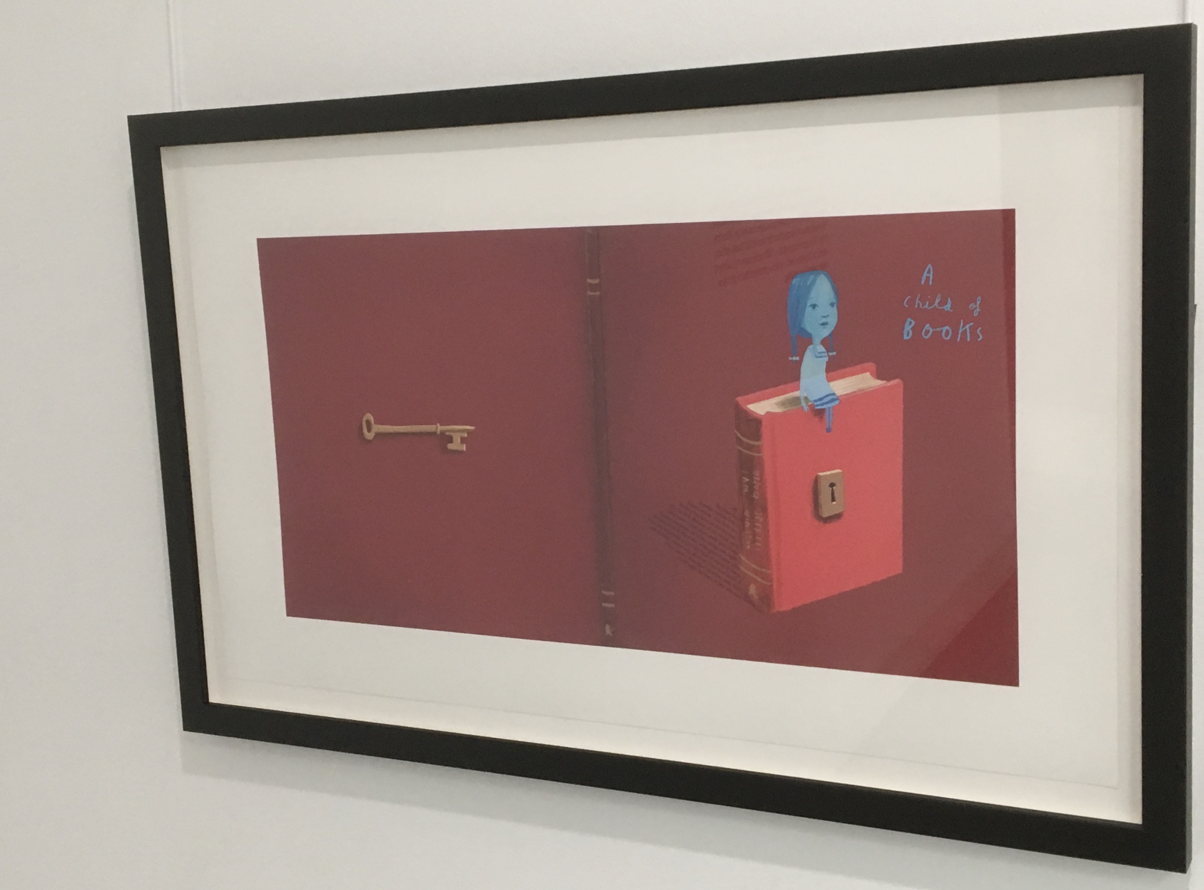
Readers familiar with Winston’s A Dictionary Story and his collaboration with Oliver Jeffers in A Child of Books (both below) will recognize a growing refinement and, now, breadth and depth in Winston’s storytelling. The youngest audience and beginning readers will be held by the shapes, colors and simplicity of the story. Older readers will easily grasp its underlying meanings and be intrigued by the variety of letters and scripts and the idea that languages and alphabets can die. Still older readers and teachers will appreciate the helpful resources following the story’s ending invitation. At all levels, the audience will delight in Winston’s creation of his characterful abstractions with letters from the alphabets and scripts identified in those resources. Those with an eye for such artistry will appreciate Winston’s extension of a tradition embraced by Paul Cox, Roberto de Vicq de Cumptich, Sharon Forss and Nicolas McDowall.
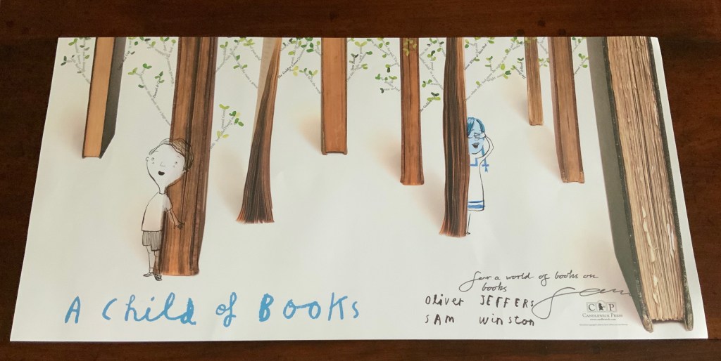
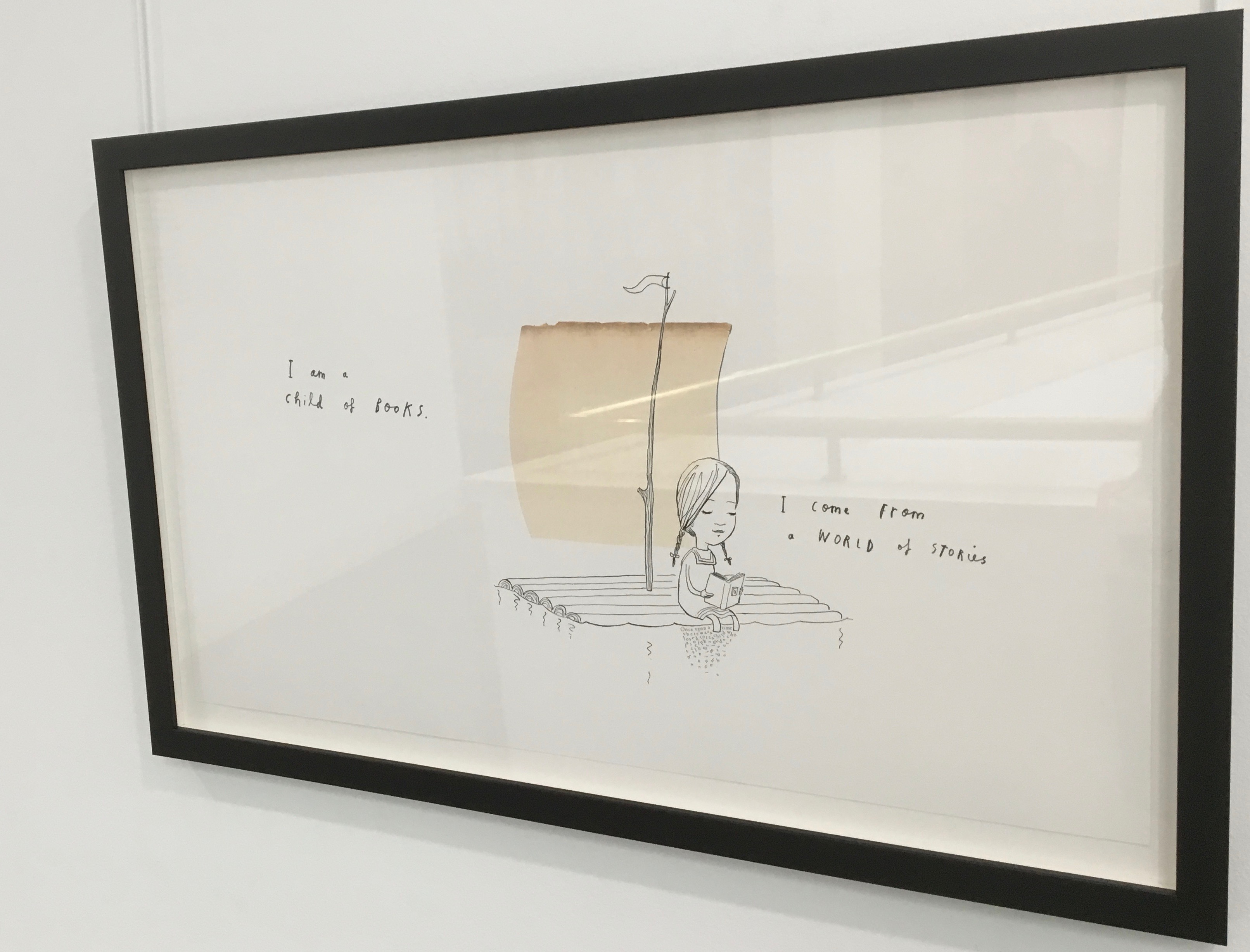
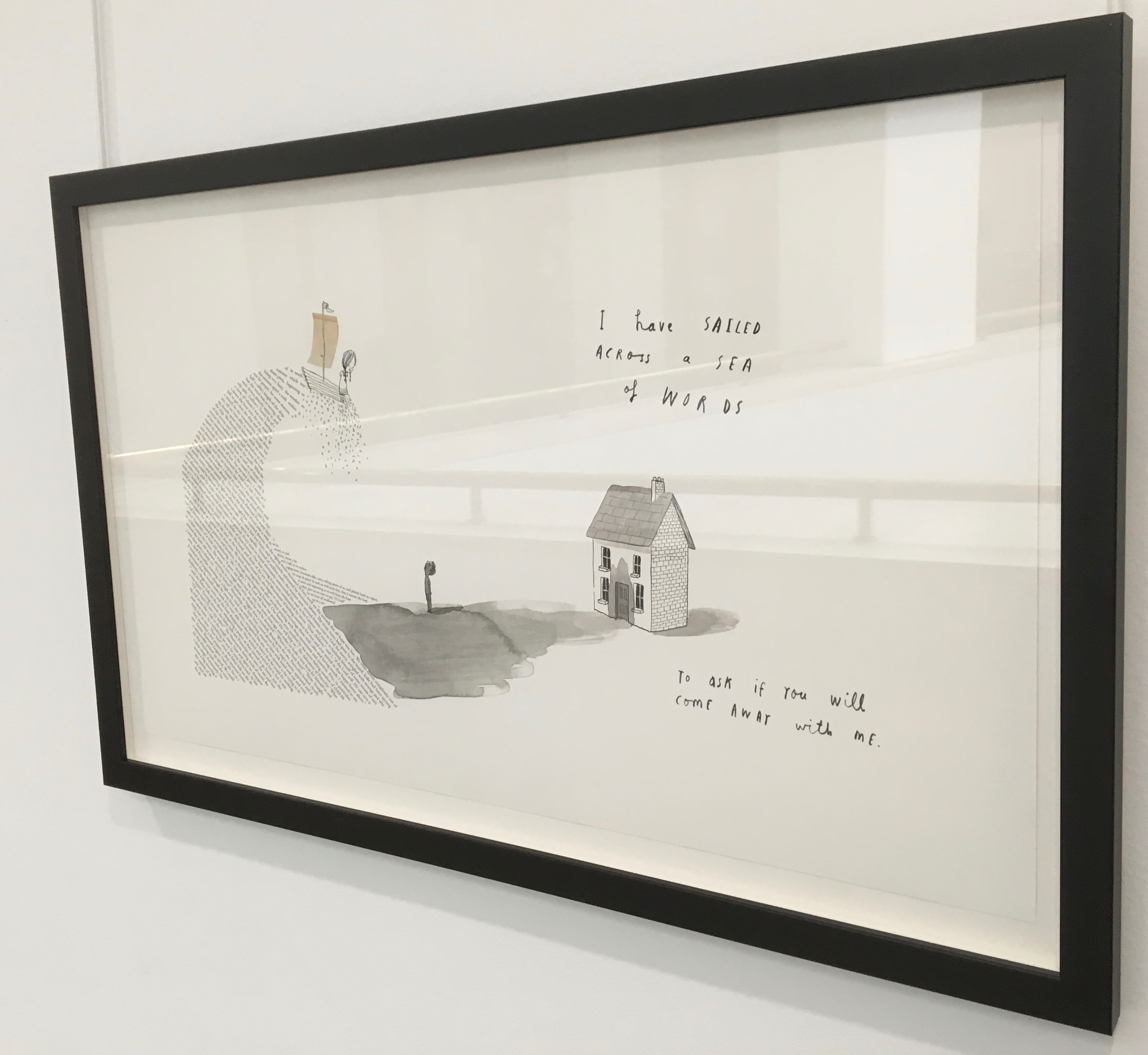
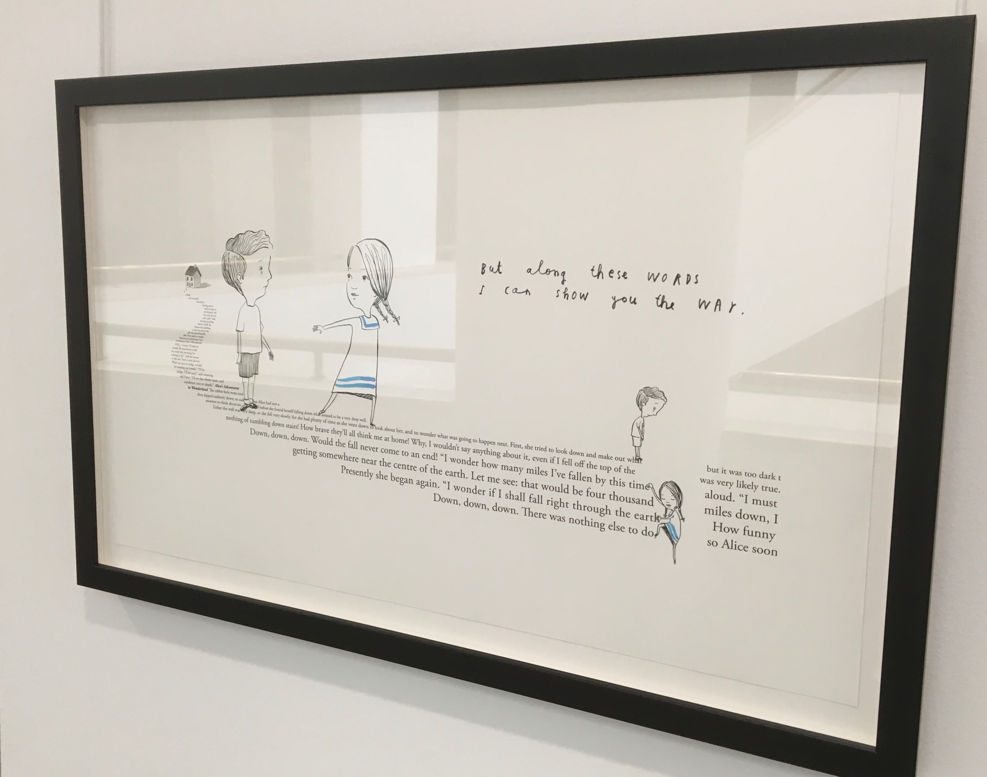
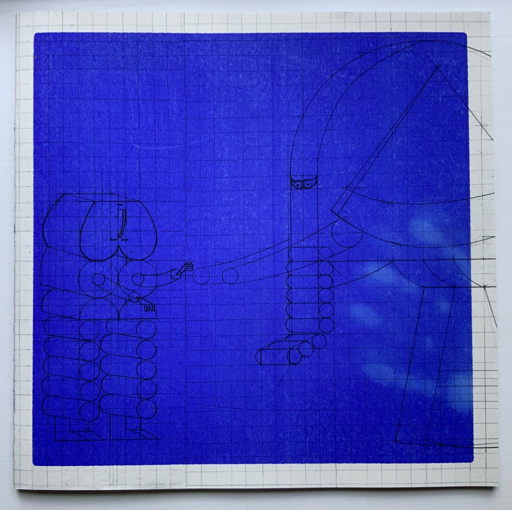
A forest made of fore-edges. A raft made of spines and its sail a book page. A wave and a path made of excerpts from books. In this fabulous world made from the features of books, the simpatico imaginations of Oliver Jeffers and Sam Winston deliver a heroine and an invitation that are hard to resist.
Promotional poster. Displayed with permission of Sam Winston.
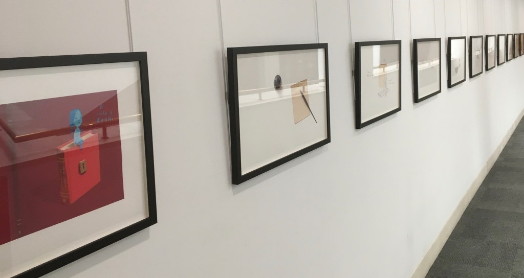
In addition to the poster above and the trade book it promotes, Winston created an artist’s book edition celebrated by this hallway gallery below mounted by the British Library shortly after its appearance.
A Child of Books prints displayed at the British Library, 9 August – 27 September 2019.
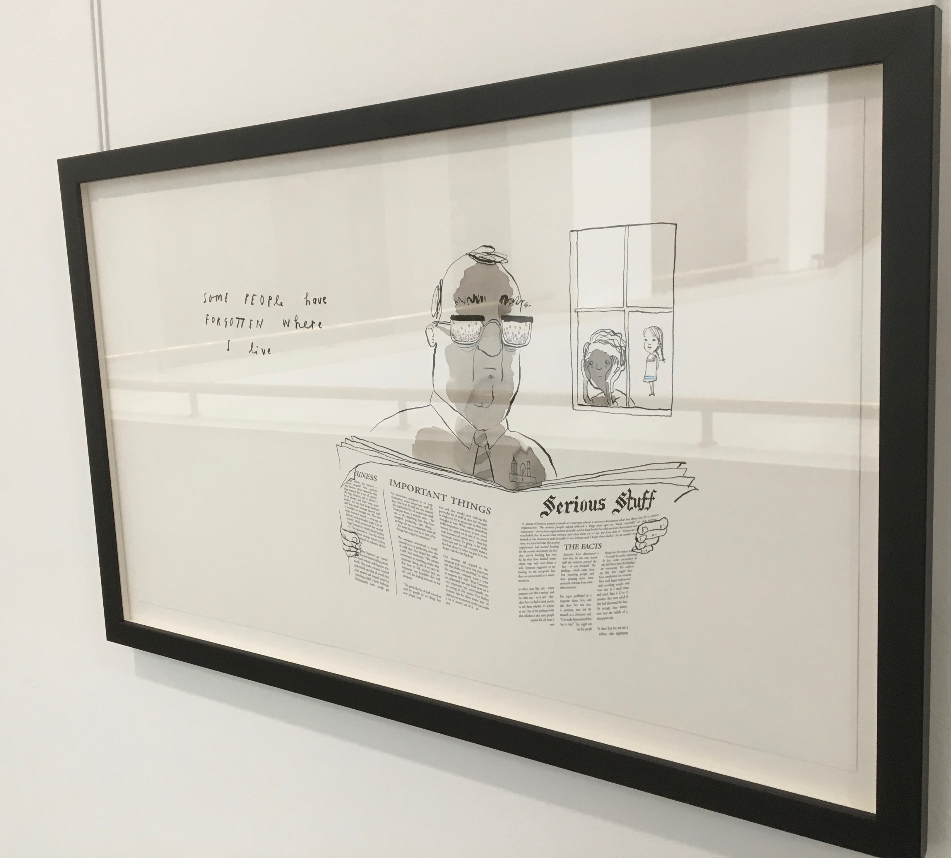
Winston’s abiding love of letters, words and stories shines through in A Child of Books. Arguably, it has its origins in an earlier work whose story is told by his invention of a very different “child of books”.
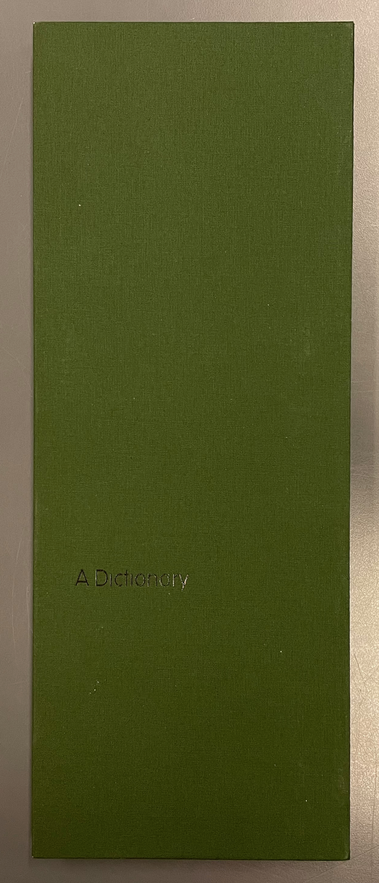
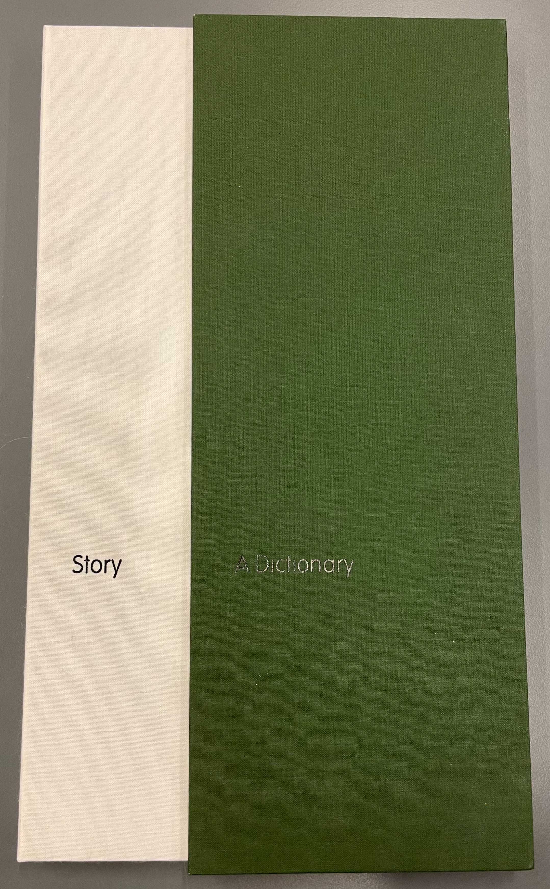
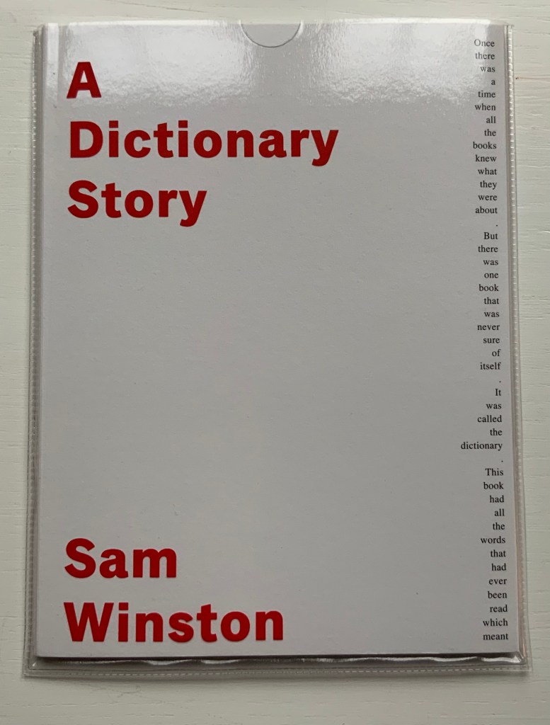
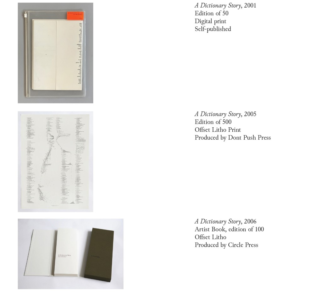
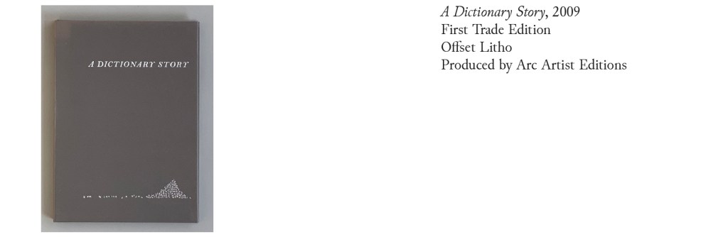
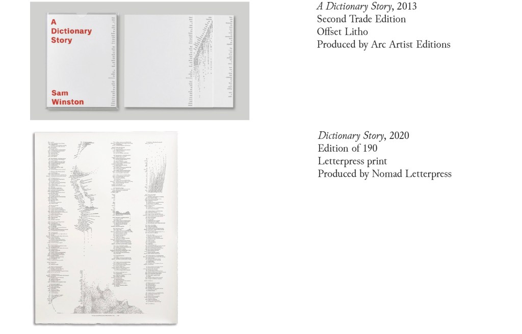
A Dictionary Story (2001 – 2020)
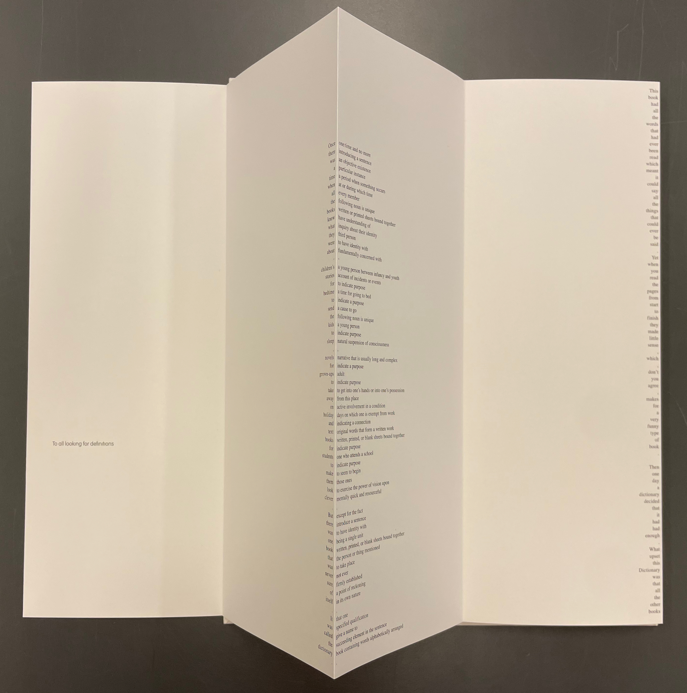
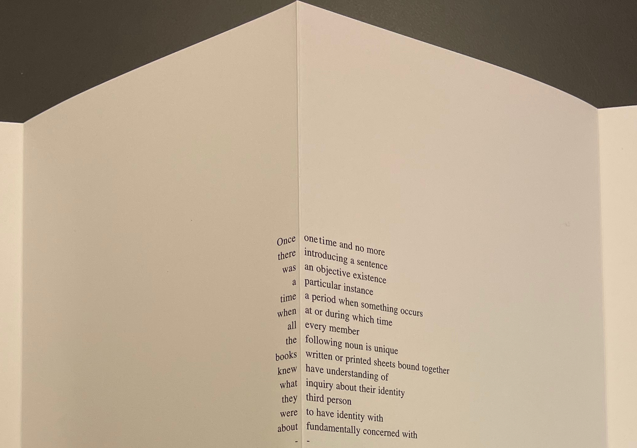
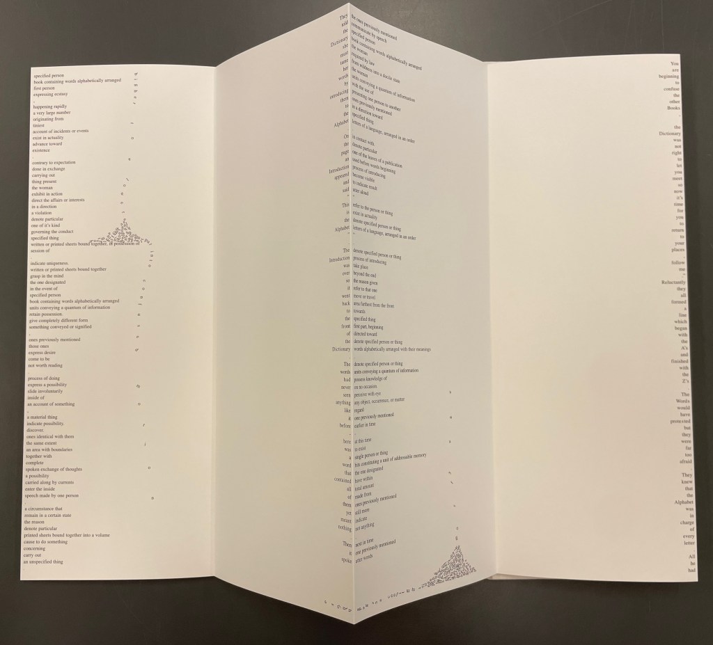
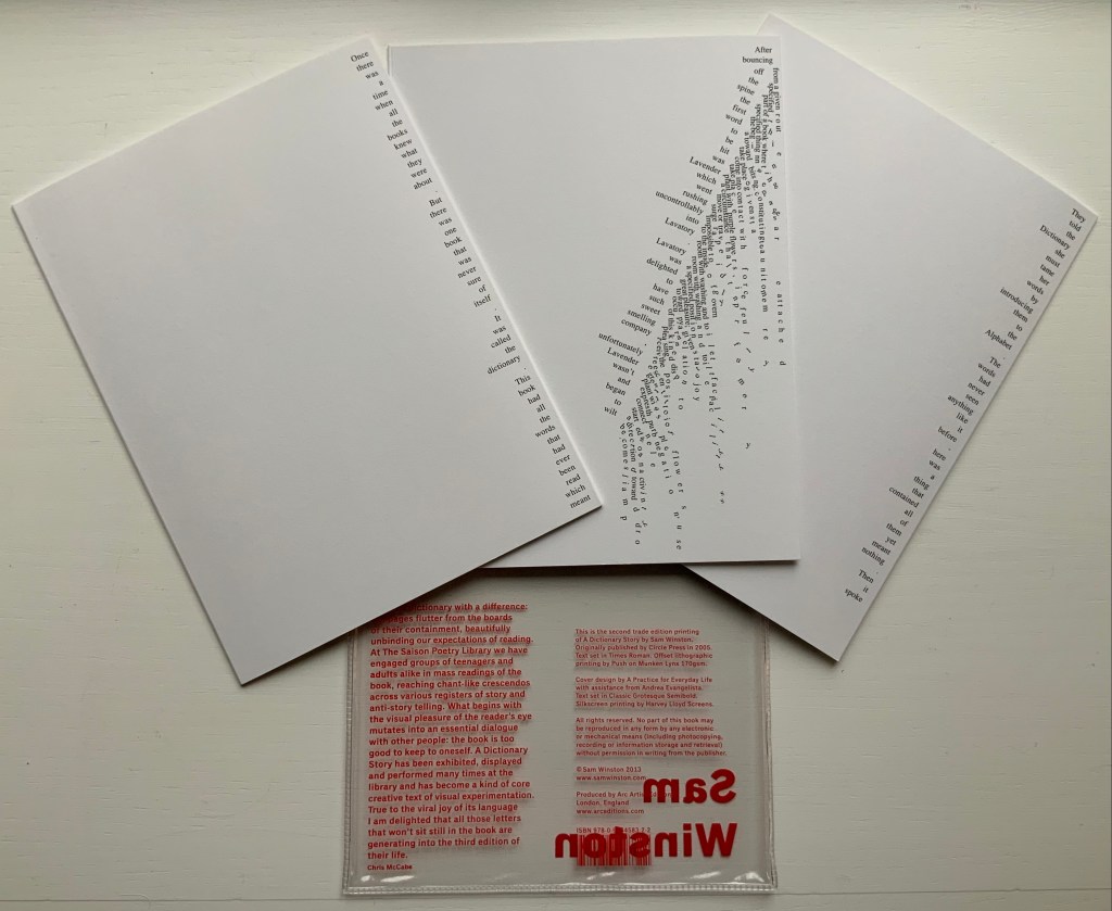
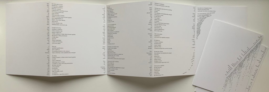
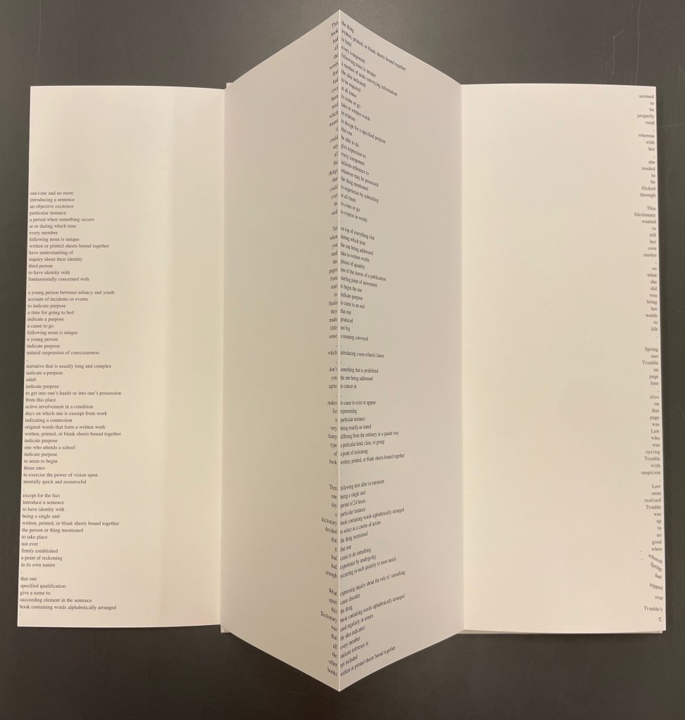
Since its origin as a student project in 2001, A Dictionary Story has appeared in an accordion book form as a fine press edition and two trade editions and as single-sheet prints. The Books On Books Collection holds the fine press edition and the second trade edition, both of which have in common a vertical flush-right single-word column that tells the story and the immediately adjacent vertical flush-left column of definitions of the words in the story. In the fine press edition, the two columns meet at each mountain peaks of the accordion fold.
A Dictionary Story (2006) Sam Winston Slipcased leporello between cloth-covered boards.H360 x W140 mm, 25 panels. Story text set in 9 point Times Roman by Sam Winston. Book designed by Richard Bonner-Morgan and Sam Winston. Printed by David Holyday at Trichrom Limited. Bound at Quality Art Reproductions, England. Published by Circle Press. Edition of 100, of which this is #68. Acquired from the artist, 30 May 2018. Photos: Books On Books Collection. Displayed with artist’s permission.
“Once there was a time when all the books knew what they were about. But there was one book that was never sure of itself.”
Panels 2-5 from the fine press edition; detail of panels 2-3.
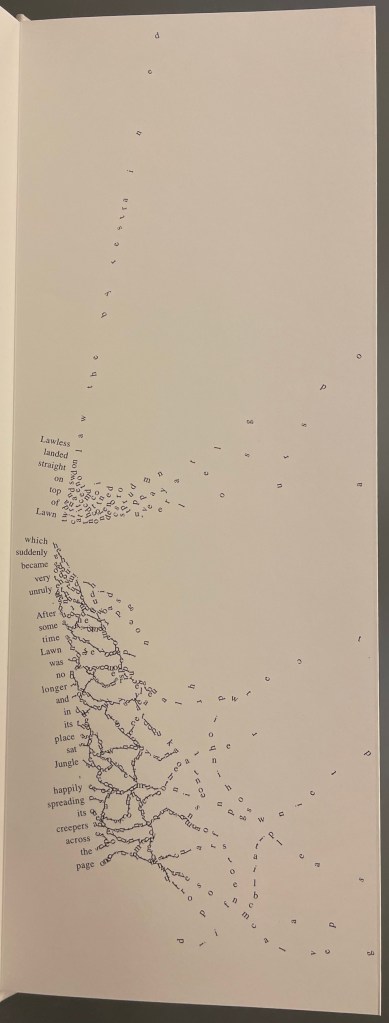
So begins Winston’s tale about this uncertain book. The book never sure of itself is the Dictionary, which of course it must be, otherwise the tale would not be called “A Dictionary Story”. The Dictionary is jealous of all the other books because they are “properly read”, whereas she is just flicked through from time to time. A bit like the “One” in One and Everything, the Dictionary seems to think she contains all the stories imaginable, because she contain all the words — just not in the right order. So she decides to bring her words to life as characters to see what will happen. Words and letters fly about, enacting the story as if in a concrete poem. A meaningful tussle between text and image is a frequent feature for artists’ books as well as visual poetry.
Another defining aspect of book art is its self-referential nature. In an interview with Typeroom, Winston captures this in his response to the question “What is Dictionary Story all about?”:
Dictionary Story is a playful way of exploring some of our presumptions around the printed word. Or you could say that it looks towards a tool we are given at a very young age – the Dictionary – and invites us to actually think about how that works. Here’s a device that is designed to explain a word’s meaning by offering further words in its place – to me that is remarkable. This is a type of knowledge that can only explain itself through referencing itself. As a visual person the image that comes to mind is a giant, never ending, Möbius strip of language twisting back on itself.
Of course for less visual persons, the Dictionary’s whim engenders chaos, which Winston, a dyslexic, can appreciate. So he brings onstage (or “onpage”) the Books, of whom the Dictionary was jealous, to remonstrate that if words become disconnected from their definitions, how will they the Books know what they are about? Insisting that she tame her words, they have the Dictionary’s Introduction introduce her bewildered words to the character “Alphabet”.
Making the journey over the hills and valleys of A Dictionary Story is satisfying, and re-making it is even more satisfying and delightful each time. The making and re-making of A Dictionary Story must also have been satisfying and delightful for Sam Winston; he has done it so many times.
A Dictionary Story (2013) Sam Winston Three five-panel accordion folded sections in a plastic sleeve cover. Second trade edition. Sleeve: H205 x W160 mm. Sections: H200 x W150 mm, 15 panels. Acquired from the artist, 13 December 2020. Photos: Books On Books Collection.
Watching the artist adjust the typography of A Dictionary Story to changing dimensions is like watching a star tennis player who is also a star basketball player and star soccer (football) player. There’s always a ball, there’s always a net, there’s always genius.
The trade edition splits the fine press edition into three less narrow leporellos and nudges some of the two columns (story/definition) into the valley fold. Below, in the trade edition across panels 3 and 4 is where the Dictionary decides to bring her words to life, and on the right side of the fourth panel, the words begin to slip away from the fold.
The same part of the story in the fine press edition occurs on the fourth panel below, and the words tilt against the fold.
These variations create subtly different narrative paces and visual impressions in the two editions. Not one better than the other, just different. The poster variations, however, subordinate narrative pace entirely to visual impression. At present, the posters are not in the collection, but the images below help to make the point. As with movie goers, some will like the prints more than the books, others the books more than the prints, and still others will marvel at the genius in all of them.
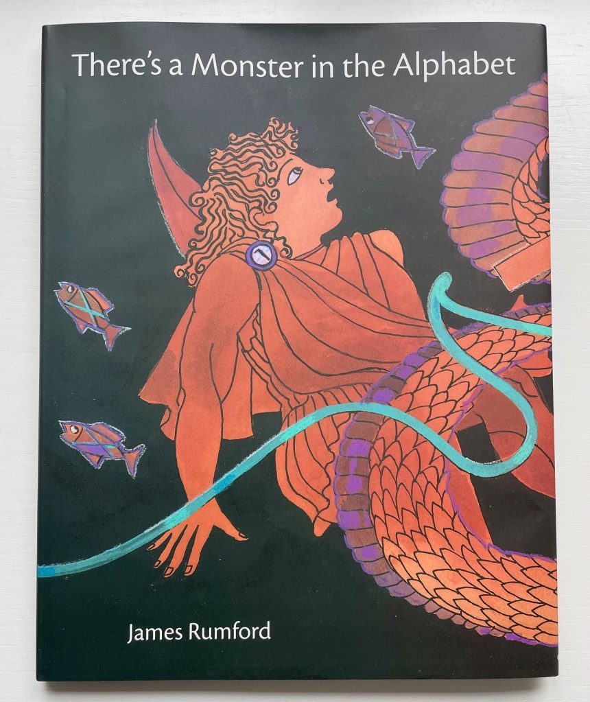
There’s a Monster in the Alphabet (2002) James Rumford Dustjacket, hardcover. H285 x W230 mm. 32 pages. Acquired from Bud Plant and Hutchison Books, 3 November 2022. Photos: Books On Books Collection. Displayed with permission of the author.
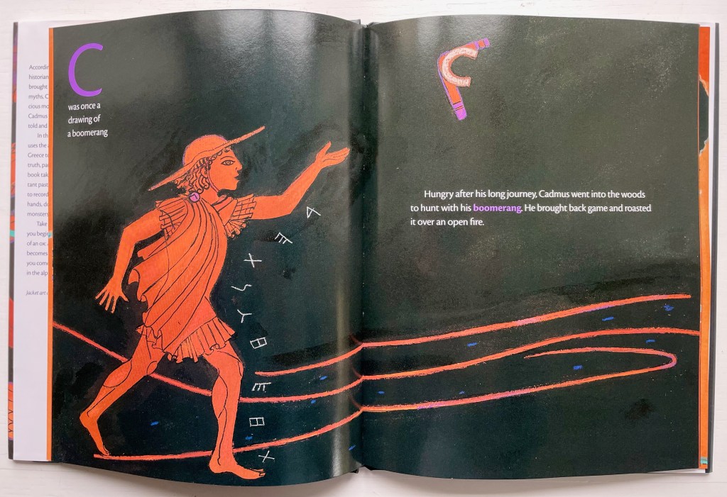
James Rumford subtly weaves fanciful, speculative and well-founded points about the origin and transmission of the alphabet into his inventive reframing of Herodotus’s tale of how the Phoenicians brought the alphabet to Greece. In the double-page spread above, the letter A’s evolution can be found in the ox’s head on the right and among the fish on the left.
Rumford’s painting with letters is another reminder of the fluidity of picture and letter. Phoenician and early Greek letters are used white on black to outline figures and suggest motion (as with the stick-throwing Cadmus above) or orange on black to evoke the decorative patterns of Greek pottery (as with the vase below).
The note shaped within the vase makes for a deft graphic transition from the pictorial to the fully textual appendix on the recto page, whose explanations will send an attentive reader back to the preceding pages to look more closely at their images.
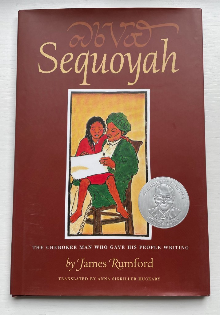
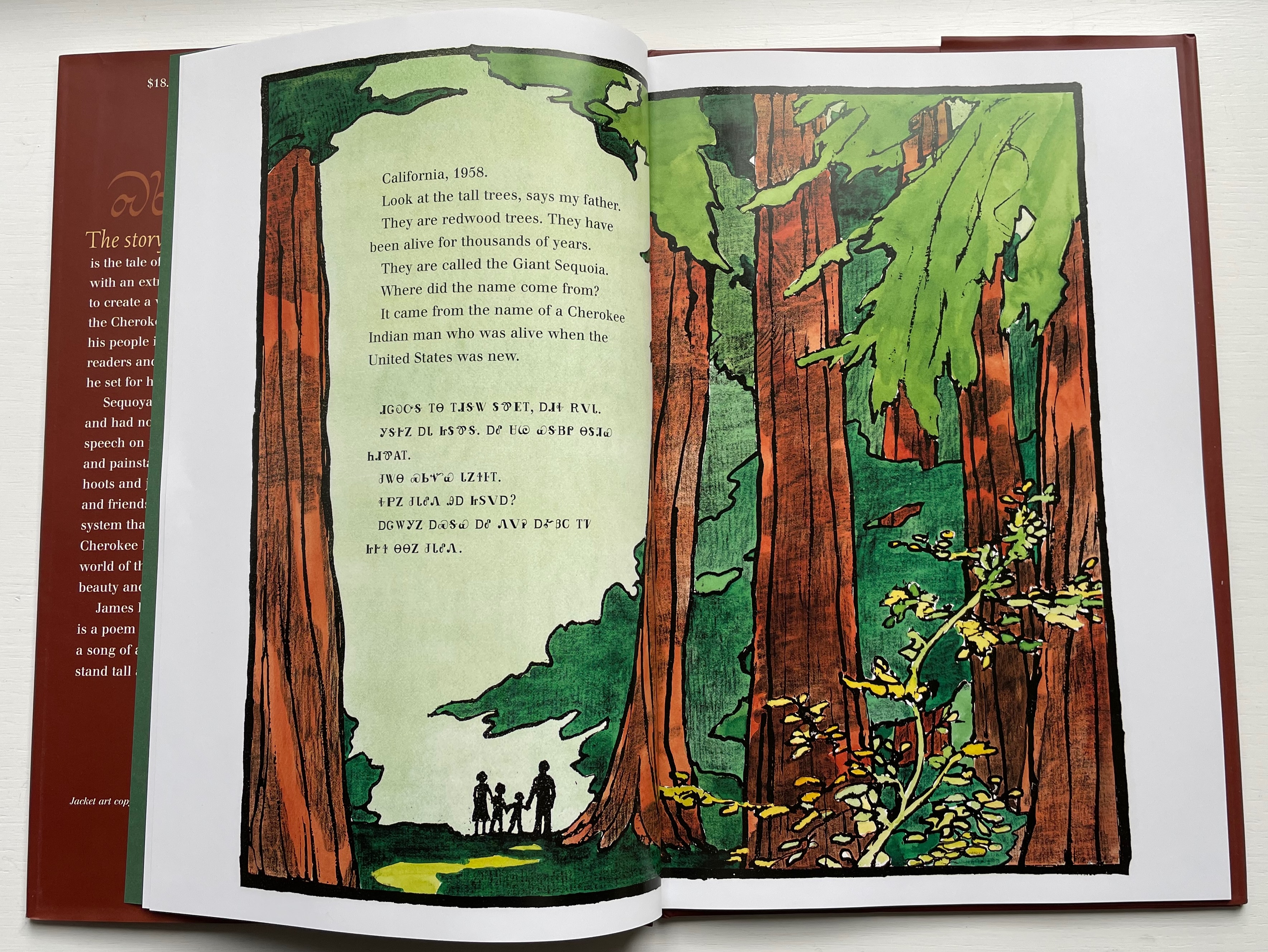
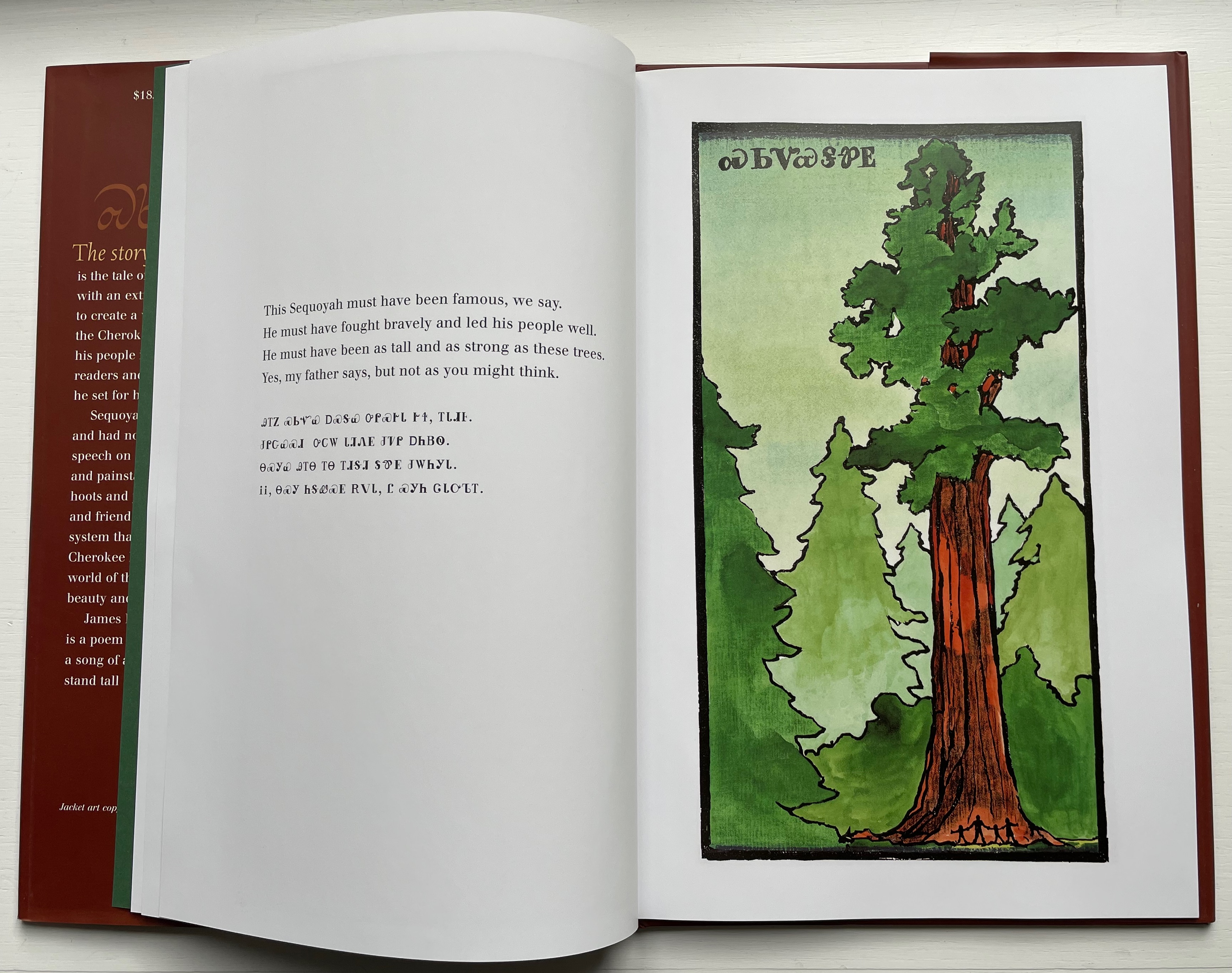
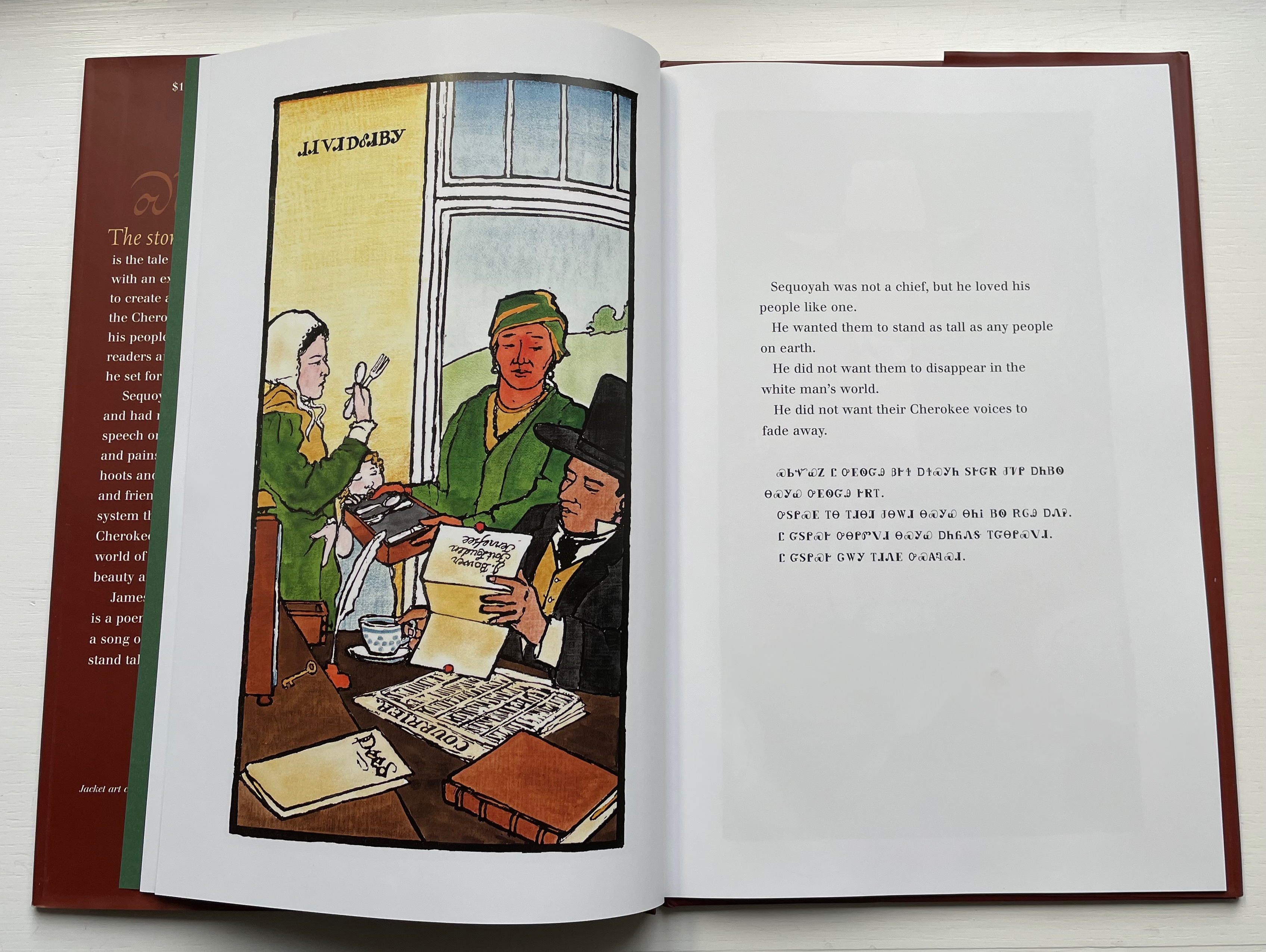
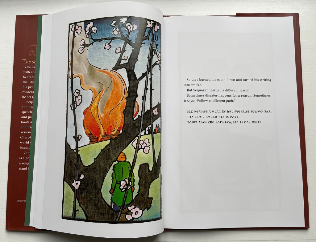
Sequoyah (2004)
Sequoyah (2004) James Rumford Dustcover, hardback. H285 x W230 mm. 32 pages. Acquired from Amazon EU, 25 September 2022. Photos: Books On Books Collection. Displayed with permission of the author.
Rumford’s Hawaiian residence places him on the equivalent of a linguistic equator reflected in the range of languages his books have engaged: Arabic, Bamum, Chinese, English, French, Ikinyarwanda, Persian and, of course, Hawaiian. He might be suspected of aiming to create an A-Z library of stories about the world’s languages. He has even covered hieroglyphics and Latin.
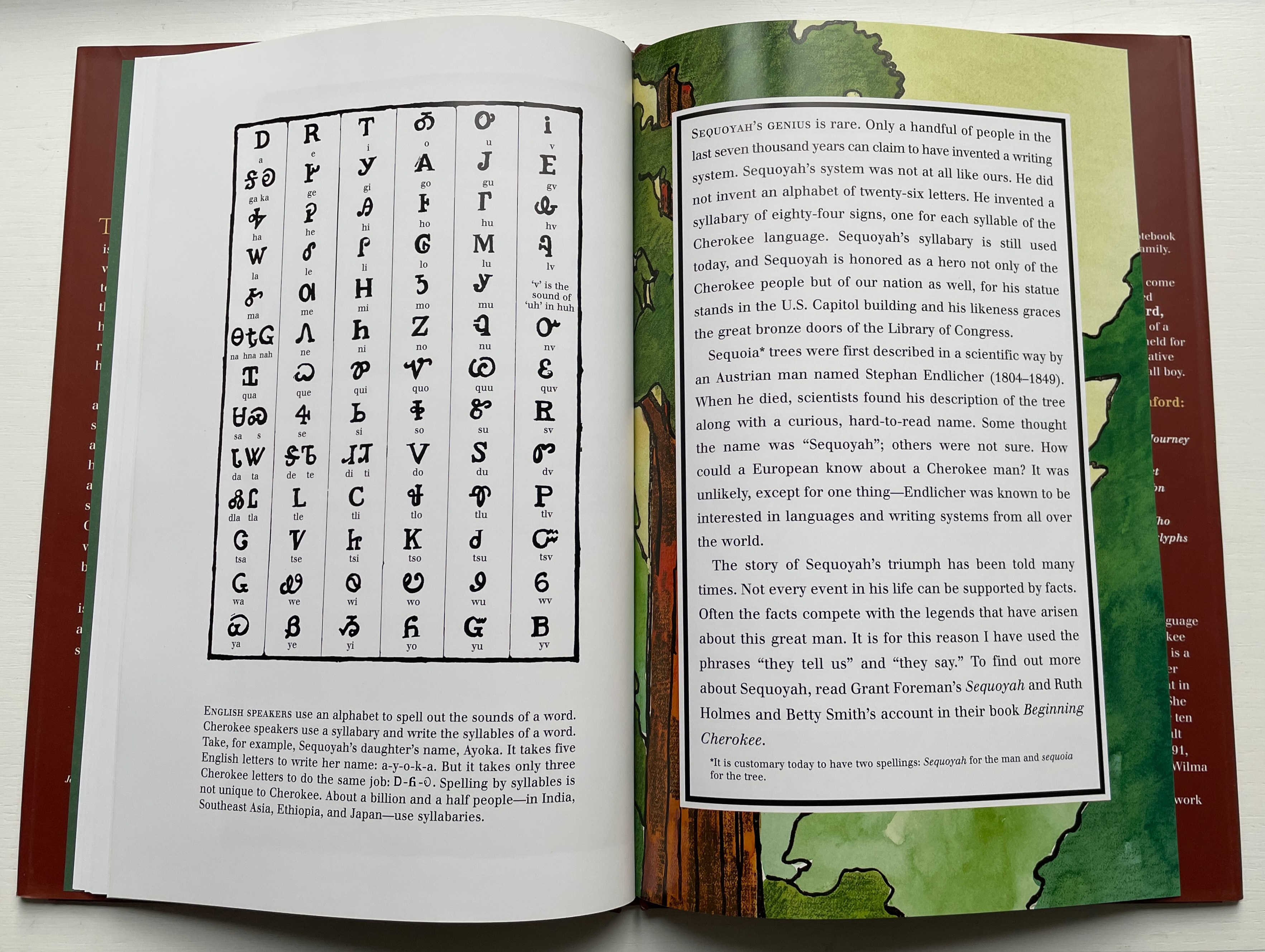
With Sequoyah, Rumford gives bilingual treatment to an astonishing feat — the creation of a syllabary within decades as opposed to the centuries it has taken for most other languages’ alphabets and syllabaries.
Rumford’s style in this book takes on elements of Japaneses woodcuts and the perspective and color that Gaugin found in them.
As with There’s a Monster in the Alphabet, the audience for Sequoyah is older children (probably ages 8 and older), but supporters of the Endangered Alphabets Project and fans of works such as Sam Winston’s One and Everything (2022) would also enjoy Rumford’s two books.
Diringer, David, and Reinhold Regensburger. 1968. The alphabet: a key to the history of mankind. London: Hutchinson. A standard, beginning to be challenged by late 20th and early 21st century archaeological findings and palaeographical studies.
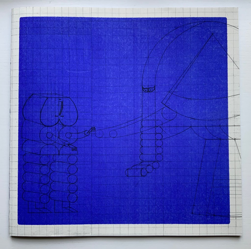
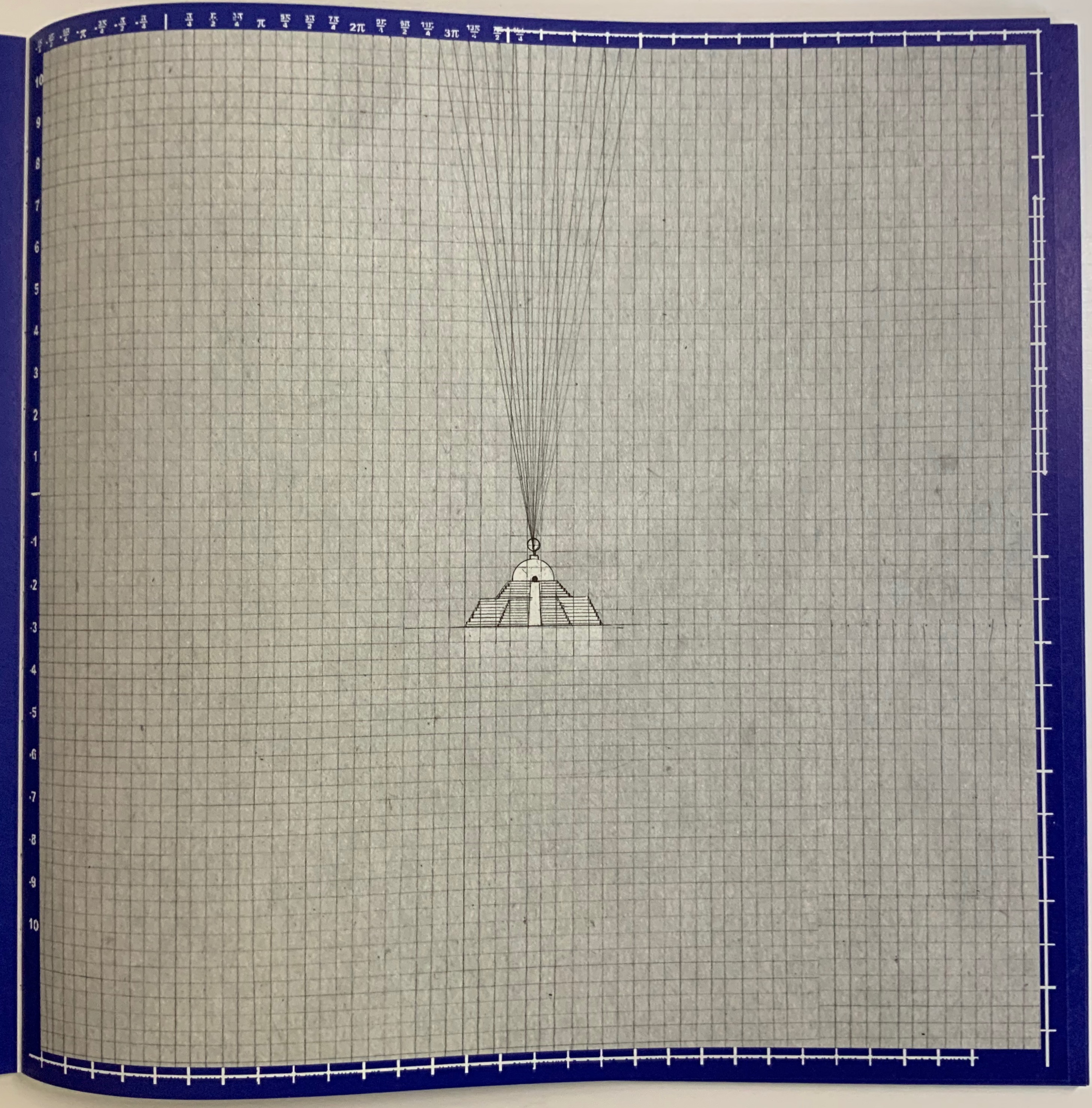
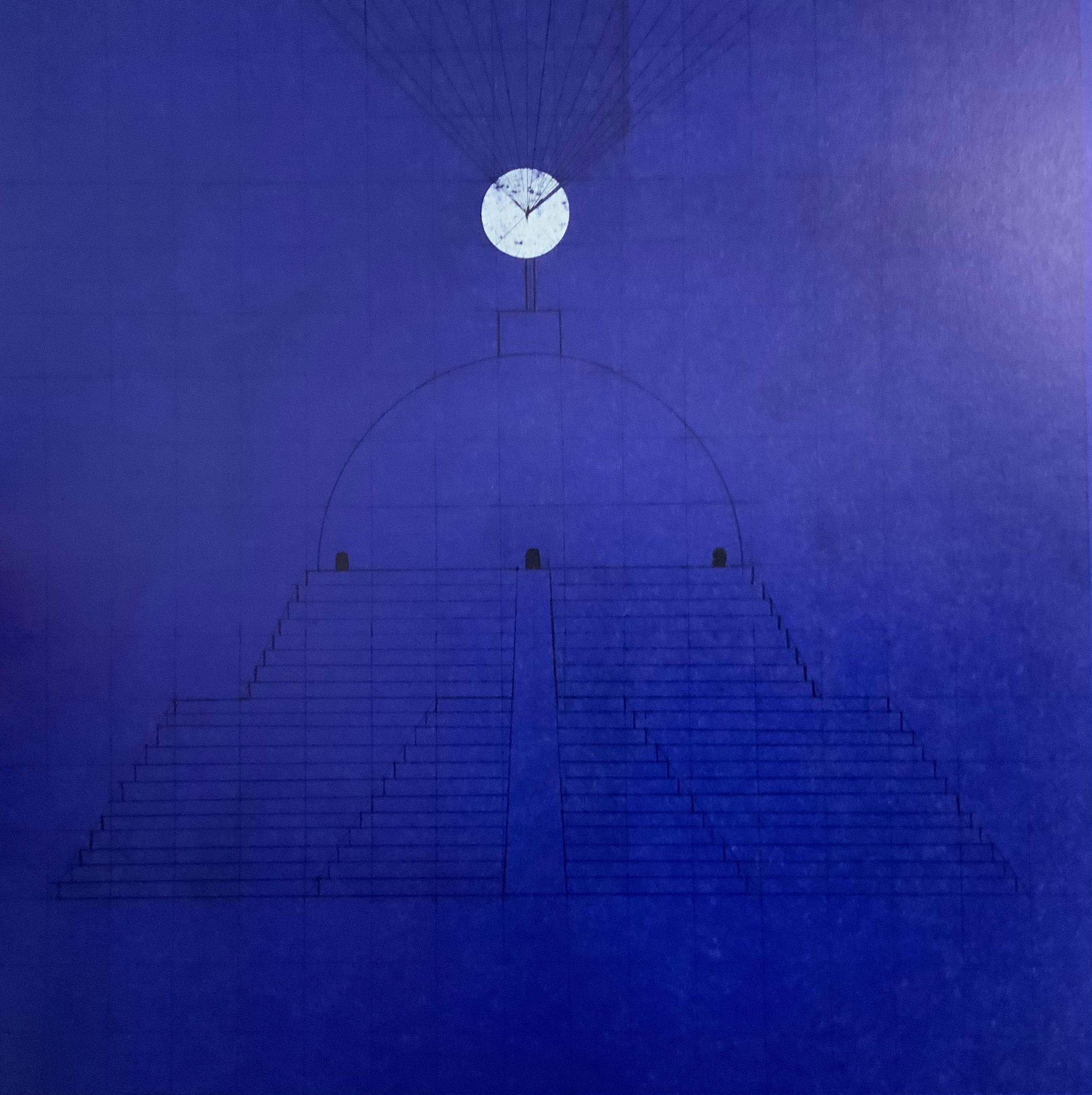
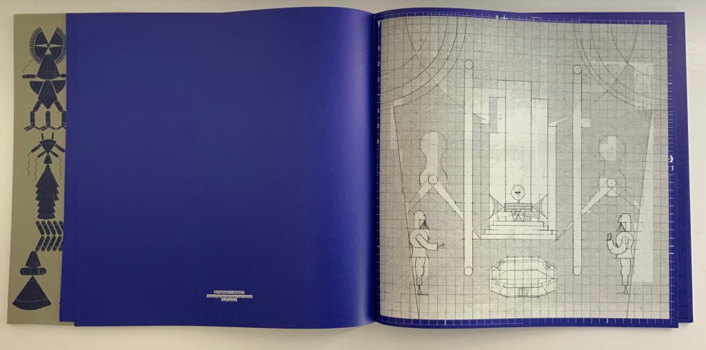
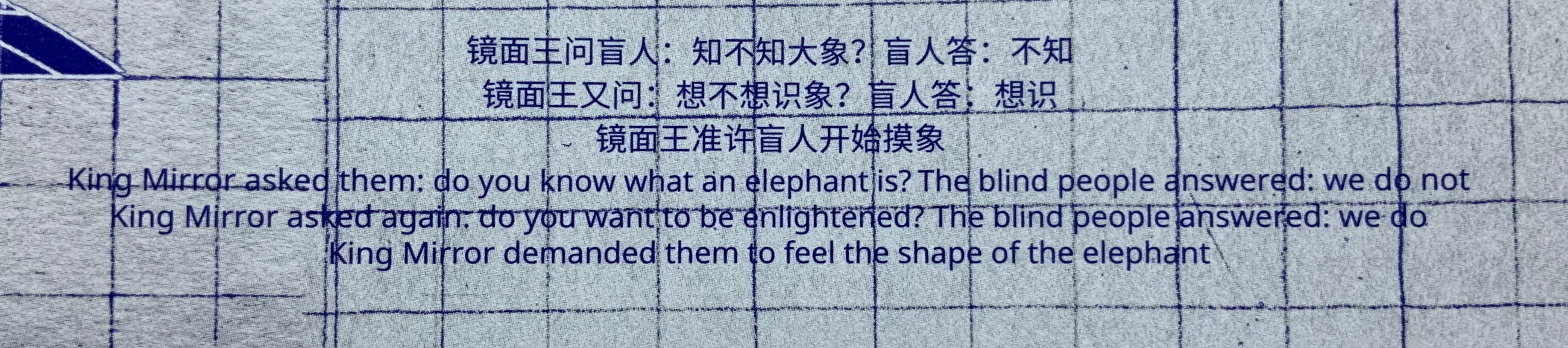
The Blind Men and the Elephant (2019) Xiao Long Hua Sleeved paperback, exposed sewn spine. Sleeve: 305 x 305 mm. Book: H303 x W305 mm. 52 pages. Edition of 500, of which this is #178. Acquired from Northing, 18 May 2022. Photos: Books On Books Collection.
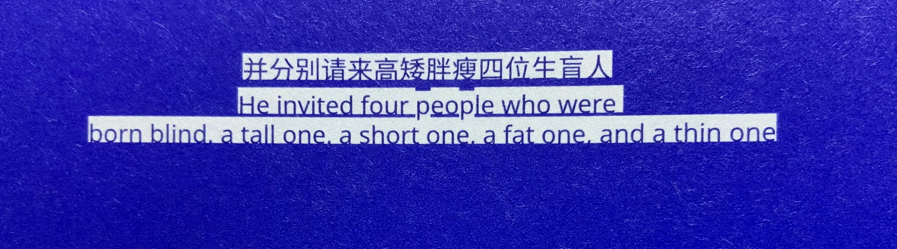
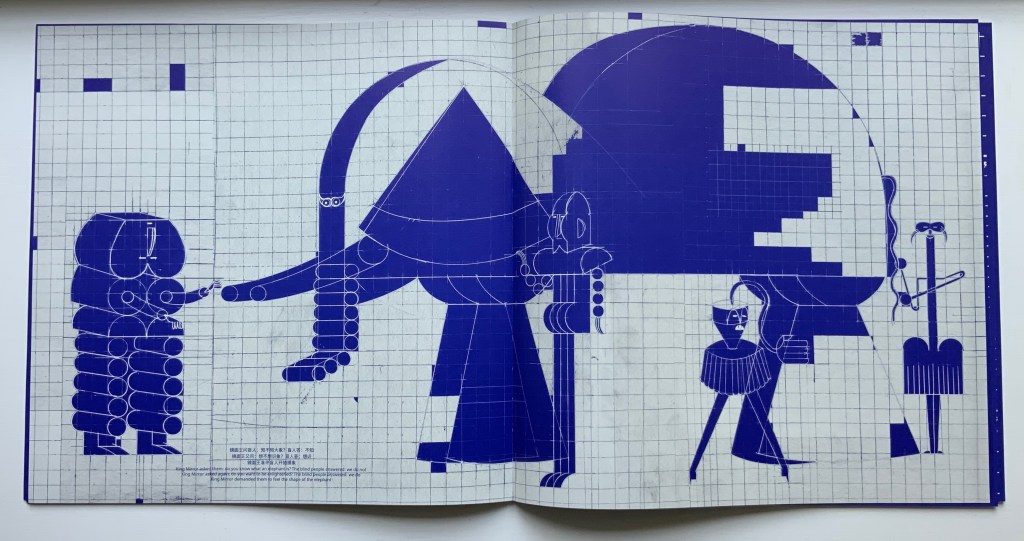
Working with binding designer Zhong Yu and tbook designer Lu Min of the “One and One Half Atelier”, Shanghai-based Xiao Long Hua has found a sympathetic outlet and form for his creative vision. His first work with them is The Blind Men and the Elephant, a variation on the parable in the Buddhist sutra Tittha Sutta. It takes place in the kingdom “Mirari”, ruled by King Mirror.
Selection from One and One Half Atelier. Photos: Books On Books Collection.
As in the more traditional version, the blind men report the elephant to be of different shapes, but in this version, those shapes reflect those of the blind men themselves. Throughout the book, a blueprint grid in the background of the dark blue and light gray page serves to emphasize the geometric shapes of the characters and images and to reflect, with its reductiveness, each blind man’s rigid view of the elephant’s nature. And up to this point of the blind men’s report, the grid has been bounded intermittently by coordinate markers, some numerical, some in letters and some in Chinese characters.
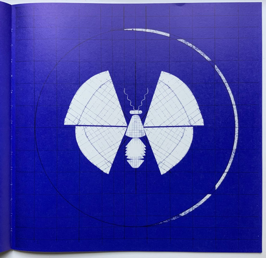
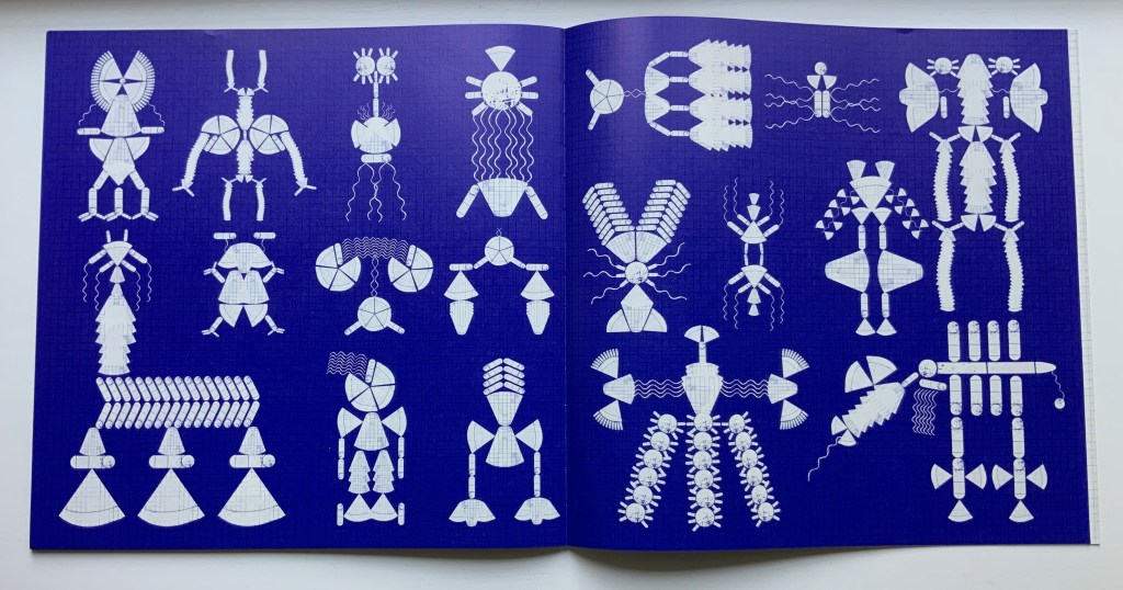
Xiao Long Hua places the different shapes the blind men perceive into the mind of the king, where they become a butterfly and then transform endlessly and kaleidoscopically into other figures represented across a series of pages printed dark blue. This variation on the theme comes from the Miao (Hmong) creation song Butterfly Mother or Mother Butterfly.
The final colorless two pages consist of cut-outs inviting the readers’ hands to create more strange figures along with the king’s mind. This element of touch recurs on the cover, which on closing the reader will find is covered in fingerprints. The cover’s ink is thermochromatic, fading away under the warmth of touch, returning as it cools and waiting for our next blind touch.
Selection from One and One Half Atelier edition. Photos: Books On Books Collection.
The publishing house Qianxun Neverend has issued a shorter trade edition of The Blind Men and the Elephant. Although a thermochromatic cover proved to be too expensive, an equally interesting design feature animates the cover’s image of the butterfly transforming into the multiple figures in the king’s mind.
Prior to The Blind Men and the Elephant, Xiao Long Hua engaged primarily in illustrations, scroll painting, installation works and sculpture, some of which can be seen on his Tumblr blog. For his latest work with the One and One Half Atelier, The Great Migration, the Atelier’s site announced a multimedia installation. A comment about this work sheds light on The Blind Men and the Elephant as well; he writes, “…I want to paint a magnificent picture of the Great Migration to express those spaces and memories that are fading away, I try to blur the forms between people, animals and objects. “
Other works in the Books On Books Collection to compare with The Blind Men and the Elephant include
Recent exhibition of art from Oliver Jeffers’ and Sam Winston’s A Child of Books. The British Library.
Richard Price and his team at The British Library just concluded their fifth event in this series of “show and tell” talks by book artists. Most of the events have staked a claim to some relationship with a British Library event or exhibition current at the time — World Book Night, Writing: Making your Mark, and Buddhism — but the title of this fifth event punningly encapsulates the real point of the entire series: “Contemplating: Artist’s Books Now”.
When picturing an artist’s book what do you imagine? Intricate design, ornate bindings, blank space, fold outs and pop-up rinsed through with vibrancy of text and colour. Is it something more unearthly and harder to describe? An air of peace in the topsy-turvy hullabaloo of our modern world. A pause of contemplation as a work speaks to you? Or, on the contrary, is it a space of immense energy, of ‘thought-provocation’, where contemplation is something you feel compelled to do to make sense of the sensations and ideas the book stimulates? “Contemplating: Artists’ Books Now”
Whether the organizing theme has been “here and now” “place”, “Latin America“, “writing” or “contemplation”, the evening inevitably turns to reflecting on the nature of book art, bookworks, the artist’s book, the book arts, bookness and even art itself. Even with 50-60 in the audience and four to six presentations, Price and team have arranged the agenda to allow for hands-on “viewing” of the works, conversations with the artists and question time that evolves into a room-wide conversation, not just Q&A.
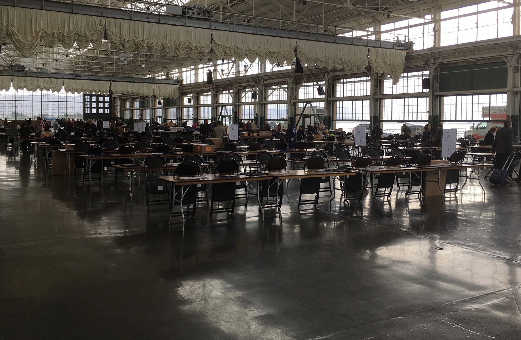
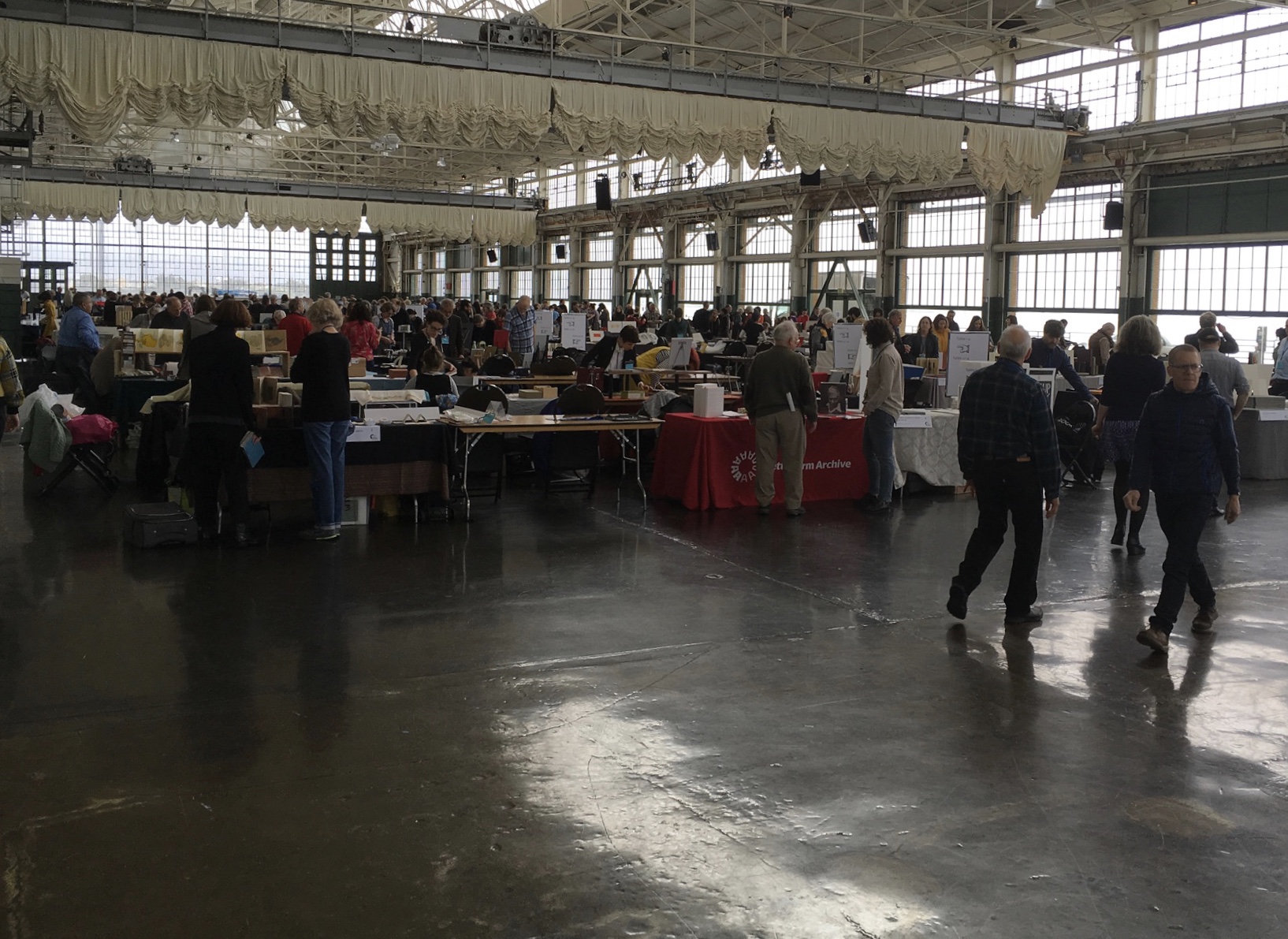
The seventh biennial Codex book fair and symposium in Berkeley and Richmond, California have come to a close. Of what use it is now to explain how to enjoy them, you be the judge. Your first step is to read the story in Mark Twain’s Roughing It of “Jim Blaine and His Grandfather’s Ram”. Being the story of a story — book art being so self-reflexive and all — it is the best way to commence:
Every now and then, in these days, the boys used to tell me I ought to get one Jim Blaine to tell me the stirring story of his grandfather’s old ram—but they always added that I must not mention the matter unless Jim was drunk at the time—just comfortably and sociably drunk.
Not to advise drink before the fair.
For the start of this Codex, rain and mist hover outside the hangar. The polished concrete floor looks wet but isn’t — so first-time visitors step to avoid slips that won’t really occur. The old-timers though stride from table to table arms wide, bussing each other on the cheek or humping crates around and placing and re-placing their works for the right effect. Arriving early to watch adds a certain enjoyment.
At last, one evening I hurried to his cabin, for I learned that this time his situation was such that … he was tranquilly, serenely, symmetrically drunk—not a hiccup to mar his voice, not a cloud upon his brain thick enough to obscure his memory. As I entered, he was sitting upon an empty powder- keg, with a clay pipe in one hand and the other raised to command silence. … On the pine table stood a candle, and its dim light revealed “the boys” sitting here and there on bunks, candle-boxes, powder-kegs, etc. They said: “Sh—! Don’t speak—he’s going to commence.”
‘I don’t reckon them times will ever come again. There never was a more bullier old ram than what he was. Grandfather fetched him from Illinois—got him of a man by the name of Yates—Bill Yates—maybe you might have heard of him; his father was a deacon—Baptist—and he was a rustler, too; a man had to get up ruther early to get the start of old Thankful Yates; it was him that put the Greens up to jining teams with my grandfather when he moved west.
‘Seth Green was prob’ly the pick of the flock; he married a Wilkerson—Sarah Wilkerson—good cretur, she was—one of the likeliest heifers that was ever raised in old Stoddard, everybody said that knowed her. She could heft a bar’l of flour as easy as I can flirt a flapjack. And spin? Don’t mention it! Independent? Humph! When Sile Hawkins come a browsing around her, she let him know that for all his tin he couldn’t trot in harness alongside of her. You see, Sile Hawkins was—no, it warn’t Sile Hawkins, after all—it was a galoot by the name of Filkins—I disremember his first name; but he was a stump—come into pra’r meeting drunk, one night, hooraying for Nixon, becuz he thought it was a primary …
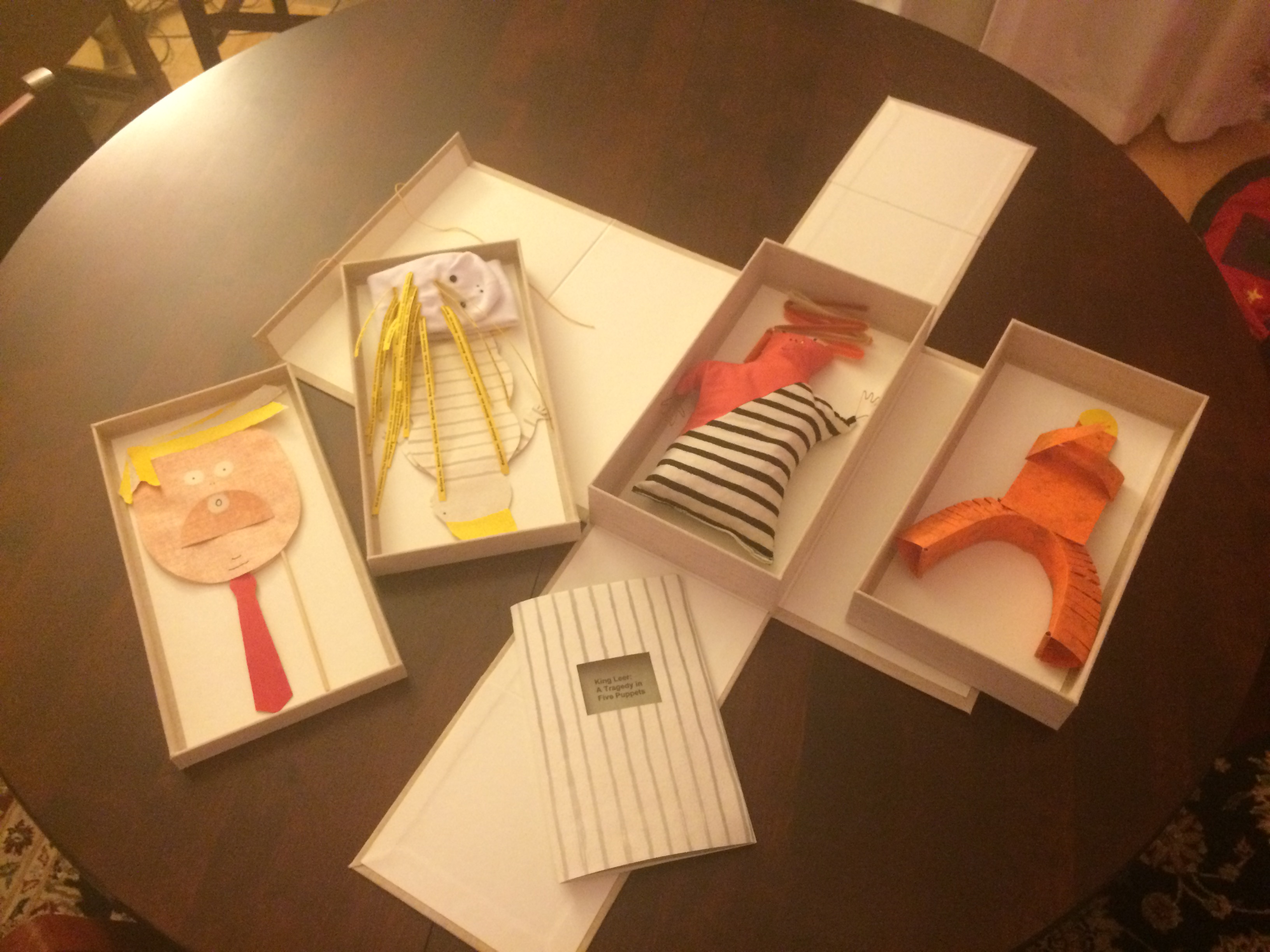
Which reminds me of Emily Martin and her politically biting King Leer —
King Leer: A Tragedy in Five Puppets (2018) Emily Martin
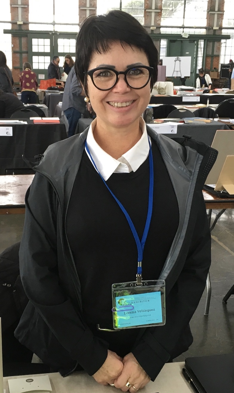
There is plenty more somber work to go around: Lorena Velázquez from Mexico has followed up her powerful Cuarenta y tres with Exit, her hope in our turbulent times;
Barcelona’s Ximena Perez Grobet has 2.10.1968-2018on display, commemorating the 50th anniversary of the Tlatelolco massacre in Mexico City; Sue Anderson and Gwen Harrison from Australia offer Phantomwise Flew the Black Cockatoo, an indictment of a cruel welfare system; and there is Islam Aly from Egypt with Inception, Bedaya, inspired by stories and journeys of refugees. Book art everywhere wears its heart on its cover.
Still, book artists are a convivial bunch and cheerful in their internationality. On Monday evening, Mary Heebner (Simplemente Maria Press) and her husband photographer Macduff Everton are in the Berkeley City Club’s off-limits members’ room settling down to a bottle of Santa Barbara red, and here come upstate New Yorker Leonard Seastone (Tidelines Press), Anglo-German Caroline Saltzwedel (Hirundo Press), Irishman Jamie Murphy (The Salvage Press) and Geordie David Esslemont (Solmentes Press). Macduff is launched on a tale about running into Queen Elizabeth on her horse-riding visit to Ronald Reagan’s ranch, when David remembers rounding down a path in the Lake District during an art residency to find Prince Charles legging it up the same — by which time Macduff has just returned from his room with a bottle of single malt — which reminds Caroline of a stormy weather hike along Hadrian’s Wall, where Macduff diverts onto a tale of nearly being blown off the same and making his shaky, near-death way back to a bed-and-breakfast for a hot bath and terrible food from the grumpy owners, which launches Leonard onto the story about his local Russian butcher/grocer/refugee who refuses to sell him salad but insists on providing chiropractic services one day and adopts Leonard as his only friend in the US with whom he can have true political debate. Jamie still wants to know why the Russian wouldn’t sell Leonard any salad.
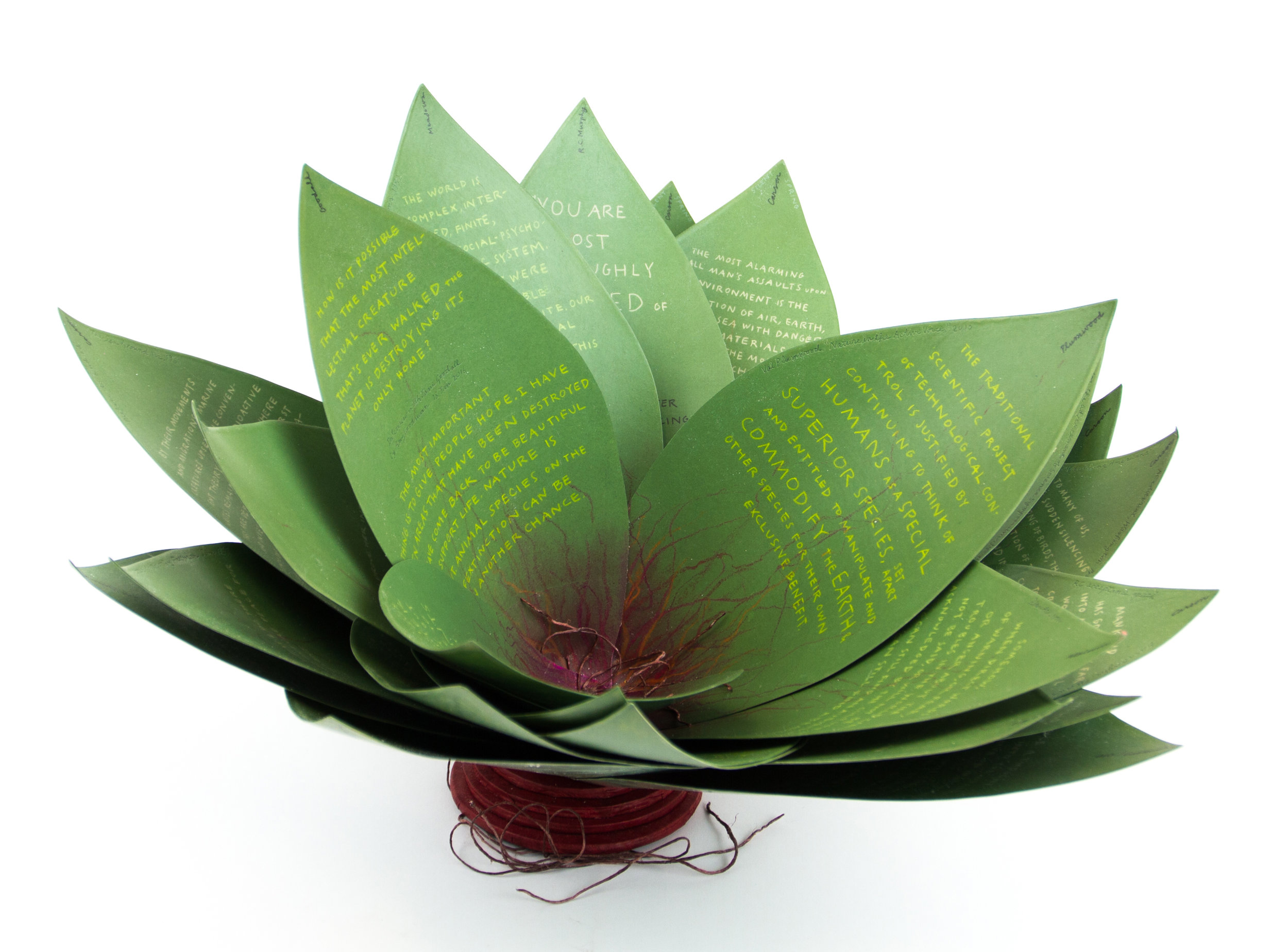
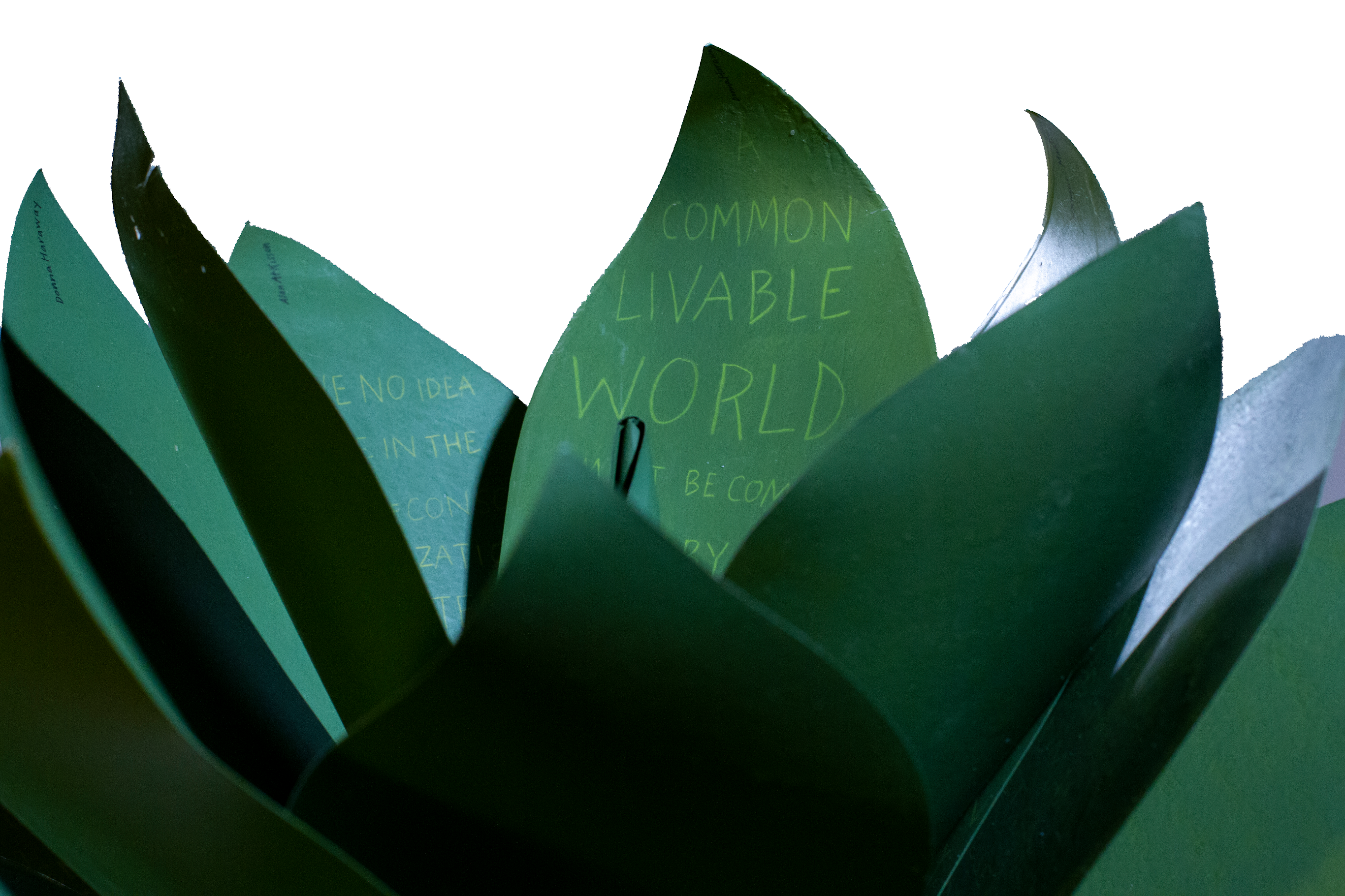
Speaking of greens — Robin Price’s prototype for Witnessing Ecology: the agave plant book again displays that thread of social concern, but this work and Price herself draw attention to another thread of enjoyment to pursue: the recurrence of collaboration among book artists. One artist leads to another.
Witnessing Ecology: the agave plant book (2019) Robin Price Photo: Mike Rhodes
As with the now-famous The Anatomy Lesson by Joyce Cutler-Shaw, Price has joined forces again with Daniel Kelm on the agave plant book, Kelm also collaborated with Ken Botnick on the long-gestating Diderot Project on display here just a few tables away, Botnick collaborated with the novelist and translator William Gass on A Defense of the Book, who in turn with the photographer Michael Eastman — who lives over in Oakland — created the digital-only book Abstractions Arrive: Having Been There All the Time. Whatever the medium, the book just naturally encourages collaboration — and chance. As Price’s book Counting on Chance implies and as so many book artists echo — as does Jim Blaine —
‘… There ain’t no such a thing as an accident. When my uncle Lem was leaning up agin a scaffolding once, sick, or drunk, or suthin, an Irishman with a hod full of bricks fell on him out of the third story and broke the old man’s back in two places. People said it was an accident. Much accident there was about that. He didn’t know what he was there for, but he was there for a good object. If he hadn’t been there the Irishman would have been killed. Nobody can ever make me believe anything different from that. Uncle Lem’s dog was there. Why didn’t the Irishman fall on the dog? Becuz the dog would a seen him a coming and stood from under. That’s the reason the dog warn’t appinted. A dog can’t be depended on to carry out a special providence. Mark my words it was a put-up thing. Accidents don’t happen, boys. Uncle Lem’s dog—I wish you could a seen that dog. He was a reglar shepherd—or ruther he was part bull and part shepherd—splendid animal; belonged to parson Hagar before Uncle Lem got him.’
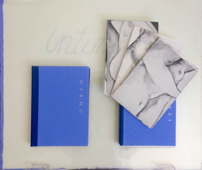
Chance, luck or accident — if you are to enjoy this book fair, you need to count on them, not just allow for them. How likely was it that in pursuit of Mary Heebner’s Intimacy: Drawing with light, Drawn from stone, I would be caught up with that crew in the off-limits members’ club?
Intimacy: Drawing with light, Drawn from Stone (2017) Mary Heebner
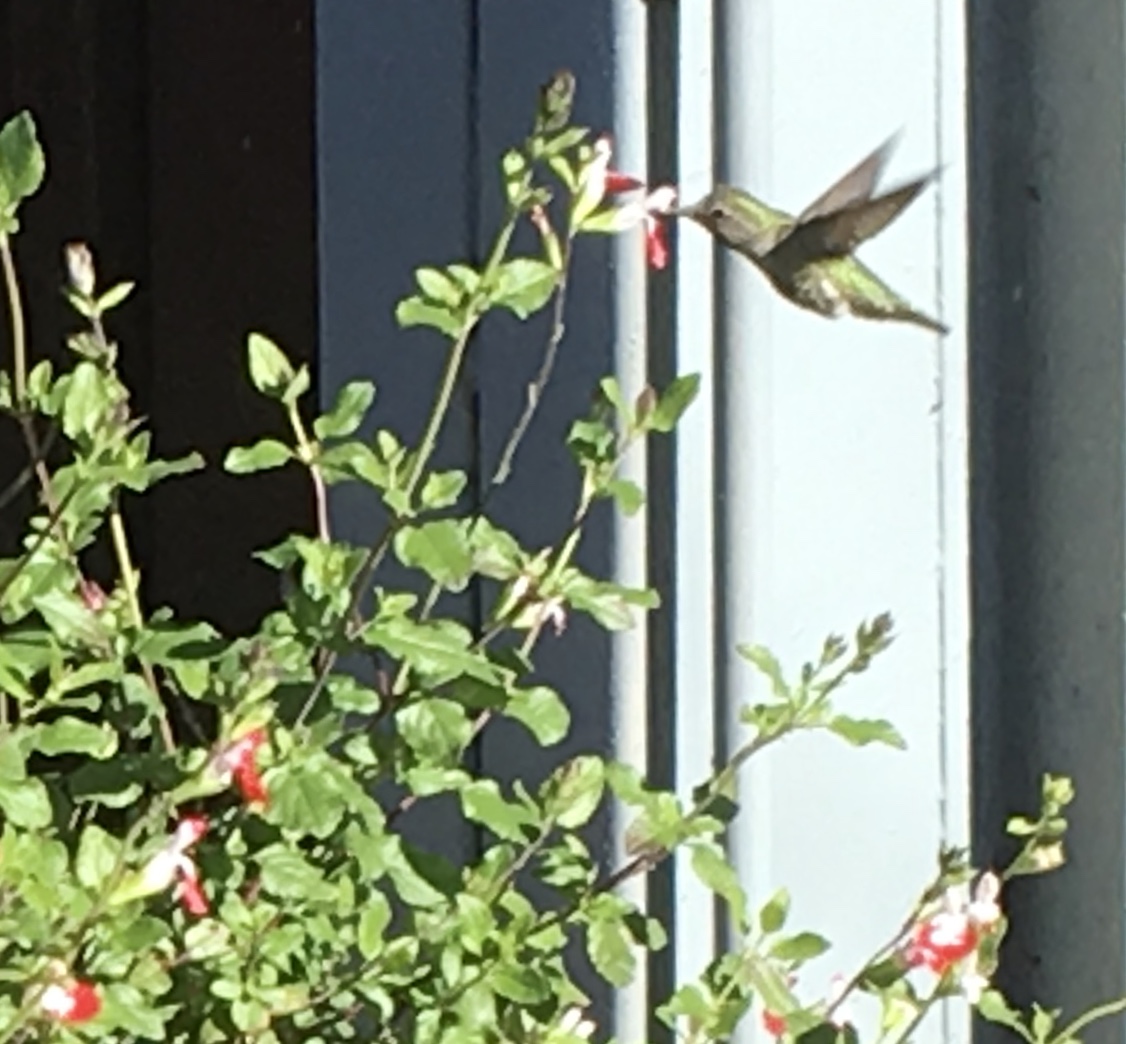
Or if I weren’t staying a good walking distance from the symposium, how would I have come across a hummingbird in the cold of February after being delighted with Sue Leopard’s Hummingbird?
Hagar is a common Nordic name. But how likely was it that Twain would use that particular name in his California mining-camp story and that Codex VII is hosting “Codex Nordica”? Mark my words it was a put-up thing.
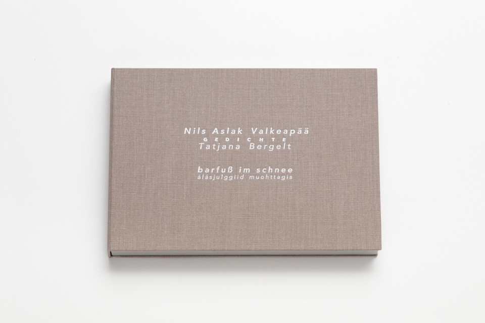
That not one of the symposium presenters introducing us to “Codex Nordica” is named Hagar should not be held against the organizers. Their choices — Åse Eg Jørgensen (co-editor of Pist Protta, Denmark’s longest running contemporary artists’ journal), Tatjana Bergelt (multilingual, of German-Russian-Jewish culture and settled in Finland), Thomas Millroth (art historian from Malmö) — are entertaining, informative and good humoured (proof at least for the Danes that they can’t all be Hamlet or Søren Kierkegaard). What they have to say and show speaks to book art’s uncanny rhyming across geographies and times.
With every issue the outcome of guest editing, artists’ contributions and a mandate to be unlike any previous issue, Pist Protta is a cross between Other Books and So, the collaborative, gallery-challenging venture of Ulises Carrión in the last century, and Brad Freeman’s US-based Journal of Artists’ Books.Printed Matter has faithfully carried every issue of Pist Protta, so there is little excuse to be unaware of it and its liveliness. Fitting for someone who thinks of herself as a collage of cultures, Tatjana Bergelt’s barfuß im Schnee-álásjulggiid muohttagis (“Barefoot in the Snow”) is a photo-collage of old maps, satellite maps, poetic texts, landscapes and portraits of the Sámi, the dwindling inhabitants of the northern parts of Norway, Sweden, Finland and the Murmansk Oblast. It reminds me of UK-based Nancy Campbell’s Vantar/Missing.
Vantar/Missing (2014) Nancy Campbell Digitally printed on Munken Polar, hand-sewn binding with hand-incised design, edition of 300
Both works delve into the vulnerable and disappearance — be it culture, gender or environment. Vantar‘s cold diptychs recording the mountain snow cover and barely perceptible signs of life in the ghost town Siglufjörður chime with Bergelt’s final slide:
“From Finland barefoot in snow”, Codex VII, 4 February 2019 Tatjana Bergelt
barfuß im Schnee-álásjulggiid muohttagis (2015) Tatjana Bergelt 2 books in linen cassette, edition of 4, in each book 6 poems by Nils Aslak Valkeapää in Sámi, Finnish and German languages, translations P.Sammallahti, C.Schlosser
The bus from the symposium in Berkeley to the fair itself in Richmond is another chance for chance to play its role. One day I’m sitting next to Amanda Degener (Cave Paper), who delights in our common acquaintance with Ioana Stoian and Eric Gjerde; the next, it’s Jeanne Drewes (Library of Congress), who introduces me to Mark Dimunation (Library of Congress), who regales us and the collector Duke Collier with tales of the British artist Ken Campbell. But the terrible thing about chance is that it takes up so much time and, at the same time, shows you what you wish you had more time for.
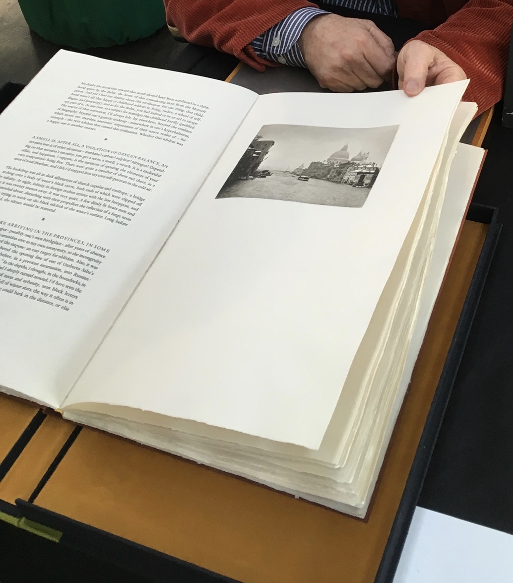
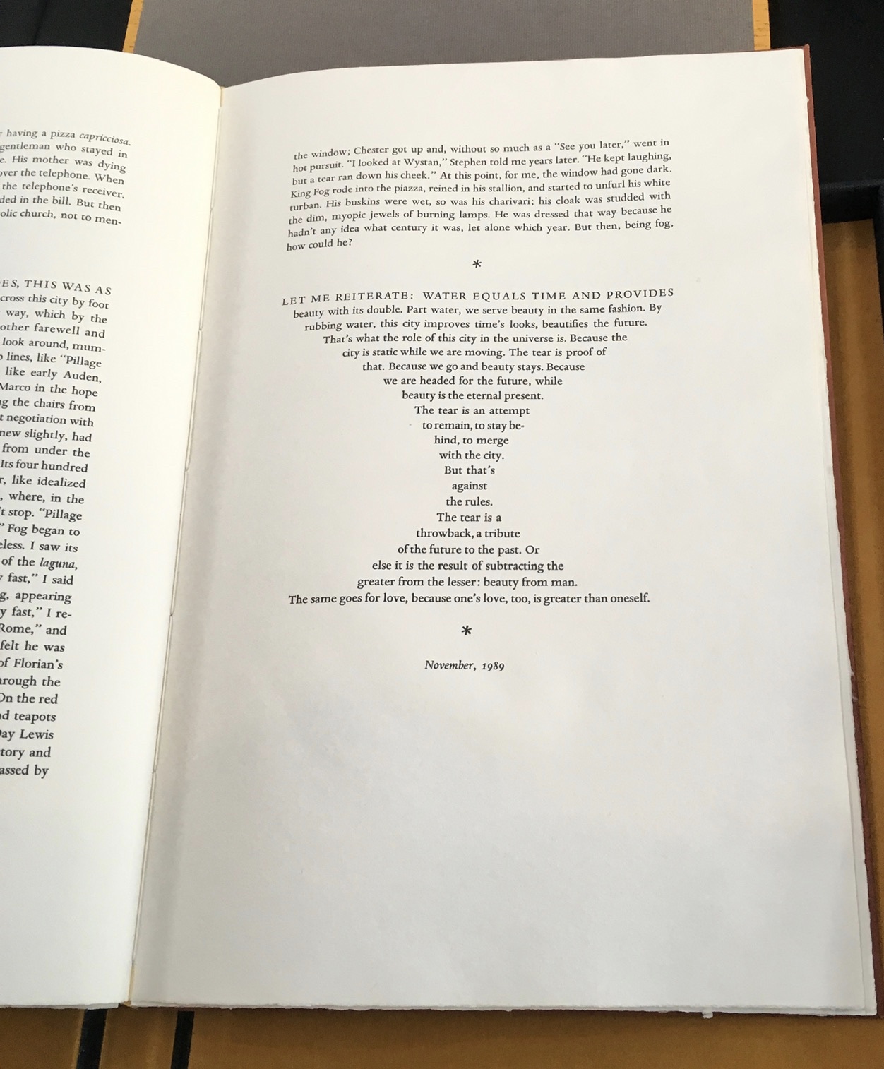
Recto: note the vaporetto in the image.Verso: think of the registration magic.The conclusion to Watermark and Koch’s homage to Aldus Manutius
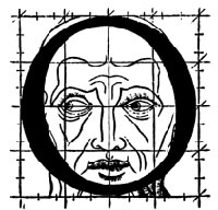
Or to Russell Maret discussing his work Character Traits and Geoffroy Tory’s Champ Fleury: The Art and Science of the Proportion of the Attic or Ancient Roman Letters, According to the Human Body and Face (1529):
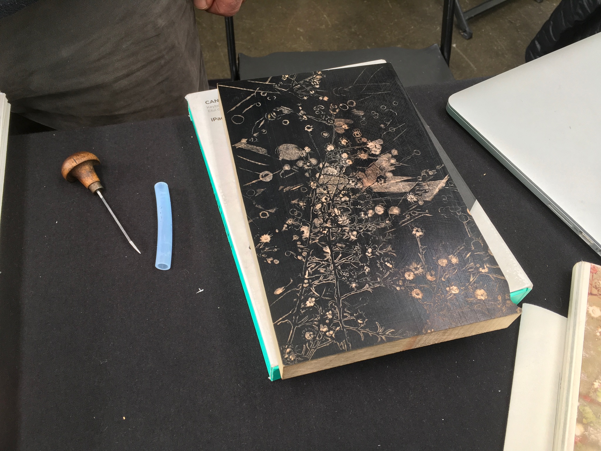
Or to Gaylord Schanilec (Midnight Paper Sales) enjoying his work on a woodblock:
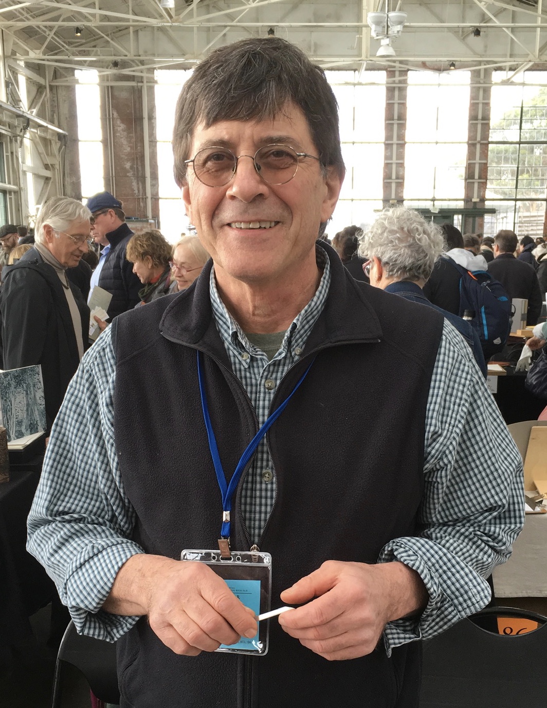
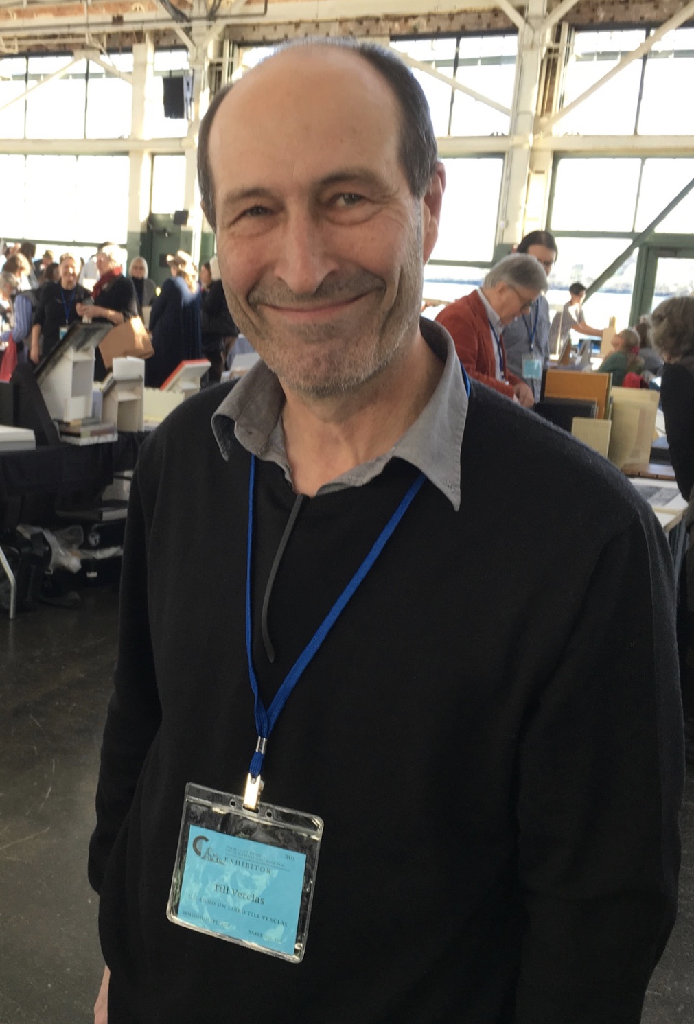
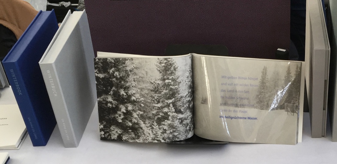
Or to Till Verclas (Un Anno Un Libro) explaining how his children helped achieve the effect of snow falling over Friedrich Hölderlin‘s words in Winterbuch:
Or to Sam Winston (ARC Editions) sharing his Reading Closed Books, which like Darkness Visible, sprang from his 7 Days performance in a blacked-out studio:
Sam is kind enough to introduce me to his colleagues at ARC Editions (Victoria Bean, Rick Myers and Haein Song). Individually and together, they are forces to watch. Myers’ An Excavation, which I’d had the pleasure to see previously in The Hague, can be partly experienced in these videos, and Song’s fine bindings and artist’s books must be seen. Bean’s symposium talk is on Check, her portfolio of typewriter prints featuring fifty writers, from Oscar Wilde to Joan Didion, and the checks they wore, and on Flag, the follow-up series of artist’s books that takes a writer from Check and uses colour, cloth and typewriter prints to explore an individual work by that writer.
Slide from “Flag”, Codex VII, 5 February 2019 Victoria Bean
Typewriter prints from Check by Victoria Bean
Tess (2019) Victoria Bean The red and black ribbons and white linen are drawn from images in Hardy’s Tess of the D’Urbervilles symbolizing Tess and critical events of her life and death.
Detail of Tess Victoria Bean
Detail of Tess Victoria Bean
Check and Flag illustrate that bright enjoyable thread that shows up again and again at Codex and book art at its prime — the integration of letter, image, material, form, process and subject in a way that self-consciously calls attention to them yet yields a work of art that simply is — on its own terms.
Which, if you have read “Jim Blaine and His Grandfather’s Ram”, ought to remind you that
… Parson Hagar belonged to the Western Reserve Hagars; prime family; his mother was a Watson; one of his sisters married a Wheeler; they settled in Morgan county, and he got nipped by the machinery in a carpet factory and went through in less than a quarter of a minute; his widder bought the piece of carpet that had his remains wove in, and people come a hundred mile to ‘tend the funeral. There was fourteen yards in the piece.
‘She wouldn’t let them roll him up, but planted him just so—full length. The church was middling small where they preached the funeral, and they had to let one end of the coffin stick out of the window. They didn’t bury him—they planted one end, and let him stand up, same as a monument.
With its 222 exhibitors here weaving the threads of book art and the book arts, Codex VII is a monument to enjoy. As for that old ram, you will have to read the story — and prepare for Codex VIII.