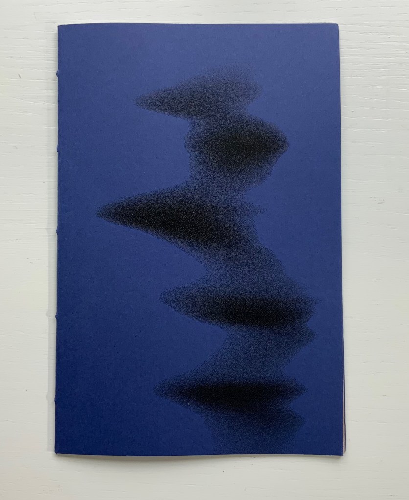
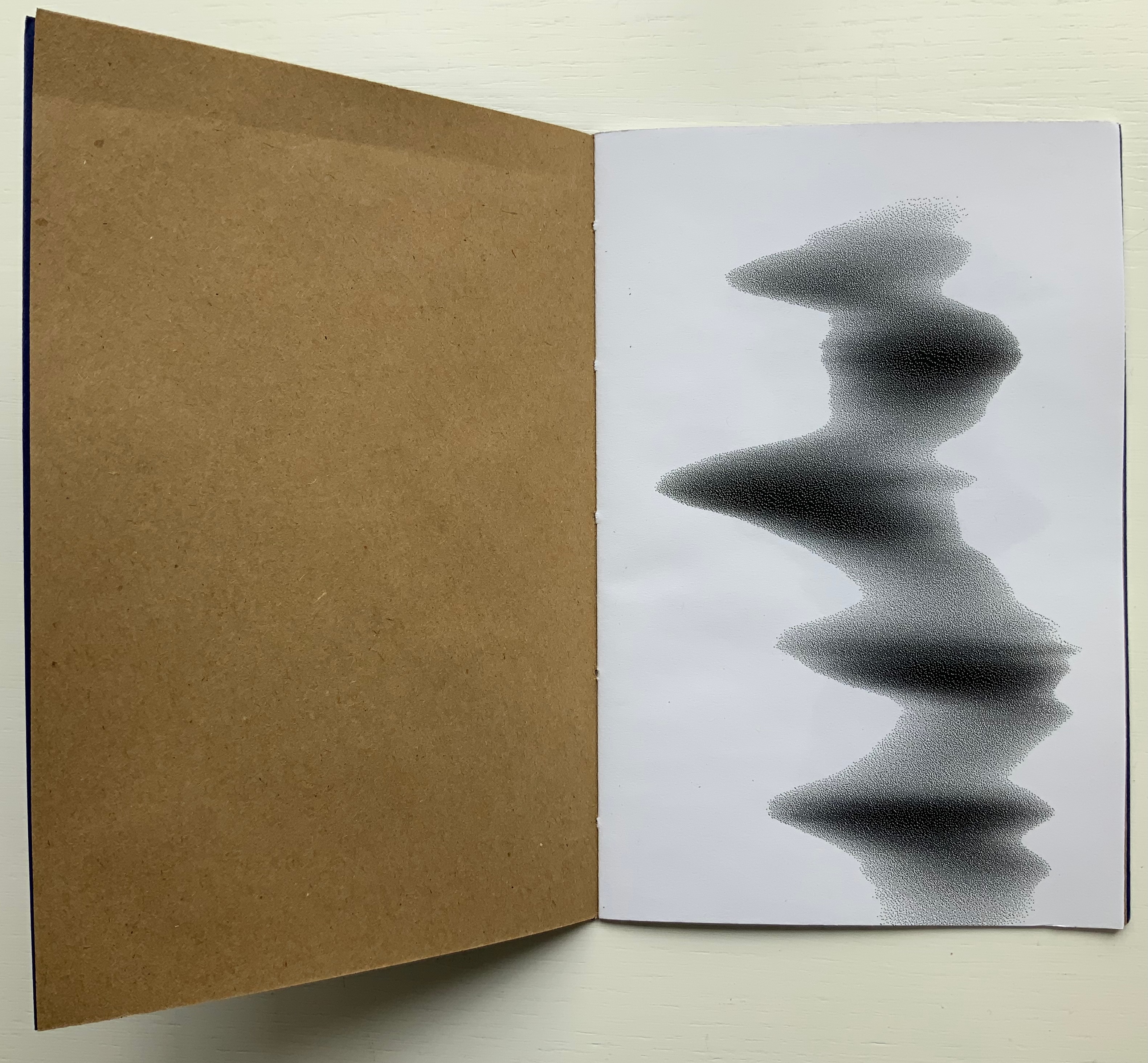
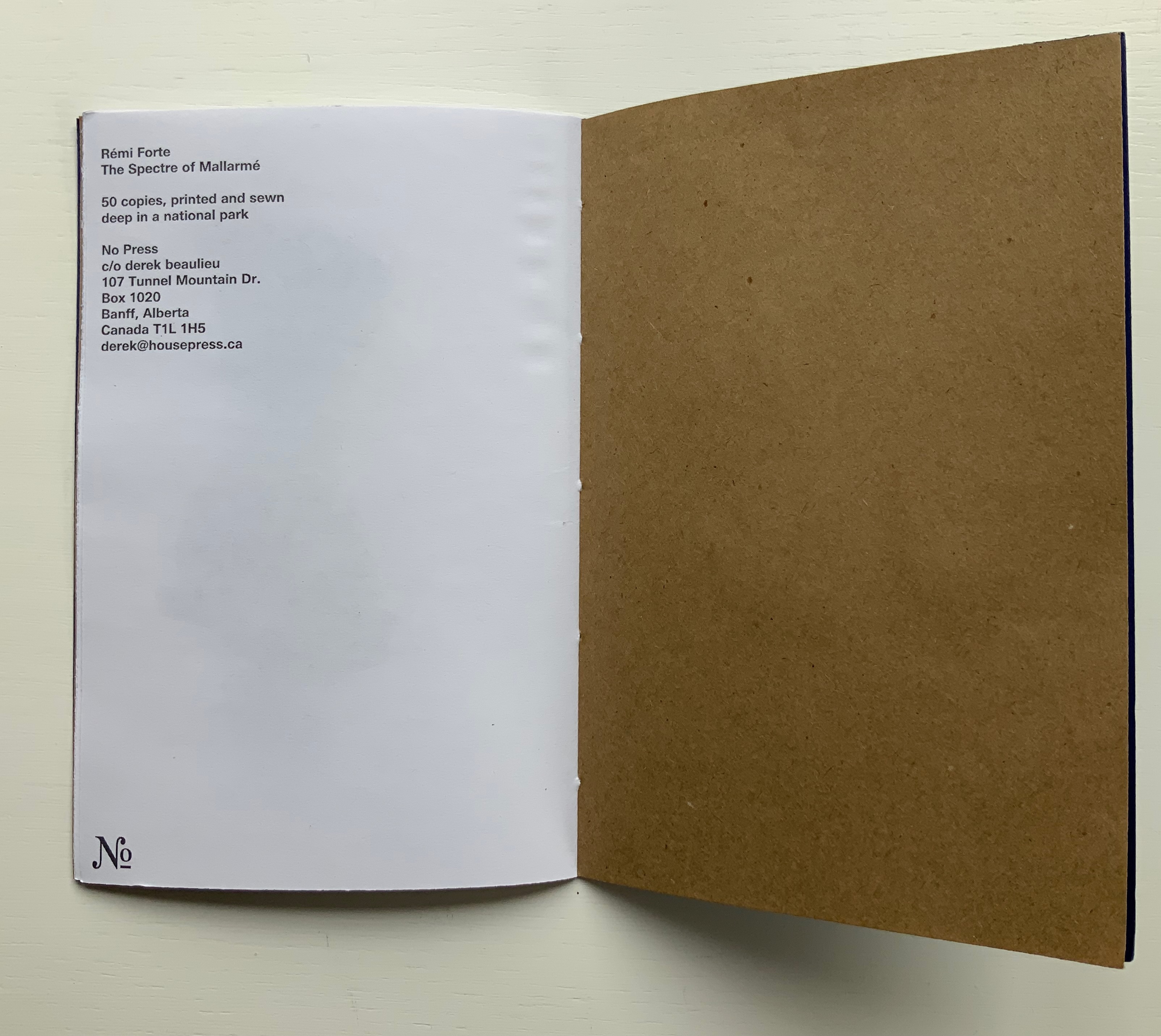
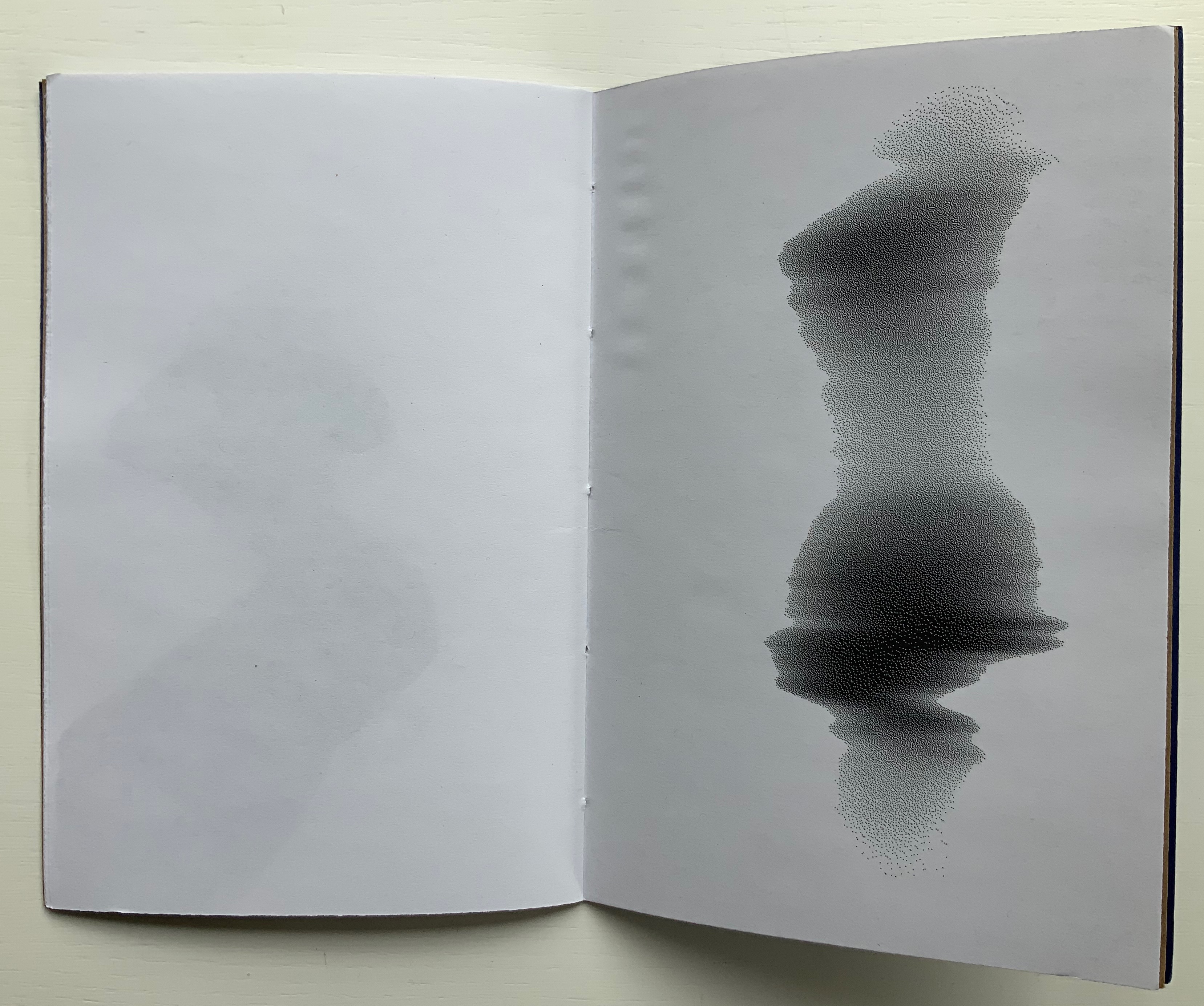
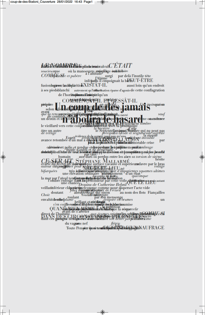
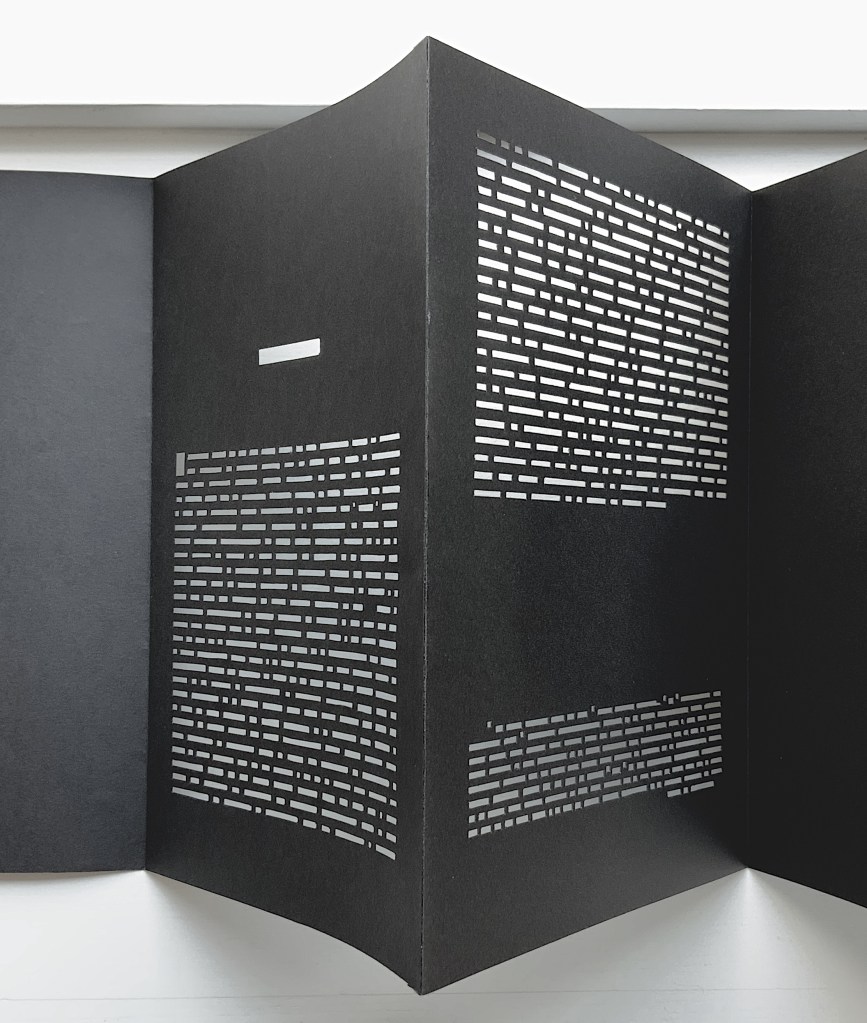
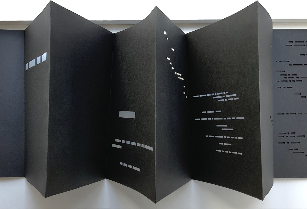
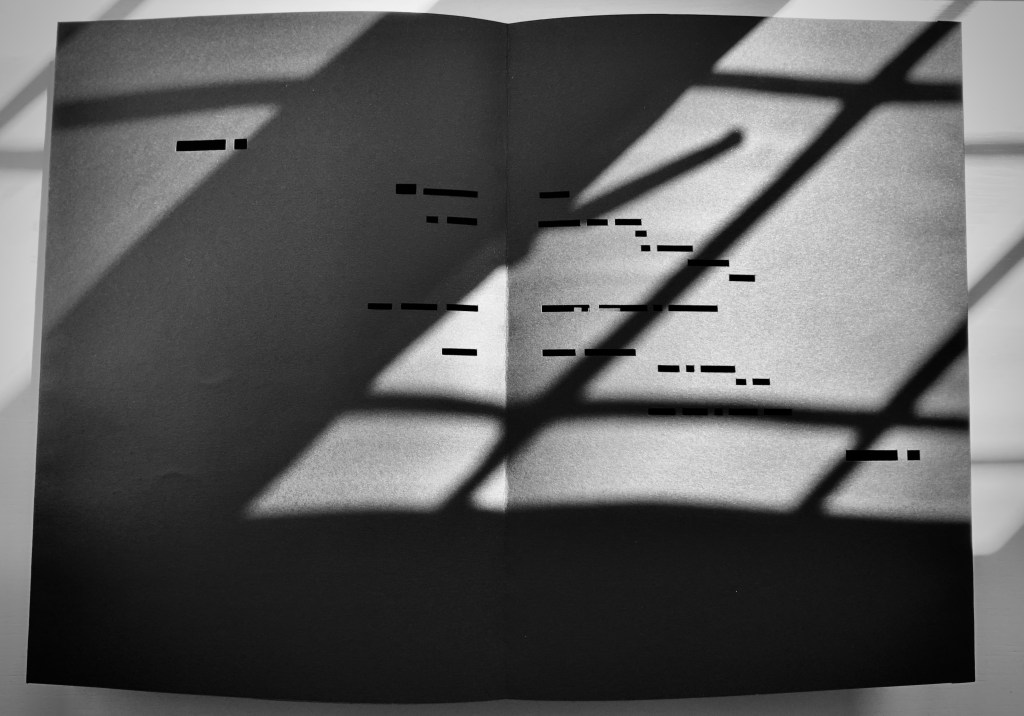
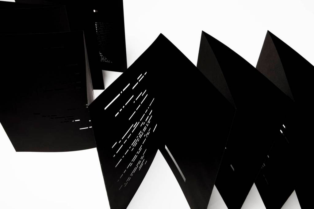
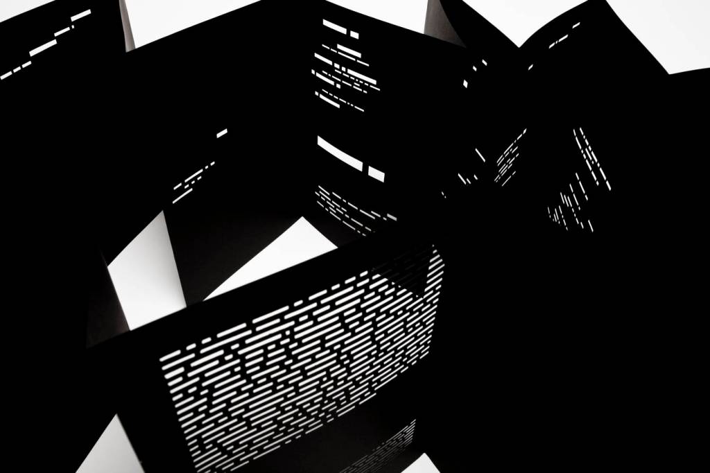
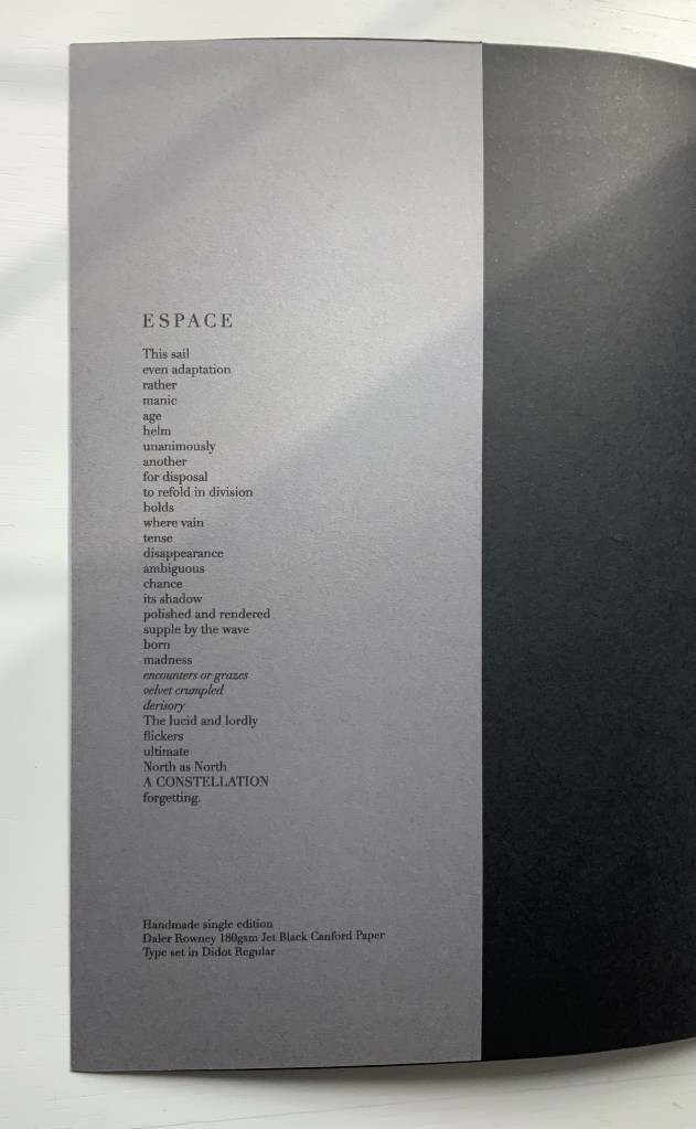
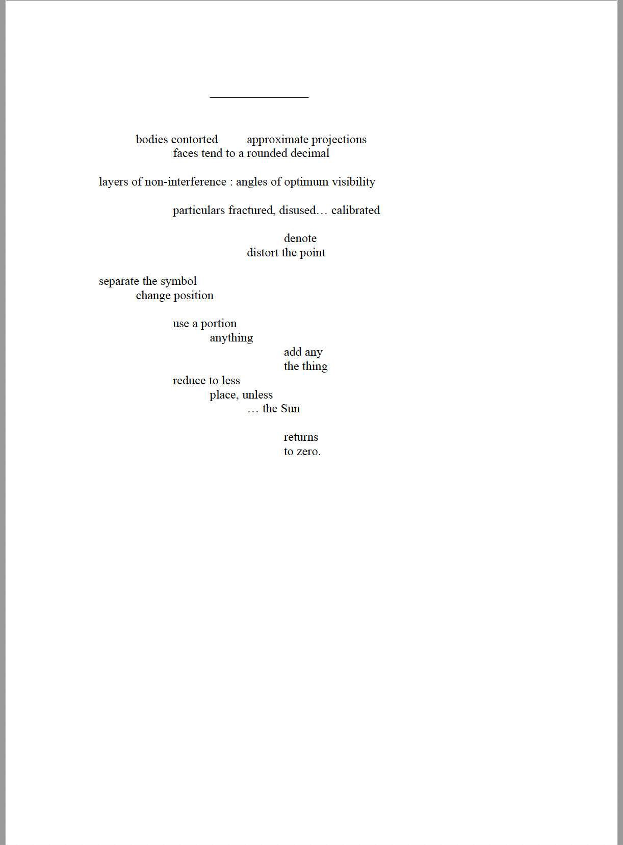
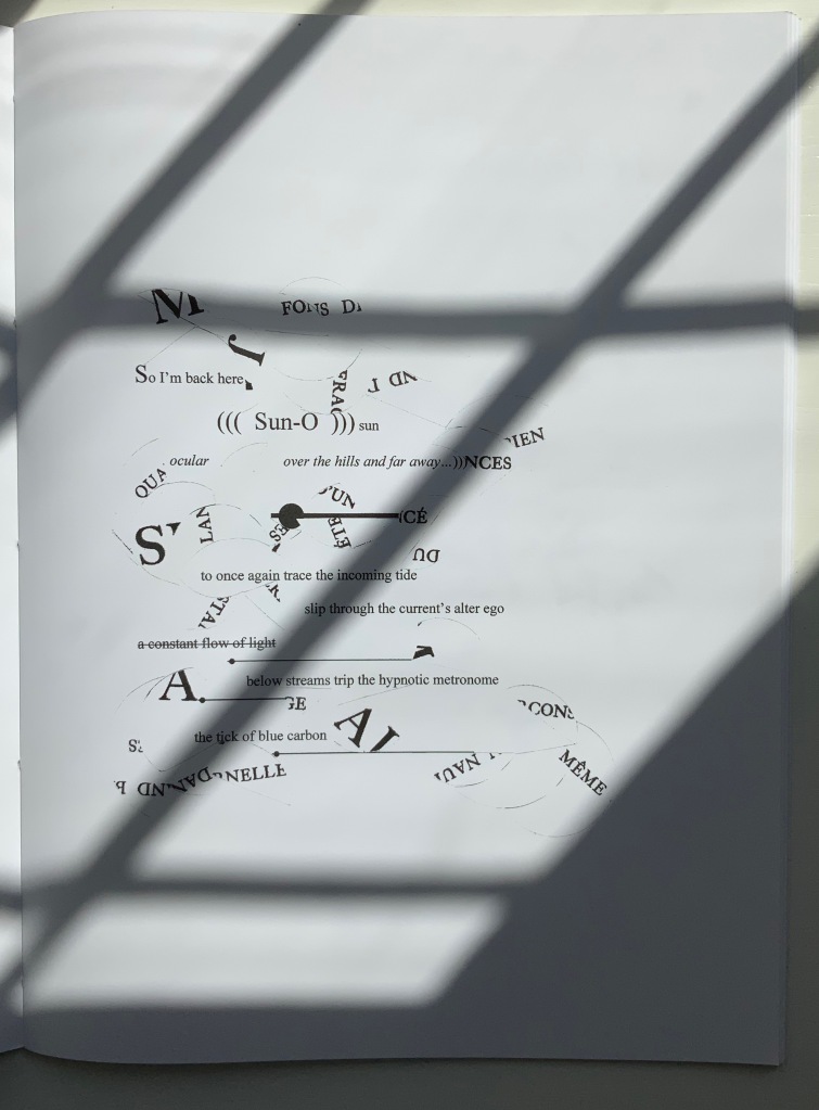
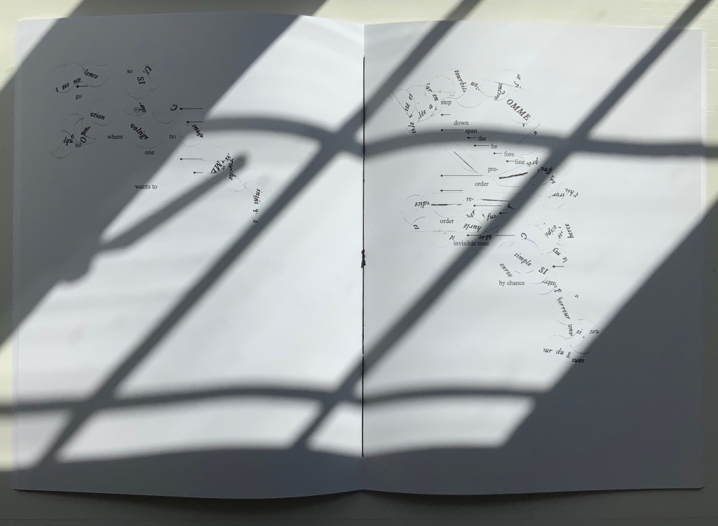
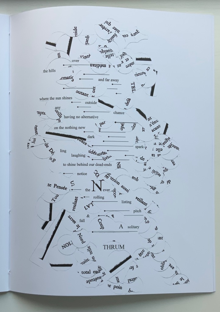
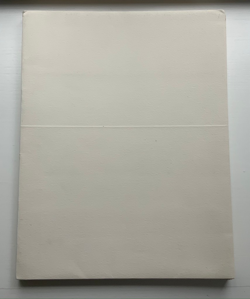
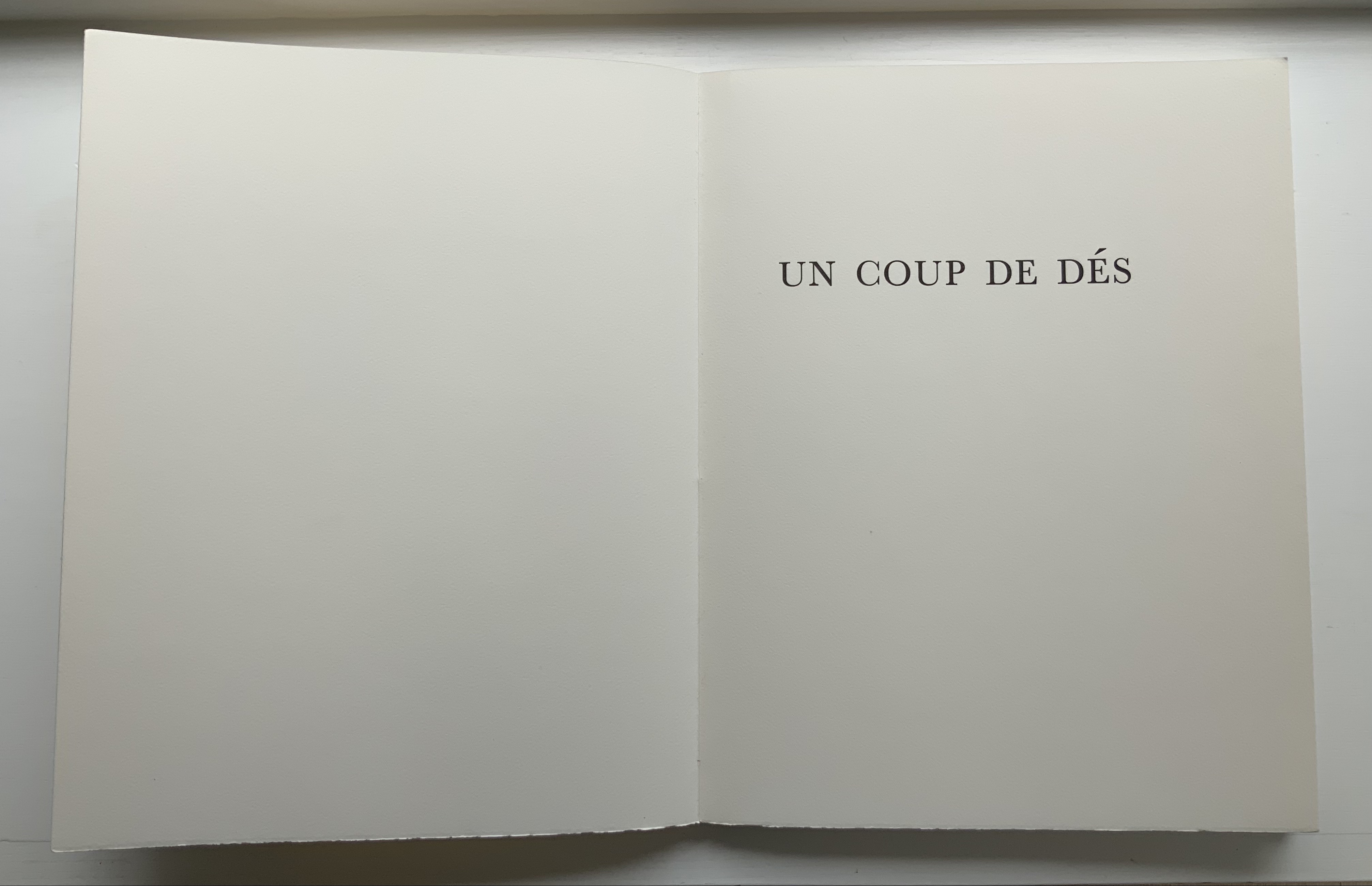
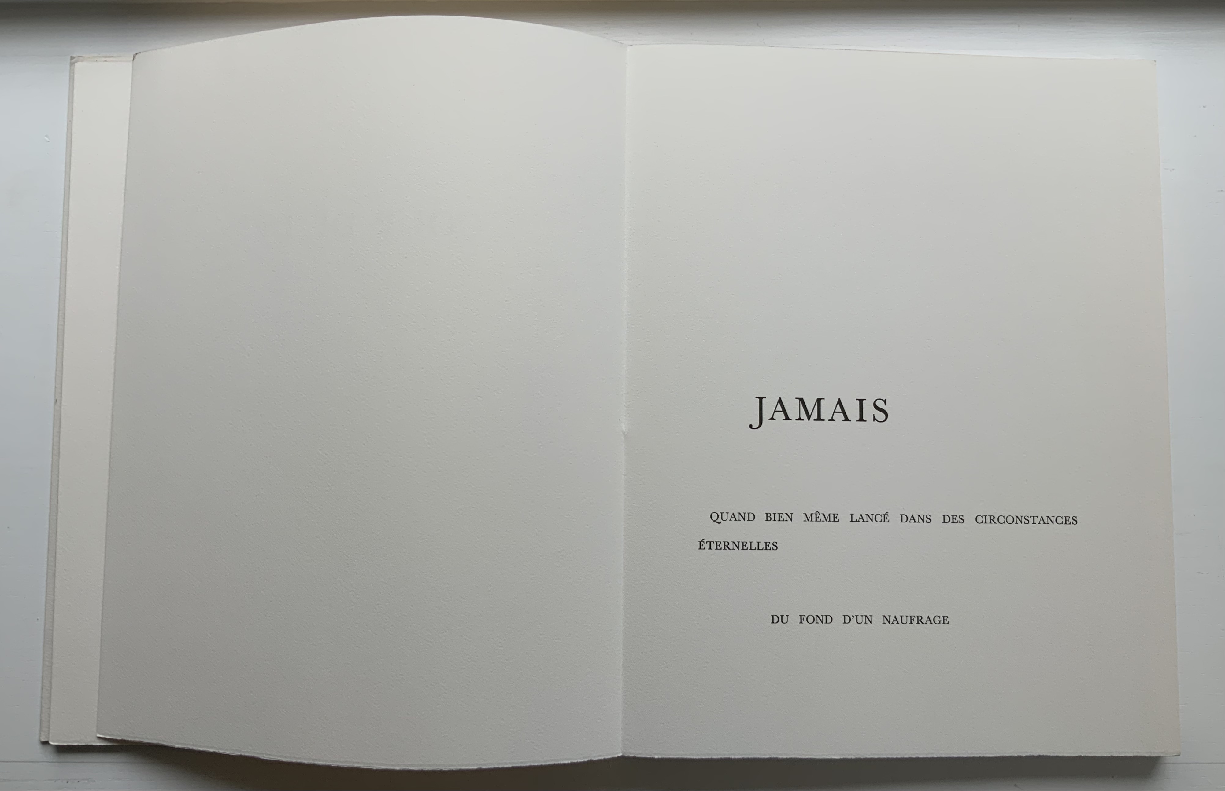
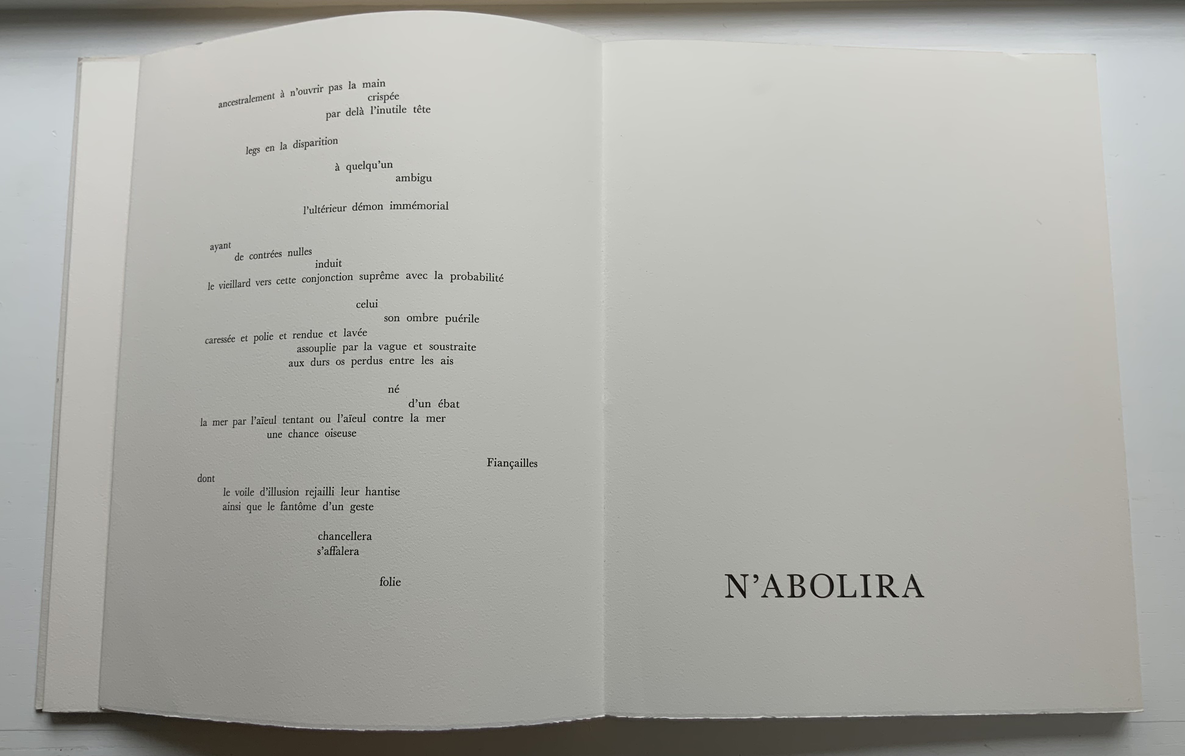
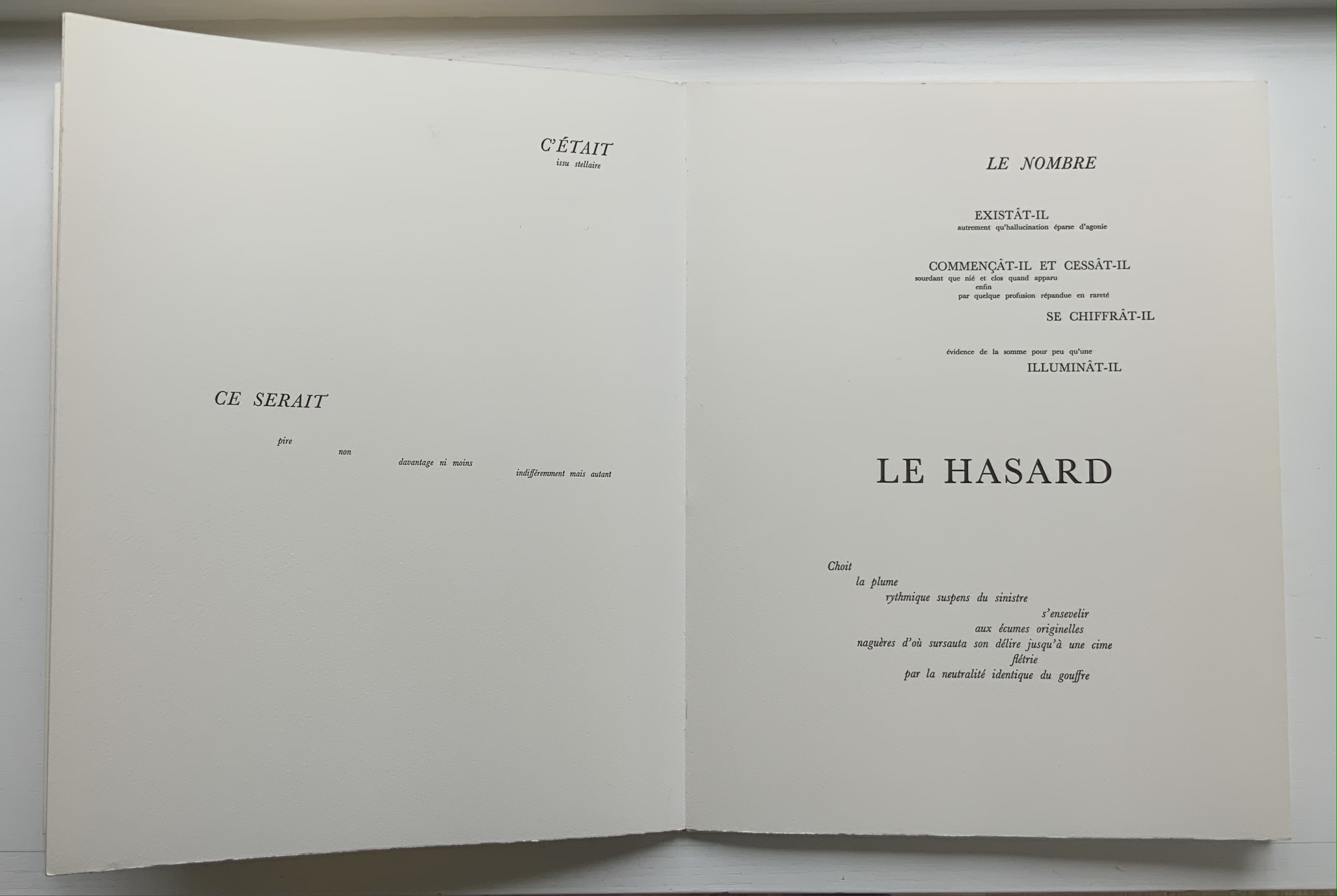
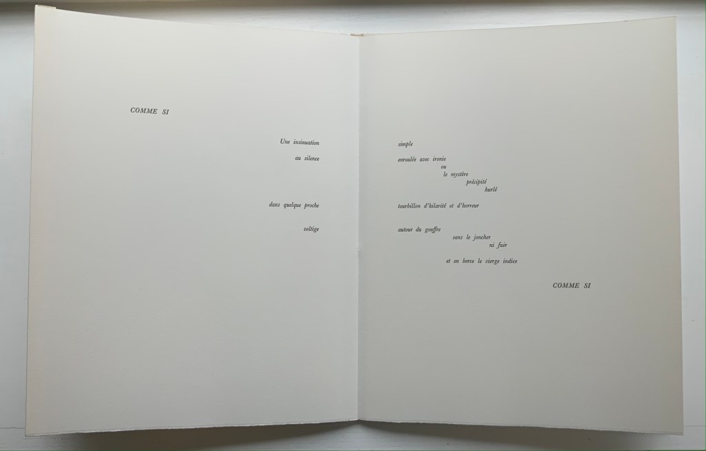
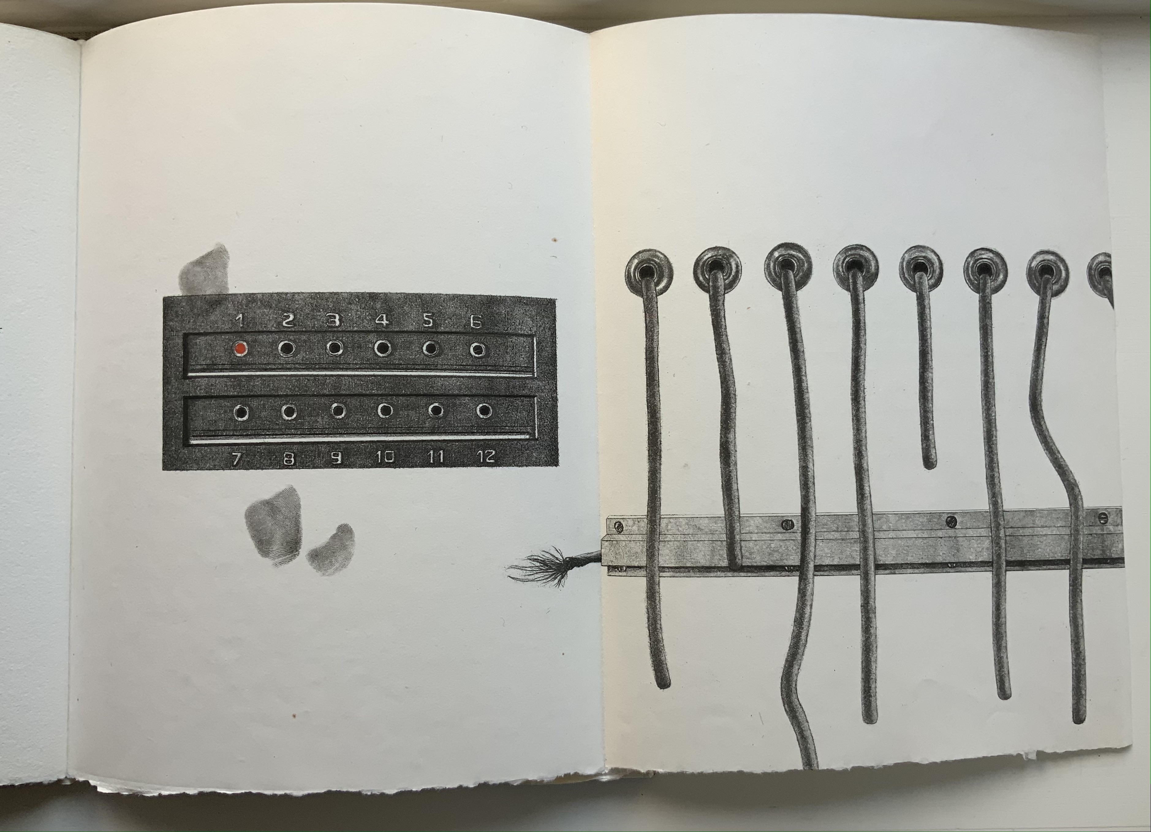
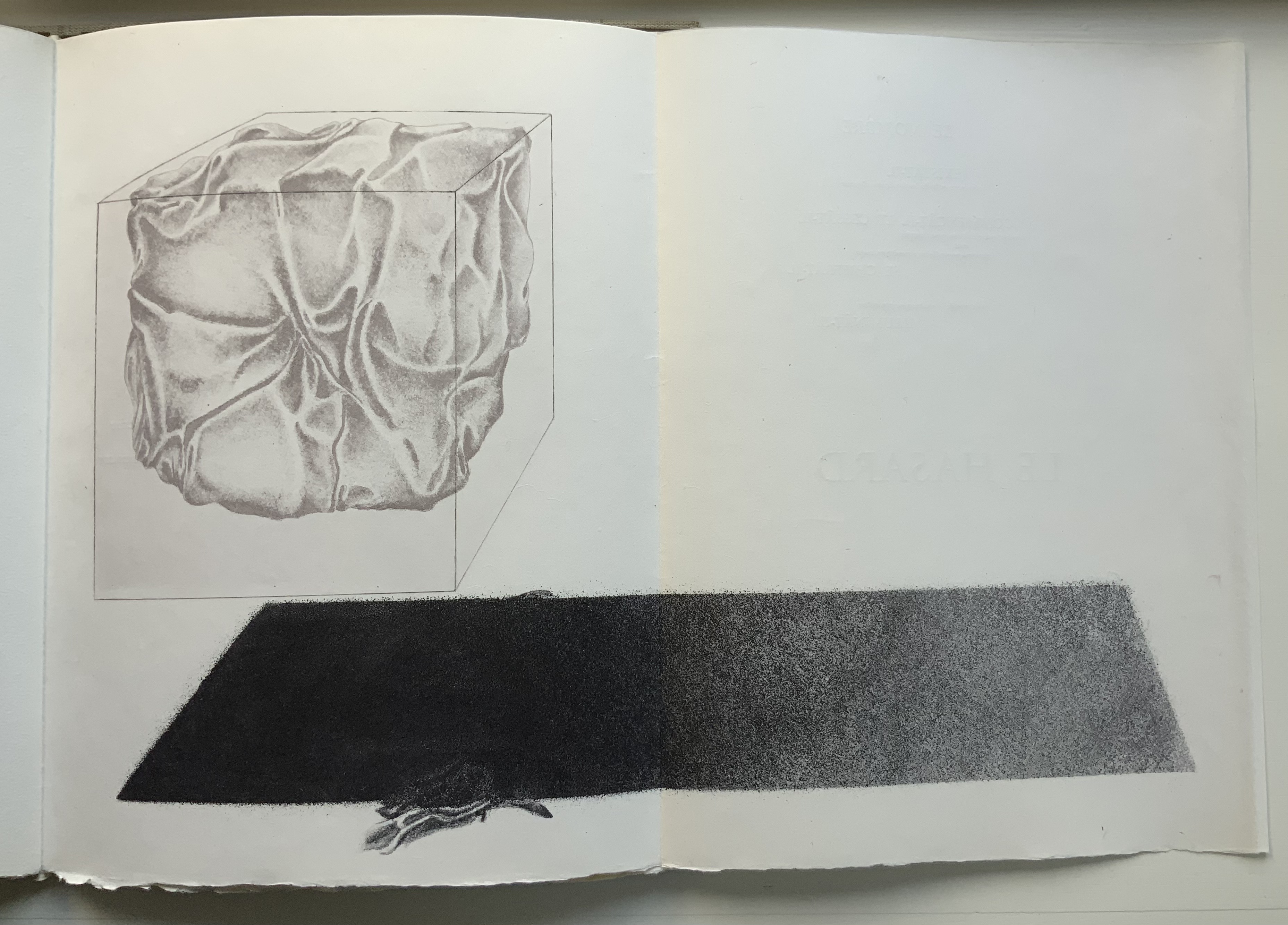
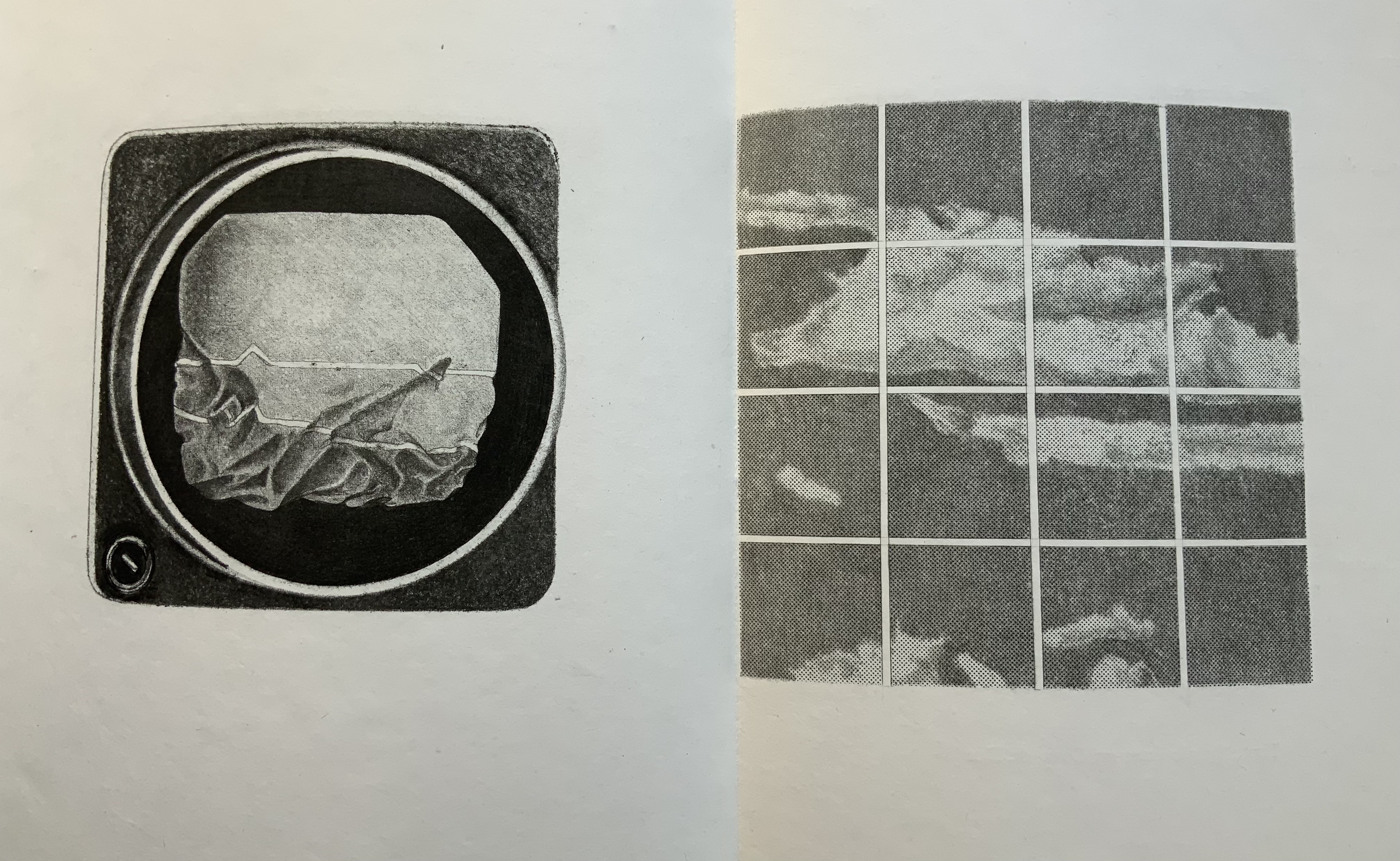
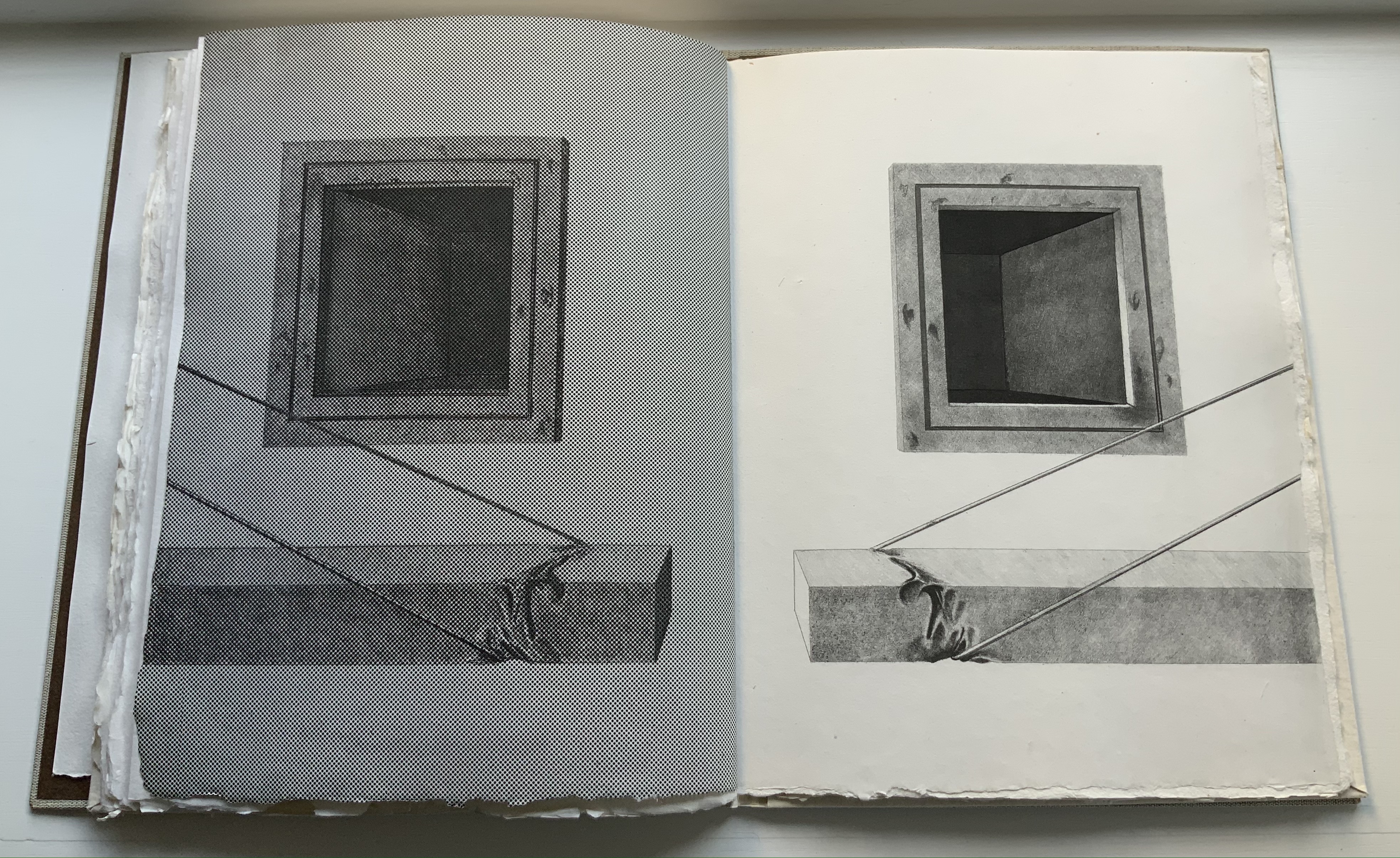
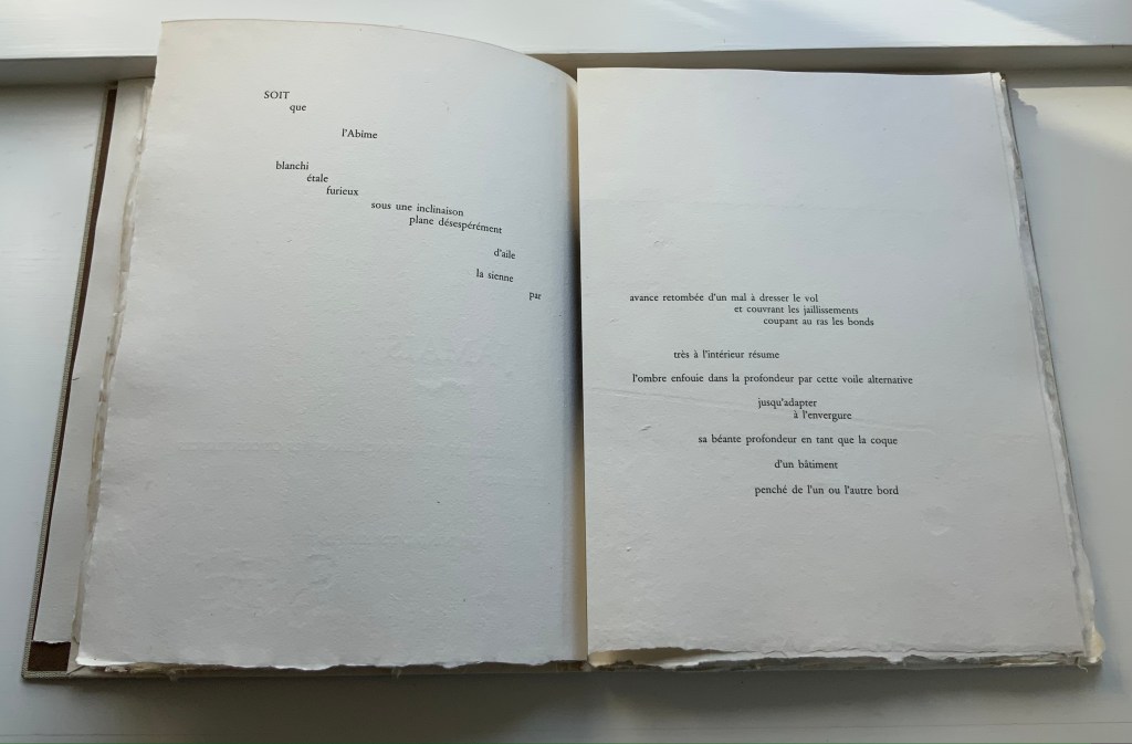
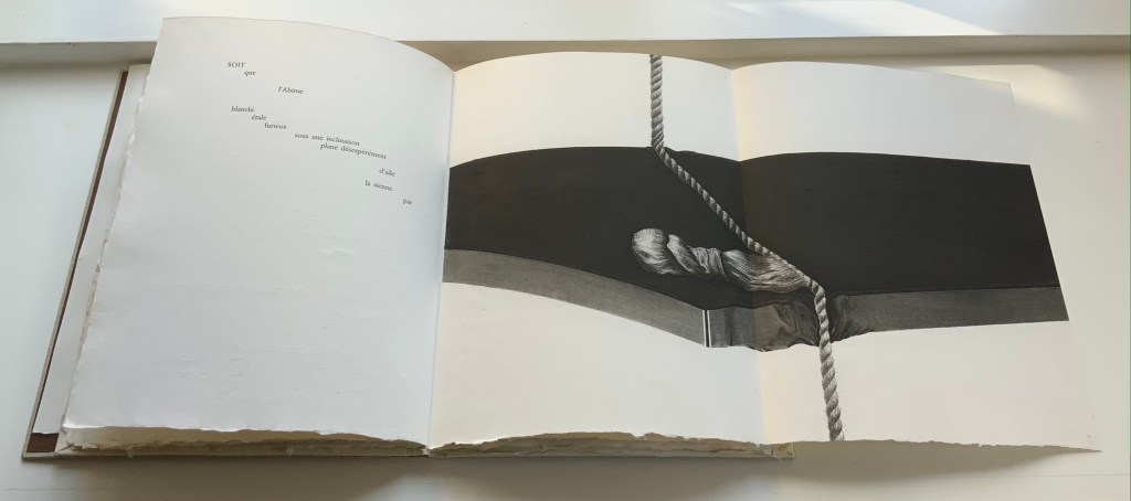
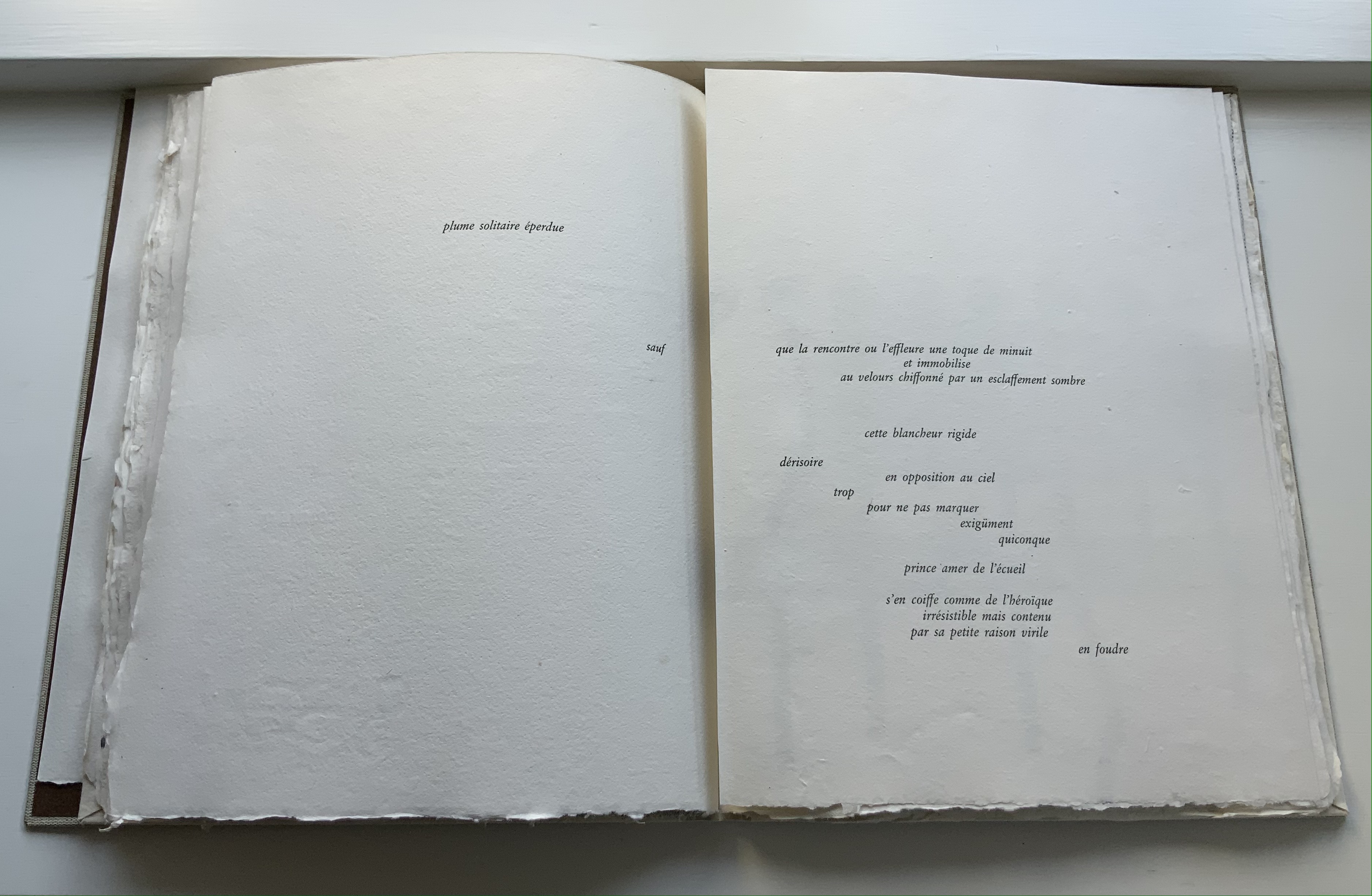
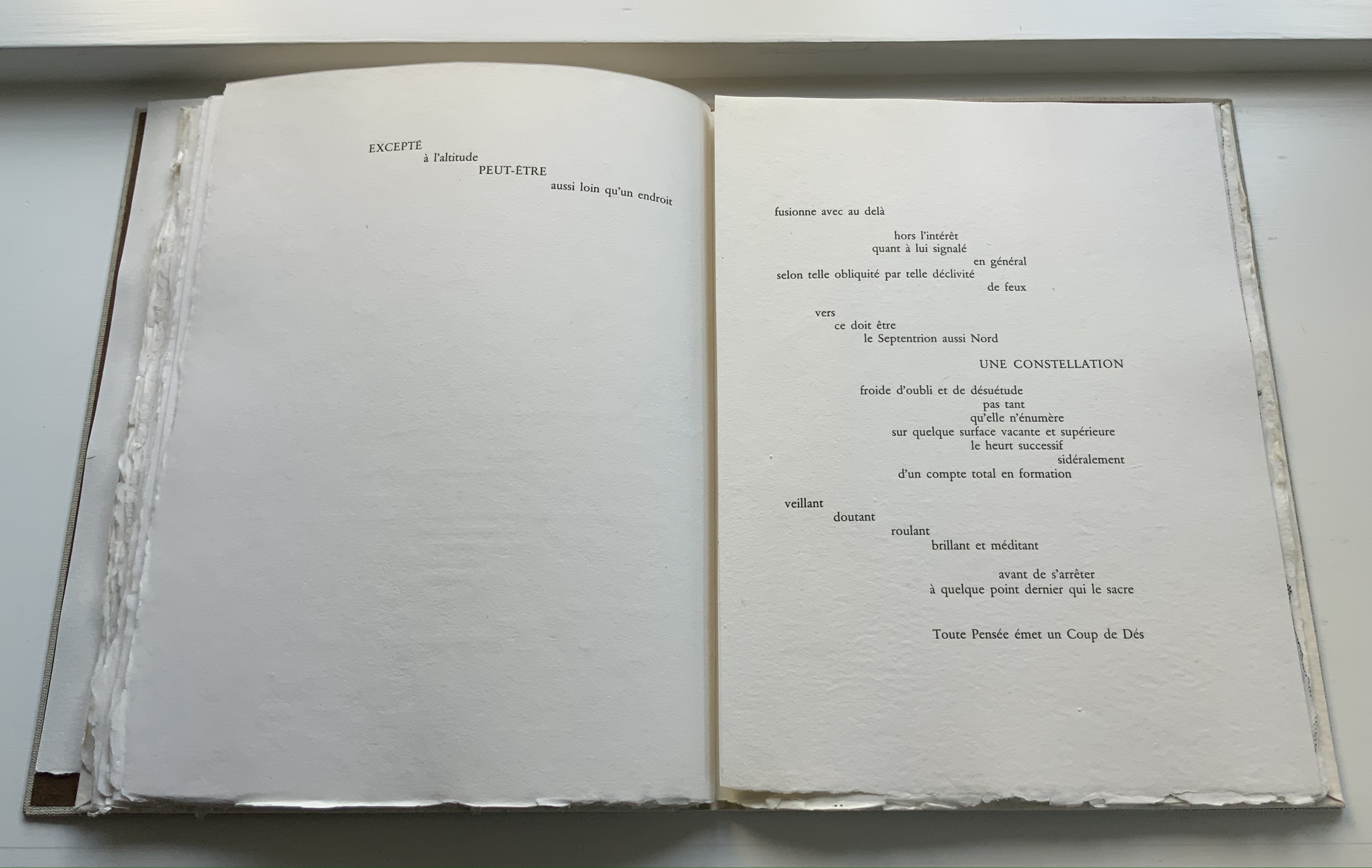
The Spectre of Mallarmé(2022) Rémi Forte Paper booklet, sewn. H190 x W126 mm, 16 pages. Edition of 50. Acquired from Rémi Forte, 8 April 2022. Photos: Books On Books Collection. Displayed with permission of the artist.
Published by Derek Beaulieu’s No Press in 2022, Rémi Forte’s images actually began life digitally over a ten-year period, first emerging on Instagram in November 2021. A foundry manager, artist and student, Forte is drawn to “vaporous, elusive abstract forms” [correspondence with Books On Books Collection, 28 April 2022]. The images are handmade with digital sensors. Whether in white on black or black on white, Forte has varied the grays in his effort to find the movement Mallarmé achieved by type, space, words.
Chance and the vagaries of the publishing process account for the images’ appearing on single pages and in black on white, but regardless of that, this homage is no mapping of the Cosmopolis or NRF/Gallimard editions. It harks back to Ernest Fraenkel’s response but without any long-winded assertions about delving into Mallarmé’s psyche. But that comparison is a straw man. Forte’s response is a direct artistic act with 21st century tools.
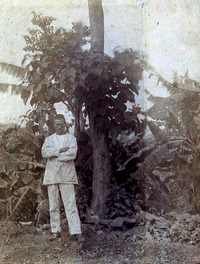
It leaves to the reader/viewer the opportunity to see the smoke curling from Mallarmé’s cigar in his portrait by Édouard Manet, the sails of his boat, the shadows or light reflecting from the river running through Valvins or the type, space and words of Un Coup de Dés Jamais N’Abolira le Hasard moving across the page.
Further Reading
“Nicolas Guyot“. 20 May 2020. Books On Books Collection.
Ein Würfelwurf kann den Zufall nicht abschaffen A Throw of the Dice will Never Abolish Chance(2011)
Ein Würfelwurf kann den Zufall nicht abschaffen A Throw of the Dice will Never Abolish Chance(2011) Daniela Deeg and Cynthia Lollis Stab-bound book with added screwpost binding in a vinyl cover, housed in a greyboard box with title stamped on lid. H230 x W345 mm, 40 pages. Edition of 18, of which this is #7. Acquired from Vamp & Tramp, 31 March 2022. Photos: Courtesy of ETC Press; Books On Books Collection. Video: Books On Books Collection. Displayed with permission of the artists.
Removed from its greyboard box, this artists’ book by Daniela Deeg and Cynthia Lollis appears clouded by its overlapping layers of vinyl covers. As the top cover turns to the left and the next layer turns to the right, the shine of the covers’ slick side combines with the dull side to create an impression of wet fog, parting to reveal an equally cloudy translucent double-folded leaf of Cristalla paper on which is printed Übergang and transition in the typeface Sabon in roman font and gray. With the Übergang/transition page turned over rightwards, the inner double-page spread shows three words in blue italic: Fluß, flux and fleuve. If the whole Fluß/flux/fleuve spread is turned over leftwards, Übergang/transition reappears on the left along with stroom in blue italic in the center and transition and overgang in gray roman on the right. When the transition/overgang page turns rightwards, the words toeval and Zufall appear in blue italic.
What is going on? To be sure, an artist’s book entitled Ein Würfelwurf kann den Zufall nicht abschaffen / A Throw of the Dice will Never Abolish Chance implies an homage to Stéphane Mallarmé’s famous poem Un Coup de Dés Jamais N’Abolira le Hasard. The most famous homage to date comes from the Belgian Marcel Broodthaers, who replaced the lines of verse with black strips in an edition with translucent paper. Deeg and Lollis do include those redactive bars in their work. But what has that to do with all those gray and blue words?
The bilingual title suggests that questions of language are in play. Even if, however, the words are recognized as German, English, Dutch/Flemish and French — and understood as rough multilingual synonyms for “transition”, “river”, “flux” and “chance” — a few hints about the rules of the game would help. There is no colophon at the end of the book, but with all the turning over this way and that, one might think to turn the box over. And there it is.
So there is a lot going on. About the word list as a starting point, more later. Another starting point — not fully clear from the colophon — lies in the reference to the Frans Masereel Centrum in Belgium. Collaboration at a distance and during joint travels over texts and visuals is part of the artists’ working process.
We often travel to other places to inspire our artists’ books, and we’ll select an author that we admire to act as our guide. Each of our books includes our native languages, English and German, plus the language that represents the place we visited. Ein Würfelwurf was a little different. We’d just completed a decade of making books together. Instead of going somewhere new, this book was to be a look back to places that we had traveled in those ten years. We were printing this book on a residency in Belgium, so this time we looked for a Belgian to lead us. Because our book would be focused on language, its poetic potential, and the translation of words, we chose an artist as our guide. Specifically, we chose one who translated printed words into visual form. Both of us admired Broodthaers’ conceptual work, and we thought that it was fitting to quote his Un Coup de Dés artwork. [Correspondence from Cynthia Lollis with Books On Books Collection, 4 April 2022]
Some of the photographs to which Lollis refers depict buildings from multiple locales, interiors, a desk with an open book, traffic lights, a landscape from on high, and other scenes difficult to recognize because all are rendered in screen prints as backgrounds to words or other photographs rendered as simplified outlines and silhouettes. Most of the outlines and silhouettes such as the ones of a cuckoo clock’s counterweights, a chandelier, mailboxes, crowd control stanchions, human figures, a park bench or buildings are easily recognizable even though they may be turned on their sides, split in two or enlarged. Two recurrent images that require some deciphering are of street lamps and signposts appearing as overlapping outlines and silhouettes from various perspectives and positioned at various angles. On the left below, the silhouette of a street sign topped with a wagon wheel of globe lamps is more easily detected if looked at from the side. On the right below, the silhouette of an ornate streetlamp seen from an angle below is transformed into a white outline, enlarged and turned on its side so that it seems to be a map. (The blue background is a screen printed photo of an interior with windows, tables and chandeliers.)
To return to the words scattered throughout, the images have detectible relationships to them — often with ease, sometimes only by pondering the synonyms. The outline of the street sign appears close to Übergang, which can mean “crossroads” as well as transition, which also appears on the same page, but on a double-page spread with the outline of the same street sign, the words Fluß/flux/fleuve appear. Making the connection here between image and words can be as challenging as deciphering Mallarmé’s metaphors, and that could well be the point. Also, there is something Mallarméan about the way the book requires the reader to hold a set of multilingual near-synonyms in suspension — like bated breath — while turning the pages. Sometimes a synonym appears for a set of words some pages later and in the context of other words. For example, stroom (Dutch for “flow”) appears only after the Fluß/flux/fleuve pages have been tucked away, and then it appears across from transition and Overgang.
The reason that some words are set in gray roman and others in blue italic goes back the work’s starting point and creative process. Not sure where it might lead, the artists began creating a list of English words in 2001. In 2011, with the aim of creating this book, Deeg and Lollis arrived at the Frans Masereel Centrum in Belgium with design ideas and three lists in hand: the original set (5 words), another in English (5) and one in German (5). When they began the task of translation to create a final list of 30 (15 pairs), the realities of ambiguity and multiple meanings across and within languages arose. Undaunted, they handed over their lists to Belgian artist colleagues to see what clarification an injection of more perspectives, more languages (Dutch/Flemish and French) and therefore chance might bring. The 2001 list appears in gray roman, the 2011 in blue italic.
Another element of chance entered with the screen printing and folds of the translucent paper. The text and images seem to rise up through the folded pages and through each other to float on the surface. With all of these compositional, conceptual and material aspects, not only must this work be read and looked at carefully, it must be felt and listened to. Even as the book is lifted from its box, its Cristalla Transparent paper rustles inside the slippery covers, and every turn of page emits a symphony.
Chen, Julie. 2013. 500 Handmade Books. Volume 2. New York: Lark. Pp. 136 (Risk/Risiko), 289 (Ein Würfelwurf kann den Zufall Nicht Abschaffen/A Throw of the Dice Will Never Abolish Chance).
Un coup de dés jamais n’abolira le hasard (1914/2012)
Un coup de dés jamais n’abolira le hasard(1914/2012) Stéphane Mallarmé (text), Alain Hurtig (design), Catherine Belœil (art) Online and downloadable files for printing at L’Outil Typographique. Creative Commons (BY-NC-SA). Accessed 28 January 2022. Screenshots: Books On Books Collection. Displayed with permission of Alain Hurtig.
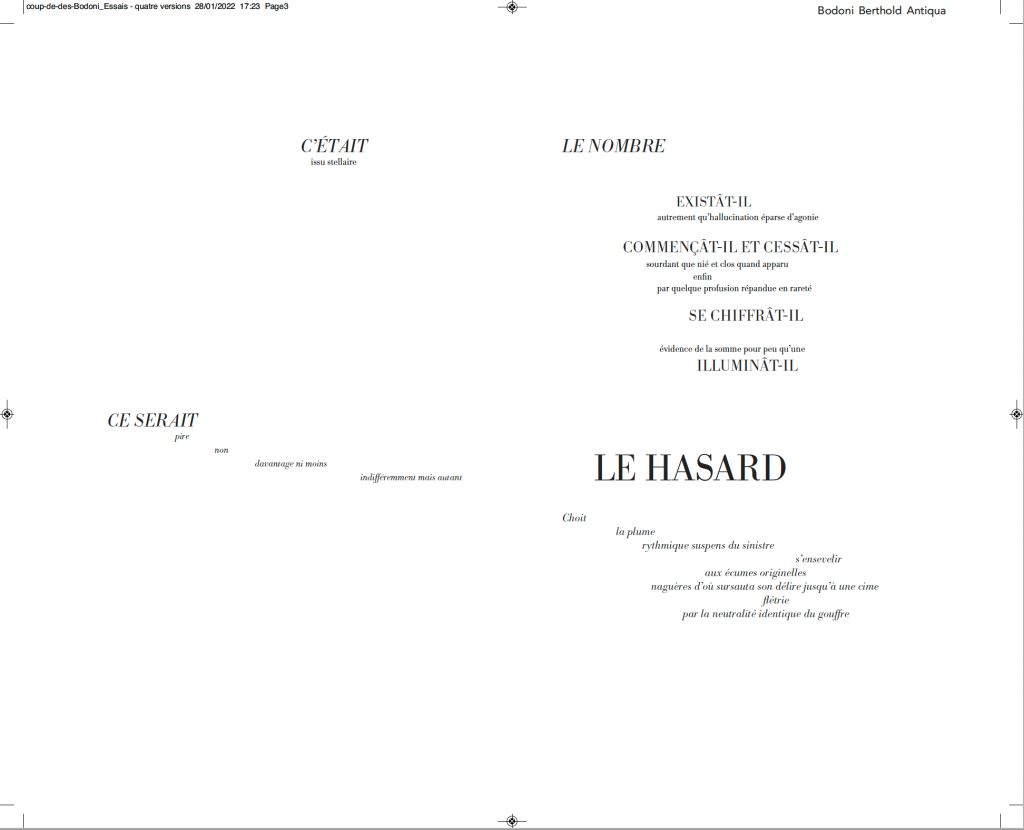
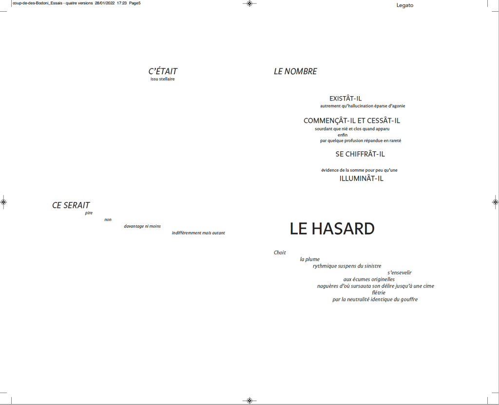
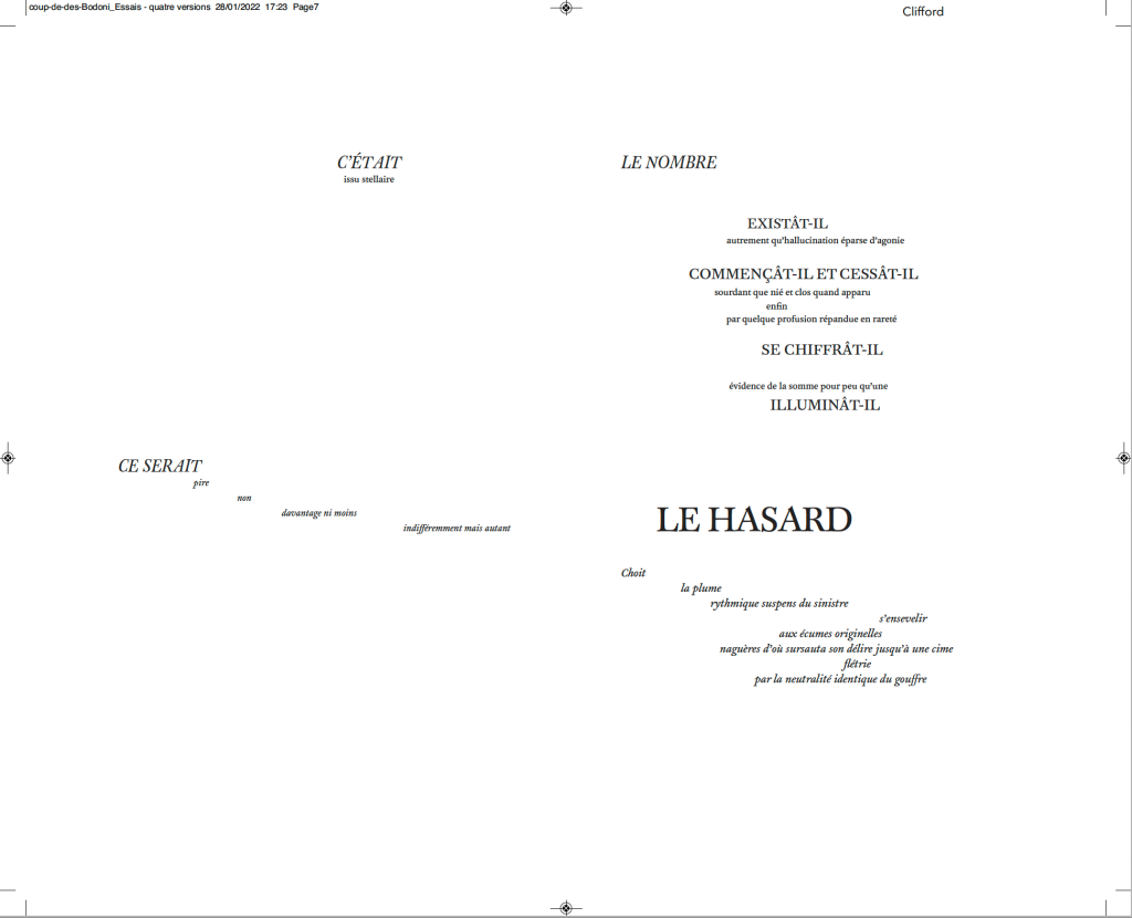
Much has been made of Mallarmé’s precision or preciosity in the marked-up proofs of the deluxe edition of Un Coup de Dés. Also, as many scholars, hommageurs and facsimilists have attested, a suitable substitute for the Firmin-Didot typeface that the poet specified for the deluxe has been hard to find. Master typographer Alain Hurtig, however, puts “suitable substitute” into perspective with his essay “À propos du Coup de dés de Stéphane Mallarmé“. The essay offers single pages and double-page spreads set in Bodoni Antiqua (Berthold), Legato, Clifford and the Hoefler & Frère-Jones digital revival of Didot.
Clockwise from the upper left: Bodoni Antiqua (Berthold), Legato, Clifford and Didot.
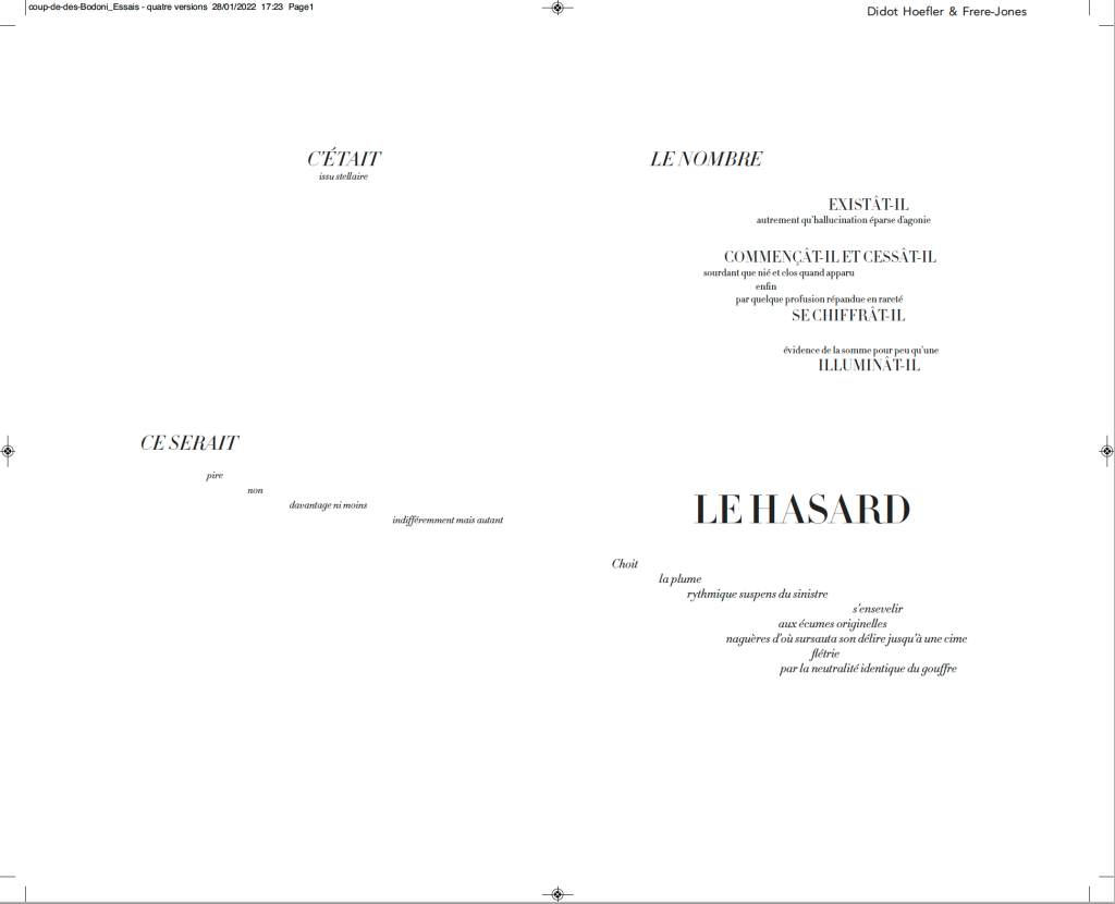
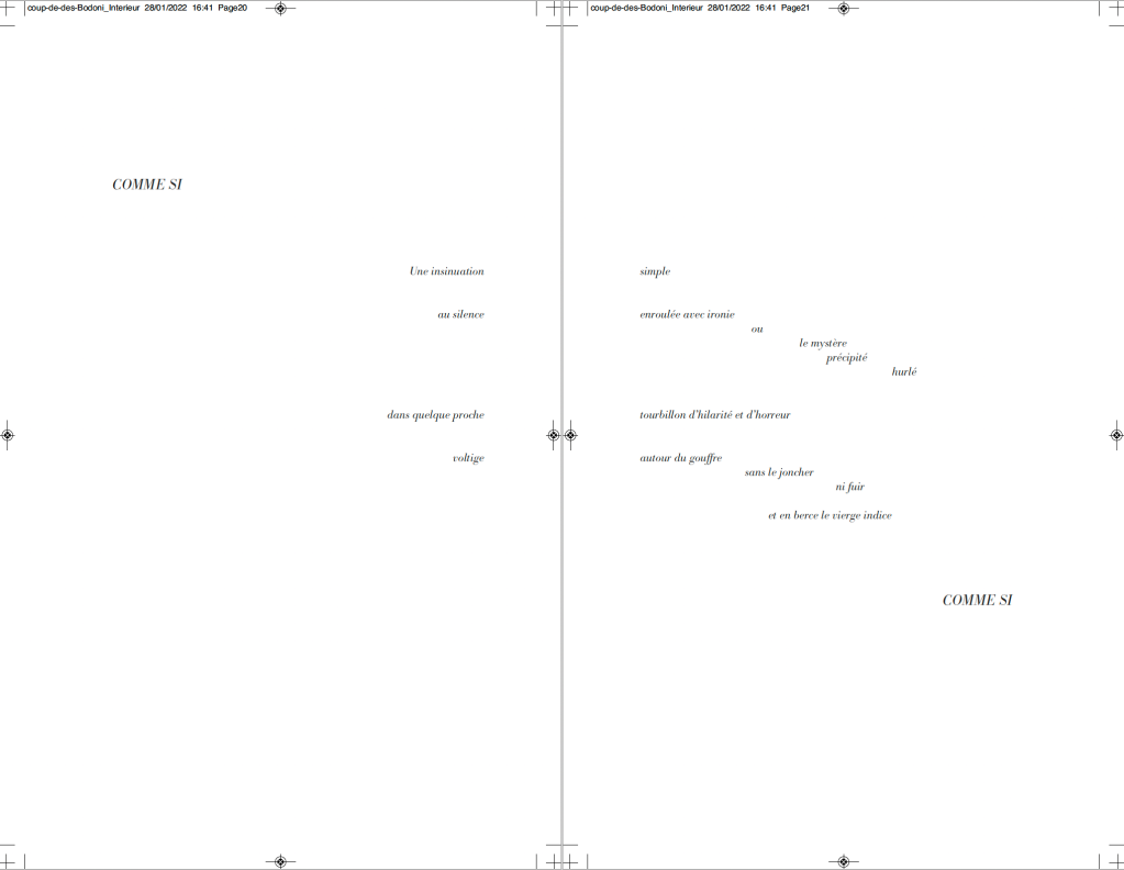
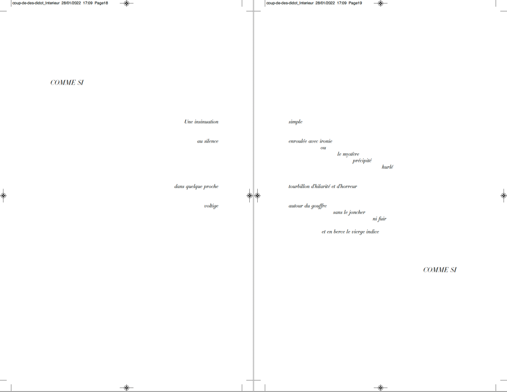
It seems unlikely that Mallarmé pored over the Didot firm’s type books to choose the Firmin-Didot face, but there is nothing precious about specifying a typeface. Different faces have different personalities. Hurtig enables us to see rather than imagine the effect of choosing the business-card-like Legato — not that that would have been a choice for Mallarmé. Nor would the Clifford, although a plausible (if squat) choice with its contrasting thin and thick strokes. The opportunity for the most extensive comparison comes with Hurtig’s two complete settings of the poem — one in Bodoni Antiqua (Berthold), the other in HFJ Didot. Below, for comparison, is the poem’s central double-page spread — the COMME SI … COMME SI verses.
Above: Bodoni Antiqua (Berthold). Below: Hoefler & Frère-Jones Didot.
Of these two revival faces — Bodoni Antiqua (Berthold) and HFJ Didot — Hurtig himself prefers Bodoni. Bodoni is one of the more attractive alternatives for facsimilists. Neil Crawford chose it for the edition created with Ian Tyson, as did Gary Young for his edition with D.J. Waldie. Hurtig even provides a comparative view of three versions of Bodoni:
Hurtig’s explanations of deciding the trim size and adjusting the size of fonts and spacing fascinate. Likewise his choice of Bodoni because it
s’imposait avec élégance, il rythmait les phrases en les faisant incroyablement vibrer et remplissait de sa grâce les immenses blancs de la double page — ces espaces que, selon Mallarmé, “il n’est pas moins beau de composer que les vers” [Hurtig, 2012]
[imposed itself with elegance, it gave rhythm to the sentences by making them vibrate incredibly and filled with its grace the immense blanks of the double page — these spaces which, according to Mallarmé, “it is no less beautiful to compose than the verse”.]
My vote, however, would be for the HFJ Didot. It has a more upright, steelier and brighter aspect, fittingly constellatory. In other online comments, Hurtig points out, however, that the HFJ Didot is not the Firmin-Didot of Mallarmé:
Le didot d’Hoefler n’est évidemment pas celui choisi par Mallarmé, et pour cause : un siècle les sépare — et Hoefler a, dans son dessin, évidemment tenu compte des conditions modernes de composition et d’impression : au plomb, son travail ne tiendrait probablement pas une seconde, et moins encore sur les papiers utilisés à l’époque. [Hurtig, 2018]
[Hoefler’s Didot is obviously not the one chosen by Mallarmé, and for good reason : a century separates them – and Hoefler has, in his design, obviously taken into account modern conditions of composition and printing: with lead, his work would probably not hold for a second, and even less so on the papers used at the time.]
While carefully experimenting with the choice of faces, Hurtig has no qualms about jettisoning Odile Redon from his edition. He does not like the Redon prints et en plus il est mort (“and besides he’s dead”). Combined with his finer typographic points, Hurtig’s substitution of prints he commissioned from Catherine Belœil heeds the call to which facsimilists and hommageurs such as Jean Lecoultre, Alessandro Zanella and Jacques Vernière, Honorine Tepfer, Robert Bononno and Jeff Clark, Virgile Legrand and Hervé Di Rosa, and Sam Sampson have also responded: to look afresh and even radically at Un Coup de Dés.
Hurtig, Alain. 11 July 2018. “Remarques typographiques“, responding to Laurent Bloch’s “Le Poème de Stéphane Mallarmé: Un coup de dés jamais n’abolira le hasard. Son exégèse et sa typographie”, posted 11 July 2018, modified 29 September 2020. Accessed 26 January 2022.
UN COUP DE DÉS JAMAIS N’ABOLIRA LE HASARD — ESPACE (2012)
UN COUP DE DÉS JAMAIS N’ABOLIRA LE HASARD — ESPACE (2012) Richard Nash Hand-cut concertina with inkjet printed turn-in cover. Closed: H286 x W204 mm; Open: W 11.2m. Unique. Acquired from the artist for donation to the Bodleian Library, 2 April 2022. Photos: Courtesy of Richard Nash; Books On Books Collection. Permission to display from the artist.
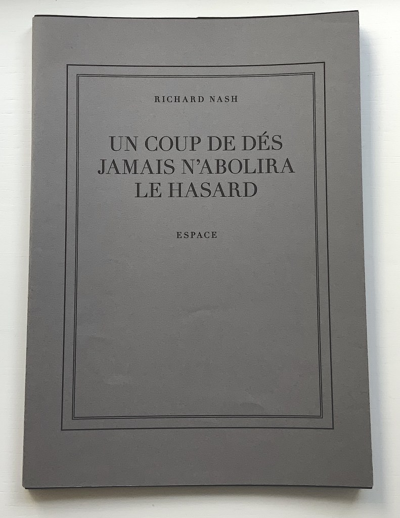
Credit goes to Rafaella della Olga’s Constellation (2009) for being the first homage to Un Coup de Dés to remind us that constellations appear against the blackness of space, not the whiteness of paper. But the first to apply this reminder in 180gsm Jet Black Canford paper to a double homage to Mallarmé’s poem and Marcel Broodthaers‘ version is Richard Nash’s Un Coup de Dés Jamais N’Abolira le Hasard — Espace(2012).
The preface
The opening pages
COMME SI … COMME SI spread
Additional photos courtesy of Richard Nash.
On the flyleaf, Nash has added his own verse entitled “Espace”, which set in Didot Regular is equally a typographic and poetic . Espace has a monumentality to it that encourages imagining it at a larger scale in different material; for example, a sculpture of cut steel painted black, installed along a seaside strand and backlit at night. In that evocative physical characteristic, Nash’s homage evokes the oracular and vatic tone of
RIEN / N’AURA EU LIEU / QUE LE LIEU / EXCEPTÉ / PEUT-ÊTRE / UNE CONSTELLATION (“Nothing will have taken place but the place except perhaps a constellation”)
and
Toute pensée émet un Coup de Dés (“All thought emits a throw of the dice”).
On Innards (2015)
On Innards (2015) Amanda Couch, Mindy Lee, Andrew Hladky and Richard Nash Limited edition publication individually stamped and numbered, digitally printed and cut, folded, bound and finished by hand. H260 x W205 mm, 200 pages of various intersecting formats and custom binding. Limited edition of 200, of which this is #74. Acquired from Richard Nash, 2 April 2022. Photos: Courtesy of Richard Nash; Books On Books Collection. Permission to display from Richard Nash.
On Innards began as a multidisciplinary project to explore how the way we think of guts and digestion has changed, how that might drive the creative process, and how it affects our sense of self. Book art and the human body (interior and exterior) are no strangers. Carolee Schneemann’s Parts of a Body House Book (1972/2020), Ron King’s Turn Over Darling (1994) and Matisse’s Model (1996), Joyce Cutler Shaw’s The Anatomy Lesson: Unveiling the Fasciculus Medicinae (2004) and Casey Gardner’s Body of Inquiry: A Triptych Opening to a Corporeal Codex (2011) among others come to mind. On Innards introduces a very different level of intimacy though — one not for the squeamish or scatologically averse.
Artists Amanda Couch, Mindy Lee and Andrew Hladky initiated the the project and presented initial results in a panel held at the interdisciplinary conference “Body Horror” in Athens, in 2013. Subsequently, Richard Nash joined the project to curate an exhibition and event in 2014, which included text by Carlo Comanducci, Giskin Day, Dr. Simon Gabe, Nathaniel Storey, and Jamie Sutcliffe; performance by Kerry Gallagher; and illustration by Jenny Pengilly. Drawing together the output and record of the project, Nash created this hybrid research journal and artists’ book, launched at the Whitechapel London Art Book Fair in 2015.
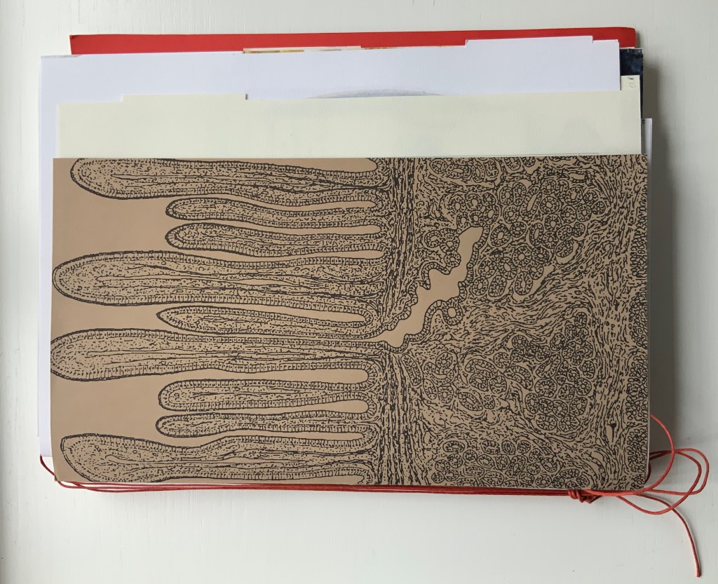
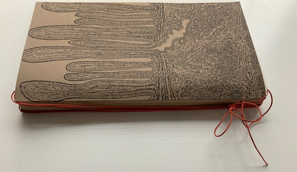
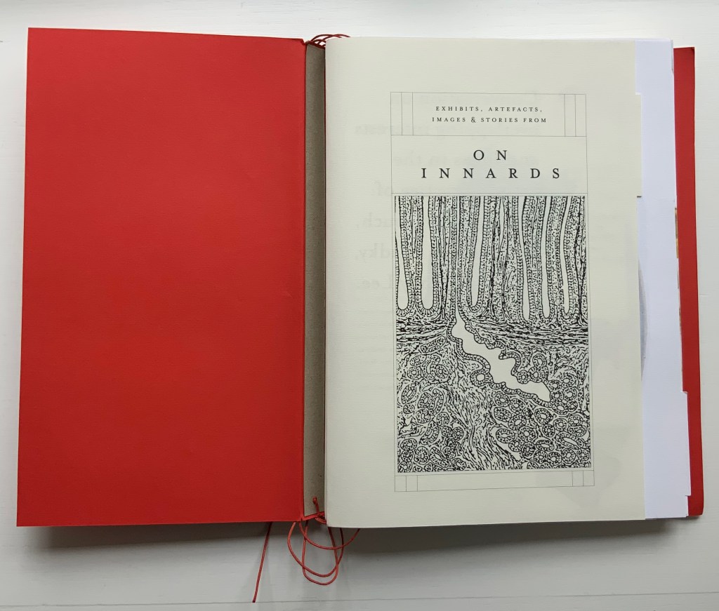
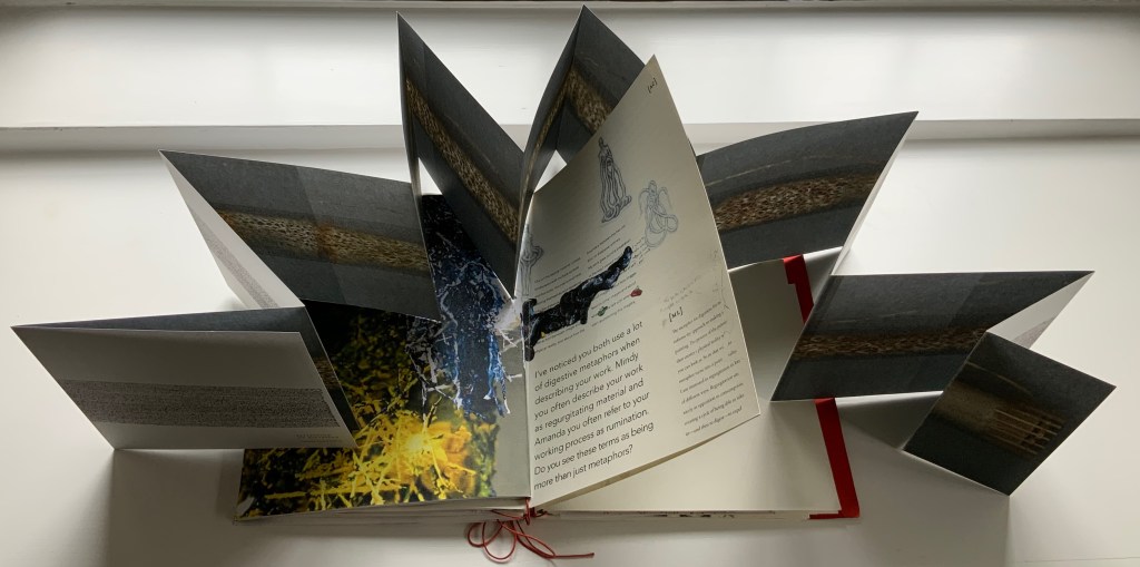
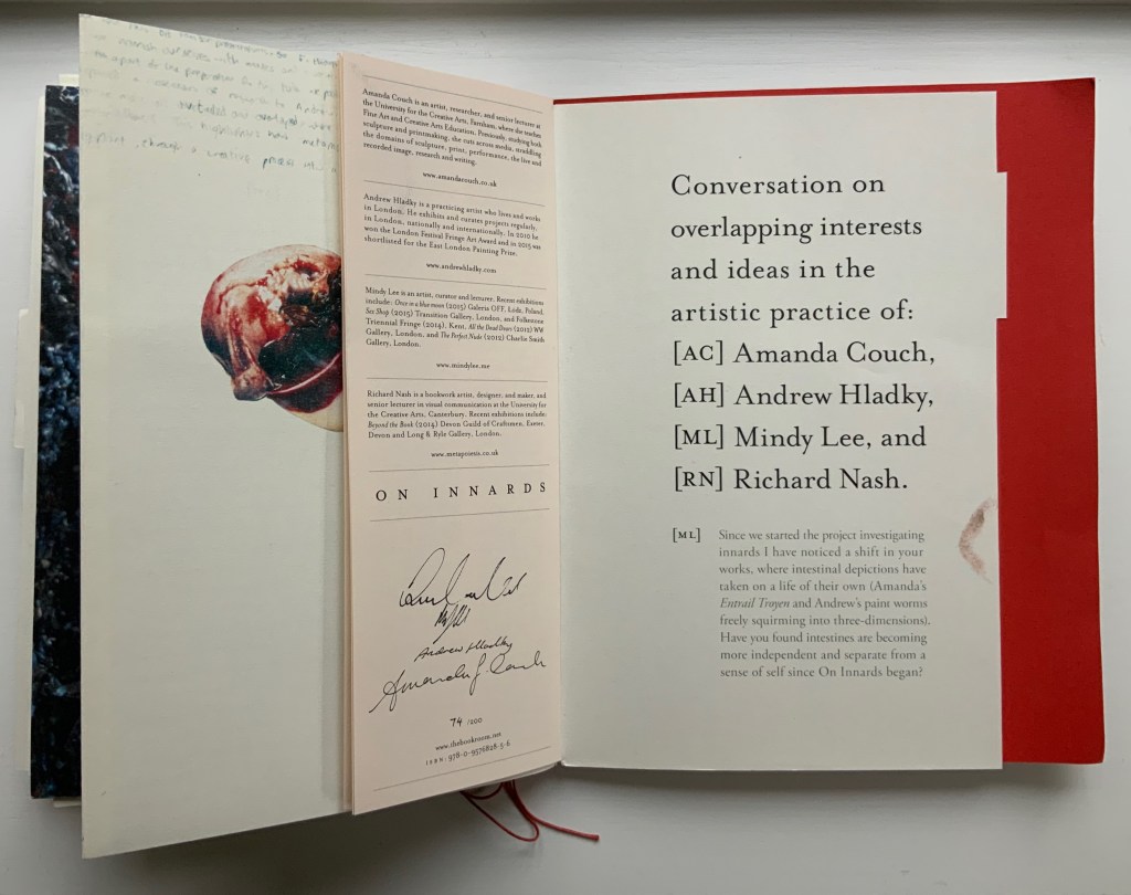
Like Espace, this work displays Nash’s sculptural approach to text, graphics, ideas and the book as raw material for an artistic creation. The bookwork interweaves, concertinas, folds out, pops up, gate-folds, roll-folds and unwinds. Used to reveal reflections on the project, recalled events, artefacts, images, and stories from the conference, these various “book innards” become an embodiment of digestion. It also somewhat resembles an expandable file folder, its contents secured by a long looping slip-knotted red thread sewn through a heavy card spine pasted to red endpapers that are pasted to brown cover papers. Despite the resemblance to a landscape portfolio, the contents proceed in portrait codex fashion with the tabbed half-title “page” below. The half-title, however, is the first panel of a double-sided accordion that extends from that tabbed half-title page all the way to the last (also tabbed) page of the book (also below). When the half-title turns, it reveals a description of the contents (also below) printed on the double-sided accordion.
Landscape view of the spine and external thread binding.
Portfolio view of endpaper and half-title page. Note the glimpse in the center of the spine’s interior.
Left: The verso page or panel gives a description of the contents of the double-sided accordion. Right: last panel of the double-sided accordion.
The valleys of the double-sided accordion hold the various other parts of the book, some of which are secured in their valleys by the red thread’s looping over and down their centers, and some of which are secured by being folded around or over the thread-secured parts. The dimensions of those parts vary, and other parts lie loose. This can lead to the guts of the book spilling out, surely not an accident! Nor is it necessarily a bad thing, for reading the other side of the accordion requires removing all of the contents from the binding.
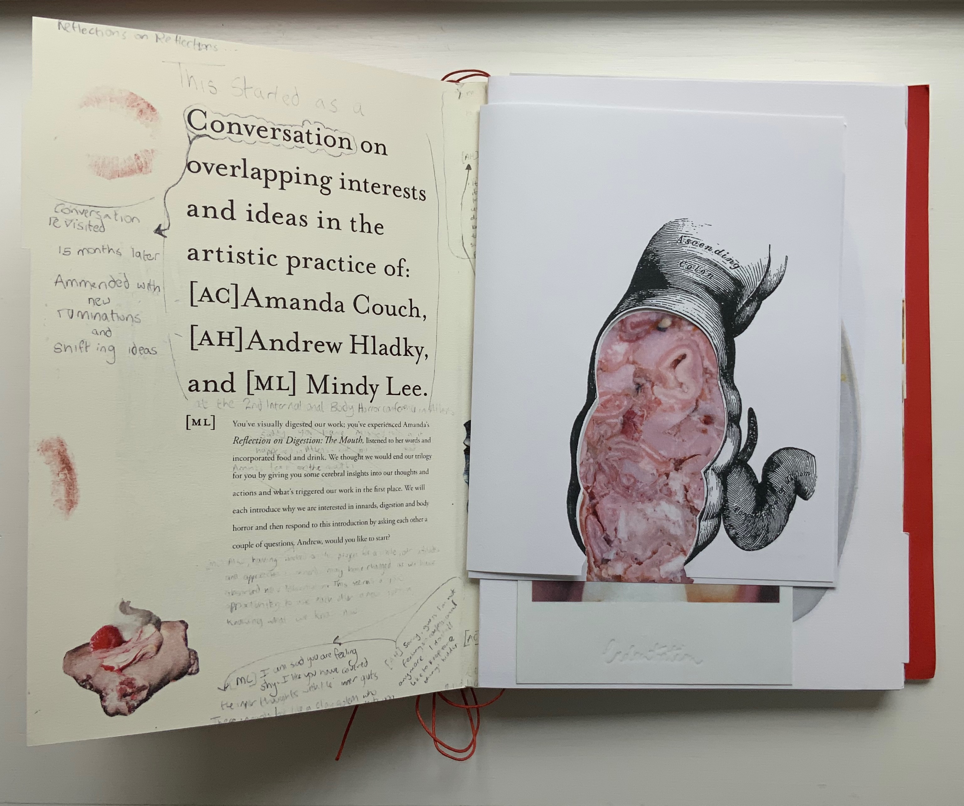
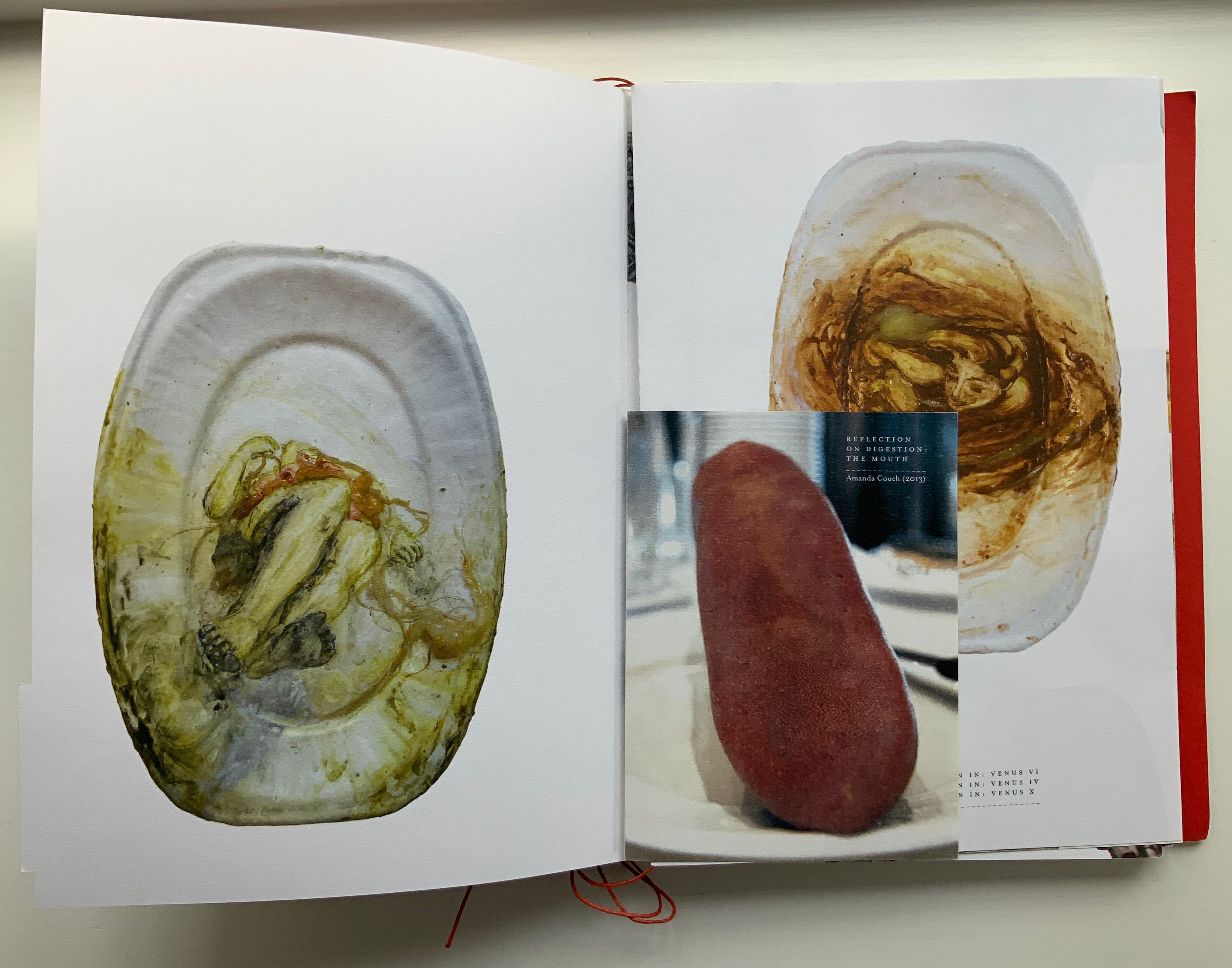
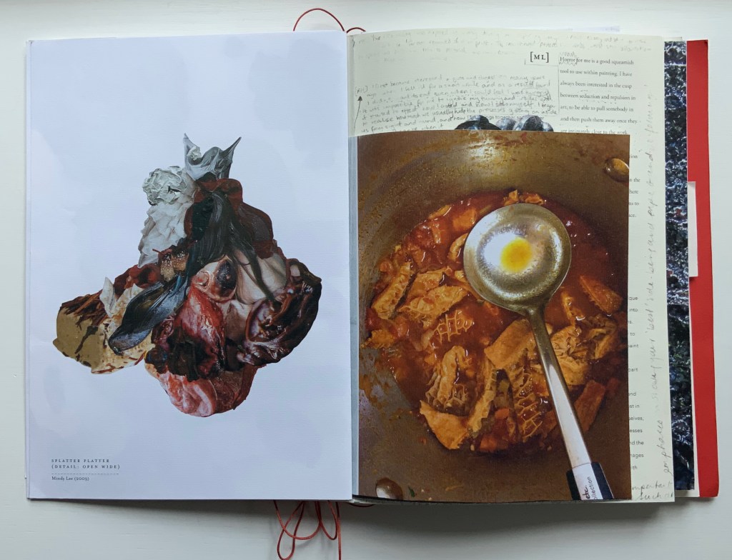
The first interleaved artefacts and images come from Amanda Couch and Mindy Lee. Couch’s first item is a passe-partout construction displaying at the start “Organ-Offal Caecum Andouillette” (2015) and at the end “Organ-Offal Stomach-Tripe” (2015). The passe-partouts combine black-and-white photos of anatomical engravings with color photos of the gut (see above), and between them is a photo of an annotated recipe for beginner’s tripe or chitterlings. Her second item (see below) is a pamphlet entitled “Reflection on Digestion: The Mouth” (2013), recounting and illustrating a presentation/performance/tasting of a serving of tongue that Couch gave during the “Body Horror” conference.
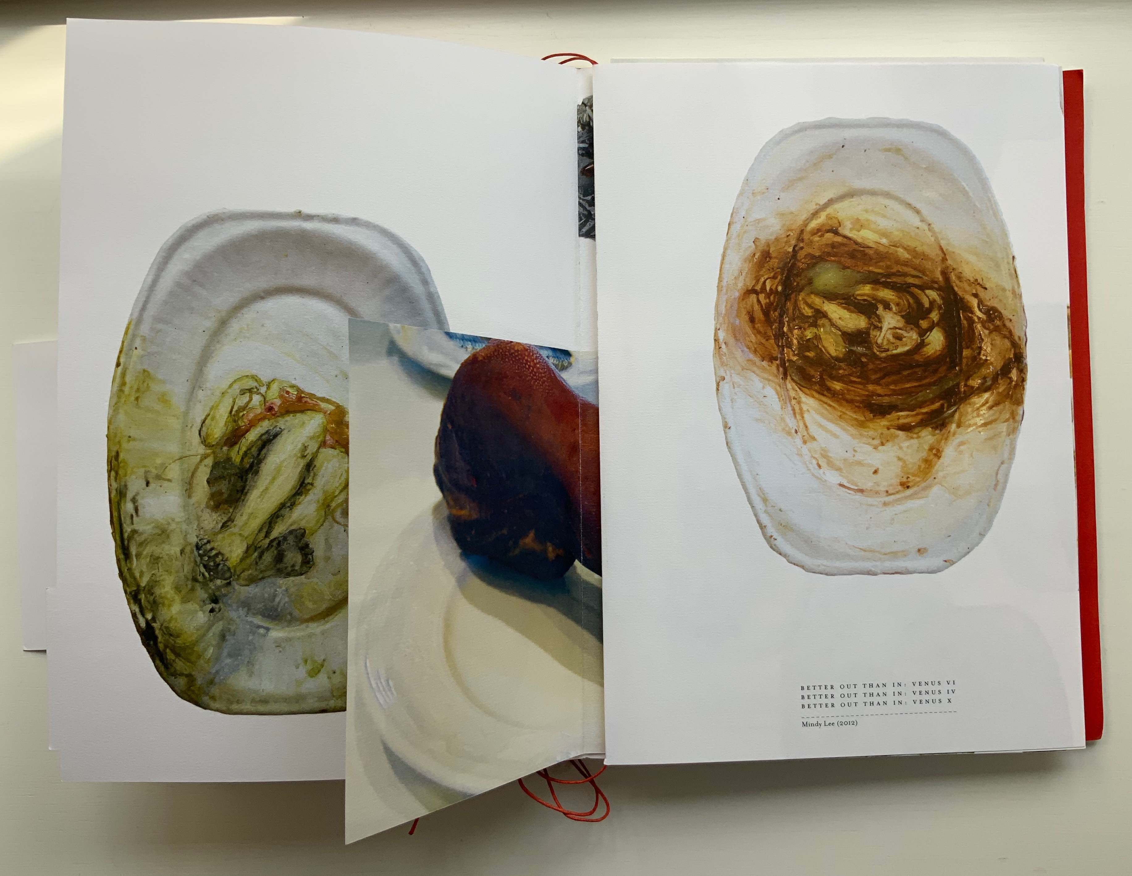
Lee’s contributions appear (also below) on the larger pages embraced by and interleaved with Couch’s two items. The images display photographs of works entitled Better Out than In: Venus VI, IV & X (2012) and Splatter Platter (2009). In Better Out, Lee’s “canvasses” are paper plates, but the perspective from which Venus is perceived suggests the underside of a closed, soiled toilet seat.
Couch’s “Reflection on Digestion” pamphlet interleaved with photos of Lee’s Better Out than In series.
Detail from photo of Lee’s Splatter-Platter; enclosing page from Couch’s annotated and illustrated recipe for tripe.
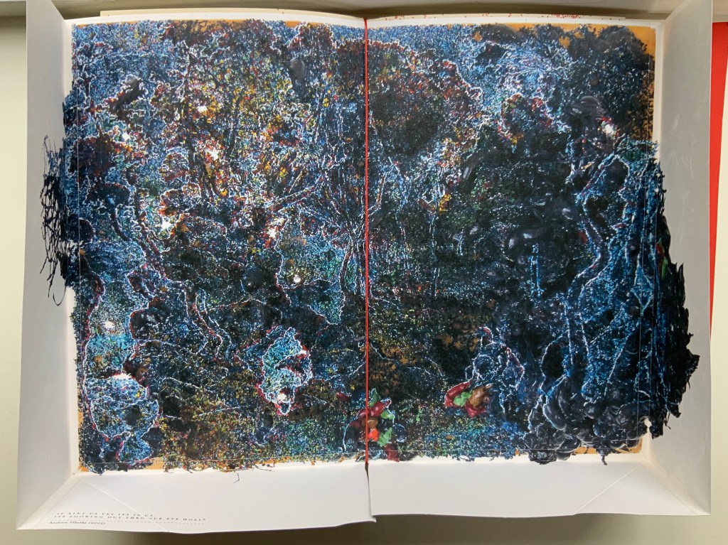
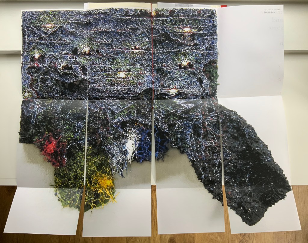
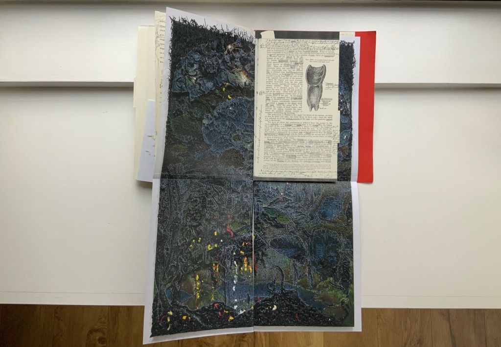
Andrew Hladky’s contributions are prints of three-dimensional works made of oil and bamboo sticks on wood panels ranging from 3 inches to 10 inches in depth. To capture this, On Innards delivers the print of It ain’t us yet its in us. Its looking out thru our eye hoals (2015) as a pop-up box (see below), and the prints of Well, This is Goodbye (2007-15) and The Clearing (2011-14) are cut and folded such that they spill out well beyond the trim size of the portfolio (also below).
Hladky’s It ain’t us yet its in us. Its looking out thru our eye hoals (original work 12 x 18 x 10 inches). The other side of this box also bears a print of a detail view of the work.
Haldky’s Well, This is Goodbye (original work 8.5 x 10.5 x 3 inches)
Hladky’s The Clearing unfolded (original work 61.5 x 43.5 x 6.5 inches), with Giskin Day’s “End Notes” interleaved.
As mentioned, some works are loose inserts, but some of the loose inserts are folded over a panel of the core double-sided accordion. Nash uses that structural feature to emphasize one of the hallmarks of book art: self-reflexivity. Below, straddling a mountain fold in the core double-sided accordion is another double-sided accordion. On one side, there is a photo of Couch’s Entrail Troyen (2014), a three-dimensional tube knitted from leftover cured saucisson sec shredded into ribbon-like thread. The title is derived from the French sausage Andouillette de Troyes, which harks back to the pamphlet “Reflection on Digestion: The Mouth” (2013) and its andouillette and chitterlings.
In case the reader misses the connection to the earlier item, the other side of this double-sided accordion presents a condensed photo of Couch’s nine-meter long accordion book entitled Reflection on Digestion (2012), a continuous line of handwriting looping back and coiling like the villi of intestines (see the cover of On Innards), relief printed from photo polymer plates on 410 gsm white Somerset satin paper. Couch uses this work in her reading performances of the same name. (Did I mention self-reflexivity?)
Loose double-sided accordion fold item displaying Couch’s Entrail Troyen on one side and Reflection on Digestion on the other.
Continued commentary on and illustration of this addition to the Books On Books Collection would be to regurgitate the whole work, which is certainly the opposite direction the work takes and which would be unfair to the work’s artists and contributors. After all, On Innards is a limited edition, and as many copies as possible should be ingested by as many institutions possible that are intent on improving their clientele’s digestion of book art.
Signature page concluding the “bibliographical” brochure summarizing the project, sponsors, conference, Blyth Gallery event and the artists’ book in hand, providing its colophon and listing sources and works displayed; penultimate page of the core double-sided accordion.
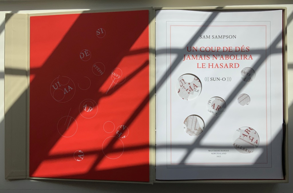
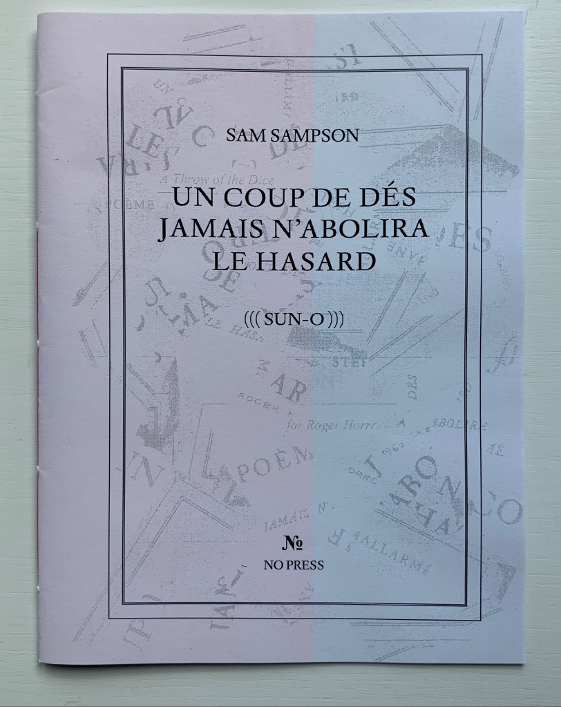
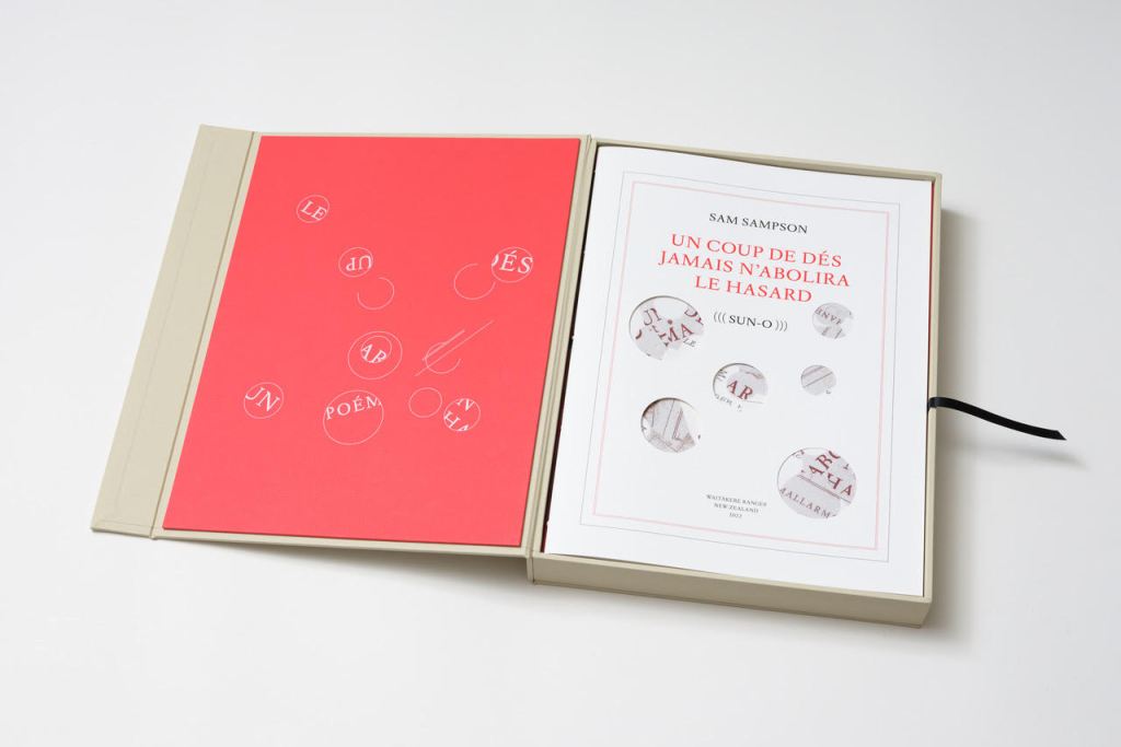
Derek Beaulieu (No Press) first published Sam Sampson’s homage to Un Coup de Dés as a handsewn pamphlet in 2020. To celebrate the 125th anniversary of Mallarmé’s initial publication of “the poem that made us modern”, Sampson enlisted Jacinda Torrance of Verso Visual Communications for design, the firm Centurion for printing, and Louise James of The Binding Studio for hand binding to produce this deluxe edition.
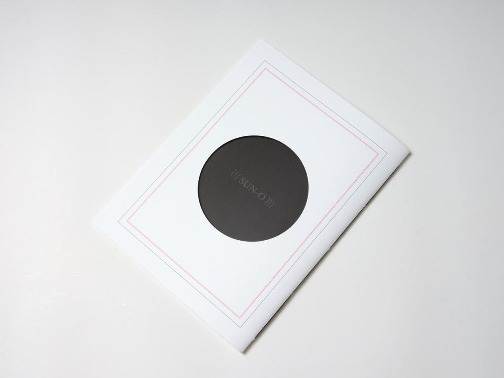
UN COUP DE DÉS JAMAIS N’ABOLIRA LE HASARD (((SUN-O))) (2022)
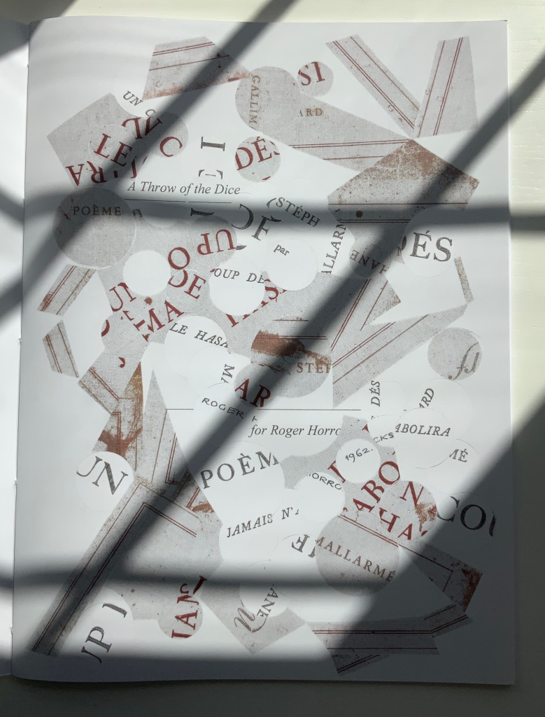
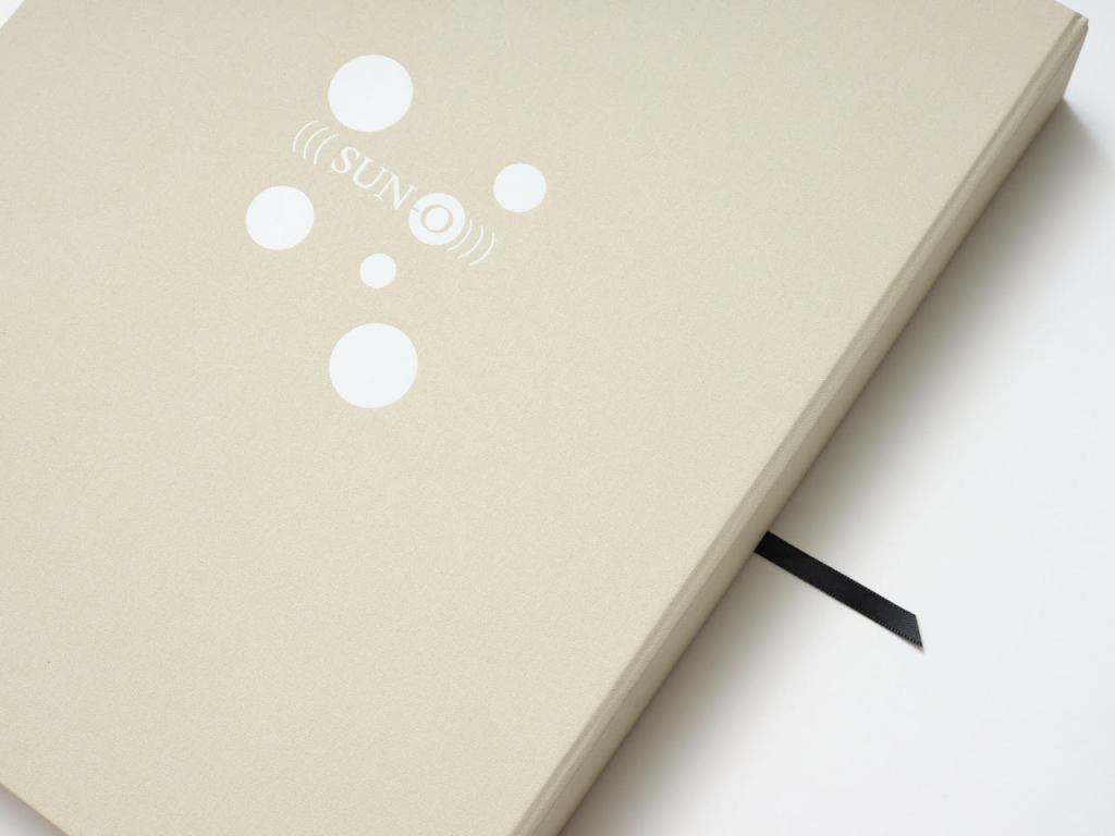
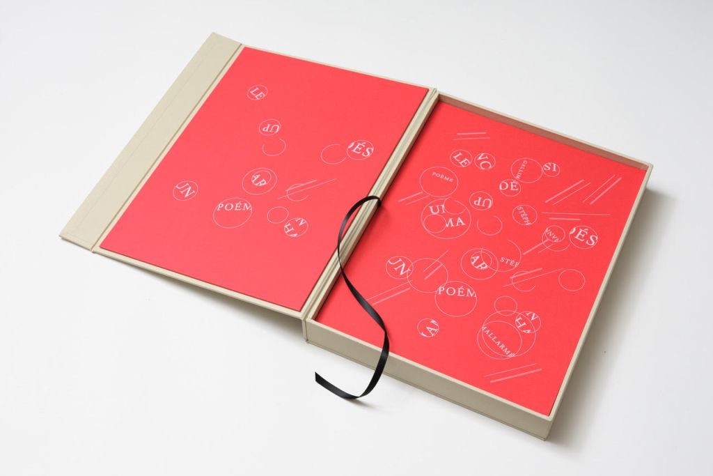
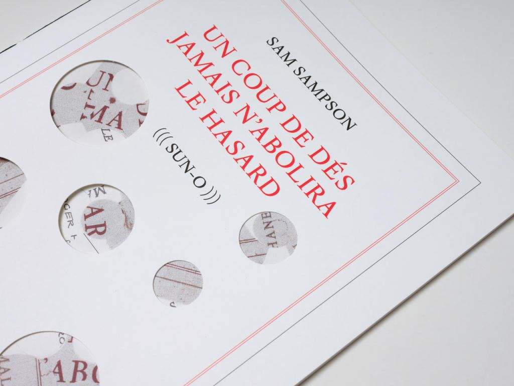
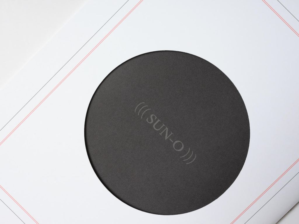
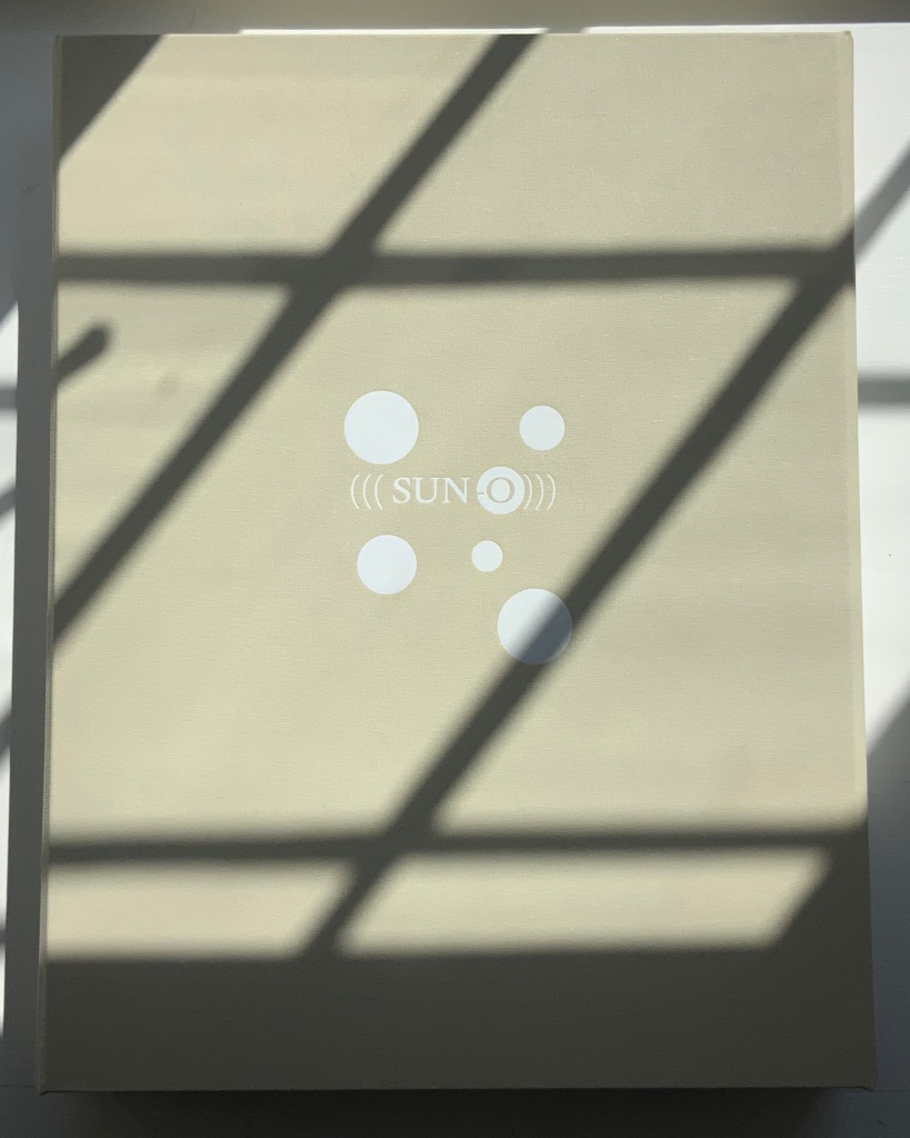
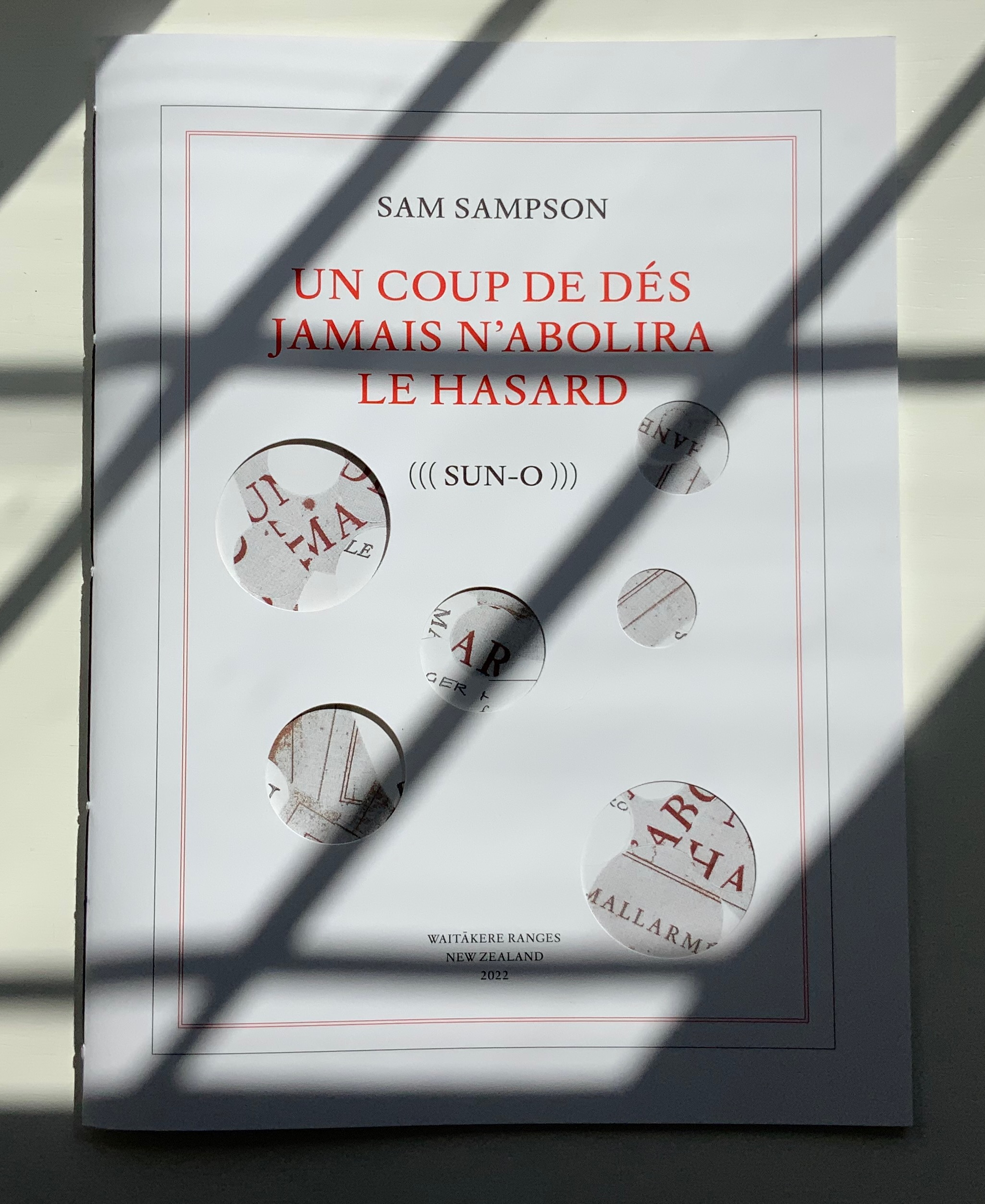
Un Coup de Dés Jamais N’Abolira le Hasard ((( Sun-O ))) (2022) Sam Sampson Handsewn book, H300 x W225 mm, 28 unnumbered pages. Edition of 20 (10, each enclosed in a hinged-lid box with magnetic flap; 10 unboxed), of which this is boxed # 2. Acquired from the artist, 7 April 2022. Photos: Books On Books Collection. Displayed with permission of the artist.
As with most creative works, (((Sun-O))) had multiple points of inception. One of them was an essay Sam Sampson read by Susan Howe and Cole Swensen. They quote Mallarmé’s preface to the poem (“nothing new except a certain distribution of space made within the reading” and speak of his aim to fuse sequential and simultaneous perception, to fully engage the eye and ear, as a result pushing poetry in two directions – toward visual art and toward musical performance. This resonated with a series of poems Sampson was writing and manifests itself in (((Sun-O))):
The physical design and analogy in my rendition is aligned with what I would call the ‘O Poems’. ‘O’ Zero, being the sound that runs through these poems, but I’ve also been interested in the numerical concept of zero: the beginning point, but also the point of departure, the ‘O’ as an ideogram, giving the text a pictorial as well as vocalised movement. [Correspondence with Books On Books Collection, 29 March 2022]
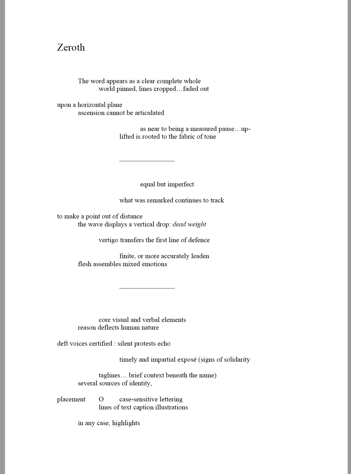
Another of the “O Poems” is Zeroth. Sampson reads it here:
Zeroth leads to another point of inception: a conversation with Roger Horrocks, a New Zealand poet, writer, film-maker, educator and cultural activist, to whom (((Sun-O))) is dedicated. After reading Zeroth, Horrocks told Sampson that it reminded him of his favorite Seattle experimental metal band at the time – Sunn O))). Sampson describes their sound as slow, heavy, blending diverse genres including “drone, black metal, dark ambient and noise rock”. Sampson’s mulling over the very sound of the band’s name led to free associations with the secondary meanings of drone (surveillance, panopticon). Mulling over the name’s compression of word and the letter O led to his hybridized subtitle (((Sun-O))) “with its parentheses radiating out but never closing”. A potent visual and textual image for a poem touching on, if not touching, the sun, the abyss and the human.
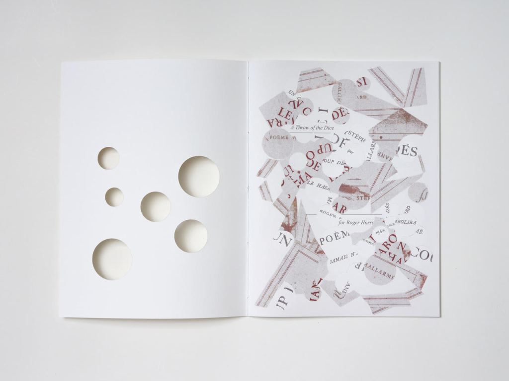
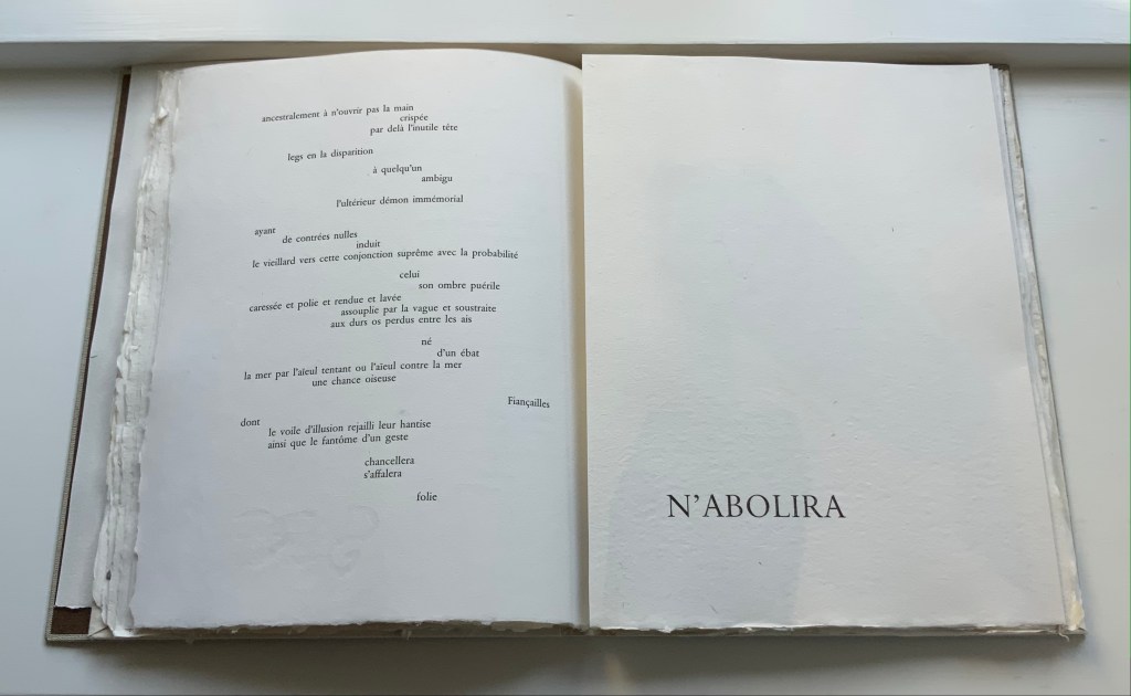
But, of course, the zero point of inception is Un Coup de Dés. On a visually material level, (((Sun-O))) has a scaffolding of bullet-pointed rules, whose lengths are based on measuring each of Mallarmé’s lines, whose weights approximate the variable font sizes, and whose placement matches that in Un Coup de Dés. This lattice serves as the physical structure for the collage of words and O’s that Sampson layers like paint or screenprint onto the page. Some words and lines are upside down like the detritus of a shipwreck. Some words curve and drape between the lines like torn sails. Appropriately, some come from the precisely corresponding pages in Mallarmé’s poem. Faint lines of the circumferences of O’s leap across and down between the lines almost like musical notations.
Within this tangle, Sampson’s own elusive and allusive text plays. Some of its phrases come from traditional song; some fix the geographical location (“blue carbon” places the speaker in a coastal community); some “un-fix” the location (“over the hills and far away”); some are struck through, alerting the reader to be ready to discard and start again; some set the technological time frame (the reference to operating systems like Suse, Symbian and, of course, Solaris). As in Un Coup de Dés, the text’s syntax and placement on the page encourage reading in fits and starts, back and forth. As Sampson puts it:
I wanted [my] poem to somehow capture, as Mallarmé had described it, “the invitation of the great white space”, and the successive, incessant, back-and-forth motions of our eyes travelling from one line to the next, and beginning all over again. [Correspondence with Books On Books Collection, 29 March 2022]
Indeed, before writing Un Coup de Dés, Mallarmé foreshadowed more expansively this phenomenon toward which Sampson strives:
Pourquoi — un jet de grandeur, de pensée ou d’émoi, considérable, phrase poursuivie, en gros caractère, une ligne par page à emplacement gradué, ne maintiendrait-il le lecteur en haleine, la durée du livre, avec appel à sa puissance d’enthousiasme: autour, menus, des groupes, secondairement d’après leur importance, explicatifs ou dérivés — un semis de fioritures. [Oeuvres Complètes, 2, 227]
“Why — couldn’t a considerable burst of greatness of thought or emotion, carried in a sentence in large typeface, gradually placed with one line per page, hold the reader’s bated breath throughout the entire book by appealing to his or her power of enthusiasm: around this [burst], smaller groups of secondary importance, explicating or deriving from the primary phrase — a scattering of flourishes.” [Arnar, 234]
Whereas in Mallarmé’s poem there is a primary sentence in large typeface (“UN COUP DE DÉS JAMAIS N’ABOLIRA LE HASARD”) off which the secondary groups of phrases and sentences play, (((Sun-O)))‘s primary foil is the combination of two things: the collage made from shards of Mallarmé’s poem and that strange, enjambed subtitle (((Sun-O))). After all, the full title of Sampson’s work is UN COUP DE DÉS JAMAIS N’ABOLIRA LE HASARD (((SUN-O))).
The “Comme si … Comme si” center double-page spread.
Sampson calls Mallarmé’s poem a form of metaphysical gambling, reproducing the sensation of being both in and outside time. Being both in and outside of time — that could be the defining state of human consciousness. Unlike the abstract representation of humanity in Un Coup de Dés, however, (((Sun-O)))‘s representation is concretely personal. The traditional song “Over the Hills and Far Away“, which Sampson cites at the start of (((Sun-O))), can be read as a reference to Horrocks’ departure from New Zealand for the United States in the 1960s. At one point, the speaker addresses Horrocks directly: “Roger / what of these / parallels of blue / sea shanties / masquerading mind-sets / …”. Sampson takes the image of Roger Horrocks’ signature from Horrocks’ copy of an edition of Un Coup de Dés, fragments it and reproduces it on the pages of (((Sun-O))). Did Sampson have in mind the story of René Magritte’s loaning his copy of Un Coup de Dés to Marcel Broodthaers, which led to Broodthaers’ Image version of Mallarmé’s poem? (See Marine Hugonnier’s retelling of the tale here.) The scaffolding of bulleted-pointed lines certainly pays homage to Broodthaers and other “hommageurs by redaction” such as Michalis Pichler, Sammy Engramer and others. (((Sun-O))) is a work of many conversations on many levels across time and time zones.
One of the main topics in (((Sun-O))), however, naturally seems to defy the bridging of the personal and abstract: climate crisis. It is hard to miss the allusions to the global shipwreck that is the climate crisis, engendering rising ocean levels and spastic efforts towards zero carbon emissions based on a computational chaos of competing environmental models and competing economic and political systems. It is clearly of personal concern to the speaker, but that does not take the issue from the abstract to the concretely personal in the way that Horrocks’s signature in a copy of Un Coup de Dés does. Making the climate crisis personal could, of course, run the risk of descending into small talk about the weather.
The references to music and the poem’s demonstration of musicality throughout are also hard to miss, and given its zero point of inception, the poem would be seriously remiss without them. The aim for union of text, sound and graphic image is as central to Sampson’s poem as the manipulation of syntax and les blancs is to Mallarmé’s. The aim’s importance in Sampson’s poem even has the last note and oversized word in the poem:
... the Never / rolling / listing / pitch / & / fall / A solitary / THRUM
The frequency of achieved union may be what puts Sampson’s homage in the front rank.
The special edition of (((Sun-O))) enhances that union in material ways. The design and materials play off Sampson’s cutting into and out of, sticking on and sticking through Un Coup de Dés. Six circles foiled in white on the front cover of the box turn the subtitle into an emblem — a mark maker. On the box’s inside lining, a design of circles and broken circles echoing the collage of O’s in the poem (even hinting at musical notation) is used to designate the number of the copy in the edition of 10. For this copy (#2), straight lines cut through 2 of the circles.
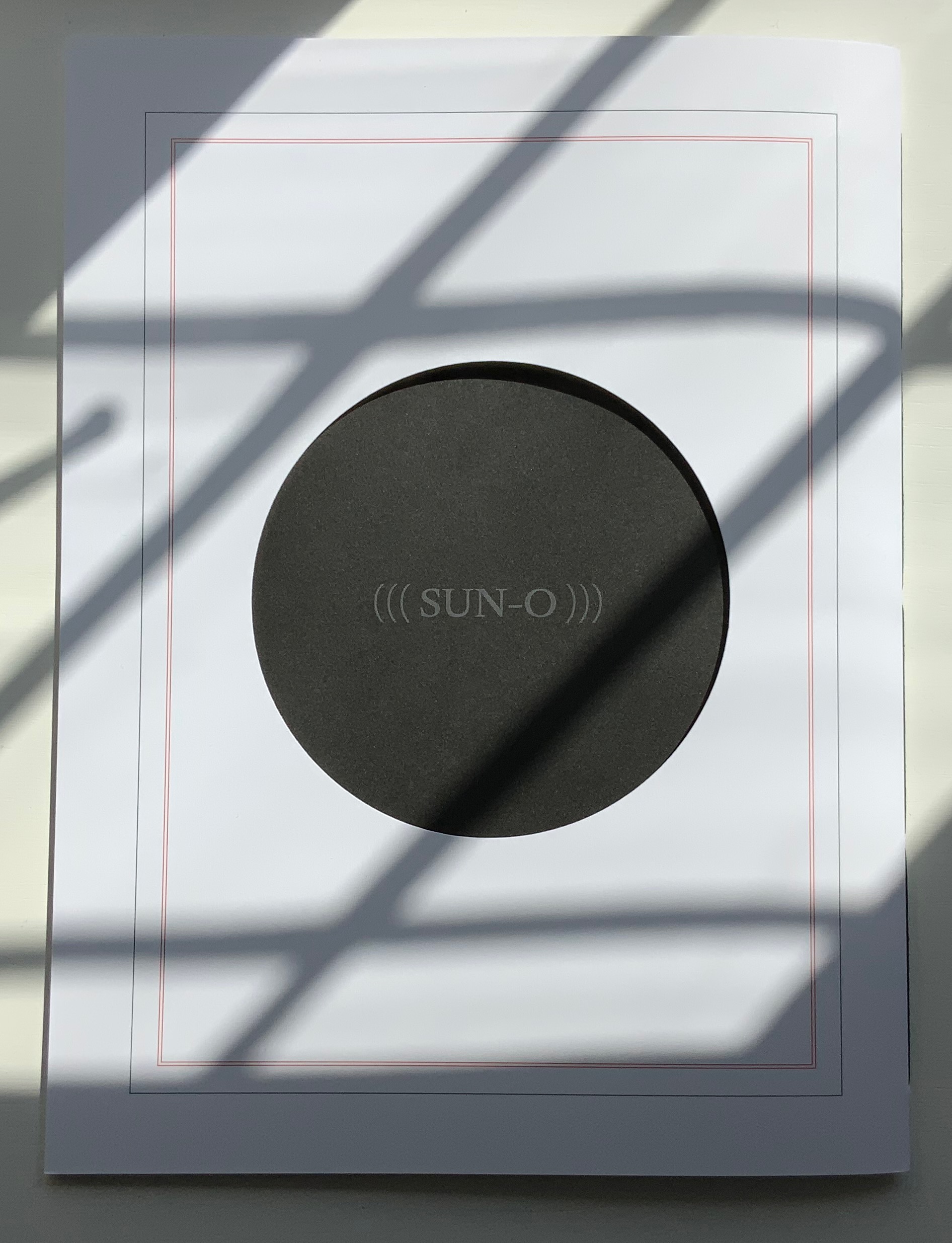
Like the white circles, six die-cut circles on the book’s front cover correspond to the six parentheses of the subtitle and likewise one face of a die. They also recall the hemistich of French poetry’s twelve-syllable Alexandrine, which Un Coup de Dés shattered. An image peeks through the die cuts and, as the cover turns, reveals itself as a collage of the cut-up cover of Horrocks’ copy of the poem and pages of (((Sun-O))). On the back cover, a single large die-cut circle centers on a black-hole sun with a faint, almost invisible ((( Sun-O ))) disappearing into blank/blackness.
By chance or by sly humor, the typeface used is DTL Elzevir. (((Sun-O))) is obviously not in the hunt for absolute fidelity to the edition planned by Mallarmé and Ambroise Vollard in 1896-97, which collapsed with the poet’s death. When Mallarmé’s son-in-law Dr. Edmond Bonniot issued an edition with Gallimard/NRF in 1914, the typeface was Elzevir, allegedly a face that Mallarmé detested. With this special edition of (((Sun-O))), Sampson is in the hunt on his own terms for his own more personal Mallarméan prism, constellation or radiant (((Sun-O))) that syntactically, auditorily, visually and physically scatters and focuses his response to the human condition.
UN COUP DE DÉS JAMAIS N’ABOLIRA LE HASARD (((SUN-O))) (2020)
Un Coup de Dés Jamais N’abolira le Hasard: (((Sun-O))) (2020) Sam Sampson Handsewn pamphlet. H255 x W190 mm, 24 pages. Edition of 60. Acquired from No Press, 4 January 2021. Photo of the work: Books On Books Collection. Displayed with permission of the artist.
[Mallarmé’s] work is a constellation and trying to unpack and explicate what went into my response hopefully doesn’t remove the joy of just jumping in. I like what John Ashbery said about his own work: “my work is accessible, if you take the time to access it.” [Sampson in correspondence with Books On Books Collection, 29 March 2022]
Further Reading & Listening
“Derek Beaulieu“. 19 June 2020. Books On Books Collection.
Davenport, Philip. 27 March 2020. “‘France’, or… we are circles of cancelled stars’“, Synapse International: An international visual poetry gathering. Started by Karl Kempton and Davenport in February 2018, Synapse International quickly attracted online works of homage to Un Coup de Dés, including an early appearance in March 2018 of Eric Zboya‘s Translations and later a visually adapted essay by David W. Seaman and as well as an “ADVERTISEMENT” from Derek Beaulieu that links to his 3D rendering of Un Coup de Dés.
POÉME: Un coup de Dés jamais n’abolira le Hasard (2007)
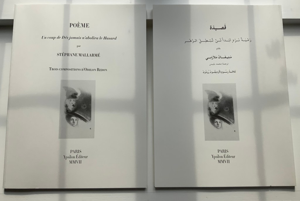
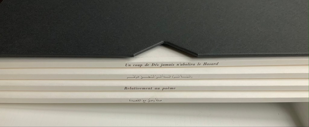
POÉME: Un coup de Dés jamais n’abolira le Hasard (2007) Stéphane Mallarmé, Isabelle Checcaglini and Mohammed Bennis Four volumes in slipcase. H380 x W280 mm, 40 pages per volume. Edition of 99, of which this is #57. Acquired from J.F. Fourcade, 7 January 2022. Photos: Books On Books Collection.
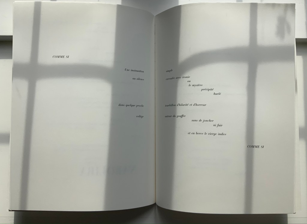
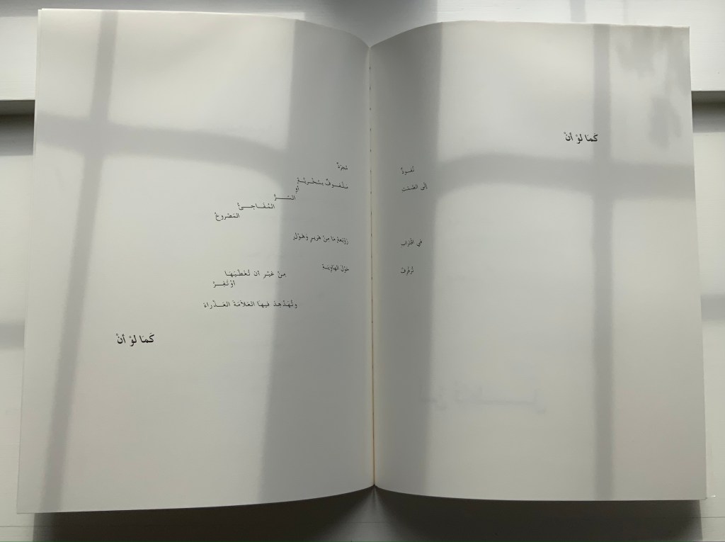
Ypsilon Éditeur’s editions of Un coup de Dés jamais n’abolira le Hasard bring together for the first time the three prints from Odilon Redon with the deluxe edition layout intended by Stéphane Mallarmé. Also for the first time, we have a translation into Arabic. Below, the central double-page spread of the poem is displayed in the French and Arabic editions to show how their mirror images of the layout heighten its movement.
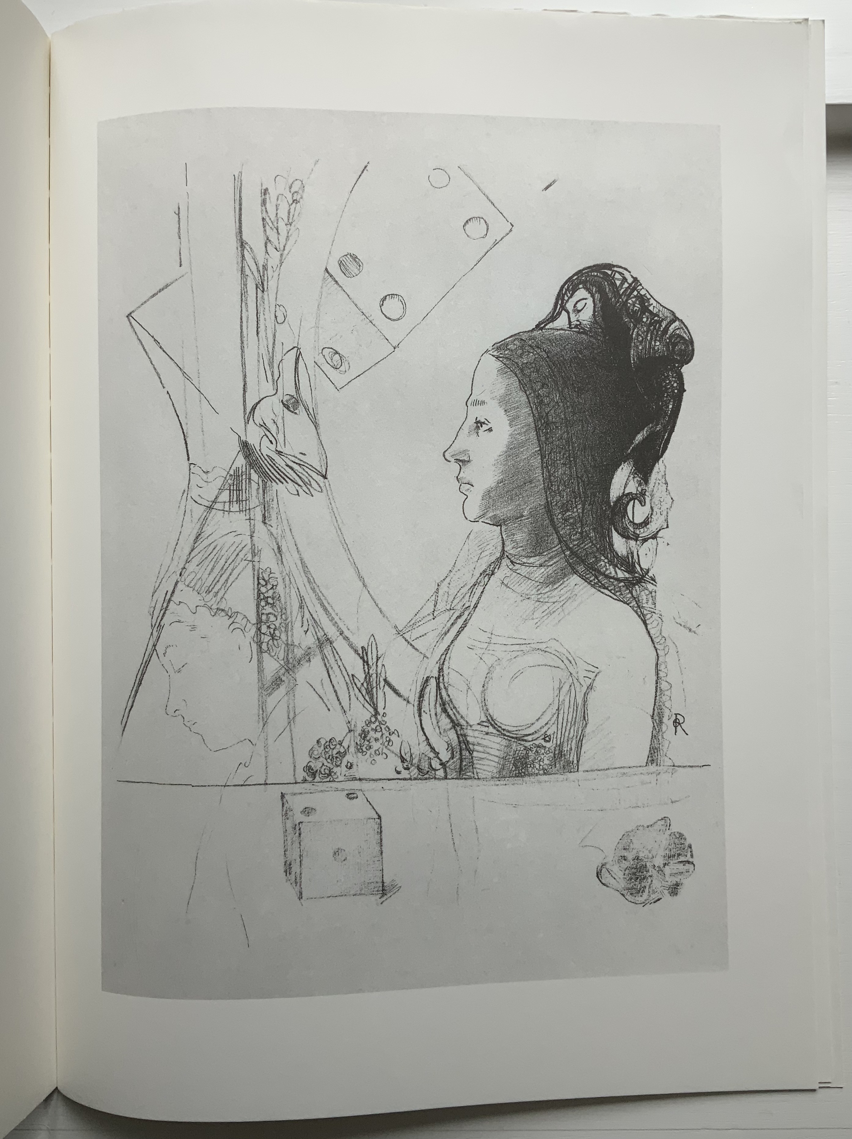
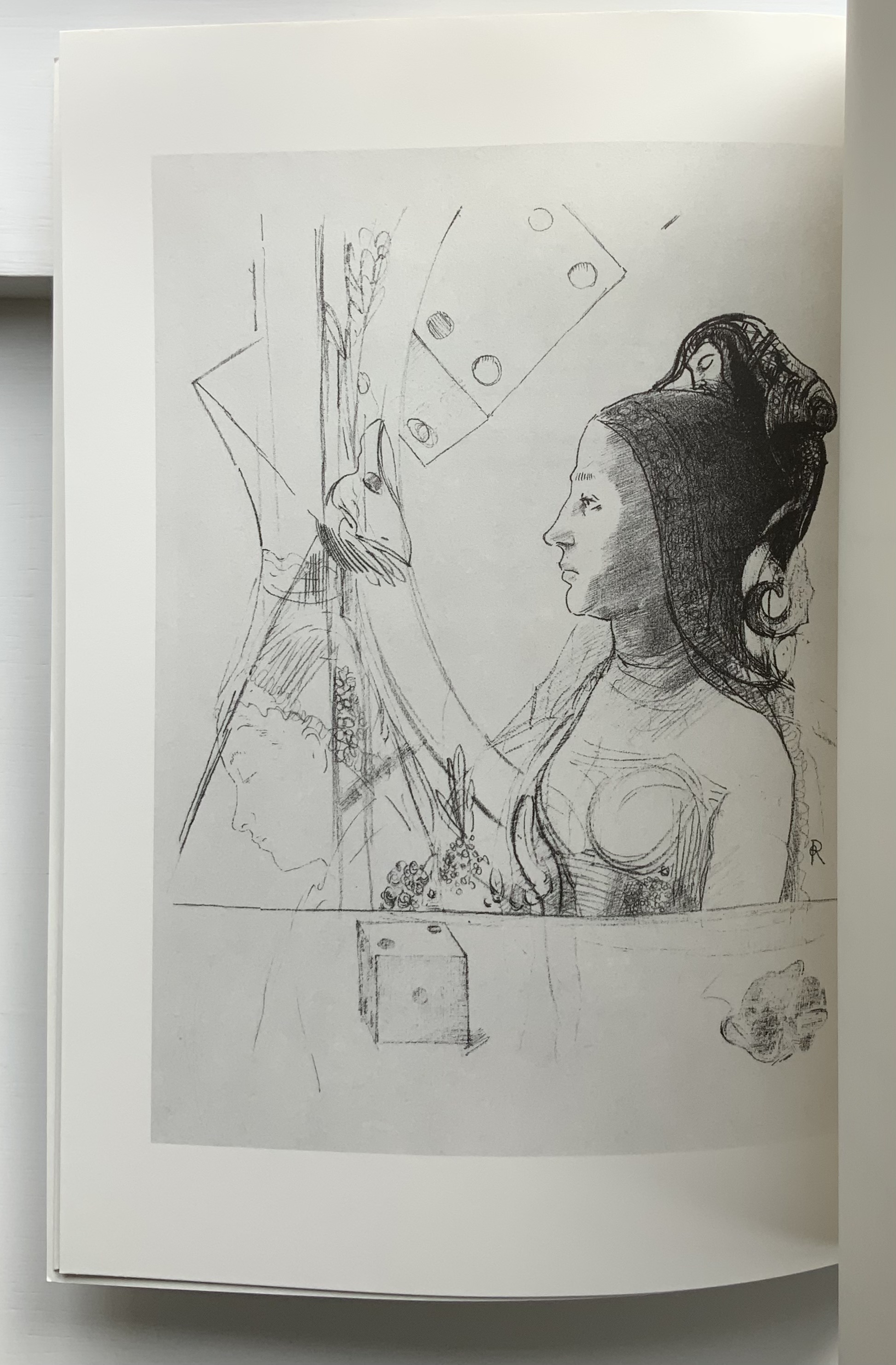
In the additional French volume and its Arabic counterpart, Checcaglini adds a brief history about Mallarmé and Vollard’s plans for the deluxe edition and helpfully includes correspondence among them and Odilon Redon. Although the earlier edition published by Mitsou Ronat & Tibor Papp in 1980 does include Redon’s prints, they are placed in a separate folder along with other visual and textual tributes. The Redon prints may not be among his best, nor do they include the mooted but undiscovered fourth print, still at least we now have the three and the poem in relation to each other more nearly as intended, which makes it possible to compare and contrast this deluxe edition with the outpouring of works of homage to Mallarmé’s poem. Even with the prior absence of that chance, few if any of those hommageurs would be unaware of Redon’s images. Jean Lecoultre (1975) notes how his publisher’s solution to handling his soft varnish etchings honors the intended separation of text and images. By contrast, Christiane Vielle (1989) challenges Mallarmé’s layout and his unit of the double-page spread by altering the spatial relationships among lines, hiding text beneath panels and juxtaposing her artwork with the text.
The added volume with Checcaglini’s synopsis also includes a three-way dialogue among Mohammed Bennis, Isabelle Checcaglini and Bernard Noël about the light that the translation sheds on the poem.
Checcaglini’s edition also claims to have most closely reproduced the Firmin-Didot typeface that Mallarmé wished for his deluxe edition. The search for absolute fidelity to this font that has been unavailable for at least a century has been an obsession since the discovery of the poem’s proofs corrected and annotated in Mallarmé’s hand. The Further Reading provides a start for anyone inclined to join the search.
UN COUP DE DÉS JAMAIS N’ABOLIRA LE HASARD: POÈME (1989)
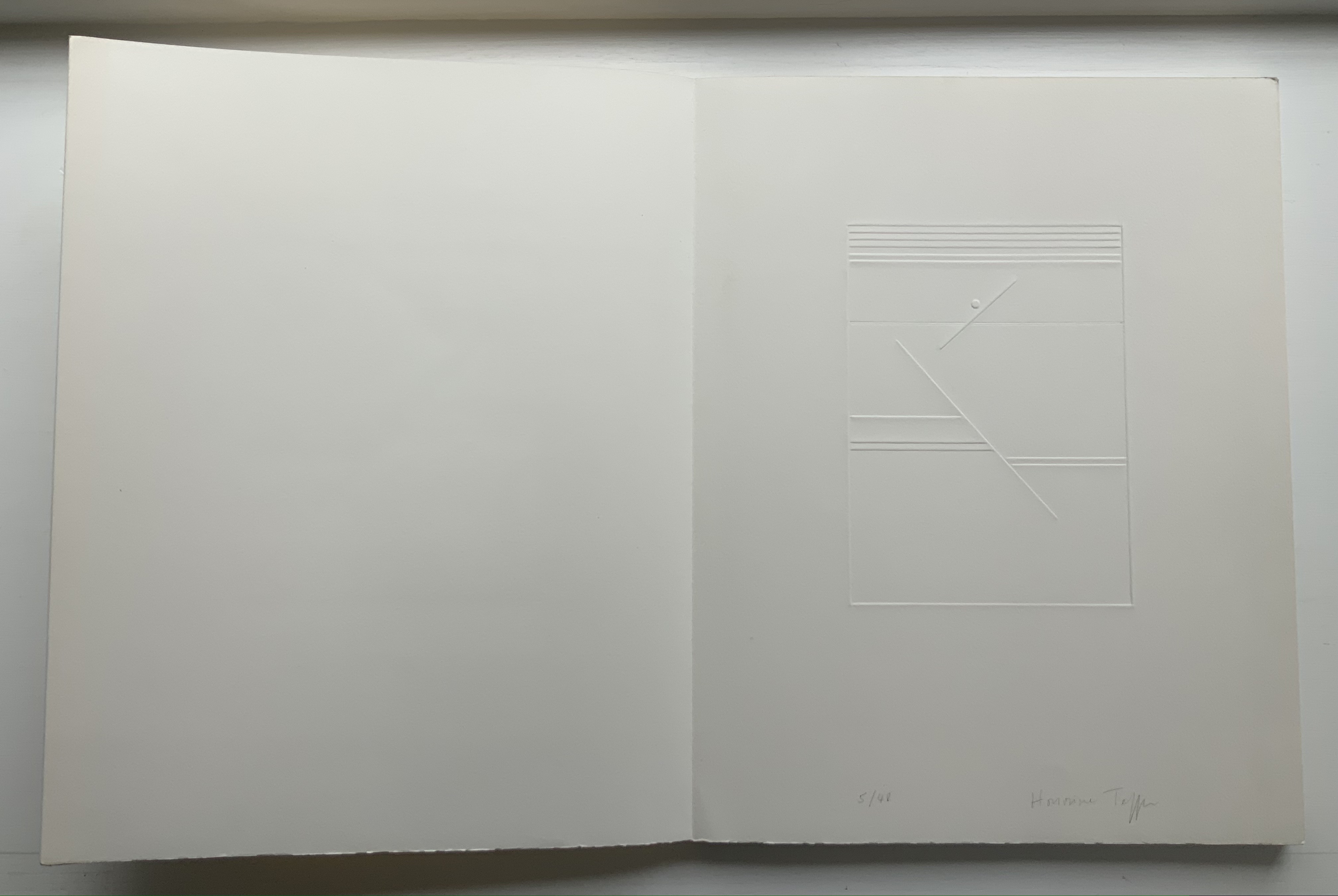
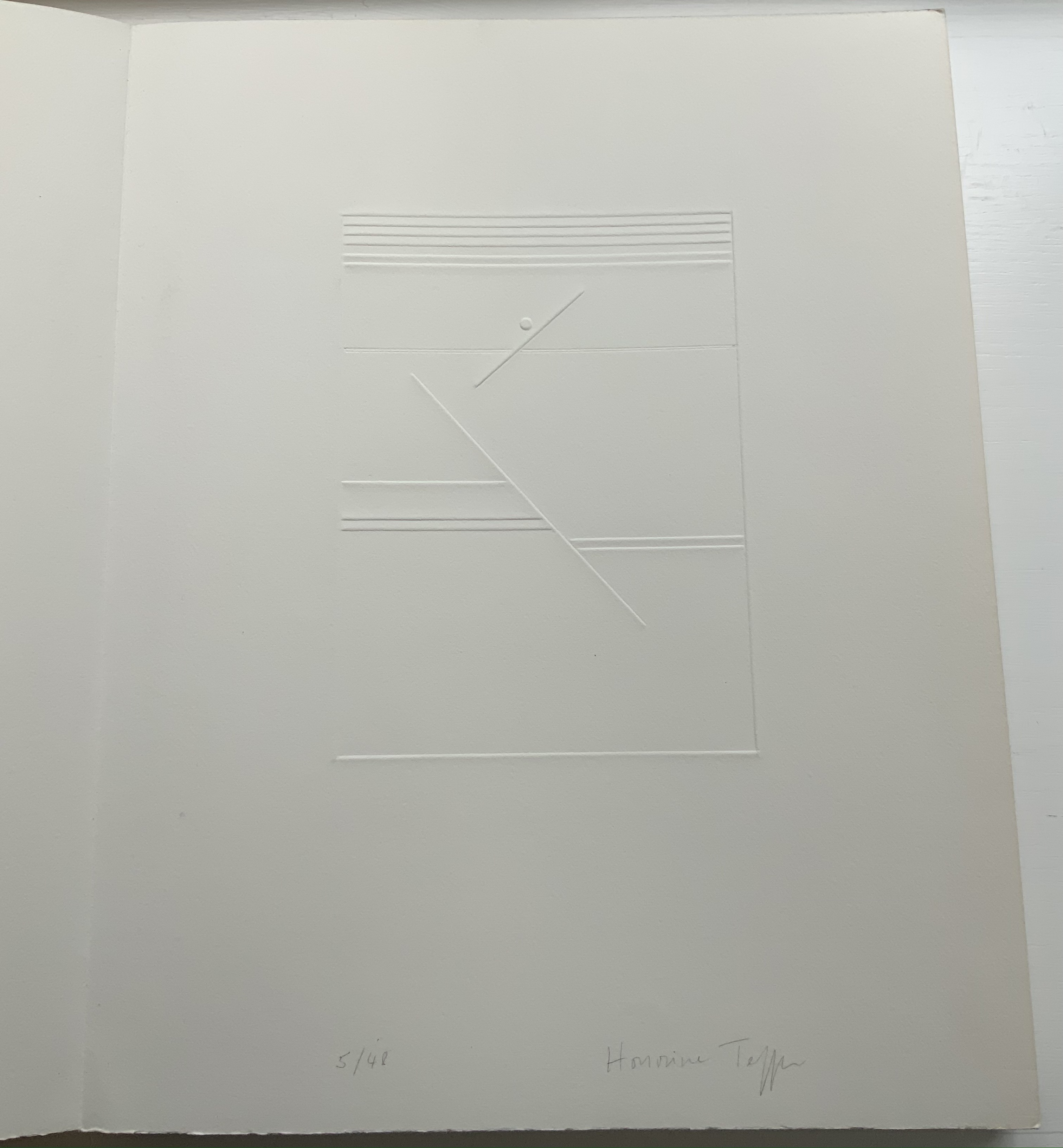
UN COUP DE DÉS JAMAIS N’ABOLIRA LE HASARD: POÈME(1989) Stéphane Mallarmé (text); Honorine Tepfer (art & design) Accordion fold with embossed paper cover. Cover – H325 x W255 mm; Book – H320 x W250 mm, 34 pages. Edition of 48, of which this is #5. Acquired from Studio Montespecchio, 2 February 2022. Photos: Books On Books Collection. Displayed with permission of the artist.
Before his sudden death in 1898, Stéphane Mallarmé was planning a deluxe edition of Un Coup de Dés Jamais N’Abolira le Hasard with Ambroise Vollard, an entrepreneur and publisher. A single-volume version of the poem did not appear until 1914. Issued under the direction of Mallarmé’s son-in-law Dr. Edmond Bonniot through the Nouvelle Revue de France (NRF), it omitted intended prints by Odilon Redon, used the typeface Elzevir rather than the Didot that Mallarmé preferred, and did not precisely follow his layout. We know all this because of correspondence between the poet, Redon and Vollard and because the Sorbonne’s Bibliothèque littéraire Jacques Doucet and Harvard’s Houghton Library hold proofs of the deluxe edition with Mallarmé’s handwritten corrections and instructions.
Mallarmé’s placement of words and lines was intentional and precise. Even before the planning for the deluxe edition, he wrote of what could be achieved with type size and layout:
Pourquoi — un jet de grandeur, de pensée ou d’émoi, considérable, phrase poursuivie, en gros caractère, une ligne par page à emplacement gradué, ne maintiendrait-il le lecteur en haleine, la durée du livre, avec appel à sa puissance d’enthousiasme: autour, menus, des groupes, secondairement d’après leur importance, explicatifs ou dérivés — un semis de fioritures. [Oeuvres Complètes, 2 227]
“Why — couldn’t a considerable burst of greatness of thought or emotion, carried in a sentence in large typeface, gradually placed with one line per page, hold the reader’s bated breath throughout the entire book by appealing to his or her power of enthusiasm: around this [burst], smaller groups of secondary importance, explicating or deriving from the primary phrase — a scattering of flourishes.” [Arnar, 234]
The NRF edition 1914 edition makes quite a few sad missteps as Robert Cohn pointed out in 1967. Tepfer’s inspiration to restore the intended layout follows in the footsteps of Mitsou Ronat & Tibor Papp (1980) and Neil Crawford (1985). She visited the Doucet library to examine the proofs and layout. Following the layout was not difficult, but with the scarcity of Didot, Tepfer needed to select another typeface. She chose Baskerville. Given that Firmin Didot was inspired by John Baskerville’s experimentation with thick and thin strokes, the choice adds historical interest, although Bodoni might have been nearer the mark. Below are Tepfer’s double-page spreads across which Mallarmé’s burst of thought appears one line per page among the “scattering of flourishes”.
The book’s central double-page spread, beginning with COMME SI / “AS IF”) in the upper left and ending with COMME SI / “AS IF” in the lower right, mimics the throw and fall of the dice and provides another example of the semantic and typographic play that Mallarmé describes above.
Like the artists before her — Redon (1897), André Masson (1961), Mario Diacono (1968), Marcel Broodthaers (1969), Jean Lecoultre (1975), Ian Wallace (1979) and Ian Tyson (1985) — Tepfer had to solve the puzzle of relating image to text. This is the difficult path of inverse ekphrasis: what and how the visual, tactile and conceptual works of art that come after Mallarmé’s text can be. We are more used to ekphrasis where the object, painting or sculpture comes before the text — like Achilles’ shield before Homer’s description, or the Grecian urn before Keats’ ode, or Brueghel’s Fall of Icarus before Auden’s Musée des Beaux Arts. Homer, Keats and Auden vie with the art of the crafted object to put that object (and more) in front of us with words. With the inverse, the crafted objects vie without the words to put Mallarmé’s poem (and more — and sometimes less!) in front of us. Tepfer’s solution?
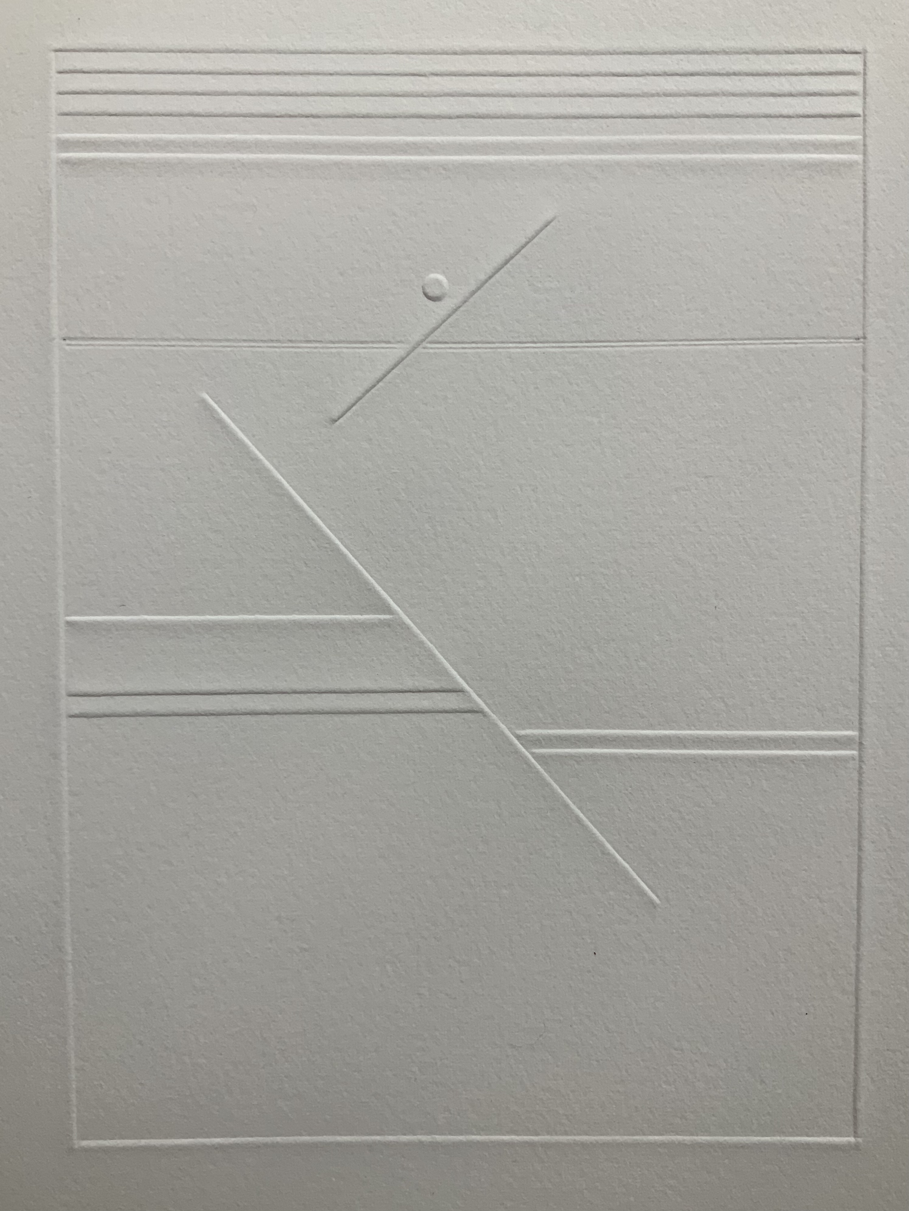
A simple line runs across the debossed front and back covers. As Tepfer wrote in June 1990 about her journey into Un Coup de Dés: La ligne d’horizon était un sujet de ma hantise / “The horizon line was my obsession”. As the folded paper cover opens, a single geometric, abstract image appears — debossed and embossed on blank paper. Except for a single round dot, everything is linear. Two separate lines angle across the space. One cuts through the debossed horizon line that lies beneath a series of closely spaced horizontal lines — suggesting clouds? The other, longer one cuts at a different angle, creating a foreground from two sets of parallel lines that have slipped or shifted like tectonic plates. Could the round dot be the single-dot side of a die rolling down a slanted deck or broken mast? Could the longer slanted line be a broken mast? Could the shifted parallel lines be a broken handrail?
Rather than trying to track back to verbal images in the poem, though, perhaps we should recognize Tepfer’s prefatory image as a kind of substitute for Mallarmé’s preface in 1897 — the one he preferred we not read. He wanted us to look. To see les blancs. To hold thought and emotion like our breath across the space of the book. With her simple rectangle of blank paper, with the absence of ink, with the geometric solidity of the horizontal and slanting lines, and with the velvet softness of the velin d’Arches across her version’s accordion folds, Tepfer encourages us to look, see, hold meaning in abeyance and sense it.
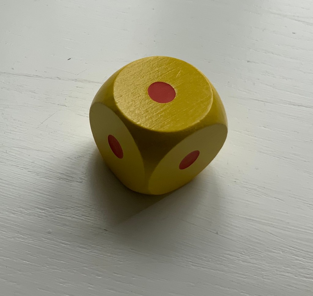
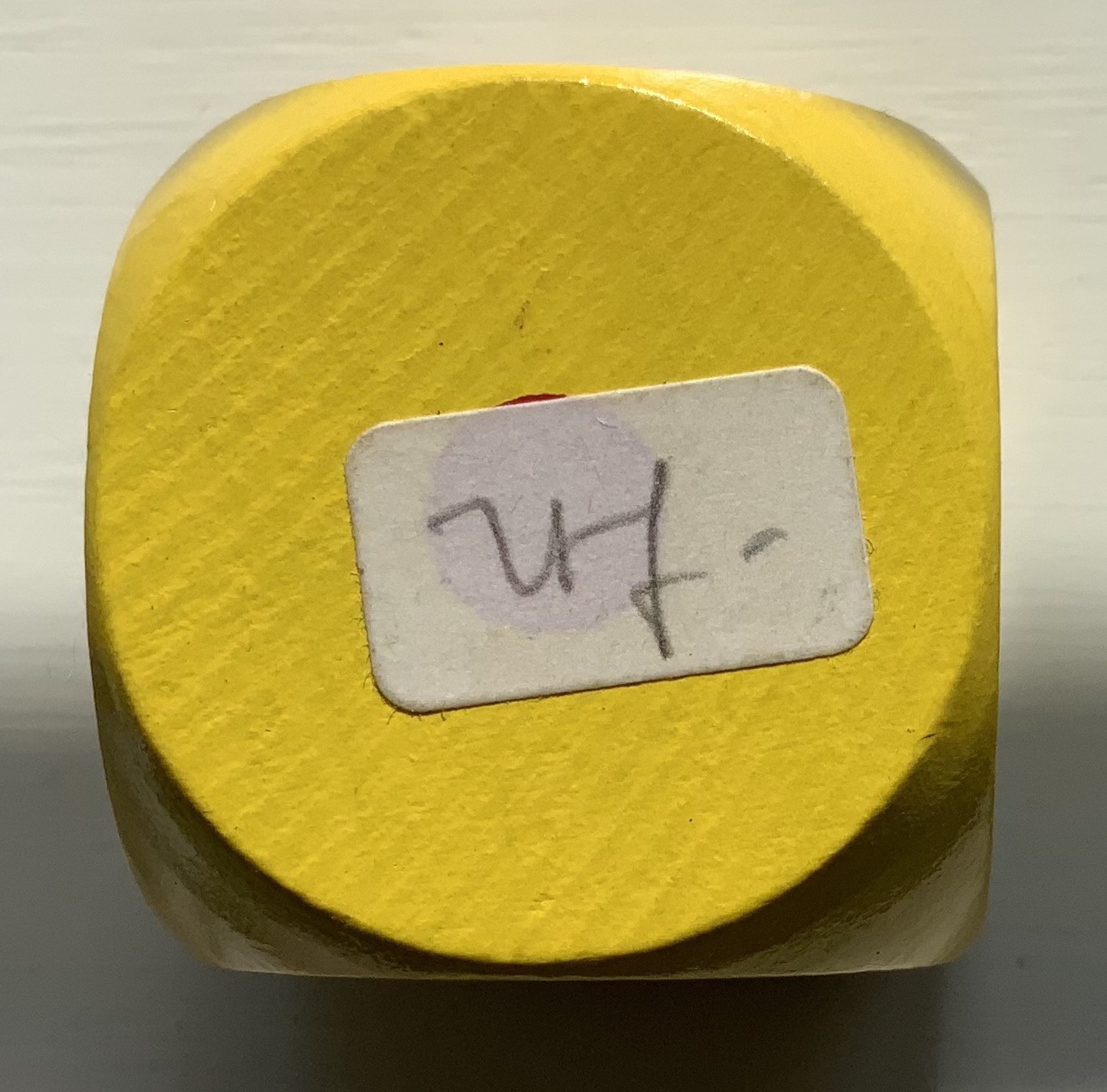
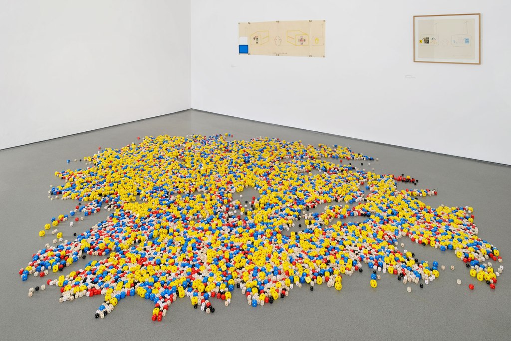
Eins. Un. One. (1984) Robert Filliou Wooden die. 3 x 3 x 3 cm. Edition of 150 dice with handwritten signatures, signed ”r.f.’’. Edition by Armin Hundertmark. Acquired from Galerie van Gelder, 22 February 2022. Photos: Books On Books Collection.
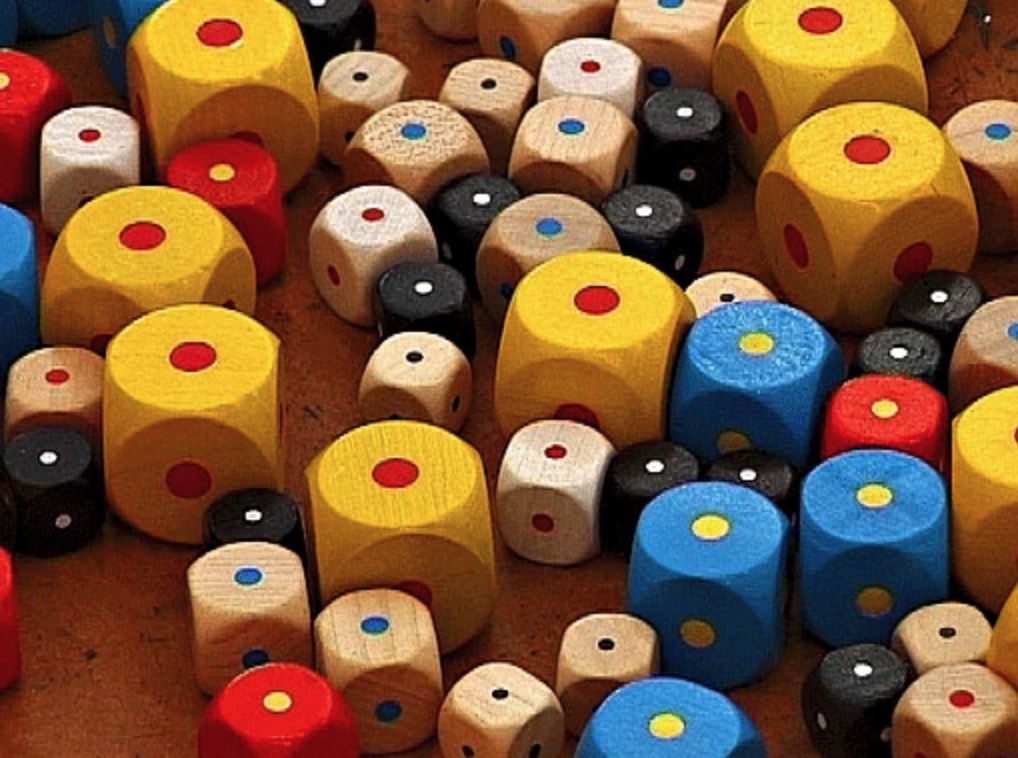
This work first appeared in 1984 and has been displayed in several 21st-century exhibitions, including Robert Filliou’s first solo exhibition at the Henry Moore Institute in Leeds in 2013. The constellation of 16,000 multicolored dice, each with all six sides bearing a single dot, delivers one of the more humorous works of homage to Stéphane Mallarmé’s Un Coup de DésJamais N’Abolira le Hasard. With the guarantee of a single dot, it might be thought that chance has been abolished, whichever and however many dice are rolled. The multiple sizes and colors of the dice and the varied constellations into which they might fall per installation suggest otherwise.
Just a thought.
As Mallarmé’s last line — Toute Pensé émet un Coup de Dés — implies, even this thought emits a throw of the dice.
Filliou, Robert, and Sylvie Jouval. 2003. Robert Filliou: éditions & multiples. Dijon: Les presses du réel. See p. 91 for documentation of Eins. Un. One.
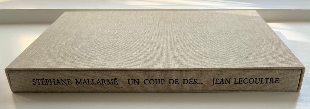
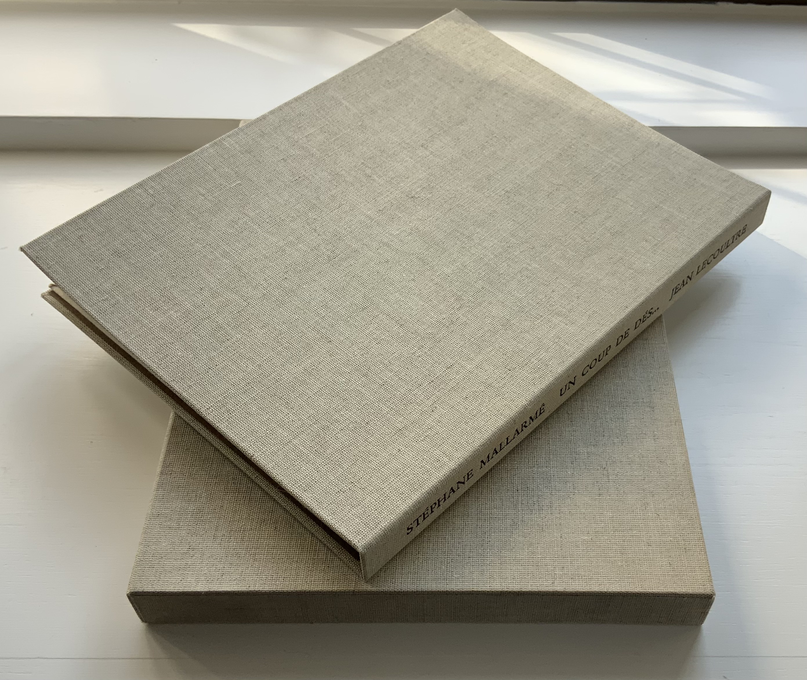
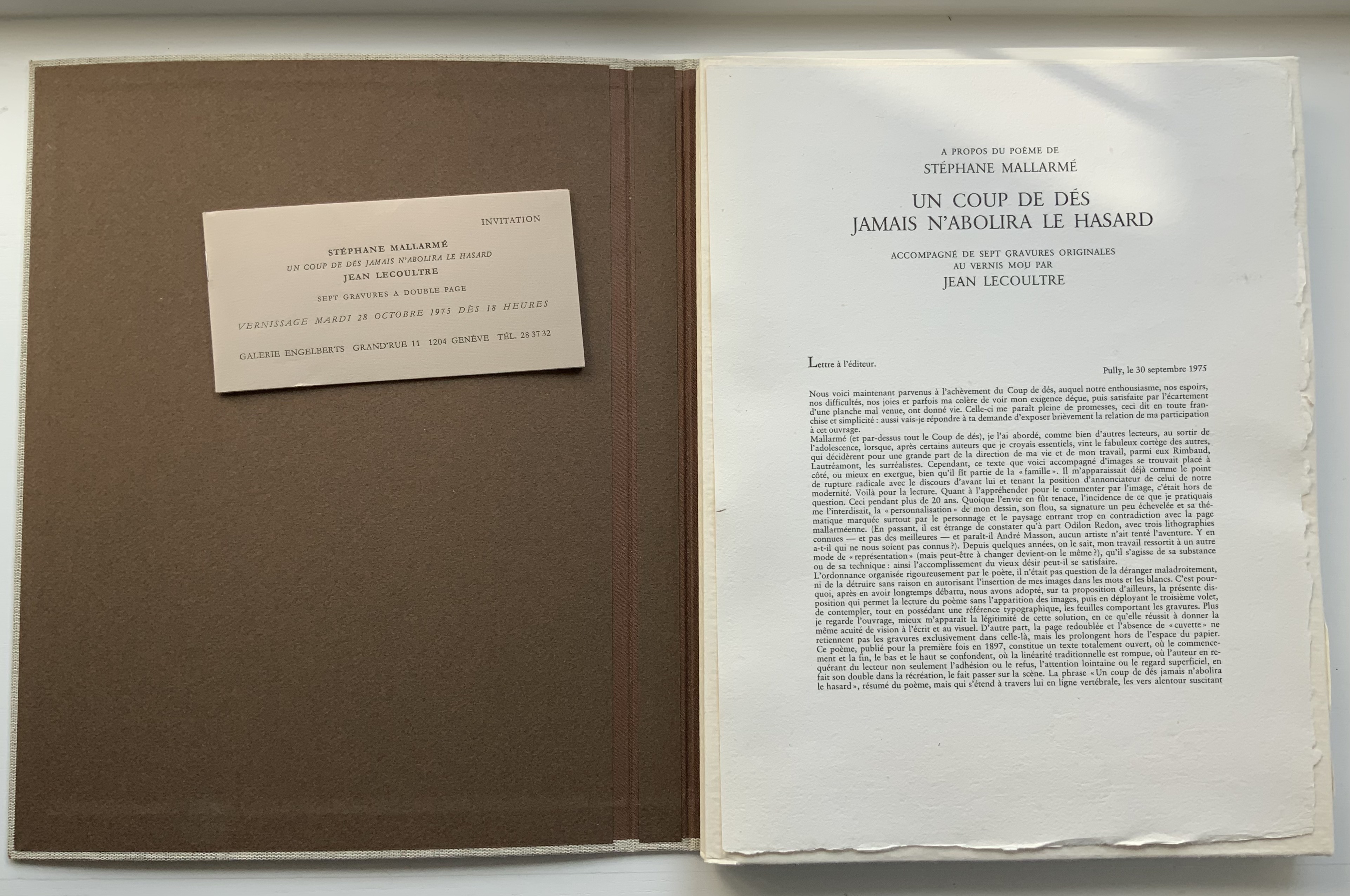
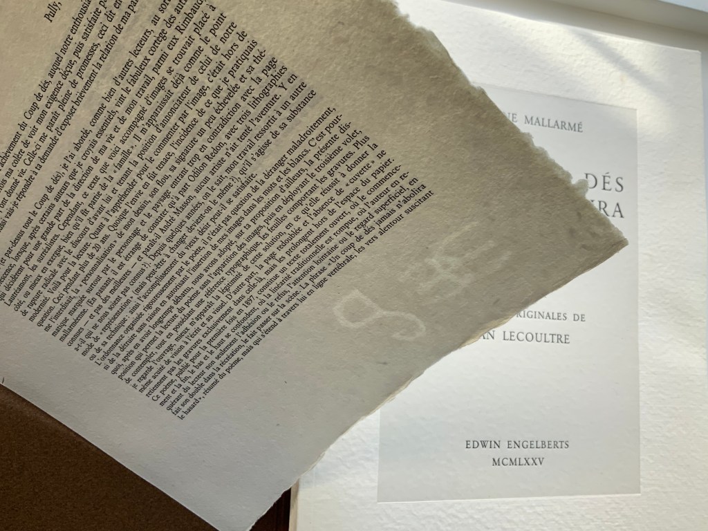
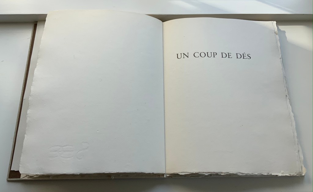
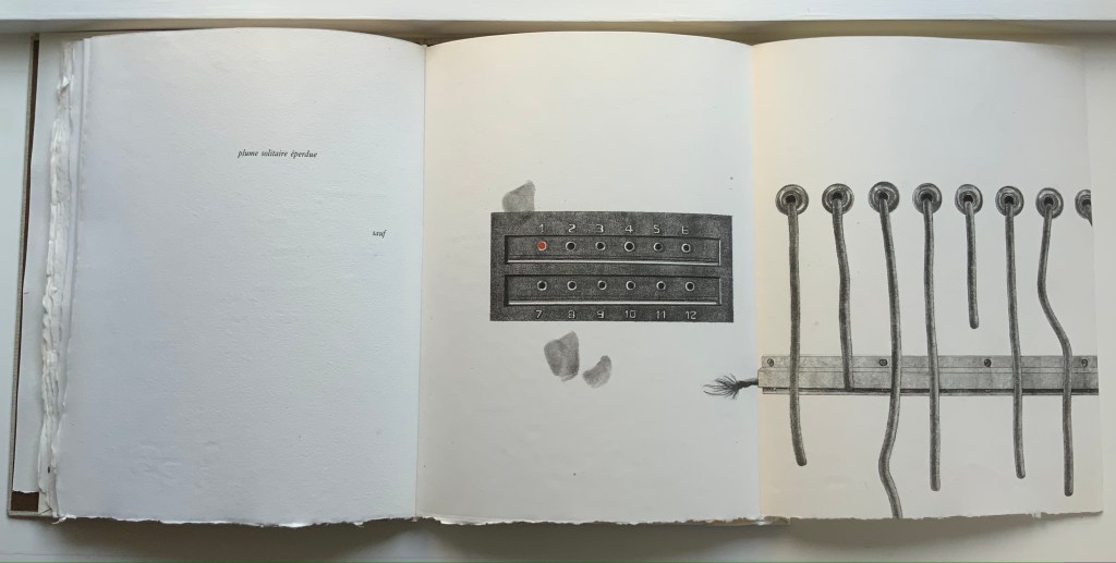
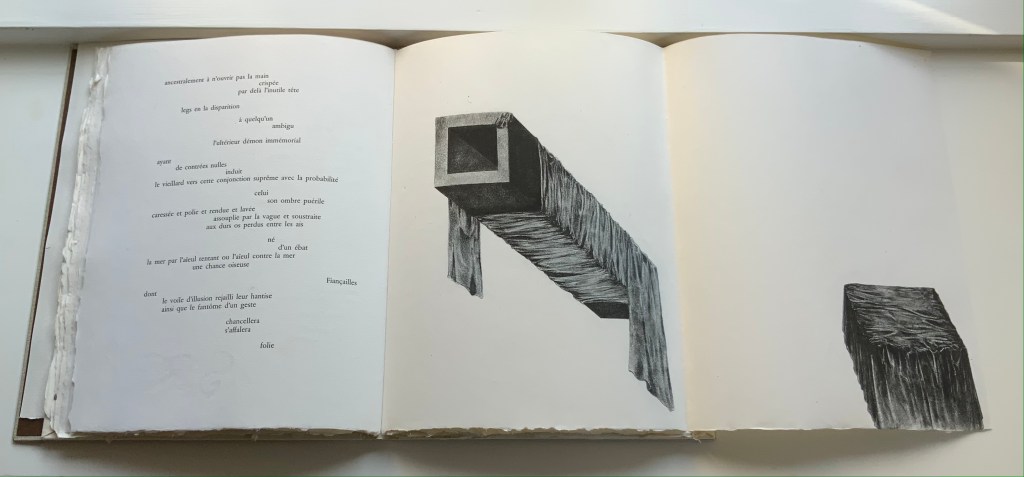
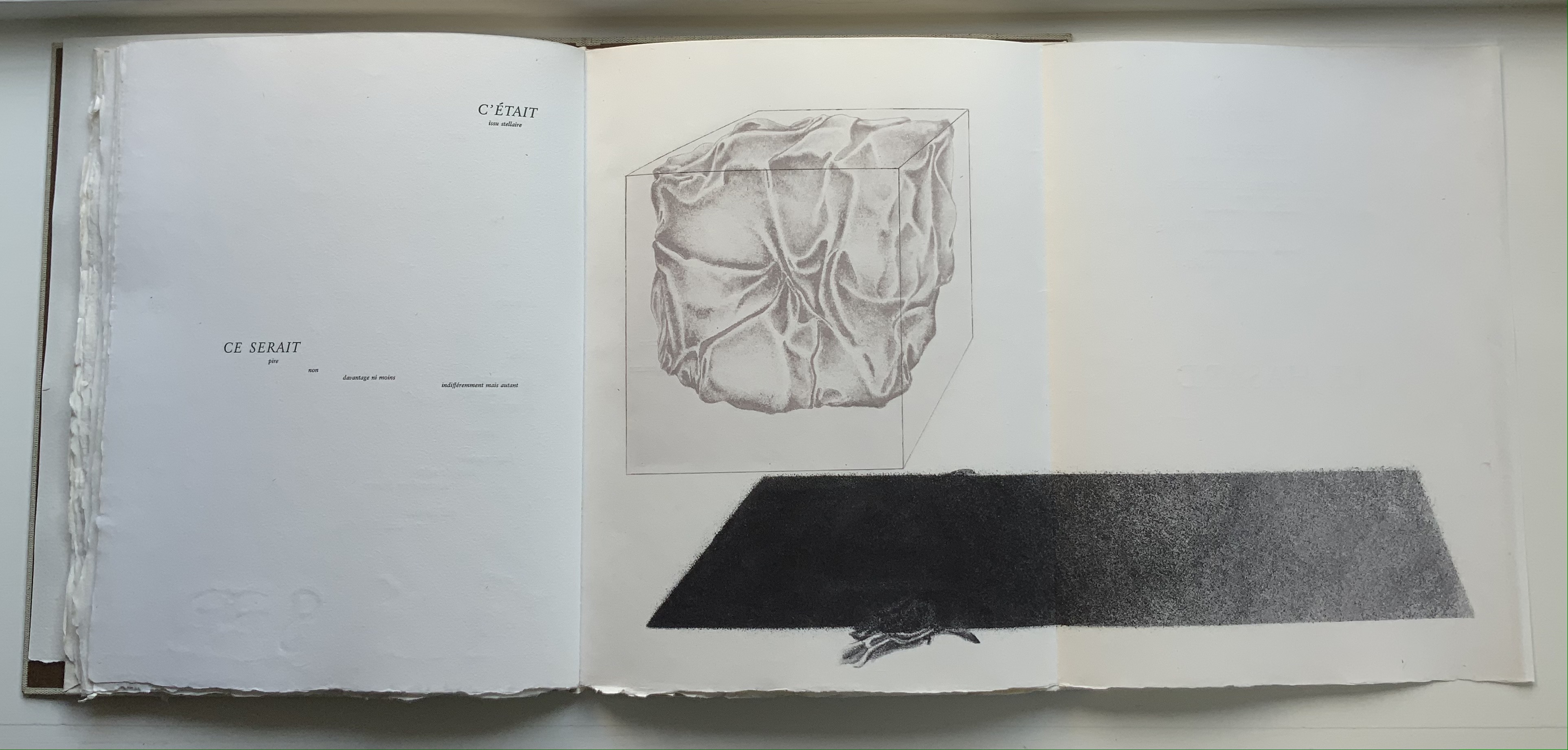
STÉPHANE MALLARMÉ,UN COUP DE DÉS JAMAISN’ABOLIRA LE HASARD: POÈME (1975) Jean Lecoultre Double canvas slipcase/folder enclosing a folded-paperbound book. Slipcase: 340 x 260 mm; Book: 330 x 250 mm, 62 pages inclusive of the 5 foldouts. Edition of 115, of which this is #78. Acquired from OH 7e Ciel, 10 March 2022. Photos: Books On Books Collection. Displayed with permission of Jean Lecoultre
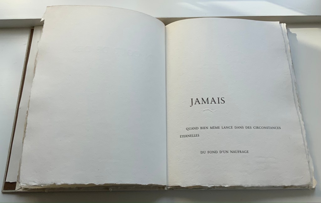
Among the many distinguishing features of Jean Lecoultre’s homage to Stéphane Mallarmé’s poem, three of the most striking are the typeface, the paper and the images. In deliberate ways, each differs from the deluxe edition that Ambroise Vollard and Mallarmé planned after the poem first appeared in 1897.
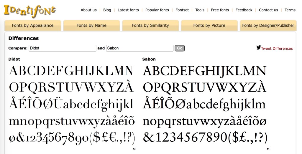
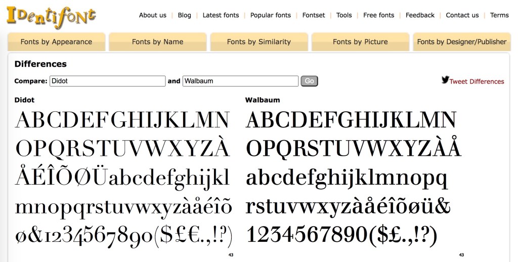
Sabon is the typeface, designed by Jan Tschichold in 1964 under commission from Walter Cunz of Stempel. The Linotype, Monotype and Stempel foundries released it jointly in 1967, which makes its use only eight years later a little bit daring. Only a “little bit” because anything more modern (say, Garamond) would have been preferable to Mallarmé rather than the Elzevir chosen by NRF when it published the 1914 edition. Lecoultre and the publisher Galerie Edwin Engelberts followed the 1914 layout but, thank goodness, not the typeface. Sabon’s thin and thick strokes do not contrast as much as those of Didot, and it does not have the same verticality. Although rooted in Garamond, Sabon comes closer than Garamond to the narrowness of Didot. Walbaum might have been a still closer option, but with its more substantial thin strokes, Sabon has to have been a more suitable choice for the handmade paper in this work.
Georges Duchêne (1926-2012) (Moulin de Larroque and Moulin de Pombié) fabricated the paper (vélin de cuve) especially for the project. The paper bears Duchêne’s watermark as well as a rough “tooth” (surface texture that grips the ink) and uneven deckled edges. With his semantic and typographic innovation, Mallarmé intended to draw attention to les blancs (the spaces around the lines, phrases and single words). With its smoothness interrupted by bumps, its simultaneous softnesss and stiffness, the paper draws the eye and touch even more to the space around the verses.
The surface must have presented a challenge for the technique of “soft varnish” etching used by Lecoultre. Crown Point Press defines it this way:
A process that involves applying a beeswax ground made soft by the addition of tallow or petroleum jelly evenly over a heated plate with a brayer. After the plate has cooled, the artist draws on paper laid over it. The soft wax comes off on the back of the paper exactly where the artist has pressed, exposing the metal in the pattern of the grain of the paper. More pressure in drawing removes more wax and produces a darker line after the plate has been bitten. In general, soft ground lines look like lines made by the drawing instrument, usually a pencil or crayon. Soft ground can also be used to take a direct impression of any flexible material—a fingerprint, a leaf, a piece of cloth, for example.
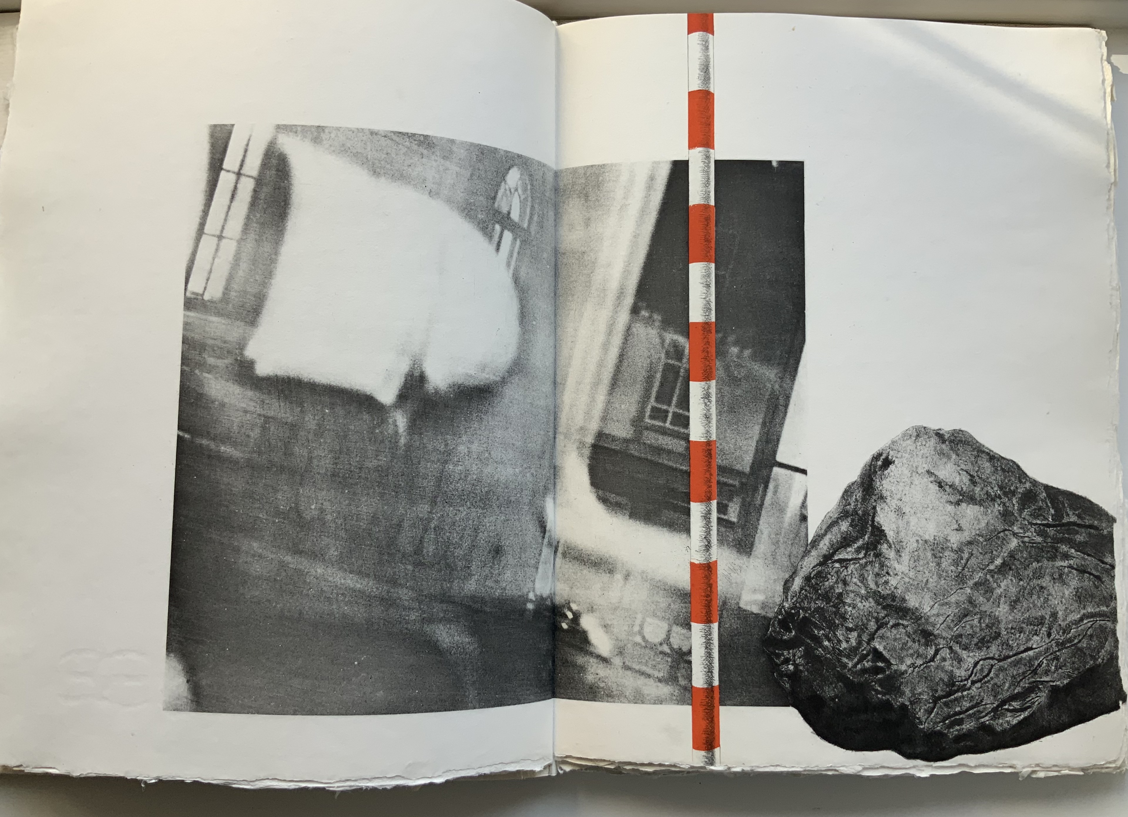
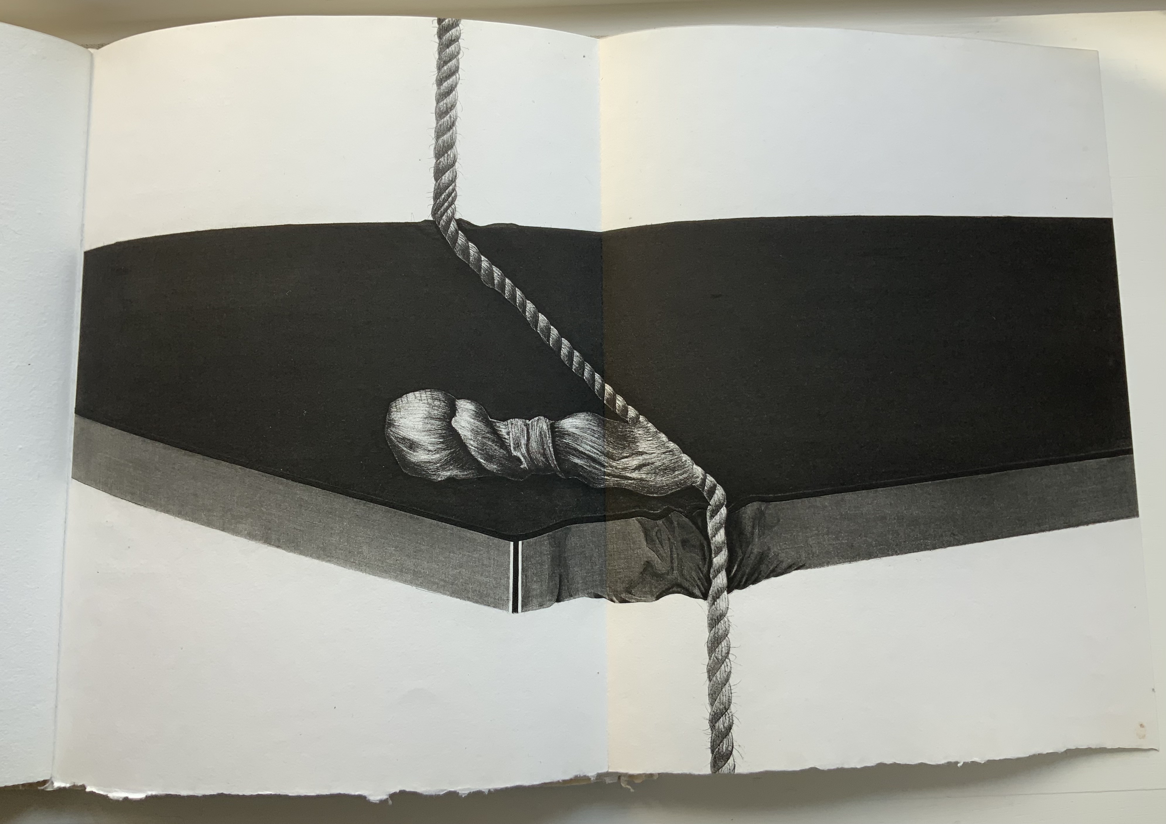
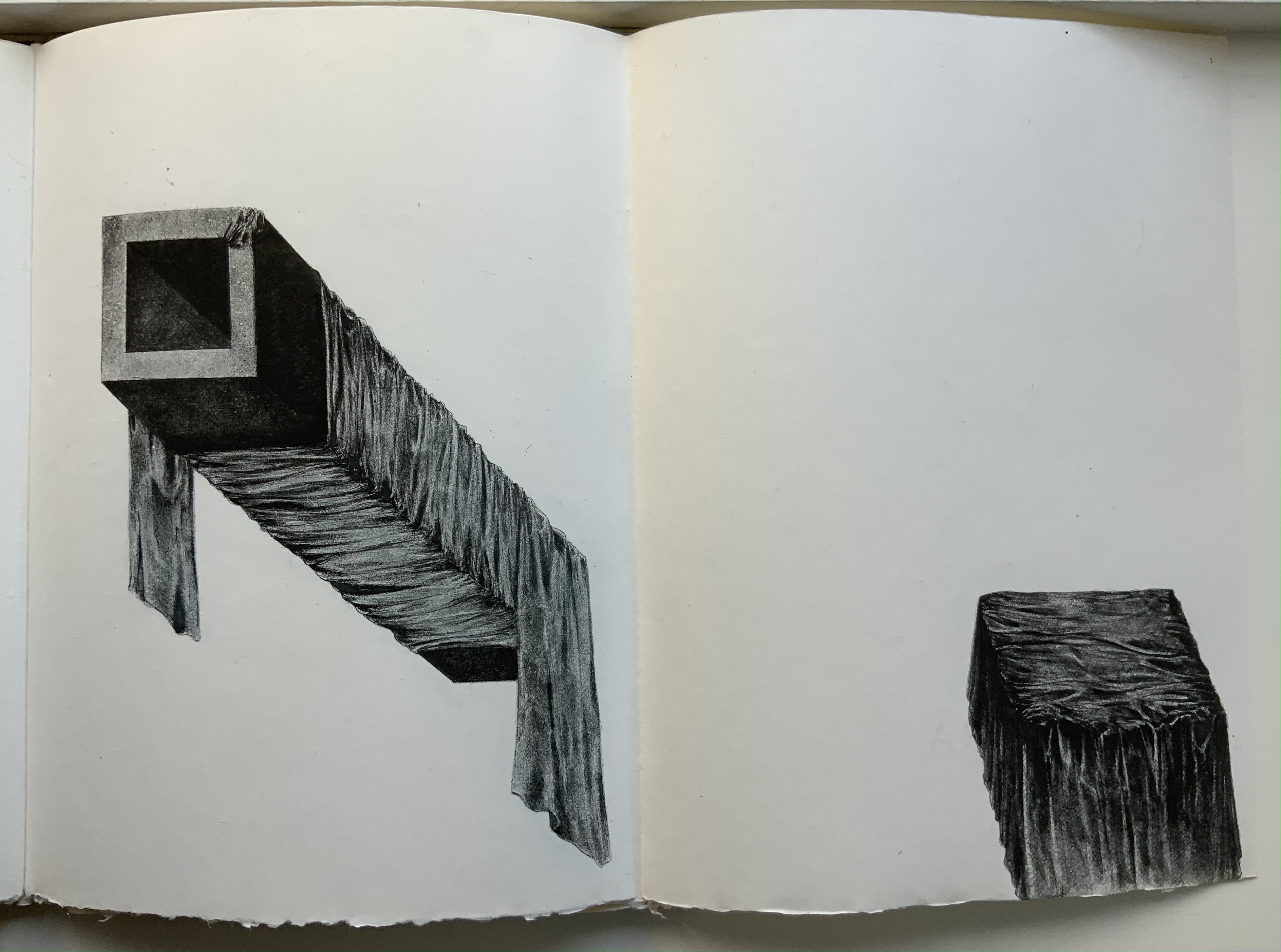
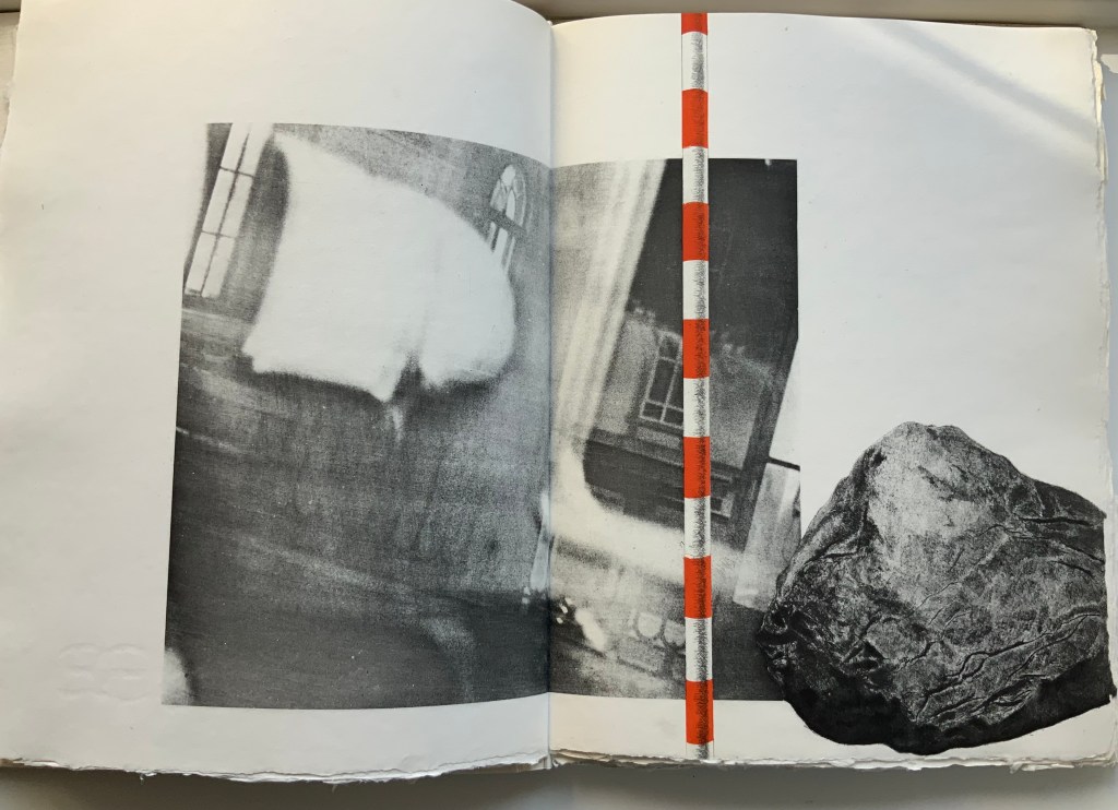
The technique resonates metaphorically with Mallarmé’s dictum peindre non la chose mais l’effet qu’elle produit (“to depict not the object but the effect the object produces”). The technique allows Lecoultre to depict the fine details of easily identifiable objects (a stone, fingerprints, a rope and more) and less easily identifiable ones (a blurred wall and windows, a pair of draped rectangular columns being sliced by a cheese-cutter-like cable and so on). Identifiable or not, the objects yield to the effects their juxtaposition, layering and blurring produce.
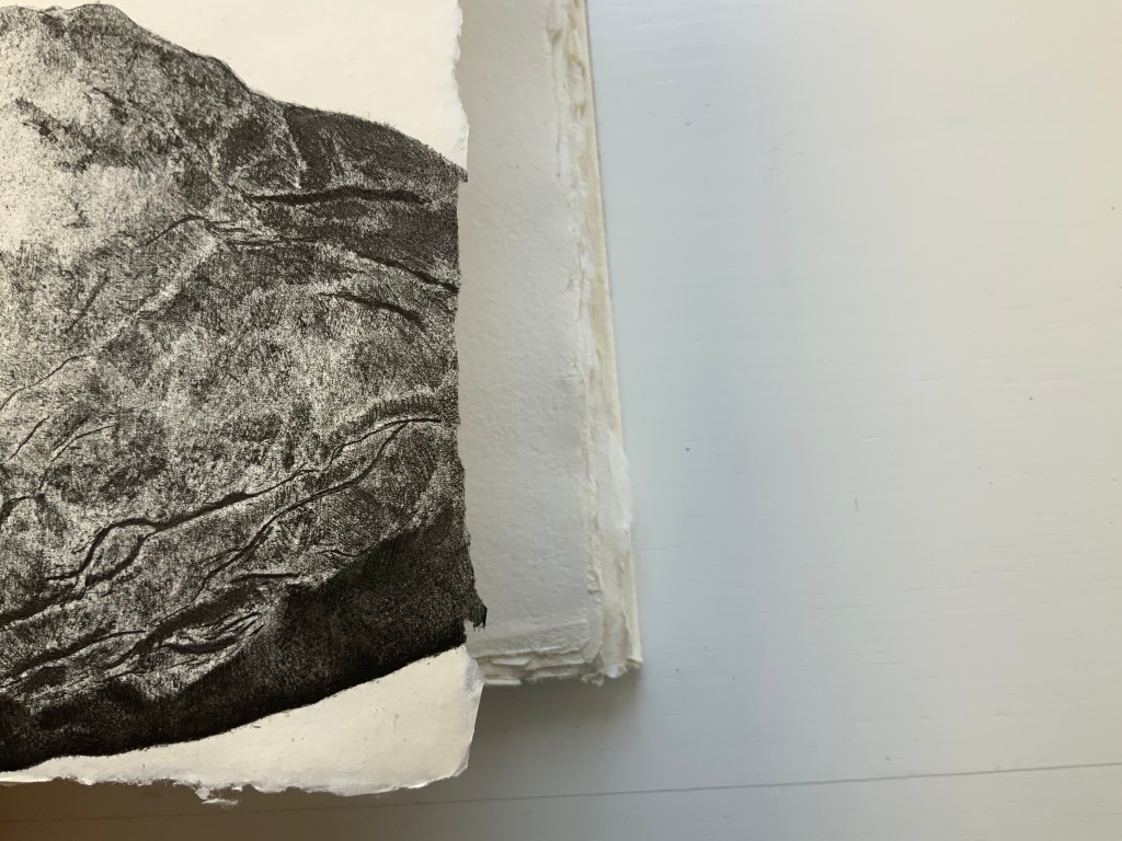
Lecoultre is also Mallarméan in his mastery of the technique. In an invitation booklet included with the book, Pietro Sarto, who pulled the prints, points out that, due to its delicacy, the soft varnish technique is most often associated with spontaneity and the chance effect. In Lecoultre’s case, Sarto makes the startling revelation that, for some of the images, the plates went through thirteen states. Thirteen chances for precision to be marred. Lecoultre even extends his chance-taking to the paper in pursuit of effect: note how the image of the rock bleeds across the deckle edge. The strange juxtaposition of objects and the way some objects seem to float on the page (or fall off it) — these also mirror Mallarmé’s arrangement of words and lines among les blancs of the pages, the precision of his images and the suggestiveness of his metaphors.
Finally Lecoultre and his publisher strike out in a novel direction with the number and placement of the prints. Unlike Mallarmé/Vollard’s plan to segregate the poem from Odile Redon’s three to four images, Lecoultre integrates his seven with the poem. This entails “bookending” the poem with two double-page spreads, each taken up entirely by a print: one spread before the half-title and one after the final page of the poem. For the remaining five prints to appear on double-page spreads, the publisher urged the use of five foldout pages. This solution, which Lecoultre approvingly embraced, simultaneously challenges and celebrates Mallarmé’s unit of the double-page spread.
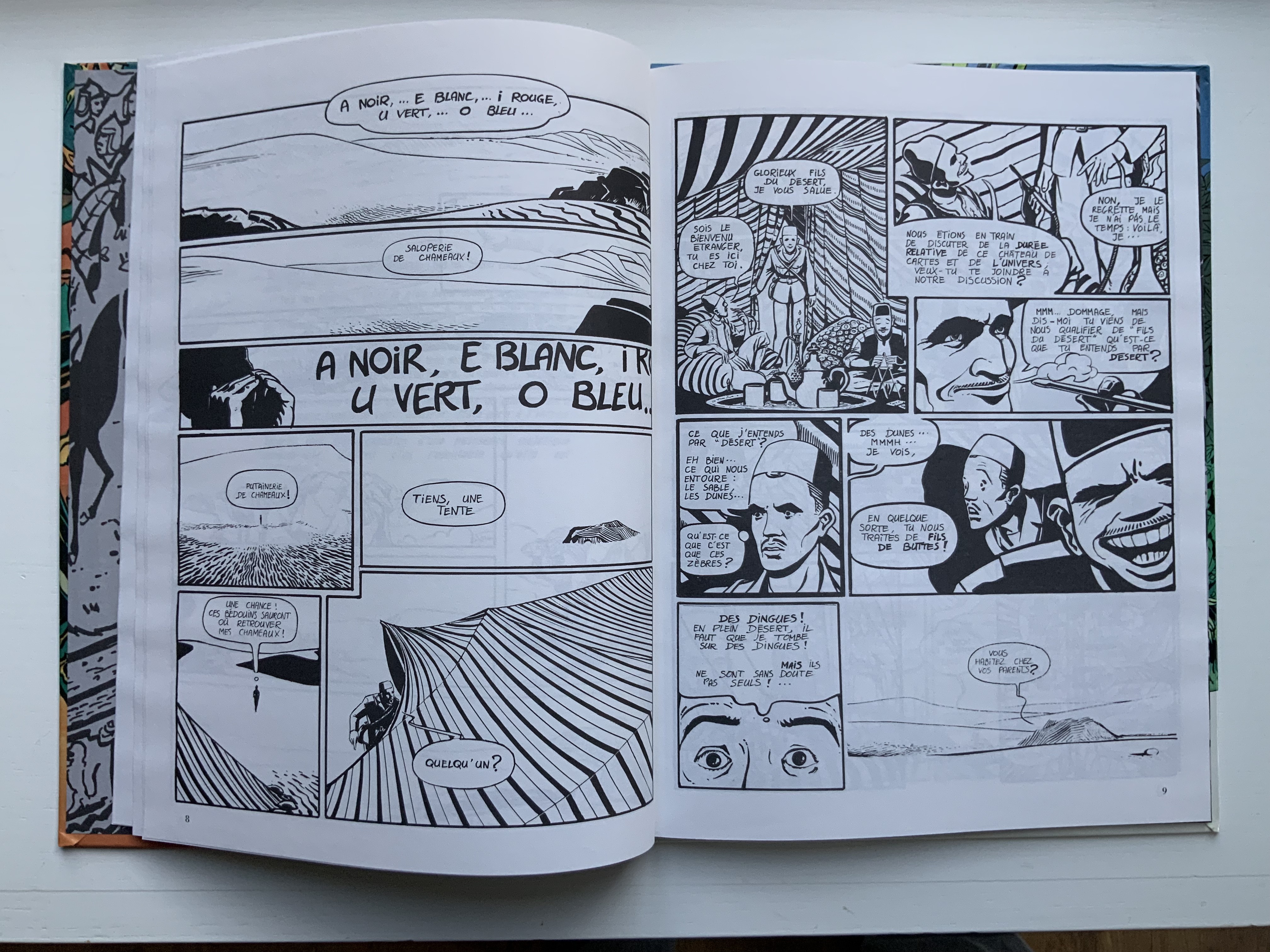
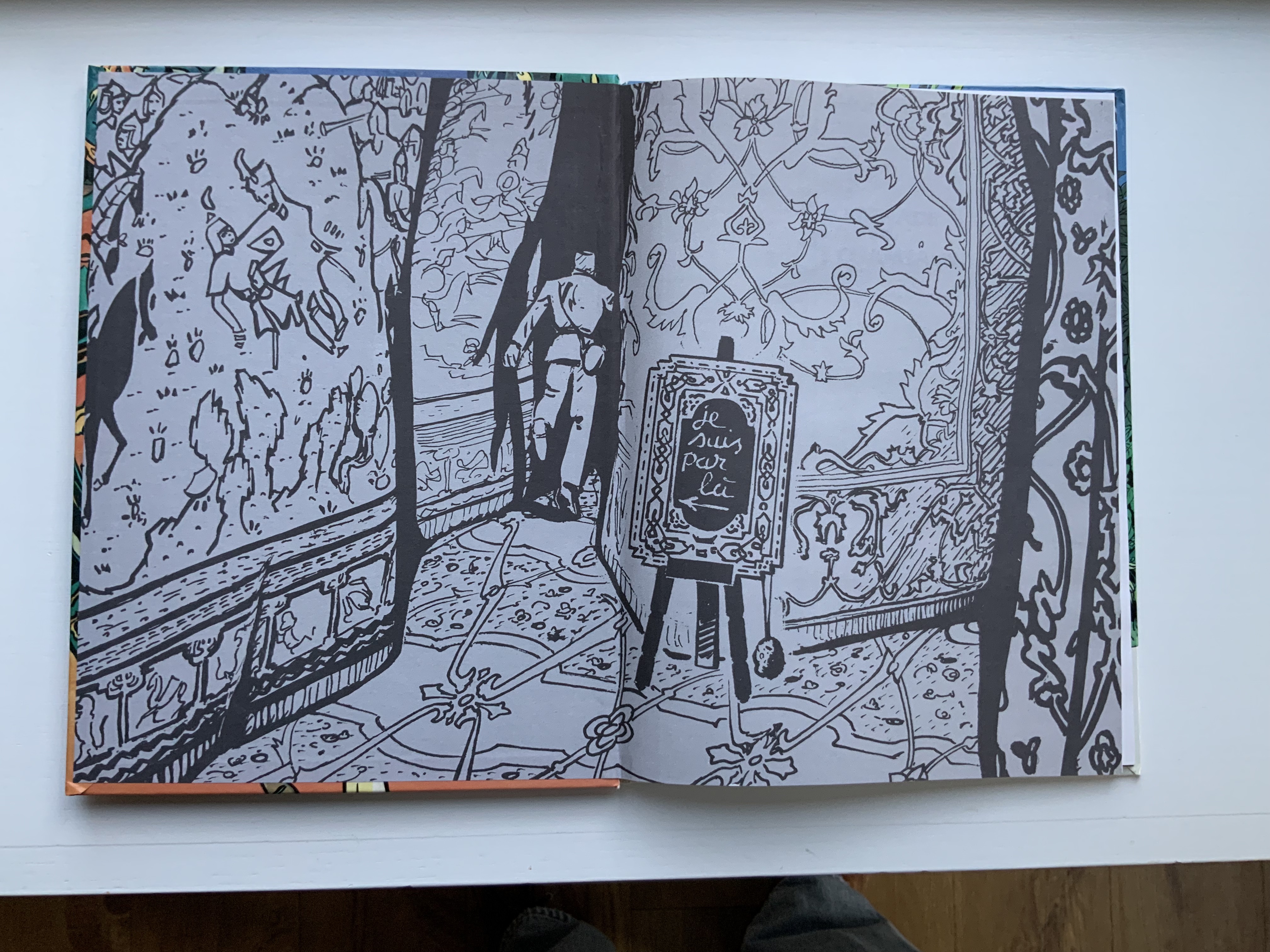
Arthur R./Promenade pour 5 Chameaux (1987) Chiavelli Bande Dessinée. H298 xW226 mm, 48 pages. Acquired from Librarie de l’Université, 28 October 2021. Photo: Books On Books Collection.
It is curious — given that Stéphane Mallarmé had only ever seen Arthur Rimbaud once and wrote about him only on commission — that Chiavelli assigns Un Coup de Dés as the subtitle of his second volume in a series of three graphic novels following the adventures of “Arthur R.”, a Tin Tin-like version of Arthur Rimbaud. Chiavelli weaves his imagined adventures of Rimbaud on the Horn of Africa (1880-91) into a three-volume graphic novel whose plot lines, scenes and dialogue balloons are stuffed with arch allusions to Rimbaud’s abandoned literary life and postmodern literary criticism.
In this first volume, Chiavelli gives his hero a favorite curse — the mild Bon sang! (“damn!”), probably uncharacteristic for the Rimbaud who killed a worker in Cyprus with a rock, but characteristic for Chiavelli making a tongue-in-cheek reference to Mauvais sang (“Bad Blood”, the second and longest poem in Une saison en enfer, 1873). The five camels of the title are named A,E, I, U and O, after the letters of his sonnet Les Voyelles (1871), which has been rendered in multiple livres d’artiste, one of which is in the Books On Books Collection. As the sonnet associates each vowel with a color, Chiavelli can be suspected of being tongue-in-cheek in delivering his comic completely in black and white. Certainly the invitation to a philosophical discussion of time that segues into a French pun “sons of the desert” into “sons of bitches” (fils de buttes for fils de putes) sets the tone to come.
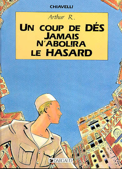
Arthur R./Un Coup de DÉS Jamais N’Abolira le HASARD (1988)
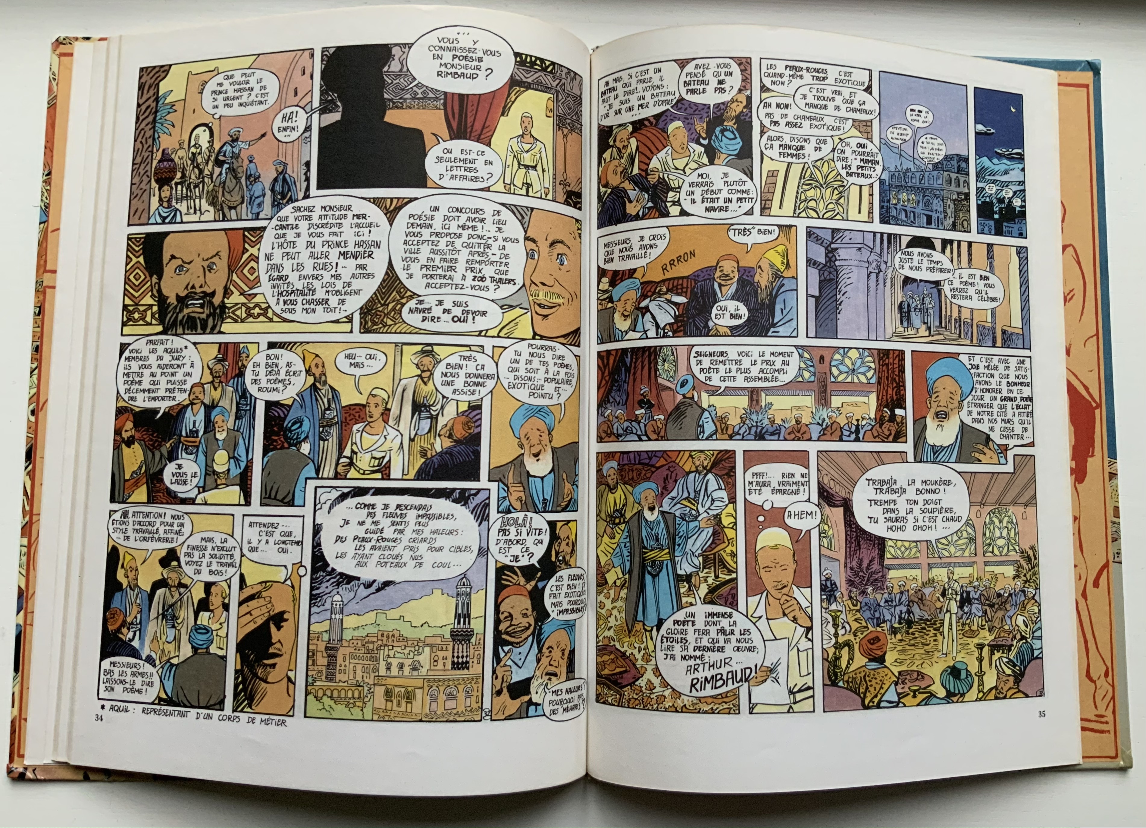
With its title, this four-color volume marks a shift in its joking allusiveness from Rimbaud alone to a conflation with Stéphane Mallarmé’s poem of the same title: an opening game of dice and a search for the city of “Azar” (homonym for hasard, meaning chance and also a game of dice). Still though, Rimbaud/Tin Tin is never far away; see the second double-page spread in which he recalls to himself the opening lines to Le Bateau Ivre/”The Drunken Boat” but then delivers to his Arab audience a racist, misogynistic ditty concocted by French legionnaires in Algeria.
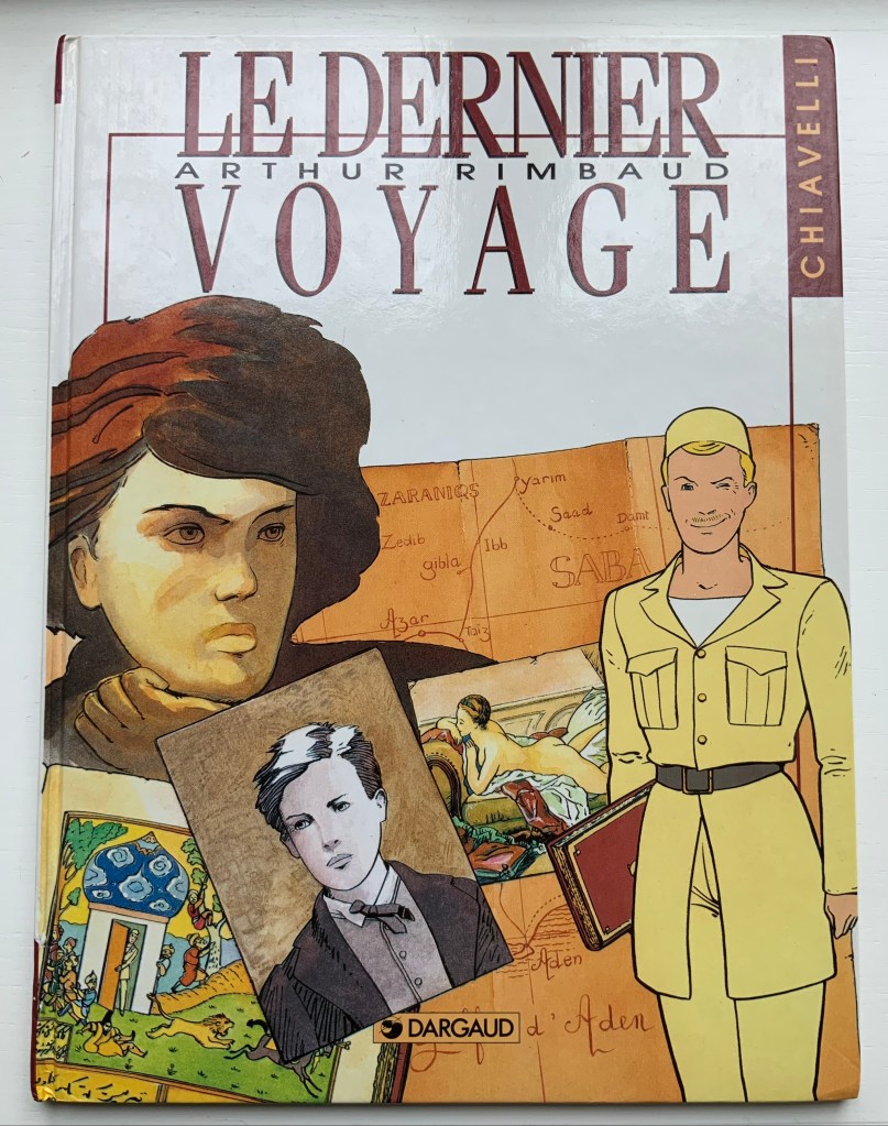
Arthur Rimbaud/ Le Dernier Voyage (1992)
Arthur Rimbaud/ Le Dernier Voyage (1992) Chiavelli Bande Dessinée H320 x W240 mm, 52 pages. Acquired from EV Asset, 29 October 2021. Photo: Books On Books Collection.
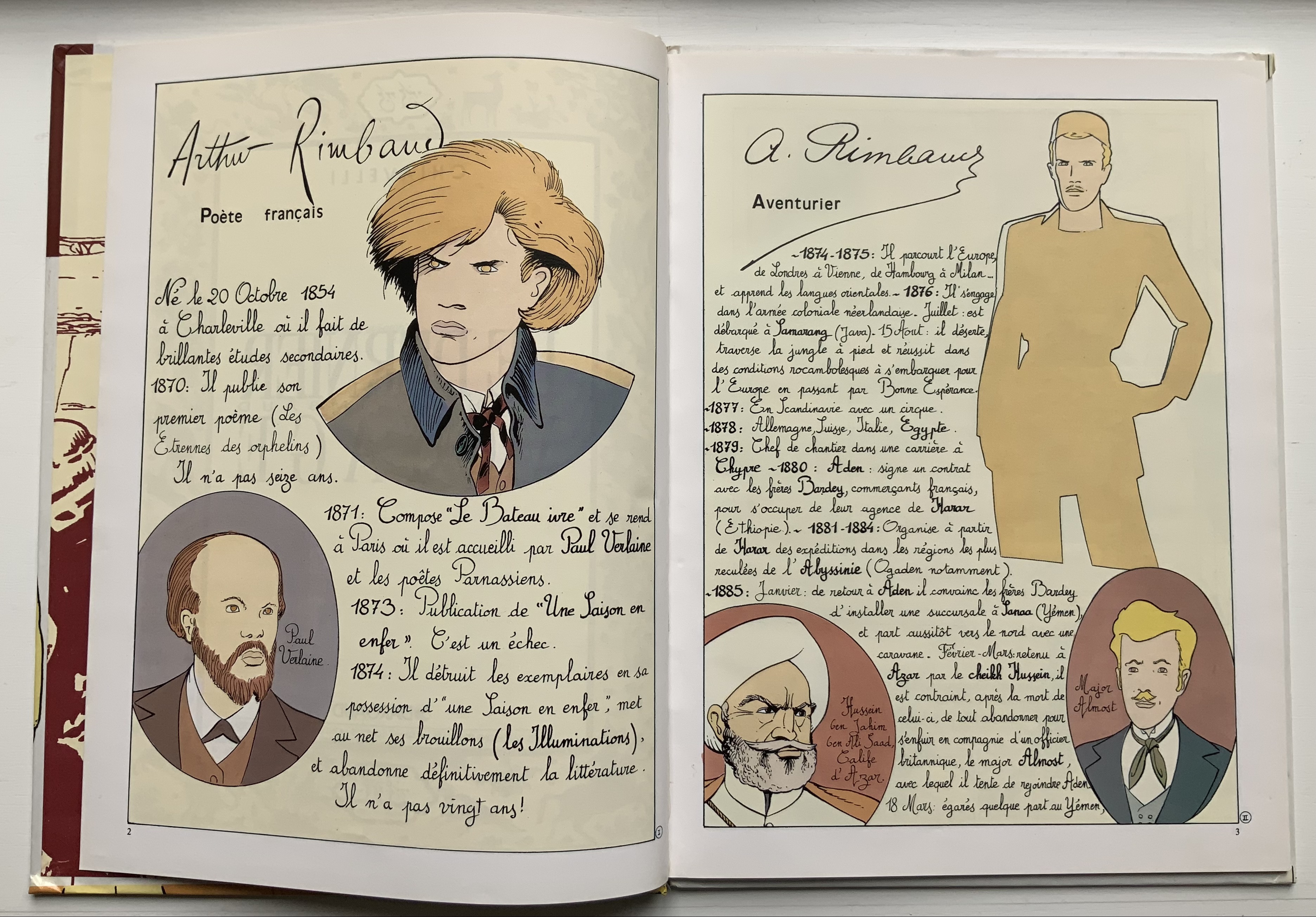
Spelling out Arthur R. on the cover of the last of the trilogy somewhat spoils the already scant Tin Tin camouflage. The inclusion of Rimbaud’s capsule biography at the start and epitaph at the end also gives this volume the feel of the earnest American comic book series “Classics Illustrated”. But its “One Thousand and One Nights” leap into the hero’s pursuit of le livre in this last voyage (a double allusion to Mallarmé?) and his amorous involvement with a femme fatale (and others) raise the trilogy to such a comic level of narrative, philosophical and literary self-reference (and such groan-inducing puns as Chipizade for Scheherezade) that the cover title and earnestness might be forgiven — depending on the reader’s age, sex and race.