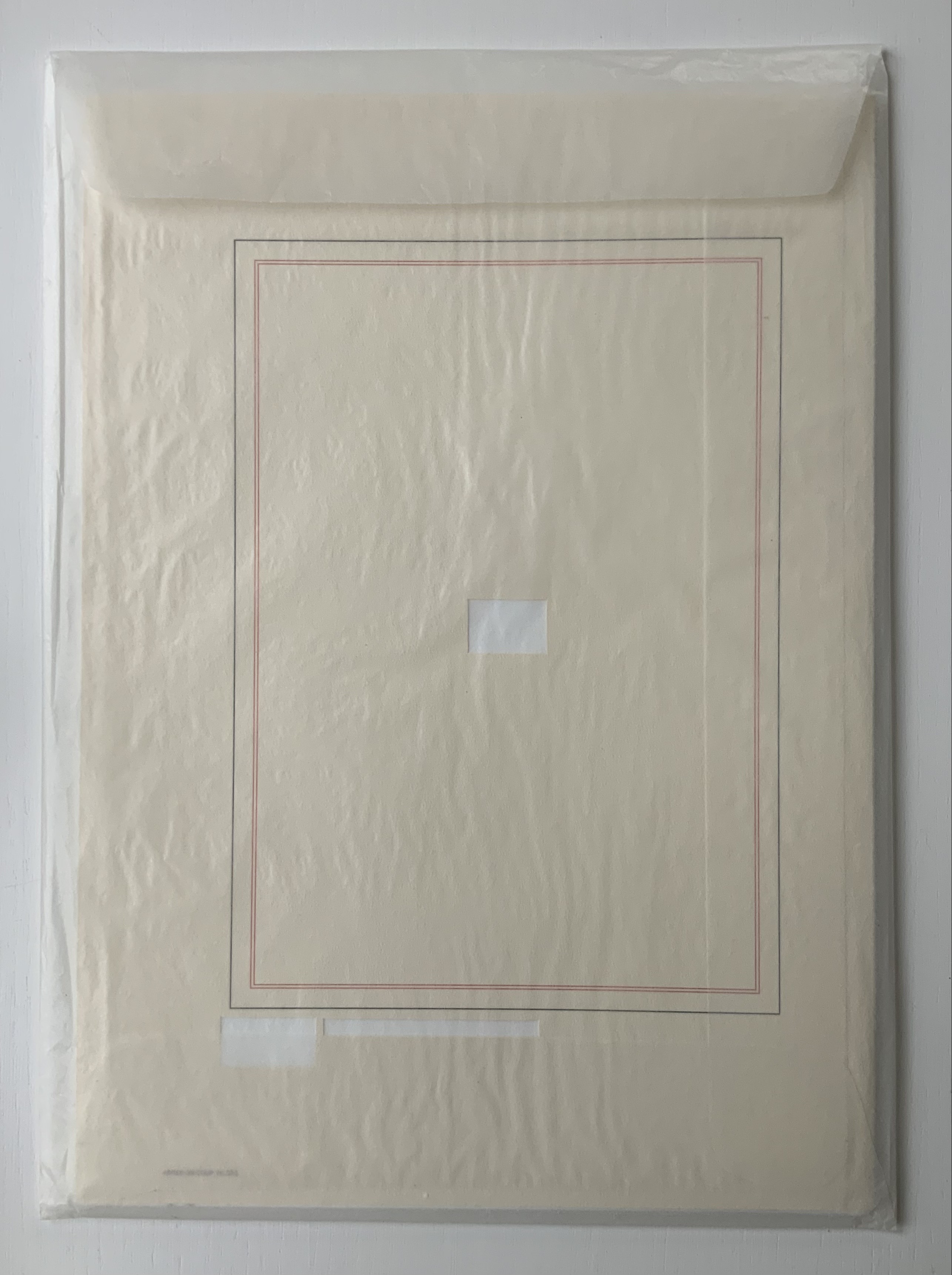
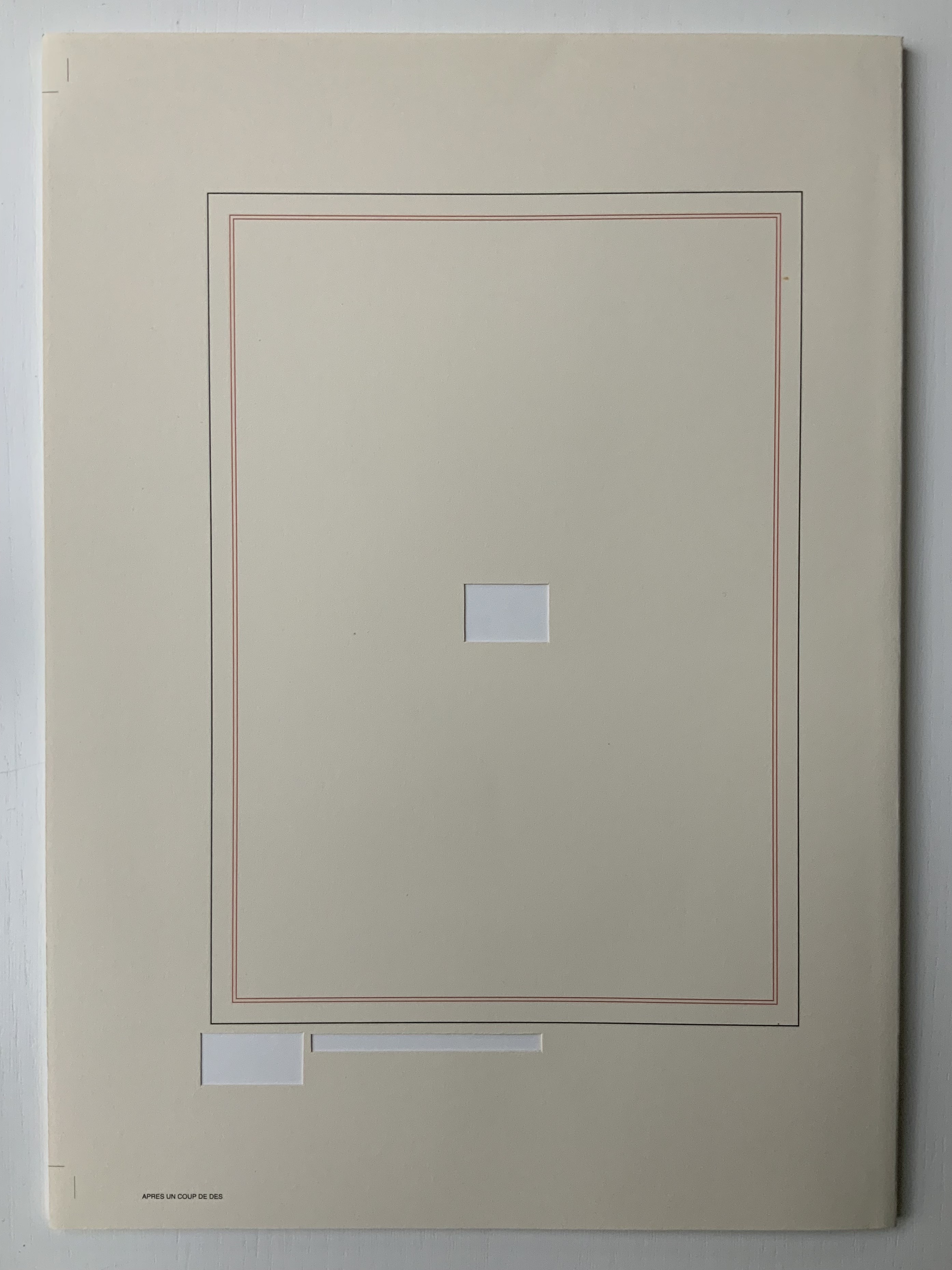
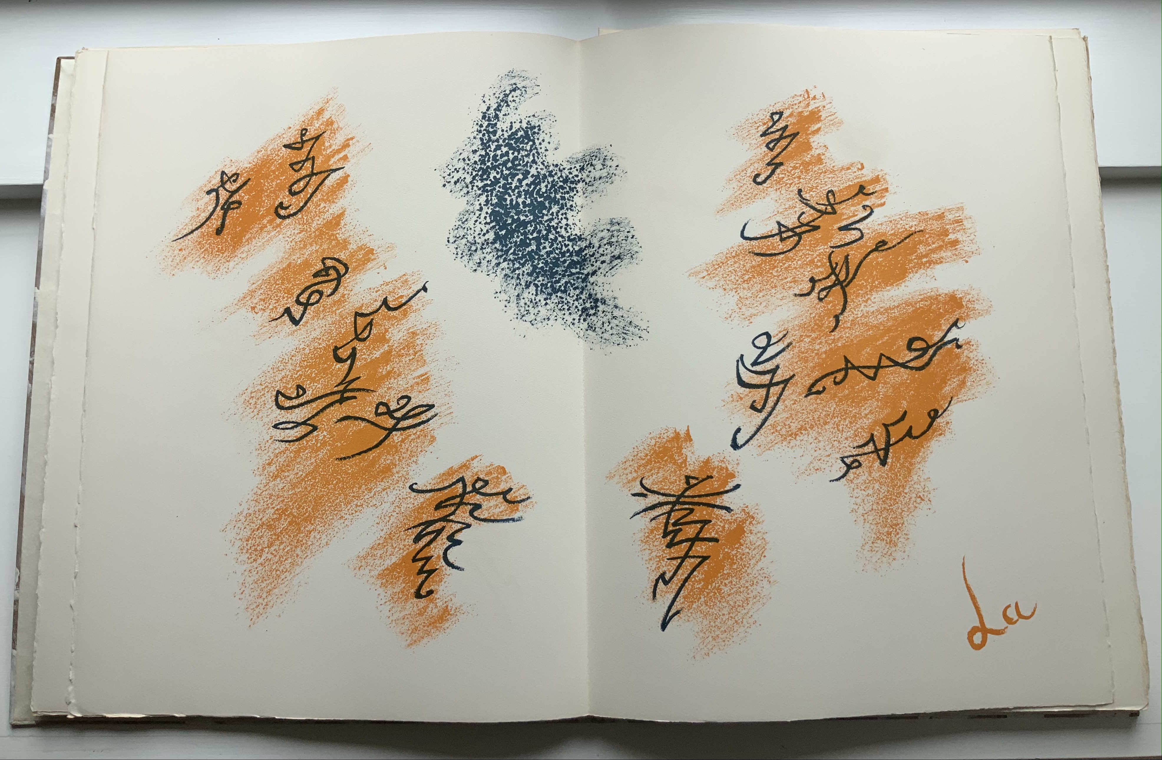
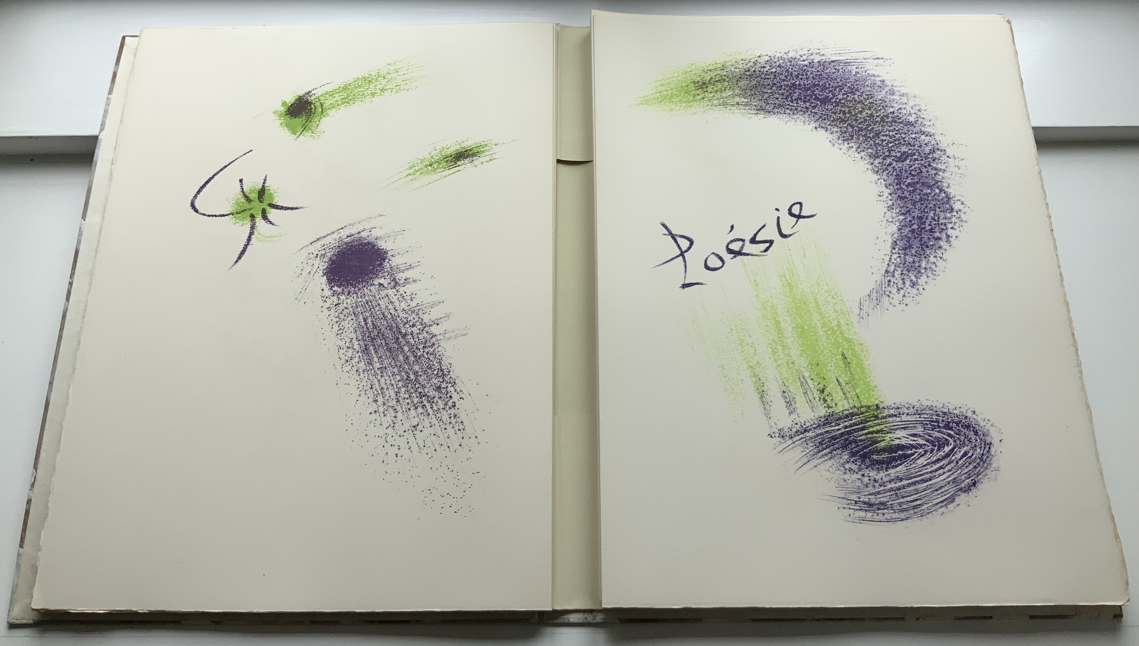
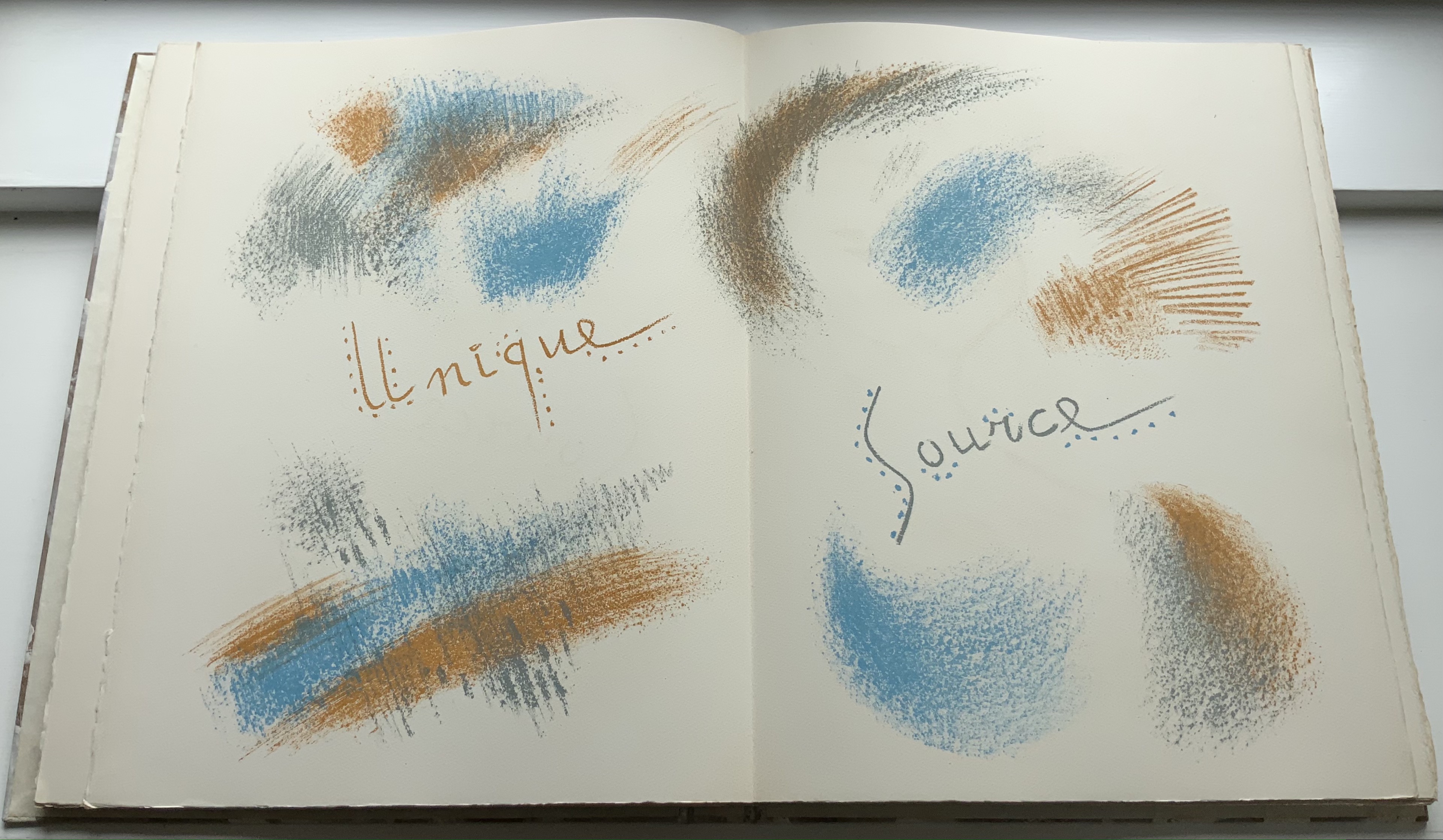
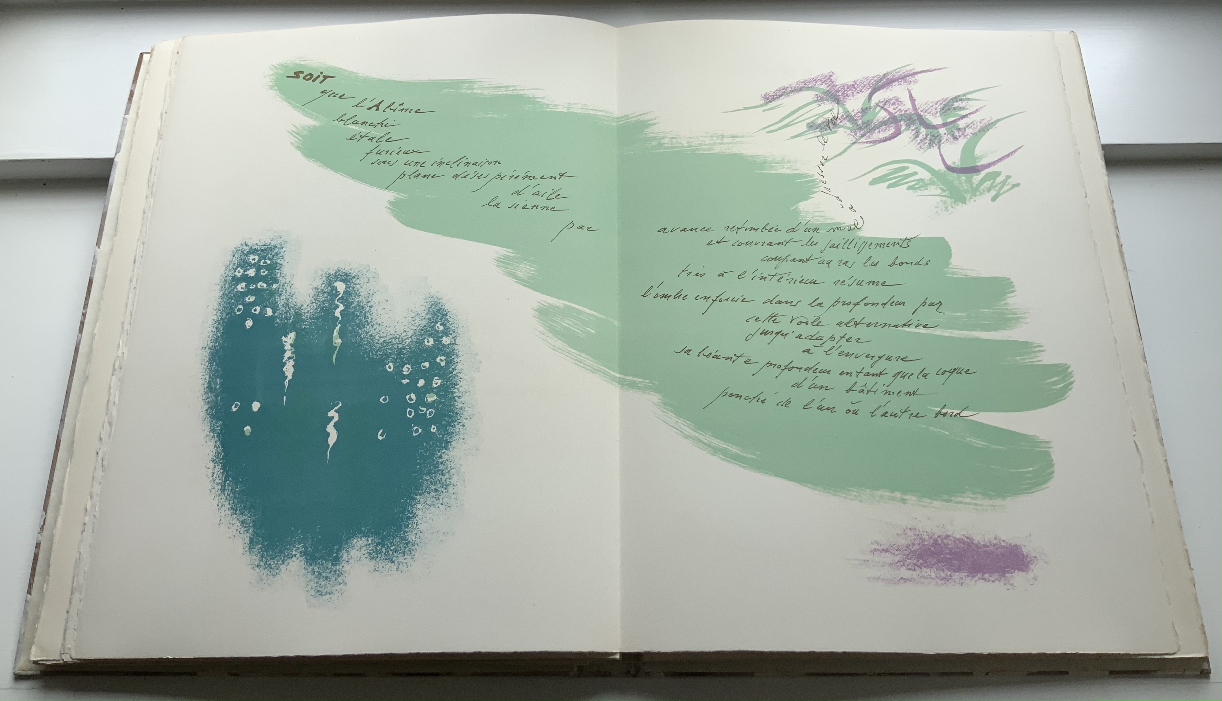
The Century of Artists’ Books (1994) — An Appreciation
Before Johanna Drucker’s The Century of Artists’ Books (1994), the discussion of artists’ books was all argy-bargy about definitions, boundaries, neologisms or the placement of apostrophes. The Century cut through all that to become the introductory textbook to the field’s evolutionary biology. Decidedly post-Darwinian, it avoided rigid taxonomy and categories.
If all the elements or activities which contribute to artists’ books as a field are described[,] what emerges is a zone of activity, rather than a category into which to place works by evaluating whether they meet or fail to meet certain rigid criteria. There are many of these activities: fine printing, independent publishing, the craft tradition of book arts, conceptual art, painting and other traditional arts, politically motivated art activity and activist production, performance of both traditional and experimental varieties, concrete poetry, experimental music, computer and electronic arts, and last but not least, the tradition of the illustrated book, the livre d’artiste. — (p. 2).
More than occasionally, certain denizen of this “zone of activity” emerge to question, prod, probe, devour, regurgitate, excrete, smash, bang together, impale, immerse, soak, burn, freeze, distill, erase, sculpt, digitize or otherwise engage the physical aspects, possibilities and very idea of “the book”. When they do, “[t]he book becomes a form of artistic expression in the hands of these artists rather than a convention-bound mode of reproduction” (p. 47). The Century of Artists’ Books serves up numerous examples of them. It teases out the various strands of book-DNA that these specimens engage in becoming artists’ books. In doing so, The Century has proven to be a valuable tool for the collector, not just for historians and critics. It enhances appreciation and enjoyment when reviewing acquisitions or considering new ones.
The numerous specimens and the different ways they interrogate “the conceptual or material form of the book” (p.3) offer points of comparison and contrast for the work acquired or about to be acquired. Is it a democratic multiple or a rare and auratic object? Is it a codex or one of its variants or its precursors or its digital successors, and is it playing them off one another? Does it exhibit a self-reflexive form? Is its form celebrating the visual over the textual/verbal, and if so, with what visual arts and what visual aspects of the book? If vice versa, what aspects of the book’s textual/verbal form does it explore? Is the work a play on sequence (narrative and non-narrative) in the book? Does it intentionally dance on the border between the ephemeral performance or installation and the more lasting book? Is it questioning the book as document? Is it posing itself as a metaphor of the book? Does it somehow declare its affinity with any of the artist’s book’s antecedents identified by The Century?
As comprehensiveas The Century is, the haptic is one element of book-DNA that it does not single out for a chapter of its own. Codex works in the Books On Books Collection that primarily address what the eye can feel and fingers see, such as Tim Mosely’s The Book of Tears (2014) and Grasping the Nettle (2020), do not have easily found specimens with which to compare and contrast. Drucker’s decision to exclude “book-like objects or book sculpture” may have led to this, although the sections “Hybrid and Spatial Variants” and “Interior Spaces” (pp. 145-53) certainly touch on them and their engagement of hand and eye.
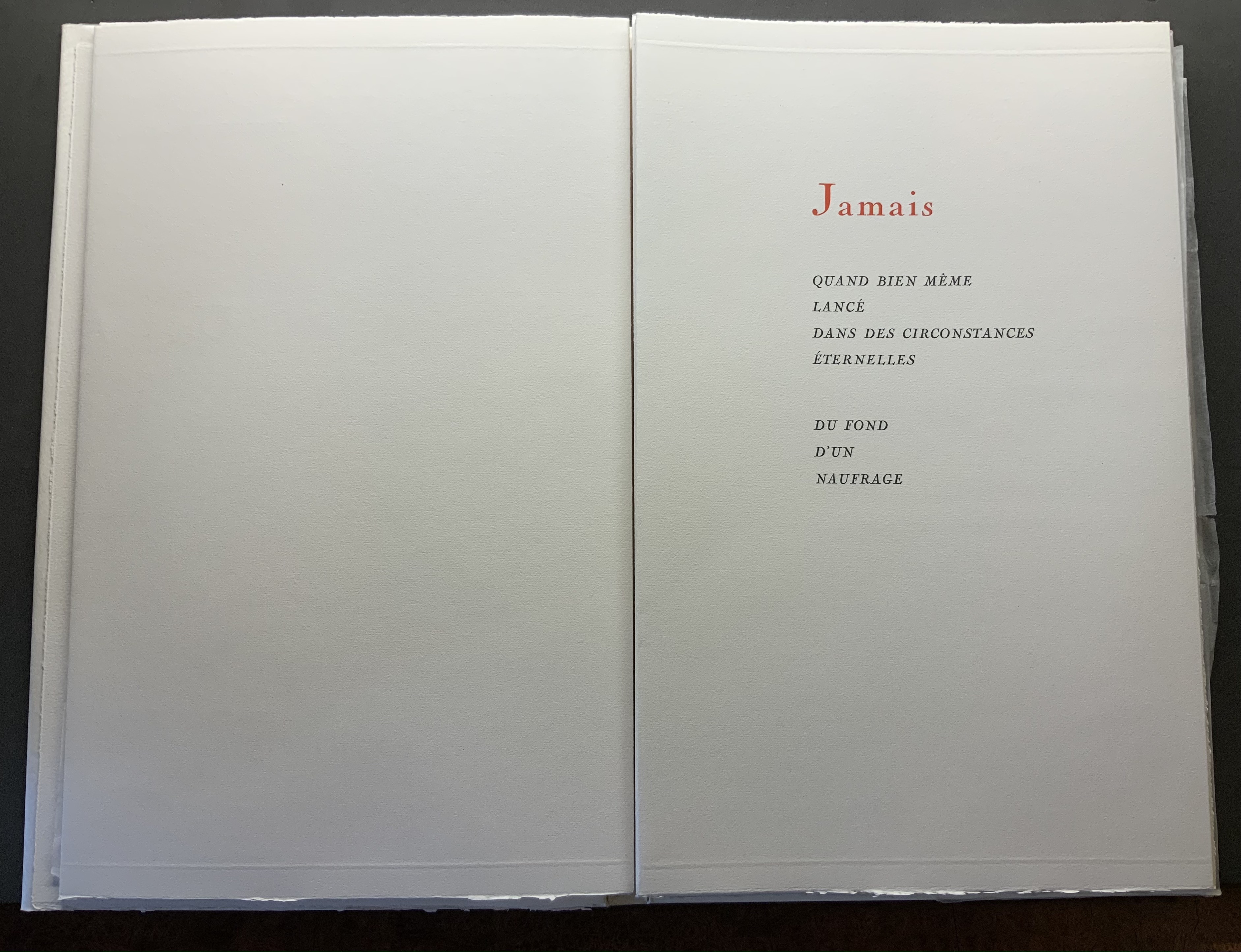
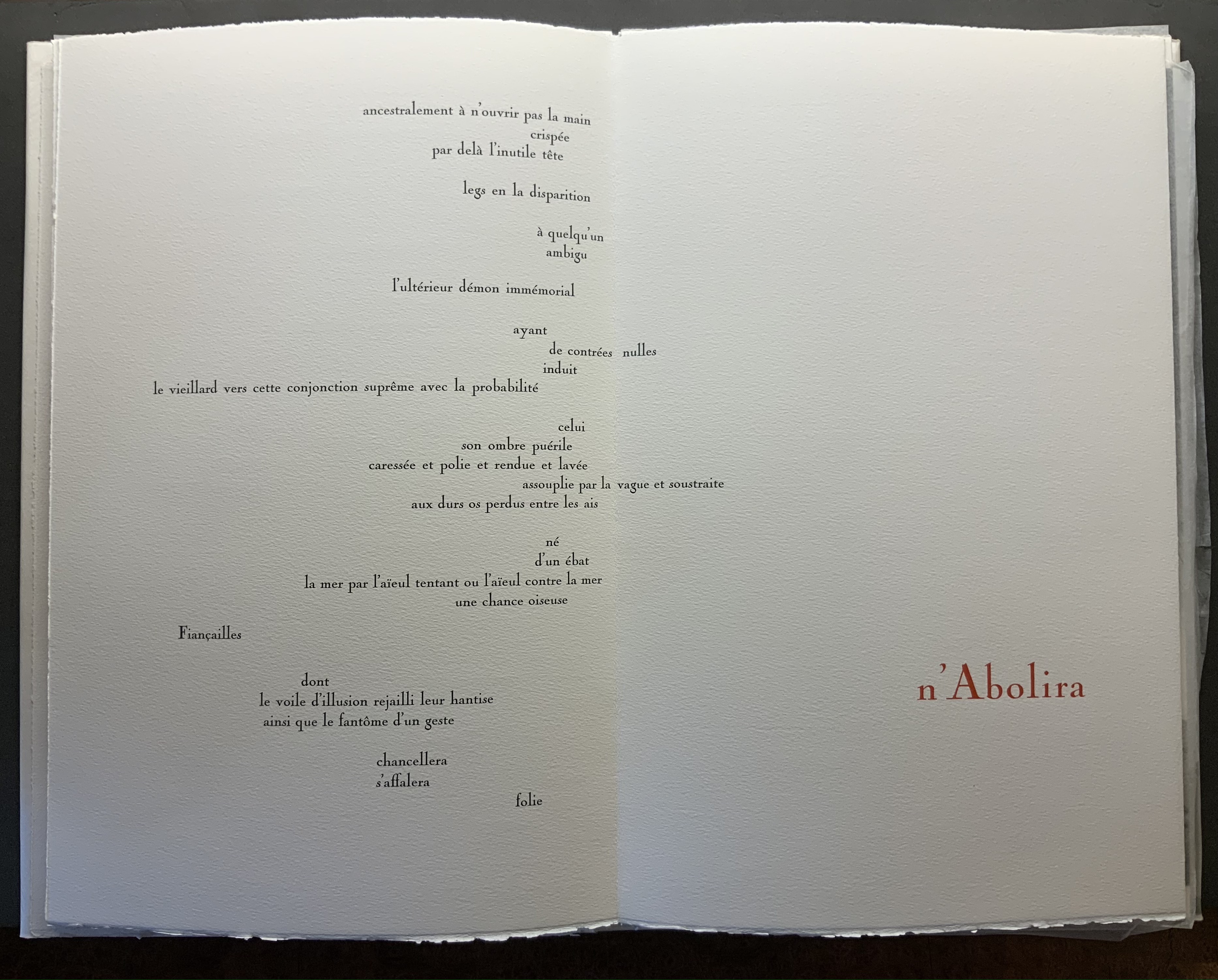
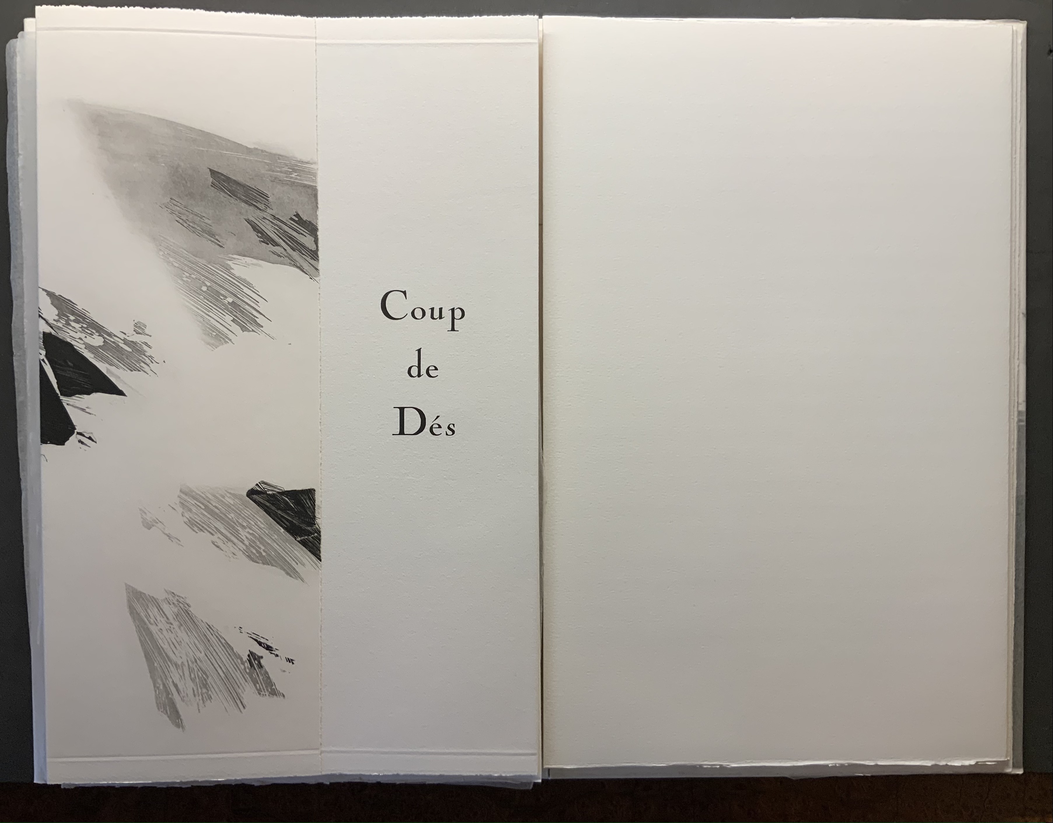
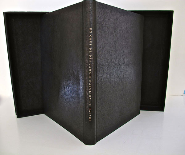
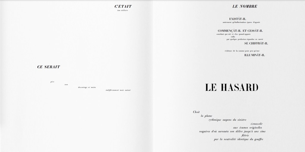
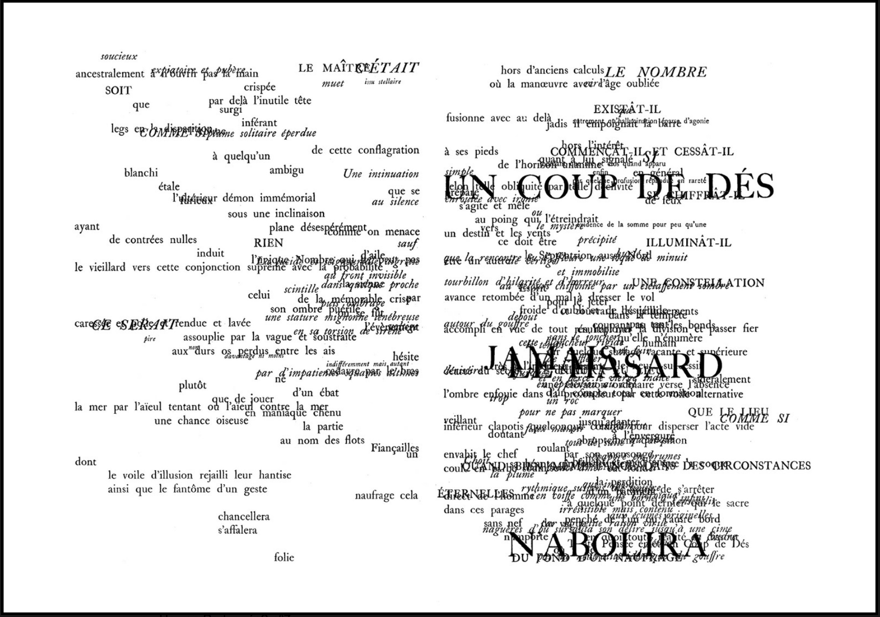
Arguably over-inclusive is The Century‘s designation of antecedents: William Blake (for his illuminated books’ union of text and image, craft and art, and vision with form and structure), Gelett Burgess (for Le Petit Journal des Refusés and its spontaneous, topical and zine-like spirit), Gustave Flaubert (for Bouvard et Pécuchet and its idea of the “book as failure” to transmit knowledge), Stéphane Mallarmé (for Un Coup de Dés Jamais N’Abolira le Hasard and its revolutionary use of type, page layout and a metaphysical idea of The Book), William Morris (for The Works of Geoffrey Chaucer and his eccentric designer’s eye) and Laurence Sterne (for Tristram Shandy‘s rollicking interrogation of the book as novel).
Of those antecedents Blake and Mallarmé (and more Mallarmé than Blake) are the most useful touchstones for a collector. Blake’s innovation with etching that enabled him to unify script and image on the page and his mythic stance as a one-man band present a high bar to subsequent book artists. But for the collector, he stands as a reminder to consider both works of rude as well as fine craft, to inquire into technique and painstaking effort, and to look for unity (or intentional dis-unity) of word, image and form when contemplating an acquisition.
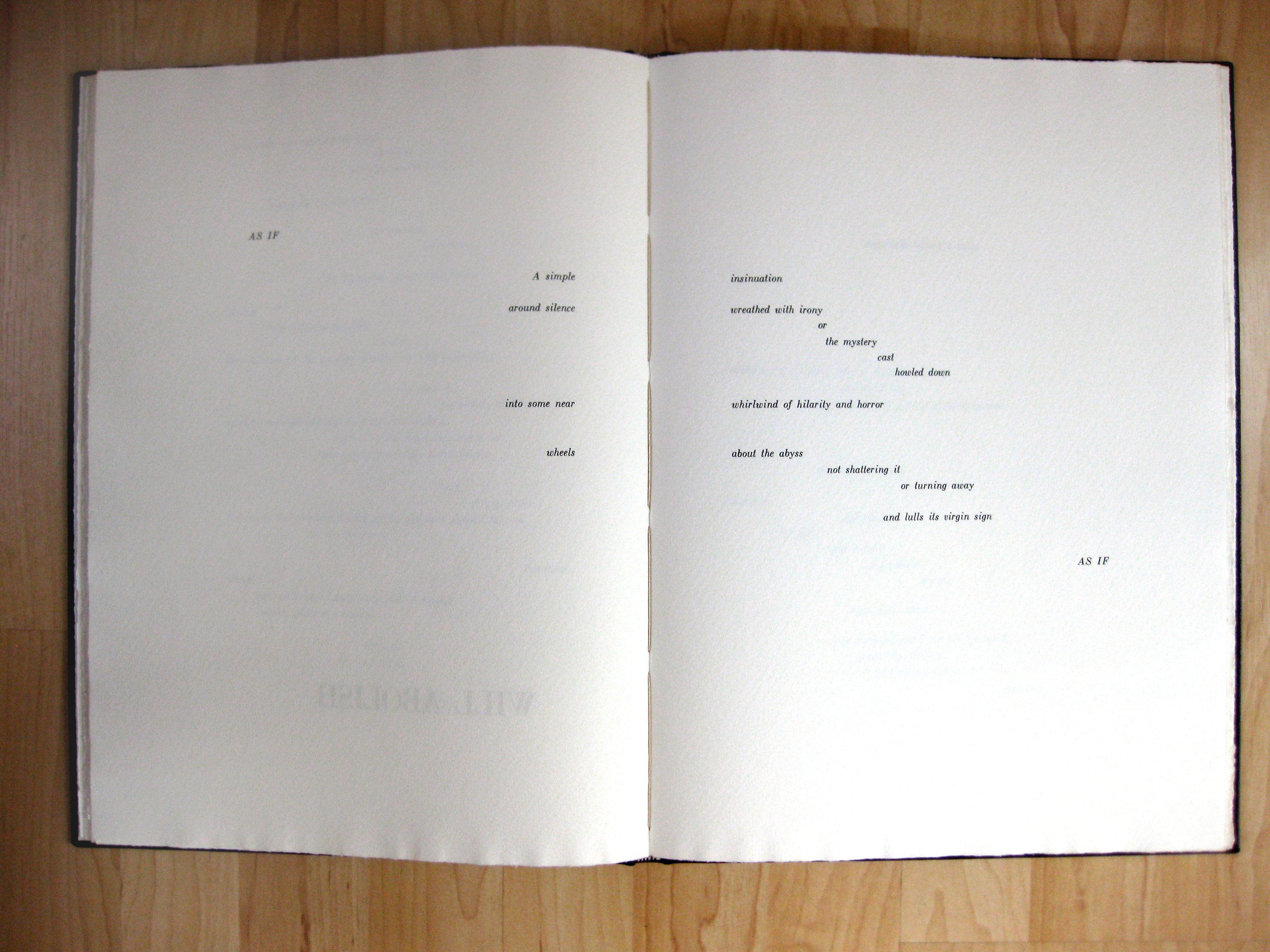
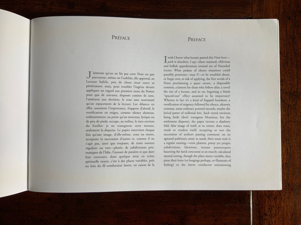
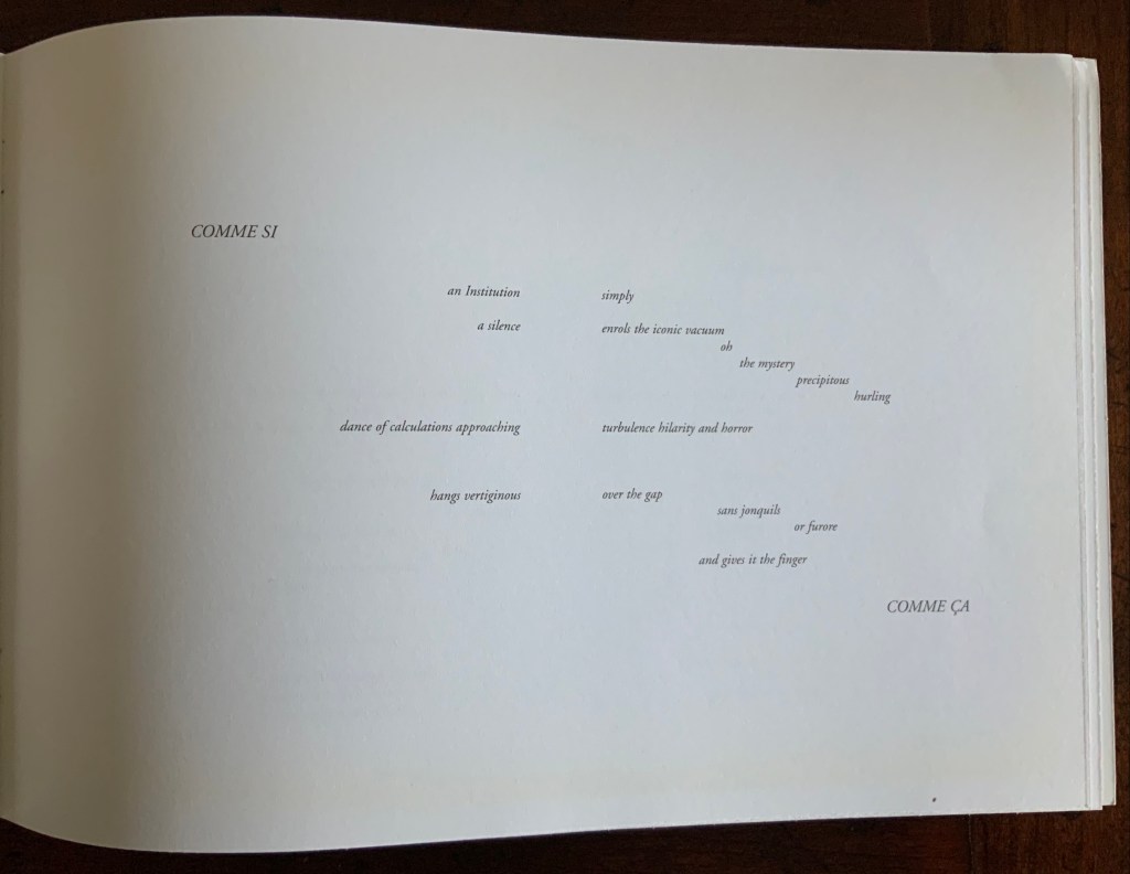
As abstruse as Mallarmé’s writings are, Poème‘s content, its play with type and the double-page spread, and its possible embodiment of Mallarmé’s metaphysical notion of the book all offer book artists more approachable avenues. In fact, so many book artists have paid direct homage to Poème and Mallarmé’s idea of le Livre (“the Book”) that a sub-genre of artists’ books has evolved. Poème‘s trueness as an antecedent touchstone can be found in the various and extraordinary ways those hommageurs respond to, and even appropriate, its book-DNA. For the collector, Mallarmé acts as a reminder to see what the book artist is doing visually, structurally and conceptually with type, the leaves, the pages and the idea of the book.
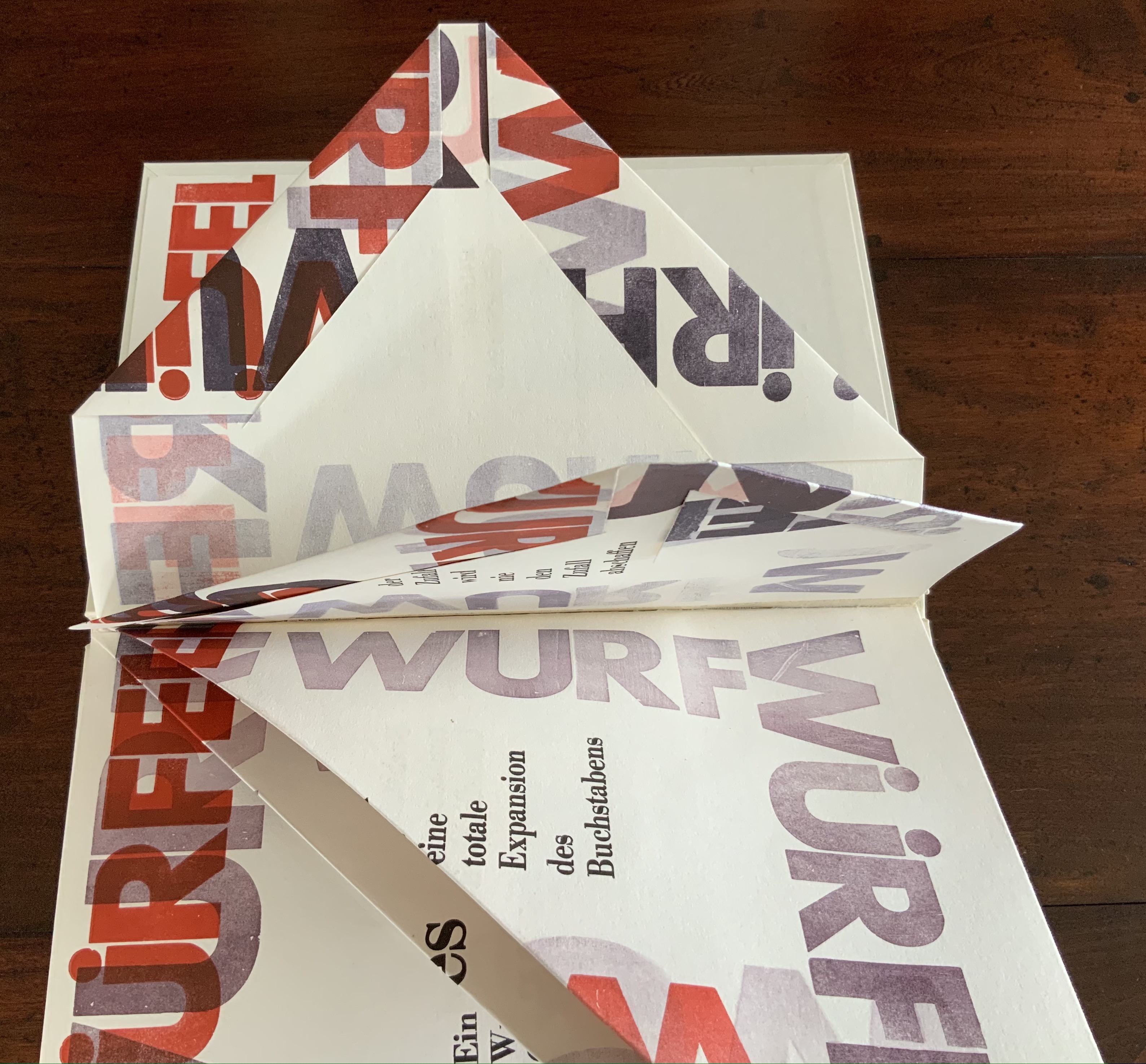
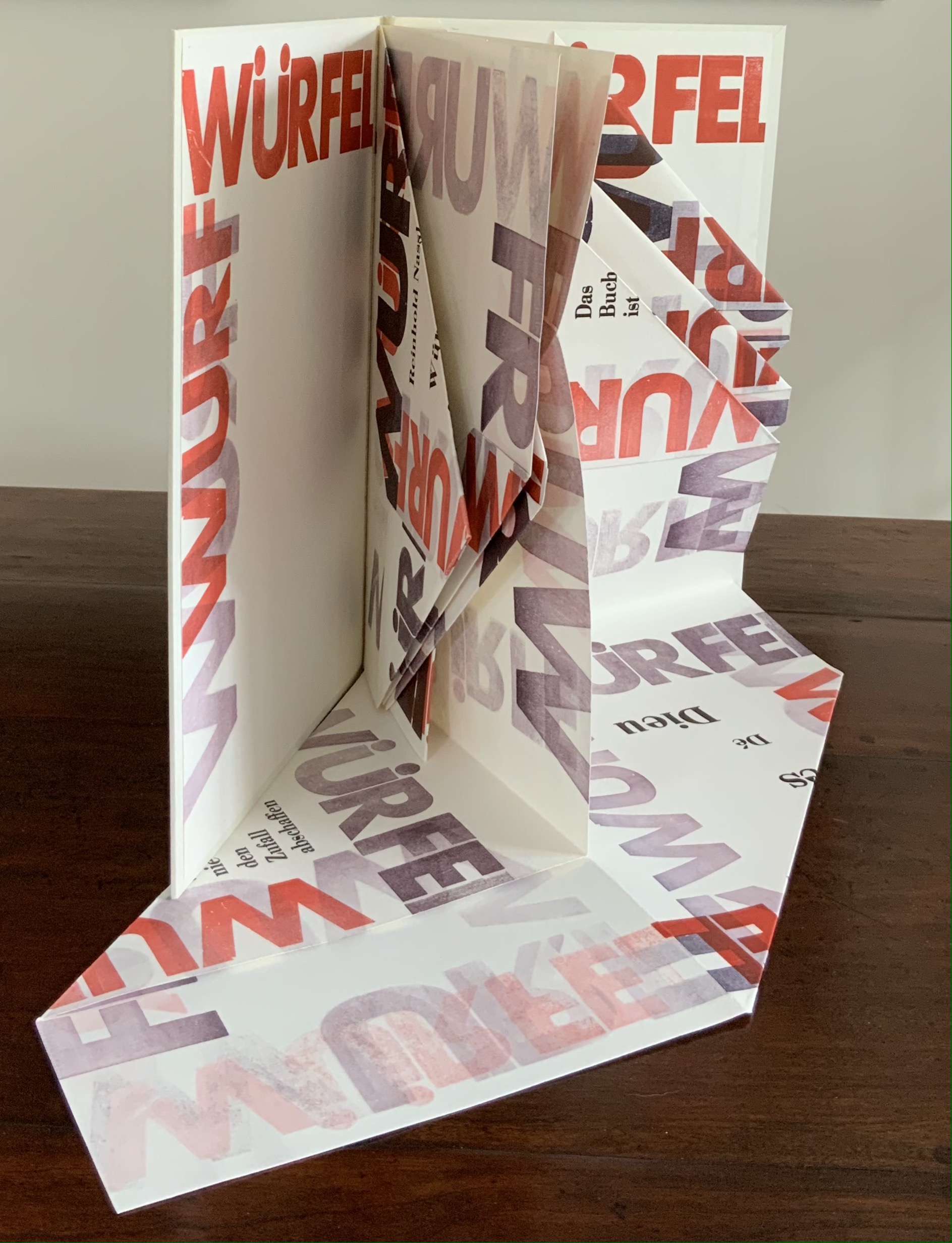
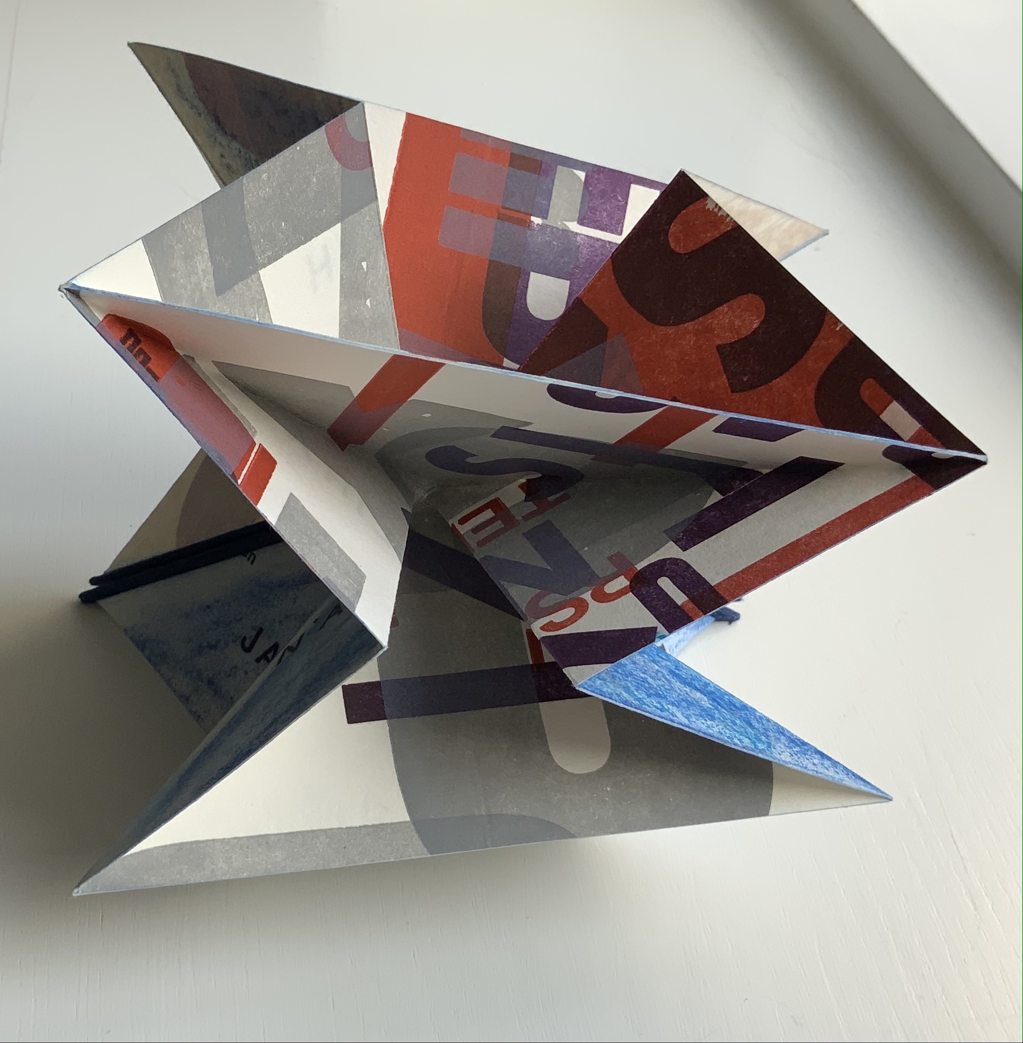
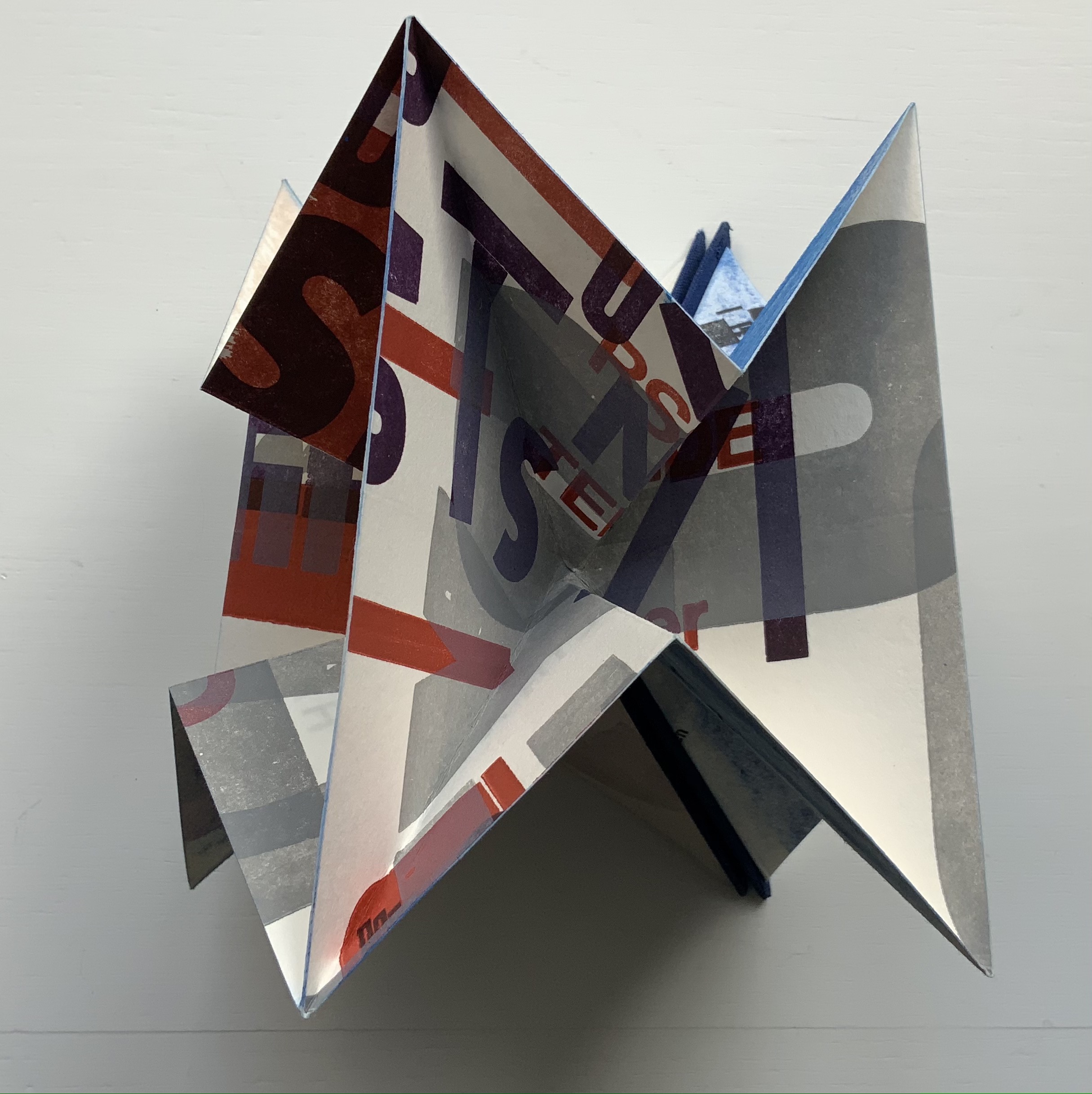
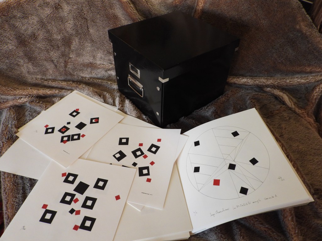
Unsurprisingly The Century proves helpful for appreciating and enjoying Drucker’s own artist’s books in the Books On Books Collection.
Stochastic Poetics (2012)
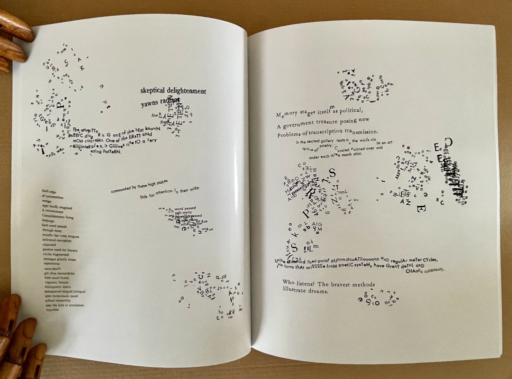
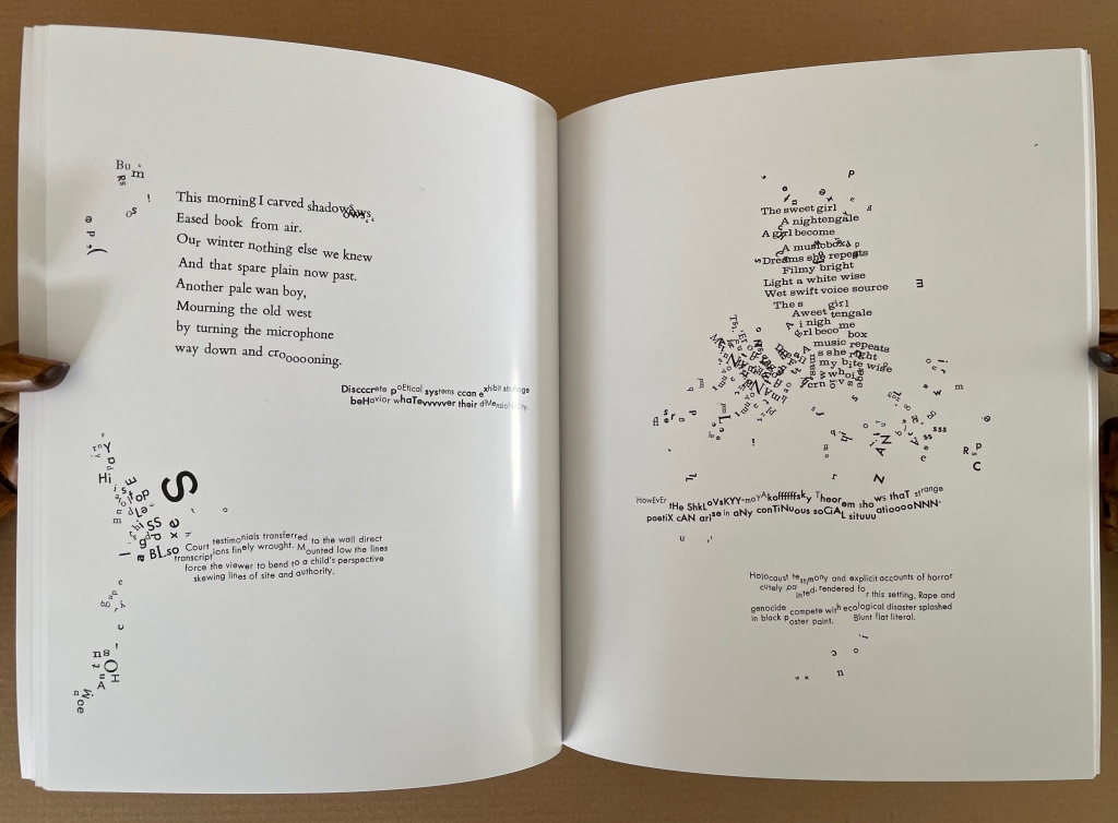
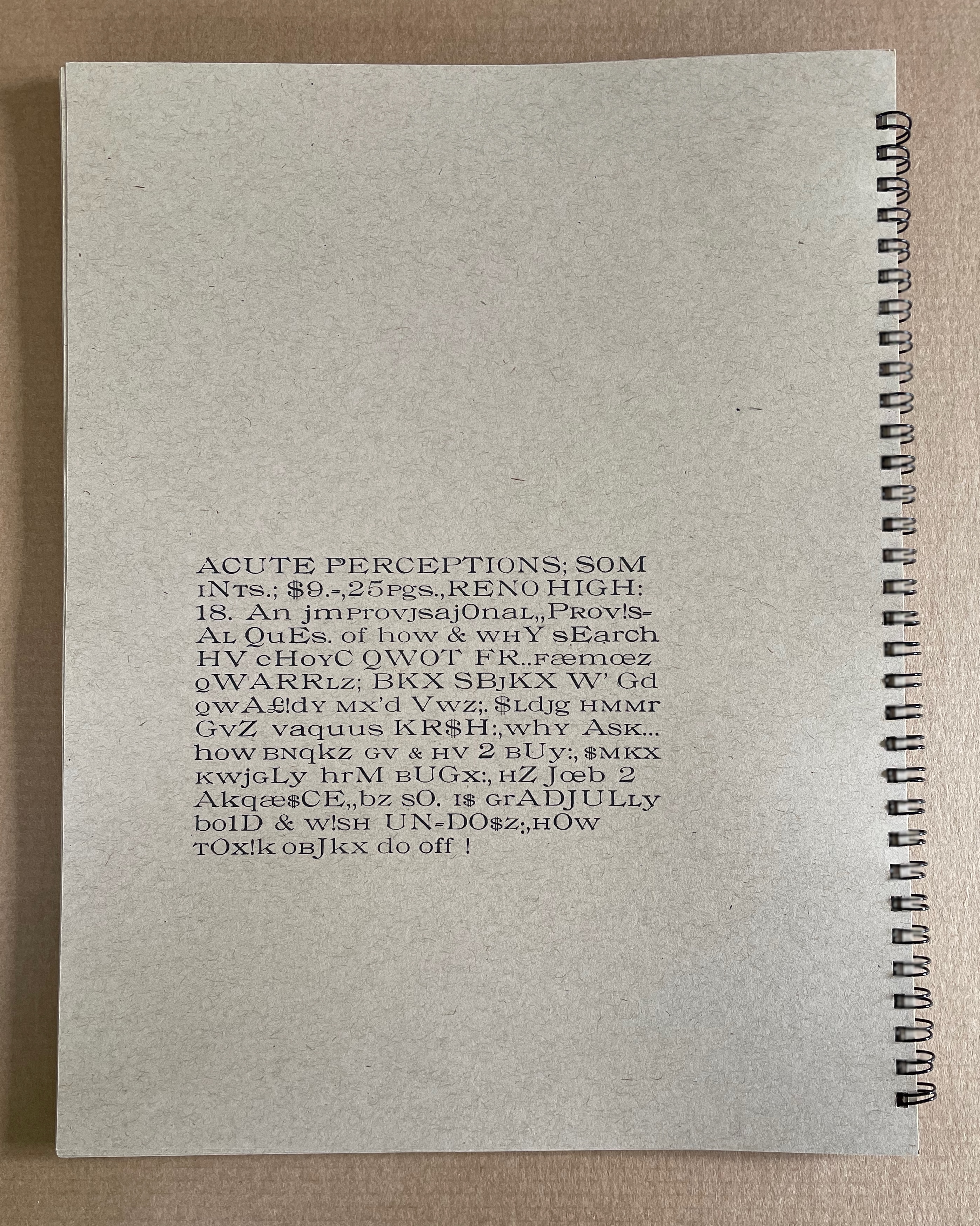
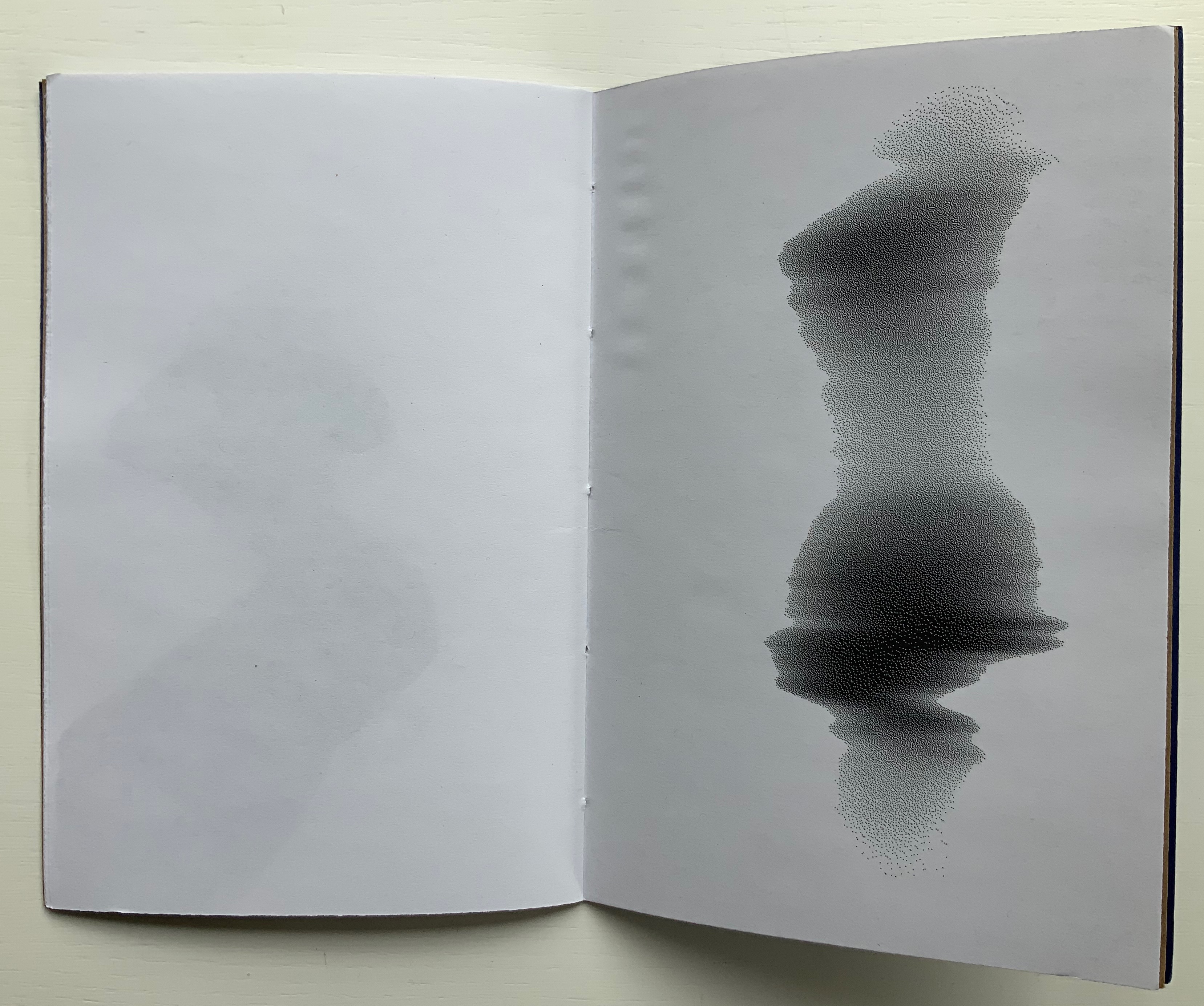
Stochastic Poetics(2012/2024) Johanna Drucker Softcover, flexible, high-gloss laminated cover. Facsimile (original’s cover was in brushed steel). H250 x W200 mm. 62 pages. Acquired from Blurb, Inc., 28 March 2024. Photos: Books On Books Collection. Displayed with artist’s permission.
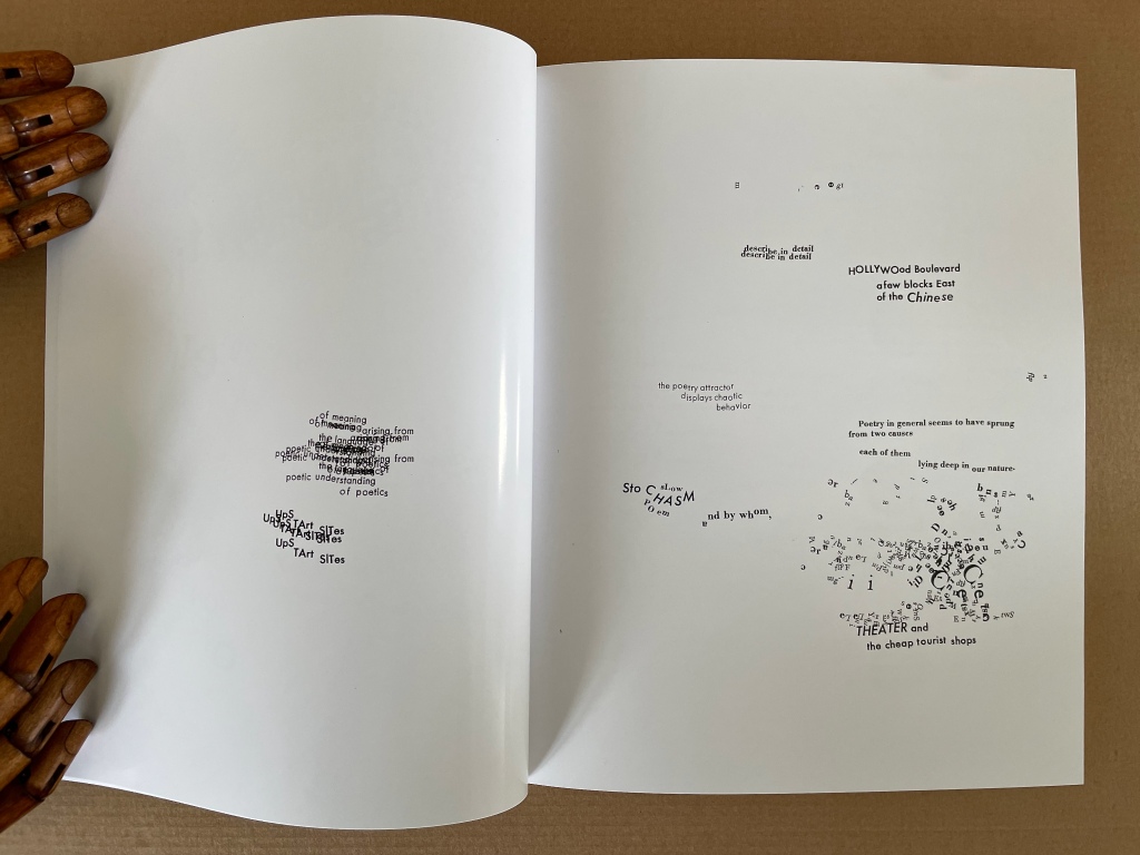
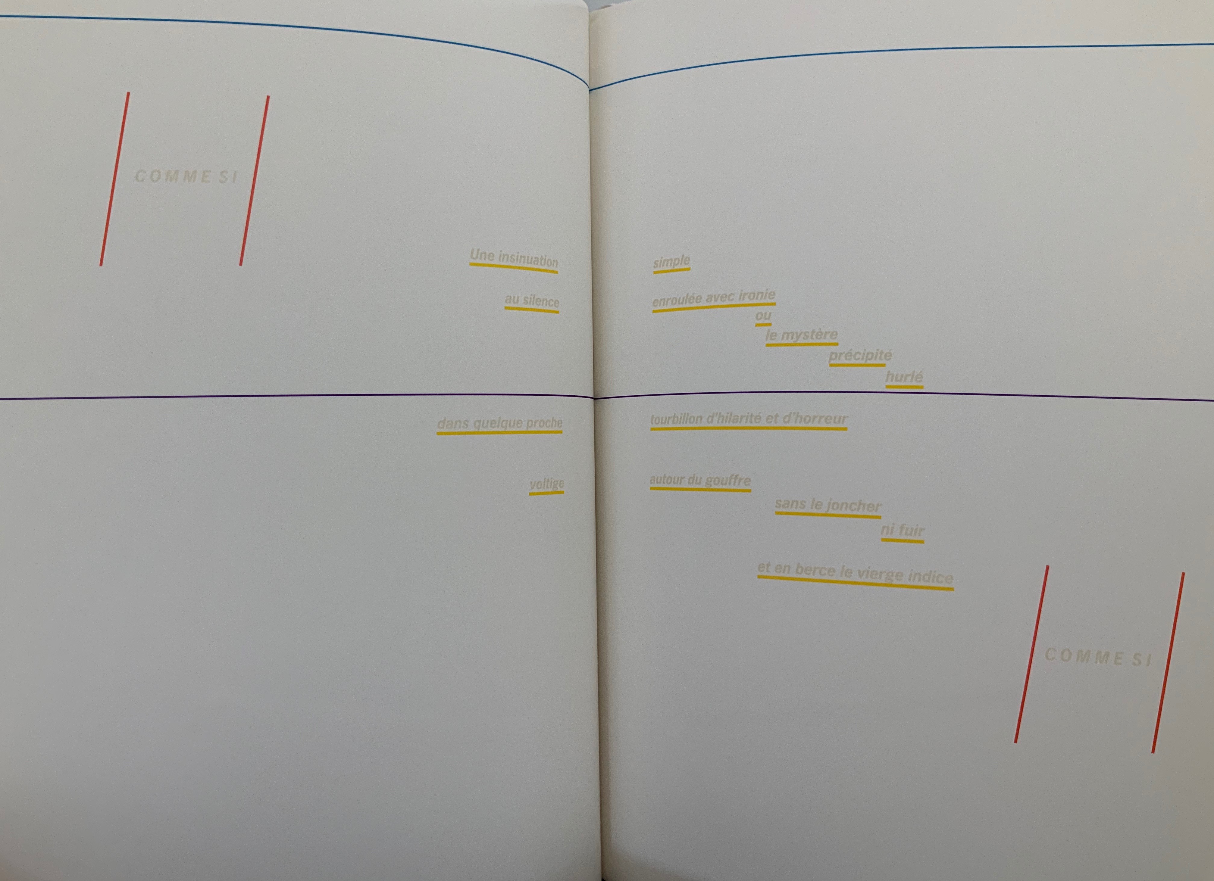
In Stochastic Poetics (2012/2024), Drucker scatters words and letters and plays with typography in a manner that makes Mallarmé’s revolutionary poem look almost staid. As Drucker explains in the colophon to Stochastic Poetics, the poem’s text is taken from Aristotle, sources on complexity theory, and “observations of readings and events at L.A.C.E. and Modern Language Association”. Aristotle might be deducible from lines such as “Poetry in general seems to have sprung from two causes in each of them lying deep in our nature”, but you would have to be vaguely familiar with his Poetics. The “observations” seem more personal, ephemeral, period-specific, but deducing their sources seems beside the point. It’s best to “go with the flow” — to unravel the explosions of sentences, phrases and words on the page and follow their imaginative leaps.
For example, on the page where Aristotle refers to the causes of poetry, that phrase “deep in our nature” leads to the wordplay of “stochasm”, and its typographic display enacts a chasm (or abyss if you’re feeling the Mallarméan vibrations). The first half of that wordplay comes from the word stochastic, whose root is stókhos [“aim, target, bullseye”], and “a stochastic process is a collection of random variables used to represent the evolution of some random value, or system, over time”). Again, if you’re feeling the Mallarméan vibrations, you’ll remember that throwing dice — one means of generating random variables — lies at the heart of Un Coup de Dés Jamais N’Abolira le Hasard (“A Throw of the Dice Will Never Abolish Chance“).
Later among the poem’s seemingly random linguistic and typographic acrobatics, two phrases jump out — “Constellationary living / language” and “MOOmeNTARY CoNsTeLLaTiOn” (see below, lower left and lower right, respectively). Those phrases clearly evoke Mallarmé’s lines from Poème: “Nothing will have taken place except the place… except perhaps a constellation”. Mallarmé’s mise-en-page fireworks have often been taken as figurative allusions to the listing and foundering ship, central to the poem, or to the Big Dipper (Septentrion) constellation, or tumbling dice. Drucker’s typography and layout take Stochastic Poetics more in the direction of the abstract than the figurative, although some of its appearance could be considered representative of randomness or the tracks on a well-used dartboard, which alludes to the stókhos [“aim, target, bullseye”] of stochastic.
If these sparks of recognition between Drucker’s and Mallarmé’s poems still seem tenuous, this brief passage from Drucker’s essay on Mallarmé’s poem may add wattage:
Another set of three phrases “Except” “Perhaps” and “A Constellation” form a typographic group. Indeed, they express the crucial exception to the terms of abyss and dissolution, scattering and fragmentation, …. Redescribed in the smaller roman font as features incidentallycreated through “obliquity” and “declination” –- astronomical terms -– that are reinforced by invocation of the “Septentrion” or Big Dipper, and the north star …. The final line, “All thought expresses a throw of the dice,” recapitulates the theme of the whole work, showing that thought as well as language is caught in the probabilistic system between chance and constellationary form. — Drucker, 2011, pp. 12-13.
But enough of Mallarmé for a moment: go with the flow and read/view Stochastic Poetics without precisely tracking down its allusions. Clusters of letters not quite forming words, phrases or sentences suggest abstract doodling. The shapes of the clusters and lines create a sense of mental motion, or “AACTIION”. Eyes twist and turn as hands rotate the book to untangle words, phrases and sentences. In disentangling the portmanteau words and phrases such as “skeptical delightenment”, the mind finds itself playing out the reading — being skeptical, delighting, experiencing enlightenment. This is the artist-printer interrogating “the conceptual or material form of the book as part of [her] intention, thematic interests, or production activities” (The Century of Artists’ Books, p.3). This is the author-artist-printer twisting and turning the visual and verbal strands of book-DNA. This is a true specimen of the artist’s book.
The Word Made Flesh (1989/1996)
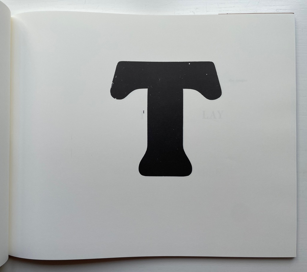
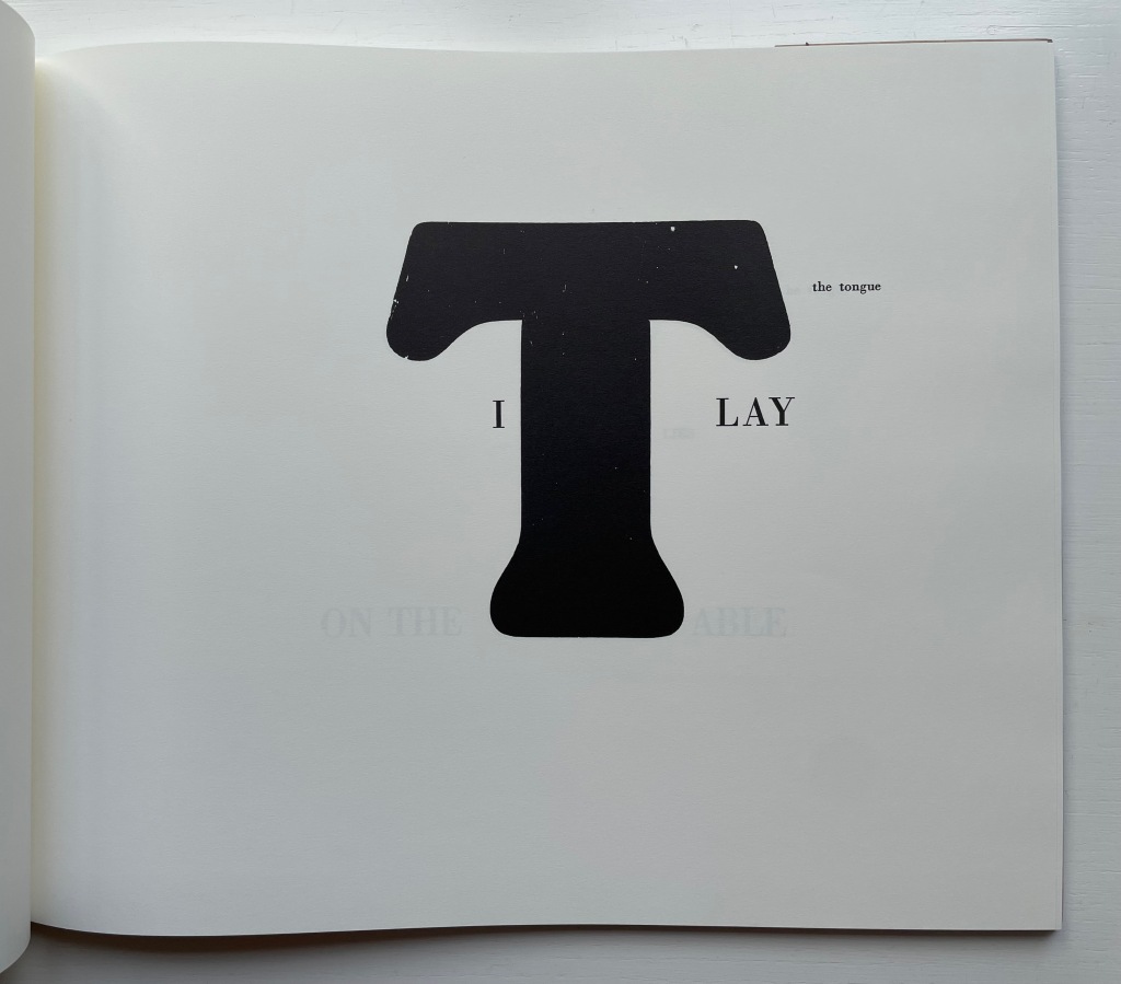
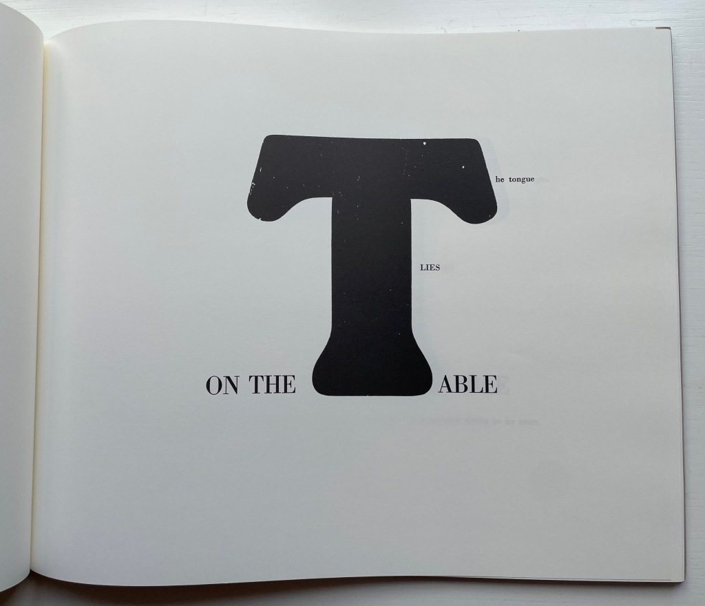
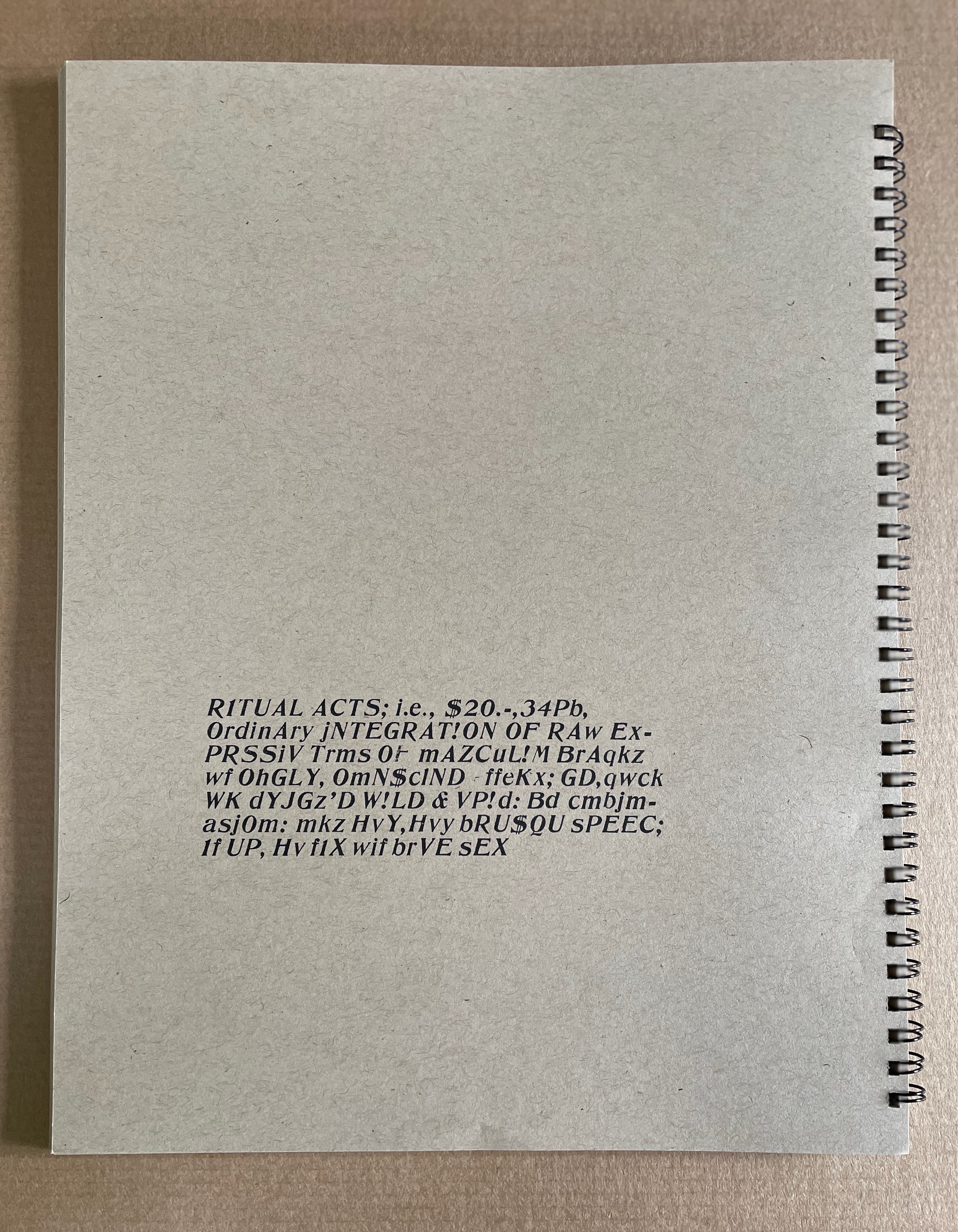
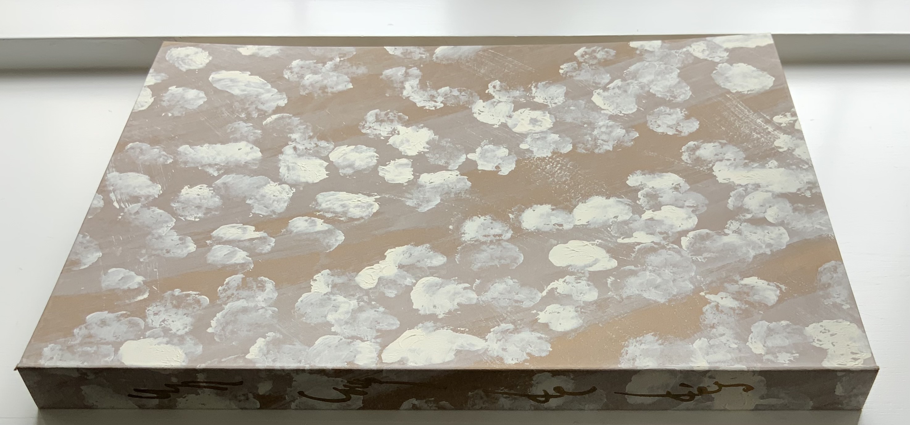
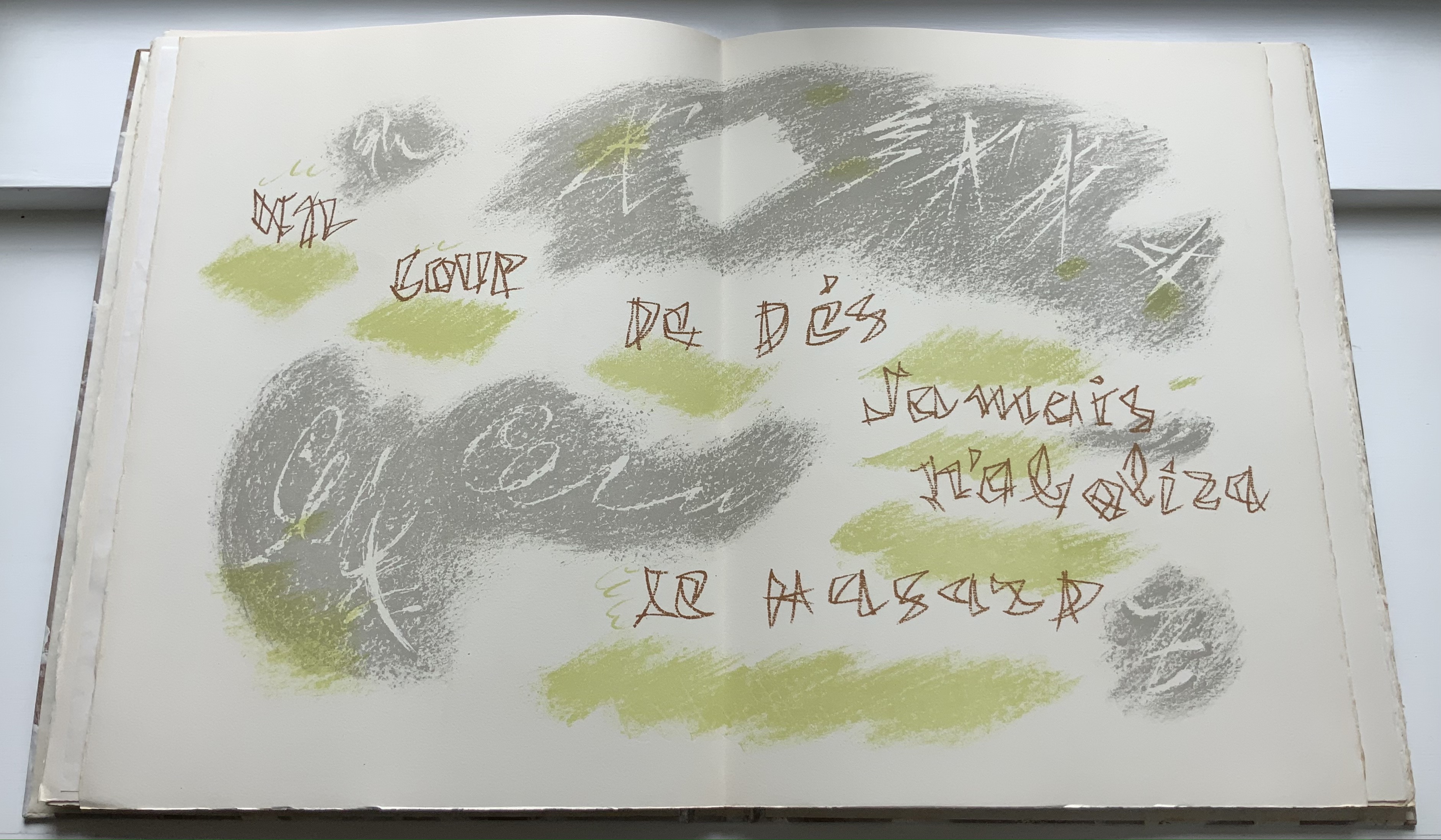
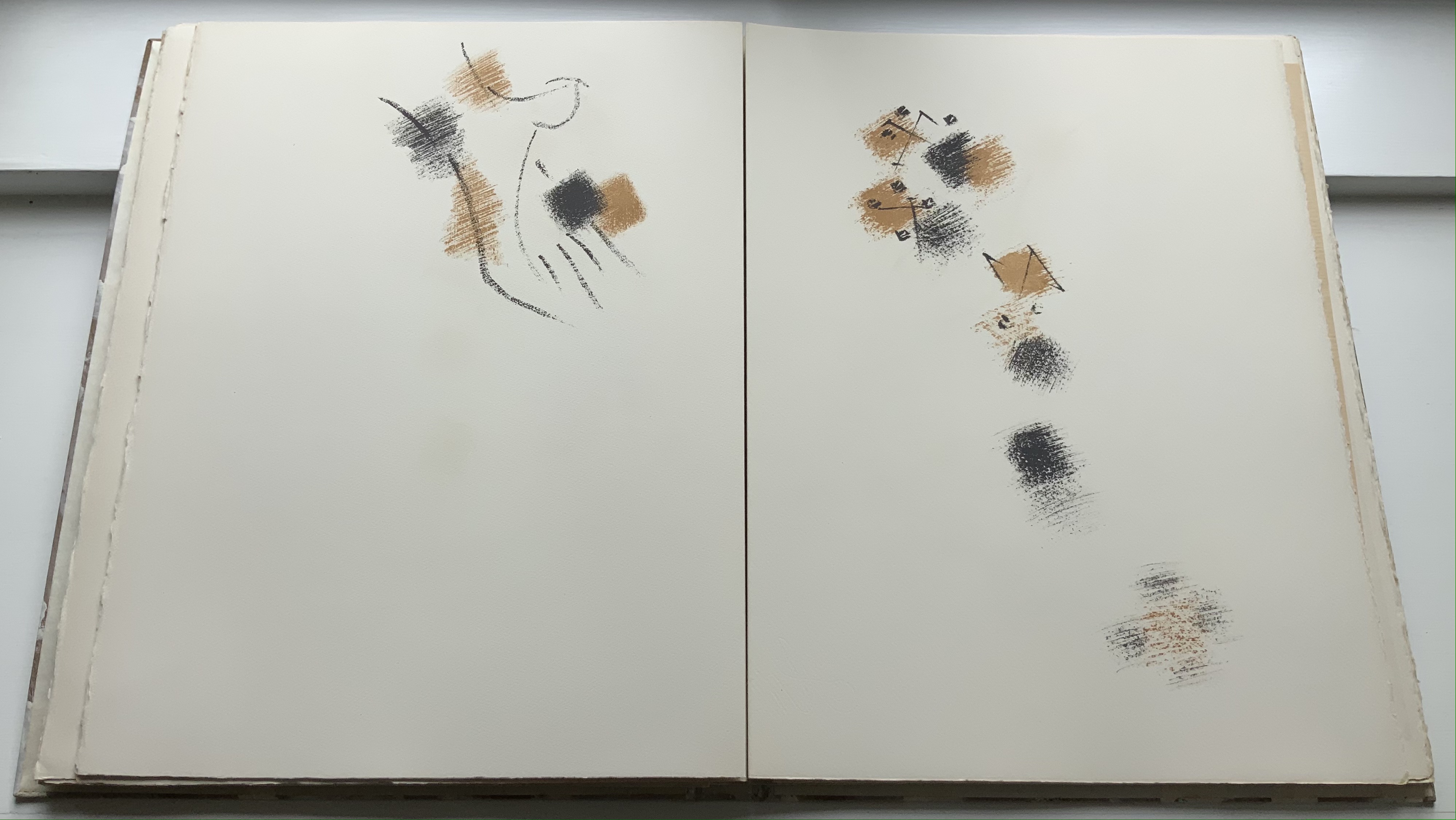
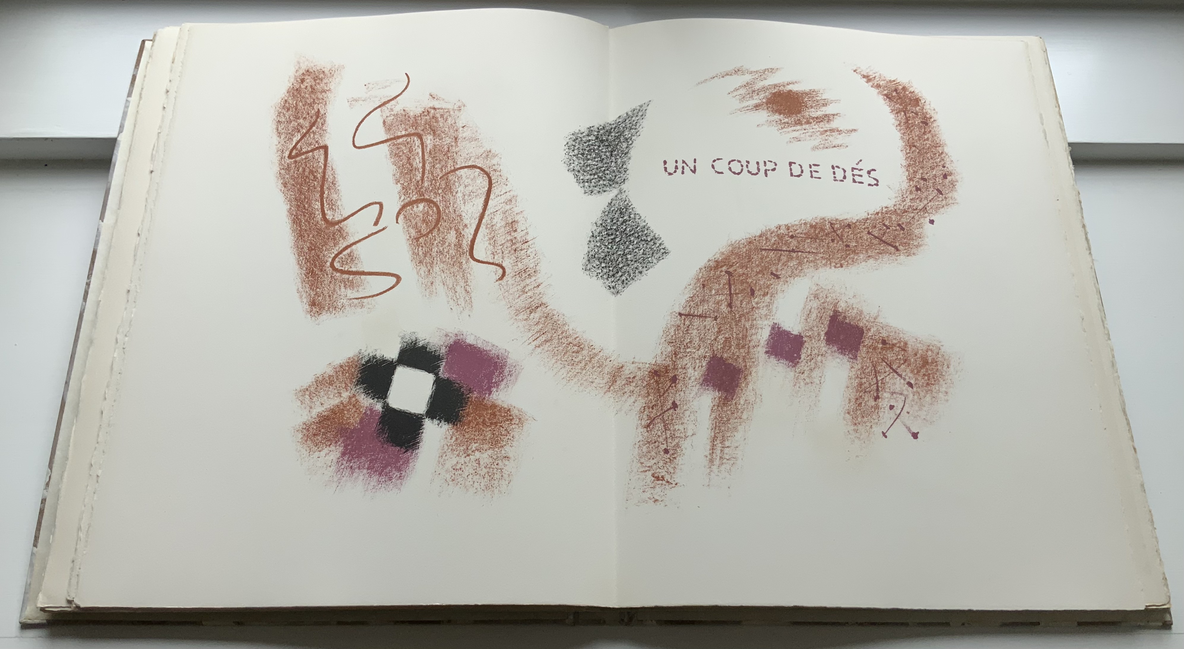
The Word Made Flesh (1989/1996) Johanna Drucker Casebound. H267 x W315 mm. 26 unnumbered leaves. Acquired from Black Dog Books, 16 August 2022. Photos: Books On Books Collection. Displayed with the artist’s permission.
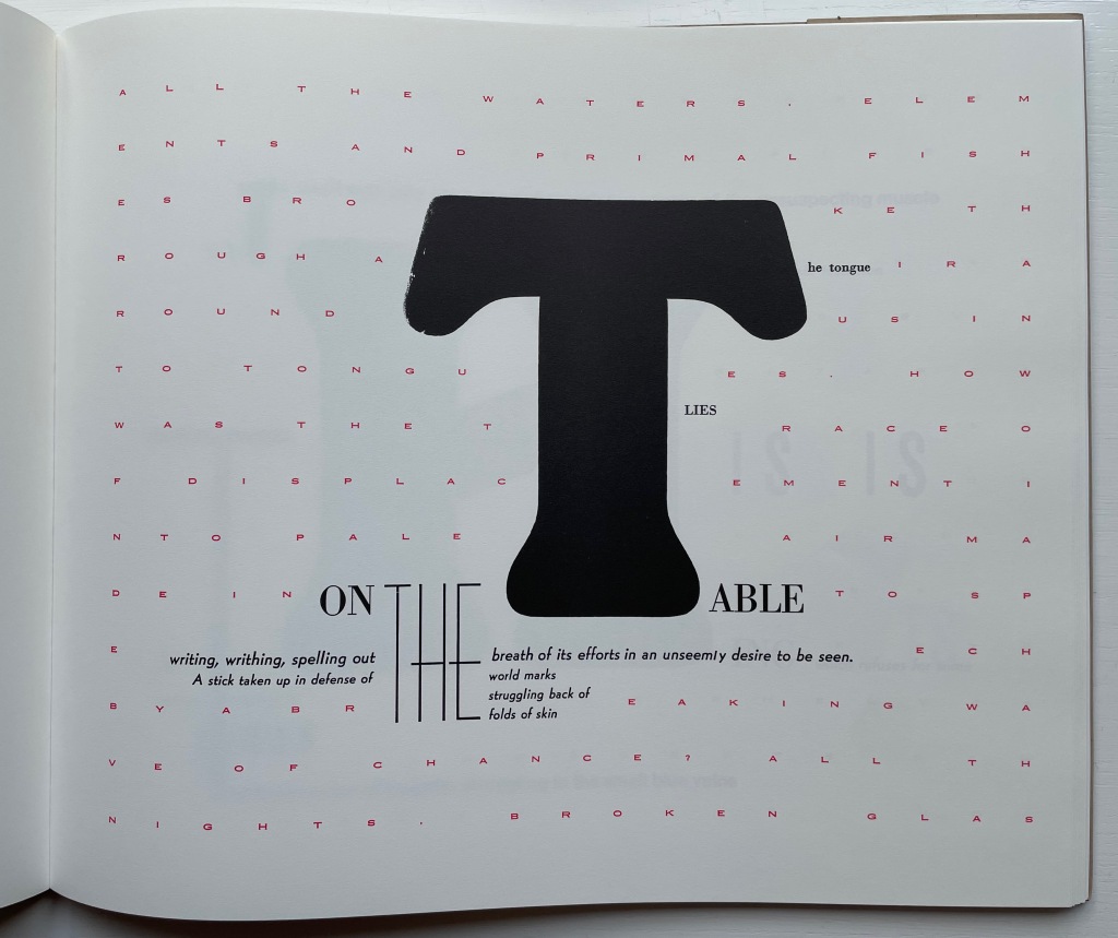
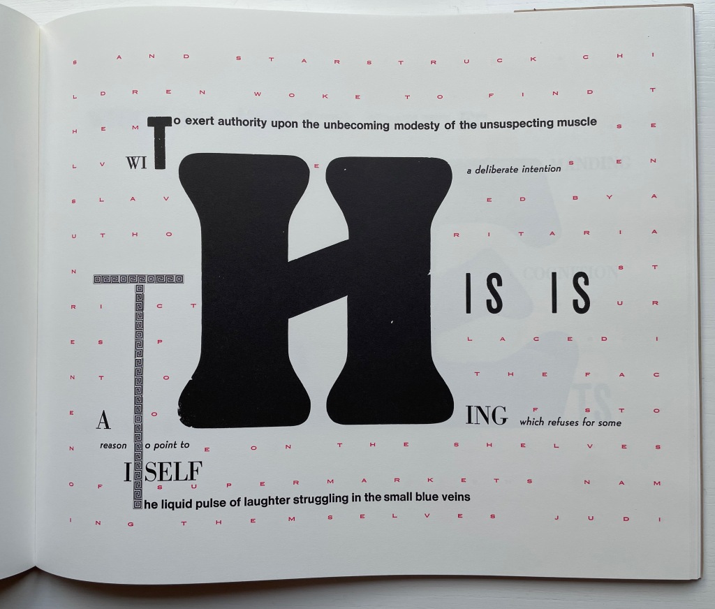
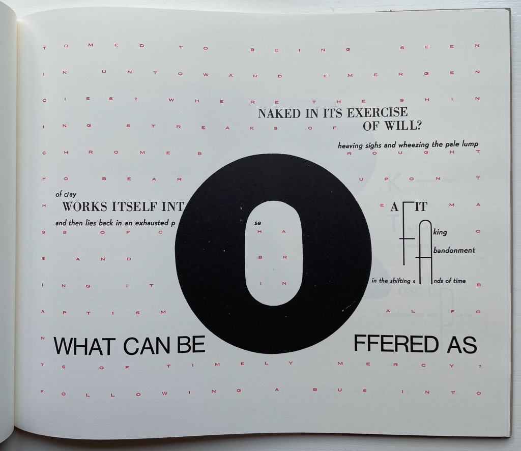
When it comes to The Word Made Flesh, we find the Mallarméan influence again in the typographic and mise-en-page fireworks and some choice allusive phrases. Not content with spreading the oversized words of the title across the book’s pages as Mallarmé’s does with UN COUP DE DÉS JAMAIS N’‘ABOLIRA LE HASARD, Drucker amplifies each letter of each word. As if stuttering or trying to unstick its tongue from the roof of its mouth, the letter T takes up each of four pages until, on the fifth try, it is followed by the letter H on the next page, then E and so on until THE WORD MADE FLESH is spelled out. In the original letterpress edition, whose fiftieth and last copy provided the source for this facsimile edition (five hundred copies, fittingly), these oversized letters presumably came from wooden type. À la Mallarmé, the surrounding letters come from various families, fonts, sizes and styles of type, but amplifying and extrapolating his typographic technique, Drucker attaches the oversized letter to multiple words: “it”, “the”, “this, “table” and so on.
In Un Coup de Dés, the syntactically split and parallel texts become difficult to read. In The Word, the typographically split words add to the difficulty of reading the text. Already at the opening of The Word, Drucker has flagged that she will out-Mallarmé Mallarmé and take us à l’interieur du langage and à l’interieur de la langue (“into the interior of language and into the interior of the tongue”). Keep in mind that la langue not only means “tongue” but also “language” in the usual sense in English, whereas le langage means diction, a kind of language (jargon, computer, etc.) as well as the faculty of speech.
Adding another level of difficulty in reading is a background grid of red letters in small caps that appears behind the fifth T in the sequence above. It spells out a text made difficult to read by the spacing between letters and their disruption by the separate text of the black letters in the foreground and center. The visionary background text reads:
All the waters, elements and primal fishes broke through air around us into tongues. How was the trace of displacement into pale air made into speech by a breaking wave of chance? All the nights, broken glass and starstruck children woke to find themselves enslaved by authoritarian strictures placed into the face of stone on the shelves of supermarkets naming themselves judiciary operations. The sting of power marked the world into small spaces of unorthodox arrangements. Vivid scarlet as the fact of blood against the winter wash. Then all the earth. Unfocused energy and wandering eyes made their way into the pulse of a primitive economy and waited there for the ice to crack on our surface of time. But how about old engines accustomed to being seen in untoward emergencies? Where the shining streaks of chrome brought to bear upon the mass of chaos and bring it in baptismal fonts of timely mercy? Following a bus into battle we shook with a horror at the dimness of the horizons we approached, and hope of a casual sacrifice was made for us time after time while moments were substituted one for another in a succession so rapid no accounting was made of their relation to themselves to us or to each other, we have listened to tales of trading we have seen flights of birds into men, women pigs and out again as babies hurried off in designing programs whose wily whistling whims would wake the world from wild slumber if that were that possible. Ripeness was a matter of appetite, not taste, in the sweet afternoon of a genuine opportunity the afterimage on the glass was a miracle of form and of correctness. The slipping substance of jam on sticky fingers of engagement worked their own way into the graces of prevalent currents, and when the matter was fully in hand, at bay, up for question and review, there was no longer any sort of book into which to enter the record of tasks which showed up on glass as a mere trail of slime. How to imagine the world without remembering how it had been presented to us in the past and in the package of delights according to rules of the game were measured out in draughts matched to a mood of a brilliant day. Some small needles had been heated and grasses lit as sparks to sponsor a crusade to mentor the insects listening just below the ground, training their small ears to take notice of complex arrangements of formal elements in the sky. The most complex movements of plates of earth, most a minute opening in the sphere of heavens we know what was wrong as sighs slid into a hallway of archival dust and we had never felt more grateful than when well laundered meaning implied by an inflamed arc of successes glowing with salvation for the aching heart of bankrupt gossip, found meandering through the powdered landscape, trailing its timely marks the next day, its activity, a prefigured silence dancing in front of us at last and all attendant fantasies flushed our wistful flesh, and many fragmentary signs of monumentality, suggestions and reconditioned bodies manifest themselves long enough to be recognized according to the delicately nuanced pace of articulation of a raw and passionate tongue.*
There are hints of Mallarmé above in phrases such as “a breaking wave of chance” and “complex arrangements of formal elements in the sky” and, of course, in the general surreality and obscurity. More deeply, though, The Word addresses the elemental, primitive origin of language, its descent into adspeak and legalese, and a need to return to “a raw and passionate tongue” — hence à l’interieur du langage and à l’interieur de la langue. The Mallarmé keen “to purify the words of the tribe” would recognize these concerns and aims. To Mallarmé’s tools for doing this, though, — words, lines, typography, the fold (pli en pli), space (les blancs), the double-page spread, an all-encompassing concept of the book (le Livre) — Drucker the “author-printer” has added the alphabet itself in the next work.
*Some typographical errors transmitted from the original to the facsimile have been corrected here with the author’s assistance. Text displayed with the author’s permission.
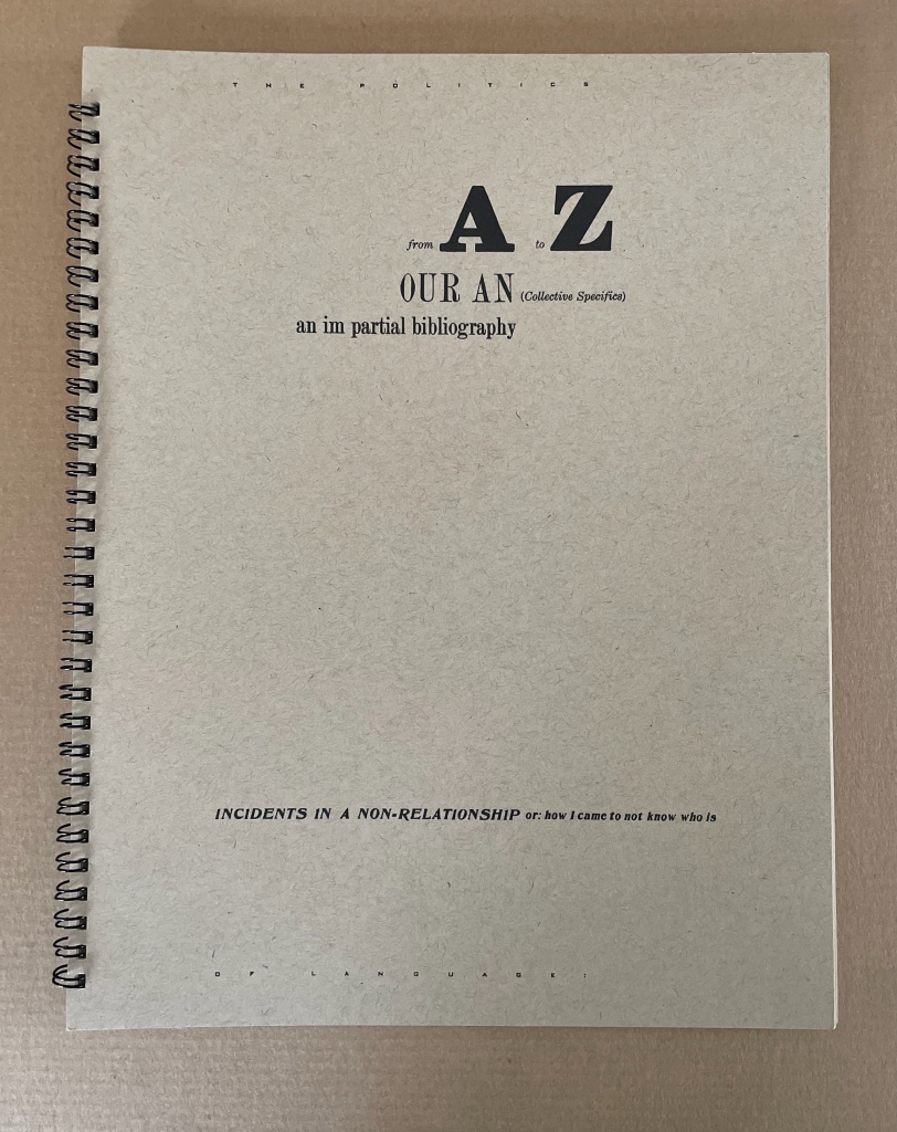
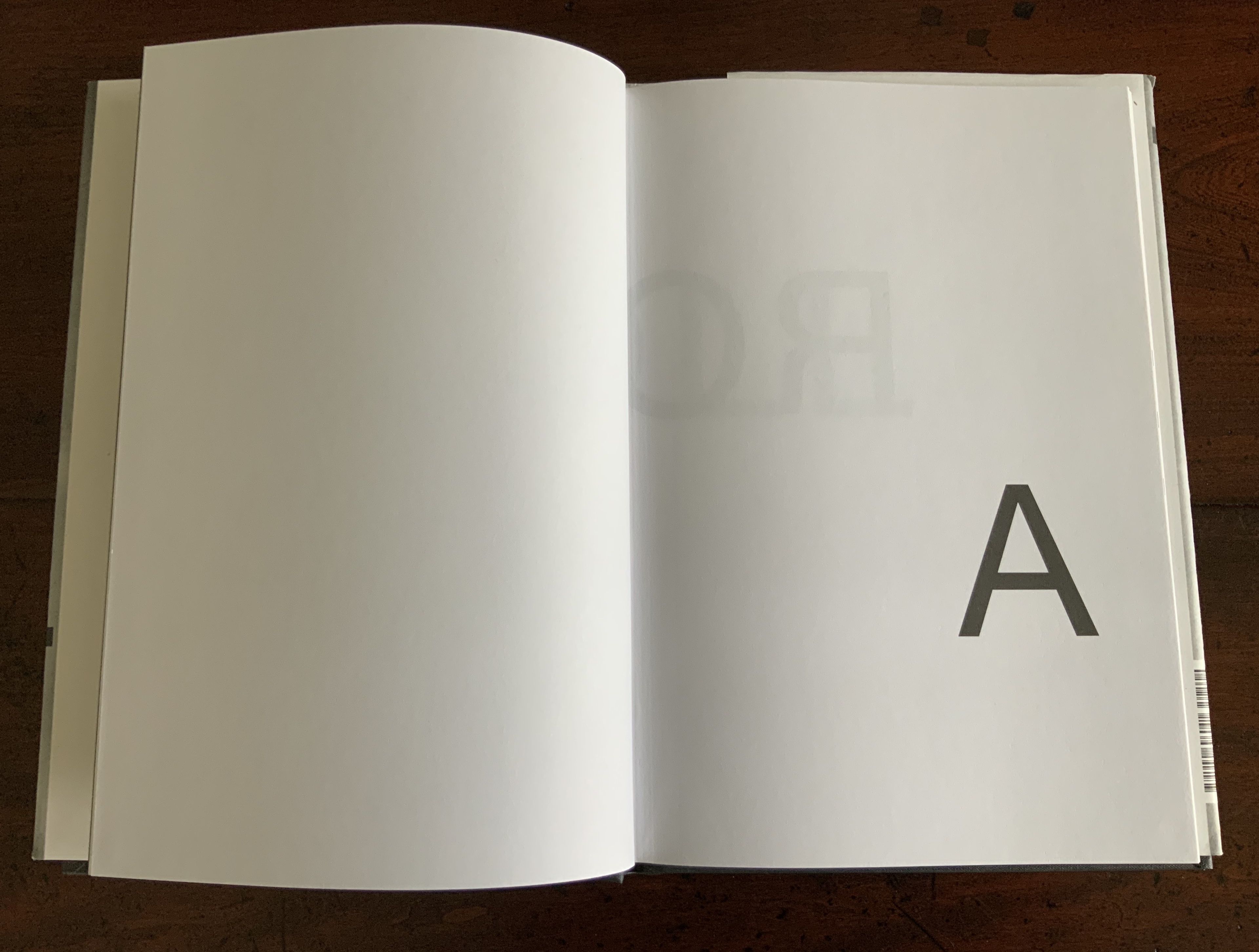
For Drucker the scholar, the alphabet has been worth two academic books: The Alphabetic Labyrinth (1995) and Inventing the Alphabet (2022). For Drucker the author-printer-artist, it has been a career-long Muse. So it should be no surprise that alphabet shows up among the strands of book-DNA teased out in The Century‘s discussion of artists’ books. Nor that it centers one of her earliest works: From A to Z: Our An (Collective Specifics) an im partial bibliography; Incidents in a Non-Relationship or how I came to not know who is (1977/2012).
In The Century the three relevant strands and their alphabetic exemplars appear in chapter 7 “Self-Reflexivity in Book Form”, chapter 9 “Books as Verbal Exploration” and chapter 10 “The Book as Sequence: Narrative and Non-narrative”. For an artist’s book whose self-reflexivity depends on the alphabet, The Century gives us Keith Smith’s Book 106: Construct (1985), which uses it as a structuring device by having it disappear from the book letter by letter (p. 180).
Keith Smith, Book 106: Construct (1985). From the Books On Books Collection. Displayed with permission of the artist.
For the book-DNA of verbal exploration, by which Drucker means bringing the sonoric and visual aspects of language “into the book form as part of its substance” (p. 227), The Century give us Maurice Lemaître’s Roman Hypergraphique [“Hypergraphic Novel”] (1950) from the Lettrisme movement (pp. 228).
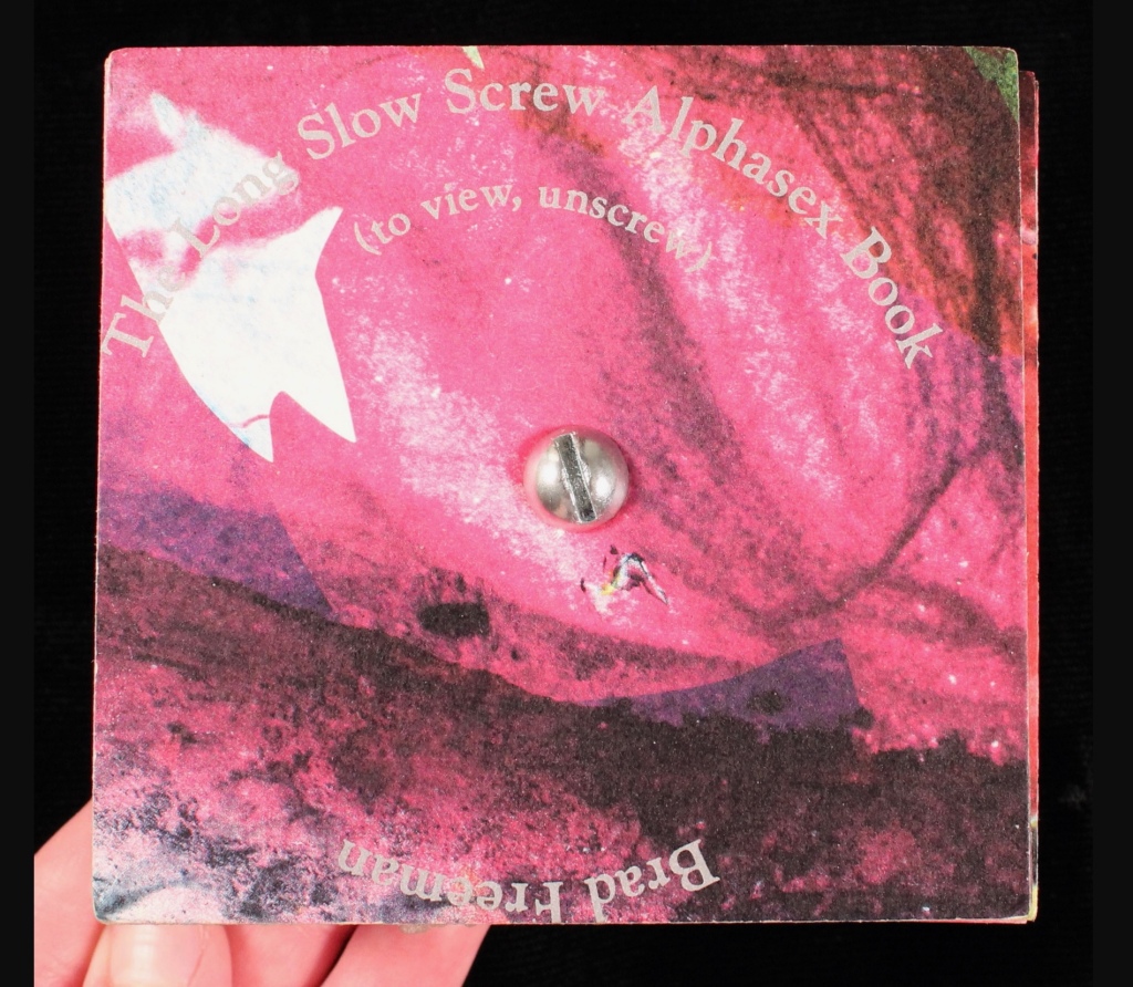
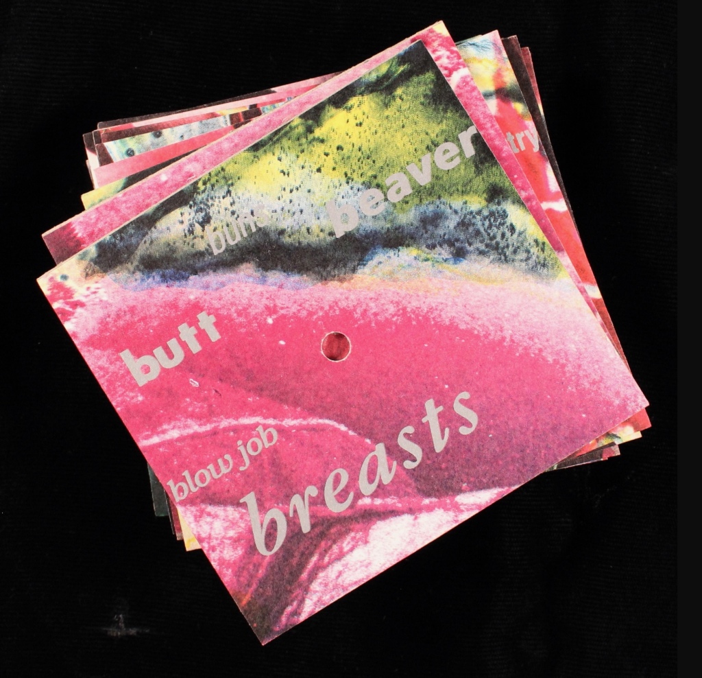
For the book as sequence, we have Brad Freeman’s Long Slow Screw Alphasex Book (1990), “an alphabet book comprised of fifteen cards drilled through the center and threaded onto a long stove bolt” (p.279). On each side of thirteen of the bolted cards, the artist has printed various anatomical and sexual terms in different fonts and sizes in alphabetic order. Unscrewed, the thirteen cards can be arranged in alphabetic order with the result being two large images on either side. The non-narrative sequence is dually dictated by the alphabetic order of the words and the composition of the images.
Brad Freeman’s Long Slow Screw Alphasex Book (1990). From the Carol Barton Collection, James Madison University Special Collections. Accessed April 14, 2024. Displayed with artist’s permission.
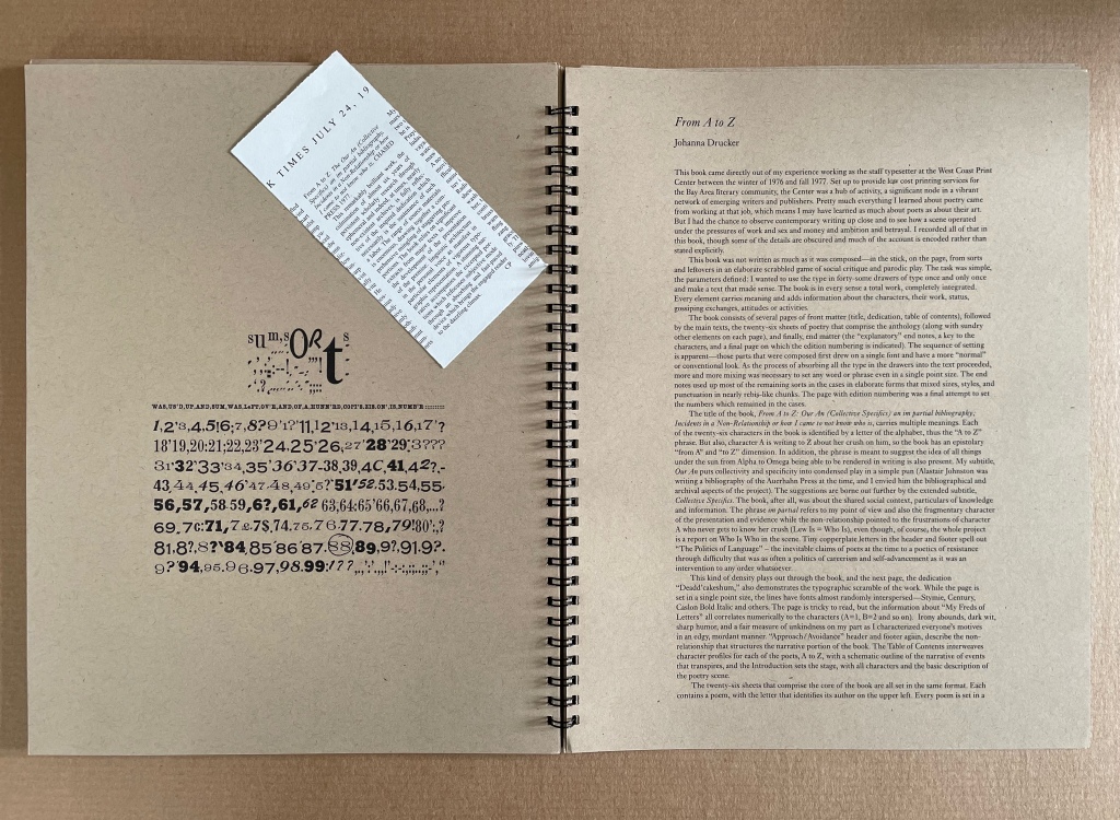
From A to Z appears in The Century as an example of self-reflexivity in book form, but it also uses the alphabet to explore the verbal and sequence elements of book-DNA. The book’s self-reflexivity appears at various levels, culminating in a two-page artist/author’s statement explaining the book’s subject, features and workings. It’s hard for a book to be much more self-reflexive than that, but in living up to the statement’s description, Drucker’s book manages to do so.
The main level comes from the book’s being a roman à clé, the key being that each character name is a letter of the alphabet. Self-reflexively at the end, the roman (“novel”) offers a key — a list of the characters and their characteristics. A, for example, is a “Miss East Coast uptight hot shit coed-just so smart and attractive and well educated and able to play it all right”, and Z is “Very Ivy League, greying prematurely and into the distinction it lent him – good family, good education, & good prospects, nice inheritance – poor fellow”, especially as his description is preceded by the word “constipation” spelled backwards. A’s preceding backwardly-spelled word is “diarrhea”, which seems appropriate for A’s failed May-December crush that is the central story played out only on the recto pages of this epistolary novel, or novel of letters from A to Z” (get it?).
The rest of the book, however, isn’t a narrative, but rather A’s anthology of poems by the twenty-six characters. In her introduction, A asserts that “the poetry of the period, as best exemplified by A, has an impressive complexity which can be traced to various contemporary influences” and then proceeds to put down the other twenty-five poets, which rather skewers her own poetry as the best exemplifier of the period. In her commentary and diaristic addresses to Z, A swings wildly between self-aggrandizement and self-deprecation. So not only is the book self-reflexive, its lead character is as well.
Left: A’s poem in the anthology. Right: Annotated citation of the volume from which the poem is taken.
Left: Z’s poem in the anthology. Right: Annotated citation of the volume from which the poem is taken.
From A to Z also plays self-reflexively with other parts of a book besides the Key and also with structural elements of page layout. The dedication’s sentences are numbered from 1 to 26, echoing the alphabet-referencing title. The table of contents embeds and interleaves the titles of the A-Z characters’ poems in a descriptive list of scenes in which the epistolary narrative will play out in the margins alongside the poems. The running heads and running feet abandon their usual function and consist of continuous text that runs across the head and foot of each page all the way to the end of the book. In keeping with A’s forwardness and Z’s indifference in the novel of letters, the text at the head begins “Approach:” and the text at the foot begins “Avoidance:”, and both capture the awkward sublimation of sex and power in a stilted acadamese.
With the exploration of the sonoric and visual aspects of language as an element of book-DNA, Drucker runs riot with peculiar misspellings (LEDDERS, DEADD’CAKESHÙM, etc.) and the diction and typeface assigned to each poet. She amplifies this sonoric/visual play with an Oulipian restriction to the use of the forty-some drawers of lead type available to her at the time. Each piece of type is used once and only once, which adds to the eyeball-twisting appearance and introduces a randomness to her Mallarméan play with the type fonts. By the time, the reader reaches
the entries under it are nigh illegible, a self-reflexive comment on the poets’ acadamese.
As for sequence (narrative and non-narrative) as a strand of book-DNA, Drucker’s use of alphabetic order throughout ties that one into a Gordian knot. The alphabetic sequence of the anthology, the naming of each character with a letter, the 26 numbered statements in the dedication, etc., call attention to the book’s self-commentary on the expected sequencing of a book. The game with sequencing occurs even at the level of the word in the “Key to Abbreviations” with the backwards spelling of the characters’ illnesses, infections or physical conditions. It’s a case of adding injury to the insults of the snarky descriptions of the characters!
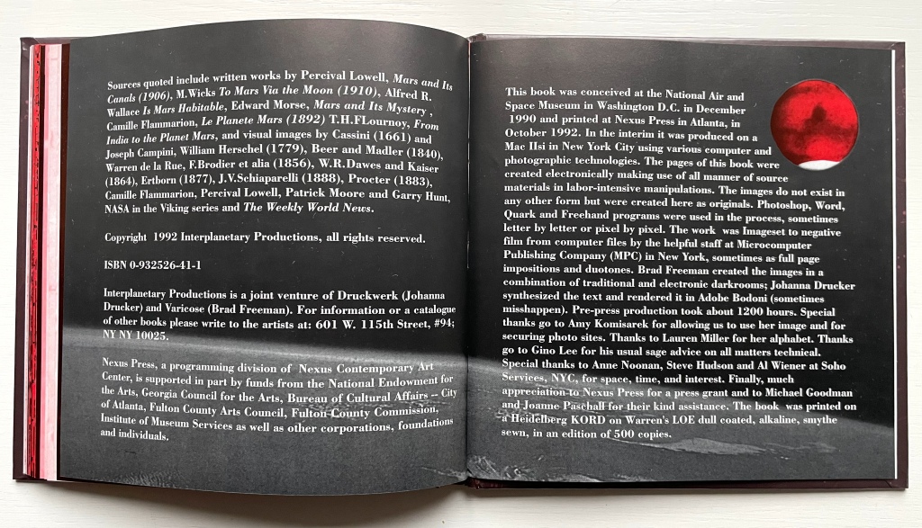
Otherspace: Martian ty/opography (1992)
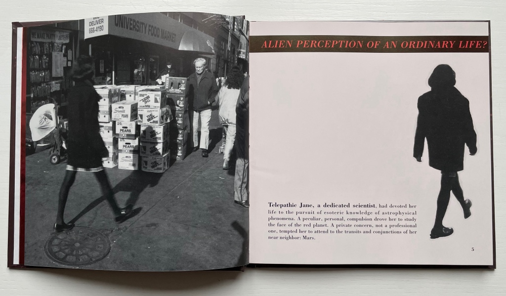
Otherspace: Martian ty/opography(1992) Brad Freeman & Johanna Drucker Casebound hardback, printed paper over boards. HxW mm. 92 pages. Acquired from Mallory Books, 11 March 2022. Photos: Books On Books Collection. Displayed with the artists’ permission.
There’s a sort of academic or anthropological distancing in the settings of Drucker’s works considered so far. In StochasticPoetics, street-level images of Los Angeles enter by way of a workshop exercise at either the Modern Language Association or Los Angeles Contemporary Exhibitions (L.A.C.E.). In The Word, the abstract, surreal, geologic and primordial put women, babies, men, fish, birds, insects, buses and even fingers sticky with jam at a surreal distance. The distancing tracks back to two trends that Lawrence Alloway noted when reviewing the exhibition “Artists’ Books and Notations” in 1978. He wrote:
There are two loose tendencies in recent art that have not yet been definitely named. One is art as an elaborate projection of the self. In one sense, of course, the firstperson of the artist is expressed in all personally originate painting and sculpture: it has been a constituent of art since the Renaissance. What is at issue here, however, is the use of confessions, souvenirs and calendars. The other tendency derives from a notion of art as simulation of social systems — from imaginary museums to the picturesque anthropology of whole cultures. The two modes, of expanded autobiography and legible societies, approach one another. Both exemplify an art of human traces, whether the perspective is that of the diarist or of the weather satellite.
Budding poets in the seventies and eighties were seeking the sun from under the shade of the Confessionals (Robert Lowell, John Berryman, Sylvia Plath et al.). Budding feminist poets had the obvious added struggle from under the shade of patriarchal societies. Alloway’s second trend identifies an effective strategy. As an emerging art form, the self-reflexive artist’s book offered an effective vehicle for adopting that strategy for poets and prose writers alike. Susan E. King’s Lessons from the South (1986) is a good example of the latter. Drucker’s three works above are good examples of the former. With Otherspace (O/u/t/h/erspace?), she adopts prose and the role of omniscient narrator.
The words “slant” and “oblique” come to mind when enjoying Drucker’s book art — not just because of the distancing or the use of the punctuation mark the “solidus” or slash. With an omniscient narrative and a collage of snippets from the main character’s work/personal diary and of quotations and images from various sources, Otherspace unfolds the story of telepathic Jane, the scientist of astrophysical phenomena, her growing obsession with Mars and her frustrating romantic relationship with J. But it’s really the story of the discovery of an Other through the alphabet — told slant through Jane’s encounter with the planet/character Mars and discovery of its topographical/typographical alphabet.
Everything seems to comment on everything else. The pixellated glyph for the letter h parades as an illustration of Martian canals described in the quotation from Alfred Russell Wallace’s Is Mars Habitable?, which runs across the double-page spread and in between snippets from Jane’s diary describing the “unintelligible transmissions” from Mars. And all of that seems glossed by the diary entry: “No word from J.”
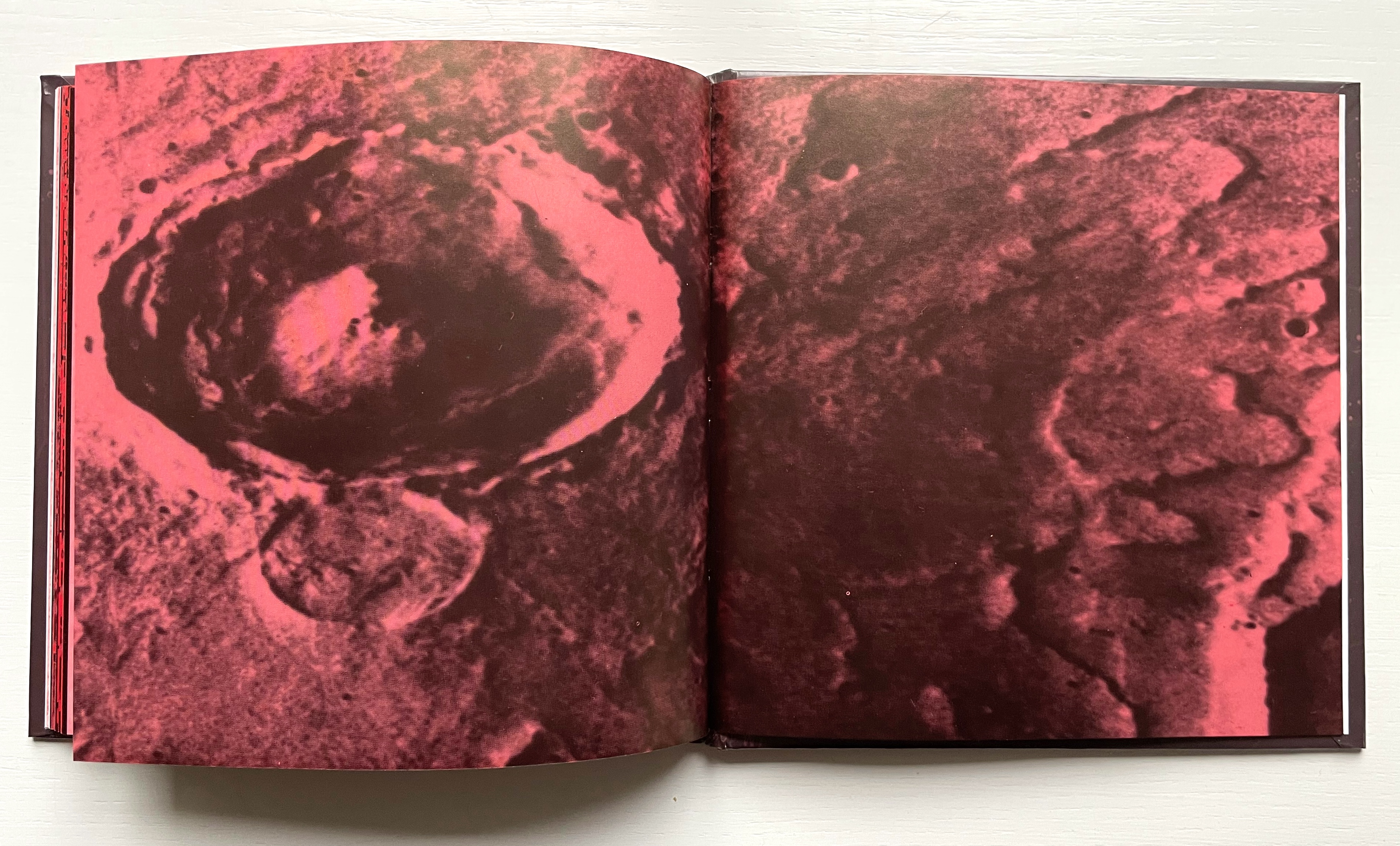
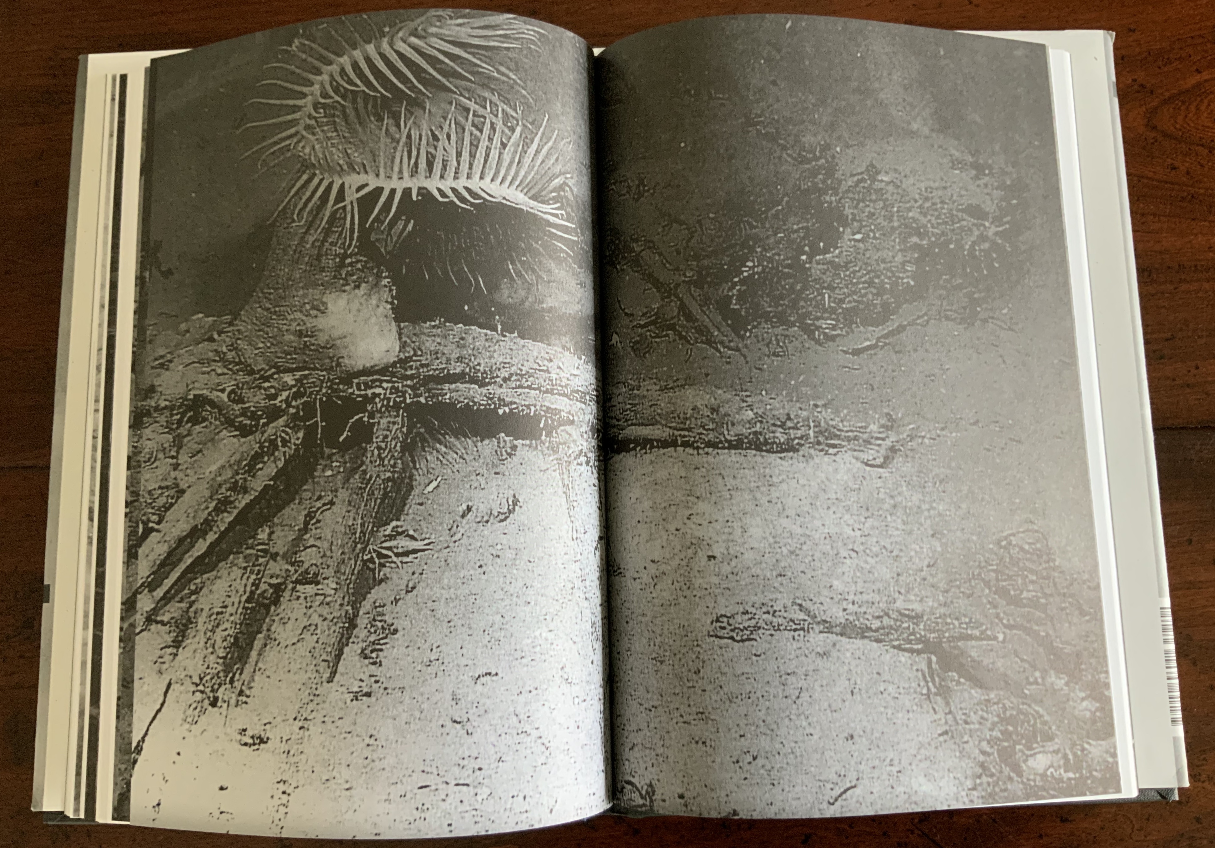
As Jane’s curiosity about the hieroglyphic face of Mars’ messages and their seemingly subliminal linguistic effort toward order grows, her disenchantment with J. intensifies to the point that, as the excerpt from Percival Lowell’s Mars and Its Canals implies, the grass grows redder on the other side. Sure enough, J. falls out of the picture, and Jane obsesses with her extraterrestrial Other. Accordingly, the book’s pages redden, and some Other-erasing fusion or consummation is sought. Mars, however, rejects Jane and her “bounded form”, and the messages cease. Mars the Other reverts “to its status as object”, returning “only an inert and passive face” while Jane tunes “her gaze into the remote monitor, hoping for renewed exchange”. The images on two final double-page spreads obliquely punctuate that ending
Polarized images Left, scene from Invaders from Mars (1953) showing the bridge into the pit where people go and come back changed; Right, extraterrestrial craters.
Still, the real mystery in Otherspace (O/u/t/h/erspace?) is not in its science fiction but rather the mysterious origin and role that our own alphabet plays in our simultaneously solitary and social existence. Jane’s futile quest to absorb and be absorbed by the Other through language has its parallel in Mallarmé’s “the Book, the total expansion of the letter”. Drucker’s comment below on Mallarmé’s quest could be taken as an oblique comment on Otherspace:
[Mallarmé’s] ideas about the metaphysical extension of “The Book” were in effect unrealizable. … Though the structure of poetics might be stretched to the point where it could attempt to be the crystallized form of thought (abstract, mobile, complex, interrelated at numerous levels), the possibility of a book which contained “all earthly existence” was always precluded by its own conceptual parameters. At the point of this limit, the end of the book begins. (Drucker, The Century, pp. 34-37).
For Jane, the end of the book Otherspace also leaves her at the point of a limit: working to decipher the Other’s mute ty/opography but still hopeful: My sense of what is to be gained is complicated by my own limitations. Maybe there will be a way to understand more than I do, after all.
For Drucker, the end of Otherspace (O/u/t/h/erspace?) is its colophon. It is an element of book-DNA that she almost always blends with the tradition of the “artist’s statement”.
Her online archive expands on the colophon: “The idea of the book came to us in the National Air and Space Museum in DC. We were looking at images of the Mars lander and the photo caption included the phrase “Martian topography.” Almost simultaneously we said aloud, “Martian TYpography.” So the project began.”
Other works by Johanna Drucker in the Books On Books Collection
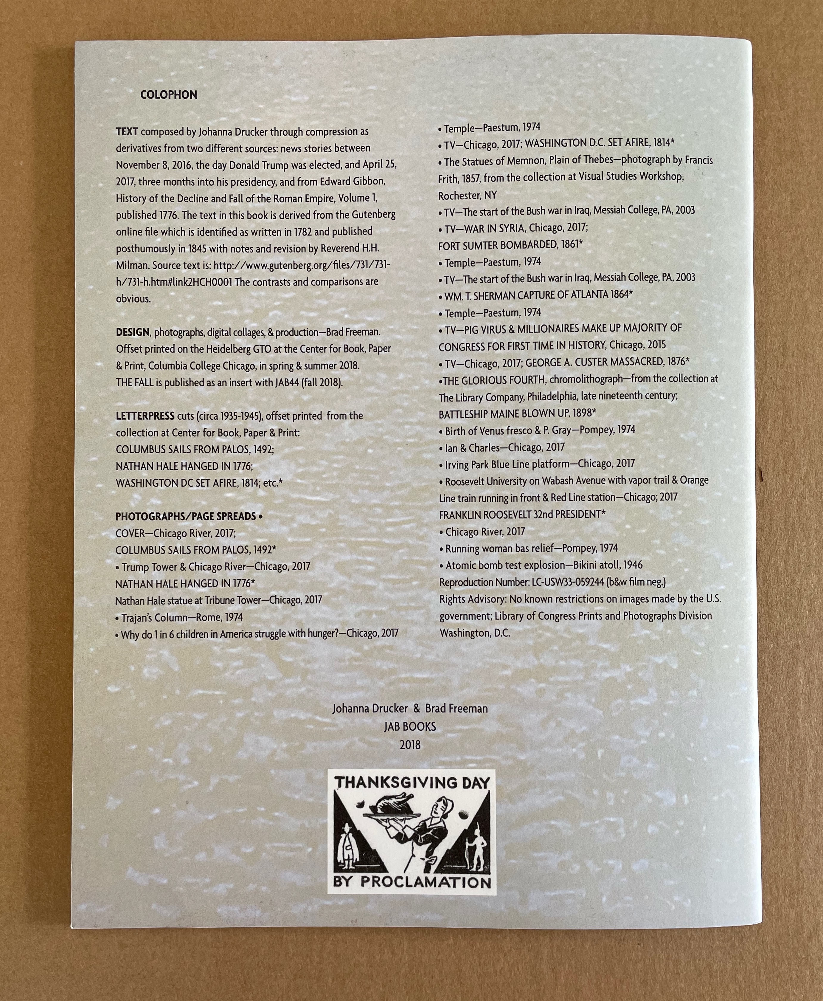
The Fall (2008)
Artist’s statement (website): Another post-Trump election work, this is fully elegiac. Using the same I-am-an-algorithm technique that I used in Fabulas Feminae, I did compression writing for a series of weeks after the election. I drew on two corpora, the mainstream newspapers and Edward Gibbon’s The History of the Decline and Fall of the Roman Empire. Brad Freeman collaborated, creating the rich, dense, dark imagery on the pages through his techniques of offset overprinting.
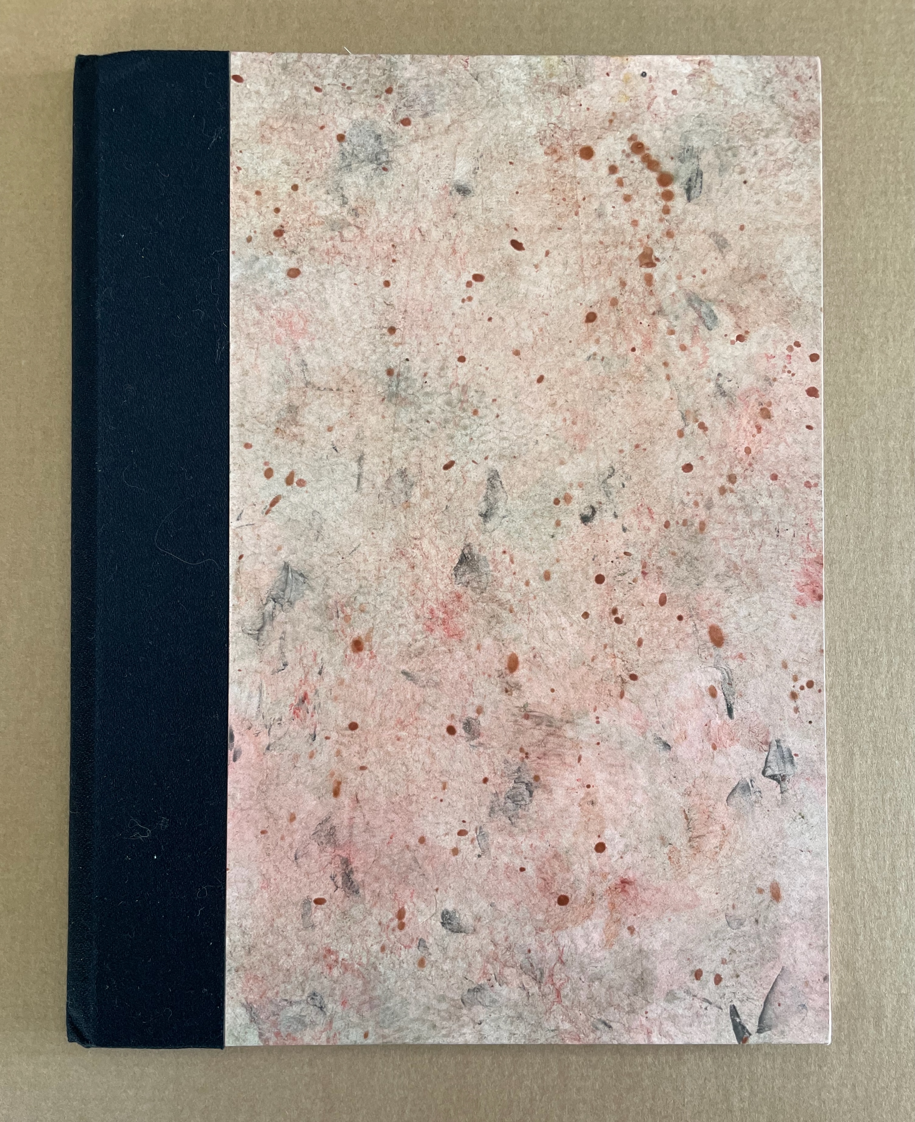
Damaged Nature Salvage Culture(2006)
Artist’s statement (website): The overall project for which these books were editioned included a series of watercolors and other studies that were exhibited in Charlottesville, first at the Off-Grounds Gallery in December, 2005, and the second time at Les Yeux du Monde as part of the Compicit Codex! exhibit in August-September 2006. The books are meant to provide a catalogue of the smaller pieces from those exhibitions and also offer a text stating the premises that underlie the works. In many ways, these pieces and the publication continue a project that has been ongoing for several decades that addresses organic process and form through drawings and watercolors.
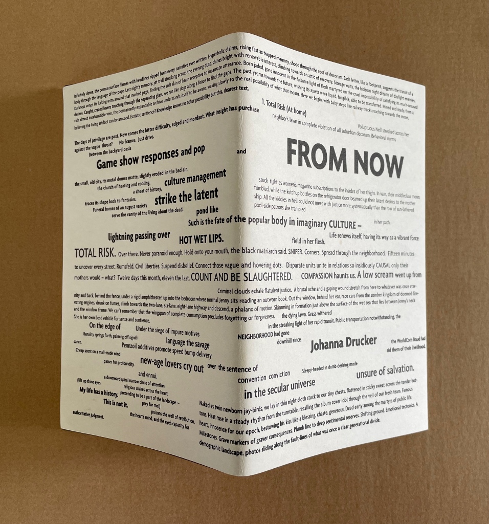
From Now (2005)
Artist’s statement (website): From Now continues the strain of my work that processes news and events through a locus of subjectivity as an organizing lens or principle. The project makes use of snippets, fragments, bits and pieces of different kinds of writing projects, most deliberately granting each autonomoy within a whole. The multiple spheres of language discourse each register in the structure and compositional mode, as well as the texture and graphic presentation of language. The “now” this is “from” is the lived and real, monstrous, grotesque, supersaturated with the noise of mass mediated culture, and yet, it is also the now of being, always, aware and present, in the midst of all that stimulation, what we are. Awareness shoots through the full world, and returns as a projection of self, that set of bounding and defining specifics that delineate a place as a profile, position, from which the world is made. So the curious codependent systems work. And language? Endlessly polyphonic, heteroglossic, multifaceted, varied in tone and vocabulary, look and sound, image and texture.
Simulant Portrait (1990)
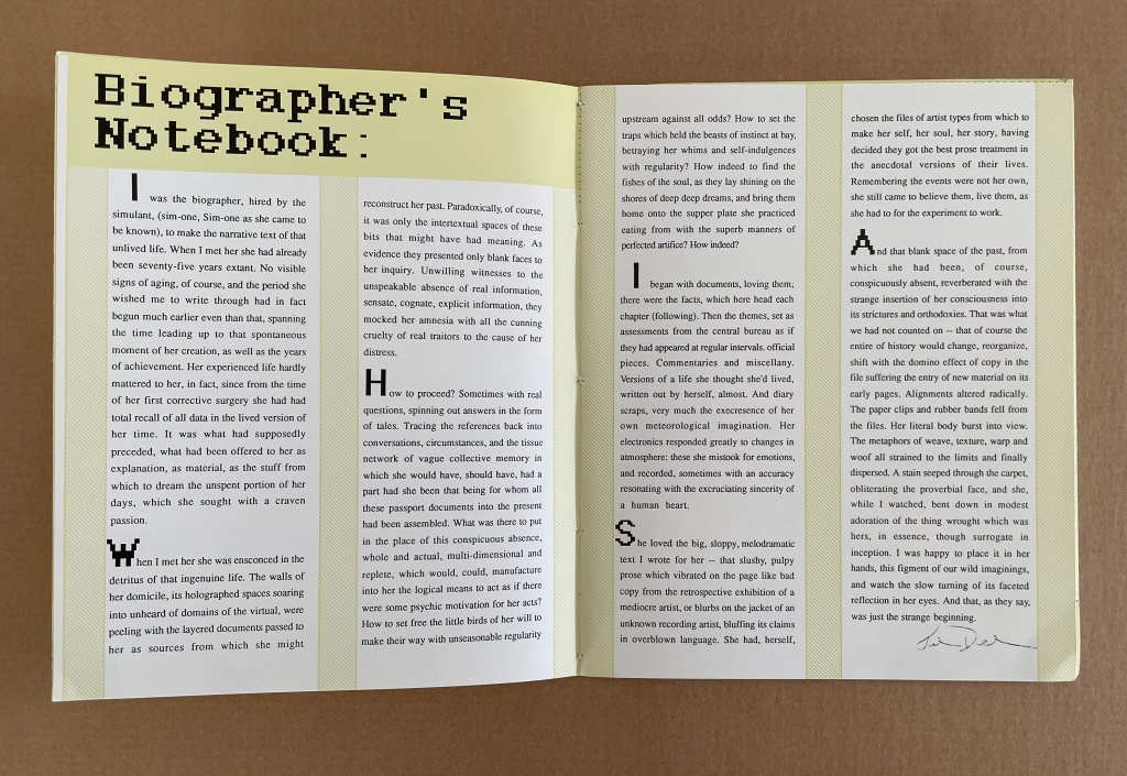
Artist’s statement (website): In the late 1980s, I was still involved in working on the biography of Ilia Zdanevich (Iliazd), begun in 1985 when I was a Fulbright Fellow in Paris, working on my dissertation. That biography went through many iterations, and was finally left unpublished after Northwestern cancelled my contract. I had lost interest in the project, swept up in other matters, but the process of research and synthesis from documents and snippets of different kinds of materials had touched a nerve. I found this utterly satisfying to a certain obsessive streak. And so the structures of biography-writing, with all their connect-the-dots assumptions, varieties and ranges of sources and voices, evidence and documents, etc., were extremely appealing. Structurally, then, Simulant Portrait was conceived to mimic that process of research. Thematically the book was closer to older themes, of women and their lives, biographies and celebrity, the tensions of mass and literary culture in my own mind, and so on. The cyber-pulp aspect of the book is harder to place, as my proclivities were hardly sci-fi at that moment. Only that such notions were in the air, with Philip K. Dick (particularly the film Blade Runner) and William Gibson (rising star) occupying a certain popular imagination.
Further Reading
See “‘Un Coup de Dés Jamais N’Abolira l’Appropriation’ — An Online Exhibition“, 1 May 2022, Bookmarking Book Art, for works of homage to Mallarmé with which Drucker’s works can be compared and contrasted. Other works in the Books On Books Collection whose comparison/contrast with Drucker’s artist’s books provide appreciation in both directions include:
The Fall (1976) Michelle Stuart for the trend of distancing described by Alloway.
Auparavant (1991) by Roland Sabatier for the Lettrist context.
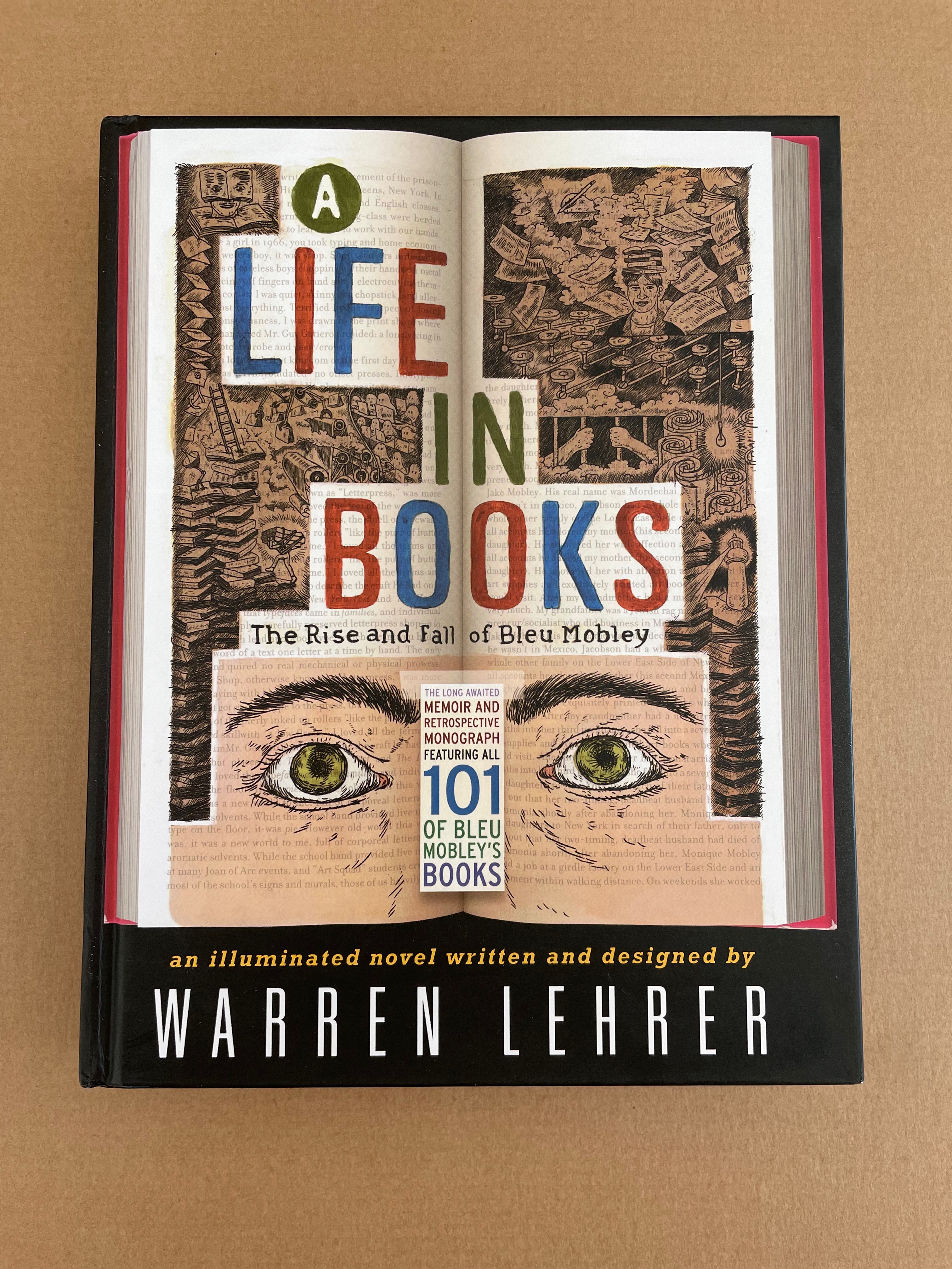
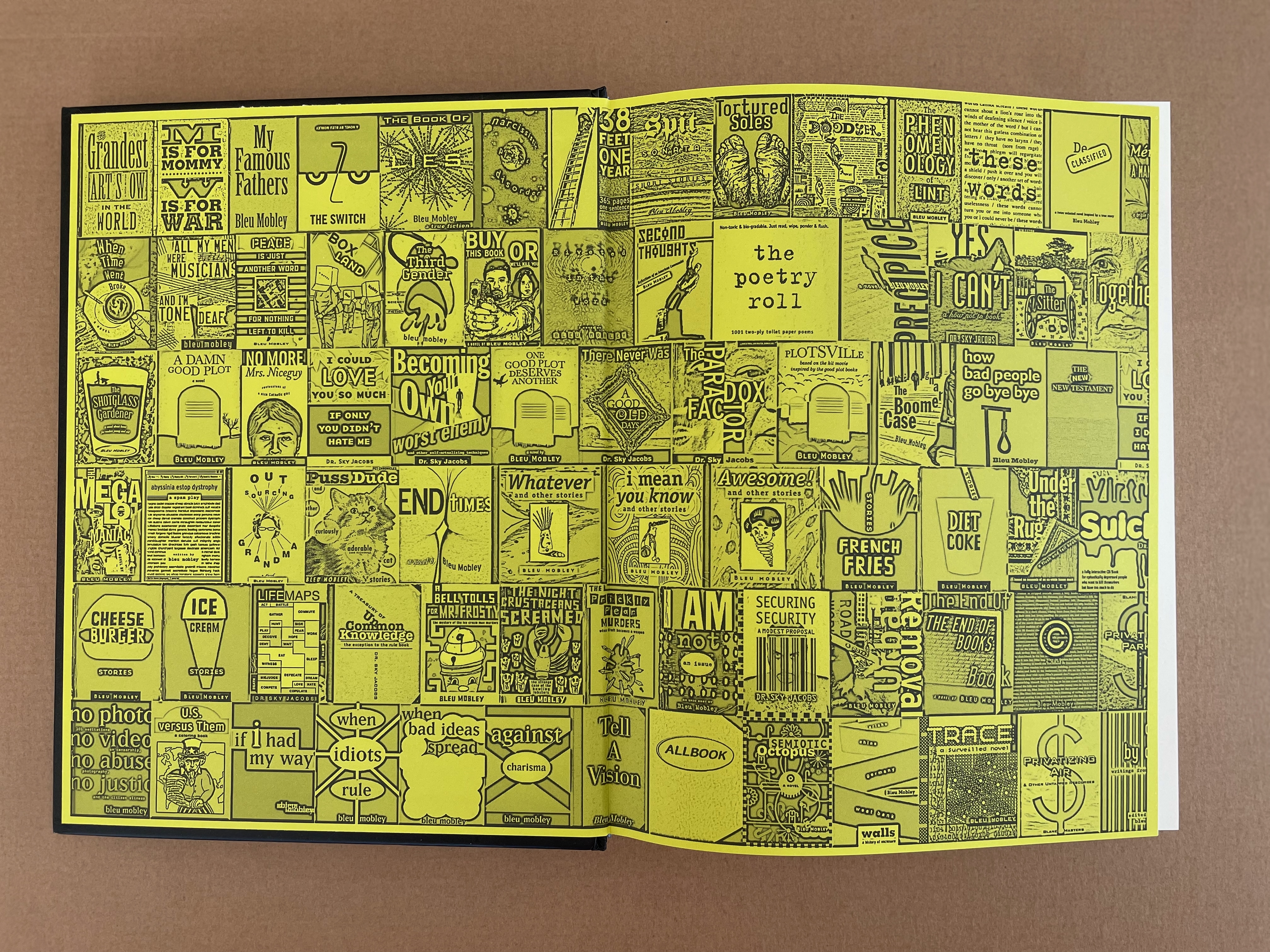
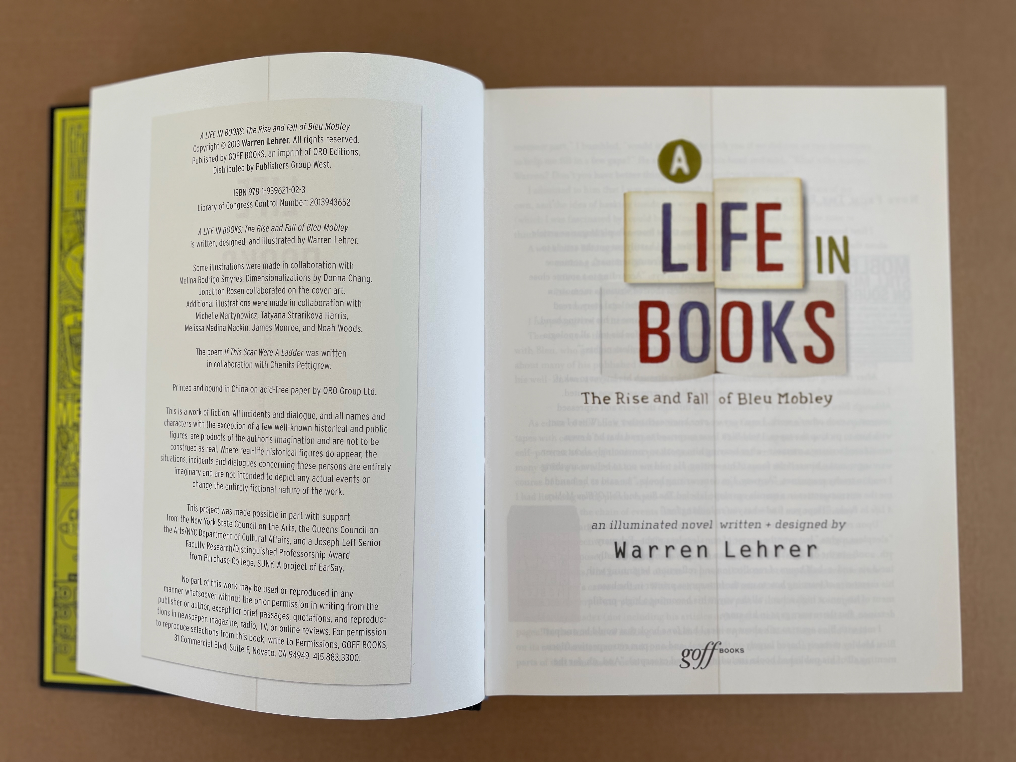
A Life in Books(2013) by Warren Lehrer for comparison with Otherspace for format and Stochastic Poetics and From A to Z for commentary on the academic literary milieu. See also Lehrer’s “Note from the Editor” for comparison with the “Biographer’s Note” from Simulant Portrait (1990) above.
Alloway, Lawrence. 9 December 1978. “Art”. [Touchstone Gallery, 118 E. 64th Street, New York] The Nation, p. 653.
Drucker, Johanna. N.D. “An Introduction to the Work of Johanna Drucker“. Artists’ Books Online: An online repository of facsimiles, metadata, and criticism. Archived 22 April 2021 at the Internet Archive Wayback Machine.
Drucker, Johanna. August 2012. “Future Visions and Versions of the Codex“. Transforming Artist Books. London: Tate Research Publication. Archived 26 March 2024 at the Internet Archive Wayback Machine.
Drucker, Johanna. 2022. Inventing the Alphabet: The Origins of Letters from Antiquity to the Present. Chicago: University of Chicago Press. Like The Century of Artists’ Books, Drucker’s scholarly works on the alphabet — this one and The Alphabetic Labyrinth below — enrich the appreciation of her artist’s books.
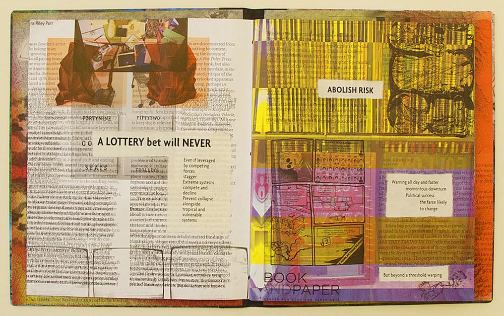
Drucker, Johanna, Brad Freeman and Jessica Cochran. 2020. Aleatoric Collaborations. Chicago, IL: Center for the Book and Paper/Columbia College. If any proof of Poème‘s direct influence on Drucker were needed, here it is:
Aleatoric Collaborations (2020) Johanna Drucker, Brad Freeman et al. Photo: Courtesy of Brad Freeman.
Mallarmé, Stéphane, and Bertrand Marchal (ed.). 2003. “Le Livre, Instrument Spirituel“. Œuvres Complètes. New ed. Paris: Gallimard. Vol. 2, p. 224-28.
Why should an obscure poem like Stéphane Mallarmé’s groundbreaking Un Coup de Dés Jamais N’Abolira le Hasard: Poème (1897) have become the cornerstone of an art-industrial complex of literary, critical and artistic responses ranging from essays, books, edited collections, countless editions, and appropriations in the form of fine press livres d’artiste, book art and sculptures, films and theater, ballets and fado, musical compositions, digital programs and installations, and even pavement art?
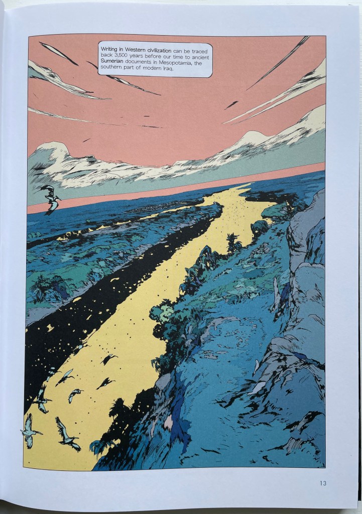
ABC of Typography (2019) David Rault Casebound, sewn, illustrated paper-over-boards cover, endbands, sewn, red doublures. H265 x W195 mm. 128 pages. London: Self Made Hero [Translated from French (Gallimard, 2018)]. Acquired from The Saint Bookstore, 29 June 2023. Photos: Books On Books Collection.
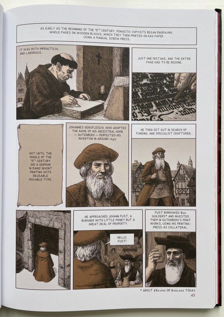
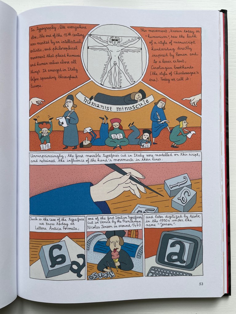
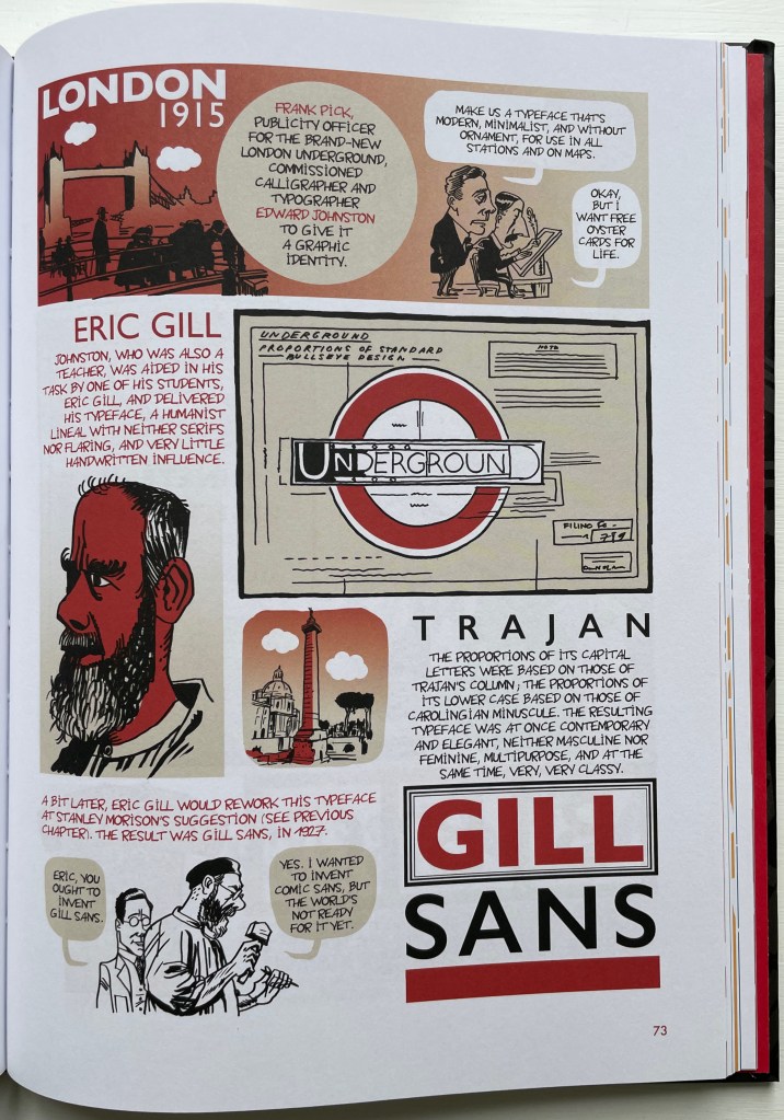
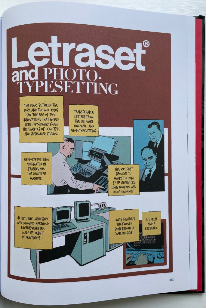
David Rault’s ABC of Typography traces 3,500 years of letters and type from pictographs and cuneiform through Roman lettering and Gutenberg to the Bauhaus and beyond. For the Books On Books Collection, it enriches the focus on the alphabet, typography and artists’ books — in particular, that subset of illustrated histories of the alphabet and type. These include Tommy Thompson’s The ABC of Our Alphabet (1952), William Dugan’s How Our Alphabet Grew (1972), Tiphaine Samoyault’s Alphabetical Order (1998), James Rumford’s There’s a Monster in the Alphabet (2002), Ada Yardeni’s A-dventure-Z’ (2003), Don Robb and Ann Smith’s Ox, House, Stick (2007) and Renzo Rossi’s The Revolution of the Alphabet (2009).
While enhancing that subset of illustrated reference works, ABC of Typography also highlights a gap in the collection. Rault and his team of invited artists hail from the Franco-Belgian tradition of lesbandes dessinées (BDs), which the French and Belgians call laNeuvième Art (“the Ninth Art”). English-language readers will likely be familiar with BDs from seeing Hergé’s Tintin or René Goscinny’s Asterix. Other than Chiavelli’s Arthur R./Un Coup de DÉS Jamais N’Abolira le HASARD (1988) and its two companion volumes, the collection has no BDs. The Rault volume does, however, deliver a mini-survey of styles among contemporary bandes dessinateurs with its assignment of chapters to eleven different artists.
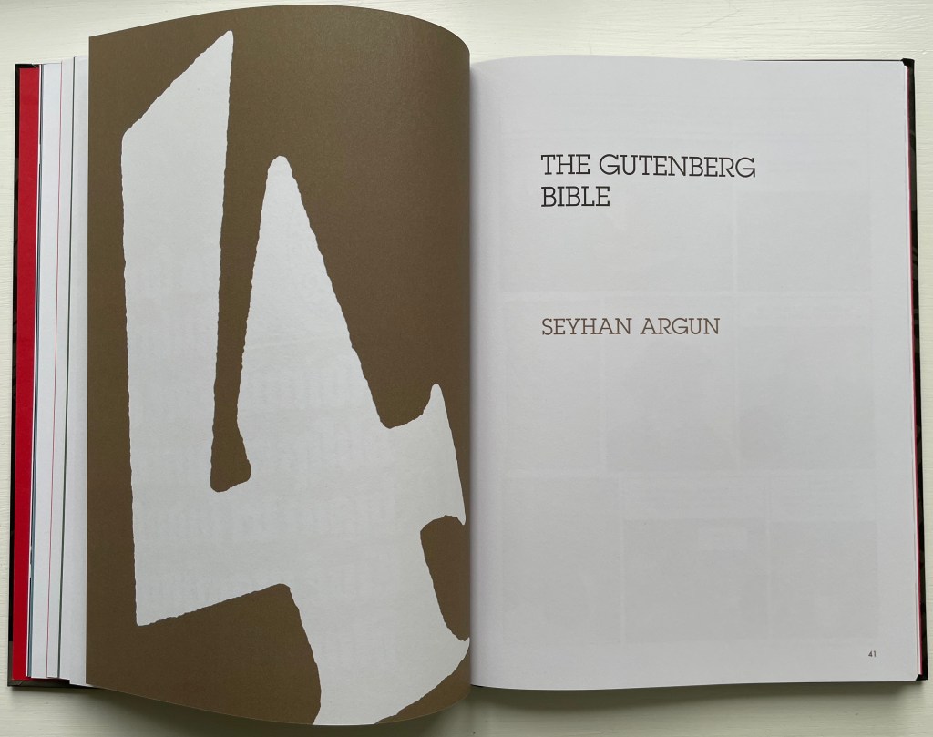
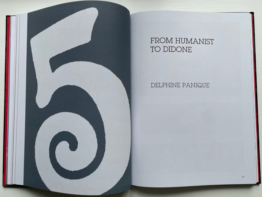
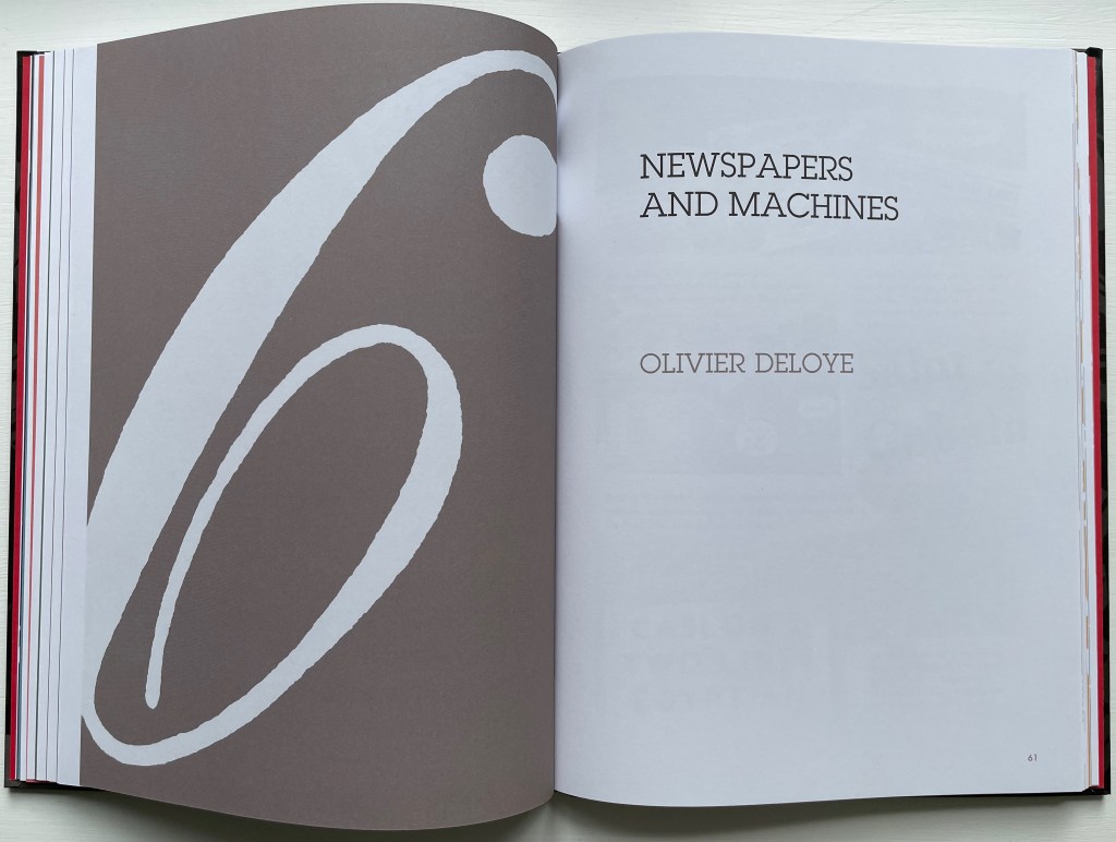
The book’s overall design by Jean-Christophe Menu simultaneously embraces and sets off the individual styles of drawing and lettering. Menu’s consistent use of a slab serif font (Lubalin Graph Std?) for chapter titles alongside oversized chapter numbers that bleed off the facing page signals his intent and success.
The variety of “strip” layouts pushes the boundaries of unity. Some, like Libon’s and Clérisse’s, float on the page. Others, like Singeon’s and Simon’s, are ruled off. Within the strip layouts, panels vary in shape, and the images within them tilt at different angles, all creating as much of a sense of movement as any action comic. Even where a strip is ruled off, sketches sometimes encroach across panels as well as the book’s margins or gutter to give depth and perspective as well as movement. as happens with the gulls in flight below from Aseyn’s chapter.
Note how the gulls in flight in Aseyn’s chapter appear within panels but also cross them and the gutter.
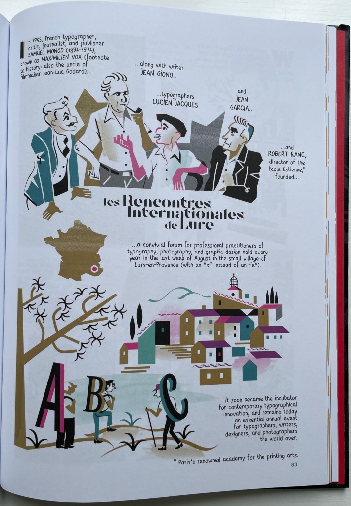
Evident from Clérisse’s recounting of “Les Rencontres internationale de Lure” (an influential annual forum in Provence), Simon’s homage to the typologist Maximilien Vox (one of the forum’s founders) and Ayroles’ positioning of the typeface DIN, the volume’s European roots are never far from the surface, which also makes ABC of Typography a useful and necessary addition to this collection or any shelf of Anglo-centric works about the alphabet, type or design. It’s interesting that, while the French have categorized BDs as the ninth among the ten officially designated arts, typography and design do not yet rate a category. Neither does the livre d’artiste for that matter, which raises a question:
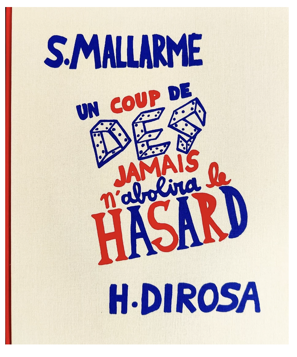
Between the traditional BD and livres d’artistes by graphic artists, is there fertile ground for artists’ books that blend subject, material, form and metaphor into innovative works of book art? The above-mentioned BD by Chiavelli, paying homage to Mallarmé’s Un Coup de Dés, represents one end of that spectrum. Hervé di Rosa, part of the Figuration libre movement, associated with Keith Haring and graffiti artists, can provide the other end of the spectrum with his Un Coup de Dés jamais n’abolira le Hasard (2021), published by Virgile Legrand. For the work of book art between them, Nanette Wylde’s Babar Redacted: ABC Free (2020) might be a case in point. Likewise, Catherine Labio’s curated exhibition in 2013 — “From Bande Dessinée to Artist’s Book” — finds earlier exemplars in the works of Lars Arrhenius, Felicia Rice, Omar Olivera and Mamiko Ikeda.
Babar Redacted: ABC Free (2020) Nanette Wylde Based on an altered copy of the board book B is for Babar: An alphabet book by Laurent de Brunhoff. French link exposed spine on tapes. 9″ x 9″ x .5″ closed. Edition of 3. Photos: Courtesy of the artist.
“Richard Niessen“. 23 April 2021. Books On Books Collection.
Library of Congress. “Bande Dessinée: Comics & Graphic Novels“, in “Reading in French: A Student’s Guide to Francophone Literature & Language Learning”. Library of Congress Research Guides. Accessed 11 August 2023.
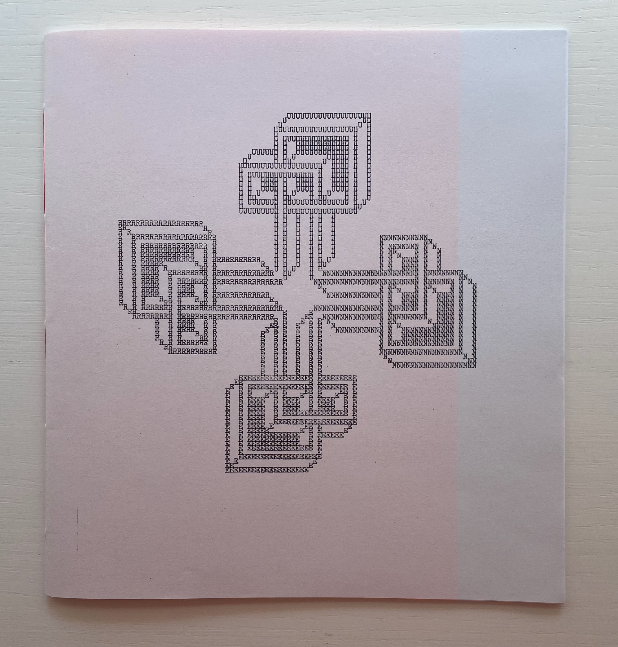
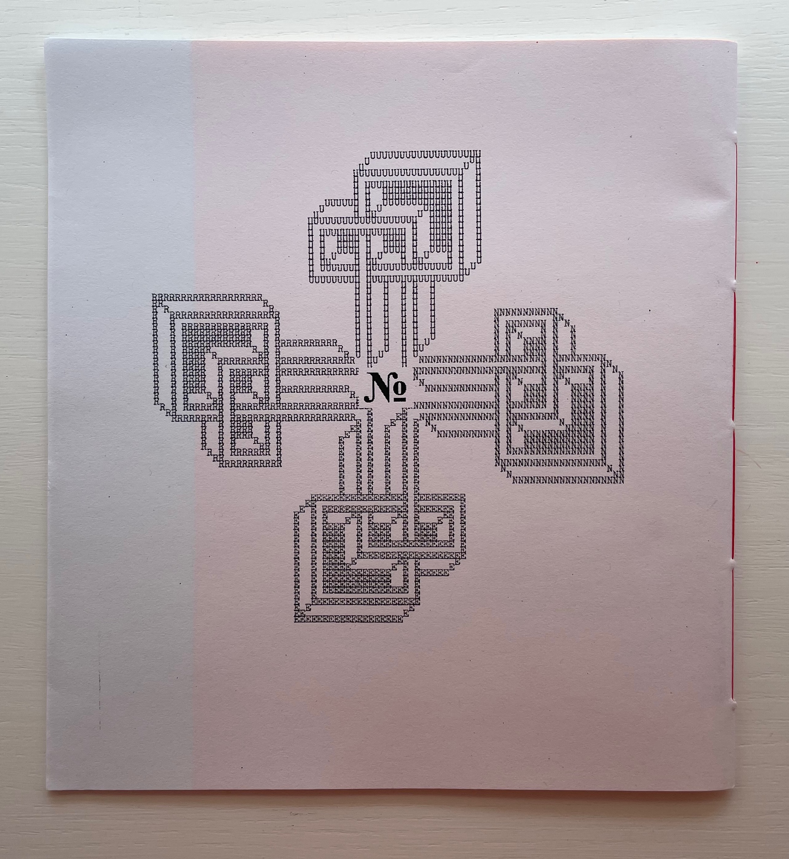
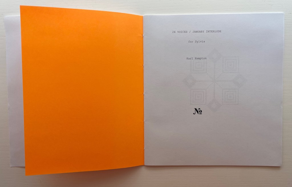
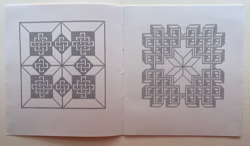
26 Voices / January Interlude (2020) Karl Kempton Sewn booklet. H190 x W177 mm. 28 pages. Edition of 60 unnumbered. Acquired from Derek Beaulieu, 4 January 2021. Photos of the work: Books On Books Collection. Displayed with permission of the artist.
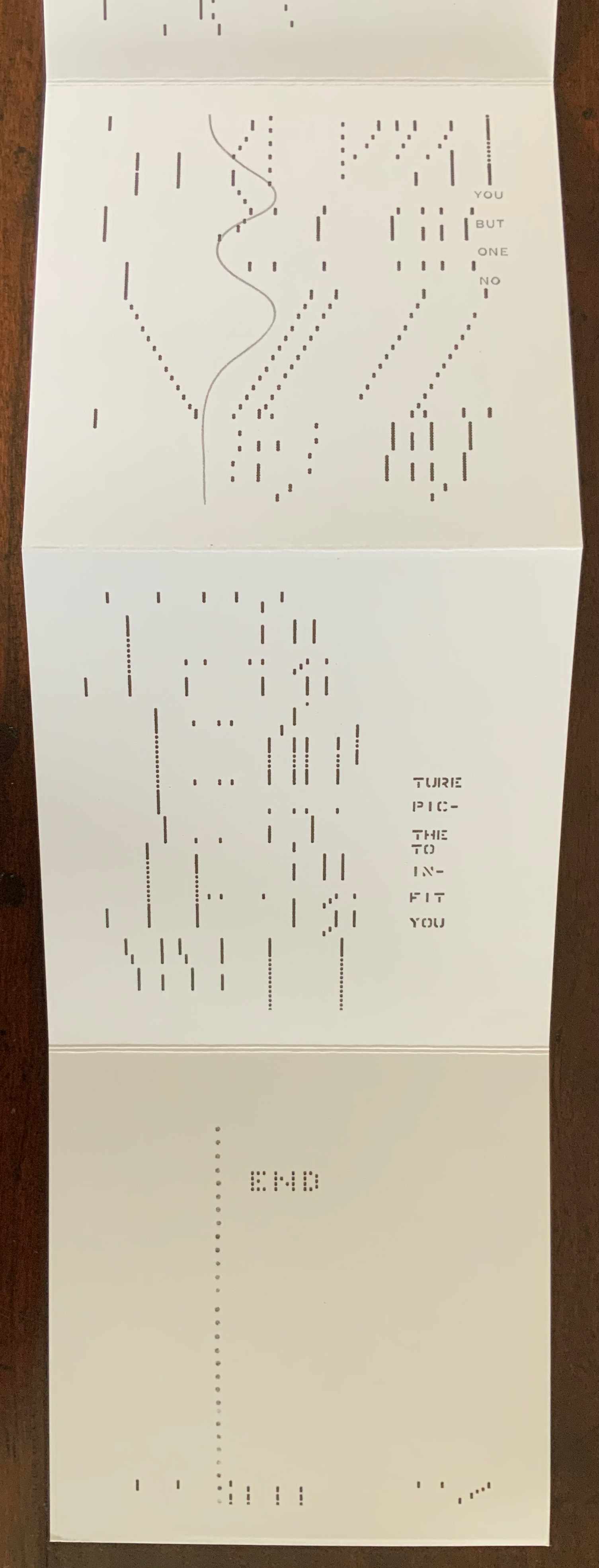
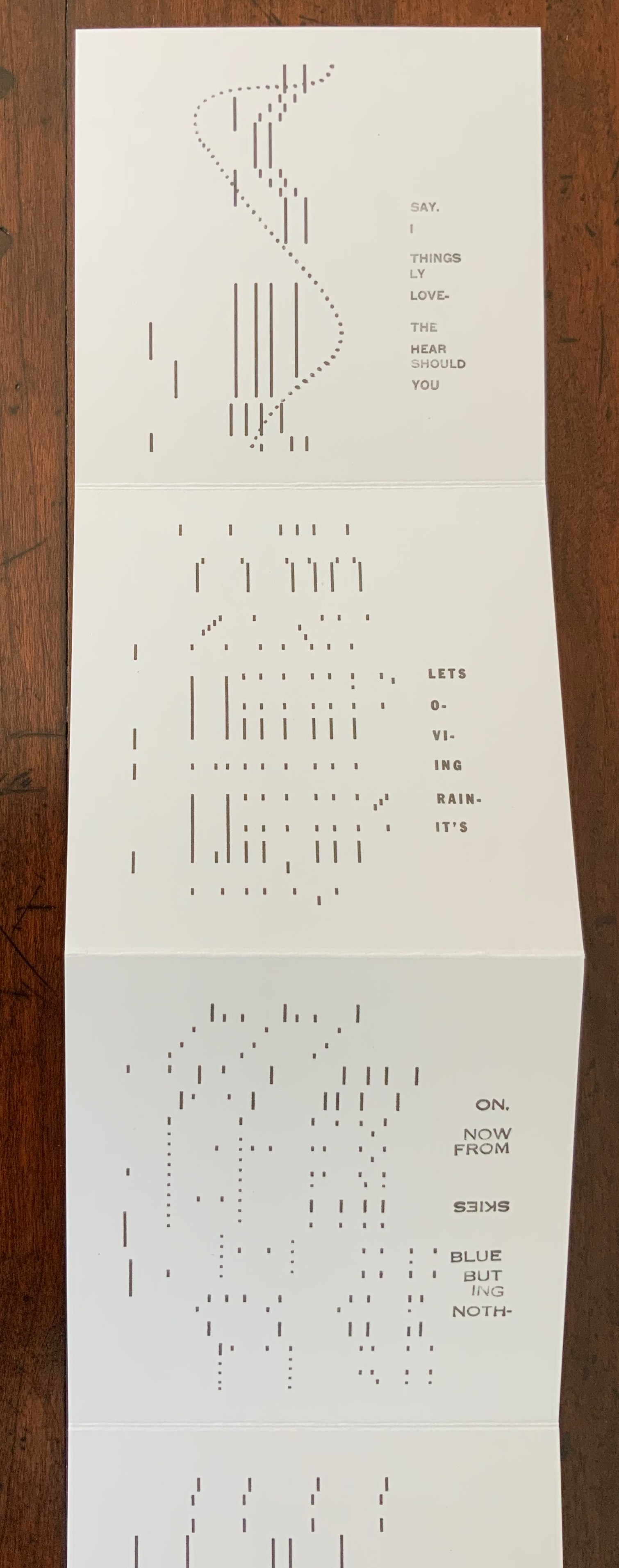
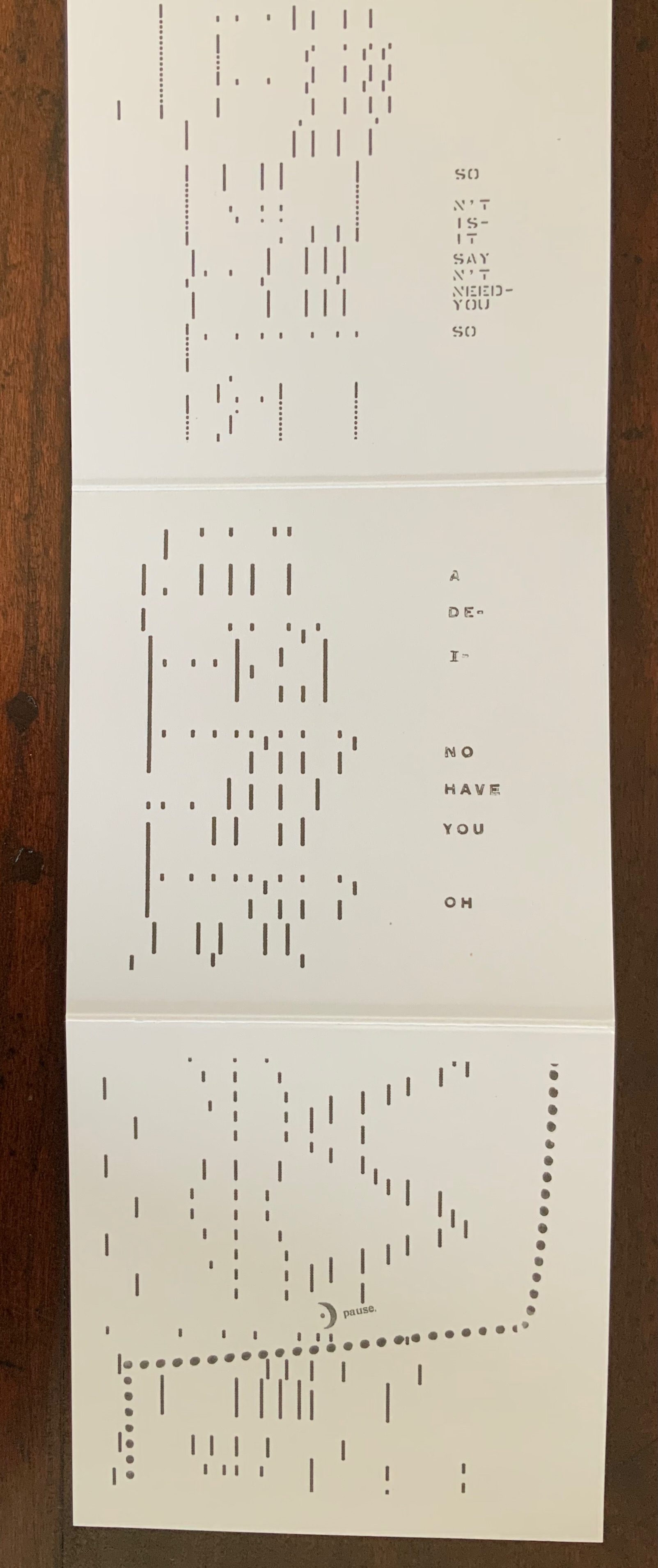
Derek Beaulieu deserves a vote of thanks for bringing this work back into print, even if for a limited edition. 26 Voices / January Interlude first appeared under the title Rune 2: 26 voices/ january interlude as number 10 in Robert Caldwell’s Typewriter series, published by Bird in the Bush Press (1980). In the Acknowledgements, Kempton writes that the series “was composed in January, 1978 in 28 days. After the letter K the flow stopped until a dream of L’s form arrived unblocking the flow”.
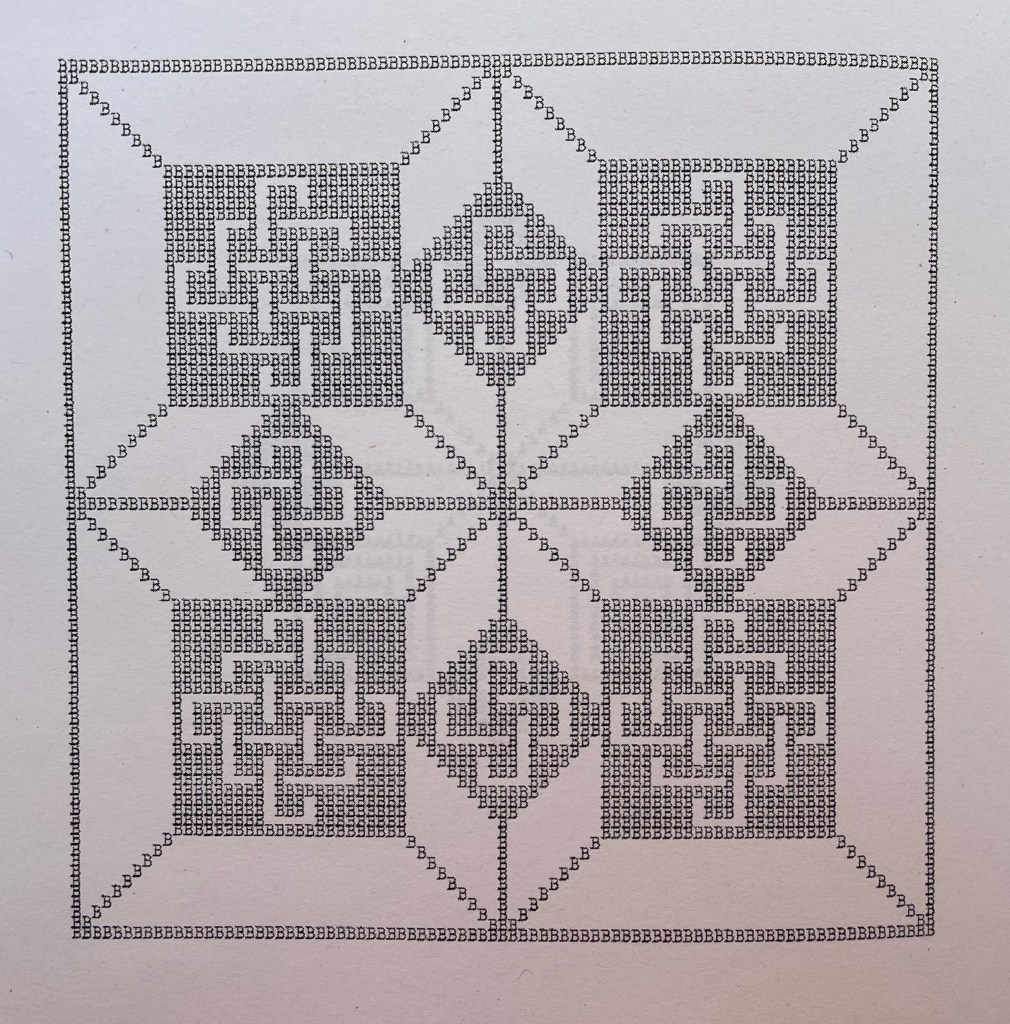
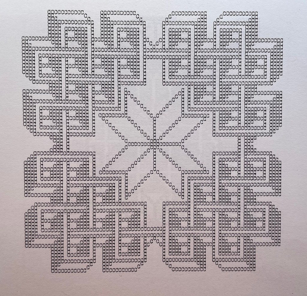
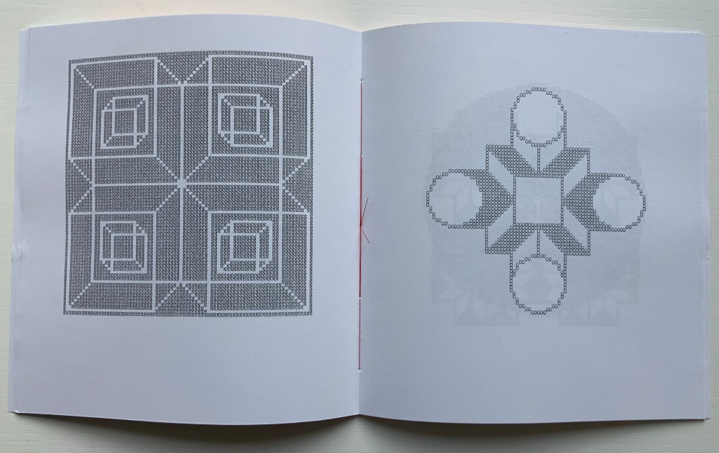
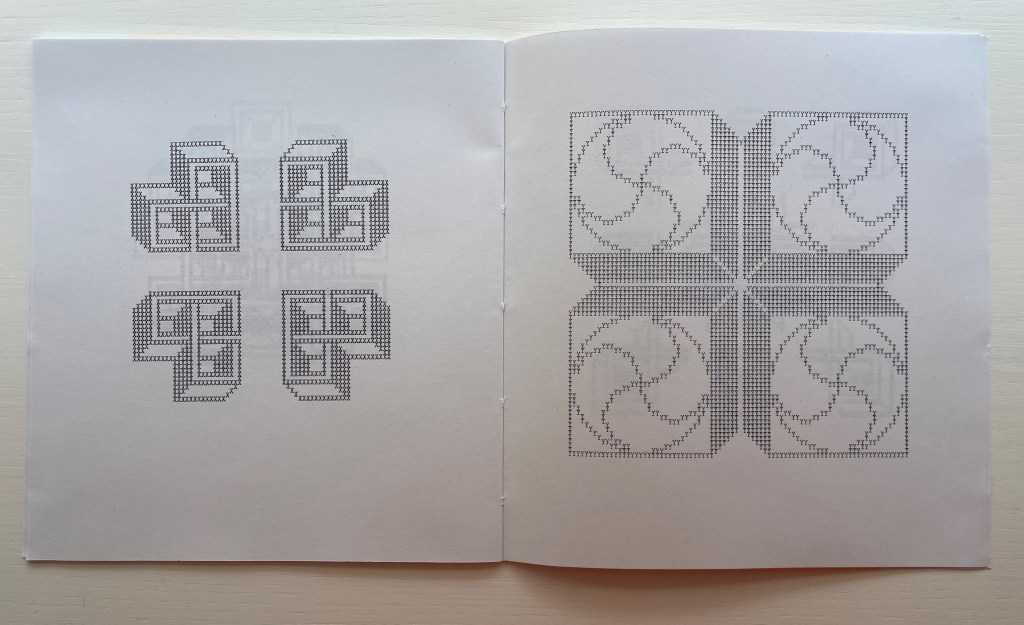
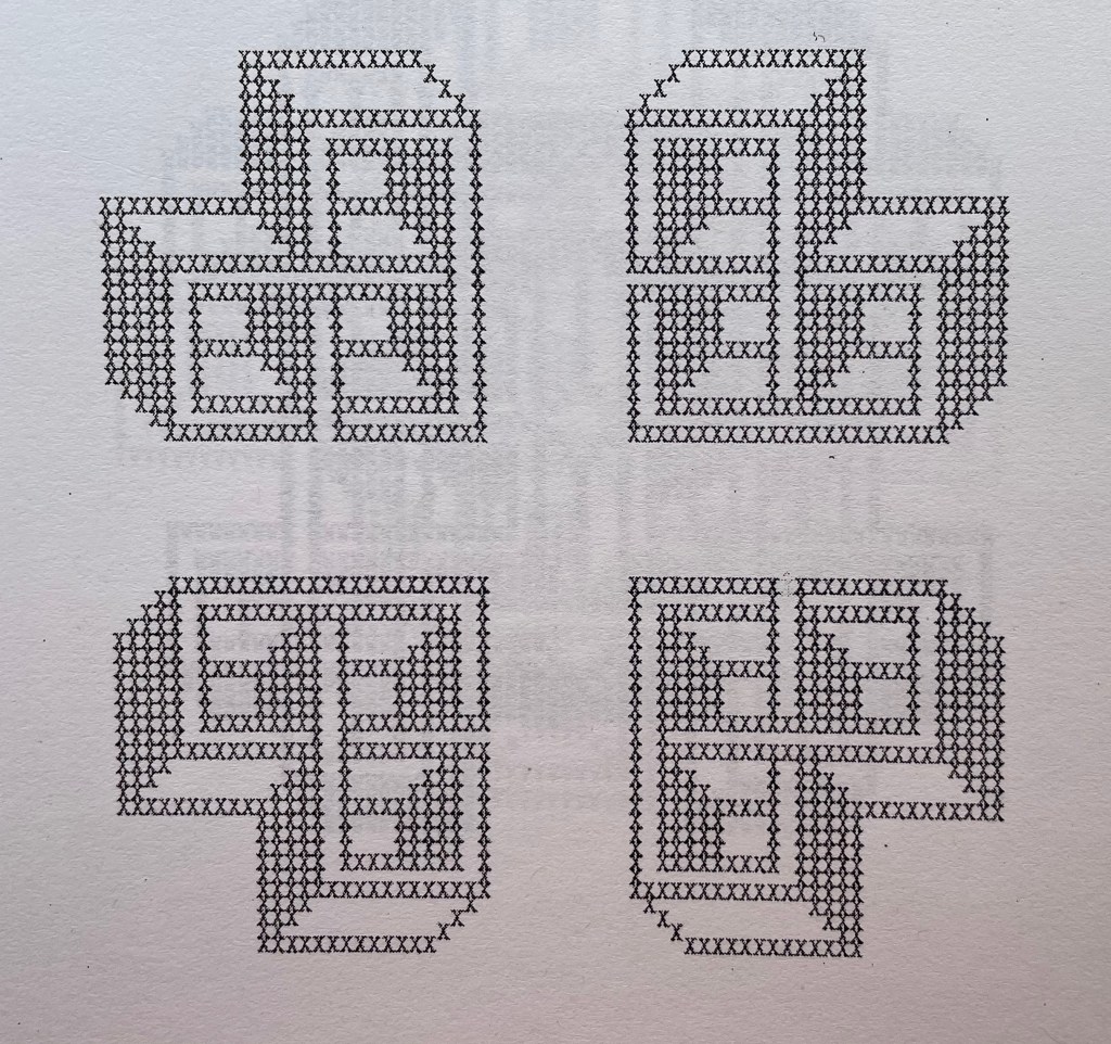
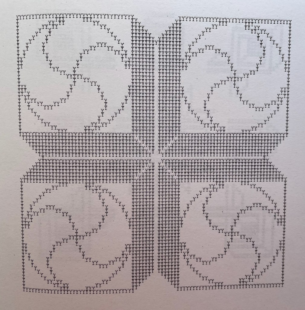
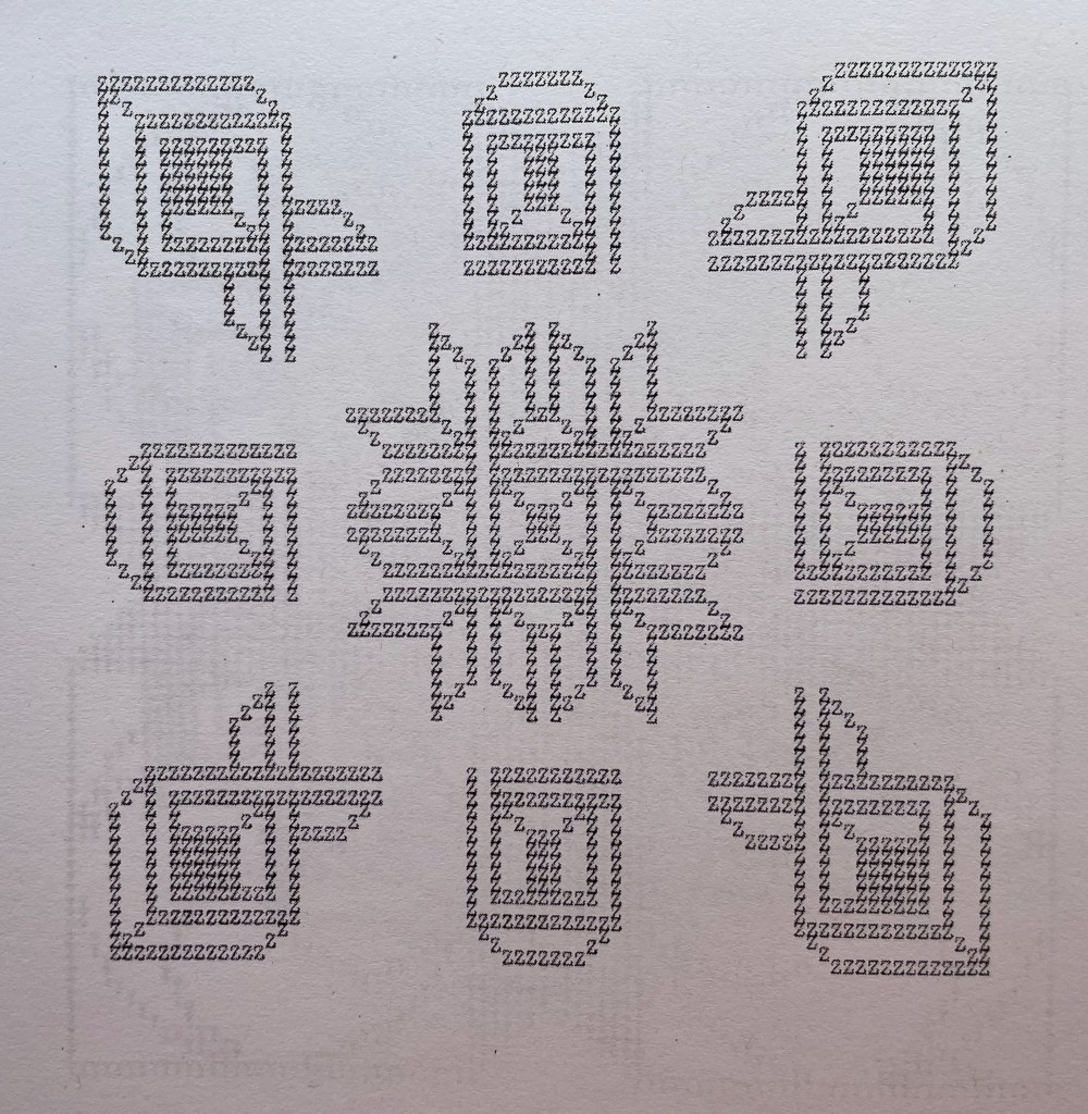
The series of patterns, each made from an upper case letter of the alphabet typed over and over, range in appearance — some like Amish quilts, some like Byzantine rugs, some like Celtic knots, but like snowflakes, no two alike. Given how some pairs of letters are mirror images of each other (bd, pq) or inverse (bp, dq), you would expect some close affinity in their two patterns, but no. No pairs of those patterns look at all alike. You would also be mistaken to expect a pattern to reflect the letter that constitutes it. Instead, you find one pattern resembling the letter X, but it is made of letter U’s. There are naturally some similarities between patterns at the broadest level — E and N, L and M or R and S — but these have little to do with the letters themselves, and the similarity recedes as details come to the fore or falls into the background with illusory three dimensionality. The shapes are not rune like, but individually and sequentially, they have the associative dream-like qualities of runes.
A close up
Double-page spread B&C
B close up
C close up
Center double-page spread N&O
Double-page spread X&Y
X close up
Y close up
Z close up
Actual runes appear in the following work, similarly in black and white and with similarly illusory three dimensionality. Not technically in the Books On Books Collection, playground (2013-14) can be found online. Surprisingly, it has not been in print.
playground (2013-14)
playground (2013-14) karl kempton Online, 78 pages (screens). Accessed 7 August 2022. Screenshots reproduced with permission.
What an opportunity for collaborators to join with Kempton to produce playground in different editions varying in color (black and white, red and white, green and white, blue and white, etc.), in paper (handmade, watercolor, washi, high gloss, matte, etc.) and in binding (accordion, stab binding, case bound, scroll, etc.). Perhaps such an extravaganza is not in keeping with Kempton’s style and approach over the years, but this playground is such an invitation to play.
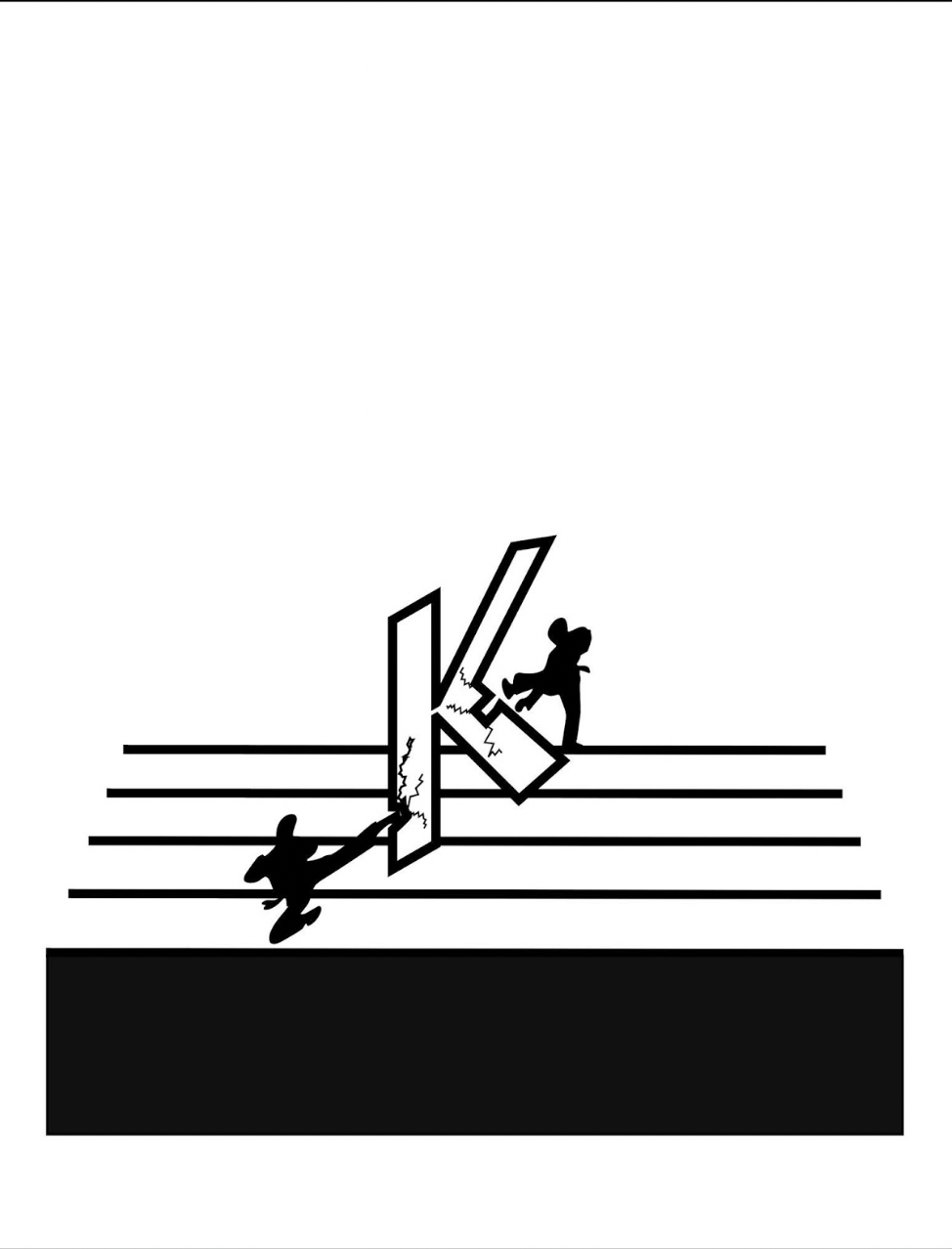
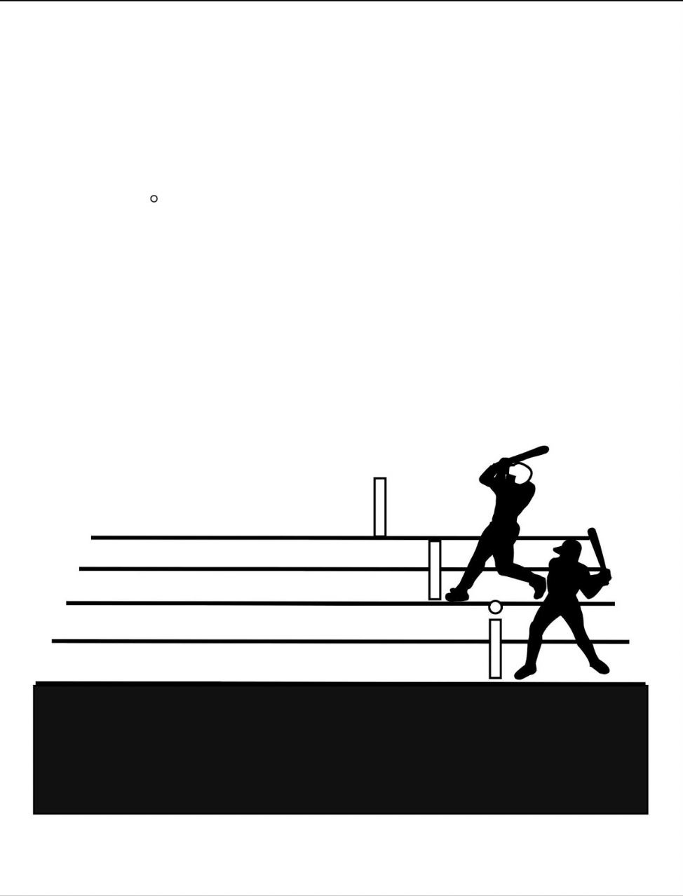
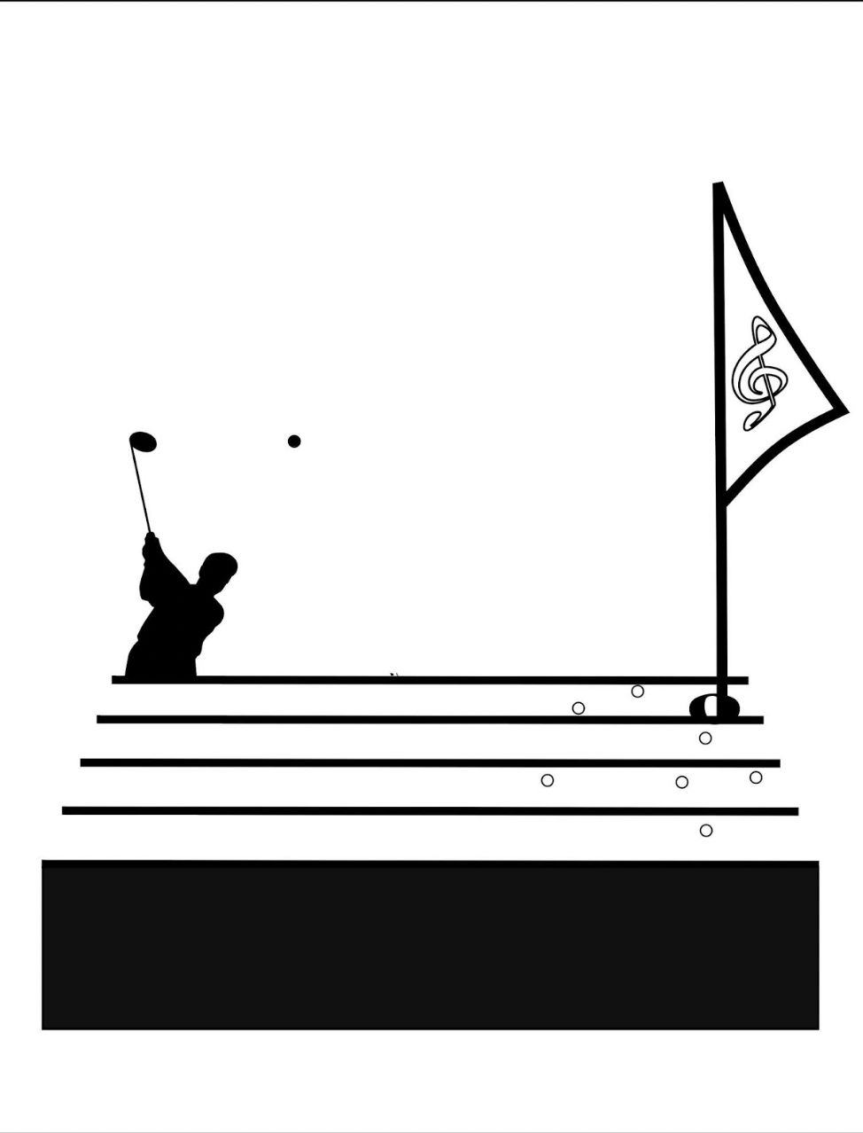
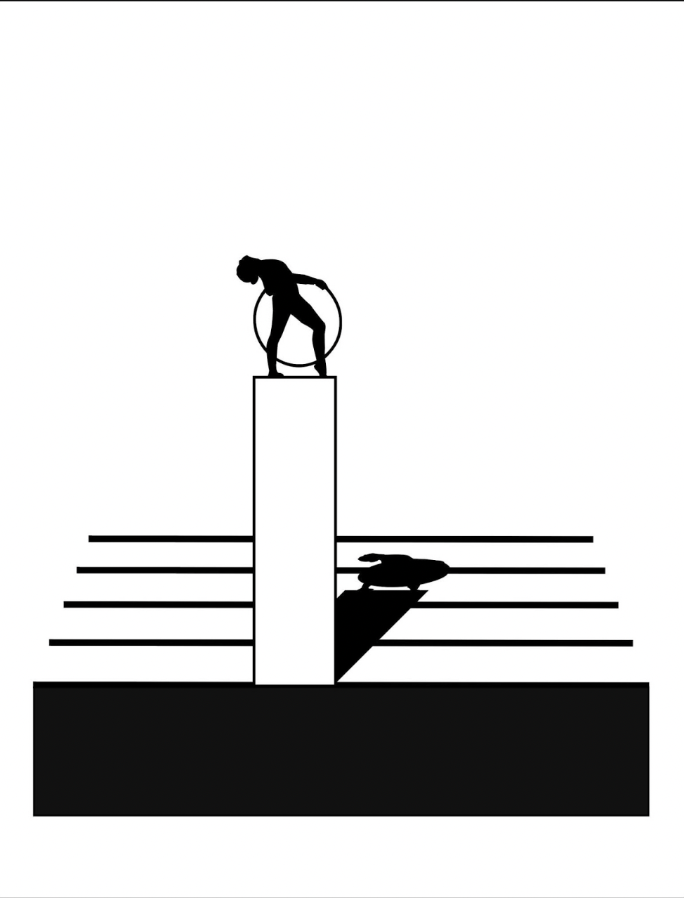
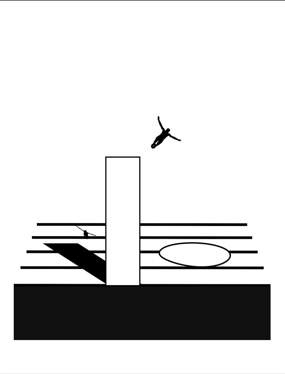
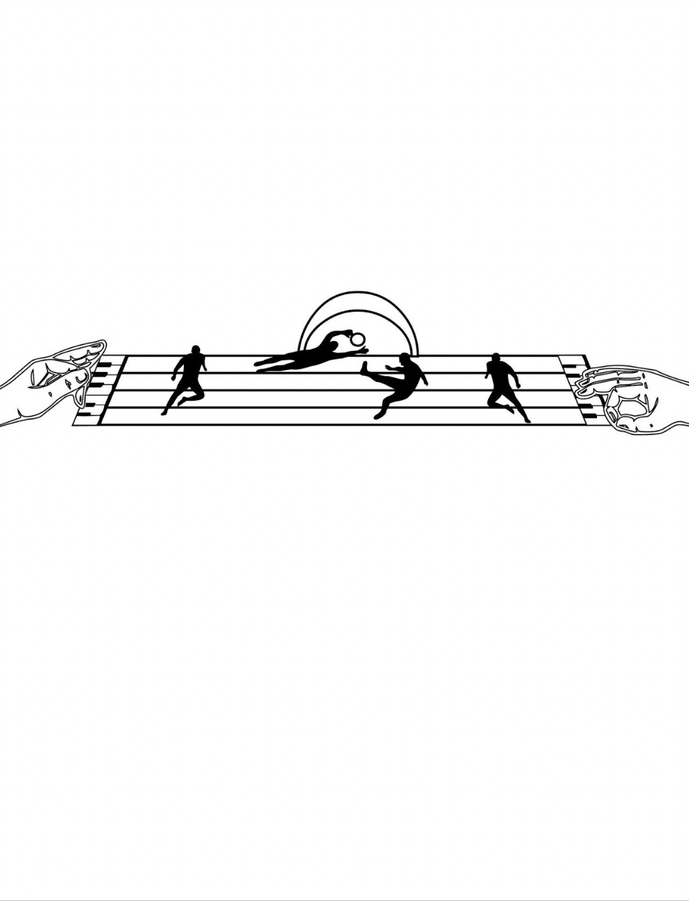
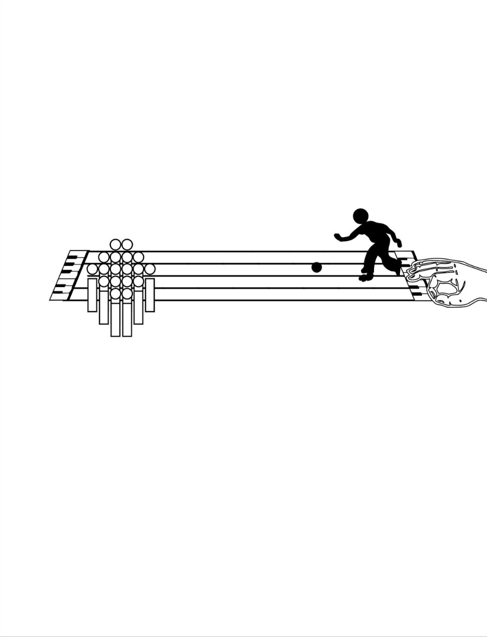
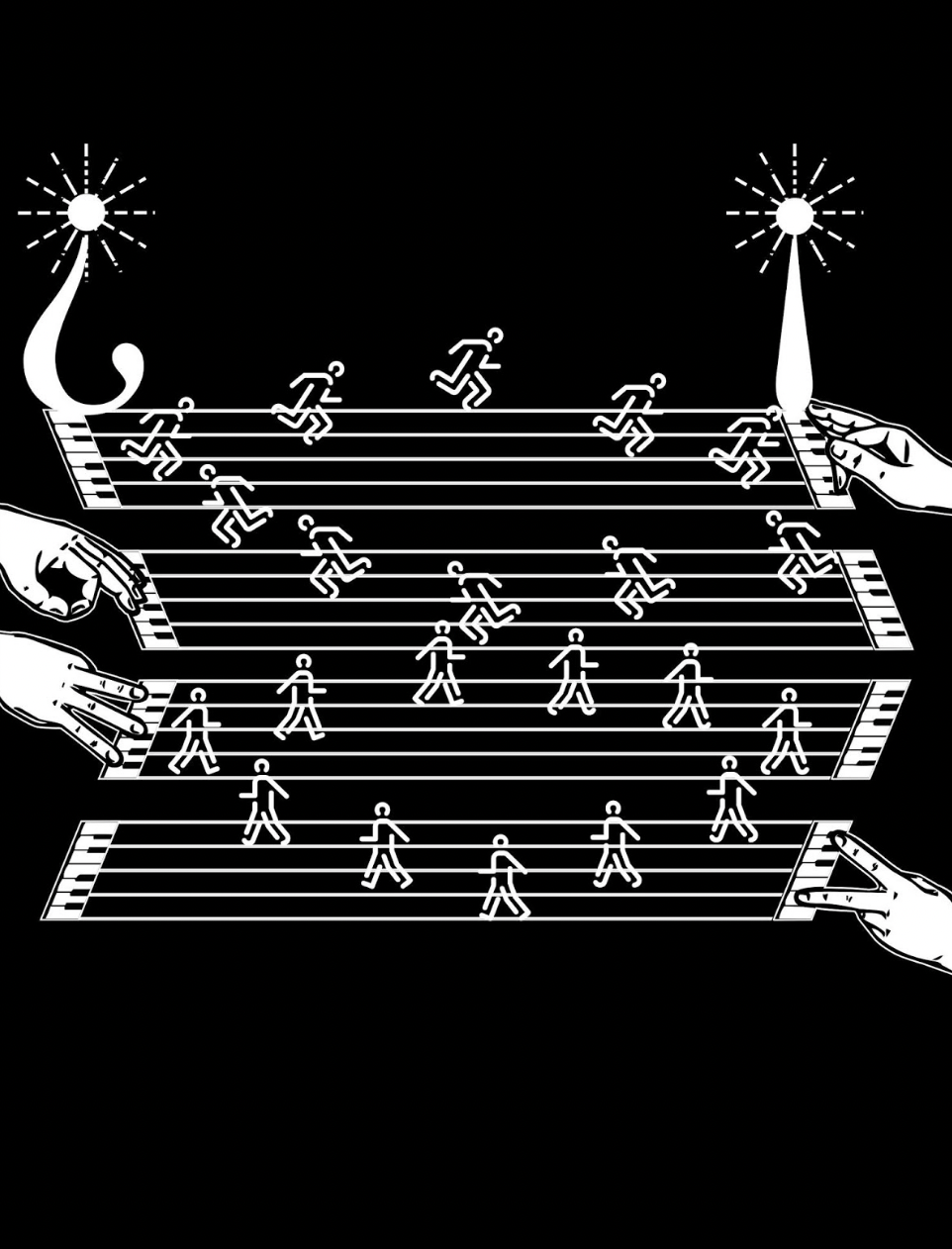
Games and sports are depicted together with letters and punctuation marks on platforms made of the musical staff or stave, all of which offer Kempton multiple means of metaphor. FIrst, inked martial arts figures break a K of karate boards. Then, a baseball player bats the dot of a lowercase i into the air. A basketball player jumps and aims at a basket formed of a half note. A golfer chips toward a half-note hole flagged with a pennant bearing the treble clef G. A boxer punches the bowl of a large P.
The images become more worked as the book proceeds. A weightlifter atop a lowercase e lifts a set of weights composed of the umlaut above the e, and the shadow of the image is cast across the stave lines behind the letter. Shadows of gymnasts appear behind an uppercase G, lowercase o and lowercase i.
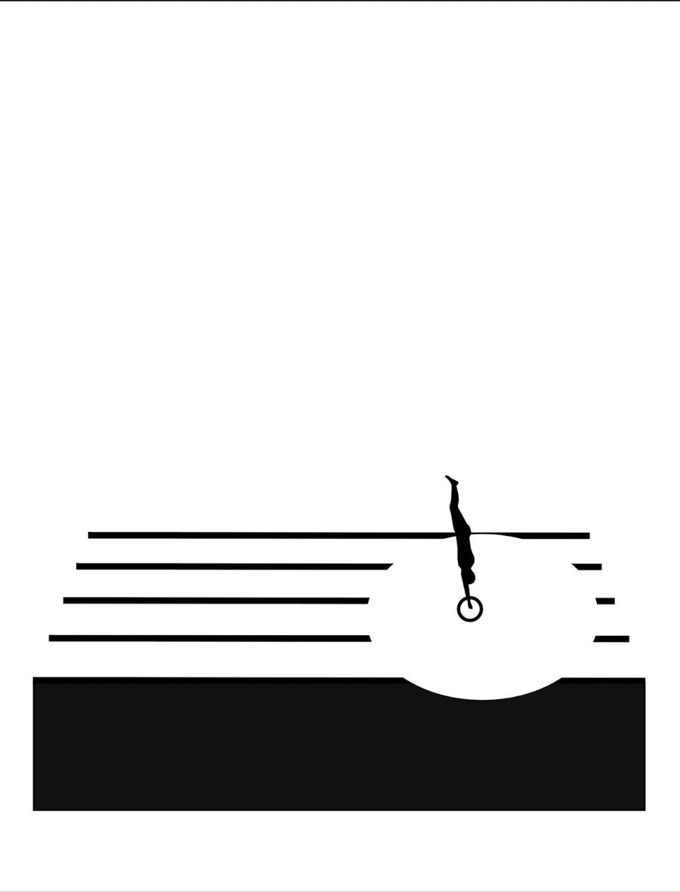
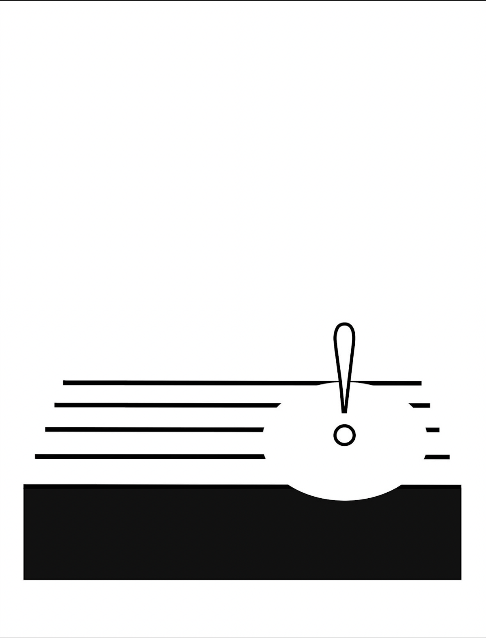
Animation sequences occur, such as the platform diver leaping from the body of a lowercase i and creating an exclamation-point splash in a pool formed by a circle that widens across the stave as the diver submerges.
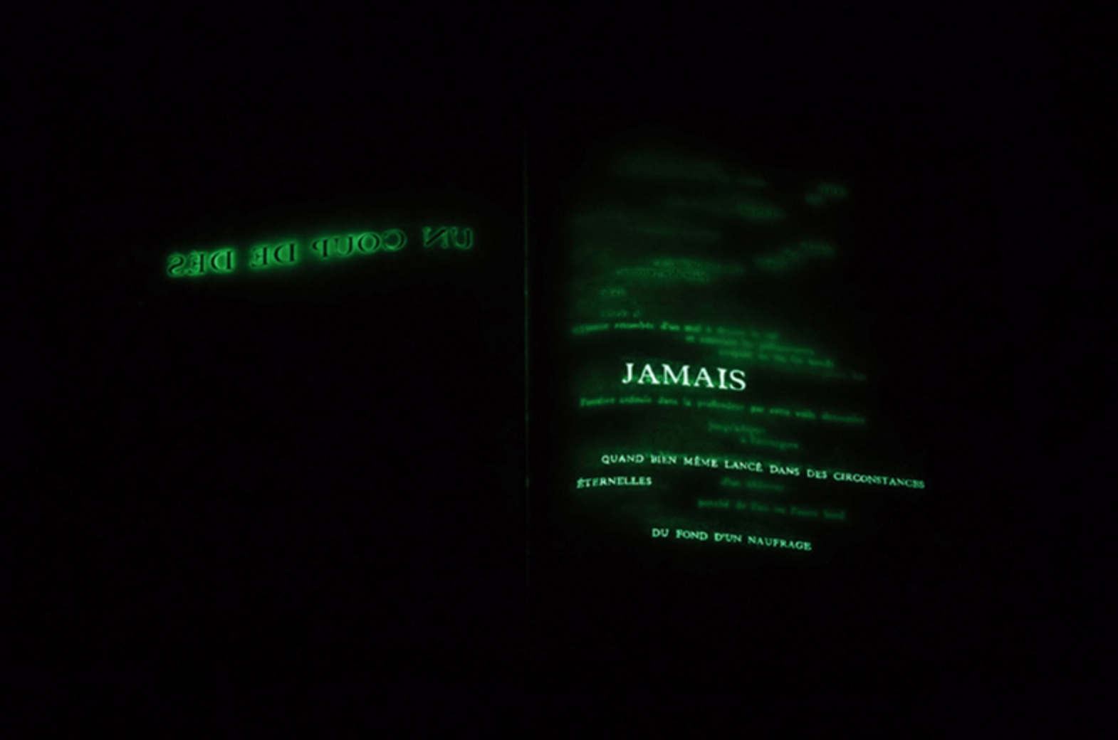
Around the same time of playground‘s inception, this combination of letters and musical notation found expression among other artists: for example, Jim Avignon & Anja Lutz in Neoangin: Das musikalische ABC (2014) and Bernard Heidsieck in Abécédaire n° 6 clef de sol : été 2007 (2015). Metaphorically linking textual expression, if not individual letters of the alphabet, with musical scores goes back at least as far as Stéphane Mallarmé’s Un Coup de Dés Jamais N’Abolira le Hasard (1897) and carries forward into explicit linkage by Michalis Pichler (2009) and Rainier Lericolais (2009) in their works of homage to Un Coup de Dés.
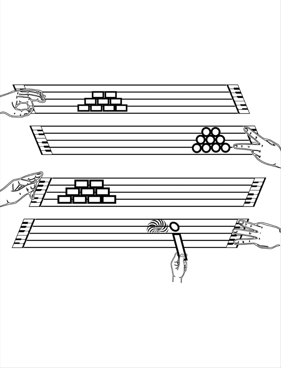
To return to Kempton’s playground, an interlude occurs to associate the alphabet with magnetism, then breaks off to return to the games motif, this time in the form of winter sports. The musical notation motif is still there, but Kempton modifies it with a piano keyboard at both ends of the stave and with manicules fingering the keyboards at both ends while articulating a variation on sign language. Musically and metaphorically, matters become more complex with the introduction of two pairs of staves, pyramids of squares and circles and one manicule using the lowercase i to bring back the magnetism interlude.
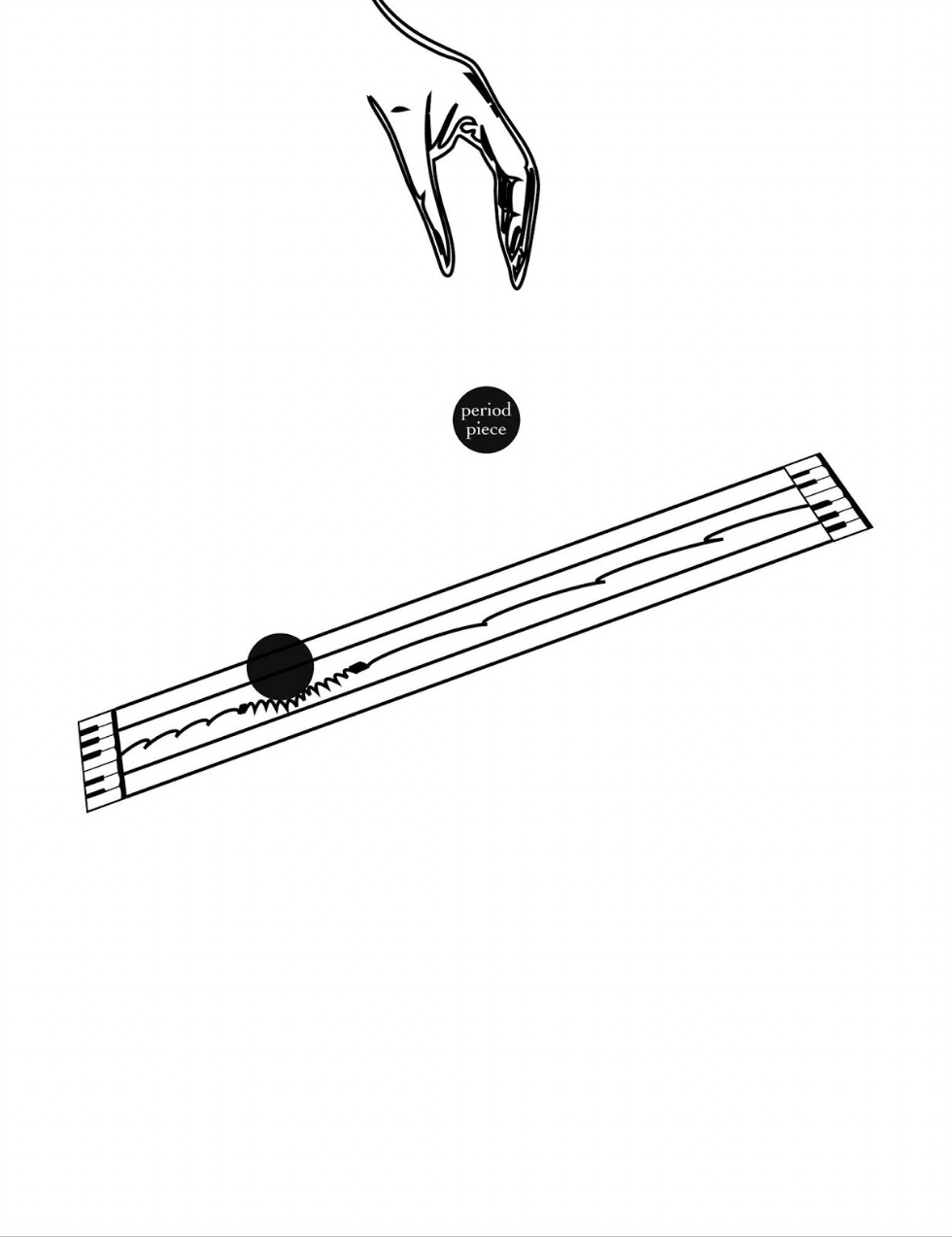
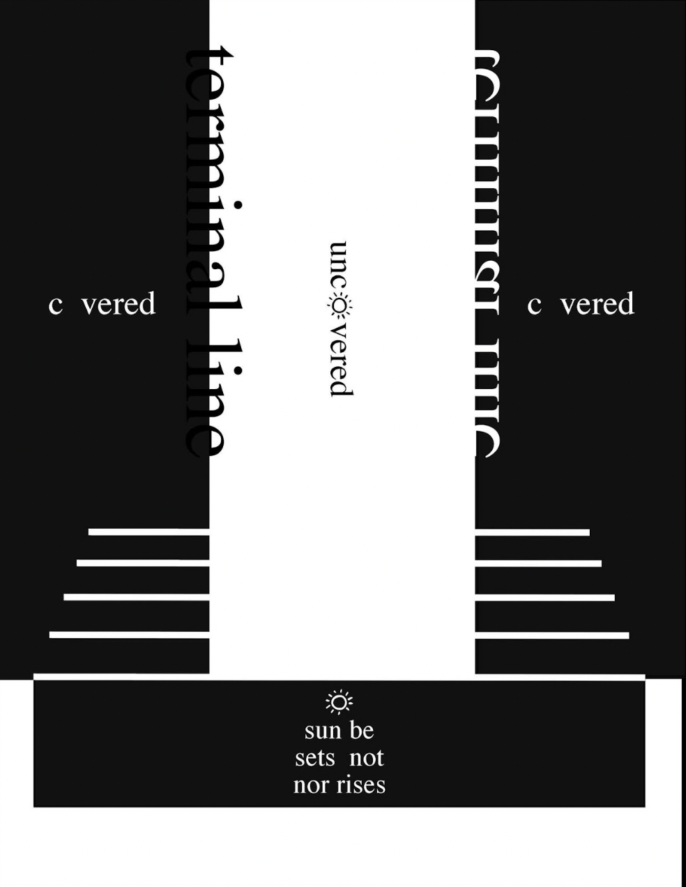
From here on, additional motifs are developed, and words and phrases appear: a physics experiment punningly labeled “period piece”, a night game lit by inverted question and exclamation marks, and juxtaposed opposites (“covered/uncovered” and “sunrise/sunset”).
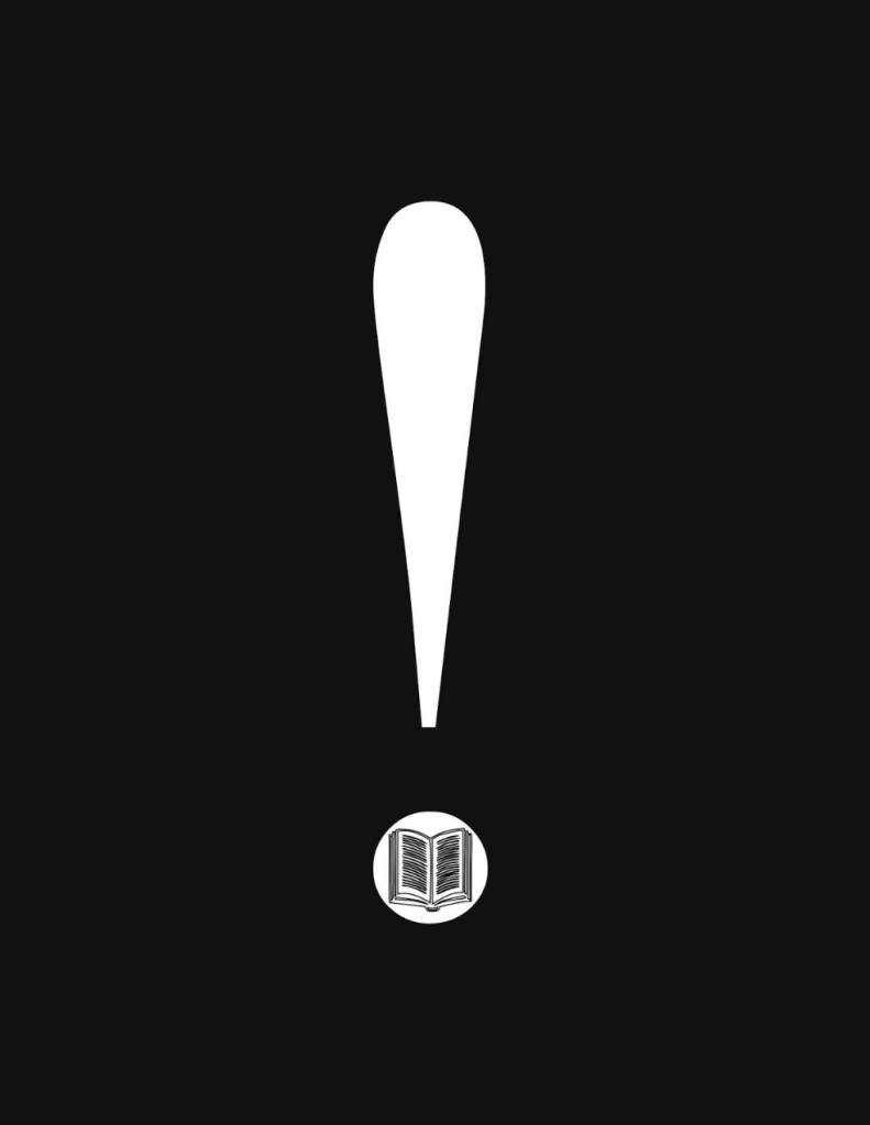
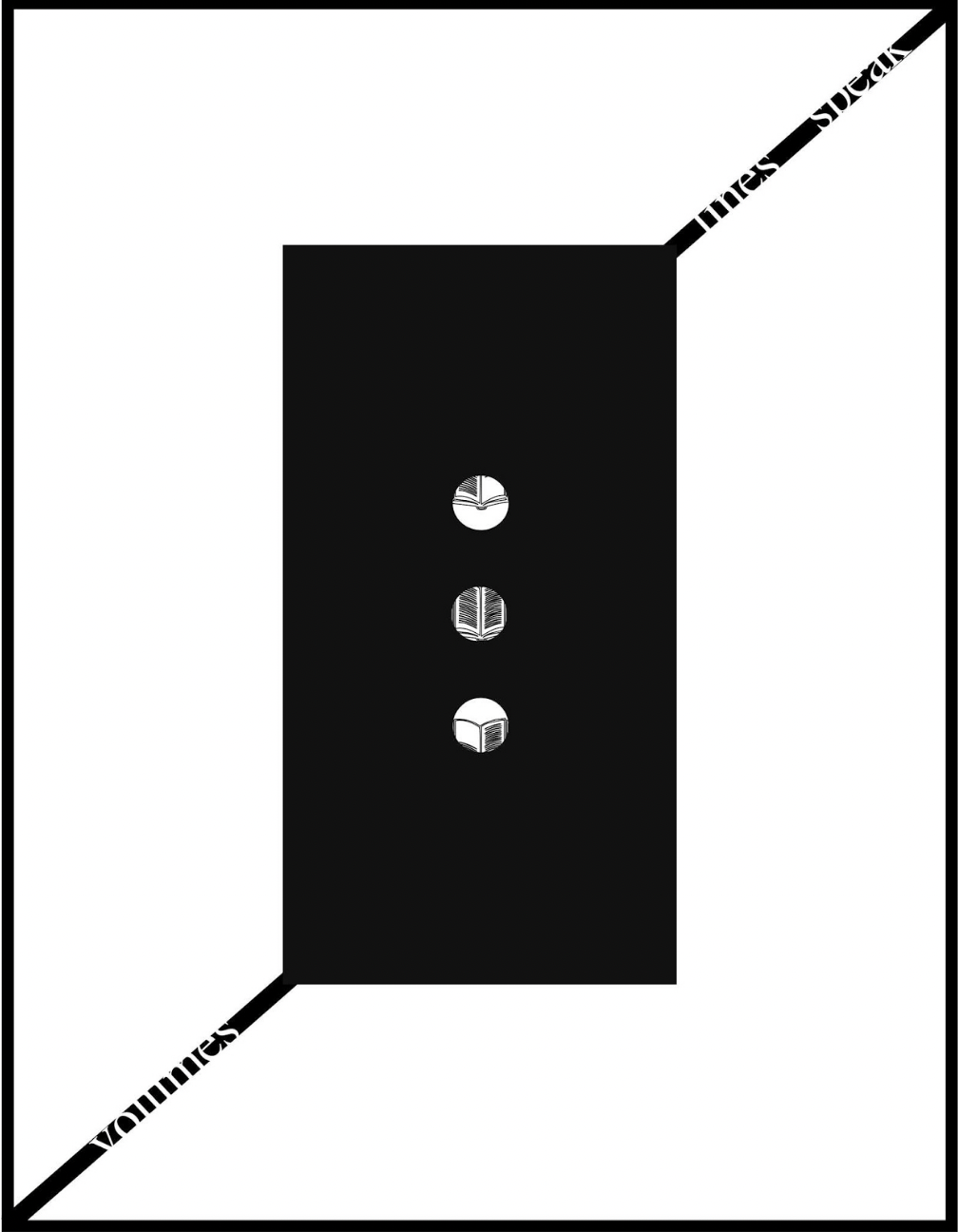
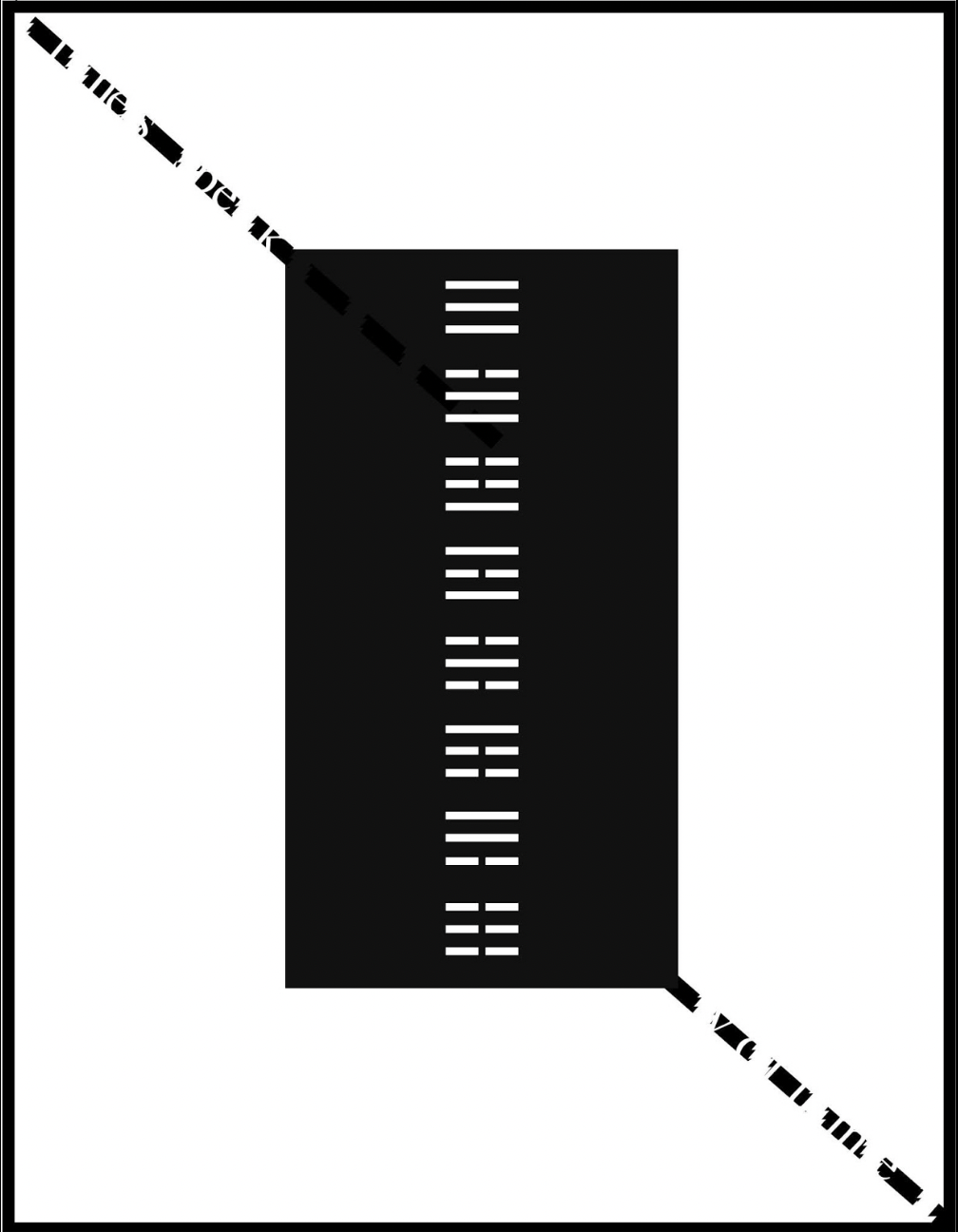
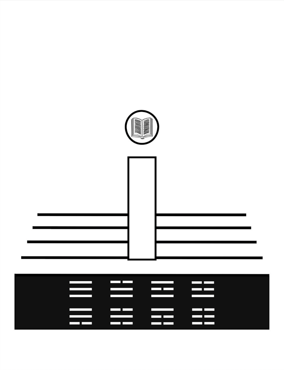
All these motifs, textual and visual puns, and images seem concerned with the development of symbols for interpreting the world and communicating that interpretation. With the appearance on black background of an exclamation mark with an open book inside its point, then a pair of rectangles each suspended by the sentence “volumes lines speak / lines speak volumes”, an animated sequence begins an extended narrative drawing everything together.
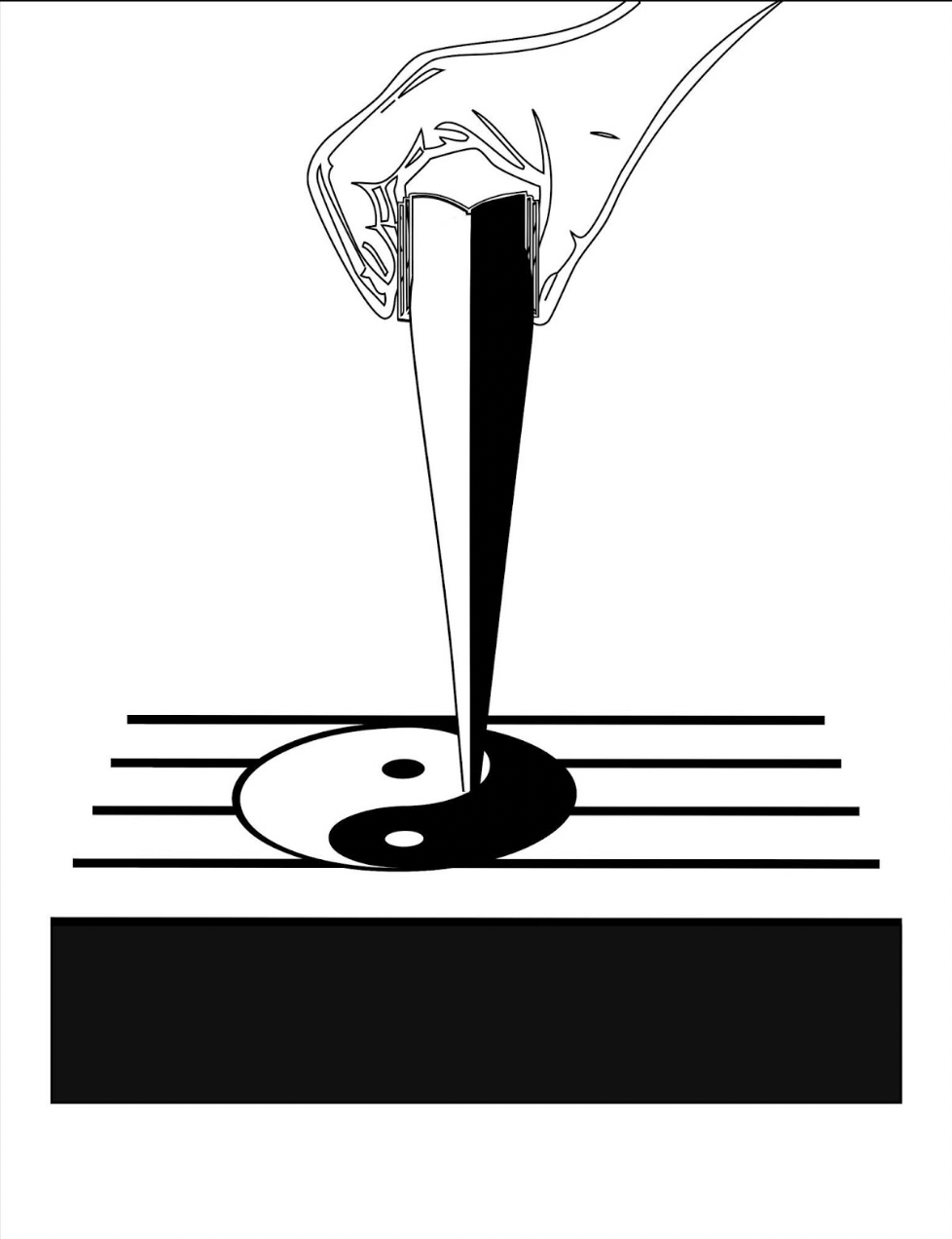
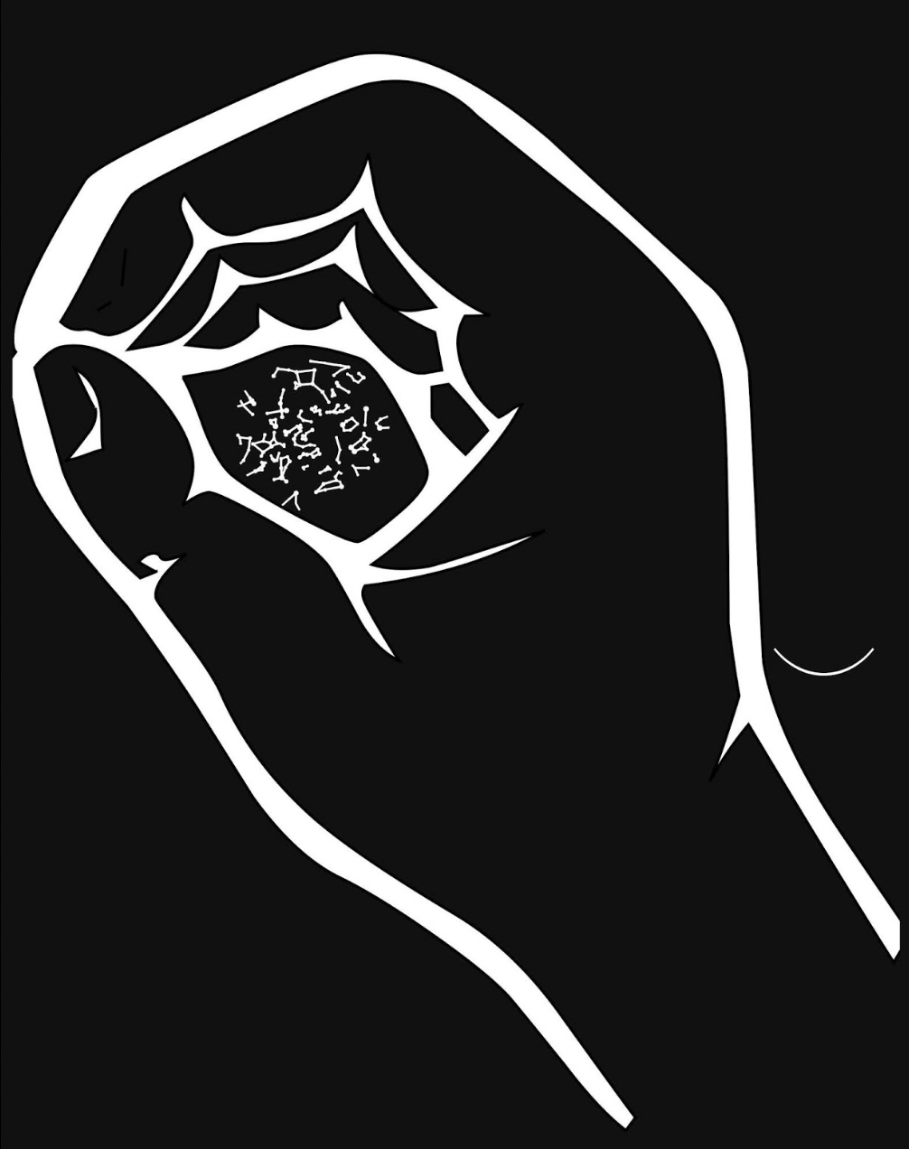
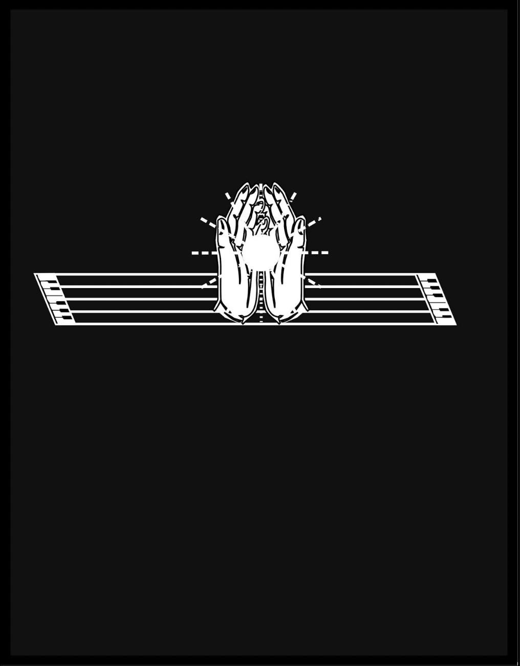
After the descending hand squeezes out the yin yang symbol onto the stave from the image of an open book, Kempton joins this theme of interconnected opposite forces with the development of language, which is where the runes come in, held in an unclosed fist. Eventually the book concludes with an open pair of hands, centered on reversed-out stave/keyboards and holding a point of light radiant against the blackness.
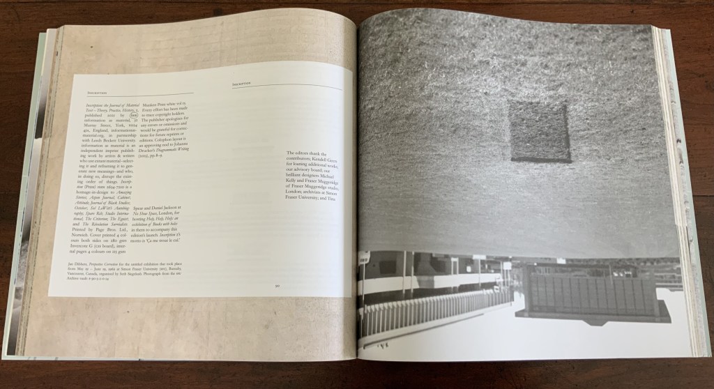
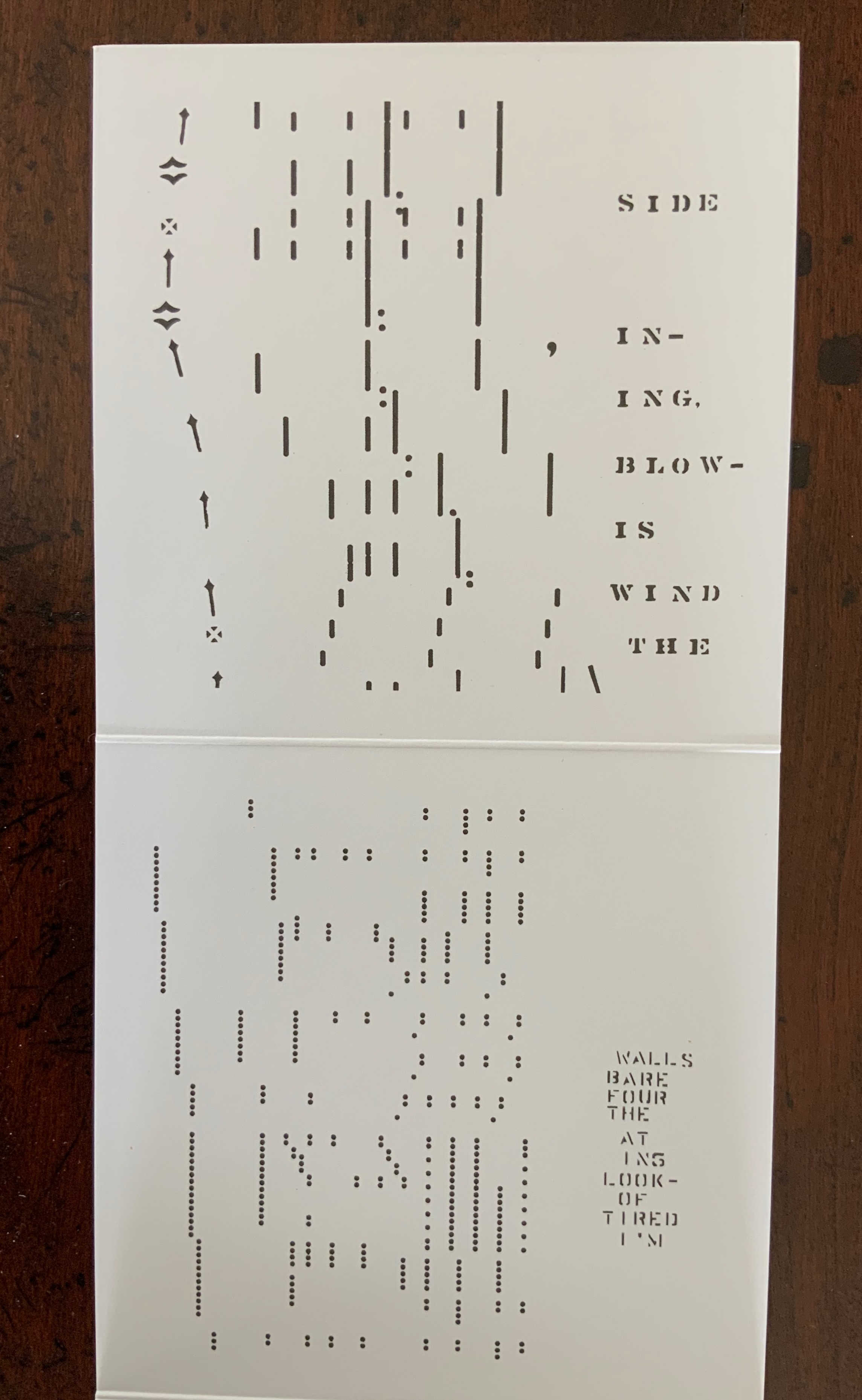
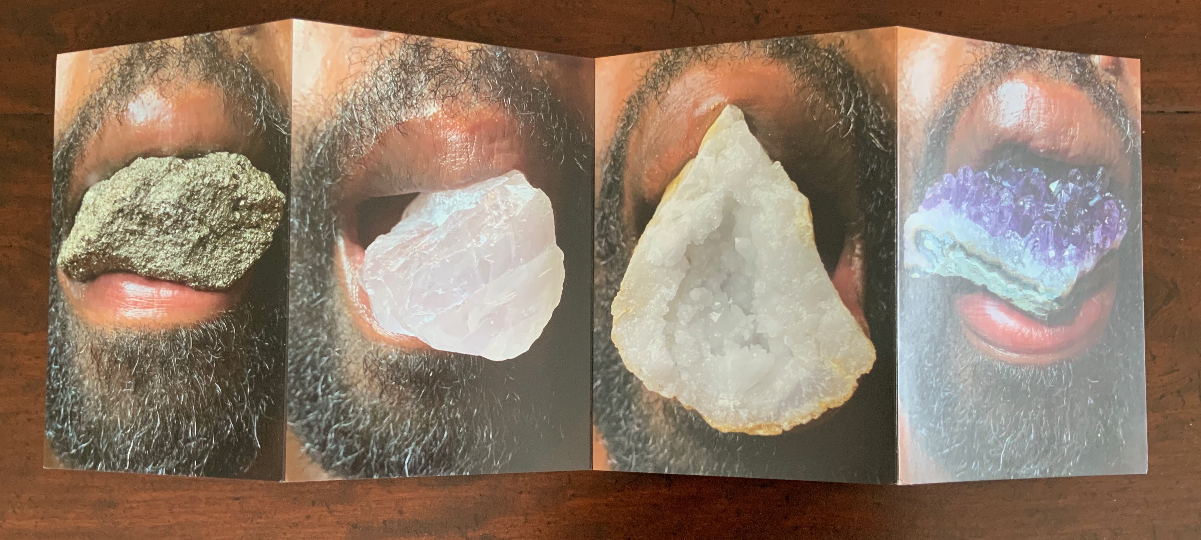
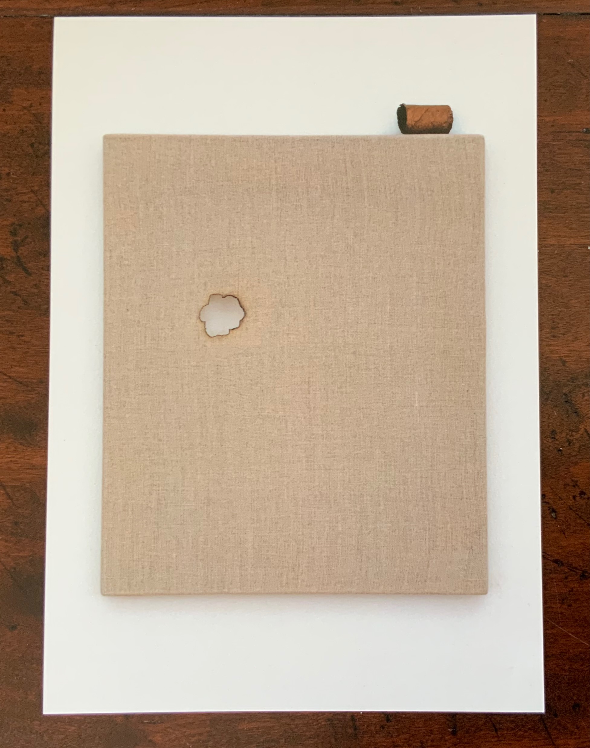
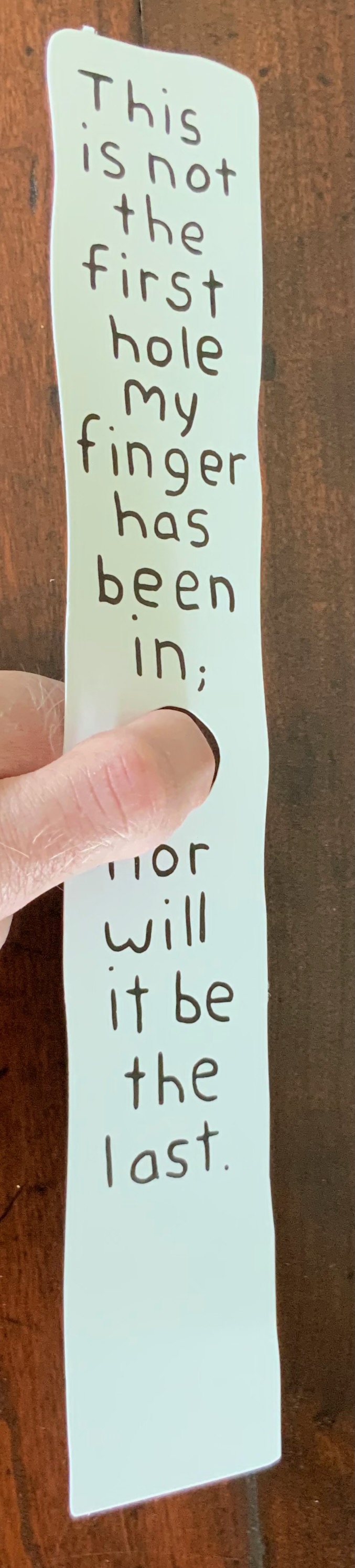
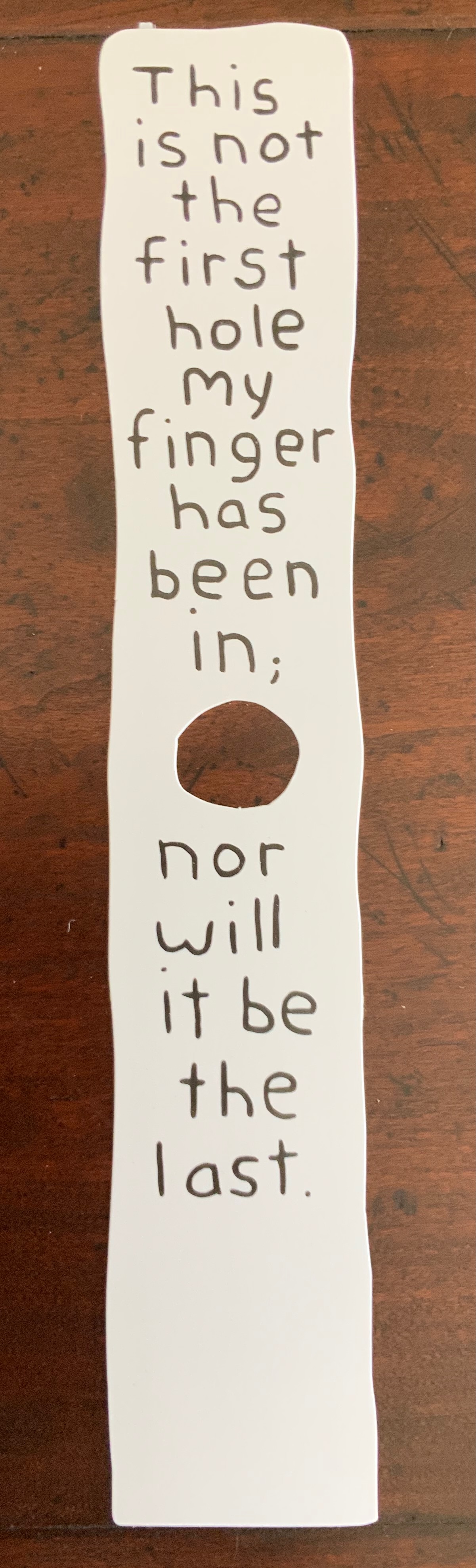
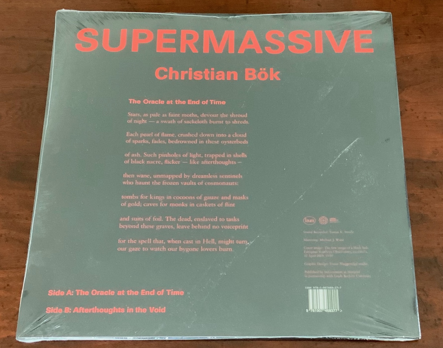
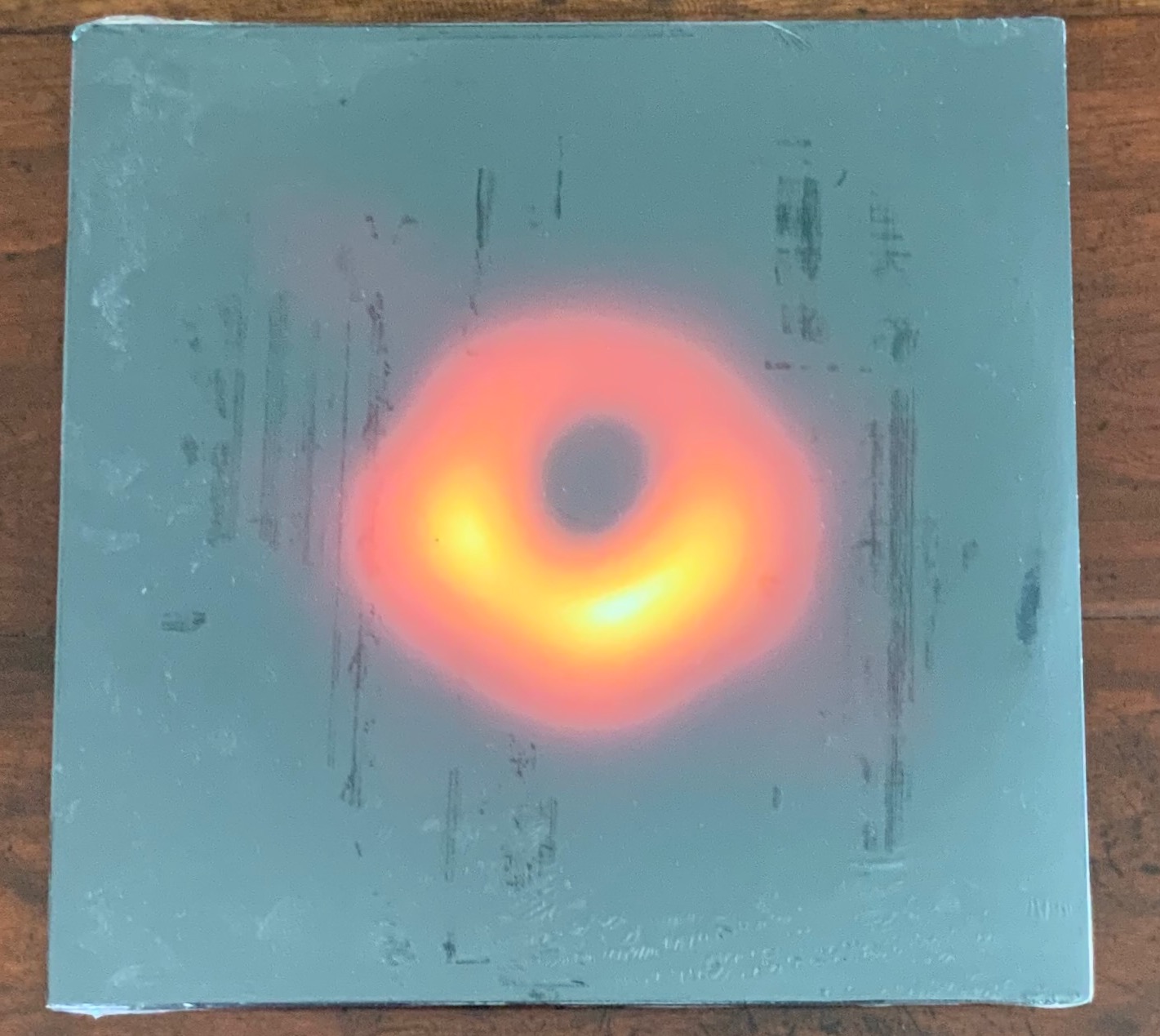
Inscription: The Journal of Material Text – Theory, Practice, History, Issue 2 on Holes (2021) Simon Morris, Gill Partington and Adam Smyth (eds.) Perfect bound softcover, H314 x W314 mm, 180 pages. Editions included: Fiona Banner (aka Vanity Press), Full Stop, front & back covers; Kendell Geers, Stripped Bare, end papers; Carolyn Thompson, The Beast in Me, H1180 x W1180 mm; Erica Baum, Piano Rolls, H120 x W120 closed, W960 mm open; Harold Offeh, Crystal Mouths, H210 x W105 closed, W480 mm open; David Bellingham, Cigar Burn Apertures, H210 x W105 mm; Miranda July, Bookmark, H302 x W54 mm; Christian Bök, Supermassive, LP. Acquired from Information as Material, 10 October 2021. Photos of the issue: Books On Books Collection.
How materially perverse is it that the second issue of Inscription is devoted to “the hole”, yet it is the first issue that actually has a hole in it? The first issue of Inscription did set a seriously playful — or playfully serious — tone, and the second issue does not fail to maintain it. The second issue continues the dos-à-dos binding but with only the front and back covers as the external giveaway. In the middle of this single-spine paperback, pages 1-90 meet an inverted pages 90-1 in the middle, which prompts the reader to turn the open book 180° and flip back to page 1. From either direction, the reader meets the traditional backmatter of a journal in the middle.
Inverted cover and center of Inscription (2021).
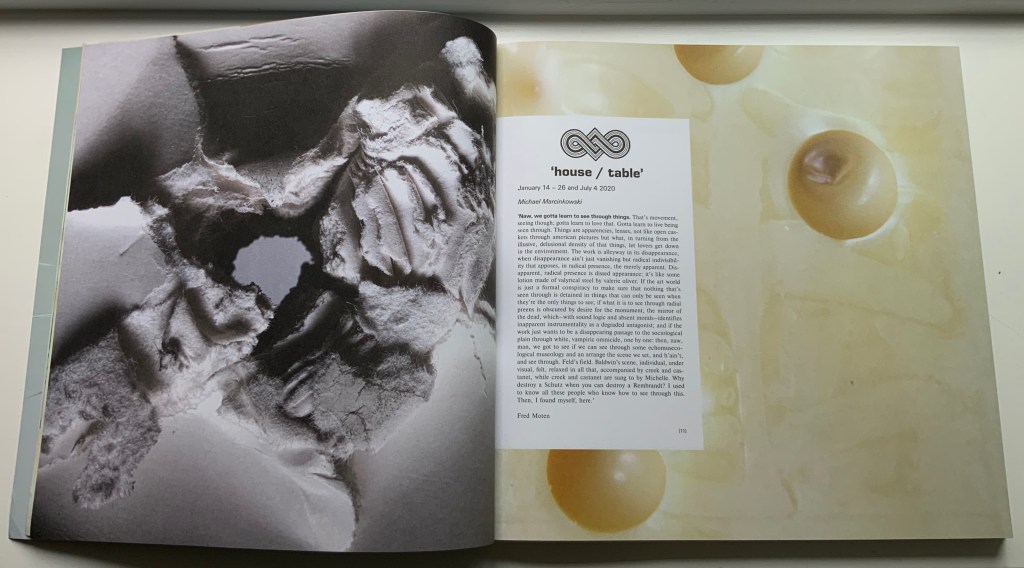
Such reversals of expectation call for a countervalent design element to avoid too much confusion. In this issue, that element consists of constant earth-tone backgrounds framing constant black-on-white text boxes (square holes?) for each article. Even within these constants, reversals of expectation play out. The backgrounds are drawn from 14 different sources, ranging from laid paper samples, parchment, pulp and brown boards to a slice of Emmental cheese (sorry, Gromit, no Wensleydale), and the layouts for each square hole differ, being taken from 16 other journals such as The Criterion, The Egoist and National Geographic.
List of backgrounds used throughout the issue.
List of publications whose layouts are used throughout the issue.
The Emmental cheese background around the opening of Marcinkowski’s essay; Hybrid wove/laid paper made for James Watt & Co around the opening of Lüthi’s essay.
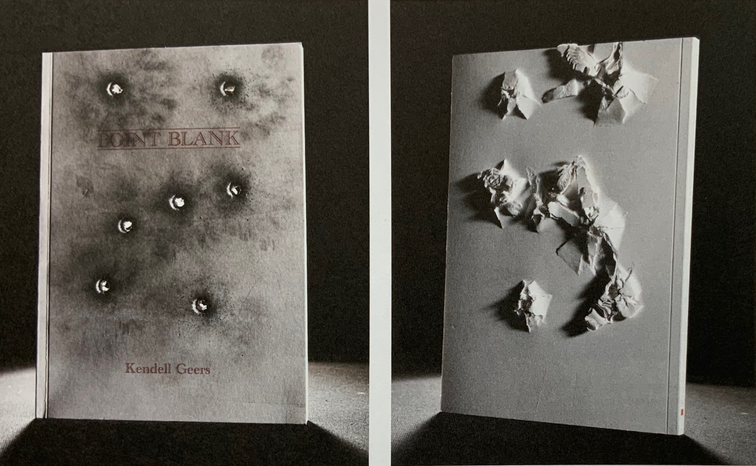
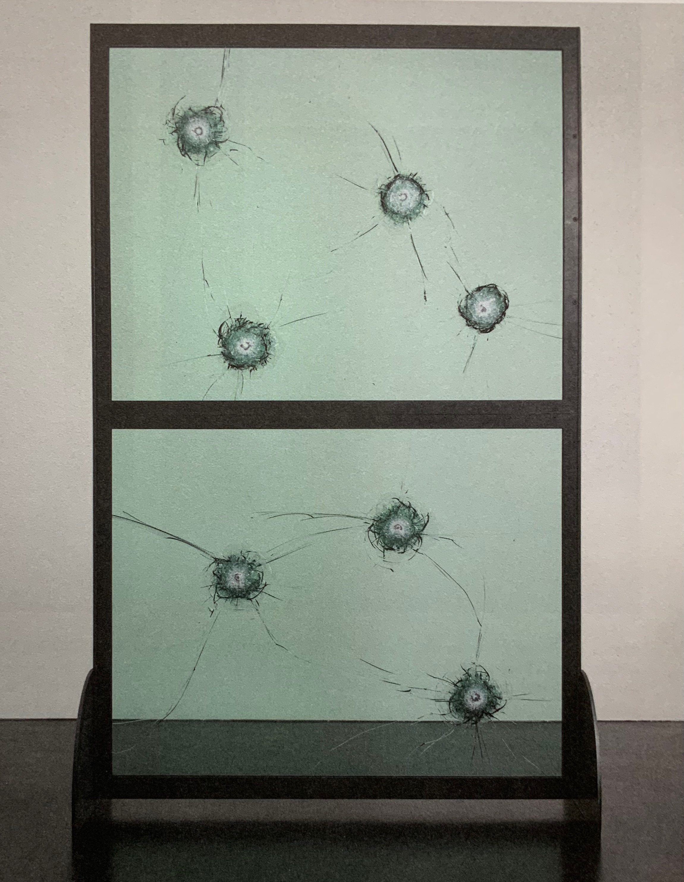
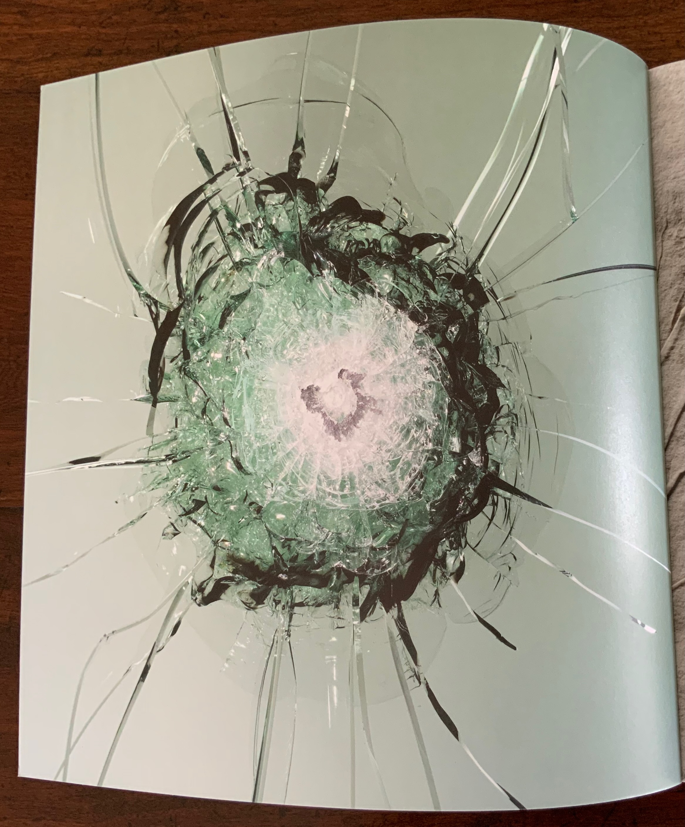
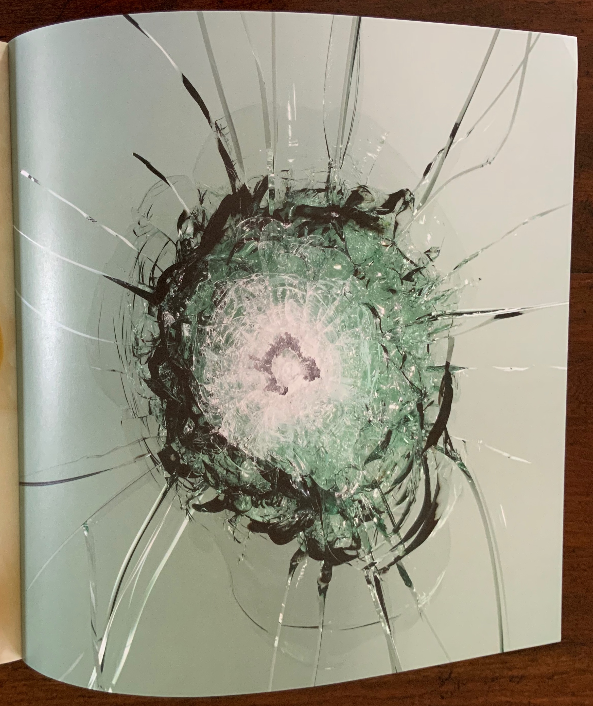
There is an even more recurrent “bass” line in this issue. It comes from the South African artist Kendell Geers, interviewed by the Editors. Even this bass line plays with variable perspective. Marking the start of most articles is a sheet bearing on recto and verso pages the image of a bullet hole (entry then exit) taken from Geers’ work Point Blank (2004). Bullet holes in glass — from Geers’ Stripped Bare (2009) — punctuate inversely the inside covers, bringing two symmetric/asymmetric openings to this topsy turvy production.
Kendell Geers, Point Blank (2004), front and back covers; Stripped Bare (2009; inside covers of Inscription (2021).
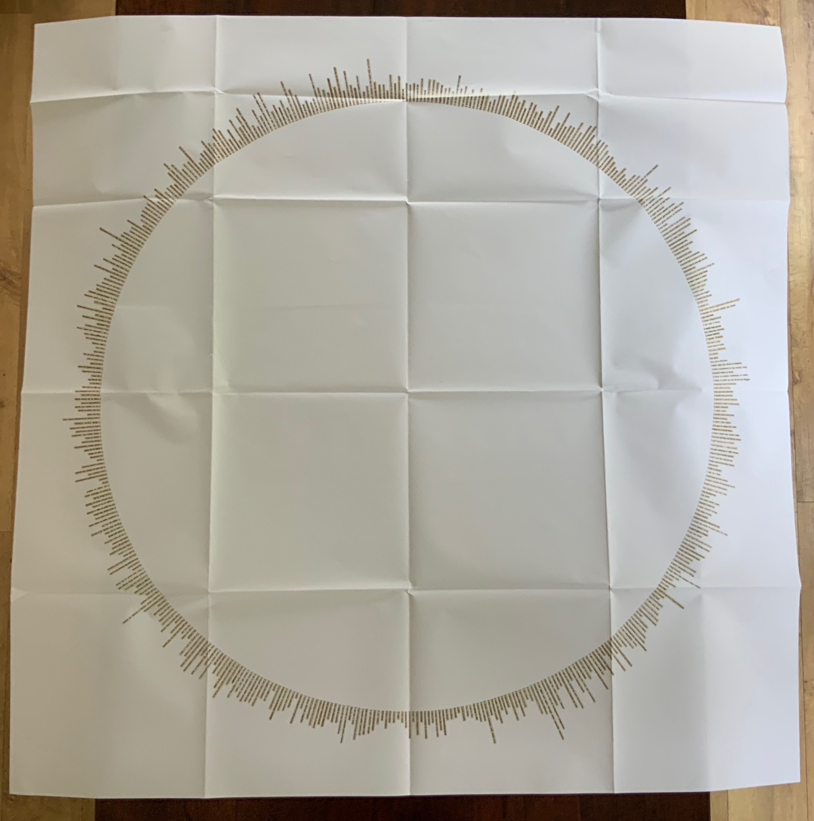
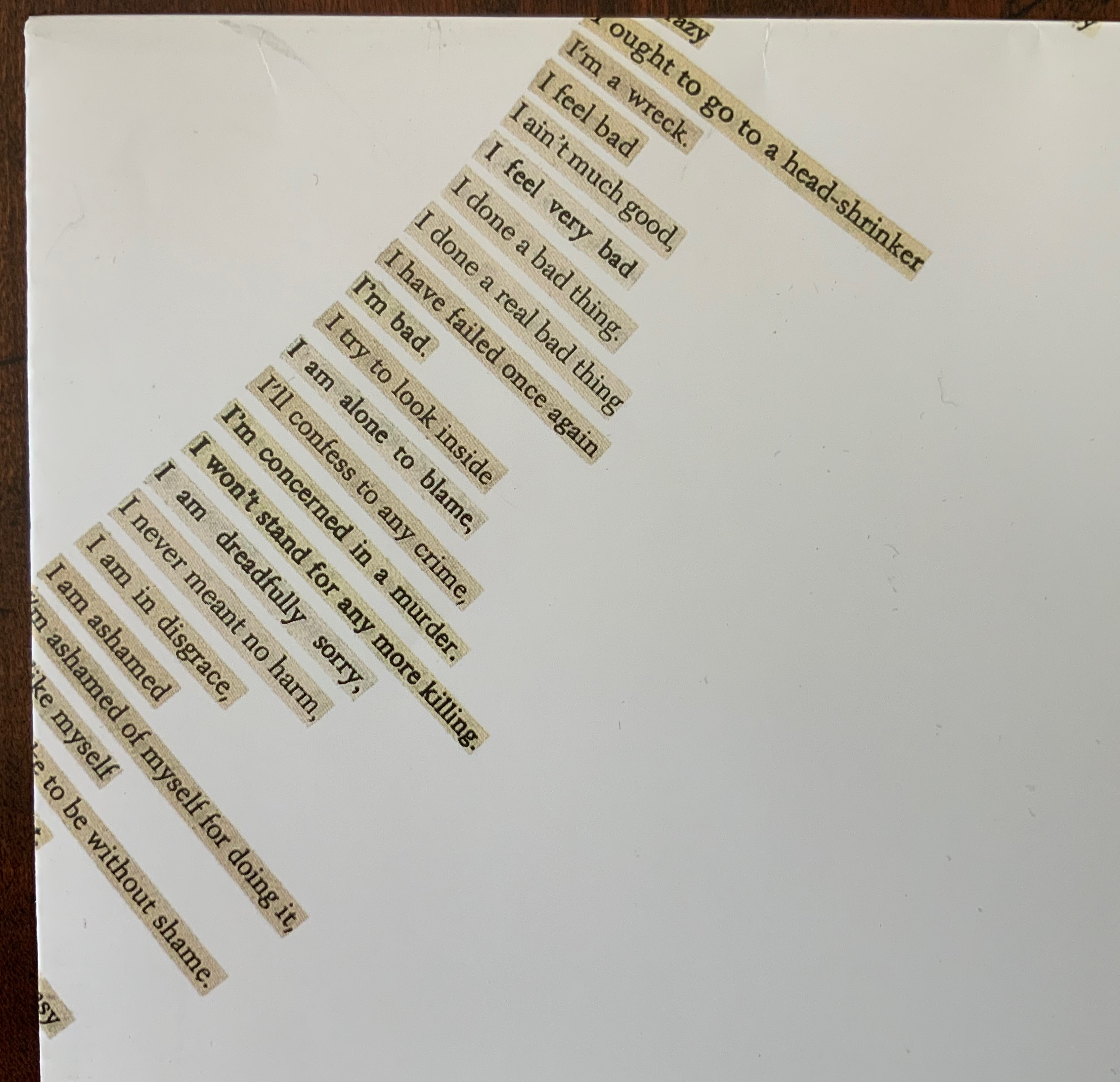
Long-time admirers of the 1960s-70s multimedia magazine Aspen, the editors have continued their practice of including unbound elements. In this issue, they have included Carolyn Thompson’s enormous poster The Beast in Me, whose sentences and part-sentences beginning with “I” have been cut from eight different novels and pasted down to form the hole seen below. Also included are Erica Baum’s Piano Rolls, Harold Offeh’s Crystal Mouths, David Bellingham’s Cigar Burn Apertures, Miranda July’s, Bookmark and Christian Bök’s Supermassive LP.
Carolyn Thompson, The Beast in Me, H1180 x W1180 mm. Photo: Ricky Adam. Photos of the work: Books On Books Collection.
Erica Baum, Piano Rolls, H120 x W120 closed, W960 mm open. Photos of the work: Books On Books Collection.
Harold Offeh, Crystal Mouths, H210 x W105 closed, W480 mm open; David Bellingham, Cigar Burn Apertures, H210 x W105 mm; Miranda July, Bookmark, H302 x W54 mm; Christian Bök, Supermassive, LP. Photos of the works: Books On Books Collection.
Like the famous combined Aspen issue Nos.5/6 — an homage to Stéphane Mallarmé — Inscription manages to pull off an eclectic unity with the essays included, which unlike Aspen was accomplished after a double-blind review process. Inscription‘s editors have turned on its head Robert Frost’s dismissive characterization of free verse as playing tennis without a net; they are playing doubles with a net and blindfolded and have created a work of art. This issue’s entries range from Paul Reynold’s erudite and whimsical definitions of all sorts of holes; the scholarly detective work on the holes that bind (pin holes and punch holes by Craig Robertson and Deirdre Lynch and filing holes by Heather Wolfe); James Mission’s tracking the crafts of scribe, typesetter and coder in representing lacunae, gaps or holes in the text; Louis Lüthi’s puncturing juxtaposition of W. Somerset Maugham’s 1948 abridgment of Moby-Dick, Orion Books’ 2007 Moby-Dick in Half the Time and Damion Searls’ 2009 riposte ; or The Whale; to Fiona Banner’s photo-essay on her hole-creating Full Stop‘s, granite sculptures of full stops (periods) created from the Peanuts , Klang and Orator typefaces, two of which were dropped into the marine protected area of Dogger Bank to put a sure stop to industrial fishing there. Here is the table of contents:
Michael Marcinkowski — “house / table” Galina Oustinova-Stjepanovíc — “Reading the Hole on the Last Address Memorial Plaques in Moscow” Fiona Banner — “Full Stop intervention with Greenpeace” Simon Morris — “Perspective Correction” Dianna Frid, Carla Nappi and Ian Truelove — “Wormholes, The Cascabel Butterfly and an AR collaboration” Aleksandra Kaminska and Julian De Maeyer — “The Perfect Cut: Talking with Myriam Dion” Paul Reynolds — “A Glossary of Holes” Louis Lüthi — “A Snow Hill in the Air” James Mission — “Signifying Nothing: Follow a Hole Through Three Text Technologies” Editors — “An Interview with Kendell Geers” Heather Wolfe — “On Curating Filing Holes” Craig Robertson and Deirdre Lynch — “Pinning and Punching: A Provisional History of Holes, Paper, and Books”
Inscription continues to provide one of the liveliest examples of what Anne M. Royston calls “artistic arguments (my emphasis), a term that indicates theory that pushes back against the expectations of the theory or criticism genre, specifically by employing signification that exceeds the semantics of printed text”.
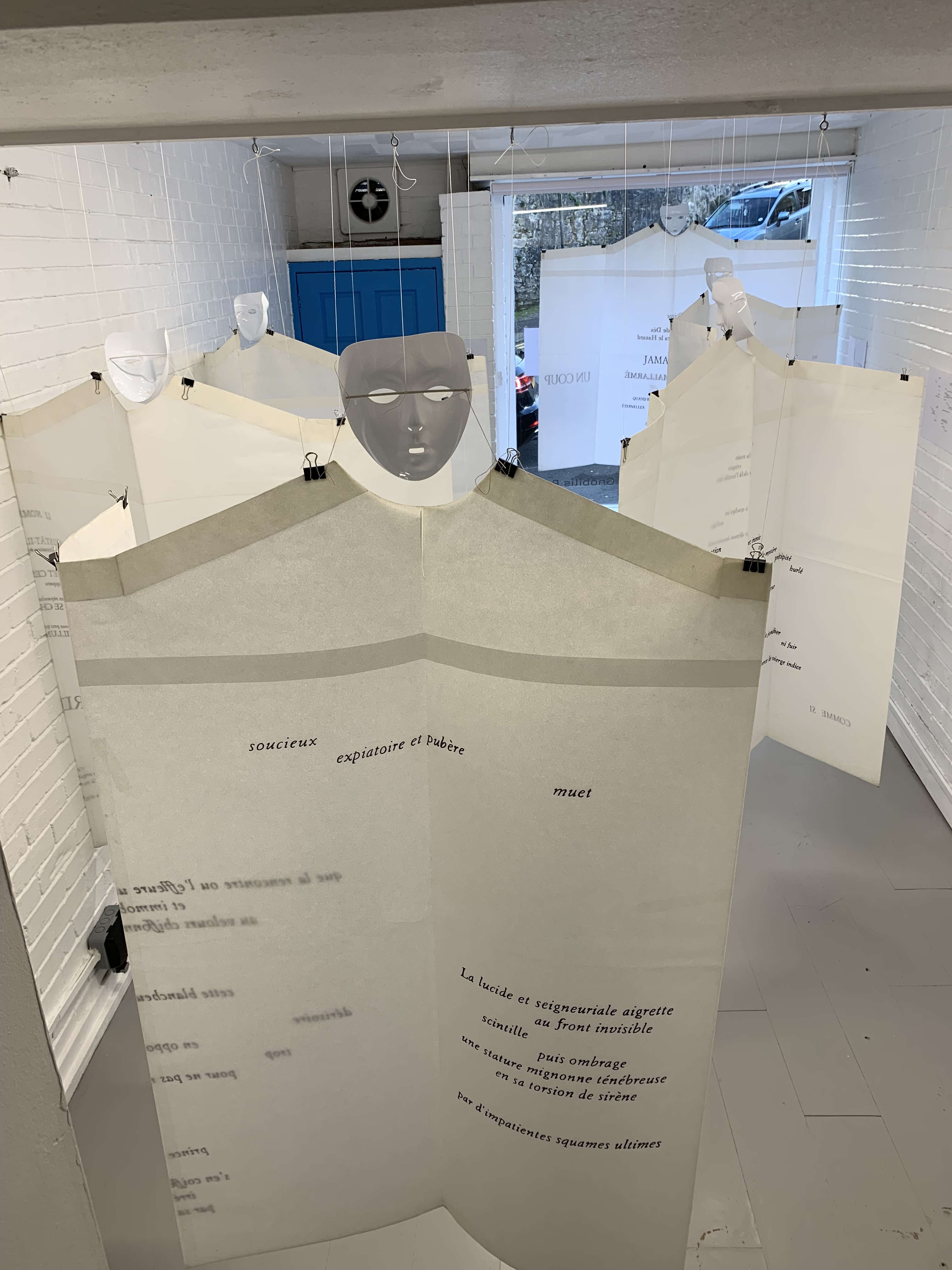
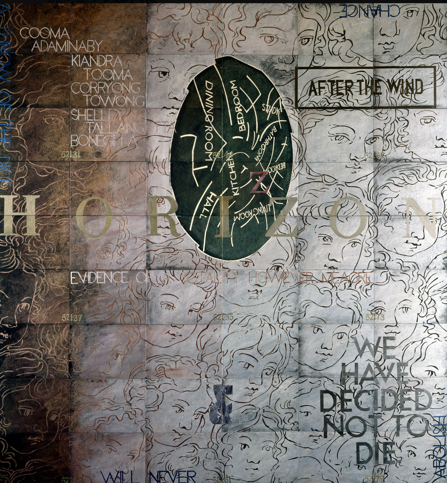
Welcome to the online celebration of the 125th anniversary of Stéphane Mallarmé’s poem Un Coup de Dés Jamais N’Abolira le Hasard (1897).
This is the poem that launched countless works of free verse and experiments with typography and the page. Visually and physically, its arrangement of scattered words in different type sizes and styles across the pages echoes the drama, images and delaying syntax that the text plays out — a sinking ship, its struggling master, cresting waves, a Siren, a whirlpool or abyss, the North Star and its nearby constellation Ursa Minor. Its challenge to the reader heralded 125 years of artistic and intellectual engagements: a crisis in language and representation, the struggle to reconcile pattern and meaning with chance and nothingness, and the never-ending tarantella of the material with the conceptual. Mallarmé’s is the poem that made the world modern and then post-modern.
The poem also launched a host of livres d’artiste in numerous languages as well as homage in the form of film, painting, photography, sculpture, installation, theater, costume, music, dance, programming, and book art. Even exhibitions of book art. The exhibition best known from the 20th century is Marcel Broodthaers’ 1969 show. Academic exhibitions for the 1998 centenary of Mallarmé’s death included artworks. The fact, however, that no less than five art exhibitions in homage to Un Coup de Dés appeared in the first decade of the 21st century demonstrates a rapidly growing recognition of its importance as a muse to book artists.
Together, these exhibitions captured somewhat less than half the relevant works that would have qualified. Following the Pichler exhibition in 2017, the number of such works has only grown. On the 125th anniversary of the first publication of Un Coup de Dés Jamais N’abolira le Hasard, it is time to take stock again.*
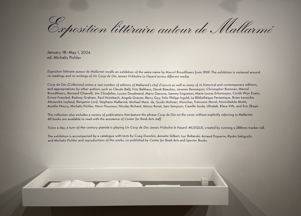
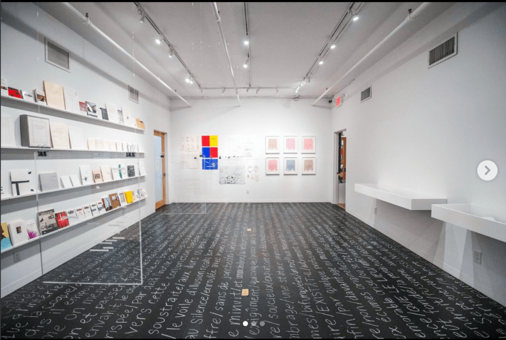
*Hosted by New York’s Center for Book Arts, Michalis Pichler remounted and expanded his Exposition littéraire autour de Mallarmé in 2024 (18 January through 1 May). This time it has been accompanied by an extensive anthology: Coup de Dés (Collection): Books and Ideas After Mallarmé (2024), which has been added to the Books On Books Collection and is reviewed here.
The Poem that “Made Us Modern”
The poem arrived May 1897 in Volume VI, No. 17 of Cosmopolis, Revue internationale, published in London. The anticipated shock of the poem’s layout for its readers prompted the editors to request a preface from Mallarmé explaining how to read the poem. Occasionally a worn copy of the issue comes up for sale by a rare book dealer or auction house, but Gallica (France’s National Library online catalogue) offers access where we can see the single-page and double-page spreads that caused such concern.
The Cosmopolis editorial team may have overestimated its readers’ immediate shock (there was little response), but imagine the team’s shock if Mallarmé had insisted that Cosmopolis somehow print the poem as he really wished: across eleven double-page spreads rather than the nine single pages into which it was compressed. Again, Gallica provides the means to see what most of us will never see firsthand: Mallarmé’s mark-up of the later proofs showing his intended double-page spreads. These proofs were for the deluxe edition Mallarmé wanted to publish with the entrepreneur Ambroise Vollard. From their correspondence, we know that prints by Odilon Redon were to be included. We know also that Mallarmé’s instructions on size, weight and placement of words, down to the letter, were meticulous.
The printers proclaimed the whole thing madness. Vollard did not press. And Mallarmé died in 1898. Finally in 1914, with the involvement of Edmond Bonniot, Mallarmé’s son-in-law, Éditions de la Nouvelle revue française (NRF) delivered on Mallarmé’s typographic intentions — almost — the typeface was Elzevir not Didot. Gallimard/NRF has reissued it several times in various trim sizes over the years. Subsequent archival discoveries and close observations led to other facsimiles, many of which are recorded in Thierry Roger’s monumental L’Archive du Coup de dés (2010). The scope of this essay/exhibition does not include every one of the many editions of the poem (or its translations) — only those that attempt an artistic homage as well. They appear chronologically among the artworks in the exhibition.
Neither is the essay/exhibition an attempt to explicate this enigmatic poem. What happens in Un Coup de Dés, what it means, how it made us modern and then post-modern — all that and more — have been the subject of countless books, essays and web pages. Those on which this essay/exhibition has relied for such insights can be found under the heading “Further Reading (and Viewing)” at the end of the exhibition. The aims here are rather to present the reader/viewer with an exhibition as comprehensive as possible of the works of artistic homage to this singular poem that have appeared since 1897. For additional exhibitions marking the occasion,see the heading “Other Exhibitions in 2022”, also at the end of this exhibition.
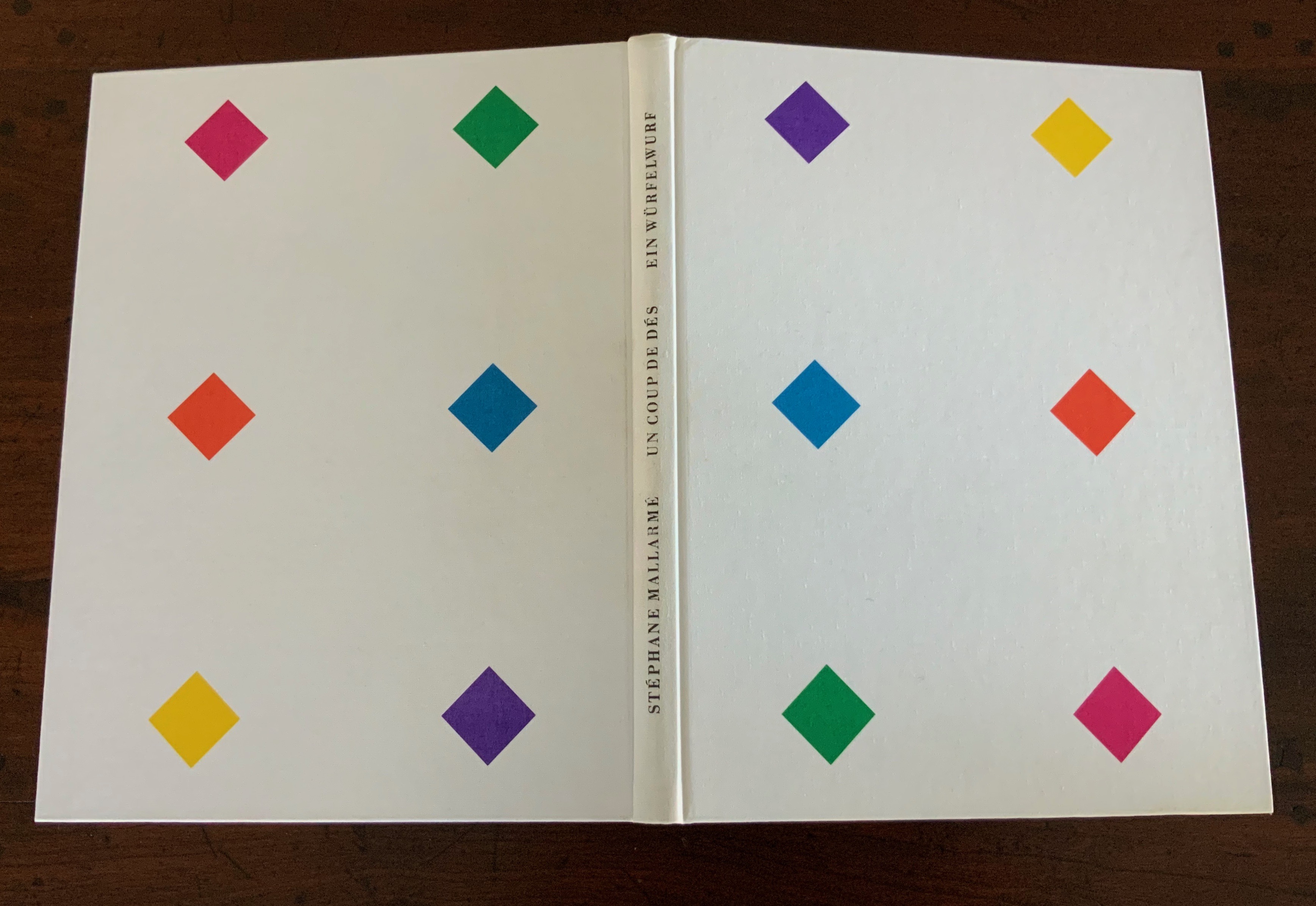
Covers of the 1914 edition (held by the Bodleian) and 1993 edition (from the Books On Books Collection). Photos: Books On Books Collection.
Un Coup de Dés Jamais N’Abolira “l’Appropriation”
While the experience cannot be the same, the reach of a virtual exhibition can exceed that of a bricks-and-mortar affair in certain ways. Moreover, it can provide building blocks for future organizers, curators and enthusiasts of book art and this unusual poem. By virtue of its virtuality, this exhibition is updateable. Its bibliographical references are linked wherever possible to permalinks, enabling the viewer to locate the nearest physical copy of the work. Where Pichler’s exhibition included a working player piano and piano roll version of Un Coup de Dés and films/videos (albeit not related to Mallarmé’s poem), this virtual exhibition provides visuals and hyperlinks to films/videos directly related to the poem as well as the same for operatic, balletic and musical renditions of Un Coup de Dés Jamais N’Abolira le Hasard. The works of homage included come from an exploration of exhibition catalogues, BnF Gallica, the Library of Congress, the Bodleian libraries, WorldCat and Google search — and tips from the scholars and artists themselves.
The word “homage” extends a wide umbrella — over parody, pastiche, livre d’artiste and appropriations in all manner of art forms. One or two works in the exhibition stretch the point of paying homage. Picasso’s pun un coup de thé is one example. Its admission rests on its being the earliest hint of the poem’s presence in other artworks. Subsequent omissions may be intentional or unintentional. In its seeming allusiveness to the poem, Cy Twombly’s Poems to the Sea (1959) petitions for admission. Lacking more obvious appropriation, though, it is more an “homage” to Twombly’s experience of the Mediterranean than of Mallarmé’s poem. Other petitioners, considered or missed, await future curators.
The Artworks
From 1897 to 1959 (5)
Just five works of homage in the first sixty years after the poem’s appearance is not a promising start, but it provides context in which to appreciate the later acceleration.
The earliest homage to Un Coup de Dés came only a few months after its publication. It took the form of Australian Christopher Brennan’s handwritten pastiche scolding the critics of his own poems influenced by Mallarmé. The work has only appeared in facsimile and then not until 1981. Its lengthy title is better appreciated in its handwritten form. More on this work here.
Facsimile edition of the handwritten manuscript. Published by Hale & Iremonger. Photos: Books On Books Collection.
In 1973, the art historian and critic Robert Rosenblum remarked on Picasso’s likely homage in the truncated newspaper headline — from “UN COUP DE THÉÂTRE” to “UN COUP DE THÉ” — for use in his 1912 collage. The connection seems a stretch, but Picasso was aware of Mallarmé and the poem, as were the circles in which Picasso moved. One of the avant-gardists — Man Ray — would be far less subtle in his cinematic homage to the poem.
Man Ray’s set location was Villa Noailles, a villa built for Charles and Marie-Laure de Noailles by the architect Robert Mallet-Stevens. Not surprisingly for patrons of Brancusi, Mallet-Stevens and Picasso among many others, the Noailles were footing the bill for Man Ray’s cinematic effort. The film opens with a screen quotation from the poem, but, other than the dice-shaped aspect of the villa which sparked the connection, the film develops its own mysterious suggestions apart from Mallarmé’s.
Film, one reel, 16 mm, 19:46 minutes. Posted 26 April 2014. Accessed 1 April 2018.
The Art et Action Laboratoire de Théâtre planned a spectacle including a polyphonic vocal performance of the poem as early as 1919. Thwarted by copyright law, Art et Action joined with the Société des Gens de Lettres for a new orchestration in 1942. Claude Autant-Lara’s 1923 poster for the abortive presentation (along with three other similar spectacles) and his decor (not shown here) foreshadow performance works by Danièle Huillet and Jean-Marie Straub, Kathy Bruce and Alistair Noble, Bernadette O’Toole and many others — all noted below.
Another unrealized hommage rests in Camille Soula‘s 1941 annotation of his copy of the 1914 edition of the poem. Soula was a physician who also studied and wrote about Mallarmé’s poetry and prose. The unsigned watercolor below is thought to represent Soula’s interest in staging a ballet version of Un Coup de Dés.
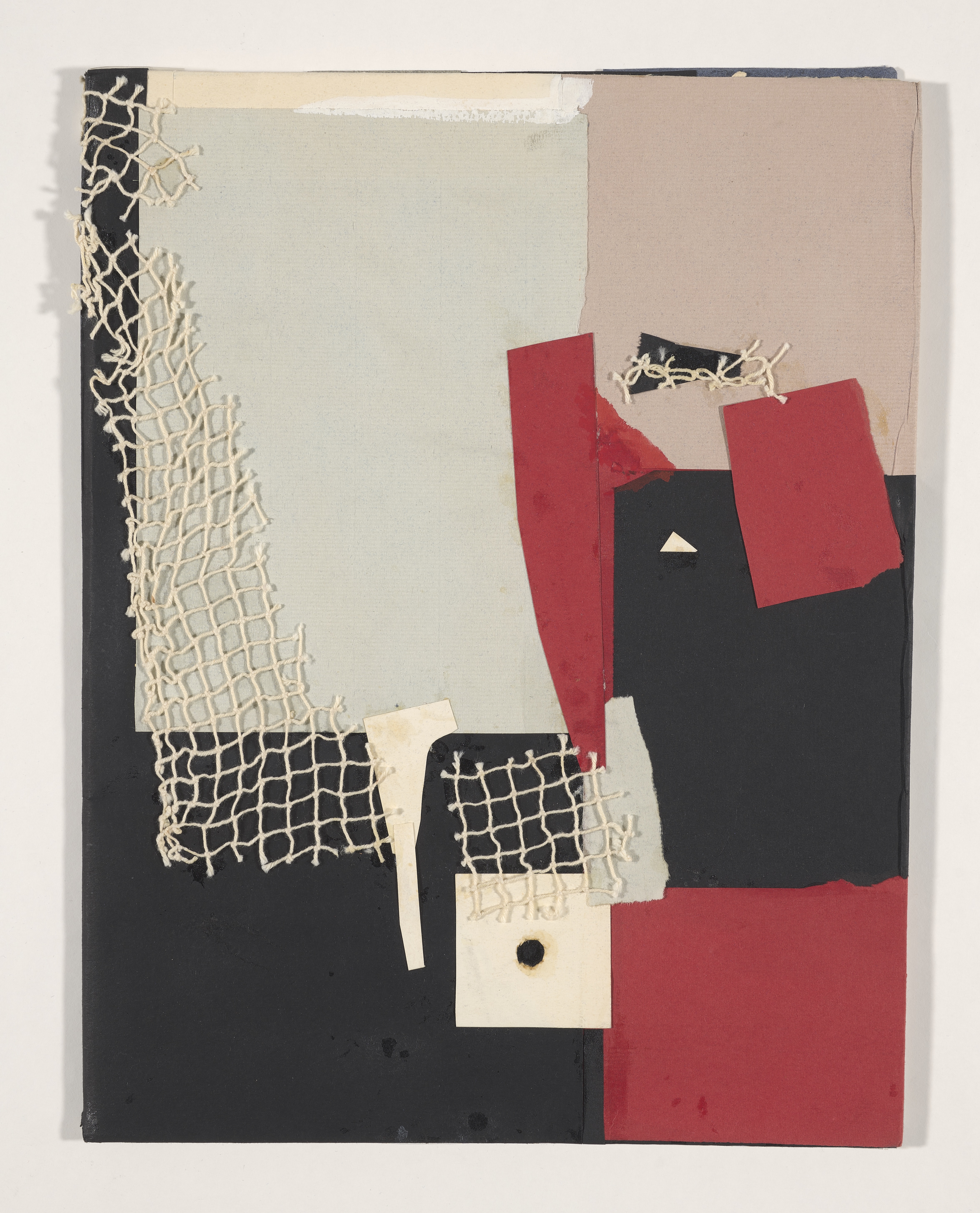
The efforts from 1897 to 1929 did little to prompt others to explore Un Coup de Dés for material and inspiration in the next three decades. Perhaps the first livre d’artiste version of the poem (and the fifth and last homage from 1897 to 1959) was created by Hella Guth in 1952. Guth’s distinctive style of collage foreshadows future extensions into more three-dimensional and material techniques.
Front and back covers of Hella Guth’s livre d’artiste. Courtesy of Bibliothèque nationale de France. Displayed with permission of Kate Rys, niece of Hella Guth.
From 1960 to 1969 (5)
The next six decades of the poem’s aftermath give a geometric progression of works in a variety of media by which homage was paid. The 1960s begin with two “over-the-top” works, over the top in very different ways.
Ernest Fraenkel was convinced that, working back from the text of Un Coup de Dés, he had “discovered” additional artwork in Mallarmé’s mind. The forms of the artwork could be shown by connecting the dots (the beginnings of the lines with each other, and likewise the ends) and shading the enclosed shapes — like a Rorshach test, only inverted (words first, then the images). Strange as the theorizing may be, stranger still is the visual results’ prediction of similar impressions almost ten years later arising from completely different premisses. More on Fraenkel’s work here.
Photo: Books On Books Collection.
Seven different diagrammatic renderings. The one at the lower right shows Fraenkel’s sideways view. Photos: Books On Books Collection.
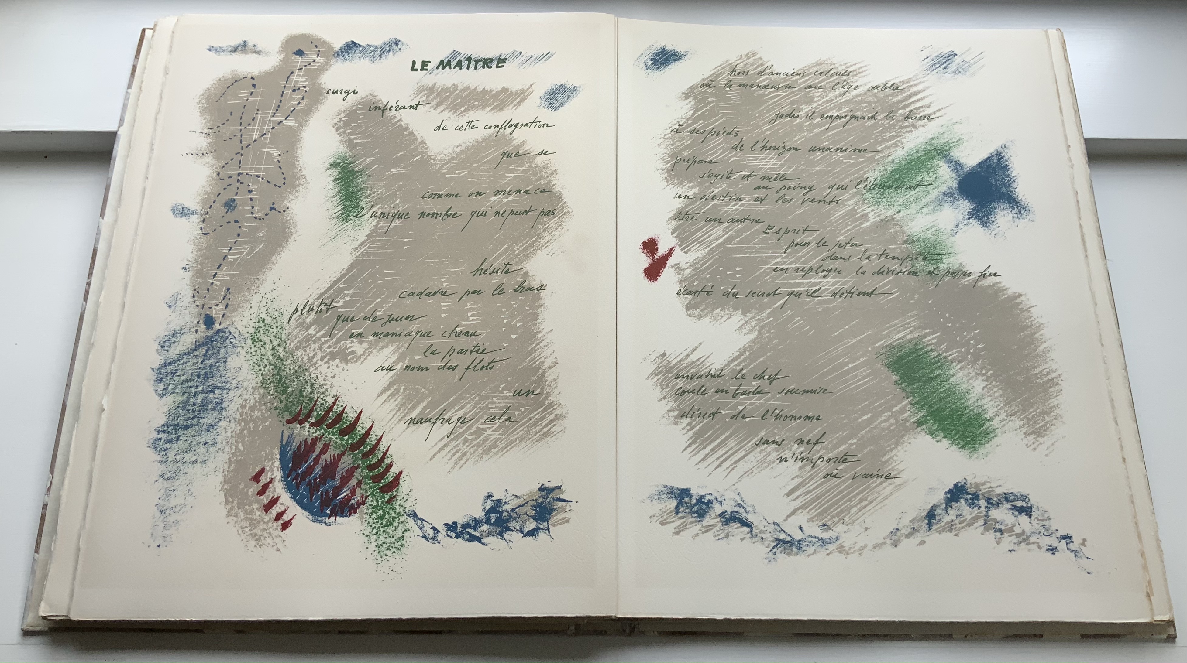
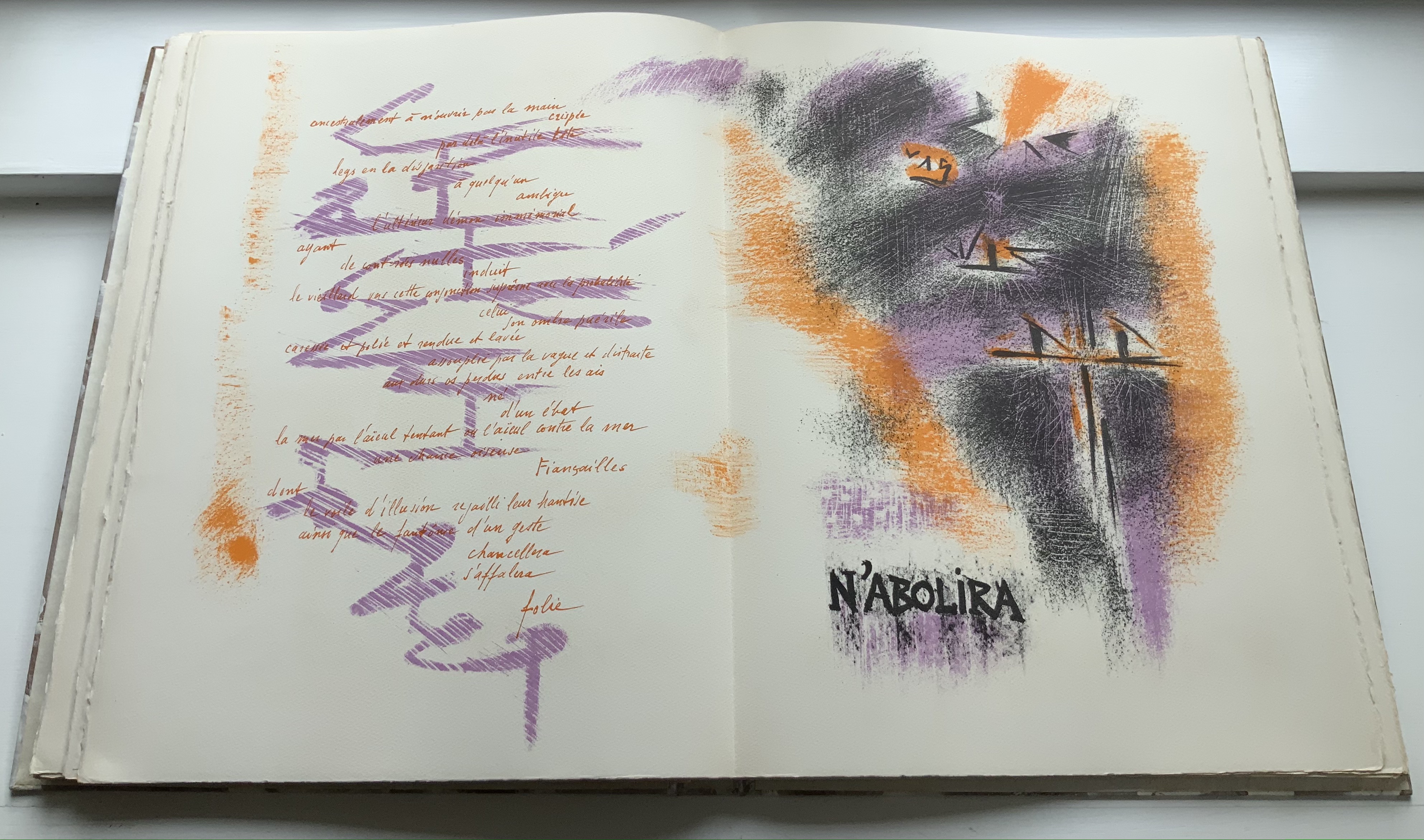
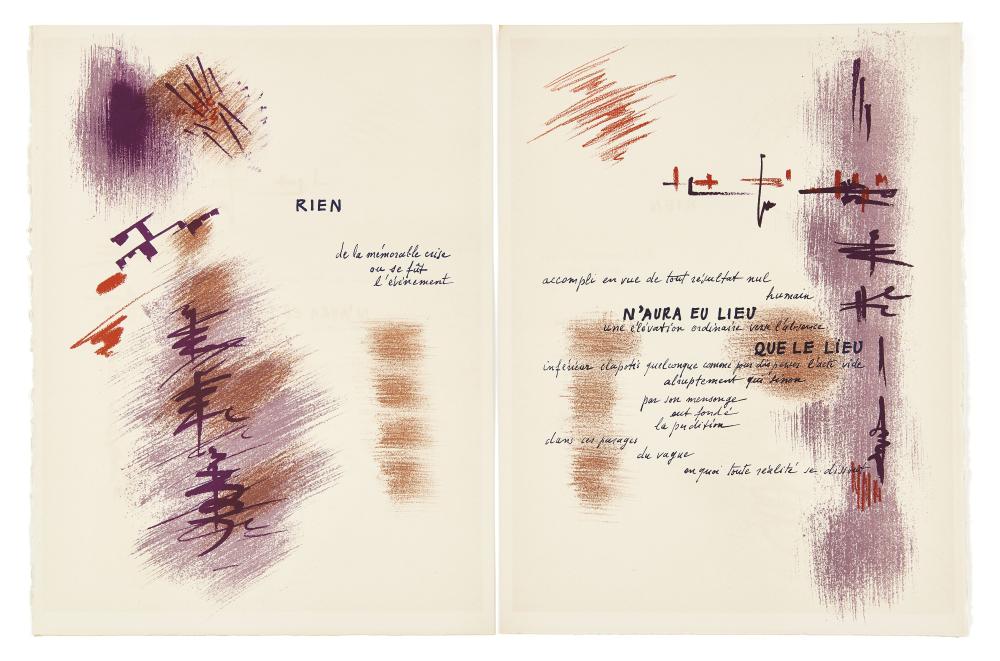
The second homage to appear in this decade is André Masson’s near illumination of the poem. It subsequently warranted an extended essay from the 2003 exhibition’s curators: Renée Riese Hubert and Judd D. Hubert. These three extracts from their essay provide useful touchstones to place against later works in this virtual exhibition:
Far from continuing or elaborating on Mallarmé’s project, Masson has contrived a systematic substitution of graphics, including calligraphy, for a typographical chef-d’oeuvre, thus enabling an unforeseen and uninvited art form to usurp the territory of another. (p. 508)
… in illustrating poetry he more often than not deserves his usual designation of abstract surrealist, all the more so because he combines automatism with the mythological dynamism so characteristic of his paintings and his drawings. (p. 513)
… Mallarmé’s poem, characterized by its avoidance of anecdotal narrative, its deliberate twistings of metaphorical patterns, its deconstruction of rhythmic continuity, practically precludes figuration. How can any illustration, however abstract, lend visual support to a text that compounds to such an extent the problematics of representation? … How could Masson graphically master a text that perversely withdraws from the reader and pores over itself, like the hypothetically sentient waves it repeatedly evokes, questions, and denies? (p. 514)
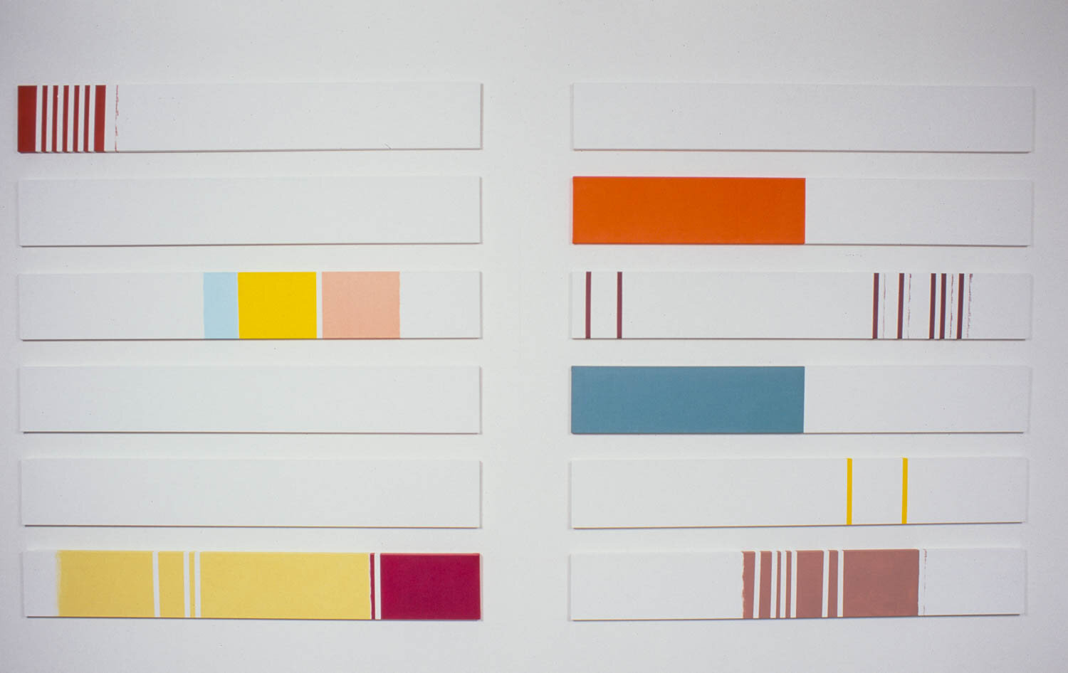
By the end of the 1960s, a very different form of homage takes over from that of Guth and Masson, one prefigured by Fraenkel’s abstract mapping of Mallarmé’s text into strips of black, one that would recur in several guises into the next century. Call it homage by redaction.
Detectable from its title, Diacono’s work intends a more social or political comment than Fraenkel’s. In an interview, he noted, “The title alternates not only colors, black and orange, but also uppercase and lowercase letters. The wordplay in essence says: the absence of metrics, of language, will not abolish poetry. Neither will the American taboos” (Nickas, 2019). Those comments align with the element of “pop” art and the underground comic in this homage. But does Diacono’s socio-political drive outweigh the rest of a METRICA n’aboolira‘s insistence on “looking at” Un Coup de Dés rather than reading it? Or is the work reminding us to read what we are looking at? More on this work here. The entire work has been digitized here.
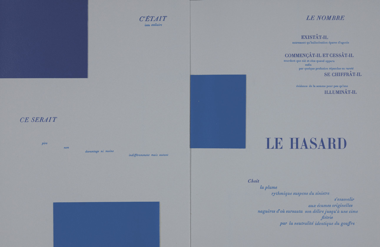
Marcel Broodthaers’ homage appeared as a three-part centerpiece to the 1969 exhibition entitled Exposition littéraire autour de Mallarmé: Marcel Broodthaers à la Deblioudebliou/S (“Literary exhibition around Mallarmé at the Deblioudebliou/S”). Deblioudebliou/S puns on a distorted French pronunciation of the letter W and the three initials of the Antwerp gallery Wide White Space, where the event occurred. The three parts consist of ten copies numbered I-X on anodized aluminum, ninety copies numbered 1-90 on transparent mechanographic paper (the original edition) and three hundred copies numbered 1-300 on opaque paper (the catalogue edition). On Broodthaers’ cover, the word Image occupies the same space as Poème on the 1914 edition’s cover. Following that, Broodthaers displaces Mallarmé’s dismissive “Préface” from Cosmopolis with his own preface: the poem’s entire text set in a block of type with the lines separated by slashes. Until the colophon, that is the only legible text to appear in this homage by redaction in which all the lines of the poem are blacked out. As visitors to the show perused the editions, a tape recording of Broodthaers’ reading the poem played in the background. Broodthaers’ multimedia homage would provoke dozens of artists to create works of double-, triple- even quintuple-homage over the next sixty years.
Photos: Top image courtesy of Charles Bernstein; middle and bottom images courtesy of MACBA.
Broodthaers’ bookworks above are not the only forms of homage he created for Un Coup de Dés. The Galerie Michael Werner hosted an exhibition entitled “Footprints of a collector: Reiner Speck. Mallarmé, Broodthaers et les autres” (2 May – 23 July 2022). In addition to outstanding copies of the Image works, the curator Sabine Schiffer and Reiner Speck included Garniture Symbolique (1975), a blue-tinted glossy photo strip with nine photos on glossy paper, showing excerpts and phrases from the poem. Also included was a painting entitled Un coup de dés jamais quand bien même… (oil, gold paint, felt pen on canvas) from 1969, which is owned by Speck and, according to his afterword in the catalogue, has appeared in every exhibition of Broodthaers work since. For anyone looking for a description of Broodthaers’ 1969 exhibition, the catalogue’s essay by Sam Sackerhoff — “Literary Exhibitions” — is the gold standard. The three black shirts across which Broodthaers “had copied the full text of the poem in thin white chalk” that Sackerhoff notes are but one of the harbingers of future works of homage to come (in particular, see Michalis Pichler and Kathy Bruce below).
The last 1960s works of homage to mention are Daniel Spoerri’s Un Coup de Dés dinner-cum-artwork, originally held in 1968 and reperformed on numerous occasions, and the Aspen Magazine in a Box [aka : The Minimalism Issue] (No. 5 + 6, Fall/Winter 1967), dedicated to Mallarmé.
Spoerri’s homage is first and foremost performative art with invited dinner guests assigned their seats by a throw of the dice. Afterwards, the meal’s detritus is fixed to a surface for vertical display, like debris on the deck of a shipwreck. No image of one of the Un Coup de Dés after-dinner works has been found for this exhibition. It may be that one or more of these performances also alluded to the literary dinners at which Mallarmé declaimed. Mark Clintberg has recounted one of these Spoerri banquets (held at Haus Maria Theresia in Dusseldorf, Germany, on 5 February 2010), and its social satiric flavor seems distant from those celebrations of the late 19th century. Though not on display here, Spoerri’s performances in homage are worth noting as heralds of the veritable variety show of performances that will appear over the coming decades.
Although The Minimalism Issue is more an homage to Mallarmé in general than one to Un Coup de Dés in particular, it too is a herald. It makes for a mixed bag (or box) and is noteworthy as much for its difficult-to-access LPs and super 8 films as for its name contributors: Roland Barthes, John Cage, Merce Cunningham, Dan Graham, Susan Sontag among others. With its mixed media, Aspen’s Mallarmé Box foreshadows even more eclectic and technically challenging efforts to come.
Permission of Whitechapel Gallery being sought.
From 1970 to 1979 (4)
If simply nodding toward Mallarmé’s poetic influence constituted homage, a small town of concrete poems could be put forward to pad the number of artworks of homage to Un Coup de Dés in the 1970s. As for artworks, perhaps artists were momentarily stunned by Broodthaers’ homage, for only four very different new works of homage appeared in the 1970s.
One of the participants in The Minimalism Issue of the Aspen Magazine, Dan Graham moved from his conceptual Poem Schema (1966), which appeared in the box, to an installation as homage. Graham’s primary interest had been Mallarmé’s long-touted Le Livre, which was to be not merely a book but a performance. So his attraction to Brian Doherty’s book as box of mixed media makes sense. Un Coup de Dés, however, may have had just as much influence as Le Livre. Consider these comments by Penny Florence as she writes about how Mallarmé’s poem and Odilon Redon’s prints must be read together:
They are a book with interchangeable pages, with varying directions and registers, with vertical and horizontal movements, with reversals and with shapes that are as important in signification as words. They challenge our notion of coherence and demand that we re-shape the relations between recorded and immediate experience. (p.110) [My emphasis]
That is also what happens in Dan Graham’s installation Present Continuous Past (1974). The installation room consists of two mirrored walls at a right angle to each other. A third wall on which a video camera is mounted above a video screen stands at a right angle to one mirrored wall and opposite the other. The fourth wall at a right angle to camera/screen wall of the room is blank white and provides the entrance to the installation. The video records the viewer and, after an eight-seconds lag, projects the recording onto the video screen. Because the recorder will then pick up the mirror reflection of the eight-seconds-lagged projection playing on the video screen and will then play that back after another eight-seconds lag, the viewer will experience in the present a continuous regress of the past(s).
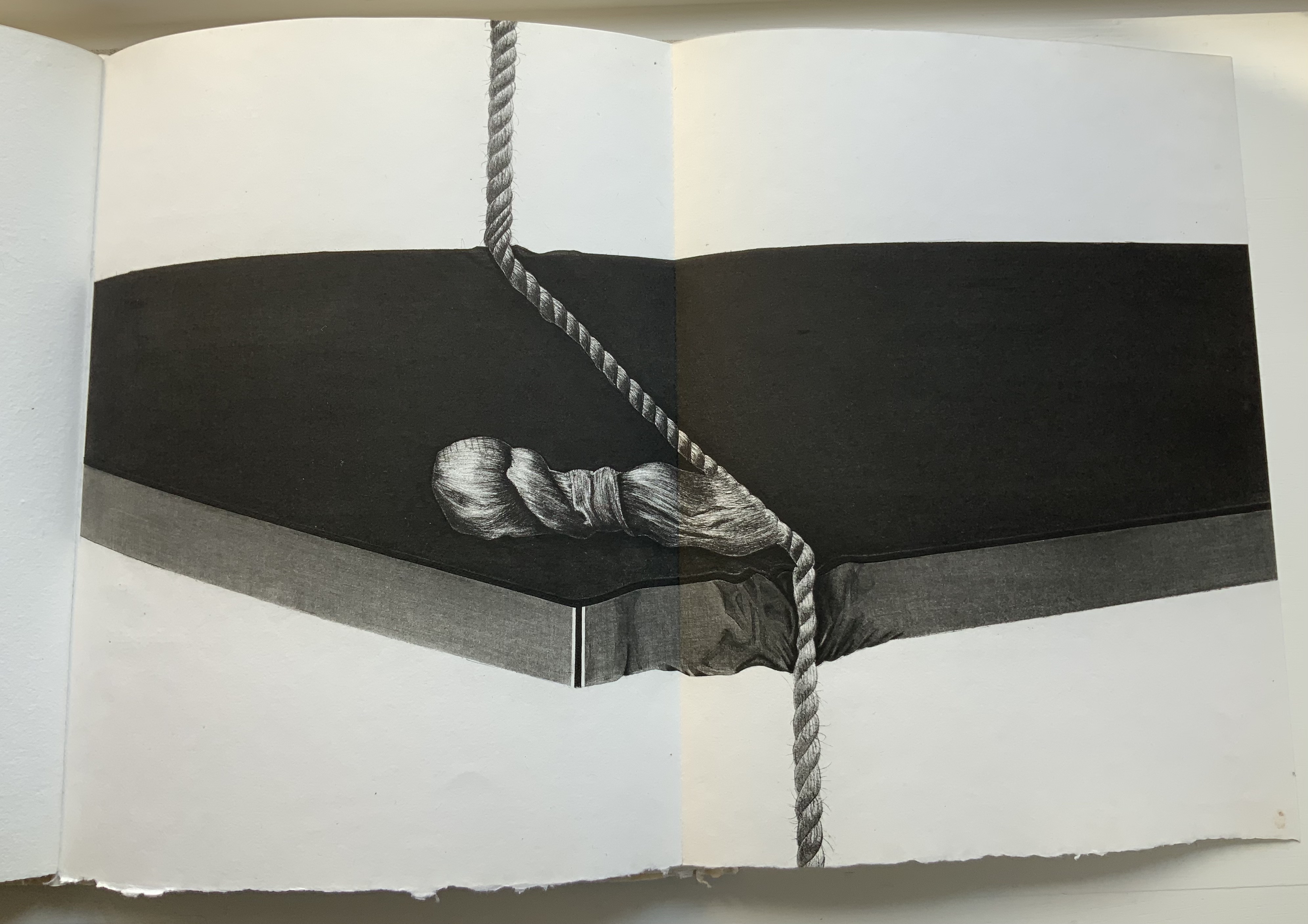
Jean Lecoultre’s livre d’artiste of “soft varnish” etching resonates with Mallarmé’s dictum peindre non la chose mais l’effet qu’elle produit (“to depict not the object but the effect the object produces”). Lecoultre depicts easily identifiable objects — a stone, a measuring rod, a rope and more — and less easily identifiable ones — a blurred wall and windows, a metallic plate with two rows of six numbered holes (the one numbered “1” filled with red), a pair of draped rectangular columns being sliced with a cheese-cutter-like cable and so on. The soft-focus realistic detail of surreal images, the strange juxtaposition of objects and the way some objects seem to float on the page — these mirror Mallarmé’s arrangement of words and lines among les blancs of the pages, the precision of his images and the suggestiveness of his metaphors.
Photos: Books On Books Collection, displayed with permission of Jean Lecoultre.
Mallarmé was always drawn to the idea of theatrical performances of his works, including Un Coup de Dés. He may have had a revolutionary grasp of staging text on blank pages, but he lacked any grasp of mise-en-scène for the actual stage. Despite his finger on the pulse of domestic fashion in his one-man magazine La Dernière Mode (1874), Mallarmé had no feel for the audience attracted to his contemporary Sarah Bernhardt.
He might have rejoiced that Danièle Huillet and Jean-Marie Straub filmed this Greek-style theatrical reading of Un Coup de Dés even if it came some sixty years after the attempt by Art et Action (see above). By staging the nine-voice reading in the Père Lachaise cemetery on the hill where the last Communards had been shot and buried, and also nearby the memorials to the Holocaust’s concentration camps, Straub and Huillet appropriated the poem for a forced chime with their film’s title, a quotation attributed to Jules Michelet, the 19th century historian of the French Revolution. War poetry and social indignation figure little in Mallarmé’s work even though the end of the Franco-Prussian war as well as the bloody suppression of the Paris Commune in May 1871 hung like a pall over France in his lifetime. But in light of another line from Michelet — “With the world began a war that will only end with the world, and not before: that of man against nature, mind against matter, freedom against fate. History is nothing but the story of this endless struggle.” Introduction à l’histoire universelle (1843) — perhaps the chime is not so forced. A video of the reading was made available on DVD in 2010.
As will be seen later in the exhibition, Ian Wallace is a “repeat hommageur”. Over three decades, he has created three separate works. With each one, something subtly new appears, but all are grounded in a particular kind of self-referencing shared with Mallarmé’s poem: the creative struggle reflected in the creation. In his own words:
In 1979, I made a large photographic work … which combined images of me in the studio making the work itself, with a text meditating on this concept of self-referencing. … This work was an early attempt to reconfigure a conceptual art practice through its literary antecedent in the work of Stéphane Mallarmé, …. After reading [Un Coup de Dés] for many years, I have come to appreciate it as one of the foundational works of modern art. Its theme, that of artistic destiny and a crisis of representation, was expressed through the collapse of metaphysics into typographics and the material space of the page. [Ian Wallace in Un Coup de Dés/Writing Turned Image, curated by Sabine Folie, p. 82.]
Hand-coloured silver gelatine print, 276 x 549 cm. Image and permission to display, courtesy of Catriona Jeffries Gallery.
From 1980 to 1989 (12)
The 1980s begin with the acclaimed édition mise en oeuvre by Mitsou Ronat and Tibor Papp. In addition to trebling the previous decade’s contribution, the 1980s offer the first sculptural installations to pay homage to Un Coup de Dés — Robert Filliou’s Eins. Un. One. (1984) and Geraldo de Barros’ Jogos de Dados (1986) — as well as the first symphony — Claude Baillif’s Un coup de dés, d’après Mallarmé, Op. 53 (1980).
In 1980, Mitsou Ronat and Tibor Papp used Mallarmé’s corrected proofs of the abortive Vollard version to produce an edition closer to Mallarmé’s intention than previously published. They followed the intended unbound-folios approach to the poem but juxtaposed it not with the etchings of Odile Redon but with artistic interpretations by Papp and his contemporaries. A decade later, Renée Riese Hubert and Judd D. Hubert would comment: “This surprising accompaniment to a scrupulously authentic printing of the original poem pays so to speak a postmodern homage to a quintessential modern master” (p. 508). Over the decades after the Ronat/Papp production, other new editions appeared — also aimed at reflecting the Master’s wishes. Not including Françoise Morel‘s facsimile of the manuscripts and proofs(2007), there are three other explorations of the “true” edition (in French): Michel Pierson‘s (2002), Ypsilon Éditeur‘s (2007) and Alain Hurtig‘s (2012). Not shown in the exhibition, Pierson’s substitutes artwork by Jorge Camacho for that by Odile Redon. Ypsilon Éditeur’s edition restores Redon and appears later in this exhibition. Also shown later, Hurtig’s edition substitutes Catherine Belœil’s artwork for Redon’s and provides an insightful analysis of typeface options, including the Didot. For more on the Ronat/Papp edition, go here.
Photo of the work: Books On Books Collection.
Double-page spreads from the 1980 Ronat/Papp edition. Photos: Books On Books Collection.
Tibor Papp, Déville. Paul Nagy, Untitled. Photos: Books On Books Collection.
Claude Baillif began this symphony while teaching at McGill University in Montréal. The musical composition for five choirs, two double basses, two percussionists, two kettledrums, and electronic tape directly addresses the poem’s shape. As explained in the LP liner notes, Baillif assigned a particular “sound property” to each of the poem’s eleven double-page spreads (with two double basses, two percussionists and two kettledrum players punctuating the change from one spread to another); designated each of the five choirs to each of the five type fonts and sizes; and generated a “ribbon of sound” in the university’s electronic music studio to create additional echoes across the eleven spreads. The result is “essentially grave, still music”, although with a great deal of dissonance. Baillif may have been “helped by the contemplation of the calm vastness of the St. Lawrence Estuary”, but do not expect Smetana’s Vltava (The Moldau); after all, Un Coup de Dés involves a shipwreck. Baillif’s is not the first musical homage to Mallarmé. Pierre Boulez’s Pli selon pli (“Fold on fold”) in 1957 holds that distinction, but Baillif’s is the first dedicated to Un Coup de Dés and signals several others to come.
Part of Gruppo 70, the Italian visual poetry movement, Eugenio Miccini would have been remiss not to have included an homage to Un Coup de Dés in his body of work.
This work first appeared in 1984 and has been displayed in several 21st-century exhibitions, including Robert Filliou‘s first solo exhibition at the Henry Moore Institute in Leeds in 2013. The constellation of 16,000 multicolored dice, each with all six sides bearing a single dot, delivers one of the more humorous works of homage to Un Coup de Dés. With the guarantee of a single dot, it might be thought that chance has been abolished, whichever and however many dice are rolled. The multiple sizes and colors of the dice and the varied constellations into which they might fall per installation suggest otherwise. Again, even this thought emits a throw of the dice.
As Ronat and Papp were preparing their édition mise-en-oeuvre following Mallarmé’s corrected proofs, Neil Crawford came across a copy of Robert Greer Cohn’s Mallarmé’s Masterwork, New Findings (Mouton & Co, The Hague, 1966) and was struck by its reproduction of the set of proofs sold by Pierre Berès to an American collector – the so-called Lahure proofs. Crawford, too, was determined to prepare a typographic translation of the proofs — but in English. Crawford’s choice of the Bodoni typeface as a substitute for the Didot that Mallarmé wanted can be justified on two grounds: first, the two typefaces are historically contemporaneous and inspired alike by John Baskerville’s experimentation with the contrast between letters’ thick and thin strokes; and second, even if there had been an English translation to set in 1897 or 1914, Bodoni was the more available face for English-language typesetters. Having enlarged Cohn’s reproductions to their originals’ size, Crawford undertook the daunting task of figuring out how to squeeze an English version taking up 10% more space than the French into Mallarmé’s careful layout. It would take seven years of evenings in tracing letters, translating, transcribing, adjusting, retranslating and retranscribing to generate hand-crafted layouts that could be stored away until the day that photocomposition would be sufficiently advanced to accommodate the word and character spacing necessary to follow them. Fittingly by chance encounters, Crawford was introduced in 1982 to Ian Tyson, who was planning his own livre d’artiste version. In an ironic reversal of Mallarmé’s concern that the Redon prints might undermine the typography, Tyson and Crawford were concerned that anything less than letterpress printing would not ensure the density of black on the page that would complement Tyson’s aquatints. This led to phototypesetting output as patch setting, then hand pasting according to Crawford’s layouts, and then creation of process line blocks for the relief printing in letterpress. More on Tyson and Crawford’s homage here.
Michael Lechner‘s diptych, a drawing and painting on acid-free, natural white Van Gelder paper, has some affinity with Tyson’s homage. Both oscillate between abstraction and iconography. Both allude to the computational but overlay it with sandy gradations of tint. Lechner himself writes: “by the geometrical, I trap the dream and by the dream I make fun of the geometry”.
Geraldo de Barros created his sculptural forms in the 1980s. Jogos de Dados was among the first large-scale sculptural installations paying homage to Un Coups de Dés. Haraldo and Augusto de Campos and their Noigrandes literary magazine had raised the profile of the poem over the preceding decades, and Augusto de Campos, friend to de Barros, dedicated a poem to his squares.
Mounted on wires stretched from ceiling to floor, the 55 geometric sculptural forms of de Barros’s Jogos de Dados(Games of Dice, 1980s) dominate the space, hanging in clusters facing this way and that. Close to the centre, the originating piece, Pai de Todos (Father of Them All), is a hexagon comprising 12 rhombuses, pristine in its mathematical precision, the simplicity of its black, white and grey colours, and its smooth, almost textureless expanses of Formica. — Rigby, Art Review.
Alessandro Zanella, founder of Edizioni Ampersand, asked the artist and fellow printer/publisher Vernière to join him in realizing this Italian livre d’artiste. Vernière’s abstract woodcuts capture the poem’s imagery of sea foam, shipwreck and the abyss. More on Zanella and Vernière here.
More an allusion than homage, Bernard Chiavelli’s hardcover comic book is the second of a trilogy, following its main character through adventures based on the imagined East African life of exile Arthur Rimbaud, one-time visitor to Mallarmé’s Tuesday soirées, fellow poète maudit, gun runner and Paul Verlaine’s lover. More on Chiavelli’s trilogy here.
Carol Rudyard’s homage is dual, linking Mallarmé to Marcel Duchamp, and may be the first video installation to incorporate Un Coup de Dés. In the video, the title of the poem is chanted. Perhaps recalling Picasso’s collage of newspaper text “un coup de thé”, Rudyard juxtaposes the text uncoup with the image of a goblet (une coupe), and the words le hasard appear, reproduced from a newspaper and repeatedly photocopied. Before that, the words de dés appear beside the glass, behind which is a cloth patterned in black and white squares suggesting a checkerboard or dice, and likewise the words jamais and n’abolira appear. Rudyard’s allusions are as subtle and elusive as Mallarmé’s own experiment with language in his poem as Lyn Merrington’s essay in Australian Divagations demonstrates.
Honorine Tepfer embeds her homage in paper as if taking her cue from Mallarmé’s letter to André Gide about the poem:
… le rythme d’une phrase au sujet d’un acte ou même d’un objet n’a de sens que s’il les limite et, figuré sur la papier, repris par les Lettres à l’estampe originelle, en doit rendre, malgré tout quelque chose […]. La littérature fait ainsi sa preuve: pas autre raison d’écrire sur du paper.
“… the rhythm of a sentence about an act or even an object has meaning only if imitates them and, enacted on paper, when the Letters have taken over from the original etching must convey something despite it all […]. Literature thus makes its proof: there is no other reason to write on paper.” — from Selected Letters, in Rancière’s Mallarmé: The Politics of the Siren, pp. 56-57.
Tepfer’s choice of Baskerville highlights the recurring issue of honoring Mallarmé’s wish for the poem to be set in Didot.
One of the more daring of livres d’artiste. Christiane Vielle not only deploys her engravings to take Mallarmé’s poem beyond the double-page spreads he envisioned, she also does so by redistributing his text under folds and across them. In offering her re-reading of the work, Vielle offers viewers the chance for their own re-reading in opening, closing and reopening the folds to see how the poem and images enfold one another in different views.
The number of works paying homage to Un Coup de Dés in the 1990s continued the decade-on-decade increase since the 1980s. Numerous exhibitions and conferences in honor of the centennial of Mallarmé’s death closed out the decade them were:
Mallarmé, 1842-1898 : Un Destin D’écriture (Mallarmé, 1842-1898: A Destiny of Writing), curated by Yves Peyré at the Musée d’Orsay, where the pages of the poem were displayed on the exhibition room’s walls.
In keeping with D. J. Waldie’s reading of Danielle Mihram‘s analysis of the proofs of the intended Mallarmé/Vollard livre d’artiste and Waldie’s own examination of the proofs at Harvard, Young’s four woodcuts are presented separately from the text and aim to honor Mallarmé’s desire for images that are “blond and pale” in relation to the white of les blancs and the sharp black of the type. The design by Young and Felicia Rice used several cuttings of Bodoni to approximate the Firmin-Didot of the original proofs. More on the Young, Rice and Waldie volume here.
Any new livre d’artiste in homage to Un Coup de Dés naturally faces questions of quantity, placement and color of the artwork. Mallarmé’s primary concern was that they not detract from the visual imagery of the text in its careful typography and layout. In all three considerations, Ellsworth Kelly and Limited Edition Press may be honoring Ambroise Vollard’s entrepreneurial hopes more. Despite (or because of) Kelly’s minimalist associations, more is more in this leatherbound volume that runs to 97 unpaginated pages, including 11 lithographs. A double-spread of blank pages follows each recto page of text and each page of lithographs, each of which appears on a recto page. The number of prints is a balancing response to the 11 double-spread pages of the poem, but those intervening blank pages nod toward Mallarmé’s les blancs.
Mallarmé’s poem is one of many literary obsessions for Reinhold Nasshan and has yielded two works of homage: Würfelwurf and Un Coup. Both of these sculptural works are semantically subtle. The first deliberately omits the article eins (“a”). “Throw of the dice”, “dice throw” or “throwing dice” are all reasonable translations of Würfelwurf, but not “a throw of the dice”, which most German translators render as ein Würfelwurf when tackling Mallarmé’s Un Coup de Dés. But then Reinhold Nasshan is not translating the poem. As the subtitle indicates, he is making “a fragmentary approach”, an approximation. By truncating the poem’s title, Un Coup also projects its fragmentary approach. In its three-dimensional shape-shifting, it presents the “moment of movement itself, the transition between the throw and the impact of the dice, emerge graphically” (moment der bewegung selbst den ubergang zwischen dem werfen und dem auftreffen der wurfel, graphisch hervortreten zu lassen). More on Nasshan’s work here.
This is the second of Ian Wallace’s works inspired by Un Coup de Dés, and as he notes, it had a transformative effect:
… I did make a more assertive reference to Mallarmé’s book by photographing it at a specific page (as well as Jacques Scherer’s publication of Mallarmé’s Le Livre — his incomplete and unpublished ‘great work’ …) conspicuously inserted amongst a random collection of materials on my worktable…. I recognized that the blank pages of this poem were … an early literary equivalent to the endgame aesthetics of late modernist aesthetics of monochrome painting that I had practiced earlier in the 1960s…. and … shifted my work away from abstract monochrome painting to montage photography influenced by the linguistic aspect of conceptual art that I called the “literature of images.” — Ian Wallace in Un Coup de Dés/Writing Turned Image, curated by Sabine Folie, p.86.
Perhaps uniquely, Barry Guy’s musical homage to what he calls “a typographical symphony of words” has architectural origins. In the liner notes for its performance by the Hilliard Ensemble, Guy writes:
The choice of Mallarmé’s Un coup de dés as the basis of the piece came about through studies of the conceptual buildings by the architects Richard Rogers and Peter Eisenmann respectively. Rogers’ project was for the Tomigaya exhibition space in Tokyo where modules and floors would operate like an adjustable shelving system, flexing with the needs of the inhabitants. Eisenmann’s project was the Max-Reinhardt-Haus, Berlin, which manipulates the infinite three-dimensional Moebius strip to arrive at a series of topological surfaces which form the prismatic character of the building. The conceptual link was provided by Mallarmé’s poem which transformed the idea of the ‘module’ and the Möbius strip into a dice twisting in the air.
… One of the surprising elements is Mallarmé’s very radical use of upper and lower case lettering. I set about to distil the upper case words in sequence into a new quasi-abstract text that lent itself to vocalisation. Additionally Mallarmé’s ‘landscape’ layout suggested a graphic representation of the music and its movement. The score is accordingly on one large page and portrays the rolling of the dice associated with the desired pitches, execution and text. — Barry Guy.
Guido Molinari, Continuum pour Mallarmé (1994) [Update 23 July 2024]
This work by Molinari was exhibited in 1994, but then disappeared for thirty years. It is a 48-page artist’s book and was displayed at the Guido Molinari Foundation’s exhibition Sophie Lanctôt, Mallarmé, Molinari: Mots Croisés (6 June – 25 August 2024). More on this work and Équivalence, Molinari’s later work of homage, can be found here.
Images courtesy of Fondation Guido Molinari. Photo: Michael Patten.
Over all other hommageurs of Un Coup de Dés, Joëlle Tuerlinckx has the advantage that her name originates in the Old Flemish word teerling(en)/die(dice). Perhaps in some subtle way, this has made her susceptible to the poem’s influence. In correspondence, she writes:
I like to quote ‘rien n’aura (eu) lieu que le lieu ‘. I share this perception / conception of the world and of the space-time that it induces. almost like a philosophy of life, a way of living and exhibiting. — Joëlle Tuerlinckx, 18 February 2021, correspondence with Books On Books.
Tuerlinck’s first throw of the dice in 1994 was occasioned by being asked to place a work in the exhibition’s entrance display case. With no concrete sense of the display’s place or placement of the other objects in the exhibition, she left matters to chance:
On the road when I reached Witte de With, I picked up a green cube that morning, put it in my pocket. I still had a (hard-boiled?) breakfast egg in my pocket that I hadn’t had time to eat. And on a piece of paper, in front of the window, I scribbled a point, and immediately emptied my pocket. Everything happened, as it was obvious, on demand. I marked each object with a few points at random .. by the shape of the egg and its improbability as an object to be thrown or to have a face, and with the two-dimensionality of the piece of paper each stroke was in advance both won and lost. 18 February 2021, correspondence with Books On Books.
For her second throw of the dice (2008), Tuerlinckx placed (threw?) three black undifferentiated cubes on what appears to be a geographical map but is a happenstance stain created by a puddle of evaporating tea. With no markings on the dice, there is no winning or losing, and nothing has taken place but the place marked by the dice on a chance-made map.
Scholar of typography and design, Klaus Detjen presents the poem three times in this volume: first, in French overlaid with an interpretive design, then in French and finally in German. All three instances follow the typography and layout of the first book edition of the poem as published in 1914 by Gallimard. The colored linear frames, threads and markings are allocated to the typographical motifs Mallarmé uses. Using Chinese-fold folios, Detjen carries his color diagrams across the fore-edge to highlight the reading order as he understands the syntax relayed by the typographical motifs. He also takes Mallarmé at his word about les blancs and seizes on the whiteness of the surrounding space and runs to the prismatic metaphor that the spectrum of colors is simply the decomposition of white light. More on Detjen’s homage here.
Ofer Lellouche‘s homage consists of marine plywood covered in black leather, dice embedded in the spine and stand, 9 etchings, trim size of H76 x W56 cm, and Arches 250gsm printed in 22 pt Times New Roman. The pages of text replicate those of the then-current Pléiade edition of Mallarmé’s Complete Works. Of course, the size of the work is scaled up. The replication results in the placement of “JAMAIS” and certain other phrases and a typeface not as Mallarmé designated in the proofs for the deluxe edition. It also means that page numbers appear, and it accounts for the use of Times New Roman. There is an underlying reason for the scaling up and replication. Lellouche not only wanted the scale for the display of his double-page spread prints (below) but also for the allusion to Picasso’s rumored habit of using his copy of Mallarmé’s poems as a sketchbook. Ever since his “brick wall” encounter with Un Coup de Dés and its white-on-black, black-on-white aesthetic, Lellouche has felt its influence on his art — including self-portraiture, the figurative and landscapes.
The chosen trim size foreshadows Alastair Noble’s monolithic homage Mallarmé 2000 (H96.5 x W66 cm), and the ghostly etchings foreshadow the effects achieved by Raffaella della Olga’s phosphorescent ink in Un Coup De Dés Jamais N’abolira Le Hasard – Constellation (2009). But this homage is the only one that brings the poem together with all three artistic traditions of self-portraiture, the figurative and landscapes.
Alastair Noble‘s installation work focuses on the “Comme si / Comme si” double-page spread in Un Coup de Dés. Transparent overlapping sail-like shapes angle across the words printed at an angle within two frames hung on a wall at angles to one another. Hanging at angles from the ceiling by steel cables and holding screen mesh are three frames shaped to echo the diptych’s sail-like shapes. Seen longitudinally the three hanging frames form what could be the listing hull of a ship or the pages of a book opening or closing. Across and within two and three dimensions, Noble’s multiple mastery of space honors and rivals Mallarmé’s mastery of the double-page spread. The installation first appeared at the View Gallery in New York. The diptych was later displayed in the exhibition “The Next Word” (1998) curated by Johanna Drucker at the Neuberger Museum in New York.
Valise for Mallarmé is one of several aesthetic expressions of Kathy Bruce‘s experience of the poem that “made us modern”. With this homage, she takes Marcel Duchamp’s Boîte en Valise and Joseph Cornell’s boxes in an original direction and replaces their mysterious surreality with the mysteries of Un Coup de Dés and the surreality arising from chance-found objects and their juxtaposition. The Duchampian valise opens to show that it has been pressed into a Mallarméan voyage. In the deeper compartment sits a Cornellian glass-covered wooden box. It contains a red die; collage of an engraving of penguins, a spouting whale, a ship under sail against towering glaciers and a flight of birds; scraps of paper marked with Chinese ideograms and handwritten numbers and symbols; and mechanical diagrams. A reflective, smoky blue sheet surrounds the glass-covered “raft”. It is a piece of X-ray film discarded from Gramercy Hospital in New York City. The film is face down and affixed to a sheet of paper that later developed ripples. The excavated book on the shallow side of the valise is John L. Stoddard’s Lectures (Ireland, Denmark, Sweden, Supplementary Vol 1). Stoddard was a prolific writer and prodigious traveller. The lecture series appeared 1897 to 1898, haply coinciding with Mallarmé’s poem and death.
Solitary Plume continues exploring Cornellian techniques with which to pay homage to Mallarmé. Cornell, too, was influenced by Mallarmé. He remarked that his boxes “are life’s experiences aesthetically expressed”, an echo of Mallarmé’s exhortation to describe not the thing but its effect. Even before it is opened, this cigar box wafts the effect of plumes of cigar smoke said to envelop Mallarmé as he held forth to the regular visitors to his Tuesday night salons. The solitary plume inside the lid poses as the “found” plume solitaire éperdue in Un Coup de Dés. In the poem, that plume solitaire is followed by the very lines printed on the edge of the triangular block of wood resting on a scrap of stiff, midnight blue material — the kind from which a cap (toque) might be made — in turn resting on a piece of crumpled velvet.
Comocíon, Contucíon, y Compresíon Cerebrales continues to reflect the influence of Joseph Cornell, but if it were viewed in any other context, we might miss that Mallarmé’s poem inspired it. The altered book’s title, difficult to make out on the spine, is Patología y clínica quirúrgicas (1873), a medical manual by Joseph-Auguste Fort, a French contemporary of Mallarmé. The manual’s shredded pages are packed around the wooden box embedded in the gutted medical manual. Inside the box, the dice can freely roll over the collaged print of ships. Among the packing at the foot of the box is a barely decipherable shred of a heading from the book that gives this work its title. How can Comocíon, Contucíon, y Compresíon Cerebrales (cerebral concussion, contusion and compression) be avoided in an altered book hanging tilted in a frame? What can protect against Chance that no roll of the dice can ever abolish or against the “bookwreck” in which the dice are embedded? What surrounds the altered book implies that they cannot. The crumpled white cloth (from the poem’s velours chiffonné) evokes not only a fallen sail but also a coffin’s lining in which the book lies.
Kathy Bruce and Alastair R. Noble, Foldings (1998)
With Foldings, Bruce and Noble joined forces. Six masked dancers wear costumes that are in effect human-size folios across which the pages of Un Coup de Dés have been printed front and back in French. As a prerecorded English translation is read by numerous voices corresponding to the changing fonts, the dancers rotate and display the lines being read. A performance was given as part of the exhibition A Painter’s Poet, held at the Leubsborf Art Gallery (Hunter College). This fell under the aegis of the Millennium Mallarmé celebrations in New York, the poster for which can be seen below overlaying the staging sketches for the performance. Later, as part of an installation under the title Navigating the Abyss (Brookdale Community College, Lincroft, New Jersey), the costumes were suspended from the ceiling along with a framed screen mesh reminiscent of Noble’s As if / As If (see above).
Update: 25 February 2023. The gallery of Dunoon-MoCA (Museum of Contemporary Art) in Scotland reprised the display of the six costumes in February-March 2023. Location: 18 Ferry Brae Dunoon PA23 7DJ. Hours: Friday & Saturday 12-5pm and by appointment.
For a more “tech-fashionable” version, scroll down to Bruce and Noble’s Digital Mallarmé (2008), a collaboration with James Cook.
Michael Graeve‘s series of paintings appeared in the group exhibition “On the ashes of the stars …” curated by Michael Graf at Monash University in Australia to explore Mallarmé’s influence on the arts. Like many of the works seen so far, Graeve’s is a multiple homage, but his is the first to include composers in a visual medium. The series distinctively pays homage to Un Coup de Dés by taking it as an intermediary to John Cage and Pierre Boulez. Graeve had found the three of them drawn together in letters between Cage and Boulez in the 1950’s. In his website, Graeve writes:
for Cage, Mallarmé’s poem was a precursor and invitation to include chance procedures and indeterminacy into compositions. Boulez on the other hand was much more concerned with the retention of compositional control, and as a result incorporated explicit choice for the performer (rather than chance) into his work. — Michael Graeve, 2003.
With images from a reprint of an early Sears Roebuck Catalogue and drawing on John M. Bennett‘s poetry as well as Un Coup de Dés, Jim Clinefelter composed his book on a borrowed Macintosh SE — the late twentieth-century substitute for penmanship. Mallarmé only thought of having some images from his friend Odilon Redon separated from the text Un Coup de Dés. Clinefelter’s sense of fun and close attention to the original led him to integrate those Sears images throughout with the text to mimic Mallarmé’s textual and typographic road signs. More on this parody here.
Denis Cohen‘s musical homage for five instruments, recorded voice and computer was commissioned for the Musée d’Orsay exhibition in 1998. The homage to Un Coup de Dés is indirect. In his notes to the composition, Cohen explains that he is using only a framework of durations derived from two verses of Un Coup de Dés (unidentified) by which another of Mallarmé’s poems is read (La chevelure/”The head of hair”). The title of Cohen’s work means both “veil” and “sail”, which is a dual meaning that Mallarmé exploits in his poetry: a veil of hair, a sail in the wind. A brief extract can be heard here.
In 1981, Imants Tillers had already begun a collective body of work known as The Book of Power, which has its roots in Mallarmé’s dictum “tout, au monde, existe pour aboutir à un livre“, variously translated as
“everything in the world exists to end up as a book”, “everything in the world exists to end up in a book”, “everything in the world exists in order to end in a book” [Susan Sontag’s version]
Tillers compiled the paintings from multiple individual canvasboards done in synthetic polymer paint and gouache. In 1998, he began to incorporate lines from Un Coup de Dés almost as a textual frame holding together the multiple canvasboards. But while the words inevitably contribute shared themes or motifs from Mallarmé’s poem, they are fully appropriated into Tillers’ own agenda, which leads in the next decade to a fruitful collaboration with Michael Nelson Jagamara.
It is a shame that no image of Mairey’s work of homage could be found for this exhibition. Fortunately, the brief catalogue for the 2003 exhibition in which it appeared has a useful description of it.
Françoise Mairey’s 1999 tribute to Un Coup de dés, like Masson’s, differs radically from Mallarmé’s original — it is compact, repetitive, and grid-like. She repeatedly typed each line of the poem until she created three-by-two-and-a-half-inch blocks of words, one block — or line — to a sheet of paper. Mairey recorded the date and place of her work at the bottom of each sheet, and she also noted the number of mistakes she made (both “evident” and “non-evident”), acknowledging the element of chance that caused her to hit the wrong key. Cheryl Hartup, Visual Poetics.
Also fortunate, but still without an image, is the entry on Mairey in The Art of Typewriting (2015):
Mairey’s masterpiece consists of 220 cards, each incorporating a repetitive word or words taken from Mallarmé’s poem. These typed cards are mounted within 20 frames of varied dimensions, each frame denoting one page of the poem. P. 334.
Mairey’s combination of the performance of creation with the artifact of creation recalls Ian Wallace’s approach in 1979 and 1993 and foreshadows that of Raffaella della Olga in 2018. Her metricizing and documenting the number of errors in the work shows an affinity with the Lettrists and Concrete Poets.
The wooden box holding this work and its transparent cubes may evoke thoughts of Joseph Cornell, but its exuberant Lettriste interior runs in a different direction entirely. It is a rare work, so Albert Dupont‘s description of it and the photos in Livre / Typographie, as well as its online presence at the Bibliothèque Littéraire Jacques Doucet, offer welcome glimpses and insights. Dupont identifies the constituent parts of the work as five transparent dice variously inscribed and loosely embedded in the spine of a box-like tray of varnished wood encasing two renditions of the poem. Dupont calls these renditions poèmes-blocs. The first replicates the Ronat/Papp edition of the poem on transparent pages. Dupont calls the second section Calme-bloc, words taken from Mallarmé’s Le tombeau d’Edgar Allan Poe:
Calme bloc ici-bas chu d’un désastre obscur (Silent block fallen here from an obscure disaster)
Calme-bloc, also on transparent pages, consists of Dupont’s Lettrist interpretation of Un Coup de Dés, deploying type, hand-lettering, cursive script, drawings, diagrams and colors. In another layering, Dupont “revises” Mallarmé’s preface to the poem. He first prints the original, which begins famously “J’aimerais qu’on ne lût pas cette Note ou que parcourue, même on l’oubliât” (I would like this Note not to be read or, if read, to be forgotten even). Dupont alters it to “J’aimerais qu’on lût cette Note et que parcourue, même on s’en souvînt” (I would like this Note to be readand, if read, remembered even). Dupont’s re-reading/re-writing of the preface increases the chances of appreciating not only Mallarmé’s les blancs but also Dupont’s additional “unusual poetic elements, the geological or underwater transparency, les blocs“.
Unsurprisingly, Poème Bloc Poème was one of the works of homage selected for the 2003 exhibition curated by Renée Riese Hubert and Judd Hubert at the University of California-Irvine. The link above in this entry’s title leads to the WorldCat listing, from which other locations of the work can be found.
As noted at the start of this essay/exhibition, this decade boasted no fewer than five exhibitions of art paying homage to Un Coup de Dés, and its richness in works of homage continued that of the previous twenty years. It begins with two distinctly different installations.
Bill Seaman‘s installation consists of two video projectors, a Macintosh G4 computer, Red Dice software, laser disc player, electronic tablet and pen, sound system, and a desk and chair. In 2001, it was presented under the auspices of the Daniel Langlois Foundation and Cinémathèque québécoise. Jacques Perron of the Foundation writes:
By assembling different forms of expression in a “recombinant poetics,”(2) Seaman appeals to our memory, our imagination and our perceptions as we weave our own web of meanings. For not only does the participant play an active, even performative, role that is necessary for the meaning to emerge, this role also calls the notion of author into question. Like his predecessors in conceptual art, Seaman steps aside in favour of his work, leaving the greater share to the navigator.
Seaman’s work presents the text of Un Coup de Dés and his own interactive audio/visual meta-text. It involves large-scale projections, and via a Pen/Wacom tablet interface, the viewer/user can touch words with the pen and activate their vocalization. This is the first digital work of homage and a nearly prescient response to Rosemary Lloyd’s comment in the same year:
Mallarmé’s evocation, in his study entitled “Étalages”, of a “reseau de communications” may not have included the world-wide web, but he would certainly have enjoyed finding himself transformed and represented in electronic media, and may well have reformulated Un coup de dés into something more digital.
Following the installation As if / As if and performance Foldings, Alastair Noble embraced the tradition of “homage by redaction” with Mallarmé 2000, which was included in a well-reviewed installation at the Robert Pardo Gallery in New York. Arthur Danto remarks in Artforum:
The sculptor leaned six large, thick panels of glass against the wall, perching them on shelves. Deep troughs were sandblasted into the panels, corresponding to the way the lines and fragments of lines are arrayed in Mallarmé’s Un Coup de Des. The opaque troughs, from which Noble had entirely etched away any trace of language, were reflected as shadows on the wall. This almost metaphysical use of glass, with its vocabulary of transparency and translucency and its contrast between deep green edges and clear central area, manages to escape the decorativeness that dogs the medium.
In Sculpture magazine, Robert C. Morgan notes how the work signifies “the collapse of language through the cancellation of signs, the space in-between things” and comments:
The leap that Noble has taken is profoundly conceptual, yet visually exquisite….It is a revelatory exegesis on mental space and opens the threshold for how mental space can manifest itself as spatial presence through the cancellation of conventional signs,….
Both works are reproduced in The Point of It (2014), to which the links above point.
In his first homage, John McGreal removes all of the words in Mallarmé’s Préface but retains the original punctuation marks. In the poem itself, punctuation marks are supposed to replace the letters. While similar, the effect on each page differs from that of Broodthaers’ smooth redacting blocks. Proofing Broodthaers’ approach had an advantage over McGreal’s. Only the presence, size, and slant of each mark of redaction needed checking for Image. For ESPACE, the replacement of each letter needed checking, which at least for the last line Toute pensée émet un Coup de Dés was not done.
In his 2002 essay “Meditation on a Musigram” (included in The Point of It), McGreal reflects on his more ambitious second homage. Taking up Mallarmé’s urging to read the poem as a musical score, McGreal devises a musical notation (“standard marks modulated to denote their glyphic origin” and “differentiated to acknowledge the poet’s use of roman and italic scripts”) to displace the words. The notations are transposed to large sheets of white Tosashi woven paper gathered and stretched like sails across painted bamboo masts and crossbeams. Each sail presents the equivalent of three double-page spreads. McGreal describes the resulting installation:
Hanging at a tangent, the sails thus preclude a horizontal, linear reading. Slowly turning, the spread sails offset one another in a certain still rhythm. Suspended in the slow air, in two simultaneous movements, the work hopes for an auditor more or less open to the resonance of its musical armature: the ‘setting’ of the sails, the ‘chords’ and ‘ties’ of the rigging, the ‘timbre’ of the masts. It anticipates a listener, for whom the work is not just a physical object but the materialisation of those silent echoes which reverberate from the core of Mallarmé’s audacious master-work …. McGreal, p. 244.
Like Mallarmé seeking to create a unified whole from syntactic, spatial and typographic leaps across eleven double-page spreads, Alain Satié places small paintings, collages and book-like objects into pockets in the clear plastic sheet shown. Although the items differ from one another, the arrangement of pockets impose an order. The interpolation of bien ou mal armé (“well or badly armed”) in the title of Satié’s work deftly picks up the teetering, the diffidence and indecisions in Mallarmé’s poem. In their technique, the forty items seen here allude to Satié’s corpus: body art, collage, assemblage and, above all, Lettrisme.
From www.coupdedes.com captured 05 January 2012, Wayback Machine. Accessed 16 March 2021. Permission to display, courtesy of Michel Pierson.
From www.coupdedes.com captured 05 January 2012, Wayback Machine. Accessed 16 March 2021. Permission to display, courtesy of Michel Pierson.
With the encouragement and contribution of the late Cuban Surrealist, Jorge Camacho, Michel Pierson and Denis Péraudeau undertook a limited edition to match Mallarmé’s typographic wishes. Rare as that print edition is, we are fortunate that the Wayback Machine has captured the supporting website launched in 2010. At that site, the poem can be viewed and downloaded (pdf), although Camacho’s artwork is not shown. With the earlier efforts of Neil Crawford (above) and the later ones of Alain Hurtig (below), we have three clear views of the poem set in Didot.
In the first three minutes of this extract from the film Molinari: la couleur chante (2005), Molinari walks through an exhibition of Équivalence, discussing it with Roald Nasgaard and commenting on Un coup de Dés, its visual musicality and his transformation of it into his colourful geometric abstractions. The opportunity to see all of the poem ranged along one wall and all of Molinari’s abstractions along a facing wall is a pleasure. More on this homage here.
Mutel’s appropriation of Un Coup de Dés looks forward to Sammy Engramer’s reproduction of the poem in sound waves and recalls Danielle Huillet and Jean-Marie Straub’s nine-voice reading in the Père Lachaise cemetery. There are three connected volumes in this work. They seem to present four speeches from George W. Bush, four from Tony Blair and the text of Un Coup de Dés — in the form of phonograms. The reality is that the images are all the same — sound waves from an unidentified man reading Mallarmé’s poem. The false visualization of the politician’s speeches implies we are no wiser to what they were saying than we are to “reading” Mallarmé’s words shown as sound waves.
Chris Edwards‘ A Fluke follows in the footsteps of several parodists of Un Coup de Dés. He mingles bilingual homophonic mistranslation with the monolingual variety, false cognates, mis-contextualization and more to deliver his “fluke”. Part of that “more” leads off with the subtitle and side-by-side prefaces. The pun in “pretext” plays out not just in the word itself but in Edwards’ squeezing into one page the French pre-text alongside its English exaggeration. The squeeze harks back to Mallarmé’s “Note” being added to the Cosmopolis issue, where it first appeared, at the insistence of the editors. Having led with the pun and clown-car layout, Edwards follows on with a fright wig (mixed metaphors, too, are part of the “more”). He turns Mallarmé’s tongue-in-cheek “I would prefer that one not read this Note or that having read it, one forgets it” into “I wish I knew what lunatic pasted this Note here — …”. Edwards’ madcapping his way to A Fluke must have been part of a global warming trend in pastiche. How else to explain Jim Clinefelter’s A Throw of the Snore Will Surge the Potatoes (1998), John Tranter’s “Desmond’s Coupé” (2006) and Rodney Graham’s Poème: Au Tatoueur (2011)? More on Edwards’ homage here.
These two works of homage run the spectra of small to large as well as three- to two-dimensions. Each one lays claim to being thething for summarizing, critiquing, parodying and paying homage to le Maître‘s work. If the game is “the total expansion of the letter”, as Mallarmé declaimed, would the dispersal of the poem’s spaces and letters across the many faces of a Rubik’s cube not be the total reduction of the letter? Or would it be the collapse of the spacing and text in its various type sizes and styles into one 70 x 100 cm double-page spread? Noury provides us with two works by which to contemplate these questions. More on Noury’s work here.
The Bedside Book Project is a quintuple homage. It begins with this anecdote:
In 1945 René Magritte gave Marcel Broodthaers a copy of Mallarmé’s poem as ‘a way of explaining his art to a young admirer without explaining it literally’. In 1969, Broodthaers modified an edition of the poem by covering all its words with black stripes that correspond directly to the typographic layout used by Mallarmé to articulate the text. In this way, Mallarmé’s poem, which Broodthaers considered had unconsciously invented modern space, is reduced to its structure.
From here, Marine Hugonnier‘s imagination takes hold. As if in a film scene, she moves into the bedrooms of Redon, Schwitters and Hamilton, steals their copies of Un Coup de Dés from their bedside tables, alters each one by inserting images and then replaces them. The result is a series of installations in which the pages of their altered books are displayed on the gallery walls. Each has its “book title”: La forme du mystère (Odilon Redon), Altération (Kurt Schwitters) and L’espace social (Richard Hamilton). Here is Hugonnier’s description of Redon’s book and the installation performance in which it is presented:
The Bedside Book Project: La forme du mystère (Odilon Redon). Source: Museu d’Art Contemporani de Barcelona, displayed with permission of Marine Hugonnier.
The Bedside Book Project: Altération (Kurt Schwitters). Source: Museu d’Art Contemporani de Barcelona, displayed with permission of Marine Hugonnier.
The Bedside Book Project: L’espace social No.2 (Richard Hamilton). Source: Museu d’Art Contemporani de Barcelona, displayed with permission of the Marine Hugonnier.
More on this challenging and rewarding installation here.
Despite other publishers’ earlier efforts to publish an edition of the poem as Mallarmé intended it, Isabella Checcaglini, Ypsilon Éditeur’s founder and director, felt that gaps remained — specifically, first, that there was no version that included Odilon Redon’s three prints (top row below) and, second, that there was no version in Arabic (bottom row below). Checcaglini arranged with the renowned Moroccan poet Mohammed Bennis to fill the latter gap. In addition, she compiled a separate volume of essays: Bennis’ journal of translation notes and his correspondence with Checcaglini and Bernard Noël, the French writer and poet; her own essay recounting the history of Mallarmé’s uncompleted livre d’artiste with Ambroise Vollard and Odile Redon, including excerpts of correspondence among the interested parties; and Bernard Noël’s appreciation of the poem. The suite consists of four volumes: the poem in French and Arabic, the essays in French and Arabic.
This important edition should be read with Penny Florence’s book near to hand. Mallarmé, Manet and Redon insists that Un Coup de Dés must be experienced with Redon’s prints in place and shows us how to read it. Florence’s guidance has the added benefit that its example can be followed with the other works of homage in this essay exhibition.
With Navigating the Abyss, Kathy Bruce picks up the Cornellian baton again. Rigging-like thread wraps around a copy of Intermediate Reader, a relic from a series of readers compiled between 1867 and 1927 for the Brothers of the Christian Schools, headquartered in Montreal, which recalls Mallarmé’s school-teaching days. Three triangles of wood panelling are attached to the book’s back cover, a deft choice of material for the sail-like seams and shape. A glossy piece of postcard or a cut from the cover of an art book depicting a gilded hand, open as if having just rolled the dice, occupies one corner of the cover. It’s impossible to say whether it is the lower or upper, left or right, as the book has been turned upside down and back to front in its altering (note the photos above). The three loose lenses add to this effect of shipwreck detritus, as does the convex lens embedded like a porthole in the book and revealing a torn page and part of a handwritten letter presumably left in the book. Across from the convex lens, the pasted-down diagram is a scaled drawing of a template for what appears to be a rigging pulley with a diameter of 9 and 3/4 inches. The collaged precision diagram alludes not only to the ship but also to the poem’s reference to anciens calculs. It adds to the artifice and abstraction of poem, book, ship and flotsam that Bruce has created.
Kathy Bruce, James Cook and Alastair Noble, Digital Mallarmé (2008)
Mallarmé — as editor and heteronymic author of La Dernière Mode, as fellow admirer of new technologies with Octave Uzanne, and as ecstatic theorist of the dance in his essay Ballets — would surely have embraced Digital Mallarmé. Following their Foldings performance (see above), Kathy Bruce and Alastair Noble engaged with James Cook (then Chair of the 3D Division in the University of Arizona Tucson School of Art) to submit this entry for the College Art Association’s “Social Fabrics: LEONARDO Educational Forum Exhibition” in Dallas, Texas. Employing screen mesh, fabric, bamboo frame, Japanese rice paper, LCD displays, video monitors, CD player and power packs, Digital Mallarmé displays text with interpretive digital video images extracted from Un Coup de Dés. [Update, 25 February 2023:
It is curious that it took so long after Bill Seaman’s Red Dice for another digital work of homage to come along. The year before, Émile Fromet de Rosnay at the University of Victoria (Canada) mounted a web-rendering of Un Coup de Dés that enables the user to undertake the kind of syntactic and semantic tracking and re-presentation of the poem that Claude Roulet did in print with his publications in the 1940s as well as that by Klaus Detjen in his 1995 homage. Fromet de Rosnay’s and his colleagues’ work also foreshadows the digital techniques in the later works of homage by Karen ann Donnachie and Andy Simionato, Tayyib Yavuz and Derek Beaulieu (see below).
Michael Maranda calls his work a “meditation on les blancs“, the term that Mallarmé used in his 1897 preface to Un Coup de Dés to draw attention to the blank spaces surrounding the carefully scattered lines of verse. It is also an homage to Marcel Broodthaers as much as to Mallarmé. In all of the pages that follow the preface (“translated” by Babelfish into Dutch, then into English, and then printed in black for the English and reverse-out against a cream-colored background for the French), Maranda inks around Broodthaers’ blancs with cream-colored ink. Paradoxically, Mallarmé’s text and Broodthaers’ black stripes have become blank spaces, and les blancs to which they drew attention have been printed in cream. More on Maranda’s homage here.
Michalis Pichler appropriates Mallarmé through Broodthaers’ design and production: an efficient and direct double appropriation. He follows the trim size and layout of the 1914 and 1969 works. Further underscoring the double appropriation, he reprints verbatim Broodthaers’ preface (the full text of Mallarmé’s poem set in small type as a single paragraph with obliques separating the lines of verse). Like Broodthaers, he produced limited editions of three versions: 10 copies in plexiglas (rather than Broodthaers’ 10 in anodized aluminum), 90 copies in translucent paper (just as Broodthaers had done) and 500 copies in paper (rather than Broodthaers’ 300). Where Broodthaers had solid black stripes, though, Pichler substitutes laser cuts in the translucent and paper editions and engraving or abrasion in the plexiglas edition. Hence Sculpture (2008), rather than Image (1969) or Poème (1914). In 2017, Pichler would expand on his appropriation and inventiveness (see below in the next decade). More on Pichler’s works of homage here.
Pichler’s Sculpture editions: paper, translucent and plexiglas. Photo: Books On Books Collection. Displayed with permission of Michalis Pichler.
Cerith Wyn Evans‘ 2008 homage adopts the neon medium for which he is well known. Although his 2009 work reverts to paper, it does so in a way that continues his trademark celebration of light and shadow. Of course, Evans’ version of Un Coup de Dés pays double homage to Mallarmé and his redacteurs such as Broodthaers. Rather than in book format, though, the pages are framed and hung, allowing the pebbled wall behind the excisions to show through. More on Evans’ work here.
In Rainier Lericolais‘ homage, the words and lines of Mallarmé’s poem take up their positions as perforations on a continuous paper roll used for a barrel organ or hurdy-gurdy. For a multidisciplinary artist and musician, Lericolais’ choice of medium here is highly appropriate, as is the choice of Mallarmé’s poem for an artist in pursuit of “grasping the elusive“. The work is now in the permanent collection at the Musée national d’art moderne, Centre Pompidou.
Six years after Raffaella della Olga created this homage, Paulo Pires do Vale included it in the “Pliure” exhibition at the Fondation Calouste Gulbenkian in Paris. An attendant ushers the visitor into a small enclosed area where a white volume is propped on a stand. The attendant moves behind the book, the small room begins to darken, and the attendant begins to turn the pages. Phosphorescent ink painted on each letter of the poem begins to glow, and the words emerge like stars in a constellation. More on della Olga’s work here.
Jérémie Bennequin argues in the preface to his multi-volume boxed work that Un Coup de Dés does not abolish chance but rather enhances, elevates, ennobles it, and he poses the two questions that initiated his homage. The first is Or, le hasard peut-il abolir Un Coup de Dés? (So, can chance abolish Un Coup de Dés?) He argues that, being an artist of the eraser, he is well-suited to erasing or abolishing Mallarmé’s work, and that rolling the die to direct his act of erasure or abolition is fitting. But then comes his second crucial question: … comment définir au juste, dans le détail, la cible de chaque coup? (how to define in detail the target of each throw?)
After considering such targets as the letter, the word, the page, the double-page spread, Bennequin settles on the syllable for reasons reflecting Mallarmé’s own theories of poetry and music. Booklet 1.0 represents the starting point displaying the poem in its entirety, with the next volume 1.1 being the outcome of the end of a live performance on 23 October 2009, which involved Bennequin decomposing Mallarmé’s poem by repeatedly rolling a die then locating, vocalising and erasing the syllable corresponding to the number rolled. This occurred on computer screen in real time. With each of the subsequent eighteen performances, the starting point was the state arrived at in the preceding booklet; 1.2 began with 1.1, 1.3 with 1.2 and so on. By the last performance, very little — but something — of Un Coup de Dés was left. So Bennequin has the answer to his first question. As he puts it in the last sentence of his preface: Le hasard jamais n’abolira Un Coup de Dés (Chance will never abolish Un Coup de Dés). More on Bennequin’s homage here.
Photos: Books On Books Collection. Permission to display from Jérémie Bennequin.
Where Fraenkel, Diacono and Broodthaers gave us images of the text covered up, and where Evans, Lericolais and Pichler gave us images and planes of the text excised, Sammy Engramer presents us with sonograms — visualizations of the text being read aloud. Superficially, Engramer’s work might be considered an homage to these other homage. Unlike them, however, the text is still there, not blotted out or cut out, and yet, the visualization is not readable. Theoretically, one might scan the printed sonograms and generate a mechanical reading-aloud of the text, but that’s another artwork to be read. More on Engramer’s homage here.
Michalis Pichler‘s Musique version of Un Coup de Dés had its visual precursor in Rainier Lericolais’ Carton Perforé, but as a working mechanical homage, it is without precedent. In the next decade, in Pichler’s Milan solo exhibition appropriating Broodthaers’ Antwerp exhibition, visitors were allowed a “feet-on” encounter with the piece. More on Pichler’s works of homage here.
The number of works in this period almost doubles that in the previous decade, which is reflected in Michalis Pichler’s 2017 exhibition that expanded his appropriation of Broodthaers’ appropriation of Mallarmé. Not only did the exhibition include his Sculpture version of Broodthaers’ Image version of Un Coup de Dés and appropriate the title of Broodthaers’ exhibition that introduced the Image version, it also included appropriations from a dozen or so other artists. Among them was Sammy Engramer’s Wave (2009), but in 2010, Engramer held his own exhibition expanding Wave from the two-dimensional to the three-dimensional as well as adding an animation.
For this exhibition, Engramer prepared eighteen 3D PVC renderings of the sonograms and a large-scale animation of a rolling die. In one room, the pages from Wave ranged along the wall. In a hall-like room with the animation projected on the endwall, the PVC renderings occupied the walls leading to the die at the end. As tangible as the PVC renderings are — sounds made palpable — we are now more removed from the text than we were with the haptic book of printed sonograms. Where, with les blancs and the shape of the page, Mallarmé was addressing a crisis of language and representation in the face of chance and nothingness, Engramer amplifies the address with these visual, physical and multimedia renderings or transformations of Mallarmé’s entire poem. More on Engramer’s homage here.
Images and permission to display, courtesy of Sammy Engramer.
On Raffella della Olga’s website, there is a link behind the image that goes to an online presentation. The image, however, is of a unique, analogue work. The artist has taken apart a Gallimard edition of the work, folded the double pages and deleted with white paint all of the poem except each of the words from its title. A close look at the framed pages will detect the faint shadows of the painted-over text. On the wall, the permutation arises in the changeable order of hanging, which the online algorithm permits the viewer to perform.
The photo in question is the 78th among 81 photos that mirror and document an installation exhibited by Alexandra Leykauf at the Musée d’Art Moderne de la Ville de Paris in 2010. In the photo, a double-page spread has been removed from a book, folded and creased into a three-dimensional shape. Or perhaps, as hinted in the interview at the end of the book, it is an enlarged re-creation staged for the photo. The catalogue provides no caption for it or any other image. The text concluding the catalogue does not clarify what it is. Only for someone familiar with Marcel Broodthaers’ homage to Un Coup de Dés Jamais N’Abolira le Hasard are the pages recognizable. More on
Given that the first “intermedial” response to Mallarmé’s poem was Man Ray’s Les Mystères du Château de Dé (1929), and given the performative homage of Art et Action, Strauss and Huillet, and Bruce and Noble, how much of a stretch for the poem’s influence can it be to inspire an opera for two sopranos, mezzo-soprano, six dancers, orchestra, live electronics, and live video? John King describes his work as “a chance-determined opera, where order, duration, spacing of each vocal part, all orchestral parts, dance fragments, order, spacing and duration are all chance determined TWICE, once for the first ‘act’ (30 minutes) which is followed by an entr’acte of 5 minutes, followed by a separately chance-determined second ‘act’ of 30 minutes duration”. The link above goes to a roughly 8-minute segment of the full version as presented by CalArts. The opera had its world premiere at his alma mater the California Institute of the Arts. Reviews here.
As with many of the homage to Un Coup de Dés, the subtitle here matters. Being in quotation marks, Rodney Graham‘s subtitle indicates that what follows is a missive, not a form. The missive addressed to a local tattoo artist was arranged à la Mallarmé and described an image of Popeye that Graham wanted. But the twist that makes Graham’s version work is the translation of the instructions into French and their publication in the 1913 format of Mallarmé’s poem. This is an intricate “set-up”. In a way, it is analogous to Mallarmé’s careful attention to the positioning of words and lines, the kind of mise-en-scène that characterizes much of Graham’s photography and painting. More on Graham’s homage here.
This is the third of Ian Wallace’s works of homage to Un Coup de Dés. On each canvas, the rectangles of pastels and white that overlap one another like working papers on a desk surround a photo displaying a work surface in the artist’s studio. This could be Wallace’s version of Rien n’aura eu lieu que le lieu (Nothing will have taken place except the place). For Wallace, the “place” that is central to so many of his works is the site of creation — the paradoxical place where nothing will have taken place except the place of creating, which is also the creation (work of art) that we are viewing.
Ruth Loos and Frouke Hermens, “Eye Drawings” (2011)
Under the guidance of Professor Johan Wagemans at the Laboratory of Experimental Psychology, University of Leuven, Frouke Hermens and Ruth Loos created this animation to show captured eye-movements evoked by the features of the fourth page of the poem. Nature may not proceed by leaps, but in reading, the eye moves by leaps only, called saccades. The white line in the animation tracks side-to-side movements, the blue dot tracks ones up and down. In her article on the experiment, Loos declines to call the results of the animation an artwork, even though it was displayed in the Nottebohm Room of the Library Hendrik Conscience in Antwerp (6 August to 11 September 2011) positioned between the 1914 edition and Broodthaers’ “redacted” version. But why not? Compare and contrast this animation with Donnachie and Simionato’s work below.
Daniela Deeg in Germany and Cynthia Lollis in the US use pairs of Dutch, French, German, and/or English words printed on translucent paper illustrated with flat screenprinted simplified versions of photographs to address a core challenge that Mallarmé faces in his poem: in the presence of chance, how is language — the essential act of creativity — possible?
In Deeg’s and Hollis’ work, the pairs of words are synonyms. But, they ask, are they the same? Given how language is laden with connotations, can a word in one language really represent what a word in another language represents? And, if direct translation from one language to another is not possible, can language directly translate experience? More on this work here.
Jorge Méndez Blake’s originality in the homage Mallarmé Library arrives through multiple juxtapositions: the idea of the poem’s shipwreck with the resinous burnt detritus on the table; the detritus with the book-shaped rectangular blocks on the table; the flotsam and floating books in the print on the wall; the two-dimensional prints with the three-dimensional blocks; the black rectangular blocks with the idea of Marcel Broodthaers’ black redactions in his homage or appropriation.
Appropriation is very much a theme in 2011 exhibition and the other two works. The title Du fond d’un naufrage (From the bottom of a shipwreck) is lifted from Un Coup de Dés, and the artist has placed a copy of the poet’s Collected Poems and Other Verse on the floor, spine out as if on a shelf and squeezed tightly between two columns of bricks. Using the poem’s final line for the title of Toute Pensée Émet un Coup de Dés (All thought emits a throw of the dice), the artist reproduces with colored pencil nine classic shipwreck scenes and tilts them in their frames, thus paying homage to Mallarmé’s use of layout to evoke the image of a foundering ship. More on Méndez Blake’s works here.
Brian Larosche‘s oversized version of Un Coup de Dés requires the intervention of 3D glasses. Its large black cover suggests a dark movie screen on which Larosche’s version of the poem will play out in 3D. But why 3D? Trying to read Un Coup de Dés while wearing a pair of 3D glasses challenges the eyes’ patience just as much as the poem’s ambiguities challenge the mind’s. Within the Coup de Dés genre, there is a necessary strain of strained humor. Without it, art runs the risk of taking us too seriously. More on Larosche’s analglyphic slapstick here.
Little information has emerged about this artist or her work that arrived in a shipment from a dealer based in Italy. He seemed to recall that she was young and at a table of her own at an exhibition in … was it Barcelona or Madrid? There is only the artist’s signature at the end of the work and an indication that it is the sixth of six copies. The dealer remembers that each of the six varied due to their handmade nature. Without a date, in which decade in this exhibition does it belong? With its three tipped-in pages inside a double-sided accordion structure, with their mix of laser-cut and printed text, with the bright collage of abstract and figurative images, the work speaks for itself. The cuts place it among the “works of homage by redaction”, for example, Bennequin (2009), Nash (2012) or Lorand (2015), but it comes after the adoption of laser cutting in artists’ books, for example, that by Pichler (2017). Its bright colors place it among the bursts of color from Deeg and Hollis (2011), Méndez Blake (2011) and Larosche (2012).
Richard Nash‘s manipulation of Daler-Rowney 180gsm Jet Black Canford paper into this concertina of inverted silhouettes of Broodthaers’ redactions proves that originality in paying homage to Mallarmé and his redacteurs has not been exhausted. Nash has converted Mallarmé’s les blancs into the night sky against which the excision of Broodthaers’ redactions enacts a constellation — just as the poet implies the words will do. The concertina structure introduces an enhancing movement to Mallarmé’s double-page spreads that mimics both the rise and fall of waves and the transit of stars at night. Nash has wed simplicity to Mallarmé’s complexity and the redacteurs’ abstraction.
In the previous decade, Aurélie Noury collapsed all of the poem’s text inventively into a poster-size double-page spread. Here, for his homage in book form, Hurtig displays his originality by avoiding the red-bordered NrF cover and collapsing all of the text into a single-page text block for his cover. In addition to his freely downloadable version of the poem, Hurtig insightfully provides side-by-side views of different versions of Bodoni and views of a page of the poem set in three different typefaces that he considered as substitutes. Hurtig’s essay stands well in comparison with Robert Massin’s in Livre / Typologie, edited by Hélène Campaignolle-Catel et al.
Not entirely an homage to Un Coup de Dés, Johanna Drucker‘s work nevertheless hits the bull’s eye with “Constellationary living / language” and “MOOmeNTARY CoNsTeLLaTiOn” on its unnumbered pages 27 and 40. In the midst of a scattering of words and letters that make Un Coup de Dés look staid, Drucker’s two phrases could not more clearly evoke Mallarmé’s lines “Nothing will have taken place except the place… except perhaps a constellation”. Once the connection with Un Coup de Dés is detected, the etched aluminum cover shown on the left below will recall Broodthaers’ anodized pages photographed by Charles Bernstein (see above). While these sparks of recognition between Drucker’s and Mallarmé’s poems may be feeble for some, this brief passage from one of her essays may add wattage:
Another set of three phrases “Except” “Perhaps” and “A Constellation” form a typographic group. Indeed, they express the crucial exception to the terms of abyss and dissolution, scattering and fragmentation, …. Redescribed in the smaller roman font as features incidentally created through “obliquity” and “declination” –- astronomical terms -– that are reinforced by invocation of the “Septentrion” or Big Dipper, and the north star …. The final line, “All thought expresses a throw of the dice,” recapitulates the theme of the whole work, showing that thought as well as language is caught in the probabilistic system between chance and constellationary form. — Drucker, 2011, pp. 12-13.
Jérémie Bennequin‘s second homage to Un Coup de Dés literally picks up where the first left off. In his preface to the first homage, its last sentence is Le hasard jamais n’abolira Un Coup de Dés (Chance will never abolish Un Coup de Dés). The inversion of Mallarmé’s title is a signal of further inversions to come, and that subtitle OMAGE is a signal within the signal. Recall that Broodthaers replaced Mallarmé’s subtitle Poème with Image; now open Bennequin’s Omage to find Mallarmé’s words reappearing, albeit inverted and reversed out, against Broodthaers’ black bars of redaction. Further inversions are revealed here.
William G. Franklin‘s “video reverie” begins with a video clip of an indistinct vessel on the ocean, then comes the sound of dice being shaken and then suddenly comes the view and sound of dice striking a wall, coming to rest on a gray surface that begins to undulate. As the dice “roll” with the surface, another clip suddenly comes into view — a rain-swept road seen through a windshield — only to be displaced with another throw of the dice against the wall and again their undulating on the gray surface — only to be displaced by a video clip of a bronze statue of a dog or wolf in a city garden — only to be displaced with another throw of the dice … and so on for six minutes. The external-world clips range around the globe — as if everything in the world exists to wind up between the dice throws of this video reverie.
This installation takes its title from Kathy Bruce’s 2008 homage (see above) and was featured in the exhibition Tracking the Cosmos,Simons Center Gallery, Stony Brook University, Long Island, New York. Expanding on the wooden block in Solitary Plume (1998), Bruce has distributed all of the lines of Un Coup de Dés across the planes and edges of dozens of wooden blocks of various shapes. Walking along the trestle table, a viewer could read the entire poem and be reminded by the planes, edges and entire blocks covered with astronomical maps what is taking place is “perhaps a constellation”. More on Bruce’s works of homage here.
Jean-Jacques Birgé‘s homage is a series of improvisatory performances driven by cards drawn by the audience from Oblique Strategies, the creativity deck designed by Brian Eno and Peter Schmidt. Each card in the deck offers an axiom, question, instruction or simply a word — “Discard an axiom”; “Honor thy error as a hidden intention”; “What are the sections sections of?”; “Reverse”. In the throes of recording, painting or improv, draw a card and act on it.
The performance below includes Birgitte Lyregaard and Linda Edsjö and Jean-Jacques Birgé. Other performances with Pascal Contet and Antonin-Tri Hoang available here and with Médéric Collignon and Julien Desprez here.
Denis Lavant‘s performance and Carlo Mazzotta‘s typographical screen montage are entrancing. Lavant’s verbal repetition, manic laughter, and energetic capering, François R. Cambuzat and Gianna Greco‘s electrifying music, the use of lighting, and an overlaid animation of the poem’s text present a far cry from the Mardi salons of Mallarmé. Just as far afield, the performance took place at the Festival Croisements, Post Mountain, in China under the auspices of the Institut Français and French embassy.
Jeff Clark has designed this book for a dramatic entrance: eleven double-page spreads presenting in large type the English title (interrupted with a full-bleed double-page spread of random-light burst-mode photographs of black-and-white laserprints) followed by Mallarmé’s name in equally large type. The words in all caps Helvetica type bounce across the pages like dice, or rise and fall like waves.
Both the English and French versions of the preface and poem occur without interruption by images (as Mallarmé would have wished) and in the layout implied by Mallarmé’s mark up of proofs before his death. Their relatively plain sailing, contrasted with the book’s dramatic opening, actually draws attention to the disruptive and groundbreaking nature of the poem’s intended layout and variations in typography.
The dramatic opening of double-page spreads returns at the end of the English version. Four spreads of undulating photographs of the seabed separate it from the French version. The spreads begin with a blow-up shot of seaweed or coracle and encrusted wreckage, then back off to a slightly longer shot in the next two spreads and return to a blow-up in the fourth spread. Although these are stills, their manipulation over the pages conveys a sense of underwater movement. Four more double-page spreads conclude the book with photographs so blown-up and darkening that they leave the reader/viewer wondering if the phosphorescent underwater world has metamorphosed into a constellation. Bononno and Clark’s edition was well-reviewed in the Los Angeles Review of Books, and more on this homage can be found here.
At first glance, Michel Lorand’s Après Un Coup de Dés (2015) appears to replicate the approaches of Michalis Pichler and Cerith Wyn Evans in the previous decade. Look closer though. Après presents as an unfinished work, a book not yet trimmed and bound, which reflects not only Mallarmé’s unfinished realization of the poem as a book but also his unfinished life’s pursuit: le Livre, the thing in which everything in the world would end up — the thing that, by virtue of a spacious mobility of typographic layout and the interplay of its elements, would be “the total expansion of the letter”. Lorand’s attention and manual precision in excising the blackened blocks where the text would otherwise appear also evoke Mallarmé’s attention to the minute details of typeface, size and font shown in his handwritten mark-up of the proofs for the book edition he was planning before he died. More on Lorand’s homage here.
Although Penny Florence released an interactive CD ROM celebrating Un Coup de Dés in 2000, it is curious that it took so long for a digital work of homage to validate Rosemary Lloyd’s comment in 2000:
Mallarmé’s evocation, in his study entitled “Étalages”, of a “reseau de communications” may not have included the world-wide web, but he would certainly have enjoyed finding himself transformed and represented in electronic media, and may well have reformulated Un coup de dés into something more digital.
Together, Karen ann Donnachie and Andy Simionato and, separately, Tayyib Yavuz delivered on the potential at the same time. Because of the proliferation of works of homage, Donnachie and Simionato wondered whether the poem contains some sort of self-propagating seed. After analyzing the poem’s layout and type styles with geospatial statistical tools, they built an algorithm that served up its double-page spreads, then reordered them according to throws of two die, and redistributed the poem’s text from its original order into the new order of spreads. While the results were interesting in an Oulipo-esque way, their breakthrough came in hitching up the algorithm to Google’s reCAPTCHA system.
The reCAPTCHA system is a version of the Completely Automated Public Turing test to tell Computers and Humans Apart (CAPTCHA) system. To thwart unauthorized access by mechanical means, CAPTCHA presents distorted characters that a human can recognize but Optical Character Recognition systems cannot. A part of the the Google book-scanning project, reCAPTCHA used crowdsourcing to train its scanning system.
Now instead of using Mallarmé’s text to repopulate their algorithmically generated series of Mallarméan double-page spreads, they asked reCAPTCHA to supply words that would resist parsing or semantic understanding by computers. As Donnachie and Simionato put it, “In this way, A Throw of the Dice becomes a recombinatorial, recursive, self-productive machine capable of making and unmaking meaning across both Mallarmé’s cryptic ‘unfinal’ book of poetry and Google’s book project, each meeting points of the book a century apart.”
Tayyib Yavuz‘s digital artwork also follows the premise of the book as an autonomous and autocratic object rather than just a container for plain text. Using the game engine Unity3D, Yavuz animates the poem in a 3D virtual reality.
As the application opens, the viewer sees black dice floating upwards (or perhaps the viewer is floating downwards). Behind the dice and in the background is the black-on-white text of the poem, curving as if printed on the inside of a sphere. Broken beams like a ship’s hull come into sight above and around the falling viewer, and the viewer lands on a walkway leading to stairs ascending to the single dot on the ever-enlarging face on one of the black die. The animation carries the viewer forward up the stairs; into and through the dot, which has a swirling, watery appearance; and into a blackness shaped like the single dot. The blackness suddenly disappears, and the viewer sees a red curtain with the text of the poem’s title page on it; the curtain flutters and floats against a completely white background. As the curtain moves along an axis toward the viewer, expands, fills the screen and, seemingly, passes around and behind the viewer, the first page of the Préface comes into view in the distance, moving toward the viewer. When the first page “passes through” the viewer, and the second page appears in the distance, the white background that was above, below and to either side of the first page disappears. Blackness fills the space on the left and right. Overhead and underfoot (as it were), two white scrolls with blurry text roll past. Approaching in the distance are the pages of the poem, ranked one behind another. Yet, each page consists only of its lines of text as blocks floating in space.
Using the cursor — much as in Google’s Street View map — the viewer can move 360º “inside the poem”. As the pages continue to move along their axis, the viewer can see the edges of the blocks as they pass by. If the viewer rotates the perspective with the cursor by 180º along that axis, the pages reverse their direction of movement, and the blocks of text move away from the viewer. The viewer can also look 180º up and down. The scrolls unrolling overhead and underfoot are, in fact, the poem. For a peek at LE MAÎTRE with the dice in his hand, go back to the application’s start and look straight up.
James Reynolds describes the work as “a scenario for narrator, cello, percussion and trumpet”. It was commissioned by the Sydney Conservatory of Music and premiered there on 5 September 2017.
Reynolds’ choice of the word “narrator” and his description of the narrator as a “non-participant” in the story he or she is relating in a calm demeanor are interesting. In his preface and correspondence, Mallarmé downplays any intended narrative line, but when discussing the performance of the long-intended Livre, he describes a role that aligns with the one Reynolds assigns.
The music does not attempt to relate to the imagery of the poem. My goal in writing the scenario was not simply to provide a musical accompaniment, but rather through the use of suggestion, allusion and ambiguity to explore simultaneous and sequential moments rather than goal orientated event progressions.
Son of Giorgio Maffei (bookseller, curator, scholar and book artist in his own right), Giulio Maffei has made video catalogues for Studio Bibliografico Giorgio Maffei since 2015. In this twenty-sixth outing, Maffei has created a video that morphs the 1914 edition into Broodthaers’ 1969 Image version of Un Coup de Dés.
Within a project developed in cooperation with Belugoa Z/B, this performative homage promised a three-way conversation in two parts between dancer Israel Galván, artist Pedro G. Romero and graphic designer Filiep Tacq “in which Israel Galván will act, dance, what he says, his way of speaking. Minutes before this, Pedro G. Romero and Filiep Tacq will try to explain the performance; they will give clues and hone in, and maybe help with the reading of the movements to come; they will fail, gloriously, in their attempt to translate the gestures, music and silences of Israel Galván into a book, a text, a way of speaking.” Unfortunately, no video recording of the homage has been posted, but additional images can be found at Museo Reina Sofía.
Una tirada de dados…, Israel Galván, Pedro G. Romero and Filiep Tacq. At Playground, November 2016. Photos: Joeri Thiry / STUK. Displayed with permission of Joeri Thiry and Israel Galván.
Serge Chamchinov, Le Hasard à l’Infini (2016)
Serge Chamchinov has been inspired by Un Coup de Dés repeatedly. His Le Hasard à l’Infini, a unique work, was featured in a special issue of Ligature: revue critique du livre d’artiste, which also devoted space to Odile Redon, Ernest Fraenkel, Mario Diacono and Marcel Broodthaers. Although several artists have seized on the poem’s dice for allusion, Chamchinov has elevated and placed them central to his visual and material homage. The black box contains a suite of books whose titles and imagery play on the face of the die and chance.
This homage originated with an article by David Dernie, “Elevating Mallarmé’s Shipwreck” in Buildings (Vol. 3, 2013). As an architect and visual artist, Dernie writes about and demonstrates collage as a means to explore spatial ideas. Here, his use of the practice of drawing-as-research, the spatiality of drawing and the nature of paper inspired this collaborative homage with the writer Olivia Laing. More on Shipwreckhere.
Organized with Kunstverein Milano and hosted by Il Lazzaretto, this exhibition included the three variants of Pichler’s Sculpture version of Un Coup de Dés as well as the Musique version. Pichler also brought together numerous “editions of Mallarmé’s chef d’oeuvre as well as many of its historical and contemporary editions and appropriations by other authors such as Jérémie Bennequin, Bernard Chiavelli, Jim Clinefelter, Mario Diacono, Sammy Engramer, Cerith Wyn Evans, Ernest Fraenkel, Elsworth Kelly, Michael Maranda, Guido Molinari, Aurélie Noury and Eric Zboya…. [and] a variety of publications (backgammon tutorials, pulp fiction, and militaria books) that feature the phrase ‘Coup de Dés’ on the cover without explicitly referring to Mallarmé”. Pichler’s effort celebrates almost every metaphor and material aspect of Un Coup de Dés that could be extracted. The exhibition video demonstrates the musical version, as does this separate video. More on Pichler’s works of homage here.
This permanent sidewalk at Fundación Proa Buenos Aires, Argentina, may be the only large-scale installation homage to Un Coup de Dés. Like Christiane Vielle’s earlier homage, this one departs from the double-page spread. Dolores Zinny and Juan Maidagan, however, must accommodate a rather different gutter as well as the external limits and punctuation of a crosswalk and bollards.
Derek Beaulieu‘s back-to-back works of homage present an unusual phenomenon: the digital preceding the analog. In 2013, a text editor appeared, called BodySearches/PoetryMachine. In 2016, it was introduced as 3D Poetry Editor at the Poetry International Festival in Rotterdam. Below Beaulieu has applied 3D Poetry Editor to Un Coup de Dés. Or is it, Beaulieu below has applied Un Coup de Dés to 3D Poetry Editor? Any one snapshot of the shifting tides of Beaulieu’s rendition would recall Aurélie Noury’s poster (see above). It is precisely the shifting-tide effect that makes Mallarmé’s poem and 3D Poetry Editor a perfect match.
3D Poetry Editor credits: Michiel Koelink, David Jonas, Jon Ståle Ritland and Michael Hambleton.
Tattered Sails provides a wordless, expressive analog homage to Mallarmé’s poem while also alluding to Broodthaers and other more linear redacteurs. Tattered Sails refreshes perception — of the work in itself and those on whose metaphors and techniques it stands. Turning our eyes into hands, it is part of a book art genre — “a genre of Un Coup de Dés” — in which works not only recall the original’s words, their shapes on the pages, the shipwreck tangling and untangling of syntax, the images and meanings bouncing into view like numbers on the side of rolling dice but also recall the rolls of the dice by others before.More on Tattered Sailshere.
Eric Zboya‘s book is one of the several tours de force among the works of homage to Un Coup de Dés. Zboya uses graphic imaging software to transform each letter, mark of punctuation and pixel into an abstract image based upon the original topographical placement of the type on the space of the page. Text mutates into a graphic, nonlinear entity. Zboya calls this “Algorithmic Translation”.Due to a randomization function, the program never yields the same image from the same input. In keeping both with the title (Un Coup de Dés Jamais N’Abolira le Hasard) and the poem’s last line (Toute pensée émet un Coup de Dés), no run of the program ever abolishes chance, and every input (thought) generates a roll of the dice. More on Zboya’s intricate work here.
Zboya has also published Un coup de Dés jamais n’abolira le Hasard: Translations in Higher Dimensions (Visual Writing 003, Ubu Editions, 2011), which includes a transliteration of Un Coup de Dés in the 3D alphabet Univers Revolved designed by Ji Lee as well as the pages from his own algorithmic visual translation.
Nicolas Guyot’s livre d’artiste sits self-assuredly in a long line of works inspired by Stéphane Mallarmé’s seminal 1897 poem Un Coup de Dés. Unlike Ellsworth Kelly (1992) but like Christiane Vielle (1989) and others, Guyot integrates his images with the text. In print technique, his silver bromide echoes the silver gelatine of Ian Wallace (1979), but Guyot’s unique cover prints and hand binding distinguish his work from any other in the long line. His technique and layout evoke a feeling of the late 19th century, the contemporary images respond creatively to the original poem’s own cryptic imagery, and altogether the effect is a simultaneity across time, poet and artist. More on Guyot’s homage here.
Raffaella della Olga refers to this work as a tapuscrit. Typewritten on tracing paper with fabric and carbon paper, and measuring H32 × W50 cm, Trame echoes Un Coup de Dés materially and linguistically — without any words except for its title. Trame is the plural of trama in Italian, meaning plot, storyline or frame, weft, warp and texture. Even though Mallarmé disavowed any narrative or storyline in Un Coup de Dés, he avowed the alignment of the typographical layout with events and images in the poem. The hazy result of repeated keystrokes on tracing paper aligns with the elusiveness of Mallarmé’s text while still emphasizing the frame of the typographical layout. The strokes look like stitches in sail fabric, suggesting the weaving in and out of Mallarmé’s typographical motifs. It is as if dell Olga were adhering to Mallarmé’s dictum peindre non la chose mais l’effet qu’elle produit (“to depict not the object but the effect the object produces”). More on della Olga’s work here.
Bernadette O’Toole follows in a long line of distinguished “serial hommageurs”: Ian Wallace, Jérémie Bennequin, Marcel Broodthaers, Kathy Bruce, Marine Hugonnier, Jorge Méndez Blake, Alastair Noble, Michalis Pichler, Raffaella della Olga and Joëlle Tuerlinckx. Like many of them, she extends her work across multiple media. Like all of them, she is driven by the metaphysics and motifs expressed in Un Coup de Dés.
The book Variant Sail contains reproductions of twelve digital prints (H38 x W57 cm, four displayed with the book cover below) created by scanning and digitally manipulating each of the double-page spreads of Un Coup de Dés in Photoshop to produce twelve variants, each foregrounding the gutter in a different way. The prints in turn inspired paintings (same dimensions) that are reproduced in a second book As If. Mallarmé’s poem in translation supplies the titles of both books, but what matters equally is the repeated pattern of two words. Two recalls the double-page spread and is a factor of twelve, recalling the Alexandrine of French poetry as well as two faces on a die.
In another version of Variant Sail, O’Toole incorporates an inventive sculptural work that she calls a “gesture”. In a black presentation box, a translation of Un Coup de Dés rests beside a small painted gesture, oil on plaster. Here is her description of the process by which a gesture is created:
The process of making the work involved tracing my brush-stroke into a bed of clay, pushing into the surface which proved resistant at first. Plaster was poured into the indent, casting the absent gesture [brush-mark]. Once the form had set, I separated it from the bed of clay and took hold of the object. The absent gesture [brush-mark] had become embodied. The form was simultaneously liberated from the mould, and from the limitation of the painting surface. It was cast out, recalling the Japanese practice known as, ‘flung-ink’, which Norman Bryson observes is ‘thrown’ as one throws dice. — Interview with Josie Jenkins, 22 November 2020.
A Rare State consists of 12 booklets (H38 x W57 cm), each with its own cover and title. Each encloses 12 loose interchangeable folios. Each captures images from different performative readings (by the artist) of Un Coup de Dés or from animated patterns of marks and numbers appearing and disappearing. Some of the patterns occupy the positions of Mallarmé’s text on his double-page spreads. Others appear in sequences of 1-6 within a square or diamond suggesting the face of a die.
Like Variant Sail and As If but on a wider scale and, perhaps, more intricately, A Rare State expands on the idea of a numerical or mathematical principle at play — be it 1-6 on the face of a die, the 12 syllables of the Alexandrine that the poem explodes, the 2 of the double-page spread as a factor of 12, or the 4 triangles across the double-page spread above as another factor of 12. More here on these works.
When Benjamin Lord takes the predicate of Mallarmé’s title (“abolish chance”) and elevates it to the main title, substitutes the word “sequence” for the subtitle Poéme, and places it all in a cover layout reminiscent of the 1913 NRF edition of Mallarmé’s book, he raises expectations and questions. Perhaps chance can be abolished? Perhaps by a certain sequence — of words?
Bowling over the textual expectations raised by the cover, the interior pages offer only images — images that gradually shift from linearly arranged black rectangles to what seem to be digitally generated Rorschach tests, shifting QR codes or snapshots of a bitmap computer game, all blurred by the turning of the translucent paper. The translucency and images add another layer to each page and double-spread of images and also add another set of expectations and questions. What determined the starting point of those arranged rectangles? What drives the sequence of their change?
Without Lord’s own description of the work, a highly developed form of art-historical, science-historical visual genius is required to answer those questions. A genius able to recognize that thefirst spread of Lord’s book copies the last spread of Marcel Broodthaer’s Image version. A genius able to recognize that the sequence is “generated using a simple mathematical formula known as the Game of Life, originally devised by the mathematician John Conway, also in the year 1969.” More on Lord’s homage here.
In Sylvain Moore‘s video, the words and lines of the poem appear and disappear at varying speeds in white against a completely black screen. Sometimes they wax into view placed where Mallarmé intended; sometimes they move across the screen into position. Moore realized three Coup de Dés, each following the variation in layout of the print editions consulted. There is no delineation on screen marking the gutter, but the positioning of the fragments indicates that the Troisième Coup de Dés is based on an edition following the prospect of the double-page spread.
Each waxing and waning of text is accompanied by Tristan Murail’s Bois flotté (1996), written for trombone, string trio, piano and synthesized sounds played live on a MIDI keyboard. The interval between the disappearance and reappearance of text is timed to coincide with silences in the score. It is not only the music’s structure that makes Moore’s choice so appropriate; it is also its title referring to wood washed ashore. Like all of the musical homage before it, Troisième Coup de Dés is spurred by Mallarmé’s comparison in its Préface of the poem to a symphony. Its twofold significant difference from many of them, though, lies in the absence of vocalization and the challenge to remember the disappearing words and lines and their relation to one another within the poem’s disjointed syntax. The screen’s blackness has taken the place of the white spaces (les blancs); the bright letters have taken their place in a moving constellation.
The ingenuity and organization of Guillaume Theulière‘s curation suggests the exhibition as another genre of homage to be considered. And how fitting that Par Hasard occurred on the cusp of two decades as if to look backward and forward simultaneously. This extensive exhibition held in Marseilles at La Friche la Belle de Mai did not restrict itself to works of homage but rather took the poem as a starting point for its Alexandrine of 12 themes by which its 50 artists were selected and organized. Alongside only two of our hommageurs (Bennequin and Filliou), Theulière placed John Baldessari’s Throwing Three Balls in the Air to Get a Straight Line (best of thirty six attempts ) (1973), Sophie Calle’s Suite vénitienne (1980), and 45 others.
Par hasard à la Friche la Belle de Mai – Marseille – Vue de l’exposition. Curated by Guillaume Theulière. Images and permission to display, courtesy of Guillaume Theulière. The work featured in the middle image is Adrien Vescovi’s Infusions (2019); in the right-hand image, Virginie Sanna’s Cubes de 10 (2015-2019).
Only thirteen copies of this work were produced. To examine it in person would likely not be by chance. Fortunately, the artists have provided some images for online viewing, and the colophon helpfully reminds us of the pandemic situation from 2019 to 2022 challenging any form of collaboration. As the images show and the colophon points out, the pandemic was not the only contributor to chaos.
The sheets in Aleatoric Collaborations were overprinted purposefully from work produced (all Journal of Artists’ Books related) on the Heidelberg GTO offset press by Brad Freeman at the Center for Book and Paper / Columbia College Chicago from 2014 to 2019. The text on Asuka kozo was written by Johanna Drucker– responding to our difficult times and inspired by Un coup de dés jamais n’abolira le hasard by Stéphane Mallarmé. The font on the Asuka kozo is Agenda. This book was bound by Brad Freeman in April/May 2020 during the time of COVID-19. The artists and writers are Isabel Baraona, Johanna Drucker, Brad Freeman, Yukie Kobayashi, Jen Kornder, Tom Sowden, Debra Riley Parr, April Sheridan, Doro Boehme, Augusto Mora, HR Buechler, Robert Gore, Deirdre Brollo, Ulises Carrión, Jim Prez, and others who cannot be identified. The centerfold–Karol Shewmaker and Brandon Graham at Blackie’s in Chicago–a happy moment despite the ongoing and disastrous corporate takeover of the USA and other bad stuff. This book was produced on the occasion of the exhibition curated by Jessica Cochran honoring the Center for Book and Paper in September, 2019 at the Glass Curtain Gallery, Columbia College Chicago.–Colophon
The film records dice being thrown against the open pages of Bennequin’s 2014 OMAGE (see above). Continuing with his technique of homage within homage, Bennequin’s Le Hasard N’Abolira Jamais Un Coup de Dés(Changes of Music): Film) reverses John Cage’s 1951 Music of Changes not only in its title but also in its recorded notes. The object in the Books on Books Collection fixes all these reversals on a USB drive. The reader can view and listen to it here and compare the recording with Cage’s original here.
Photos: Books On Books Collection. Displayed with permission of the artist.
Lericolais revisited his visual barrel-organ homage to create this version for the piano, which appeared as sheet music and a recording with Direct to Disk Éditions. Just as Broodthaers and other hommageurs signaled their homage by changing Mallarmé’s subtitle from Poème to Image, Sculpture, Musique, etc., Lericolais alters it to Piano, which also humorously pays homage to his own earlier work: Carton Perforé (2009). A performance can be heard here.
This solo installation/exhibition took place at the RocioSantaCruz Gallery in Barcelona and included several works in homage to the poem. In the middle of a gallery room, a large cube-shaped structure of wood and paper stands. Methacrylates in each side support the expanses of paper. As the visitor walks around it, the inside can be seen but not accessed, part of the metaphor of this non-accessible structure resembling a giant die. On its sides, in inverted order, is the partial phrase from Un Coup de Dés: “Le Hasard Jamais N’Abolira“, which Arza completes with the watermarked words “Le Patriarcat“. The inversion is reminiscent of that in Jérémie Bennequin’s two works — Le Hasard Jamais N’Abolira un Coup de Dés: Omage (2014) and Le Hasard Jamais N’Abolira un Coup de Dés (Changes of Music): Film (2020). Mar Arza’s completion of the sentence, however, makes this work more a social critique. In contrast to the large die structure are three small porcelain works also entitled with fragments of the poem. Besides the first of the die’s always yielding a three and the other two appearing to have been eroded by the sea, it is also interesting how Mar Arza has increased their sizes from 25 x 25 x 25 mm to 30 x 30 x 30 mm then to a distorted 45 x 45 x 50 mm. This increasing size is not apparent from these images, but the concept in juxtaposition with the large walk-in cube is clear.
Éditions Virgile LeGrand surprises with this homage in several ways — mostly by ignoring Mallarmé’s intended deluxe edition. It returns to the Cosmopolis edition for the layout of the poem. It intersperses artwork throughout. And for artist, it presents the colorful Hervé Di Rosa, part of the Figuration Libre movement of French painters. More on this work here.
Gwenn Froger, artistic director of the Association jamais le Hasard, has provided the video link to this spectacular homage to Mallarmé’s work. Starting at the 1:25:42 mark, Un Coup de Dés closes out the performance with a black-and-white silent film. Its opening will recall aspects of Man Ray’s Les Mystères du Château de Dés (1929), but the film adheres to the poem’s central images as a live organist plays accompaniment to the words, phrases and lines of the poem appearing across the screen in their by-now familiar layout.
Sarahjane Swan & Roger Simian (the strangely named duo behind Avant Kinema) were responding to an invitation from the AHRC-funded project Imprints of the New Modernist Editing in 2019, which would have resulted in an exhibition at Shandy Hall, home of the Laurence Sterne Trust, but the Covid-19 pandemic intervened. Their response consisted of “visual artworks, photography, poetry, fiction and Tarot style card designs featuring ‘twelve virgin symbols extracted from Un coup de dés‘” (Swan & Simian, “Introduction”). Combined, the works constituted an interdisciplinary approach to translating the poem. This booklet captures those works and concludes with a new translation of the poem.
Rémi Forte’s homage had its unpublished start in 2011. As a young student of typography, Forte was absorbed by the poem and its movement across the page. Along with his response — three white on black handmade images, with digital sensors — came a ghostly sentence: “A spectre is haunting poetry, the spectre of Stéphane Mallarmé”. When Derek Beaulieu — no stranger to the digital preceding the analogue (see above) — came across the images, he persuaded Forte to publish The Spectre of Mallarmé in black on white alongside his own homage Tattered Sails and that of Sam Sampson (further below). More here on Forte’s work here.
Since the first homage in this online essay/exhibition originated in Australia, it seems fitting that the last homage should also come from the Antipodes. Sam Sampson’s (((Sun-O))) first appeared as a pamphlet publication from Derek Beaulieu’s No Press in 2020. When the 125th anniversary came to Sampson’s attention, he undertook this special boxed edition. The work turns Mallarmé’s poem, specifically a friend’s signed copy of it, into a collage. In a nod to the “hommageurs by redaction”, Sampson replaces Mallarmé’s lines with bullet-pointed rules, each the same length as the line replaced, each weighted according to the weight of the original line’s face and each placed on the page where the original line is placed. Having turned Un Coup de Dés into a rich graphic, Sampson weaves into it his own verse.
Before the opening, the poem was chalked onto the floor of the main display room. Within minutes of the opening, the visitor traffic had erased most of it.
On the wall: Bibliophagia, 2016 and 2024. Hanging: UN COUP DE DÉS JAMAIS N’ABOLIRA LE HASARD (SCULPTURE) 2016; Against the wall: UN COUP DE DÉS JAMAIS N’ABOLIRA LE HASARD (MUSIQUE) 2009 Michalis Pichler
Sophie Lanctôt, Mallarmé, Molinari: Mots croisés (2024)
Curators Gilles Daigneault and Monic Robillard mounted the “Crosswords” exhibition at Guido Molinari Foundation to present nine new paintings by Sophie Lanctôt dedicated to Mallarmé (with a series of five to Un Coup de Dés) and a rediscovered work by Guido Molinari, both joining “the long line of artists who have drawn inspiration from the work of Stéphane Mallarmé, whom Marcel Broodthaers described as the precursor of modern art” (exhibition brochure). Molinari’s 1994 artist’s book, Continuum pour Mallarmé puts his later 2003 polyptych Équivalence (see above) in a new context and sheds light on the artist’s practice in the early 1990s. Lanctôt’s large-and moderate-scale paintings fuse the poem with text and images in her own original way and bring the exhibition to life.
On the left: Guido Molinari, Untitled (2003). This work belongs to Équivalence, a polyptych of 12 paintings created by Molinari based on Stéphane Mallarmé’s poem Un Coup de Dés Jamais N’abolira le Hasard (1897). On the right: Sophie Lanctôt, Observation relative au poème (2024). Extract from Mallarmé’s preface to the first edition Un Coup de Dés Jamais N’abolira le Hasard (1897). Photo: Michael Patten.
Continuum pour Mallarmé (1994) Guido Molinari Displayed with permission of the Guido Molinari Foundation.
What is it about Un Coup de Dés that has attracted the works of art (especially book art) in this exhibition right up to the present day?
Perhaps it is the poem’s circular self-reflexivity — beginning and ending with the words un coup de dés. So much of book art is self-reflexive, saying and being what it does.
Perhaps it is the poem’s constellatory fireworks on the pages, across the pages. So much of book art revels in the tensions between the textual and the visual.
Perhaps it is the poem’s suggestion by layout and imagery of music and dance. So much of book art — like Keats’ “Ode to a Grecian Urn” — seeks to re-evoke on its own terms the sound and movement that Mallarmé achieves in his poem. A kind of inverse ekphrasis in which the material re-presents the aural and kinesthetic.
Perhaps it is the game the poem plays with us. So much of book art is a playful invitation to a game. As Anna Sigrídur Arnar puts it: “For Mallarmé, the game concept provided a meaningful paradigm for the activities of reading and writing. … Replacing the … instructor, … priest, or … poet prophet is the savvy game player who challenges the reader by presenting compelling combinations of words. The next step in this game, therefore, is placed in the hands — or more appropriately, the mind — of the reader. / … Mallarmé challenges the reader to develop a different set of reading strategies. In place of the hypnotic “back-and-forth” rhythm of traditional reading, the reader must negotiate reading with looking — scanning the page as an entity yet also reading individual words and phrases. … Mallarmé has thus initiated the first step of the game by provoking the reader with a daring gesture. The text is written, composed, and presented with the reader in mind. Without a reader, the creative process is incomplete; the game is not worth playing. [Arnar,p. 168]
Now, as ever, after Broodthaers’ and Pichler’s exhibitions, Engramer’s sculptures, King’s opera, Bruce and Noble’s Foldings, Galván’s dancing, Zinny-Maidagan’s sidewalk, Franklin’s and Moore’s videos, and Sampson’s (((Sun-O))), the poem challenges us to negotiate reading not only with looking but also with hearing, touching, wearing, watching, moving and reflecting — all by which the dice are thrown once more.
Further Reading(and Viewing)
Les Abattoirs. 2016. Le Livre dans le Livre, Exposition présentée à la Médiathèque des Abattoirs du 15 octobre au 16 janvier 2016, FRAC. Accessed 12 April 2020.
Arnarsson, Ingólfur. 1984. Iceland: The Art Revealed: Bookworks, Performances and Graphic Art New York: Franklin Furnace. In his preface in the form of a letter to Arnarsson addressing what constitutes book art, Dieter Schwarz (former director of Kunstmuseum Winterthur) invokes Un Coup de Dés.
… his poem “Un coup de dés” … can be considered as the first poem to exist in book form only. … the annotated proof sheets of a projected book edition prove how meticulously he designed the particular position of each word on the page. The text is inseparable from its layout, not just on a single page, but in its specific position in the book as a whole. Mallarmé achieves a constellation of signifiers comparable to the constellations of the stars in the sky; they too can be read in various ways without offering a final, definitive quintessence. The pages of such a book reflect each other, build up a dense interaction of significations, and yet reject the claim of being an image of the world’s totality. …. (p. 6).
Bouhours, Jean-Michel, and Patrick de Haas. 1997. Man Ray: directeur du mauvais movies [sic]. Paris: Centre Georges Pompidou. The most extensive commentary on Man Ray and Mallarmé’s influence comes from Bouhours’ chapter “La légende du château du dé”. The volume can be found in the Internet Archives.
Cohn, Robert G. 1966. Mallarme’s Masterwork: New Findings. The Hague: Mouton. Contains the photographs that inspired Neil Crawford’s typographic translation.
Cohn, Robert Greer. 1965. Toward the poems of Mallarmé. Berkeley: University of California Press. See in particular for his analysis of the relationship between Un Coup de Dé and the sonnet À la Nue Accablante Tu (pp. 229-36).
Davenport, Philip. 27 March 2020. “‘France’, or… we are circles of cancelled stars’“, Synapse International: An international visual poetry gathering. Started by Karl Kempton and Davenport in February 2018, Synapse International quickly attracted online works of homage to Un Coup de Dés, including an early appearance in March 2018 of Zboya’s Translations and later a visually adapted essay by David W. Seaman and as well as an “ADVERTISEMENT” from Derek Beaulieu that links to his 3D rendering of Un Coup de Dés.
Drucker, Johanna. 1991. “Typographic Manipulation of the Poetic Text in the Early Twentieth-Century Avant-Garde” in The Artist’s Book: The Text and its Rivals, a special two-issue volume of Visible Language, Vol. 25, Nos. 2/3, edited by Renée Riese Hubert (Providence, RI: Rhode Island School of Design), pp. 234-36.
Florence, Penny. 2009. Mallarmé, Manet, and Redon: visual and aural signs and the generation of meaning. Cambridge: Cambridge University Press. “They are a book with interchangeable pages, with varying directions and registers, with vertical and horizontal movements, with reversals and with shapes that are as important in signification as words. They challenge our notion of coherence and demand that we re-shape the relations between recorded and immediate experience.” (p.110) — which is also what happens in Dan Graham’s installation Present Continuous Past (1974)
Gábor, Képes. 2018. “Hommage à Tibor Papp“, The Past of the Future, Informatika Történeti Kiállítás. 13 August.
Givry, Christine ed. 1998. Les Échos de Mallarmé: Du Coup de Dés… à l’Informatique. Musées de Sens. Givry presents a variety of concrete poets influenced by Mallarmé, including Eugene Gomringer, Die Konstellationen(1963)Emmett Williams The Voy Age (1975); Jiri Kolár, “Mallarmé” Poèmes du Silence (1965); August de Campos, O Pulsar (1991) and Haroldo de Campos SI LEN CIO (1991).
Lloyd, Rosemary. 2000. “Mallarmé at the Millennium”, The Modern Language Review, vol. 95, no. 3, pp. 674–683. Accessed 14 June 2020. Lists the centenary conferences and exhibitions.
Massin, Robert, Caroline Hillier, and Vivienne Menke (trans). 1970. Letter and Image. London: Studio Vista. Insightful tracing of the poem’s influence, with numerous illustrated examples.
McDowall, John. 2016. “Regarding Word’s,” PAGES: Text Book Leeds: Wild Pansy Press. pp. 15-21.
Meirelles, Isabel. 2009. Topography/Typography (poster). Northeastern University Annual Research Expo. Accessed 24 May 2019. Reproduced with permission.
Michaud, Guy; Marie Collins and Bertha Jumez, trans. 1966. Mallarmé. London: Peter Owen. pp. 153-163. “1. Space around the poem is better dispersed ‘over the page according to the requirements of the thought or meaning’ (p. 155). 2. ‘As a result, poetry will become an art of time’ (p. 155). 3. ‘The unity in such a placement of words [‘a figuration of thought’, Mallarmé to Gide, One can sometimes see in it ‘a vessel listing from the top of one page to the bottom of another,’ sometimes a constellation taking on ‘the look of a constellation’] is no longer the line’ (p. 156). 4. ‘The poet is not content with playing with page makeup; he also plays with type faces, which give more or less importance to each idea by their form or significance. What he thus obtains is no longer a simple literary text, but a musical score, in which ‘the difference in type face between the preponderant, secondary, and subsidiary motifs dictates their importance for an oral reading’…” (p. 156).
Rancière, Jacques, and Steve Corcoran, trans. 2011. Mallarmé: the politics of the siren. London: Continuum. A “poetico-philosophical work” (as Corcoran calls it) that, among much else, shines light on how Mallarmé’s sonnet A la nue accablante tu (“Hushed to the crushing cloud”) works ( a balancing of the octave’s metaphorical hypothesis against the sextet’s) and serves as a summary of Un Coup de Dés.
Rasula, Jed. 2009. Modernism and Poetic Inspiration: The Shadow Mouth. London: Palgrave. Accessed via Electronic Poetry Center, University of Pennsylvania, n.d. Accessed 14 June 2020. “Fraenkel’s sixty-eight seismographic and astral diagrams (or “stylizations”) practice a truly graphic mode of literary analysis. It was Fraenkel’s conviction that “a plastic text rests hidden in the extra-conscious layers of the poet, paralleling the verbal text of the poem” ….In their accentuation of the visual character of Un Coup de dés, Fraenkel’s designs are like watching a movie with the sound turned off, forced to rely on gesture rather than dialogue in order to follow the action.” That could describe Man Ray’s Les Mystères du Château de Dés.
Rice, Robin. 30 April 1998. “Mallarmé Day“. My City Paper. Accessed 21 June 2021.
Robb, Graham. 1996. Unlocking Mallarmé. New Haven: Yale University Press. Like Rancière, Robb presents Mallarmé’s sonnet A la nue accablante tu (“Hushed to the crushing cloud”) as a useful précis to Un Coup de Dés.
Roger, Thierry. 2009. “Sur le genre du Coup de dés“, Poétique Vol. 4, No. 160, pp. 443-70. Probably the best current article tracing the formal and thematic influences of Un Coup on other poets. Accessed 24 May 2019.
Roger, Thierry. 2010. L’Archive du Coup de Dés: Étude critique de la réception d’Un coup de dés jamais n’abolira le hasard de Stéphane Mallarmé (1897-2007). Paris: Éditions Classiques Garnier. See, in particular, Rogier’s documentation on Picasso (pp. 716-21), Art et Action (pp. 775-82), Man Ray (pp. 751-59), Masson (pp. 712-16), Broodthaers (pp.), Straub (pp. 762-73). This monumental review of the poem’s critical reception between 1897 and 2007 also lists and comments on editions, facsimiles, translations, artistic interpretations (musical, dramatic and cinematographic).
Rosenblum, Robert. 1973. “Picasso and the typography of Cubism”. Picasso in Retrospect, eds.Roland Penrose, John Golding. Daniel-Henry Kahnweiler.New York: Praeger. 32-47.
Sackner, Martin and Ruth. 2015. The Art of Typewriting : 570+ Illustrations. 2015. London: Thames & Hudson. Includes entry on Françoise Mairey’s 22o-card homage to the Mallarmé’s poem.
Schraenen, Guy. 1997. Hommage an Stéphane Mallarmé’s Würfelwurf. Bremen: Neues Museum Weserburg Bremen. Focused in its first half on the 1960s-80s, and in its second half on concrete poetry.
Seaman, David W. 1981. Concrete poetry in France Ann Arbor, MI: UMI. Although pointing out Ernest Fraenkel’s application of his visual analysis to the Cosmopolis version of the poem, he graciously acknowledges Fraenkel’s insights into the ideogrammatic aspects of the poem regardless of edition.
Shaw, Mary Lewis. 1992. Performance in the Texts of Mallarmé: The Passage from Art to Ritual. University Park, PA: Penn State University Press. Shaw’s analysis of Herodiade, Igitur, Un Coup de Dés and Le Livre mentions the Man Ray film of 1929 but not Danièle Huillet and Jean-Marie Straub’s Every Revolution Is a Throw of the Dice from 1977. Nevertheless, her analysis of the performative signals in Un Coup de Dés reads well onto the performances that have occurred from the 1990s on.
Trettien, Whitney Anne. 5 June 2010. “Computers, Cut-ups, and Combinatory Volvelles“. electronic book review. Accessed 5 February 2022. Useful in relation to Tayyib Yavuz; Karen ann Donnachie & Andy Simionato; Bill Seaman; Derek Beaulieu; Kathy Bruce, James Cook & Alastair Noble.
Walton Jude and Victoria University (Melbourne Vic). 2010. “By Hand and Eye : Dance in the Space of the Artist’s Book”. Dissertation. Victoria University. Useful insights that could be applied to Israel Galván, Pedro G. Romero and Filiep Tacq (above).
“It seems logical that computing begins with computers; or at least computing as we conceive it today. However, data processing is nothing new. The twentieth century did not discover the fact that information can be organized. Because literature is bound to the book as a concrete object, it belongs to a peculiar paradigm of information, and today the digital revolution allows us a better understanding of this paradigm. By contrast, the underlying implications of book culture become visible. This gives us a glimpse of media regime long-term changes. From Mallarmé’s poem-object to computer-based literature, the point of crossing a century of literary history will be to lay the foundation for a media archeology consisting in a computational view of literary creation, from the end of the nineteenth century to the beginnings of computer distribution in every domain of society.”
“Footprints of a Collector: Reiner Speck – Mallarmé, Broodthaers et les Autres“. 2 May – 23 July 2022. Michael Werner Gallery, Gertrudenstraße 24 – 28 50667 Köln, Germany. Curated by Sabine Schiffer. For anyone interested in Broodthaers or Mallarmé, the catalogue for this exhibition is spectacular. Michael Werner Gallery and Reiner Speck are to be congratulated on both. The Gallery’s idea of hosting particularly focused and rich collections from time to time is brilliant as is the choice of Speck’s collection. Speck knew Broodthaers and, through that association, came to concentrate as well on “les Autres”, who were inspired by Mallarmé’s poem. The catalogue provides insight on Mario Diacono’s extremely rare work of homage (happily included in the Speck Collection) as well as works not mentioned above: Futurist Carlo Carrà’s homage (1945), Wolfram Erber’s pastels and drawings (1980), Fritz Balthaus’ Two to Toulouse! (1984), Roland Vachez’ homage from L’ Atelier (2013) and Olivier Foulon’s Untitled [3 Bücher – Vortrag in Bilbao #2] (2016).
Renée Riese Hubert and Judd D. Hubert, the curators of a 2003 exhibition celebrating the influence of Un Coup de Dés on art, took umbrage at André Masson’s homage as these three extracts demonstrate:
Far from continuing or elaborating on Mallarmé’s project, Masson has contrived a systematic substitution of graphics, including calligraphy, for a typographical chef-d’oeuvre, thus enabling an unforeseen and uninvited art form to usurp the territory of another. (p. 508)
… in illustrating poetry he more often than not deserves his usual designation of abstract surrealist, all the more so because he combines automatism with the mythological dynamism so characteristic of his paintings and his drawings. (p. 513)
… Mallarmé’s poem, characterized by its avoidance of anecdotal narrative, its deliberate twistings of metaphorical patterns, its deconstruction of rhythmic continuity, practically precludes figuration. How can any illustration, however abstract, lend visual support to a text that compounds to such an extent the problematics of representation? … How could Masson graphically master a text that perversely withdraws from the reader and pores over itself, like the hypothetically sentient waves it repeatedly evokes, questions, and denies? (p. 514)
His use of only the last four words in Mallarmé’s preface to the Cosmopolis edition (reprinted with changes in the 1914 NRF/Gallimard edition) is a clue that Masson is going to challenge La Poésie as the Unique Source or perhaps confirm it as the source of this very work that, according to the Huberts, runs at odds with Mallarmé’s poem.
But, given that deliberate, selective quotation from the preface, is this work the result of chance-driven Automatism? After all, isn’t the work driven by the poem to which it pays homage and by the engagement with the Amateurs du livre et de l’estampe modernes. While chance-driven Automatism implies a spontaneity that the practice of lithography affirms, that is so only up to a point. Even if Masson were drawing directly on a prepared surface, the production of these colors and imposition would have required careful planning and methodical execution. Much like Mallarmé’s as revealed in the proofs of his unfulfilled deluxe edition.
Although Masson’s layout of the text does not follow Mallarmé’s meticulous adjustments, it does nod in that direction as can be seen above and below, and like Mallarmé, Masson is primarily engaged with the double-page spread as his canvas. The dark green image in the spread above left could be anchored seaweed; the script curling away into the tangle could be words trapped in the shipwreck’s rigging. The gray image in the spread above right is a spectral human form juxtaposed with the words “Le Maître”. But if the Huberts are right that no illustration can lend visual support to a text that challenges the foundations of representation, is this work of homage a failed attempt to continue or elaborate on Mallarmé’s project as they conclude?
There is another perspective. Other of Masson’s works such as Florence at Dusk (1958) and Metamorphosis (1963) display the same technique and color so manifest in this distinctive homage. There is no denying that this artist’s response is anything other than authentic. Isn’t it the case that Masson’s embrace of the chance-driven technique of Automatism and chance puts him at the end of Le Maître‘s voyage where “All thought emits a throw of the dice” rather than at the beginning where there is hesitation in the face of Le Hasard. No surprise then that Masson’s homage does not concern itself with choosing the right typeface, placing the words precisely on the page as they appeared in the 1914 edition or respectfully distancing any artwork from the text. Masson takes Un Coup de Dés as a point of departure for a throw of the dice on his own terms. Masson does not usurp; he appropriates.
Further Reading & Viewing
Ades, Dawn. André Masson. London: Academy Editions, 1994.
“André Masson”. Artsy. Accessed 30 July 2021. Displays 217 works. “An early Surrealist and devotee of Cubism—who went on to inspire the New York Abstract Expressionists before taking up a late interest in impressionistic landscapes—André Masson was an iconoclast whose abrupt stylistic transitions defy classification. Along with Joan Miró, he explored automatic drawing, seeking to express the creative force of the unconscious. This led to images—like the celebrated Battle of the Fishes (1927), a poetic depiction of conflict and metamorphosis with undertones of primordial eroticism—derived from random gestures and drawn spontaneously in glue, then sprinkled with colored sands for added texture and complexity. His signature violence, evident in the terrifying, fragmented figures of In The Tower of Sleep (1938), reflects the horrors of the Spanish Civil War and WWII, as well as his own troubled psyche in the aftermath of his service in WWI.”
“André Masson”. Wikiart: Visual Art Encyclopedia. Accessed 30 July 2021.
Bernadette O’Toole follows in a long line of distinguished “serial hommageurs”: Ian Wallace, Jérémie Bennequin, Marcel Broodthaers, Kathy Bruce, Marine Hugonnier, Jorge Méndez Blake, Alastair Noble, Michalis Pichler, Raffaella della Olga and Joëlle Tuerlinckx. Like many of them, she extends her work across multiple media. Like all of them, she is driven by the metaphysics and motifs expressed in Un Coup de Dés.
Variant Sail (2015); As If (2016)
Variant Sail (2015) and As If(2016) Bernadette O’Toole Presentation box. H240 x W172 mm. Acquired from the artist, 1 April 2022. Photos: Books On Books Collection. Displayed with permission of the artist.
Bernadette O’Toole’s two small booklets first appeared in Sharon Kivland’s MA Bibliothèque and are now out of print. The presentation case in which they arrived conveys her recurrent practice or technique of recontextualizing. A copy or copies from an edition may be re-presented so as to create a new work or works. Variant Sail and As If constitute a case in point.
Variant Sail (2015)
Variant Sail (2015) Bernadette O’Toole Booklet, two-staple saddle-stitch. H190 x W130 mm, 24 pages. Edition of 25, of which this is #6. Photos: Courtesy of Bernadette O’Toole. Books On Books Collection. Displayed with permission of artist.
The booklet Variant Sail contains reproductions of twelve digital prints (H38 x W57 cm). The prints were created by scanning and digitally manipulating each of the double-page spreads of Un Coup de Dés in Photoshop, producing twelve variants with each one foregrounding the gutter in a different way. The manipulation has made Mallarmé’s text faintly detectable but indecipherable and rendered the double-page spreads as entire blancs — variants, as it were, of the white spaces (les blancs) to which Mallarmé refers in his poem’s preface.
[From the NRF/Gallimard 1914 edition]
The ‘blanks’ indeed take on importance, at first glance; the versification demands them, as a surrounding silence, to the extent that a fragment, lyrical or of a few beats, occupies, in its midst, a third of the space of paper: I do not transgress the measure, only disperse it. The paper intervenes each time as an image, of itself, ends or begins once more, accepting a succession of others, and, since, as ever, it does nothing, of regular sonorous lines or verse – rather prismatic subdivisions of the Idea, the instant they appear, and as long as they last, in some precise intellectual performance, that is in variable positions, nearer to or further from the implicit guiding thread, because of the verisimilitude the text imposes.
From Mallarmé’s marked-up proofs for his planned deluxe edition, we know that he viewed the double-page spread, not the single page, as the poem’s primary structural unit. Each of O’Toole’s blank double-page spreads can be seen as a voile alternative (“variant sail”), a phrase appearing on the NRF/Gallimard edition’s second double-page spread. With a different foregrounding of the gutter in each of her double-page spreads, O’Toole underscores both the variance within her Variant Sail and the important constancy of the double-page spread in the poem to which she is paying homage.
A bit more esoterically, the double-page spread suggests the quantity 2, an allusion to the result of thrown dice, their two faces up. It may also allude to the poem’s revolutionary versification, challenging French poetry’s Alexandrine, the traditional measure of 12 syllables usually divided into two hemistichs. It seem no accident that O’Toole has chosen a pattern of two-word titles for her booklets.
As If (2016)
As If (2016) Bernadette O’Toole Booklet, two-staple saddle stitch. H205 x W140 mm, 16 pages. Edition of 25, of which this is #6. Photo: Courtesy of Bernadette O’Toole; Books On Books Collection. Displayed with permission of artist.
The prints for Variant Sail in turn inspired paintings (same dimensions) that are reproduced in the second booklet As If, which takes its two-word title from the poem’s central double-page spread, the one beginning and ending COMME SI (“as if”). Mallarmé’s words are no longer detectable. What is detectable instead is each brushstroke on the painted surfaces. It is as if the work As If appropriates the work Variant Sail, just as Variant Sail appropriates Un Coup de Dés.
“Appropriation” may not be the right characterization. Re-contextualizing, re-purposing or re-cycling perhaps. Consider where O’Toole goes next with these two other works not in the Books On Books Collection at the moment.
Variant Sail II (2016)
For Variant Sail (II), O’Toole incorporates an inventive sculptural work that she calls a “gesture”. In a black presentation box, a translation of Un Coup de Dés rests beside a small painted gesture, oil on plaster. Here is her description of the process by which a gesture is created:
The process of making the work involved tracing my brush-stroke into a bed of clay, pushing into the surface which proved resistant at first. Plaster was poured into the indent, casting the absent gesture [brush-mark]. Once the form had set, I separated it from the bed of clay and took hold of the object. The absent gesture [brush-mark] had become embodied. The form was simultaneously liberated from the mould, and from the limitation of the painting surface. It was cast out, recalling the Japanese practice known as, ‘flung-ink’, which Norman Bryson observes is ‘thrown’ as one throws dice. — [Interview with Josie Jenkins, 22 November 2020]
Variant Sail II has appropriated, re-cycled, re-purposed or re-contextualized the works Variant SailandAs If in several ways — by transforming the surface brushstroke into a three-dimensional object, by juxtaposing those two works (through the gesture) with the translation
A Rare State (2018)
A Rare State consists of 12 booklets (H38 x W57 cm), each with its own cover and title. Each encloses 12 loose interchangeable folios. Each captures images from different performative readings (by the artist) of Un Coup de Dés or fromanimated patterns of marks and numbers appearing and disappearing. Some of the patterns occupy the positions of Mallarmé’s text on his double-page spreads. Others appear in sequences of 1-6 within a square or diamond suggesting the face of a die.
A Rare State expands on the idea of a numerical or mathematical principle at play — be it 1-6 on the face of a die, the 12 syllables of the Alexandrine that the poem explodes, the 2 of the double-page spread, or the 4 triangles constituting the face of a die across the double-page spread. This expansion is also an expansion of O’Toole’s technique of appropriation, re-cycling, re-purposing or re-contextualizing to create new artwork. It is as if her every thought emits a throw of the dice.
Cohn, Robert G. 1966. Mallarme’s Masterwork: New Findings. The Hague: Mouton. Contains the photographs that inspired Neil Crawford’s typographic translation.
Cohn, Robert Greer. 1965.Toward the poems of Mallarmé. Berkeley: University of California Press. See in particular for his analysis of the relationship between Un Coup de Dé and the sonnet À la Nue Accablante Tu (pp. 229-36).