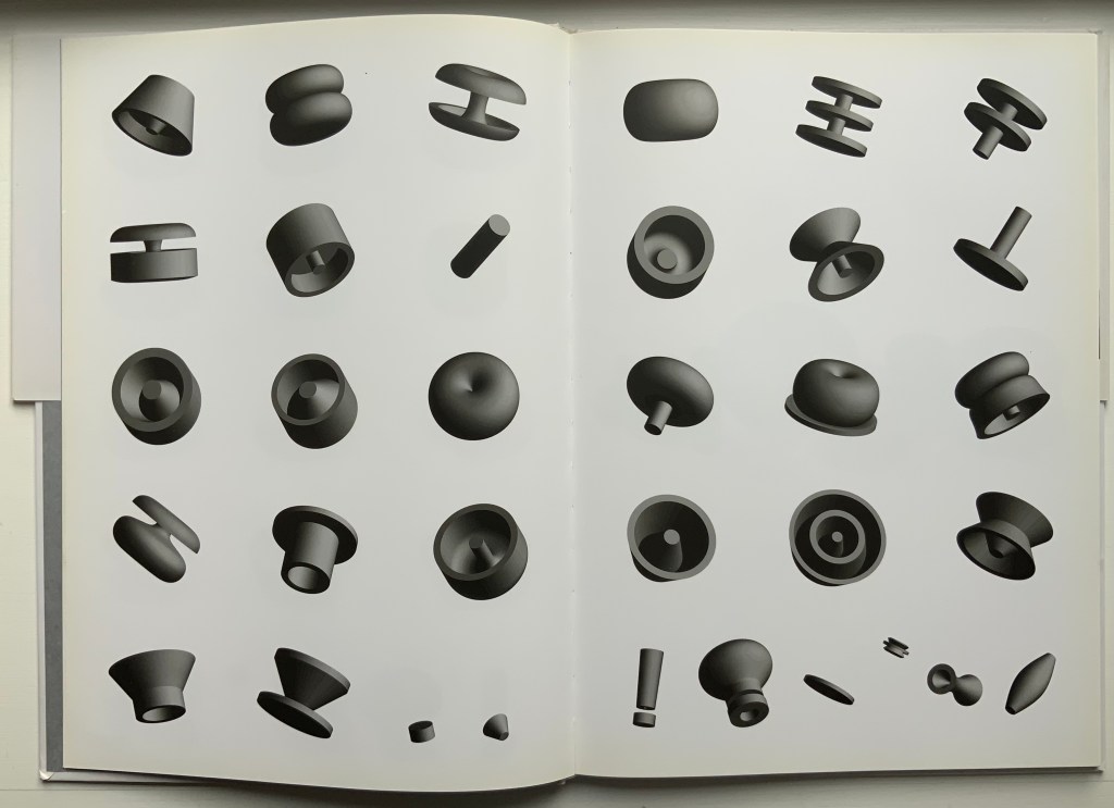
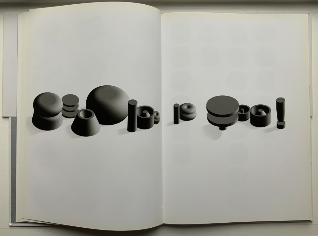
As Mitsou Ronat and Tibor Papp were preparing their mise-en-page edition of Mallarmé’s Un Coup de Dés Jamais N’Abolira le Hasard(1897/1980) following Mallarmé’s corrected proofs, Neil Crawford came across a copy of Robert Cohn’s Mallarmé’s Masterwork and was struck by its reproduction of the set of proofs sold by Pierre Berès to an American collector – the so-called Lahure proofs. Crawford, too, was determined to prepare a “typographic translation” of the proofs — but in English. In an essay providing a rich background to the poem, his meeting with Tyson and the publishing of their homage, Crawford explains how he went about his typographic translation.
First, using Cohn’s reference to the original’s size, he enlarged the reproductions photographically and then began puzzling over how to squeeze an English version taking up 10% more space than the French into Mallarmé’s careful layout. Compromising on the use of Bodoni in place of Didot as the typeface (the latter was not available to English typesetters when the poem was first pubIished anyway), it would take Crawford seven years of evenings in tracing letters, translation, transcription, adjustment, retranslation and retranscription to generate hand-crafted layouts that could be stored away until the day that photocomposition would be sufficiently advanced to accommodate the word and character spacing necessary to follow them. The original of Crawford’s typographic layout resides at the University of San Diego. Below are iterations toward the double-page spread that completes the appearance of the poem’s title within the poem.
Courtesy of Neil Crawford.
When Crawford and Tyson met in the early Eighties, Tyson had already established Tetrad Press and was planning his own livre d’artiste version of the poem. His aquatints in a separate folio cover would occupy the position Mallarmé expected for Odilon Redon’s prints in the abortive limited edition in train at the time of his death in 1898. In an ironic reversal of Mallarmé’s concern that the Redon prints might undermine the typography, Tyson and Crawford were concerned that anything less than letterpress printing would not ensure the density of black on the page that would complement Tyson’s aquatints. This led to phototypesetting output as patch setting, then hand pasting according to Crawford’s layouts, and then creation of process line blocks for the relief printing in letterpress.
At a glance, Tyson’s aquatints present a puzzling juxtaposition with the poem, but we can thank Crawford’s essay for a clue to the puzzle.
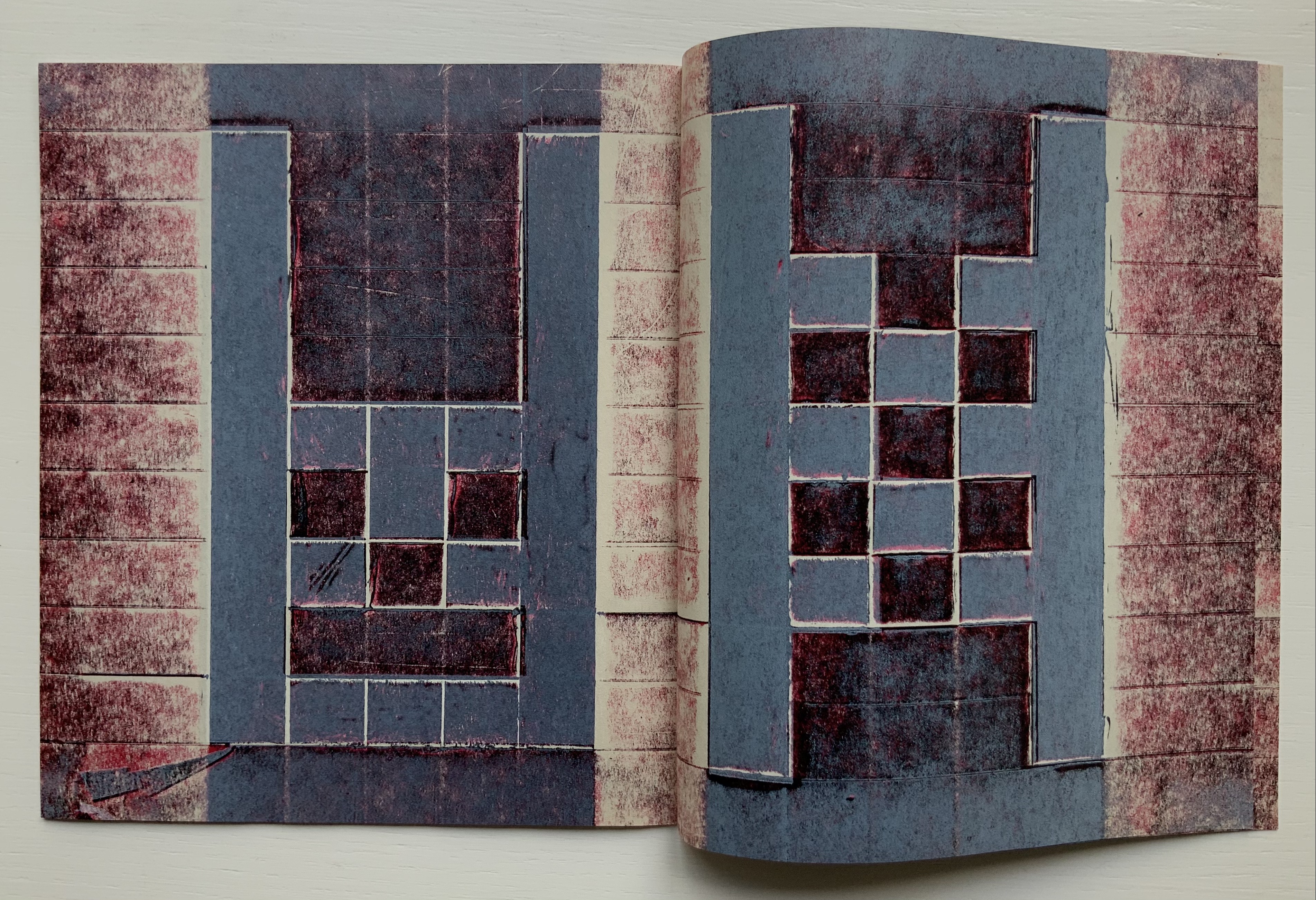
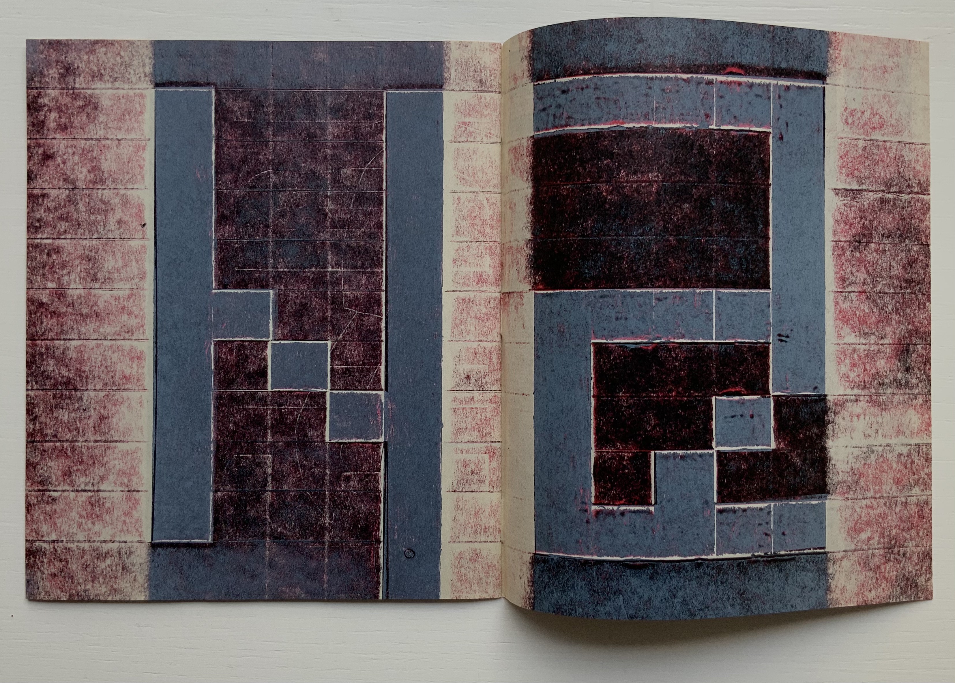
The poem’s reference to LE NOMBRE (“THE NUMBER”) has sent plenty of scholars on the hunt for its identity. Mitsou Ronat had argued that the magical number has to be 12. After all the classic Alexandrine line of French poetry numbers 12 syllables, and the larger type sizes that Mallarmé chose for the poem are 36, 48 and 60. Unconvinced “typographically”, Crawford points out that “at the time of composition – faces above 24 point were cut in multiples of twelve as standard”. Nevertheless, he also writes, “It would appear that the number 12 (the number of feet in the classic Alexandrine verse form) had great symbolism for Mallarmé” and notes that Tyson’s images
reflect the undertones of the Poème’s symbolism with a composition based on a duodecic permutation corresponding to the measures within the Alexandrine metre, referring in an oblique way to Mallarmé’s recurring imagery ….
Duodecic refers to the Base 12 system, which has the arithmetic advantage over Base 10 of making fractions easier as can be seen from the following image. To apply that image’s Base 12 grid to Tyson’s permutations, however, requires modifying it from 3×4 to 4×6. In other words, there are 24 small squares underlying Tyson’s images, not 12. Mallarmé intended the double-page spread, not the single page, to be the unit for page layout. So perhaps Tyson’s oblique reference to the Alexandrine is also “doubly oblique” (2×12), referring to Mallarmé’s preferred canvas.
Valise for Mallarmé(1997) Kathy Bruce Valise, altered book, X-ray film, wood, glass, die, collage. H8.5″ x W10.5″ x D5″. Unique. Acquired from the artist, 3 November 2021. Photos of the work: Books On Books Collection.
Any artist who flirts with surreality is likely to begin or end up carryingMarcel Duchamp‘s bags or bearing Joseph Cornell‘s boxes. Cornell himself was influenced by Duchamp. He assisted Duchamp with the latter’s Boîte-en-Valise series, 1935-41, and assembled a few of his own suitcase- or valise-based works, such asUntitled (The Life of Ludwig II of Bavaria), 1941-52, and Untitled (The Crystal Cage: Portrait of Berenice), 1934-67. Boxes though became his forté. Although Cornell sourced a substantial amount of collage material from books, he did not frequently use altered books (especially excavated ones) as an object within an object, a container of objects or object in itself. One excavation example is his Object (glass, dust and plastic spoon), 1939. Another, which however embodies all the permutations, is Untitled (To Marguerite Blachas), c.1939, a thorough-going alteration of the Journal d’Agriculture Practique (Volume 22, 1911). A variation with Volume 21 was discovered after his death in 1972.
So, since 1972, how to make anything not merely derivative? Hefting the influences lightly, Kathy Bruce takes Duchamp and Cornell in an original direction and replaces their mysterious surreality with the mysteries of Stéphane Mallarmé’s poem Un Coup de Dés Jamais N’Abolira le Hasard (1897) and with her own surreality arising from chance-found objects and chosen juxtaposition. Cornell remarked that his boxes “are life’s experiences aesthetically expressed”. Valise for Mallarmé and the four other of Bruce’s works described below are aesthetic expressions of her experiences of the poem that “made us modern”.
This Duchampian valise opens to show that it has been pressed into a Mallarméan voyage. In the deeper compartment sits a Cornellesque glass-covered wooden box. It contains a red die; collage of an engraving of penguins, a spouting whale, a ship under sail against towering glaciers and a flight of birds; scraps of paper marked with Chinese ideograms and handwritten numbers and symbols; and mechanical diagrams. A reflective, smoky blue sheet surrounds the glass-covered “raft”. It is a piece of X-ray film discarded from Gramercy Hospital in New York City. The film is face down and affixed to a sheet of paper that later developed ripples. The artist “liked the way it looked– like waves in the water, so it stayed” (correspondence with the artist, 11 December 2021).
On the shallow side of Valise for Mallarmé is an altered book, excavated to fit around the “raft” and show a passage from Un Coup de Dés pasted at the bottom of the excavation and covered with translucent paper. The book is John L. Stoddard’s Lectures (Ireland, Denmark, Sweden, Supplementary Vol 1). Stoddard was a prolific writer (16 volumes in his lecture and photograph series) and prodigious traveller (26 countries and multiple states in the US visited). The lecture series appeared 1897 to 1898, haply coinciding with Mallarmé’s poem and death. Strangely enough, where Mallarmé ended his spiritual voyage from Catholicism to atheism, Stoddard ended his from atheism to Catholicism. The combination of coincidence and divergence from this found readymade no doubt confirmed it to Bruce as the right choice of color, shape and material to echo the poem’s last line — Toute pensée émet un Coup de Dés (All thought emits a roll of the dice).
Conmoción, Contución y Compresión Cerebrales (1998)
Conmoción, Contución y Compresión Cerebrales (1998) Kathy Bruce Framed, altered book, surrounded by white cloth and containing an embedded box containing another box with dice and collage. H15″ x W12″ x D3″. Unique. Acquired from the artist, 3 November 2021. Photos of the work: Books On Books Collection.
Were it not for the preceding work, the presence of dice and and the image of a ship pasted to the back of the glass-covered box embedded in the altered book framed here, we might miss that Mallarmé’s poem inspired Conmoción, Contución y Compresión Cerebrales. The altered book’s title, difficult to make out on the spine, is Patología y clínica quirúrgicas (1873), a medical manual by Joseph-Auguste Fort, a French contemporary of Mallarmé. Fort had travelled in Spain, voyaged to South America and studied medical education and practice in several countries there, hence the Spanish of his book.
The shredded book pages packed around the box within the box embedded in the medical manual could be compared to The Wasteland‘s “fragments I have shored against my ruins”, but T.S. Eliot’s fragments are snippets of civilisation (lines from a nursery rhyme, Dante’s Purgatorio, a Latin poem, etc.) that his speaker uses to shore against his contemporary wasteland. Bruce’s snippets come from that medical manual and serve a dual purpose. First, to provide the title of her work. Second, to insulate and secure the box containing the dice and print of the ships under sail. The title appears in the bottom space between the boxes and comes from a section heading in the book, a phrase that “speaks to the chaos and confusion of the wrecked ship at sea” (correspondence with the artist, 12 December 2021).
So, from what is the packing insulating that inner box? Loose in the tilted embedded box, the dice can still roll; tilted in the box, the ships are continually bound to founder. How can conmoción, contución y compresión cerebrales (cerebral concussion, contusion and compression) be avoided? What can protect against Chance that any roll of the dice can never abolish or against the “bookwreck” in which they are embedded? What surrounds the altered book implies that they cannot. The crumpled white cloth (from the poem’s velours chiffonné) evokes not only a fallen sail but also a coffin’s lining in which the book lies. How appropriate then that Mallarmé’s poem confronting le néant (nothingness) and inspiring this work of book art is here but not here.
Solitary Plume Lost(1998 or 2000)
Solitary Plume Lost(1998 or 2000) Kathy Bruce Small cigar box, feather, pine wood, collage, cloth. Closed H1.5″ x W6.5″ x D3.5″. Unique. Acquired from the artist, 3 November 2021. Photos of the work: Books On Books Collection.
Inside the box:
Lining the cigar box, a piece of white crumpled velvet, which refers to the poem’s velours chiffonné.
A scrap of stiff, dark blue, glittering felt, a kind from which a toque de minuit (a hat or cap the color of midnight) might be made.
A triangular block of pine wood on which three translated lines of the poem are pasted along the hypotenuse surface, a 1998 commemorative stamp with Mallarmé’s likeness is pasted on the top surface, an image of the Aquila constellation with its main stars Altair, Tarazed and Alshain is pasted on the bottom surface, and constellation markings for the hypergiant stars of Draco are pasted along the two remaining sides.
A white feather, which refers to (plume solitaire éperdue/solitary lost plume), attached to the inside surface of the box’s top.
Among the best known images of Mallarmé is the portrait by Edouard Manet in 1876. Cross-legged in an armchair, the poet leans toward his right hand resting on a side table and holding a cigar from which smoke curls. It is so well known that, after puzzling over the constellations and text on the other sides of the block, it is a surprise that the image on the stamp has not somehow changed into it.
Navigating the Abyss I (1998)
Navigating the Abyss I (1998) Kathy Bruce Altered book, wood, lenses, collage, thread. H7.5″ x W5″ x D3″. Unique. Acquired from the artist, 3 November 2021. Photos of the work: Books On Books Collection.
Bruce brings her sculpture outside any enclosure with Navigating the Abyss I. Rigging-like thread wraps around a copy of Intermediate Reader, a relic from a series of readers compiled between 1867 and 1927 for the Brothers of the Christian Schools, headquartered in Montreal, which recalls Mallarmé’s school-teaching days. Three triangles of wood panelling are attached to the book’s back cover, a deft choice of material for the sail-like seams and shape. A glossy piece of postcard or a cut from the cover of an art book depicting a gilded hand, open as if having just rolled the dice, occupies one corner of the cover. It’s impossible to say whether it is the lower or upper, left or right, as the book has been turned upside down and back to front in its altering (note the photos above). The three loose lenses add to this effect of shipwreck detritus, as does the convex lens embedded like a porthole in the book and revealing a torn page and part of a handwritten letter presumably left in the book. Across from the convex lens, the pasted-down diagram is a scaled drawing of a template for what appears to be a rigging pulley with a diameter of 9 and 3/4 inches. The collaged precision diagram alludes not only to the ship but also to the poem’s reference to anciens calculs. It adds to the artifice and abstraction of poem, book, ship and flotsam that Bruce has created.
The paragraph pasted on the book’s front cover (the artwork’s “back cover”) comes from the Intermediate Reader. The content is uncannily apt:
Far in the horizon, they thought they saw a beautiful lake, with branching palm-trees. They longed for the water and the cool shade; but their ____ guide told them there was no lake in the place where it seemed to be; that it was only the mirage — a seductive illusion floating in the air.
The small rectangle excised from this passage is pasted face down among the other detritus on the opposite side. It is another bit of controlled artifice that not only alludes to the use of empty space (les blancs) in Un Coup de Dés but contributes to the work’s surreality.
Navigating the Abyss II (1999)
Navigating the Abyss II (1999) Kathy Bruce Altered book, camera lens, collage, thread. H9″ x W7″ x D5″. Unique. Acquired from the artist, 3 November 2021. Photos of the work: Books On Books Collection.
A withdrawn library copy of Jean-Jacques Rousseau’s 18th century bestseller Julie, ou la nouvelle Heloïse, with one-sixth leather binding over marbled boards, provides Bruce with the raw “stone” for her second sculpted version of Navigating the Abyss. Headed for the graveyard of pulping or burying in landfills, this culled copy, stamped WITHDRAWN in black on all of its faded marbled edges, is destined never to be opened again, a point underscored by the tangle of black thread holding it closed. The inaccessible content is the epistolary tale of Julie d’Étange, an aristocrat who falls in love with her tutor Saint-Preux, is married off to the tolerant atheist Lord von Wolmar, becomes devout to overcome her attraction to Saint-Preux, and dies of hypothermia after plunging into water to save her child. The inauthenticity into which Rousseau throws religious belief makes Bruce’s choice of this marbled stone appropriate for paying homage to Mallarmé who chose to navigate the abyss without God.
Although both versions of Navigating the Abyss have a similarity, somehow this second version is bleaker than the first. Looked at on edge, the black lens and marbled book appear to be a funerary sculpture on a plinth. Unlike the embedded lens in the first version, a single Cyclopean camera lens sits atop the book into which a hole has been bored. The darkness at the lens’ center evokes the idea of an abyss or whirlpool, especially as the words and letters from the torn pages circle around the edges like detritus being pulled down. A black-and-white version of Goya’s Saturn Devouring his Son provides the ghostly image floating in the lens. While it isn’t necessary to know the source of the image or that the series from which Goya’s mural painting comes is called The Black Paintings, the details add to the funereality evoked by the black thread, the black stamp and decayed state of the book.
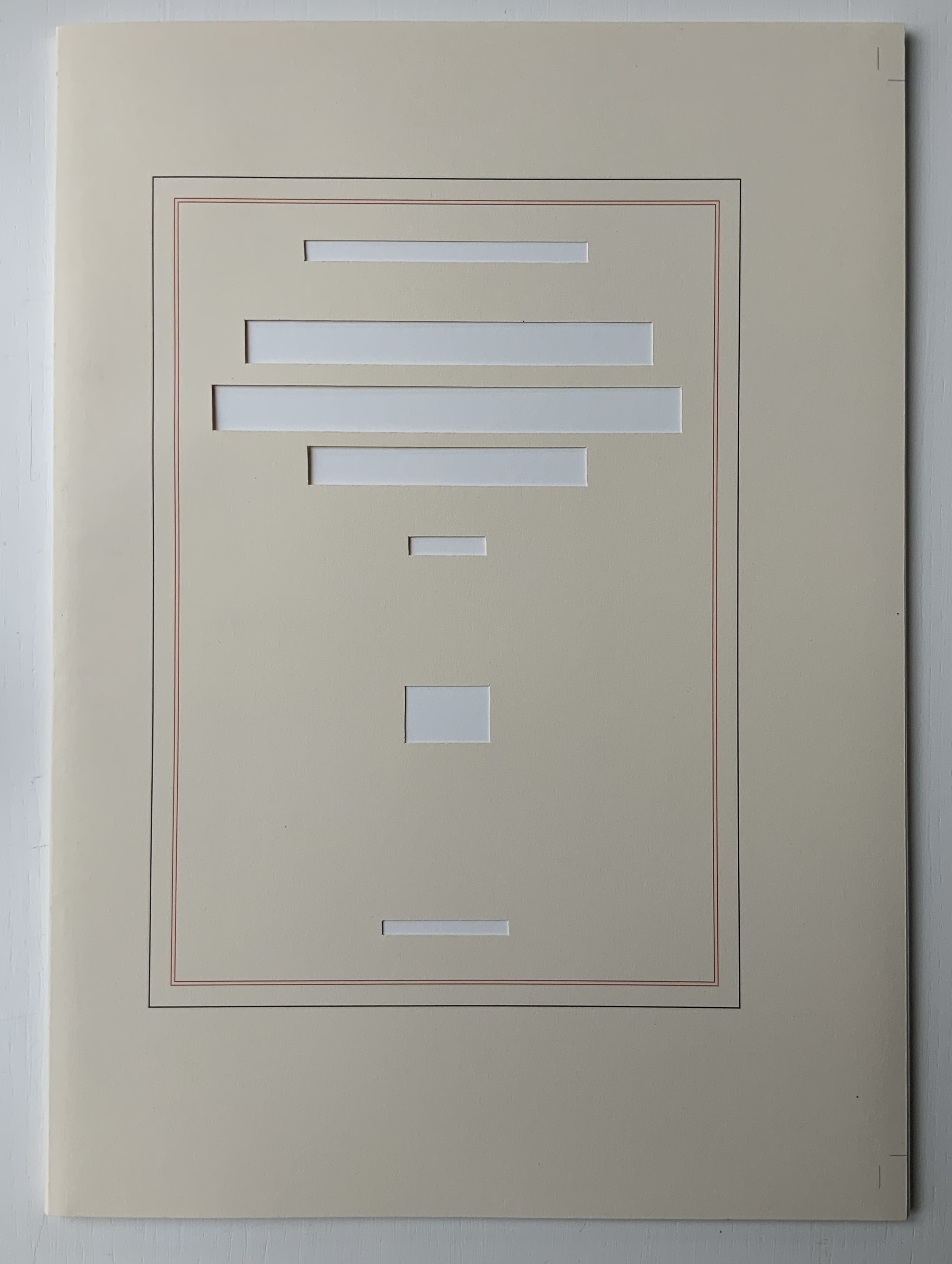
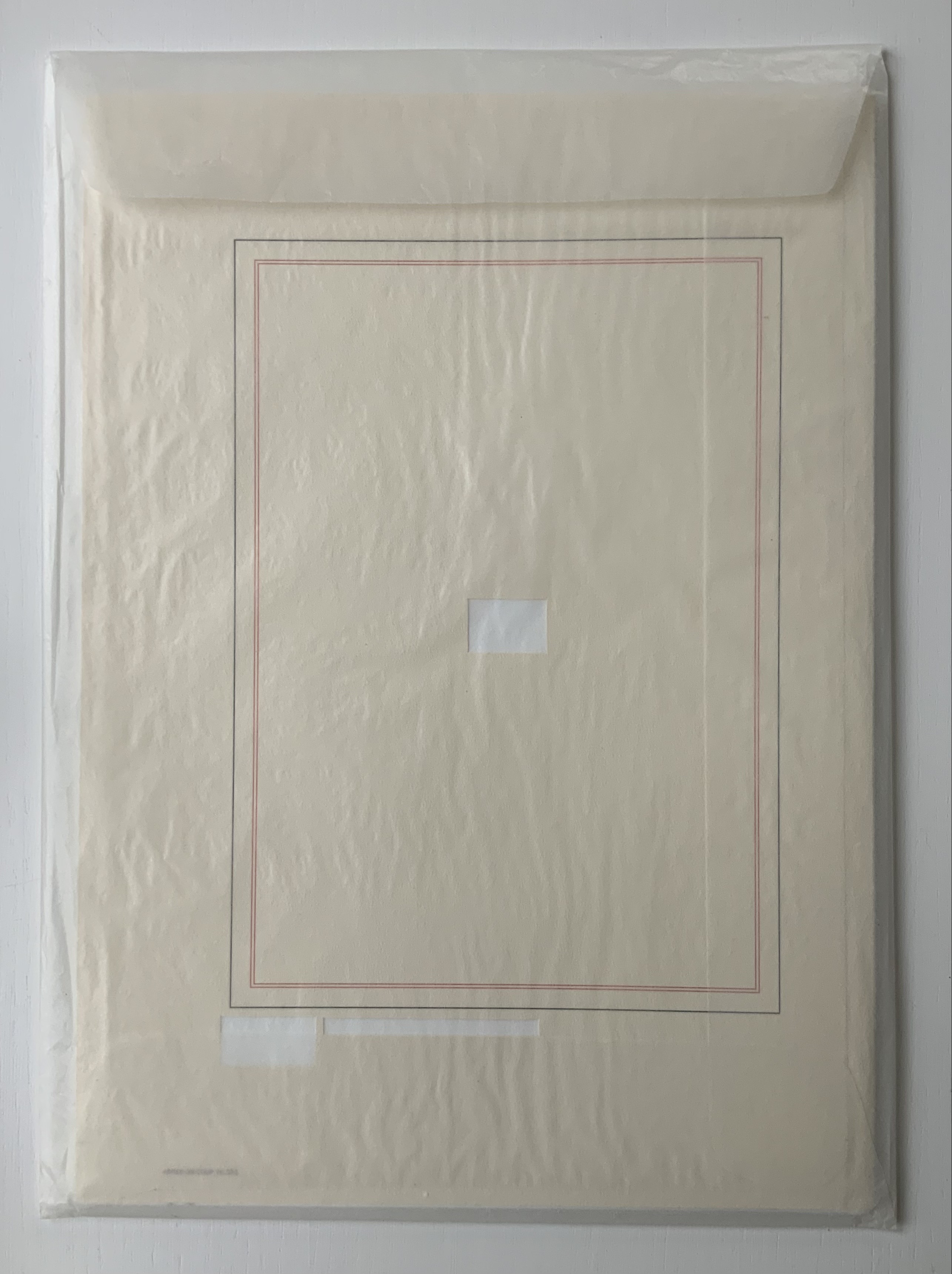
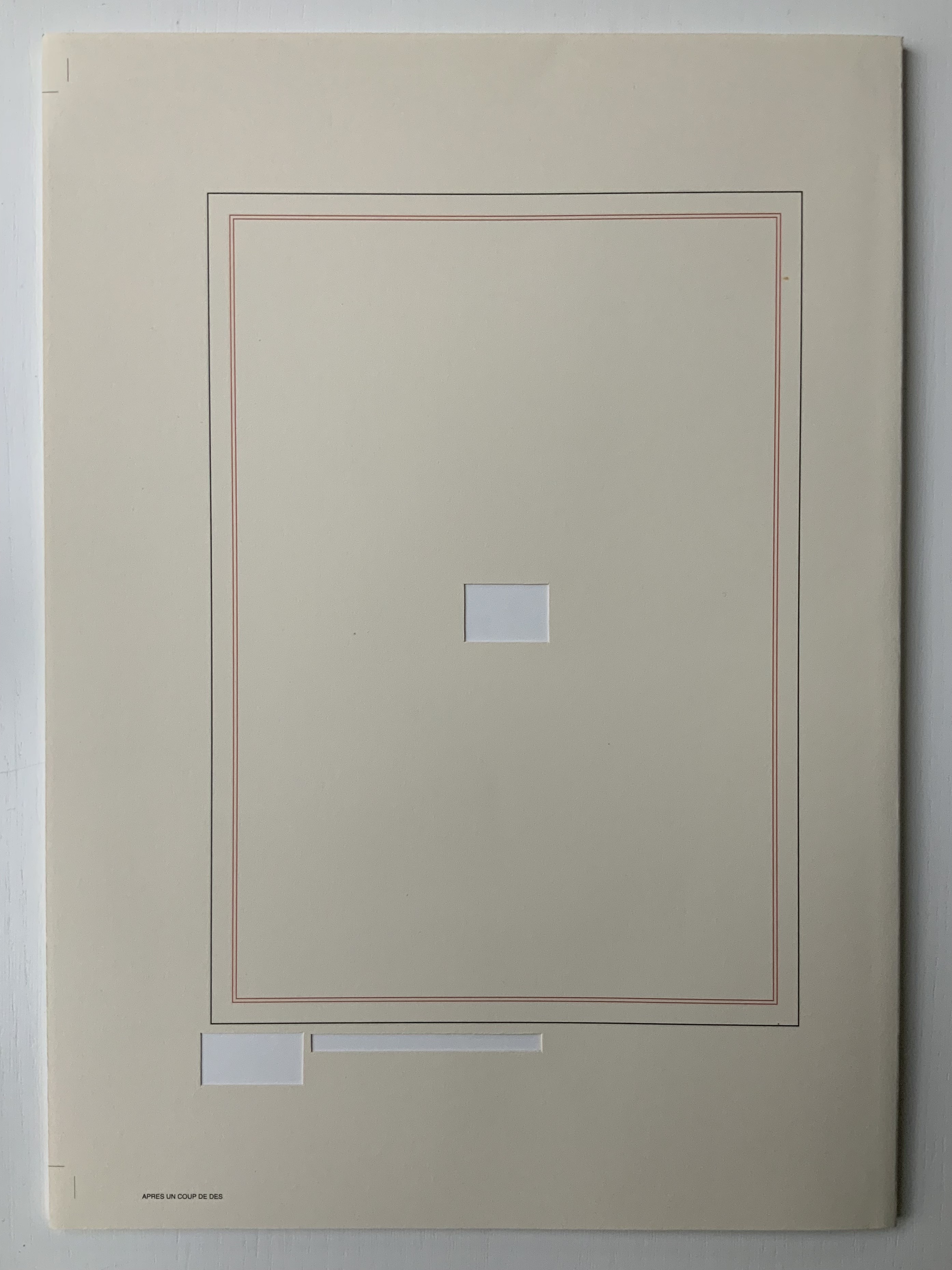
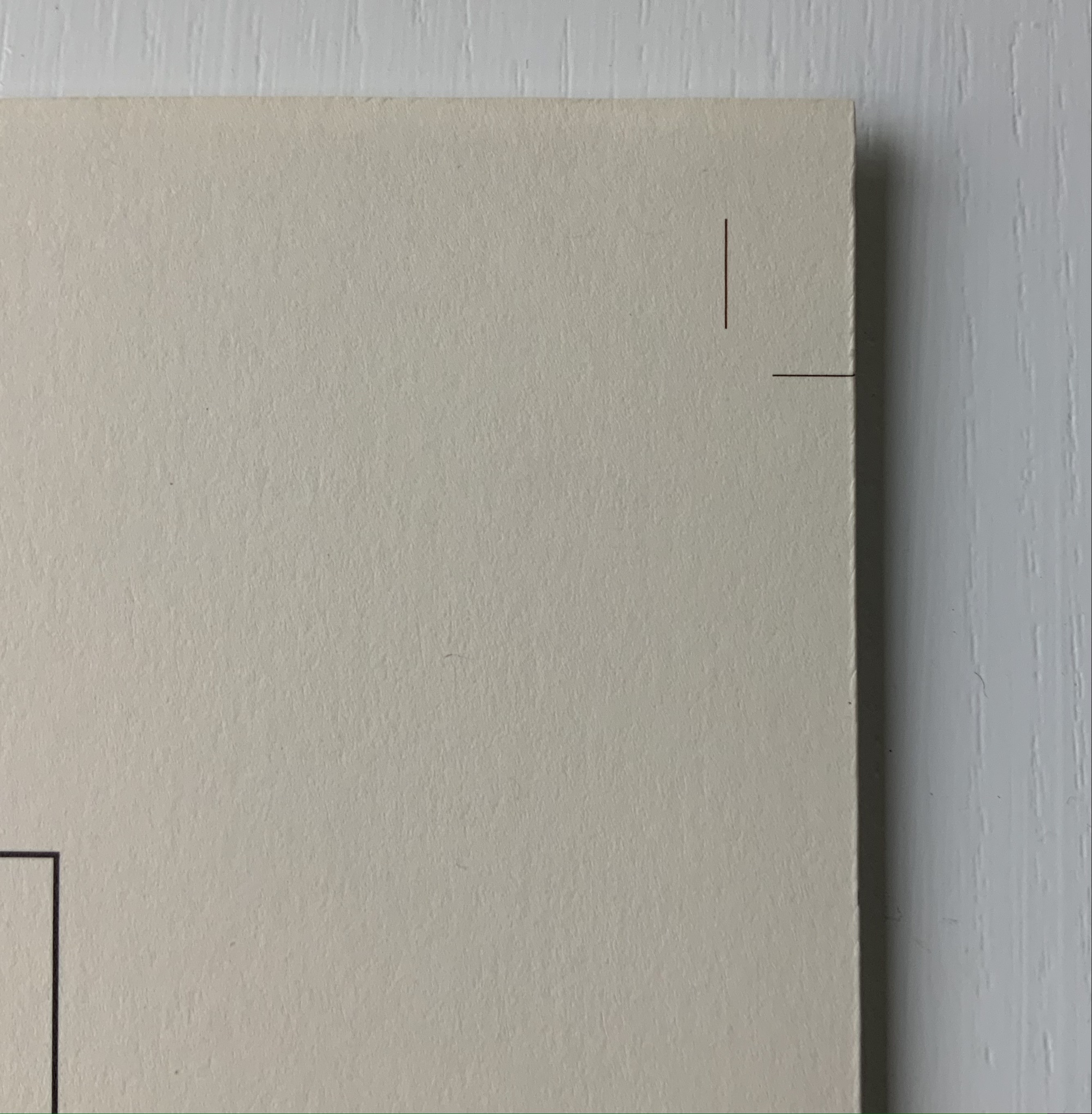
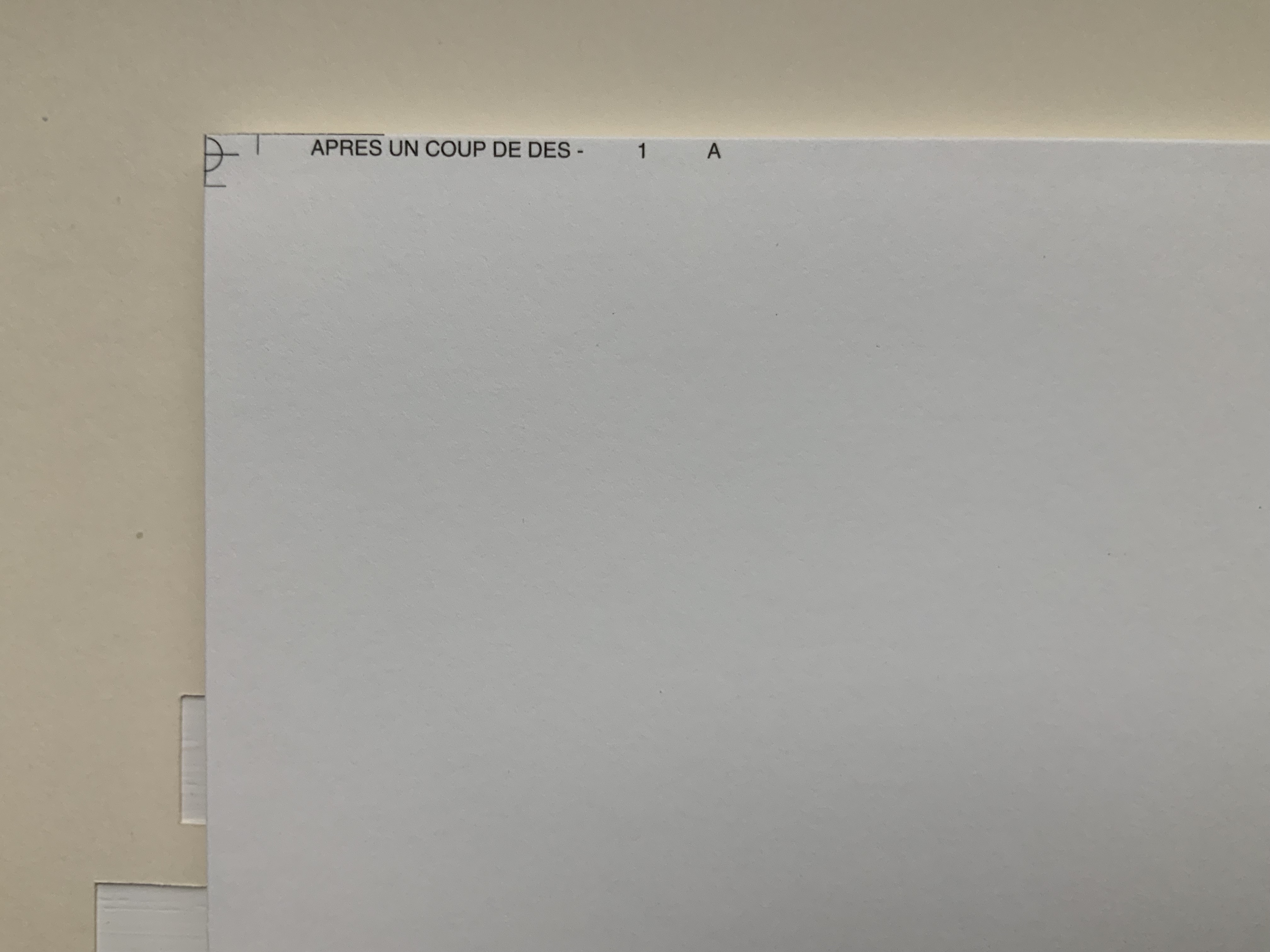
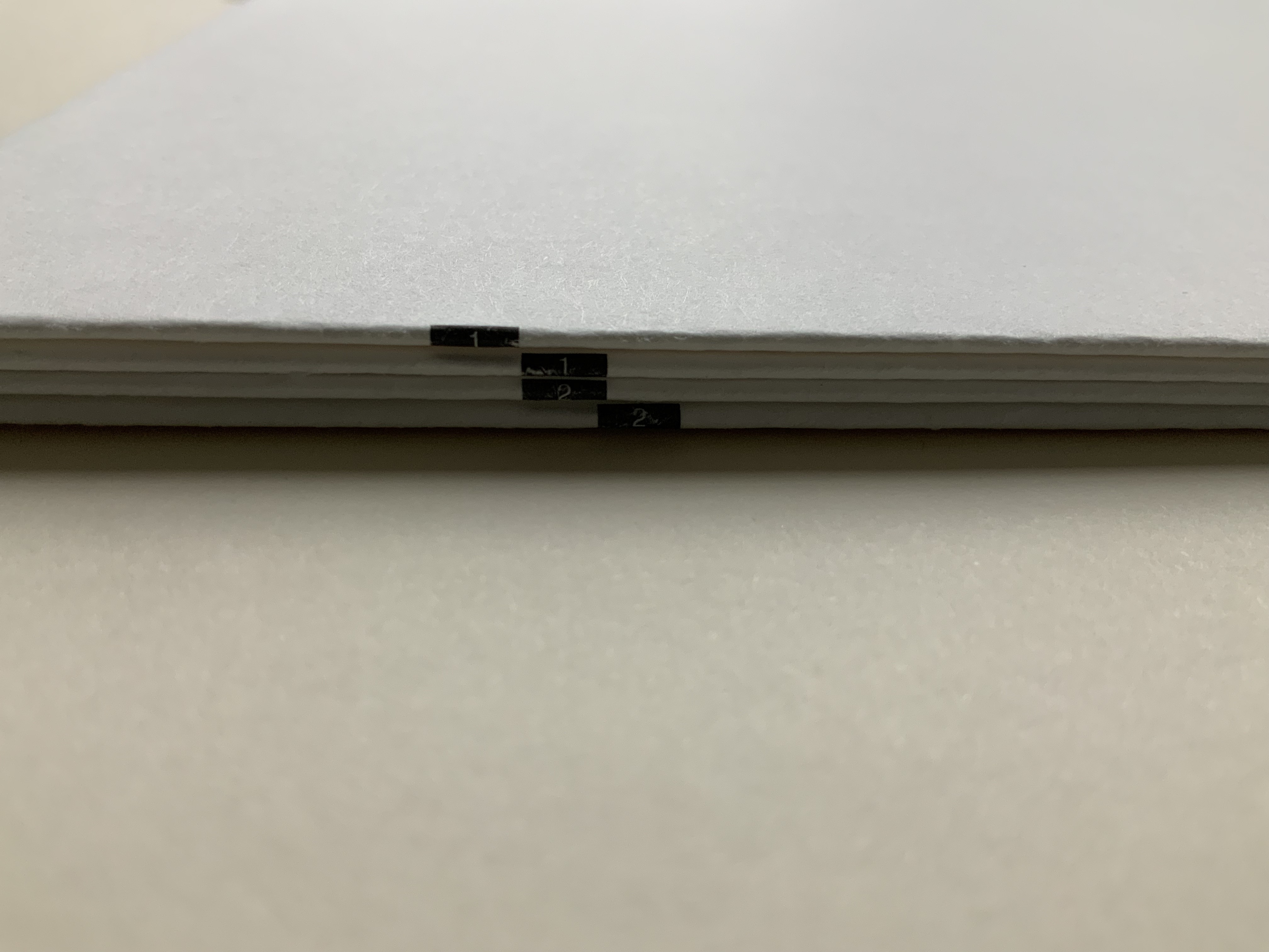
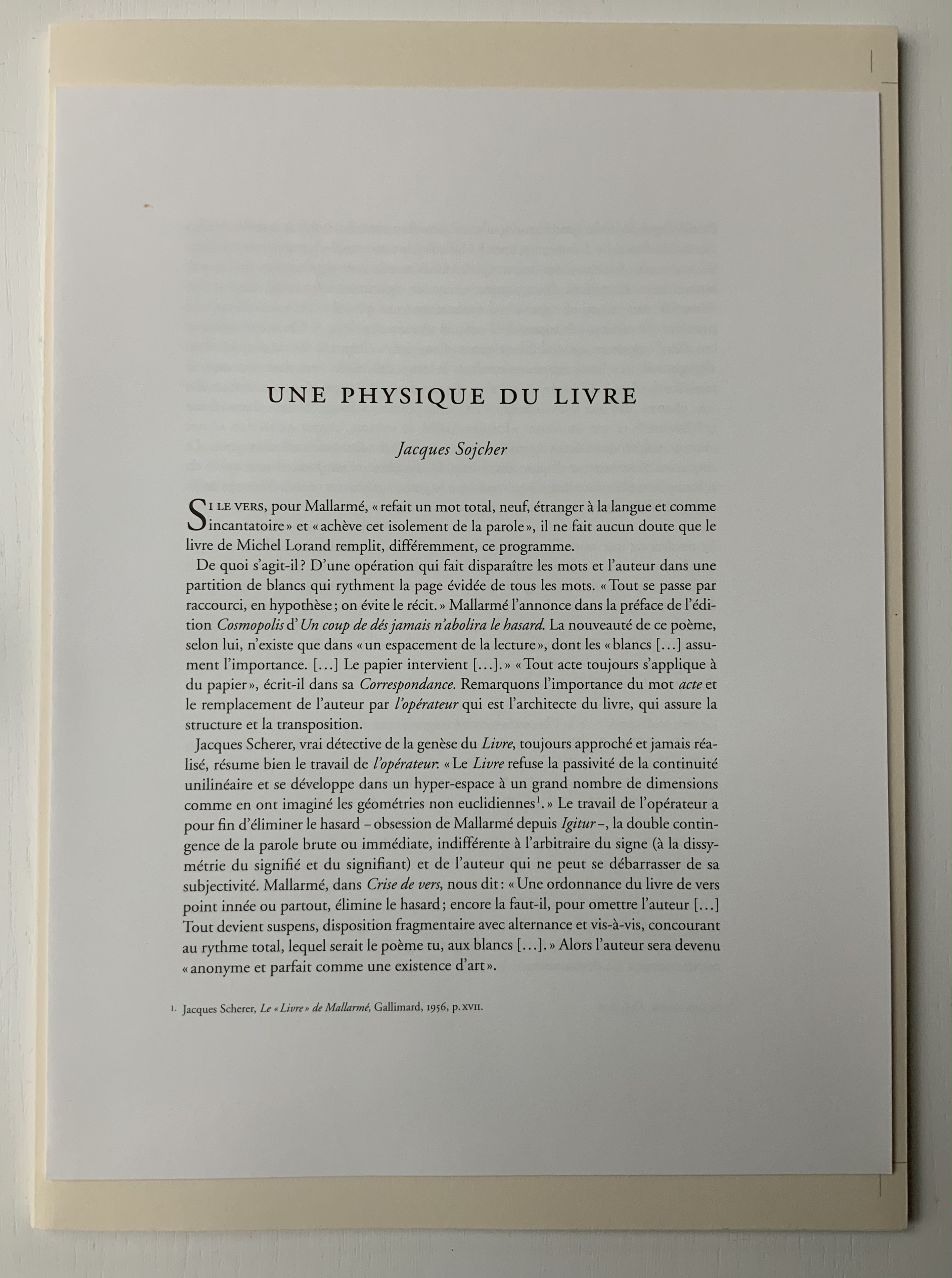
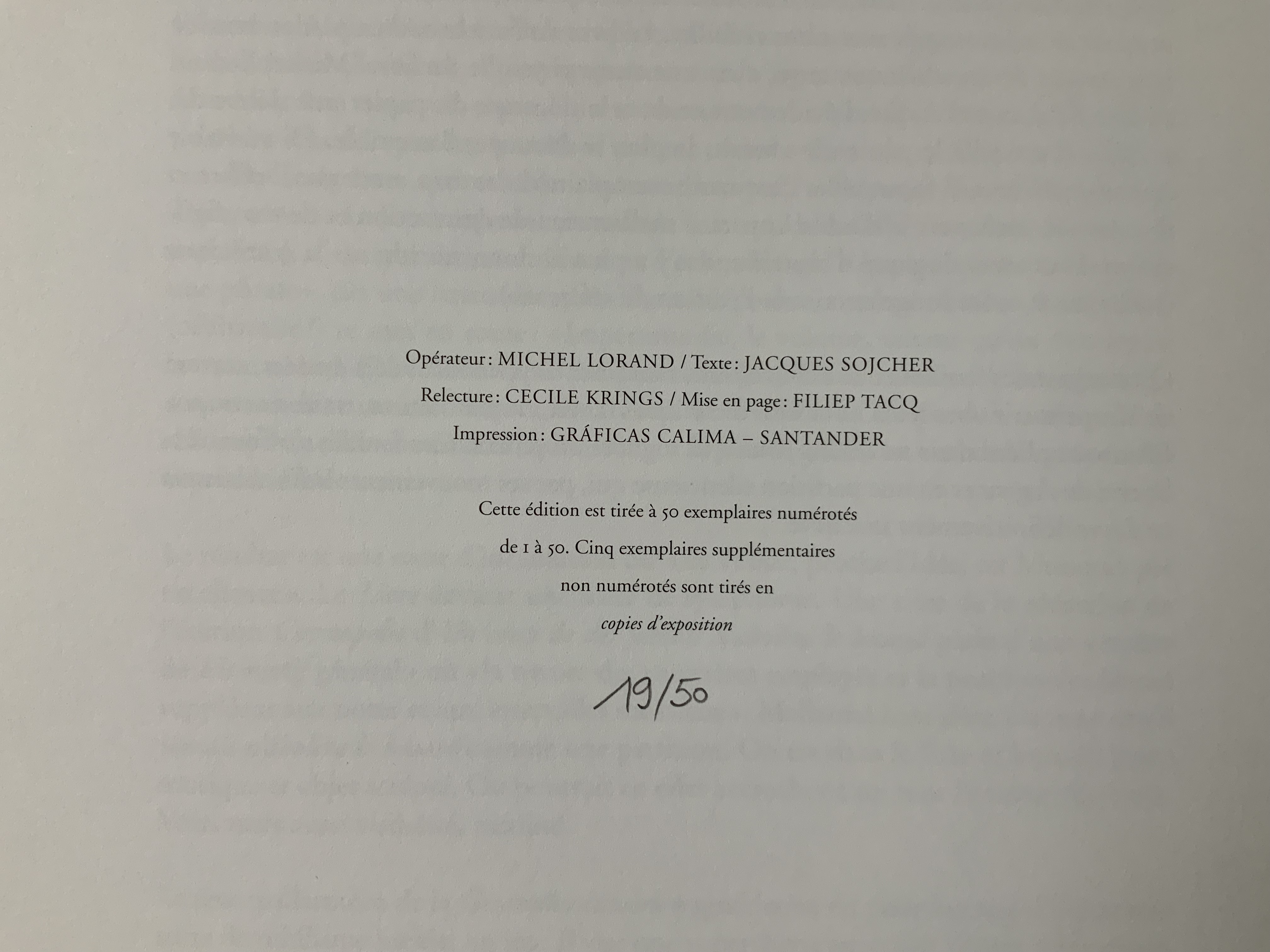
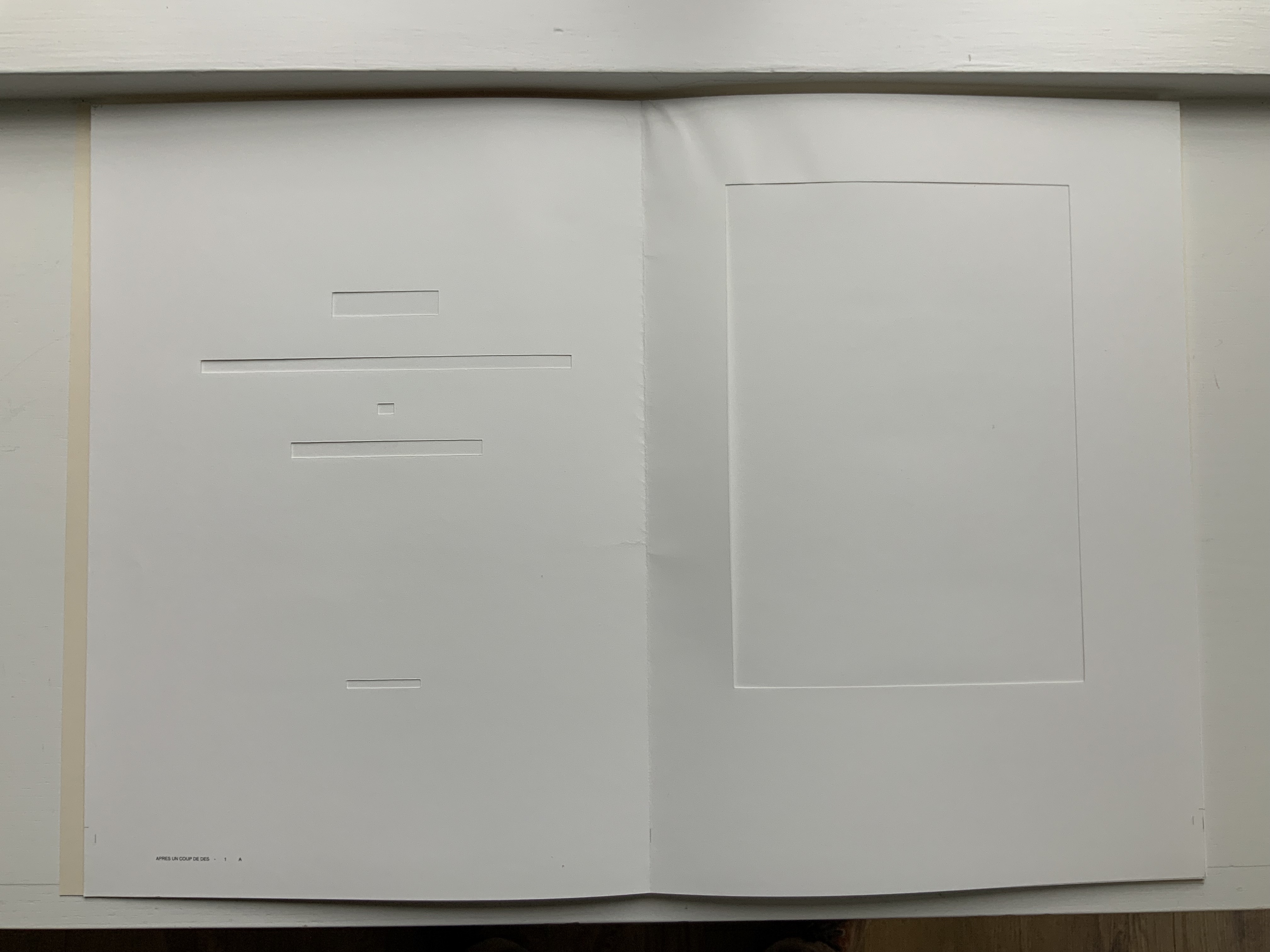
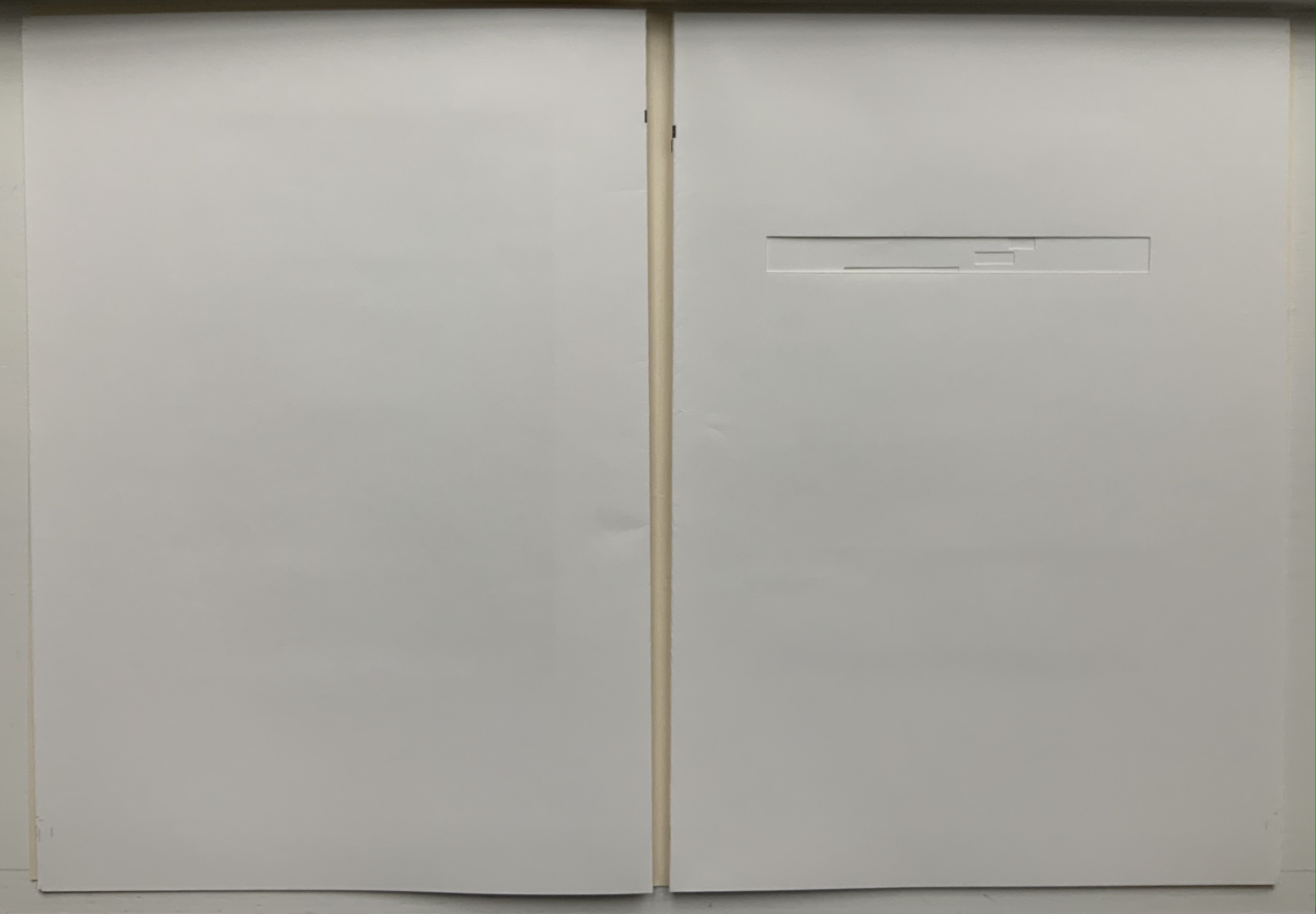
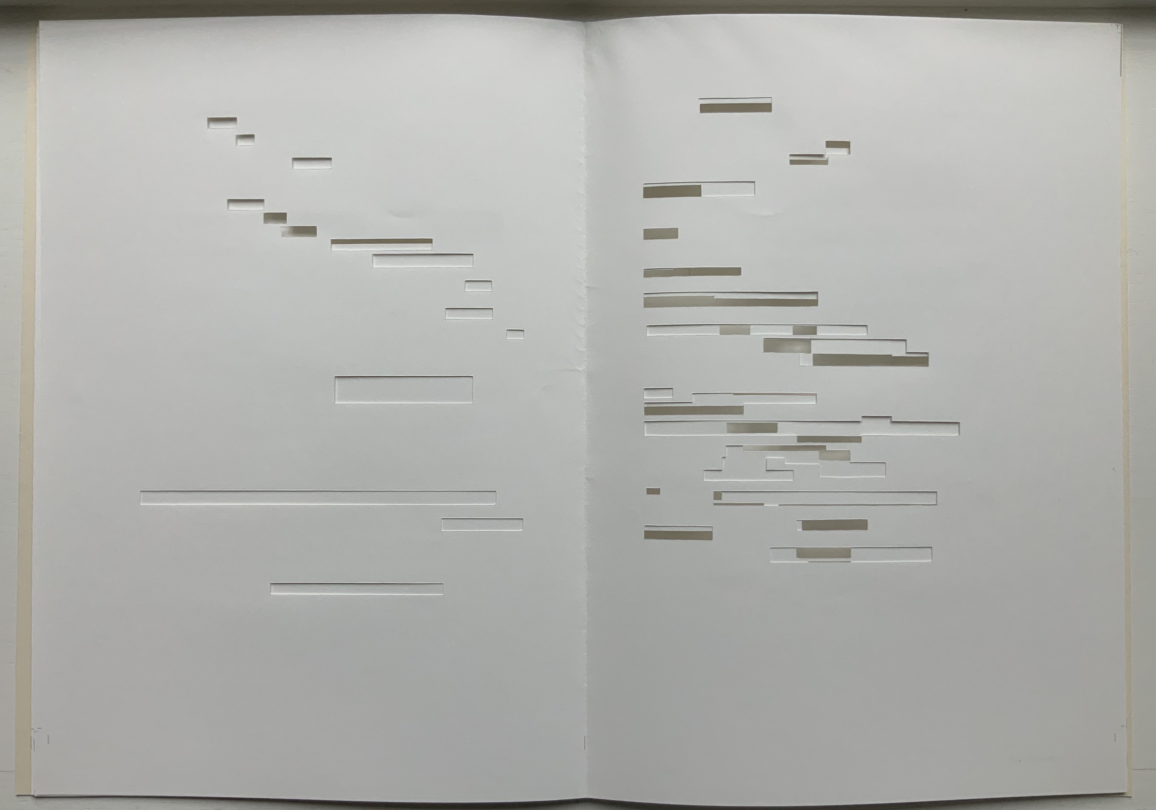
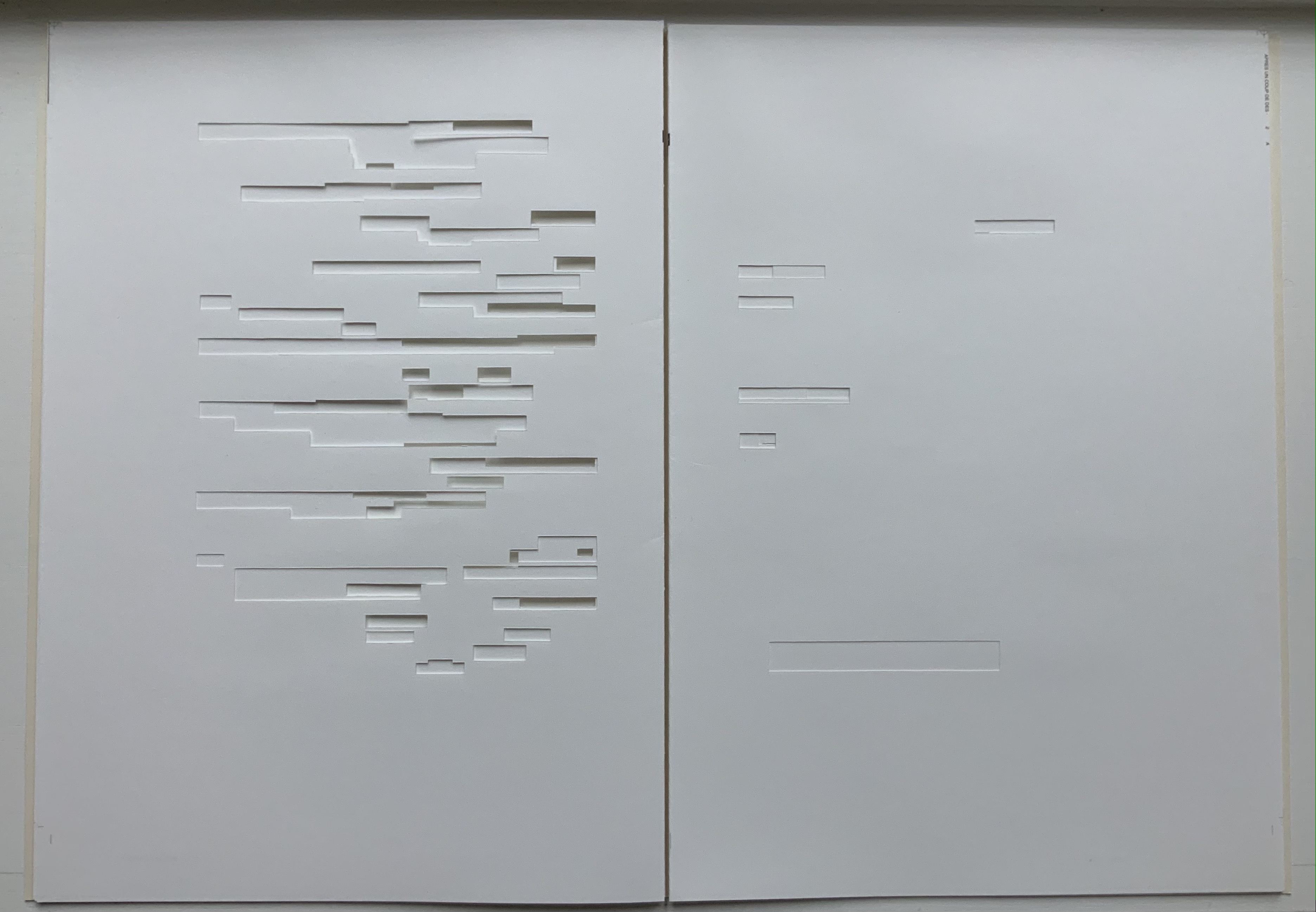
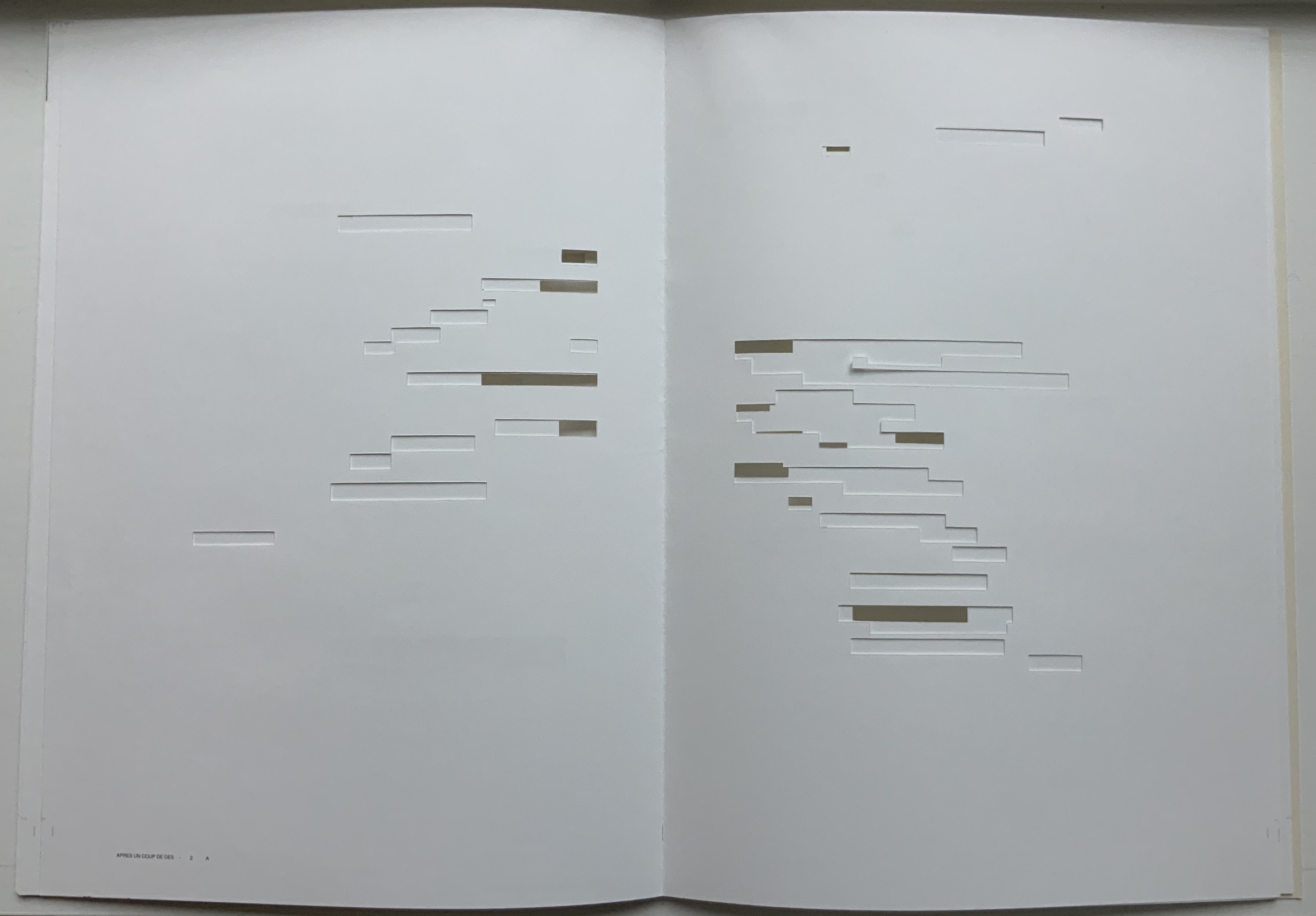
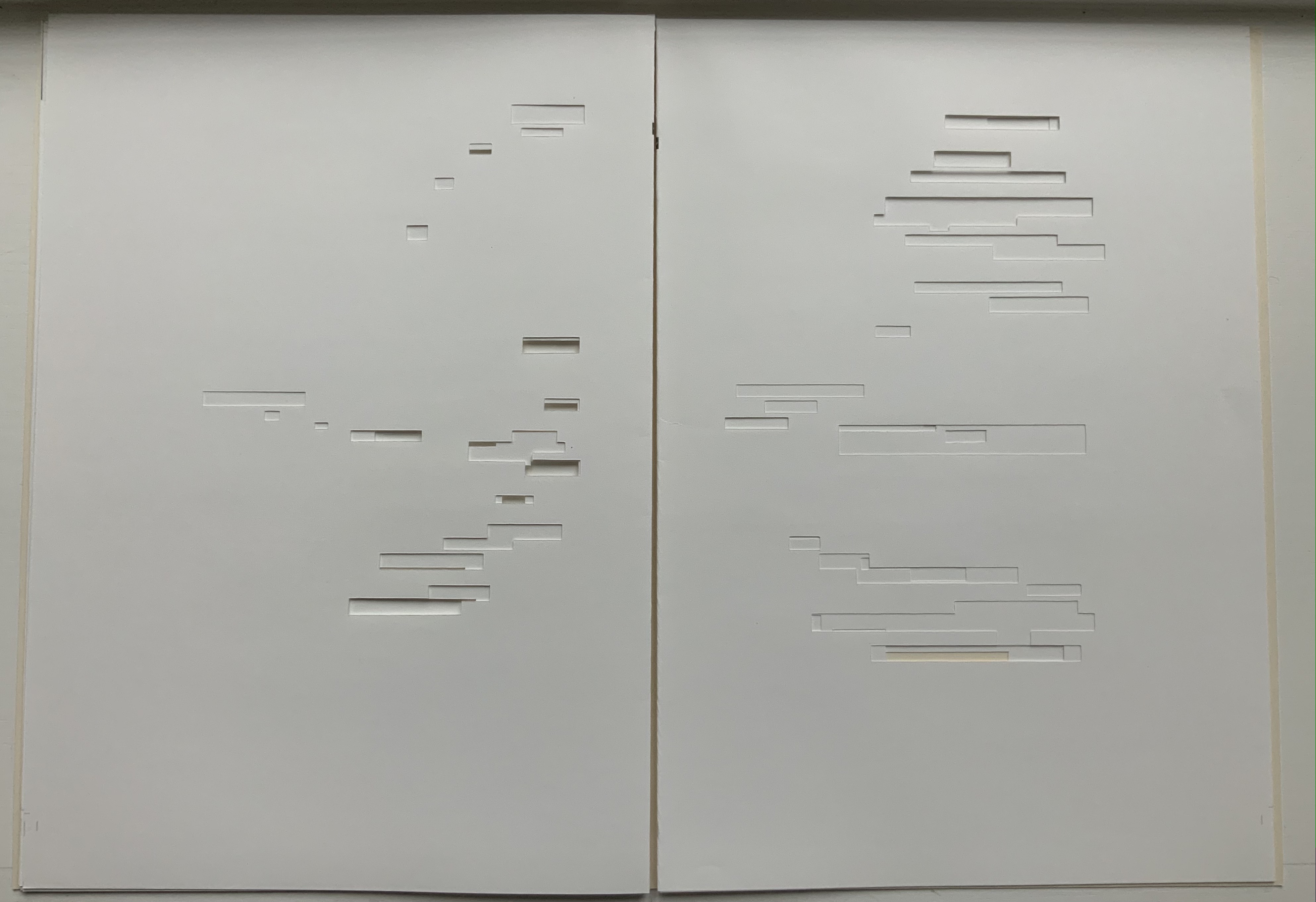
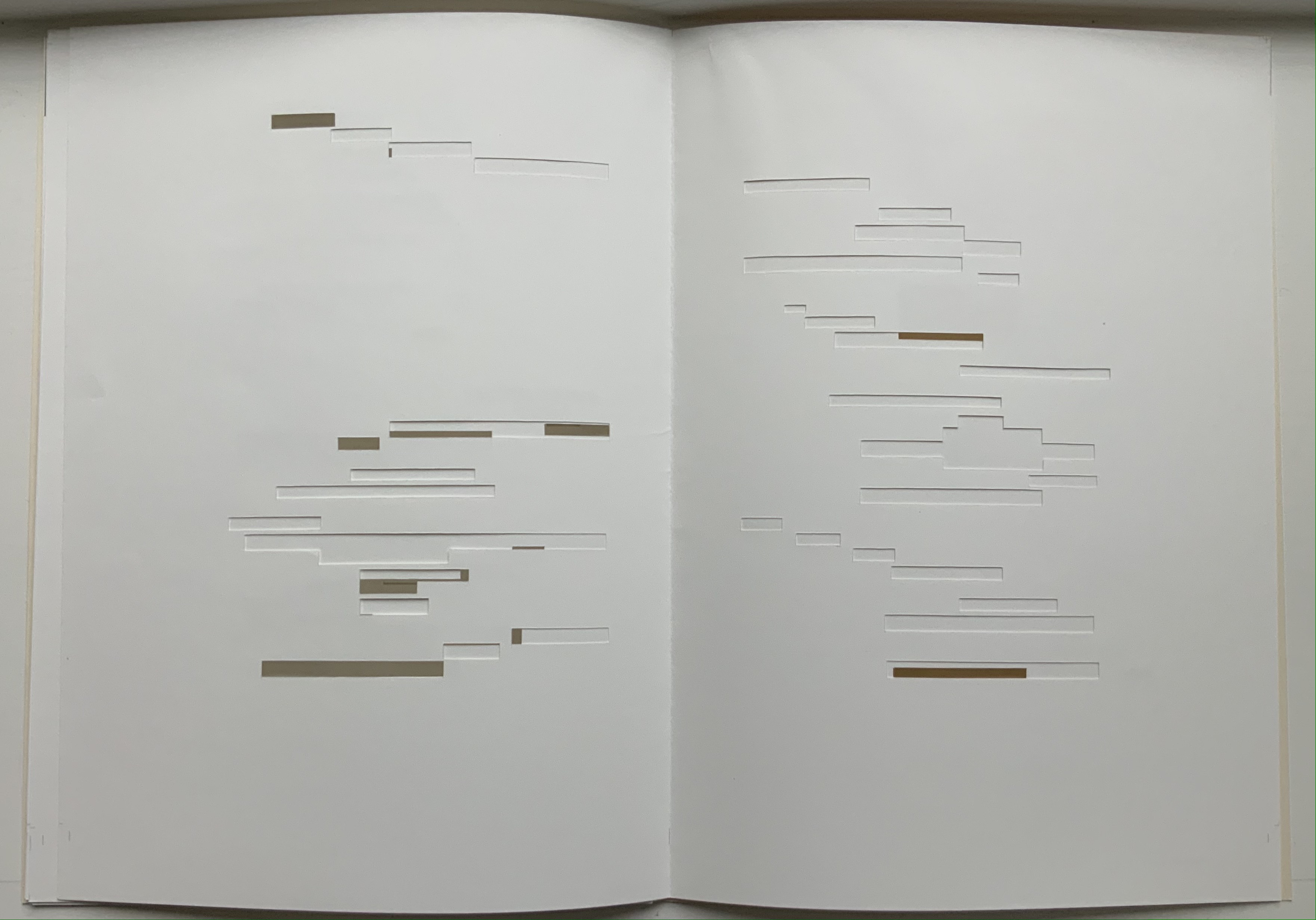
Après Un Coup de Dés (2015) Michel Lorand Cover and gatherings, untrimmed and unbound, in glassine envelope. Cover: H362 x W260; gatherings: H362 x W256 mm; 32 unnumbered pages. Edition of 50, of which this is #19. Acquired from the artist, 22 October 2021. Photos: Books On Books Collection. Displayed with the artist’s permission.
Since the 1960s when Ernest Fraenkel, Mario Diacono and Marcel Broodthaers blotted out the text of Mallarmé’s poem Un Coup de Dés Jamais N’Abolira le Hasard (1897) to create their works of homage, numerous others have expanded on the technique: substituting images of sonograms (Sammy Engramer, 2009) or algorithmically generated abstractions (Eric Zboya, 2018, and Benjamin Lord, 2019), or excising the text (Michalis Pichler, 2008, and Cerith Wyn Evans, 2008) or algorithmically erasing it (Jérémie Bennequin, 2009) — just to name a few.
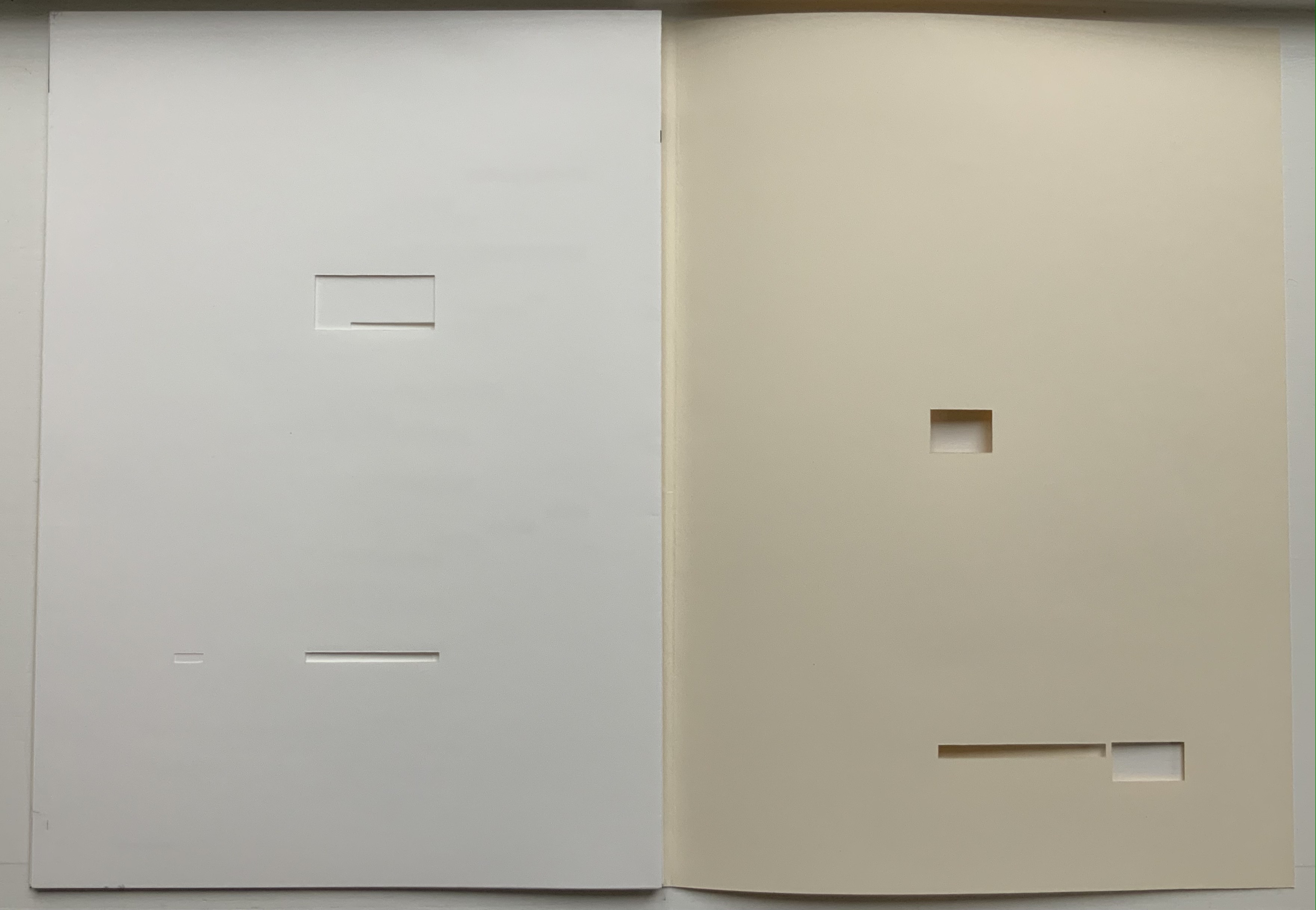
In Après Un Coup de Dés (2015), the only printed marks are the cover’s traditional black and red borders and the printer’s registration and gathering marks on the sheets. Wherever else Mallarmé’s text would have been printed has been excised. In reply to a question about the process involved, Lorand explains that he had asked the designer Filiep Tacq to create a layout that would cover in black exactly the blocks of text as it appears in the current Gallimard book edition of Mallarmé’s poem, including the front and back covers (correspondence with the artist, 1 November 2021). Lorand took a scalpel to the offset printed sheets, removed the blackened blocks, folded the sheets by hand into the four gatherings, assembled them in the correct order and laid them untrimmed and loose inside the cover. Each of fifty copies was placed inside its own handmade glassine envelope along with a flyer including introductory text by Jacques Sojcher (emeritus professor, University of Brussels) and the colophon for the work. It is a book that is not-yet a book.
Lorand’s and all of these other works of homage give us inverse ekphrasis. They are the visual, tactile and conceptual works of art that come after Mallarmé’s text. We are more used to ekphrasis where the object, painting or sculpture comes before the text — like Achilles’ shield before Homer’s description, or the Grecian urn before Keats’ ode, or Brueghel’s Fall of Icarus before Auden’s Musée des Beaux Arts. Homer, Keats and Auden vie with the art of the crafted object to put that object (and more) in front of us with words. With the inverse, the crafted objects vie without the words to put Mallarmé’s poem (and more — and sometimes less!) in front of us.
Many of the hommageurs hint at the “and more” with a subtitle to Un Coup de Dés Jamais N’Abolira le Hasard. With Broodthaers, it is Image; with Pichler, Sculpture; with Engramer, Onde (Wave as in soundwave); and with Bennequin, Omage (as in hommage with the “h” and “m” missing). With Lorand, there is no subtitle. Instead, we have the word après prefacing the truncated title of the poem. But, “after” Mallarmé’s poem, what is Lorand proposing? An homage in the form of something that restates, reproduces the poem but without the words? An homage in the form of something else presented in the manner of Un Coup de Dés but without the words? Or something else that simply occurs after the poem’s roll of the dice? As it turns out, all that and more.
Paul Valèry was probably the first of Mallarmé’s circle to see and hear Un Coup de Dés. His reaction picks out one of the themes that make up Lorand’s “and more”:
It seemed to me that I was looking at the form and pattern of a thought, placed for the first time in a finite space. Here space itself truly spoke, dreamed, and gave birth to temporal forms. Expectancy, doubt, concentration, all were visible things. With my own eye I could see silences that had assumed bodily shapes. Inappreciable instants became clearly visible: the fraction of a second during which an idea flashes into being and dies away; atoms of time that serve as the germs of infinite consequences lasting through psychological centuries — at last these appeared as beings, each surrounded with a palpable emptiness…. there in the same void with them, like some new form of matter arranged in systems or masses or trailing lines, coexisted the Word! — Paul Valéry, Collected Works of Paul Valery, Volume 8: Leonardo, Poe, Mallarmé (1972).
Lorand writes:
My <<Après un Coup de Dés>> introduces a corpus of approaches to what might be “the movement” that constitutes speech: “A language that speaks” as Martin Heidegger calls it (Unterwegs zur Sprache, Verlag Günther Jeske, Pfullingen, FRG, 1959).
How can we think, how can we imagine this movement within language itself? What path to take to allow us to experience this movement, the one that constitutes the word itself. This word is sound. The object of all my work is the identification of what could be the image of this movement, of this word. This exploration attempts to approach the nature of this movement: a word beyond language when the latter is silent. (Correspondence with the artist, 1 November 2021.)
Like his others, Heidegger’s On the Way to Language is a dense book; more than the others, it is poetical, an invitation to experience language. In it is a series of lectures entitled “The Nature of Language” in which Heidegger uses two poems, one by Stefan George and one by Gottfried Benn, to question language about its nature. Although George’s poem is the one that Heidegger deeply explicates, Benn’s is the one that, echoing Valèry, sheds the most light on Lorand’s Après Un Coup de Dés — especially with its last two lines.
A Word
A word, a phrase –: from cyphers rise Life recognized, a sudden sense, The sun stands still, mute are the skies, And compacts it, stark and dense.
A word — a gleam, a light, a spark, A thrust of flames, a stellar trace — And then again — immense — the dark Round world and I in empty space.
Après Un Coup de Dés seems to be a wordless invitation to experience language. But in a sense, Mallarmé’s words have not disappeared, not entirely. Their shapes — embodied in the voids — move silently and rhythmically across the unfolded sheets; in the gatherings, they cascade over one another much as they do syntactically and typographically in print. And even though the text is not before (in front of) us, Lorand’s artwork delivers a wordless experience of a key paradox of language with which Mallarmé sought to imbue his poem: the language of the void or abyss — the void or abyss of language. One of the ways in which the poem presents this self-enveloping paradox is that it begins and ends with the words un coup de dés, the act that can never abolish chance and the act that all thought emits. Similarly, Après un Coup de Dés displays the presence of language by displaying the absence of language, or les blancs defined by and defining empty space.
Mallarmé’s invitation in Un Coup de Dés, however, beckons us to a slightly different concept of language than that articulated by Heidegger. For Mallarmé, chance plays a prominent role in what Heidegger would call the “neighborhood of poetry and thought”. But chance, hazard or a roll of the dice plays a much less prominent role for Heidegger, and in Lorand’s work of art, with its registration and gathering marks and glassine enclosure, there seems little allusion to it — perhaps naturally so since Lorand’s work comes after the dice have been rolled.
Even though it comes after Mallarmé’s completed poem and after the Gallimard book edition, Après presents as an unfinished work, a book not yet trimmed and bound, which reflects not only Mallarmé’s unfinished realization of the poem as a book but also his unfinished life’s pursuit: le Livre, the thing in which everything in the world would end up — the thing that, by virtue of a spacious mobility of typographic layout and the interplay of its elements, would be “the total expansion of the letter”. Lorand’s attention and manual precision in excising the blackened blocks where the text would otherwise appear evoke Mallarmé’s attention to the minute details of typeface, size and font shown in his handwritten mark-up of the proofs for the book edition he was planning before he died.
Après also comes after the efforts of Broodthaers and Pichler, both of whom organized exhibitions for their works of homage. In fact, Pichler paid homage to Broodthaers by naming his exhibition “Pichler: Exposition Littéraire autour de Mallarmé” (Milan, December 2016) after “Broodthaers: Exposition littéraire autour de Mallarmé” (Antwerp, December 1969). Pichler’s exhibition was also daring in its exposure of the works to the visitors.
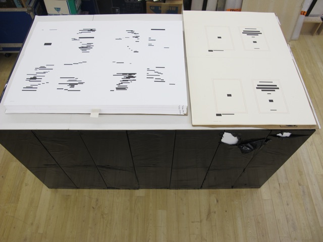
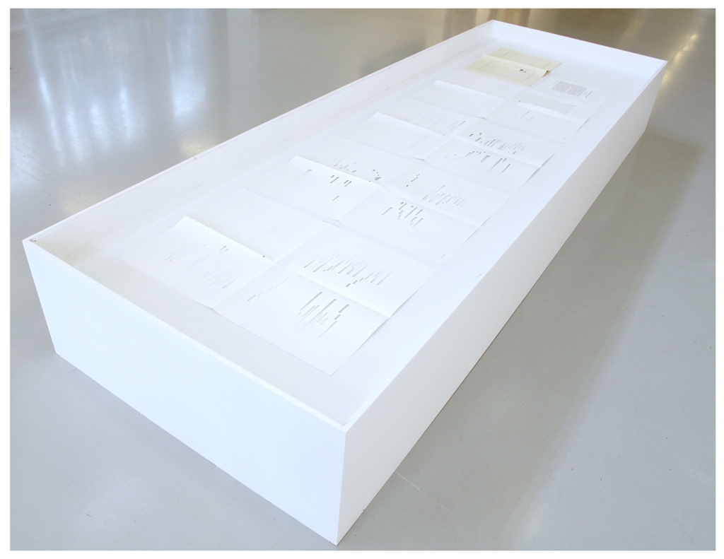
In the 2018 display of Après Un Coup de Dés, the previously gathered but now unfolded sheets and cover lie side by side under glass. Often this is cause for complaint about the distanced display of artist books. In the case of Après Un Coup de Dés, the distance effectively draws point-blank attention to what the privileged reader gradually discovers in handling the work. The unprivileged reader may have to imagine the making, unmaking and remaking of the book but, confronted with the gestalt of the undone gatherings and their registration marks, that reader immediately sees/witnesses the void defined by a void.
Après Un Coup de Dés in the group exhibition Reading Hand Writing Bodies at Les Abattoirs de Bomel, Centre d’art de Namur, Belgium, 8 February – 11 March 2018. Photo: Courtesy of the artist.
In relation to Broodthaer’s Image and Pichler’s Sculpture, Après comes both before and after. The positioning of the words après, image and sculpture vis à vis the poem’s title has been noted already. Of all three visual, tactile and conceptual works, Lorand’s stands as the chronologically “after” yet unfinished “before” to Broodthaers’ and Pichler’s finished works. In yet another “afterness” to Mallarmé’s poem, Lorand likens Après to a silent score of music or a piano roll (correspondence with the artist, 1 November 2021). This echoes — if that is not too perverse a verb — Mallarmé’s reference to “score” in his preface to Un Coup de Dés. In premonitory, if not coincidental, irony, Lorand’s piano-roll-like 2015 work precedes a work that Michalis Pichler created for his 2016 Milan exhibition: a piano roll playable on a foot-pumped pianola and entitled Un Coup de Dés Jamais N’Abolira le Hasard: Musique (see video above).
The interplay of its philosophical roots with its mechanically produced print and its manual cuts makes Lorand’s AprèsUn Coup de Dés one of the more challenging works of homage to Mallarmé’s poem. To “hear” it side by side with the others in the Books On Books Collection (see below) is rewarding.
Further Reading
“Derek Beaulieu“. Books On Books Collection. 19 June 2020.
“Eric Zboya“. Books On Books Collection. 01 June 2020.
Heidegger, Martin, and Peter D. Hertz, trans. 1959/2009. On the Way to Language. San Francisco: HarperOne. Reprint. “No matter how we put our questions to language about its nature, first of all it is needful that language vouchsafe itself to us. If it does, the nature of language becomes the grant of its essential being, that is, the being of language becomes the language of being” (p. 72).
Alphabet (2016) Julien Gineste Staple-bound pamphlet. H180 x W130 mm, 32 pages. Edition of 100. Acquired from ~zeug, 25 March 2020. Photos: Courtesy of the publisher, ~zeug.
These single-color risograph-printed photos of celebrities and literary figures are without labels. The reader’s ability to identify them depends on general, historical, literary and popular knowledge and some awareness of how the French pronounce the letters of the alphabet.
A clever piece to make us think about the relationship of text to image. If you can recognize the tennis legend Arthur Ashe, you have to know that the letter H is pronounced “aash” to make sense of his position in the booklet. No need to know there is no difference in saying “O”; you only need to know the face of Jackie O. Several of the personalities go by an initial that corresponds to their alphabetic position: Jay Z and Mister T, but did the French really call “Dubya”, the 43rd president of the US, “doobla-vay”?
Sciullo, Pierre di. L’Après-midi d’un phonème — The Afternoon of a Phoneme (Paris, FR: ~zeug, 2019). Another exercise in French/English punning — if only in the title’s play on Mallarmé’s poem and Débussy’s musical homage L’Après-midi d’un Faune. The book is a more complex affair, being both an accomplished artist book and interview by Sandra Chamaret and Julien Gieneste of di Sciullo.
Ernest Fraenkel should have left it at visually mapping Un Coup de Dés and offered it up as simply an artistic response to the poem. Even if it is a mapping of the condensed single-paged Cosmopolis (1897) version of the poem, think of the various renderings in handset chapbook form printed on letterpress or as lithographs, or etchings on glass, or even sculptures. It could have been the “Prometheus bound” to the “Prometheus unbound” of those who paid homage by appropriating the more expansive double-page spread book version (1914) that Mallarmé intended. Instead, it lies tucked away with 44 pages del’explication. Professor David W. Seaman (Georgia Southern University), who has engaged with Fraenkel’s analysis, puts it well:
It must be said in [Fraenkel’s] defense that the idea is tempting: to make wordless patterns of the pages of the poem in order to see the ideogrammatic shapes more clearly. In addition, Fraenkel has contributed some worthwhile insights into the use of space and text in the poem, … However, there are three major objections to his project. First, he used, for most of his research, the text of the Cosmopolis edition of the poem, an edition which nearly everyone agrees is far from the author’s intentions, especially insofar as the ideograms are concerned; the preface to that edition gives ample warning of this. … / The second objection is that Fraenkel strays too far from the text, preferring to keep in mind a general idea of the meaning of the poem, and then go off according to the feelings the designs give him. … In fact, sometimes Fraenkel recommends turning the design on its side or upside-down to see what image may present itself! / The third objection is that these designs are then used more or less like Rohrschach ink blots. (Seaman, pp. 142-43)
In his nine sets of single-sided uncut sheets, Fraenkel offers seven different diagrammatic approaches to the poem as it appeared in Cosmopolis, whose editors could not allow the poem’s lines to cross over the gutter to the next page as Mallarmé imagined the layout. The opening pages of Fraenkel’s seven approaches are laid out below in sunlight and paired with the textual opening page.
Seven different diagrammatic renderings. The one at the lower right shows Fraenkel’s sideways view.
The first rendering (above, upper left) is closest to what Mario Diacono and Marcel Broodthaers would create later in the decade.
Left: a METRICA n’aboolira (1968) by Mario Diacono (1968). Right: Image: Un coup de dés jamais n’abolira le hasard (1969) by Marcel Broodthaers (1969).
Fraenkel’s nine sets of sheets break down into eight of 8 pages and one of 4 pages. Below is the first set opened out.
The first set of eight pages
Compared with Diacono’s, Broodthaers’ and all the other works of homage to date, Fraenkel’s renderings retain a distinction and suggest other new directions not yet taken physically or digitally. Given the sculptural interpretations by Geraldo de Barros, Jorge Méndez Blake and Kathy Bruce, doesn’t Fraenkel’s first rendering call for a three-dimensional cantilevered homage constructed of slabs of blackened flotsam connected with brushed steel rods?
Given the video created by Giulio Maffei transforming the 1914 book version into Broodthaers’ and the digital legerdemain of Karen ann Donnachie and Andy Simionato and Tayyib Yavuz, why not an animated digital transformation of the Cosmopolis version into the 1914 book version?
And Professor Jed Rasula (University of Georgia), who has also explored Fraenkel’s work, suggests yet another medium:
“Fraenkel’s sixty-eight seismographic and astral diagrams (or “stylizations”) practice a truly graphic mode of literary analysis. It was Fraenkel’s conviction that “a plastic text rests hidden in the extra-conscious layers of the poet, paralleling the verbal text of the poem” (9). … In their accentuation of the visual character of Un Coup de dés, Fraenkel’s designs are like watching a movie with the sound turned off, forced to rely on gesture rather than dialogue in order to follow the action.”
With the exception of Unpacking my Library and Between the Sheets, Spector’s works in the Books On Books Collection fall into the category of ephemera. More than most book artists’ ephemera such as invitations, broadsides and the like, however, Buzz Spector’s ephemera have that self-reflexiveness so characteristic of book art.
Artist, curator and historian Jeffrey Abt wrote that the “irresistible” idea of placing an exhibition of artists’ books alongside the University of Chicago Library’s collection “broadly representative of the history of the book” started with a visit to famed art dealer Tony Zwicker‘s studio. It was also, however, almost as if he were taking a cue from this statement by artist-printers Betsy Davids and Jim Petrillo just the year before:
A representative collection of artists’ books often does not seem visually remarkable in a gallery, where a wide range of visual experience is the norm. The same collection, installed in a library or bookstore, can seem visually startling almost beyond the limits of decorum. — “The Artist as Book Printer: Four Short Courses”).
While Abt’s introductory essay rings the historical changes on the roots of book art — once there was Mallarmé’s Un Coup de Dés Jamais N’Abolira Le Hasard, but before Mallarmé, there was William Blake — the works included and the catalogue’s design ring some chimes of their own about book art. One way or another, all book art self-consciously draws attention to some particularly bookish element. For the most part, the 49 works listed in this catalogue ring true. The catalogue’s design itself, however, not only chimes to that notion of self-reflexiveness but also to wider notions about the nature of book art within contemporary art.
Not long after this exhibition, Spector wrote of “the language of the book” and all its parts — pages, signatures, cover, letter forms and their placement on the page, etc. — as having a syntax (“Going Over the Books”). With its pencil-circled numbers, alignment guides, pastedowns and other designer’s marks appearing throughout — as if a printer’s devil had run amok and let the marked-up proofs go to press unchanged — the catalogue draws attention to that syntax, the underlying processes of bookmaking and, therefore, this object’s “bookness”. The colophon’s note initialed by Jeffrey Abt to Buzz Spector and “pasted” on the last page jokingly rings the self-reflexive chime of the markings throughout the catalogue.
The second chime comes in the catalogue’s verbal and visual punning. Like book art, punning is self-reflexive, words playing on words. The title ”the book made art” can be read with different meanings: “the book made into art”, “art that is bookish” and so on. The catalogue’s trim and two-dimensional representation of three-dimensions create the visual pun of a glass or white cube. The verbal and visual puns also play with Abt’s “irresistible” context. Here in the Joseph Regenstein Library was an exhibition catalogue, teasing the viewer with a reminder that vitrines separated them from the bookworks. Reviewing two other exhibitions of book art, Spector elaborated explicitly on his visual tongue-in-cheek irony:
The dilemma in staging exhibitions of books as art objects is the denial of access to the work that conservation necessarily demands. … and it is a morethan passing irony that implications of hermeticism and elitism should surround books shown to a public using the library as a means of gaining access to texts. — “Art Readings”.
The catalogue also teases with its title and design by suggesting that once books have been placed on display like this, the setting is no longer a library but a “white cube gallery“. As the catalogue progresses, black-and-white photos of items from the exhibition appear on the verso page in frames that appear to be hanging on the trompe l’oeil cube’s rear wall.
Poster distributed on the University of Chicago campus. The image combines Michael Kostiuk’s Airplane Shadow Book (1981/82) with a variation of the catalogue cover. Photo: Courtesy of the artist.
But a viewer standing in the “brutalist” construct of the Regenstein Library and holding the finished catalogue might have asked, “What makes these objects I cannot touch — or, in some cases even if I could, cannot read — art?” There is the catalogue’s third chime. From the start, book art has faced a constant definitional or identity crisis and even the challenge “but is it art?” The catalogue’s title echoes Lucy Lippard’s Duchampian proposition: “It’s an artist book if an artist made it, or if an artist says it is”. The catalogue’s design says, “This is the gallery, these are the objects on display in it, they are art”.
The “white cube gallery” brings on a fourth and final ironic chime. In the 1970s and early ‘80s, artists’ books were pitched as a “democratic” medium and means by which art could escape the clutches of the gallery and reach a wider public. In another catalogue — the one for the 1973 Moore College exhibition, nominated as the first of book art — John Perreault writes:
Books as art, from the artist’s point of view and the viewer’s point of view, are practical and democratic. They do not cost as much as prints. They are portable, personal, and, if need be, disposable. Because books are easily mailed, books as art are aiding in the decentralisation of the art system. — “Some Thoughts on Books as Art”.
By the mid-80s, lo and behold, The Book Made Art’s catalogue-cum-gallery jokingly recaptures “books as art”. And in a further irony, by the mid-80s and since, the increased rareness and price of such bookworks have made them into galleries‘ and museums’ expensive objects of desire. Including this catalogue.
The Library of Babel (1991)
The Library of Babel Curated and edited by Todd Alden; catalogue designed by Buzz Spector. Dos-à-dos binding, offset. H241 x 177 mm Buffalo, NY: Hallwalls Contemporary Art Center, Hallwalls Inc., 1991. Photo of the work: Books On Books Collection.
As with The Book Made Art, Spector uses the cover (this time with a photograph of The Library of Babel) to introduce the self-reflexivity so characteristic of book art, but he does not stop there. Pagination and the back-to-back binding structure work together to evoke a mirror’s reflection; the last page of the first half “faces” the last page of the second half.
Photo of the work: Books On Books Collection.
The first half contains Todd Alden’s essay “The Library of Babel: Books to Infinity”, Paul Holdengräber’s “Unpacking Benjamin’s Library: Bibliomania in Dark Times”, and a checklist of the 34 works by their 10 artists.
Photo of the work: Books On Books Collection.
The second half contains half-tones of selected works and brief CVs of the artists. Among the half-tones are also photographs of works referenced by Alden (one by Jasper Johns, two by Marcel Broodthaers). Notice how the rules change position in the footers of the two halves, again evoking the back-to-front theme of the dos-à-dos binding.
Photo of the work: Books On Books Collection.
As in The Book Made Art, Spector had an entry in “The Library of Babel“ exhibition. With its torn pages, North Sea (for M.B.) (1990) echoes Altered LeWitt (1985), further below, but it is instead a work 10 feet long and presented on a table appropriately jutting out from the wall like a pier. “M.B.” is Marcel Broodthaers, to whose works there are multiple and layered references. The eleven “waves” of torn pages placed in a row on top of the steel shelf come from eleven copies of the Walker Art Center’s 1987 catalogue to Broodthaers’s first U.S. retrospective. Spector had all the pages in each copy painted with white gesso before tearing out the pages.
Marcel Broodthaers (1990) Buzz Spector An altered copy of: Marcel Broodthaers (Minneapolis/New York: Walker Art Center/Rizzoli, 1989). Photos: Courtesy of Buzz Spector.
He saved the excised “wedges” and bound them at the fore edges. Because the gesso does not completely obscure the text and images from the catalogues, viewers who come close to the work can see slivers of some of Broodthaers’ works along with the word fragments typical of Spector’s altered books.
North Sea (for M.B.) (1990) Buzz Spector Books, steel, gesso, 25 x 96 x 10 inches Collection Orange County Museum of Art,CA; Museum purchase with additional funds provided by Peter and Eileen Norton and the National Endowment for the Arts, a federal agency. Photo: Courtesy Orange County Museum of Art.
Spector’s library contains a copy of Broodthaers’ 1974 artist book, A Voyage on the North Sea. These layered references and self-references — direct references to Broodthaers’ A Voyage, indirect references through the self-reference to Spector’s Marcel Broodthaers (1990) — bring into sparkling focus two features of book art and, in particular, late 20th century book art: reverse ekphrasis and bookworks in conversation with one another.
When a visual work of art inspires poetry or prose, the literary result is called ekphrastic: “the verbal representation of visual representation”. But where the poets Keats, Auden and Jarrell, for example, use words to “recreate”, re-present, evoke or respond to works of art — an antique urn, a painting by Brueghel and Donatello’s sculpture of “David” — book artists have in turn used the letter, words, actual books, the physical materials of the book or even the shape of books, their functions or processes of making them to create works of art. A kind of ekphrasis in reverse.
Not only does Spector perform this reverse ekphrasis with exhibition catalogues in North Sea (M.B.), he does it in conversation with a multimedia work by Broodthaers. Works in conversation with one another is also a common occurrence in poetry. An entire anthology showcases these poems that talk to other poems. The later work not only evokes the earlier work, it illuminates and adds to it. In book art, other instances include Bruce Nauman’s Burning Small Fires (1968), a one-sheet folded book of photos of Ed Ruscha’s Various Small Fires and Milk (1964) being set on fire and burning to ash, and Dennis Oppenheim’s Flower Arrangement for Bruce Nauman (1970), a leporello which refers to Nauman’s Flour Arrangements (1967), a video in which the artist pours over 50 pounds of flour on a mock talk-show studio floor and then sculpts it into ephemeral shapes. Nauman’s shift to an ingenious folded single-sheet structure and Oppenheim’s shift (and pun) to an accordion view of flowers are part of the addition to their conversations with their very structurally different counterparts. Spector’s shift to the sculptural is part of the addition to his conversation with Broodthaers’ book and video. Consider not only Spector’s gessoed sea of pages and the pier, but also those two 19th century black bronze sailing ship bookends evoking the 19th century nautical painting that Broodthaers appropriated in A Voyage on the North Sea.
North Sea (for M.B.) (1990) Buzz Spector Books, steel, gesso, 25 x 96 x 10 inches Collection Orange County Museum of Art,CA; Museum purchase with additional funds provided by Peter and Eileen Norton and the National Endowment for the Arts, a federal agency. Photo: Courtesy Orange County Museum of Art.
Unpacking my Library (1994-95) Buzz Spector Leporello full-colour offset printed; folded H100 x W155 mm, unfolded W3600 mm; Cleveland Center for Contemporary Art. Installation exhibited at the San Diego State University Art Gallery, 1-31 October 1994. Photo of the work: Books On Books Collection.
Clearly from his entry in The Library of Babel, Spector’s artistic output extends beyond altered books and catalogue design to larger scale installations. One of the more well-known, Unpacking my Library imposes multiple orders on what Walter Benjamin called “the chaos of memories”. How “multiple orders”? First, because of its subtleties; second, because of its several forms.
From the start at the San Diego State University Art Gallery, 1-31 October 1994, the installation imposed the order of “descending height” on Spector’s library, unpacked and displayed across one shelf attached along the white walls of a room in the gallery. The single shelf ran 188 feet.
Although Spector is rejecting the library’s traditional method of making sense of a collection of books — ordering by academic category — in favor of a physical criterion, the title imposes another method of making sense — allusion. The installation makes “more” sense if you have read Walter Benjamin’s essay “Unpacking My Library — A Talk on Collecting” (1931). If you haven’t, then, on the reverse of the leporello produced with the Cleveland Center for Contemporary Art, are these two sentences from the essay:
This or any other procedure is merely a dam against the spring tide of memories which surges toward any collector as he contemplates his possessions. Every passion borders on the chaotic, but the collector’s passion borders on the chaos of memories.
So what has ordering by height to do with the chaos of memories? Well, if the order of the personal library had been chronological by acquisition, that would be an assertion against chaos, a kind of aide- mèmoire. If the order had been by the library’s traditional method, again that would be an assertion against chaos. Benjamin and Spector embrace the chaos. Spector’s at-first amusing and puzzling organization of his library prods the viewer into the chance to do somewhat the same — to wander along the shelf with that phrase of process hovering in the mind and be reminded of books once read (when? where?), familiar and almost-familiar names and places (from when or where?) and subjects studied (what did that cover?). But the viewer also experiences a surge of unknown names, places and subjects, and spines that mystify.
The allusion to Benjamin’s essay offers another way of making sense of this experience into which the viewer is prodded. If a personal library is a kind of self portrait you can detect from the clues that its usual groupings into fiction, biographies, history, science, etc., give us about the owner, then here the order by height washes them and the portrait away. And if the viewer knows the essay, Benjamin’s last sentence may come to mind:
So I have erected one of [the real collector’s] dwellings, with books as the building stones, before you, and now he going to disappear inside, as is fitting. — Walter Benjamin, “Unpacking My Library”
Spector mentions this disappearance in a video record of the making and showing of the installation. Whether or not the installation’s spectator knows Benjamin’s essay, the installation’s title is a clue to the imposition of a fictional order. “Unpacking my library” is a phrase implying an activity that is just getting going. For his essay, Benjamin created the fiction of the reader’s being present as the library is being unpacked. Likewise for Spector’s installation, any spectator walking into it has entered a fiction. Spector’s library has already been unpacked, sorted on the floor and placed on the single shelf running around the room.
Of course, however, the owner of the leporello form of Unpacking my Library does not experience this fiction as directly. The opening and arranging of the leporello is a hands-on activity; the unpacking of Spector’s library occurs panel by panel in the reader’s hands. The library’s arrangement by height appears more gradually than in the gallery. Once the bookwork is fully extended, the installation’s fiction then becomes more readily available to the leporello’ s reader/viewer.
Photo of the work: Books On Books Collection.
As fictions, Benjamin’s essay and Spector’s installation need an ending. Benjamin’s technique is to disappear into his collection. Spector chooses a different technique. In correspondence with Books On Books, he writes:
The length of all the publications in my library was 165 feet; the single shelf, at the UCSD Art Gallery, on which they were placed ran 188 feet. That additional space implied a future, and life-affirming, growth of my collection. — Buzz Spector, 26 March 2020.
Photo of the work: Books On Books Collection.
Whether it is leporello or installation, the reader/viewer of Unpacking my Library is launching and launched on this open-ended ending.
The Book Maker’s Desire (1995)
The Book Maker’s Desire: Writings on the Art of the Book Buzz Spector Pasadena, CA: Umbrella Editions, 1995. 2nd printing. Cover design by Buzz Spector. Image: History of Europe (1983) by Buzz Spector; plaster over found book, 10.5 x 12 x 15 inches. Photo of the work: Books On Books Collection.
Spector’s essays are tonic. His comments on Margaret Wharton’s bookworks could refresh any reader and viewer lucky enough to see her works (Union League Club-Chicago or Yale) or remind the viewer of them when looking at works by later artists such as Thomas Wightman or the “Mystery Book Artist of Edinburgh”. In the past few months, Walter Hamady and John Baldessari have died, and Spector’s essays on them bring them both and particular works of theirs to present life. His essay and letter on Broodthaers would enhance any reading of the artists who have stood on Broodthaers’ shoulders to address Mallarmé’s Un Coup de Dés: Bennequin, Mutel, Pichler, Wyn Evans, Zboya. The essay “Going Over the Books” may have inspired Alden’s curation of ‘The Library of Babel” exhibition.
The essays are not entirely the point of having The Book Maker’s Desire in the Books On Books Collection. What completes the point is the cover design. The object on the book’s front cover is Spector’s own work History of Europe (1983), which pays homage to Broodthaers’ Pense-Bête (1964). But look closer. The cover stock has elements of text and colour seeping through, almost as if it were made of shredded books. The aptness and artistry of the cover design make The Book Maker’s Desire an object of desire in and of itself.
Detail of cover: Books On Books Collection.
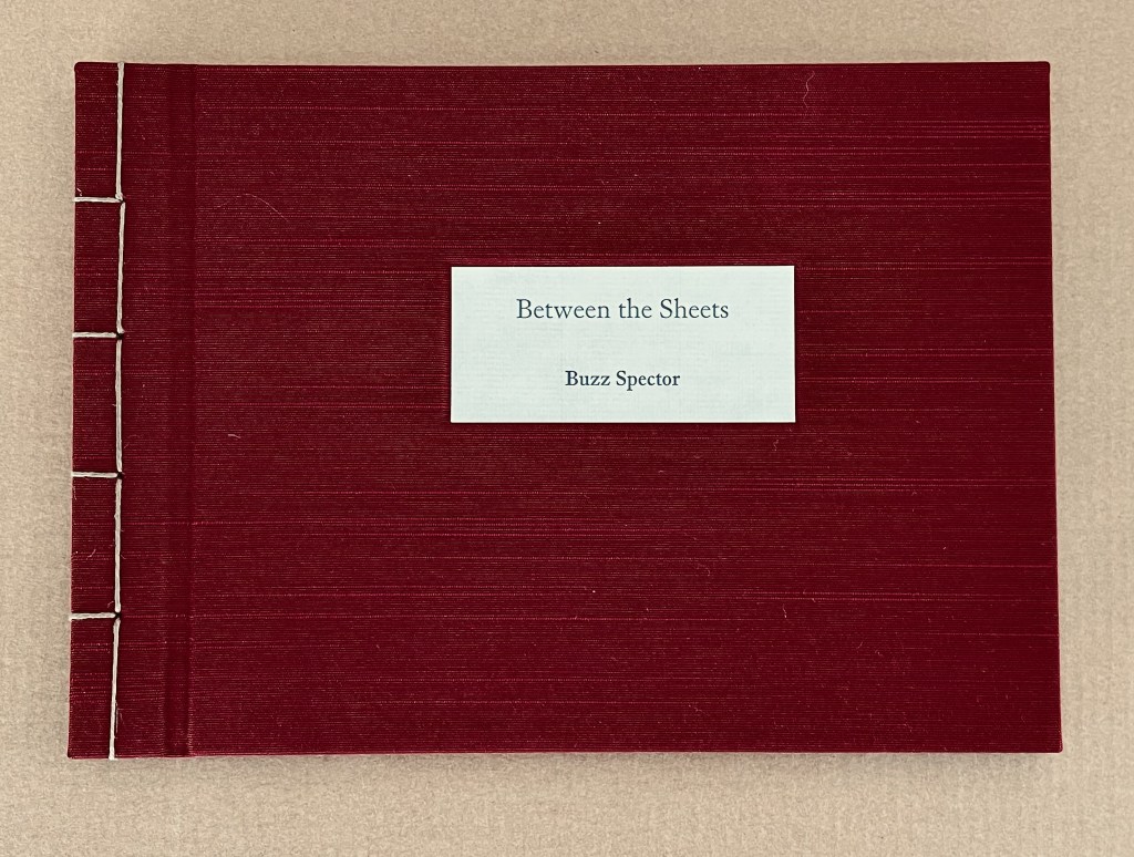
Along with Unpacking my Library, Between the Sheets (2003) is the only other of Spector’s limited edition artist’s books in the Books On Books Collection. It is the solo exhibition to the joint exhibition of The Book Made Art (1986), described at the outset of this entry. In Between the Sheets, Spector again shows the self-reflexiveness of book art but also demonstrates how originality can spring from it.
Between the Sheets (2003)
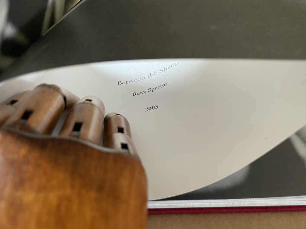
Between the Sheets (2003) Buzz Spector Cloth over boards, Japanese stab binding, 15 folded sheets, outer sides offset printed with enlarged “authors’ photos” clipped from dust jackets of art books repurposed by Spector for his bookworks, inner side printed (recto only) with text by and selected by Spector. H157.5 x W216 x D12.7 mm. Edition of 40, of which this is #40. Acquired from Olive Branch Press, 26 June 2020. Photos of the work: Books On Books Collection.
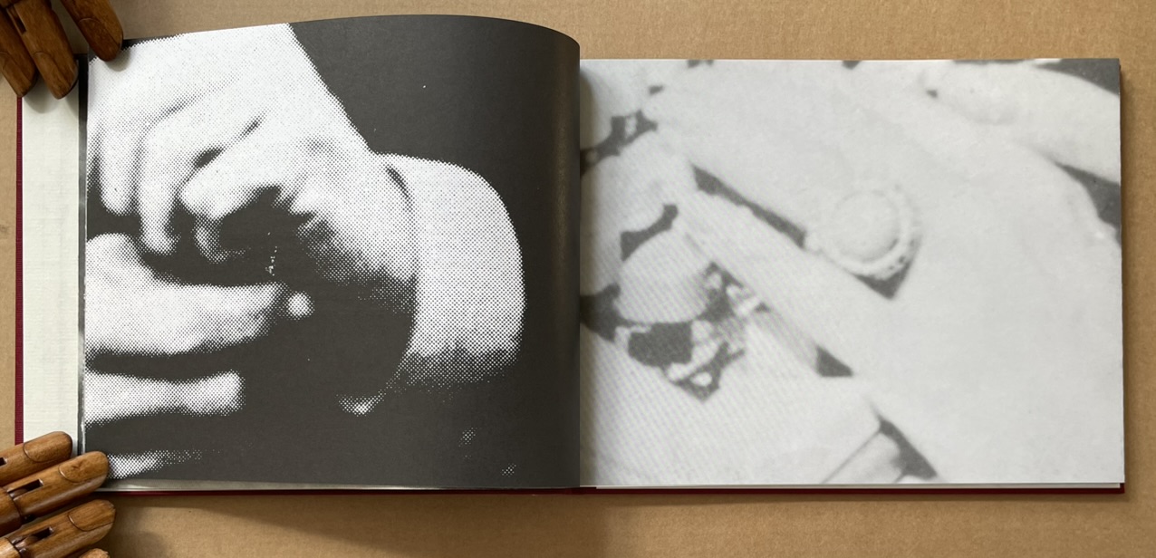
Unlike Altered Lewitt (1985) and North Sea (for M.B.) (1990), which appropriate and alter named works, Between the Sheets is made at two or three removes from its source material. In the first instance, Spector clipped authors’ photos from the dust jackets of their books (unnamed), then rephotographed and printed them at enlarged scale in offset editions. These prints were then bound together to make books. As with Altered Lewitt and other works, Spector then tore strips in a sequence of decreasing increments from the spreads so as to form a wedge-shaped cross section of the image block. In the next remove, this process left a pile of torn strips, and from these torn strips, Spector has proceeded to create Between the Sheets. With images on one side and text imposed on the reverse, these folios are folded and bound at their open ends with Japanese stab binding.
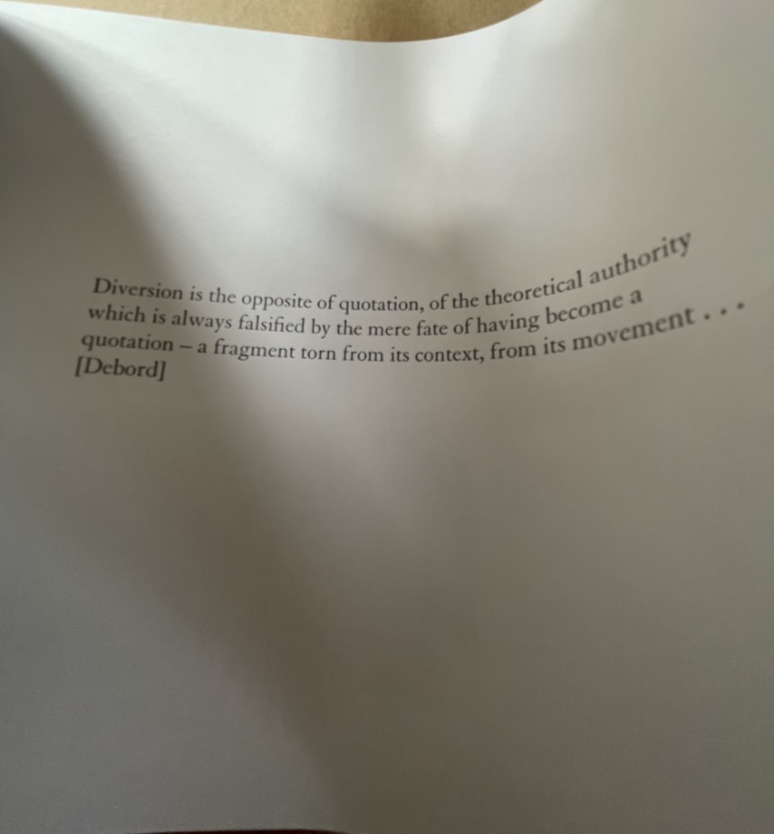
The work’s main thrust is philosophically, artistically and self-reflexively aesthetic. It quotes from the French philosopher Guy Debord, the Belgian artist Marcel Broodthaers and Spector himself. The quotation from Debord comes early on, the first after the title page and two of prefatory explanation, and very much sets the tone.
Diversion is the opposite of quotation, of the theoretical authority which is always falsified by the mere fate of having become a quotation — a fragment torn from its context, from its movement … [Debord]
With Between the Sheets, we have on our hands a decidedly multi-layered diversion. At one layer, it diverts by questioning Debord’s own words, consigning their “theoretical authority” to a fate of falsification by “having become a quotation — a fragment torn from its context”. Like a fun-house mirror, the page bows to give this distorted reflection of Debord’s words.
But is it a diversion? After all, the “truth” of Between the Sheets rests at least in part in its composition from fragments. At this other layer, Between the Sheets “quotes” the fragments torn from the context of another of Spector’s artwork. In turn, that other artwork was composed of prints of photographic “quotations”, the fragments torn from authors’ images on dust jackets (the coverlets for the source books and their sheets). It is no accident that, when the sheets of Between the Sheets are bowed to permit a look inside, the images bracket the text pages like single quotation marks.
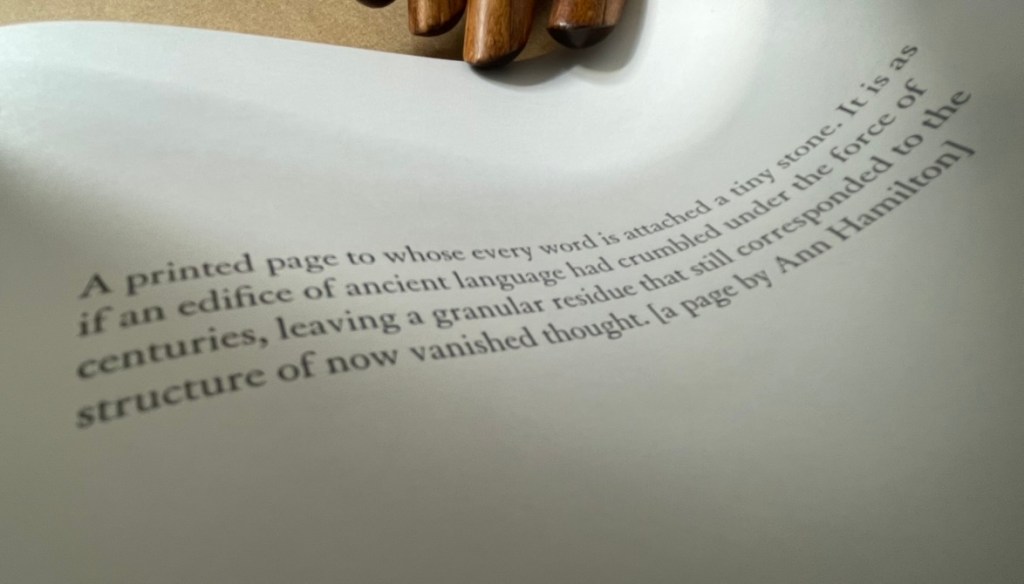
Another quotation resting between the sheets comes from Spector’s own essay on Ann Hamilton in The Book Maker’s Desire (p.63):
A printed page to whose every word is attached a tiny stone. It is as if an edifice of ancient language had crumbled under the force of centuries, leaving a granular residue that still corresponded to the structure of now vanished thought. [a page by Ann Hamilton]
Spector runs the risk of “Debord-ing” himself here with his self-quotation, but he only succeeds in diverting this reader back to the essay on Hamilton’s work and specifically the four works commissioned to benefit The New Museum of Contemporary Art in New York:
The artist chose a total of fifty four volumes (40 in the edition, plus 14 artist’ proofs) for the untitled project. These found books, mostly old novels or poetry, were selected for a variety of physical characteristics –size, wear, and paper quality — and for their typographic layout. Each book was opened to its middle, where six or eight pages were cut from the text block and reattached, edge-to-edge, to the right-hand side of the opened page spread, making an accordian-fold [sic] extension from the book. The eight pages thus displayed were meticulously rendered unreadable by Hamilton and several attendants who glued tiny stones over every word on the visible side. (p. 63)
Is it a coincidence that Between the Sheets also consists of 40 in the edition just like Hamilton’s commission? Spector quotes not only images and words from others’ works and his own, he quotes the details of their production and form. It is certainly no coincidence that Between the Sheets quotes the stab bound structure of Marcel Broodthaers’ A Voyage on the North Sea. After all, in his hidden prefatory explanation, Spector makes no bones about the fact that Between the Sheets arose in part from his astonishment at finding the page numbers hidden within the bound edge of A Voyage. But how did he find them? In the process of creating his own North Sea (for M.B.) (1990). So yet another self-quotation of production process.
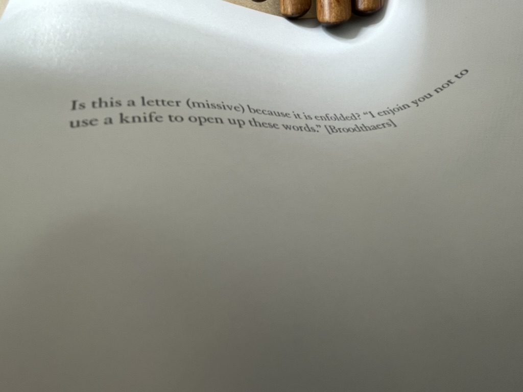
Spector’s forthright quotations are divertingly sly. When he cites Broodthaers between these sheets,
he is also echoing Broodthaers’ injunctions in A Voyage on the North Sea:
Before cutting the pages the reader had better beware of the knife he will be wielding for the purpose. Sooner than make such a gesture, I would prefer him to hold back that weapon, dagger, piece of office equipment which, swift as lightning, might turn into an indefinite sky. … These pages must not be cut.
Of course, Spector did not cut the pages; he tore them.
Another sly diversion is sex. By using photos of male and female authors and by interposing suggestive phrases inside the folds (“a movement of bodies together as one body” and “peek between the sheets”), Spector spices up the obvious diversion of sex in his work’s title. But the slyness re-diverts via Broodthaers to Mallarmé, whose poem Un Coup de Dés Jamais N’Abolira le Hasard (1897) Broodthaers “knifed up” at the very level of the words and whose contemplations of the letter, the page and the fold have taken on an erotic tone that Spector embraces in A Book Maker’s Desire:
When Stéphane Mallarmé described the folded and uncut signatures of books as “virginal,” awaiting the penetration of the “paper knife,” he identified an erotics of reading. (p.15)
The topography of an open book is explicit in its erotic associations: sumptuous twin paper curves that meet in a recessed seam. Page turning is a series of gentle, sweeping gestures, like the brush of fingers on a naked back. Indeed, the behavior of readers has more in common with the play of intimacy than with the public decorum of art viewing or music listening. Most of us read lying down or seated and most of us read at least partially unclothed. We dress up to go out and look at art; undressed, in bed, we read. We seek greater comfort while reading than the furnishings of museums or concert halls will ever grant us. When we read — the conventional distance between eye and page is around fourteen inches — we often become the lectern that receives the book: chest, arms, lap, or thighs. This proximity is the territory of embrace, of possession; not to be entered without permission. (p.17)
There is much more between the sheets of Between the Sheets. I wish that the 40 copies could find many more readers/lovers to embrace its diversions.
Buzz Spector: Alterations (2020)
Buzz Spector: Alterations (2020) Buzz Spector Gretchen L. Wagner; Elizabeth Wyckoff; Andrea Ferber Brochure. H254 x W256 mm, 4 unnumbered pages. Acquired from the artist, 23 June 2020. Photos of the work: Books On Books Collection.
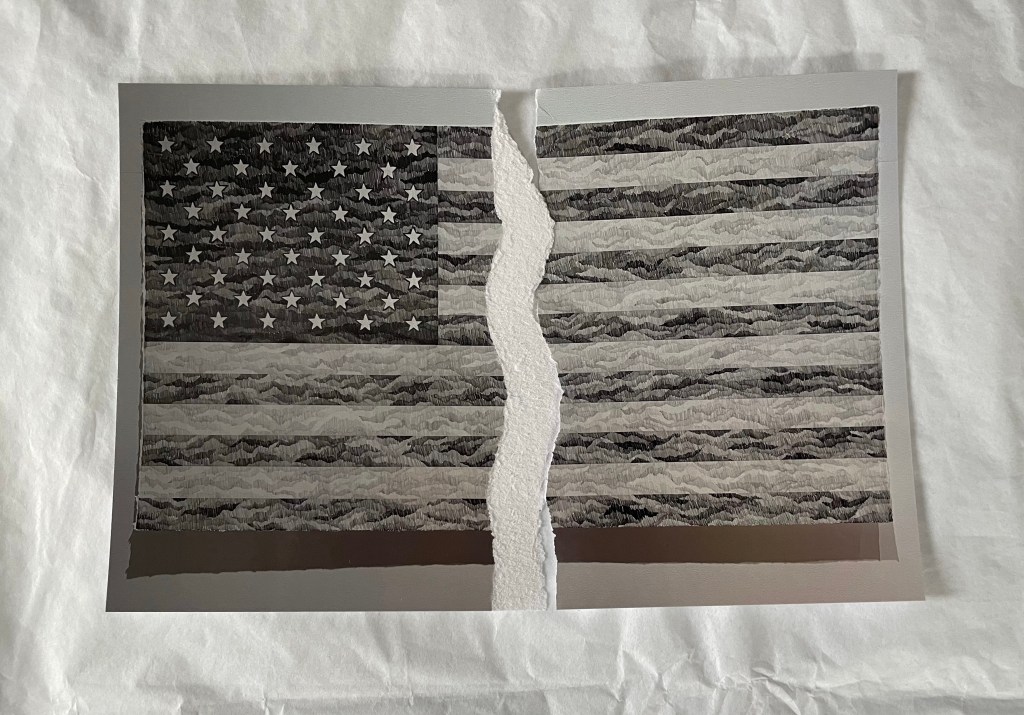
Three items of ephemera conclude this entry. The first is a pristine copy of the announcement for Spector’s retrospective at the Saint Louis Art Museum, held 20 November 2020 through 31 May 31 2021, along with a copy of it with the front cover hand torn by the artist. The second is the catalogue from his show in 2021 Between the Lines. With both, Spector makes an ephemeral piece echo the works in the exhibition. The third item is a hand torn postcard reproducing his drawing Torn Flag (2022).
Between the Lines (2021)
Between the Lines (2021) Buzz Spector Elizabeth Wyckoff, Gretchen L. Wagner, Meredith Malone, Michael Garzel, Jane E. Neidhardt Perfect bound paperback. H268 x W 230 mm, 81 pages. Acquired from the artist, 10 March 2021. Photo of the work: Books On Books Collection.
The Zolla/Lieberman Gallery, which has supported Spector’s work since 1995, sponsored this monograph following 2020/21 retrospective held at the Saint Louis Art Museum. As a slightly less ephemeral item, it neatly rounds off this entry. Its cover image shows one of Spector’s well-known alterations: Altered LeWitt (1985), one of five of the found and hand-torn catalogue: Sol LeWitt, Drawing Series I, II, III, IIII A & B (Turin, Italy, at the Galleria Sperone, 1974). Compare it with North Sea (for M.B), above, which Spector created five years after Altered LeWitt. Spector extends the technique and concept across the two works in distinctive ways to echo two distinctive artists and yet also speak to commonalities and originality among the three artists.
Photo of Between the Lines (pp. 12-13): Books On Books Collection.
Between the Lines‘ presentation of the works is spectacular. Recalling the effect in The Book Made Art (above), they seem to float three dimensionally on the page. The detail photo of Unpacking my Library across a double-page spread offers a good example, especially when compared with the images above.
Photo of Between the Lines (pp.16-17): Books On Books Collection.
Between the Lines also provides the opportunity to end this entry with an image of the work incorporating an image of the author and his generosity toward his fellow bookworkers. Note in particular the reference to Michael Garzel, the monograph’s designer and creator of the typeface used so strikingly on the cover, for chapter titles and here in the heading “Acknowledgments”.
Photo of Between the Lines (pp. 4-5): Books On Books Collection.
Torn Flag (2024)
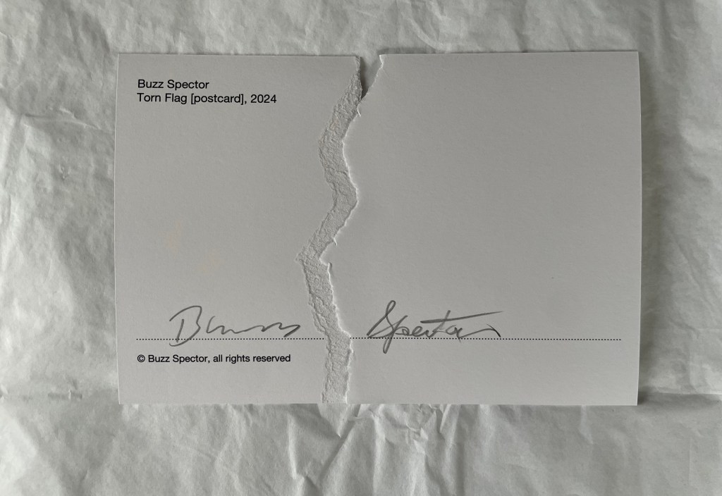
Torn Flag(2024) Buzz Spector Postcard. Acquired from the artist, 26 February 2024. Photos: Books On Books Collection.
Revisiting Spector’s works this time was prompted by an invitation from the Center for Book Arts to “BookTalk: Full Dress or Half Dress, Not Casual with Buzz Spector” on 8 October 2024. The postcard reproduces the drawing Torn Flag (2022), a 565 × 1118 mm drawing (graphite on paper) that appeared in the Zolla/Lieberman Gallery. Spector describes the postcard as an “(informal) edition … Elegy to the Divided States”. Ephemeral though the postcard may be, its tearing makes a self-reflexive artistic gesture. But it also serves as an injunction: Vote. Always.
Revised entry: 7 October 2024; 24 September 2021; original entry, 31 March 2020.
Further Reading
“Buzz Spector“, Bookmarking Book Art, 12 March 2016.
Davids, Betsy, and Jim Petrillo. “The Artist as Book Printer: Four Short Courses” in Artists’ Books: A Critical Anthology and Sourcebook, edited by Joan Lyons (Rochester, NY: Visual Studies Workshop Press, 1985), p. 160.
Drucker, Johanna. 2004. The Century of Artists’ Books [Second edition] ed. New York City: Granary Books. See pages 118-19 for perceptive comments on Spector’s A Passage (1994) and his method of torn pages.
Lippard, Lucy. “New Artist’s Books” in Artists’ Books. A Critical Anthology and Sourcebook, edited by Joan Lyons (Rochester, NY: Visual Studies Workshop Press,1985), p. 53.
Mathews, Emily, and Sylvia Page. “Off the Shelf and Into the Gallery: Librarians on Spector”, Buzz Spector: Off the Shelf, Grunwald Gallery of Art, October 19 — November 16, 2012 (Bloomington, IN: Grunwald Gallery of Art, Indiana University, 2012), pp. 9-15.
Otten, Liam. “A sea of torn pages“, The Source, Washington University in St. Louis, 26 February 2010. Accessed 26 March 2020.
Perloff, Nancy. 2016. Explodity : Sound, Image, and Word in Russian Futurist Book Art. Los Angeles, California: Getty Research Institute. See pages 179-81 for perceptive comments on Spector’s A Passage (1994), a variant on biblioclasm and example of what Spector calls “a ‘conceptual purity’ because it engages completely with the book as a book.” (p.180)
Perrault, John. “Some Thoughts on Books as Art” in Artists Books, Moore College of Art, 23 March – 20 April 1973, curated by Dianne Perry Vanderlip (Philadelphia, PA: Moore College of Art, 1973), p. 21.
Schlesinger, Kyle. “The Missing Book”, Buzz Spector: Off the Shelf, Grunwald Gallery of Art, October 19 — November 16, 2012 (Bloomington, IN: Grunwald Gallery of Art, Indiana University, 2012), pp. 17-25.
Spector, Buzz. “Going Over the Books” in The Book Maker’s Desire (Pasadena, CA: Umbrella Editions, 1995), p. 8.
Spector, Buzz. “Art Readings” in The Book Maker’s Desire (Pasadena, CA: Umbrella Editions, 1995), p. 13.
Spector, Buzz. “I stack things. I tear stuff up”, Buzz Spector: Shelf Life: selected works, Bruno David Gallery, January 22 — March 6, 2010 (Saint Louis, MO: Bruno David Gallery, 2010).
Spector, Buzz. 25 March 2021. “Art Speaks“. Saint Louis Art Museum. Video series of artists’ talks. Accessed 23 August 2021.
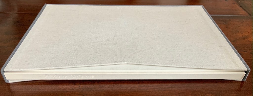
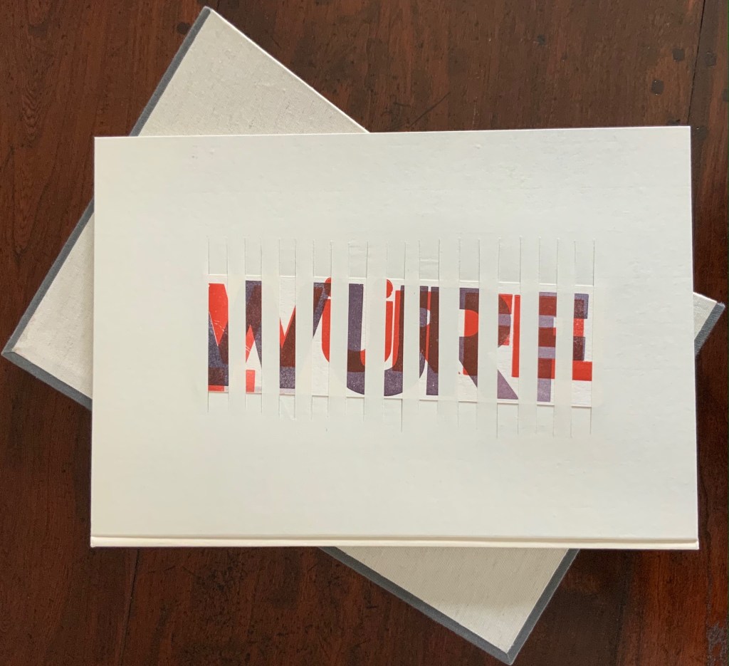
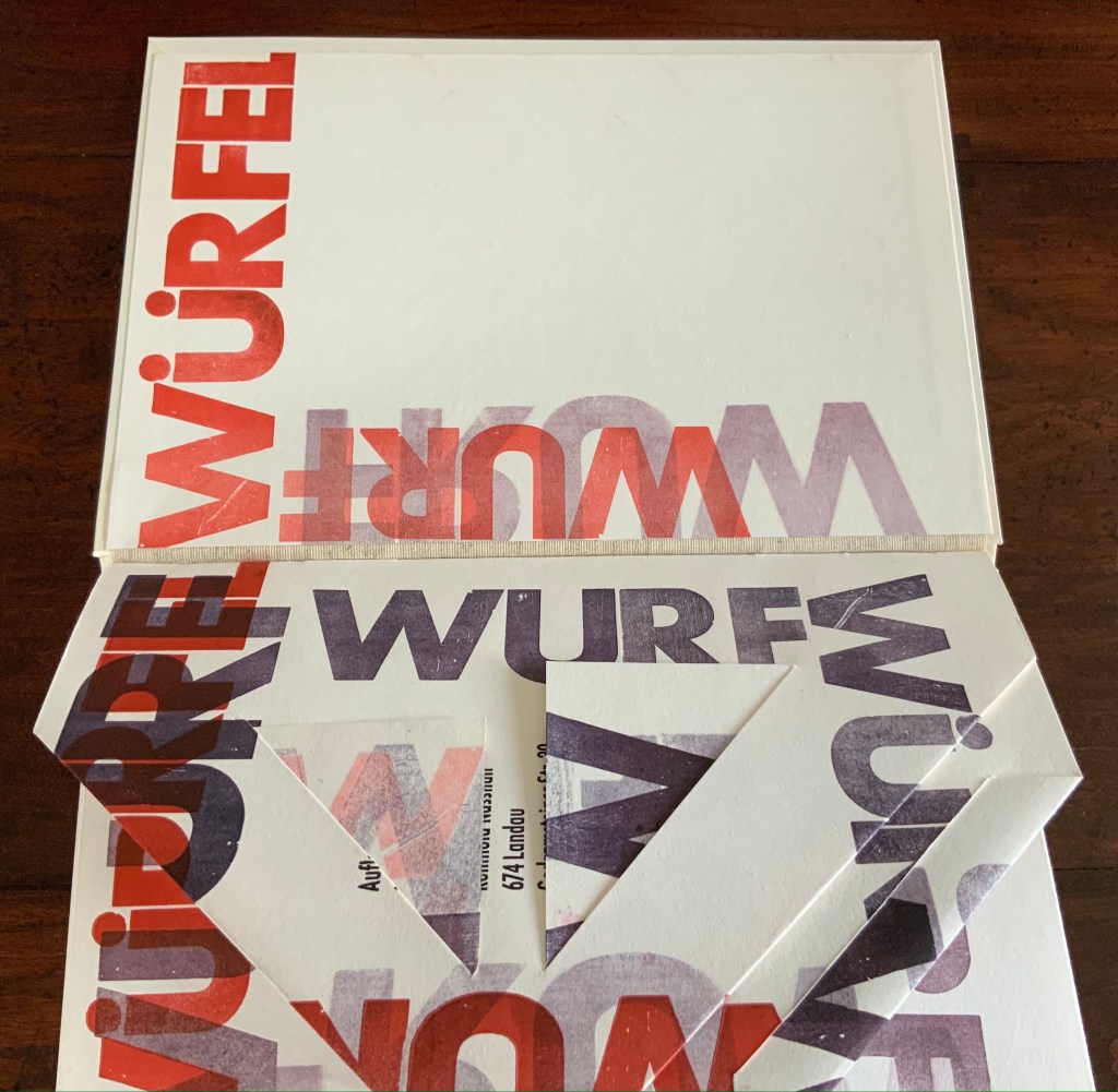
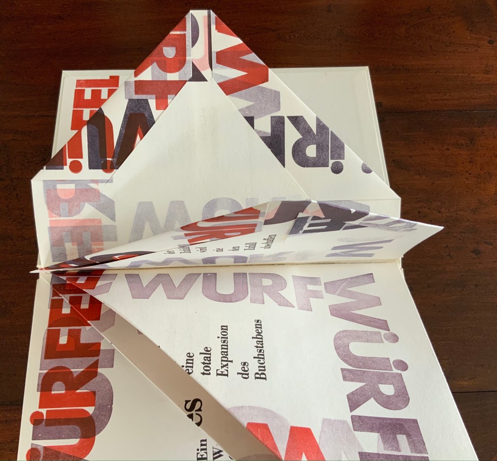
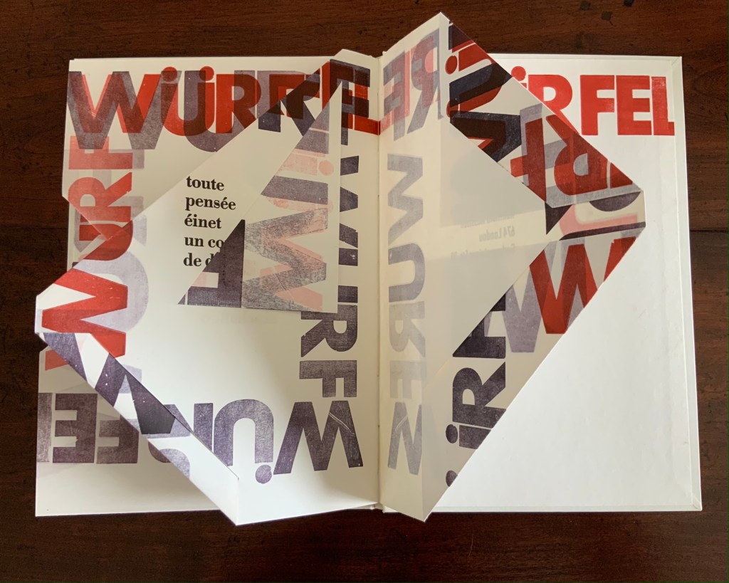
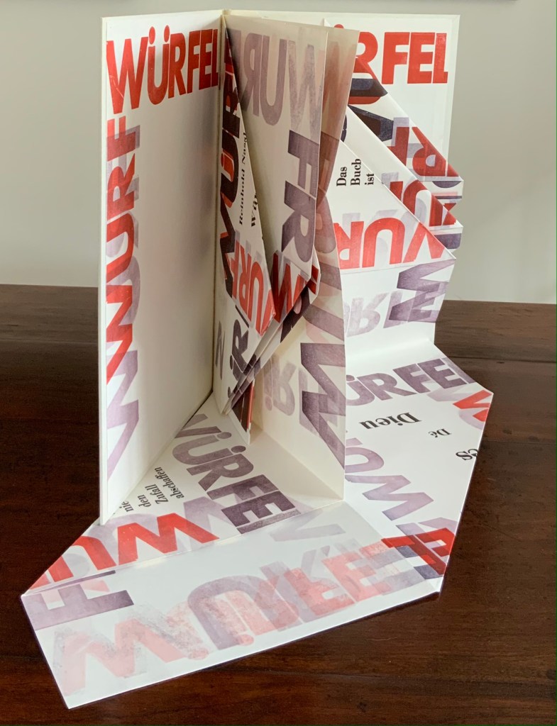
Würfelwurf: fragmentarische Annäherung an Stéphan Mallarmé (1992) Reinhold Nasshan Slipcase, embossed spine, casebound in paper-covered boards, front cover decorated with title set on slip of paper woven into the cover, block sewn and glued, with relief prints as pastedowns. Slipcase: H360 x W248 mm; Book: 351 x 243 mm, 4 gatherings of folios of varying size cut, tucked or folded to fit within the binding’s dimensions. Unique. Acquired from the artist, 24 February 2021. Photos of the work: Books On Books Collection. Displayed with artist’s permission.
“Throw of the dice”, “dice throw” or “throwing dice” are all reasonable translations of Würfelwurf, but not “a throw of the dice”, which most German translators render as ein Würfelwurf when tackling Mallarmé’s Un Coup de Dés. But then Reinhold Nasshan is not translating the poem. As the subtitle indicates, he is making “a fragmentary approach”, an approximation.
The very structure and working of Nasshan’s Würfelwurf underscore his title’s distinction between a single act and repetition of the act. On its front cover, the word würfelwurf splits in two, one half printed over the other on the slip woven into the slits in the front cover. The slip angles downward from left to right suggesting action, which comes aplenty inside the book.
Some pages are cut, their corners folded and tucked in. One gathering consists of a sheet 688 x 470 mm that is creased with mountain- and valley-folds and untrimmed at the bottom edge so that it unfolds into a base that spills out beyond the covers. Pages take on dice-shaped edges and planes that seem to roll from within and against the book. The achieved effect of motion recalls Marcel Duchamp’s Nude Descending a Staircase (No. 2) or Umberto Boccioni’s Unique Forms of Continuity in Space.
Although the title of Mallarmé’s poem appears, most of the text scattered across the surfaces comes from his other writings; for example, peindre, non la chose, mais l’effet qu’elle produit (“to paint, not the thing, but the effect it produces”); tout, au monde, existe pour aboutir à un livre (“everything in the world exists to end up in a book”); and Das Buch ist eine totale Expansion des Buchstabens (“The book is a total expansion of the letter”). When that large folded gathering comes, though, the Mallarmé’s words begin to be jumbled: Ein Würfelwurf wird nie das Würfelspiel abschaffen (“A throw of the dice will never abolish the game of dice”) and Ein Wurf Gottes wird nie den Zufall abschaffen (“A throw from God will never abolish chance”).
Strangest of all is the mangling of émet from the poem’s final line Toute pensée émet un coup de dés (“All thought emits a throw of the dice”). The word becomes éinet. Not French, not German. Perhaps a typo of “in” for “m”? As it turns out, according to the artist, it is a fluke that the letter “m” available in the font on hand printed poorly, so “i” and “n” provided an alternative three vertical strokes.
Un Coup: Stéphane Mallarmé (1997)
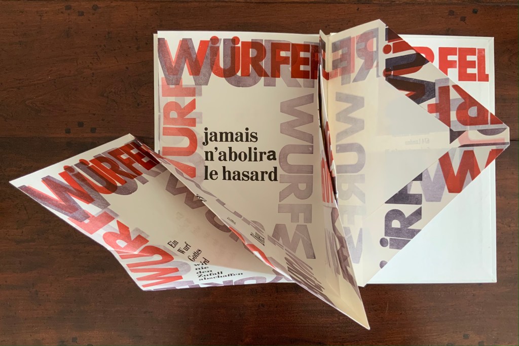
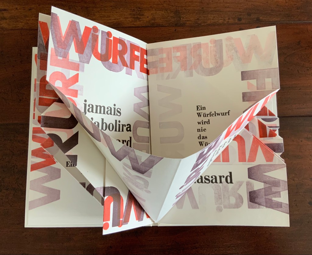
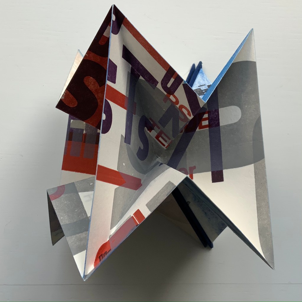
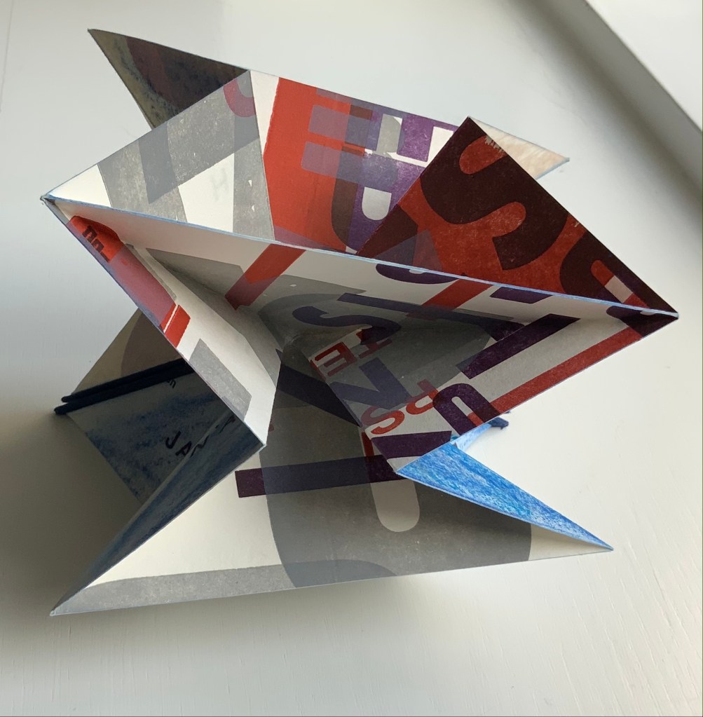
Un Coup: Stéphane Mallarmé (1997) Reinhold Nasshan Flexible triangular cloth-covered book boards, 4 cotton paper squares folded into origami water bomb base and glued. Triangle: 127 x 127 x 179 mm; Square “pages”: 166 x 166 mm. Acquired from the artist, 24 February 2021. Photos of the work: Books On Books Collection. Displayed with artist’s permission.
Nasshan also refers to this as a “letter sculpture”. Inviting the reconfiguring as with the works of Eleonora Cumer or Bruno Munari, or simply constant fiddling as with a paper fortune teller, Un Coup is more three-dimensional than Würfelwurf. As with Würfelwurf, this work lets the “moment of movement itself, the transition between the throw and the impact of the dice, emerge graphically” (moment der bewegung selbst den ubergang zwischen dem werfen und dem auftreffen der wurfel, graphisch hervortreten zu lassen). With less surface than Würfelwurf, though, it has fewer extracts from Mallarmé’s writings. Indeed, along with the physical shape shifting, the enlarged letters overprinted at multiple angles to one another combine to make this work more abstract than extract. But because text and book are material from which, on which and with which Nasshan creates, the abstract retains its links to the book.
Also a painter, Nasshan’s works fall into two categories or surfaces — painted books and painted canvases. Though lacking the shape of a book, his abstract paintings retain that link to “the world of Letters” in shapes and figures that evoke hieroglyphics, Chinese characters, typography and even cave paintings. His influences appear equally eclectic — though more Kandinsky, Klee and Miró than Pollock or Rothko — which matches up with his choice of substrates in fiction and nonfiction. When not choosing works from the ancient, classical or Romantic periods (from Gilgamesh to Seneca to Hölderlin), he chooses Apollinaire, Beckett, Celan, Joyce or Wittgenstein among others from the Modern period.
A wider audience would profit from Nasshan’s works. At least these two and others that might enter the Books On Books Collection will be available in the 2022 exhibitions celebrating the 125th anniversary of the publication of Un Coup de Dés in Cosmopolis (May 1897).
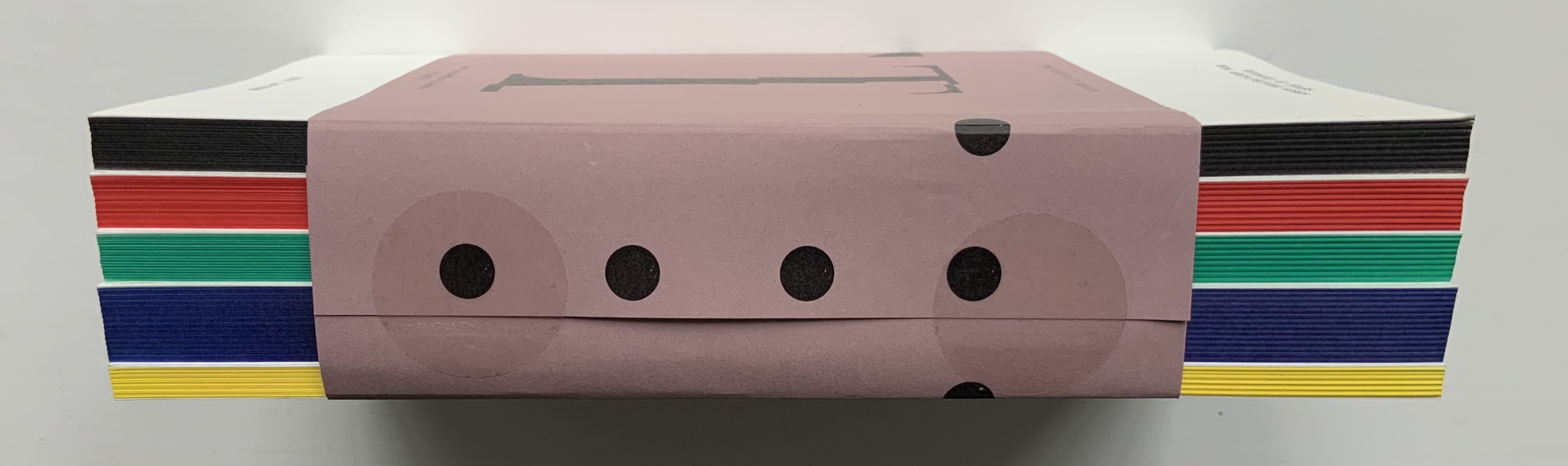
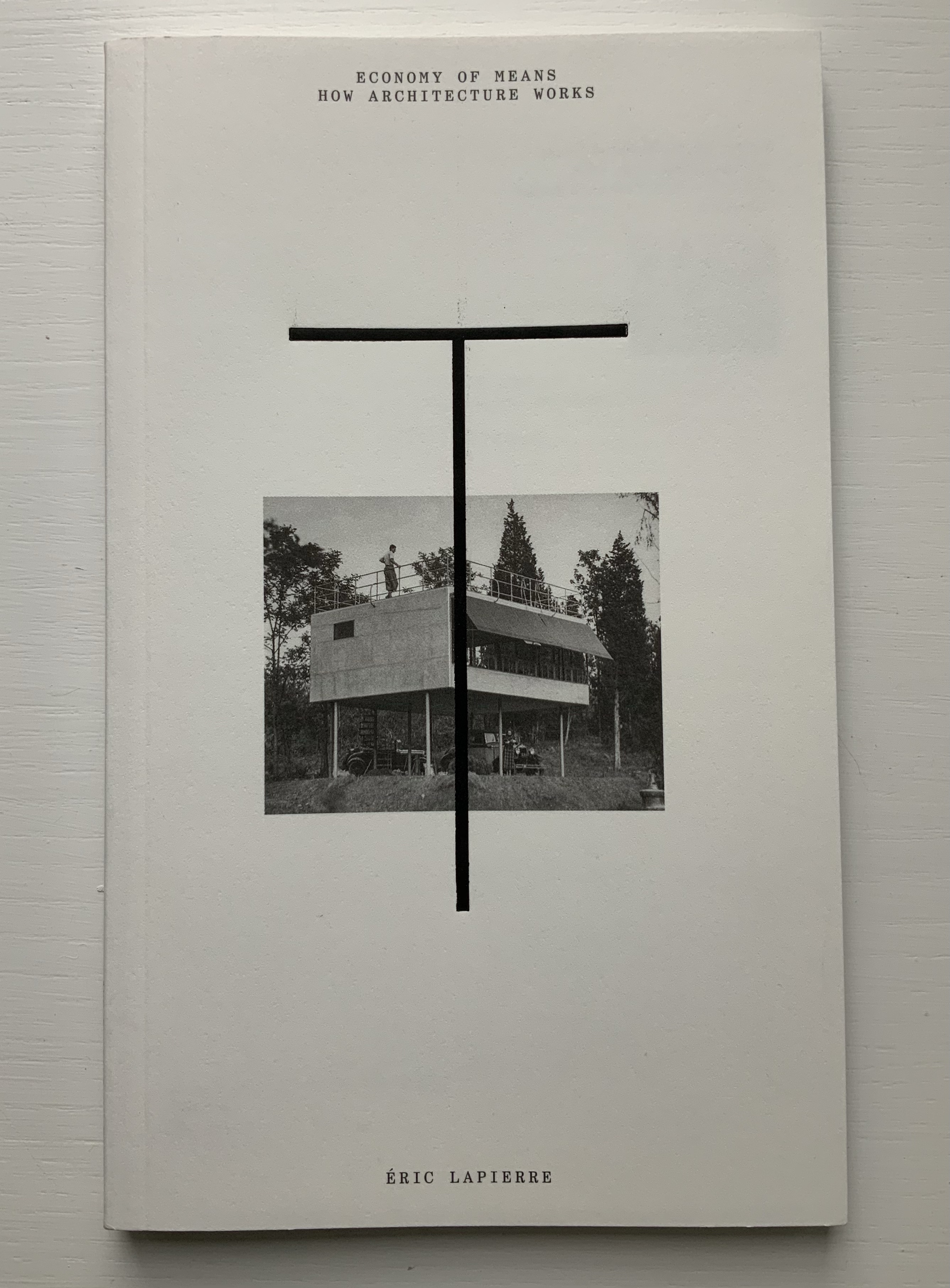
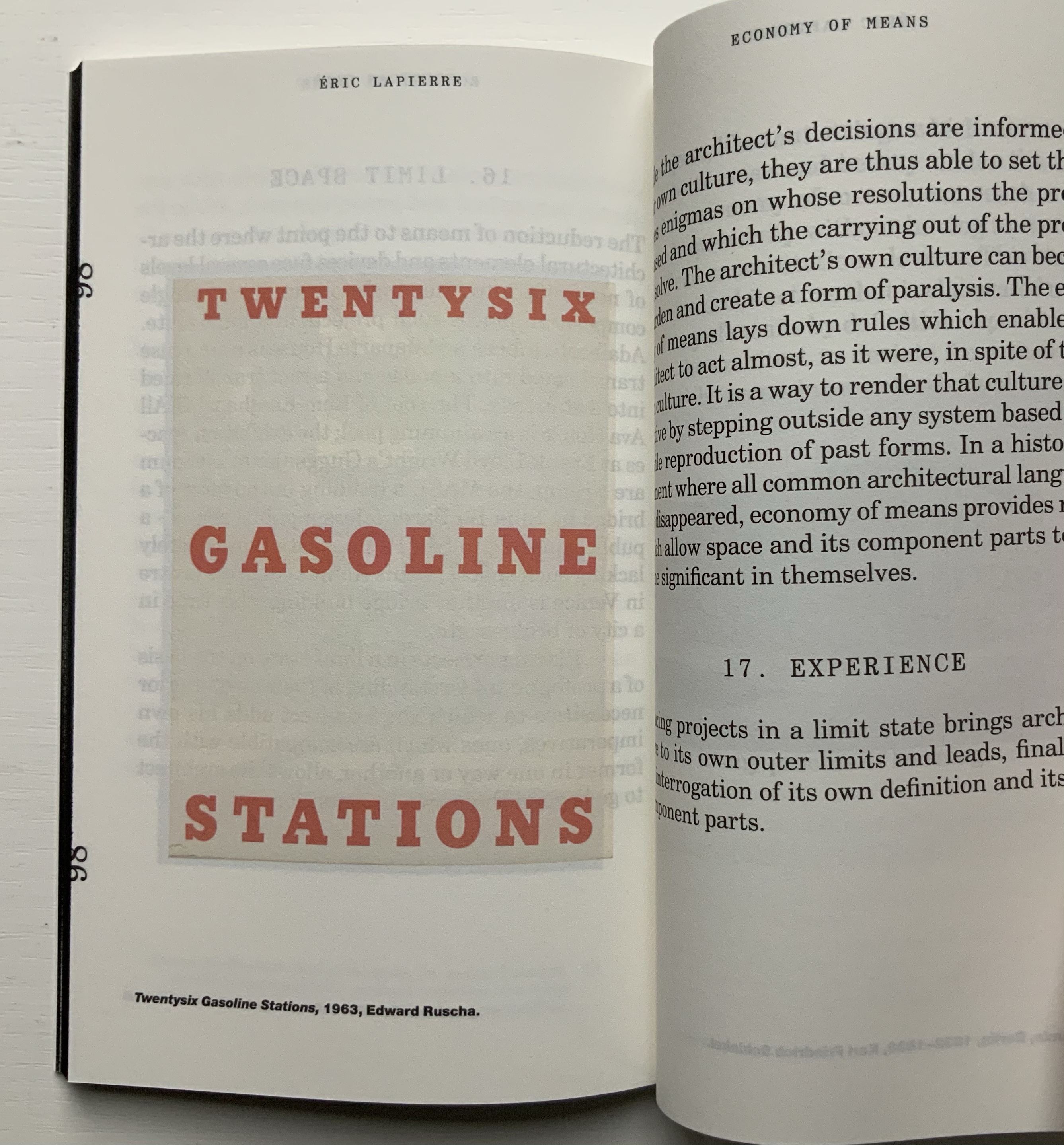
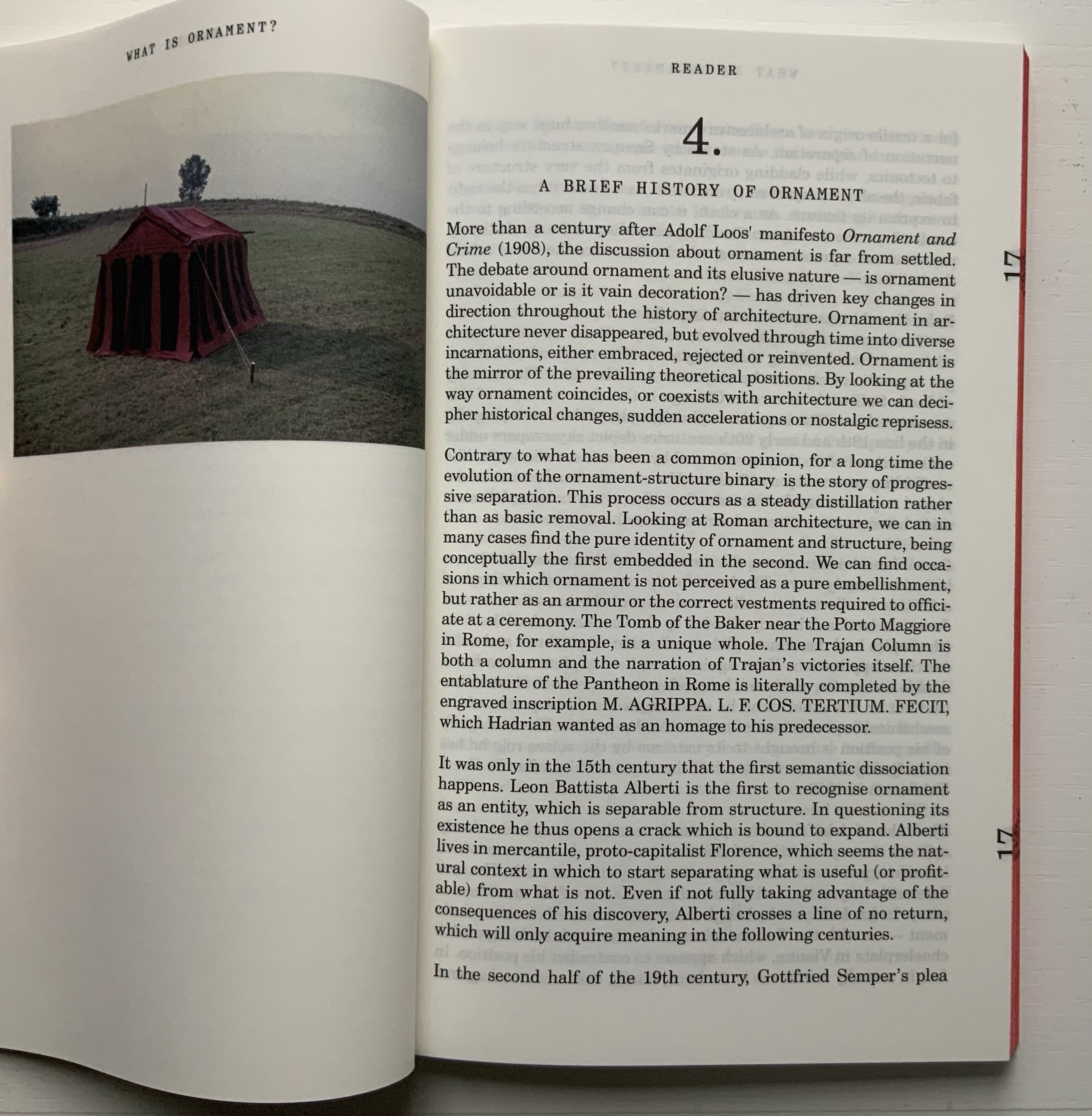
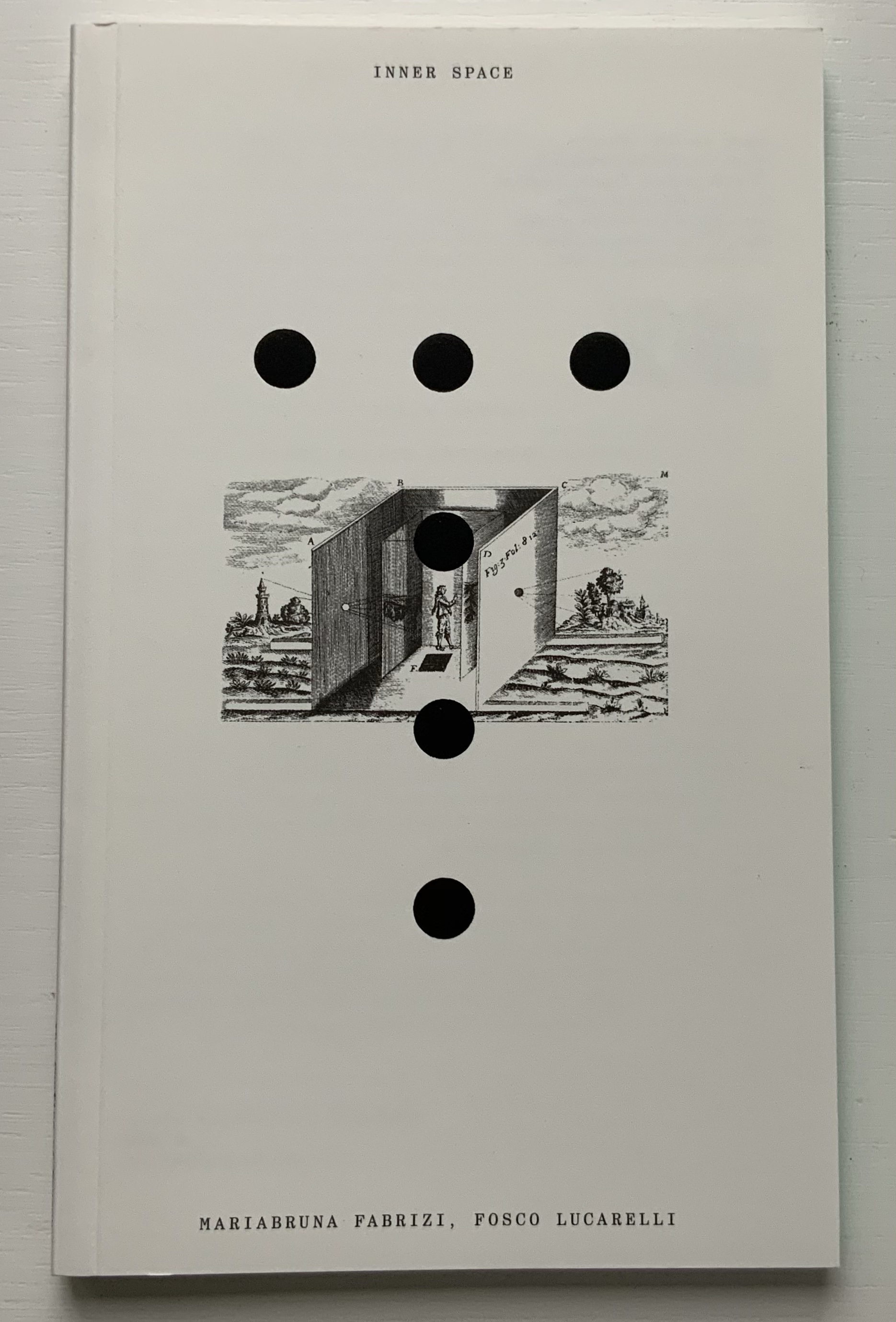
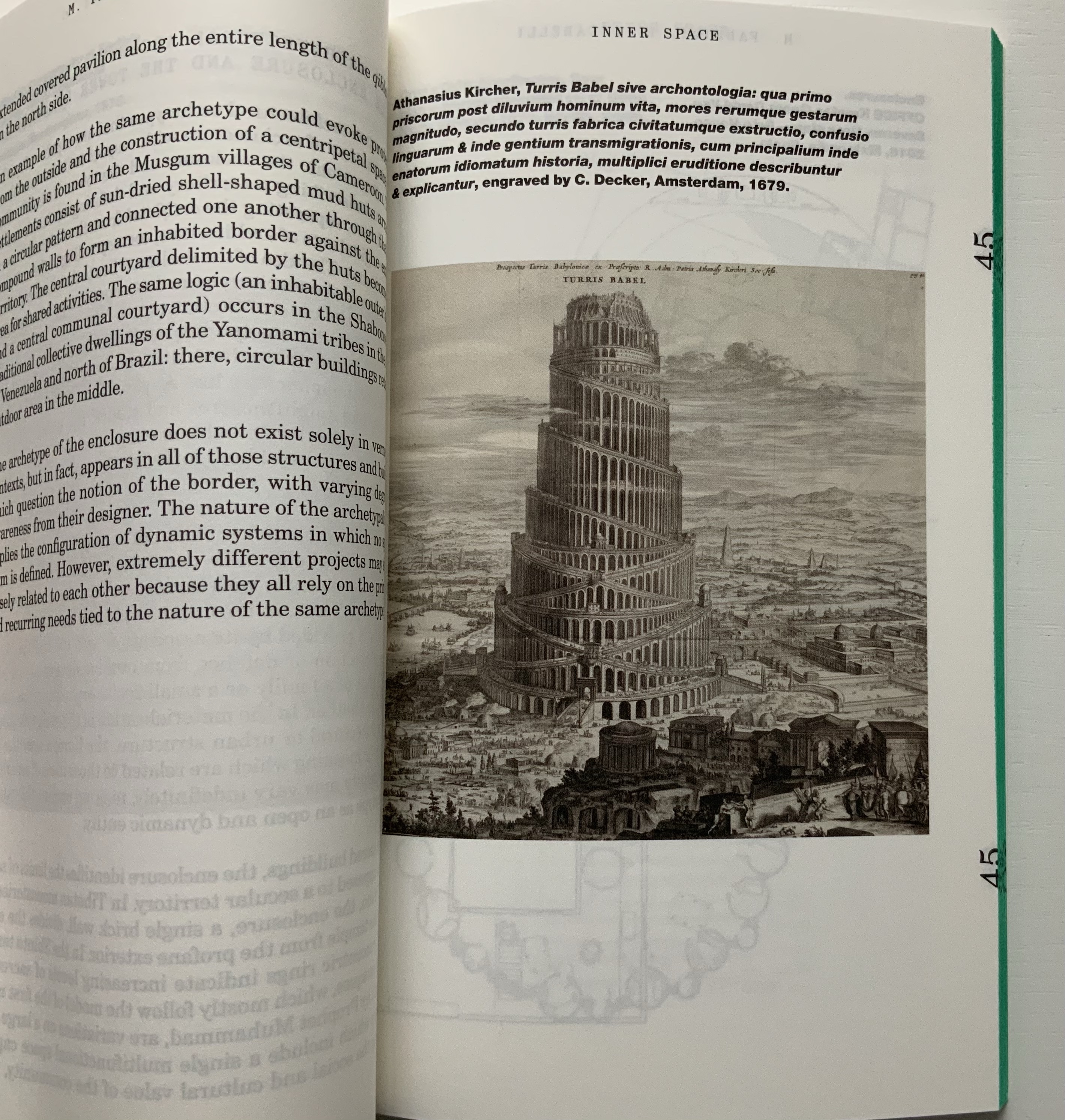
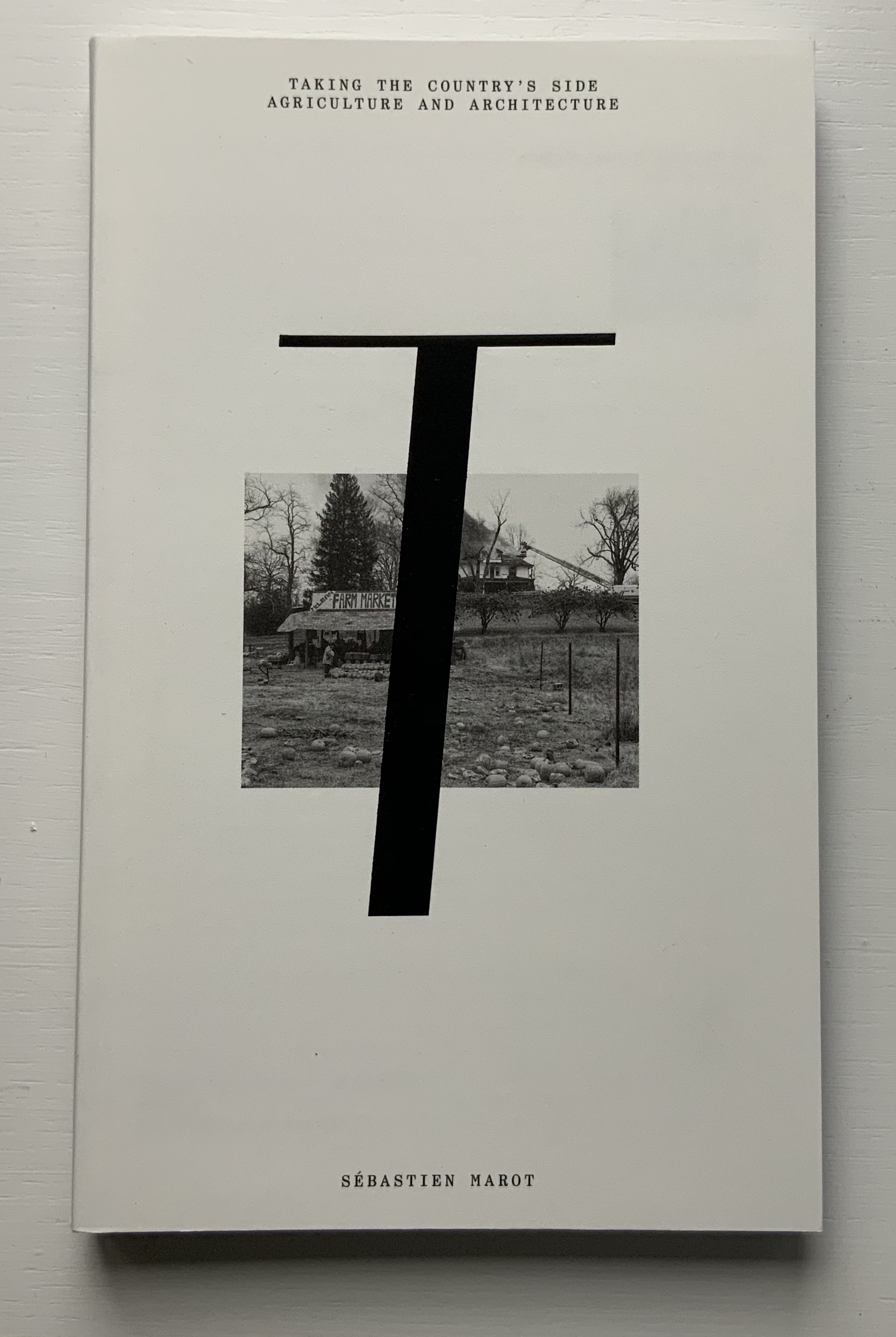
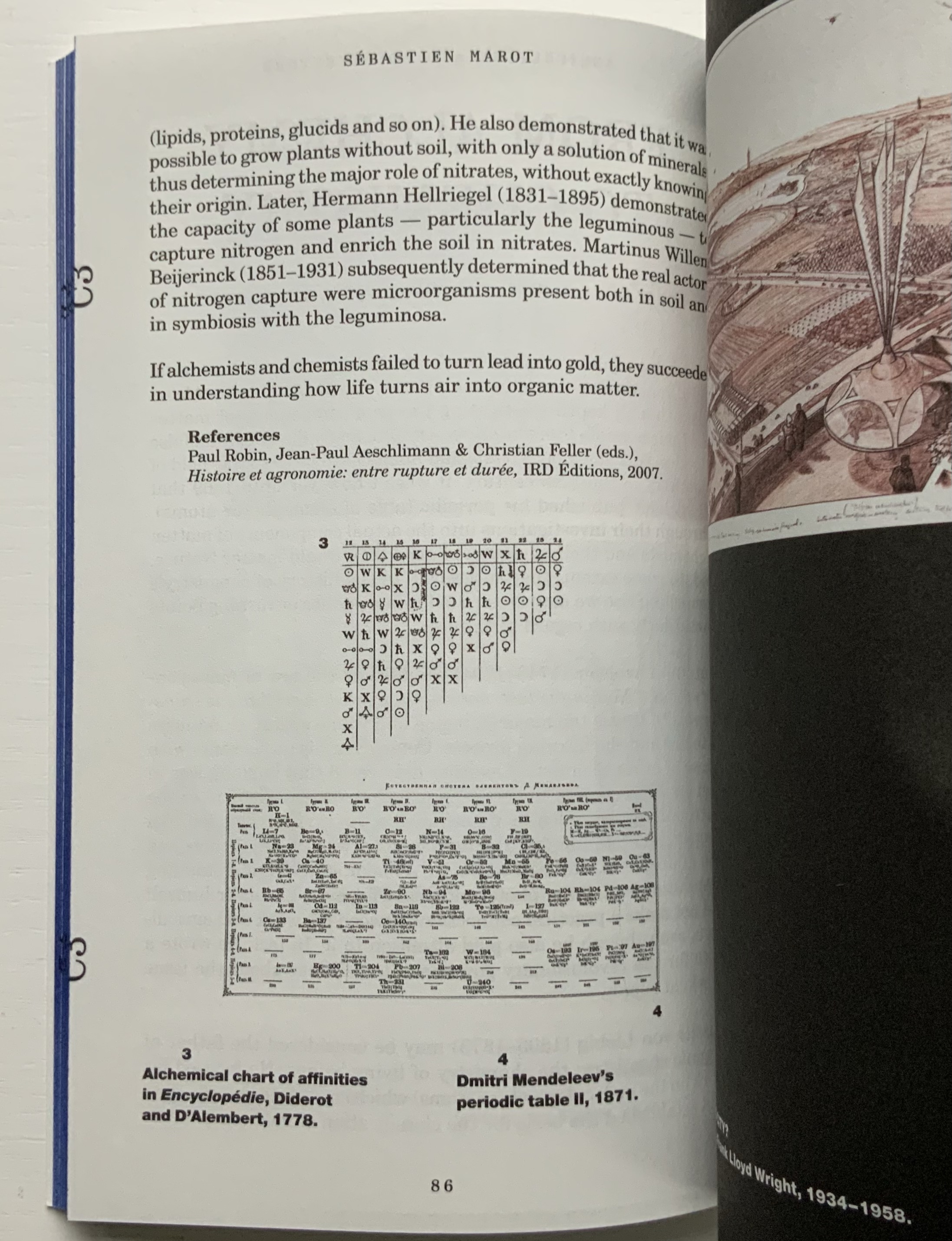
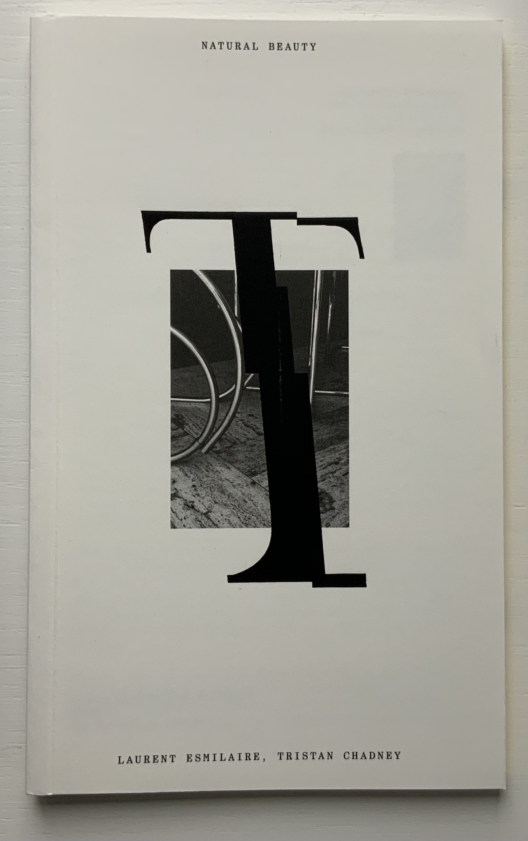
“The Poetics of Reason” was the title and theme for the fifth Lisbon Architecture Triennale in 2019 (the first was in 2007). Awarded the ADG Laus 2020 Golden Prize in the category of editorial graphic design, this work stands well with Bruno Munari’s three small 1960’s books on the square, circle and triangle, now available in a single volume, and calls to mind several works testifying to the relationship between architecture and book art. In the first of the five volumes, Éric Lapierre even interweaves with his text on architectural rationality illustrations from book artists such as Bernd and Hilla Becher, Sol Lewitt and Ed Ruscha — all without comment, in itself conveying their implicit relevance. His similar display of a page from Stéphane Mallarmé’s Un Coup de Dés Jamais N’Abolira le Hasard — that progenitor of modern and post-modern book art — speaks to the role that space — les blancs, as Mallarmé calls it — plays in these adjacent communities.
136 pages
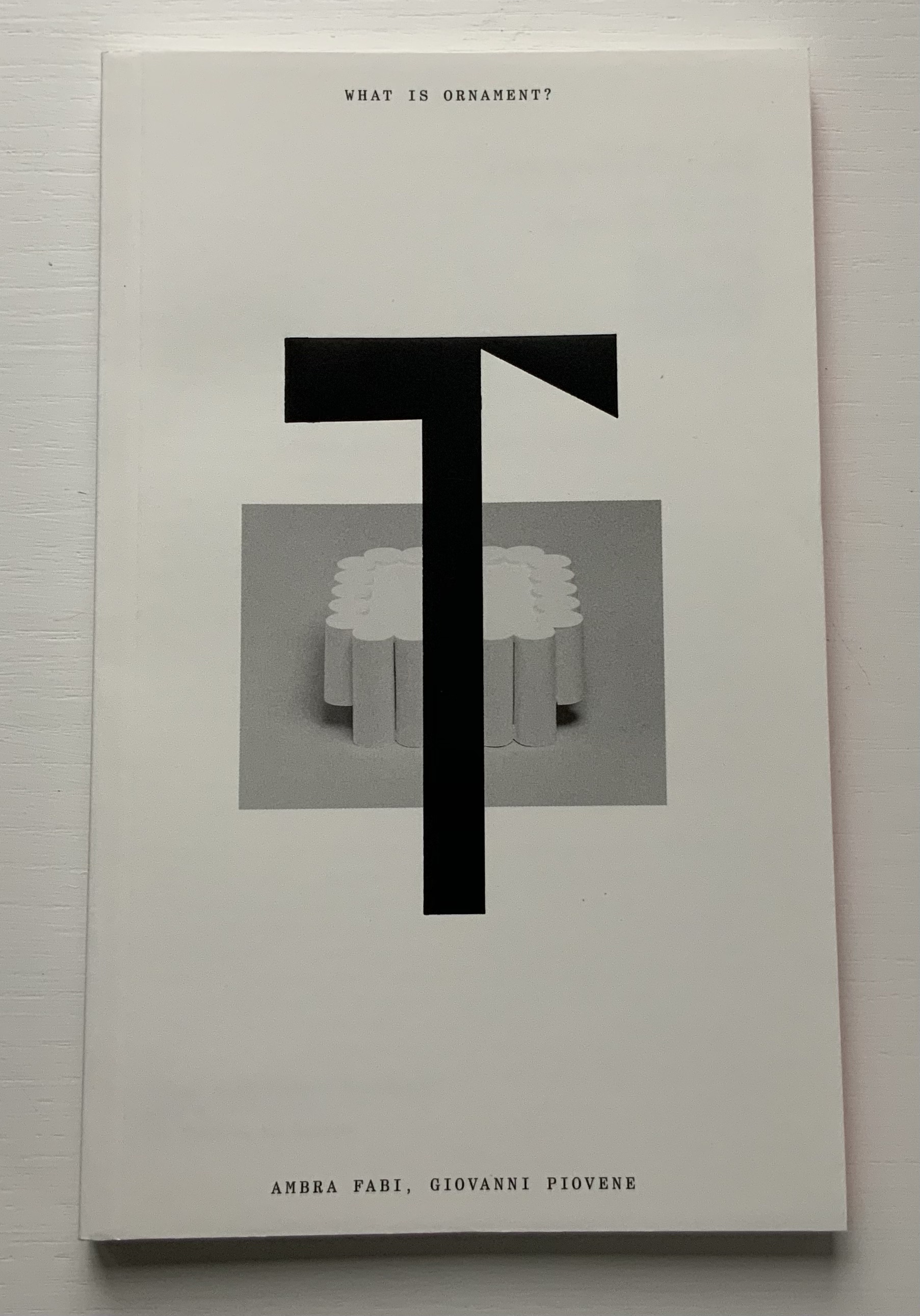
The second volume, by Ambra Fabi and Giovanni Piovene, draws in Leon Battista Alberti, of course, whose columns ornament works by Mari Eckstein Gower, Helen Malone and many other book artists.
136 pages
Drawing on Gaston Bachelard and Juhani Pallasmaa as it does, the third volume, by Mariabruna Fabrizzi and Fosco Lucarelli, calls to mind the work of Olafur Eliasson and Marian Macken here in the Books On Books Collection and elsewhere. Anyone familiar with Richard Niessen’s The Typographic Palace of Masonry will appreciate Fabrizzi and Fosco’s exploration of where architecture, imagination and memory intersect.
136 pages
In the lengthiest of the five volumes, Sébastien Marot takes us into the territory of urban architecture and the anthropocene, also occupied by book artists Sarah Bryant, Emily Speed, Philip Zimmermann and many others.
216 pages
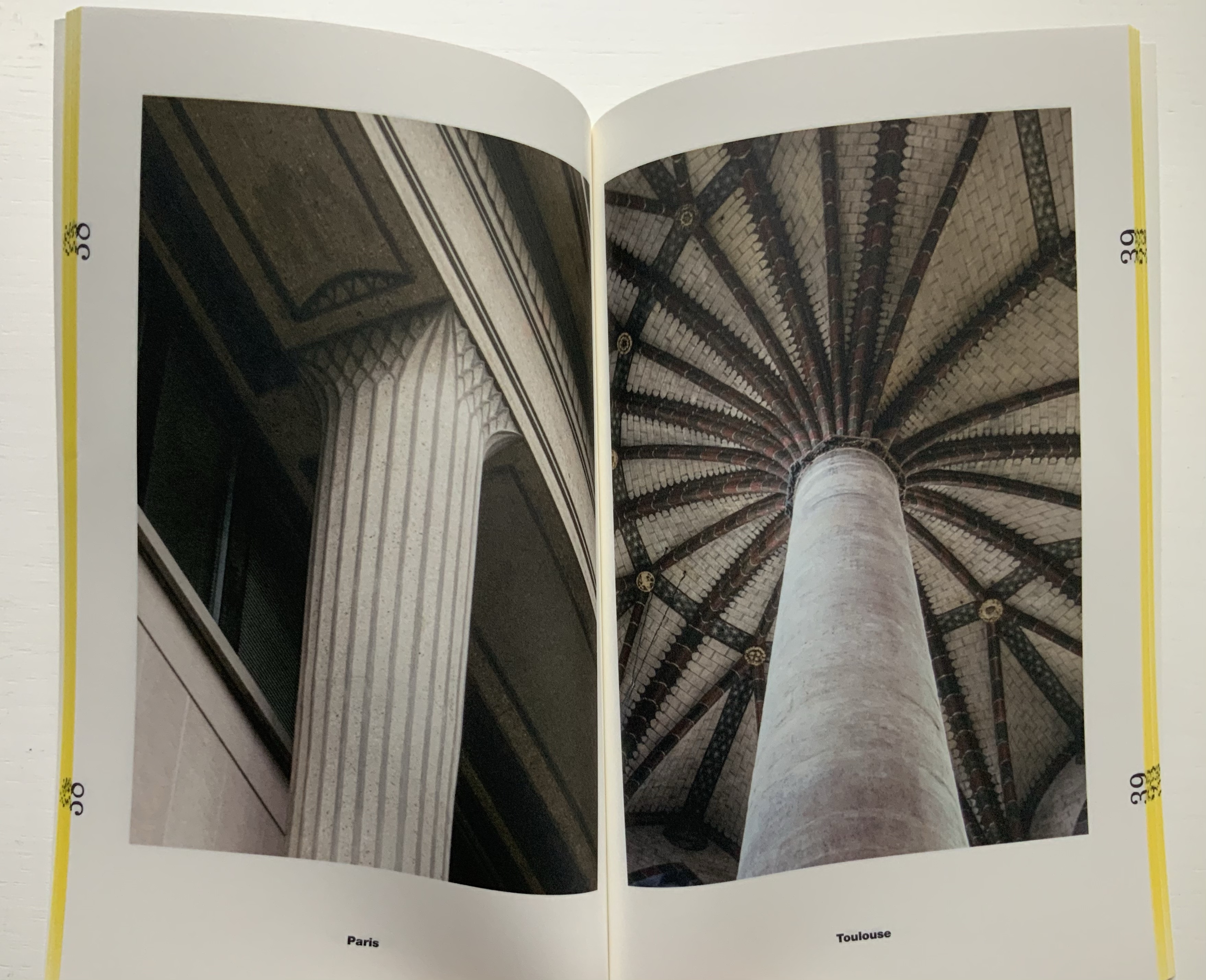
The last and shortest volume, put together by Laurent Esmilaire and Tristan Chadney, consists mostly of photos that may remind the viewer of Irma Boom’s Elements of Architecture, with Rem Koolhaas, or Strip, with Kees Christiaanse — especially in conjunction with the tinted fore edges.
88 pages
Referenced below, Pedro Vada’s review of the Triennale and the five separate sites across which it occurred in Portugal provides more insight into the five volumes themselves. Marco Ballesteros LETRA website provides additional images of the five volumes’ design.
Further Reading
“Architecture“. 12 November 2018. Books On Books Collection.
SOCKS Studio, an extraordinary website run by Fabrizzi and Lucarelli.
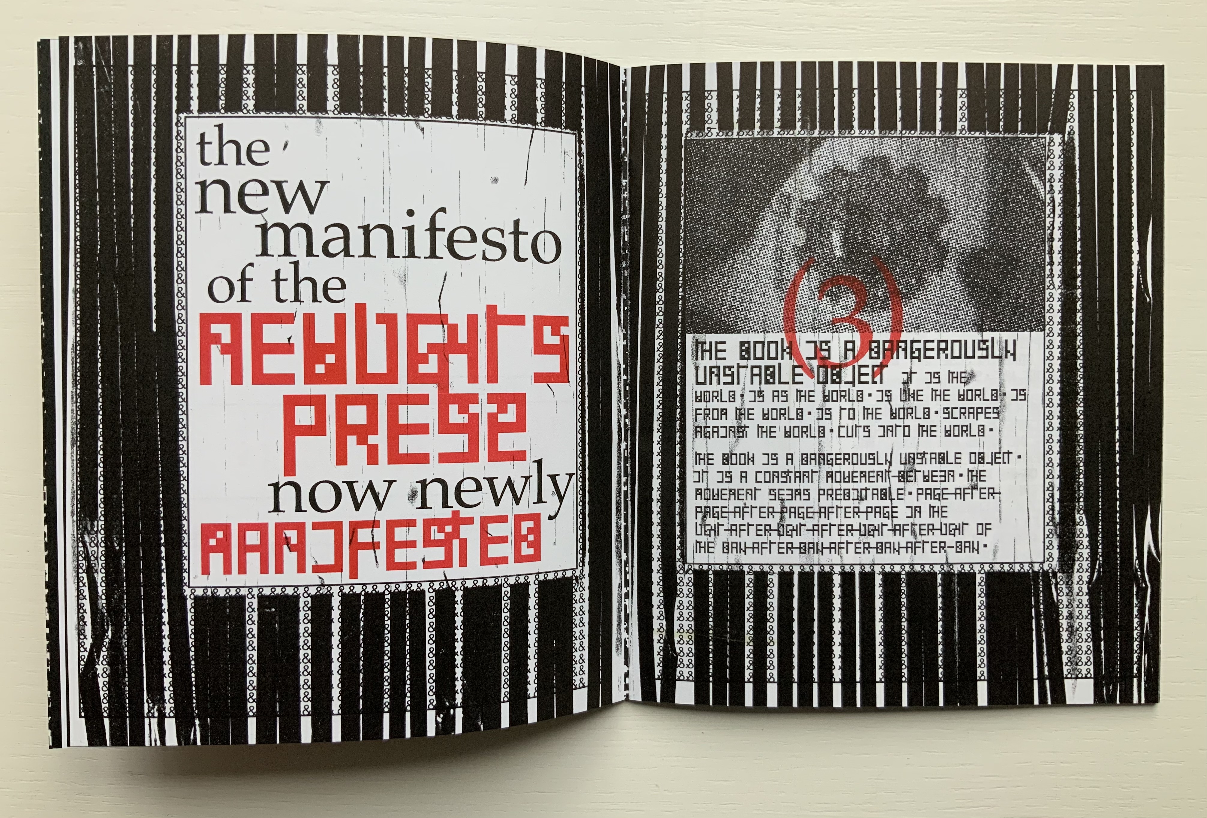
The New Manifesto of the NewLights Press (third iteration) (2017)
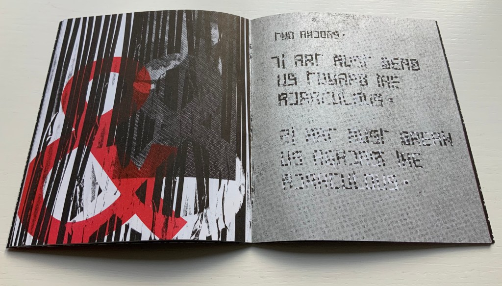
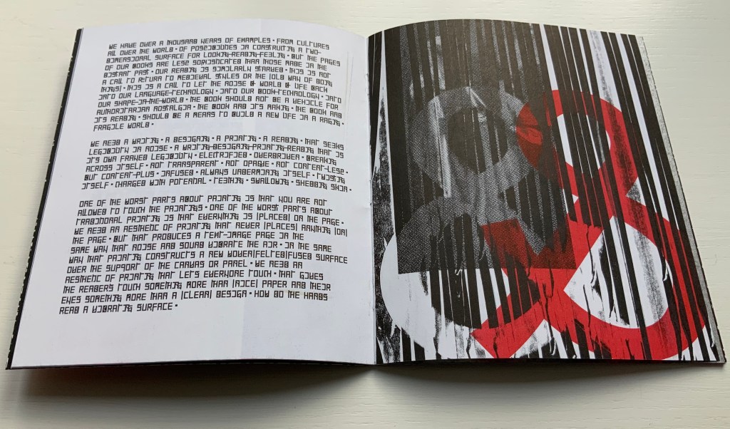
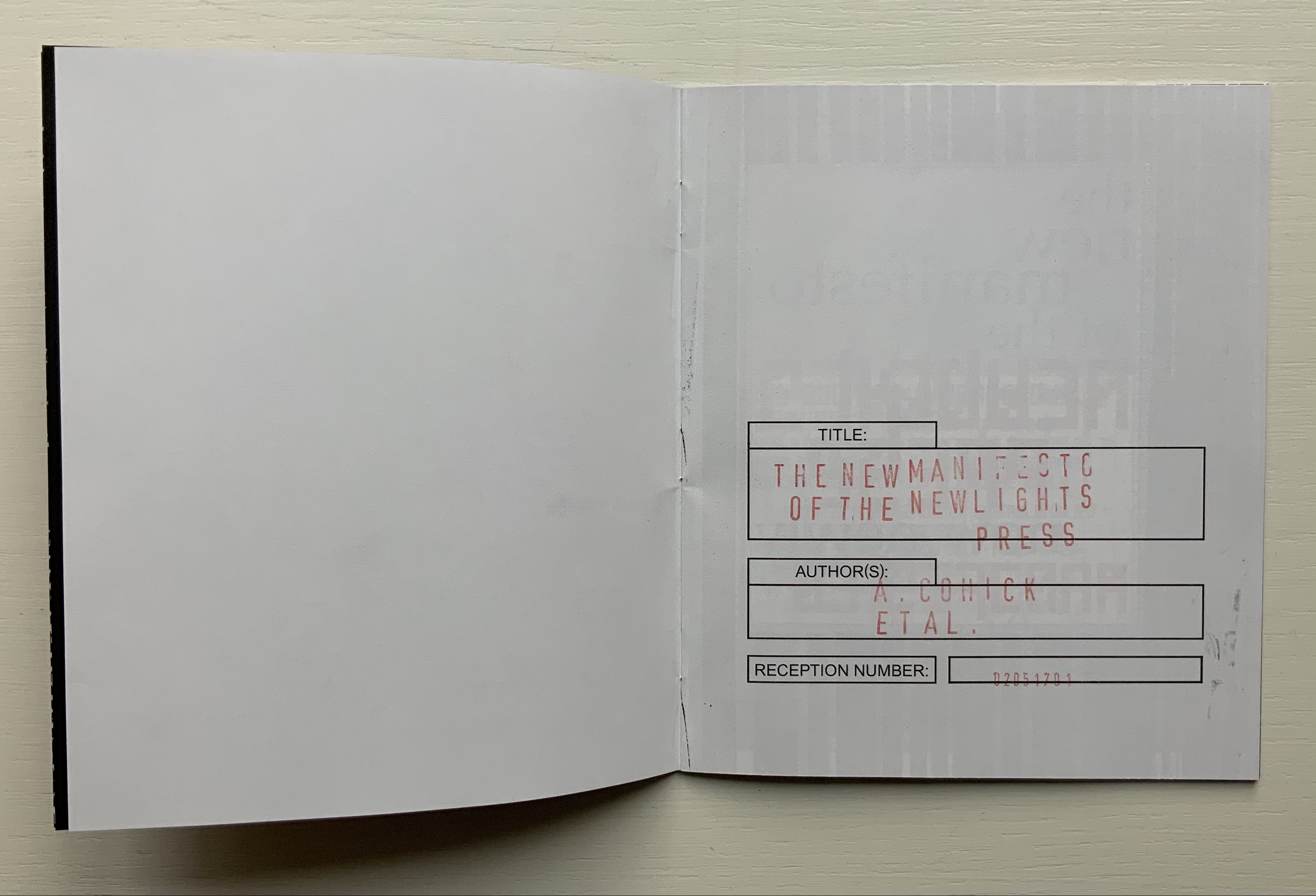
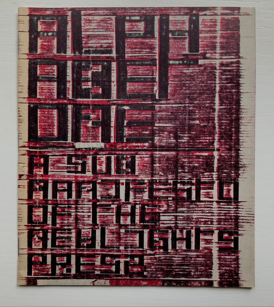
The New Manifesto of the NewLights Press (third iteration) (2017) Aaron Cohick Booklet, saddle-stapled, risograph, letterpress/collagraph, and hand painting. H165.1 x W139.7 mm (closed), 20 pages. #000611, unlimited, iterative edition. Acquired from New Lights Press, 11 December 2020. Photos: Books On Books Collection. Displayed with permission of the artist.
The New Manifesto of the NewLights Press (third iteration) has multiple starting points. Even in its first iteration, we have
The book is a dangerously unstable object, always between, continuously opening. It is interstitial, occupying many planes at once.
Digital technology has killed the book, finally.
The book is an impossible thing — comprised entirely of edges and full of holes. It moves. It happens in between.
Readers move through authors and books. Books move through readers and authors. Authors move through books and readers. They exist between each other’s pages. They only exist in between.
The form of the book, the history of the book, and the processes involved in its production provide a foundation for rethinking and re-evaluating the dominant discourse(s) of contemporary art.
The book … exemplifies a model that expands beyond form and content…. It is a field, whose axis points [form, content, production and reception] are always held in tension. In this model a piece or practice is a “zone of activity.”
Moreover, there are ten refinements on these starting points, touching on Julia Kristeva’s “intertextuality”, Roland Barthes’ “death of the author”, Michel Foucault’s “death of the book” and much more in the same vein. Each iteration even has diagram and footnotes, underscoring the academic nature of the starting points.
By its third iteration, The New Manifesto‘s words been further refined as a combination of announcement, exposition, lyric and prayer. It soars beyond literary theories and finds birds of a closer feather among Ulises Carrión and Michalis Pichler.
The book is a dangerously unstable object // It is a series of edges // Once clustered and knotted // Now open and spreading // Now cutting and bending // Mostly // The book betrays // Mostly // The book howls // The book falls apart in the face of our anguish // In the face of our quiet // In the silence of our slipping // Mostly // It will also always be something else // That we did not // Can not yet // See // The book is a remarkable technology // It is a shimmering substance // It is a noise of the hands and thought // The book is perhaps now a dead thing // In the hands of the dead // So be it // We never mattered much anyway // Beyond our capacity to consume // Our capacity to labor // We are fuel // So be it // We remain in the dark // With these books // The original autonomous window technology that is us looking through // At // In // Against // With care // The book returns our labor to us //
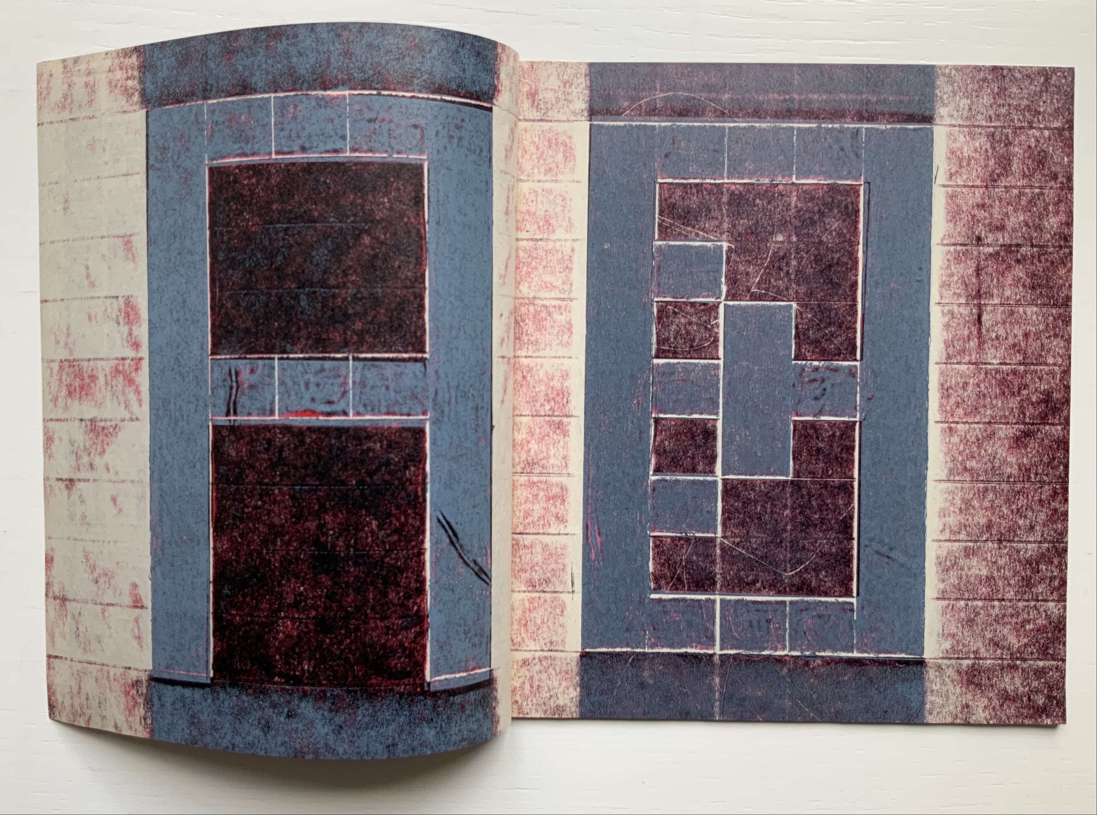
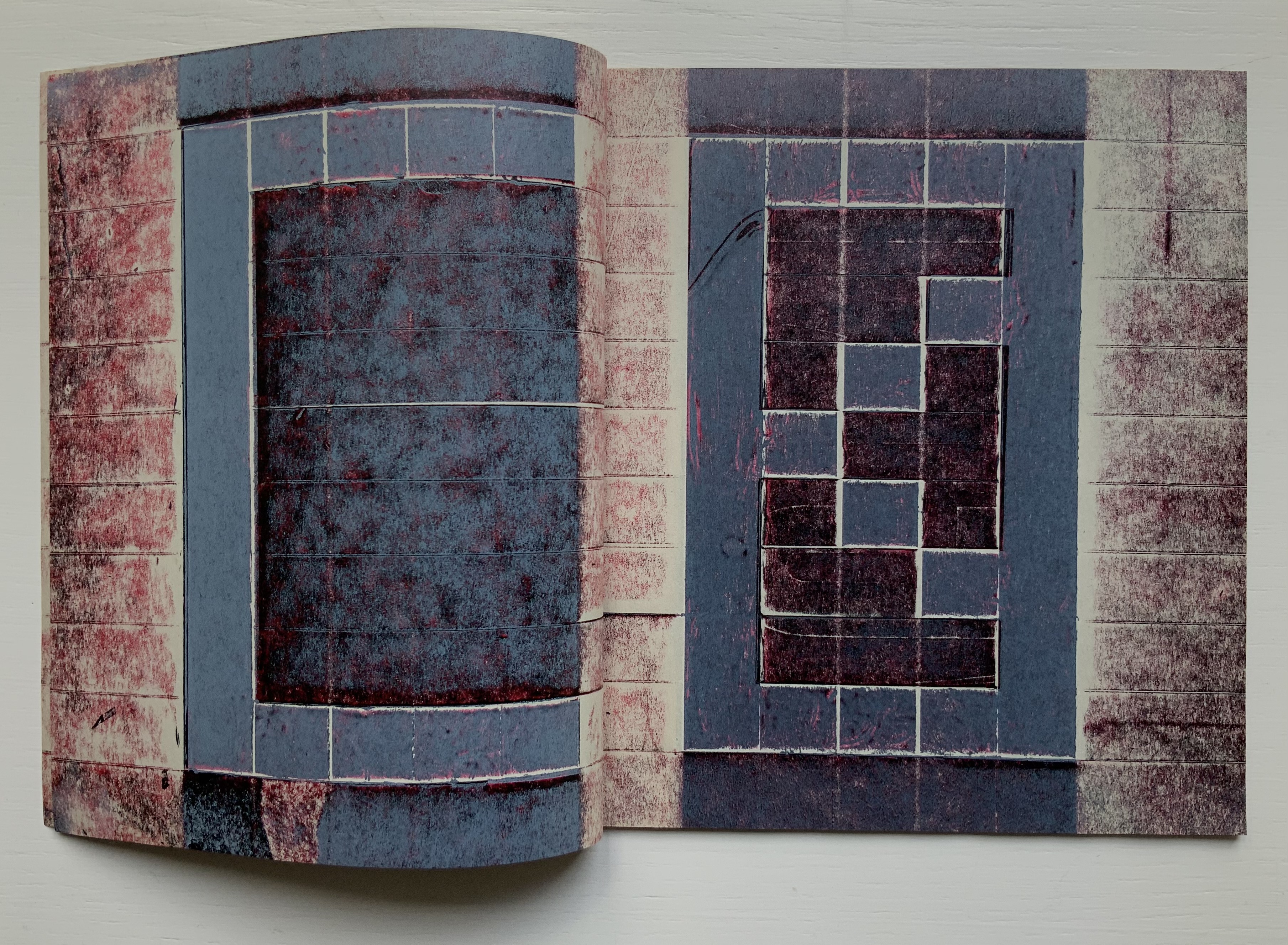
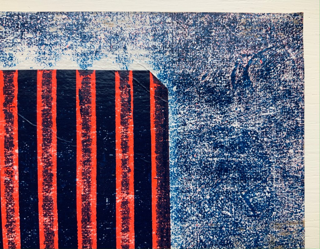
If a new edition of Publishing Manifestos is ever issued, Cohick’s hortatory words should be considered. The words, however, cannot be considered alone. Over the three iterations, The New Manifesto — the only one in the collection and, therefore, the only one tangible for the visitor — has “participated more & more in the world of visual art”. Cohick’s use of the collagraphic technique increases. It adds painterliness to the booklets as well as a sense of depth and spatial play within the page, across the gutter and from recto to verso pages. In a series of online essays for the College Book Art Association, Cohick confirms the pleasure and intent here:
Collagraph is a well-known technique and is usually taught as part of introductory letterpress courses. It has an immediacy and fidelity that is very exciting—you can stick a leaf or other flat object to a block, print it, and get a decent image of that object. Unfortunately it usually stops there. Those flat objects are hard to push beyond that initial single-color print. Linoleum, photopolymer, wood and metal type, and to some extent woodcut are all made to be “neutral” printing surfaces—flat and smooth. Trying to get collagraph to be flat and smooth begs the question: why use collagraph at all? In collagraph the material that makes the plate is not neutral—the material is exactly the point. That embrace of material and its many, varied effects and marks is what moves collagraph closer to the direct markmaking of drawing/painting. It makes all of those “unacceptable” (or abject?) marks readily available. Relief collagraph printed with letterpress equipment can be a method of painting or drawing in multiple, with control as good as—if not better than, but also different from—the hand. “You’re doing it all wrong (Part 2)“
From the first iteration of the manifesto, black & white details of Jan Van Eyck’s The Arnolfini Marriage appear and are manipulated on the cover and throughout. Although they recede in the second iteration, they move strikingly to the fore in the third. Constantly alongside the Arnolfini details has been the ampersand, enlarged, reversed, in different colors, and present — almost ornamentally — within the text line. The increased visuality of the third iteration announces itself on the booklet’s cover and inside with the grainy enlarged detail of the mirror from The Arnolfini Marriage. What do the Arnolfini details signify? Although Van Eyck’s original itself is straightforwardly representational, its meanings are not always any clearer than that of its use in Cohick’s collage. With his slices of black (“a series of edges”) obscuring the image of the groom, perhaps Cohick is compounding obscurities to present “something else // That we did not // Can not yet // See”.
And what about the large overlapping ampersands in red and gray, systematically reversed and alternating in color? Are they emphasizing the “and so on and so on” of tradition in Cohick’s painterly printing technique? Are they alluding to the joining of hands in the marriage? Are they alluding to, and performing, a marriage of the book and visual art? On a verso page in the manifesto’s first iteration, he writes, “The form of the book, the history of the book, and the processes involved in its production provide a foundation for rethinking and re-evaluating the dominant discourse(s) of contemporary art.” On the facing recto page, the Arnolfini bride in reverse from the original extends her hand to a reversed ampersand.
In perhaps the most important enhancement of the third iteration’s visuality, Cohick’s full-blown typographic redesign of the alphabet occupies the visual foreground, middle ground and background. It is as if Cohick sets out to demonstrate Mallarmé’s proposition that the book is the “total expansion of the letter”. The first iteration’s completely legible Palatino, Arial and Placard Condensed typefaces used in the text line have yielded to what Cohick calls a “dislegible” font, which he often reverses, lays out as occasional “running sides” rather than “running heads”, and subjects increasingly to collagraphic layering. In his “You’re doing it all wrong” series, Cohick explains:
If “legible” and “illegible” are binary opposites, then the term “dislegible” is about looking at the space between those two poles. Dislegibility displaces, dislocates, deforms, and/or disrupts the process of reading, with the ultimate goal of making that process of reading (dis)legible to the reader. The dislegible can be read, but it resists closure or certainty. “You’re doing it all wrong (Part 1)“
Also contributing to dislegibility is the reversal of images, the ampersand and letters. More than that, the reversal reminds us of what is involved in letterpress production — the inked relief surface and its reversed image or letter to be transferred to paper. Always in tension with form, content and reception, production makes up the open field from which the artist’s book emerges. The third iteration exudes production’s physicality. A black saturated endleaf bleeds over onto a stark white sheet that faces a stamped title page, intensifying a feel of mechanical working. Letterforms behave as so much raw material — as if they were oil, acrylic, brick or mortar — to be re-seen from different angles, noted for more than one function and their text read for more than one meaning.
According to Cohick, “For art to thrive, form and content must be in a dynamic relationship… It must contain enough disruptions, ambiguities, and peculiarities to resist the deadly state of stable signification.” The iterations of The New Manifesto enact that statement.
Alphabet One: A Submanifesto of the NewLights Press (2017)
Alphabet One: A Submanifesto of the NewLights Press (2017) Aaron Cohick Booklet, center-stapled. Letterpress printed from woven collagraph blocks on newsprint. H165 x W140 mm, 28 pages. Acquired from the artist, 11 December 2020. Edition of 250, unnumbered. Photos: Books On Books Collection, displayed with permission of the artist.
Alphabet One, “companion book to the third iteration of The New Manifesto of the NewLights Press”, presents Cohick’s “complete ‘noise’ alphabet, in order, in condensed and full form”. In The New Manifesto, Cohick has described the book as “a noise of the hands and thought”. Well then, being a book, Alphabet One demonstrates that the manifesto is the alphabet, and the alphabet is the manifesto, and “woven collagraph blocks” could hardly be less “a noise of hands and thought”. Lest those inferences seem strained, continue reading the passage Cohick reproduces from The New Manifesto immediately after the reference to the “complete ‘noise’ alphabet”:
This is not a utopian program // This is not an alphabet for saving the world // Such a thing is a dangerous lie // This is one possibility // Not a tool // But a movement-between // An object-between // A growing // Changing thing // Meant to do just that // It is about attention and its revitalization // It is about structure and our being in it //
A, B, C, D. Photos: Books On Books Collection.
W, X, Y, Z. Photos: Books On Books Collection.
It cannot be an accident that the “noise” alphabet’s letterforms arise from varyingly shaded bricks: rose, gray, reddish gray and reddish black. To left and right of each letter, the rose color dominates. A reddish gray bar tops and tails each letter. The color gray forms the “strokes” of each letter. Reddish black fills the counters. Extracting the signal from the noise of the alphabet or books does not come easily. This is intentional. Just as The New Manifesto says,
With these books // The original autonomous window technology that is us looking through // At // In // Against // With care //The book returns our labor to us //
Days Open Air (2016)
Days Open Air(2016) Aaron Cohick Booklet, center-stapled, H203 x W152, 12 pages. Edition of 100, of which this is #40. Acquired from the artist, 11 December 2020. Photos: Books On Books Collection, displayed with artist’s permission.
Days Open Air is one of those books returning our labor to us that The New Manifesto announces. Cohick call it “an artists’ book/poem thing … an experiment: with our new Risograph, with the alphabet, with writing, with random numbers, and with noise.” Letterforms stretch. Words run sideways, they break in the middle across lines, even across pages.
Look-See (REAED) (2014)
Look-See (REAED) (2014) Aaron Cohick Print. H300 x W456 mm. Photos: Books On Books Collection, displayed with artist’s permission.
More evocative of barcode stripes than bricks, the letterform strokes in this poem-print-poster stretch even more than in Days Open Air. Printed on a Vandercook 219 from vinyl and gesso collagraph blocks, the letterforms challenge us to “look” and “see”. An angle at the top right, two angles midway on the right and two counters condensed to small squares suffice to define the first letter — R. The letters E and A are more efficient, requiring only the placement of two counters each. Note how the textural effect of the gesso and letterpress printed collagraph on chipboard joins The New Manifesto‘s celebration of the physicality and noise of production.
In Cohick’s world, the book and art make, and should be perceived as, a “strange” continuity. His vision and embrace of the collagraph suggest a 21st century version of William Blake. He names his nearer contemporaries as Ken Campbell, Walter Hamady, Amos P. Kennedy, Jr., Karen Kunc, Emily McVarish, Dieter Roth and Nancy Spero. In the Books On Books Collection, those far and near can also be found in Eleonora Cumer, Raffaella della Olga and Geofroy Tory.
Univers Revolved: A Three-Dimensional Alphabet (2004)
Univers Revolved: A Three-Dimensional Alphabet (2004) Ji Lee Sewn paper on board hardback. H338 x W238 mm, 64 unnumbered pages. Acquired from Unoriginal Sins, 12 December 2020. Photos: Books On Books Collection.
In his extended essay on Stéphane Mallarmé’s Un Coup de Dés Jamais N’Abolira le Hasard, Eric Zboya celebrates Ji Lee’s 3D typeface by rendering the entire poem in that face. The discovery of that essay led to the acquisition of Zboya’s artist book, which led to the acquisition of Ji Lee’s scarce volume Univers Revolved: A Three-Dimensional Alphabet (2004). Lee’s book resonates with several other works in the Books On Books Collection. Compare it, for example, with Johann David Steingruber’s alphabet book Architectonisches Alphabeth (1773/1973), Paul Noble’s alphabet book Nobson Newtown (1998) and Sammy Engramer’s three-dimensional rendition of Mallarmé’s poem.
This double-page spread displays the manipulation of the alphabet’s first four letters around their axes at two different angles to render their 3D shapes.
These two double-page spreads show the complete alphabet and punctuation marks at two different angles, which provide a key with which to begin reading text spelled out in the book.
Lee teases his reader by composing sentences with different sized letters. “Reading is Fun!” is one of the easier to decipher.