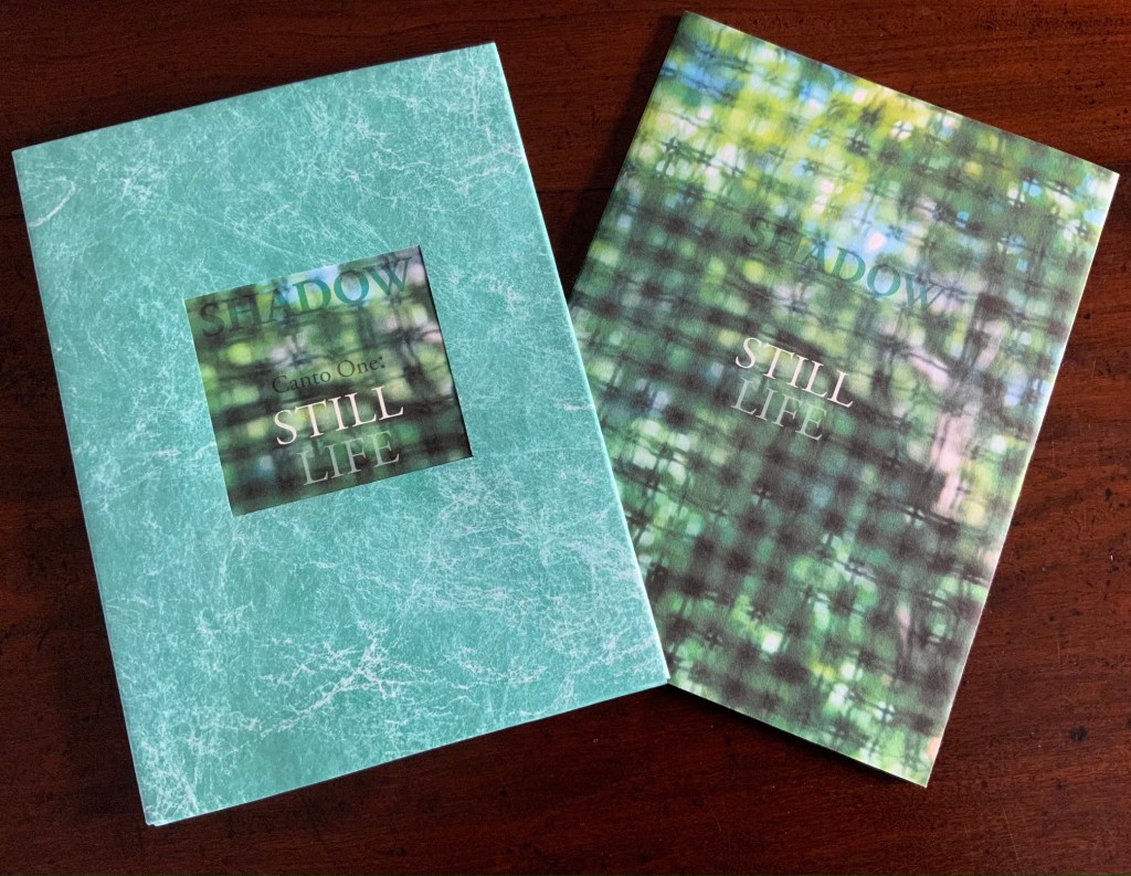
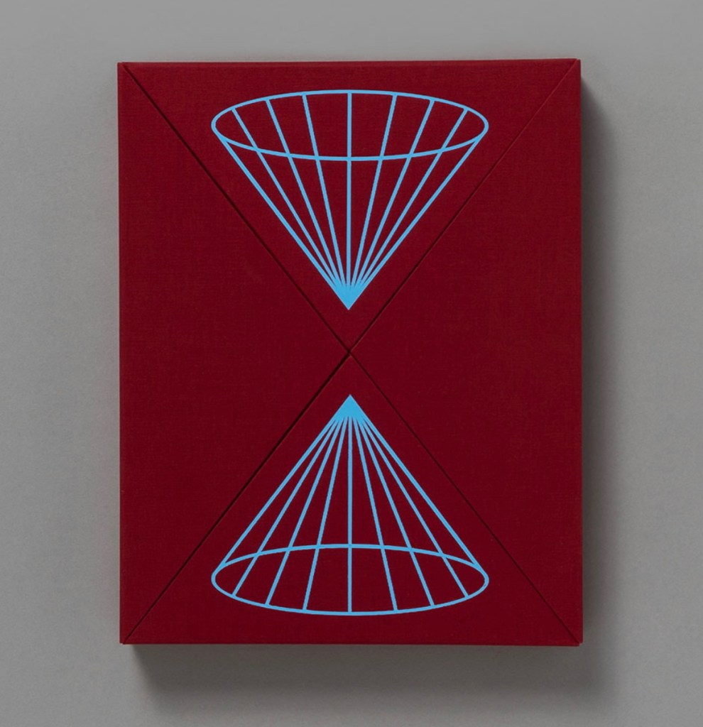
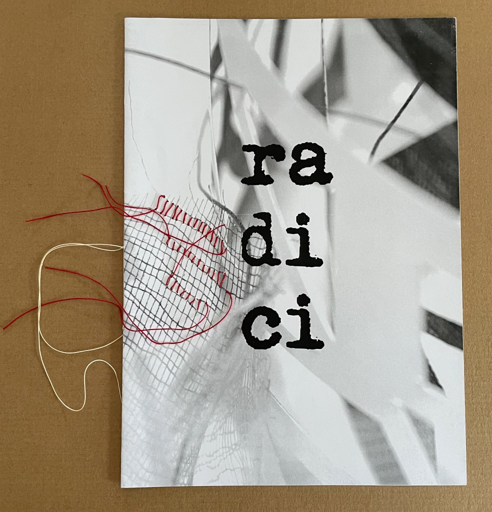
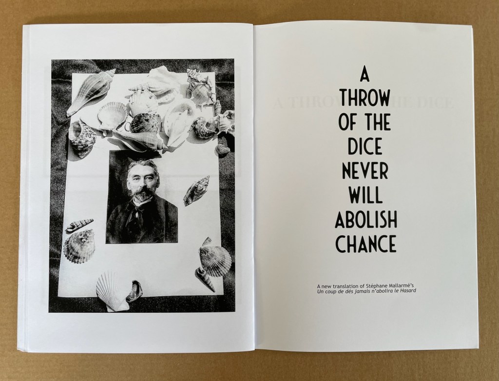
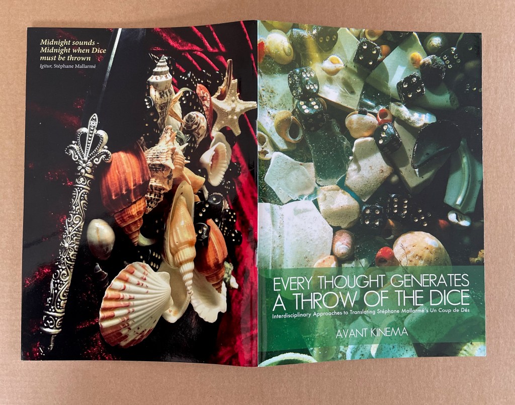
Making Memeries (2016)
Making Memeries (2016)
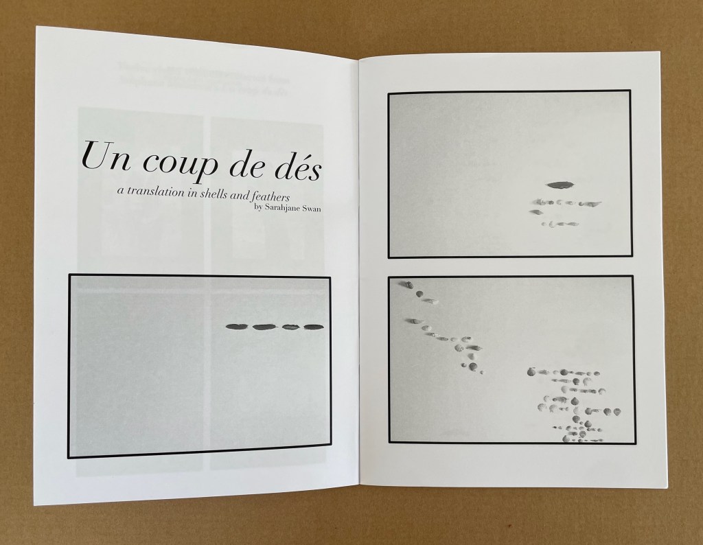
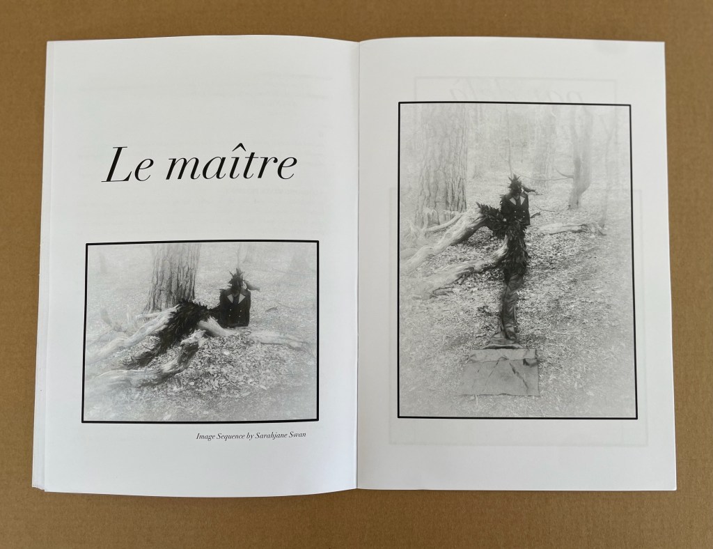
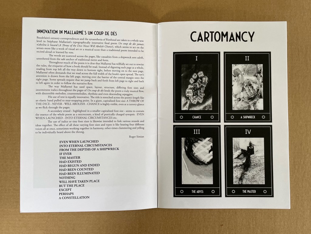
Lucas Blalock
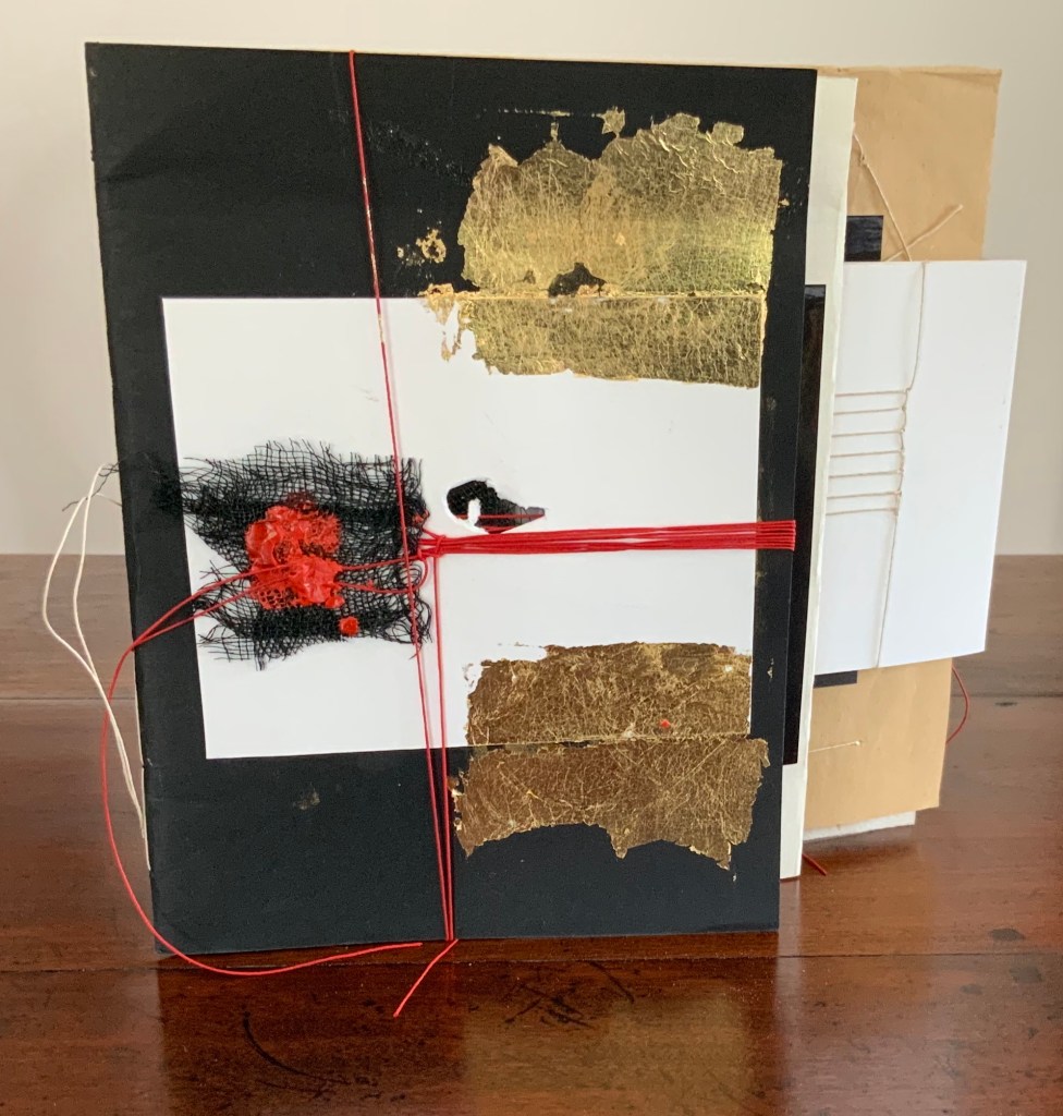
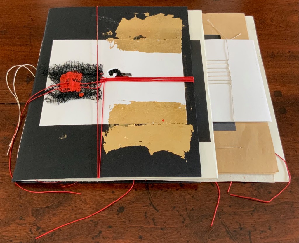
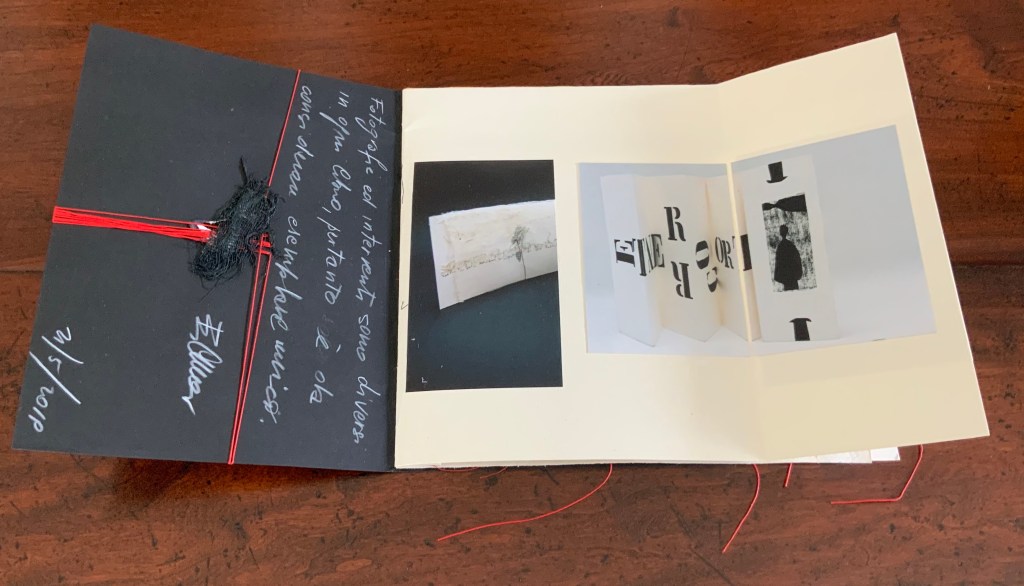
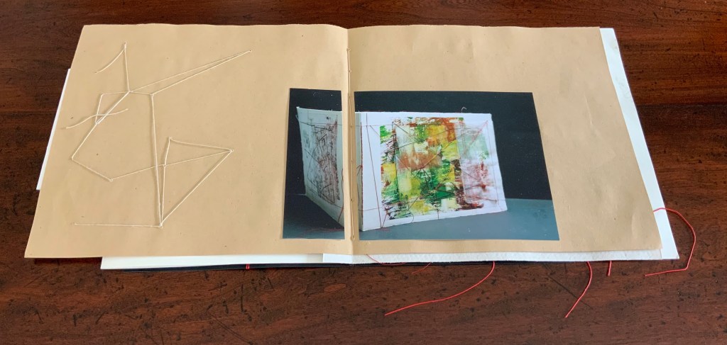
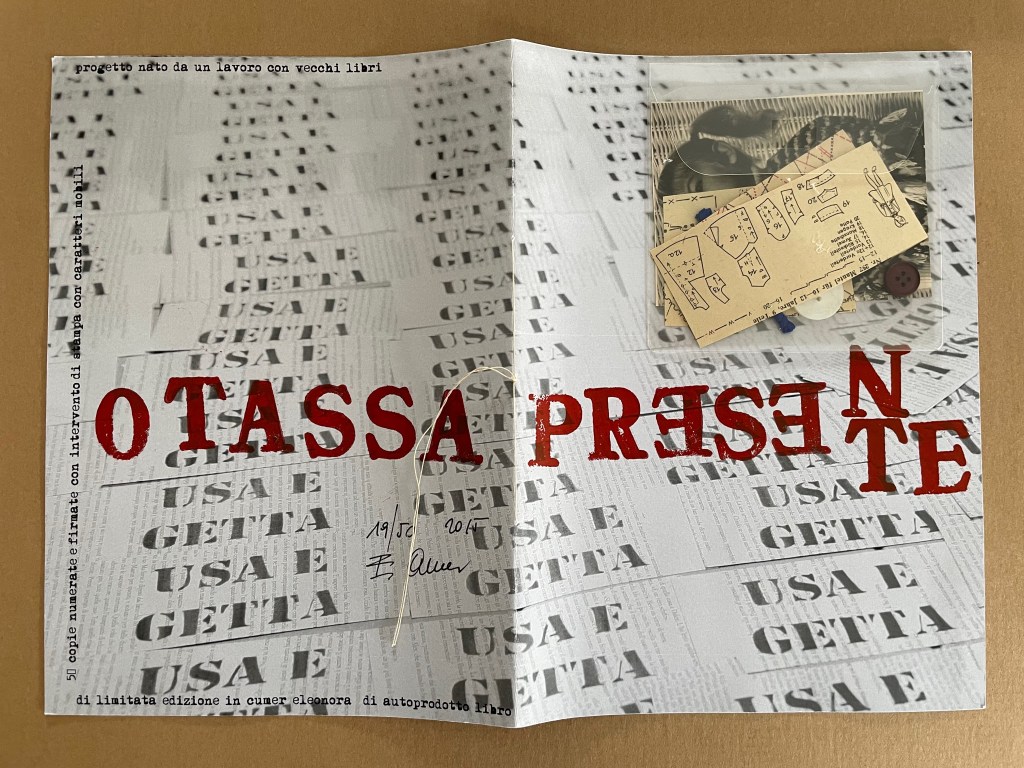
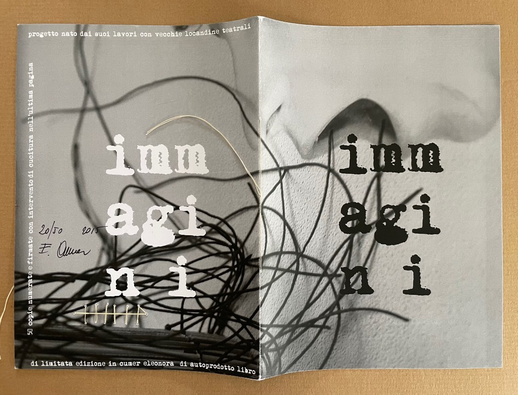
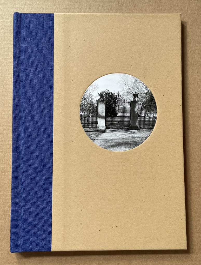
Board book consisting of nine 3mm thick card leaves with 8 double-page large colour photos, all of which interact with a down-loadable app. H330 x W210 x D28 mm. [18] pages. Edition of 500. Acquired from David Bunnett Books, 31 July 2023.
Photos of the work: Books On Books Collection.
How do we respond to an artwork of collage or assemblage that is missing a piece — assuming that we can tell ? And if all of the elements are ephemera, does it matter to our appreciation of it? Do we keep returning in annoyance to the gap — like a tongue to a missing tooth? Do we give up on it — like the purchaser of a secondhand jigsaw puzzle missing a piece or two? Or do we sigh and suppose appreciatively that the disappearance of an element of ephemera from a collage or assemblage of ephemera proves the artwork’s point?
Lucas Blalock is an artist of augmented realities. With the right device and app pointed at his artwork, we should be able to see images floating and moving over its surface or seemingly in the surface among its images or transforming them. According to the back cover, we can download this app from the iTunes App Store to interact with the book’s images. The app, however, was removed from the App Store in July 2023. Using the WayBack Machine, we can find the publisher’s announcement of the Making Memeries installation with Blalock in the Tate Modern’s Turbine Hall:
The London-based curatorial project Self Publish, Be Happy presents a programme of events that explore the blurring boundaries surrounding on/offline existence and distribution of photographs. The event, titled Making Memeries, will take place at Tate Modern during this year’s Offprint London art book fair from 20-22 May.
Artist Lucas Blalock has created an installation for the middle of the Tate Modern’s Turbine Hall that functions as a staging area for workshops and performances. The installation consists of a set of eight movable panels that display a new suite of photographs by Blalock. The elements of the installation, conceived of specifically for this project, can be further activated via this app, Making Memeries.
The audience will be able to immerse themselves in, and interact with the work through the app, which uses your camera to produce a digitally augmented reality. Blalock’s work has long been interested in the cohabitation of the worldly and the virtual behind the photographic surface, and this project has allowed the artist to picture this cohabitation on both sides of that plane. Blalock has collaborated with REIFY, the augmented reality (AR) creative studio, to build an experience that blurs traditional boundaries and challenges one’s expectations of viewership.


Photos from old website of Self Publish, Be Happy. Accessed 26 October 2025.
Among the performances facilitated by the installation was Anouk Kruithof’s Connection, which also contributed to the aim of blurring the boundaries of the physical and digital.
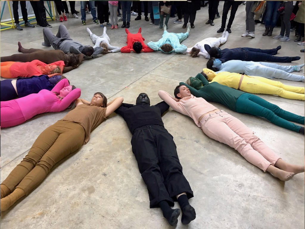
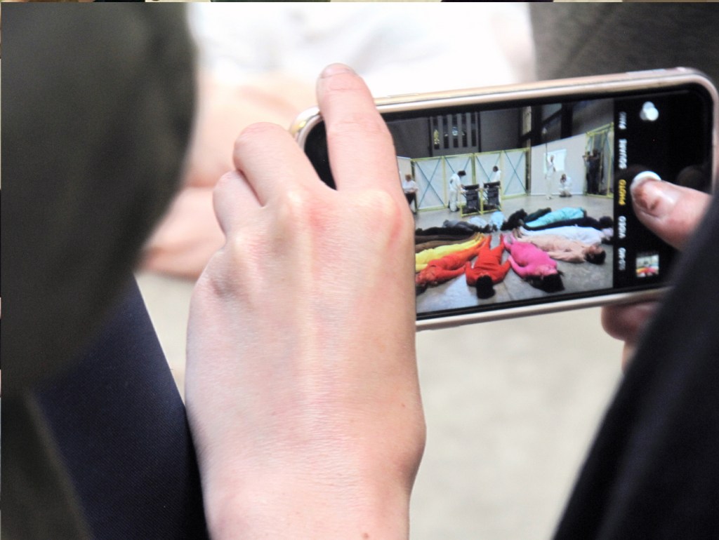
Photos from Connection, installation by Anouk Kruithof. Accessed 26 October 2025.
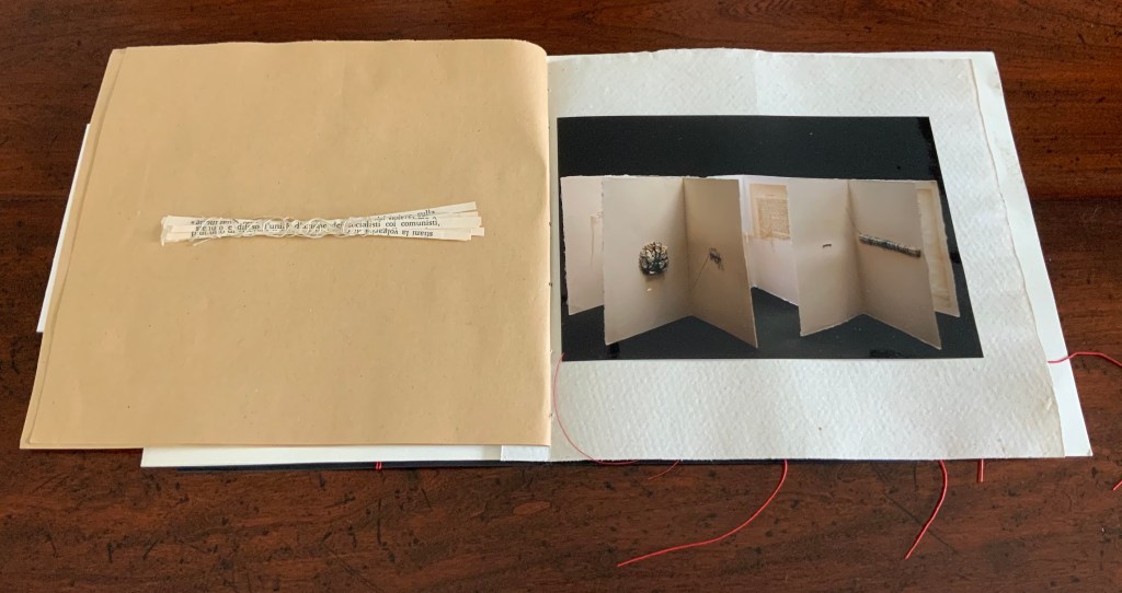
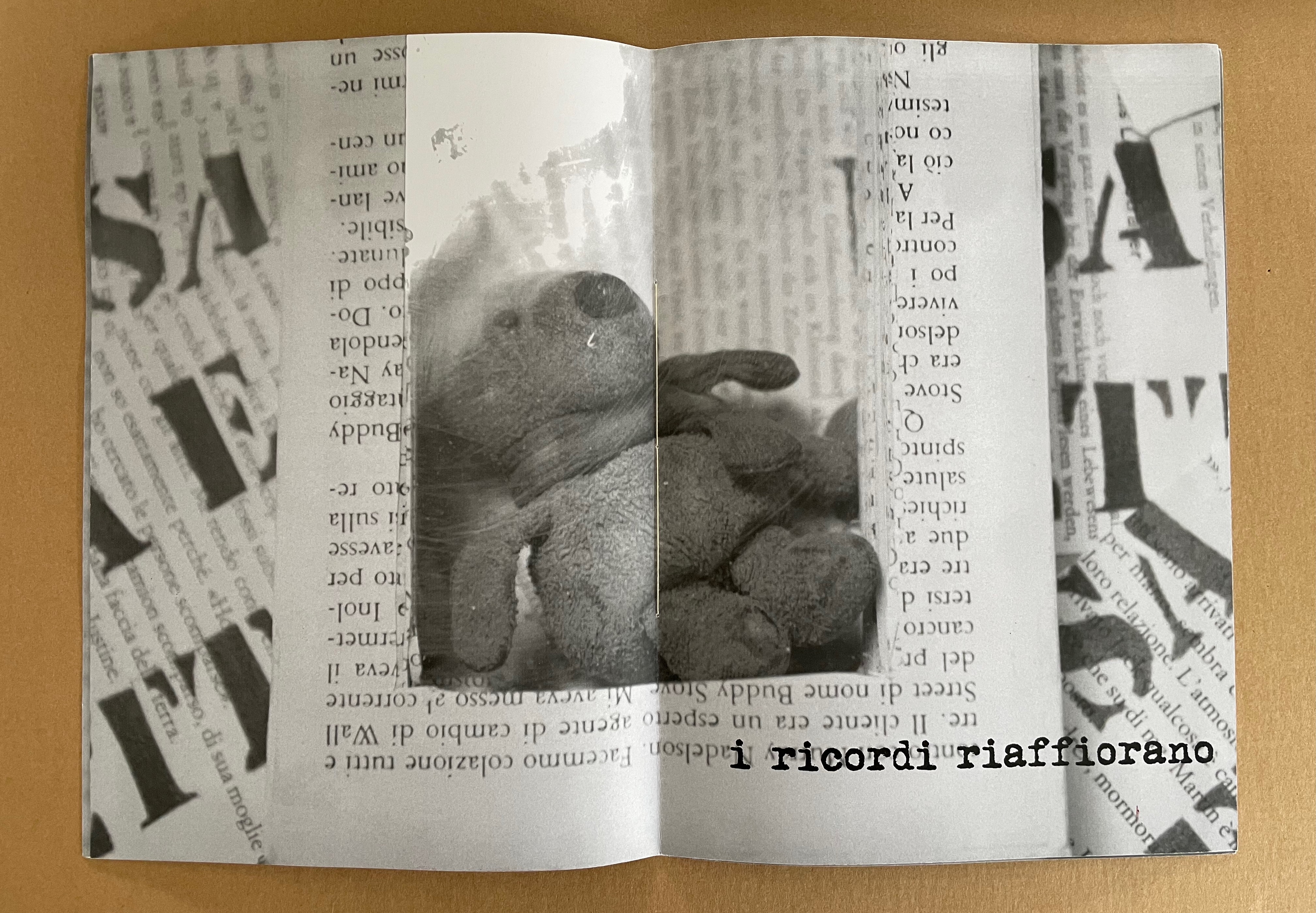
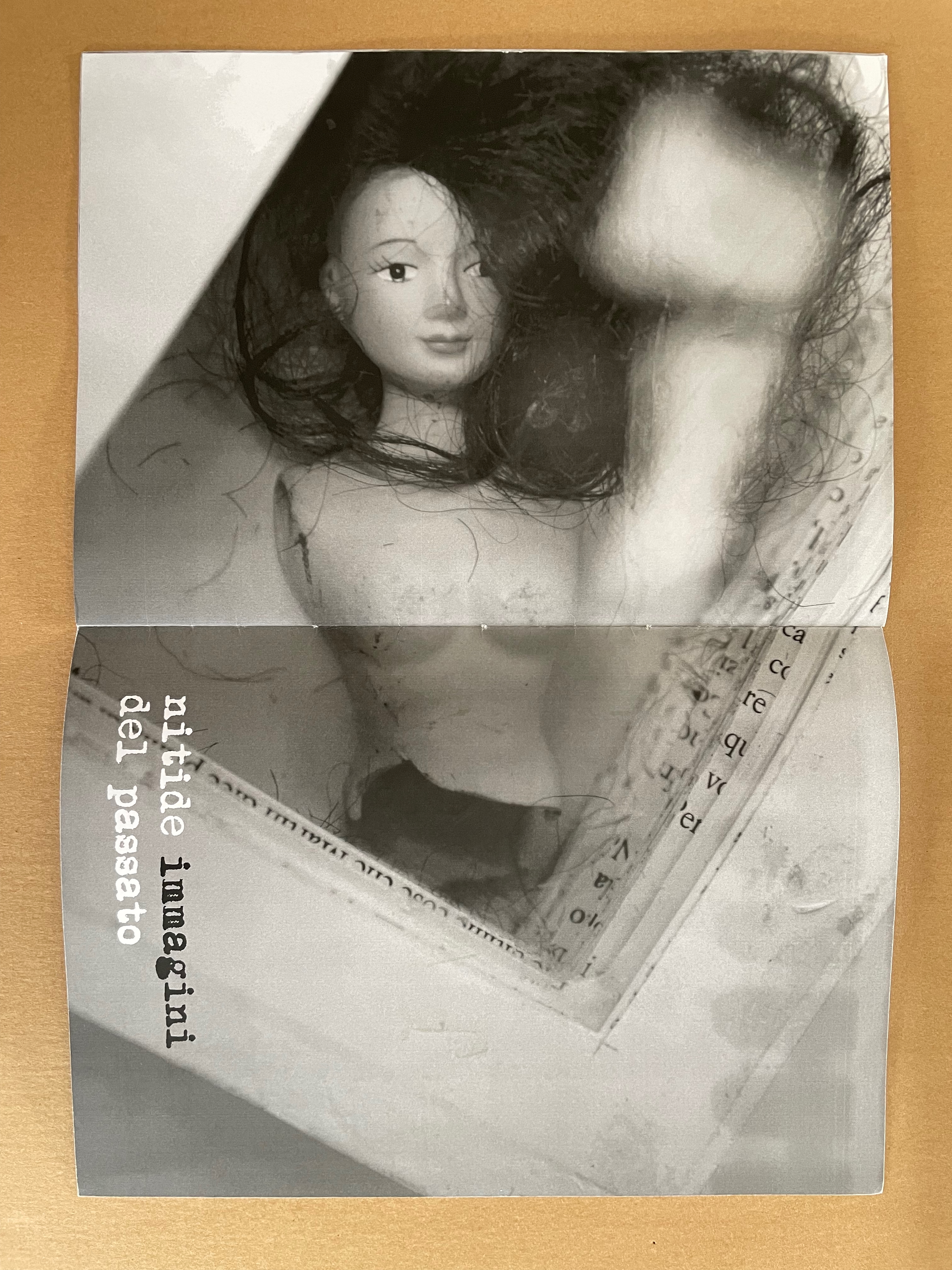
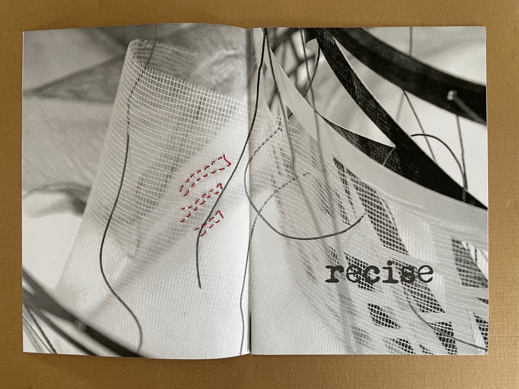
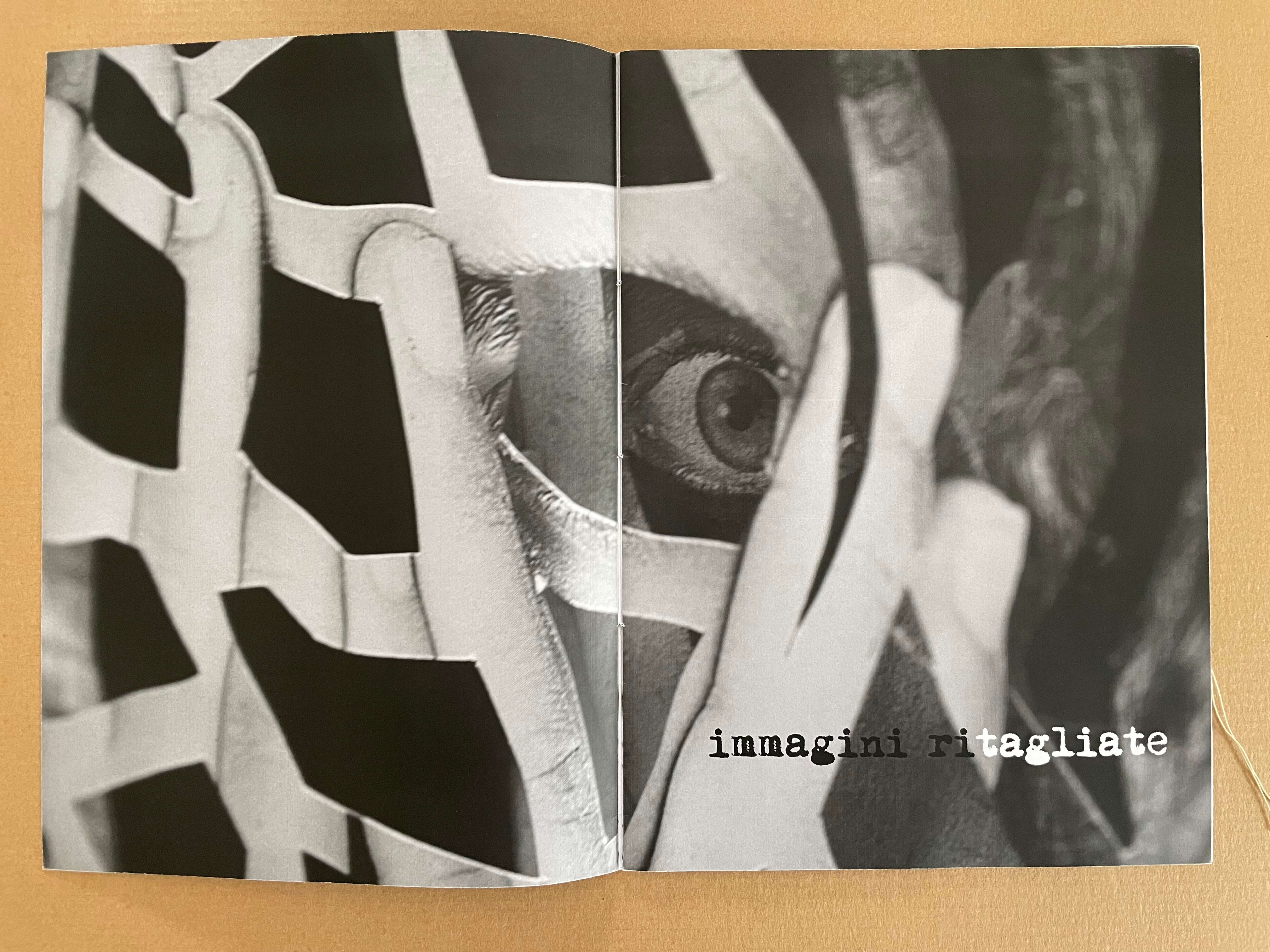
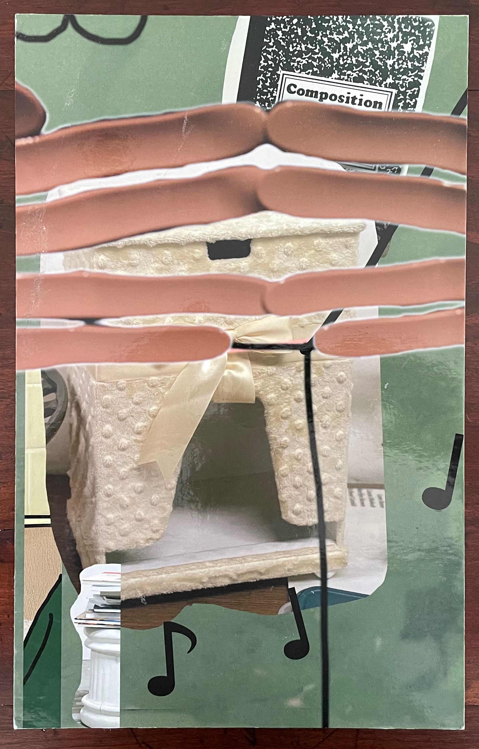
But without the app or memory of the installation, we have a gap like that missing tooth. We can bridge the gap somewhat with online links and the book’s collaged imagery of mixed media and photographs to recognize that Making Memeries is also about how we perceive surfaces and what lies beneath — and what might come between. Consider the earplugs alongside the telephone below. Then there’s the pair of spectacles in the shape of fingers that would cover the wearer’s eyes. Now look back to the cover, and we find the view from behind those finger-spectacles.
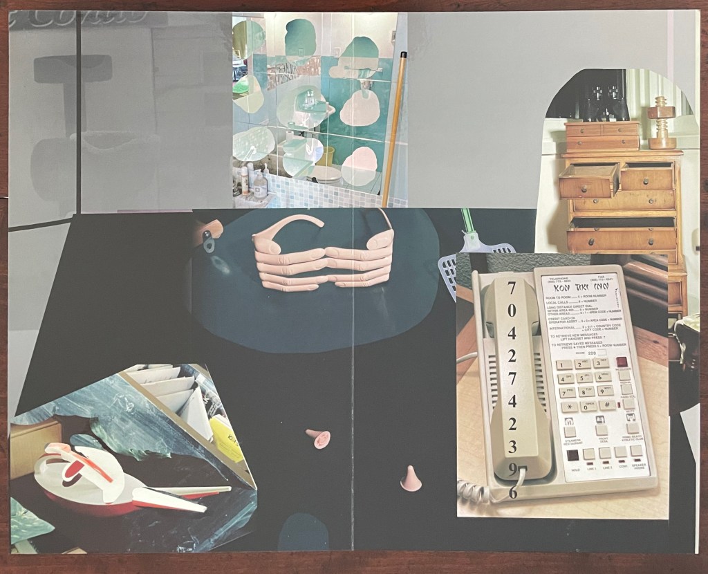
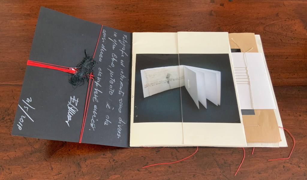
Photo of the work: Books On Books Collection.
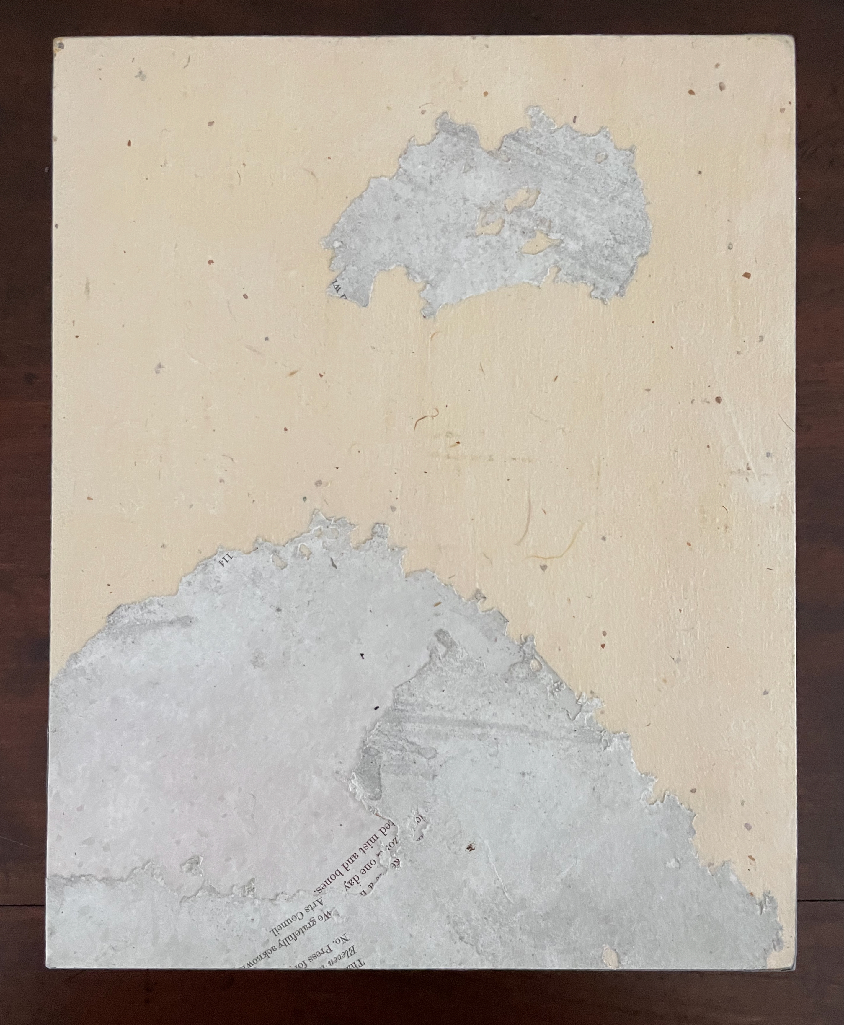
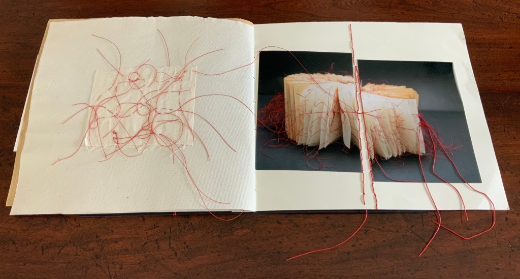
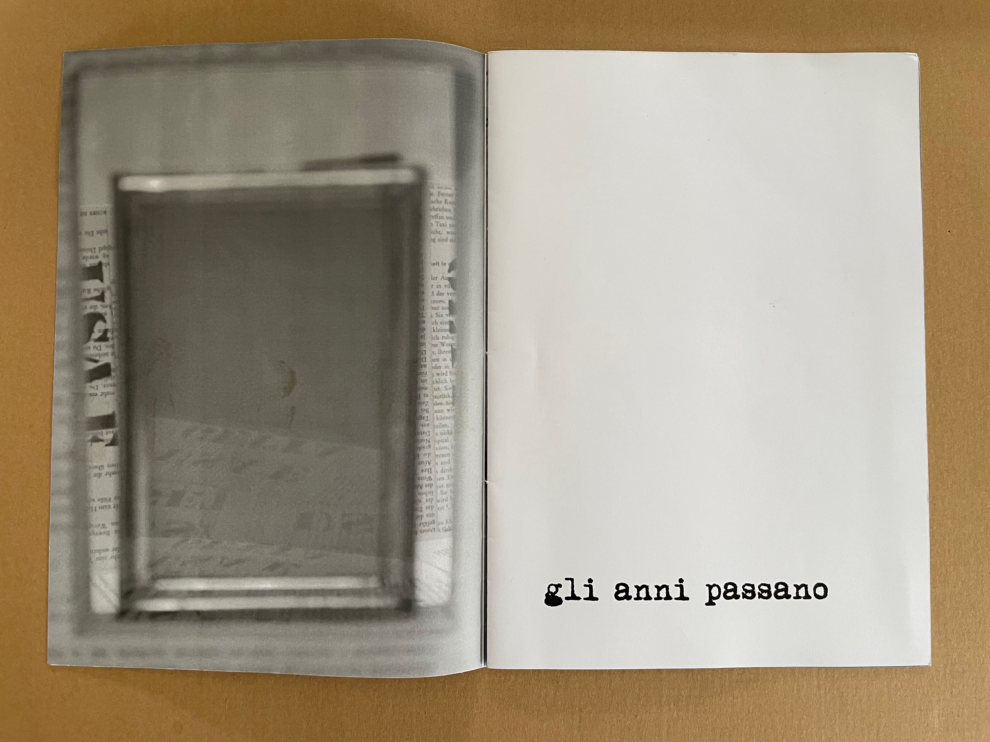
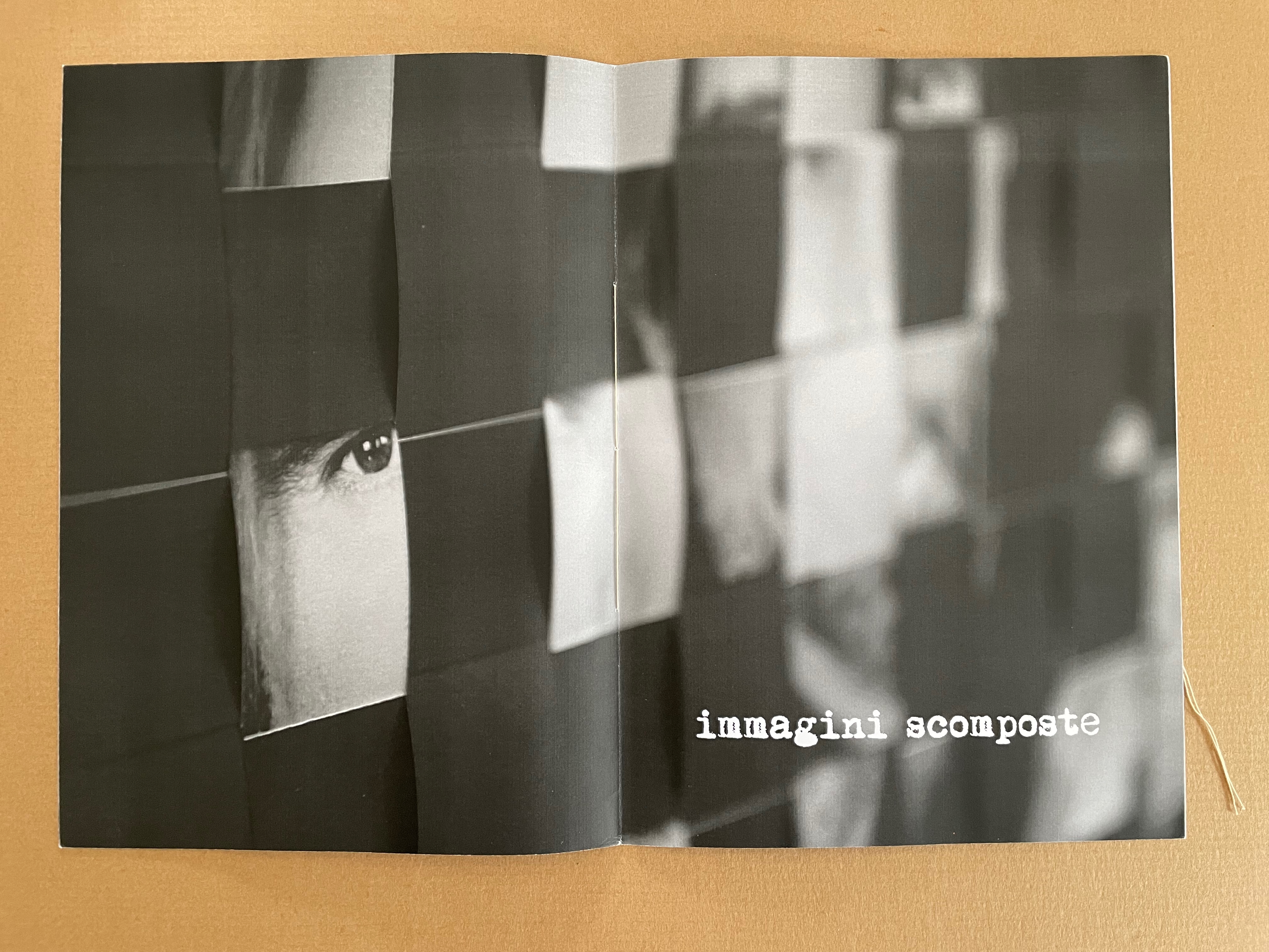
Or consider the images of the model of the epidermis with which the book opens and closes. ortunately, we have a YouTube link and Olga Yatskevich’s review to let us know that the “augmented reality radically changes the experience, making the image active rather than static – the app brings rounded depth to the model, shows blood running through the vessels, and allows us to explore the space around the object, its sides and the top”.
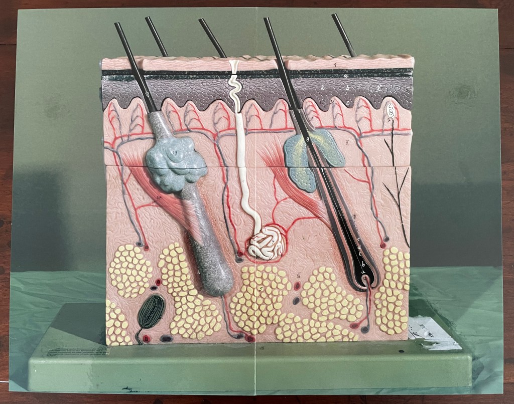
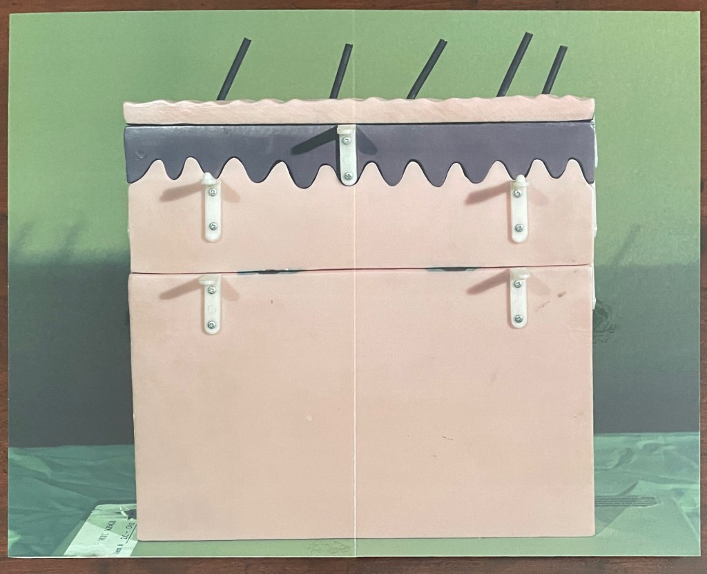
First and last double-page spreads. Photos: Books On Books Collection.
There’s something childlike, playful but serious conveyed in all this. Physically Making Memeries presents itself as an oversized children’s board book (or perhaps a board book for undersized adults). The use of the board book to make this cross-over can also be found in other artists’ books — Colleen (Ellis) Comerford’s ABCing and Phil Zimmermann’s Sonorensis, for example.
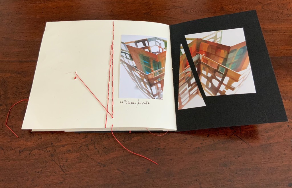
Fore edge of Making Memeries.
What the board book only partially conveys with the Connection link in hand, so to speak, is the intent expressed on the back cover and in the Tate’s announcement:
Making Memeries is set in a time when everyone has become a lifestyle photographer. It is still your life but the image production is decidedly public; and in that case temporary, verging on fleeting, because these public channels have so many content providers and, along with our attention spans, are in a perpetual state of refresh. [back cover]
Before the advent of the Internet the act of taking a photo was often intended to make memories; to store and preserve our past in still, printed images. In today’s digital age the act of taking photos can be enough for the photograph-taker. The act is exhausted by the process. This can be seen in the way a mobile phone camera offers immediate satisfaction — producing a file that may never be looked at again. Today a photo has a different claim to time, being much more in the “now” than in the “this has been” of its 19th and 20th century pre-internet forbearers. We, in turn, live in a culture of the perpetual present, in a meme-driven world where photos can effortlessly be shared, but where they most often disappear into digital oblivion. [Tate Modern announcement]
It feels ironic that Making Memeries‘s “missing tooth” is digital. The same year of Blalock’s installation at the Tate, Pokémon Go arrived, and people began wandering into traffic to capture Pokémon figures that their cameras projected onto the streets around them. Nine years later, the company owning the app has sold for $3.5 billion, and the world’s richest country is governed by meme. Is art miming life, or life miming art?
Further Reading
“Colleen Ellis“. 7 March 2024. Books On Books Collection.
“Anouk Kruithof“. 19 July 2021. Books On Books Collection.
“Philip Zimmermann“. 14 January 2020. Books On Books Collection.
Art21. 11 September 2015. “Lucas Blalock’s Digital Toolkit“. Art21 “New York Close Up”. Accessed 26 October 2025.
Blalock, Lucas. 13 April 2020. “On Amusement Parks, Torture, and Making Photographs Look the Way the World Feels“. Zolo Press. Accessed 23 October 2025.
ICA LA Production. 27 June 2019. “Lucas Blalock: An Enormous Oar“. Los Angeles: Institute of Contemporary Art.
Yatskevich, Olga. 22 November 2016. “Lucas Blalock, Making Memeries“. Collector Daily.