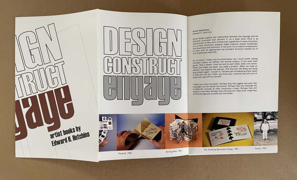
Guilford College Art Gallery
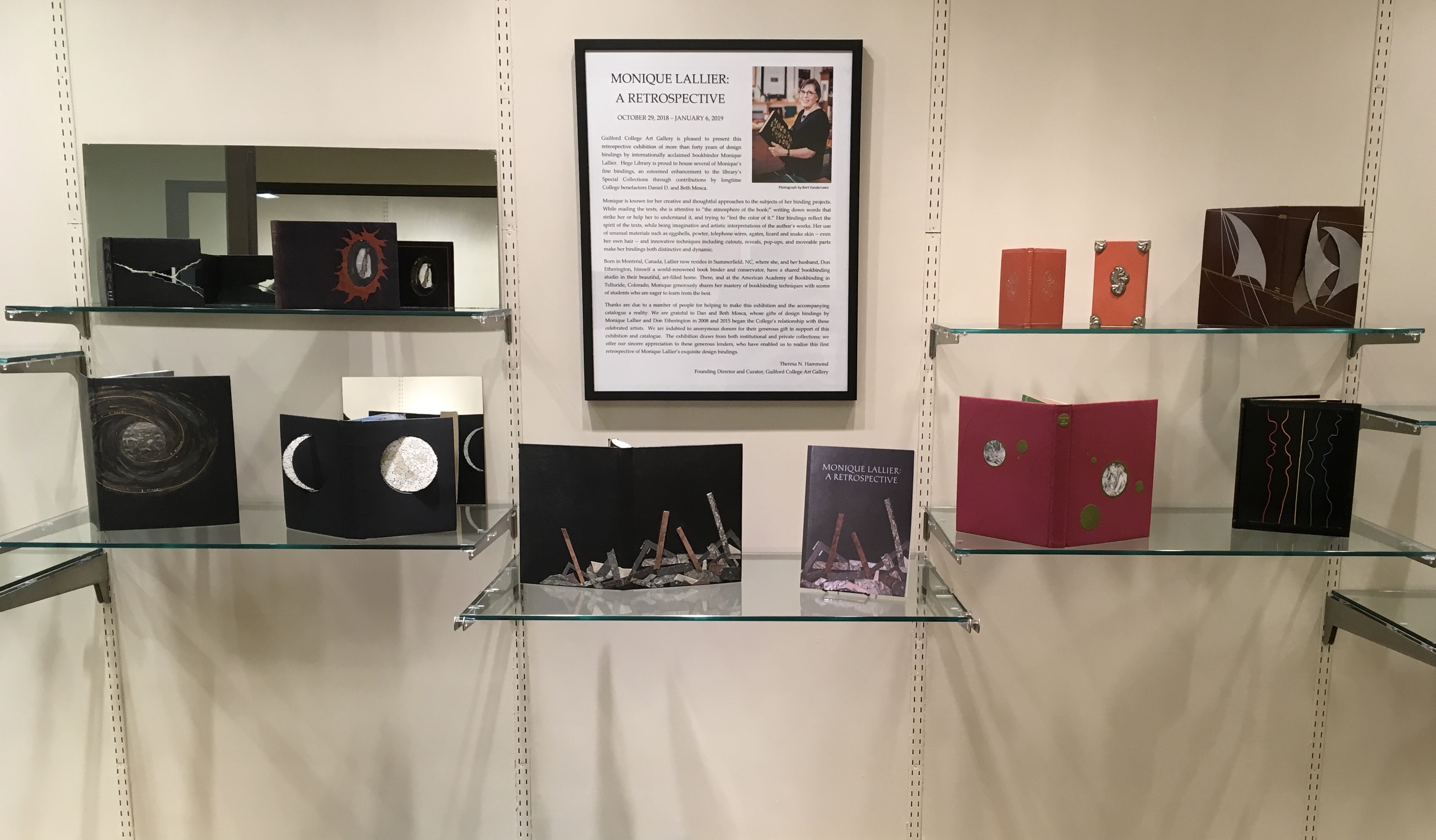
North Carolina can be a quiet state of hidden gems. Particularly those of the book arts, book art and publishing variety. The art gallery fronting the library on the Quaker-founded Guilford College campus in Greensboro is one such gem. Within that gem for the next two months is another. The Gallery’s director and curator Theresa N. Hammond has marshaled its collection of Monique Lallier’s bindings and dozens of others from around the world for a retrospective on forty-six years of work by Lallier.
Lallier’s roots are in the tradition of fine French binding, which goes back to the practice of book buyers’ purchasing unbound books and taking them to their favorite specialist binder for customized binding, most often in leather. Lallier has written here about the technique in detail. While it is true to call Lallier a bookbinder, it misses what the displayed works say she is: a sculptor and artist of the book. For anyone lucky enough to visit Guilford College Art Gallery, the comments and photos below offer a handful of pointers to details and background supporting that statement. The exhibition catalogue including an insightful essay by Karen Hanmer as well as multiple views of the works displayed and several outside the exhibition will clinch the argument.
Theresa N. Hammond, the Gallery’s director and curator, reflected here behind La Lune (1971) and its swiveling “phases of the moon”, rounds coated in eggshells of differing colors.
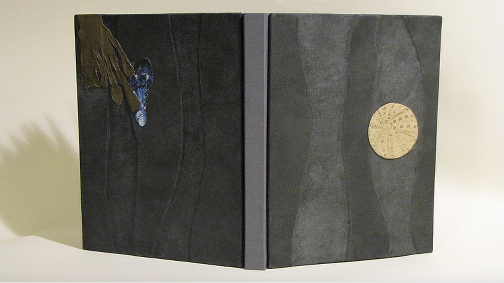
One of the distinguishing characteristics of Lallier’s artistry is her innovative use of materials: eggshells in La Lune (1971), her own hair in L’Eloge de la Folie (1974), translucent agates in Portes Sud (1979), silver in Histoire de Minnie (1982), wires from old telephones in Lignes (1986) and pewter in The Song of Songs, which is Solomon’s (2002).
Rarely does Lallier use on the cover an image from within the book at hand. Here is one of the exceptions. The cavorting monks from Erasmus’ satire come from Albert Dubout’s 1951 illustration of the classic. Lallier, however, couldn’t resist using her own hair to form their tonsures.
Note in the reflection the light coming through the agate embedded in the cover.
In the exhibition, be sure to look at the back cover where Lallier has used the silver piece, embedded in the front cover, to stamp the back cover.
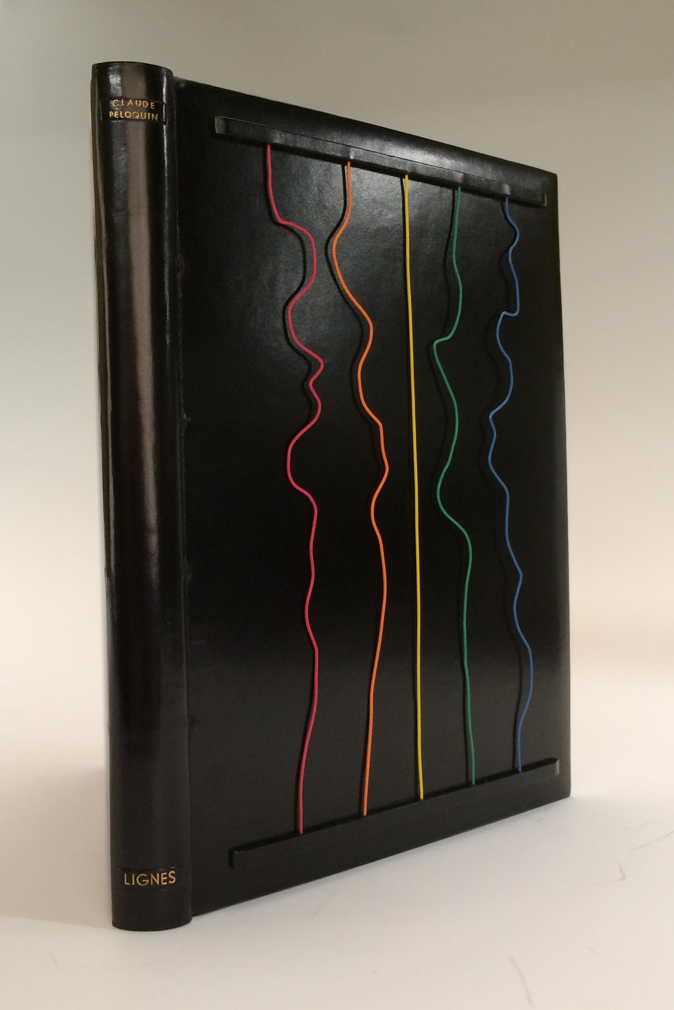
This is Lallier’s only collaboration from scratch. For a Montréal exhibition whose organizers set the theme of “lignes” or lines, she conceived the cover design. Sharing only blank pages and not the design, she then asked Claude Péloquin to provide text and illustrations on the theme.
The “telephone wires” attached to the front cover are loose and manipulable by the reader — a tongue-in-cheek form of interactivity with lines of communication in the pre-Web age.
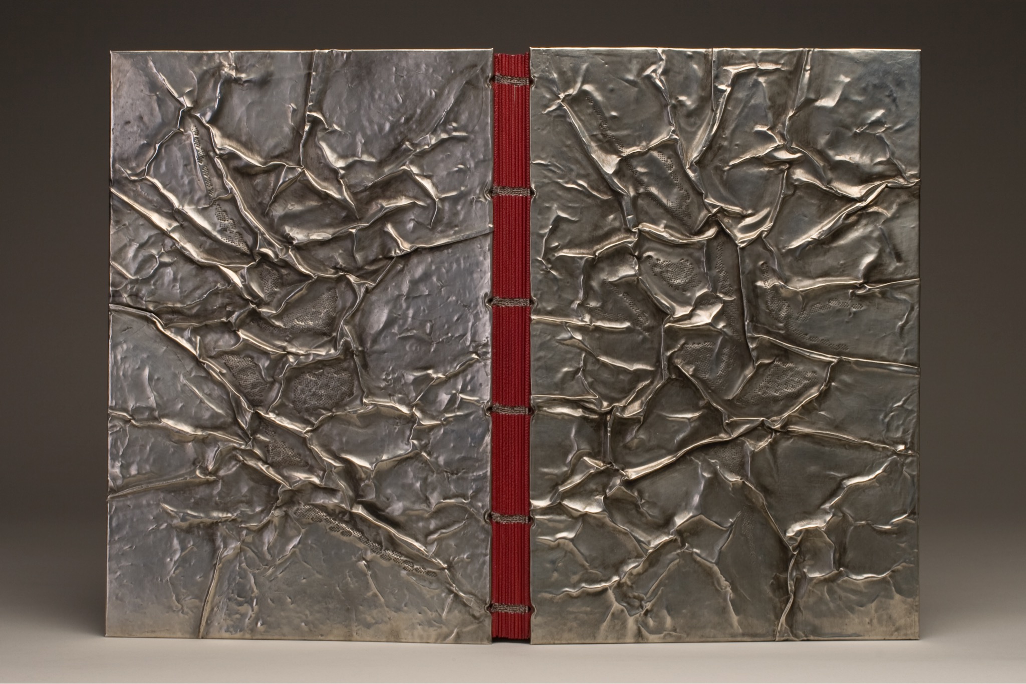
Visiting a Parisian builders’ store with a friend selecting decor items, Lallier was entranced by sheets of pewter and its varying thicknesses. She bought some. The inspired result above sits alongside another in the exhibition — The Enchiridion of Epictetus (2003); be sure to look at the reflection of The Enchiridion to spot the use of pewter in the interior.
The odd materials chosen are frequently highly apropos of the book in question. In the catalogue, take a look at Le Papier, Le Livre (2015), which has embedded pieces of a wasp’s nest, entirely in keeping scientifically and historically with the subject. In 1719, the French naturalist René Antoine Ferchault de Réaumur published an essay to the Royal Academy of Sciences on the natural history of North American wasps and hypothesized how man could adopt their natural papermaking industry.
Another element of Lallier’s work to look for is the form of binding — not just the covers but the interior structure. Despite the glass cases protecting these items, it is easy to spot and enjoy the structural features, for example, the book in the form of a distinctively shaped Southern lady’s fan for The Birthday (1990). The catalogue shows a dos-à-dos (back-to-back) binding of the volumes of Pilgrim’s Progress (2003), a daring rebinding of a rare 18th century production. The Friends of the Library at University of Alberta made the courageous right decision.
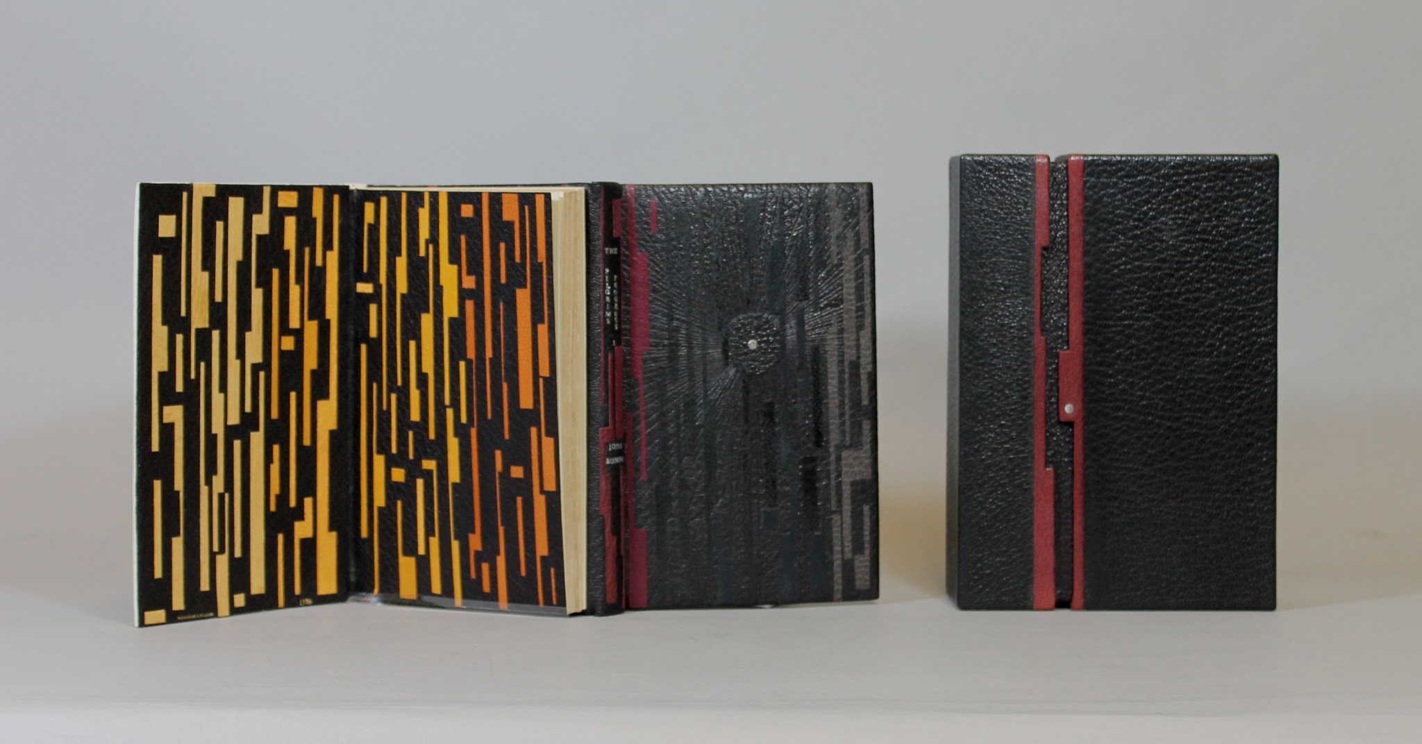
Dos-à-dos binding, showing the first part of the book, in which Pilgrim sets out on his journey in darkness, which Lallier marks with a black leather circle with a palladium dot at its center.
Photo credit: University of Alberta.
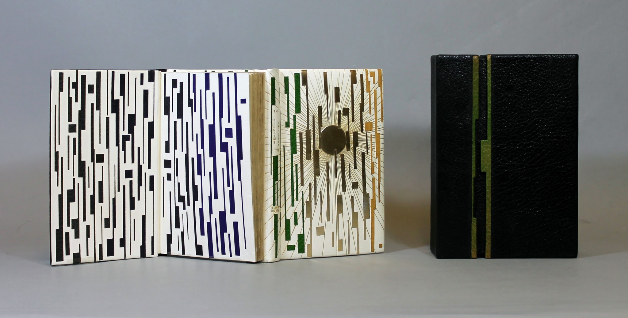
Dos-à-dos binding, showing the second part of the book, in which Pilgrim arrives at the Celestial City, which Lallier marks with a gold tooling radiating from a gold circle.
Photo credit: University of Alberta.
Some of the interior and exterior forms are more subtle. Lallier has made extensive use of the stub binding technique (see below), and there are several examples of cross structure binding (see below).
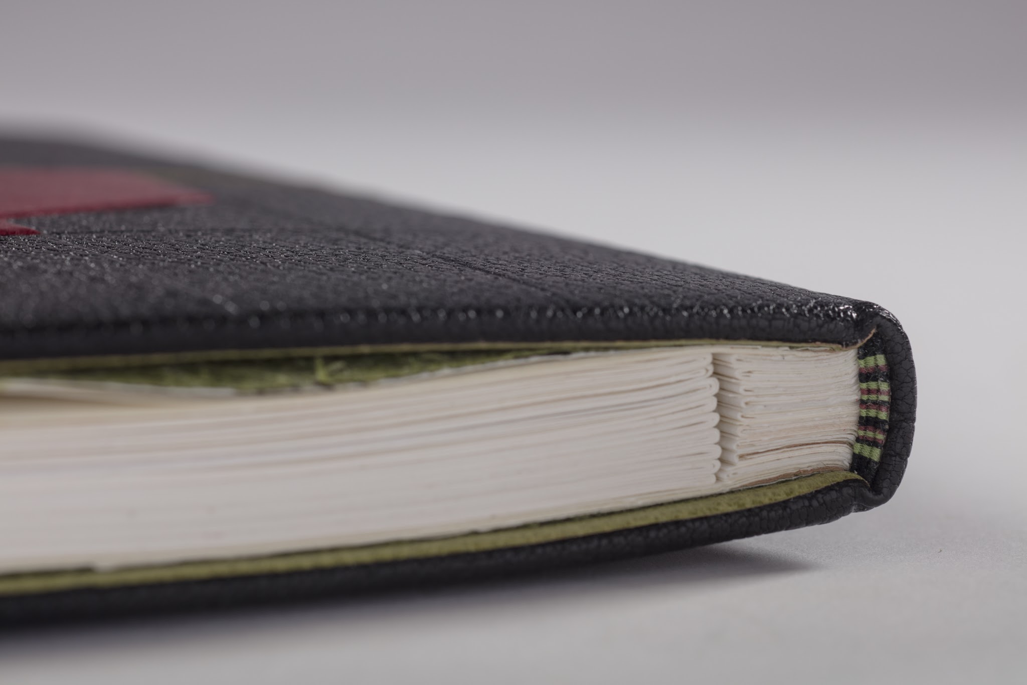
In the exhibition, be sure to look closely at the spine’s deliberately exposed cross-structure binding in full goatskin leather.
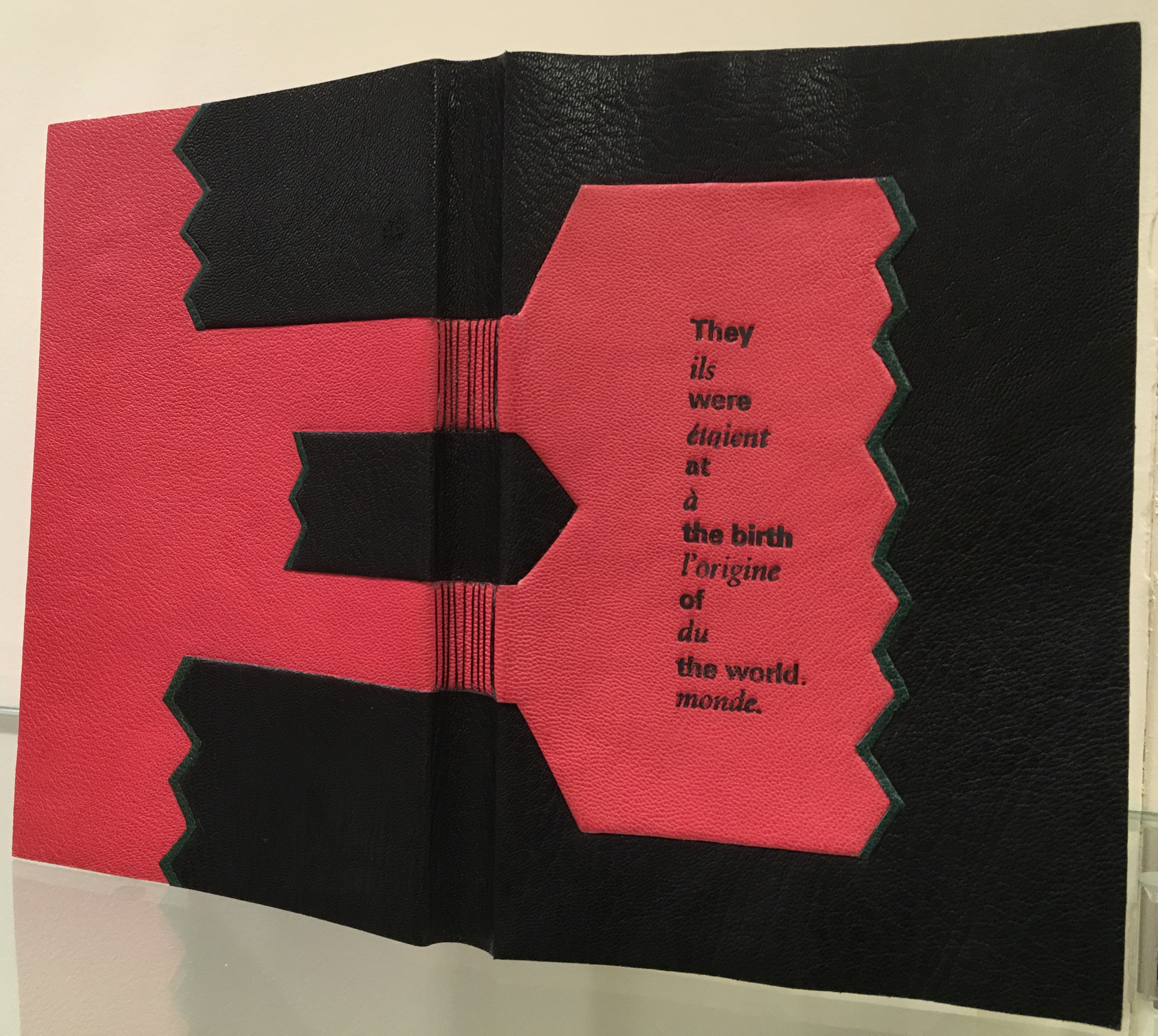
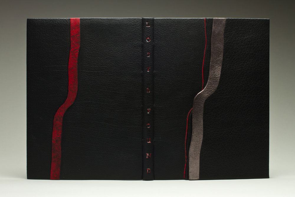
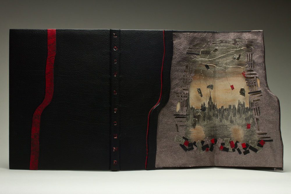
Le Livre des Origines is another one of those rareties where Lallier uses on the cover something from within the book. Stamped on the front, the phrase alternating in English and French comes from the text relating the Huron Nation’s creation myth as recorded in French by ethnologist Marius Barbeau, reinterpreted and rewritten by André Ricard. The alternating roman and italic presentation of languages reflects the book’s alternating pages of English and French. Note how the simple design in black and red with the diagonal onlays of green leather captures characteristic elements of the art of the Wyandot tribes, which can be explored here. A design philosophy of using imagination and craftsmanship in service to the book exemplifies itself again and again throughout the exhibition.
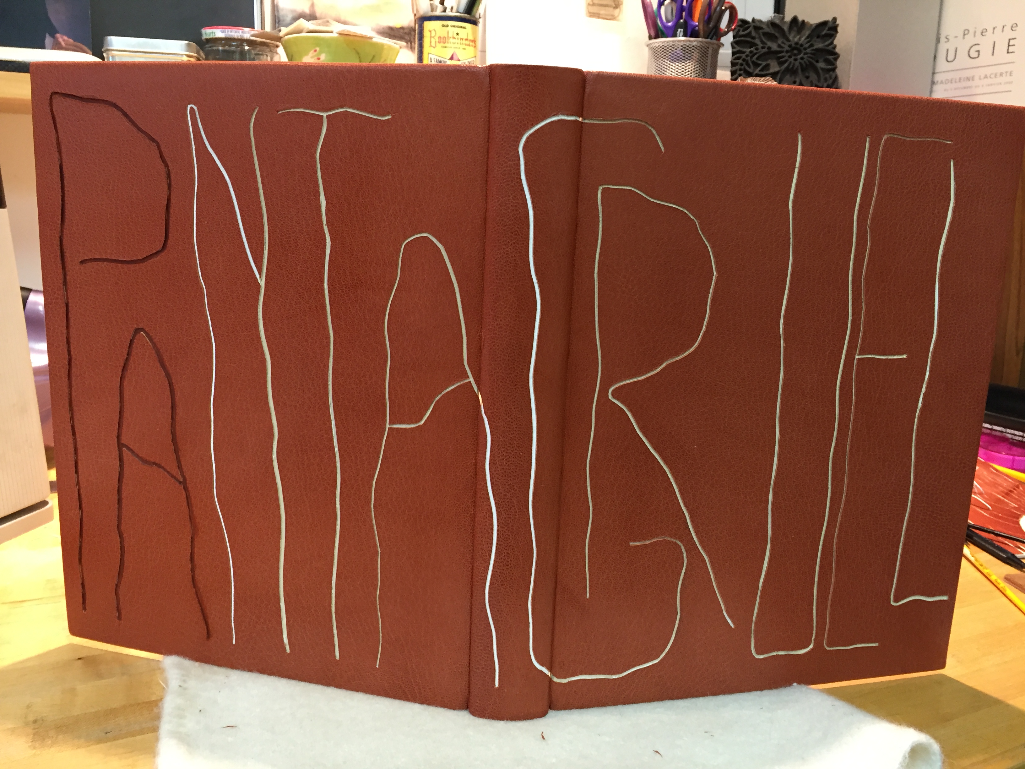
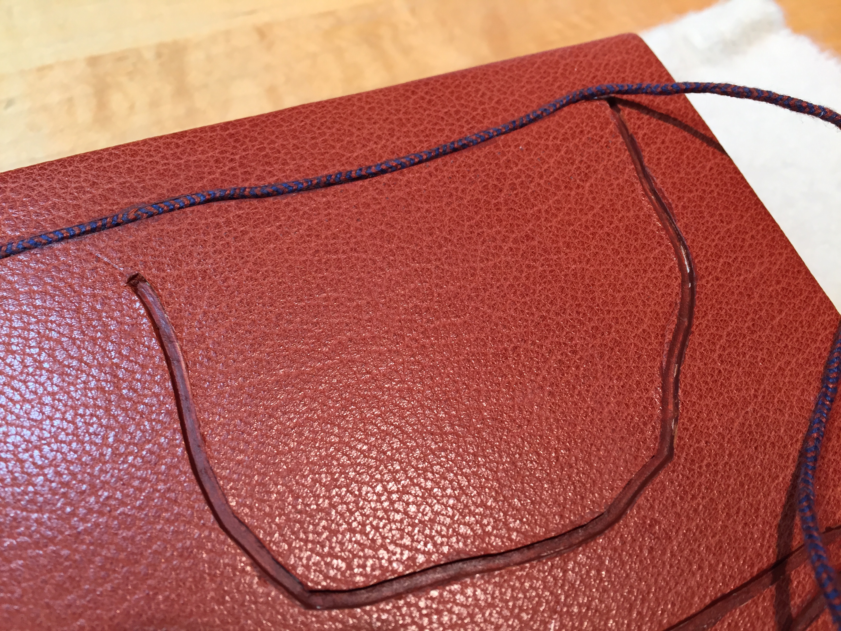
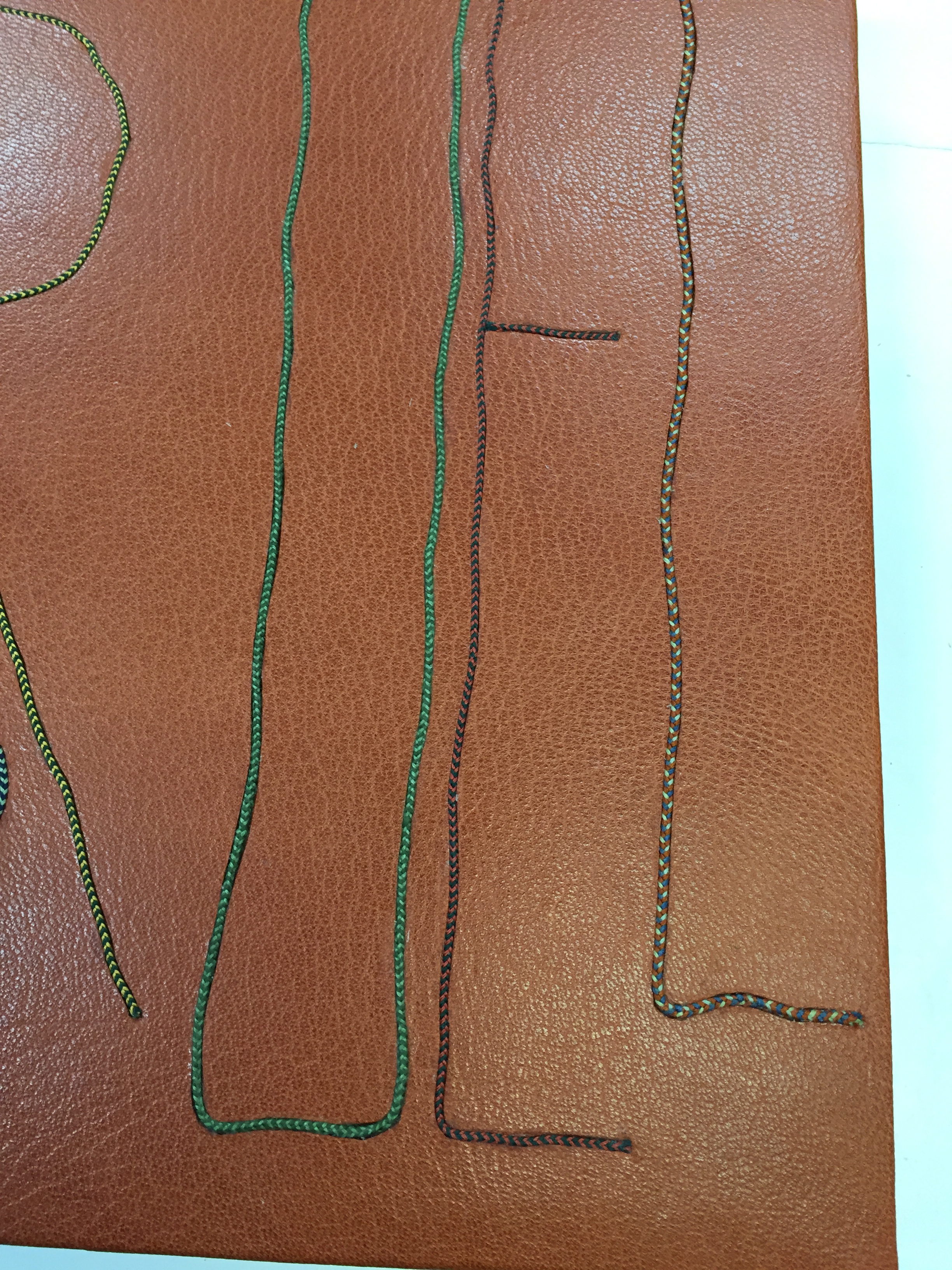
Which brings us to another characteristic of Lallier’s art to seek out: the painstaking handwork. For this, Pantagruel (2016) is worth a long look. Lallier once observed a student engaged in kumihimo braiding (the Japanese technique of using a disk to gather multiple threads of different colors into a single strand) and asked to be taught. Inspired by André Derain’s illustrations of Rabelais’ riotous satire, she set out to use braids for the title’s letters, filled and surrounded with the colors from the illustrations. Some of the leather inlays are handpainted; all — even the smallest — are handcut, beveled, tucked in the covering leather and tooled. The series of process photos below — all courtesy of the artist — provide a look behind the scenes.
Awarded one of 25 Silver Prizes at the International Competition of Designer Bookbinders (2016)
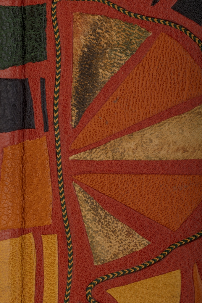
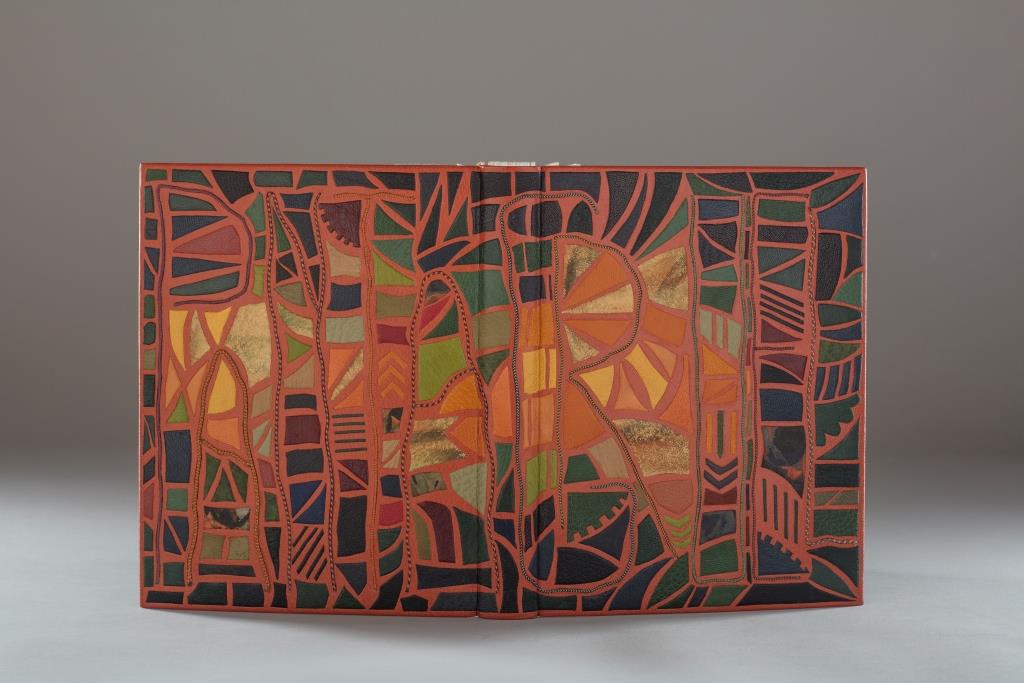
Shakespeare: Les Sonnets (2012) is another case in point of craftsmanship. Creation of this work began with a drawing (shown below) and then a maquette to enable Lallier to visualize the sculptural and aesthetic implications of multiple layers’ surfaces and edges being seen from all angles. The boards were cut out and lined with a green goat skin. The covering leather was also cut out and lined with green Japanese paper before covering. The doublures (linings of the book cover) received the same treatment before being applied to the inner boards.
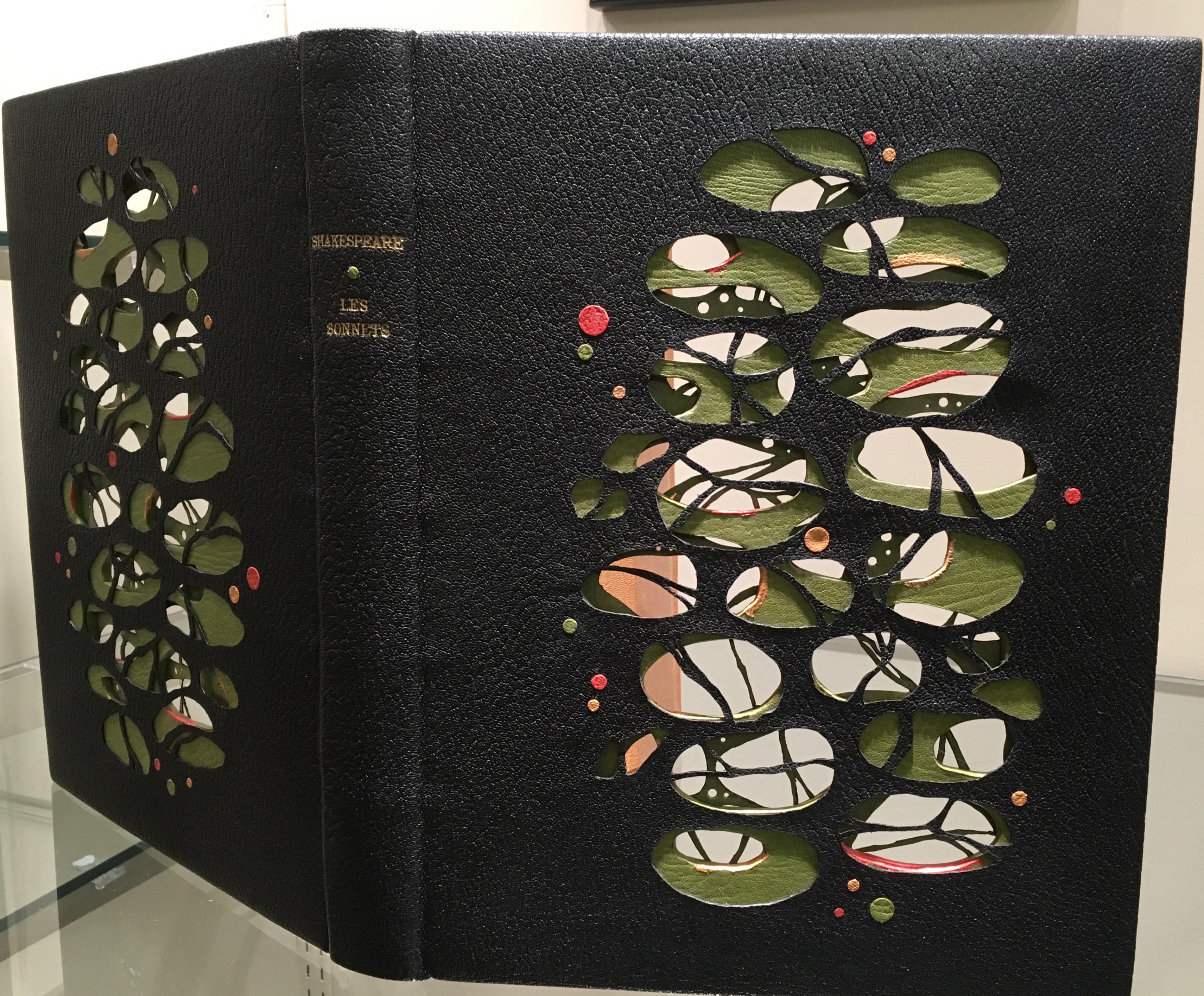
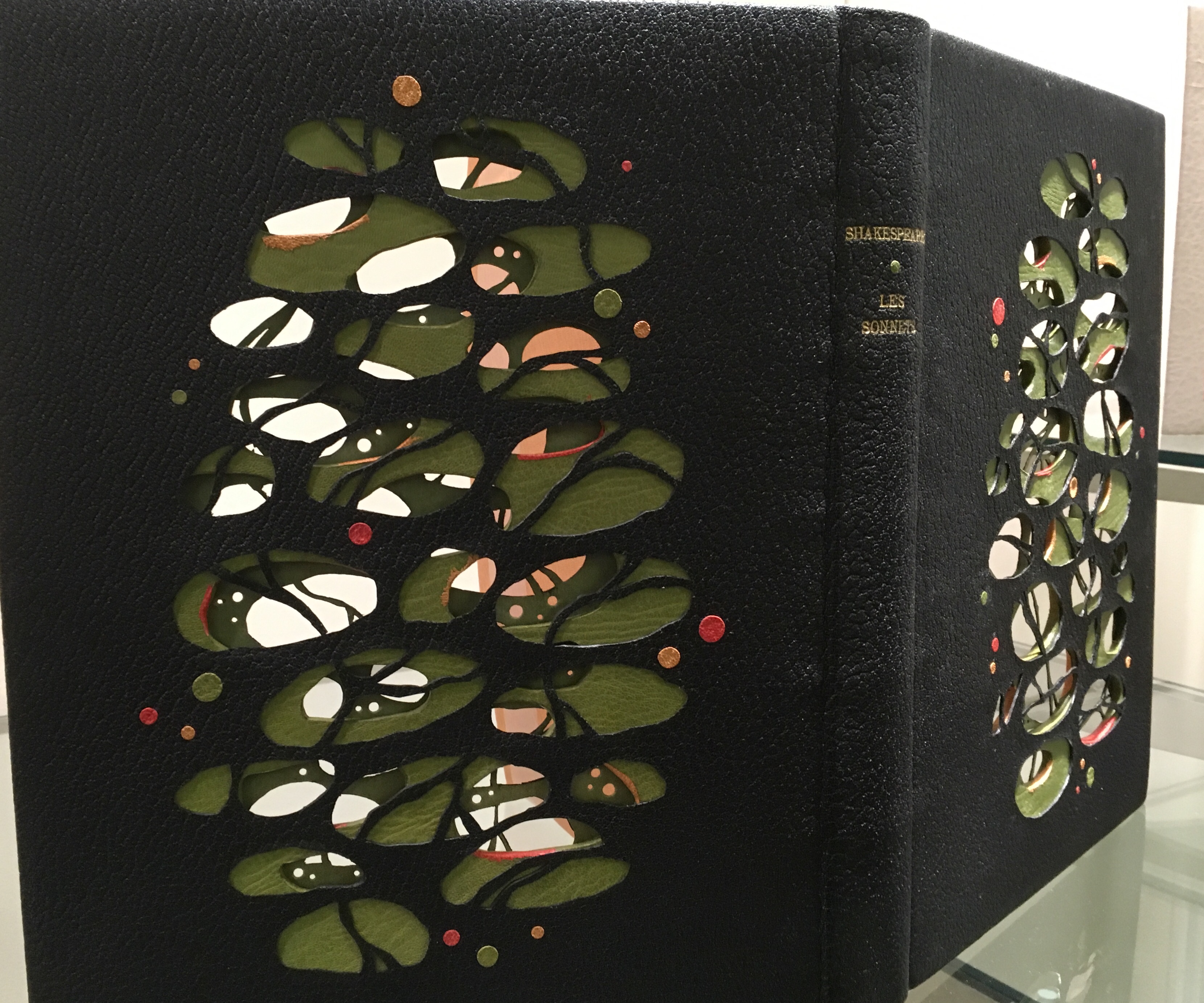
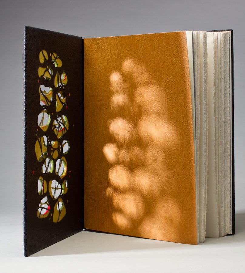
There is a sense of movement in this three-dimensional, sculptural treatment of the cover, which brings us to a final pointer for visitors. Lallier’s signature and most original technique — the front cover panel that swings open along the fore-edge to reveal a hidden design.
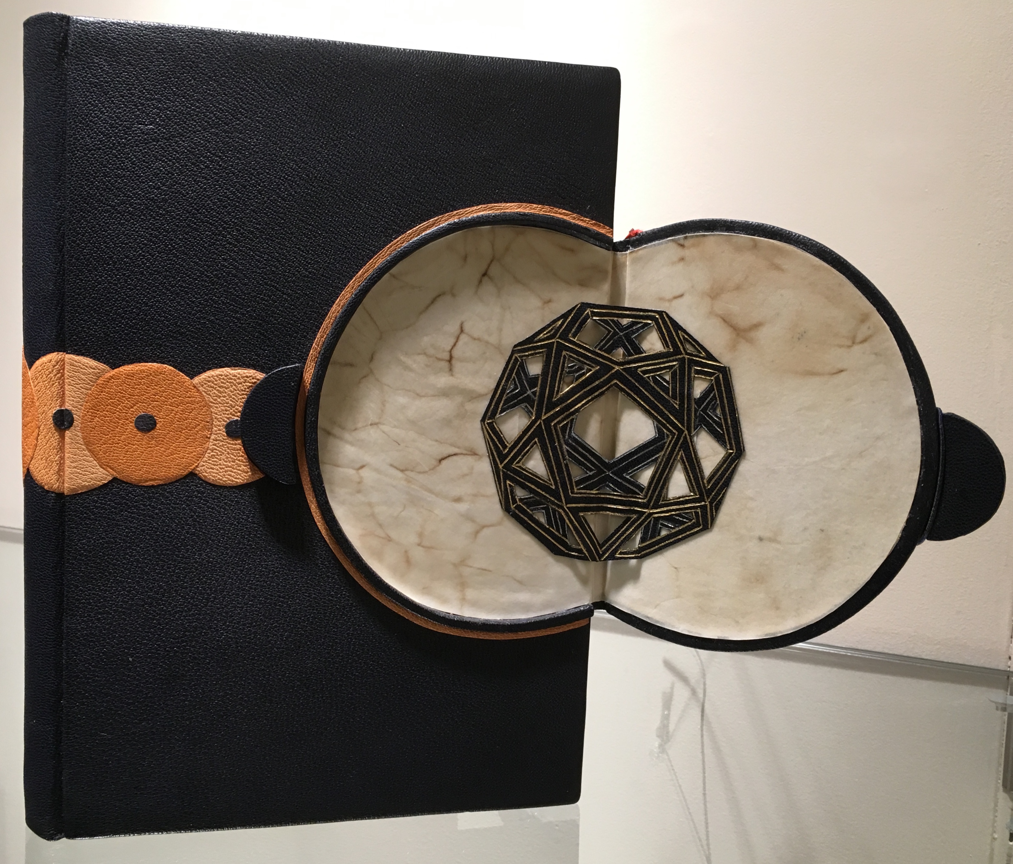
The open panel reveals a geodesic dome in leather with gold and palladium tooling. With the panel closed, the front cover’s design echoes a Da Vinci machine.
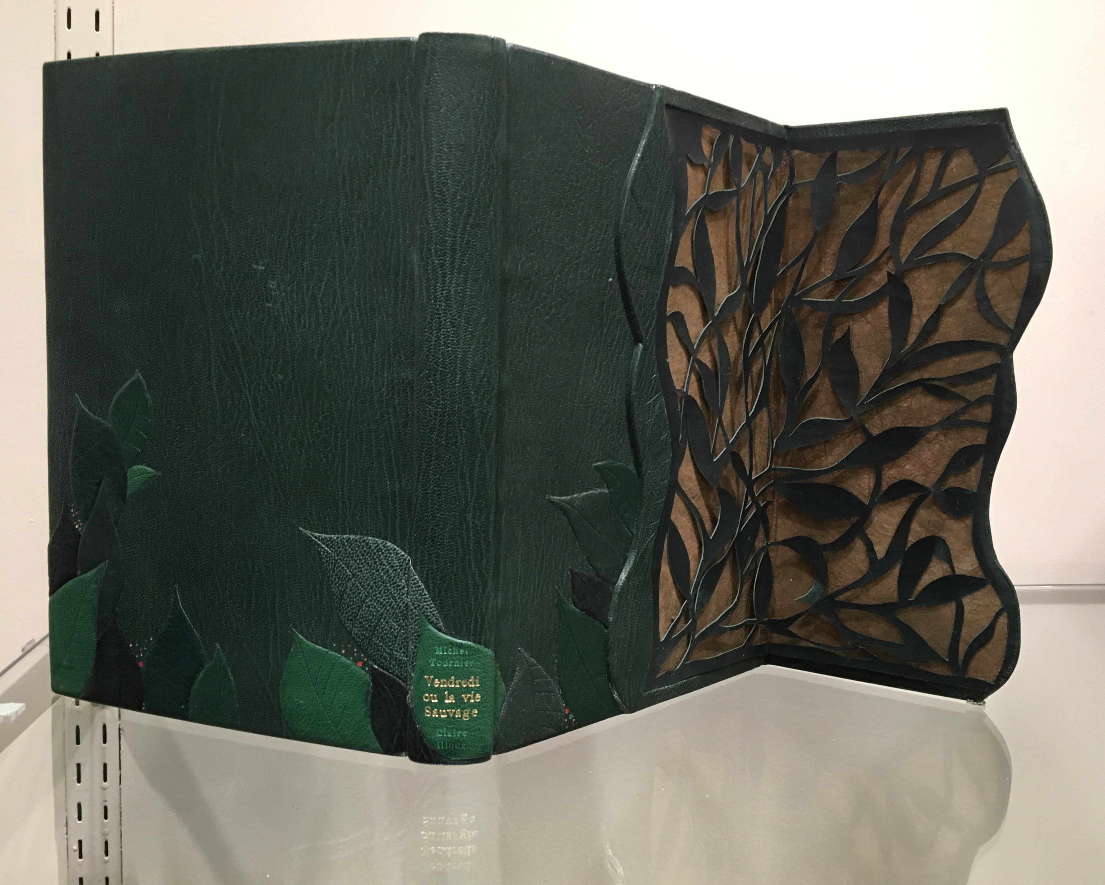
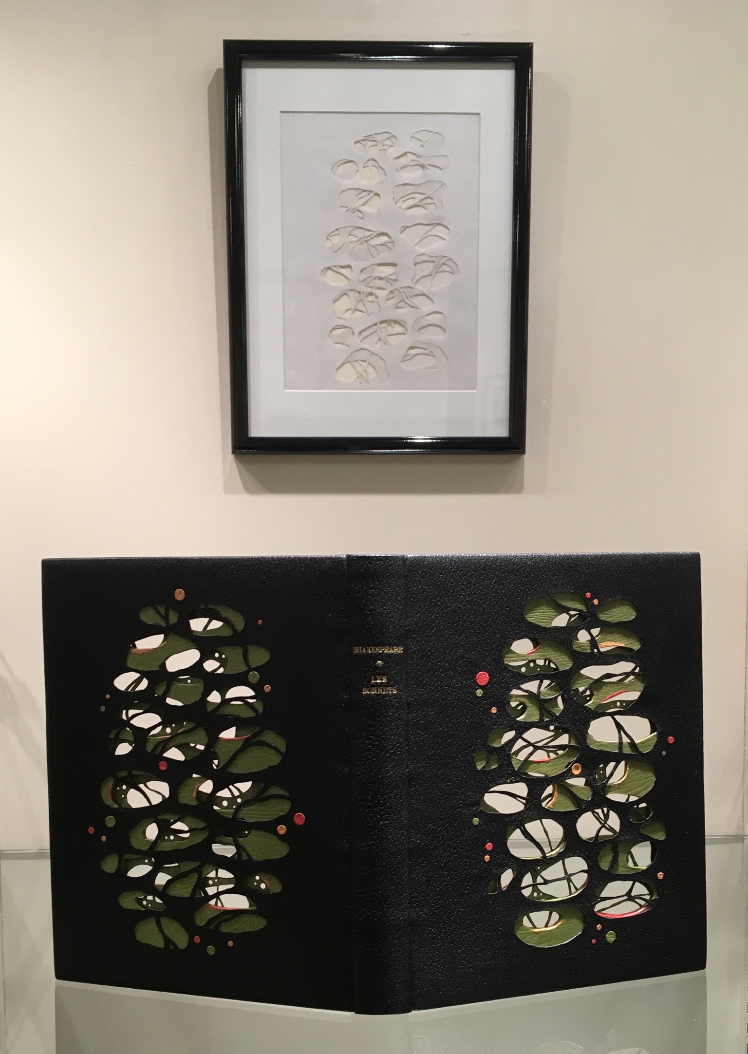
Opening on layers on layers of carved foliage, the panel evokes the island on which Friday finds himself castaway in Michel Tournier’s version of Defoe’s Robinson Crusoe. In the exhibition, stand on tiptoe or someone’s shoulders to see the top edge’s coloring. Extraordinarily it resembles flower petals submerged in water.
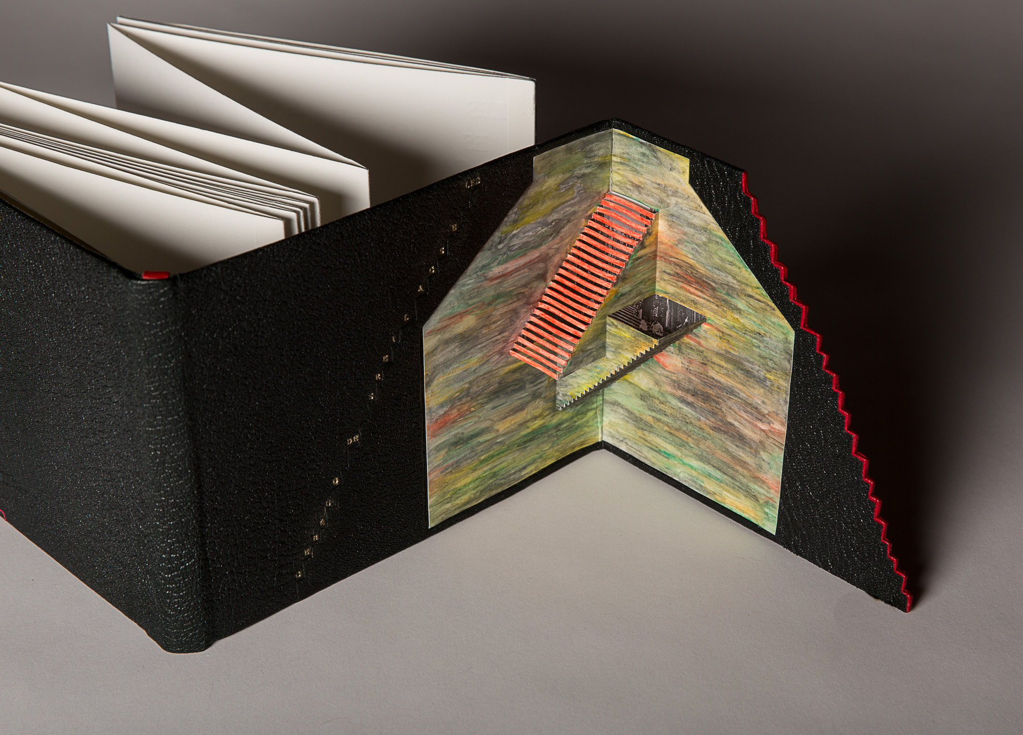
Bound in black Morocco leather in the “drop spine” technique, this work unites the stair-stepping accordion form of the text with a gold-tooled title climbing the steps of the front cover panel, which opens on a hand-colored pop-up set of Escher-like stairs.
Lallier’s unity of design with the text by Luc Bureau and illustrations by Ghislaine Bureau celebrating the famous thirty sets of stairs between the upper and lower parts of Québec can hardly be excelled. Except that she does — again and again — with the examples on display. This retrospective resoundingly affirms Lallier’s intention always to serve the book in front of her. Go judge for yourself.
Monique Lallier: A Retrospective runs from 29 October through 6 January 2019 at The Guilford Art Gallery on the campus of Guilford College. For more background on Lallier’s work, there is a series of interviews with Erin Fletcher of Herringbone Bindery here.


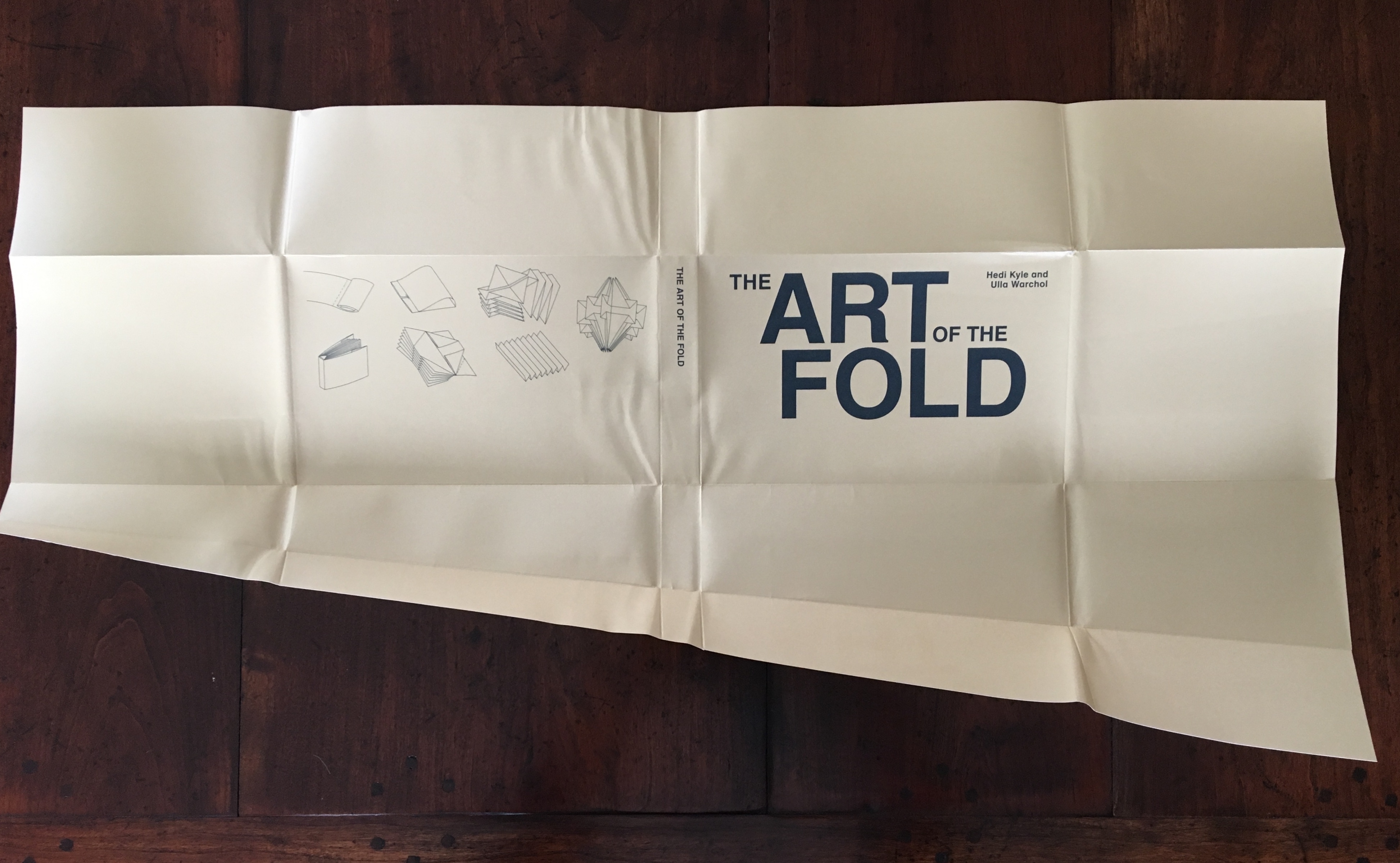


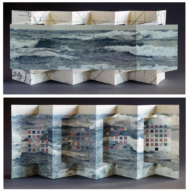


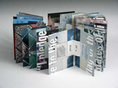
 Consider Schilling’s Half-Life/Full-Life and its binding a variation on the accordion/flag structure of Hedi Kyle and Claire Van Vliet. The complexity of the form marries well with that of the intertwining, interleaving text and photos along the timelines of the Doomsday Clock and global warming.