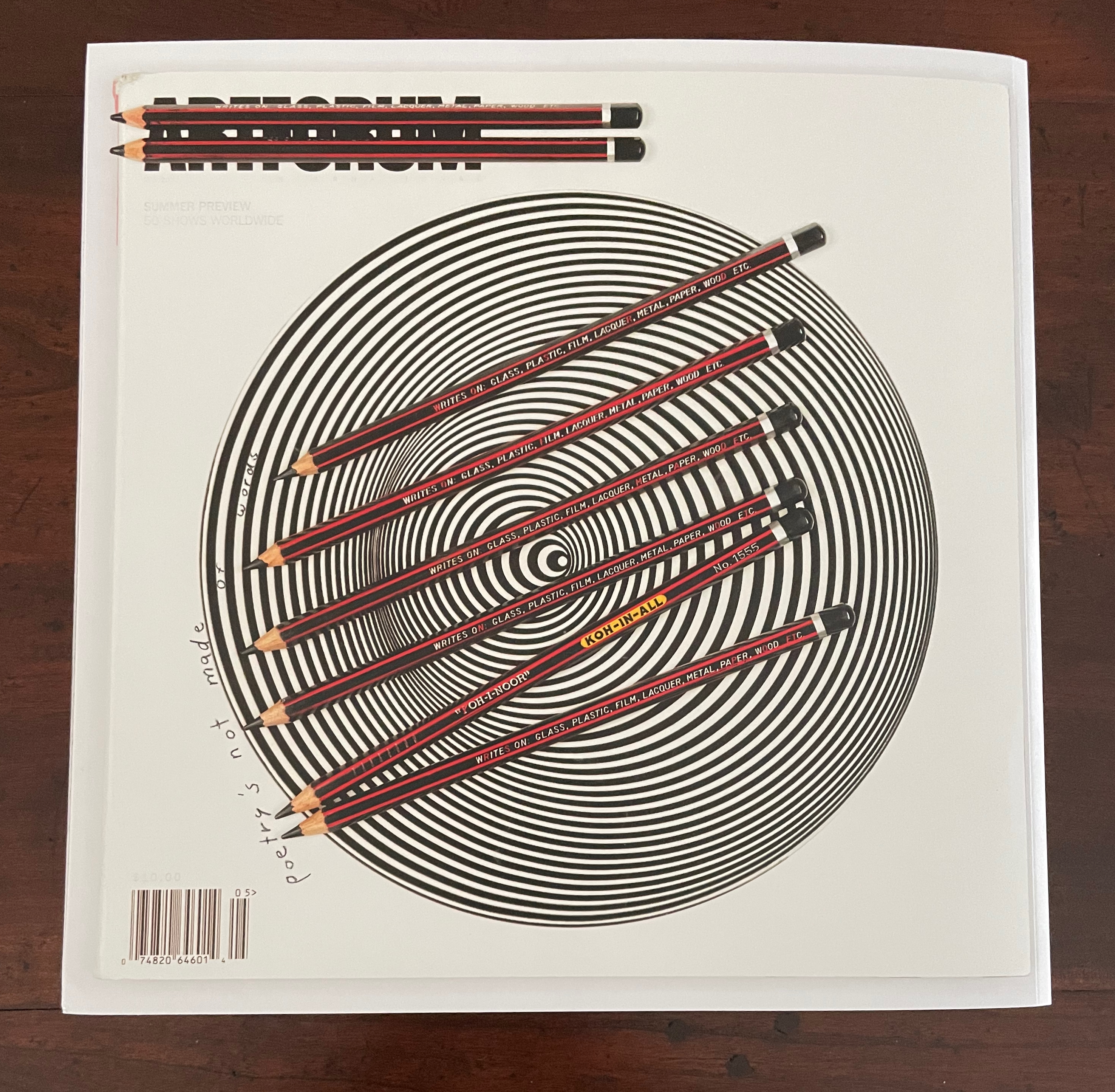
Inscription: The Journal of Material Text, Issue 4 on Touch Simon Morris, Gill Partington and Adam Smyth (eds.) Cased perfect bound paperback, printed paper cover. 313 x 313 mm. 120 pages. ISSN: 2634-7210. Acquired from Information as Material, 29 November 2023. Photos: Books On Books Collection.
Different readers will come to different conclusions on whether Inscription #4 dedicated to the subject of touch evokes the level of tactility in Melville’s famous Chapter 94 “A Squeeze of the Hand”. But all can agree that they share a certain seminality. Like Herman Melville with his preliminaries to Moby Dick, the editors of Inscription lead their fourth issue with definitions and choice quotations on the subject of “touch”, as much a Leviathan subject as that of Melville’s novel. Where Melville merged scholarly apparatus with narrative fiction to create a novel literary work, Simon Morris, Gill Partington and Adam Smyth have merged photography, poetry, augmented reality and audio with academic and critical essays to create a novel form of scholarship.
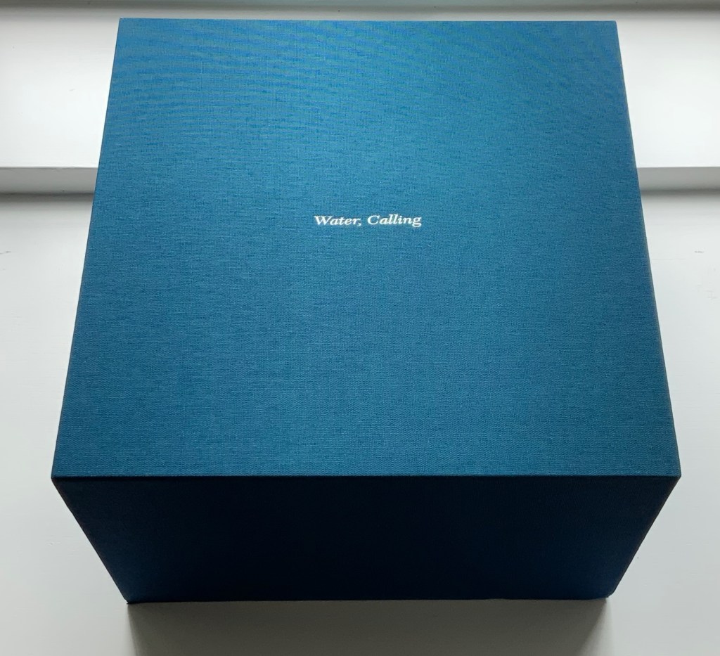
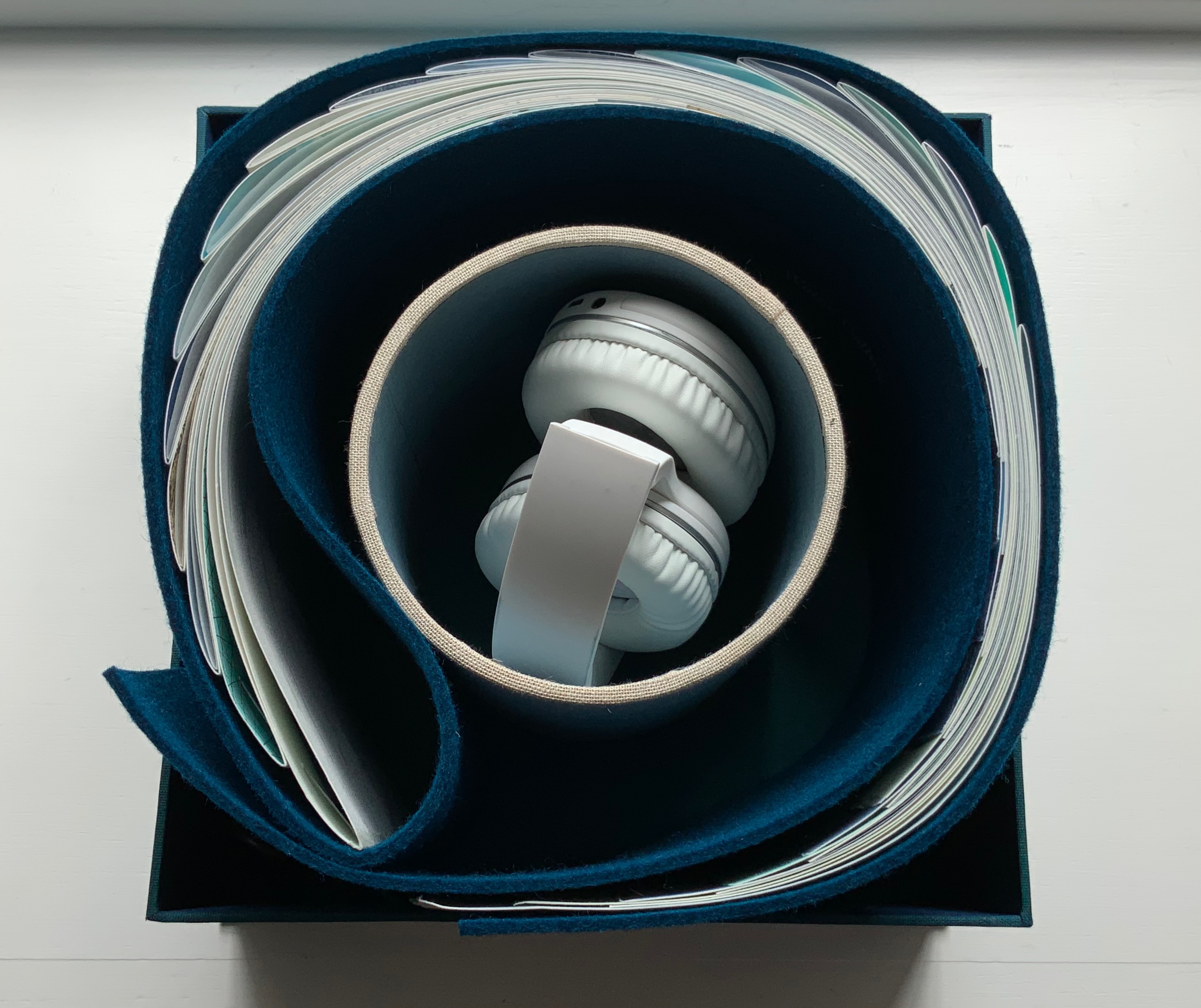
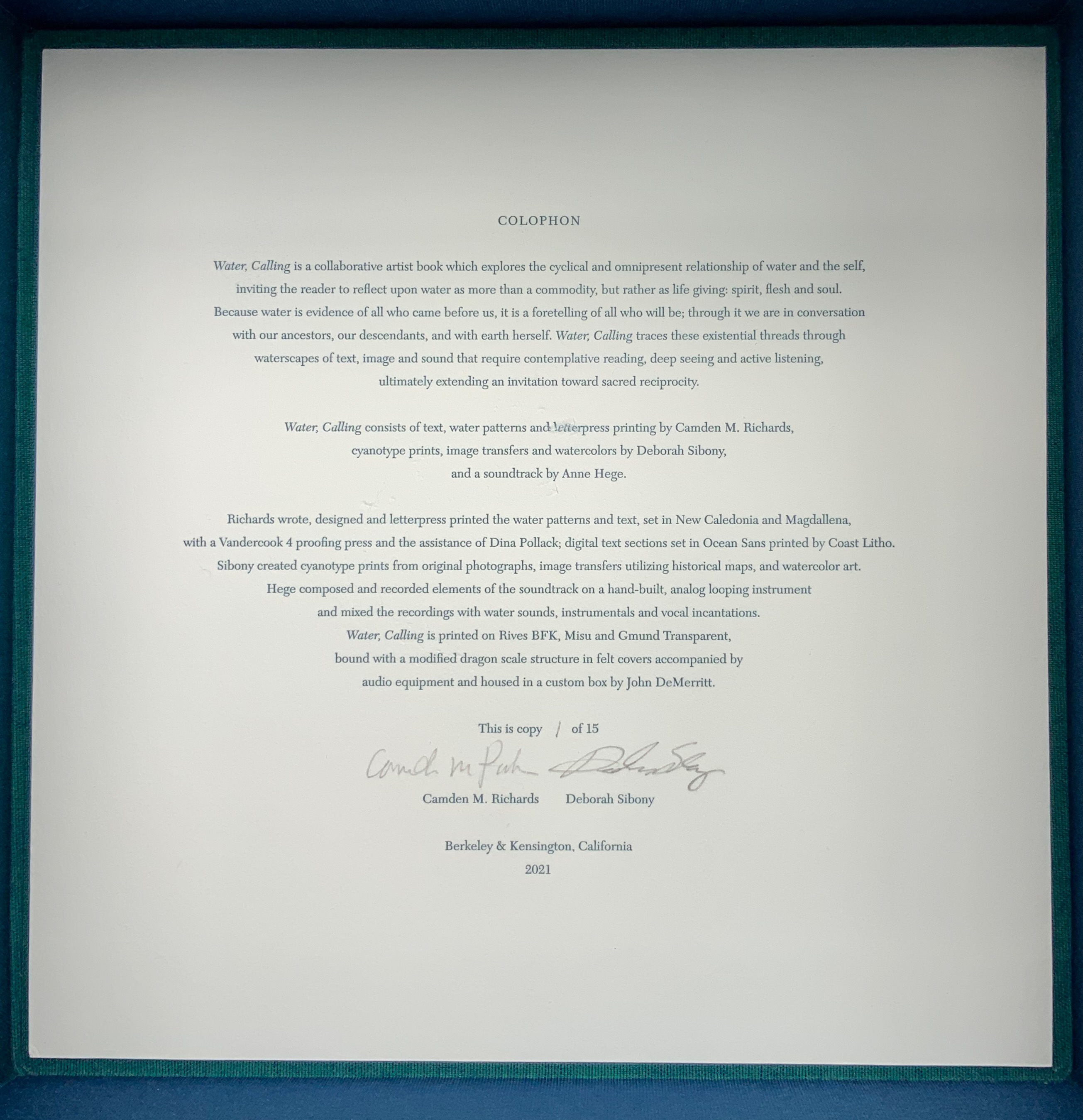
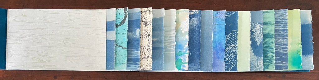
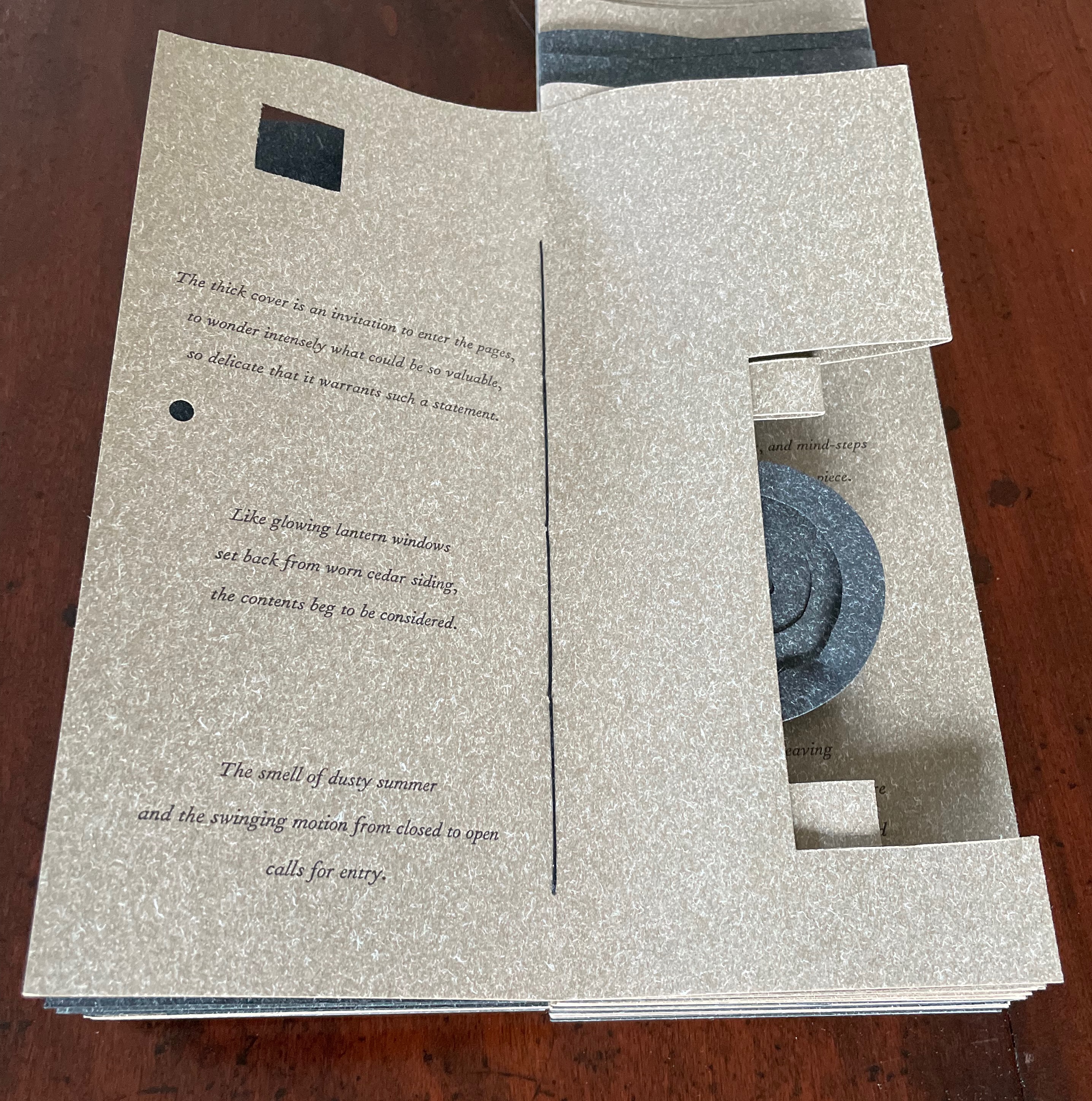
Water, Calling (2021) Camden Richards & Deborah Sibony Felt-covered, modified dragon-scale bound artists’ book, accompanied by audio equipment in custom box. Box: 262 x 262 x D170 mm. Book: H155 x W775 mm (closed). 110 pages. Edition of 15, of which this is #1. Acquired from the artists, 5 October 2022. Photos: Books On Books Collection. Displayed with artists’ permission.
Colophon “Water, Calling is a collaborative artist book which explores the cyclical and omnipresent relationship of water and the self, inviting the reader to reflect upon water as more than a commodity, but rather as life giving: spirit, flesh and soul. Because water is evidence of all who came before us, it is a foretelling of all who will be; through it we are in conversation with our ancestors, our descendants, and with earth herself. Water, Calling traces these existential threads through waterscapes of text, image and sound, extending an invitation to enter more fully into a dialogue composed of acts requiring active listening, contemplative reading and deep seeing with the hope of inspiring sacred reciprocity.”
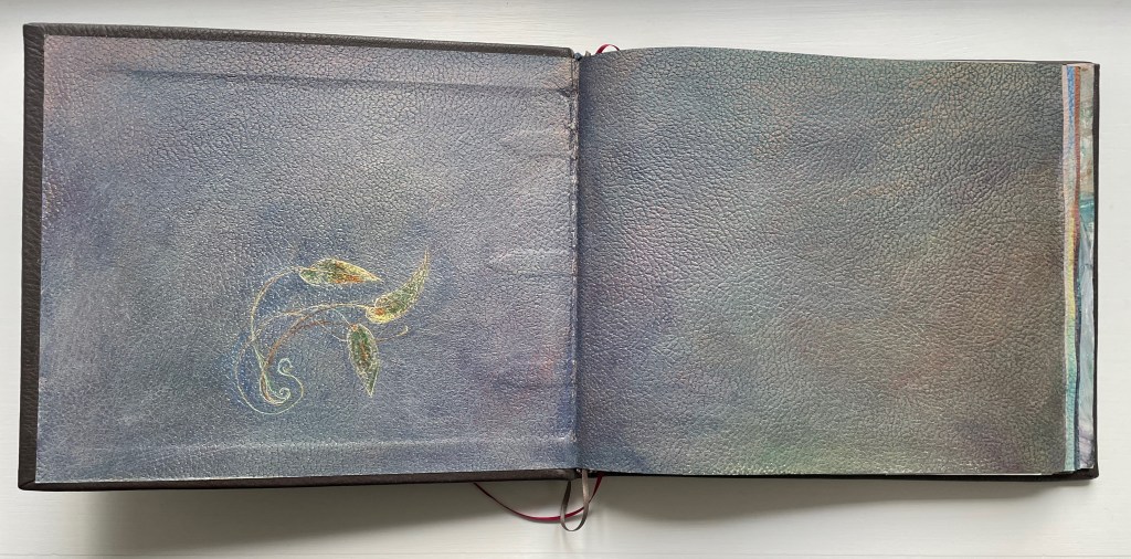
Handscapes (2016) Margaret (Molly) Coy & Claire Bolton Casebound, hand sewn and bound with doublures and two ribbon bookmarks. H260 x W310 x D30. 80 folios. Edition of 12, of which this is #9. Acquired from the artists, 19 October 2023. Photos: Books On Books Collection. Displayed with artists’ permission.
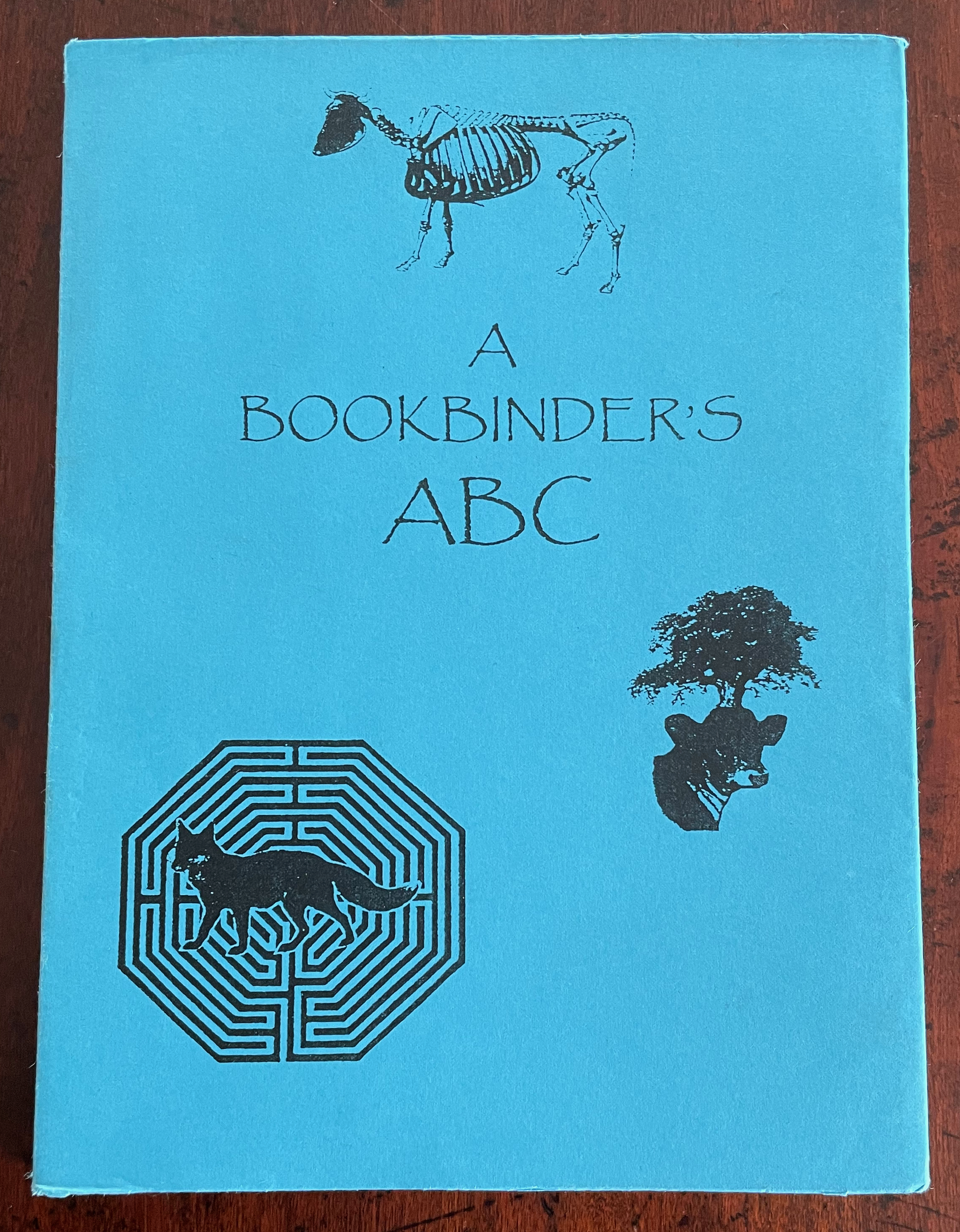
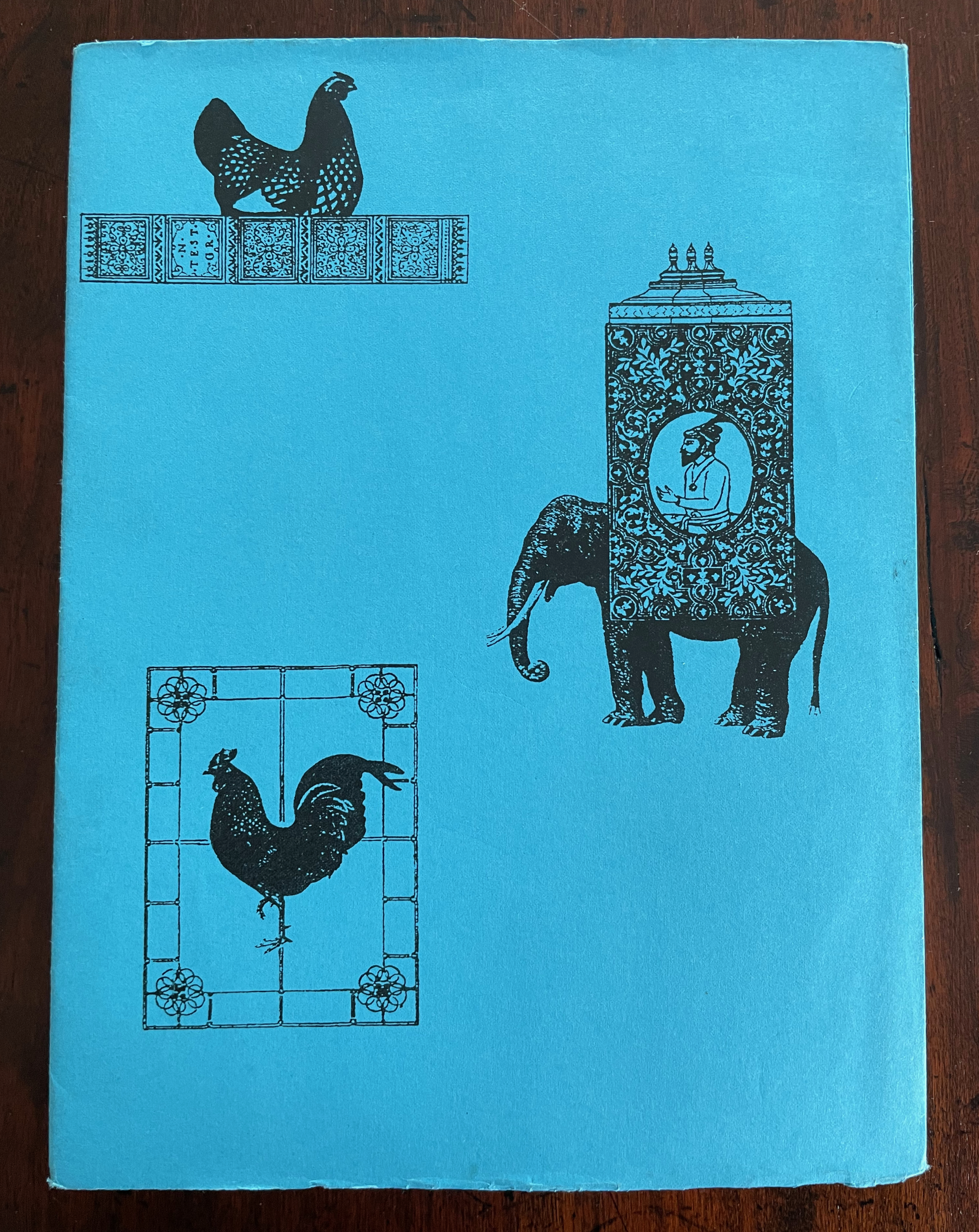
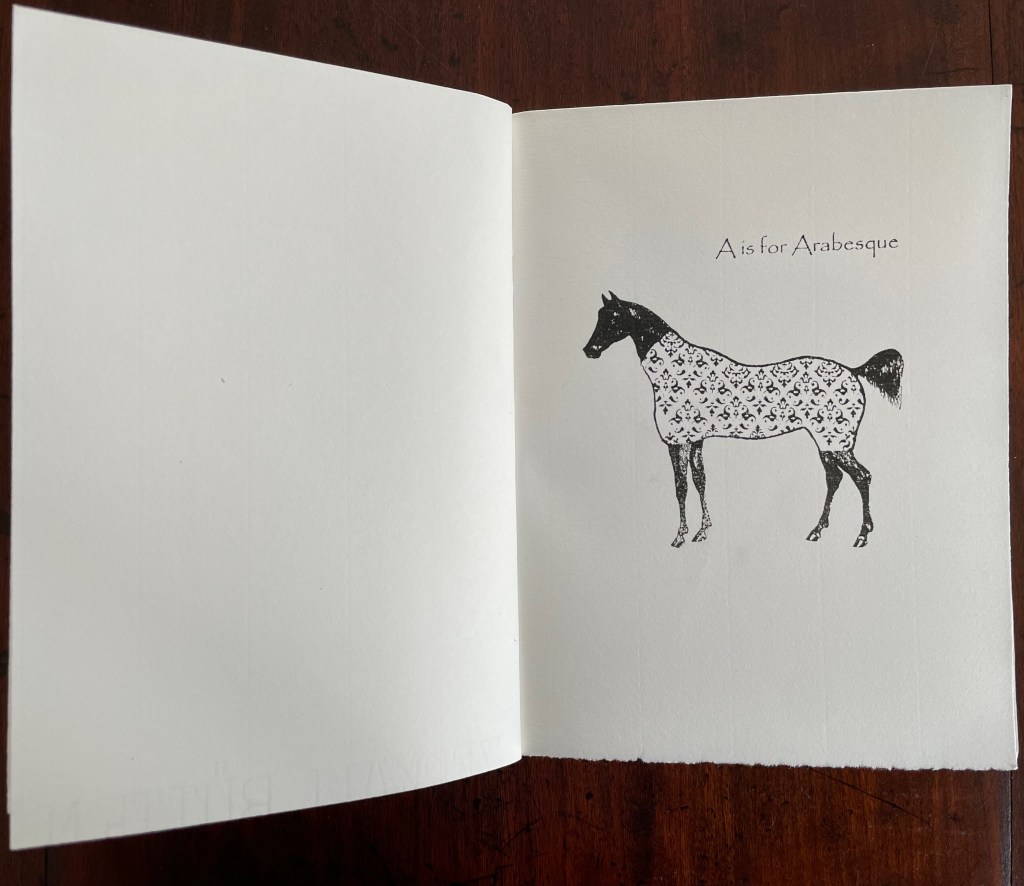
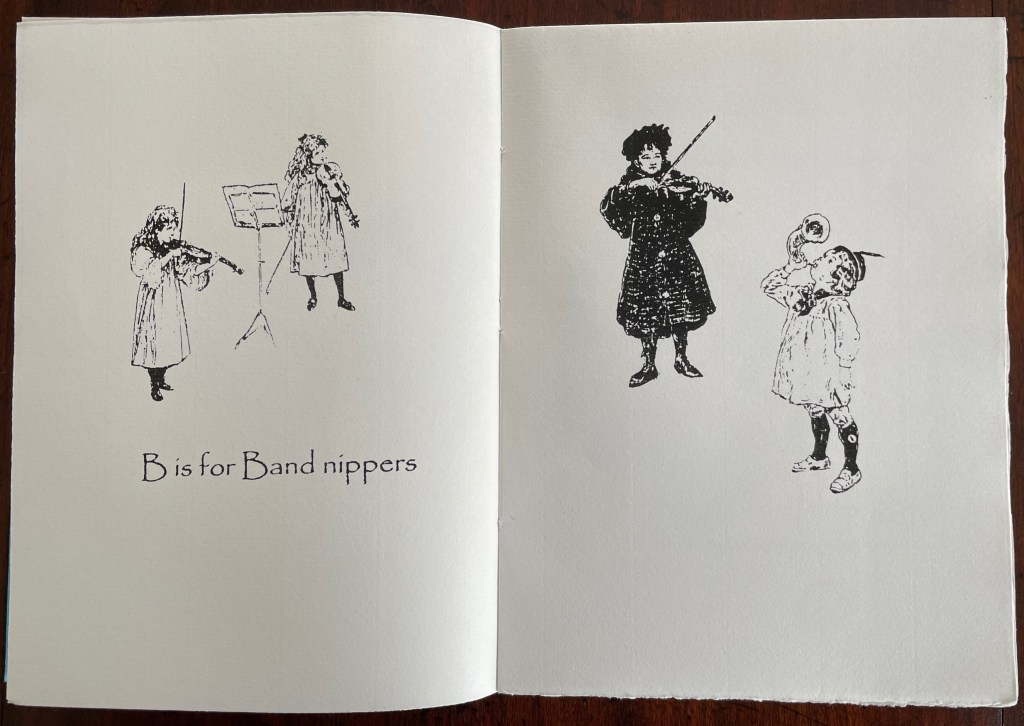
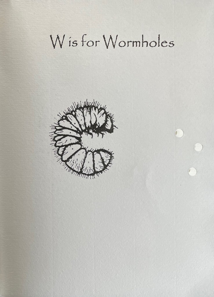
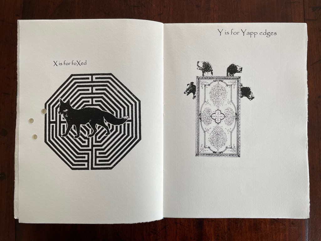
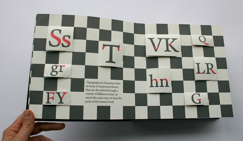
A Bookbinder’s ABC (2003) Christopher Hicks, Leaning Chimney Press Editions Soft cover (buff card, illustrated paper jacket glued to spine, sewn block). H200 x W150 mm. 34 pages. Edition of 75. Acquired from Barter Books, 18 October 2023. Photos: Books On Books Collection.
Although Glaister’s Encyclopedia of the Book is the canonical dictionary for book terminology, A Bookbinder’s ABC provides 26 humorous visual reminders.
An Arabian stallion in a decorative onsie for recalling the description of fleurons and other devices derived from Islamic patterns.
What else would a binder call a children’s orchestra?
A fox flummoxed by a maze is certainly “foxed”. This one is also likely puzzled by the holes carried over from “Wormholes” on the previous page. Barking dogs springing from a book cover might be a helpful mnemonic for the name of the wide soft edges or flaps for Bible covers devised by the 19th century London bookseller Yapp.
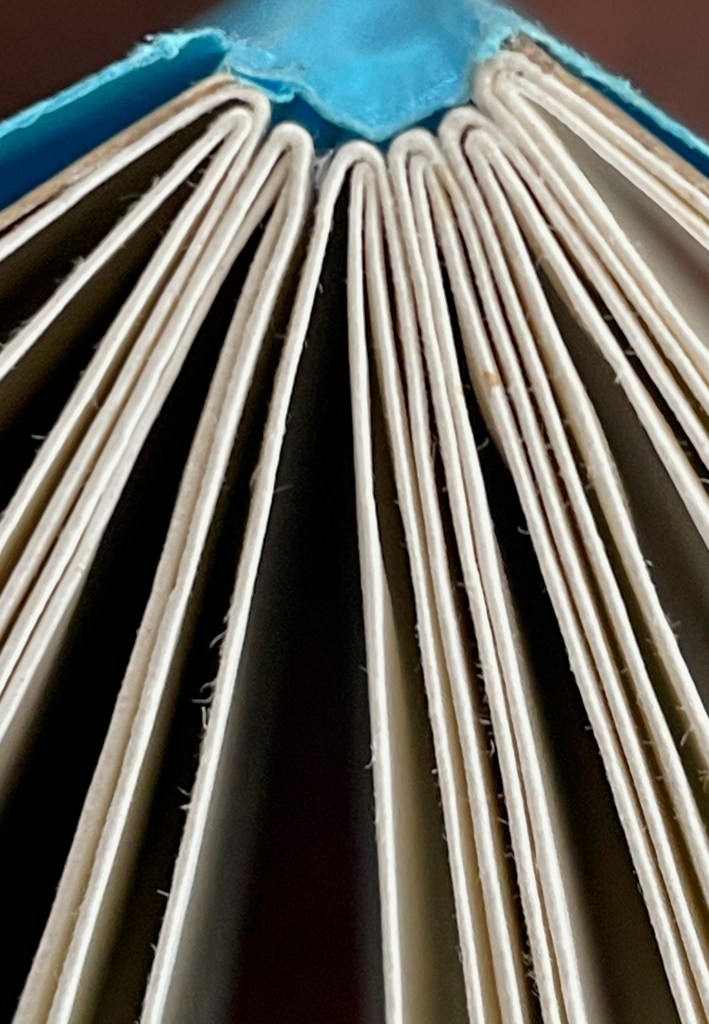
The work’s own binding has simple but interesting features. The front and back covers in buff card are glued to the first and last sewn gatherings, respectively, and the sewn gatherings are glued in between and sewn together. The blue paper jacket’s spine is glued to the spines of the gatherings and its fore edges fold over the fore edges of the buff card. Curious but not as self referential as the features of two nearby birds of a feather from Andrew Morrison’s Two Wood Press.
Detail of uncut top edges and gluing of gatherings and spine.
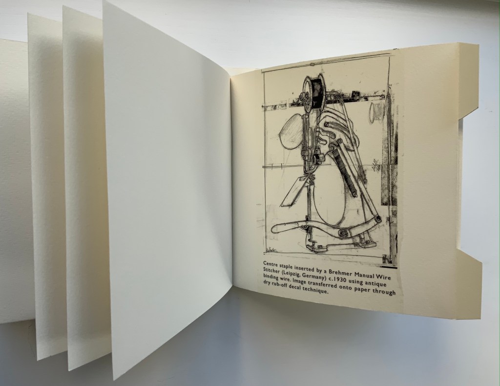
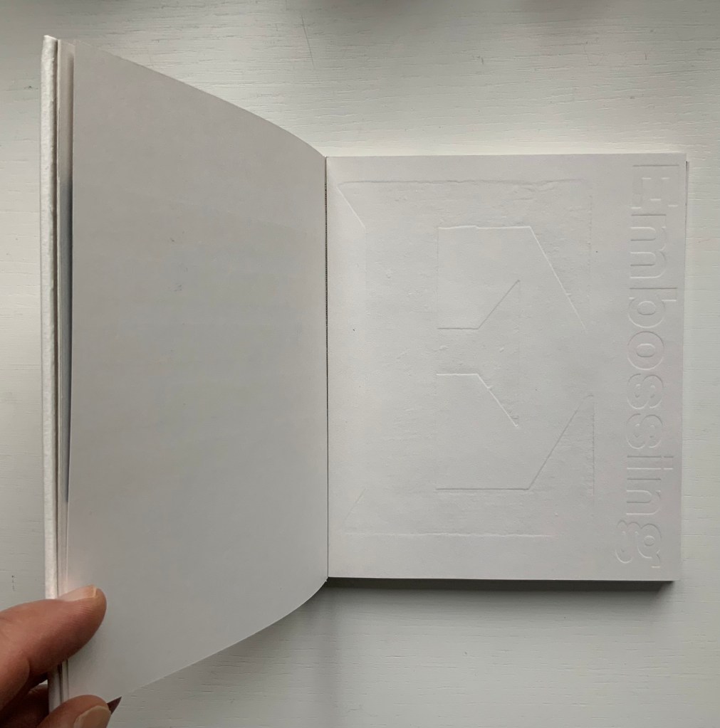
From Morrison’s Provenance (2018), showing an actual wire-stitched gathering and then an illustration of the mechanism; from Morrison’s Two Wood Press A-Z (2003), showing showing an embossed page illustrating E for Embossing. Photos: Books On Books Collection.
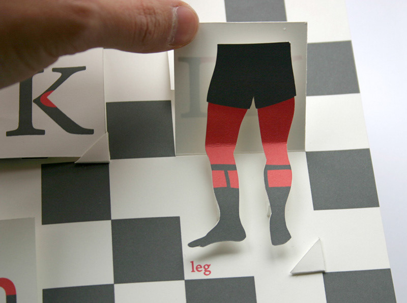
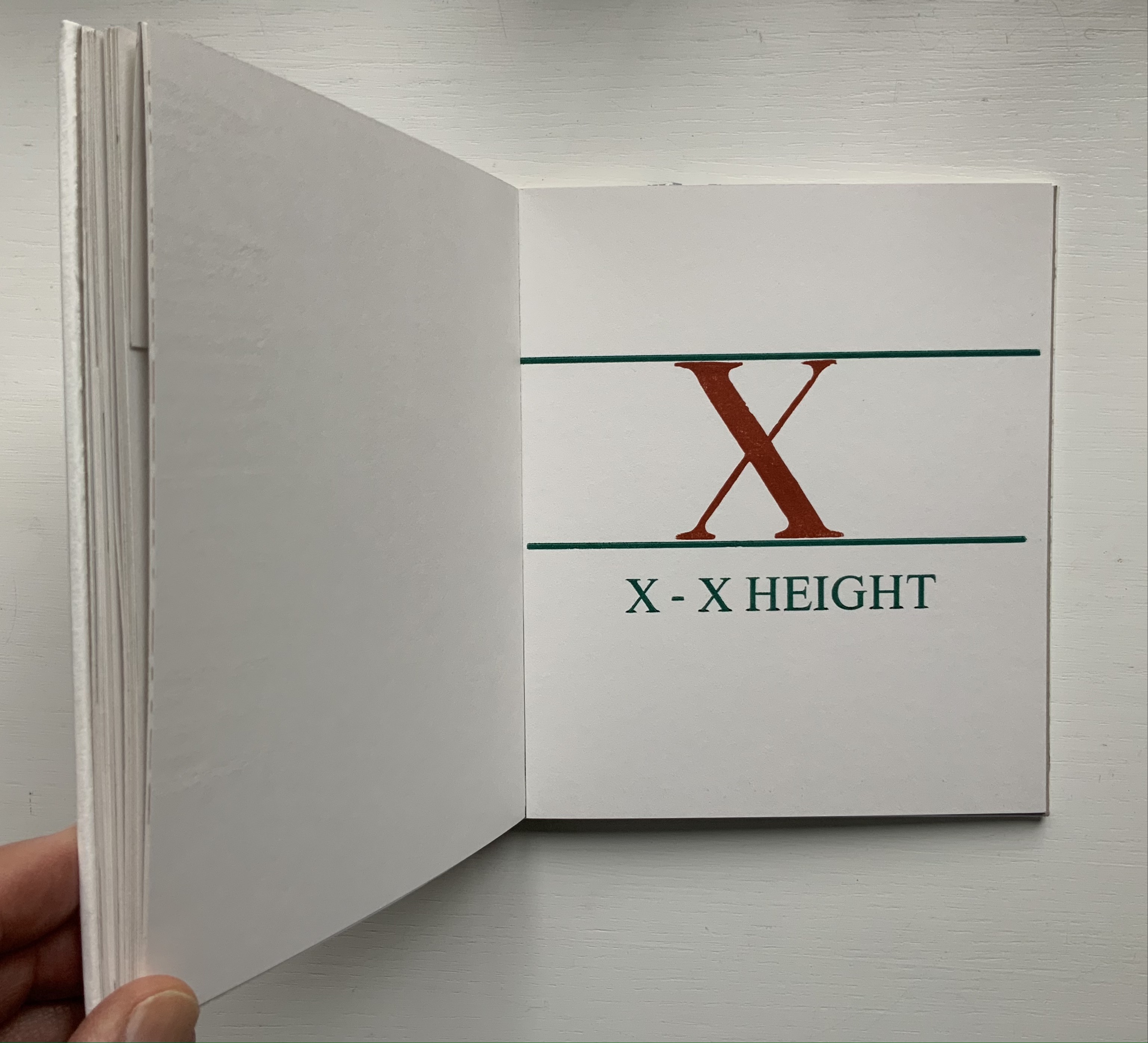
But what would a self-referential binding for A Bookbinder’s ABC look like — especially one that might carry on the punnery of the contents? Presumably because they are closer to the words, entries in letterpress abecedaries such as Morrison’s Two Wood Press A-Z (2003) and Kevin M. Steele’s The Movable Book of Letterforms (2009) have an easier time of the visually self-referential.
From Steele’s A Movable Book of Letterforms, showing the anatomical term for the red areas of the L & R (a leg lift?); from Morrison’s Two Wood Press A-Z, showing x’s definition of its height.
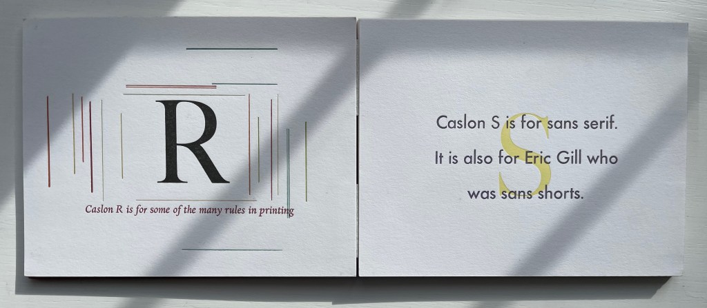
Closer still to the words are the typographical punsters such as Marie Dern and William Caslon’s Typographic ABC (1991), Nicolas McDowall and A Bodoni Charade (1995) or Sharon Werner & Sharon Forss and Alphabeasties and Other Amazing Types (2009).
From Dern’s William Caslon’s Typographic ABC, McDowall’s A Bodoni Charade and Werner & Forss’ Alphabeasties and Other Amazing Types.
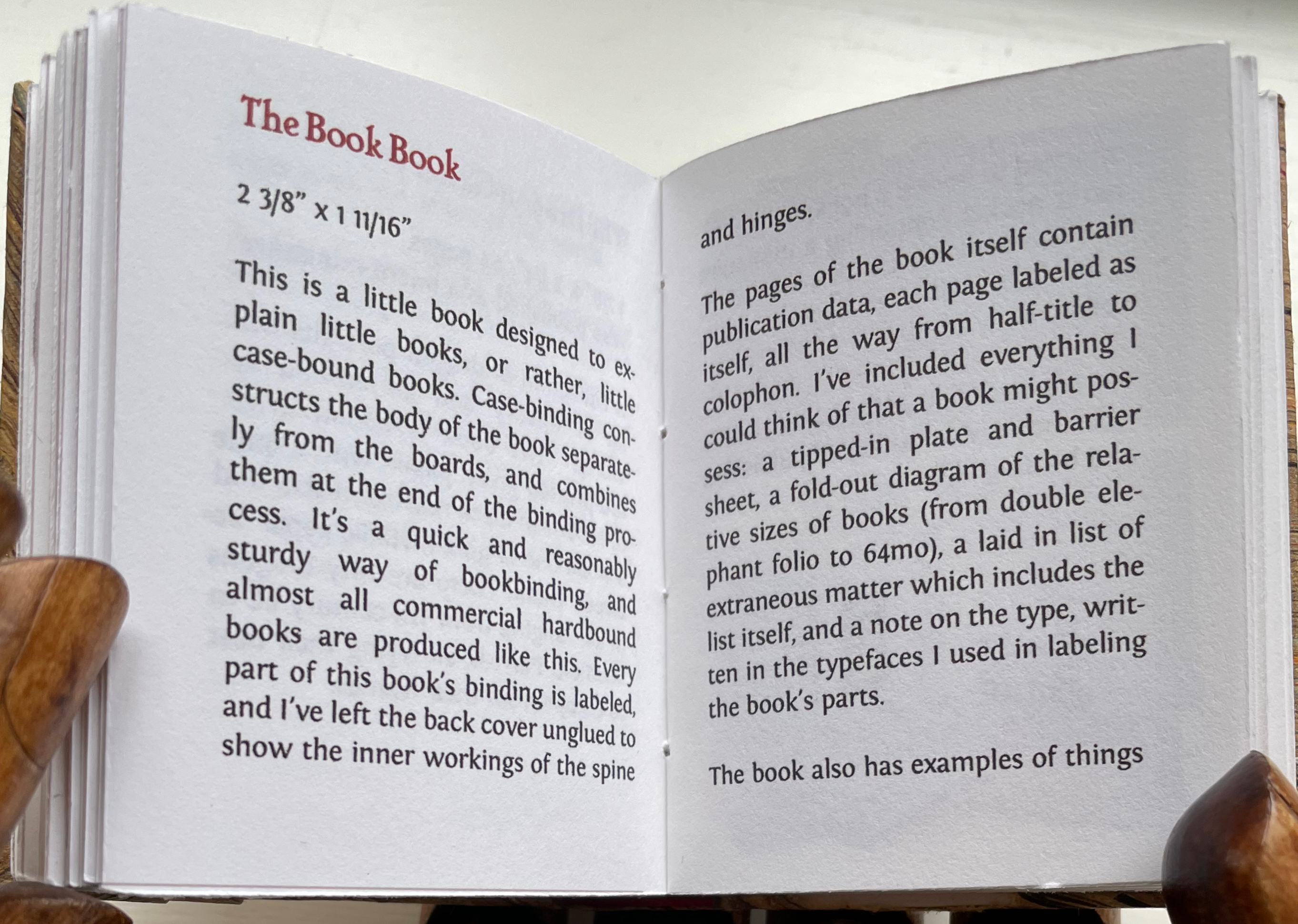
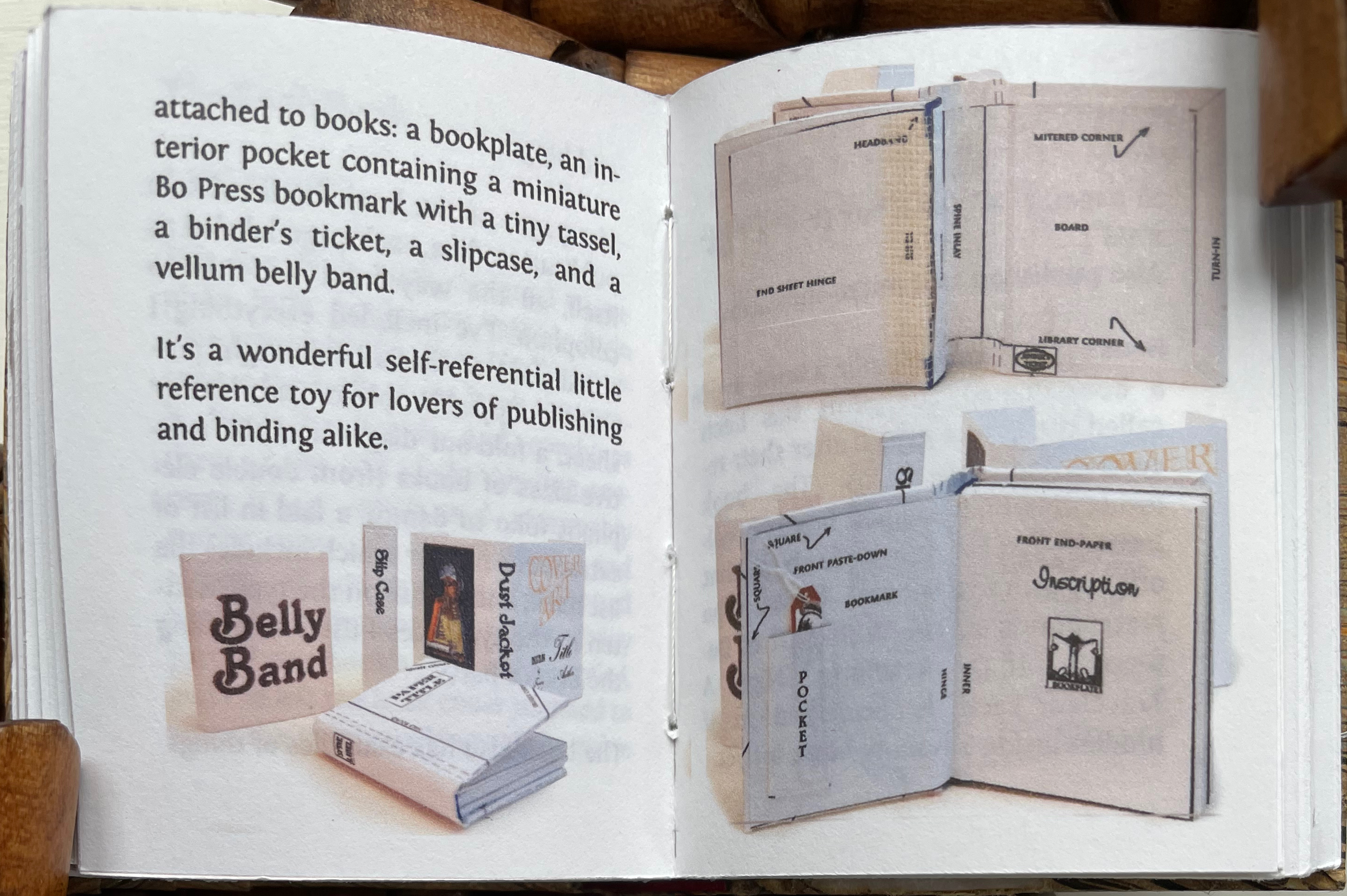
Perhaps Pat Sweet’s miniature The Book Book (2010) comes closest on self-referentiality in a work about binding. For the puns, we will have to wait for another bookbinder to take a stab at it.
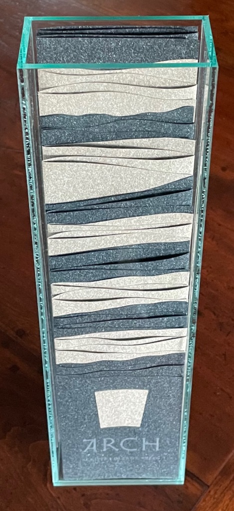
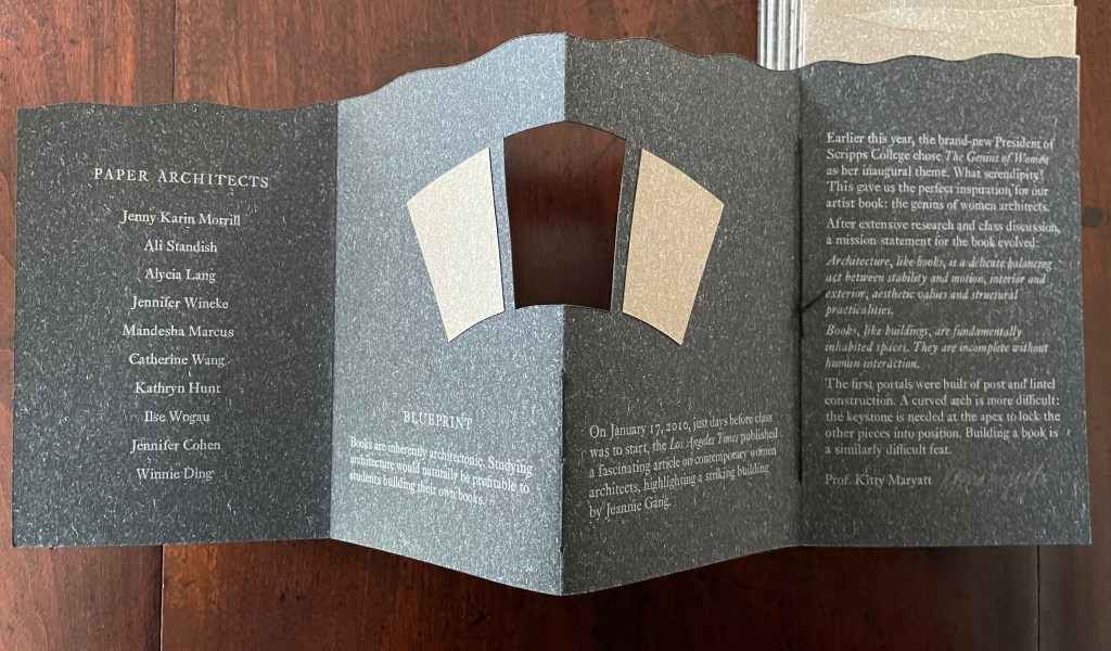
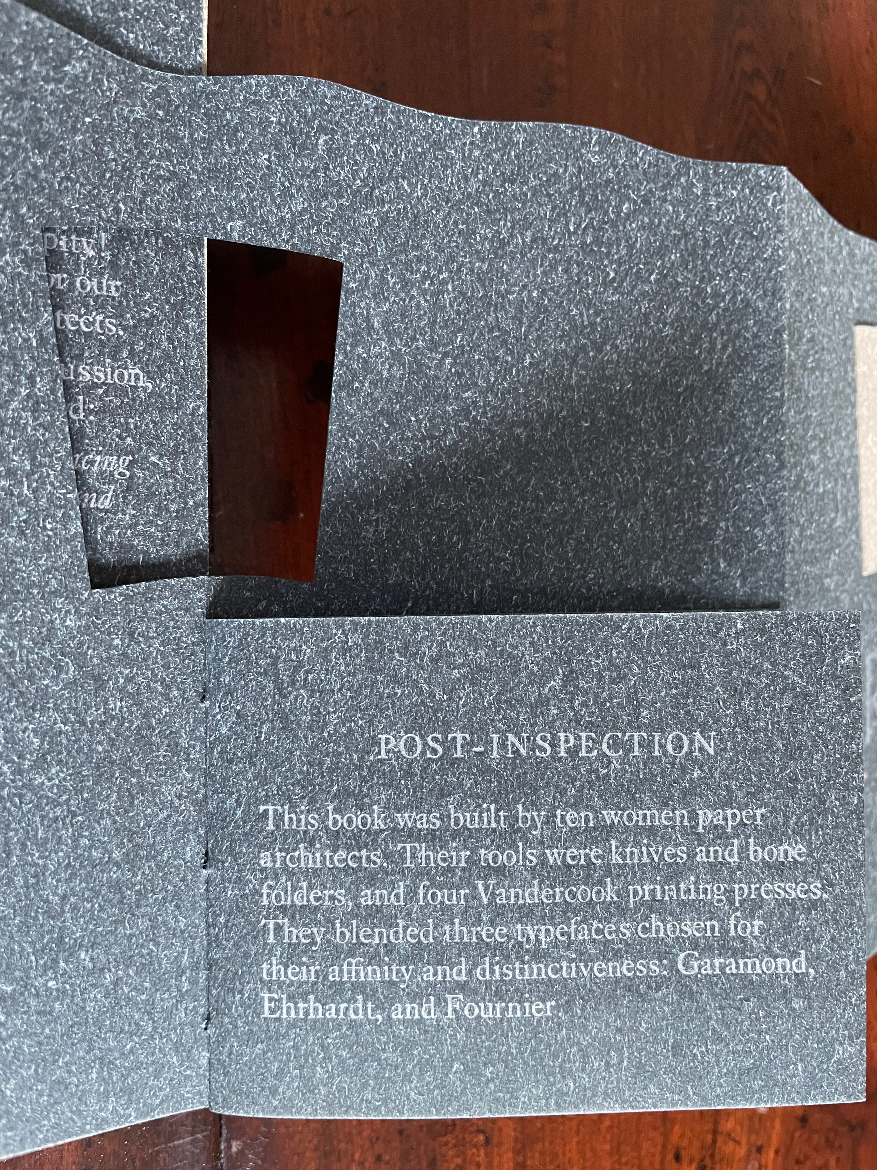
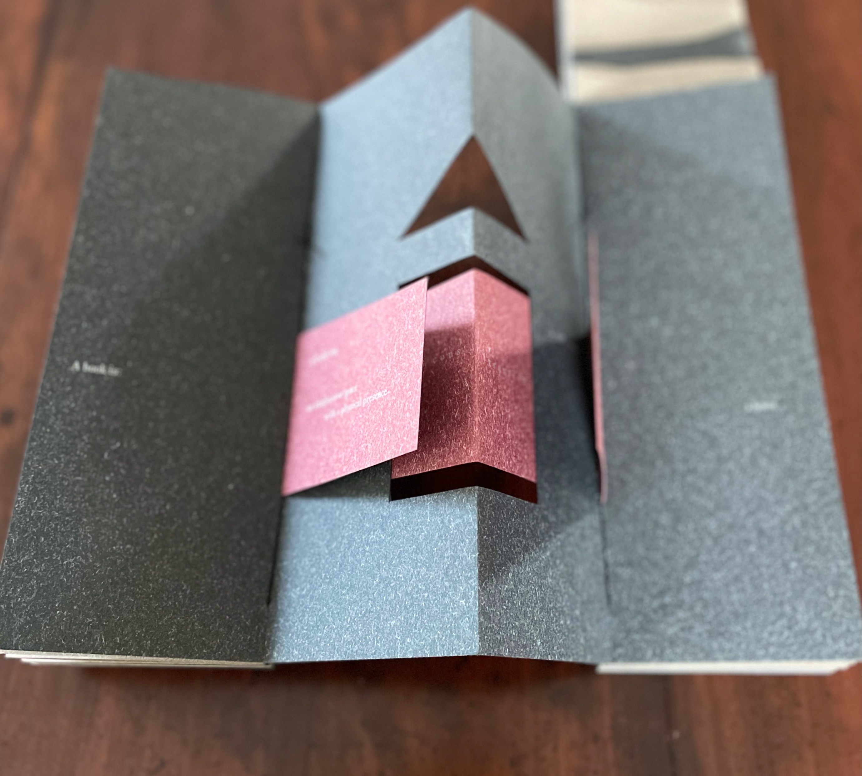
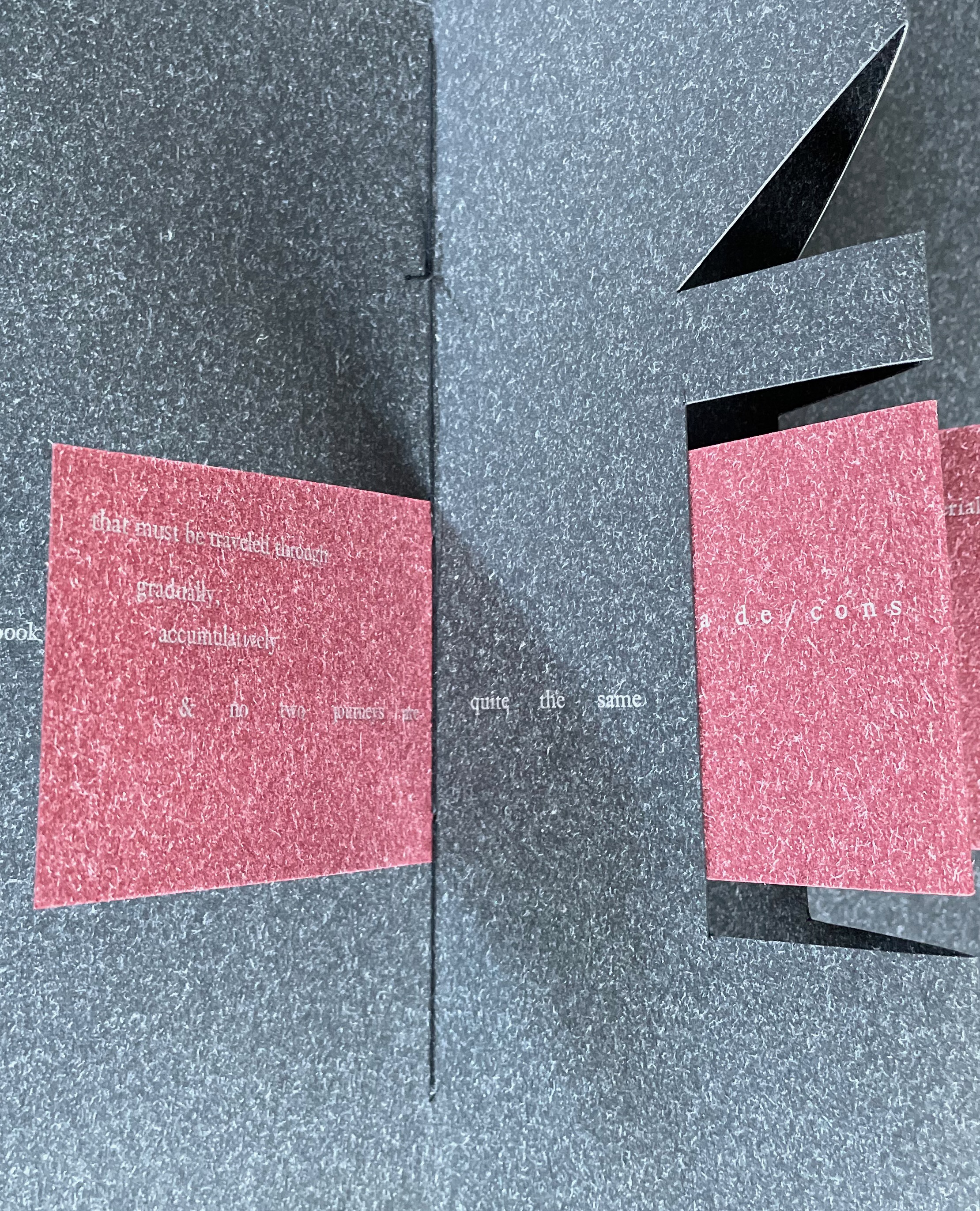
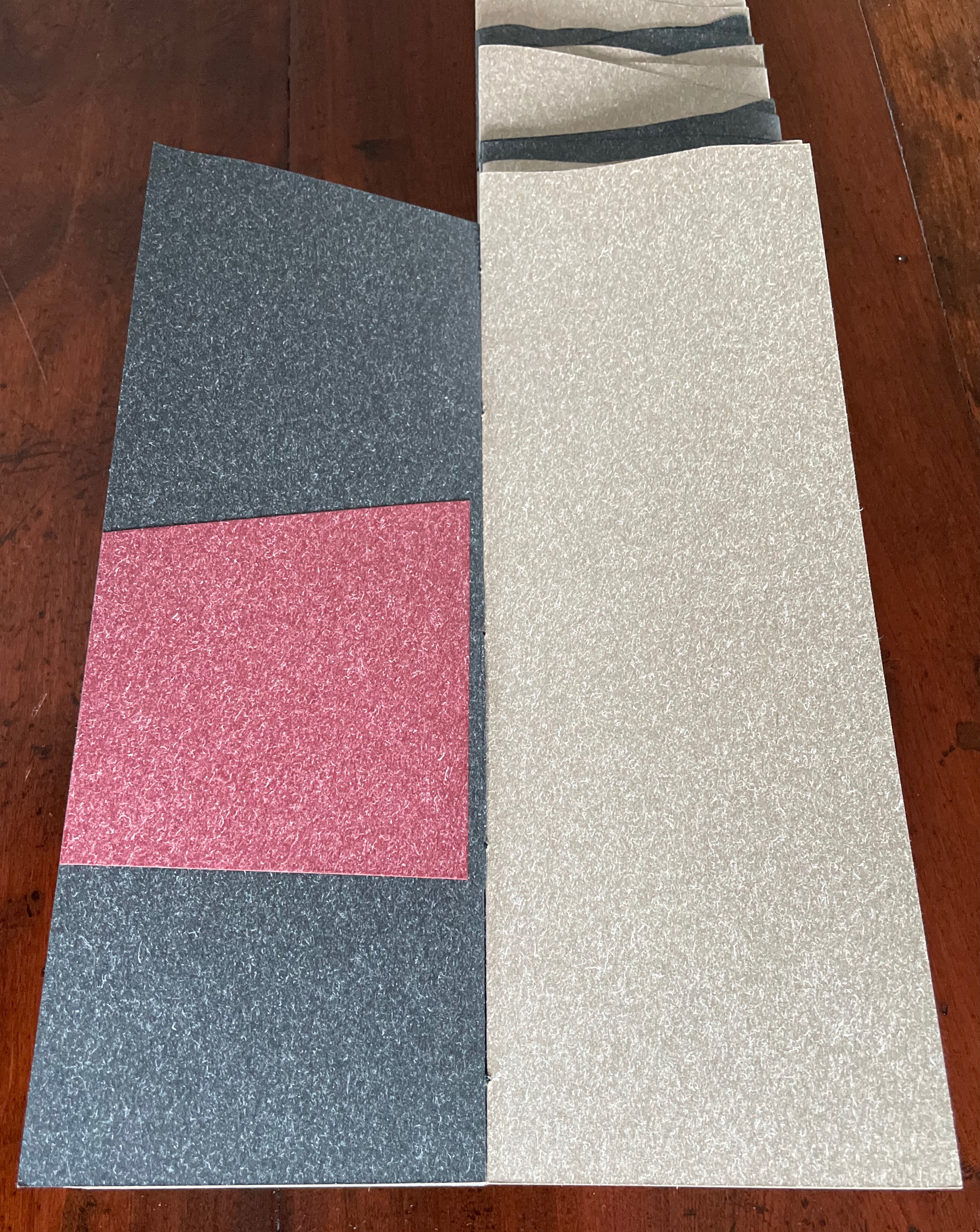
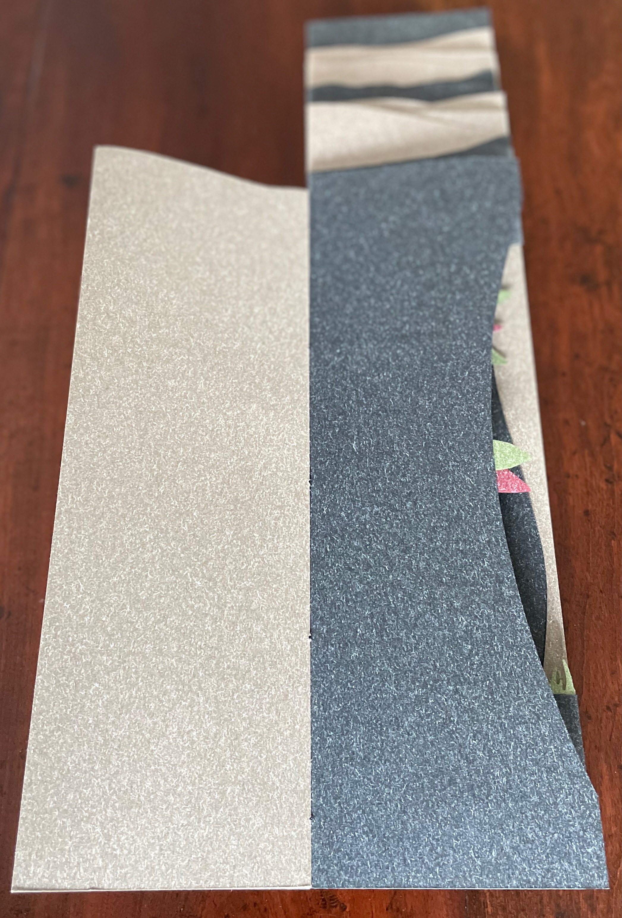
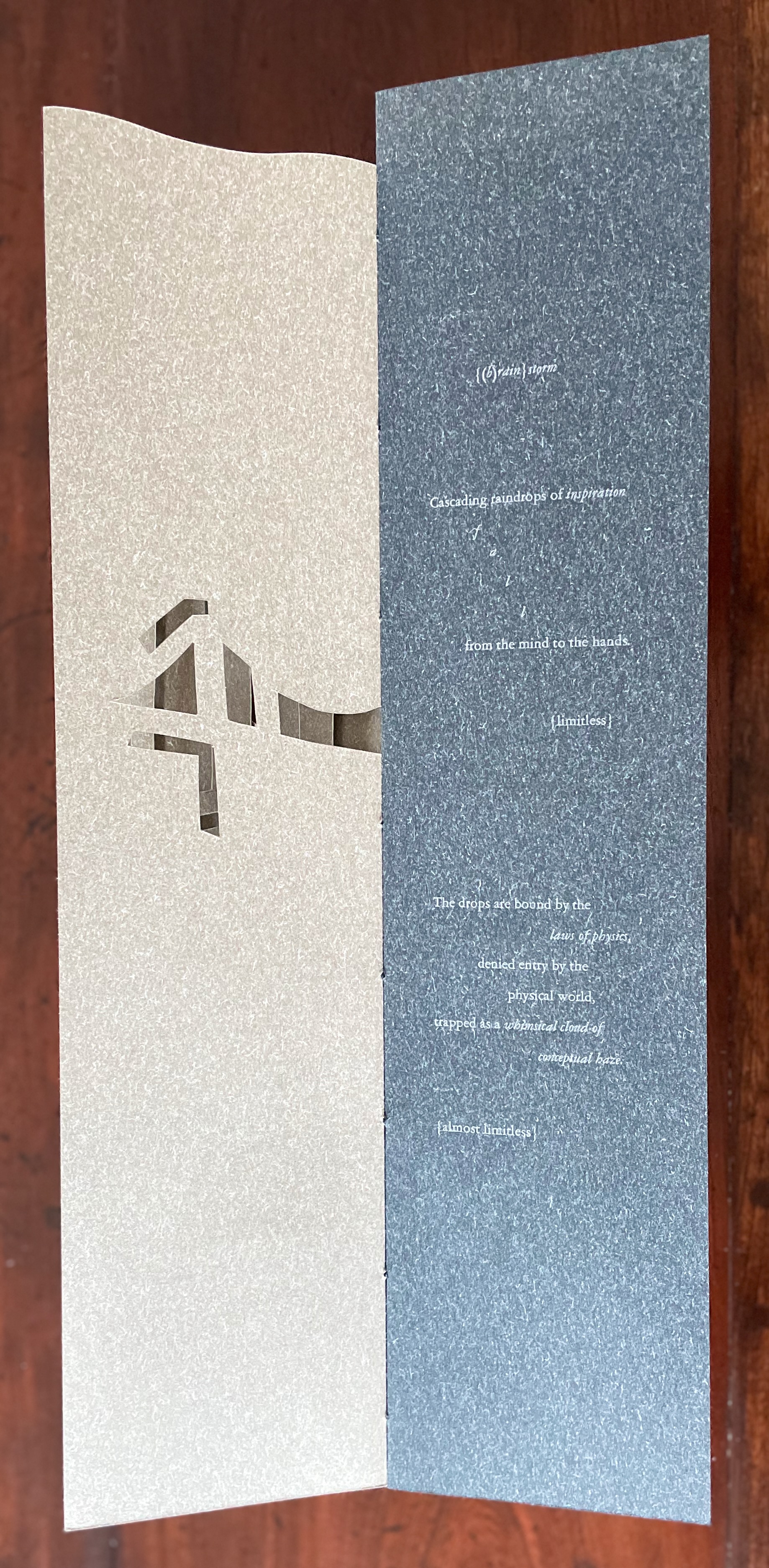
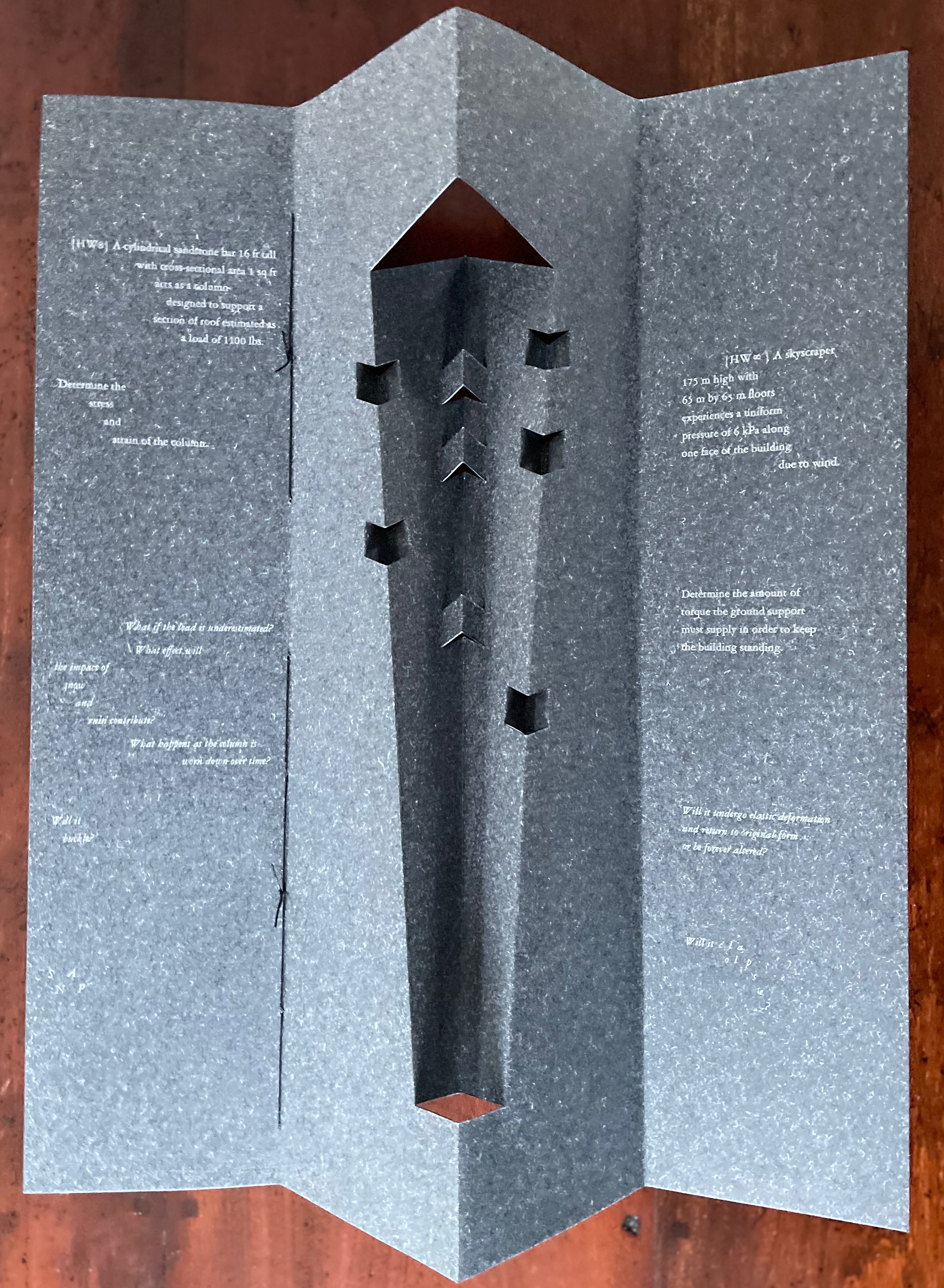
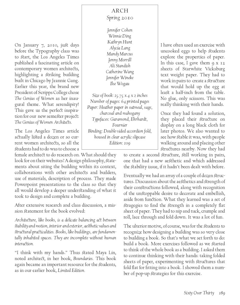
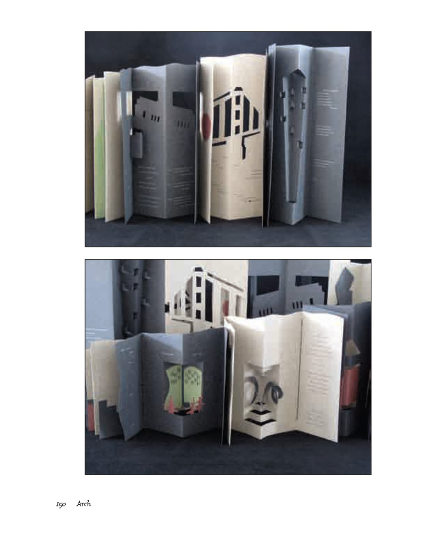
Arch (2010) Kitty Maryatt, Jenny Karin Morrill, Ali Standish, Alycia Lang, Jennifer Wineke, Mandesha Marcus, Catherine Wang, Kathryn Hunt, Ilse Wogau, Jennifer Cohen and Winnie Ding Acrylic slipcase, leporello formed of self-covering booklets sewn together. Slipcase: H410 x W110 x D50. Leporello: H400 x W 90 mm (closed). 64 pages. Unnumbered copy from edition of 109. Acquired from Bromer Booksellers, 7 December 2022. Photos: Books On Books Collection
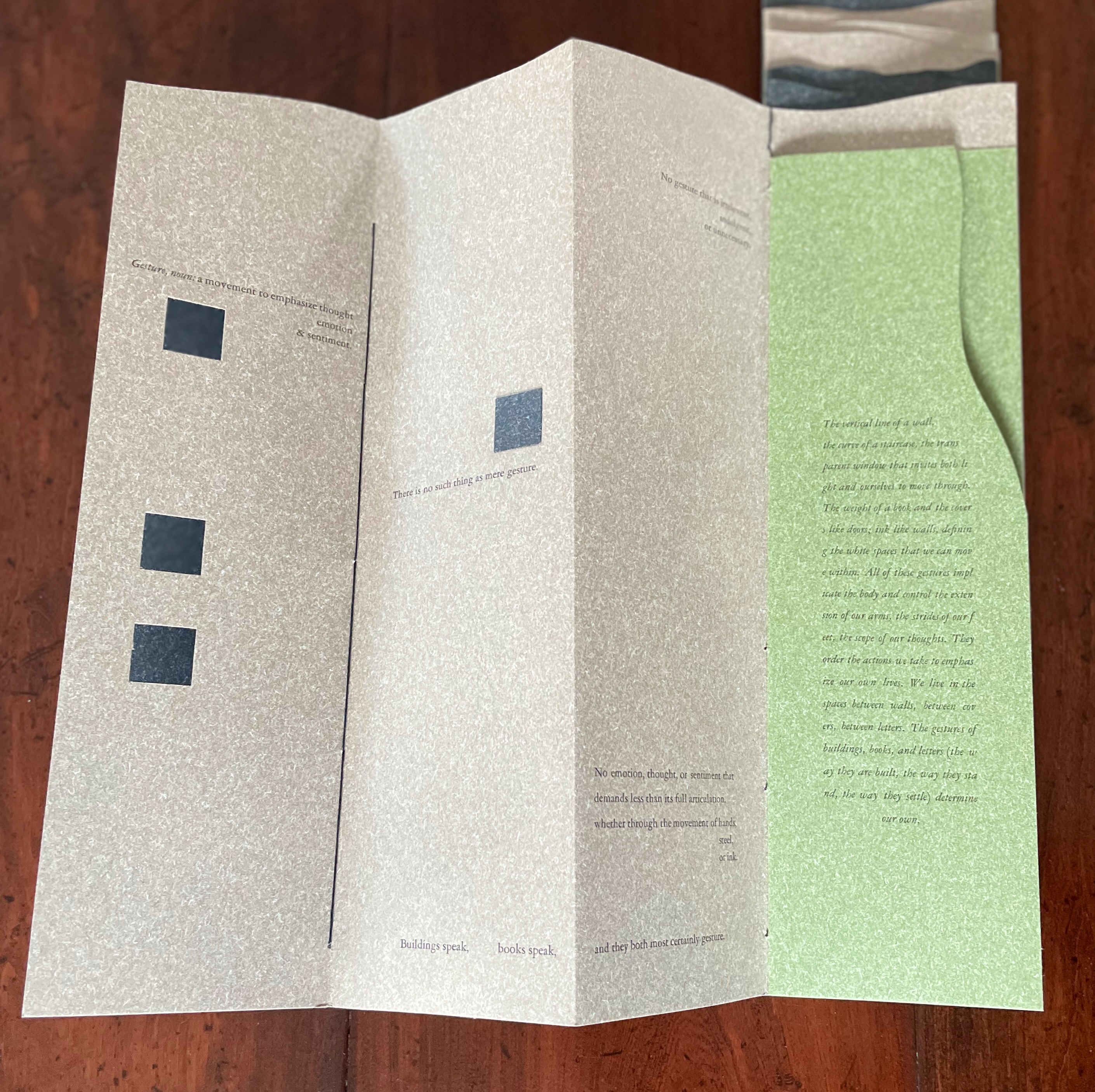
Nôtre-Dame de Paris (1831), Archdeacon Claude Frollo points to the book in his hand and then to the cathedral and says, “This will kill that”. It is ironic that Hugo’s book (popularly known now by its English title The Hunchback of Nôtre-Dame) was written in large part to save the then-decaying cathedral (post-Revolution, it served as a warehouse), and it succeeded. It is also ironic that, while the fictional character’s metaphor has a point about the book’s permanence of replicability outlasting the building’s permanence of stone, it misses the collaborative foundations of both.
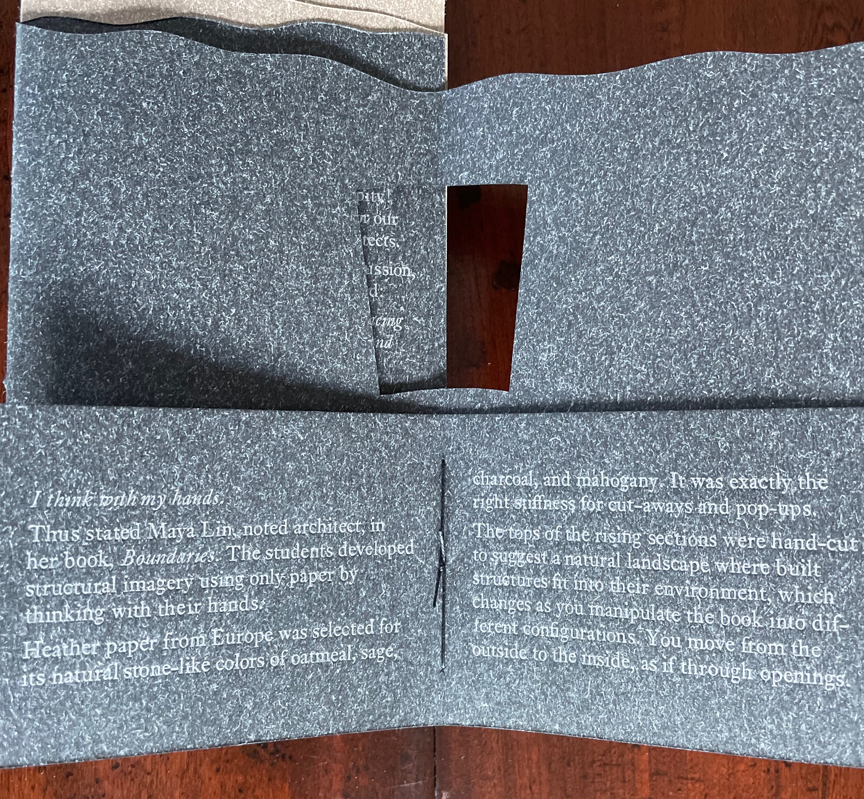
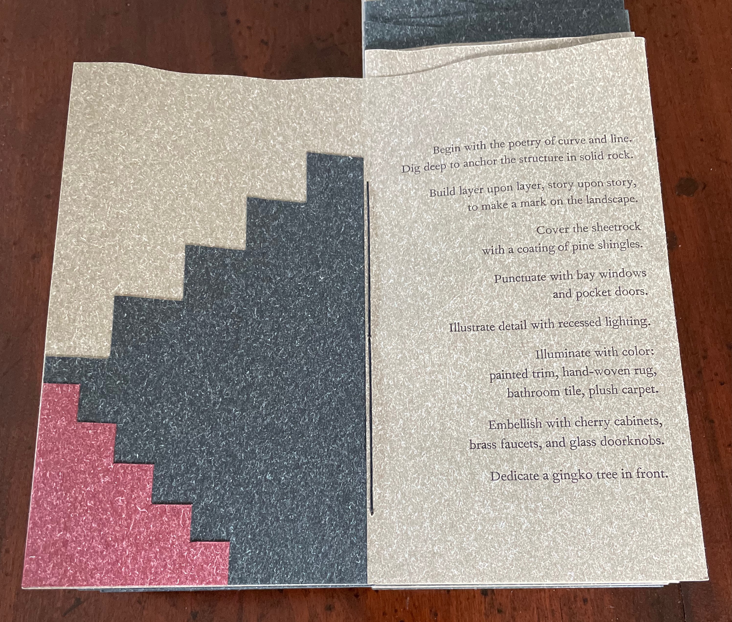
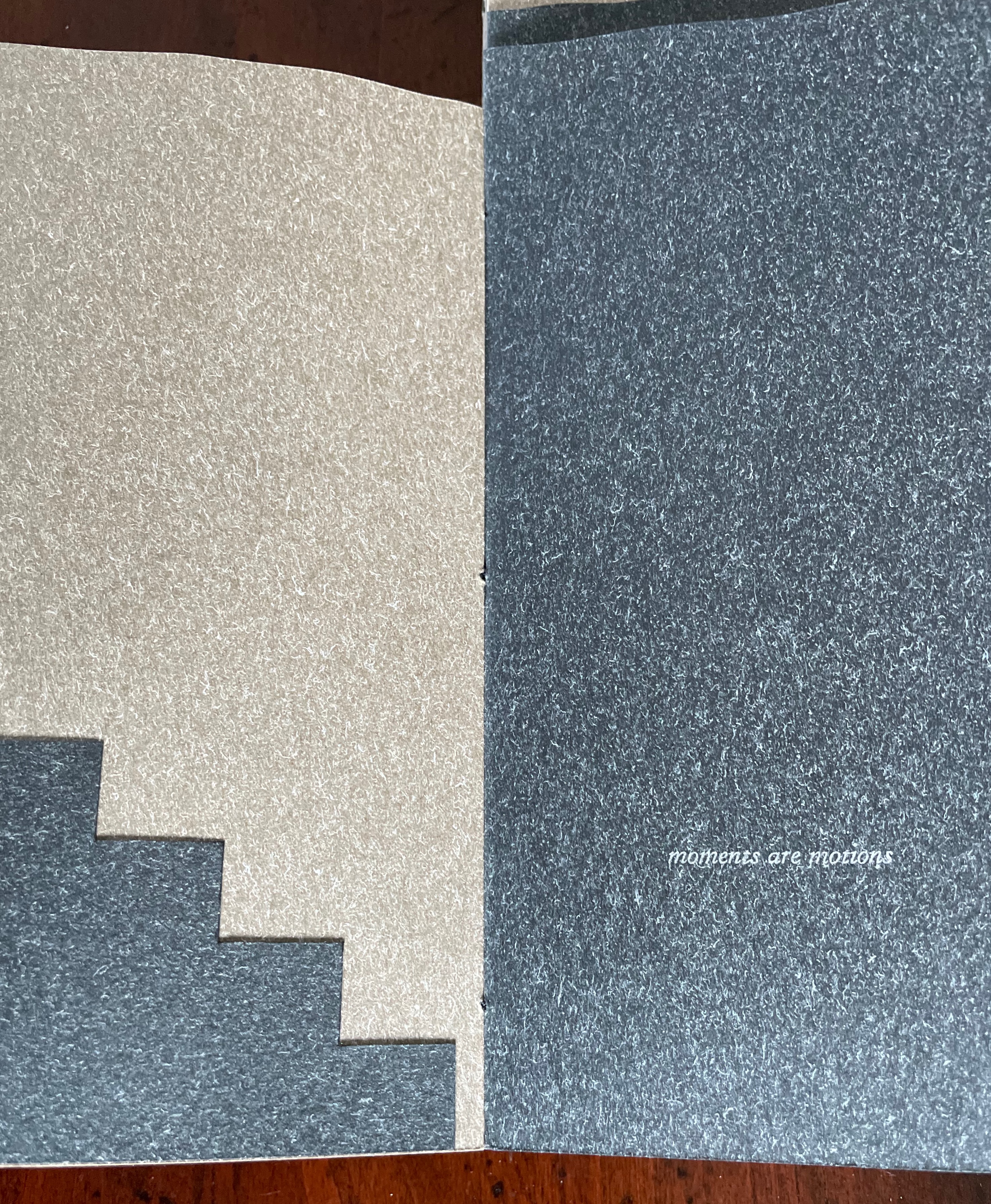
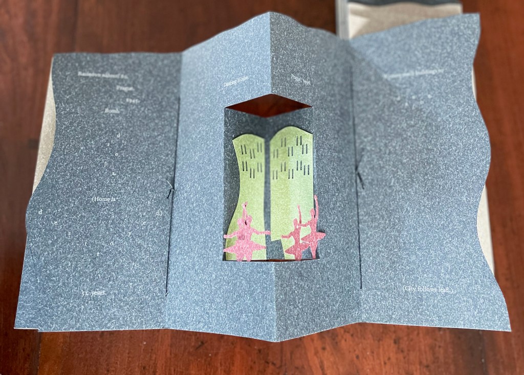
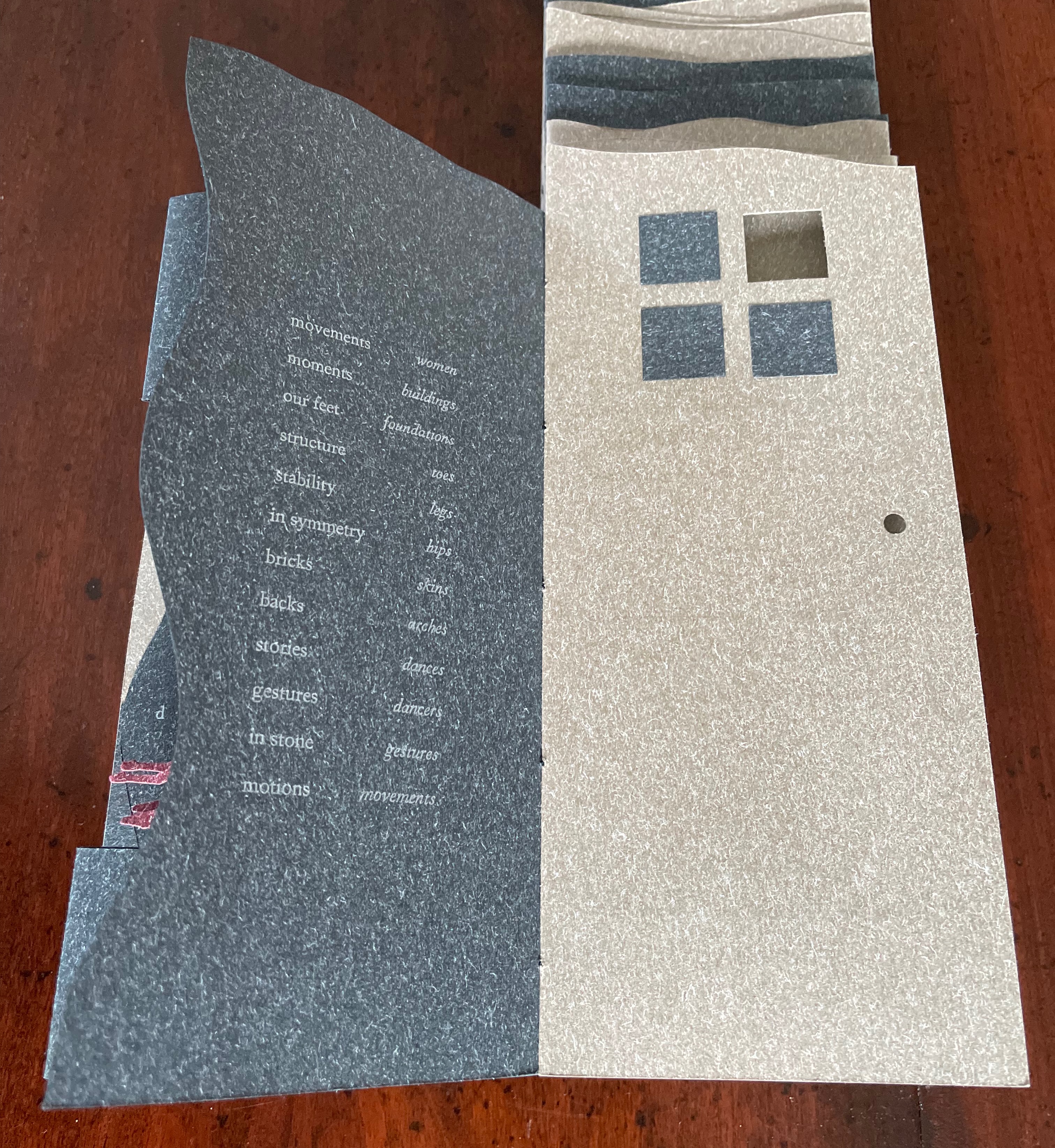
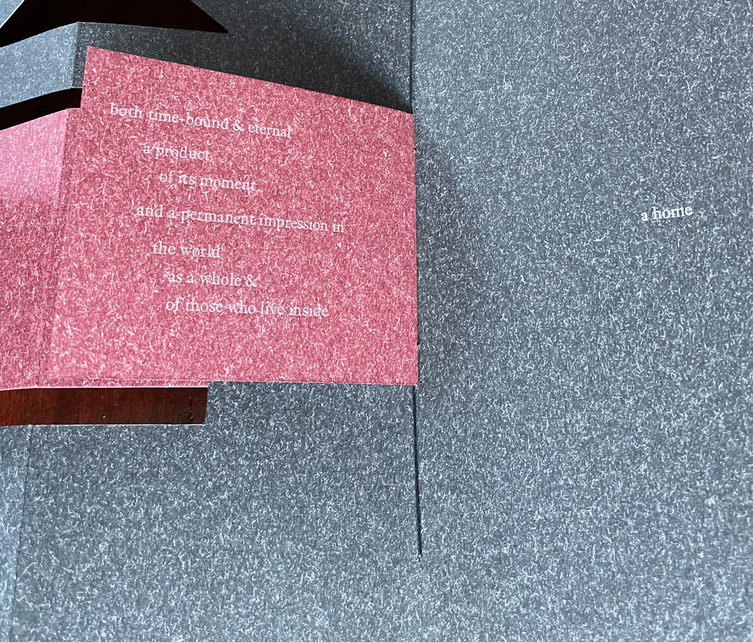
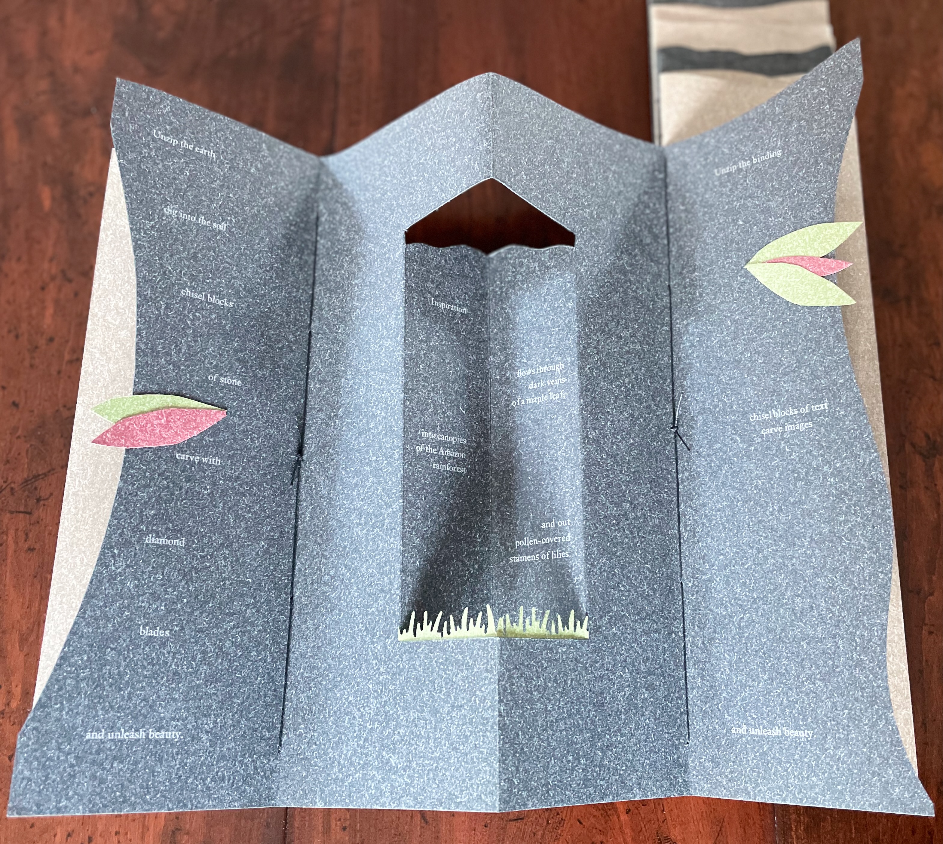
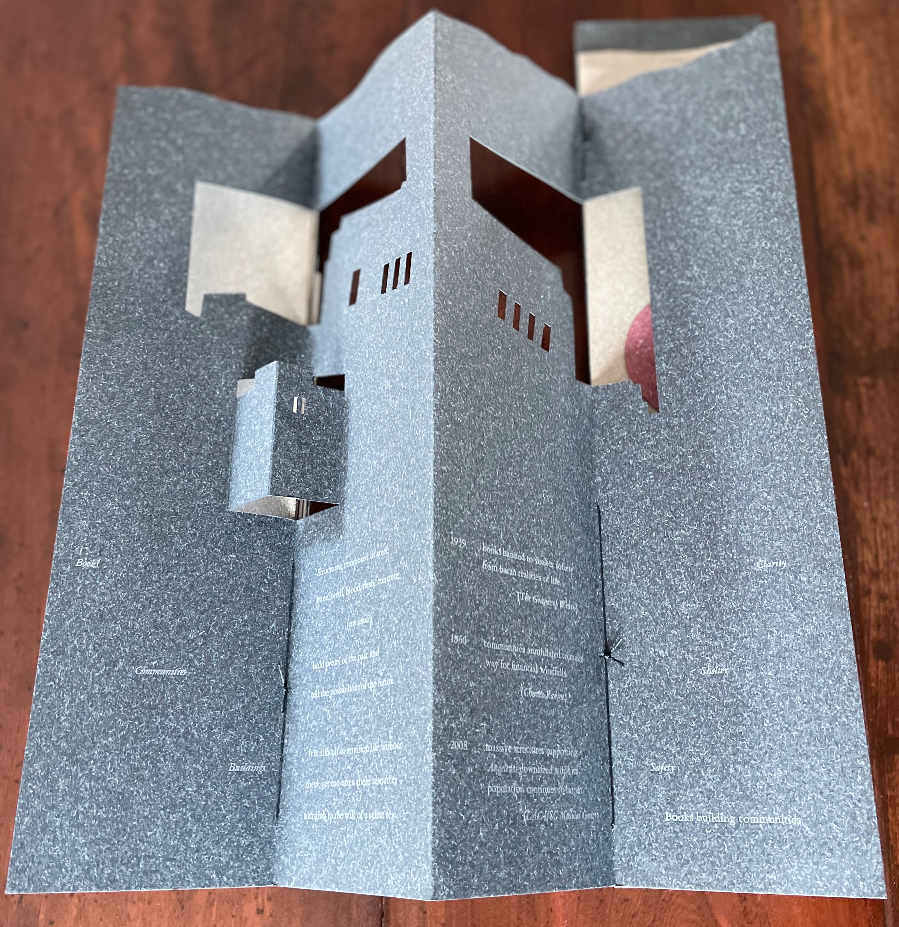
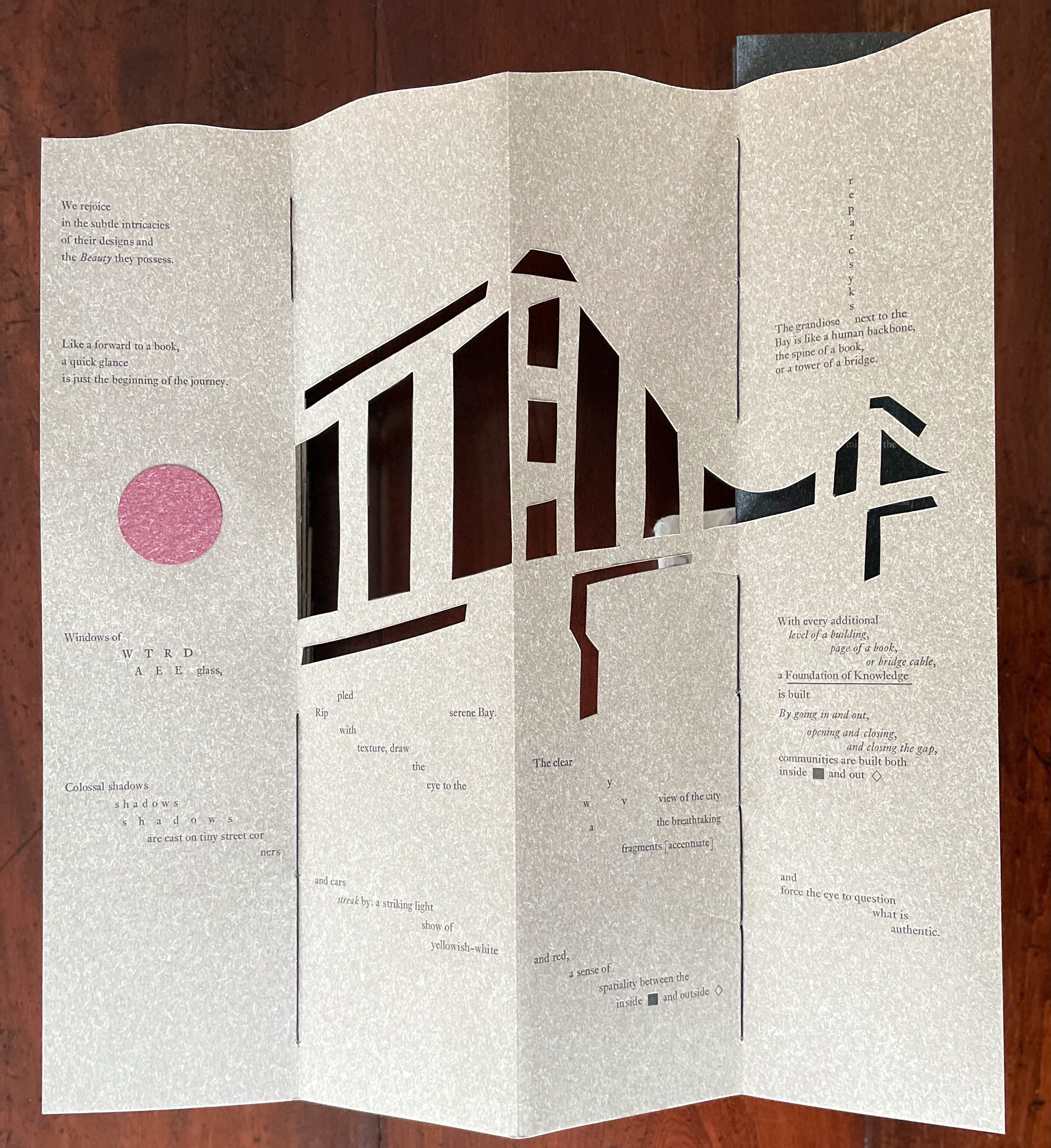
Arch (2010), created by ten students at Scripps College under the direction of Kitty Maryatt, reminds us that the creation of a book — even a work of book art — is a collaborative effort. All the students involved in the design, planning and production were women, a happenstance serendipitously blessed ahead of time by a Los Angeles Times article celebrating women architects. Drawing on that article and Maya Lin’s Boundaries (2000) as well as other research, the students agreed on a mission statement for the work: “Architecture, like books, is a deliberate balancing act between stability and motion, interior and exterior, aesthetic values and practicalities. Books, like buildings, are fundamentally inhabited spaces. They are incomplete without human interaction.”
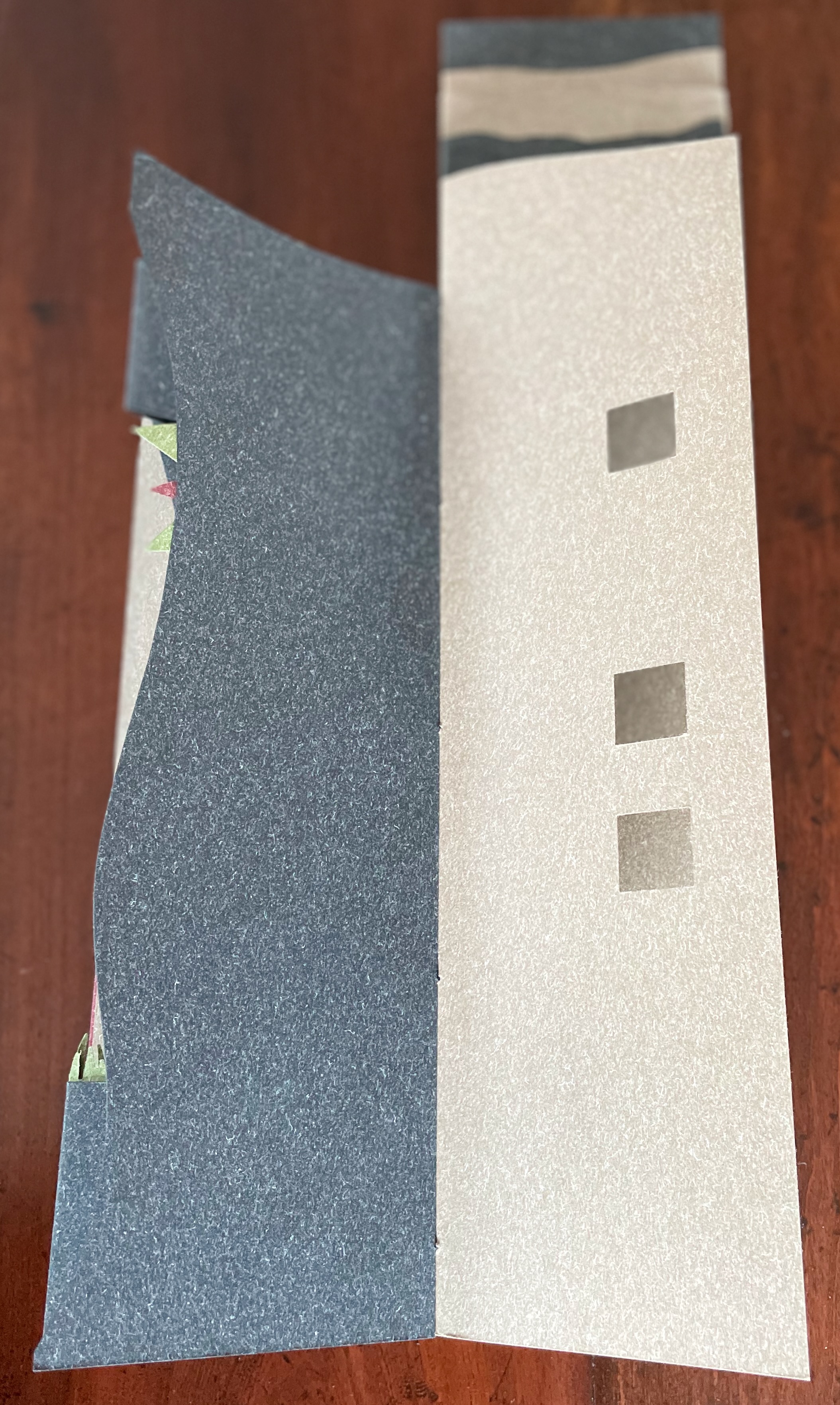
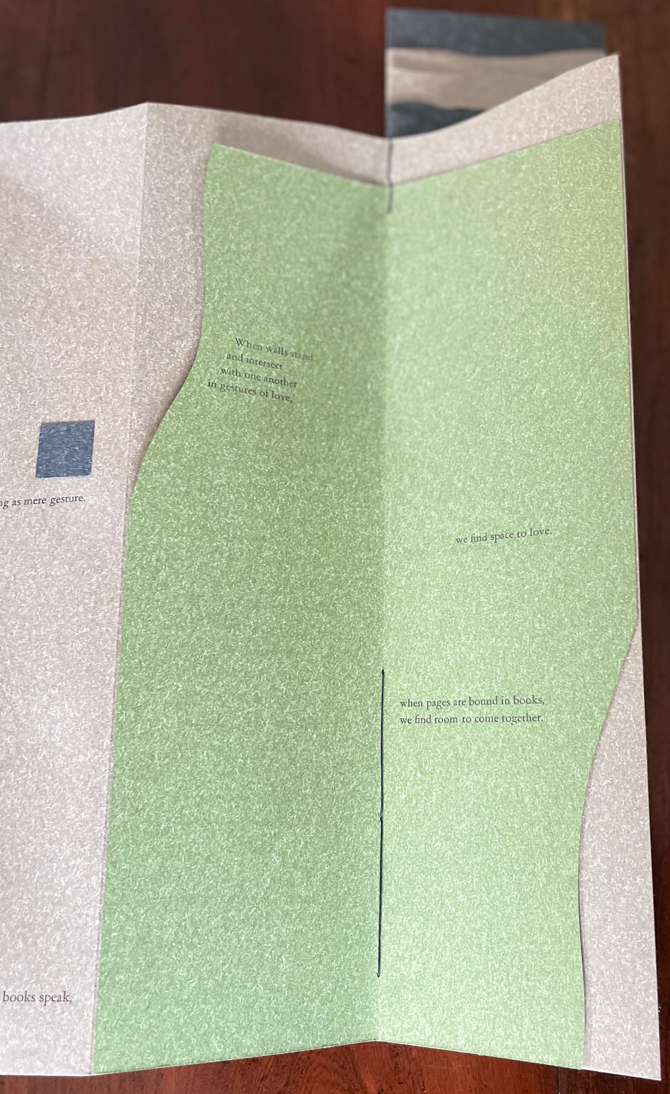
Clever structural use of paper with a stone-like appearance, paired with apt choices of text matched with equally judicious choices in typography, evoke the similarities between books and buildings. Each architect/bookmaker’s contribution is a self-covering booklet in leporello format. Of different heights, the booklets are sewn together to create a tiered tower to be housed in an acrylic slipcase.
The first booklet, open below, incorporates Maryatt’s introduction, entitled “Blueprint”, all of which appears in the work’s entry in the publication Sixty over Thirty: Bibliography of Books Printed Since 1986 at the Scripps College Press (2016). The entry is reproduced in full further below.
The next booklet lists the sources of architectural inspiration, and as the lattice door on the list’s facing page turns, two sets of stairs, cutouts in contrasting colors, ascend on the verso page to the text that begins at the top of the recto page and ends at the foot of descending stairs on the next double-panel spread. Like Maya Lin, Maryatt’s students built their works by learning to think with their hands. The reader, too, has to think with the hands to experience fully this booklet and those that follow. The whole work conjures up the titles of Juhani Pallasmaa’s books — The Thinking Hand and The Embodied Image. Readers of this online entry will have to expand the images below, enjoy the words and imagine their way through with the title of another of his books — The Eyes of the Skin.
Lynn, Greg. 2004. Folding in Architecture Rev. ed. Chichester, West Sussex: Wiley-Academy. See for references to Mario Carpo, Gilles Deleuze and Peter Eisenman.
Macken, Marian. Binding Space: The Book as Spatial Practice (London: Taylor and Francis, 2018). A trained architect and book artist, Macken articulates and illustrates the how and why of the overlap between architecture and book art.
Padberg, Susanne (curator). 7 May – 26 June 2026. “Book. Space. House. Space of Movement“. Exhibition at Galerie Druck & Buch, Vienna, Austria. Accessed 22 May 2026. “The artist’s book as a three-dimensional space: forming a house, outlining, remembering, mimicking—thinking the human being within space. Between object and narrative, books unfold as architectural structures, as inhabitable thought-spaces, as reflections of individual and collective experience. The exhibition brings together artistic positions that expand the book as a spatial body.”
Williams, Elizabeth. 1989. “Architects Books: An Investigation in Binding and Building”, The Guild of Book Workers Journal. 27, 2: 21-31. This essay not only pursues the topic of architecture-inspired book art but turns it on its head. An adjunct professor at the time, Williams set her students the task of reading Ulises Carrión’s The New Art of Making Books (Nicosia: Aegean Editions, 2001) then, after touring a bindery, “to design the studio and dwelling spaces for a hand bookbinder on an urban site in Ann Arbor, Michigan”. But before producing the design, the students were asked “to assemble the pages [of the design brief and project statement] in a way that explored or challenged the concept of binding”. In other words, they had to create bookworks and then, inspired by that, create their building designs. Williams illustrates the essay with photos of the students’ bookworks. [Special thanks to Peter Verheyen for this reference.]
Erwin Huebner is a professor at the University of Manitoba engaged in research and teaching cell and developmental biology. He is also a book artist and miniaturist. Following his work, the Books On Books Collection has started small and hopes to grow into his larger works. At both ends of the spectrum, Huebner’s themes resonate with the integration of art and science, a recurrent focus of the collection (see Further Reading below).
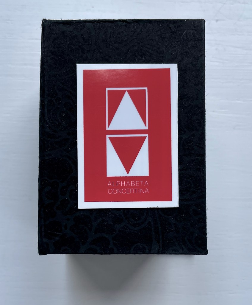
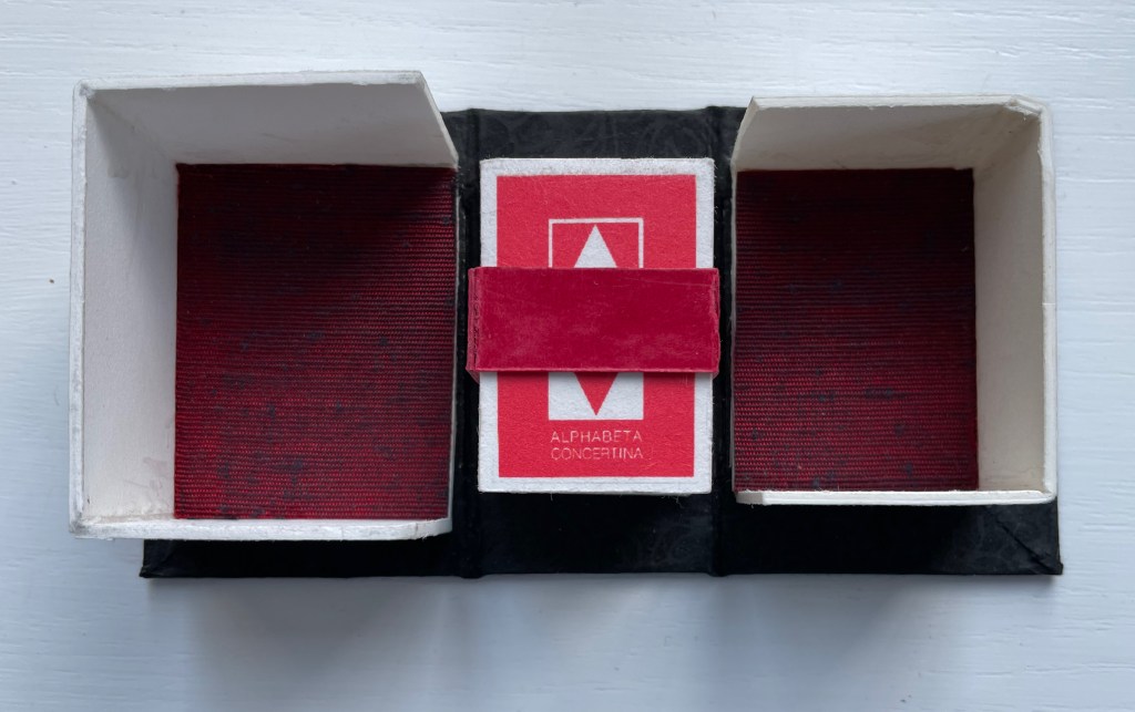
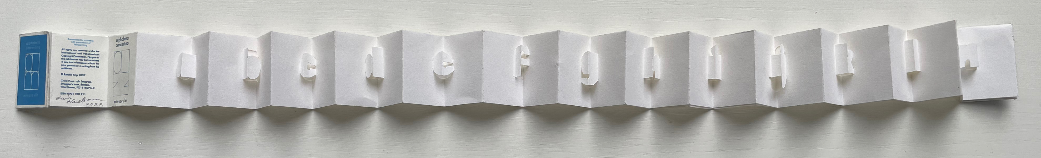
Alphabeta Concertina Majuscule (2015)
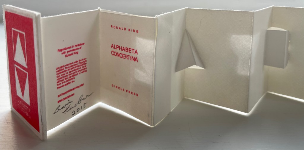
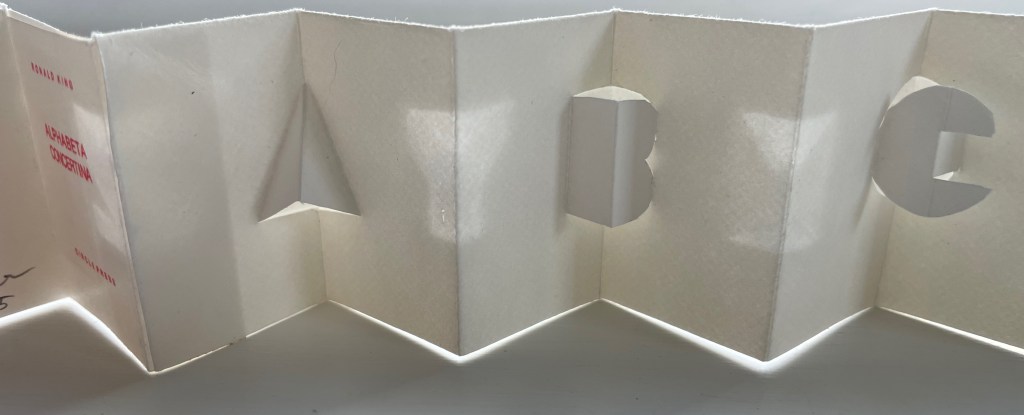
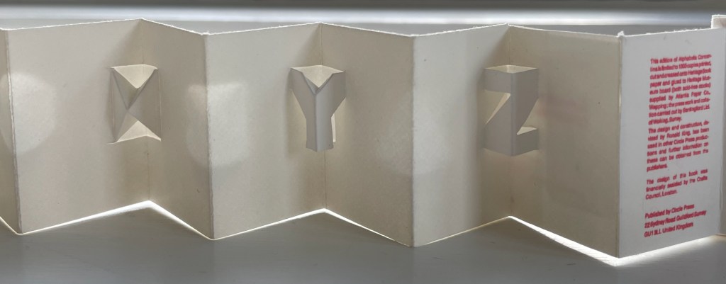
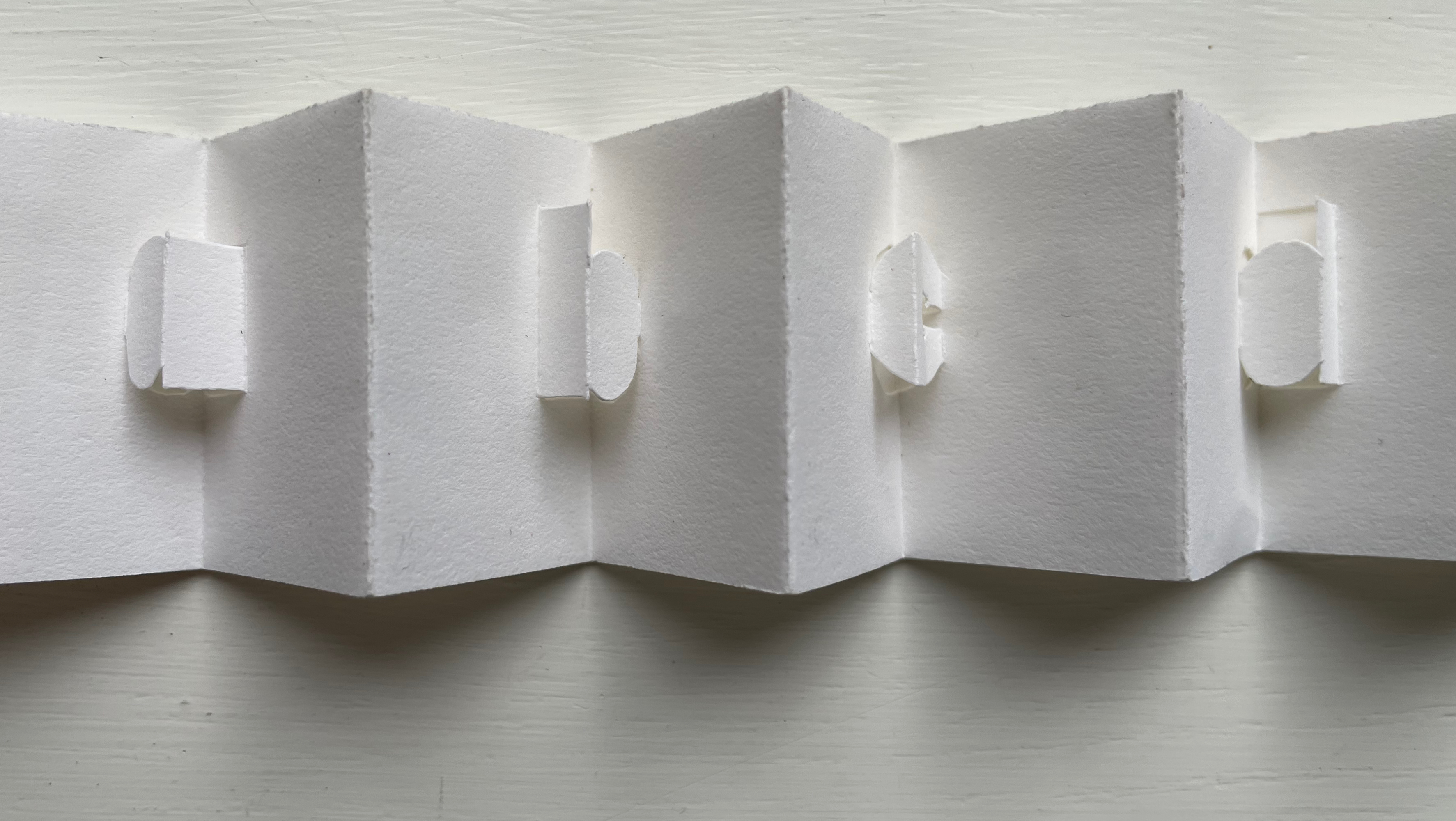
Alphabeta Concertina (2015) Erwin Huebner (with permission of Ron King) Miniature double-sided leporello. H 1.5 x W 1.0 x D 0.75 in. Edition of 4. Acquired from Erwin Huebner, 20 January 2023. Photos: Books On Books Collection.
The geometry and invention of Ron King’s work must have appealed to a kindred spirit in Erwin Huebner. The classificatory nature of the alphabet must also have spoken to Huebner’s inner Linnaeus. As 2023 is the 270th anniversary of Linnaeus’ Species Plantarum, which introduced his classification system, it is an auspicious moment for Huebner’s miniature versions of King’s alphabet concertinas to join the Books On Books Collection and be included works in the Bodleian exhibition “Alphabets Alive!” (19 July 2023 to 24 January 2024, Weston Library, Oxford).
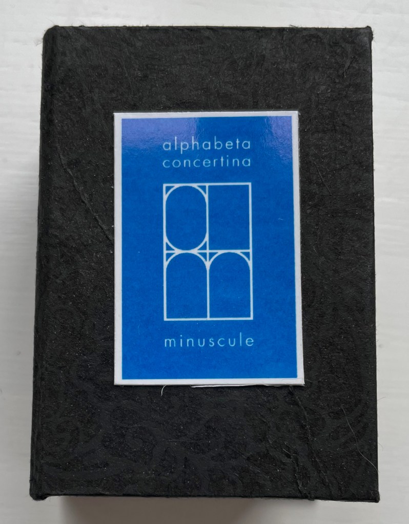
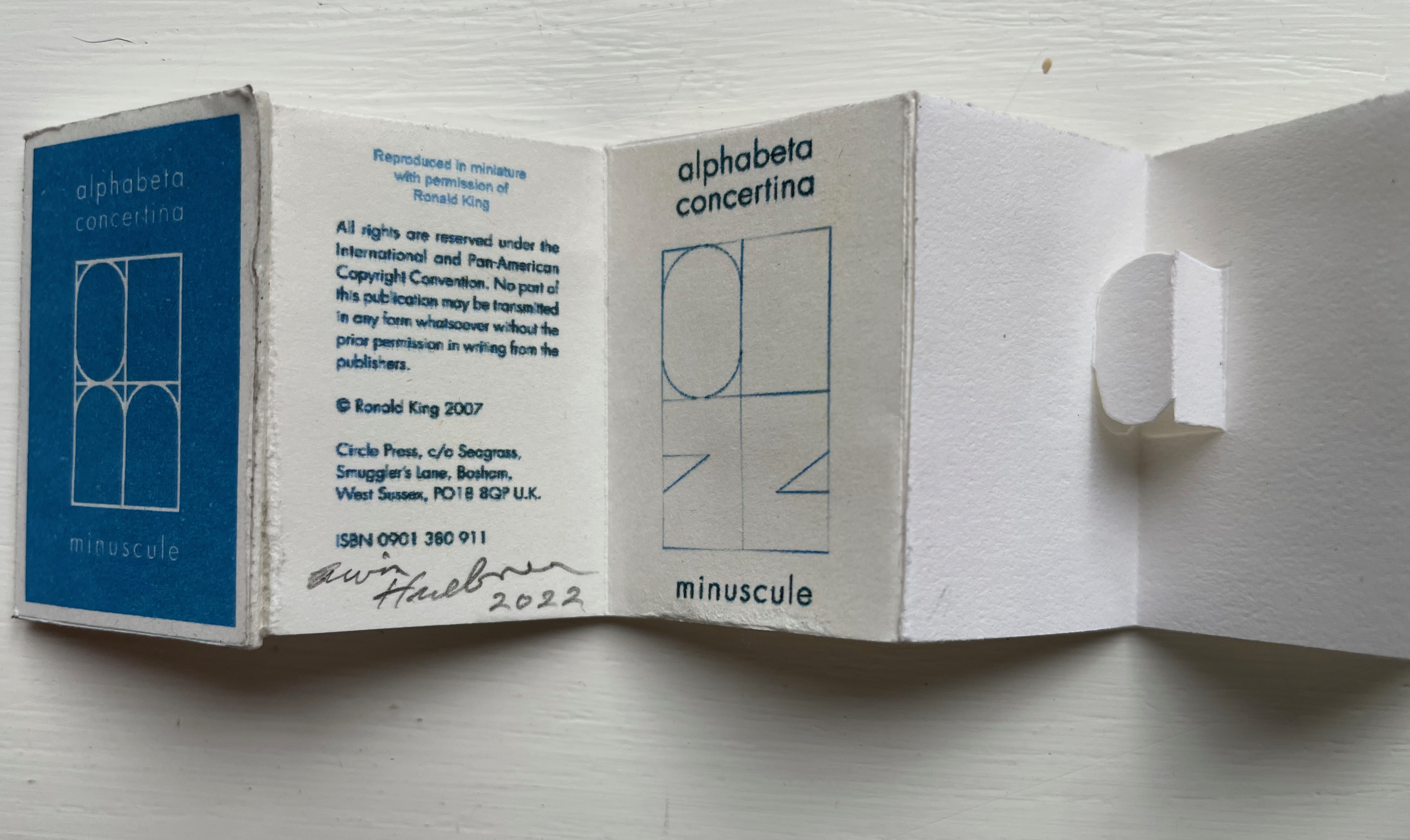
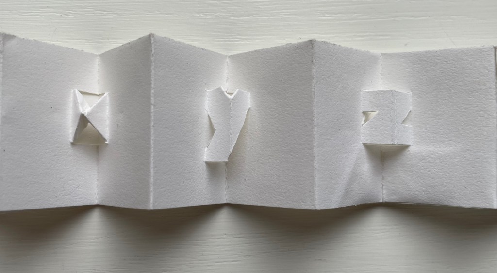
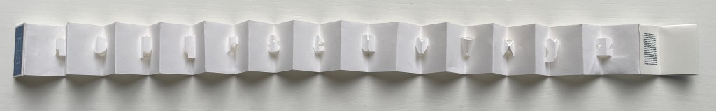
alphabet concertina miniscule (2022)
alphabet concertina miniscule (2022) Erwin Huebner (with permission of Ron King) Miniature double-sided leporello. H 1.5 x W 1.0 x D 0.75 in. Acquired from Erwin Huebner, 20 January 2023. Photos: Books On Books Collection.
Both the majuscule and miniscule concertinas are double-sided with half the alphabet on one side and half on the other just as King designed from the first with The White Alphabet and the majuscule concertina in 1984 and subsequently 2007 with the miniscule.
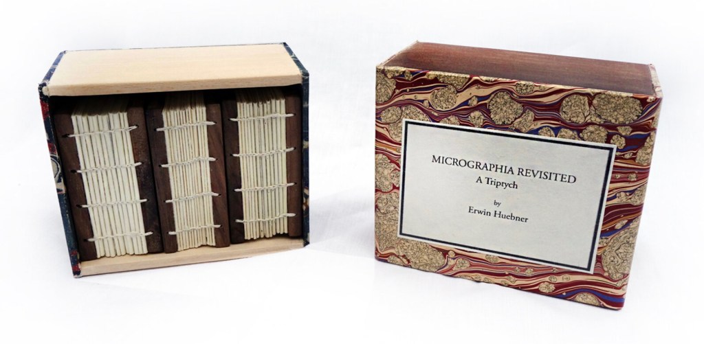
Micrographia Revisited (2017)
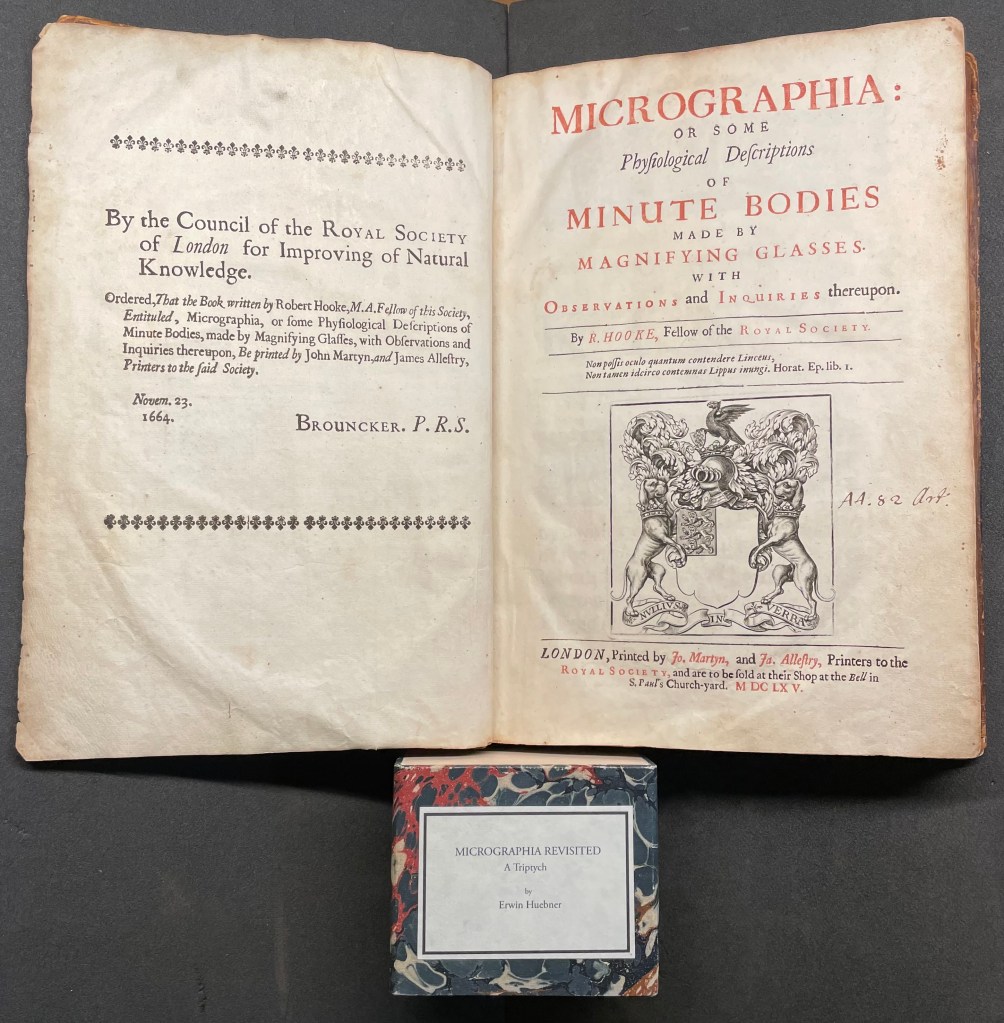
Micrographia Revisited: A Triptych (2017) Erwin Huebner Box with 3 Coptic-bound volumes, each H 2.625 x W 1.875 x variable depth. Edition of 3. Acquired from Erwin Huebner, 20 January 2023. Photos: Courtesy of the artist.
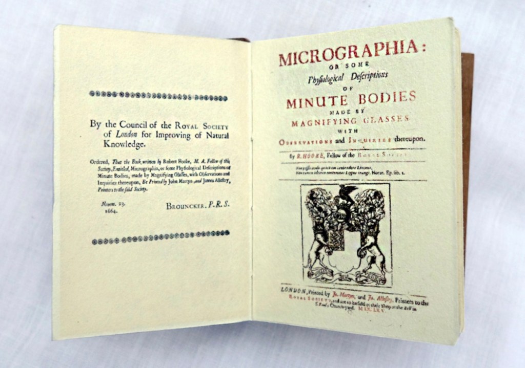
Despite Francesco Stelluti’s Melissographia (1625), Robert Hooke’s Micrographia: Or Some Physiological Descriptions of Minute Bodies Made by Magnifying Glasses with Observations and Inquiries Thereupon (1665) was long thought to be the first publication with illustrations drawn from observation with a microscope. Given Huebner’s scientific and artistic careers, it would seem impossible for him to resist paying homage to this work. Indeed, in his larger artist’s books, he has incorporated entire microscopes, but here, he exploits the technological advances of photography and electron microscopy and joins them with the craft of bookbinding to produce just as wondrous a work. Using Scanning Electron Microscopy (SEM), Huebner has created images of the same or similar objects to those Robert Hooke observed in the 1600’s. One of the volumes in the triptych presents these photographic results, and the other two present a reprint of Micrographia.
The coptic binding to black walnut covers, the wooden case covered in marbled paper and the subtitle create a suitable medieval/Renaissance air for this homage.
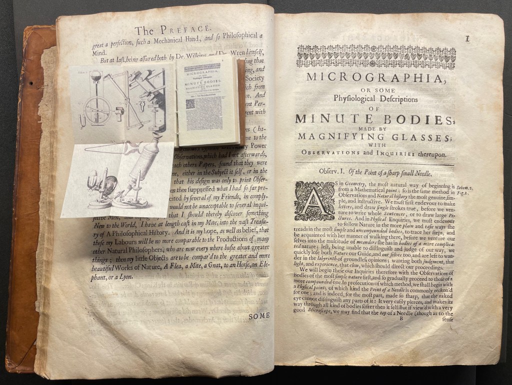
Living in a village near Oxford and having access to the Bodleian Libraries, I took Micrographia Revisited on a pilgrimage to compare it with a copy of the original not far from Hooke’s alma mater Wadham College.
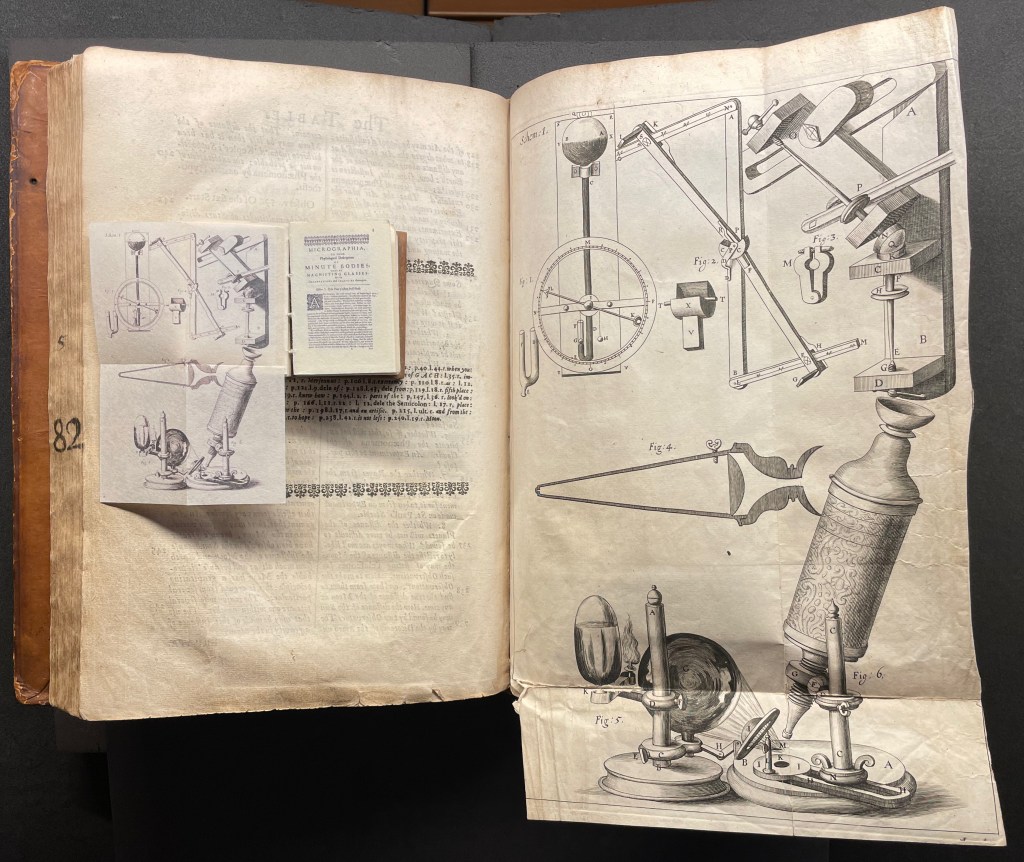
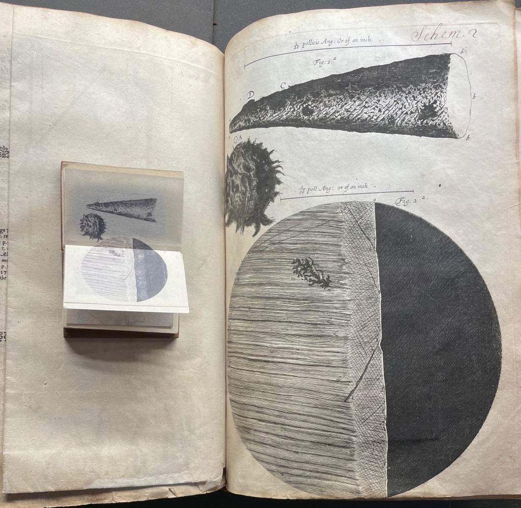
Among the many outstanding features of Huebner’s homage is his use and placement of fold-outs to capture the larger plates in Hooke’s original, all of which were placed in an appendix and some of which were also printed as fold-outs. In the juxtapositions below, note how Huebner has placed Hooke’s illustration of his equipment at the end of the Preface.
Sitting atop the double-page spread showing the end of the Preface and page 1 of Hooke’s original is Micrographia Revisited, open to Huebner’s fold-out of Hooke’s illustration of his equipment. Hooke’s same fold-out illustration from the appendix is juxtaposed below with Huebner’s.
Hooke’s first two objects under the microscope Hooke are the point of a needle (described on pages 1-3) and the edge of a razor (described on pages 4-5). Huebner transforms Hooke’s single-page plate illustrating what he describes into a double-page spread between pages 2 and 3 of Micrographia Revisited.
Juxtaposing Huebner’s double-page presentation of Hooke’s drawings of a needle point and edge a razor with Hooke’s single-page presentation.
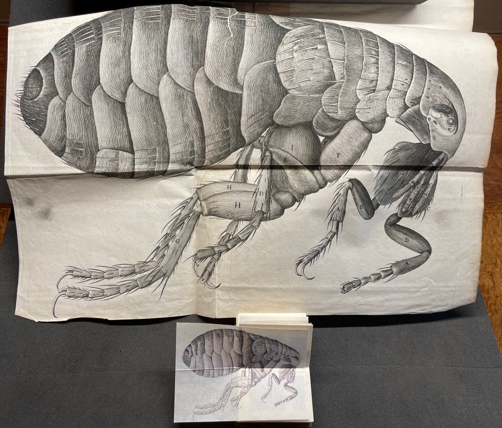
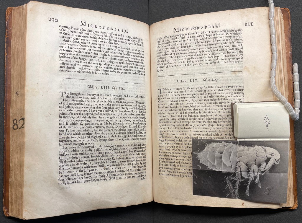
Hooke’s large fold-out of his flea may display the most impressive drawing in the book. The description appears on page 210, and the fold-out is in the appendix. Huebner’s double-fold fold-out of the illustration falls between pages 210 and 211.
The flea from Micrographia juxtaposed with that from Micrographia Revisited.
But most impressive of all is Huebner’s SEM image of a flea and its testament to Hooke’s powers of observation and skills as a draughtsman.
In the spirit of “standing on the shouders of giants”.
John Crombie formed Kickshaws in 1979 in Paris. Joined by Sheila Bourne, they published over 150 works. Apparent as the esoteric influence of visual poetry and the Oulipo movement may be, their works have the combined smell of the printer and typesetter’s workshop and artist’s studio that distinguish them from that crowd.
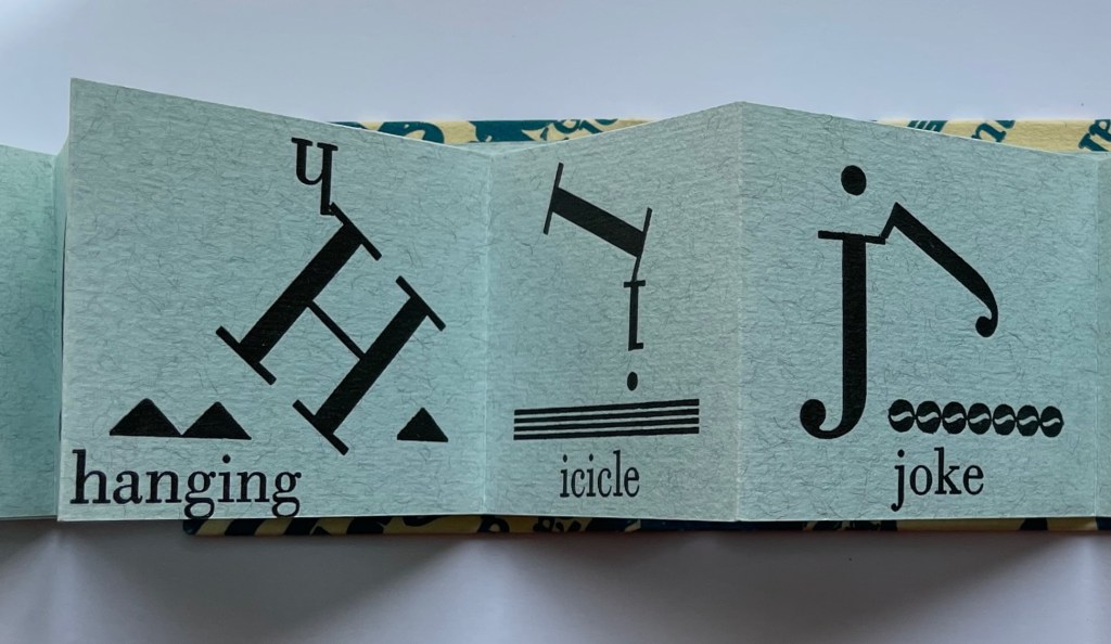
ABC in a maze (1987)
ABC in a maze (1987) John Crombie Spiral bound on four sides, double gate fold. H95 xW95 mm, 17 leaves. Edition of 300 (150 in English, 150 in French), of which this is Letter of 26 numbered A-Z. Acquired from Librairie Jean-Étienne Huret, 17 March 2022. Photos: Books On Books Collection.
The cover of this work hides its title, just as the proper order of the pages hides in the reiterations of the alphabet across 17 leaves of this double gatefold puzzle and book.
The French title ABC Dédale carries more freight than the English. Not only does it convey the idea of the maze by reference to its inventor Daedulus, it refers to Cadmus, the Phoenician prince who brought the alphabet to Greece while on his quest to find his sister Europa, mother by Zeus to the Minotaur — the “monster in the alphabet”. If that seems a far-fetched allusion, then consider the additional hint in the name of the chosen typeface: Hélios, the Greek god and personification of the sun, to which Daedulus’ son Icarus flew too close in their escape from Crete.
Portrait évolutif du typographe “Evolving portrait of the typographer” (1988)
If a selection of works from the Books On Books Collection were made based on the theme of “artists’ books and color”, this small work would have to make the cut. Moving from five small splashes of color in the first pass, subsequent passes build up a multi-colored cartoon image of the typographer in a head-on eyeless gaze. At the seventh pass, however, the colors begin to fade; in the ninth, the features of the portrait begin to erode, and by the twelfth, only streaks of gray and the faintest impression of the outline remain.
A close look at the title reveals that same faint impression of the portrait’s outline. Were it not for its reference to the three primary colors, the title would have to be amended to a baker’s dozen of passes in collaboration with the press.
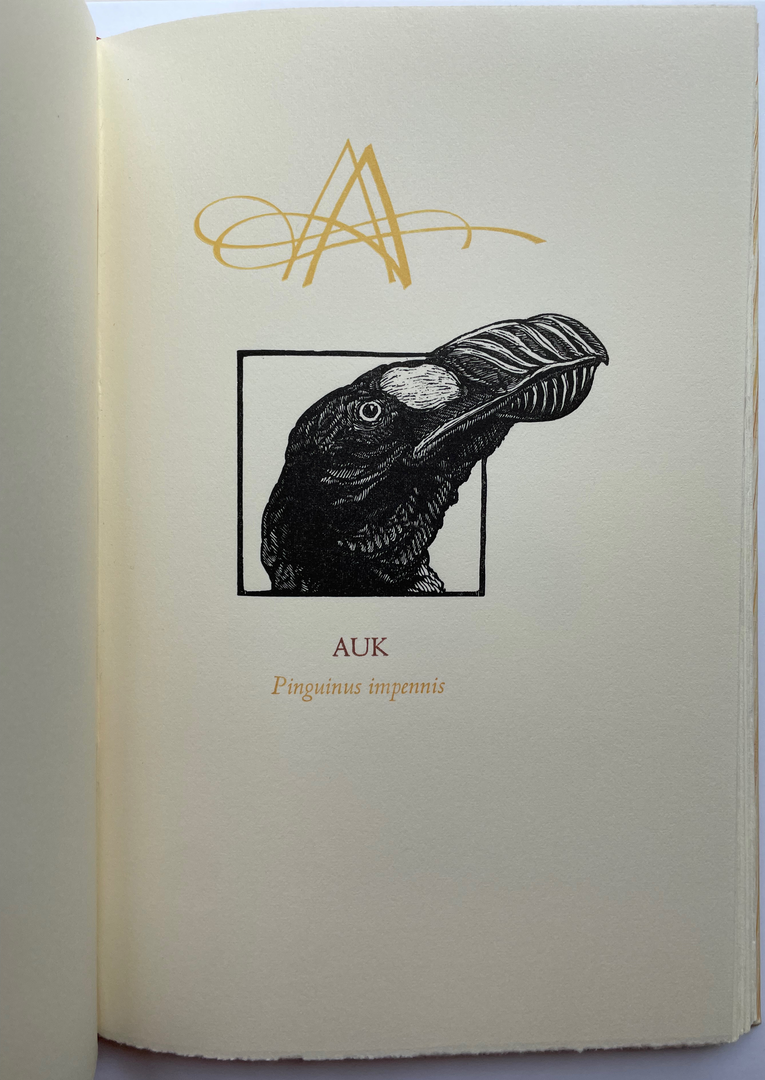
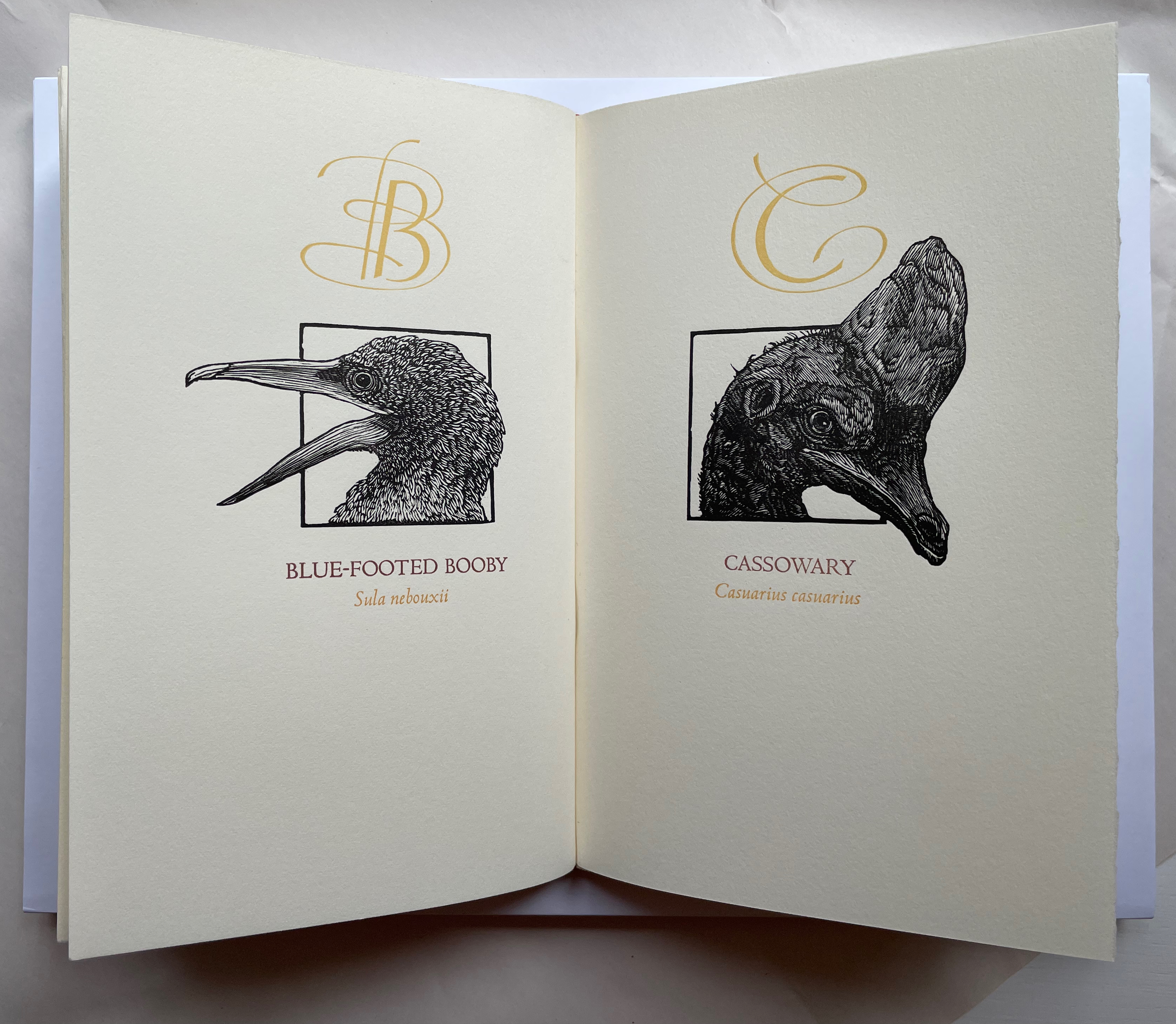
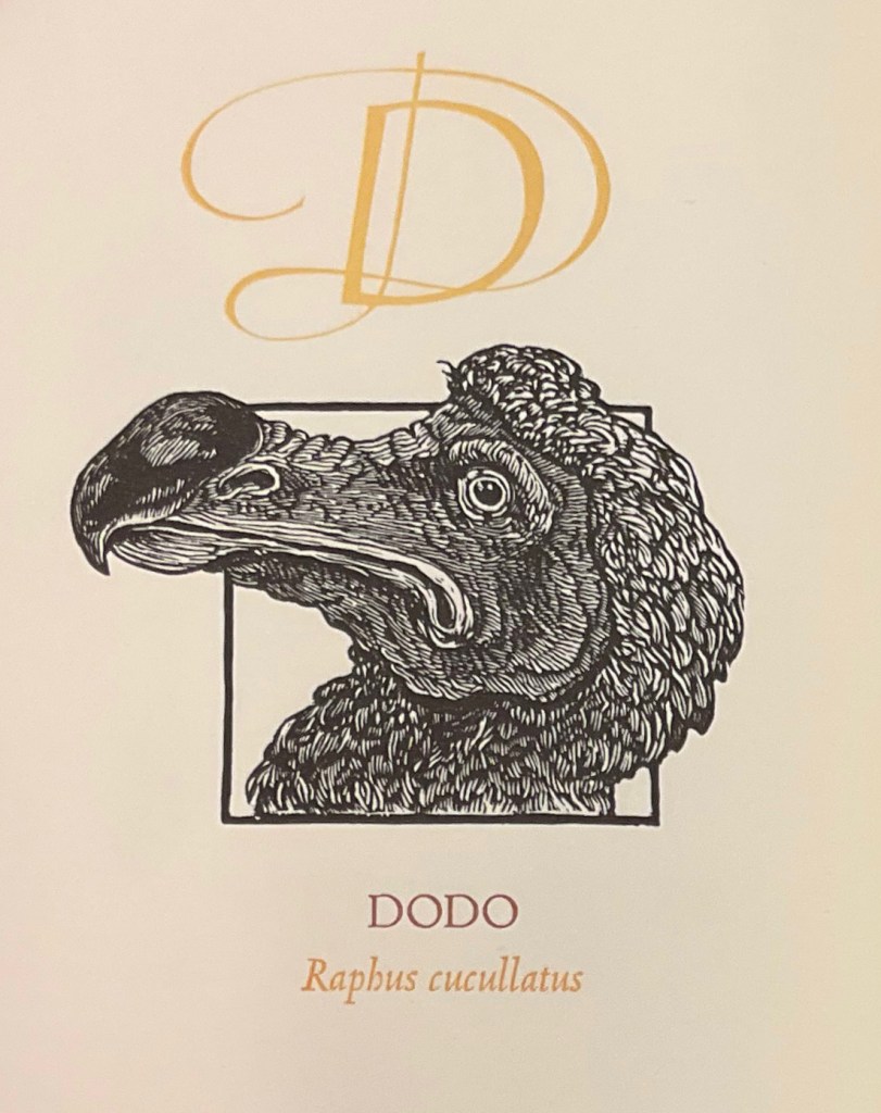
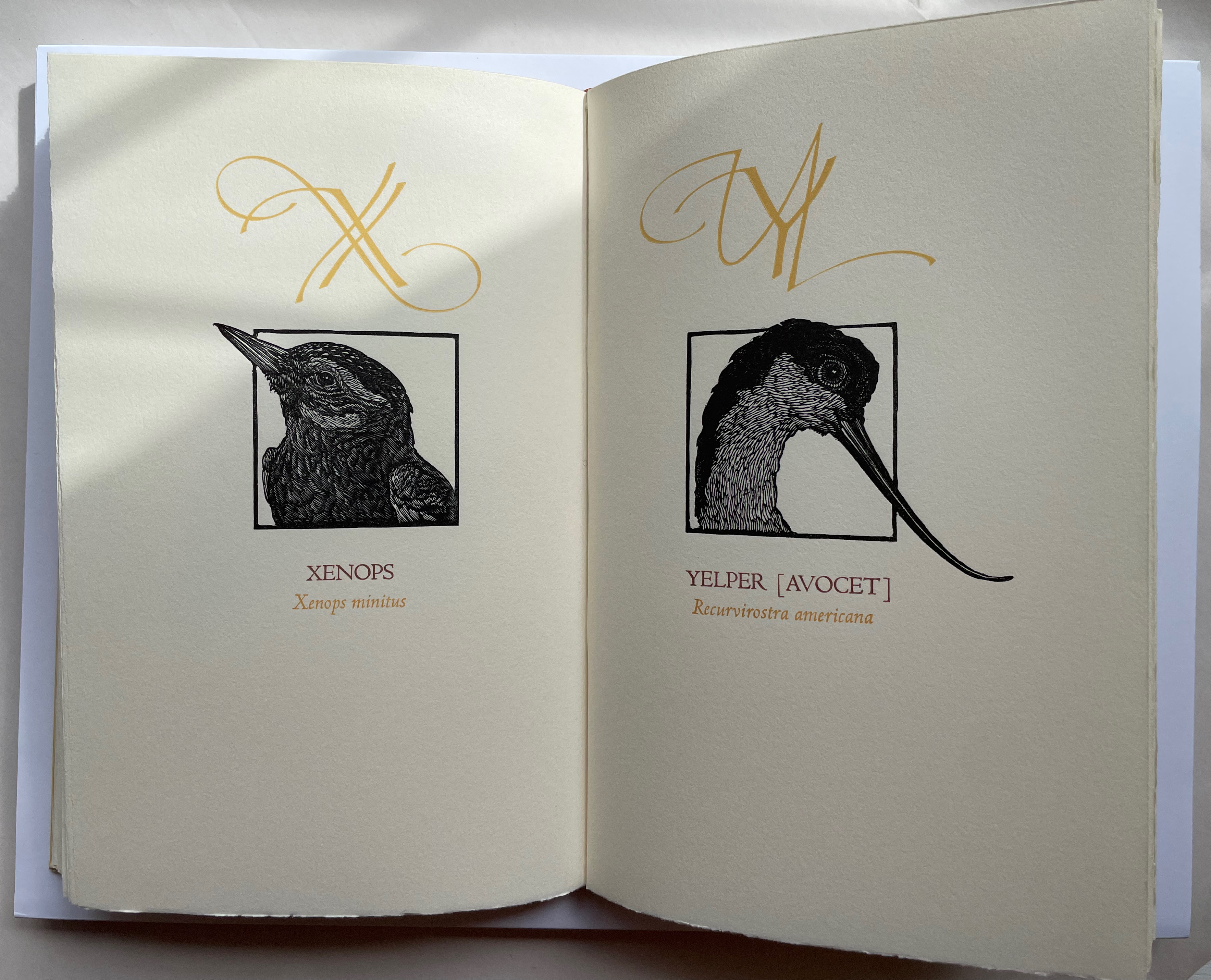
A Fowl Alphabet (1986) Alan James Robinson (etchings), Suzanne Moore (calligraphy) Casebound. Marbled paper over boards. Doublures and flyleaves. H218 x W145 mm. 26 Folios untrimmed at head. Four-page prospectus loose. Acquired from Bromers Bookseller, 16 August 2022. Photos: Books On Books Collection. Displayed with permission of the artists.
Under his Cheloniidae Press imprint, Alan James Robinson created three artist’s alphabets: A Fowl Alphabet with Suzanne Moore; An Odd Bestiary (1982) and The Birds and Beasts of Shakespeare (1990), arranged as a double abecedary, first the birds and then the beasts. Although this copy of A Fowl Alphabet comes from the regular edition and does not have the color of the deluxe editions of all three abecedaries, it does demonstrate the extraordinary fineness of Robinson’s wood engraving as well as his compositional talent, which also informs the book’s design. The positioning of the birds’ heads in their printed black frames conveys a sense of movement and three dimensionality on the individual page, but notice how Robinson varies the positioning from page to page and across double-page spreads to enhance the sense of movement.
With its core thick strokes shadowed and entwined with thinner flourishes, Suzanne Moore’s calligraphy creatively complements the way that the heft of Robinson’s engraved heads plays against those compositional features.
“Cheloniidae” is the scientific term for the family of sea turtles, and much of Robinson’s art is marine related. But the dominant and consistent impression conveyed by the ouput of Cheloniidae Press is that of Robinson’s artistic skill as an impresario and conductor of artistic talents. Added to the background of his duet with Moore are Master Printer Harold Patrick McGrath, Faith Harrison and her hand marbled paper, Arthur Larson and his hand typesetting and the binding skills of Claudia Cohen.
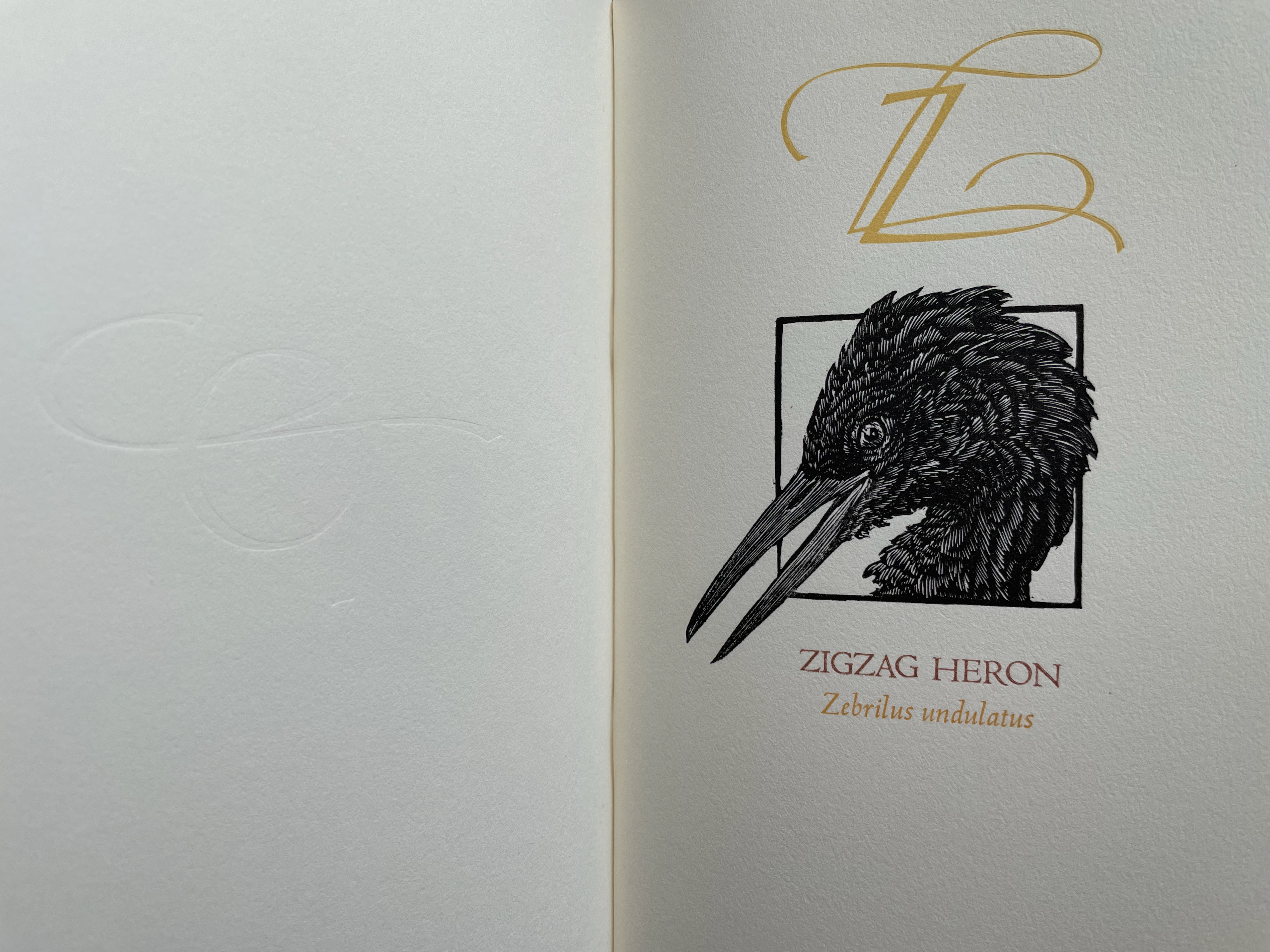
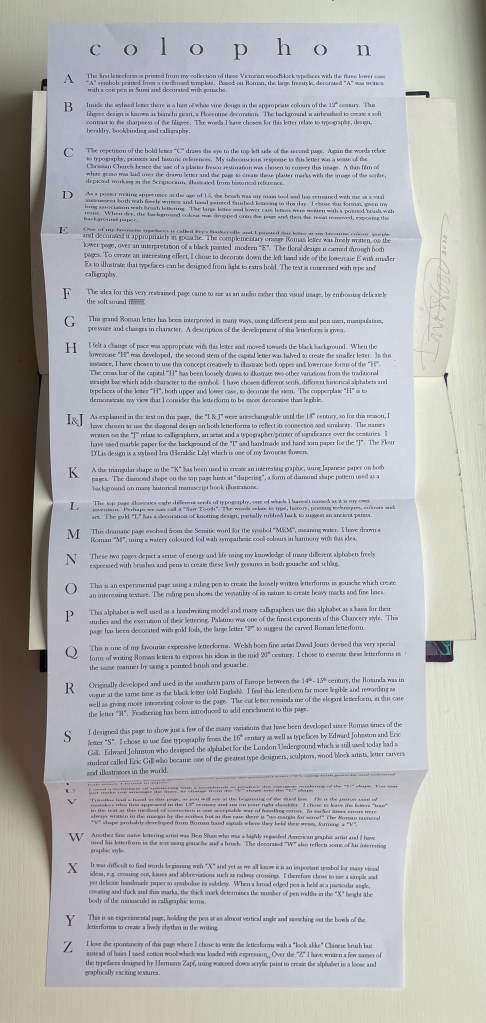
Alphabetica (2002) Dave Wood Bound in vellum; open-spine binding sewn on vellum strips. H210 x W290 x D30 mm. 54 pages. Loosely inserted colophon. Edition of 26. Acquired from the artist, 27 July 2022. Photos: Books On Books Collection. Displayed with permission of the artist.
From Alphabetica‘s description as an exploration of the alphabet’s “diverse development from historic shapes to the infinite variations we see today in typefaces and calligraphic forms of the Western alphabet”, the reader might expect an academic work. The deeply embossed and debossed royal purple cover presenting the title in landscape format suggests otherwise as do the marbled endpapers and embossed gold foil title page. The cover is built up with a very strong paper made in Nepal, painted with acrylic then sprayed with semi-matte varnish. Inside, the reader finds a portfolio of twenty-five distinct “canvases” in which Wood demonstrates both historical sensitivity and artistic inspiration.
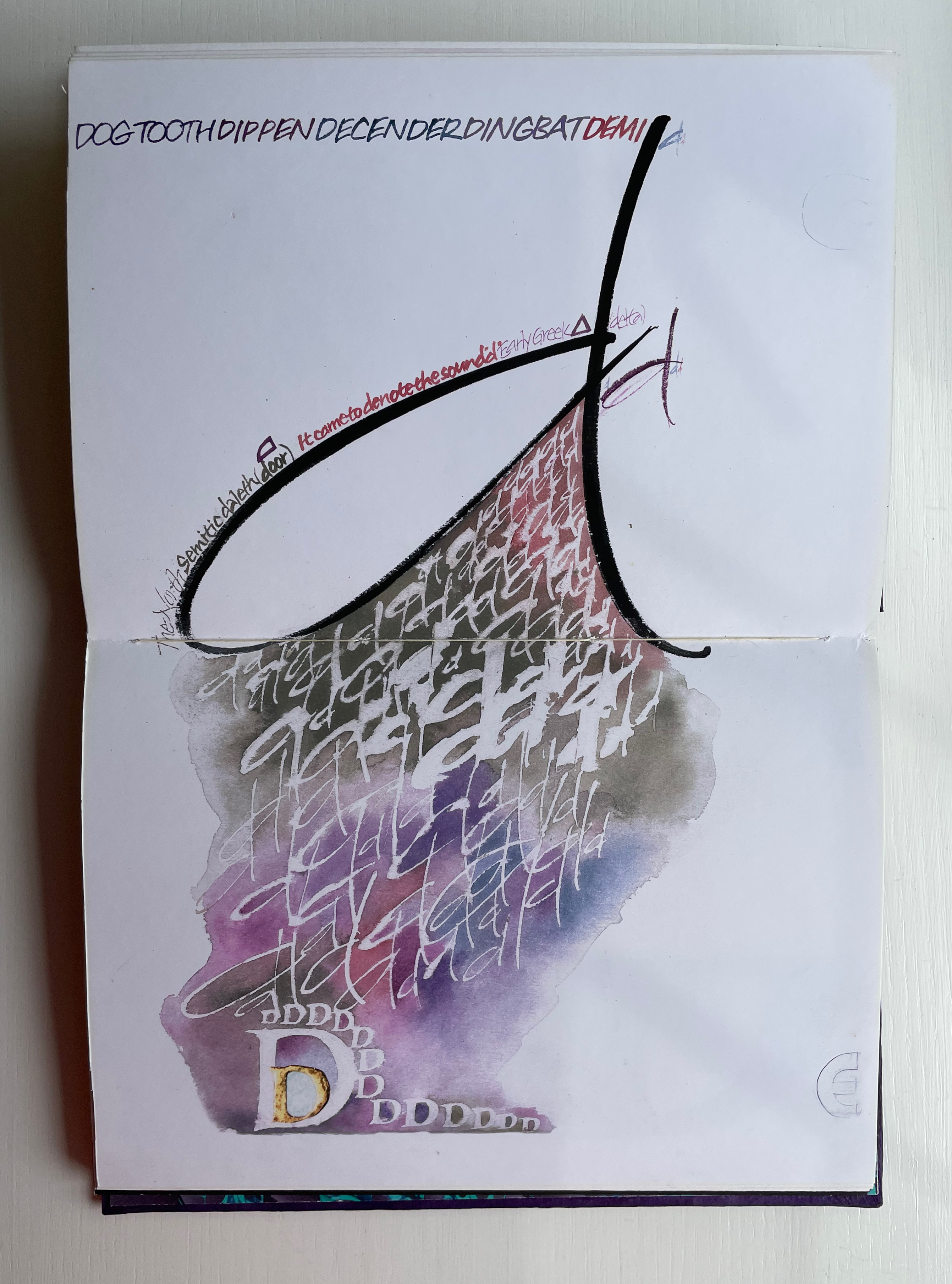
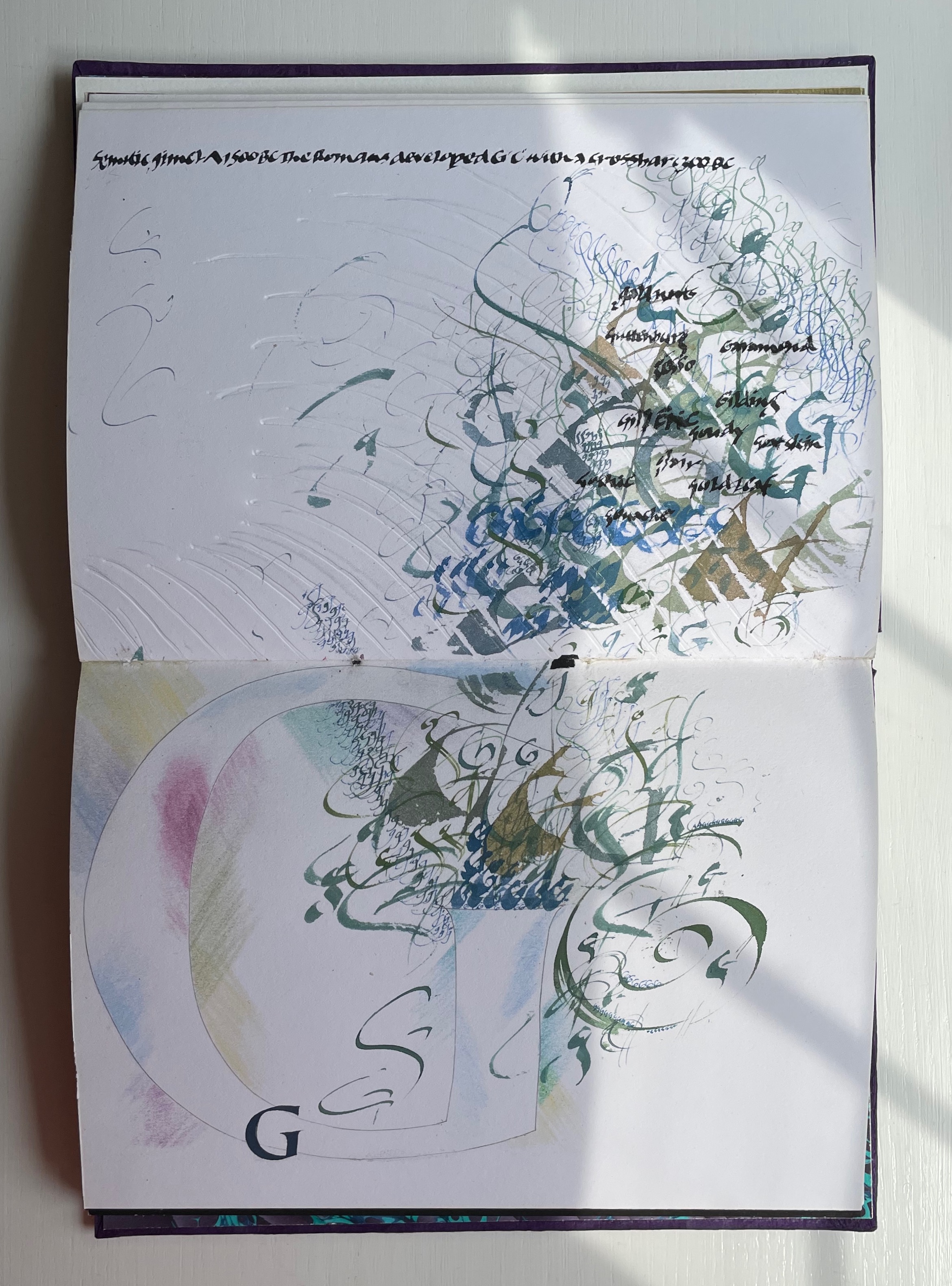
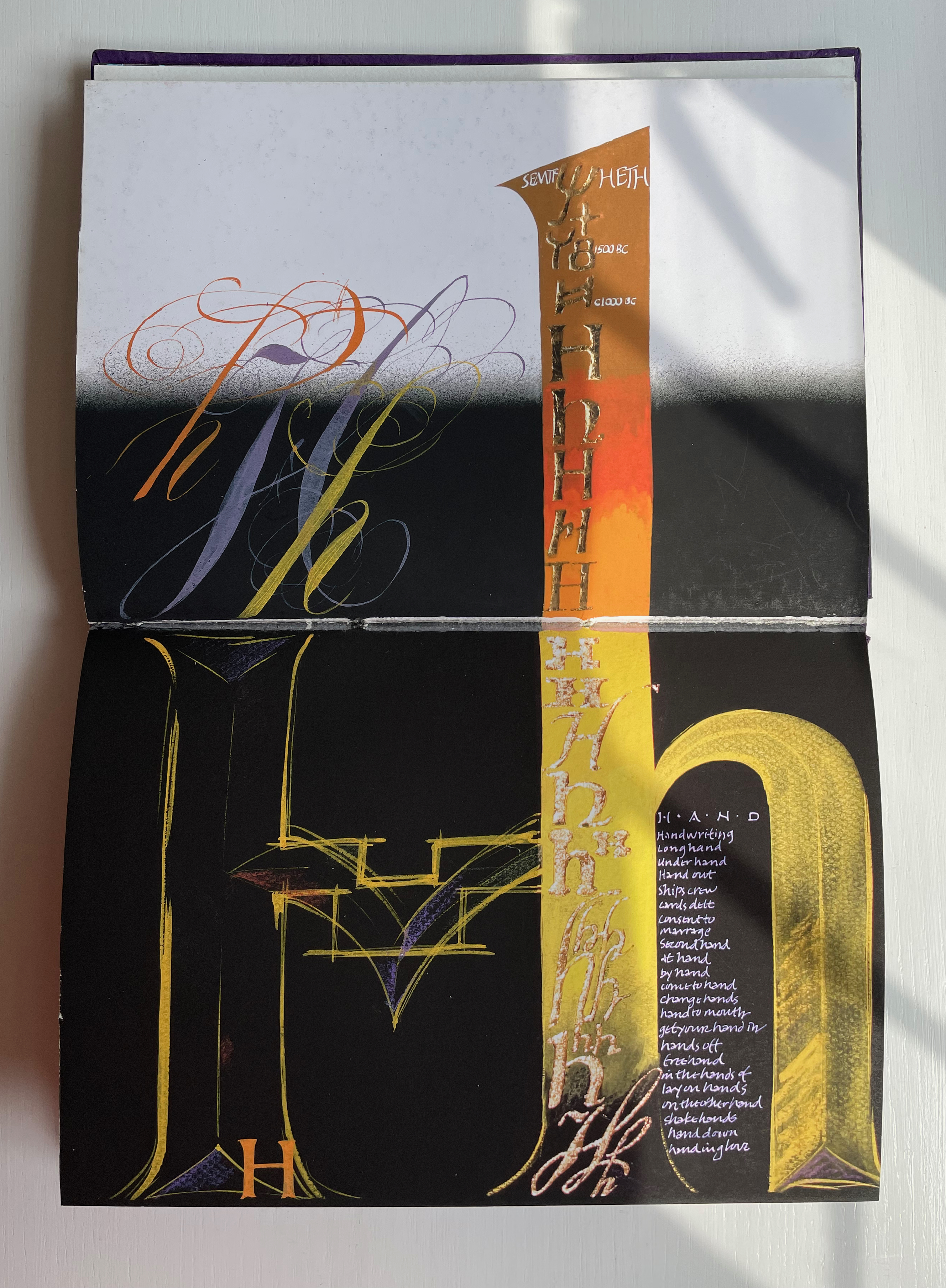
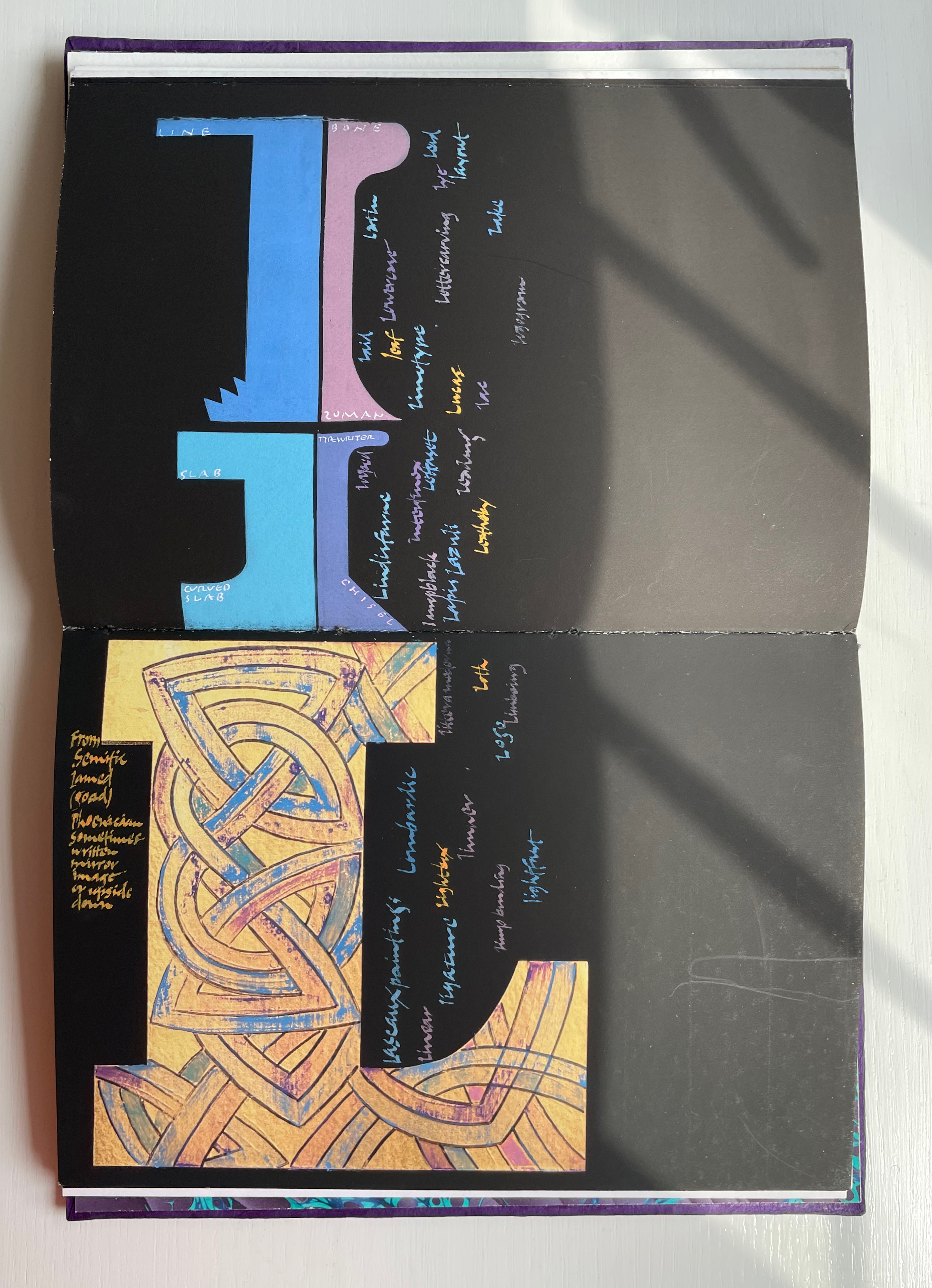
Across the twenty-six spreads, Dave Wood has captured each letter’s distinct story with multiple styles of calligraphy in Sumi ink and gouache paints as well as varying textures and techniques (Canson and Arches paper, glassine, foil, embossing, stamping, feathering and cutting), colors and layouts.
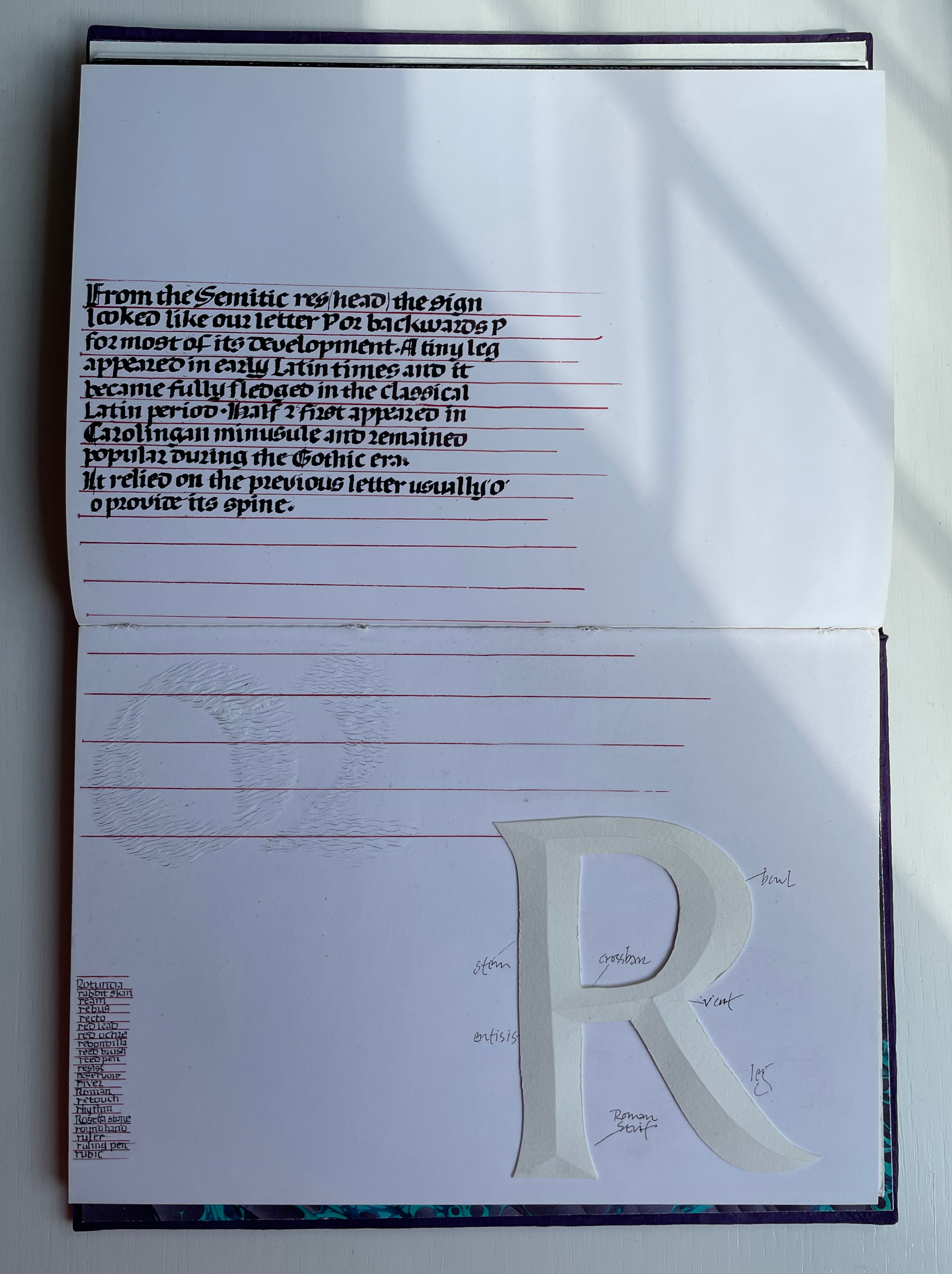
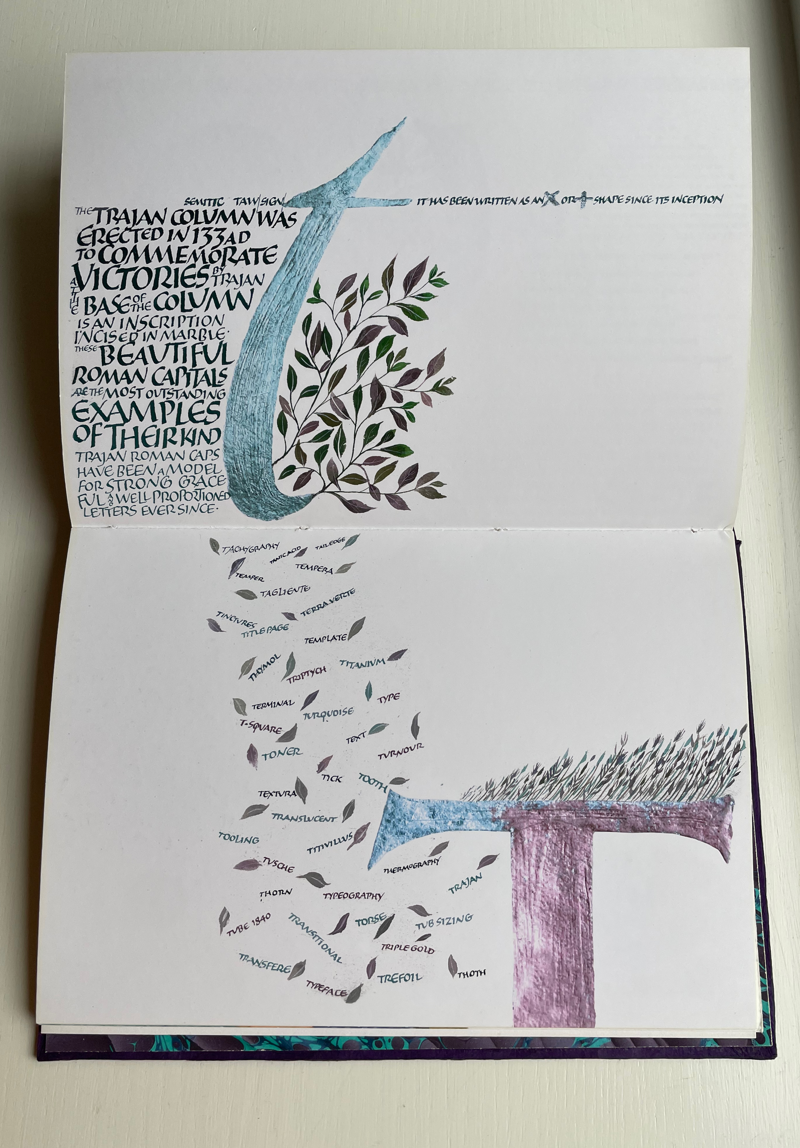
The letters’ developing shapes and periods are labeled. Starting with the letter B, Wood adds names of typefaces, structural terms for type, palaeographical terms and terms from the crafts of calligraphy, typesetting and printing — all beginning with /b/. Similar labeling occurs for the letter C but with a different layout. Across the twenty-five canvases, Wood excels at this balancing of difference and similarity. Notice, for example, how letters B and C incorporate the Renaissance style of illumination called bianchi girari (white vine stem decoration).
The ways in which uppercase-to-lowercase movements interact with the layout’s variations make for a dynamic experience. Sometime it’s subtle, sometimes vigorous. Note, for example, how the letter D de-emphasizes the gutter whereas the letter E emphasizes it.
With letters H through Q, a shift from Arches white to Canson black paper and back adds to the overall dynamic movement. Yet Wood is attentive to elements of unity; for example, his playful handling of the gutter in the transition from letter H to letters I/J echoes that from letters D to E.
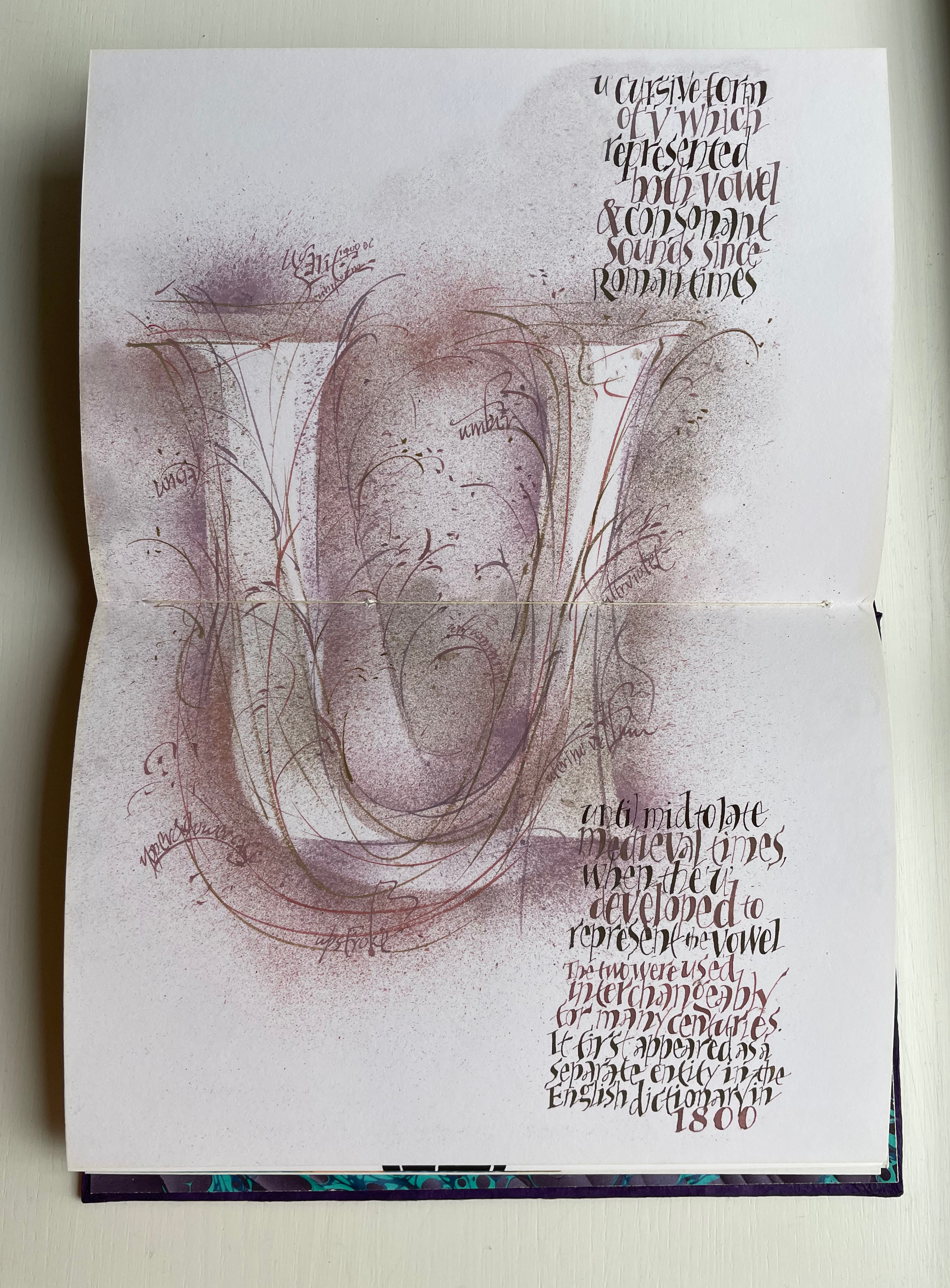
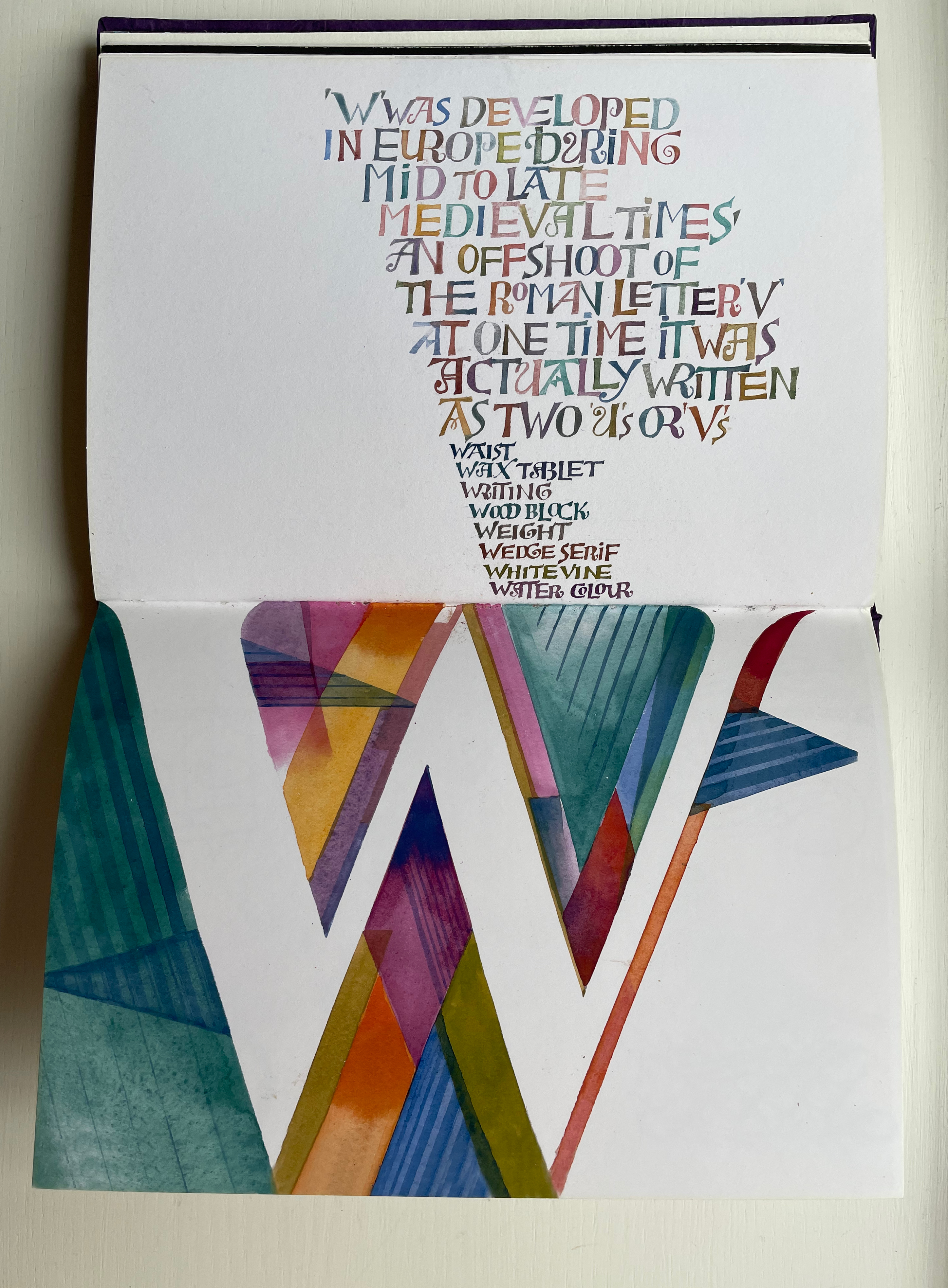
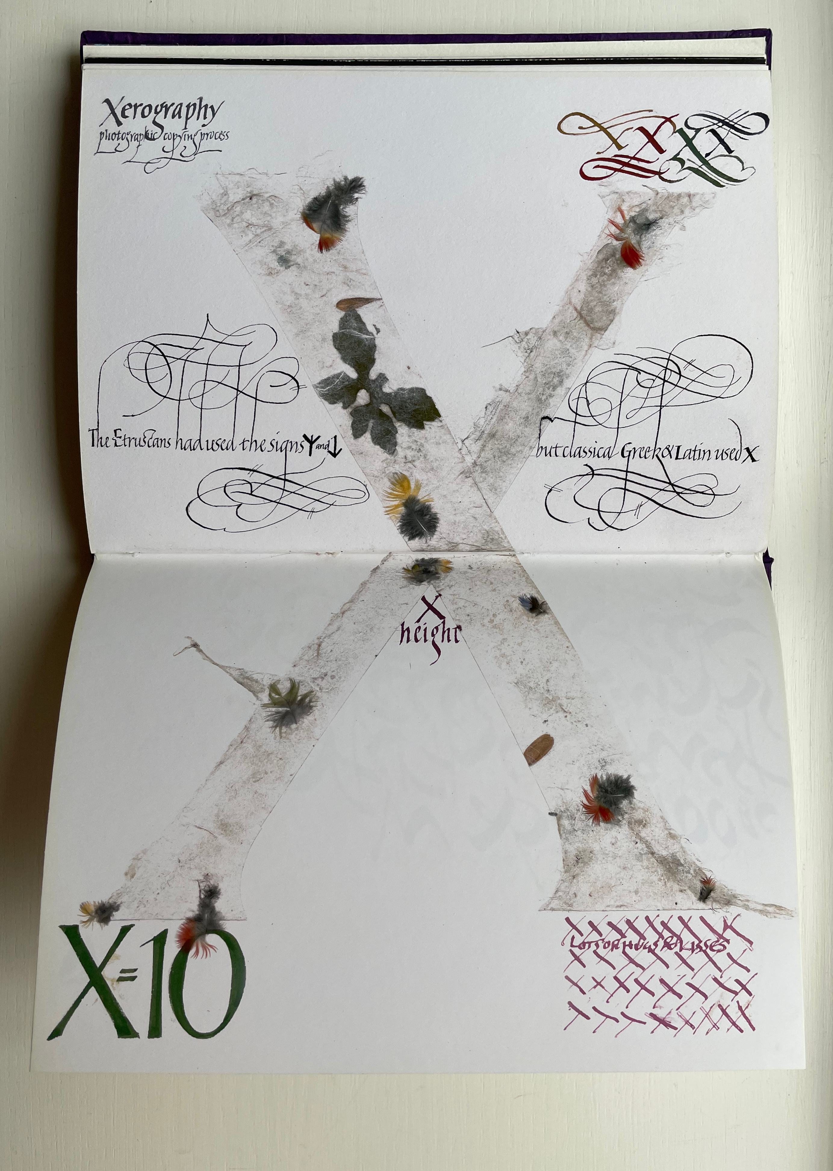
Only six letters perform the trick of extending across the gutter — lowercase H and uppercase K, M, O, U and X. While O, U and X take the similar approach of almost evenly straddling the gutter, each of the other three succeed differently. M is perhaps the most striking and interesting of them all. M derives from the Semitic word for “water” mem. As Wood points out in the loose insert colophon, the watery blue that fills the letter is intentional — as must be the precise alignment of the inner peaks of the letter with the gutter. Such attention to detail in the midst of so much activity on the page demands a similar attentiveness from the reader.
For example, the long tail of the Q does not show up until the bottom of the spread. And the reader may need to pick out the the word “or” in the text to spot the lowercase r in the textured, oversized written word “or” directly below the text.
Visual puns abound. Celtic knots in a capital L (for the Lindisfarne gospels). An S formed of stones. Leaves falling from a lowercase t (for tree or tea, of course). A U growing underground.
Fortunately, the accordion-fold colophon loosely inserted in the book offers pointers to some (not all) allusions. For example, the beginning of the third line for the letter V pays homage to Titivillus, the 13th-century patron demon of scribes’ mistakes. The illustrated W is an homage to Ben Shahn’s letter design. The highly contrasting thicks and thins in the letter X allude, in calligraphic terms, to the thick mark’s determining the number of pen widths making up the x height (the body of the miniscule).
And while the colophon may be necessary to know that the typefaces written in color below were created by Hermann Zapf, any viewer can enjoy Wood’s incorporating the entire alphabet in the Sumi ink design culminating in the letter Z as a fitting self-referential conclusion to Alphabetica.