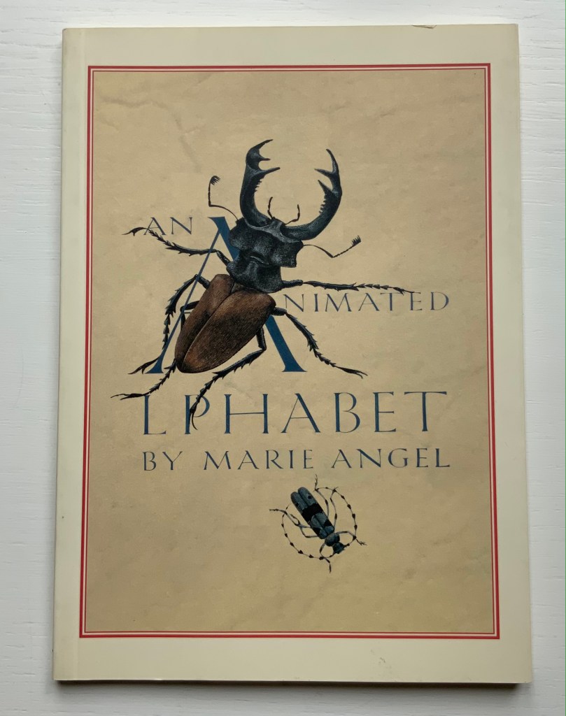
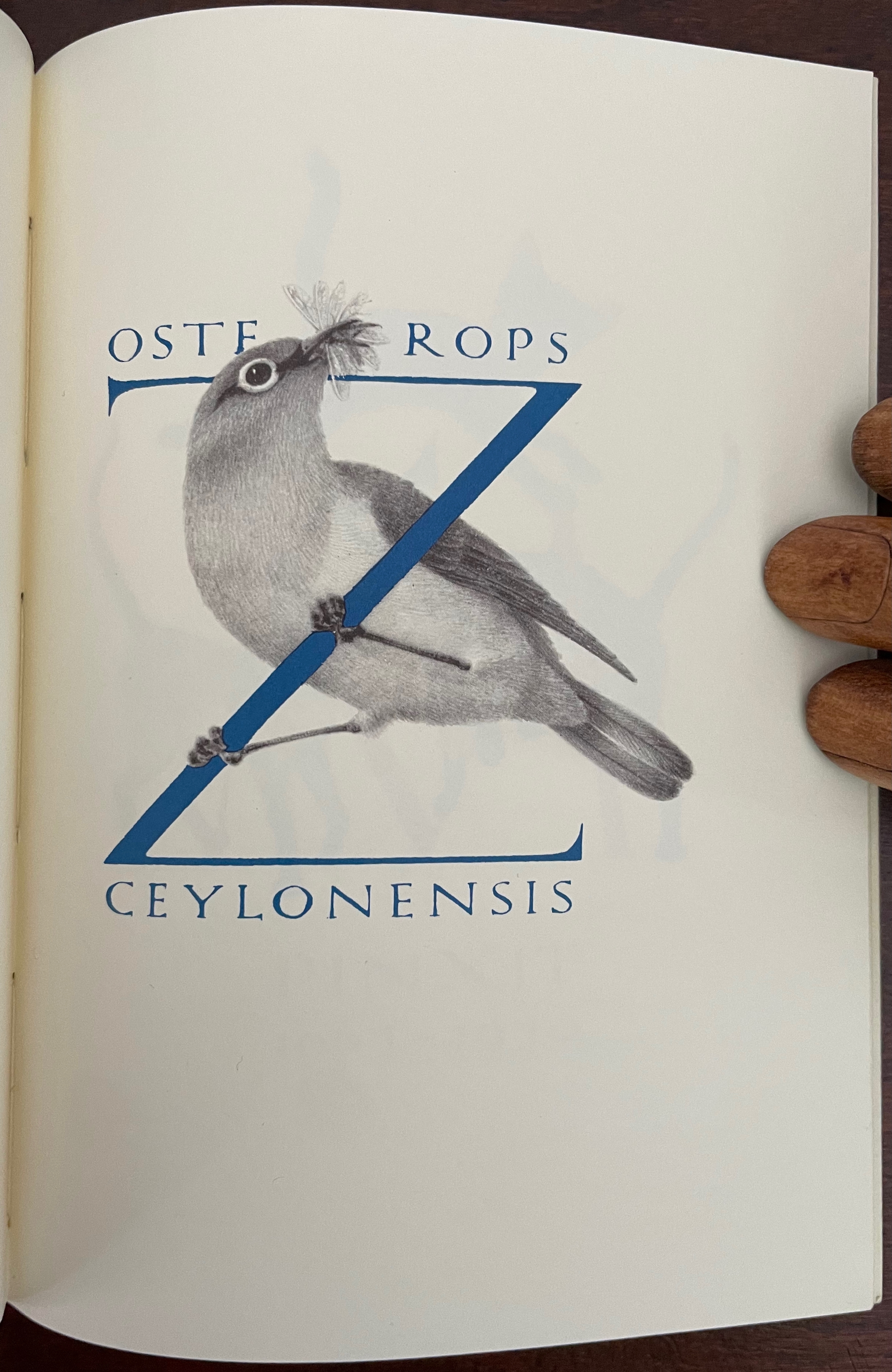
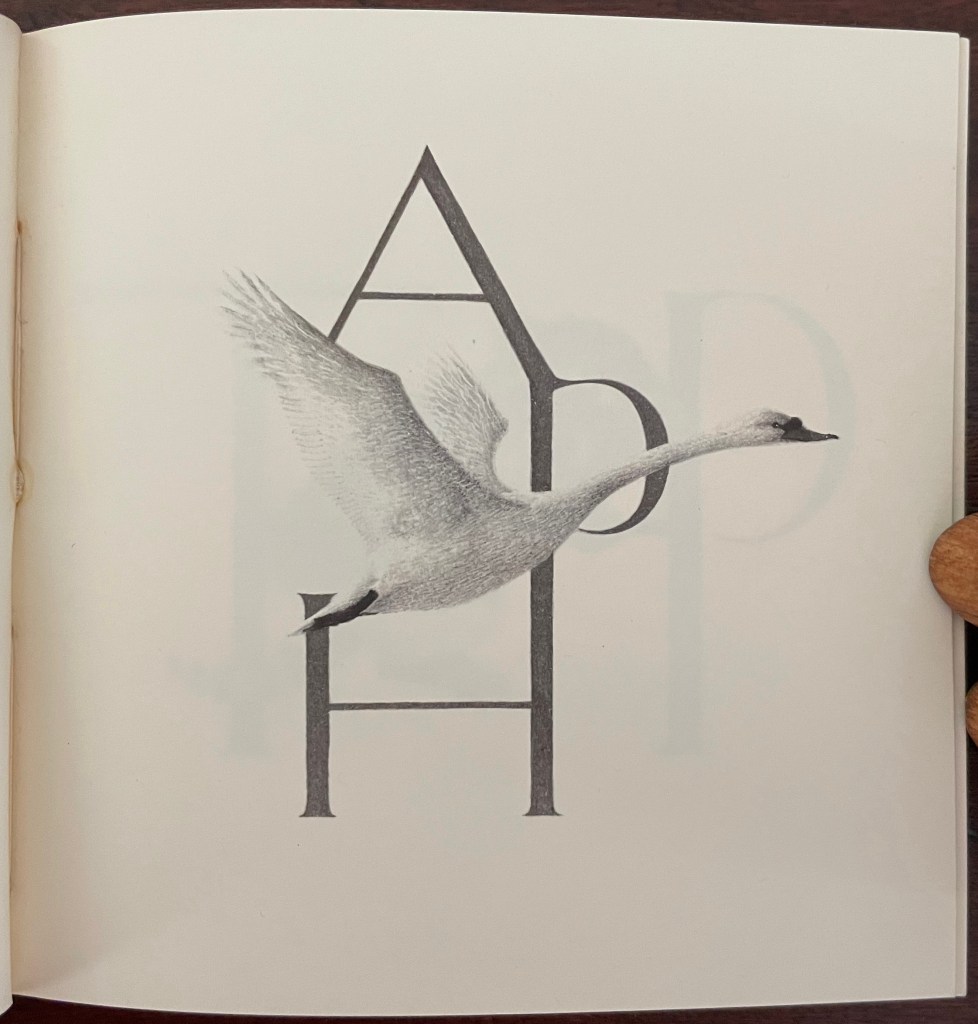
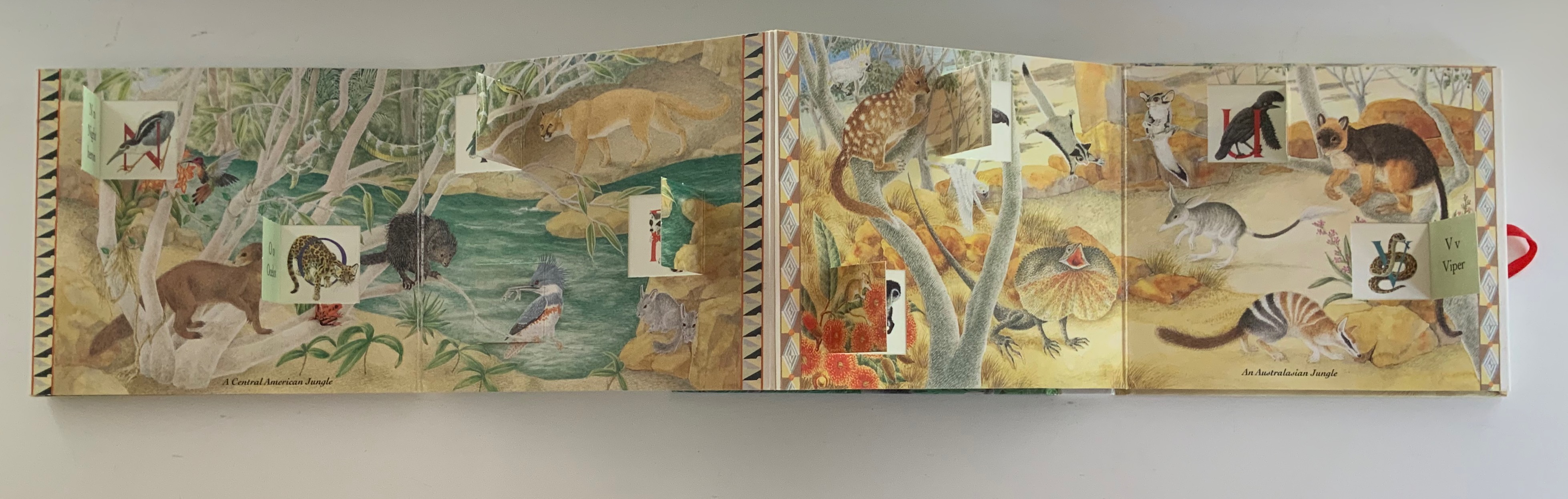
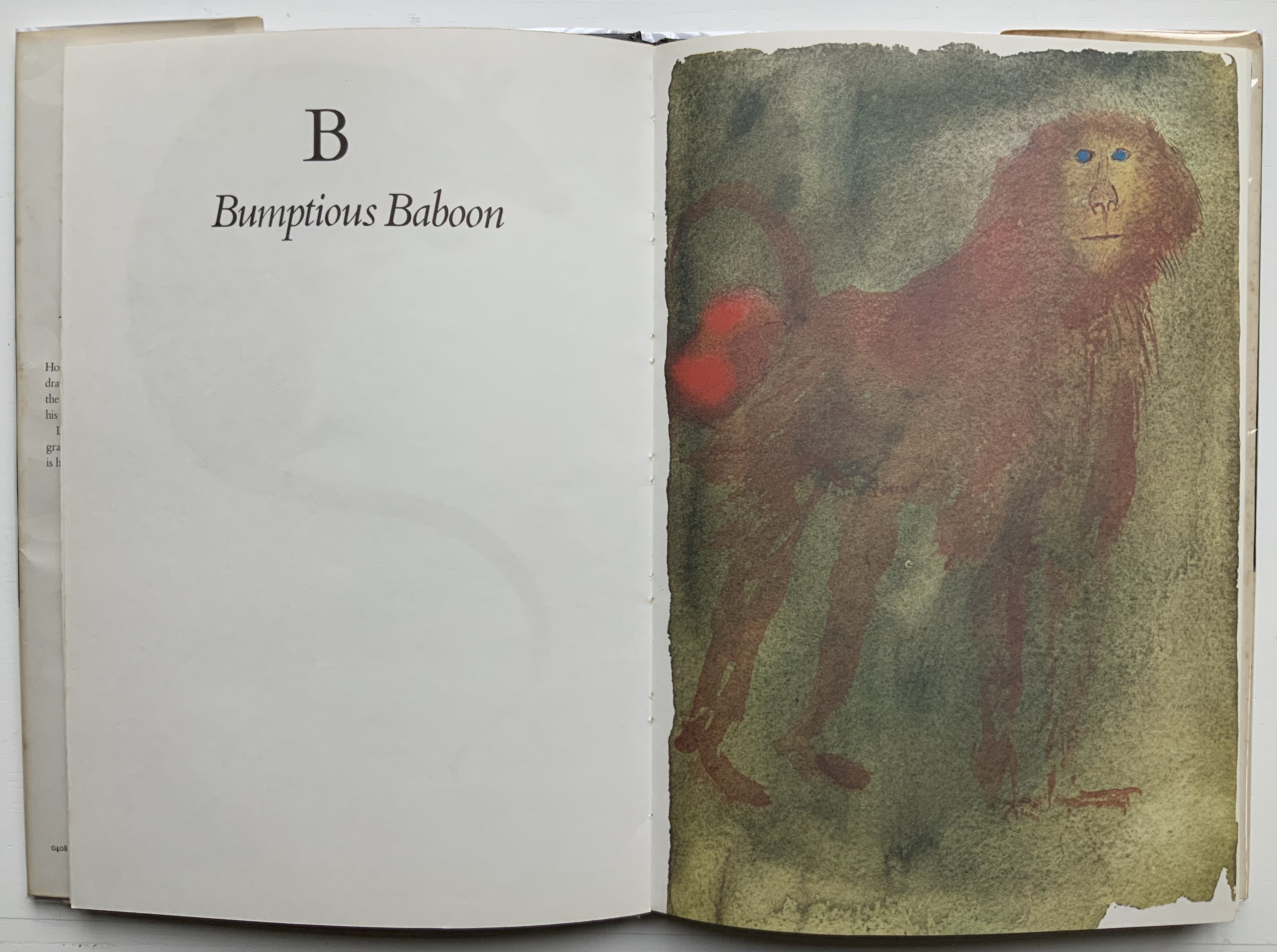
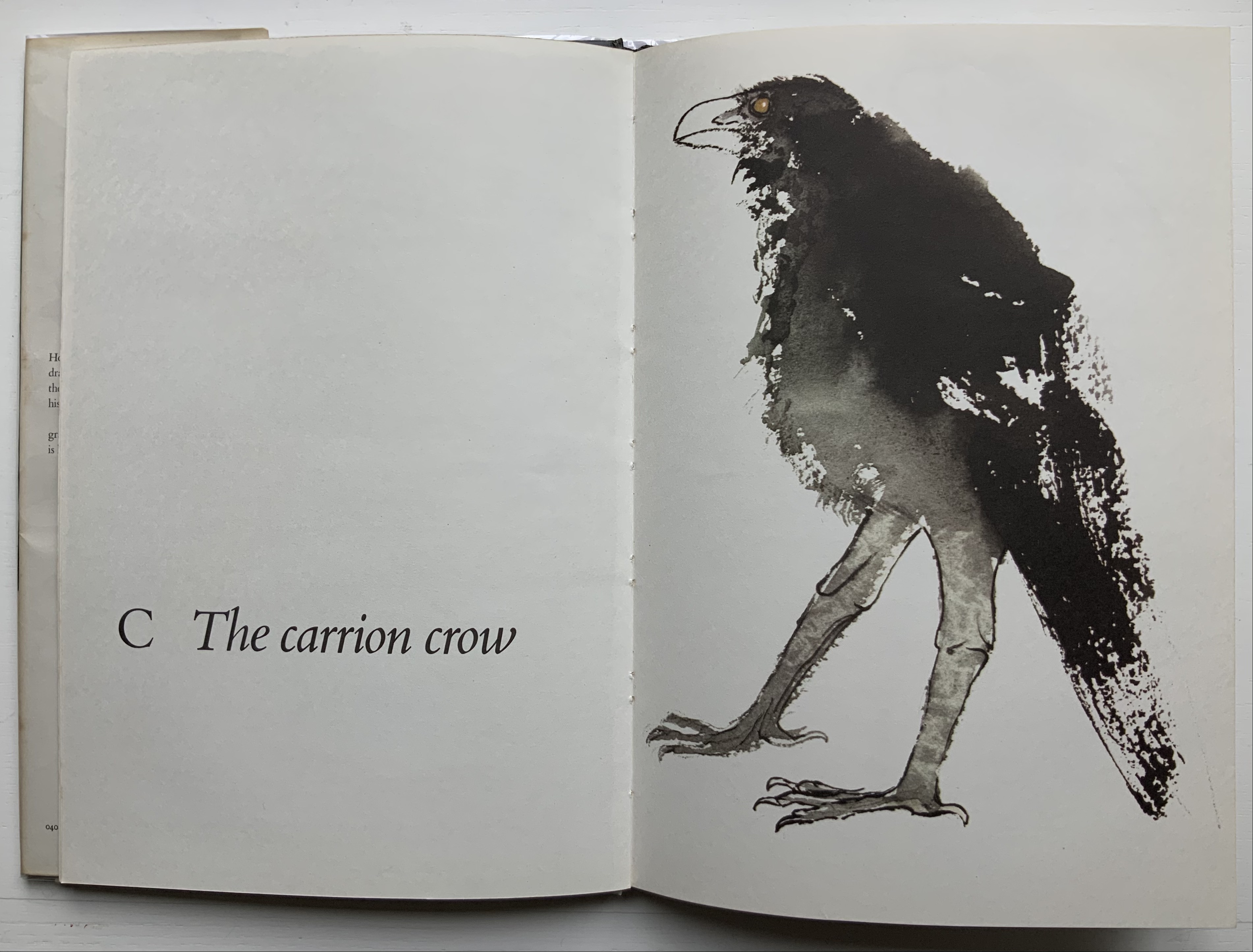
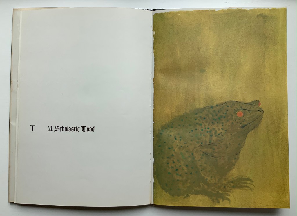
An Animated Alphabet (1996) Marie Angel Paperback, perfect bound. H140 x W160 mm, 64 pages. Acquired from Redux Books, 28 April 2021. Photos: Books On Books Collection.
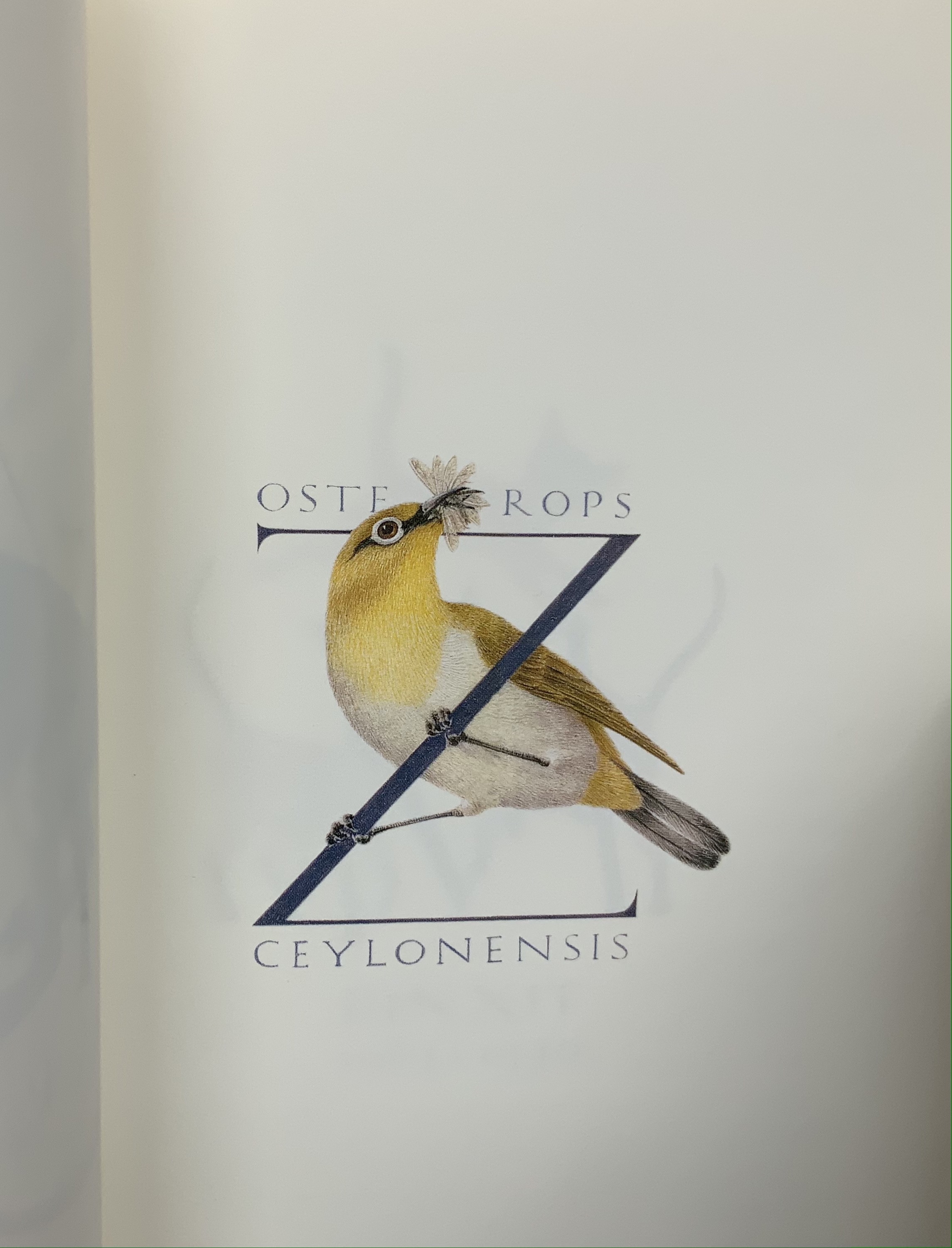
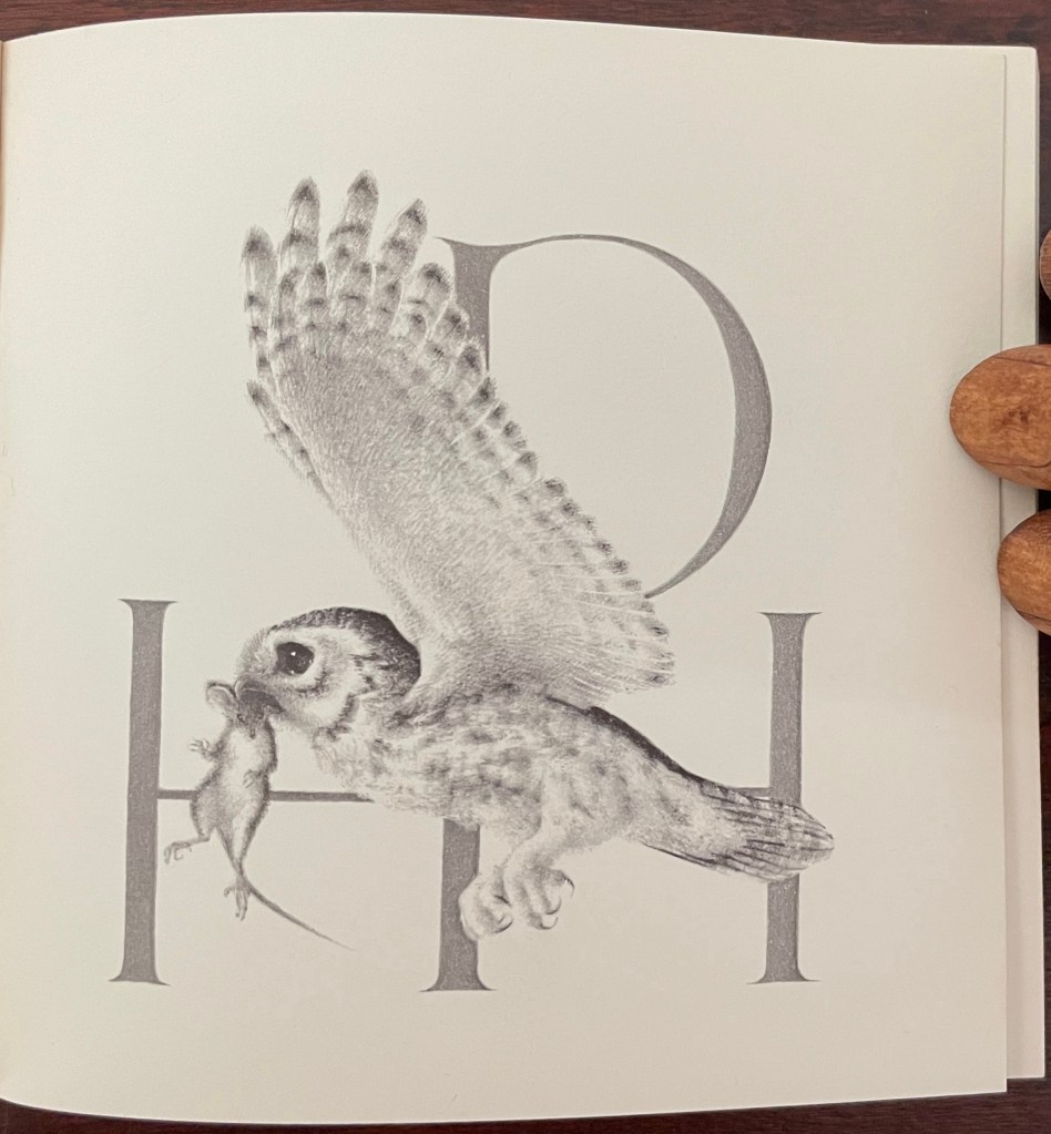
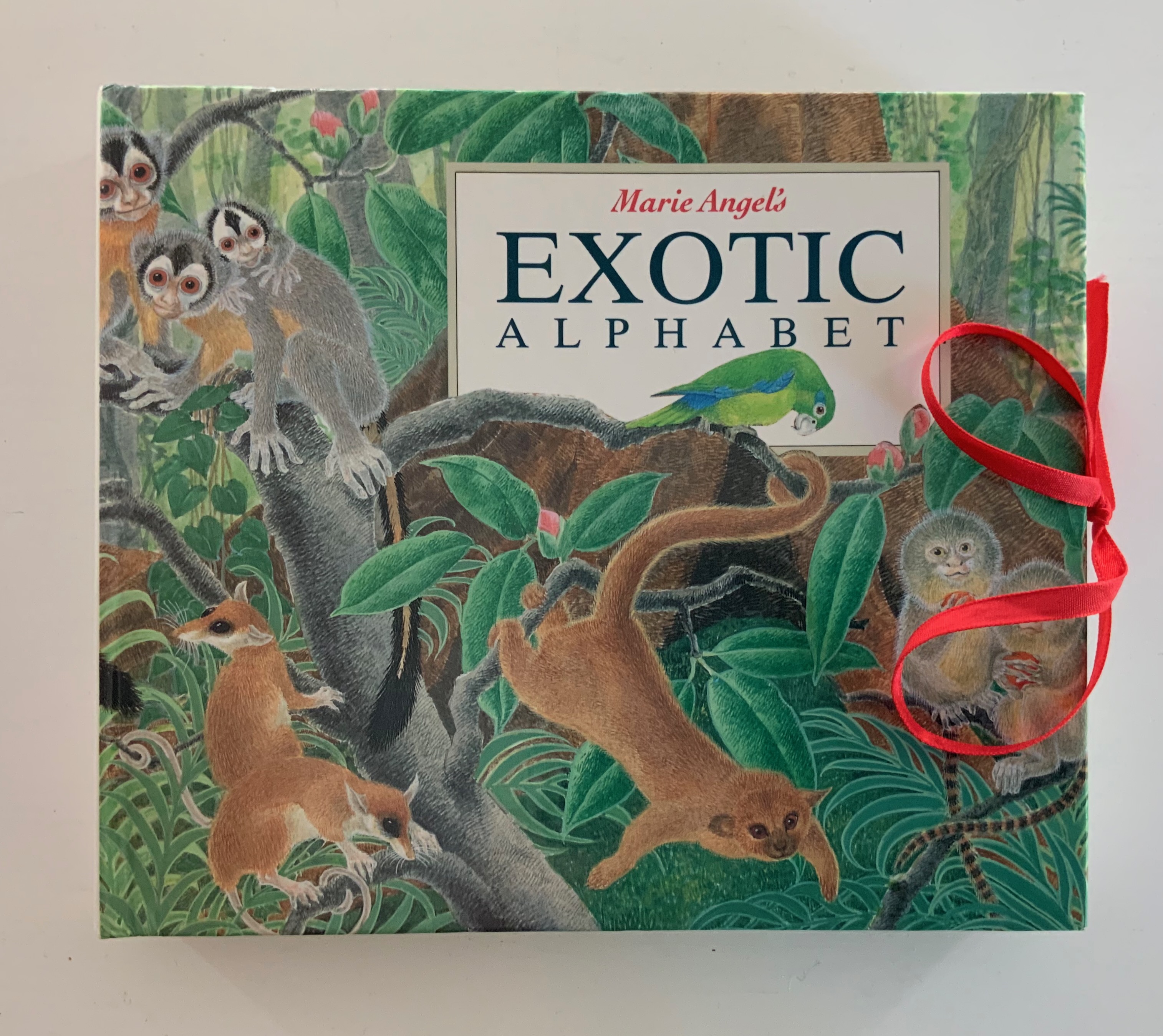
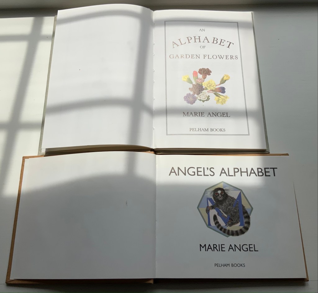
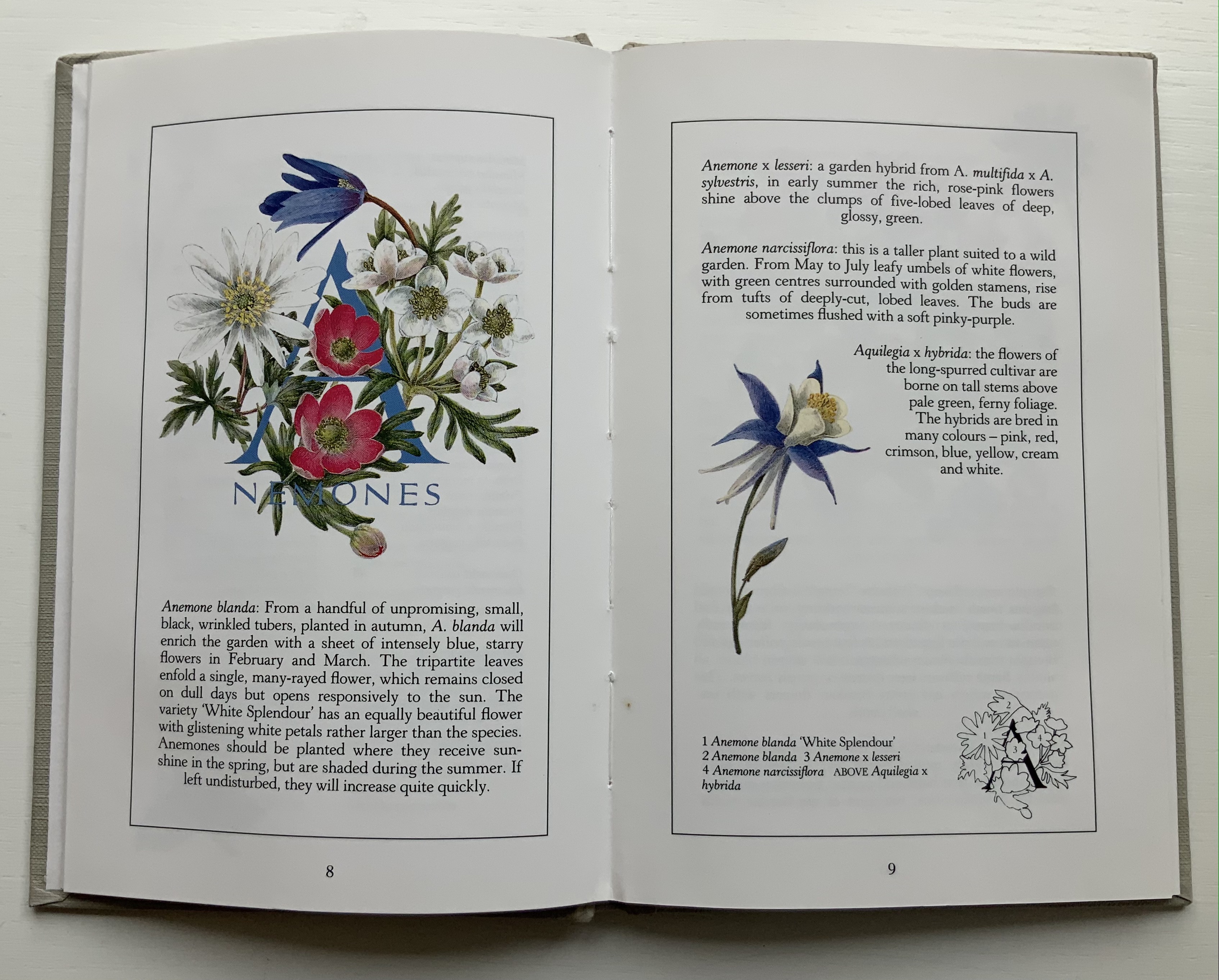
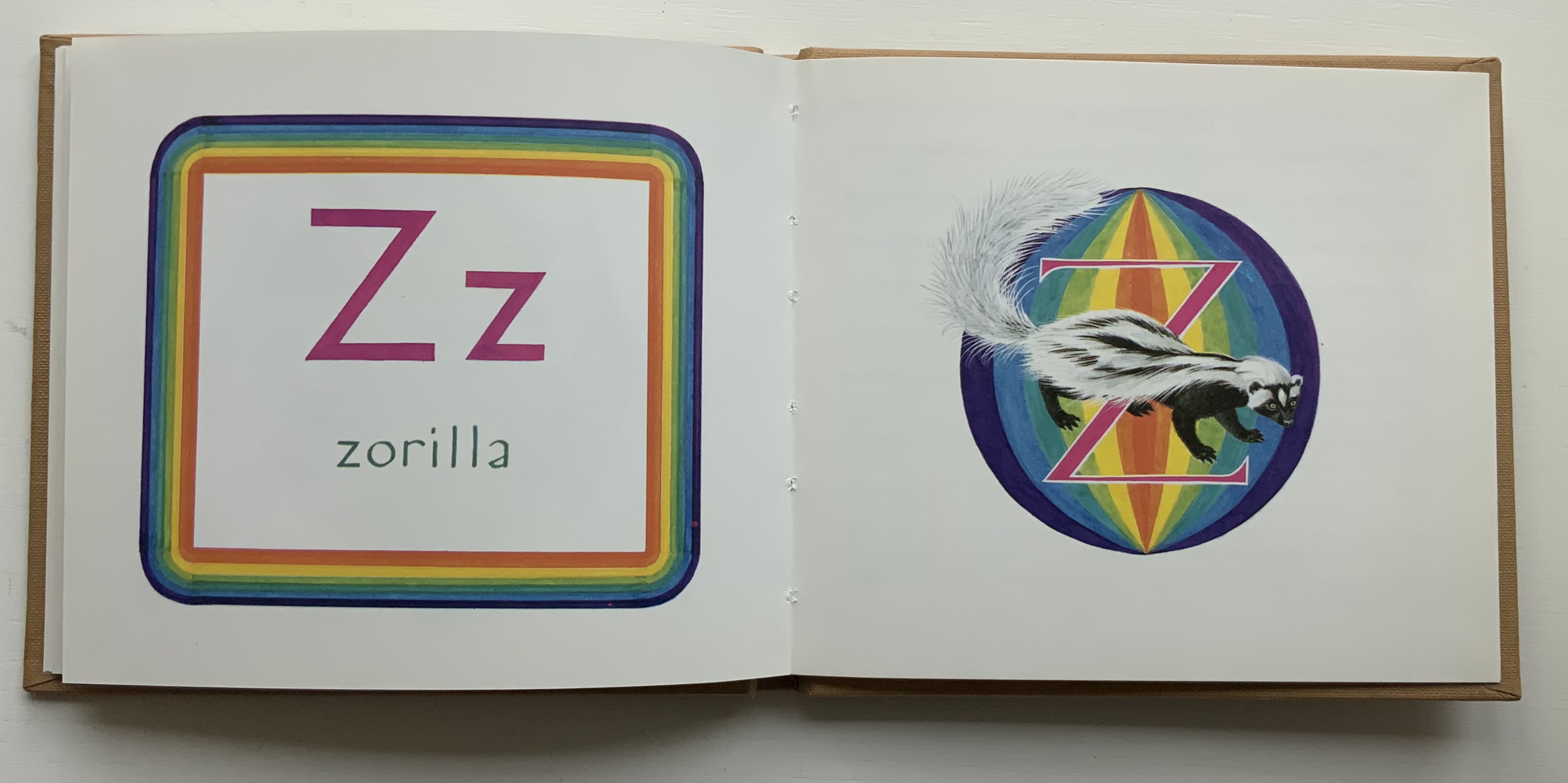
In the 1960s, Philip Hofer of Harvard’s Houghton Library commissioned the British illustrator to create a series of bestiaries. A black and white edition of An Animated Alphabet appeared in 1967. The publisher David Godine issued this full color edition in 1996. Before the Godine edition, other abecedaries appeared, including Marie Angel’s Exotic Alphabet(a lift-the-flap double-sided accordion book) in 1992, the colorful Angel’s Alphabet in 1986 and An Alphabet of Flowers in 1987.
From An Animated Alphabet
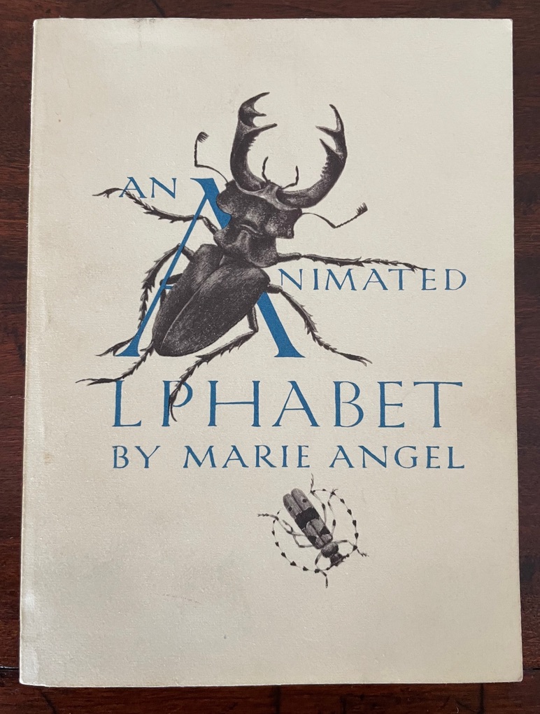
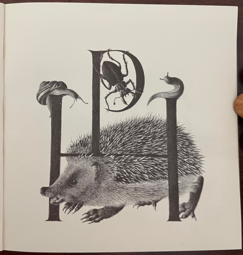
An Animated Alphabet (1971)
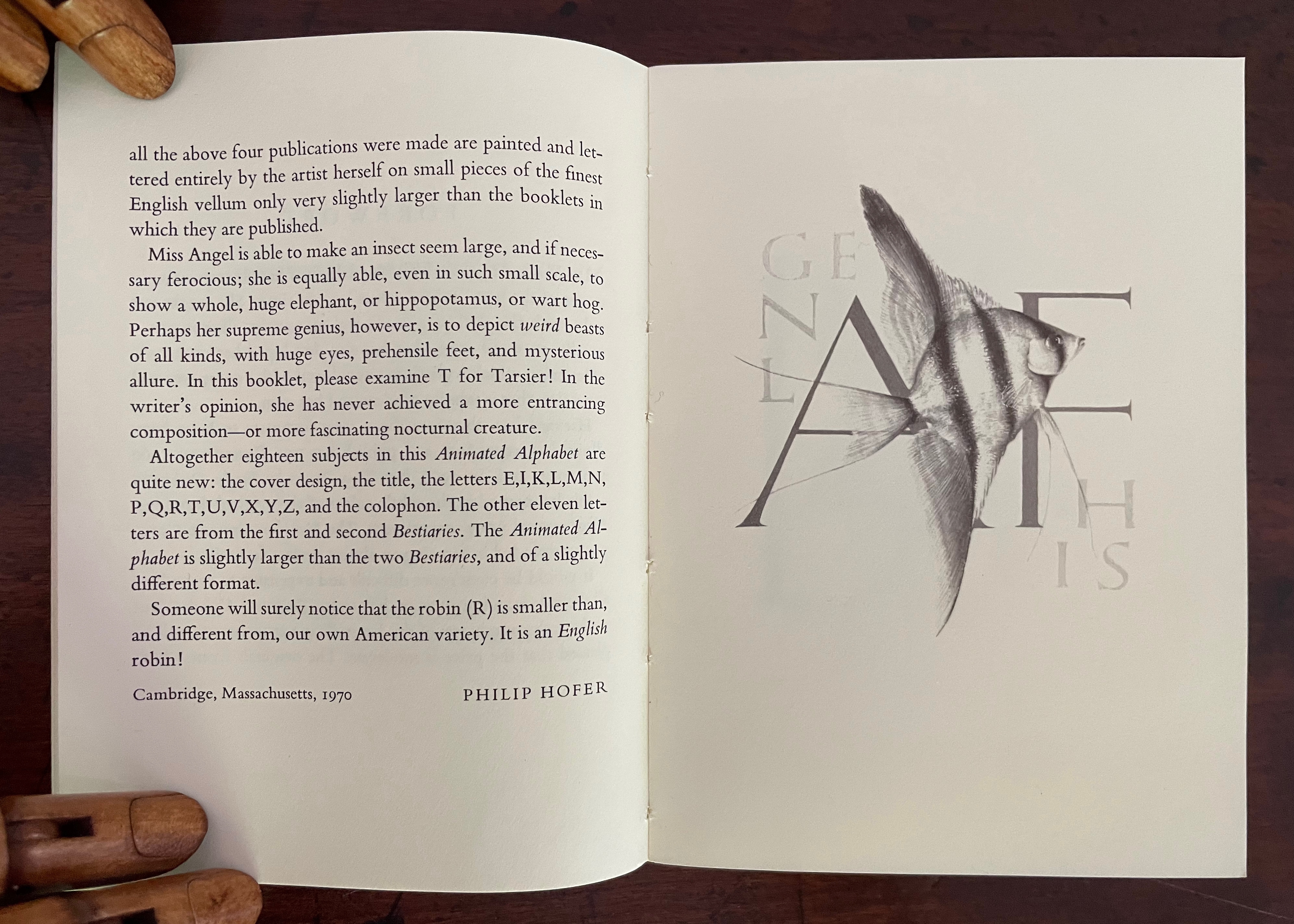
An Animated Alphabet (1971) Marie Angel Cased softcover, sewn. H140 x W105 mm. [64] pages. First edition. Acquired from Oakholm Books, 29 August 2023. Photos: Books On Books Collection.
From the earlier two-color Harvard edition.
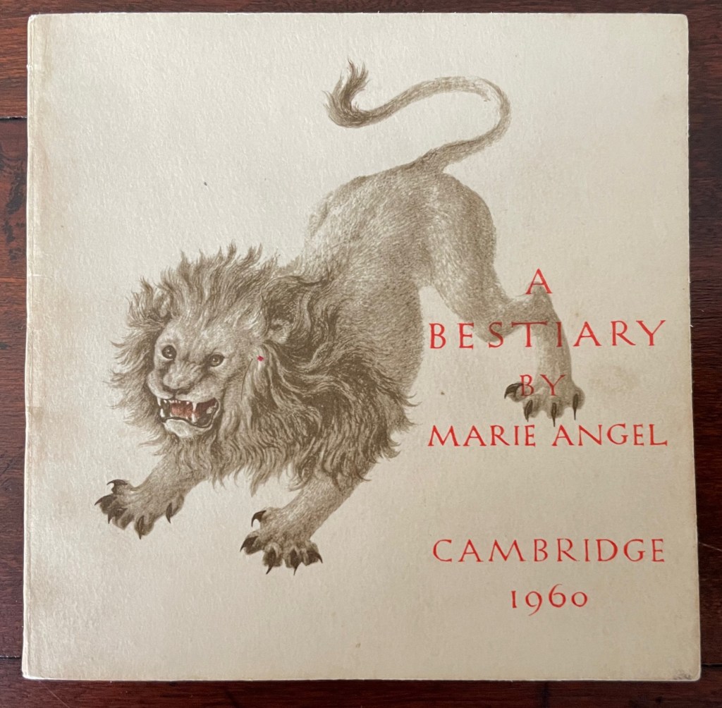
A Bestiary (1960)
A Bestiary(1960) Marie Angel Cased softcover, sewn. H100 x W104 mm. 60 pages. First edition, 1000 copies. Acquired from Oakhlm Books, 29 August 2023. Photos: Books On Books Collection.
Some illustrations’ initials are the monograms of their commissioners. The originals were painted in color on vellum.
Perhaps the earliest commission by Hofer of Angel’s drawing and calligraphy.
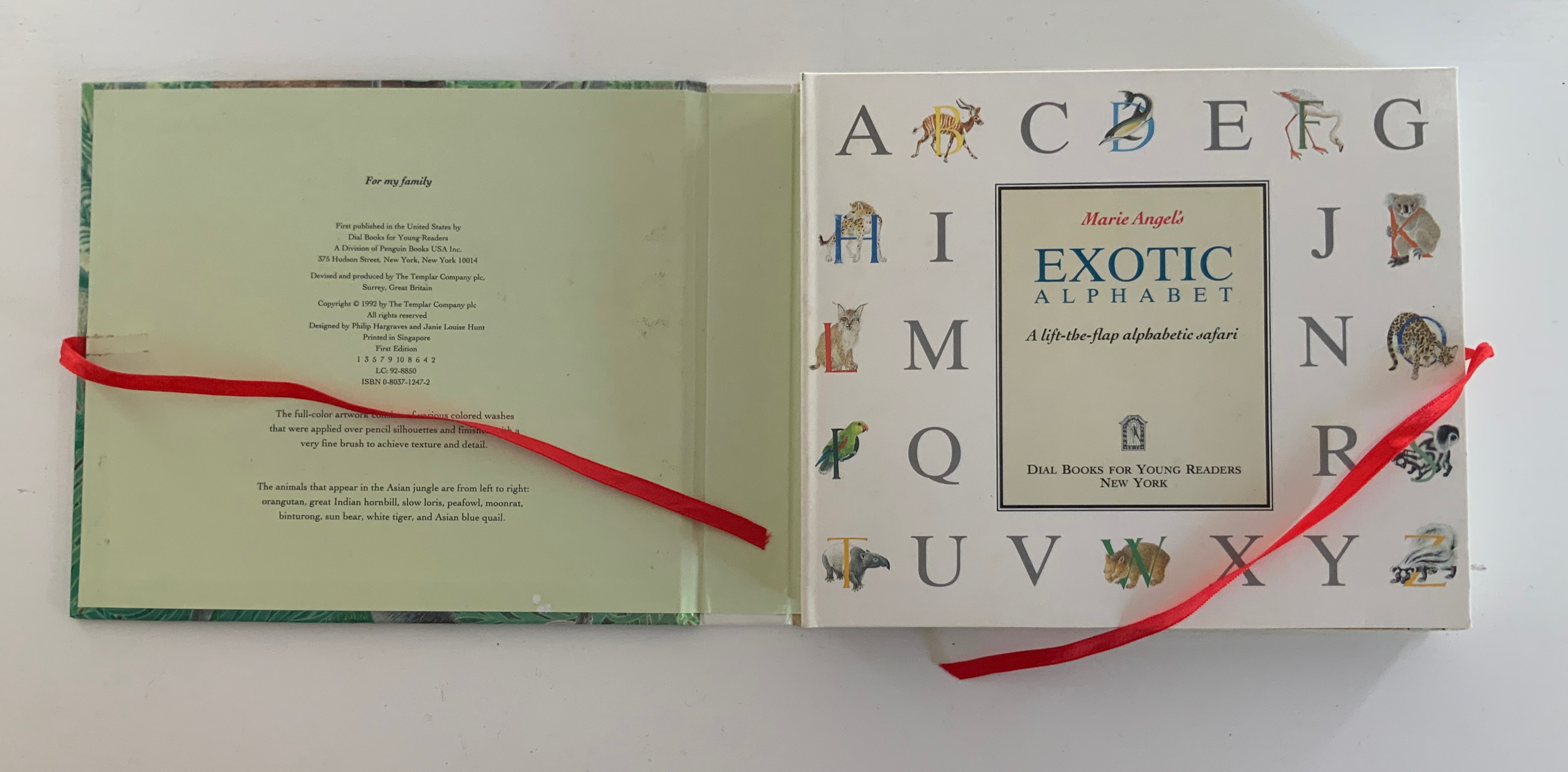
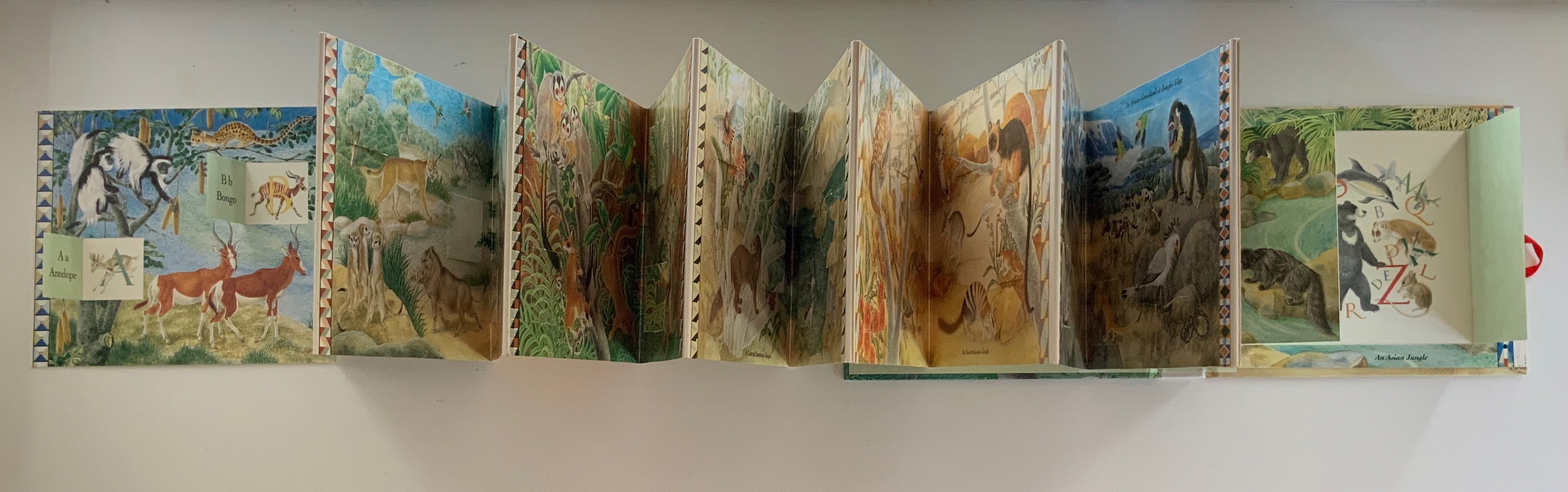
Marie Angel’s Exotic Alphabet (1992) Marie Angel Ribbon-tied, paper on boards case, inclosing lift-the-flap double-sided accordion book. Closed: H172 x W202 x D28 mm. Open: W2730 mm, 27 panels, including title panel. Acquired from Robert Gavora, Fine and Rare Books, 7 September 2021. Photos: Books On Books Collection.
An Alphabet of Garden Flowers (1987) Casebound with decorated endpapers. H205 x W140 mm, 66 pages. Angel’s Alphabet (1996) Casebound with decorated endpapers. H140 x W 160 mm, 60 pages. Acquired 7 June 2021. Photos: Books On Books Collection
Even with different audiences, Angel’s style and eye for choice show through from A to Z.
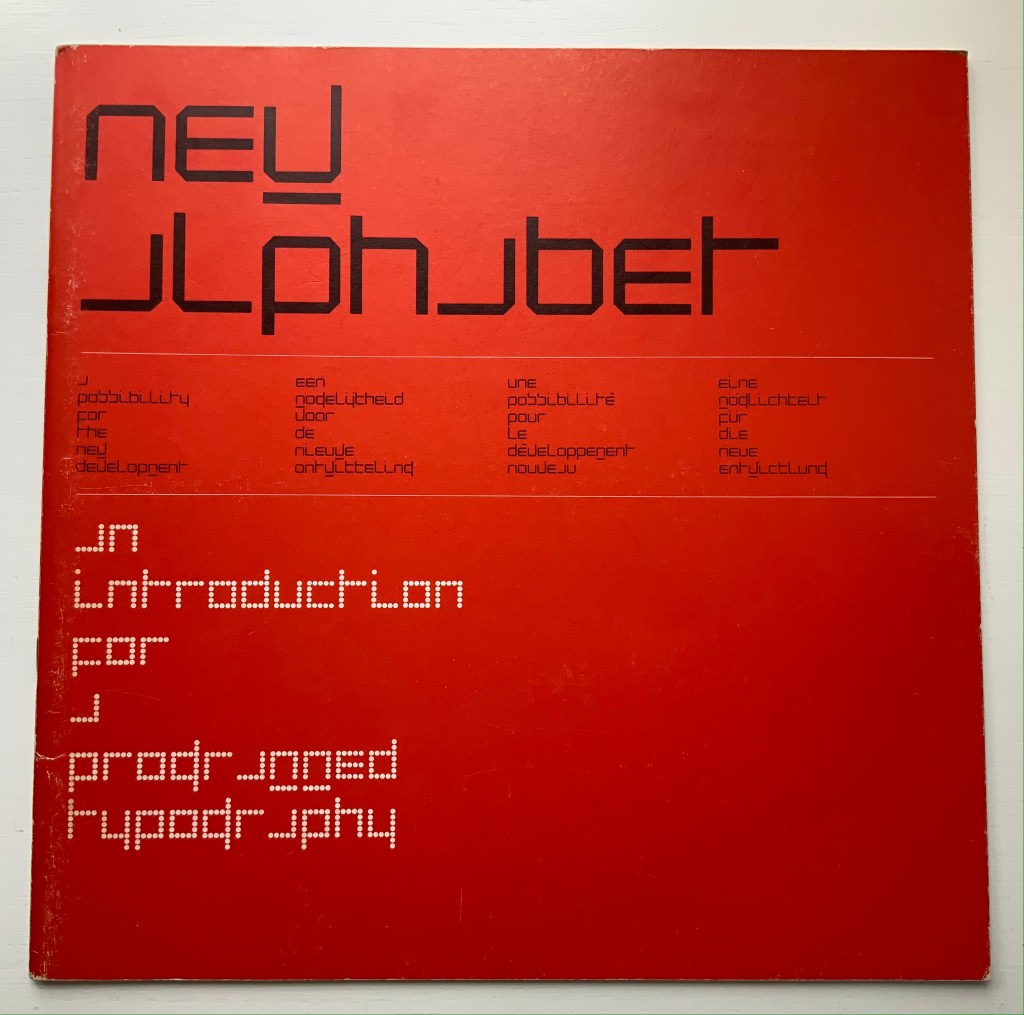
Shocked by the very low resolution output of electronic type-setting machines and sparked by the challenge to define a type that, more than traditional types, would be suited for the speed of machine output (particularly composing systems with CRT — cathode-ray tubes) and still be readable by humans, Crouwel came up with the New Alphabet.
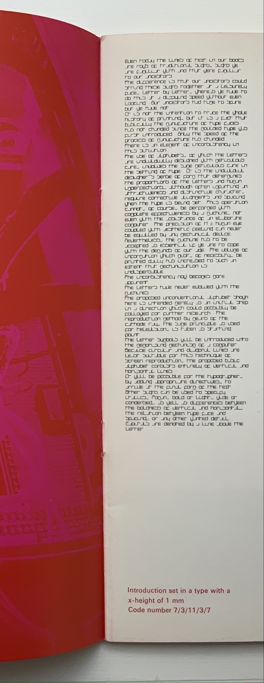
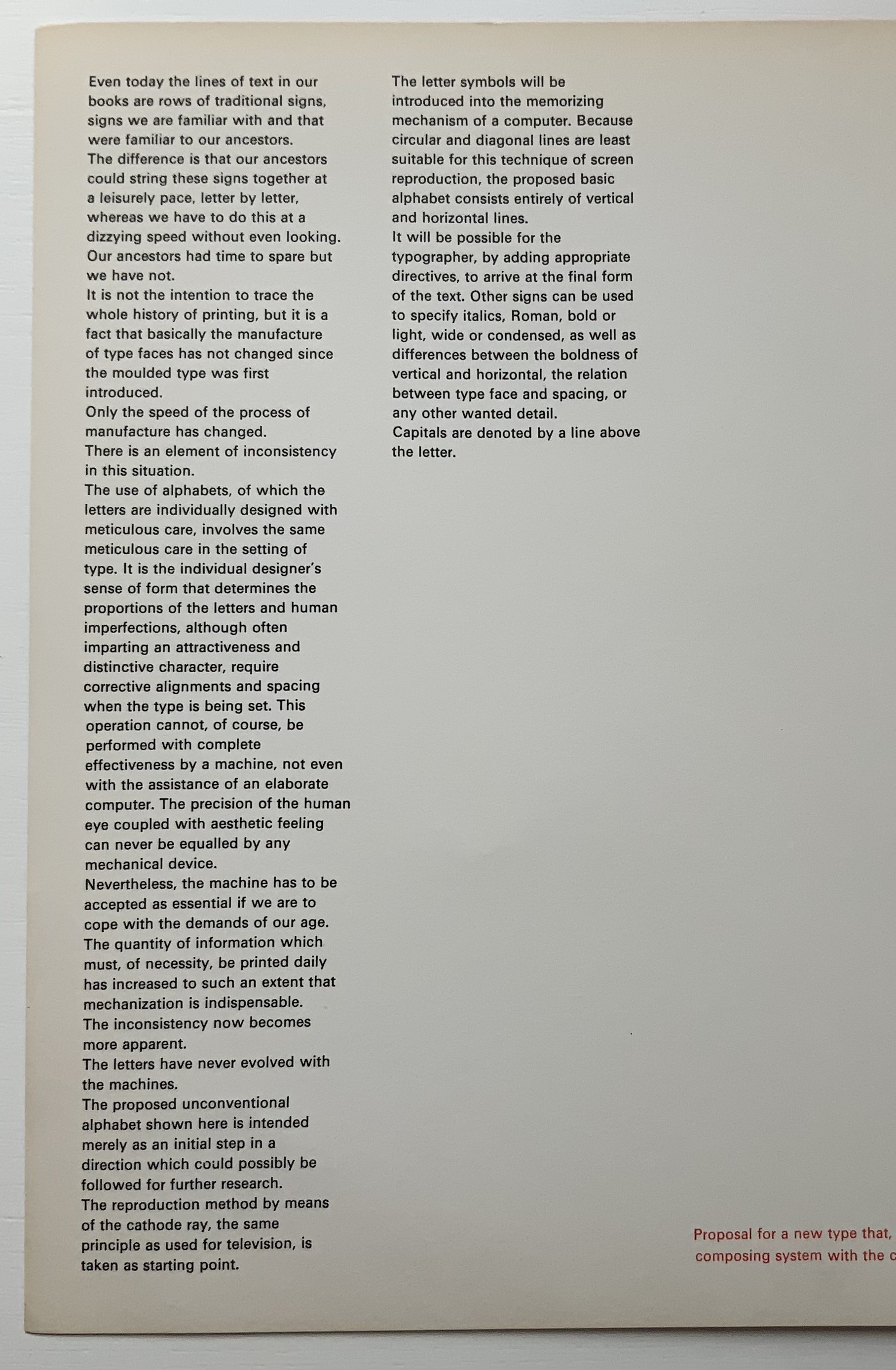
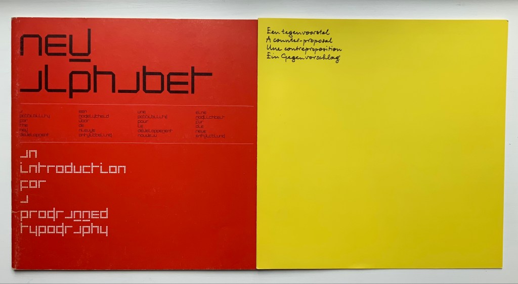
On the left, Crouwel’s introduction in New Alphabet; on the right, in Univers.
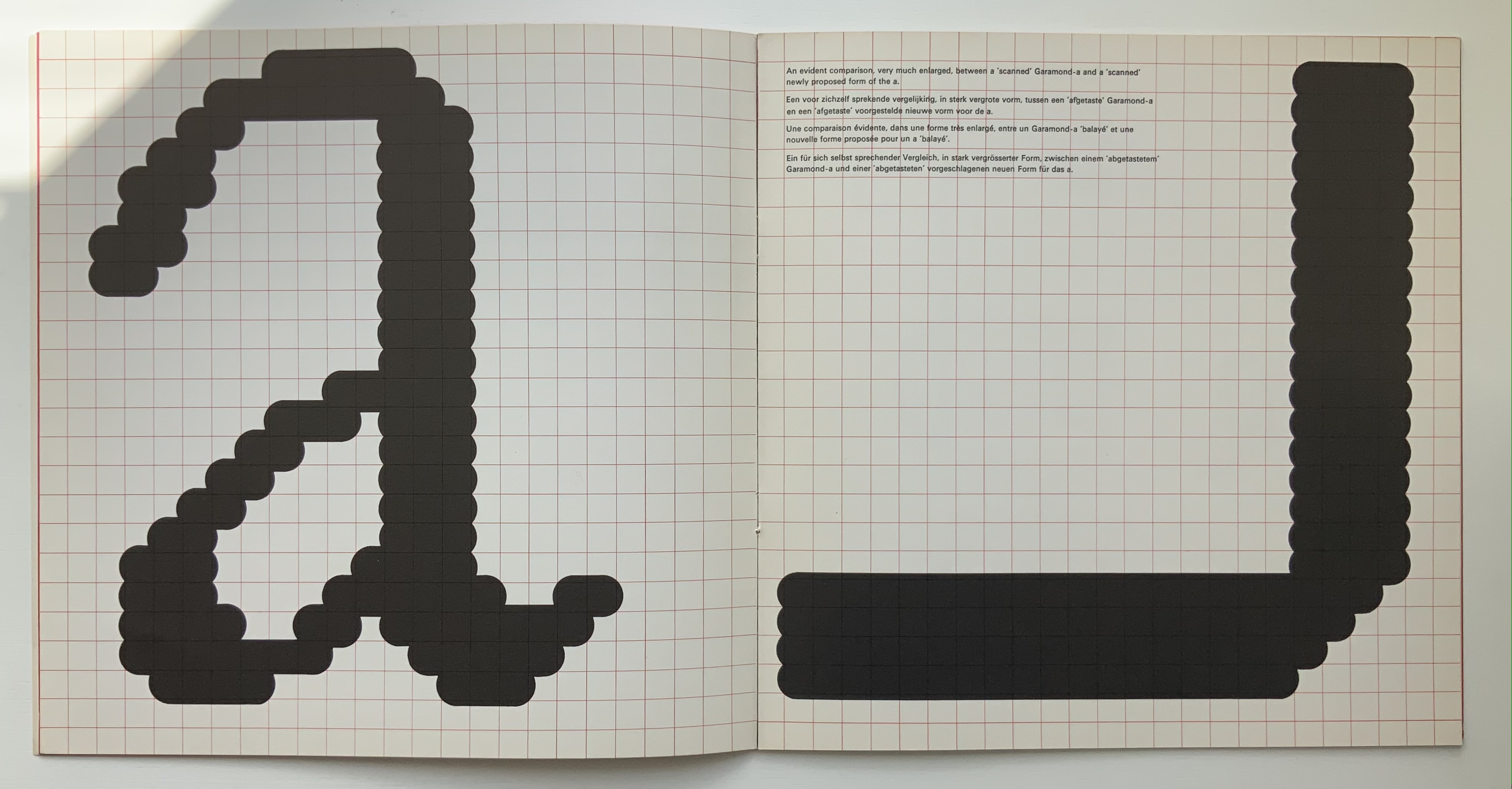
A double-page spread (not shown) explains the variables and rules for coding and resizing the letters. Clearly, from the side-by-side view of Crouwel’s introduction (above), humans would need to learn some new conventions (e.g., majuscules are designated by bars over miniscules) for the font to be readable. Some letters, such as “a” (below), would require recognition of an utterly different shape. Despite — or because of — that, the font appealed to album and magazine cover designers in the digital ’80s.
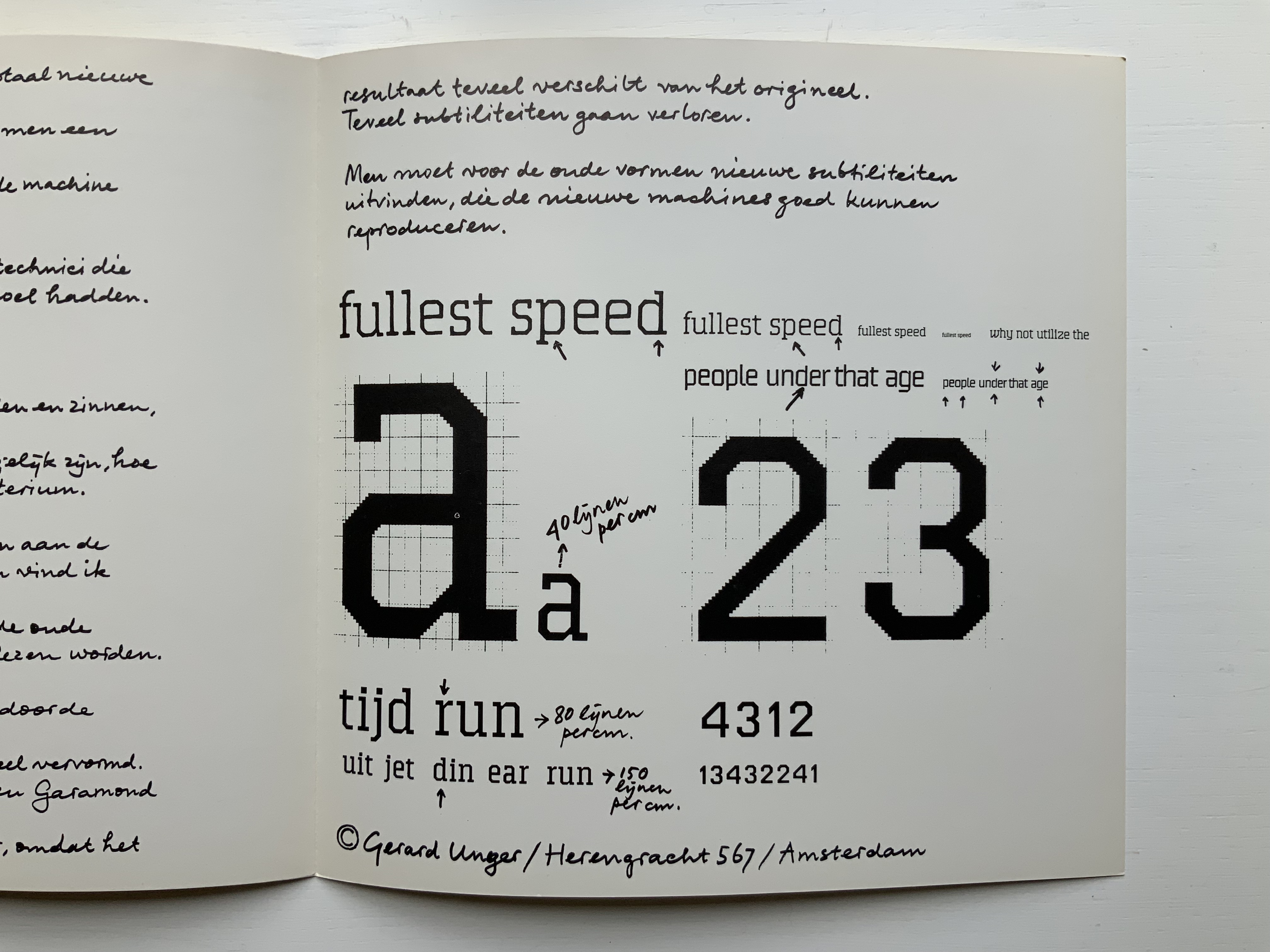
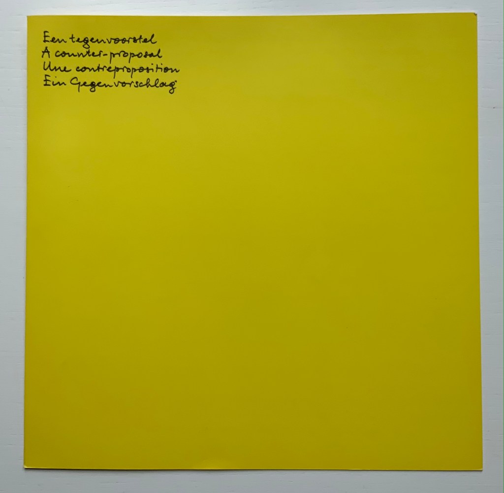
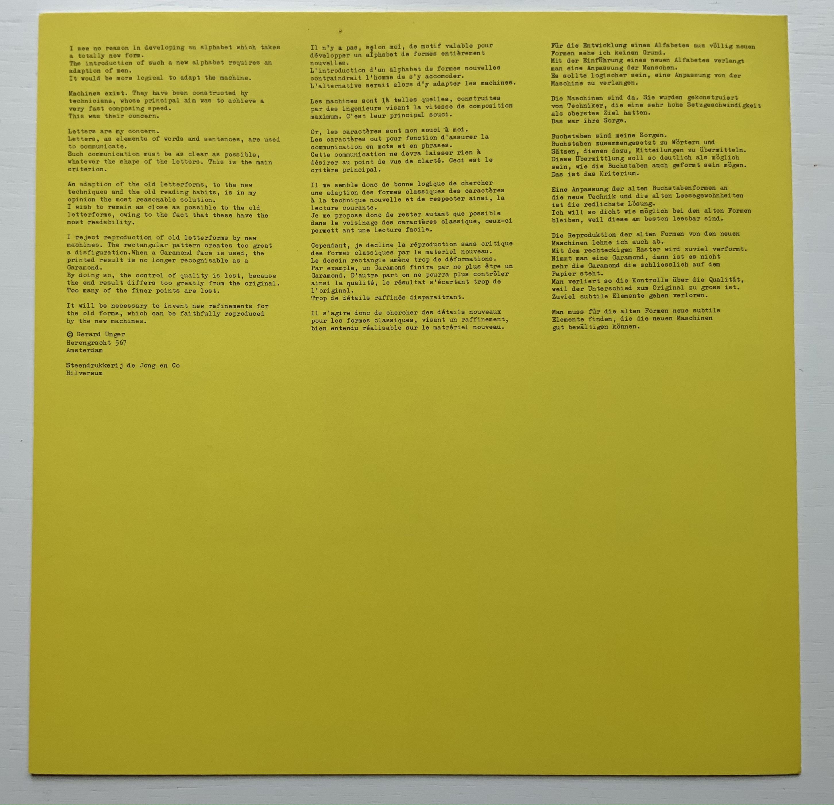
Disturbed by letting machines take precedence over the human eye, Gerard Unger, one of Crouwel’s colleagues, submitted a “counter proposal” — tellingly in handwriting. Juxtaposition of their lowercase “a’s” with Geofroy Tory’s majestic majuscules offers a counter-counter historic perspective on the art of the alphabet.
A few months after Pieter Brattinga issued Wim Crouwel‘s New Alphabet (below left), he followed up with this single-fold riposte from Gerard Unger, invited in fact by Crouwel.
Left: Crouwel. Right: Unger.
Unger urges designing or teaching machines to accommodate “human-readable” letterforms rather than inventing new fonts for machines. Given advances in digital type and artificial intelligence, Unger’s point may have been prescient, but there is still something to be said for the artistic stimulus of machine constraints.
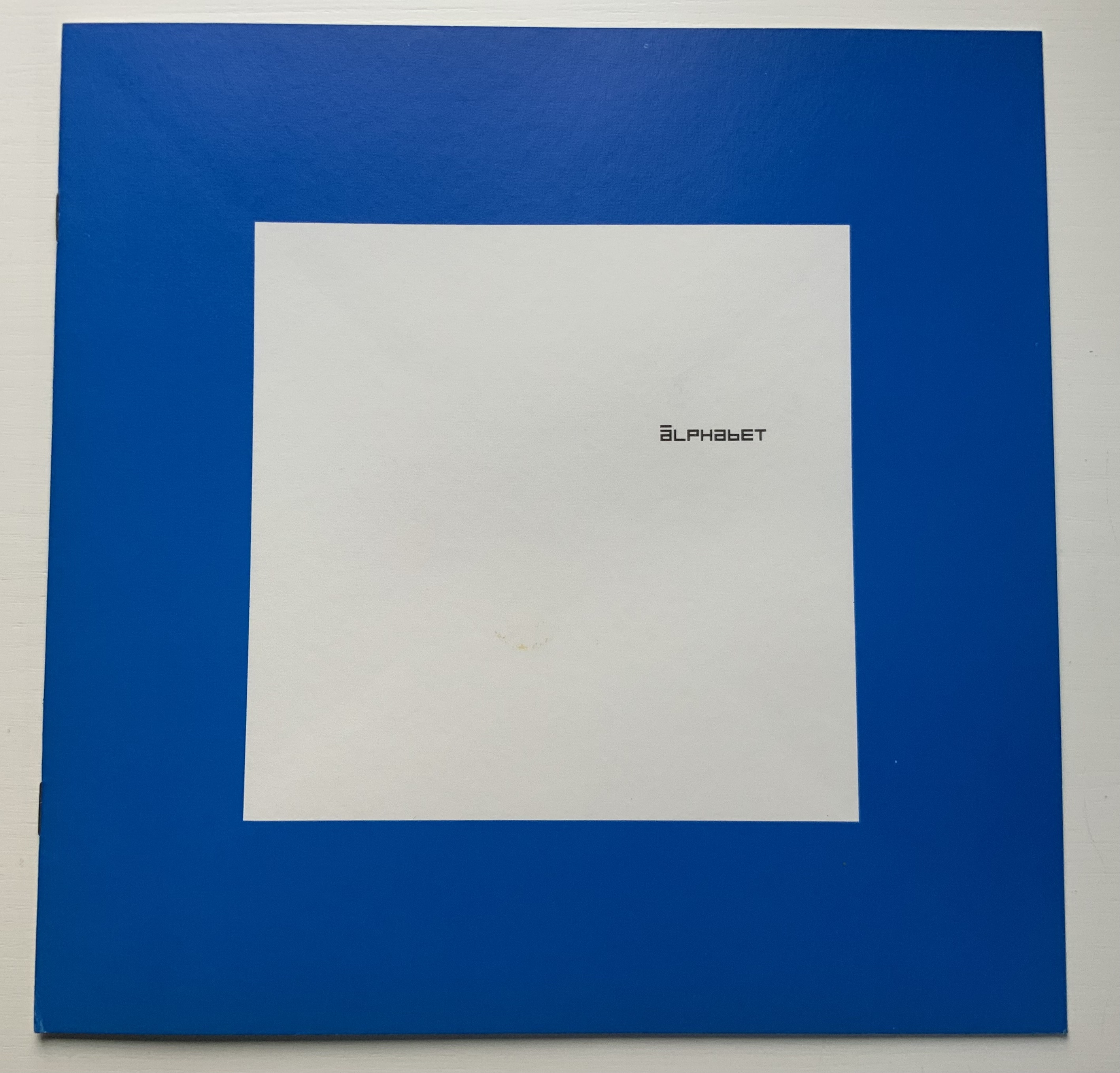
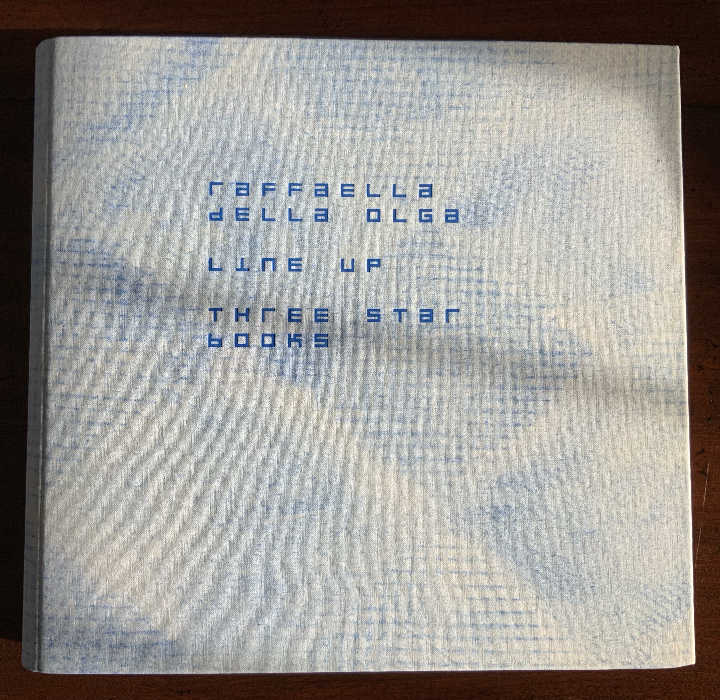
Brattinga extended the dialogue later to include Timothy Epps and Christopher Evans in 1970. If, as it did, the Epps/Evans alphabet led to LINE UP by Raffaella della Olga and Three Star Press, what other works of art have benefited from similar alphabetic and typographical dialogues?
Alphabet (1970), Timothy Epps and Christopher Evans; LINE UP (2020) Raffaella della Olga
Jeffrey Morin and Steven Ferlauto‘s Sacred Space (2003) has its roots in Ferlauto’s historical research into Roman capitals. Jennifer Farrell‘s The Well-Travelled Ampersand (2019) has its roots in the letterform and design thinking of Adrian Frutiger, Frederic Goudy, Dard Hunter, Edward Johnston and Russell Maret, among several others. Inclusion of source material like that by Crouwel, Epps and Evans, and Unger in the Collection offers paths to increased appreciation of those works of art inspired by them. Something for the future history of book art.
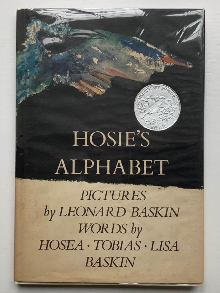
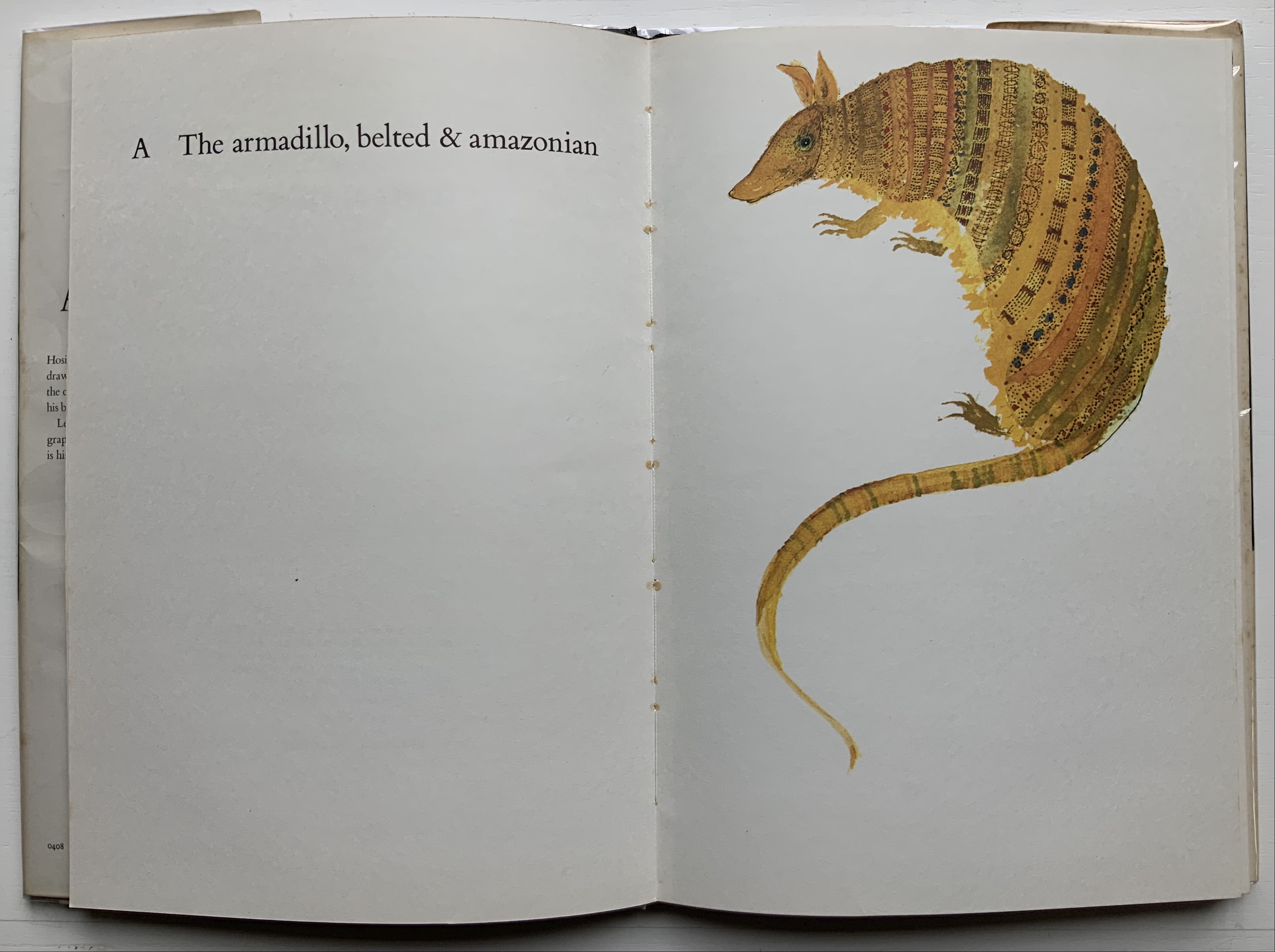
Hosie’s Alphabet (1972) Pictures by Leonard Baskin, words by Hosea, Tobias and Lisa Baskin Hardback H293 x W203 mm, 56 pages. Acquired from Springwell Books, 7 April 2021. Photos: Books On Books Collection.
The Bodleian Library holds the Leonard Baskin archive, but strangely did not have a copy of Hosie’s Alphabet. Recently (19 July 2023 – 24 January 2024) for its exhibition “Alphabets Alive!”, the full set of original prints created for The Gehenna Alphabet (1982) went on display.
So this acquisition for the Books On Books Collection performs the double duty of adding a Caldecott winner to its subset of abecedaries and, when the Collection arrives as a donation, filling the gap in the Bodleian’s holdings.
Baskin’s artistry in this book not only resides in the pictures. The layout and handling of Bembo vary — sometimes dramatically, sometimes subtly — in just the right way, be it in the use of uppercase, lowercase, roman, italic, bold, size, shading or the sudden introduction of Goudy Text.
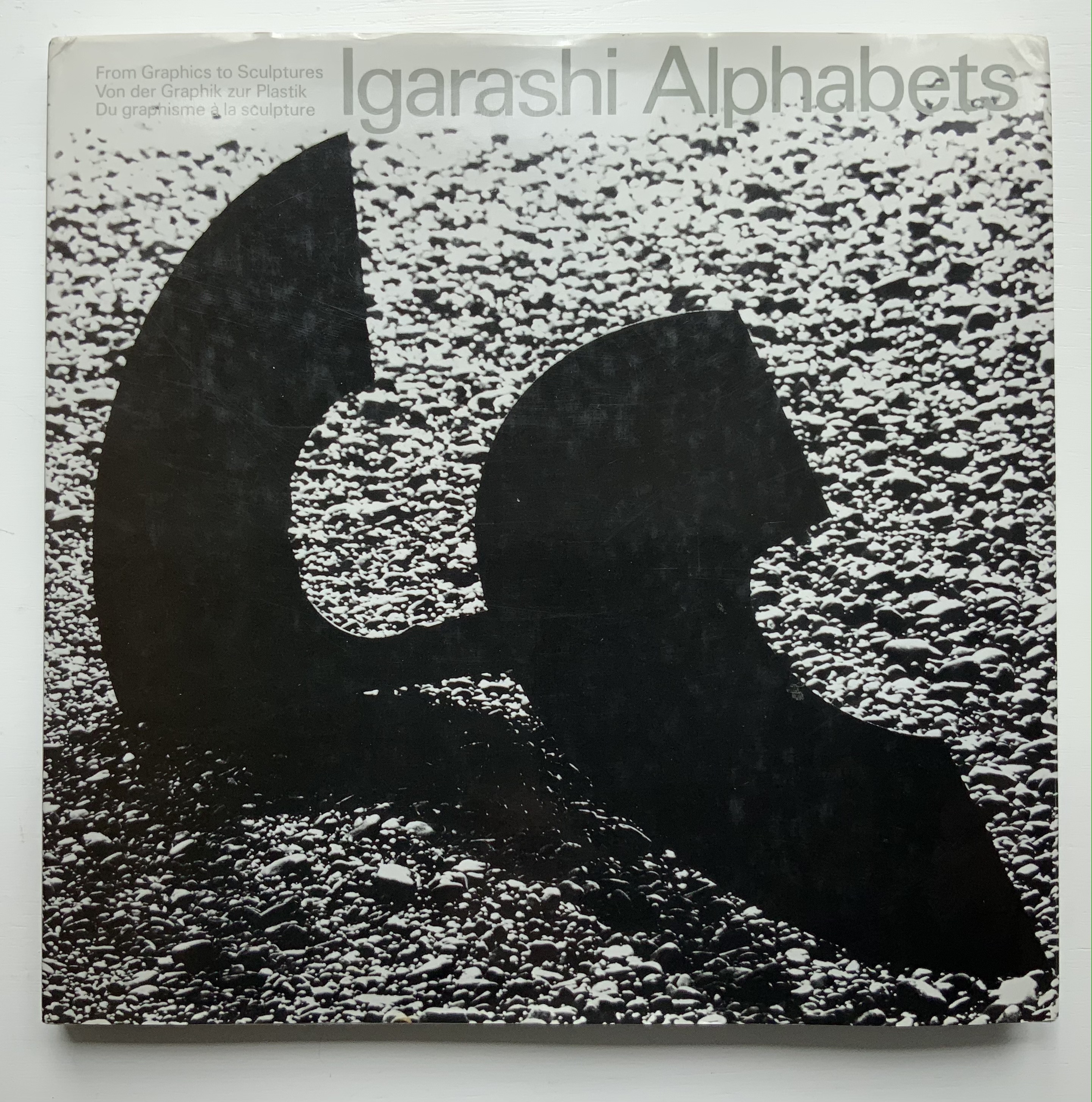
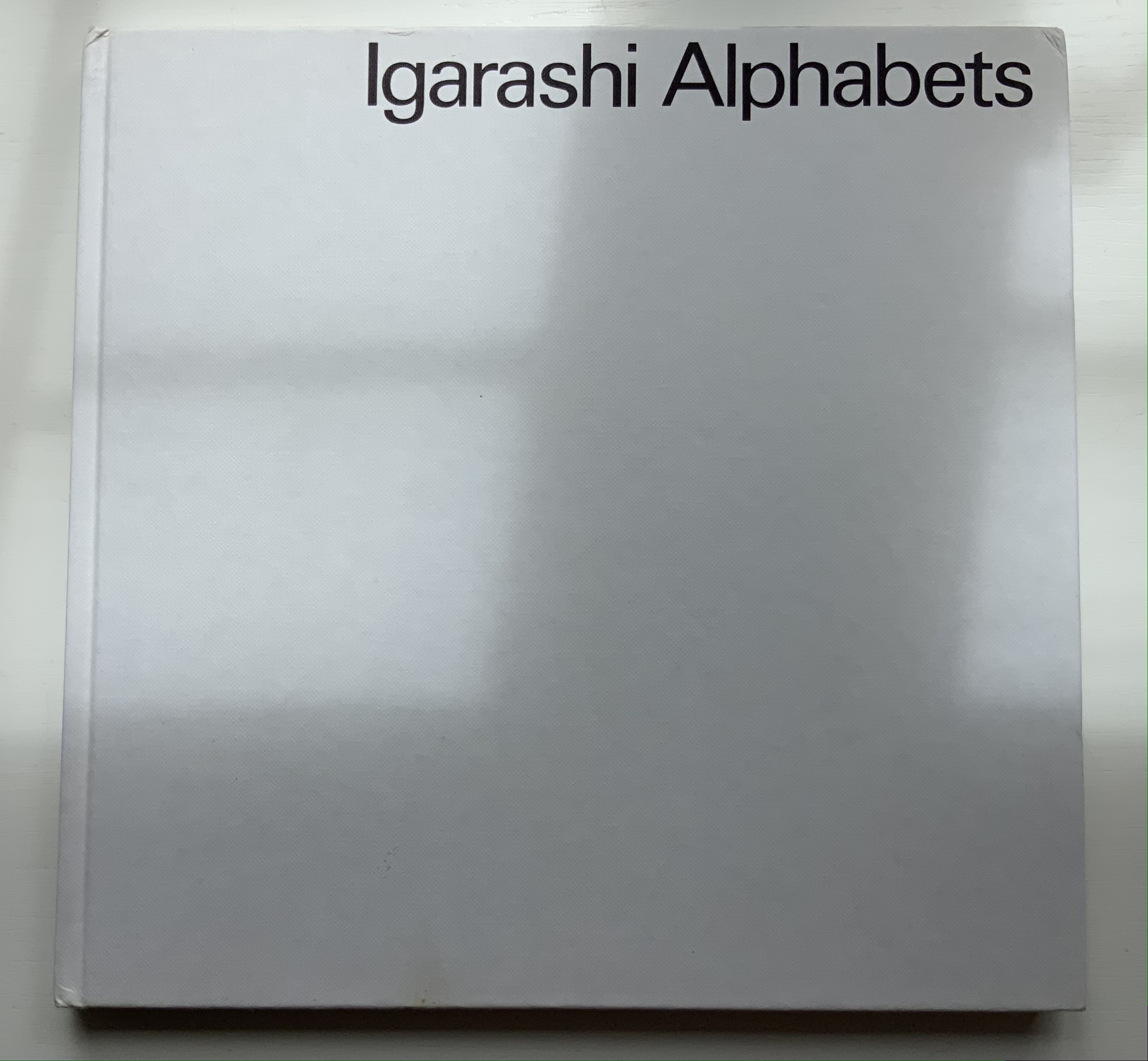
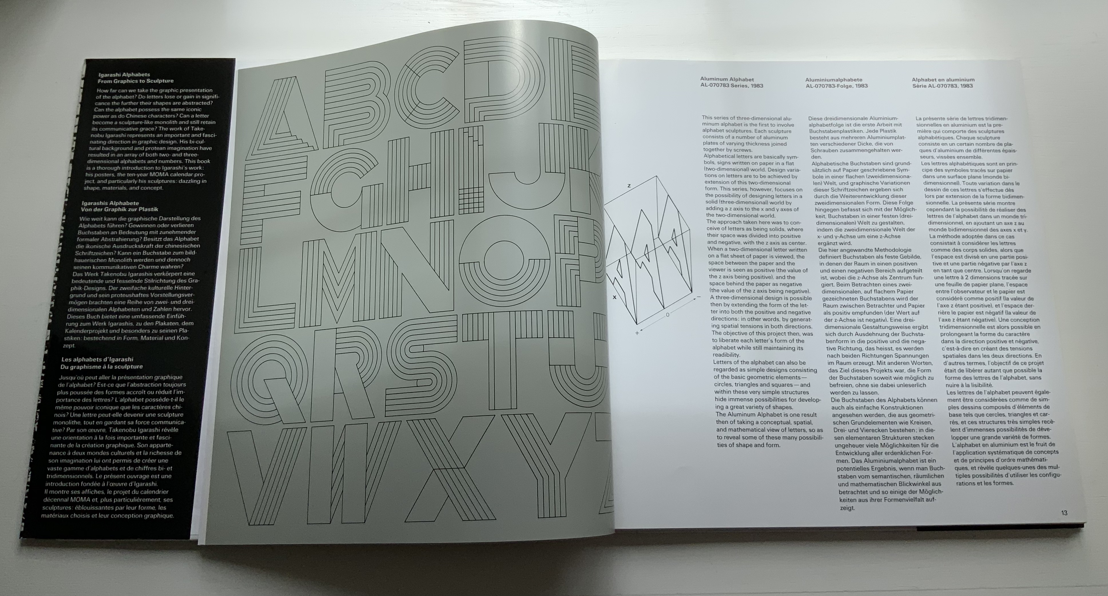
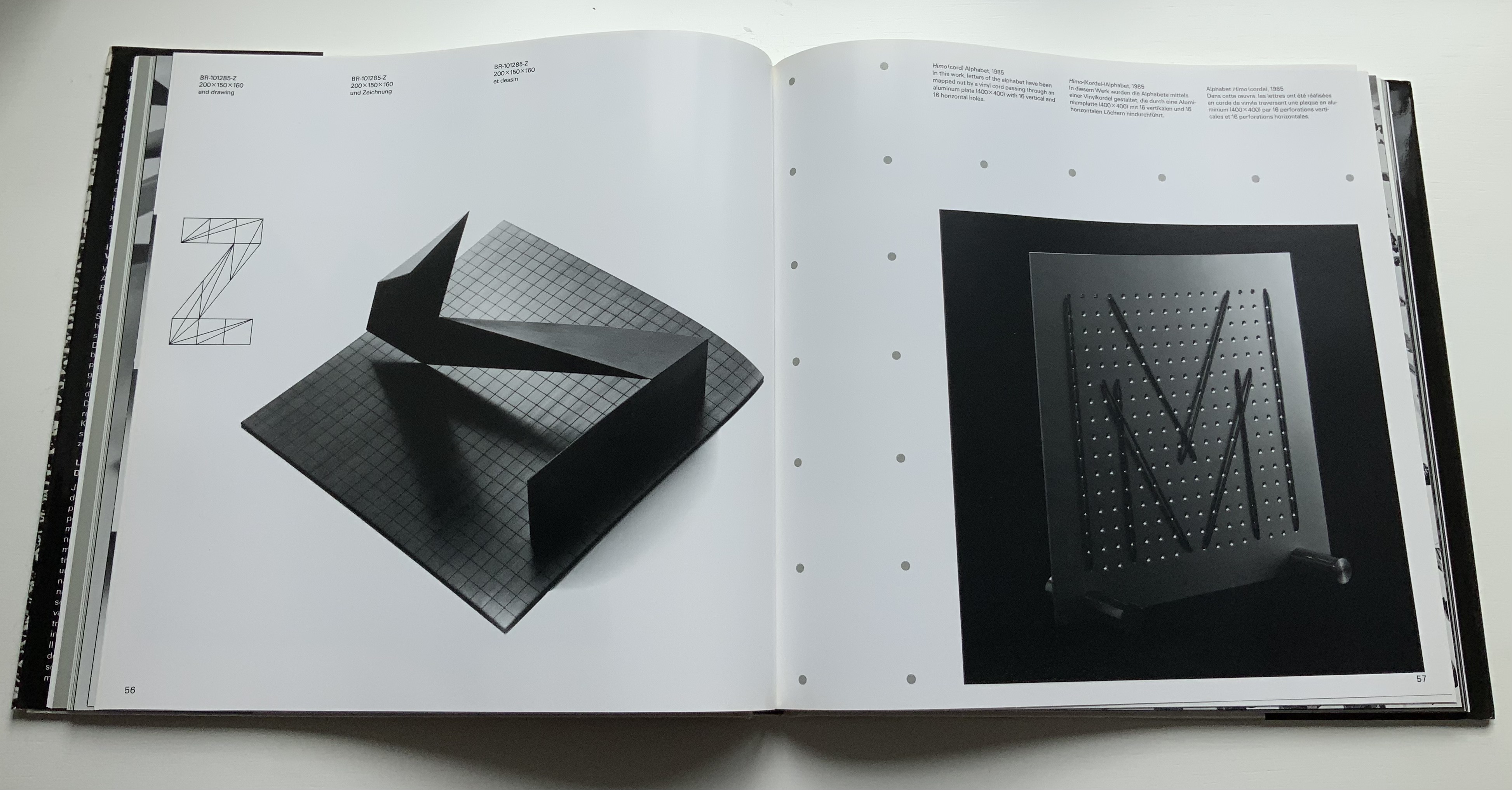
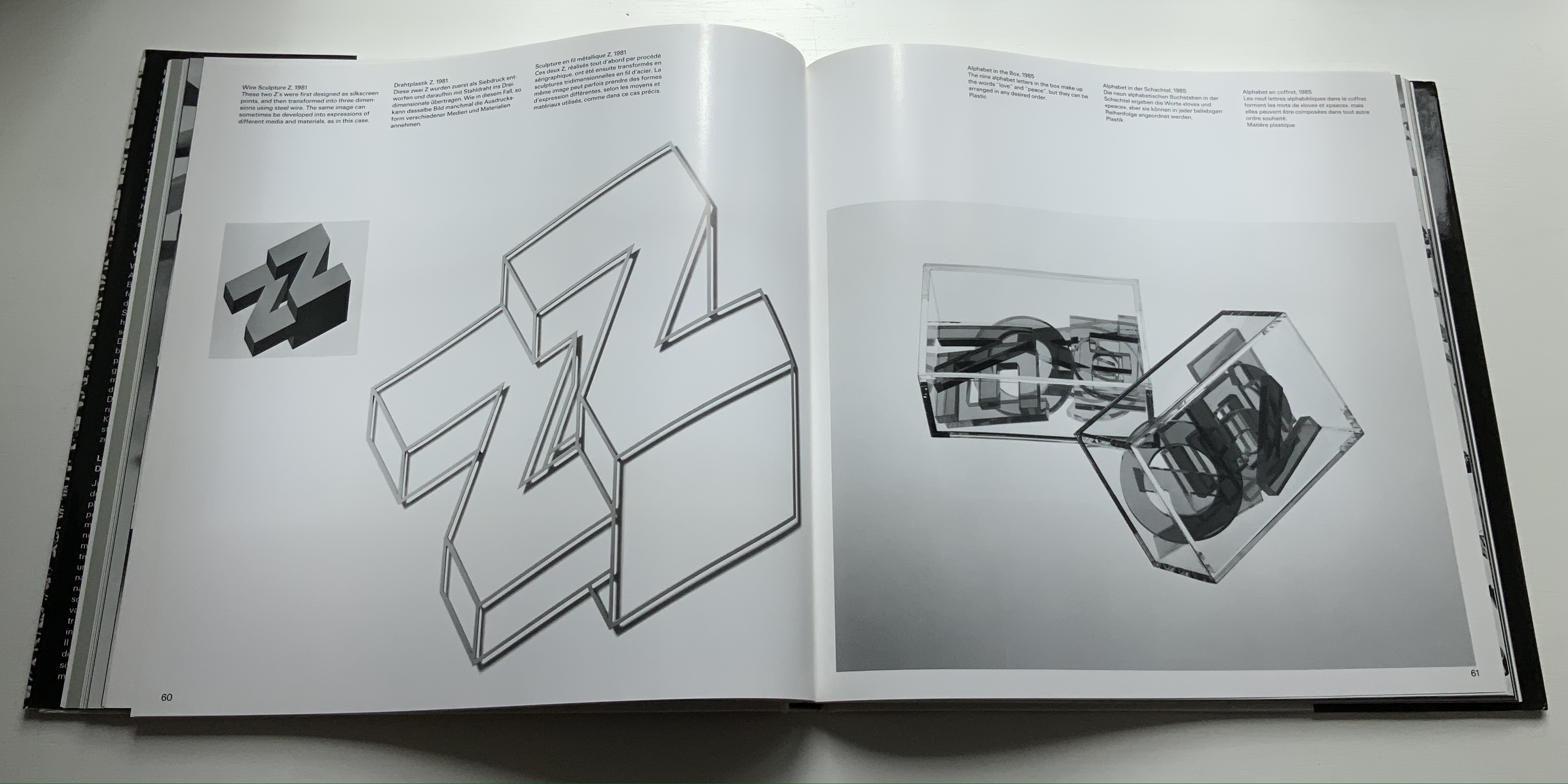
Thirty-three years after this rare volume’s appearance, some renewed interest in Igarishi’s design and artistry has arisen. The Thames & Hudson volume noted below was widely noted but reviewed in depth in only a few places (see below).
In noting in their 1995 facsimile of Johann David Steingruber’s Architectonisches Alphabeth that three-dimensional alphabet design inevitably reflects its typographic and architectural milieu, Joseph Kiermeier-Debre and Fritz Franz Vogel single out Igarishi’s work in aluminum, concrete, wood and plastic as a perfect 20th century example. Unlike that of his European predecessors, Igarashi’s milieu has been both Eastern and Western. It shows not only in his design, surfaces and choice of material but also in the global attention paid to his work. The briefest search online yields sources in Poland, the Czech Republic, Spain, Singapore and many others besides those expected in the US and Japan.
Along with the works of Katsumi Komagata, Yasushi Cho and Zhang Xiaodong, Igarashi’s volume adds some Eastern balance to the Western bias in the Books On Books Collection.
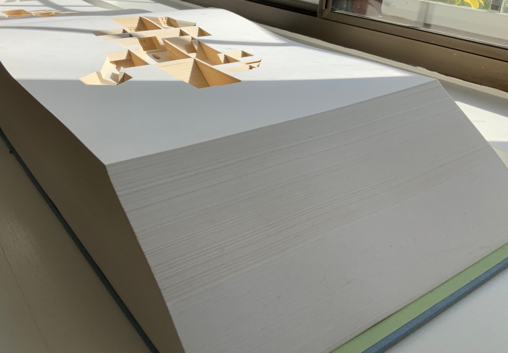
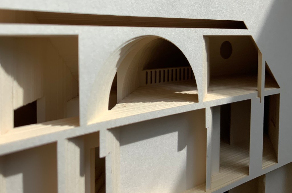
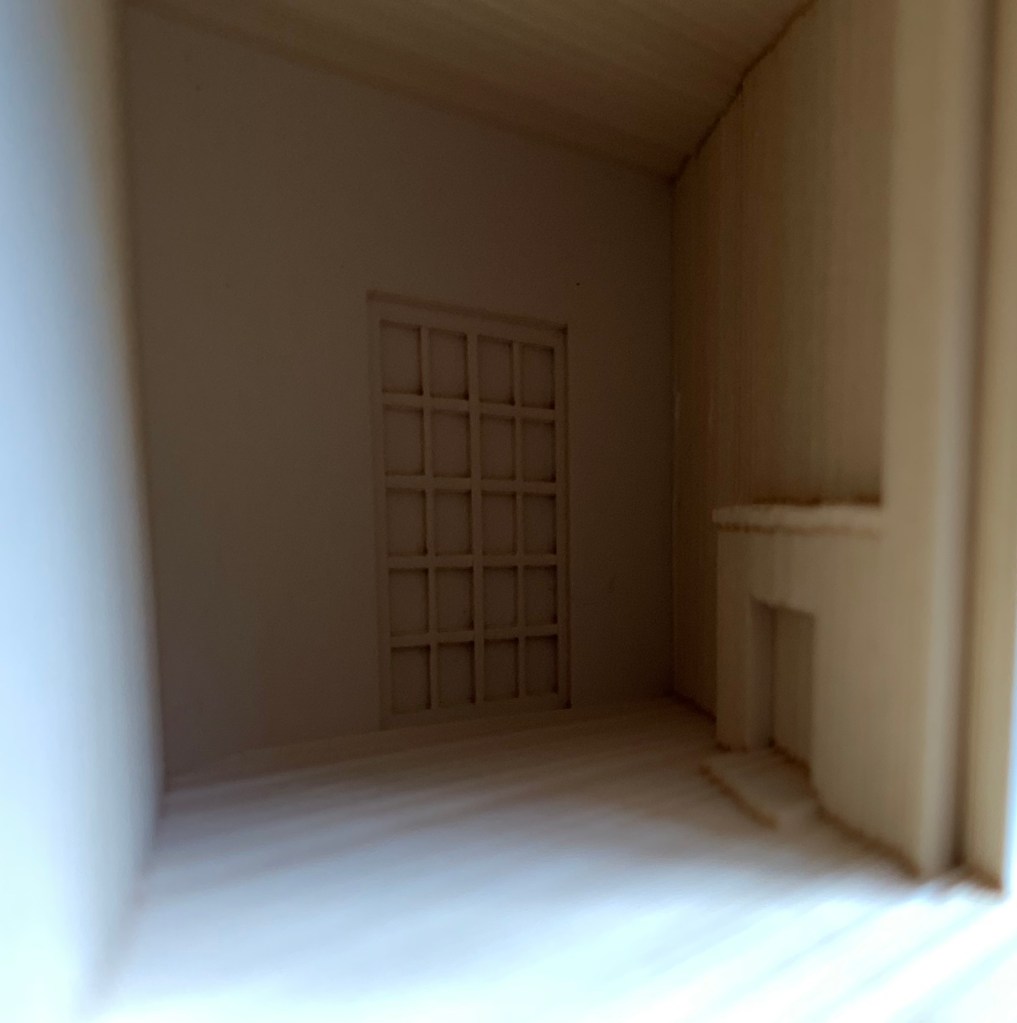
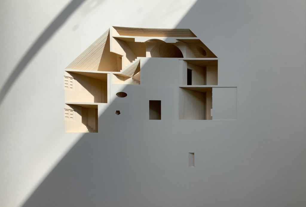
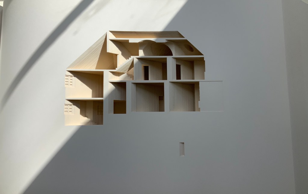
Your House (2006) Olafur Eliasson Hardback handbound with 454 laser cut leaves. H273 × W432 × D114 mm. Edition of 225, of which this is #210. Acquired from Carolina Nitsch Contemporary Art, August 2020. Photos: Books On Books Collection, displayed with permission of the artist.
Your House is a laser-cut model of Olafur Eliasson’s residence in Copenhagen at a scale of 1:85, which means that each page equates to a 220 mm section of the actual house. How do you read a work like this — physically? At the 22″ mark in the video below, the pages fall in a cascade like a flipbook, but for the most part, their size, accumulated bulk and weight — and delicacy — defy that handling. They must be turned slowly and carefully. Your House heeds the task of the arts as posed by the architect Juhani Pallasmaa, “in our age of speed, …to defend the comprehensibility of time, its experiential plasticity, tactility and slowness” (The Embodied Image, p. 78).
As you move from Your House‘s entrance to its exit, the outlines of walls, floors, stairs, doors, domes, windows, fireplaces and bookcases tremble in the air. Is this what Gaston Bachelard calls “the material imagination”? What Juhani Pallasmaa calls “the embodied image”?
Video: Books On Books Collection. Displayed with permission of Studio Olafur Eliasson.
Photos of the work: Books On Books Collection. Displayed with permission of Studio Olafur Eliasson.
There is something meditative about reading Your House properly. The cautious repetitive turning of pages can induce a daydream of inhabiting the space revealed. At some point in turning the pages, the empty shapes begin to become “your house”. Perhaps you see yourself moving through its spaces, and imagined furnishings occupying its rooms.
Photos of the work: Books On Books Collection. Displayed with permission of Studio Olafur Eliasson.
Or perhaps as in the sequence above — the end of one room (or chapter or part) and the start of another — you become a ghost — with all the work’s past and future readers — passing through the walls.
Video: Books On Books Collection. Displayed with permission of Studio Olafur Eliasson.
In The Poetics of Space, Bachelard writes of poetic time and prosodic time. The one is vertical, a spot in time, a frozen moment; the other is horizontal, a narrative, a continuity. But they are not mutually exclusive. Your House is a site where poetic and prosodic time occupy the same space. More than that, it is a site where temporality, as Eliasson puts it, “becomes something you perform by involving yourself physically over time” and thereby you become, “in the end, the createur” (“Not how, but why!”, p. 108).
Eliasson’s house in Hellerup, a suburb of Copenhagen, was advertised for sale in 2024. For comparison with the book, you can see photos of the exterior and interior here. Also, with thanks to Byopia Press, an X-ray documentation of the book can be found here.
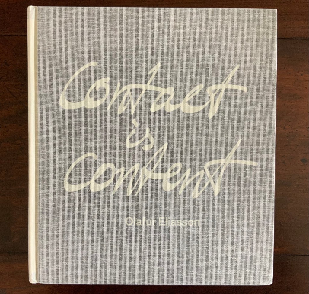
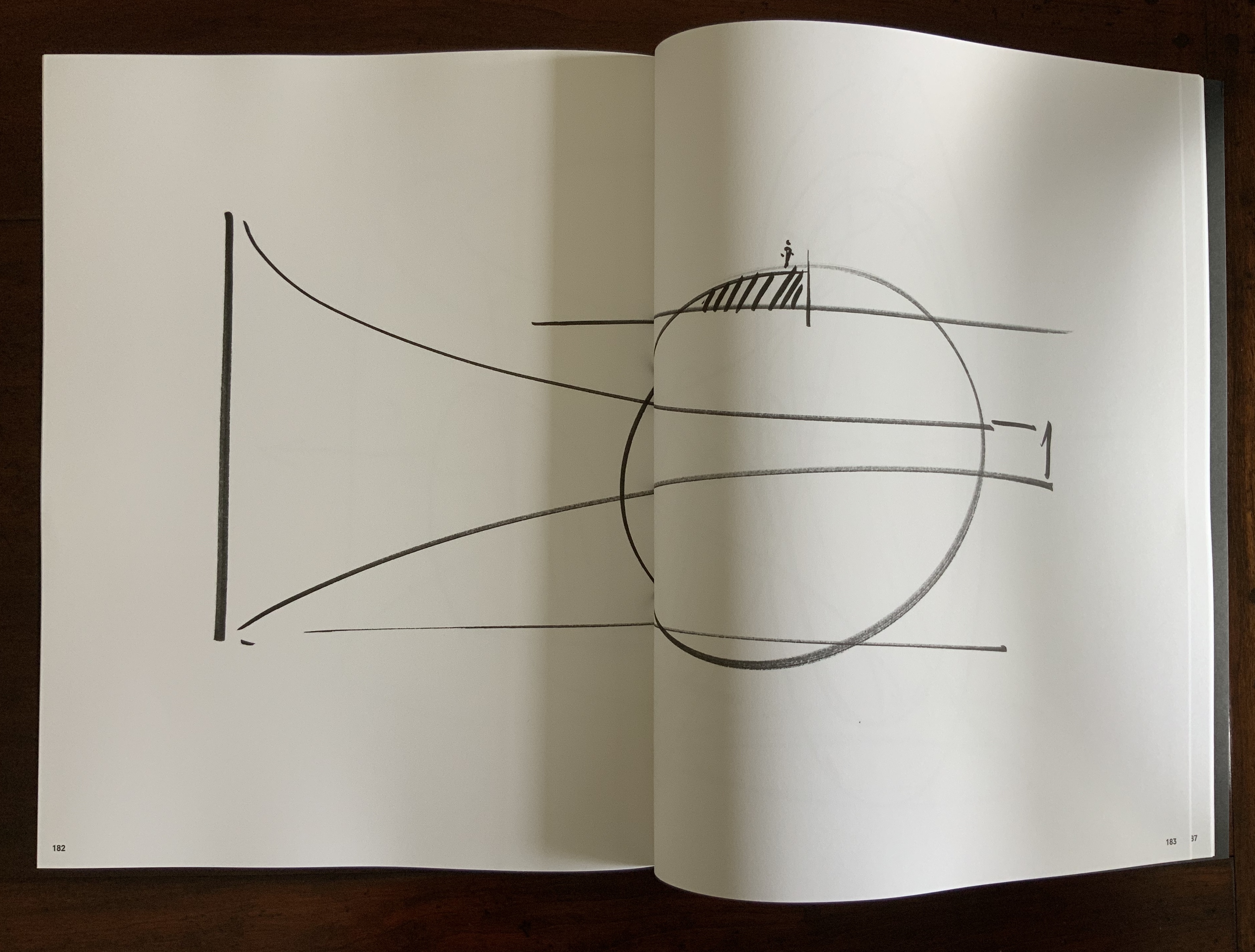
Contact is Content (2014)
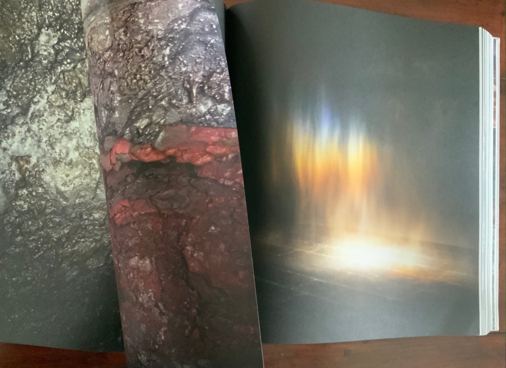
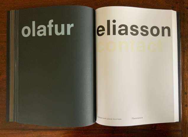
Contact is Content(2014) Olafur Eliasson Casebound, cloth mesh-covered board. H345 x W310 x D50 mm, 416 pages. Photos: Books On Books Collection. Displayed with permission of the artist.
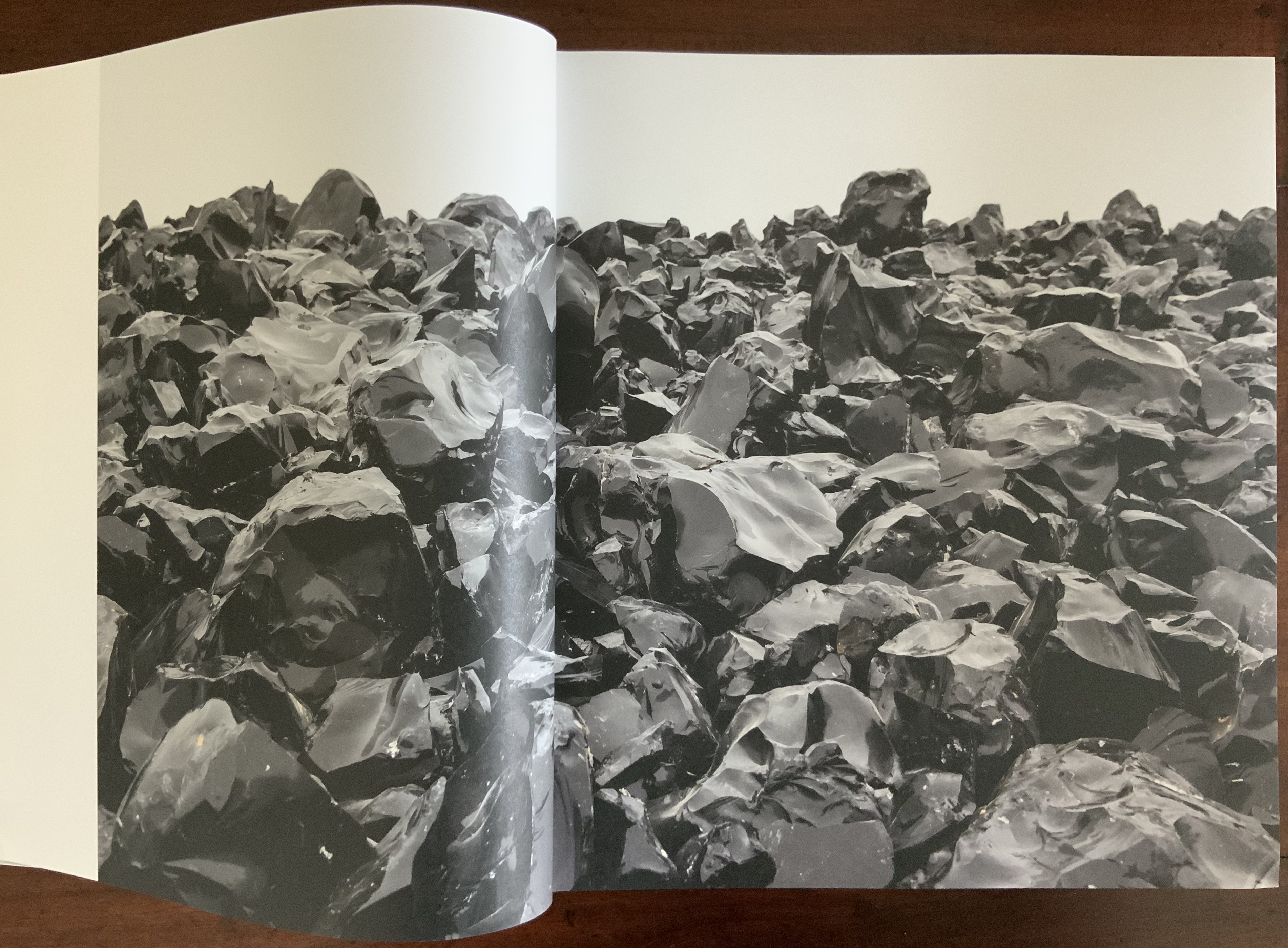
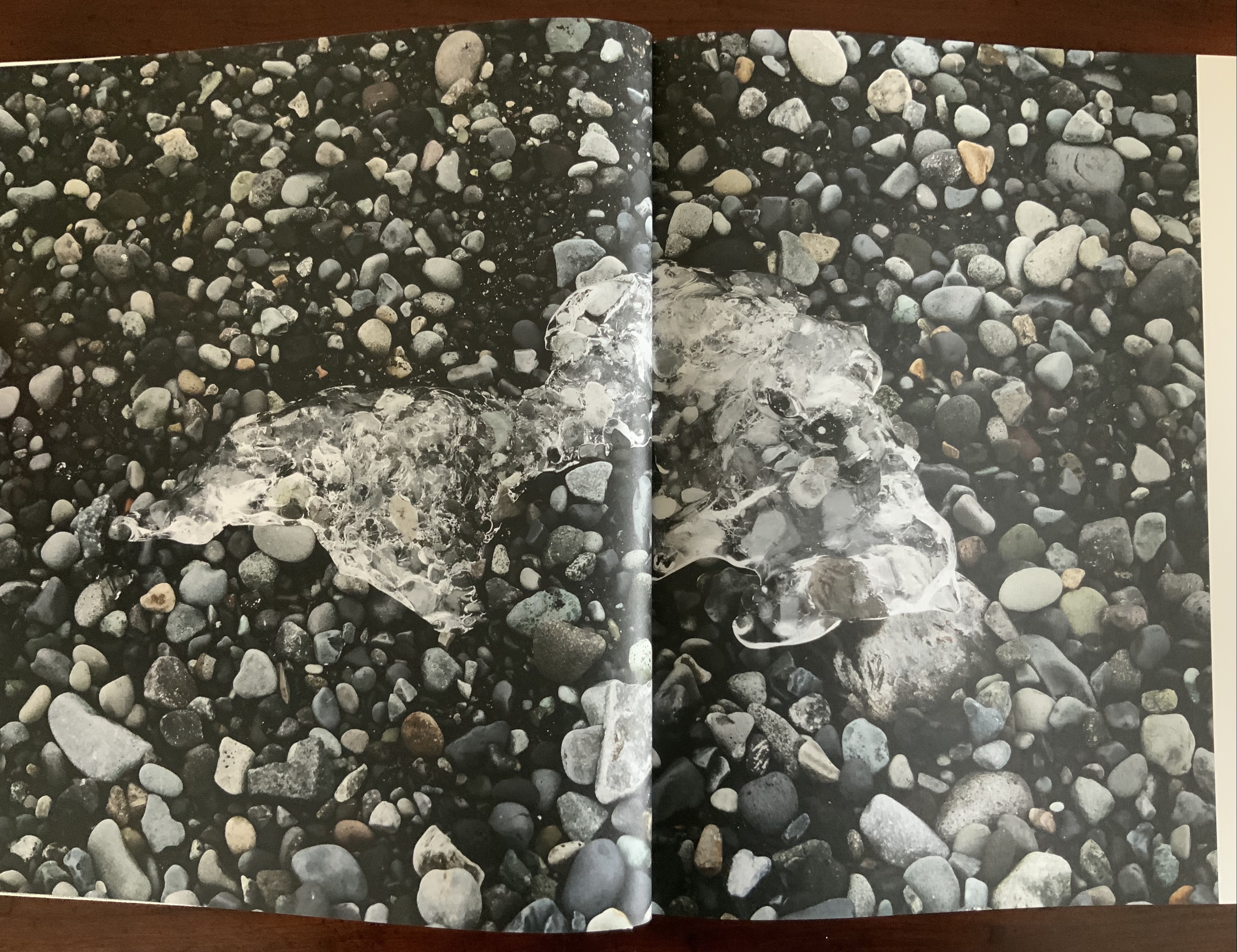
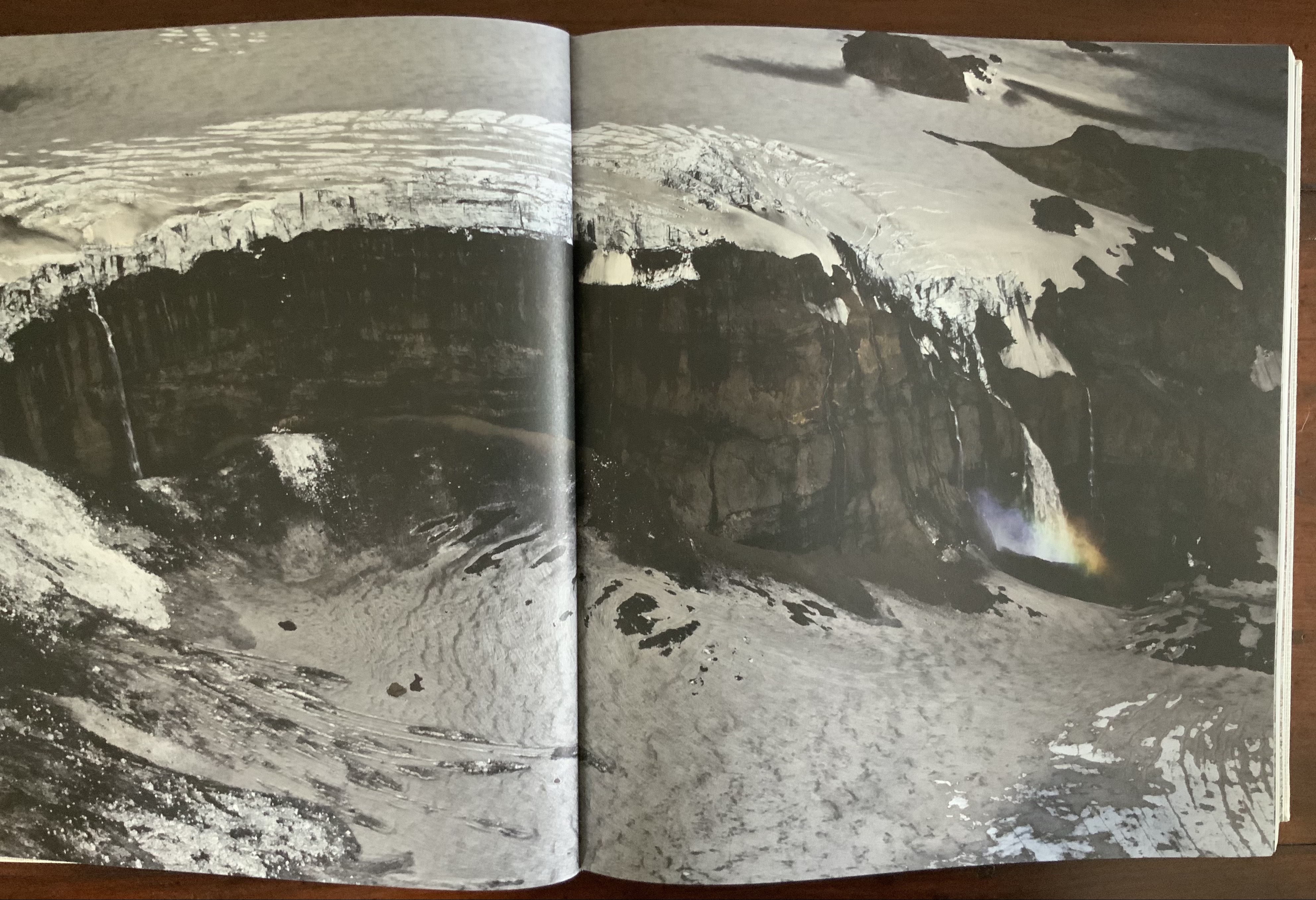
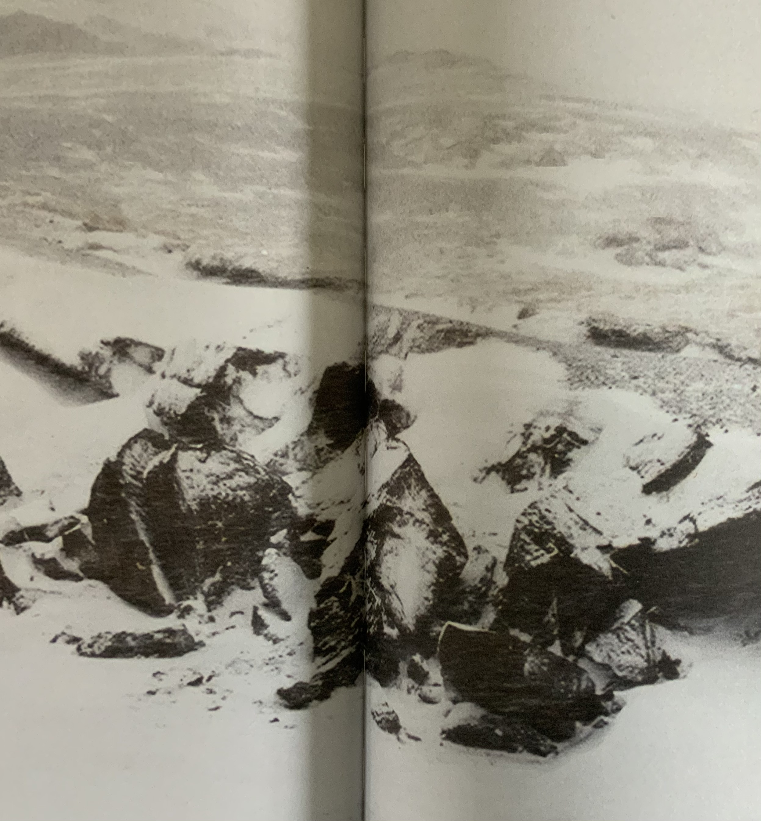
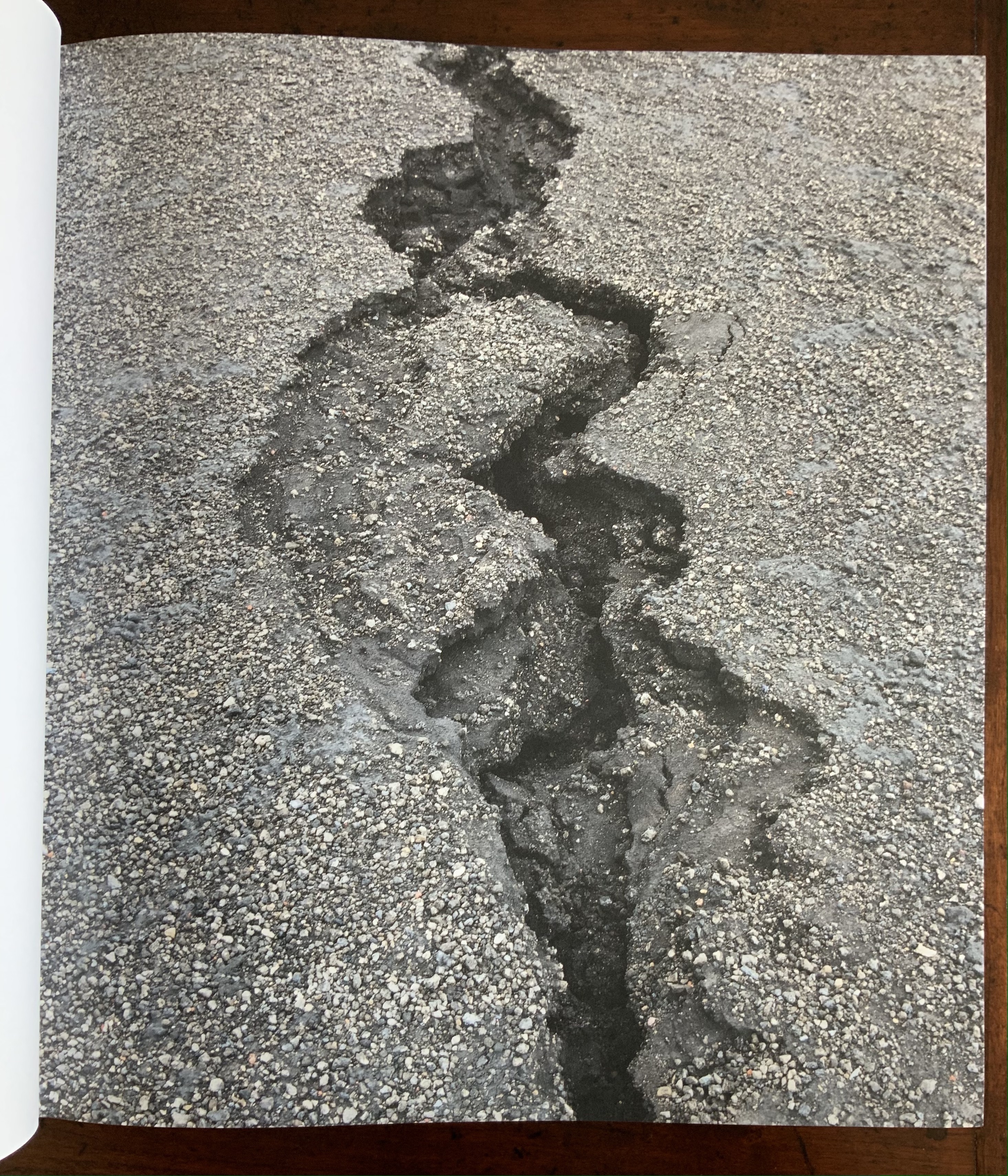
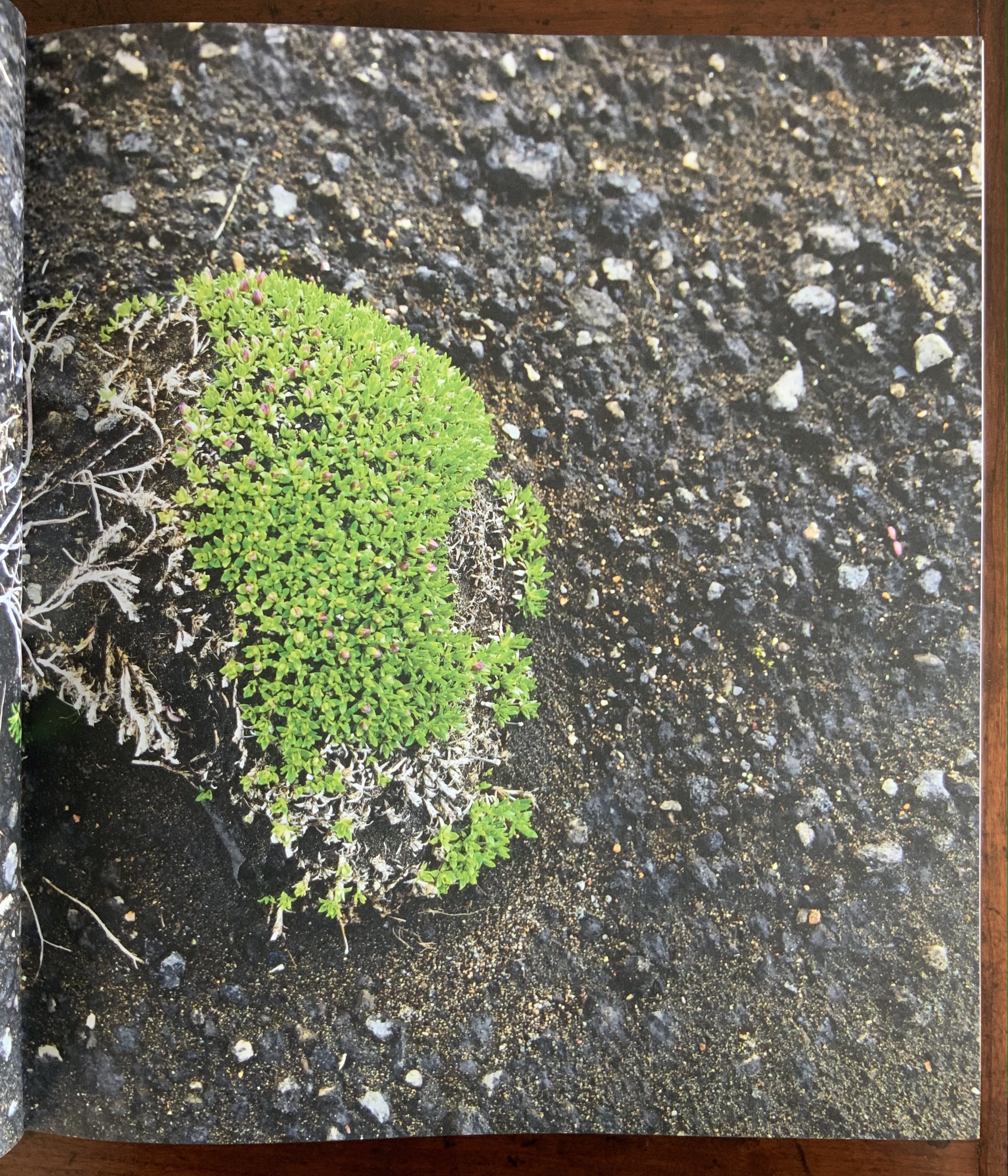
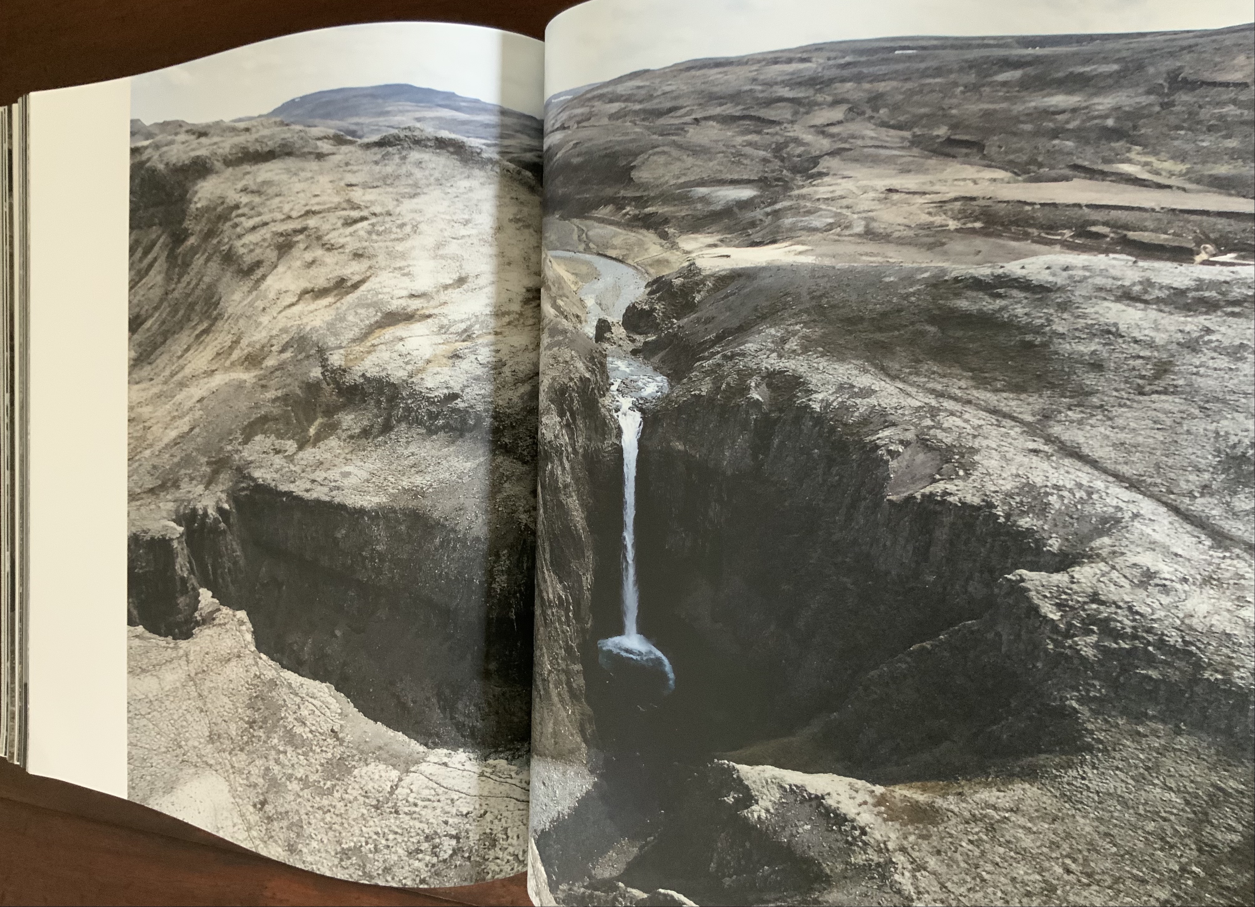
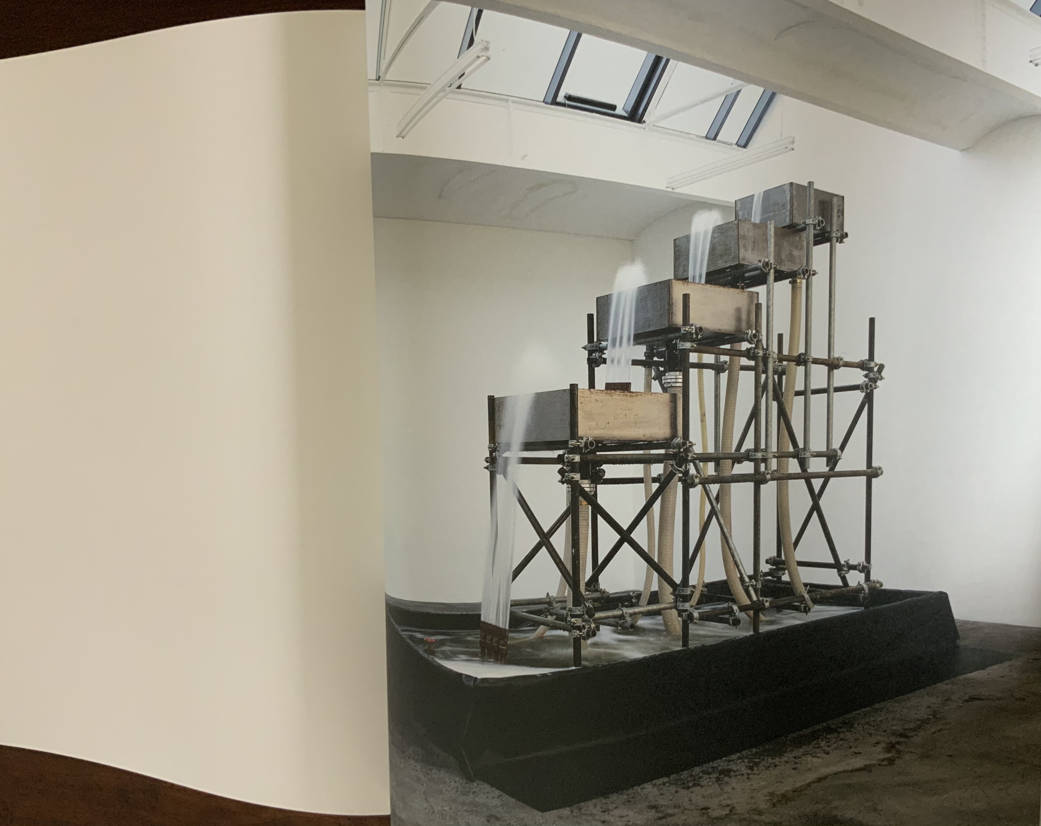
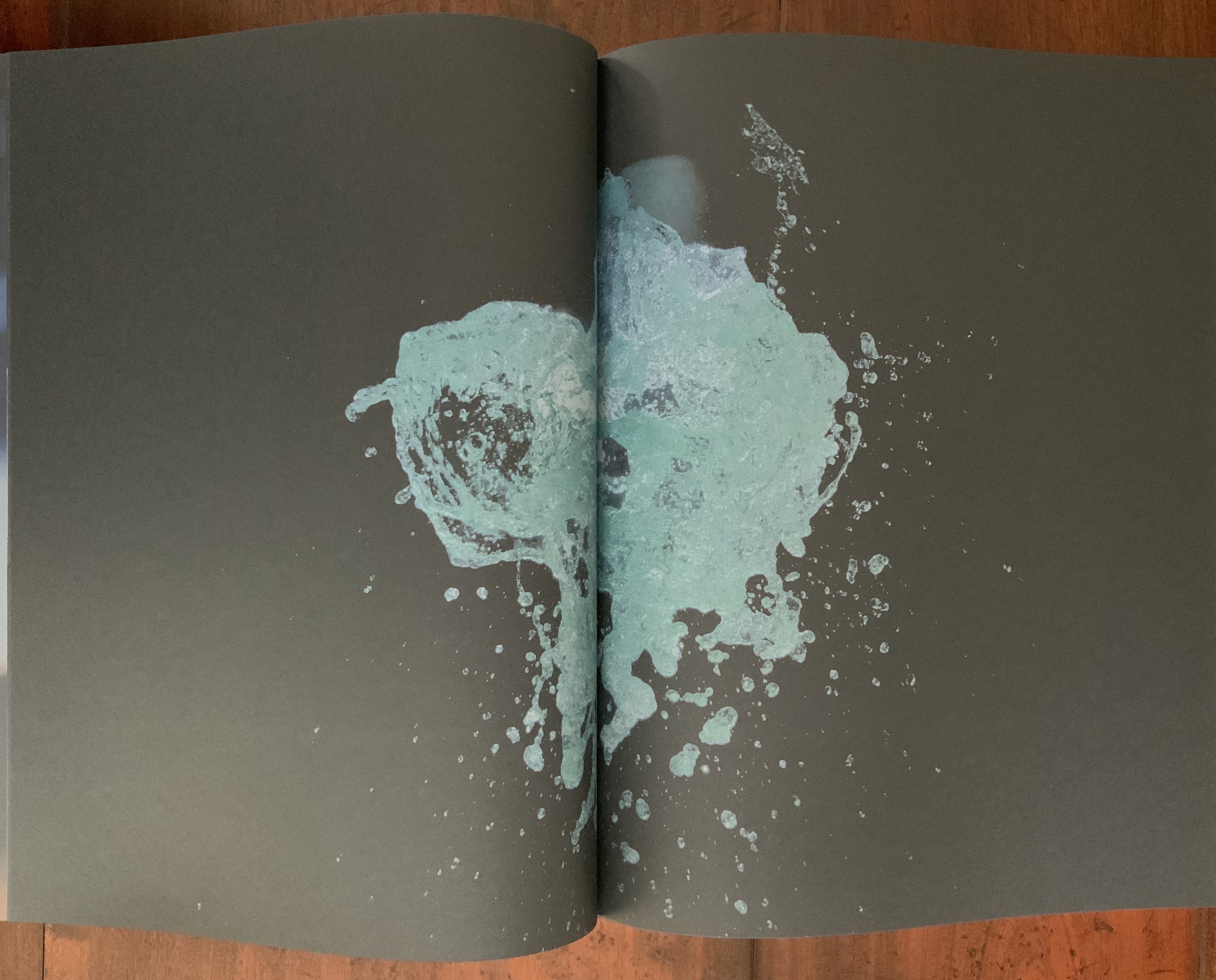
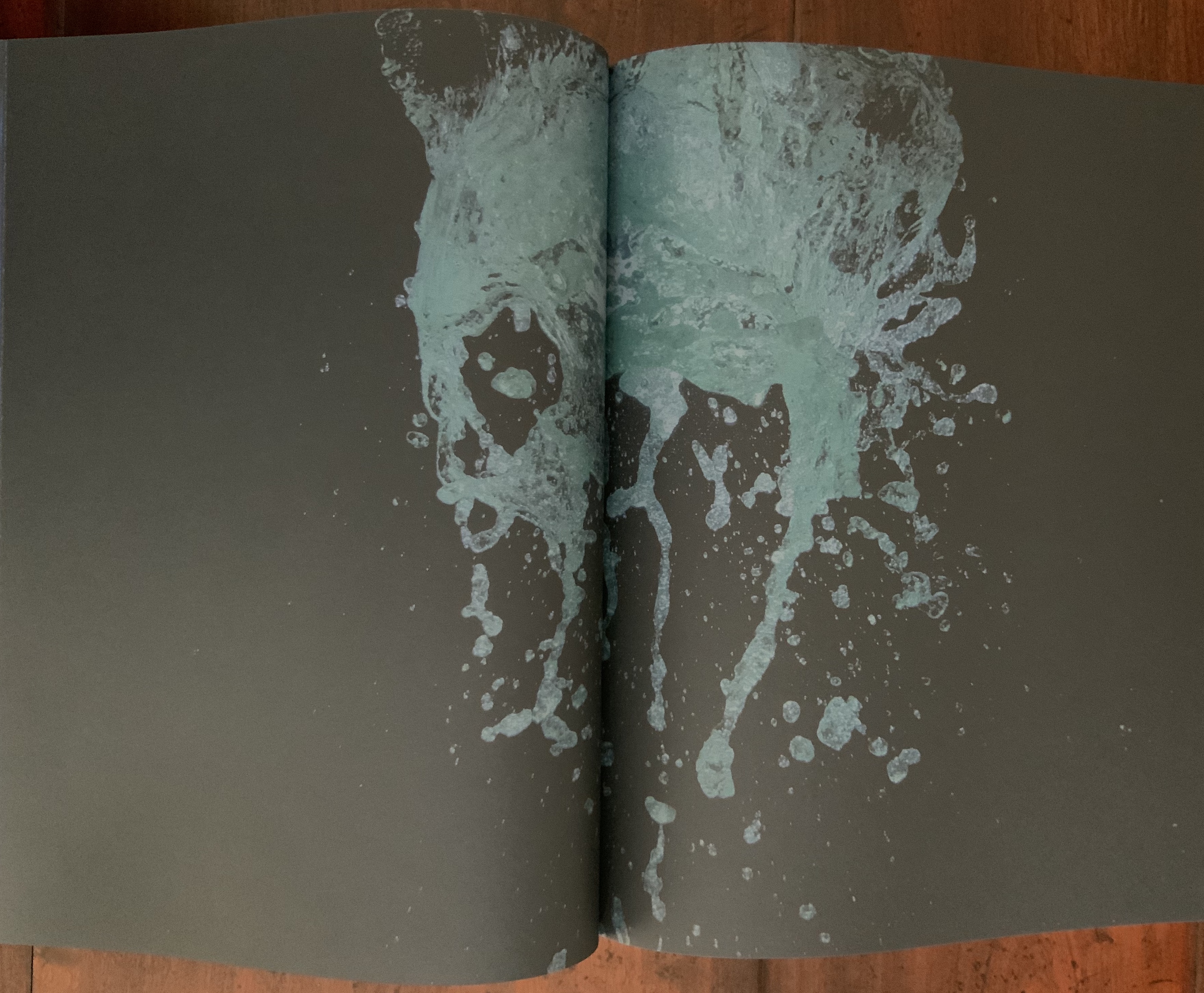
Like Your House, this work requires a slow, careful interaction in which viewing becomes learning the language of Eliasson’s images, discovering its syntax and exploring its rhymes and rhythms — reading the content presented with it. Unlike Your House, which focuses on contact with one source of content, Contact is Content draws on multiple sources: photographs Eliasson took in Iceland between 1986 and 2013 as well as images from his other projects and artworks. Over 80 different series make up the content of this work. The overwhelming number of round images — artificial and natural — in Contact is Content might suggest that Eliasson is completely sold on Bachelard’s pronouncement in The Poetics of Space that all being is round. But Eliasson’s world is spikier.
Within Contact is Content, images converse with one another — over near and far subjects, over aerial and ground level perspectives, over contrasting textures, over colors and their absence or presence, over artifice and nature
Often the conversations are reverse echoes: the reflective surface of blocks of ice echoes that of basalt.
The echo of near and far becomes a theme in itself: black-and-white aerial views of landscapes elide into black-and-white close-ups.
The absence and presence of color also emerges as a theme in its own right that interweaves with that of “near and far”: waterfalls without color vs waterfalls with the barest hint of color; close-ups of rocky terrain without color vs those dotted with intensely green or blue flora.
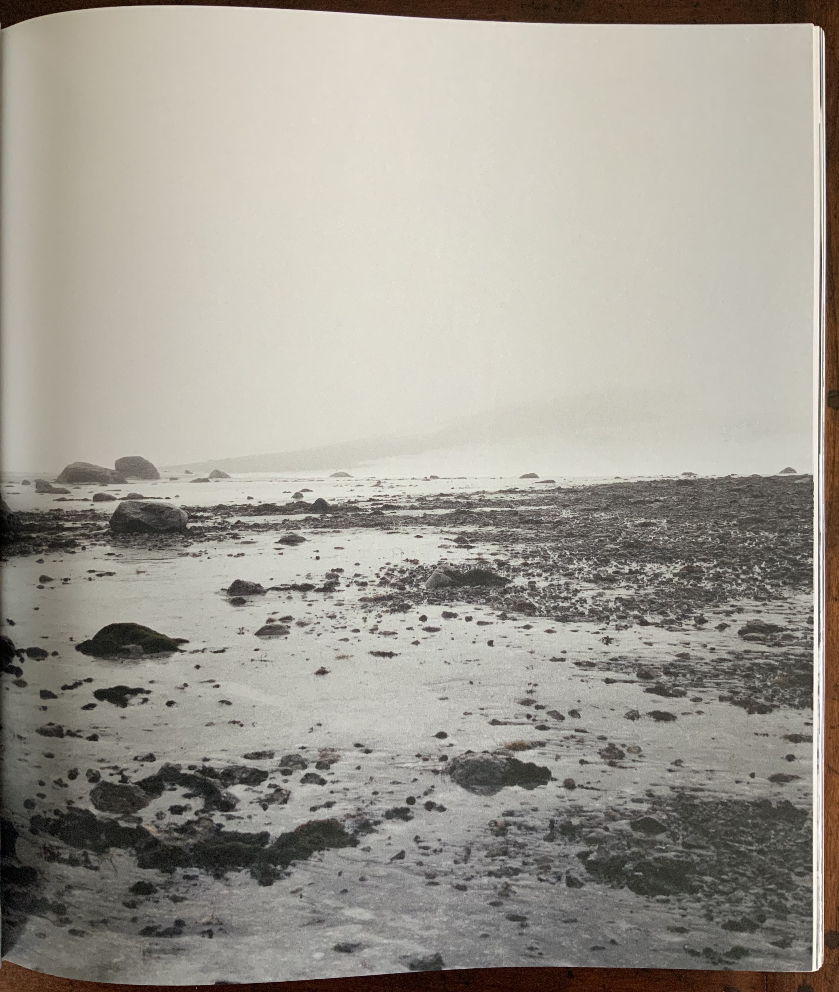
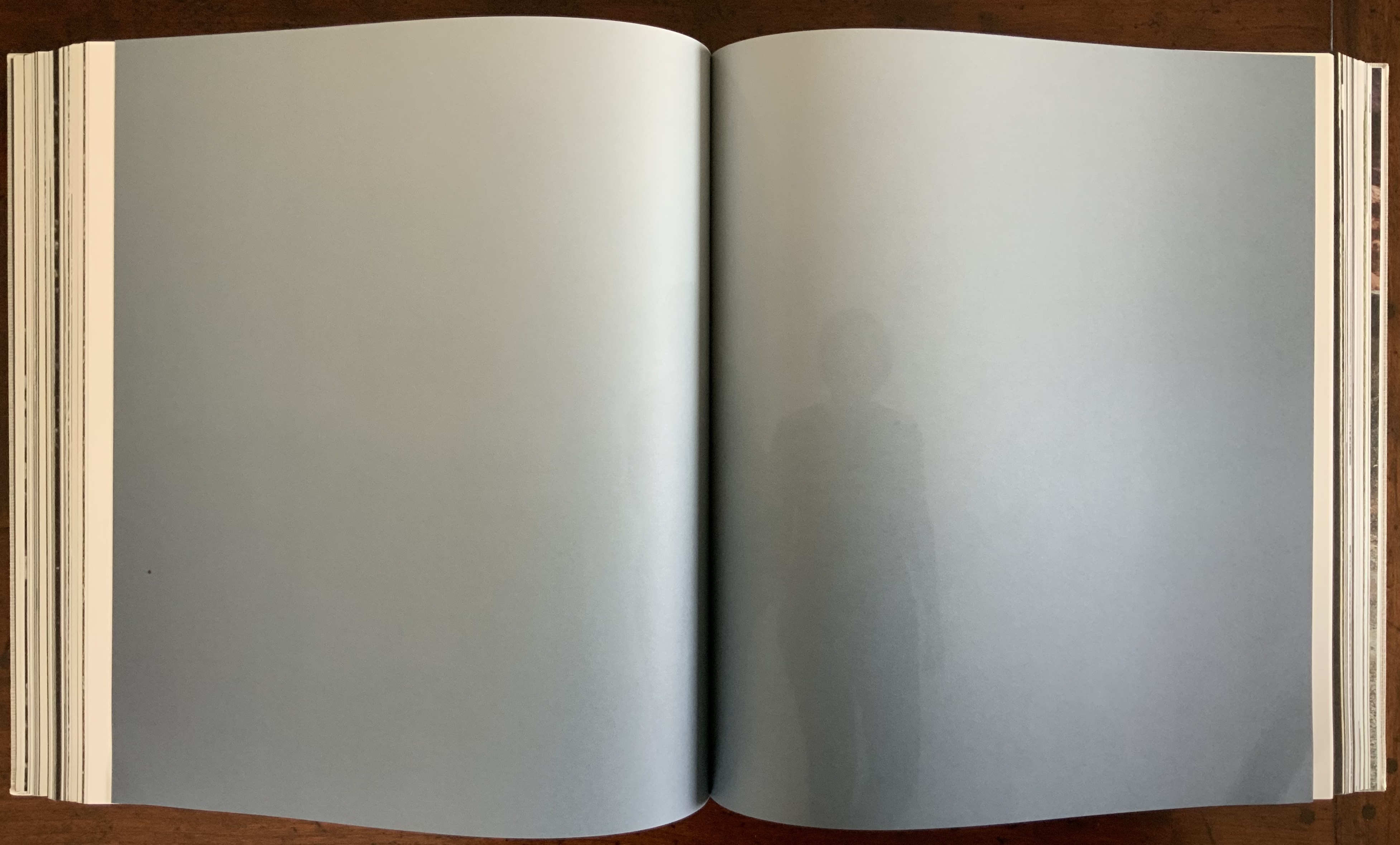
Some reverse echoes are the artificial conversing with nature: a gallery room containing a construction pumping water upwards over four levels echoes an Icelandic waterfall; or shorescapes under fog echo human outlines swallowed up in gallery rooms flooded with color-lit mists. Down to up; outside to inside; black-and-white to color; nature to artifice. And back.
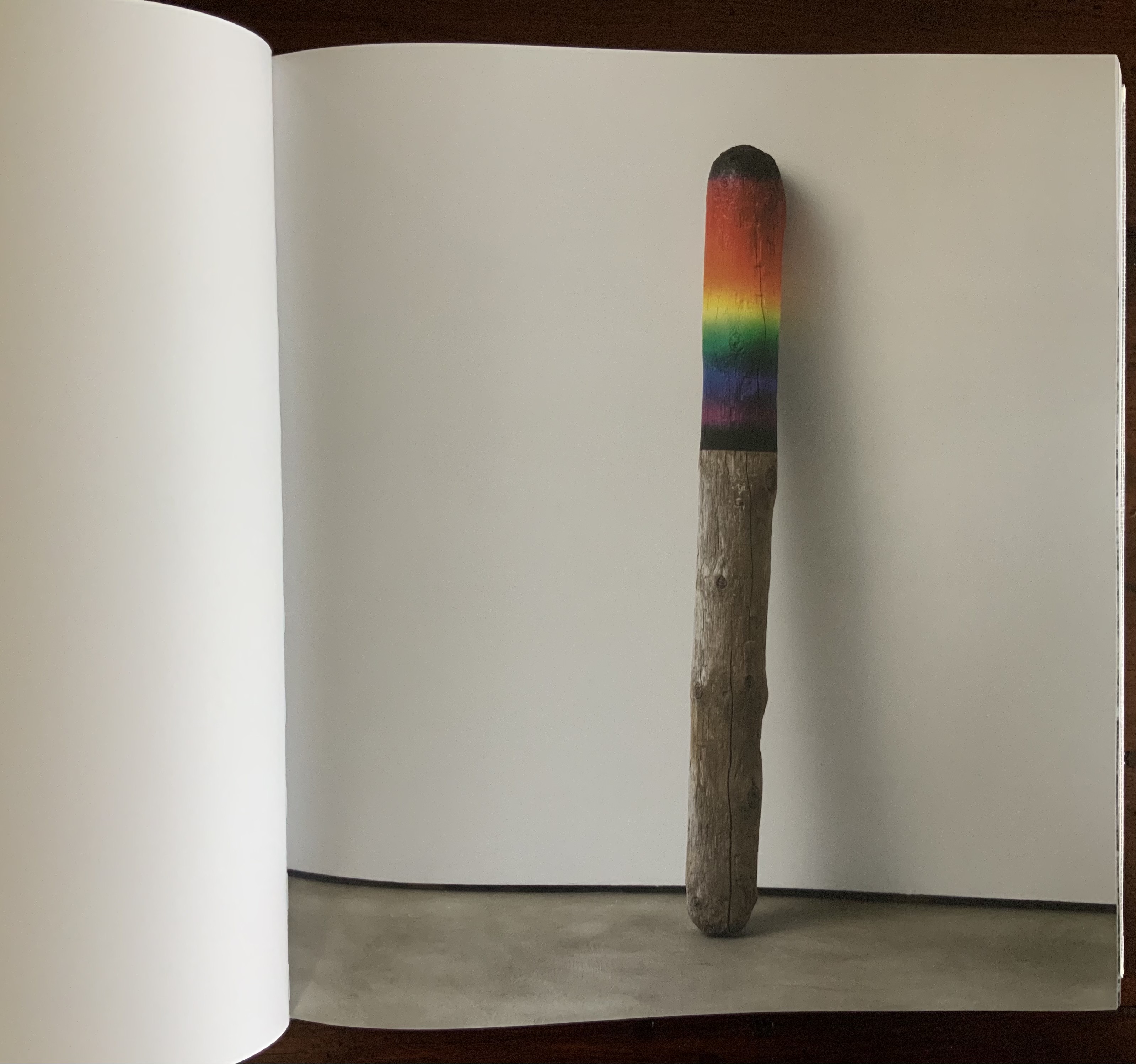
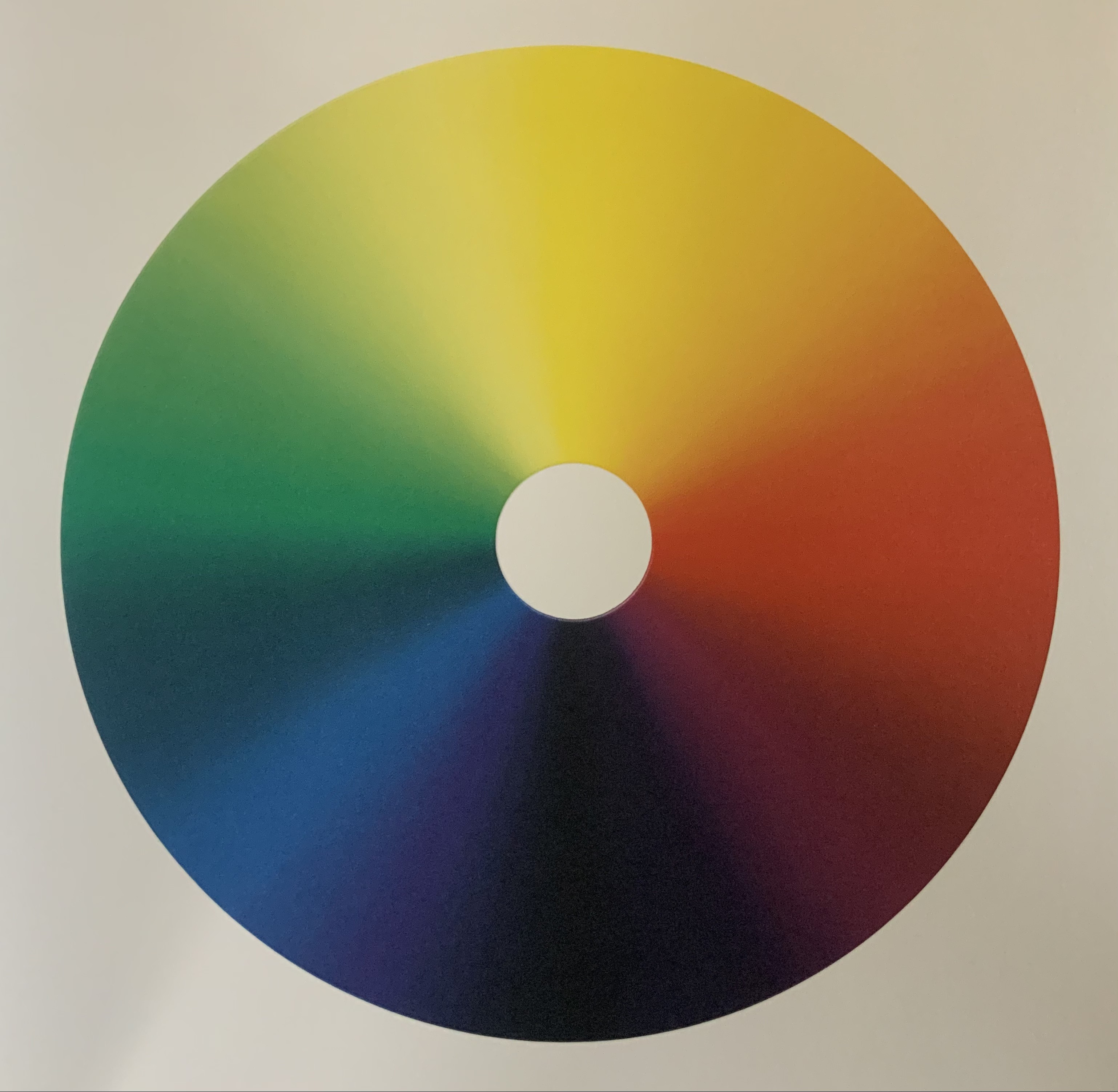
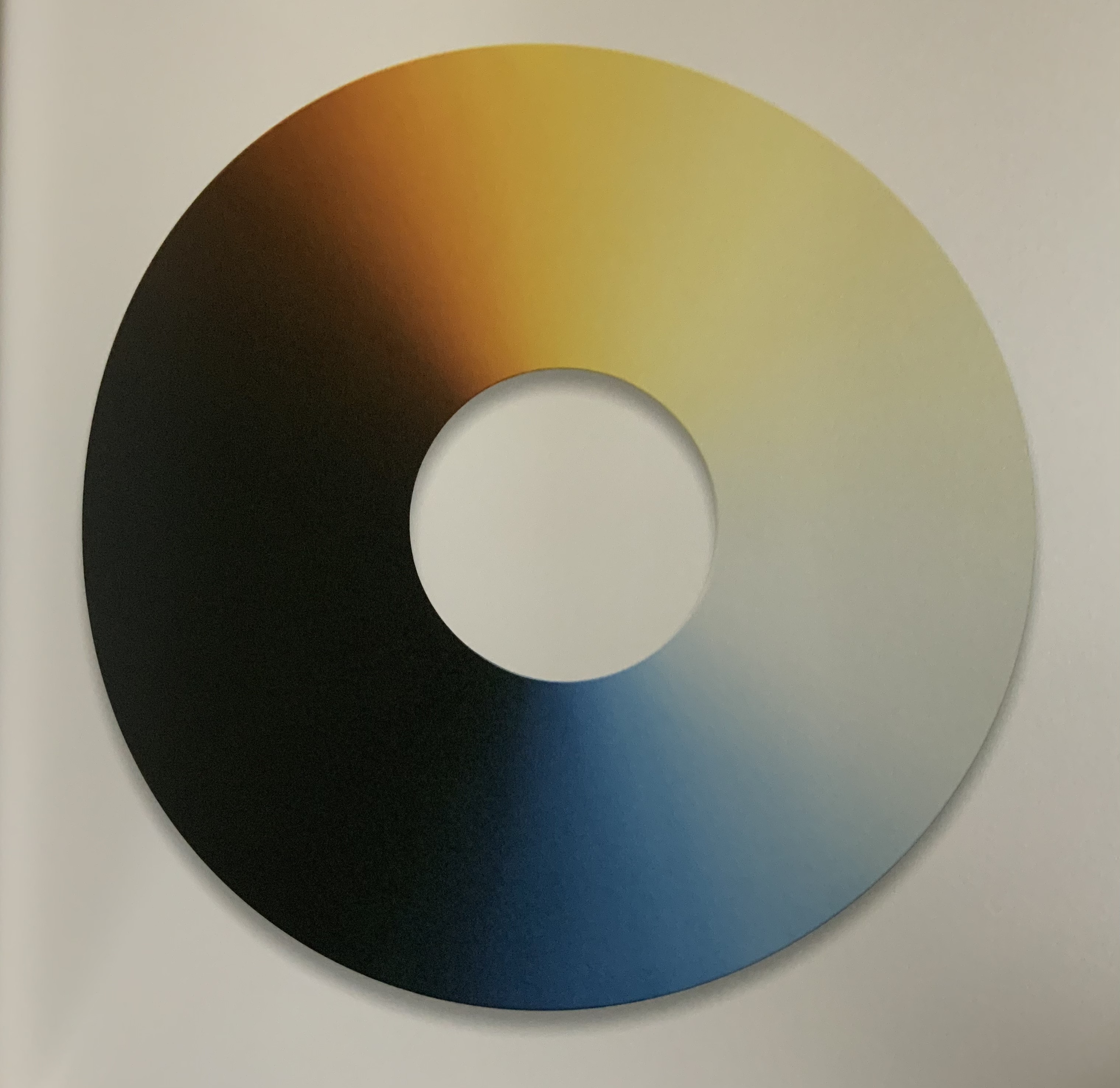
Some of these artifice/nature echoes are compressed into one image: a brightly half-painted stick of driftwood echoes the multiple color wheels used to punctuate the stretches of landscape images.
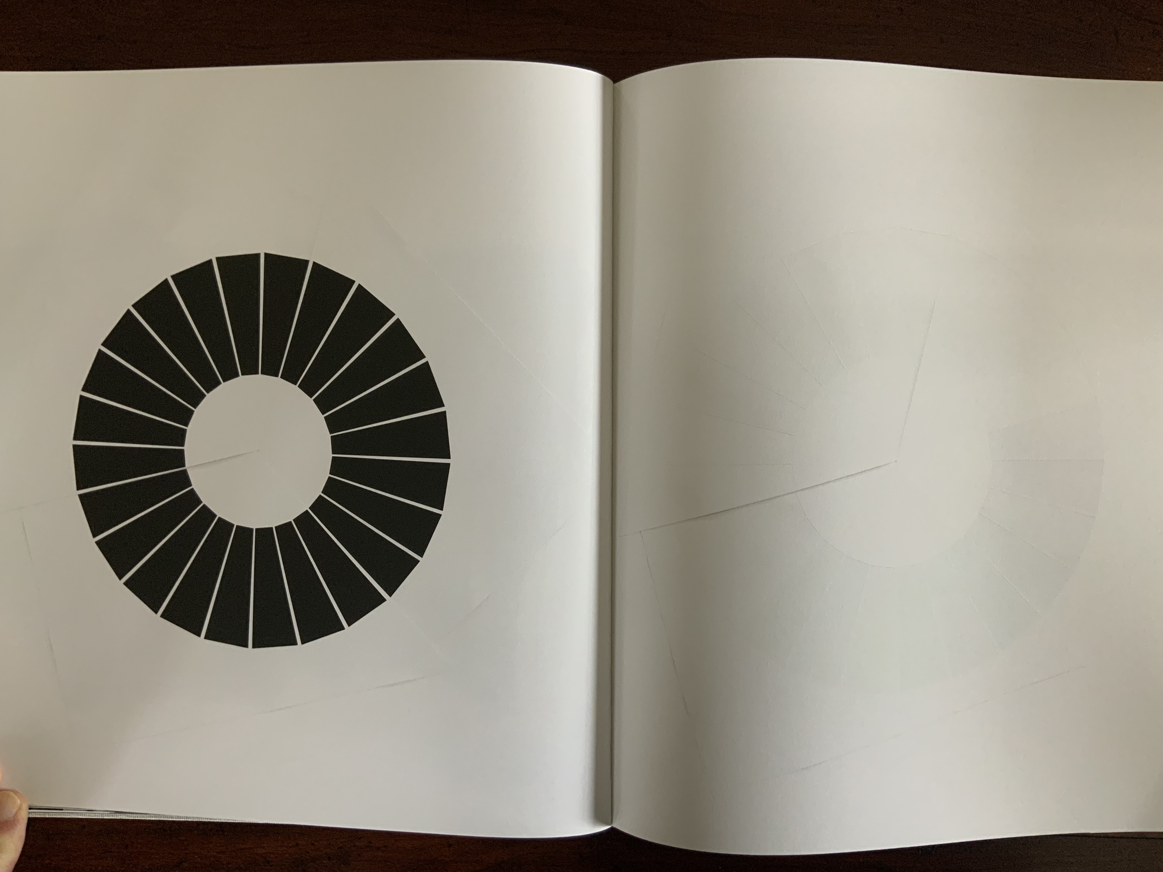
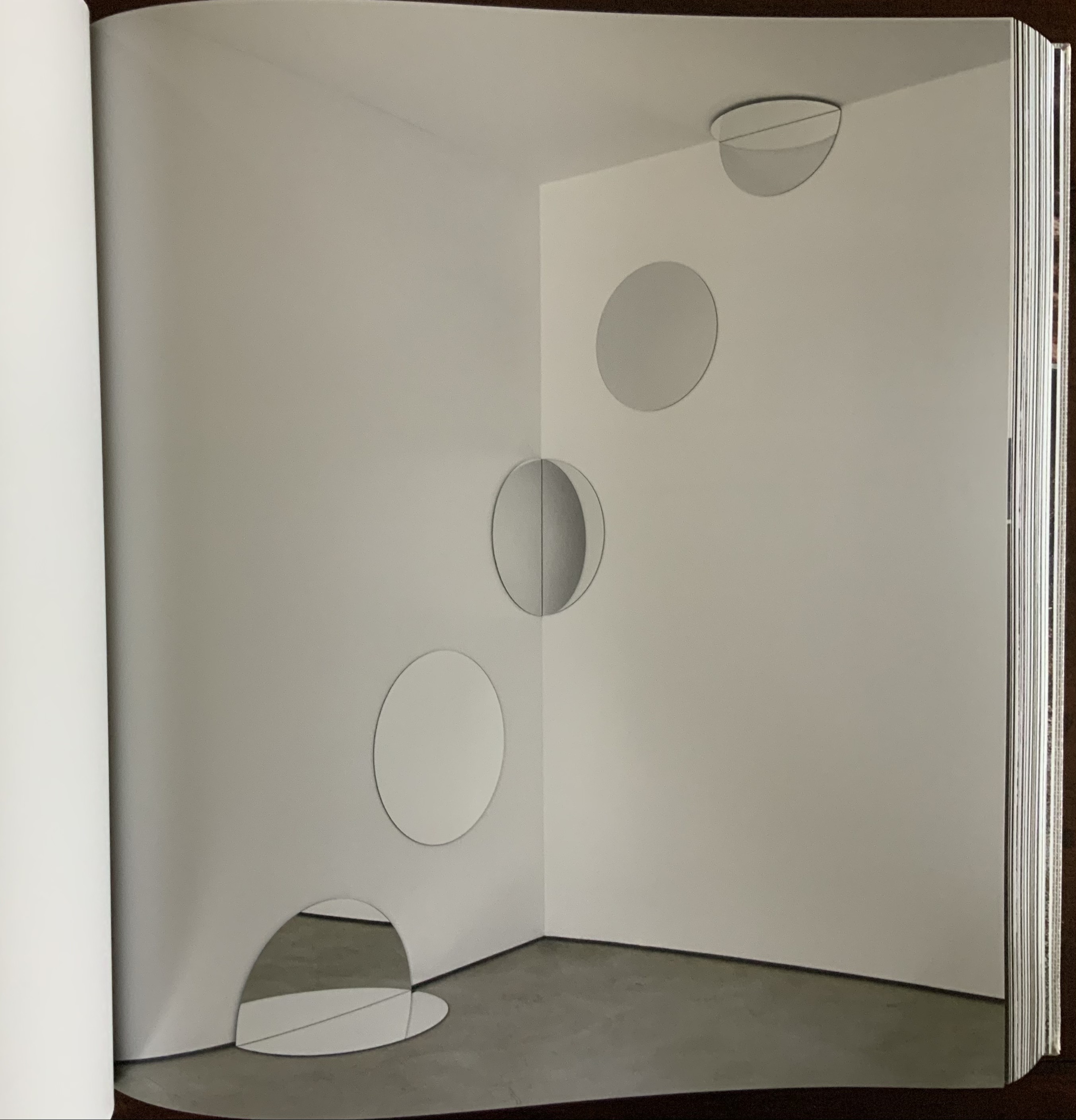
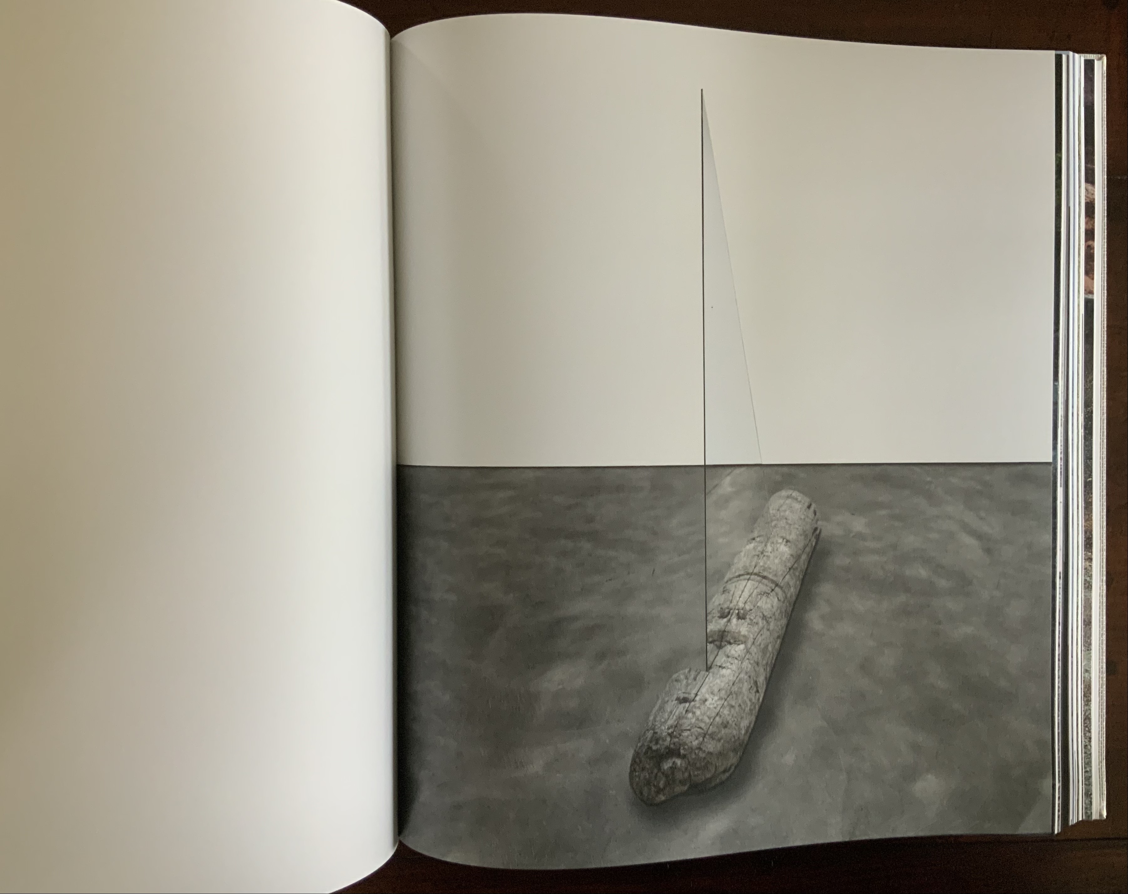
Other echoes occur within the span of artifice (whole color wheels echoed by sliced black ones) before colliding with nature (a piece of driftwood impaled by a glass triangle) and then jumping back to artifice (round mirrors bisected at floor and wall and cascading upwards to be bisected by wall and ceiling).
Some echoes occur across dozens and dozens of pages. Still others occur in the single turn of a page.
These are but a few of the themes that Eliasson weaves into a narrative with his images, artworks and projects. Every encounter with this book as container seems to reveal a new theme.
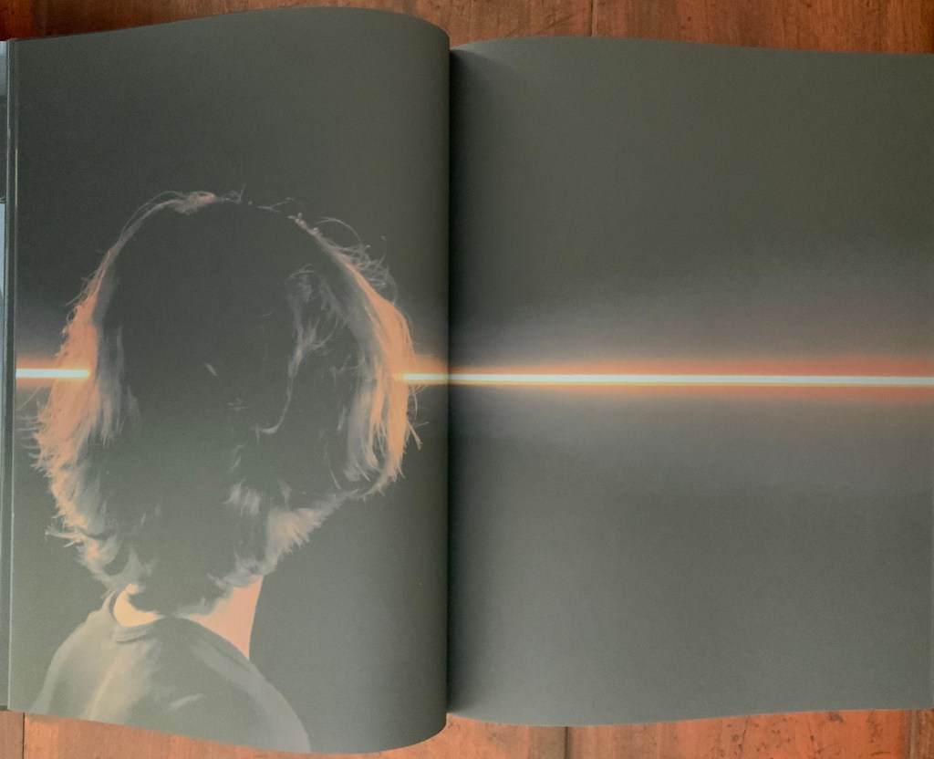
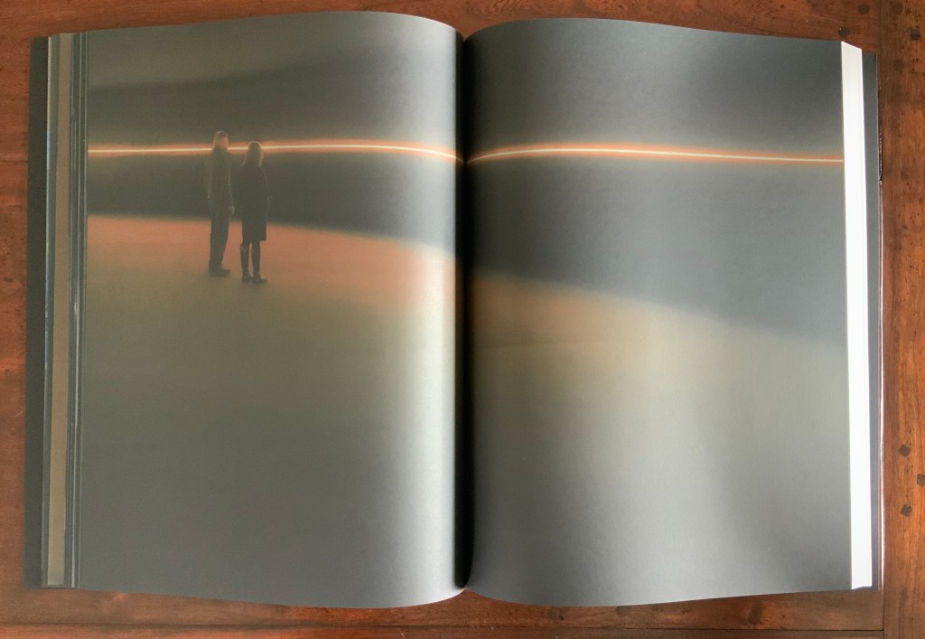
Contact (2014)
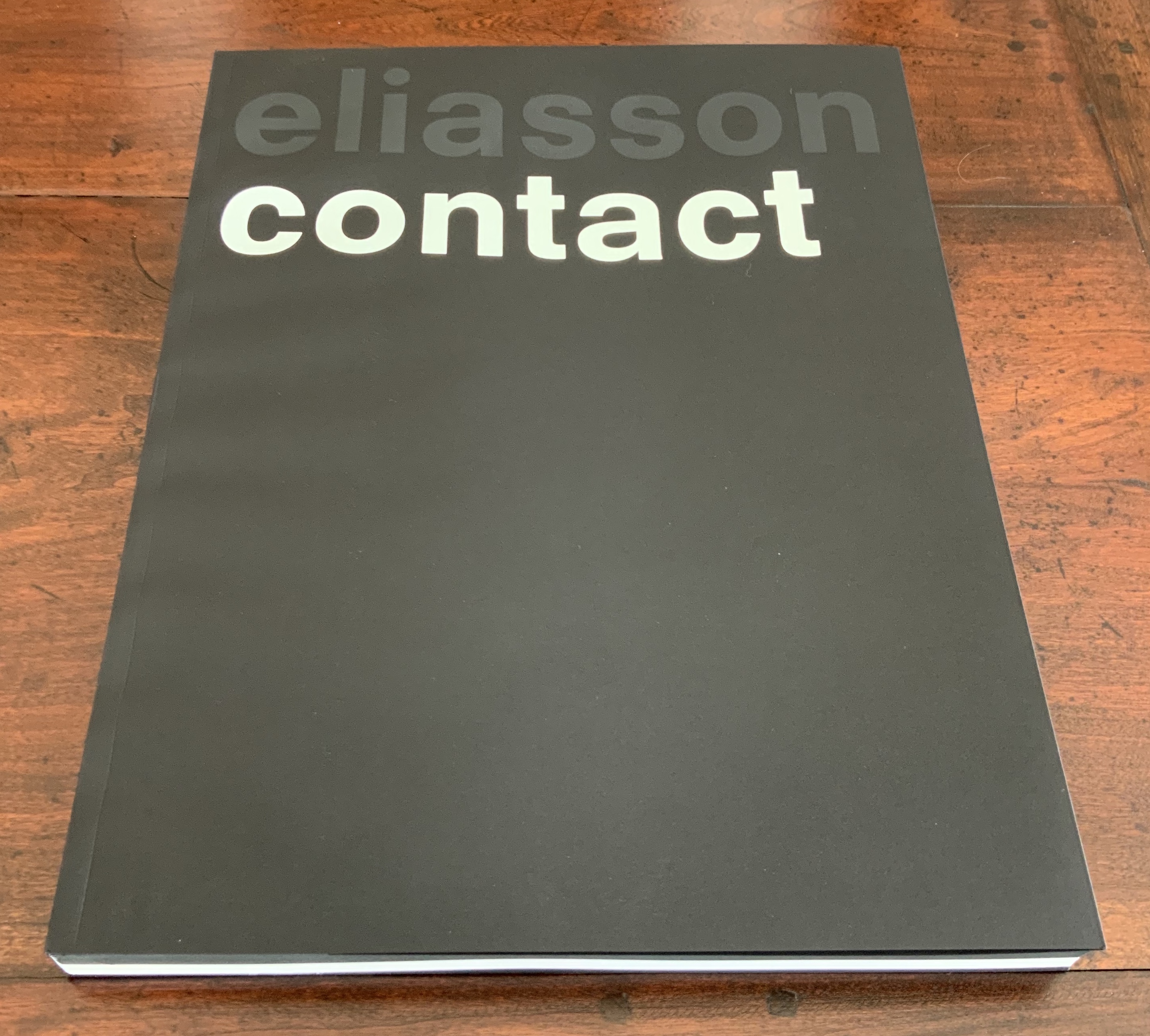
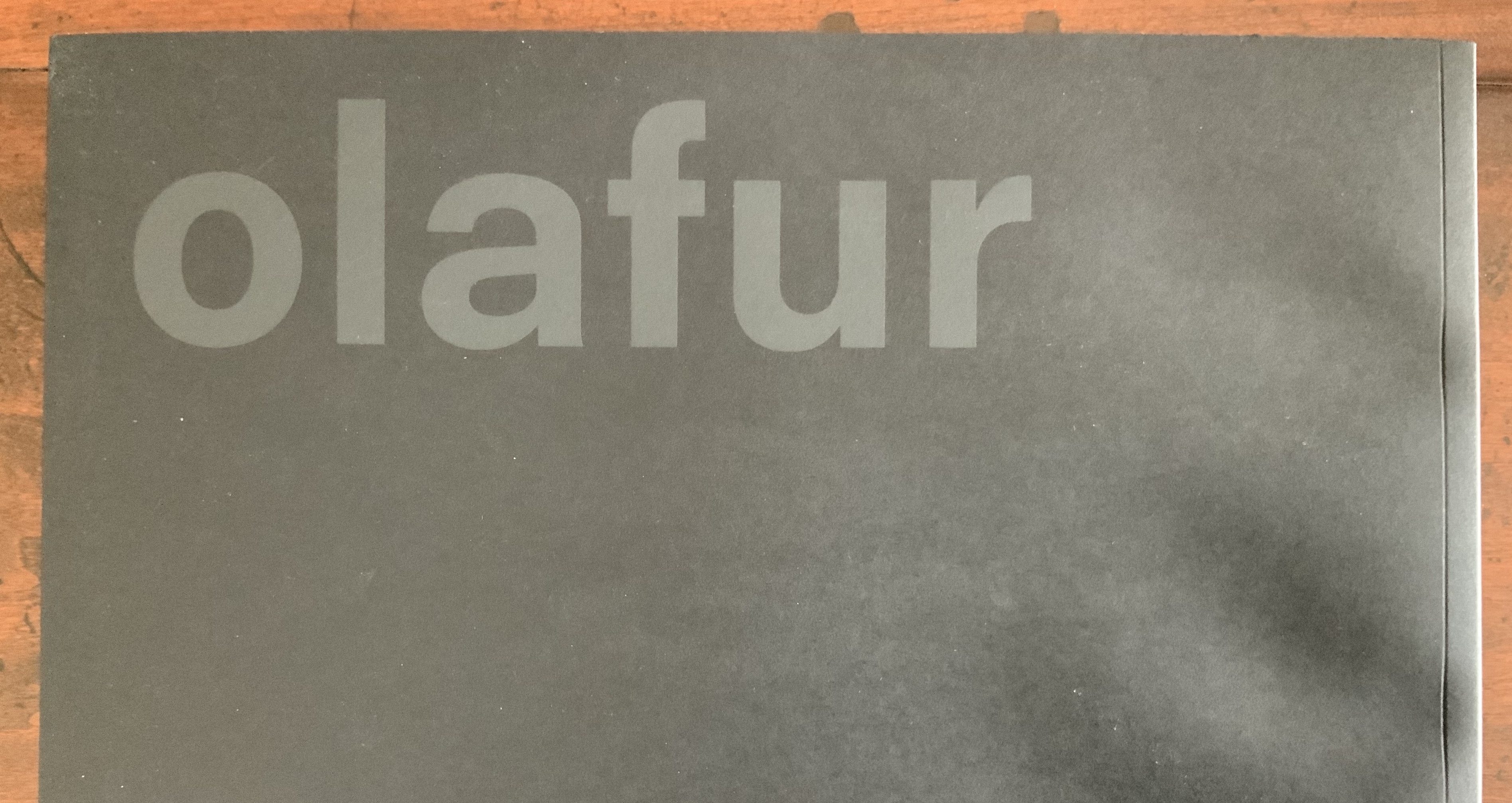
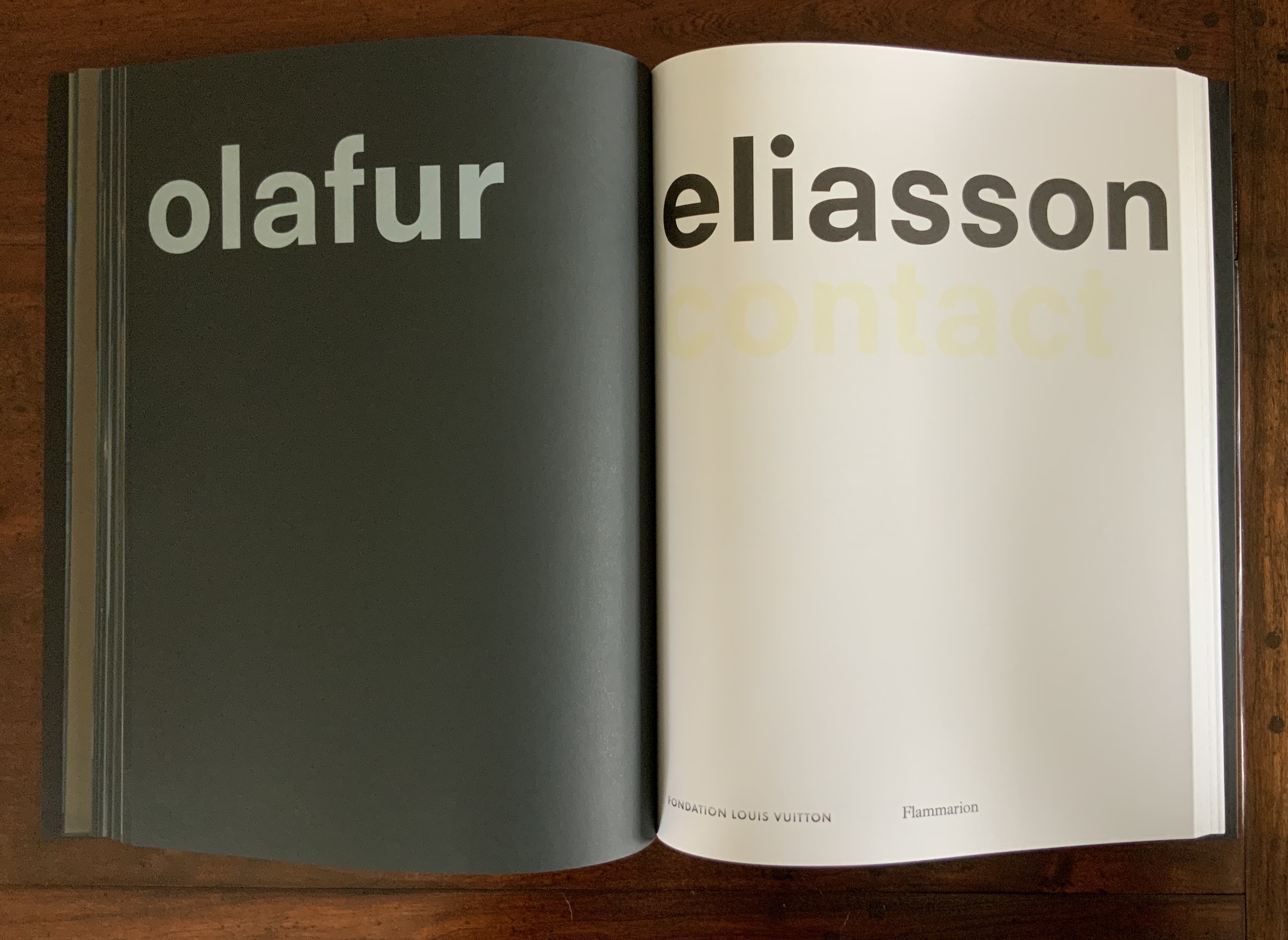
Contact (2014) Olafur Eliasson Front and back covers and center spread of exhibition catalogue in paperback. Designed by Irma Boom. Acquired from Artbooksonline.eu, 27 September 2020. Photos of the work: Books On Books Collection. Displayed with permission of Studio Olafur Eliasson.
Contact interprets the eponymous site-specific exhibition, commissioned by the Fondation Louis Vuitton and held in its Frank Gehry-designed building, 17 December 2014 through 23 February 2015. Here is the artist’s statement on Contact:
being in contact is the opposite of being disconnected. to be in contact is to be aware of the consequences that your actions have in and on the world. contact is about experience rather than consumption. to be in contact is to be in touch with the good things in life as well as with the difficult things in life. contact can be a greeting, a smile, the feeling of another person’s hand in your hand. contact is not a picture, it is not a representation; it is about your ability to reach out, connect, and perhaps even put yourself in another person’s place. for me, contact is where inclusion begins. contact is the highest luxury of all. olafur eliasson
Contact is also between page and page. Eliasson and Irma Boom, “the queen of books”, have worked together on several works. Boom’s mastery of the full bleed, double-page spread and gutter is the perfect match for this volume that brings the virtual into contact with the material.
Contact is also between paper and ink, between black and white as well as between dark and light when the book’s fluorescent title glows in a darkened room. The cover’s fluorescent ink, however, is not integral enough with the rest of the book to rise above an amusing touch; whereas contact between black and white extends to the division of the book into black and white halves.
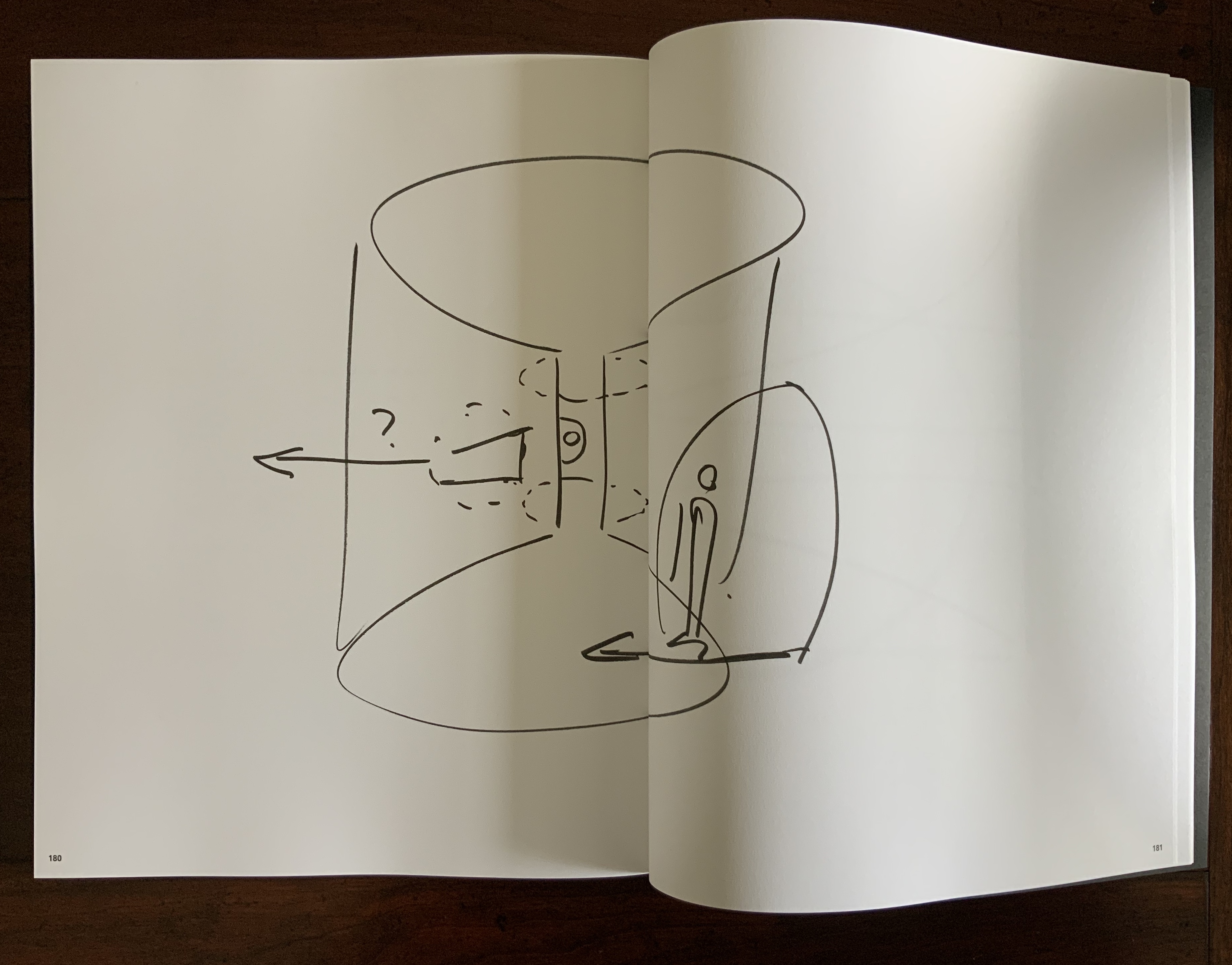
In the first half of the book, photographs on entirely black paper present a codex-experience of the exhibition. In the second half of the book, drawings take the viewer behind the scenes of the exhibition’s design and, retrospectively, train the eye to read the book as exhibition.
This incorporation of design drawings draws attention to time, and Contact is very much about our perception of time. In her book Binding Space: The Book as Spatial Practice, Marian Macken refers to “the tenses of the book”. Especially when presented in a book, architectural plan drawings “are not fixed in their sequence, but instead may be read and interpreted as existing within a range of times, such as the time of their making, of the present of the reader, the future they may refer to, and the contextual moment of apprehension” (p. 157). In the case of this “book of the exhibition”, published to coincide with the exhibition, the plan drawings and photographs exist in the exhibition’s past and present. For an exhibition attendee, they exist as a reminder of a personal past performance of contact with the exhibition. For attendees and non-attendees, they bring the exhibition’s past and future together in the present in a performance of contact guided by the architecture of the book.
How appropriate it is that, in her essay in the book’s white section, Caroline A. Jones writes, “Personally, I will not have seen the installations that the present text accompanies” — as is/will be the case for many of us experiencing Contact only in its book form. Jones’ essay is entitled “Event Horizon: Olafur Eliasson’s Raumexperimente”, which confirms that contact is not only about perception of time, but of space as well. While Jones teases out how the exhibition will play/plays/played with the astrophysical conundrum, she cites a comment from Eliasson in conversation that captures a simpler view: “There is a tradition of the horizon as a boundary between the known and unknown. But as you approach, it fades in, or comes into your experience. You can think of it as a space” (p. 133).
Space — which brings up the awkward point of the setting in which the exhibition occurred. Since the Renaissance, imagination in art and science has sat sometimes uneasily, sometimes too easily with wealth and privilege. There may be nothing democratic in Eliasson’s expensive, spectacular art, but Contact’s fusion of science, art, nature (Earth-bound and cosmic) and social connectedness contrasts pointedly and paradoxically with its setting in the opulent property of a global luxury brand — “the blandishments of follies and bling” as Jones puts it. As Eliasson’s artist statement asserts: “contact is about experience rather than consumption….is where inclusion begins….is the highest luxury of all”. But without the Fondation’s patronage, the experience of Contact in situ or even in these artfully designed pages would be denied.
Somewhat less reconcilable is the statement “contact is not a picture,… is not a representation”. Placing contact with art (a picture, a representation) in opposition to contact through human touch and empathy is not quite right. Just as Your House resonates with the perspective of the physicist/philosopher/humanist Bachelard, for whom the image is language, so too does the language of Contact as exhibition, images, objects, book — and experience. We cannot have contact without it.
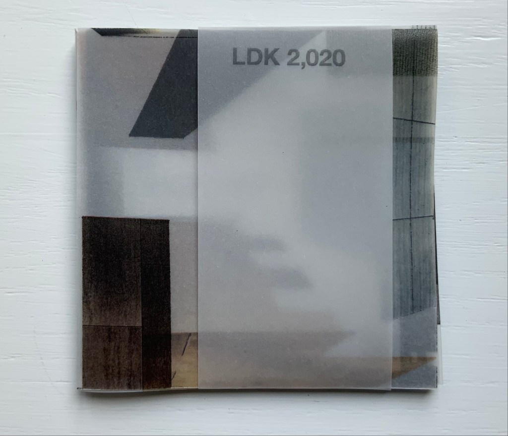
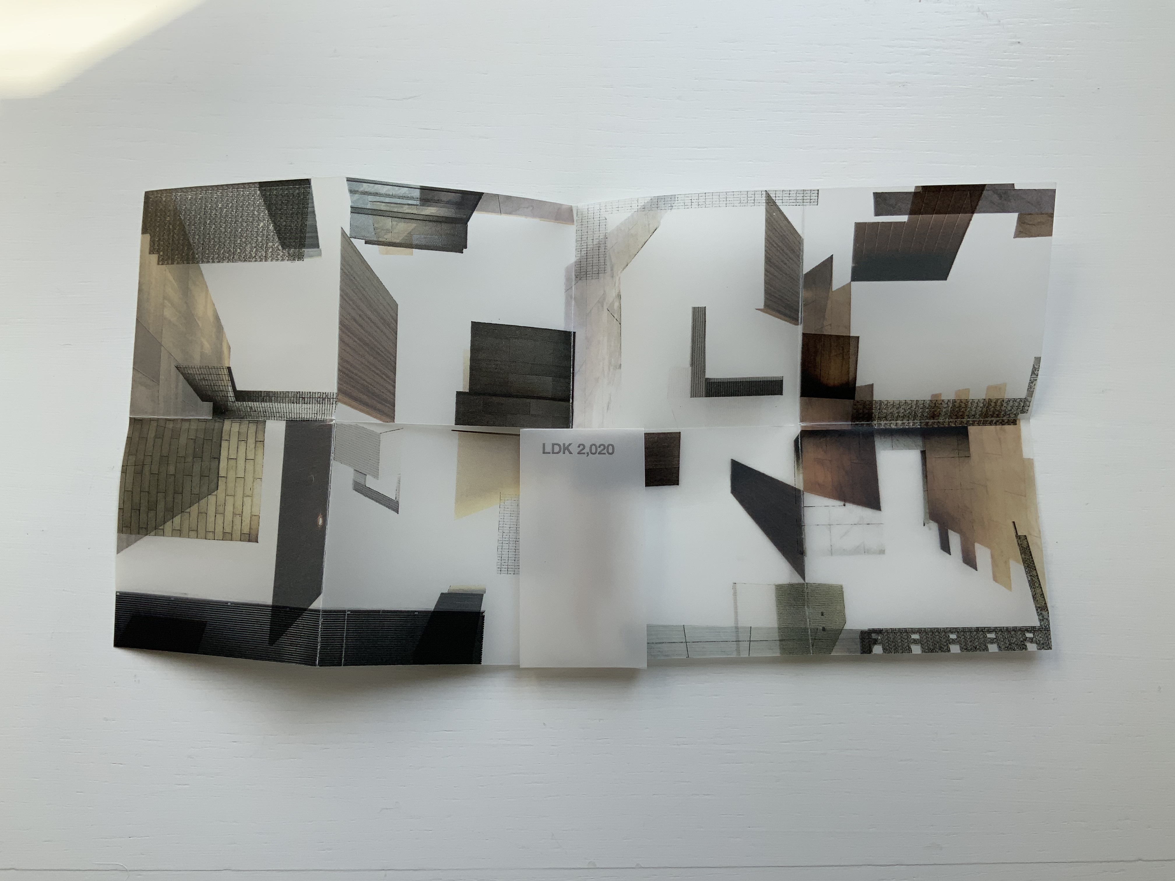
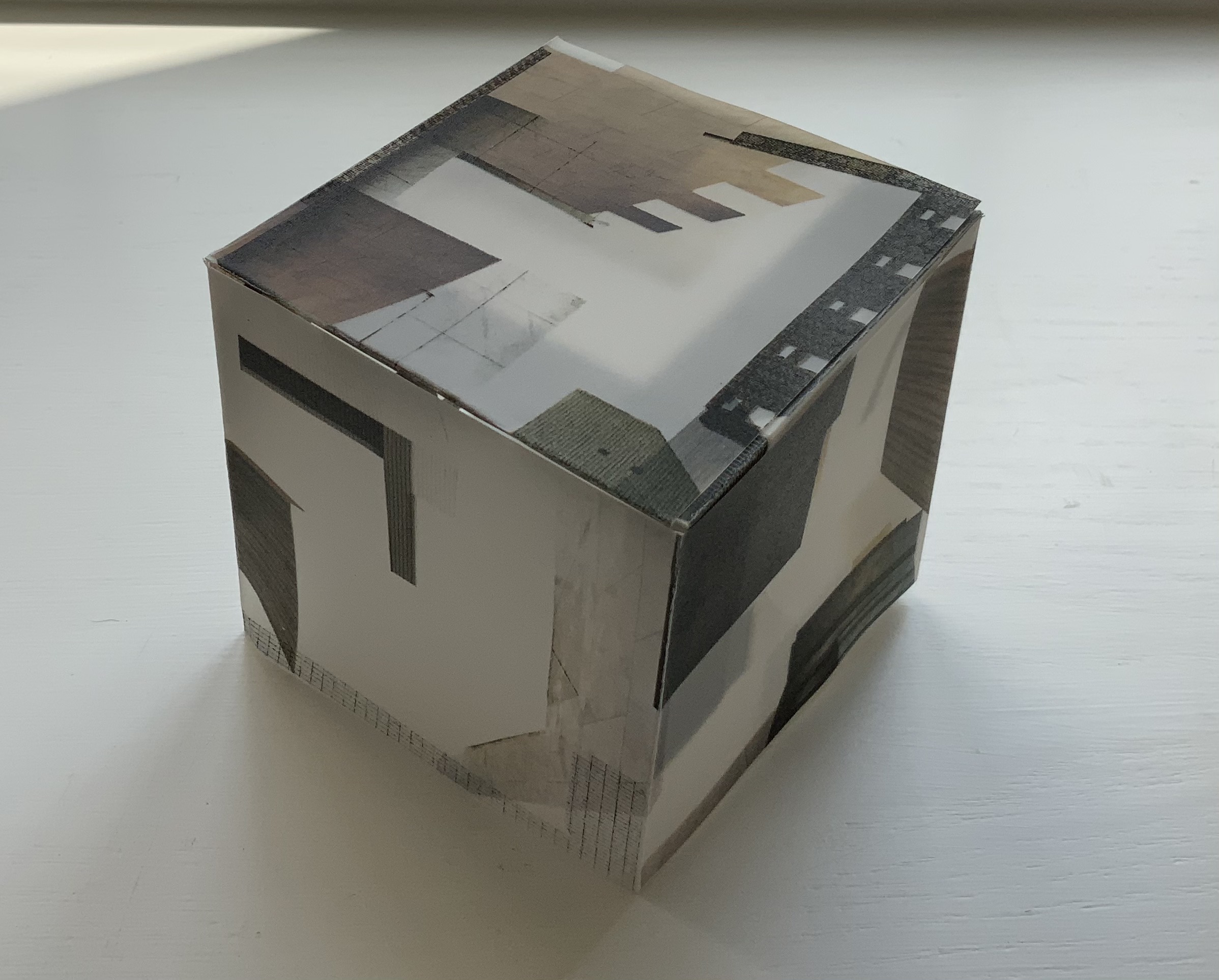
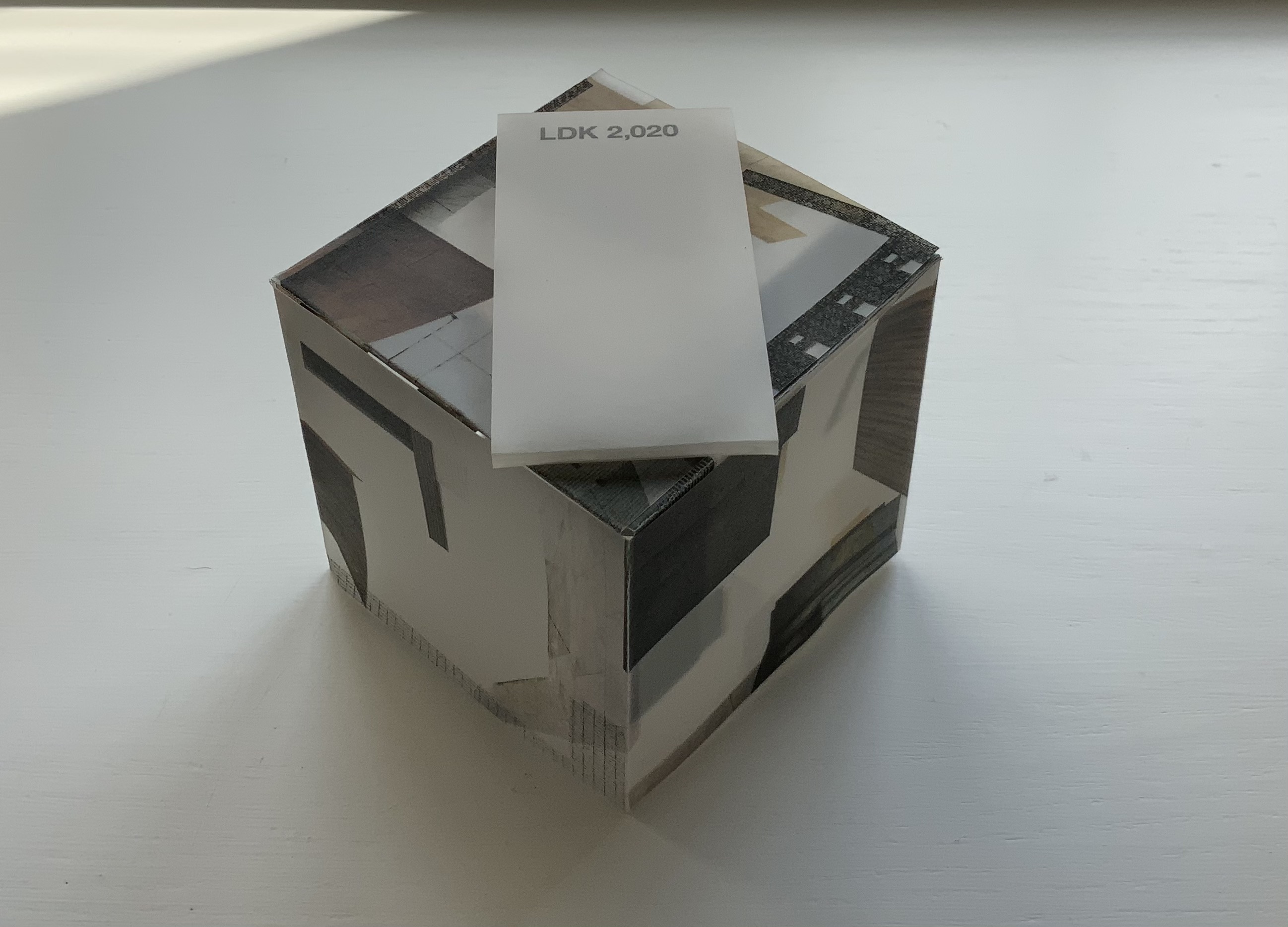
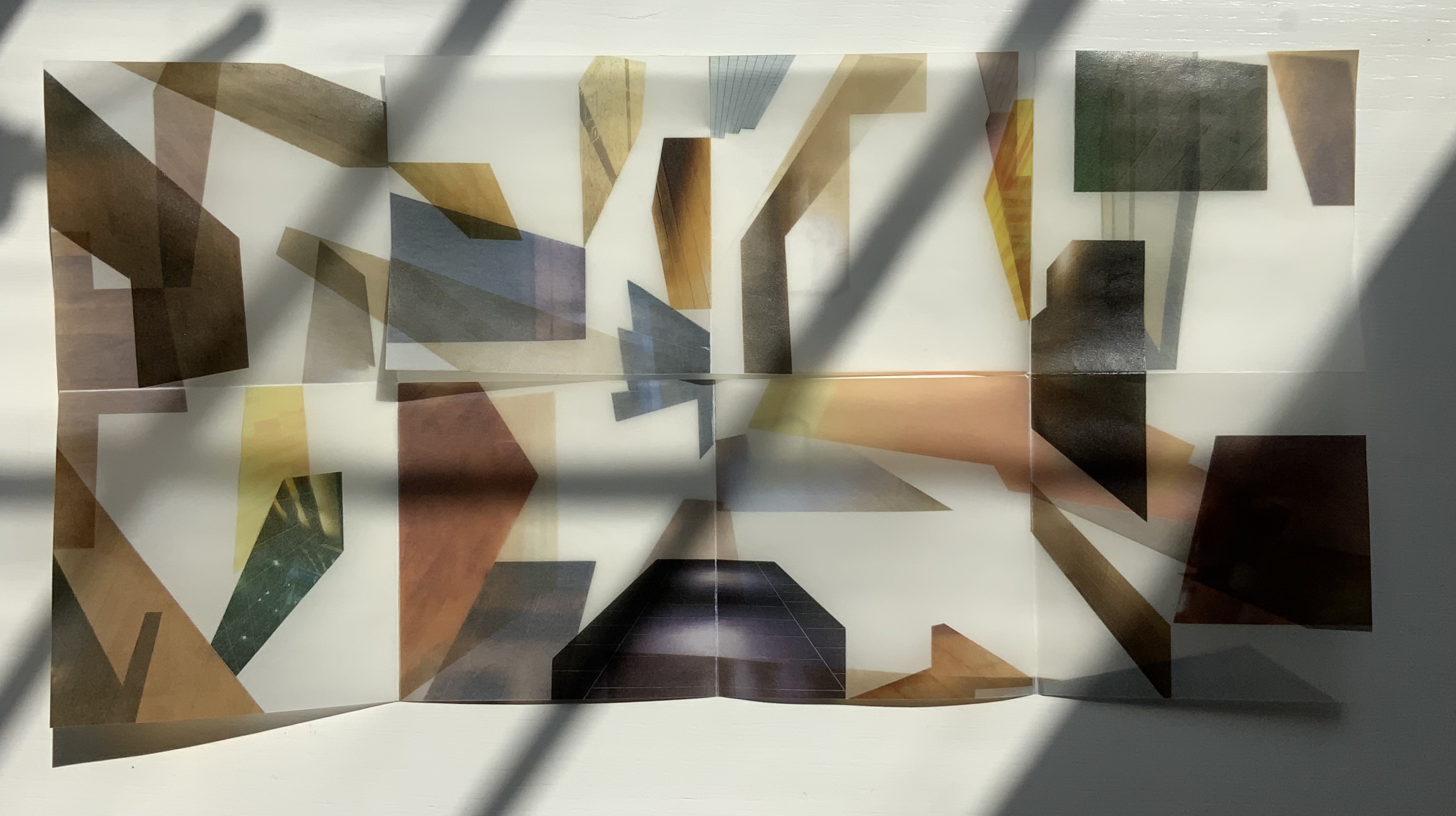
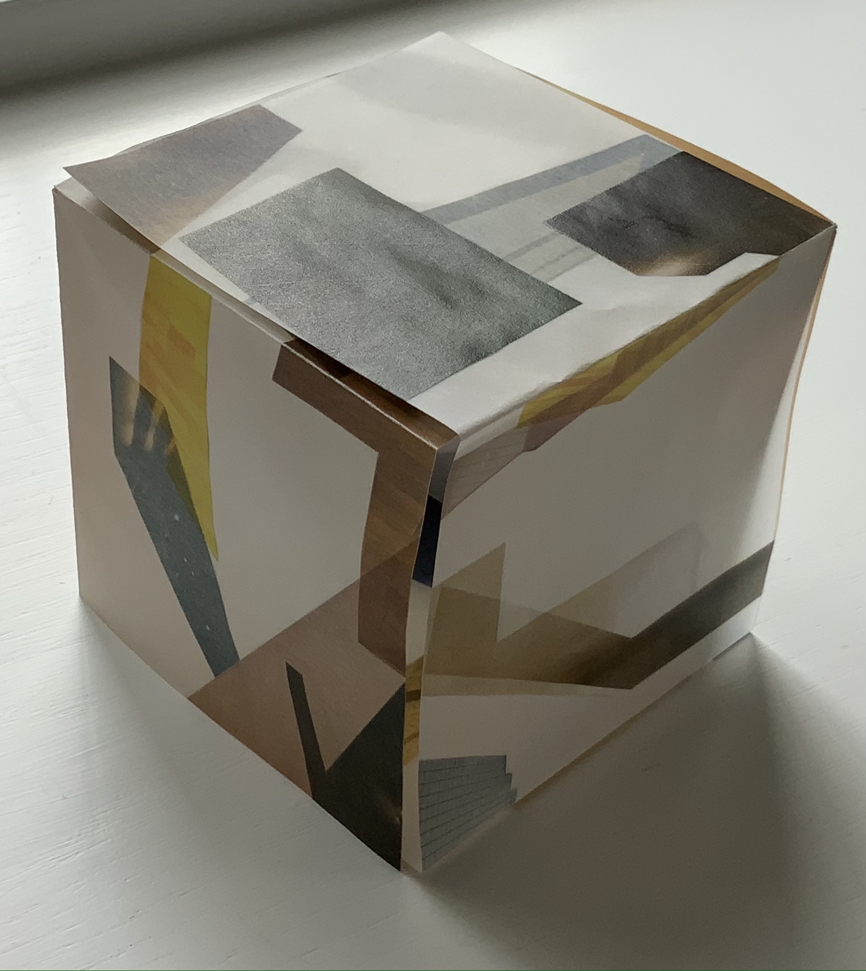
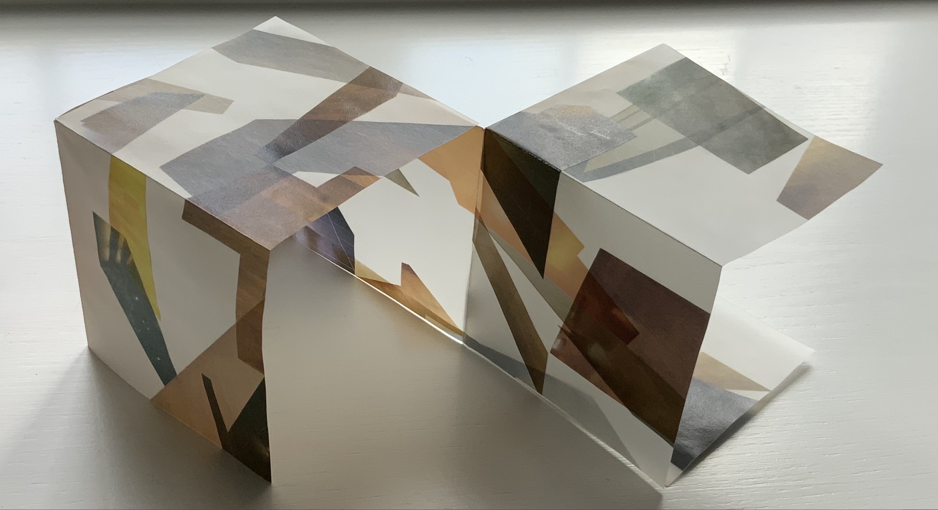
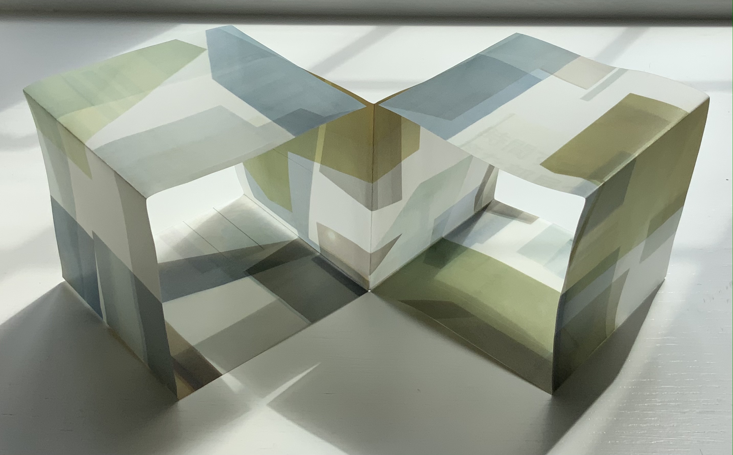
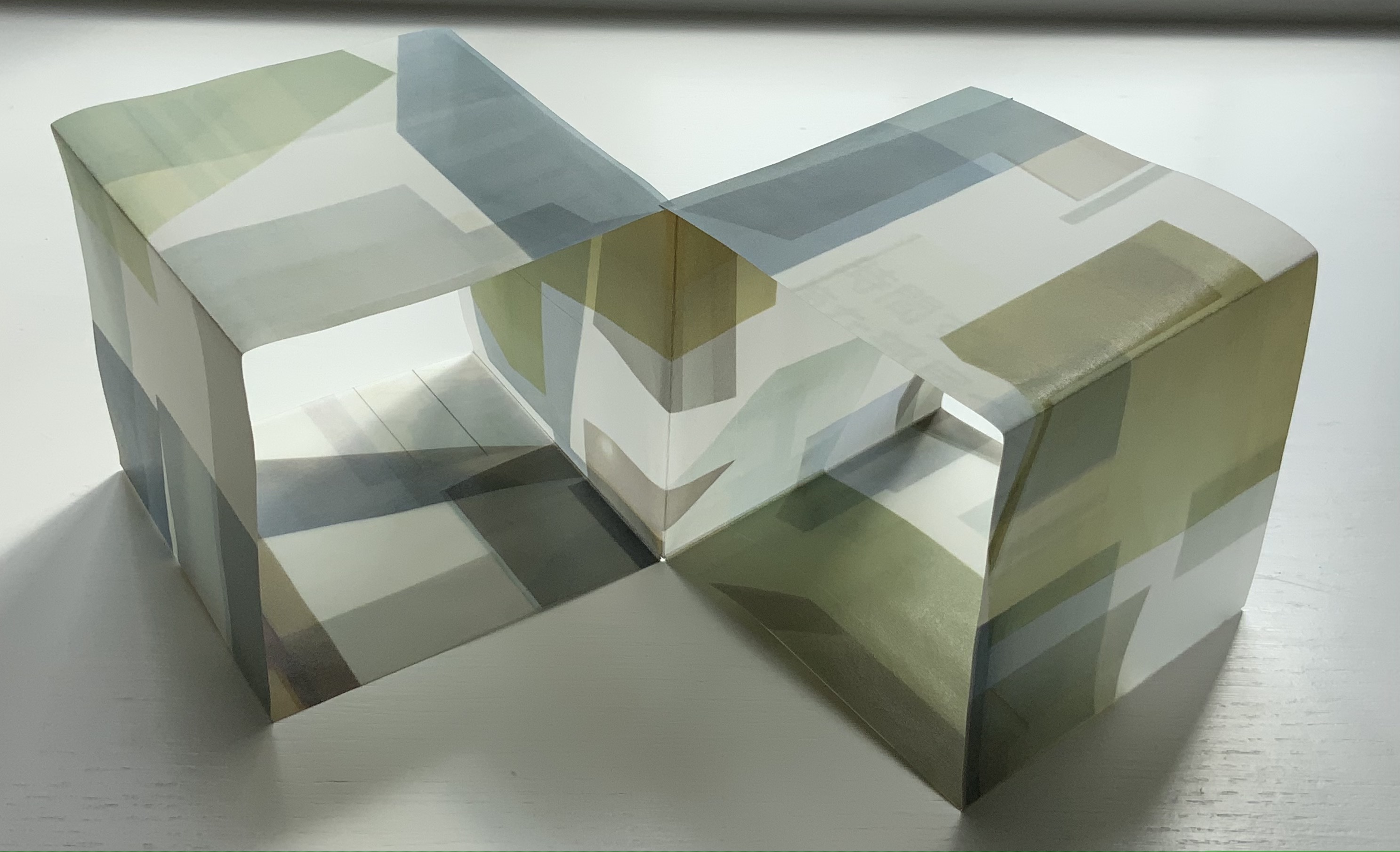
LDK 2,020 (2020) Yasushi Cho Banderole bound, single sheet cut and folded accordion style. 75 x 75 mm. Edition of 45, of which this is #7. Acquired from the artist 10 April 2021. Photos: Books On Books Collection.
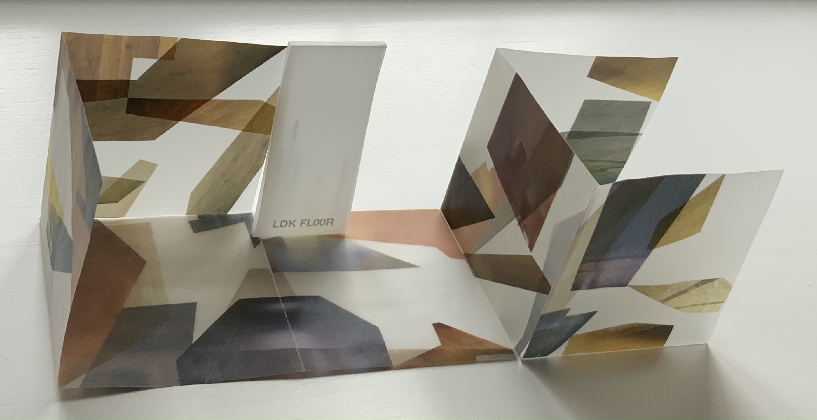
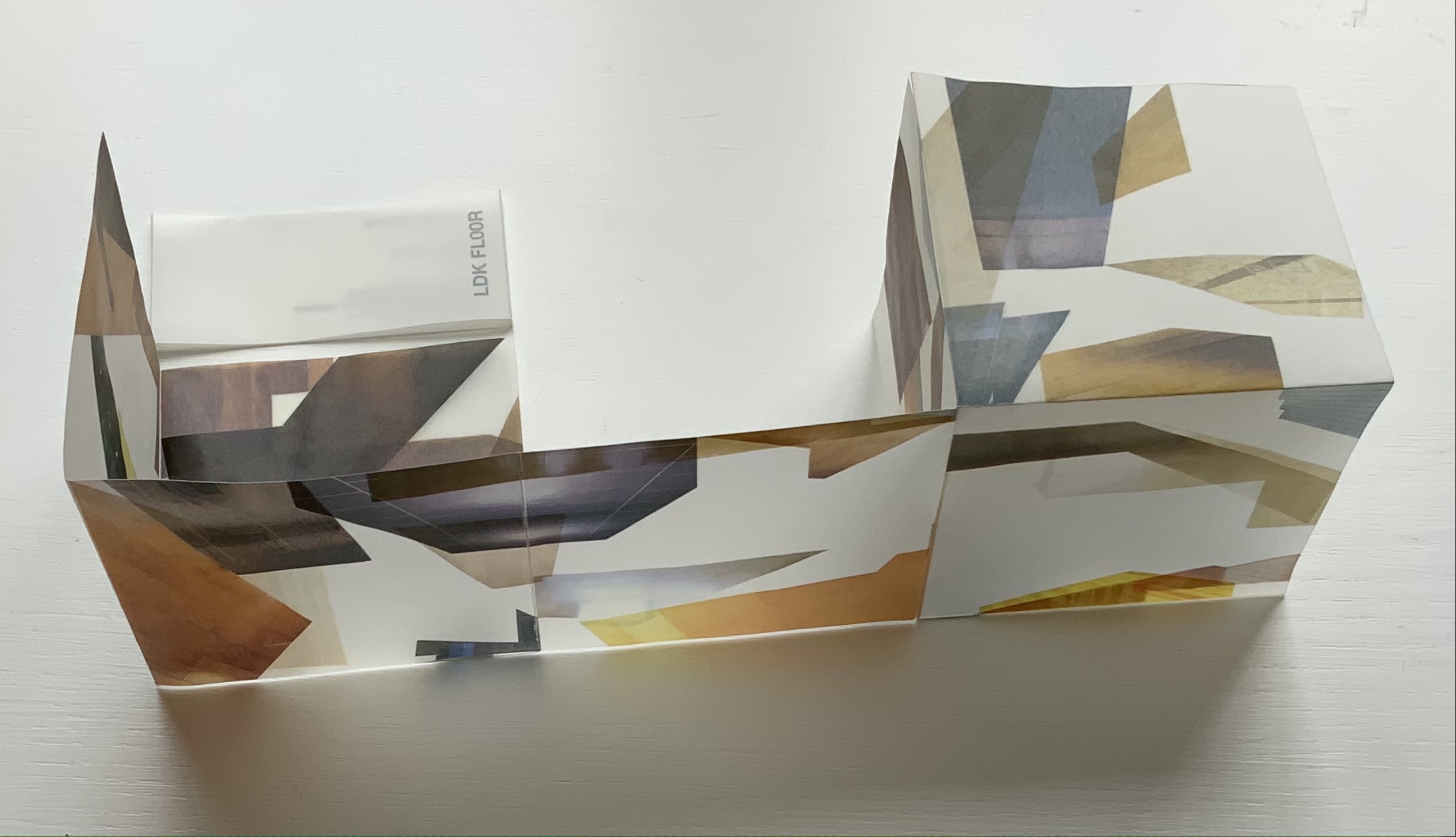
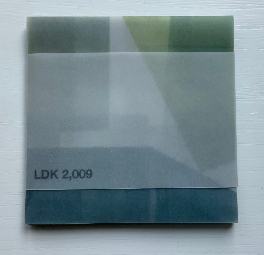
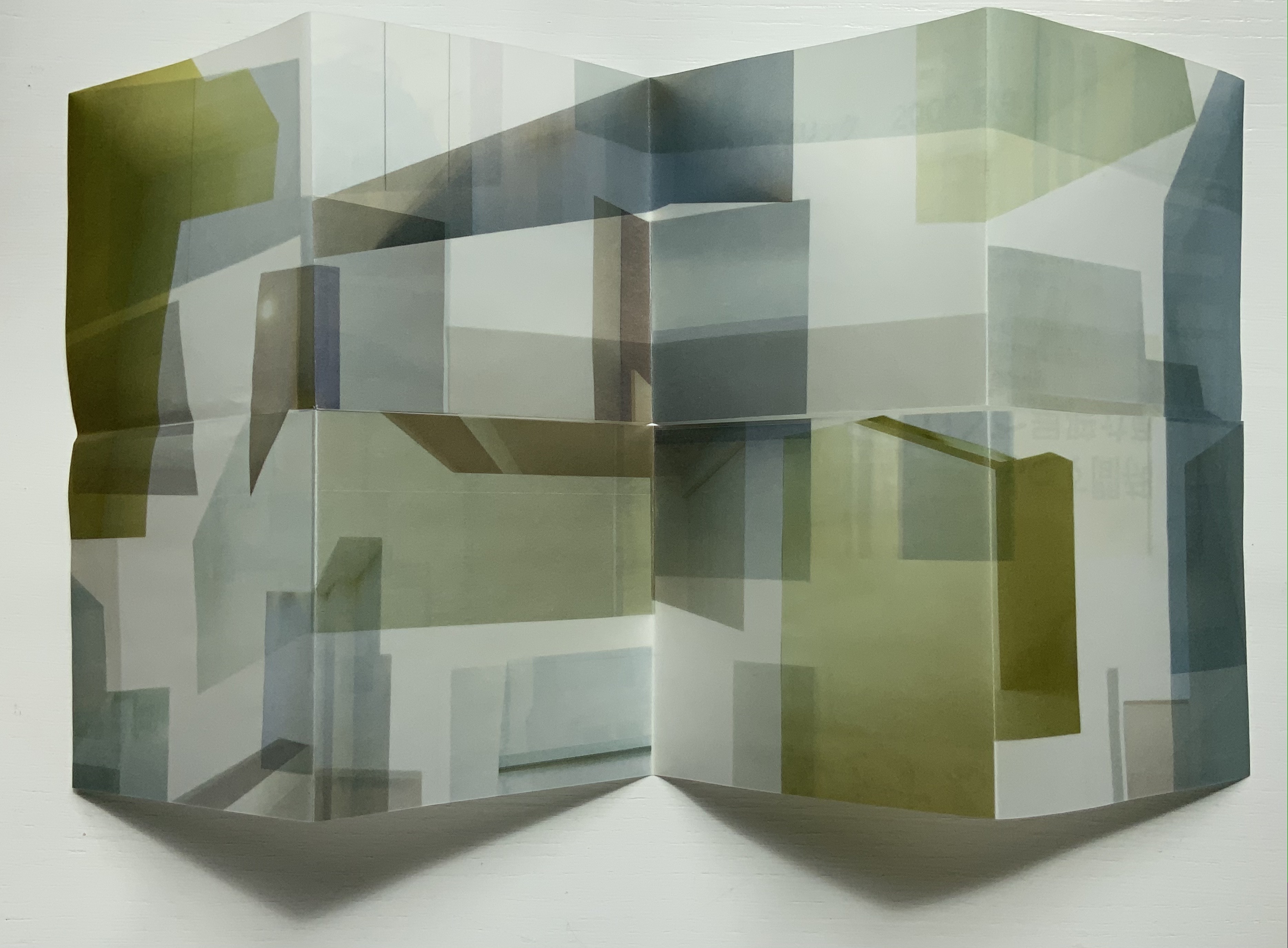
LDK 2,020, LDK FL00R and LDK 2,009 make up part of a series. Their letters L, D and K stand for Living, Dining and Kitchen and are the usual abbreviations in Japanese apartment/flat sales leaflets. Every day they arrive or can be picked up on the street, and Cho creates collages from them, digitally printing them on stiff translucent paper to be cut and creased, then folded into an accordion-style booklet. For the reader, the folds and cuts of the stiff translucent paper make a tricky “assembly and disassembly” — or reading — of the work to make it into a cube or other three-dimensional shape.
In the process of flattening the booklets into a single sheet, then folding and creasing and re-creasing, the reader wonders how the aspects of LDK may have fit together before their abstraction into the collage. Eventually though, the assembly creates objects whose interiors are their exteriors — and vice versa — and inevitably recall the shoji screens still used in traditional houses and even apartments.
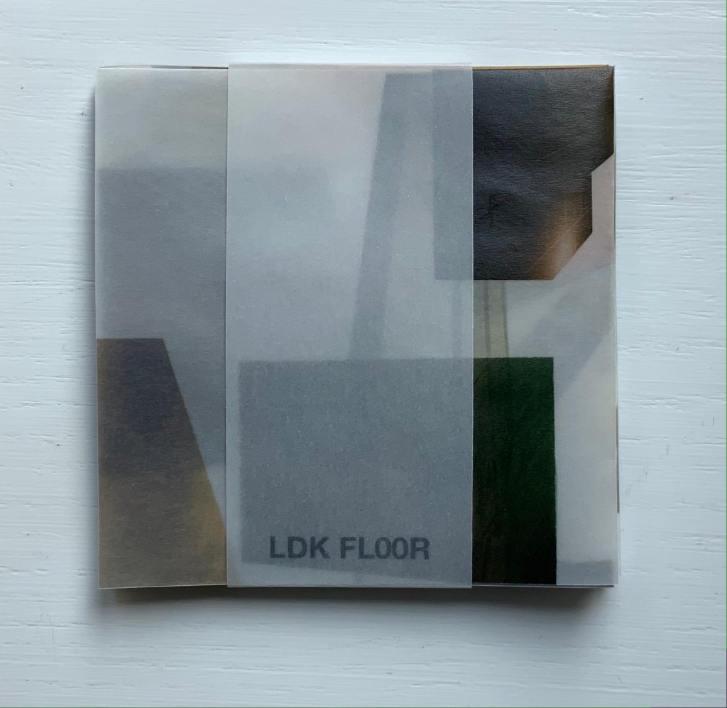
LDK FL00R (2010)
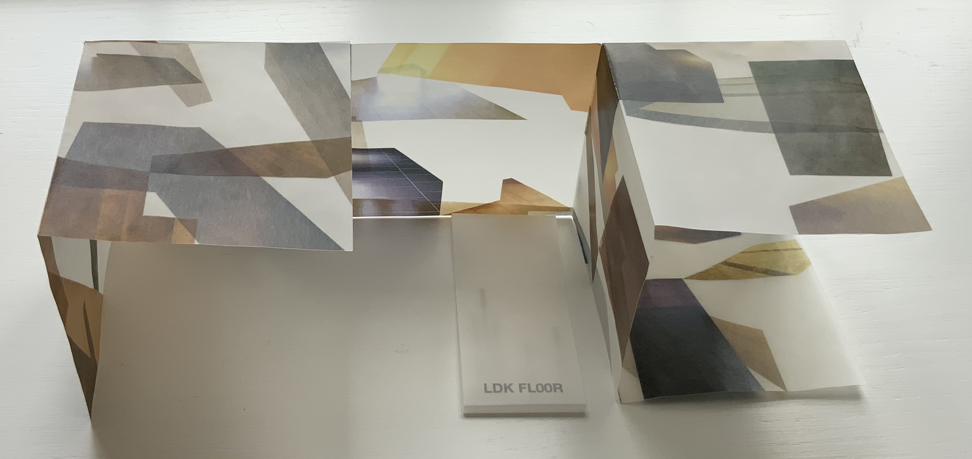
LDK FL00R (2010) Yasushi Cho Banderole bound, single sheet cut and folded accordion style. 85 x 85 mm. Edition of 45, of which this is #3. Acquired from the artist, 10 April 2021. Photos: Books On Books Collection.
Like the commas in LDK 2,020 (above) and LDK 2,009 (below), the zeroes in LDK FL00R play on the apartment prices listed in the sales leaflets, but also allude to the apartments’ floor numbers. The wordplay of the titles echoes the playful multiple shapes that the sheets can take and the resulting multiple views of the collages. The collaged images in LDK FL00R, however, are of the floor surfaces only.
LDK 2,009 (2009)
LDK 2,009 (2009) Yasushi Cho Banderole bound, single sheet cut and folded accordion style. 75 x 75 mm. Edition of 45, of which this is #36. Acquired from the artist, 10 April 2021. Photos: Books On Books Collection
With smaller works of book art, size can disguise their depth and impact. In “reading” LDK 2,009 and its companions, an extraordinary depth and impact emerge. As the opened books assume their shapes and take their place in display, another element of the artful choice of material and printing technique emerges: the resulting play of light. This is a theme that Cho explores in two very different ways in the next works.
.interior (2010)
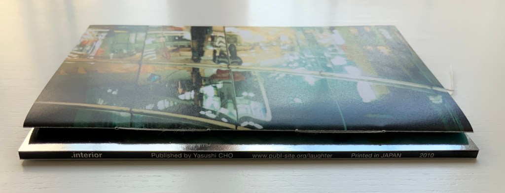
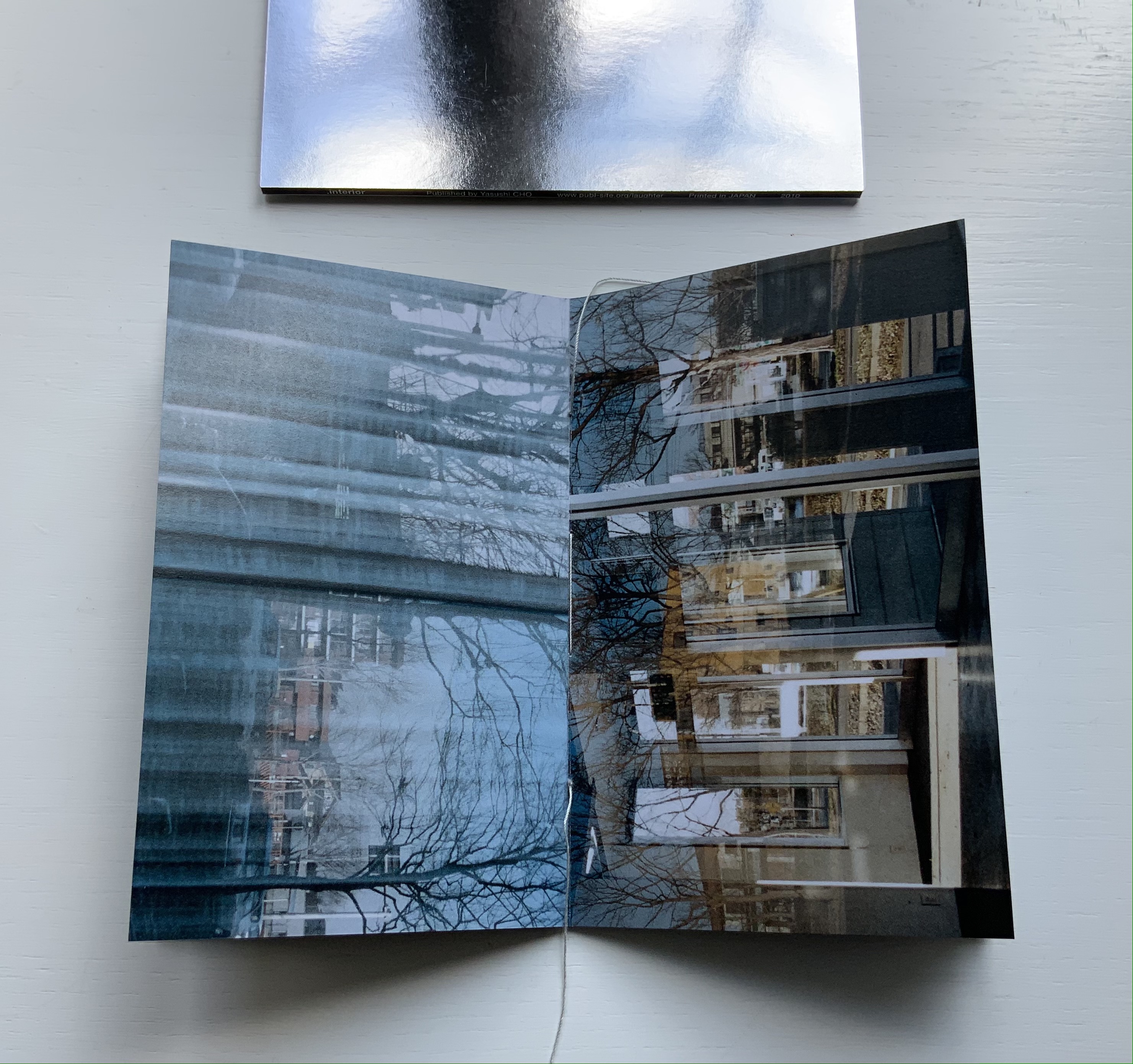
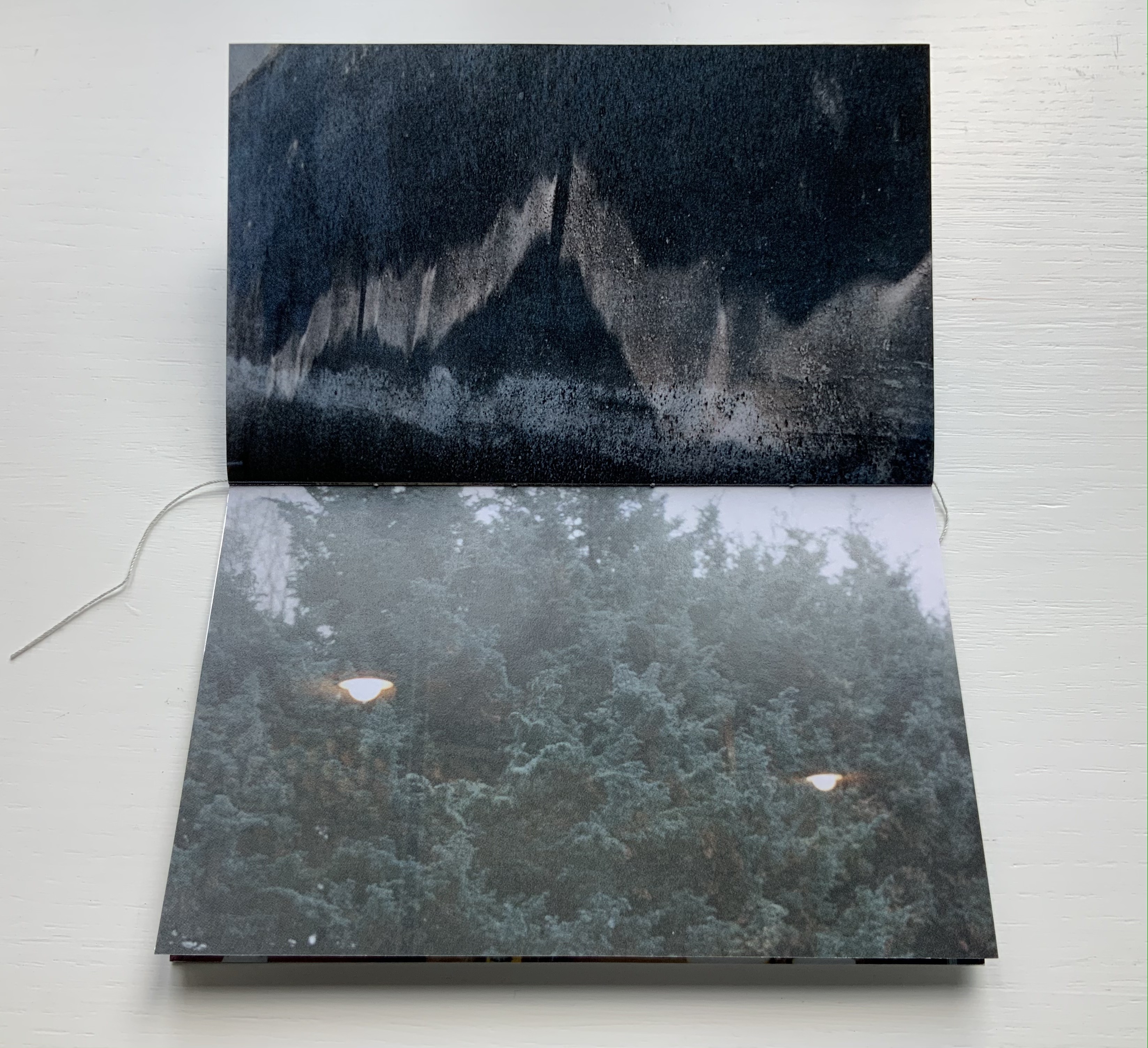
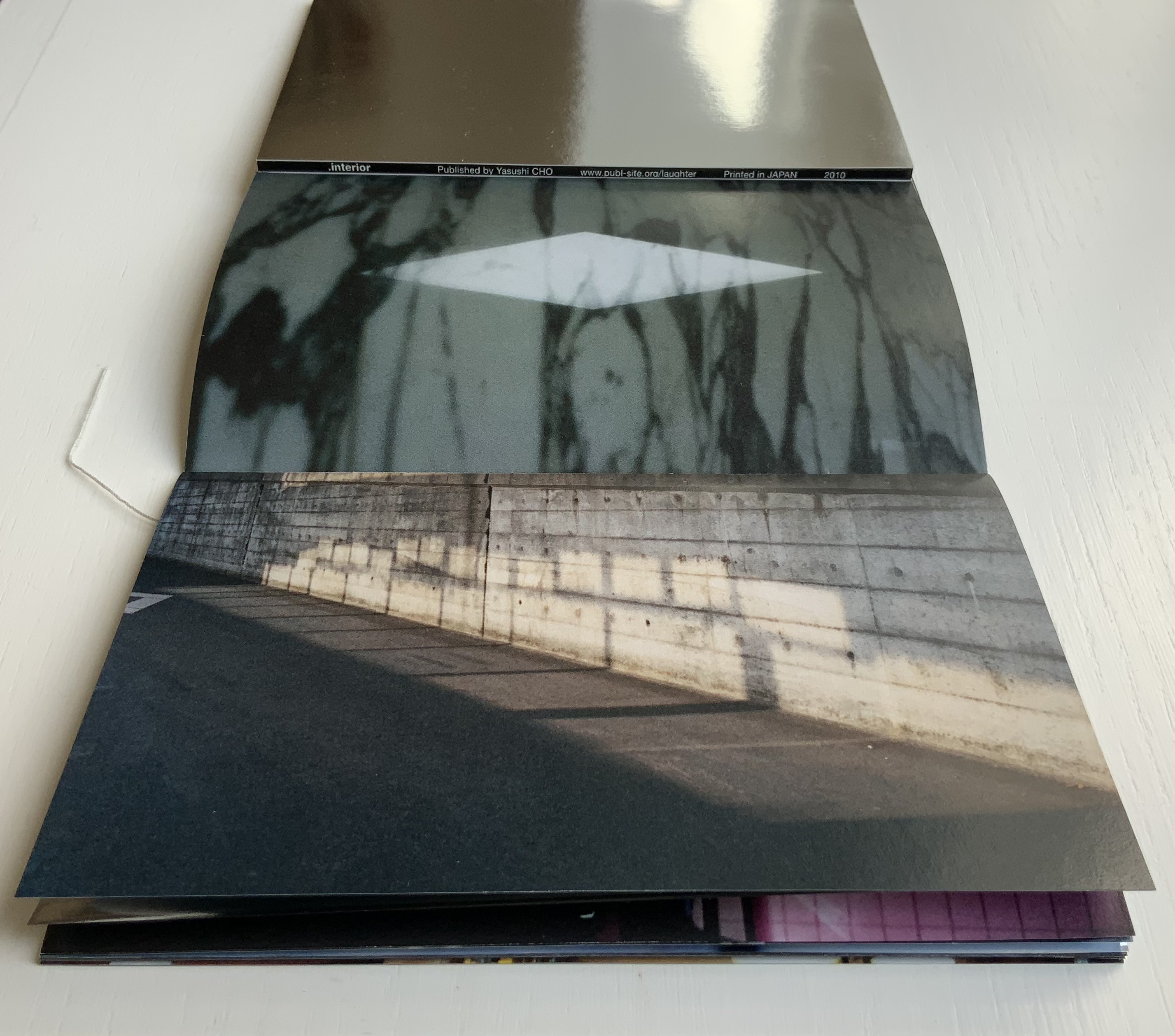
.interior (2010) Yasushi Cho Slipcase. Booklet, sewn. H150 x W98 mm, 24 pages. Edition of 30, of which this is #4. Acquired from the artist, 10 April 2021. Photos: Books On Books Collection.
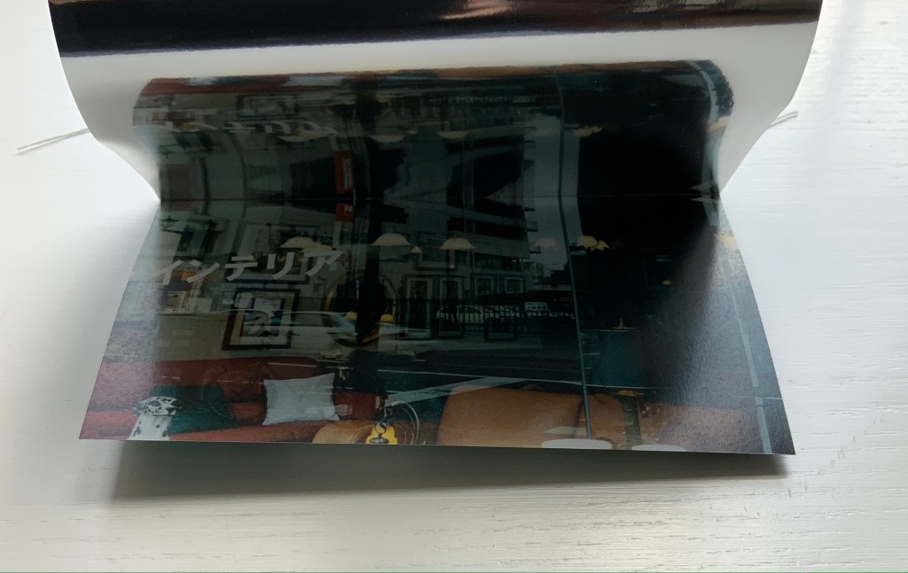
The photos in Cho’s book display views of the outside world, some of which appear to have been taken from inside an apartment whose interior is reflected in its window. Other photos display interiors — a café, an empty store — taken from an exterior vantage, resulting in reflections from the establishments’ window fronts. Some — a carpark, a walkway — seem unmediated. The playful title .interior, taken from the transposition of ・インテリア printed in the window below, and displayed on the spine of the mirrored slipcase above, confirms the artist’s theme of exploring the paradox of interior vs exterior, reflection and the mediation of vantage points.
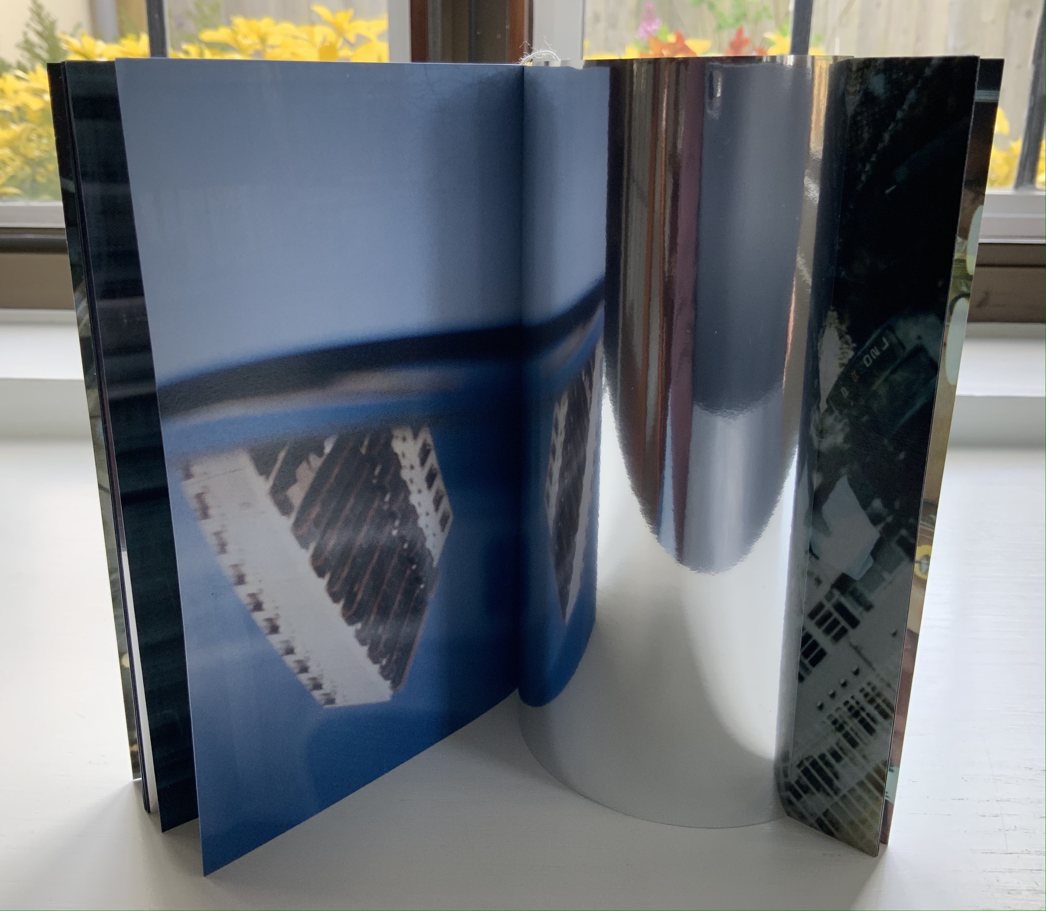
The work’s theme of reflection is also compounded by the flimsy mirrored paper interpersed between some (not all) of the recto and verso pages. Depending on the image reflected and how the mirrored paper is turned, the reader may find a simple duplicate or an extension of a pattern. Above, the shop’s interior duplicates itself upside down; below, the high rise against a blue sky duplicates itself.
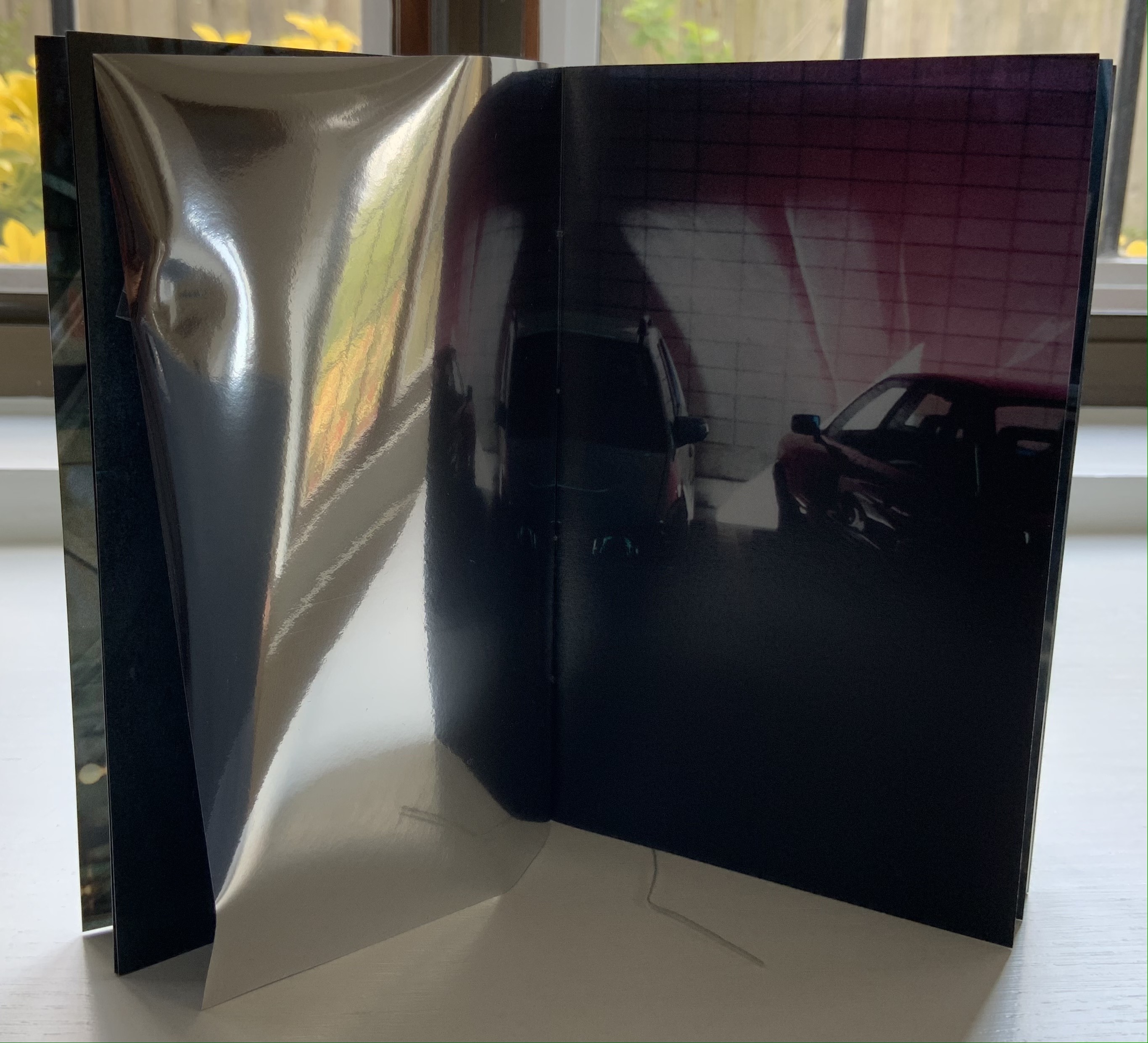
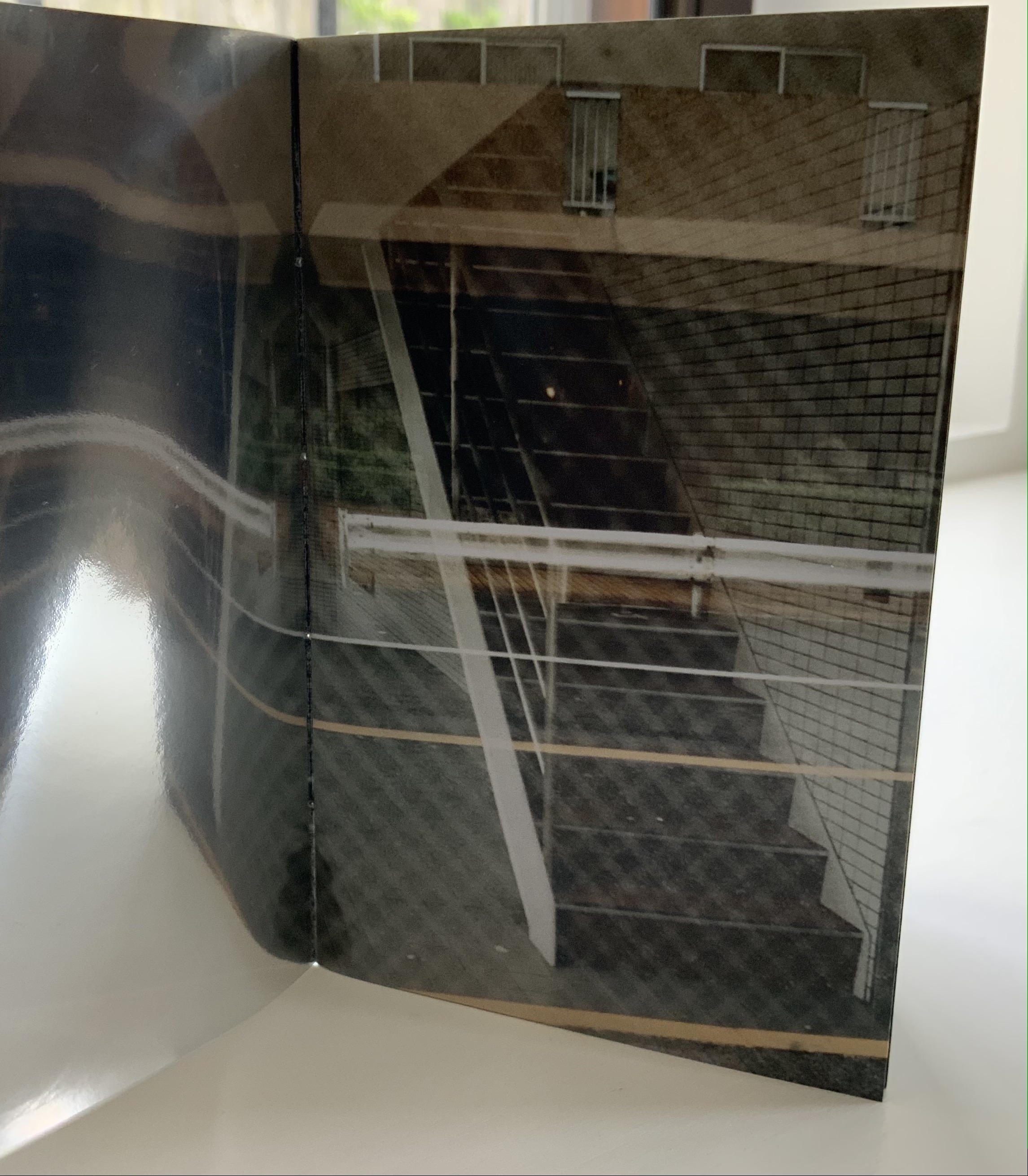
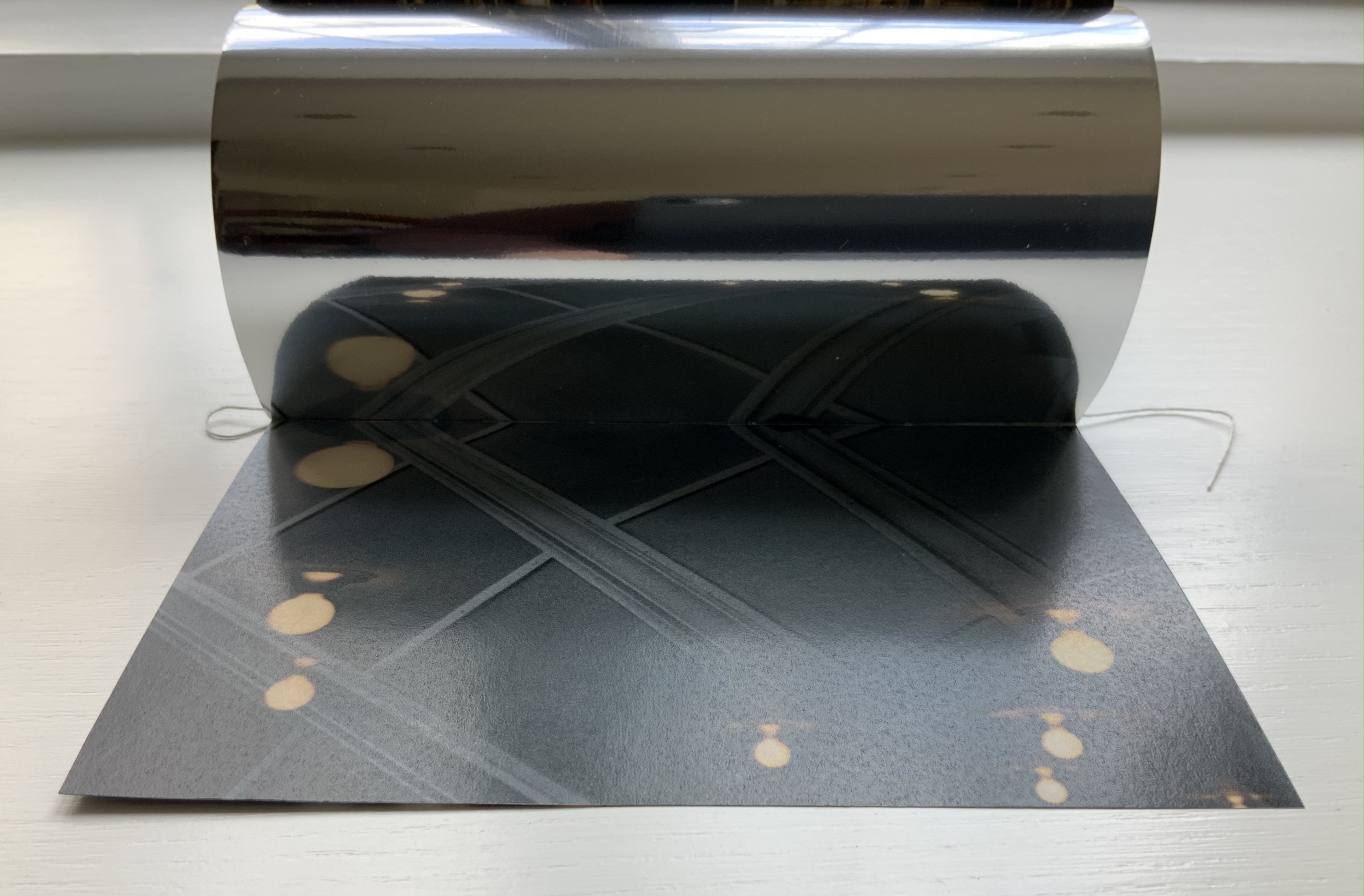
Above, the staircase seems to curve behind itself, the reflected car extends the row of parked cars, and below, the ceiling and light fixtures extend their pattern into the mirror.
Where the recto and verso are not divided by the mirrored paper, other permutations on the theme of reflection occur. Below, in the center of the book, the window in the recto page seems to reflect the vantage point from which the verso page’s photo was taken. The virtuosity in manipulating vantage points here recalls that of Michael Snow’s Cover to Cover (1975) and Marlene MacCallum’s Theme and Permutations (2012) or Shadow Cantos(2018-19).
In its composition, the photography fascinates the eye, and Cho’s use of the book and mirrored paper to present and transform the photos fascinates the mind, provoking contemplation of the paradoxes of interior, exterior and their reflections. No doubt, a gallery show could deliver similar fascination, but as a book, .interior is more than a gallery of artwork: it is a work of art.
Ld (2003)
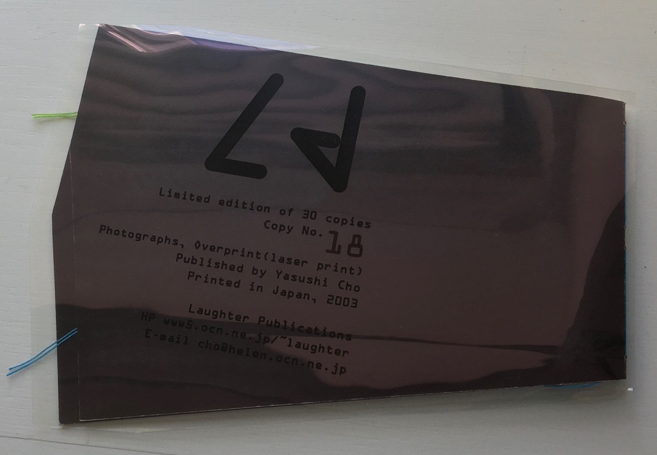
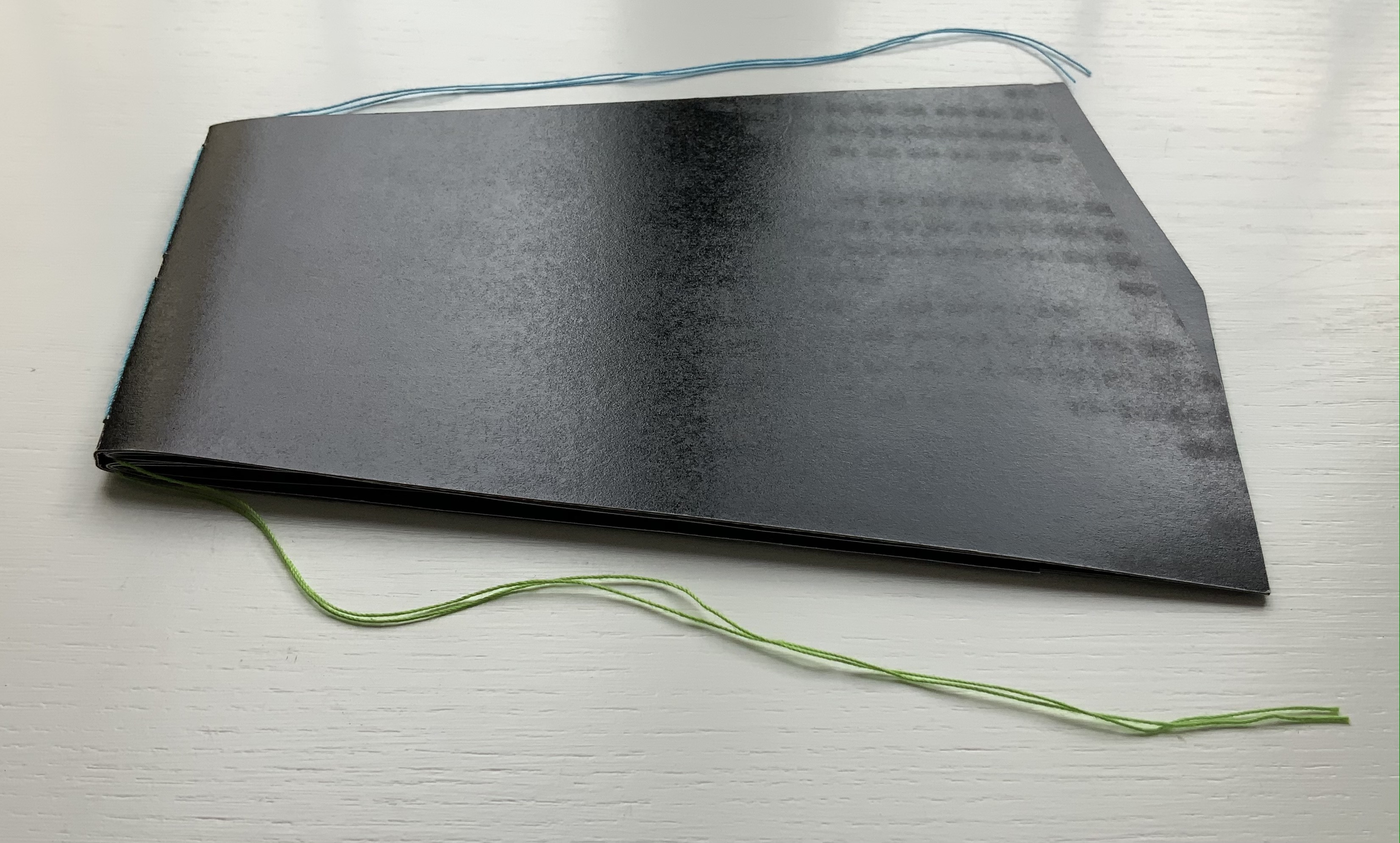
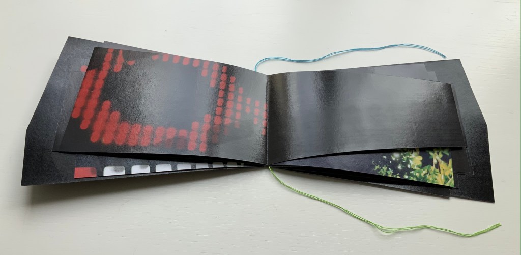
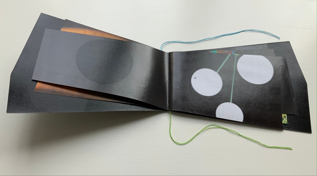
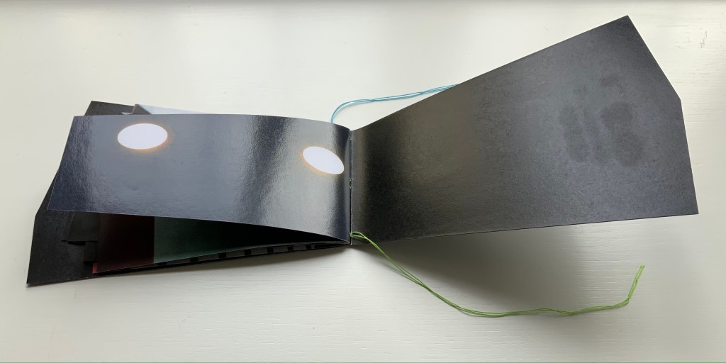
Ld (2003) Yasushi Cho Acetate sleeve. Booklet, handsewn. A5 nonstandard trim, 32 pages. Edition of 30, of which this is #18. Acquired from the artist, 10 April 2021. Photos of the work: Books On Books Collection.
If the stylized letters “L” and “d” do not suffice to distinguish this work from the LDK series, its shape, content and source certainly do. The way the images, surfaces and shapes play off one another suggests that “L” stands for light, and “d” for dark. The very different source from which the work arises — a night-time walk and shoot in Tokyo — confirms it.
On the black pages, the artist has overprinted in black to give a shadowy depth to the images and surface. The images in the dark sometimes reflect the images in the light — sometimes from the facing page, other times from previous pages. Below, for instance, the film-sprocket shapes just visible on a previous verso page’s lower edge reappear faintly, enlarged and in black over the red lights. The red lights, in turn, reappear faintly, also enlarged and in black on the lower half of the narrowing recto page.
These reflections begin to suggest those retinal images that appear after a flash of light or when eyes are held too tightly closed — both of which conjure up a night-time photo shoot in an environment of contrasts between neon lights or spotlights and the shadows they cast. By staring at the bright images on one page (below), the reader may also experience additional retinal images on the facing page.
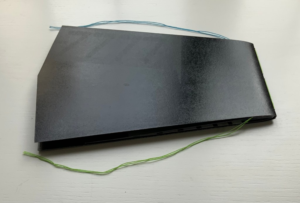
The irregularly shaped pages recall Philip Zimmermann’s High Tension (1993) or Helmut Lohr’s Visual Poetry (1995). Cho’s pages alternate at angles, narrow or widen. With the flashes between light and dark, they evoke the photographer’s searching eye, focusing lens and movement through night-time Tokyo.
Both .interior and Ld are sophisticated — materially, conceptually and in execution. With the LDK series, they make a strong addition to the Books On Books Collection.
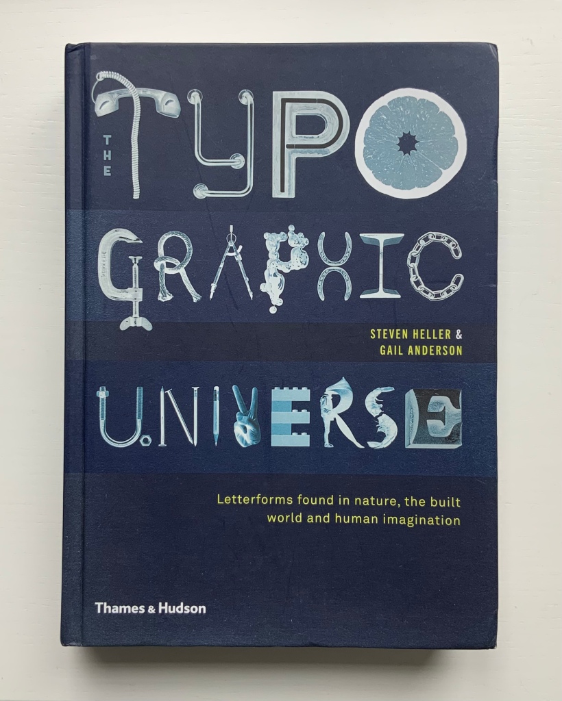
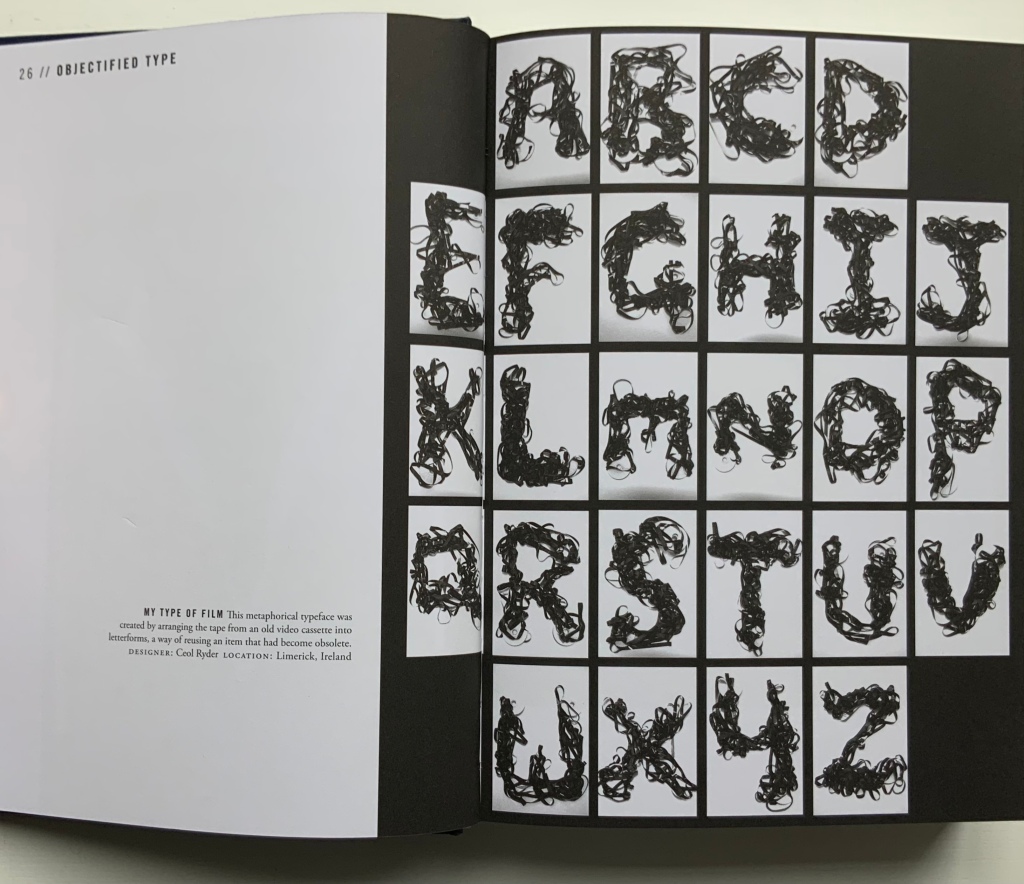
Heller and Anderson’s exploration of “the alphabet of everyday things” goes beyond finding the alphabet in everyday things (a form of pareidolia or “the tendency to perceive a specific, often meaningful image in a random or ambiguous visual pattern” — Merriam-Webster). Many (most?) of their examples involve making the alphabet from everyday things. Some, not so everyday like this one by Ceol Ryder.
Photo of the work: Books On Books Collection. Displayed with permission of Ceol Ryder.
Not all are as intricate or as long in the making as the alphabetic architectural efforts of Johann David Steingruber or Takenobu Igarashi, who are not mentioned. Still, the book serves as a useful mixed spice of images with which to season any appreciation of the interaction of the imagination with the alphabet.
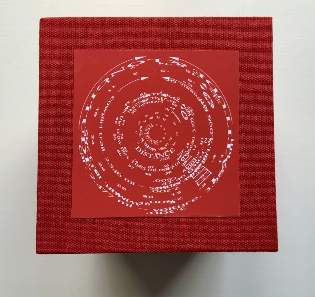
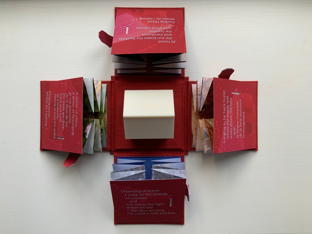
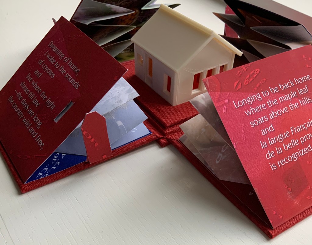
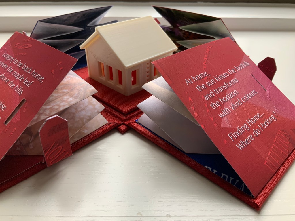
Finding Home (2019) Louise Levergneux Explosion box with cloth over board binding with inkjet printed images (H114 x W115 x D115 mm, closed); 4 Turkish map fold booklets (H95 x W95 mm, closed) inkjet-printed on Lasal paper, each attached to the interior of a box flap; 3D printed house. Third edition of 3 copies, of which this is #2. Acquired from the artist, 5 February 2021. Photos of the work: Books On Books Collection.
An explosion box, Turkish map fold, and small 3D-printed plastic house — the inventive combination reflects the many-featured domain of book art. That alone would warrant adding this work to the collection, but its union of material with content clinched the decision.
The work’s nomadic theme may have its roots in Levergneux’s various places of residence over time, but it also echoes her blog, entitled 1/2 Measure Studio, which began at the end of 2015 with her moving from a 20×12-foot studio into one measuring 10×10. The blog records indefatigable travels and visits with fellow book artists at all points of the compass to which Finding Home‘s four flaps might also allude — just as the small model might also allude to the half-measure studio.
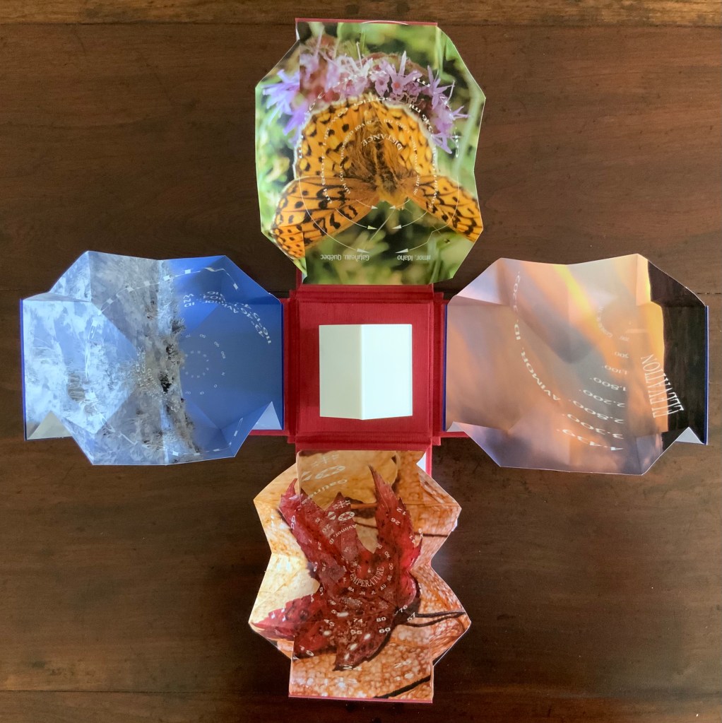
Among the Turkish fold maps, the small house also conveys centrality and both a point of departure and one of arrival. The spirals and concentric circles within the open maps emphasize further the theme of seeking a center. But the work is not only about place. With all the maps open, we have a house surrounded by four blooms of color, which implies a still point in time among the shifting seasonal imagery.
There’s much about this work that recalls Gaston Bachelard’s The Poetics of Space (1969). There is, of course, the miniature house itself, for which Bachelard has entire chapters, but also in the maps, there is the butterfly recalling the chrysalis (pp. 85-86); the sun-kissed foothills, the recurrent theme of the horizon, distance and immensity (passim); the red maple leaf, the autumnal recollections (p. 179); and the prairie snowscape, the paean to snow (p.61); and the longitudinal and latitudinal references, recalling this passage:
Each one of us, then, should speak of his roads, his crossroads, his roadside benches; each one of us should make a surveyor’s map of his lost fields and meadows. Thoreau said that he had the map of his fields engraved in his soul. And Jean Wahl once wrote:
Le moutonnement des haies C’est en moi que je l’ai. Poème, p. 46(The frothing of the hedges I keep deep inside me.)
Thus we cover the universe with drawings we have lived (p. 33).
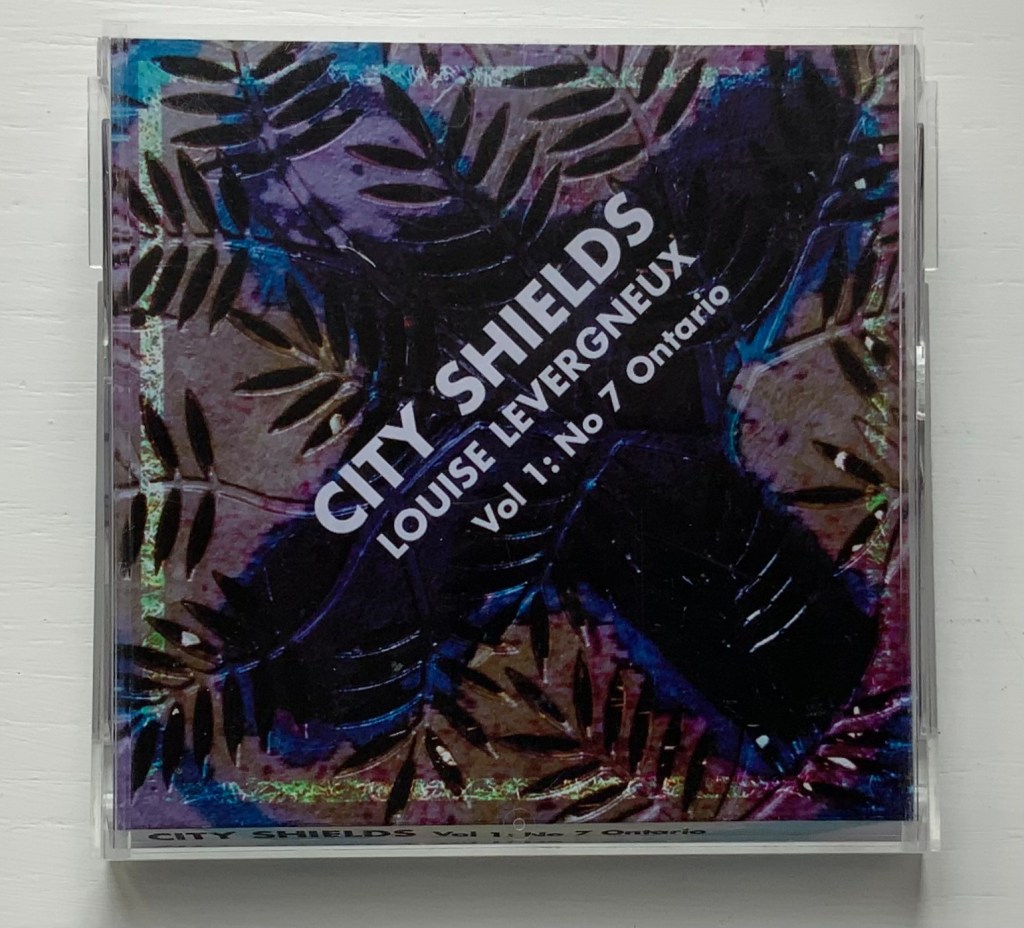
City Shields, Vol 1: No 7 Ontario (2017)
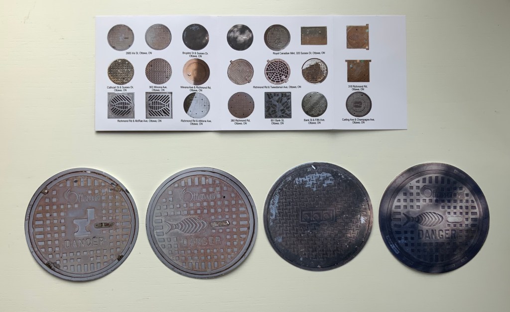
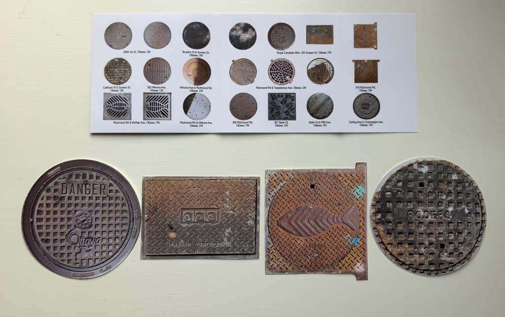
City Shields, Vol 1: No 7 Ontario (2017) Louise Levergneux Jewel case cover (H103 x W105 mm) with insert printed on Inkpress Matte paper holding 21 die-cut photos of manhole covers printed on Generations G-Chrome Lustre paper. Edition of 25 copies. Acquired from the artist, 5 February 2021. Photos of the work: Books On Books Collection.
Like Finding Home, this work is autobiographical, documenting Levergneux’s travels from 1999 to 2020, from Scotland, Canada and the US. As summarized on the insert for this one issue, the shapes and design of the actual manhole covers vary — as do their die-cut photos — some round, some square, rectangular, flanged. Small as they are, their colors and shadows nevertheless entice thoughts of miniature tunnels and drains lying beneath them and winding their way under whatever surface on which the manhole covers rest. City Shields‘ evocation of hidden space and their reminder to look down as well as up at city architecture create a strange and welcome fit with the architectural theme in the Books On Books Collection.
Levergneux celebrated the close of the City Shields project with a 20th Anniversary Edition, described here.
Further Reading
“Architecture“, Books On Books Collection, 12 November 2018.
“Guy Bigland“. 31 August 2023. Books On Books Collection. (See his Square Photographs of White Circle Paintings (2022) for comparison).
Bachelard, Gaston, Maria Jolas, Mark Z. Danielewski, and Richard Kearney. 2014 (1964). The Poetics of Space. New York: Penguin Books.
Chen, Julie. 2013. 500 Handmade Books. Volume 2. New York: Lark. P. 20 (see Will Karp’s 49 Masterpieces of Art (2011) for comparison).
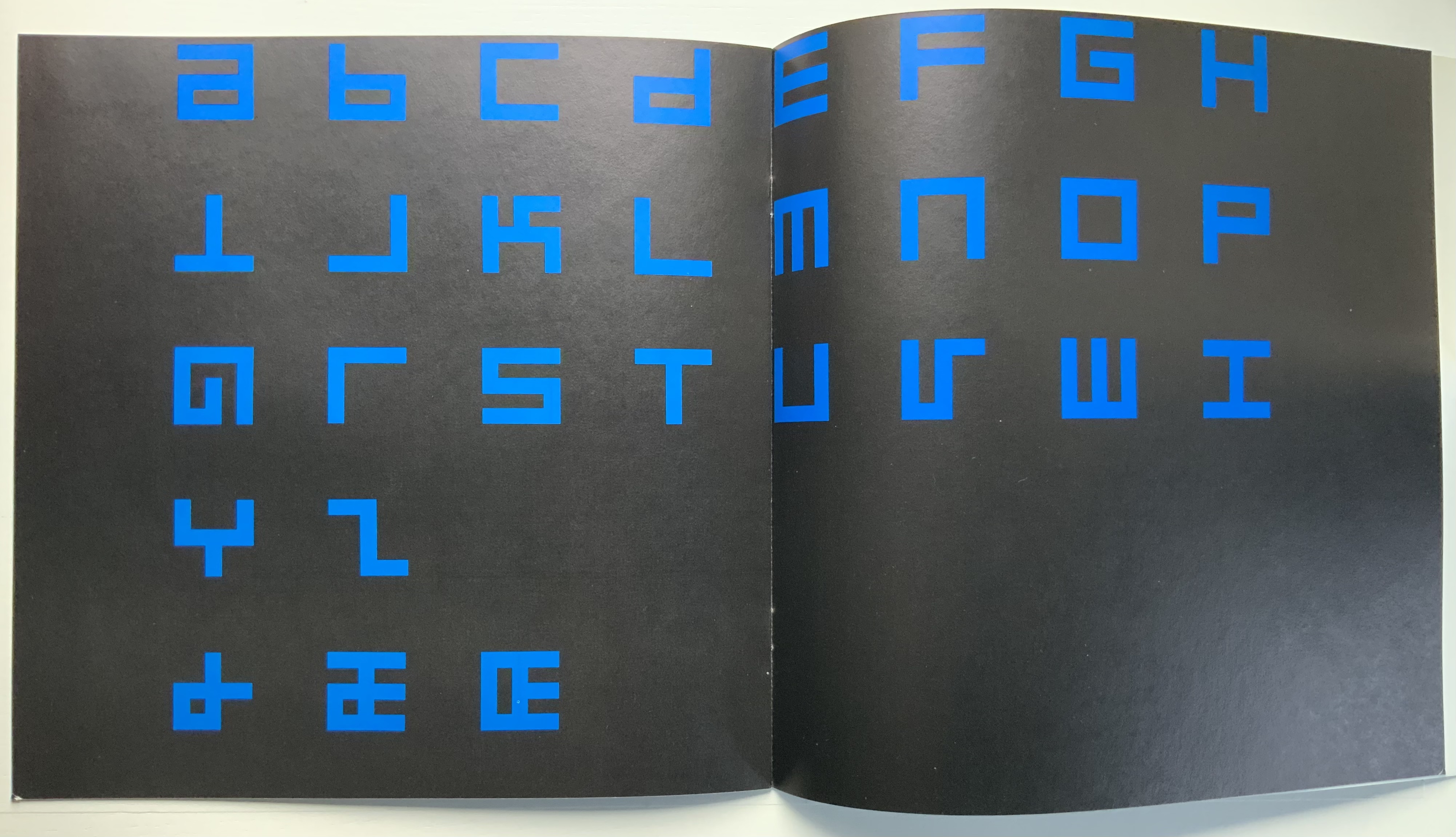
Alphabet (1970) Timothy Epps and Christopher Evans Booklet. 250 x 250 mm, 16 pages. Acquired from Antiquariaat Frans Melk, 23 November 2020. Photos: Books On Books Collection.
This is the alphabet that inspired Raffaella della Olga’s LINE UP (2020), also in this collection. At the UK’s National Physical Laboratory, Epps and Evans created their alphabet in 1969 in response to the challenge to overcome machine-readable typefaces’ human-unreadability. Perhaps because it was the second of three responses to Wim Crouwel‘s New Alphabet (1967), published in the Kwadraatblad/Quadrat-prints series, the Dutch graphic designer and series editor, Pieter Brattinga, snatched it up for publication in his series of experiments in printing ranging over the fields of graphic design, the plastic arts, literature, architecture and music. This particular issue was designed by John Stegmeijer at Total Design.
While the bright blue (above left) stands out strikingly against the black background, the booklet appropriately makes the human eye strain to see the letters darkly printed against the black. Would a scanner pick them up? Does the similar elusive effect created by debossed printing in della Olga’s collaboration with Three Star Press allude to this as well? What would that ingenuity create if applied to Crouwel’s New Alphabet or to Gerard Unger‘s A Counter-Proposal (the first response to Crouwel’s booklet) or Anthon Beeke‘s Alphabet (the third and strangest response — letters composed of naked women)?