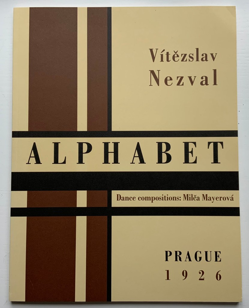
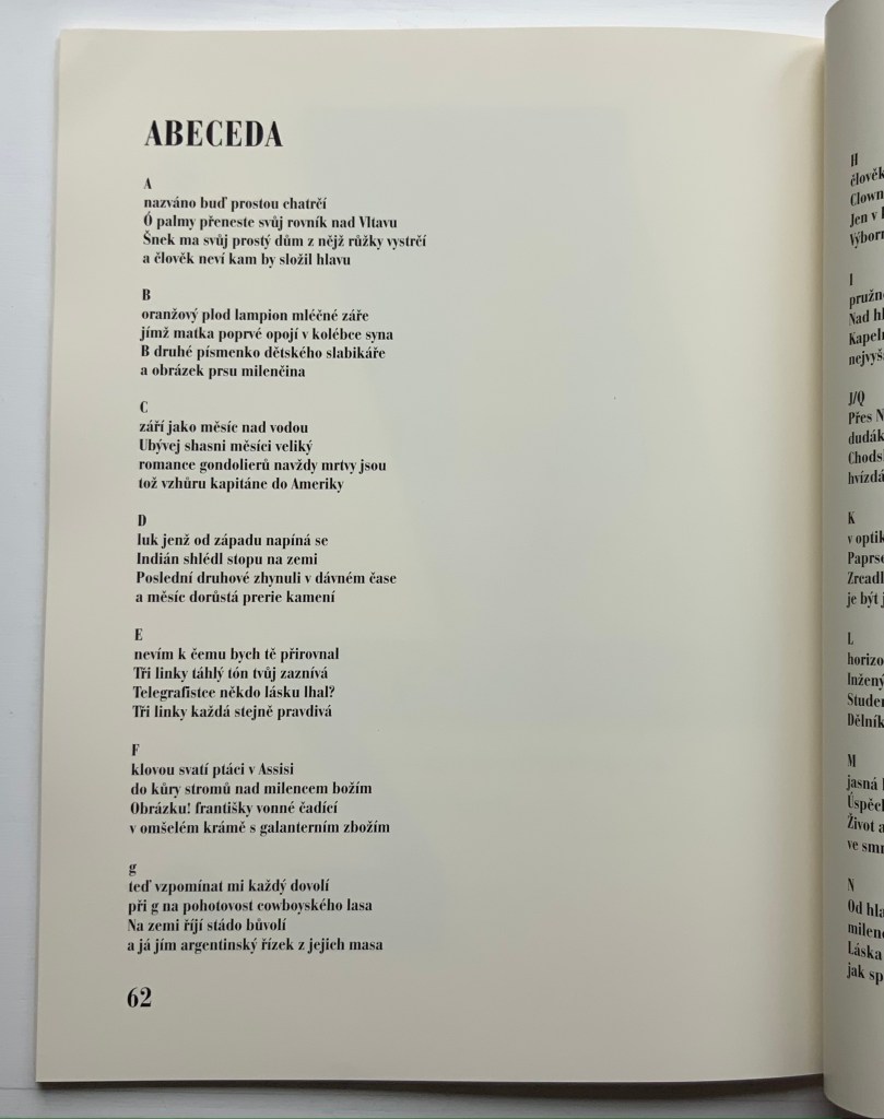
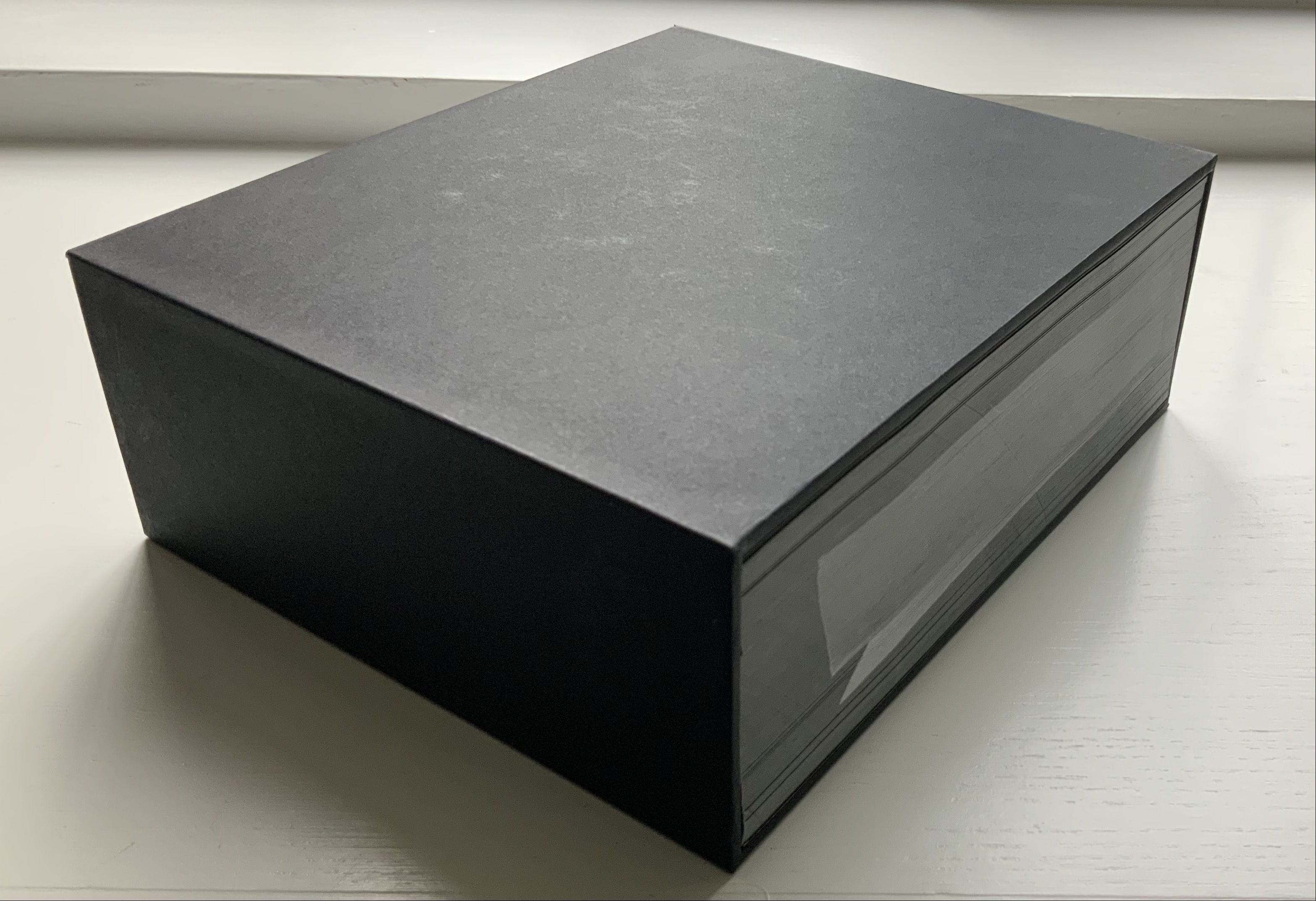
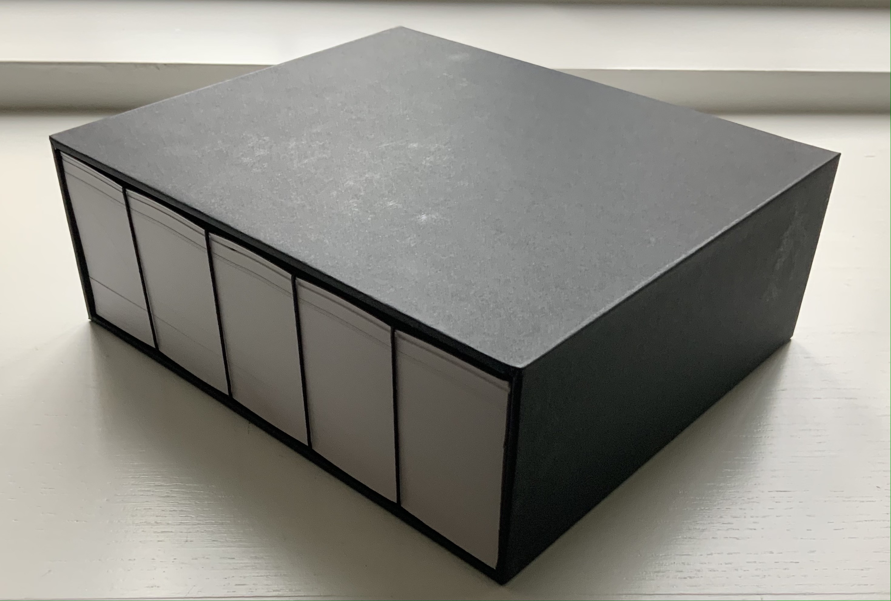
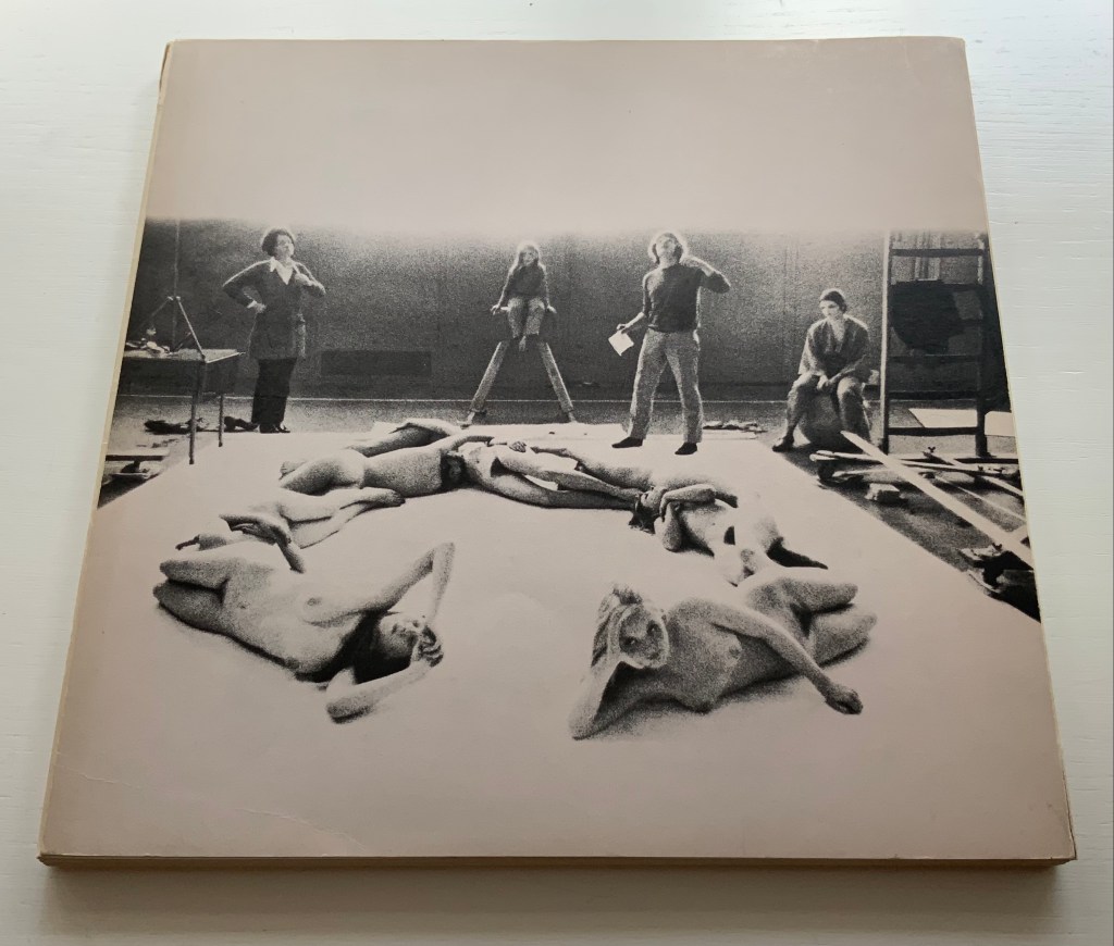
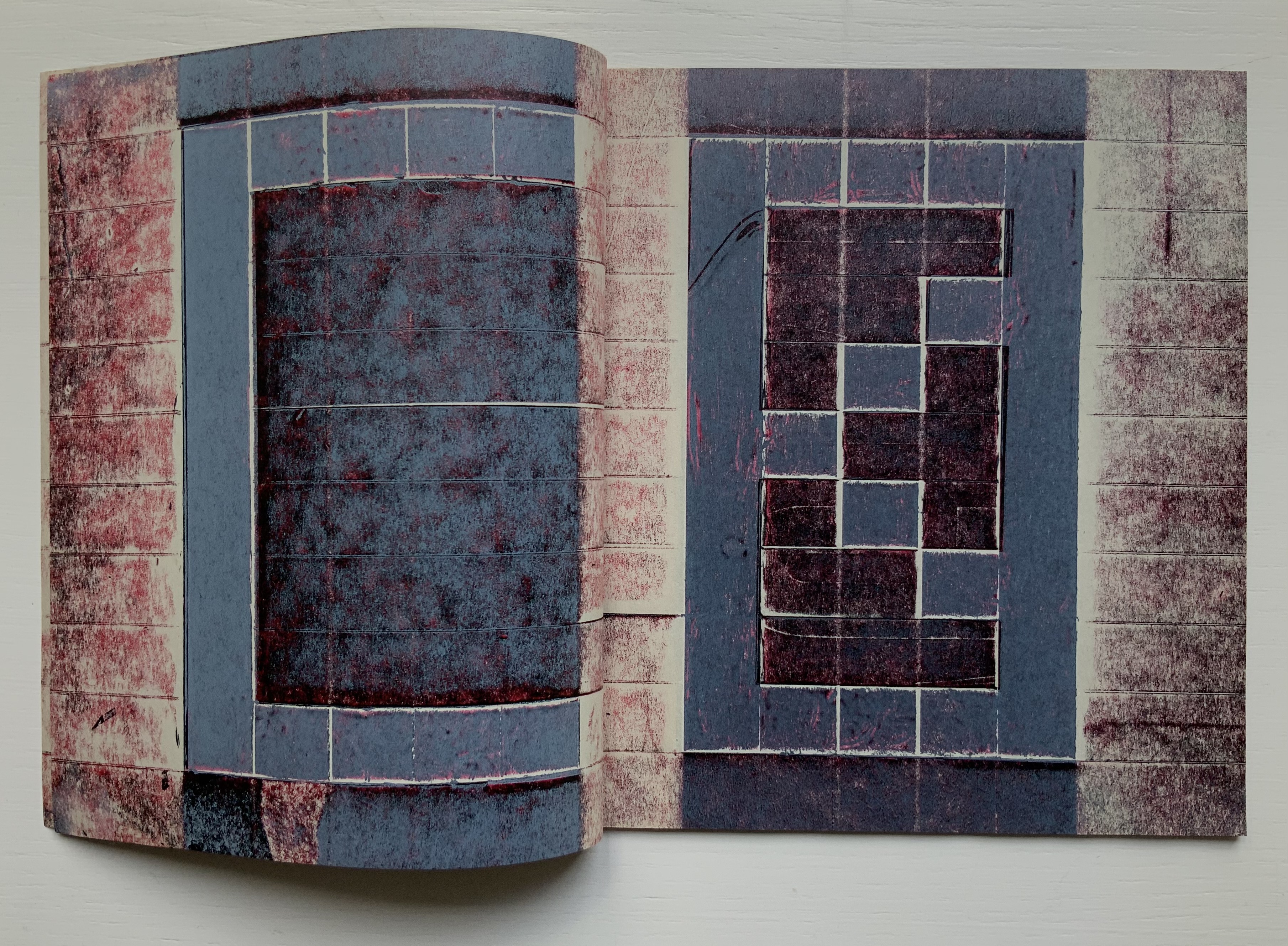
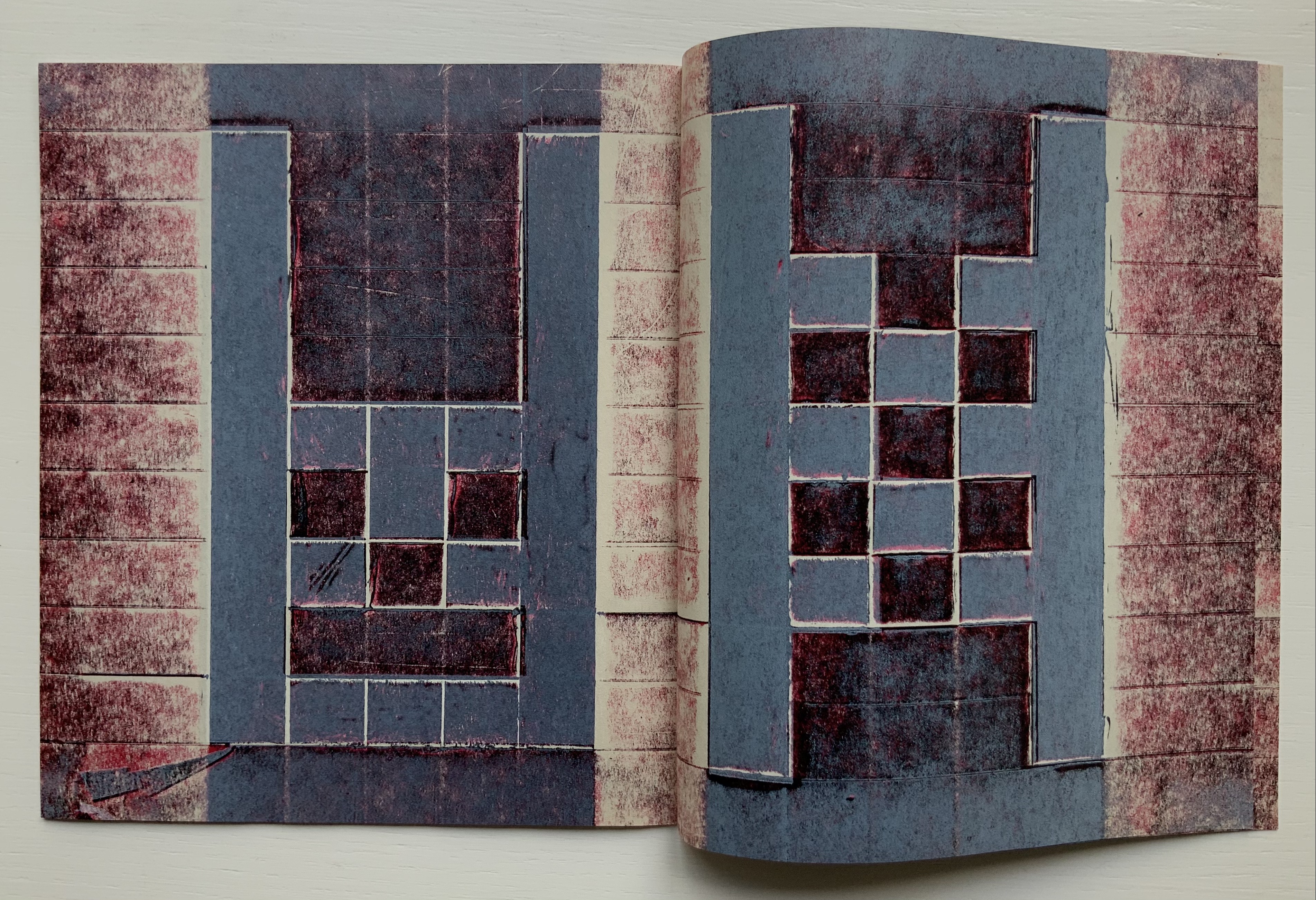
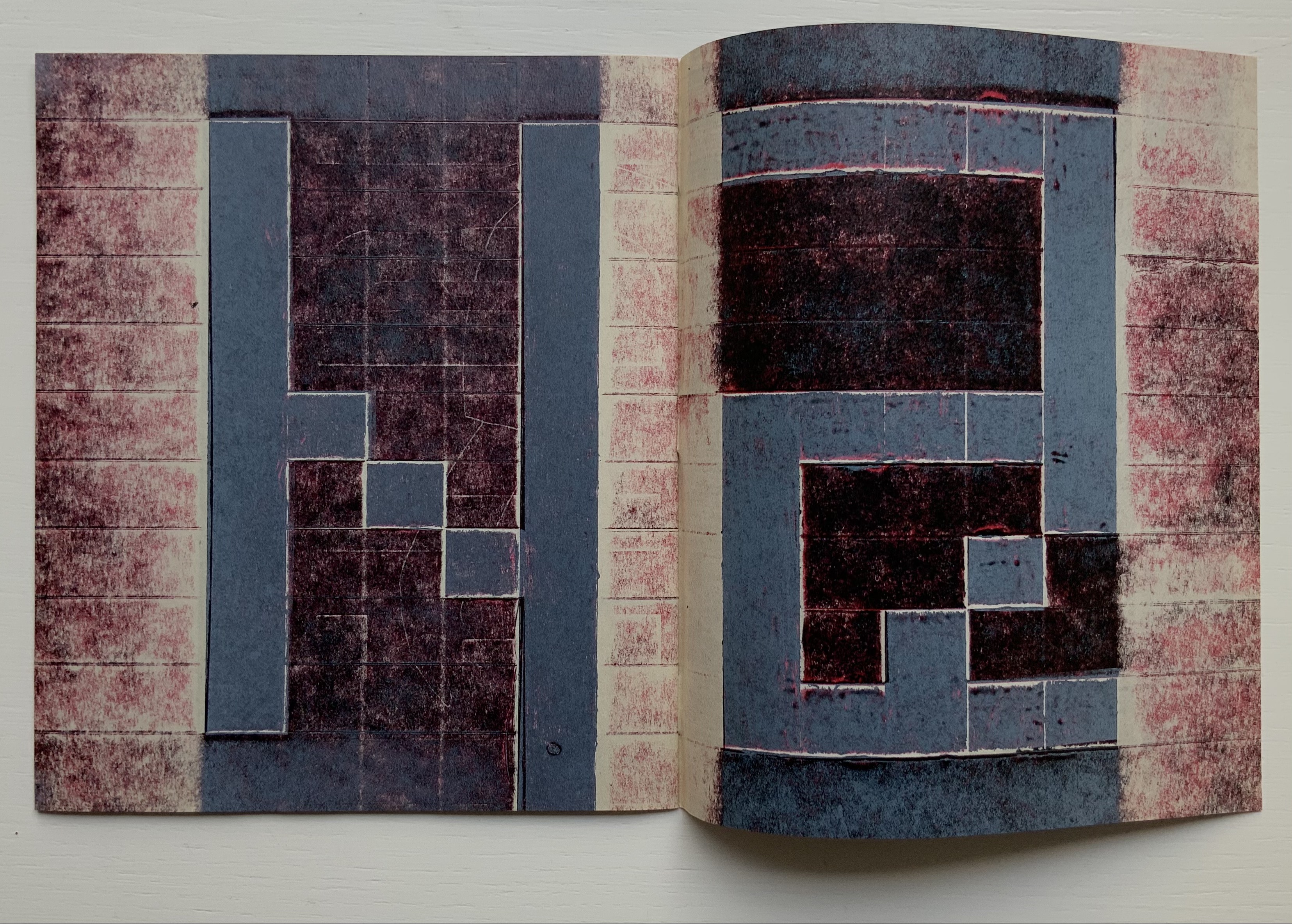
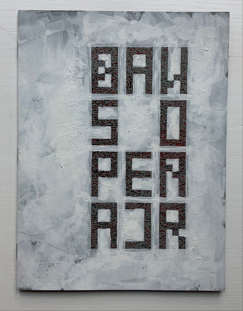
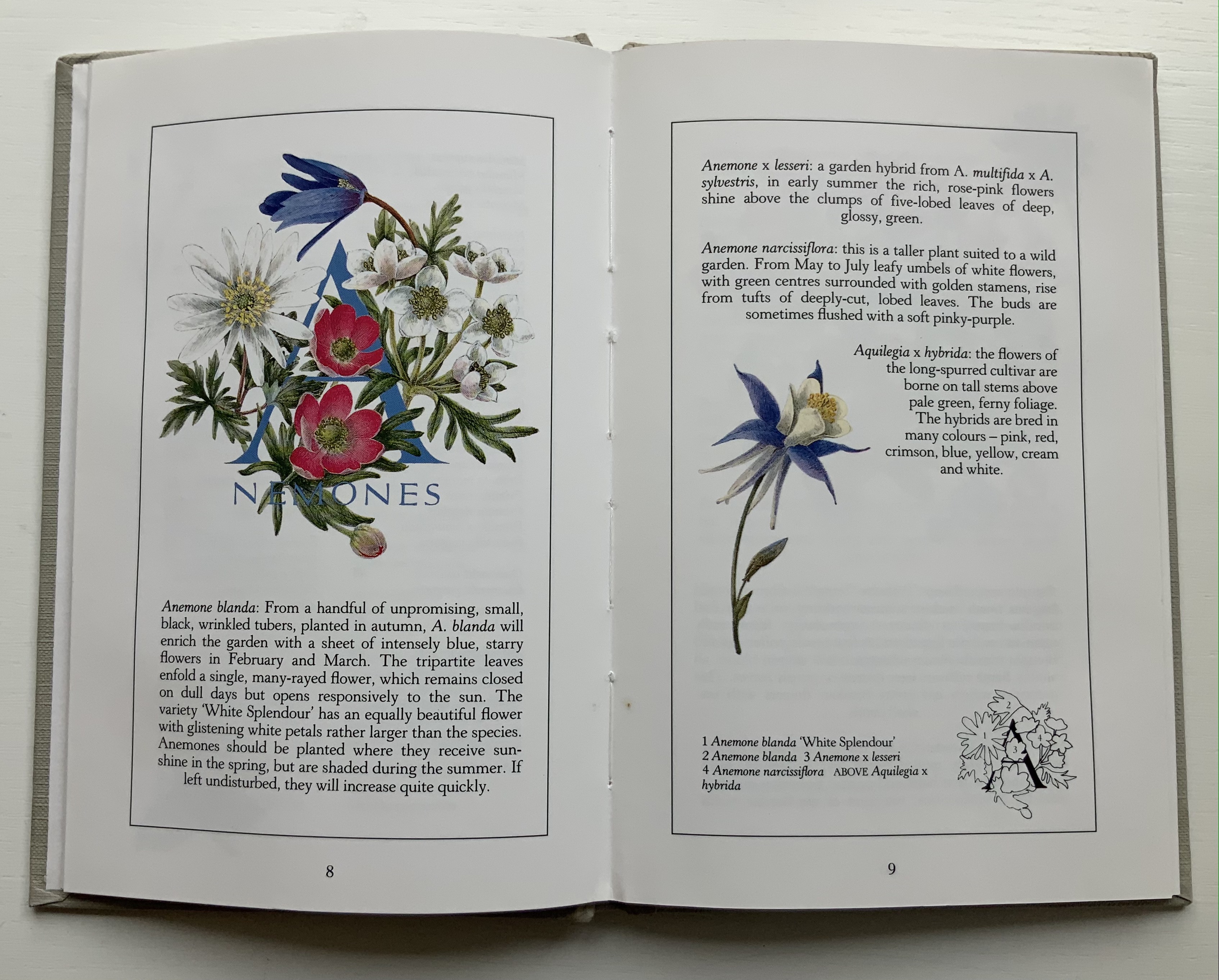
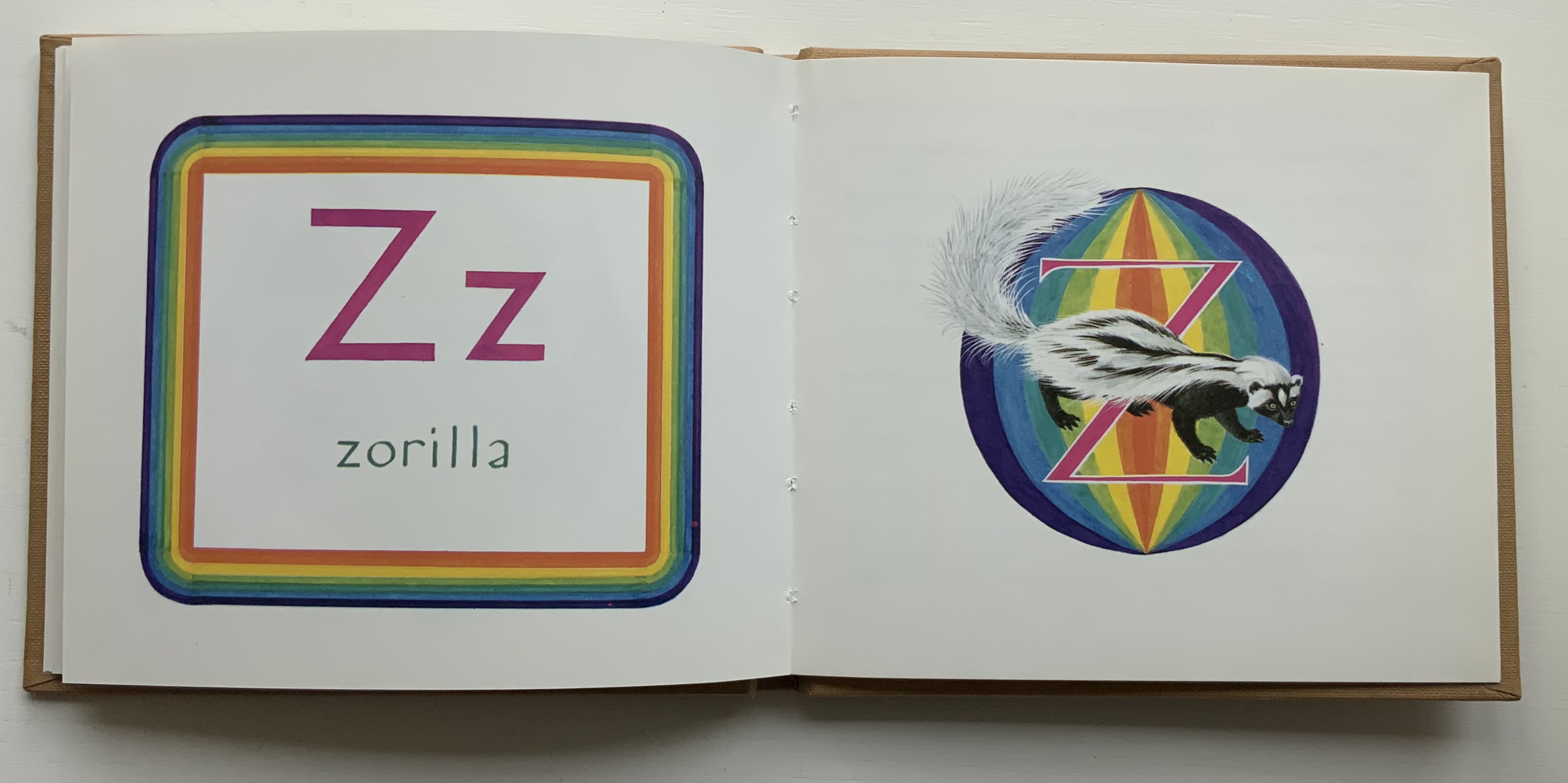
Alphabet (1926/2001) Karel Teige & Vítězslav Nezval / translated by Jindřich Toman and Matthew S. Witkovsky Facsimile and translation of Abeceda. Perfect bound paperback, H305 xW235 mm, 72 pages. Acquired from Ergode Books, 1 July 2021. Photos: Books On Books Collection.
From the Afterword:
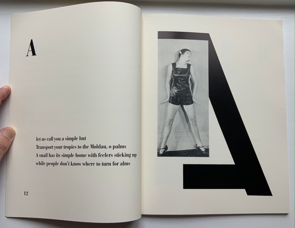
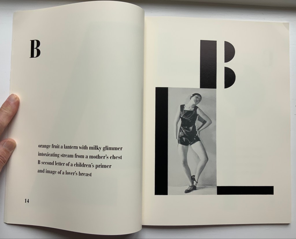
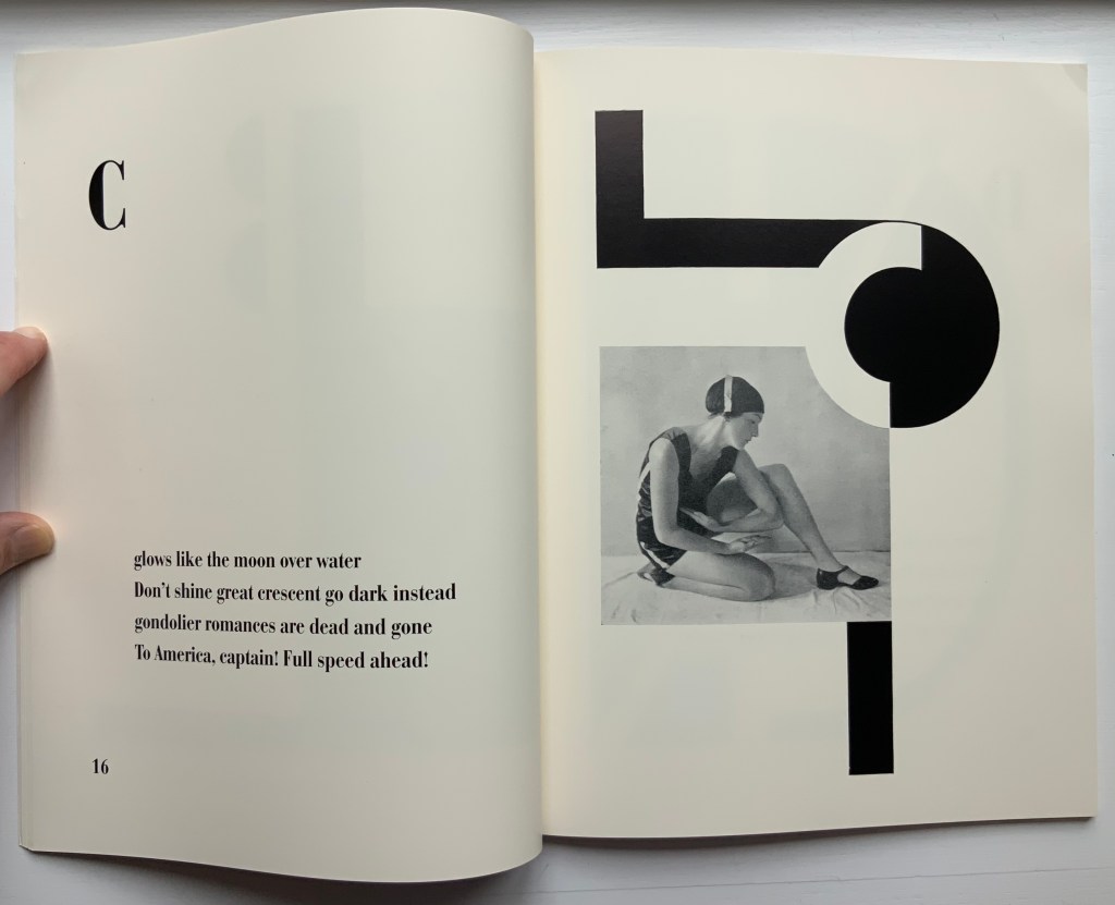
The 1926 book Alphabet (Abeceda) is a landmark achievement in European modernism. Its frequent reproduction in exhibition catalogues and scholarly articles has made it a key symbol of Devětsil (1920-ca. 1931), the Czech artists’ collective within whose ranks the book was conceived, and its importance is increasingly measured in international terms as well. The book consists of a series of rhymed quatrains by Devětsil poet Vítězslav Nezval, titled and ordered according to the letters of the Latin alphabet. Facing each set of verses is a Constructivist photomontage layout by Karel Teige, a painter turned typographer who was also Devětsil’s spokesperson and leading theorist. Teige developed his graphic design around photographs of dancer and choreographer Milada (Milča) Mayerová, a recent affiliate of the group, who had performed a stage version of “Alphabet” to accompany a recitation of the poem at a theatrical evening in Nezval’s honor in April 1926… The project to create a new alphabet epitomizes the proselytizing attitude of avant-gardists in various fields in the years after World War I. From Dada poetry to Constructivist architecture and design, from calls to overhaul theater to revolutions in literary theory, a panoply of experiments took the alphabet as their model or target and disclosed the potency of this elementary linguistic structure as a trope for creative renewal and social revolution.
The Afterword mistakenly asserts that there was no precedent for Mayerová’s choreography and performance of the alphabet. In fact, the Athenian dramatist Kallias (late 5th century BCE?) wrote Grammatike Theoria, sometimes called “a spectacle of letters”, the ABC Show or ABC Tragedy, in which actors and a chorus sang and danced the twenty-four characters of the new-fangled Ionian alphabet. What does seem to be without precedent is the collaboration across poetry, dance, typography, photography and bookmaking.
Carrying on the collaborative tradition and more emphatically challenging gender stereotyping, here is Paulina Olowska dancing Abeceda at the Simon Lee Gallery’s 2019 exhibition of Tomaso Binga/Bianca Menna‘s works, which included Alfabetière Pop (1976), his/her nude alphabet portfolio. If only Tomaso/Bianca or Paulina would find a book artist to reprise the codex part of the collaborative tradition.
Further Reading
“Anthon Beeke“. 21 June 2021. Books On Books Collection.
Culture.pl. n.d. “Paulina Ołowska“. Accessed for update, 31 January 2023.
Gagné, Renaud. 2013. “Dancing Letters: The Alphabetic Tragedy of Kallias”. In Choral Mediations in Greek Tragedy, ed. R. Gagné and M. Hopman, Cambridge University Press 282-307.
Lawler, Lillian. April, 1941. “The Dance of the Alphabet”. The Classical Outlook, 18: 7, pp. 69-71.
Wikipedia. 1 July 2021. “Paulina Olowska“. Accessed 8 July 2021.
Another key performance in Paulina Olowska oeuvre was the Alphabet, which was inspired by the book ABECEDA by Karel Teige, a key figure in the Czech avant-garde who in 1926, in collaboration with Milca Mayerova, created an experimental “mobile alphabet”. Referring to Teige’s project, Olowska combines rhythmicity with a constructivist fascination with typography and points to the rhetorical function of dance: three performers arrange their bodies into 26 letters, from A to Z, confronting the alphabet of written language with the “alphabet” of gestures and movements, creating a new system for expressing meaning. Alphabet was first shown in Berlin in 2005 (Galerie Meerrettich). In 2012 it was exhibited at the Museum of Modern Art in New York, and in early 2014 it was presented at the Museum of Modern Art in Warsaw.” Wikipedia.
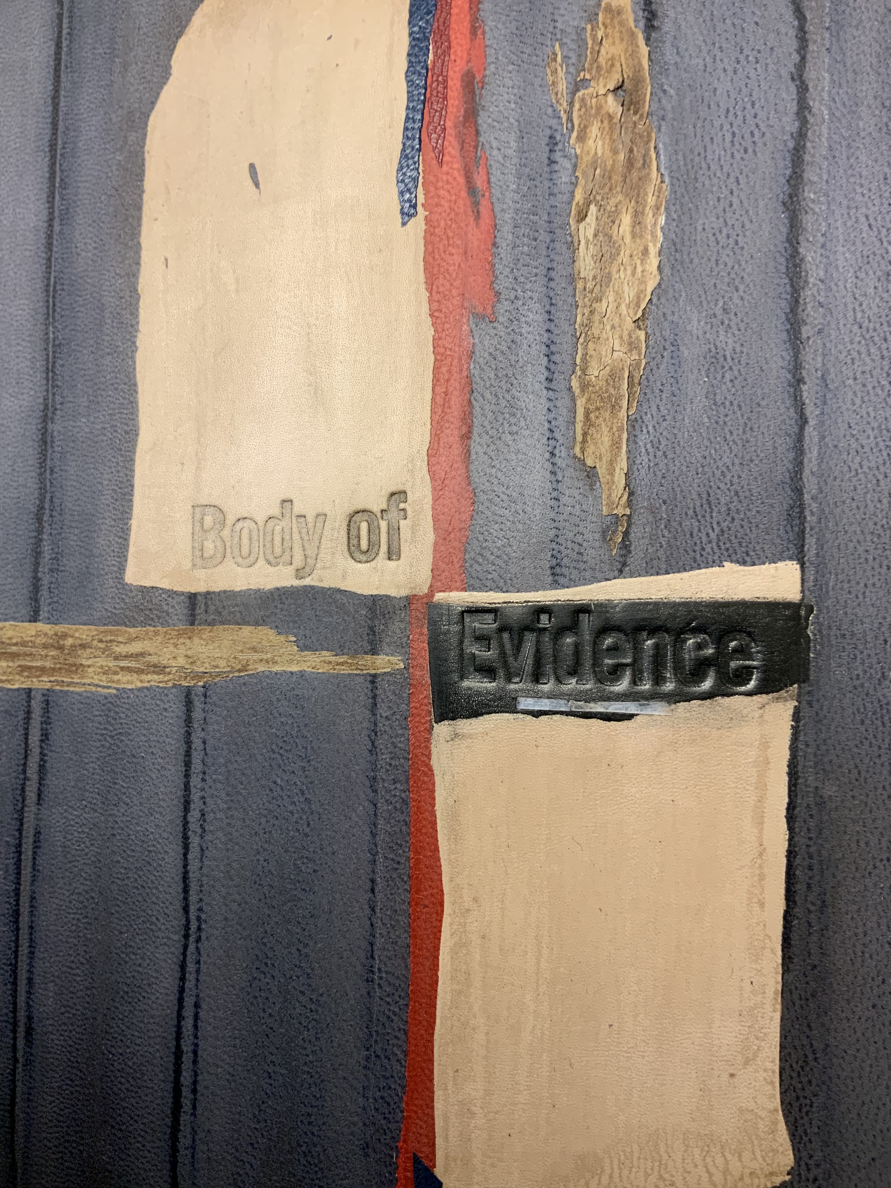
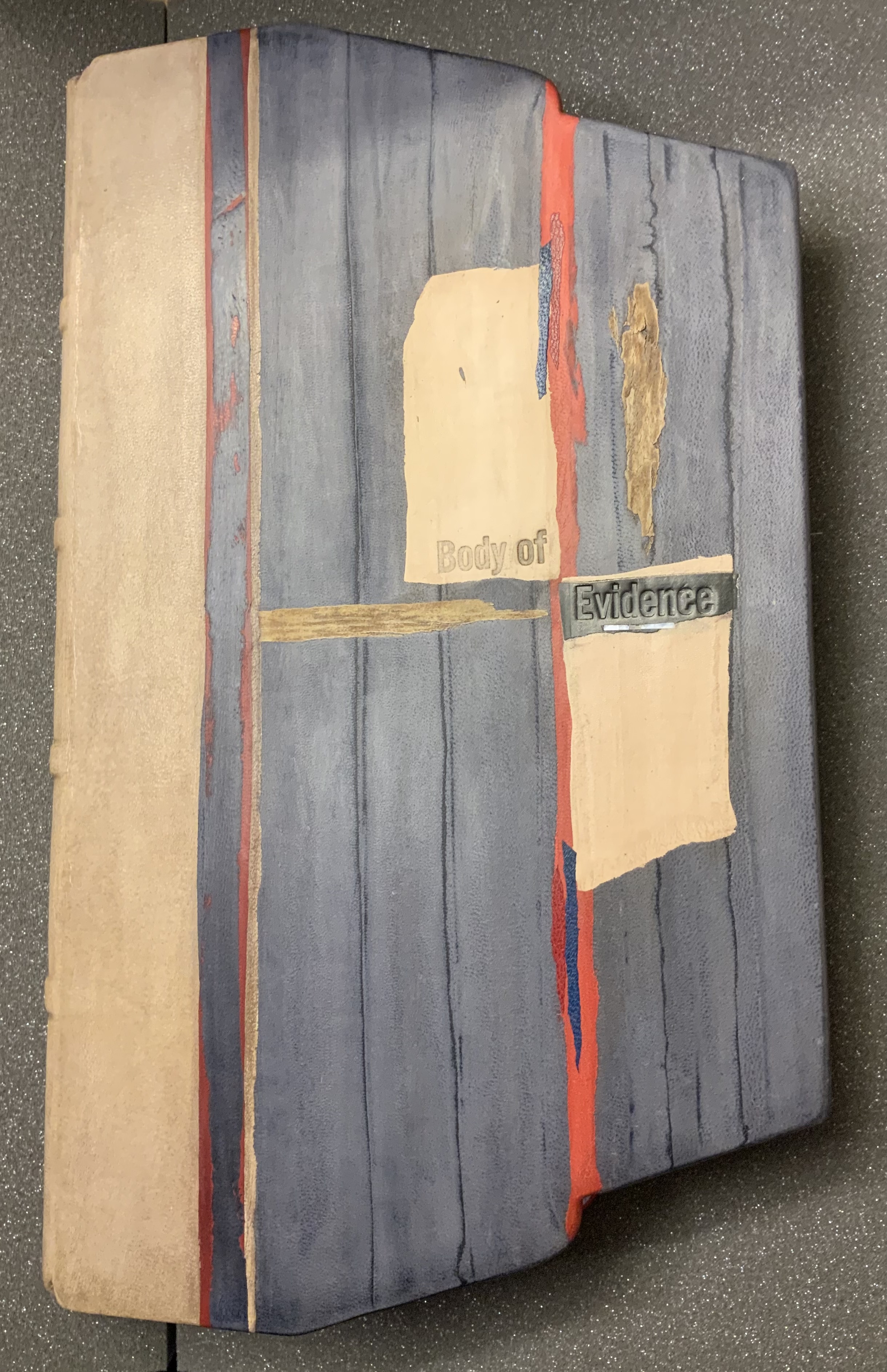
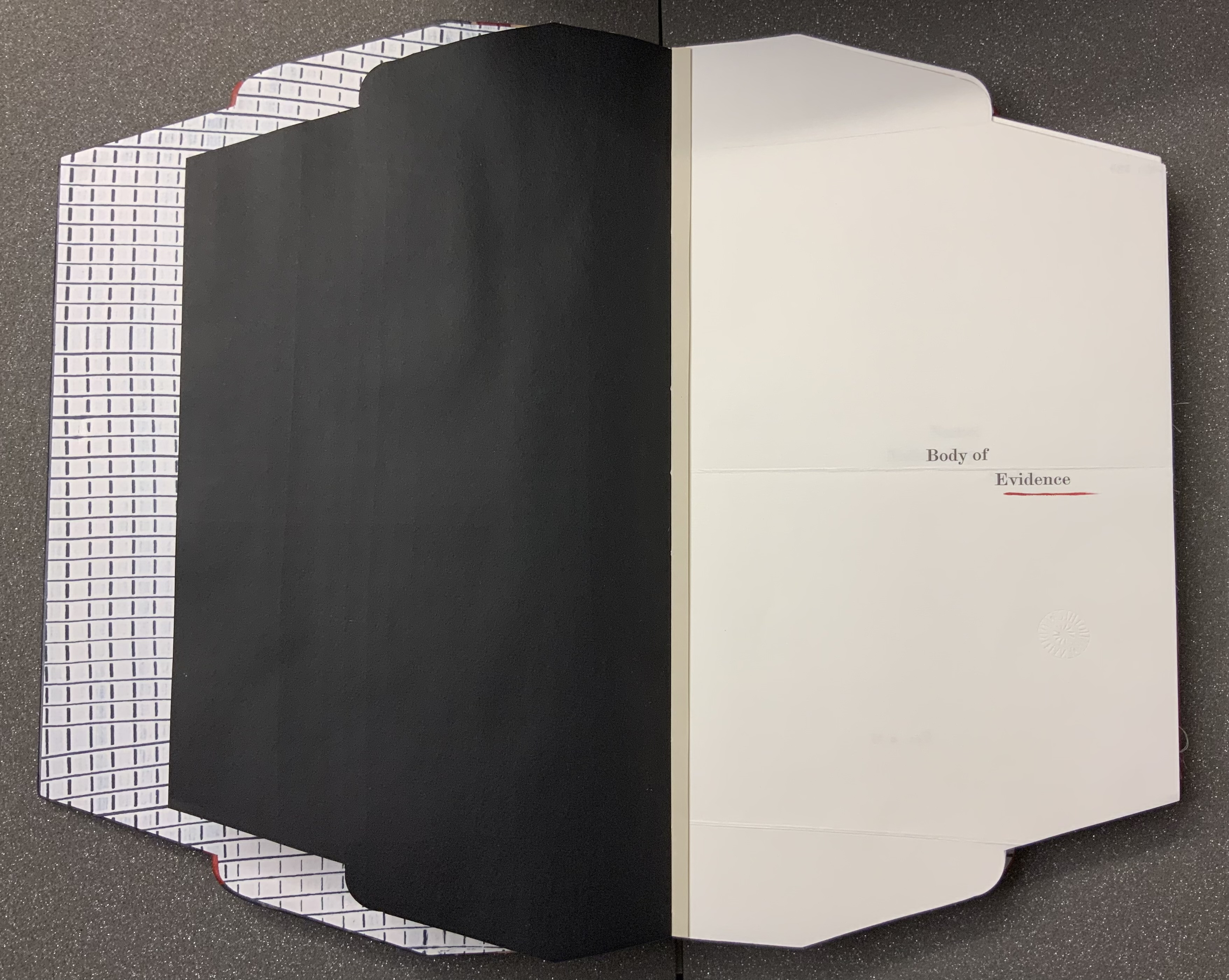
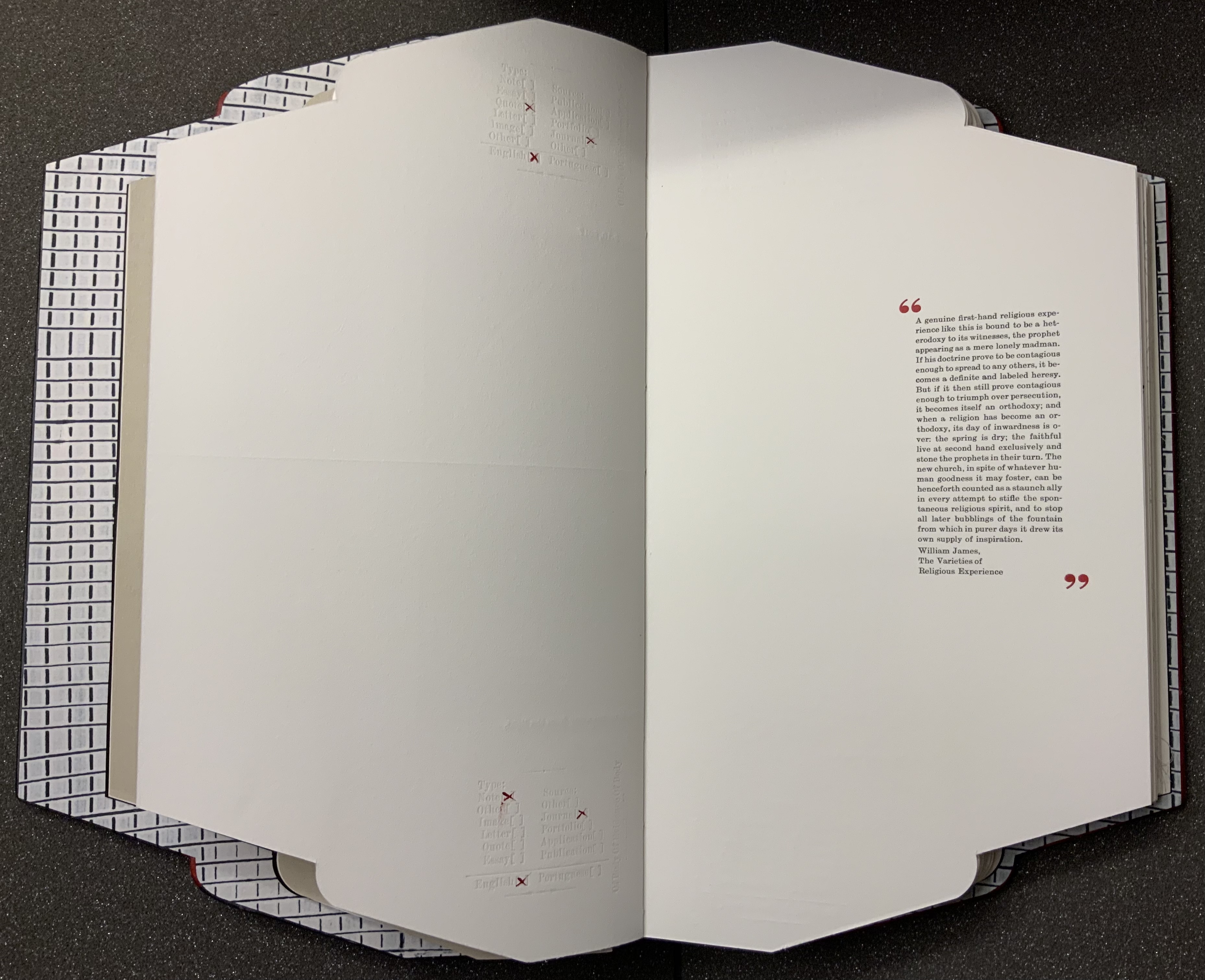
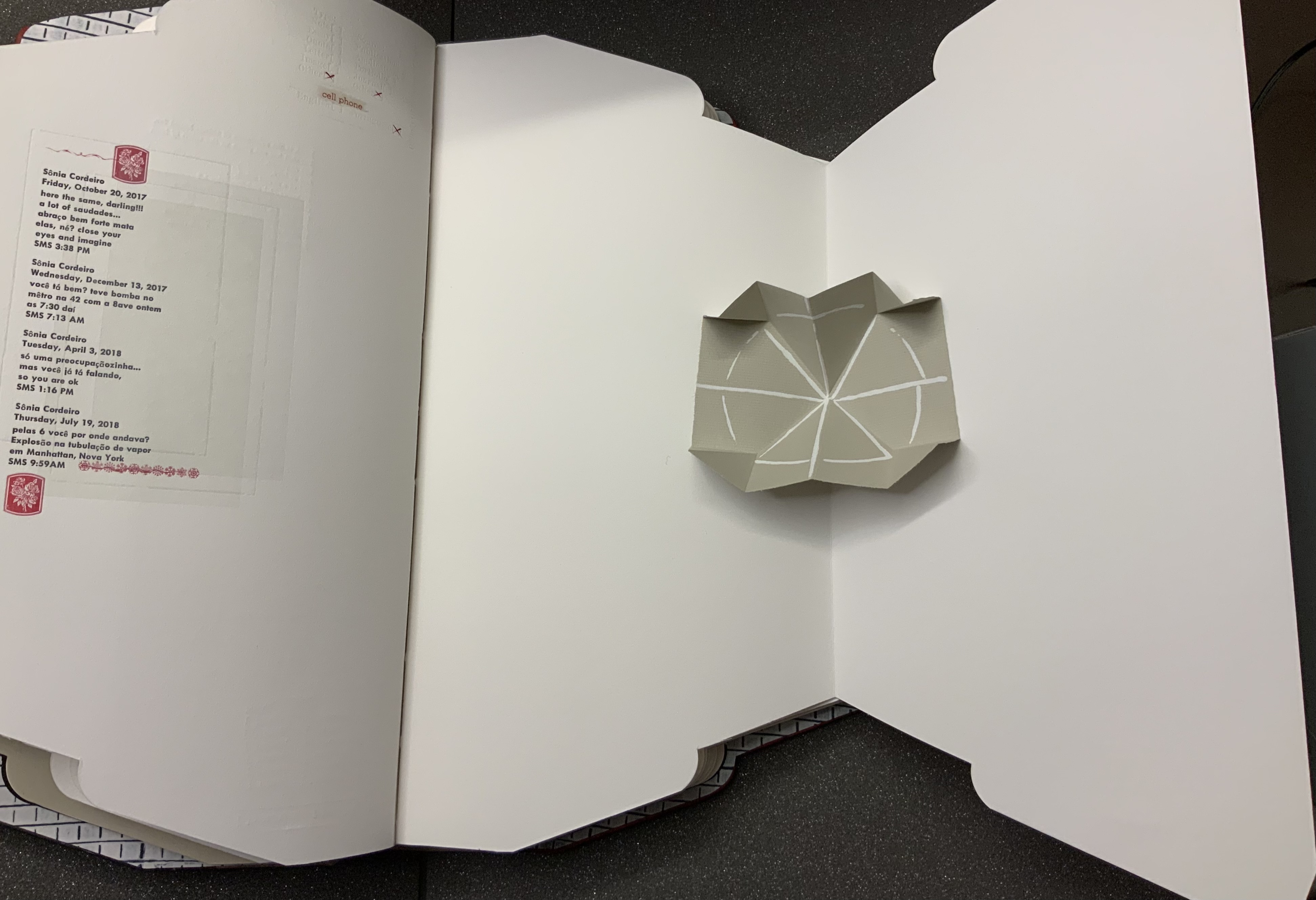
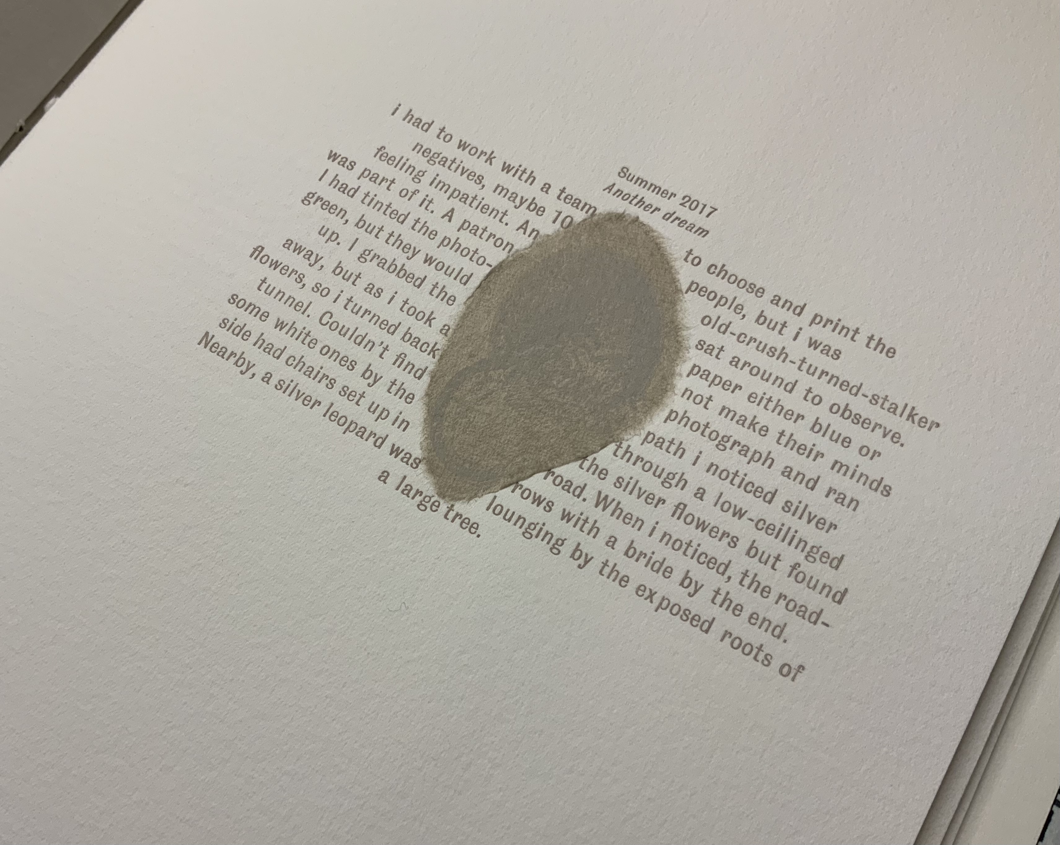
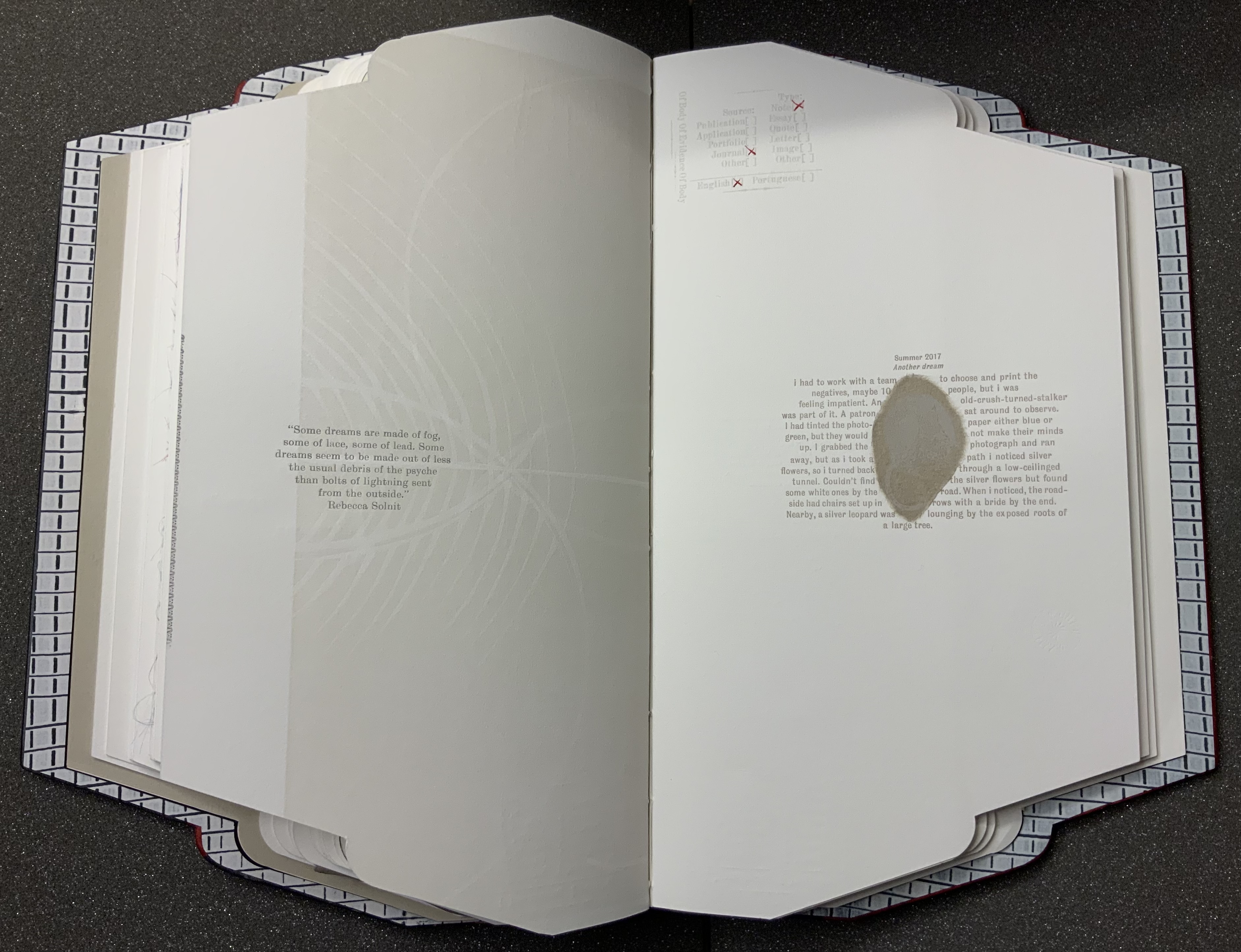
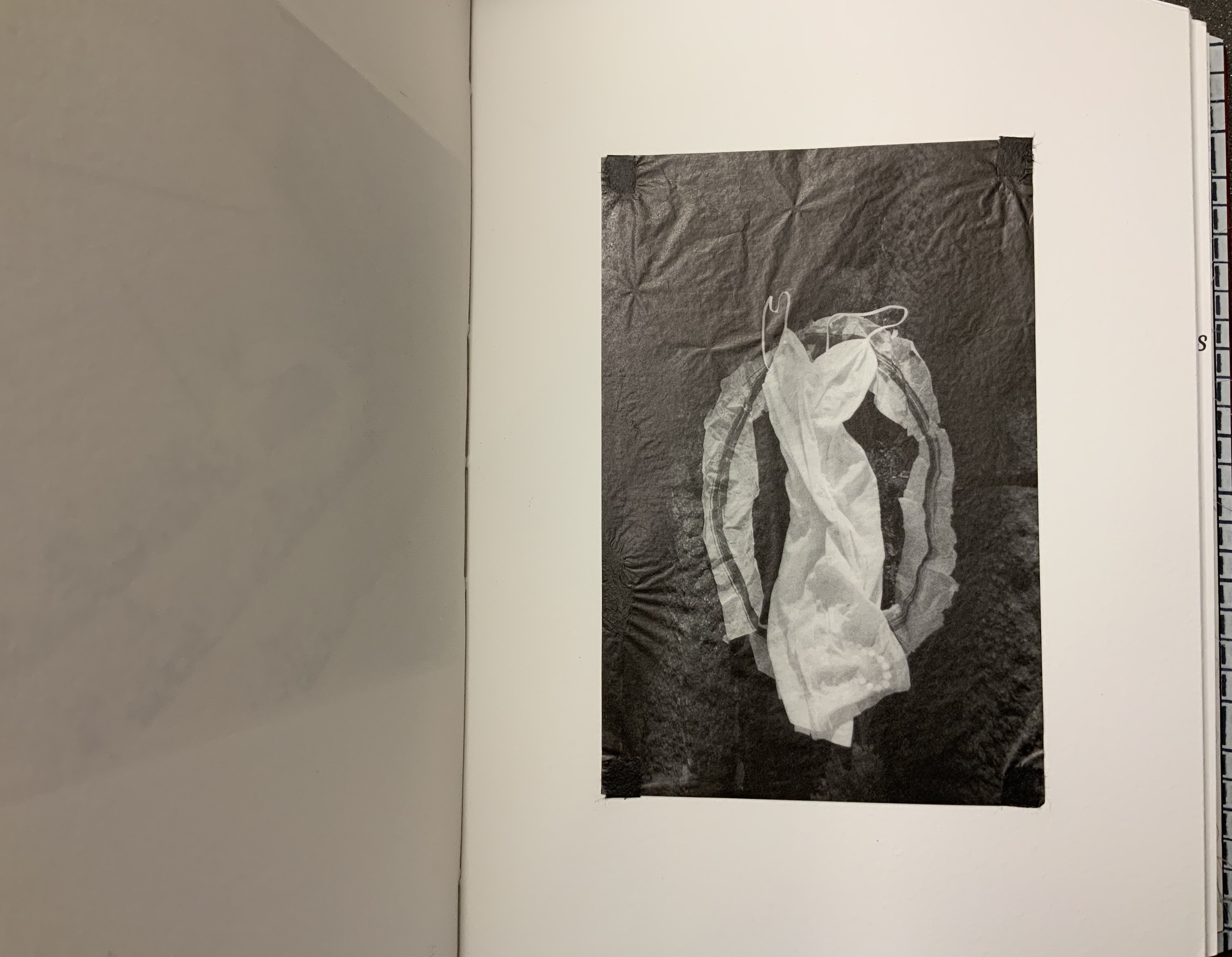
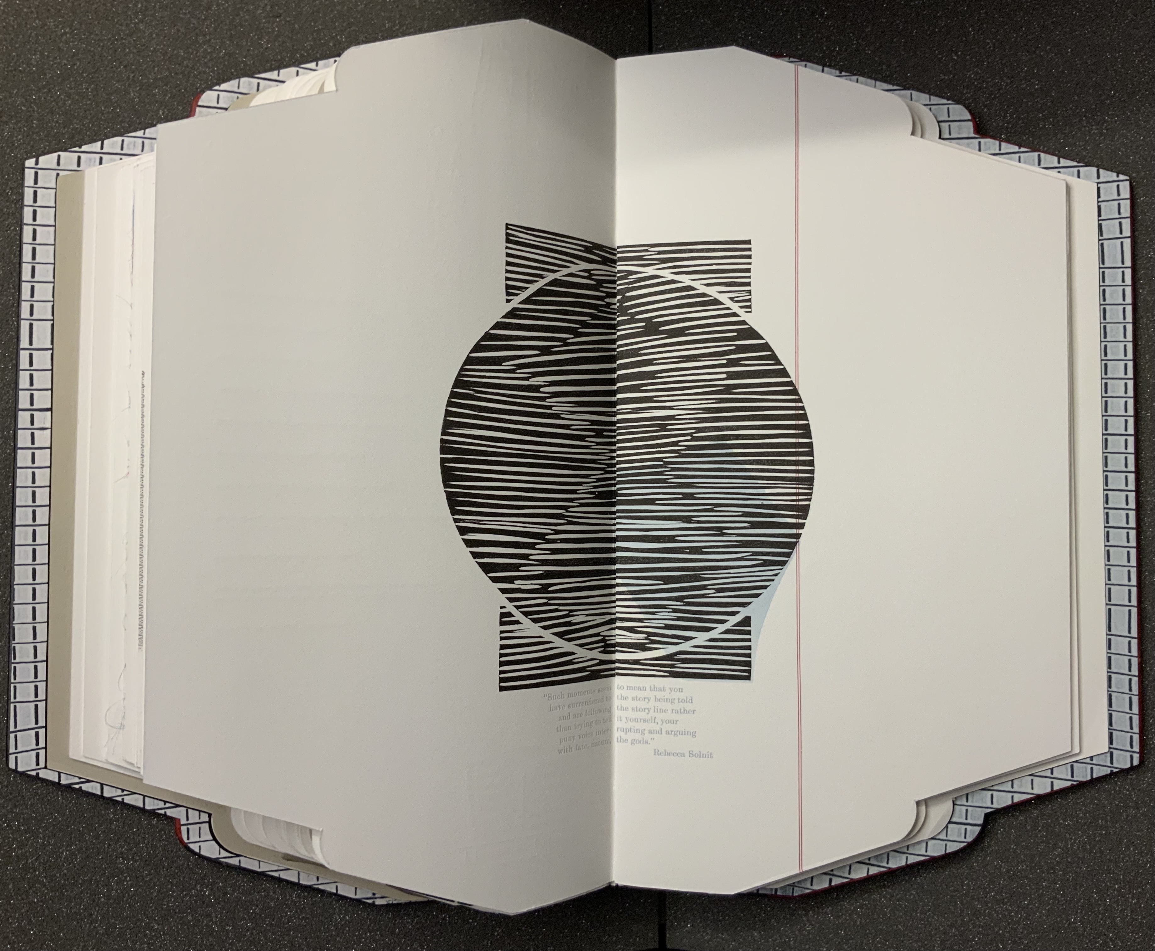
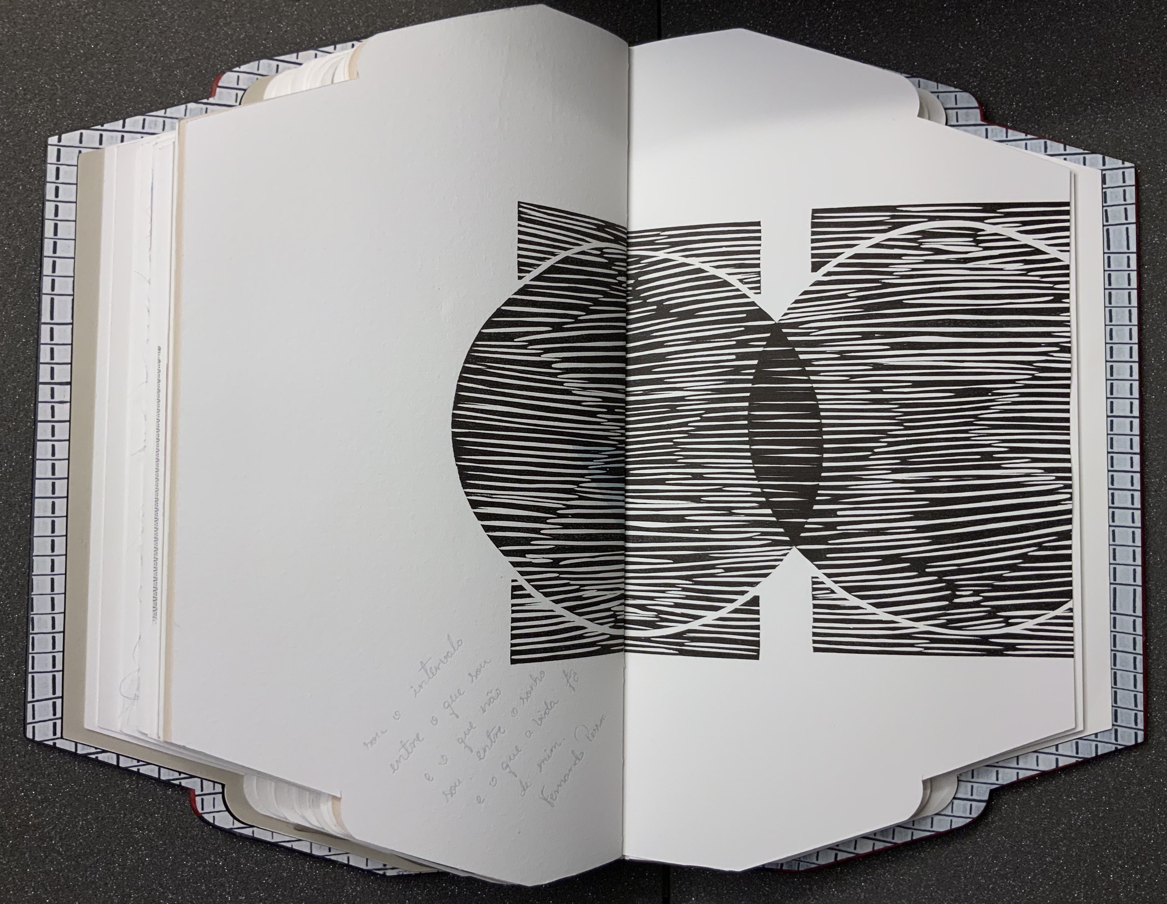
Body of Evidence (2020) Ana Paula Cordeiro Artist’s book. Bound on meeting guards, covers in full leather lacunose panels with tree bark and mother-of-pearl onlays. H16 x W9 in, 30 pages. Somerset, Magnani and Zerkall papers with gampi and mulberry inclusions. Edition of 9; this copy commissioned by the Bodleian Library. Photos: Books On Books Collection, with thanks to Alexandra Franklin, Jo Maddocks and Sarah Wheale of the Bodleian.
When I encounter works of book art, I often recall another collector’s comment — “you don’t collect these works to read them” — and shake my head. Every one of these works expects you to try — even the ones nailed shut, submerged, cast in concrete, burnt to calcification or otherwise hermetically sealed. At their end of the spectrum, those are challenging your expectation that a book is meant to be opened. At the other end are those that “mess with” nearly every material and metaphorical aspect of the book such that they challenge nearly every expectation you might have. Starting with its title and shape, Body of Evidence falls at this end of the spectrum.
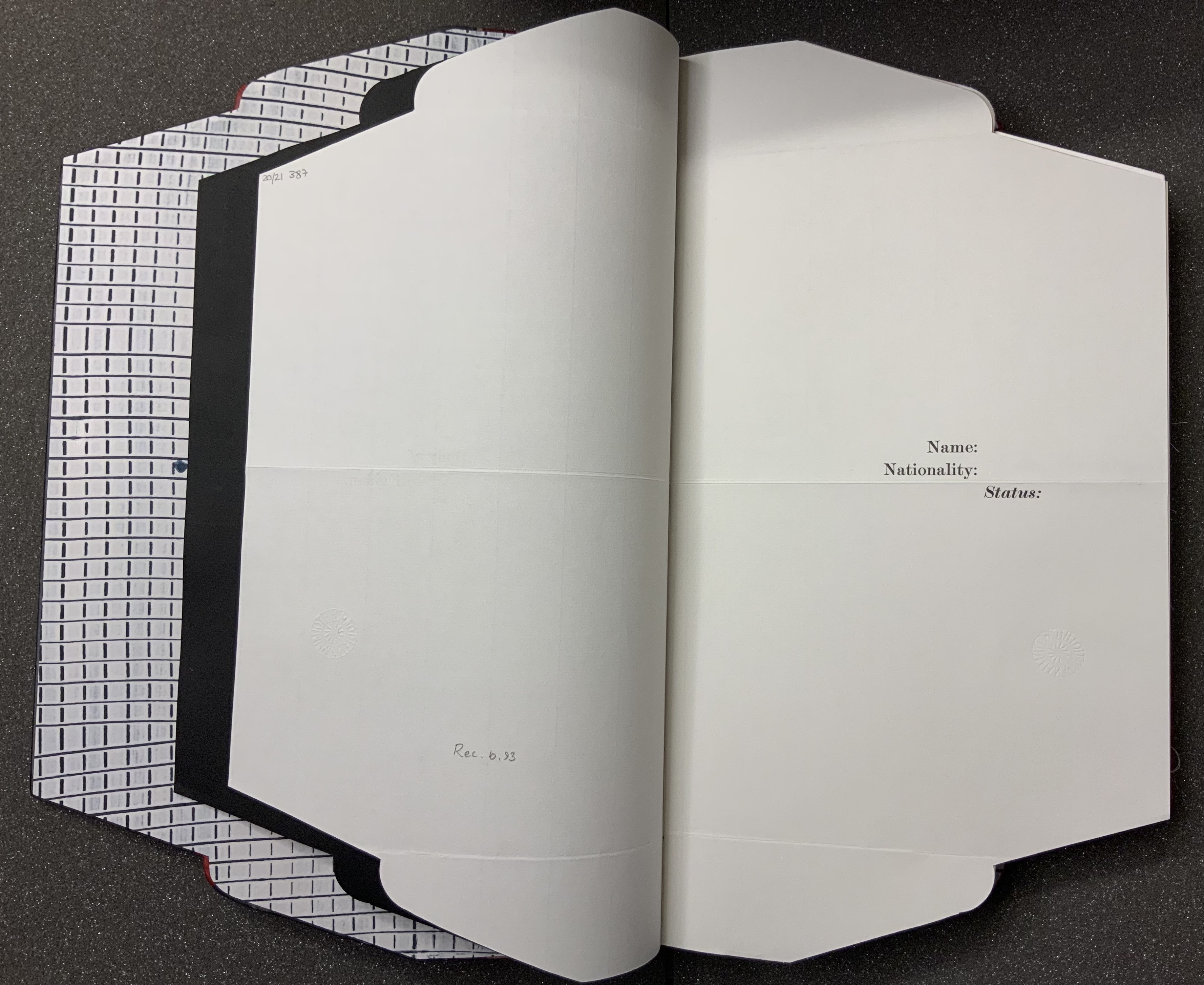
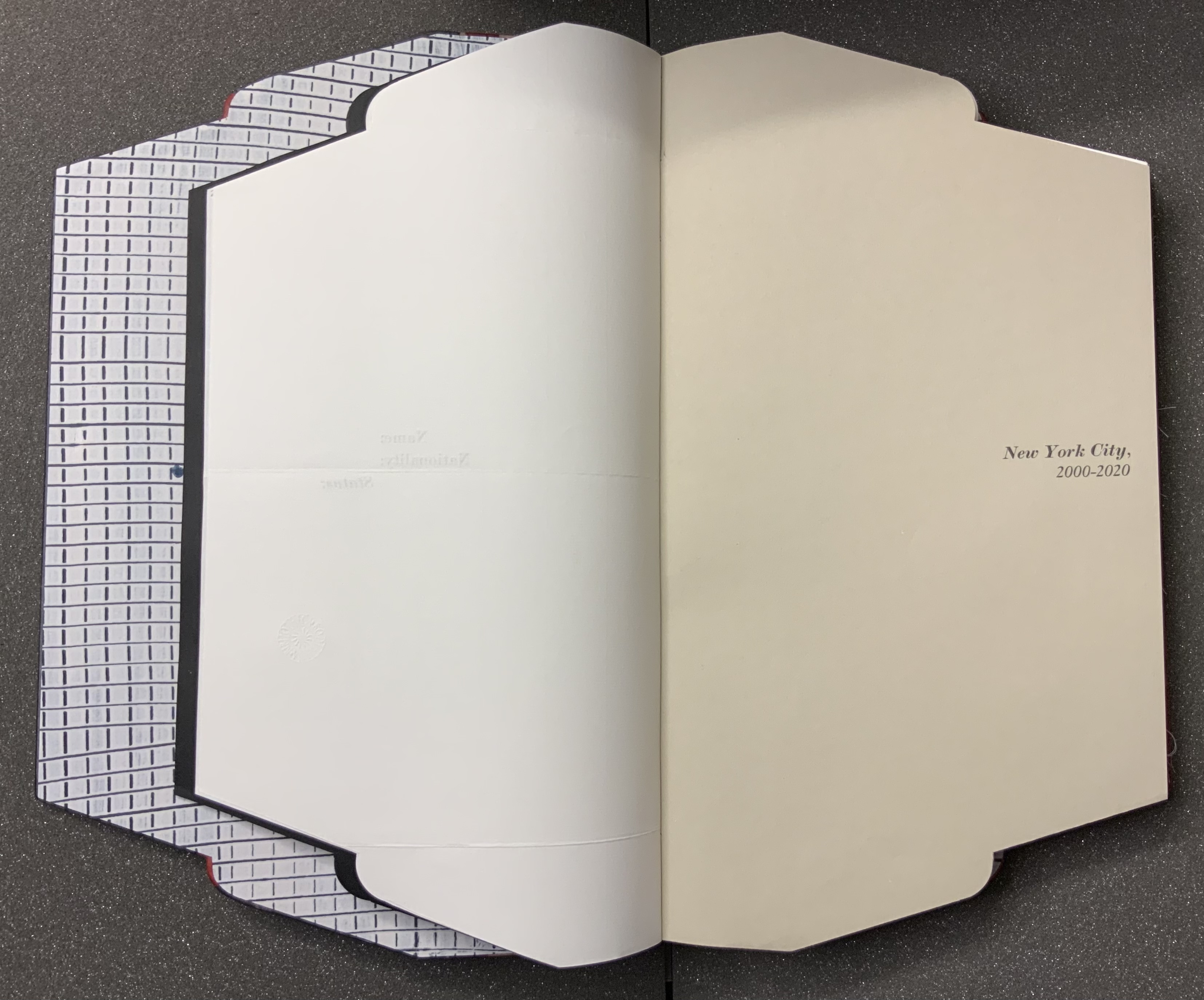
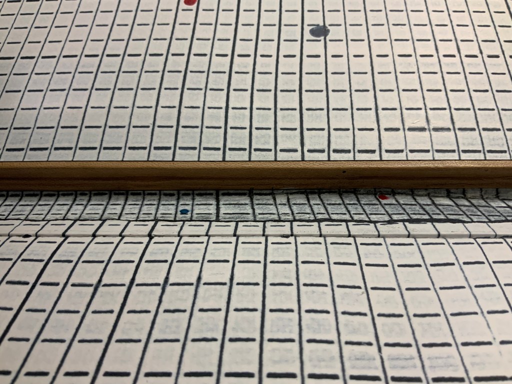
From its folder or opened-envelope outline, you know that, if this is a murder mystery as the title implies, the shape, the gridded endpaper, spotted with drops of red and blue, the flimsy black liner and stiff sheets of the title and subtitle pages are telling you: read with caution, read with unease, read to detect. That the front cover falls away from the book block to show the inner spine to be lined with the same spotted grid as the endpaper tells you: look as you read.
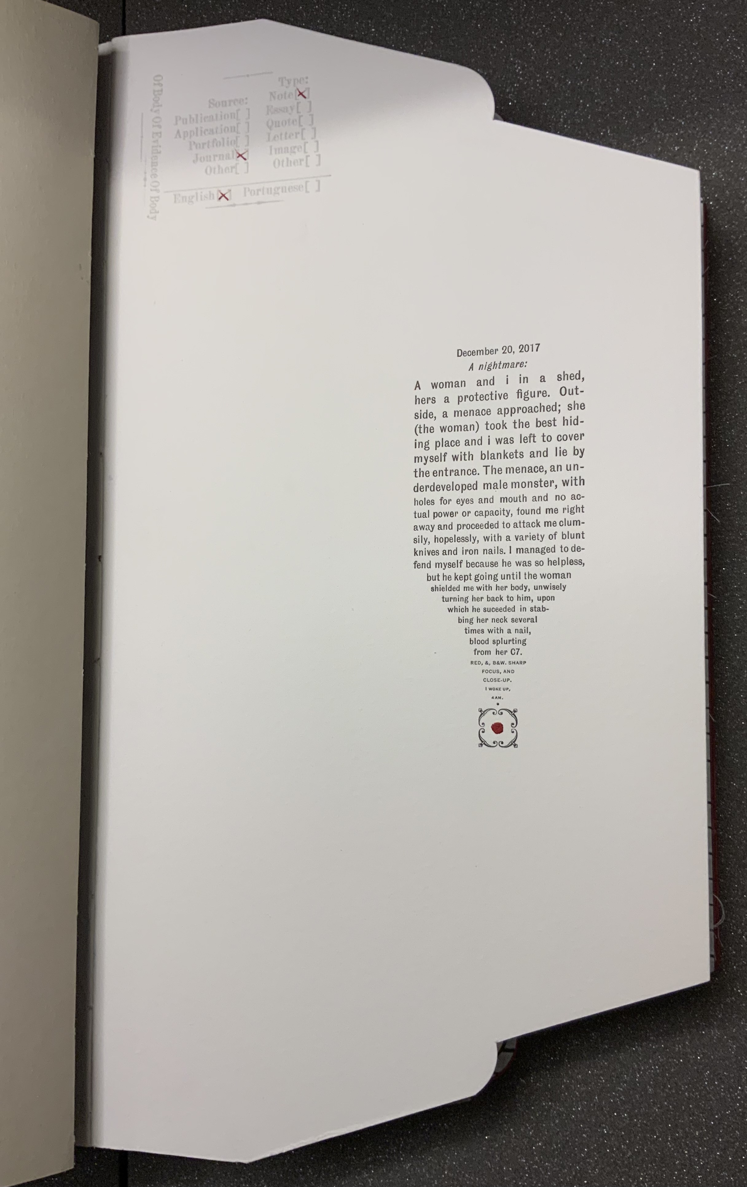
Another urging to look and read is the faint and embossed stamp with not-so-faint red X’s indicating the source and type of evidence presented on the page or spread. The opening text relates a violent assault, but one that occurs in a dream. The X’s in the stamp designate the source as “Journal”, the type as “Note”, the language as “English”, but says nothing about the shaping of the text into a pen nib pointing to a square fleuron, or is it a dagger ending in a drop of blood? The next body of text occupies the same place on its page, the categorizing stamp indicates that it, too, comes from a journal, and its language is English. But its type is “Quote”.
Like the first text’s italicized date headline that suggests its journal origin, the second text’s inverted commas identify it as a quotation. So why then the categorizing stamp? The journal writer is the artist, as the colophon will confirm, but the categorizing stamp and the envelope/folder form of the book identify the artist as collector, categorizer and shaper of the evidence. Is the artist implying “heteronyms” like those invented by Fernando Pessoa, another source of quotations?
This out-of-context quotation from William James’ The Varieties of Religious Experience seems to describe the preceding dream as a “genuine first-hand religious experience”. The dream extract is a piece of evidence. The commonplace extract from James is also a piece of evidence that contextualizes the dream extract. Read them.
Other pieces of evidence include
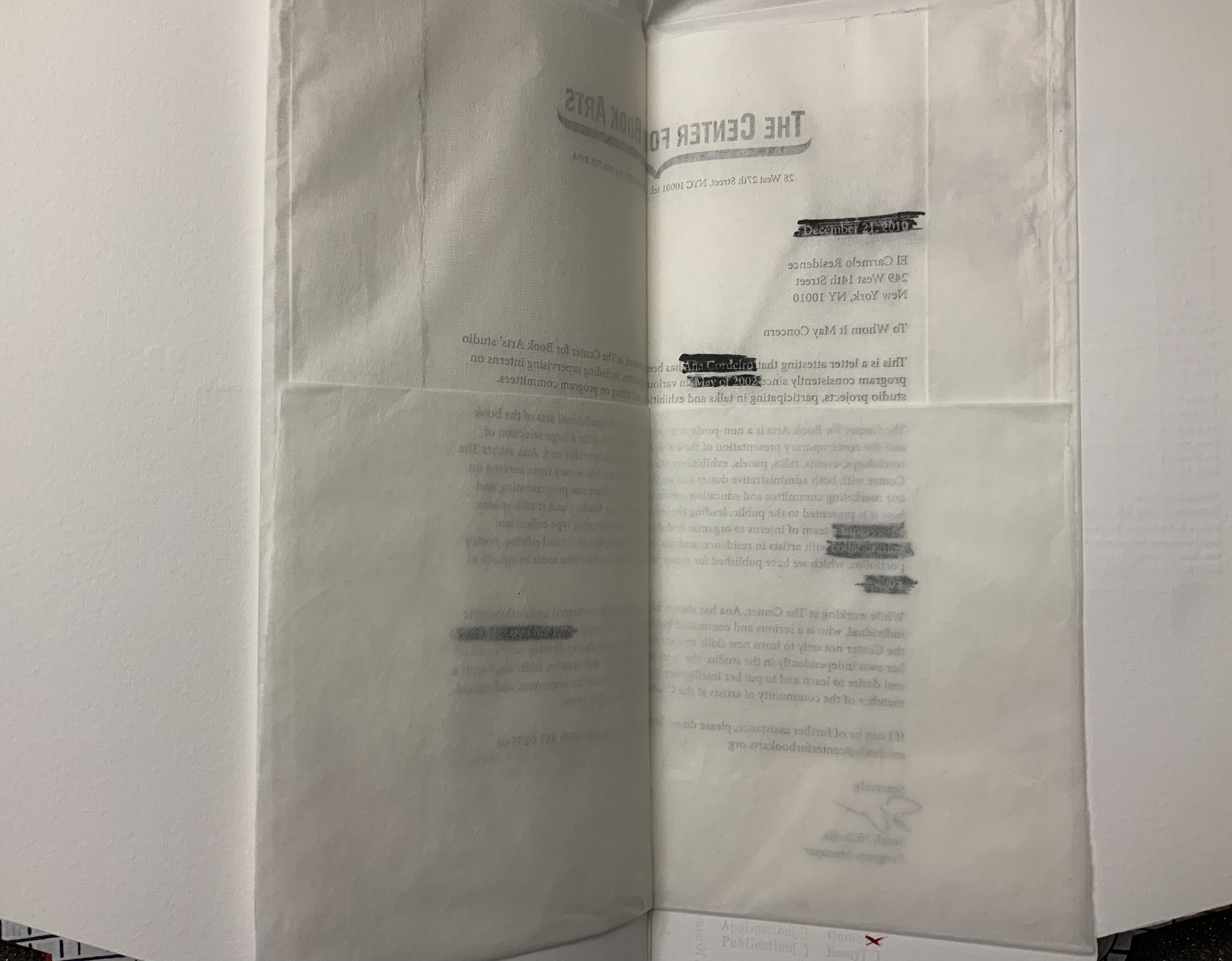
a “To whom it may concern” document on Center for the Book Arts letterhead, folded inwards from all four sides like a deed or secret letter. The letter supports an immigration application. The paper is mulberry tissue paper; so initially the text appears in reverse. Attention is drawn to that view by blocks of black redactions in which right-reading text appears in white (a reverse-out on the reverse side of the letter).
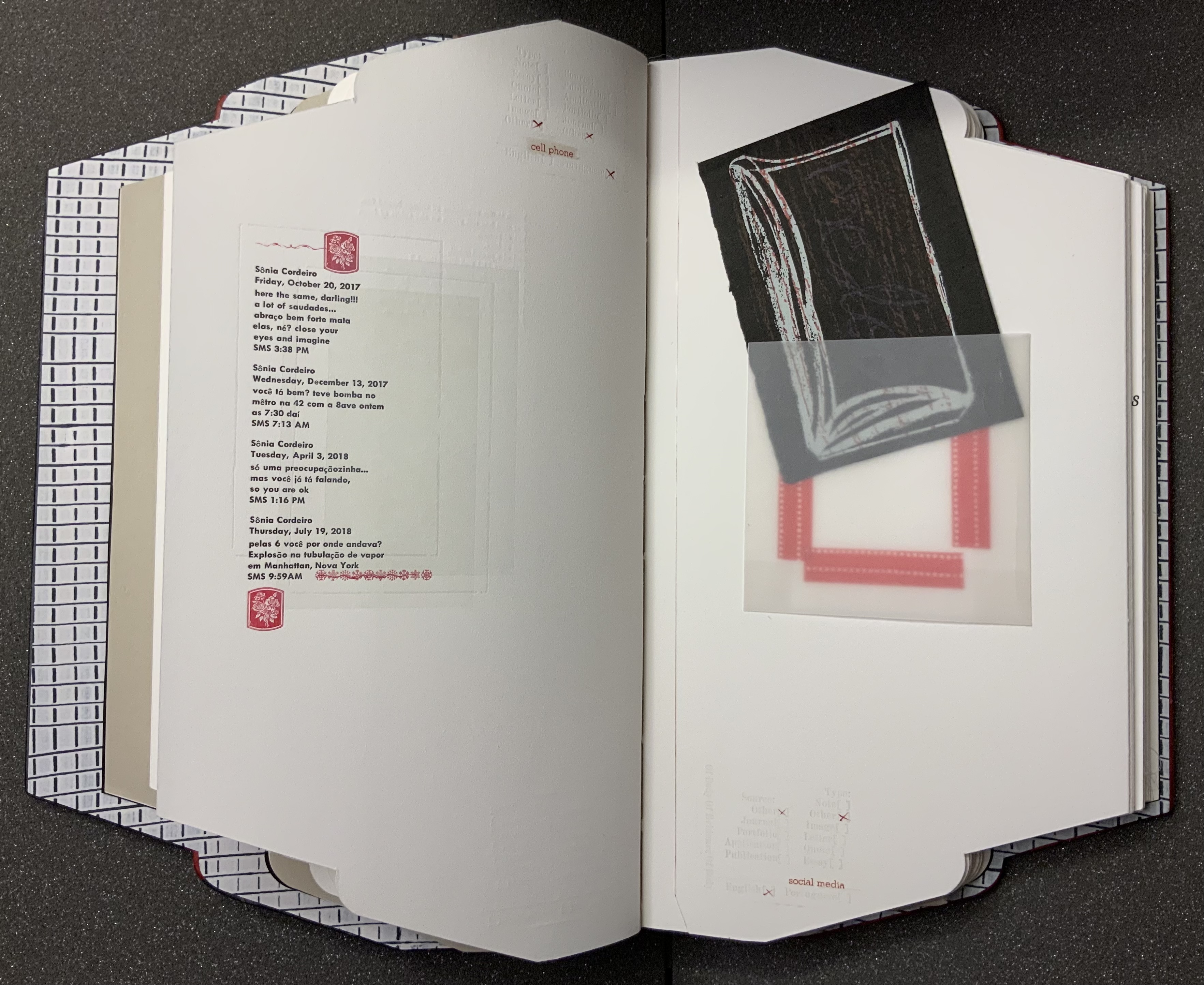
a display of SMS texts between the artist and her mother, made to appear like a print-out that had been folded then sealed with red sealing wax impressed with a sigil.
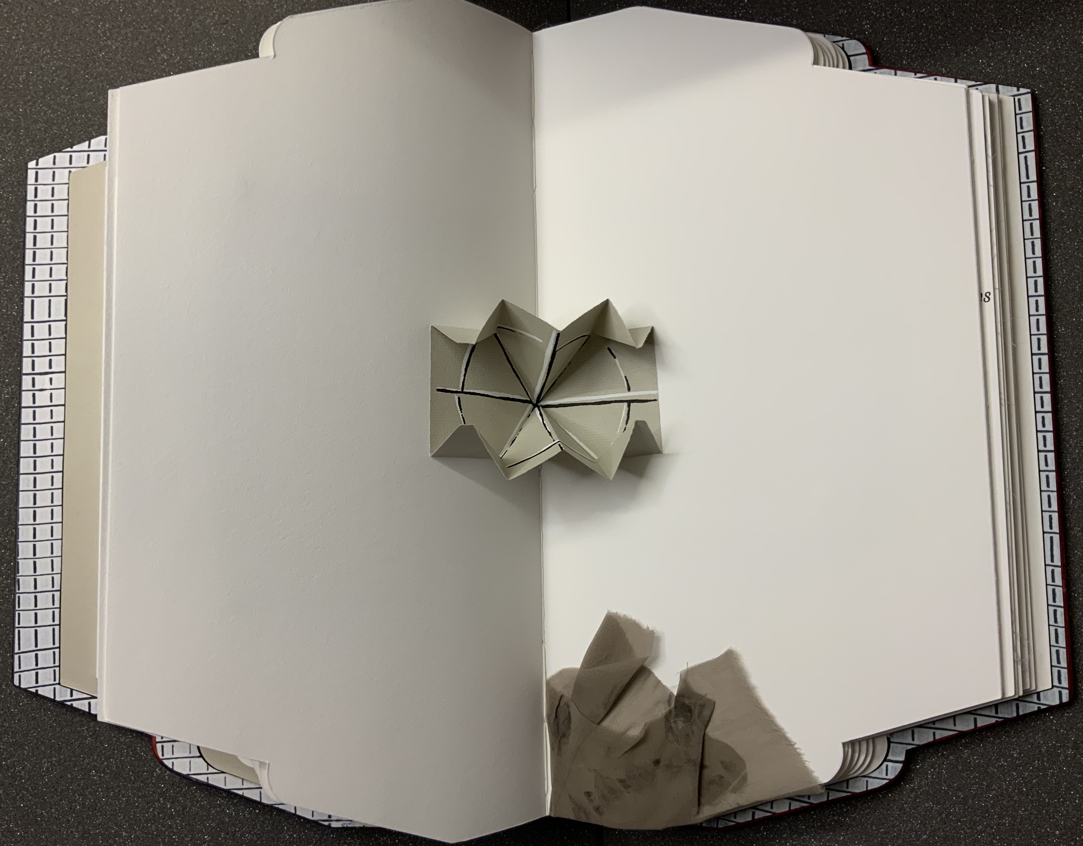
two Turkish fold maps, both with the same geometric emblem printed inside, one that pops up in the gutter of a double-page spread and one hidden under an inward-folded flap.
a medallion of gampi impressed with the image of a crouching leopard and placed within a journal extract set to surround the medallion. The pressure on the silk-like gampi causes the image to flicker iridescently.
But of what is this a body of evidence? The photo of an empty negligee and the insert of part of a nylon stocking raise the questions – of what body, whose? The empty clothing points to the wordplay on “body” in the categorizing stamp’s own label — “Of Body Of Evidence Of Body”. Perhaps it is missing. Perhaps it is outlined or staring at us from the strobing abstractions over the quotations from Rebecca Solnit and Pessoa. Perhaps it is the artist whose name appears only in only three places — in white against one of the black reverse redactions, in the SMS texts and in her signature in the colophon.
From the artist’s website. Accessed 8 July 2021.
From the artist’s website. Accessed 8 July 2021.
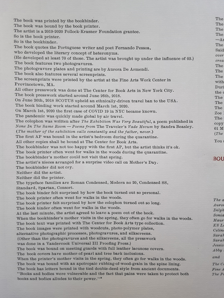
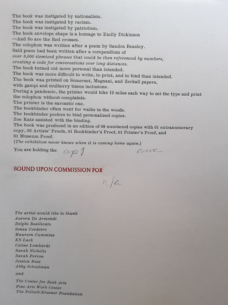
Despite its usual place of culmination, the colophon is just as unusual as the shape of Body of Evidence and its treatment of almost every other material and metaphorical aspect of a book. The colophon comes as an unbound folio, enclosed in a deed-fold sheet that is bound to the book. It is much more than the usual brief assertion of creation by scribe or printer. It is an outpouring, a venting. As the last piece of evidence, it answers the question “Of what is this a body of evidence?”
It is the accretion of the immigrant artist’s tensions and unease in the context of anti-immigrant feeling and, on its heels, a pandemic requiring isolation and its further inciting “fear of the Other”. Like the material aspects of Body of Evidence, those tensions and the unease are complex. In its ambiguity of heteronymy and near anonymity, Body of Evidence invites the reader/viewer to be an empathetic witness to the tension between a desire for privacy and a desire to be open and welcoming. The tension between wanting to belong and not wanting to lose one’s self. A tension arising from hurt inflicted under the guise of intended empathy. The tension of selves.
Whether the reader/viewer can empathize is answerable only from reading, looking and feeling.
Further Reading (and Looking)
Produced by Thomas Gallagher and uploaded 15 January 2021. Accessed 8 July 2021.
Further Reading
Drucker, Johanna. 2004. The Century of Artists’ Books [Second edition] ed. New York City: Granary Books. Drucker’s comments on auratic works under the heading “The Book as Private Archive” would be useful in developing further readings of Cordeiro’s work.
Around the Corner(2020) Ximena Pérez Grobet Japanese bound in slip case open at both ends. H200 x W175 x D70 mm. Edition of 20, of which this is # 2. Acquired from the artist, 1 December 2020. Photos: Books On Books Collection.
Since 2008, the AM Bruno coalition has sponsored artist book challenges. The one in 2020 was entitled “One and Many Pages” and challenged the participants to respond to the image below:
Clive Philpott reviewed the various proposals and selected twelve to go forward. Pérez Grobet’s Around the Corner was one. On the fore-edge you can see the whole image of “a”one and many pages” reproduced. As you remove the book from its slipcase, you are gradually astounded that, in fact, the image produces the book. Like a flip book, each page holds a segment of the whole image of the “one and many pages” photo. As each segment appears as a full-page bleed, this image of a book un-builds and re-builds within and around the corners of the book in your hands.
Richard Kostelanetz writes of an essential distinction that separates the imaginative from the conventional book:
In the latter, syntactically familiar sentences are set in rectangular blocks of uniform type …, and these are then ‘designed’ into pages that look like each other (and like pages we have previously seen). An imaginative book, by definition, attempts to realize something else with syntax, with format, with pages, with covers, with size, with shape, with sequence, with structure, with bnding — with any or all of these elements, ideally reflecting the needs and suggestions of the particular book. Most books are primarily about something outside themselves; most book-art books are primarily about themselves. P. 48.
This catalogue of the exhibition organized by the late Hermann Havekost at Oldenburg University in 1986 qualifies as imaginative on nearly every one of those criteria. To boot, it is about itself as well as about something outside itself.
The ambidextrous book appeared the same year as The Book Made Art, edited by Jeffrey Abt and designed by Buzz Spector. The size of the Oldenburg catalogue dwarfs that of The Book Made Art, is more globally representative (especially of Central and Eastern Europe), and has more of a textual, Fluxus feel to it. Nevertheless, the catalogue’s German and Italian titles, several of its selections and its very production and performance chime with the sculptural, book-object tenor that Spector achieved with his design and Abt with his selections for The Book Made Art.
Among the Oldenburg exhibition’s artists and their works clearly addressing the book as object are
Denise AubertinJournal impubliable (1984), a work of altered, torn, collaged-over pages
Sheril CunningSummer Rain (1984), a codex of pages of gampi and abaca with mica particles, bearing watermarks of a rain storm
Elisabetta GutLibro-incabbiato (1981), a bamboo bird cage with a miniature Italian-German dictionary inside
J.H. Kocman Paper-re-making book No. 057 (1982), a book made handmade paper sheets made from seven books that were ground to pulp in water
Martin PeulenUntitled (c. 1984), a matchbox labelled “Martin Peulen Caution Book!” and holding a stapled book (H20 x W200 mm)
Adam RzepeckiUntitled (1984), a book with a saw stuck halfway through
Franz E. WaltherStoffbuch 2 Zwei (1969), a book of blank fabric pages, closed with cloth straps and resembling a folded straitjacket.
However broadly representative of book art in the 1980s and star-studded (Roberta Allen, Barton L. Beneš, Mirella Bentivoglio, Agnes Denes, Robert Filliou, Dick Higgins, Dennis Oppenheim and Tibor Papp to mention a handful), the Oldenburg catalogue’s chief claim to a place in the Collection remains its status of “catalogue as book art”, a claim to “book art” that rests on its four-fold binding structure. In this, it is similar to The Book Made Art (1986) with its trim and trompe l’oeil vitrine pages; or Irma Boom’s The Architecture of the Book (2013), a catalogue miniaturisé; or Odd Volumes (2014) with its more “traditional” dos-à-dos binding.
These “interrogations” of the book’s structure serve to excite the appetite for even more complex, self-reflexive acrobatics with exhibitions of book art. Which institution of book art will spring for this six-fold structure?
An Alphabetical Accumulation (2017) Francesca Lohmann Handpress printed and calligraphed book. H157 x W117 mm, 26 leaves + title + colophon. A black and red tray case, H171 x W128 mm. Edition of 36, of which this is #16. Acquired from The Veatchs, 11 June 2021. Photos: Left, Books On Books Collection; Right, Courtesy of The Veatchs. All photos displayed with permission of the publisher.
Rollin Milroy of Heavenly Monkey, Francesca Lohmann and Claudia Cohen collaborated on this work of art. The alphabetical accumulation is the accumulation of 36 letter A’s entirely hand drawn in red, 25 calligraphed partial alphabets reproduced in black from polymer plates, and 900 pages in which the next letter in the sequence of the partial alphabet has been drawn in red. Each copy of the edition thus presents the full alphabet in original calligraphy across its pages. Printed and calligraphed only on the recto side, this is an alphabet that repays page by page attention. As each new letter arrives in red, all the previous ones and their accumulated foliage fall into black. Not every letter appears in capitals. The letters’ size, arrangement and ligatures shift as the alphabet accumulates.
The edition is also an accumulation of unusual production artistry. Those tapes exposed on the binding — a non-adhesive limp vellum, gold-tooled at the edges, with the title calligraphed in red on the spine — are strips from the old vellum manuscripts used as “paste”downs that are not pasted down. Three different papers — all printed damp at Heavenly Monkey on an Ostrander-Seymour handpress — are used: Crown & Sceptre, J. Whatman, and T.H. Saunders. Deckled leaves and trimmed leaves intermingle.
Fittingly the colophon is calligraphed and reproduced in black from a polymer plate, leaving space for the calligrapher to supply finishing strokes: the number and signature in red.
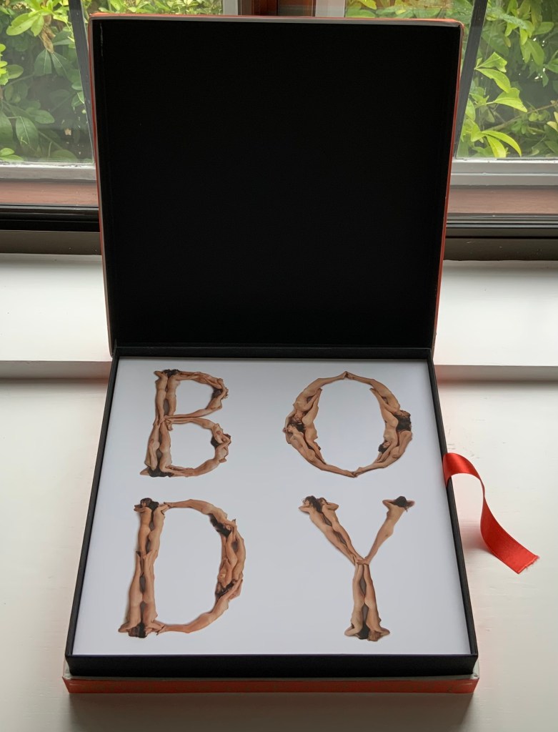
Beeke devised “The Body Alphabet” around 1968/69. It came in response to the “sexual revolution” of the 1960s and in reaction to functional typography. The designer Pieter Brattinga had published Wim Crouwel’s New Alphabet (1967) in the Kwadraatblad series and followed that up with Gerard Unger’s A Counter-proposal (1967) and Timothy Epps and Christopher Evans’ Alphabet (1970). Brattinga must have felt that “bad boy” Beeke’s tongue-in-cheek response modelled on Baskerville fit the bill as a final coda.
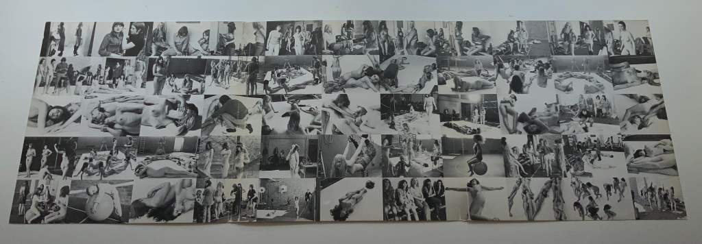
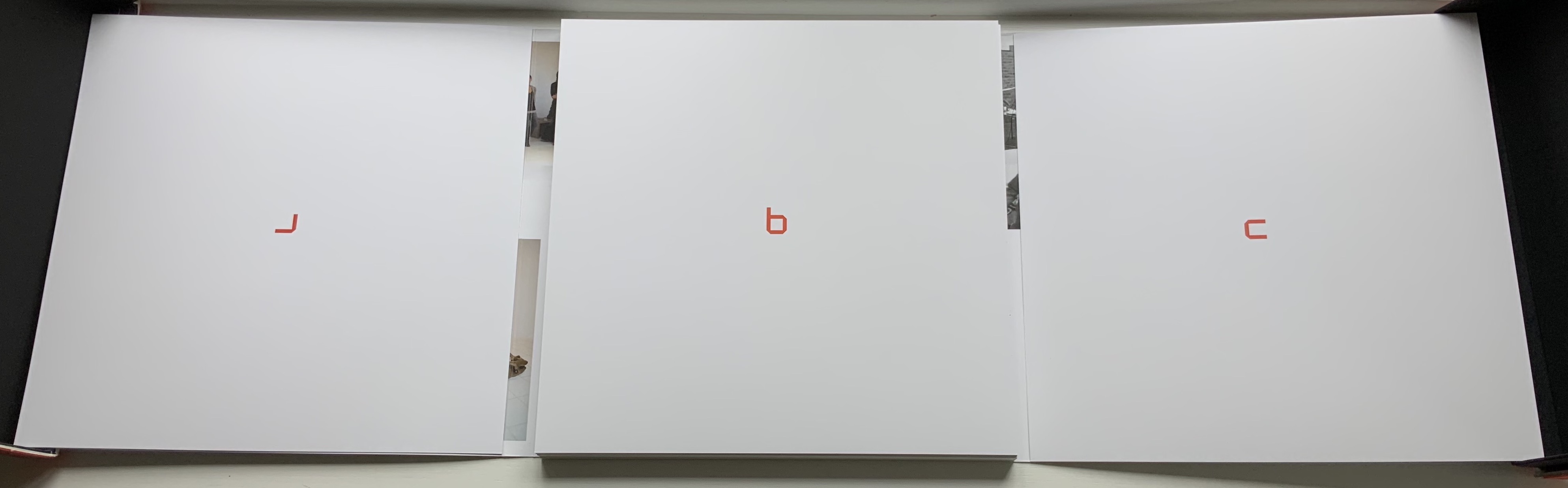
The portfolio’s cover has three panels that fold and overlap around the folios. The exterior is shown above. The interior below displays a spread of 55 small photographs from the photo shoot, showing the models standing around waiting to be directed into position for the relevant letter. Once the models were in place, the shot wad taken from above. Some letters like M required as many as 12 models.
Baskerville may have been Beeke’s template, but the letters G and Q stray far from it. The serifs in the G’s lower right stroke are misdirected. The Q is too oval, and its swash is missing the left-hand stroke characteristic of all the Baskervilles. In fact, a hunt through Rookledge’s Classic International Typefinder for similar Q’s suggests Century as a closer template. Nevertheless, the intention is winning and a challenge to subsequent pursuers of the naked alphabet. And there have been a few, such as Olivia Brookes and Anastasia Mastrakouli as well as “digital” alphabetists such asAmandine Alessandra, Tien-mien Liao, Lucas Neumann andJosé ErnestoRodríguez.
“The Body Alphabet” shoot has the air of a live-model art class, and the result is not prurient or exploitative, even with the child to form the smallest points of punctuation (Tinelou van der Elsken, the daughter of Ed van der Elsken, is the model for the ‘comma type’ in the alphabet). Sexist? Non-diverse? For near-perfect balance, the Books On Books Collection should have an artist’s book or portfolio available from self-partnering Tomaso Binga (something like the self-portraiture in Living Writing), but Beeke, René Knip and Spinhex & Industrie Drukkerij have more than addressed the issues with the following remarkable work.
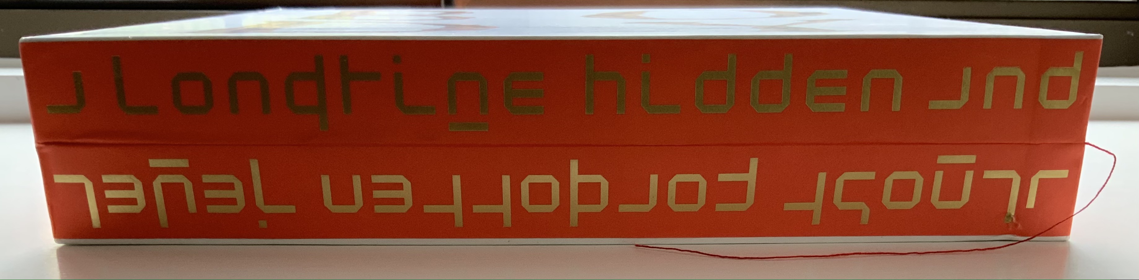
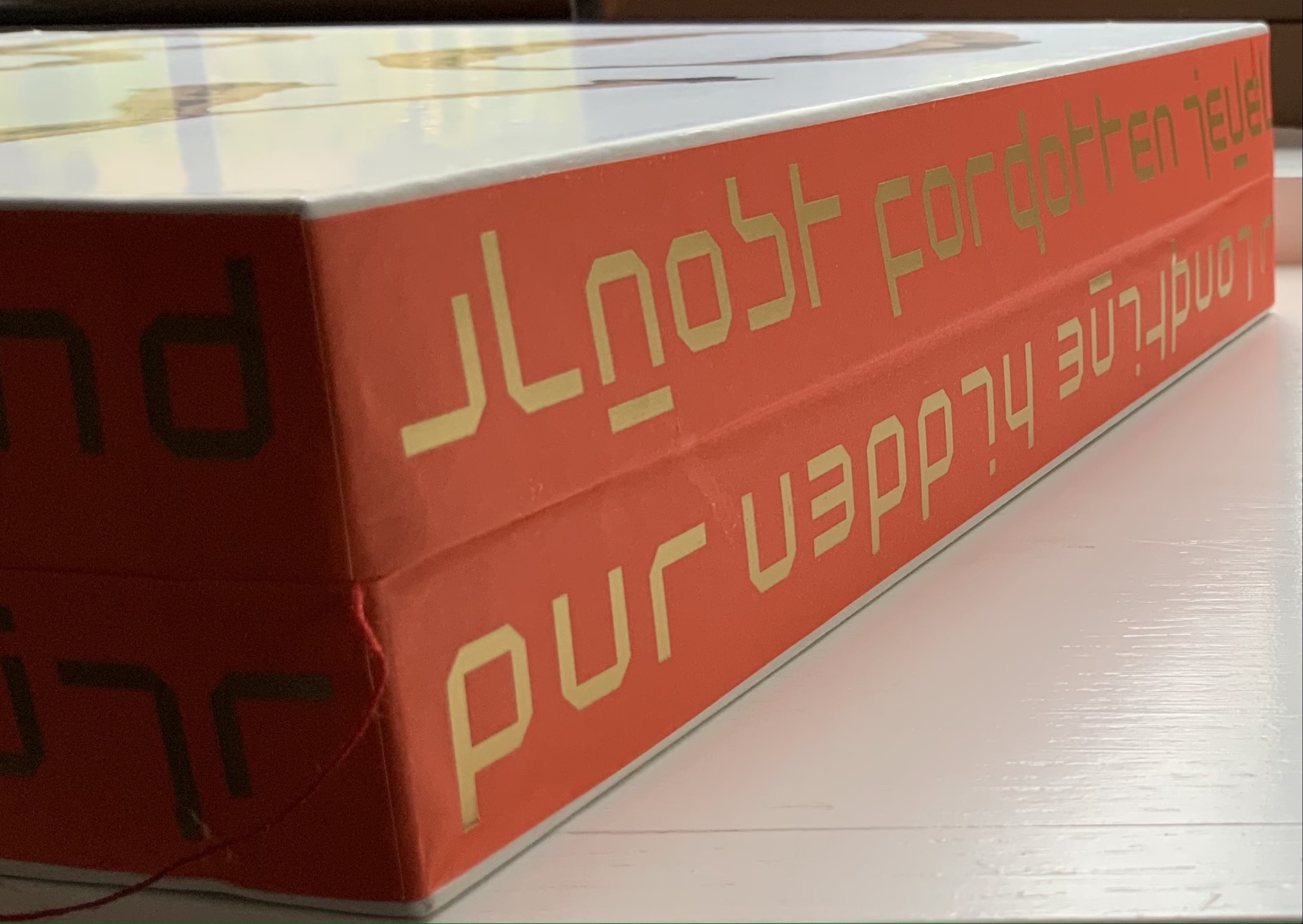
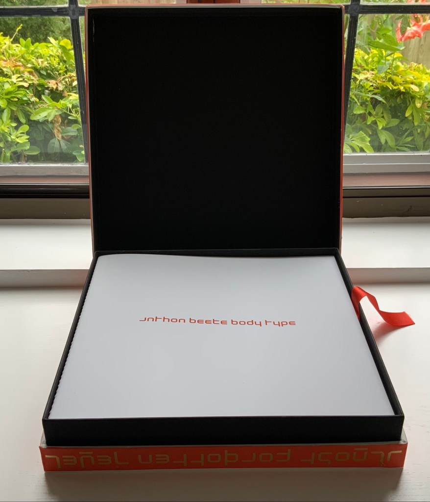
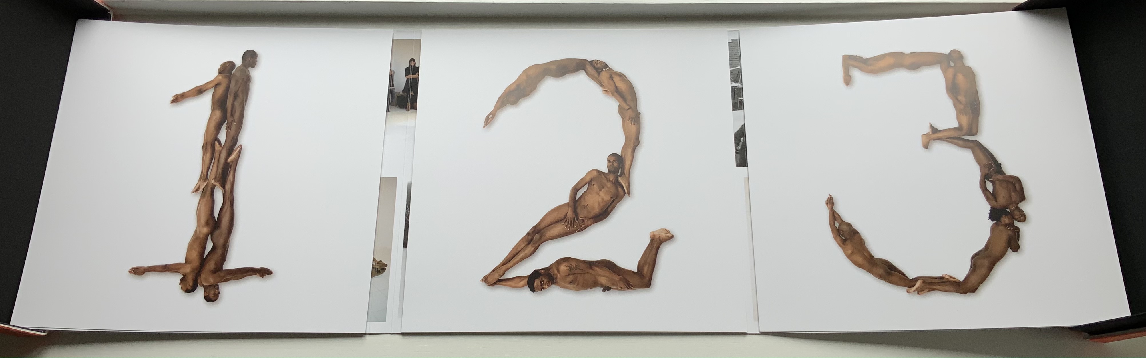
Designer René Knip and Spinhex & Industrie Drukkerij have preserved two important artifacts in typographic and design history and brought them to renewed artistic life. In a way, the collector gets to participate. Body Type arrives as a sealed time capsule requiring a razor to open it and let out the past. Inside are three glossy works lying atop a ribbon pull. The first work is a softcover book, its spine sewn with red thread to match the title on the front cover. Announcing the renaming of Beeke’s Alphabet (1969) as Body Type, it is cheekily set in Crouwel’s New Alphabet (1967) to which Beeke’s original “naked ladies alphabet” had responded. These are the two artifacts preserved, in Crouwel’s case, by use of his alphabet for the titles and section headings and, in Beeke’s case, by extension of his typeface and recreation of the photoshoot that originally realized it. Given their deaths at the end of the last decade (Beeke in 2018, Crouwel in 2019), Body Type provides a valuable juxtaposition of their reflections (Crouwel’s preface and Beeke’s essay).
In addition to his narration of the old and new shoots, Beeke shares an insight about an influence beyond the foil that was the New Alphabet. As Beeke puts it, “If Wim Crouwel pointed to the future, then I was going to perfect the past,….” What he found in the past was a Folies-Bergère-inspired alphabet by Erté (Romain Petrovitch Tirov).
The second work in the box is a portfolio containing a full-color recreation of the original 1969 alphabet and punctuation marks with the addition of Naked Numbers. On the inner side of the portfolio’s wraparound, Ed van der Elsken’s black-and-white production shots sit side by side with the new color production shots. The full color folios themselves present on one side the character constructed with human bodies and on the other side the corresponding character from Crouwel’s New Alphabet.
The art of the alphabet seems to be a rite of passage for graphic artists. Perhaps it is that art and the alphabet find common ground in the urge to make sense of the world. Perhaps it’s that the alphabet’s invention, development and artistic treatment present a rich tradition for artists to follow or challenge. Perhaps it’s that letterforms and the alphabet offer raw material, subject and organizing principle all in one. Semic or asemic. Calligraphic, typographic or even plastic. Representational or abstract. All are options. But most often, something bookish results. From Islam Aly’s 28 Letters(2013) to Ludwig Zeller’s Alphacollage (1979), a significant part of the Books On Books Collection is taken up with artists’ books based on the ABCs and letterforms. The Collection’s two facsimiles of Geofroy Tory’s Champ Fleury provide a useful historical backdrop that throws into relief several of the Collection’s works and their performance of this rite of passage.
It should be no surprise that Geofroy Tory de Bourges (c.1480-1533) serves up such an exemplar. In her Playful Letters, Erika Boeckler writes
An accomplished designer, typographer, printer, poet, author, translator, calligrapher, illustrator, woodcutter, and engraver, he received his education in Italy and ultimately settled in Paris, setting up a bookstore, writing his own works, running a press, and collaborating with or working for Simone de Colines, director of one of the most influential and experimental fine publishing houses of the time. Personally writing the text, designing the woodcuts, and cutting some of them, organizing the layout, perhaps even setting the type, Tory created Champ Fleury as what we might call today an artist’s book. (p. 29)
Tory straddles the letters of the late Middle Ages and Renaissance. Appointed by François I in 1530 as his printer, Tory operated on the Petit Pont under the sign of le Pot cassé (“the broken pot”) and was known for his workshop’s handwritten Book of Hours (1524). Rooted in the horae tradition reaching back to the 13th century, Tory’s Book of Hours is an early-to-mid-Renaissance version of its predecessors. As beautiful as his Book of Hours is, Champ Fleury (1529) became his best known work. Authored and designed by Tory, it was produced by hand typesetting and letterpress printing in Paris with Giles Gourmont. Printed less than 100 years after Gutenberg’s innovation, Champ Fleury represents the printed book toddling out of its incunabula period.
Book of Hours Geofroy Tory (1524) Bound in the 18th century, 113 leaves of vellum. Lessing J. Rosenwald Collection (Library of Congress). Accessed 30 May 2021.
According to Jeremy Norman’sHistory of Informationsite, the first separate printed title page appeared in 1463. Subject indices date back to the 13th century, originating at the University of Paris, and the first printed indices, to 1470. Champ Fleury‘s front matter boasts a title page, two prefaces to the reader, a statement of the King’s Privilege awarded for the book for ten years (a forerunner to the copyright page), a name index without location references and a subject index with folio references. Champ Fleury’s back matter consists of a colophon preceded by a lengthy appendix illustrating various forms of the alphabet (Hebrew, Greek, Latin, etc.).
Tory’s placement of the indices in the front matter rather than the back matter reflects the gradual development of the anatomy of the book towards the structure that would ultimately be codified in reference works like the Chicago Manual of Style. Paratextual elements like the title page, table of contents, page numbers, etc., did not spring up overnight. If, as Eric Havelock and others assert, society, the arts and culture are a superstructure erected on the foundation of the alphabet (see below), Champ Fleury and its “letterology” make for a particularly fitting exemplar of the book as an element of the superstructure arising from the alphabet.
Perhaps book artists sense this, which again leads to that alphabet art rite of passage and the elaborate variations on it. The illustration of various forms of the alphabet in the appendix also draws on another developing tradition: the typesetter/printer’s sample book advertising the firm’s fonts. Abecedaries and artist books have sprung from that tradition, too.
Tory was not the first to propose an art and science behind the letterforms of the alphabet. Predating his efforts were Giovanninno de’ Grassi (1390-1405), Felice Feliciano (1463), the Anonymous Chicagoensis and Anonymous Monachensis (1468?), Damianus Moyllus (1480), Fra Luca Pacioli (1509), Sigismondo Fanti (1514), Francesco Torniello (1517), Ludovico Arrighi (1522), Albrecht Dürer (1525) and Giovanni Battista Verini (1527). Leading up to Champ Fleury, these earlier efforts track the development of humanism. Arguably, Tory’s effort is a capstone, combining myth, allegory, metaphysics, geometry, linguistics, calligraphy, typography and cryptography.
Book One, concerned with the mythical origins of the French language, also addresses the fabled origins of the alphabet: the story of Jove, Io and Mercury behind the letters I and O and their claim to being the first letters and also the tale of Apollo’s accidental murder of Hyacinth explaining the letters A and Y and their similar claim. Two works in the Collection built on alphabet origin stories are Francisca Prieto’s Printed Matter series (2002-2008) William Joyce’s The Numberlys (2014), but many more follow in Champ Fleury’s art and science footsteps.
Tory’s late medieval/early Renaissance perspective gives way to 20th and 21st century poetics and phenomenology in most works of the Collection. Aaron Cohick’s The New Manifesto of the NewLights Press (third iteration) (2017) offers a good example. Another — closer to Tory’s moral and geometric perspective but of a more modern spirituality — is Jeffrey Morin and Steven Ferlauto’s Sacred Space (2003).
Compile all the abecedaries ever created and it would approximate the result of Adam and Eve’s task of naming all the creatures and things of the world. Leonard Baskin echoes that innocence in Hosie’s Alphabet(1972) with its words and animals supplied by his children. If Adam and Eve had had an alphabet, they might have been tempted into pareidolia, which is represented in the Collection by VUES/LUES: Un Abécédaire de Marion Bataille (2018) and Typographic Universe (2014) by Steven Heller and Gail Anderson. Heller and Anderson’s compendium extends to letters formed of natural and drawn objects from the real world, which Champ Fleury’s appendix foreshadows with its floral and fantastic alphabets.
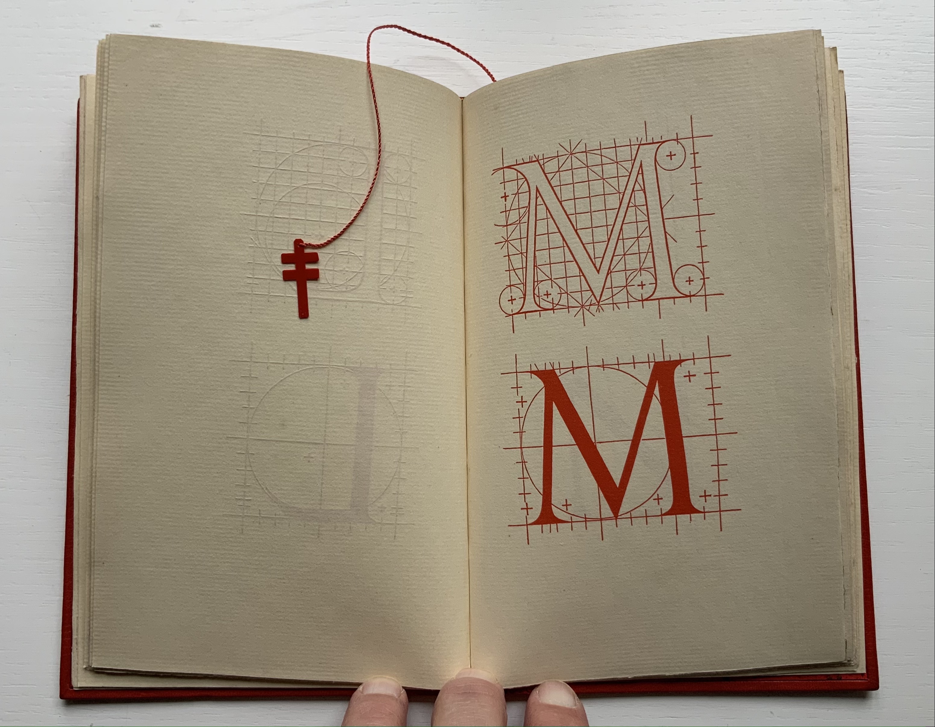
Of course, Tory’s work is not an abecedary. In Books Two and Three, it develops into a full-blown treatise on letterforms whose meaning and appearance are explained allegorically and driven by the compass, rule and geometry expressed within a 10x10x10 cell cube. It would overstate the case to call it “typographic design”. As drawn, Tory’s diagrams would serve poorly for cutting and forming punches or matrices (although it has been done). Nevertheless, his geometric approach foreshadows the grids and algorithms of Wim Crouwel’s New Alphabet (1967), Timothy Epps and Christopher Evans’ Alphabet(1970) and Ji Lee’s Univers Revolved: A Three-Dimensional Alphabet (2004).
Before the age of computers and algorithms, though, the artist and designer Bruce Rogers did bring typographic design to bear on Champ Fleury. The Grolier Club sponsored the printing of George B. Ives’ English translation. Rogers’ design “translates” Champ Fleury just as much as Ives does, perhaps more so. The Grolier Club edition is one of only ten books to be set completely in the Centaur typeface designed by Rogers.
Of course, the translation entails a complete resetting of the text, and Centaur naturally delivers crisper letters. Also, in redesigning with Centaur, Rogers alters the original’s layout and, therefore, the reader’s experience of it. Notice in the OAHK pages above and in the three double-page spreads below how Rogers changes Tory’s flow or jumpiness to something fixed or stately. Attention to the page and its layout offers book artists as well as book designers yet another creative avenue. For proof of that, compare the Collection’s entries for Angel, Baskin and de Cumptich.
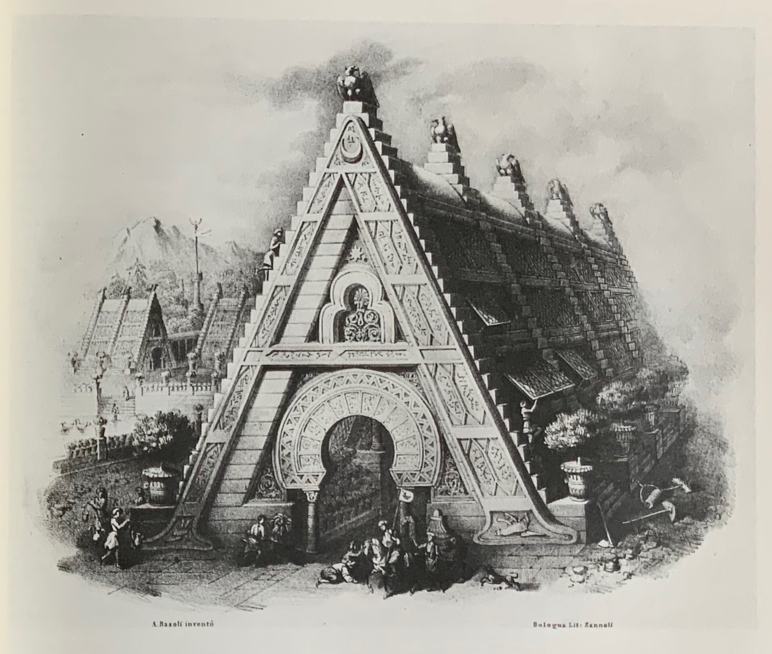
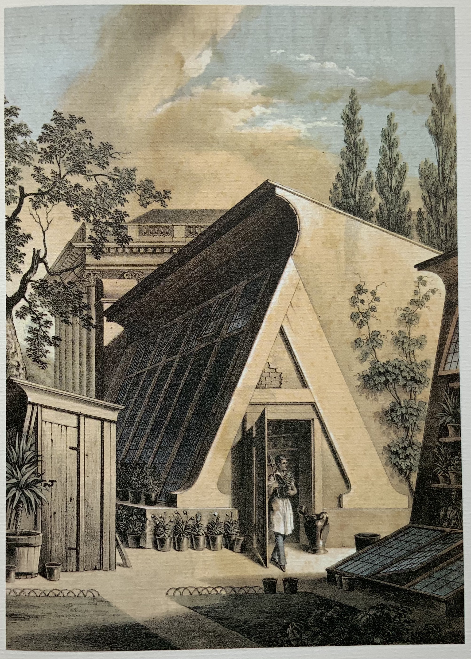
Architecture is another of Tory’s well-developed analogies and explanations of the ancients’ thinking behind the letterforms. In his drawings below, he aligns the letters AHKOIS with the parts of a building and letters IL with floor plans. He connects the circularity of the Coliseum’s exterior and the ovalness of its arena with the proper shape of the letter O. In the Collection, the analogy reappears fantastically in Johann David Steingruber’s Architectural Alphabet (1773/1972), Antonio Basoli’s Alfabeto Pittorico (1839/1998) Antonio and Giovanni Battista de Pian’s efforts in 1839 and 1842.
The architectural analogy provides Tory with his segue from plane to solid geometry in aligning the shapes of letters with human anatomy and virtues. His three-dimensional analysis of letterforms also finds contemporary analogues in two of Pieter Brattinga’s Kwadraat Blad series: Crouwel’s, mentioned above, and Anthon Beeke’s Alphabet (1970). Tory’s three-dimensional letterforms foreshadow Crouwel’s investigation of units based on the assembly of organic cells and his later musings on a laser-generated four-dimensional typography (Elliman, 62). And it is hard to evoke anything more humanoid and three-dimensional — albeit far less analytical or prudish — than Beeke’s alphabet formed with naked female models. (Tory comments that in a correctly drawn A, the crossbar will virtuously cover the genitals of Vitruvian man inscribed in the 10×10 grid. Modesty seems to extend to H as well but not so much to O and K.)
The calligraphic impulse that underlies Champ Fleury‘s typographic representations shows itself clearest in the woodcuts for the Cadeaulx alphabet in the appendix. The Books On Books Collection has its share of calligraphic abecedaries such as Marie Angel’s An Animated Alphabet (1996) and Andrew Zega and Bernd Dam’s An Architectural Alphabet (2008) as well as more purely calligraphic alphabets such as Islam Aly’s, mentioned above, and Suzanne Moore’s A Blind Alphabet (1986) .
Two artists whose abecedaries blend the calligraphic and typographic are Robert de Vicq de Cumptich and Cathryn Miller. In de Cumptich’s Bembo’s Zoo (2000), letters and punctuation marks from the Bembo typeface form calligraphic animal shapes. Miller’s L is for Lettering(2011) joins up the alphabetic rite of passage, calligraphy and typography by allying each of her hand-drawn letters with the name of a typeface from “A is for Arial” to “Z is for Zapfino”.
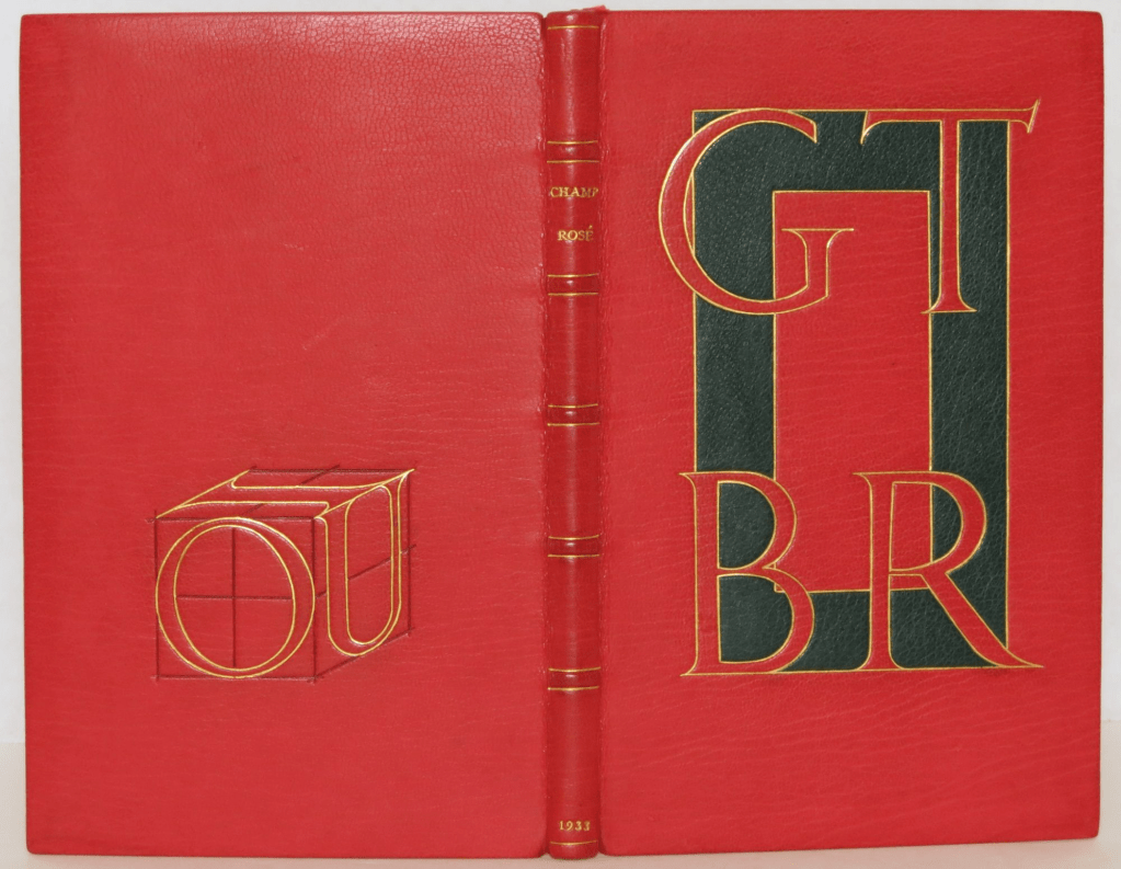
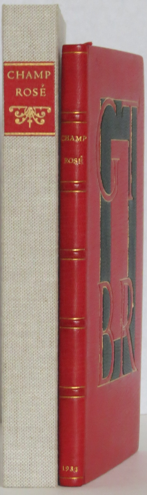
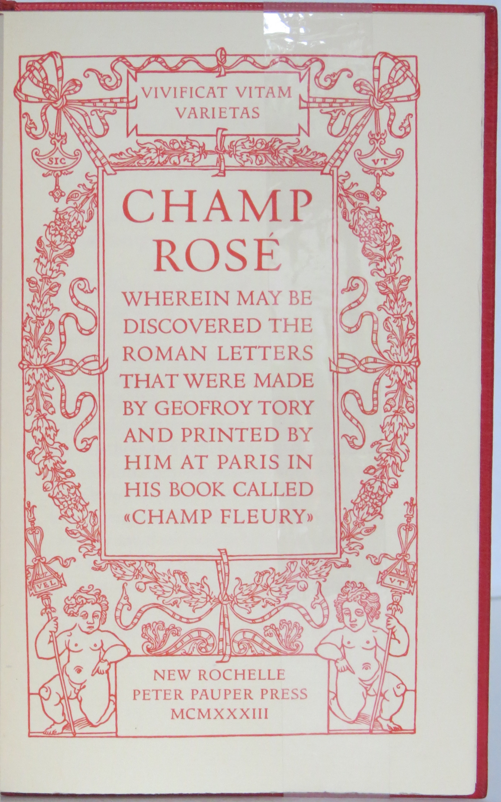
The last page of Tory’s illustration of additional alphabets is not the end of his work. The colophon plays that role. Curiously, Tory misses out the character that plays that role for the alphabet itself: the ampersand. “Curiously” because the character & appears throughout Champ Fleury — even at the end of the colophon’s fourth line in French — and it is after all the most flowery of the alphabet’s characters. Perhaps some book artist will follow Bruce Rogers’ example in his joking Depression-era homage to Tory on the back of Champ Rosé and create an homage to Tory and Rogers of three-dimensional ampersands.
Gelb, Ignace J. 1974. A Study of Writing. Chicago: University of Chicago Press.
Golec, Michael. 2015. “Champ Fleury in the Machine Age”, lecture at the School of Visual Arts, NYC. Uploaded 4 June 2015. Accessed 12 May 2021. Good slides and a comparative look at Tory’s original and Rogers’ resetting.
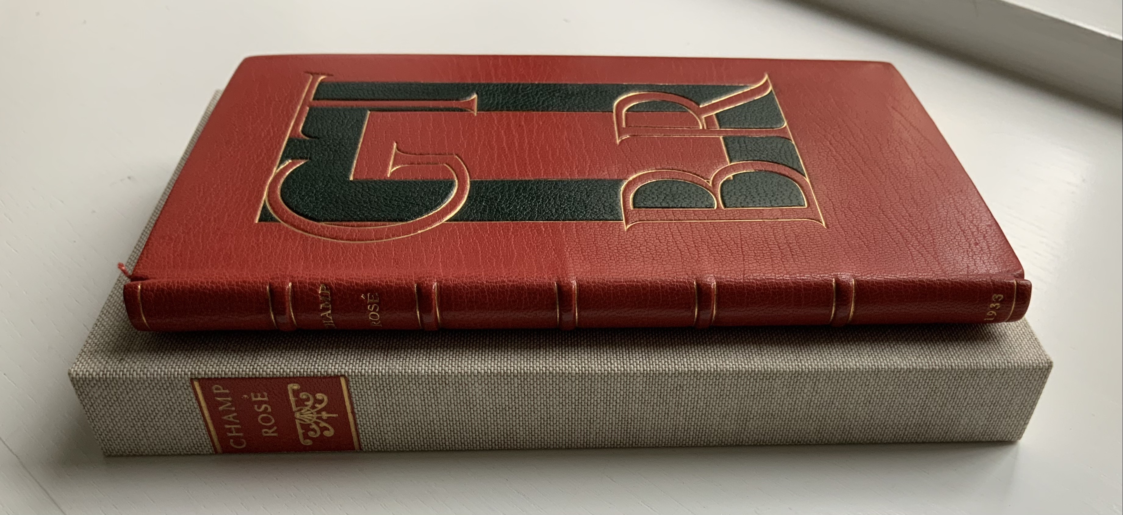
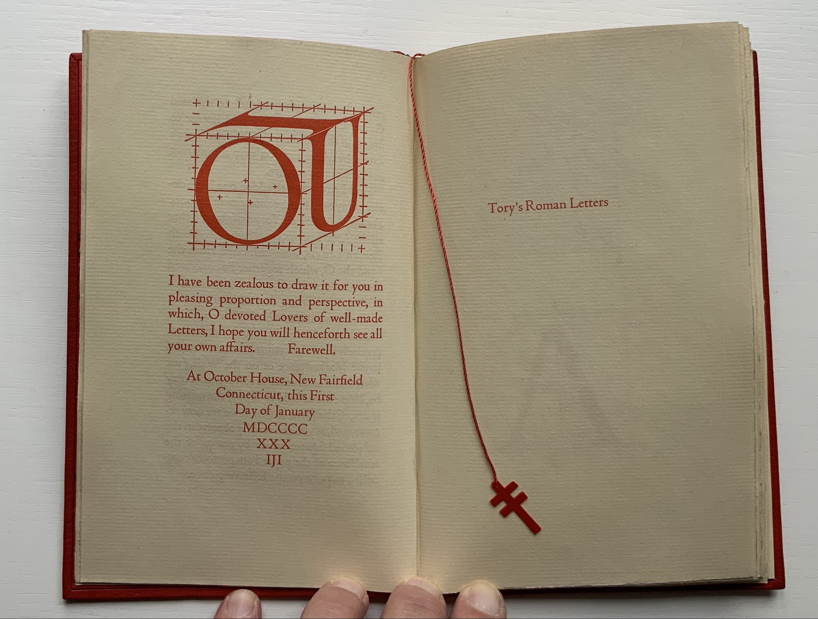
Rogers constructed the IOU device in a joking Depression-era homage to Tory. Referencing the mythological tale about Jupiter, Juno and poor IO who was turned into a cow, Tory maintained in Champ Fleury that all the Roman letters were fashioned from the “I” and the “O.” By placing Roger’s IOU on the back cover, binder Peter Geraty doubles Rogers’ pun on the debt to Tory’s “letterology”. Both Geraty and Rogers are acknowledging a debt to Tory as a book designer.
Adding to his joke, Rogers printed the whole of Champ Rosé in red, which Geraty follows. Rogers explained the red ink in his poor man’s Champ Fleury “as in these aforesaid days of hardship & depression much Book-Keeping is being written down in red…perhaps it would be better for Book-Selling too if Printing were done in that cheerful colour.…”
Geraty’s binding was part of the 1989 Guild of Book Workers exhibition.
Photos: The Veatchs.
Photos: Books On Books Collection.
The Books On Books Collection also holds a copy of George B. Ives translation of Champ Fleury, designed, typeset at printed by Rogers.
The New Manifesto of the NewLights Press (third iteration) (2017)
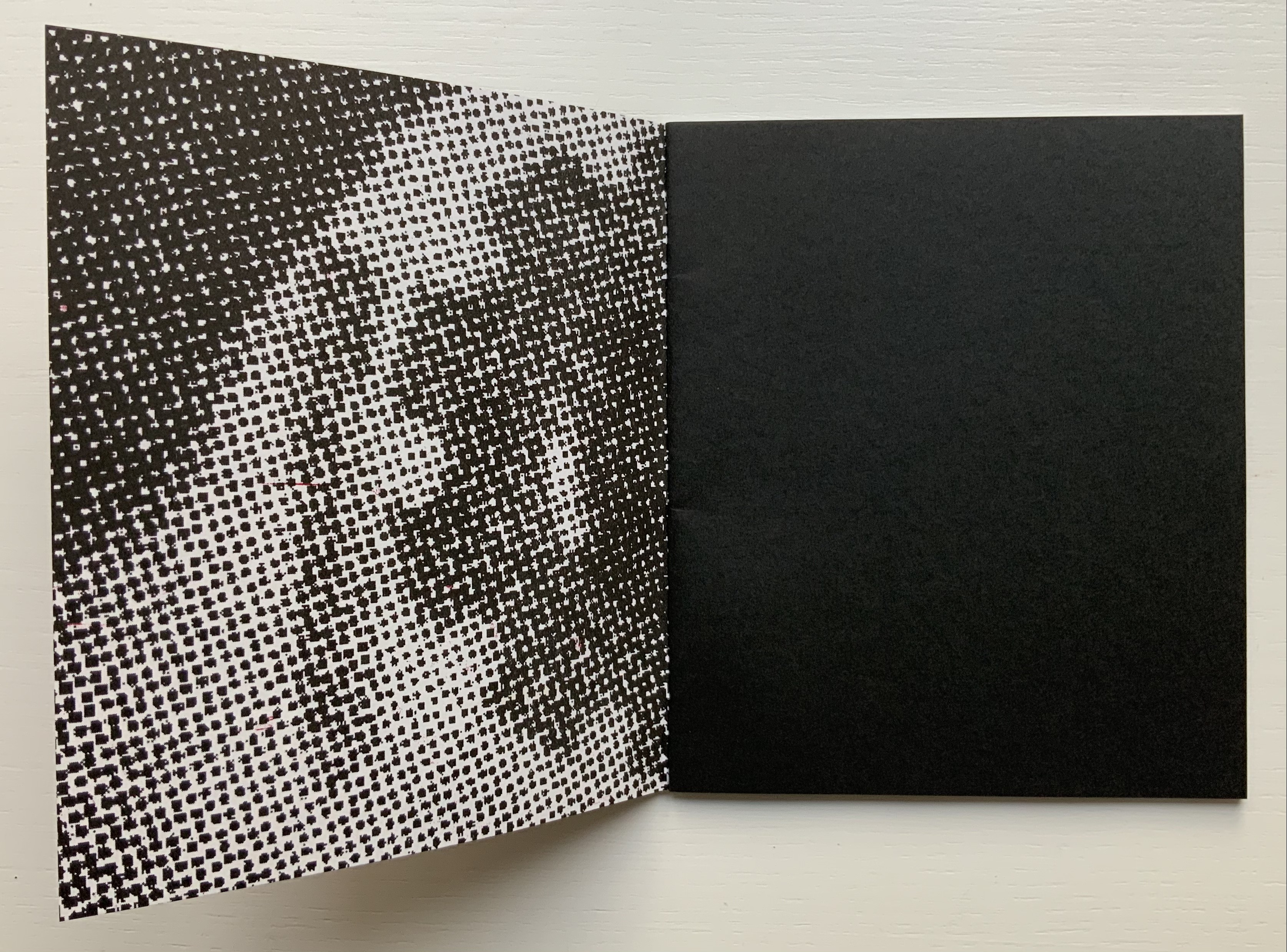
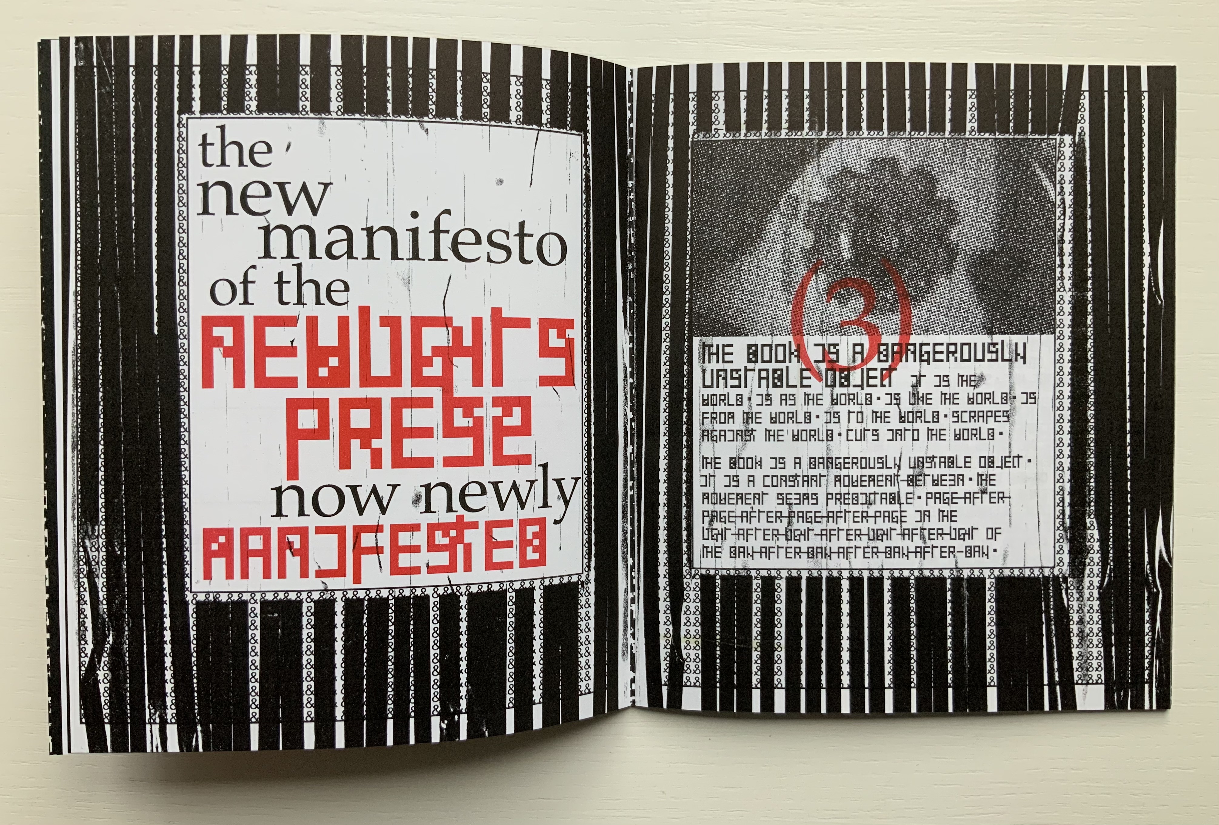
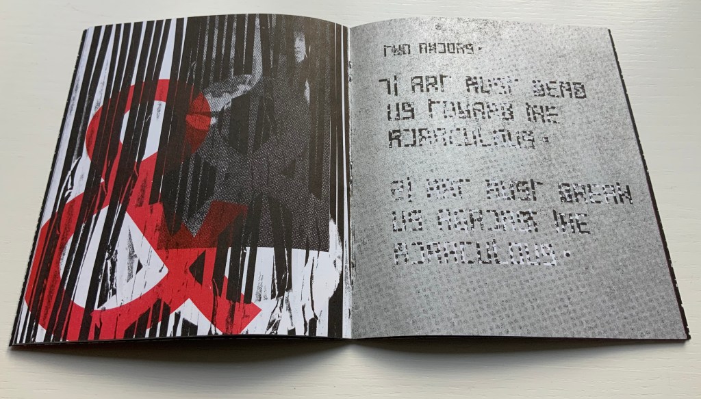
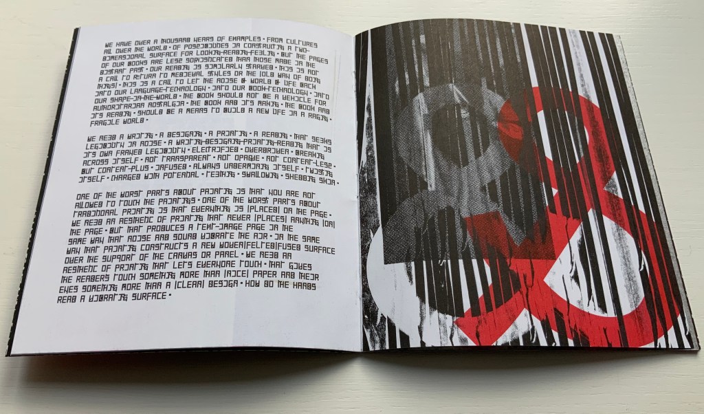
The New Manifesto of the NewLights Press (third iteration) (2017) Aaron Cohick Booklet, saddle-stapled, risograph, letterpress/collagraph, and hand painting. H165.1 x W139.7 mm (closed), 20 pages. #000611, unlimited, iterative edition. Acquired from New Lights Press, 11 December 2020. Photos: Books On Books Collection. Displayed with permission of the artist.
The New Manifesto of the NewLights Press (third iteration) has multiple starting points. Even in its first iteration, we have
The book is a dangerously unstable object, always between, continuously opening. It is interstitial, occupying many planes at once.
Digital technology has killed the book, finally.
The book is an impossible thing — comprised entirely of edges and full of holes. It moves. It happens in between.
Readers move through authors and books. Books move through readers and authors. Authors move through books and readers. They exist between each other’s pages. They only exist in between.
The form of the book, the history of the book, and the processes involved in its production provide a foundation for rethinking and re-evaluating the dominant discourse(s) of contemporary art.
The book … exemplifies a model that expands beyond form and content…. It is a field, whose axis points [form, content, production and reception] are always held in tension. In this model a piece or practice is a “zone of activity.”
Moreover, there are ten refinements on these starting points, touching on Julia Kristeva’s “intertextuality”, Roland Barthes’ “death of the author”, Michel Foucault’s “death of the book” and much more in the same vein. Each iteration even has diagram and footnotes, underscoring the academic nature of the starting points.
By its third iteration, The New Manifesto‘s words been further refined as a combination of announcement, exposition, lyric and prayer. It soars beyond literary theories and finds birds of a closer feather among Ulises Carrión and Michalis Pichler.
The book is a dangerously unstable object // It is a series of edges // Once clustered and knotted // Now open and spreading // Now cutting and bending // Mostly // The book betrays // Mostly // The book howls // The book falls apart in the face of our anguish // In the face of our quiet // In the silence of our slipping // Mostly // It will also always be something else // That we did not // Can not yet // See // The book is a remarkable technology // It is a shimmering substance // It is a noise of the hands and thought // The book is perhaps now a dead thing // In the hands of the dead // So be it // We never mattered much anyway // Beyond our capacity to consume // Our capacity to labor // We are fuel // So be it // We remain in the dark // With these books // The original autonomous window technology that is us looking through // At // In // Against // With care // The book returns our labor to us //
If a new edition of Publishing Manifestos is ever issued, Cohick’s hortatory words should be considered. The words, however, cannot be considered alone. Over the three iterations, The New Manifesto — the only one in the collection and, therefore, the only one tangible for the visitor — has “participated more & more in the world of visual art”. Cohick’s use of the collagraphic technique increases. It adds painterliness to the booklets as well as a sense of depth and spatial play within the page, across the gutter and from recto to verso pages. In a series of online essays for the College Book Art Association, Cohick confirms the pleasure and intent here:
Collagraph is a well-known technique and is usually taught as part of introductory letterpress courses. It has an immediacy and fidelity that is very exciting—you can stick a leaf or other flat object to a block, print it, and get a decent image of that object. Unfortunately it usually stops there. Those flat objects are hard to push beyond that initial single-color print. Linoleum, photopolymer, wood and metal type, and to some extent woodcut are all made to be “neutral” printing surfaces—flat and smooth. Trying to get collagraph to be flat and smooth begs the question: why use collagraph at all? In collagraph the material that makes the plate is not neutral—the material is exactly the point. That embrace of material and its many, varied effects and marks is what moves collagraph closer to the direct markmaking of drawing/painting. It makes all of those “unacceptable” (or abject?) marks readily available. Relief collagraph printed with letterpress equipment can be a method of painting or drawing in multiple, with control as good as—if not better than, but also different from—the hand. “You’re doing it all wrong (Part 2)“
From the first iteration of the manifesto, black & white details of Jan Van Eyck’s The Arnolfini Marriage appear and are manipulated on the cover and throughout. Although they recede in the second iteration, they move strikingly to the fore in the third. Constantly alongside the Arnolfini details has been the ampersand, enlarged, reversed, in different colors, and present — almost ornamentally — within the text line. The increased visuality of the third iteration announces itself on the booklet’s cover and inside with the grainy enlarged detail of the mirror from The Arnolfini Marriage. What do the Arnolfini details signify? Although Van Eyck’s original itself is straightforwardly representational, its meanings are not always any clearer than that of its use in Cohick’s collage. With his slices of black (“a series of edges”) obscuring the image of the groom, perhaps Cohick is compounding obscurities to present “something else // That we did not // Can not yet // See”.
And what about the large overlapping ampersands in red and gray, systematically reversed and alternating in color? Are they emphasizing the “and so on and so on” of tradition in Cohick’s painterly printing technique? Are they alluding to the joining of hands in the marriage? Are they alluding to, and performing, a marriage of the book and visual art? On a verso page in the manifesto’s first iteration, he writes, “The form of the book, the history of the book, and the processes involved in its production provide a foundation for rethinking and re-evaluating the dominant discourse(s) of contemporary art.” On the facing recto page, the Arnolfini bride in reverse from the original extends her hand to a reversed ampersand.
In perhaps the most important enhancement of the third iteration’s visuality, Cohick’s full-blown typographic redesign of the alphabet occupies the visual foreground, middle ground and background. It is as if Cohick sets out to demonstrate Mallarmé’s proposition that the book is the “total expansion of the letter”. The first iteration’s completely legible Palatino, Arial and Placard Condensed typefaces used in the text line have yielded to what Cohick calls a “dislegible” font, which he often reverses, lays out as occasional “running sides” rather than “running heads”, and subjects increasingly to collagraphic layering. In his “You’re doing it all wrong” series, Cohick explains:
If “legible” and “illegible” are binary opposites, then the term “dislegible” is about looking at the space between those two poles. Dislegibility displaces, dislocates, deforms, and/or disrupts the process of reading, with the ultimate goal of making that process of reading (dis)legible to the reader. The dislegible can be read, but it resists closure or certainty. “You’re doing it all wrong (Part 1)“
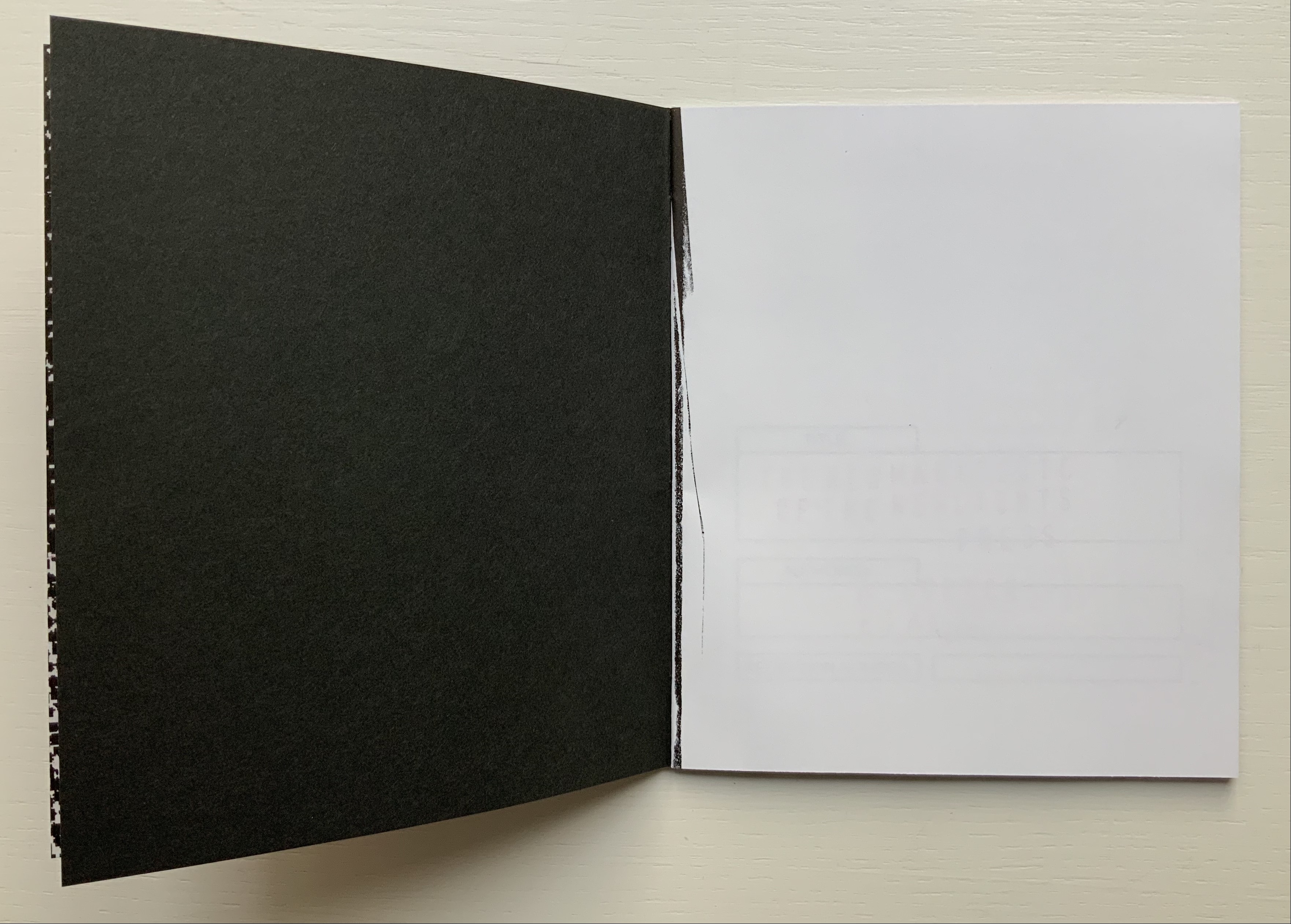
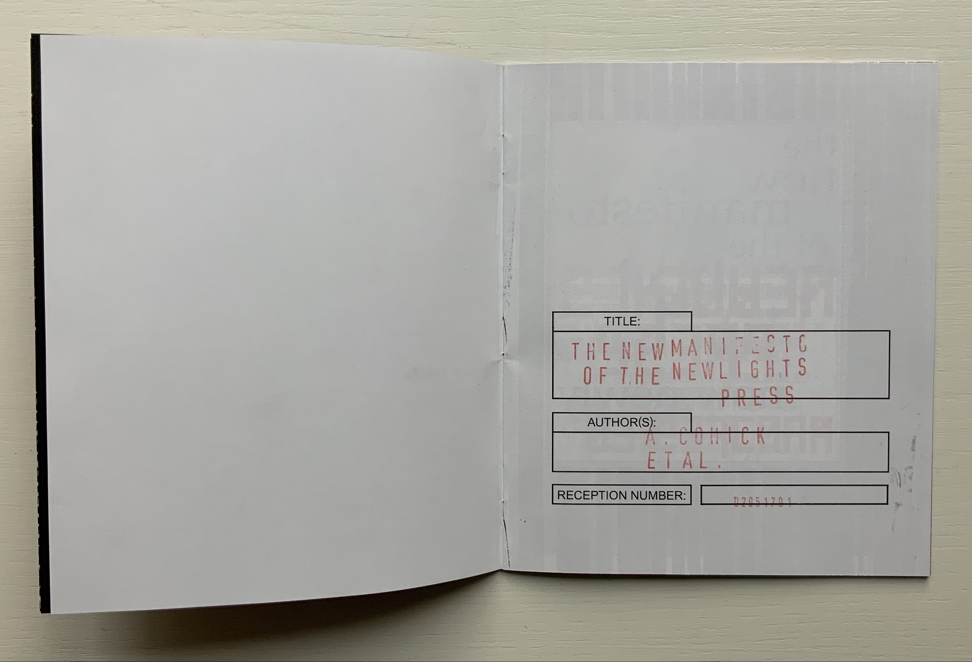
Also contributing to dislegibility is the reversal of images, the ampersand and letters. More than that, the reversal reminds us of what is involved in letterpress production — the inked relief surface and its reversed image or letter to be transferred to paper. Always in tension with form, content and reception, production makes up the open field from which the artist’s book emerges. The third iteration exudes production’s physicality. A black saturated endleaf bleeds over onto a stark white sheet that faces a stamped title page, intensifying a feel of mechanical working. Letterforms behave as so much raw material — as if they were oil, acrylic, brick or mortar — to be re-seen from different angles, noted for more than one function and their text read for more than one meaning.
According to Cohick, “For art to thrive, form and content must be in a dynamic relationship… It must contain enough disruptions, ambiguities, and peculiarities to resist the deadly state of stable signification.” The iterations of The New Manifesto enact that statement.
Alphabet One: A Submanifesto of the NewLights Press (2017)
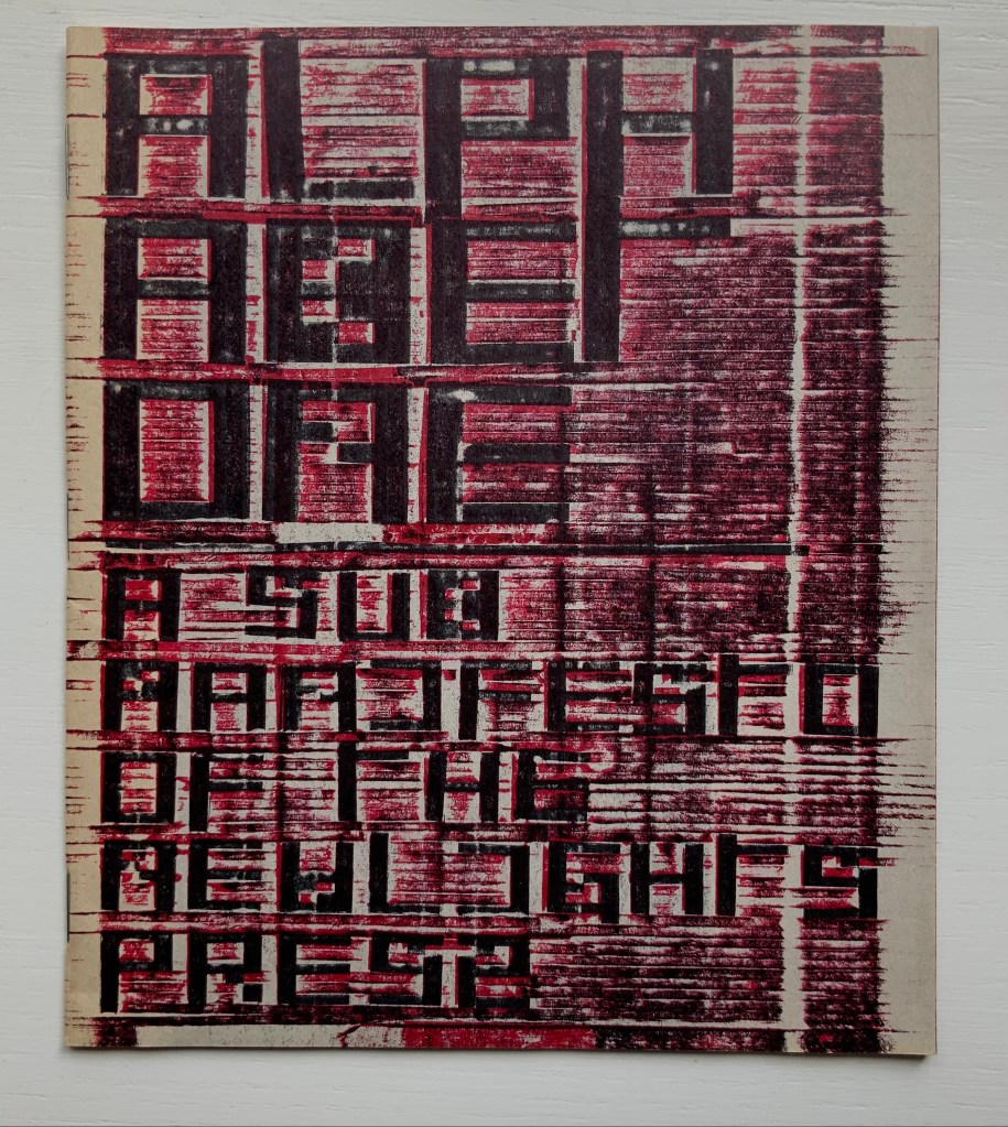
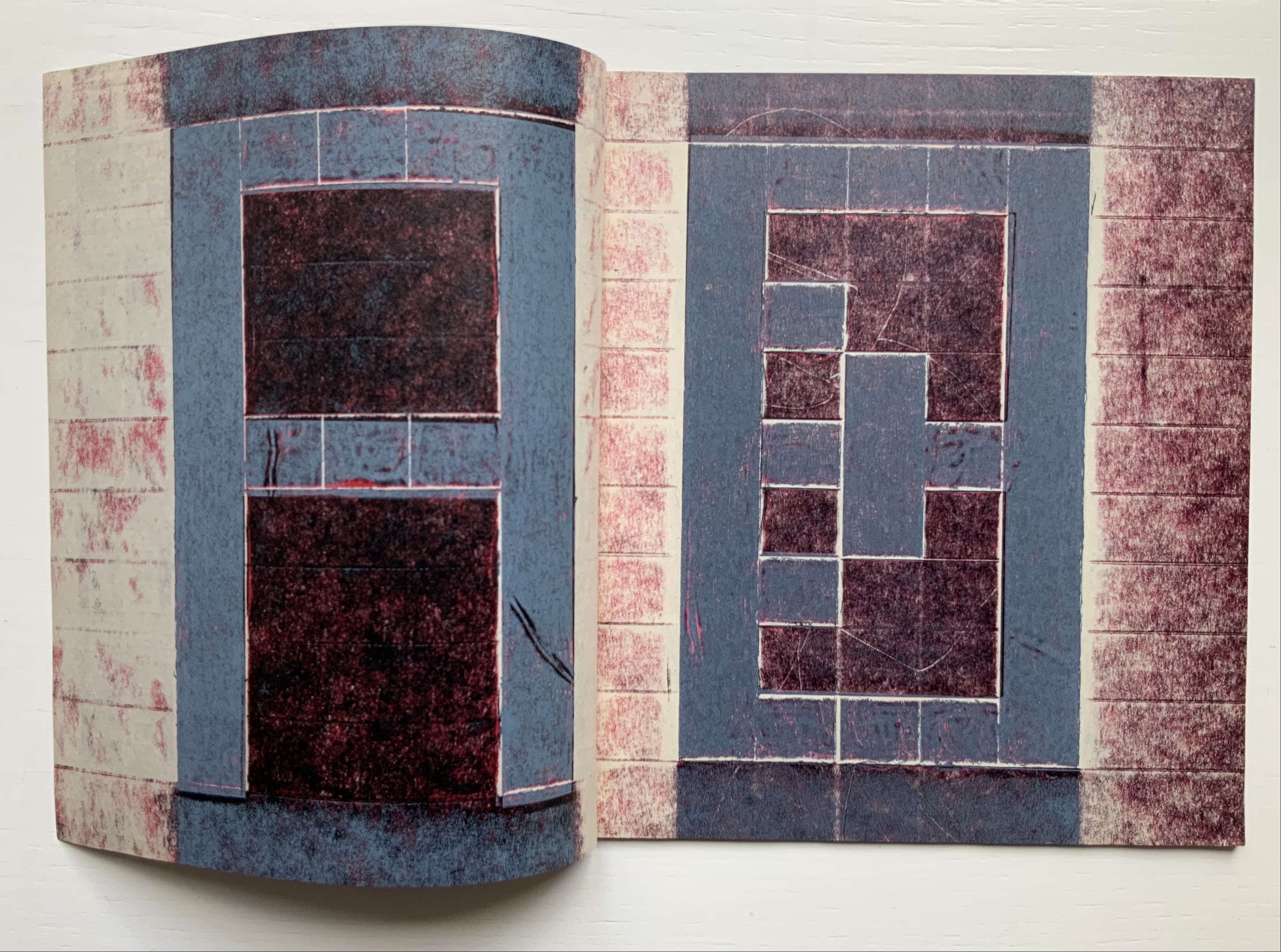
Alphabet One: A Submanifesto of the NewLights Press (2017) Aaron Cohick Booklet, center-stapled. Letterpress printed from woven collagraph blocks on newsprint. H165 x W140 mm, 28 pages. Acquired from the artist, 11 December 2020. Edition of 250, unnumbered. Photos: Books On Books Collection, displayed with permission of the artist.
Alphabet One, “companion book to the third iteration of The New Manifesto of the NewLights Press”, presents Cohick’s “complete ‘noise’ alphabet, in order, in condensed and full form”. In The New Manifesto, Cohick has described the book as “a noise of the hands and thought”. Well then, being a book, Alphabet One demonstrates that the manifesto is the alphabet, and the alphabet is the manifesto, and “woven collagraph blocks” could hardly be less “a noise of hands and thought”. Lest those inferences seem strained, continue reading the passage Cohick reproduces from The New Manifesto immediately after the reference to the “complete ‘noise’ alphabet”:
This is not a utopian program // This is not an alphabet for saving the world // Such a thing is a dangerous lie // This is one possibility // Not a tool // But a movement-between // An object-between // A growing // Changing thing // Meant to do just that // It is about attention and its revitalization // It is about structure and our being in it //
A, B, C, D. Photos: Books On Books Collection.
W, X, Y, Z. Photos: Books On Books Collection.
It cannot be an accident that the “noise” alphabet’s letterforms arise from varyingly shaded bricks: rose, gray, reddish gray and reddish black. To left and right of each letter, the rose color dominates. A reddish gray bar tops and tails each letter. The color gray forms the “strokes” of each letter. Reddish black fills the counters. Extracting the signal from the noise of the alphabet or books does not come easily. This is intentional. Just as The New Manifesto says,
With these books // The original autonomous window technology that is us looking through // At // In // Against // With care //The book returns our labor to us //
Days Open Air (2016)
Days Open Air(2016) Aaron Cohick Booklet, center-stapled, H203 x W152, 12 pages. Edition of 100, of which this is #40. Acquired from the artist, 11 December 2020. Photos: Books On Books Collection, displayed with artist’s permission.
Days Open Air is one of those books returning our labor to us that The New Manifesto announces. Cohick call it “an artists’ book/poem thing … an experiment: with our new Risograph, with the alphabet, with writing, with random numbers, and with noise.” Letterforms stretch. Words run sideways, they break in the middle across lines, even across pages.
Look-See (REAED) (2014)
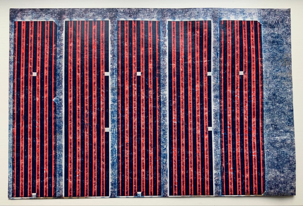
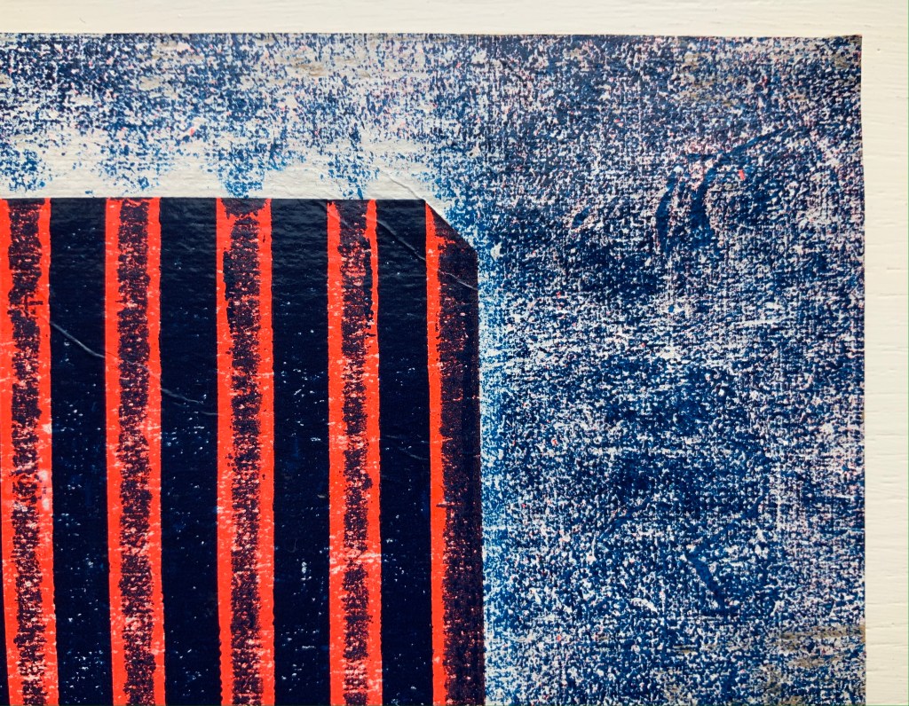
Look-See (REAED) (2014) Aaron Cohick Print. H300 x W456 mm. Photos: Books On Books Collection, displayed with artist’s permission.
More evocative of barcode stripes than bricks, the letterform strokes in this poem-print-poster stretch even more than in Days Open Air. Printed on a Vandercook 219 from vinyl and gesso collagraph blocks, the letterforms challenge us to “look” and “see”. An angle at the top right, two angles midway on the right and two counters condensed to small squares suffice to define the first letter — R. The letters E and A are more efficient, requiring only the placement of two counters each. Note how the textural effect of the gesso and letterpress printed collagraph on chipboard joins The New Manifesto‘s celebration of the physicality and noise of production.
In Cohick’s world, the book and art make, and should be perceived as, a “strange” continuity. His vision and embrace of the collagraph suggest a 21st century version of William Blake. He names his nearer contemporaries as Ken Campbell, Walter Hamady, Amos P. Kennedy, Jr., Karen Kunc, Emily McVarish, Dieter Roth and Nancy Spero. In the Books On Books Collection, those far and near can also be found in Eleonora Cumer, Raffaella della Olga and Geofroy Tory.
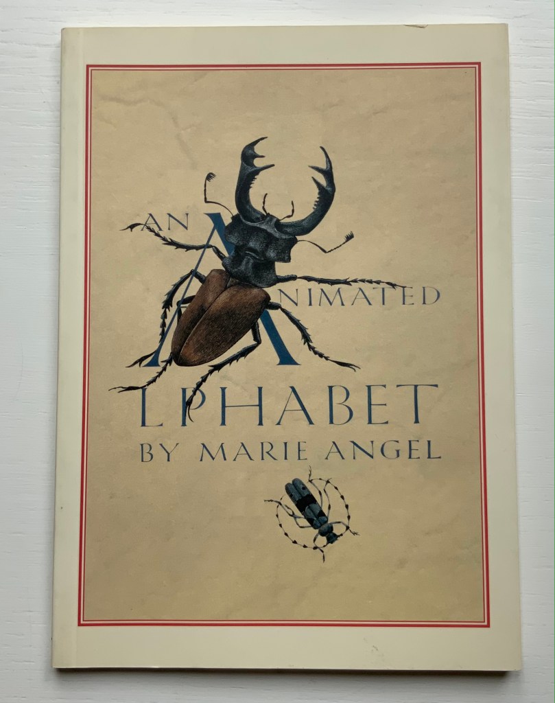
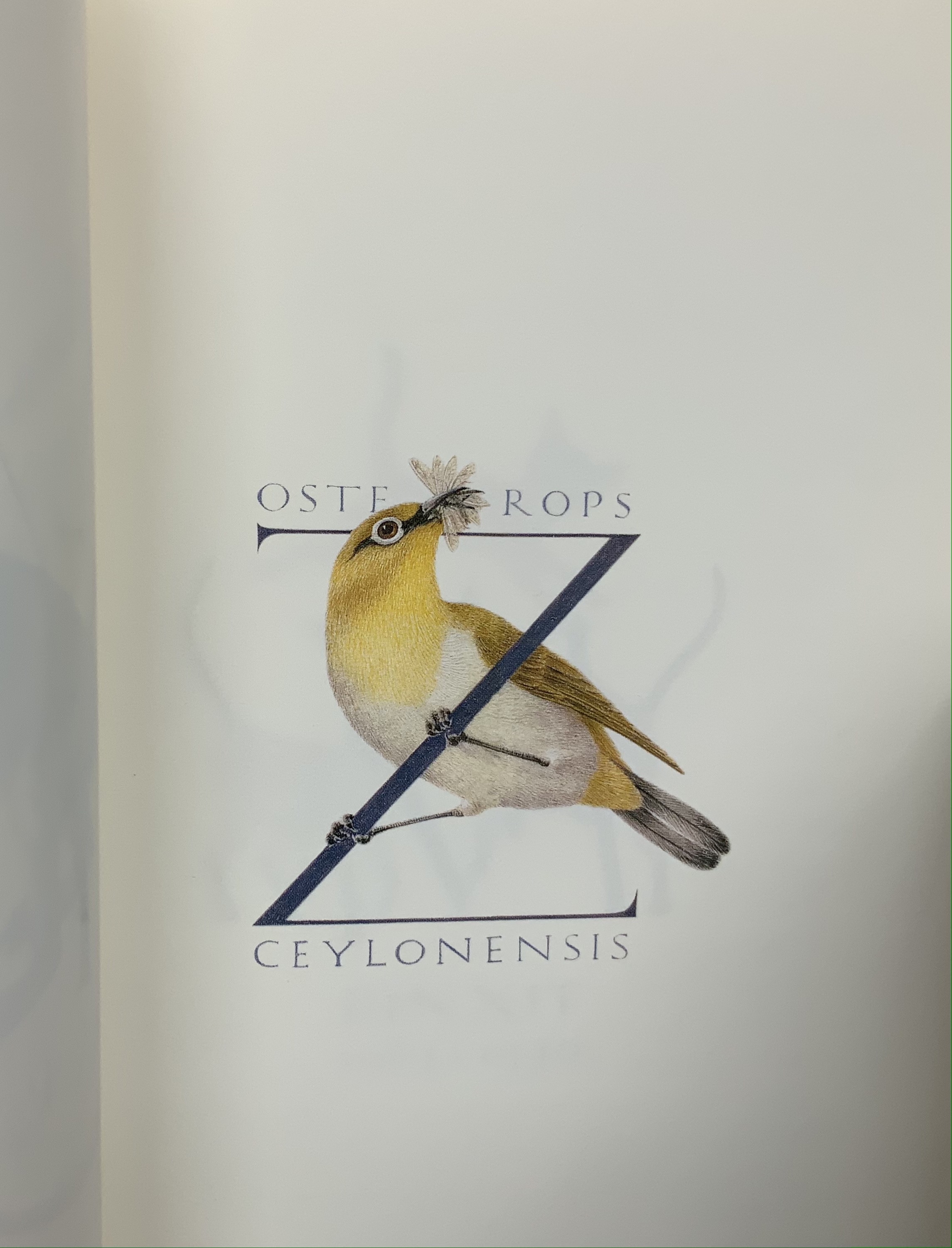
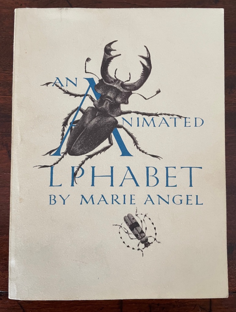
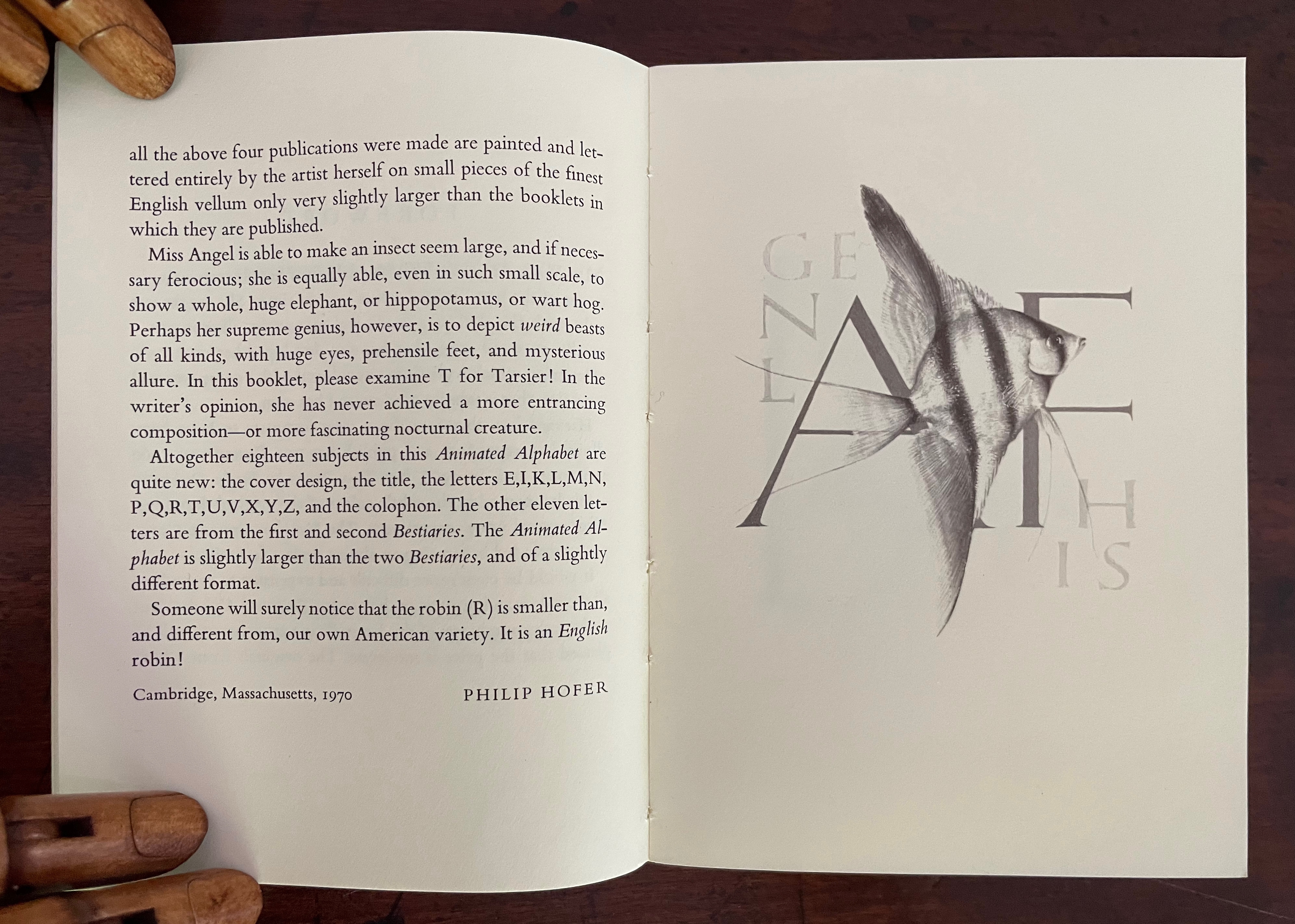
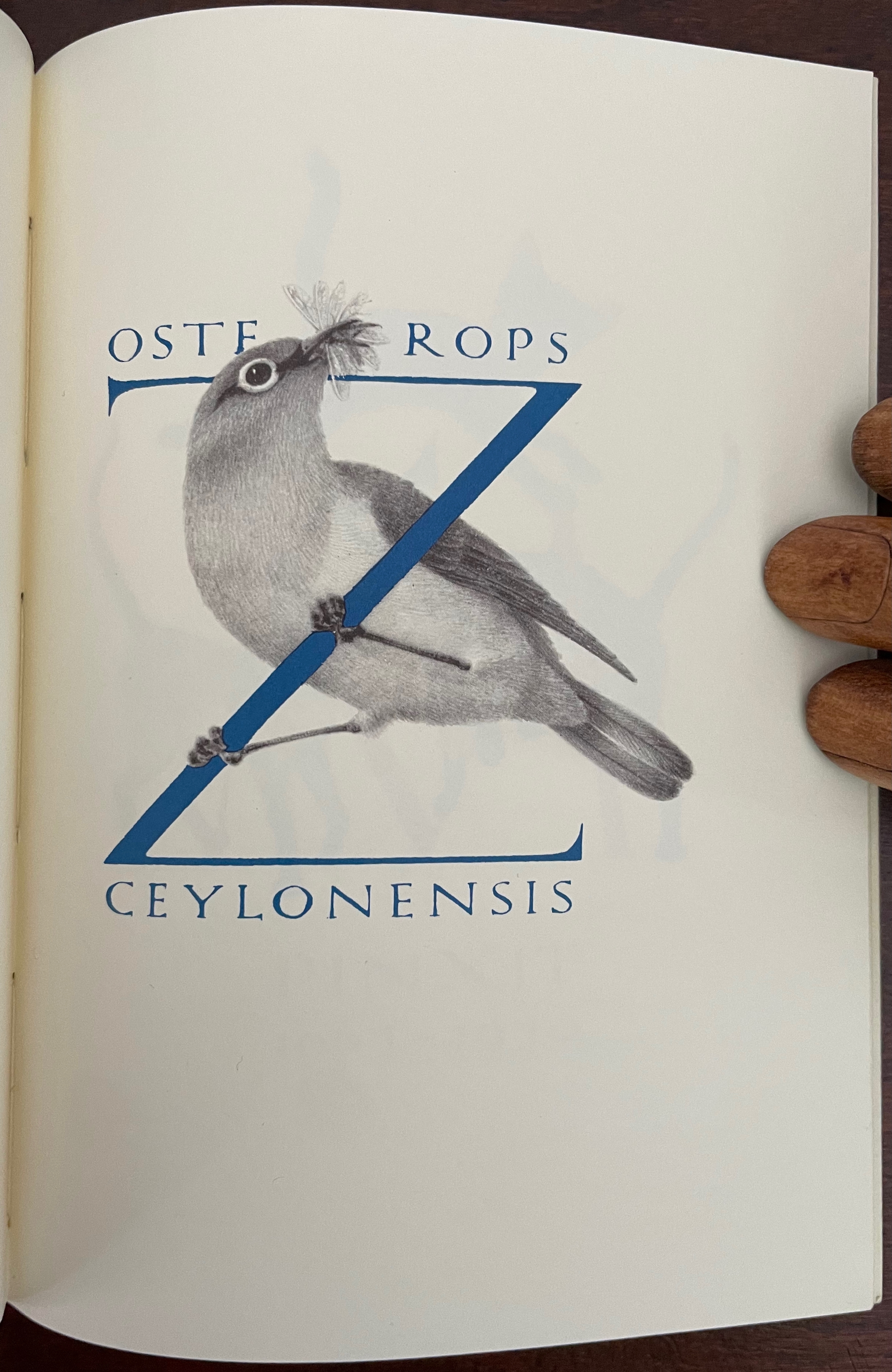
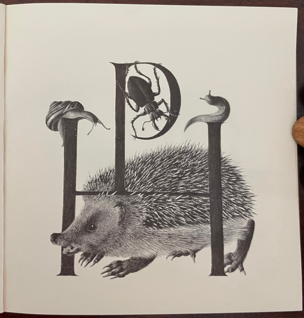
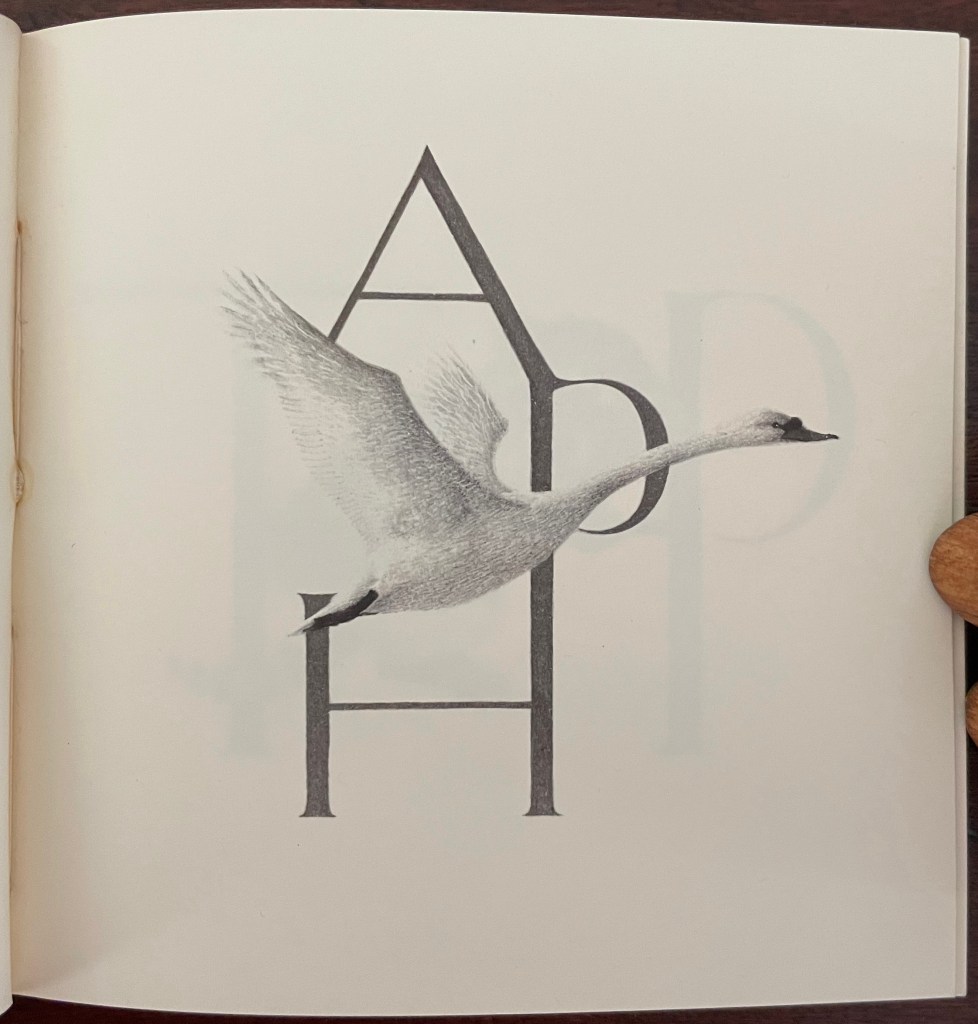
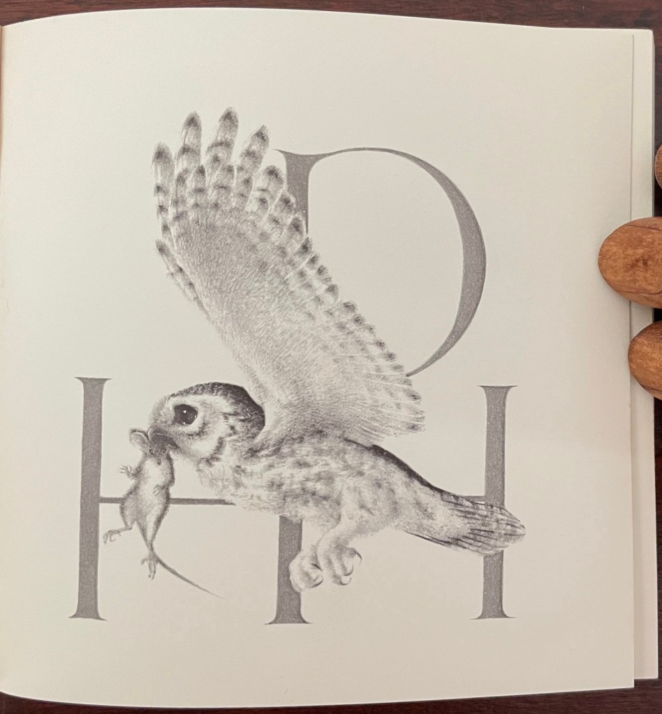
An Animated Alphabet (1996) Marie Angel Paperback, perfect bound. H140 x W160 mm, 64 pages. Acquired from Redux Books, 28 April 2021. Photos: Books On Books Collection.
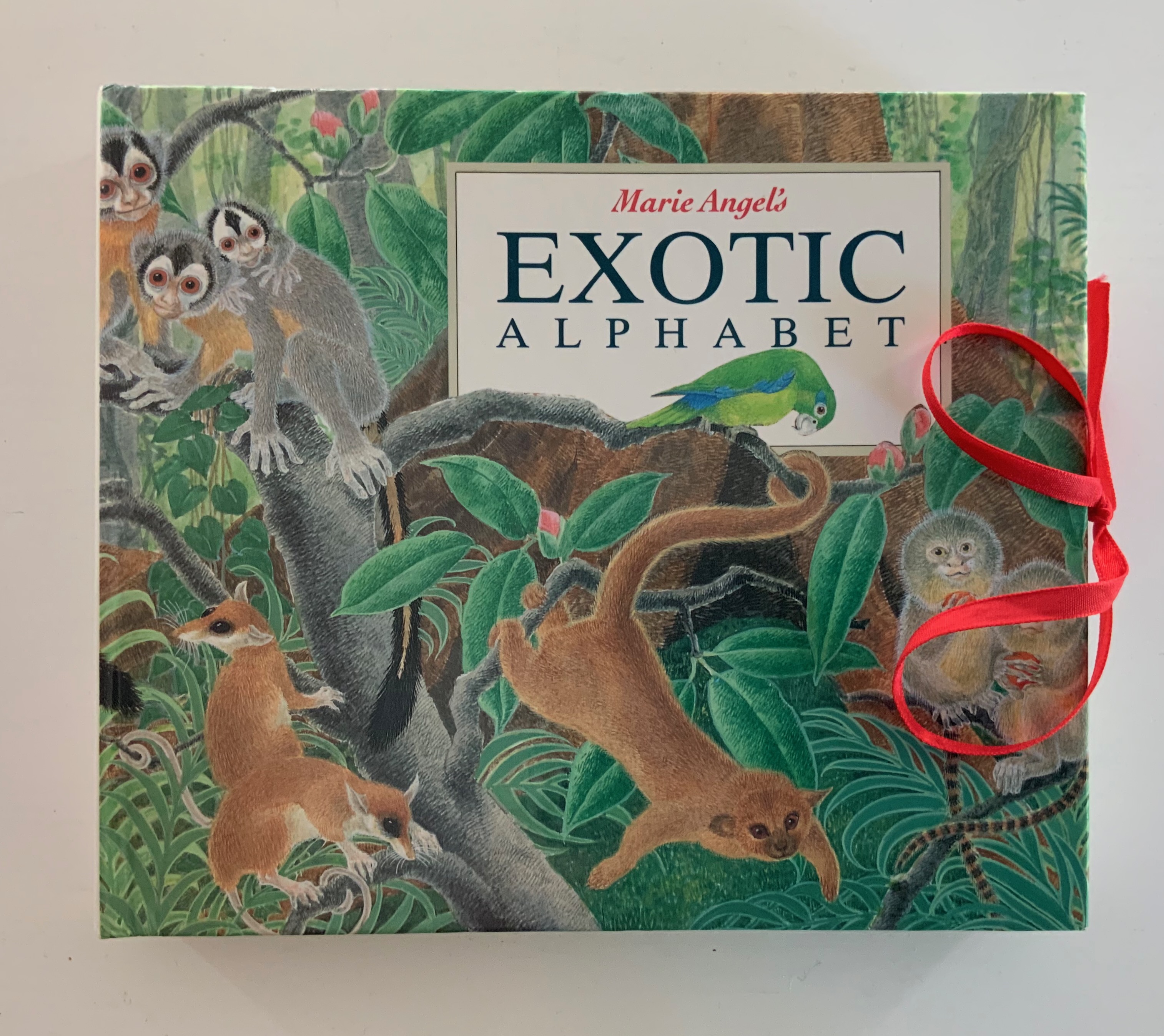
In the 1960s, Philip Hofer of Harvard’s Houghton Library commissioned the British illustrator to create a series of bestiaries. A black and white edition of An Animated Alphabet appeared in 1967. The publisher David Godine issued this full color edition in 1996. Before the Godine edition, other abecedaries appeared, including Marie Angel’s Exotic Alphabet(a lift-the-flap double-sided accordion book) in 1992, the colorful Angel’s Alphabet in 1986 and An Alphabet of Flowers in 1987.
From An Animated Alphabet
An Animated Alphabet (1971)
An Animated Alphabet (1971) Marie Angel Cased softcover, sewn. H140 x W105 mm. [64] pages. First edition. Acquired from Oakholm Books, 29 August 2023. Photos: Books On Books Collection.
From the earlier two-color Harvard edition.
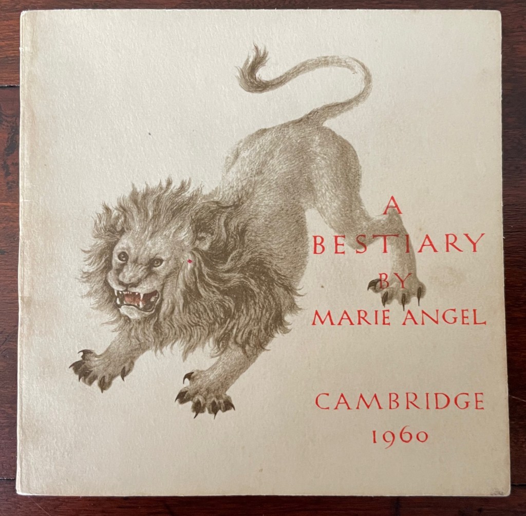
A Bestiary (1960)
A Bestiary(1960) Marie Angel Cased softcover, sewn. H100 x W104 mm. 60 pages. First edition, 1000 copies. Acquired from Oakhlm Books, 29 August 2023. Photos: Books On Books Collection.
Some illustrations’ initials are the monograms of their commissioners. The originals were painted in color on vellum.
Perhaps the earliest commission by Hofer of Angel’s drawing and calligraphy.
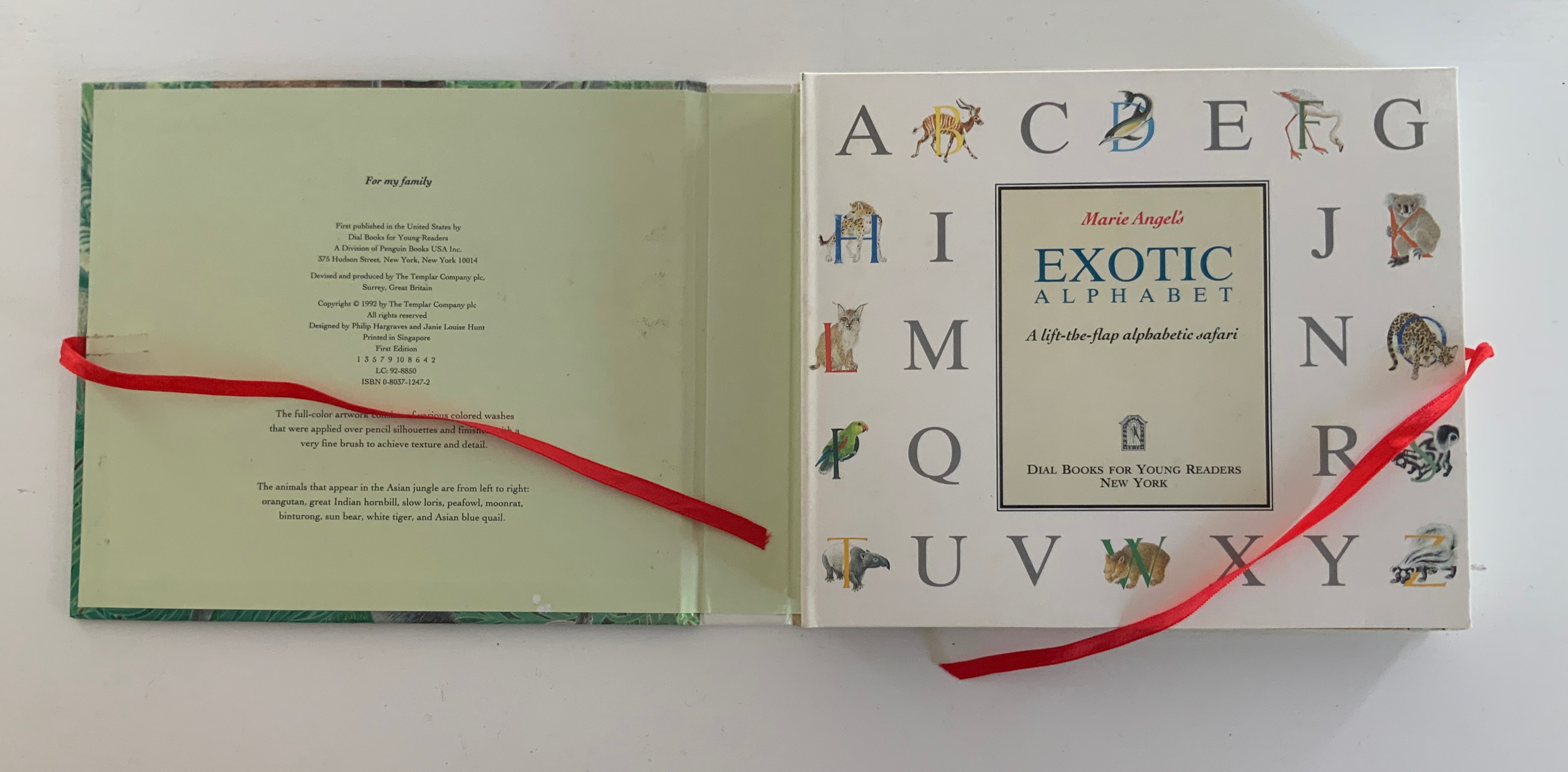
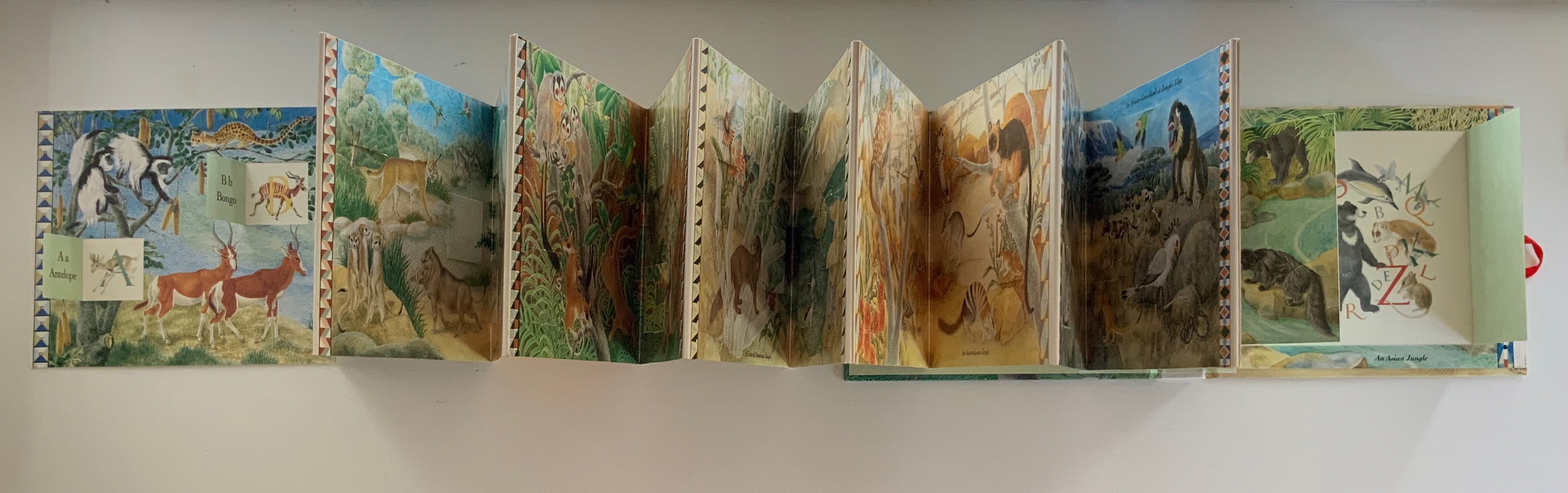
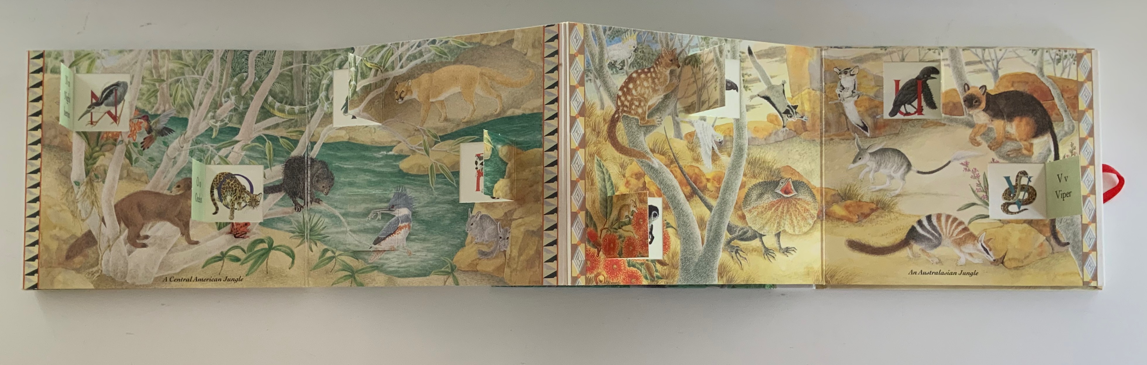
Marie Angel’s Exotic Alphabet (1992) Marie Angel Ribbon-tied, paper on boards case, inclosing lift-the-flap double-sided accordion book. Closed: H172 x W202 x D28 mm. Open: W2730 mm, 27 panels, including title panel. Acquired from Robert Gavora, Fine and Rare Books, 7 September 2021. Photos: Books On Books Collection.
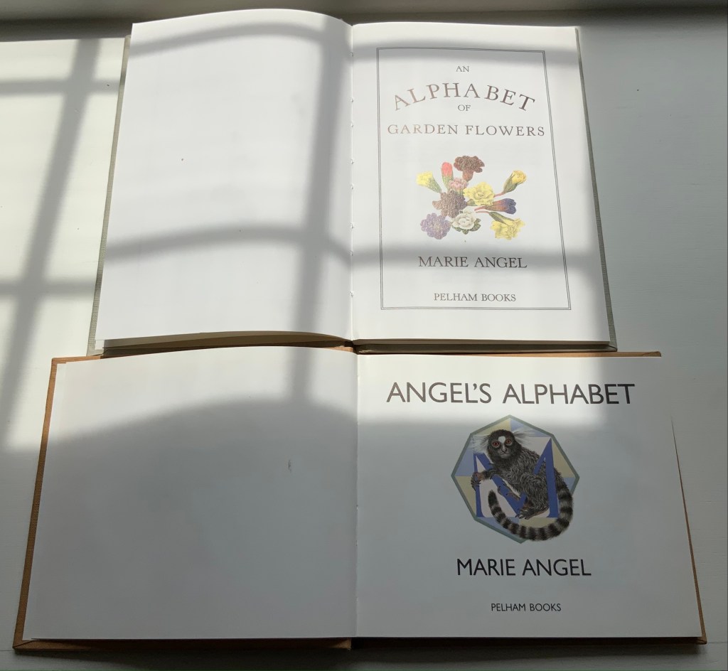
An Alphabet of Garden Flowers (1987) Casebound with decorated endpapers. H205 x W140 mm, 66 pages. Angel’s Alphabet (1996) Casebound with decorated endpapers. H140 x W 160 mm, 60 pages. Acquired 7 June 2021. Photos: Books On Books Collection
Even with different audiences, Angel’s style and eye for choice show through from A to Z.