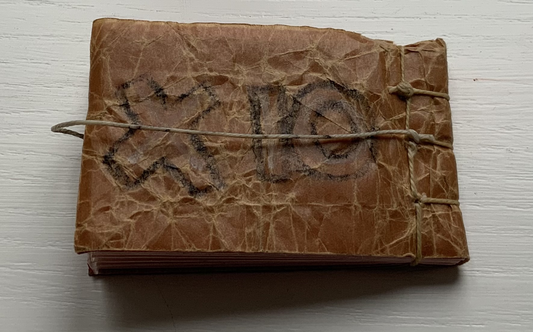
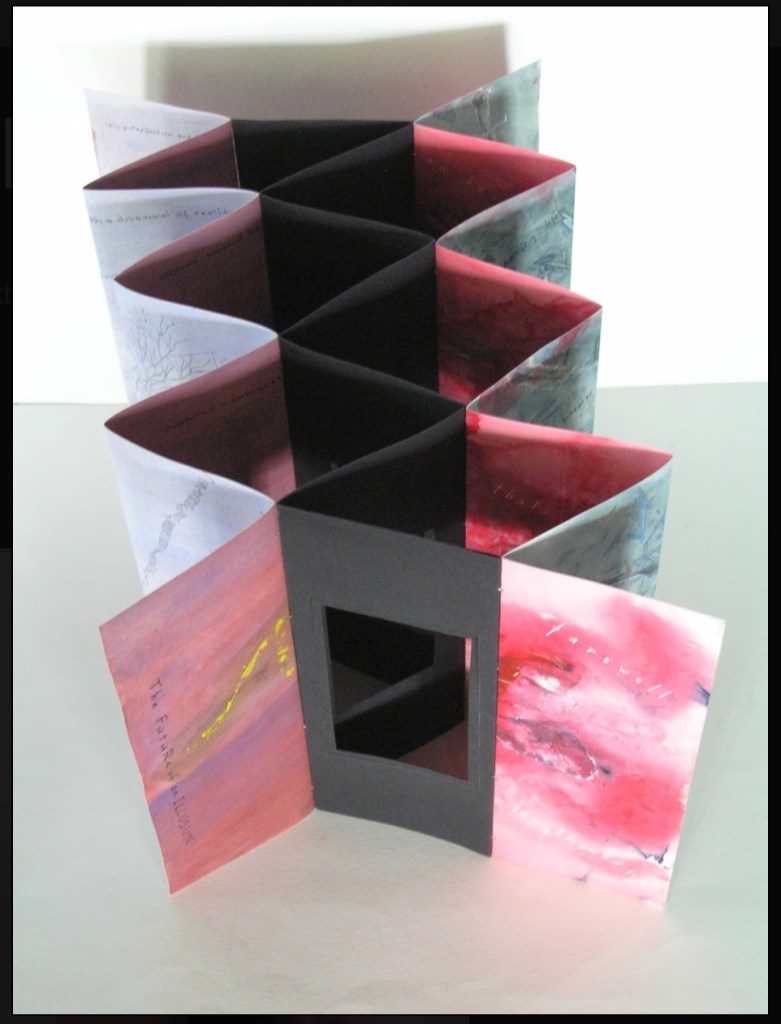
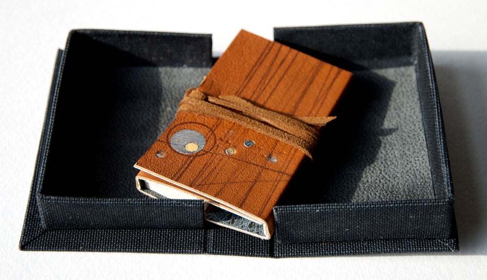
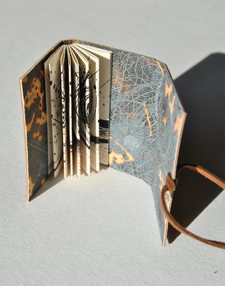
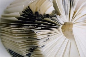
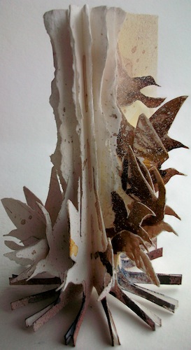
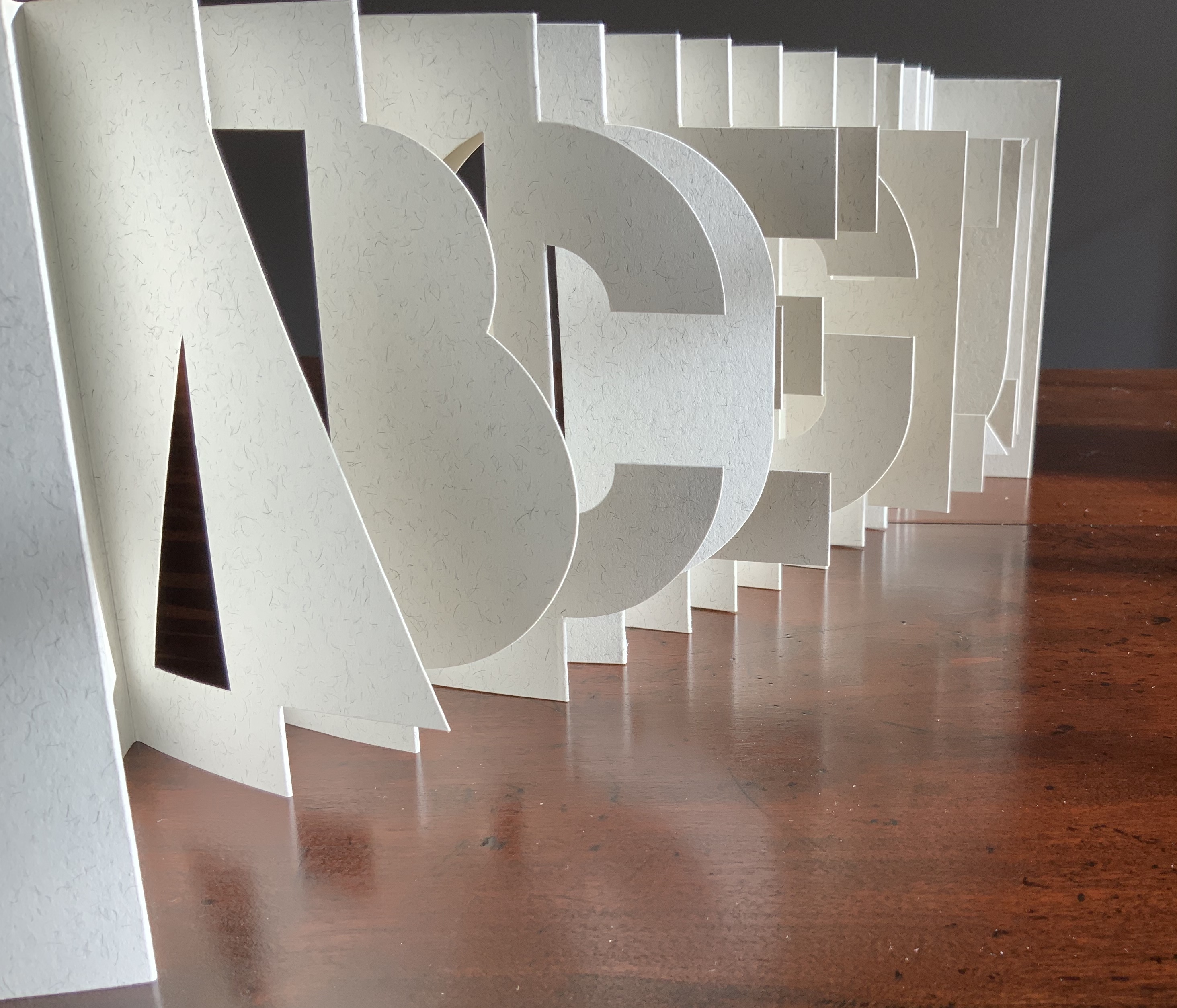
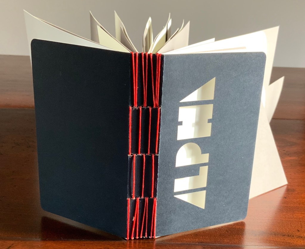
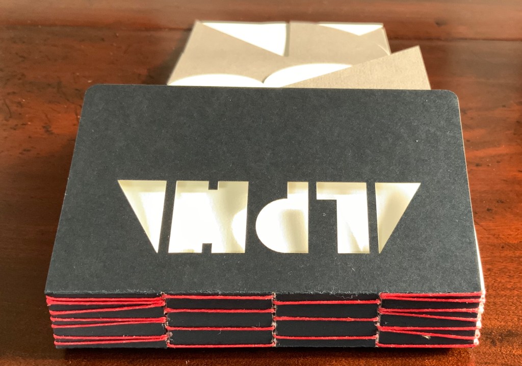
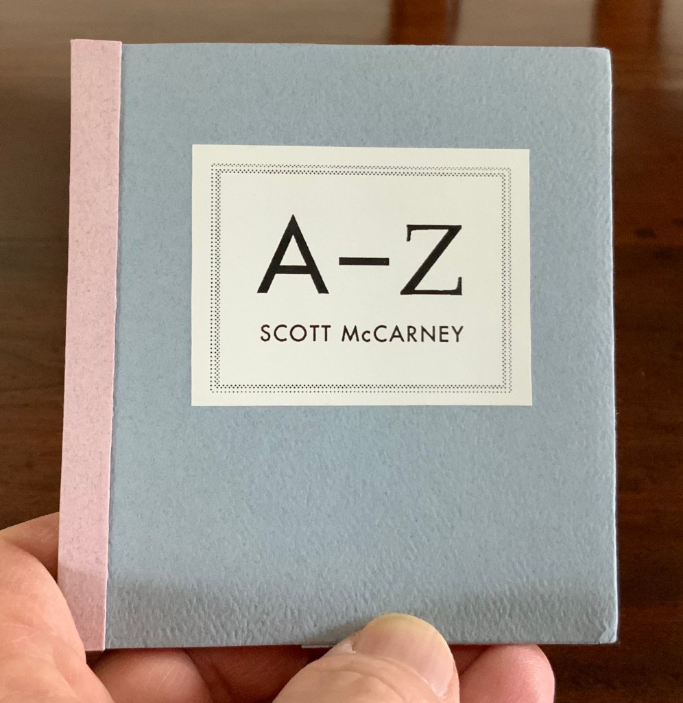
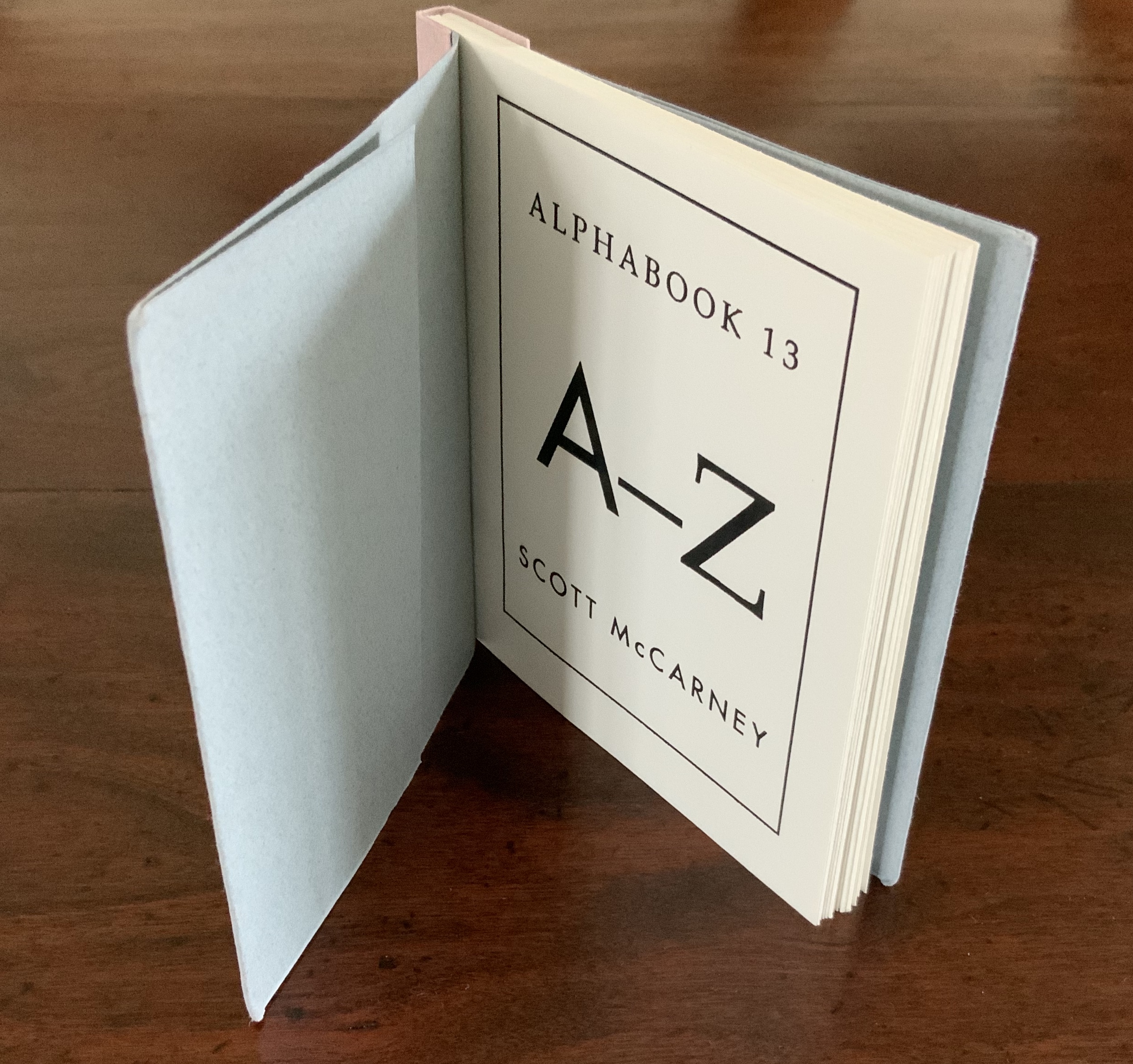
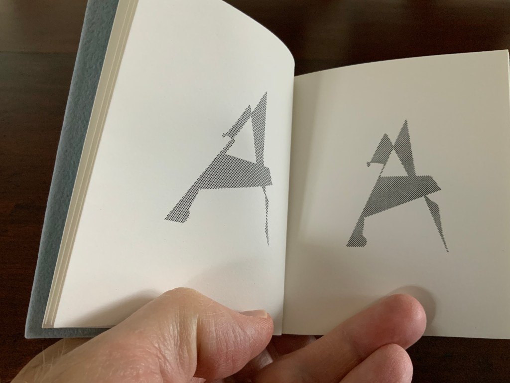
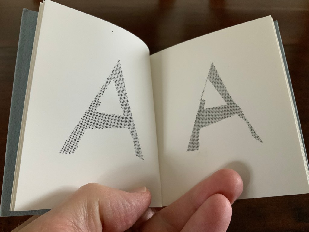
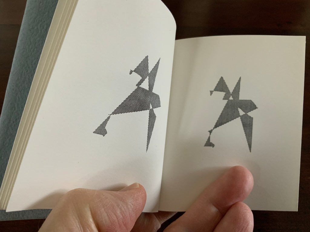
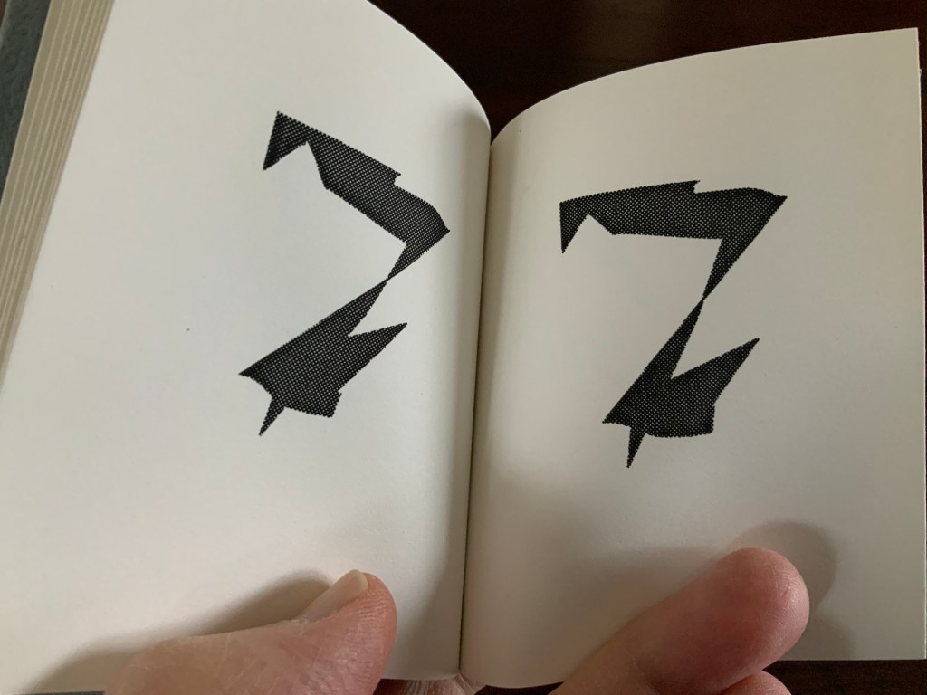
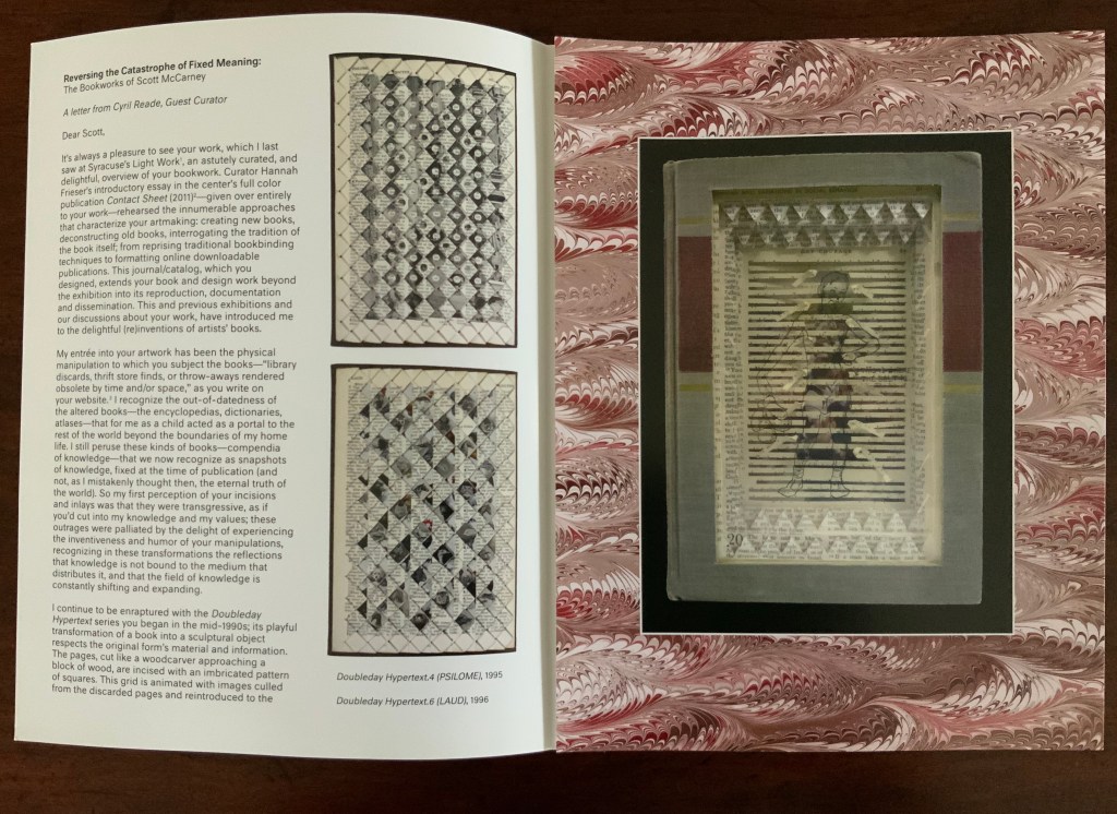
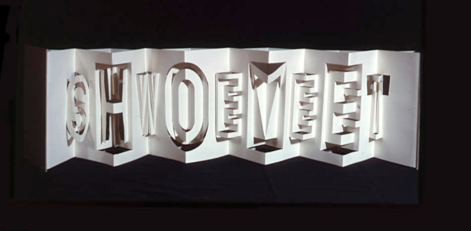
Alphabook (1998/9)
Alphabook (1998/9)
Claire Jeanine Satin
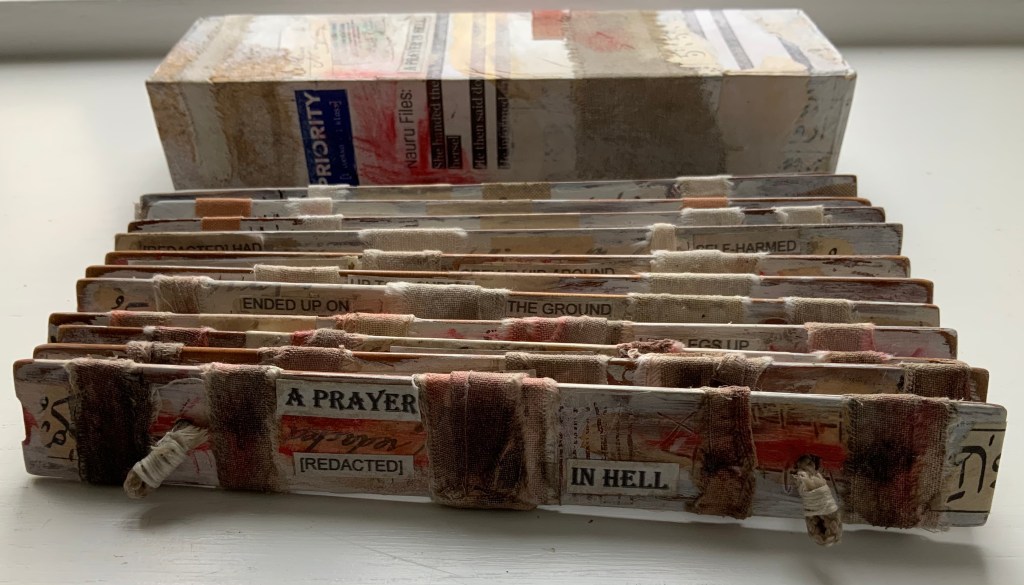
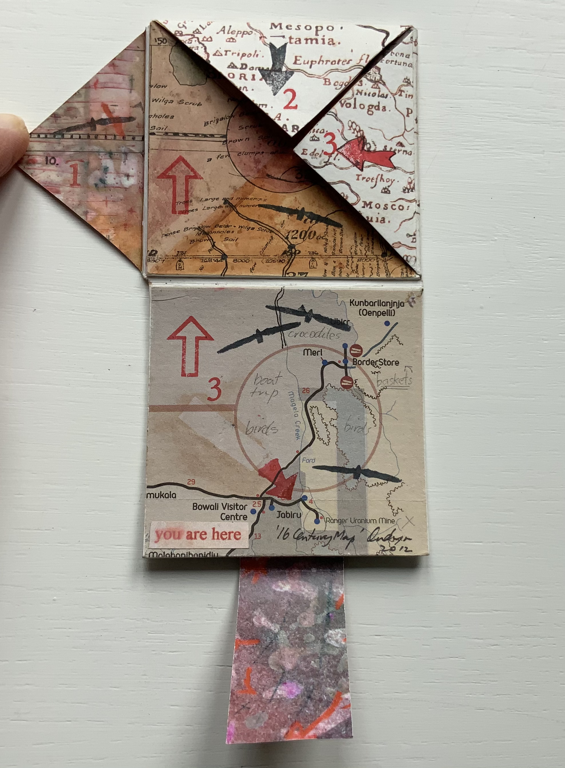
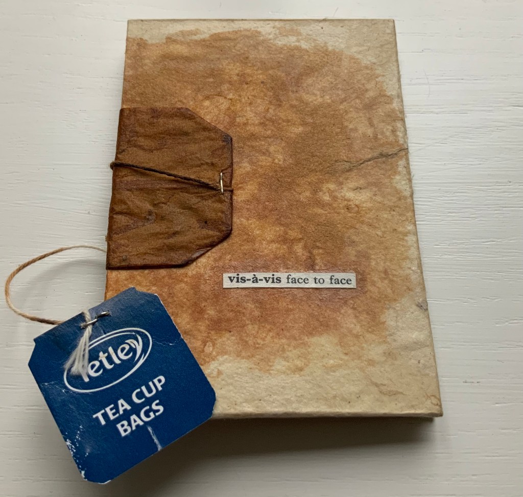
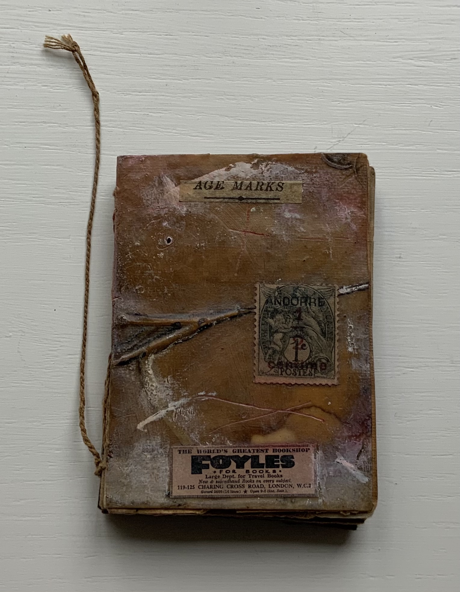
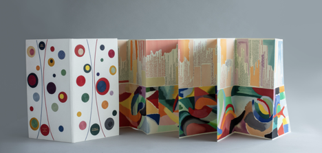
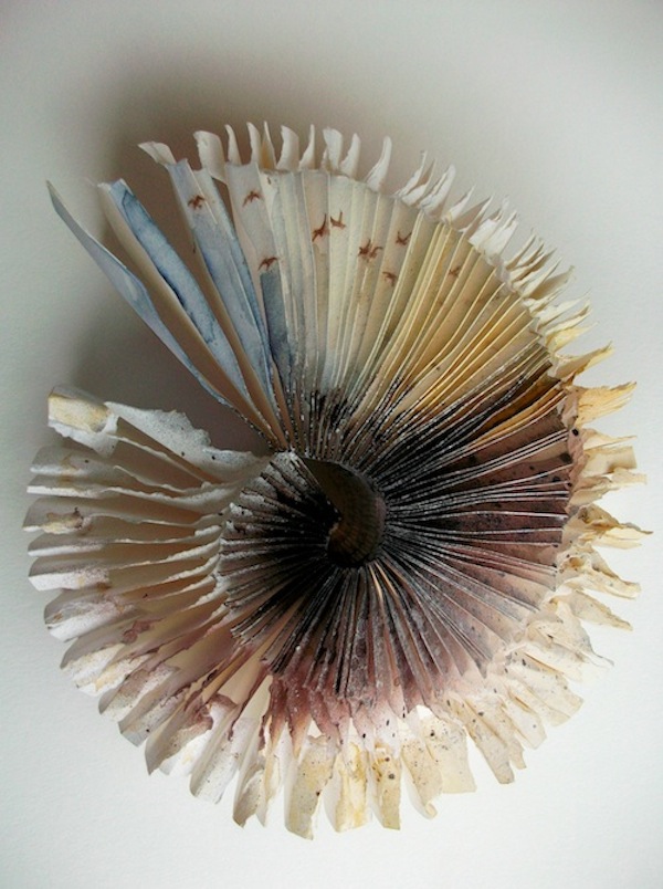
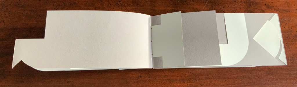
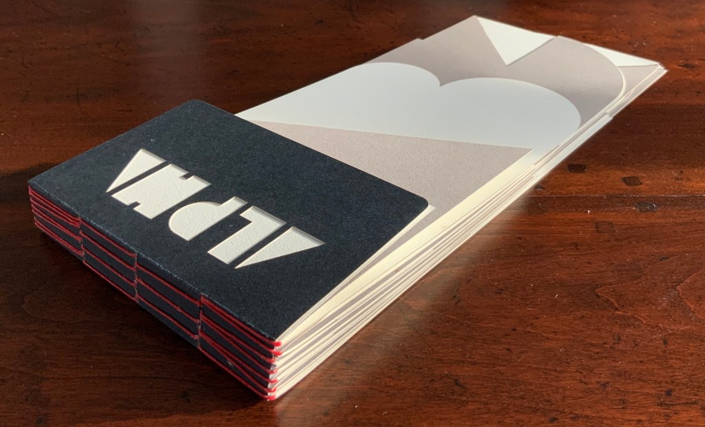
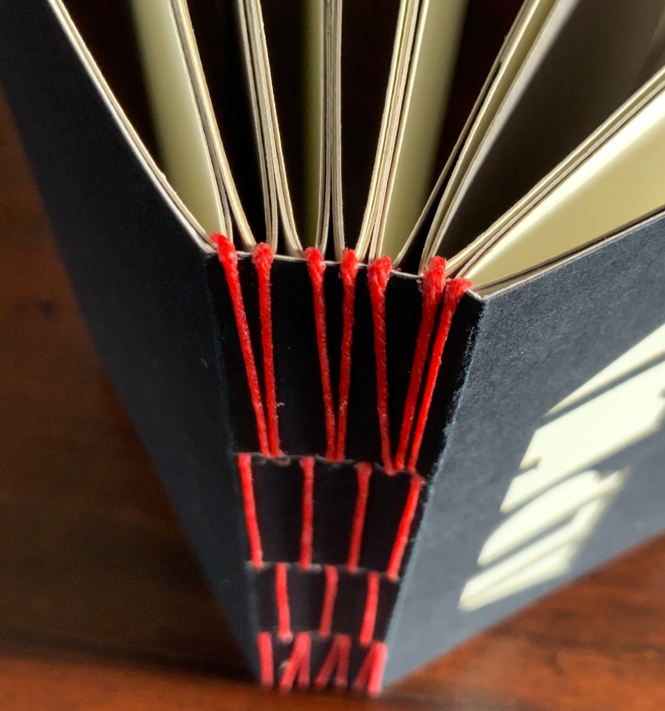
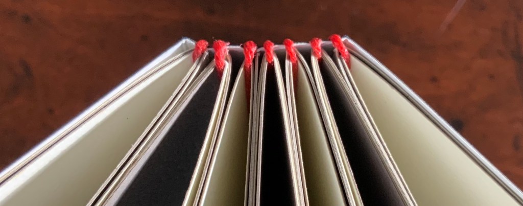
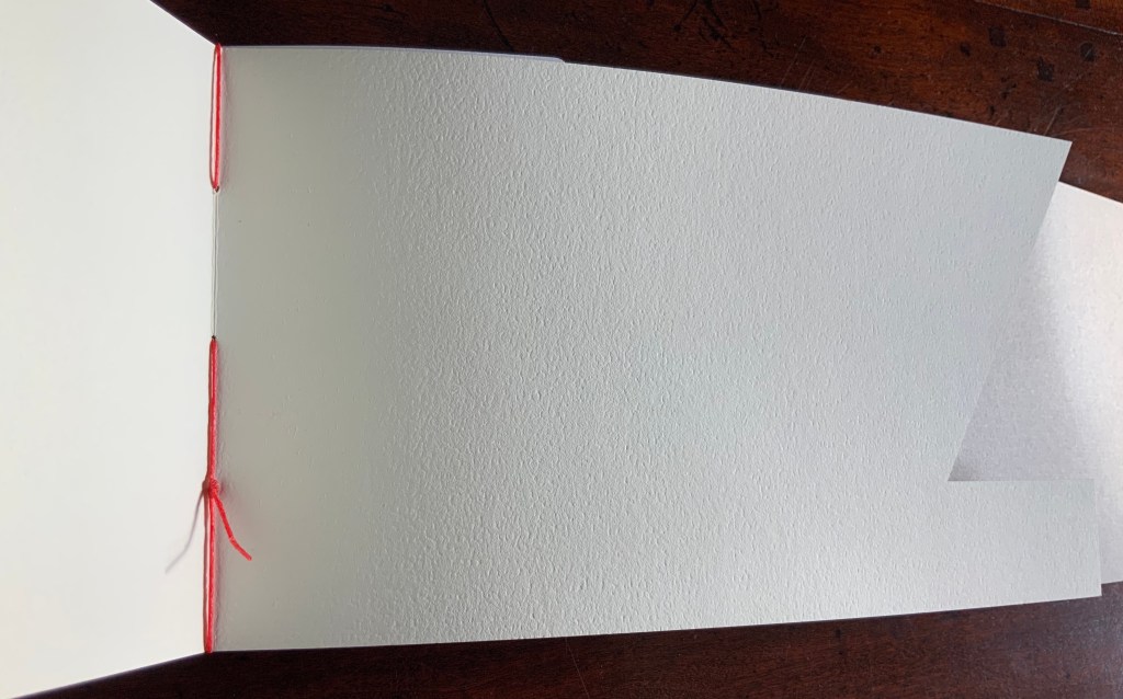
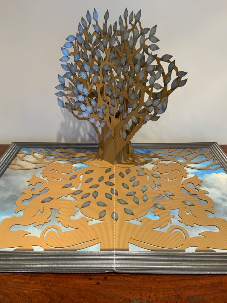
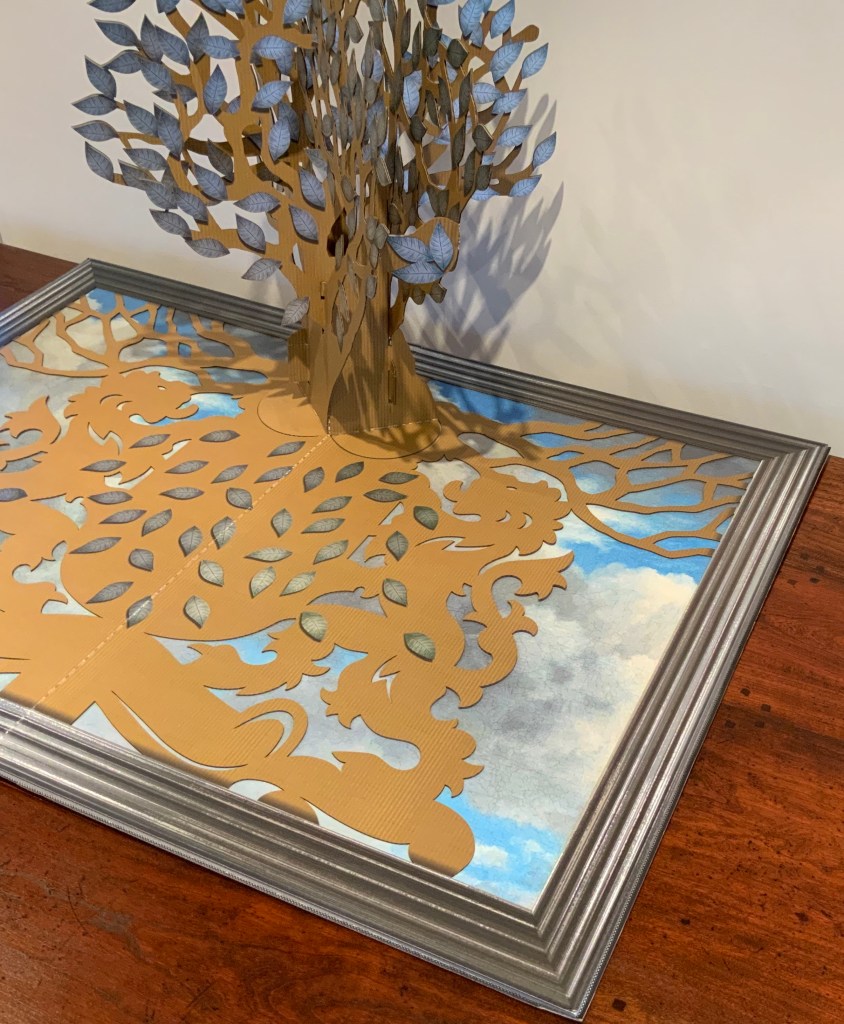
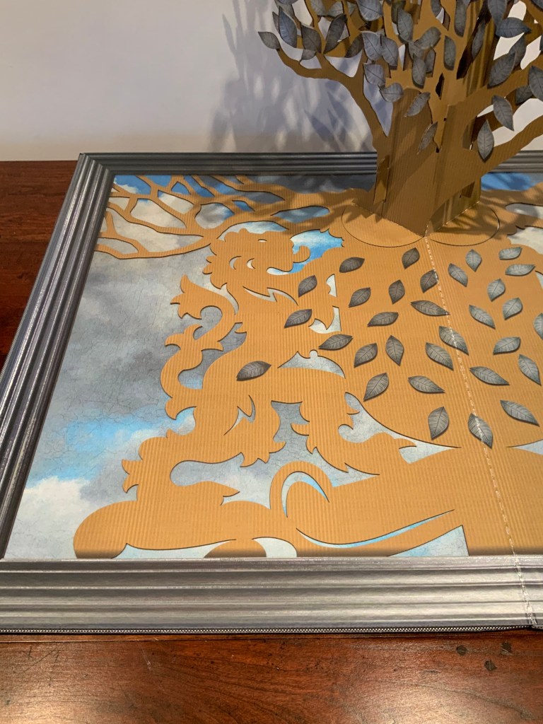
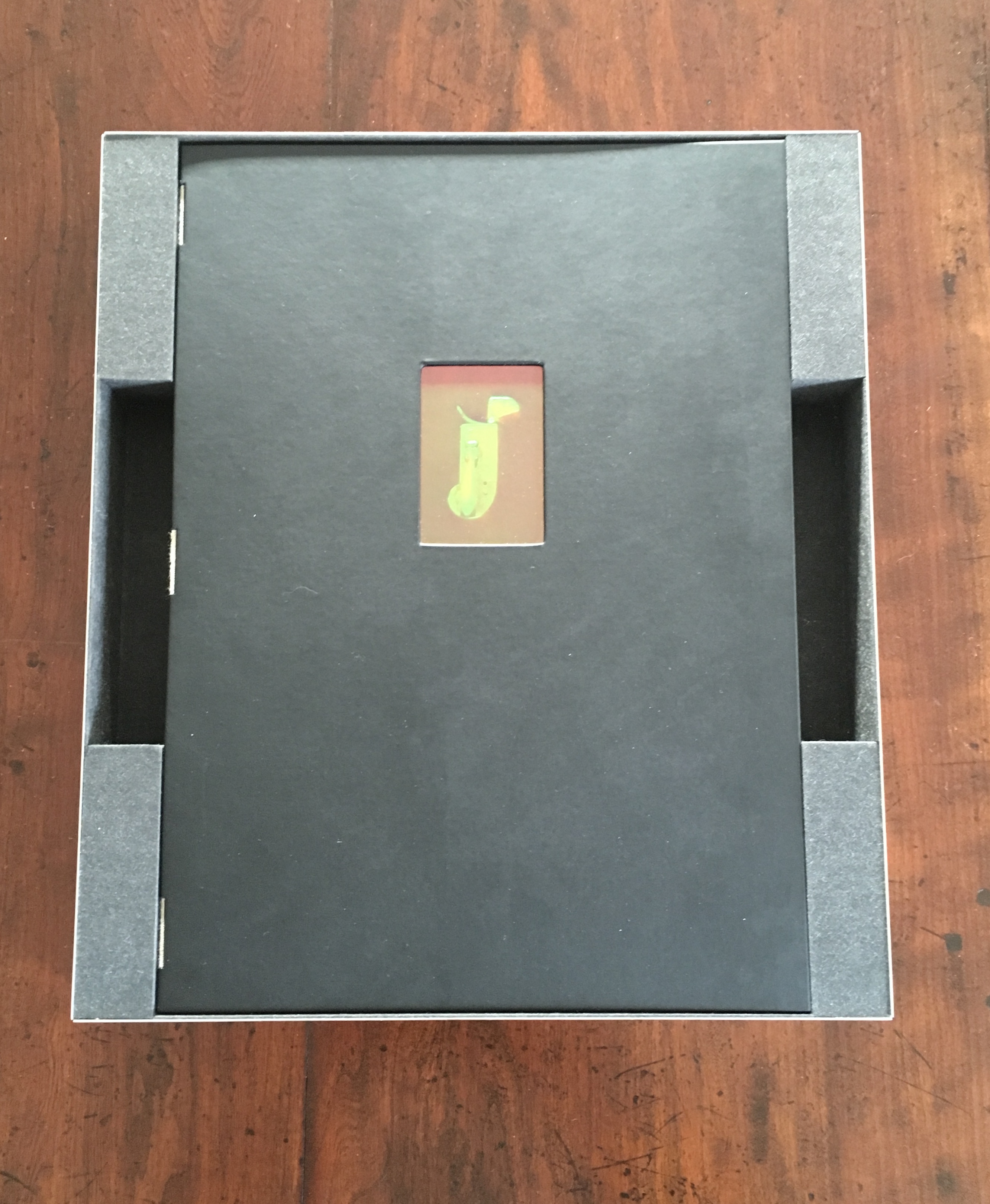
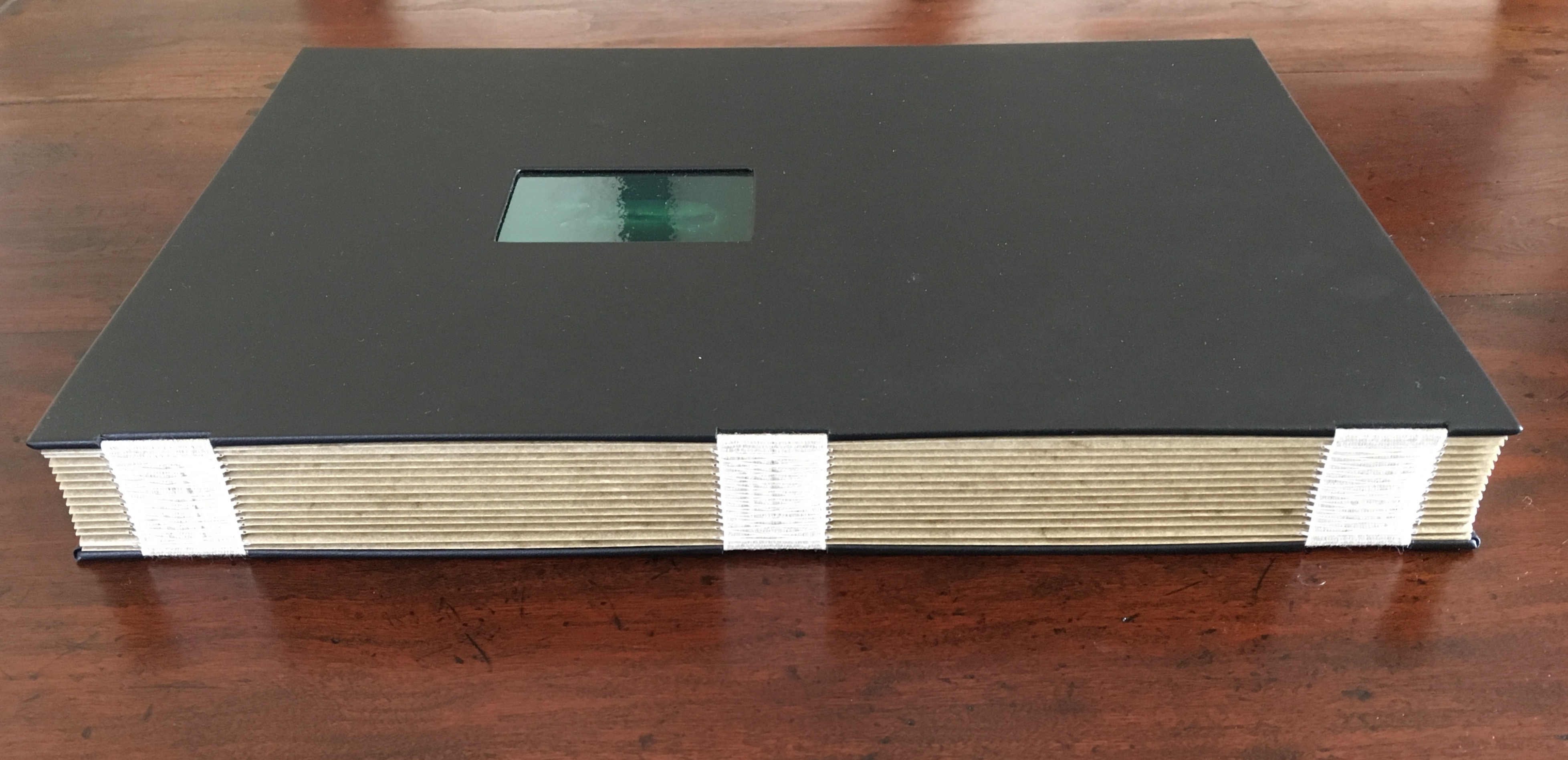
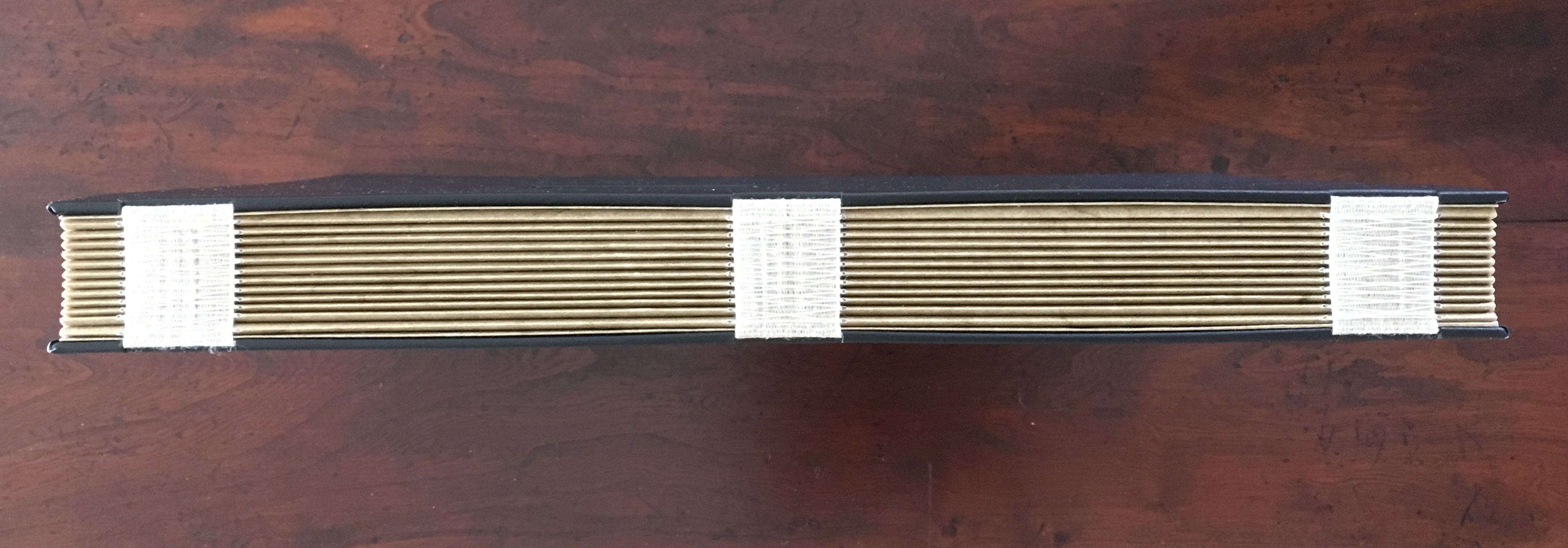
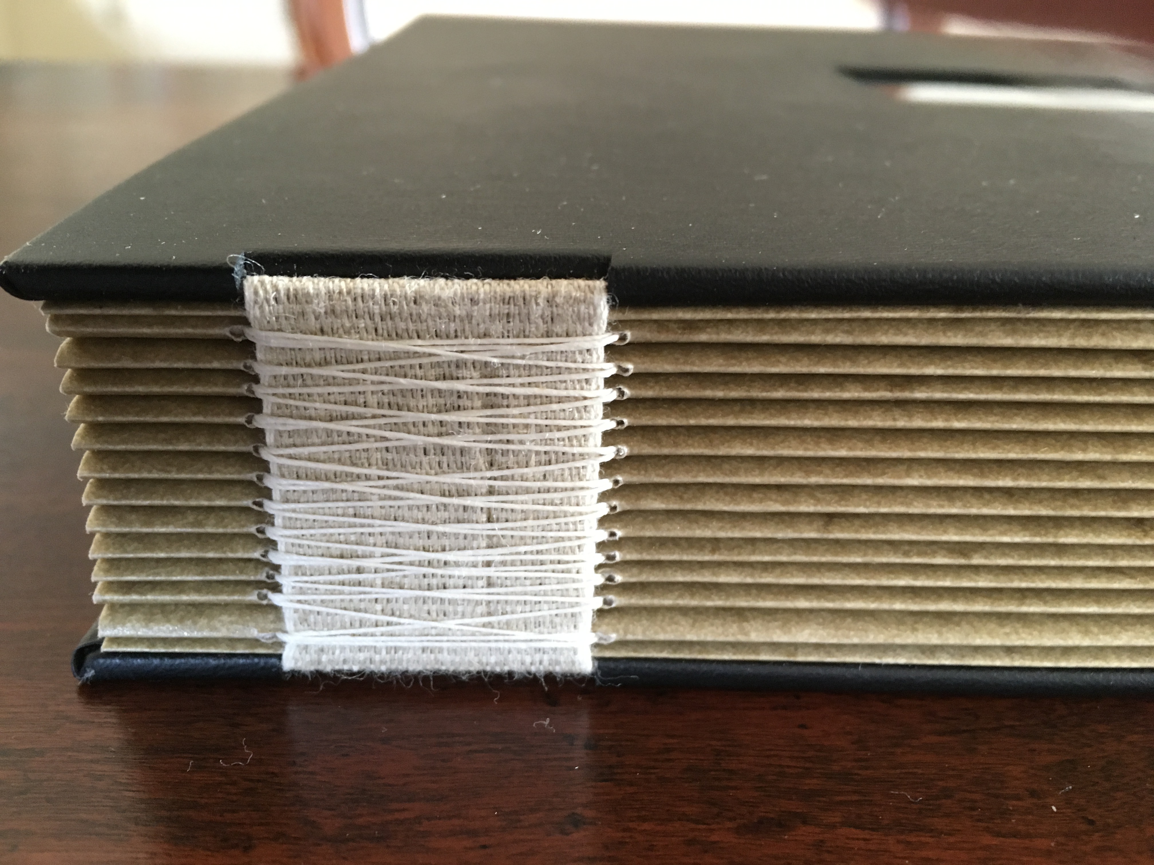
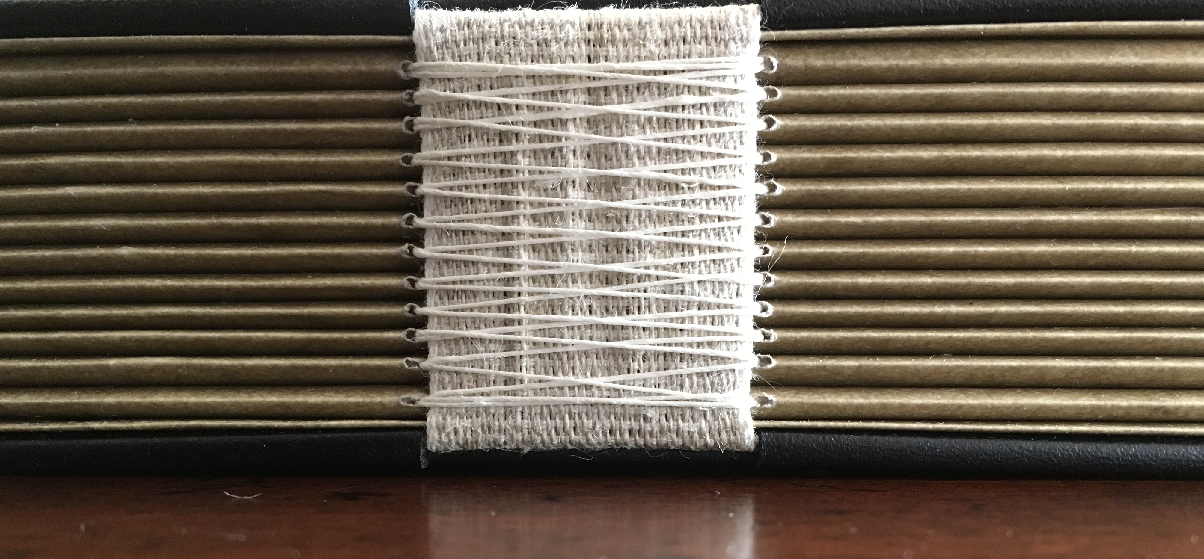
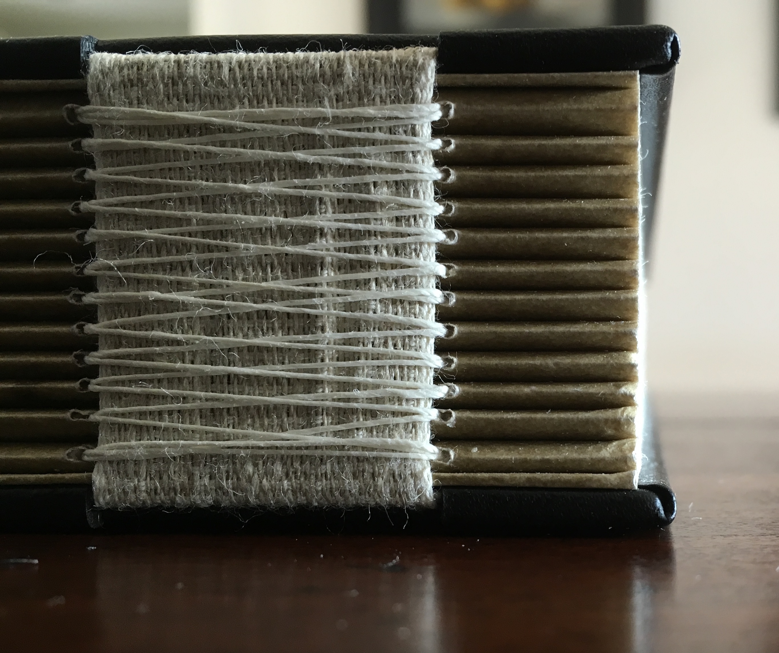
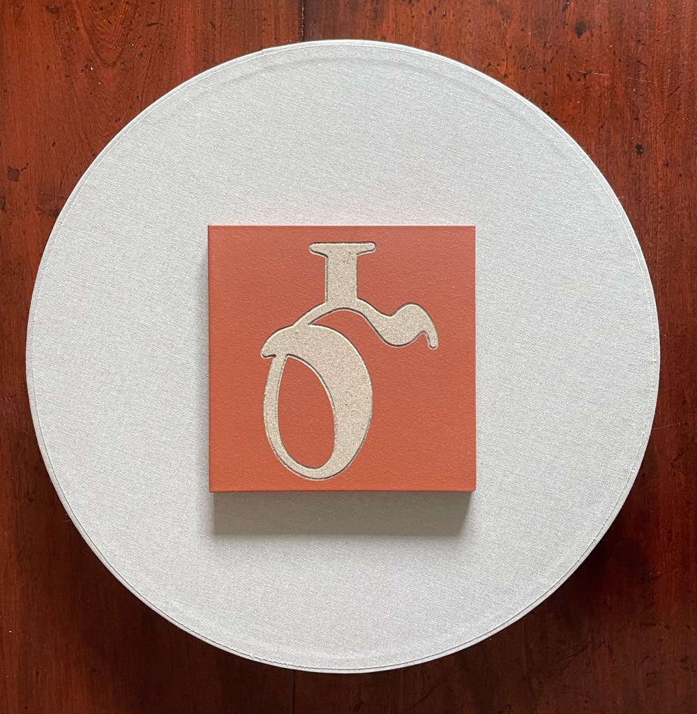
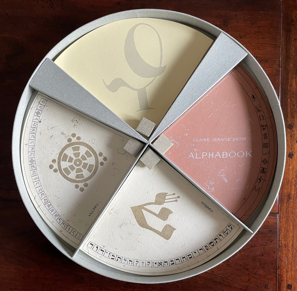
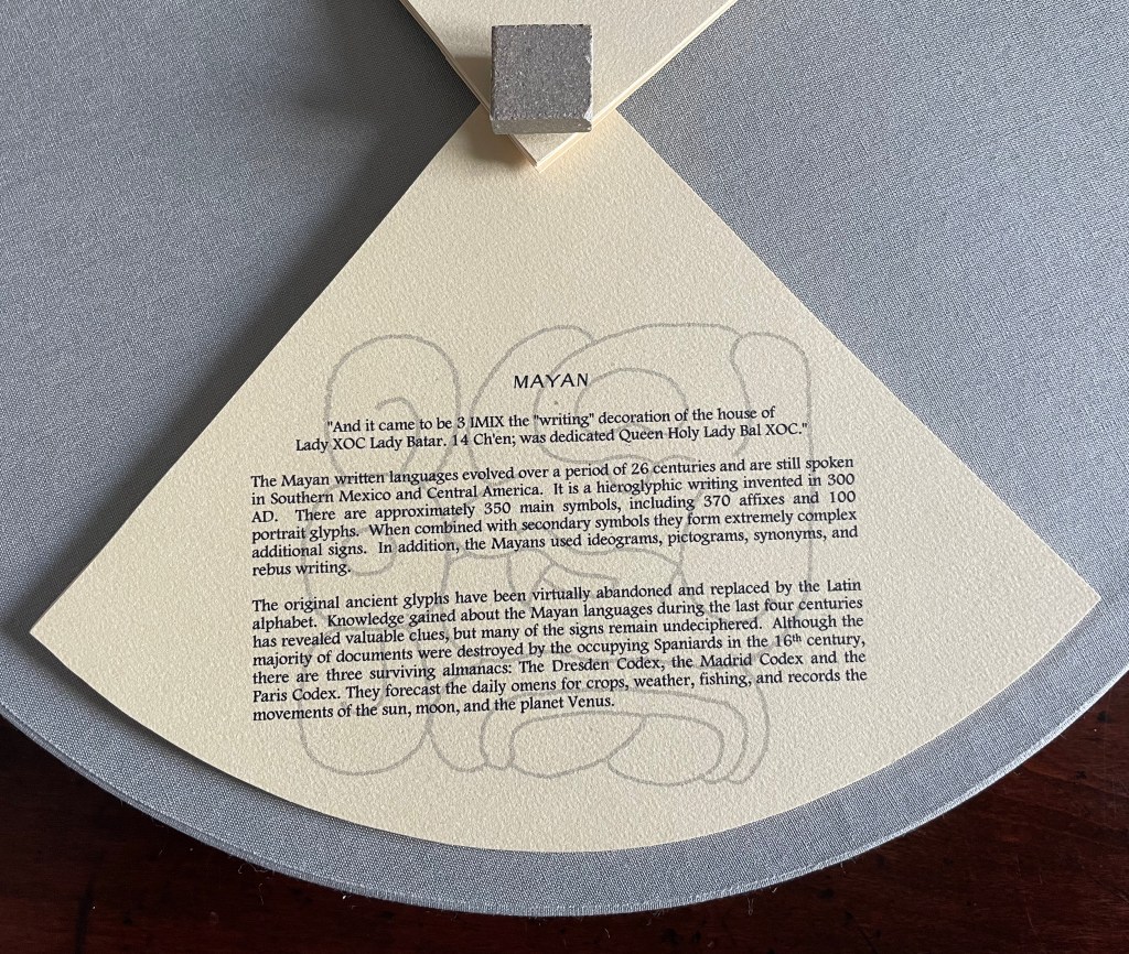
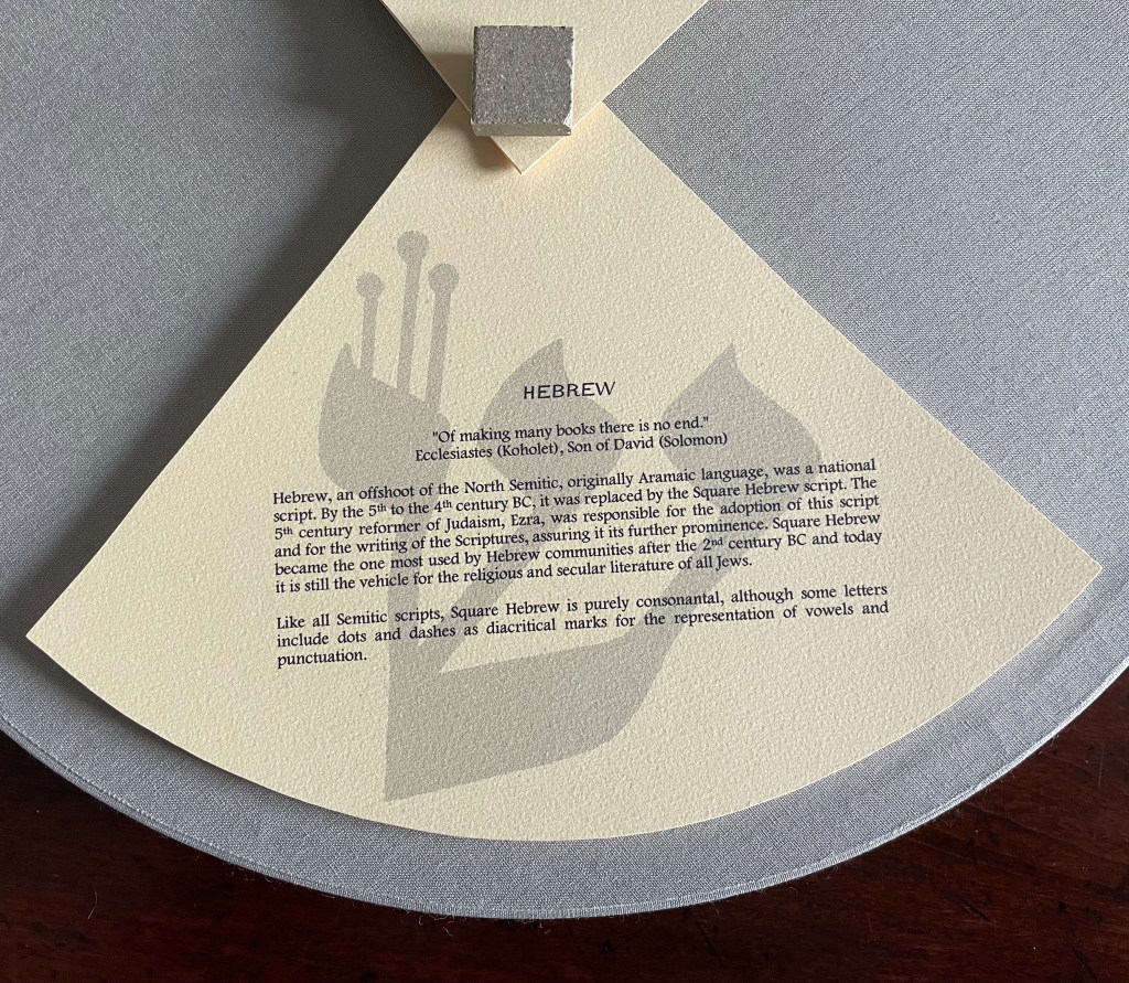
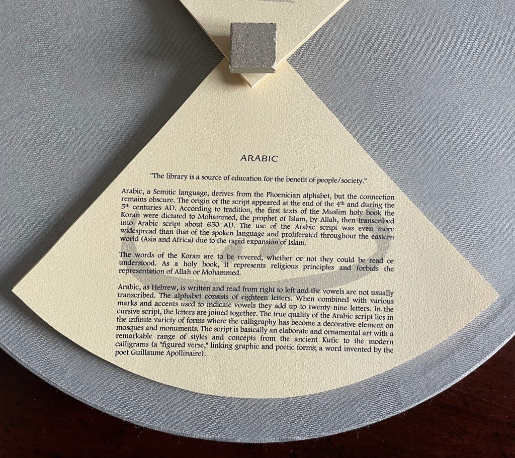
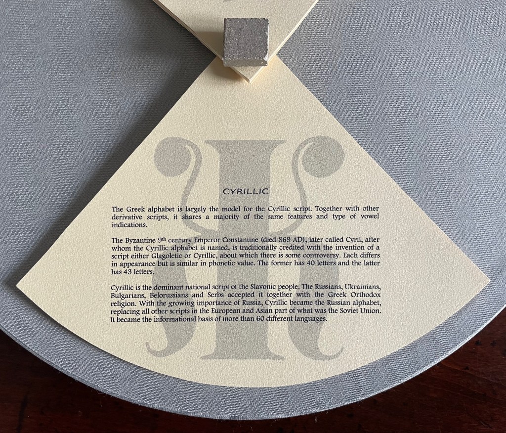
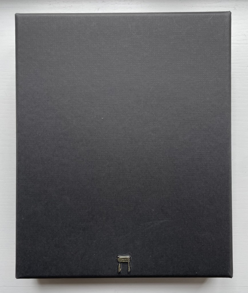
Circular box containing four segments of post-bound pages. Diameter 356 x D51 mm. Limited variable edition of 11, this copy with a segment on the Cherokee syllabary and a Cherokee sign tile on the cover. Acquired from the artist, 15 December 2022. Photos: Books On Books Collection. Displayed with artist’s permission.
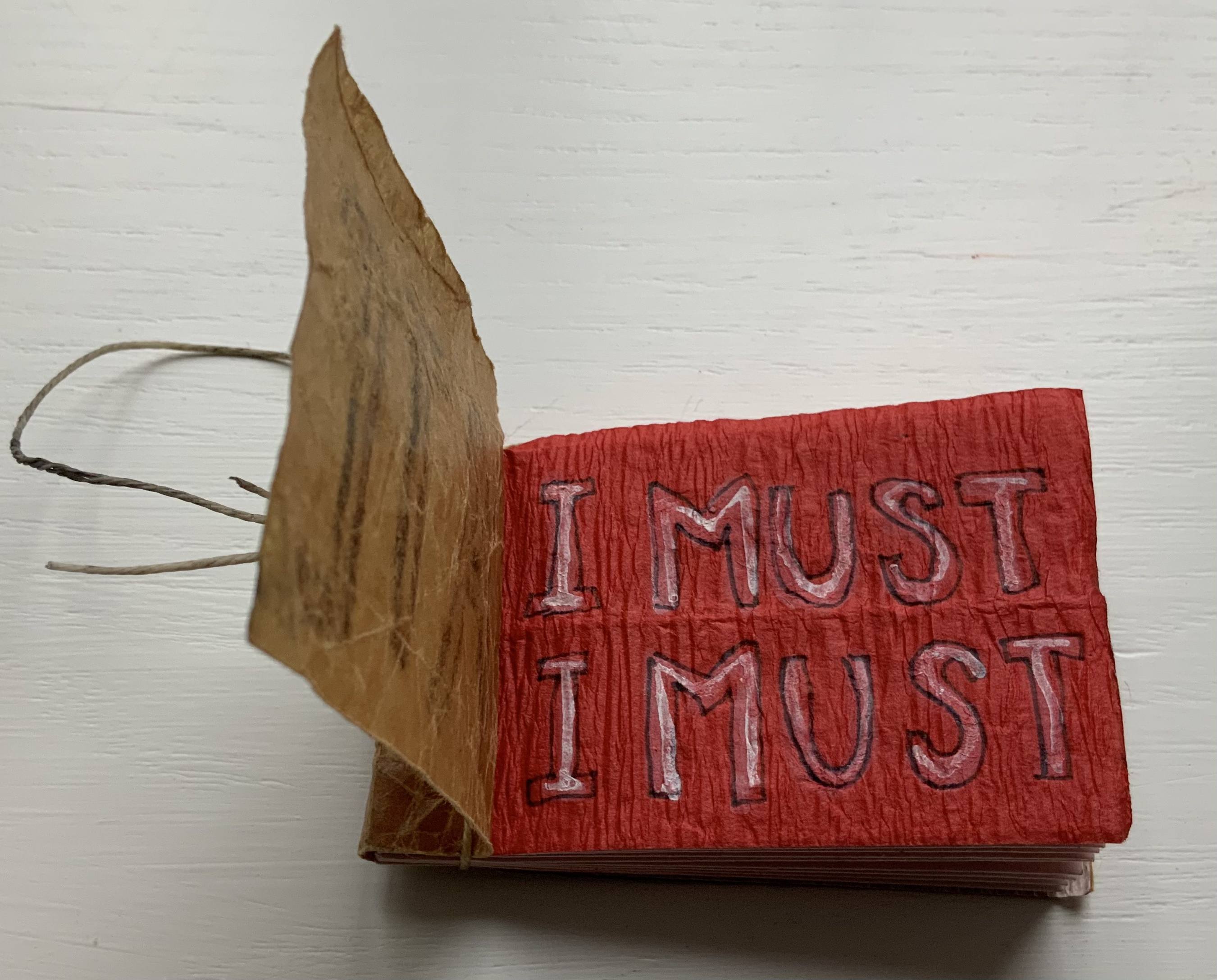
From the artist’s description:
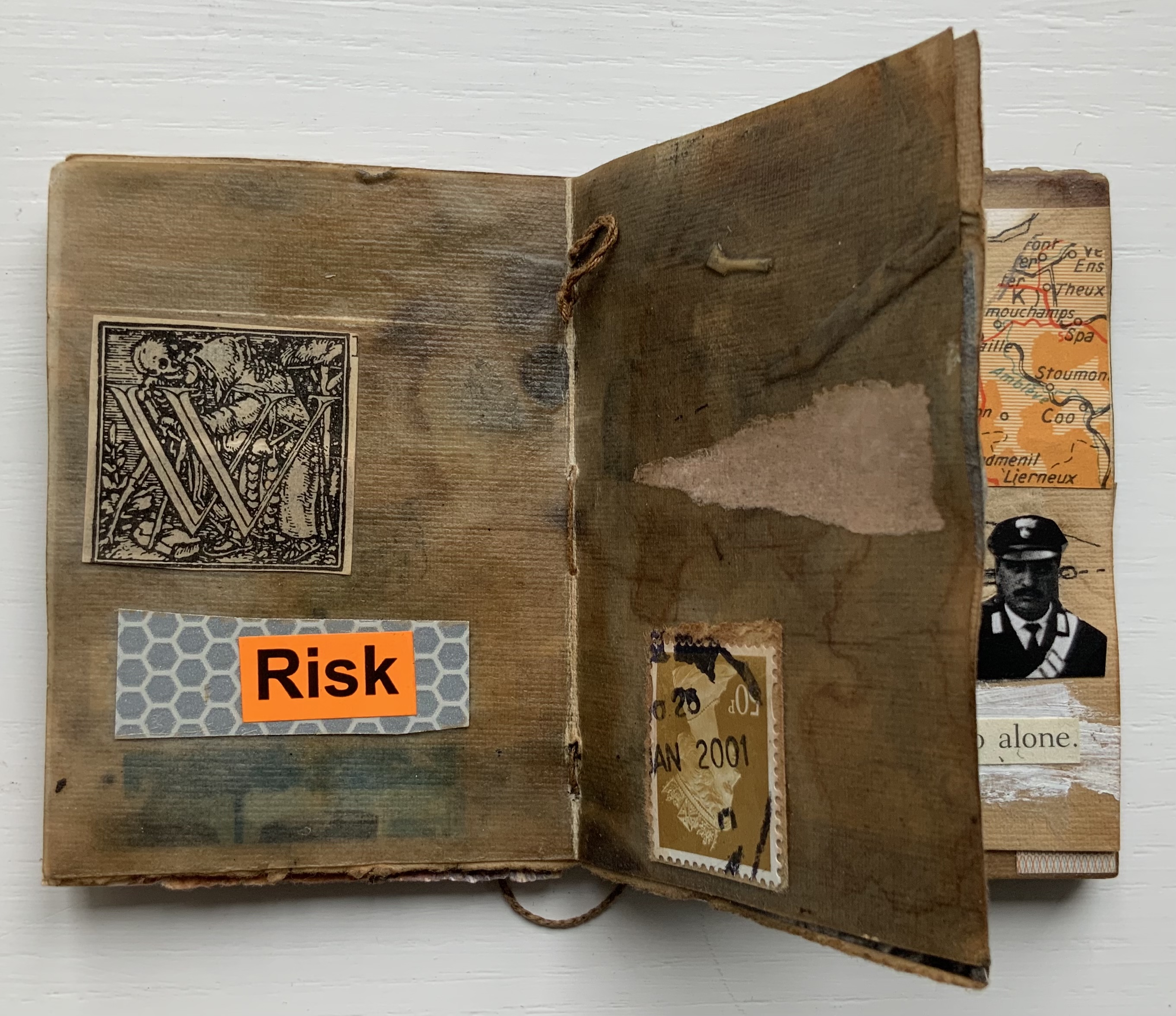
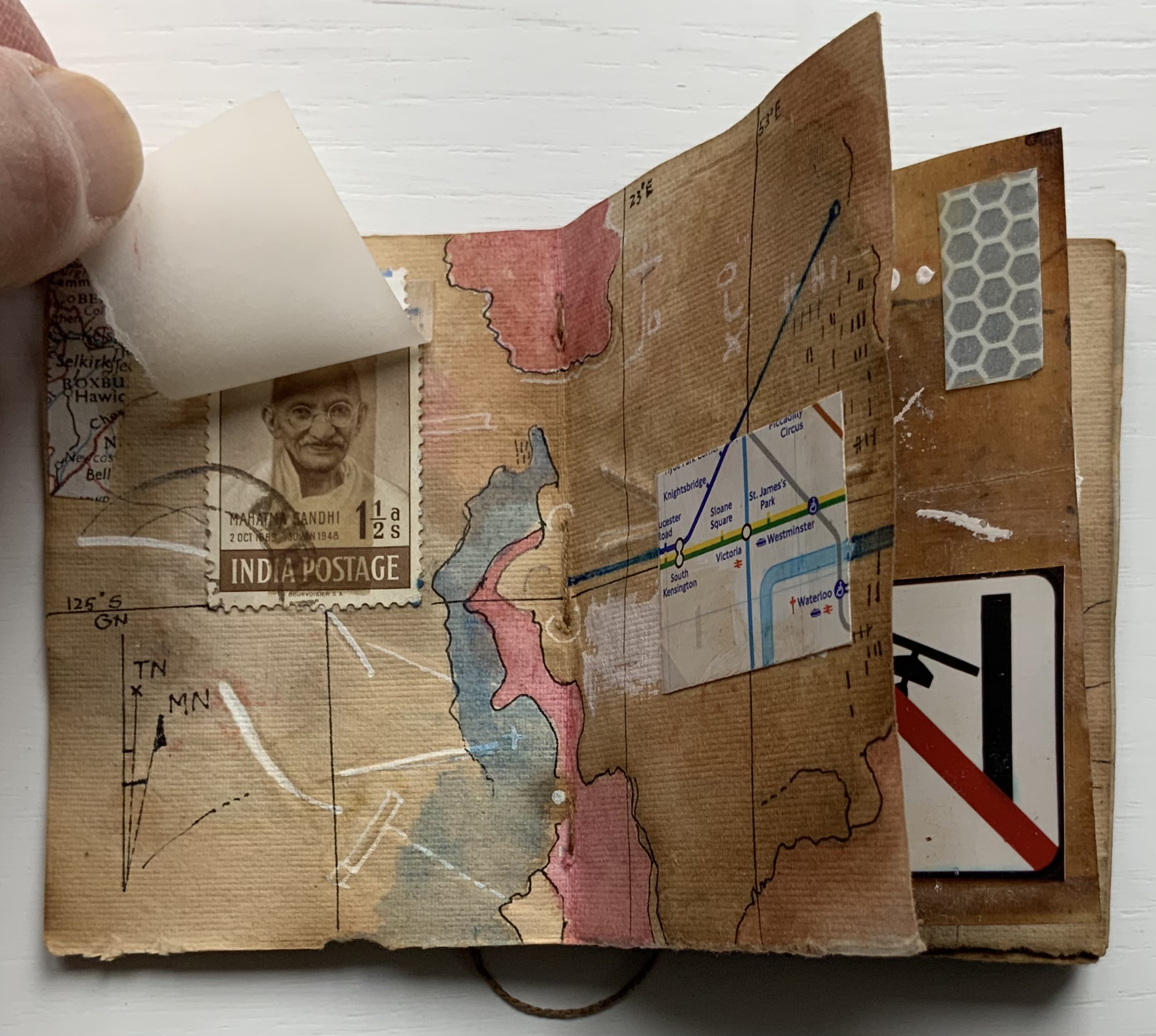
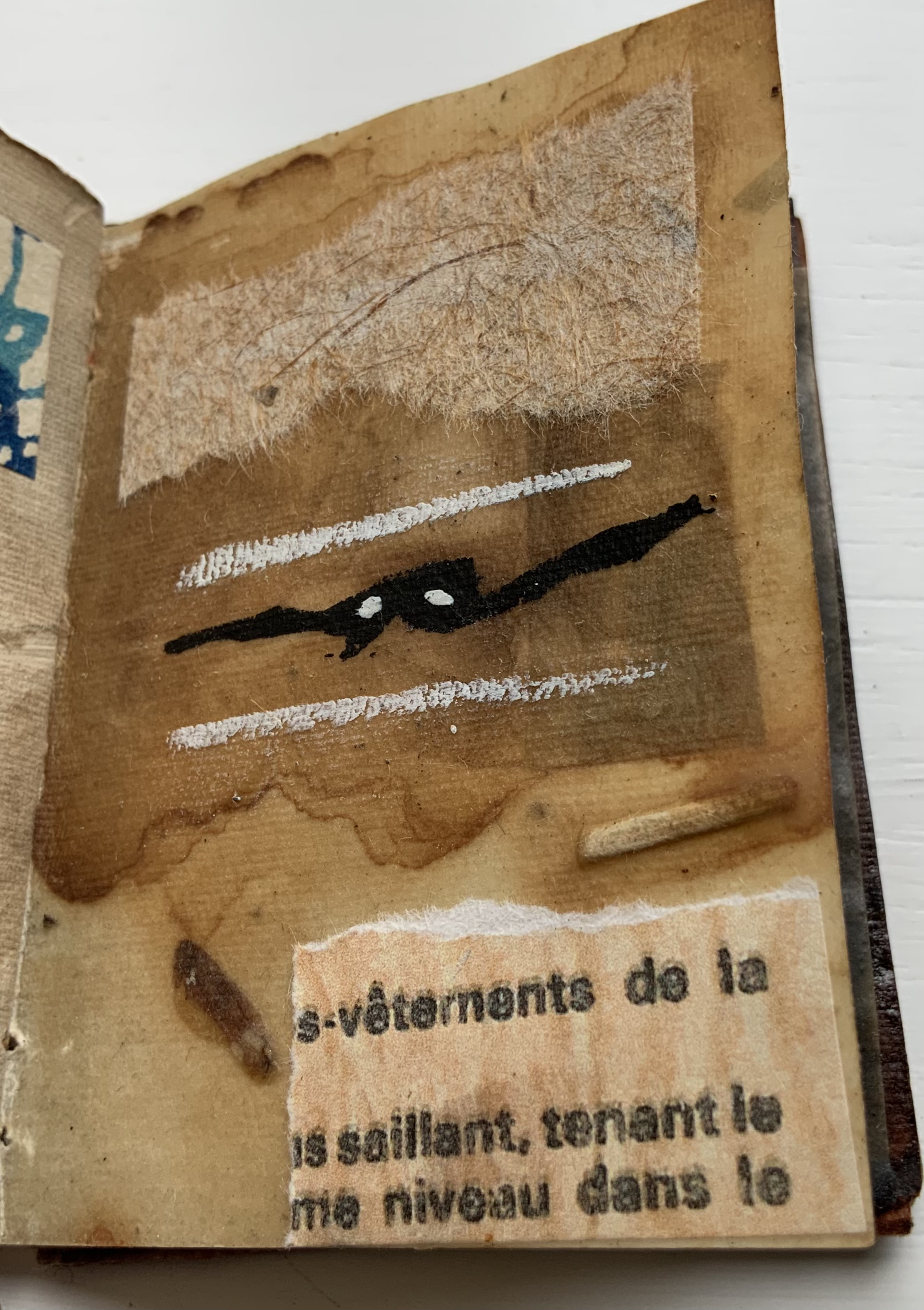
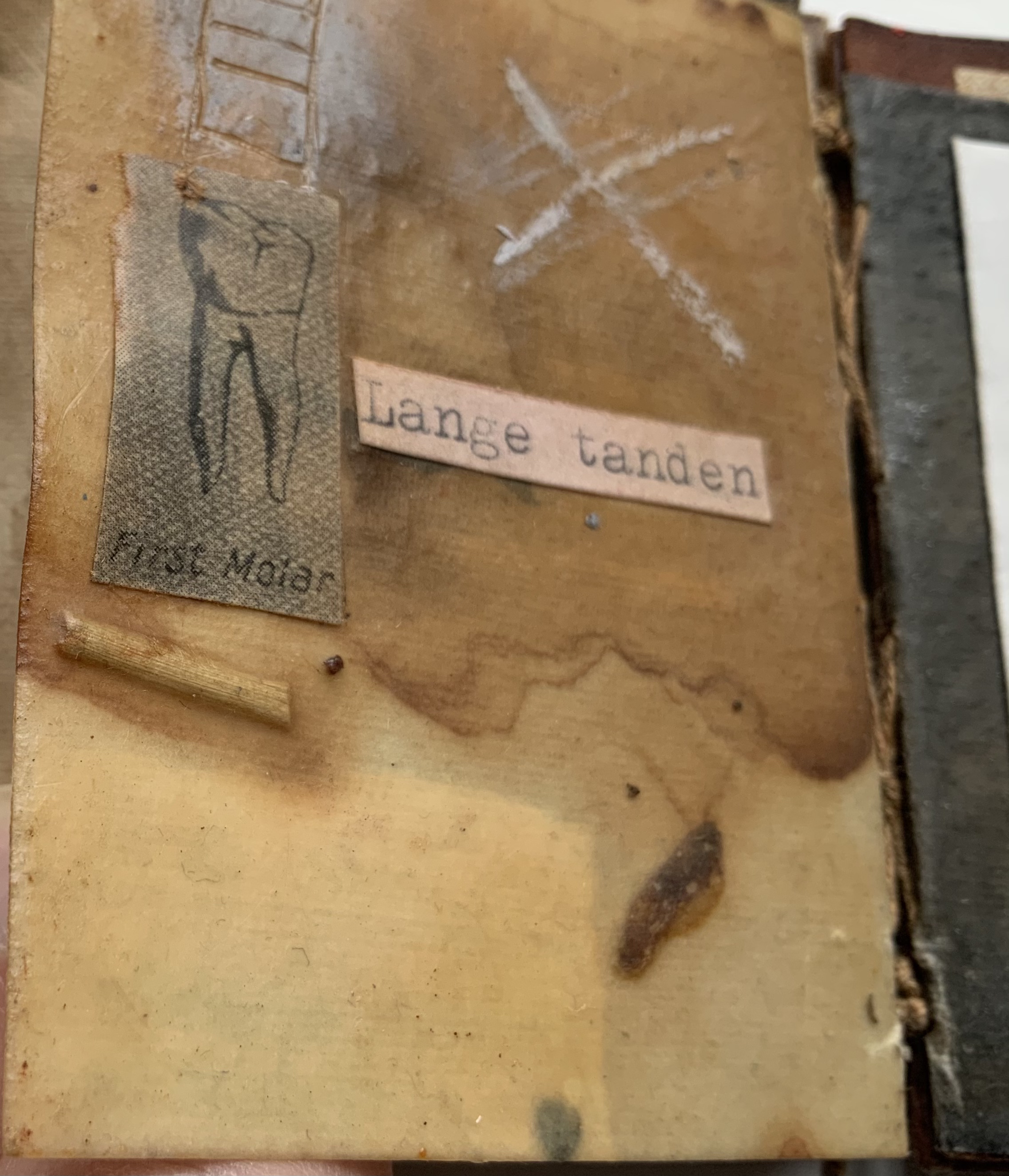
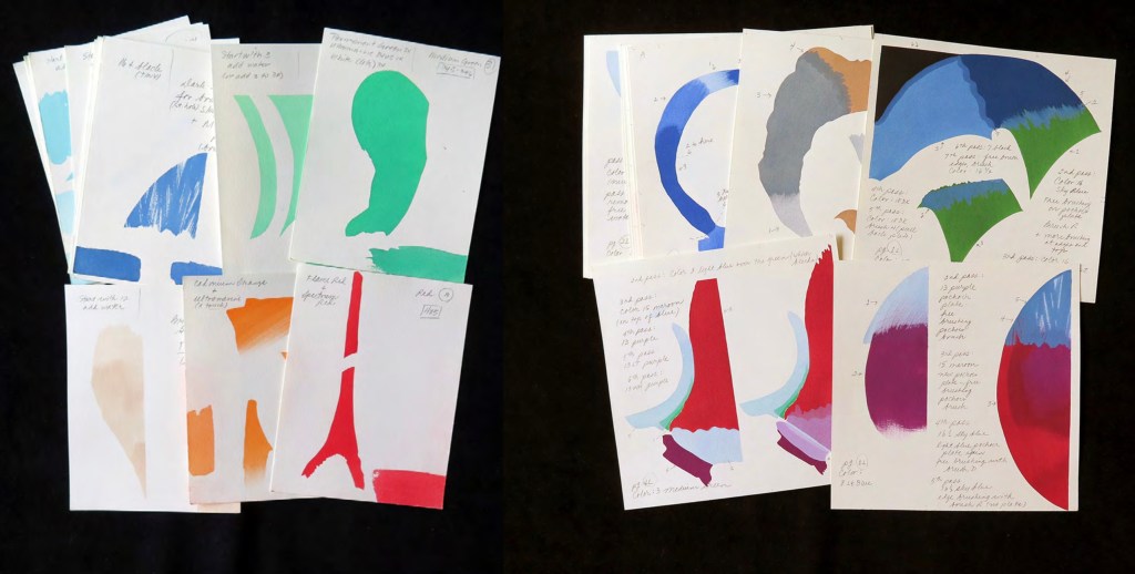
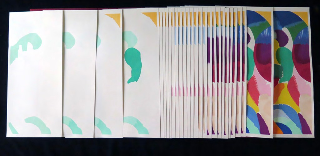
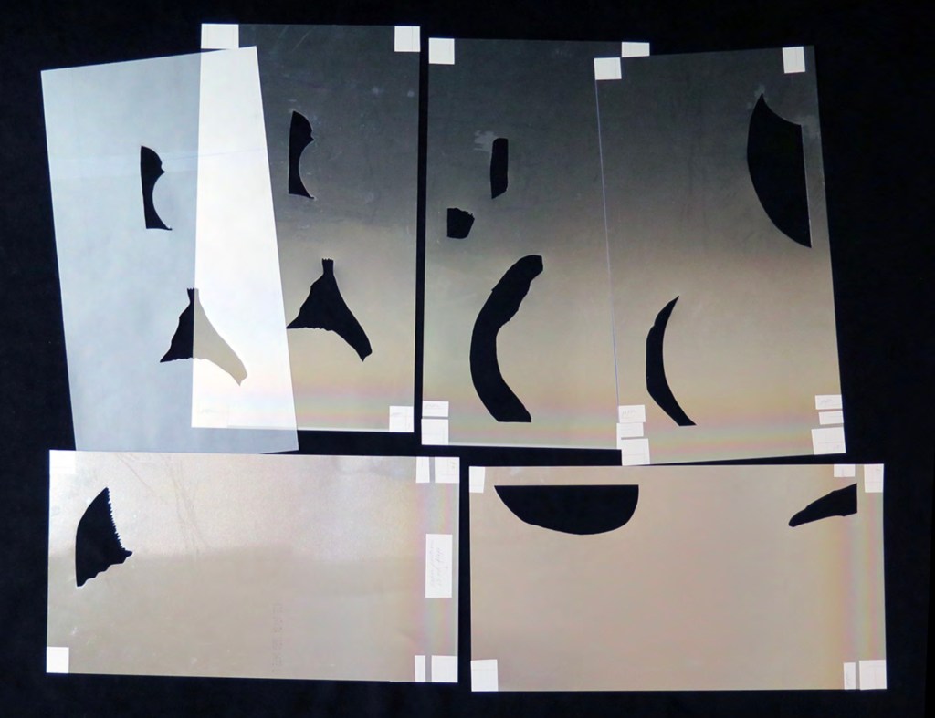
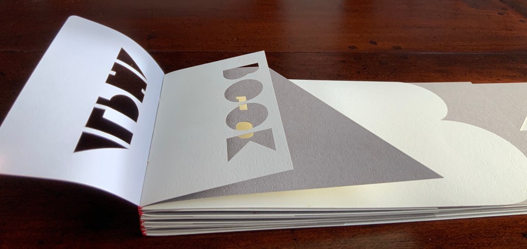
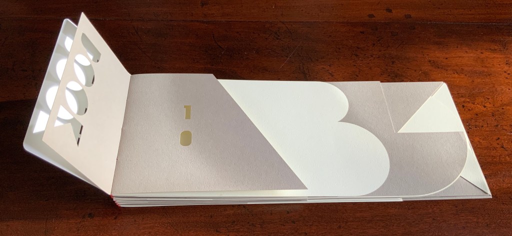
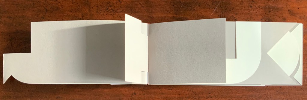
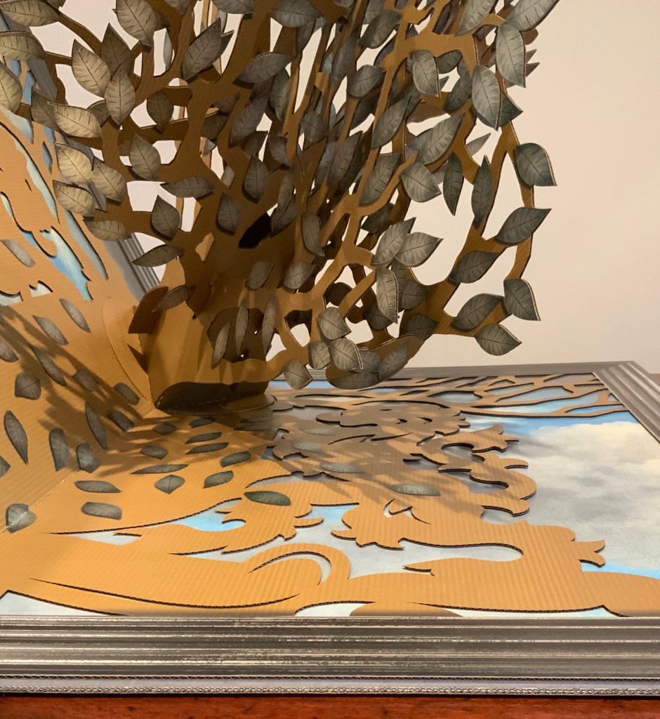
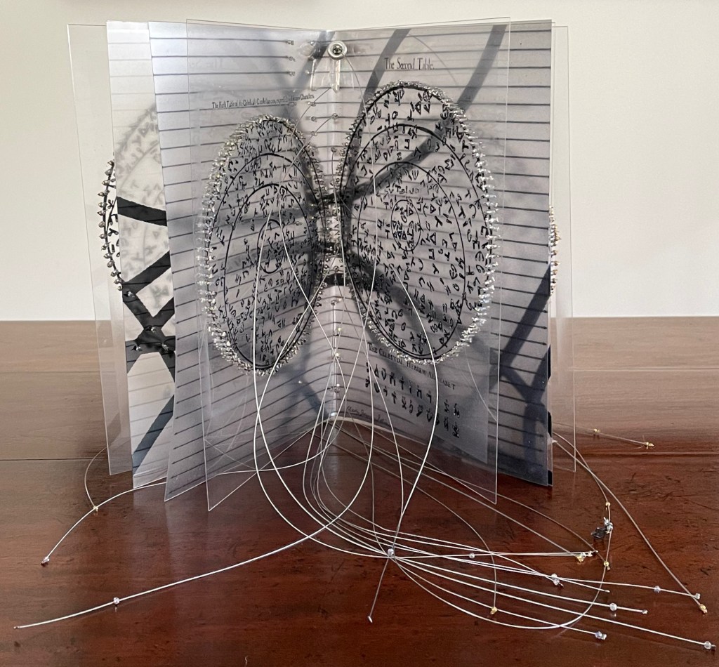
Alphabook is photo-etched and printed on 360 gm/m2 Fabriano Murillo with inks and metallic colors. The sets of pages are grouped in four segments. Three consist of alphabetic notations, images, phrases, and poetry. The fourth set consists of accompanying texts describing the alphabet or notations, (in this case Cherokee). The pages form circles when fully opened. A colophon page is included and signed at the end. The circular containers were constructed and bound in Italian Ciralux cloth and topped with a water-jet cut tile designed by the artist. The rim is gold stamped with the Latin phrase: VERBA VOLENT, SCRIPTA MANENT.
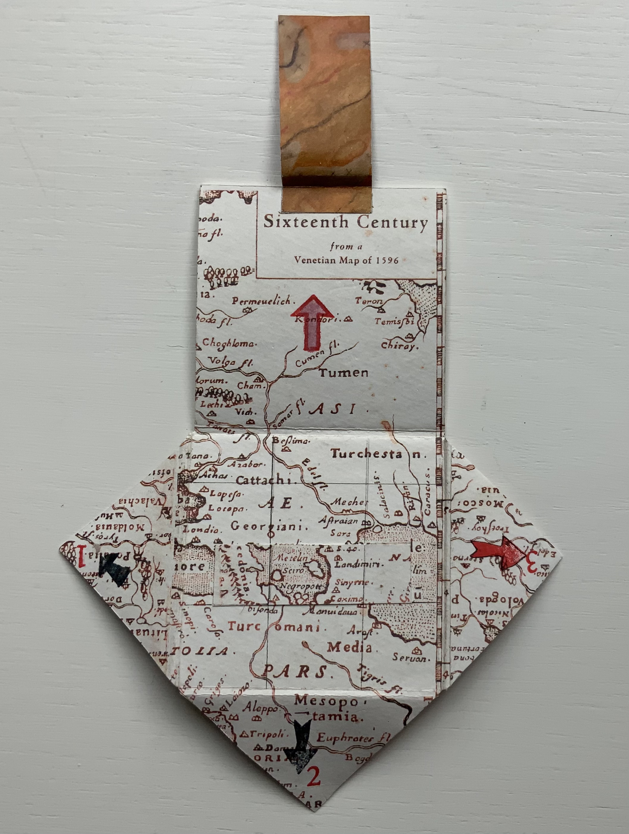
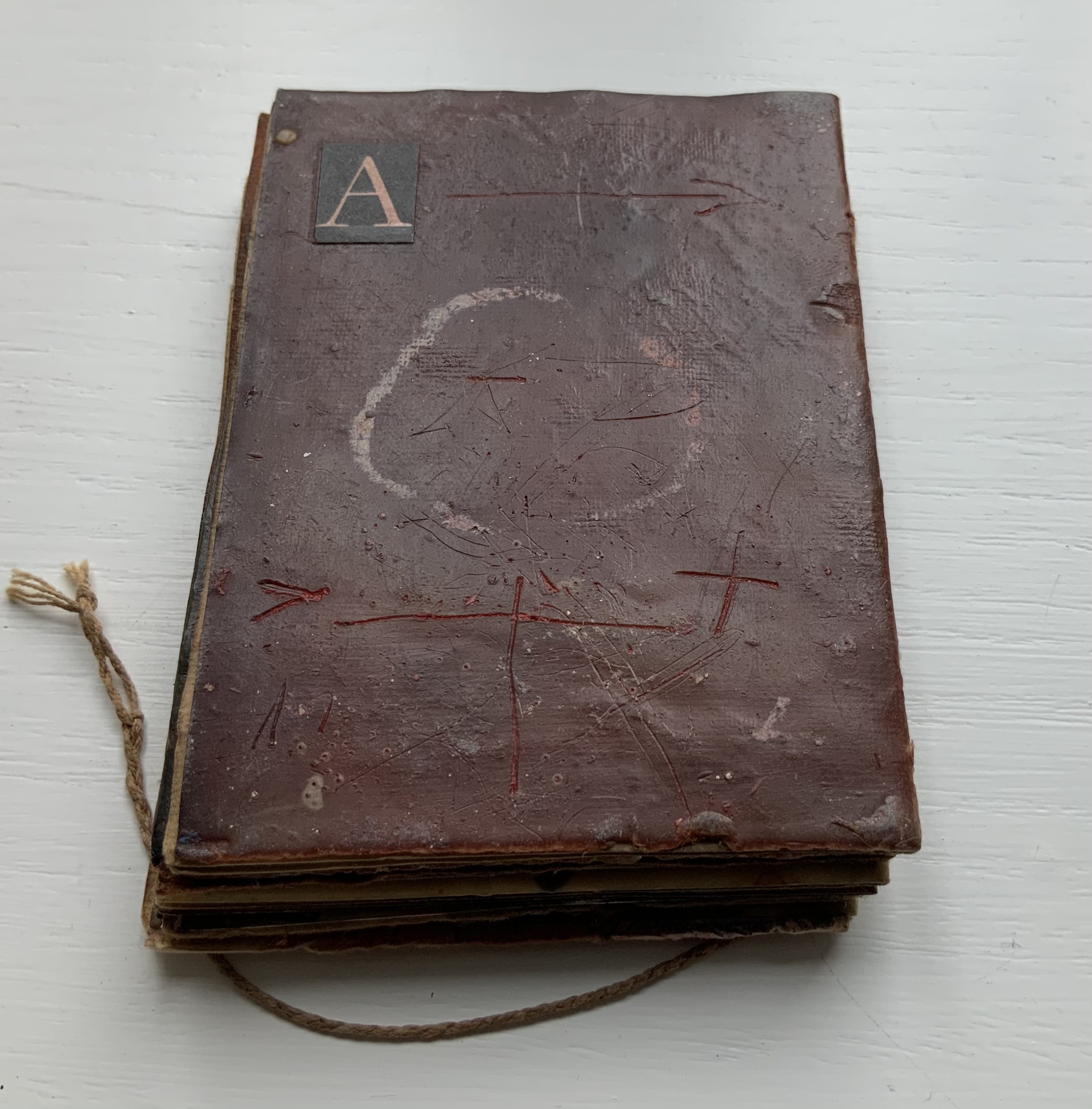
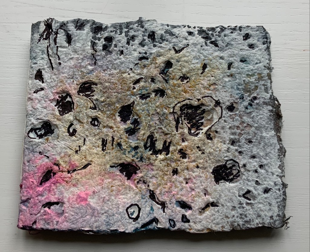
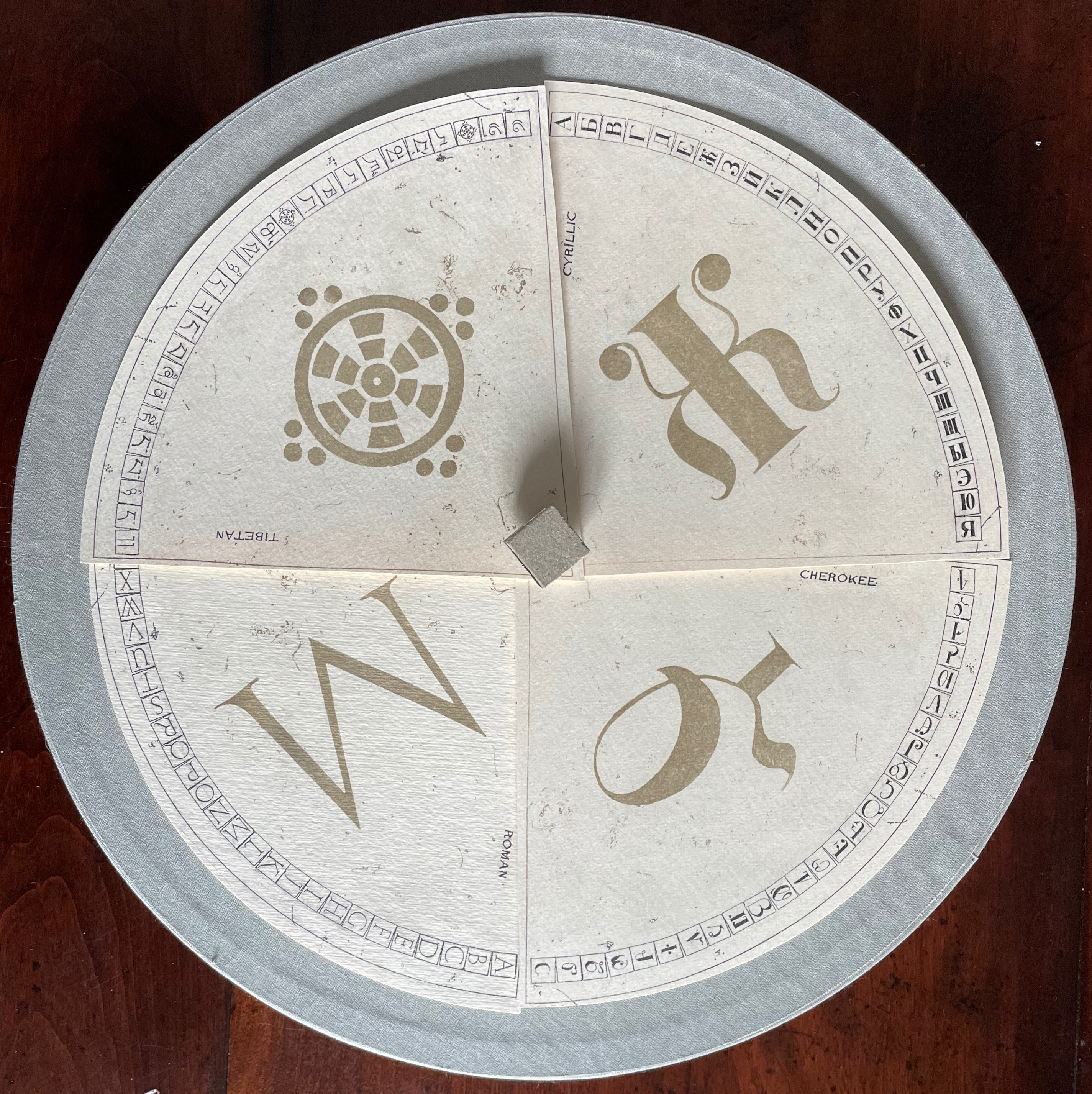
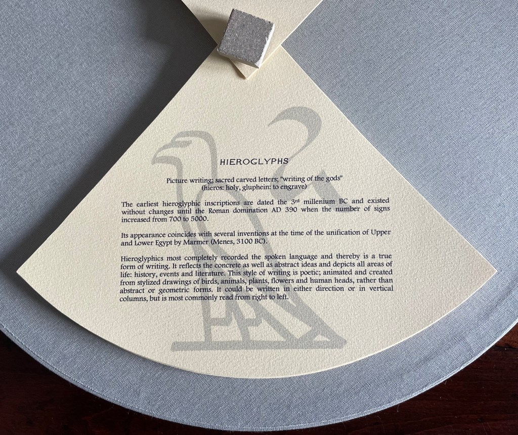
This work has no externally visible title, only the Cherokee letter Ꮉ (for the sound “ma”) on the tile and that gold-stamped Latin phrase. Traditionally the proverb runs in the indicative — Verba volant, scripta manent (“Words fly, writing remains”) — but presumably to draw yet more attention to the solidity of the written word over the iffy ephemerality of the spoken word, the subjunctive volent (“Words may fly” or “If words fly”) comes into play. As the lid lifts, the work’s title Alphabook appears, indicating that, at its heart, this work of art is a book. The container’s circular shape, its inner segmentation and the post-bound segments may challenge the traditional notion of a book, but the segments’ text just as strongly asserts a bookish purpose, highlighting eleven prewriting and writing systems: Prehistoric, Hieroglyphs, Mayan, Hebrew, Arabic, Greek, Roman, Chinese, Tibetan, Cyrillic and Cherokee.
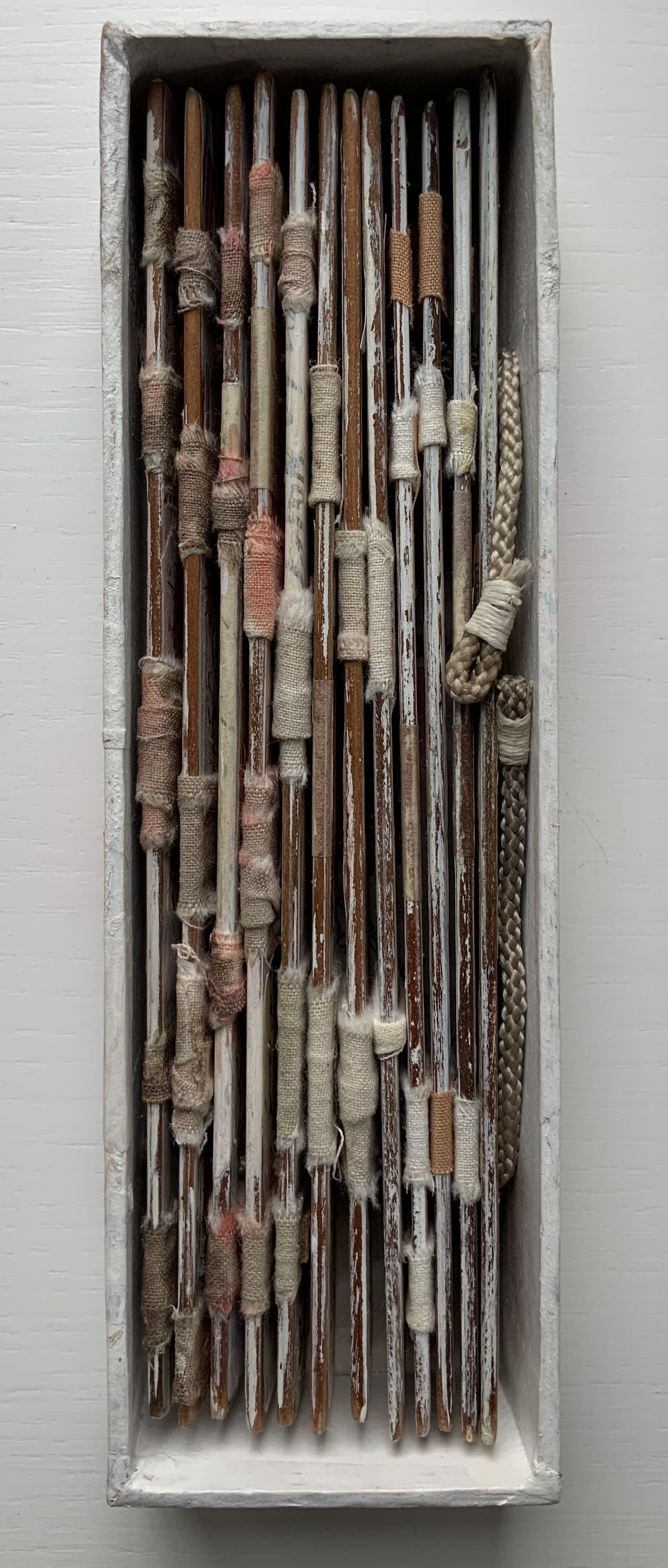
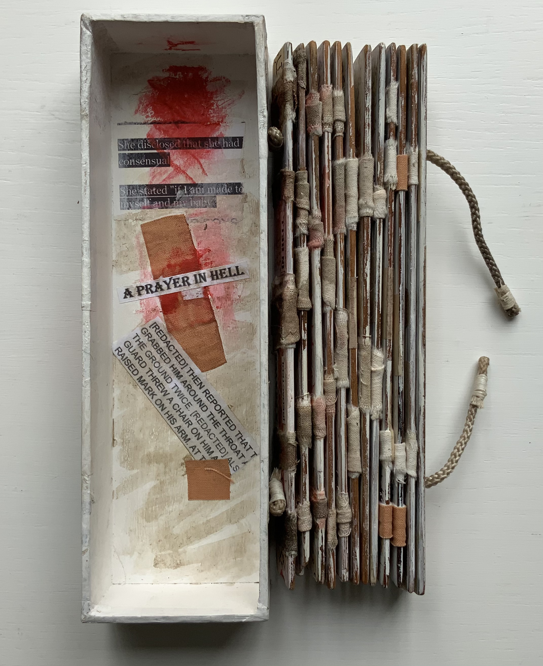
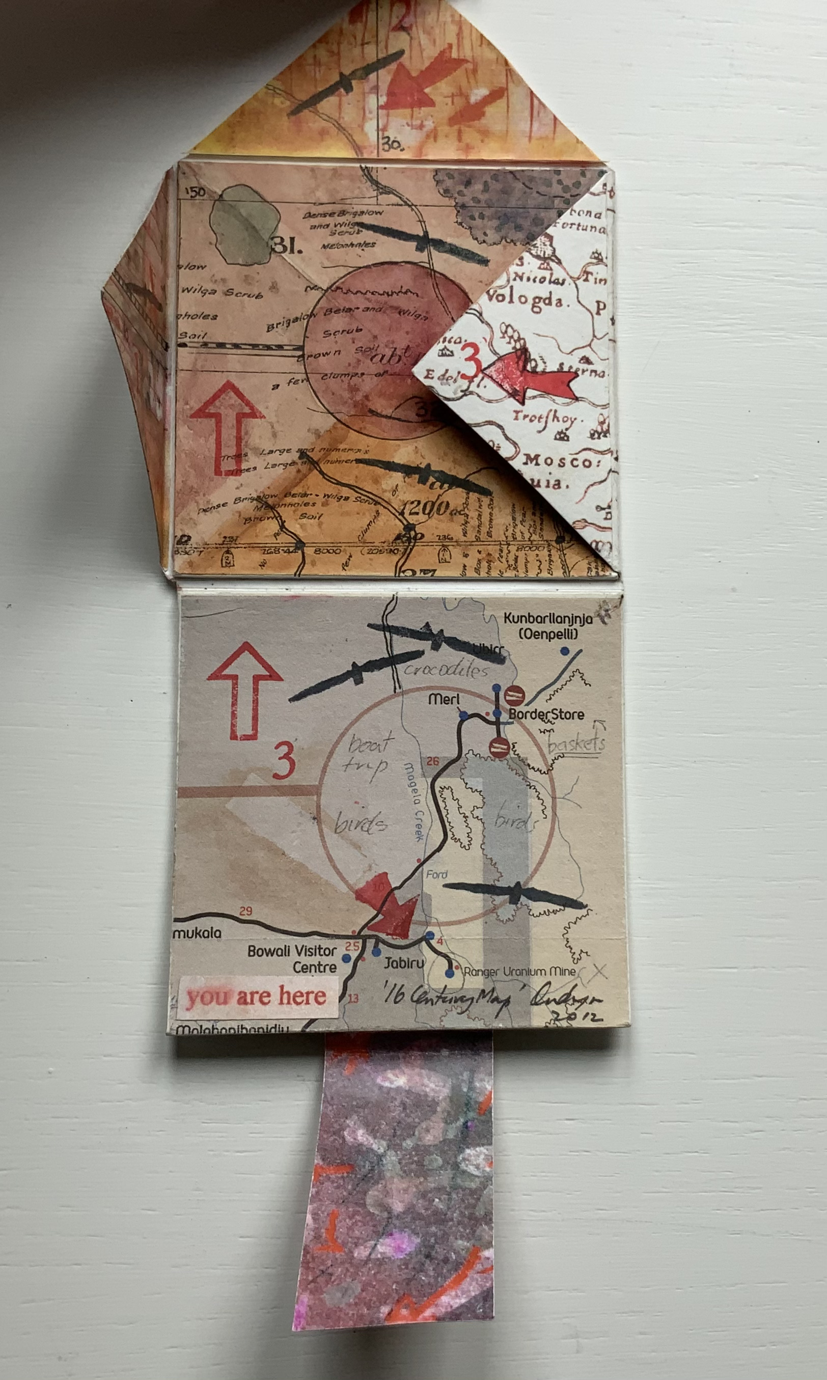
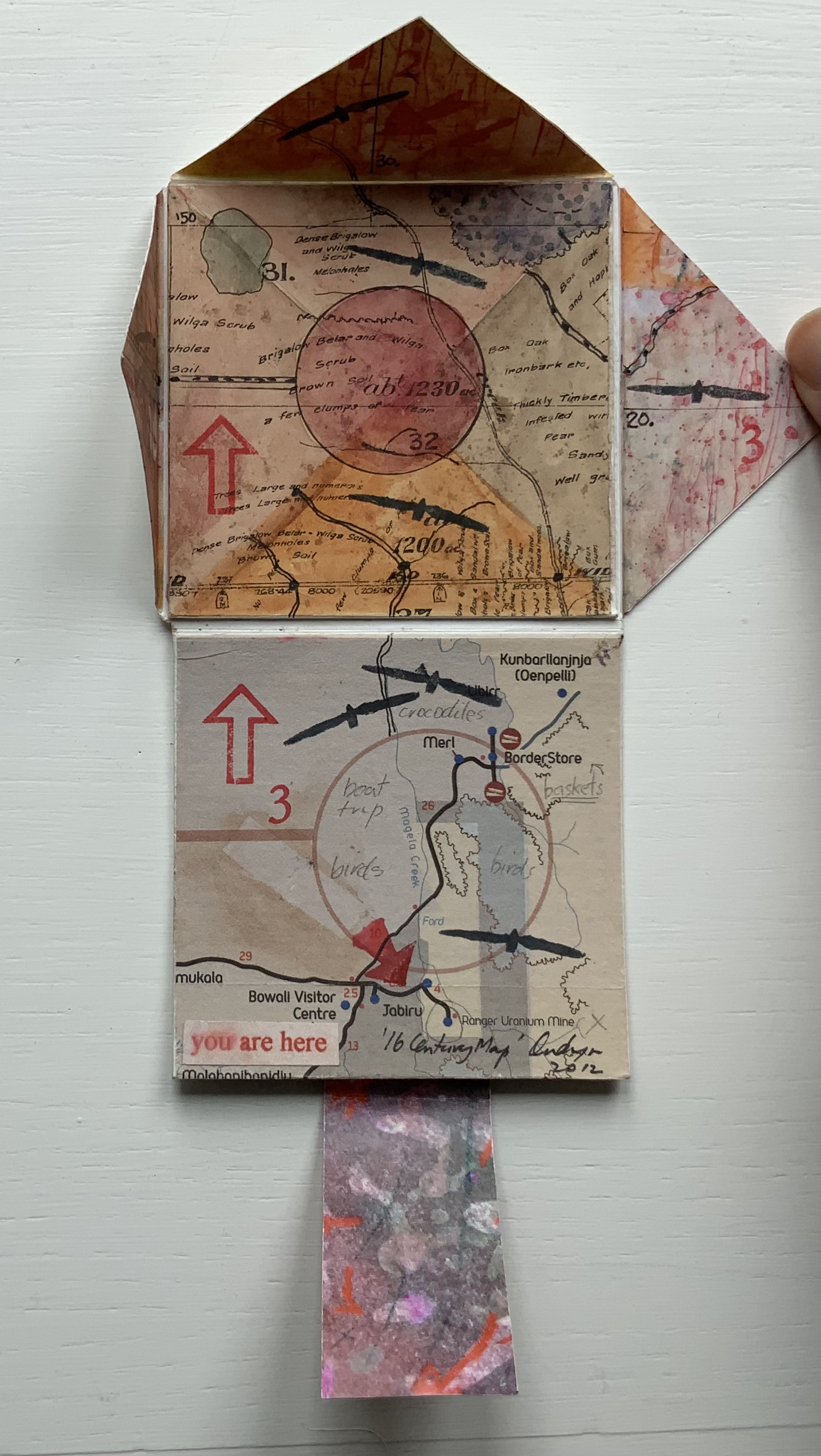
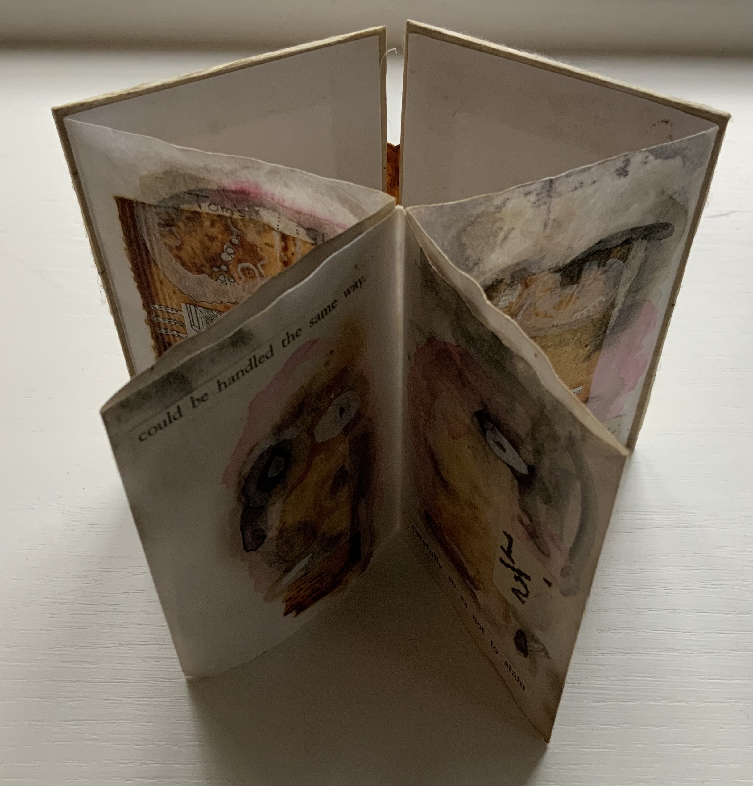
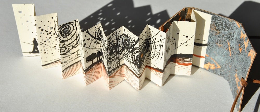
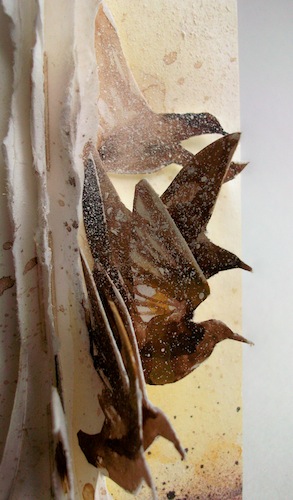
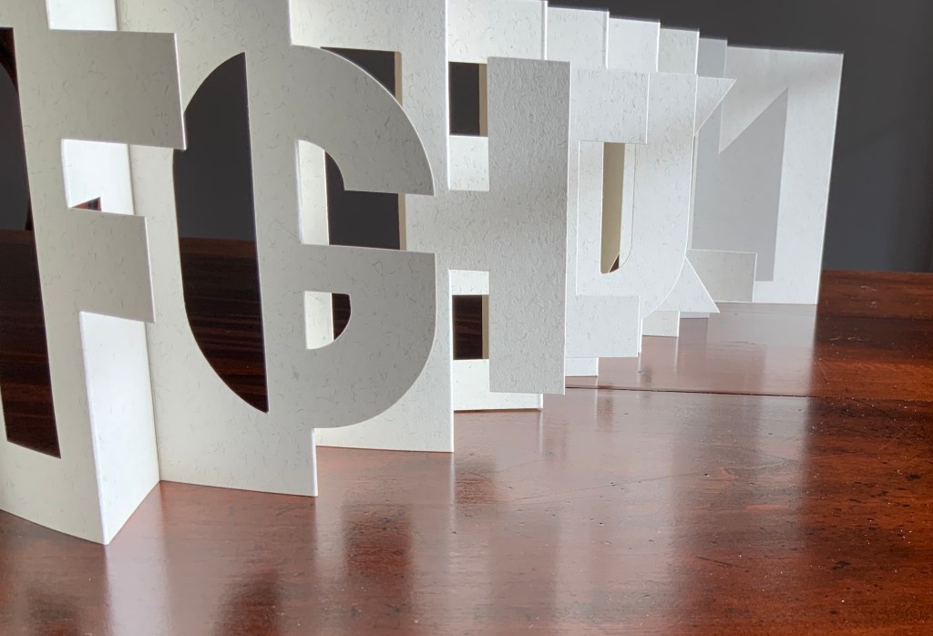
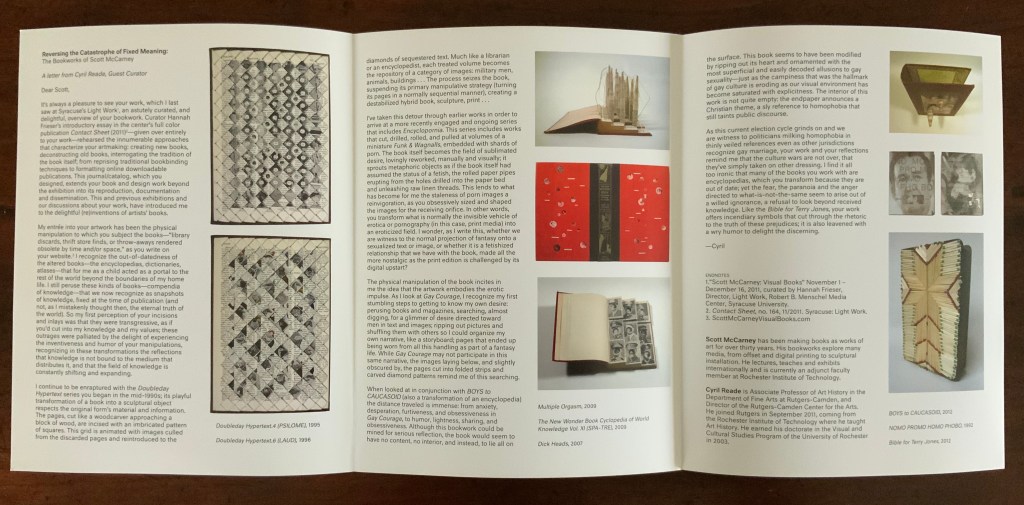
With their pages pivoting on their central posts, the segments can sometimes display wingspans, nudging forward an interpretation of Verba volent, scripta manent that a writing system’s shapes permanently out-soar sounds on the air.

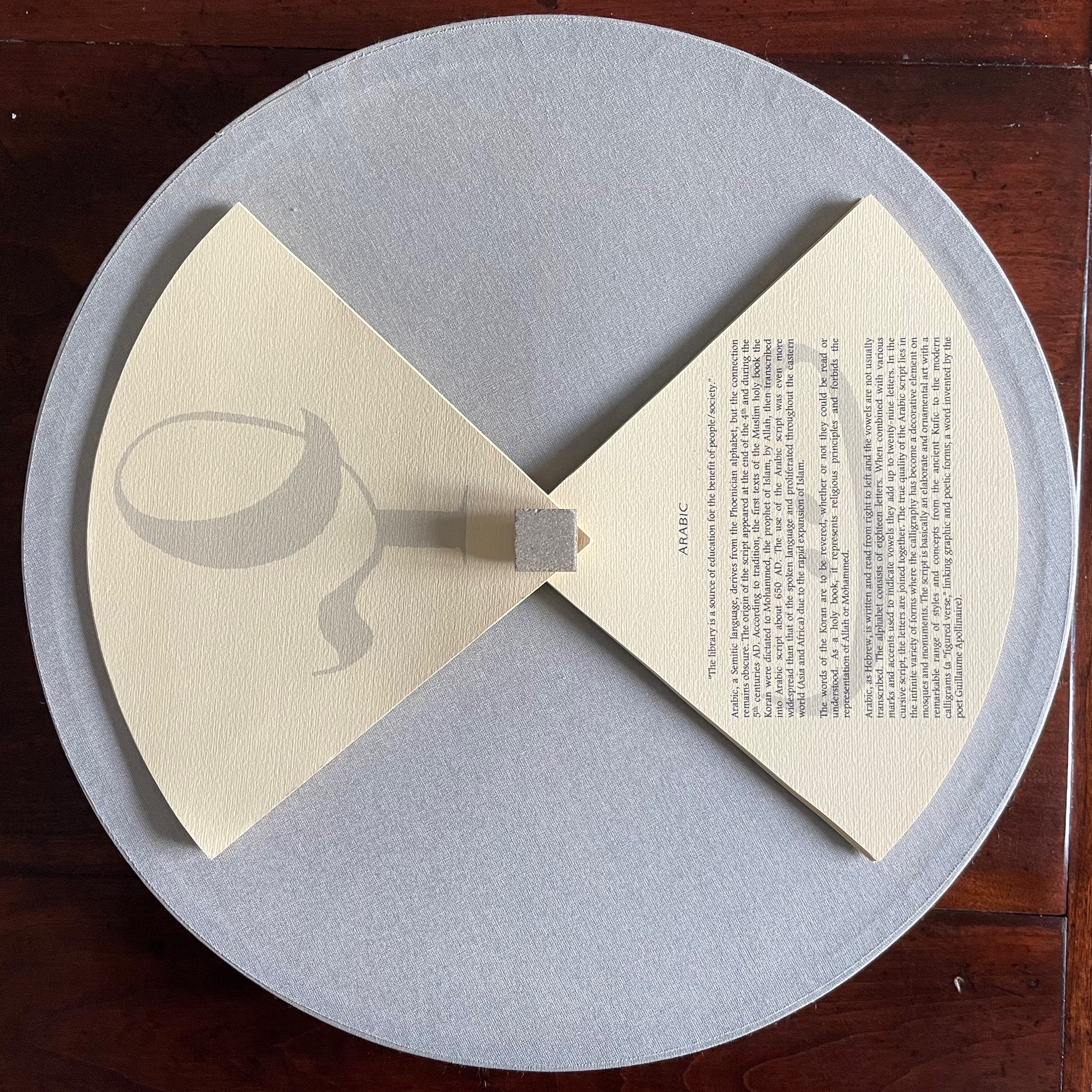
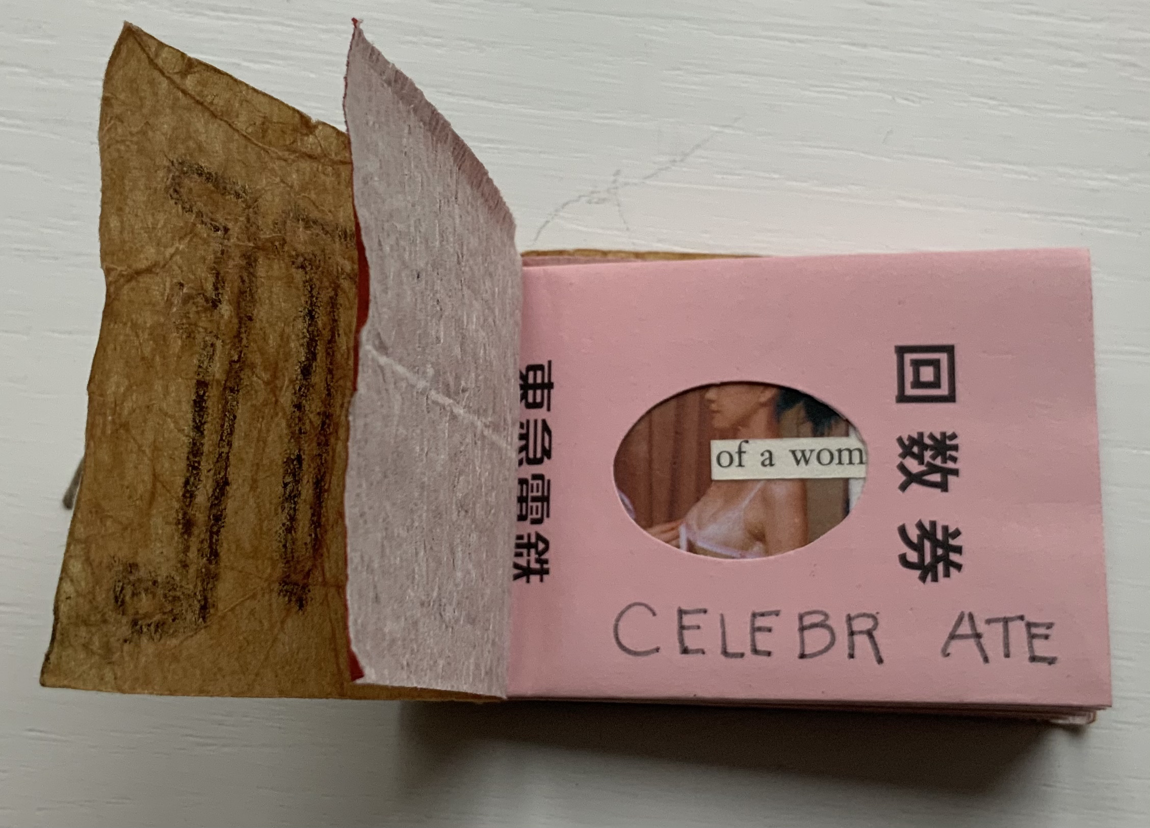
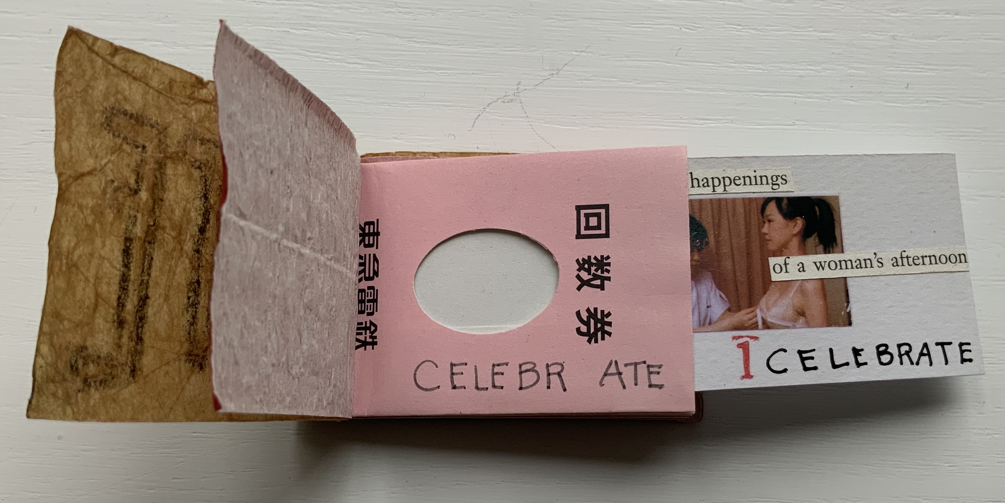
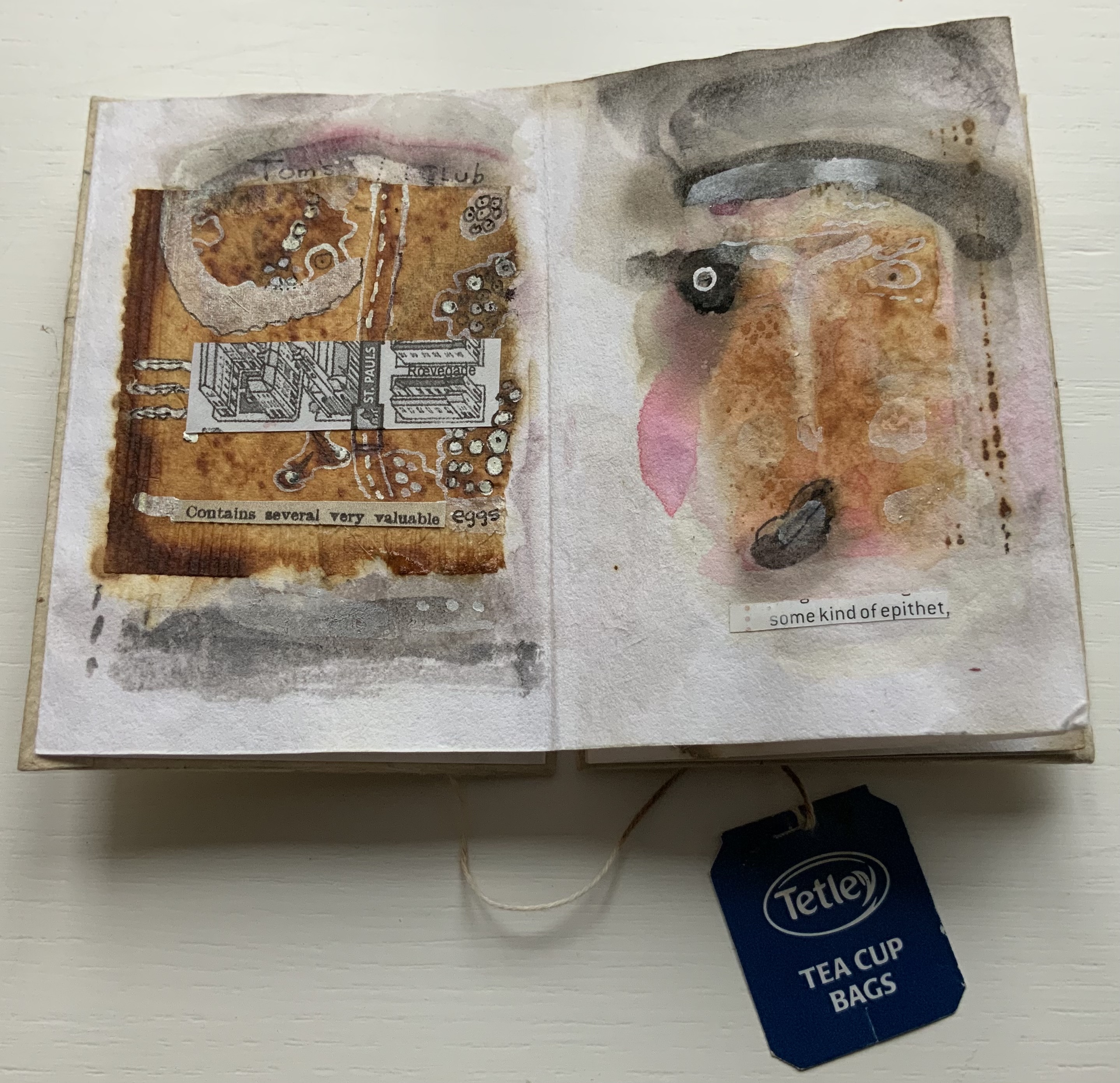
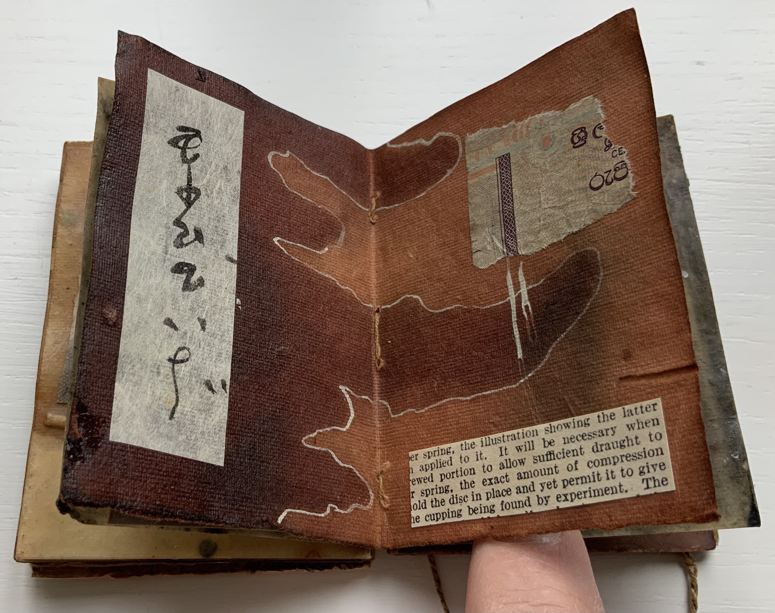
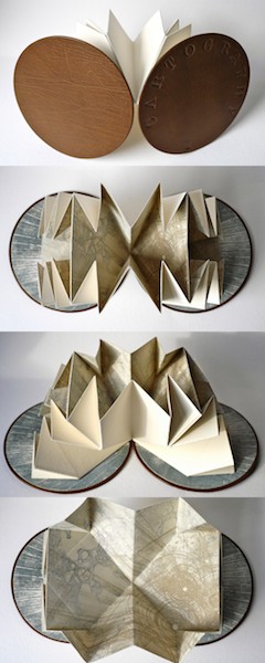
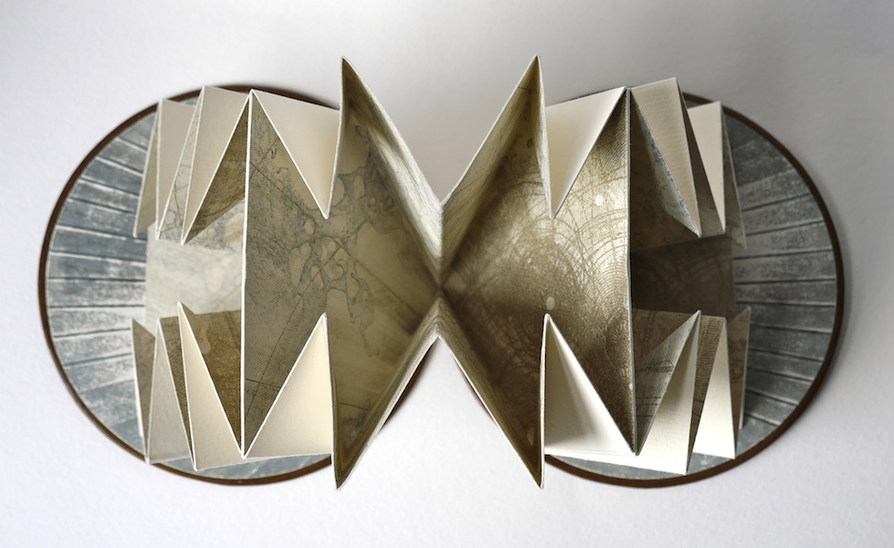
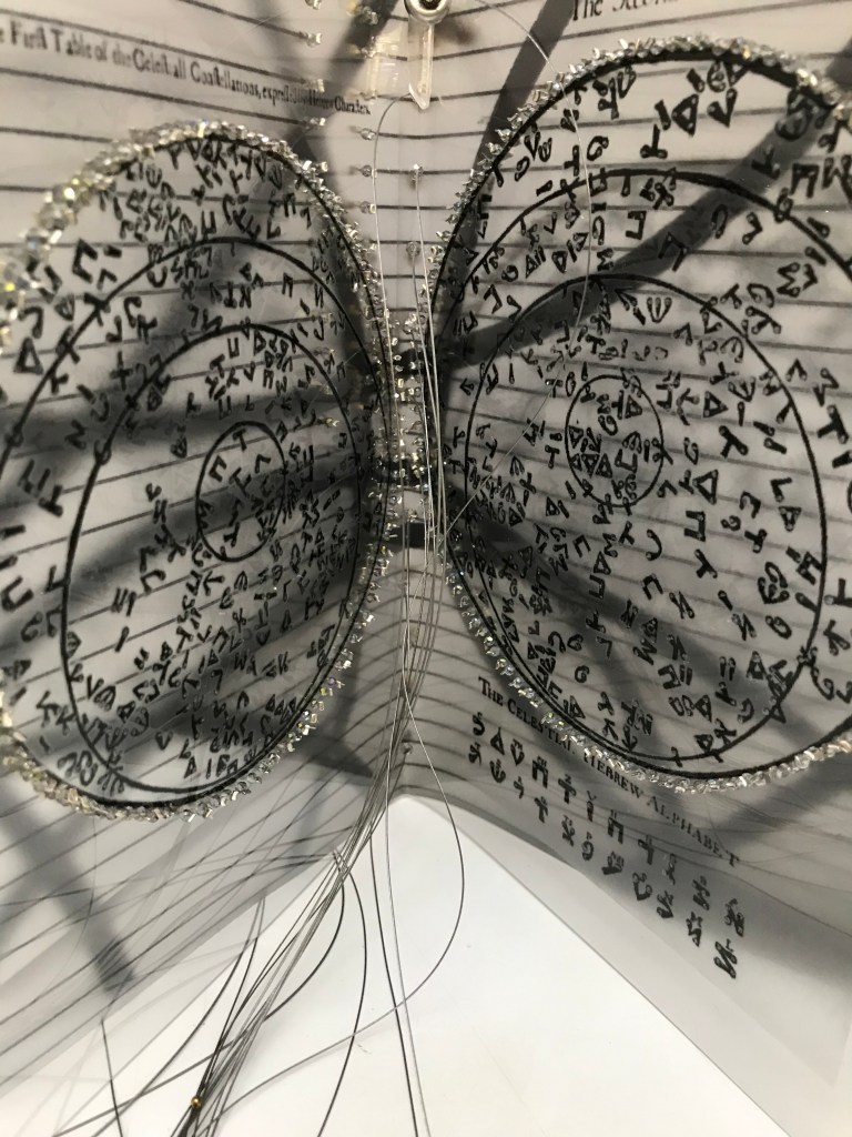
Segment open to Chinese page on the left, Arabic page on the right.
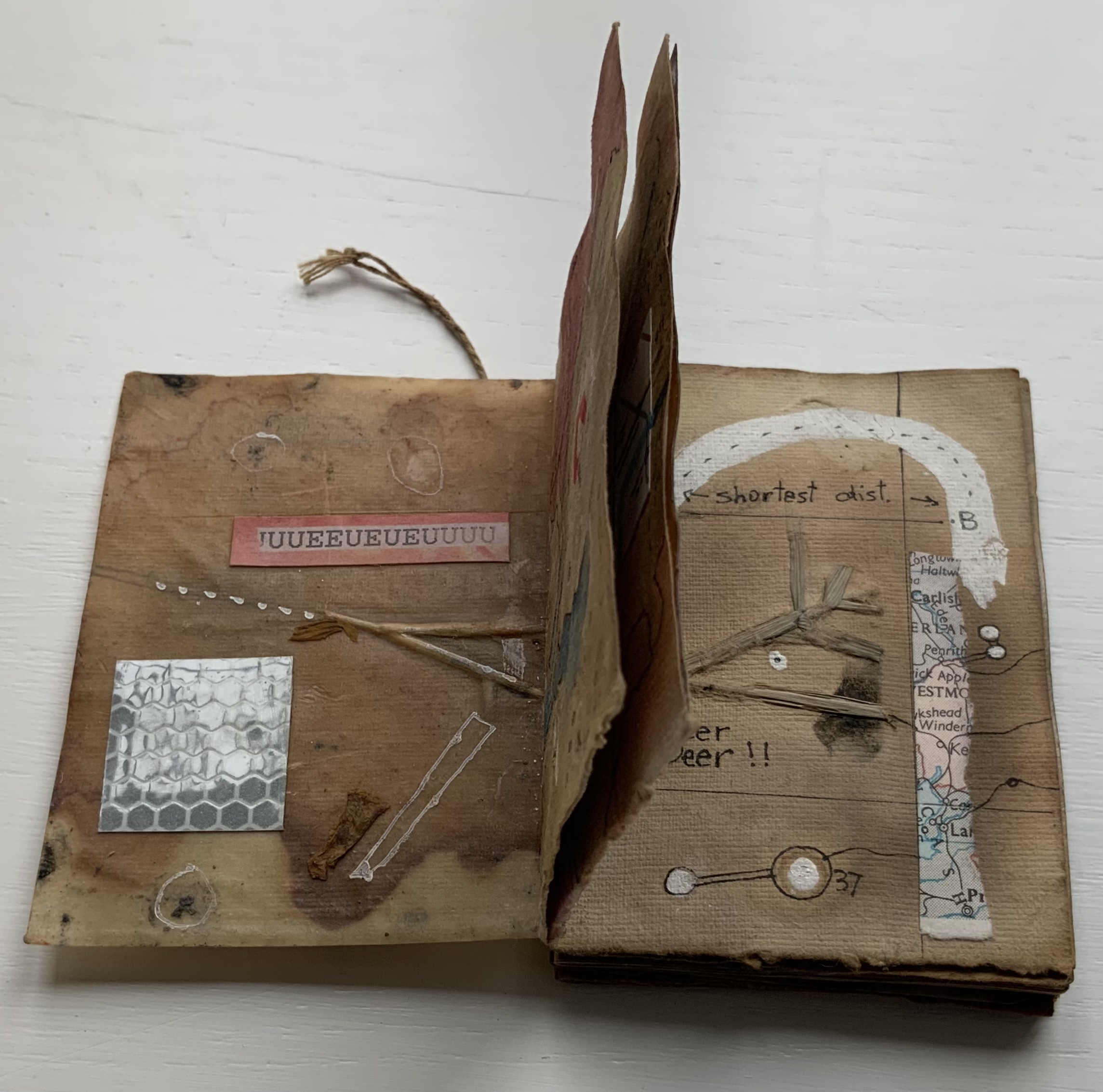
Fully opened, the segments evoke the Phaistos Disc, resident in the Archaeological Museum of Heraklion on Crete. Dating sometime between 1850 B.C. and 1600 B.C, the disc remains undeciphered, hovers indeterminately among statuses of hieroglyph, syllabary and alphabet and is still subject to speculation about its source — Linear A or Linear B.


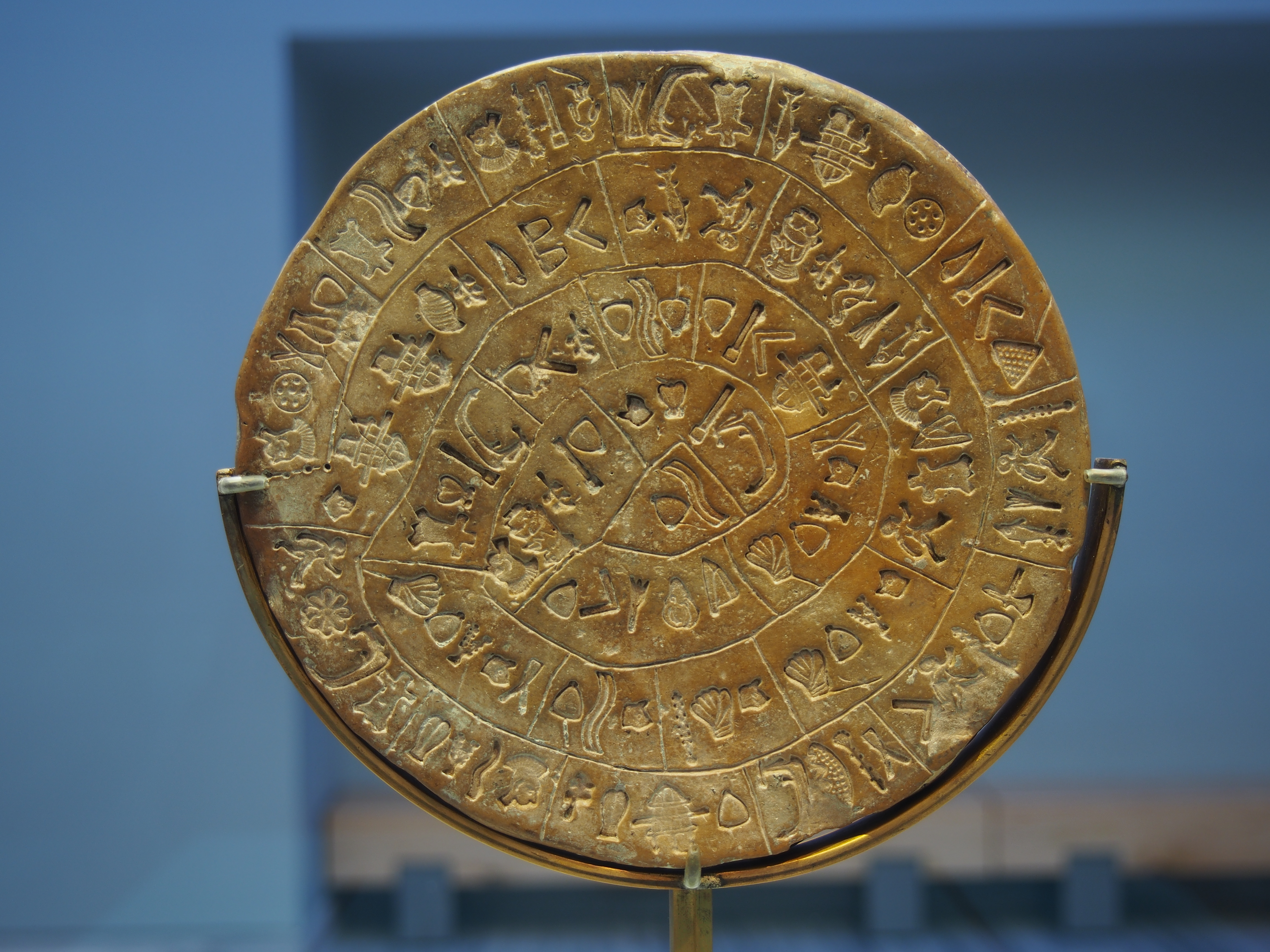
Phaistos disc, sides A and B after the 2014 renovation. Photos by C. Messier – Own work, CC BY-SA 4.0.
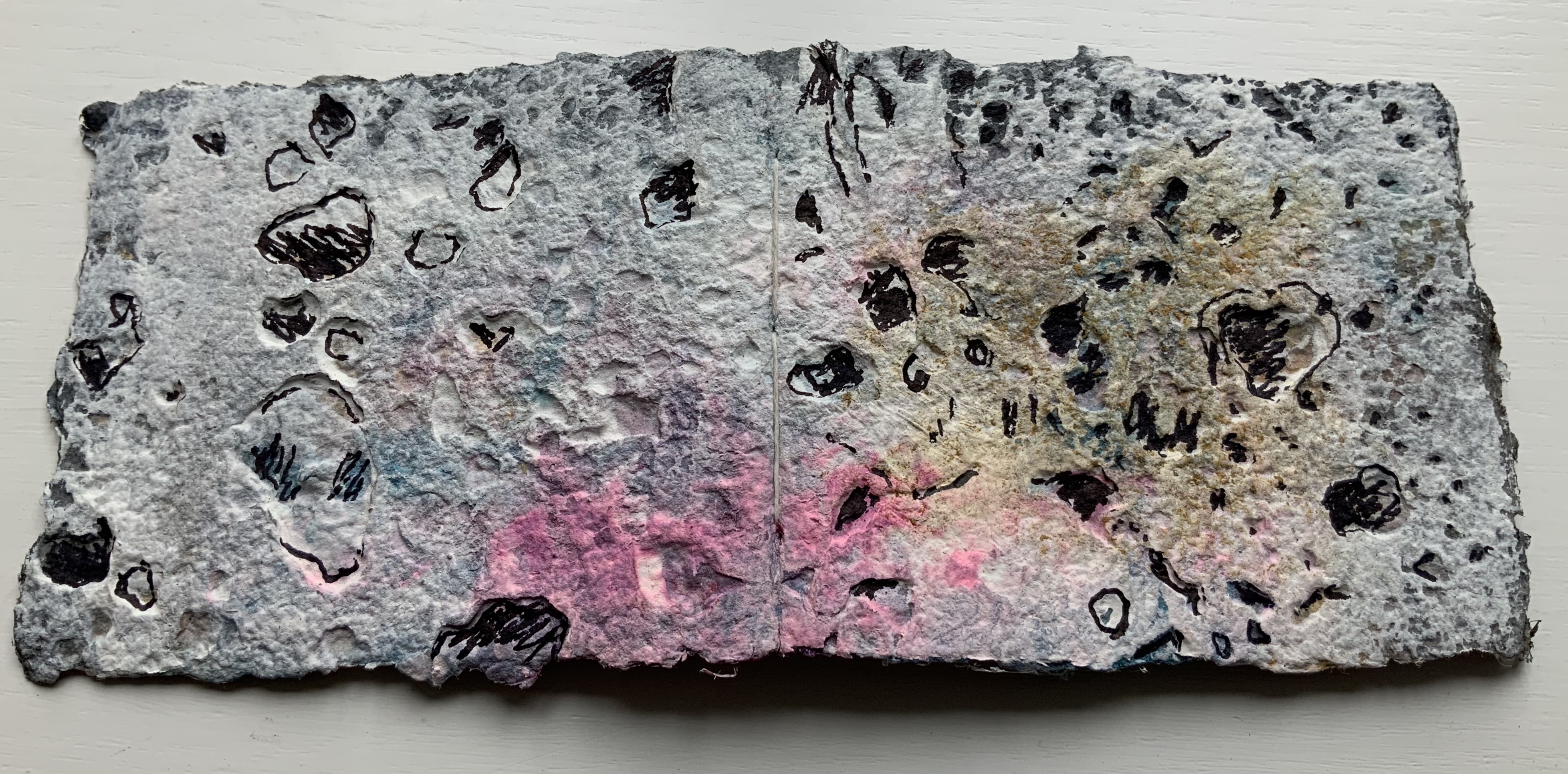
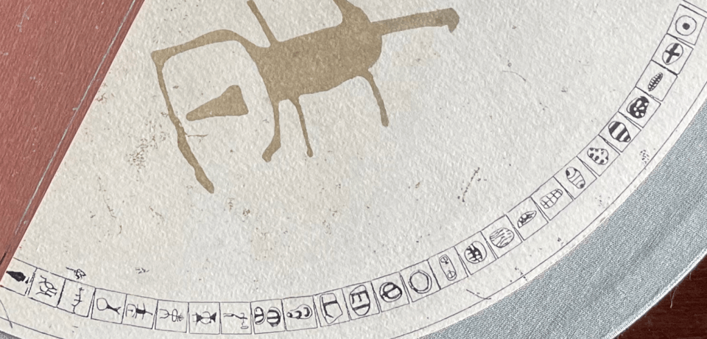
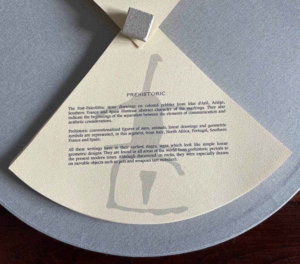
Drawing on pebble and cave art images from France and Spain created as long as 36,000 years ago, Alphabook reaches back further than the Phaistos Disc. The depicted shapes along the rim of the Prehistoric segment mark the millennia-long trail to the formation of any writing system, alphabetic or non-alphabetic.


Sequoya’s Cherokee syllabary is the youngest of the eleven marking and writing systems that Alphabook covers, a distinction that made this particular version of the limited variable edition attractive. In the Books On Books Collection, works of book art such as Gerald Lange’s The Neolithic Adventures of Taffi-Mai Metallu-Mai (1997), Cari Ferraro’s The First Writing (2004) and Helen Malone’s Alphabetic Codes (2005) among others address the origin period, but besides James Rumford’s children’s book Sequoyah (2004), no others address this remarkable single-handed creation of the Cherokee script.

Opportunities for book art inspired by newly invented alphabets and syllabaries or even by endangered languages abound. There is the Odùduwà alphabet (for the Yorùbá people) and ADLaM (for the Fulani language) as well as the syllabary that “comes with” its own artist: Frederic Bruly Bouabré and his syllabary for the Bété language (Ivory Coast). The Endangered Languages Project and Endangered Alphabets Project can both offer inspiration. In fact, the latter sparked Sam Winston’s One and Everything (2023), now part of the collection.
The Hebrew Alphabet Expressing the Celestial Constellations (2017)
The concept of the celestial alphabet is simple: the forms of the letters are supposedly derived from observation of configurations of stars in the heavens which can be ‘read’ as a form of sacred writing. These alphabets are visually recognizable by the use of nodal points to indicate the stars at the intersection of the bars or lines in their forms, the empty spots in the ink lines signalling the bright point of light in the dark sky. — Johanna Drucker, The Alphabetic Labyrinth, p. 125.
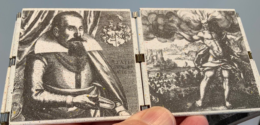
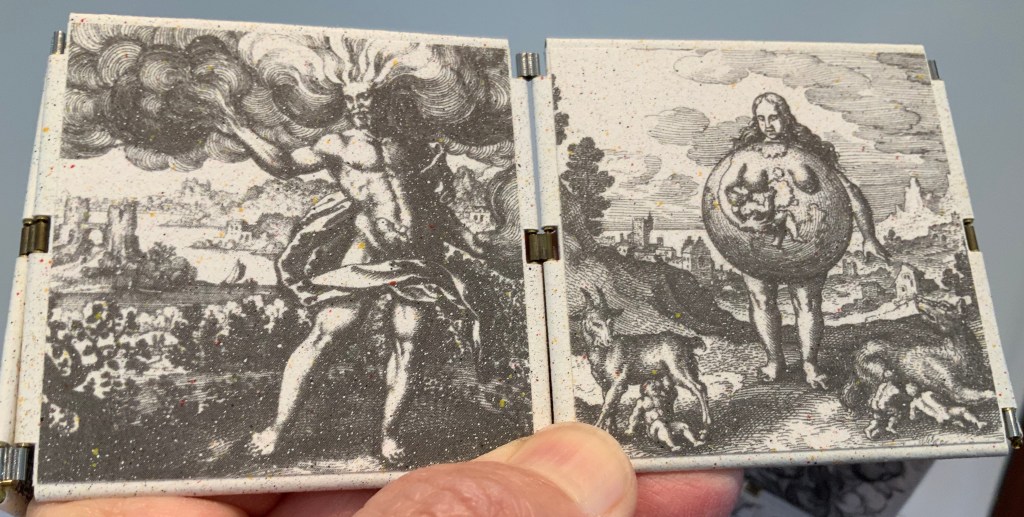
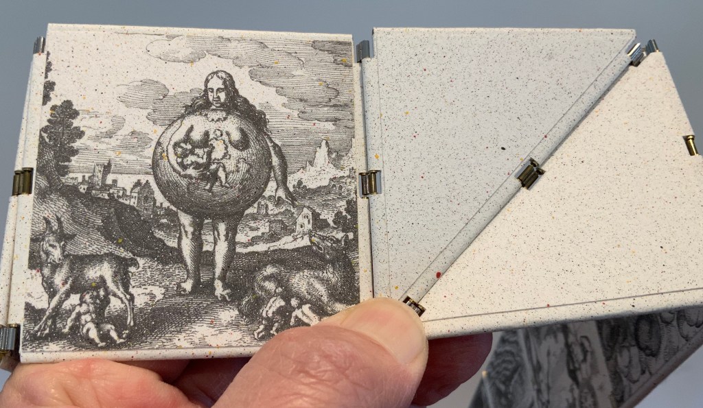
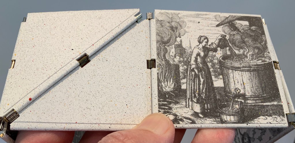
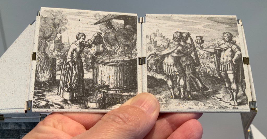
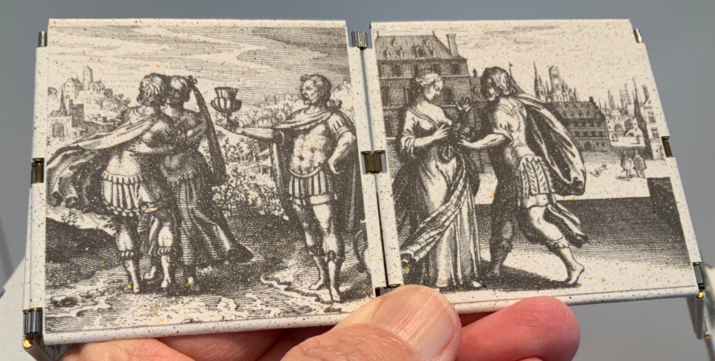
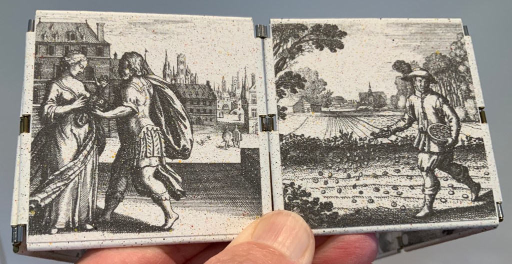
A volume in New York’s Morgan Library by Jacques Gaffarel (1601–1681), a French scholar and astrologer, provides inspiration and material for Satin’s artist’s book The Hebrew Alphabet Expressing the Celestial Constellations (2017). More precisely, two woodcuts from the 1650 English translation of Gaffarel’s Curiositez inouyes sur la sculpture talismanique des Persans, horoscope des Patriarches et lecture des estoiles (1629) are the source.

Unheard-of Curiosities : Concerning the Talismanical Sculpture of the Persians, the Horoscope of the Patriarkes, and the Reading of the Stars (1650)
Jacques Gaffarel

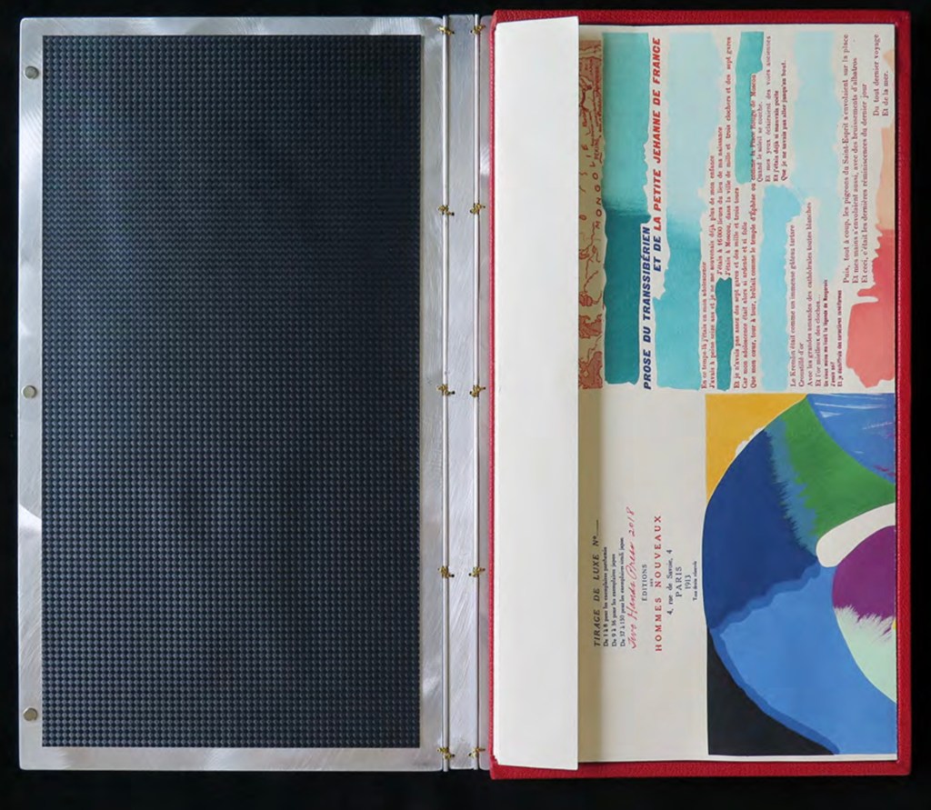
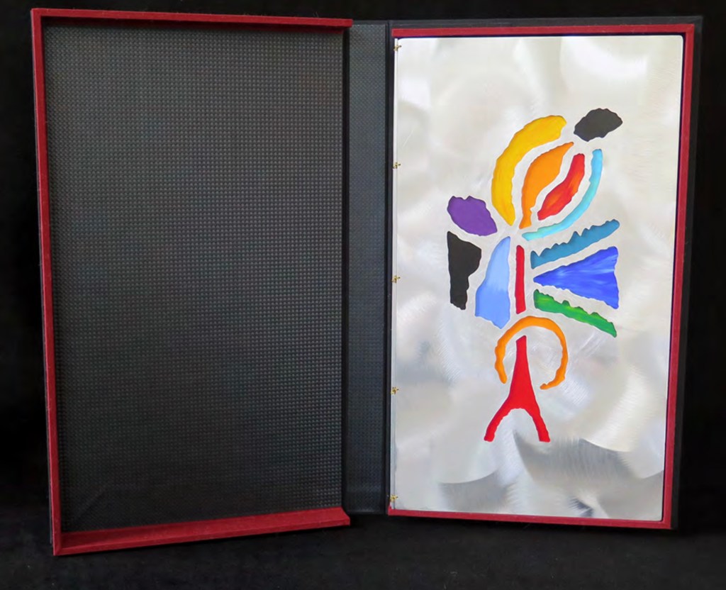
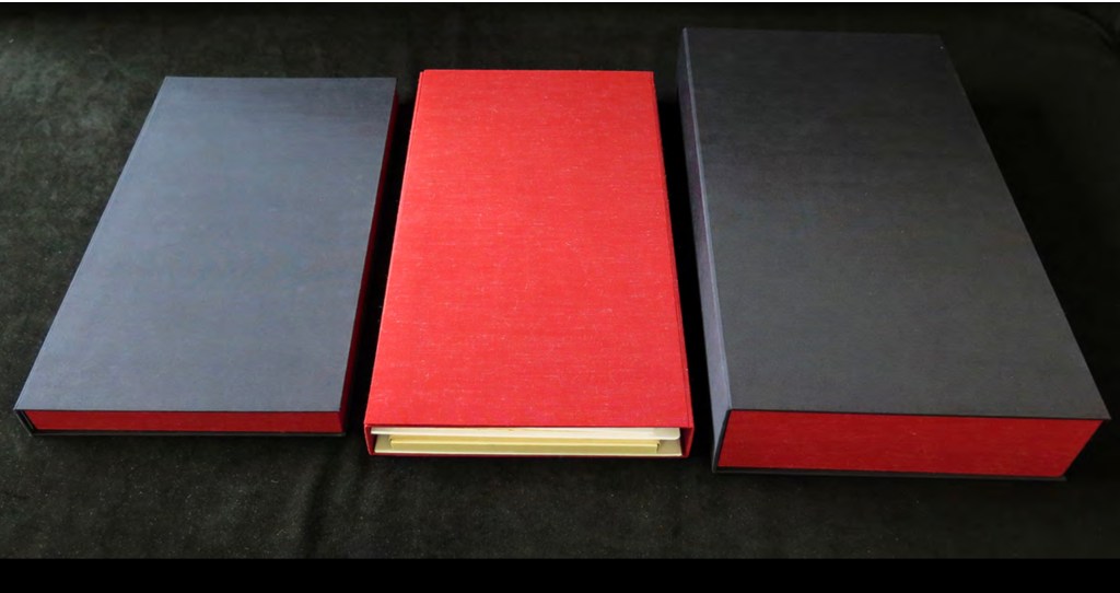
The Hebrew Alphabet Expressing the Celestial Constellations (2017)
Claire Jeanine Satin
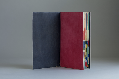
Saddle stitched with fishline. Box: H277 x W225 mm. Book: H 240 x W165 x D42 mm. 16 pages. Unique edition. Acquired from the artist, 12 April 2023.
Photos: Books On Books Collection. Displayed with permission of the artist.
In addition to its astrological character, Gaffarel’s work sits in the traditions of gematria, the Kabbalah and alchemy, which Satin conjures up with gold and silver beads, and crystals. Among the earlier contributors to these traditions is Heinrich Cornelius Agrippa. Like his mentor Johannes Trithemius, Agrippa was a polymath, occultist and theologian as well as physician, legal scholar and soldier. The Latinized Hebrew letters and their corresponding characters in the celestial alphabet seen below come from Agrippa’s De occulta philosophia (1533), which is more legible than Gaffarel’s above.
Henrici Cornelii Agrippae ab Nettesheym à consiliis & archiuis inditiarii sacrae Caesareae maiestatis De occulta philosophia libri tres (1533)
Heinrich Cornelius Agrippa von Nettesheim
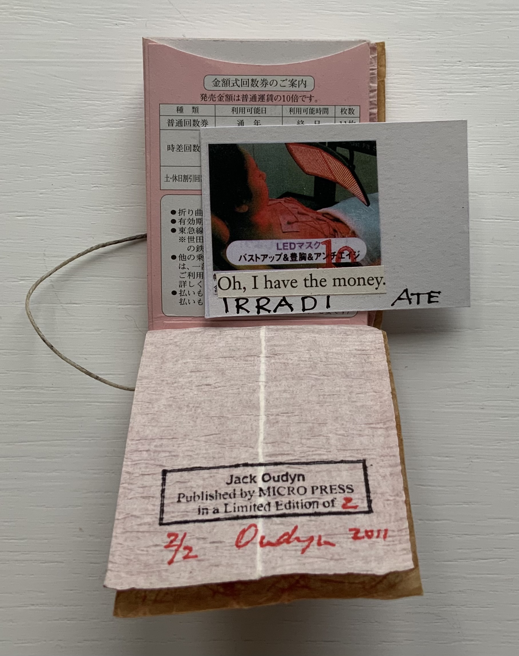
But there’s a much later inspirational source of esoterica at play elsewhere in the book and in the silver letter adhering to the black box that holds the book. The letter on the box is He, the fifth letter of the Hebrew alphabet, which according to Satin was chosen at random in homage to John Cage’s theory of chance and its role in music and creativity.
The rules printed on the acetate pages suggest a school composition book, an ordered contrast to Cage’s indeterminacy. Or perhaps they are recurring lines of musical staves, and the beads clamped to the fish line are meant to suggest a chaos of errant musical notation. The alphabetic order projected on the heavens in earlier centuries is belied by the disorder of chance projected in later centuries.
With the transparency of the pages, with gold on one side of them and silver on the other, and with two distinct “projections”, Satin leaves us in suspense or a suspenseful state of simultaneity.

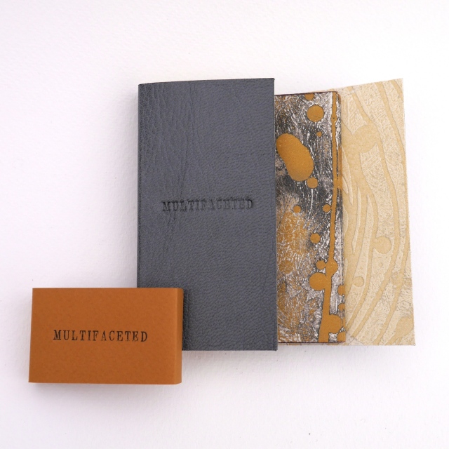
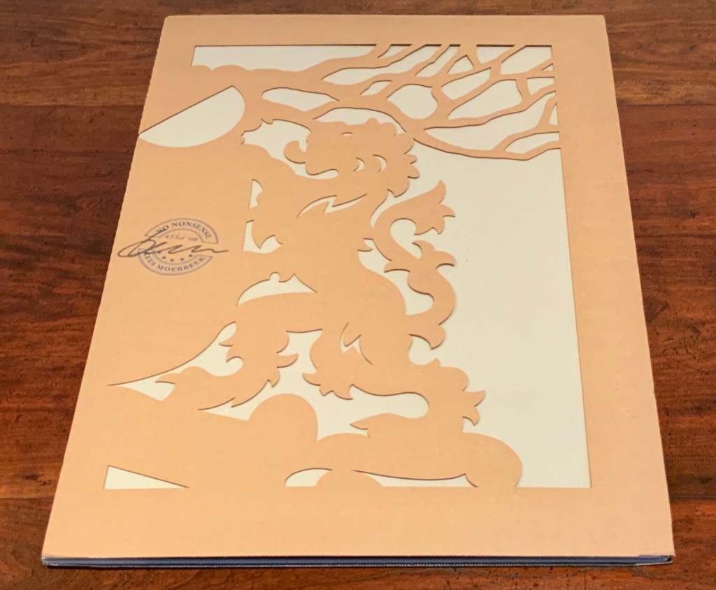
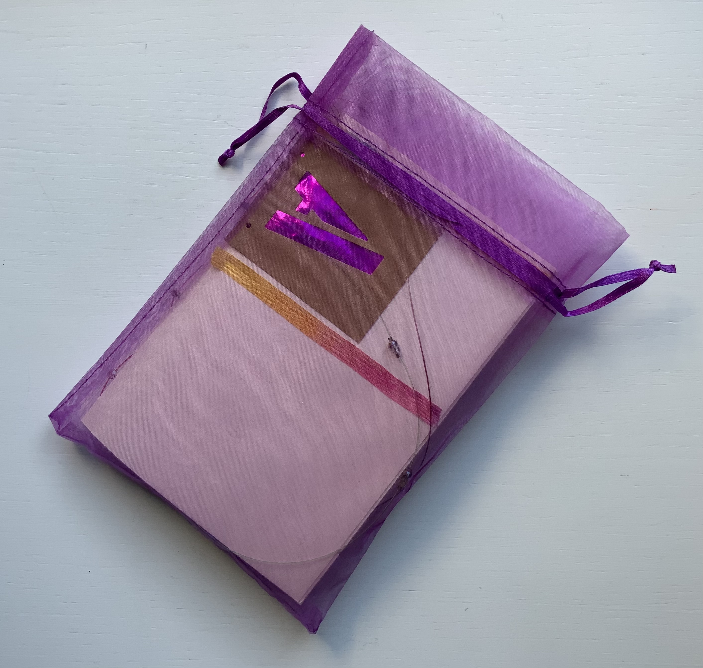
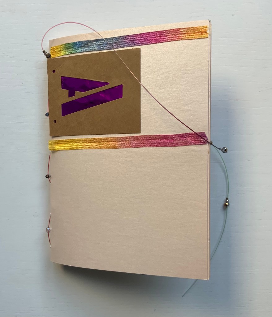
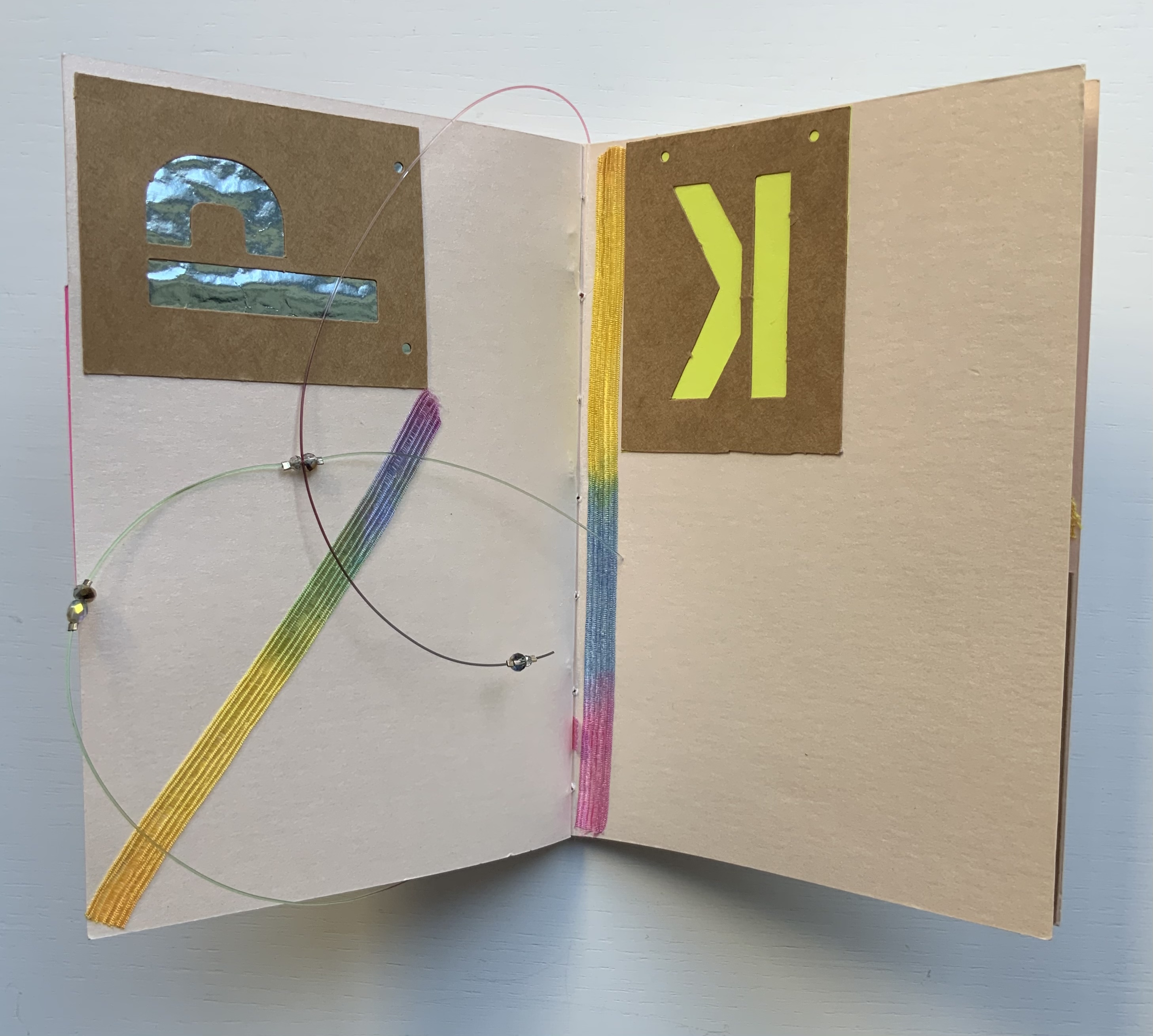
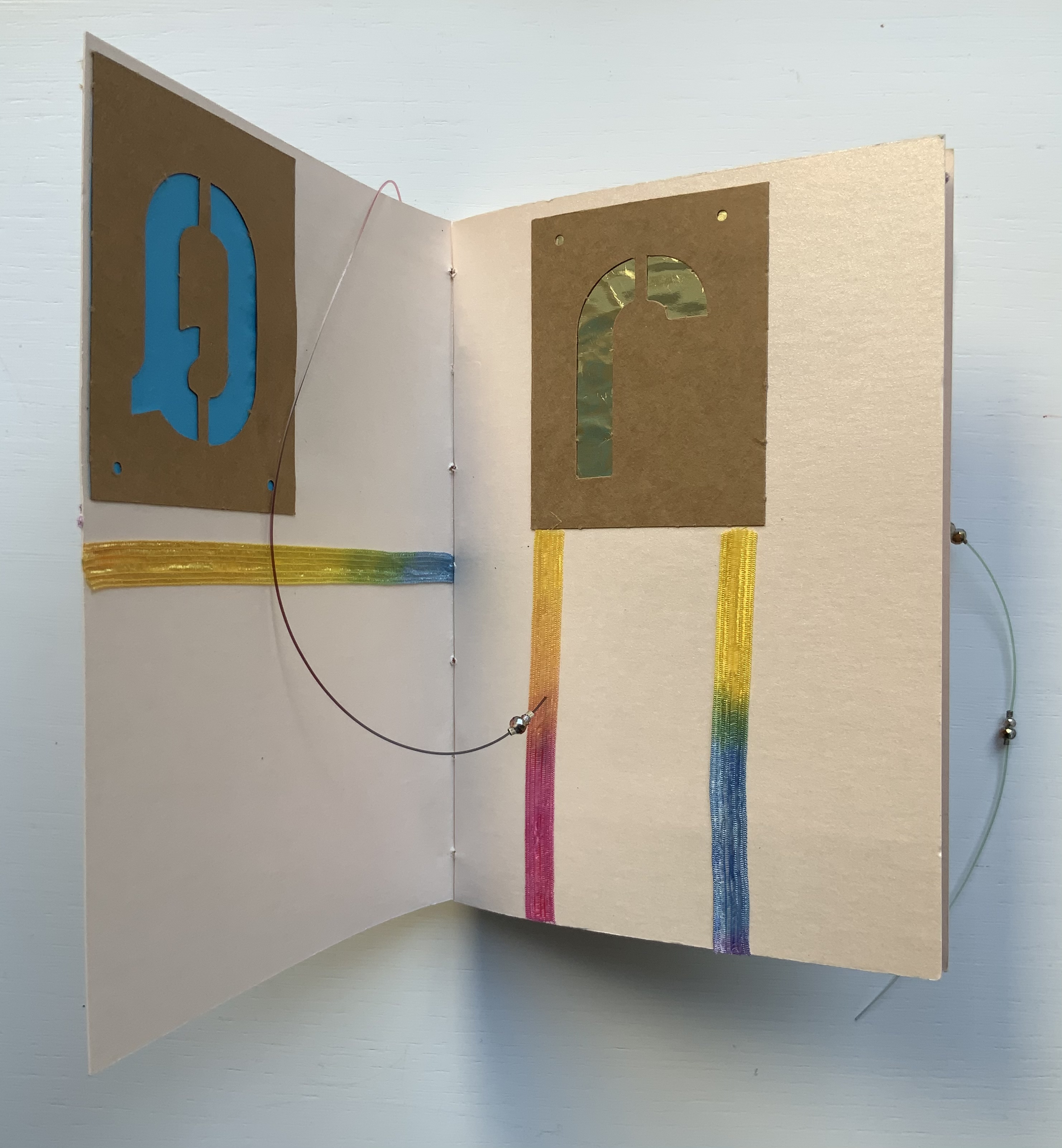
Alphabet Cordenons paper book (2020)
Alphabet Cordenons paper book (2020)
Claire Jeanine Satin
One of a series of unique works, each created with Cordenons paper, a fine paper that has been manufactured in Italy since 1630. This book uses alphabet letters, glittery strips of ribbon, sequins, crystals, and monofilament to create precise and inventive designs on the cover and each page. In a lavender cloth bag. Measures 9 x 7 inches. 10 unnumbered pages. Acquired from The Kelmscott Bookshop, 8 February 2021. Photos of the work: Books On Books Collection. Displayed with permission of the artist.

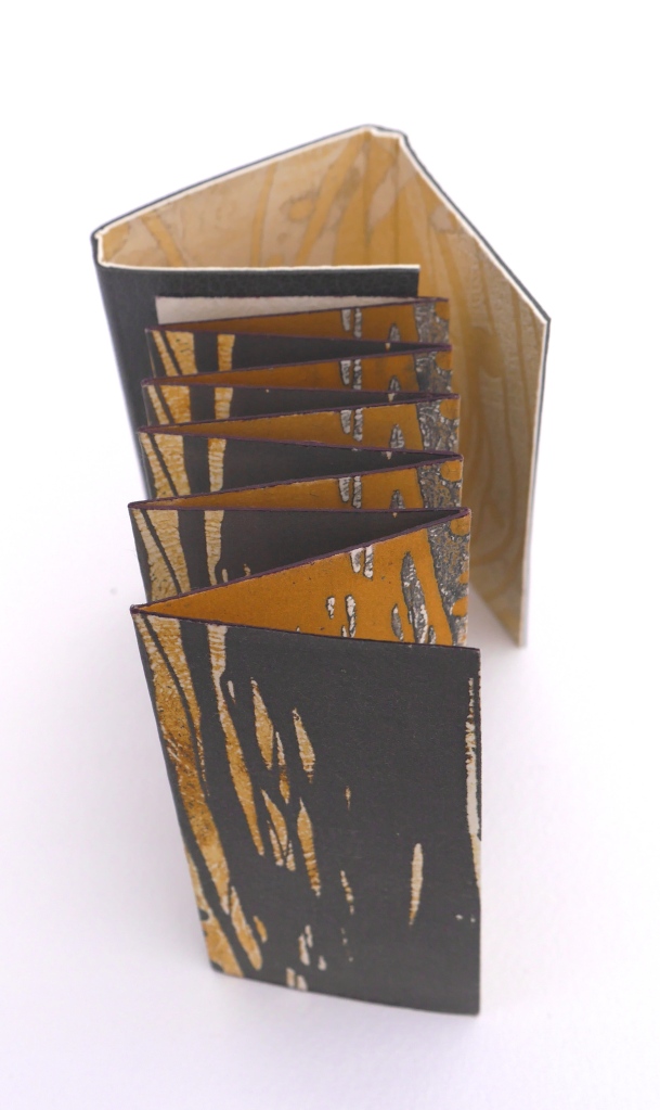
In Alphabet Cordenons, as the title suggests, the elemental meets the material. The ancient Greeks called the letters of the alphabet stoicheia (“elements”). In a sense, the elemental yields to the material. Not every letter of the alphabet appears in Alphabet Cordenons, and those that do, appear out of sequence, upside down, sideways, in varied colors and types of paper appearing through their cut stencil shapes. These aspects of materiality draw attention to the paper itself, which comes from a mill established in Corden0ns, Italy in 1630 and is still produced there.
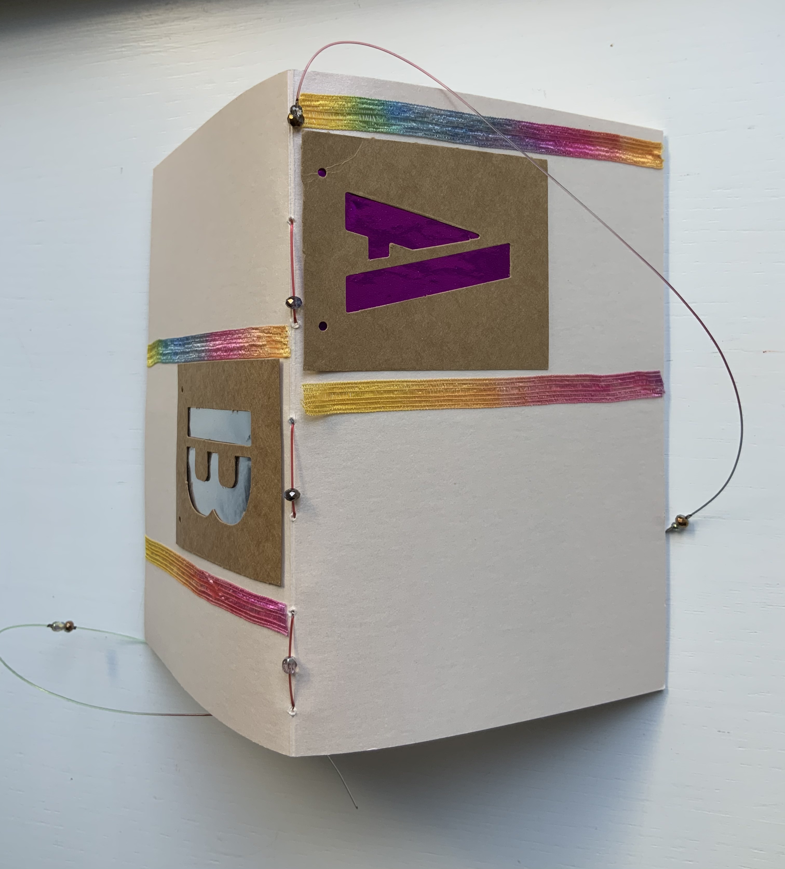
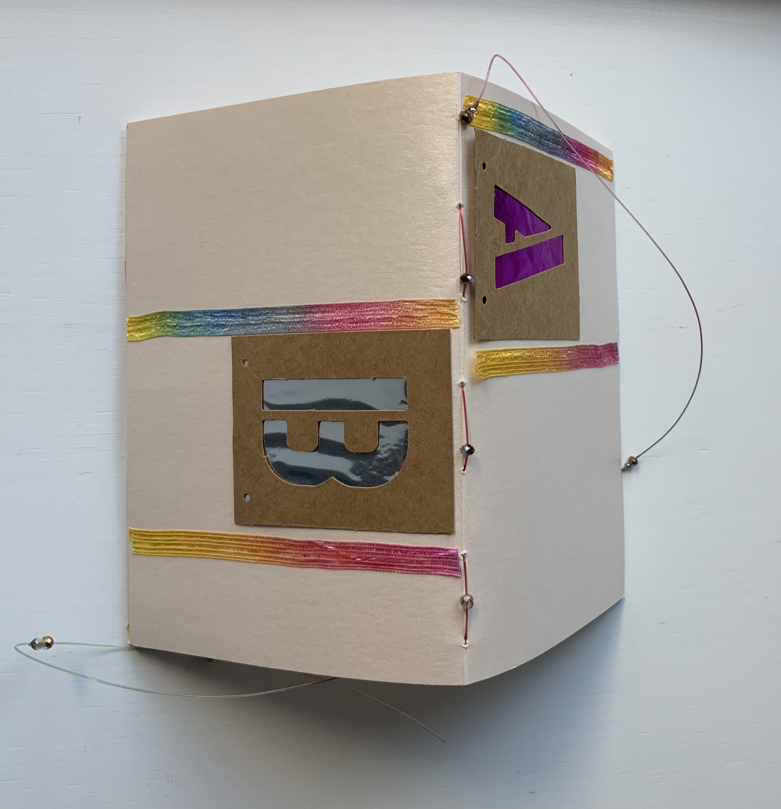
Also drawing attention to the paper are satin ribbon with graduated shifts of color, colored foil backing that lightens and darkens, and glittering beads threaded on multi-colored fish line. Each calls attention to the encaustic-like sheen that comes from the inclusion of mica in making Cordenons Stardream (285 gms) paper.
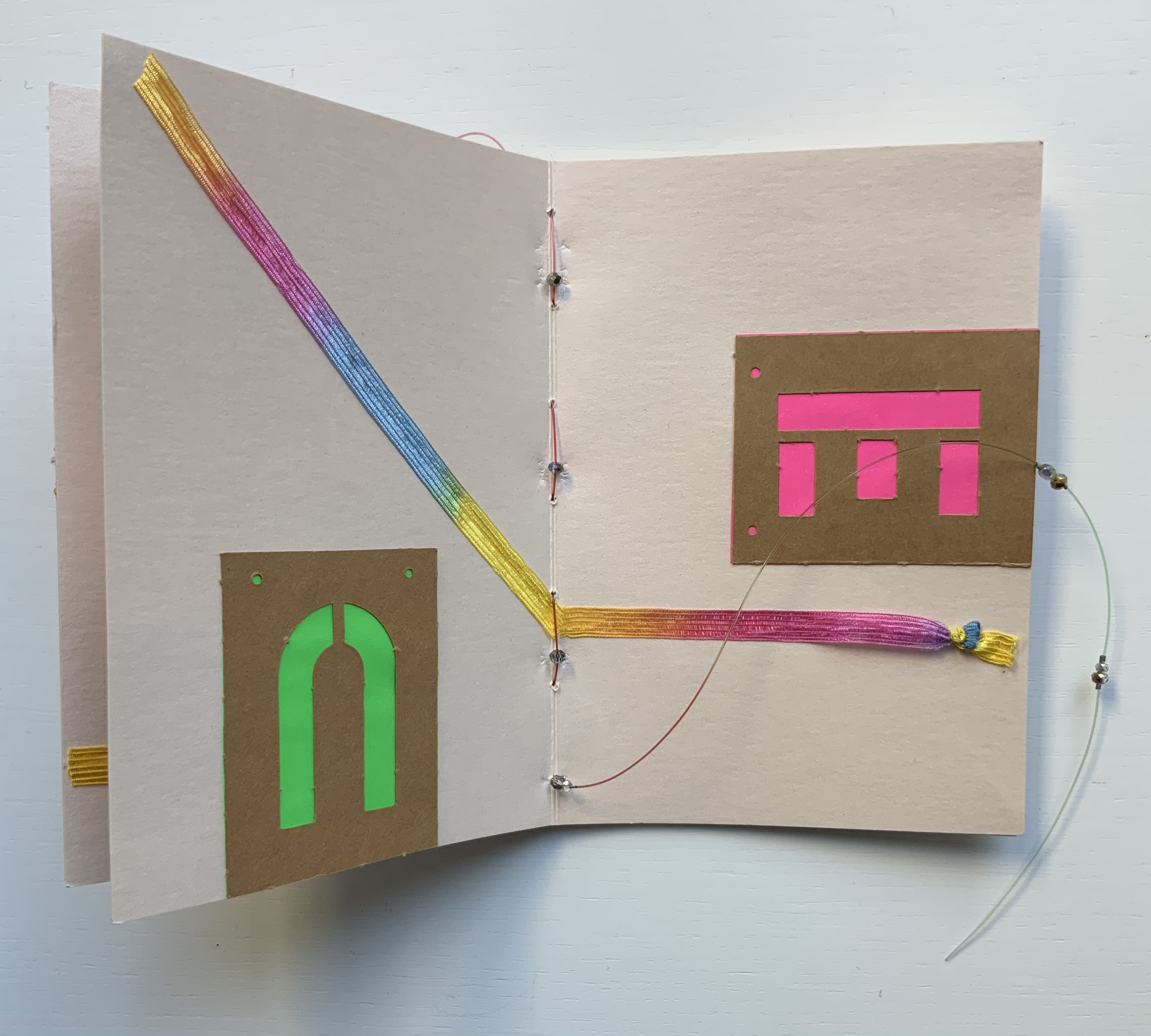
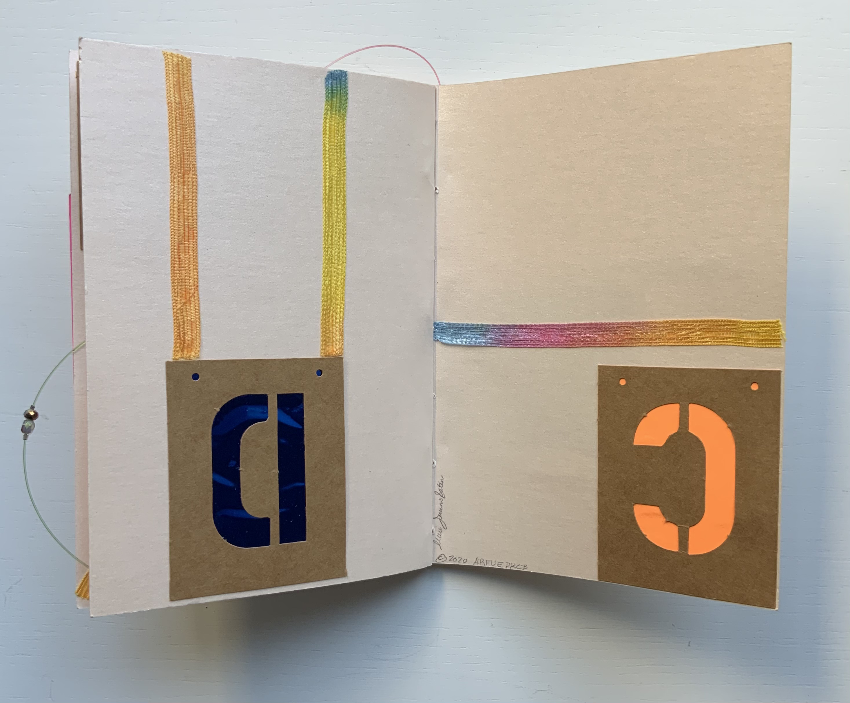
The finish’s indeterminacy under shifting light seems to find a mirror in the random order, selection and placement of the letters as well as the changing orientation of the ribbon.

Even more indeterminate is the fish line that flips about, curls within, and slips without the turning pages. But while materiality seems to outshine the elemental at every turn, the elemental reasserts itself in the peculiar orientation of the letters and the incompleteness of the alphabet.
Further Reading and Viewing
“Abecedaries I (in progress)“. Books On Books Collection.
“Lyn Davies“. 7 August 2022. Books On Books Collection. Reference and fine print.
“Timothy Donaldson“. 1 February 2023. Books On Books Collection. Reference.
“Cari Ferraro“. 1 February 2023. Books On Books Collection. Artist’s book.
“Edmund Fry“. Books On Books Collection. (For more on the “begats” of the celestial alphabet, see this entry for the near-facsimile copy of Fry’s Pantographia.)
“David J. Goldman“. Books On Books Collection. Reference. [In progress]
“Rudyard Kipling and Chloë Cheese“. 15 February 2023. Books On Books Collection. Illustrated children’s book.
“Abe Kuipers“. 15 February 2023. Books On Books Collection. Artist’s book.
“Gerald Lange“. Books On Books Collection. Artist’s . [In progress]
“Helen Malone“. 23 July 2020. Books On Books Collection. Artist’s book.
“James Rumford. 21 November 2022. Books On Books Collection. Illustrated children’s book.
“Tiphaine Samoyault“. Books On Books Collection. Illustrated children’s book. [In progress]
“Ben Shahn“. 20 July 2022. Books On Books Collection. Artist’s book.
“Tommy Thompson“. 21 August 2022. Books On Books Collection. Reference.
“Sam Winston“. Illustrated children’s book. [In progress]
Clodd, Edward. 1913. The Story of the Alphabet. London: Hodder and Stoughton. 1913. Superseded by several later works, but is freely available online with line illustrations and some black and white photos.
Diringer, David, and Reinhold Regensburger. 1968. The alphabet: a key to the history of mankind. London: Hutchinson. A standard, beginning to be challenged by late 20th and early 21st century archaeological findings and palaeographical studies.
Drucker, Johanna. 1999. The alphabetic labyrinth: the letters in history and imagination. New York, N.Y.: Thames and Hudson.
Drucker Johanna. 2022. Inventing the Alphabet : The Origins of Letters from Antiquity to the Present. Chicago: University of Chicago Press.
Dukes, Hunter. 10 October 2023. “Pantographia: A Specimen Book of All the Alphabets Known on Earth (1799)“. Public Domain Review.
Düsterhöft, Jan. 2022. “Foreword”. In Fry, Edmund. 1799. Pantographia, Containing accurate Copies of all the known Alphabets in the World. Turin, Ialy: Black Letter Press.
Ege, Otto. 1921/1998. The Story of the Alphabet, Its Evolution and Development… Embellished Typographically with Printer’s Flowers Arranged by Richard J. Hoffman. Van Nuys, CA: Richard J. Hoffman. A miniature. The type ornaments chosen by Hoffman are arranged chronologically by designer (Garamond, Granjon, Rogers) and printed in color.
Firmage, Richard A. 2001. The alphabet. London: Bloomsbury.
Fischer, Steven Roger. 2008. A history of writing. London: Reaktion Books.
Gannon, Megan. 10 April 2019. “Cave Markings Tell of Cherokee Life in the Years Before Indian Removal“. Smithsonian Magazine. Accessed 14 July 2023.
Goldman, David. 1994. A is for ox: the story of the alphabet. New York: Silver Moon Press. Children’s book.
Jackson, Donald. 1997. The story of writing. Monmouth, England: Calligraphy Centre.
Pflughaupt, Laurent. 2008. Letter by letter: an alphabetical miscellany. New York: Princeton Architectural Press.
Robb, Don, and Anne Smith. 2010. Ox, house, stick: the history of our alphabet. Watertown, MA: Charlesbridge. Children’s book.
Robinson, Andrew. 1995. The story of writing. London: Thames and Hudson.
Rosen, Michael. 2014. Alphabetical: how every letter tells a story. London: John Murray.
Sacks, David. 2003. Language visible unraveling the mystery of the alphabet from A to Z. New York: Broadway Books.
Samoyault, Tiphaine. 1996/1998 trans. Alphabetical order: how the alphabet began. New York: Viking. Children’s book.
Satin, Claire Jeanine. 1997. Claire Jeanine Satin : Artist Books: Verba Volent : Scripta Manent. New York: HarperCollins Exhibition Space.
Thompson, Tommy. 1952. The ABC of our alphabet. London: Studio Publications. Not a fine press publication, but its layout, illustrations and use of two colors bear comparison with the Davies book. It too is out of print and unfortunately more rare.
Vermeer, Beth. May 2016. “Claire Jeanine Satin and her research on Henry James”, Design of the Universe. Accessed 17 February 2020.