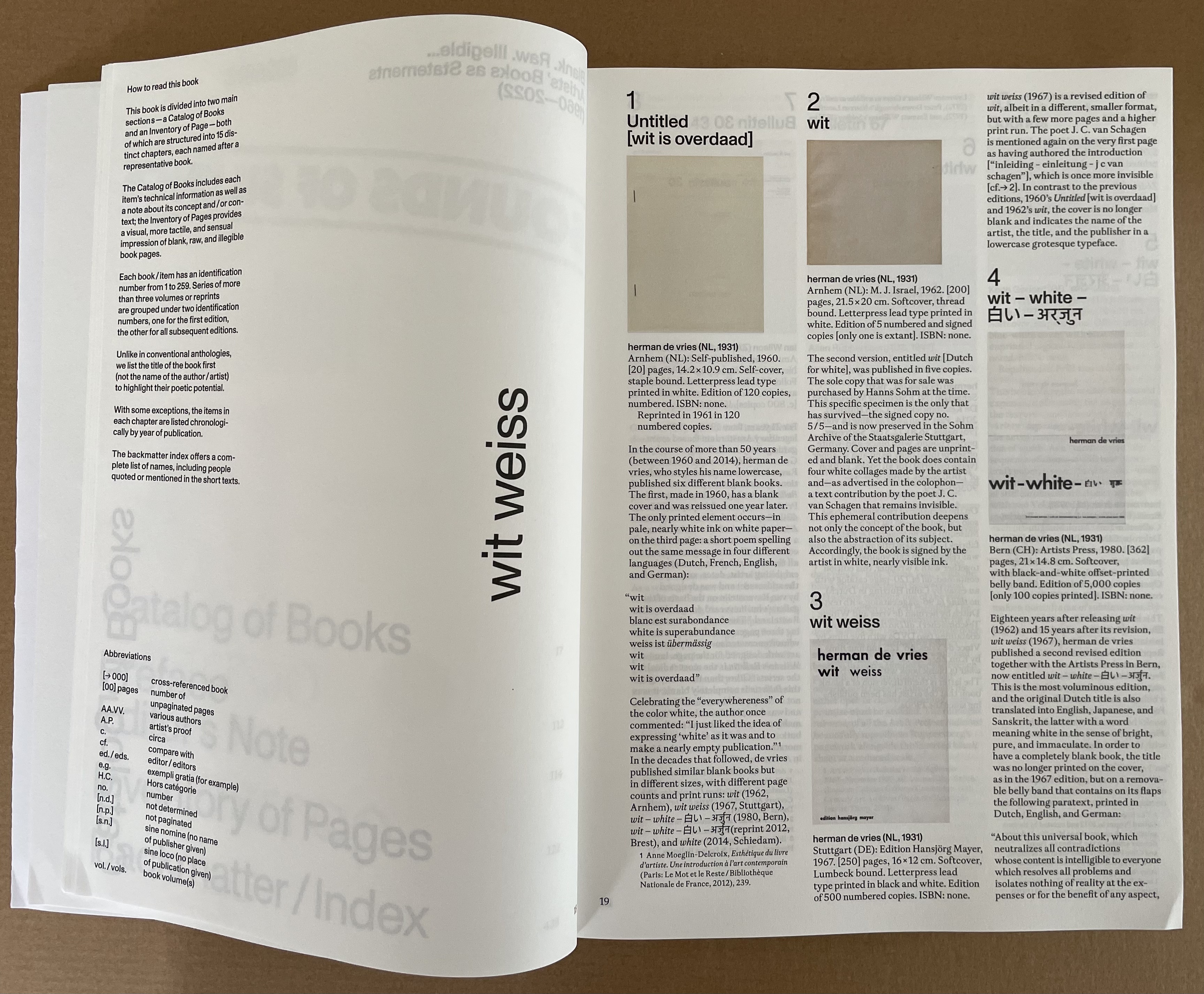
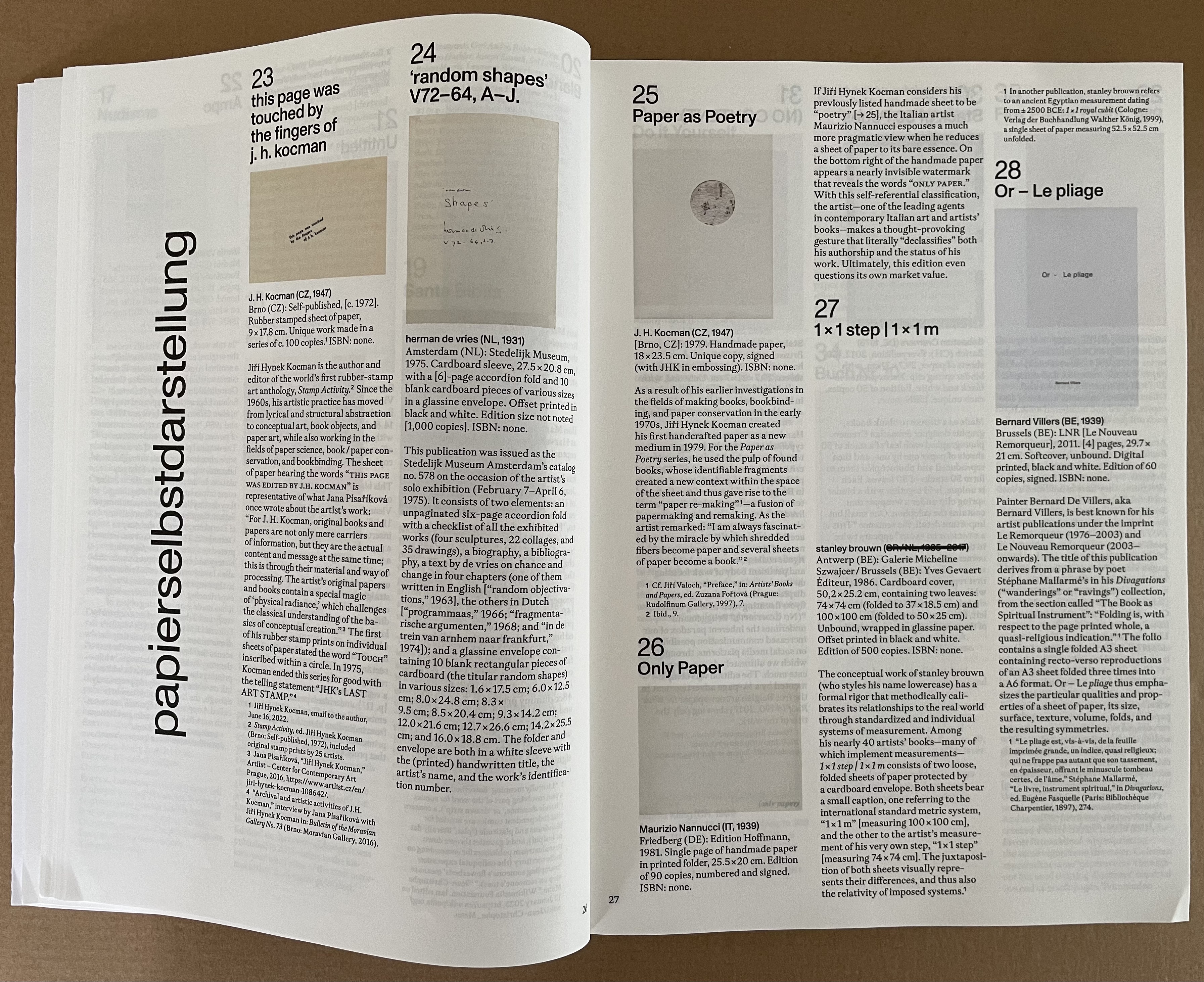
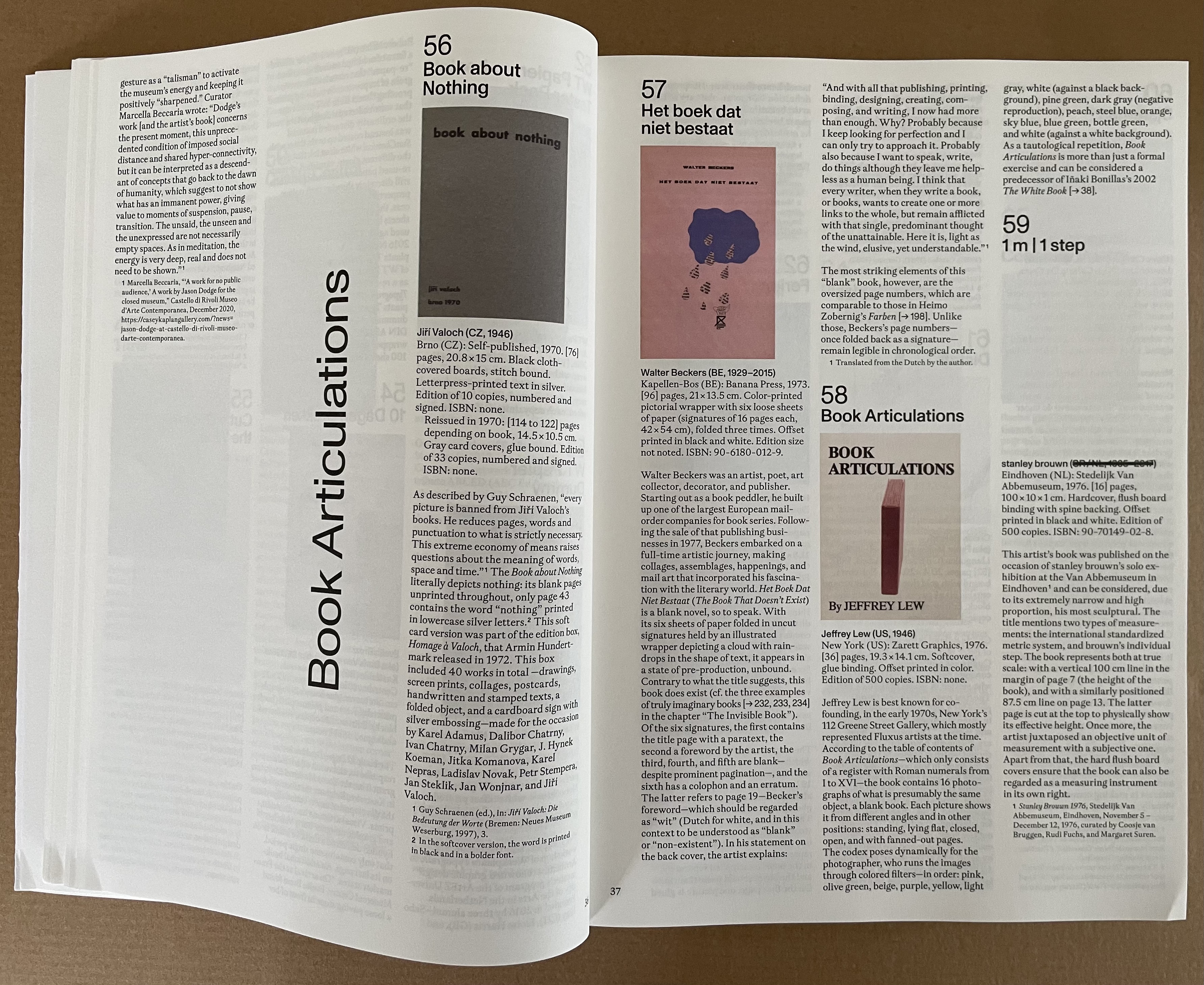
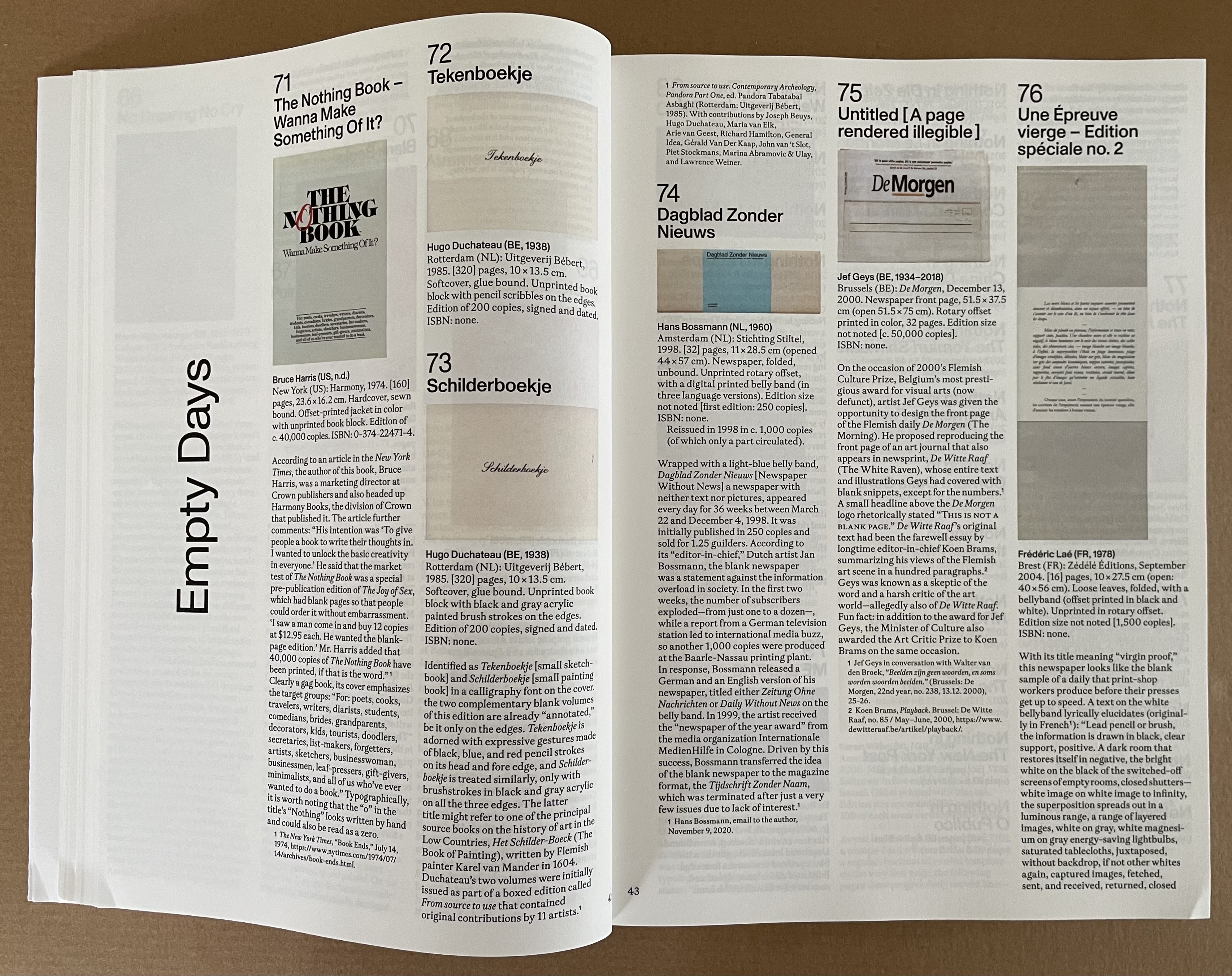
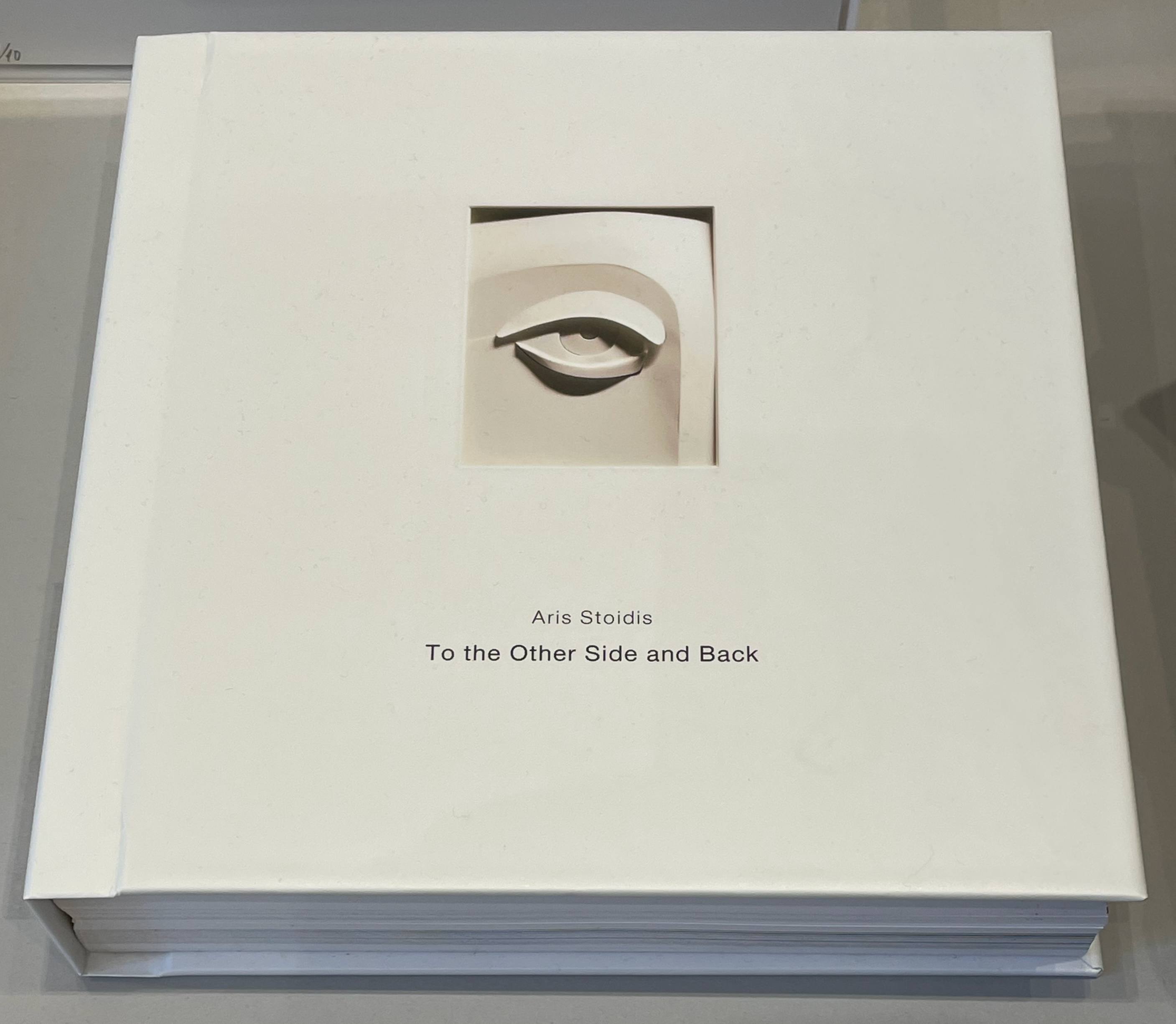
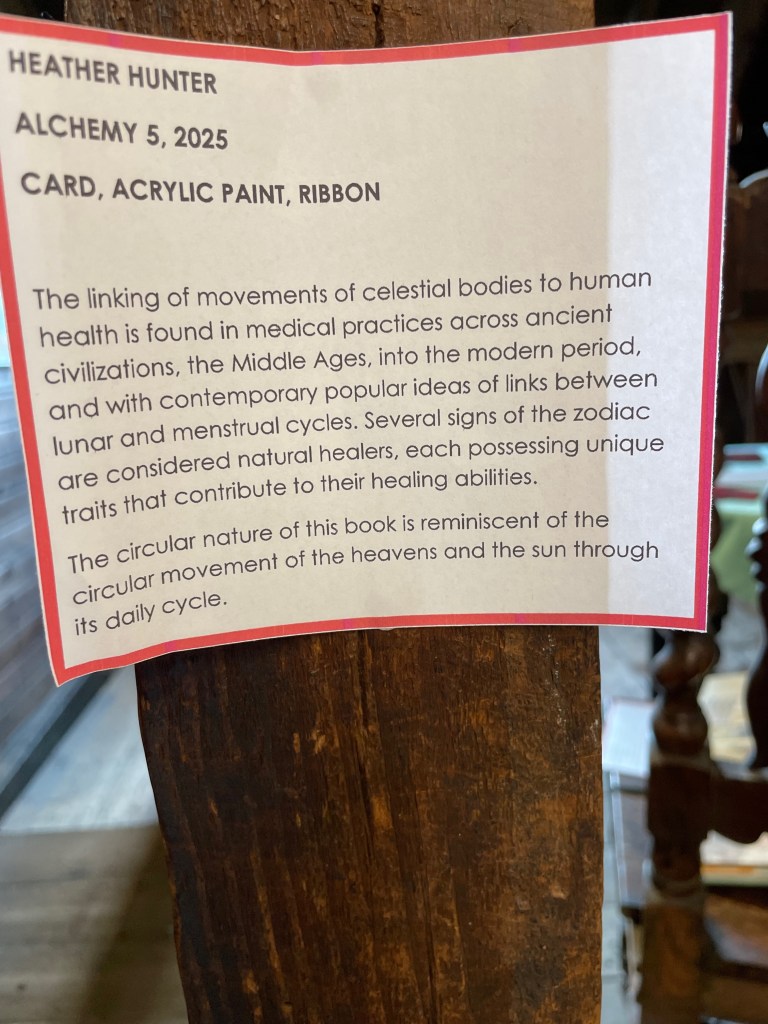
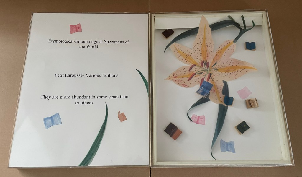
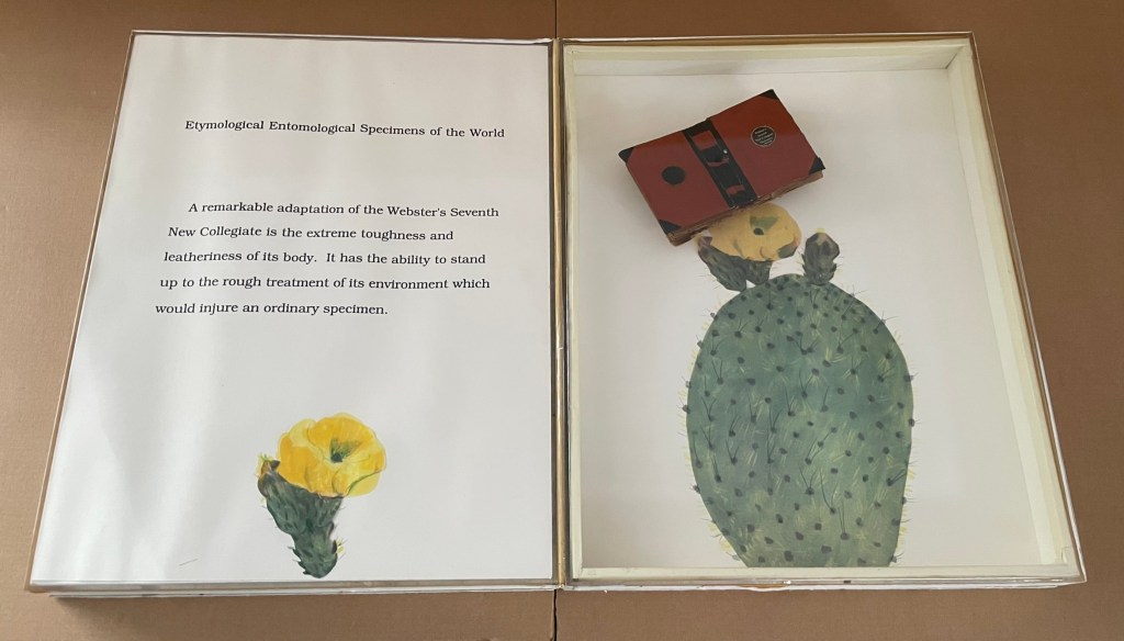
Silent Book, vol. 11
Silent Book, vol. 11 (2023)
Ryuta Iida
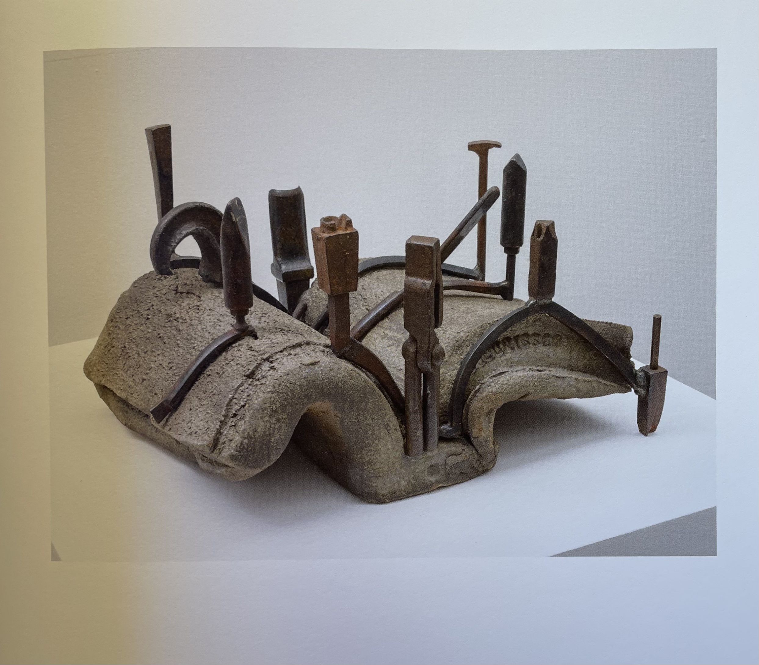
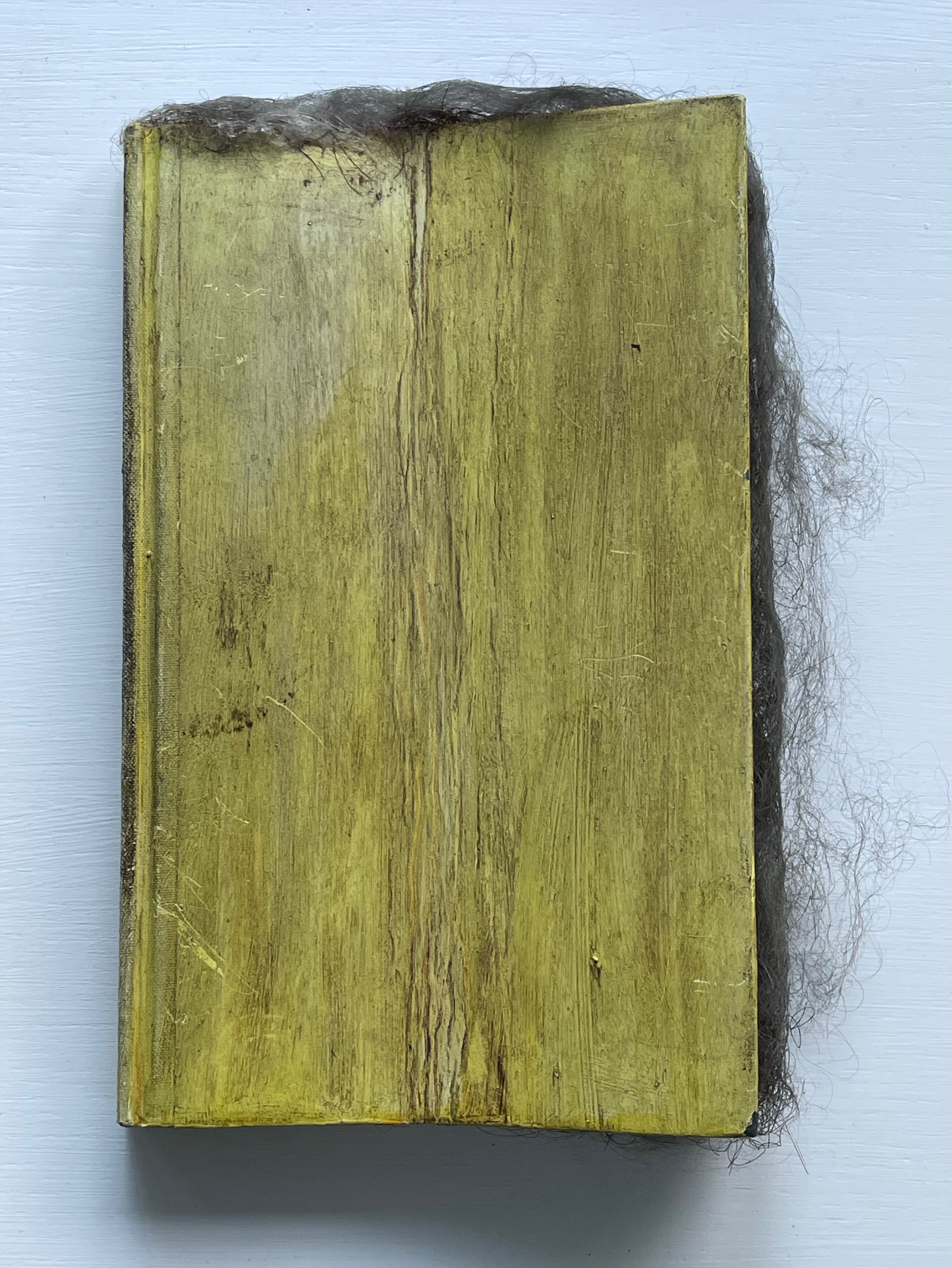
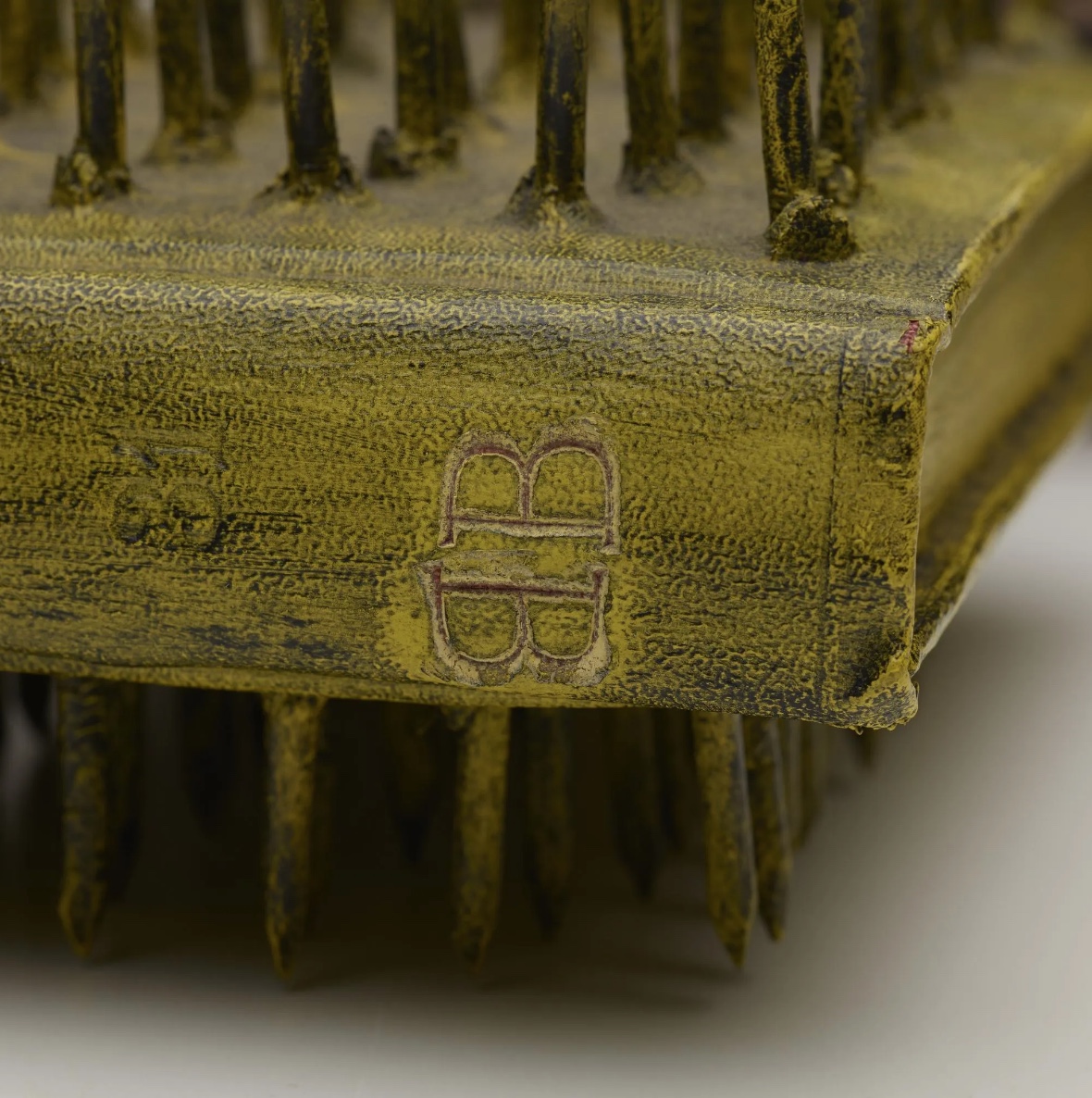
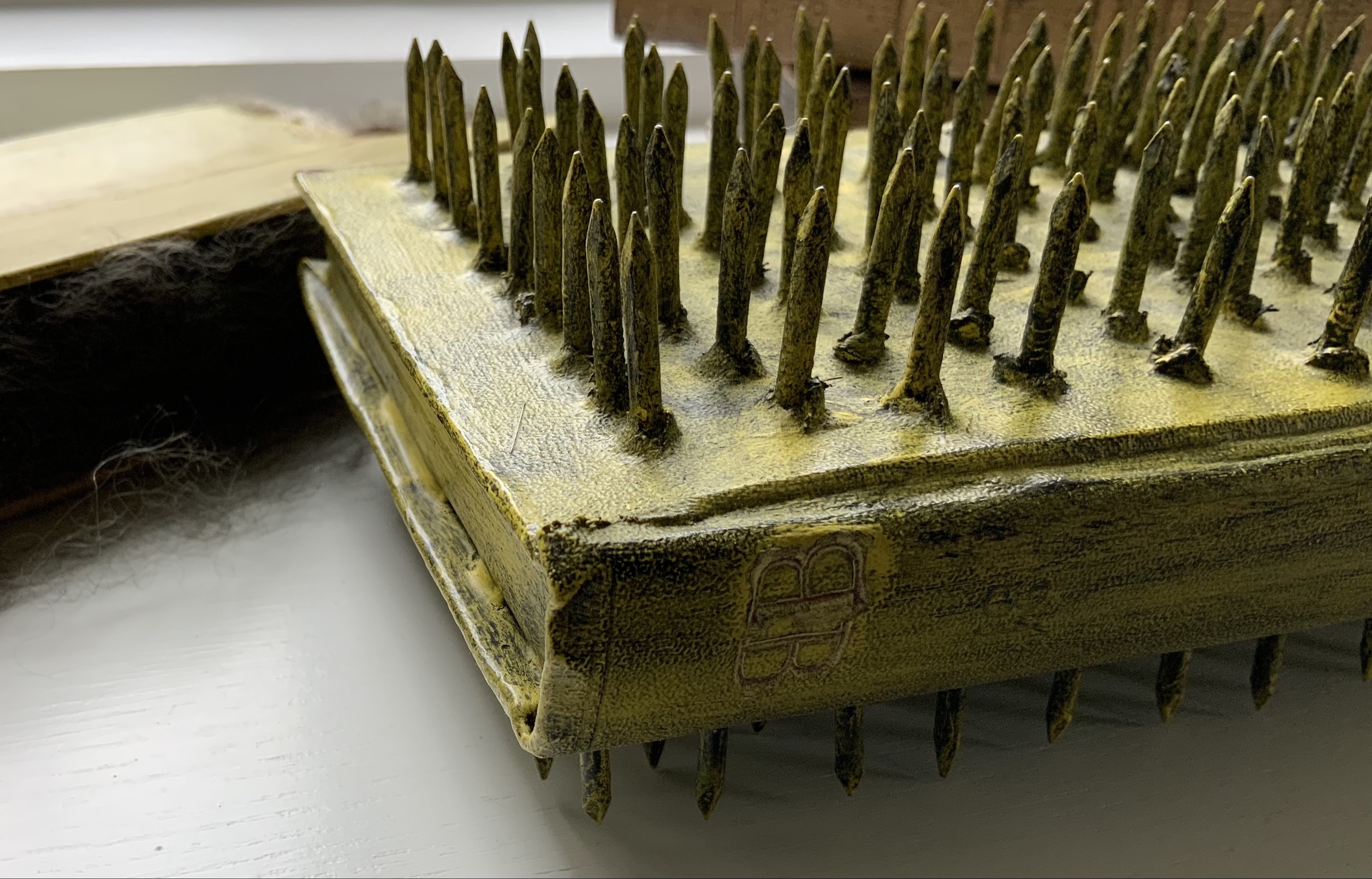
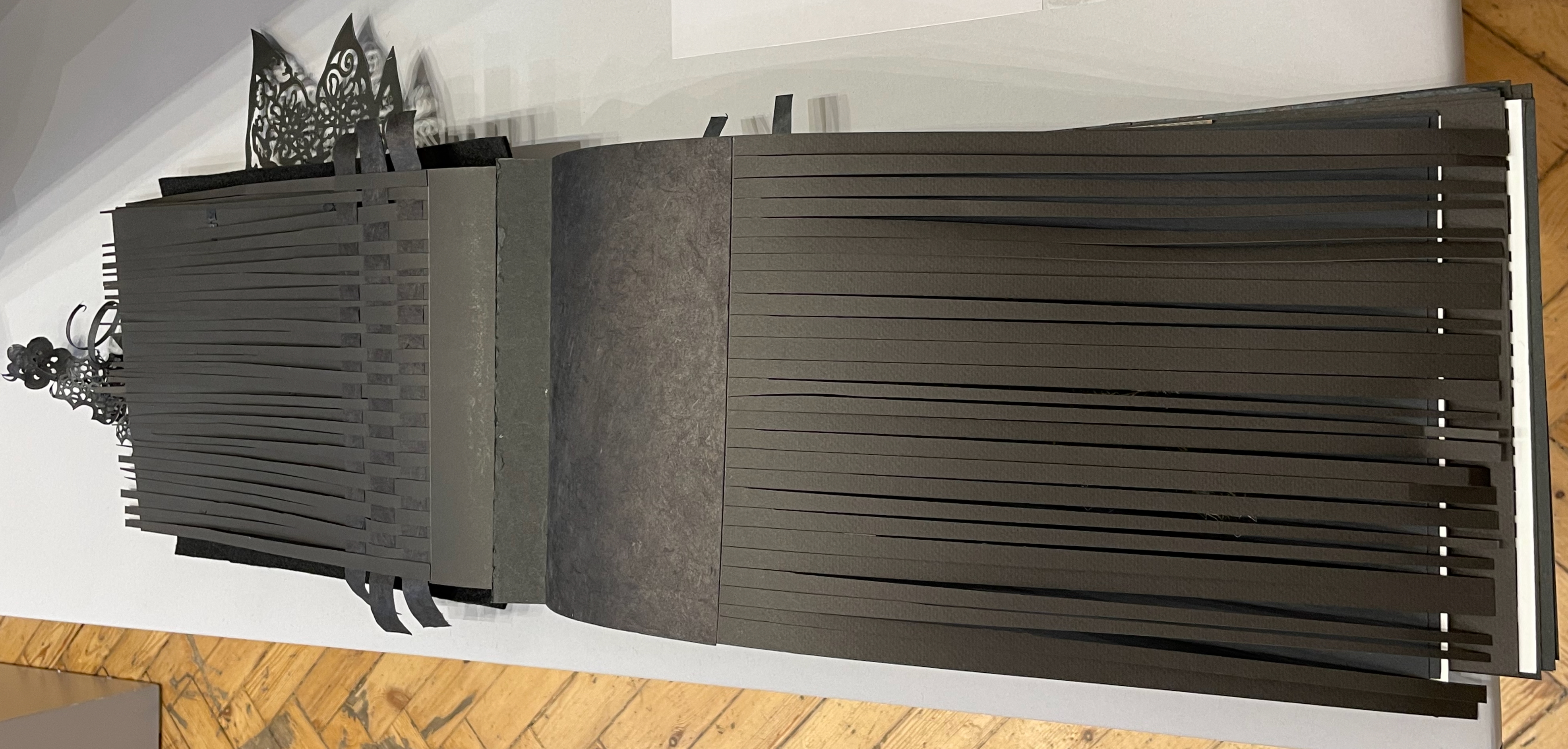
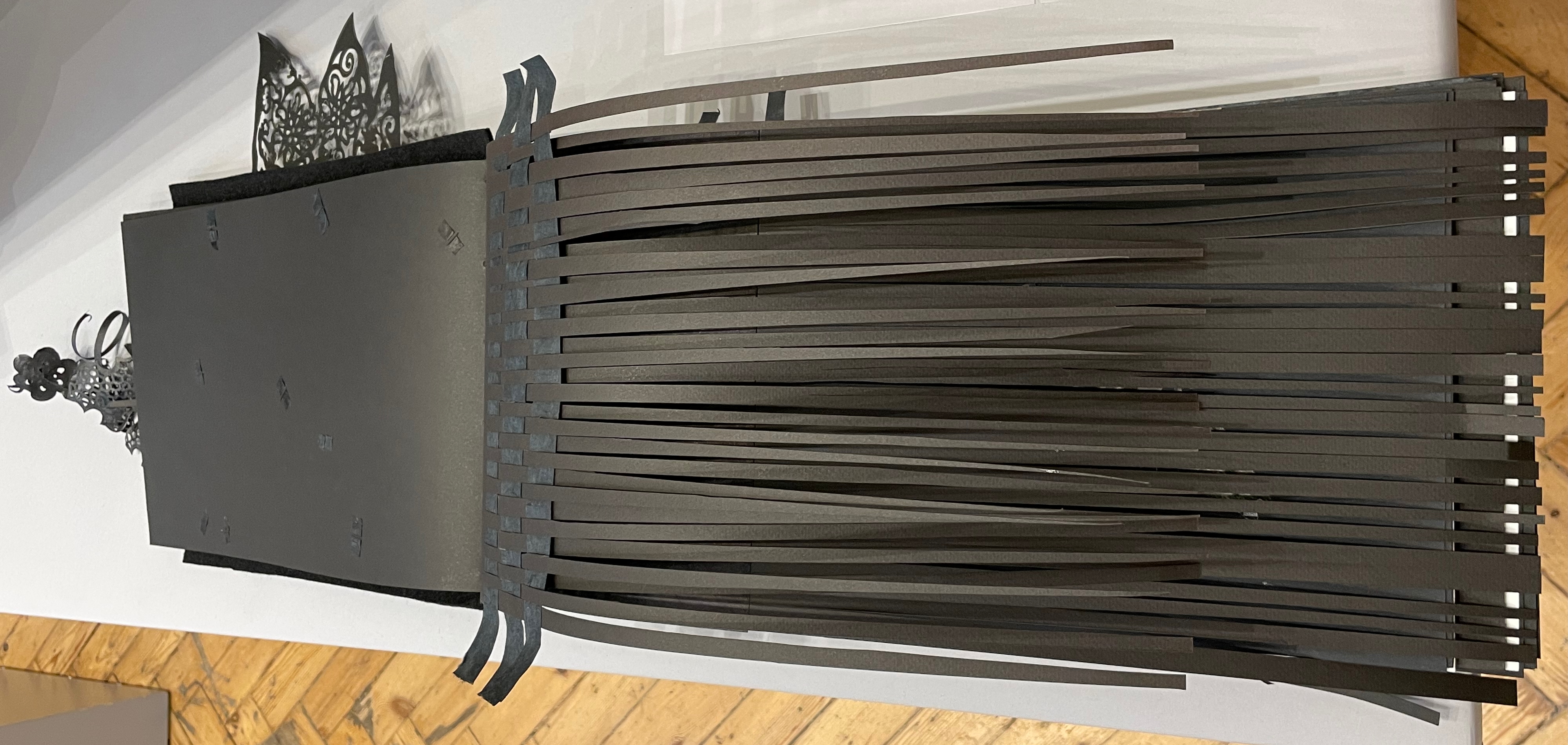
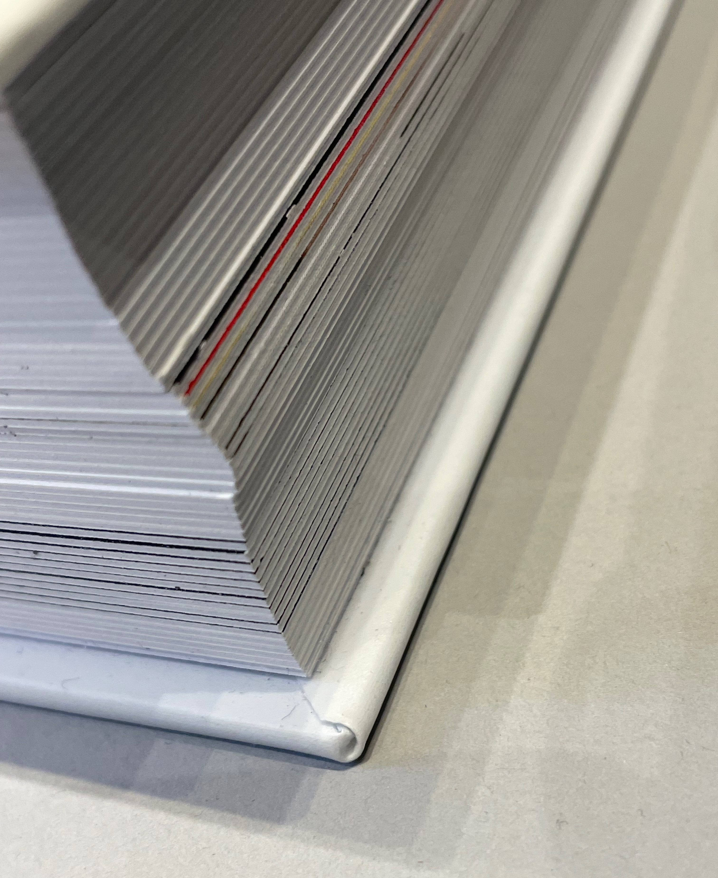
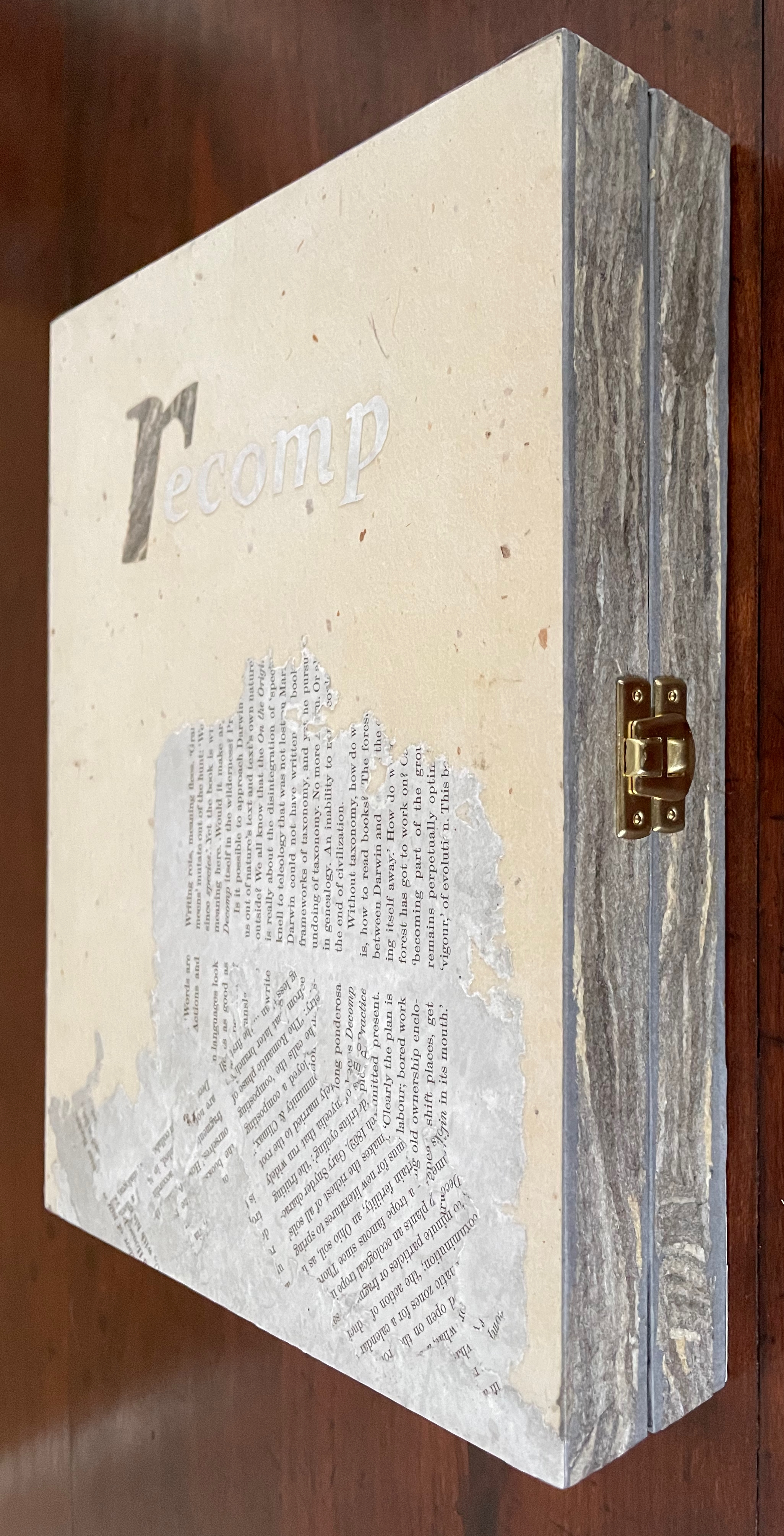
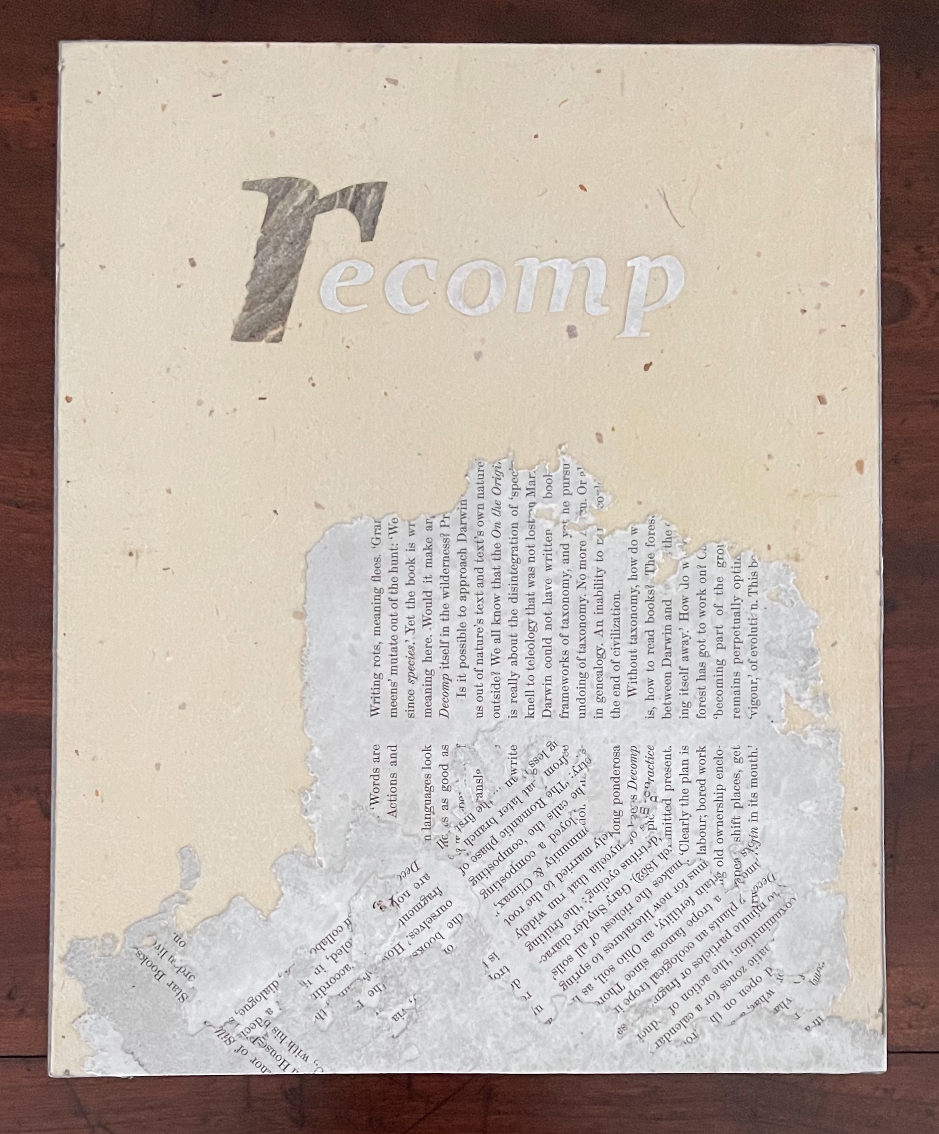
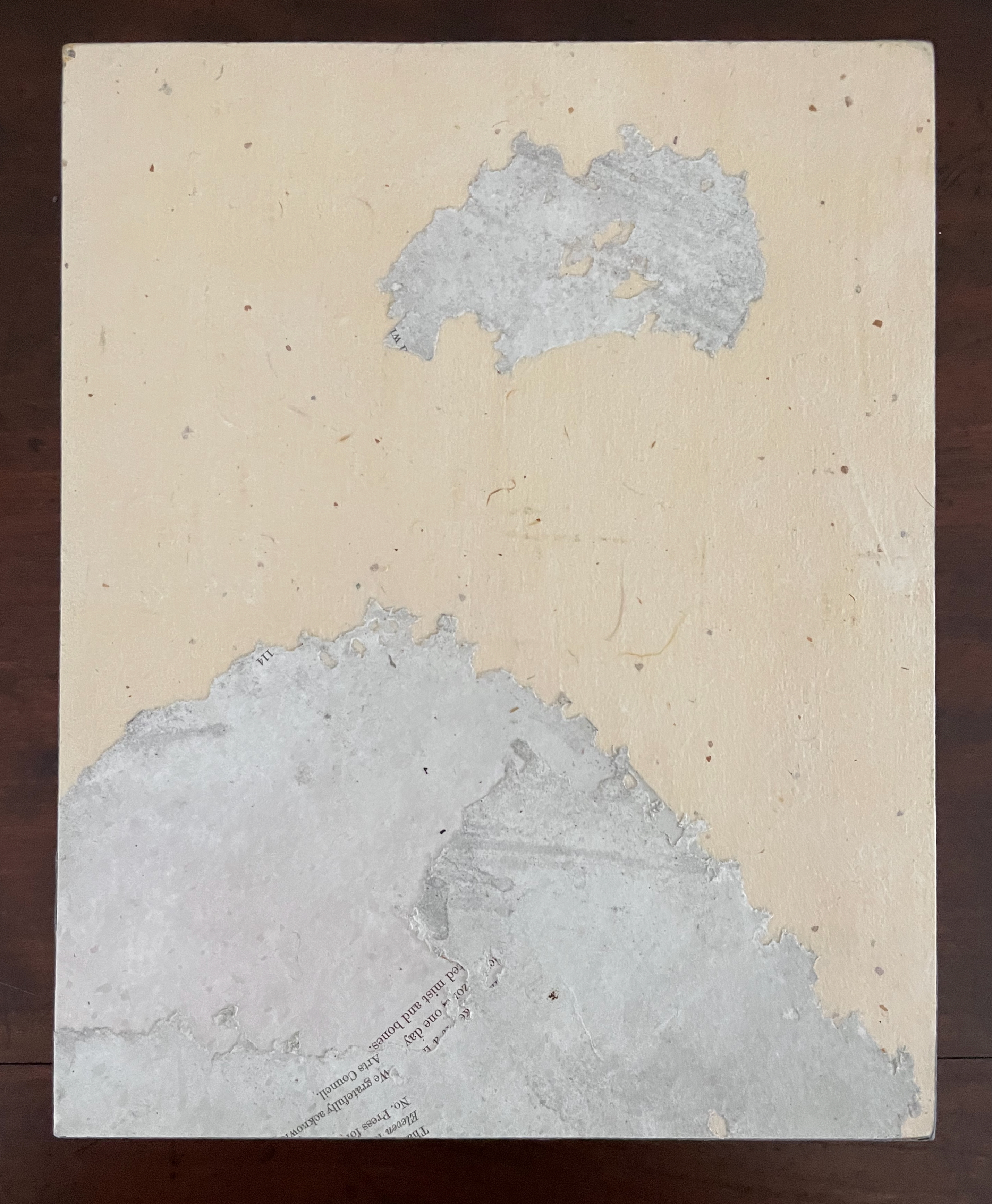
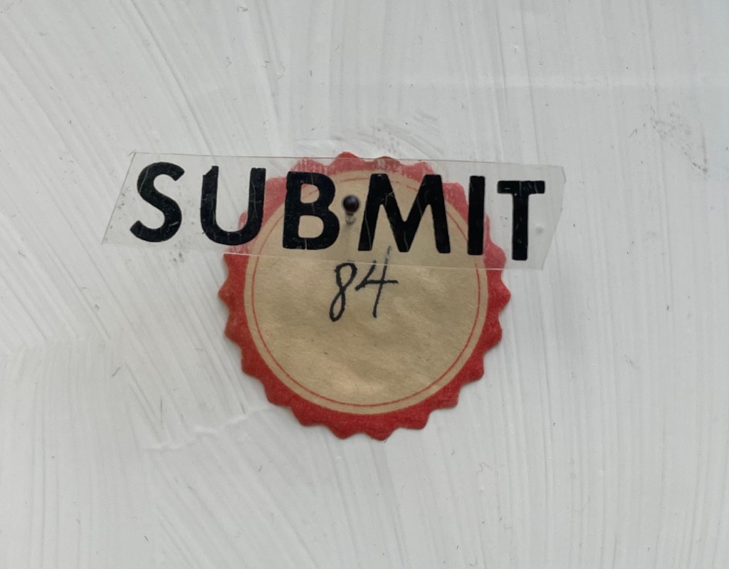
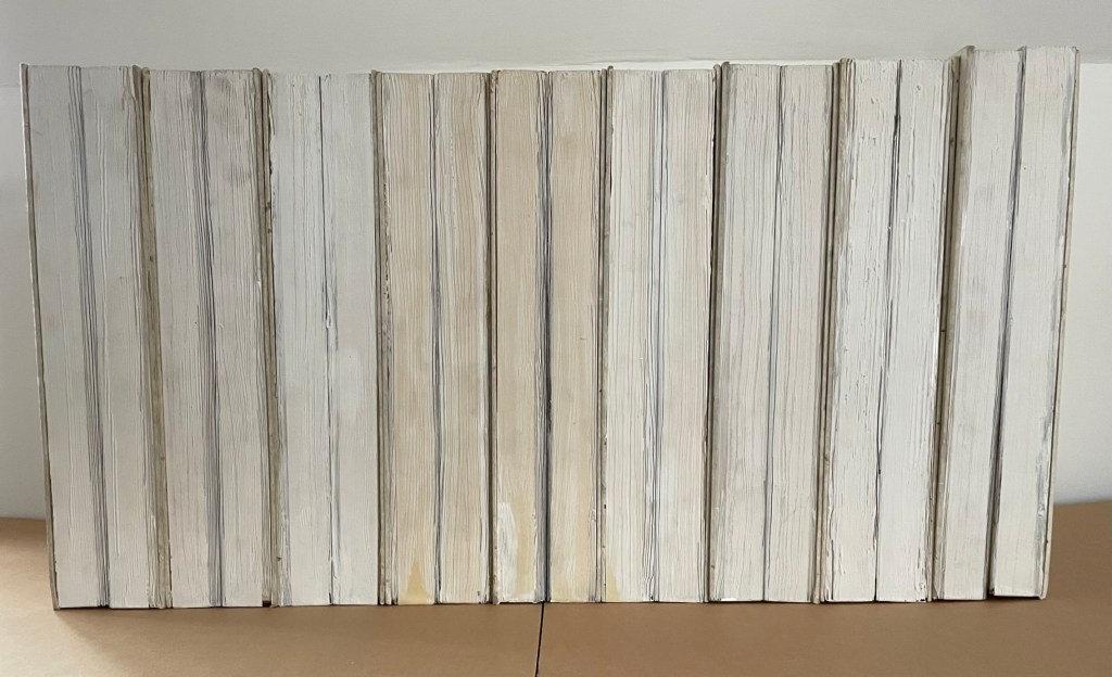
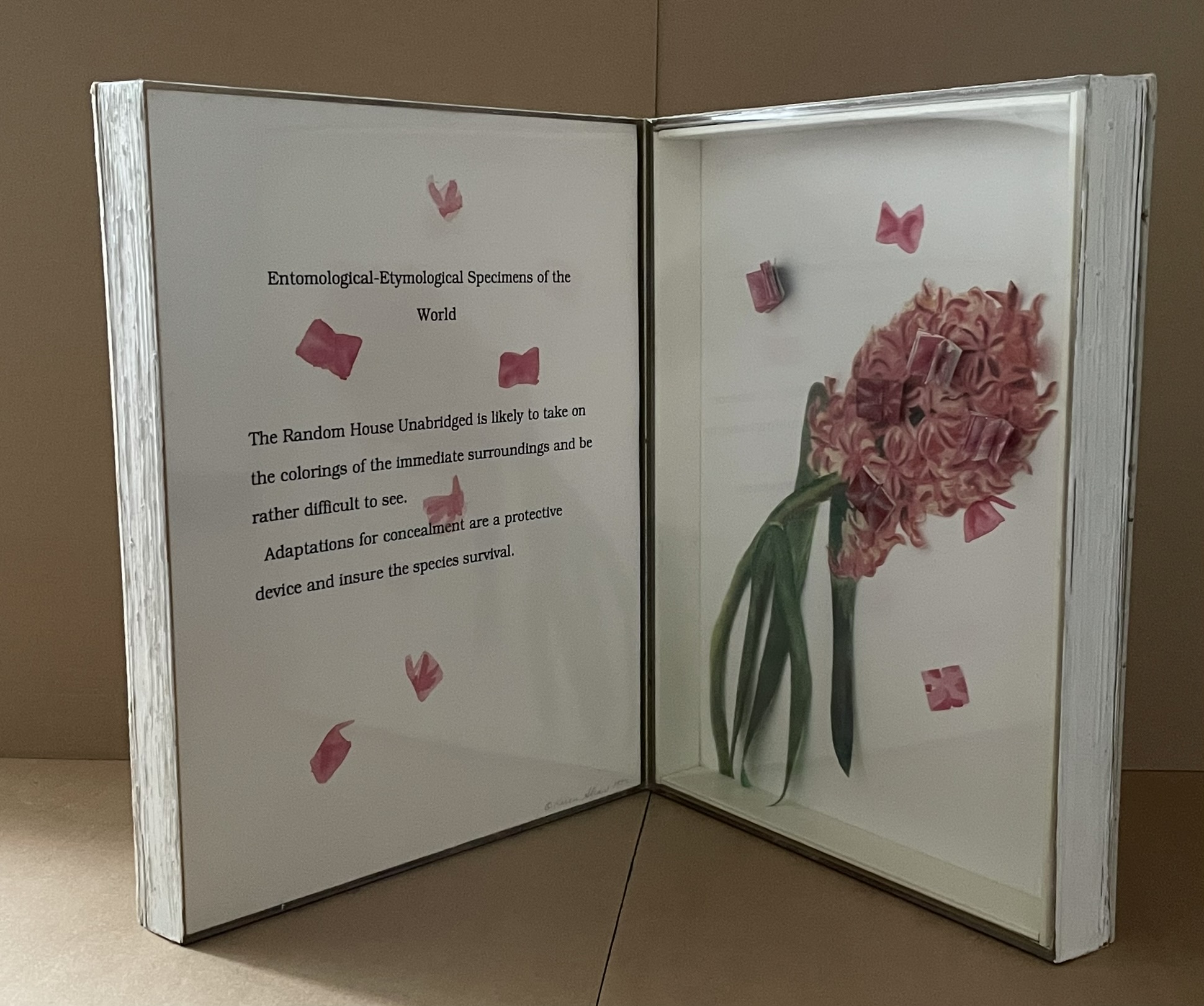
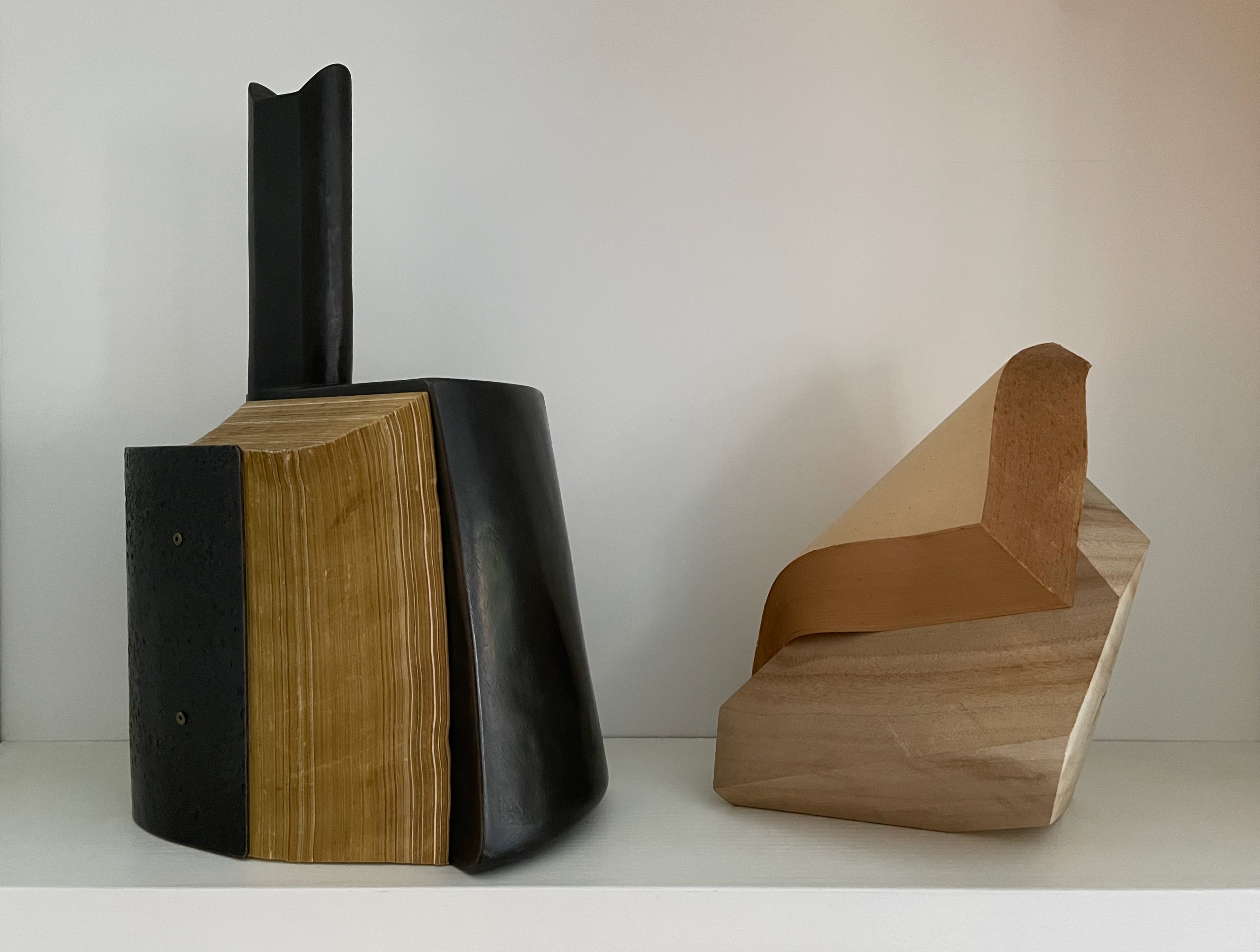
Altered book, camphor tree stump, and glue. H210 × W170 × D190 mm. Unique. Acquired from Fragile Books (Tokyo), 20 August 2024.
Photos: Above, courtesy of Fragile Books; below, Books On Books Collection.
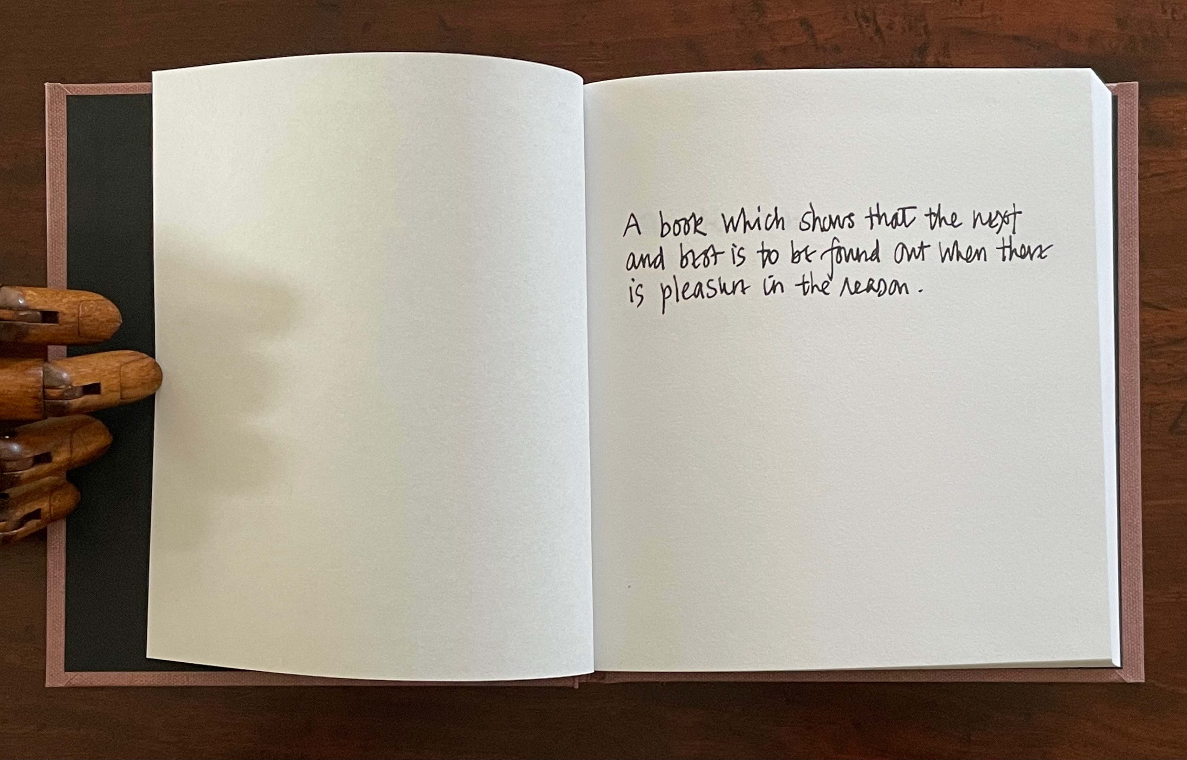
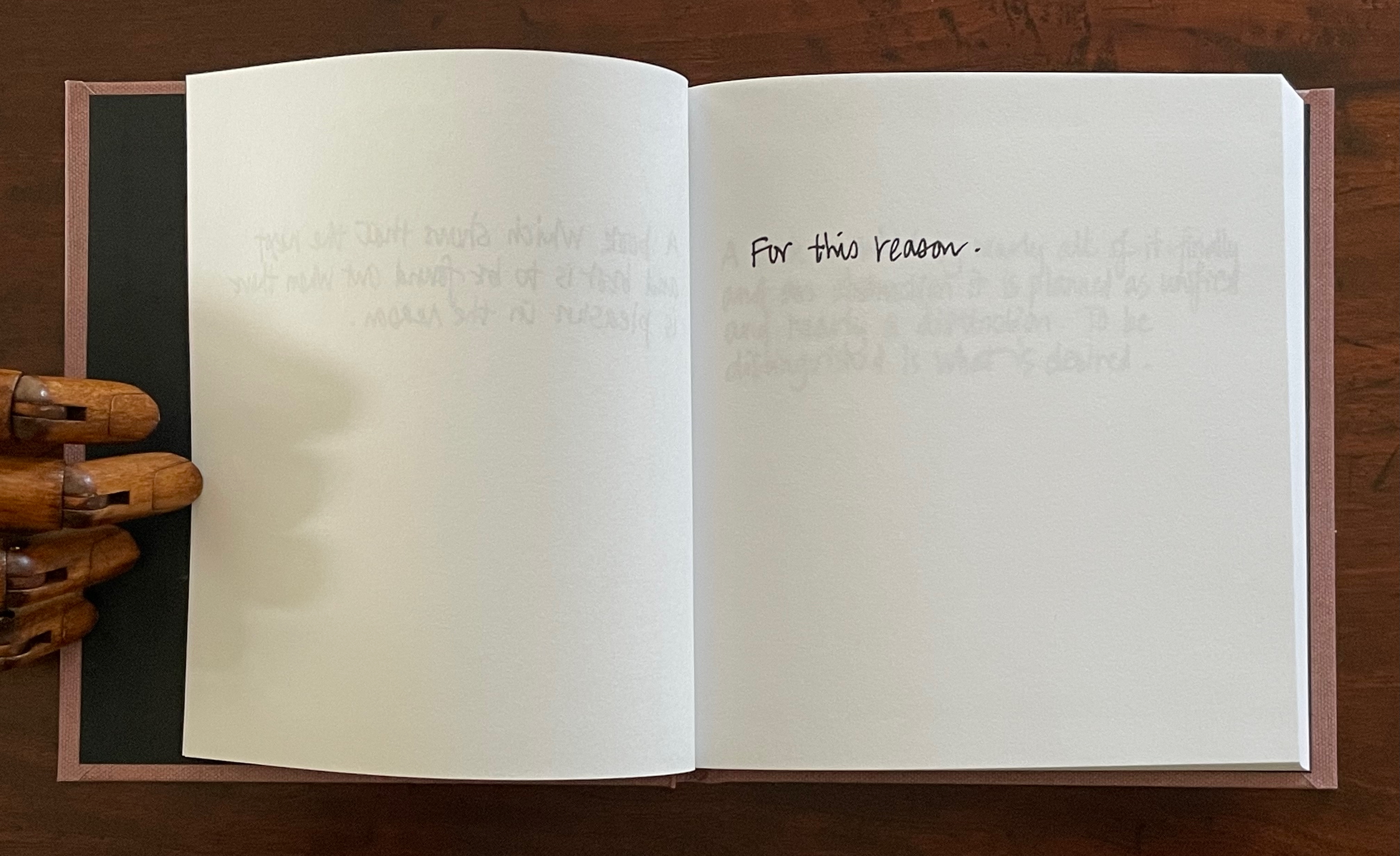
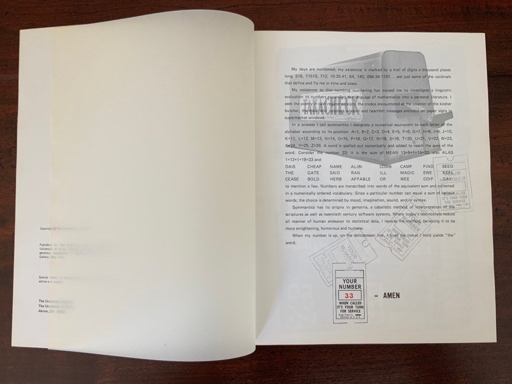
The cover, door, table of contents, numbering, text, and endnotes are all filled with a series of information. I thought to stop and crystallize all the functions of the “book,” … I decided to crystallize it. It took the time to go through the hands of people, the old book that finally reached me, sealed on a pedestal, it is now ripe for its next role. (Artist’s statement)
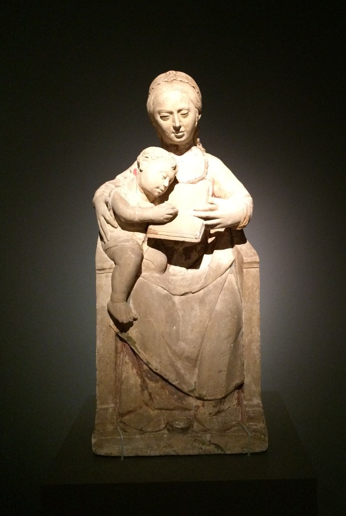
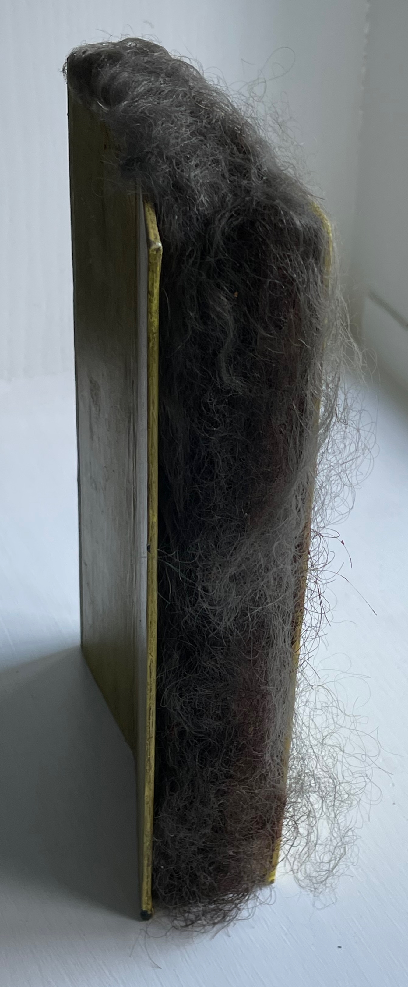
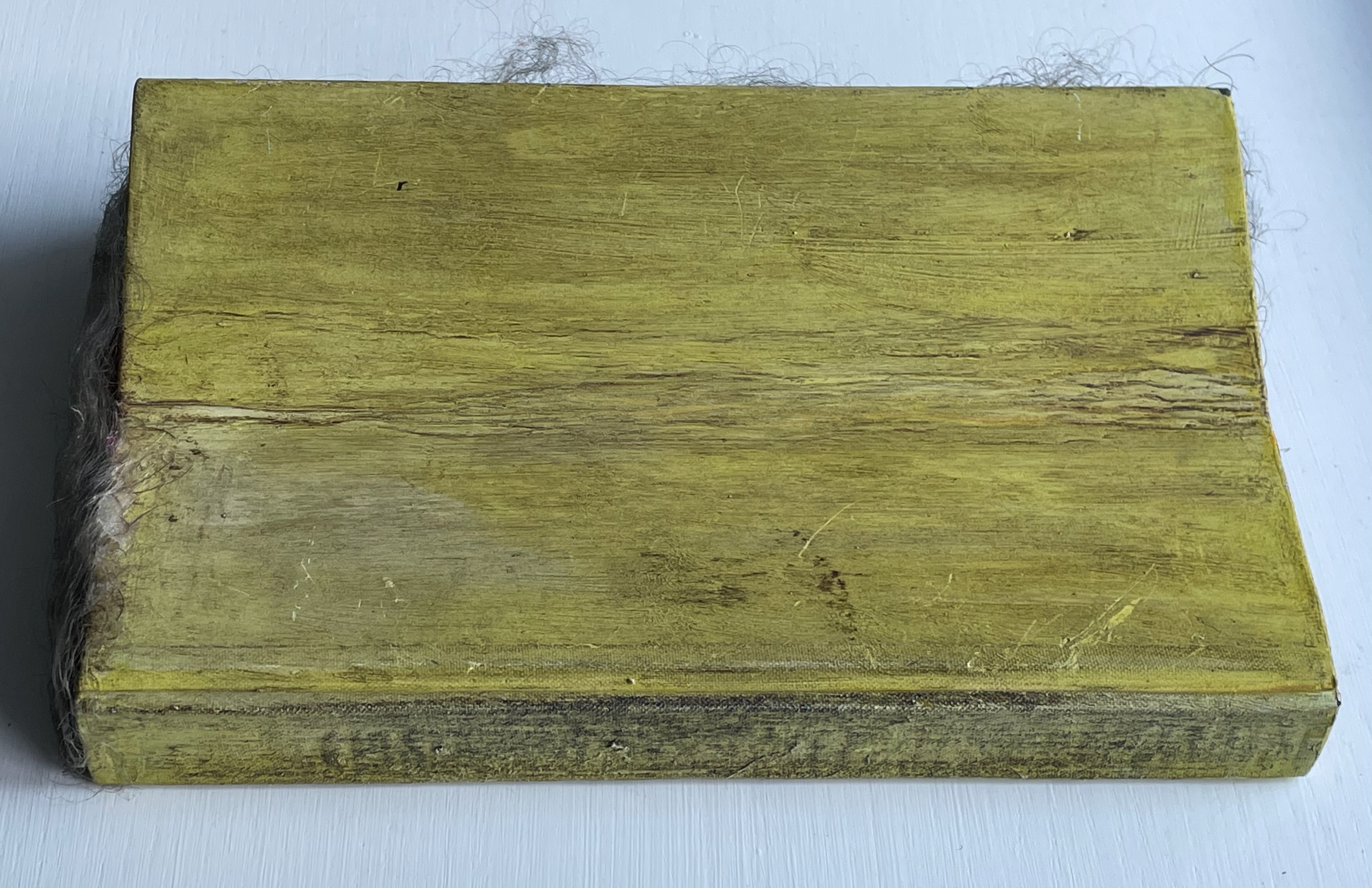
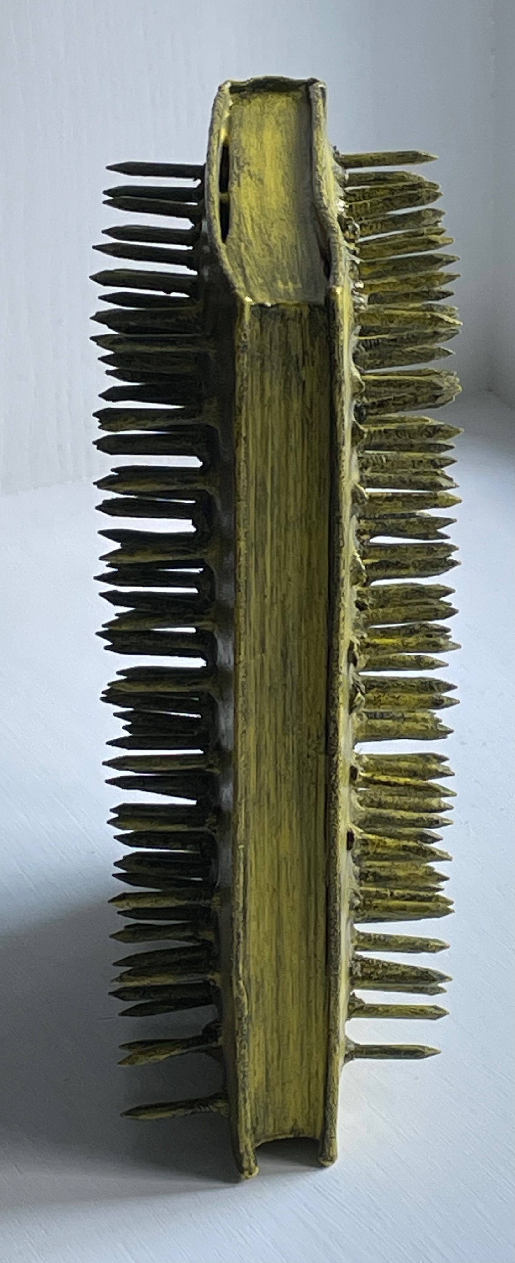
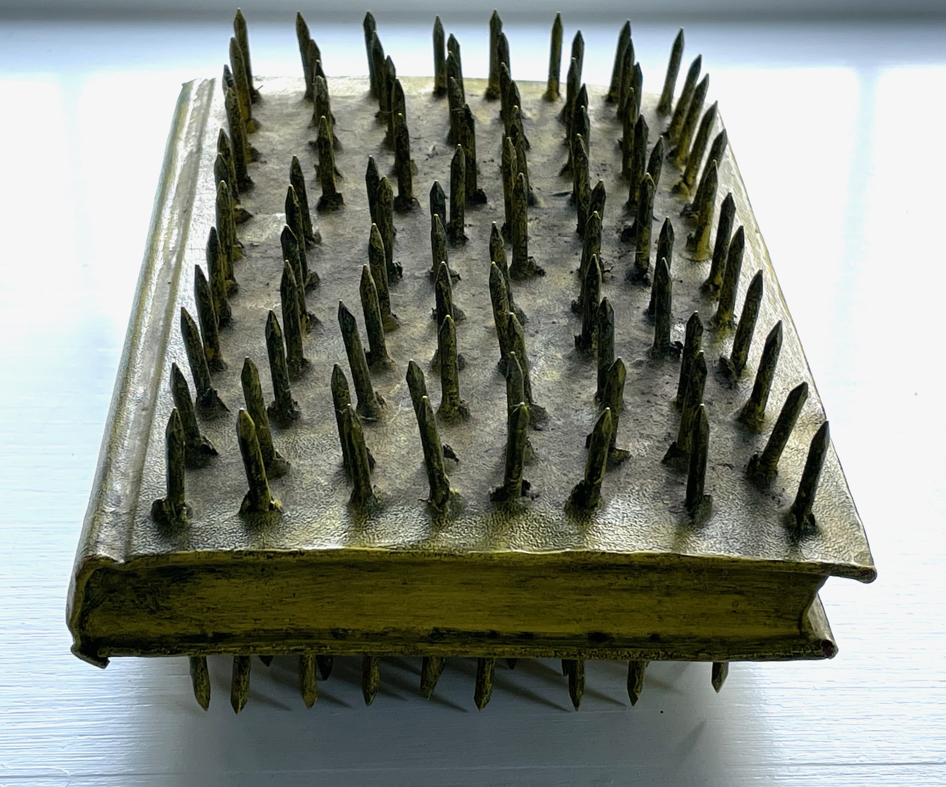
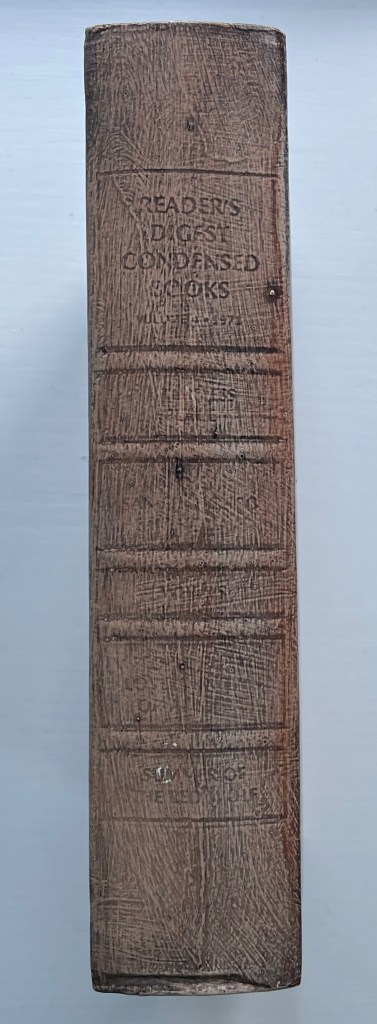
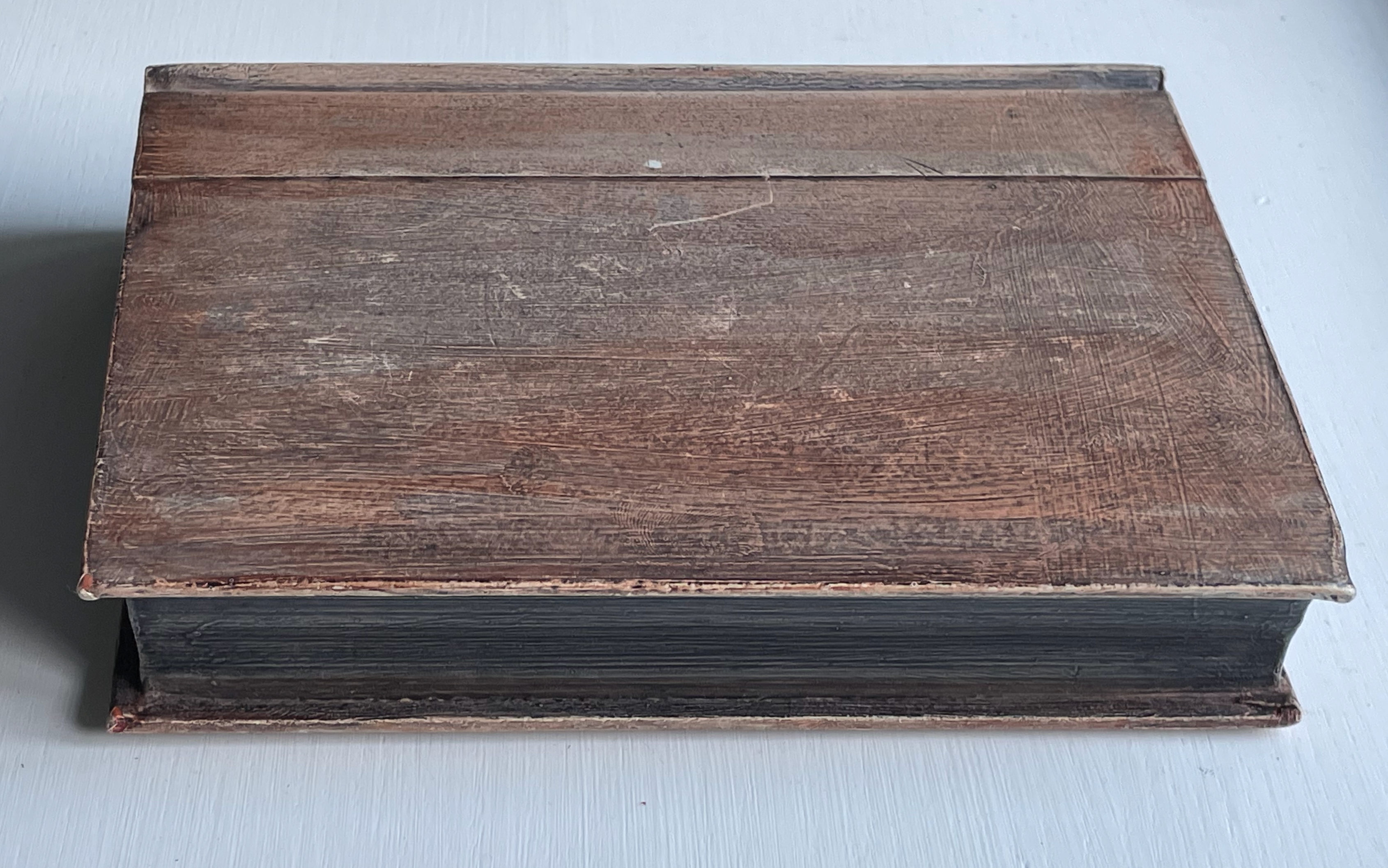
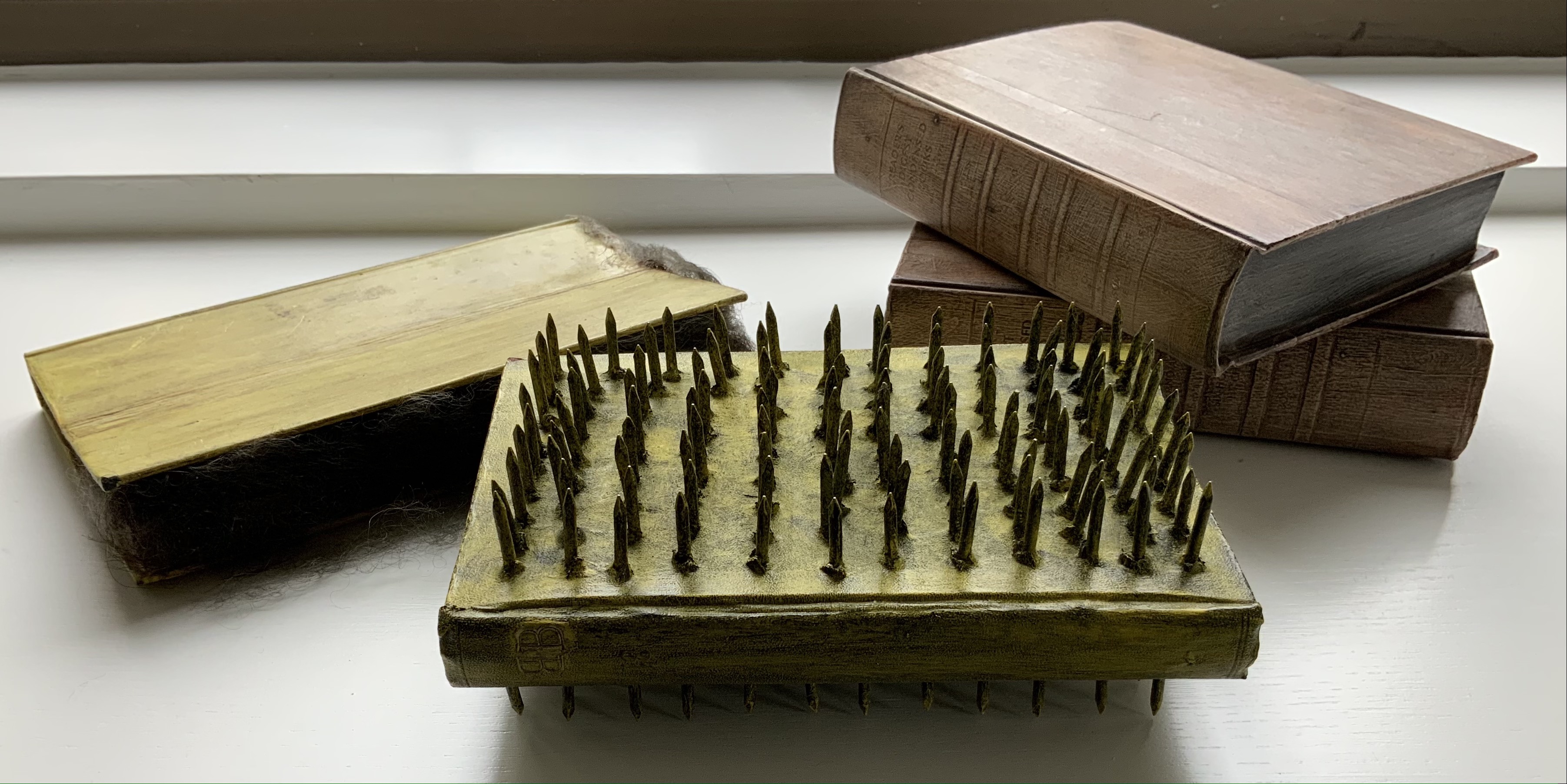
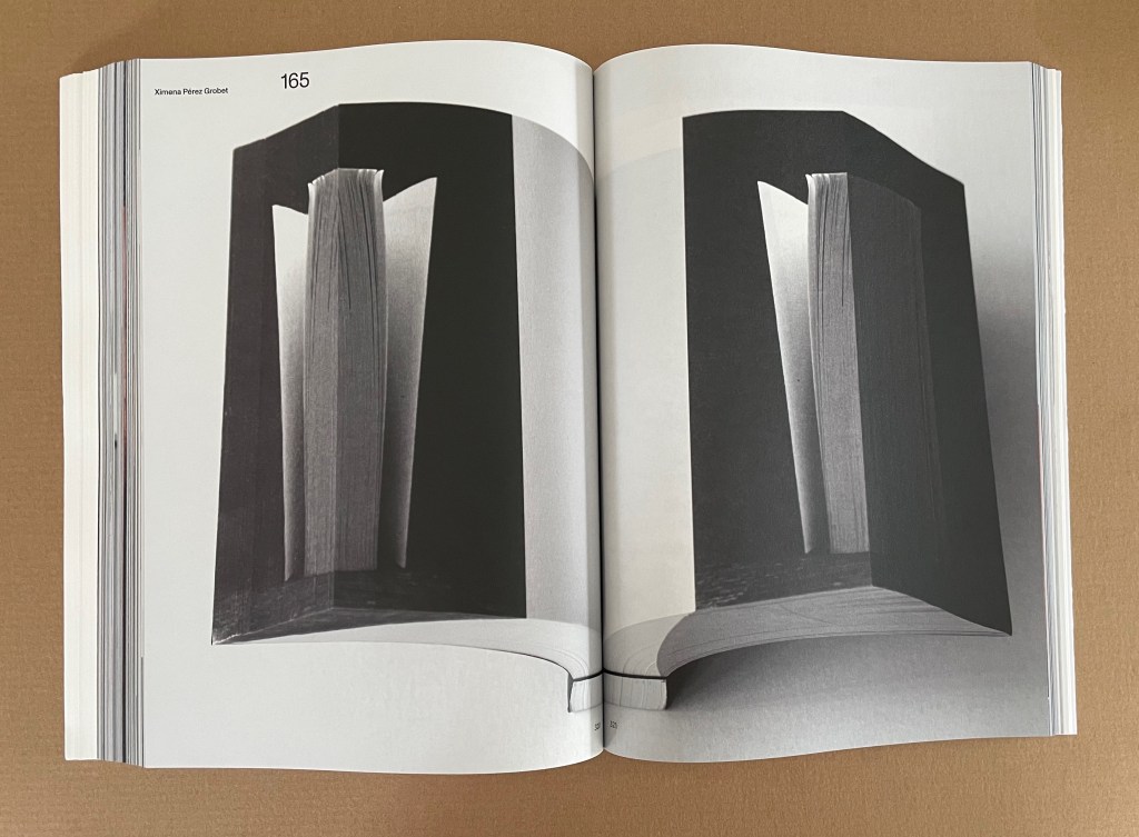
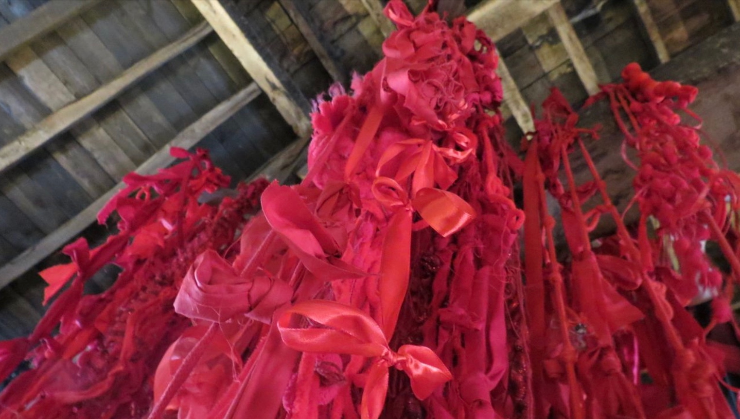
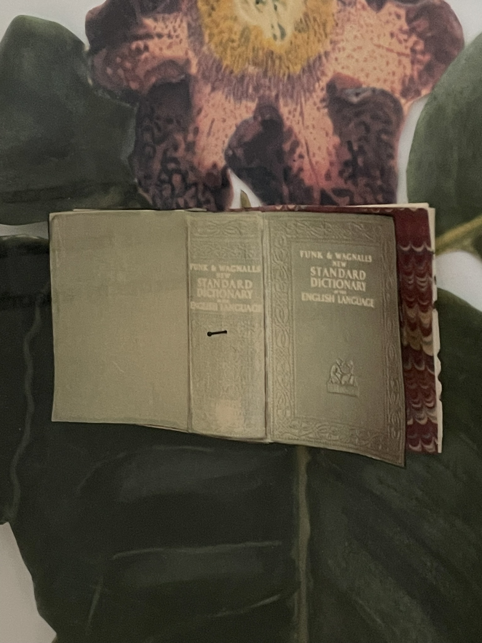
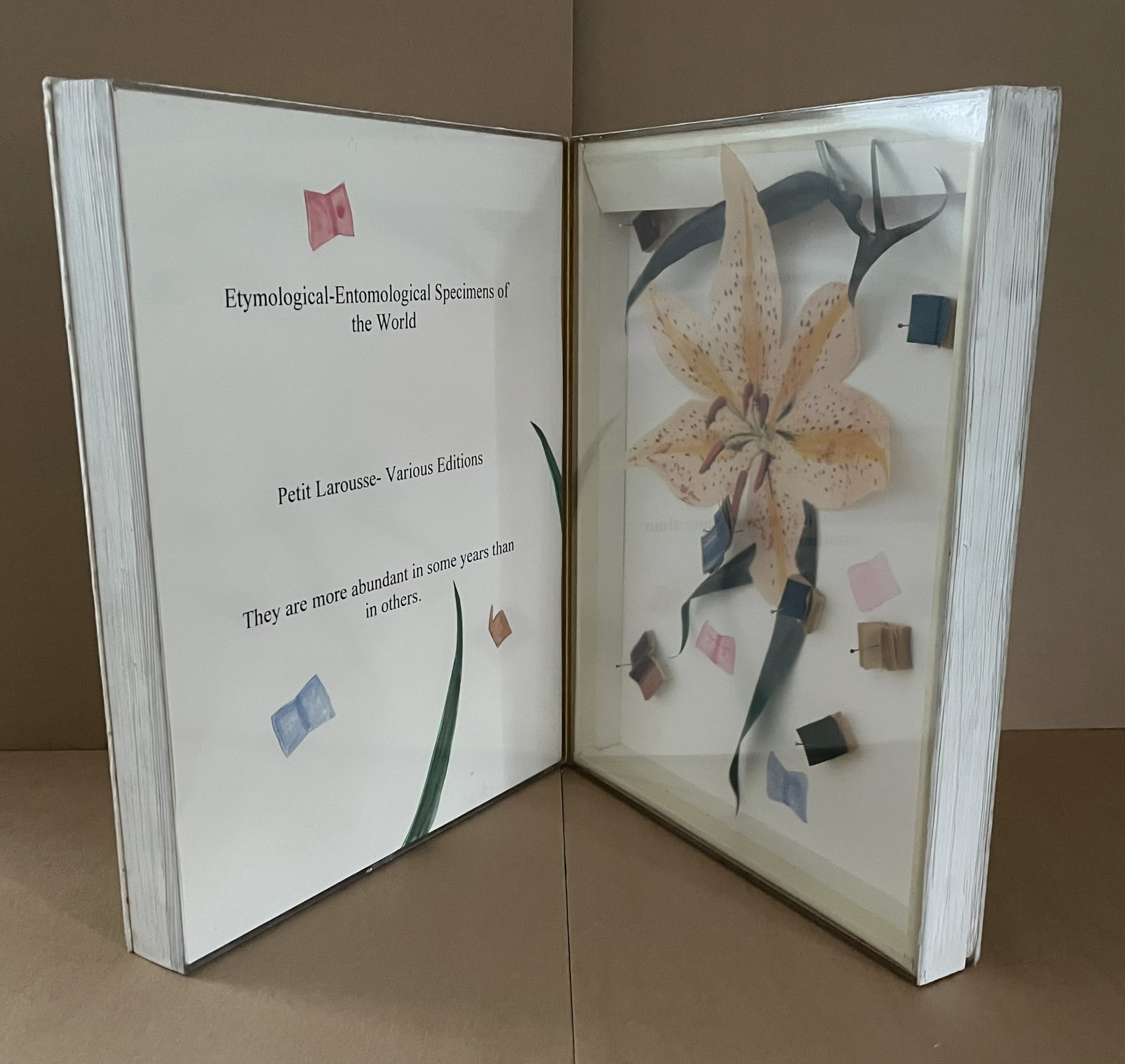
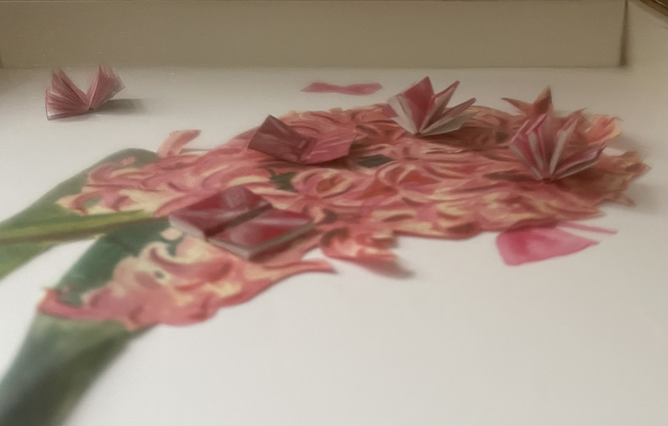
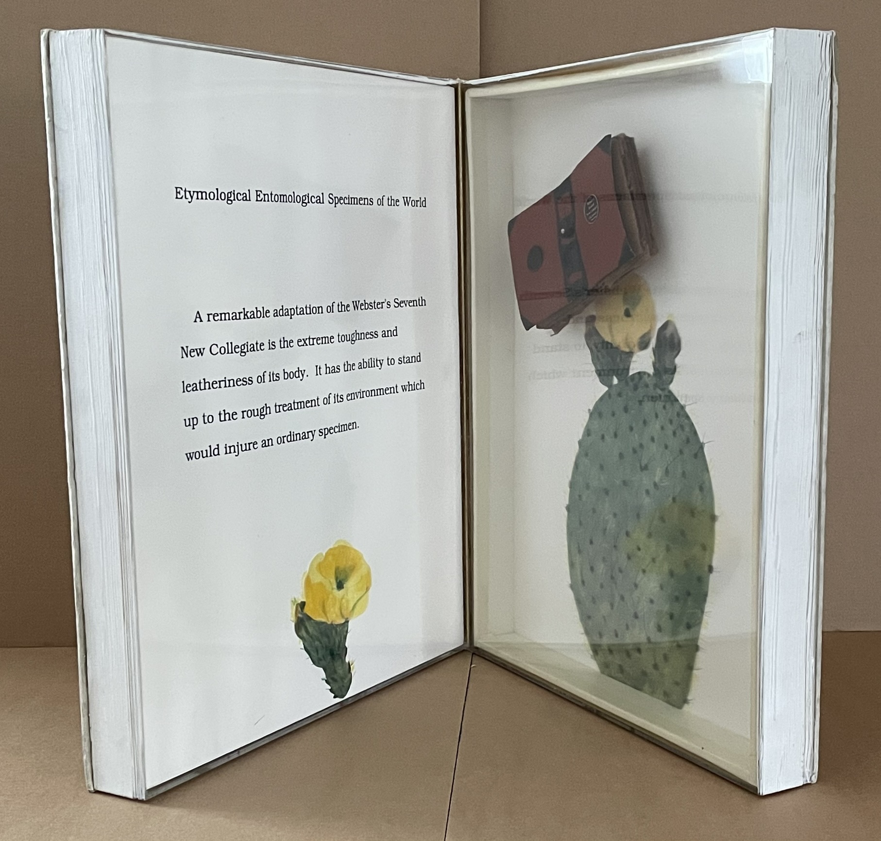
“Crystallized” is not the first word that comes to mind when viewing and handling this eleventh in Ryuta Iida’s series Silent Book. Perhaps it does for the angled planes of the cut block of camphor wood, but for the coverless codex, folded, draped, moulded, carved, and sculpted come closer. Two names that might not spring to mind (but should) are Giambologna (Jean Boulogne) and Gian Lorenzo Bernini. Like them, Iida offers us more than a single or primary vantage point from which to appreciate his work. Like Giambologna’s Abduction of a Sabine Woman (Loggia dei Lanzi, Florence) or Bernini’s Apollo and Daphne (Galleria Borghese, Rome) Silent Book must be circled and viewed in the round. The nine images below show the work turned right to left in stages.
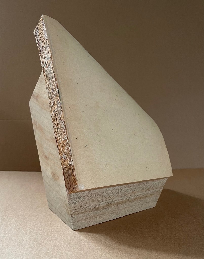
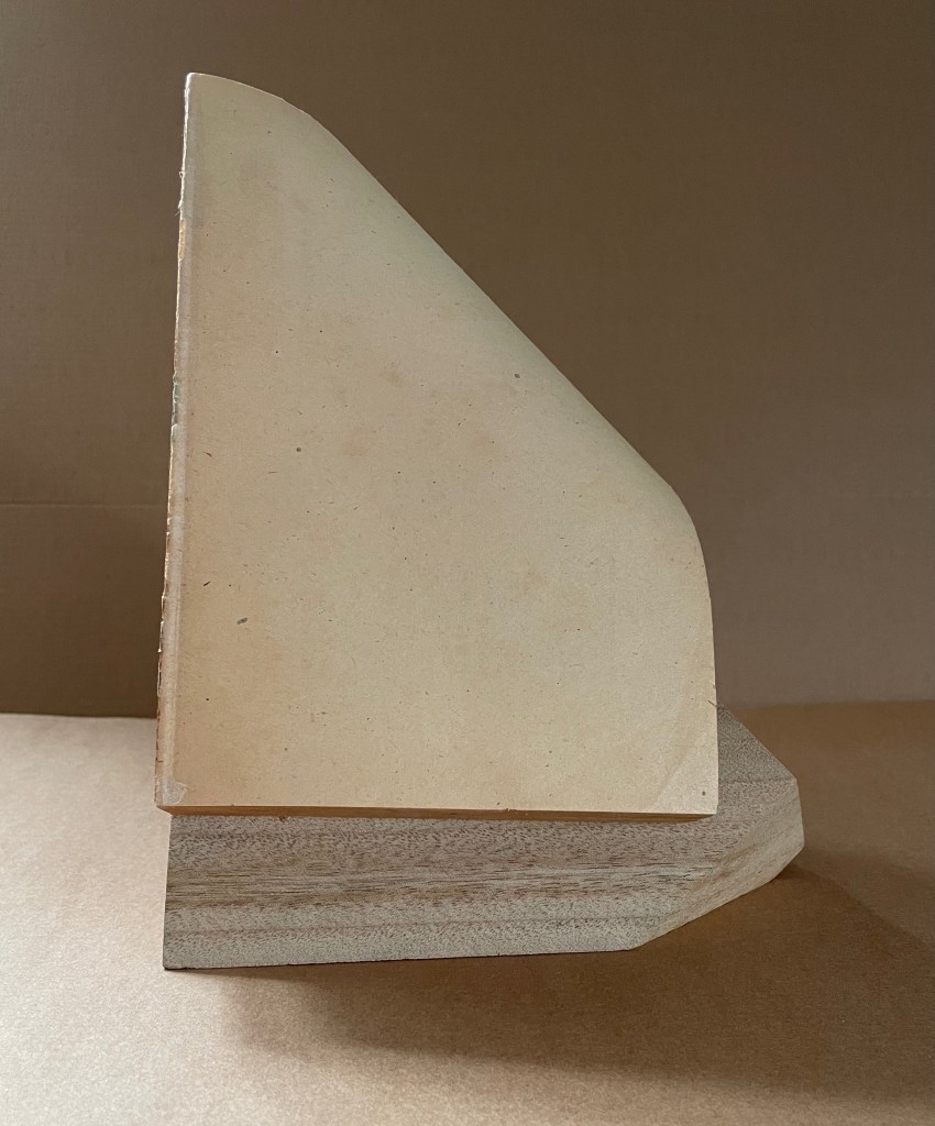
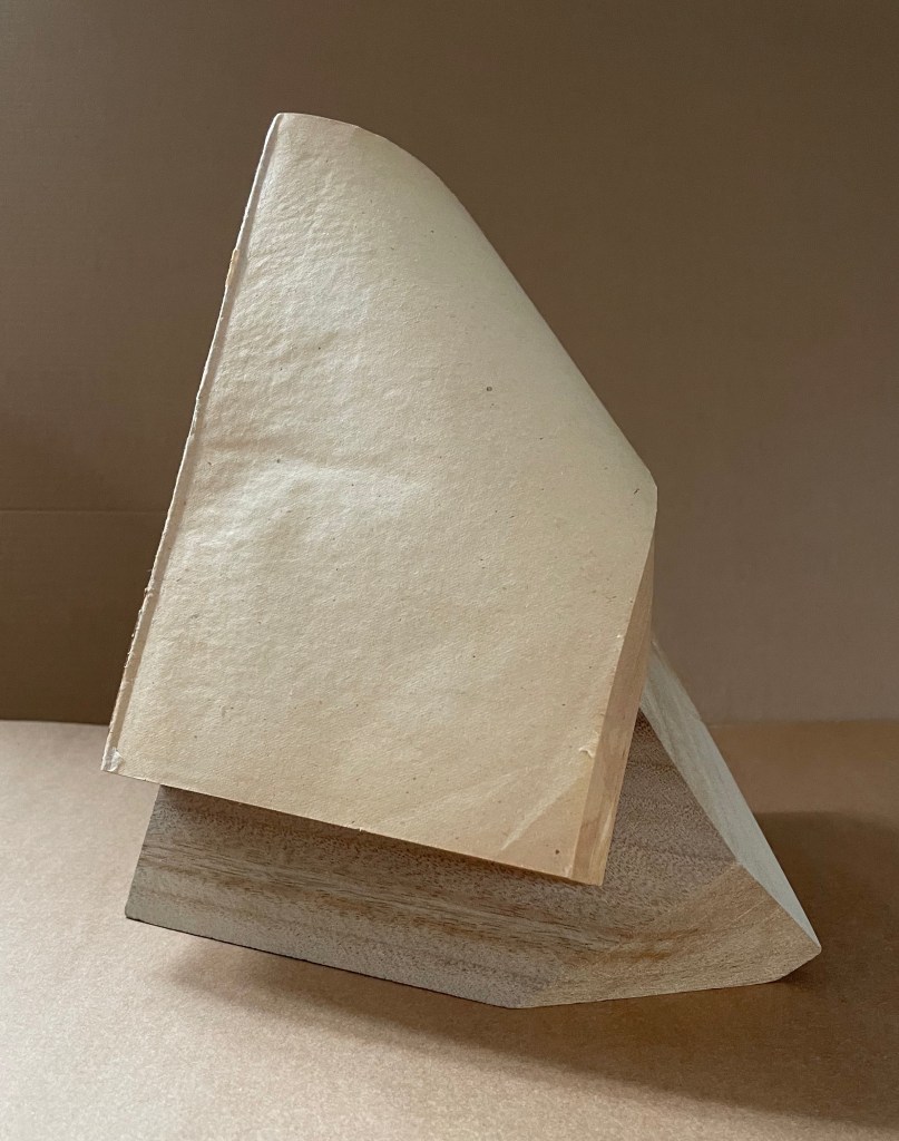
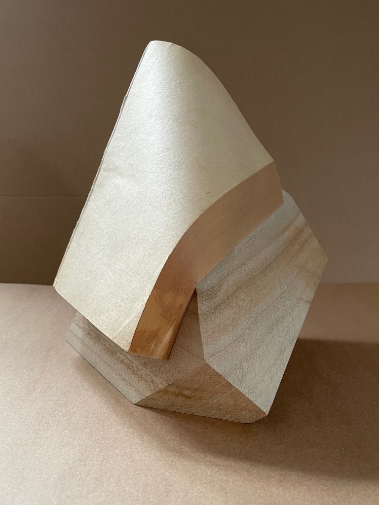
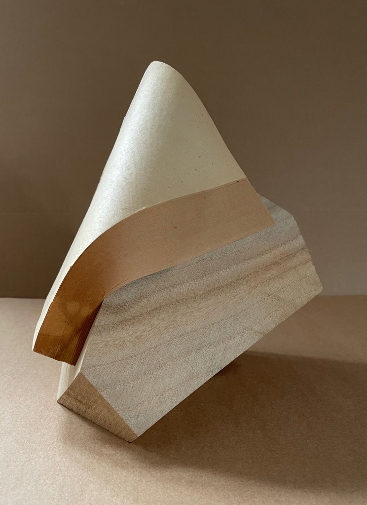
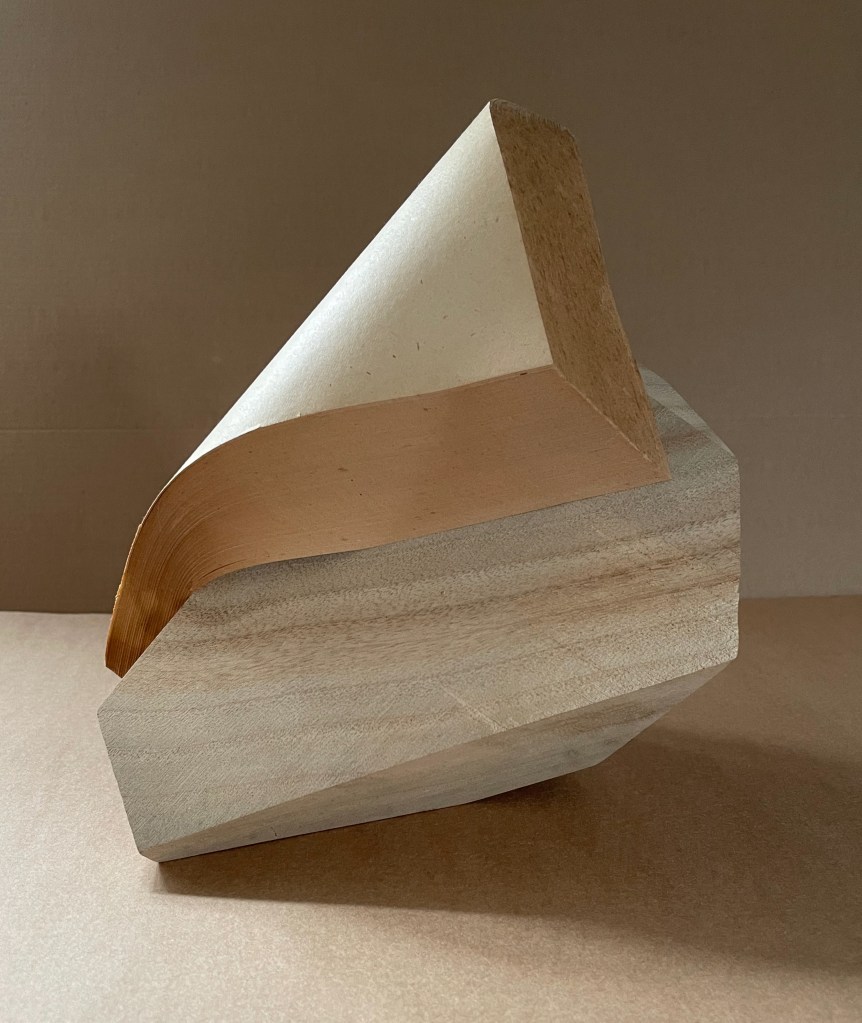
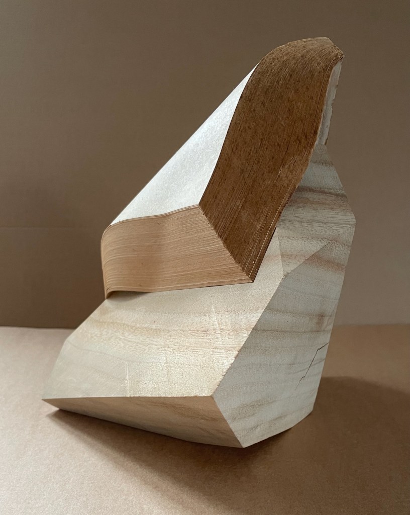
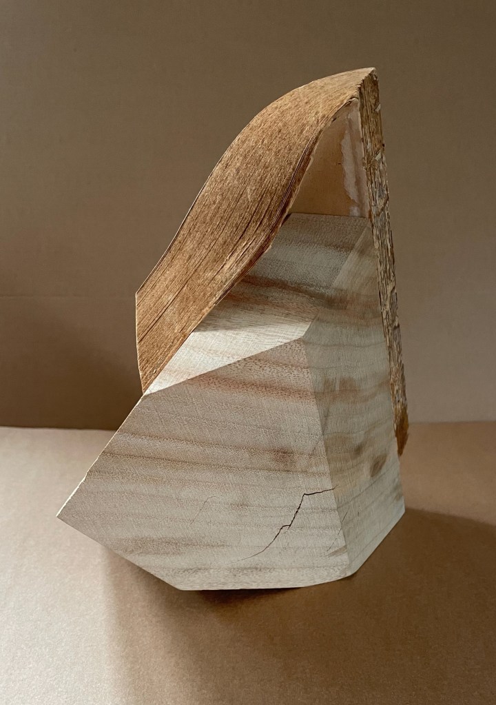
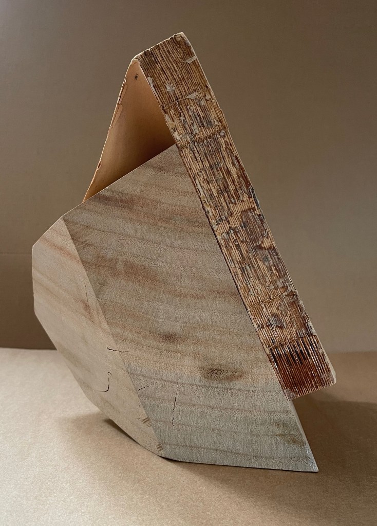
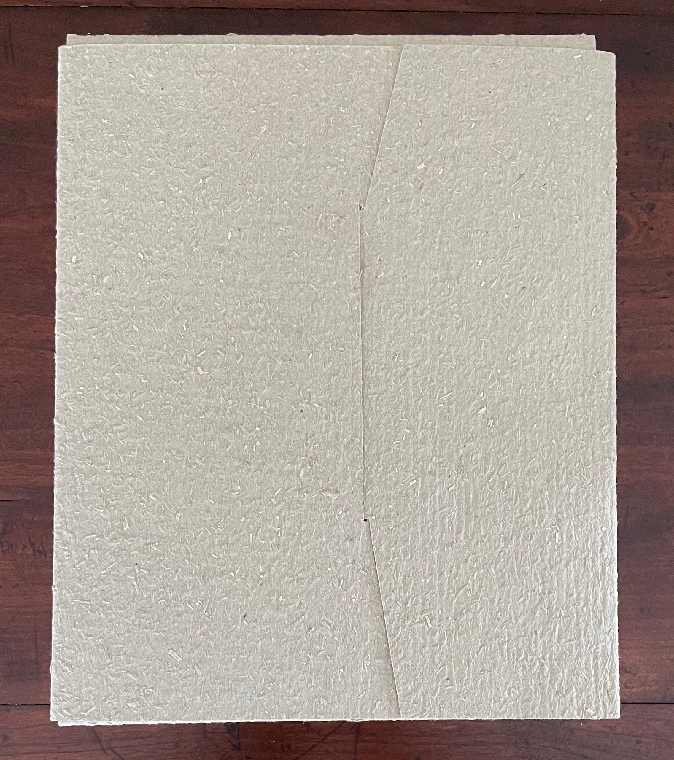
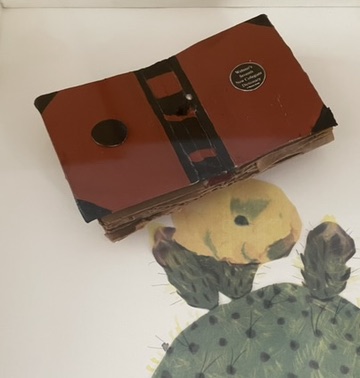
Far as Silent Book is from the figurative, violent, and ornate features of the 16th and 17th century masterpieces, it still harbors its own complexities of line, shadow, texture, and form. There is a volume of dynamics between and among them that belies the work’s title. Note how the layers of pages echo the wood’s grain, and how the color and texture of the page surface contrasts with those of the book’s top edge, and how that contrast reverberates with the shifting colors of the wood. Iida has moulded and sealed the book block so that the top edge curves to a point in a duet with the cut angles of the wood block.
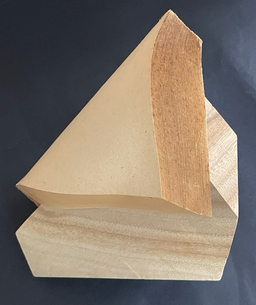
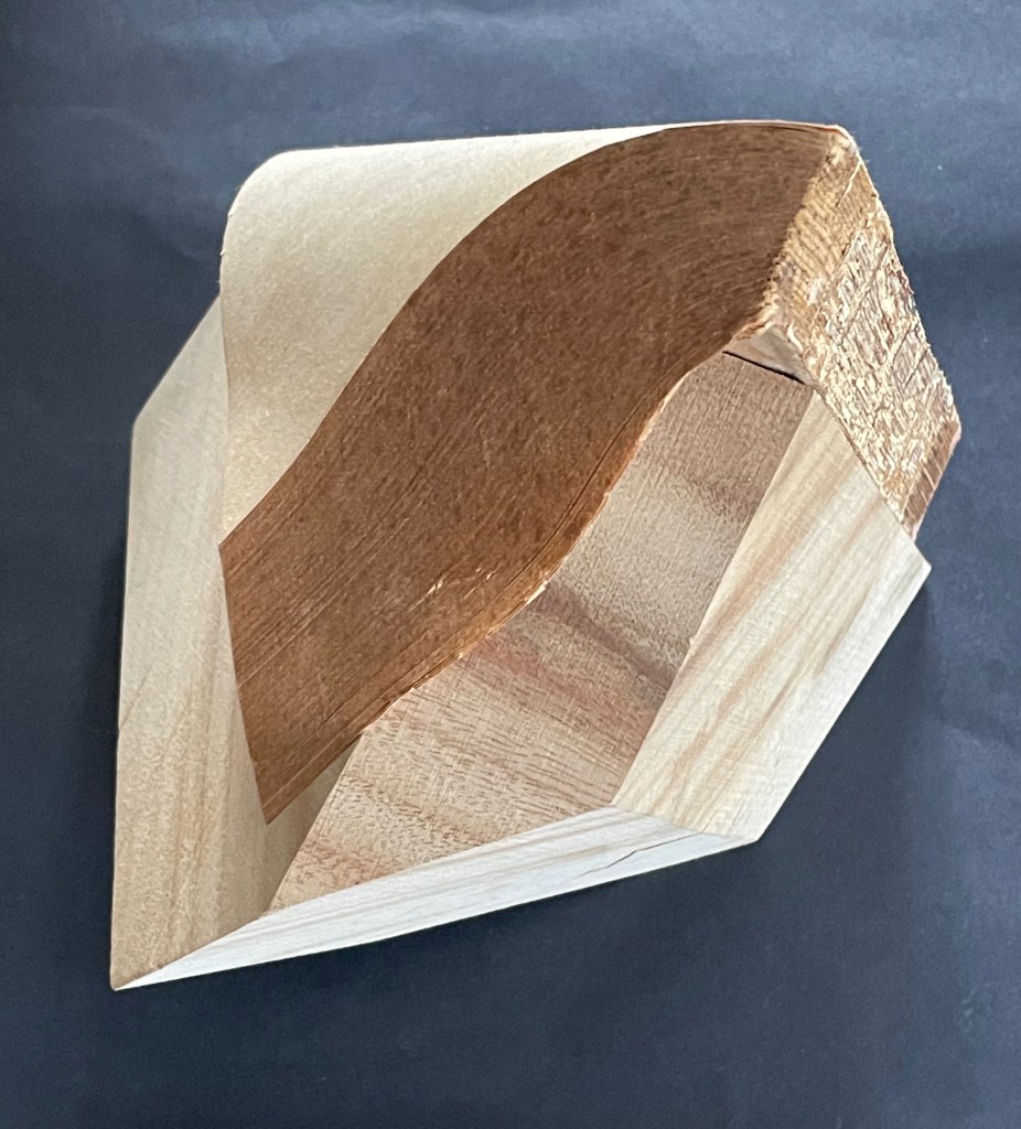
Silent Book has many kin in the world of book art, works that make the content of a ready-made volume inaccessible and make something anew from the material object. Too often this sub-genre has been dismissed as a fetishization of the book. This overlooks how Silent Book and its kin make us think about the book as a material for making art and as a source of metaphors, and we overlook what the individual artworks are. By sealing away the content of a book, giving the book block a sinuous shape, and fusing it with a carved block of wood, Iida invites us to look afresh.
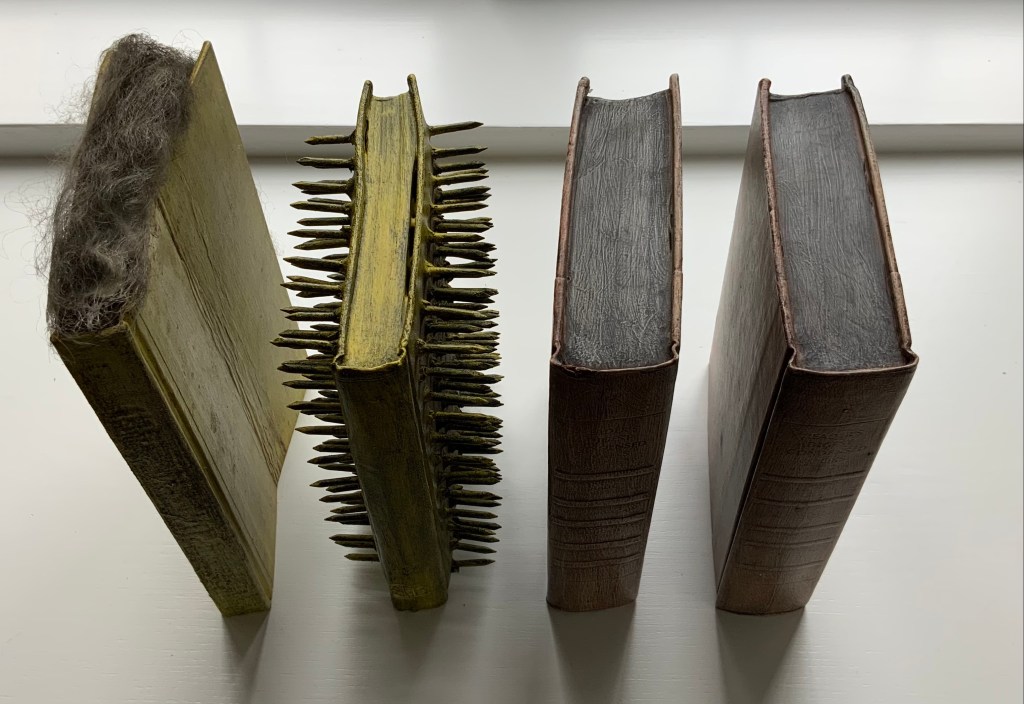
In the Books On Books Collection, several other works share this play of inaccessibility with tangibility: Barton Lidice Beneš’s Untitled (1973), Andrew Hayes’ Offset (2013), Jacqueline Rush Lee’s The First Cut and Silenda (both 2015), Doug Beube’s Red Infinity #4 (2017), Lorenzo Perrone’s Kintsugi (2018), and Chris Perry’s 217 Ripples: Sediment (2020). Of these, Offset seems closest to Silent Book. Comparison can increase appreciation of each and their sub-genre.
Both Hayes and Iida have managed to elicit a sense of action and motion from their materials. From one view of Offset, metal embraces the body of the book; from another, the book pushes the metal apart. From one side of Silent Book, the upward-angled block of wood supports the coverless codex folding over and slipping down its pedestal; from another, the book drapes a protective arm over the sideways-angled block.
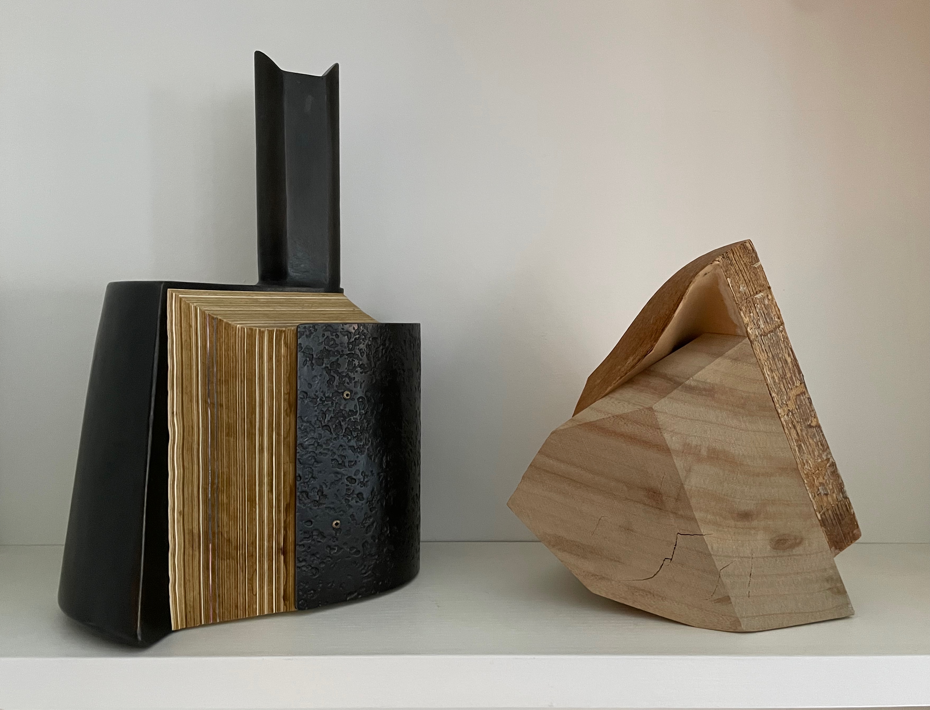
Views of Offset (2013) by Andrew Hayes and Silent Book (2023)
The titling of the two works raises appreciable similarities and differences. Offset suggests the printing method of the same name, which does involve metal plates. The overall shape, however, suggests some strange assemblage of early letterpress components: the bulbous ink balls (or dabbers) with their handles, the torque bar, and the metal furniture locks. The offset position of the piece’s “handle” also reflects the title. What can’t be appreciated from the images is that Offset wobbles if touched in the slightest.
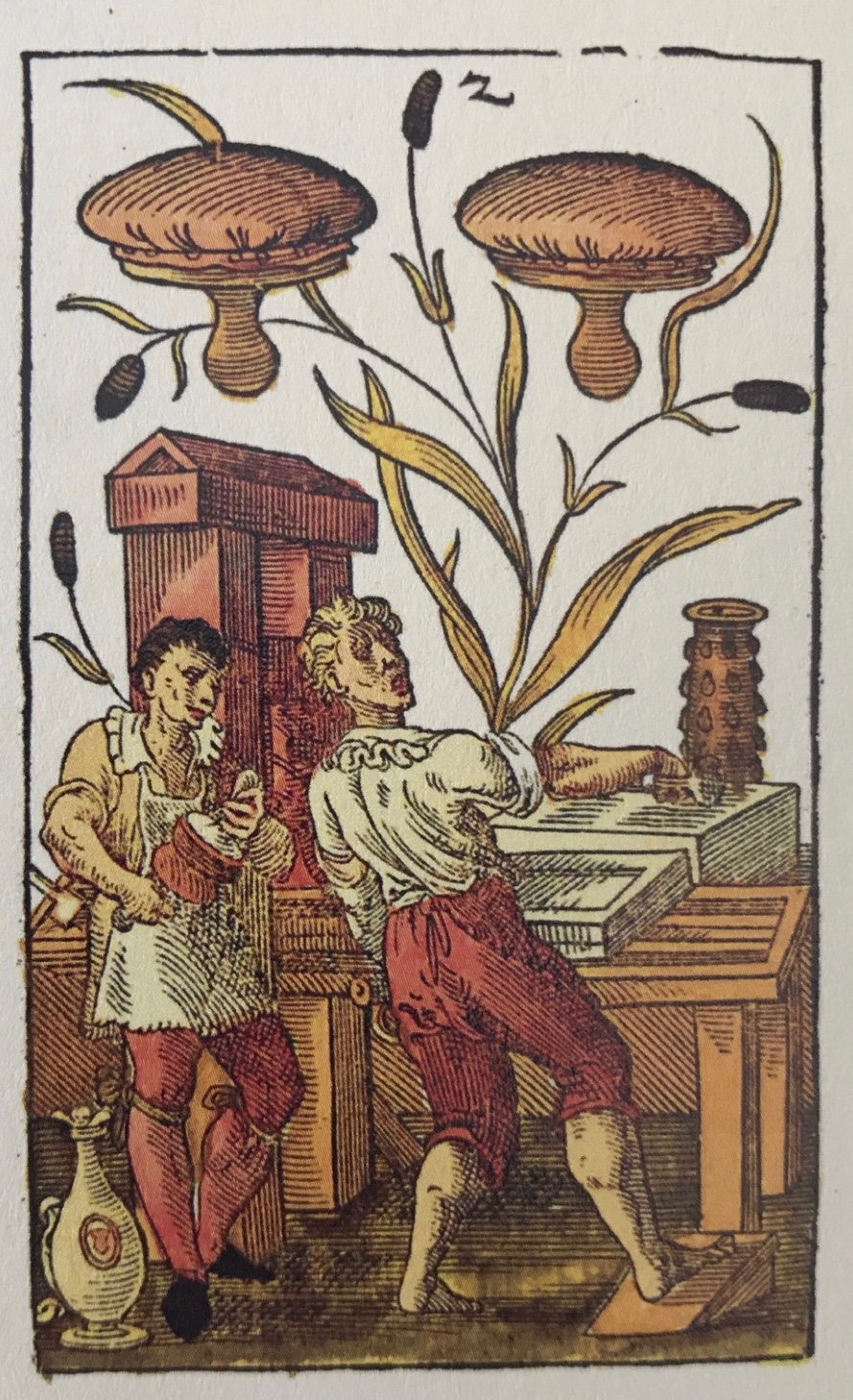
“The two of printer’s dabbers” from Jost Amman’s 1588 deck of cards.
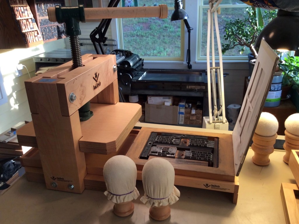
The BookBeetle Press, a portable screw press designed and built by Josef Beery. Reproduced with permission of Beery.
The title of Silent Book refers, of course, to the book block’s being sealed, an obvious visual/verbal pun. None of its information passes the lips of its pages. Like Offset, however, the title is also oblique. Although the derivation of the word book from the Old German Buche (meaning “beech”) is a debatable assumption, it’s widely accepted enough to allow that the block of wood is also a silent book.
Now imagine the substitution of a large block of pink bubble gum for the book material in Offset and Silent Book. Not a block of gum in the shape of a book, but an oversized, unchewed block of gum. Something very different to chew on now, isn’t it? The ways in which book artists manipulate the material and metaphor of the book vary every bit as much as the ways in which painters, sculptors, and other artists vary their techniques, materials, and subjects. Even within the slice of book art that focuses on physical inaccessibility, such as Marcel Broodthaers’ Pense-Bête (1964), Wolf Vostell’s Betonbuch (1971), Irwin Susskind’s Book Faced Down – Embedded in Plaster (1999), Jonathan Callan’s Rational Snow (2002), Anselm Kiefer’s Untitled (Constellation Book) (2004), Hanne Stochholm Exe’s Remake (2015), and Neil Nenner and Avihai Mizrahi’s Cover Story (2017), the variety abounds. Ryuta Iida’s series Silent Book is a resounding reminder.
Further Reading
“Barton Lidice Beneš“. 21 December 2025. Books On Books Collection.
“Doug Beube“. 21 April 2020. Books On Books Collection.
“Hanne Stochholm Exe“. 29 September 2018. Bookmarking Book Art.
“Ximena Pérez Grobet“. 7 July 2021. Books On Books Collection.
“Andrew Hayes“. 4 September 2019. Books On Books Collection.
“Ivon Illmer“. 22 December 2025. Books On Books Collection.
“Guy Laramée“. 18 September 2019. Books On Books Collection.
“Lucia Mindlin Loeb“. 28 November 2022. Books On Books Collection.
“Jacqueline Rush Lee“. 8 October 2019. Books On Books Collection.
Neil Nenner and Avihai Mizrahi, see “Hanne Stochholm Exe“.
“Lorenzo Perrone“. 8 September 2019. Books On Books Collection.
“Chris Perry“. In process. Books On Books Collection.
Beery, Josef. 15 September 2021. “Inking Without A Roller…“. BookBeetle Press.
Küng, Moritz (ed.). 2023. Blank. Raw. Illegible … : Artists’ Books as Statements (1960-2022). Köln: Verlag der Buchhandlung Walther und Franz König.
Peachey, Jeff. 14 July 2020. “Printer’s Ink Balls: Before the Roller or Brayer“. Peachey Conservation.