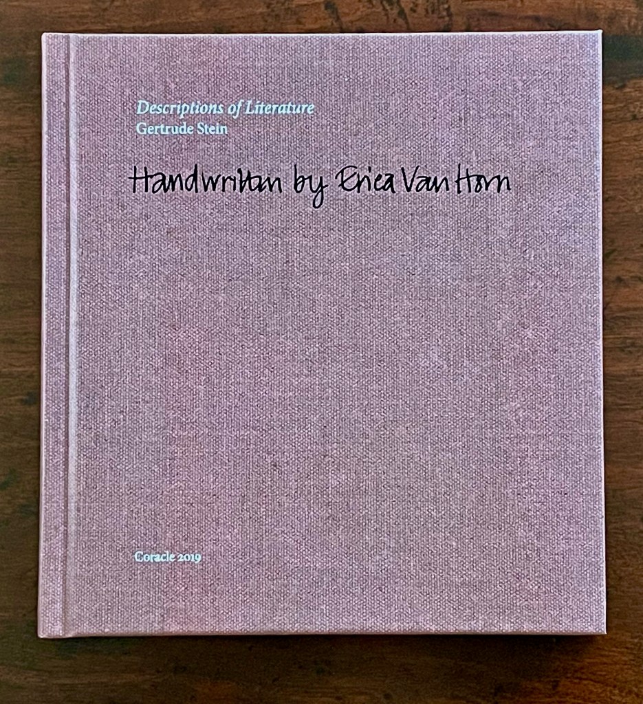
Descriptions of Literature by Gertrude Stein: Handwrittenby Erica Van Horn (2019)
Descriptions of Literature by Gertrude Stein: Handwrittenby Erica Van Horn (2019) Erica Van Horn Limited edition (unknown quantity). H157 x W146 mm. [144] pages. Acquired from Books about Art, 2 July 2025. Photos: Books On Books Collection.
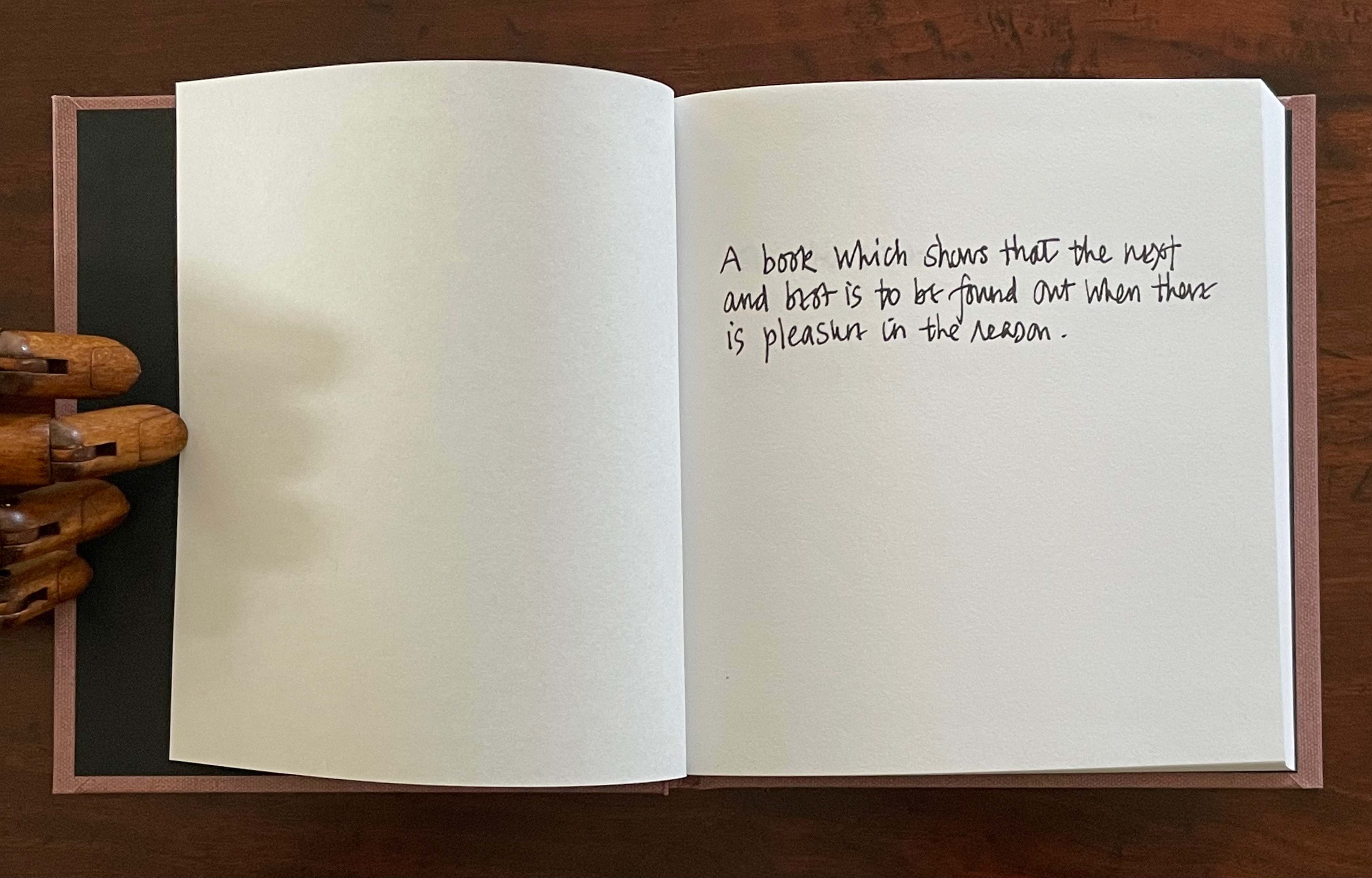
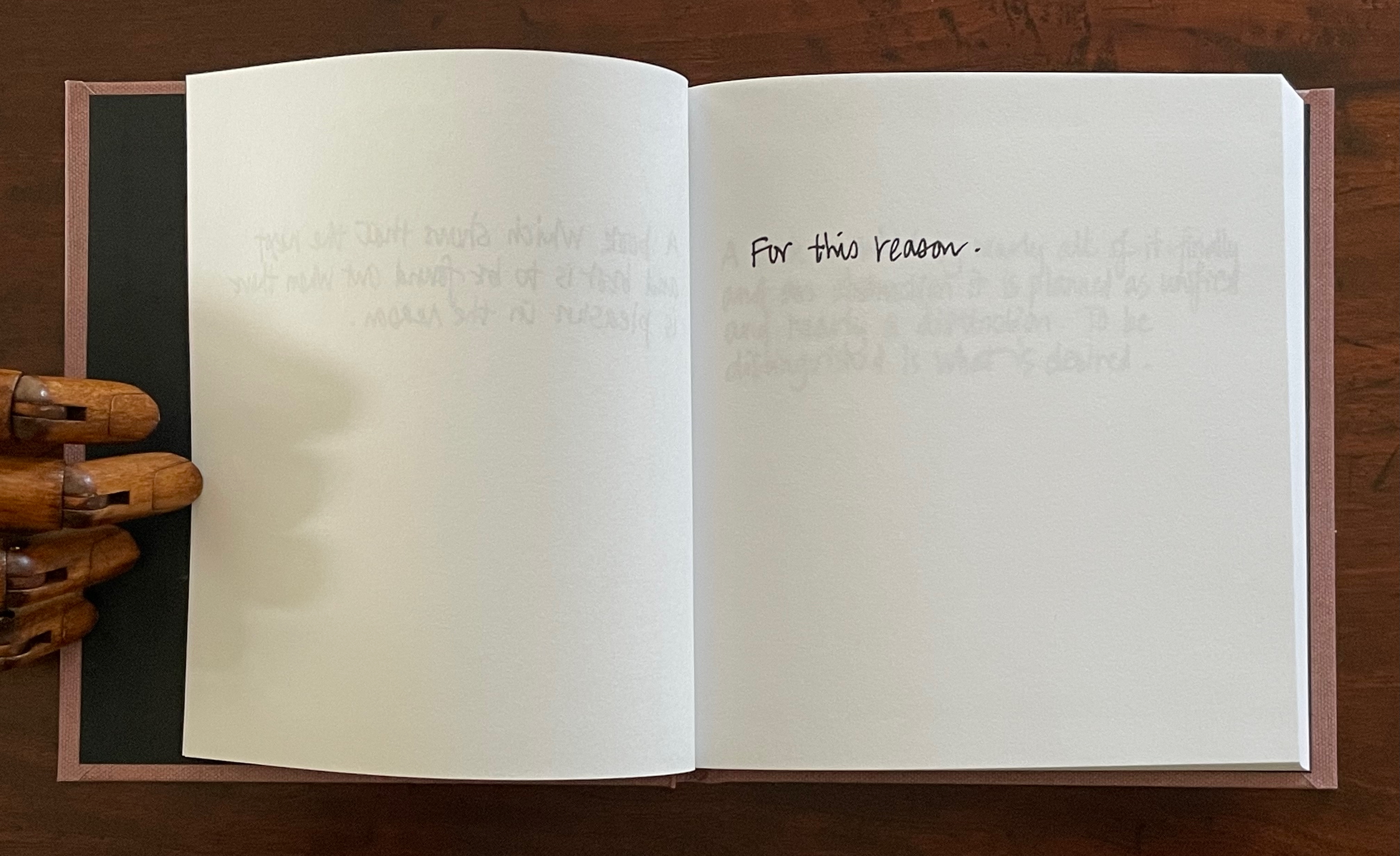
Appropriation has its reasons. Gertrude Stein’s description of literature with which Erica Van Horn begins her scribal appropriation of sixty-six of Stein’s exacting and elusive apothegms is particularly appropriate. In the brief afterword, Van Horn explains that she has always been proud of her handwriting and loves writing by hand. So, this book “shows that the next and best is to be found out when there is pleasure in the reason” as its next folio shows: Van Horn’s pleasure in the reason is her pleasure in the reason.
Altered books as artists’ books present a seemingly endless variety.
Some may be the conversion of old books into just-legible new ones as in A Humument redacted with ink, paint, excision, and collage by Tom Phillips, Tree of Codes mechanically excised by Jonathan Safran Foer, or The Eaten Heart scalpeled into existence by Carolyn Thompson. They give us a new work to read page by page extracted page by page from the earlier work, which remains more or less (mainly less) present in our hands.
Others like Marcel Broodthaers’ page-by-page redactions of Mallarmé’s Un Coup de Dés by ink in one case and excision in another or Michalis Pichler’s similar reformatting and excision of the same poem in clear acrylic or Jérémie Bennequin’s page-by-page erasures of Proust’s Remembrance of Things Past give us artists’ books that make the altered books illegible but still accessible page by page.
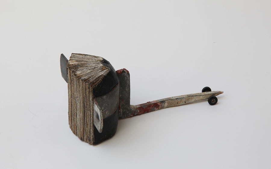
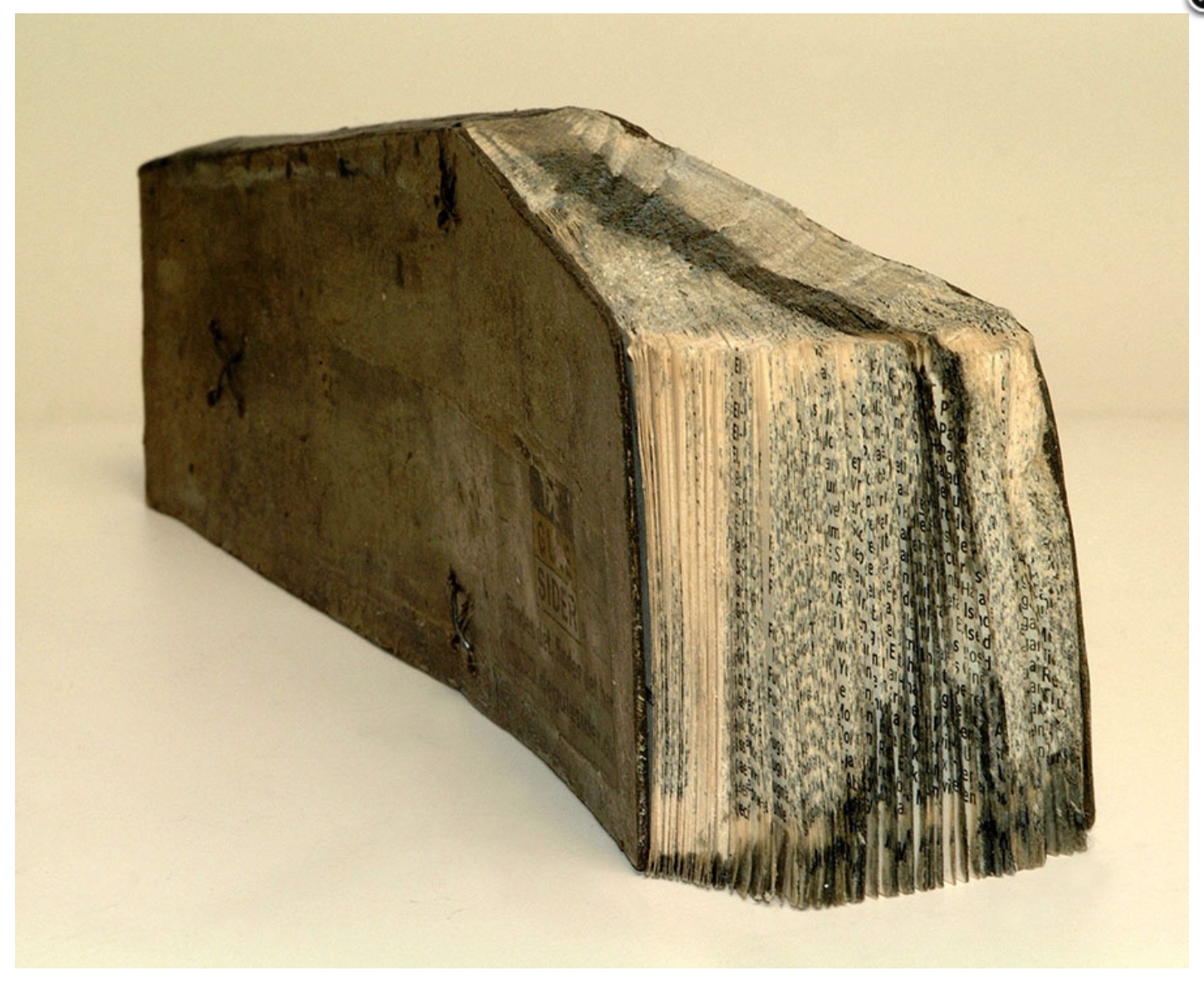
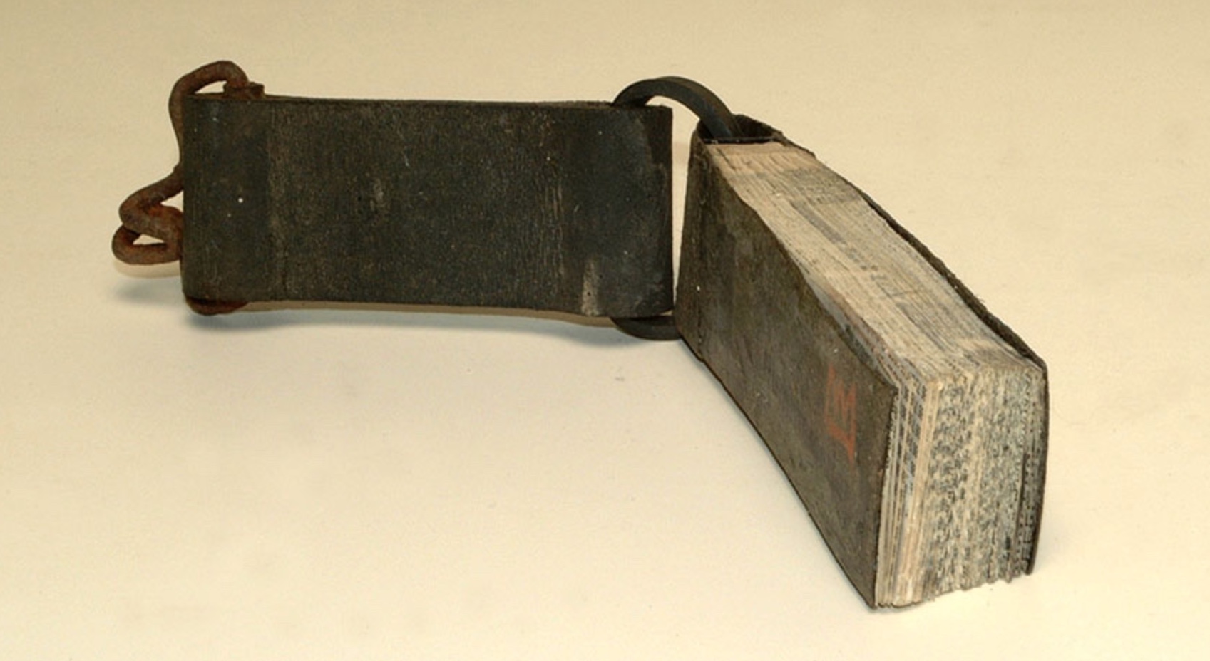
Other altered books as artists’ books are mainly one-off spatial objects that can be taken in in one go — not necessarily in just a glance but in the look or gaze given to a sculpture or painting. The ground up and encased works in Literaturwurst by Dieter Roth. The sealed, painted, nailed, and “hairied” works of Barton Lidice Beneš. The torn works of Buzz Spector. The sandblasted works of Guy Laramée. The glued and carved works of Brian Dettmer. The bullet-hole-ridden Point Blank by Kendell Geers. The pun-packed moebius-sculpted Red Infinity #4 by Doug Beube. They give us artists’ books that make the altered books illegible and inaccessible as books.
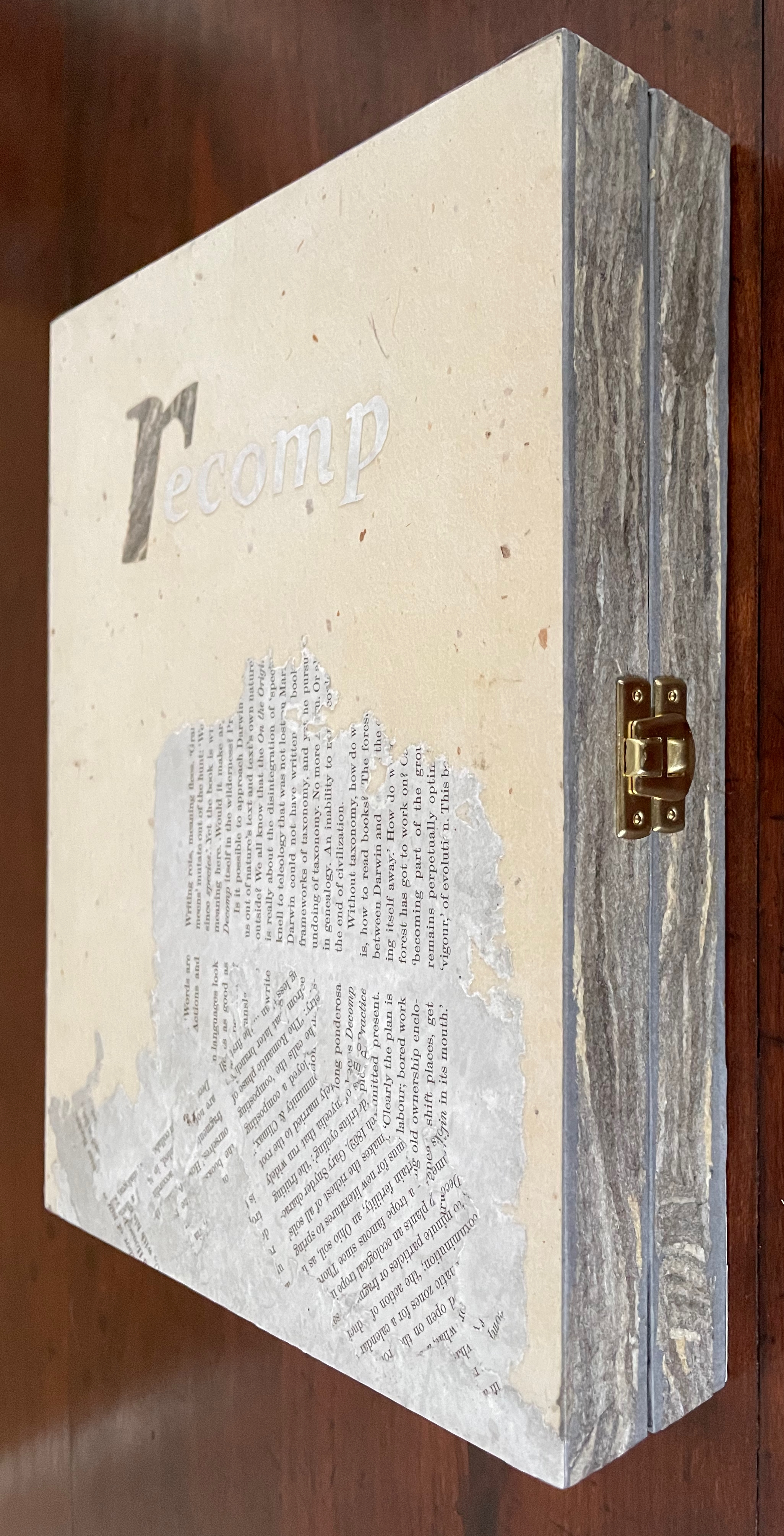
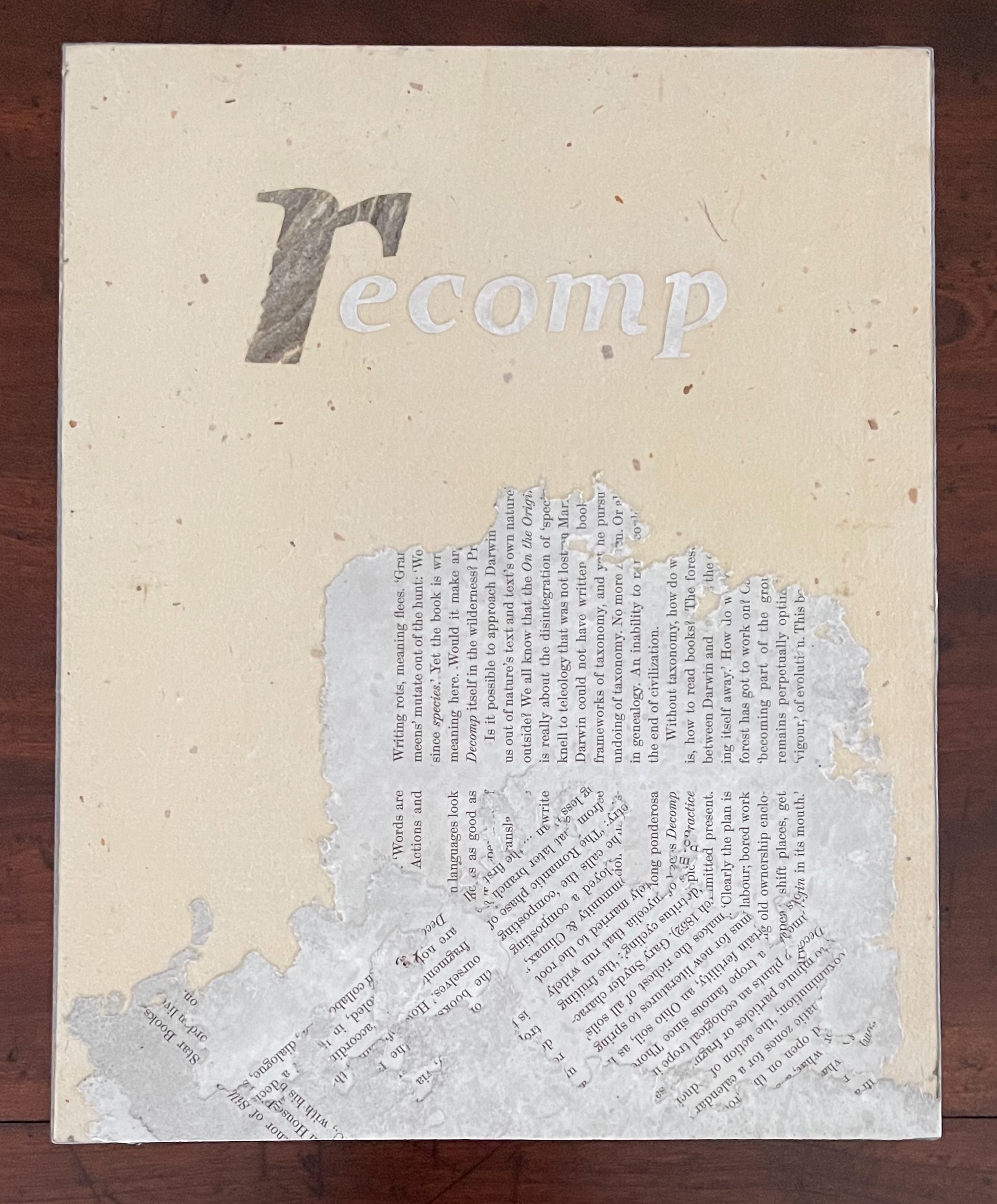
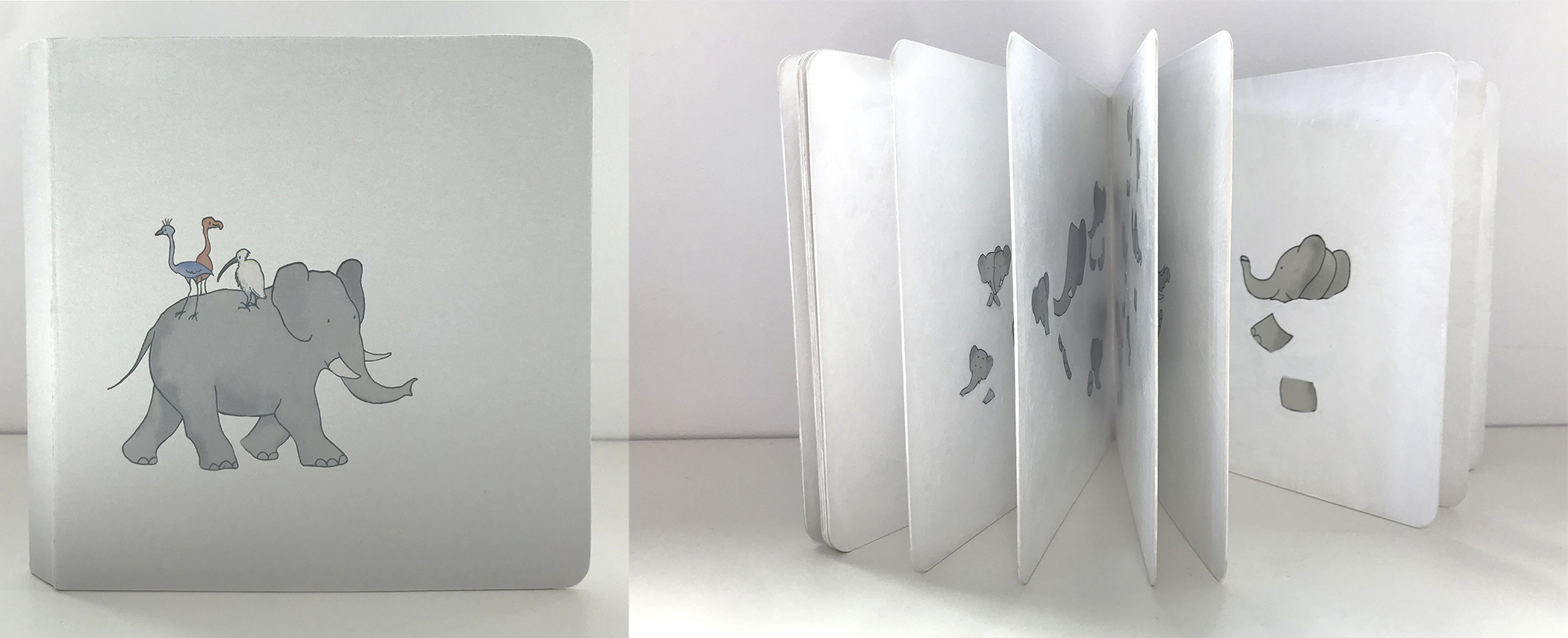
recomp (2013-23) Cathryn Miller Hinged and clasped diptych, housing an altered book, explanatory booklet, and loose colophon. Unique. Acquired from Vamp & Tramp Booksellers, 2025. Photos: Books On Books Collection.
Recomp (2013-2023) is a collaboration with a colony of bald-faced hornets. Having reviewed Stephen Collis and Jordan Scott’s decomp (2013), their artists’ book devised by exposing several copies of Darwin’s On the Origin of Species to the elements, Cathryn Miller followed suit and hung her reviewer’s copy of decomp in a tree. Over time, the wind, rain, and snow sent the book to the forest floor where it fell apart. Hornets had done their part in its decomposition, nibbling away at its edges and weakening the structure. Their conversion of the book into cellulose for their nest was also the start of their artistic partnership with Miller. Eventually the nest, too, became prey to the elements or marauders and fell and broke apart on the ground. Miller and photographer husband David recorded all this and gathered up the book fragments and broken nest.
In the 1970s, post-Minimalism, post-Conceptualism, Language-based Art, Neo-Dada, Fluxus, Arte Povera, OuLiPo, the commodification of art and the “dematerialization of the art object” — all made a messy milieu for visual and literary artists. According to Stefan Klima, this is also the period when the messy notion of the artist’s book or “book art” gained recognition as a genre with exhibitions curated by Dianne Vanderlip for Moore College of Art and Design, Germano Celant for Nigel Greenwood Gallery, and Martin Attwood for the Arts Council of Great Britain.
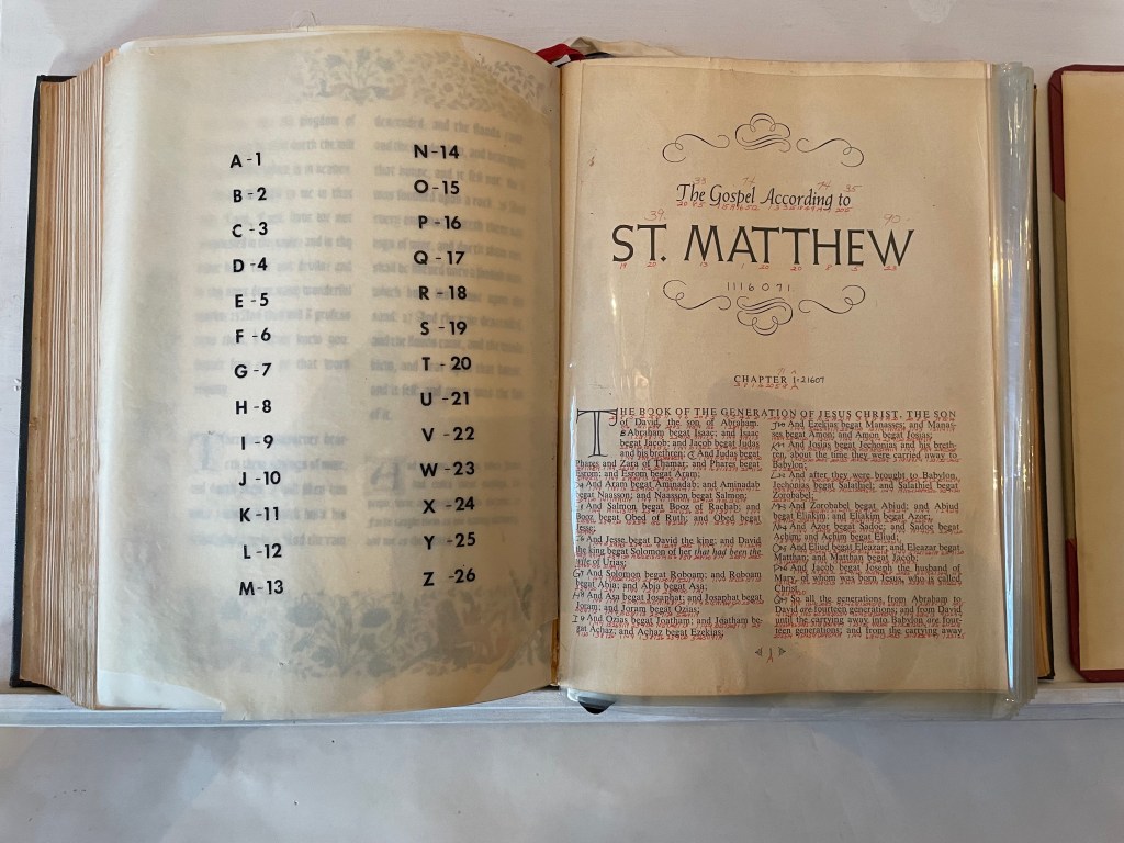
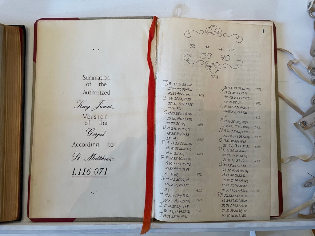
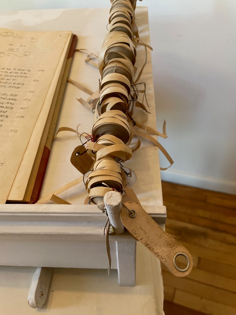
Into this environment came Bronx-born Karen Shaw, an aspiring artist and data analyst for the broadcaster NBC. On the job, she learned about the hash function — that one-way cryptographic algorithm that condenses input data of any size into an output of fixed lengths. When she saw that she could change a word into a number by assigning each letter a number according to its place in the alphabet and then summing them up, she arrived at the idea of reducing “the masterpieces of literature, poetry and prose to a number, which would signify the ‘essence’ of the work”.
After applying the approach to Blake, Shelley, Keats and others, she tackled the King James version of the Gospel according to St. Matthew. Here’s her description of the procedure:
I wrote the numerical equivalent of each letter under each letter … in the Bible itself. Then I added up the number/letter of each word until I had the sum for each word, verse, and chapter. I then recorded the sums in an accounting book. This became the second version …. Next I added it all up on adding tapes, one tape for each chapter, which I measured to find out the length of each chapter. I then attached each labeled tape to a rod at the edge of a shelf that had been built to hold the work. This was the third version …. (Sellem, “Karen Shaw = 100”.)
Here was an utterly different form of artist’s book by alteration: an assemblage of a “Rembrandt” Bible’s St. Matthew Gospel with each letter hand-numbered according to its place in the alphabet; each of the gospel’s words summed and recorded in an accounting book with all of its word-sums summed to its essence of 1,116,071; and the “scrolls” of the adding machine tapes for each chapter ranged alongside the Bible and accounting book. For Shaw, this altered-book form of art was merely a first step into a series of discoveries and inventions that led to a lifetime of artistic exploration and creation.
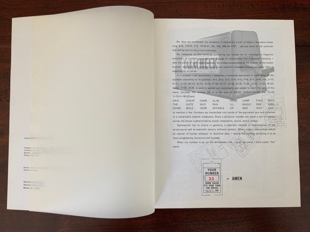
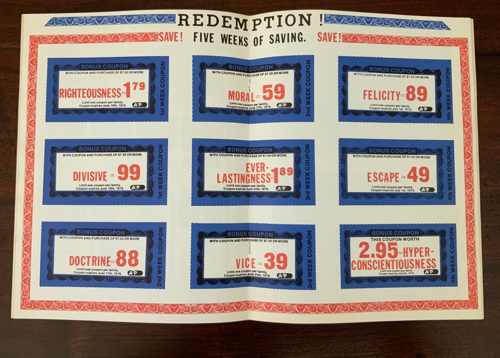
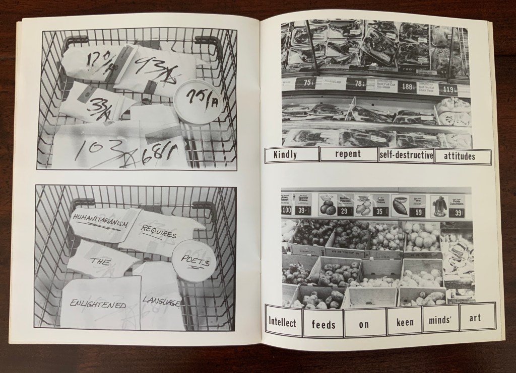
As she plied her calculations, she noticed that obviously many words had the same number. The impulse to collect words equalling 100 (the sum of her name’s letters) led to creating a numerical dictionary — the Sumantic Vocabulary Collection — listing words with equal sums. With that, Shaw began to see words in what she called “the numerical waste” surrounding her: numbers on receipts, savings coupons clipped from newspapers, brand labels, barcodes and pricing stickers and other everyday consumer signage. Strange poems could be derived from them. Eventually “sumantic” — playing on sum and semantics — evolved into “summantics” as her description of her artistic methodology. Her 1978 artist’s book Market Research spells (or numbers?) this out in its foreword.
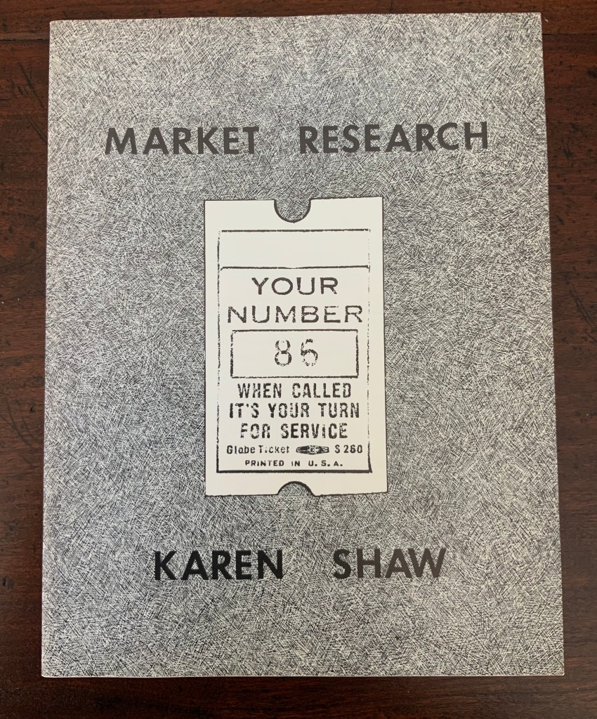
Market Research (1978)
Market Research (1978) Karen Shaw Softcover booklet, saddle stitched with staples, translucent fly leaves. H280 x W215 mm. 24 pages. Acquired from , . Photos: Books On Books Collection.
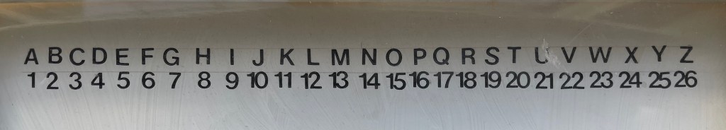
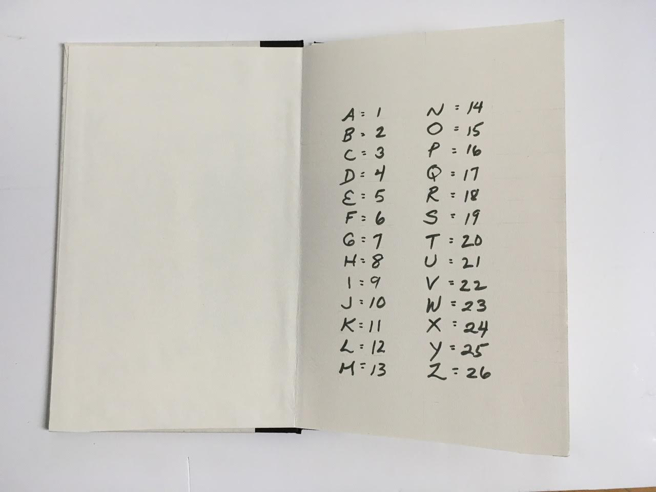
In a process I call summantics, I designate a numerical equivalent to each letter of the alphabet according to its position: A=1, B=2, C=3, D=4, E=5, F=6, G=7, H=8, I=9, J=10, K=11, L=12, M=13, N=14, O=15, P=16, Q=17, R=18, S=19, T=20, U=21, V=22, W=23, X=24, Y=25, Z=26. A word is spelled out numerically and added to reach the sum of a word. Consider the number 33. It is the sum of MEAN = 13+5+1+14 = 33, also ALAS = 1+12+1+19 = 33 and:
DIAS CHEAP NAME ALIBI COMB CAMP FIND SEED THE GATE SAID RAN ILL MAGIC EWE KEEL CEASE BOLD HERB AFFABLE OR WEE COIF GAY
to mention a few. Numbers are transcribed into words of the equivalent sum and collected in a numerically ordered vocabulary. Since a particular number can equal the sum of various words the choice is determined by mood, imagination, sound, syntax and/or grammatical structure.
Summantics has its origins in gematria, a cabalistic method of interpretation of the scriptures as well as late twentieth century software systems. Where today’s technocrats reduce all manner of human endeavor to statistical data, I reverse the process believing it to be more enlightening, humorous and humane.
Given the humor of the work’s opening, it’s likely that the title Market Research cheekily refers to her data analysis work with NBC questionnaires completed by mothers for tracking the impact of TV violence on their young sons.
In his review of the 1978 exhibition “Artists’ Books and Notations” (Touchstone Gallery, 118 E. 64th Street, New York), Lawrence Alloway noted Karen Shaw’s methodology as another instance of “the ways by which language has entered recent visual art, formerly protected from such incursions by the prestige of Form. If artists use words in their work, it is not because they are now more dependent on writers or on theory than in the past, as has been suggested, but because language has become available as subject matter” (p.653). With Shaw in particular, it was a case of language and numbers becoming available as subject matter.
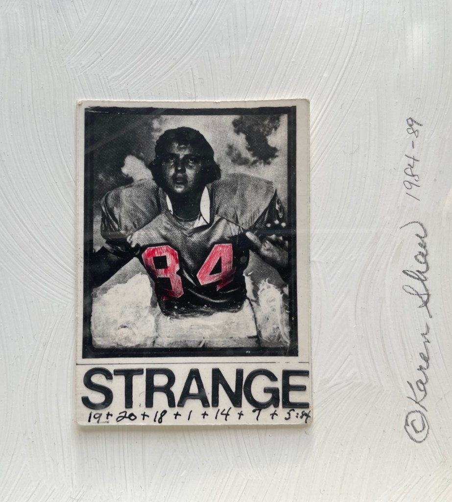
George Orwell 1984 (1984-89)
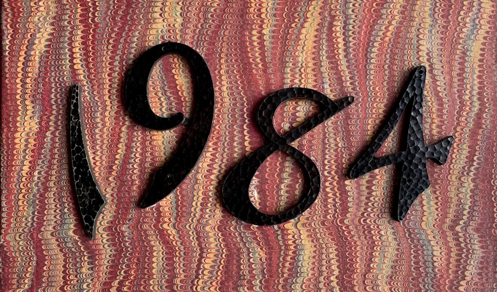
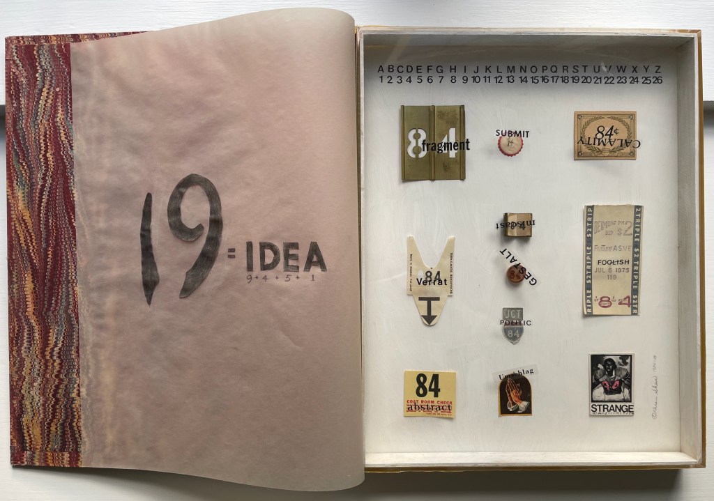
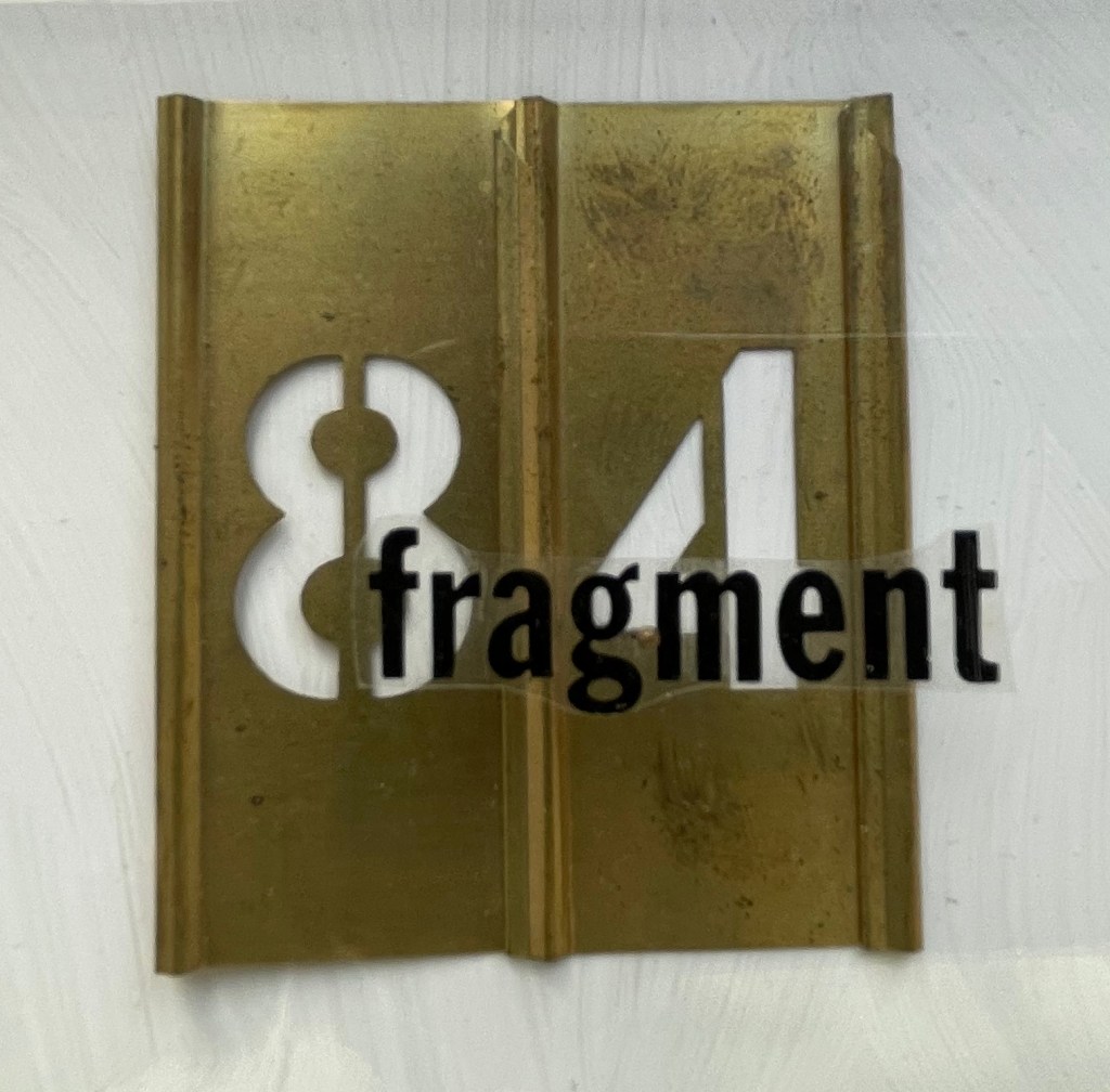
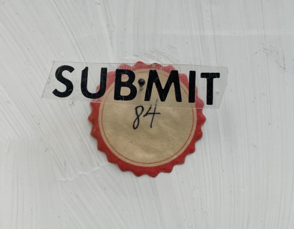
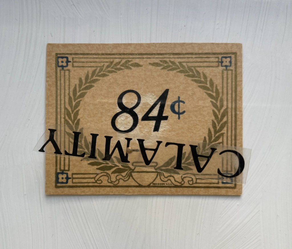
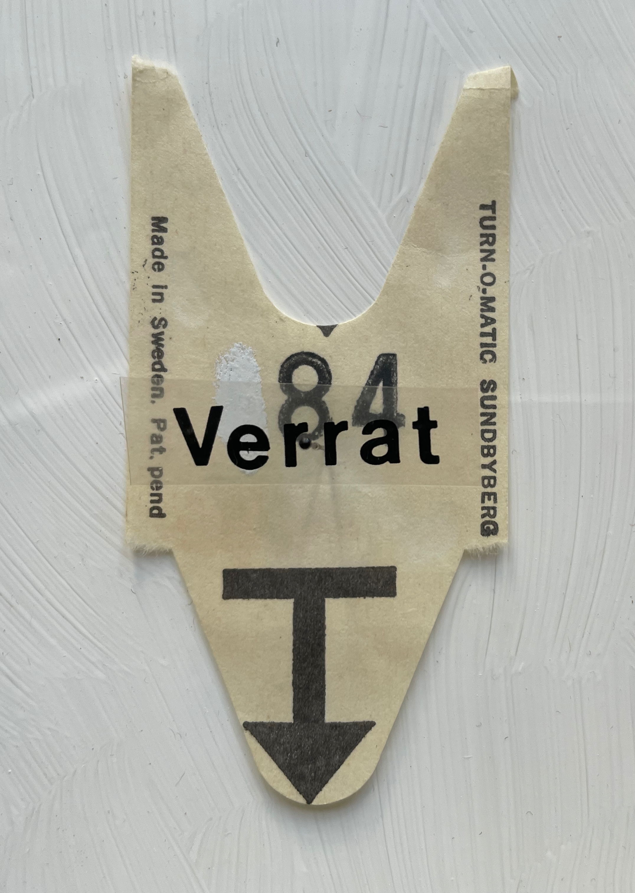
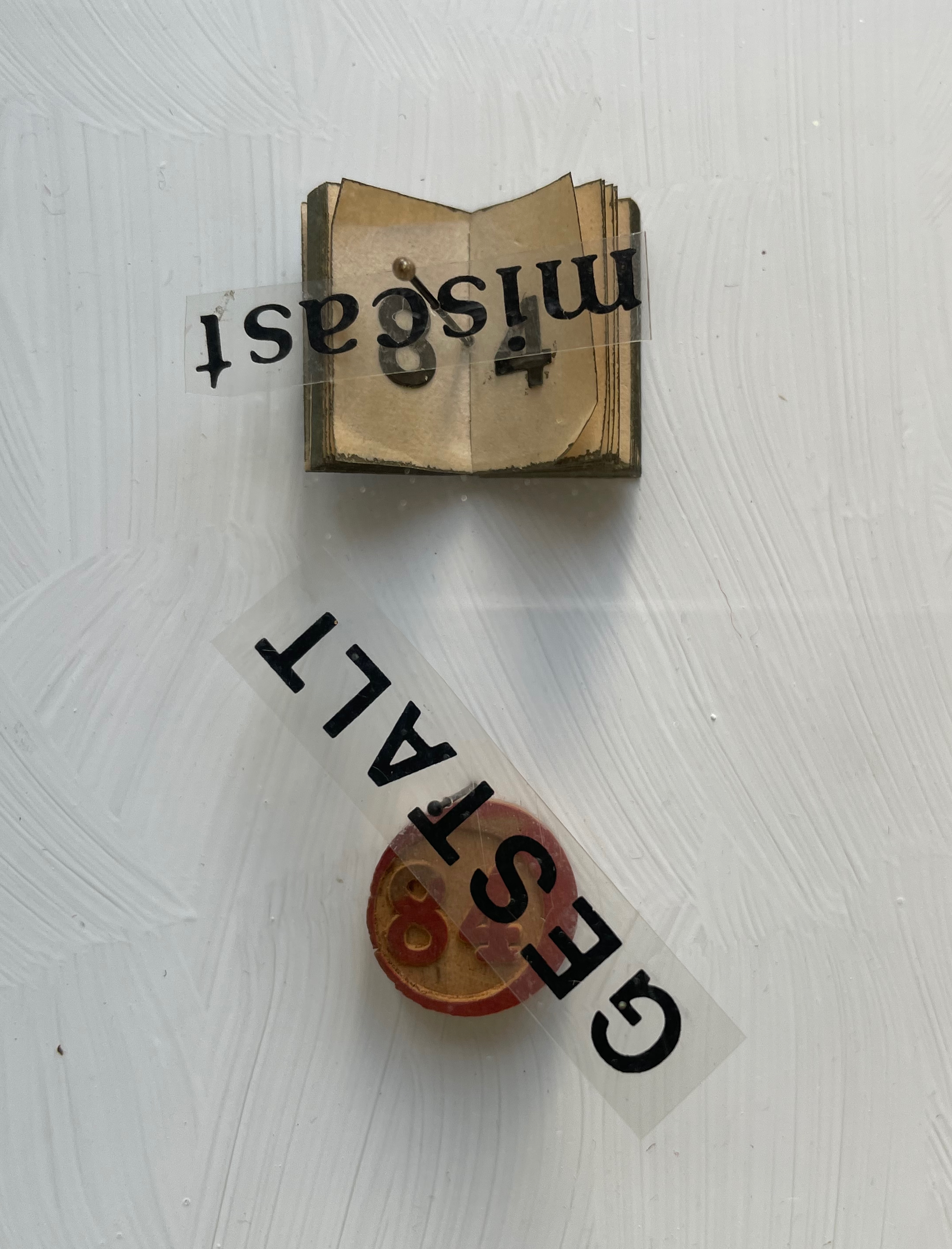
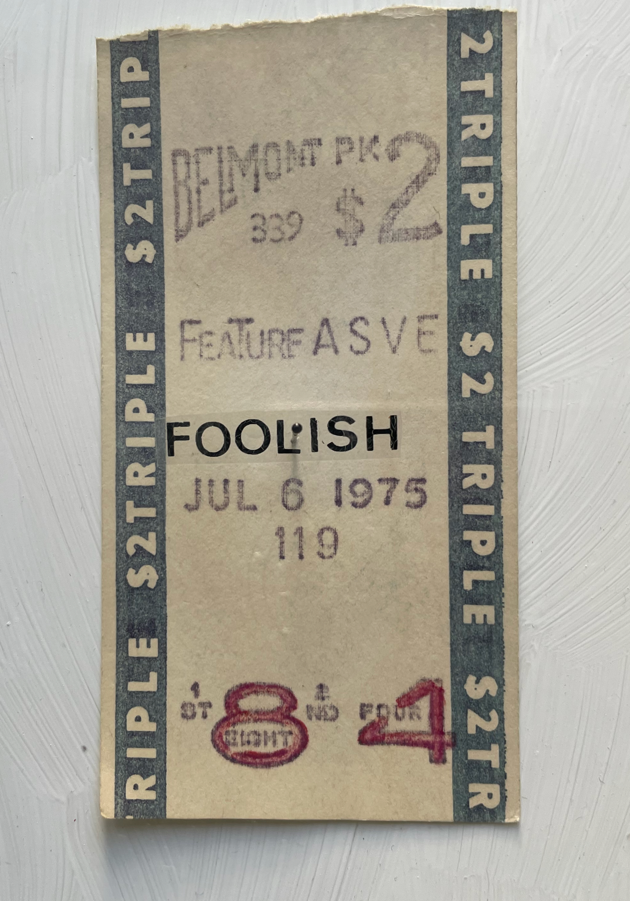
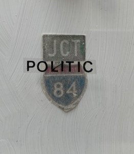
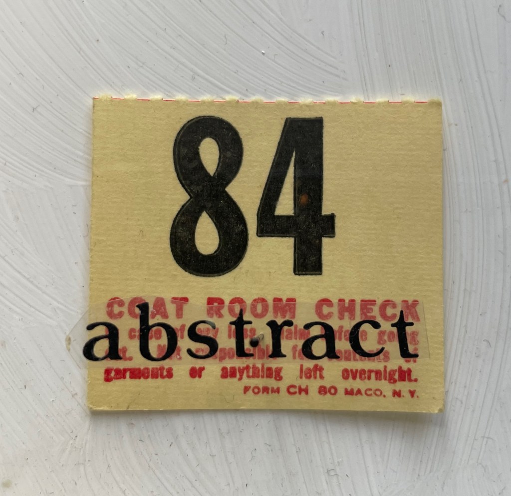
George Orwell 1984 (1984-89) Karen Shaw Diptych box covered with marbled paper on front and spine, wrought iron numerals 1984 and plastic letters fixed to front cover, translucent flyleaf with inked symbols and numbers, with text colored and cut out from translucent paper, plexiglas glued to wooden case with gessoed interior and 11 found items bearing the number 84, each fixed to the interior wooden panel with a black-bead-headed pin. H360 x W290 x D40 mm. Unique work. Acquired from Peter Kiefer Buch- und Kunstauktionen, 21 October 2023. Photos: Books On Books Collection.
Whether tabulating words or deciphering numbers, Shaw leaned further into three-dimensional assemblages resembling one- or two-page books. The somewhat-damaged homage George Orwell 1984 blends her interest in transposing literary works into hash codes with that of reversing numbers in the numerical wasteland into words with the help of her dictionary. Shaw plays off Orwell’s idea of double-speak by splitting his title in two. The first half is the sum of the numerical values of the letters in “idea”, appropriate for an idea-driven book. For the second half, however, she seeks out words that sum up to 84, letrasets them on clear plastic, and pins them over found and sometimes manipulated objects. A word may allude to its found object, or it may vaguely relate to Orwell’s book, or whether there’s any association at all may be obscure. A Belmont racetrack betting slip makes an ironic match with “foolish”, but seems unrelated to the novel. The German word Verrat translates as “betrayal”, which certainly fits the book, but what it has to do with the queue ticket (manipulated to show “84”) is unclear. That the word “calamity” has spun upside down over its manipulated token is an accidental irony, and what association the overwritten token has with the word or novel is also unclear.
Like Louis Lüthi’s A Die with Twenty-six Faces (2019), built on a collection of literary works entitled with a single letter, Shaw might have extended this part of her oeuvre with other number-titled works: Ray Bradbury’s Fahrenheit 451 or Joseph Heller’s Catch-22. Had she been inclined, she could have even used Lüthi’s book and its reference to Marcel Broodthaers’ quip “The alphabet is a die with 26 faces”. These might have yielded results more compelling than George Orwell 1984, but she would have still been captive to finding luckily appropriate words with the right word-sums.
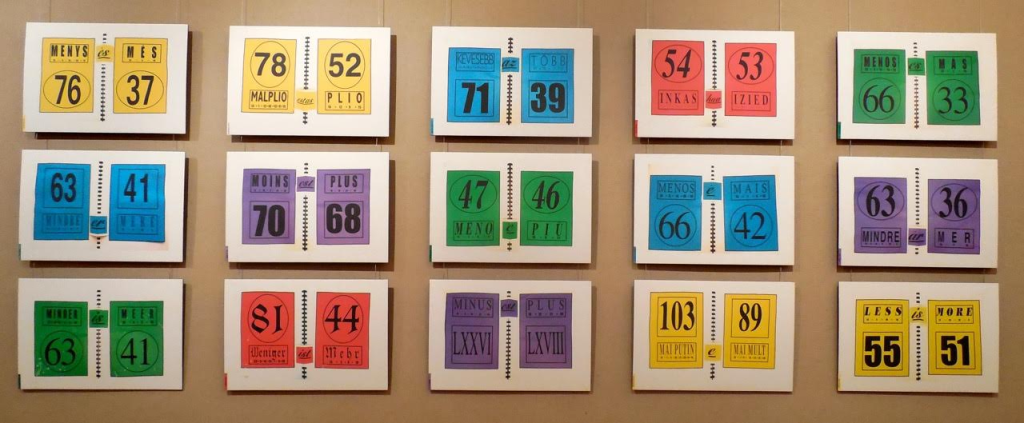
Two summantic works not in the collection — Less is More: Proof in 15 Languages (1999) and Summantic Proofs (2019) — are more compelling and uncanny. The fact that so many languages’ words for “less” have word-sums greater than the word-sums for the words for “more” is simply uncanny, and Shaw’s typography, color and layout in her spiral sketchbook presentation are compelling.
Less is More: Proof in 15 Languages (1999) Karen Shaw Photo: Courtesy of the artist.
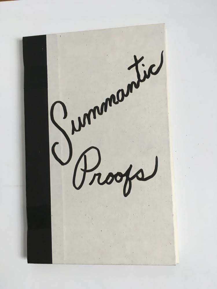
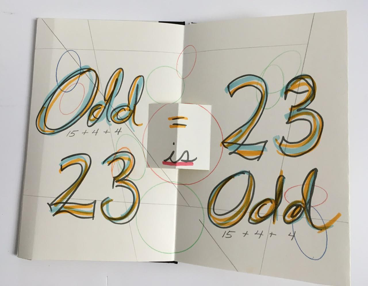
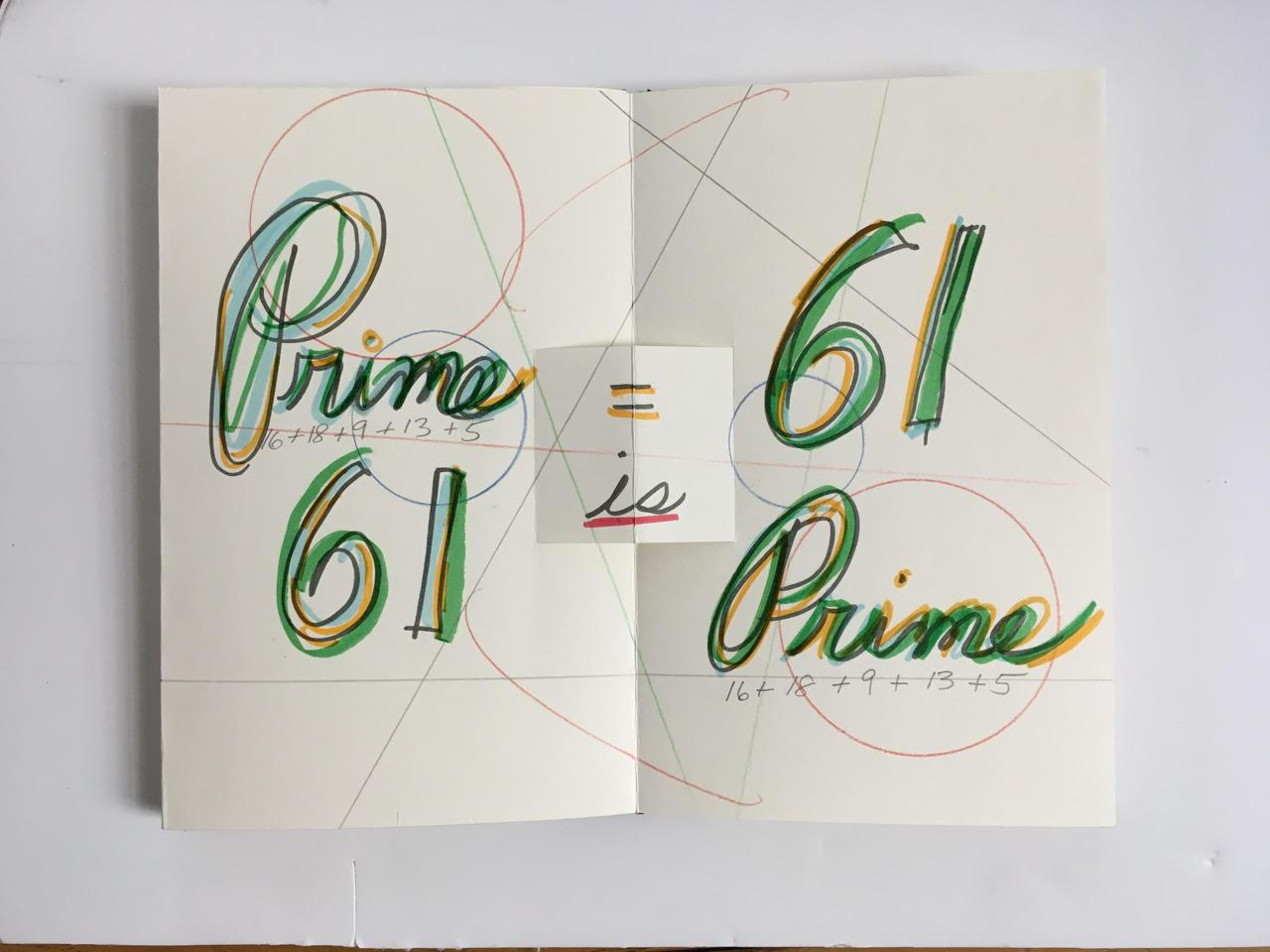
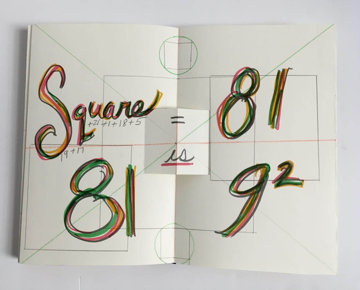
Also uncanny is her later collection of “proofs” in which she demonstrates that the word-sum for “odd” is an odd number, that the word-sum for “prime” is a prime number, and that the word-sum for “square” is 9 x 9. The pop-up equals sign, the ruler-drawn lines and the hand-colored script in this late mock-up reflect her ongoing artistic drive.
Summantic Proofs (2019) Karen Shaw Photos: Courtesy of the artist.
The most striking and consistent of Shaw’s works in the collection departs from her summantic method. It nevertheless embodies the ingenuity, humor, and humanity at play in her art.
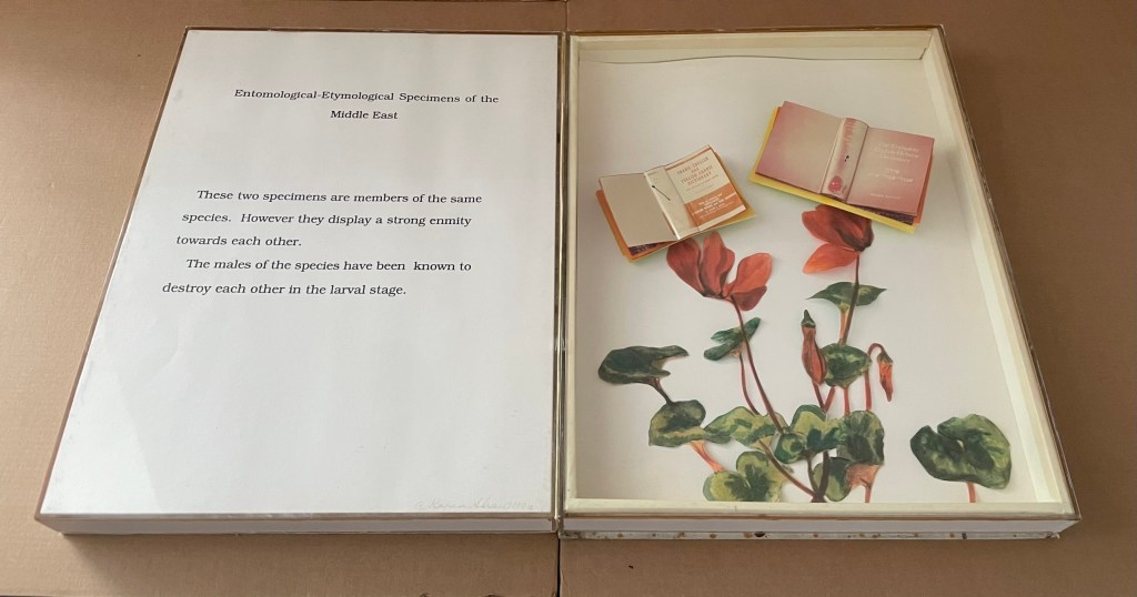
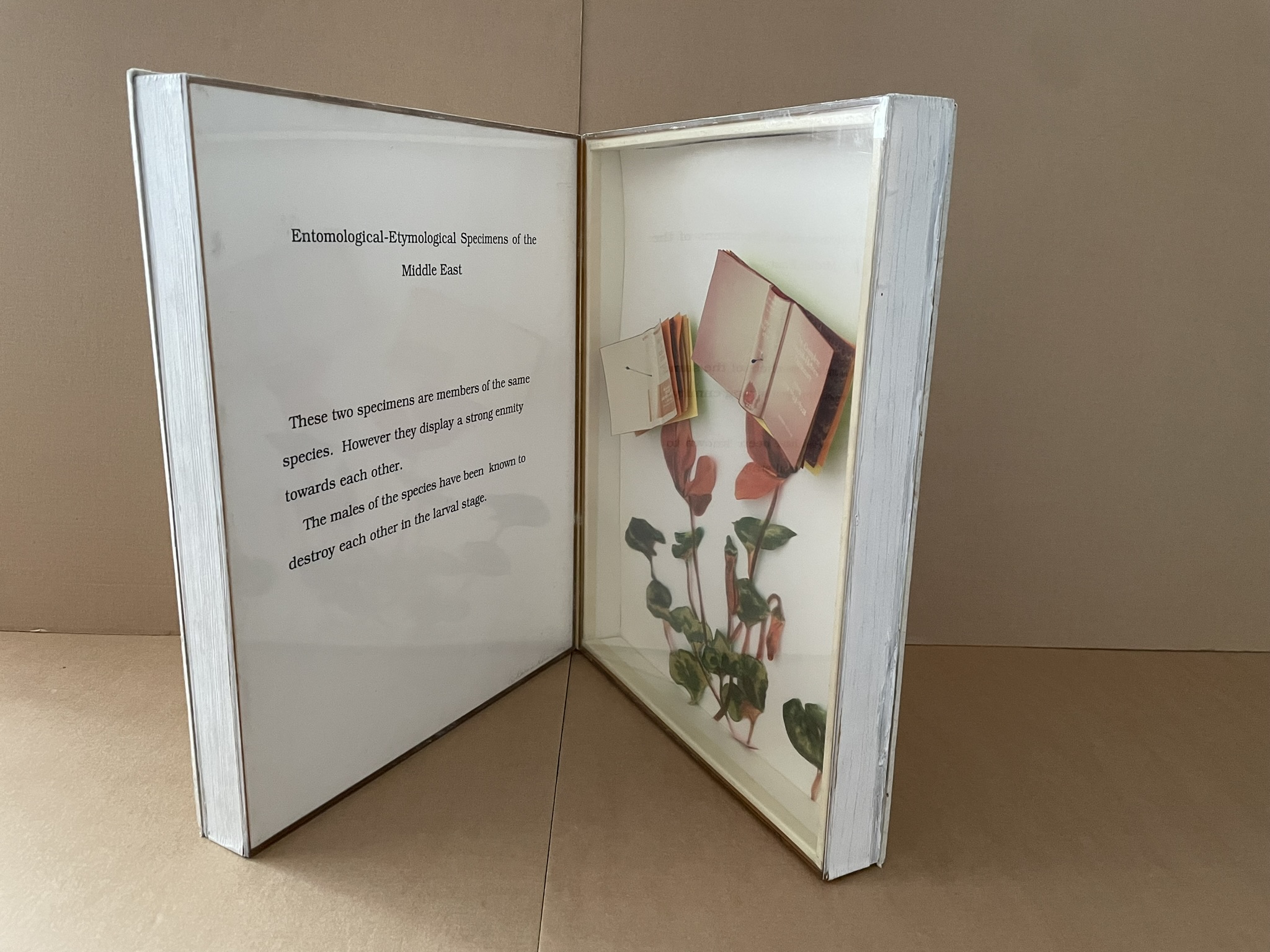
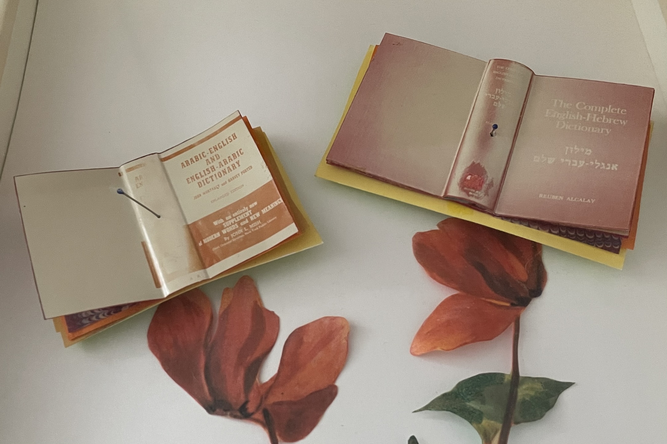
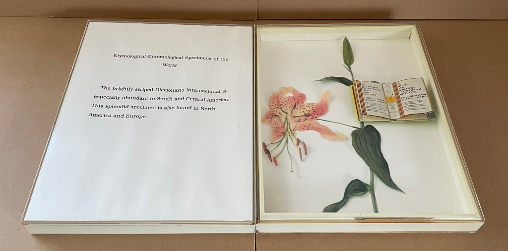
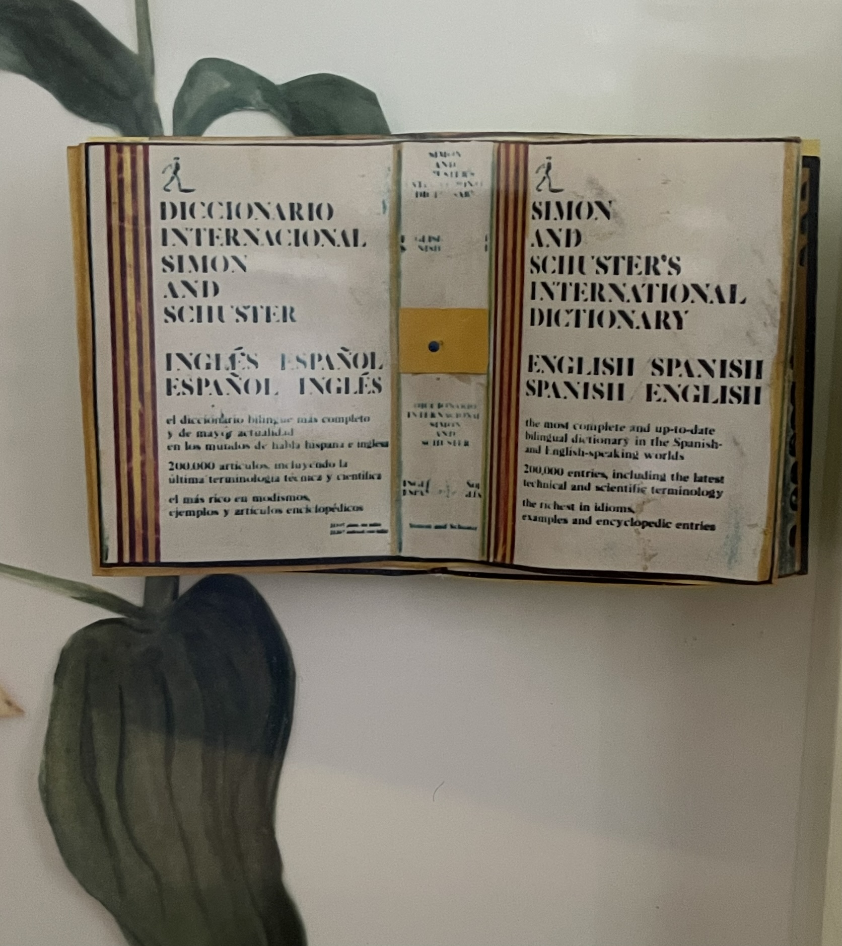
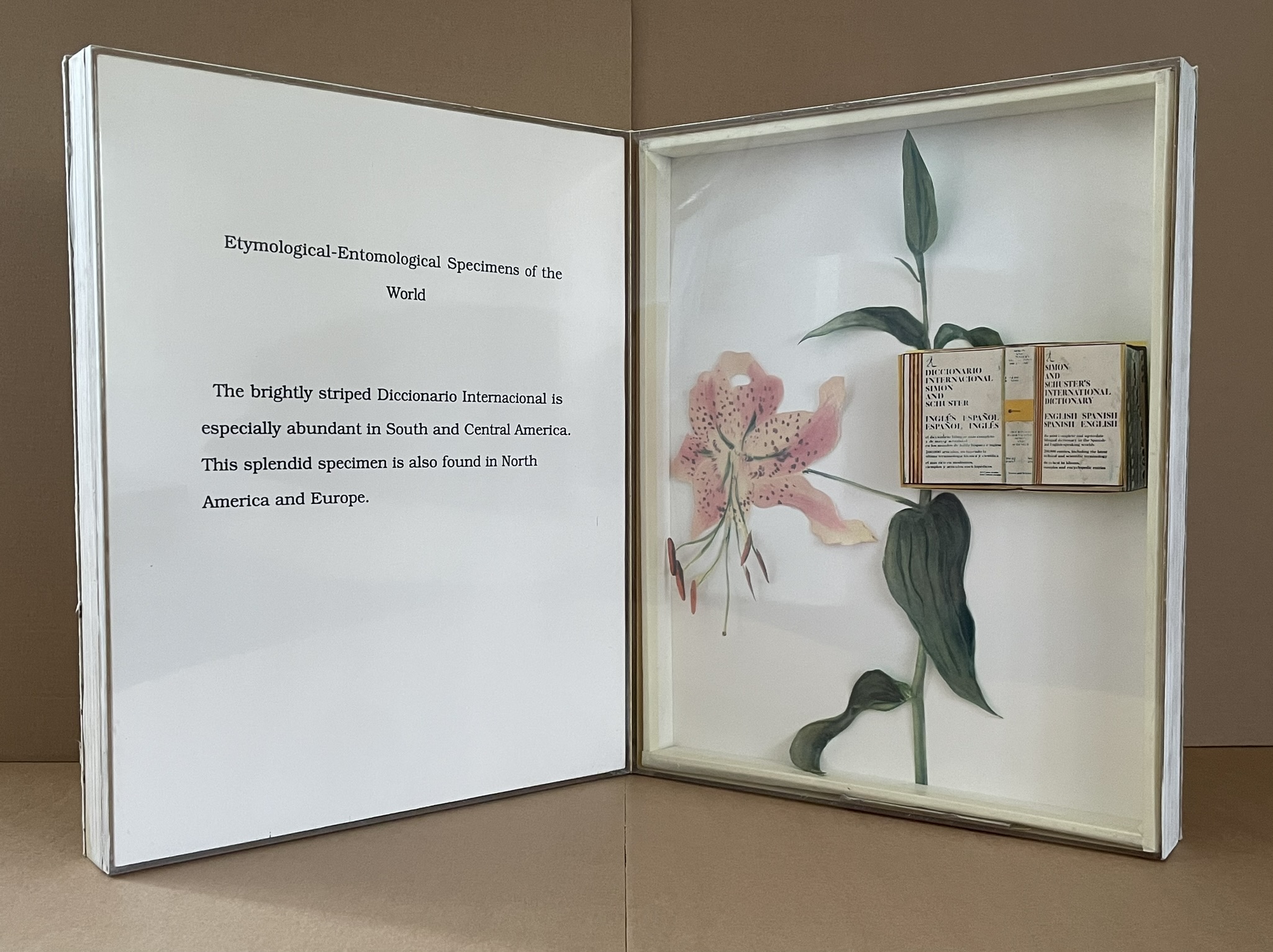
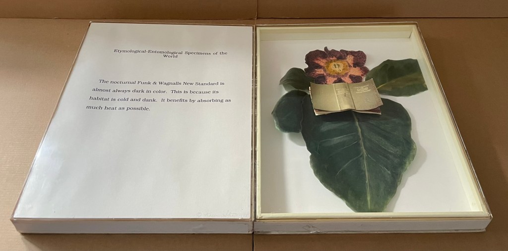
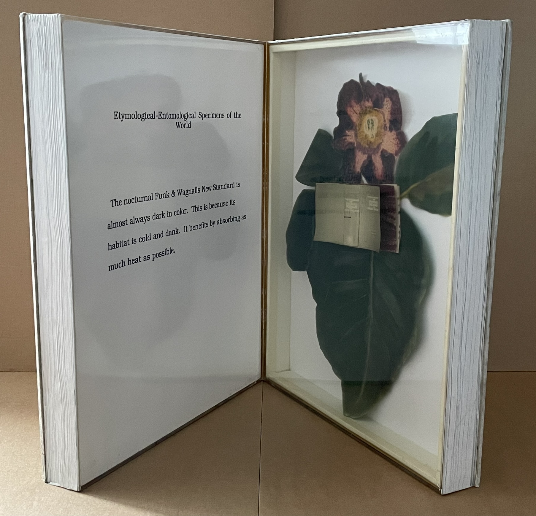
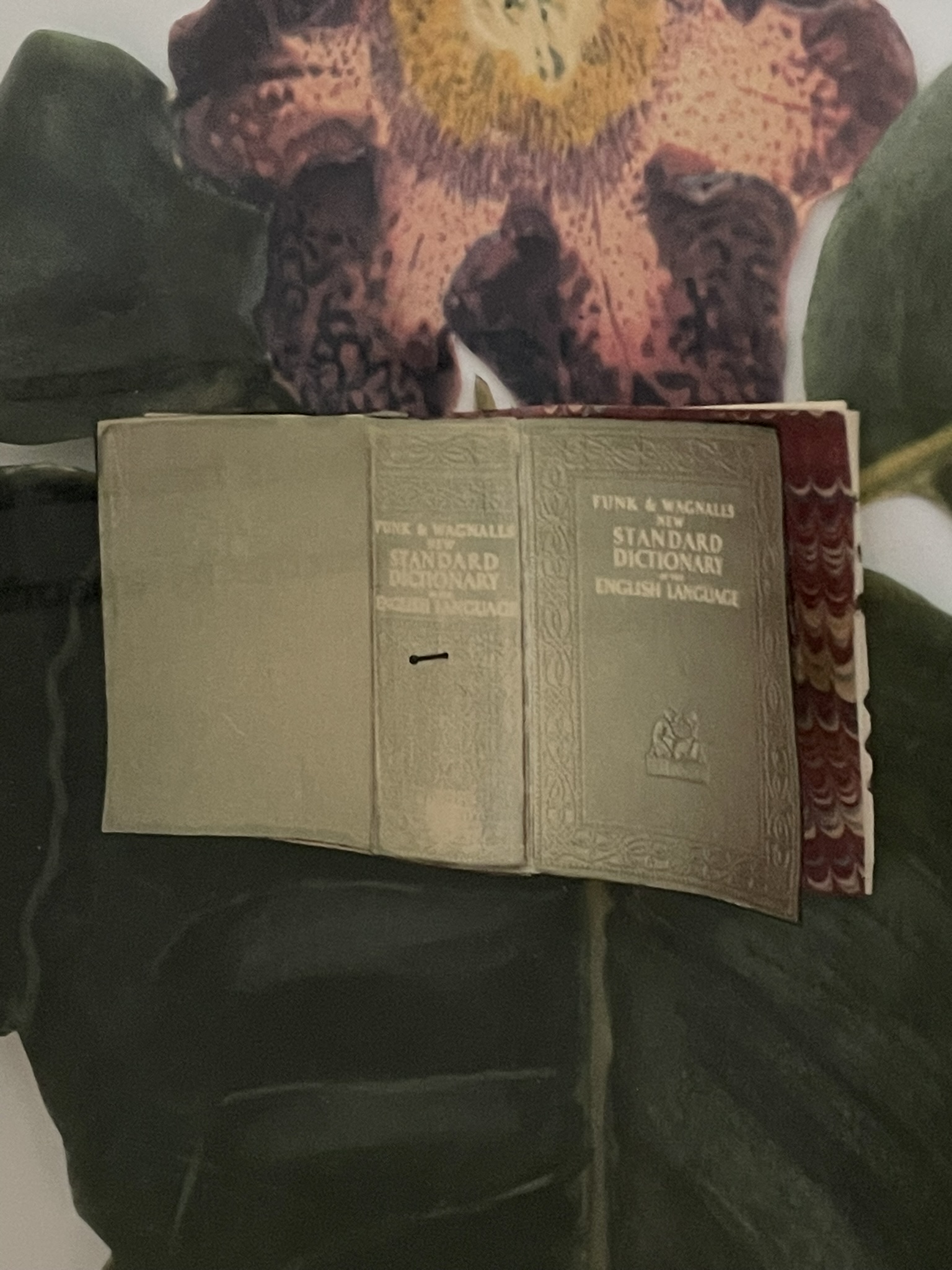
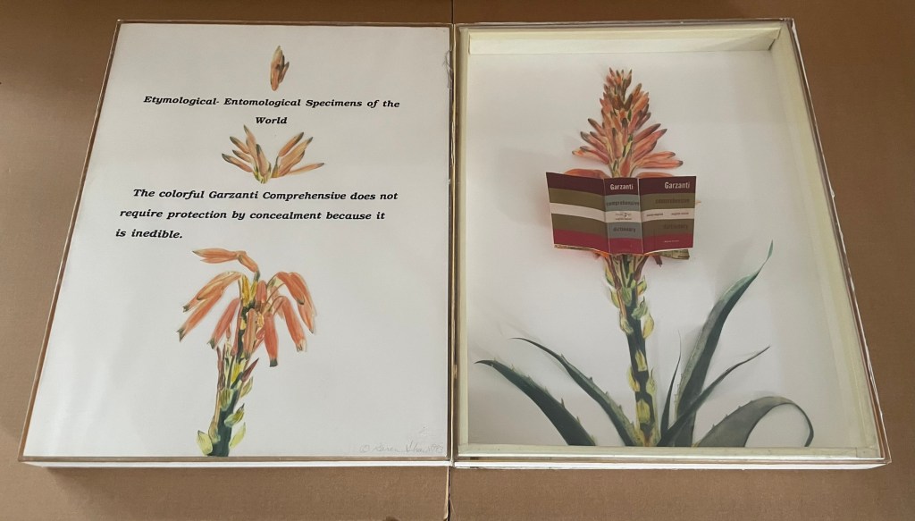
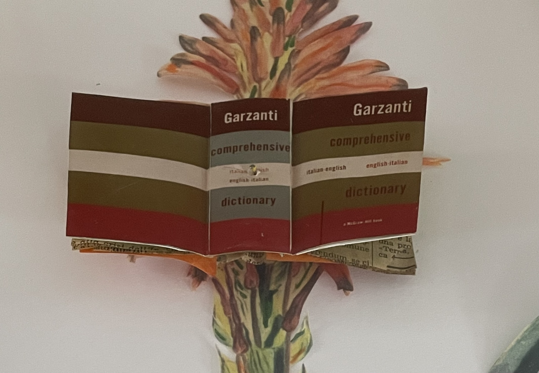
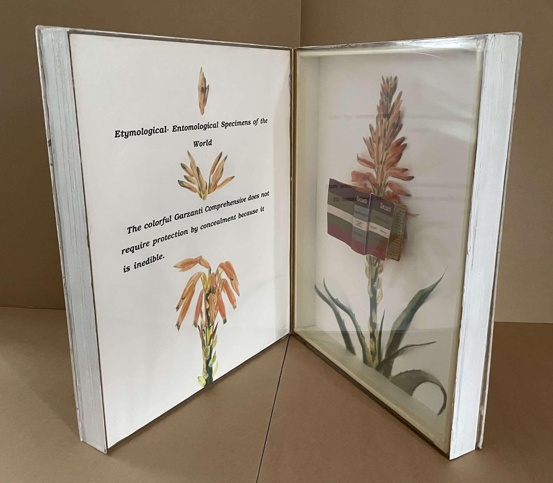
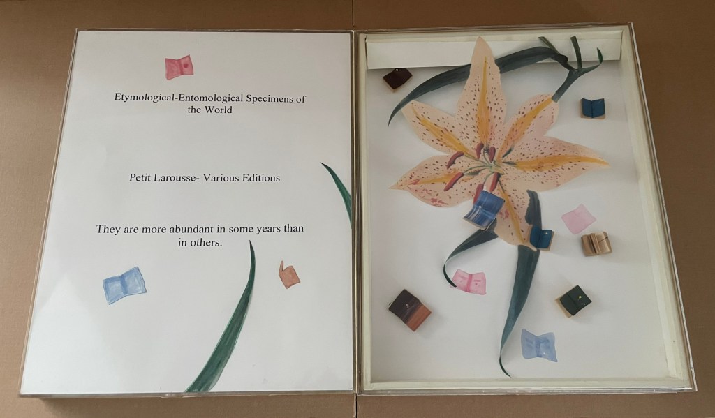
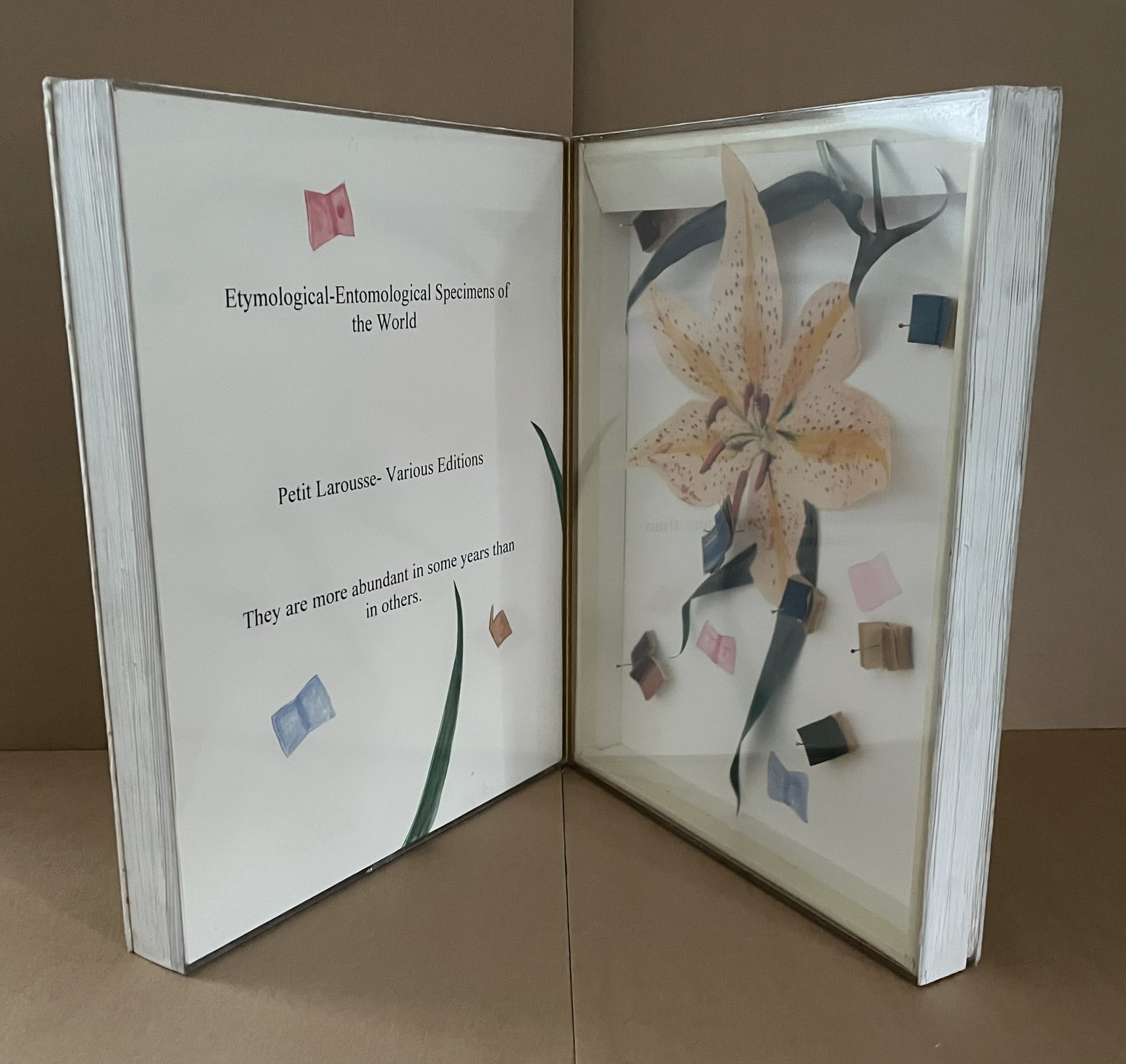
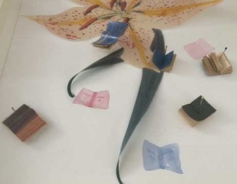
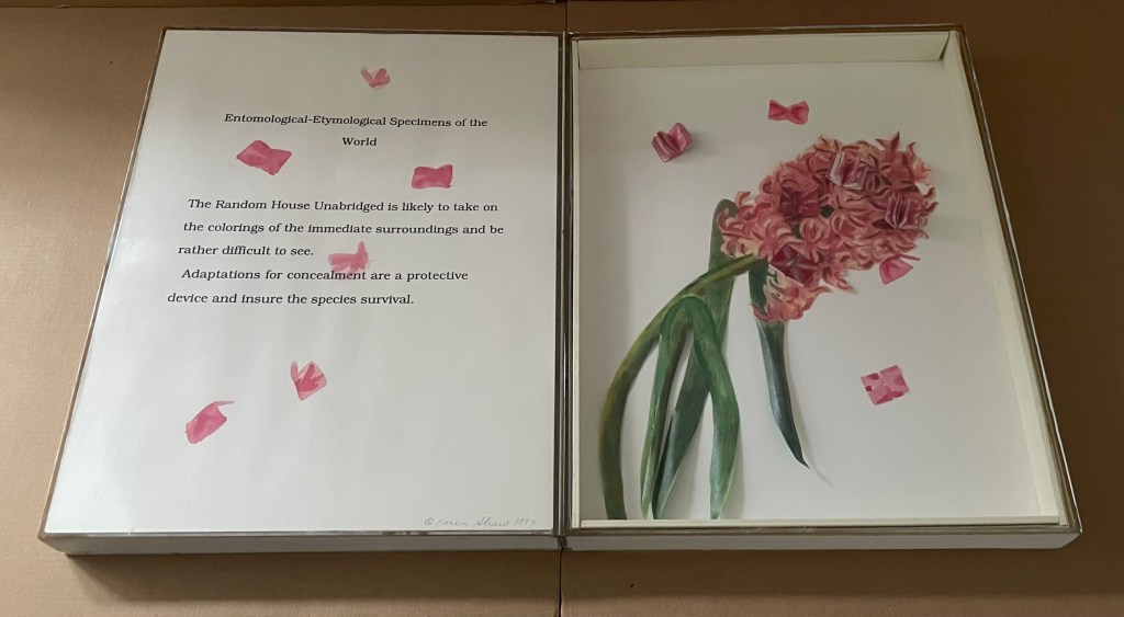
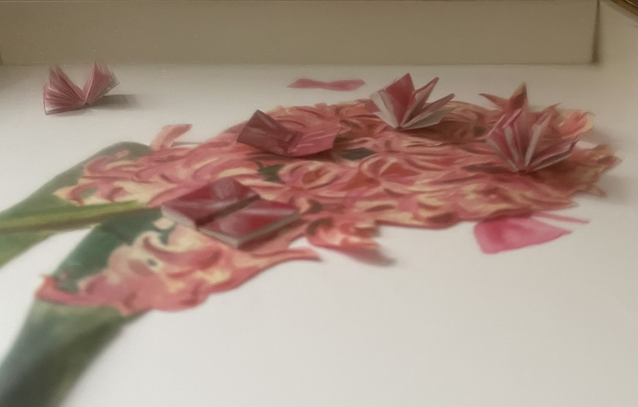
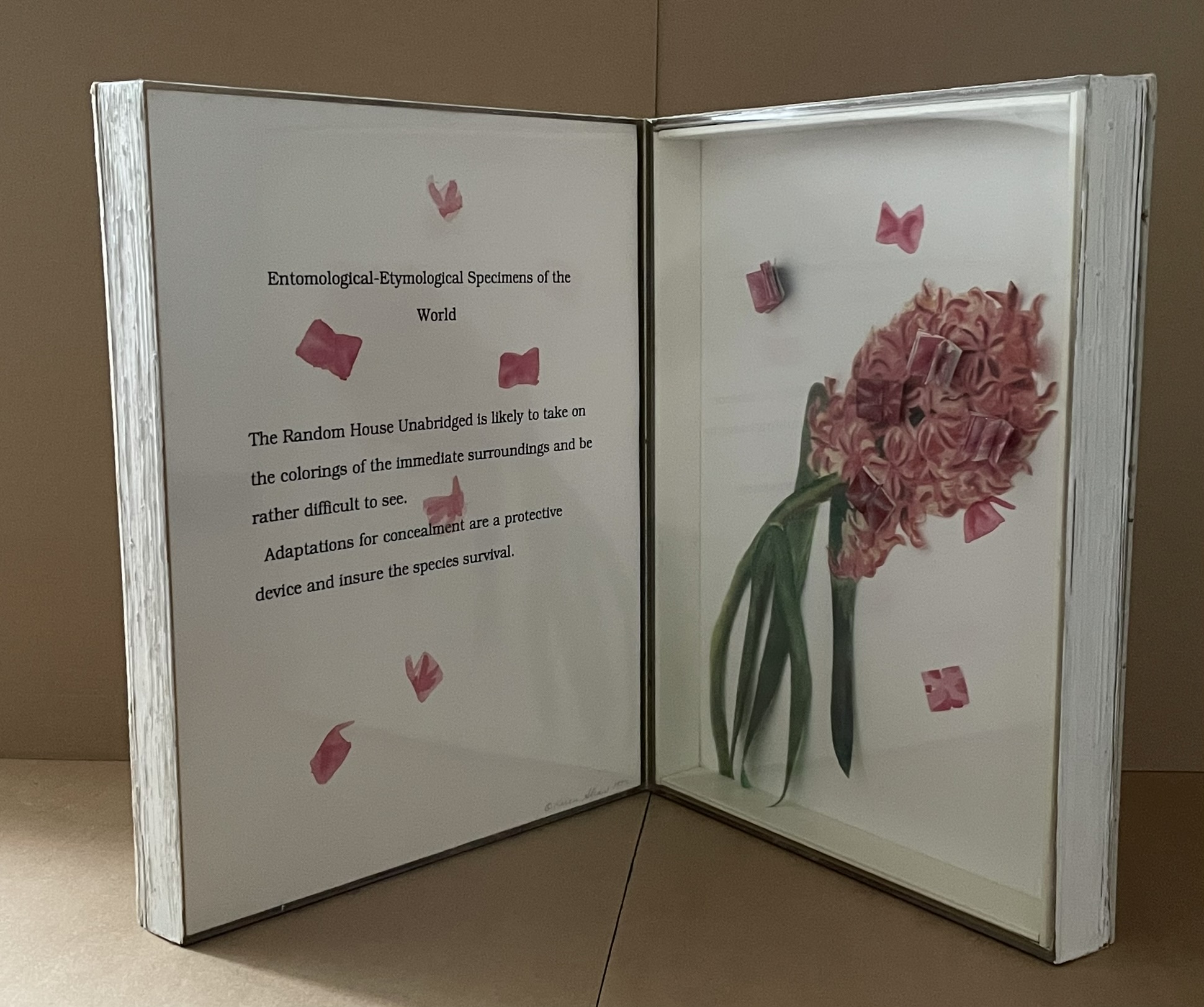
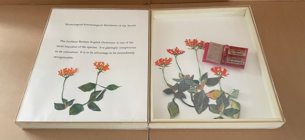
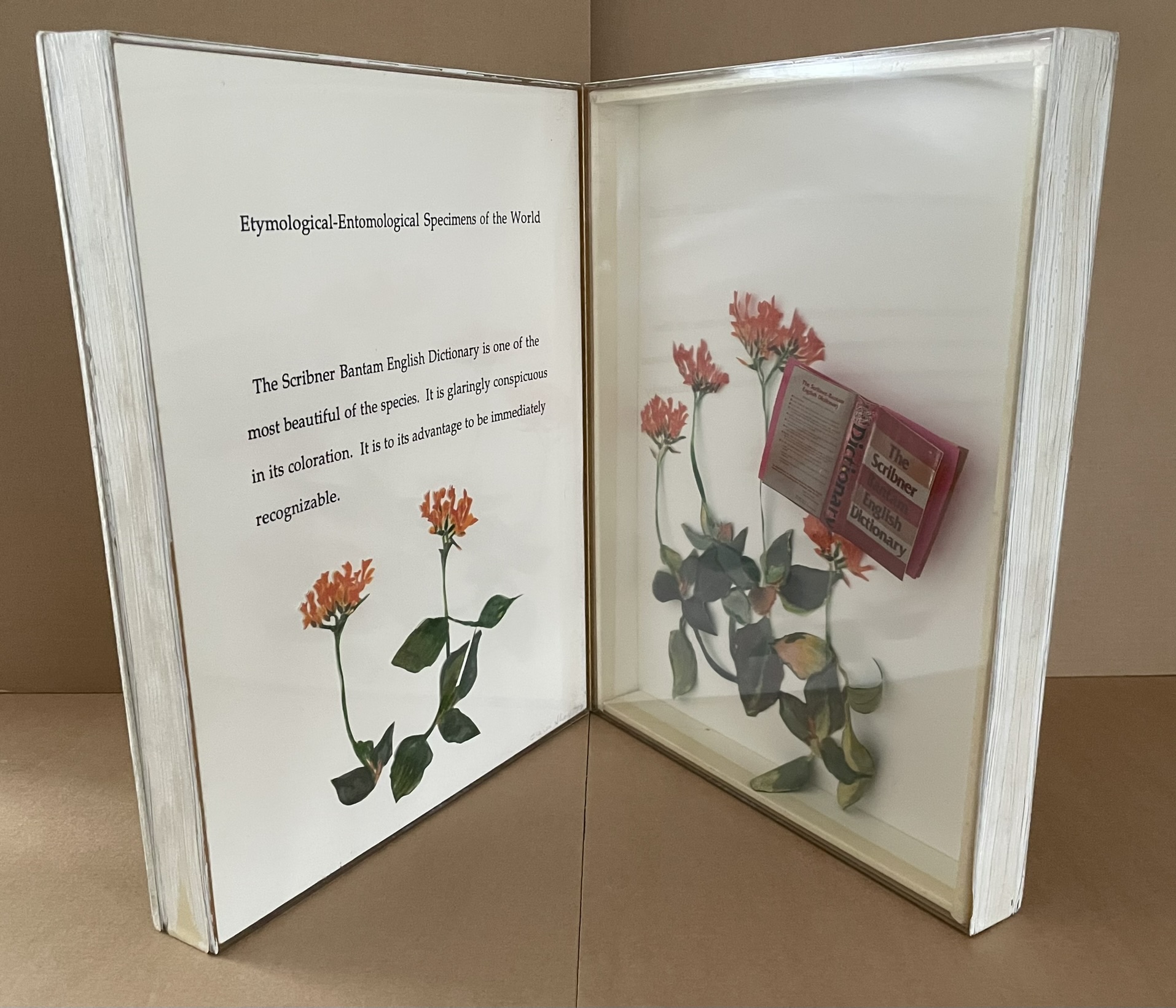
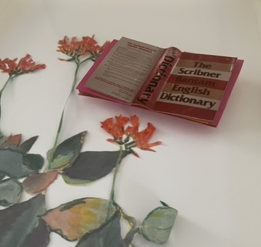
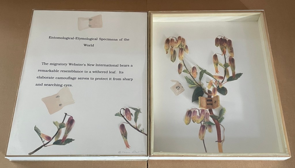
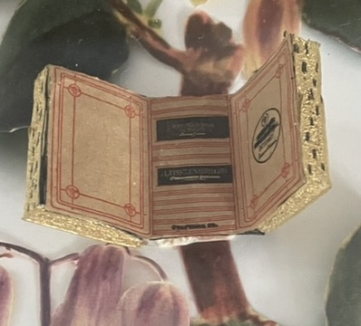
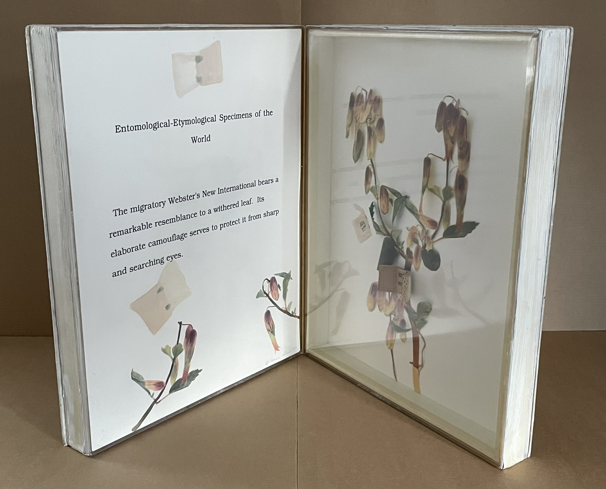
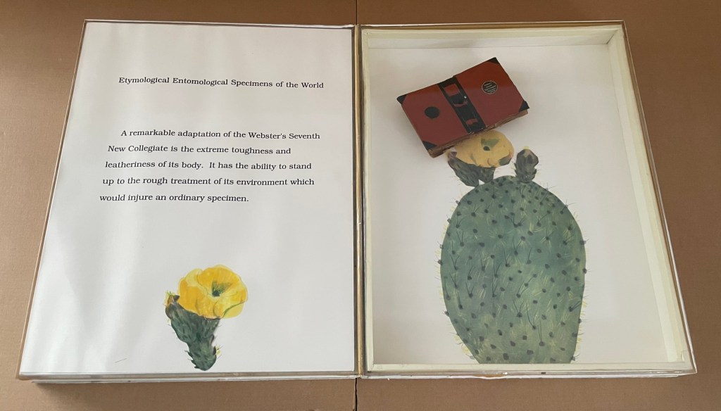
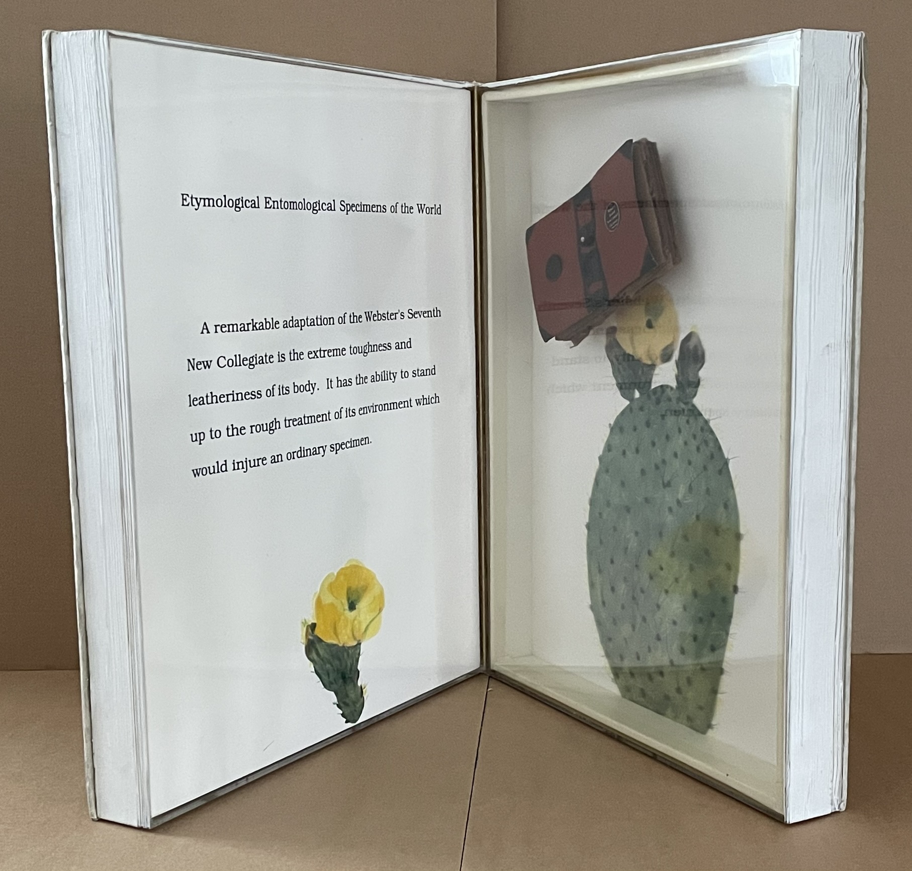
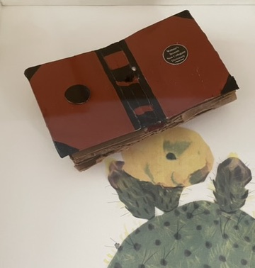
Etymological-Entomological Specimens of the World (1993)
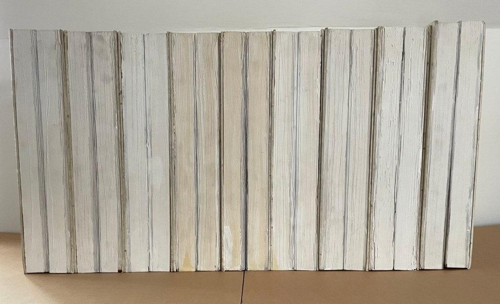
Etymological-Entomological Specimens of the World (1993) Karen Shaw Nine codex-shaped boxes of paper-covered boards, each opening to plexiglas-covered diptychs miniature books of various sizes posed as butterflies among text, handcut and painted paper foliage and flowers. H368 x W268 x D77 mm. Acquired from Karen Shaw, 8 October 2024. Photos: Books On Books Collection.
Jean Sellem’s interview with Shaw in the bilingual review Heterogénesis has been quoted earlier. In that exchange, we are lucky to have Shaw’s reply to question: “Why do you combine the concept of entomology with that of etymology?”
KS : In the past, I always used to confuse those two words. I knew the definition of each of them, but I couldn’t remember which definition belonged to which word. Eventually, I taught myself a mnemonic method to remember which word was which. “Ent” sounds like ant, so entomology is the study of insects, and so etymology is the study of words. When I was looking for a format for my ideas, using entomology pins seemed like the perfect way to attach words to numbers. The closeness of the spelling and the complicity of the two words was fun and made sense to me. The needles themselves are beautiful, long and thin. It just seemed like the perfect solution.
It’s happenstance. It’s the physical material. It’s the fun and humor of wordplay. It’s the artistic eye that finds meanings at the curious intersections of nature and language. All of this in Karen Shaw comes to the fore in the nine volumes of Etymological-Entomological Specimens of the World (1993). The top, bottom and fore edges of these book-shaped diptychs mimic closed books, whose mimicry yields to a mimicry of entomological display cases under clear covering, which in turn yields to miniature dictionaries posed to mimic butterflies. A mnemonic solution to an unwanted confusion of words leads to the book artist’s deliberate visual and verbal punning of dictionaries with insects.
In the interview, the only movements and artists directly influencing her work that Shaw remembers are Dada, new-Dadaism, Eva Hesse, On Kawara, Douglas Huebler, Joseph Kosuth and Conceptual Art. For Specimens, she has noted in correspondence a direct inspiration: the interest of Vladimir Nabokov in lepidoptery. Seeing butterflies as miniature dictionaries also overlaps a bit with Nabokov’s perceiving letters of the alphabet as having colors. Nabokov’s chasing butterflies and leaping from letter to color finds a simulacrum in Shaw’s chasing words, numbers, and meaning in her everyday environs with her artist’s book butterfly net.
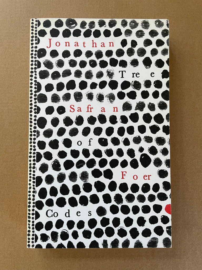
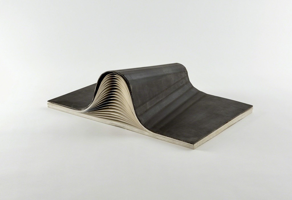
Tree of Codes (2010) Jonathan Safran Foer Perfect bound paperback of die-cut pages. H220 x W135 mm. 284 pages. Acquired from Visual Editions, 30 January 2014. Photos: Books On Books Collection.
The artist’s book “tradition” of excising words from the page goes back at least to Marcel Broodthaers’ and Mario Diacono’s renderings of Un Coup de Dés Jamais N’Abolira le Hasard by Stéphane Mallarmé. Jonathan Safran Foer’s Tree of Codes (2010) takes that tradition to the more complex plane that Tom Phillips reached with A Humument (1980-2016). In the hands of Foer and his publisher Visual Editions, the treatment becomes simultaneously more personal and mechanical. The more personal aspect is best expressed in Foer’s afterword (see below). The mechanical aspect is the use of die cutting for production and the reader’s use of a blank sheet to enable reading the text left over from Bruno Schulz’s The Street of Crocodiles (1934, trans. 1963) that forms the new narrative of Tree of Codes.
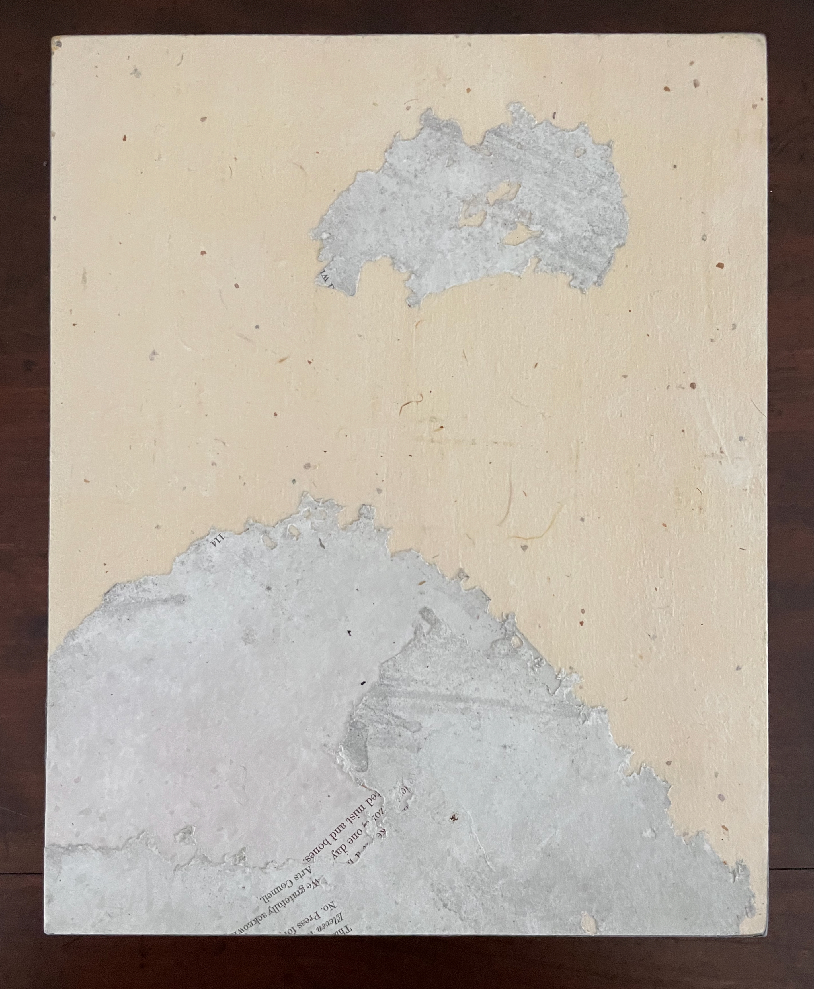
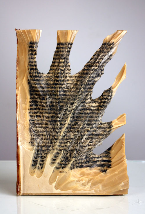
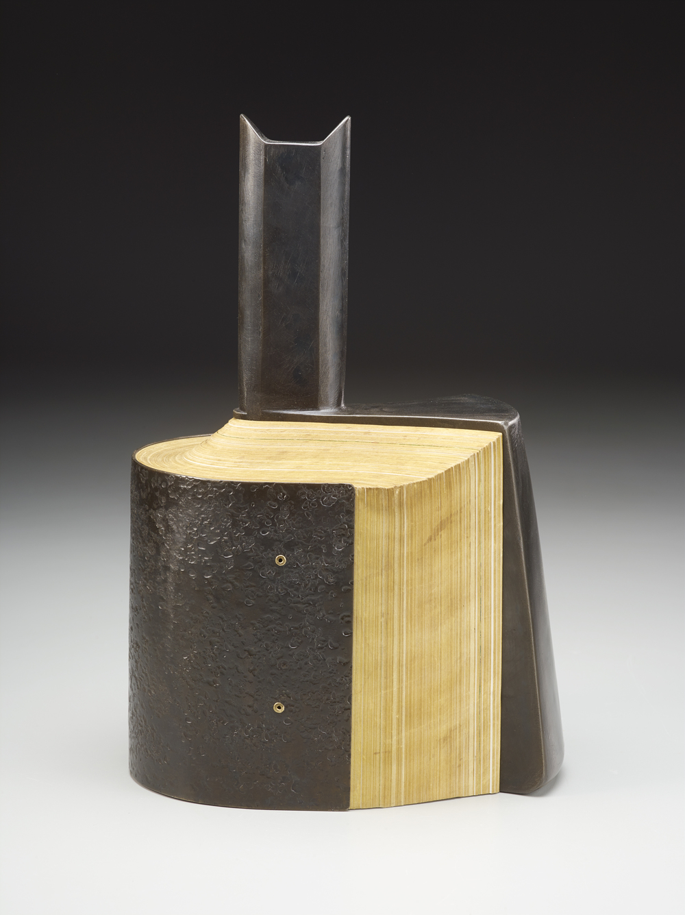
Carving 9 (2012) Jessica Drenk Altered book and wax. H203 x W152 x D38 mm. Unique. Acquired from the Seager Gray Gallery, 10 February 2019. Photo: Courtesy of the gallery.
Once a book becomes another material from which art can be made, the rectangular block offers itself up to an unbounded variety of treatments. It can be folded into something else. Or macerated and squeezed out, or into, something else. Or shot, burnt, frozen, soaked, coated or buried and dug up. Or torn, shredded and reconstituted or scattered. Or carved with any number of implements into any number of shapes.
But that oblong of material just lying there and the techniques of altering it are not usually sufficient starting points for the artist. In Jessica Drenk’s case, a visit to a botanic garden’s “large greenhouse full of hundreds of different succulent species” provided the necessary catalyst. As she explained in an interview with Patron: “It blew me away to see so much slight variety within the same category of plant and this experience sent me down a path of experimenting with books in the studio; I wanted to see how many different shapes and objects I could make out of the one material.”
Why should an obscure poem like Stéphane Mallarmé’s groundbreaking Un Coup de Dés Jamais N’Abolira le Hasard: Poème (1897) have become the cornerstone of an art-industrial complex of literary, critical and artistic responses ranging from essays, books, edited collections, countless editions, and appropriations in the form of fine press livres d’artiste, book art and sculptures, films and theater, ballets and fado, musical compositions, digital programs and installations, and even pavement art?
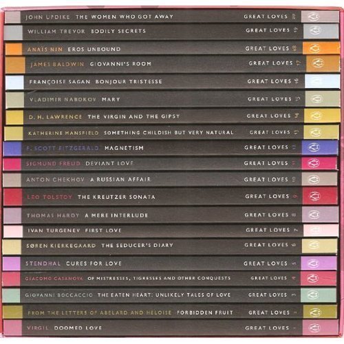
Penguin’s 2007 series “Great Loves” is a twenty-book set of short paperbacks with selections from the usual suspects (D. H. Lawrence) and the unusual (Søren Kierkegaard). The selection of eleven tales from Giovanni Boccaccio’s Decameron provides Carolyn Thompson with the opportunity to create a work of altered book art enjoyable on several levels.
The unaltered cover promises one thing. Its “under-the-cover” title page delivers another.
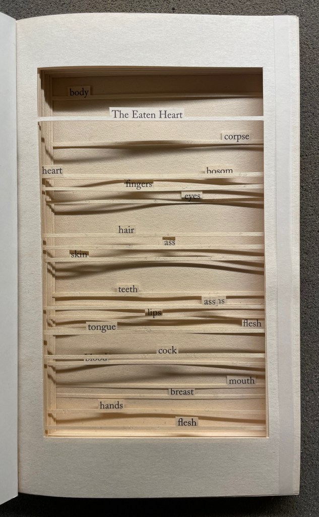
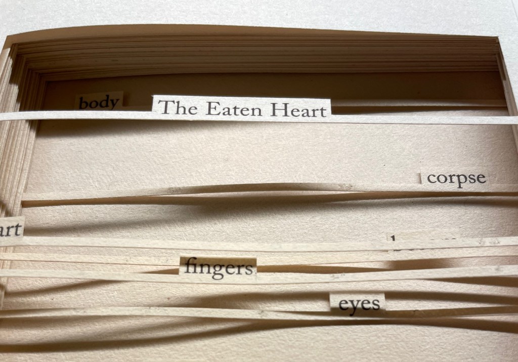
The Eaten Heart (2013)
The Eaten Heart(2013) Carolyn Thompson Altered perfect bound paperback. H180 x W111 mm. 124 pages. Edition of 3, of which this is #2. Acquired from Eagle Gallery, 7 October 2023. Photos: Books On Books Collection. Displayed with artist’s permission.
Thompson’s chosen technique of removing text with a scalpel enacts one of the paradoxical meanings of the revealed tell-tale title it presents: the scalpel has eaten away all the text on this title page except for the text chosen as the title. Boccaccio’s text is there but not there, and the “under-the-cover ” title nods toward his missing content. Leaving only words referring to the body, Thompson’s work of book art celebrates the raunchy “under the covers” innuendo in Boccaccio’s text.
The transparent tape that holds the body of cut pages together (just detectable in the image of the title page above) can be removed and the pages turned (carefully!). Below is page 11 “in motion”.
The sequence of pages 116 to 119 below shows that, while the verso pages do not play a role in the work, the movement of words on the recto side away from those that follow them, revealing the blank sheet at the end, invites musing about their possible relationship as well as marvelling at the artist’s delicate patience applied to the indelicate.
Later on, using the 50 books in the Penguin Modern Box Set (2018), Thompson created text pieces, drawings, embroideries, prints and additional altered books in the spirit of The Eaten Heart. The Laurence Sterne Trust exhibited the full set of works at Shandy Hall, York, in 2019. Eagle Gallery hosted them again in London in February 2020, and the same year, After Capote: When Truman met Marlon, her altered version of Truman Capote’s The Duke and His Domain in the series, won the Minnesota Center for Book Arts Prize People’s Book Art Award.
The more wide-ranging but more consolidating work that follows demonstrates Thompson’s indefatigable originality and insatiableness as a re-purposing artist.
The Beast in Me (2021)
The Beast in Me (2021) Carolyn Thompson Print. 130 x 130 cm. Acquired from Information as Material, October 2021. Photos: Books On Books Collection. Displayed with artist’s permission.
Although The Beast in Me has a previous iteration from 2014, this one commissioned for the second issue of Inscription: The Journal of Material Text (the “holes issue”) expands to over 500 snippets of text beginning with ‘I’ from eight different novels. Its manner of doing so makes The Beast in Me simultaneously centrifugal and centripetal in its effect — perhaps more emblematic of Inscription‘s coverage in its “holes issue” than the impressive work chosen for the covers.
Here is Thompson’s description of the commissioned work:
The statements (over five hundred of them) are presented one after another in a circular narrative with no natural beginning or ending and can therefore be read from any point. When removed from their original context, they become ham-fisted stabs at self-revelation and blurted snapshots of confession. They contradict one another, and the narrator. The piece explores the power struggle within all of us, where different aspects of our personalities vie for dominance over one another at any given moment, while others yearn for internal balance. The narrative, whilst light and frivolous in places, descends into a sinister and uncontrollable rant in others.
If we accept the print’s invitation as we would a book’s invitation to read — to engage in narrative — we find that human identity’s ever precarious balance — between inward and outward forces, its introverted and extroverted elements, the being apart and the being a part of, and integration vs disintegration — is captured sharply. A blank center, a void or hole — there but not there — defined by fragments simultaneously flying outward and pressing inward.
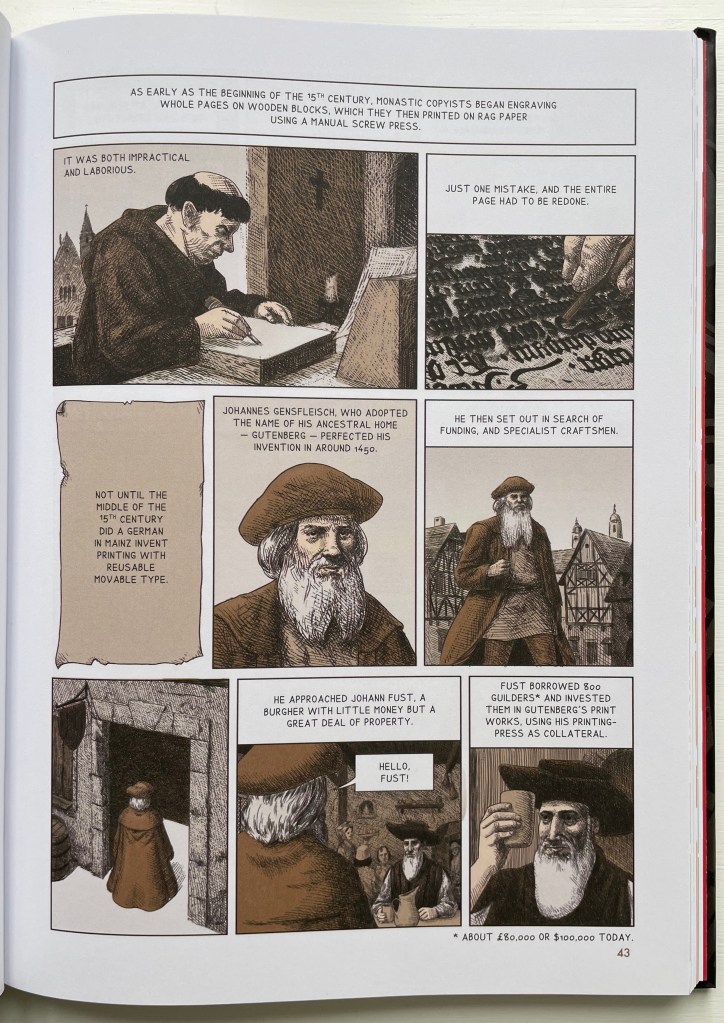
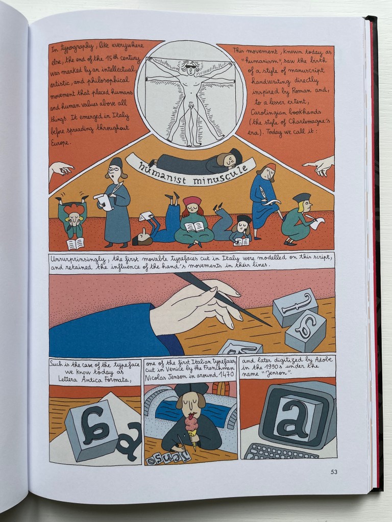
ABC of Typography (2019) David Rault Casebound, sewn, illustrated paper-over-boards cover, endbands, sewn, red doublures. H265 x W195 mm. 128 pages. London: Self Made Hero [Translated from French (Gallimard, 2018)]. Acquired from The Saint Bookstore, 29 June 2023. Photos: Books On Books Collection.
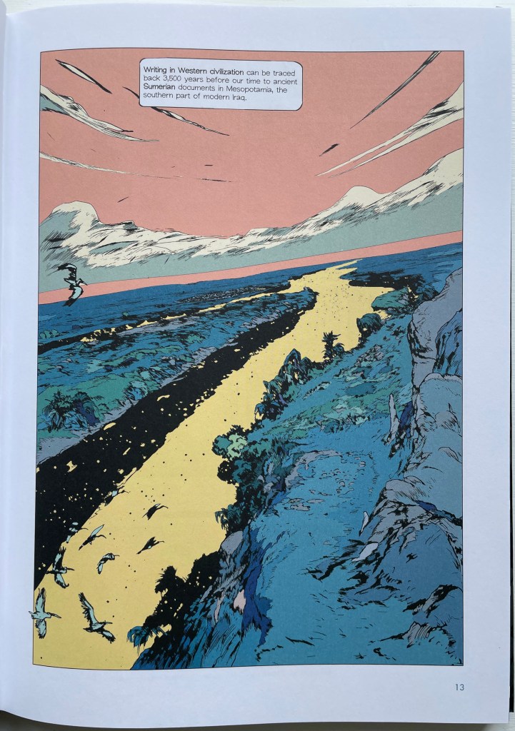
David Rault’s ABC of Typography traces 3,500 years of letters and type from pictographs and cuneiform through Roman lettering and Gutenberg to the Bauhaus and beyond. For the Books On Books Collection, it enriches the focus on the alphabet, typography and artists’ books — in particular, that subset of illustrated histories of the alphabet and type. These include Tommy Thompson’s The ABC of Our Alphabet (1952), William Dugan’s How Our Alphabet Grew (1972), Tiphaine Samoyault’s Alphabetical Order (1998), James Rumford’s There’s a Monster in the Alphabet (2002), Ada Yardeni’s A-dventure-Z’ (2003), Don Robb and Ann Smith’s Ox, House, Stick (2007) and Renzo Rossi’s The Revolution of the Alphabet (2009).
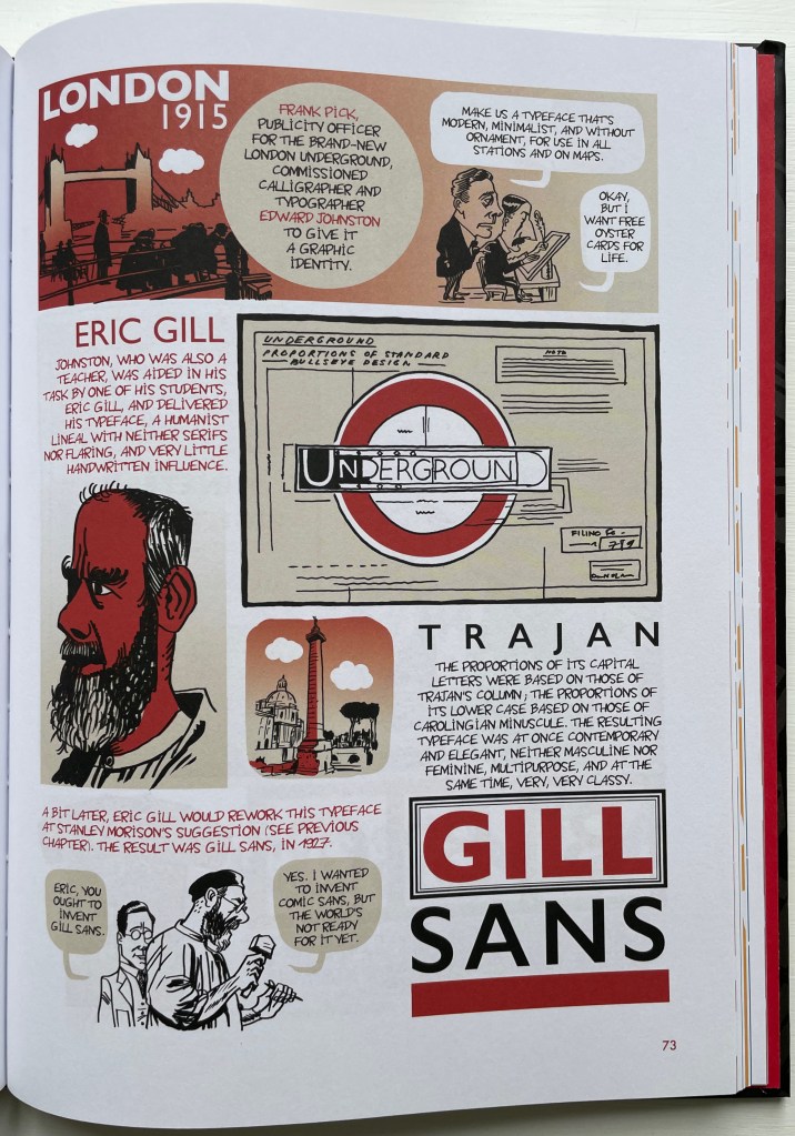
While enhancing that subset of illustrated reference works, ABC of Typography also highlights a gap in the collection. Rault and his team of invited artists hail from the Franco-Belgian tradition of lesbandes dessinées (BDs), which the French and Belgians call laNeuvième Art (“the Ninth Art”). English-language readers will likely be familiar with BDs from seeing Hergé’s Tintin or René Goscinny’s Asterix. Other than Chiavelli’s Arthur R./Un Coup de DÉS Jamais N’Abolira le HASARD (1988) and its two companion volumes, the collection has no BDs. The Rault volume does, however, deliver a mini-survey of styles among contemporary bandes dessinateurs with its assignment of chapters to eleven different artists.
The book’s overall design by Jean-Christophe Menu simultaneously embraces and sets off the individual styles of drawing and lettering. Menu’s consistent use of a slab serif font (Lubalin Graph Std?) for chapter titles alongside oversized chapter numbers that bleed off the facing page signals his intent and success.
The variety of “strip” layouts pushes the boundaries of unity. Some, like Libon’s and Clérisse’s, float on the page. Others, like Singeon’s and Simon’s, are ruled off. Within the strip layouts, panels vary in shape, and the images within them tilt at different angles, all creating as much of a sense of movement as any action comic. Even where a strip is ruled off, sketches sometimes encroach across panels as well as the book’s margins or gutter to give depth and perspective as well as movement. as happens with the gulls in flight below from Aseyn’s chapter.
Note how the gulls in flight in Aseyn’s chapter appear within panels but also cross them and the gutter.
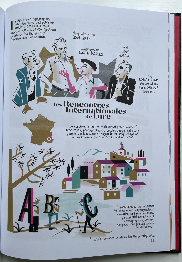
Evident from Clérisse’s recounting of “Les Rencontres internationale de Lure” (an influential annual forum in Provence), Simon’s homage to the typologist Maximilien Vox (one of the forum’s founders) and Ayroles’ positioning of the typeface DIN, the volume’s European roots are never far from the surface, which also makes ABC of Typography a useful and necessary addition to this collection or any shelf of Anglo-centric works about the alphabet, type or design. It’s interesting that, while the French have categorized BDs as the ninth among the ten officially designated arts, typography and design do not yet rate a category. Neither does the livre d’artiste for that matter, which raises a question:
Between the traditional BD and livres d’artistes by graphic artists, is there fertile ground for artists’ books that blend subject, material, form and metaphor into innovative works of book art? The above-mentioned BD by Chiavelli, paying homage to Mallarmé’s Un Coup de Dés, represents one end of that spectrum. Hervé di Rosa, part of the Figuration libre movement, associated with Keith Haring and graffiti artists, can provide the other end of the spectrum with his Un Coup de Dés jamais n’abolira le Hasard (2021), published by Virgile Legrand. For the work of book art between them, Nanette Wylde’s Babar Redacted: ABC Free (2020) might be a case in point. Likewise, Catherine Labio’s curated exhibition in 2013 — “From Bande Dessinée to Artist’s Book” — finds earlier exemplars in the works of Lars Arrhenius, Felicia Rice, Omar Olivera and Mamiko Ikeda.
Babar Redacted: ABC Free (2020) Nanette Wylde Based on an altered copy of the board book B is for Babar: An alphabet book by Laurent de Brunhoff. French link exposed spine on tapes. 9″ x 9″ x .5″ closed. Edition of 3. Photos: Courtesy of the artist.
“Richard Niessen“. 23 April 2021. Books On Books Collection.
Library of Congress. “Bande Dessinée: Comics & Graphic Novels“, in “Reading in French: A Student’s Guide to Francophone Literature & Language Learning”. Library of Congress Research Guides. Accessed 11 August 2023.
Danish artist Hanne Stochholm Exe‘s “assemblages”, which garnered first prize in the 7th International Artist’s Book Triennial Vilnius 2015, have cousins far afield — geographically and chronologically.
Remake (2015) Hanne Stochholm Exe Reproduced with permission of the artistTalks (2005) Hanne Stochholm Exe Reproduced with permission of the artistSmall Talk (2005) Hanne Stochholm Exe Reproduced with permission of the artist
Geographically, this merging of book and metal finds common cause in the US (see Andrew Hayes’ works) and Israel (see the work of Neil Nenner and Avihai Mizrahi, represented — as is Hayes — by the Seager/Gray Gallery).
Offset (2013) Andrew HayesCover Story #4 (2017) Neil Nenner and Avihai Mizrahi
Chronologically, the hold that books and metal have had on one another reaches far past the moveable type of Gutenberg’s Bible and Master Baegun‘s earlier Jikji.
Of course, those 11th century metal fittings probably passed unnoticed by studious readers. Not so with these studious artists in the 21st century whose imaginations have seized on the contrast of materials to recast the book object as an art object.