Erwin Huebner is a professor at the University of Manitoba engaged in research and teaching cell and developmental biology. He is also a book artist and miniaturist. Following his work, the Books On Books Collection has started small and hopes to grow into his larger works. At both ends of the spectrum, Huebner’s themes resonate with the integration of art and science, a recurrent focus of the collection (see Further Reading below).
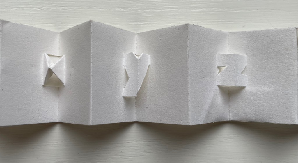
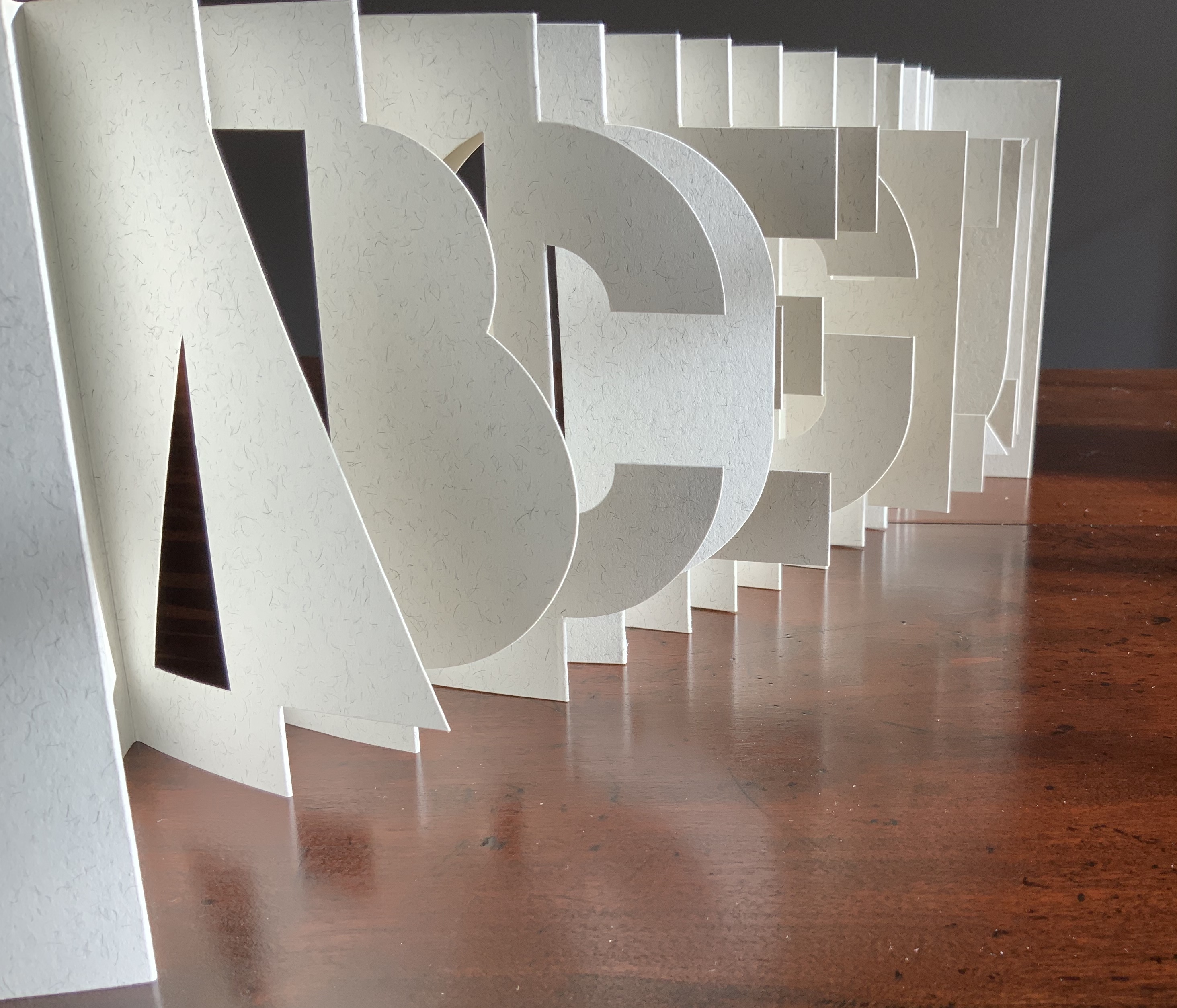
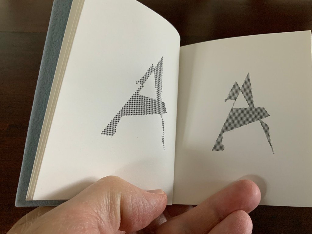
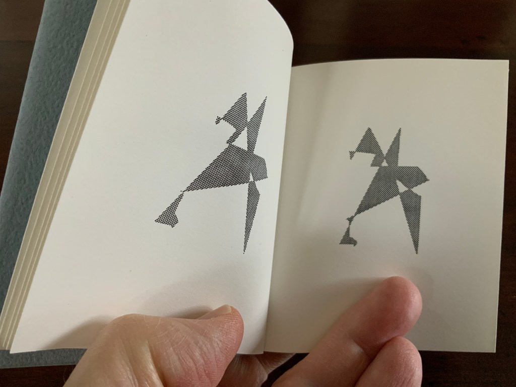
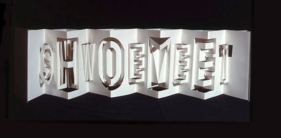
Alphabeta Concertina Majuscule (2015)
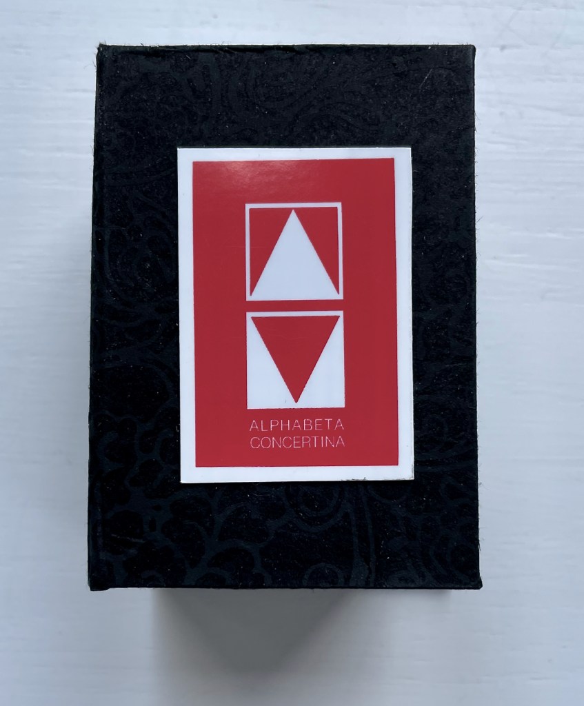
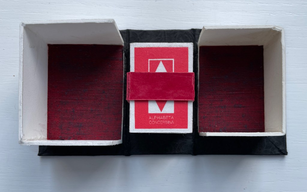
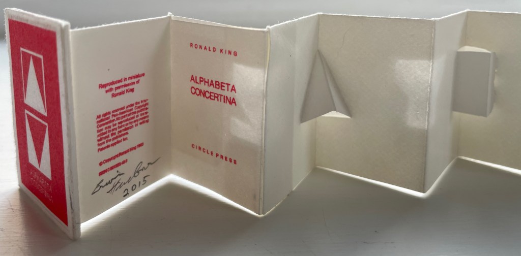
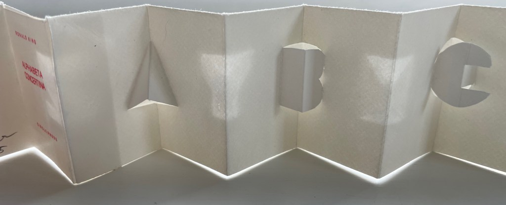
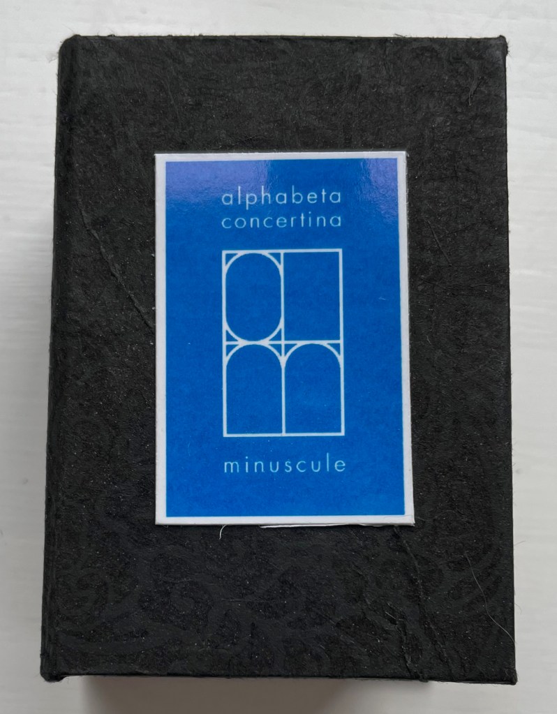
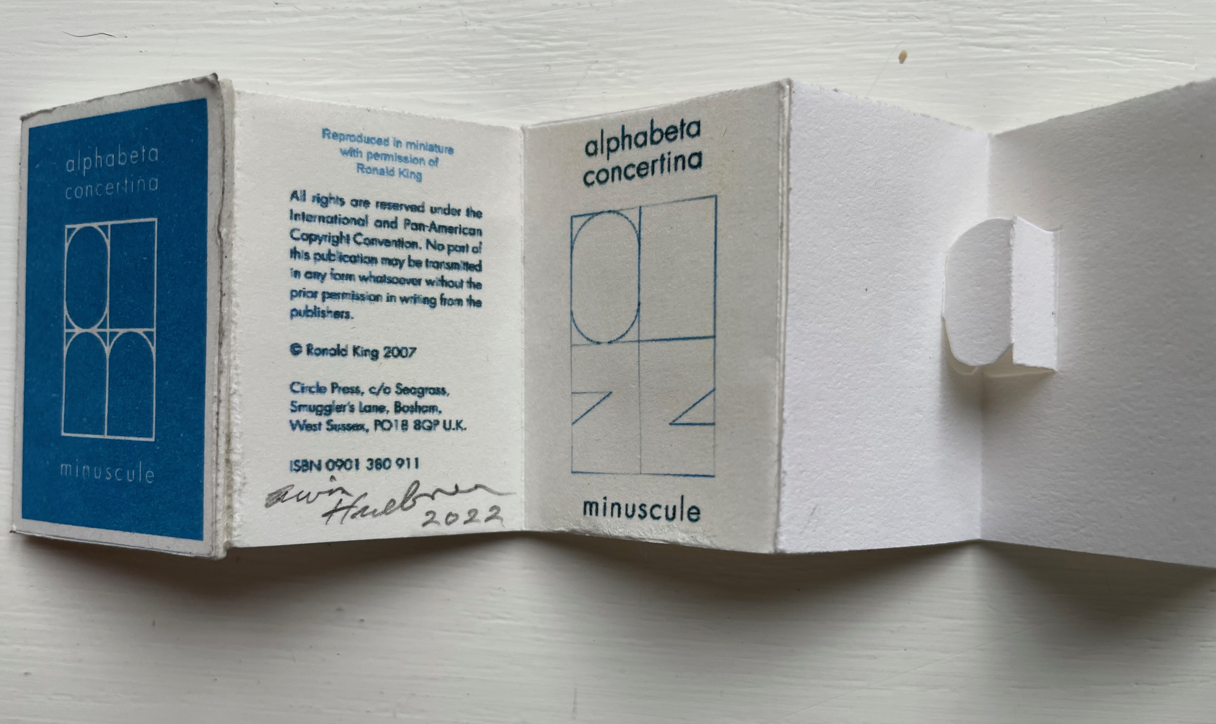
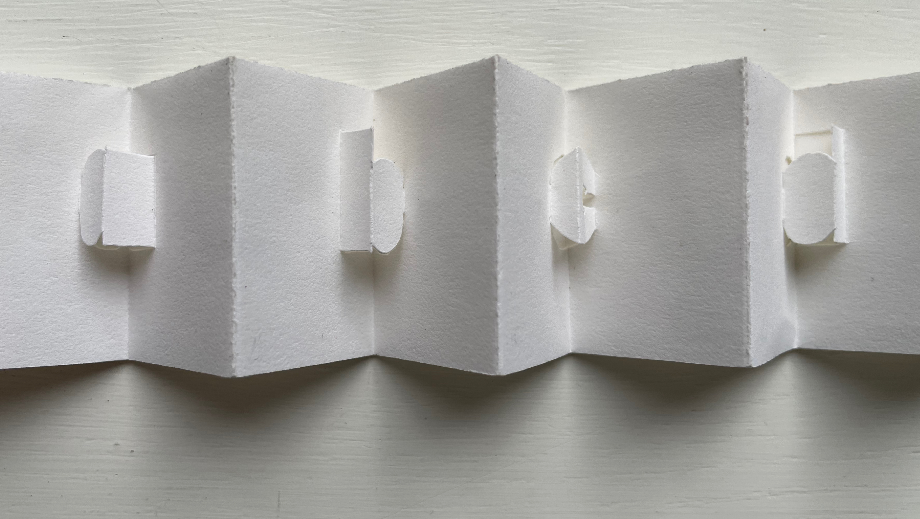
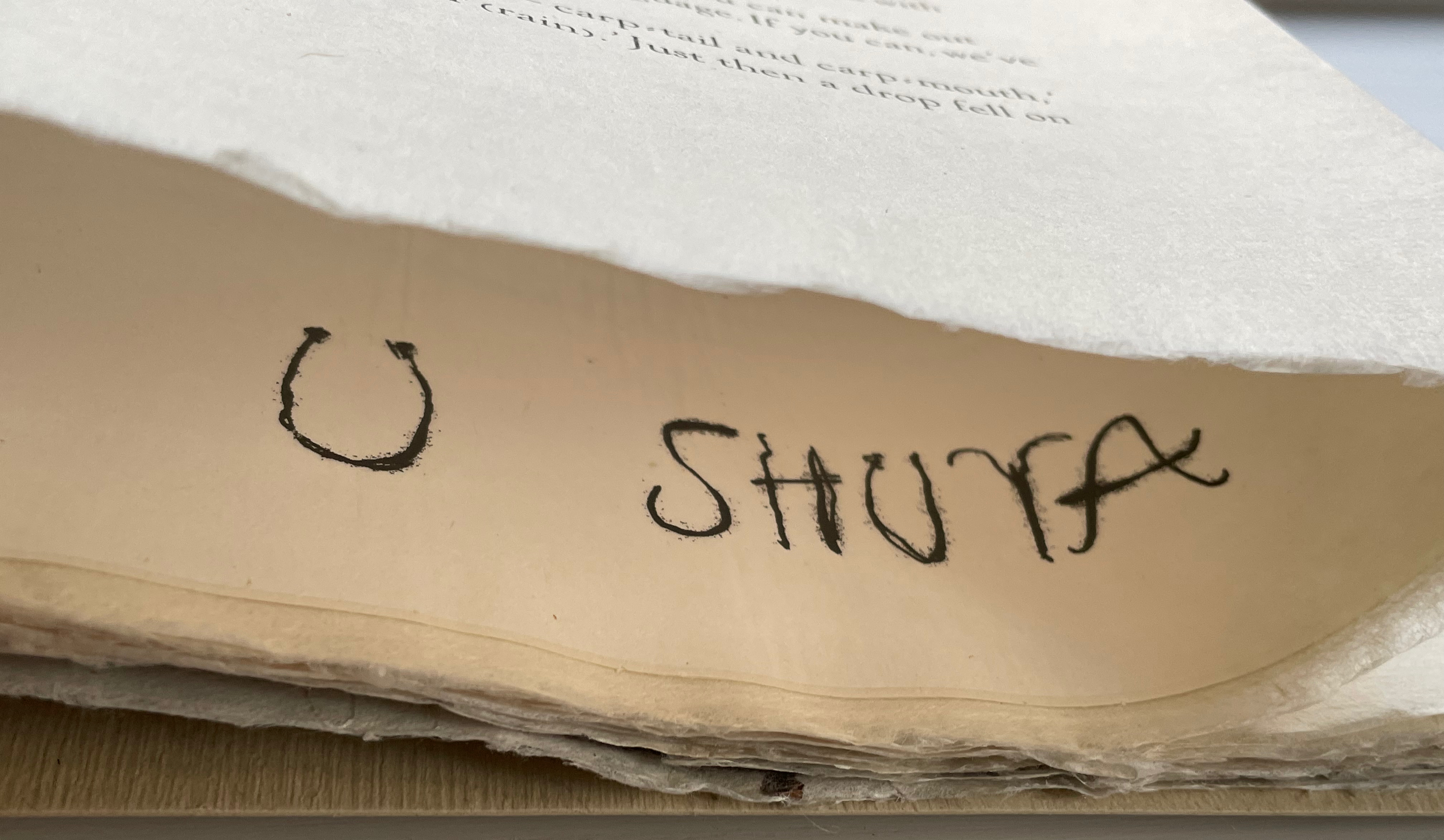
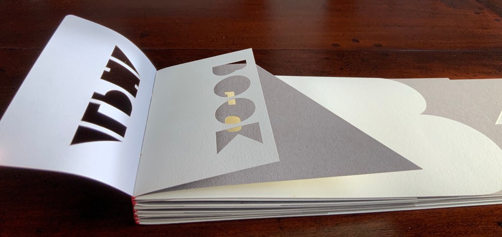
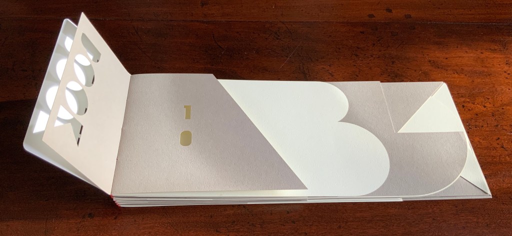
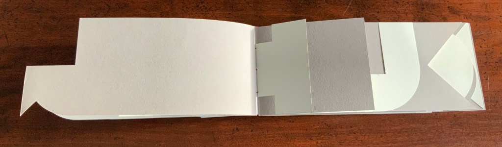
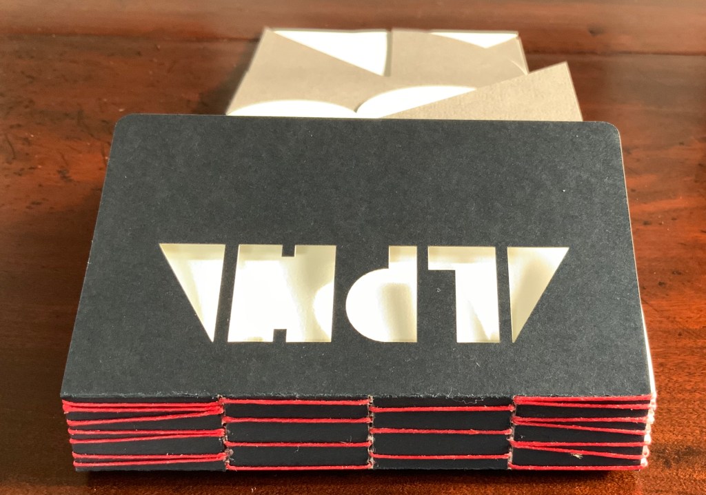
Alphabeta Concertina (2015) Erwin Huebner (with permission of Ron King) Miniature double-sided leporello. H 1.5 x W 1.0 x D 0.75 in. Edition of 4. Acquired from Erwin Huebner, 20 January 2023. Photos: Books On Books Collection.
The geometry and invention of Ron King’s work must have appealed to a kindred spirit in Erwin Huebner. The classificatory nature of the alphabet must also have spoken to Huebner’s inner Linnaeus. As 2023 is the 270th anniversary of Linnaeus’ Species Plantarum, which introduced his classification system, it is an auspicious moment for Huebner’s miniature versions of King’s alphabet concertinas to join the Books On Books Collection and be included works in the Bodleian exhibition “Alphabets Alive!” (19 July 2023 to 24 January 2024, Weston Library, Oxford).
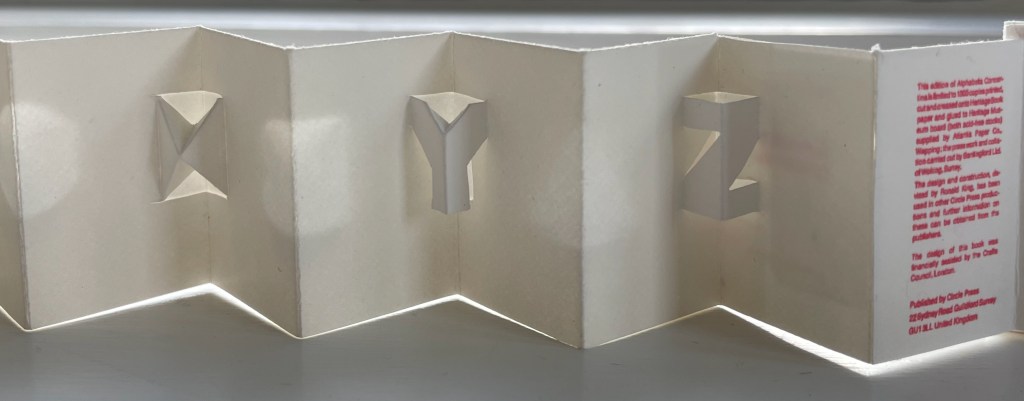
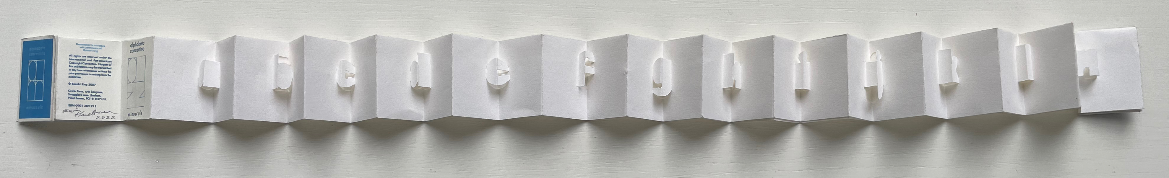
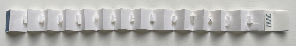
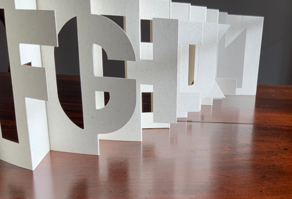
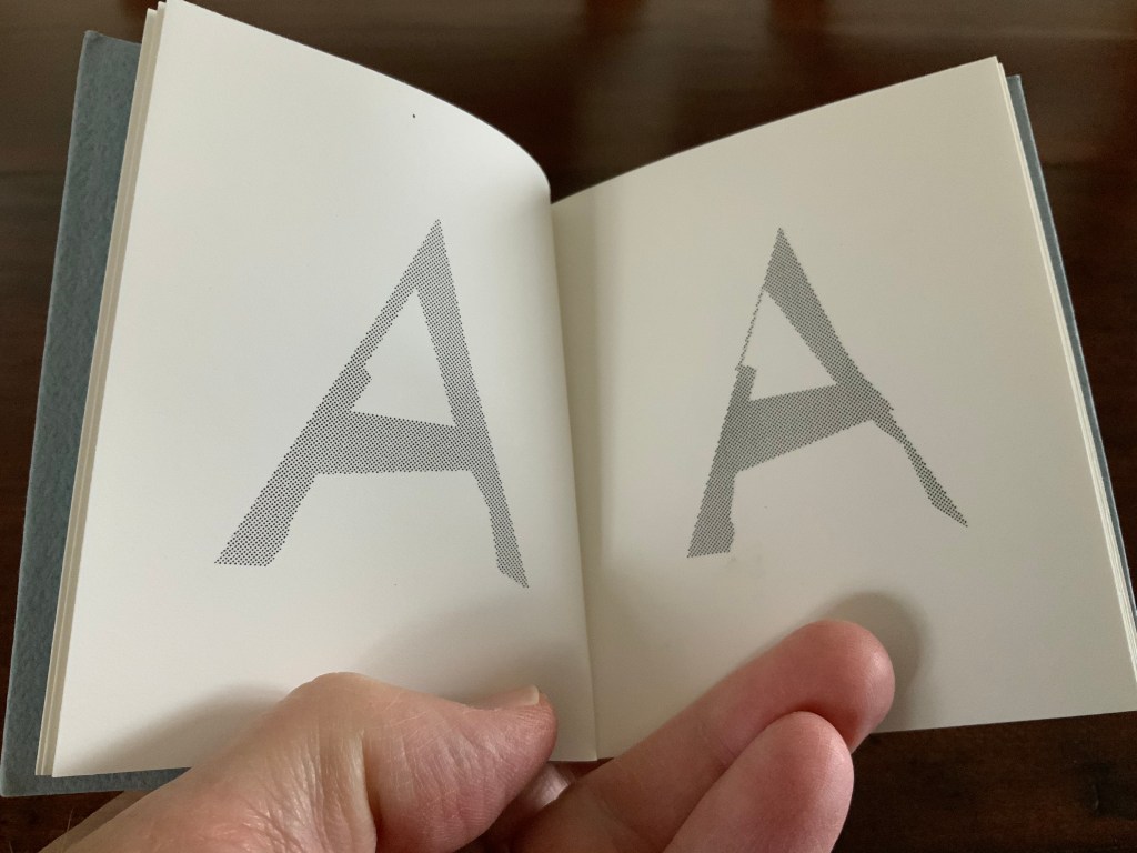
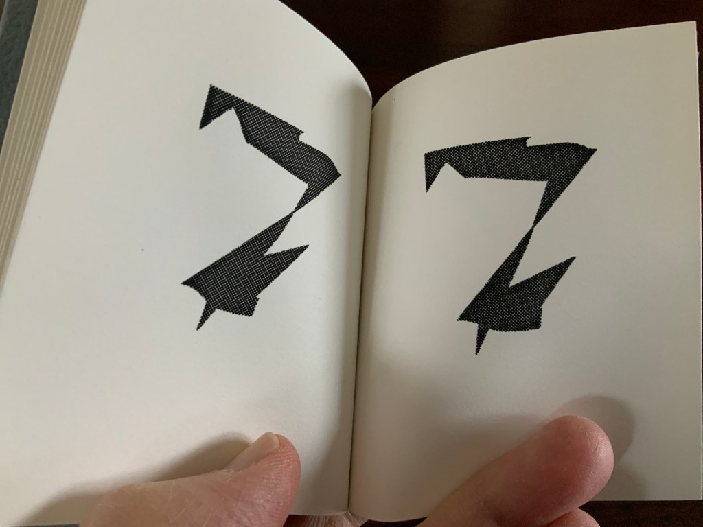
alphabet concertina miniscule (2022)
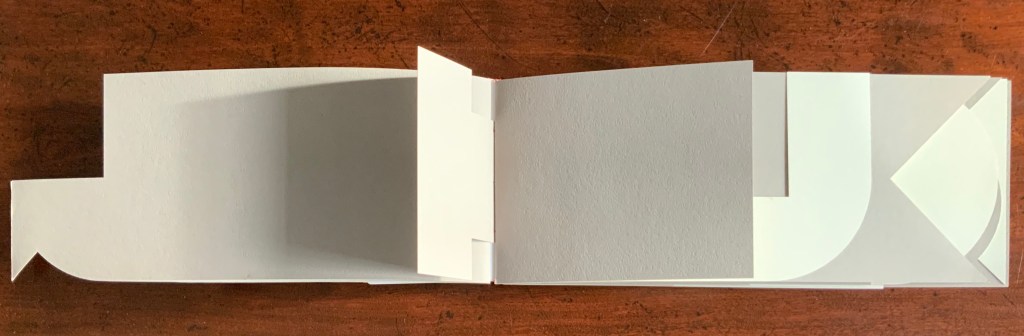
alphabet concertina miniscule (2022) Erwin Huebner (with permission of Ron King) Miniature double-sided leporello. H 1.5 x W 1.0 x D 0.75 in. Acquired from Erwin Huebner, 20 January 2023. Photos: Books On Books Collection.
Both the majuscule and miniscule concertinas are double-sided with half the alphabet on one side and half on the other just as King designed from the first with The White Alphabet and the majuscule concertina in 1984 and subsequently 2007 with the miniscule.
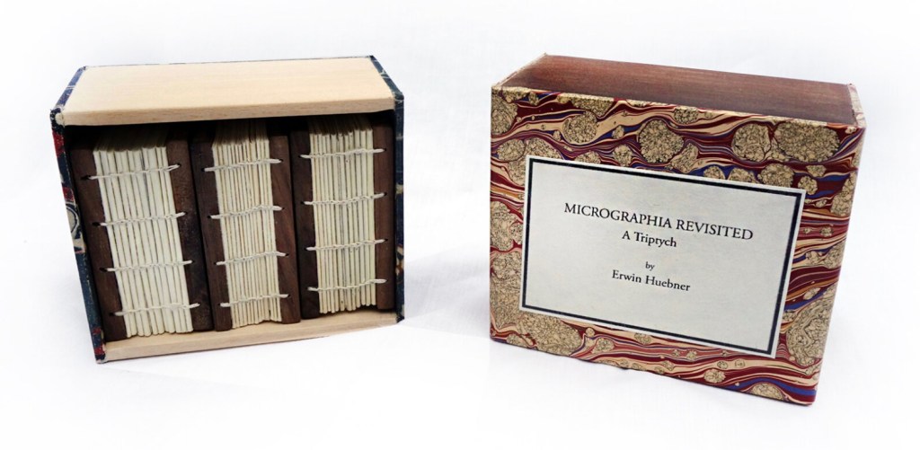
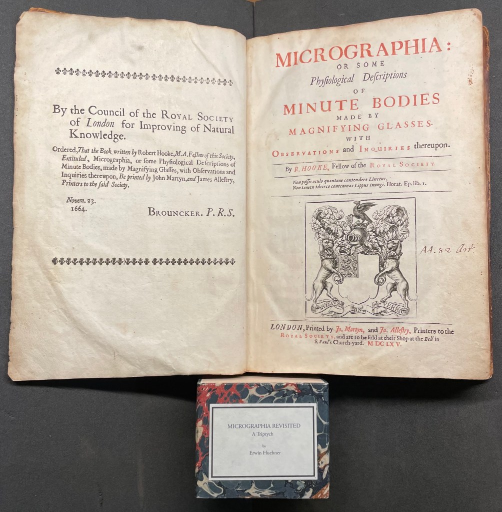
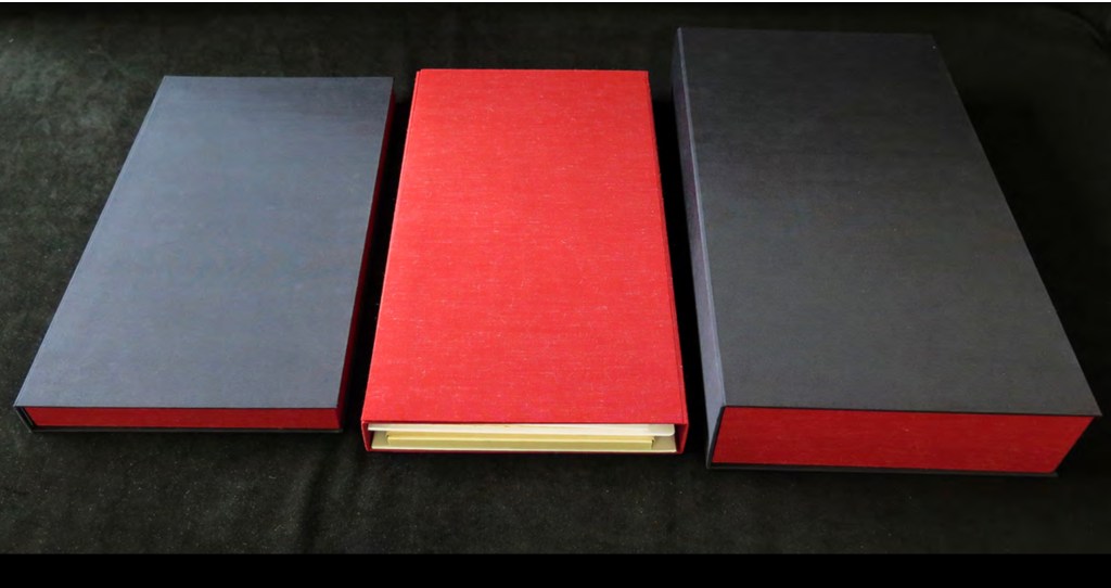
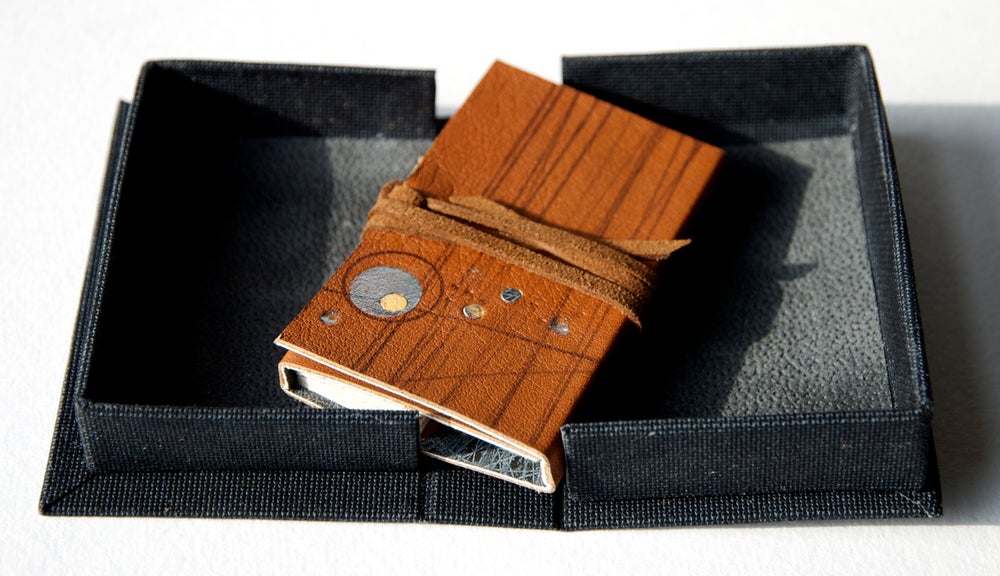
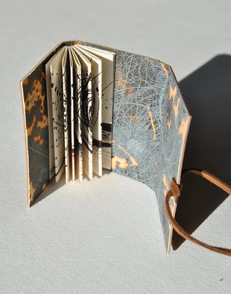
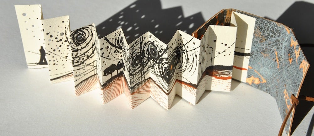
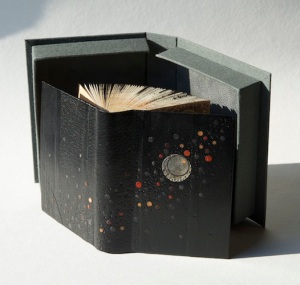
Micrographia Revisited (2017)
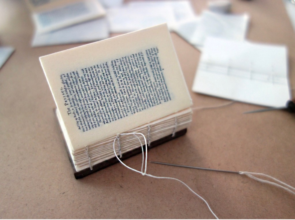
Micrographia Revisited: A Triptych (2017) Erwin Huebner Box with 3 Coptic-bound volumes, each H 2.625 x W 1.875 x variable depth. Edition of 3. Acquired from Erwin Huebner, 20 January 2023. Photos: Courtesy of the artist.
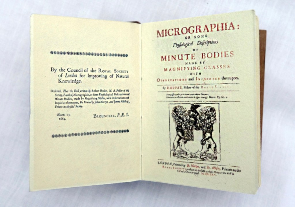
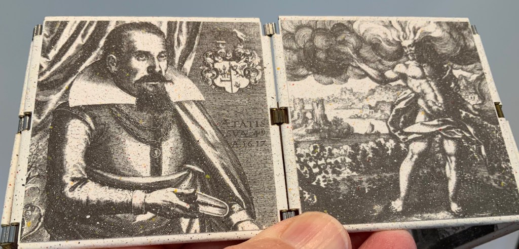
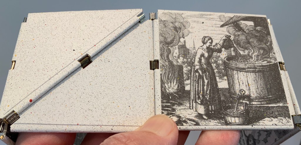
Despite Francesco Stelluti’s Melissographia (1625), Robert Hooke’s Micrographia: Or Some Physiological Descriptions of Minute Bodies Made by Magnifying Glasses with Observations and Inquiries Thereupon (1665) was long thought to be the first publication with illustrations drawn from observation with a microscope. Given Huebner’s scientific and artistic careers, it would seem impossible for him to resist paying homage to this work. Indeed, in his larger artist’s books, he has incorporated entire microscopes, but here, he exploits the technological advances of photography and electron microscopy and joins them with the craft of bookbinding to produce just as wondrous a work. Using Scanning Electron Microscopy (SEM), Huebner has created images of the same or similar objects to those Robert Hooke observed in the 1600’s. One of the volumes in the triptych presents these photographic results, and the other two present a reprint of Micrographia.
The coptic binding to black walnut covers, the wooden case covered in marbled paper and the subtitle create a suitable medieval/Renaissance air for this homage.
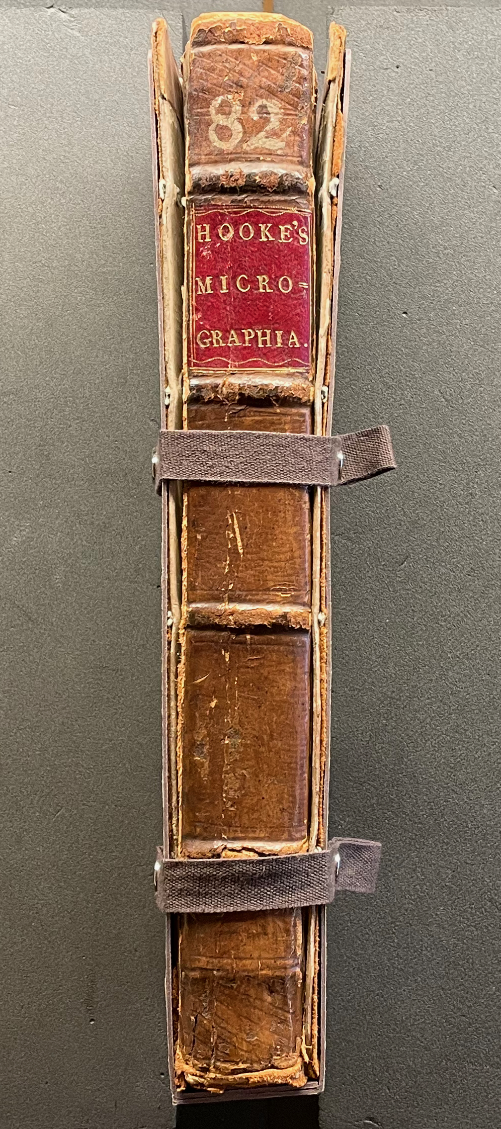
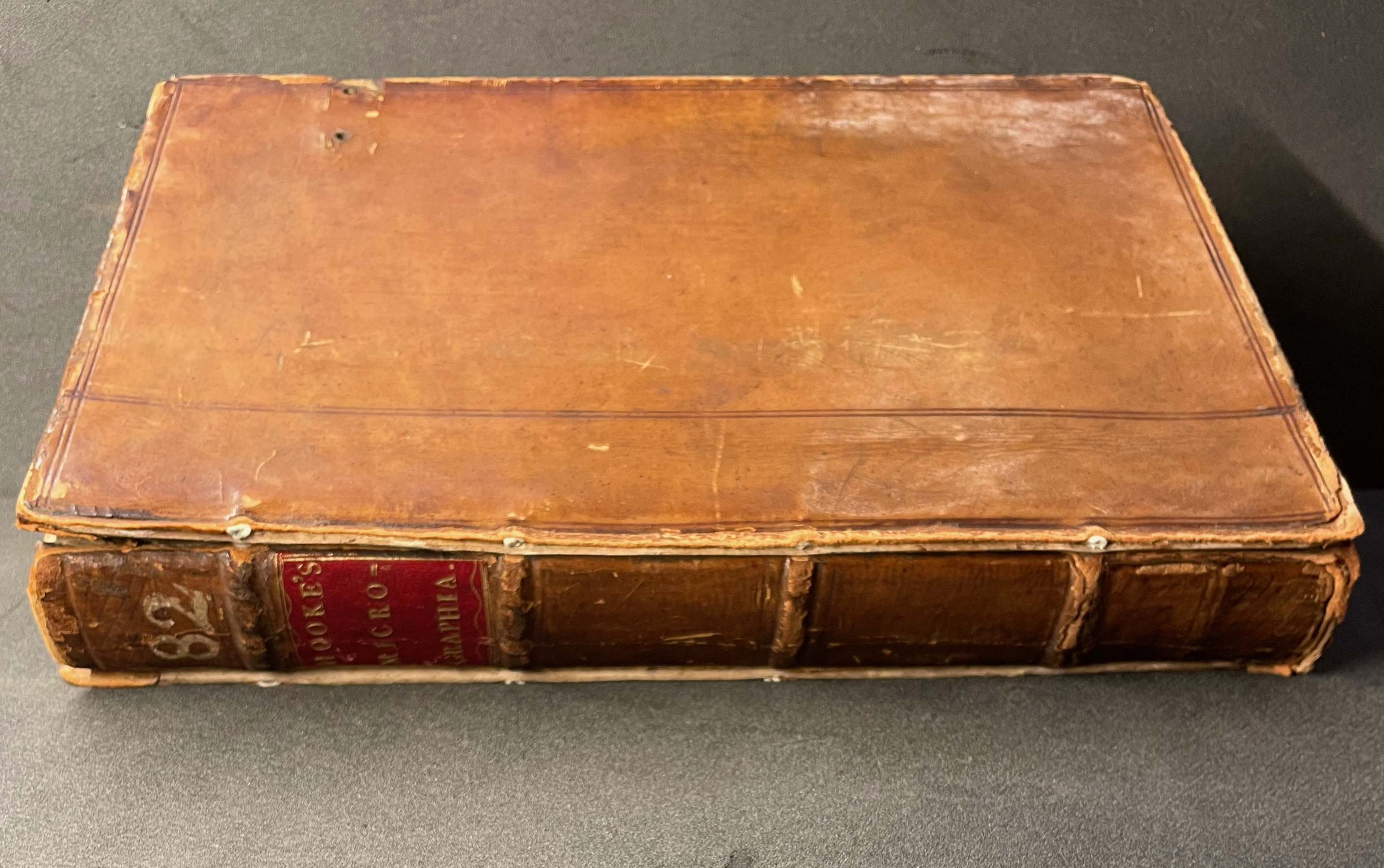
Living in a village near Oxford and having access to the Bodleian Libraries, I took Micrographia Revisited on a pilgrimage to compare it with a copy of the original not far from Hooke’s alma mater Wadham College.
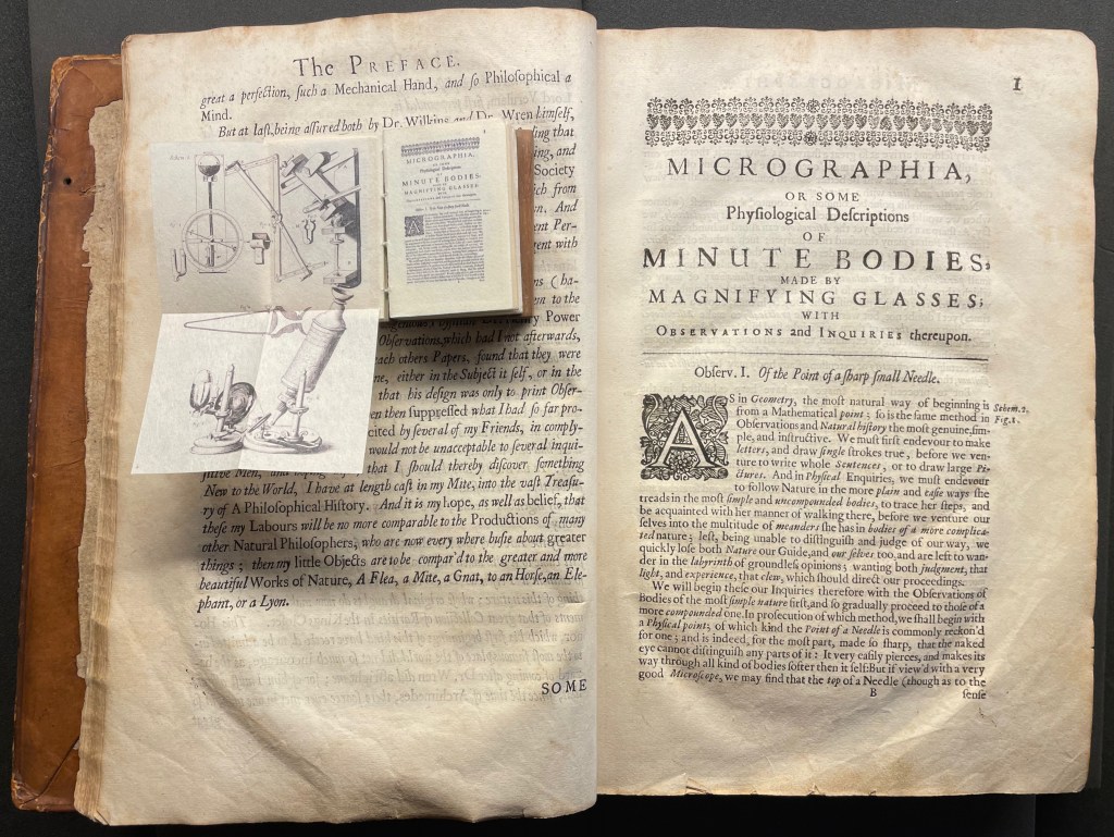
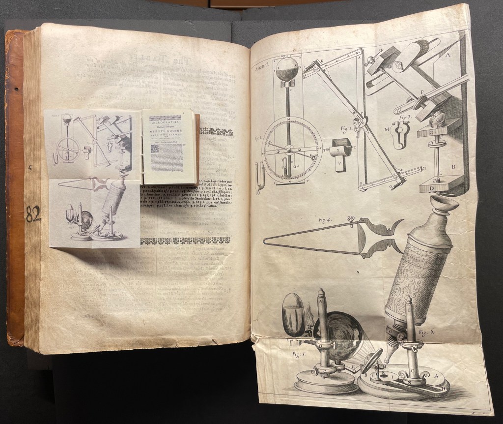
Among the many outstanding features of Huebner’s homage is his use and placement of fold-outs to capture the larger plates in Hooke’s original, all of which were placed in an appendix and some of which were also printed as fold-outs. In the juxtapositions below, note how Huebner has placed Hooke’s illustration of his equipment at the end of the Preface.
Sitting atop the double-page spread showing the end of the Preface and page 1 of Hooke’s original is Micrographia Revisited, open to Huebner’s fold-out of Hooke’s illustration of his equipment. Hooke’s same fold-out illustration from the appendix is juxtaposed below with Huebner’s.
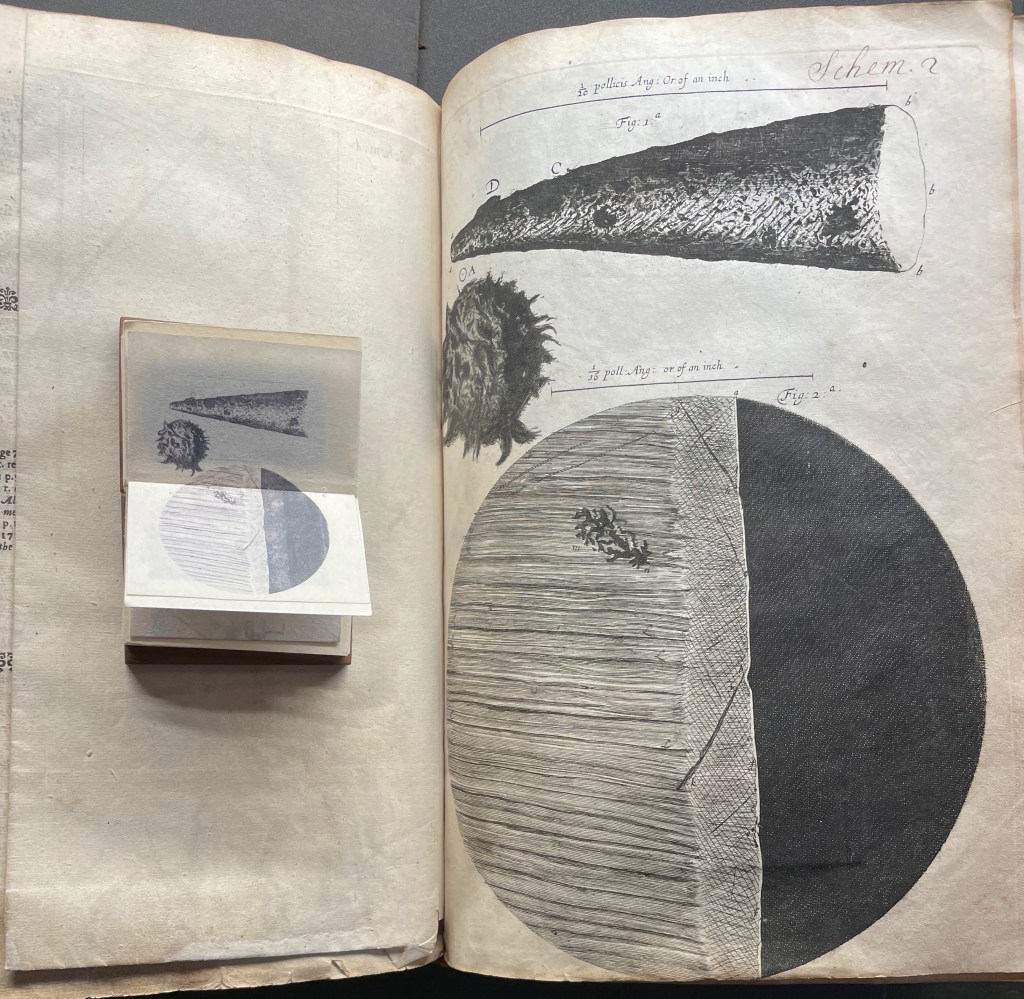
Hooke’s first two objects under the microscope Hooke are the point of a needle (described on pages 1-3) and the edge of a razor (described on pages 4-5). Huebner transforms Hooke’s single-page plate illustrating what he describes into a double-page spread between pages 2 and 3 of Micrographia Revisited.
Juxtaposing Huebner’s double-page presentation of Hooke’s drawings of a needle point and edge a razor with Hooke’s single-page presentation.
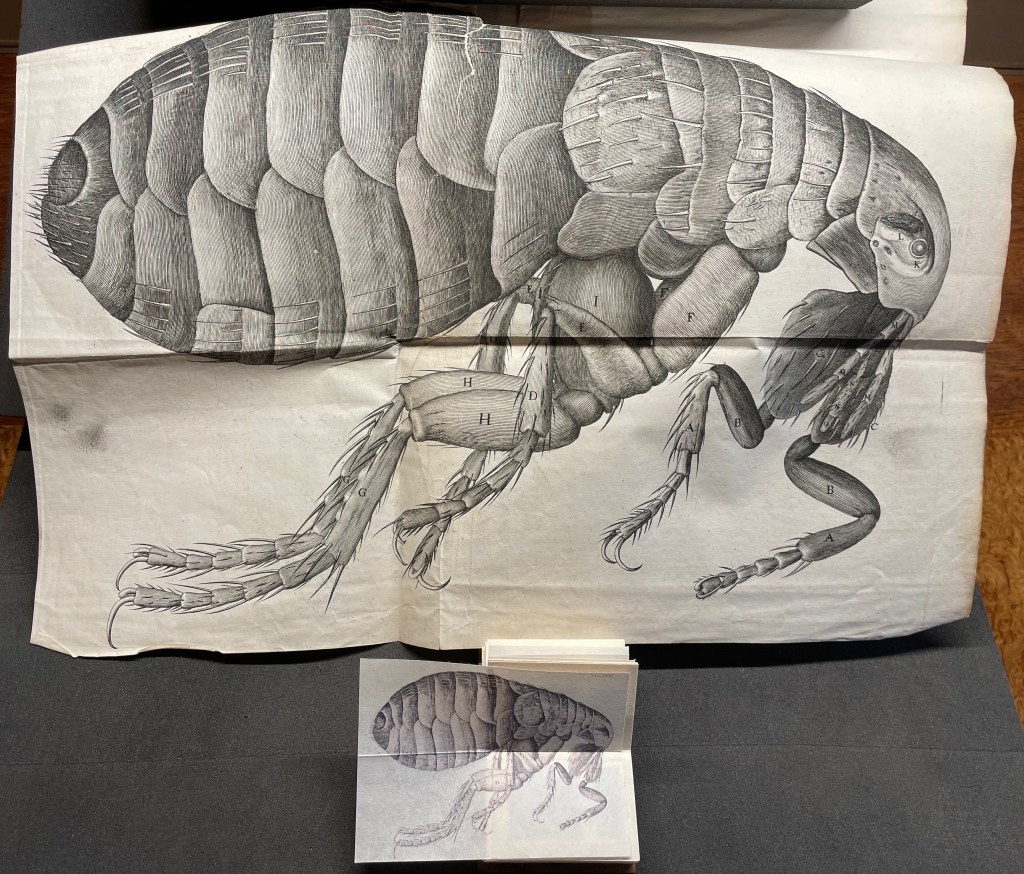
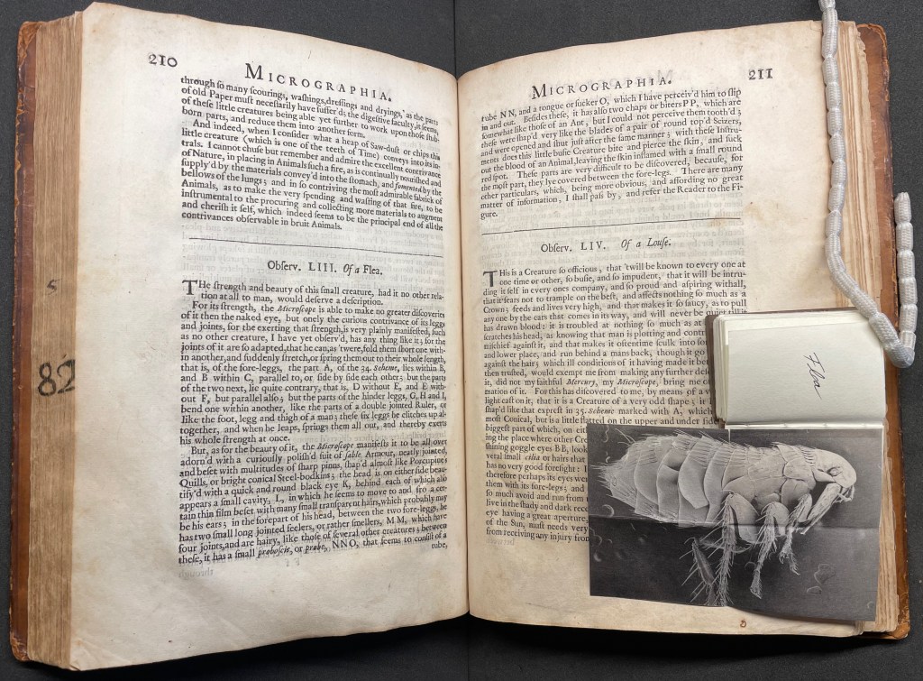
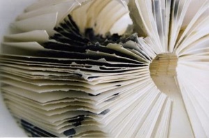
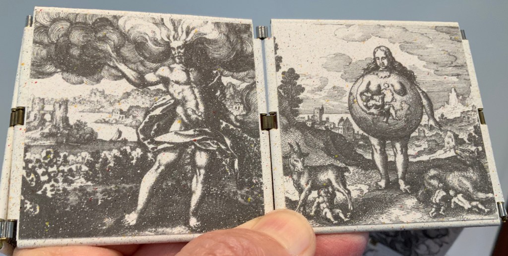
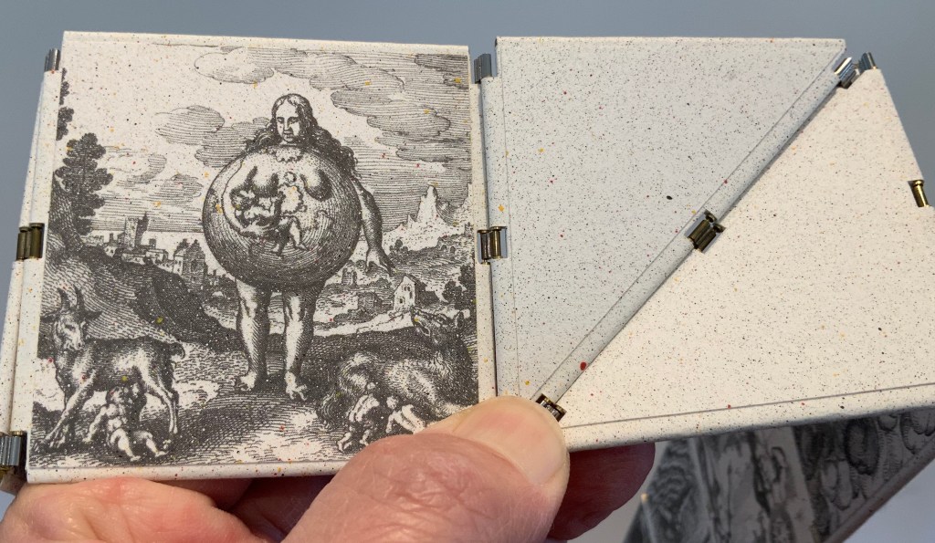
Hooke’s large fold-out of his flea may display the most impressive drawing in the book. The description appears on page 210, and the fold-out is in the appendix. Huebner’s double-fold fold-out of the illustration falls between pages 210 and 211.
The flea from Micrographia juxtaposed with that from Micrographia Revisited.
But most impressive of all is Huebner’s SEM image of a flea and its testament to Hooke’s powers of observation and skills as a draughtsman.
In the spirit of “standing on the shouders of giants”.
John Crombie formed Kickshaws in 1979 in Paris. Joined by Sheila Bourne, they published over 150 works. Apparent as the esoteric influence of visual poetry and the Oulipo movement may be, their works have the combined smell of the printer and typesetter’s workshop and artist’s studio that distinguish them from that crowd.
ABC in a maze (1987)
ABC in a maze (1987) John Crombie Spiral bound on four sides, double gate fold. H95 xW95 mm, 17 leaves. Edition of 300 (150 in English, 150 in French), of which this is Letter of 26 numbered A-Z. Acquired from Librairie Jean-Étienne Huret, 17 March 2022. Photos: Books On Books Collection.
The cover of this work hides its title, just as the proper order of the pages hides in the reiterations of the alphabet across 17 leaves of this double gatefold puzzle and book.
The French title ABC Dédale carries more freight than the English. Not only does it convey the idea of the maze by reference to its inventor Daedulus, it refers to Cadmus, the Phoenician prince who brought the alphabet to Greece while on his quest to find his sister Europa, mother by Zeus to the Minotaur — the “monster in the alphabet”. If that seems a far-fetched allusion, then consider the additional hint in the name of the chosen typeface: Hélios, the Greek god and personification of the sun, to which Daedulus’ son Icarus flew too close in their escape from Crete.
Portrait évolutif du typographe “Evolving portrait of the typographer” (1988)
If a selection of works from the Books On Books Collection were made based on the theme of “artists’ books and color”, this small work would have to make the cut. Moving from five small splashes of color in the first pass, subsequent passes build up a multi-colored cartoon image of the typographer in a head-on eyeless gaze. At the seventh pass, however, the colors begin to fade; in the ninth, the features of the portrait begin to erode, and by the twelfth, only streaks of gray and the faintest impression of the outline remain.
A close look at the title reveals that same faint impression of the portrait’s outline. Were it not for its reference to the three primary colors, the title would have to be amended to a baker’s dozen of passes in collaboration with the press.
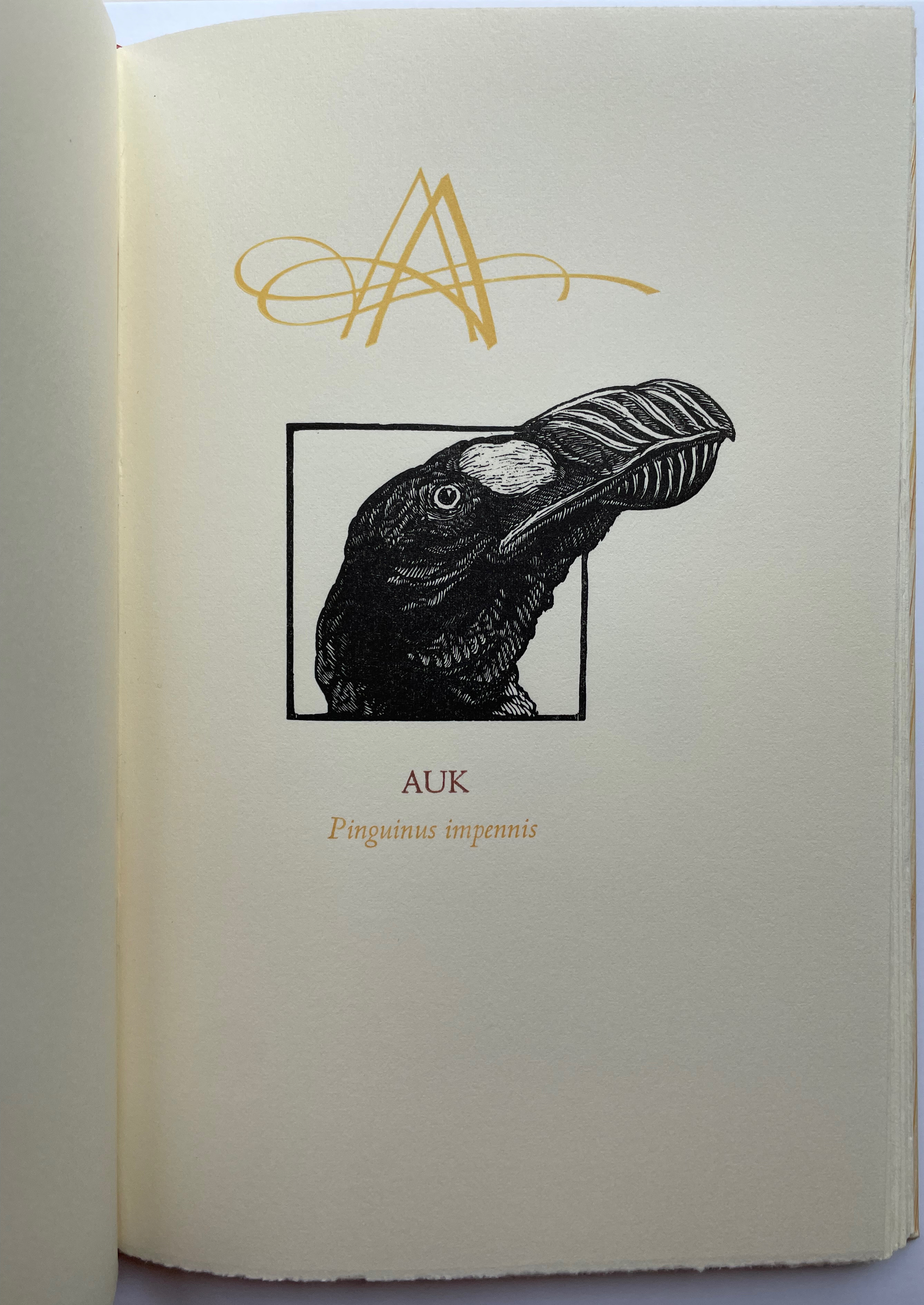
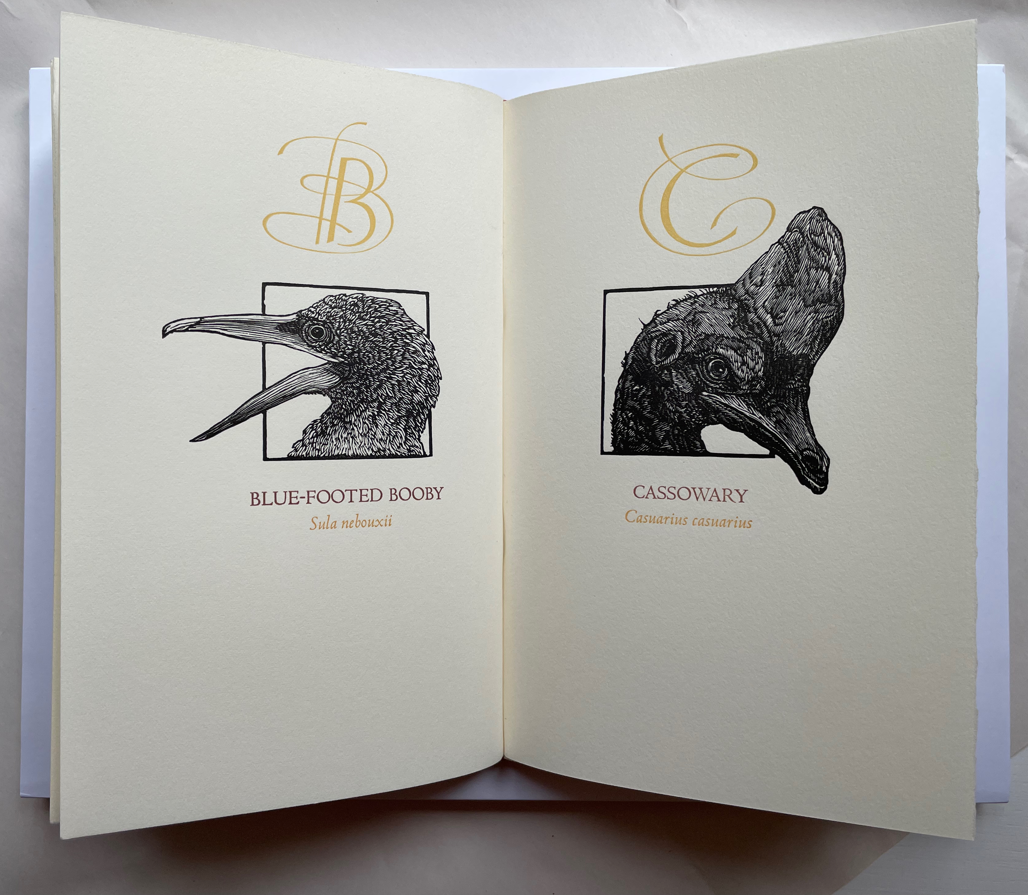
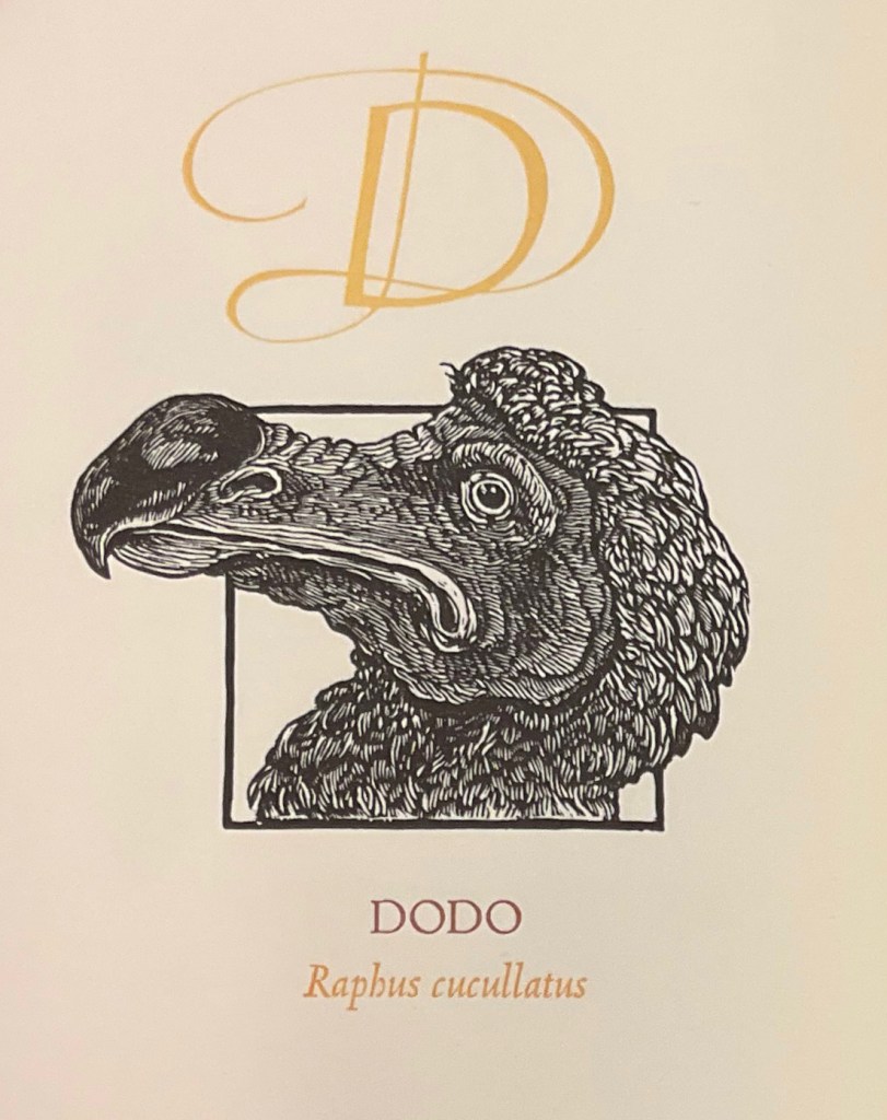
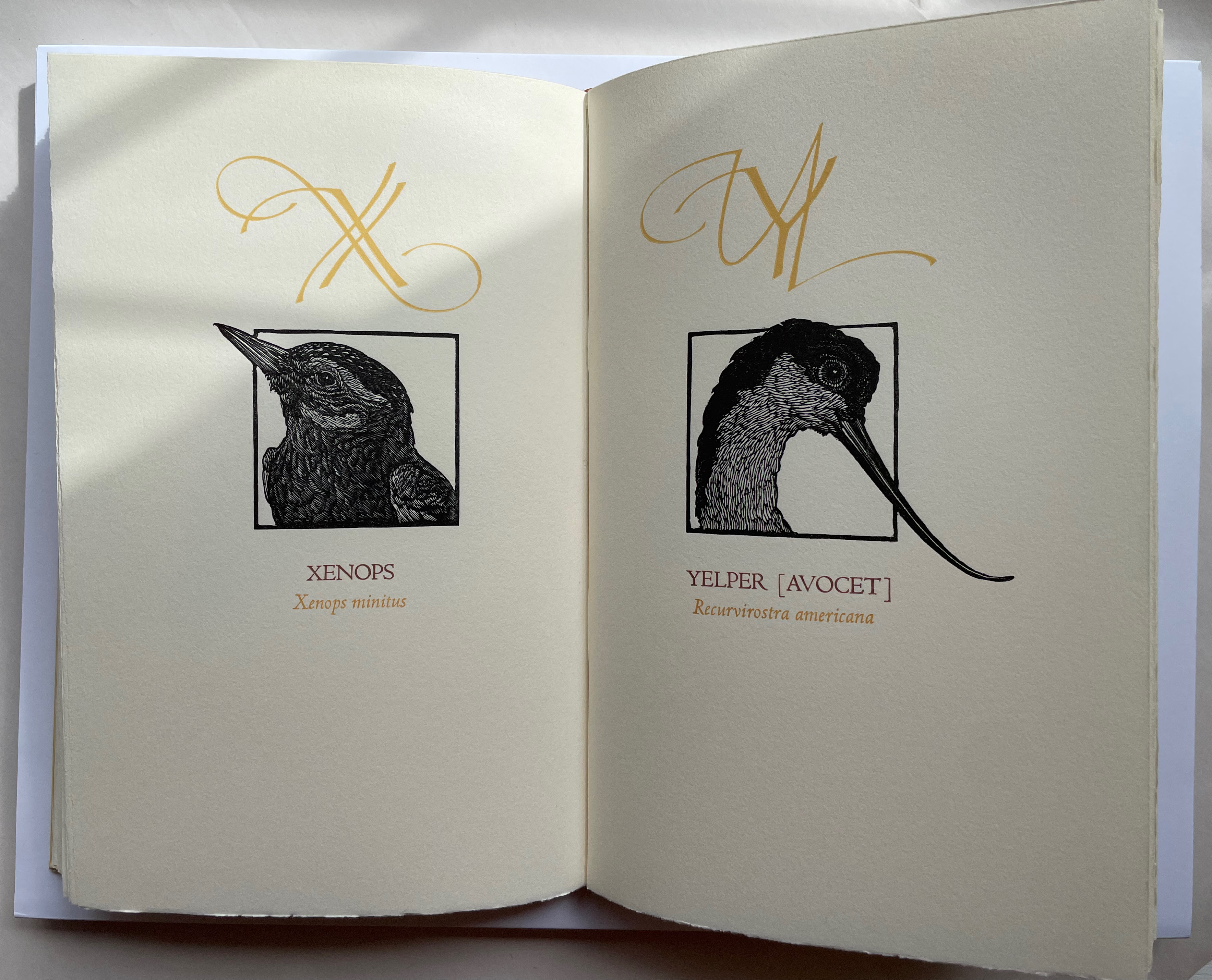
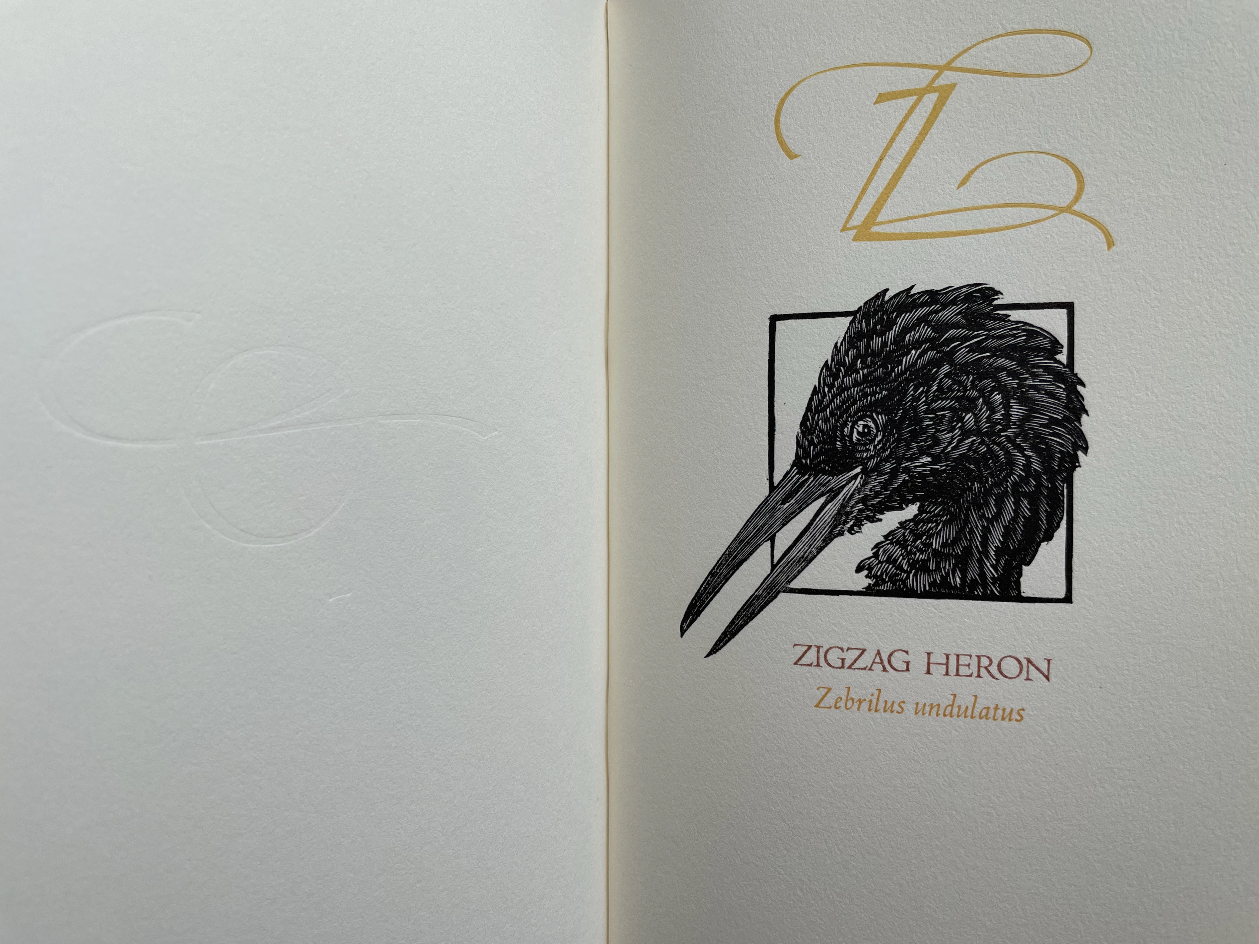
A Fowl Alphabet (1986) Alan James Robinson (etchings), Suzanne Moore (calligraphy) Casebound. Marbled paper over boards. Doublures and flyleaves. H218 x W145 mm. 26 Folios untrimmed at head. Four-page prospectus loose. Acquired from Bromers Bookseller, 16 August 2022. Photos: Books On Books Collection. Displayed with permission of the artists.
Under his Cheloniidae Press imprint, Alan James Robinson created three artist’s alphabets: A Fowl Alphabet with Suzanne Moore; An Odd Bestiary (1982) and The Birds and Beasts of Shakespeare (1990), arranged as a double abecedary, first the birds and then the beasts. Although this copy of A Fowl Alphabet comes from the regular edition and does not have the color of the deluxe editions of all three abecedaries, it does demonstrate the extraordinary fineness of Robinson’s wood engraving as well as his compositional talent, which also informs the book’s design. The positioning of the birds’ heads in their printed black frames conveys a sense of movement and three dimensionality on the individual page, but notice how Robinson varies the positioning from page to page and across double-page spreads to enhance the sense of movement.
With its core thick strokes shadowed and entwined with thinner flourishes, Suzanne Moore’s calligraphy creatively complements the way that the heft of Robinson’s engraved heads plays against those compositional features.
“Cheloniidae” is the scientific term for the family of sea turtles, and much of Robinson’s art is marine related. But the dominant and consistent impression conveyed by the ouput of Cheloniidae Press is that of Robinson’s artistic skill as an impresario and conductor of artistic talents. Added to the background of his duet with Moore are Master Printer Harold Patrick McGrath, Faith Harrison and her hand marbled paper, Arthur Larson and his hand typesetting and the binding skills of Claudia Cohen.
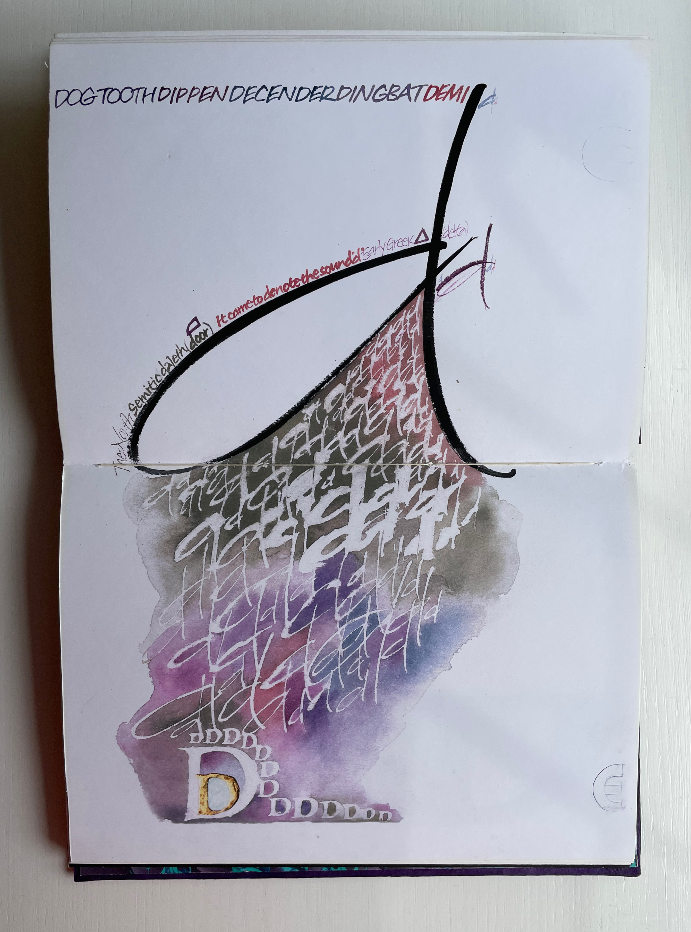
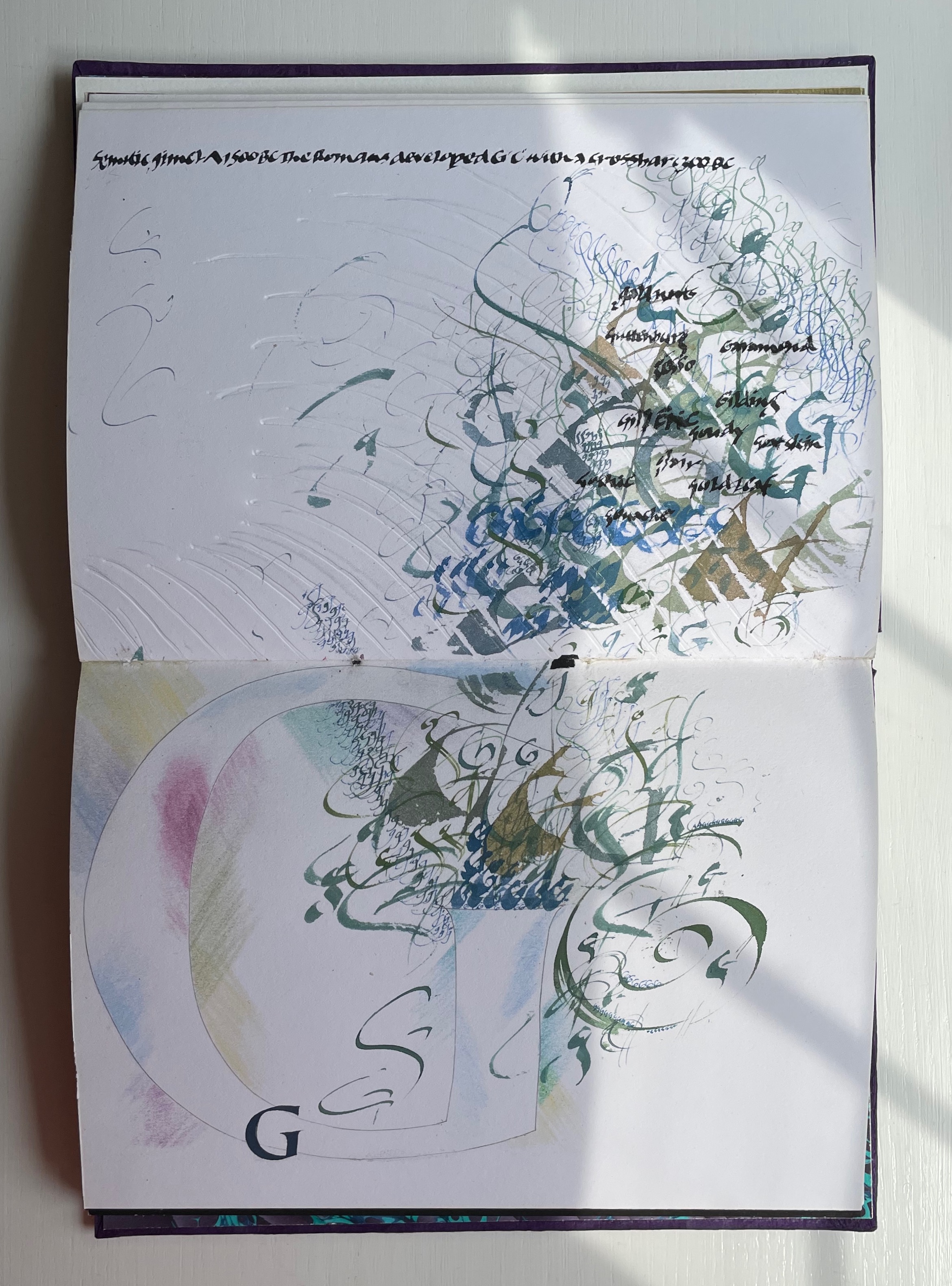
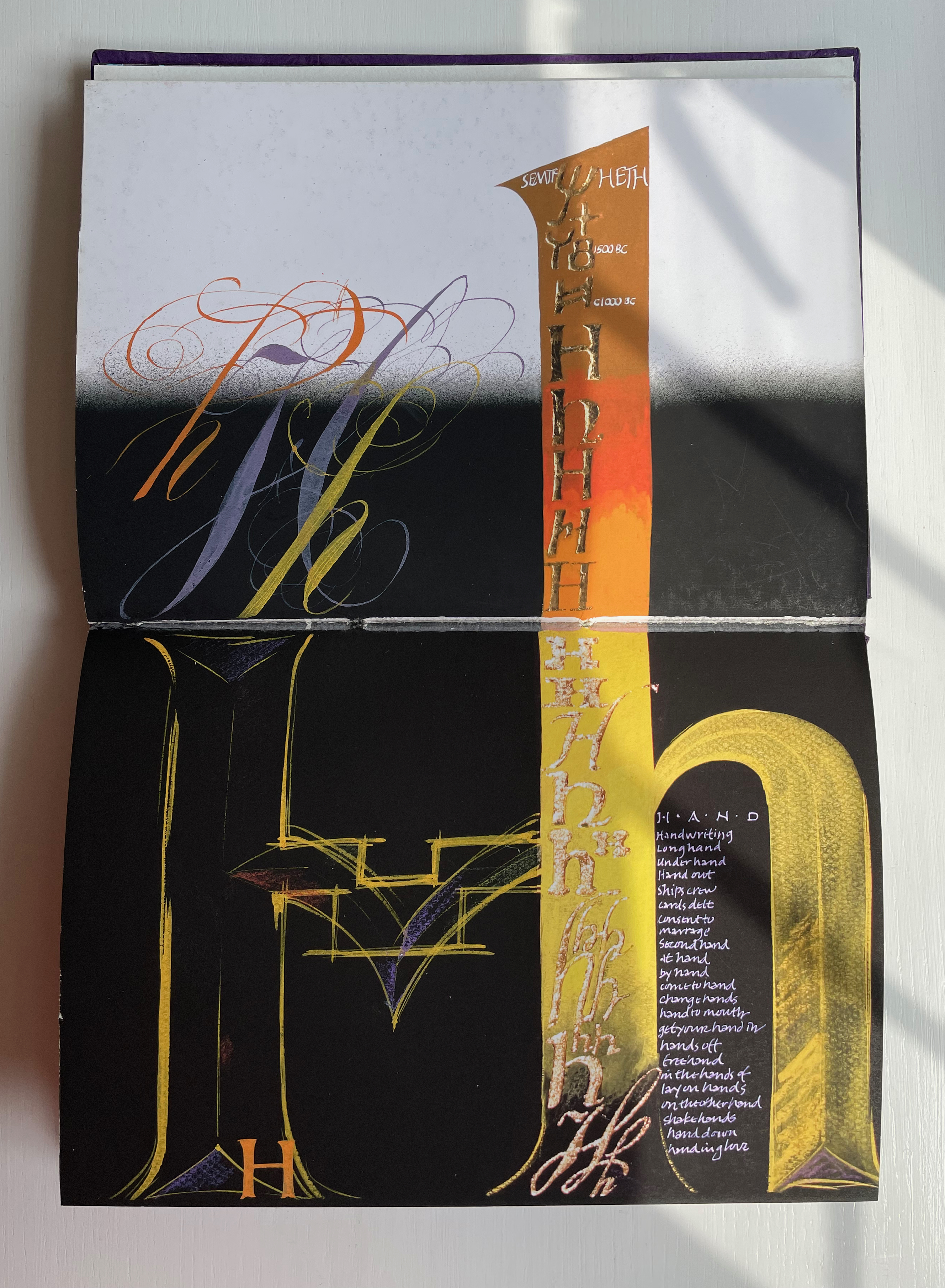
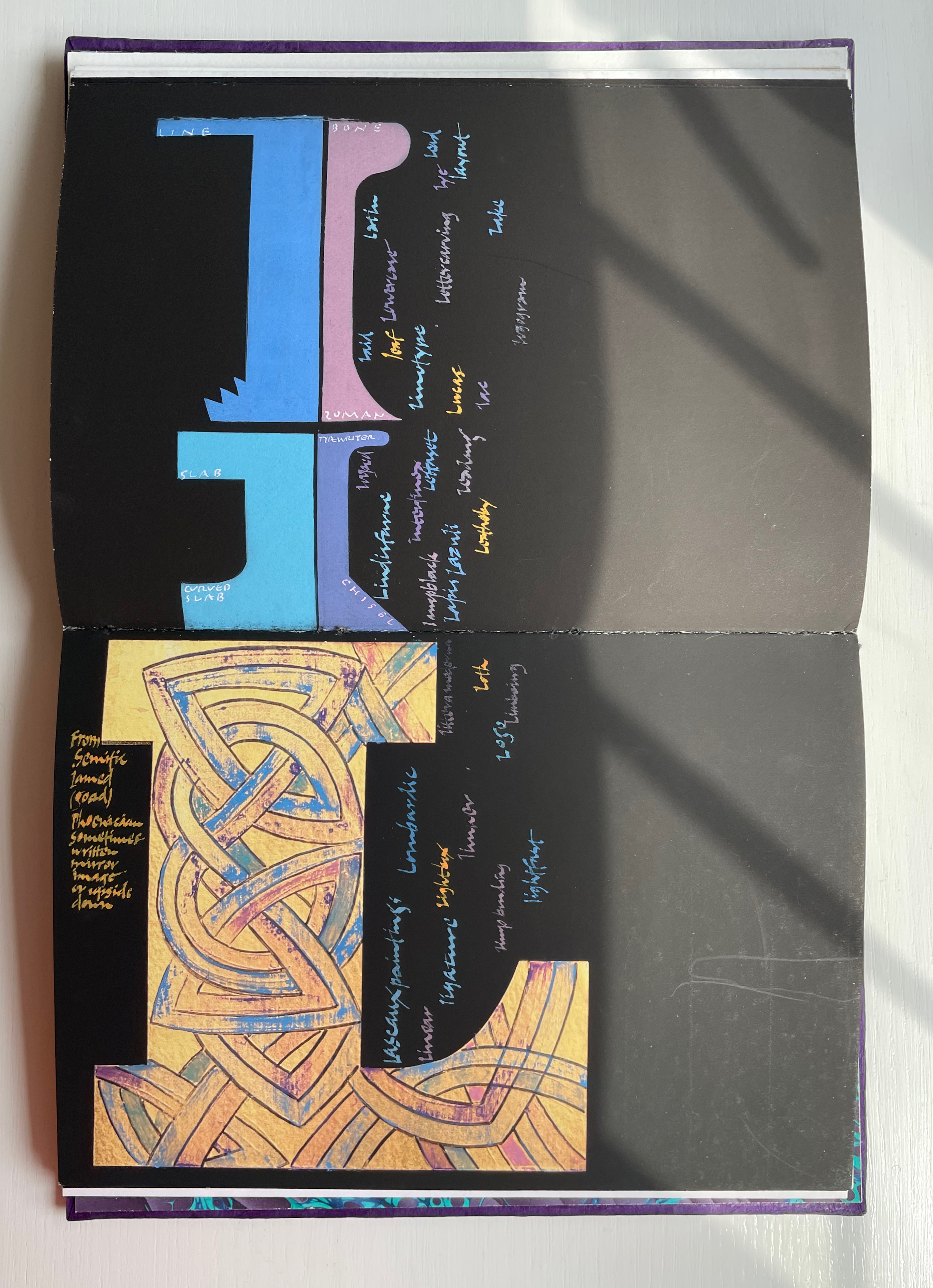
Alphabetica (2002) Dave Wood Bound in vellum; open-spine binding sewn on vellum strips. H210 x W290 x D30 mm. 54 pages. Loosely inserted colophon. Edition of 26. Acquired from the artist, 27 July 2022. Photos: Books On Books Collection. Displayed with permission of the artist.
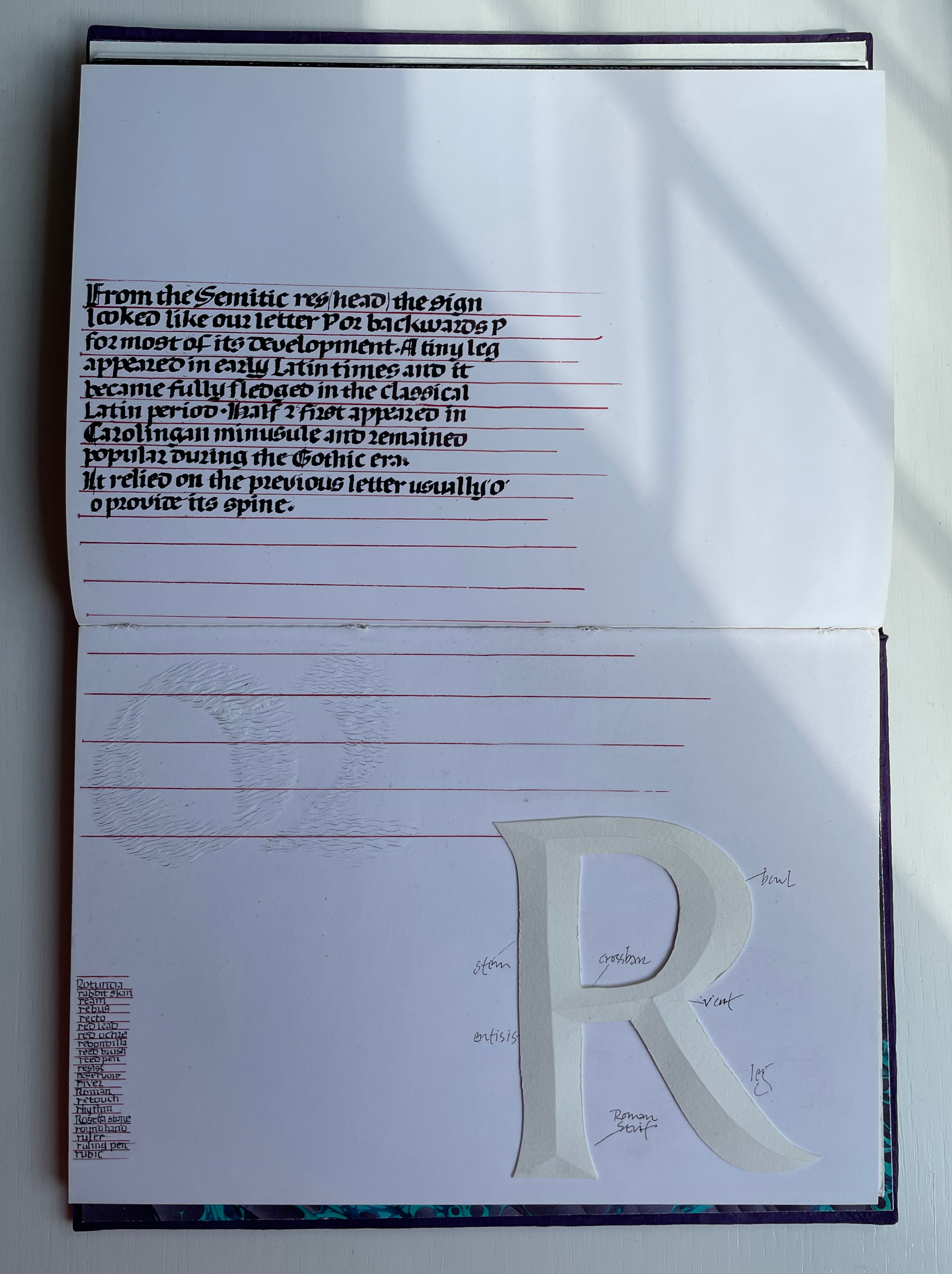
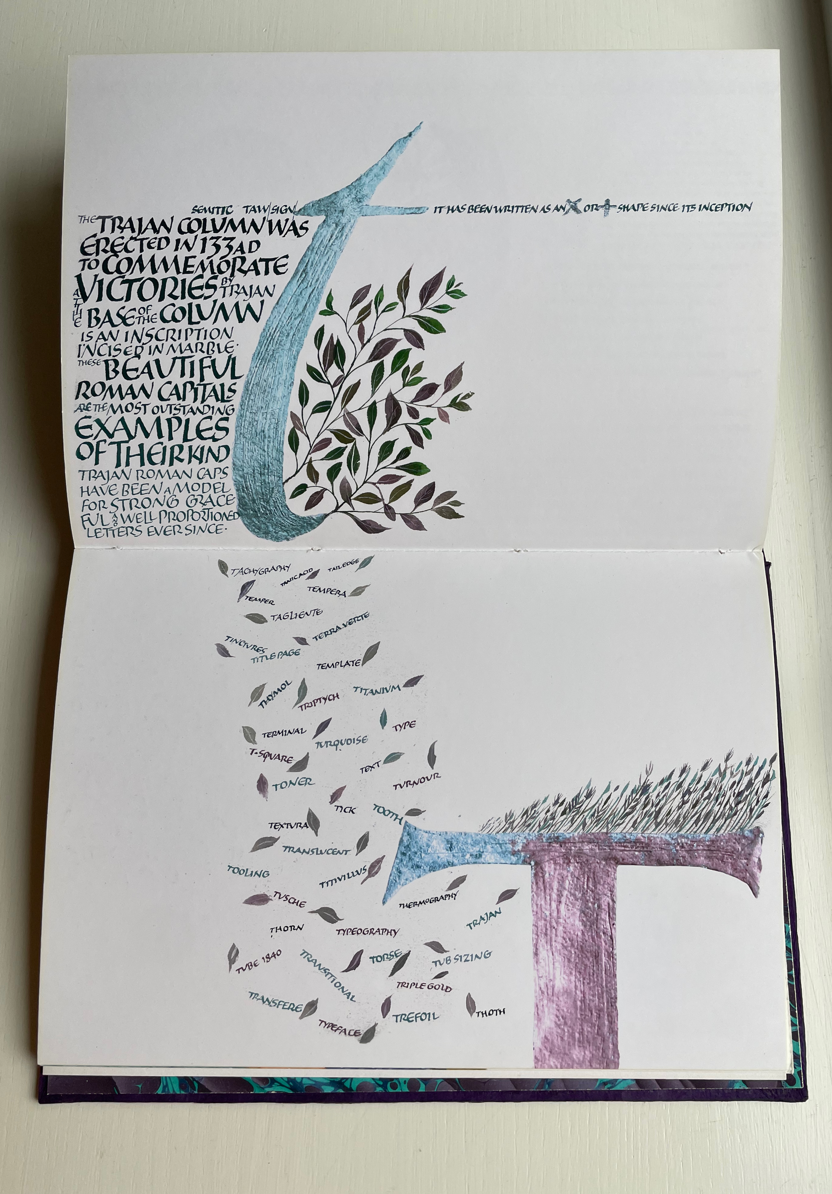
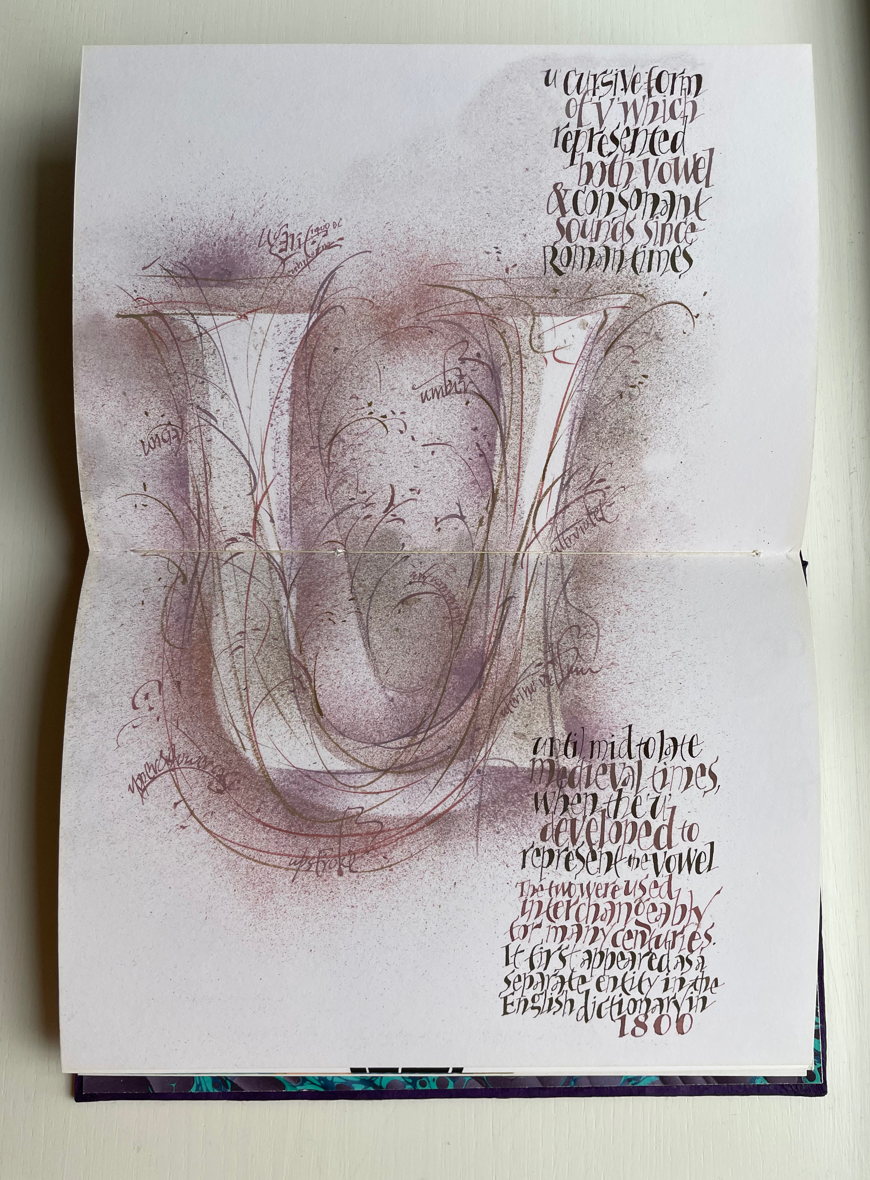
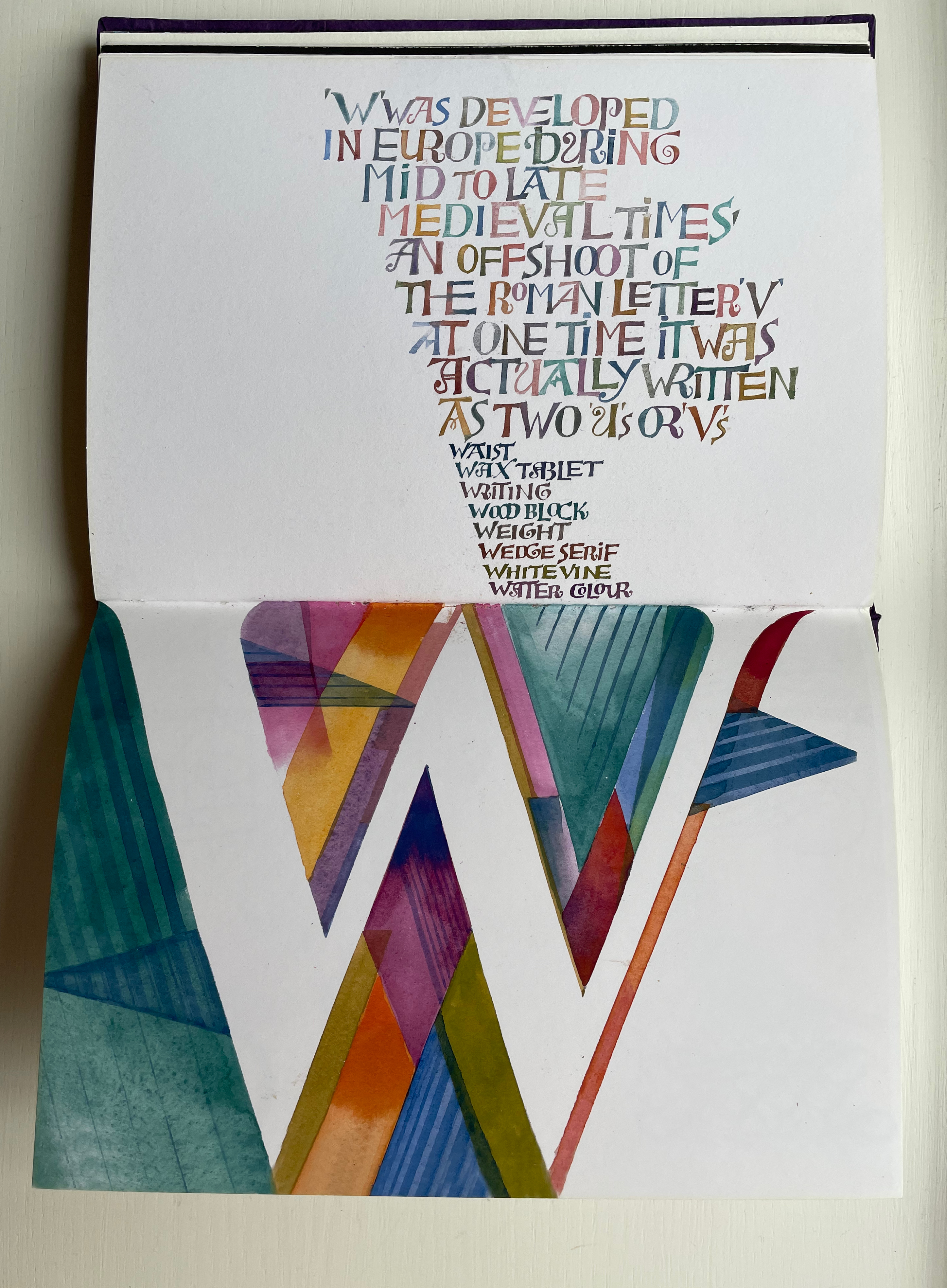
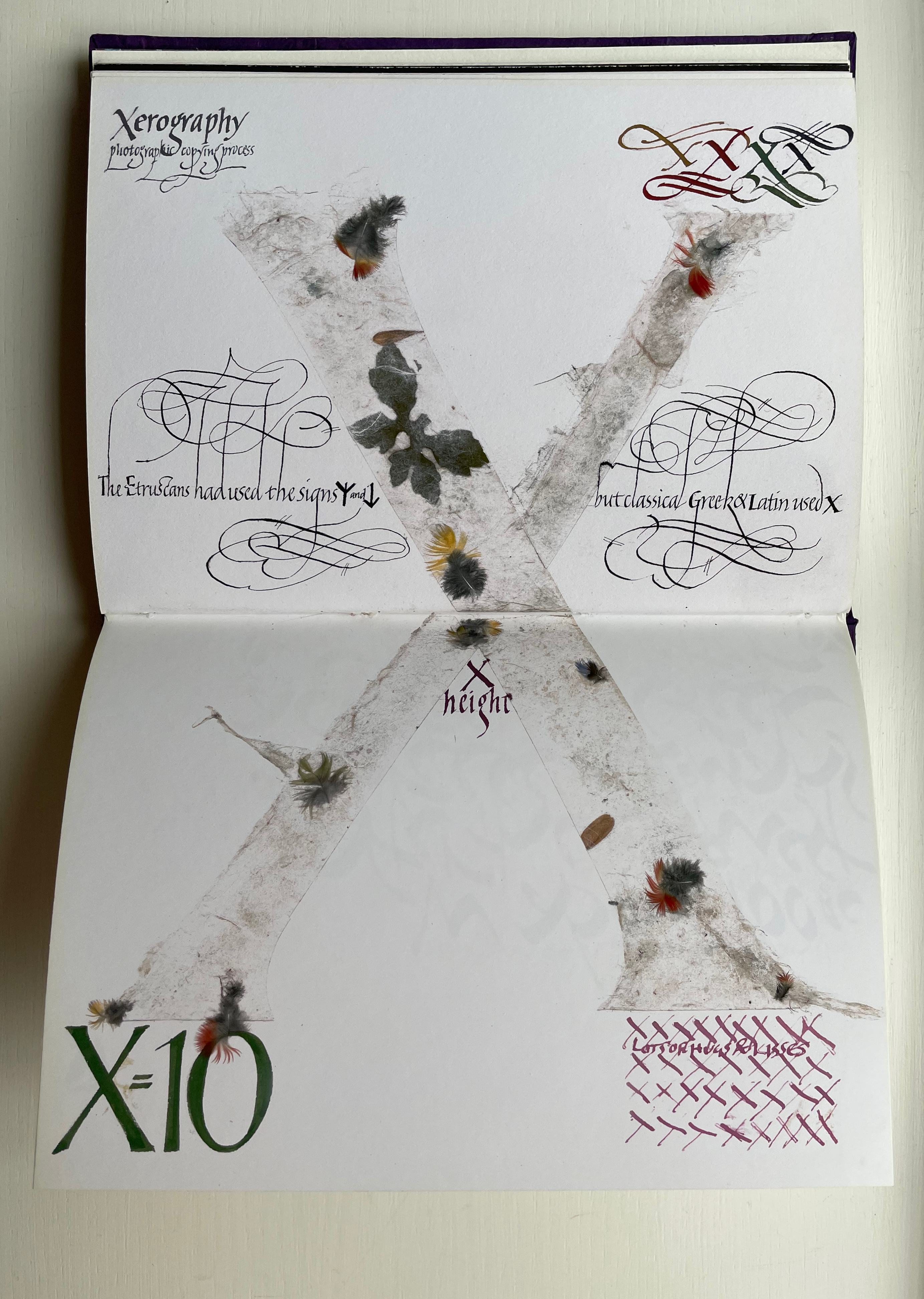
From Alphabetica‘s description as an exploration of the alphabet’s “diverse development from historic shapes to the infinite variations we see today in typefaces and calligraphic forms of the Western alphabet”, the reader might expect an academic work. The deeply embossed and debossed royal purple cover presenting the title in landscape format suggests otherwise as do the marbled endpapers and embossed gold foil title page. The cover is built up with a very strong paper made in Nepal, painted with acrylic then sprayed with semi-matte varnish. Inside, the reader finds a portfolio of twenty-five distinct “canvases” in which Wood demonstrates both historical sensitivity and artistic inspiration.
Across the twenty-six spreads, Dave Wood has captured each letter’s distinct story with multiple styles of calligraphy in Sumi ink and gouache paints as well as varying textures and techniques (Canson and Arches paper, glassine, foil, embossing, stamping, feathering and cutting), colors and layouts.
The letters’ developing shapes and periods are labeled. Starting with the letter B, Wood adds names of typefaces, structural terms for type, palaeographical terms and terms from the crafts of calligraphy, typesetting and printing — all beginning with /b/. Similar labeling occurs for the letter C but with a different layout. Across the twenty-five canvases, Wood excels at this balancing of difference and similarity. Notice, for example, how letters B and C incorporate the Renaissance style of illumination called bianchi girari (white vine stem decoration).
The ways in which uppercase-to-lowercase movements interact with the layout’s variations make for a dynamic experience. Sometime it’s subtle, sometimes vigorous. Note, for example, how the letter D de-emphasizes the gutter whereas the letter E emphasizes it.
With letters H through Q, a shift from Arches white to Canson black paper and back adds to the overall dynamic movement. Yet Wood is attentive to elements of unity; for example, his playful handling of the gutter in the transition from letter H to letters I/J echoes that from letters D to E.
Only six letters perform the trick of extending across the gutter — lowercase H and uppercase K, M, O, U and X. While O, U and X take the similar approach of almost evenly straddling the gutter, each of the other three succeed differently. M is perhaps the most striking and interesting of them all. M derives from the Semitic word for “water” mem. As Wood points out in the loose insert colophon, the watery blue that fills the letter is intentional — as must be the precise alignment of the inner peaks of the letter with the gutter. Such attention to detail in the midst of so much activity on the page demands a similar attentiveness from the reader.
For example, the long tail of the Q does not show up until the bottom of the spread. And the reader may need to pick out the the word “or” in the text to spot the lowercase r in the textured, oversized written word “or” directly below the text.
Visual puns abound. Celtic knots in a capital L (for the Lindisfarne gospels). An S formed of stones. Leaves falling from a lowercase t (for tree or tea, of course). A U growing underground.
Fortunately, the accordion-fold colophon loosely inserted in the book offers pointers to some (not all) allusions. For example, the beginning of the third line for the letter V pays homage to Titivillus, the 13th-century patron demon of scribes’ mistakes. The illustrated W is an homage to Ben Shahn’s letter design. The highly contrasting thicks and thins in the letter X allude, in calligraphic terms, to the thick mark’s determining the number of pen widths making up the x height (the body of the miniscule).
And while the colophon may be necessary to know that the typefaces written in color below were created by Hermann Zapf, any viewer can enjoy Wood’s incorporating the entire alphabet in the Sumi ink design culminating in the letter Z as a fitting self-referential conclusion to Alphabetica.
The Neolithic Adventures of Taffi-Mai Metallu-Mai (1997)
The Neolithic Adventures of Taffi-Mai Metallu-Mai(1997) Gerald Lange and Rudyard Kipling H216 x W260 mm. 55 pages with 17 additional illustrated page inserts. Edition of 150, of which this is #149. Acquired from the artist, 11 Febuary 2023. Photos: Books On Books Collection. Displayed with the artist’s permission.
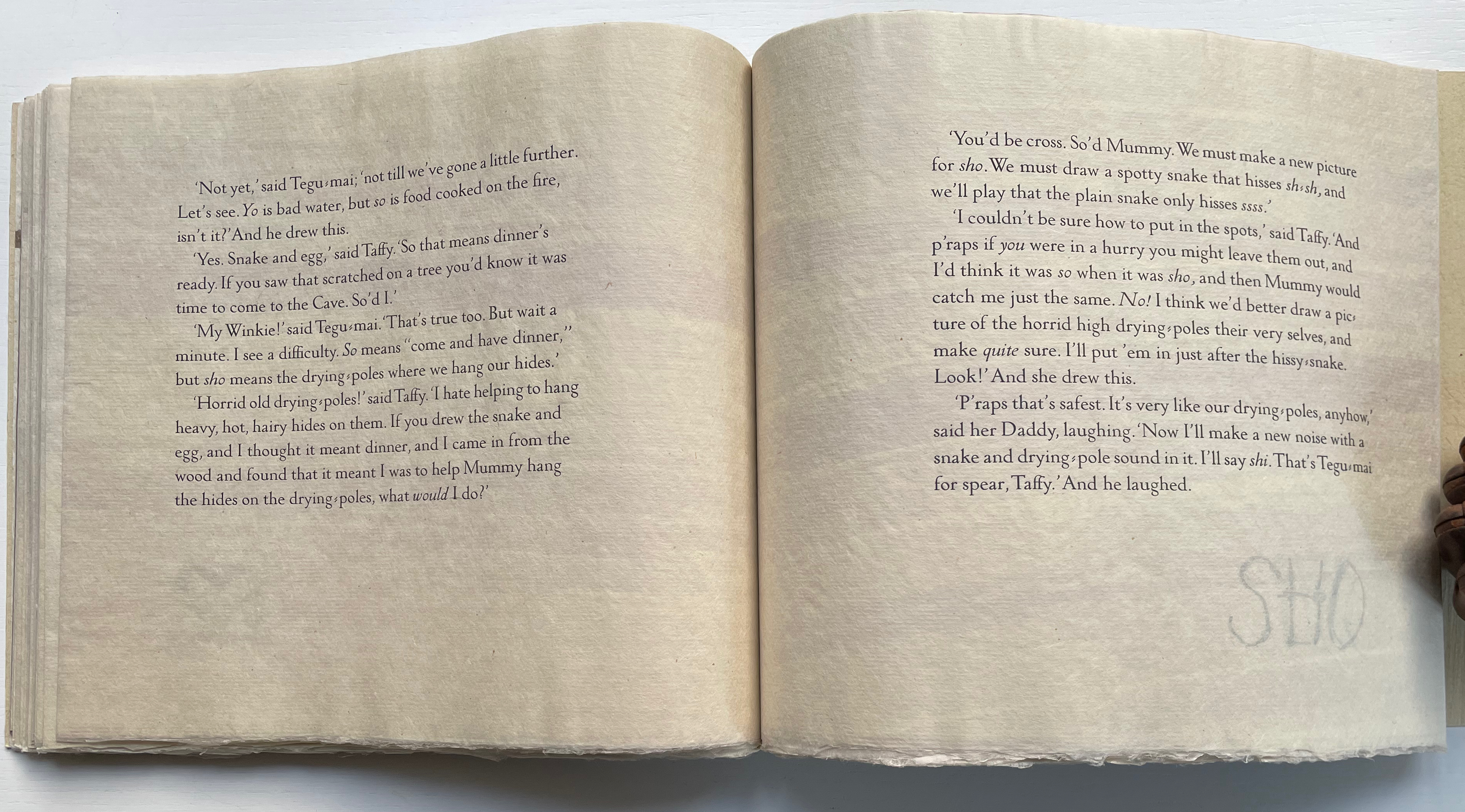
Gerald Lange’s choice of “How the First Letter Was Written” and “How the Alphabet Was Made” from Rudyard Kipling’s Just So Stories (1902) for this elaborate, delicate but robust edition was fitting. By 1997, he had founded the Bieler Press (1975), co-founded the Alliance for Contemporary Book Arts (1987) and edited its journal AbraCadaBrA for seven years, had been the Master Printer at USC Fine Arts Press and selected as the first recipient of the prestigious Carl Hertzog Award for Excellence in Book Design (1991) and was about to publish the first edition of his Printing Digital Type on the Hand-Operated Flatbed Cylinder Press (now in its fifth edition, 2018). In keeping with his interests leading up to this work, Lange letterpress-printed it from handset Monotype Pastonchi and a digitally altered version of Berthold Post Antiqua. More to the point, as he noted on the Bieler Press site, he chose the stories for “their affinity with subjects related to the lettering arts”. If that affinity is not clear enough from the text, Lange’s treatment underscores it in subtly ingenious ways.
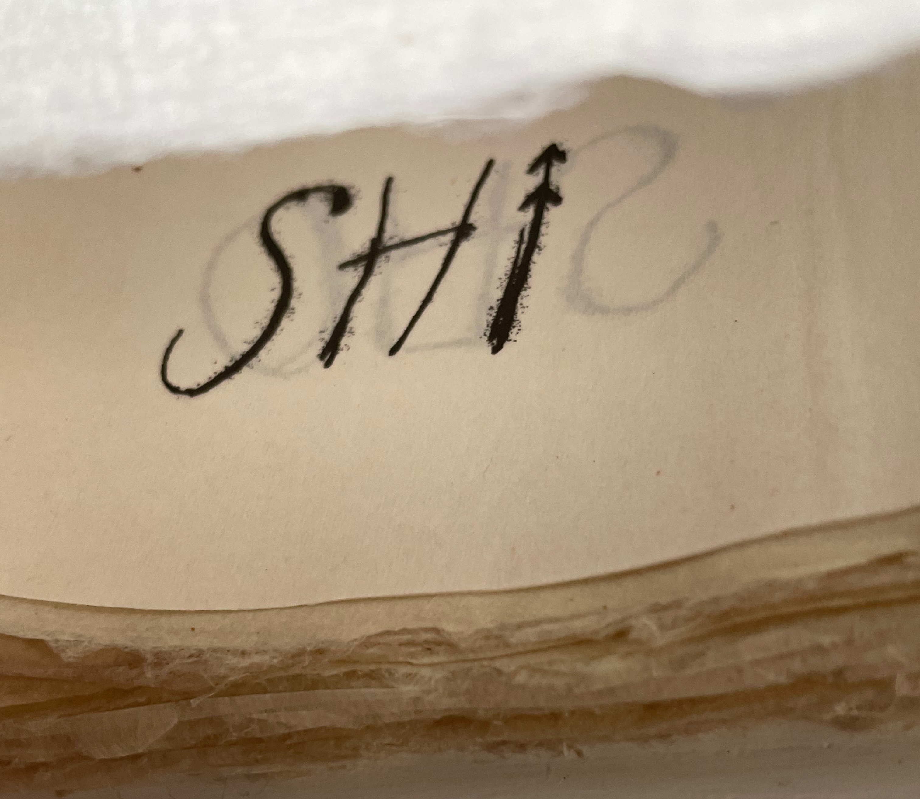
Kipling attributes the drawings throughout to his heroine, Taffi and her father. Where others like Macmillan Children’s Books have rendered them boldly, Lange prints the primitive petroglyph-like images on separate Gampi sheets inserted between the folded Kitakata text leaves of the tortoise shell edge-sewn binding. Those text leaves are individually water colored on their reverse sides (urazaiki manner based on nihonga painting) so that the pictographs beneath reveal themselves through a striated layer. The color and striations are reminiscent of cave paintings. Additional Asian papers (Kasuiri and Chirizome for end sheets, Cogan Grass for covers) increase the work’s tactility — simultaneously soft and rough, flimsy and tough — and contribute a grassy smell redolent of the stories’ physical setting.
The quality and rightness of choices in structure, material and process have placed several of Lange’s works in The British Library, University of California (various), Columbia University, Harvard University, University of Minnesota, New York Public Library, Princeton University, Stanford University, Victoria and Albert Museum, Yale University and others. The initial reason bringing this particular work into the Books On Books collection was its representation of book art inspired by the alphabet. That Robin Price, several of whose works are also in the Books On Books collection, assisted with the design came as a bonus. That this is one of the last bound copies of The Neolithic Adventures of Taffi-Mai Metallu-Mai makes it a treasure.
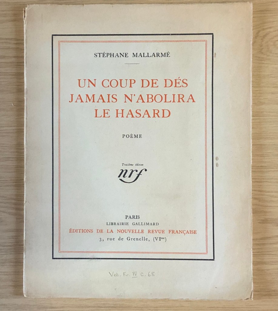
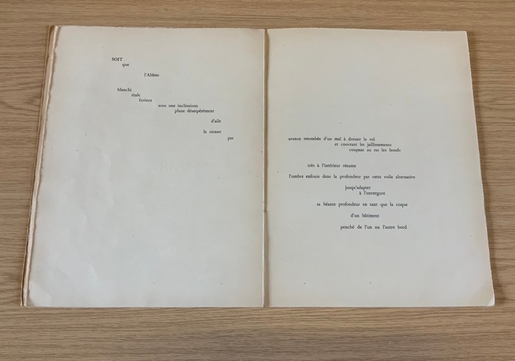
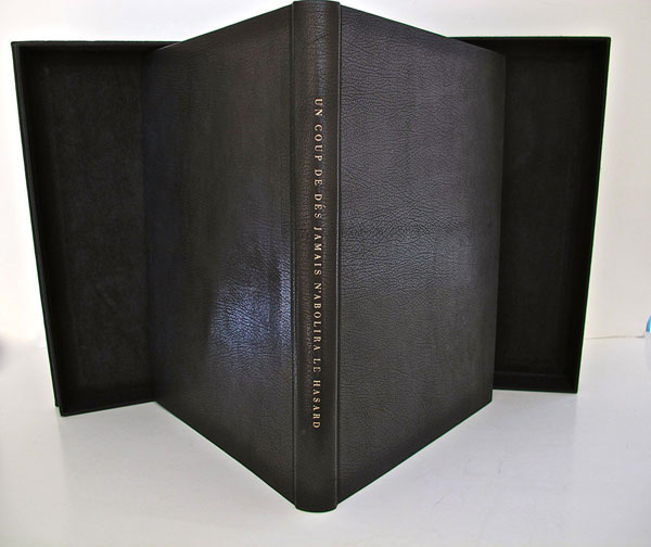
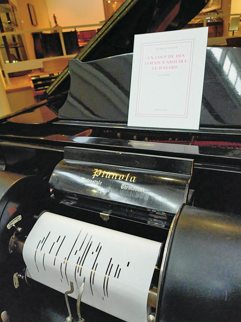
It was 1913. Stravinsky’s ballet “The Rite of Spring” debuted. The Cubists, Constructivists, Suprematists, Futurists all bound onto the art scene, many of them showcased in the Armory Show in New York that year. The Nouvelle revue française (NRF) attempted the first book form of Stéphane Mallarmé’s Un Coup de Dés Jamais N’Abolira le Hasard, which revived that 1897 typographic disruption of the page and prepared the ground for dozens of works of book art since. And Blaise Cendrars and Sonia Delaunay-Terk announced and published what they called le premier livre simultané. It was La Prose du Transsibérien et de la petite Jehanne de France.
From the Bodleian Library collection Photos: Books On Books
From the National Art Library, Victoria & Albert Photo: Books On Books
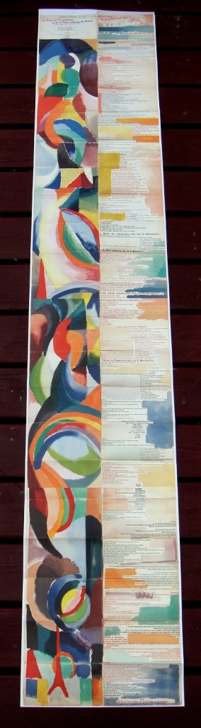
Like Mallarmé, Cendrars disrupts the page with multiple typefaces (thirty distinct ones in his case) and scattered placement of lines and stanzas. But La Prose presents an even more physical and structural disruption of the page and book than Un Coup de Dés. Unlike the latter, La Prose unfolds — twice — in an accordion format to over two metres in length or rather height since the text descends on the right and ends alongside the interlinked images of the Eiffel Tower and a Ferris wheel at the foot of the accordion. Cendrars and Delaunay had aimed to produce 150 copies of La Prose because, placed end to end, that would have equalled the Eiffel Tower’s height.
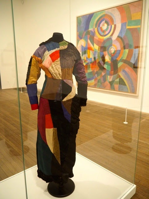
More than this monumental, sculptural, typographic and physical disruption of page and book, La Prose presents a temporal disruption. By le premier livre simultané, Cendrars meant a simultaneity of the verbal and visual — the way that text and image appear all at once — en un éclair. Early Bohemian that he was, Cendrars was co-opting a fair bit of artistic and literary theorising by the Cubists, Futurists and others. Most important and of the moment was his co-opting of Robert and Sonia Delaunay’s colour theory of simultanéisme. The “couleurs simultanées de Mme Delaunay-Terk” had also appeared in her 1913 robe simultanée and paintings. Building on a French scientist’s exposition on how perception of colours changes depending on the colours around them, the Delaunays claimed that rhythmic, musical and spatial synaesthetic elements were also at play. Sonia Delaunay asserted that the artwork produced for La Prose was not in response to reading the poem but hearing it from Cendrars. (Listen to it for yourself here.)
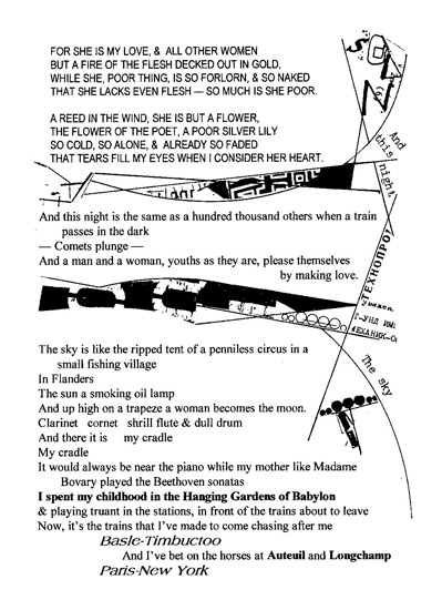
In presenting the adolescent Cendrars travelling physically eastward on the Transsibérien, travelling mentally to Flanders-Basle-Timbuctoo-Auteuil-Longchamps-Paris-New York while still registering the landscape outside, seeing the maimed and wounded returning from the front of the Russo-Japanese war, conversing with a prostitute named after Joan of Arc, doubting himself as a poet, and so on until a sudden transposition back to Paris, the process poem juxtaposes the sacred and profane, past/present/future, stationary and dynamic, national and international in outlook and locale. In short, simultaneously. In a format that is bound and unbound, the poem mirrors the swirling, interacting shapes and colours beside and in which it moves — and vice versa.
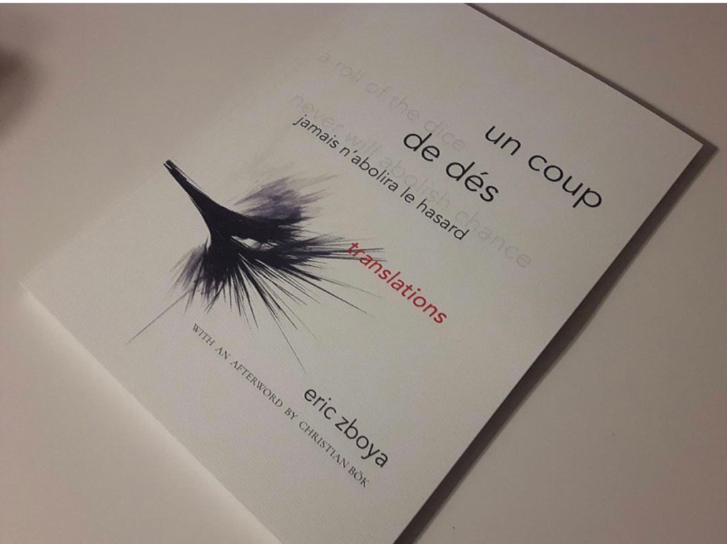
However more disruptive of the page and book La Prose may have been, it did not inspire the profusion of direct re-interpretations (or appropriations) that Un Coup de Dés prompted from artists such as Jérémie Bennequin, Ellsworth Kelly, Man Ray, Didier Mutel, Michel Pichler, Eric Zboya and dozens of others.
Not until 2001 did a re-versioning of La Prose appear. Tony Baker and Alan Halsey published an English translation and codex re-formatting. Its black on white imagery is reminiscent of the Russian Futurists, the type is monochromatic, and the typefaces, fonts and weights vary but not as much as in La Prose.
Baker and Halsey note in their colophon:
So far as we’re aware no translation of the poem into English has ever been attempted to give a sense of Cendrars and Delaunay’s original conception, not the least reason for which may have been the difficulty until recently of seeing the first edition, even in reproduction. — Prose of the Trans-Siberian and of the Little Jeanne de France (Sheffield: West House Books, 2001)
A well-founded lament — at least for the book art community. Not until 2000 had there been a reduced-scale reproduction of La Prose. It appeared in Granary Books’ A Book of the Book by Jerome Rothenberg and Steven Clay across a four-page foldout in the embrace of Ron Padgett’s English translation. Only in 2008 was there a full-scale, full-colour offset facsimile, produced by Yale University Press with an appended translation. It is now out of print.
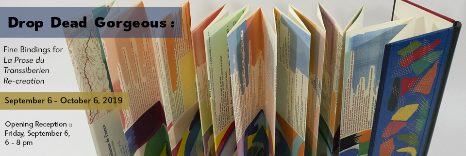
With her work La Prose du Transsibérien Re-creation (2019), Kitty Maryatt has changed all that. With this deuxième livre simultané, she has more than caught the echo of Cendrars/Delaunay’s original and its arrival. As scholar, artist and veritable impresaria, she has reinvigorated the book art/arts community with the legacy of La Prose.
Her blogspot documents the research and production with rich details about sourcing the type, learning about stencil-cutting from Atelier Coloris (one of the few remaining businesses devoted to pochoir), determining the recipes for the ink colours, testing papers (Zerkall Crème, Biblio, and Rives HW), creating a census of the existing 1913/14 originals and their locations — all that and more, including the use of bacon fat and a wine bottle filled with lead shot. She also organized a documentary by Rosylyn Rhee: “The Pochoir Re-creation of La Prose du Transsibérien”. It brings the importance of the original and this re-creation to life in the expressions and voices of prominent collectors, librarians and scholars, artists, rare book dealers and the project’s funders.
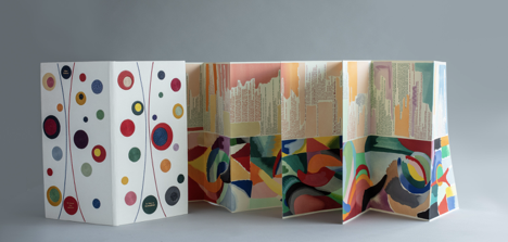
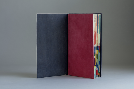
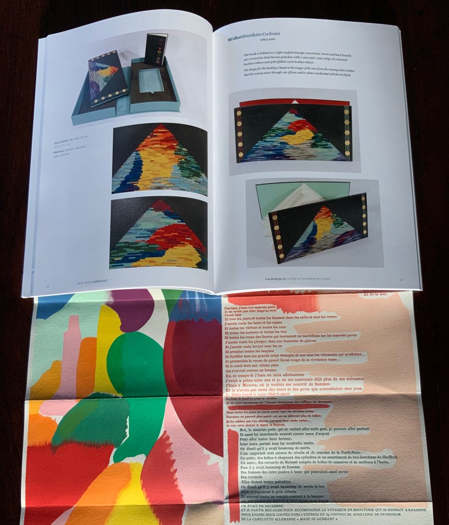
In addition, Maryatt has been either a contributor to, or the motivating force behind, several symposia and exhibitions such as “Paris 1913: Reinventing the Artist’s Book” (at the Legion of Honor Museum in San Francisco, 2018) and “Drop Dead Gorgeous”. The latter is a travelling exhibition resulting from invitations to twenty-four book artists and designer bookbinders to design and create bound copies of La Prose du Transsibérien Re-creation. For the San Francisco venue, Maryatt prepared a workshop on traditional French pochoir and provided text for the exhibition catalogue (available from the online store of the San Francisco Center for Books).
Monique Lallier’s fine binding of La Prose du Transsibérien Re-creation Photos: Courtesy of Monique Lallier
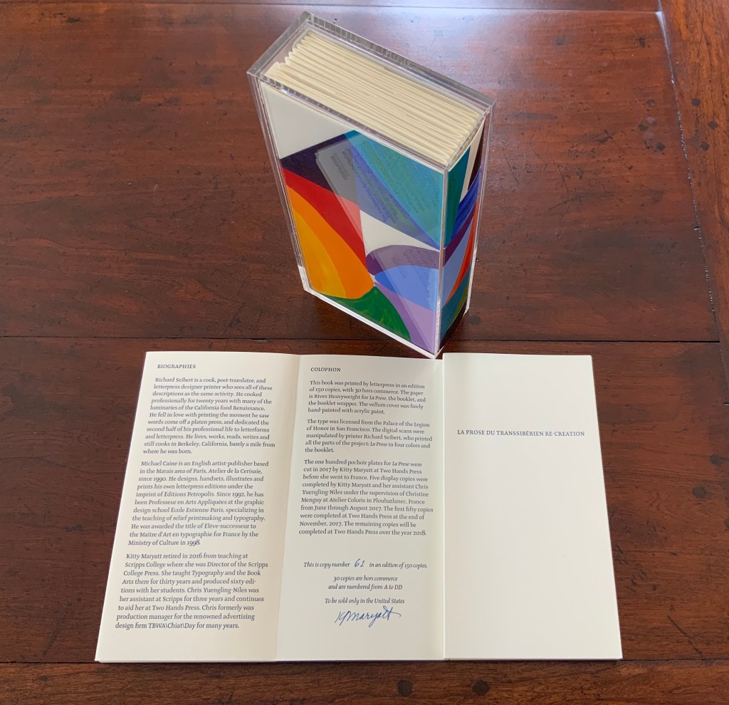
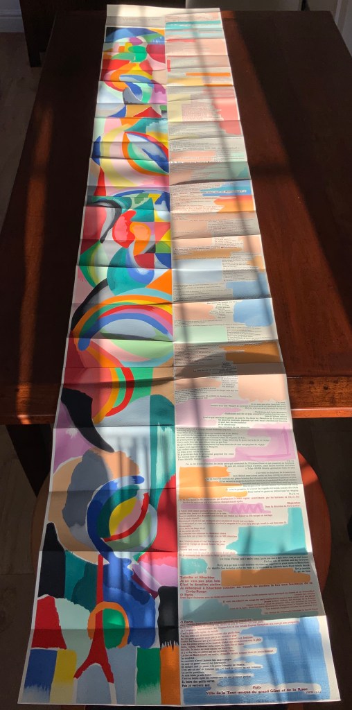
The pinnacle of Maryatt’s efforts, of course, is the standard and deluxe editions of La Prose. Both editions consist of 4 pages, glued together to create the tall single page. For the standard edition, the page is folded into 21 sections and loosely placed in a painted vellum cover with a booklet describing the project and production. An acrylic slipcase houses the covered bundle.
The standard edition Slipcase: H195 x W108 x D45 mm. Wrapper: H182 x W97 x D35 mm. Leporello: H81 x W95 mm (closed). H1954 x W160 mm (open). Booklet: H81 x W94 mm (closed), W1055 mm (open). Photo: Books On Books
Photo: Books On Books
Photos: Books On Books
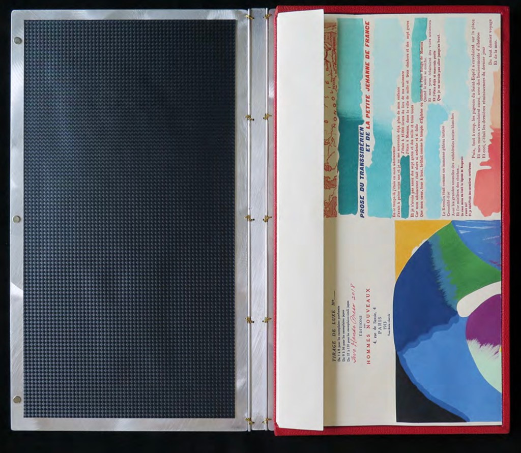
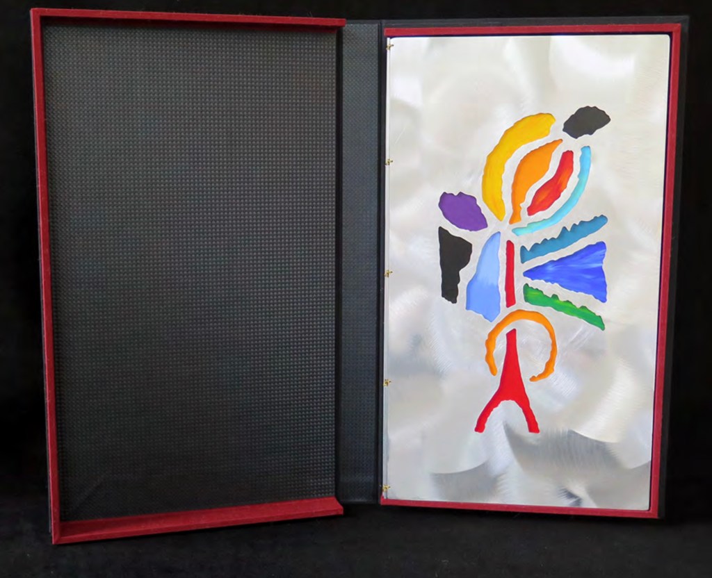
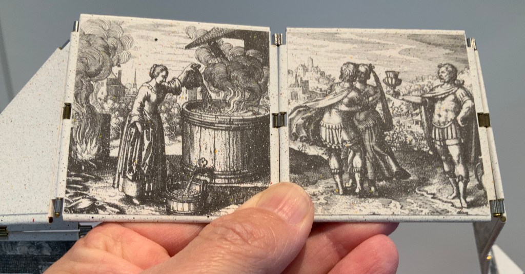
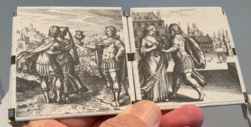
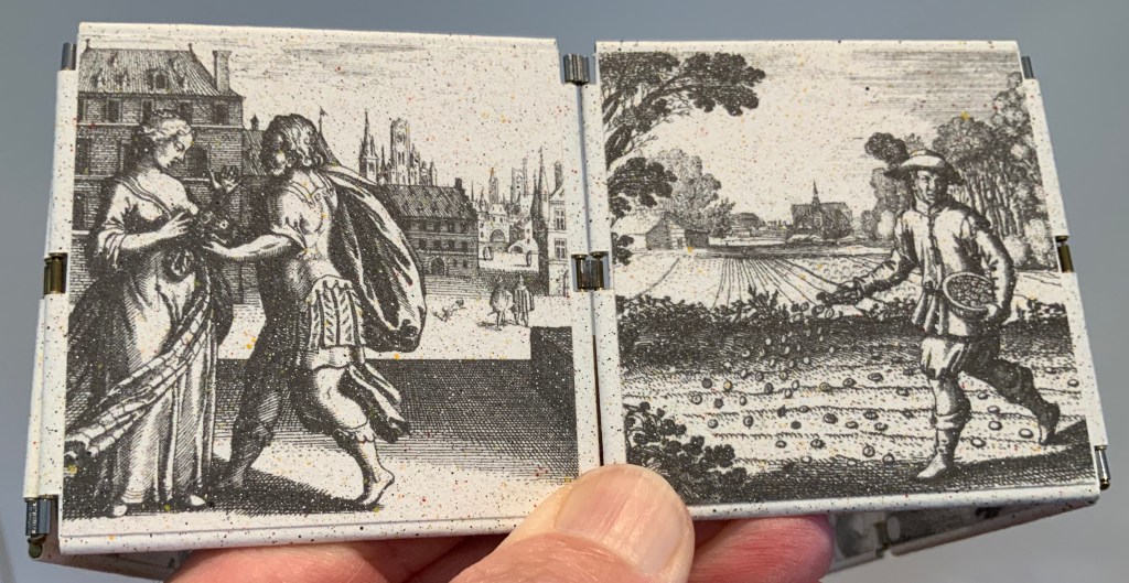
For the deluxe edition, the single page is left double-wide, accordion-folded double-tall between aluminum covers and housed in a clamshell box. A separate case holds the painted vellum cover, colour cards, Sonia’s visual vocabulary, 27 progressives for page one, 5 pochoir plates with tracing paper and registration system, the booklet with introduction and colophon, and the list of 30 typefaces Cendrars used. A large clamshell box houses this separate case and the boxed book. The colour cards include the recipe for mixing the gouache, and Sonia’s visual vocabulary shows the numbered steps of operations. The progressives for page one show the steps for doing the pochoir stencils and handwork.
The deluxe edition Photos: Courtesy of Kitty Maryatt
Any institution with a focus on book art or the graphic arts should seek out the standard edition of La Prose du Transsibérien Re-creation. Any institution with a focus on teaching and practice in those domains should seek out the deluxe edition. As indefatigable as Cendrars and as productive as Delaunay, Kitty Maryatt has provided the basis of master classes for generations. Now it is up to the book art community to respond as it has to Un Coup de Dés.
A shorter version of this essay appears in Parenthesis 39, Fall Issue, 2020.
Further Reading
Ashton, Doré. “On Blaise Cendrars. . . But I Digress.” Raritan 31, no. 2 (2011): 1-42,164. An entertaining extended anecdote sketching Cendrars and his milieu.
Gage, John. Colour and Meaning : Art, Science and Symbolism(Berkeley, CA: University of California Press, 1999). Despite her works’ better quality and representation of simultanéisme, Gage focuses on Robert and mentions Sonia only in passing or footnotes. (Telling that the Tate chose Sonia not Robert for a retrospective in 2015.) Nevertheless, there are passages that place her work in context.
P.198: Chevreul’s “privileging of the harmony of complementaries was essentially in the context of ‘painting in flat tints’, a method developed largely in the decorative arts, but which was increasingly integrated into many branches of French painting in the second half of the nineteenth century …”.
P.254 “When, probably early in 1912, Delaunay wrote to Kandinsky outlining his theories, he had shifted to a rather different approach, claiming: ‘the laws I discovered … are based on researches into the transparency of colour, that can be compared with musical tones. This has obliged me to discover the movement of colours.’ …
P.256 [Delaunay’s] Essay on Light, which was composed in the summer of 1912, attributed the movement of colours less to transparency than to the qualities of hue: ‘Movement is given by the relationship of unequal measures, of contrasts of colours among themselves which constitute Reality. The reality has depth (we see as far as the stars), and thus becomes rhythmic Simultaneity.’”
P.257 “For Chevreul in 1839 such painting [in flat tints] had only a decorative, accessory function, but the Delaunays did not feel the distinction, and Sonia had recently been experimenting with flat colours in appliqué textiles and in bookbindings decorated with collage.”
Maryatt, Kitty. “A Bookmaker’s Analysis of Blaise Cendrar’s and Sonia Delaunay’s La Prose du Transsibérien et de la Petite Jehanne de France”, The Quarterly Newsletter(Fall 2016), The Book Club of California. Online version available here.
Maryatt, Kitty. Interview with Steve Miller, Book Arts Podcasts, School of Library Information and Sciences, University of Alabama, 13 January 2006.
Rothenberg, Jerome; Clay, Steven. A Book of the Book: Some Works & Projections about the Book & Writing (New York City: Granary Books, 2000). Contains an excerpt from Perloff’s book above, Ron Padgett’s translation of La Prose and a four-page foldout showing a full-color photo-reduction of the 1913 original.
Shingler, Katherine. “Visual-verbal encounters in Cendrars and Delaunay‘s La Prose du Transsibérien“, e-France: an on-line Journal of French Studies, Vol. 3, 2012, pp. 1-28. Accessed 15 November 2019. Along with Perloff’s book, this is the best explication of the work and its lineage with Mallarmé’s Un Coup de Dés.
Woodall, Stephen. “La Prose du Transsibérien et de la Petite Jehanne de France”, Insights from the de Young and Legion of Honor (San Francisco: Fine Arts Museums of San Francisco, 2020. A spectacular website presenting the original work in its context and its influences on subsequent book art. The work can be viewed panel by panel, and its overall structure is presented in an animation of its unfolding and refolding.
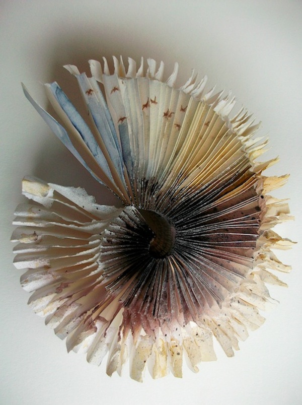
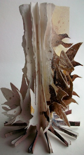
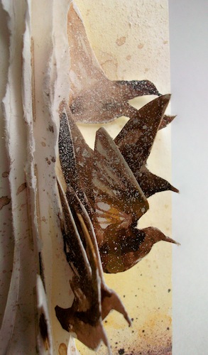
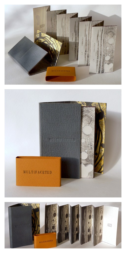
Stardust (2013) Louisa Boyd Leather bound, oil-based ink, Somerset paper, micro-fibre suede, Magnani handmade ivory wove paper, metal leaf, pencil crayon; 16 panels. Closed – H70 x W45cm x D10 mm; Open – H70 x W420 mm. Edition of 20, of which this is #10. Acquired from the artist, 28 May 2017. Photos: Courtesy of the artist.
Through abstraction and symbol, Louisa Boyd‘s art focuses on sense of place and our intrinsic connection to nature. The titles of three of her artist’s book series – Infinity, Landscape, and Mapping – and those of the book art in them – Aether (2013), A Walk (2001), and Cartography I (2014) – reflect that focus. How she manages abstract imagery and symbol across her range of material and techniques – paper (including hand-marbled paper), book structure, printmaking (block, screen, letterpress), watercolor, metalwork, leatherwork – adds to that unifying focus through a rightness of choice but also introduces a breadth of originality and variety.
In Aether, the crayon work, cutting and metalwork are applied with a three-dimensional sense wedded to an obvious understanding of the possibilities of the page and double-page spread. The stop-motion animation video tour of Aether (click on the image below) makes you wonder if Boyd conceived the work as a flipbook in the first place. There is no wondering, however, about the place of human existence in relation to the aether. In the video, look at the lower righthand fore-edge of the book.
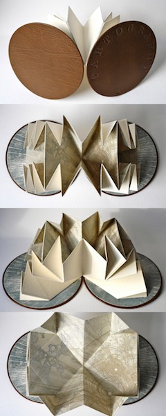
A Walk illustrates Boyd’s skill with freestanding three-dimensional sculpture, a skill that has grown in The Flight Series (more later on two of its works from 2009) and The Paper Manipulation Series, from which the work Flare above comes.
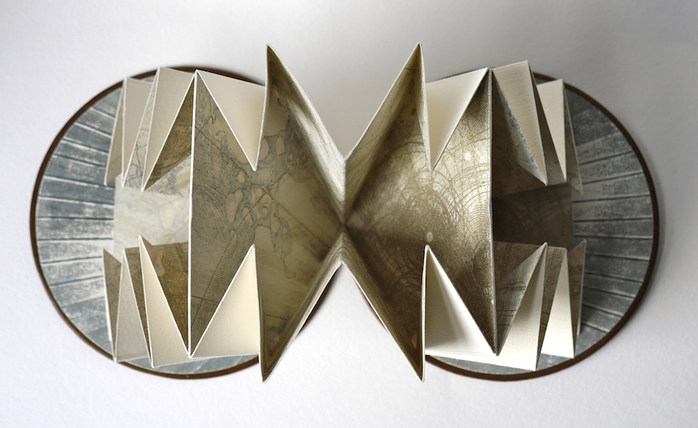
Her use of abstract markings and the Turkish map folding technique in Cartography I demonstrates again her careful marriage of abstraction, symbol and technique.
The etching printed on each of the three internal folded pages is an abstract that nevertheless evokes mapping, which the form and fold of the pages reinforces. Each Turkish fold page can lay flat to be viewed individually, or as pictured above and below, the book may be viewed as a sculpture.
The video tours (links embedded the images of Aether and A Walk above) represent Boyd’s search for what she calls “a bridge between traditional and contemporary media”. So far, that exploration reflects the artist’s rootedness in the book arts and traditional skills and processes of drawing, printing and painting. It is intriguing to think what effect a bit of influence from Helen Douglas or Amaranth Borsuk might have on Boyd’s bridge. The use of stop-action video for Aether hints at an instinct for what Douglas calls “visual narrative”.
A professed recurrent theme in Boyd’s book art is “restriction and freedom”. Although it arises from periods of city dwelling and lack of access to the countryside, imposed by the UK’s 2001 “foot and mouth” epidemic, it manifests itself in the more “traditional” spur of constraint of form and structure that goads an artist’s imagination. Flock (2009) and A Walk bear close resemblance, but note the difference in invention whereby the former plays with the book form by placing the bird imagery at the edges, spirals the paper tearing upwards and gradates the watercolor from dark to light (like a flock dispersing) and the latter deals with the “restricted” walk by blending the watercolor with tearing and tunneling.
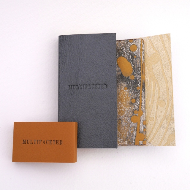
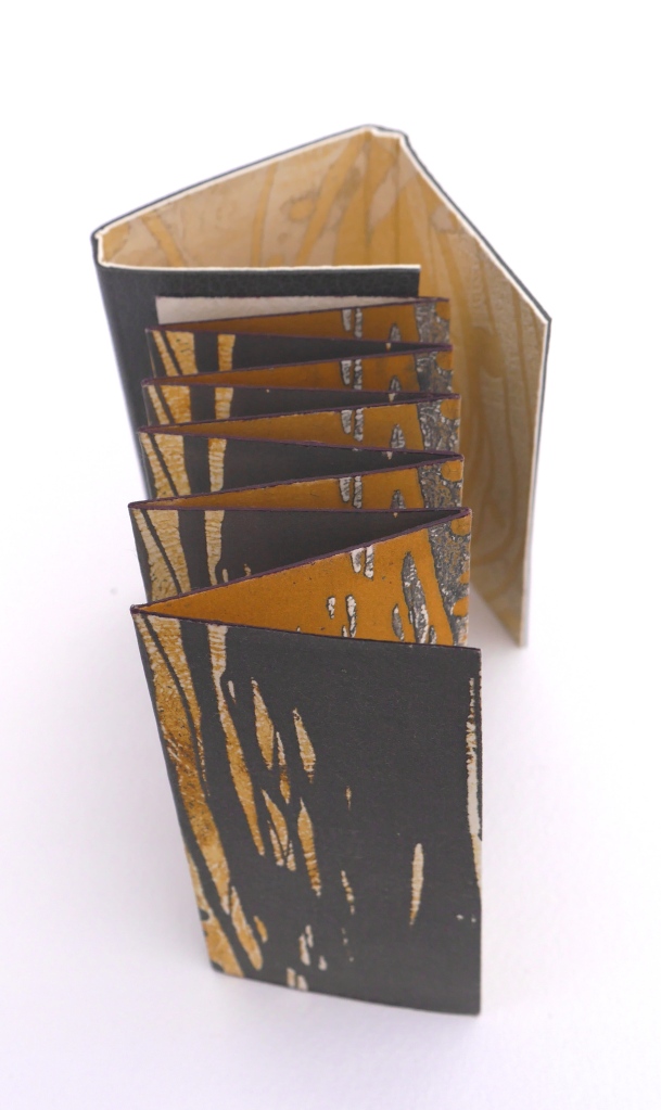
Although Multifaceted returns to the theme of different views that was the intent in A Walk, it tilts the theme more toward the abstract side of Boyd’s work. In this, Multifaceted is more akin to the works in The Paper Manipulation Series: Flare (2013), Whorl (2013), and Pleat (2013). It almost purely plays with the concept of differing perspectives. Again, techniques and form express concept with a simple rightness. This double-sided leporello is designed to be viewed from four different angles. The display of photos here cannot offer the intended perspective (pun intended): the viewer needs to circle the piece to view its facets. That word “facet” is tooled on the interior pages four times, the clue as to how the book should be read.
The abstract imagery evoking landscape or skyscape – whether juxtaposed vertically or horizontally – plays with viewpoint. Even the print technique on the interior pages plays with viewpoint: they are prints of an etching inked up both in relief and intaglio. Breaking free of the ultimate restriction of the book, the pages are not attached to the cover, allowing the piece to be read in four different directions. These features of the work and the seeming absence of that human figure from Aether throw it back on the viewer’s necessary engagement to establish fully the human connection: by engaging with Multifaceted – “reading” it – the viewer enacts the human place in the aether around the work.
Since graduating from Manchester Metropolitan University in 2001 and winning the Paperchase Future of Design Award (2001) and receiving a high commendation from the judges of the New Designer of the Year (2001), Boyd has exhibited in 46 venues. Her 47th is the most significant so far: inclusion in the John Ruskin Prize Shortlist Exhibition at Millennium Gallery in Sheffield, UK (21 June – 8 October, 2017). If this book artist manages to continue her sure-handed forging of concept, material and method, the Ruskin Prize Shortlist Exhibition will not be her last significant exhibition.
Further Reading
Chen, Julie. 2013. 500 Handmade Books. Volume 2. New York: Lark. Pp. 15 (Flock), 414 (Tower of Babel).
Abecedaries have a long lineage among calligraphers, typographers, children’s book authors and designers (including those of online books), fine press impresarios and book artists. From the world of libraries and museums, we have had abecedary lists and exhibitions such as Favorite Alphabets, (Library of Congress), Primers, etc. Post-1850 (Bodleian), Artists’ Alphabets and Ecstatic Alphabets/Heaps of Language (New York MoMA).
Since 1981, Scott McCarney has diligently extended the lineage through a series of alphabets designed in book form, where the letterforms depend upon the materiality of the book. The limits and possibilities of the book — its material, form and processes by which both can be handled — have inspired McCarney’s Alphabook series. According to the artist, all the Alphabooks (with the exception of numbers 3, 10 and 13) “are one-of-a-kind, and have not been shown much (if at all), so I’m not aware of them being illustrated anywhere“. Fortunately, Alphabook 1 (1981) appears in The Penland Book of Handmade Books: Master Classes in Bookmaking Techniques (2004), p.134, and Alphabook 9 (1985), which McCarney produced as a one-of-a-kind book of photograms in a residency at Light Work in 1985, appears in the Light Work Collection. McCarney describes his inspired manipulation of material, form and process in creating Alphabook 9:
I folded pop-up letterforms with unexposed photo paper in the darkroom and exposed it to directional light then developed, fixed, dried and flattened the prints. I made a book for Light Work for their collection that spelled out “LIGHTWORK” in the photogram alphabet, which can be seen in their database here: Light Work Collection / Artwork / Photogram Letter book [1133]. — Correspondence with Books On Books, 7 February 2020.
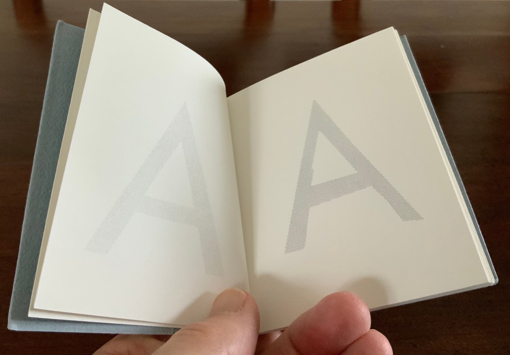
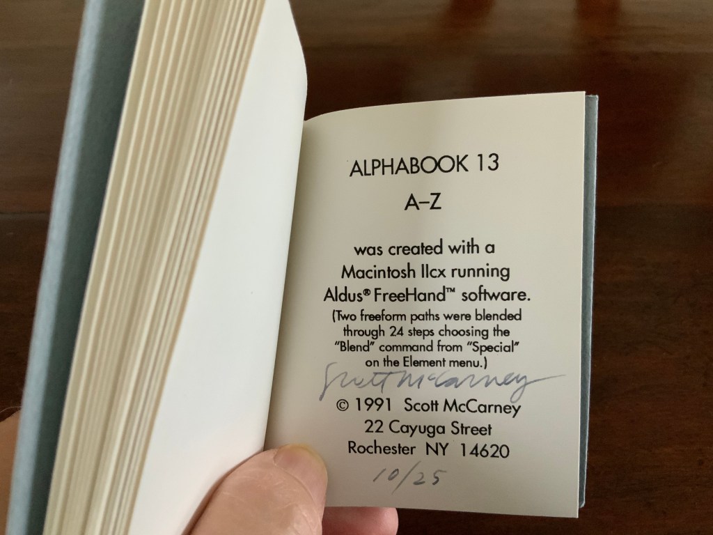
And WorldCat shows that Alphabook 13 (1991) can be found in at least three institutions. It was produced in an edition of 25 and consists of one volume (110 x 100 mm) in which the letter A gradually morphs into the letter Z.
With three of the series works now in the Books On Books Collection, the lack of illustration can be somewhat remedied.
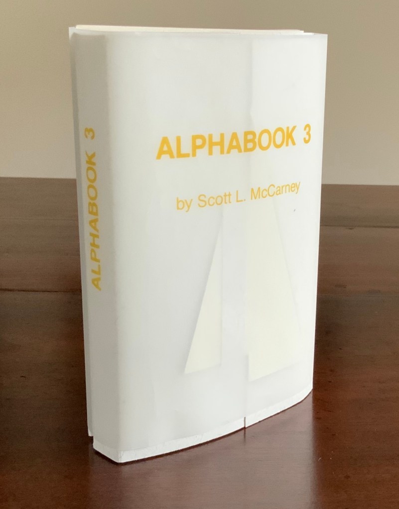
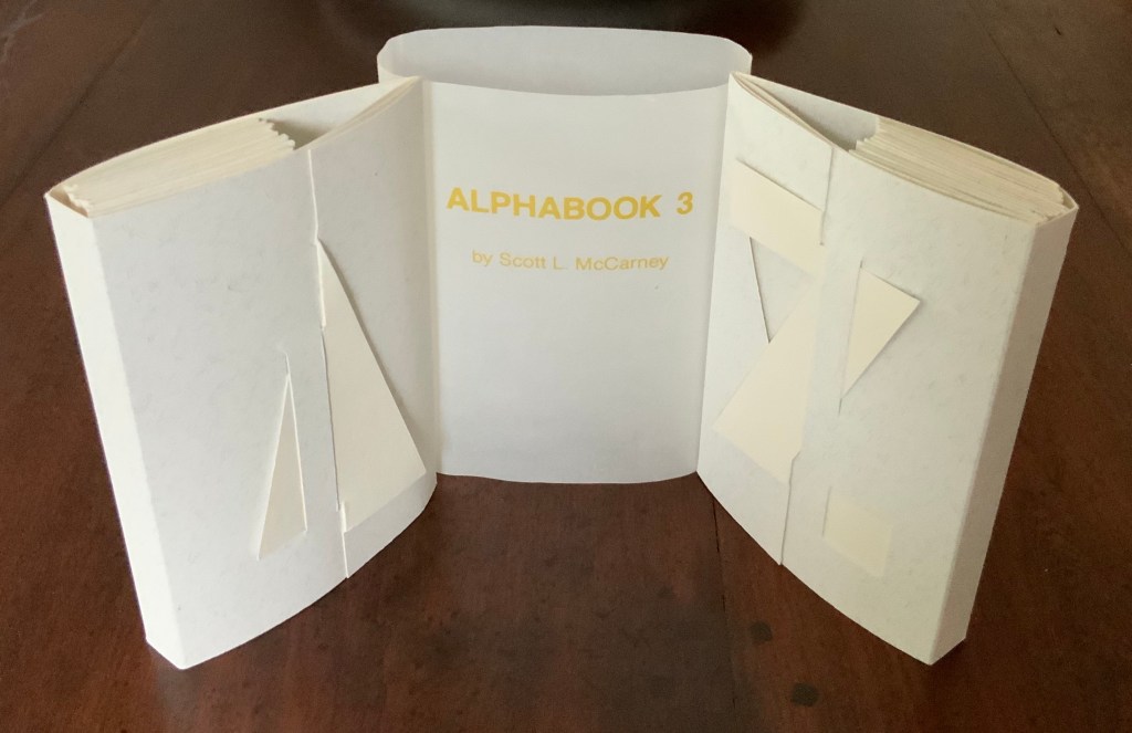
Alphabook 3 (1986)
Alphabook 3 (1986) Scott McCarney Two volumes, each of 26 unnumbered die-cut pages and wrapped in translucent belly band. Edition of 300, signed but not numbered. Each volume, closed: H151 x W104 mm; open: H151 x W2195. Acquired from the artist, 14 August 2017. Photos: Books On Books.
Photos: Books On Books.
Unlike most others in the series, Alphabook 3 is a multiple of 300 copies.
Alphabook 10 (2015)
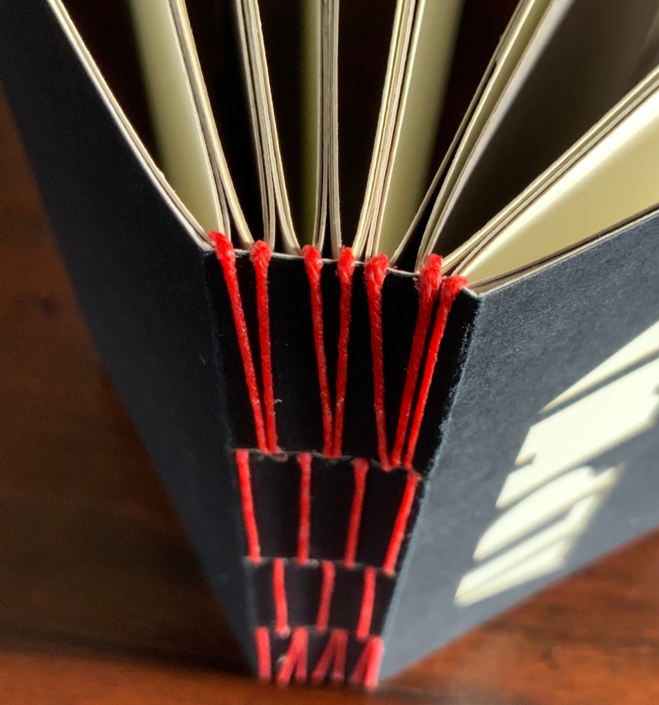
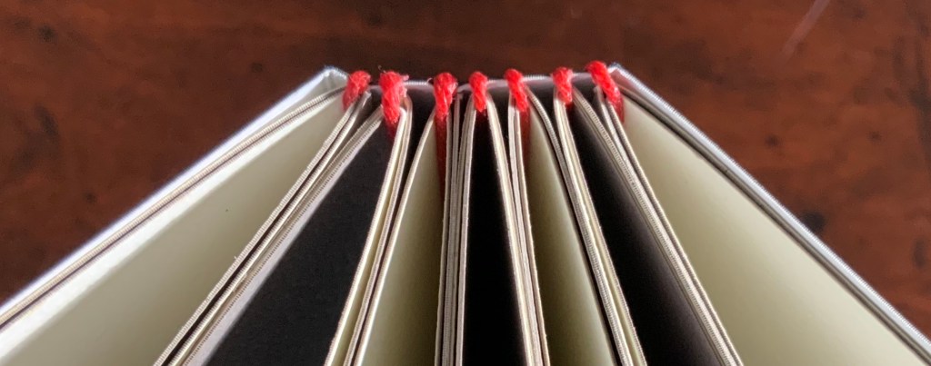
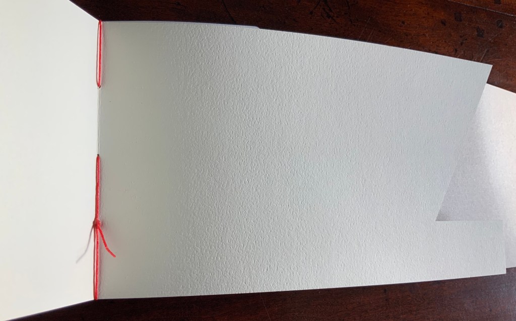
Alphabook 10 (2015) Scott McCarney Laser cut duplex papers hand bound with long stitch through slotted cover; housed in archival box. 56 unnumbered pages. 130 x 310 mm; in box 140 x 310 x 30 mm. Edition of 14, of which this is #11. Acquired from the artist, 23 January 2020. Photos: Courtesy of the artist
The codex form receives McCarney’s playfulness in Alphabook 10. The artist writes:
… The fore edge of each page is cut into geometric forms from black, white and cream toned duplex stock (two sheets of different colored paper laminated together). … Produced during a residency at The Institute for Electronic Arts, a high technology research studio facility within the School of Art and Design, NYSCC, Alfred University, New York, committed to developing cultural interactions spurred by technological experimentation and artistic investigations.
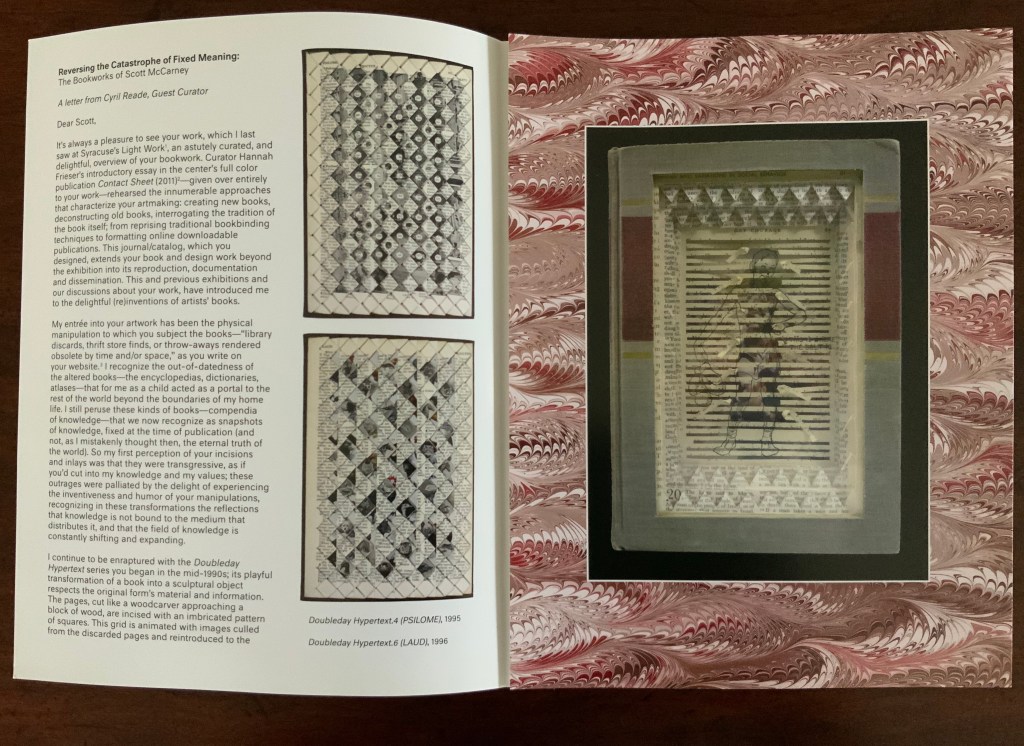
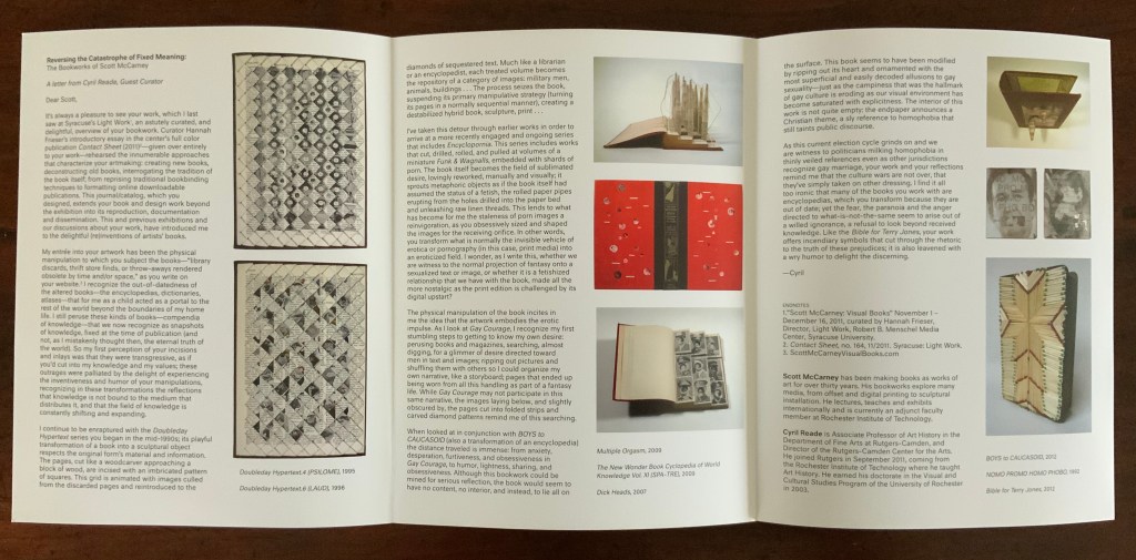
Scott McCarney, Visual Books. Accessed 9 February 2020.
The handling of the cover and first page draw attention to the role that empty space, light and stock color will play throughout the book.
Photos: Books On Books.
The binding warrants a closer look as well. Outside and inside, the red thread, its pattern and function stand out.
Photos: Books On Books.
And notice how the thread calls out the textured surface of the paper.
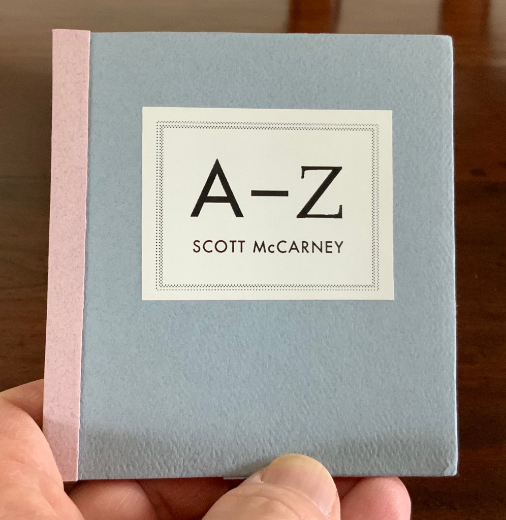
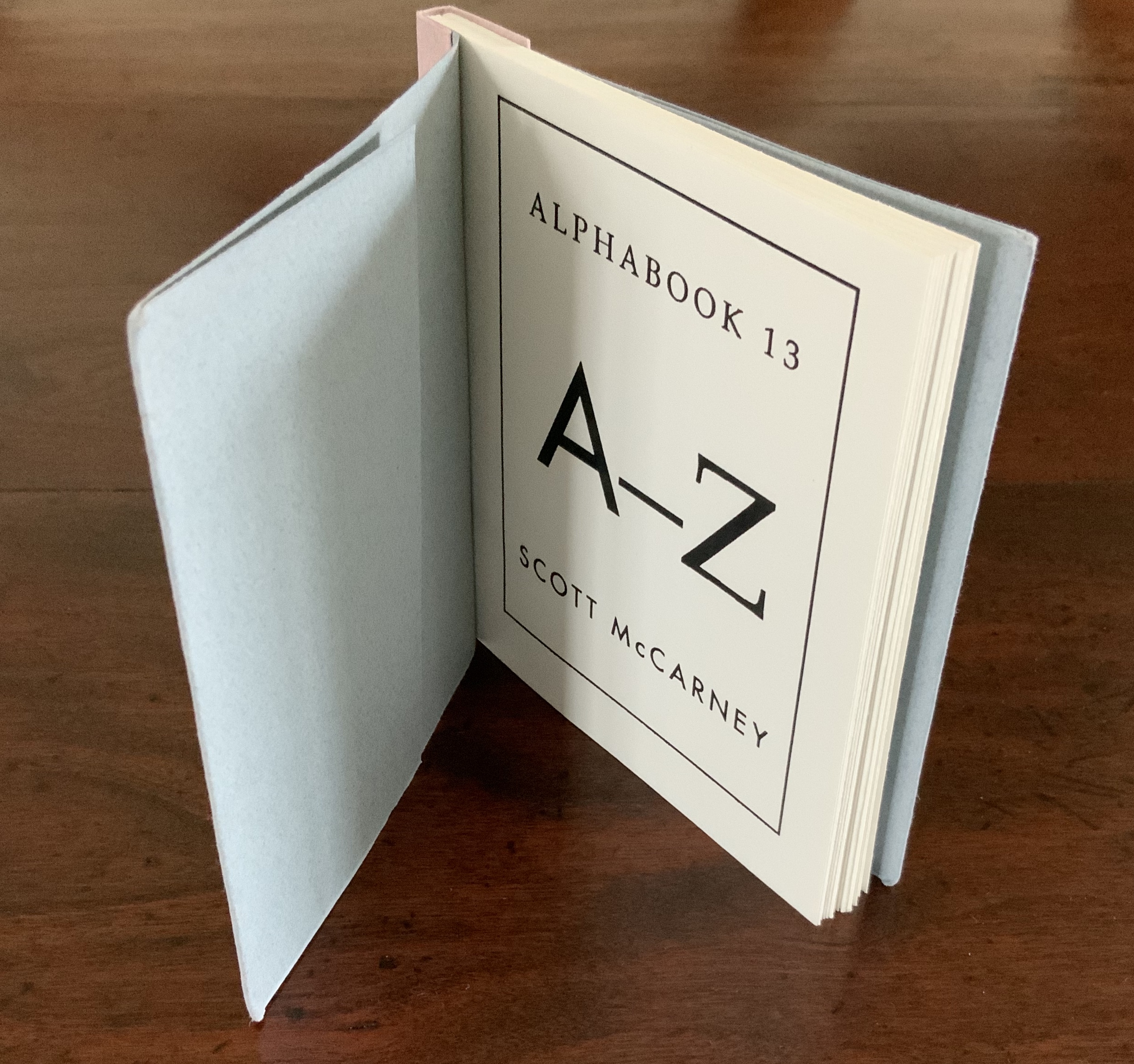
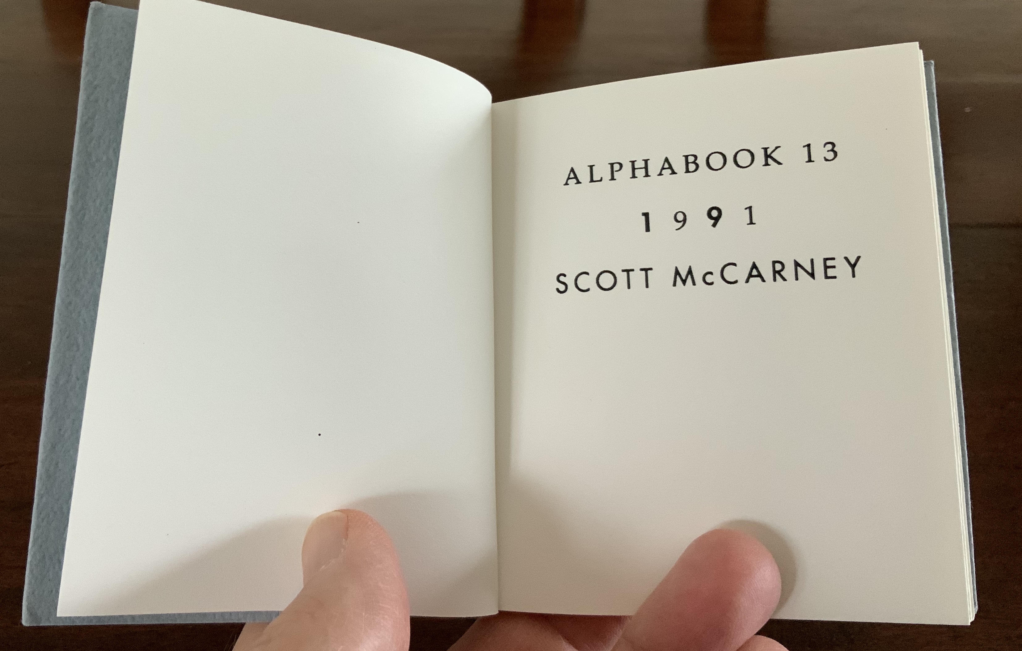
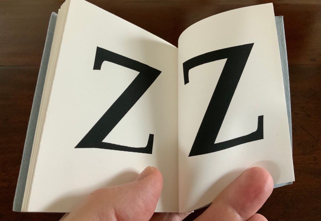
Alphabook 13 (1991)
Alphabook 13 (1991) Scott McCarney Flipbook, created with a Macintosh IIcx running Aldus® FreeHand™️ software. H100 x W92 mm. 32 pages. Acquired from the artist, 15 February 2020. Photo: Books On Books Collection.
Photos: Books On Books Collection.
Photo: Books On Books Collection.
In correspondence with Books On Books, McCarney explains that the Alphabooks’ mismatch of numbering and chronology stems from discrepancies between dates of conception and opportunities to execute. This little flipbook was conceived and executed as a photocopy edition of 25 in 1991; of more importance here though is the coming together of computer-based typesetting, book structure and pun. As we know, the shortest distance between A and Z is not B to Y, but the points in A reconfigured into Z across 24 flipping pages. It is interesting to compare this transformation with Claude Closky’s calligraphic version De A à Z (1991).
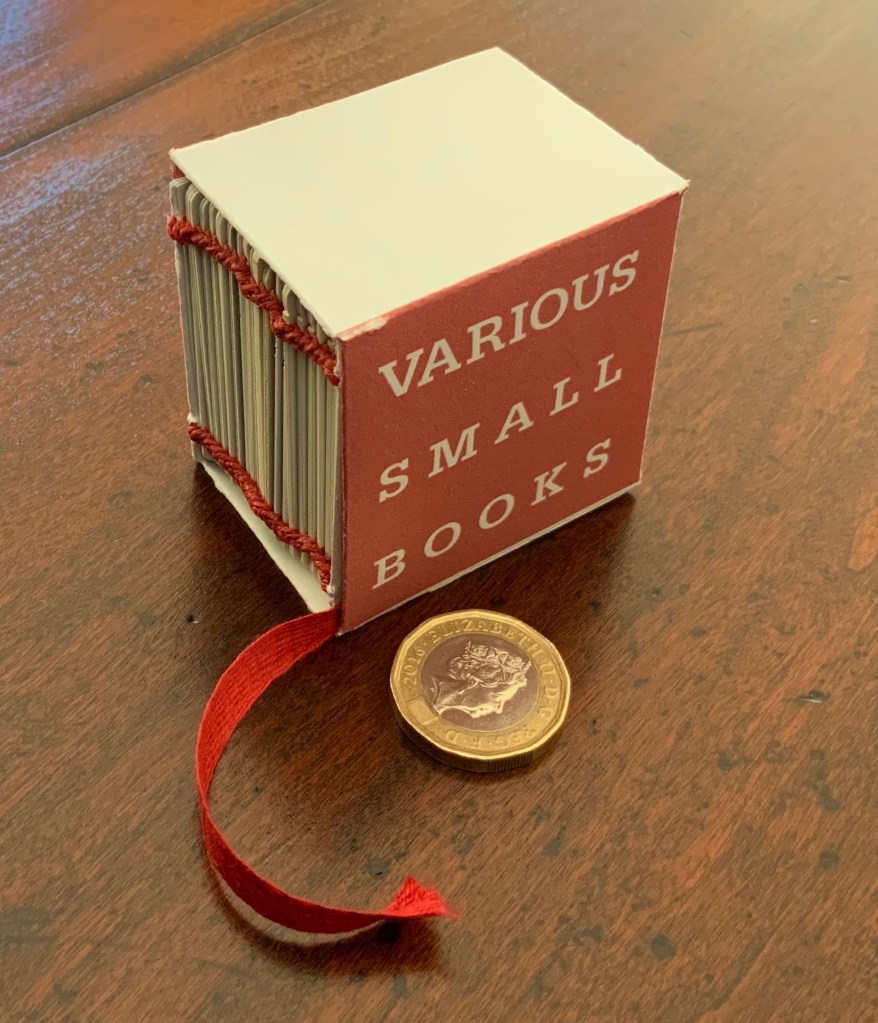
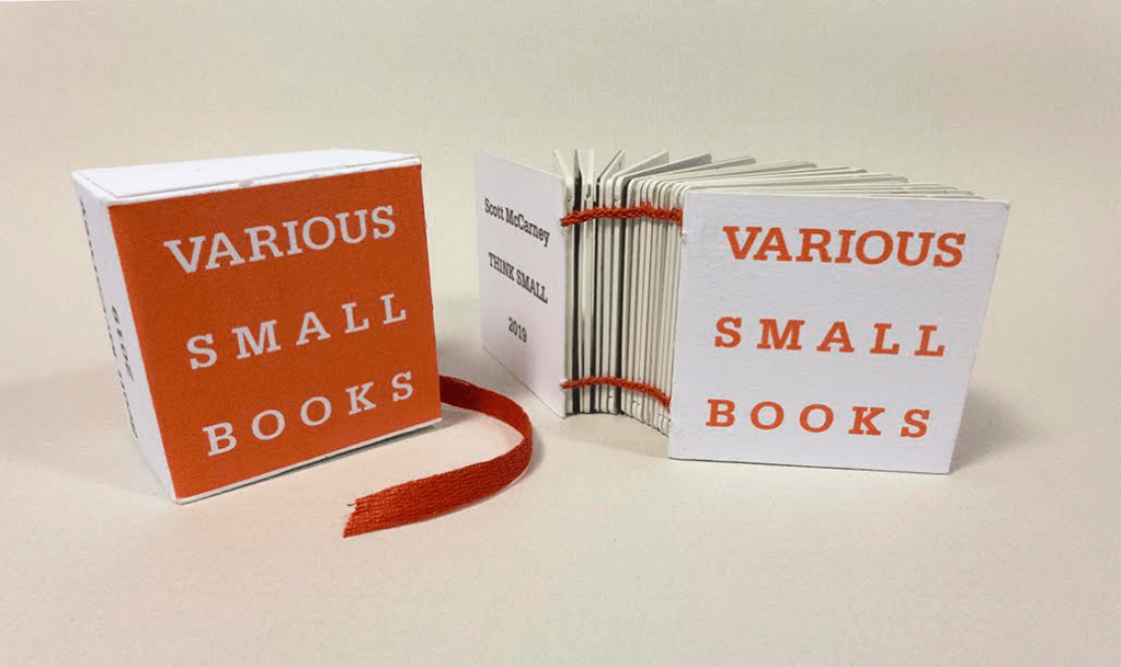
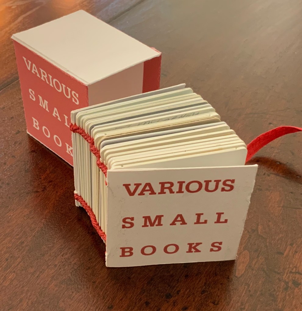
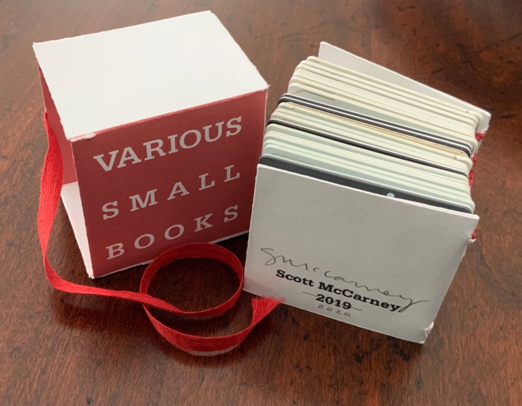
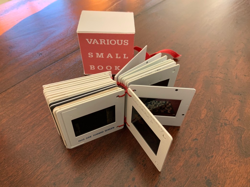
Various Small Books (2019/20)
Various Small Books (2019/20) Scott McCarney Photo: Books On Books.
Various Small Books (2019) Scott McCarney Photo: Courtesy of the artist.
The 2019 edition was conceived for a fundraising exhibition at Artspace in Richmond, VA. Both the 2019 and 2019/20 editions consist of 35mm slides documenting various of McCarney’s bookworks. Consisting of different slides, the two editions of Various Small Books are unique, and since the slides are bound together and cannot be projected, the images of the books appear small indeed.
Various Small Books (2019/20) Scott McCarney Photo: Books On Books
Courtesy of the artist, the inclusion in Various Small Books (2019/20) of slides documenting Alphabook 4, Alphabook 6 and Alphabook 10 makes the 2019/20 edition particularly apropos for the Books On Books Collection.
“Scott McCarney, Special Edition”, Contact Sheet, No. 164 (Syracuse, NY: Light Work, 2011). Exhibition catalog, which kicked off the conference “Photographers + Publishing”, 3-5 November 2011, Light Work and Syracuse University.
Home Sweet Home (1985)
Home Sweet Home (1985) [Not in collection] Scott McCarney Paper in accordion binding with decorative and marbled paper-covered boards and paper-covered slip case. 11 5/8” x 9 1/2” x 1 3/4”
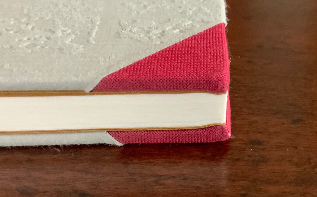
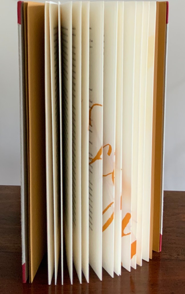
Bartleby the Scrivener: A Story of Wall Street (1995)
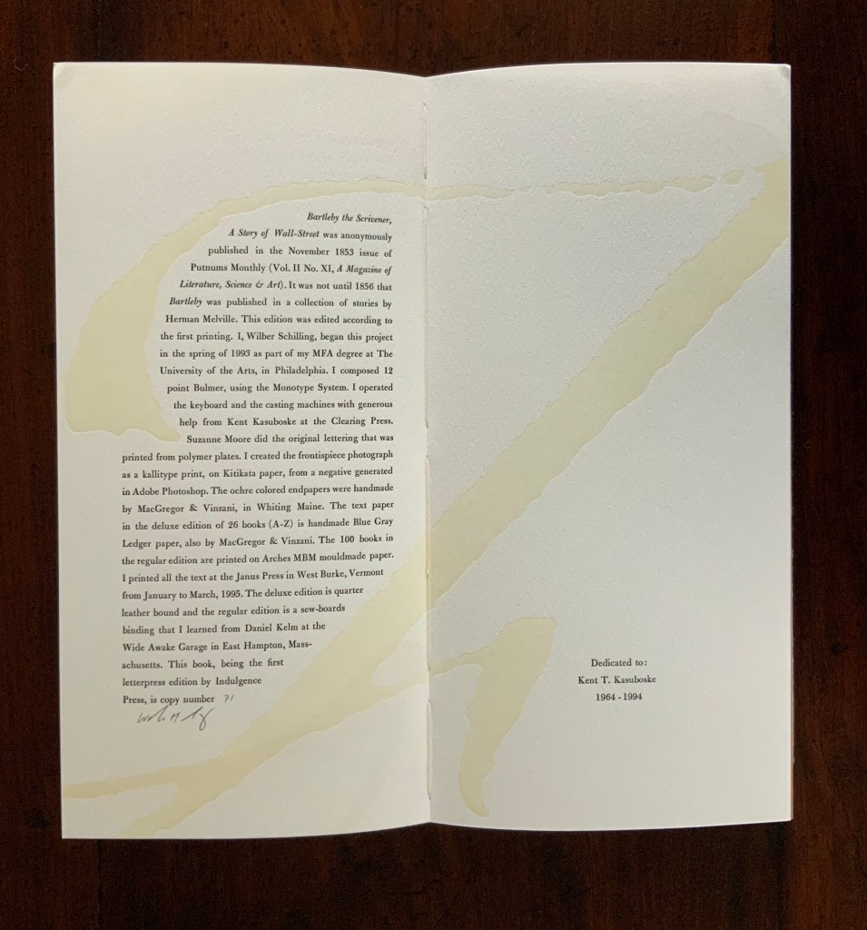
Herman Melville, Bartleby the Scrivener: A Tale of Wall Street, 1853. Indulgence Press, 1995. Type composed in 12 point Bulmer on the Monotype System and printed by Wilber Schilling on Arches MBM mould made paper at Janus Press. Calligraphy by Suzanne Moore. Ochre-coloured endpapers handmade by MacGregor & Vinzani. Wilber Schilling created the frontispiece photo as a Kallitype print from a negative generated in Adobe Photoshop. The binding, also by Schilling, is cloth over sewn boards and, over the cloth, an embossed print of details from the frontispiece photo. Edition of 100 of which this is #71. H320 x W158 x D14 mm. Acquired from Indulgence Press, 17 December 2015.
Further Reading
“Suzanne Moore“. 14 January 2020. Books On Books Collection.
Jury, David, and Peter Rutledge Koch (eds.) 2008. Book Art Object. Edited by David Jury. Berkeley, California: Codex Foundation. Pp. 198 (Where Do We Start?), 199 (Surplus Value Books #13).
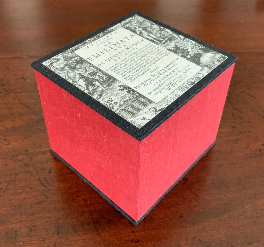
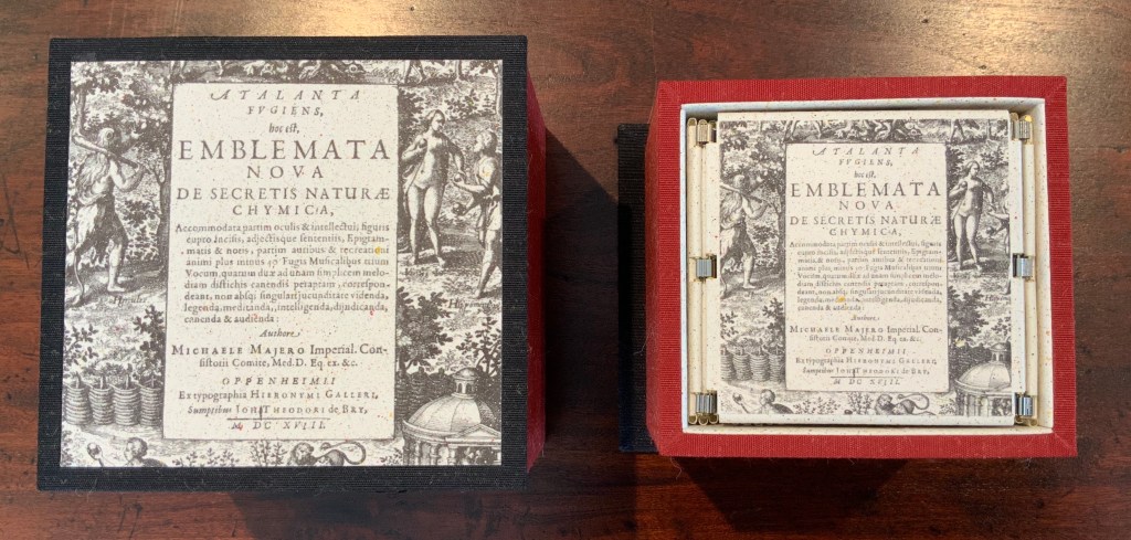
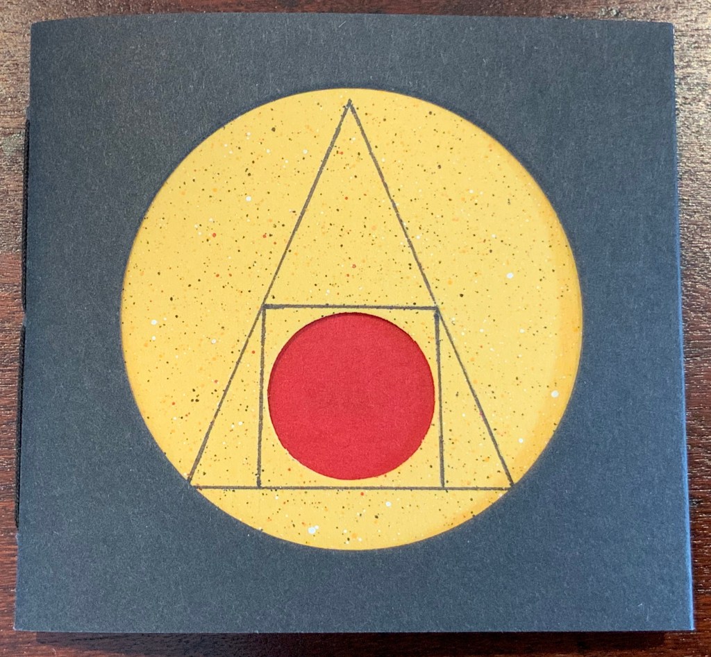
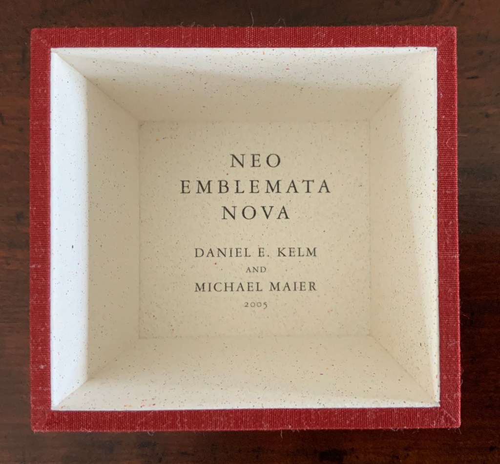
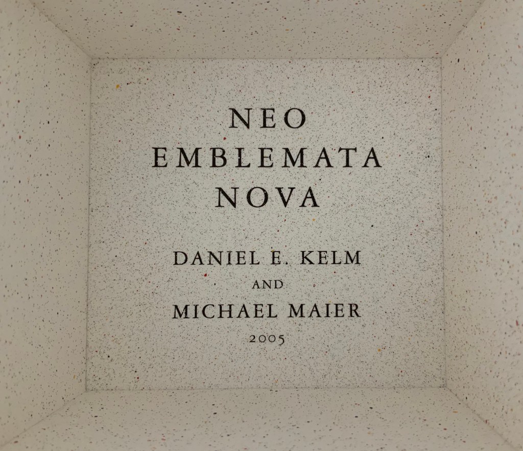
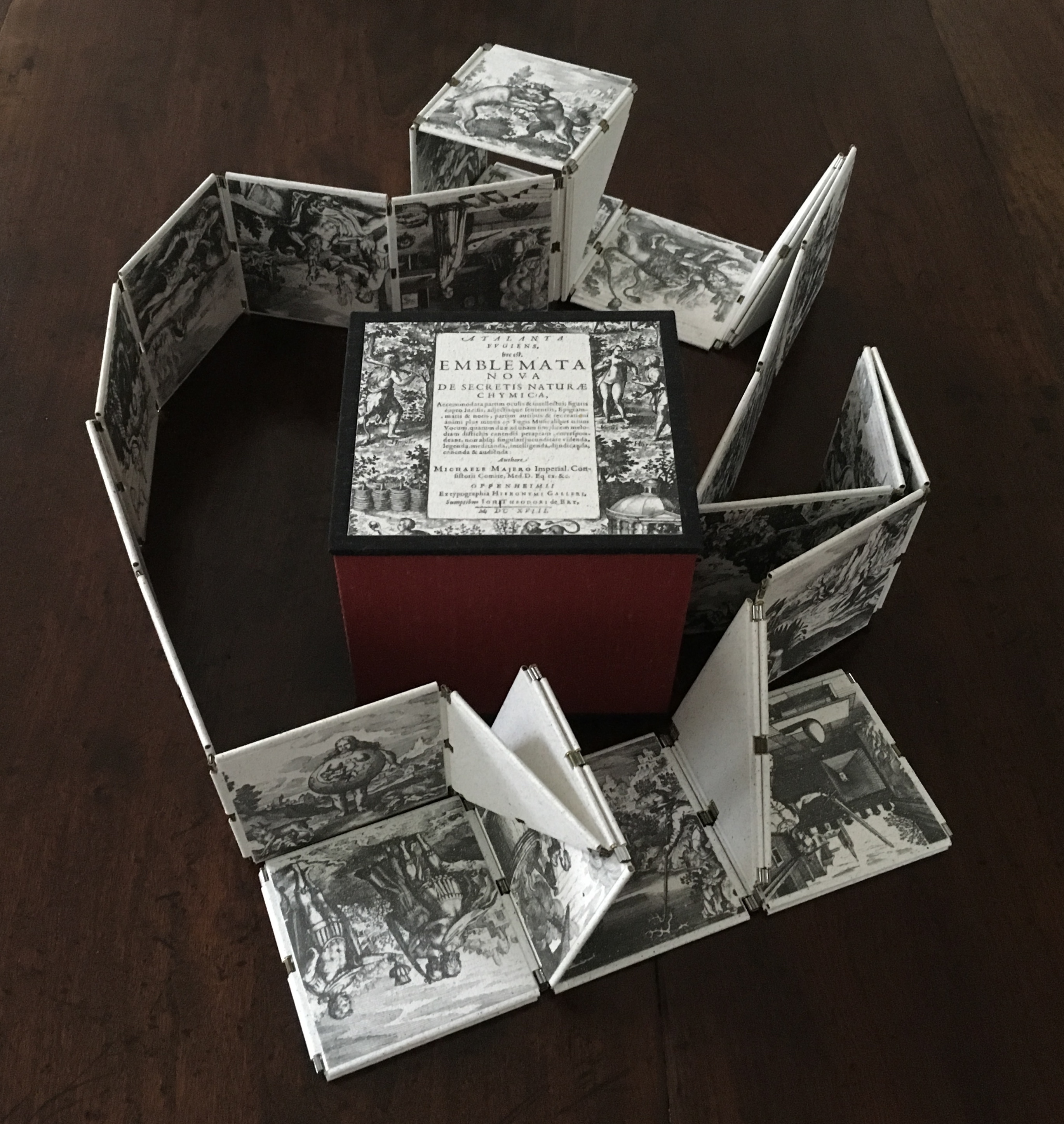
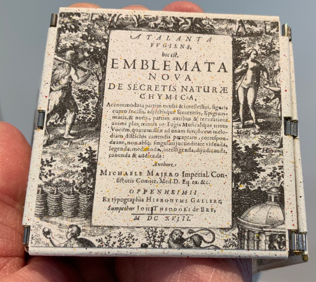
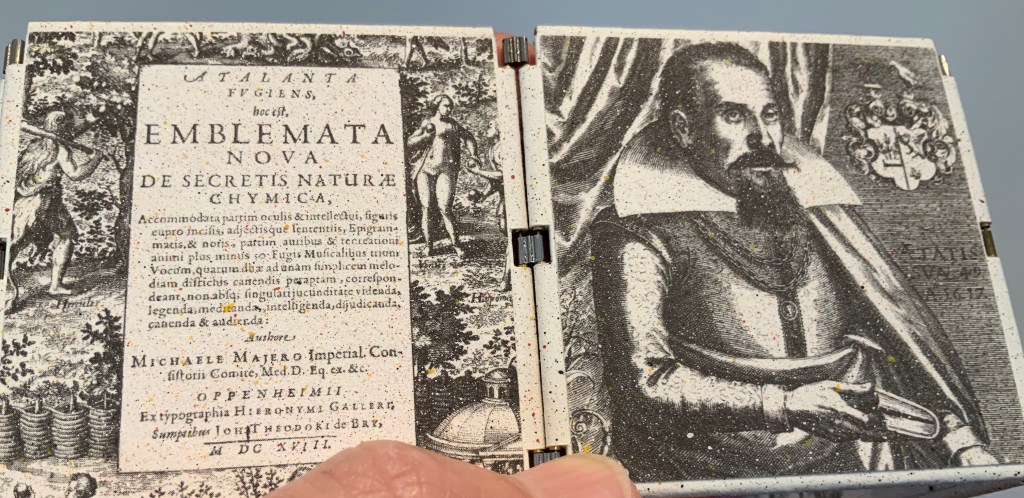
Neo Emblemata Nova (2005) Daniel E. Kelm Box: H96 x W109 x D102 mm closed. Booklet cover: H72 x W79 mm closed, H72 x W224 mm open. Booklet: H72 x W78 mm. Möbius strip: each tile is H70 x W70 mm; the strip extended is 1000 mm. Edition of twenty-one, of which this is #18. Acquired from the artist, 20 October 2018.
Opening the work.
Booklet about the work and its creation.
Inside the top of the box.
Closing and returning the Möbius strip to its box requires considerably more dexterity than reading; so much so that the booklet included provides instructions.
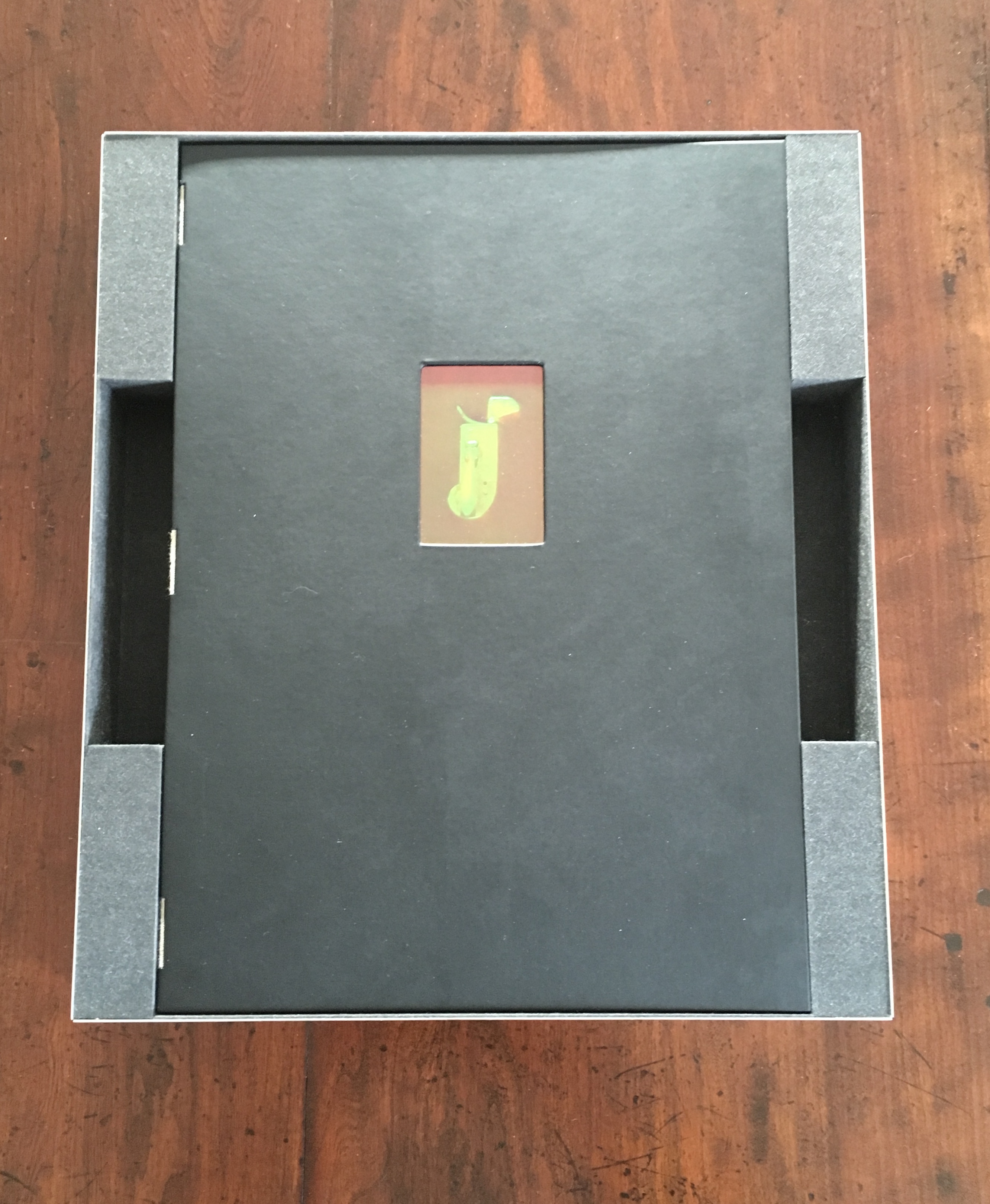
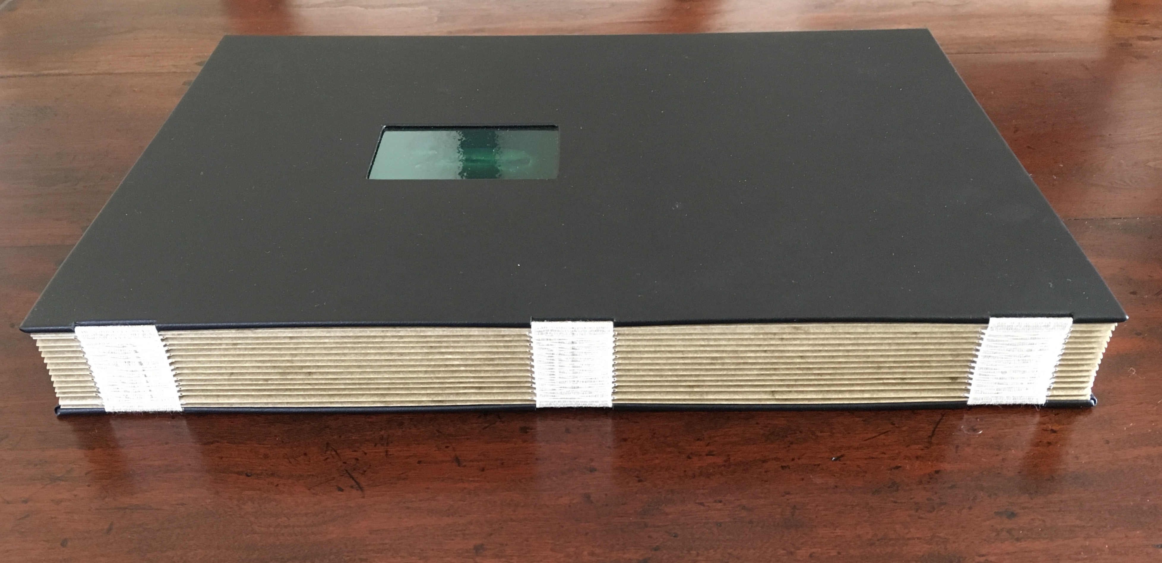
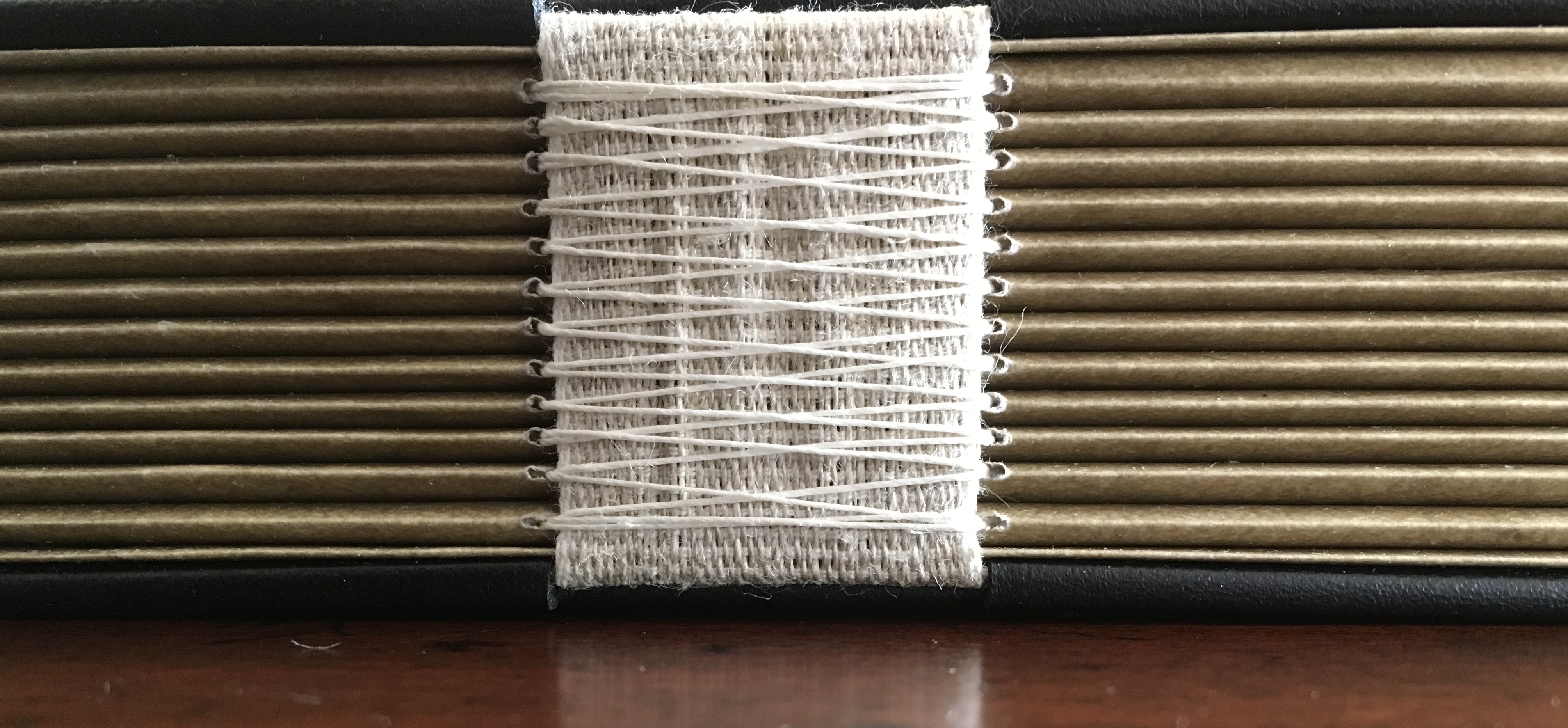
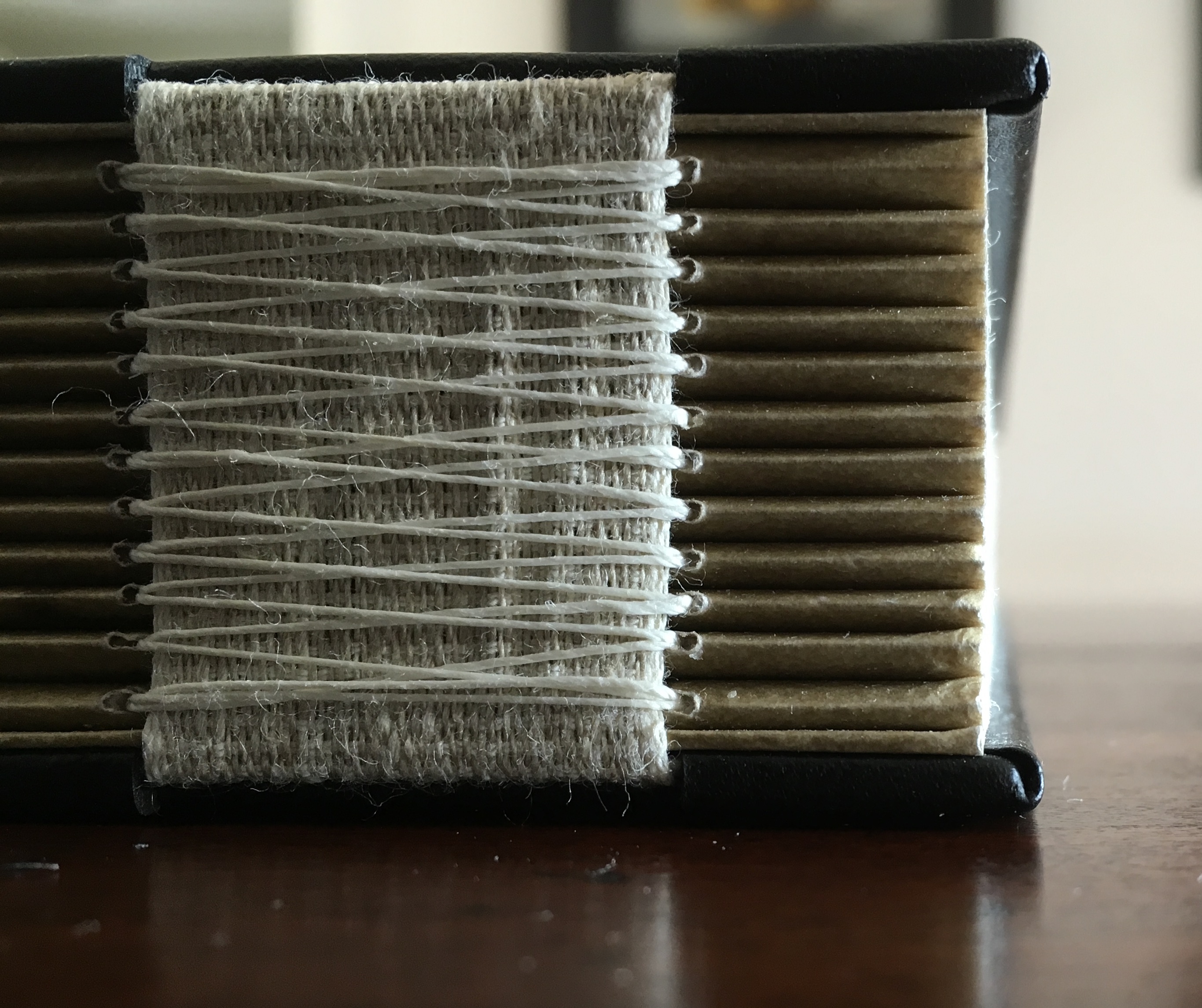
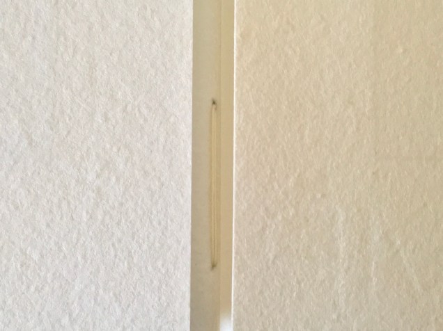
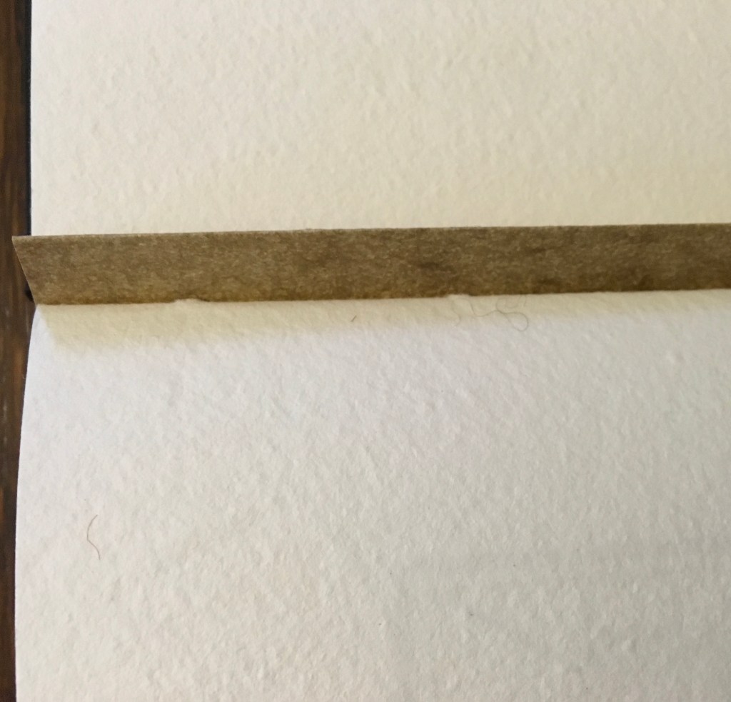
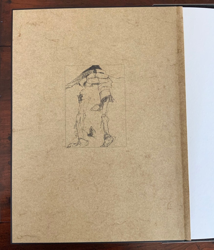
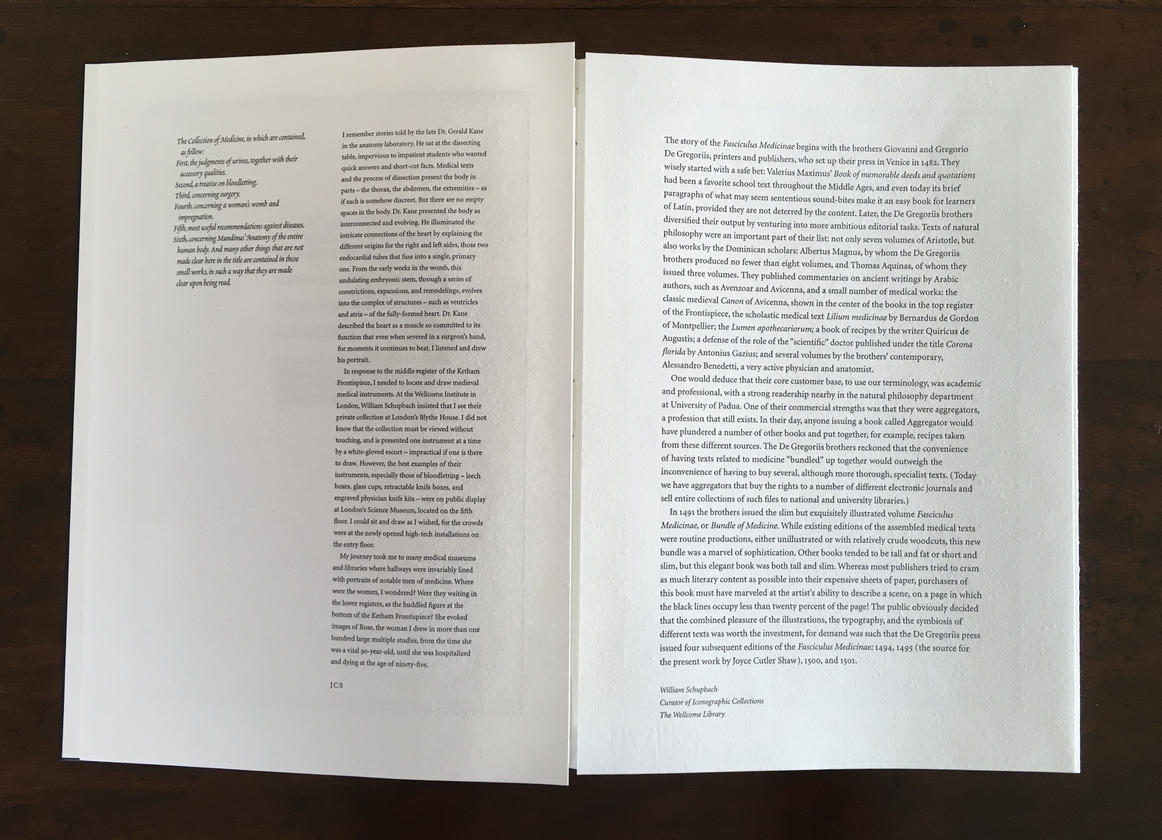
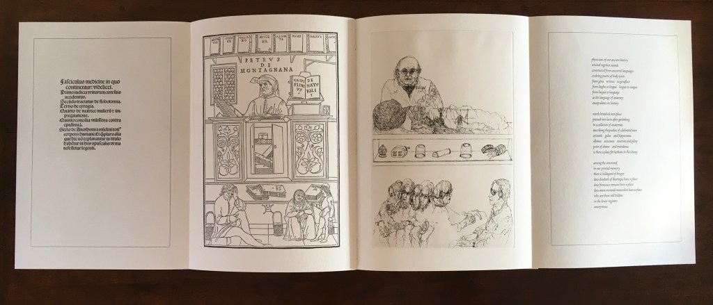
The Anatomy Lesson (2004)
The Anatomy Lesson (2004) Joyce Cutler-Shaw Middletown, CT: Robin Price, Publisher, 2004) Limited edition of 50, of which this signed copy is the binder’s copy (Daniel E. Kelm). Acquired from the binder, 20 October 2018.
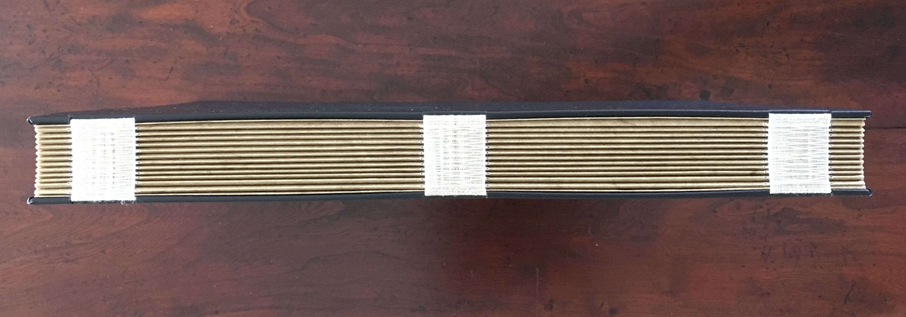
Twelve signatures of handmade cotton text paper, the central ten signatures each made up of one sheet H356 x W514 mm and one sheet H356 x W500 mm glued to the 14 mm margin of the first sheet, for a total of ninety-six pages, each measuring H356 x W253 mm. Binding of leather covered boards (a hologram embedded in front cover) with an open spine, taped and sewn into a reinforcing concertina structure: H361 X W259 mm. Contained in engraved steel box: H370 x W326 x D44 mm.
Detail of sewing and internal view of reinforcing accordion structure. For a description of this type of structure, see Hedi Kyle’s The Art of the Fold(London: Laurence King, 2018), pp. 82-85.
View of the doublure, which is part of the reinforcing concertina structure.
Cover page of second signature.
Second signature open to double-page spread.
Second signature open to four-page spread.
Further Reading
“Bieler Press”, in Book Art Object, ed. David Jury (Berkeley, CA: Codex Foundation, 2008), pp. 116-17.
Miller, Steve. “Daniel Kelm”, Book Arts Podcasts, School of Library and Information Studies, University of Alabama, 22 July 2012. Accessed 6 September 2019.