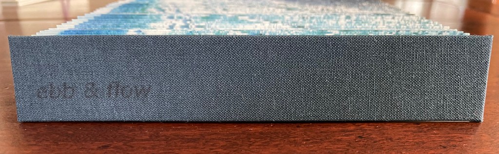
Ebb and Flow (2023) Jane Cradock-Watson Concertina book with cloth hard bound covers. H155 x W27 mm (closed), W680 mm (open). 64 panels. Edition of 20. Acquired from the artist, 21 January 2024. Photos: Books On Books Collection. Displayed with artist’s permission.
An exploration, both visually and physically, the ‘edge’ of the sea where it meets the land, with its continuous ebb and flow of the breaking waves, rhythmically rolling back and forth onto the sand. (Artist’s description)
With the binding and her photography in Ebb and Flow, Jane Cradock-Watson has sculpted and painted the sea’s edge. Four digital photographs printed on Zerkal paper have been spliced together between two cloth-covered boards. The flexibility and extent of the concertinaed paper create an undulating structure that turns seascape stills into mesmerising cinema.
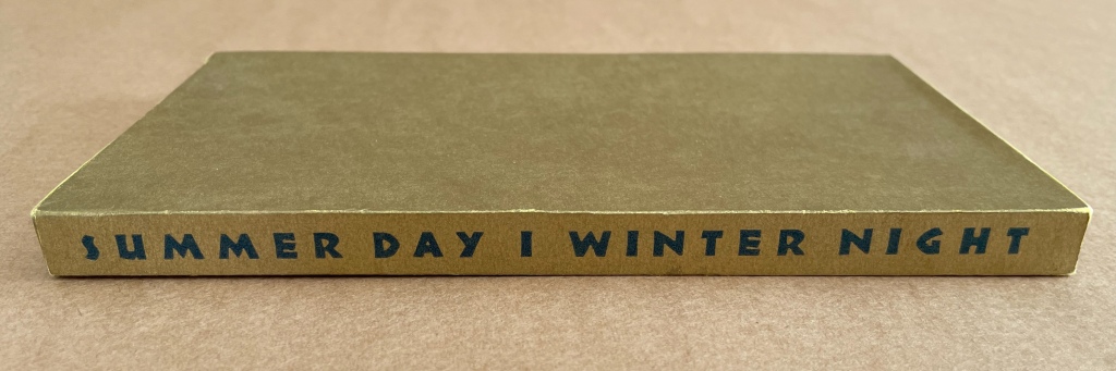
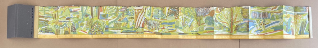
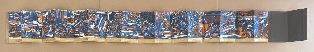
Summer Day | Winter Night (1994) Ruth Fine Papered slipcase with title printed on spine, enclosing a double-sided leporello. Slipcase, H190 x W110 x D20 mm; Leporello (extended), H185 x W1888 mm. [16] panels per side. Edition of 150, of which this is #56. Acquired from Weinrich Books, 12 June 2024. Photos: Books On Books Collection. Displayed with permission of the artist.
Inscription: The Journal of Material Text, Issue 4 on Touch Simon Morris, Gill Partington and Adam Smyth (eds.) Cased perfect bound paperback, printed paper cover. 313 x 313 mm. 120 pages. ISSN: 2634-7210. Acquired from Information as Material, 29 November 2023. Photos: Books On Books Collection.
Different readers will come to different conclusions on whether Inscription #4 dedicated to the subject of touch evokes the level of tactility in Melville’s famous Chapter 94 “A Squeeze of the Hand”. But all can agree that they share a certain seminality. Like Herman Melville with his preliminaries to Moby Dick, the editors of Inscription lead their fourth issue with definitions and choice quotations on the subject of “touch”, as much a Leviathan subject as that of Melville’s novel. Where Melville merged scholarly apparatus with narrative fiction to create a novel literary work, Simon Morris, Gill Partington and Adam Smyth have merged photography, poetry, augmented reality and audio with academic and critical essays to create a novel form of scholarship.
Handscapes (2016) Margaret (Molly) Coy & Claire Bolton Casebound, hand sewn and bound with doublures and two ribbon bookmarks. H260 x W310 x D30. 80 folios. Edition of 12, of which this is #9. Acquired from the artists, 19 October 2023. Photos: Books On Books Collection. Displayed with artists’ permission.
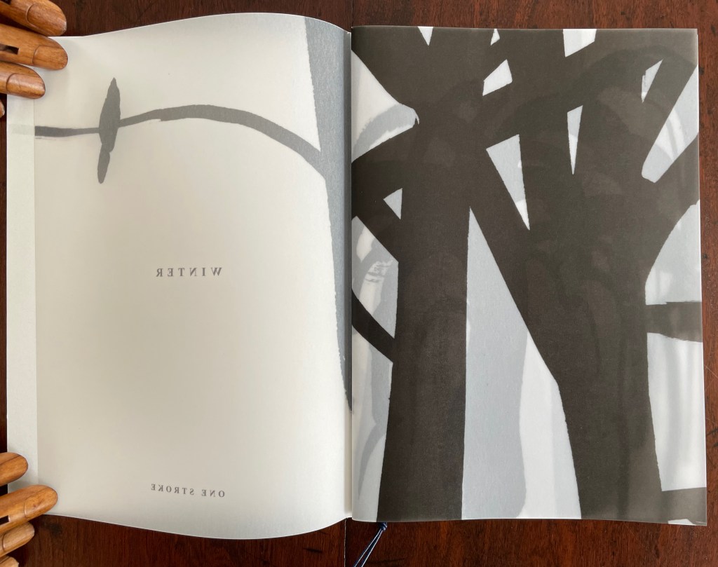
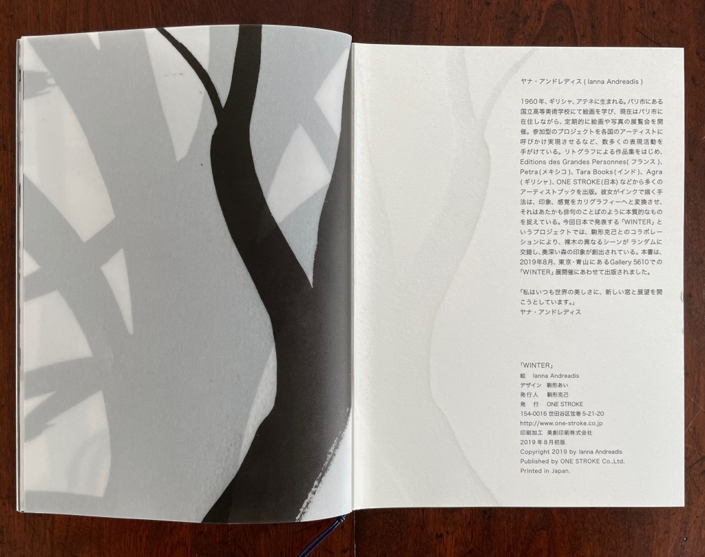
Winter (2019) Ianna Andréadis Softbound with a waxed thread loop. H210 x W150 mm. 48 pages. Acquired from Happy Babies, 30 July 2023. Photos: Books On Books Collection. Displayed with artist’s permission.
The language of the book is one we learn well before we learn to read. It has many rules and parts. One part is the single page, and one of its rules is to turn it. Another of its rules is that the page behind may affect the page before. Another part of book language is the double-page spread. One of its rules is that facing pages may affect one another and that the space between them might disappear. As with any native language, we absorb its rules and parts and use them without thinking about them. Ianna Andréadis’ Winter revels in the language of the book and invites us to page through a winter wood and confusing thicket to begin learning again what we absorbed so long ago.
Like our earliest children’s books, Winter‘s only word is its title. Inviting touch, its front cover reproduces the main image of the title page but with debossing, and the book paper that follows is heavy and translucent.
With a turn of the title page, the bird is behind us, and the branches and trunks obscured by the title page’s “winter fog” loom large in black with the woods beyond appearing through the fog continued with the translucent paper.
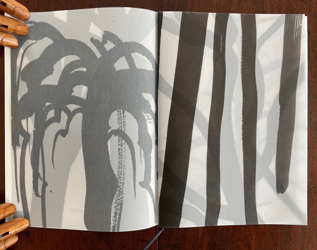
As we move further into the woods, we look down on a bush or small tree weighted with snow whose trunk and branches sink into the snow beneath. Having passed it, we find a stand of four saplings and the one furthest from us also sunk in snow.
But now look up. The tangle of black branches and the winter fog barely hide the broken limbs of the tree just behind.
Several more pages of thicket and fog come before we reach the center of the book. There the imposition imposes its mechanics. The two facing pages both bear black ink, and the viewer may wonder whether these are birchtree trunks or black trunks with footsteps and branches or clumps of tree fall in the snow-covered ground between them.
Whatever that view is, the shift in inking according to the imposition envelops us in a winter fog on the following double-page spread.
Andréadis and her imposition, however, will lead us out of the fog and thicket, and the “lightening sky” over the next several pages encourages us to look up and find another bird perched above.
After several more pages and perhaps too tired to keep looking up, our eyes turn back to the tree trunks and branches sunk in snow, until at the end, we can finally look back up, turn around and see the clear fork of a trunk behind which the wood has disappeared again in winter fog.
And if at the end, prompted by the feel of the back cover and perhaps childhood memories of first books to press the covers flat, we’ll find we have come full circle. The next-to-last page’s forking tree trunk now appears debossed on the back cover matched to its other half and the bird on the front cover. Let’s read it again!
Andréadis’ Winter is now scarce, but through the link behind the title, you might be able to locate an institution with it near you. To enjoy more of the artist’s work, several of her illustrations of others’ books are available in libraries and the used-book market. One such book is Le papillon et la lumière by Patrick Chamoiseau, which deserves publication in translation not only for its charming story but for greater access to Andréadis’ artwork.
For another means of re-experiencing the first encounter with the language of the book, try Bruno Munari’s I Prelibri, first published in 1980 and still available in a second edition from Corraini.
Further Reading
Andréadis, Ianna. 2019. Winter. Tokyo: One Stroke.
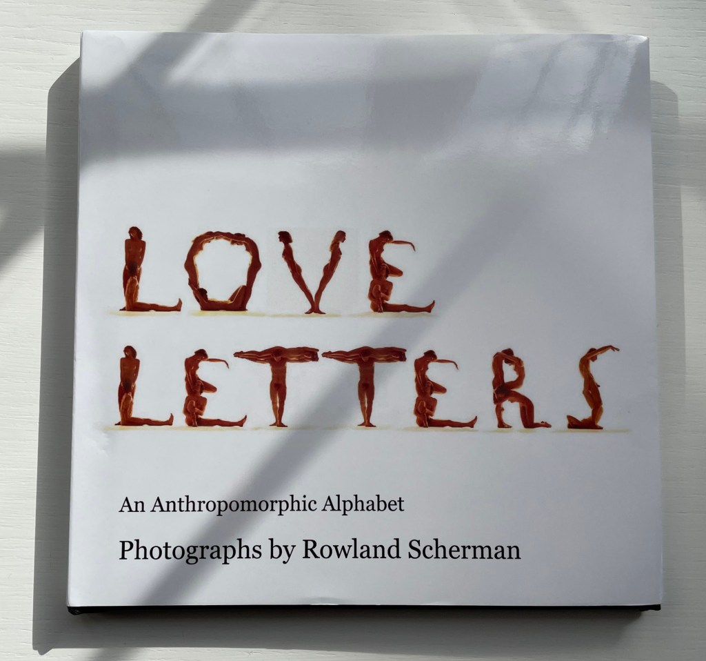
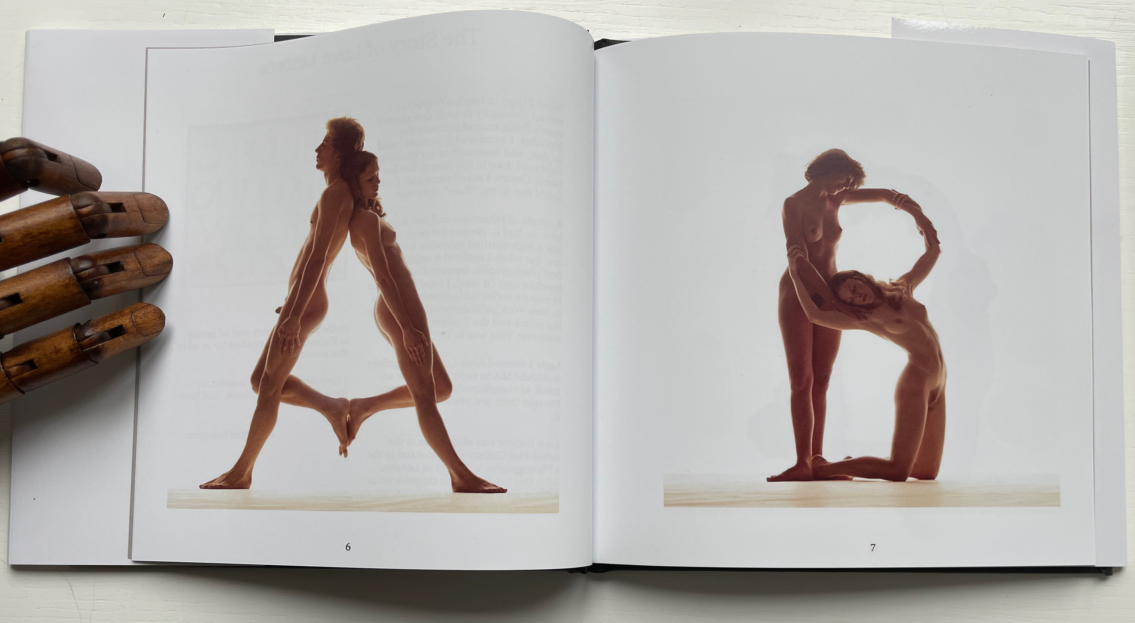
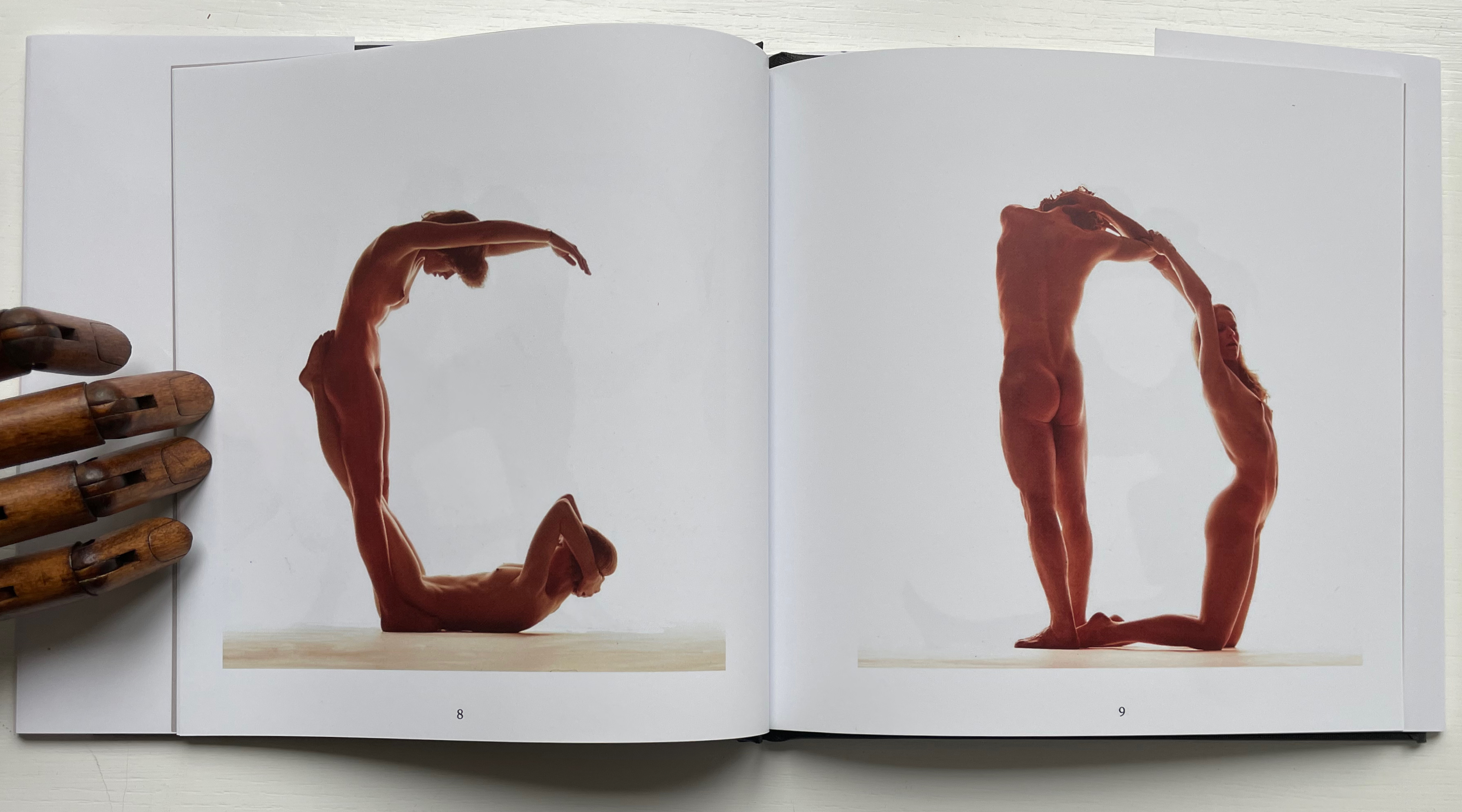
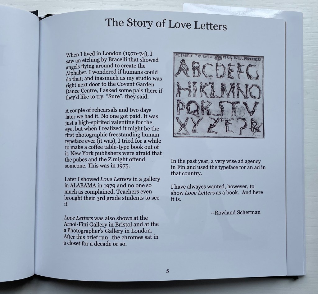
Love Letters: An Anthropomorphic Alphabet (2008) Rowland Scherman Casebound, doublures, perfect bound. H178 x W180 mm. 34 pages. Acquired from Rowland Scherman, 3 March 2023. Photos of the book: Books On Books Collection. Displayed with permission of Rowland Scherman.
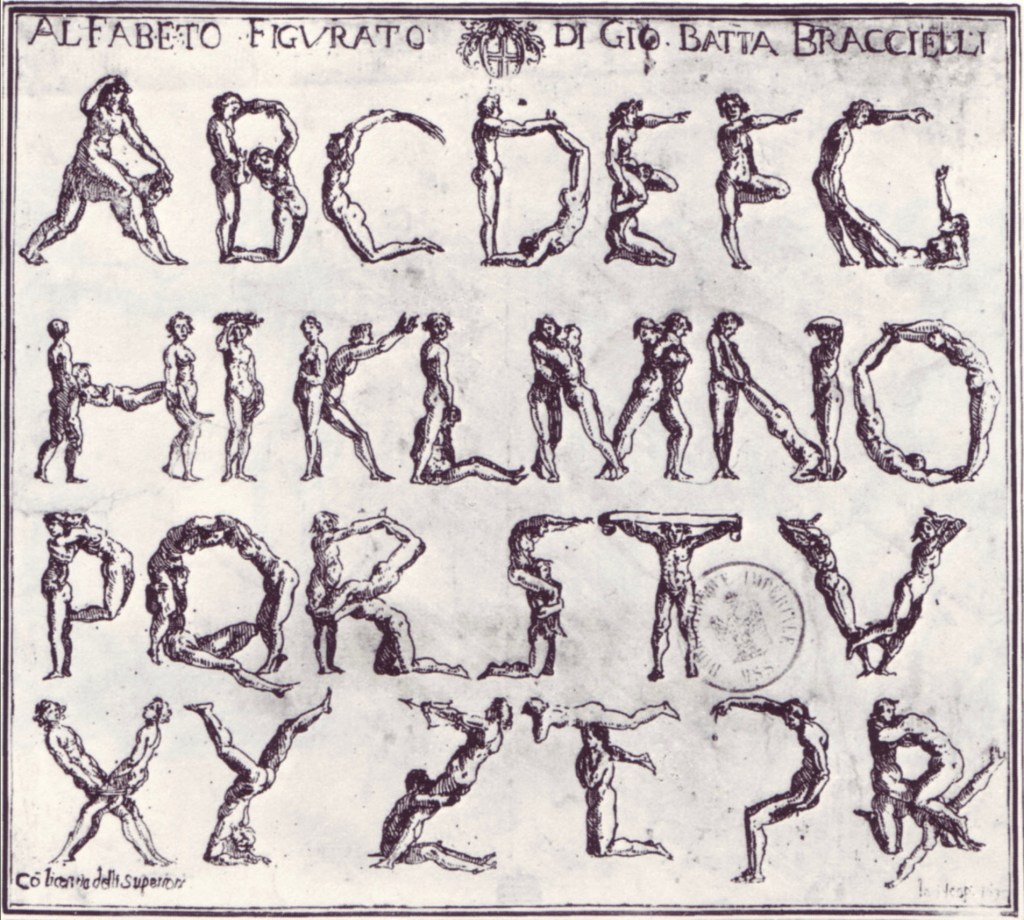
Giovanni Battista Bracelli’s “Alfabeto Figurato”, a single-sheet etching, occurred well after Carravagio’s presence there earlier in the century but well within the sphere of his ongoing influence. The print’s contortions of human bodies to display that most human of inventions — the alphabet — would probably have pulled a sneer of admiration from him. Maybe Bracelli had heard of the 5th-century comic playwright Kallias, who had his chorus dance (no doubt “cheek to cheek”) the shapes of the Ionian contenders for letterforms. In 1969, Anthon Beeke and Ed van der Elsken had their naked models arrange themselves into the alphabet on the studio floor and took photos from above. When Rowland Scherman saw Bracelli’s print on a London bus 340 years later, he wondered if human bodies could actually hold those poses or ones like them.
In the third decade of the 21st century, when book bannings and body shaming have reached new heights (or depths), Scherman’s “Story of Love Letters” might leave the reader wondering if we are now running headlong past Kallias and the 5th century into the pre-alphabetic world.
Dukes, Hunter. 27 April 2023. “Punctuation Personified (1824)“. The Public Domain Review. Not only could letters be formed with the human body, so could quotation marks and square brackets.
Erwin Huebner is a professor at the University of Manitoba engaged in research and teaching cell and developmental biology. He is also a book artist and miniaturist. Following his work, the Books On Books Collection has started small and hopes to grow into his larger works. At both ends of the spectrum, Huebner’s themes resonate with the integration of art and science, a recurrent focus of the collection (see Further Reading below).
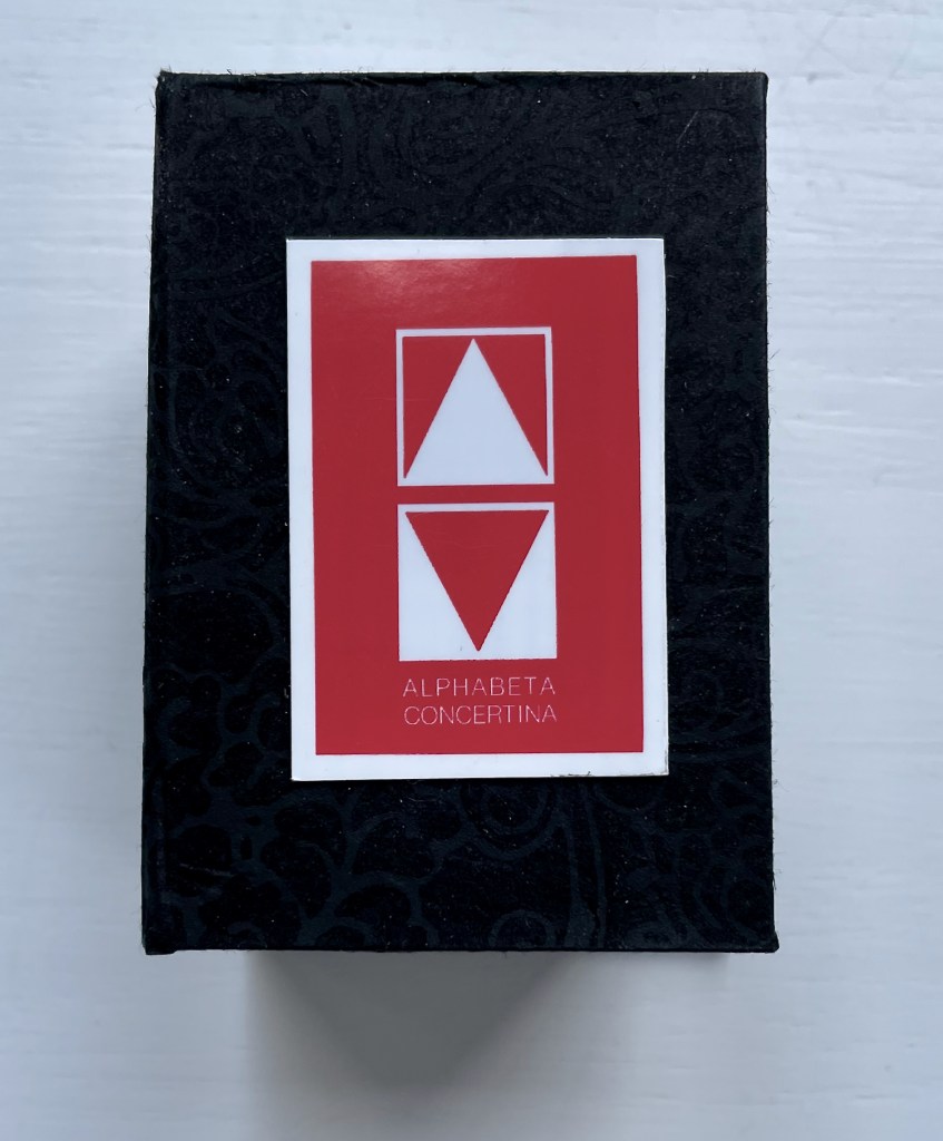
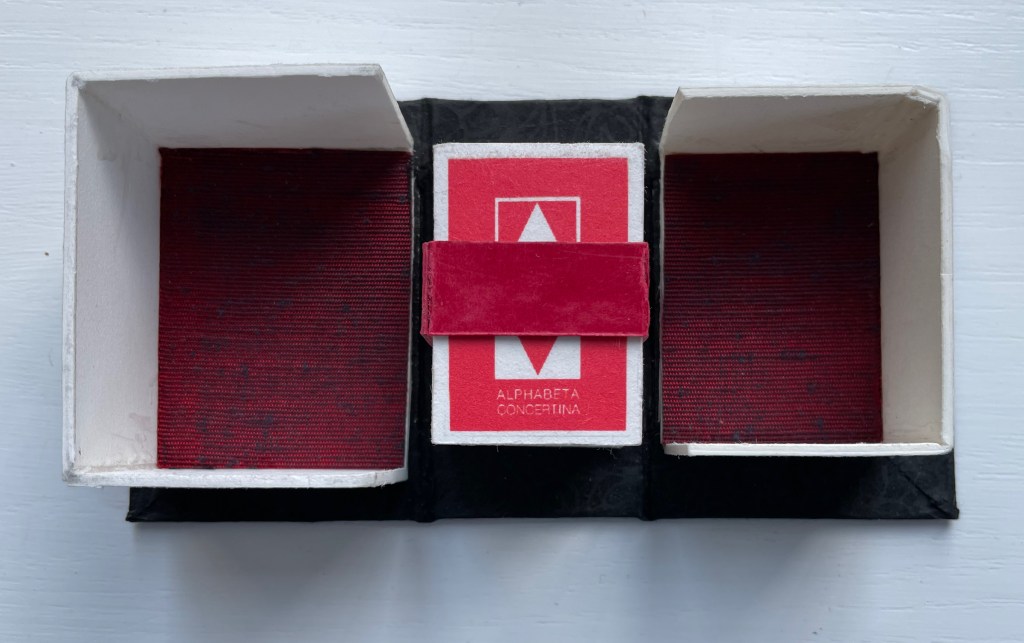
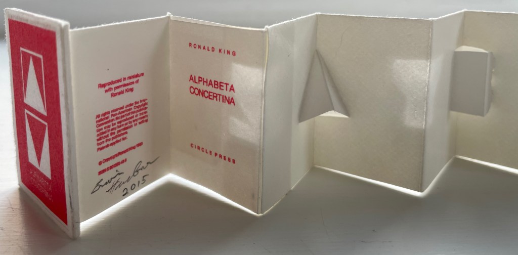
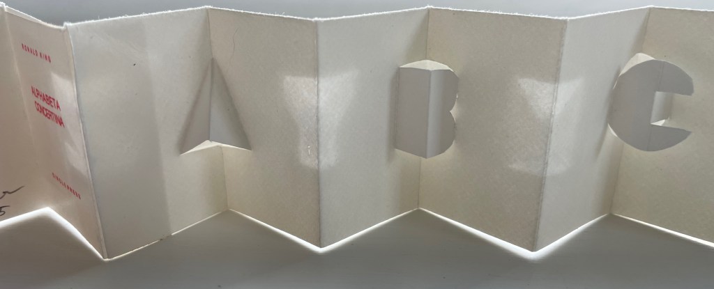
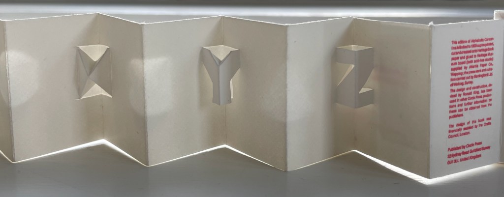
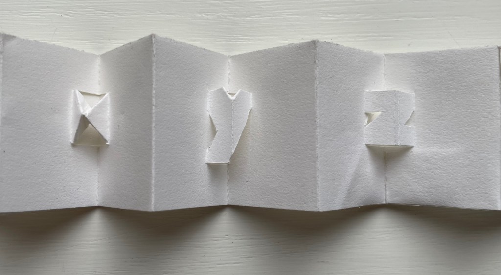
Alphabeta Concertina Majuscule (2015)
Alphabeta Concertina (2015) Erwin Huebner (with permission of Ron King) Miniature double-sided leporello. H 1.5 x W 1.0 x D 0.75 in. Edition of 4. Acquired from Erwin Huebner, 20 January 2023. Photos: Books On Books Collection.
The geometry and invention of Ron King’s work must have appealed to a kindred spirit in Erwin Huebner. The classificatory nature of the alphabet must also have spoken to Huebner’s inner Linnaeus. As 2023 is the 270th anniversary of Linnaeus’ Species Plantarum, which introduced his classification system, it is an auspicious moment for Huebner’s miniature versions of King’s alphabet concertinas to join the Books On Books Collection and be included works in the Bodleian exhibition “Alphabets Alive!” (19 July 2023 to 24 January 2024, Weston Library, Oxford).
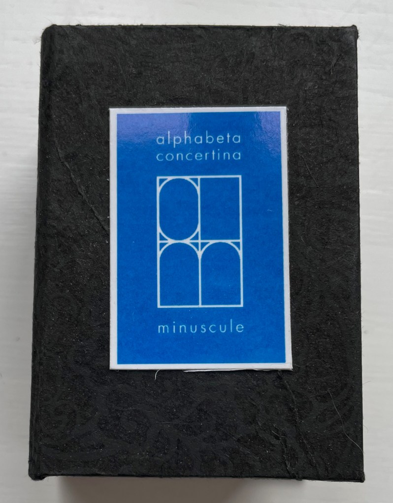
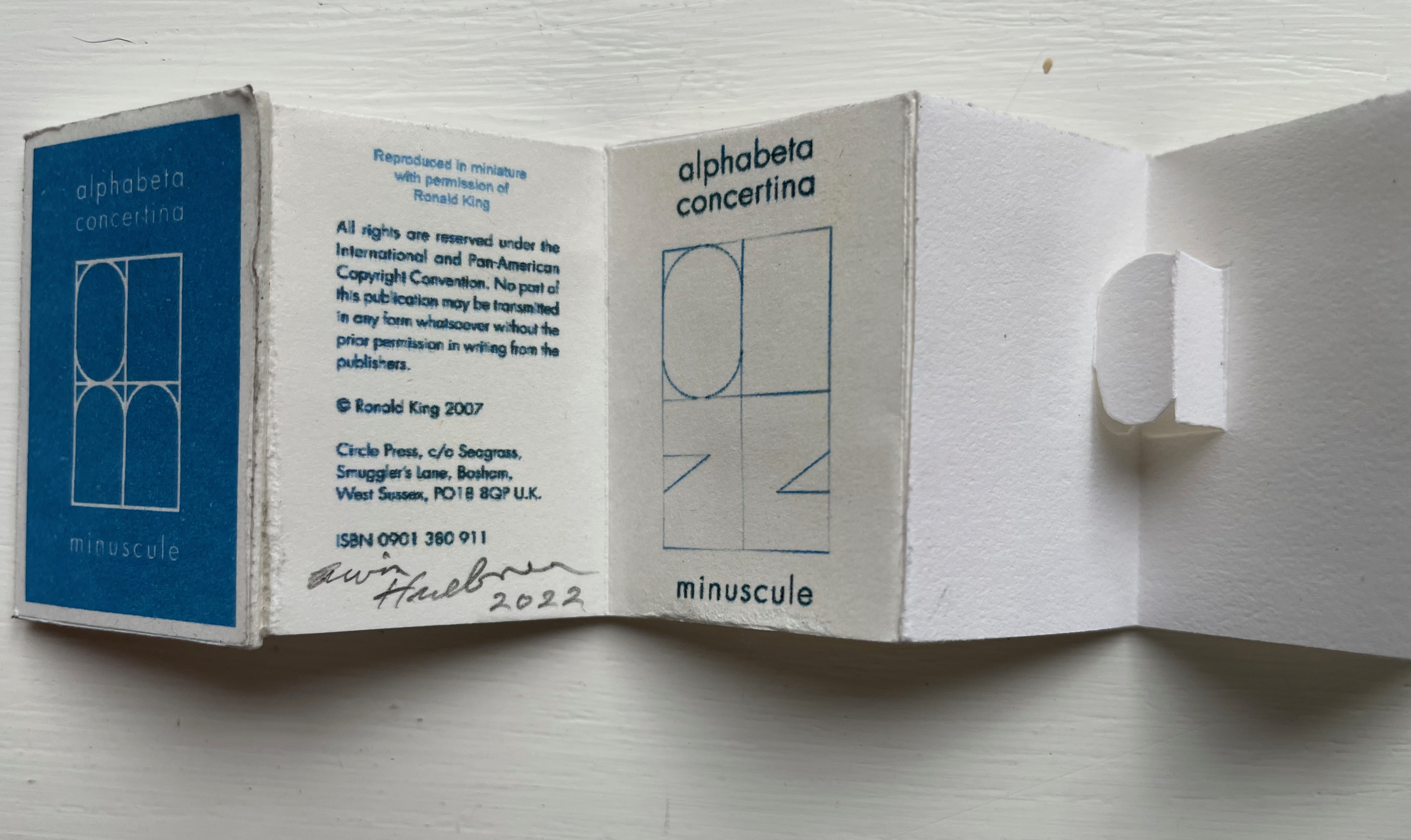
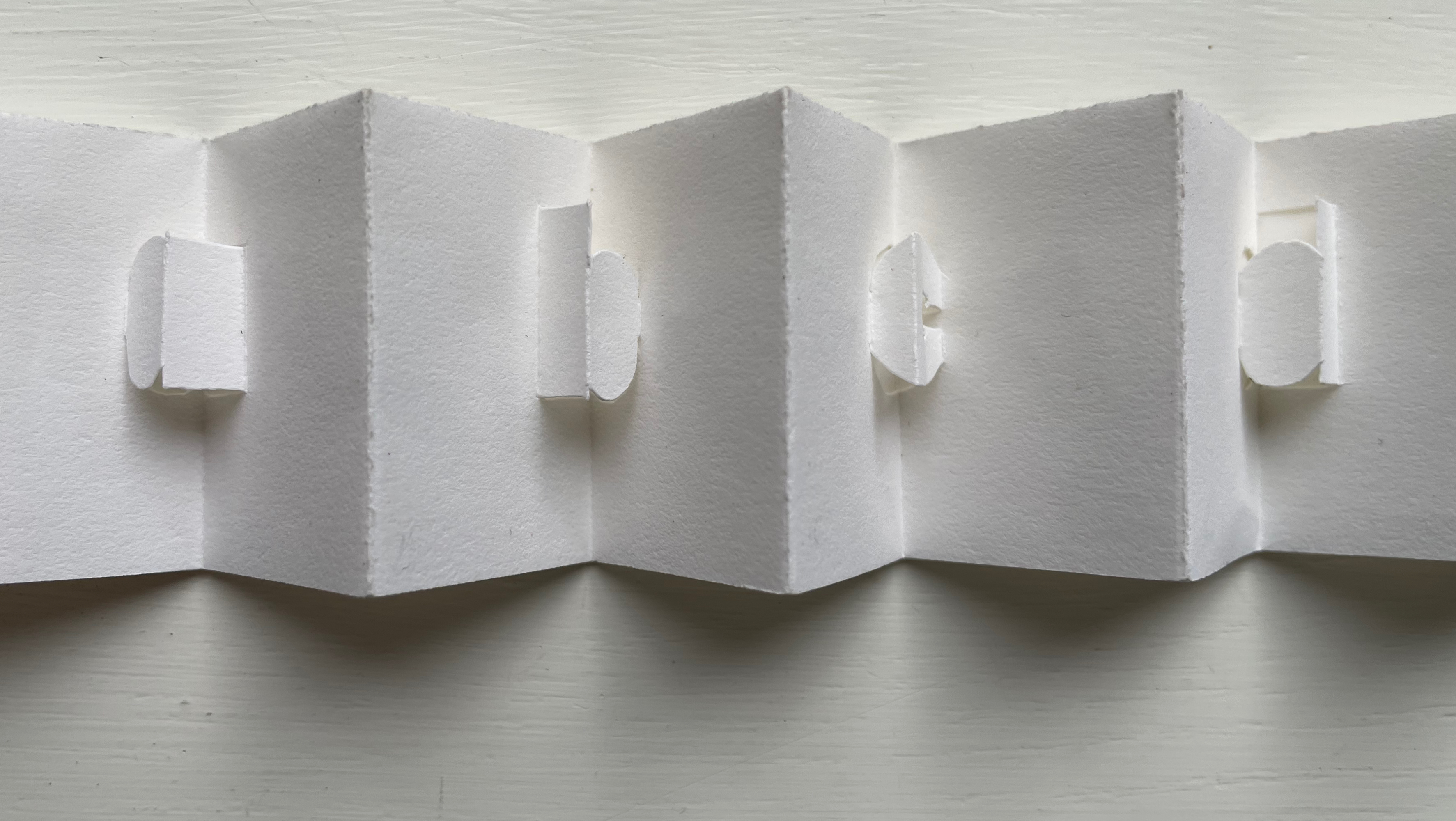
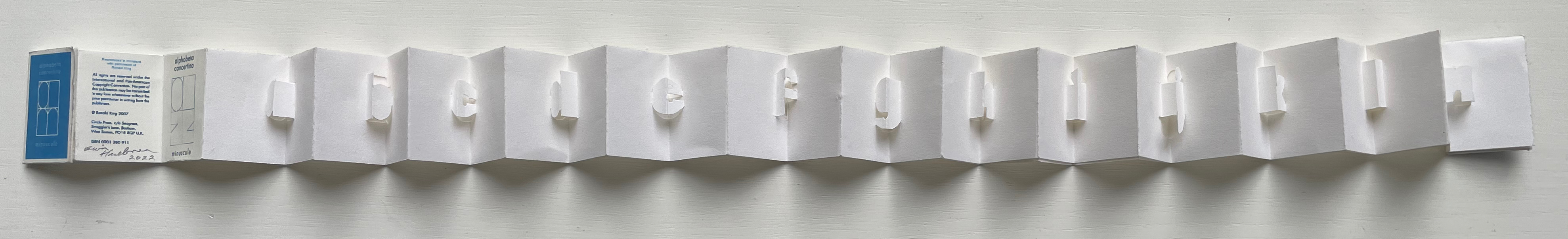
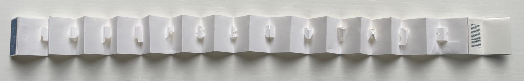
alphabet concertina miniscule (2022)
alphabet concertina miniscule (2022) Erwin Huebner (with permission of Ron King) Miniature double-sided leporello. H 1.5 x W 1.0 x D 0.75 in. Acquired from Erwin Huebner, 20 January 2023. Photos: Books On Books Collection.
Both the majuscule and miniscule concertinas are double-sided with half the alphabet on one side and half on the other just as King designed from the first with The White Alphabet and the majuscule concertina in 1984 and subsequently 2007 with the miniscule.
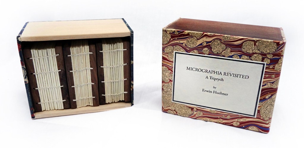
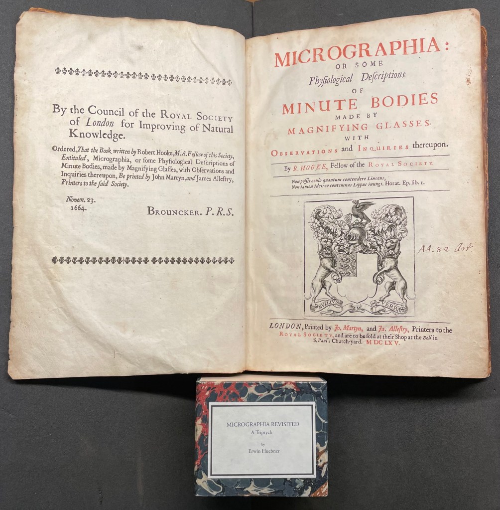
Micrographia Revisited (2017)
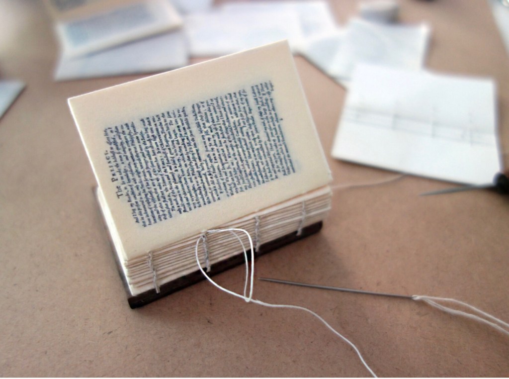
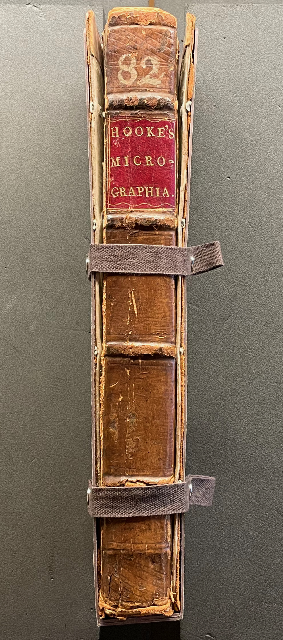
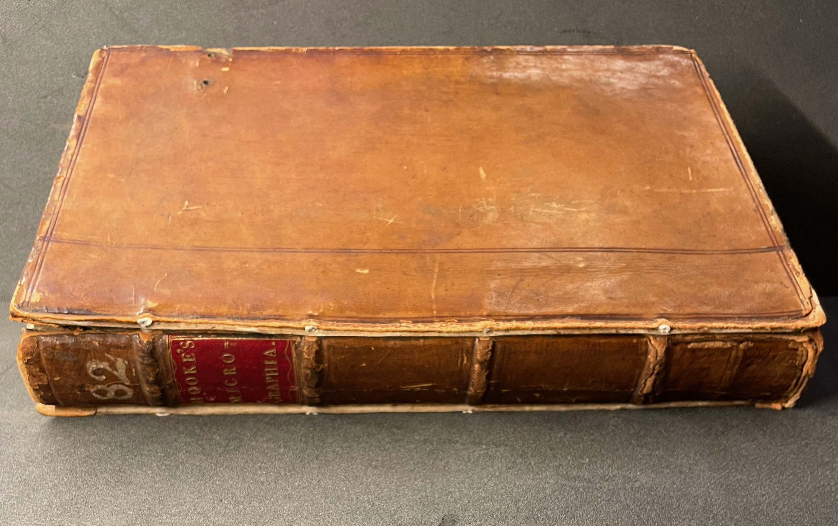
Micrographia Revisited: A Triptych (2017) Erwin Huebner Box with 3 Coptic-bound volumes, each H 2.625 x W 1.875 x variable depth. Edition of 3. Acquired from Erwin Huebner, 20 January 2023. Photos: Courtesy of the artist.
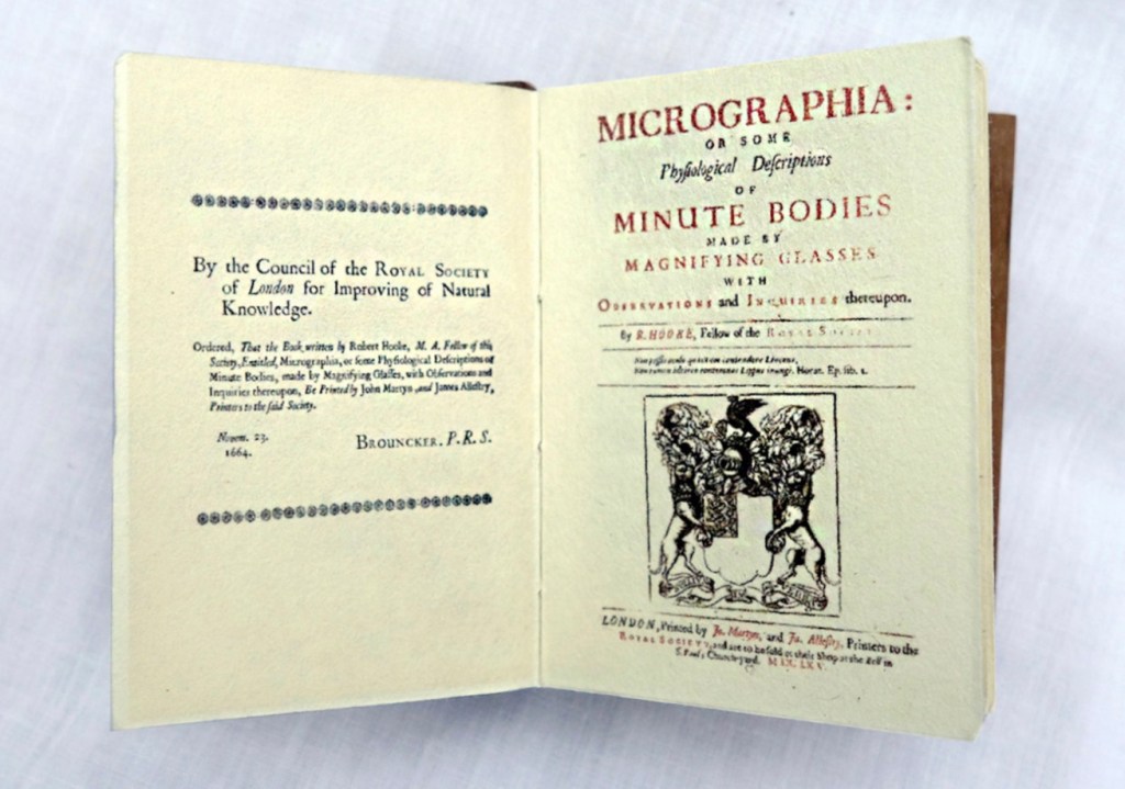
Despite Francesco Stelluti’s Melissographia (1625), Robert Hooke’s Micrographia: Or Some Physiological Descriptions of Minute Bodies Made by Magnifying Glasses with Observations and Inquiries Thereupon (1665) was long thought to be the first publication with illustrations drawn from observation with a microscope. Given Huebner’s scientific and artistic careers, it would seem impossible for him to resist paying homage to this work. Indeed, in his larger artist’s books, he has incorporated entire microscopes, but here, he exploits the technological advances of photography and electron microscopy and joins them with the craft of bookbinding to produce just as wondrous a work. Using Scanning Electron Microscopy (SEM), Huebner has created images of the same or similar objects to those Robert Hooke observed in the 1600’s. One of the volumes in the triptych presents these photographic results, and the other two present a reprint of Micrographia.
The coptic binding to black walnut covers, the wooden case covered in marbled paper and the subtitle create a suitable medieval/Renaissance air for this homage.
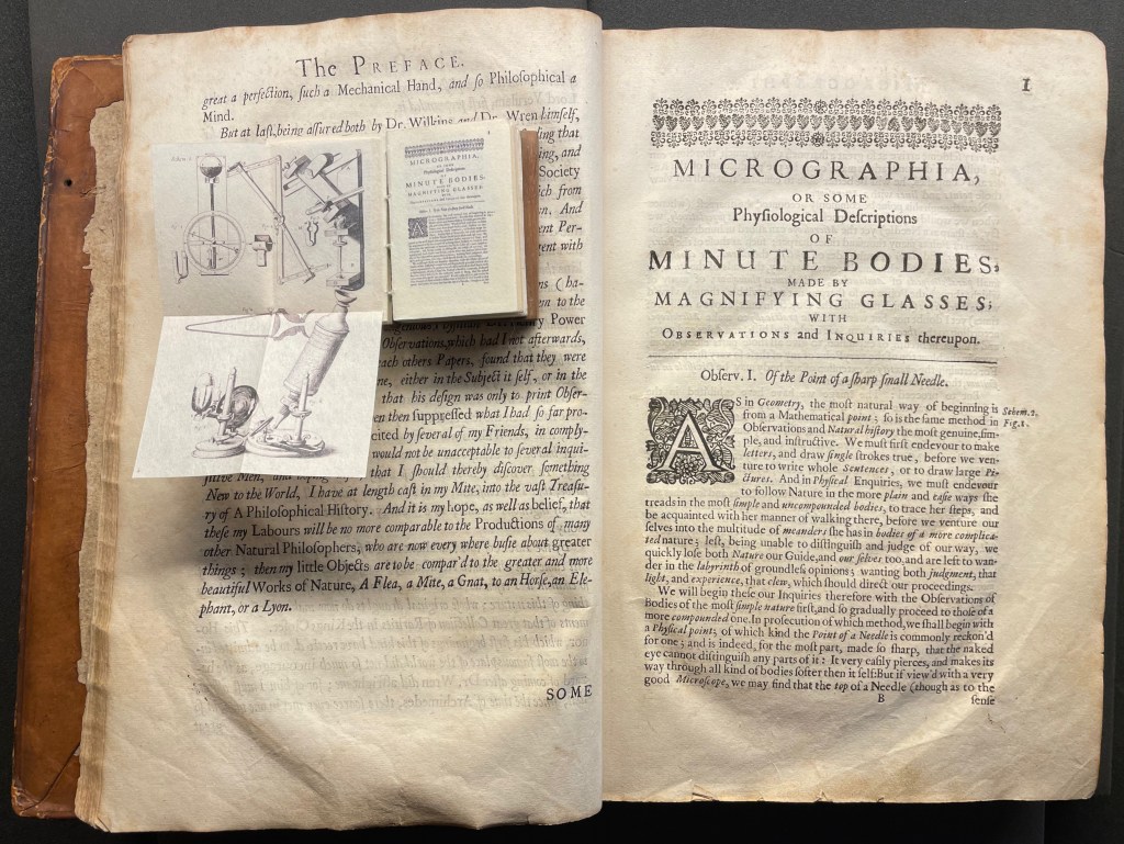
Living in a village near Oxford and having access to the Bodleian Libraries, I took Micrographia Revisited on a pilgrimage to compare it with a copy of the original not far from Hooke’s alma mater Wadham College.
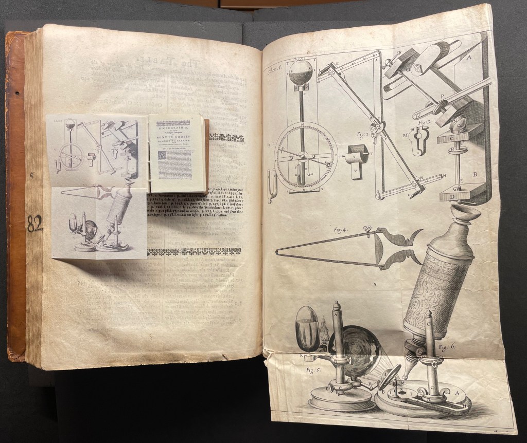
Among the many outstanding features of Huebner’s homage is his use and placement of fold-outs to capture the larger plates in Hooke’s original, all of which were placed in an appendix and some of which were also printed as fold-outs. In the juxtapositions below, note how Huebner has placed Hooke’s illustration of his equipment at the end of the Preface.
Sitting atop the double-page spread showing the end of the Preface and page 1 of Hooke’s original is Micrographia Revisited, open to Huebner’s fold-out of Hooke’s illustration of his equipment. Hooke’s same fold-out illustration from the appendix is juxtaposed below with Huebner’s.
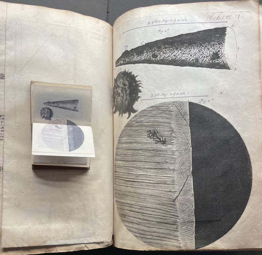
Hooke’s first two objects under the microscope Hooke are the point of a needle (described on pages 1-3) and the edge of a razor (described on pages 4-5). Huebner transforms Hooke’s single-page plate illustrating what he describes into a double-page spread between pages 2 and 3 of Micrographia Revisited.
Juxtaposing Huebner’s double-page presentation of Hooke’s drawings of a needle point and edge a razor with Hooke’s single-page presentation.
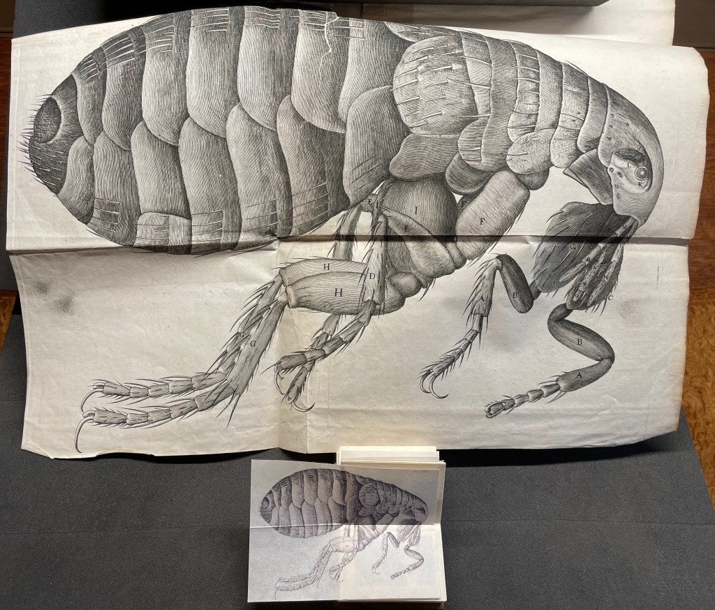
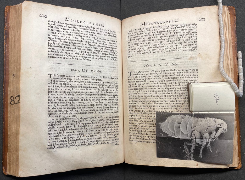
Hooke’s large fold-out of his flea may display the most impressive drawing in the book. The description appears on page 210, and the fold-out is in the appendix. Huebner’s double-fold fold-out of the illustration falls between pages 210 and 211.
The flea from Micrographia juxtaposed with that from Micrographia Revisited.
But most impressive of all is Huebner’s SEM image of a flea and its testament to Hooke’s powers of observation and skills as a draughtsman.
In the spirit of “standing on the shouders of giants”.