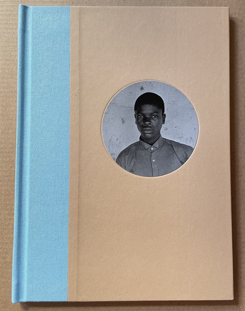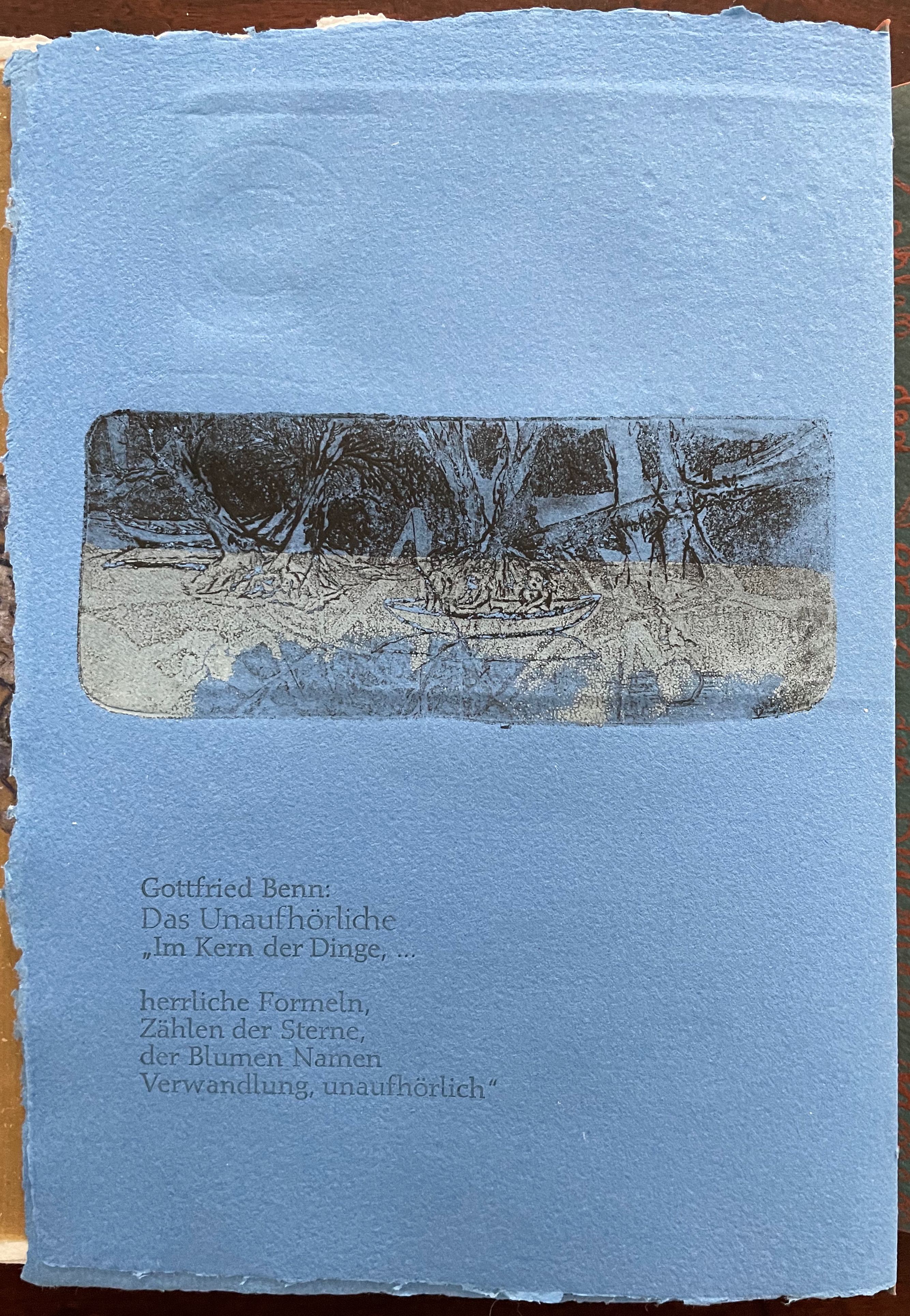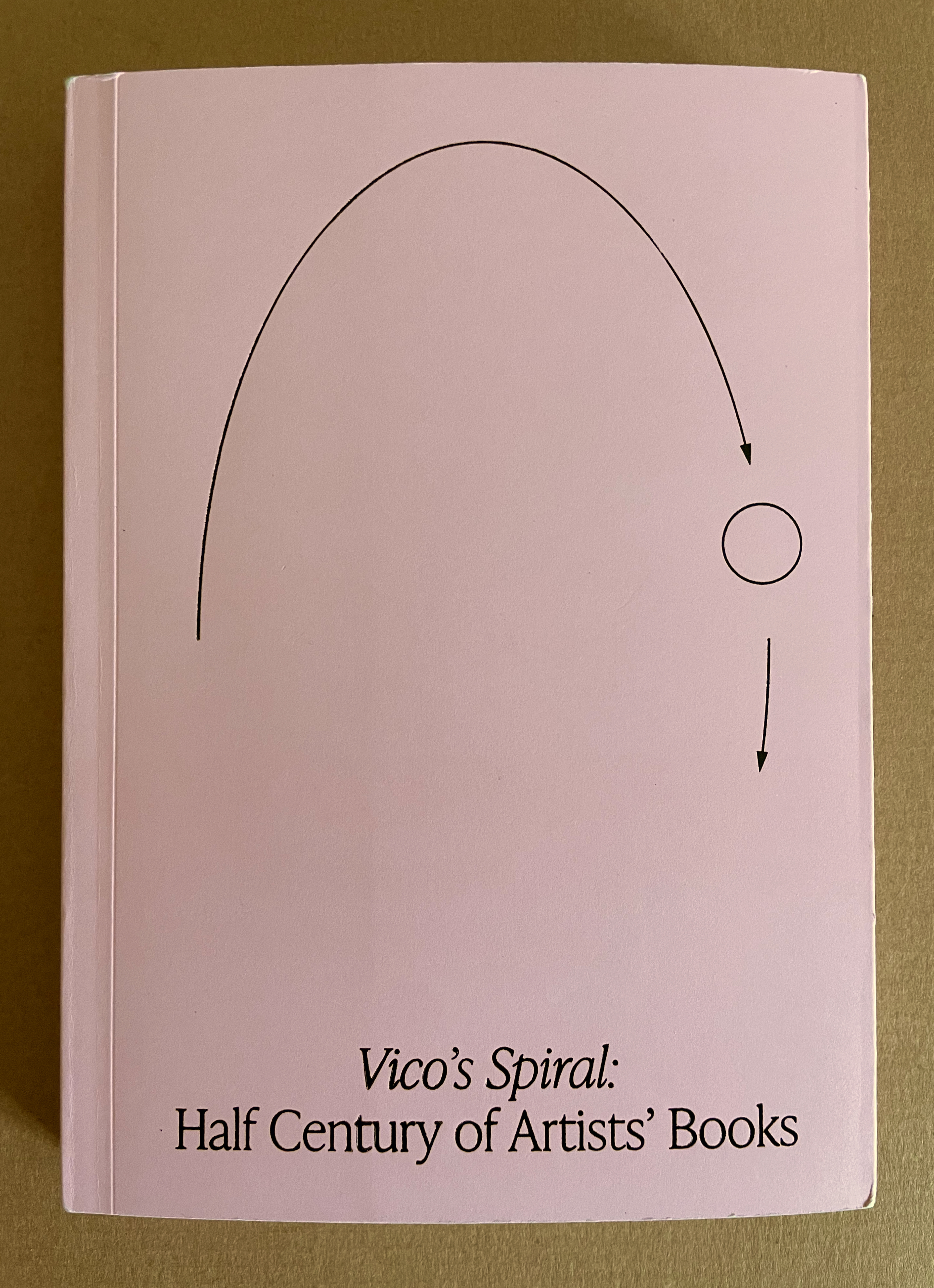
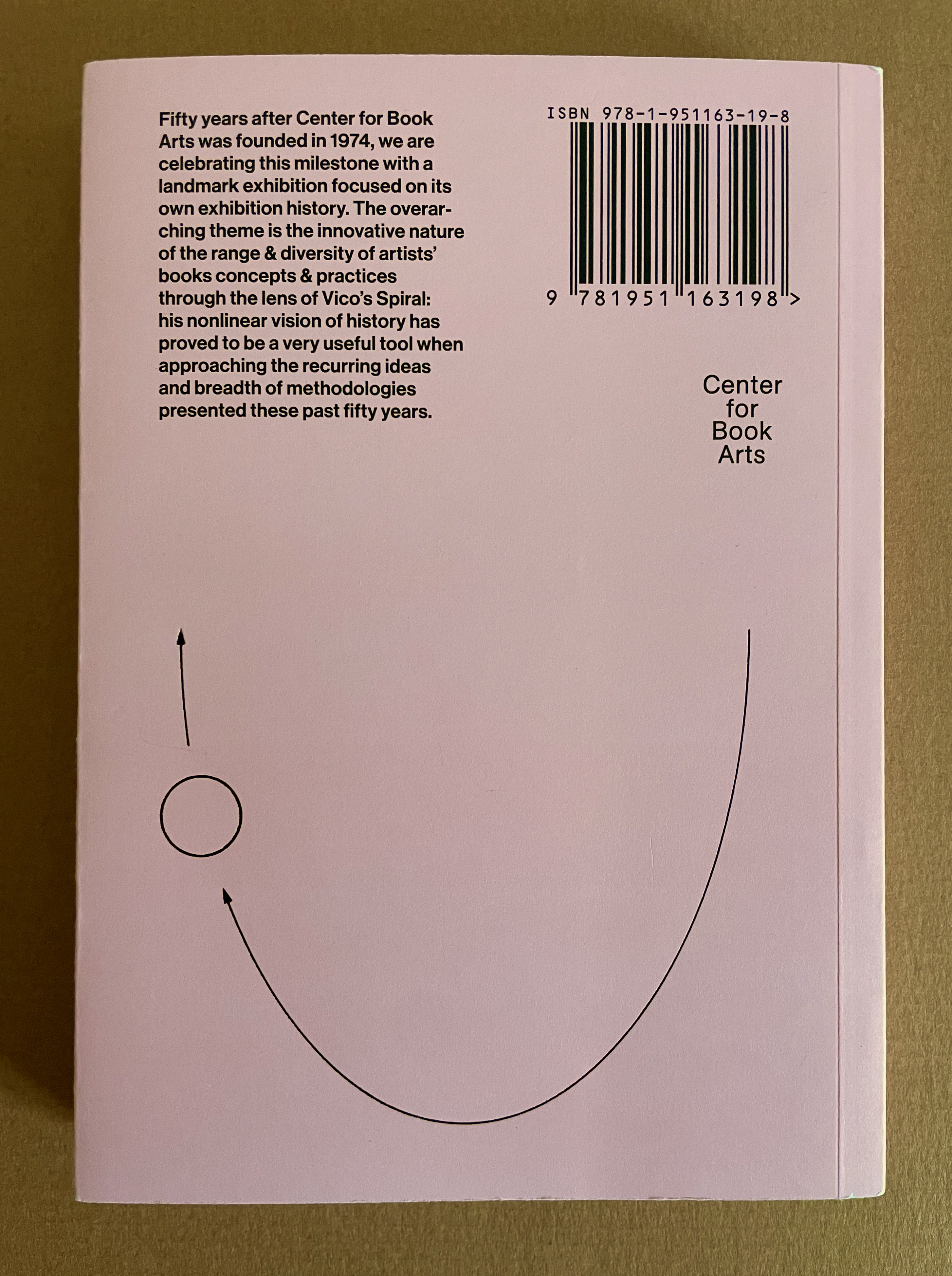
Vico’s Spiral: Half Century of Artists’ Books (2024)
Robbin Ami Silberberg and Carole Naggar, editors
Paperback. H210 x W150 mm. 256 pages. Acquired from Center for the Book Arts, 7 March 2025.
Photos: Books On Books Collection.
With Vico’s Spiral, Robbin Ami Silverberg, Carole Naggar, and Kinohi Nishikawa have made a significant contribution to how we can better appreciate artists’ books. The publication accompanied the exhibition by the same name celebrating the 50th anniversary of New York’s Center of Book Arts from 26 September through 14 December 2024.
The exhibition’s curators — Silverberg and Naggar — chose their organizing metaphor well. The 16th century philosopher Giambattista Vico proposed that history did not proceed in a straight line but instead spiraled, with patterns of events recurring with near similarity in different periods and even different regions. Naggar writes, As in Vico’s Spiral, artists’ books disregard linear chronology and geographies. Based on recurrent concepts and forms, they “meet” in vastly different time-spaces.
To prove the aptness of Vico’s model of history for book art, the curators paired art works from different times and places. For example, New York-born Warren Lehrer’s French Fries (1984) is paired with Israeli-born Uriel Cidor’s Greetings from America (2018).
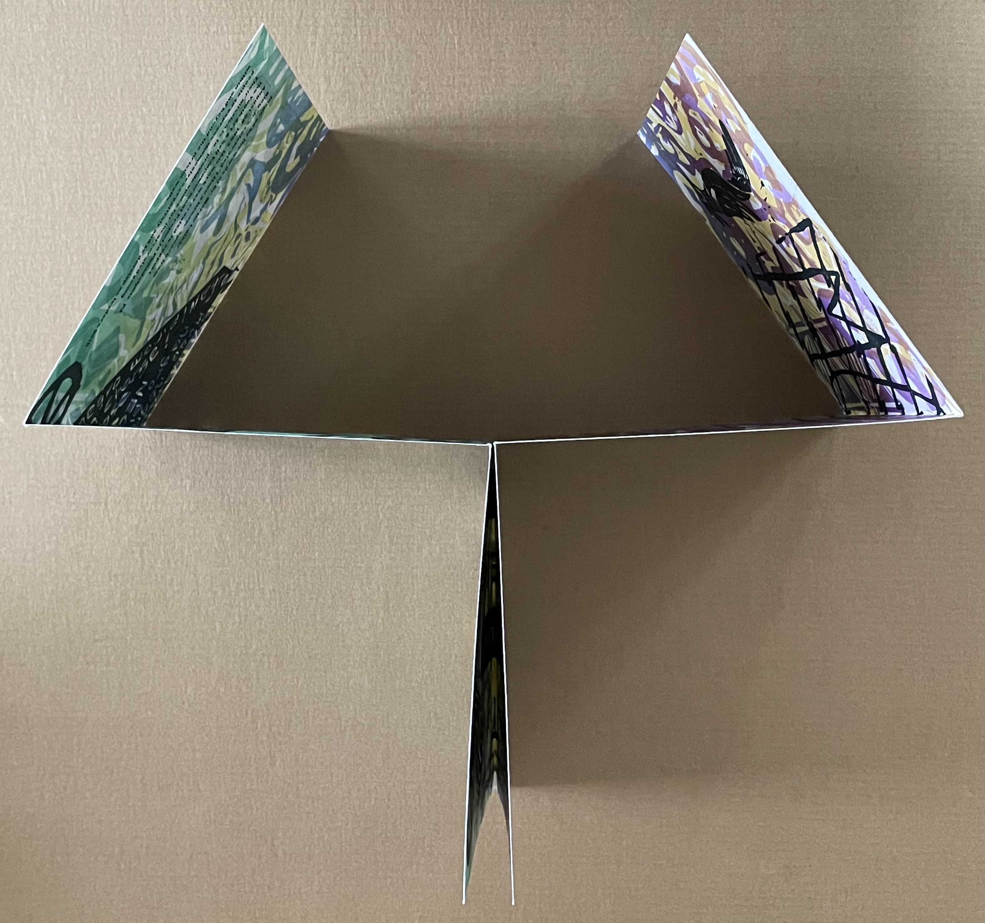
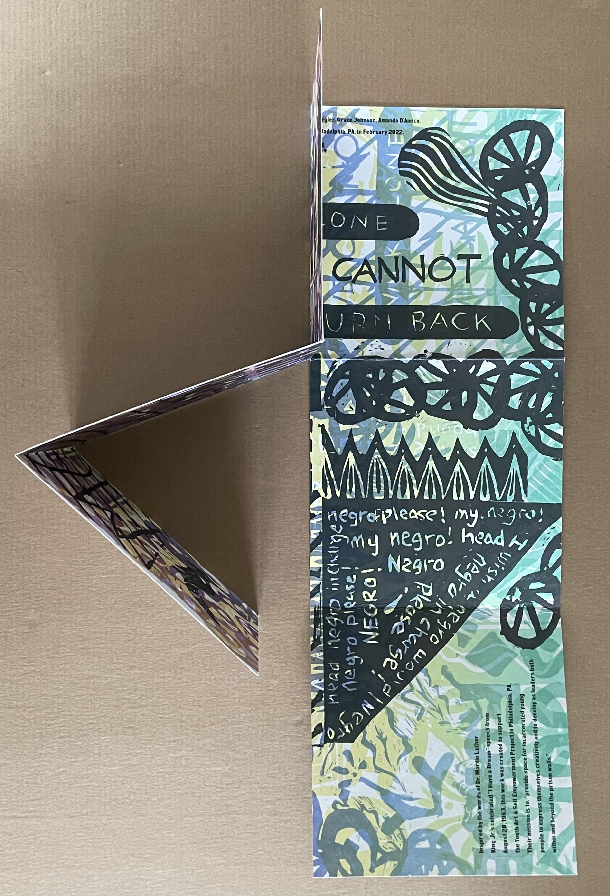
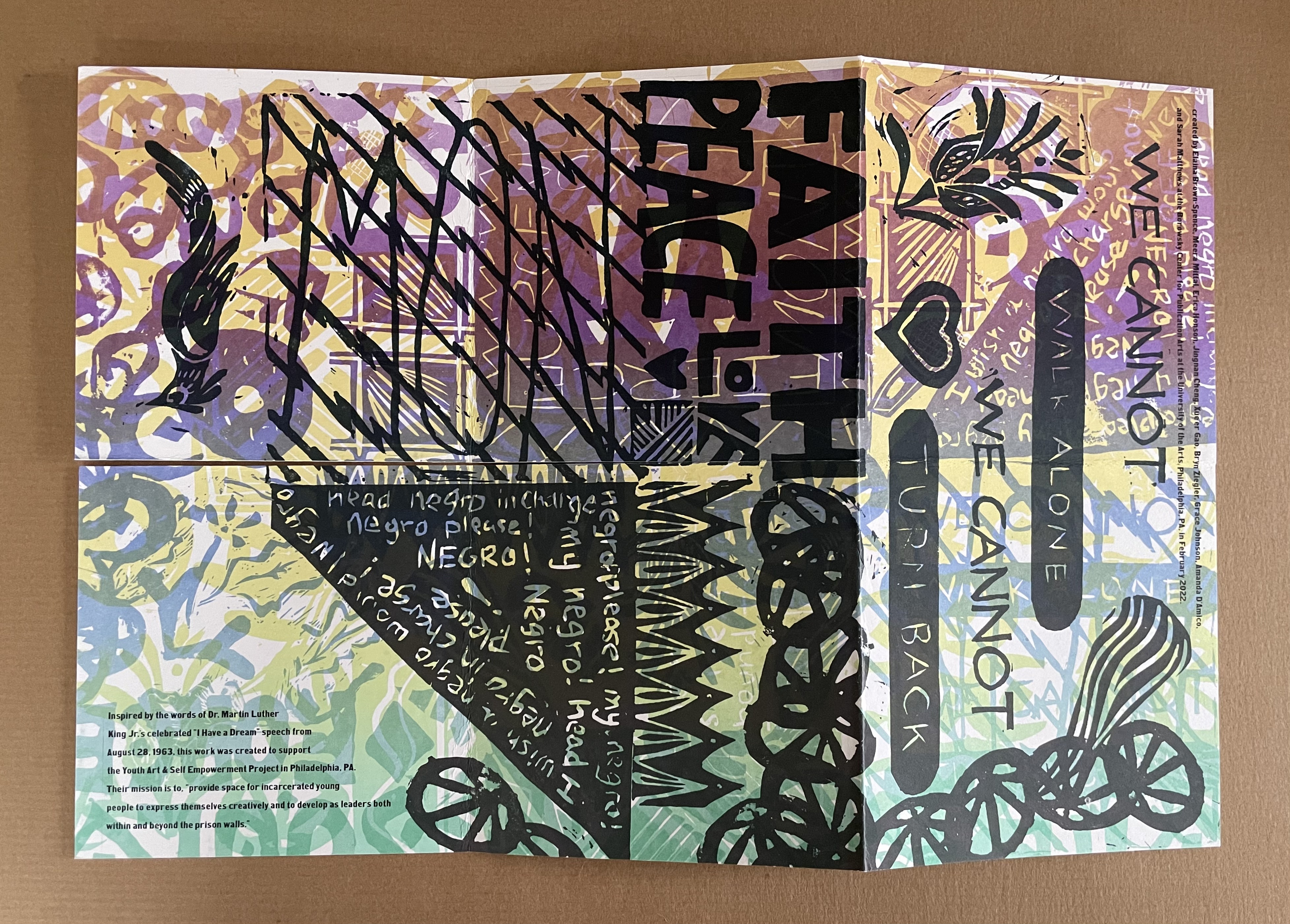
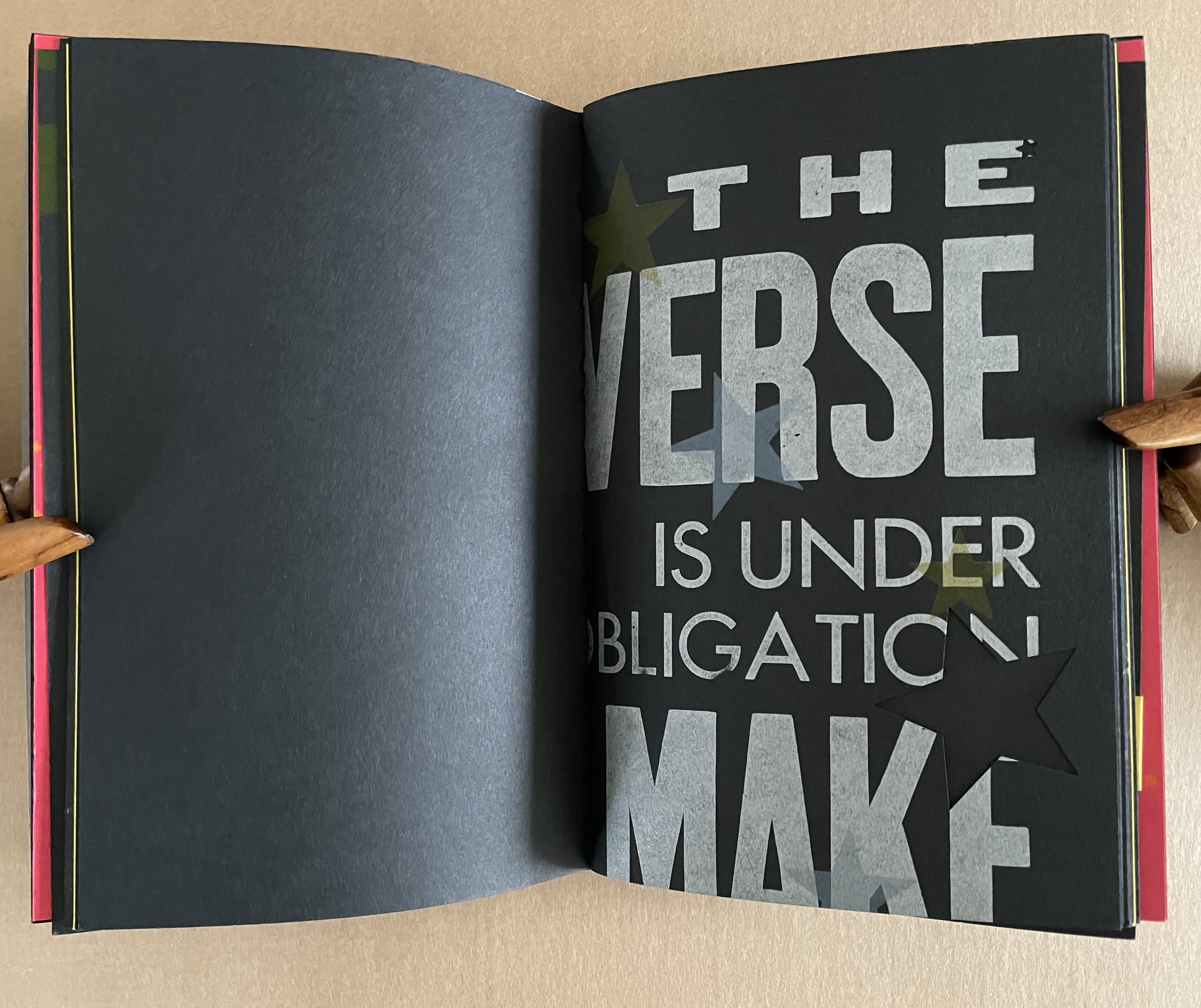
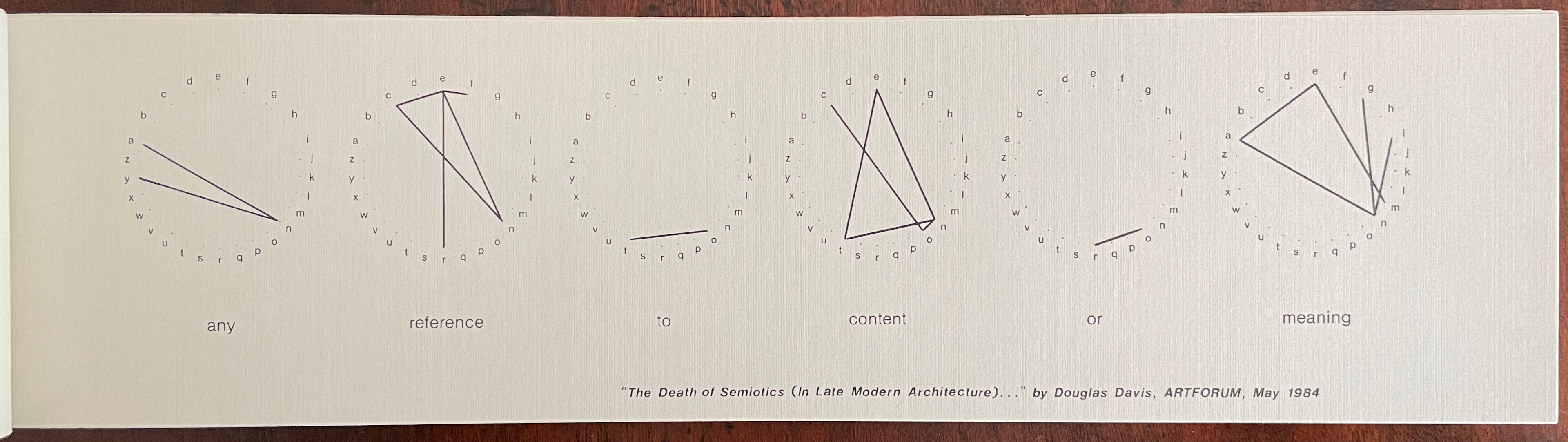
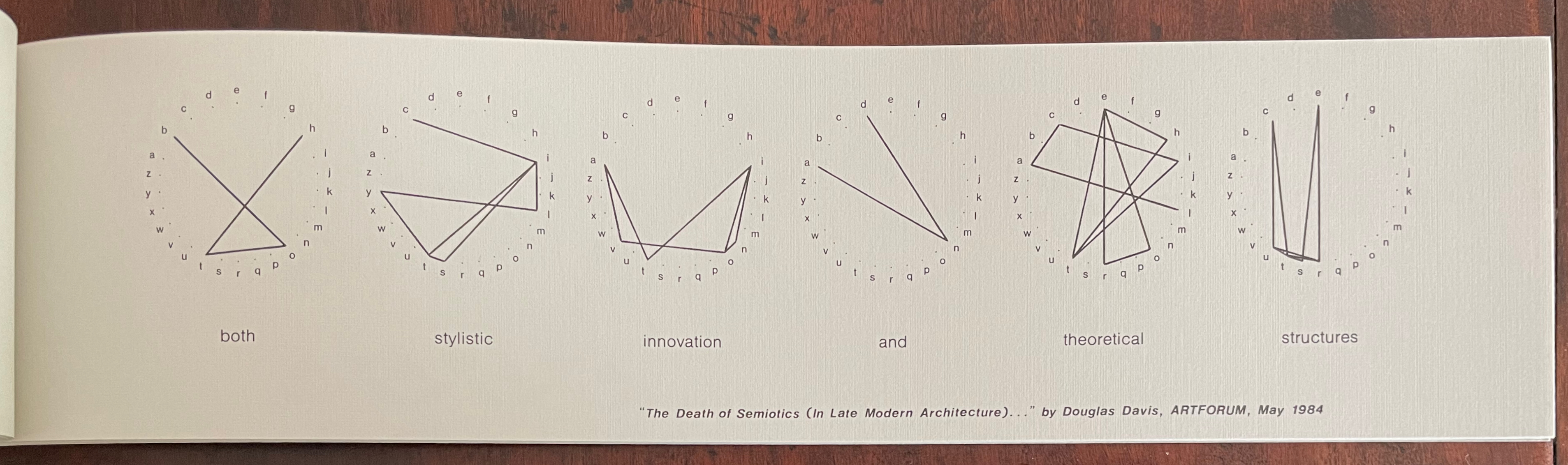
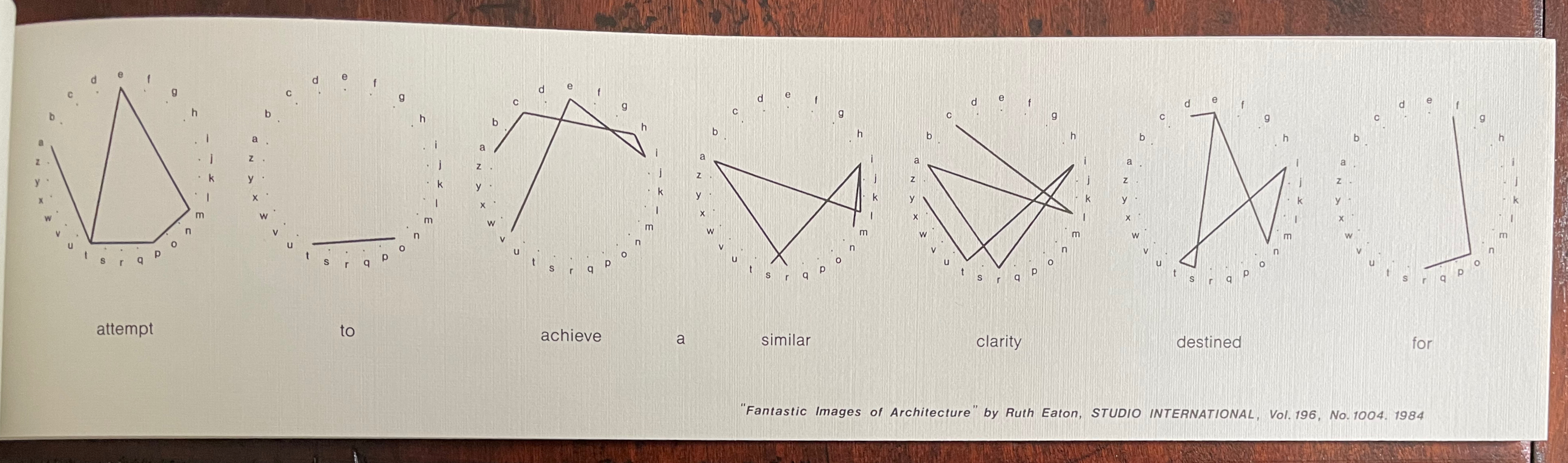
Lehrer’s satiric take on “what is America” aims to visualize the text of a ten-part play set in a DREAM QUEEN restaurant with its “core of regulars: four faithful customers, three employees and one mobile juke-box on wheels”. He calls it a “psycho-acoustic” translation in which “each character is typecast into a distinct color and typographic arrangement”. On the pages, “an array of images and marks accompany the text, evoking an appropriate ambiance, and further serving to chart the cacophony of shifting internal projections that make up the characters’ collective consciousness”.
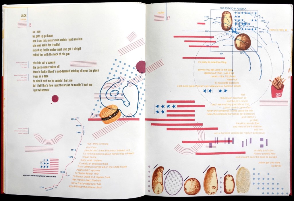
If the satiric target of French Fries isn’t clear, consider the A assembled on the double-page spread by the text’s layout and the stars-bars-and-stripes.
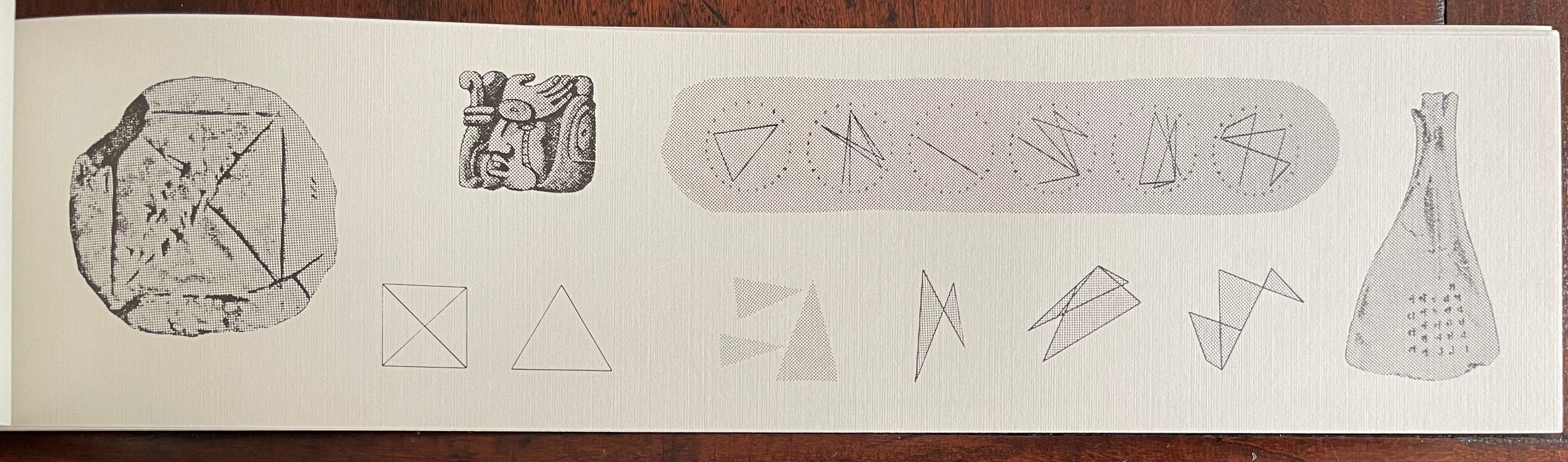
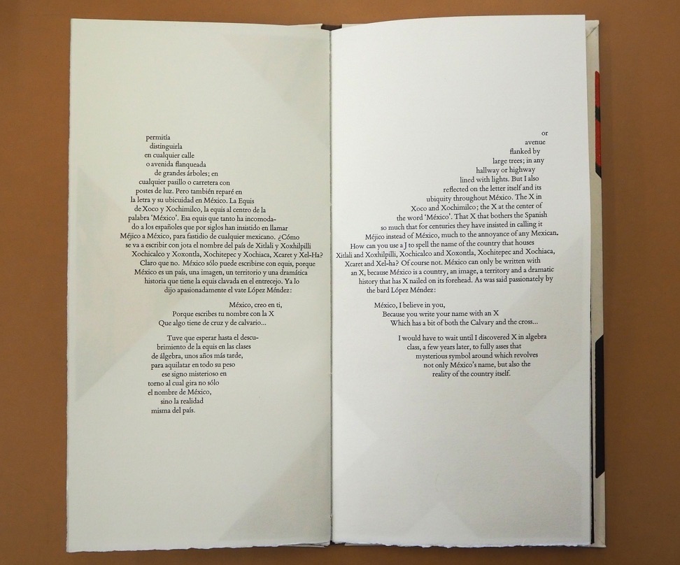
Cidor’s abecedary is populated with words that are the artist’s answers to the question “what is America?”. Each letter of the Hebrew alphabet appears on a recto page, and a word beginning with that letter is worked into an abstract image on the facing verso page. At a further level of abstraction, all the letters are formed with Cidor’s stylized Hebrew font Octavk’tav.
From right to left, the Octavk’tav version letter ayin (ע) is for shem’at ha’omes (שְׁעַת הַעוֹמֶס) or “rush hour”. The words’ letters sprawl in brown across an intersection gridlocked with ayins.
As Lehrer does in French Fries, Cidor uses the arbitrary abstraction of letters and page order along with not-so-arbitrary typographical layout and words in translation (for example, Resh for the Hebrew for Rocknroll and Ronald Reagan, Tsade for Extra large Cheezburger with fries and a soda) to capture his satirical target: the big Aleph (New York and America).
Above or beside each work displayed, a vertical time scale showing the exhibition’s span (1964-2024) was repeated on the walls. A red pin designated the nearby item’s year of publication, and a red thread ran from pin to pin around the room. Along with the spiral of tables displaying past exhibition catalogues, this fluctuating red line evoked Vico’s Spiral for visitors.

“Vico’s Spiral” at the Center for Book Arts, New York. Photo: Daniel Wang.
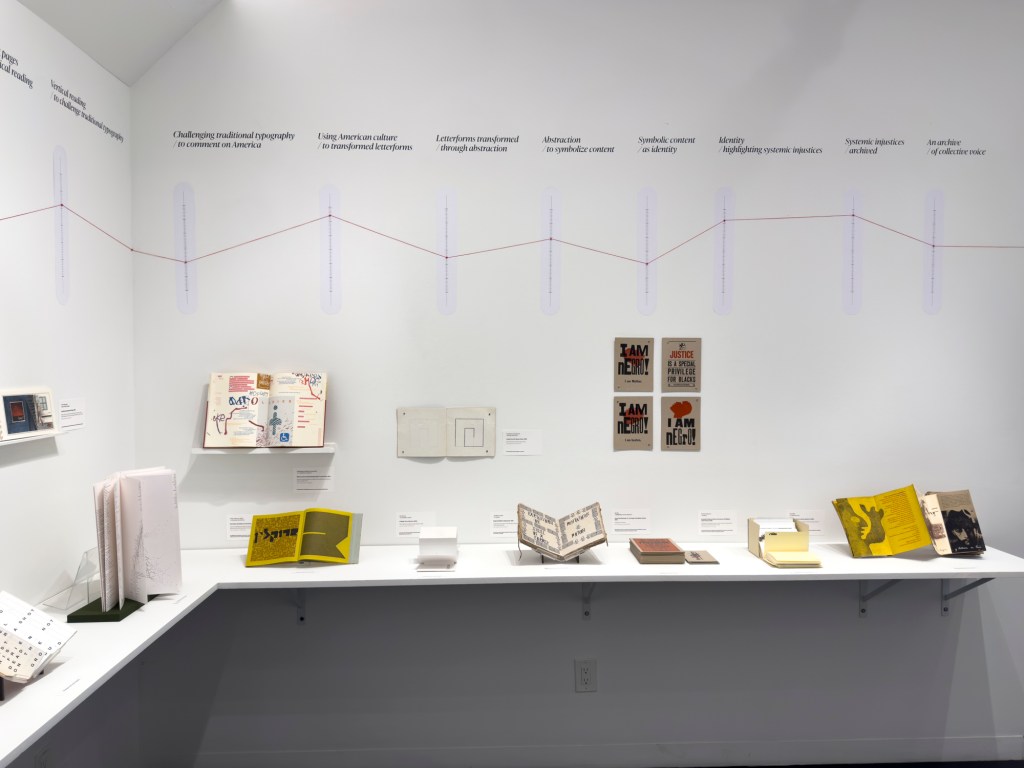
“Vico’s Spiral” at the Center for Book Arts, New York. Photo: Daniel Wang.
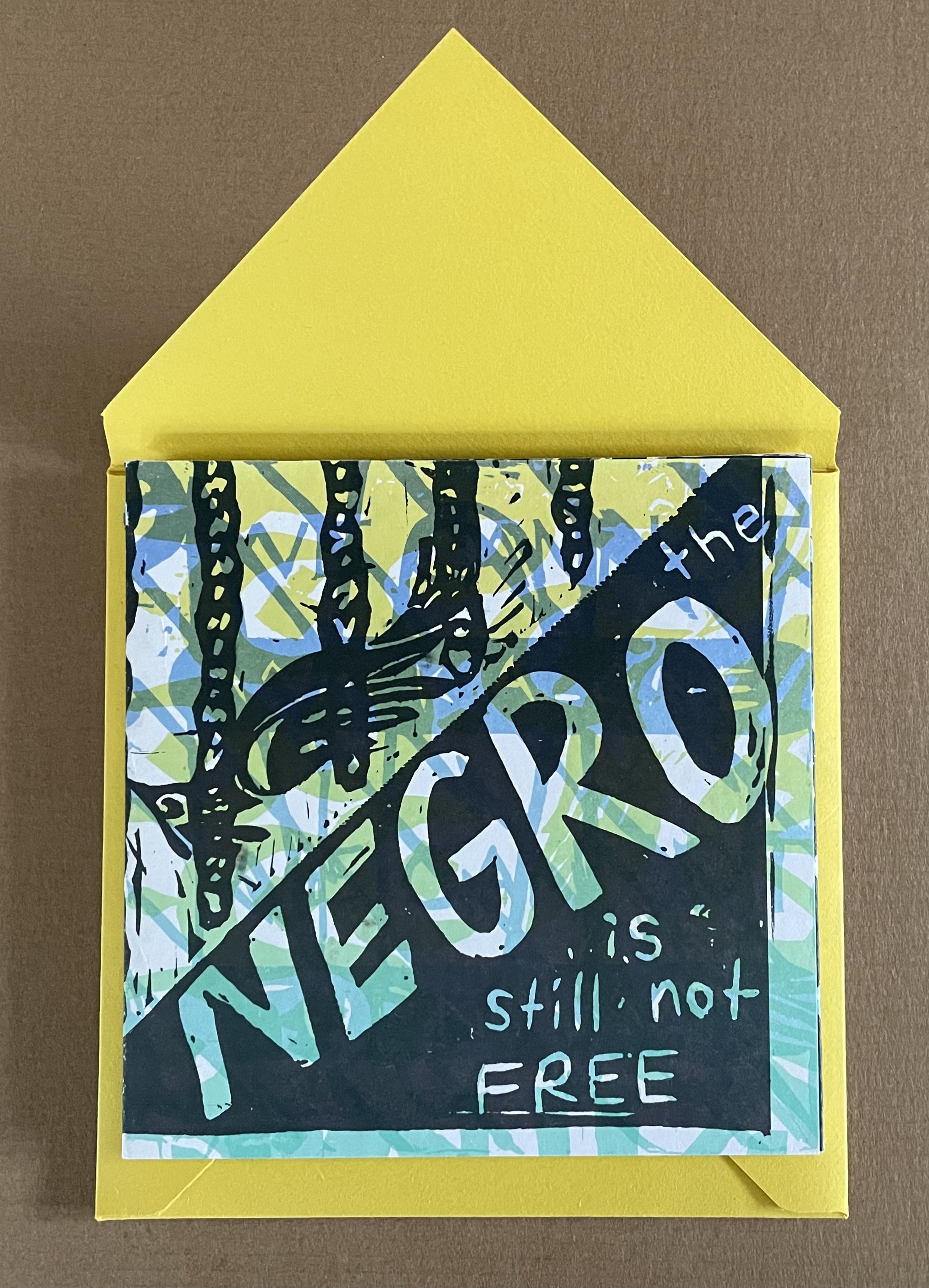
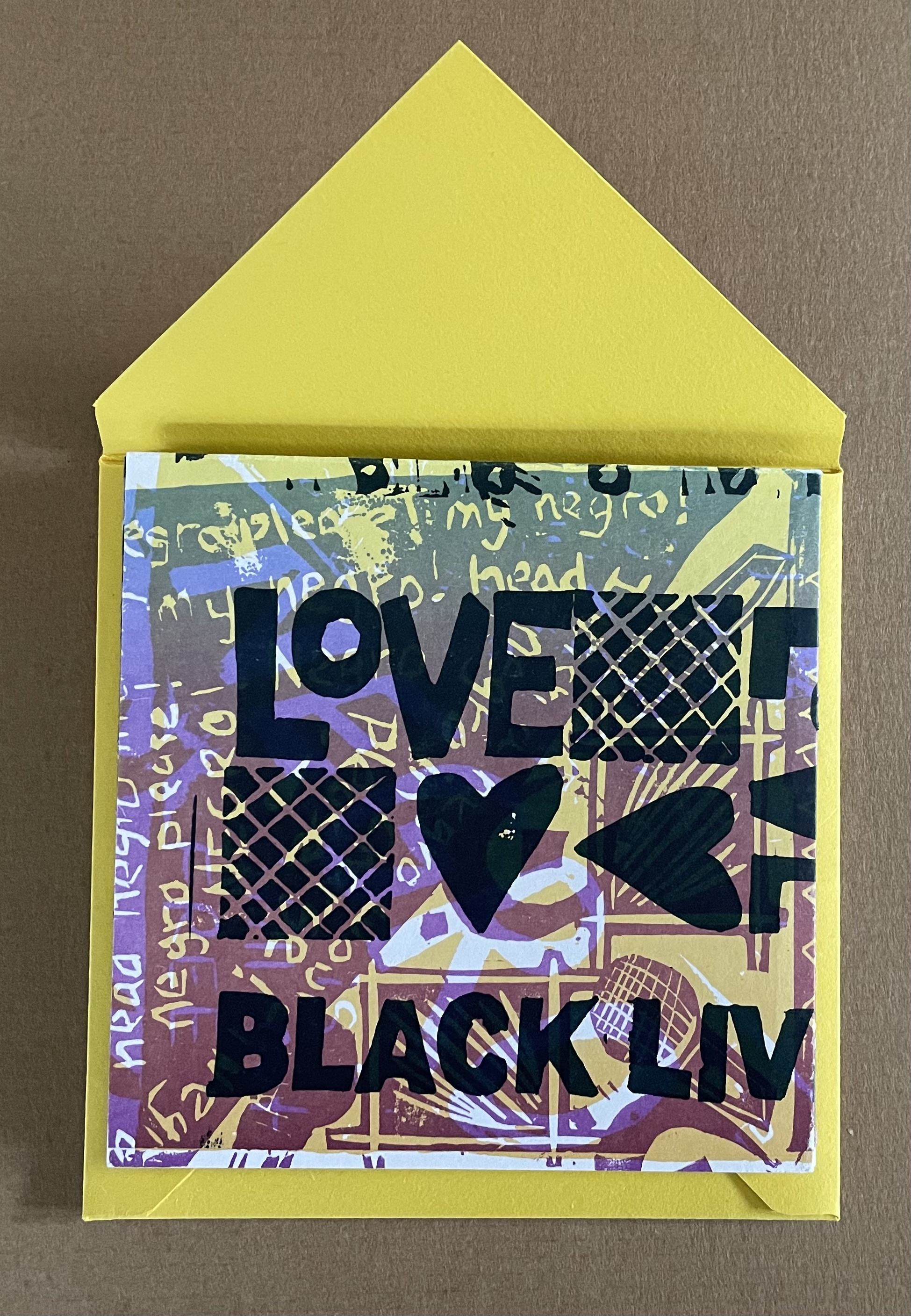
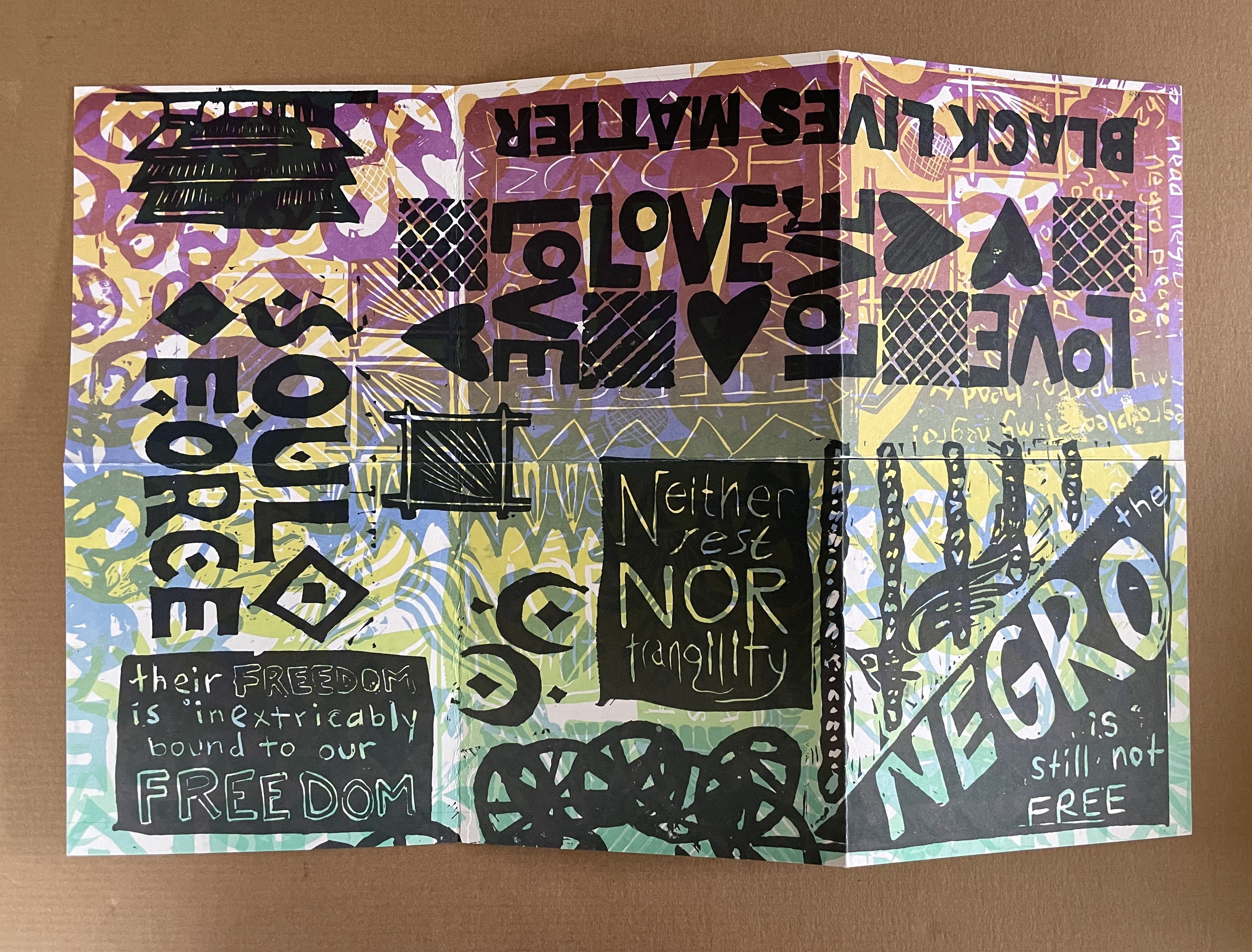
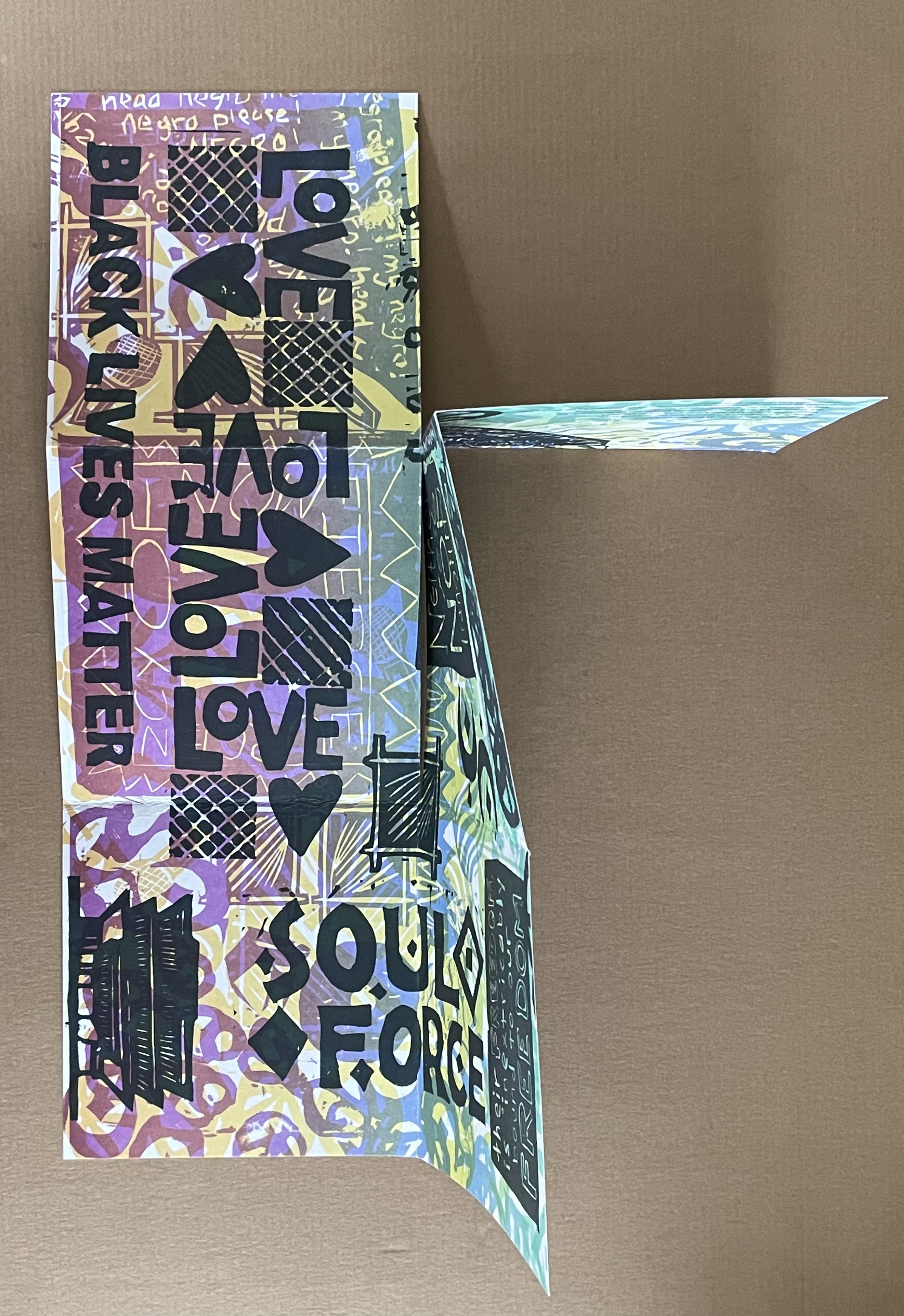
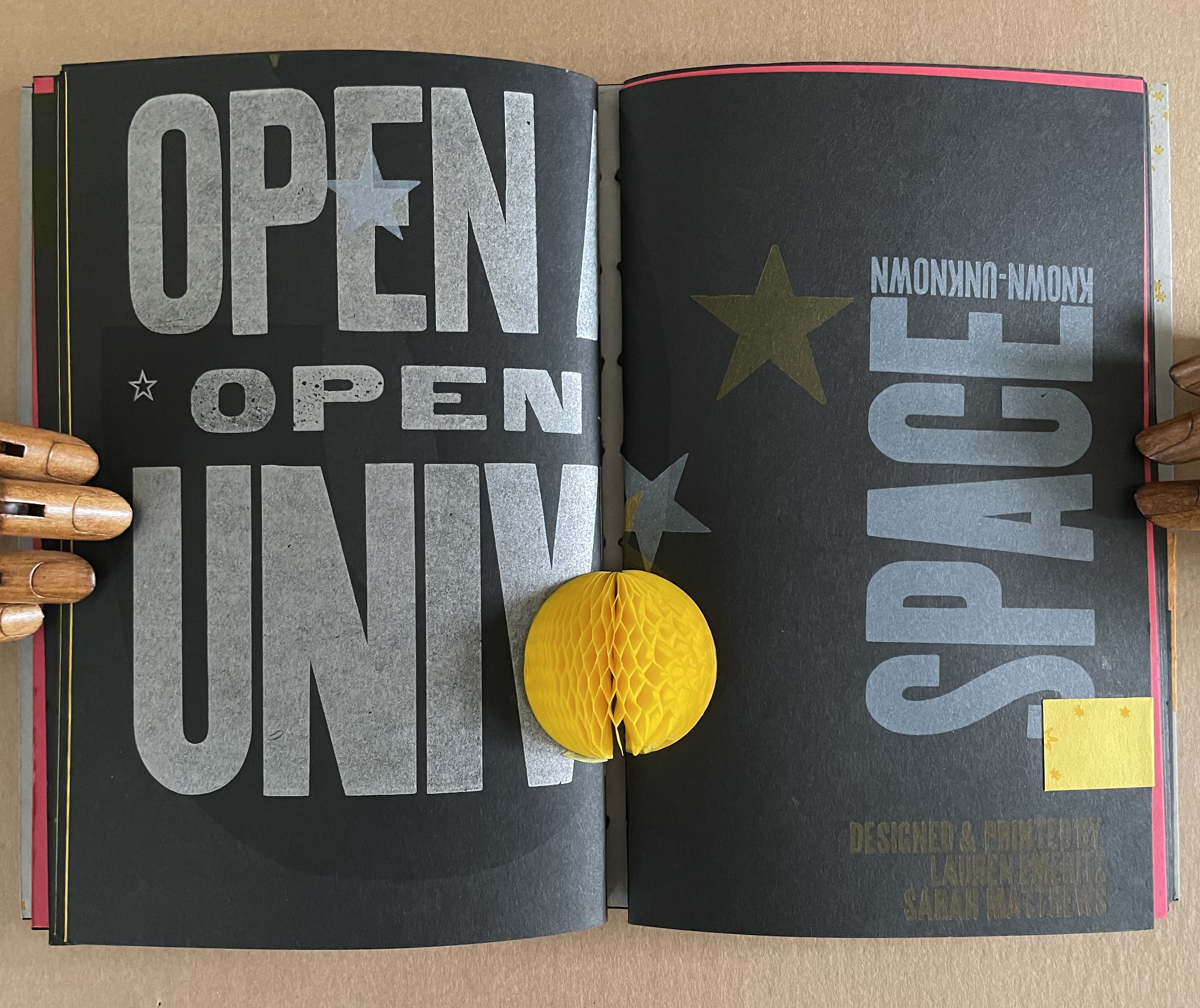
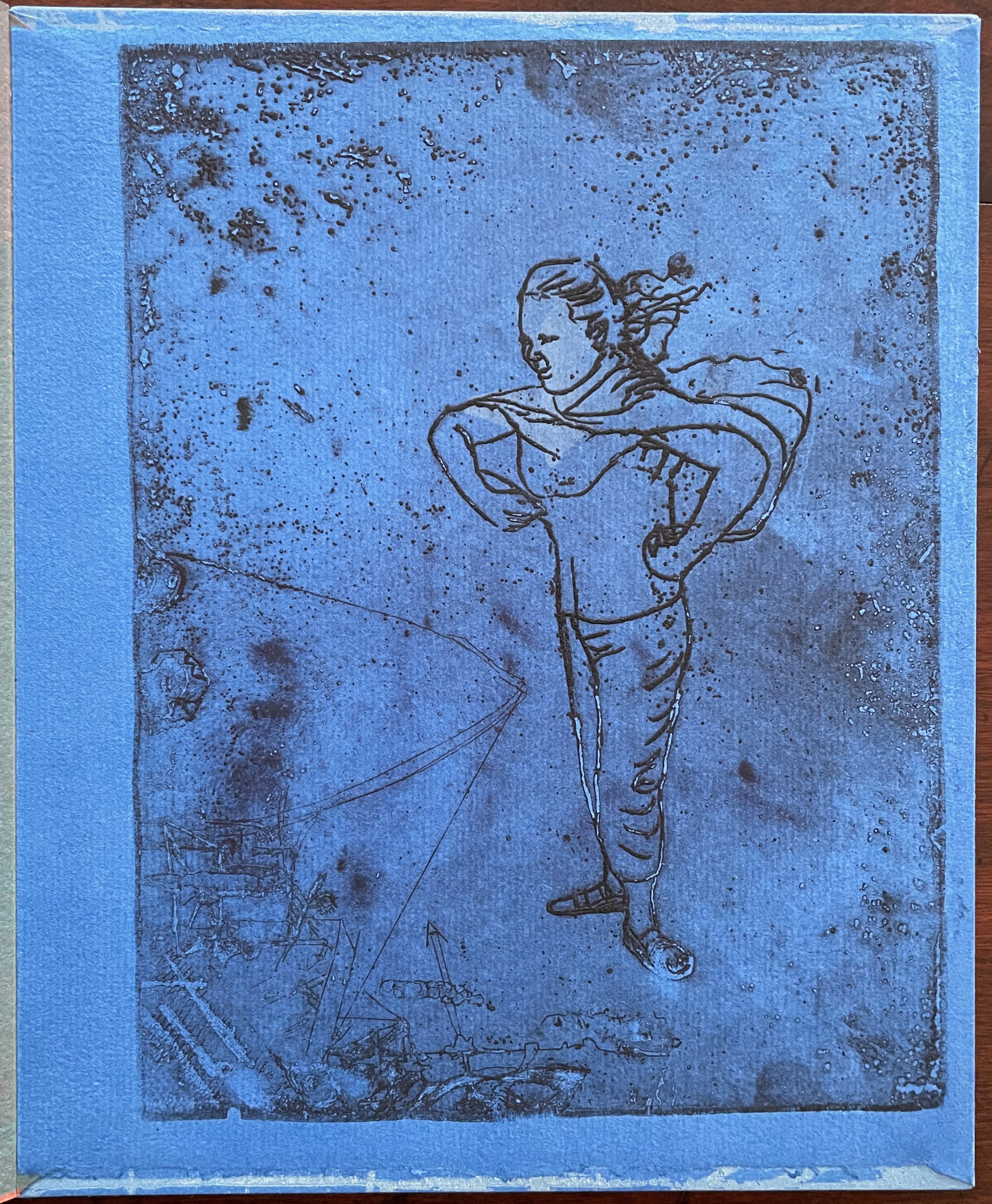
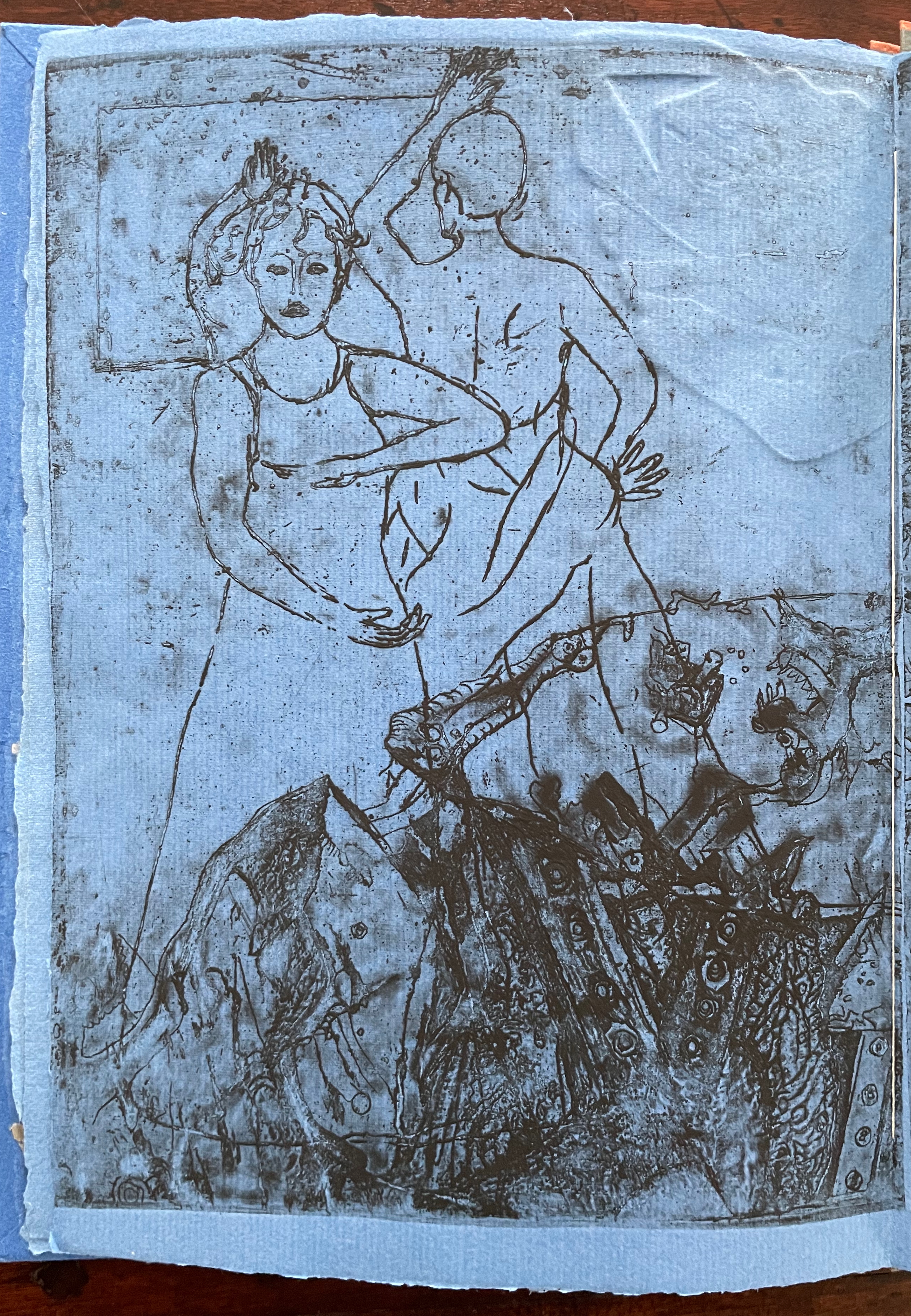
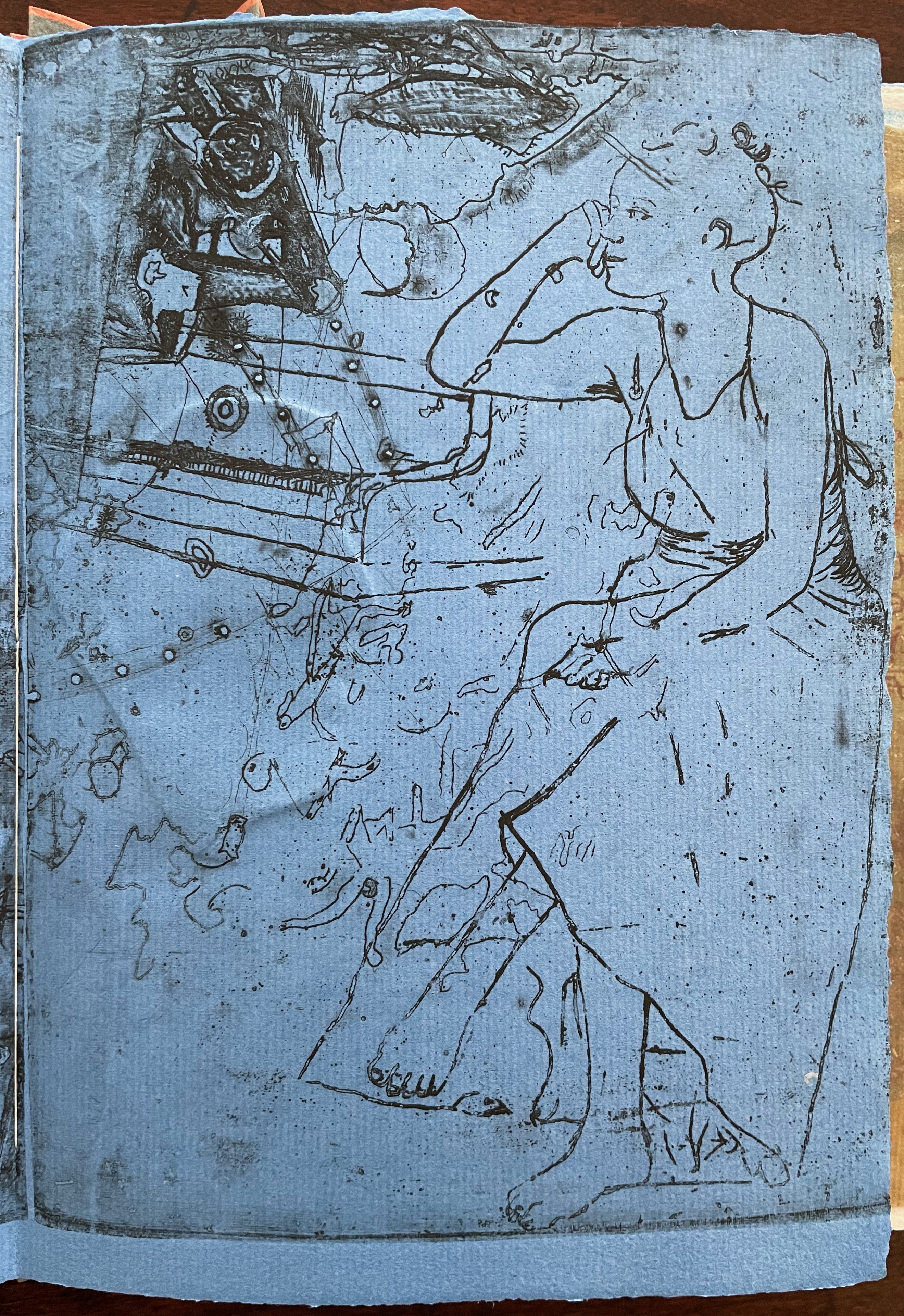
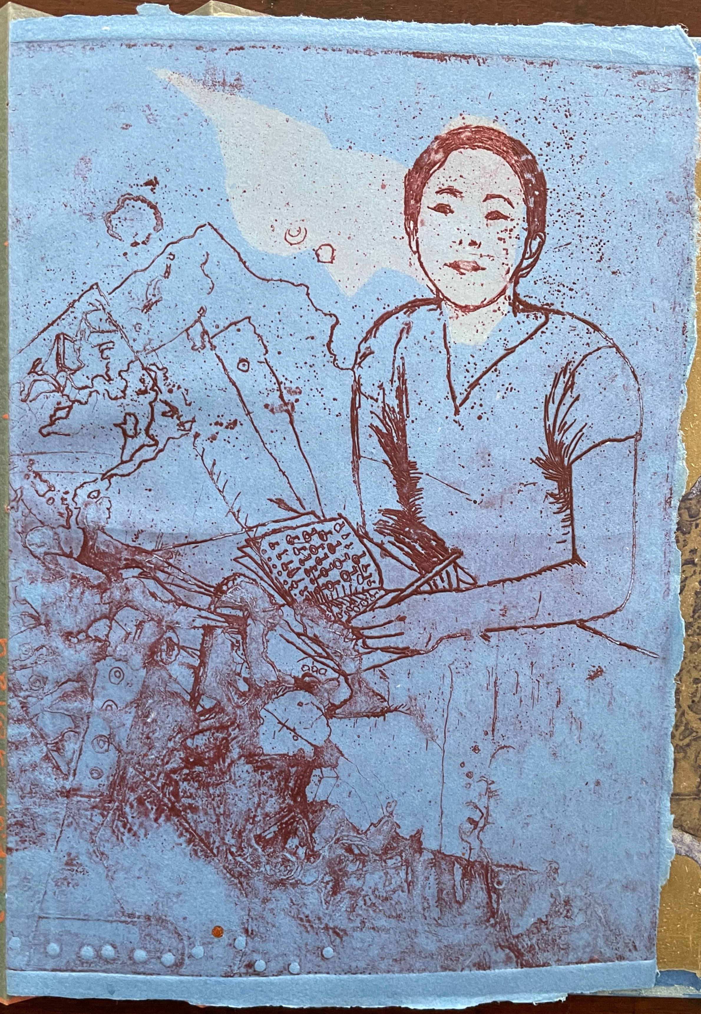
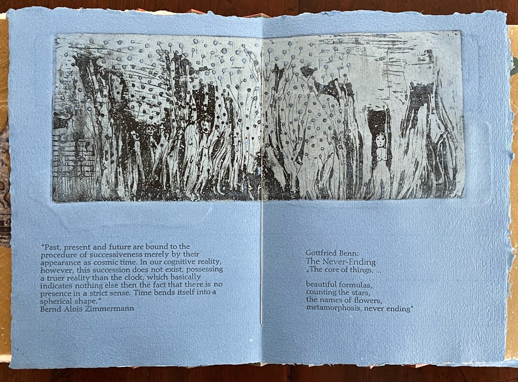
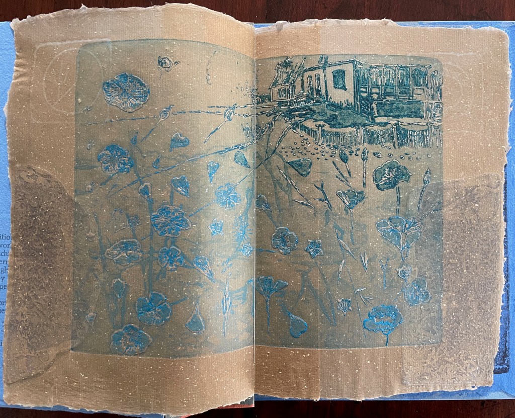
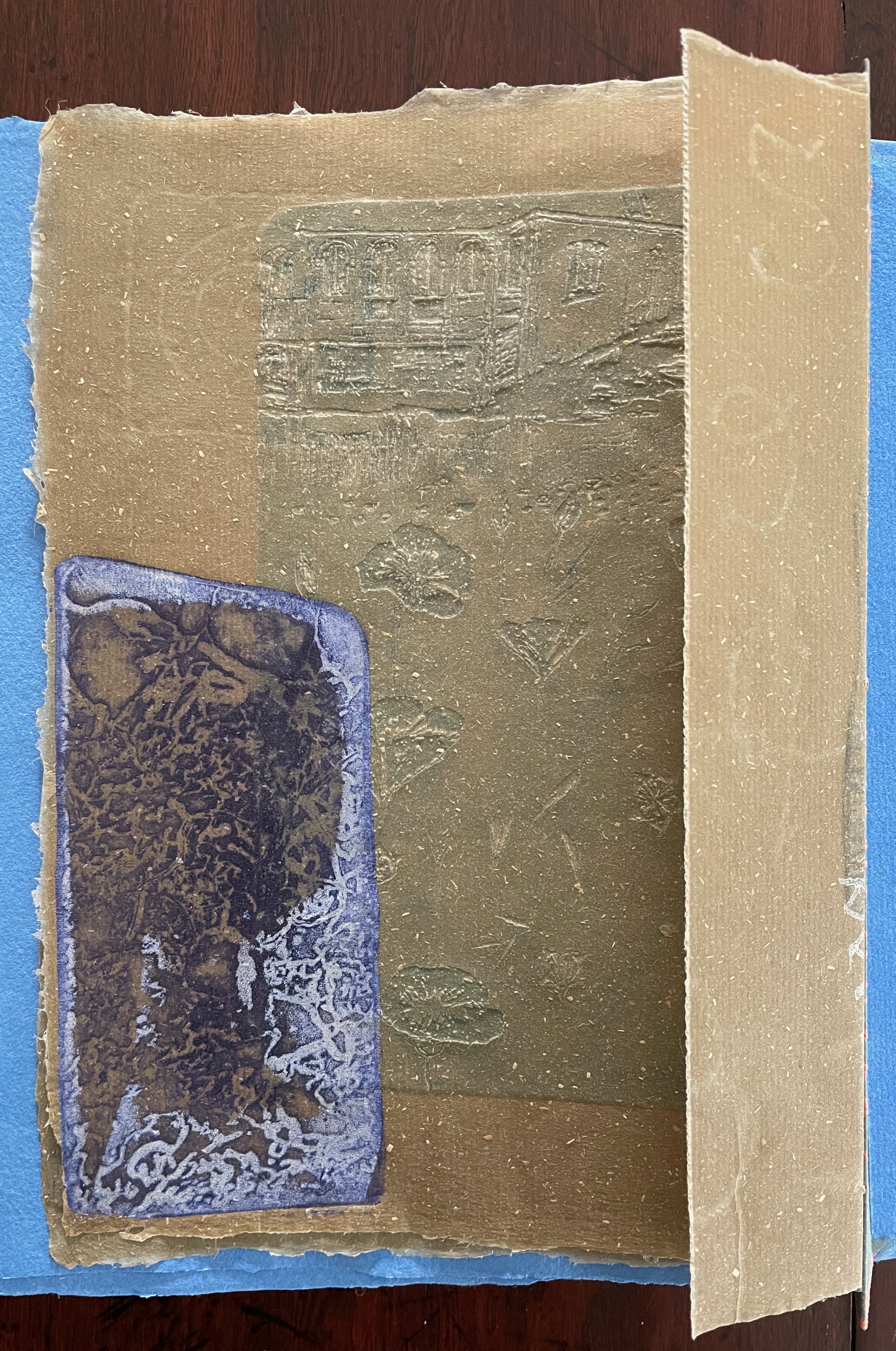
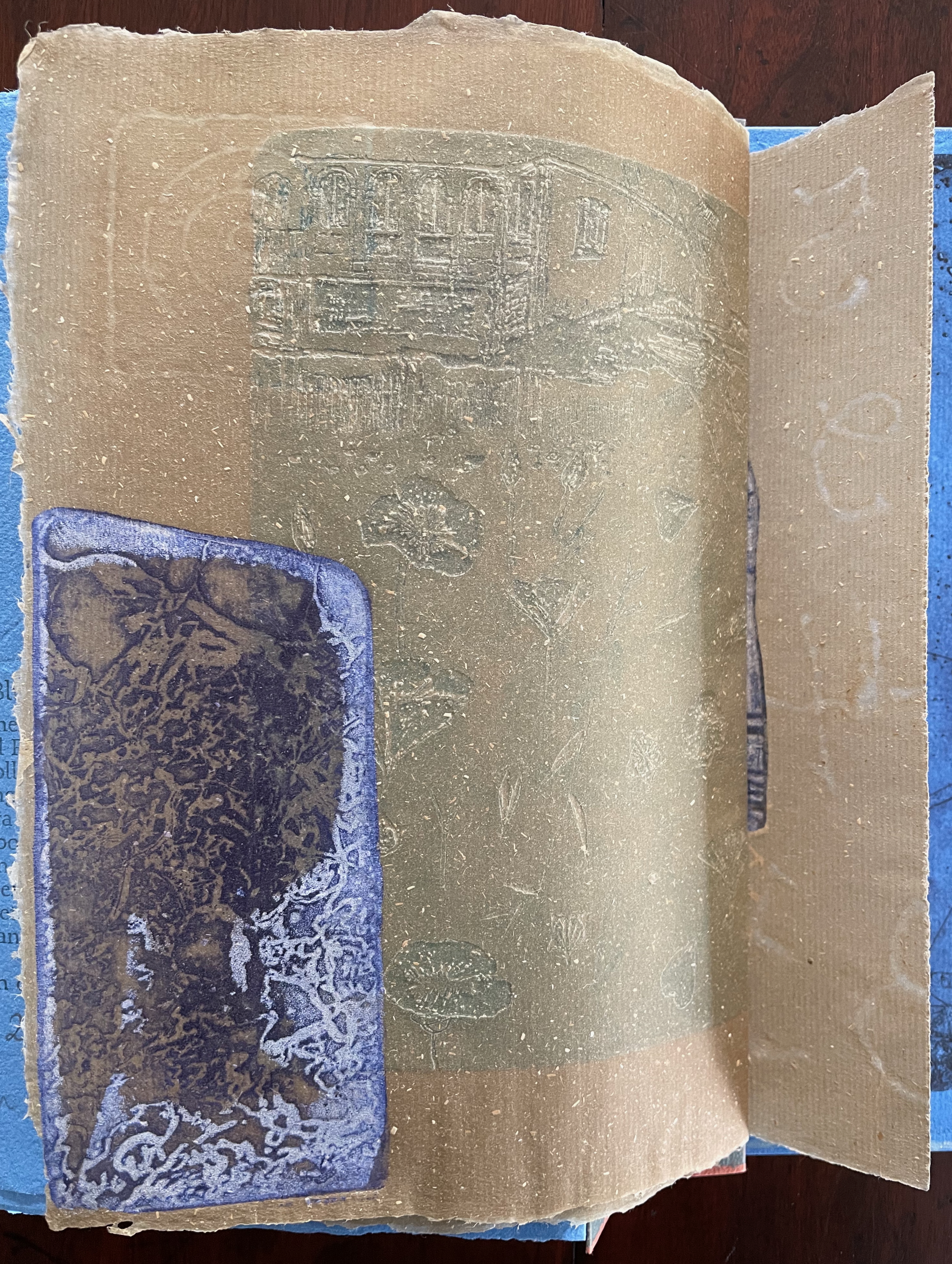
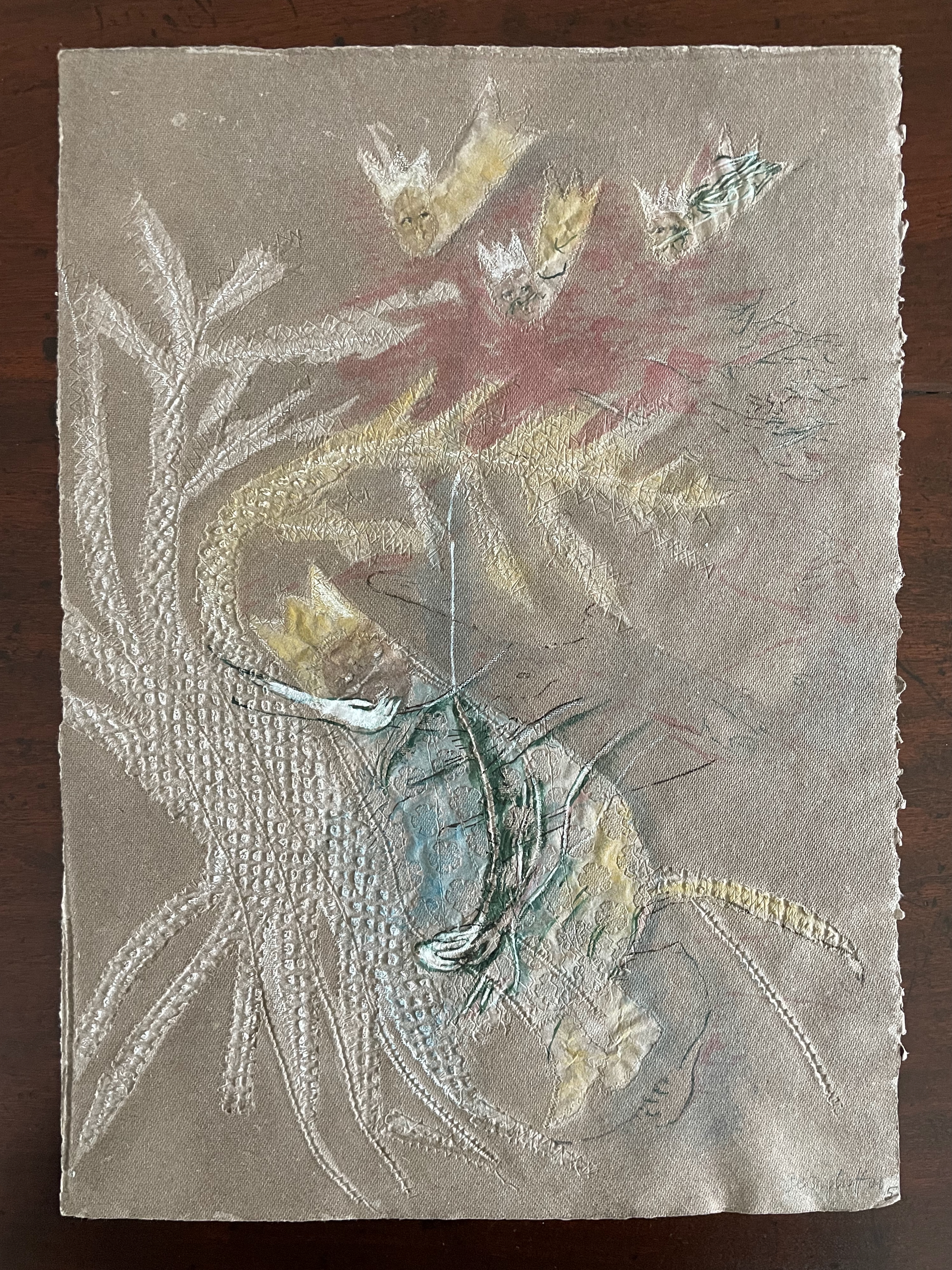
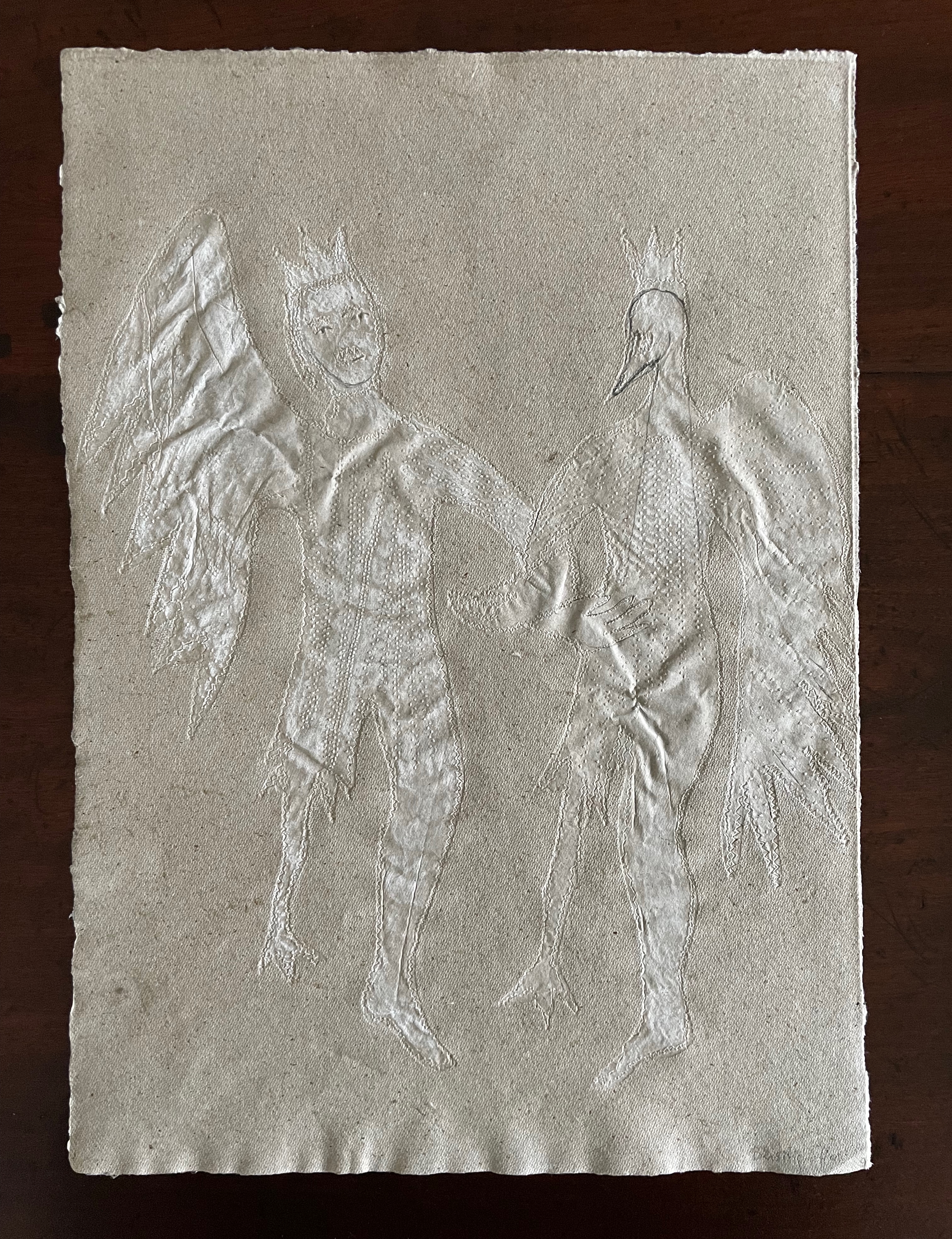
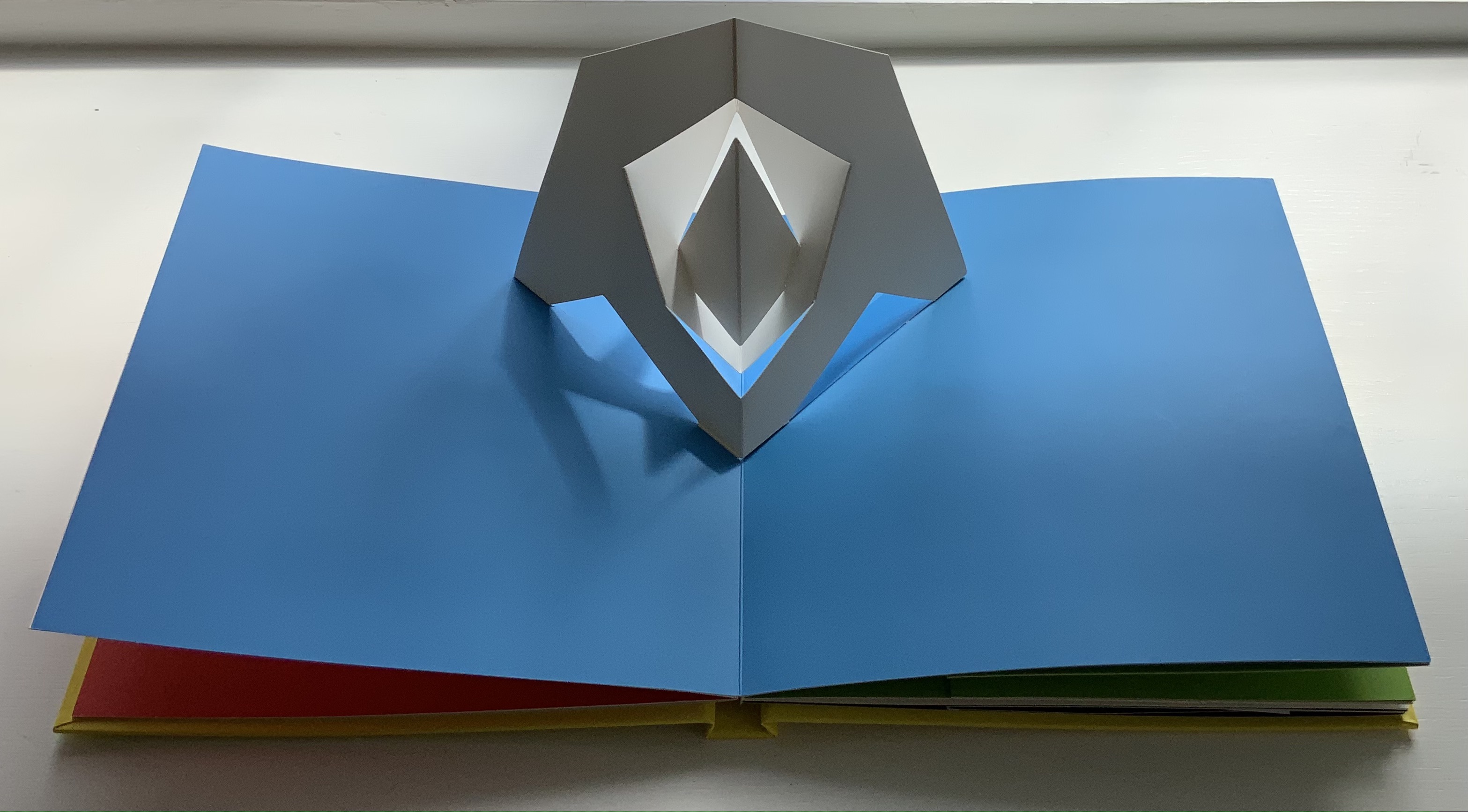
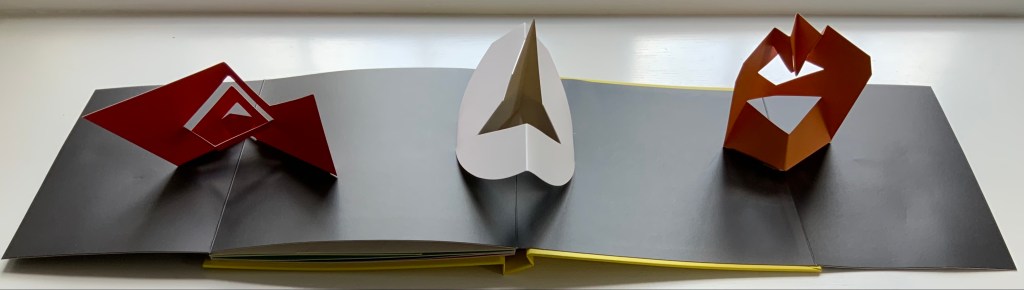
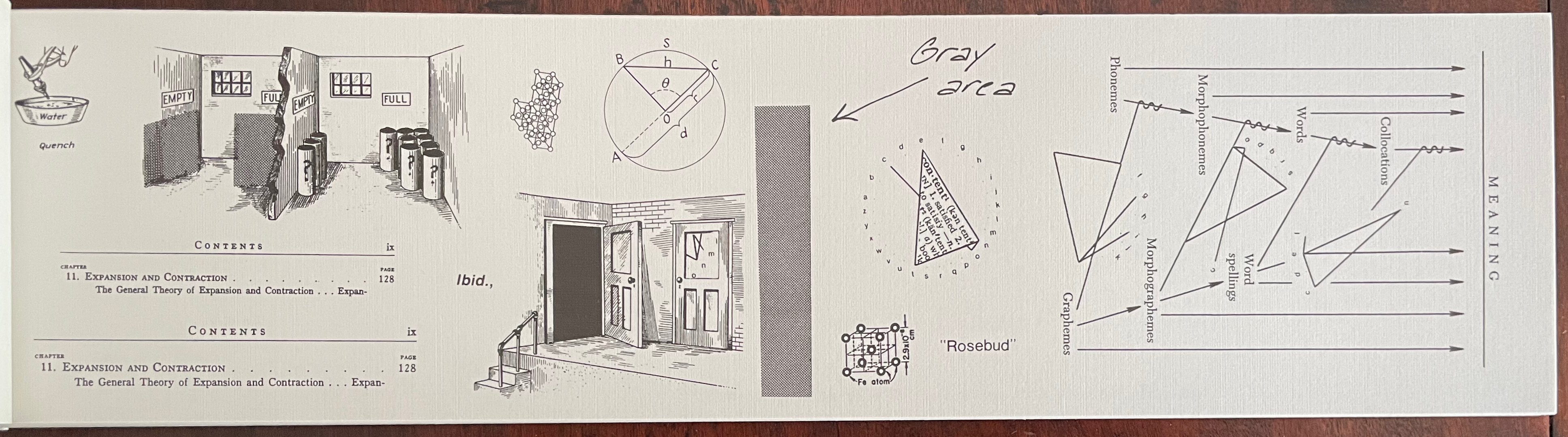
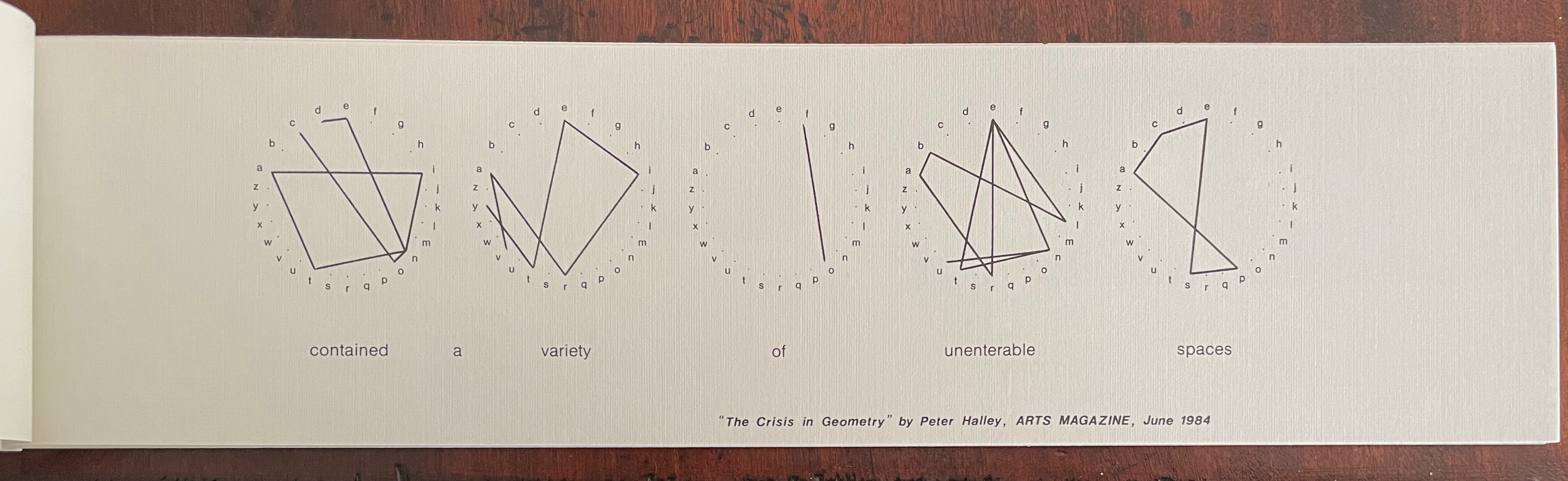
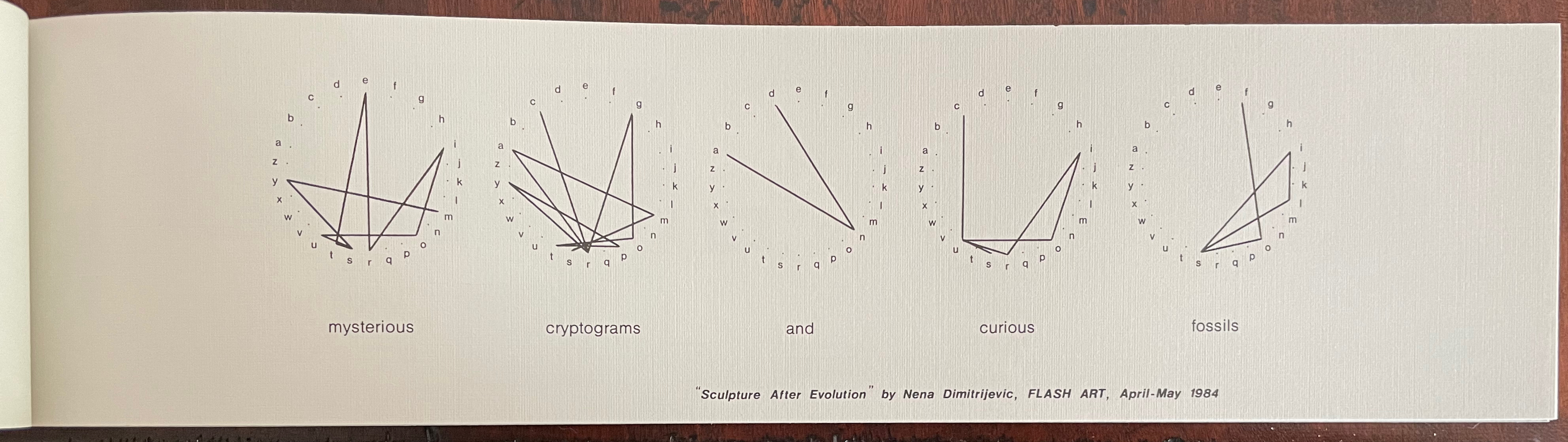
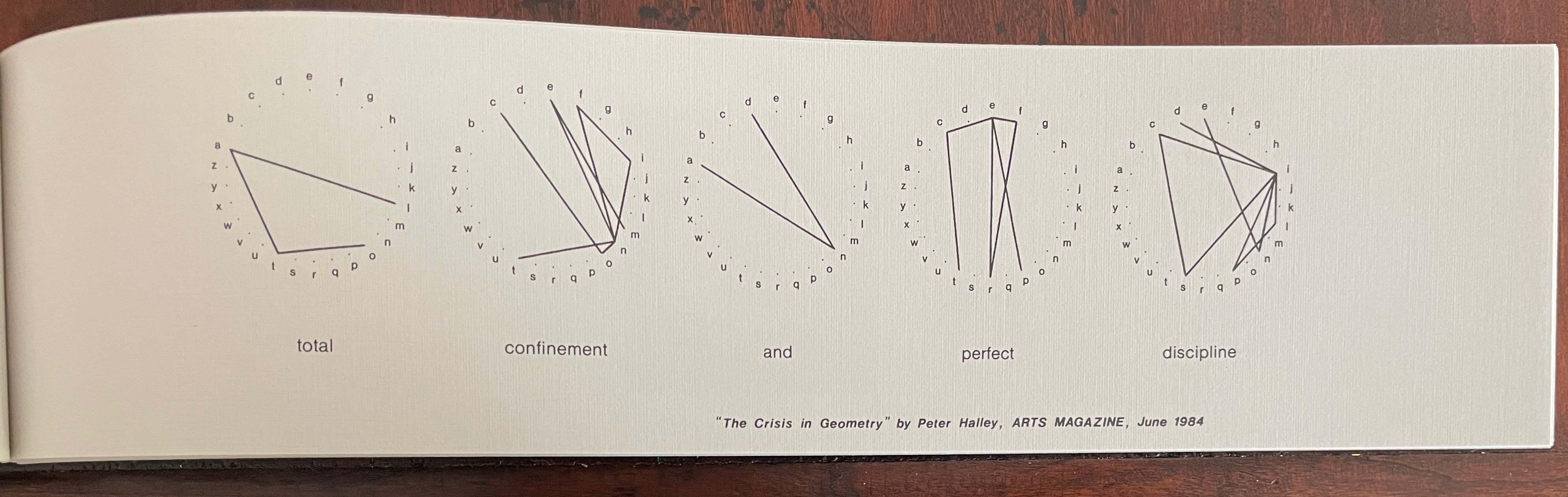
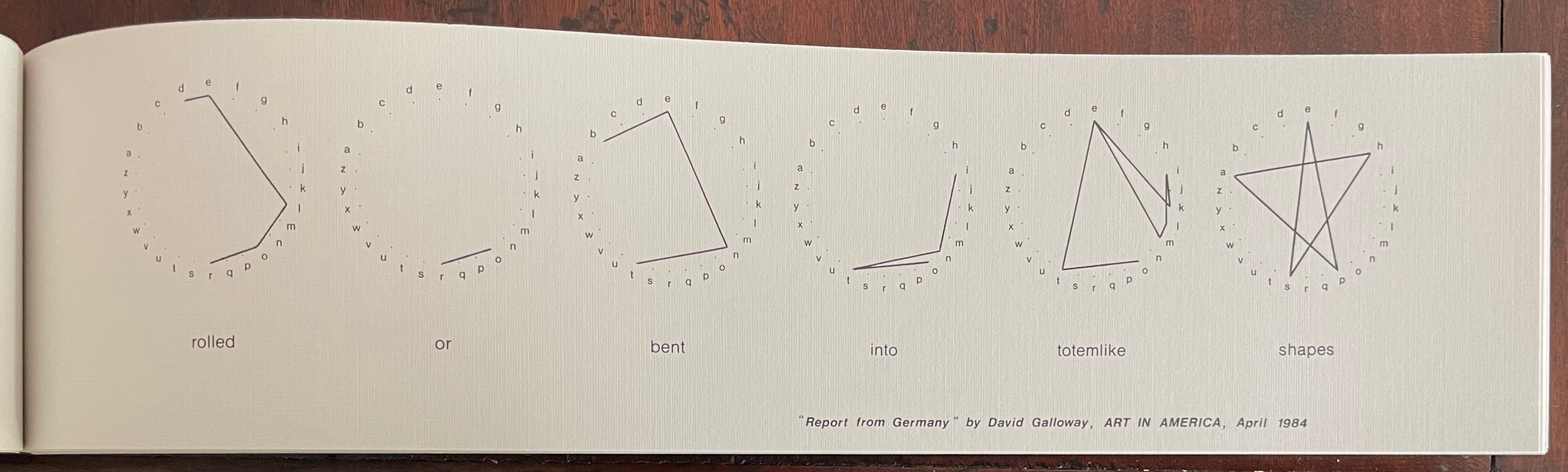
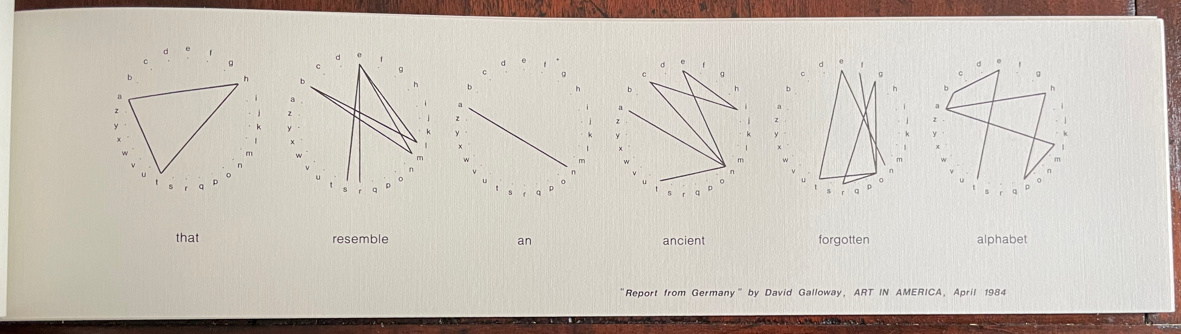
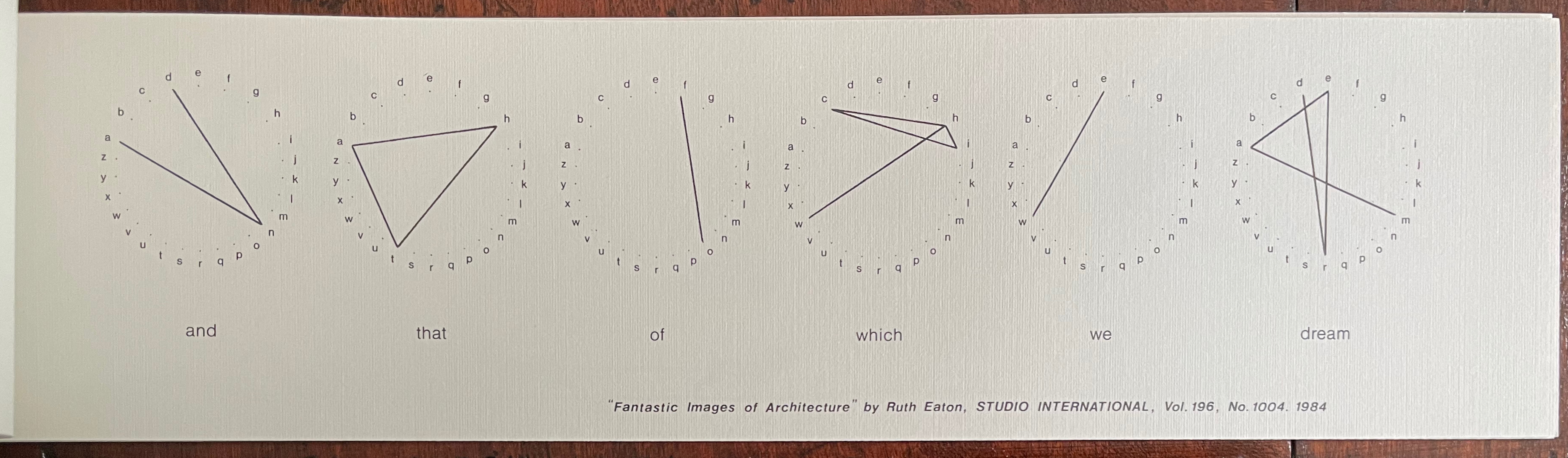
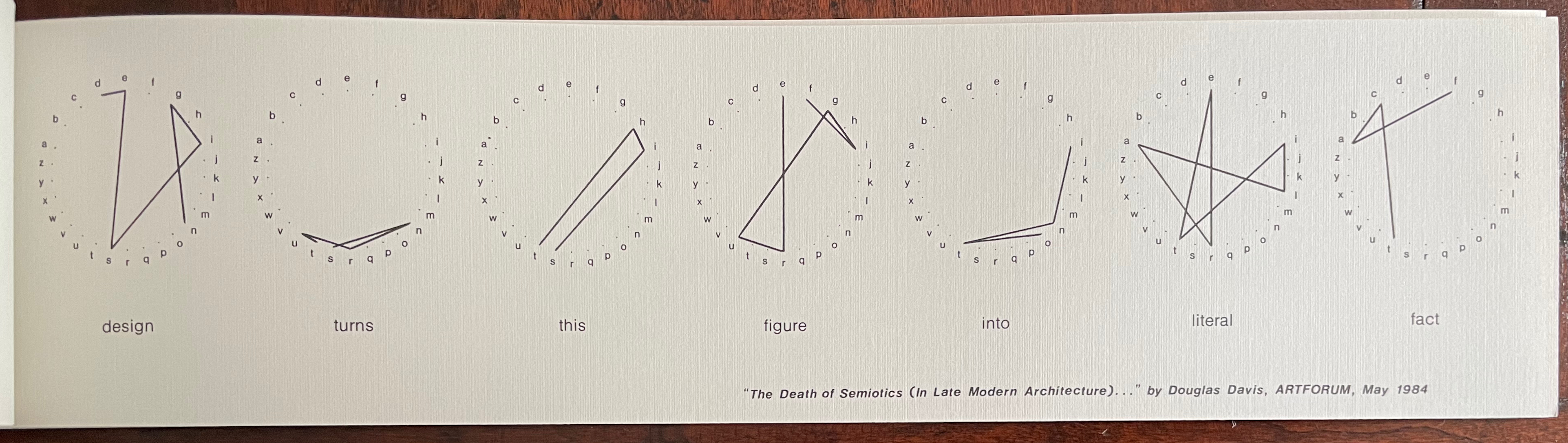
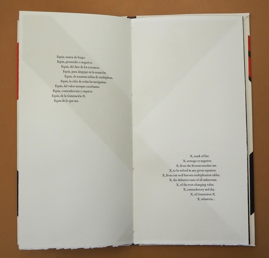
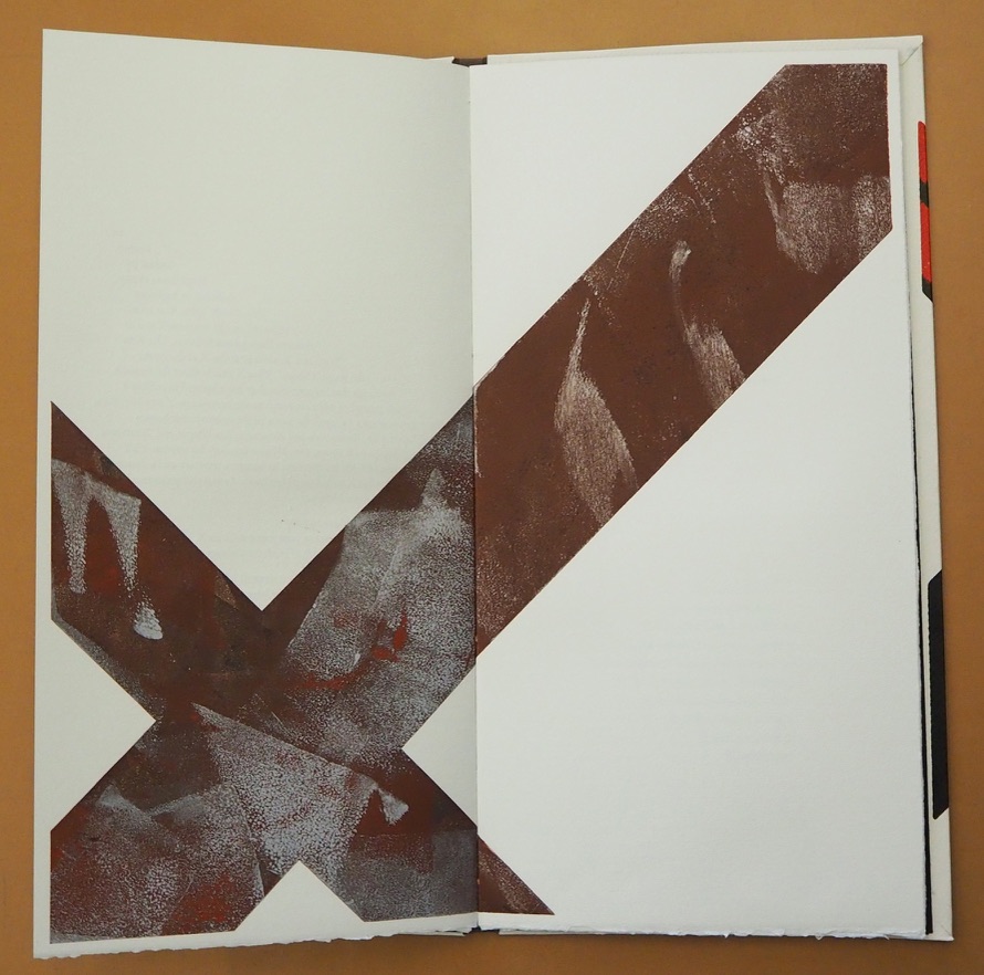
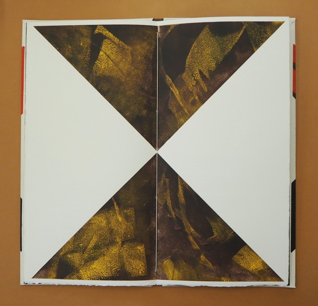
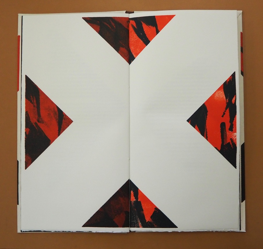
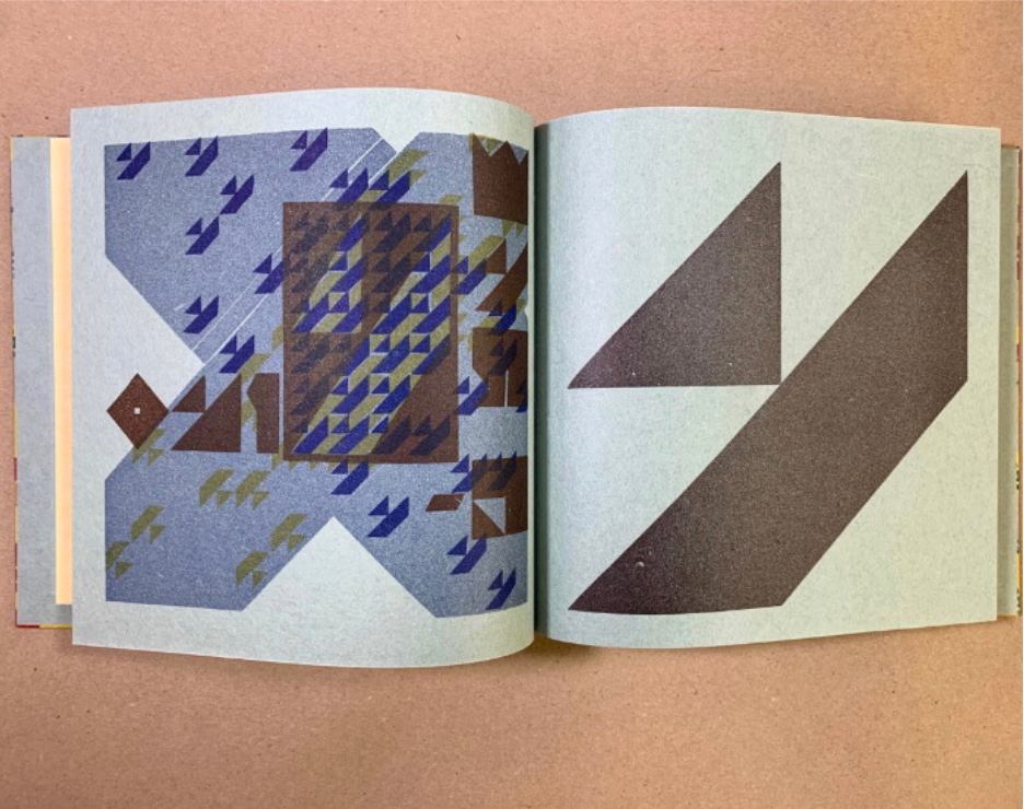
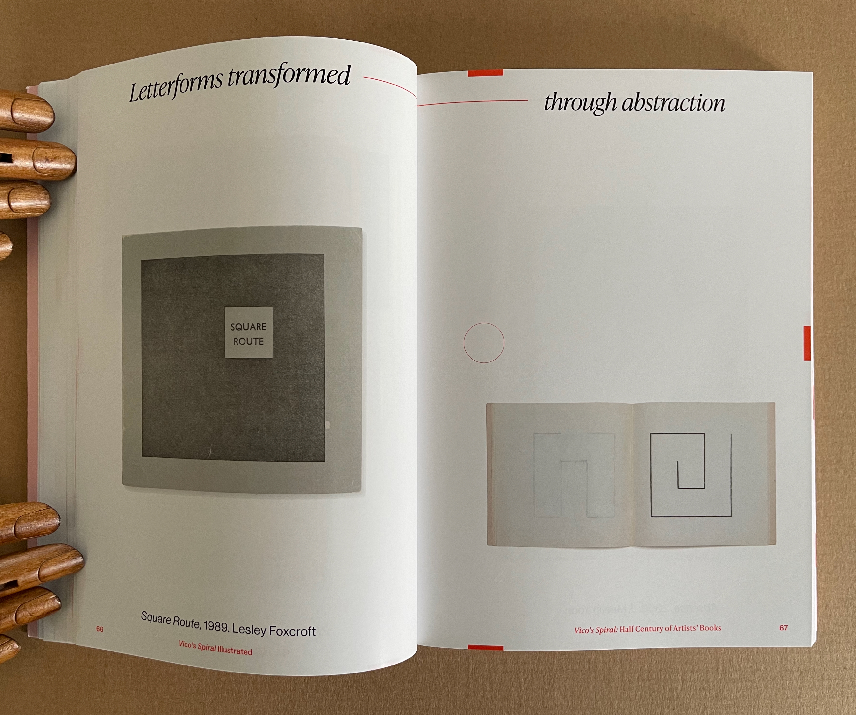
The exhibition’s catalogue emulates some of this design across pages 17-120, and what can be seen more clearly is how the curators daisy-chain their pairs with the headings used on the exhibition walls. Below are the two pairs that follow Lehrer, whose heading is “Challenging typography … to comment on America”, and Cid0r, whose heading is “Using American culture … to transform letterforms”. Foxcroft’s Square Route picks up the chain …
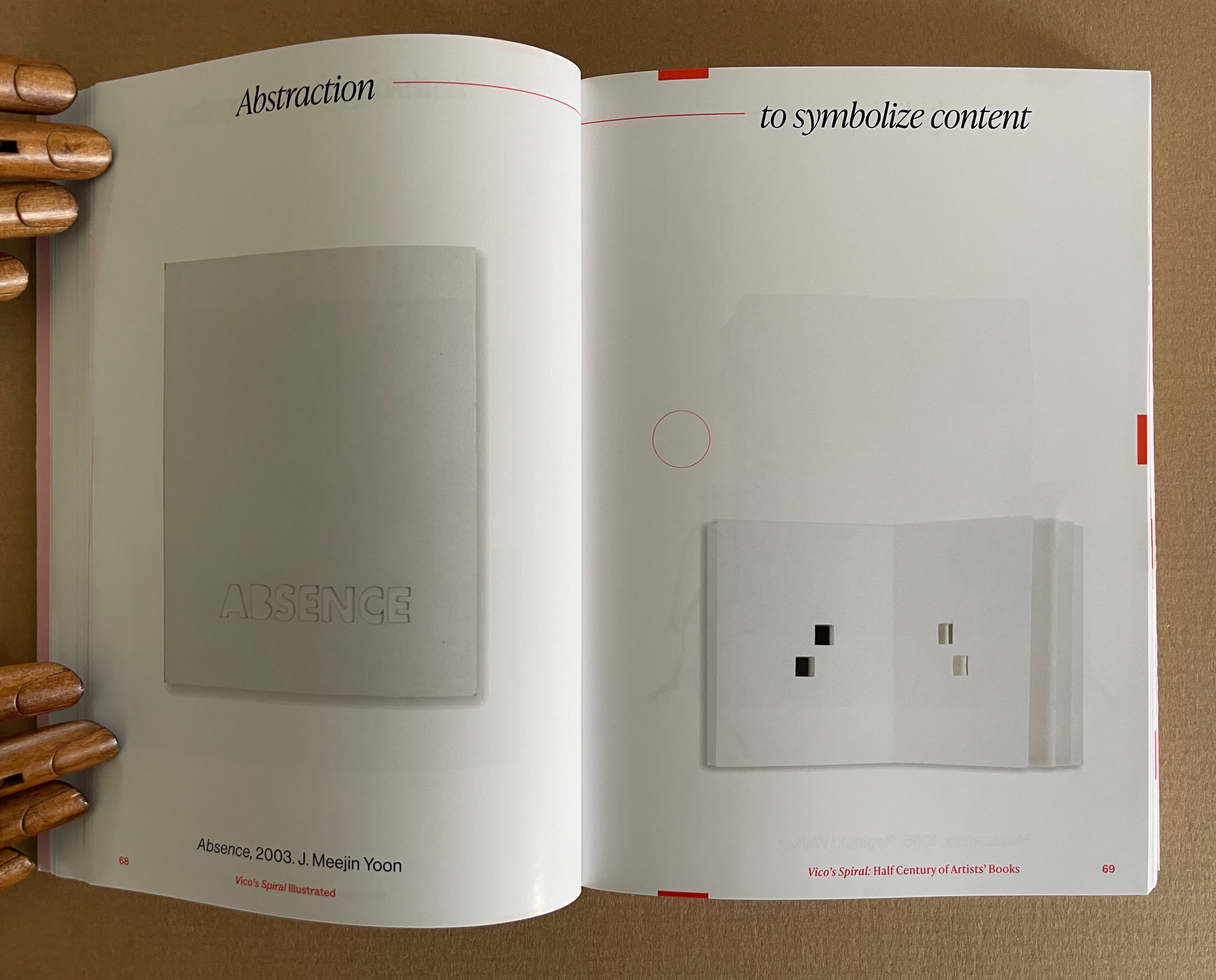
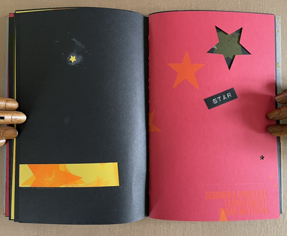
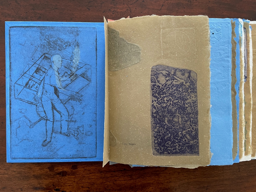
Pages 66-69. Photos: Books On Books Collection.
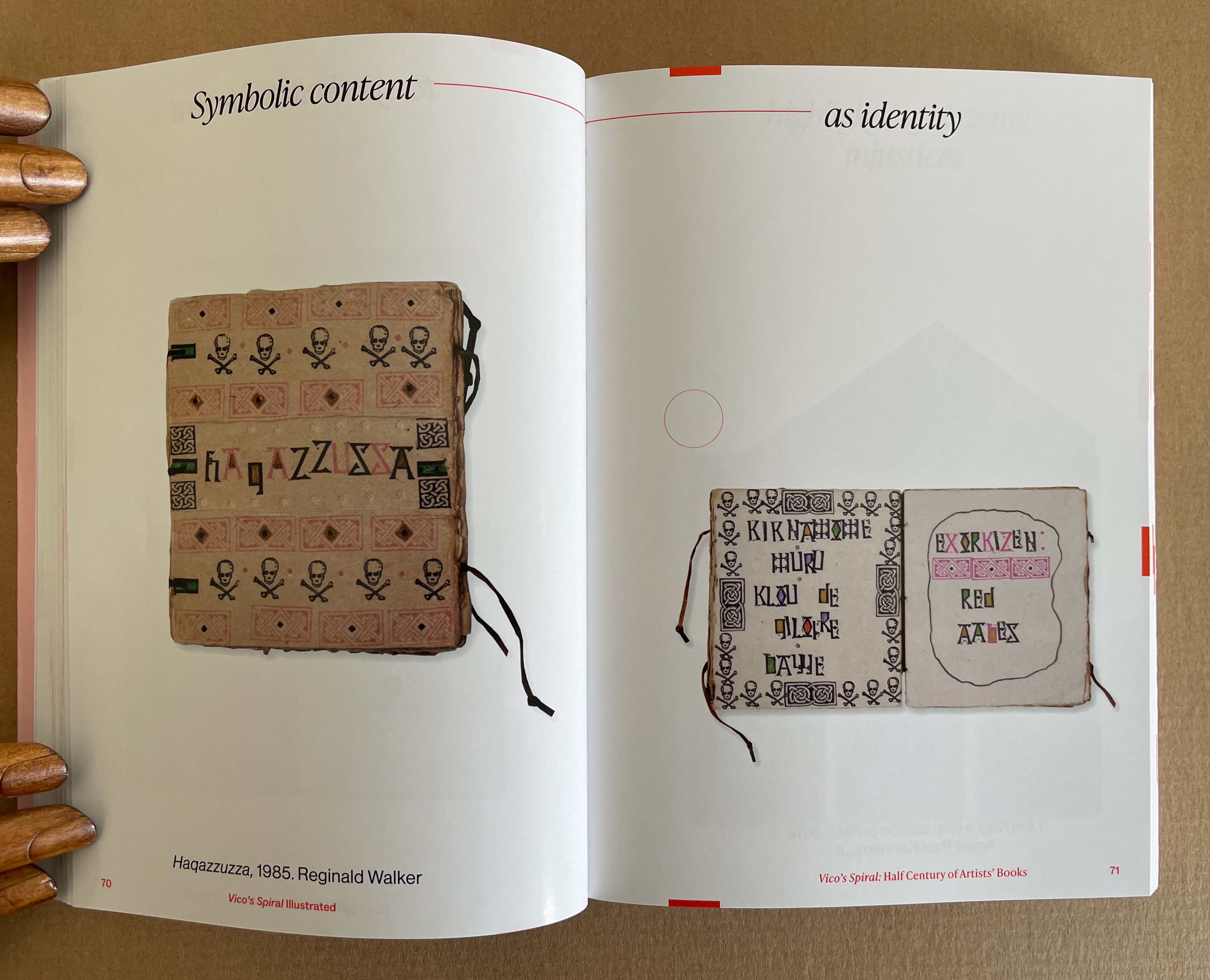
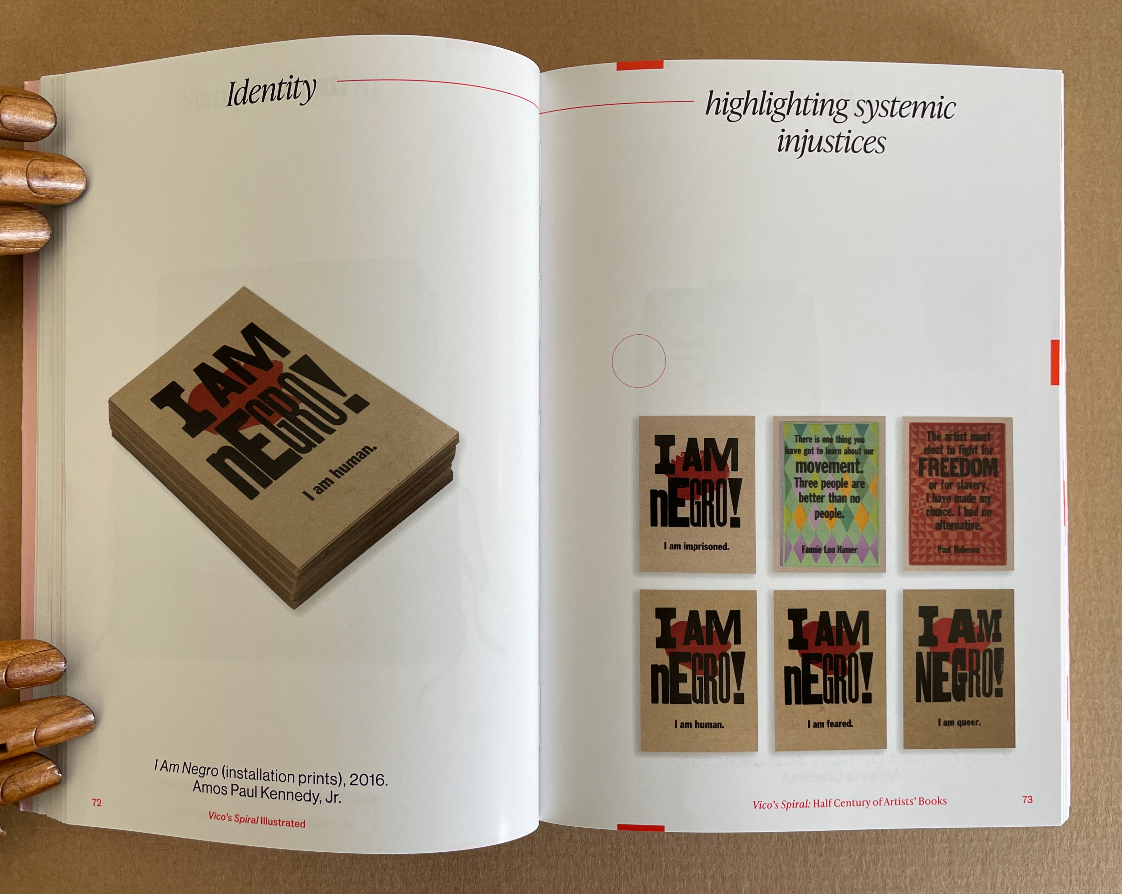
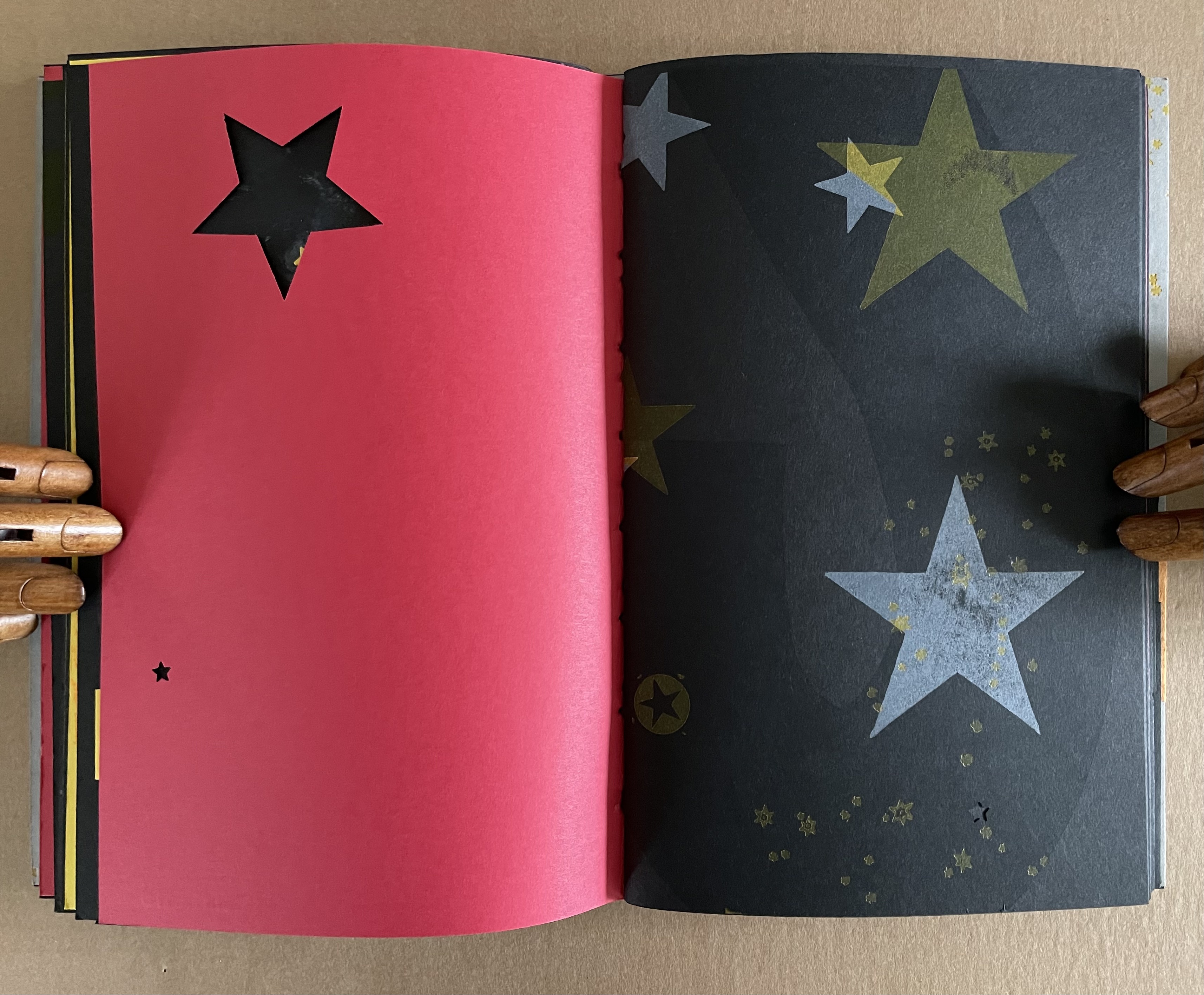
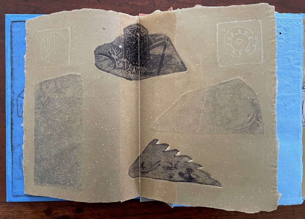
Pages 70-73. Photos: Books On Books Collection.
Kinohi Nishikawa’s essay “Strange Loops” brings a related metaphor to the party. He begins with another anniversary: the 2oth anniversary edition of Douglas R. Hofstadter’s Gödel, Escher, Bach: The Eternal Golden Braid (1979/1999).
At the heart of GEB, as devoted readers call it, is an exploration of how selfhood emerges from repeating patterns of cognition that mirror repeating patterns of the natural world, only for the cognitive patterns to turn inward and mirror themselves. GEB’s thesis is derived from Austrian mathematician Kurt Gödel’s incompleteness theorem, which contends, “All consistent axiomatic formulations of number theory include undecidable propositions.” Gödel’s theorem defines the constitutive externality of any set and, in so doing, identifies the minimal gap within a system for self-awareness to emerge. Crucially, Hofstadter does not limit his account of selfhood to the operation of cognitive processes. The metaphor of strange loops suggests how patterns that fold on themselves are perceived, felt, and, indeed, experienced by an embodied being. (p. 175)
Nishikawa’s immediate task in Vico’s Spiral is to survey the CBA’s previous half century of exhibitions, and he uses the strange loops metaphor to understand the CBA through the “set” of its exhibitions. All well and good, it is a brilliantly written and insightful essay. But if only he had also been asked to apply the metaphor to the set of artists’ books in the CBA’s archive or the set selected by Silberberg and Naggar!
In The Century of Artists’ Books, Johanna Drucker highlighted the self-interrogatory nature of the artist’s book as its defining characteristic. The application of these metaphors of Vico’s Spiral and strange loops to the history of artists’ books adds a new sense to that. The self-interrogatory nature of the artist’s book is a pattern recurring similarly but differently across time and space in those works of art created by artists who play with the book whether as material object as a whole or in its parts, as vehicle, as site of performance, as a tool-made and tool-making technology, or as concept. As each of those aspects yield fresh artists’ books with differences, we have new opportunities to perceive, feel, and experience an artwork’s pursuit of its self, the artists’ pursuit of their selves and our pursuit of our selves.
Nishikawa comes tantalizingly close to applying the strange loops metaphor to the domain of artists’ books when he writes, “Book arts is about discovering the self at the edge (fold, seam, spine) of insight and creation” and, when he writes, “… the essential question of selfhood isn’t What? or Why? but How? How do these patterns work, how do I know myself better through them?”
Indeed, “how?” is the question to be brought to each artist’s book. How do I encounter this artwork? How is it manifesting its patterns? And then to bring ourselves full circle back to Vico’s Spiral, How are those patterns manifest in other works in other times and other places?
Nishikawa’s approach to the CBA’s catalogues also offers a baton that we can hope others will carry forward. The CBA’s exhibitions provided not only a way into understanding the CBA itself but one into researching the world of artists’ books. Aware of this opportunity, Silberberg concludes the volume with a listing of artists’ books exhibitions from around the world. Who will grasp this baton next in the race along Vico’s Spiral?
Further Reading
“Johanna Drucker“. 28 May 2024. Books On Books Collection.
“Warren Lehrer“. 28 May 2024. Books On Books Collection.
“J. Meejin Yoon“. 12 January 2017. Books On Books Collection.