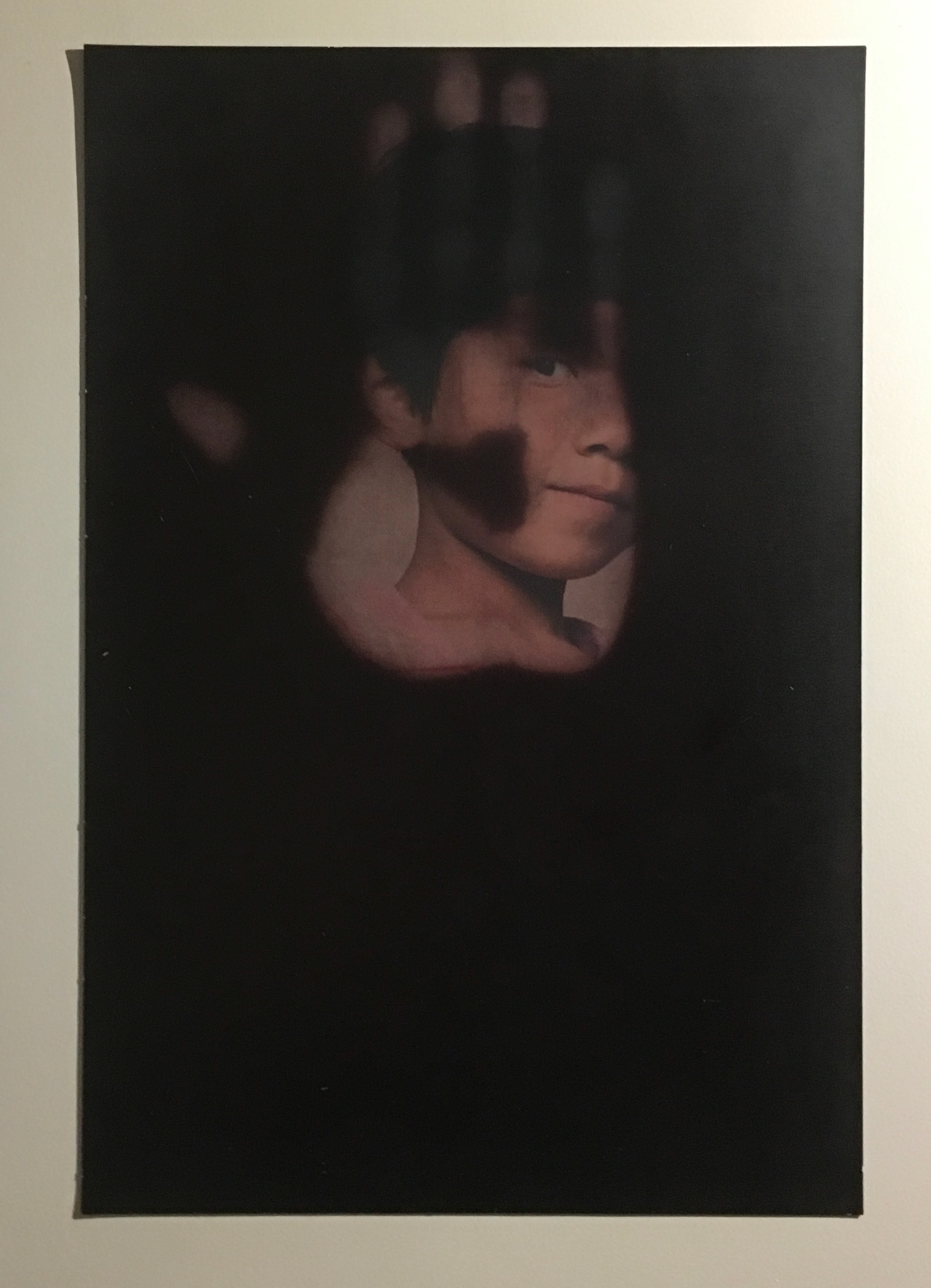
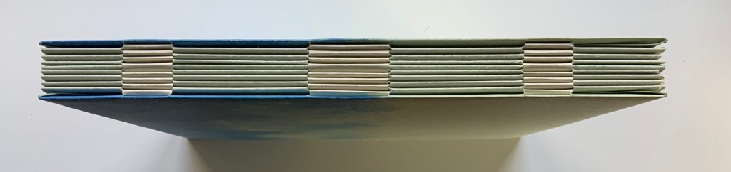
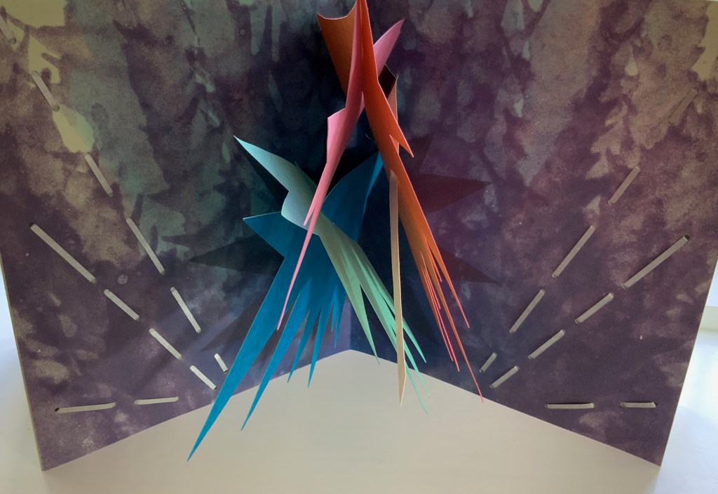
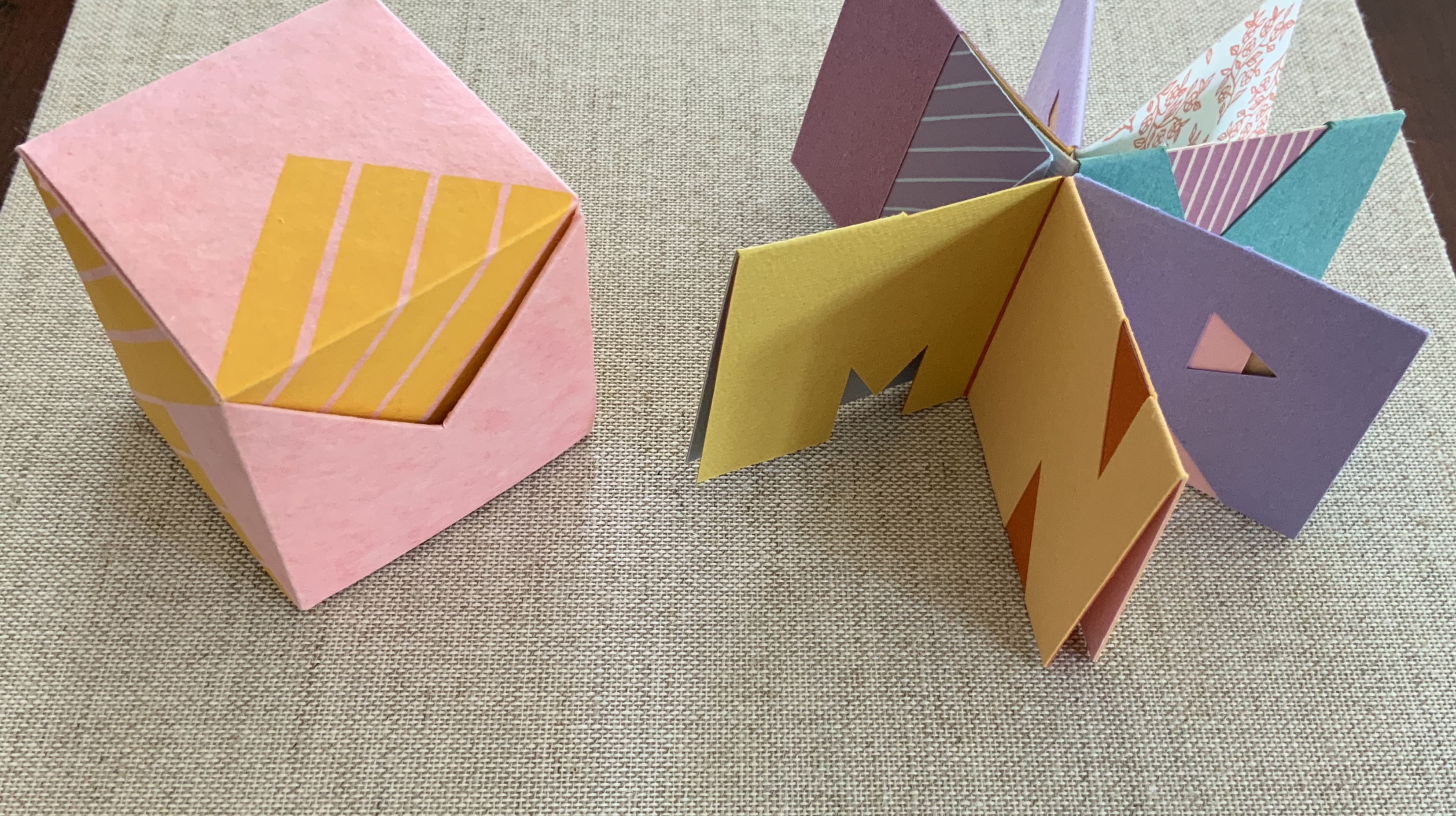
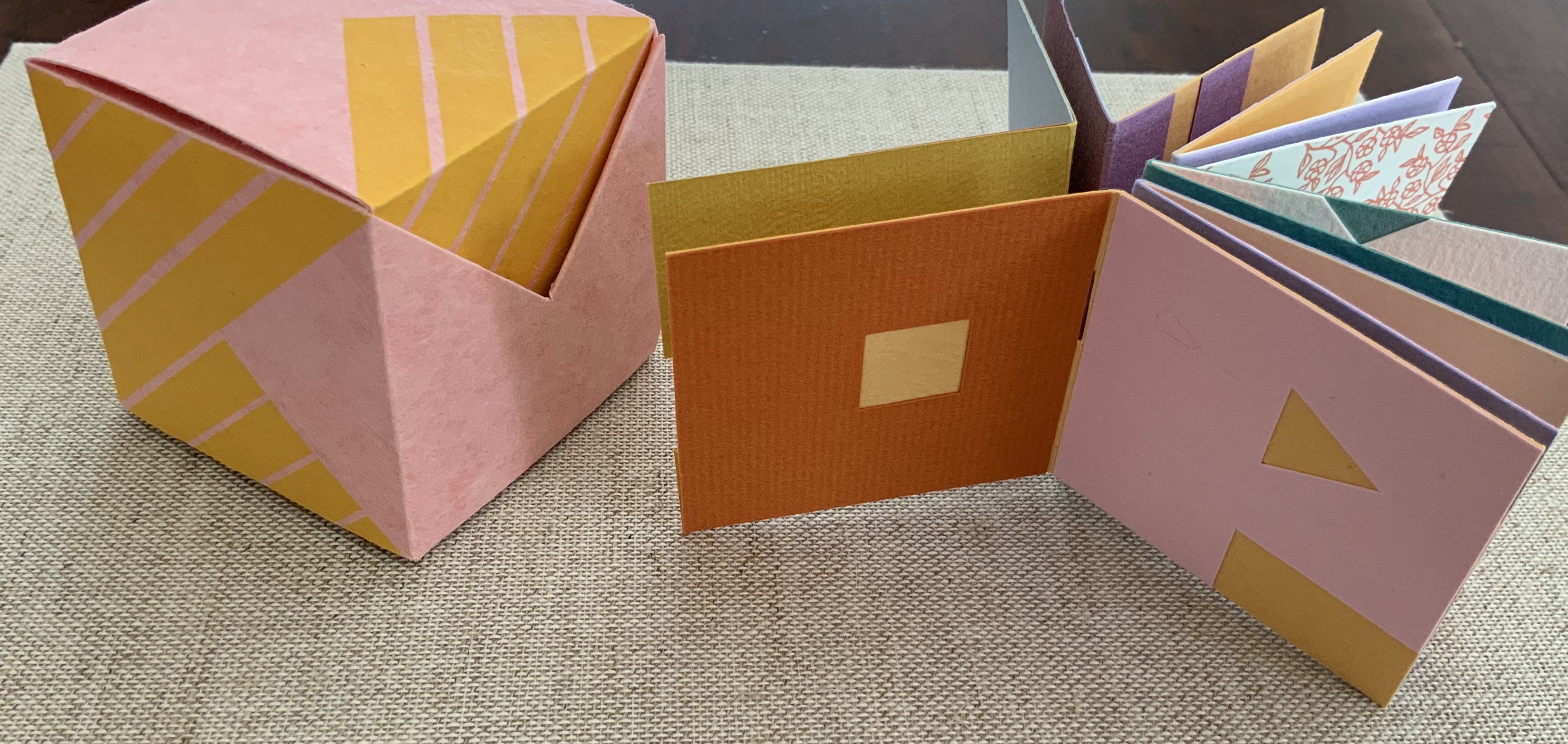
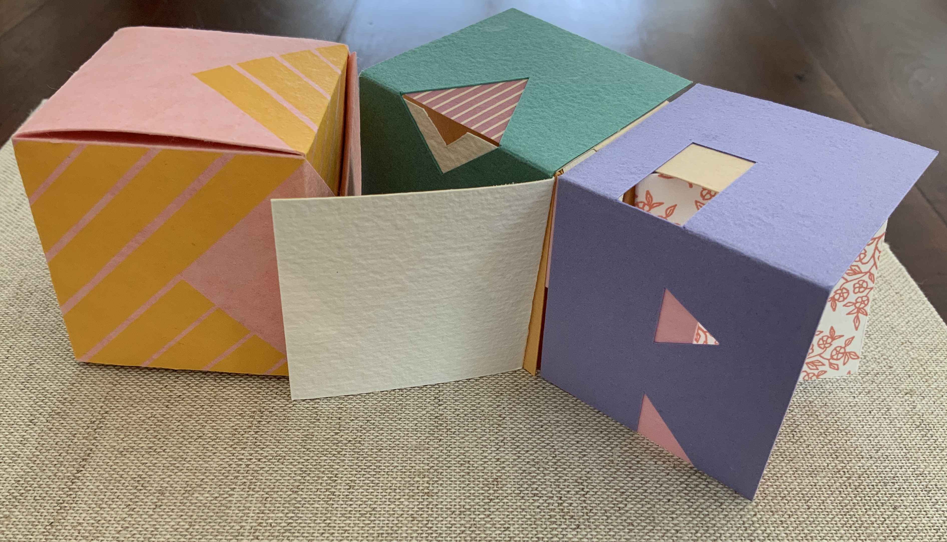
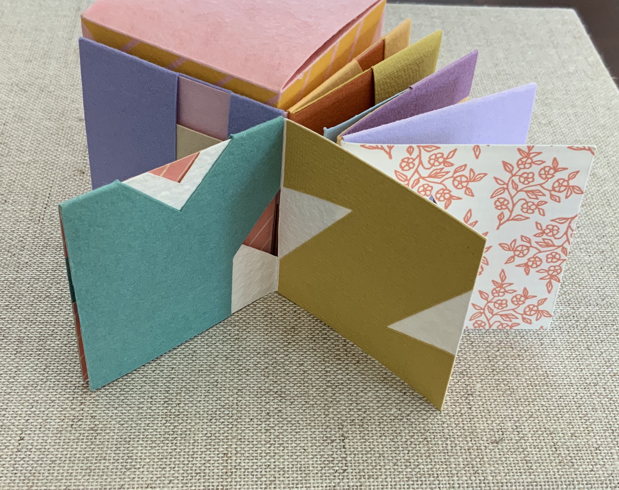
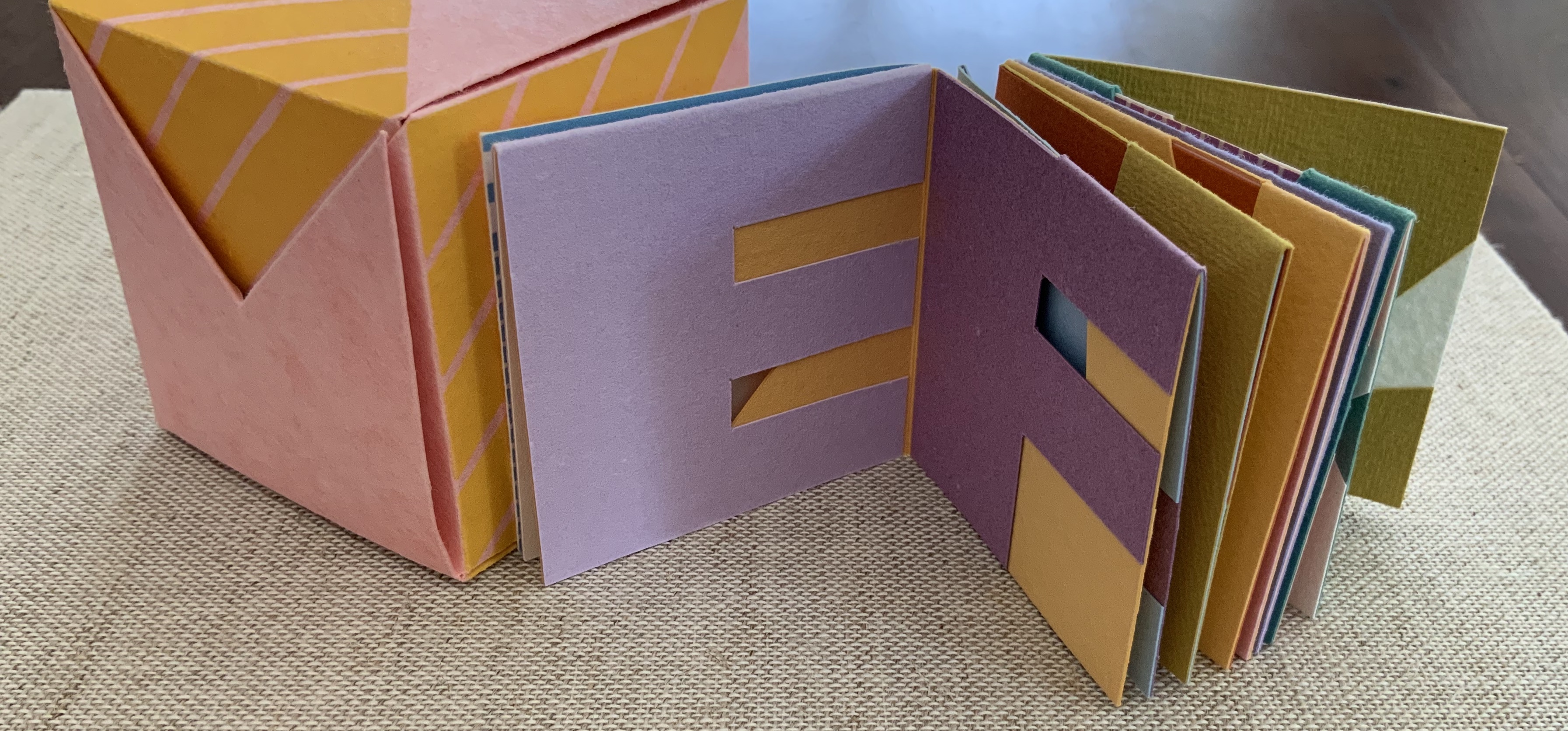
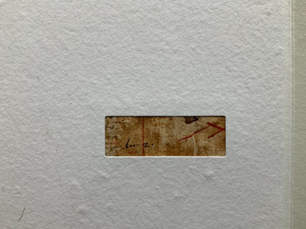
In Memoriam+ (2021) Alastair Noble Booklet thread-bound to HMP boards, cover with cutout. H210 x W205 mm, 12 pages. Edition of 22, of which this is #4. Acquired from the artist, 25 April 2021. Photos of the work: Books On Books Collection. Displayed with permission of the artist.
This work pays tribute to Ian Hamilton Finlay, whose Little Sparta, a garden across seven acres in Scotland, that expresses an artistic vision through typography, sculpture, installations and nature. Noble writes about the origins of his tribute:
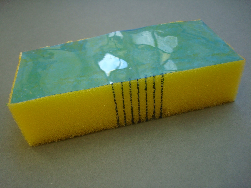
I first visited Little Sparta twenty years ago and then again last year in July out of lockdown. Thereafter, coincidentally I found a brick buried in my garden with the work “Temple” embossed on it. Consequently this became the catalyst for a little homage in form of small installation in my garden that used the brick as a foundation to an arch made from white marble fragments that suggests the Portara for Apollo’s Temple Naxos. This installation became the stimulus for this small artist’s book completed during lockdown in my studio in Liverpool, UK. — Entry in Book Arts Newsletter, No. 138 March – mid-April 2021, p. 43.
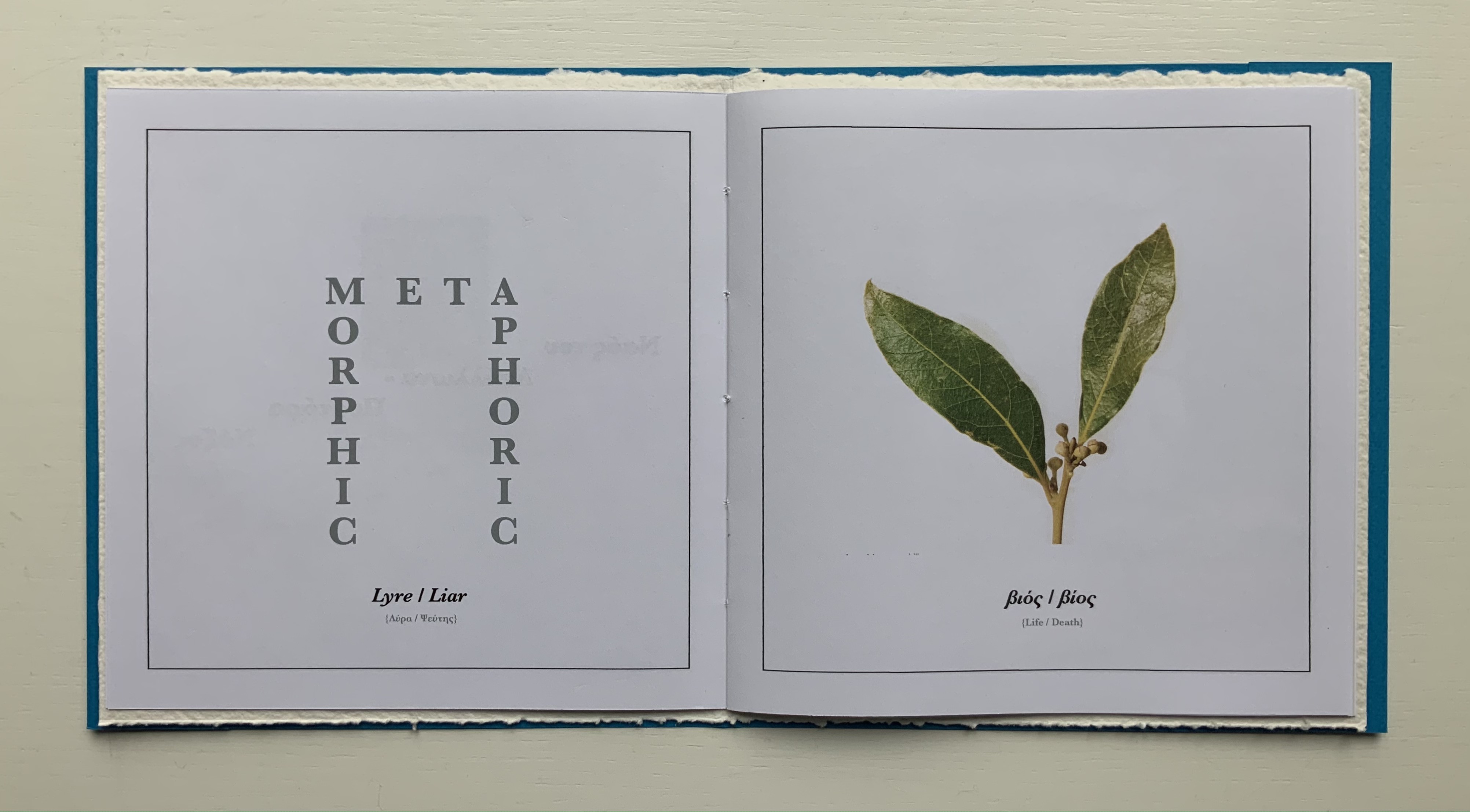
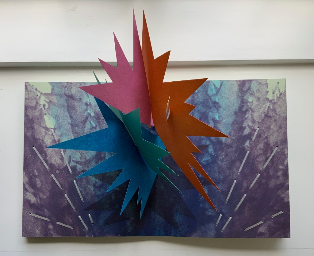
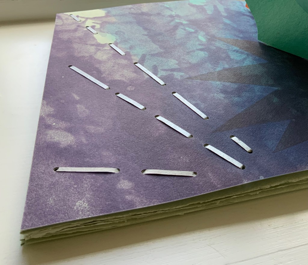
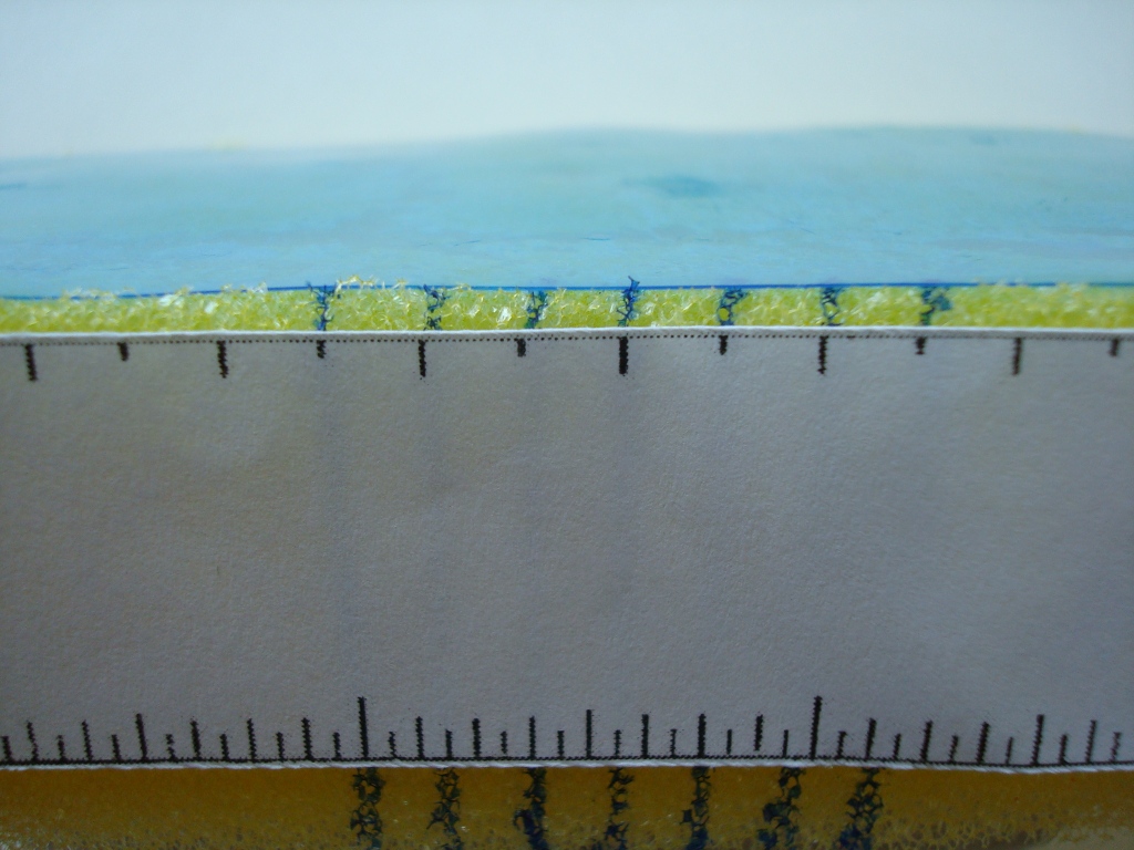
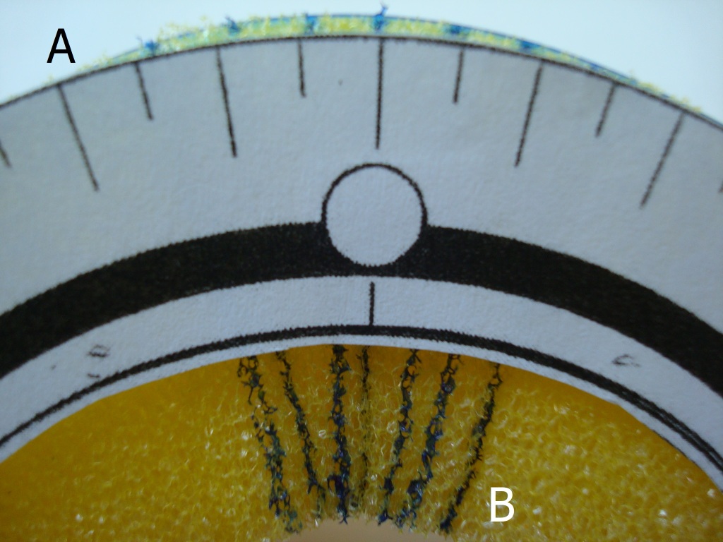
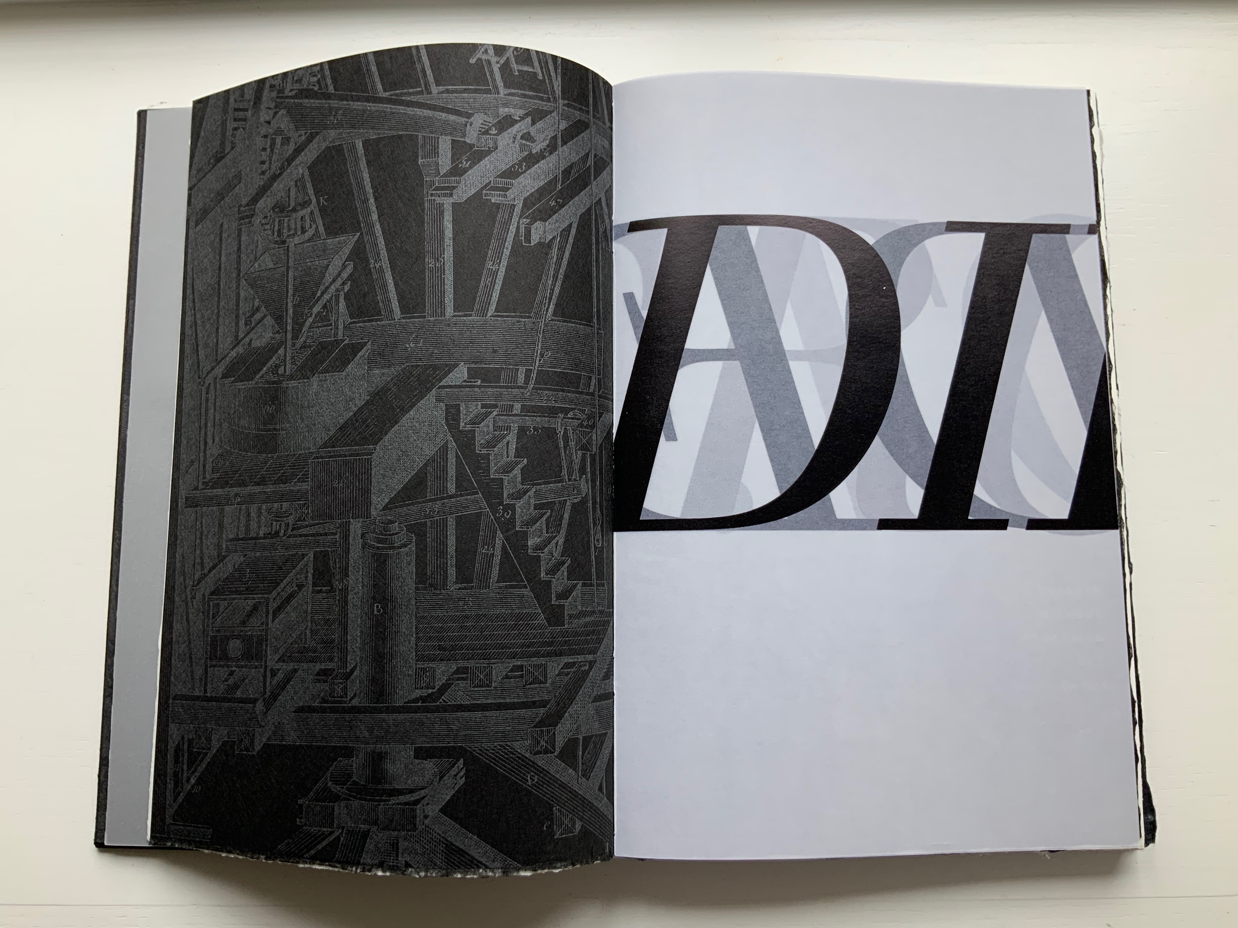
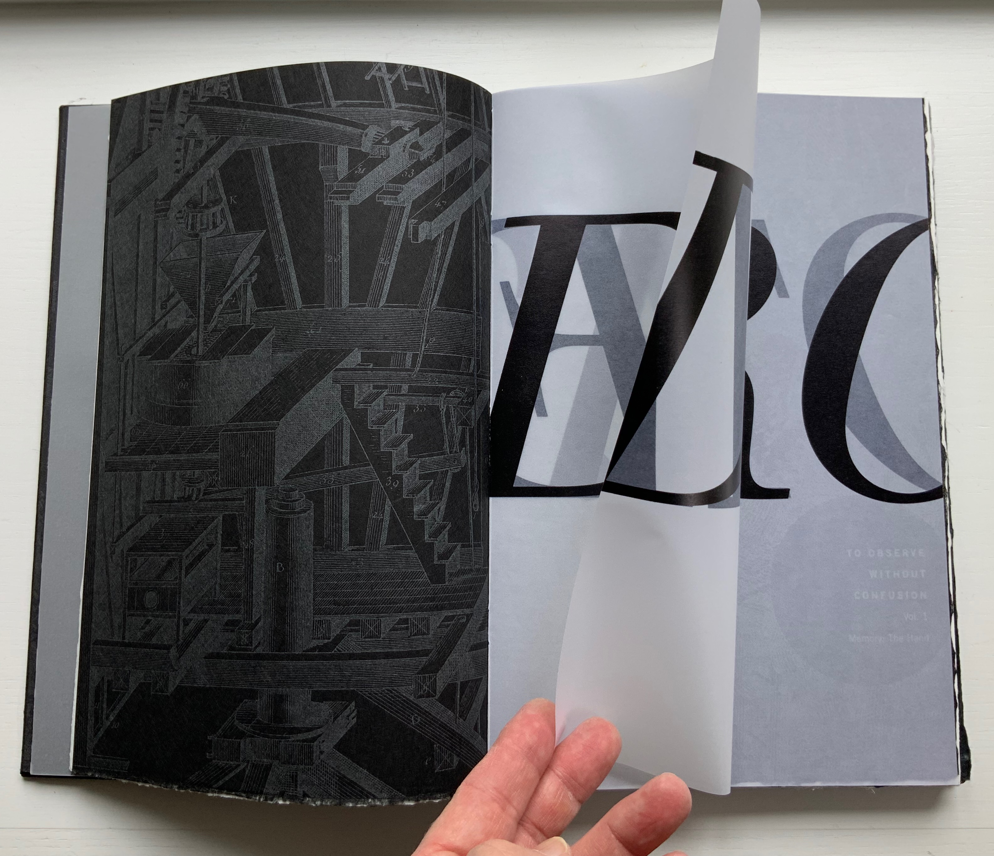
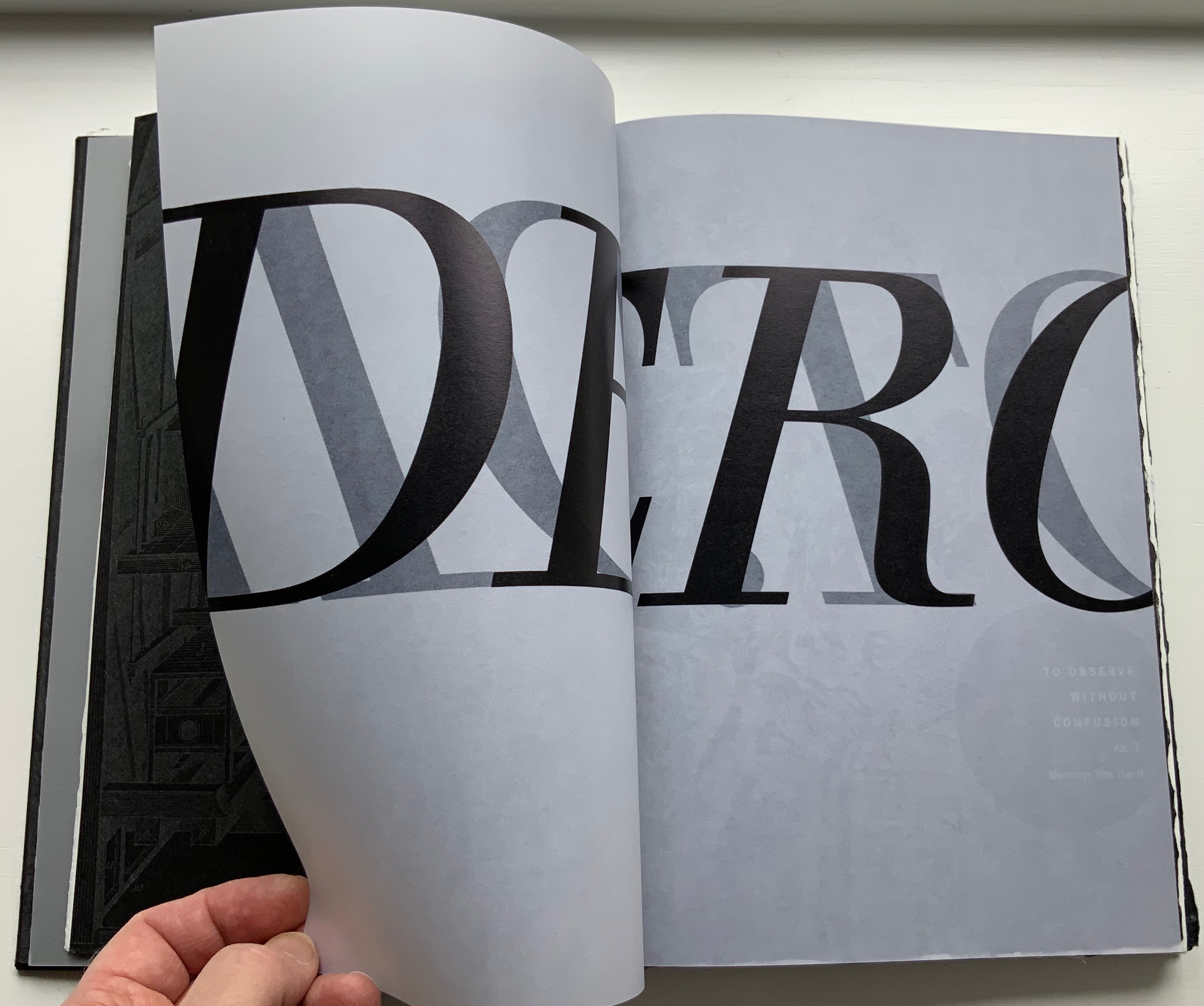
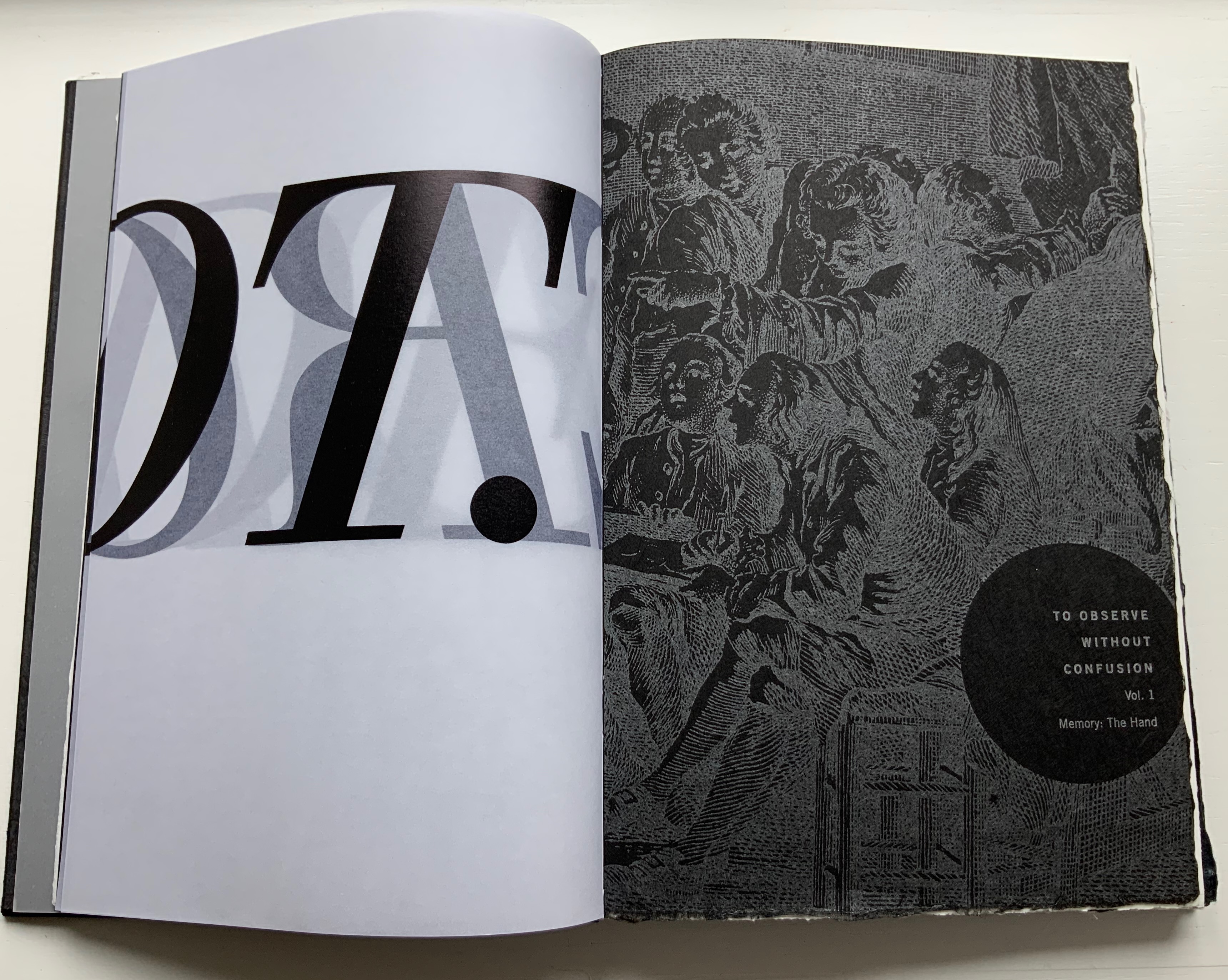
Noble has expanded and intensified his small garden homage into a slender and rich work of book art. The sculpted structure of it — how the cover, pages, images and text work with each other — rhymes with Finlay’s art, Greek mythology and Nature. Noble’s choice of the portal to Apollo’s Temple to link the found brick and arch of marble fragments to Little Sparta and Finlay’s art finds one of its echoes in the cover’s cutout and the marble-white textured board behind it. Another echo lies in the words “metamorphosis” and “metaphoric” laid out to form an arch on the page below. And just as sonic echoes overlap one another, the words and image themselves echo across the double-page spread with the laurel leaf emblem of Daphne’s transformation to escape the pursuit of the lyre-bearing sun god and mythic patron of poets laureate.
Other overlapping echoes arise from the Greek and English word pairs on the double-page spread below. The presence of the Greek words obviously chime with Apollo’s Temple, but the presence of the English chimes more deeply with the word “metamorphic”. What is a translation if not a metamorphosis? And the rhyming of “lyre” and “liar” chimes even more deeply with “metaphoric”. What is a metaphor if not like a lyre and liar at the same time that tells us Daphne’s death is her translation into life as a tree?
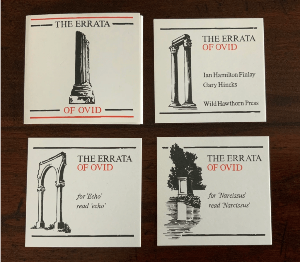
Noble’s use of “meta” for his arch’s lintel also echoes Finlay’s aphoristic concrete poetry, a good example of which is The Errata of Ovid.
The Errata of Ovid (1983/4) Ian Hamilton Finlay, Gary Hincks Miniature portfolio. H76 x W80 mm. Offset printed in red and black, eight loose cards enclosed in a flap folder. Typeset in Bruce Old Style(?); illustrations by Gary Hincks; card stock unknown. Acquired from Woburn Books, 31 October 2019. Photos: Books On Books Collection
Beyond the tribute of image/word-play, Noble’s artist’s book strikes a performative echo with the history of Finlay and Hincks’ artists’ book. A few years after the publication of The Errata of Ovid, Finlay drew up ”Six Proposals for the Improvement of Stockwood Park Nurseries in the Borough of Luton”, which included a caprice with a wall and plaques. The wall in Stockwood Park stands today, presenting the text of The Errata of Ovid engraved in eight stone plaques (minus the colophon but with the addition of “For ‘Adonis’ read ’Anemone’”). So Noble’s artist’s book followed his garden installation whereas Finlay’s garden installation followed his artist’s book. If only for perfection of that echo, one might wish Finlay’s installation be transported to Little Sparta and let Luton be satisfied with its airport!
Thresholds (2020)
Thresholds: Doors, Gates & Barriers Puno Peru (2020) Alastair Noble Perfect bound paperback. H215 x 140 mm, 48 pages. Acquired from the artist, 11 May 2021. Photos of the work: Books On Books Collection.
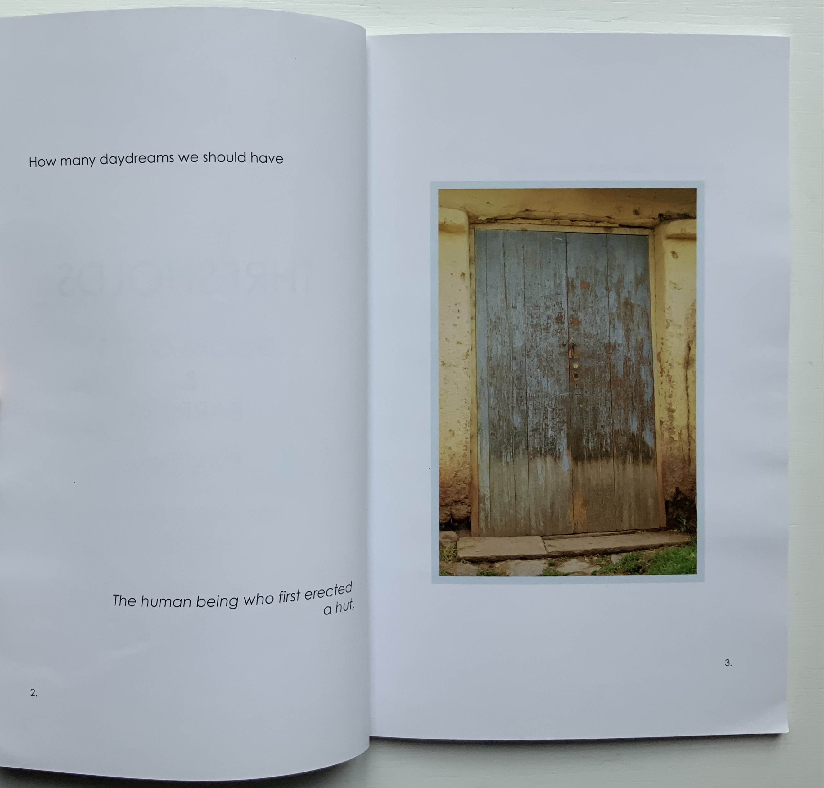
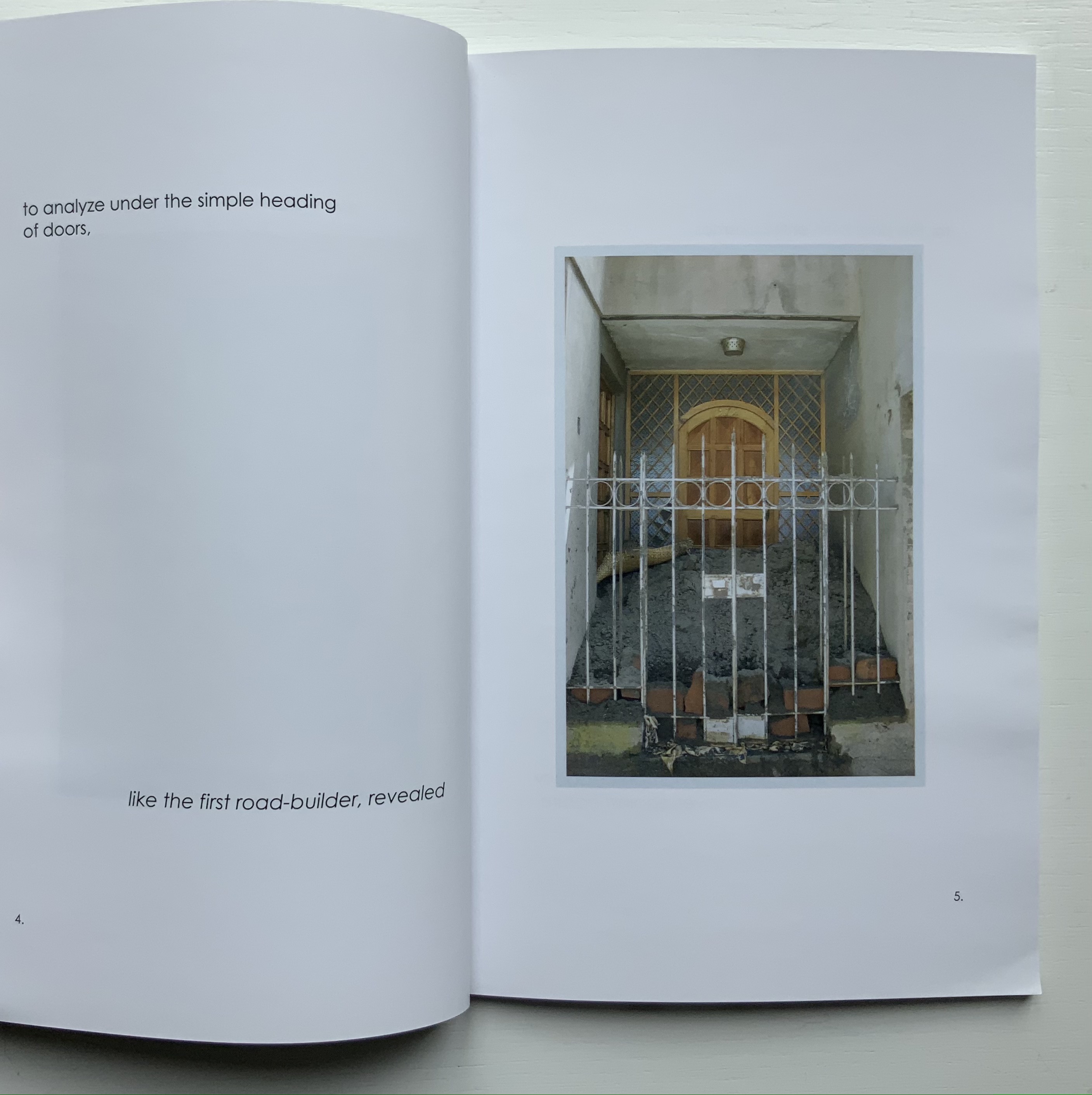
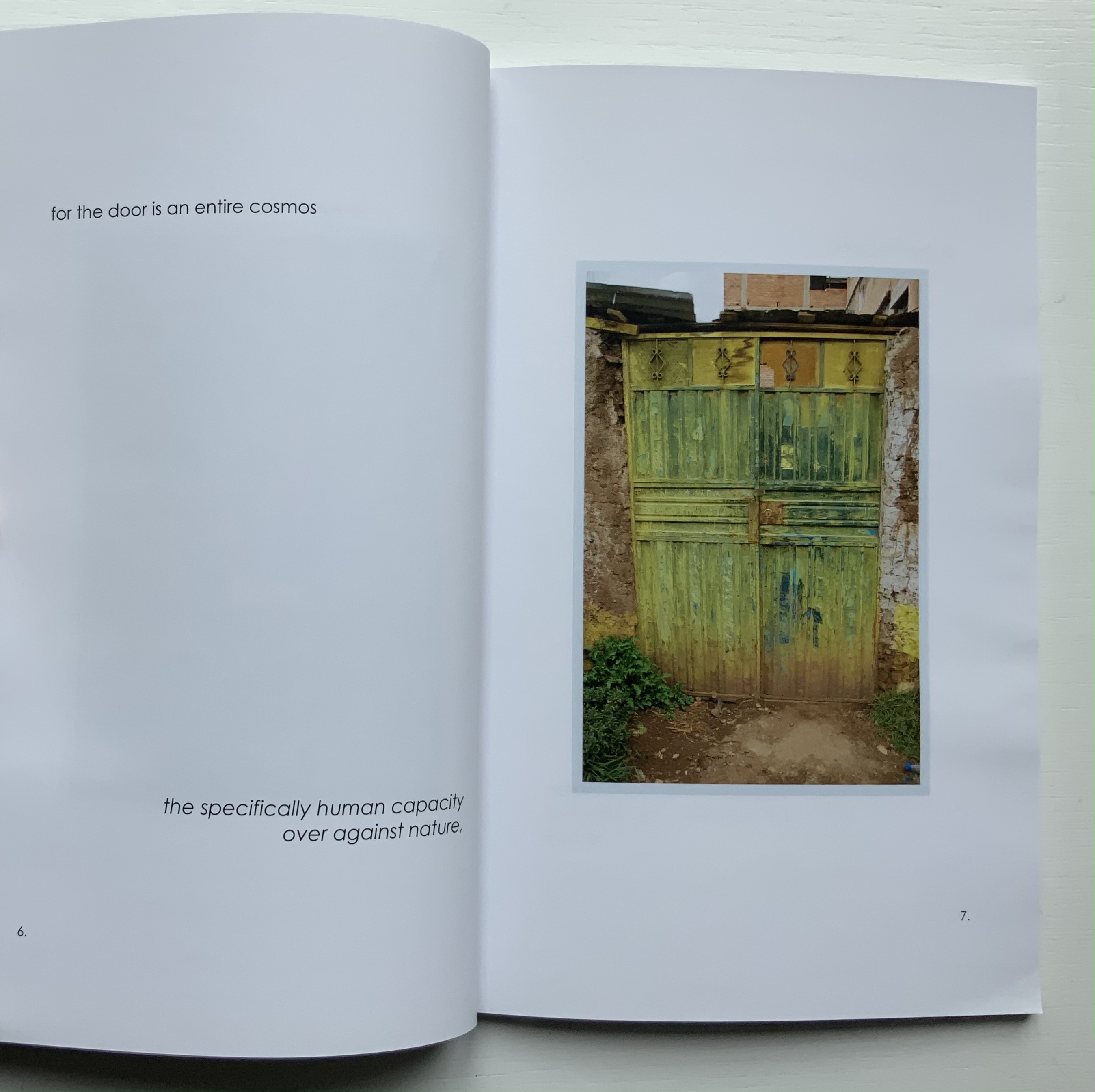
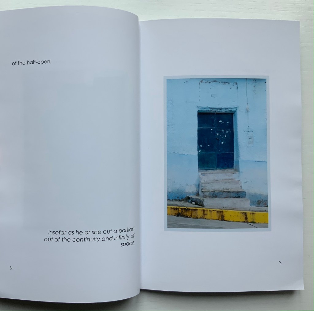
Like In Memoriam+, this work has its roots in location and a portal metaphor. While also employing juxtaposition of text and images as a structural device, it relies on images of a category of sought readymades (doors, gates and barriers) rather than a found object (like the garden brick on which the artist builds his arch) for a structuring device that is simultaneously material and metaphor.
The way Noble uses his sources of text (Gaston Bachelard’s The Poetics of Space, Martin Heidegger’s “Building Dwelling Thinking” and Georg Simmel’s Bridge and Door) causes the reader/viewer to contribute to structure and metaphor. The first sentence of Bachelard’s excerpt begins “How many daydreams” and starts at the top of page 2; Heidegger’s beginning “The threshold” starts in the middle of page 26; and Simmel’s beginning “The human being” starts at the bottom of the page 2. Bachelard’s first sentence ends on page 8, Heidegger’s on page 28, and Simmel’s on page 12. Unless one has the mind of a symphonic composer or connoisseur, it is impossible to attend to all three excerpts simultaneously and turn the pages in one sequence. Instead, it is necessary to turn the pages back and forth along three tracks to absorb the excerpts, and the metaphoric effect is to open and close those doors, gates and barriers repeatedly, which is …
… what Noble’s very last page implies.
But finally, over the course of multiple readings/viewings, the linear photographic sequence on the recto pages seems to shift. Each image takes on a different aspect depending on the excerpt being followed. Combined with the back and forth page-turning, this shifting and break in the linear photographic sequence leaves the reader/viewer with the simulation of walking around, up and down and through Puno and its doors, gates and barriers.
Southern X 2006 : Open City, Ritoque Chile (2006)
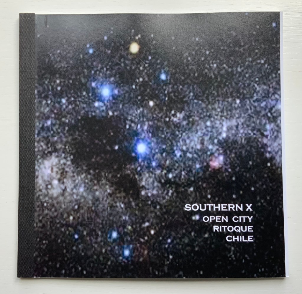
Southern X 2006 : Open City, Ritoque Chile (2006) Alastair Noble Perfect bound paperback, spine taped. H215 x W218 mm, 32 pages. Acquired from Specific Object, 2 May 2021. Photos of the work: Books On Books Collection.
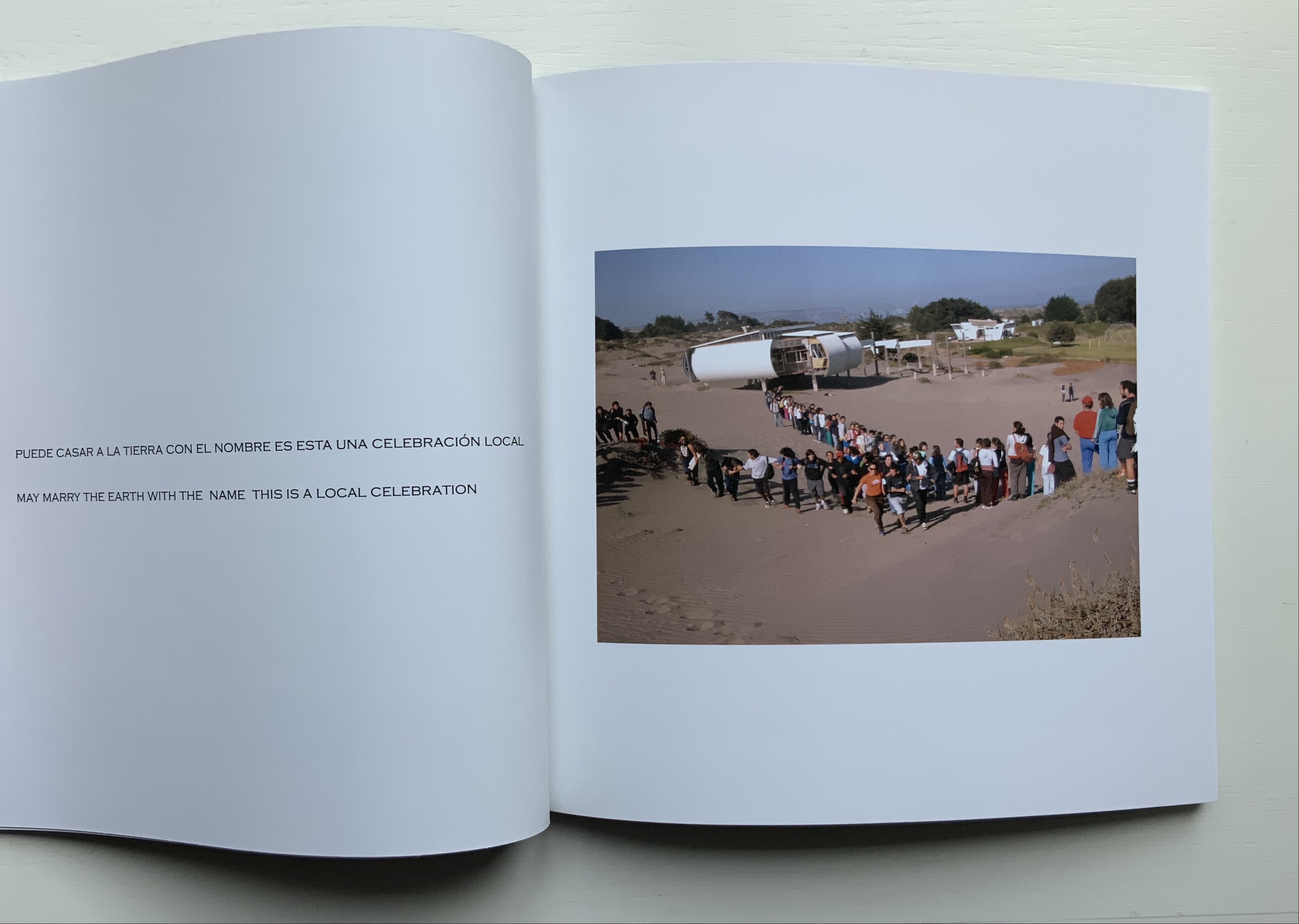
Like Thresholds, this work, too, has its roots in location, but more akin to In Memoriam+, it draws on poetry, installation and performance. Open City is a utopian site affiliated with the School of Architecture of the Catholic University of Valparaíso. Accommodations and buildings have arisen by collective collaboration. There is no plan. One of the traditions associated with construction on the site is the reading of excerpts from the book Amereida (1967), a collective epic poem, which the school describes as “a poetic vision of the American continent”.
Reading the text takes us into the permanent question about being American from the recognition of the appearance of America seen as a discovery or gift. From the first page of the poem, the encounter with the unknown opens the possibility to begin to think of the new world as a gift, a gift. Its main sign: the Southern Cross, the light that goes up the horizon and guides in the north. — “Amereida“
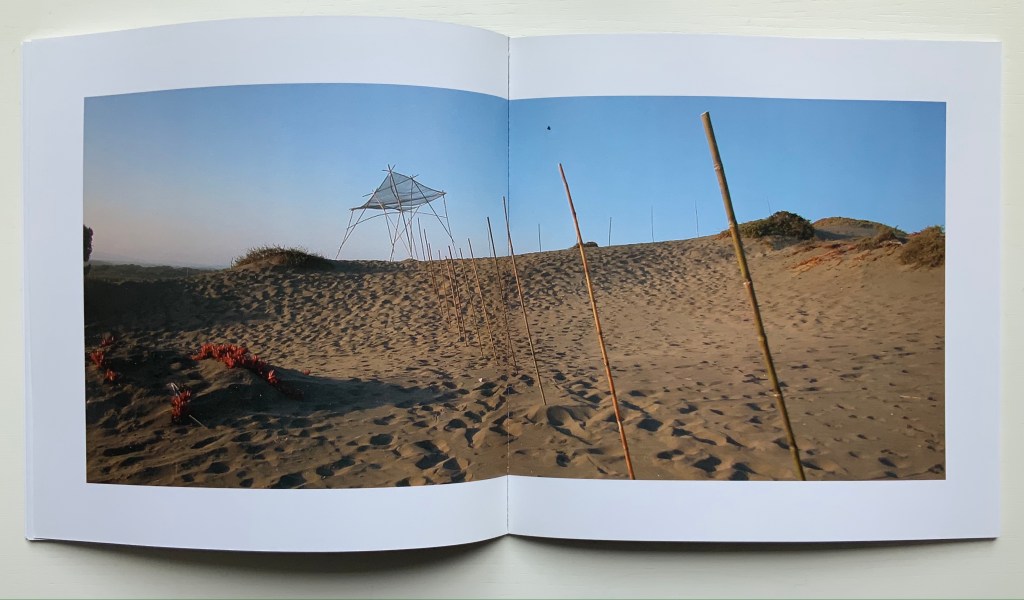
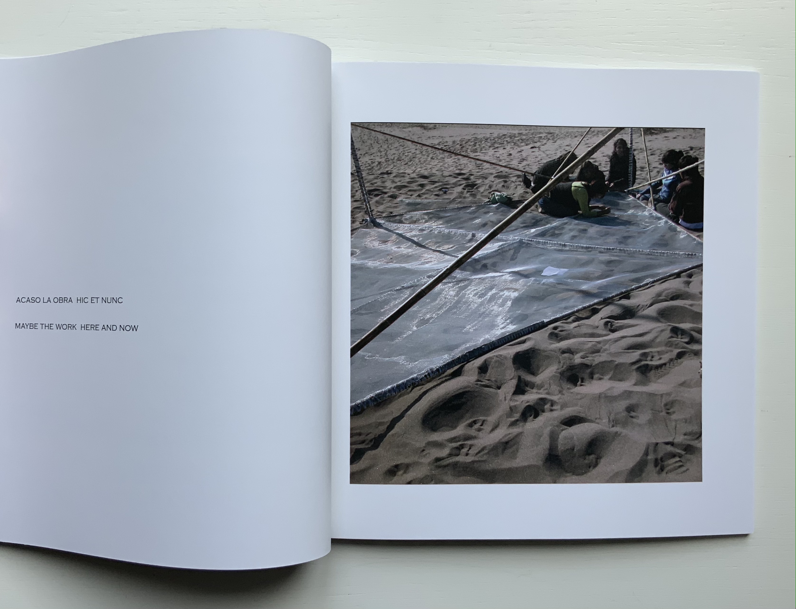
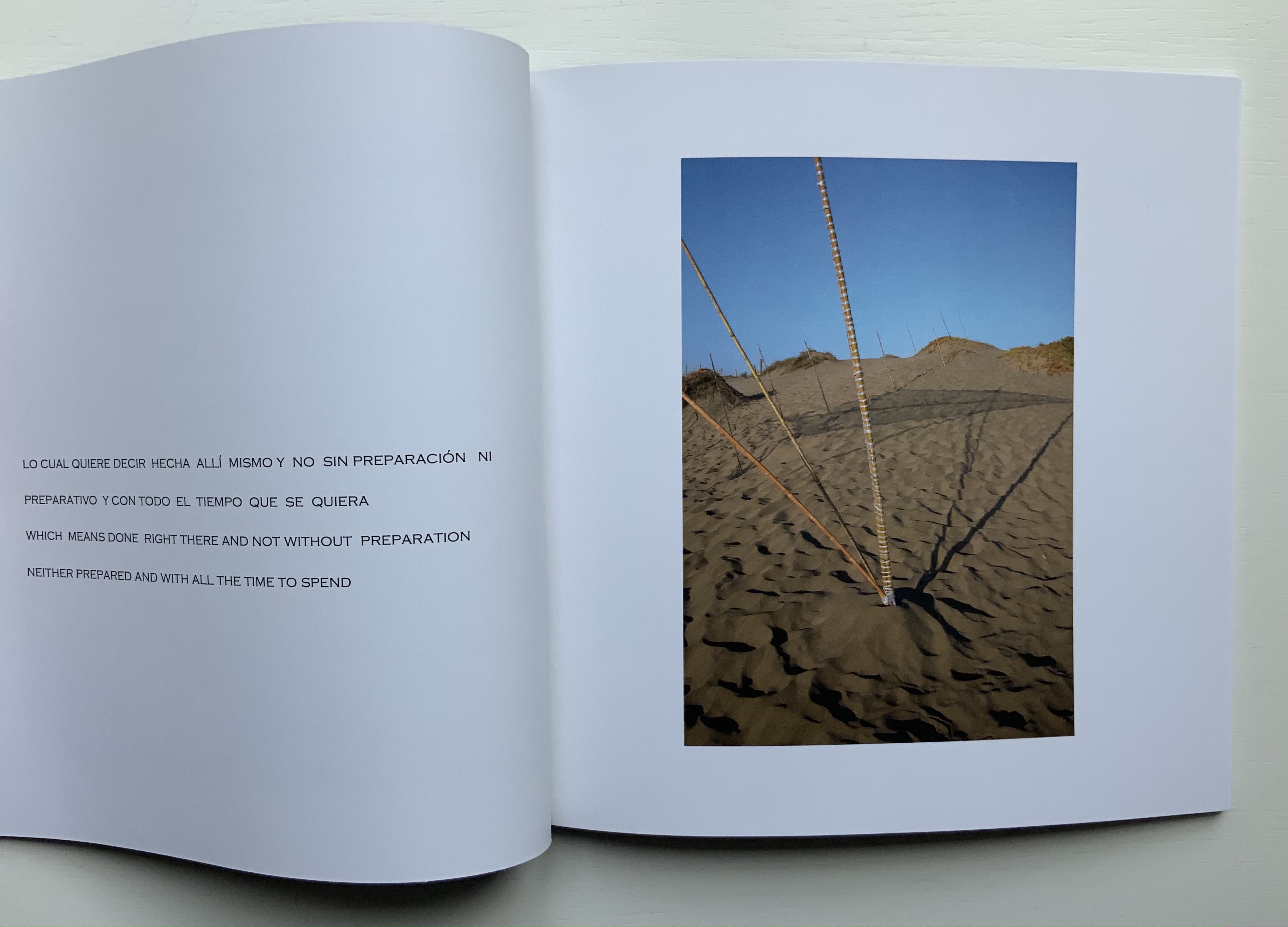
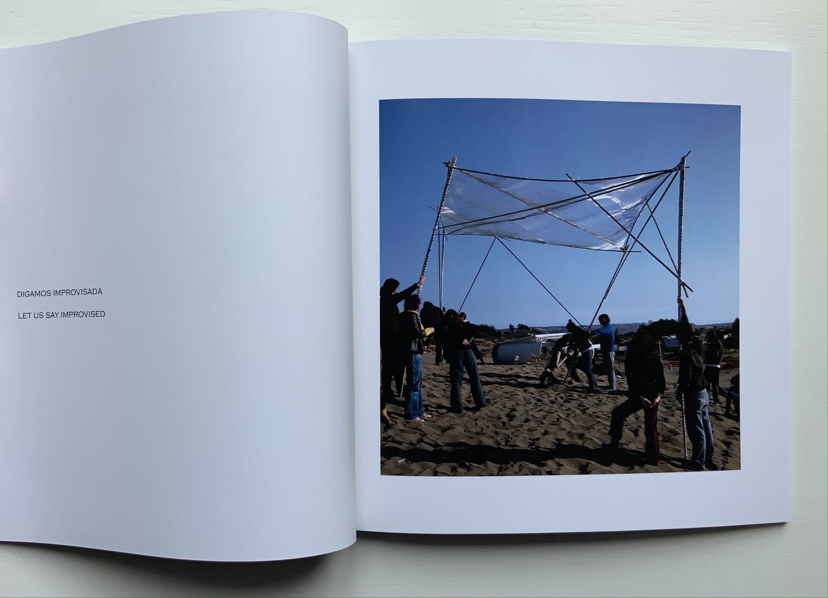
Inspired by the Amereida during a sabbatical visit to the school and Open City, Noble proposed an installation: Southern X 2006. Given that the Amereida takes the Southern Cross for its main sign and that this sign appears across the night sky in the shape of a kite, Noble’s direction for his installation sculpture was set before he began.
The actual sculpture is but a piece of a larger collective artwork consisting of Manuel F. Sanfuentes Vio’s reading from the Amereida, the students’ procession in the shape of the Southern Cross to the site selected by Noble, the collective construction of the kite, the planting of poles and the placement of the kite on them — and of course this book that photographically documents the performance of the installation and textually presents the read passages of the Amereida.
Foldings (1998)
Ephemera for Foldings (1998) Kathy Bruce and Alastair Noble. Poster and staging sketches. Photo: Books On Books Collection.
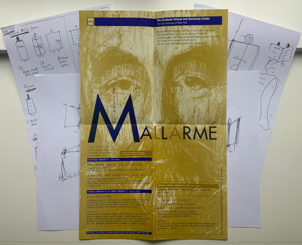
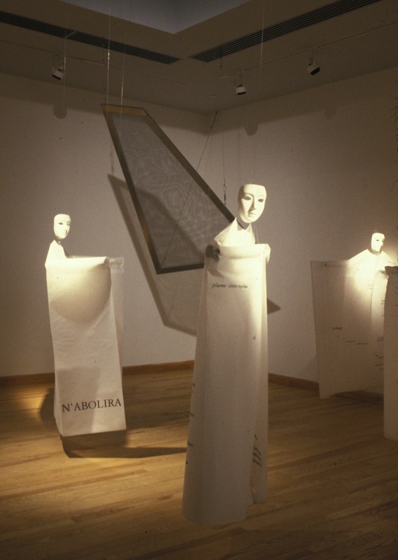
With Foldings, Noble joined forces with Kathy Bruce, his wife. Six masked dancers wear costumes that are in effect human-size folios across which the pages of Un Coup de Dés have been printed front and back in French. As a prerecorded English translation is read by numerous voices corresponding to the changing fonts, the dancers rotate and display the lines being read. A performance was given as part of the exhibition A Painter’s Poet, held at the Leubsborf Art Gallery (Hunter College). This fell under the aegis of the Millennium Mallarmé celebrations in New York, the poster for which can be seen above overlaying the staging sketches for the performance. Later, as part of an installation under the title Navigating the Abyss (Brookdale Community College, Lincroft, New Jersey), the costumes were suspended from the ceiling along with a framed screen mesh reminiscent of Noble’s As if / As If (see above).
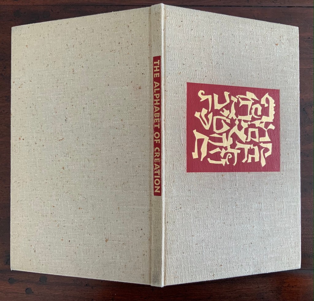
The Alphabet of Creation: An ancient legend from the Zohar(1954) Ben Shahn Hardcover, tan linen boards with red and gold decorations on cover and spine labels. H275 x 170 mm, 48 pages. Edition of 550, of which this is #497. Acquired from Midway Used and Rare Books, 7 August 2021. Photos: Books On Books Collection.
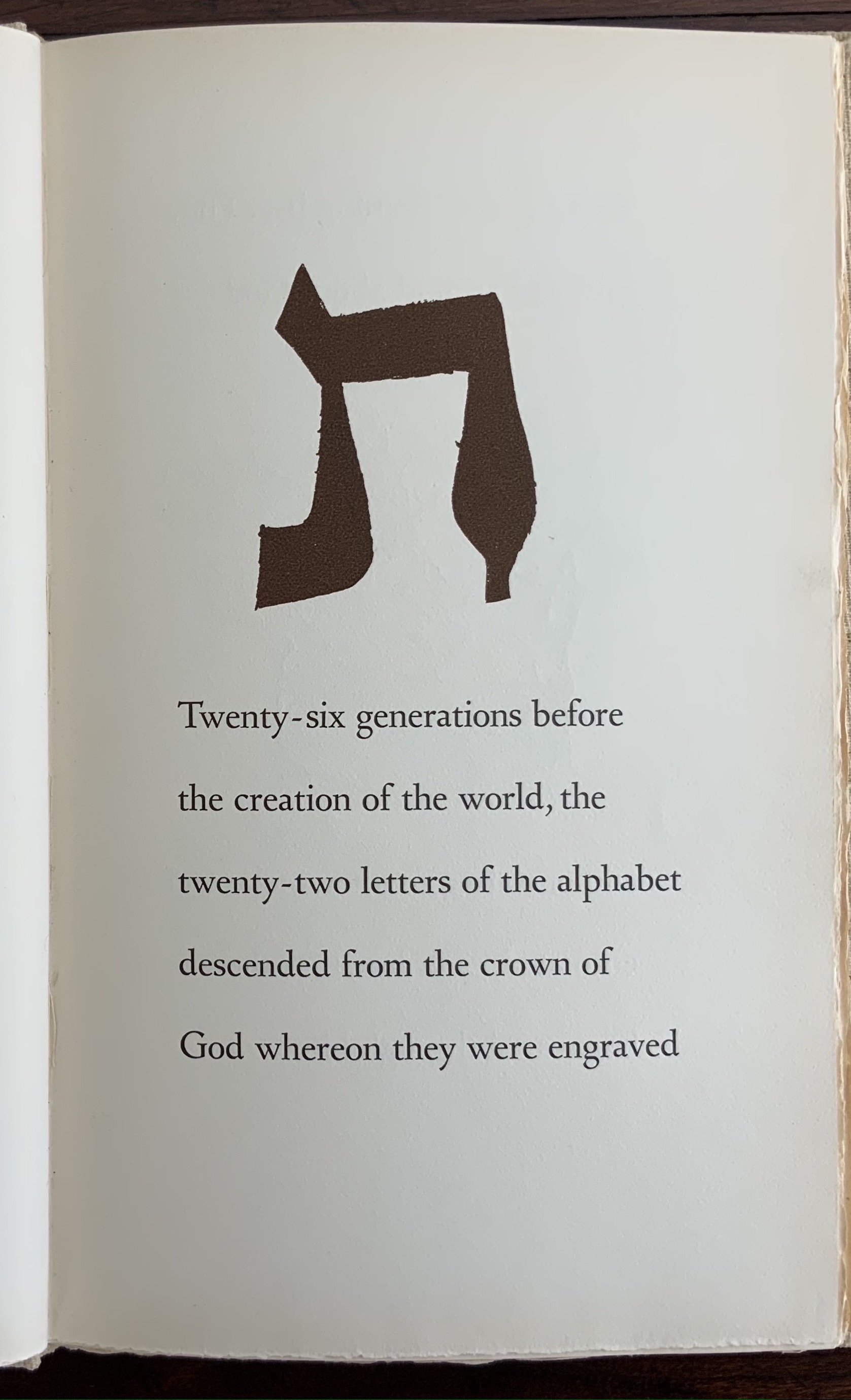
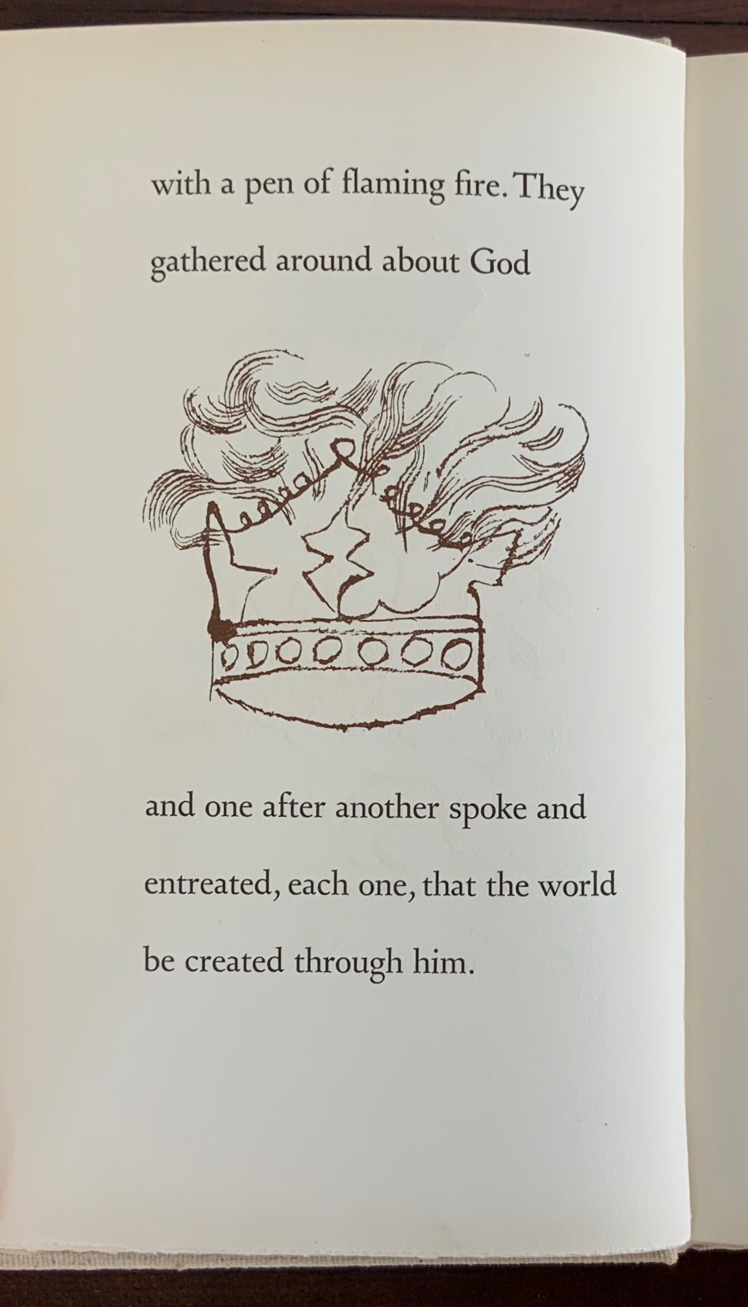
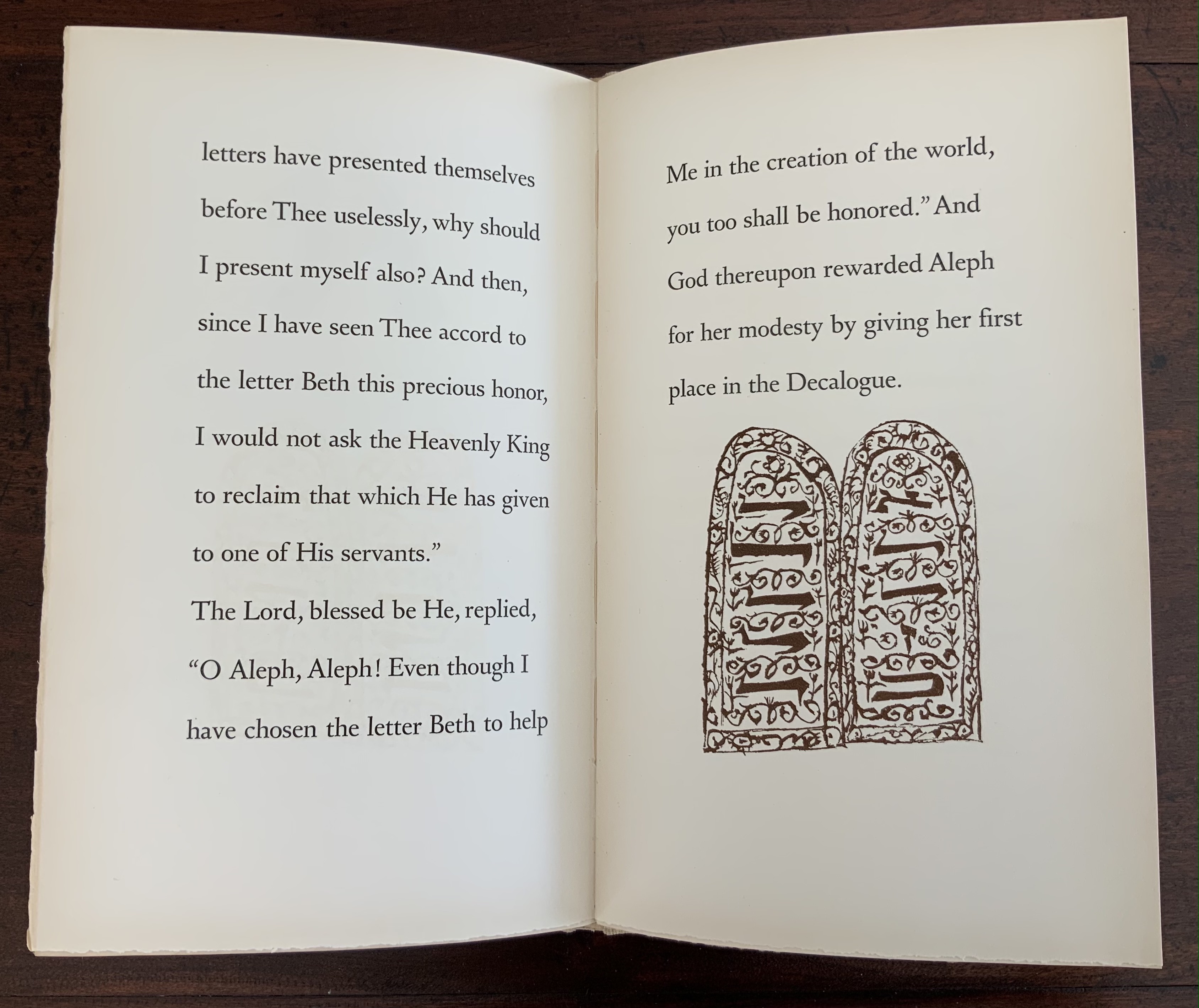
Why does the alphabet begin with the letter A? There is the theory that alef‘s association in the Phoenician alphabet with the ox suggests a “needs-based” reason: food first, then shelter (B being beth meaning house). The rationale from the Zohar, however, is more entertaining and suited to the artistry of Ben Shahn.
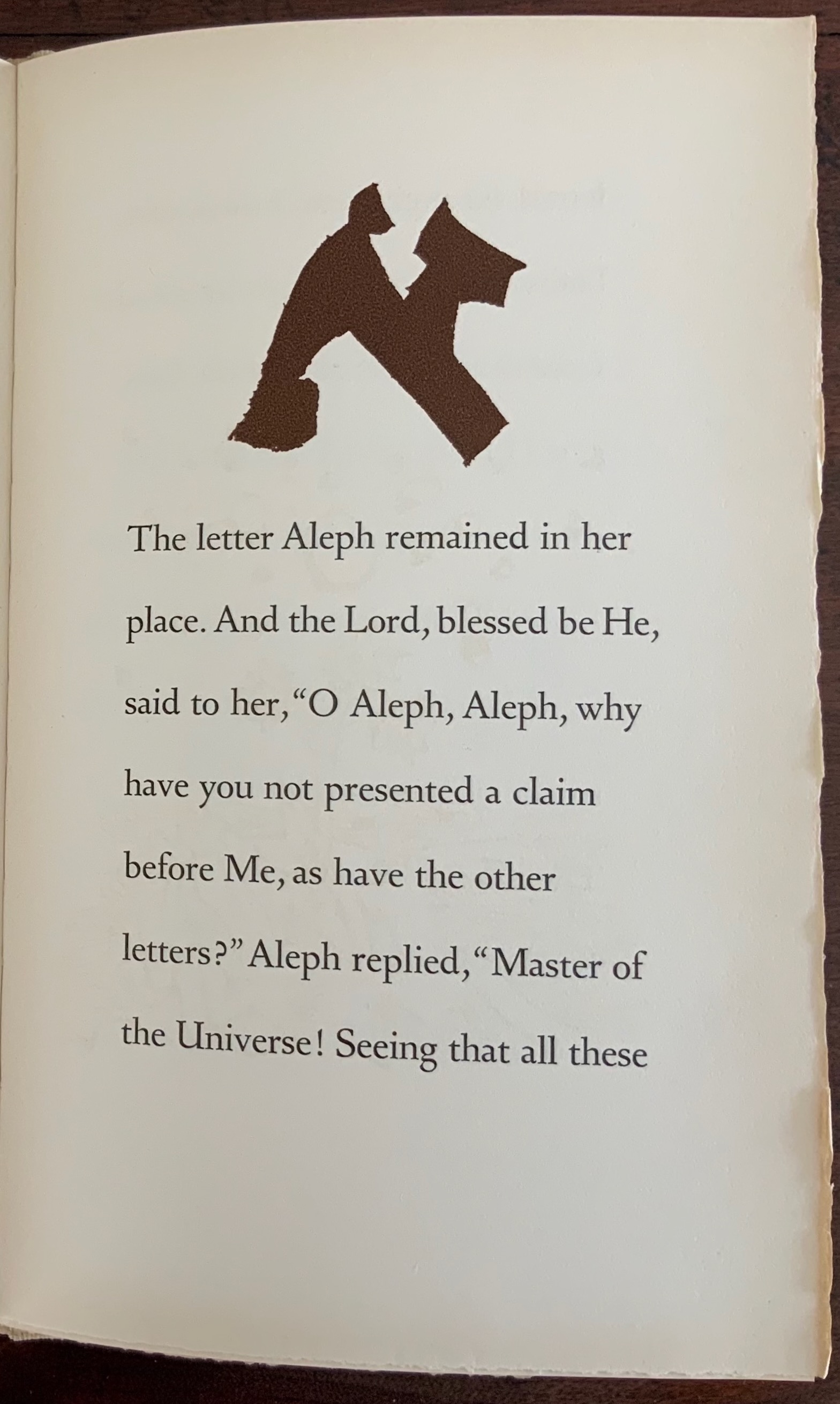
After all of the other letters have had their say and presented their arguments, the letter A, aleph, remains:
Shahn’s artist’s book provides an example of the affinity of book art with the alphabet. The list of artists’ books and abecedaries under Further Reading offers a variety of other examples, but the reasons for that affinity may be just as mystical or speculative as the answer to the question: Why should the alphabet start with the letter A? Or, for that matter, end with the letter Z?
Drucker, Johanna. 1995. The alphabetic labyrinth the letters in history and imagination. London: Thames and Hudson. An exploration of extraordinary breadth and depth: the mythical, anthropological, archaeological, art historical, calligraphical, geographical, kabbalistic, linguistic, philosophical, religious and typographical aspects of the alphabetic labyrinth are covered in style and extensively illustrated.
Ferlauto, S., and J. Morin. 2000. The sacred abecedarium. Stevens Point, WI: SailorBOYpress. A more typographical and secular perspective to compare with Shahn’s.
Flanders, Judith. 2020. A Place For Everything: the curious history of alphabetical order. New York: Basic Books. Curious that it does not address this Hebrew parable or the needs-based theories about the origin and ordering of the alphabet; otherwise wide-ranging and informative.
Thompson, Tommy. 1952. The ABC of our alphabet. London: Studio Publications. An entertaining use of the margins and overlays on the text page to illustrate the evolution of the alphabet. Deserves a reprint.
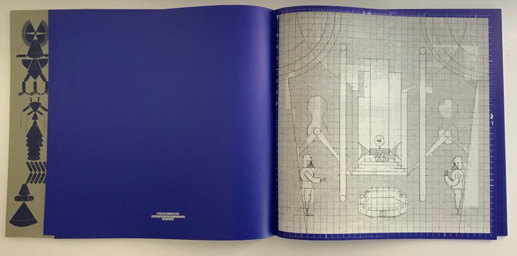
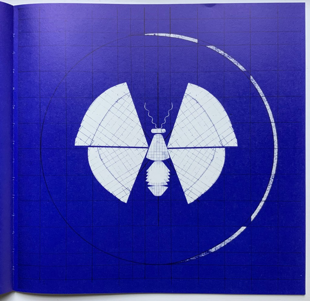
The Blind Men and the Elephant (2019) Xiao Long Hua Sleeved paperback, exposed sewn spine. Sleeve: 305 x 305 mm. Book: H303 x W305 mm. 52 pages. Edition of 500, of which this is #178. Acquired from Northing, 18 May 2022. Photos: Books On Books Collection.
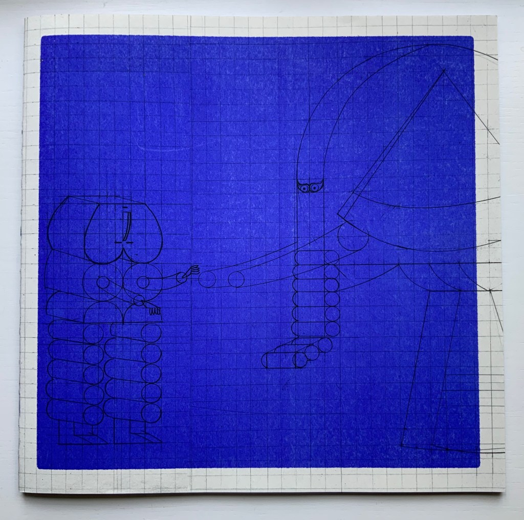
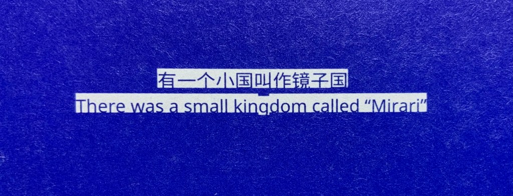
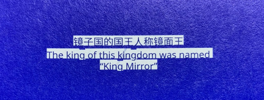
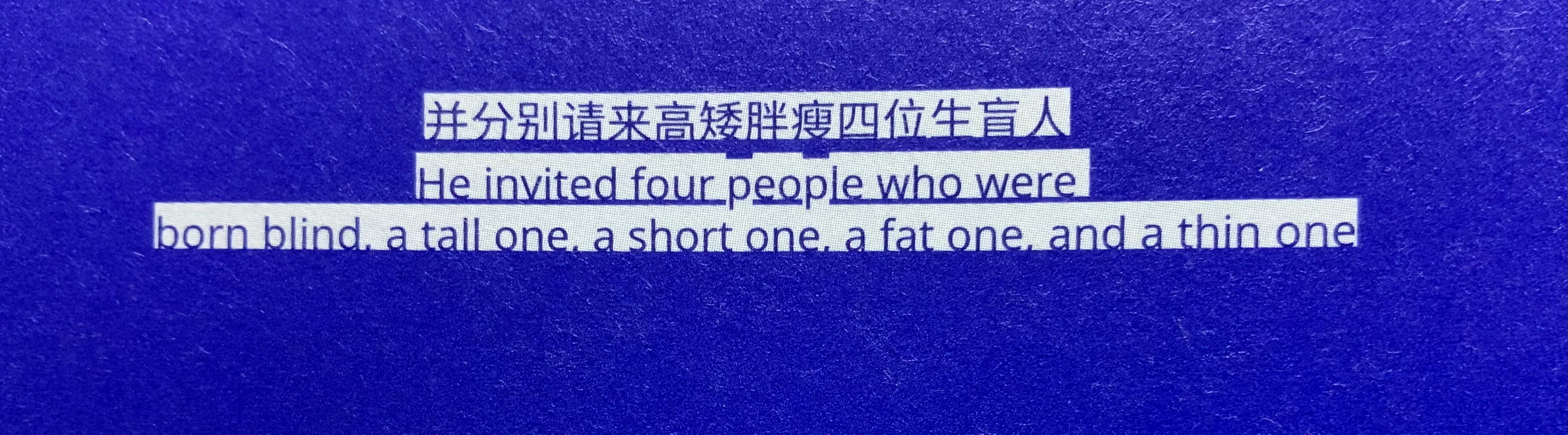
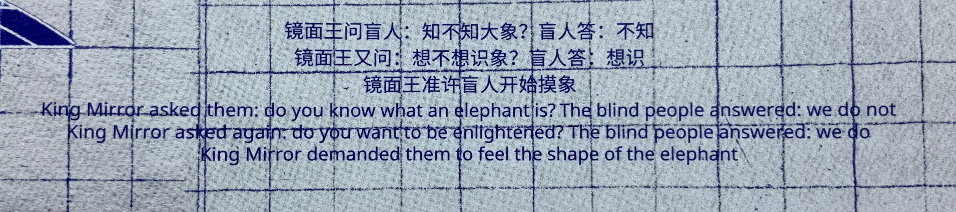
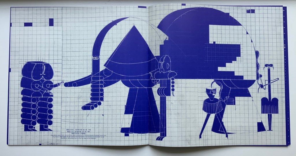
Working with binding designer Zhong Yu and tbook designer Lu Min of the “One and One Half Atelier”, Shanghai-based Xiao Long Hua has found a sympathetic outlet and form for his creative vision. His first work with them is The Blind Men and the Elephant, a variation on the parable in the Buddhist sutra Tittha Sutta. It takes place in the kingdom “Mirari”, ruled by King Mirror.
Selection from One and One Half Atelier. Photos: Books On Books Collection.
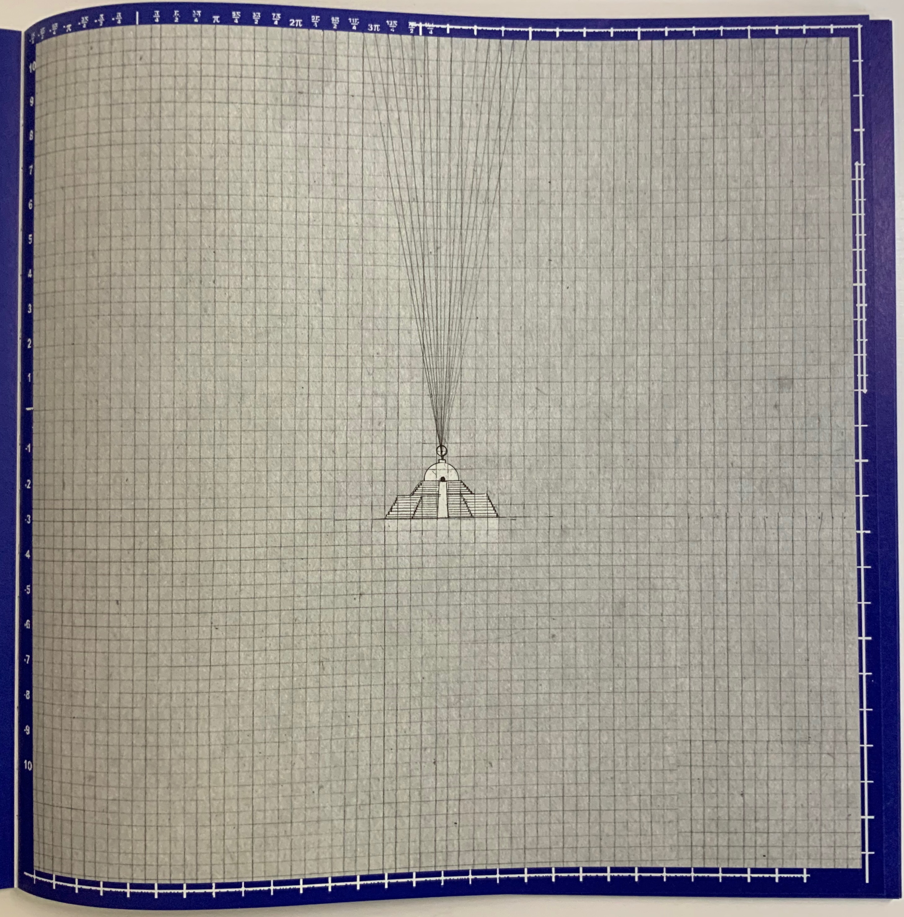
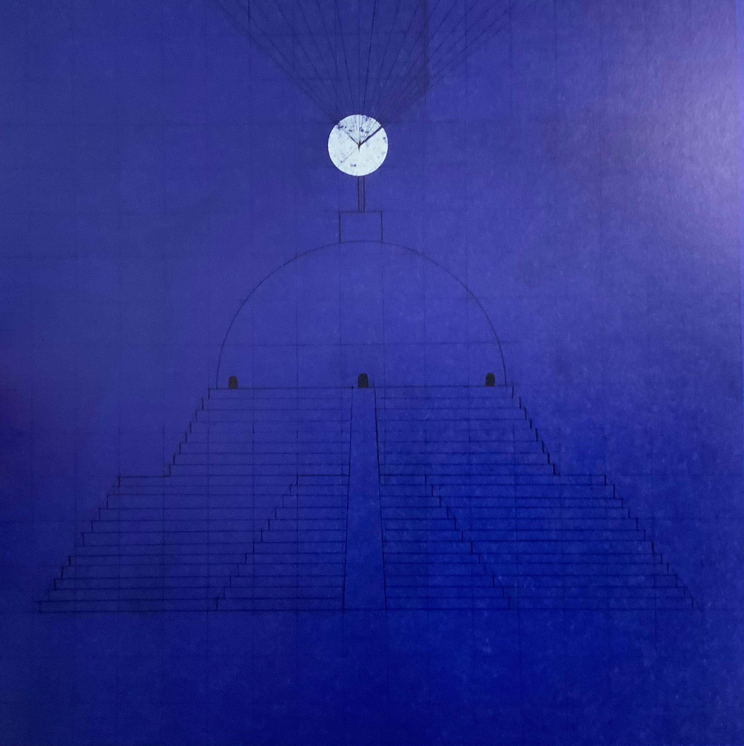
As in the more traditional version, the blind men report the elephant to be of different shapes, but in this version, those shapes reflect those of the blind men themselves. Throughout the book, a blueprint grid in the background of the dark blue and light gray page serves to emphasize the geometric shapes of the characters and images and to reflect, with its reductiveness, each blind man’s rigid view of the elephant’s nature. And up to this point of the blind men’s report, the grid has been bounded intermittently by coordinate markers, some numerical, some in letters and some in Chinese characters.
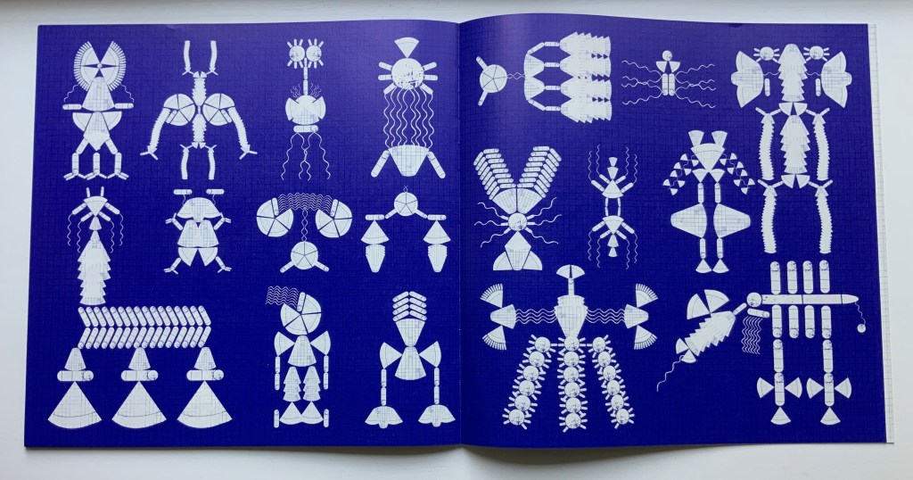
Xiao Long Hua places the different shapes the blind men perceive into the mind of the king, where they become a butterfly and then transform endlessly and kaleidoscopically into other figures represented across a series of pages printed dark blue. This variation on the theme comes from the Miao (Hmong) creation song Butterfly Mother or Mother Butterfly.
The final colorless two pages consist of cut-outs inviting the readers’ hands to create more strange figures along with the king’s mind. This element of touch recurs on the cover, which on closing the reader will find is covered in fingerprints. The cover’s ink is thermochromatic, fading away under the warmth of touch, returning as it cools and waiting for our next blind touch.
Selection from One and One Half Atelier edition. Photos: Books On Books Collection.
The publishing house Qianxun Neverend has issued a shorter trade edition of The Blind Men and the Elephant. Although a thermochromatic cover proved to be too expensive, an equally interesting design feature animates the cover’s image of the butterfly transforming into the multiple figures in the king’s mind.
Prior to The Blind Men and the Elephant, Xiao Long Hua engaged primarily in illustrations, scroll painting, installation works and sculpture, some of which can be seen on his Tumblr blog. For his latest work with the One and One Half Atelier, The Great Migration, the Atelier’s site announced a multimedia installation. A comment about this work sheds light on The Blind Men and the Elephant as well; he writes, “…I want to paint a magnificent picture of the Great Migration to express those spaces and memories that are fading away, I try to blur the forms between people, animals and objects. “
Other works in the Books On Books Collection to compare with The Blind Men and the Elephant include
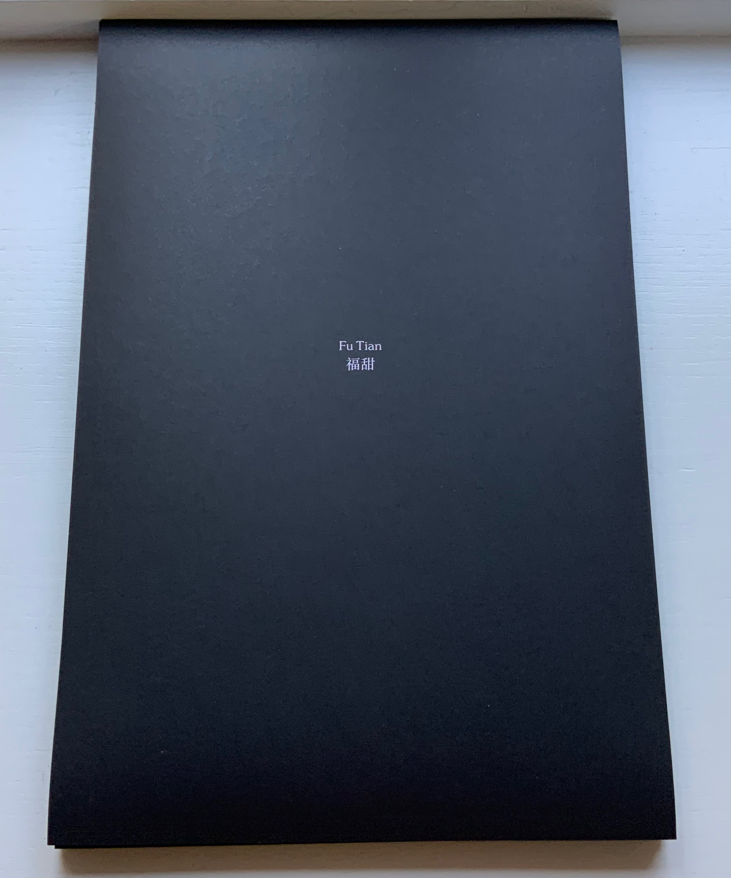
Like a Pearl in My Hand(2016) Carina Hesper Boxed folios. Box: H388 x W278 x D35. Folios: H330 x W220, 32 loose folios. Edition of 250, of which this is #221. Acquired from the artist, 19 December 2021. Photos of the work: Books On Books Collection.
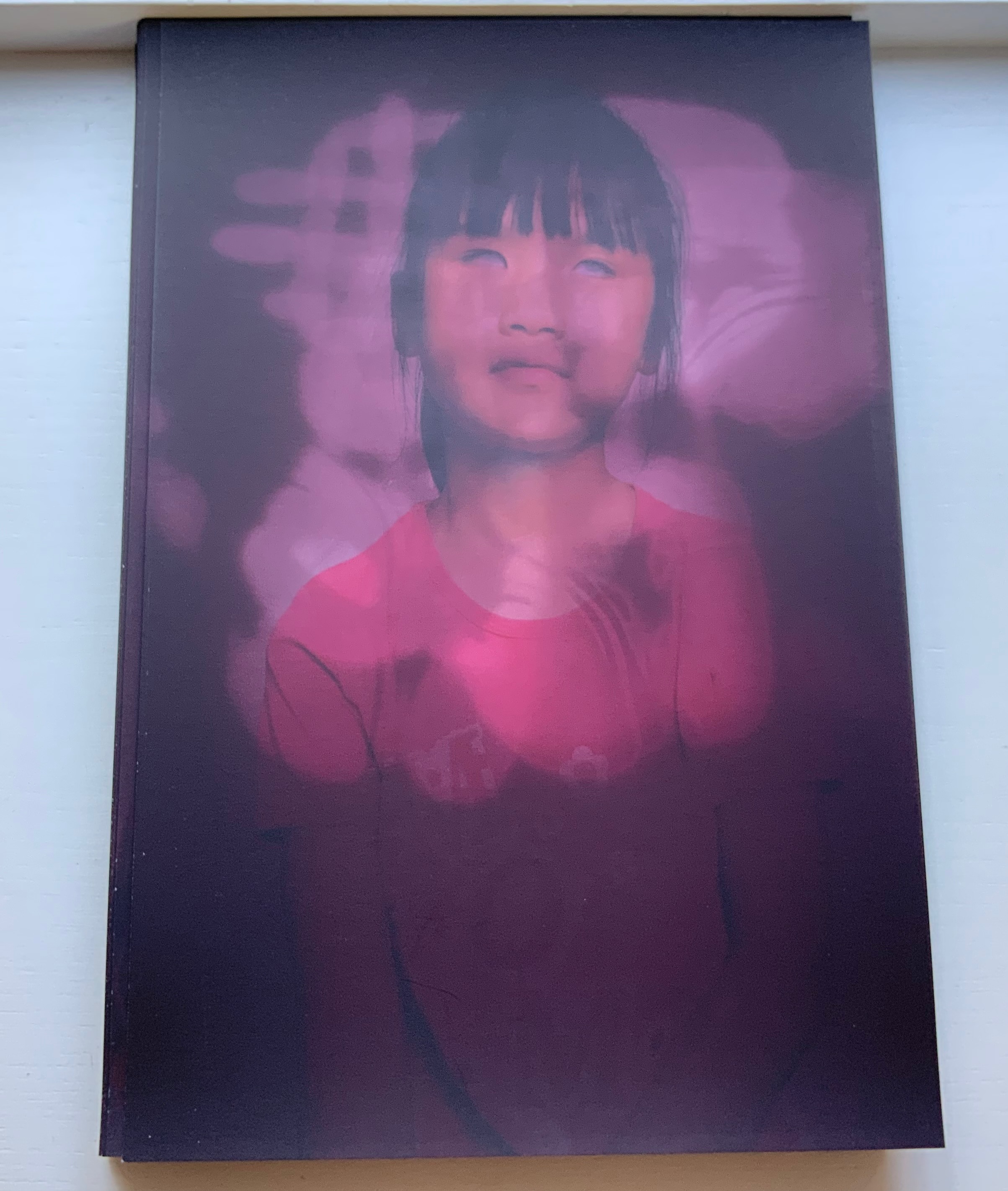
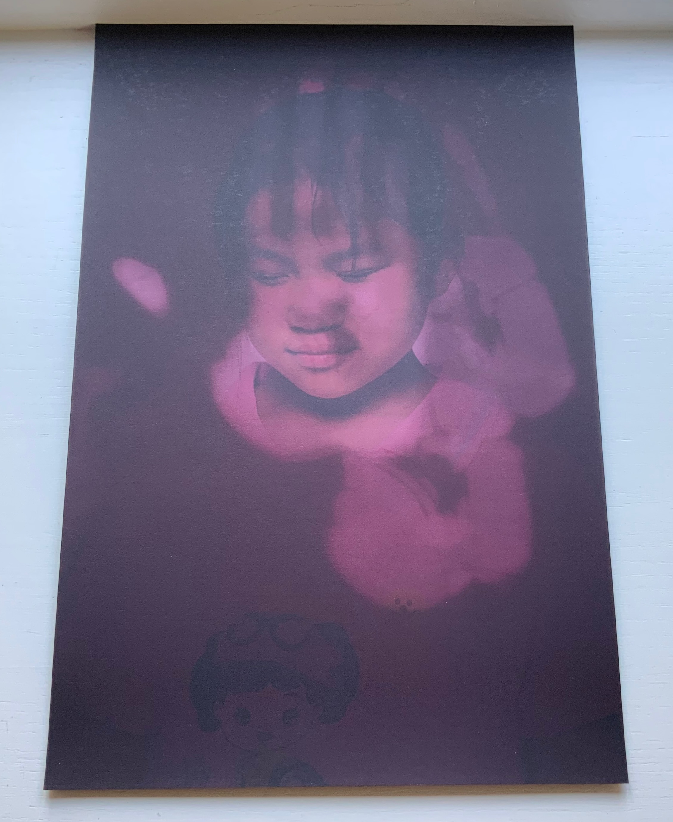
Carina Hesper’s Like a Pearl in my Hand came to the collection after its appearance in the exhibition “The Art of Reading”, 18 November 2017 to 4 March 2018, at the Meermanno Museum in The Hague, Netherlands. It was an exhibition whose curator insisted that none of the works could be under glass. They had to be touchable. Like a Pearl in my Hand is a boxed set of 32 photographic portraits, each coated in black thermochromatic ink. Only by touching the prints can you see the underlying portraits.
Photos: Books On Books Collection. Taken at the Meermanno Museum in 2017.
Each portait is of a child, congenitally blind, whom Carina Hesper met through the Bethnal China orphanage between 2012 and 2016. A folded sheet (8 unnumbered pages) includes two essays and the colophon for the work. In one essay, Bettine Vriesekoop provides background on Hesper’s visit to the orphanage Bethel China as well as social and historical observations about the position of the congenitally blind in China. In the other essay, Hannes Wallrafen, once a photographer, now blind, delivers a perceptive review of what he calls the “book with black pages on my lap”. Explaining his situation, he addresses his task by explaining “how the blind see” by touch, memory and imagination. For his review, he also has the advantage of an app, TapTapSee, which enables him to take photographs before and after touching each folio and listen to an automated description of each. A quick trial will reveal the app’s limitation vis-à-vis Like a Pearl in My Hand and underscore the poignancy of Wallrafen’s concluding comment:
For anyone who does not dare pick up the book or only gently touches the pages, this book remains what it seems at first sight: a collection of black pages.
The best artists’ books engage the reader/viewer in a multisensory experience. Even so, usually sight comes first and touch, second among the senses in the experience. Like a Pearl in My Hand challenges this by making the subject of the unsighted accessible to the sighted only through the warmth of touch.
Other works in the Books On Books Collection to compare with Like a Pearl in My Hand include
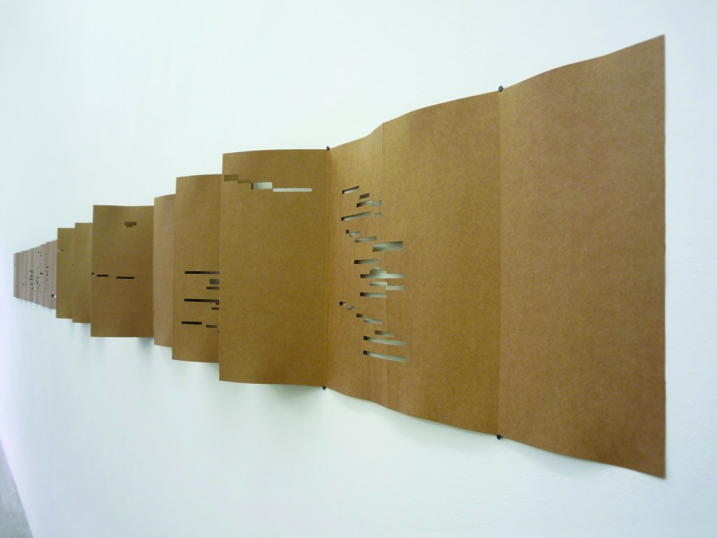
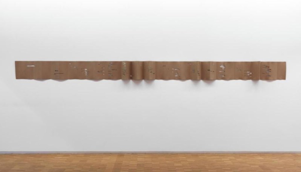
In 2009, Rainier Lericolais created one of the more unusual works of homage to Stéphane Mallarmé’s Un Coup de Dés Jamais N’Abolira le Hasard (1914). In Carton Perforé, the words and lines of Mallarmé’s poem take up their positions as perforations on a continuous paper roll used for a barrel organ or hurdy-gurdy.
For a multidisciplinary artist and musician, Lericolais’ choice of medium here is highly appropriate, as is the choice of Mallarmé’s poem for an artist in pursuit of “grasping the elusive“. The work is now in the permanent collection at the Musée national d’art moderne, Centre Pompidou.
In 2020, Lericolais revisited his visual barrel-organ homage to create a version that could be heard as well as seen. Under the Direct to Disk Éditions label, Lericolais published Carton Perforé as sheet music for piano along with a recording of it. Just as Broodthaers and other hommageurs signaled their homage by changing Mallarmé’s subtitle from Poème to Image, Sculpture, Musique, etc., Lericolais adds the subtitle Piano, paying homage to their tributes, Mallarmé’s poem and, humorously, his own earlier work. A performance of the piano version can be heard here.
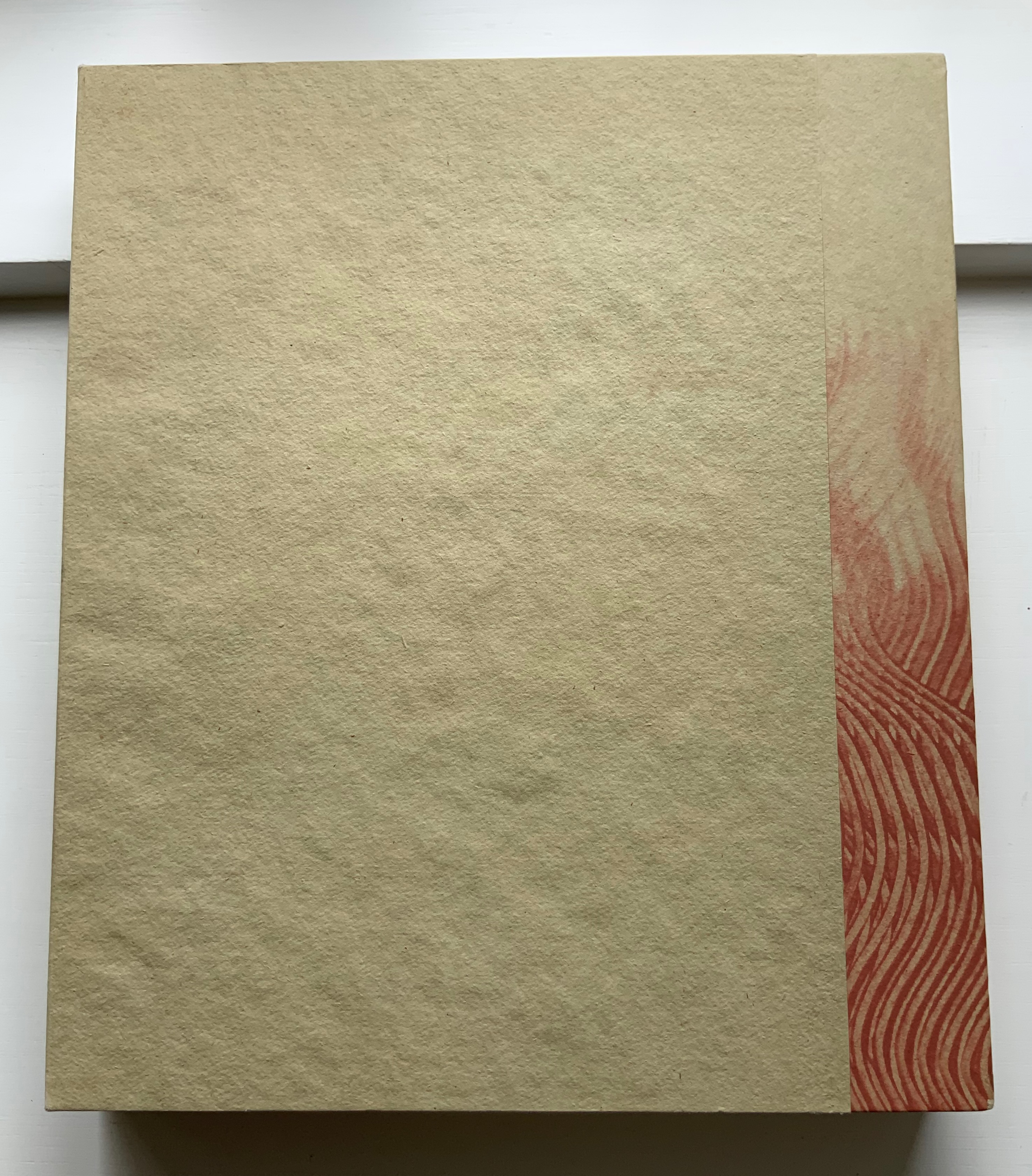
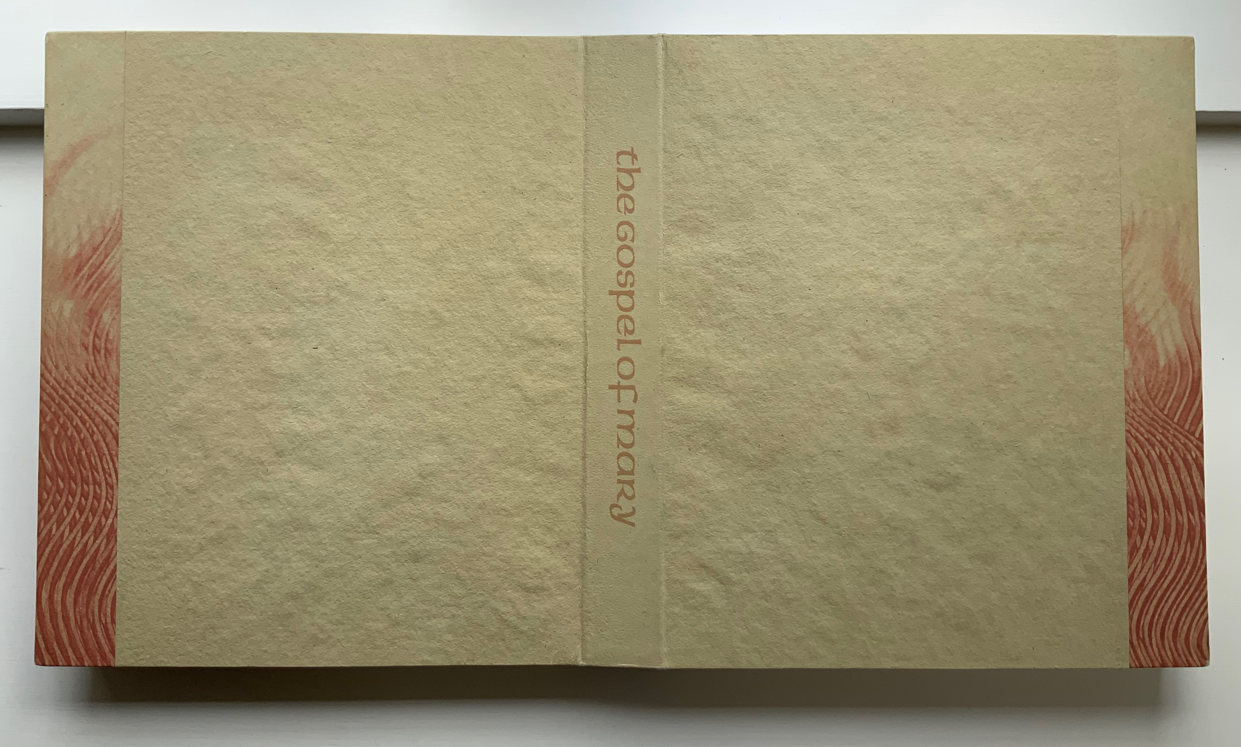
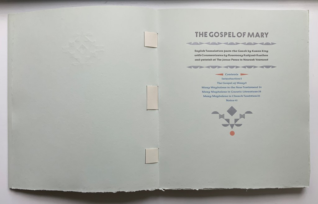
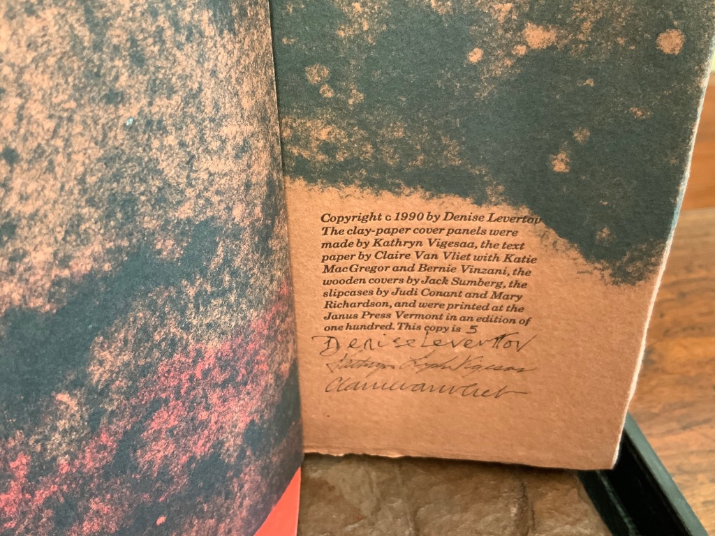
The Gospel of Mary (2006) Claire Van Vliet et al. Woven binding with Barcham Green Cairo paper, housed in De Wint paper-covered and lined birch trays. Box: H320 x W274 x D42 mm. Book: H292 x W250 x D28 mm, 44 pages, center pulp-painted pop-up. Edition of 150, of which this is #27. Acquired from Thomas Goldwasser Rare Books, 18 June 2022. Photos: Books On Books Collection.
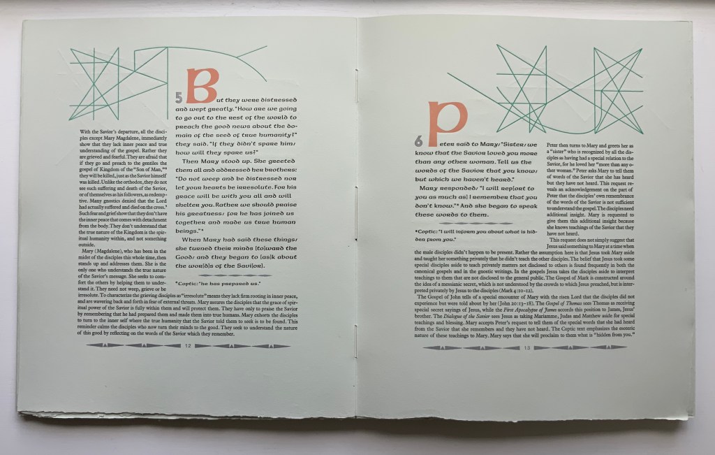
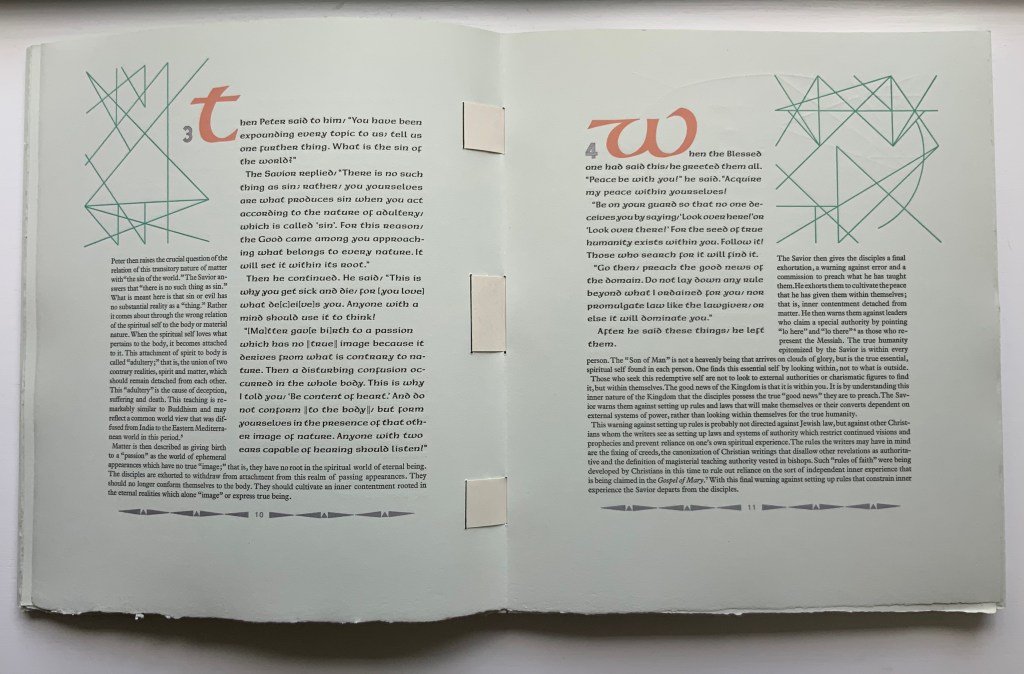
Like Woven and Interlocking Book Structures (2002), Tumblr Blocks (1996) and Batterers (1996) below, The Gospel of Mary is an outstanding work of collaboration. Its pulp painting, letterpress, woven binding and layout make this work an important addition to works by Claire Van Vliet in the Books On Books Collection. Van Vliet pulp painted the centerpiece and cover below with Katie MacGregor (Whiting, Maine), who also made the pop-up papers. Andrew Miller-Brown, the Janus Press workshop printer and founder of Plowboy Press, is credited and has signed this copy with Van Vliet. Audrey Holden, who has also signed this copy and worked on Tumbling Blocks, executed the binding. Rosemary Radford Ruether, feminist thelogian, provided the commentary on the text, both of which were typeset with the assistance of Ellen Dorn Levitt, whose collection of book arts projects and teaching materials now resides at the Maryland Institute College of Art.
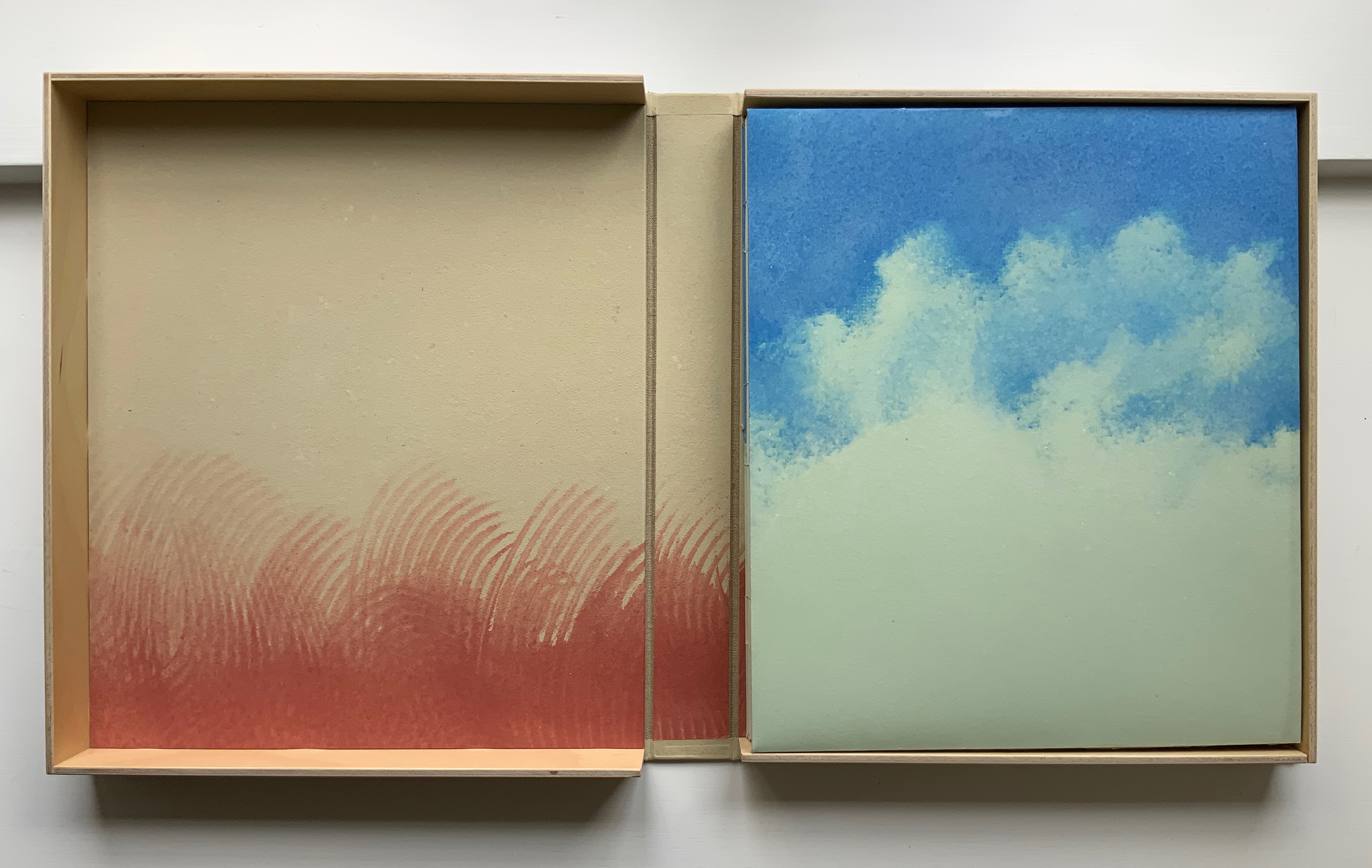
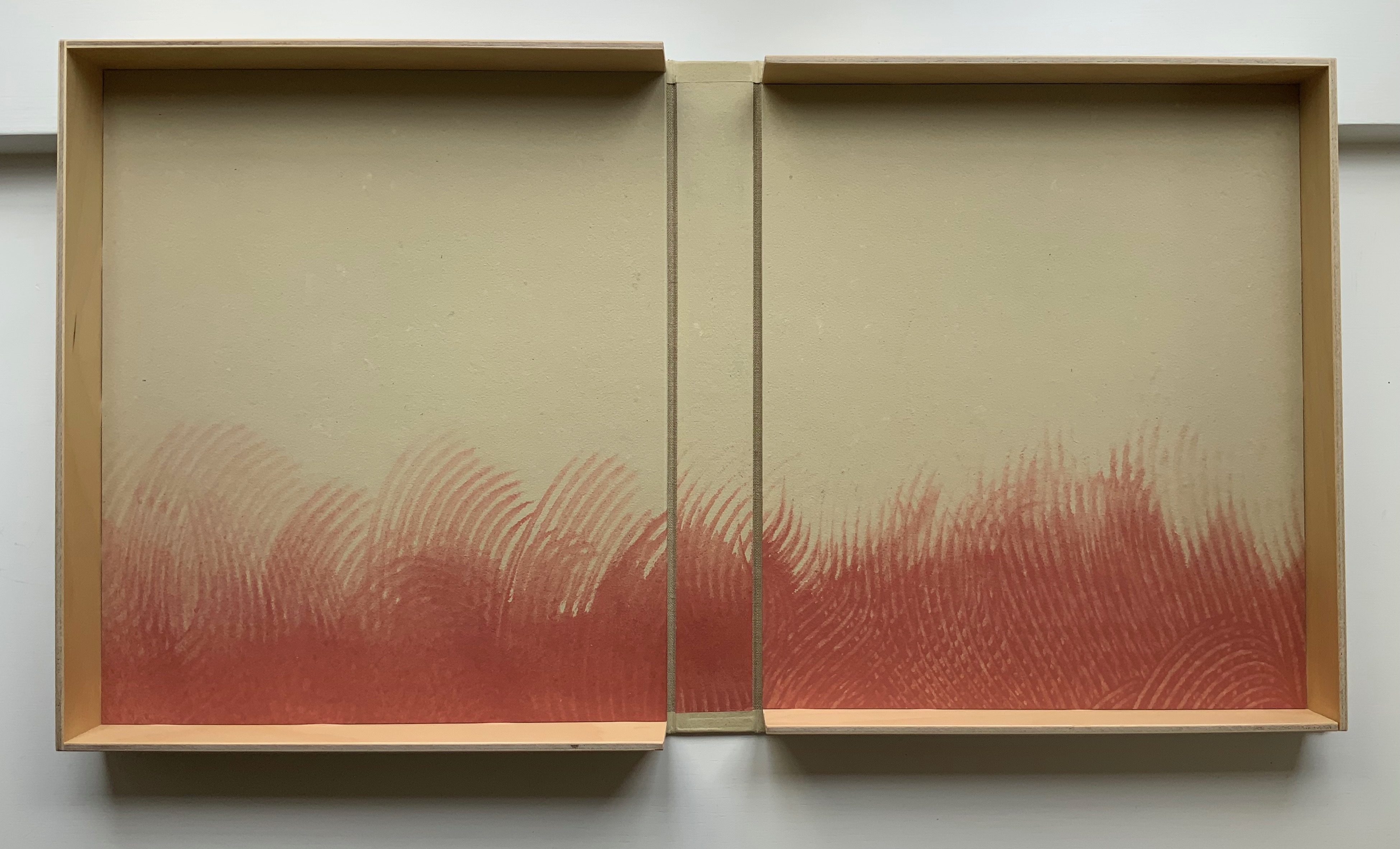
The four photos below provide views of the binding structure and also the layout in which the commentary embraces the gospel text.
Below, the five-part pulp-painted centerpiece and the silver paper ribbons woven into the double-page spread stand out against the more subtly pulp-painted background. The pop-up echoes the images on the Barcham Green Boxley paper used throughout for the text and commentary (see above).
The size of the work and the way that the printing, paper, pulp painting, layout of text and commentary, pop-up and binding complement one another echo the age of illuminated manuscripts and incunabula. It would make for a rewarding exhibition to juxtapose The Gospel of Mary with several of them.
Additional insights and process photographs can be found on pages 48, 49 and 74 of John Buchtel’s The Art of Paper (see below).
The entries below were previously published on 8 August 2019 and have been moved here.
Woven and Interlocking Book Structures (2002)
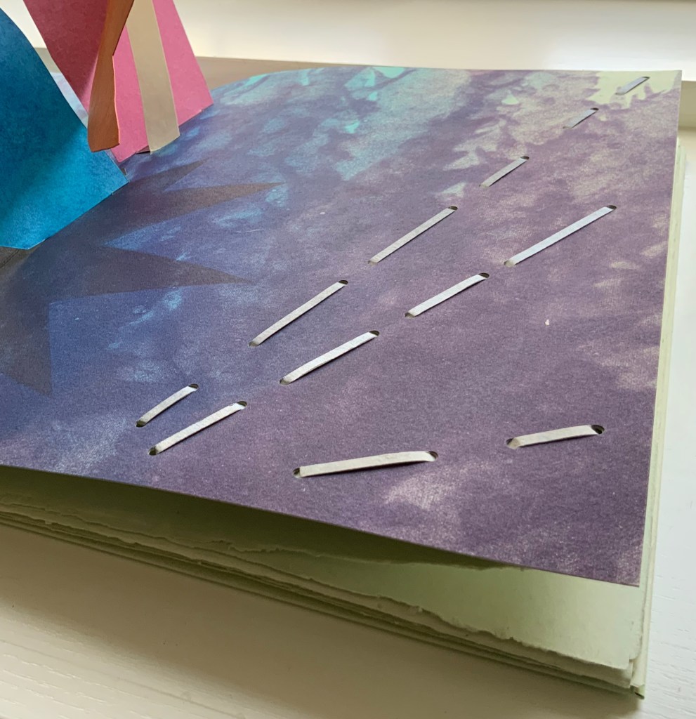
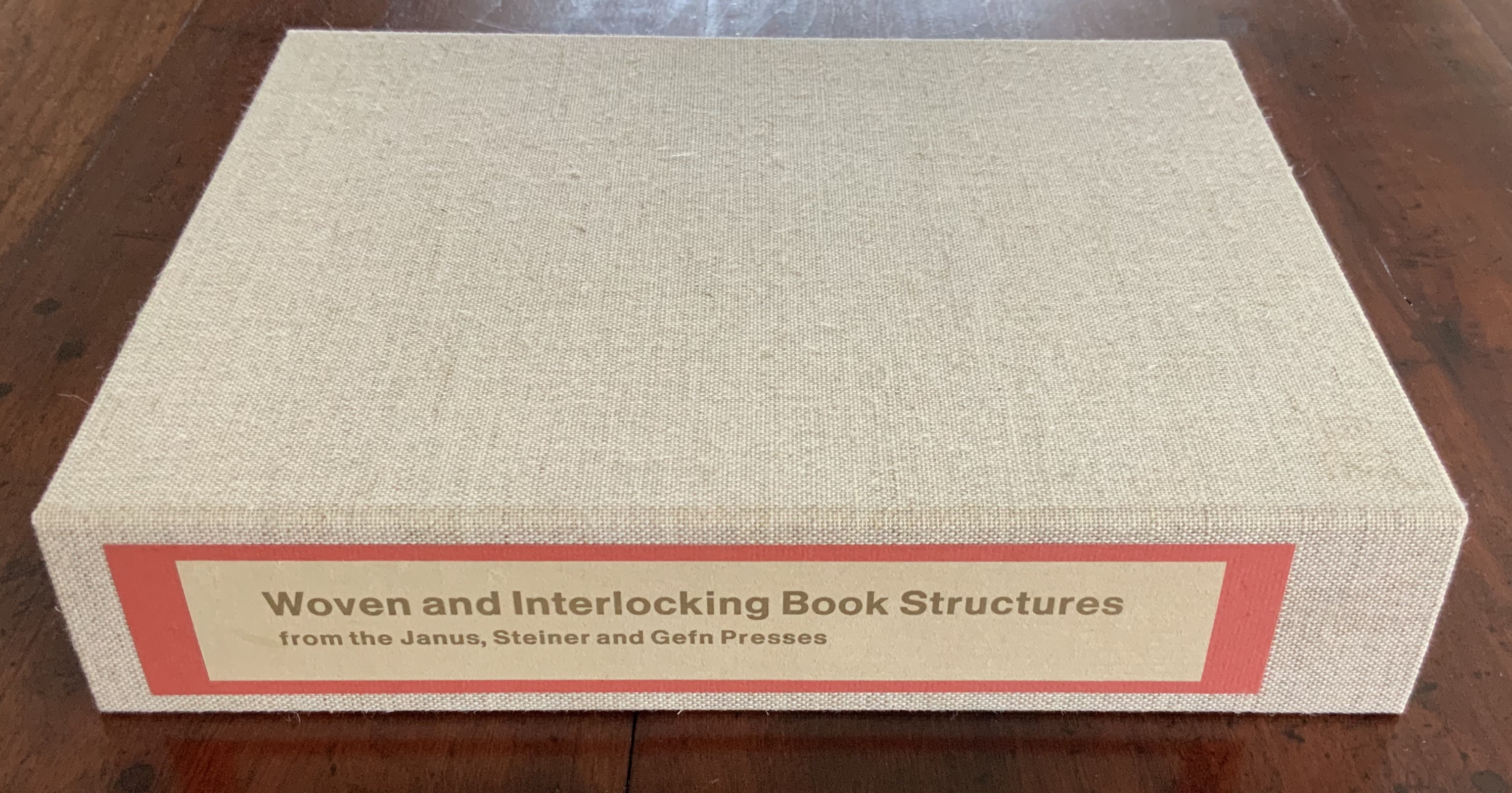
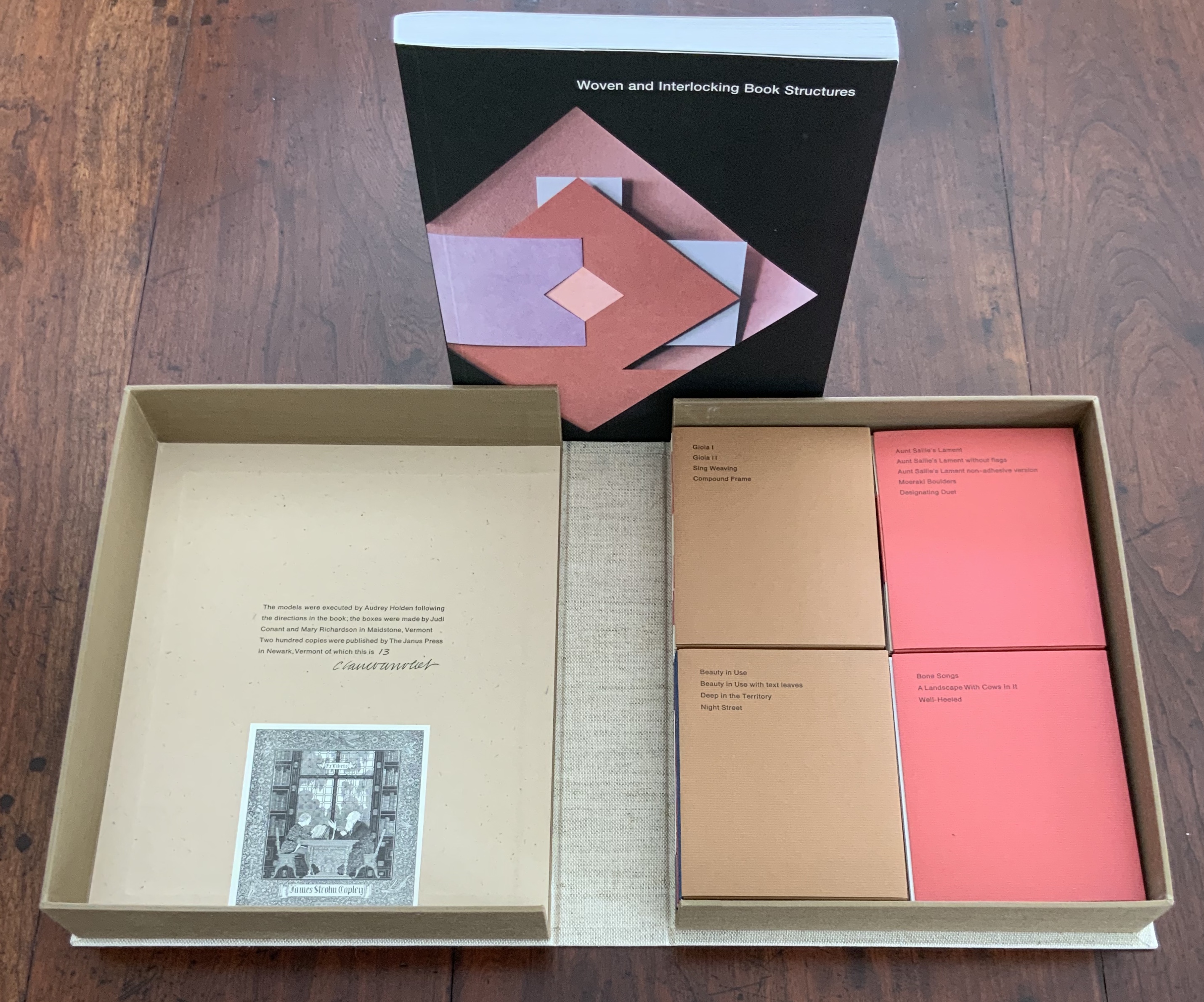
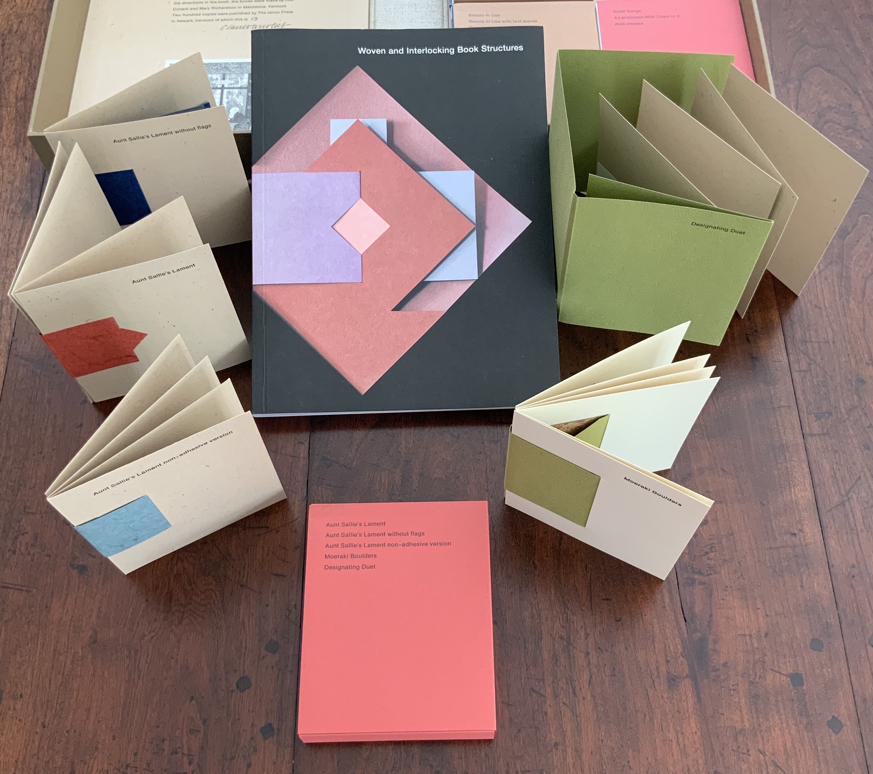
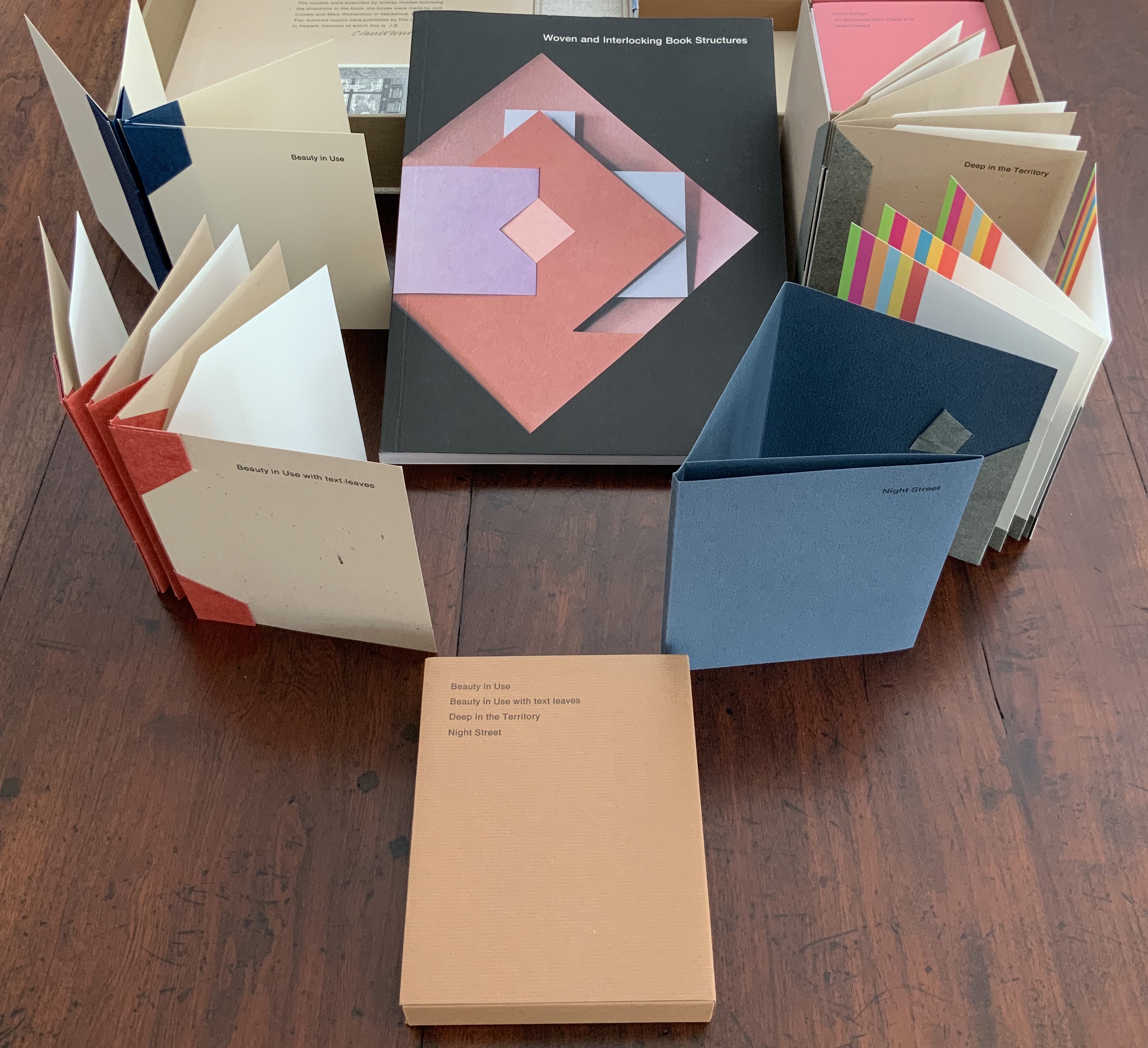
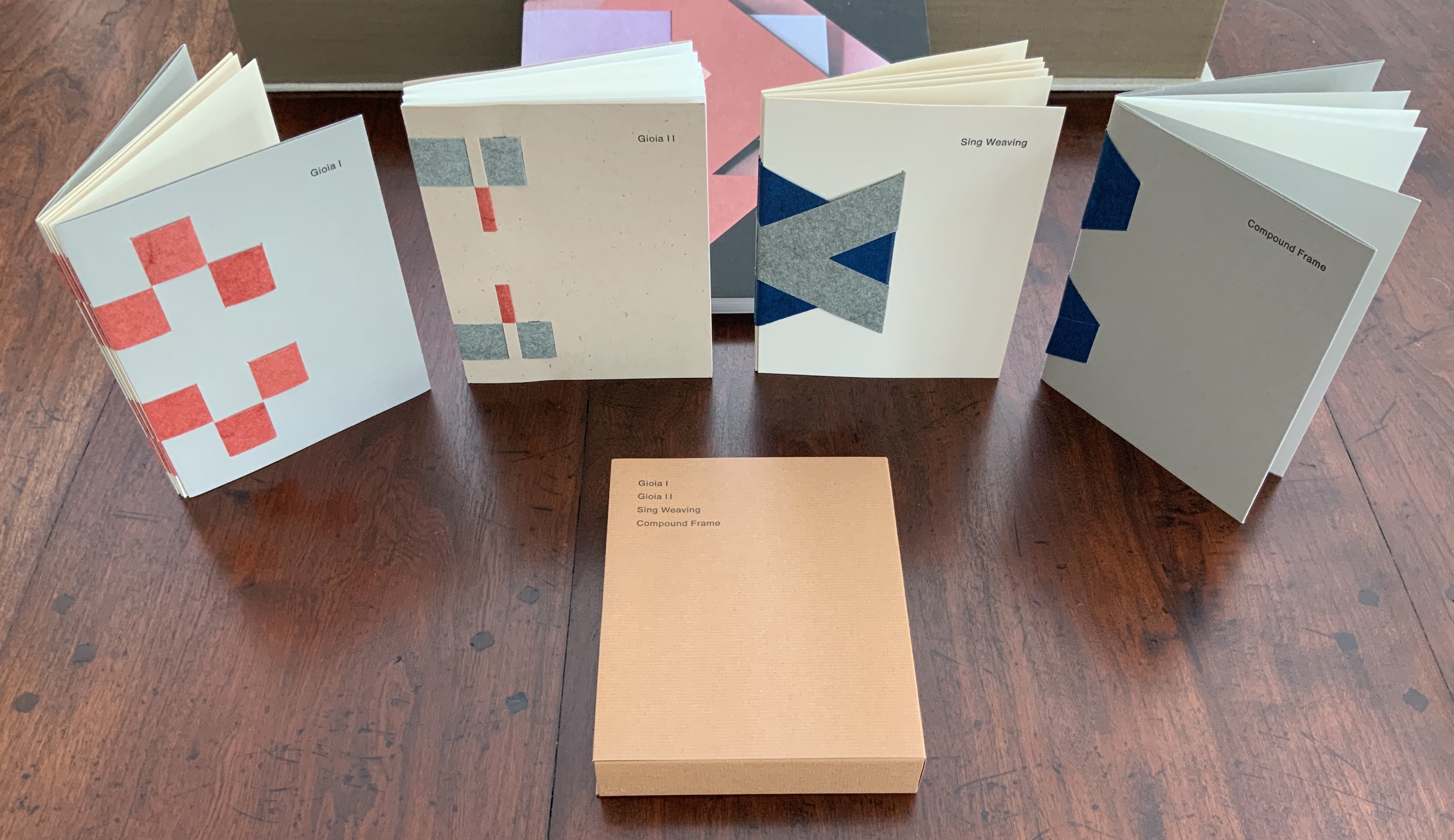
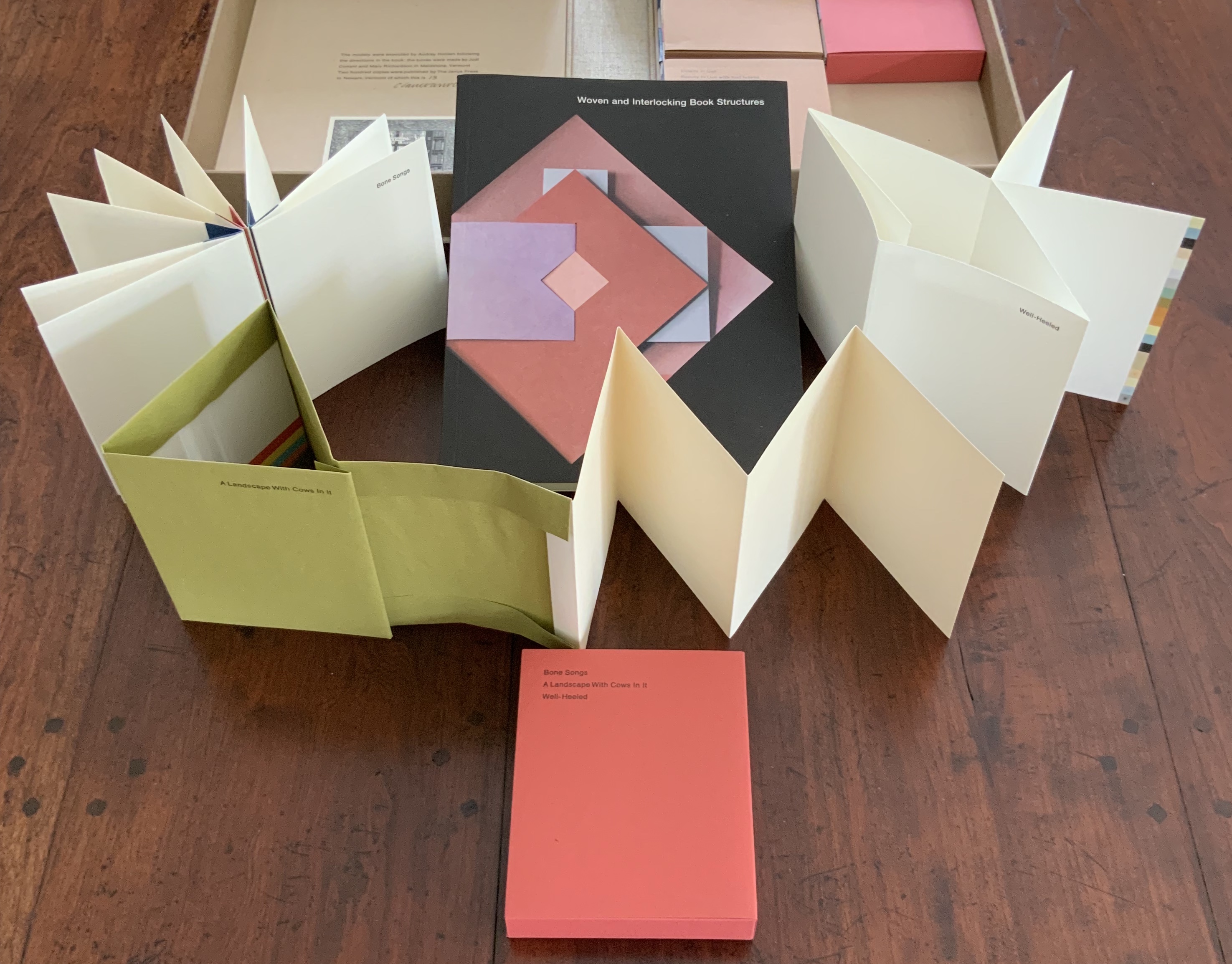
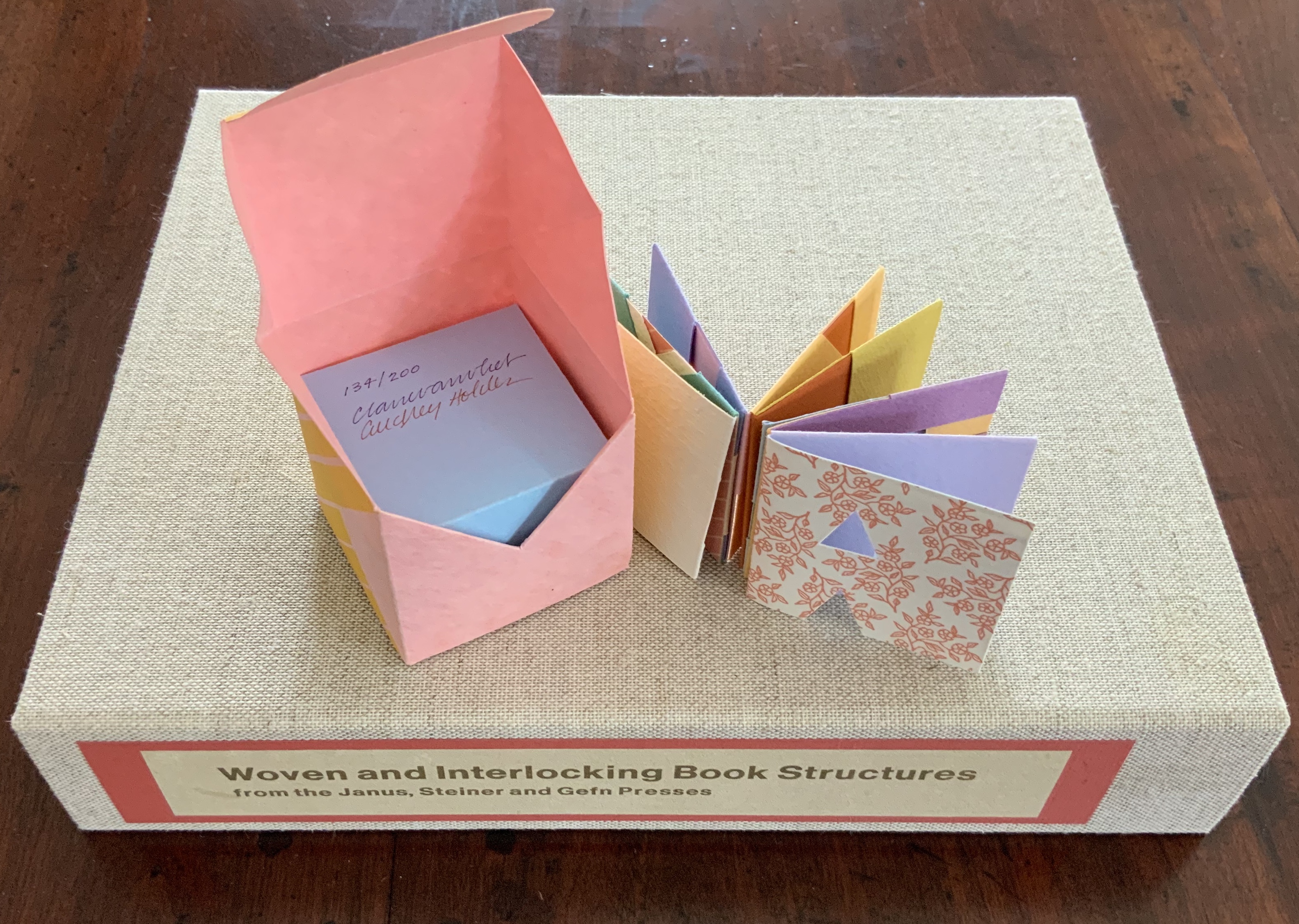
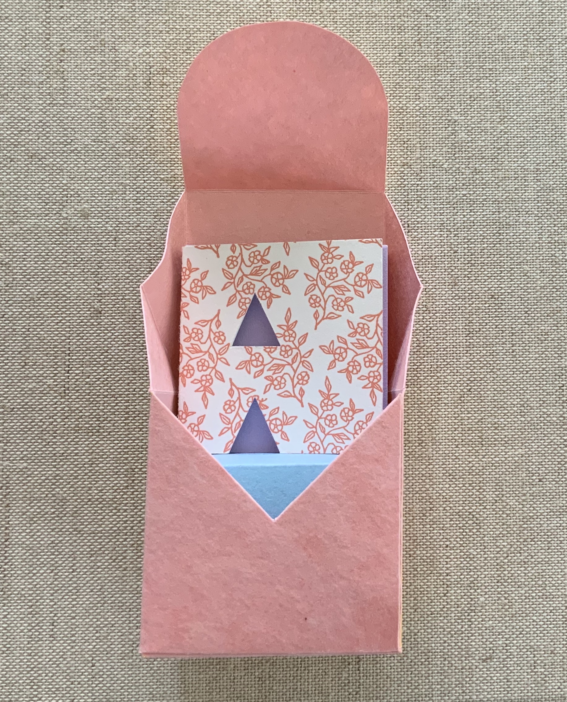
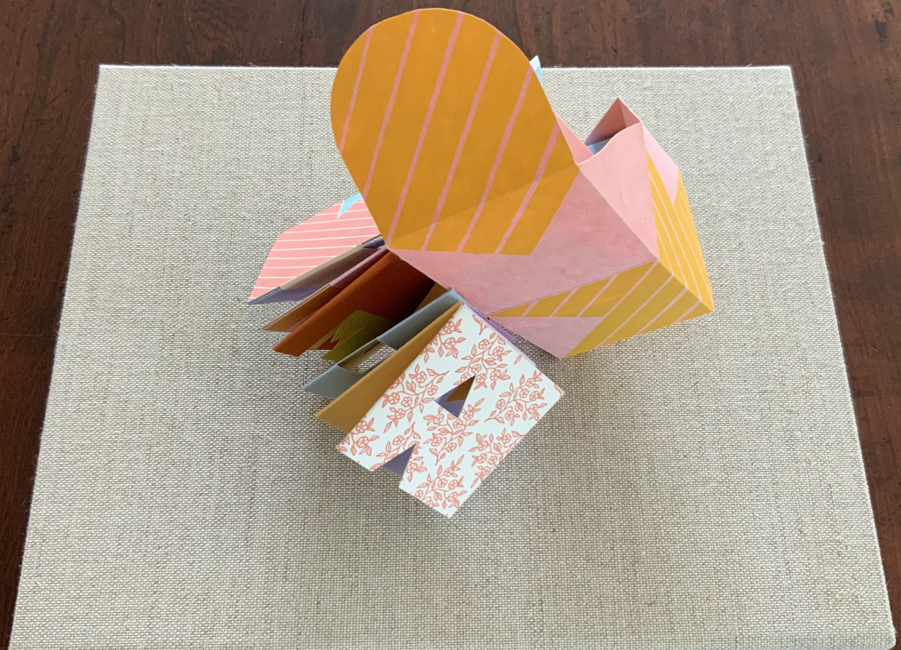
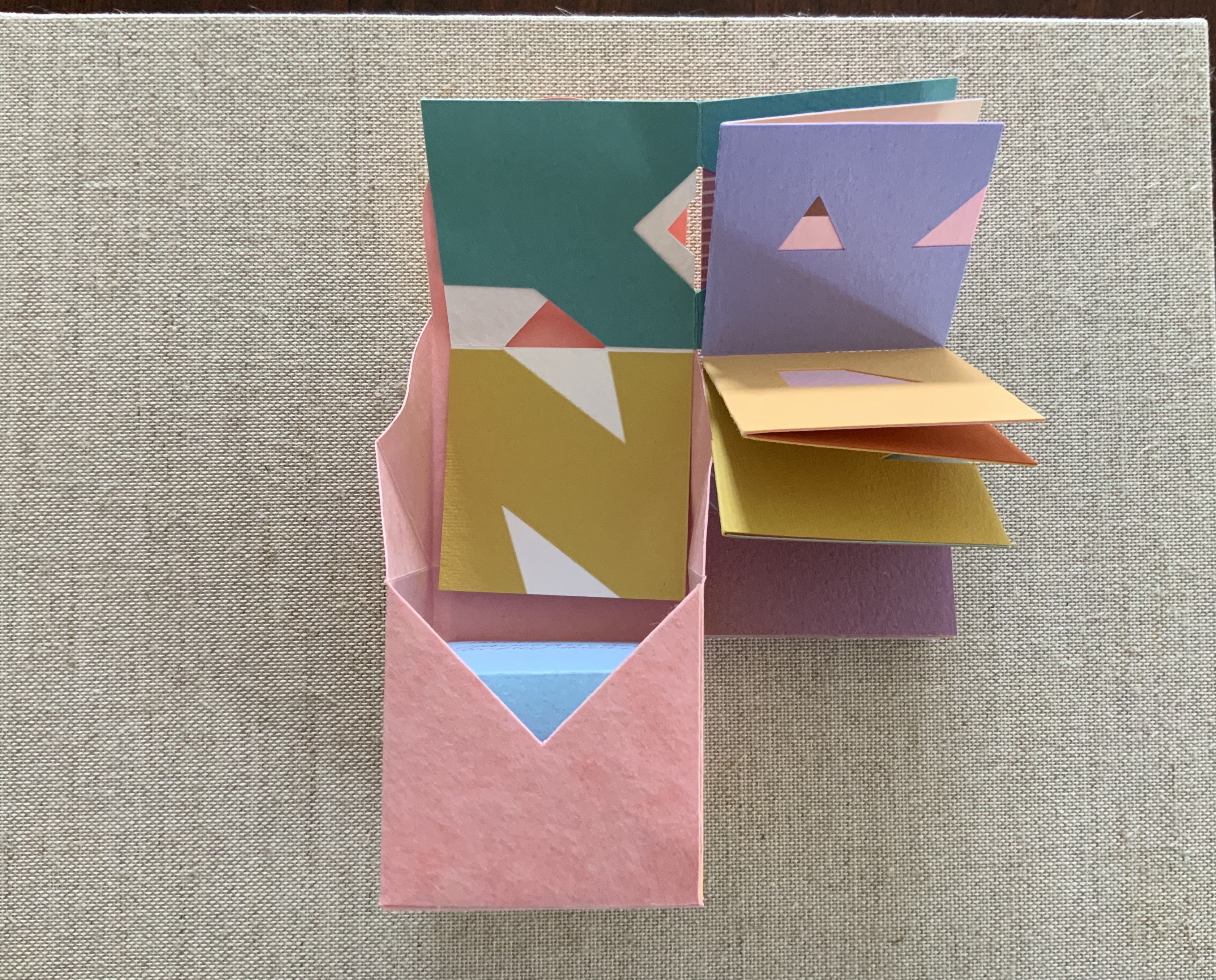
Woven and Interlocking Book Structures (2002) Claire Van Vliet and Elizabeth Steiner Four slipcases containing 16 book models are enclosed with the book in a cloth-covered clamshell box. Box: H282 x W226 x D55 mm. Slipcases: H128 x W104 mm. Book: H254 x W192 mm, 144 pages. Edition of 200, of which this is #13, signed by Claire Van Vliet. Acquired from James S. Jaffe Rare Books, 1 February 2015. Photos: Books On Books Collection.
The binding models and papers used for them are:
A — Aunt Sallie’s Lament; Aunt Sallie’s Lament without Flags; Aunt Sallie’s Lament non-adhesive version; Moeraki Boulders; Designating Duet. Papers used include Elephant Hide, Fabriano cover and Miliani Ingres, French’s recycled, Marblesmith, Bristol and Saunders laid.
B — Beauty in Use; Beauty in Use with text leaves; Deep in the Territory; Night Street. Papers used include Elephant Hide, French’s recycled, Bristol, Mohawk Superfine and Fabriano cover.
C — Gioia I; Gioia II; Sing Weaving; Compound Frame. Papers used include Elephant Hide, French’s recycled, Bristol, Mohawk Superfine, Linen Index, Neenah UV Columns and Marblesmith.
D — Bone Songs; A Landscape with Cows in It; Well-Heeled. Papers used include Elephant Hide, Mohawk Superfine, Arches laid, and Fabriano text and Miliani Ingres.
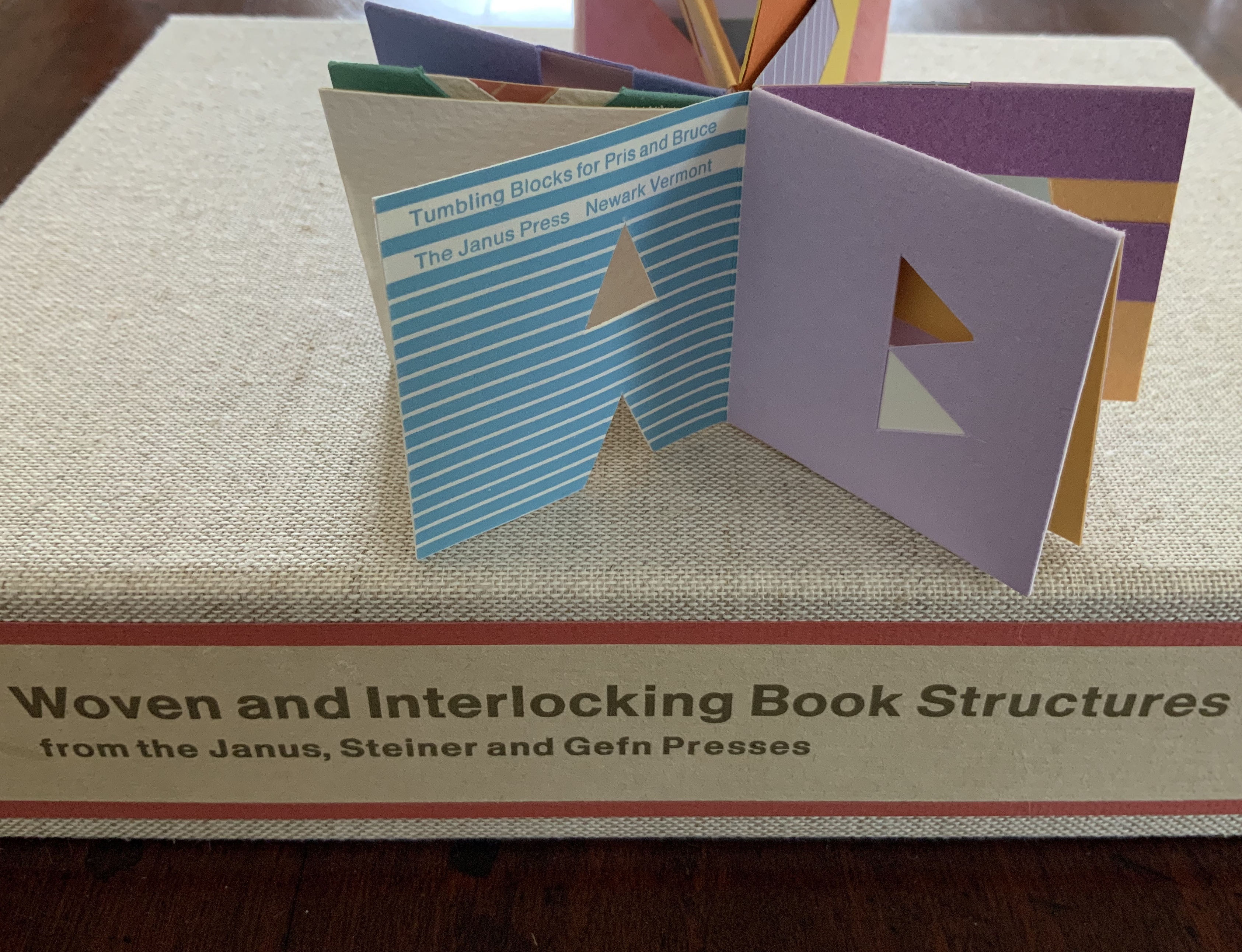
Tumbling Blocks for Pris and Bruce (1996)
Tumbling Blocks for Pris and Bruce (1996) Claire Van Vliet and Audrey Holden Paper cube issued in a non-adhesive paper box housed in a clear plastic box. 58 x 58 x 58 mm. Edition of 200, of which this is #134. Acquired from Abecedarian Gallery, 21 July 2019. Photos: Books On Books Collection.
Working with offcuts from Praise Basted In: A Friendship Quilt for Aunt Sallie (1995), Van Vliet and Audrey Holden cut pairs of letters of the alphabet and glued them back to back. These constitute the cube-book’s leaves, which are folded and glued to permit the book to open into a variety of shapes. Gently tossed from hand to hand, the book will resume its cube shape. “Pris and Bruce” are the Hubbards, Janus Press patrons.
Slipcase: H307 x W387 x D73 mm; Tray: H296 x W380 x D61 mm; Accordion: H270 x W356 x D33 (closed), H270 x W1115 mm (open). Edition of 500, of which this is #5, signed. Acquired from Van Vliet via Vamp & Tramp, 17 July 2020.
What is remarkable about this sculptural book is its fusion of collaborators’ efforts, of art forms, and of text, materials, techniques and structures.
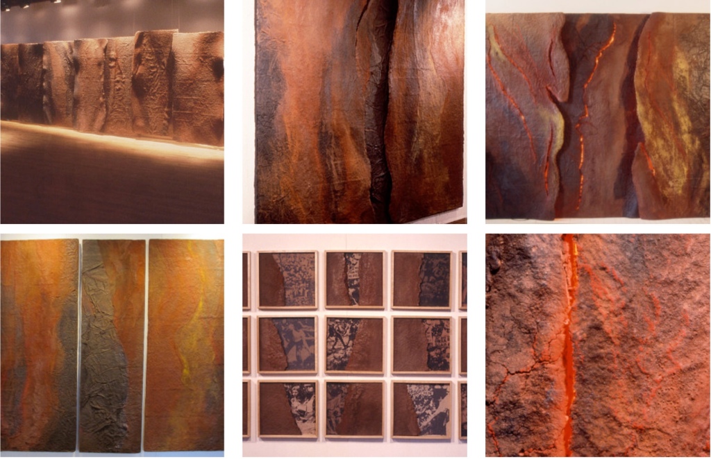
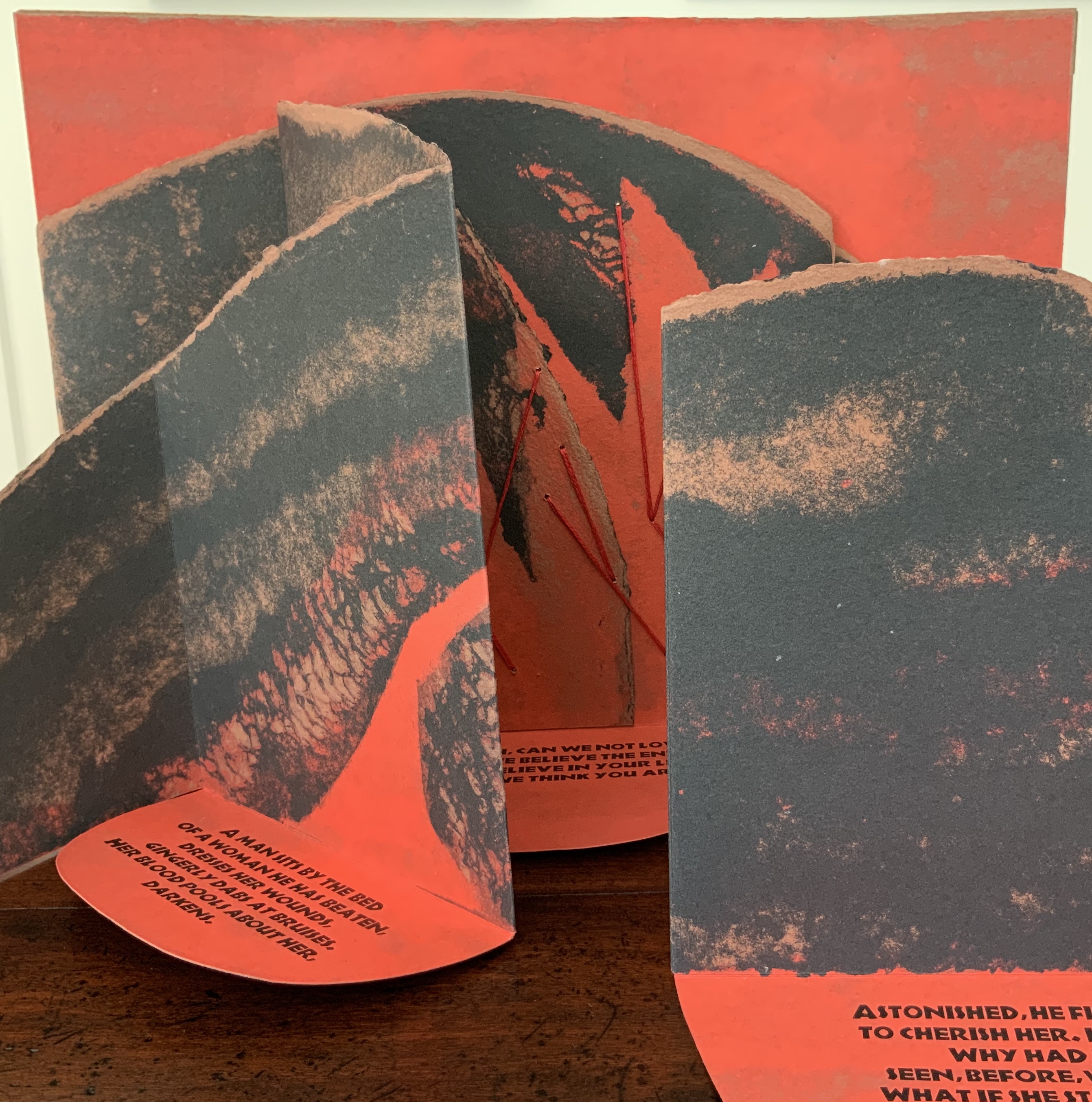
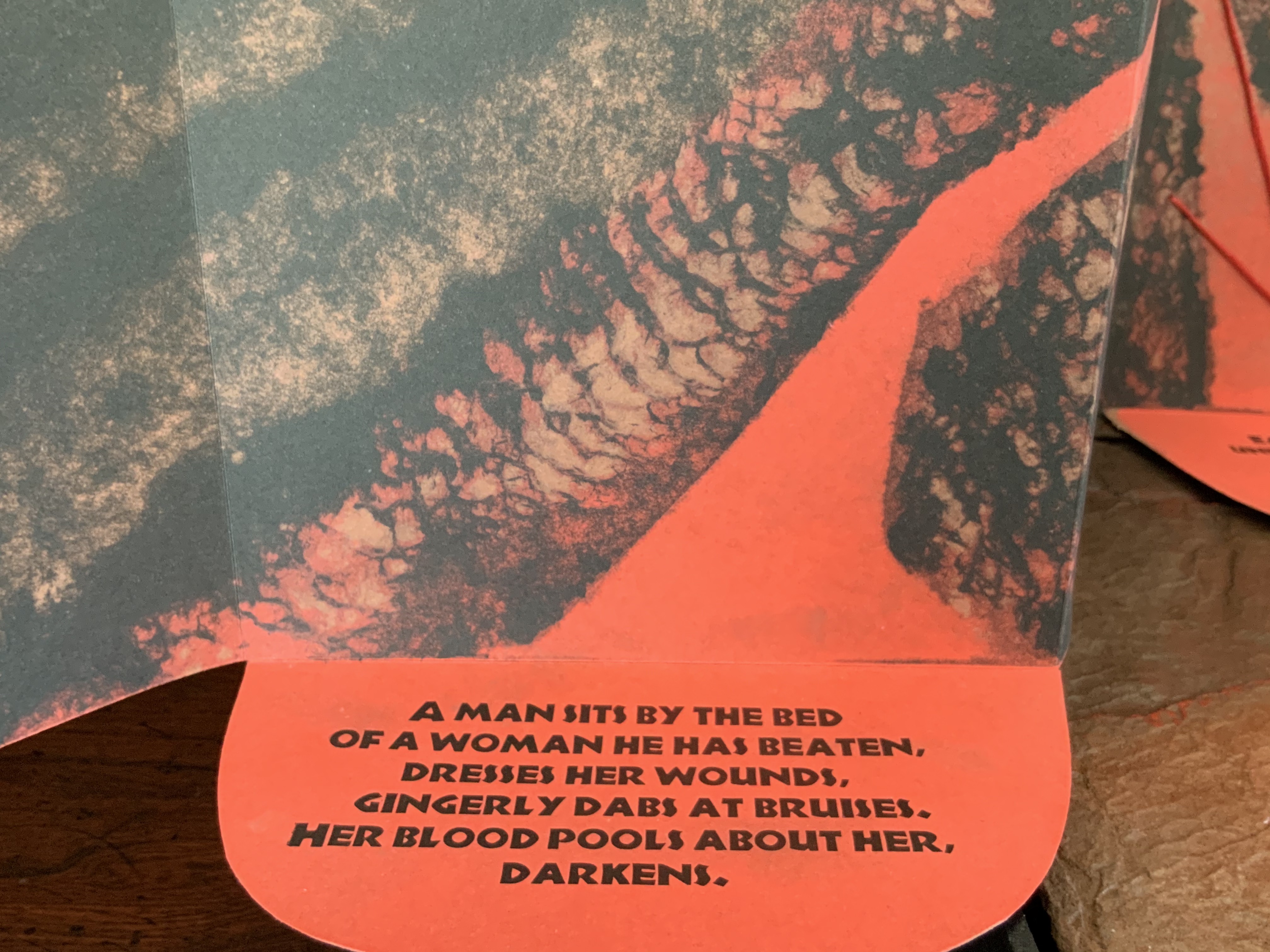
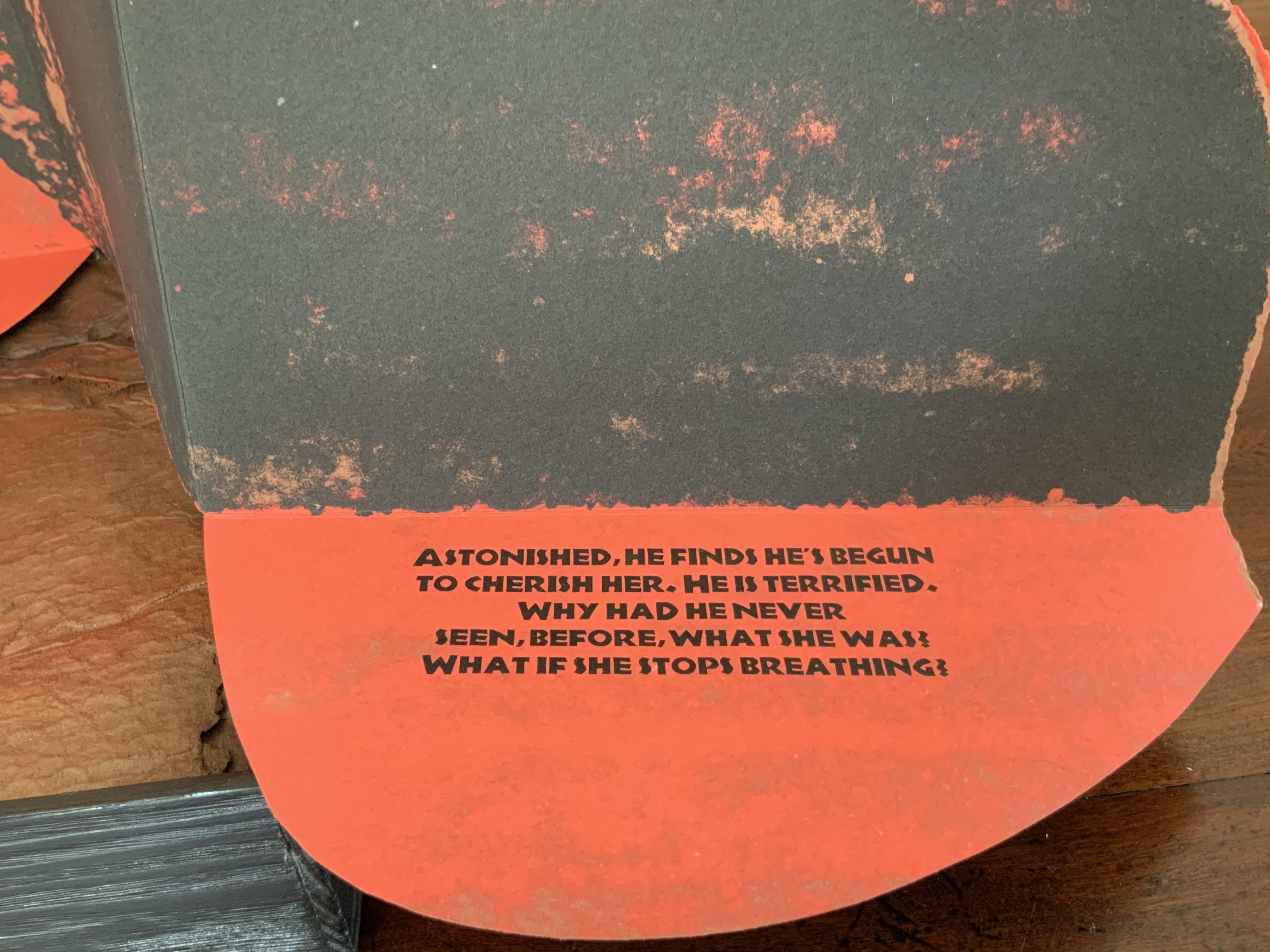
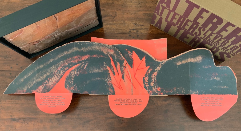
In the late 1980s, Claire Van Vliet and Kathryn Lipke (née Vigesaa) were seeking a collaborative project. After Van Vliet spotted Denise Levertov’s poem “Batterers” in the American Poetry Review (1990:6), they agreed that the poem, which enfolds our abuse of the earth within a metaphor of domestic abuse, was the appropriate text to join somehow with Lipke’s series of structural artworks called Earthskins.
Earthskins (1988-96)
Kathryn Lipke (Vigesaa)
Installation views of the works created from paper pulp, clay and pigments; some reaching 69 feet in length. Photos: Courtesy of the artist.
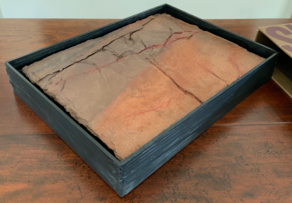
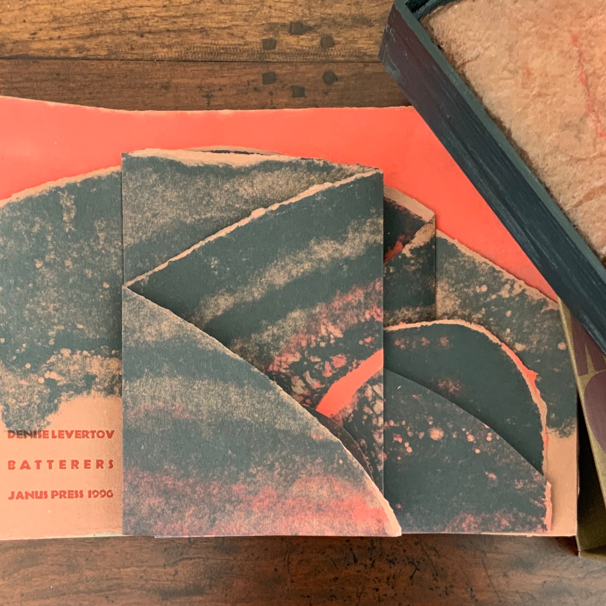
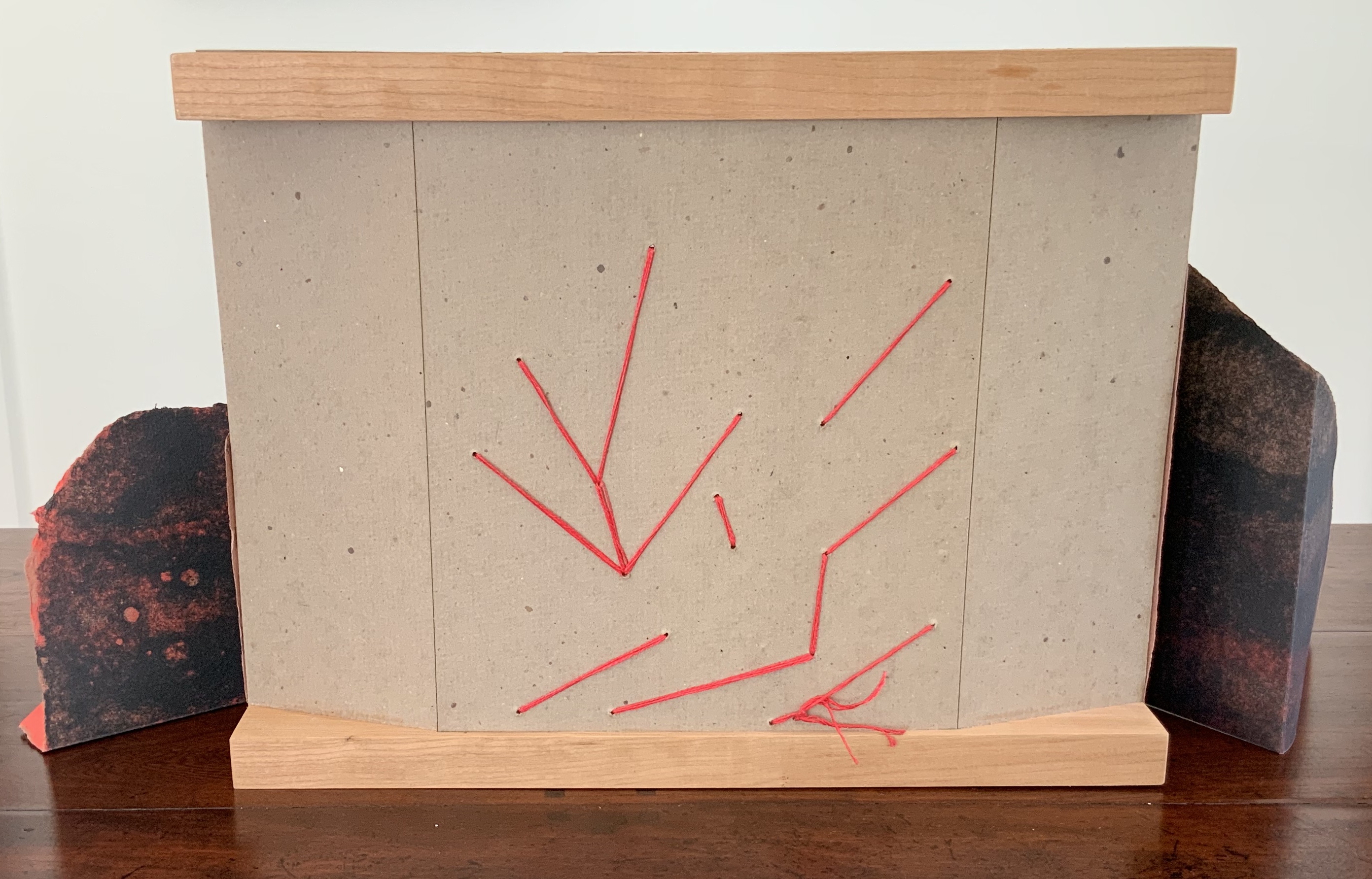
When letterpress printers consider the reproduction of a short poem, the broadside is the most common art form adopted. Van Vliet’s adoption of it is anything but common. Instead, she has orchestrated a combination of structures and art forms. From the maroon-printed, brown linen slipcase slides a tray made of tamarack wood to which Lipke’s vacuum-formed panel of clay mixed with paper is fixed. As the black tray is lifted, layers of multi-folded paper attached to a backing appear.
The top two layers are glued and sewn with multi-stranded red thread to the third and bottom layer, displaying the names of the author, work and Van Vliet’s press. The bottom layer is glued to a backing of three strong card panels tightly glued to two wood runners, sawn or routered into a slight U shape.
As the top layer is unfolded by pulling it apart, left and right, three tabs drop down to reveal Levertov’s poem.
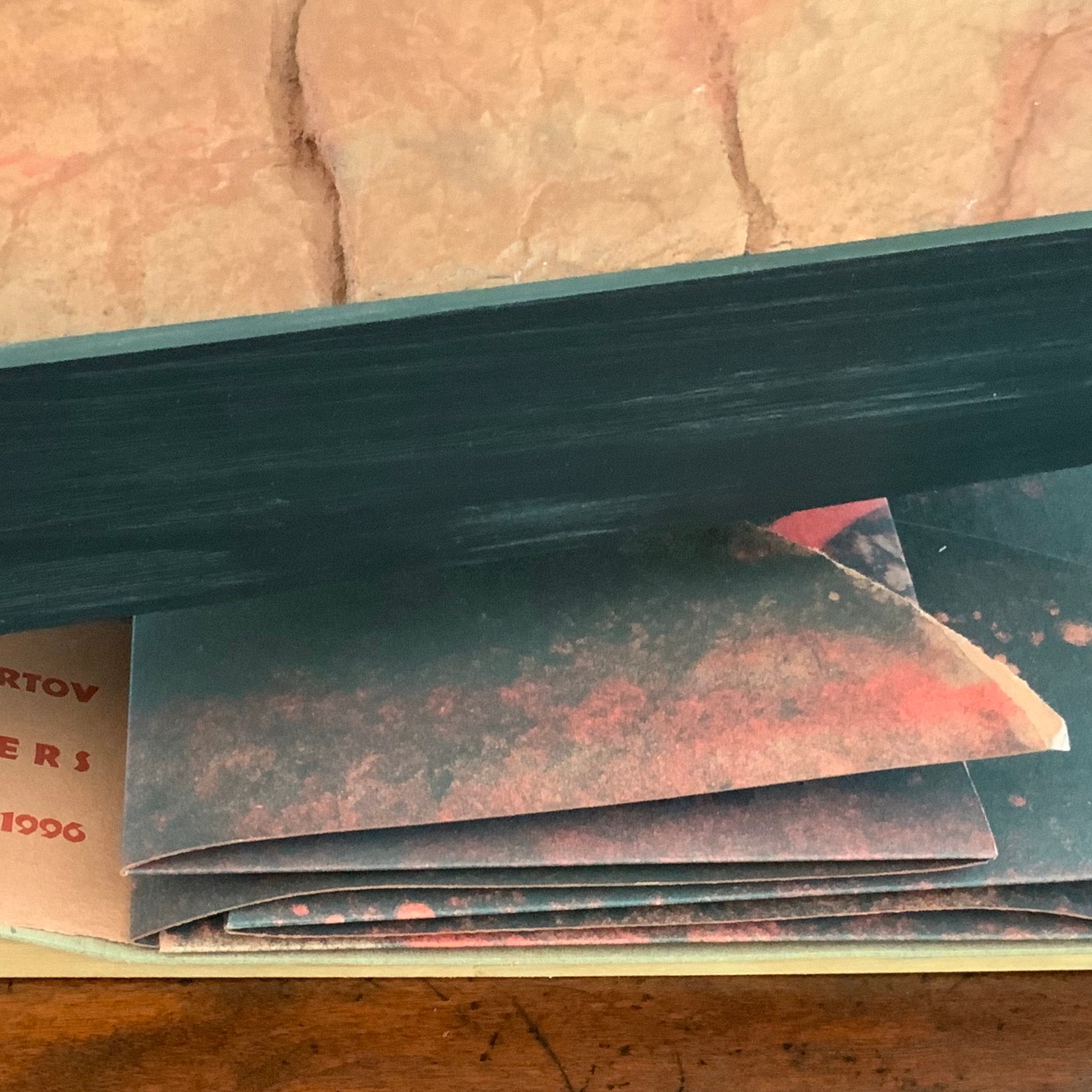
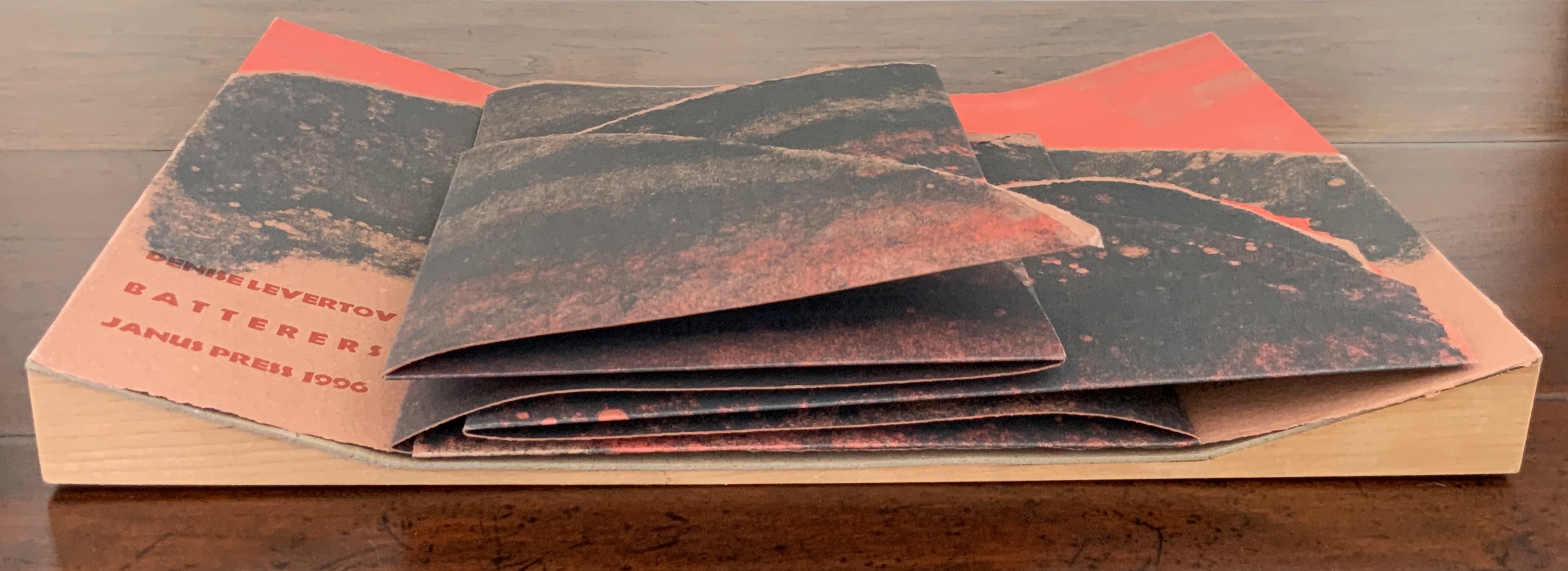
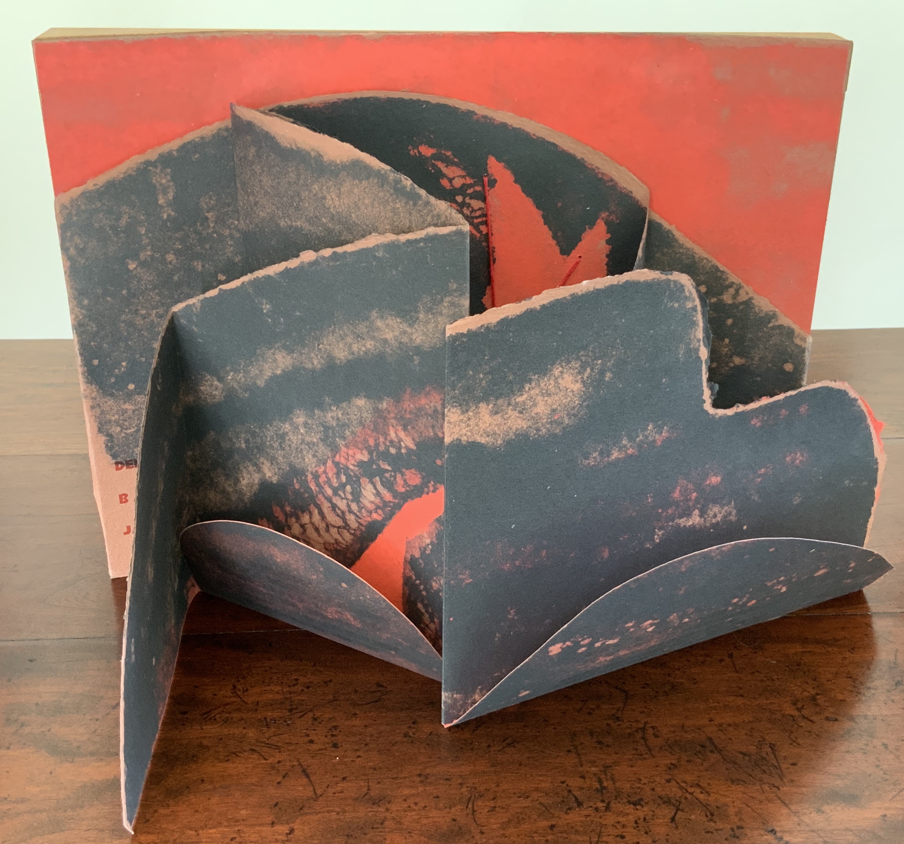
Van Vliet’s combination of structures and forms offers multiple orders in which to read the poem, which pleased Levertov because she liked the poem in both the stanzaic orders of 1-2-3 and 1-3-2 (correspondence with Kathryn Lipke and Claire Van Vliet, 20 July 2020). In a book-like way, the covering tray slides from its slipcover, the cover is removed, and the accordion pages unfold to be read left panel first, right panel second and center panel third, emphasizing the embedded and central metaphor.
Spread fully open, the structure assumes a single-sheet broadside form, and the “center” stanza moves from third to second in order. But there is a third order of reading, as it were. The broadside form “leans” into the art forms of print, painting and bas-relief sculpture. The text, images and design become a whole experience, an object to be taken in as a whole.
Photos: Books On Books Collection.
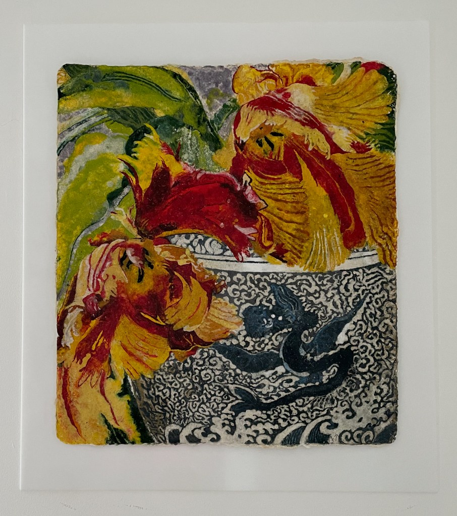
Not only in form does Batterers “lean” into the form of painting: the imagery and colors arise from the technique of pulp painting, a technique defined by the work of Marius Péraudeau in the mid-twentieth century. Pat Gentenaar’s still life Water Dragon in this collection provides another example of the technique.
Top: cover image of Marius Péraudeau: Pulp Paper Paintings (Paris: Ernst Maget, 1991). Photo taken at British Library: Books On Books. Bottom: Water Dragon 2011) Pat Gentenaar-Torley. Photo: Books On Books Collection.
In pulp painting, the paper is the painting. Assisted by Katie MacGregor and Bernie Vinzani in their paper studio in Whiting, Maine, Van Vliet poured different colors of paper pulp into prepared forms to create three sheets of paper on which to print and then collage into the image that suggests dual images: that of a volcano and that of a woman reclining on her side or face down. The fusion of shapes, the fusion of color and fiber in pulp painting, and the fusion of clay and pulp in the covering bas-relief (which can also be used as a stand for the broadside) fuse with the poem’s words and metaphor. Once this artwork has been experienced, reading the poem printed in a traditional book can never be the same.
Additional insights into The Batterers along with illustrations of the papermaking and painting process can be found in pages 43-45 of John Buchtel’s The Art of Paper (see below).
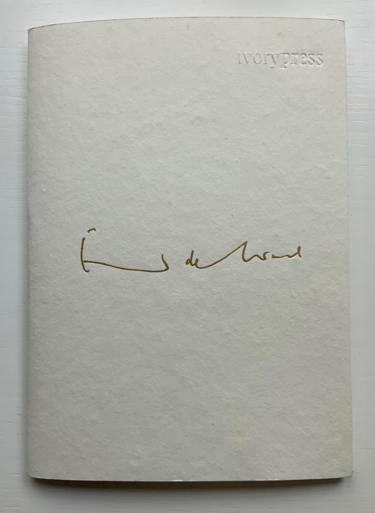
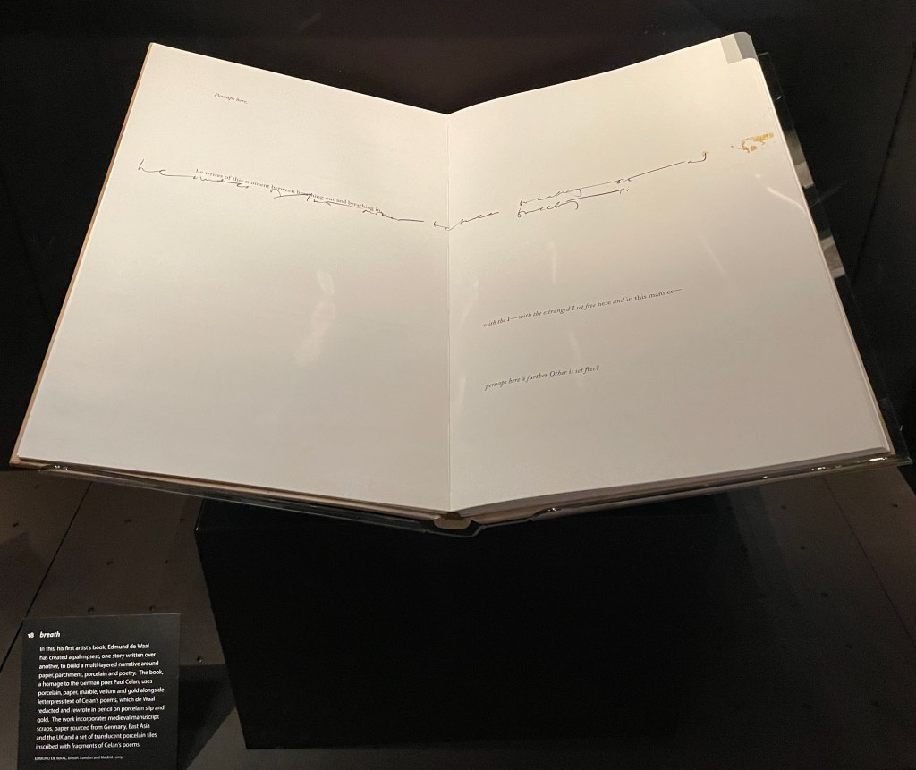
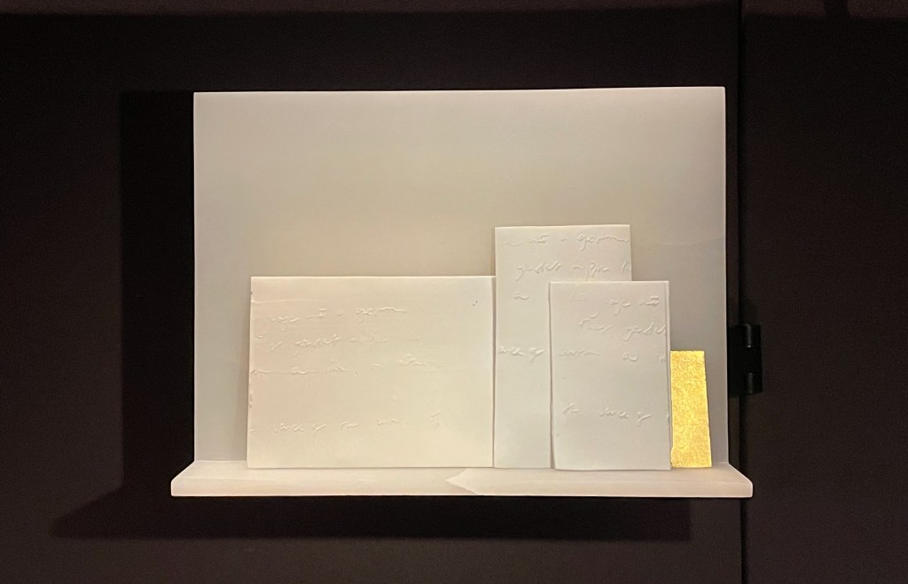
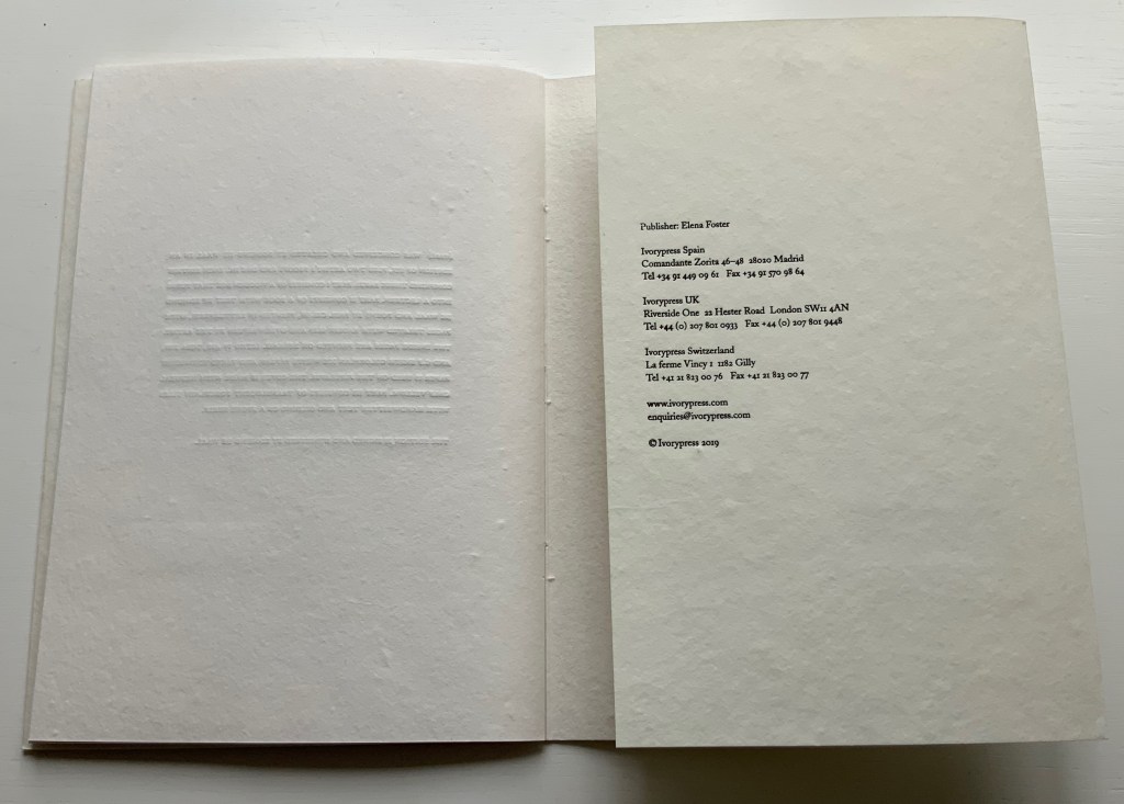
breath [prospectus](2019) Edmund de Waal Papercased sewn booklet. H214 x W152 mm, 16 pages. Acquired from Lady Elena Ochoa Foster, 28 June 2022, “Sensational Books” exhibition at the Bodleian Libraries. Photos of the work: Books On Books Collection.
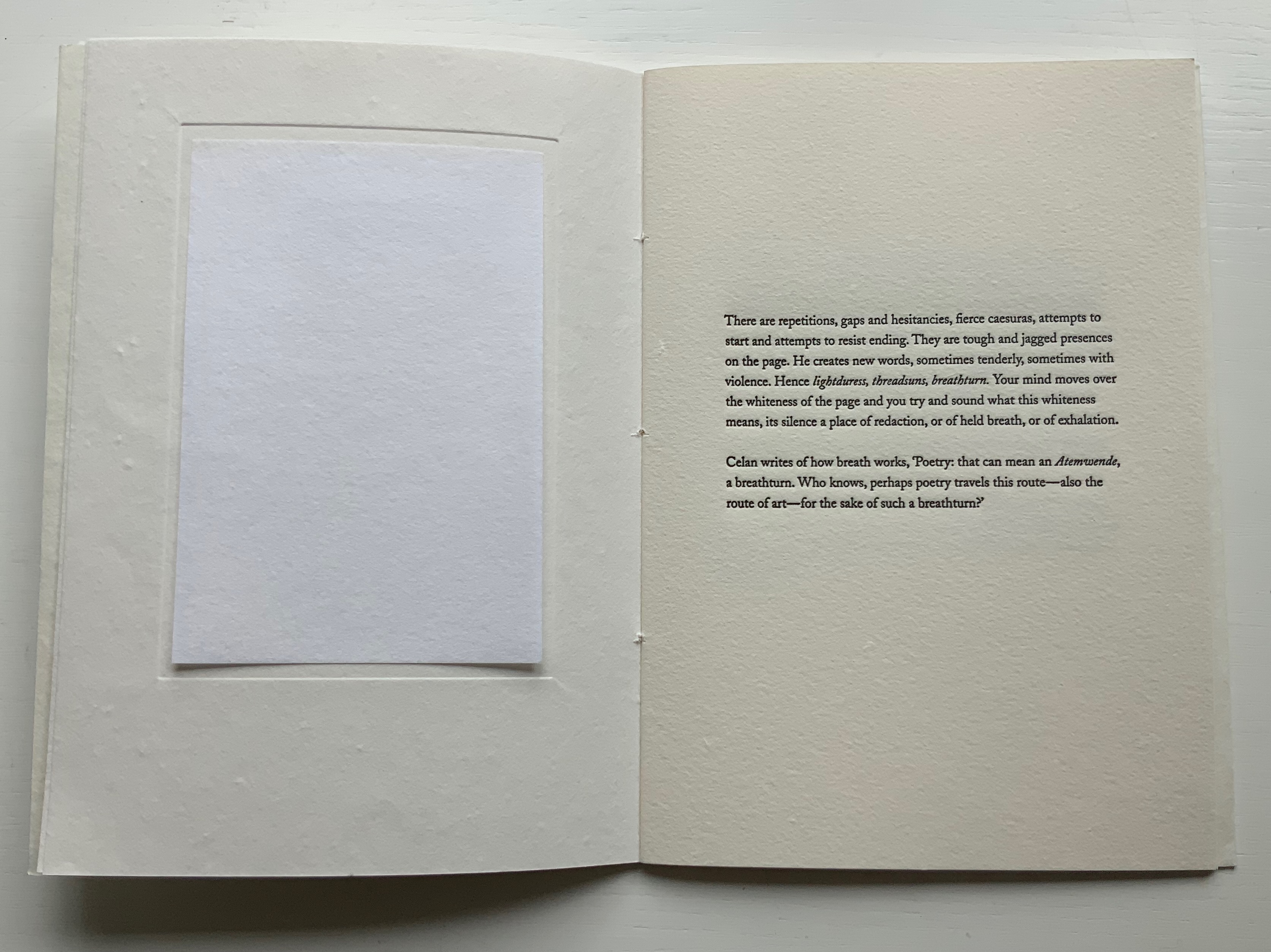
In correspondence with Ivorypress in 2019, I first learned of Edmund de Waal’s artist’s book inspired by the later works of Paul Celan. With the help of Ivorypress, de Waal created breath as an artwork consisting of the artist’s book (in a limited edition of six), a series of vitrines, shelves and diptychs conceived as open books, and a reading room. His aim was to pay homage to the Romanian poet Paul Celan, in whose last books “there is more white page than word”, as de Waal puts it. The only way to have seen the book then would have been to fly to Madrid.
In a major surprise, a copy of the edition appeared at the formal opening of the exhibition “Sensational Books” at the Weston Library, part of the Bodleian Libraries (Oxford, 28 June 2022). Heightening the surprise was Edmund de Waal’s delivering a talk about the work to open the exhibition. And capping the surprise was Lady Elena Ochoa Foster’s kind gift of this eponymous booklet describing breath. Perhaps the surprise of a long anticipation’s being met, or de Waal’s impassioned talk, or the kindness of the gift created a susceptibility to the raw emotion on, in and beneath the whiteness of this work. But no, it is objectively there. De Waal’s booklet, photos from the exhibition and the Ivorypress videos further below help to understand from where the power of breath comes.
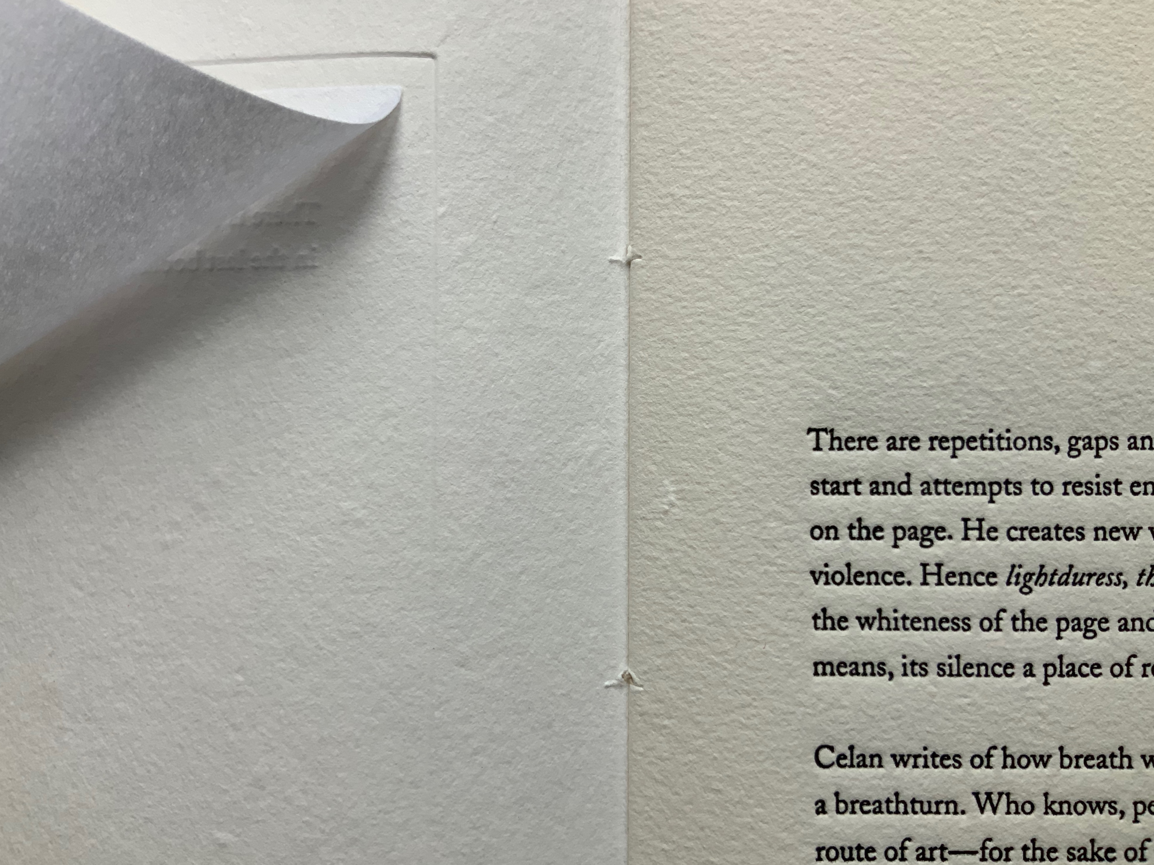
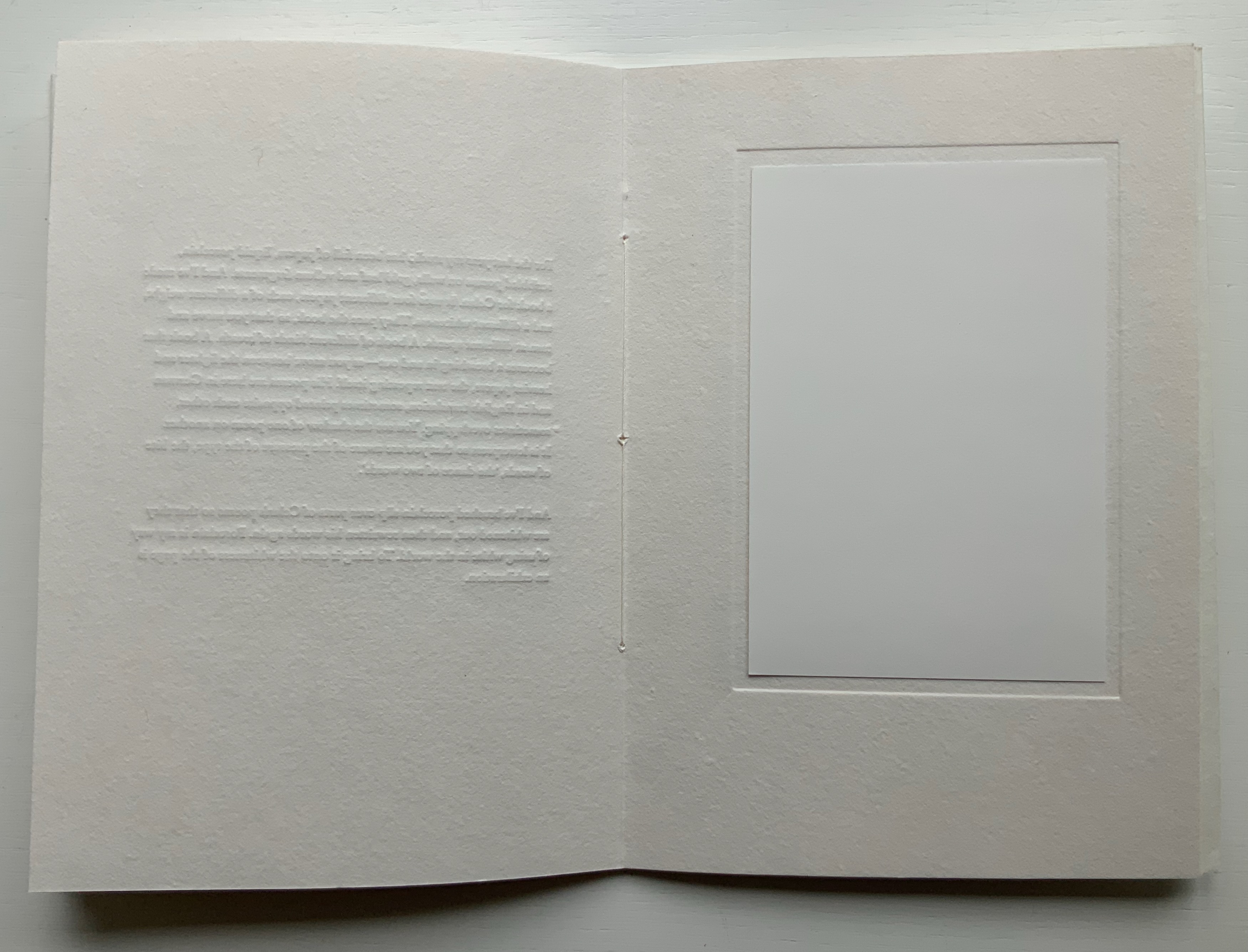
One of the booklet’s inserts is a square of white paper (perhaps the G.F. Smith Colorplan Ice White, one of the four different papers used in the artist’s book). Opposite the insert, de Waal writes, “Your mind moves over the whiteness of the page and you try and sound what this whiteness means, its silence a place of redaction, or of held breath, or of exhalation.” The close-up of the insert turned shows the paper’s degree of translucence that de Waal uses to great effect in his artist’s book as can be seen in the videos. The close-up also gives a view of the bite of the letterpress in the raised impression from the page before and the ink-filled depth on the facing page. This kind of material contrast recurs — bite and breath, white and black, lighter and heavier papers, rougher and smoother — in the larger work in so many ways.
These visual, tactile and conceptual workings realize in small what the artist’s book accomplishes on a larger almost monumental scale. The artist’s book measures 453 x 673 x 43 mm and runs to 104 pages and is housed in a wooden box that converts to a lectern and provides storage for the translucent ceramic works on which Celan’s words are inscribed.
Another source of the larger work’s power is the porcelain slip that de Waal has brushed over parts of Celan’s poems to create a white surface on which he rewrites Celan’s words. Porcelain is de Waal’s tool. When asked what he does, he often puns in reply, “I throw pots”. The presence of porcelain slip in a work of such size, materiality and grounding in Celan’s poetry of coming to grips with the Shoah conjures a more somber pun on creativity and destruction. It establishes a paradoxical, metaphorical union of fragility, breakage and exhalation with strength, restoration and inhalation.
Showcased at “Sensational Books” exhibition, Weston Library, Oxford University. Photo: Books On Books, 8 July 2022.
Showcased at “Sensational Books” exhibition, Weston Library, Oxford University. Photo: Books On Books, 8 July 2022.
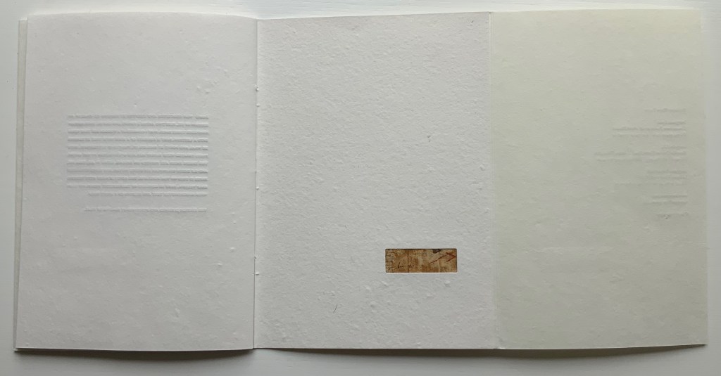
Just as the book, ceramics and lectern constitute another layer to the installation work, there are layers in the artist’s book itself, some of them hidden. The use of porcelain slip to cover Celan’s words has already been mentioned. Another layer lies in the binding, executed by Shepherds, Sangorski & Sutcliff. As was done in the early days of bookbinding, scraps of previously published material line the spine. For this purpose, De Waal collected scraps of medieval manuscripts previously used for binding. Binding within binding, centuries within centuries. By tucking away underneath the paper binding’s flap the only colored image in the booklet, an image that even looks like a scrap of illuminated manuscript, de Waal alludes to this practice.
While the scraps embedded in breath‘s binding are not materially perceptible, knowledge of it enriches the reader/viewer’s perception. Enriched perception enriches the work. As de Waal writes in the booklet and as we hear in the videos, “All books are palimpsests. As we read and reread, we re-create texts”. As readers/viewer responding to breath, each of us brings a layer to the palimpsest.
My response brings to the palimpsest another layering artist who celebrates Celan in works of book art: Anselm Kiefer. The juxtaposition provokes an intake of breath as it brings to mind Shulamith (1990) in homage to Celan’s “Todesfugue” (“Death Fugue”) or The Secret Life of Plants (2008) shown with a sound installation of Celan’s poetry and also sponsored by Ivorypress. So different from the whiteness of breath and its materiality of porcelain, wood, gold and paper, Shulamith is 64 pages made of lead, hair and ashes (1010 x 630 x 110 mm), and The Secret Life of Plants is 18 pages made of oil on lead over cardboard (1900 x 1400 x 200 mm). Both are dark and foreboding works. The artists themselves, too, differ in their roots. As told in The Hare with Amber Eyes (2010), de Waal’s family, the Viennese Ephrussis, were persecuted by the Nazis. Kiefer’s father was a soldier in the Wehrmacht, which we know from Kiefer’s infamous early works incorporating photos of him in his father’s uniform and giving the Nazi salute. Where de Waal evokes breath and whiteness, Kiefer evokes death and leadenness. Yet both fuse materiality and visual representation with text (whether explicit, implicit or hidden) to stand with Celan’s agony and creative spirit and achieve an originality, an independence that is nevertheless dependent on history.
De Waal, Edmund. 2021 “Breath“, In Paul Celan Today: A Companion, edited by Michael Eskin, Karen Leeder and Marko Pajević. Berlin, Boston: De Gruyter. 319-324.
Granero, Natalia, and Gunnar B. Kvaran. 2019. Anselm Kiefer: livres et xylographies: [catalogue de l’exposition, Montricher Fondation Jan Michalski pour l’écriture et la littérature du 8 février au 12 mai 2019 ; Oslo Astrup Fearnley Museet du 30 mai au 15 septembre 2019].
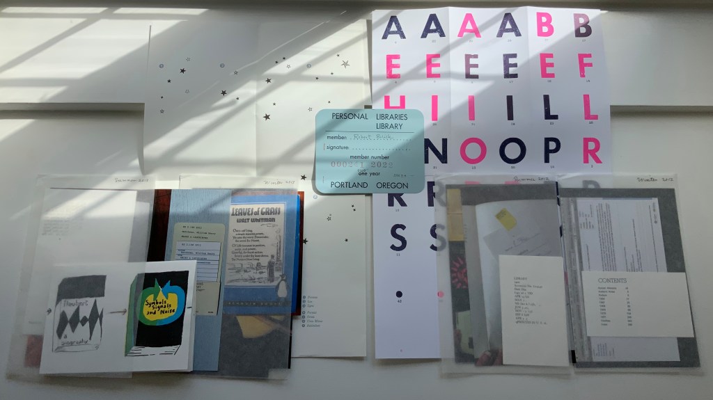
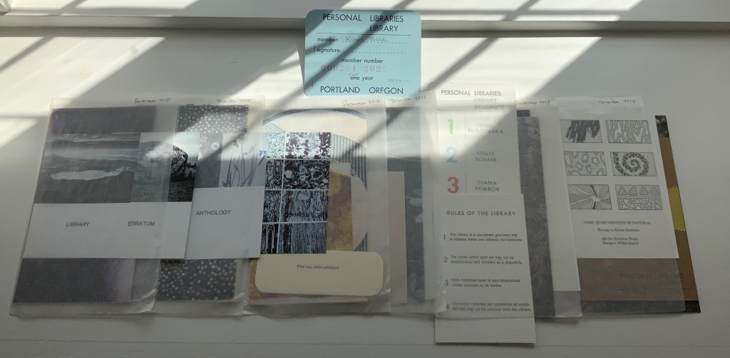
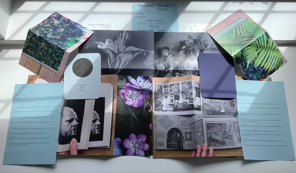
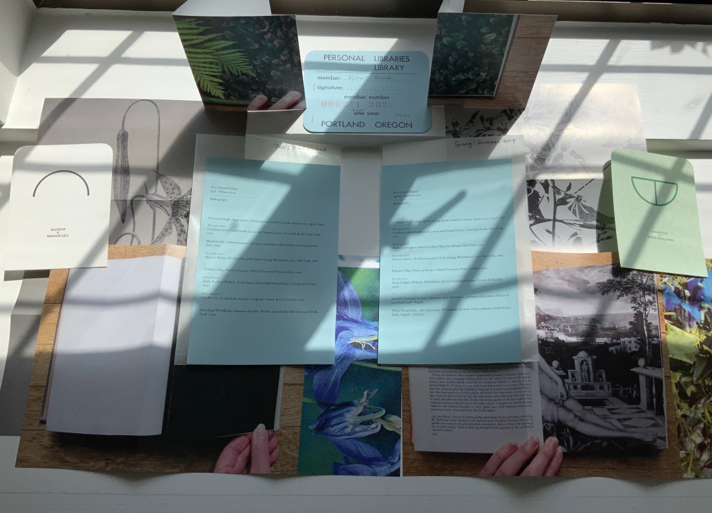
Personal Libraries Library (Winter 2009-10 to Spring/Summer 2021)
Imagine belonging to a library composed of selected personal libraries and housed on another continent. Imagine that the librarian who selects those personal libraries and hunts down copies of the works (preferably the same editions) needed to recreate those libraries completely is also constantly harvesting them for cross-references and delivers the discoveries to you in the form of ephemera. It exists. I have a library card for it.
Since 2009, Abra Ancliffe, its artist/librarian, has been replicating the personal libraries of
Maria Mitchell (1818-1889), Massachusetts astronomer, educator, suffragist and librarian Robert Smithson (1938-1973), New Jersey-born land artist, sculptor and art theorist Jorge Luis Borges (1899-1986), Argentinian writer of fiction, poetry and essays Italo Calvino (1923-1985), Cuban-Italian writer of fiction, poetry and essays Anne B. Spencer (1882-1975), Virginia-based member of the Harlem Renaissance circle, poet, civil rights activist, teacher and librarian
Each personal library has a catalogue derived from our librarian’s research and consultation with foundations associated with each of the owners. Each library has its wish list of works needed to complete the holdings; and a Reference Library Catalogue for background on each of the owners has been added. But why these particular personal libraries? Was there a rule?
The library itself has rules (courtesy of our librarian’s fellow artist Larissa Hammond):
1 The Library is a coordinate geometry that is initiated within and between the booksets. 2 The books within each set may not be disassociated and circulate as a singularity. 3 Each individual book is zero dimensional unless activated by its faction. 4 Reference materials are considered an empty set and may not be removed from the Library.
Given such rules, it is no surprise that our librarian has included Borges. The fabulist of “The Library of Babel” once held the job of first assistant in a Buenos Aires municipal library and reportedly remarked “if I were asked to name the chief event in my life, I should say my father’s library” and “I always imagined Paradise to be some kind of a library”. Also, given such rules and the inclusion of Borges, could the Cuban-Italian Italo Calvino, a member of the Oulipo movement, be far behind?
Maria Mitchell’s personal library was the seed or germinating star of the PLL in the winter of 2009-2010 (see the item in the upper right corner of the photo above). Flowers and constellations are two themes that our librarian finds as links among the personal libraries.
Another link between the libraries are the books common to more than one library. For instance, Ralph Waldo Emerson’s Essays appears in Maria Mitchell’s and Robert Smithson’s libraries. Perhaps there is a sort of transcendentalism driving the library! How appropriate that the first book from Mitchell’s library acquired and the first in the PLL was Ralph Waldo Emerson’s Essays.
By virtue of these collage-like connections that our librarian draws in the periodic issues of ephemera, a book published at a later date may seem to belong equally to an earlier owner. Perhaps, as in the collages into which the ephemera can fall, “one book may hide another” to paraphrase Kenneth Koch. The issues of ephemera arrive like challenges to Robert Smithson’s notion of site and non-site works of art. They are works that depend and do not depend on their site. They arrive so similar and so different, regular enough but sporadic enough, that they are like “Miss Mitchell’s comet” — non-periodic (until it appears again).
PLL Ephemeral Issues. Left to right and top to bottom: Winter 2009/2010; Summer 2010; Winter 2011; Summer 20012; Winter 2012; Summer 2013; Winter 2013; Summer 2014; Winter 2015; Summer 2016; Winter 2016; Summer 2017; Fall/Winter 2017; Spring/Summer 2018; Fall/Winter 2018; Spring/Summer 2019; Fall/Winter 2019; Spring/Summer/Fall/Winter 2020; Spring/Summer 2019.
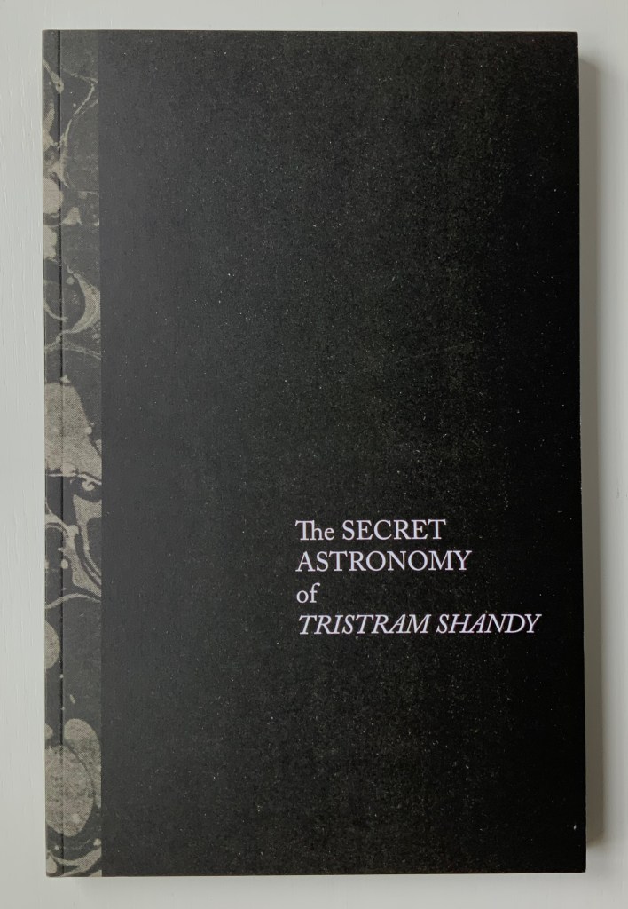
The ephemera themselves represent “collaborations” among the personal libraries — courtesy of our librarian’s reading of the Library’s “coordinate geometry”, of course. For the Spring/Summer 2021 issue, the first piece of ephemera listed on the blue manifest (its Bibliography) is “Paper to be Placed in a Window” (see the upper left-hand corner of the photo immediately above). Glossy black on both sides, the single folded sheet displays an astronomical photo with holes of different size punched to let light light up the constellation. According to the manifest or Bibliography, the work connects the constellation Aguila (Eagle) “in and around the Milky Way south of Cygnus” with J.B. Sedgwick’s Introducing Astronomy from Smithson’s library with Laurence Sterne’s The Life & Opinions of Tristram Shandy, Gentleman from Calvino’s. The connection with Sedgwick is obvious. The connection with Sterne’s novel may be obvious to readers familiar with its “black page”, or will be to readers here who proceed to the entry for the next of Abra Ancliffe’s works in the Books On Books Collection.
It is no surprise that Ancliffe’s work of book-art-cum-academic-treatise is part of the Laurence Sterne Trust Foundation’s permanent collection. Like Shandy Hall’s own The Black Page Catalogue (2010), The Secret Astronomy extrapolates and celebrates page 73 with the same whimsy and seriousness that the 73 writers and artists invited to make their own Black Page exercised. In its own self-publishing status, it also underscores like Simon Morris’s manifesto Do or DIY (2012) the same status of Sterne’s work as a forerunner to the self-published, self-referential works of book art of the mid- to late 20th century. It is Ancliffe’s elevation of the self-reflexive academic treatise to art status that secures The Secret Astronomy its position in the Books On Books Collection.
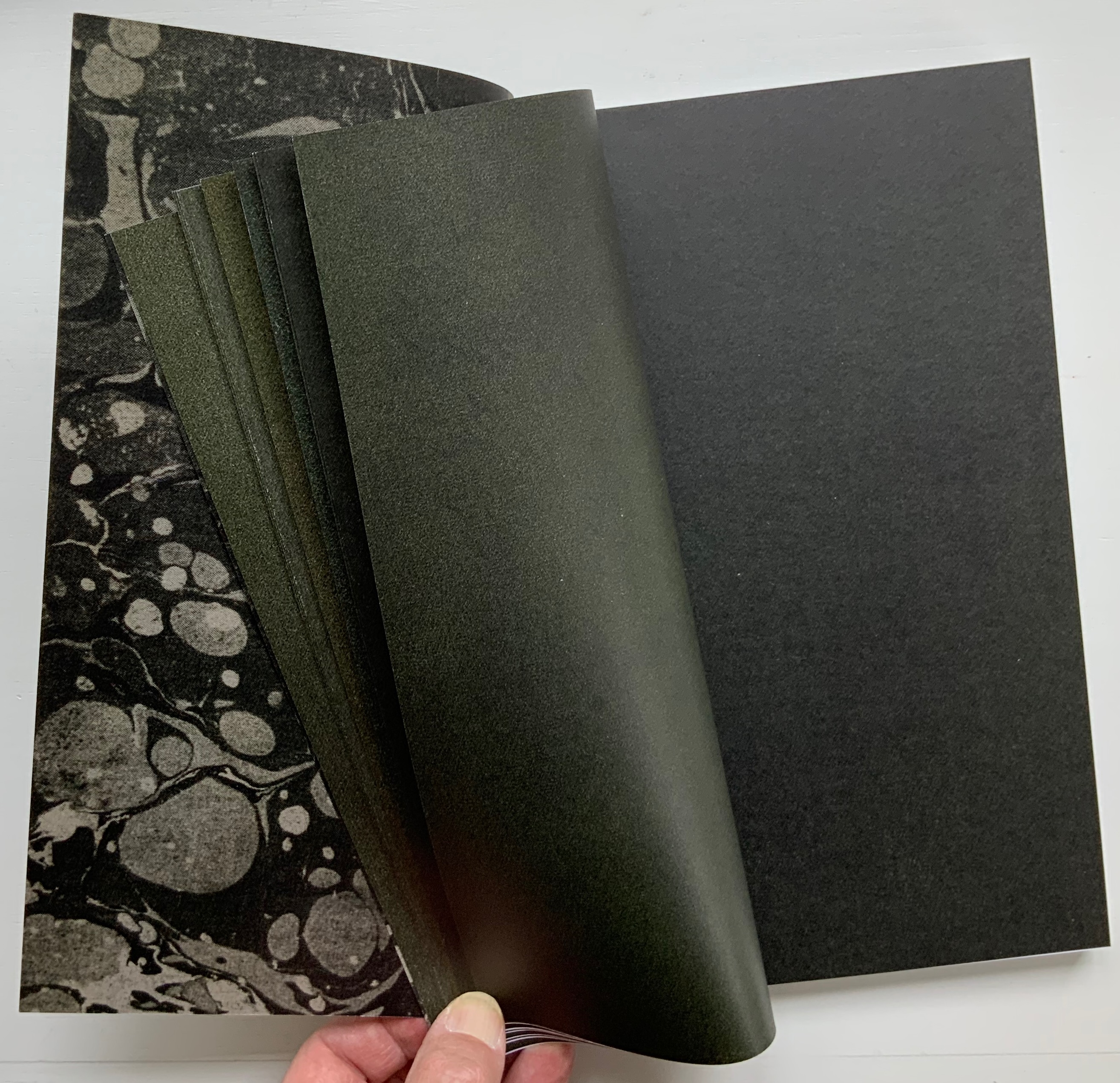
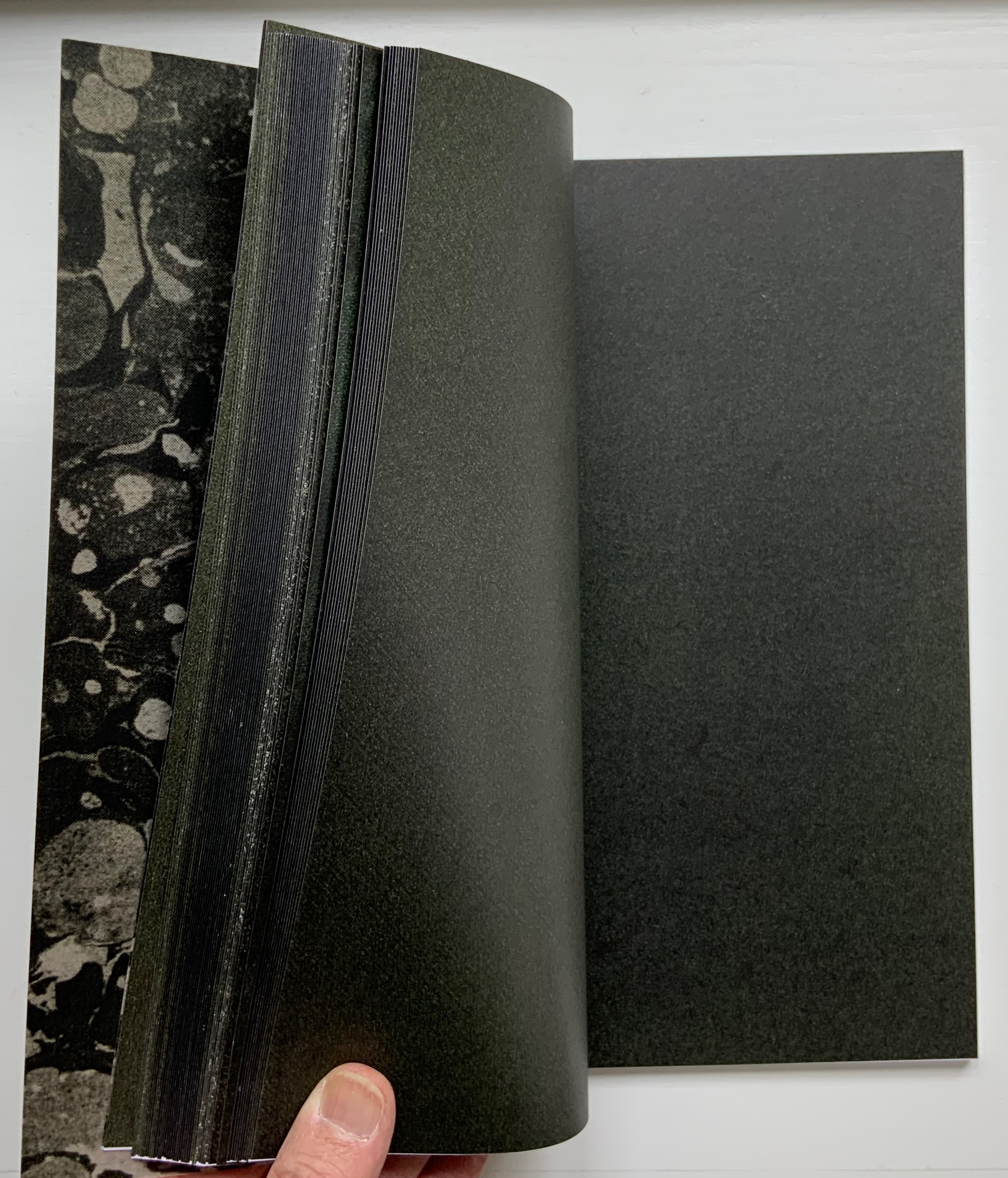
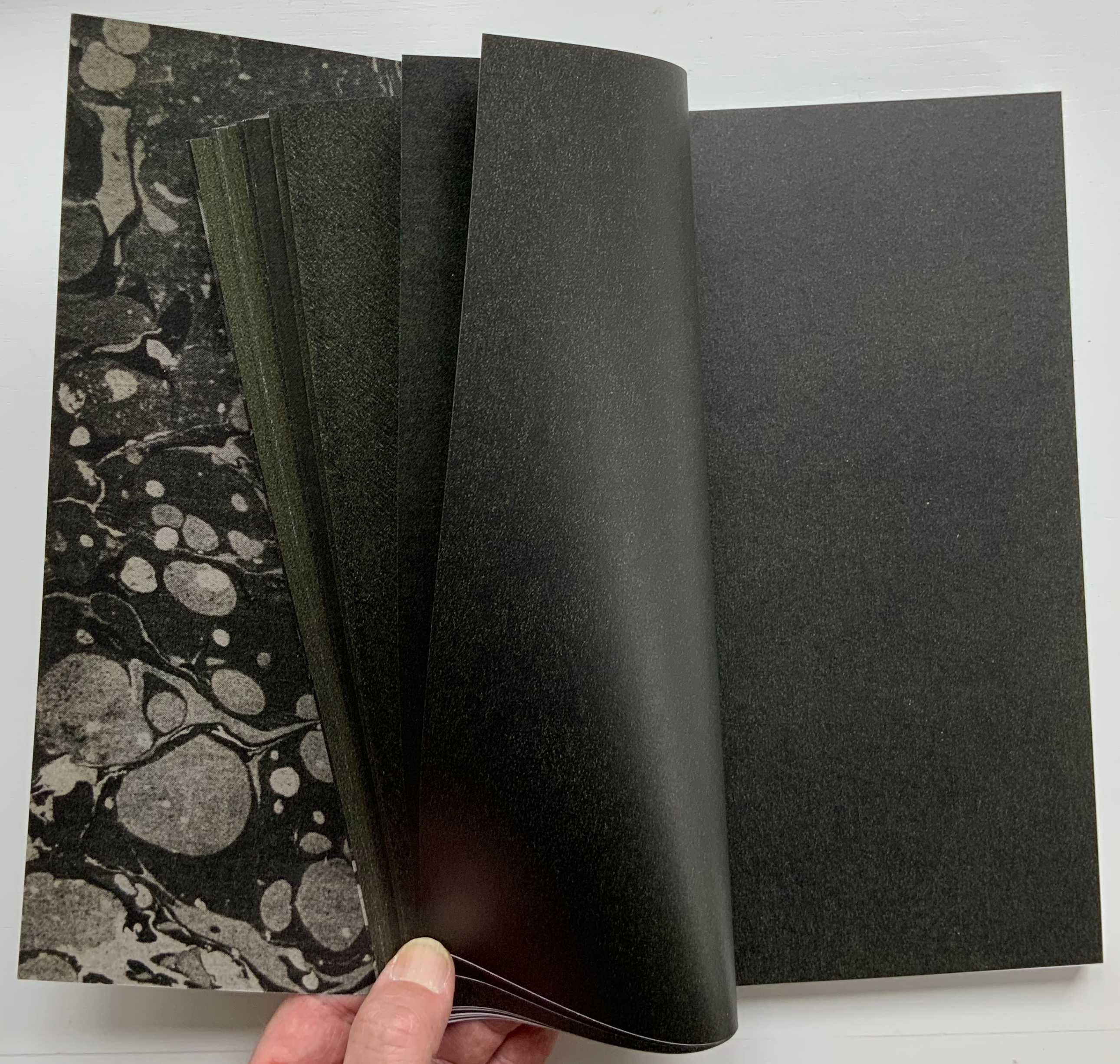
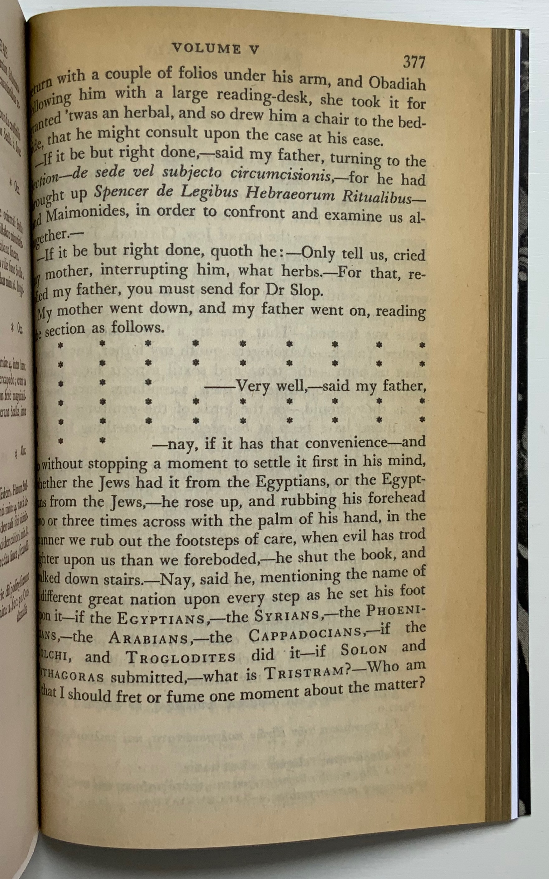
The rectangle of black appearing on page 173 in the first edition of Sterne’s novel faces the brief announcement of Parson Yorick’s death on page 172: “Alas, poor Yorick”. Taking off on the concept of academe’s variorum edition, Ancliffe has reproducedthe black pages from more than one hundrededitions of Sterne’s novel. What is a singularity in the novel becomes a contemplation of a regularity that reveals a material irregularity since the 1759 edition. Densities of ink have varied, oxidation occurred, spots from lint and fingerprints accumulated — even show-throughs from the next chapter’s text — so that the eye begins to read the accumulated pages for astronomical images — Tristram’s and Sterne’s secret astronomy. (The temptation to Grangerize this work by slipping into it Ancliffe’s ephemera “Paper to be Placed in a Window” is strong.) Ancliffe urges forward her case for the discovery of a secret astronomy with a series of appendices, one of which draws attention to Sterne’s use of the asterisk in the novel and proposes one of its hidden kabbalistic meanings in an equation: if star = *, and Sterne = star, then Sterne = *. There is even the dutiful source appendix listing all of the editions from which black pages have been gathered.
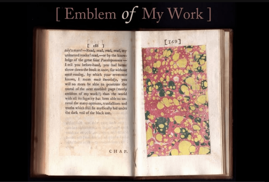
Pages 169-70 of the first edition of Tristram Shandy account for another famous singular, regular irregularity — the marbled page, which Tristram calls “the motly emblem of my work”. Ancliffe’s black, brown and gray marbled spine and inside covers make for an apt, ironic and artistic stroke — a reminder of the element of chance that is so characteristic of Sterne’s narrative project, of The Secret Astronomy and of the ephemera arising from the Personal Libraries Library.
From Shandy Hall’s Emblem of My Workblog, accessed 18 September 2019.
Further Reading
“Shandy Hall“. 1 January 2021. Books On Books Collection.
“Jorge Luis Borges“, last edited on 8 May 2022. Wikipedia. Accessed 15 May 2022.
“Italo Calvino“, last edited 20 April 2022. Wikipedia. Accessed 15 May 2022.
“Maria Mitchell“, last edited 8 March 2022. Wikipedia. Accessed 15 May 2022.
“Robert Smithson“, last edited 14 May 2022. Wikipedia. Accessed 15 May 2022.
“Anne B. Spencer“, last edited 25 April 2022. Wikipedia. Accessed 15 May 2022.
Baldwin, Kate, Denise Bookwalter, Sarah Bryant, Macy Chadwick and Tricia Treacy. 2021.REF.
With the permission of the author and The Book & Paper Gathering, this essay by Paula Steere is being reposted at Books On Books because Steere’s observations about bookbinding lead to a closer look at works in the Books On Books Collection. Keep Steere’s essay open in this window, then open another window for one of the entries in this baker’s dozen to start:
Compare images in the open windows. Just as Gary Frost’s conservation work shed light on book art, Steere’s descriptions and explanations can lead to a greater appreciation of these artists’ works and others.
Posted on Thursday 9th June, 2022 by thebookandpapergathering. Accessed 13 June 2022.
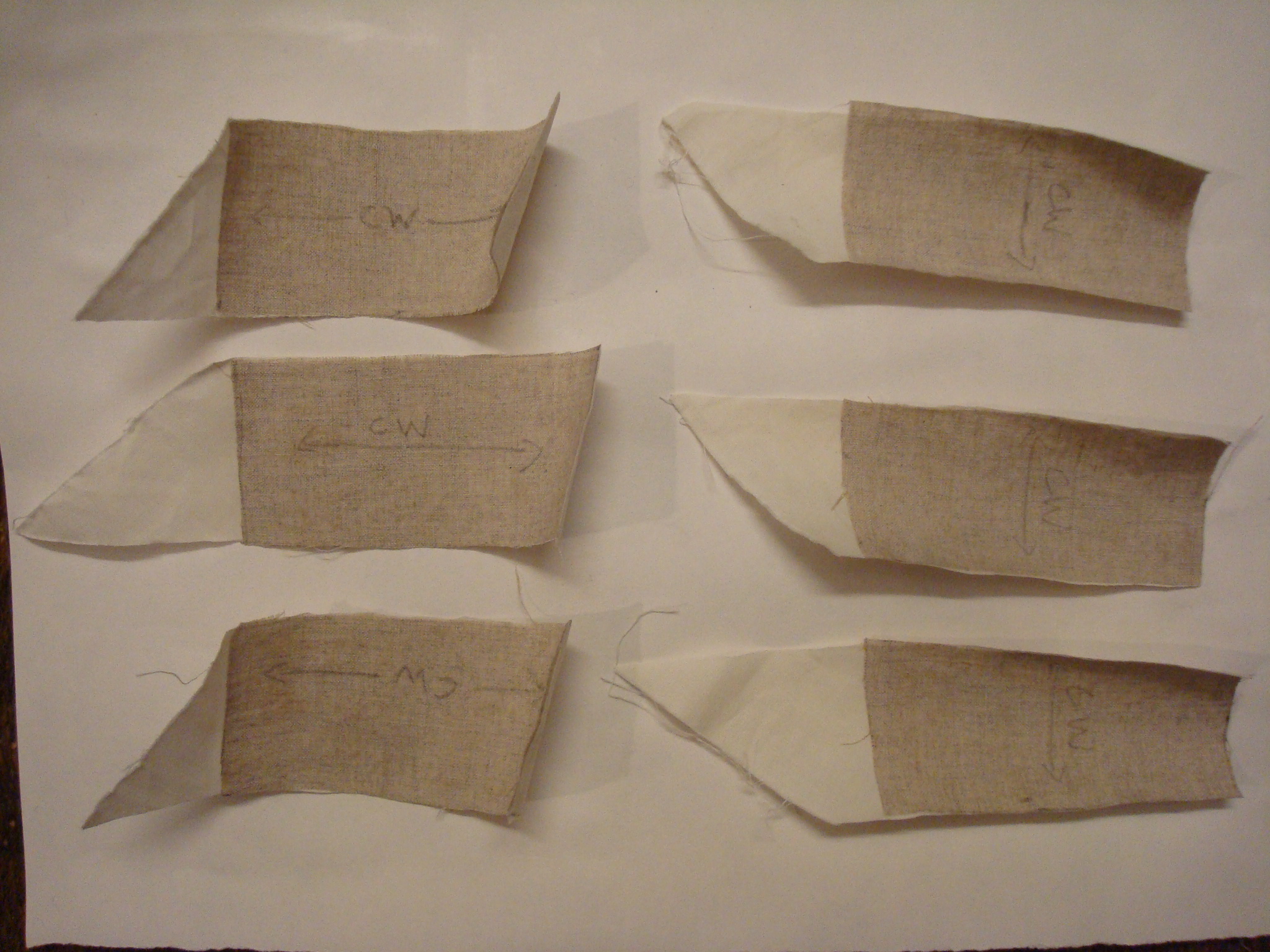
What stresses occur when we open a book? How do spine materials affect them? What are we really doing when we stick things on a book spine, sand them back, and then stick more things on? On what are we basing these decisions? As a book conservation student, keen to learn, I looked for spine structure information in popular conservation and bookbinding literature, but I found no satisfactory answers to my questions. So I did what I always do when I want to find out how things work: I talked to a mechanical engineer. This article is based on my MA Conservation dissertation research at Camberwell College of Arts, London. I realised early in the research process that I needed the knowledge of an engineer, and conveniently, there happened to be one in my family. Lee McIlvaine lives and works in the United States, has 30 years of mechanical engineering experience and specialises in mechanism and structural design. Five years later, we are still talking about book mechanics.
Spine lining materials are fundamental to the action of a book spine. Yet, a review of over 250 technical statements about book structure, lining materials or lining techniques from historical and contemporary conservation and bookbinding literature1 revealed that many statements are unqualified or unquantified. For example, Middleton (1998) advises that ‘when enough layers [of paper linings] have been applied, the end of the paper is trimmed off’, but he does not specify how many ‘enough’ would be. Technical information can also be contradictory between authors. For example, Szirmai (2001, p. 275) partially attributes the functional longevity of existing gothic bindings to the ‘restrained’ use of adhesive on the spine. However, Douglas Cockerell (1901, p. 152) advocates giving the spine ‘a thick coat of glue’ when lining heavy books. Diehl (1980 Vol. 1, p. 190) states that the hollow back is ‘one of the most commonest [sic] faults of construction’, but does not explain why. On the other hand, Middleton (1963) simply reports the historical use of recessed thongs with a hollow back to enable more throwup; he does not indicate whether this was a good or bad practice. Advice in the literature requires some level of experience to interpret it, and some statements in the literature reviewed are even technically incorrect2, all of which makes the advice unhelpful for learners. I felt an immediate kinship with an anonymous author who wrote in The British Bookmaker that
Vague generalities may always be used by theorists in describing a process of work, and they may suffice for those who know how to do it, and are consequently able to fill in the omissions of the unpractised and merely theoretical exponent of the craft, but for those who desire to learn, or for those who, being practised workmen, desire to extend their knowledge, vague generalities will not suffice. (1892-3, no page)
Clear and reliable information about linings is greatly needed. As Miller (2010, p. 100) rightly points out, ‘linings can sometimes be extremely damaging’. With that in mind, the starting point for my research was the well-known article by Conroy, ‘The Movement of the Book Spine’ (1987), in which he describes a fundamental engineering principle important for bindings – the tension and compression principle.
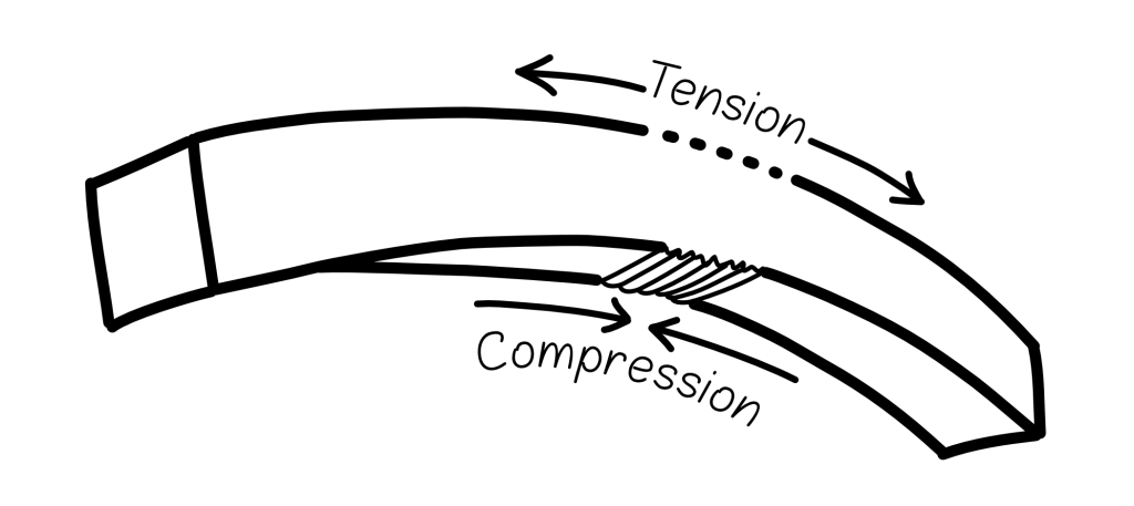
Mechanics of the book spine
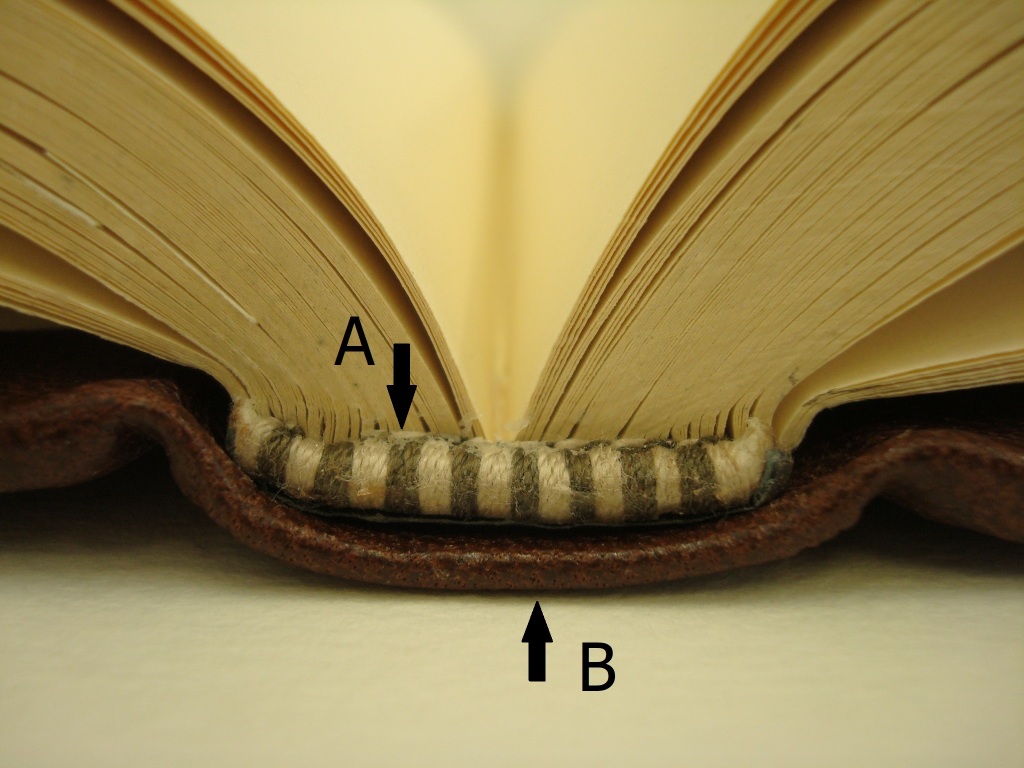
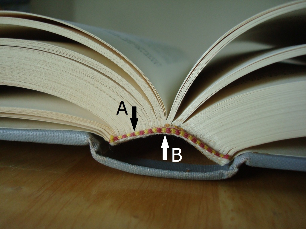
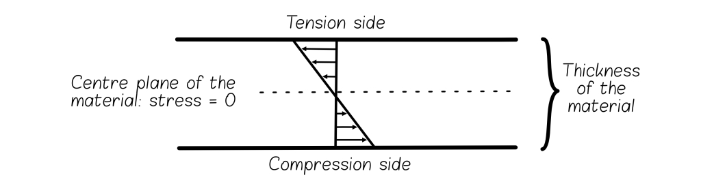
When any material bends, it has a tension side and a compression side (Fig. 1). Material in the tension layer will spread apart, while material in the compression layer will, as the name suggests, compress. This principle applies when a book is opened (Figs. 2, 3). A book spine has a tension and a compression layer. The tension layer consists of the spine folds of the text block (the folded edges of the text sections) and the material adhered directly to them. All materials placed on top of this layer are in compression.
Fig. 1 – The action of a bending object, demonstrating the tension and compression principle. Original drawing by Paula Steere; graphic rendering by The Book & Paper Gathering
Figs. 2, 3 – Tension (A) and compression (B) layers: the tension and compression principle applies to any open book, regardless of the binding type. Photography by Paula Steere
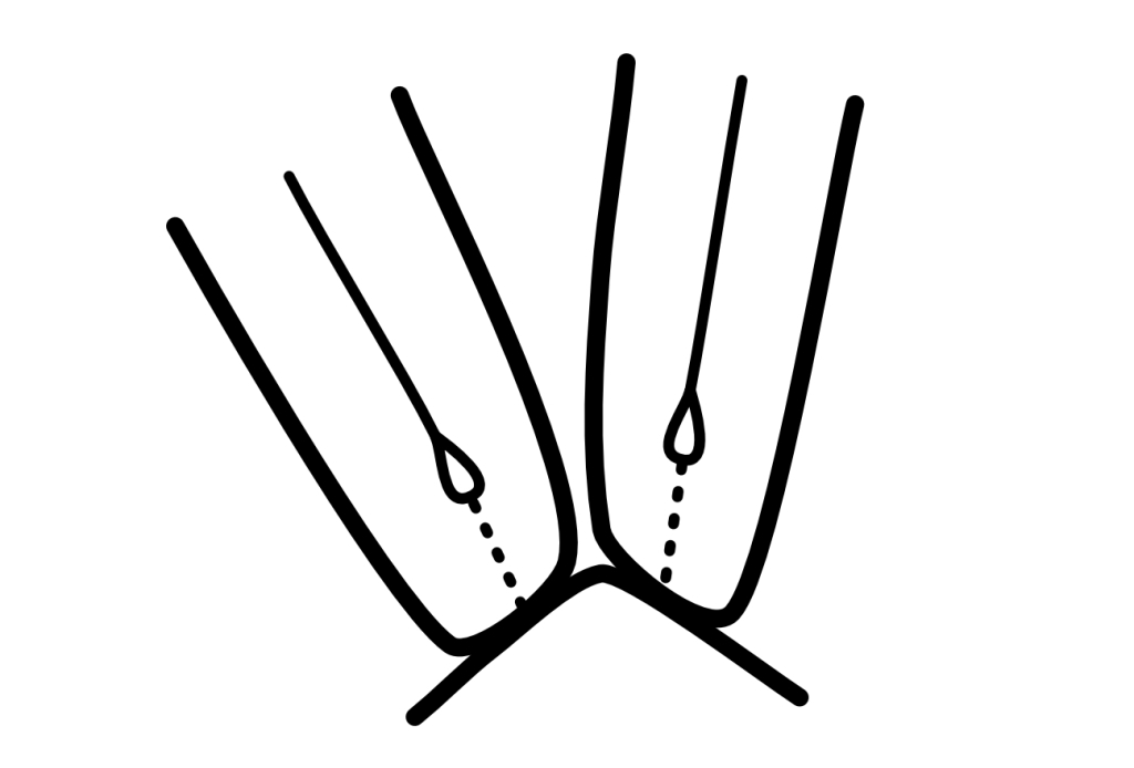
When a book is opened, the movement at the spine folds is largely imperceptible, but its importance should not be underestimated. Too much movement could contribute to poor opening and structural failure. Each of the spine folds moves with some degree of independence. This localised movement can be thought of as a series of flexible mini-bends (McIlvaine 2017a), as illustrated in Figure 4. These mini-bends have different radii and are affected by adhesives and sewing. (Sewing structure will be discussed in Part II.) They create localised strain (deformation) (Fig. 5), and it is this localised strain that causes the spine to fail.
Fig. 4 – Imperceptible movement of the spine folds in an opened book. Original drawing by Paula Steere; graphic rendering by The Book & Paper Gathering
Fig. 5 – Localised bending at each spine fold increases strain. Sewing and adhesives also create non-uniform stiffness; for example, adhesive shrinkage pulls paper down and flattens. Original drawing by Paula Steere; graphic rendering by The Book & Paper Gathering
Linings also move, and these shearing forces contribute to the deformation of the spine folds. The choice of lining materials affects the extent of the deformation. Miller (2010, p. 100) defines linings as a support that allows the spine to flex ‘without the sewn sections parting’. While in reality we cannot eliminate deformation entirely, informed choices can minimise it.
A fundamental aim of spine linings, therefore, is to minimise deformation at the interface between the text block and the first layer (the spine folds and first lining). We can achieve this by minimising the spreading apart (deformation) of the spine folds in the tension layer. Based on principles of mechanical engineering, the first step is to place a stiff and thin first lining against the text block to minimise movement. All subsequent materials, including further linings, adhesive layers and covering material, should ideally be less stiff than this first lining. This is not always an easy task. The model in Figures 6, 7 and 8 shows how adhering a stiff material to a flexible material affects the strain distribution in a composite material. Acetate, a thin and relatively stiff material, is adhered to a sponge (Fig. 6, 7). When the sponge is bent, the stiffness of the acetate minimises movement at the acetate/sponge interface (Fig. 8A). This interface is in the tension layer, and the higher stiffness of this layer drives deformation into the less stiff outer sponge (compression layer), as shown in Figure 8B. This is a simplified model of a book spine, which is also essentially a composite of several materials.
Figs. 6, 7 – A stiff material (acetate) adhered to a less stiff material (a sponge). Photography by Paula Steere
Fig. 8 – The stiffness of the acetate reduces (but does not eliminate) the spreading apart (tension) of the sponge at A. This can be a model of the spine fold – first lining interface. When the tension layer is stiffer, the deformation is driven into the compression layer at B, which represents the exterior book spine and covering material. Photography by Paula Steere
Of course, driving deformation to the outer spine layers could potentially damage the spine leather and tooling of a tight back (Franck 1941, p. 7). We also do not want to prevent movement entirely, as the spine needs to flex to some degree for the book to open well. The required degree of spine stiffness is also affected by other variables, such as the thickness of the sewing supports and type of sewing structure. Nevertheless, the tension and compression principle applies equally to all books and offers tangible criteria on which to base spine lining decisions. However, this is only the first part of the story. We must also understand the performance mechanics of the conservation spine lining materials themselves – paper, linen, cotton and adhesives.
The mechanical properties of spine lining materials determine their use
Research indicates that paper lining materials are not robust enough for book spine linings. In 1708, Zeidler wrote in his book on the philosophy of bookbinding that ‘The French do not care to glue anything on the spine. Some glue only paper strips on, putting everything slovenly over and believing they have come just as far [as putting parchment or linen cloth on neatly and exactly]’3(p. 78). Szirmai (2001, p. 196) interprets these sentiments by saying that Zeidler ‘castigates’ French bookbinders for using paper linings in gothic books.
Conroy (1987, p. 4) supports the case against placing paper on the spine. He warns that paper is prone to breaking when stretched (due to tension) and buckles easily when compressed. McIlvaine (2017a) concurs, saying that while paper is a stiff material, it is not strong enough and is susceptible to tearing. Any imperfection would propagate easily. Paper has an irregular and random structure, which determines its physical properties (Corte and Kallmes 1961, p. 14–15; see Fig. 9). Its relative weakness could be attributed in part to this formation.
Fig. 9 (left) – Paper consists of randomly arranged separate fibres. Fig. 10 (right) – Fabric consists of twisted, woven and secure threads. Drawings by The Book & Paper Gathering
Fabrics tend to have a stronger base material and structure than paper (Fig. 10). For spine linings, the important properties of fabrics are tenacity (stress at break), extensibility (degree of stretch before breaking) and modulus (resistance to stretch). Tenacity is the term used to describe fibre strength; extensibility contributes to fold endurance; and modulus contributes to stiffness. These properties are determined by the fibre structure of the raw material. Linen is made from the bast stem fibres of Linum usitatissimum. The thick-walled, tube-like cells with small lumens or canals (hollow spaces) (Landi 1998, p. 22) are arranged in bundles, as shown in Figure 11a. Cotton, meanwhile, is made from the seed hair of Gossypium herbaceum and Gossypium hirsutum. Cotton fibres are very different from linen, forming single hollow and flat cells with a large lumen (Landi 1998, p. 21; Fig. 11b).
Fig. 11 – a: A cross-section of thick-walled linen cells arranged in bundles. b: Cross-sections of thinner, flatter cotton cells. Original drawing by Paula Steere; graphic rendering by The Book & Paper Gathering
The thick walls and bundle arrangement of linen cells make linen a stiff and strong material. However, the thick cell walls lower its fold endurance and make it prone to breaking when repeatedly folded in the same place (UAL, no date), because thicker walls undergo more strain when bent. This is analogous to bending a piece of cardboard versus a piece of paper – there will be more damage (deformation) to the cardboard because of its thickness. The thicker a material, the stiffer it becomes when bent due to the neutral axis principle (McIlvaine 2017c), illustrated in Figure 12. This principle states that when a material is bent, there is no tension or compression at the centre line, but deformation increases with distance from this central plane.
Fig. 12 – Neutral axis principle: when a material is bent, the centre plane has zero tension or compression; tension and compression increase with distance from this zero axis. Original drawing by Paula Steere; graphic rendering by The Book & Paper Gathering
Linen also has less extensibility than cotton and will break more easily when stretched. Cotton has higher fold endurance than linen due to its structure: thin walls and a large lumen enable it to collapse on itself, reducing thickness locally and decreasing strain when folded (as per the neutral axis principle). These properties have been confirmed with data from fold endurance and mechanical strength tests published in the well-known books Conservation of Leather and Related Materials and The Textile Conservator’s Manual (Tables 1 and 2).
The data in Table 2 shows that linen is, on average, stronger than cotton because of its higher tenacity. Linen also has a much higher initial modulus (resistance to extension) than cotton, making it the stiffer fabric and a good candidate for a thin, stiff first lining. The less stiff cotton is a good second lining because of its higher fold endurance, and can be used to reattach boards if needed (more on that shortly).
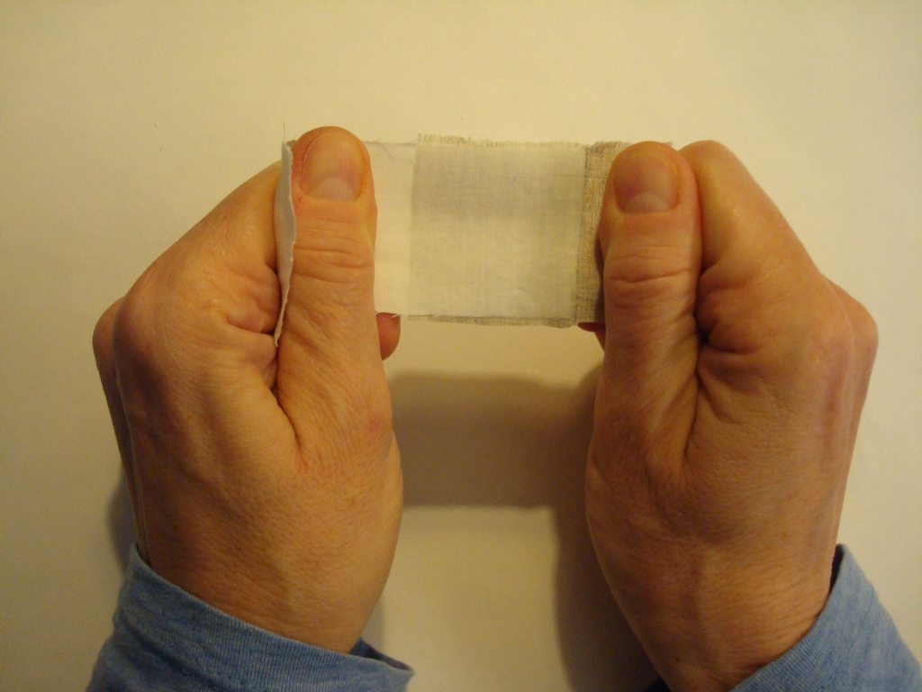
In addition to fibre composition, the orientation of the yarns also affects the mechanical properties of fabric that are relevant to this spine lining design. Warp yarns (lengthwise grain, parallel to the selvage edge) stretch less (are stiffer) because they have a higher modulus than weft yarns (crosswise grain, perpendicular to the selvage edge). Warp yarns are more tightly twisted, and hence stronger (Hackler 2006), than weft yarns. They are tightly stretched during the weaving process (The Taunton Press, no date) to allow the more loosely wound weft yarns to be woven between them. I confirmed the higher stiffness of warp yarns by pulling the fabrics the same distance in both directions. Under tension, weft yarns stretched visibly more than warp yarns. Therefore, additional stiffness in the first lining can be gained by positioning the linen with the warp yarns across the spine width, which minimises the spreading apart of the spine folds. It is worth noting that the bias grain direction has been considered the strongest because the most fibres are available; however, in this orientation, the fabric also deforms easily, and therefore, could be susceptible to damage (Fig. 13).
The properties of adhesives should also be considered. Conroy (1987, p. 4) says that an adhesive does not need to be flexible; flexibility is required only if too much adhesive is used. McIlvaine (2017b) further reminds us of the neutral axis principle (Fig. 12) – thin layers of adhesive are desirable because thin materials strain less when bent.
However, the adhesive must still be thick enough to be effective. I carried out adhesion tests on aero linen and aero cotton swatches to find the smallest amount of adhesive that still yielded strong adhesion between the two fabrics. A 1:1 mix of Evacon R and wheat starch paste (1:3 wheat starch to water v/v) was used for additional strength. A thin, medium and thick layer of adhesive was applied with a brush to clear acetate to serve as a quantity guide. The adhesive was then applied by brush to both cotton and linen swatches to be adhered together. The linen was positioned on the cotton swatches so that both the warp and weft orientations were tested in the direction of the shearing force. The cotton was not used in the bias direction. The fabrics were pressed with a bone folder and air-dried for a minimum of two hours (Fig. 14). There was no adhesive failure or obvious strength difference between the thin, medium and thick coats of adhesive mix when pulling them apart with my hands under maximum manual shearing force (Fig. 15). Therefore, the thinnest coat of adhesive could safely be used to minimise deformation and cumulative stiffness without compromising adhesion strength.
Fig. 13 (left) – Bias grain under tension deforms easily. Fig. 14 (right) – Lining design adhesion test swatches: linen and cotton adhered together with thin, medium and thick layers of adhesive. Pencil arrows show the weft (crosswise) direction. Photography by Paula Steere
Fig. 15 – Manual adhesive strength test: pulling fabrics to mimic shearing forces experienced by spine linings when a book is opened. Photography by Paula Steere
Putting the principles into practice: spine lining design
To review, for optimum functionality and durability, spine linings should minimise deformation at the interface between the spine folds and first lining material. We can achieve this by placing a stiff and thin first lining against the text block to minimise movement and keep the spine folds from spreading apart. All subsequent materials, including further linings, adhesives and covering material, should ideally be less stiff than this first lining.
For the spine lining design based on this research, aero linen should be used as the first lining, with the stronger, stiffer warp yarns placed across the spine width from shoulder to shoulder (Figs. 16, 17). Thinner, less stiff aero cotton, with its greater fold endurance, should be used as a second lining to reattach the boards. (If the boards are still attached, a second lining may not be necessary at all.) To minimise cumulative stiffness in the outer (compression) layer, positioning cotton in the bias direction could be a good choice, since this is the least stiff of the yarn orientations. Additionally, all subsequent linings, such as the paper used to smooth an uneven tight back spine, should be kept to an absolute minimum, with thin adhesive layers throughout. For heavy text blocks, I use WSP and ethyl vinyl acetate (EVA) mix (1:1) to adhere the linen to the spine folds, and I use wheat starch paste alone, without EVA, for materials in the compression layer (to reduce cumulative stiffness). For standard-sized books that are not very heavy, I use wheat starch paste on its own throughout the process; however, I have not tested swatches of wheat starch paste without EVA.
When adding more linings after the linen (and cotton, if reattaching boards), check opening characteristics after each lining has dried thoroughly. Paper linings can be omitted altogether in some instances; for example, if the tight back spine is even, in a case binding, or in a situation where throwup does not require additional control. Keep in mind the engineering principles discussed in this article when deciding on the number of additional linings and the choice of lining material: the compression layer (everything after the first linen lining) should ideally be less stiff than the tension layer. Thinly pared leather, discussed below, can be used instead of paper for additional linings to reduce stiffness.
Fig. 16 – Spine lining design based on the tension and compression engineering principle and the mechanical properties of spine lining materials. Original drawing by Paula Steere; graphic rendering by The Book & Paper Gathering
Fig. 17 – The spine of a leather reback just before reattaching the boards. On the spine is the first lining – aero linen with warp yarns running shoulder to shoulder. It has been adhered directly against the text block spine folds. The fabric above and below the spine is aero cotton and was adhered directly to the linen to reattach the boards. Photography by Paula Steere, courtesy of the College of Arms Library, London
The quarter leather tight back in Figure 18 has a heavy parchment text block, and I wanted to experiment with traditional leather linings because the mechanical properties of leather are excellent for the compression layer of my spine lining design: it is strong, but not stiff, because of the structure of its main component, the protein collagen. The linings in this image are made of thinly pared leather. I have used a graduated lining technique, which I was delighted to discover during my research, to further minimise stiffness in the compression layer. The graduated lining structure is attributed to Francis Bedford, a nineteenth-century bookbinder acclaimed for the ‘even strain’ (Anonymous author 1893, p. 58) of his bindings. The rationale for the graduated lining structure is that the stiffness needed for a book to open well at any given place varies. The centre of the spine takes the greatest strain and should be the stiffest, while less stiffness is required near the beginning and end sections of the text block (McIlvaine 2017b). Subsequent linings after the first one are ‘a little further in’ (Anonymous author 1893, p. 58), stopping a little short of the shoulders, as illustrated in Figure 18.
I also adapted the graduated lining technique to the leather covering material to reduce overall stiffness. The leather over the centre spine folds is thicker than that over the beginning and end spine folds. This was achieved through tapered paring, as shown in Figures 19 and 20. A comparison of opening characteristics before and after treatment can be seen in Figures 21 and 22.
Fig. 18 – The graduated lining structure attributed to Francis Bedford’s workshop. According to the author in The British Bookmaker, every lining after the first is ‘a little further in’, stopping short of the shoulder. The text block of this book was made from heavy parchment, and in addition to using the spine lining design described in this article, I wanted to experiment with traditional leather linings because of their strength. Photography by Paula Steere, courtesy of the College of Arms Library, London
Fig. 19 – Adapting the graduated lining technique to leather paring. Original drawing by Paula Steere; graphic rendering by The Book & Paper Gathering
Fig. 20 – Paring in progress: the thickness of the leather under the central black line will remain as is, and the leather will be pared to taper towards F and B, which indicate the width of the text block. Photography by Paula Steere
Fig. 21 – Opening characteristics of the book from Fig. 18 before treatment. Photography by Paula Steere, courtesy of the College of Arms Library, London
Fig. 22 – The same book after treatment, with improved opening characteristics. Note that some of the improvement is also due to repairs in the text block. Photography by Paula Steere, courtesy of the College of Arms Library, London
In conclusion, exploring the forces present in a book spine and the mechanical properties of familiar book conservation materials has helped me to overcome the ‘vague generalities’ found in the literature. Understanding mechanics and materials enables the conservator to take advantage of engineering concepts that offer tangible criteria on which to base spine lining decisions. I discovered several hidden gems along the way, such as Zeidler’s ire, Bedford’s famed workshop, and, of course, that anonymous kindred spirit from The British Bookmaker for whom vague generalities would not suffice.
Special thanks to my colleagues at the College of Arms, Becky Tabram and Christopher Harvey, head of conservation, who encouraged and allowed me to explore these ideas while I was a conservator there. Their experience and knowledge of books and our ongoing conversations and practical experiments in the workshop were invaluable.
Footnotes
1. I reviewed approximately 36 books and articles, spanning the years 1658 (in a 1977 translation) to 2017.
2. Technical statements in the literature were cross-referenced with a mechanical engineer, Lee McILvaine, for scientific accuracy. This research document is available upon request.
3. Translation by Isana Skeete (2017). No published English translation of this book could be found.
Bibliography
Anonymous author (1892–3) ‘Editorial’, The British Bookmaker, 6, no page number.
Anonymous author (1893) ‘On forwarding’, The British Bookmaker, 7(75), p. 58.
Cockerell, D. (1901) Bookbinding: The classic Arts and Crafts manual. New York: Dover Publications.
Conroy, T. (1987) ‘The movement of the book spine’, The Book and Paper Group Annual, 6, pp. 1–22.
Corte, H. and Kallmes, O.J. (1961) Statistical geometry of a fibrous network. New York: Regis Paper Company.
Diehl, E. (1980) Bookbinding: Its background and technique (2 vols). Rev. edn. New York: Dover Publications.
Franck, P. (1941) A lost link in the technique of bookbinding and how I found it. Gaylordsville, Connecticut: The author.
Hackler, N. (2006) Understanding fabric grain. Rev. edn. Gainesville: University of Florida.
Landi, S. (1998) The textile conservator’s manual. Butterworth-Heinemann: Oxford.
McIlvaine, L. (2017a) Email to Paula Steere, 8 April.
McIlvaine, L. (2017b) Conversation with Paula Steere, 13 April.
McIlvaine, L. (2017c) Email to Paula Steere, 26 April.
Middleton, B.C. (1963) A history of English craft bookbinding technique. Hafner Publishing: London.
Middleton, B.C. (1998) The restoration of leather bindings. Rev. Ed. Delaware, London: Oak Knoll Press, The British Library.
Miller, J. (2010) Books will speak plain – A handbook for identifying and describing historical bindings. Michigan: Legacy Press.
Silverman, R., Cains, A., Ruzika, G., Zyats, P., Reidell, S., Primanis, O., Puglia, A., Anderson, P., Etherington, D., Minter, B., Brock, D., Zimmern, F. (2006) ‘Conservation of leather bookbindings: a mosaic of contemporary techniques’, in Kite, M. and Thomson, R. Conservation of leather and related materials. Oxford: Butterworth-Heinemann, pp. 225–243.
Skeete, I. (2017) Translation of passage in Zeidler, J. (1708), 17 May.
Szirmai, J.A. (2001) The archaeology of medieval bookbinding. Burlington, Vermont: Ashgate.
Zeidler, J.G. (1708) Buchbinder-Philosophie oder Einleitung in die Buchbinder-Kunst. Hall im Magdeburgschen: in Rengerischer Buchhandlung.
Paula Steere has an education background and was head of Art and Design in a secondary school in London before retraining in book and archival conservation at Camberwell College of Arts from 2015 to 2017. She has worked at the College of Arms, the Wellcome Collection, the Senate House Library, the London College of Fashion Archive, the Victoria and Albert Museum and UCL Special Collections. Currently she is a preventive conservator, volunteer coordinator and grant writer at the Hershey History Centre, a nonprofit museum in Pennsylvania, US. She is also a book conservator in private practice.
“How does a book reflect a distinct way of thinking about a subject? How does the page become a dynamic landscape of visual and conceptual ideas?” So begins the description for a workshop run by Ken Botnick in 2017. His two works in the Books On Books Collection answer those questions with a resounding “This is how“.
Table of Contents (2020)
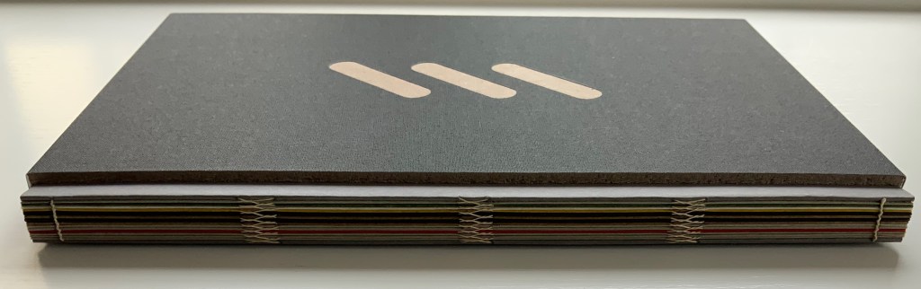
Table of Contents (2021) Ken Botnick Slipcased, boards with exposed sewn binding. Slipcase: H270 x W170 mm; Book: H265 xW185 mm, 56 pages. Edition of 20, of which this is #5. Acquired from the artist, 3 May 2022. Photos: Courtesy of the artist; Books On Books Collection. Displayed with permission of the artist.
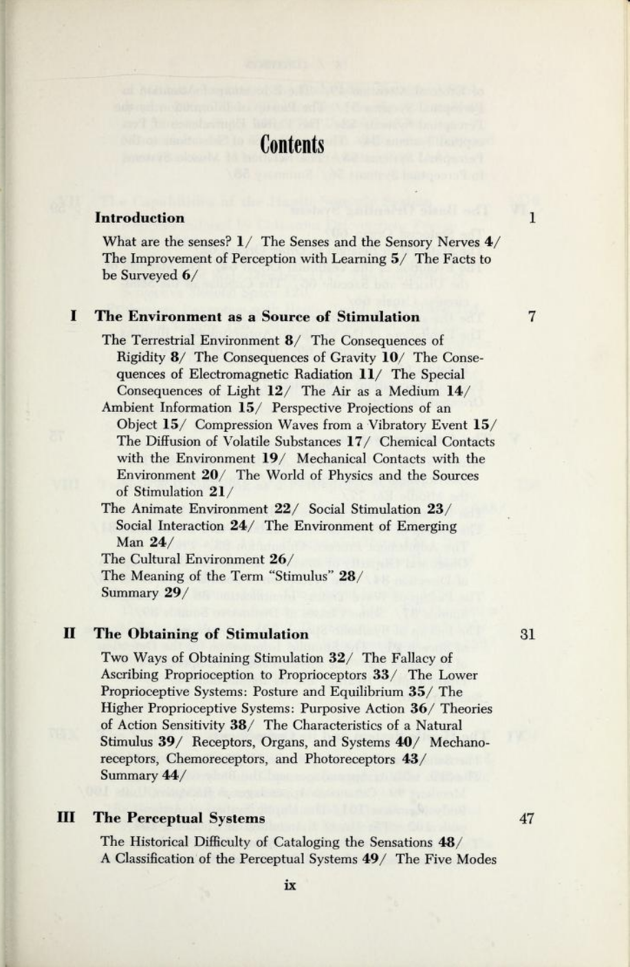
Table of Contents has no table of contents. Instead the whole book is a meditation on a table of contents — that of James J. Gibson’s The Senses Considered as Perceptual Systems (1966). On the inside cover, Botnick characterizes Table of Contents as a “book-length visual/textual poem” and identifies the cento as its model. Cento is short for the Latin centonibus (“patchwork”) and describes the technique of appropriating others’ lines of verse to compose an original “collage” poem. Rather than lines from poems, though, Botnick has appropriated text from Gibson’s table of contents and figure labels.
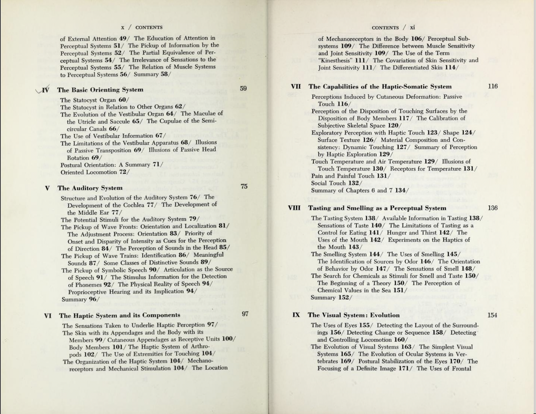
Here is Gibson’s complete table of contents:
Gibson, The Senses Considered as Perceptual Systems, pp. ix-xiv. Internet Archive.
Here is Botnick’s selection of text:
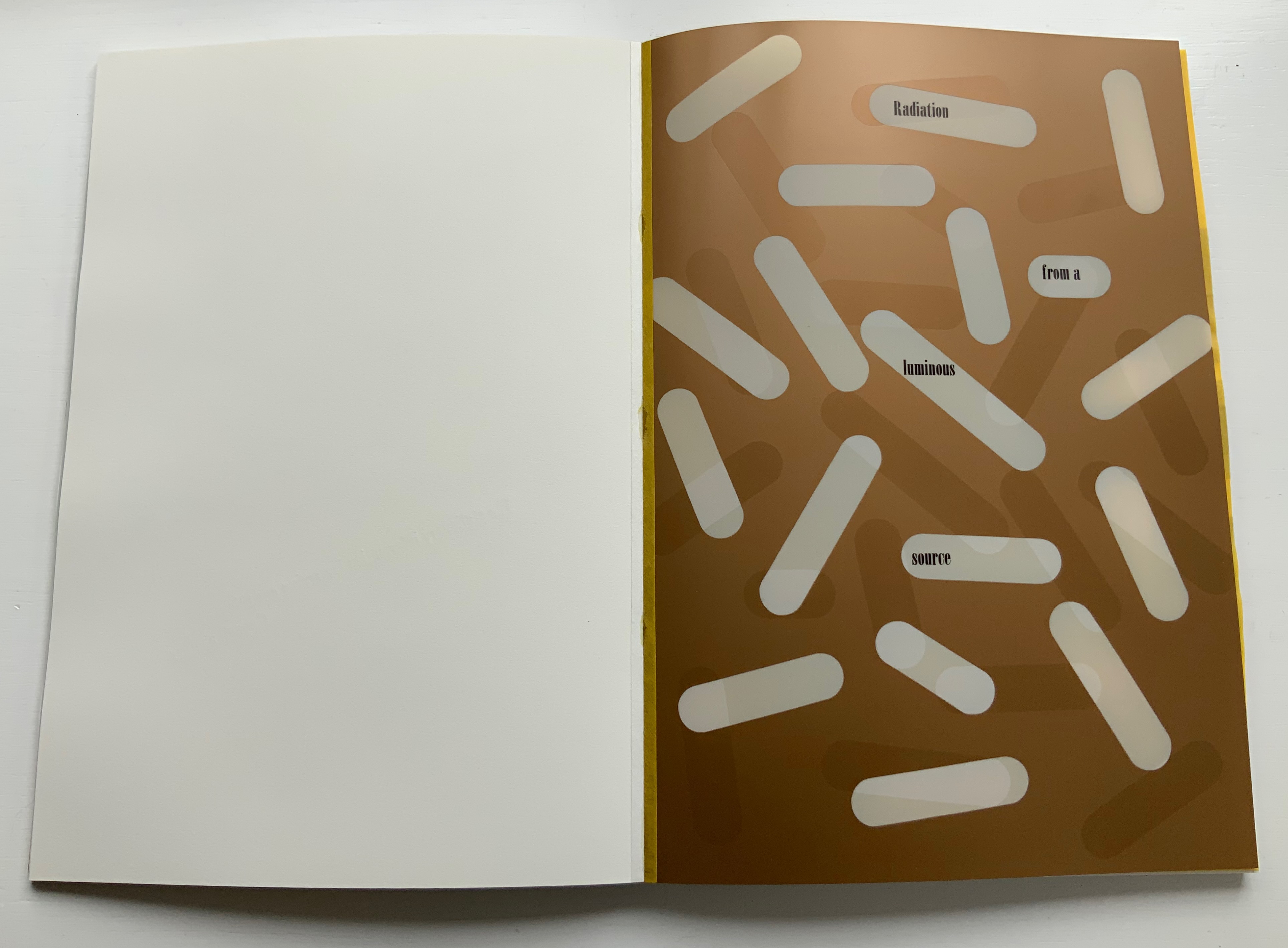
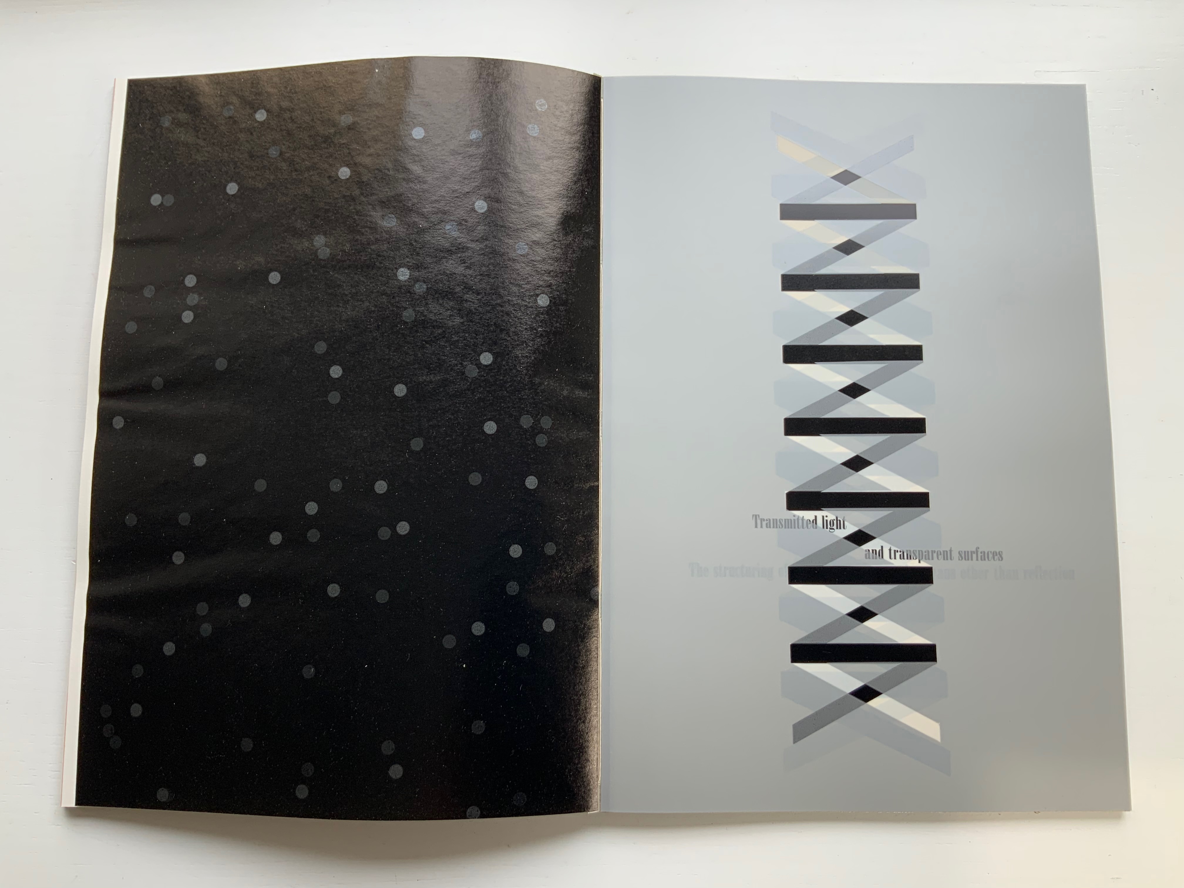
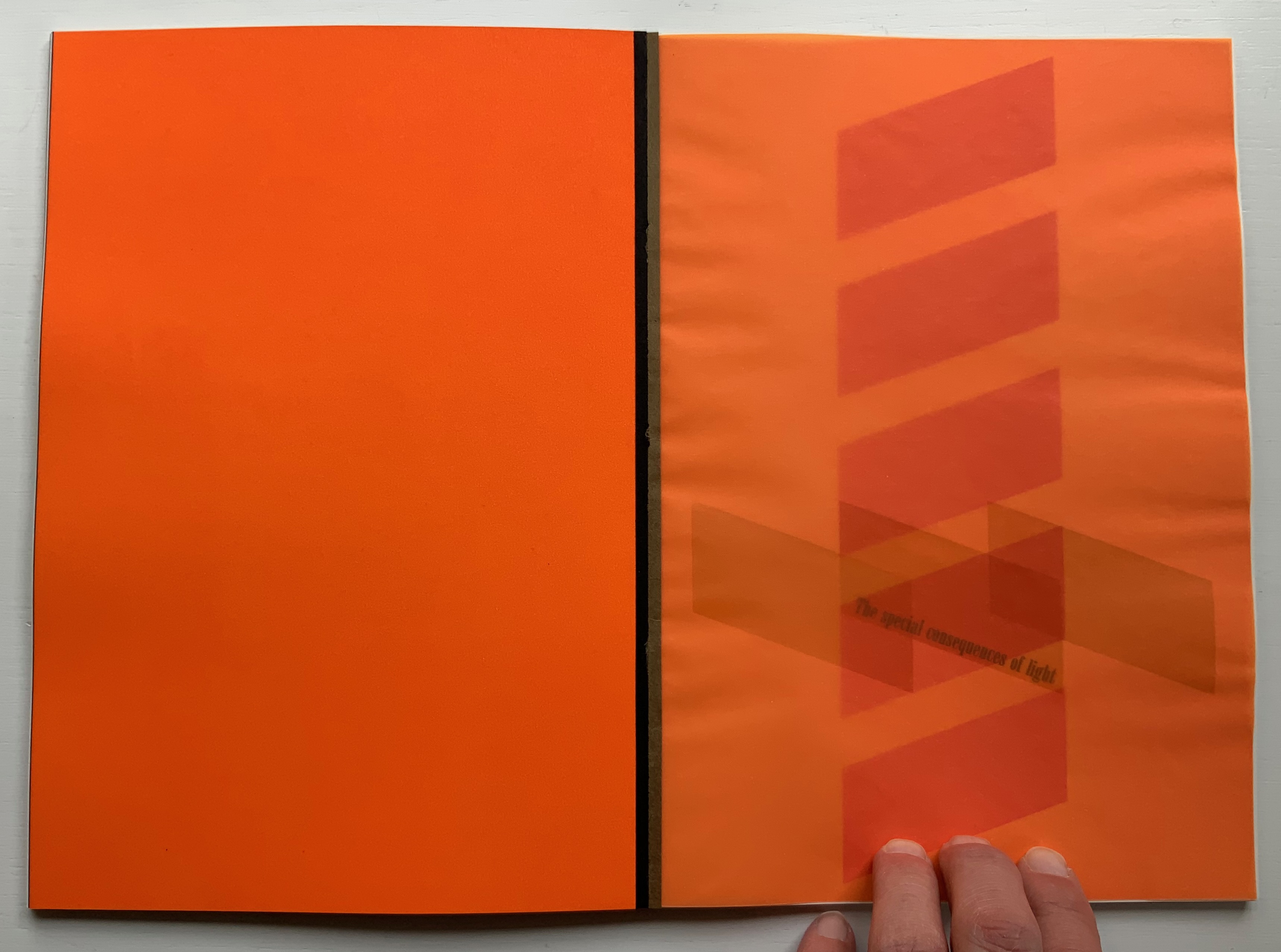
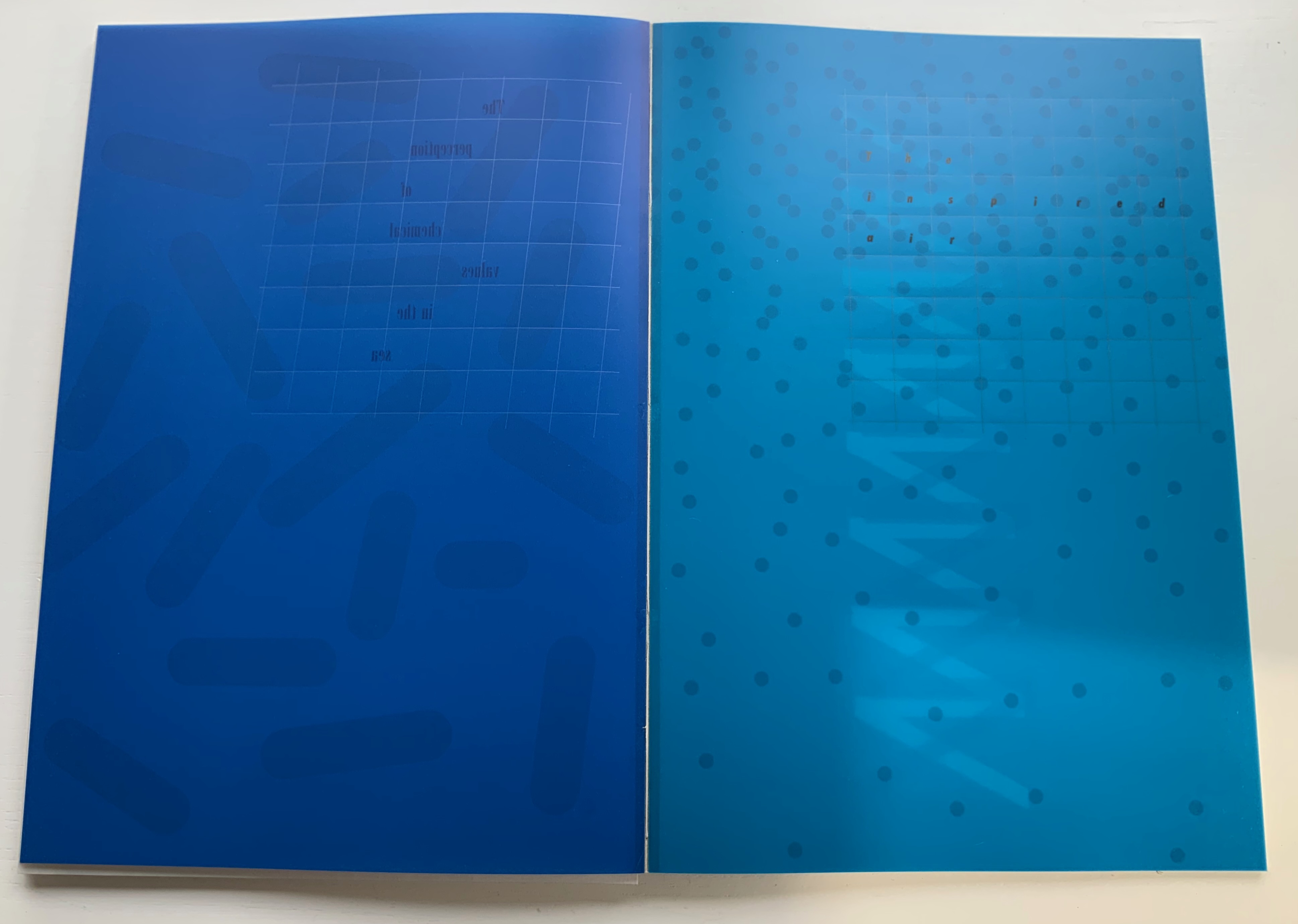
Table of Contents Compression waves from a vibratory event How are associations between events detected? The stationary information for seeing one thing through another Radiation from a luminous source The physical reality of speech The diffusion of volatile substances The development of selective attention The superfluous appeal to memory The consequences of inadequate information The consequences of rigidity The special consequences of light Transmitted light and transparent surfaces The structuring of light by means other than reflection The structuring of light by alphabetic writing The stable and unbounded character of the phenomenal visual world The perception of chemical values in the sea The inspired air The beginning of a theory
But that is not how Botnick’s cento is presented. In calling it a “visual/textual poem”, Botnick is too modest. It is much more than visual/textual: it is visual, textual, auditory and haptic — and is so from the start, proceeding by contrasts and complements, provoking multi-sensory activity and responses.
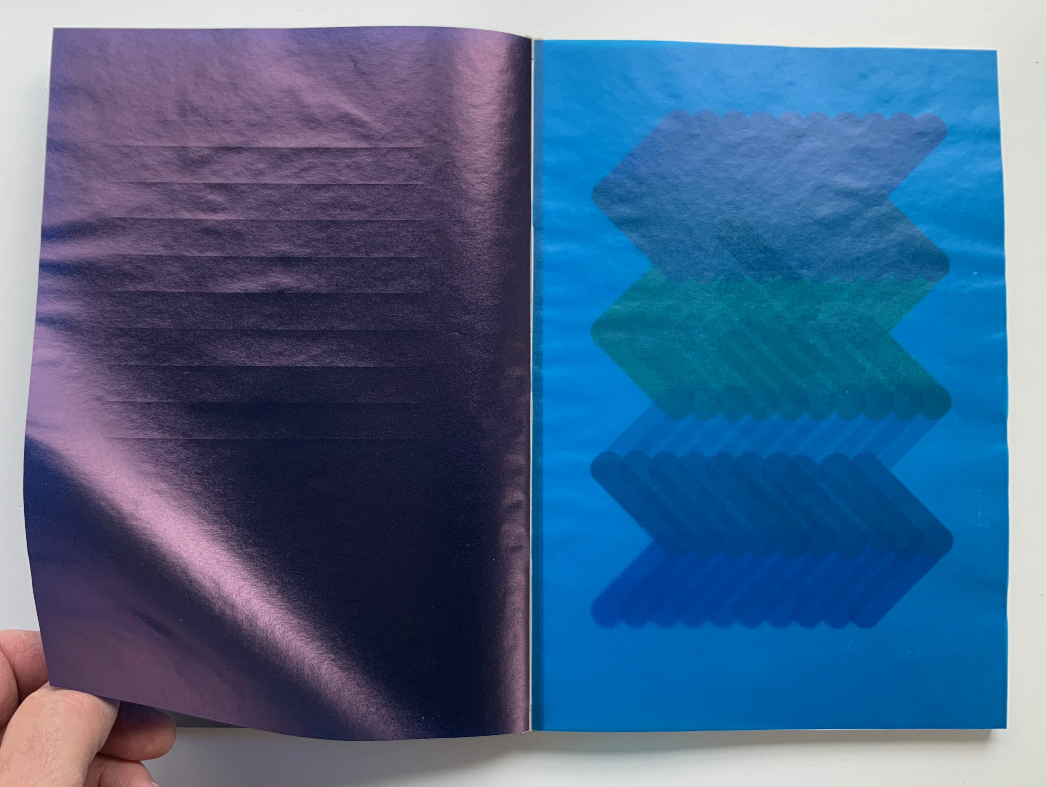
First of all, the slipcase is more of a “slipsleeve” from which the spine protrudes for fingers and eyes to feel the exposed binding threads, the pattern of knots and the ridges of the gathered signatures. This is the sewn boards structure, credited to Gary Frost, more on that later. The spine and fore edge offer bright colors that contrast with the deeply black sleeve that displays three slanting parallel cutouts in the cloth, exposing the board it covers. The pattern those cutouts make will become a recurrent visual and tactile theme as the pages turn.
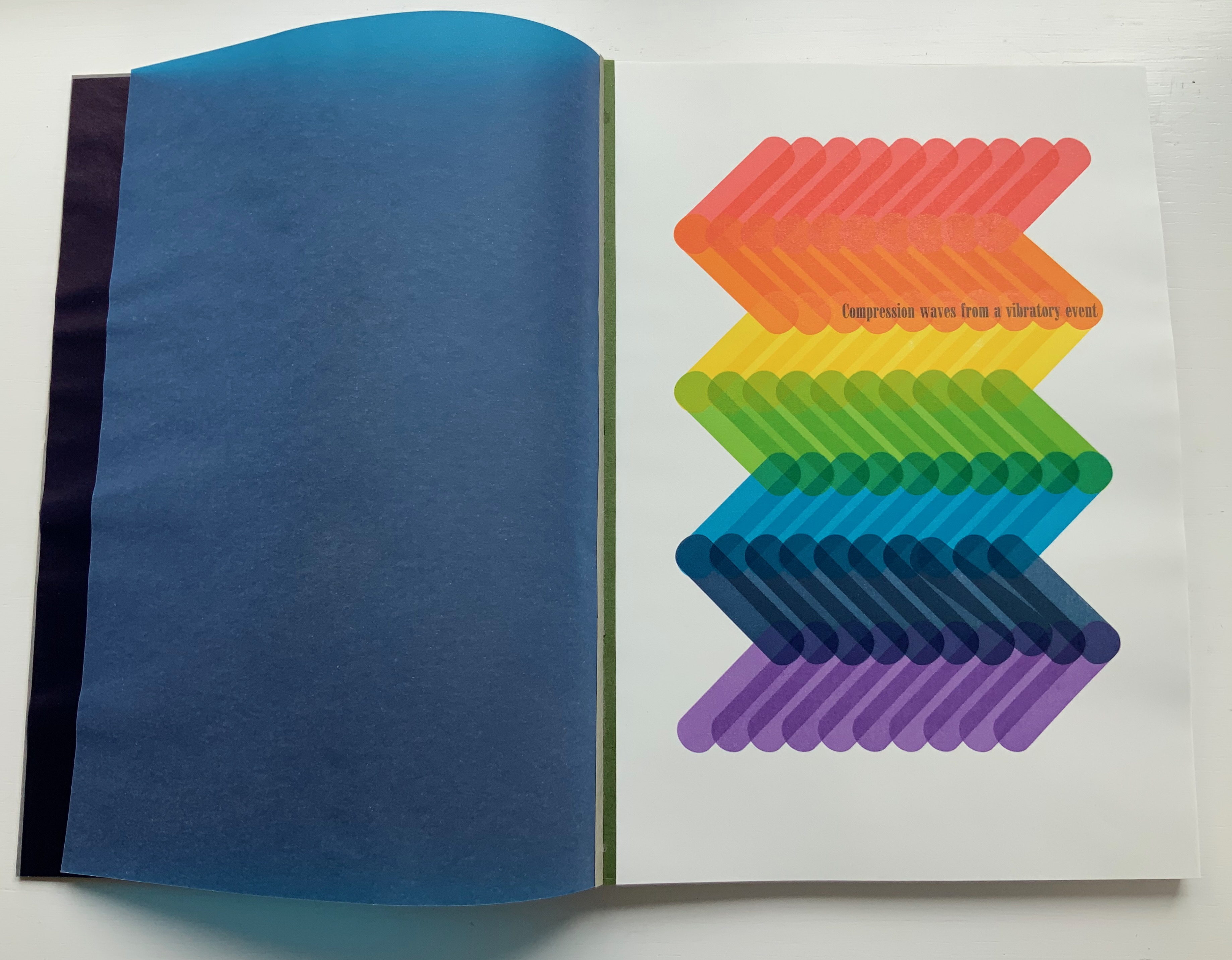
As the tightly fitting sleeve pulls away from the board-stiff book, they make a “shirring” sound together. As the front cover turns, the title page bows upward showing nine impressed parallel lines beneath the words “Table of Contents”, and when that page turns, it crackles and makes a shuffling sound as its edge drags across the following bright blue page.
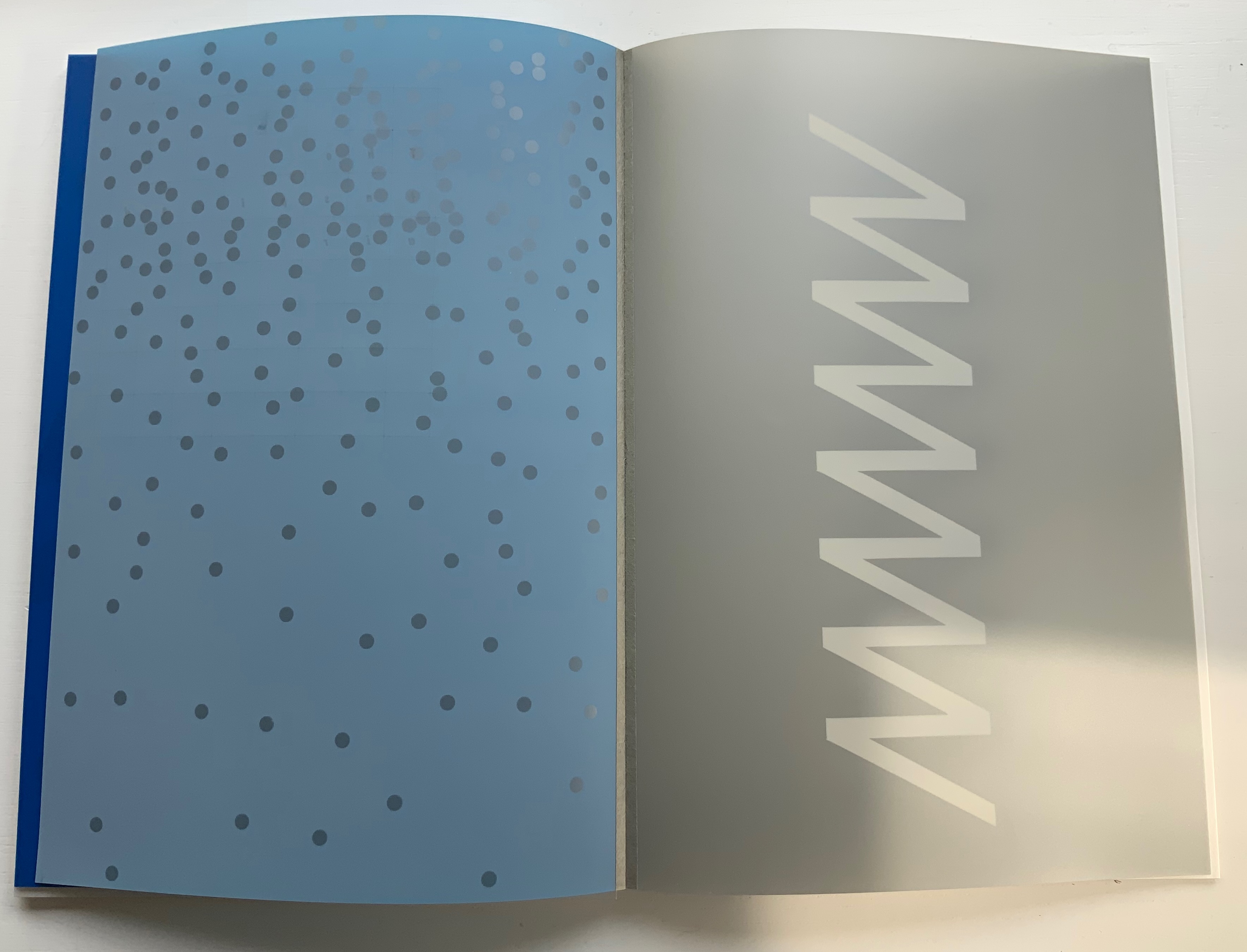
Through that bright blue translucence, the pattern from the slipsleeve reappears but rearranged and multiplied into a zigzag spectrum of colors. The physical turning of the translucent page “exposes” that zigzag spectrum and the second line of text in this poem: “Compression waves from a vibratory event”. Gibson’s text refers to the perception of sound or physical vibrations, and Botnick poetically overlays this with his selection of papers and introduction of zigzag waves of color. The zigzag pattern and its rounded elements, which on some pages are scattered, elongated, cross-hatched or sharp-edged, contribute a recurrent visual syncopated rhythm through the book. Toward the end, the zigzag moves into a more consistently vertical and angular, almost helical, appearance.
First leaf turned, second leaf turning, third leaf revealed.
Zigzag pattern scattered. Zigzag pattern become helical.
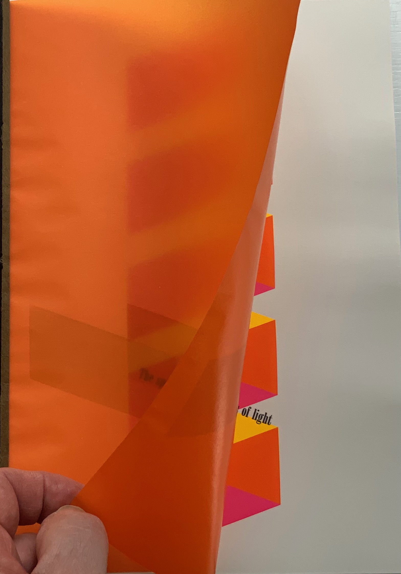
To deliver other visual and haptic effects, Botnick prints his translucent papers sometimes only on their reverse sides, sometimes on both, sometimes to the point of opacity as with the first leaf and other times to the point of transforming the colors about to appear on the next sheet beneath as with the second and third leaves. Of course, this changes the feel of the sheet from one side to the other. Botnick also uses six different paper types (including one with a watermark designed for this edition and made at Dieu Donné Paper). The variety in printing and papers introduces additional tactile and visual rhythms: slick and matte, smooth and rough, dark and light, etc. Again, proceeding by contrasts and complements, provoking multi-sensory activity and responses.
Visual effects achieved by printing on both sides of translucent paper layered over fine print paper.
Visual effects achieved by printing translucent paper to near opacity on one side, spot printing on the other side and layering that sheet over a translucent paper printed on one side.
Variation of paper types.
The sewn boards structure, executed by Emdash studio member Robin Siddall, offers the most effective means of achieving the sensory effects intended with the variety of papers, ink colors and printing techniques, as well as delivering a lay-flat binding. Each four-page signature consists of two separate sheets glued to the inner edges of a narrow folded card (the board) sewn and linked to the boards of the signatures before and after. The card used for those hinges is a Japanese washi called Moriki, known for its folding strength and colors, but how particularly apt those multiple hinges and colors are for this patchwork poem.
Detail of an open signature exposing the thread sewn through the board and showing the leaves glued to the edges of the board.
Gibson defines the haptic system as that “by which animals and men are literally in touch with the environment” (p.97). On the penultimate double-page spread, Botnick reveals the environment that touched his “book-length visual/textual poem” into existence: one of pandemic, isolation, violent exposure of institutionalized racism, the “Big Lie” and insurrection. Set in the now familiar zigzag pattern, the revelatory text annotates the lines of appropriated text and the prints, connecting both with the environment and the meditation on perception. Botnick’s book is certainly a distinctive interweaving way of thinking about these threads.
It is telling that Table of Contents ends with black and gray, the colors that dominate the other work in the collection: Diderot Project (2015), which presents this pronouncement from Odilon Redon:
Even without the prismatic range of colors in Table of Contents, Botnick’s Diderot Project (2015) may outstrip the former in the number of ways in which Botnick makes not only the page but also the codex itself “become a dynamic landscape of visual and conceptual ideas”.
Diderot Project (2015)
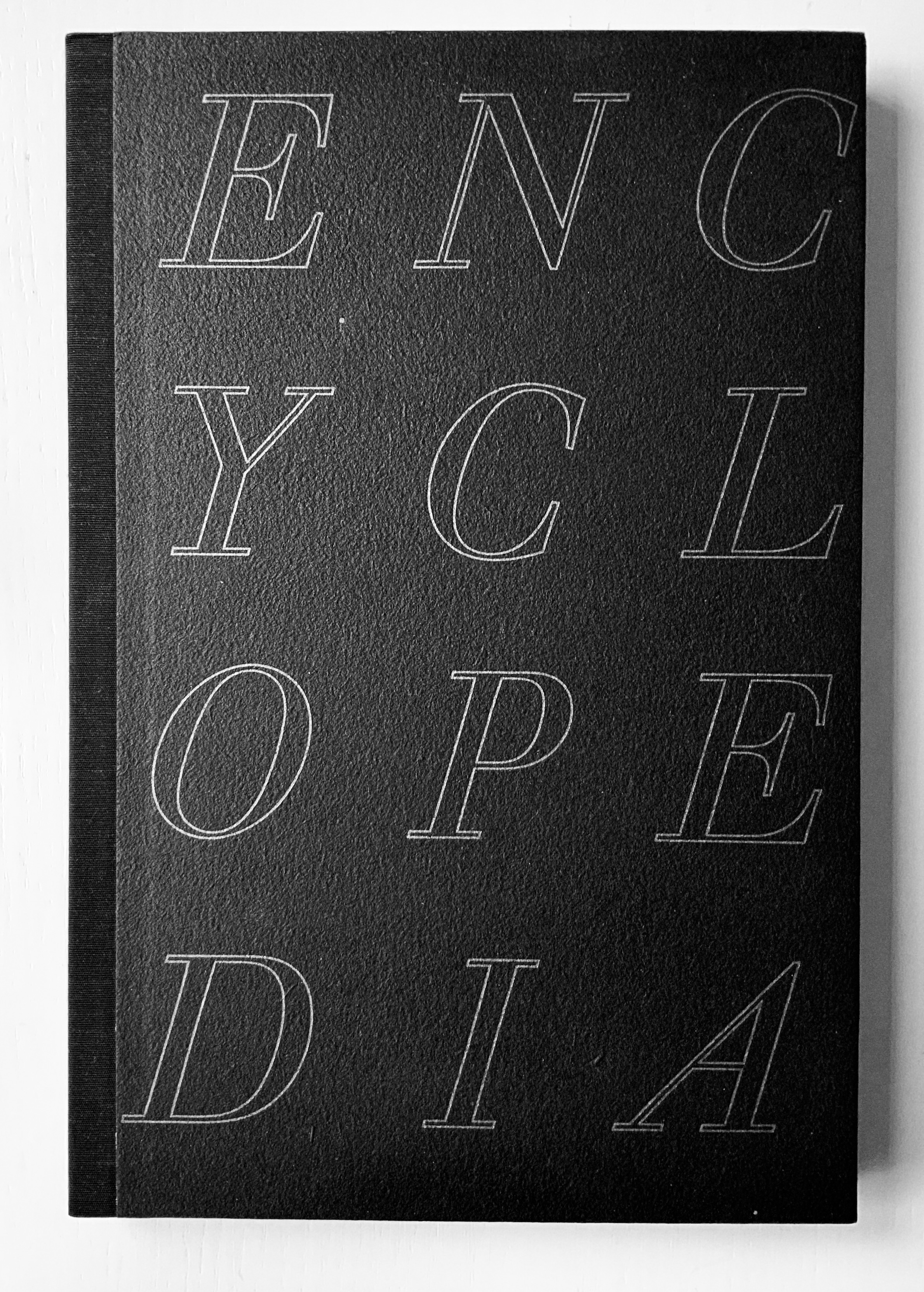
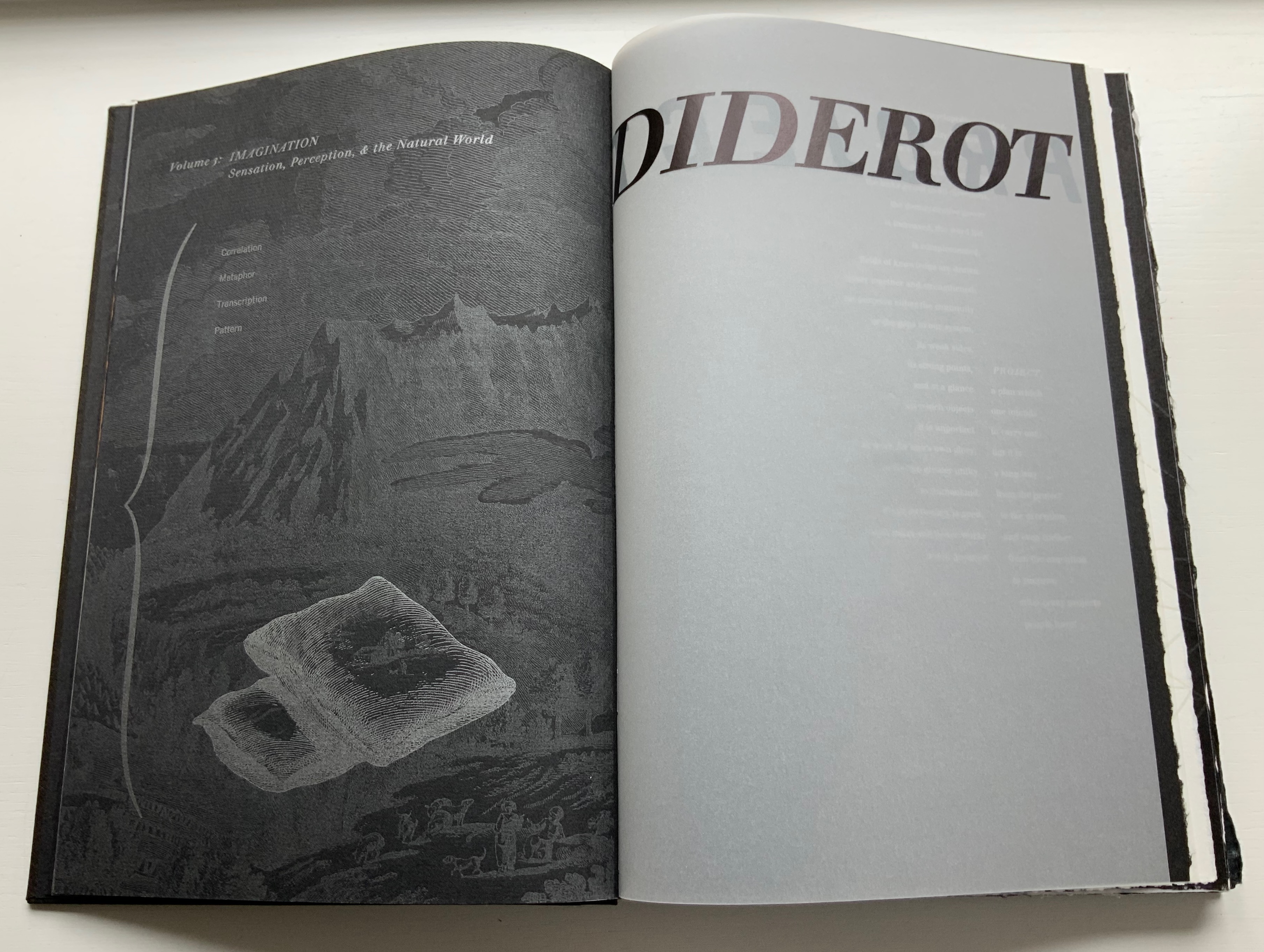
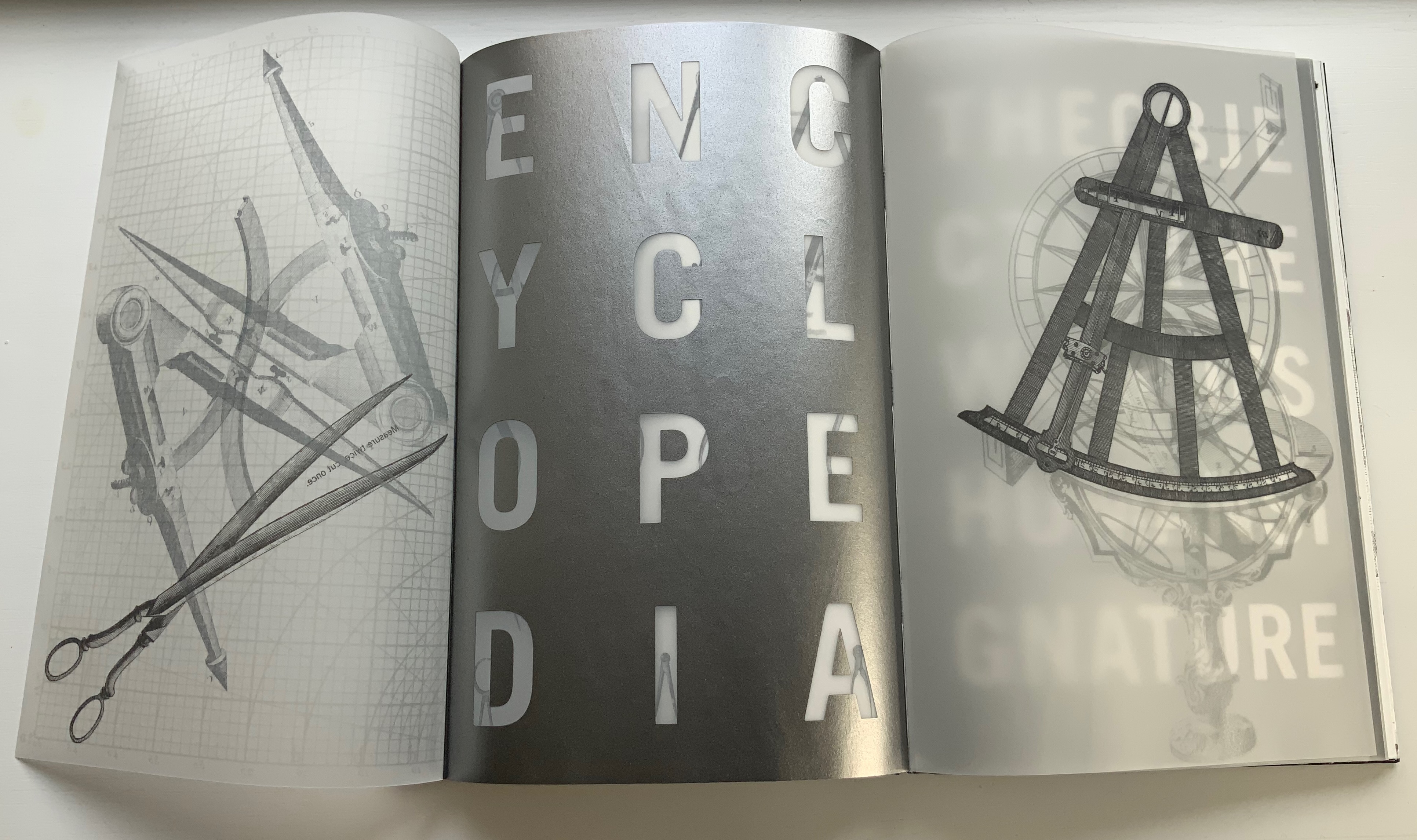
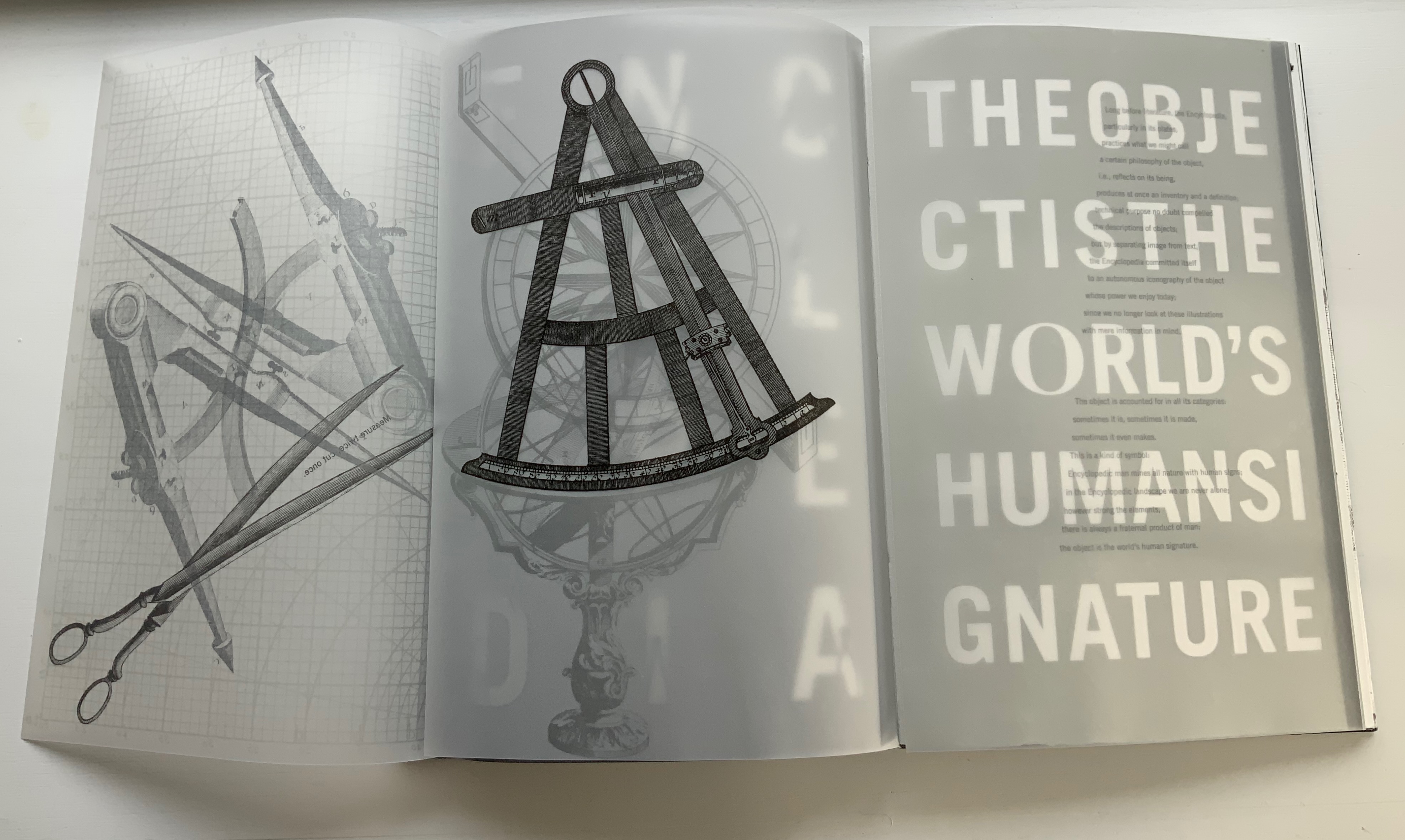
Diderot Project (2015) Ken Botnick H290 x W194 mm, 150 pages. Edition of 70, of which this is #32. Acquired from the artist, Photos: Courtesy of the artist; Books On Books Collection. Displayed with permission of the artist.
Clearly, like Table of Contents, this work is a “book-length visual/textual poem”, so it offers some insights on the book artist’s favorite rhymes, rhythms, metaphors, techniques and themes. First and foremost is his taking a literary work as his muse. With Table of Contents, it is James J. Gibson’s psychology book; in this case, it is Denis Diderot’s multi-volume Encyclopédie (Encyclopedia), a decades-long project with Jean le Rond d’Alembert and 138 other contributors. Nodding to the multiple volumes of the Encyclopedia, the artist refers to the sections of his work as Volumes 1, 2 and 3, although they are bound as one binding. The three volumes’ titles follow the Encyclopedia‘s overarching categories in its “System of Human Knowledge”: Memory, Reason, and Imagination. Digitally captured images from the Encyclopedia‘s plate volumes abound.
Table of Contents
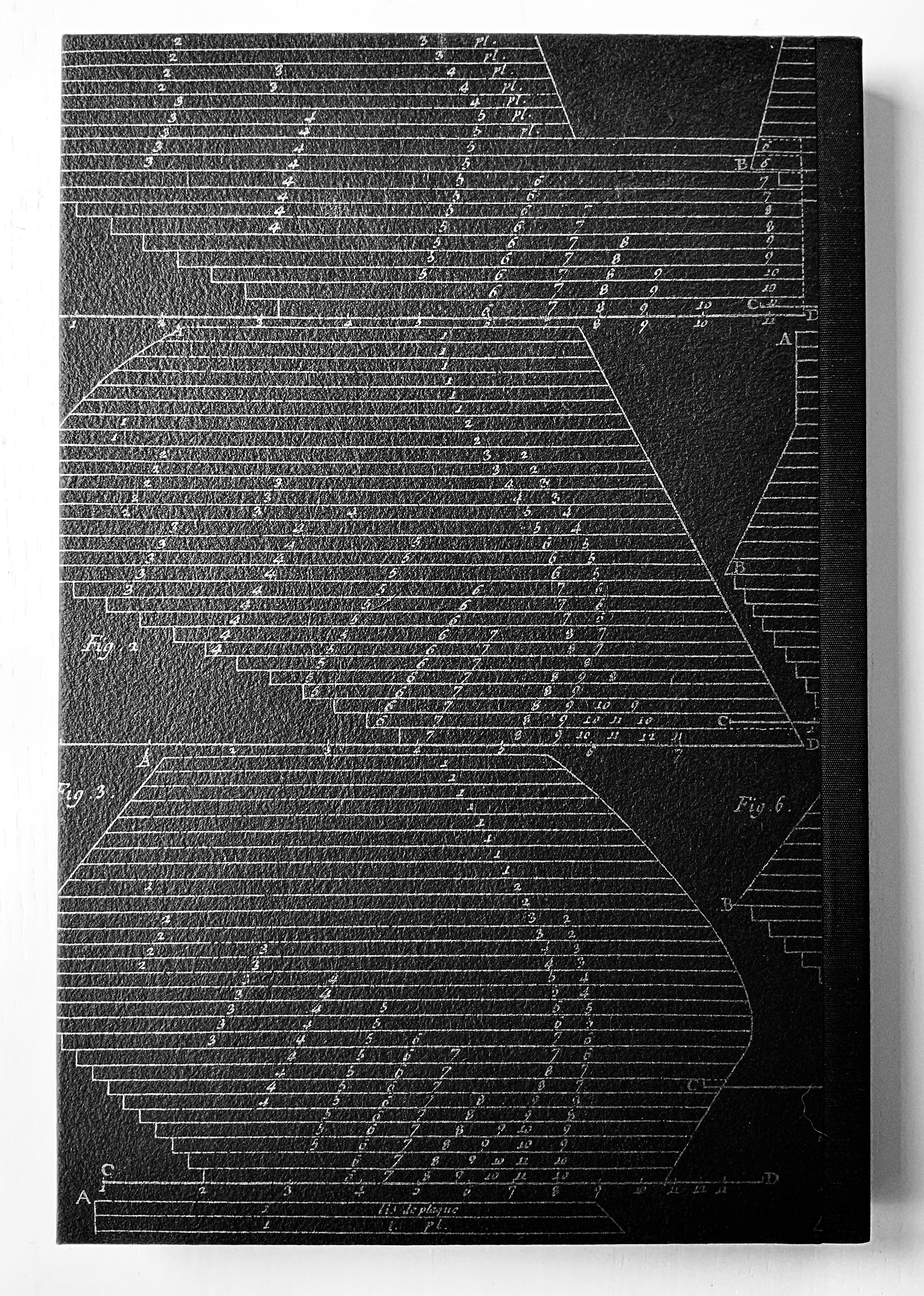
Diderot Project, however, is not a condensed version or description of the Encyclopedia. Like literary works of ekphrasis whose words meditate on a visual object, Diderot Project is book art that meditates — inversely — on a literary work. The cover to Diderot Project does not show its name where the title is expected, rather it shows the name of its object of meditation. And it displays that name in a distinctive monumental way.
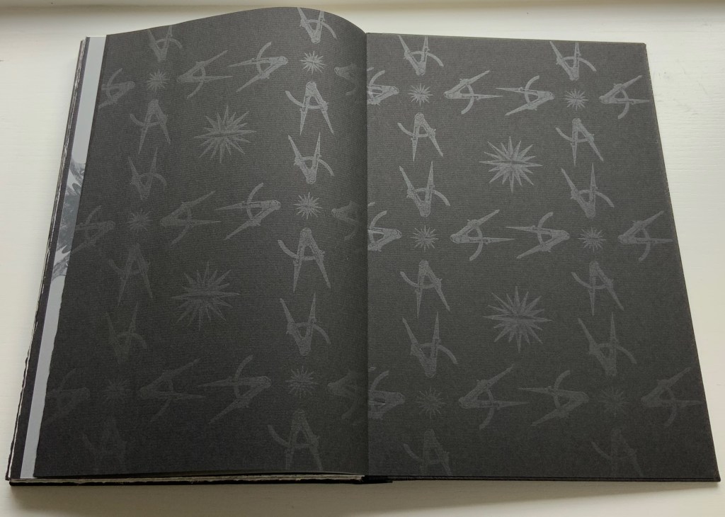
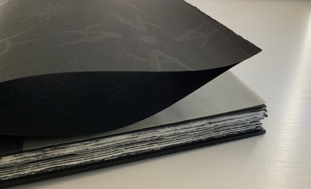
The front cover’s silver slab serif italic letters in all caps on textured, triple-dyed flax paper and the back cover’s diagram in the same palette strike chords that reverberate throughout the work. The chords are both obvious and subtle. Immediately, with a pattern of silver-gray compasses and directional stars, the doublures repeat the cover’s black and silver notes but on a less textured paper. Curiously the fly leaves of the doublures are not really fly leaves because they are pasted at their fore edges to separate leaves of black paper: a subtle hint to look beneath the surface, inquire into the mechanics. (An irresistible side note on the mechanics of the binding: the binder Daniel E. Kelm, in tipping the black fly leaf to the outer printed one, extends the fly leaf further into the book as a tipped-on hinge inserted through the first two signatures. The detailed image below on the right shows the hinging edge of the fly leaf between the signatures.)
L-R: Inside back cover, doublure with compass and directional star motif; Inside front cover, doublure leaf anchored to fly leaf; Binding detailed view of hinging edge of fly leaf extending between signatures.
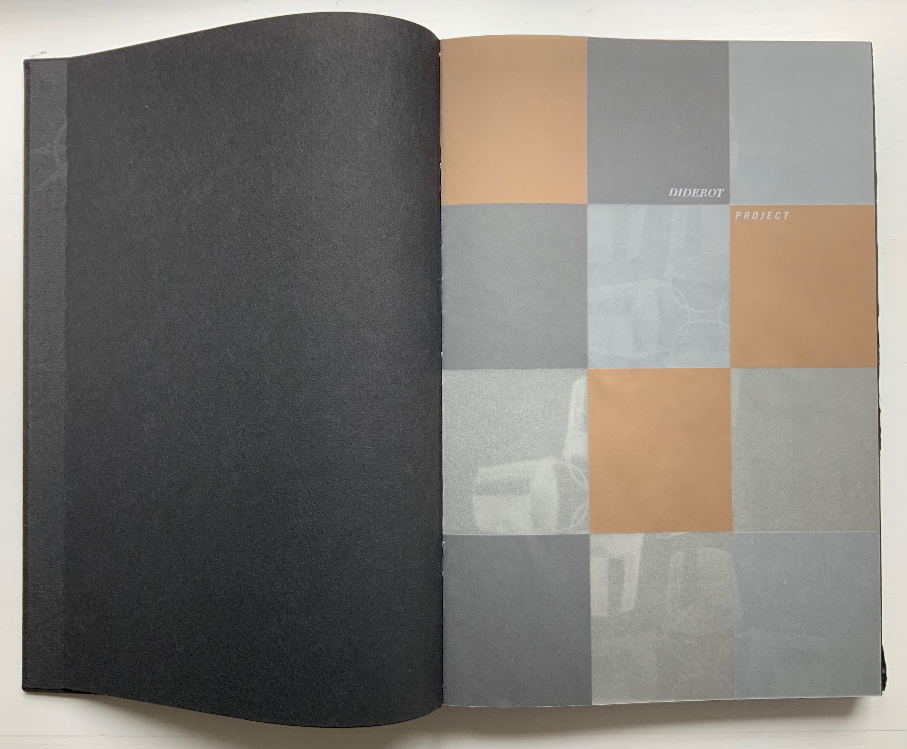
Following that almost-Chinese fold of a flyleaf, the half-title drops any pretense of hinting. Turning the half-title with its 3×4 grid of black, brown, tan and gray squares on translucent paper reveals that the squares have been created by printing in silver, copper, light brown tint and no ink on the reverse. Underneath the half-title leaf lies another black page with the recurring silver-gray image of four buckets linked by their handles. The pattern of buckets is parallel to the interlinked image of compass and directional star on the doublures. It is another subtle hint: this time, to look at patterns for their similarities and differences arising from the mechanics of effects, to consider the commonality of tools whether at the low or high end of culture.
L-R: Half-title on translucent paper; inked reverse of half-title and the interlinking buckets.
If this reaction to the prelims seems a stretch, then the following run of folios surely validates it. Not only does the text articulate the parity of craft and tools (métier) with art and science, the watermark hand gestures to it, then the watermark hand joins its mirror image “to tie” the knot of the binding thread, and then the second watermark hand joins its printed mirror image at the same point. These six pages enact parallels of similarities and differences.
The layering of translucent paper printed on one or both sides, which also occurs in Table of Contents, is another of Botnick’s favorite techniques. He has even delivered a lecture at the Getty Research Institute entitled “Transparency as Metaphor“. Botnick’s use of it in the sequence below invites the reader/viewer to meditate with him on “the nature of craft, tools, memory, and imagination, while provoking questions about authorship in artists’ books”.
Running across the four pages of the two leaves of UV Ultra Clearfold, the enlarged present, past and future letters call on perception, memory and imagination to decipher the name: Diderot, emerged and submerged. However large his name is cast, though, is Diderot the author? By bracketing these transparencies with an image of a manufactory or workshop and a crowd of listeners and observers with pens poised, Botnick evokes the other 139 contributors to the Encyclopedia and his own host of collaborators, including Kelm (binding), Paul Wong (papermaking) and, importantly the Emdash studio (Catherine Johnson, Ben Kiel, Karen Werner and, in New Delhi, Ira Raja).
Tools, the workplace and studio lie at the heart of the Diderot Project‘s second volume, which boasts the following complex foldout which in itself validates Roland Barthes’ statement from his essay on the Encyclopedia‘s plates: “The object is the world’s human signature”.
Sensation, perception and the natural world lie at the heart of the third volume, and here is another of Botnick’s favorite techniques: typographic distinction. The right-side up text on the verso page is set in Walbaum, as is every instance of Diderot’s text. The upside down text on the verso and all the text on the recto are set in Trade Gothic, as is the case for more contemporary authors (Michel Foucault and Walter Benjamin, respectively, in these instances). Note how Foucault’s upside down text reflects the action in the image of the camera obscura, and picks up the theme of perceptual flipping initiated with the watermark hand in Volume 1 and Diderot’s enlarged name across the translucent pages in Volume 2.
Both Table of Contents and Diderot Project reward revisiting for this kind of close reading, close looking, close fingering and close listening. Close comparison and contrast as well because together they answer “How does a book reflect a distinct way of thinking about a subject? How does the page become a dynamic landscape of visual and conceptual ideas?”