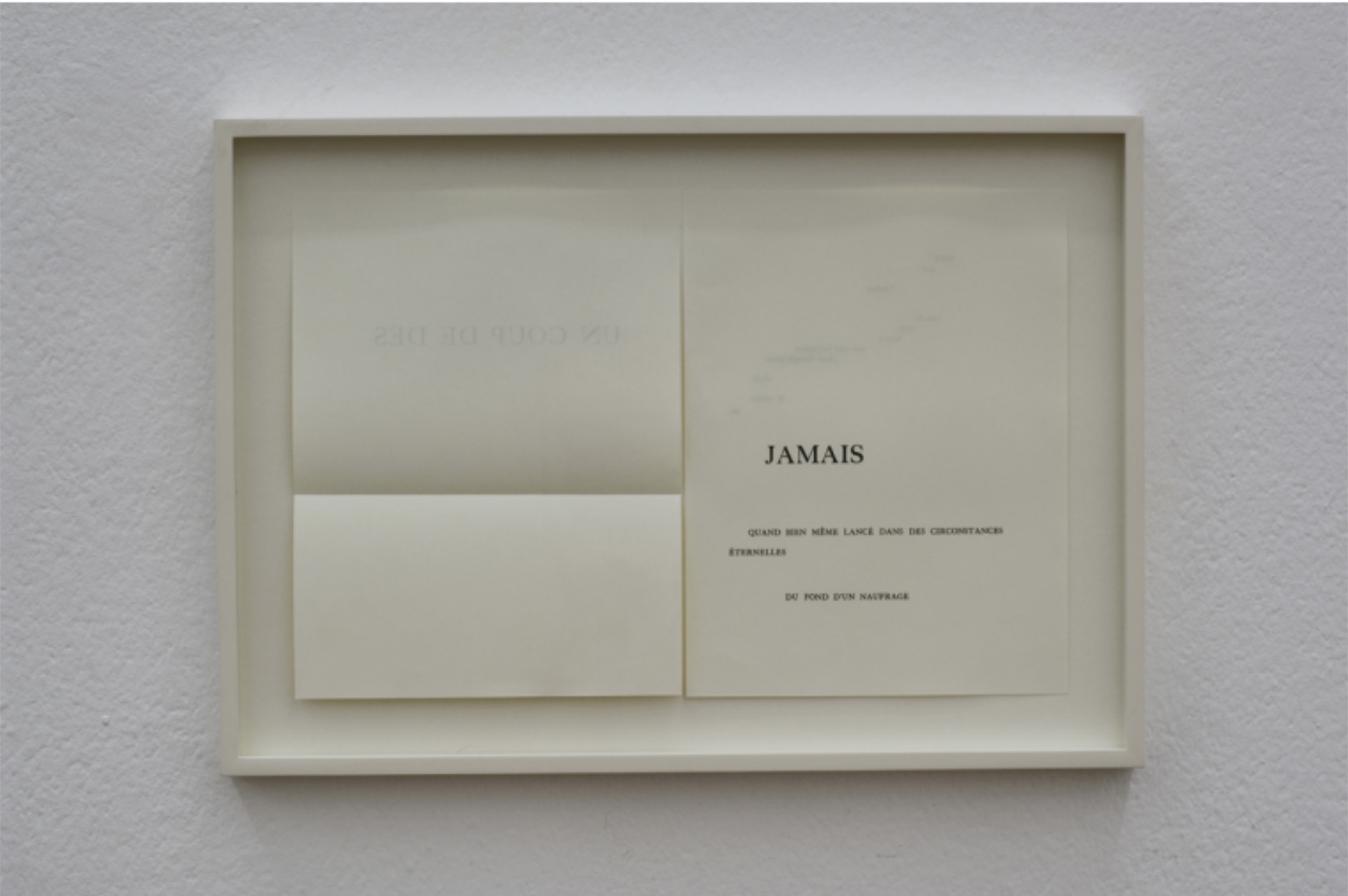
Renée Riese Hubert and Judd D. Hubert, the curators of a 2003 exhibition celebrating the influence of Un Coup de Dés on art, took umbrage at André Masson’s homage as these three extracts demonstrate:
Far from continuing or elaborating on Mallarmé’s project, Masson has contrived a systematic substitution of graphics, including calligraphy, for a typographical chef-d’oeuvre, thus enabling an unforeseen and uninvited art form to usurp the territory of another. (p. 508)
… in illustrating poetry he more often than not deserves his usual designation of abstract surrealist, all the more so because he combines automatism with the mythological dynamism so characteristic of his paintings and his drawings. (p. 513)
… Mallarmé’s poem, characterized by its avoidance of anecdotal narrative, its deliberate twistings of metaphorical patterns, its deconstruction of rhythmic continuity, practically precludes figuration. How can any illustration, however abstract, lend visual support to a text that compounds to such an extent the problematics of representation? … How could Masson graphically master a text that perversely withdraws from the reader and pores over itself, like the hypothetically sentient waves it repeatedly evokes, questions, and denies? (p. 514)
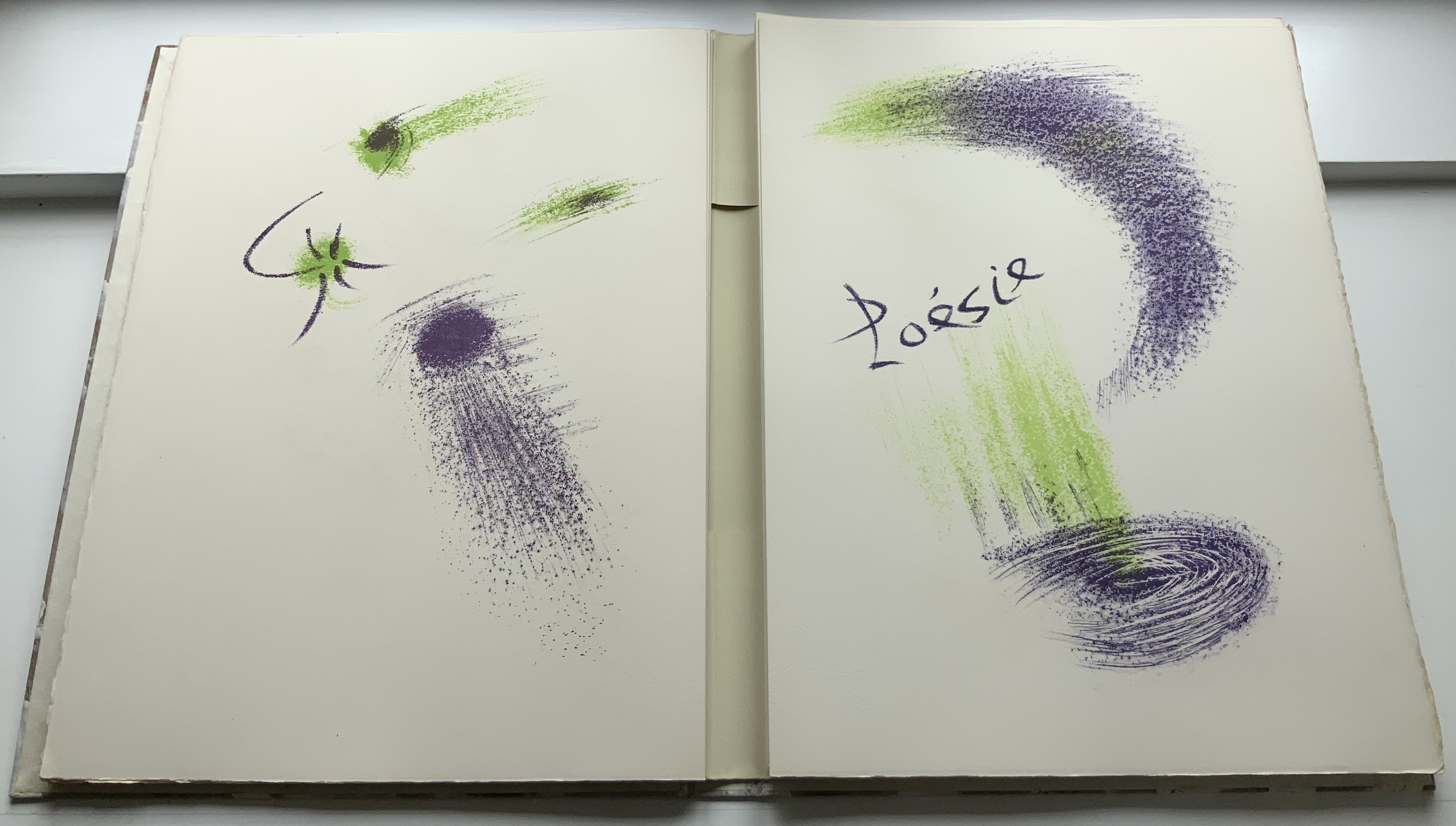
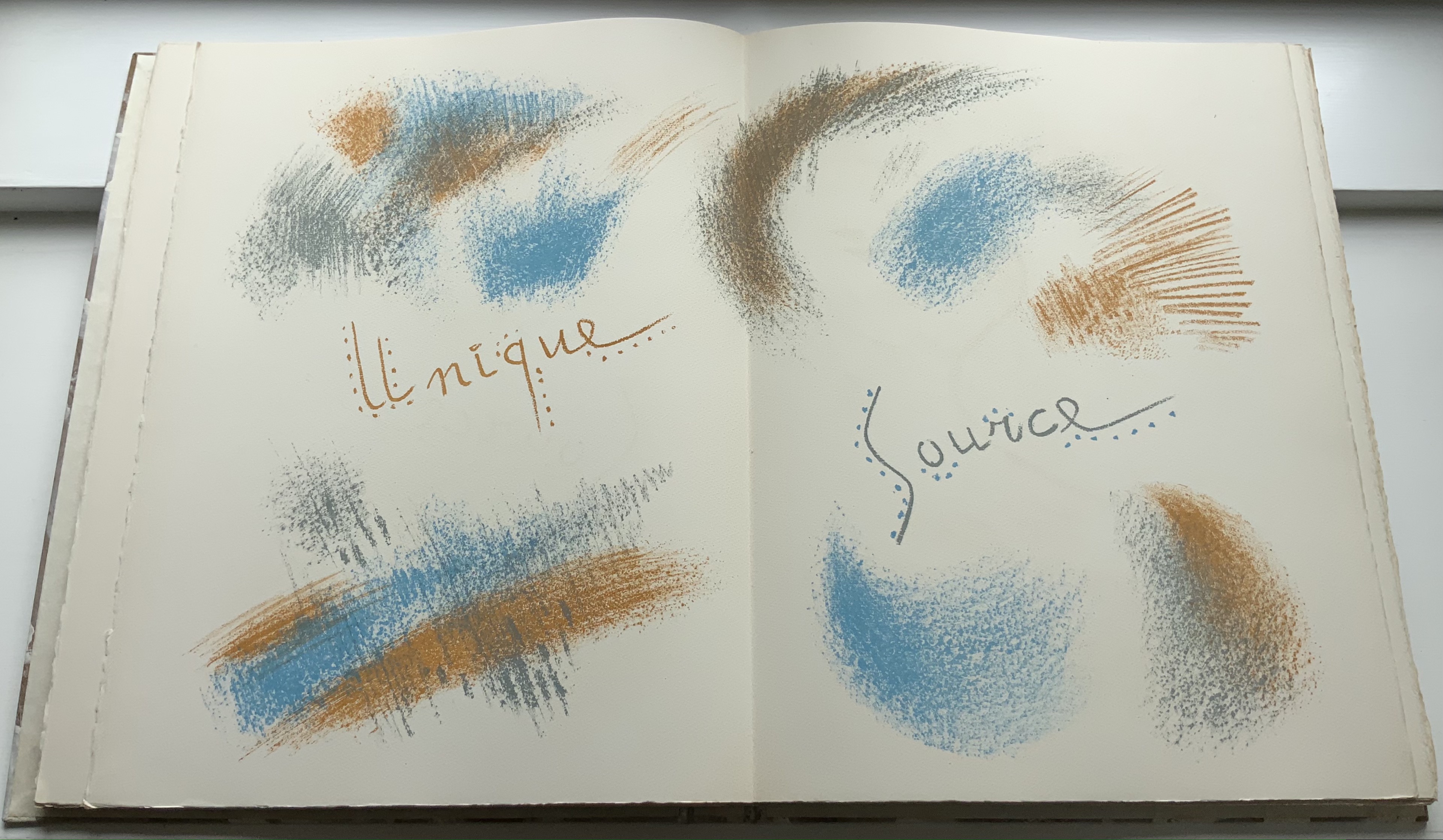
His use of only the last four words in Mallarmé’s preface to the Cosmopolis edition (reprinted with changes in the 1914 NRF/Gallimard edition) is a clue that Masson is going to challenge La Poésie as the Unique Source or perhaps confirm it as the source of this very work that, according to the Huberts, runs at odds with Mallarmé’s poem.
But, given that deliberate, selective quotation from the preface, is this work the result of chance-driven Automatism? After all, isn’t the work driven by the poem to which it pays homage and by the engagement with the Amateurs du livre et de l’estampe modernes. While chance-driven Automatism implies a spontaneity that the practice of lithography affirms, that is so only up to a point. Even if Masson were drawing directly on a prepared surface, the production of these colors and imposition would have required careful planning and methodical execution. Much like Mallarmé’s as revealed in the proofs of his unfulfilled deluxe edition.
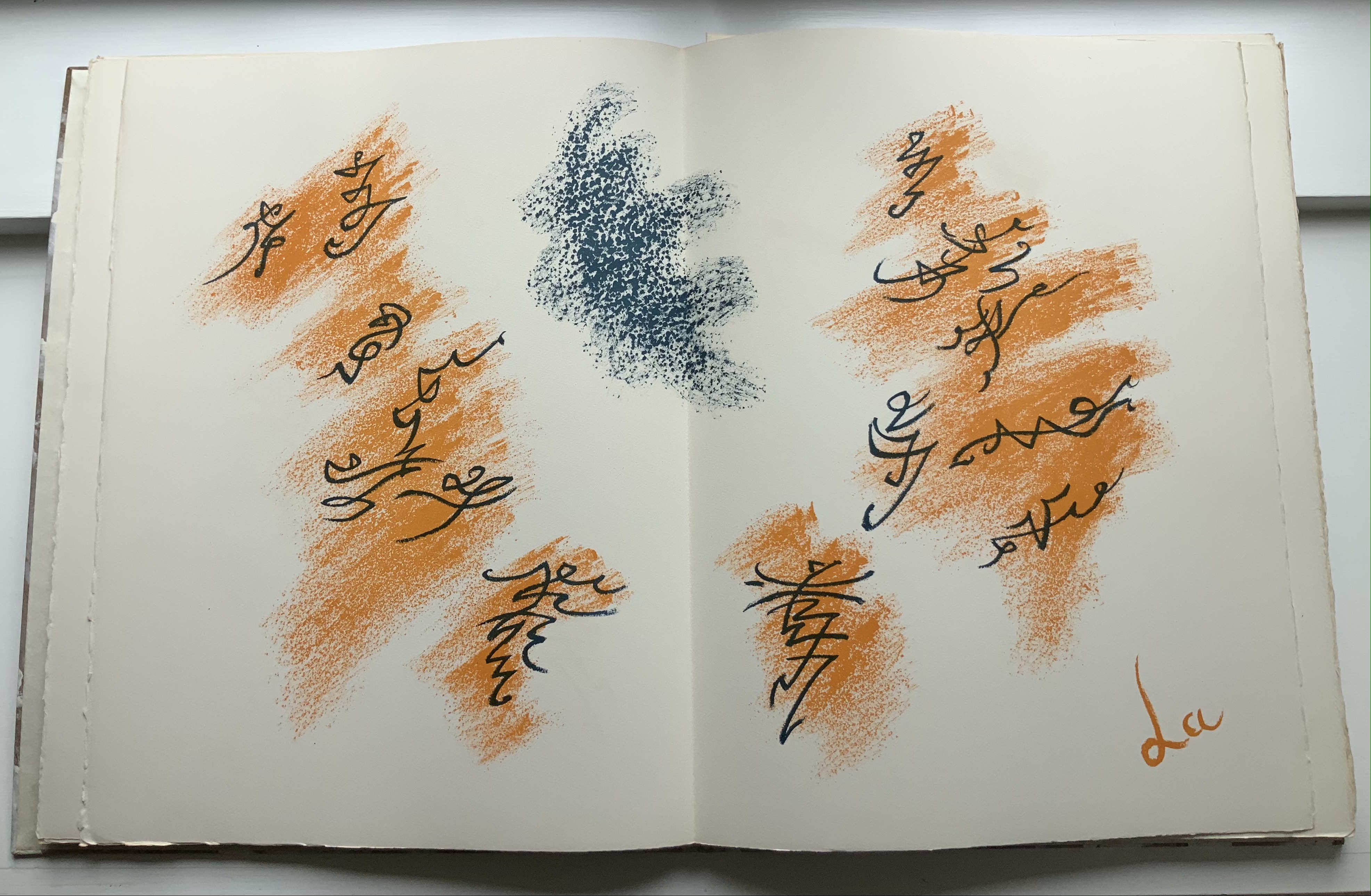
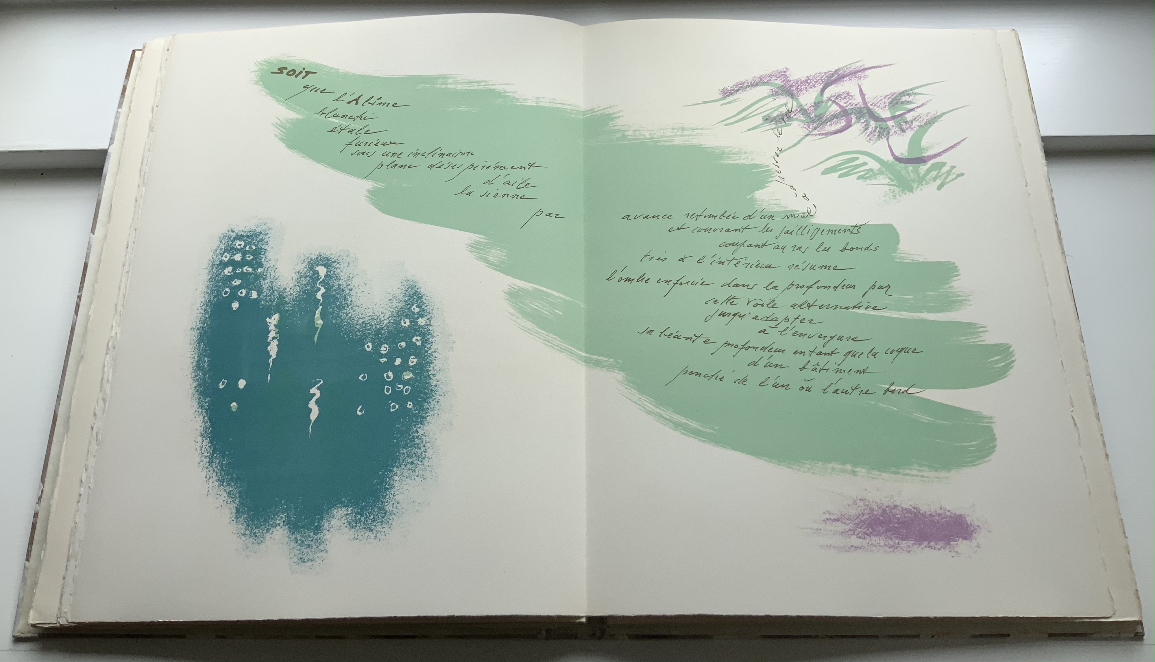
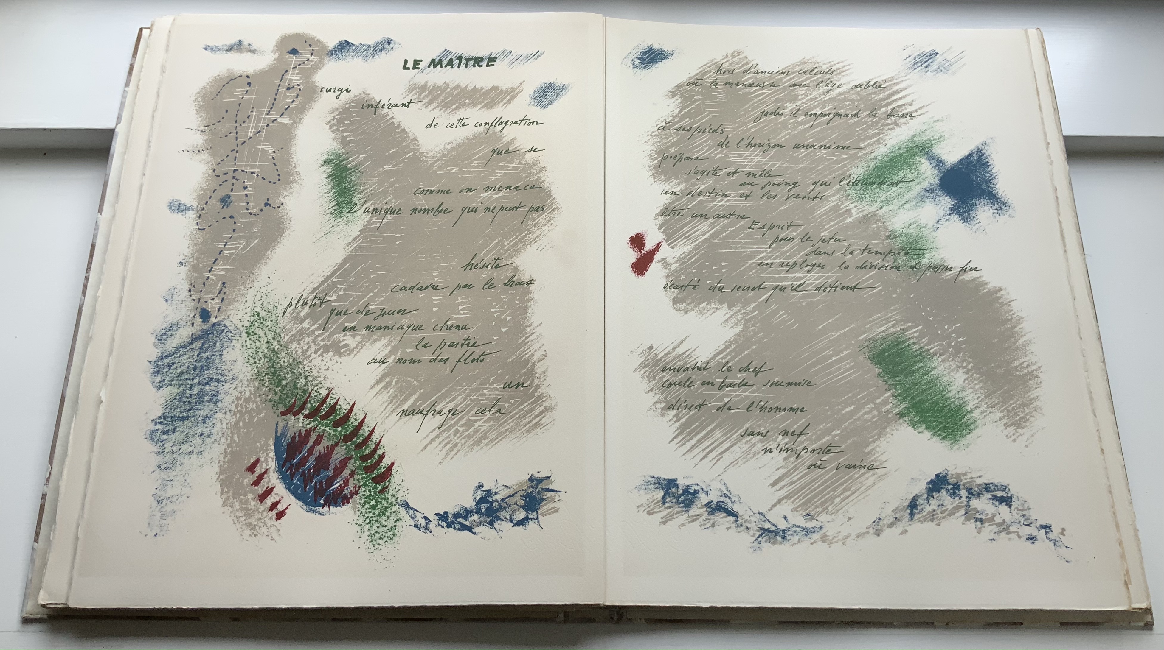
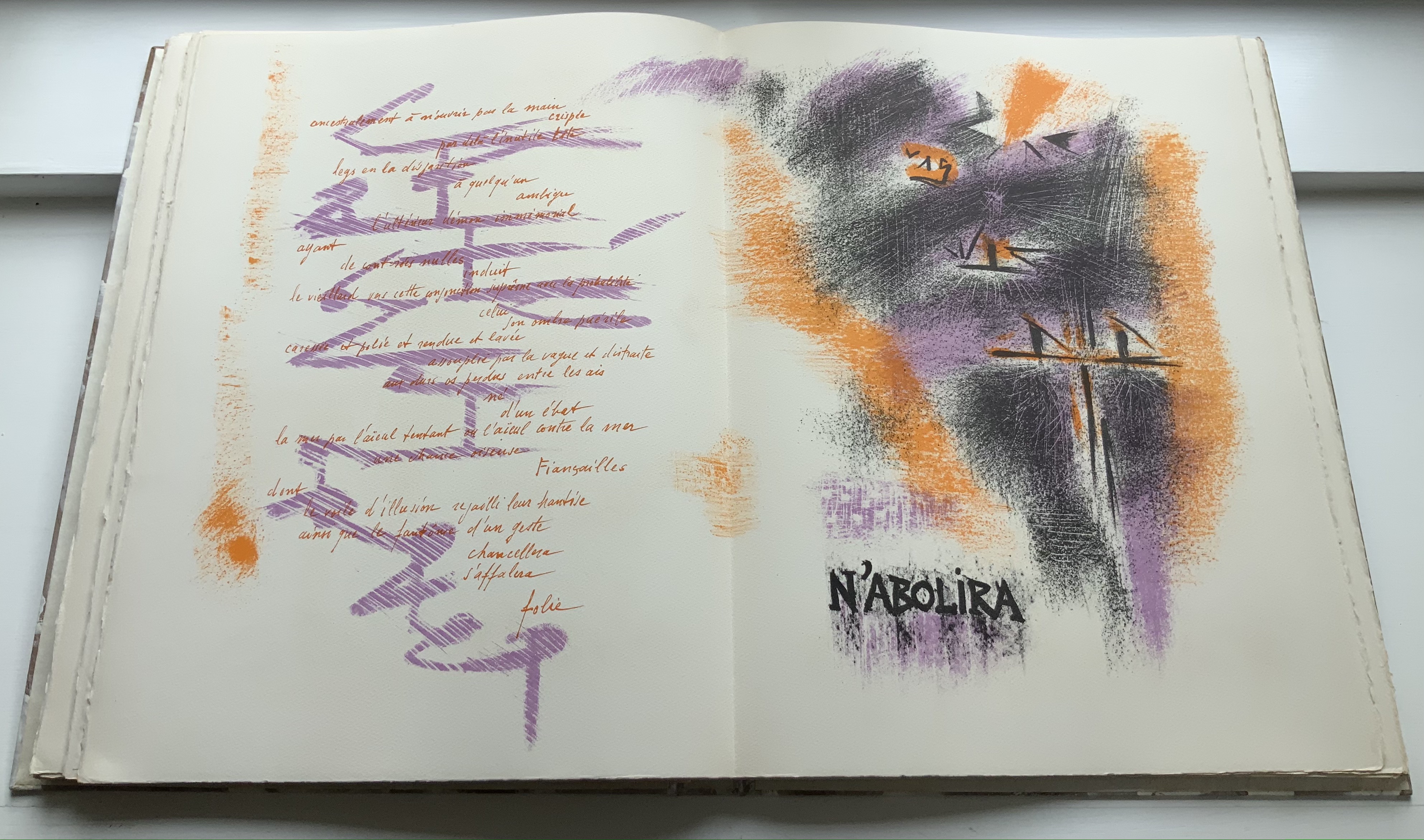
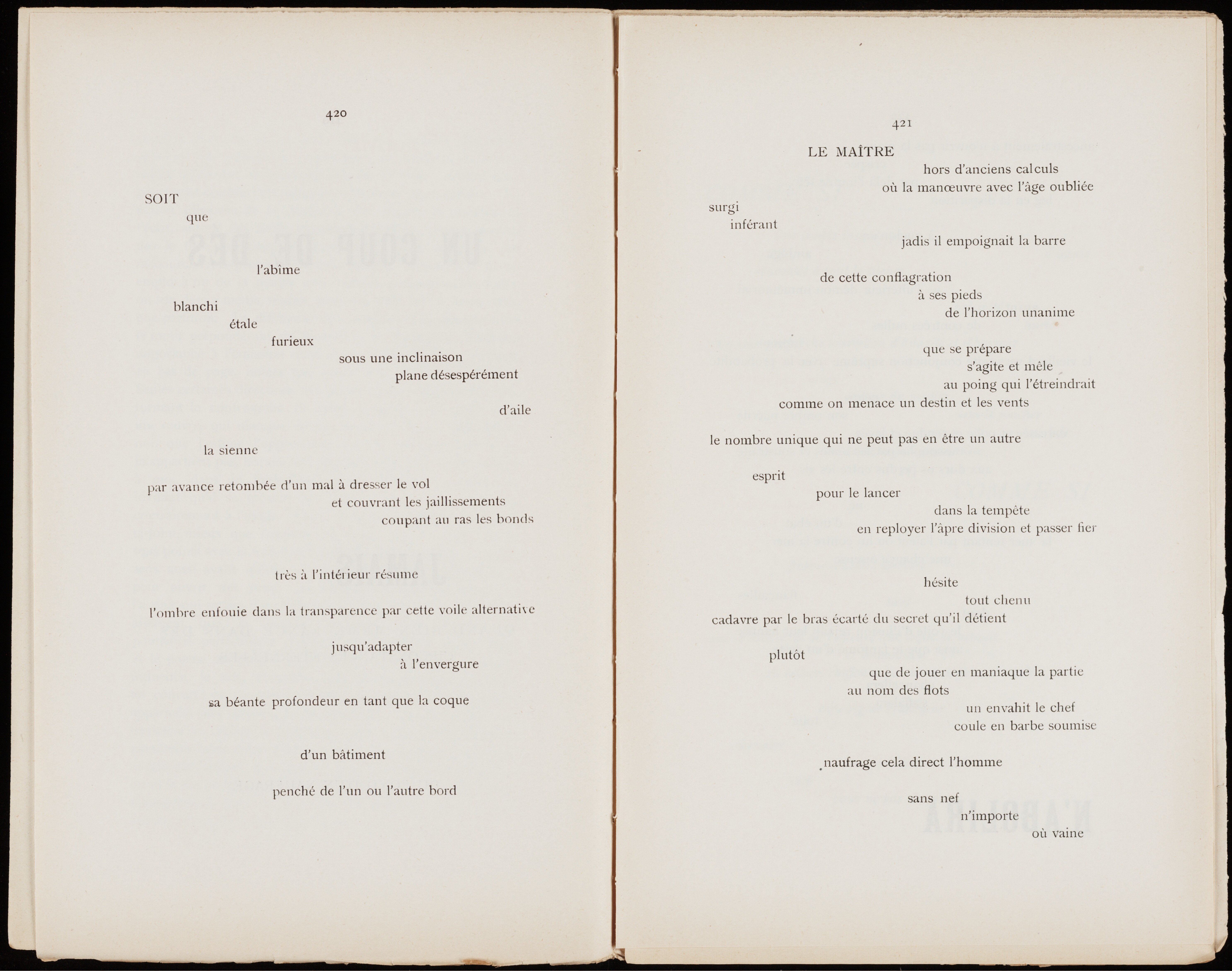
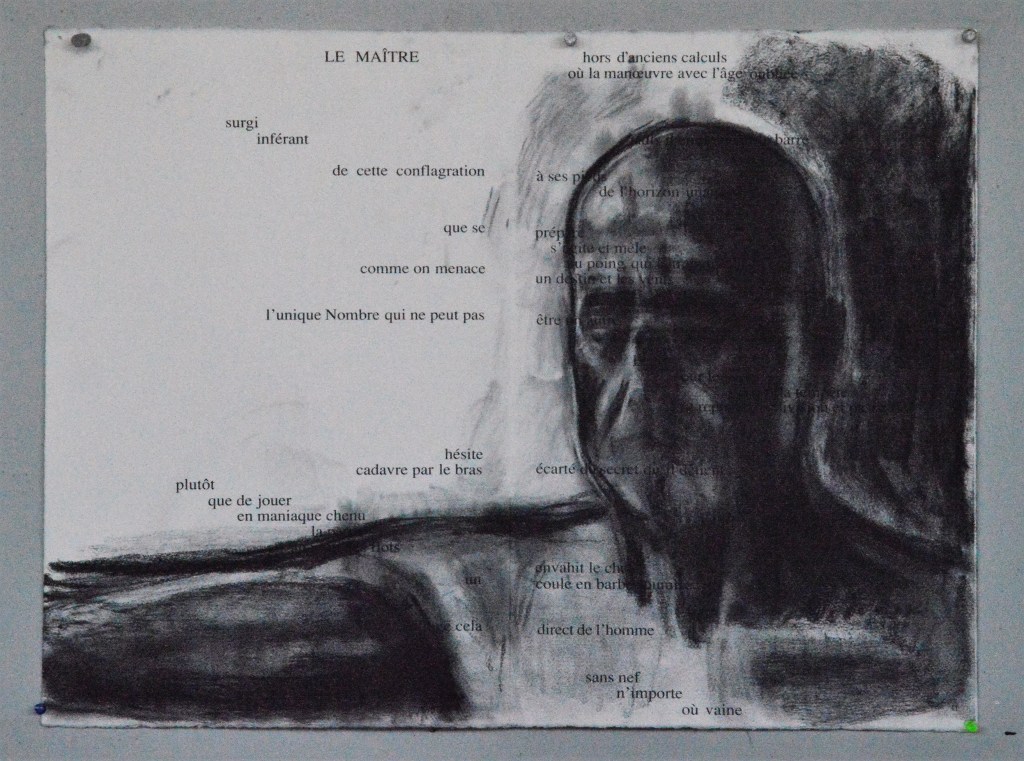
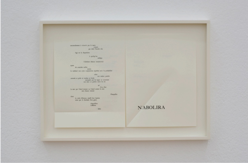
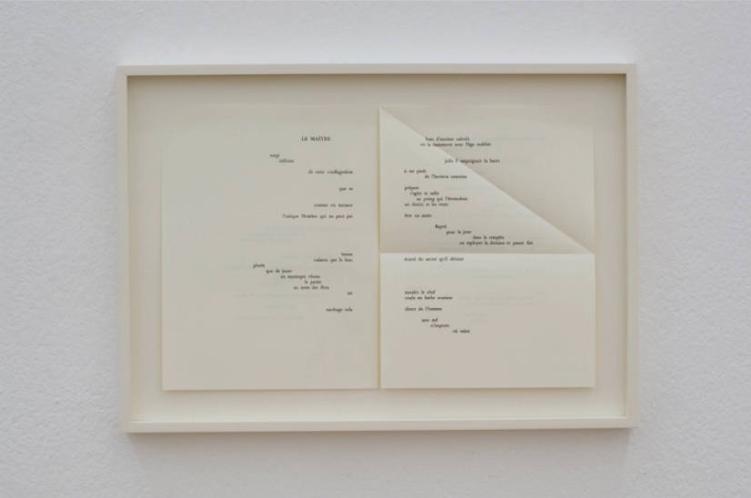
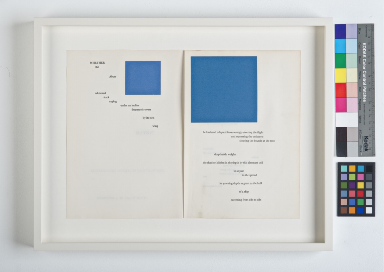
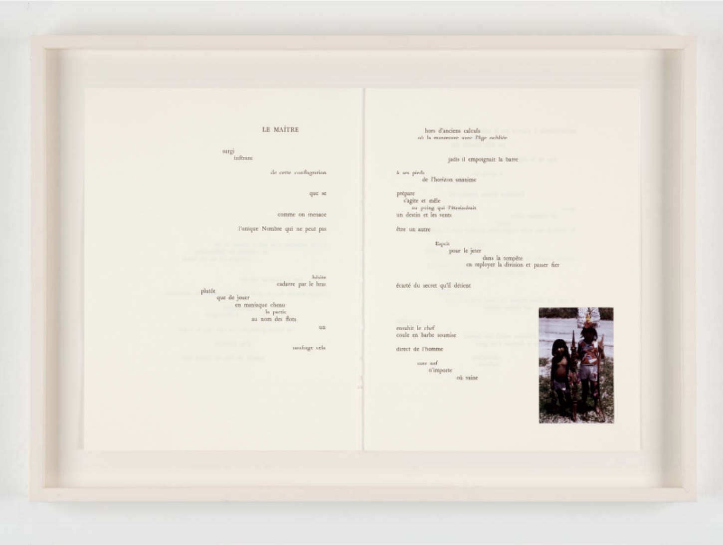
Although Masson’s layout of the text does not follow Mallarmé’s meticulous adjustments, it does nod in that direction as can be seen above and below, and like Mallarmé, Masson is primarily engaged with the double-page spread as his canvas. The dark green image in the spread above left could be anchored seaweed; the script curling away into the tangle could be words trapped in the shipwreck’s rigging. The gray image in the spread above right is a spectral human form juxtaposed with the words “Le Maître”. But if the Huberts are right that no illustration can lend visual support to a text that challenges the foundations of representation, is this work of homage a failed attempt to continue or elaborate on Mallarmé’s project as they conclude?
There is another perspective. Other of Masson’s works such as Florence at Dusk (1958) and Metamorphosis (1963) display the same technique and color so manifest in this distinctive homage. There is no denying that this artist’s response is anything other than authentic. Isn’t it the case that Masson’s embrace of the chance-driven technique of Automatism and chance puts him at the end of Le Maître‘s voyage where “All thought emits a throw of the dice” rather than at the beginning where there is hesitation in the face of Le Hasard. No surprise then that Masson’s homage does not concern itself with choosing the right typeface, placing the words precisely on the page as they appeared in the 1914 edition or respectfully distancing any artwork from the text. Masson takes Un Coup de Dés as a point of departure for a throw of the dice on his own terms. Masson does not usurp; he appropriates.
Further Reading & Viewing
Ades, Dawn. André Masson. London: Academy Editions, 1994.
“André Masson”. Artsy. Accessed 30 July 2021. Displays 217 works. “An early Surrealist and devotee of Cubism—who went on to inspire the New York Abstract Expressionists before taking up a late interest in impressionistic landscapes—André Masson was an iconoclast whose abrupt stylistic transitions defy classification. Along with Joan Miró, he explored automatic drawing, seeking to express the creative force of the unconscious. This led to images—like the celebrated Battle of the Fishes (1927), a poetic depiction of conflict and metamorphosis with undertones of primordial eroticism—derived from random gestures and drawn spontaneously in glue, then sprinkled with colored sands for added texture and complexity. His signature violence, evident in the terrifying, fragmented figures of In The Tower of Sleep (1938), reflects the horrors of the Spanish Civil War and WWII, as well as his own troubled psyche in the aftermath of his service in WWI.”
“André Masson”. Wikiart: Visual Art Encyclopedia. Accessed 30 July 2021.
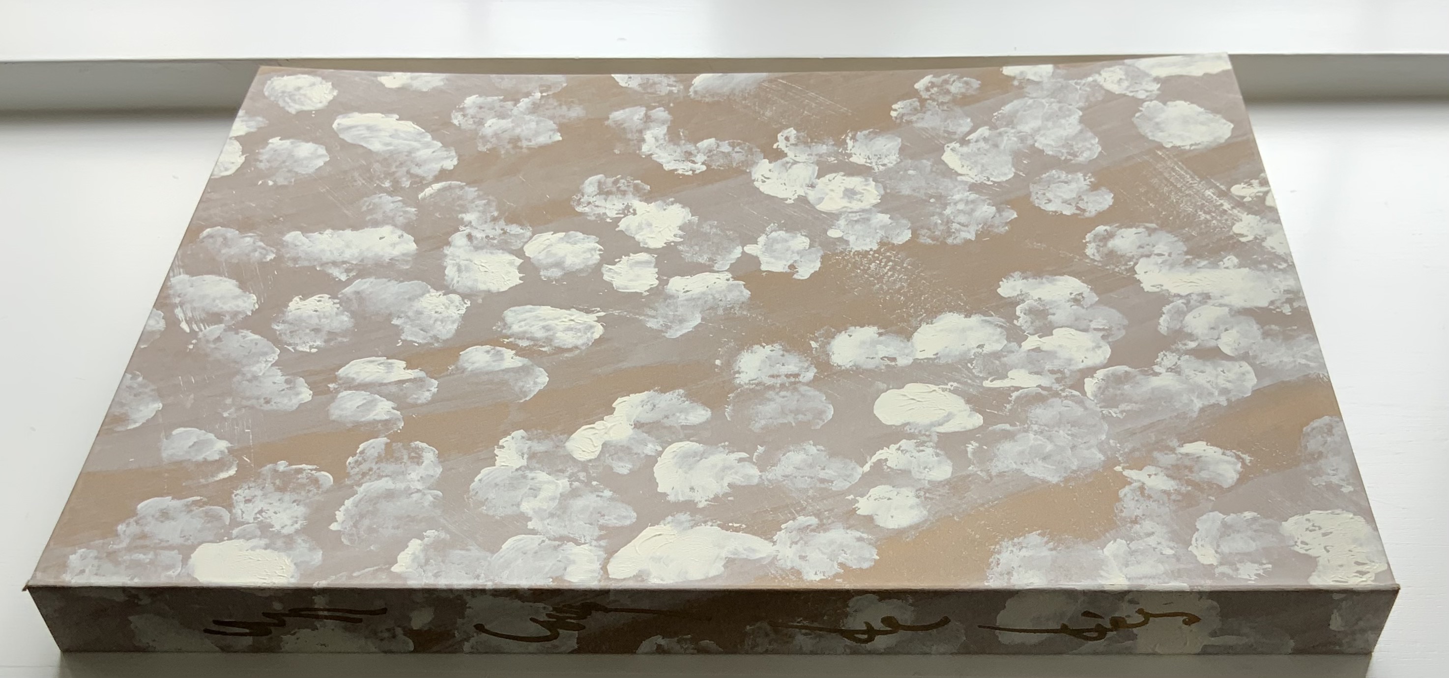
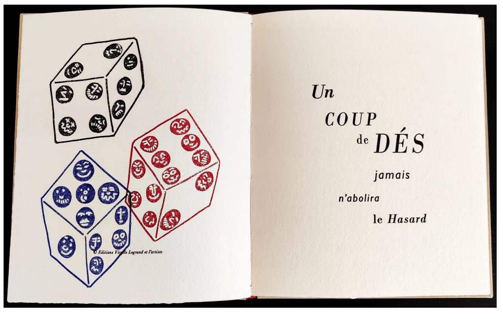
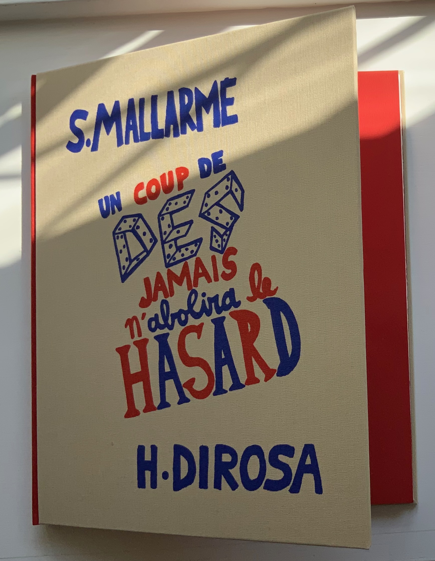
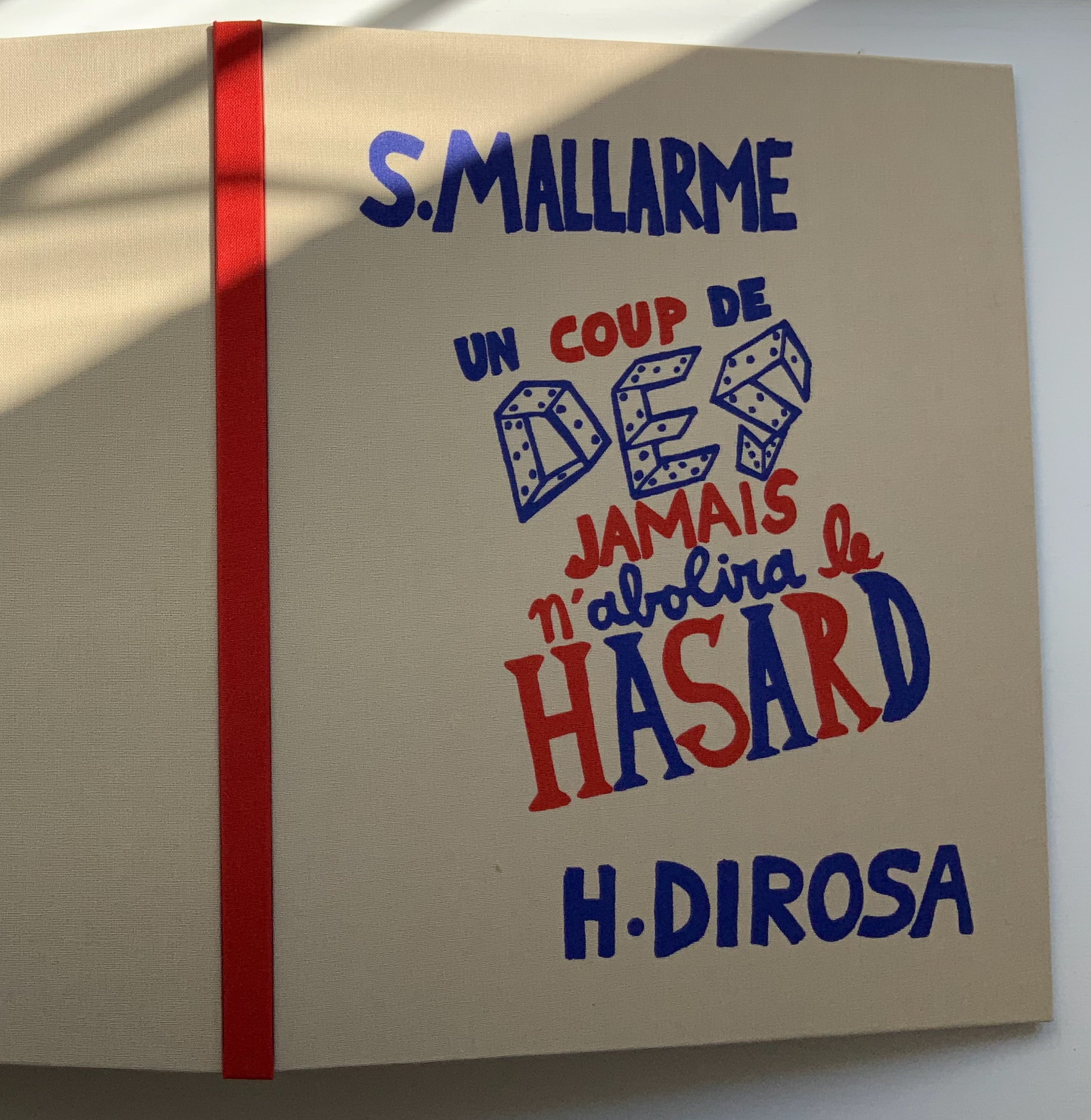
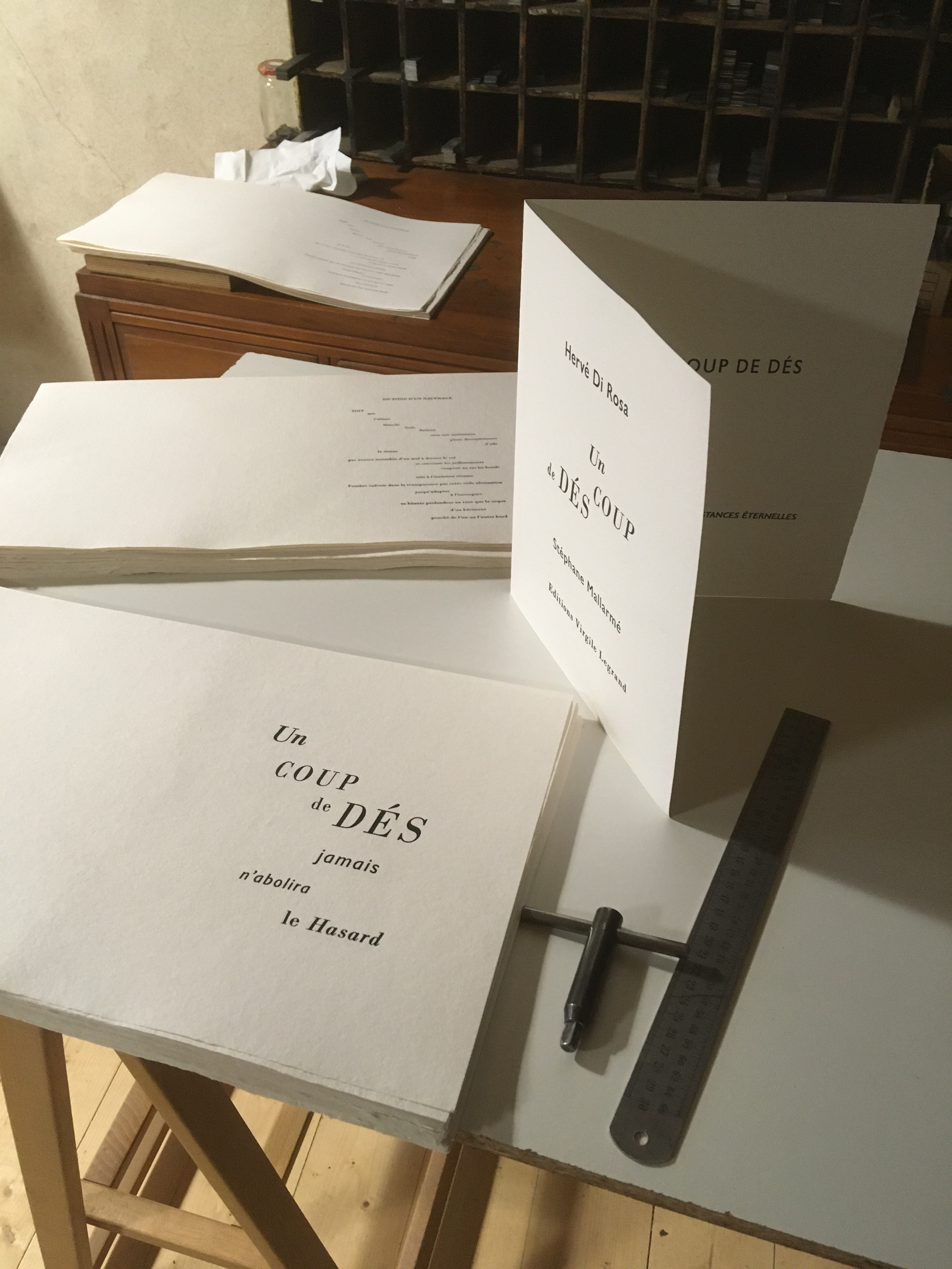
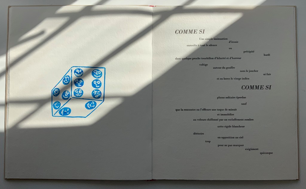
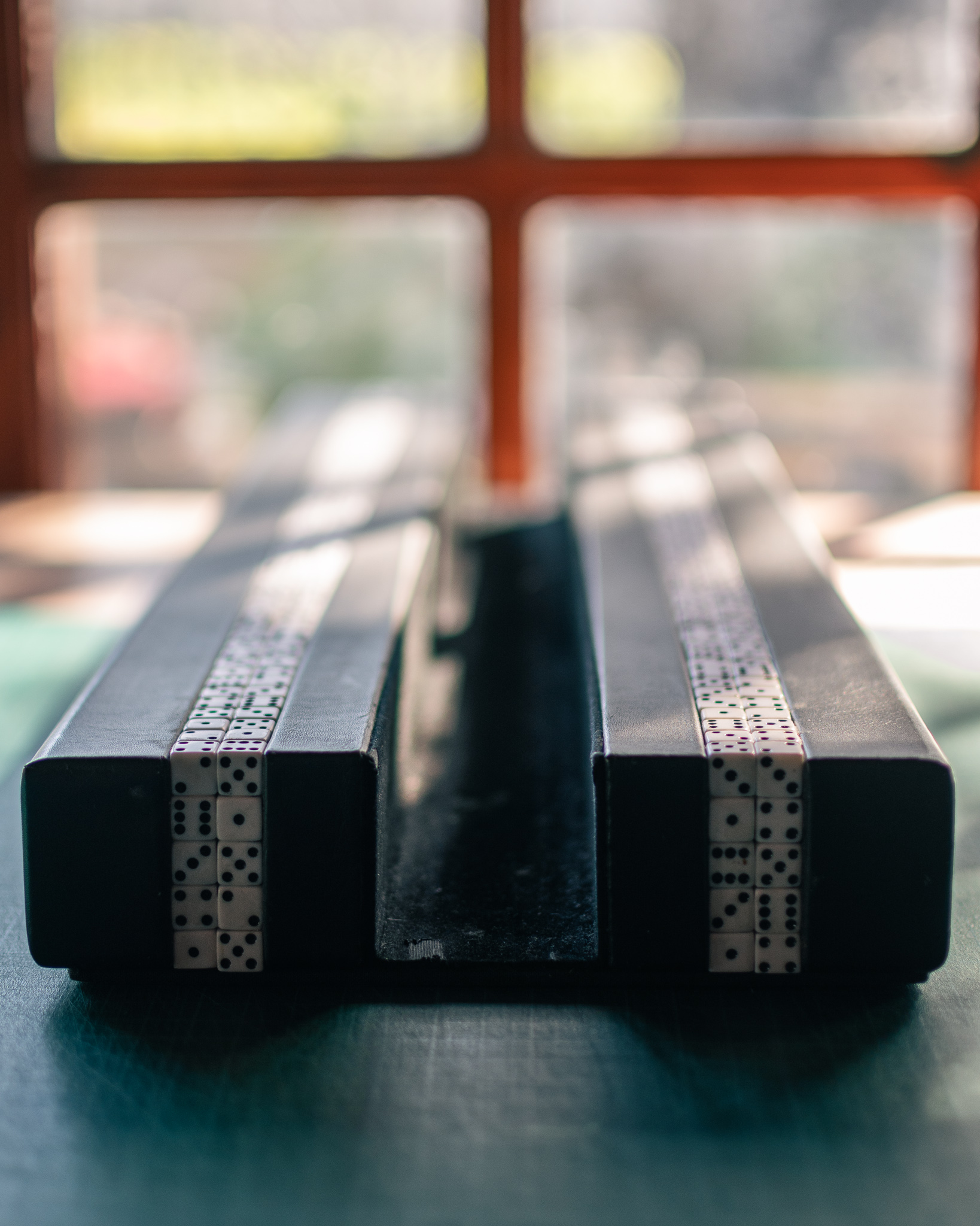
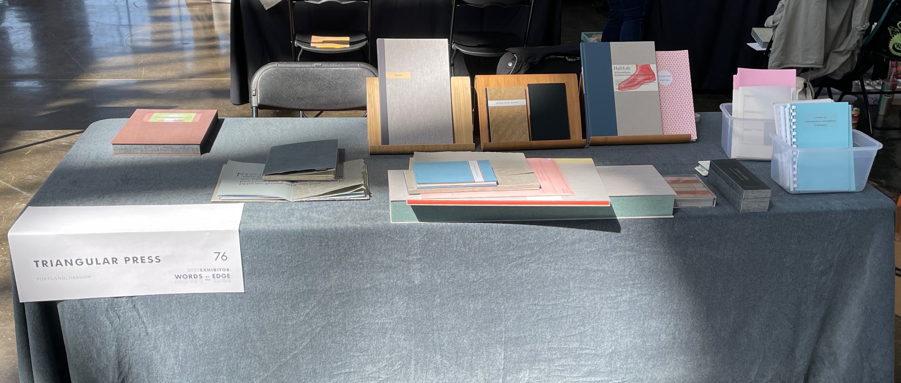
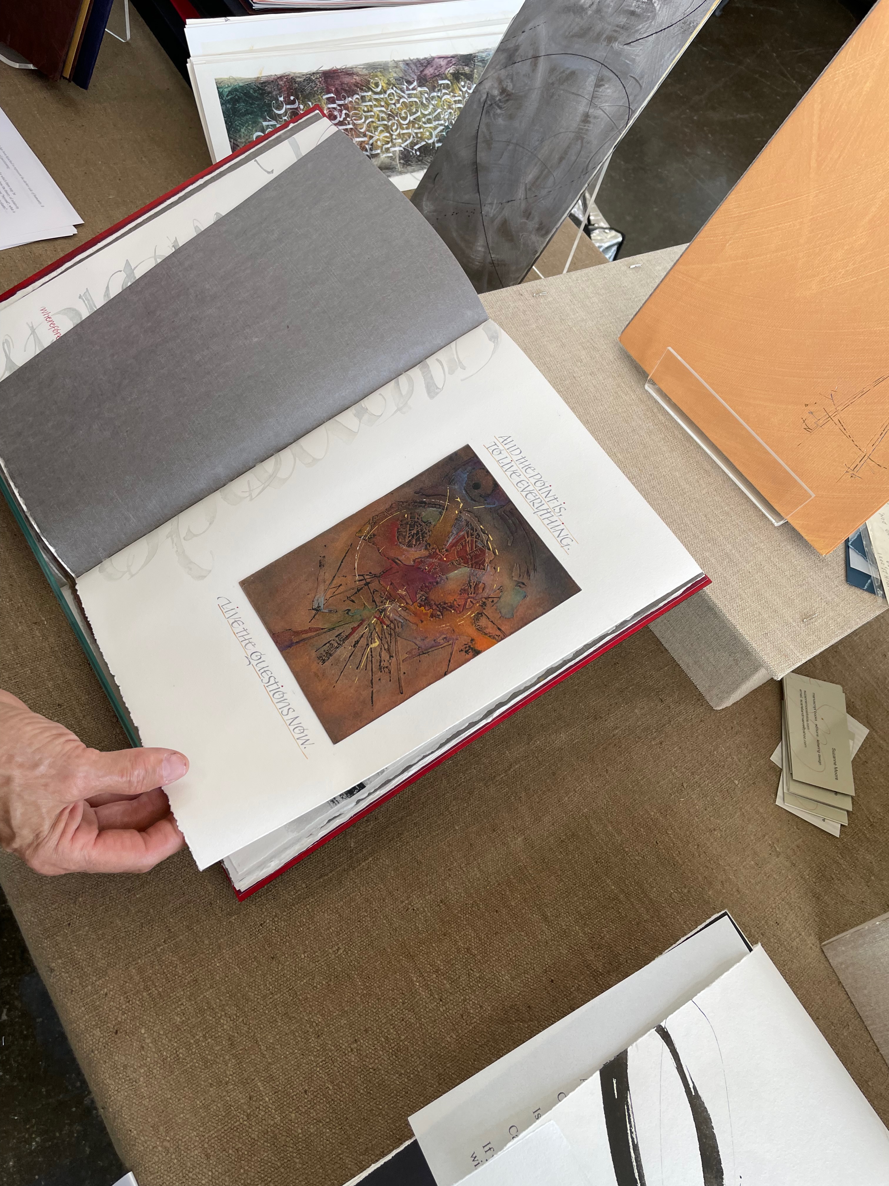
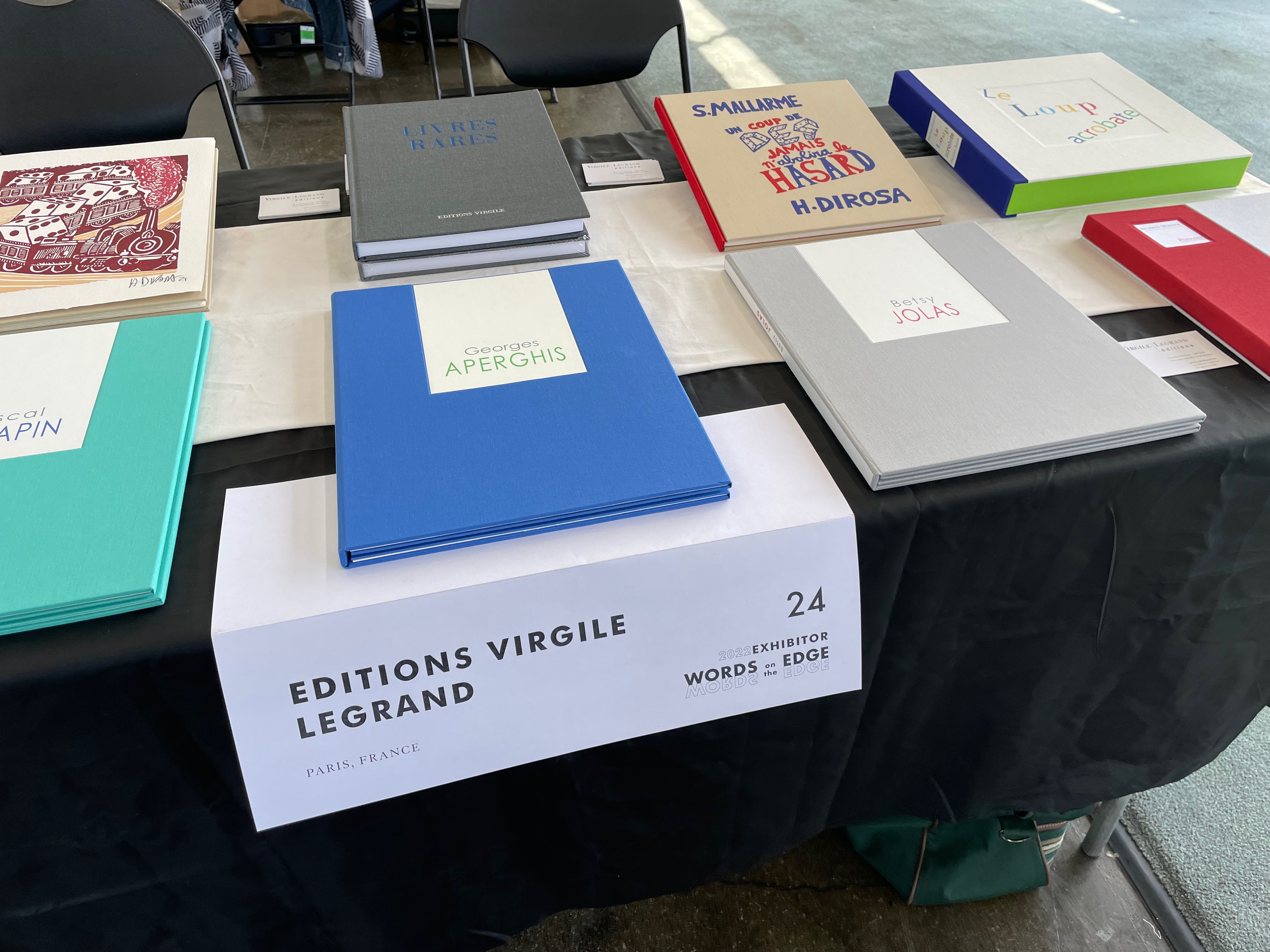
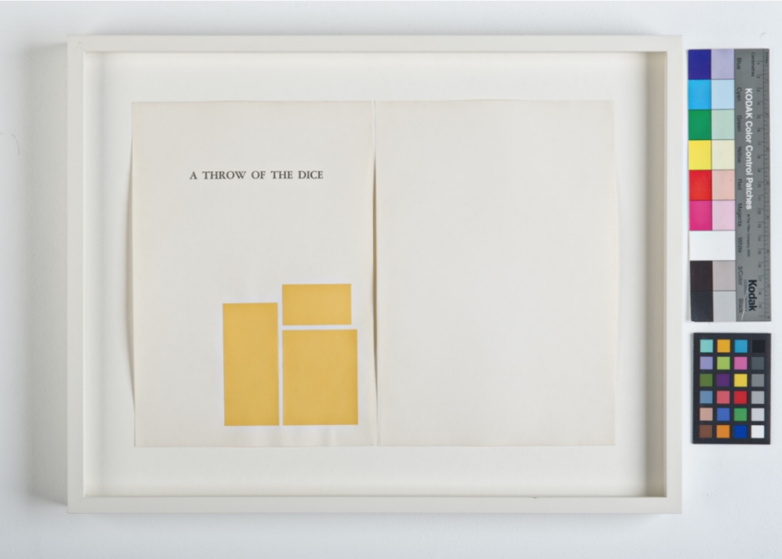
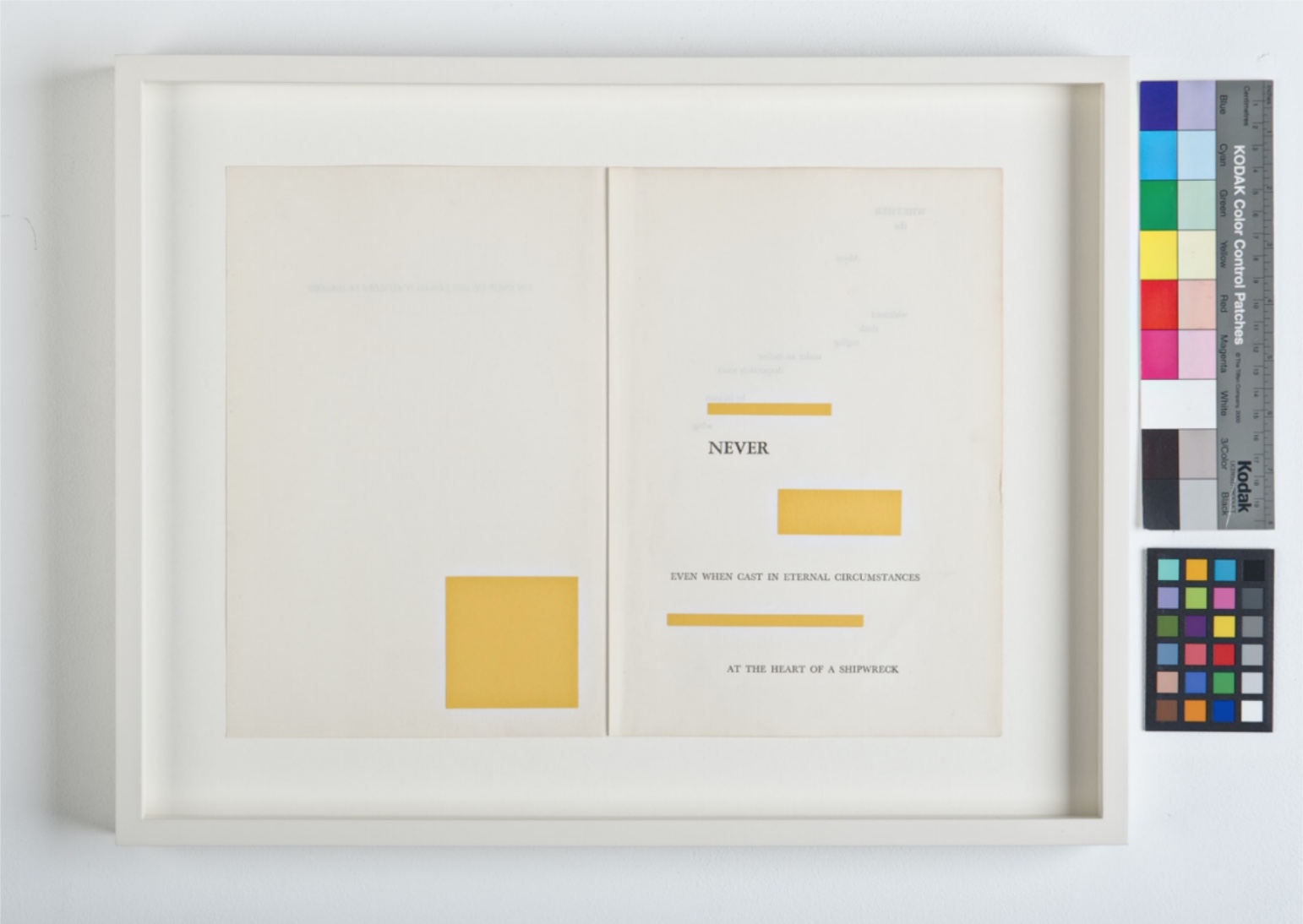
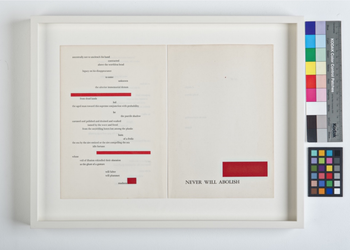
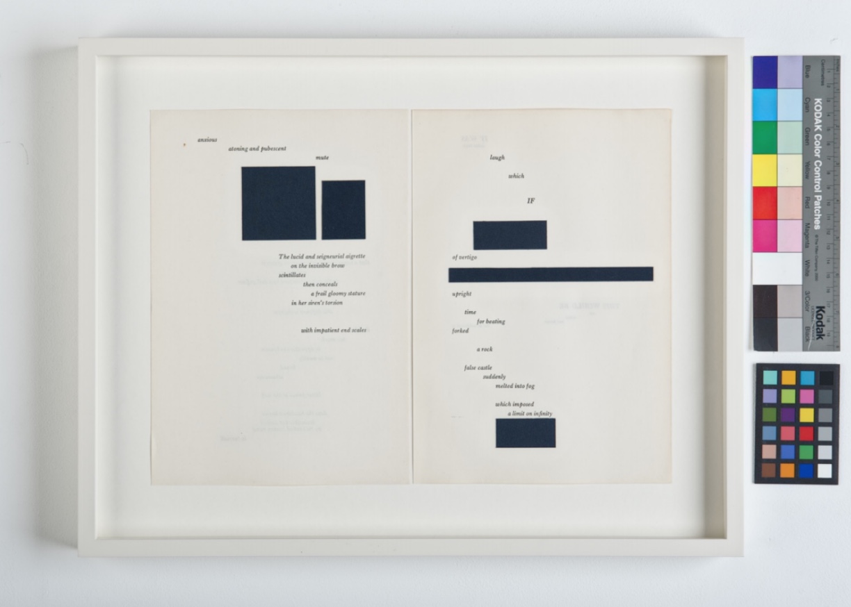
Un Coup de Dés jamais n’abolira le Hasard(2021) Stéphane Mallarmé & Hervé Di Rosa Casebound, cloth-covered hardboard. H295 x W245 mm, 36 pages. Edition of 15 (including 7 non-commercial copies), of which this is #5. Acquired from Éditions Virgile LeGrand, 11 April 2022. Photos: Courtesy of Virgile LeGrand; Books On Books Collection. Displayed with permission of Virgile LeGrand.
Many works of homage to Un Coup de Dés jamais n’abolira le Hasard seek diligently to replicate the layout, typeface, artwork (its placement) and dimensions that Mallarmé intended for his deluxe edition with Ambroise Vollard — or those we think he intended. Bertrand Marchal, editor of Mallarmé’s Complete Works, thinks that absolute fidelity is unachievable because Un Coup de Dés is ultimately an unfinished work. Alain Hurtig (2018) thinks it more than likely the choice of typeface was as much Firmin-Didot’s as Mallarmé’s. With all the foregoing efforts of Mitsou Ronat, Michel Pierson, Alain Hurtig, Neil Crawford and others to achieve the unachievable, why would any serious hommageur retread their paths?
Virgile Legrand has chosen to ignore their paths altogether and take his inspiration from the May 1897 issue of Cosmopolis, where the poem first appeared and was constrained by the Cosmopolis typesetters’ inability or unwillingness to accommodate the double-page structure and the precision-typography Mallarmé had in mind.
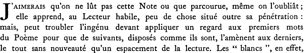
Even within the usual constraints of the magazine, the poem astounded and confounded the Cosmopolis editors so much that they insisted on a preface that would explain how to read the poem. Although the preface’s author is named as the publisher/editor, its author is Mallarmé himself, and it begins tongue in cheek:
“I would prefer that this Note not be read, or only skimmed, even then forgotten; it tells the knowledgeable reader little beyond his or her penetration: but may confuse the uninitiated, prior to their looking at the first words of the Poem, since the ensuing words, laid out as they are, lead on to the last, with no novelty except the spacing of the text.” [reproduced in the NRF/Gallimard 1914 edition]
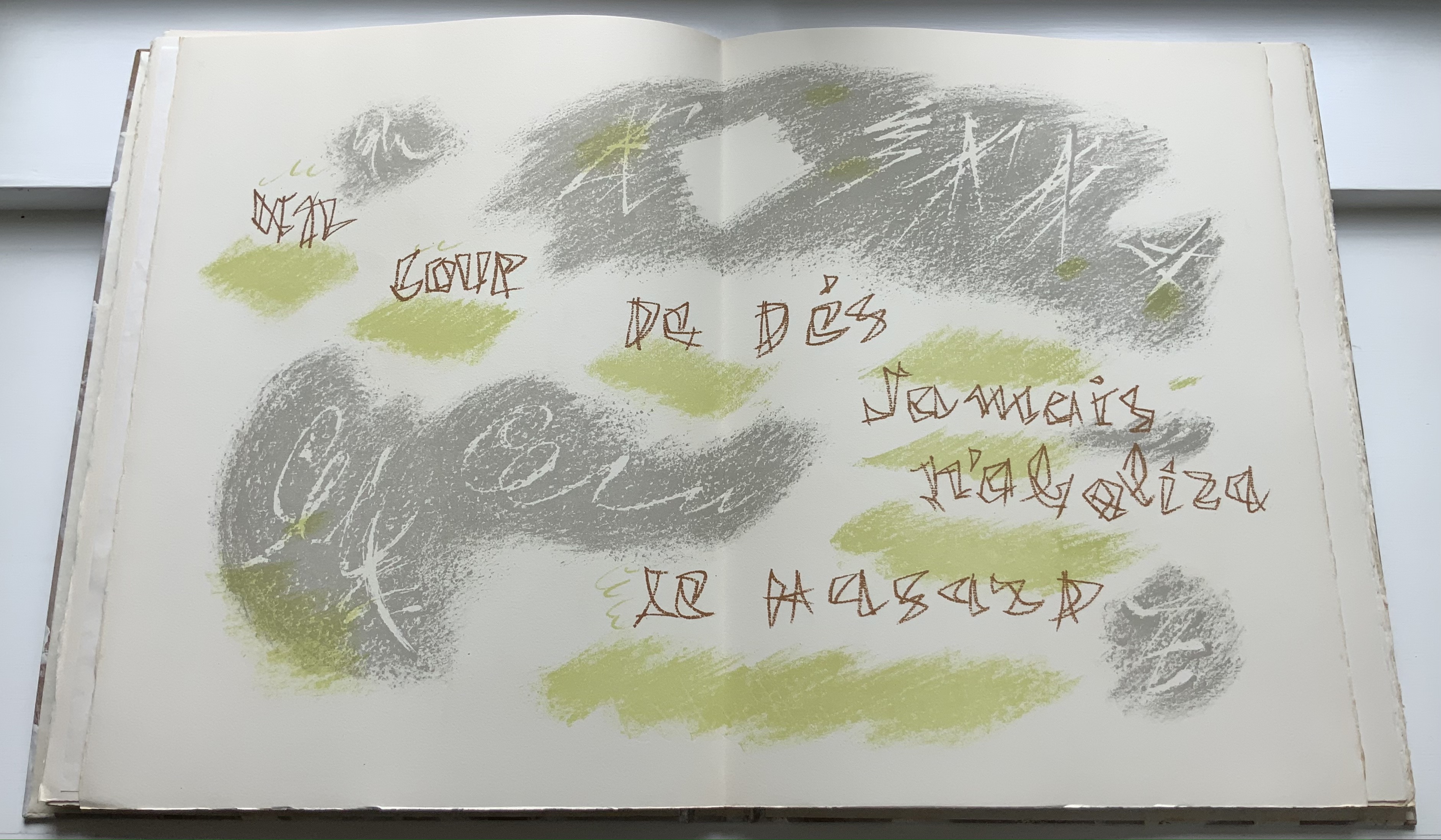
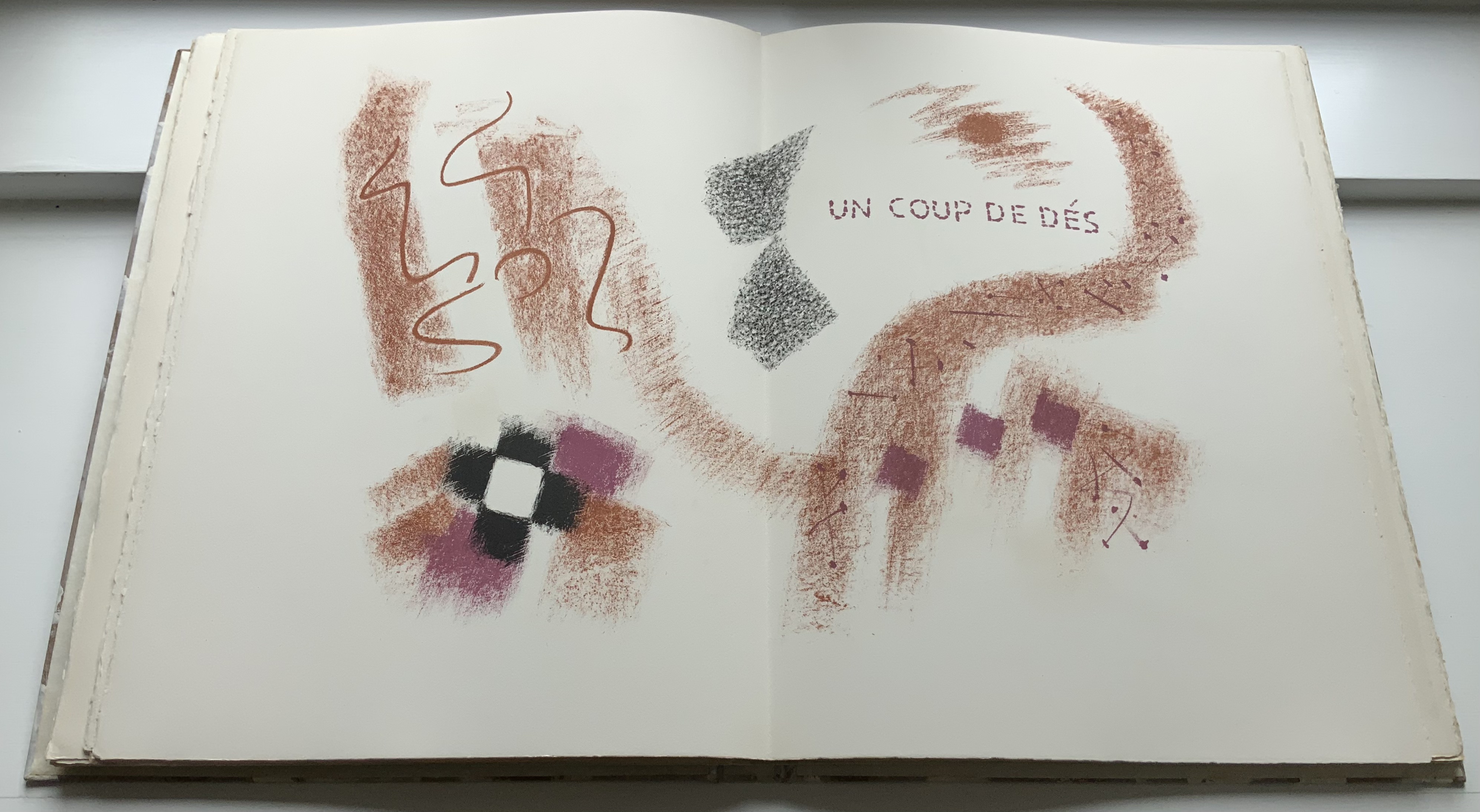
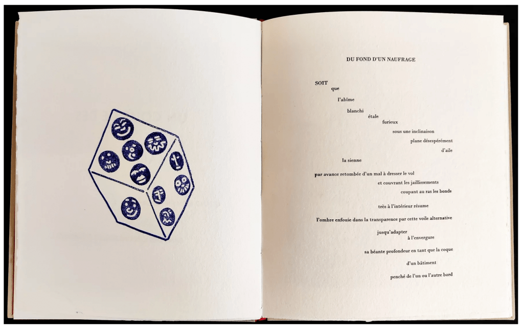
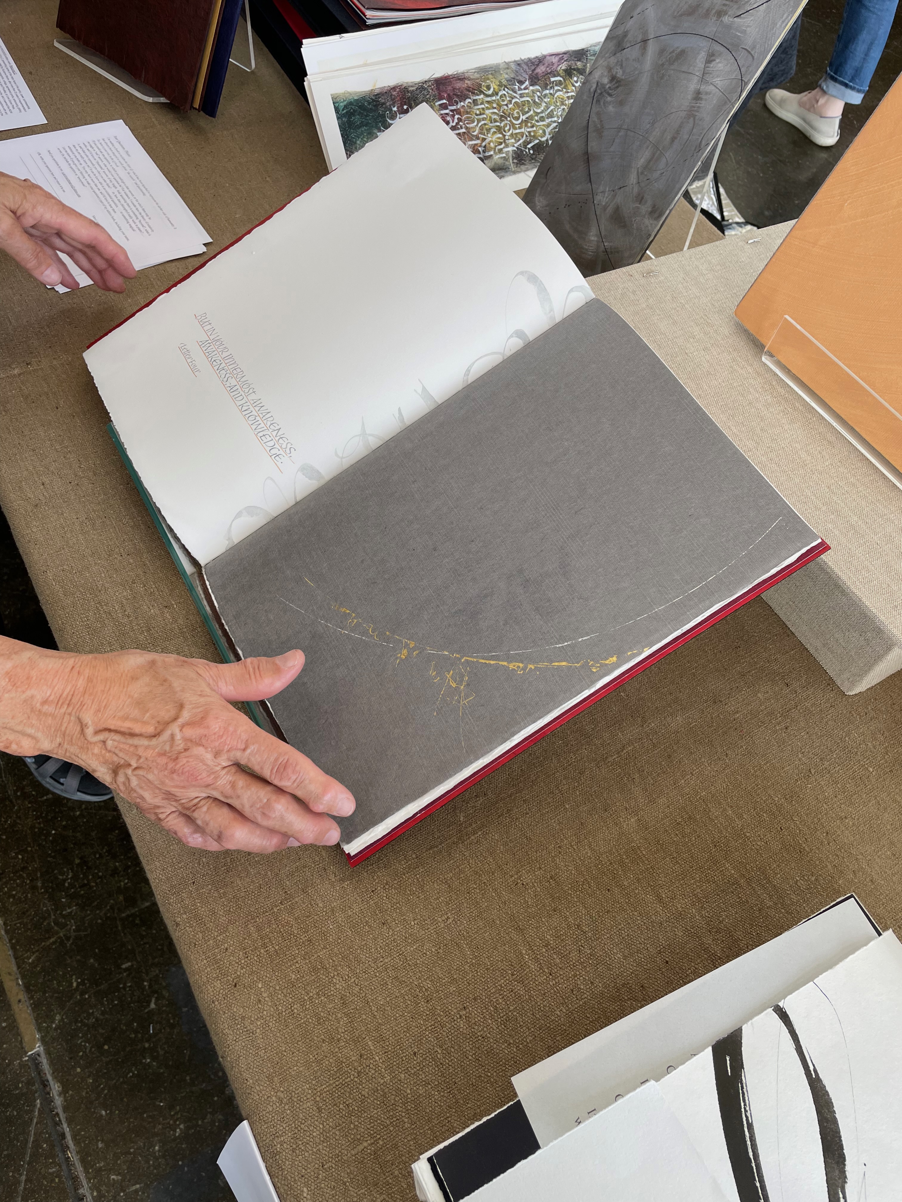
After 125 years, we can no longer be shocked by Mallarmé’s layout, and it is a humorous surprise that, having decided to ignore the pursuit of absolute fidelity to Mallarmé’s wishes, Legrand does accommodate the poet’s wish in the Cosmopolis preface and omits the Note from his homage altogether. As further evidence that the Cosmopolis edition is merely an inspiration for Legrand, several pages in the homage do not match up with it. Legrand deploys a much wider measure and takes full advantage to give les blancs a bit more space. He also does not hesitate to vary the layout and typeface of significant lines — in particular the poem’s final line (see below), mixing Bodoni and Univers.
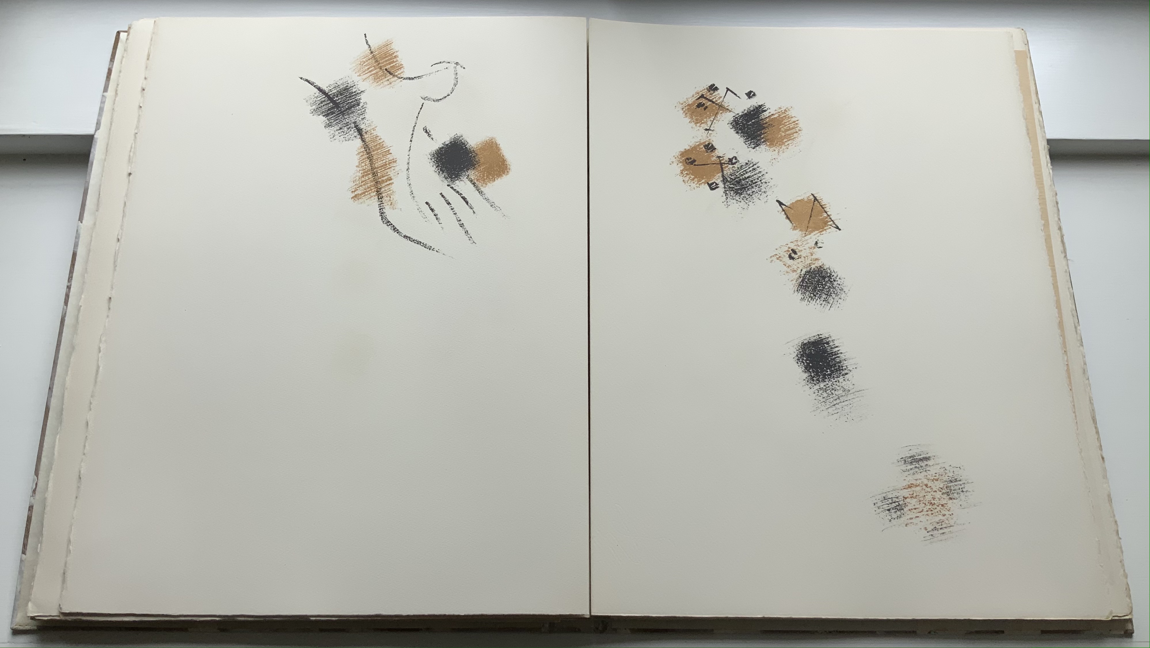
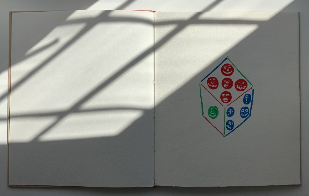
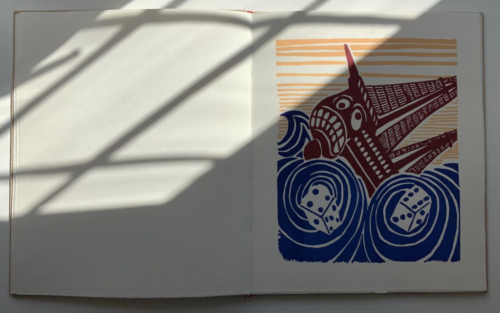
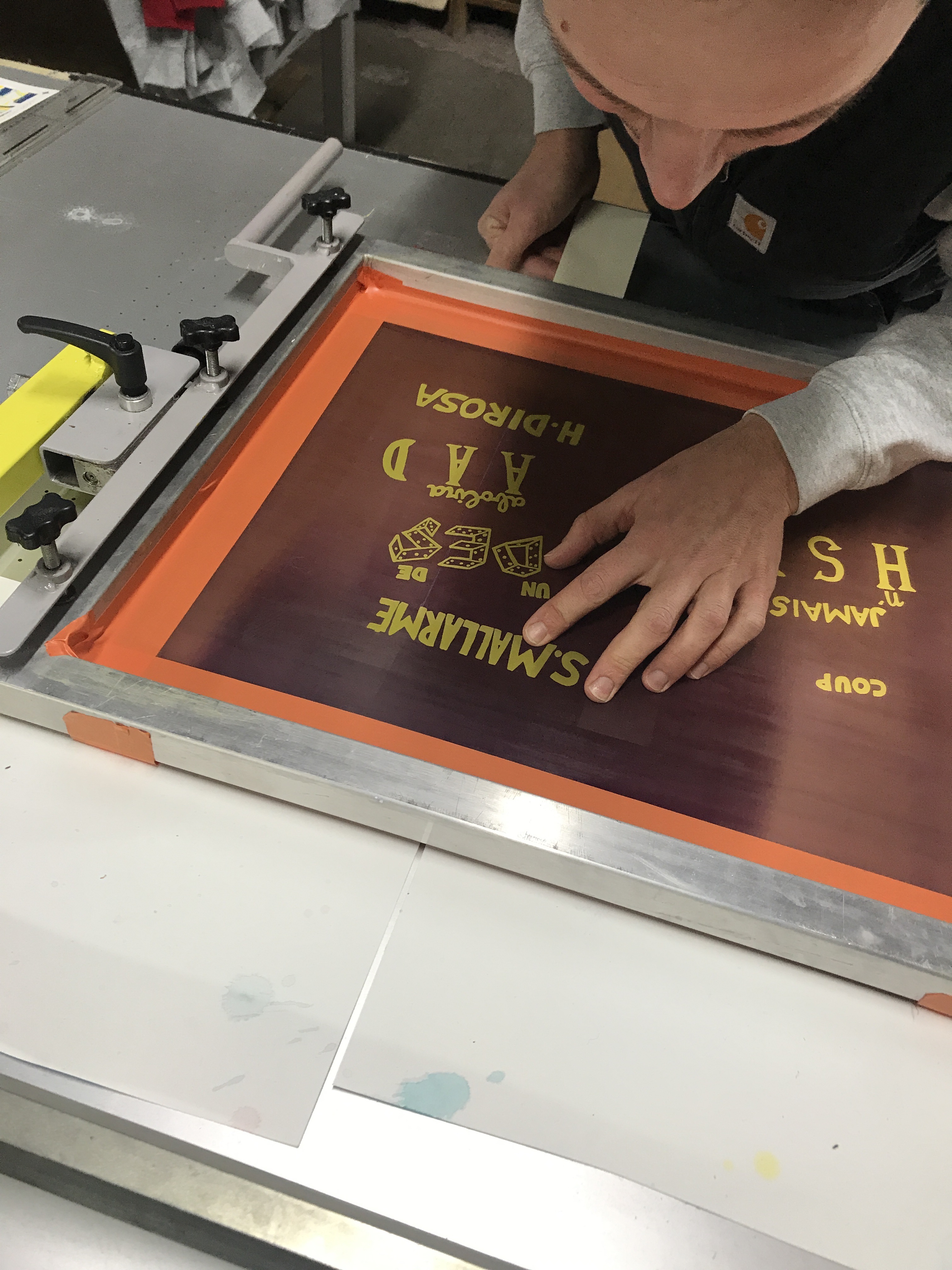
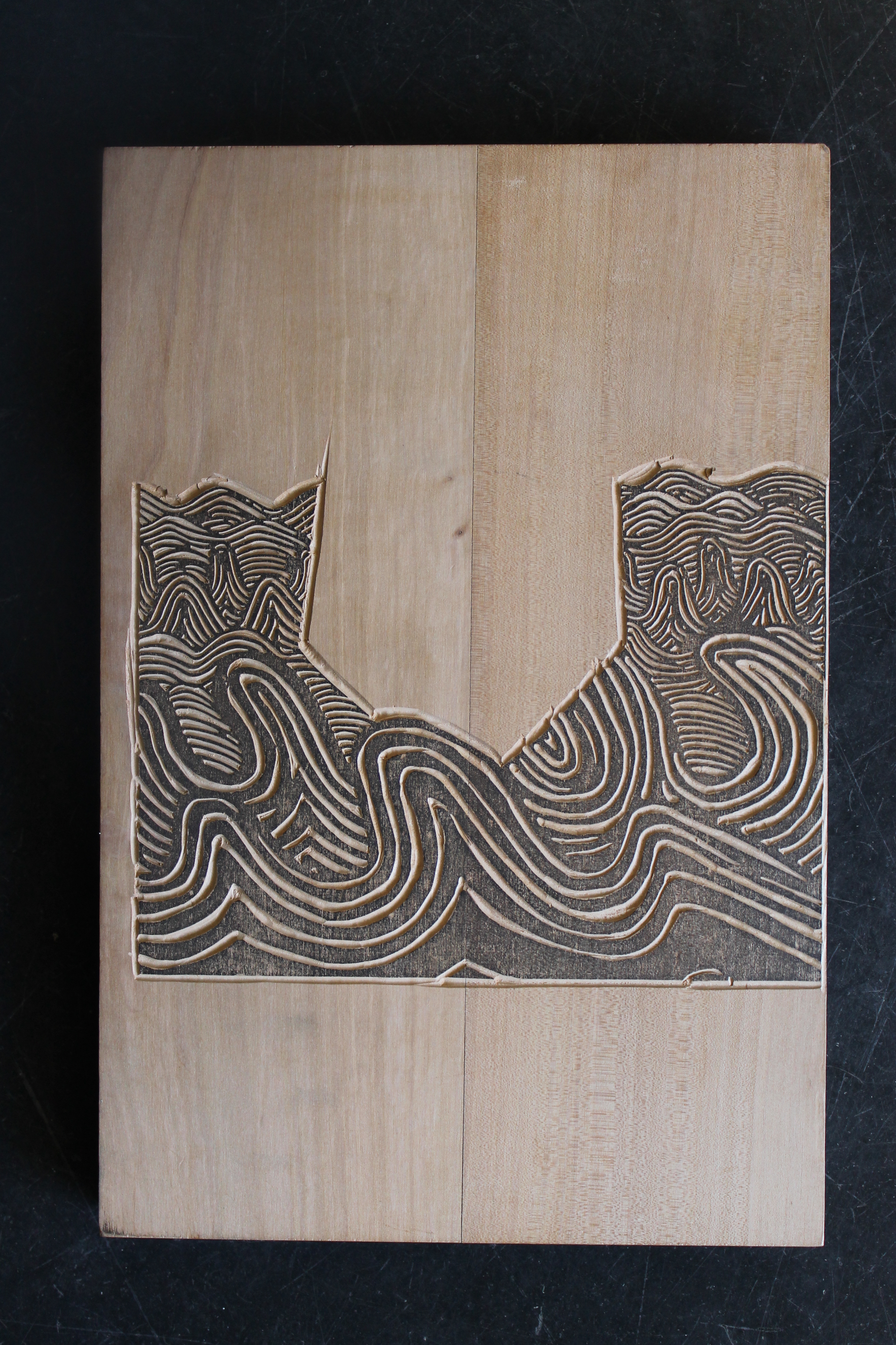
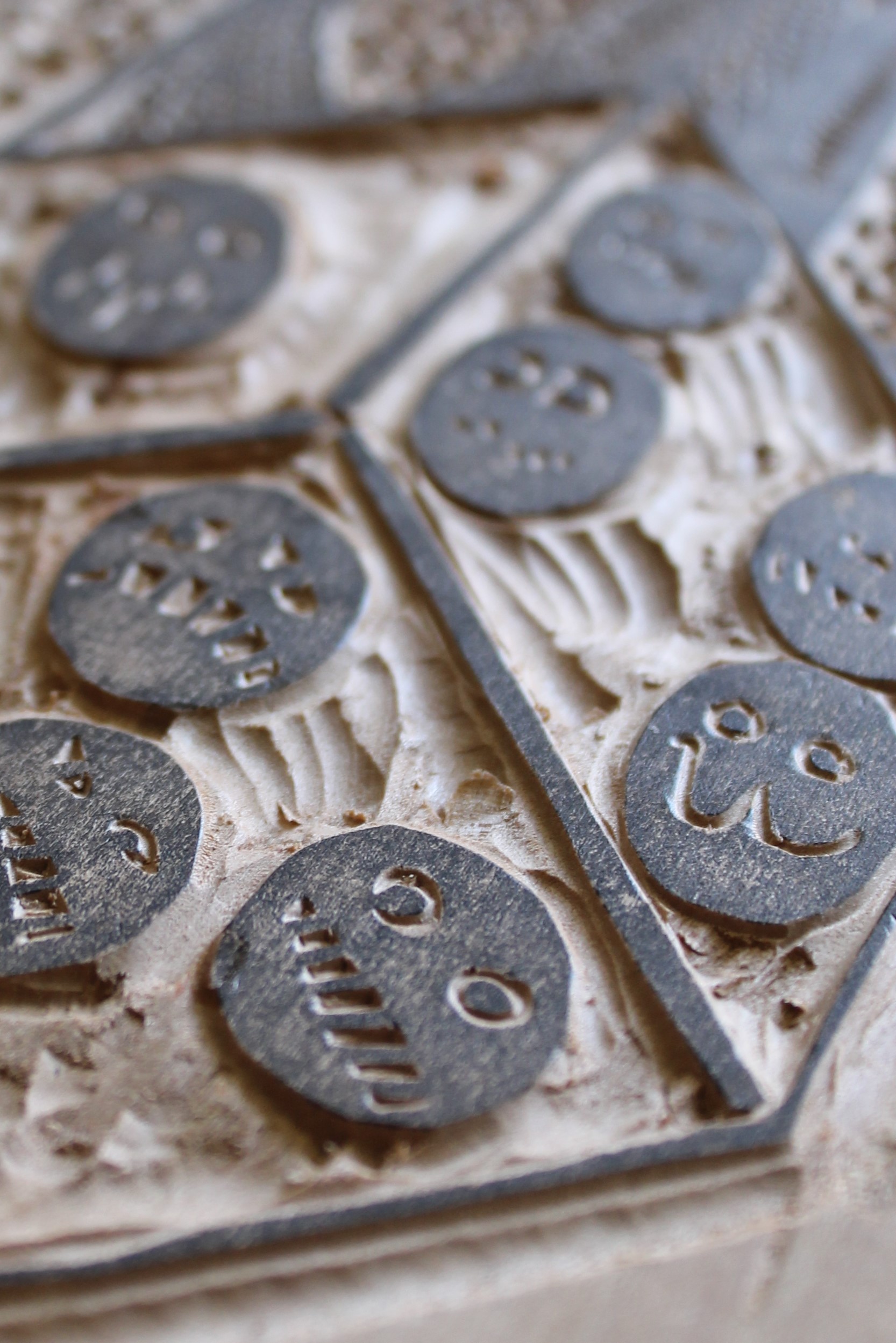
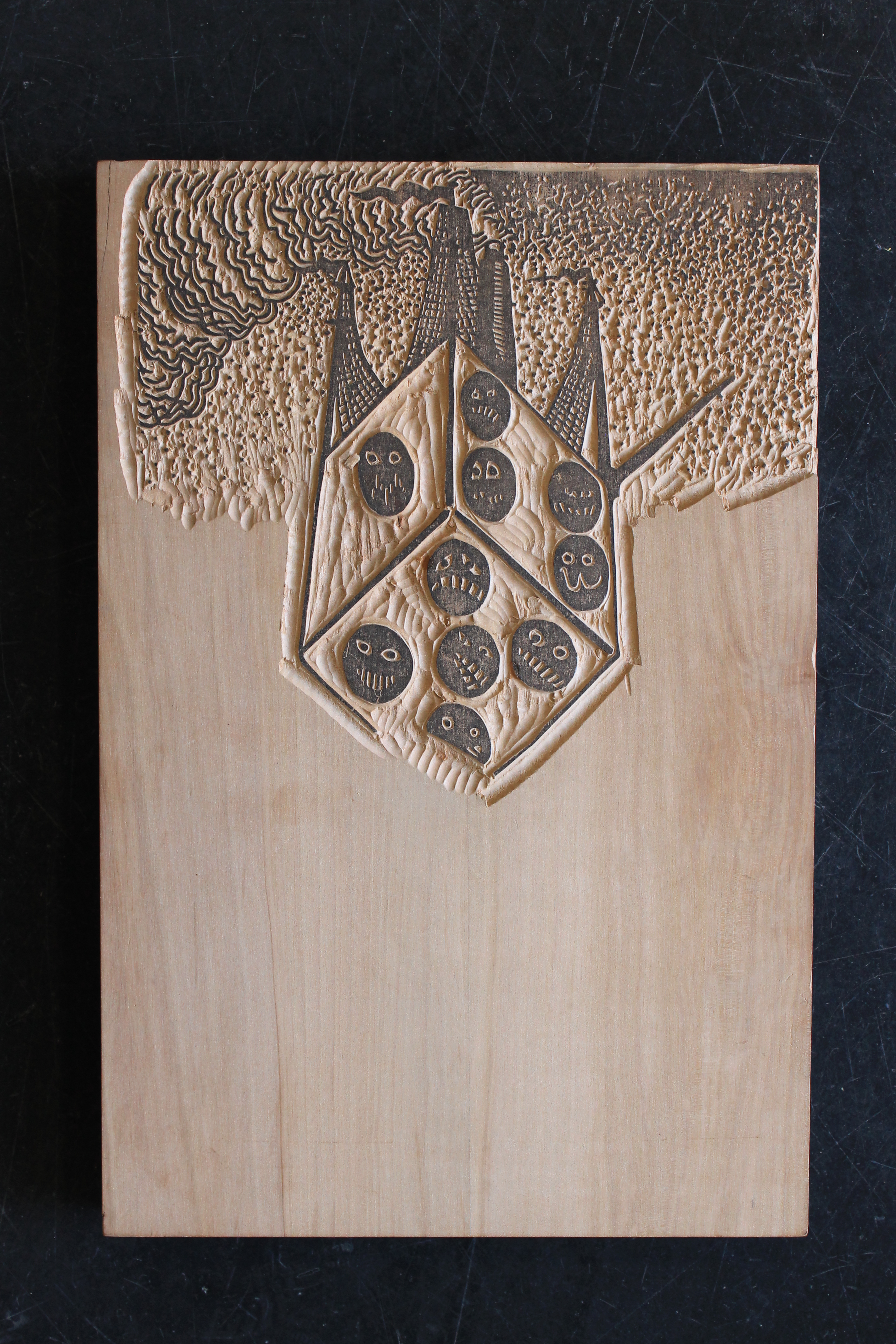
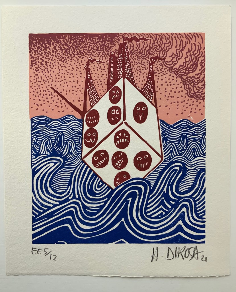
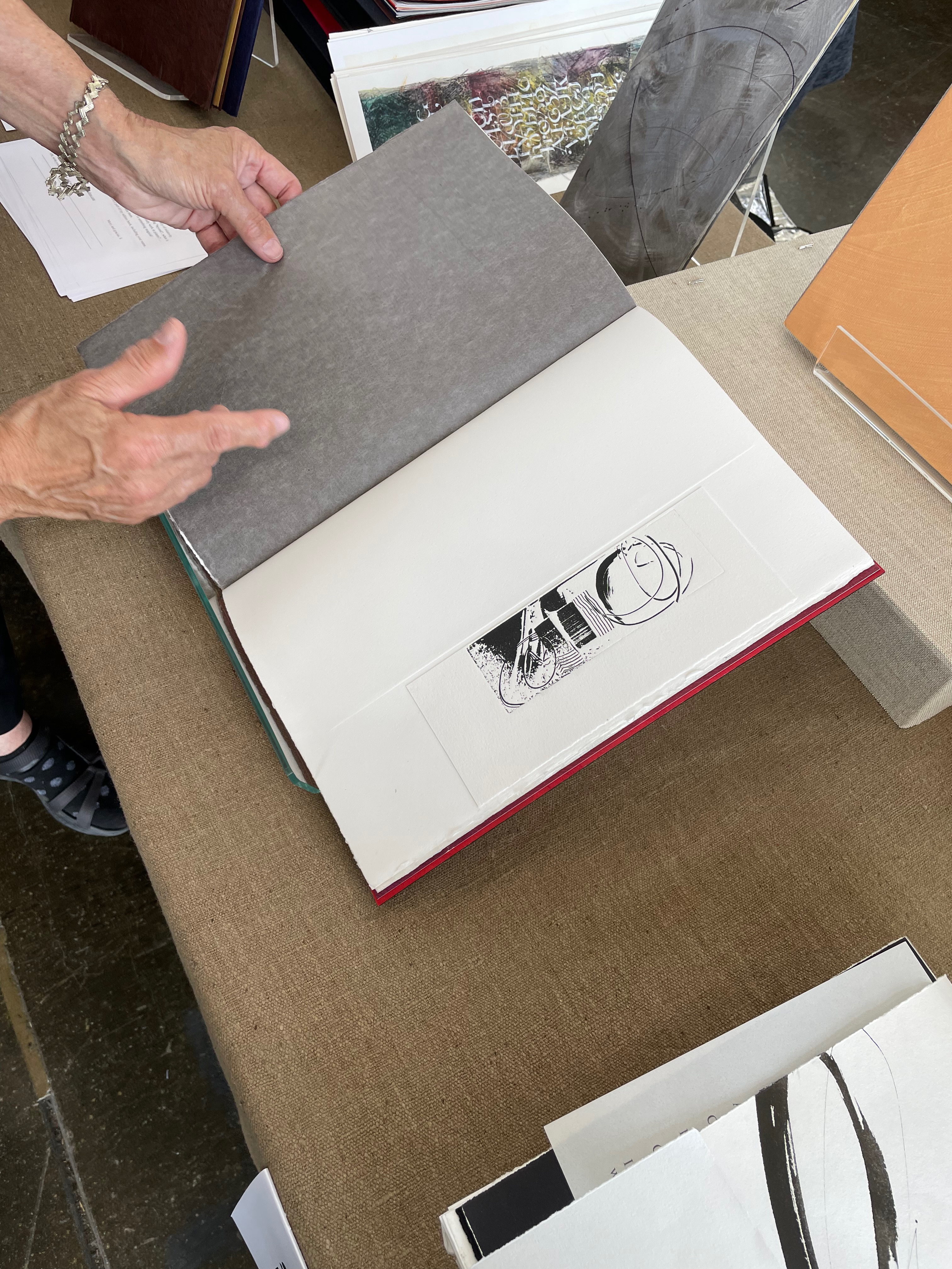
Legrand’s contrary playfulness and independence show up equally, if not more so, in his embrace of the color, woodcuts and linocuts of the artist Hervé Di Rosa. Di Rosa’s art belongs to the “Figuration libre” movement, is associated with Keith Haring and grafitti artists and is not without controversy. Hard to say who could be further from Odilon Redon, Vollard’s and Mallarmé’s choice of artiste. The faces and signs on Di Rosa’s dice (nearly reproducing the blackface that stirred controversy in another context) rollick through the book — not sequestered in front and back matter as Mallarmé planned for Redon’s. Each of the woodcuts fills a recto page, while the linocut dice appear on verso and recto. Di Rosa’s bright red squeezes through the end papers and doublures right out into the spine, and spills over onto the front cover with his equally bright blue.
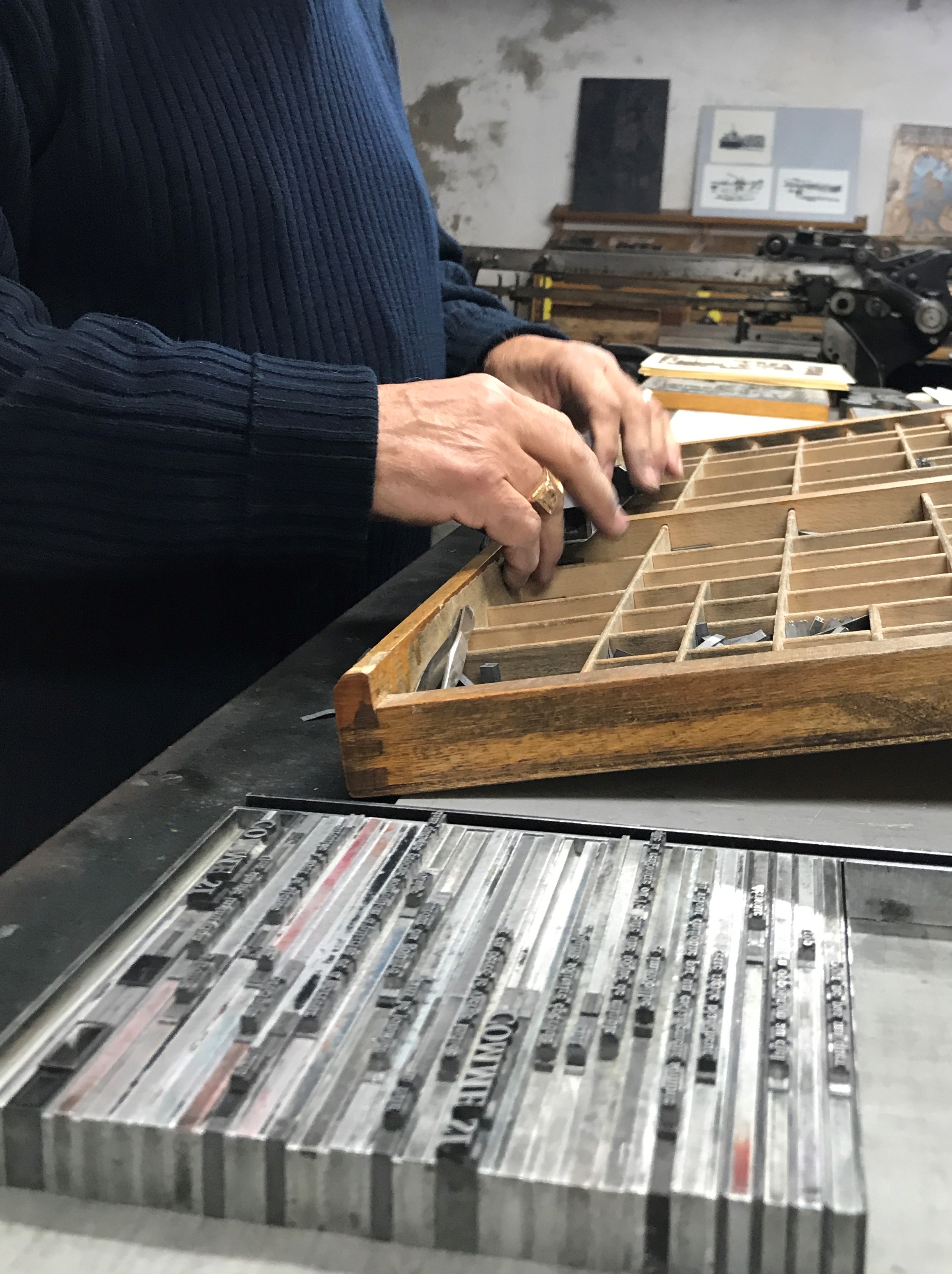
Like Vollard, though, Legrand pursues the kind of sourcing expected with livres d’artiste. The book was printed on the presses of the Dugrip Picard Jacomet workshop on Moulin de Brousse‘s paper — steeping it in the grand tradition of the livre d’artiste of handset letterpress, handmade paper and fine binding.
Also in keeping with the French livre d’artiste tradition, this copy of the homage includes a loose original print by Di Rosa (see below). As a co-founder of the Musée international des arts modestes (MIAM) and exponent of a movement to break down barriers to cultural diversity and to fringe and unorthodox art, Di Rosa is an hommageur who should remind us of Mallarmé’s unorthodoxies: the eloper, the heteronymic entrepreneur behind the short-lived fashion and culture magazine La Dernière Mode, the inscriber of poems on fans and rocks or the correspondent who wrote addresses in the form of quatrains (which the postal service recognized and delivered).
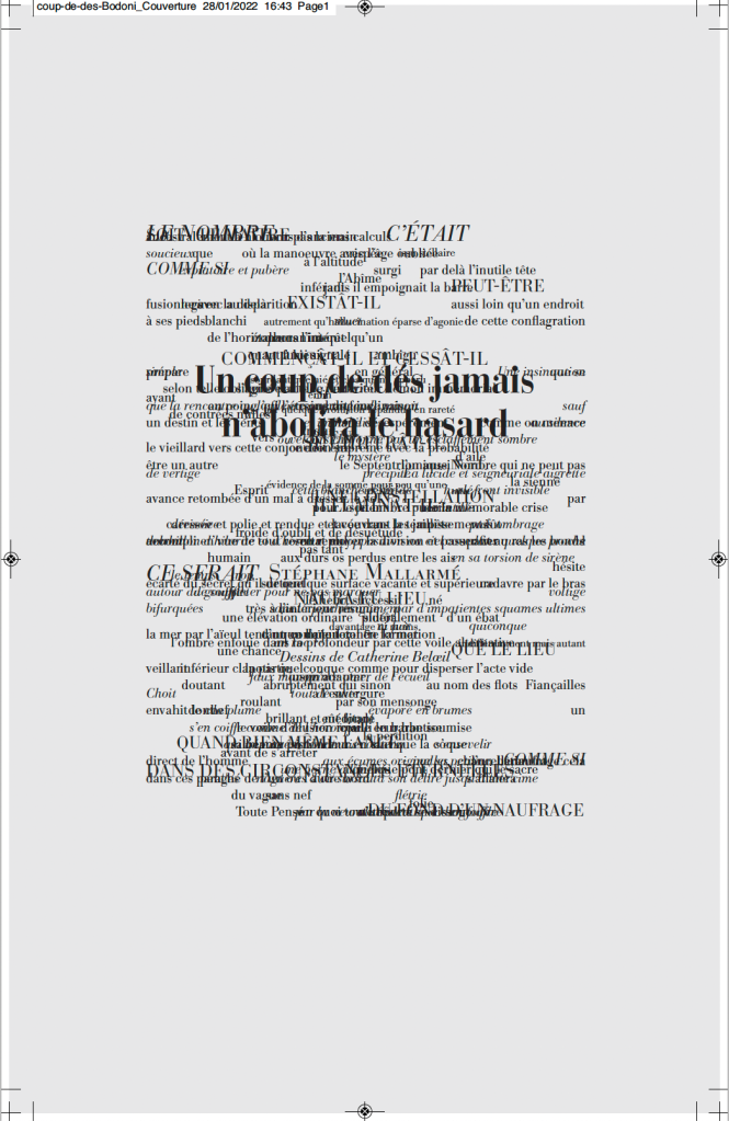
Un coup de dés jamais n’abolira le hasard (1914/2012)
Un coup de dés jamais n’abolira le hasard(1914/2012) Stéphane Mallarmé (text), Alain Hurtig (design), Catherine Belœil (art) Online and downloadable files for printing at L’Outil Typographique. Creative Commons (BY-NC-SA). Accessed 28 January 2022. Screenshots: Books On Books Collection. Displayed with permission of Alain Hurtig.
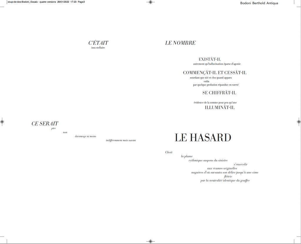
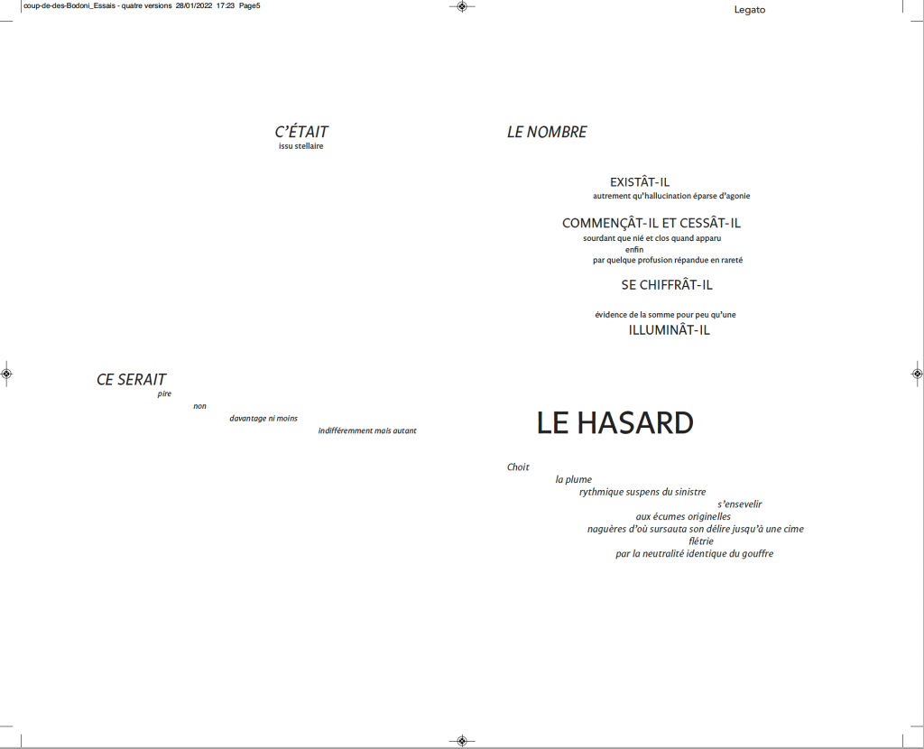
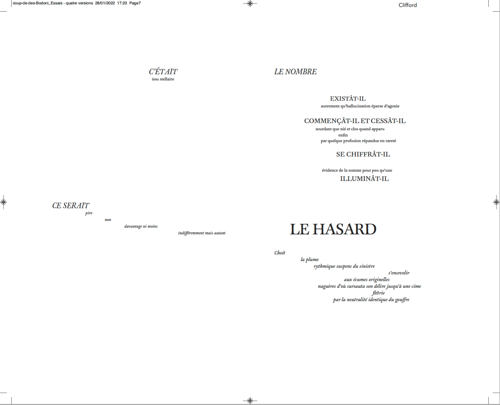
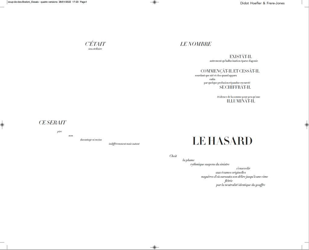
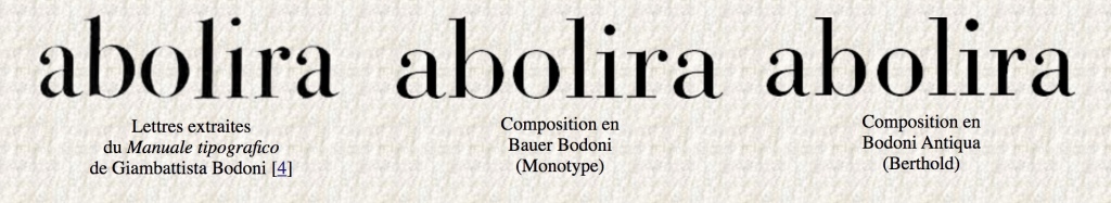
Much has been made of Mallarmé’s precision or preciosity in the marked-up proofs of the deluxe edition of Un Coup de Dés. Also, as many scholars, hommageurs and facsimilists have attested, a suitable substitute for the Firmin-Didot typeface that the poet specified for the deluxe has been hard to find. Master typographer Alain Hurtig, however, puts “suitable substitute” into perspective with his essay “À propos du Coup de dés de Stéphane Mallarmé“. The essay offers single pages and double-page spreads set in Bodoni Antiqua (Berthold), Legato, Clifford and the Hoefler & Frère-Jones digital revival of Didot.
Clockwise from the upper left: Bodoni Antiqua (Berthold), Legato, Clifford and Didot.
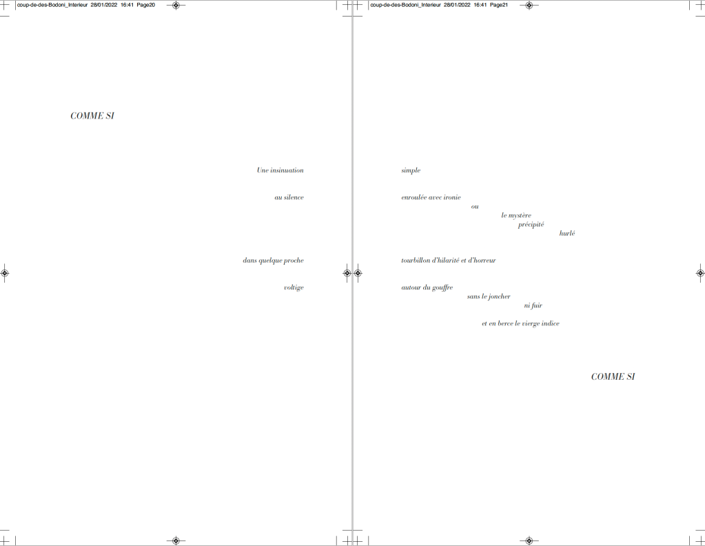
It seems unlikely that Mallarmé pored over the Didot firm’s type books to choose the Firmin-Didot face, but there is nothing precious about specifying a typeface. Different faces have different personalities. Hurtig enables us to see rather than imagine the effect of choosing the business-card-like Legato — not that that would have been a choice for Mallarmé. Nor would the Clifford, although a plausible (if squat) choice with its contrasting thin and thick strokes. The opportunity for the most extensive comparison comes with Hurtig’s two complete settings of the poem — one in Bodoni Antiqua (Berthold), the other in HFJ Didot. Below, for comparison, is the poem’s central double-page spread — the COMME SI … COMME SI verses.
Above: Bodoni Antiqua (Berthold). Below: Hoefler & Frère-Jones Didot.
Of these two revival faces — Bodoni Antiqua (Berthold) and HFJ Didot — Hurtig himself prefers Bodoni. Bodoni is one of the more attractive alternatives for facsimilists. Neil Crawford chose it for the edition created with Ian Tyson, as did Gary Young for his edition with D.J. Waldie. Hurtig even provides a comparative view of three versions of Bodoni:
Hurtig’s explanations of deciding the trim size and adjusting the size of fonts and spacing fascinate. Likewise his choice of Bodoni because it
s’imposait avec élégance, il rythmait les phrases en les faisant incroyablement vibrer et remplissait de sa grâce les immenses blancs de la double page — ces espaces que, selon Mallarmé, “il n’est pas moins beau de composer que les vers” [Hurtig, 2012]
[imposed itself with elegance, it gave rhythm to the sentences by making them vibrate incredibly and filled with its grace the immense blanks of the double page — these spaces which, according to Mallarmé, “it is no less beautiful to compose than the verse”.]
My vote, however, would be for the HFJ Didot. It has a more upright, steelier and brighter aspect, fittingly constellatory. In other online comments, Hurtig points out, however, that the HFJ Didot is not the Firmin-Didot of Mallarmé:
Le didot d’Hoefler n’est évidemment pas celui choisi par Mallarmé, et pour cause : un siècle les sépare — et Hoefler a, dans son dessin, évidemment tenu compte des conditions modernes de composition et d’impression : au plomb, son travail ne tiendrait probablement pas une seconde, et moins encore sur les papiers utilisés à l’époque. [Hurtig, 2018]
[Hoefler’s Didot is obviously not the one chosen by Mallarmé, and for good reason : a century separates them – and Hoefler has, in his design, obviously taken into account modern conditions of composition and printing: with lead, his work would probably not hold for a second, and even less so on the papers used at the time.]
While carefully experimenting with the choice of faces, Hurtig has no qualms about jettisoning Odile Redon from his edition. He does not like the Redon prints et en plus il est mort (“and besides he’s dead”). Combined with his finer typographic points, Hurtig’s substitution of prints he commissioned from Catherine Belœil heeds the call to which facsimilists and hommageurs such as Jean Lecoultre, Alessandro Zanella and Jacques Vernière, Honorine Tepfer, Robert Bononno and Jeff Clark, Virgile Legrand and Hervé Di Rosa, and Sam Sampson have also responded: to look afresh and even radically at Un Coup de Dés.
Hurtig, Alain. 11 July 2018. “Remarques typographiques“, responding to Laurent Bloch’s “Le Poème de Stéphane Mallarmé: Un coup de dés jamais n’abolira le hasard. Son exégèse et sa typographie”, posted 11 July 2018, modified 29 September 2020. Accessed 26 January 2022.
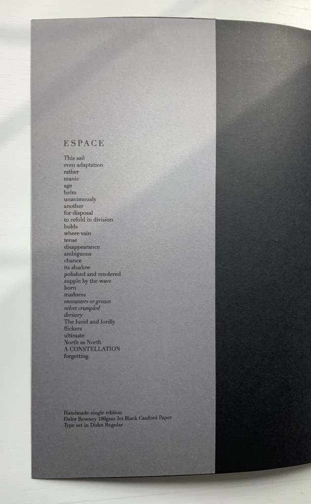
UN COUP DE DÉS JAMAIS N’ABOLIRA LE HASARD — ESPACE (2012)
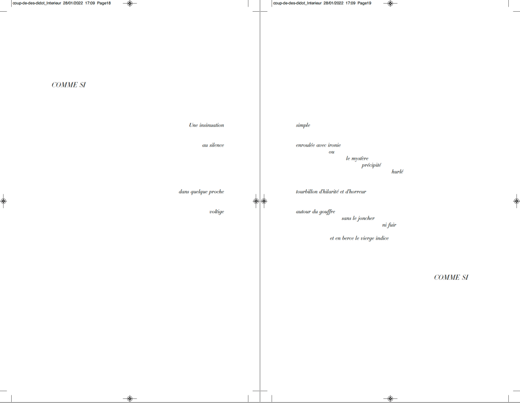
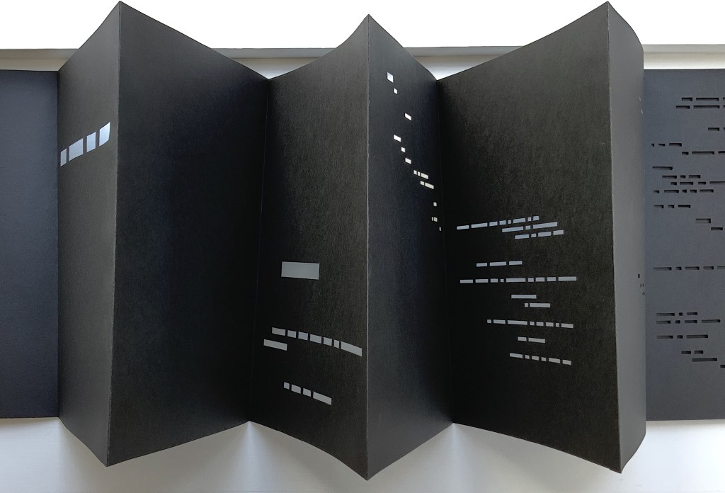
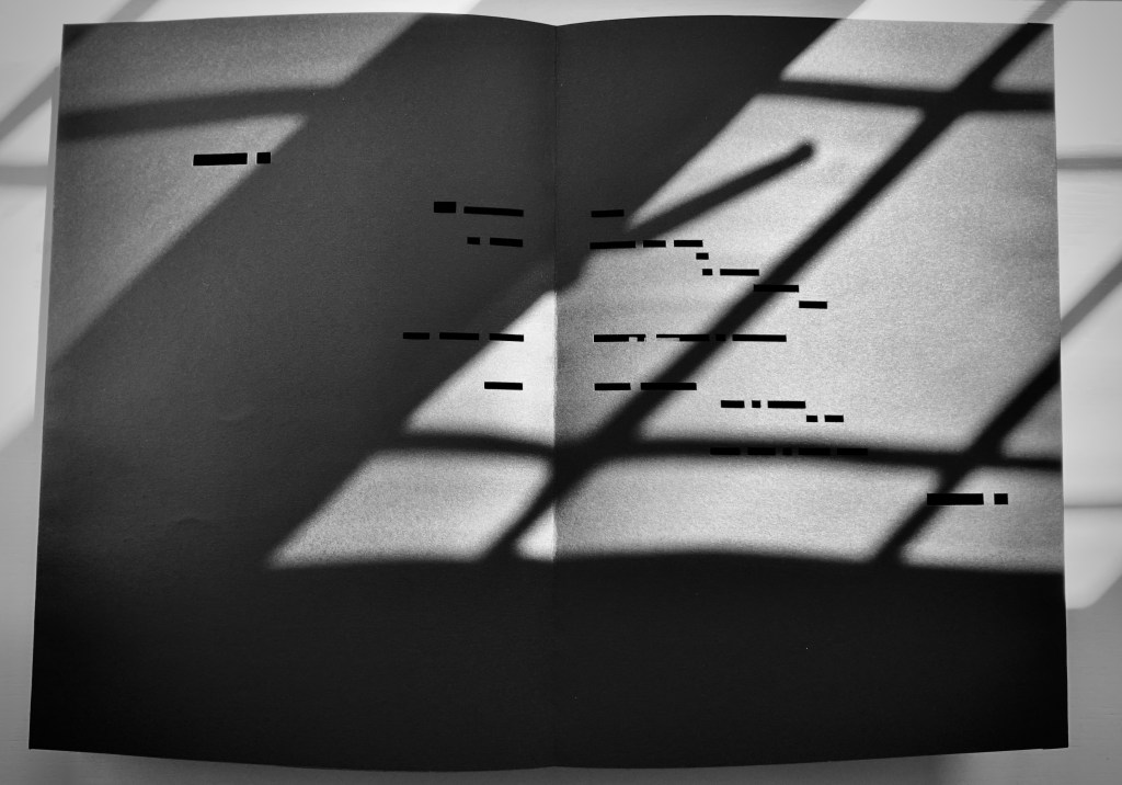
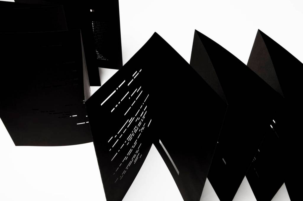
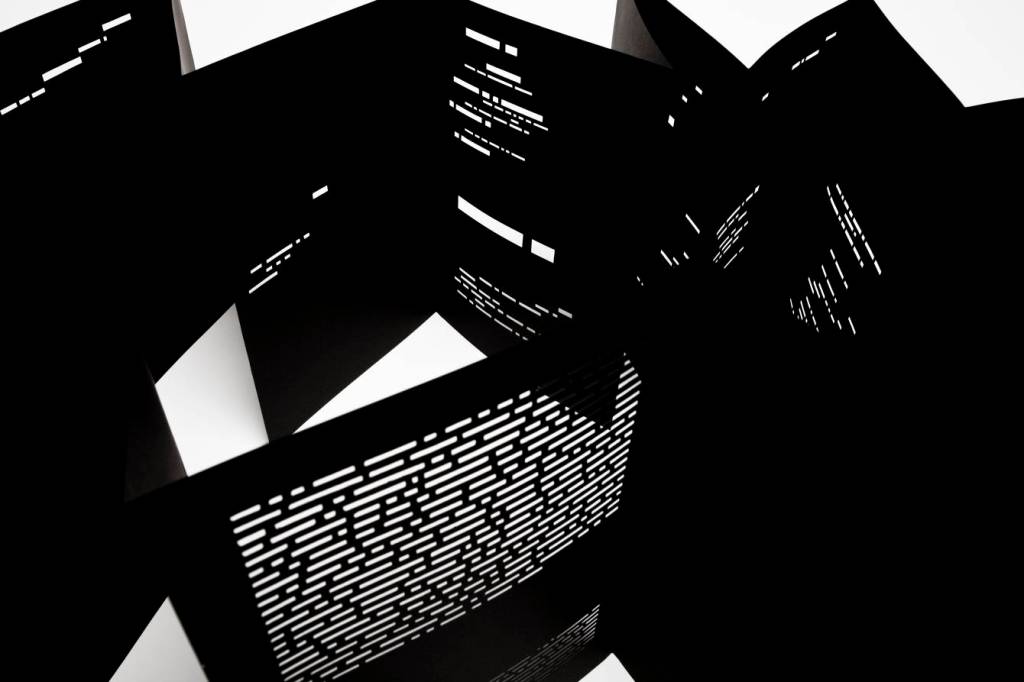
UN COUP DE DÉS JAMAIS N’ABOLIRA LE HASARD — ESPACE (2012) Richard Nash Hand-cut concertina with inkjet printed turn-in cover. Closed: H286 x W204 mm; Open: W 11.2m. Unique. Acquired from the artist for donation to the Bodleian Library, 2 April 2022. Photos: Courtesy of Richard Nash; Books On Books Collection. Permission to display from the artist.
Credit goes to Rafaella della Olga’s Constellation (2009) for being the first homage to Un Coup de Dés to remind us that constellations appear against the blackness of space, not the whiteness of paper. But the first to apply this reminder in 180gsm Jet Black Canford paper to a double homage to Mallarmé’s poem and Marcel Broodthaers‘ version is Richard Nash’s Un Coup de Dés Jamais N’Abolira le Hasard — Espace(2012).
The preface
The opening pages
COMME SI … COMME SI spread
Additional photos courtesy of Richard Nash.
On the flyleaf, Nash has added his own verse entitled “Espace”, which set in Didot Regular is equally a typographic and poetic . Espace has a monumentality to it that encourages imagining it at a larger scale in different material; for example, a sculpture of cut steel painted black, installed along a seaside strand and backlit at night. In that evocative physical characteristic, Nash’s homage evokes the oracular and vatic tone of
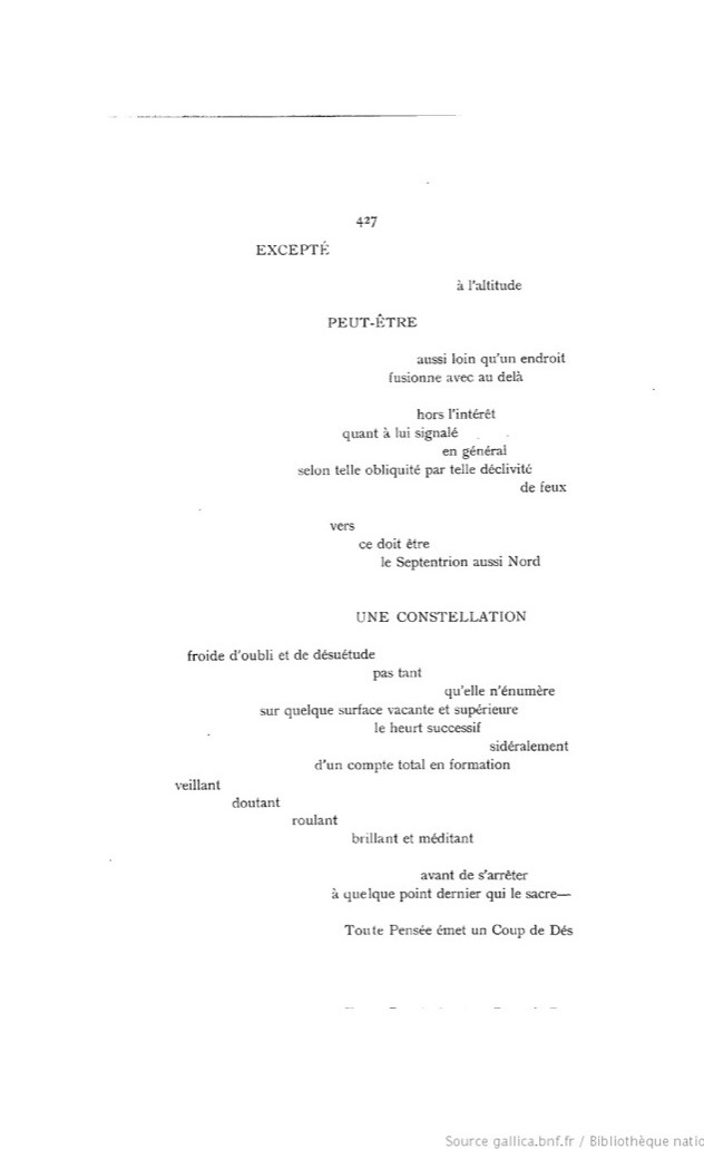
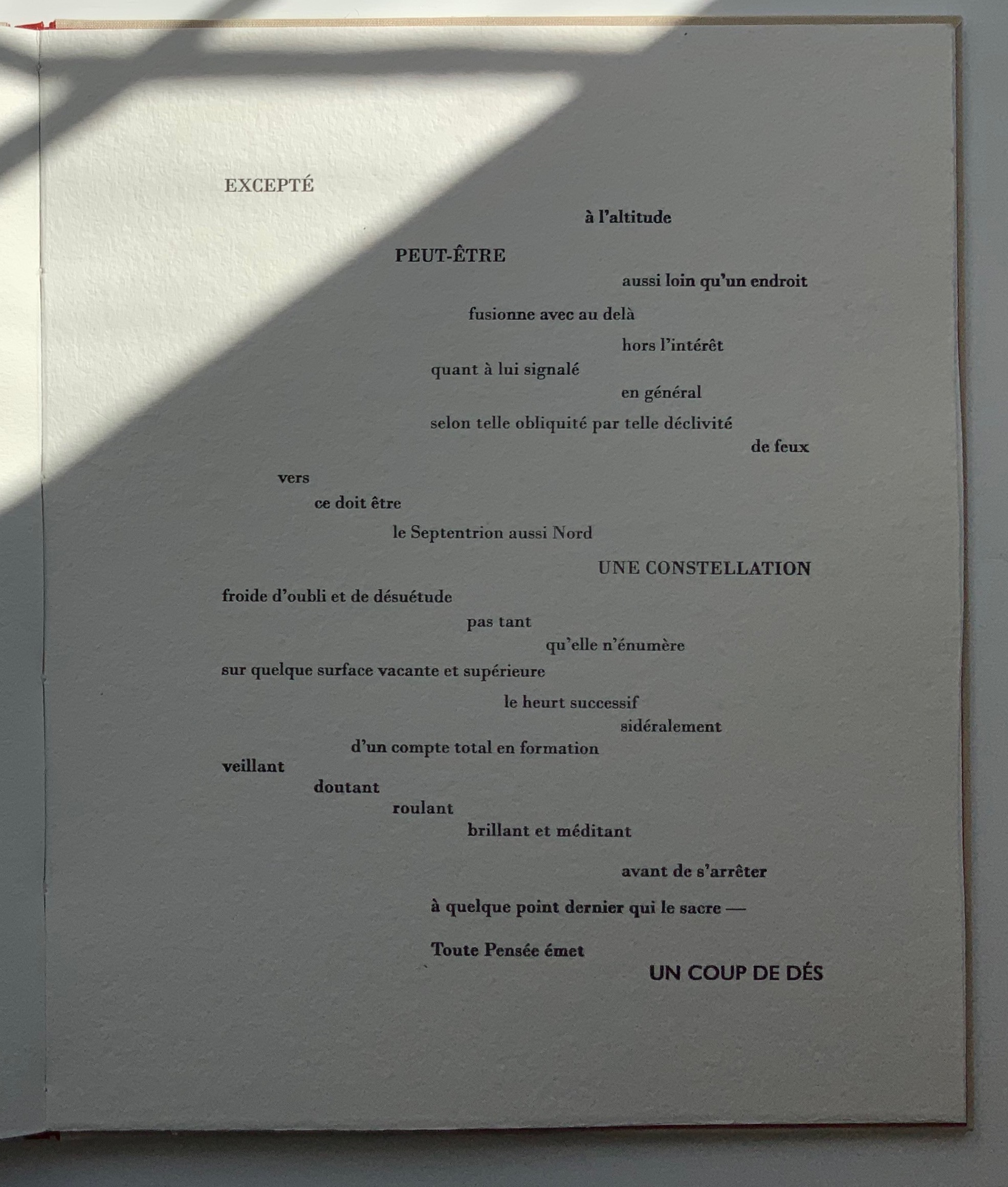
RIEN / N’AURA EU LIEU / QUE LE LIEU / EXCEPTÉ / PEUT-ÊTRE / UNE CONSTELLATION (“Nothing will have taken place but the place except perhaps a constellation”)
and
Toute pensée émet un Coup de Dés (“All thought emits a throw of the dice”).
On Innards (2015)
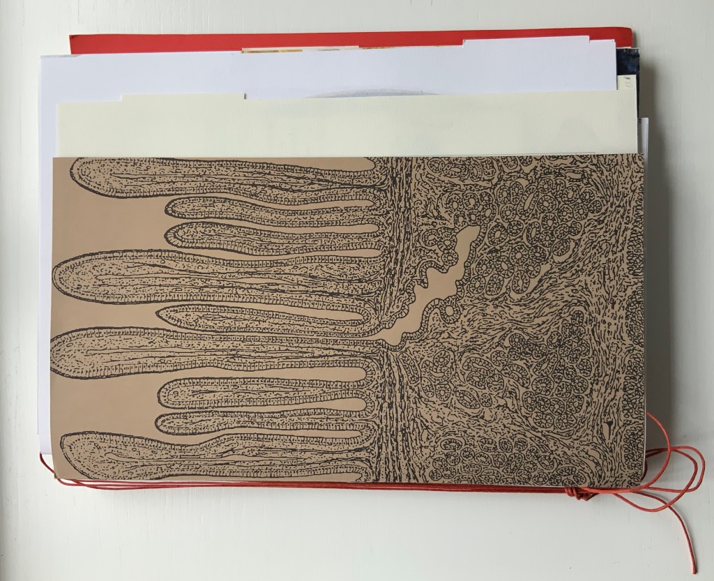
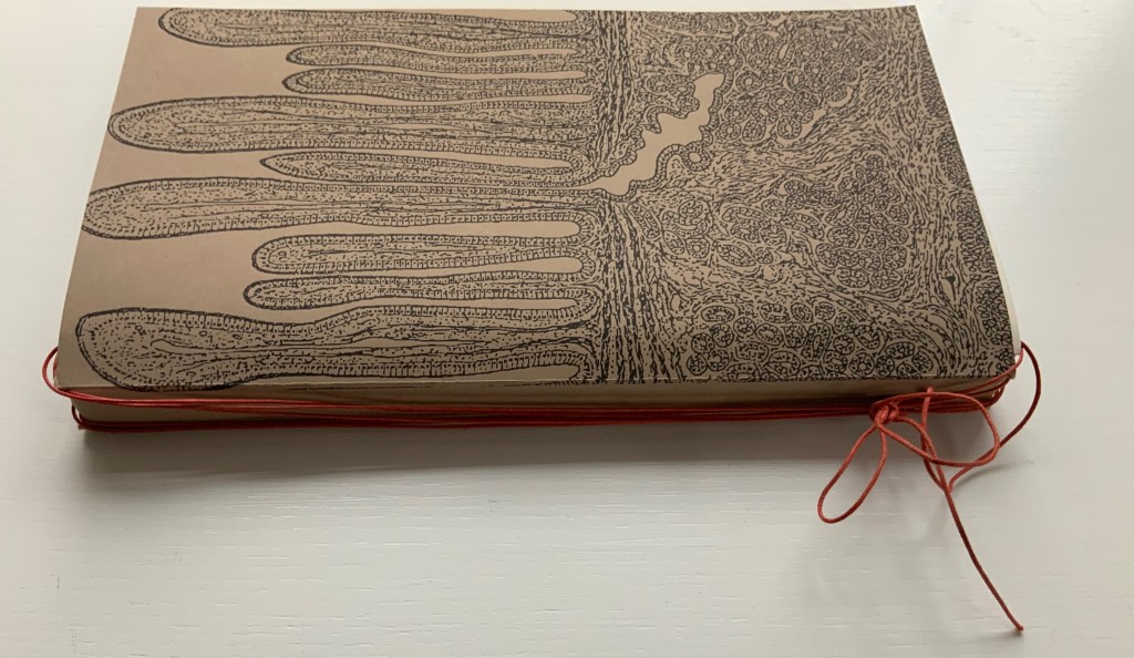
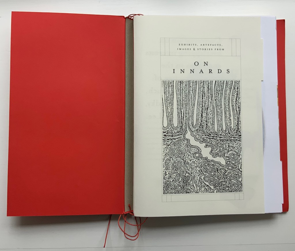
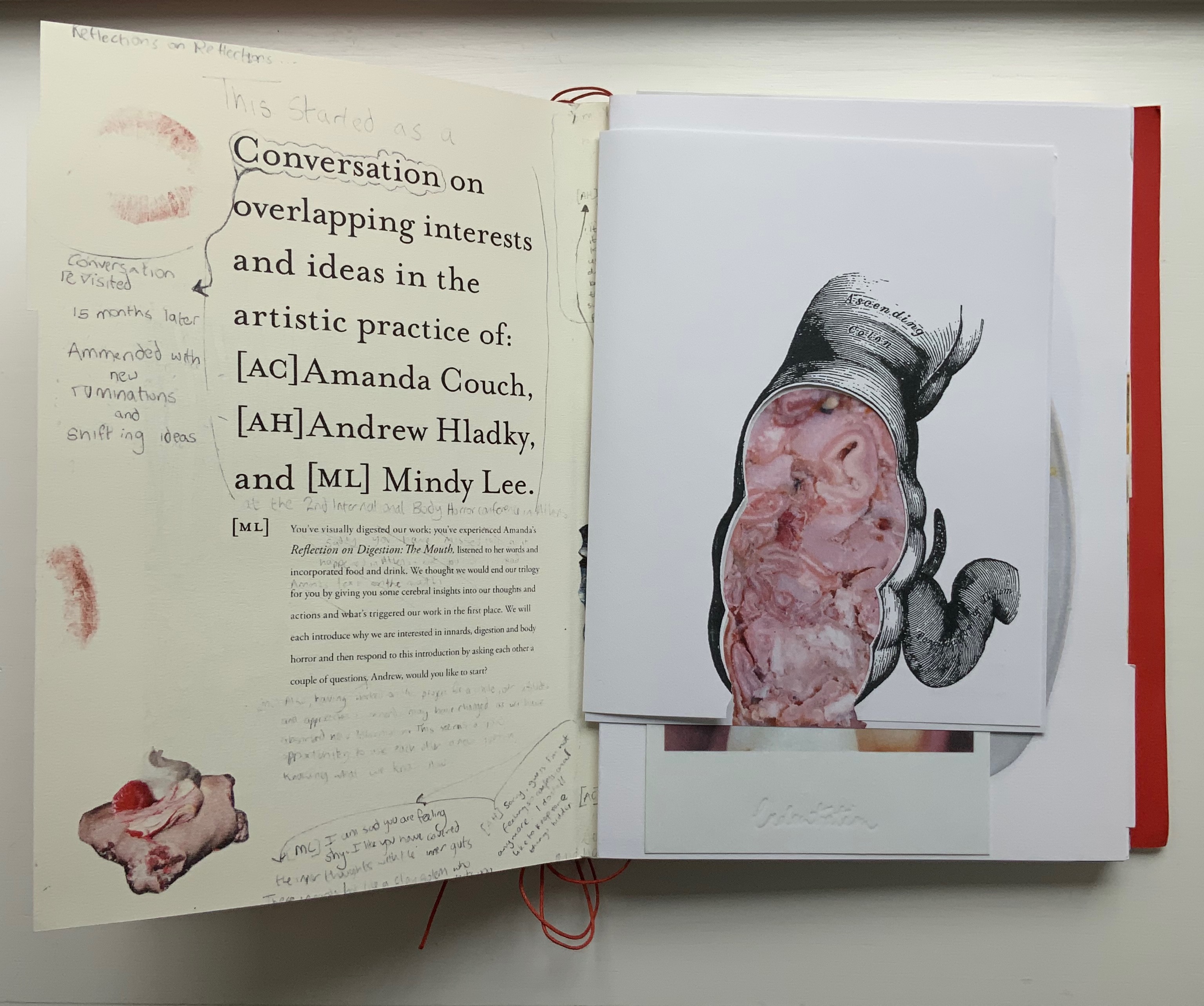
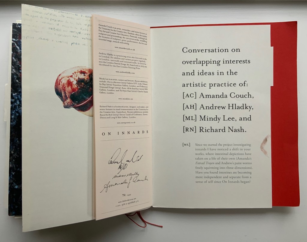
On Innards (2015) Amanda Couch, Mindy Lee, Andrew Hladky and Richard Nash Limited edition publication individually stamped and numbered, digitally printed and cut, folded, bound and finished by hand. H260 x W205 mm, 200 pages of various intersecting formats and custom binding. Limited edition of 200, of which this is #74. Acquired from Richard Nash, 2 April 2022. Photos: Courtesy of Richard Nash; Books On Books Collection. Permission to display from Richard Nash.
On Innards began as a multidisciplinary project to explore how the way we think of guts and digestion has changed, how that might drive the creative process, and how it affects our sense of self. Book art and the human body (interior and exterior) are no strangers. Carolee Schneemann’s Parts of a Body House Book (1972/2020), Ron King’s Turn Over Darling (1994) and Matisse’s Model (1996), Joyce Cutler Shaw’s The Anatomy Lesson: Unveiling the Fasciculus Medicinae (2004) and Casey Gardner’s Body of Inquiry: A Triptych Opening to a Corporeal Codex (2011) among others come to mind. On Innards introduces a very different level of intimacy though — one not for the squeamish or scatologically averse.
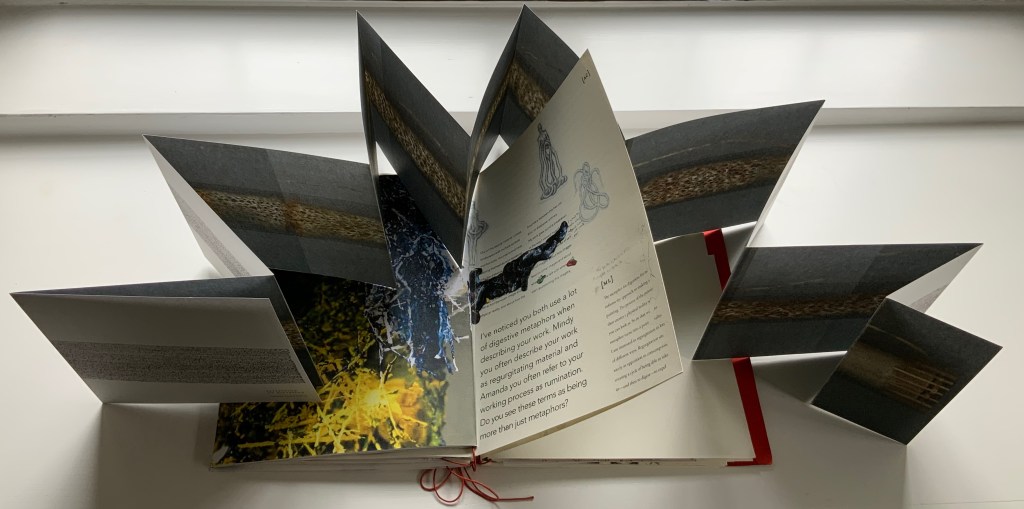
Artists Amanda Couch, Mindy Lee and Andrew Hladky initiated the the project and presented initial results in a panel held at the interdisciplinary conference “Body Horror” in Athens, in 2013. Subsequently, Richard Nash joined the project to curate an exhibition and event in 2014, which included text by Carlo Comanducci, Giskin Day, Dr. Simon Gabe, Nathaniel Storey, and Jamie Sutcliffe; performance by Kerry Gallagher; and illustration by Jenny Pengilly. Drawing together the output and record of the project, Nash created this hybrid research journal and artists’ book, launched at the Whitechapel London Art Book Fair in 2015.
Like Espace, this work displays Nash’s sculptural approach to text, graphics, ideas and the book as raw material for an artistic creation. The bookwork interweaves, concertinas, folds out, pops up, gate-folds, roll-folds and unwinds. Used to reveal reflections on the project, recalled events, artefacts, images, and stories from the conference, these various “book innards” become an embodiment of digestion. It also somewhat resembles an expandable file folder, its contents secured by a long looping slip-knotted red thread sewn through a heavy card spine pasted to red endpapers that are pasted to brown cover papers. Despite the resemblance to a landscape portfolio, the contents proceed in portrait codex fashion with the tabbed half-title “page” below. The half-title, however, is the first panel of a double-sided accordion that extends from that tabbed half-title page all the way to the last (also tabbed) page of the book (also below). When the half-title turns, it reveals a description of the contents (also below) printed on the double-sided accordion.
Landscape view of the spine and external thread binding.
Portfolio view of endpaper and half-title page. Note the glimpse in the center of the spine’s interior.
Left: The verso page or panel gives a description of the contents of the double-sided accordion. Right: last panel of the double-sided accordion.
The valleys of the double-sided accordion hold the various other parts of the book, some of which are secured in their valleys by the red thread’s looping over and down their centers, and some of which are secured by being folded around or over the thread-secured parts. The dimensions of those parts vary, and other parts lie loose. This can lead to the guts of the book spilling out, surely not an accident! Nor is it necessarily a bad thing, for reading the other side of the accordion requires removing all of the contents from the binding.
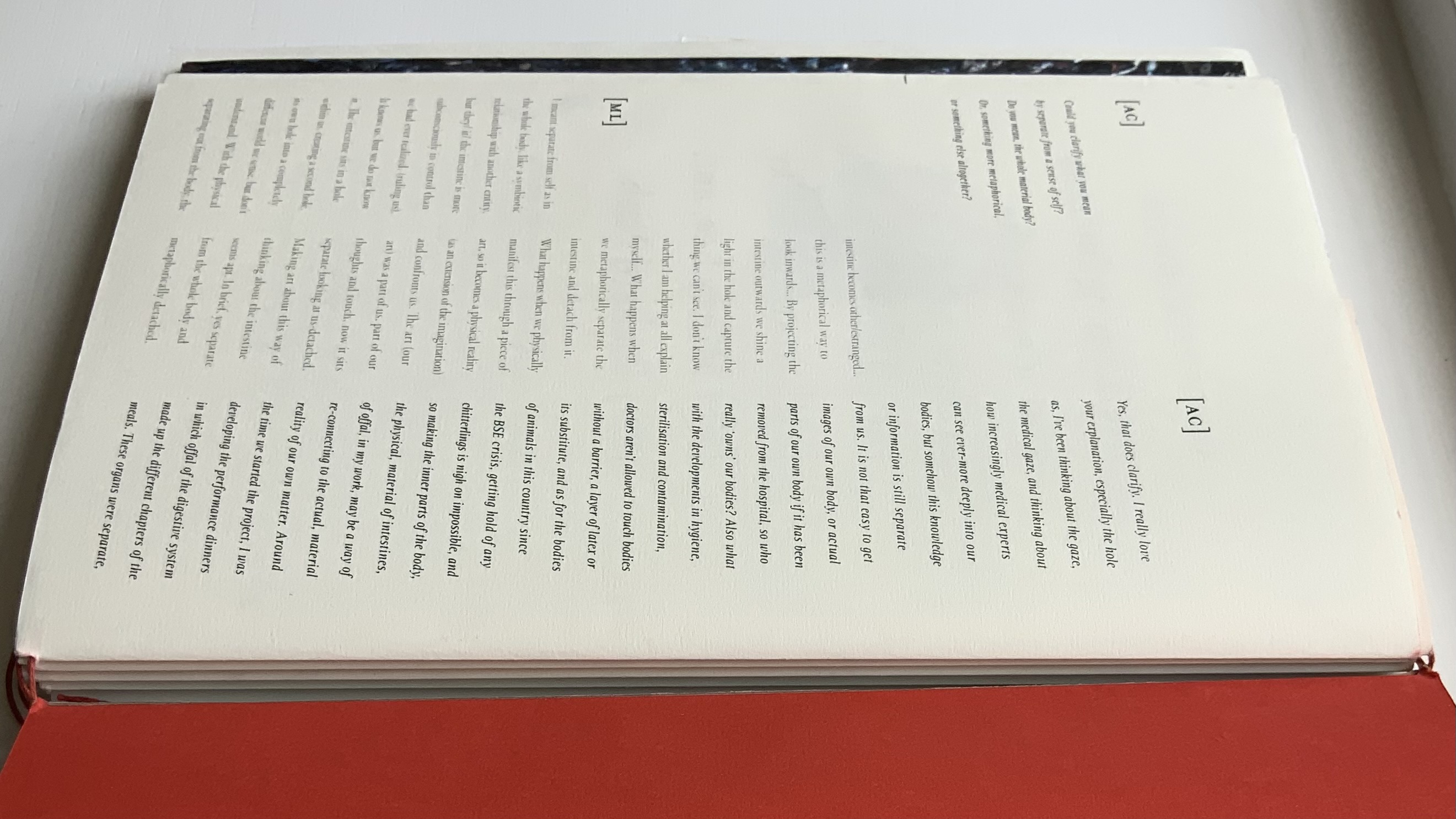
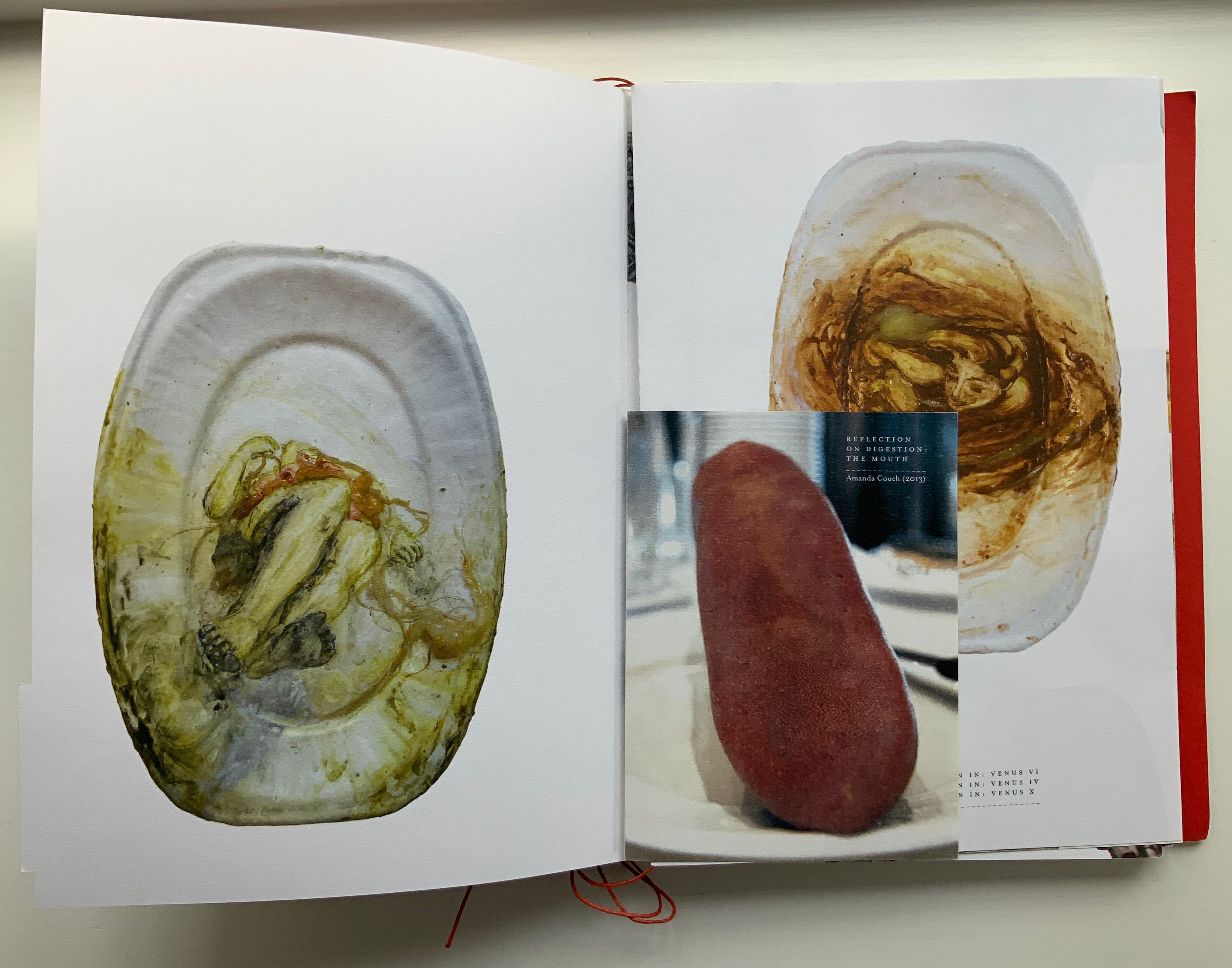
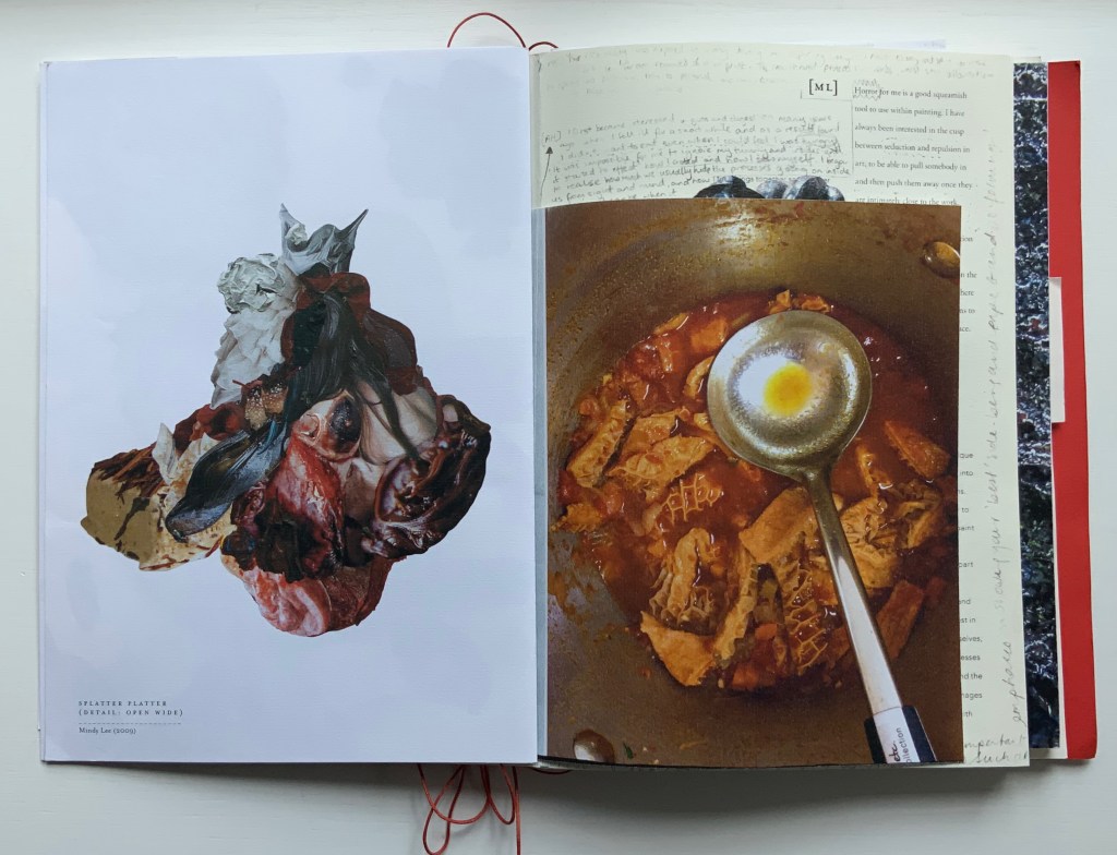
The first interleaved artefacts and images come from Amanda Couch and Mindy Lee. Couch’s first item is a passe-partout construction displaying at the start “Organ-Offal Caecum Andouillette” (2015) and at the end “Organ-Offal Stomach-Tripe” (2015). The passe-partouts combine black-and-white photos of anatomical engravings with color photos of the gut (see above), and between them is a photo of an annotated recipe for beginner’s tripe or chitterlings. Her second item (see below) is a pamphlet entitled “Reflection on Digestion: The Mouth” (2013), recounting and illustrating a presentation/performance/tasting of a serving of tongue that Couch gave during the “Body Horror” conference.
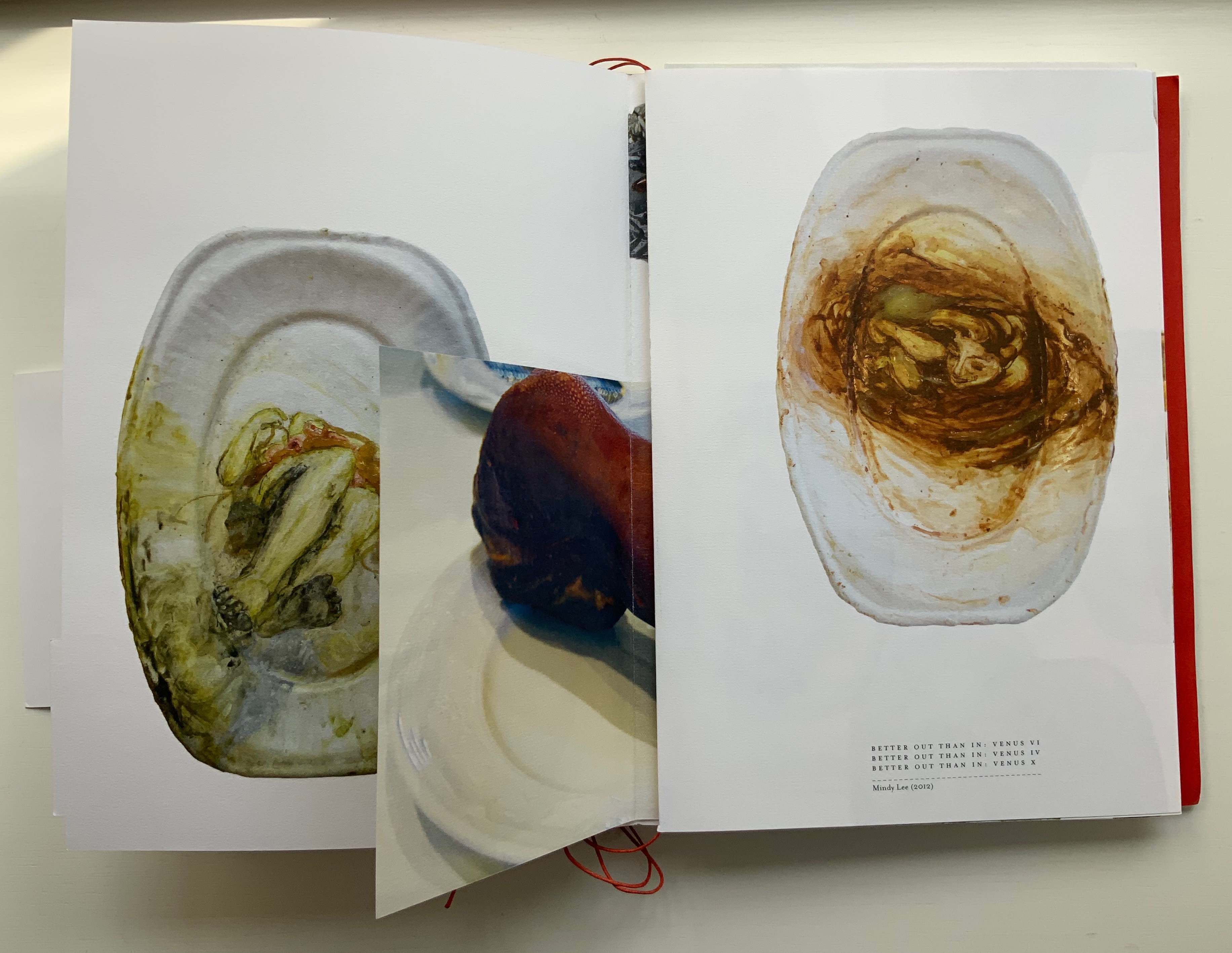
Lee’s contributions appear (also below) on the larger pages embraced by and interleaved with Couch’s two items. The images display photographs of works entitled Better Out than In: Venus VI, IV & X (2012) and Splatter Platter (2009). In Better Out, Lee’s “canvasses” are paper plates, but the perspective from which Venus is perceived suggests the underside of a closed, soiled toilet seat.
Couch’s “Reflection on Digestion” pamphlet interleaved with photos of Lee’s Better Out than In series.
Detail from photo of Lee’s Splatter-Platter; enclosing page from Couch’s annotated and illustrated recipe for tripe.
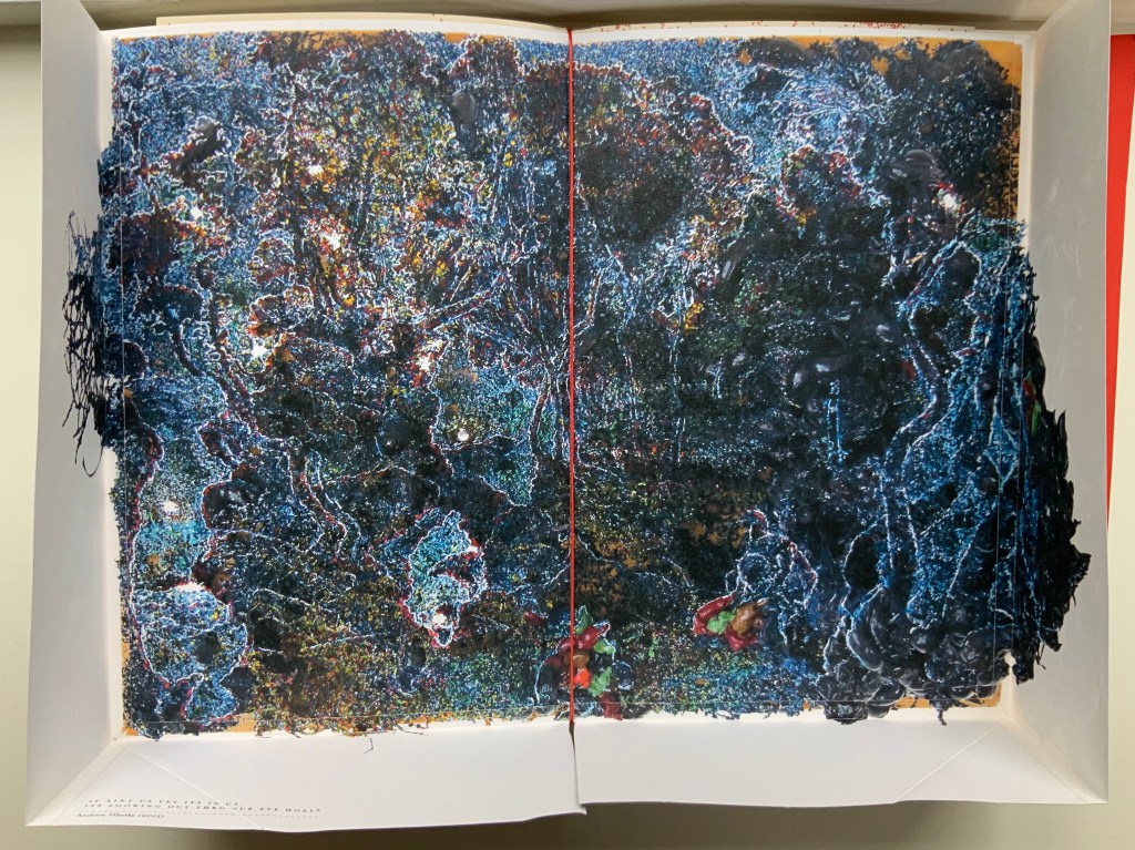
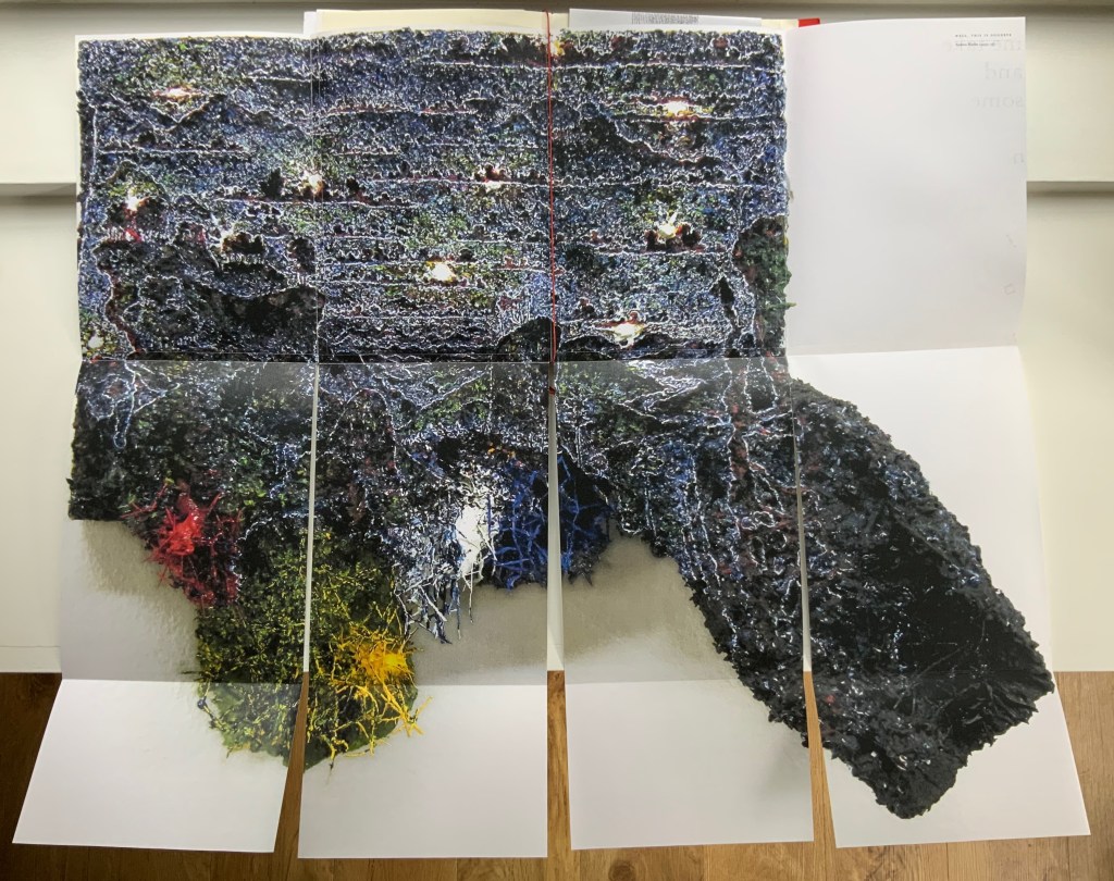
Andrew Hladky’s contributions are prints of three-dimensional works made of oil and bamboo sticks on wood panels ranging from 3 inches to 10 inches in depth. To capture this, On Innards delivers the print of It ain’t us yet its in us. Its looking out thru our eye hoals (2015) as a pop-up box (see below), and the prints of Well, This is Goodbye (2007-15) and The Clearing (2011-14) are cut and folded such that they spill out well beyond the trim size of the portfolio (also below).
Hladky’s It ain’t us yet its in us. Its looking out thru our eye hoals (original work 12 x 18 x 10 inches). The other side of this box also bears a print of a detail view of the work.
Haldky’s Well, This is Goodbye (original work 8.5 x 10.5 x 3 inches)
Hladky’s The Clearing unfolded (original work 61.5 x 43.5 x 6.5 inches), with Giskin Day’s “End Notes” interleaved.
As mentioned, some works are loose inserts, but some of the loose inserts are folded over a panel of the core double-sided accordion. Nash uses that structural feature to emphasize one of the hallmarks of book art: self-reflexivity. Below, straddling a mountain fold in the core double-sided accordion is another double-sided accordion. On one side, there is a photo of Couch’s Entrail Troyen (2014), a three-dimensional tube knitted from leftover cured saucisson sec shredded into ribbon-like thread. The title is derived from the French sausage Andouillette de Troyes, which harks back to the pamphlet “Reflection on Digestion: The Mouth” (2013) and its andouillette and chitterlings.
In case the reader misses the connection to the earlier item, the other side of this double-sided accordion presents a condensed photo of Couch’s nine-meter long accordion book entitled Reflection on Digestion (2012), a continuous line of handwriting looping back and coiling like the villi of intestines (see the cover of On Innards), relief printed from photo polymer plates on 410 gsm white Somerset satin paper. Couch uses this work in her reading performances of the same name. (Did I mention self-reflexivity?)
Loose double-sided accordion fold item displaying Couch’s Entrail Troyen on one side and Reflection on Digestion on the other.
Continued commentary on and illustration of this addition to the Books On Books Collection would be to regurgitate the whole work, which is certainly the opposite direction the work takes and which would be unfair to the work’s artists and contributors. After all, On Innards is a limited edition, and as many copies as possible should be ingested by as many institutions possible that are intent on improving their clientele’s digestion of book art.
Signature page concluding the “bibliographical” brochure summarizing the project, sponsors, conference, Blyth Gallery event and the artists’ book in hand, providing its colophon and listing sources and works displayed; penultimate page of the core double-sided accordion.
Derek Beaulieu (No Press) first published Sam Sampson’s homage to Un Coup de Dés as a handsewn pamphlet in 2020. To celebrate the 125th anniversary of Mallarmé’s initial publication of “the poem that made us modern”, Sampson enlisted Jacinda Torrance of Verso Visual Communications for design, the firm Centurion for printing, and Louise James of The Binding Studio for hand binding to produce this deluxe edition.
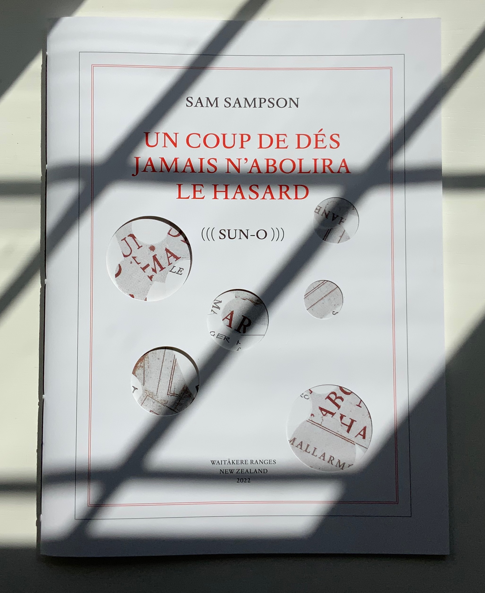
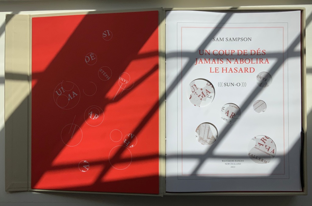
UN COUP DE DÉS JAMAIS N’ABOLIRA LE HASARD (((SUN-O))) (2022)
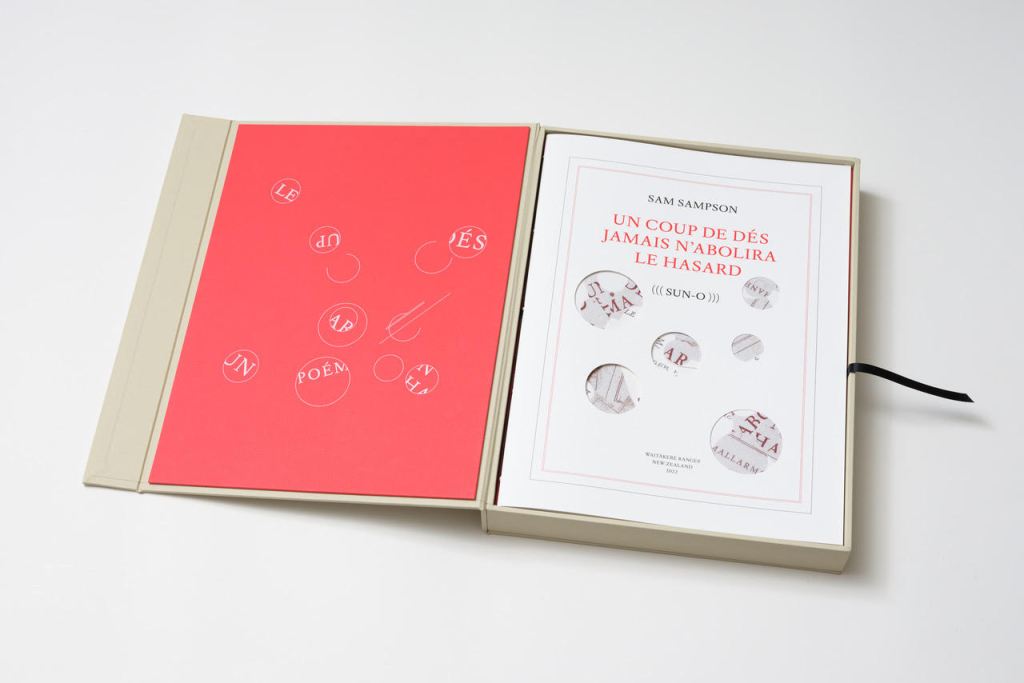
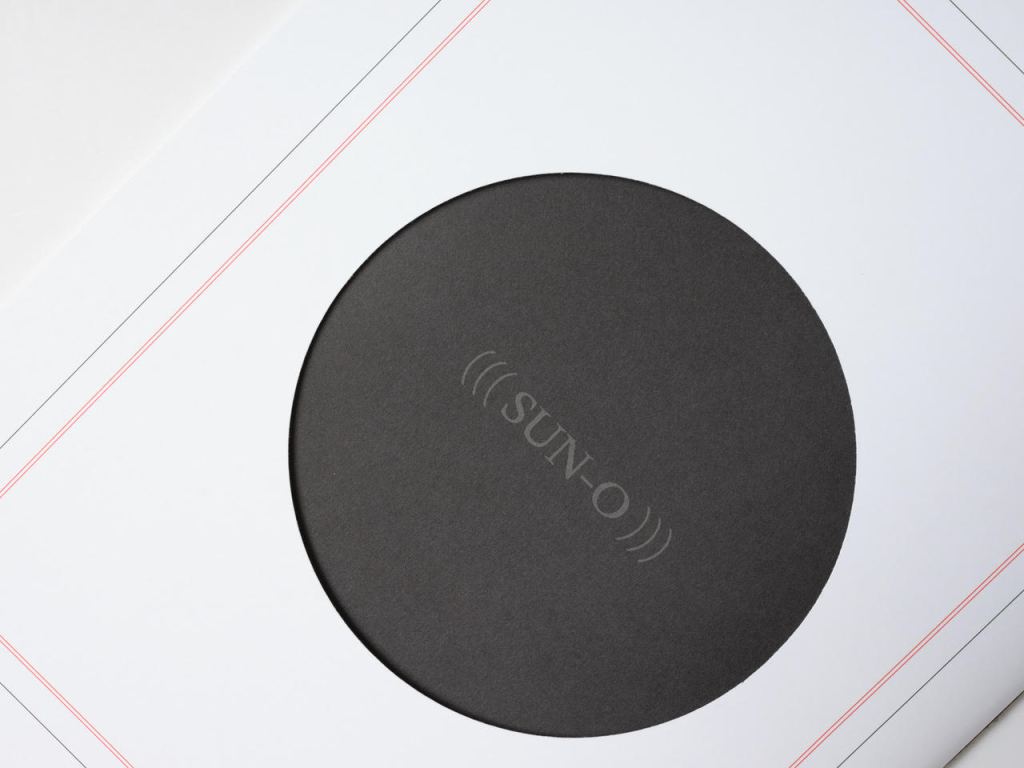
Un Coup de Dés Jamais N’Abolira le Hasard ((( Sun-O ))) (2022) Sam Sampson Handsewn book, H300 x W225 mm, 28 unnumbered pages. Edition of 20 (10, each enclosed in a hinged-lid box with magnetic flap; 10 unboxed), of which this is boxed # 2. Acquired from the artist, 7 April 2022. Photos: Books On Books Collection. Displayed with permission of the artist.
As with most creative works, (((Sun-O))) had multiple points of inception. One of them was an essay Sam Sampson read by Susan Howe and Cole Swensen. They quote Mallarmé’s preface to the poem (“nothing new except a certain distribution of space made within the reading” and speak of his aim to fuse sequential and simultaneous perception, to fully engage the eye and ear, as a result pushing poetry in two directions – toward visual art and toward musical performance. This resonated with a series of poems Sampson was writing and manifests itself in (((Sun-O))):
The physical design and analogy in my rendition is aligned with what I would call the ‘O Poems’. ‘O’ Zero, being the sound that runs through these poems, but I’ve also been interested in the numerical concept of zero: the beginning point, but also the point of departure, the ‘O’ as an ideogram, giving the text a pictorial as well as vocalised movement. [Correspondence with Books On Books Collection, 29 March 2022]
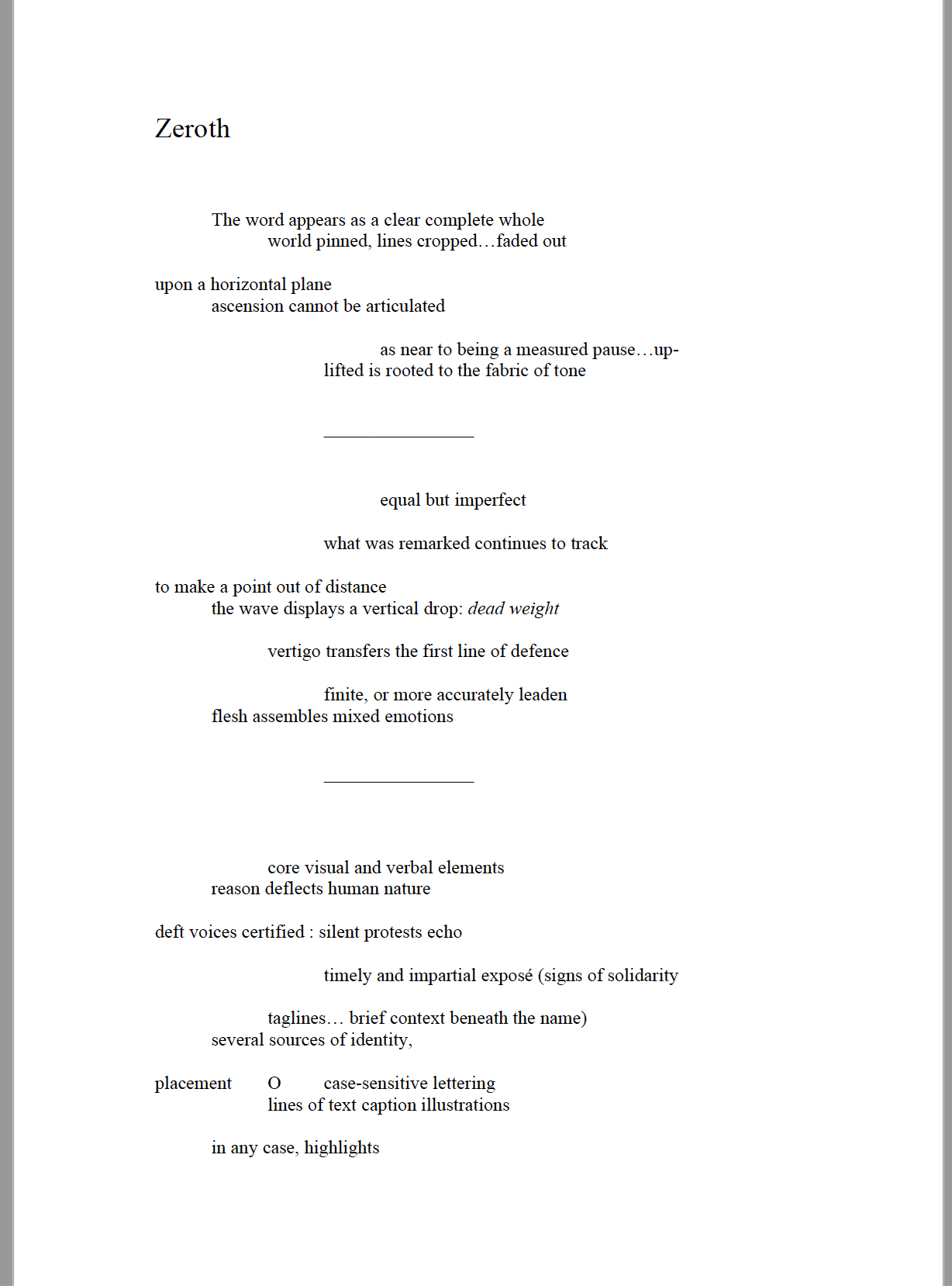
Another of the “O Poems” is Zeroth. Sampson reads it here:
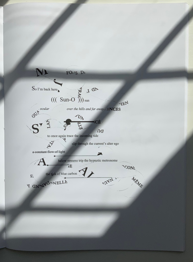
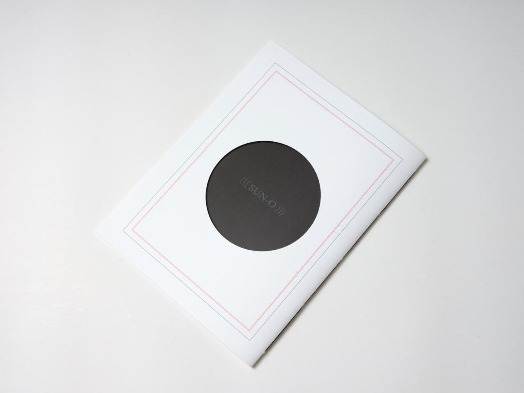
Zeroth leads to another point of inception: a conversation with Roger Horrocks, a New Zealand poet, writer, film-maker, educator and cultural activist, to whom (((Sun-O))) is dedicated. After reading Zeroth, Horrocks told Sampson that it reminded him of his favorite Seattle experimental metal band at the time – Sunn O))). Sampson describes their sound as slow, heavy, blending diverse genres including “drone, black metal, dark ambient and noise rock”. Sampson’s mulling over the very sound of the band’s name led to free associations with the secondary meanings of drone (surveillance, panopticon). Mulling over the name’s compression of word and the letter O led to his hybridized subtitle (((Sun-O))) “with its parentheses radiating out but never closing”. A potent visual and textual image for a poem touching on, if not touching, the sun, the abyss and the human.
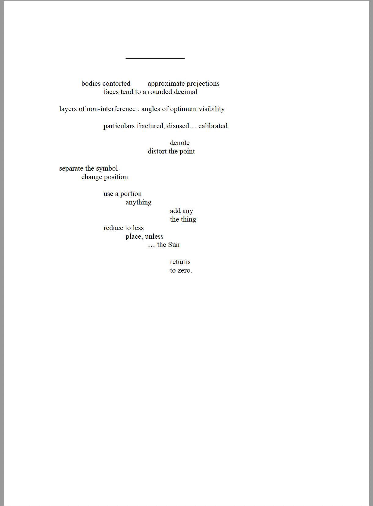
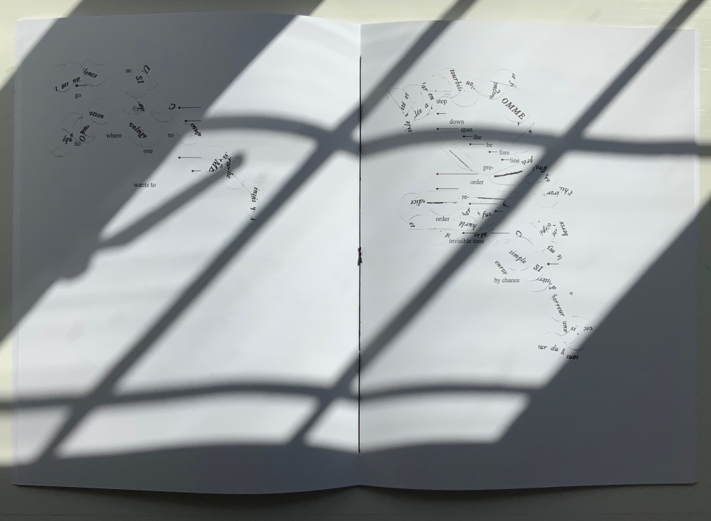
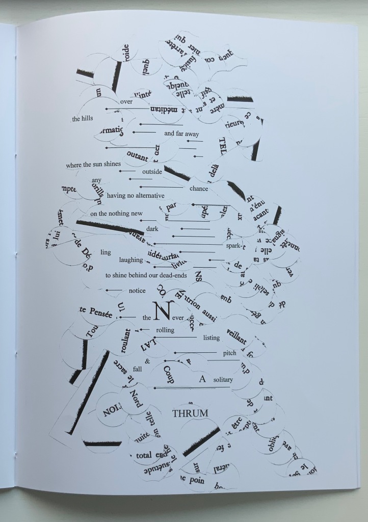
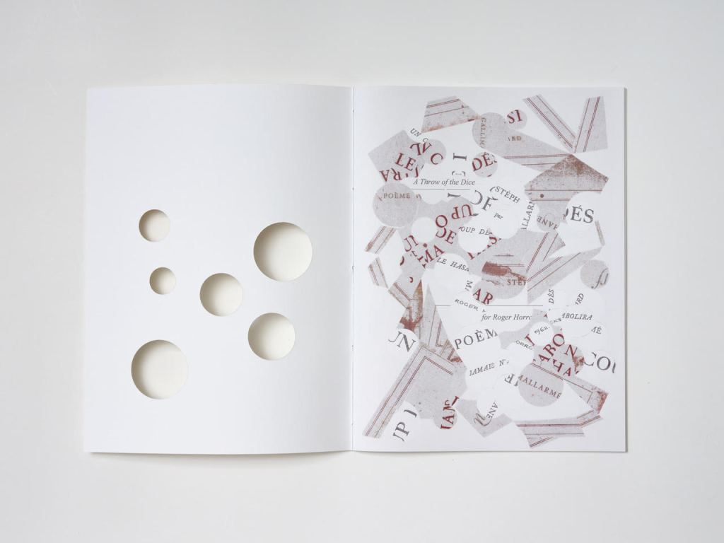
But, of course, the zero point of inception is Un Coup de Dés. On a visually material level, (((Sun-O))) has a scaffolding of bullet-pointed rules, whose lengths are based on measuring each of Mallarmé’s lines, whose weights approximate the variable font sizes, and whose placement matches that in Un Coup de Dés. This lattice serves as the physical structure for the collage of words and O’s that Sampson layers like paint or screenprint onto the page. Some words and lines are upside down like the detritus of a shipwreck. Some words curve and drape between the lines like torn sails. Appropriately, some come from the precisely corresponding pages in Mallarmé’s poem. Faint lines of the circumferences of O’s leap across and down between the lines almost like musical notations.
Within this tangle, Sampson’s own elusive and allusive text plays. Some of its phrases come from traditional song; some fix the geographical location (“blue carbon” places the speaker in a coastal community); some “un-fix” the location (“over the hills and far away”); some are struck through, alerting the reader to be ready to discard and start again; some set the technological time frame (the reference to operating systems like Suse, Symbian and, of course, Solaris). As in Un Coup de Dés, the text’s syntax and placement on the page encourage reading in fits and starts, back and forth. As Sampson puts it:
I wanted [my] poem to somehow capture, as Mallarmé had described it, “the invitation of the great white space”, and the successive, incessant, back-and-forth motions of our eyes travelling from one line to the next, and beginning all over again. [Correspondence with Books On Books Collection, 29 March 2022]
Indeed, before writing Un Coup de Dés, Mallarmé foreshadowed more expansively this phenomenon toward which Sampson strives:
Pourquoi — un jet de grandeur, de pensée ou d’émoi, considérable, phrase poursuivie, en gros caractère, une ligne par page à emplacement gradué, ne maintiendrait-il le lecteur en haleine, la durée du livre, avec appel à sa puissance d’enthousiasme: autour, menus, des groupes, secondairement d’après leur importance, explicatifs ou dérivés — un semis de fioritures. [Oeuvres Complètes, 2, 227]
“Why — couldn’t a considerable burst of greatness of thought or emotion, carried in a sentence in large typeface, gradually placed with one line per page, hold the reader’s bated breath throughout the entire book by appealing to his or her power of enthusiasm: around this [burst], smaller groups of secondary importance, explicating or deriving from the primary phrase — a scattering of flourishes.” [Arnar, 234]
Whereas in Mallarmé’s poem there is a primary sentence in large typeface (“UN COUP DE DÉS JAMAIS N’ABOLIRA LE HASARD”) off which the secondary groups of phrases and sentences play, (((Sun-O)))‘s primary foil is the combination of two things: the collage made from shards of Mallarmé’s poem and that strange, enjambed subtitle (((Sun-O))). After all, the full title of Sampson’s work is UN COUP DE DÉS JAMAIS N’ABOLIRA LE HASARD (((SUN-O))).
The “Comme si … Comme si” center double-page spread.
Sampson calls Mallarmé’s poem a form of metaphysical gambling, reproducing the sensation of being both in and outside time. Being both in and outside of time — that could be the defining state of human consciousness. Unlike the abstract representation of humanity in Un Coup de Dés, however, (((Sun-O)))‘s representation is concretely personal. The traditional song “Over the Hills and Far Away“, which Sampson cites at the start of (((Sun-O))), can be read as a reference to Horrocks’ departure from New Zealand for the United States in the 1960s. At one point, the speaker addresses Horrocks directly: “Roger / what of these / parallels of blue / sea shanties / masquerading mind-sets / …”. Sampson takes the image of Roger Horrocks’ signature from Horrocks’ copy of an edition of Un Coup de Dés, fragments it and reproduces it on the pages of (((Sun-O))). Did Sampson have in mind the story of René Magritte’s loaning his copy of Un Coup de Dés to Marcel Broodthaers, which led to Broodthaers’ Image version of Mallarmé’s poem? (See Marine Hugonnier’s retelling of the tale here.) The scaffolding of bulleted-pointed lines certainly pays homage to Broodthaers and other “hommageurs by redaction” such as Michalis Pichler, Sammy Engramer and others. (((Sun-O))) is a work of many conversations on many levels across time and time zones.
One of the main topics in (((Sun-O))), however, naturally seems to defy the bridging of the personal and abstract: climate crisis. It is hard to miss the allusions to the global shipwreck that is the climate crisis, engendering rising ocean levels and spastic efforts towards zero carbon emissions based on a computational chaos of competing environmental models and competing economic and political systems. It is clearly of personal concern to the speaker, but that does not take the issue from the abstract to the concretely personal in the way that Horrocks’s signature in a copy of Un Coup de Dés does. Making the climate crisis personal could, of course, run the risk of descending into small talk about the weather.
The references to music and the poem’s demonstration of musicality throughout are also hard to miss, and given its zero point of inception, the poem would be seriously remiss without them. The aim for union of text, sound and graphic image is as central to Sampson’s poem as the manipulation of syntax and les blancs is to Mallarmé’s. The aim’s importance in Sampson’s poem even has the last note and oversized word in the poem:
... the Never / rolling / listing / pitch / & / fall / A solitary / THRUM
The frequency of achieved union may be what puts Sampson’s homage in the front rank.
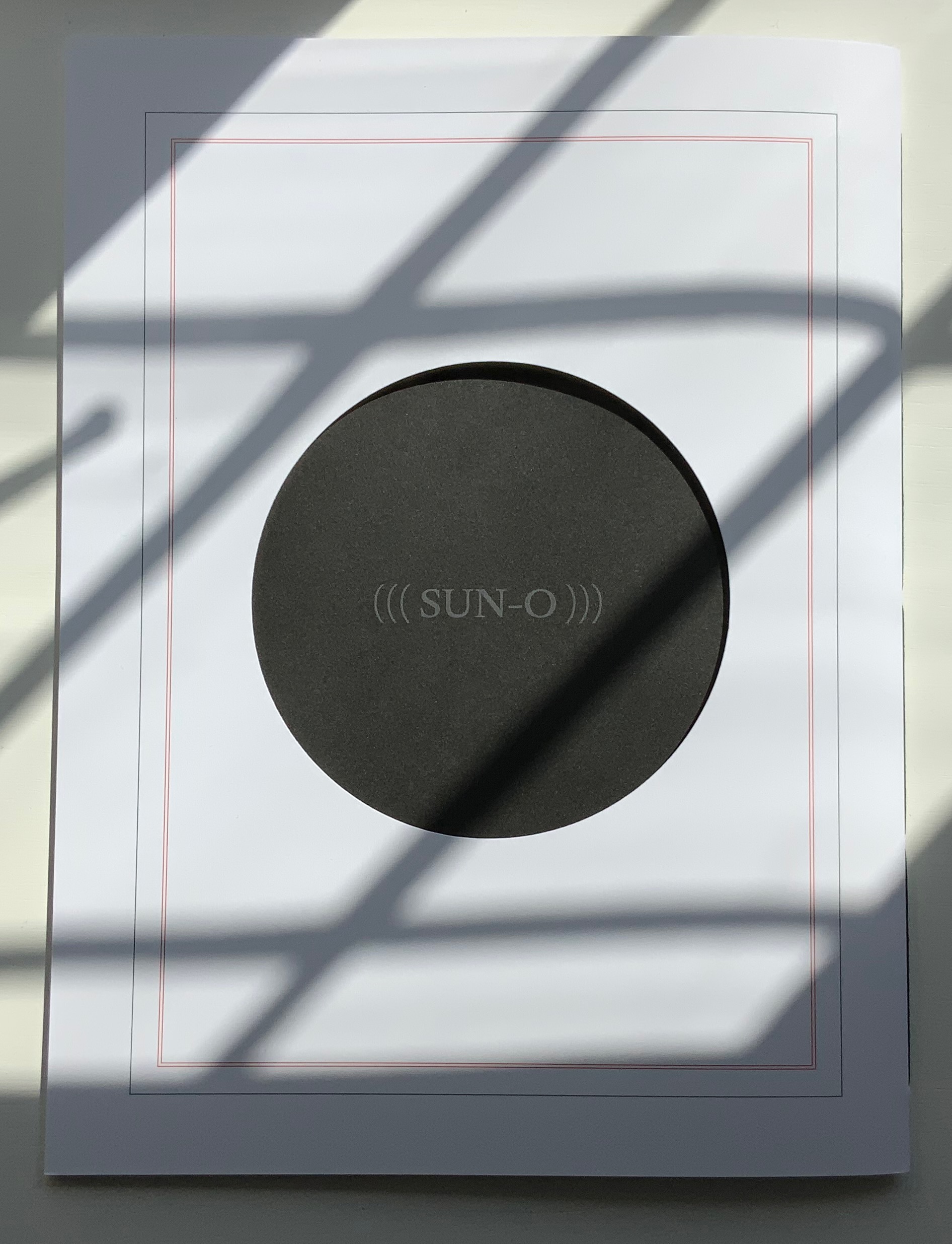
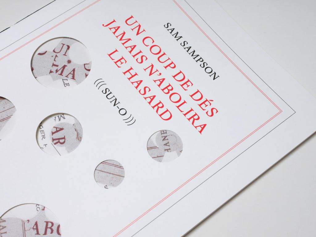
The special edition of (((Sun-O))) enhances that union in material ways. The design and materials play off Sampson’s cutting into and out of, sticking on and sticking through Un Coup de Dés. Six circles foiled in white on the front cover of the box turn the subtitle into an emblem — a mark maker. On the box’s inside lining, a design of circles and broken circles echoing the collage of O’s in the poem (even hinting at musical notation) is used to designate the number of the copy in the edition of 10. For this copy (#2), straight lines cut through 2 of the circles.
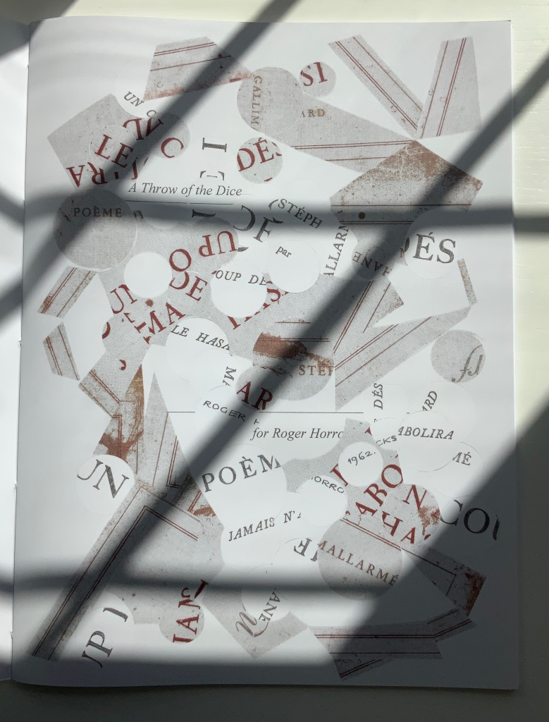
Like the white circles, six die-cut circles on the book’s front cover correspond to the six parentheses of the subtitle and likewise one face of a die. They also recall the hemistich of French poetry’s twelve-syllable Alexandrine, which Un Coup de Dés shattered. An image peeks through the die cuts and, as the cover turns, reveals itself as a collage of the cut-up cover of Horrocks’ copy of the poem and pages of (((Sun-O))). On the back cover, a single large die-cut circle centers on a black-hole sun with a faint, almost invisible ((( Sun-O ))) disappearing into blank/blackness.
By chance or by sly humor, the typeface used is DTL Elzevir. (((Sun-O))) is obviously not in the hunt for absolute fidelity to the edition planned by Mallarmé and Ambroise Vollard in 1896-97, which collapsed with the poet’s death. When Mallarmé’s son-in-law Dr. Edmond Bonniot issued an edition with Gallimard/NRF in 1914, the typeface was Elzevir, allegedly a face that Mallarmé detested. With this special edition of (((Sun-O))), Sampson is in the hunt on his own terms for his own more personal Mallarméan prism, constellation or radiant (((Sun-O))) that syntactically, auditorily, visually and physically scatters and focuses his response to the human condition.
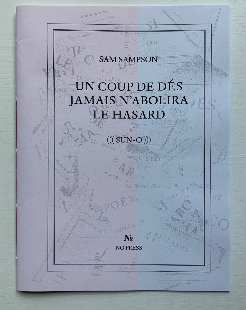
UN COUP DE DÉS JAMAIS N’ABOLIRA LE HASARD (((SUN-O))) (2020)
Un Coup de Dés Jamais N’abolira le Hasard: (((Sun-O))) (2020) Sam Sampson Handsewn pamphlet. H255 x W190 mm, 24 pages. Edition of 60. Acquired from No Press, 4 January 2021. Photo of the work: Books On Books Collection. Displayed with permission of the artist.
[Mallarmé’s] work is a constellation and trying to unpack and explicate what went into my response hopefully doesn’t remove the joy of just jumping in. I like what John Ashbery said about his own work: “my work is accessible, if you take the time to access it.” [Sampson in correspondence with Books On Books Collection, 29 March 2022]
Further Reading & Listening
“Derek Beaulieu“. 19 June 2020. Books On Books Collection.
Davenport, Philip. 27 March 2020. “‘France’, or… we are circles of cancelled stars’“, Synapse International: An international visual poetry gathering. Started by Karl Kempton and Davenport in February 2018, Synapse International quickly attracted online works of homage to Un Coup de Dés, including an early appearance in March 2018 of Eric Zboya‘s Translations and later a visually adapted essay by David W. Seaman and as well as an “ADVERTISEMENT” from Derek Beaulieu that links to his 3D rendering of Un Coup de Dés.
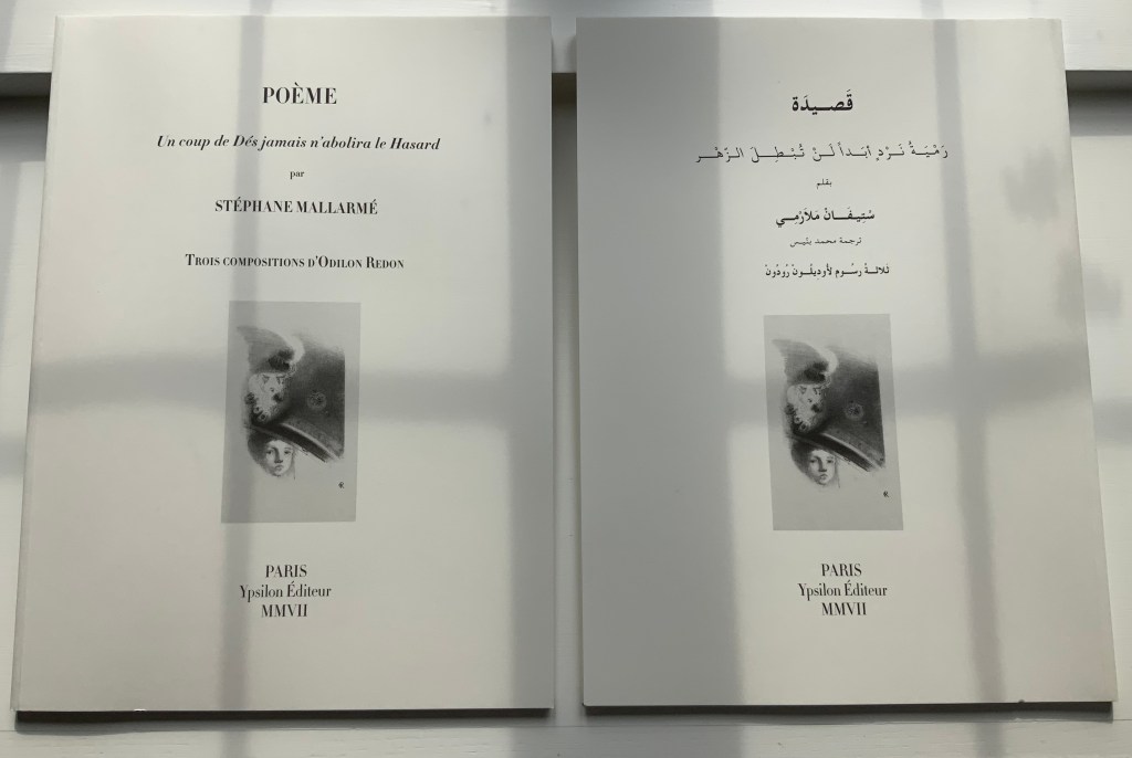
POÉME: Un coup de Dés jamais n’abolira le Hasard (2007)
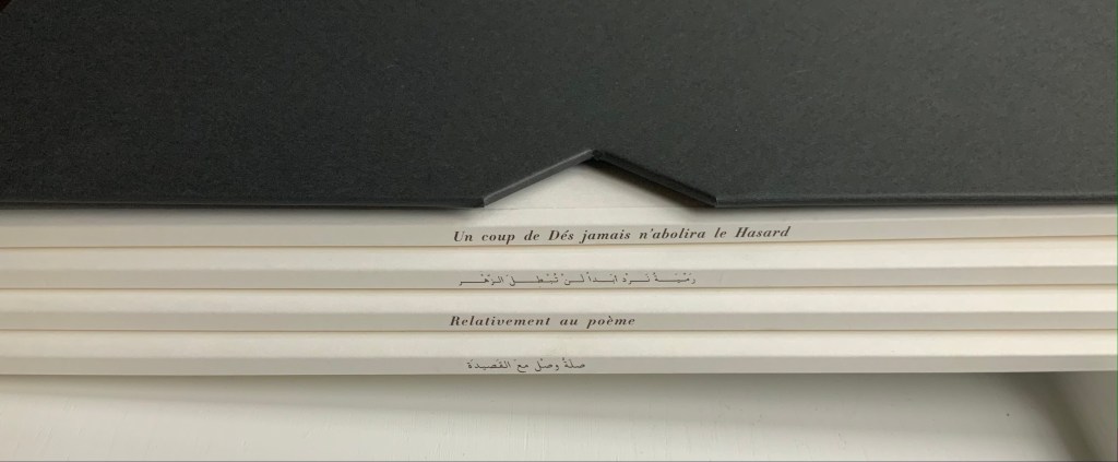
POÉME: Un coup de Dés jamais n’abolira le Hasard (2007) Stéphane Mallarmé, Isabelle Checcaglini and Mohammed Bennis Four volumes in slipcase. H380 x W280 mm, 40 pages per volume. Edition of 99, of which this is #57. Acquired from J.F. Fourcade, 7 January 2022. Photos: Books On Books Collection.
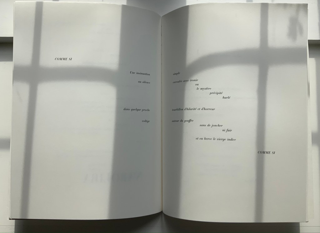
Ypsilon Éditeur’s editions of Un coup de Dés jamais n’abolira le Hasard bring together for the first time the three prints from Odilon Redon with the deluxe edition layout intended by Stéphane Mallarmé. Also for the first time, we have a translation into Arabic. Below, the central double-page spread of the poem is displayed in the French and Arabic editions to show how their mirror images of the layout heighten its movement.
In the additional French volume and its Arabic counterpart, Checcaglini adds a brief history about Mallarmé and Vollard’s plans for the deluxe edition and helpfully includes correspondence among them and Odilon Redon. Although the earlier edition published by Mitsou Ronat & Tibor Papp in 1980 does include Redon’s prints, they are placed in a separate folder along with other visual and textual tributes. The Redon prints may not be among his best, nor do they include the mooted but undiscovered fourth print, still at least we now have the three and the poem in relation to each other more nearly as intended, which makes it possible to compare and contrast this deluxe edition with the outpouring of works of homage to Mallarmé’s poem. Even with the prior absence of that chance, few if any of those hommageurs would be unaware of Redon’s images. Jean Lecoultre (1975) notes how his publisher’s solution to handling his soft varnish etchings honors the intended separation of text and images. By contrast, Christiane Vielle (1989) challenges Mallarmé’s layout and his unit of the double-page spread by altering the spatial relationships among lines, hiding text beneath panels and juxtaposing her artwork with the text.
The added volume with Checcaglini’s synopsis also includes a three-way dialogue among Mohammed Bennis, Isabelle Checcaglini and Bernard Noël about the light that the translation sheds on the poem.
Checcaglini’s edition also claims to have most closely reproduced the Firmin-Didot typeface that Mallarmé wished for his deluxe edition. The search for absolute fidelity to this font that has been unavailable for at least a century has been an obsession since the discovery of the poem’s proofs corrected and annotated in Mallarmé’s hand. The Further Reading provides a start for anyone inclined to join the search.
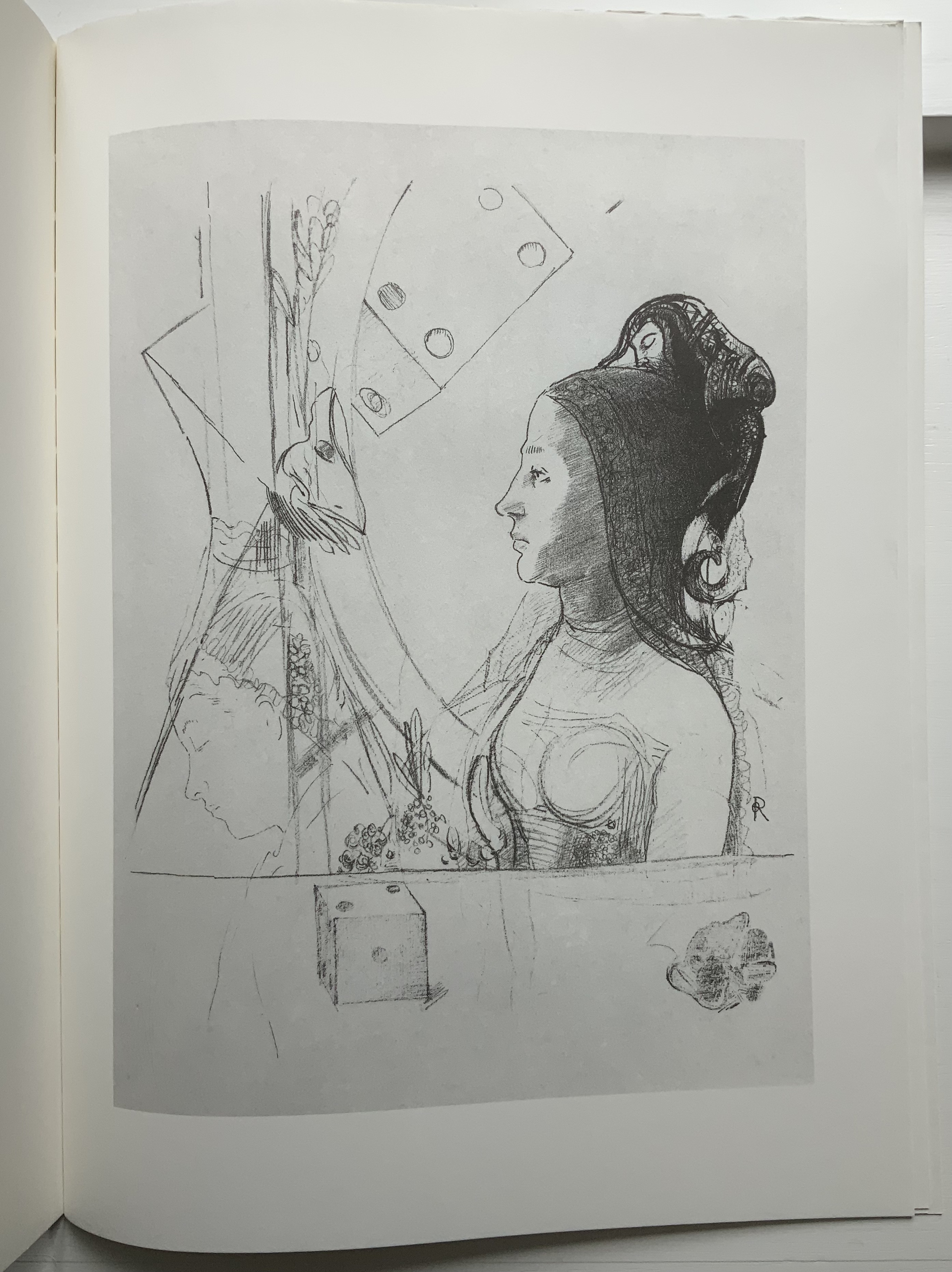
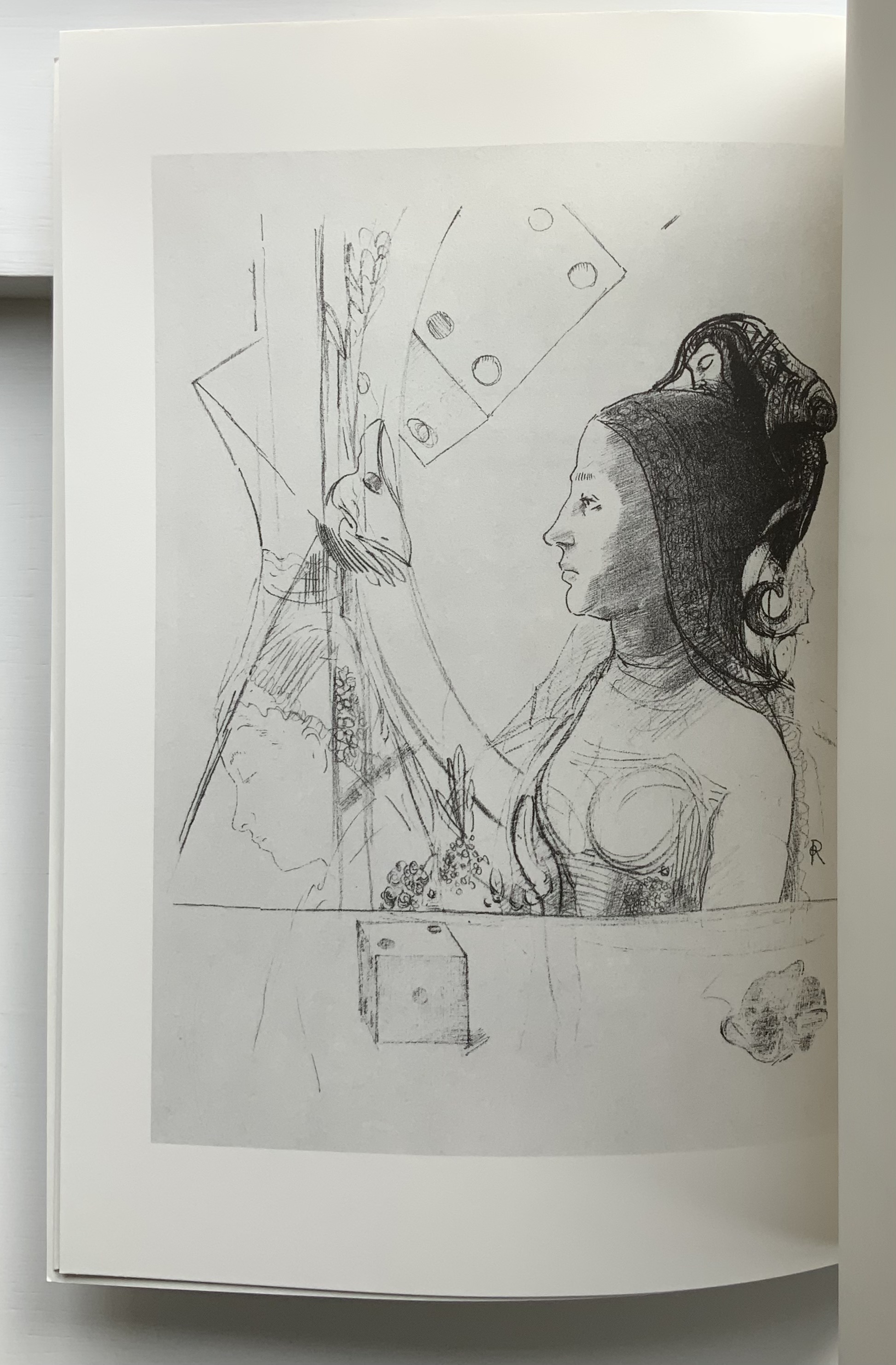
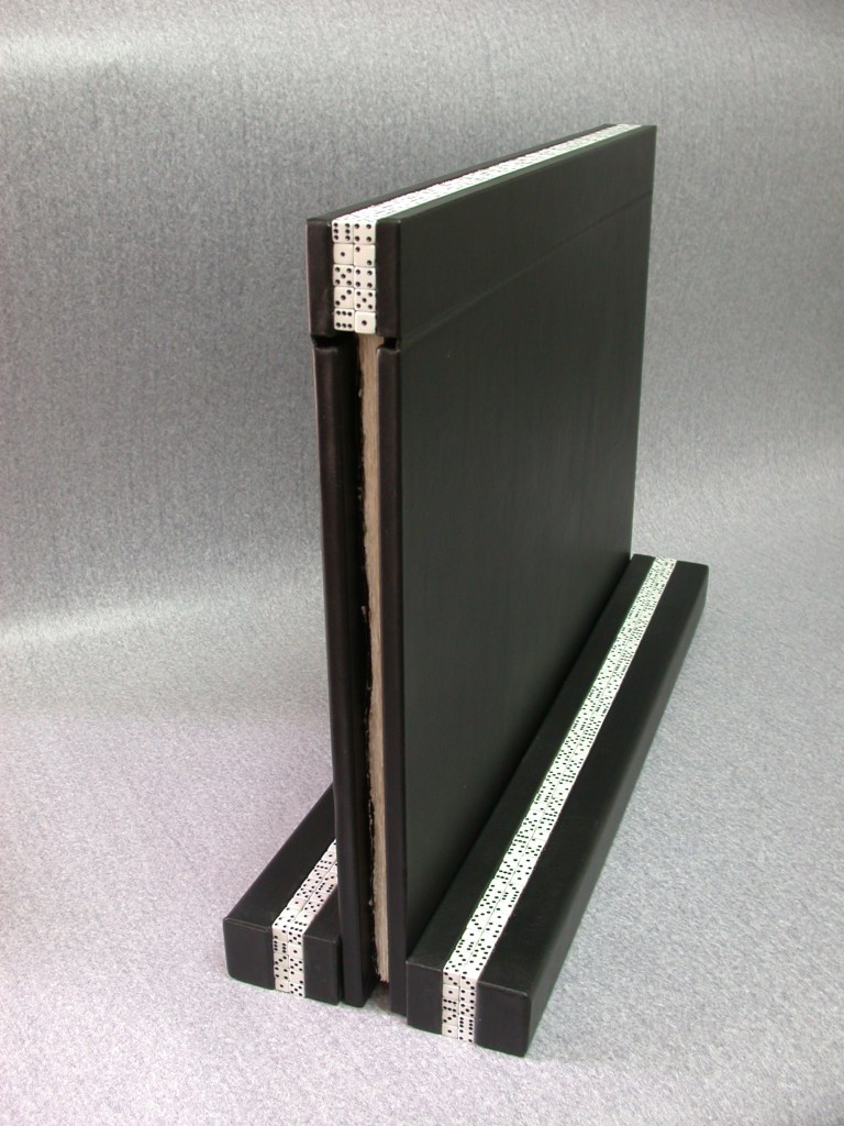
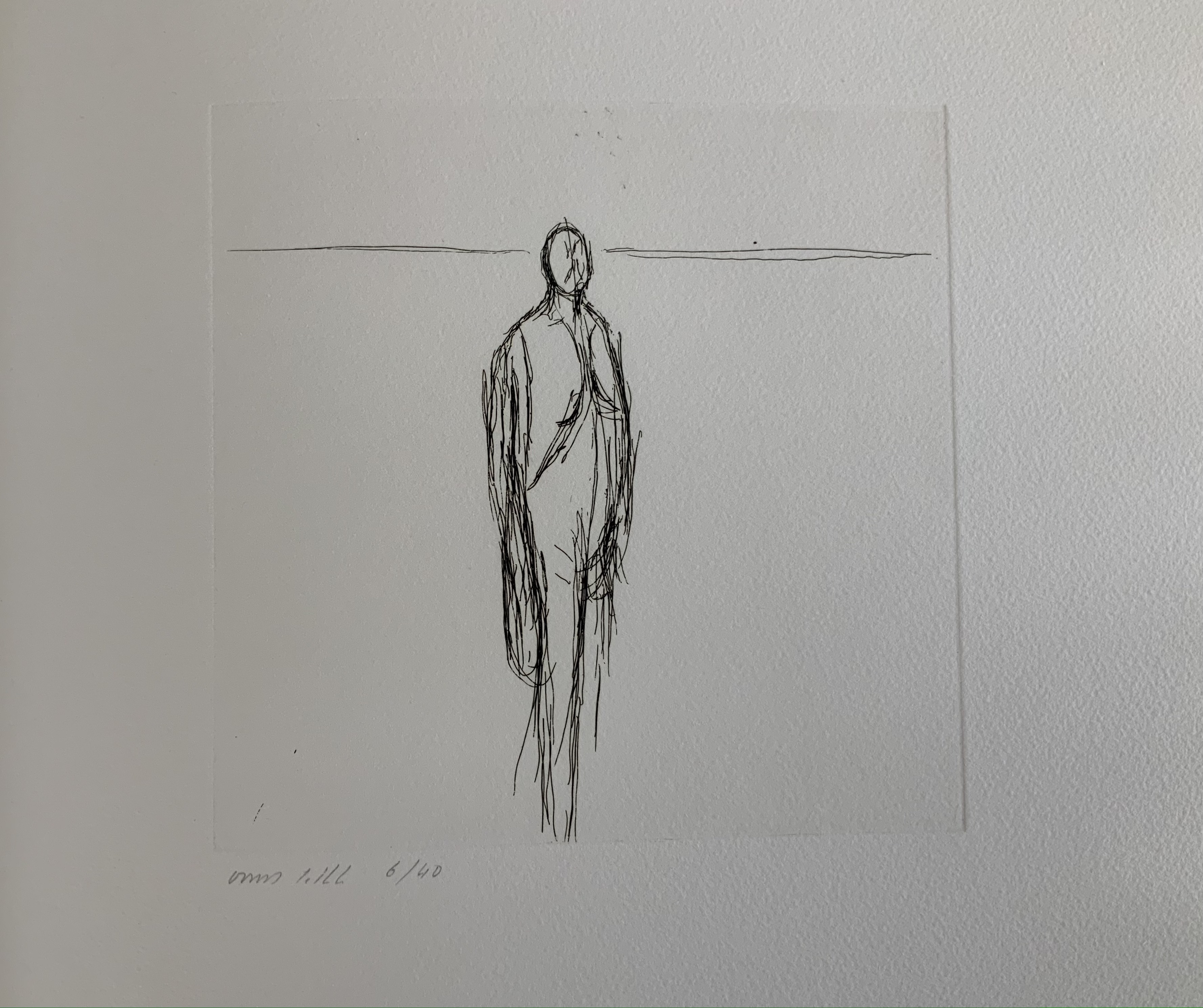
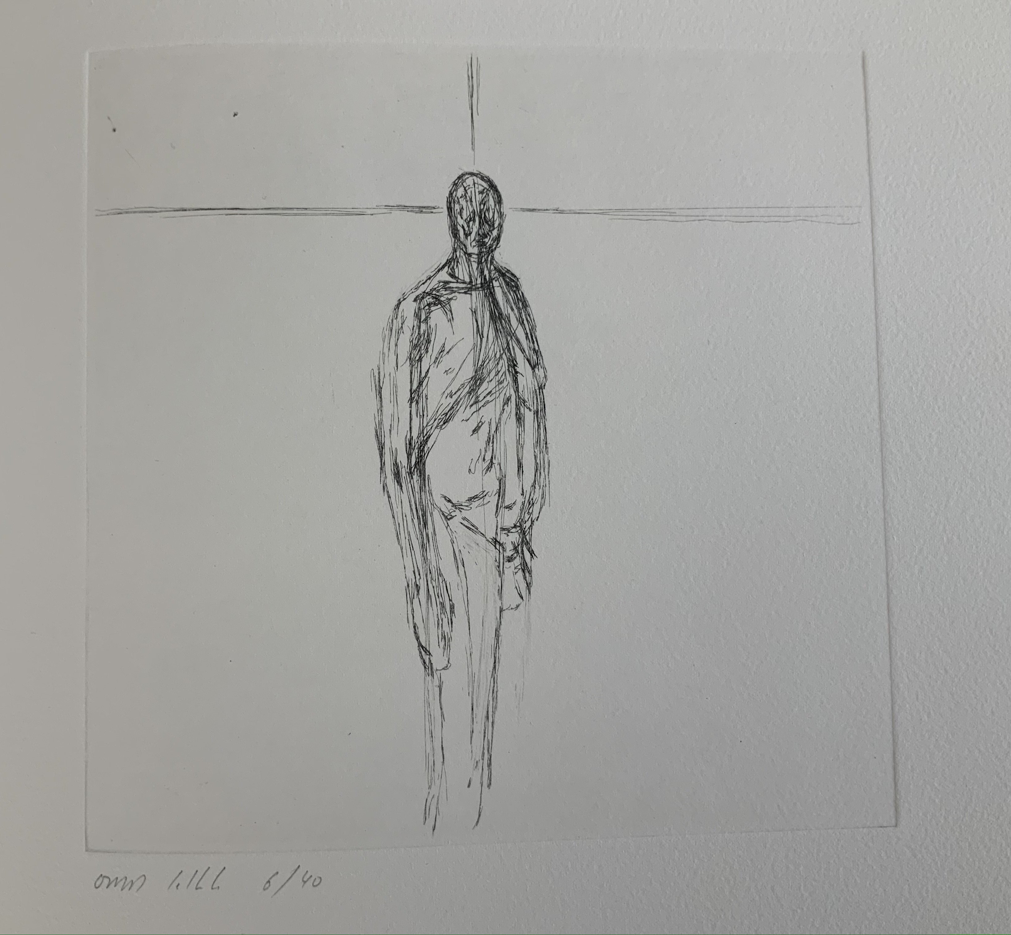
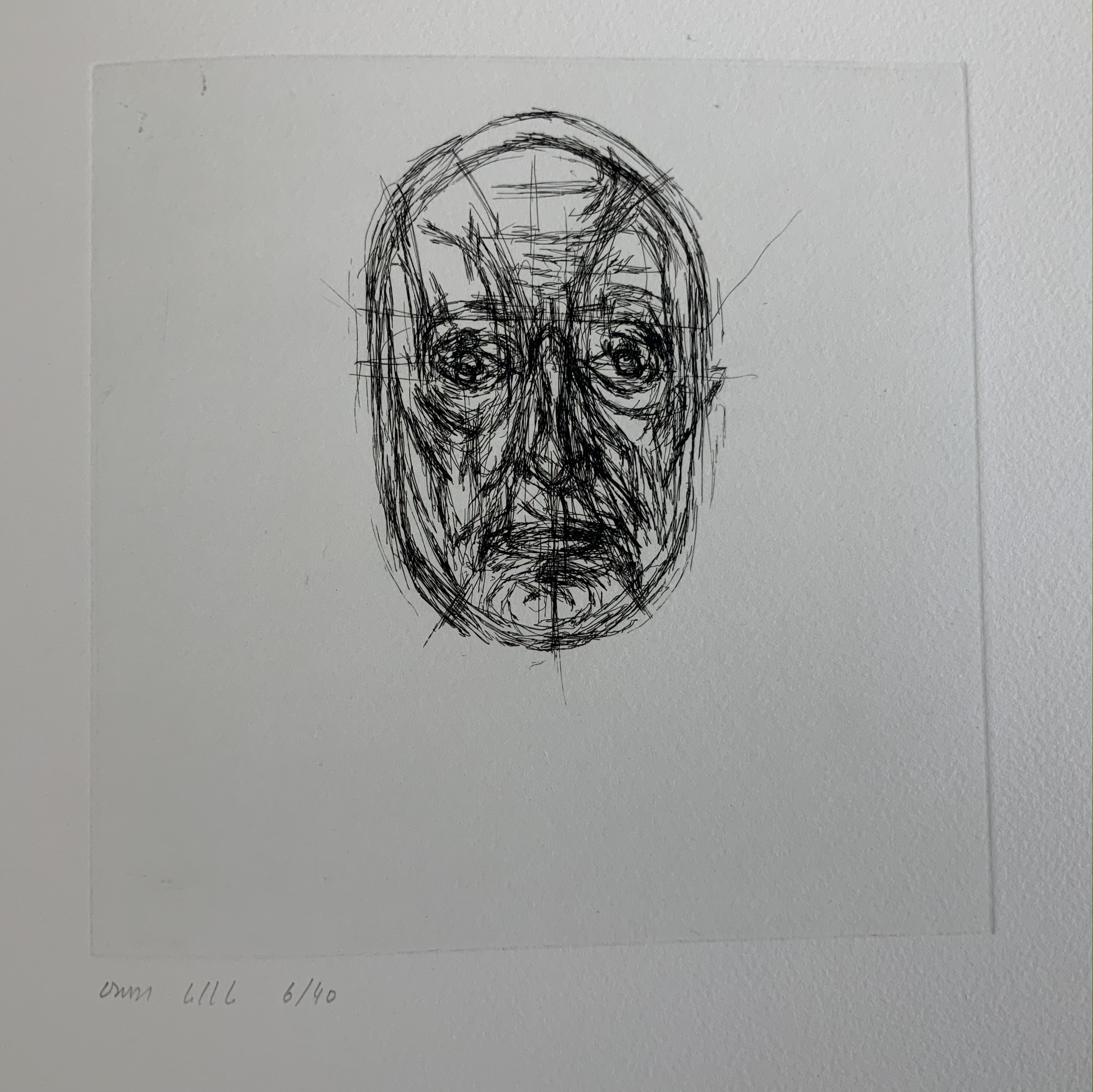
UN COUP DE DÉS JAMAIS N’ABOLIRA LE HASARD (1997) Stéphane Mallarmé Ofer Lellouche (and Uzy Agassi, ed.) Full black leather binding over marine plywood with dice, on a stand. H760 x W560 mm, 28 pages with 9 engravings. Edition of 40, of which this is #6. Acquired from Ido Agassi, 28 February 2022. Photos: Courtesy of Ido Agassi; Books On Books Collection. Displayed with permission of Ido Agassi and the artist.
Ever since his “brick wall” encounter with Un Coup de Dés and its white-on-black, black-on-white aesthetic, Ofer Lellouche has felt its influence on his art — including self-portraiture, the figurative and landscapes.When first approached by the publisher Ido Agassi (Even Hoshen) to create an artist’s book, he considered working from the ground up with a contemporary but that longstanding influence turned him to Mallarmé.
The homage consists of marine plywood covered in black leather, dice embedded in the spine and stand, trim size of H760 x W560 mm, Arches 250gsm printed in 22 pt Times New Roman and 9 etchings by Lellouche. The pages of text replicate those of the then-current Pléiade edition of Mallarmé’s Complete Works. Obviously from the size of the work, the pages have been scaled up. The replication of those pages means that the layout is not precisely as Mallarmé designated in the proofs for the deluxe edition. It also means that page numbers appear, and it accounts for the use of Times New Roman. But there are underlying reasons for the scaling up and replication despite the variance from Mallarmé’s plans.
First, the scale accommodates the size of Lellouche’s largest prints. Tellingly, they require a double-page spread. The use of double-page spreads pays homage to Mallarmé’s elevation of the double-page spread over the single page as a basic structural unit in Un Coup de Dés.
Second, the replication of the Pléiade pages begins a set of interconnected allusions and indirect homage to Mallarmé. Picasso was rumored to have used his copy of Mallarmé’s poems as a sketchbook. By replicating the Pléiade pages for his artist’s book, Lellouche inverts Picasso’s habit, draws Mallarmé’s double-page spreads into his artist’s book rather than drawing on them, and thus pays homage to both LES MAÎTRES. Also, through Picasso as inheritor of Mallarmé’s “invention” of modern art’s conception of space (according to Marcel Broodthaers), Lellouche pays a further indirect homage to the poem. The interconnectedness does not end there.
Considering that the main figure in the poem is LE MAÎTRE (the captain of the shipwreck), the fact that Lellouche’s prints pass from an abstract human figure to self-portraits implies Lellouche’s identification with LE MAÎTRE. When the self-portraits give way to the first full double-page spread (the seventh image, an abstract seascape or image of the abyss to which the poem refers), the shift confirms that self-identification, for LE MAÎTRE likewise seemingly succumbs to l’Abîme. But it is not merely the captain with whom Lellouche is identifying. LE MAÎTRE is the term by which Mallarmé’s contemporaries referred to him. Still it is not so much that Lellouche identifies himself with Mallarmé the poet and social lion as it is that he identifies with the paradoxical and impersonal creative process that lies at the heart of Un Coup de Dés. Indeed, it is through his own process that Lellouche asserts the identification. Beginning with black on white and progressing through aquatints to white on black, the self-portraits allude in an inverted way to Mallarmé’s paradoxical les blancs. The blank white space means as much as what it surrounds on the page, or rather it makes meaning along with the semantic and typographic elements that it surrounds.
Neither the poem nor the prints end with a definitive yielding to the abyss. The poem progresses to UNE CONSTELLATION. In Mallarmé’s case, the constellation comes at the end of the sentence RIEN N’AURA EU LIEU QUE LE LIEU / EXCEPTÉ PEUT-ÊTRE UNE CONSTELLATION (Nothing will have taken place but the place, except perhaps a constellation). In Lellouche’s case, the constellation takes the form of the multiple female figures ranged white on black across the two final double-page spreads. Again, Lellouche mirrors Mallarmé’s semantic and typographic juggling of symmetry and asymmetry across the center line of the double-page spread.
This brief note about this addition to the collection comes nowhere near exhausting Lellouche’s interaction with and interpretation of Un Coup de Dés. The artist’s book is also only one instance. Later etchings not in the collection underline this. By courtesy and with permission of the artist, here are three in which Lellouche pays even more direct homage to Picasso’s act of sketching on the pages of his copy of Mallarmé’s poems and by which he explores his own identification with this poem.
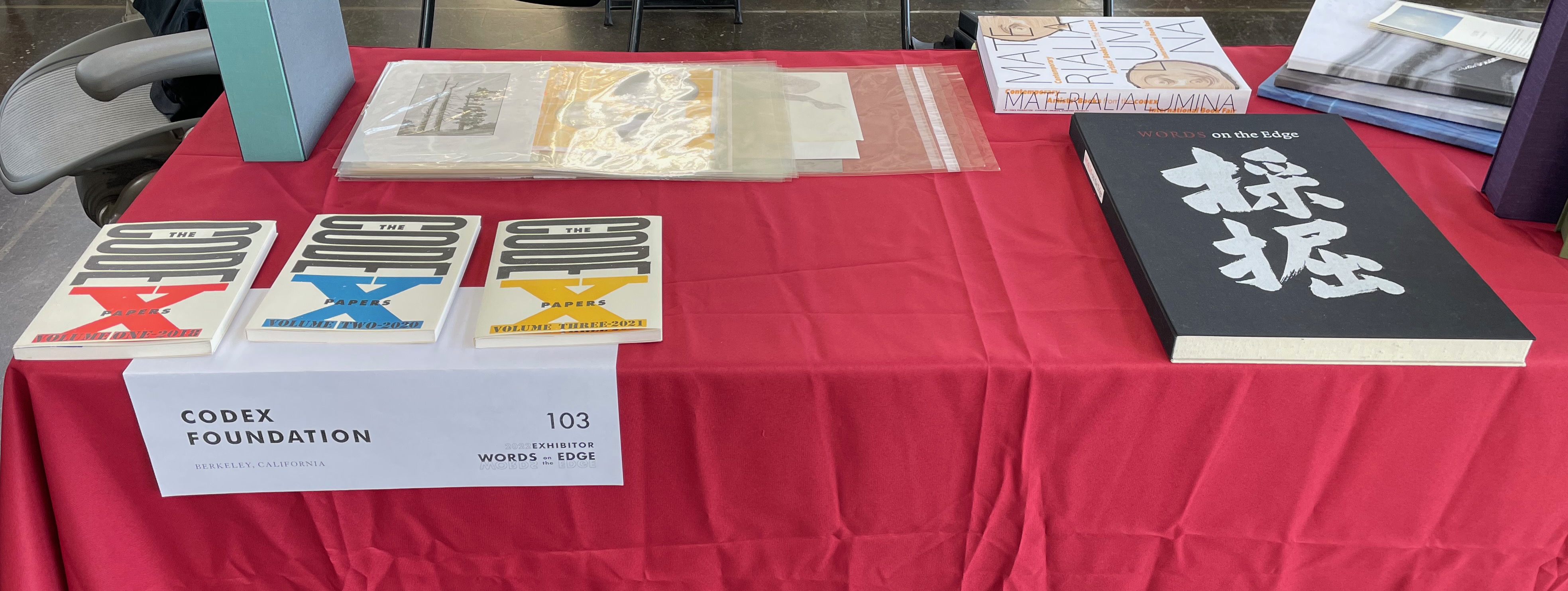
Two renegades from the CODEX talk upstairs at the Graduate (the organizers’ Berkeley hotel of choice) sat themselves down in the lobby and allowed me to eavesdrop.
The first asked the second. “Why are you not upstairs?” To which the second replied, “I got there on time for the talk, but they were running early, and I’d missed half of it, so I just gave up and told the person next to me ‘Excuse me, I have an email’.” The first laughed, “And they bought that?” Before the first could give his excuse, a third renegade showed up. “Uh oh,” said the first, “we were just talking about you; now we’ll have to stop.” The third drew up her mask and told them she was in disguise so they should carry on, admitting she’d skipped the talk upstairs, to which the first commented, “Oh, so that’s why the speaker looked so surprised when he praised your work and then couldn’t spot you in the audience.” The third replied, “I’ll just tell him I was there with you way at the back.” The second piped up, “I’ll confirm that: I saw you in the back row just as I had to step out for an ‘urgent’ email!” The third riposted, “No one will believe that; the organizers know I requested not to have a stand next to yours since you poached the Bancroft buyer away from me at the fair three years ago.” They carried on with this, looking askance in my direction as I joined their laughter. What can you do; some things are infectious no matter the mask or vaccination.
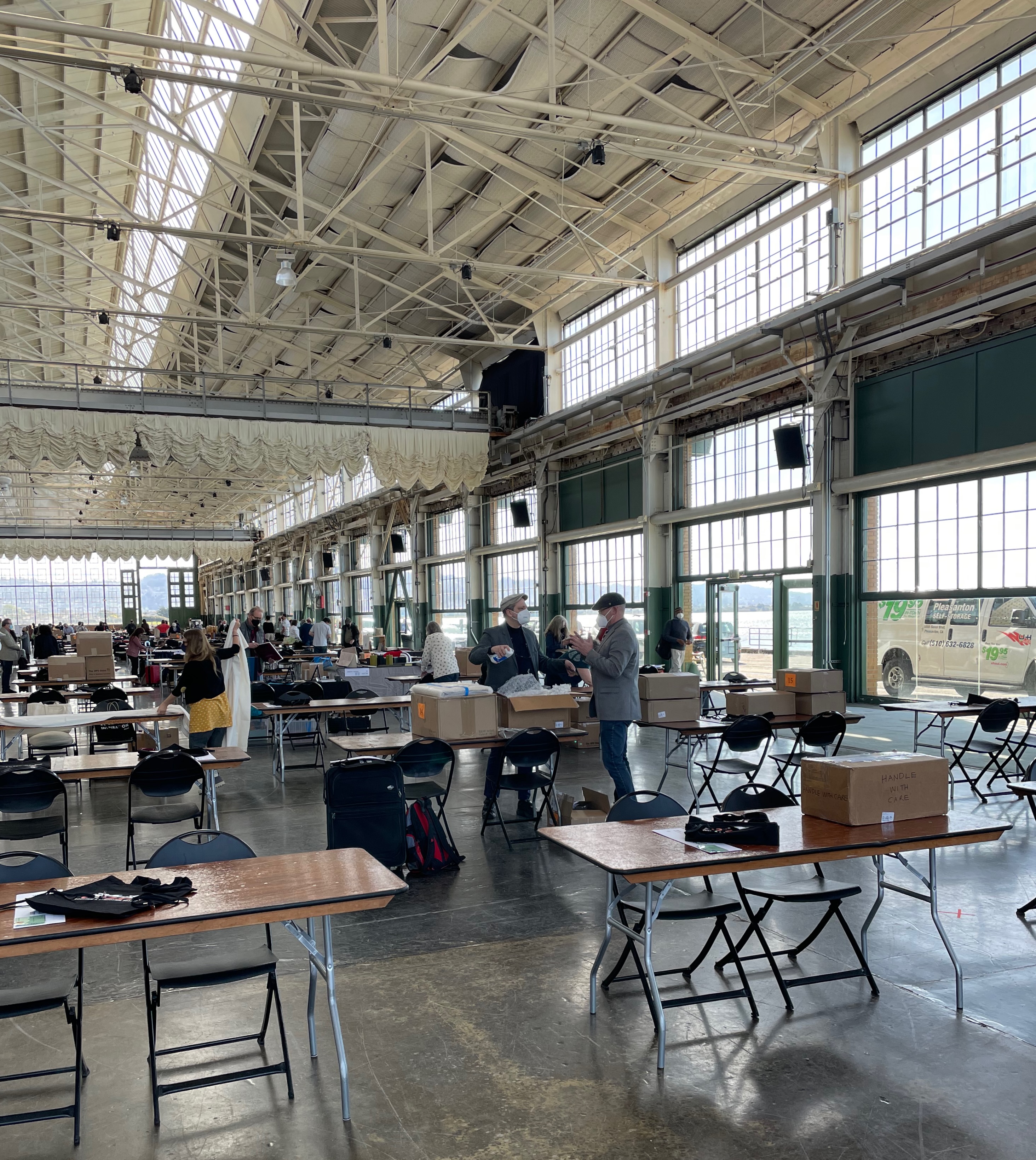
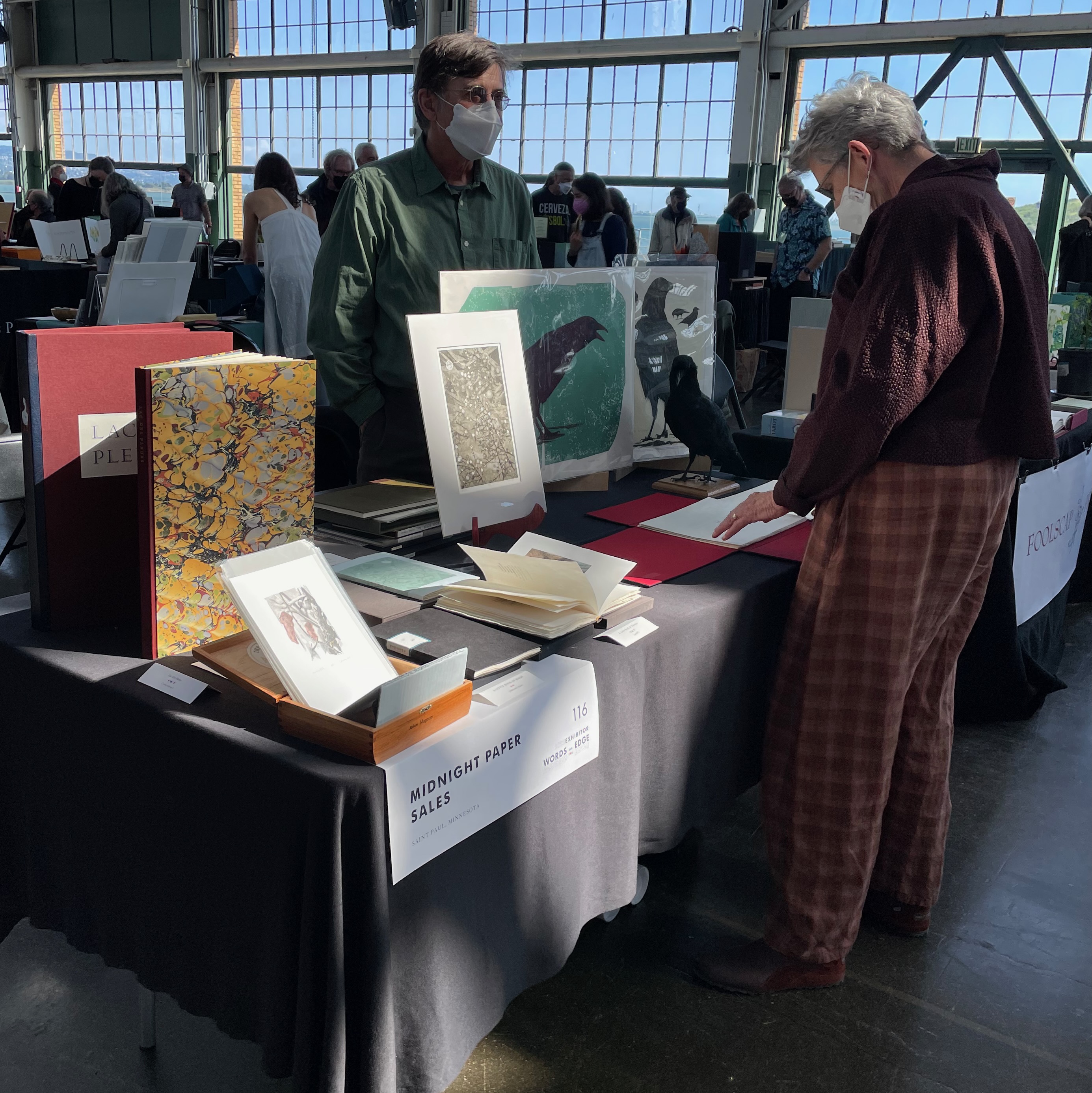
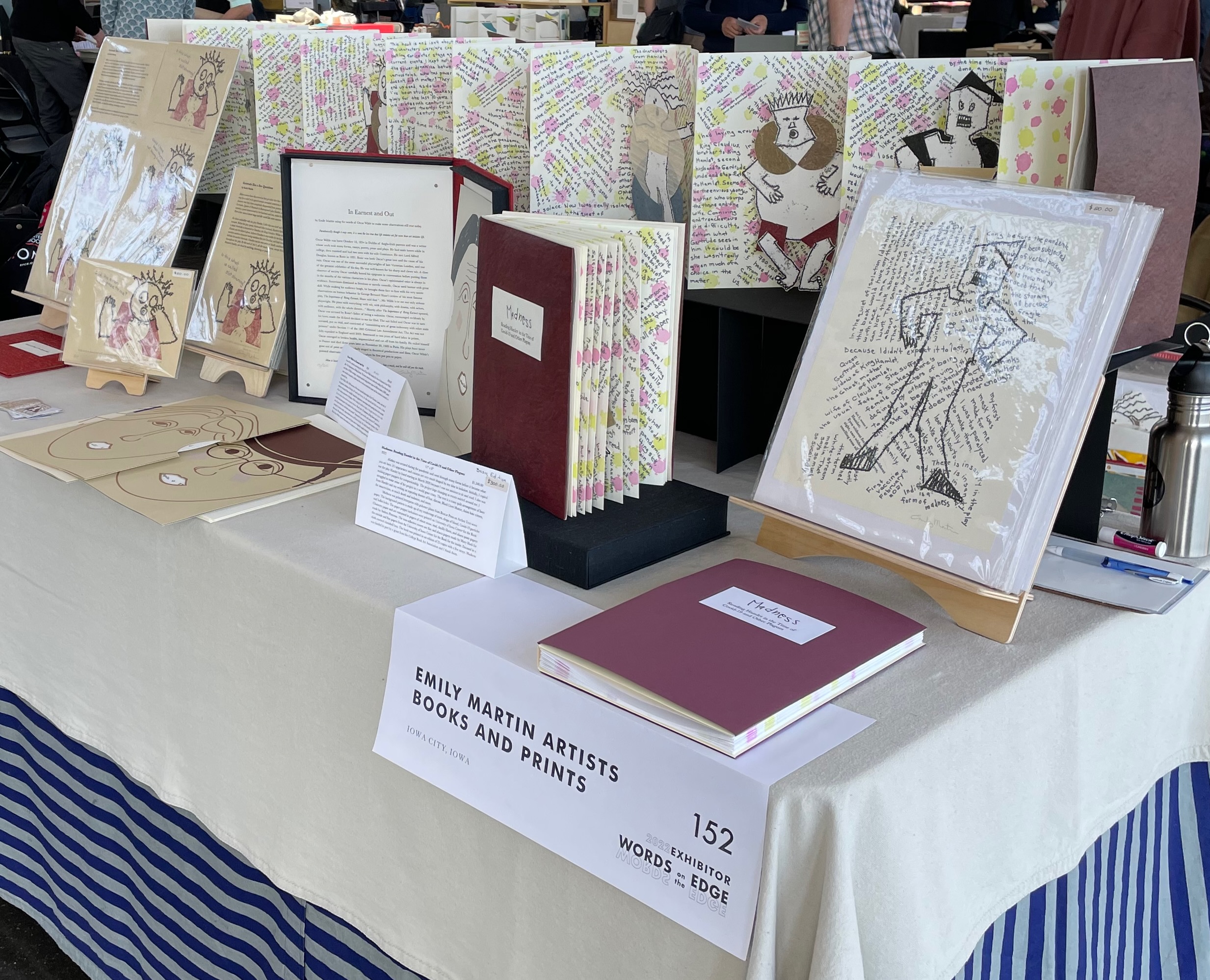
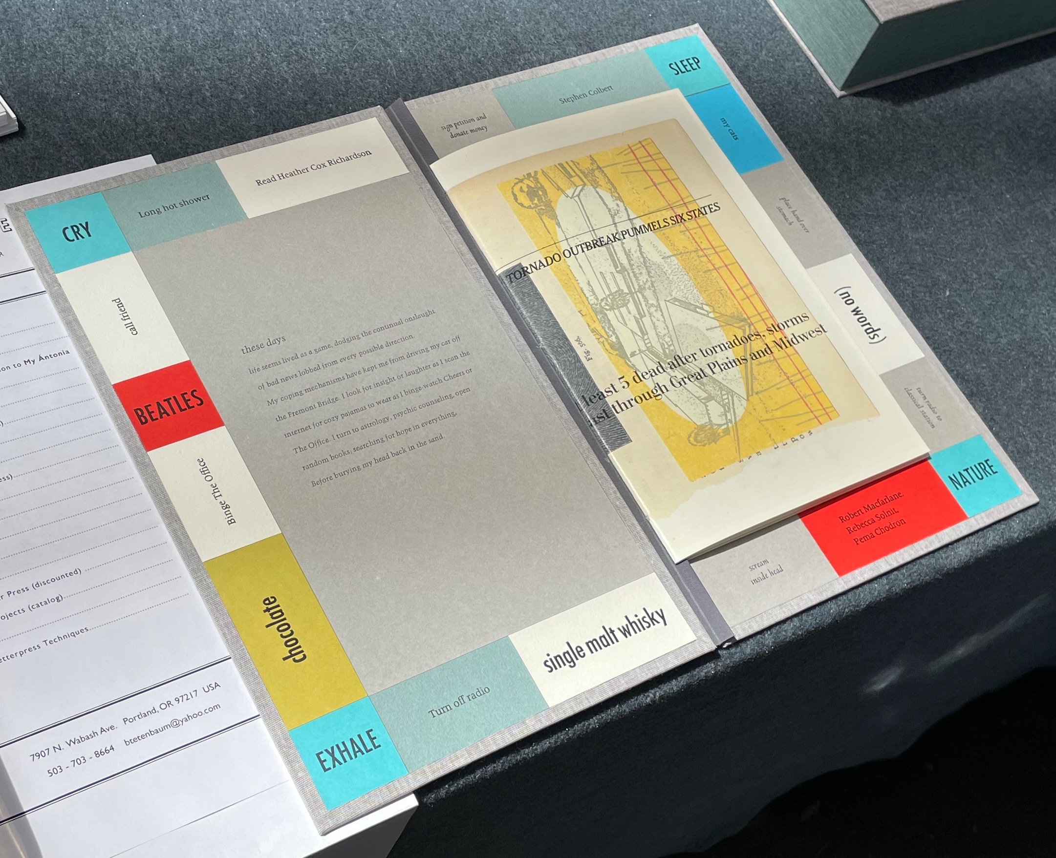
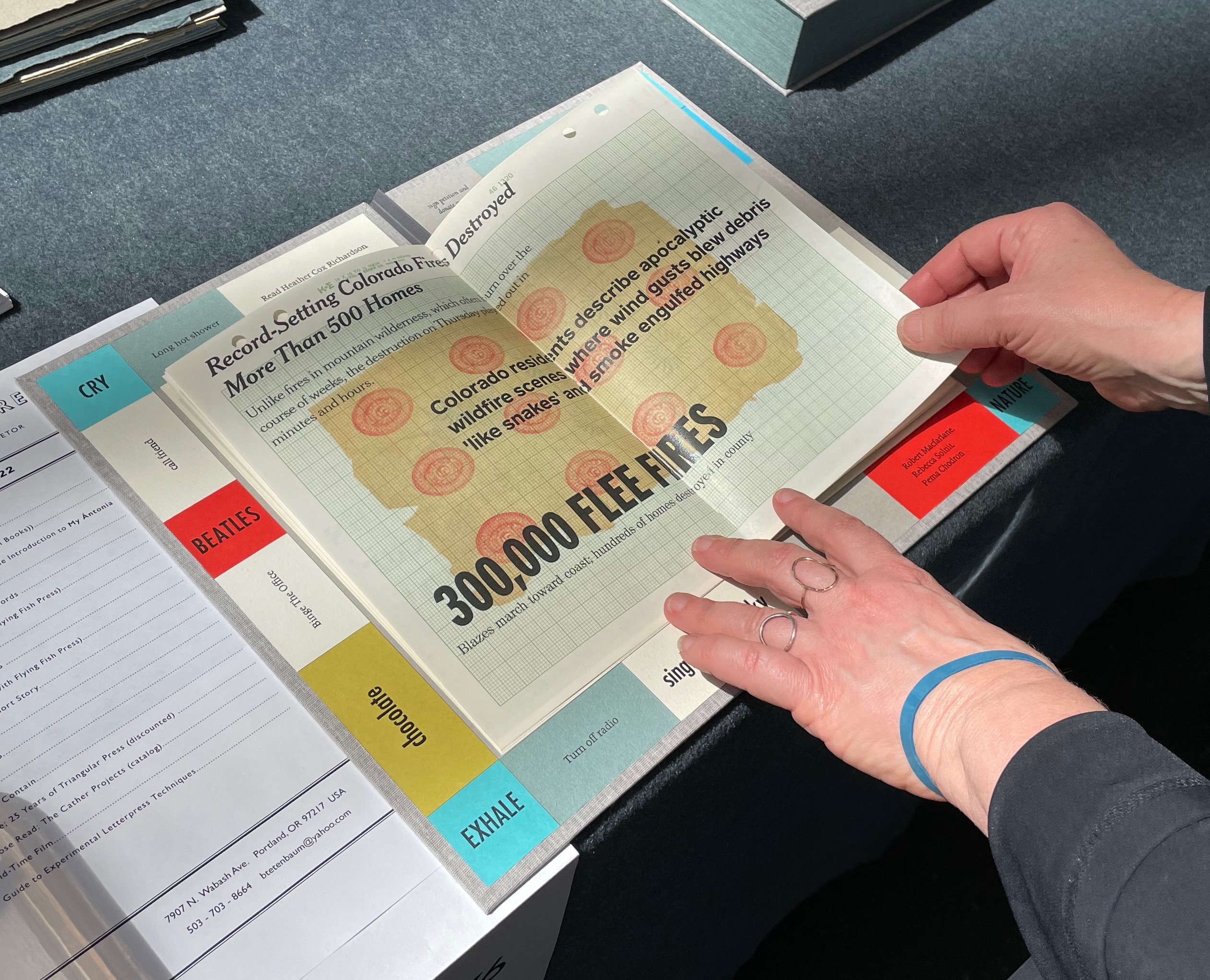
After the long pandemic-driven gap, the pent-up creatures had escaped their studios. The buzz in the cavernous Craneway Pavilion was muted by the carefully observed mask-wearing requirement, but the works shouted in the harbor’s April air blowing in.
Some works shouted about the pandemic and isolation.
The Bedside Book Project is a quintuple homage — Stéphane Mallarmé (1842-1898), Marcel Broodthaers (1924-1976), Odilon Redon (1840-1916), Kurt Schwitters (1887-1948) and Richard Hamilton (1922-2011) — and approaches its subjects in cinematic fashion. It begins with this anecdote:
In 1945 René Magritte gave Marcel Broodthaers a copy of Mallarmé’s poem as ‘a way of explaining his art to a young admirer without explaining it literally’. In 1969, Broodthaers modified an edition of the poem by covering all its words with black stripes that correspond directly to the typographic layout used by Mallarmé to articulate the text. In this way, Mallarmé’s poem, which Broodthaers considered had unconsciously invented modern space, is reduced to its structure.
From here, Marine Hugonnier‘s imagination takes hold. As if in a film scene, she moves into the bedrooms of Redon, Schwitters and Hamilton, steals their copies of Un Coup de Dés from their bedside tables, alters each one by inserting images and then replaces them. The result is a series of installations in which the pages of their altered books are displayed on the gallery walls. Each has its “book title”: La forme du mystère (Odilon Redon), Altération (Kurt Schwitters) and L’espace social (Richard Hamilton). Here is Hugonnier’s description of Redon’s book and the installation performance in which it is presented:
Redon’s bedside book has been stolen and its pages have been folded to extend the space and time of the poem’s interlude bringing his dreams to a deeper sleep. ... The mise-en-scène is composed of a white space with an open window, a spider and a man dressed in a tuxedo who will change a solitary frame, containing a folded page of the poem, on the wall every hour. On the 12th hour, the room will be left empty.
The Bedside Book Project: La forme du mystère (Odilon Redon). Source: Museu d’Art Contemporani de Barcelona, displayed with permission of the artist.
Staging a performance in which the pages of Redon’s bedside book are parceled out over 12 hours is ambitious. As she introduces Schwitters and Hamilton into The Bedside Book Project, Hugonnier creates an even more ambitious immersion for the reader/viewer in different times, spaces and influence. Further temporal instability is involved as well: the pages on Redon’s 19th century bedside table come from a 2006 Gallimard edition of the poem.
Time travelling from Redon’s bedside table to that of Kurt Schwitters, Hugonnier also introduces a bit of temporal and linguistic instability: Schwitters’ bedside copy comes from the Tiber Press edition of Daisy Aldan’s translation into English, published in 1956 eight years after Schwitters’ death. Colored paper cut-outs conceal words, disrupt the gaps of the poem and alter its reading.
With Richard Hamilton, Hugonnier gives him the same edition as Redon — the Gallimard 2006 — and fills its interstices with images as a way to change its reading.
The Bedside Book Project: L’espace social No.2 (Richard Hamilton). Source: Museu d’Art Contemporani de Barcelona, displayed with permission of the artist.
As ghostly film director and actress in the film, Hugonnier wonders how these altered bedside books might have affected the way those three artists perceived art and practiced it in their times. As Hugonnier’s audience, we must surely wonder how she has altered the way we perceive Un Coup de Dés and its influence and very possibly how we perceive time, space and art.
UN COUP DE DÉS JAMAIS N’ABOLIRA LE HASARD: POÈME (1989)
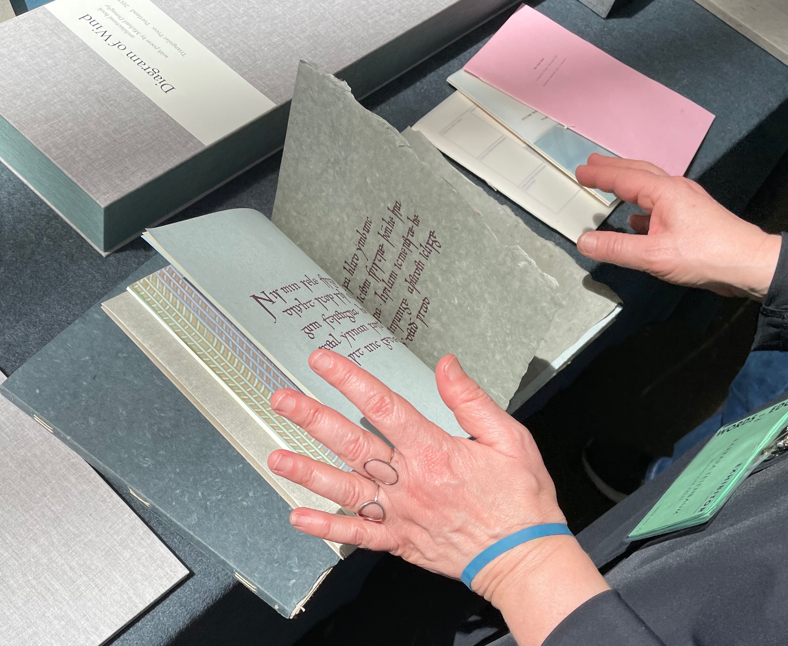
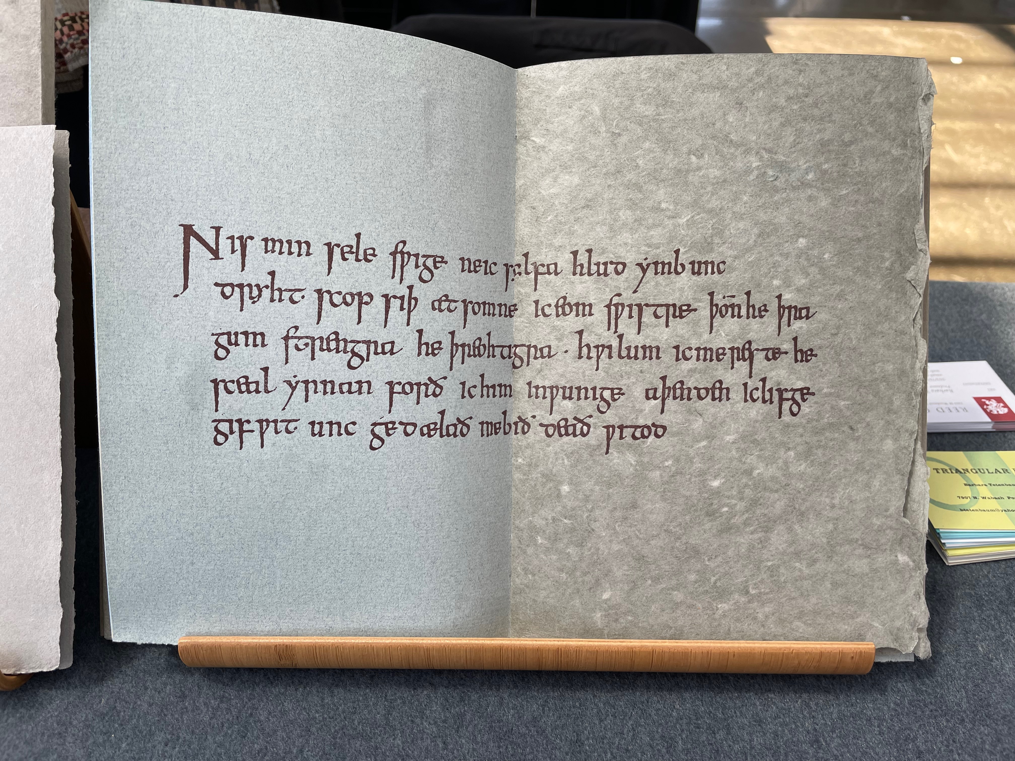
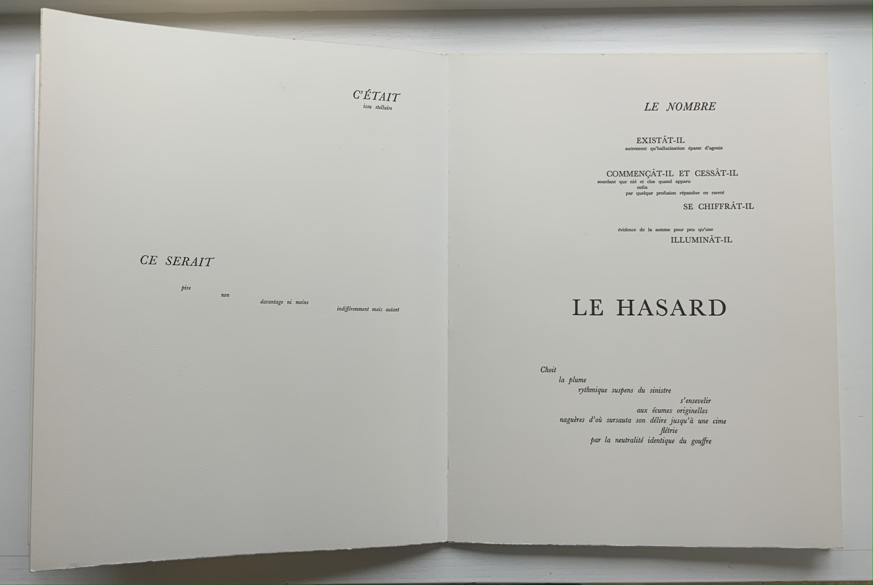
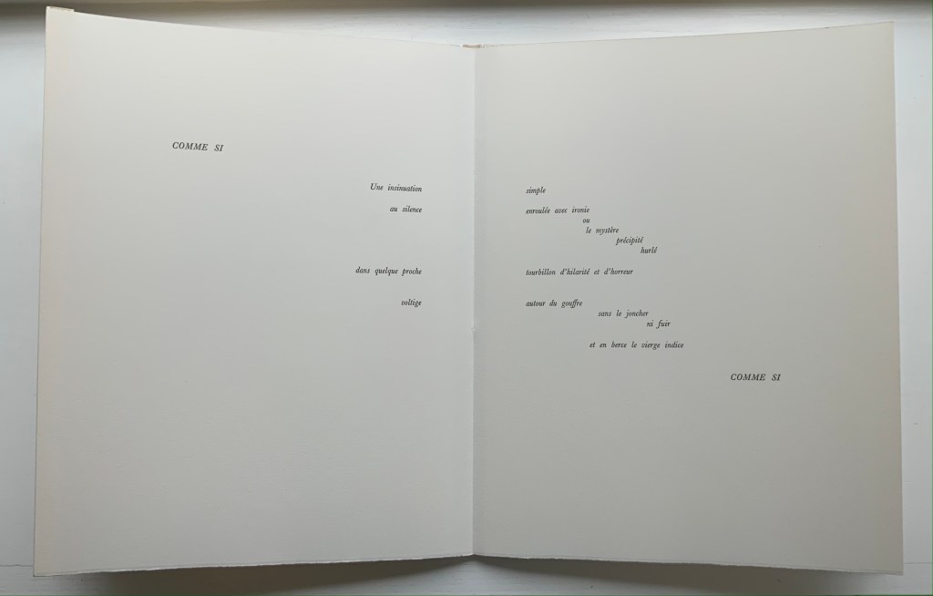
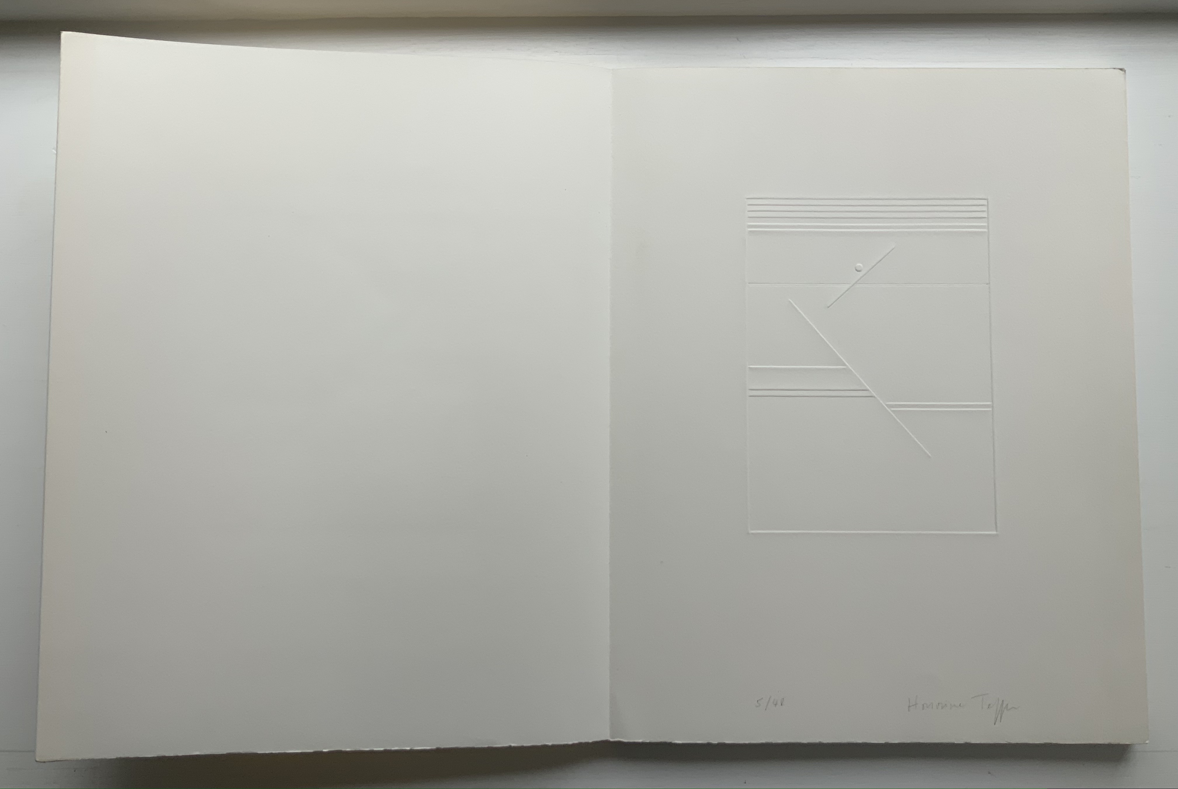
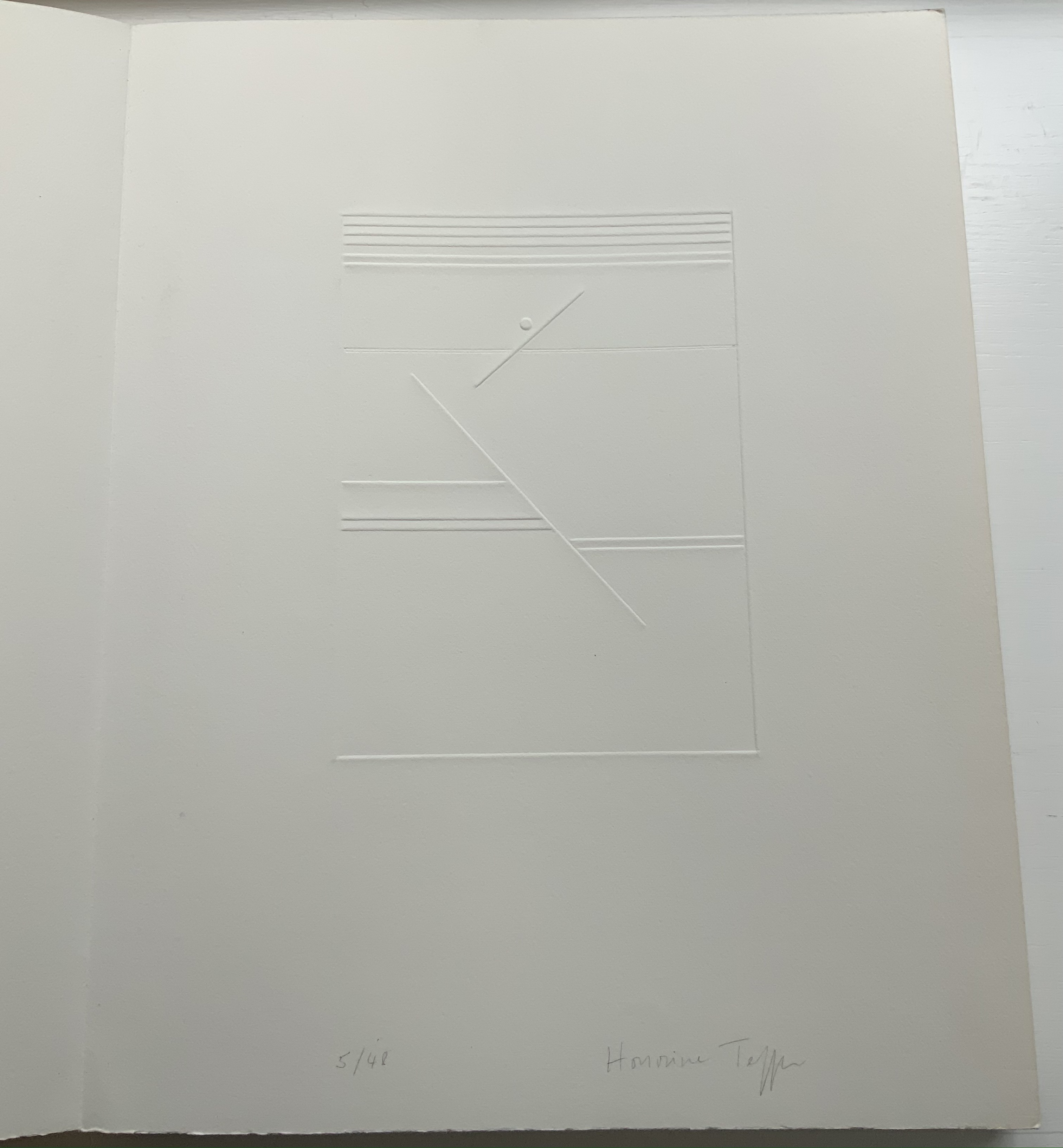
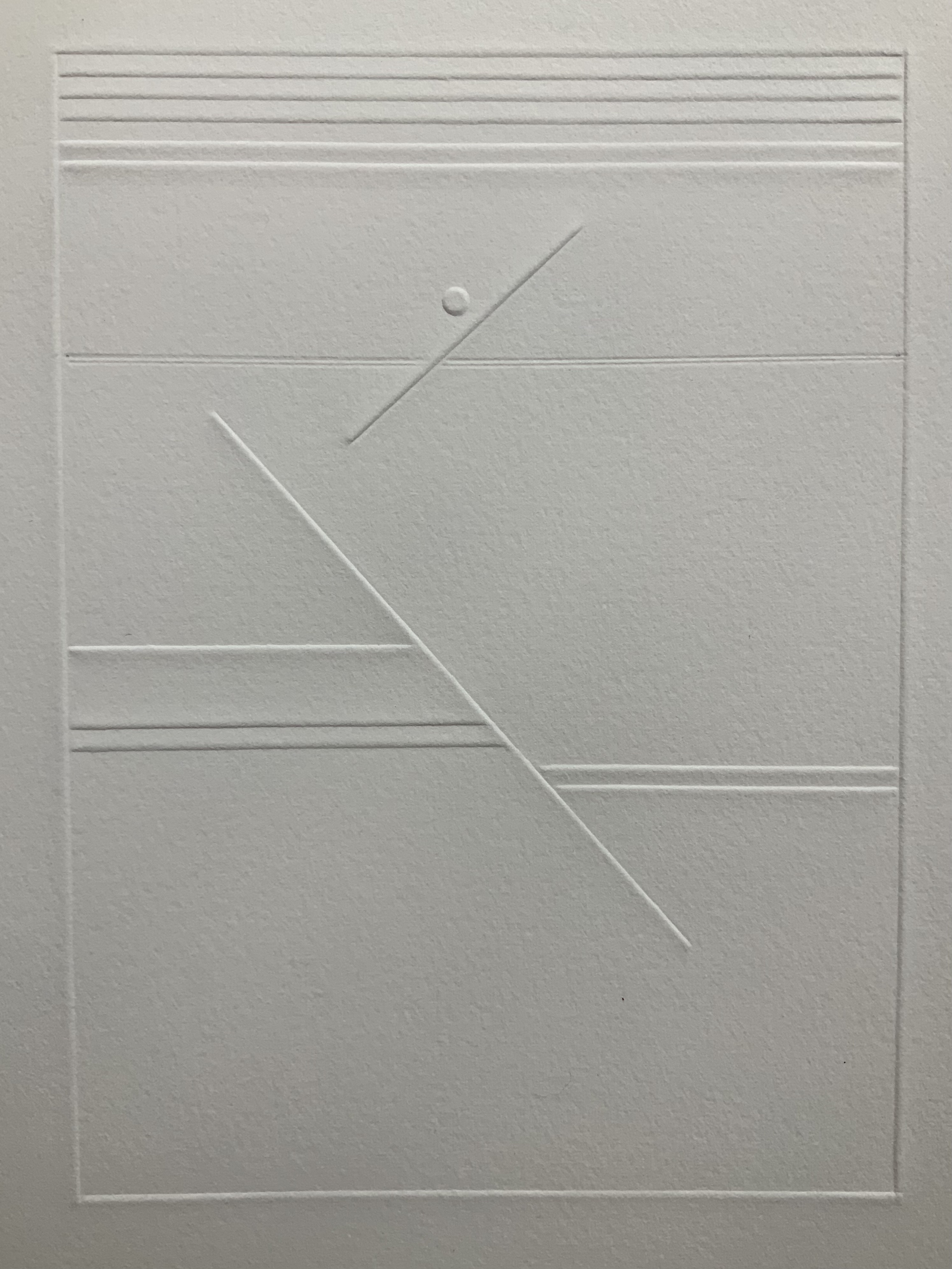
UN COUP DE DÉS JAMAIS N’ABOLIRA LE HASARD: POÈME(1989) Stéphane Mallarmé (text); Honorine Tepfer (art & design) Accordion fold with embossed paper cover. Cover – H325 x W255 mm; Book – H320 x W250 mm, 34 pages. Edition of 48, of which this is #5. Acquired from Studio Montespecchio, 2 February 2022. Photos: Books On Books Collection. Displayed with permission of the artist.
Before his sudden death in 1898, Stéphane Mallarmé was planning a deluxe edition of Un Coup de Dés Jamais N’Abolira le Hasard with Ambroise Vollard, an entrepreneur and publisher. A single-volume version of the poem did not appear until 1914. Issued under the direction of Mallarmé’s son-in-law Dr. Edmond Bonniot through the Nouvelle Revue de France (NRF), it omitted intended prints by Odilon Redon, used the typeface Elzevir rather than the Didot that Mallarmé preferred, and did not precisely follow his layout. We know all this because of correspondence between the poet, Redon and Vollard and because the Sorbonne’s Bibliothèque littéraire Jacques Doucet and Harvard’s Houghton Library hold proofs of the deluxe edition with Mallarmé’s handwritten corrections and instructions.
Mallarmé’s placement of words and lines was intentional and precise. Even before the planning for the deluxe edition, he wrote of what could be achieved with type size and layout:
Pourquoi — un jet de grandeur, de pensée ou d’émoi, considérable, phrase poursuivie, en gros caractère, une ligne par page à emplacement gradué, ne maintiendrait-il le lecteur en haleine, la durée du livre, avec appel à sa puissance d’enthousiasme: autour, menus, des groupes, secondairement d’après leur importance, explicatifs ou dérivés — un semis de fioritures. [Oeuvres Complètes, 2 227]
“Why — couldn’t a considerable burst of greatness of thought or emotion, carried in a sentence in large typeface, gradually placed with one line per page, hold the reader’s bated breath throughout the entire book by appealing to his or her power of enthusiasm: around this [burst], smaller groups of secondary importance, explicating or deriving from the primary phrase — a scattering of flourishes.” [Arnar, 234]
The NRF edition 1914 edition makes quite a few sad missteps as Robert Cohn pointed out in 1967. Tepfer’s inspiration to restore the intended layout follows in the footsteps of Mitsou Ronat & Tibor Papp (1980) and Neil Crawford (1985). She visited the Doucet library to examine the proofs and layout. Following the layout was not difficult, but with the scarcity of Didot, Tepfer needed to select another typeface. She chose Baskerville. Given that Firmin Didot was inspired by John Baskerville’s experimentation with thick and thin strokes, the choice adds historical interest, although Bodoni might have been nearer the mark. Below are Tepfer’s double-page spreads across which Mallarmé’s burst of thought appears one line per page among the “scattering of flourishes”.
The book’s central double-page spread, beginning with COMME SI / “AS IF”) in the upper left and ending with COMME SI / “AS IF” in the lower right, mimics the throw and fall of the dice and provides another example of the semantic and typographic play that Mallarmé describes above.
Like the artists before her — Redon (1897), André Masson (1961), Mario Diacono (1968), Marcel Broodthaers (1969), Jean Lecoultre (1975), Ian Wallace (1979) and Ian Tyson (1985) — Tepfer had to solve the puzzle of relating image to text. This is the difficult path of inverse ekphrasis: what and how the visual, tactile and conceptual works of art that come after Mallarmé’s text can be. We are more used to ekphrasis where the object, painting or sculpture comes before the text — like Achilles’ shield before Homer’s description, or the Grecian urn before Keats’ ode, or Brueghel’s Fall of Icarus before Auden’s Musée des Beaux Arts. Homer, Keats and Auden vie with the art of the crafted object to put that object (and more) in front of us with words. With the inverse, the crafted objects vie without the words to put Mallarmé’s poem (and more — and sometimes less!) in front of us. Tepfer’s solution?
A simple line runs across the debossed front and back covers. As Tepfer wrote in June 1990 about her journey into Un Coup de Dés: La ligne d’horizon était un sujet de ma hantise / “The horizon line was my obsession”. As the folded paper cover opens, a single geometric, abstract image appears — debossed and embossed on blank paper. Except for a single round dot, everything is linear. Two separate lines angle across the space. One cuts through the debossed horizon line that lies beneath a series of closely spaced horizontal lines — suggesting clouds? The other, longer one cuts at a different angle, creating a foreground from two sets of parallel lines that have slipped or shifted like tectonic plates. Could the round dot be the single-dot side of a die rolling down a slanted deck or broken mast? Could the longer slanted line be a broken mast? Could the shifted parallel lines be a broken handrail?
Rather than trying to track back to verbal images in the poem, though, perhaps we should recognize Tepfer’s prefatory image as a kind of substitute for Mallarmé’s preface in 1897 — the one he preferred we not read. He wanted us to look. To see les blancs. To hold thought and emotion like our breath across the space of the book. With her simple rectangle of blank paper, with the absence of ink, with the geometric solidity of the horizontal and slanting lines, and with the velvet softness of the velin d’Arches across her version’s accordion folds, Tepfer encourages us to look, see, hold meaning in abeyance and sense it.