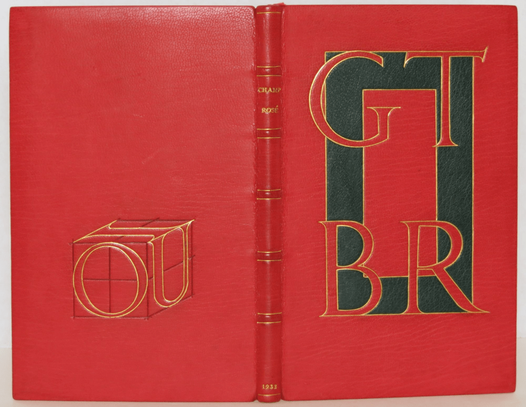
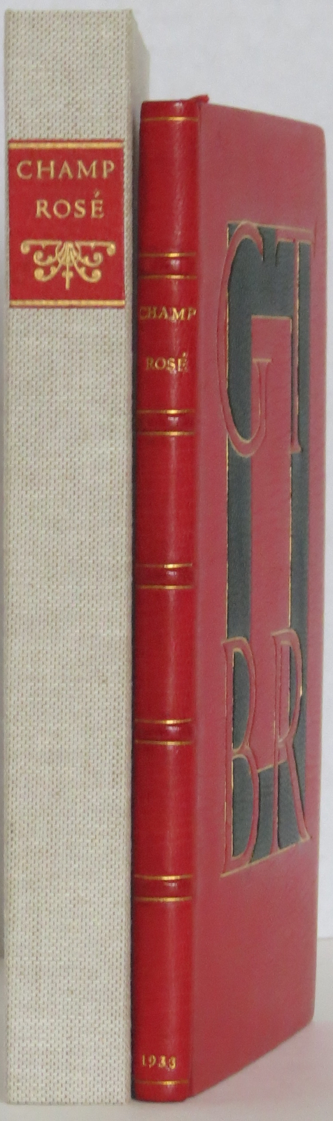
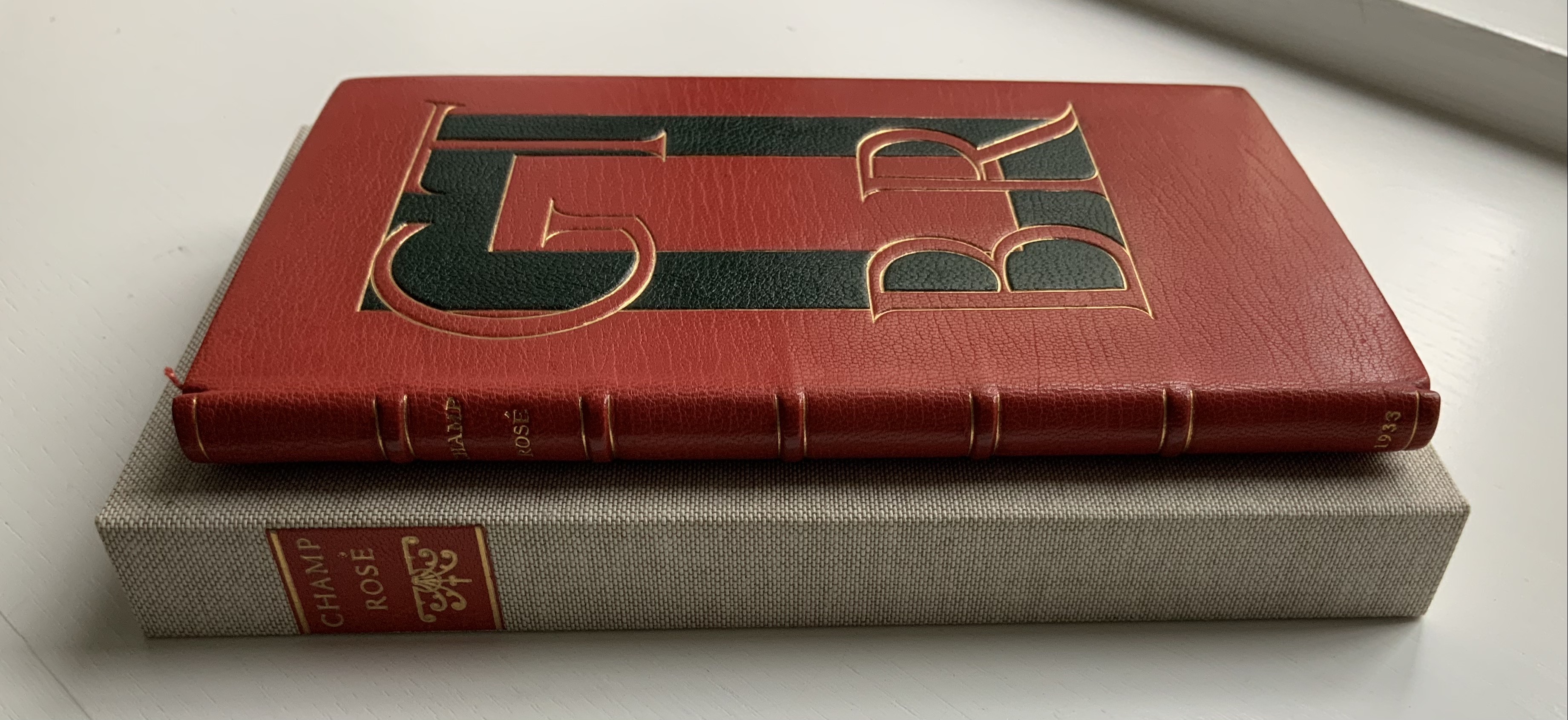
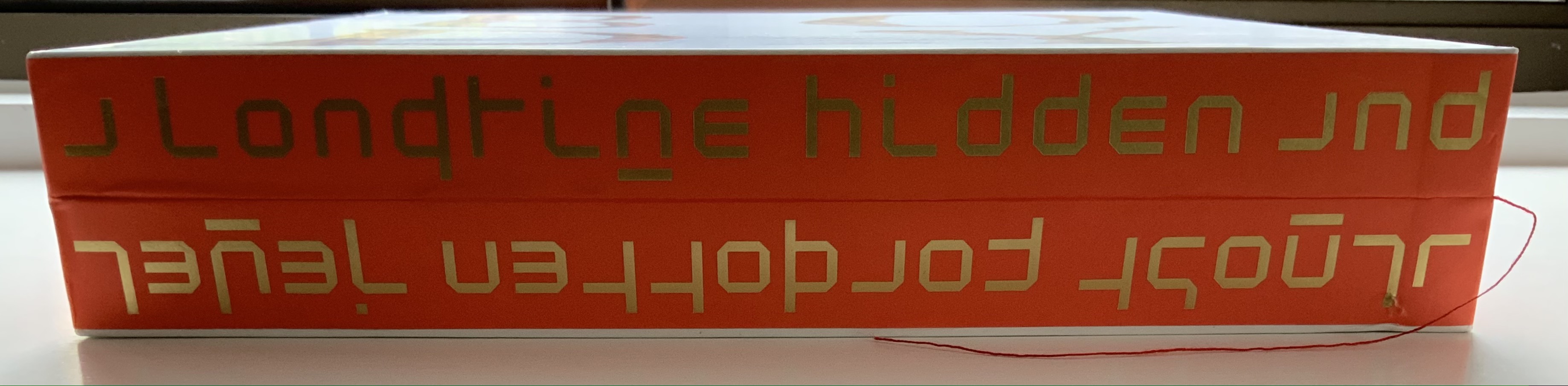
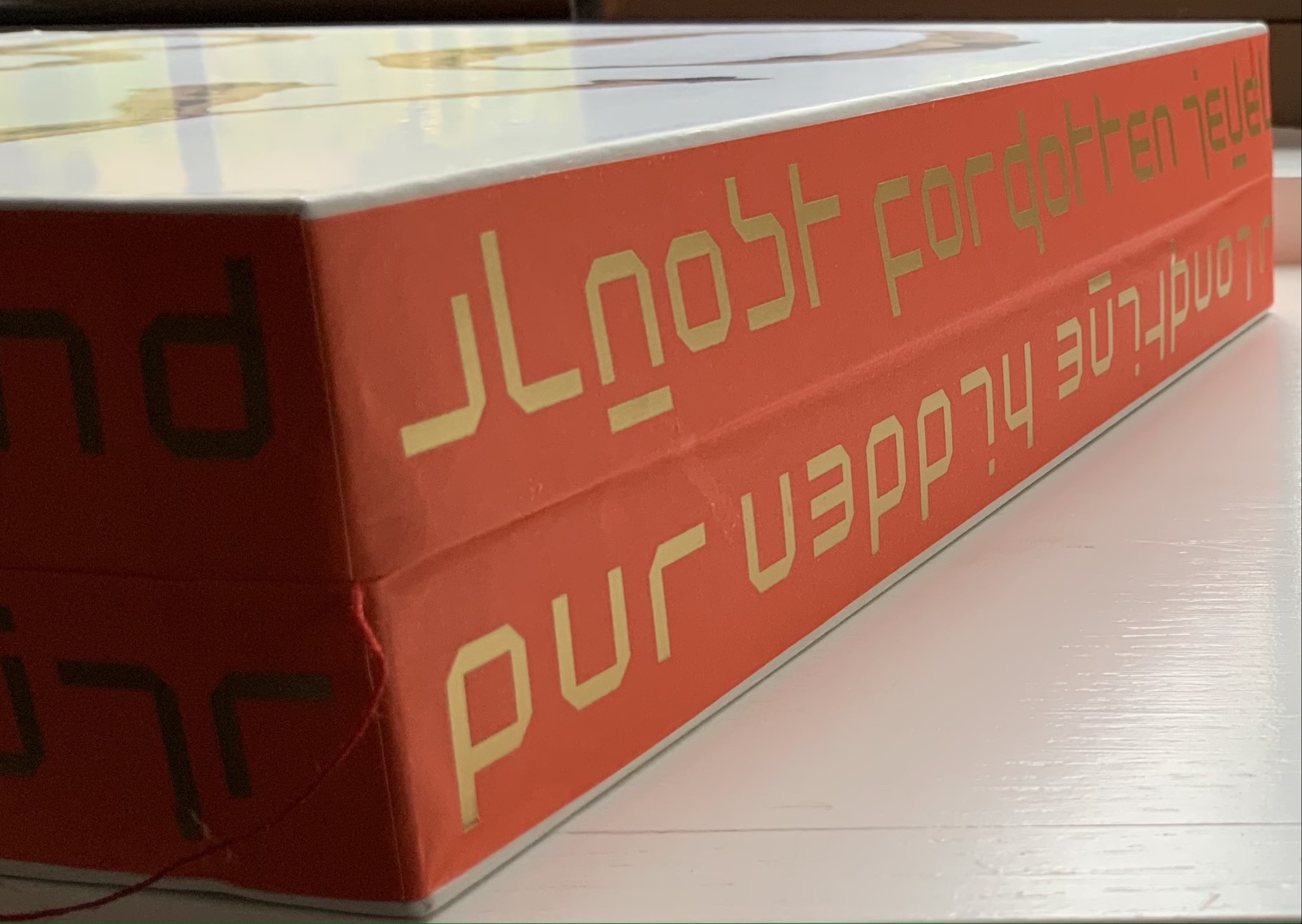
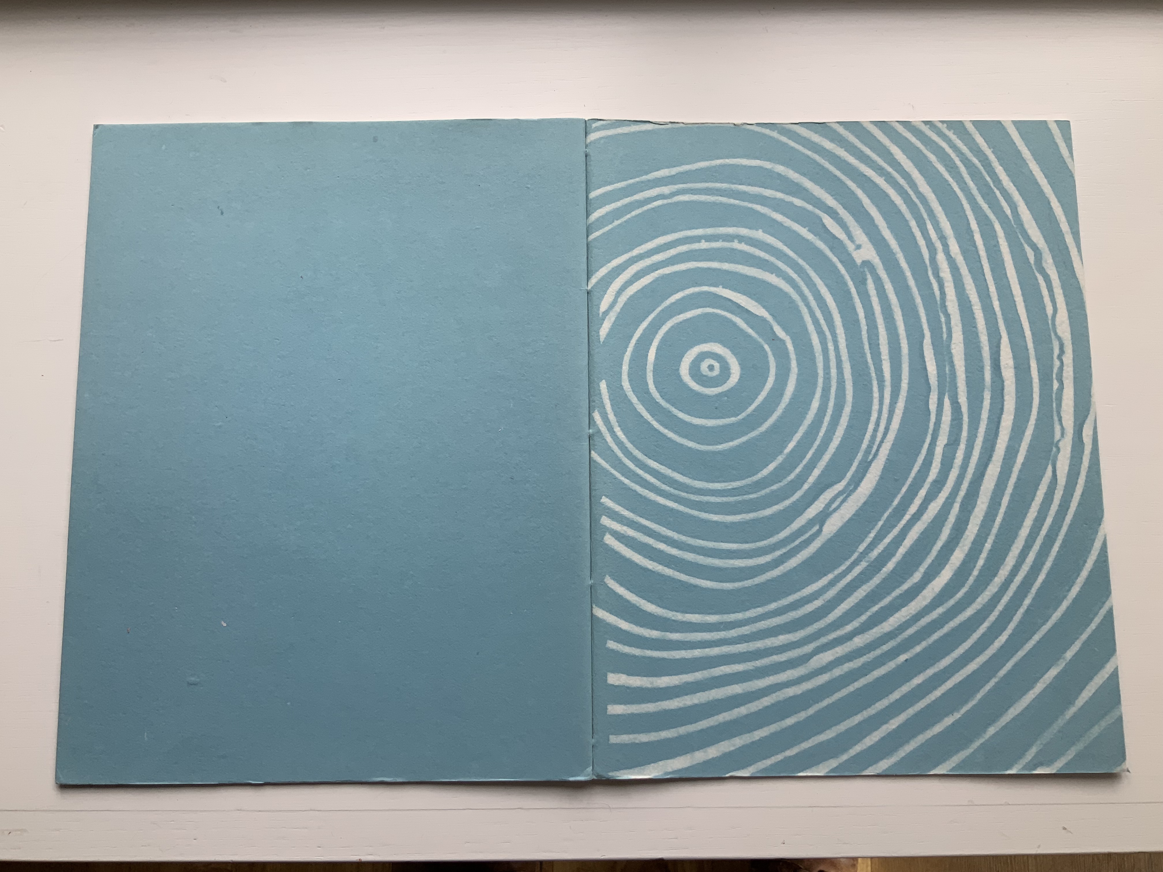
Rogers constructed the IOU device in a joking Depression-era homage to Tory. Referencing the mythological tale about Jupiter, Juno and poor IO who was turned into a cow, Tory maintained in Champ Fleury that all the Roman letters were fashioned from the “I” and the “O.” By placing Roger’s IOU on the back cover, binder Peter Geraty doubles Rogers’ pun on the debt to Tory’s “letterology”. Both Geraty and Rogers are acknowledging a debt to Tory as a book designer.
Adding to his joke, Rogers printed the whole of Champ Rosé in red, which Geraty follows. Rogers explained the red ink in his poor man’s Champ Fleury “as in these aforesaid days of hardship & depression much Book-Keeping is being written down in red…perhaps it would be better for Book-Selling too if Printing were done in that cheerful colour.…”
Geraty’s binding was part of the 1989 Guild of Book Workers exhibition.
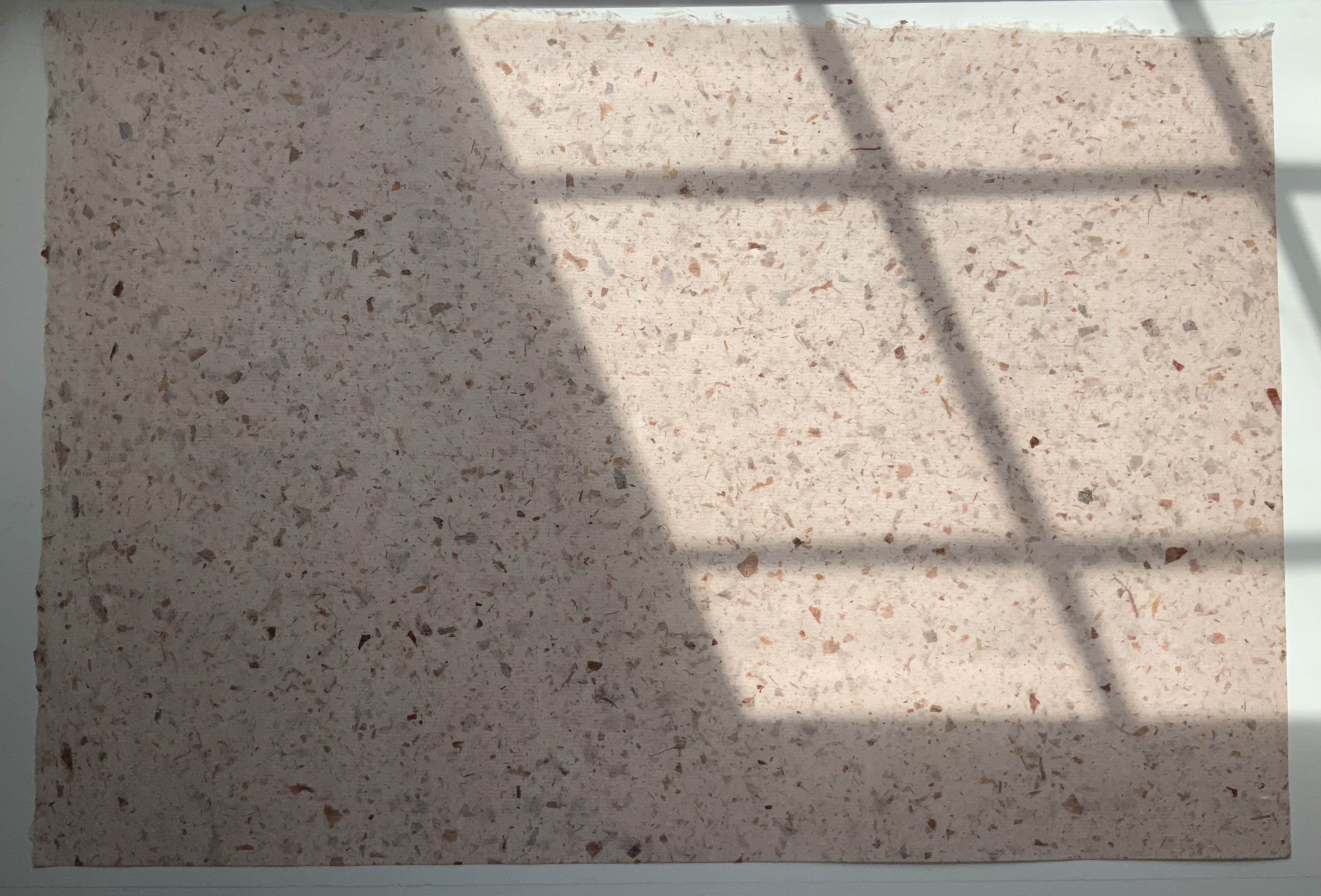
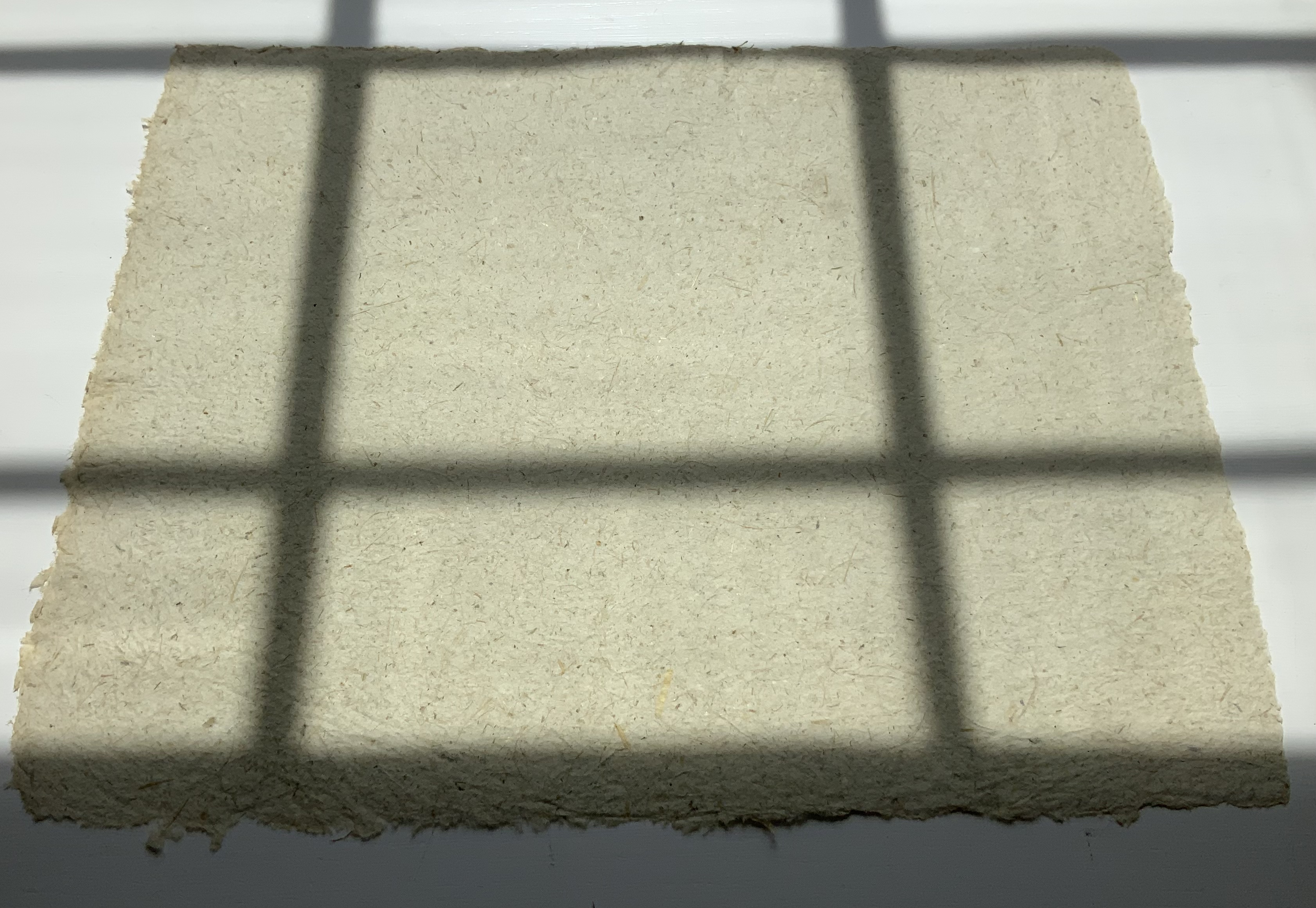
Photos: The Veatchs.
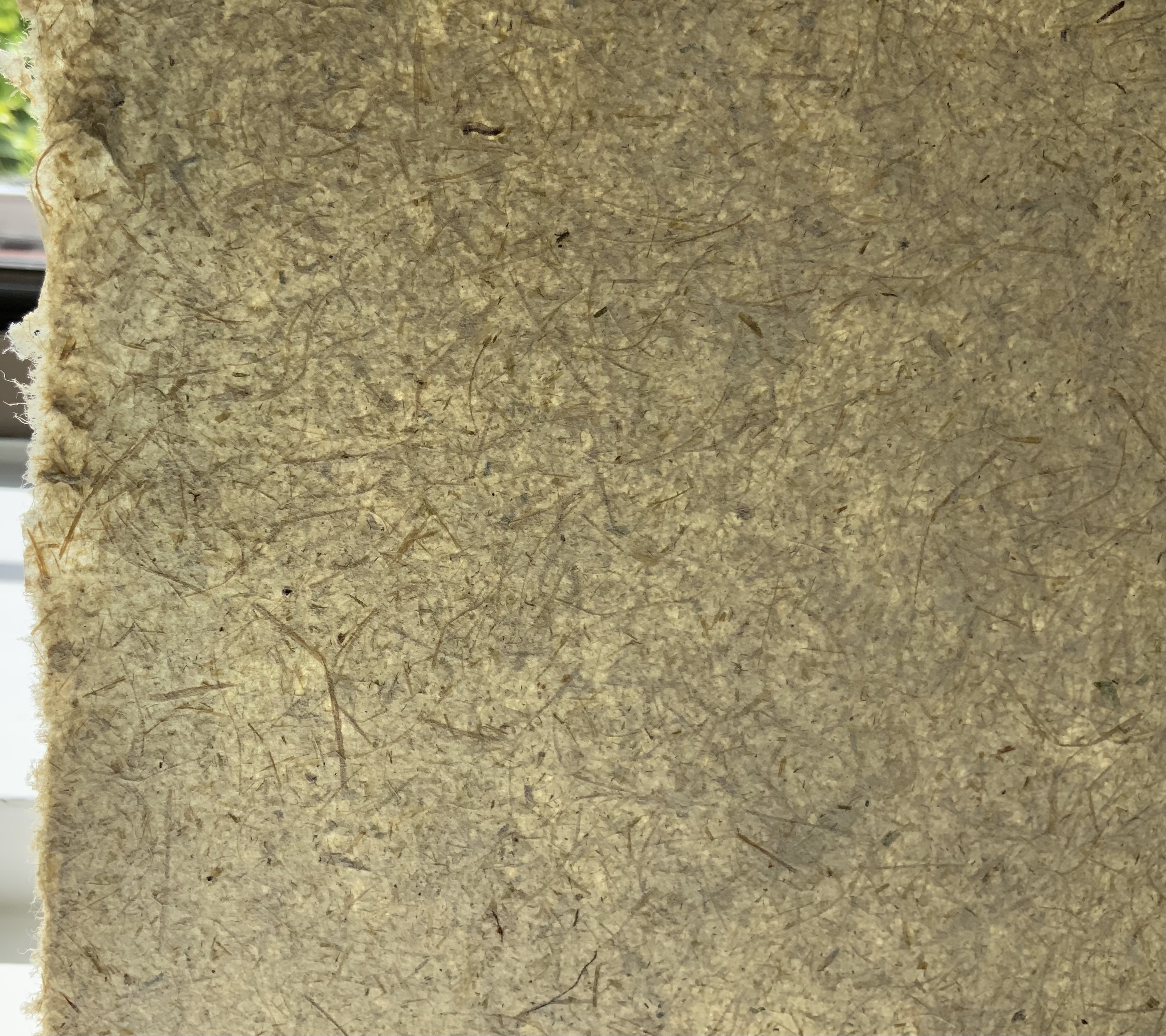
Photos: Books On Books Collection.
The Books On Books Collection also holds a copy of George B. Ives translation of Champ Fleury, designed, typeset at printed by Rogers.
The art of the alphabet seems to be a rite of passage for graphic artists. Perhaps it is that art and the alphabet find common ground in the urge to make sense of the world. Perhaps it’s that the alphabet’s invention, development and artistic treatment present a rich tradition for artists to follow or challenge. Perhaps it’s that letterforms and the alphabet offer raw material, subject and organizing principle all in one. Semic or asemic. Calligraphic, typographic or even plastic. Representational or abstract. All are options. But most often, something bookish results. From Islam Aly’s 28 Letters(2013) to Ludwig Zeller’s Alphacollage (1979), a significant part of the Books On Books Collection is taken up with artists’ books based on the ABCs and letterforms. The Collection’s two facsimiles of Geofroy Tory’s Champ Fleury provide a useful historical backdrop that throws into relief several of the Collection’s works and their performance of this rite of passage.
It should be no surprise that Geofroy Tory de Bourges (c.1480-1533) serves up such an exemplar. In her Playful Letters, Erika Boeckler writes
An accomplished designer, typographer, printer, poet, author, translator, calligrapher, illustrator, woodcutter, and engraver, he received his education in Italy and ultimately settled in Paris, setting up a bookstore, writing his own works, running a press, and collaborating with or working for Simone de Colines, director of one of the most influential and experimental fine publishing houses of the time. Personally writing the text, designing the woodcuts, and cutting some of them, organizing the layout, perhaps even setting the type, Tory created Champ Fleury as what we might call today an artist’s book. (p. 29)
Tory straddles the letters of the late Middle Ages and Renaissance. Appointed by François I in 1530 as his printer, Tory operated on the Petit Pont under the sign of le Pot cassé (“the broken pot”) and was known for his workshop’s handwritten Book of Hours (1524). Rooted in the horae tradition reaching back to the 13th century, Tory’s Book of Hours is an early-to-mid-Renaissance version of its predecessors. As beautiful as his Book of Hours is, Champ Fleury (1529) became his best known work. Authored and designed by Tory, it was produced by hand typesetting and letterpress printing in Paris with Giles Gourmont. Printed less than 100 years after Gutenberg’s innovation, Champ Fleury represents the printed book toddling out of its incunabula period.
Book of Hours Geofroy Tory (1524) Bound in the 18th century, 113 leaves of vellum. Lessing J. Rosenwald Collection (Library of Congress). Accessed 30 May 2021.
According to Jeremy Norman’sHistory of Informationsite, the first separate printed title page appeared in 1463. Subject indices date back to the 13th century, originating at the University of Paris, and the first printed indices, to 1470. Champ Fleury‘s front matter boasts a title page, two prefaces to the reader, a statement of the King’s Privilege awarded for the book for ten years (a forerunner to the copyright page), a name index without location references and a subject index with folio references. Champ Fleury’s back matter consists of a colophon preceded by a lengthy appendix illustrating various forms of the alphabet (Hebrew, Greek, Latin, etc.).
Tory’s placement of the indices in the front matter rather than the back matter reflects the gradual development of the anatomy of the book towards the structure that would ultimately be codified in reference works like the Chicago Manual of Style. Paratextual elements like the title page, table of contents, page numbers, etc., did not spring up overnight. If, as Eric Havelock and others assert, society, the arts and culture are a superstructure erected on the foundation of the alphabet (see below), Champ Fleury and its “letterology” make for a particularly fitting exemplar of the book as an element of the superstructure arising from the alphabet.
Perhaps book artists sense this, which again leads to that alphabet art rite of passage and the elaborate variations on it. The illustration of various forms of the alphabet in the appendix also draws on another developing tradition: the typesetter/printer’s sample book advertising the firm’s fonts. Abecedaries and artist books have sprung from that tradition, too.
Tory was not the first to propose an art and science behind the letterforms of the alphabet. Predating his efforts were Giovanninno de’ Grassi (1390-1405), Felice Feliciano (1463), the Anonymous Chicagoensis and Anonymous Monachensis (1468?), Damianus Moyllus (1480), Fra Luca Pacioli (1509), Sigismondo Fanti (1514), Francesco Torniello (1517), Ludovico Arrighi (1522), Albrecht Dürer (1525) and Giovanni Battista Verini (1527). Leading up to Champ Fleury, these earlier efforts track the development of humanism. Arguably, Tory’s effort is a capstone, combining myth, allegory, metaphysics, geometry, linguistics, calligraphy, typography and cryptography.
Book One, concerned with the mythical origins of the French language, also addresses the fabled origins of the alphabet: the story of Jove, Io and Mercury behind the letters I and O and their claim to being the first letters and also the tale of Apollo’s accidental murder of Hyacinth explaining the letters A and Y and their similar claim. Two works in the Collection built on alphabet origin stories are Francisca Prieto’s Printed Matter series (2002-2008) William Joyce’s The Numberlys (2014), but many more follow in Champ Fleury’s art and science footsteps.
Tory’s late medieval/early Renaissance perspective gives way to 20th and 21st century poetics and phenomenology in most works of the Collection. Aaron Cohick’s The New Manifesto of the NewLights Press (third iteration) (2017) offers a good example. Another — closer to Tory’s moral and geometric perspective but of a more modern spirituality — is Jeffrey Morin and Steven Ferlauto’s Sacred Space (2003).
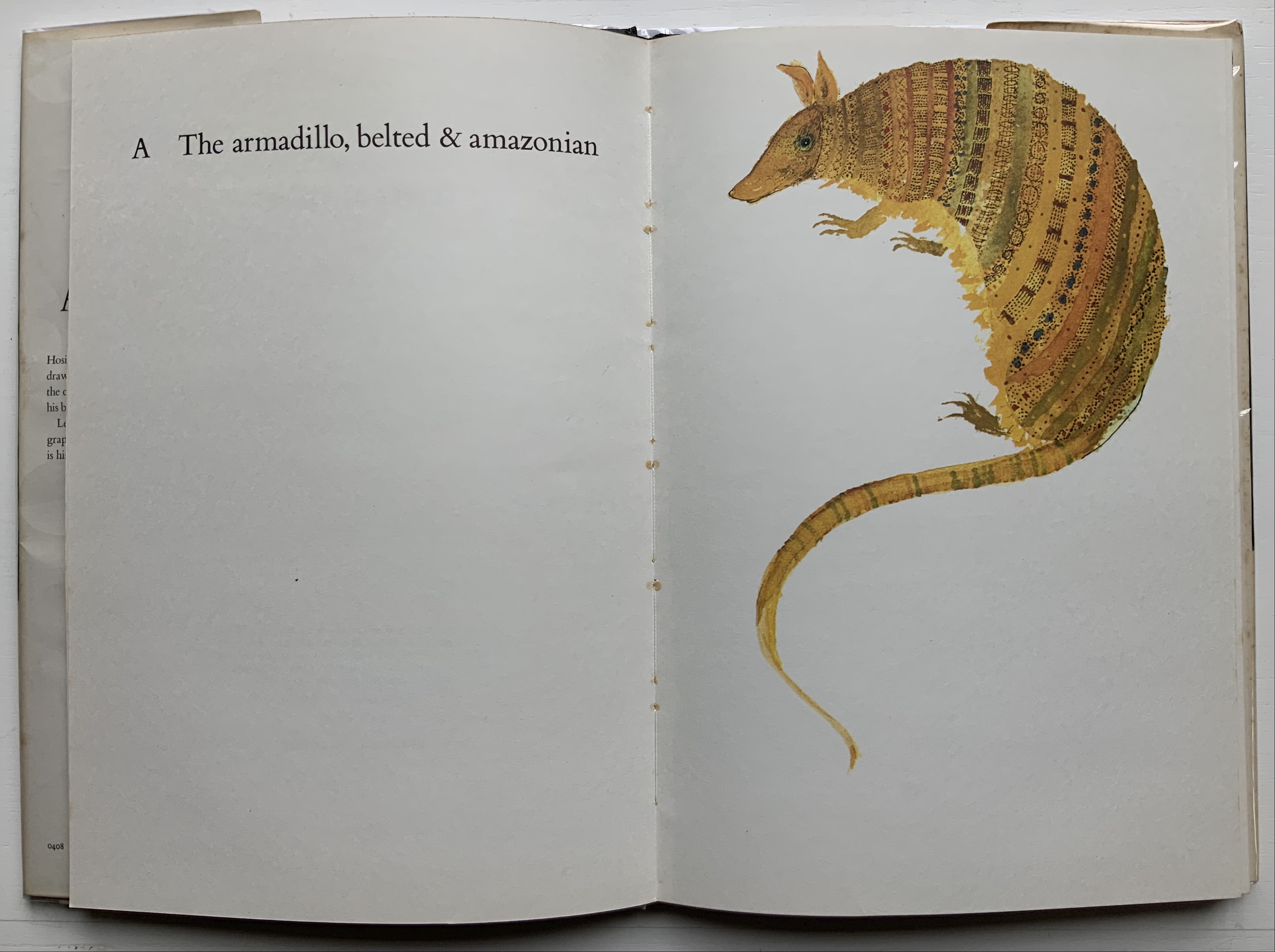
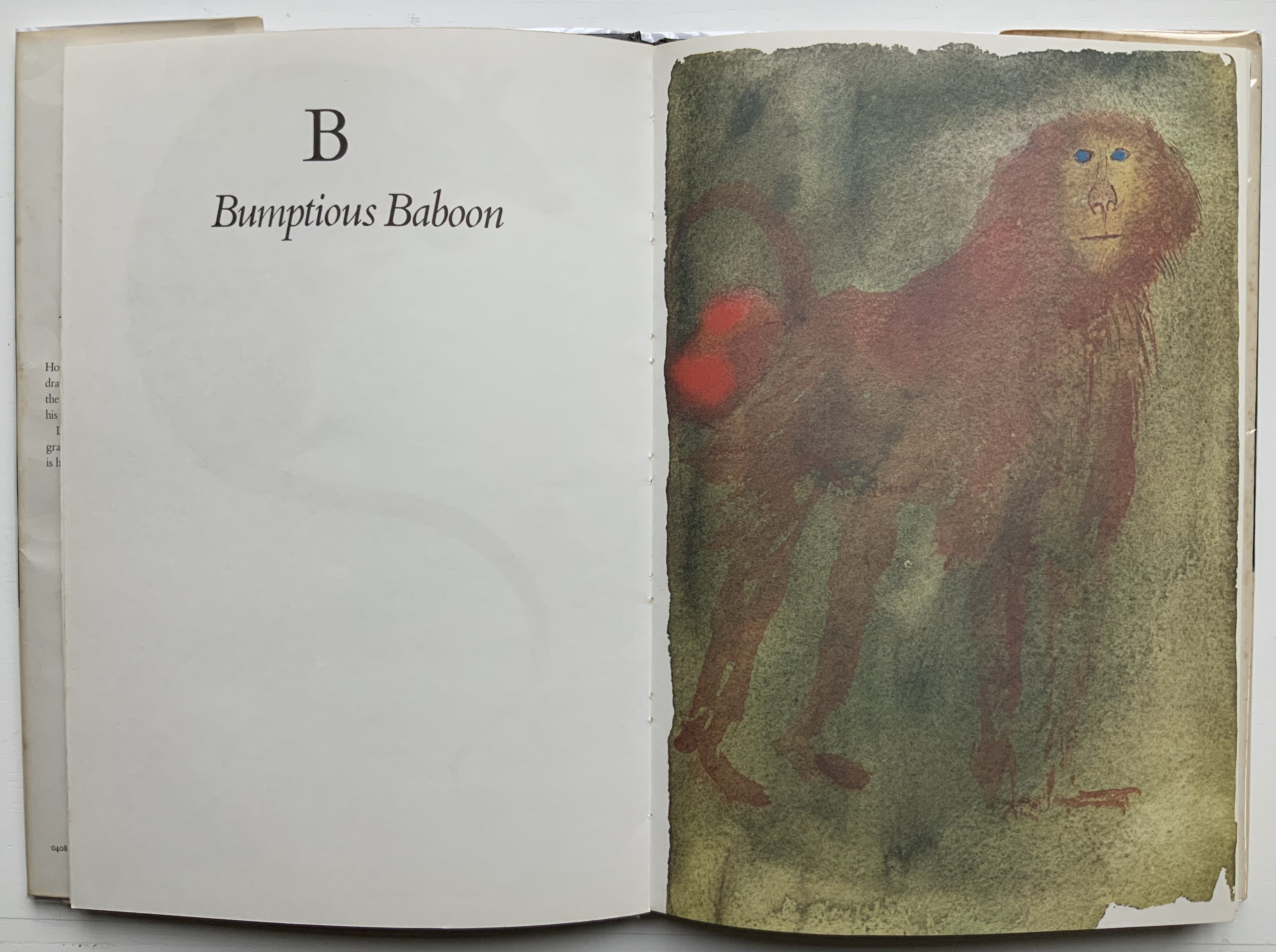
Compile all the abecedaries ever created and it would approximate the result of Adam and Eve’s task of naming all the creatures and things of the world. Leonard Baskin echoes that innocence in Hosie’s Alphabet(1972) with its words and animals supplied by his children. If Adam and Eve had had an alphabet, they might have been tempted into pareidolia, which is represented in the Collection by VUES/LUES: Un Abécédaire de Marion Bataille (2018) and Typographic Universe (2014) by Steven Heller and Gail Anderson. Heller and Anderson’s compendium extends to letters formed of natural and drawn objects from the real world, which Champ Fleury’s appendix foreshadows with its floral and fantastic alphabets.
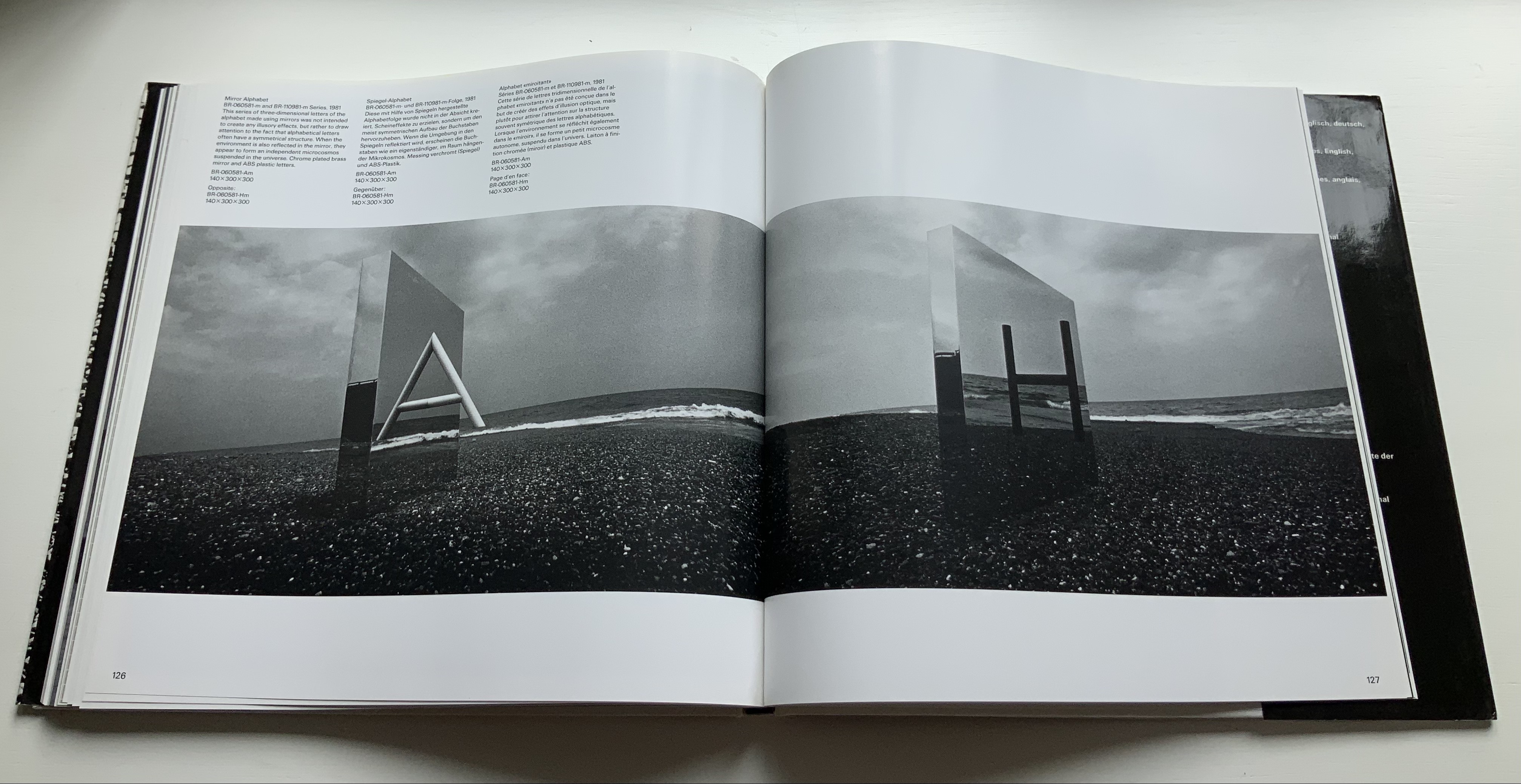
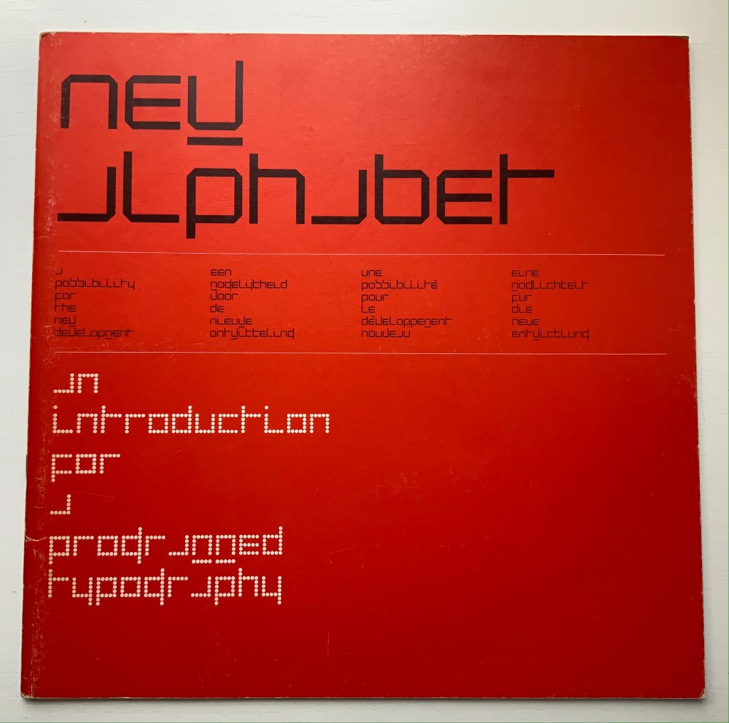
Of course, Tory’s work is not an abecedary. In Books Two and Three, it develops into a full-blown treatise on letterforms whose meaning and appearance are explained allegorically and driven by the compass, rule and geometry expressed within a 10x10x10 cell cube. It would overstate the case to call it “typographic design”. As drawn, Tory’s diagrams would serve poorly for cutting and forming punches or matrices (although it has been done). Nevertheless, his geometric approach foreshadows the grids and algorithms of Wim Crouwel’s New Alphabet (1967), Timothy Epps and Christopher Evans’ Alphabet(1970) and Ji Lee’s Univers Revolved: A Three-Dimensional Alphabet (2004).
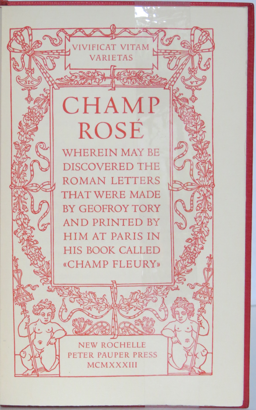
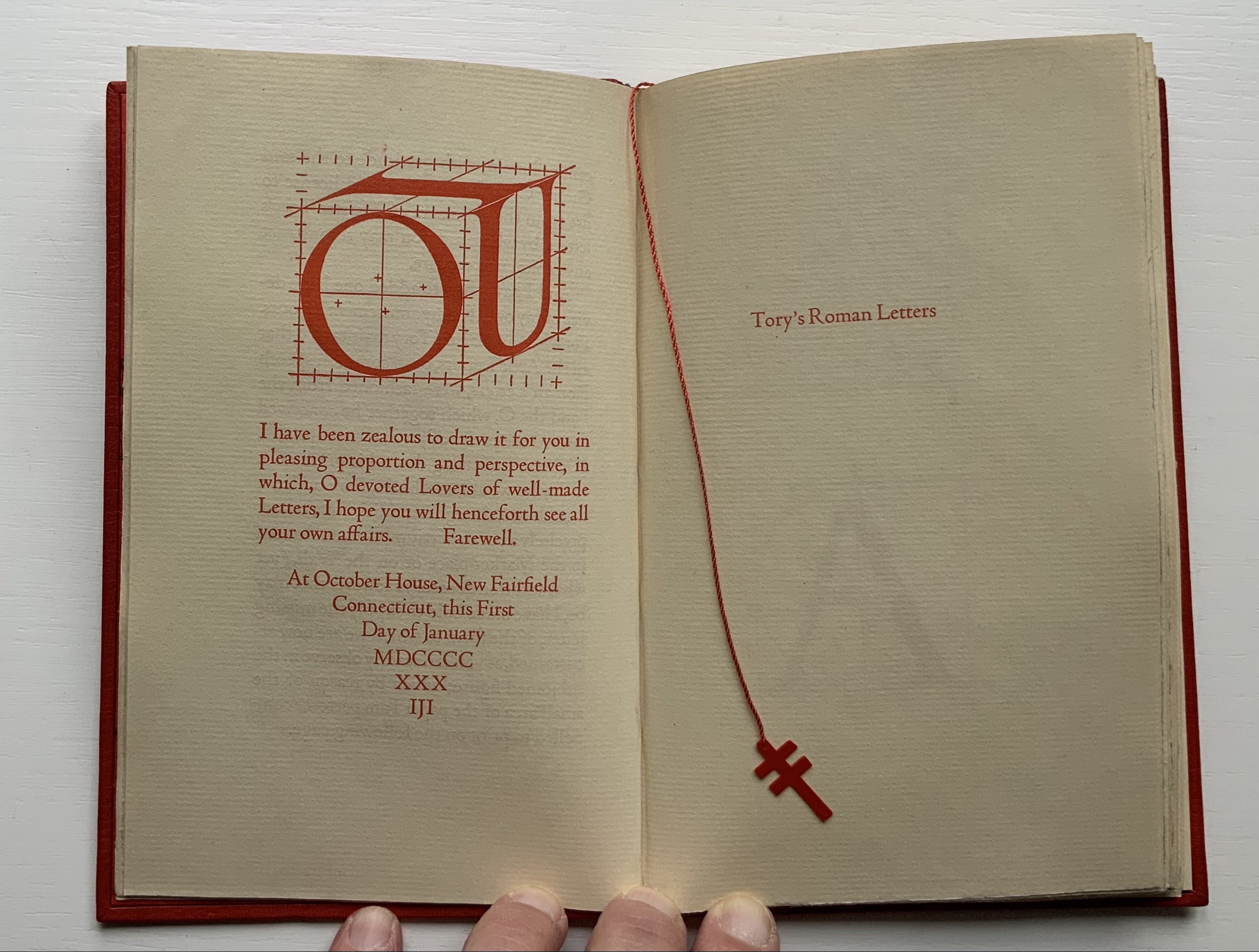
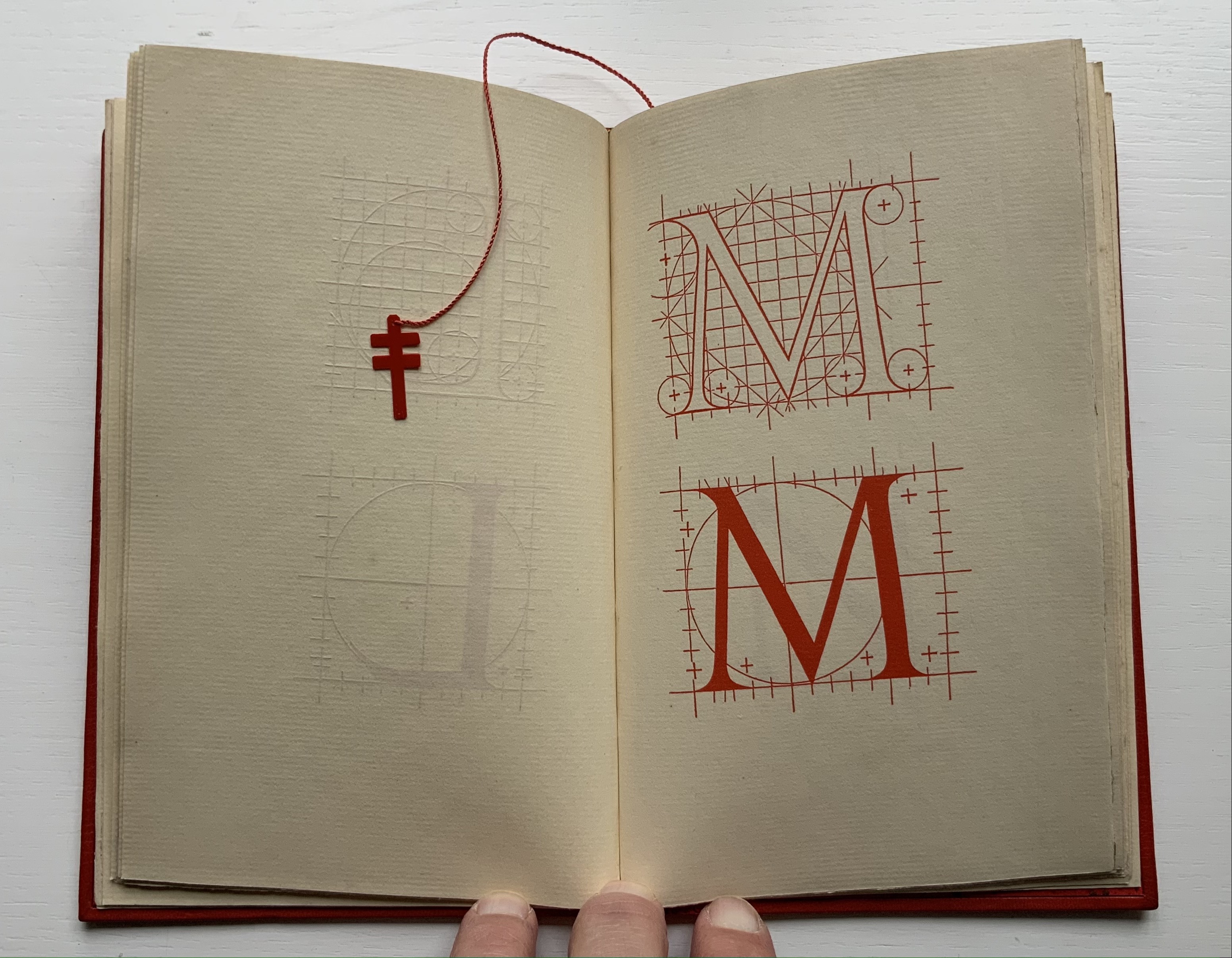
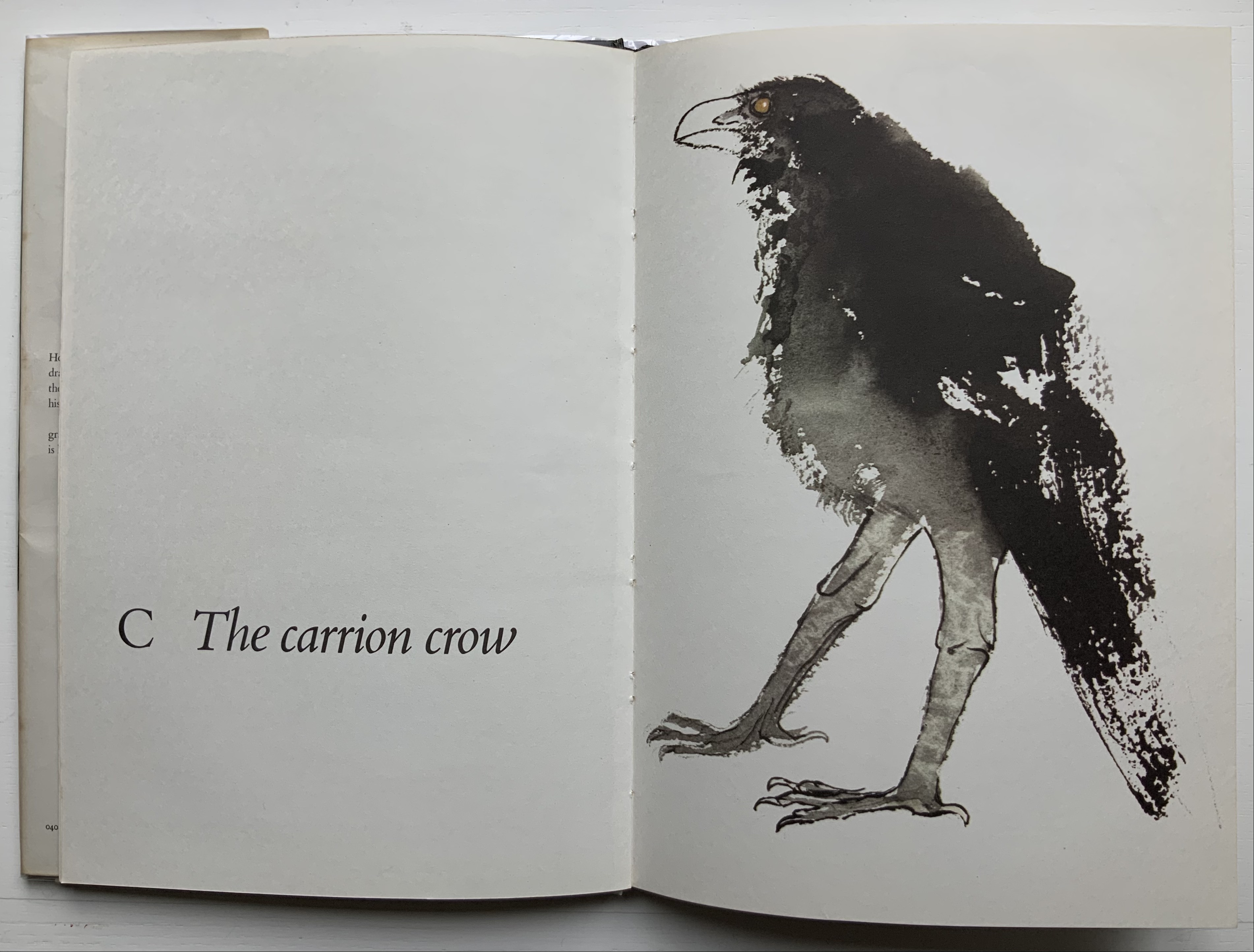
Before the age of computers and algorithms, though, the artist and designer Bruce Rogers did bring typographic design to bear on Champ Fleury. The Grolier Club sponsored the printing of George B. Ives’ English translation. Rogers’ design “translates” Champ Fleury just as much as Ives does, perhaps more so. The Grolier Club edition is one of only ten books to be set completely in the Centaur typeface designed by Rogers.
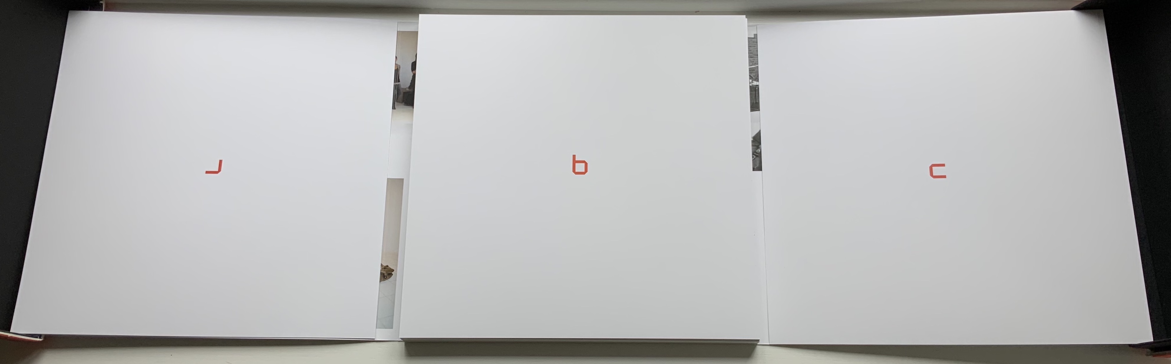
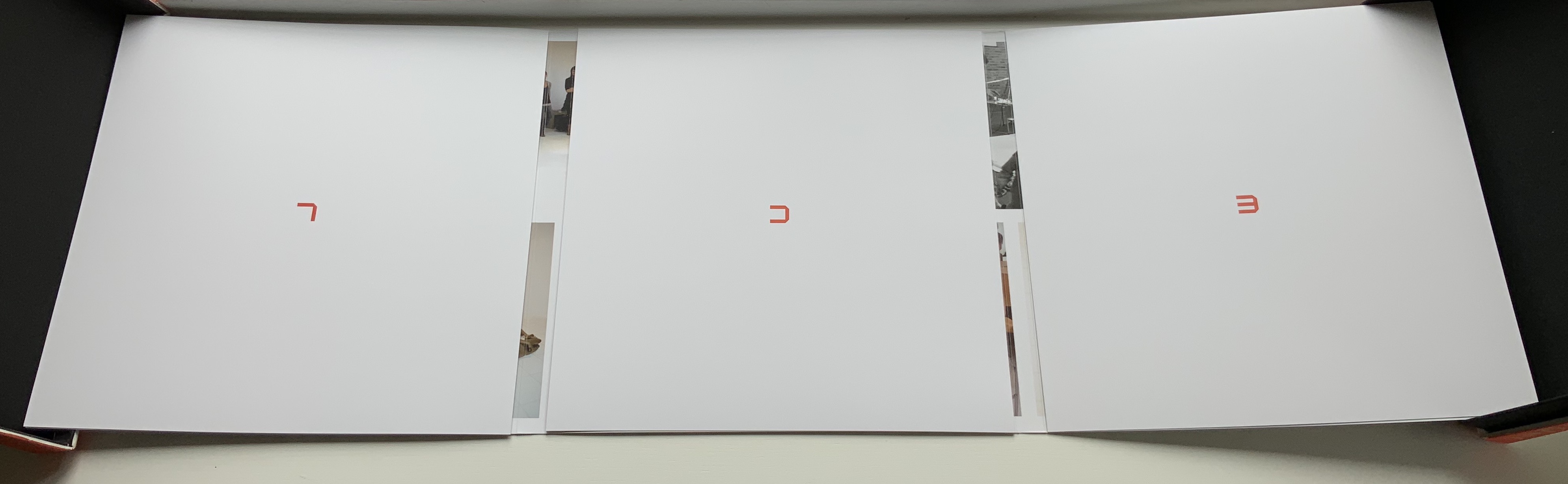
Of course, the translation entails a complete resetting of the text, and Centaur naturally delivers crisper letters. Also, in redesigning with Centaur, Rogers alters the original’s layout and, therefore, the reader’s experience of it. Notice in the OAHK pages above and in the three double-page spreads below how Rogers changes Tory’s flow or jumpiness to something fixed or stately. Attention to the page and its layout offers book artists as well as book designers yet another creative avenue. For proof of that, compare the Collection’s entries for Angel, Baskin and de Cumptich.
Architecture is another of Tory’s well-developed analogies and explanations of the ancients’ thinking behind the letterforms. In his drawings below, he aligns the letters AHKOIS with the parts of a building and letters IL with floor plans. He connects the circularity of the Coliseum’s exterior and the ovalness of its arena with the proper shape of the letter O. In the Collection, the analogy reappears fantastically in Johann David Steingruber’s Architectural Alphabet (1773/1972), Antonio Basoli’s Alfabeto Pittorico (1839/1998) Antonio and Giovanni Battista de Pian’s efforts in 1839 and 1842.
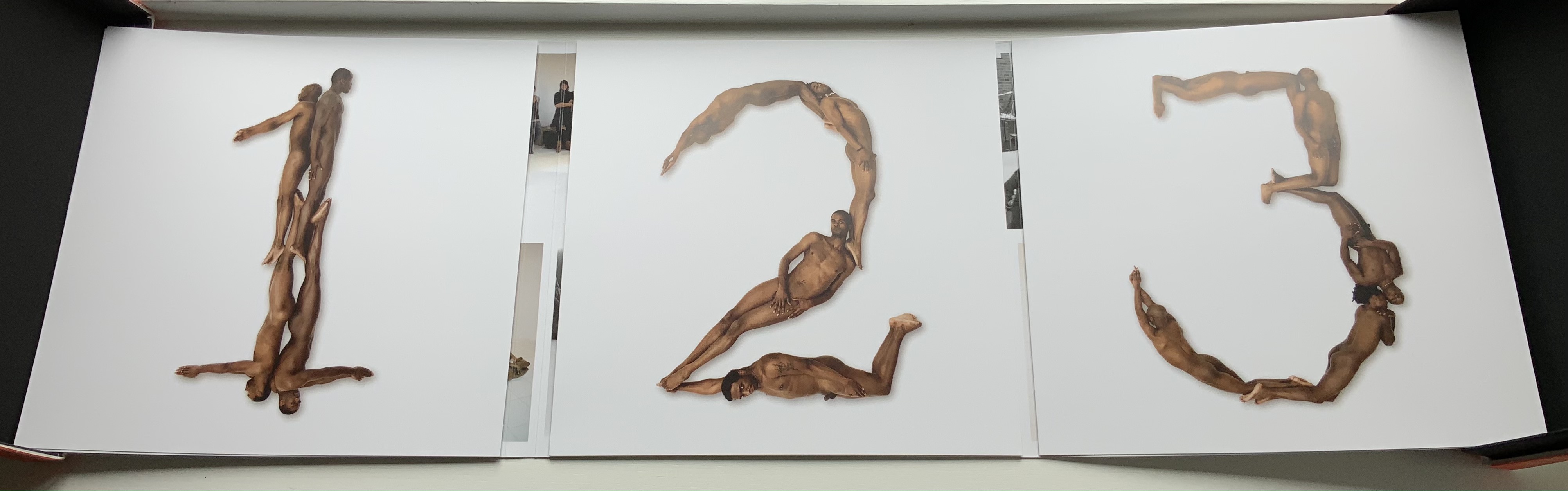
The architectural analogy provides Tory with his segue from plane to solid geometry in aligning the shapes of letters with human anatomy and virtues. His three-dimensional analysis of letterforms also finds contemporary analogues in two of Pieter Brattinga’s Kwadraat Blad series: Crouwel’s, mentioned above, and Anthon Beeke’s Alphabet (1970). Tory’s three-dimensional letterforms foreshadow Crouwel’s investigation of units based on the assembly of organic cells and his later musings on a laser-generated four-dimensional typography (Elliman, 62). And it is hard to evoke anything more humanoid and three-dimensional — albeit far less analytical or prudish — than Beeke’s alphabet formed with naked female models. (Tory comments that in a correctly drawn A, the crossbar will virtuously cover the genitals of Vitruvian man inscribed in the 10×10 grid. Modesty seems to extend to H as well but not so much to O and K.)
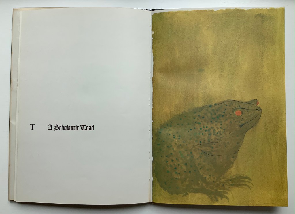
The calligraphic impulse that underlies Champ Fleury‘s typographic representations shows itself clearest in the woodcuts for the Cadeaulx alphabet in the appendix. The Books On Books Collection has its share of calligraphic abecedaries such as Marie Angel’s An Animated Alphabet (1996) and Andrew Zega and Bernd Dam’s An Architectural Alphabet (2008) as well as more purely calligraphic alphabets such as Islam Aly’s, mentioned above, and Suzanne Moore’s A Blind Alphabet (1986) .
Two artists whose abecedaries blend the calligraphic and typographic are Robert de Vicq de Cumptich and Cathryn Miller. In de Cumptich’s Bembo’s Zoo (2000), letters and punctuation marks from the Bembo typeface form calligraphic animal shapes. Miller’s L is for Lettering(2011) joins up the alphabetic rite of passage, calligraphy and typography by allying each of her hand-drawn letters with the name of a typeface from “A is for Arial” to “Z is for Zapfino”.
The last page of Tory’s illustration of additional alphabets is not the end of his work. The colophon plays that role. Curiously, Tory misses out the character that plays that role for the alphabet itself: the ampersand. “Curiously” because the character & appears throughout Champ Fleury — even at the end of the colophon’s fourth line in French — and it is after all the most flowery of the alphabet’s characters. Perhaps some book artist will follow Bruce Rogers’ example in his joking Depression-era homage to Tory on the back of Champ Rosé and create an homage to Tory and Rogers of three-dimensional ampersands.
Gelb, Ignace J. 1974. A Study of Writing. Chicago: University of Chicago Press.
Golec, Michael. 2015. “Champ Fleury in the Machine Age”, lecture at the School of Visual Arts, NYC. Uploaded 4 June 2015. Accessed 12 May 2021. Good slides and a comparative look at Tory’s original and Rogers’ resetting.
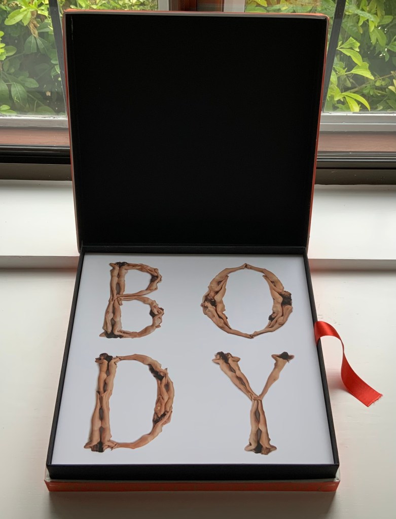
Beeke devised “The Body Alphabet” around 1968/69. It came in response to the “sexual revolution” of the 1960s and in reaction to functional typography. The designer Pieter Brattinga had published Wim Crouwel’s New Alphabet (1967) in the Kwadraatblad series and followed that up with Gerard Unger’s A Counter-proposal (1967) and Timothy Epps and Christopher Evans’ Alphabet (1970). Brattinga must have felt that “bad boy” Beeke’s tongue-in-cheek response modelled on Baskerville fit the bill as a final coda.
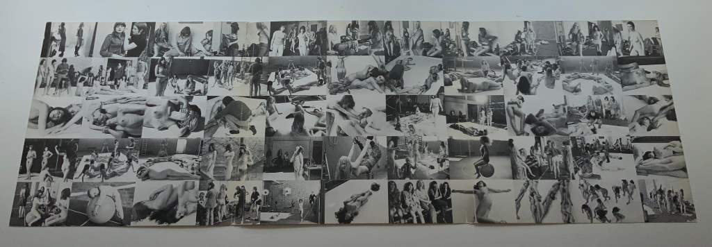
The portfolio’s cover has three panels that fold and overlap around the folios. The exterior is shown above. The interior below displays a spread of 55 small photographs from the photo shoot, showing the models standing around waiting to be directed into position for the relevant letter. Once the models were in place, the shot wad taken from above. Some letters like M required as many as 12 models.
Baskerville may have been Beeke’s template, but the letters G and Q stray far from it. The serifs in the G’s lower right stroke are misdirected. The Q is too oval, and its swash is missing the left-hand stroke characteristic of all the Baskervilles. In fact, a hunt through Rookledge’s Classic International Typefinder for similar Q’s suggests Century as a closer template. Nevertheless, the intention is winning and a challenge to subsequent pursuers of the naked alphabet. And there have been a few, such as Olivia Brookes and Anastasia Mastrakouli as well as “digital” alphabetists such asAmandine Alessandra, Tien-mien Liao, Lucas Neumann andJosé ErnestoRodríguez.
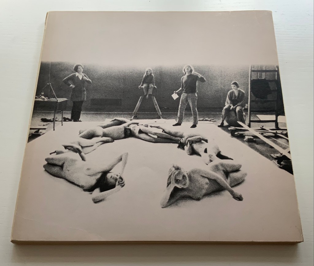
“The Body Alphabet” shoot has the air of a live-model art class, and the result is not prurient or exploitative, even with the child to form the smallest points of punctuation (Tinelou van der Elsken, the daughter of Ed van der Elsken, is the model for the ‘comma type’ in the alphabet). Sexist? Non-diverse? For near-perfect balance, the Books On Books Collection should have an artist’s book or portfolio available from self-partnering Tomaso Binga (something like the self-portraiture in Living Writing), but Beeke, René Knip and Spinhex & Industrie Drukkerij have more than addressed the issues with the following remarkable work.
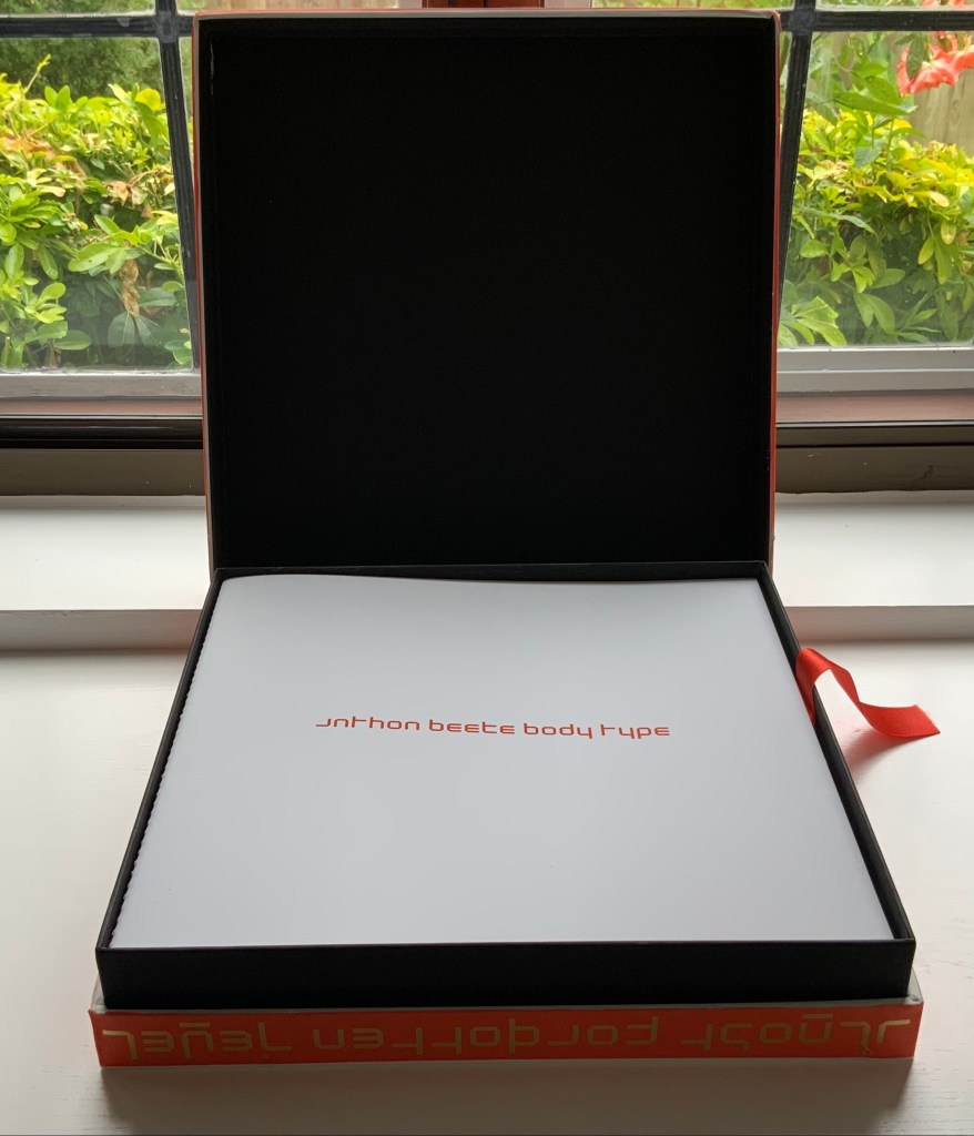
Designer René Knip and Spinhex & Industrie Drukkerij have preserved two important artifacts in typographic and design history and brought them to renewed artistic life. In a way, the collector gets to participate. Body Type arrives as a sealed time capsule requiring a razor to open it and let out the past. Inside are three glossy works lying atop a ribbon pull. The first work is a softcover book, its spine sewn with red thread to match the title on the front cover. Announcing the renaming of Beeke’s Alphabet (1969) as Body Type, it is cheekily set in Crouwel’s New Alphabet (1967) to which Beeke’s original “naked ladies alphabet” had responded. These are the two artifacts preserved, in Crouwel’s case, by use of his alphabet for the titles and section headings and, in Beeke’s case, by extension of his typeface and recreation of the photoshoot that originally realized it. Given their deaths at the end of the last decade (Beeke in 2018, Crouwel in 2019), Body Type provides a valuable juxtaposition of their reflections (Crouwel’s preface and Beeke’s essay).
In addition to his narration of the old and new shoots, Beeke shares an insight about an influence beyond the foil that was the New Alphabet. As Beeke puts it, “If Wim Crouwel pointed to the future, then I was going to perfect the past,….” What he found in the past was a Folies-Bergère-inspired alphabet by Erté (Romain Petrovitch Tirov).
The second work in the box is a portfolio containing a full-color recreation of the original 1969 alphabet and punctuation marks with the addition of Naked Numbers. On the inner side of the portfolio’s wraparound, Ed van der Elsken’s black-and-white production shots sit side by side with the new color production shots. The full color folios themselves present on one side the character constructed with human bodies and on the other side the corresponding character from Crouwel’s New Alphabet.
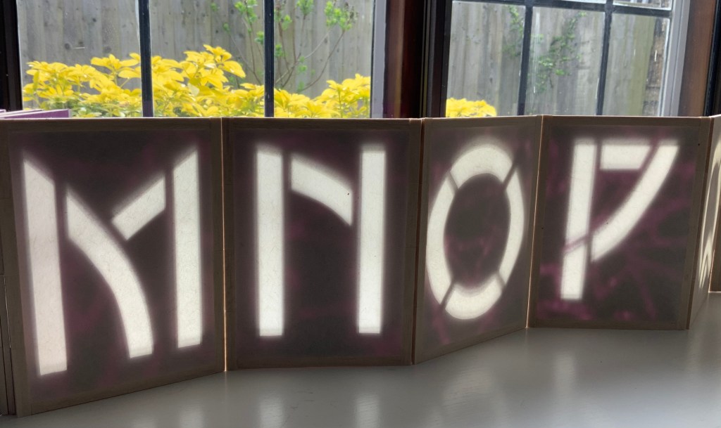
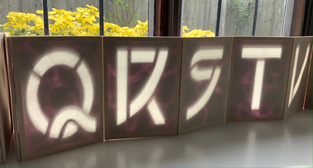
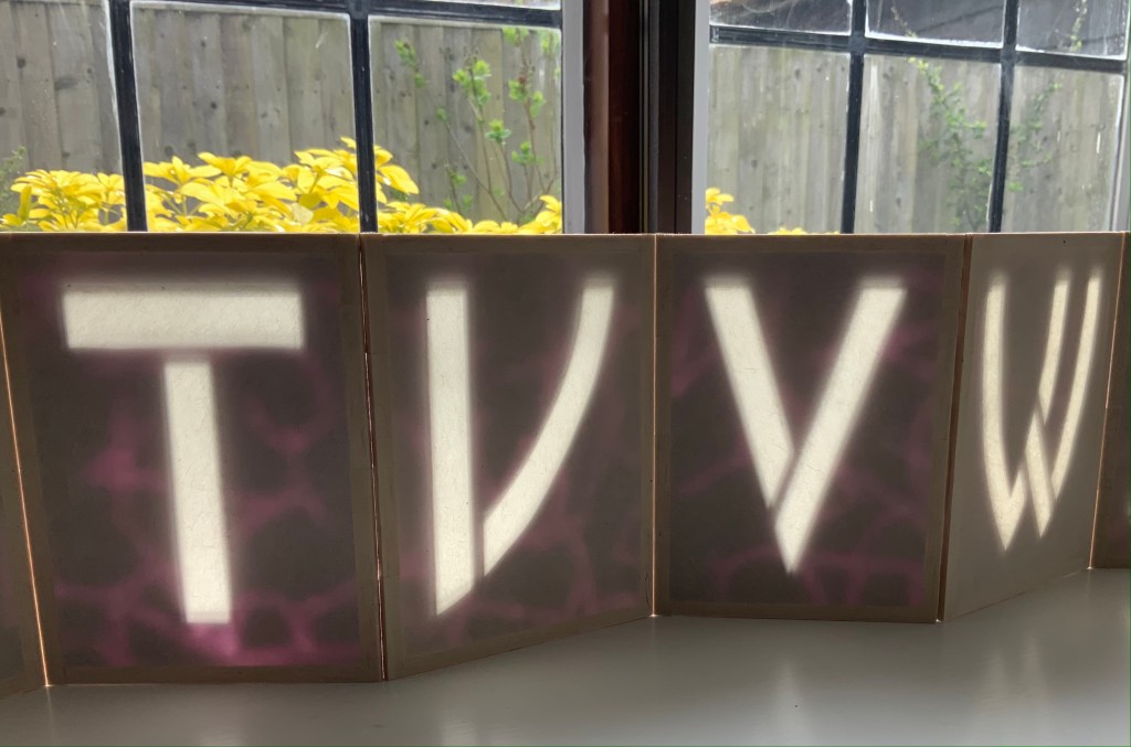
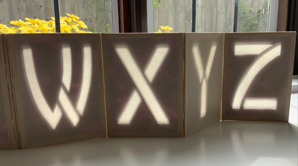
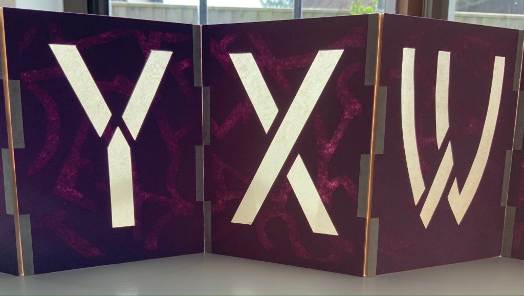
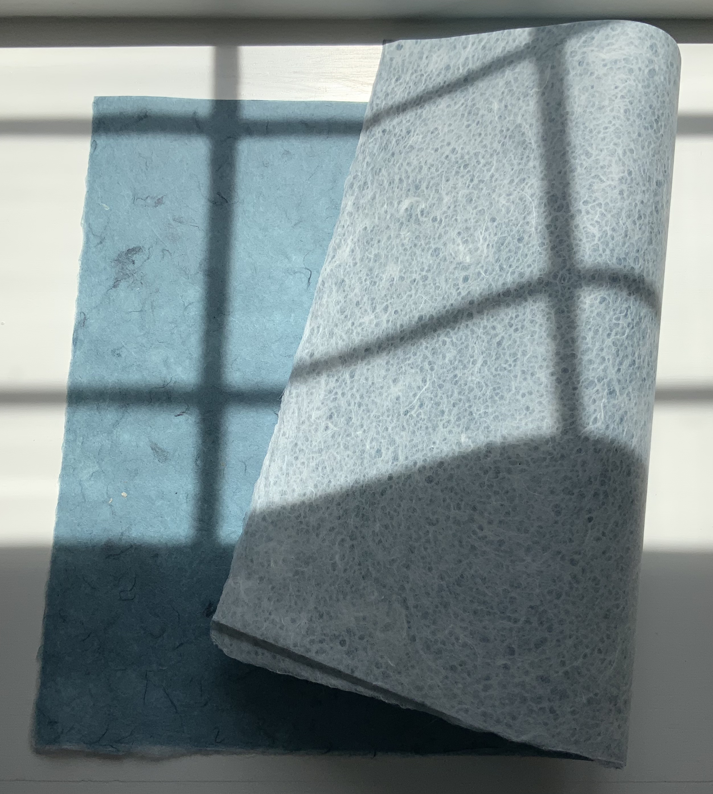
Alpha Beta(2010) Helen Hiebert Lantern-structure book in open-sided box. Closed, H158.75 x W114.3 mm; opens out to 2971.8 mm. Box size: H171.45 x W114.3 x D133.35 mm.Edition of 25, of which this is #22. Acquired from the artist, 17 February 2021.
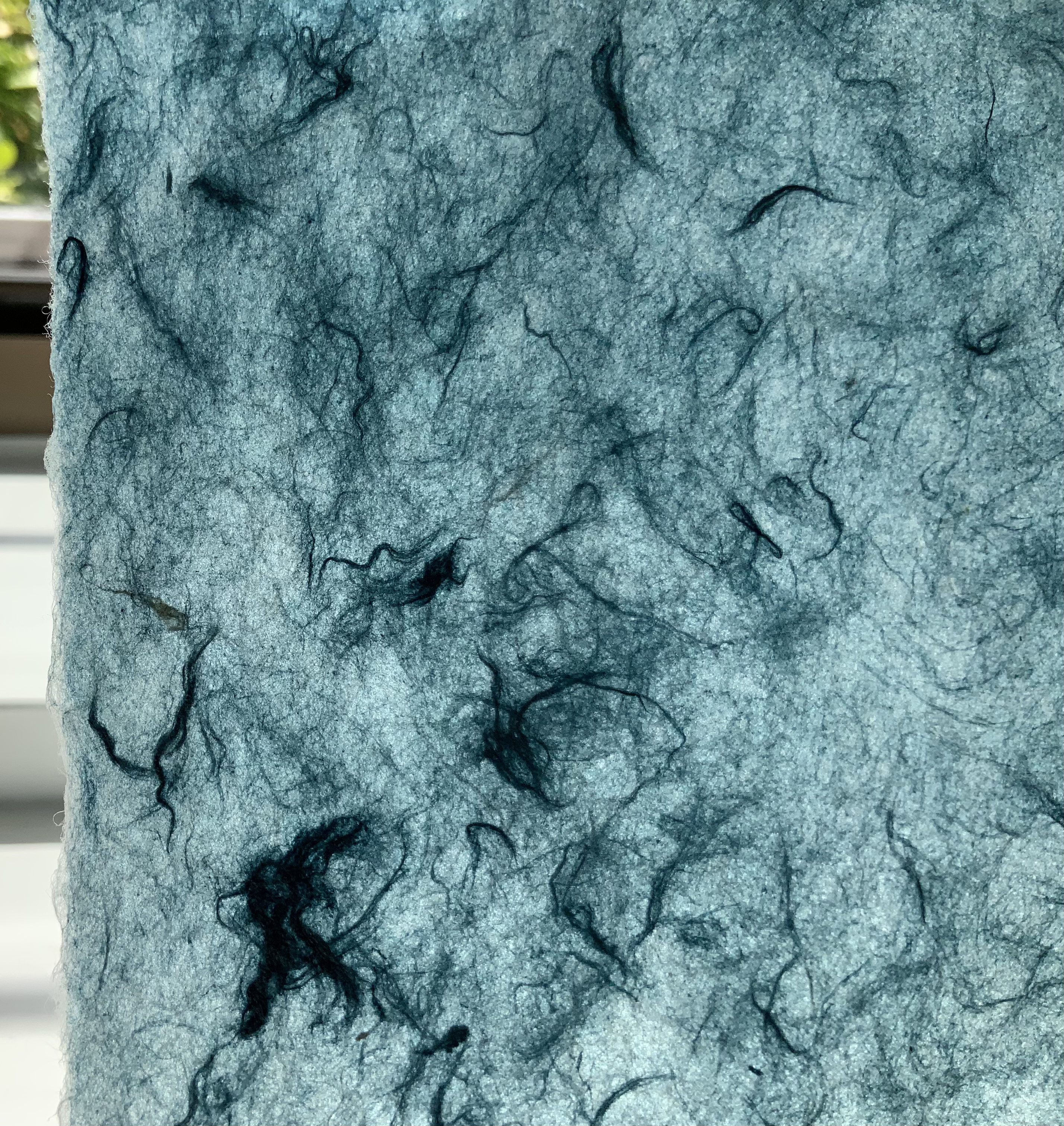
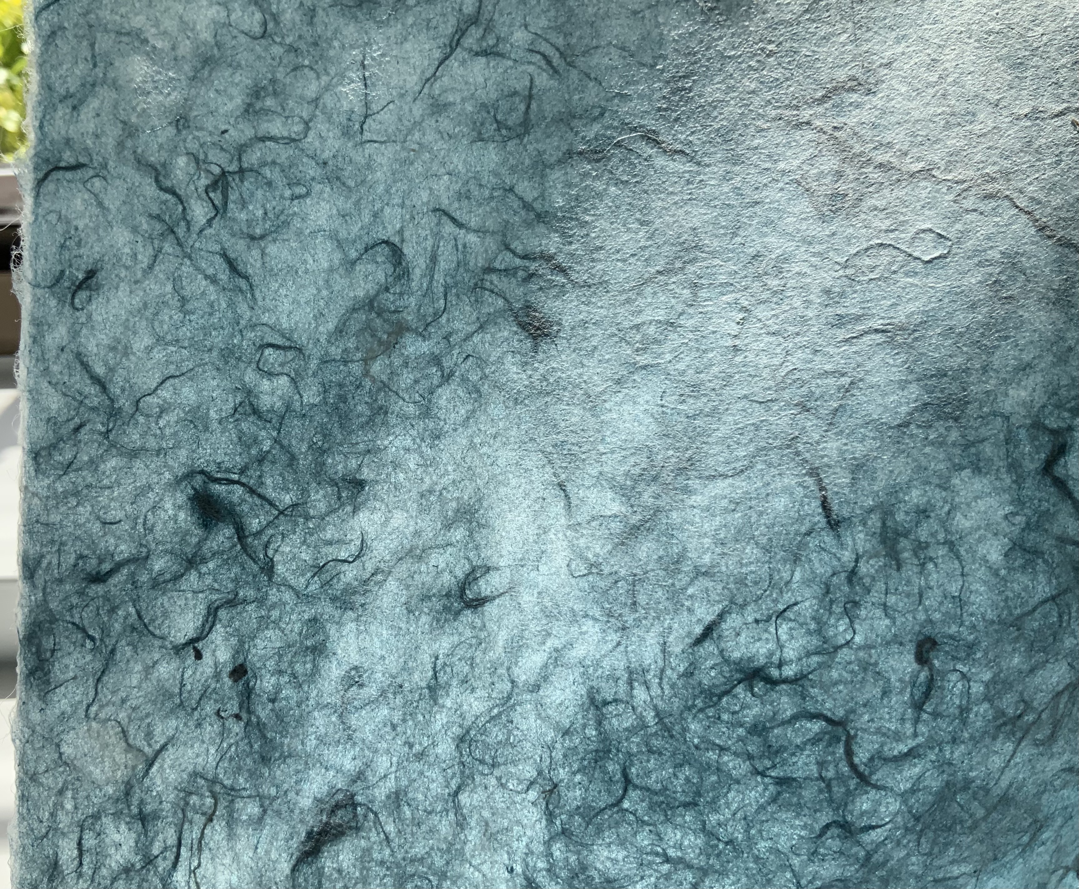
Each panel displays an alphabet letter cutout casting a shadow against a second layer of handmade paper. Appropriately, the letters follow in the Arts and Crafts style font designed by Dard Hunter, “the father of hand papermaking in 20th century America”, renowned scholar and author of Papermaking: The History and Technique of an Ancient Craft.
The book’s flexible hinges between the panels allow it to be set up in a variety of ways. As can be seen above and below, the right-reading alphabet appears on the less colorful side of the structure. When viewed from the more colorful side, the letters show in reverse, which is, of course, more evident with C-B-A than Y-X-W. The swirling strokes that shadow the right-reading letters reveal themselves on the more colorful side as asemic characters watermarked into the handmade paper. A fusion of paper, letters, form and meaning.
On the reverse side: C-B-A and Y-X-W.
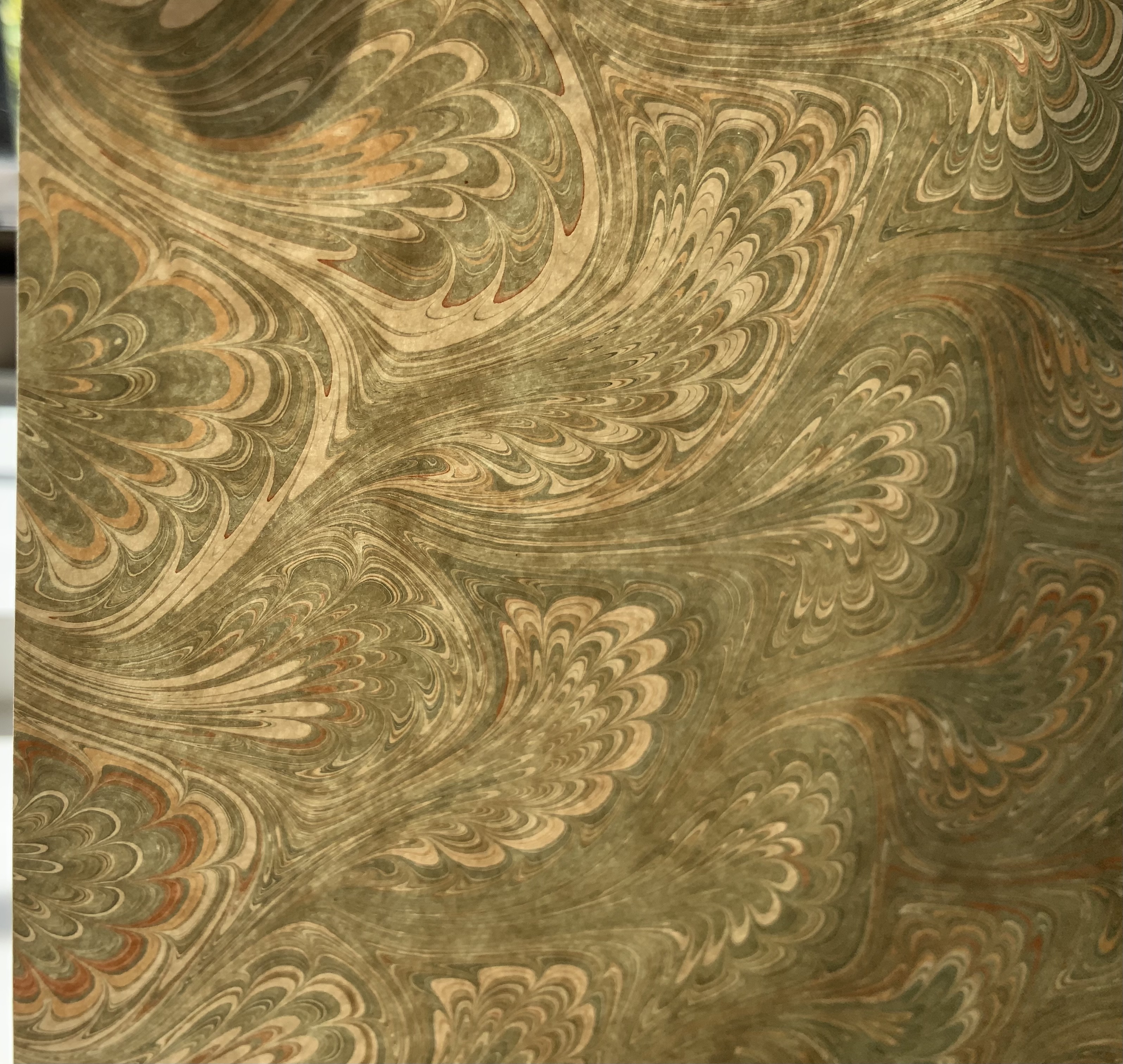
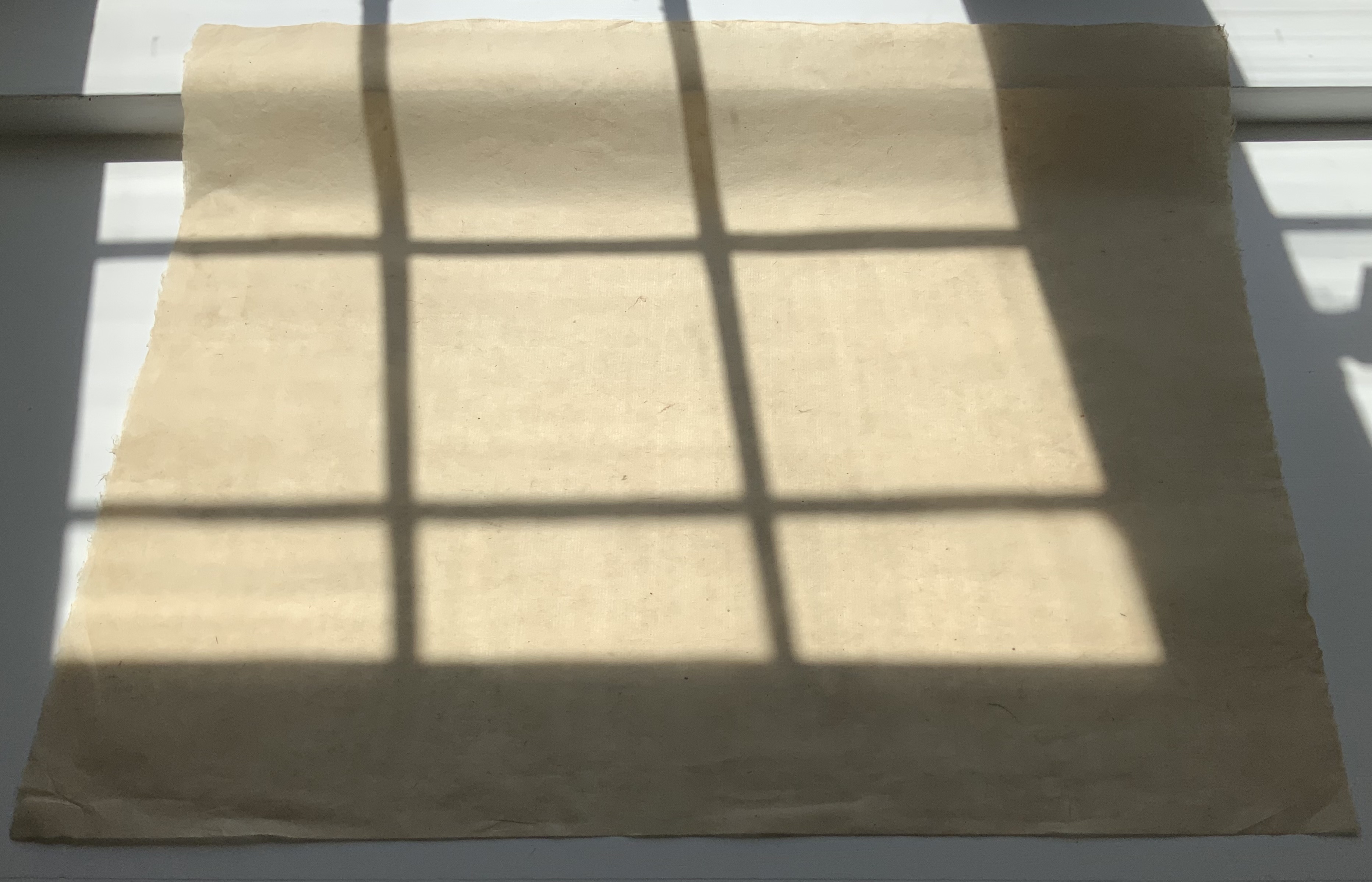
The Secret Life of Paper: 25 Years of Works in Paper (2016)
The Secret Life of Paper: 25 Years of Works in Paper (2016) Helen Hiebert Artist-made paper covers sewn over two signatures with an original string drawing in the center. H282 x W218 mm, 22 pages. Acquired from the artist, 4 April 2016. Photos: Books On Books Collection.
Catalogues like this are works of art about works of art. It came about as a result of an exhibition held at the Kalamazoo Book Arts Center and the Waldo Emerson Library at Western Michigan University. The catalogue contains an illustrated chronology of the artist’s art and career up to 2015-16. Not only does it contain that work of string art in its center, its cover is hand bound and features a pulp stenciled handmade paper.
Curated Paper Collection #1 (2021)
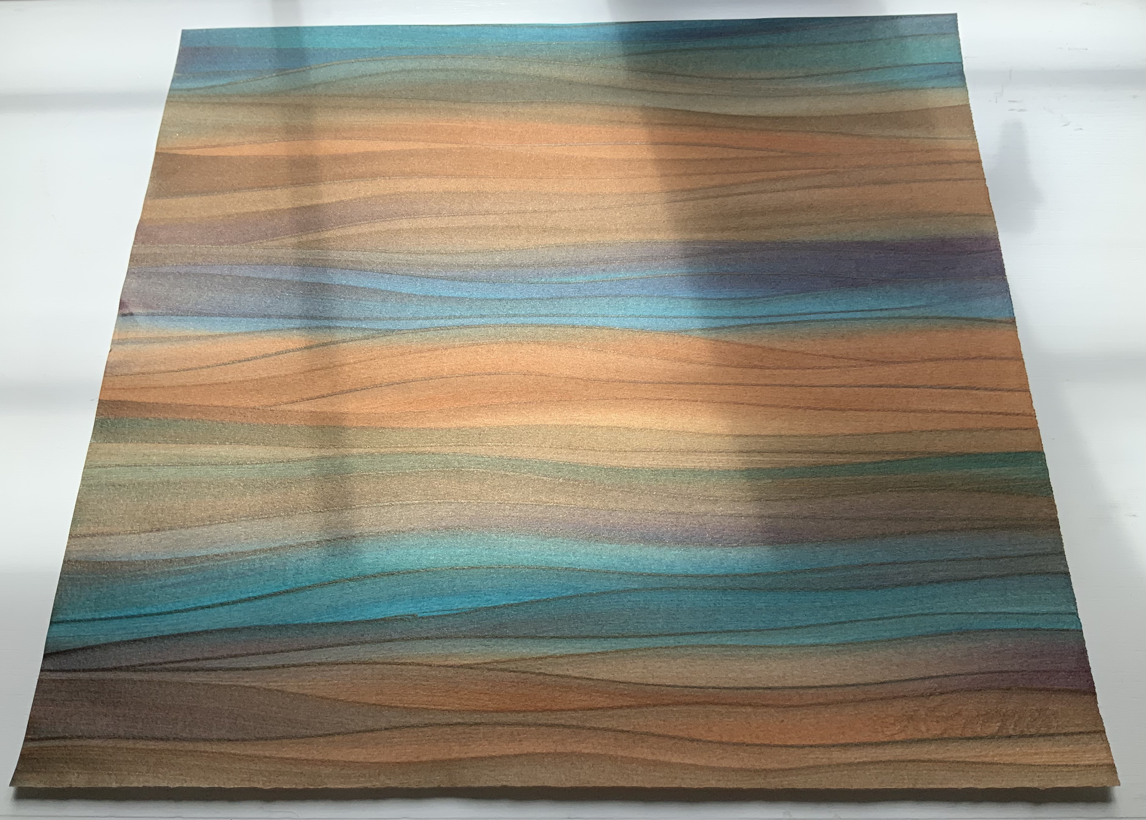
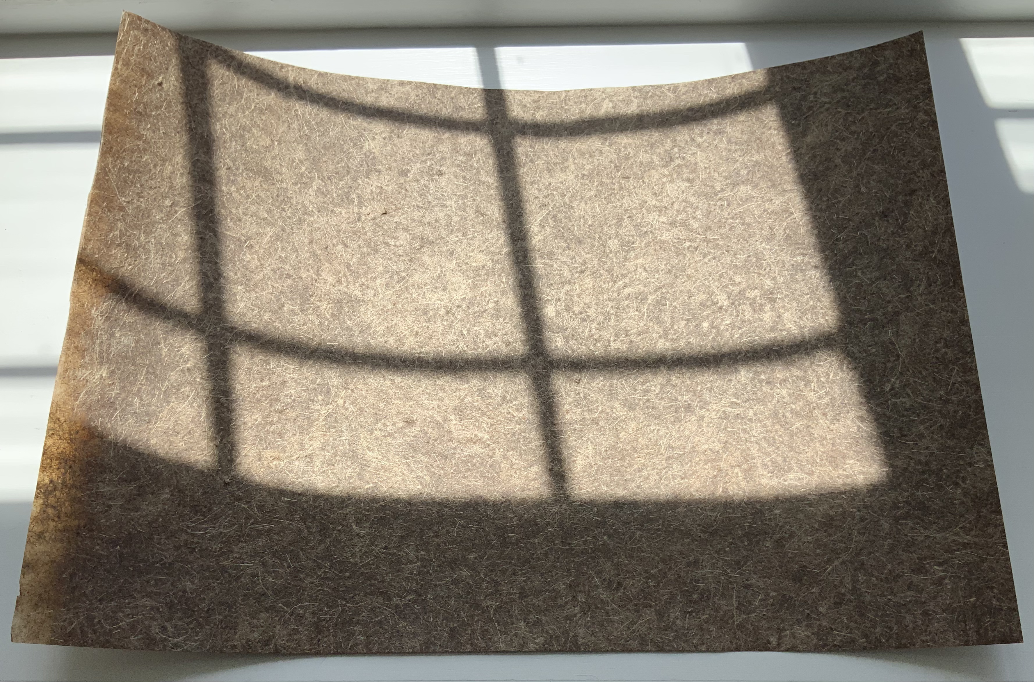
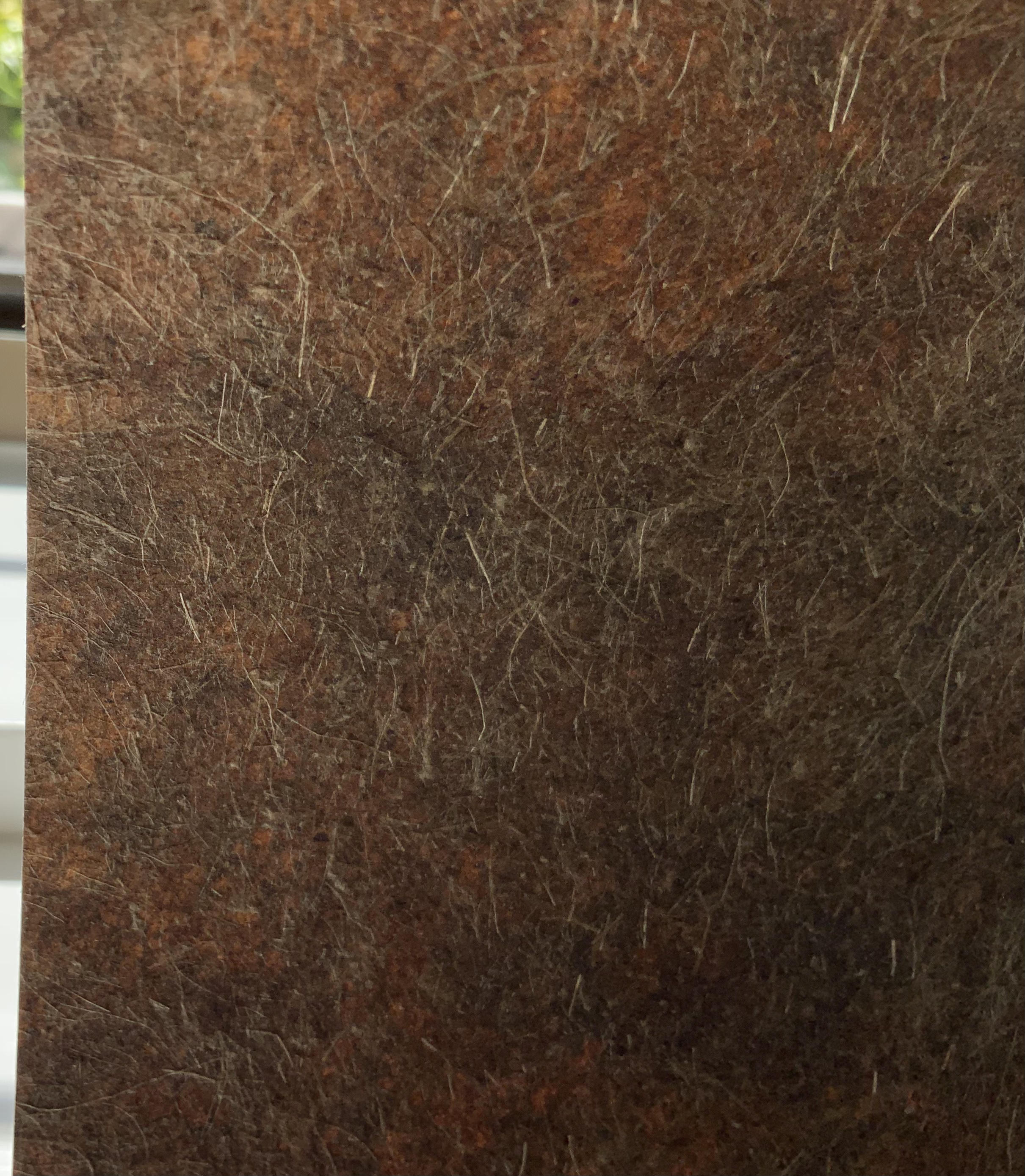
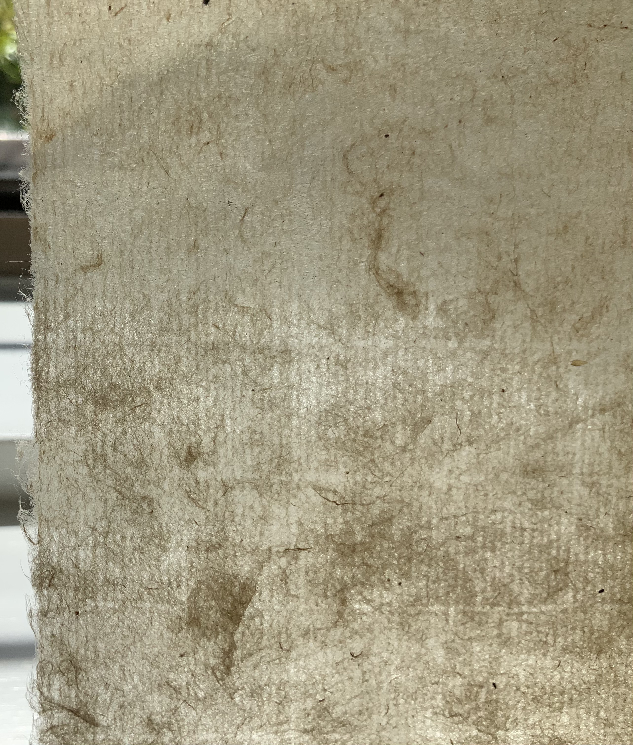
Hiebert has begun a series of curated collection of papers from around the world. The first collection contains eleven papers. The largest sheet comes from Laureli Spokes: a handmade recycled rag paper from India (100 gsm), 357 x 502 mm. It features an exclusive retro two color silkscreened design that features a retro two-color silkscreened design. The smallest sheets are ten 200 x 200 mm squares of Kite Paper at 42 gsm in brilliant colors. Similar to waxed paper, it is translucent and folds well.
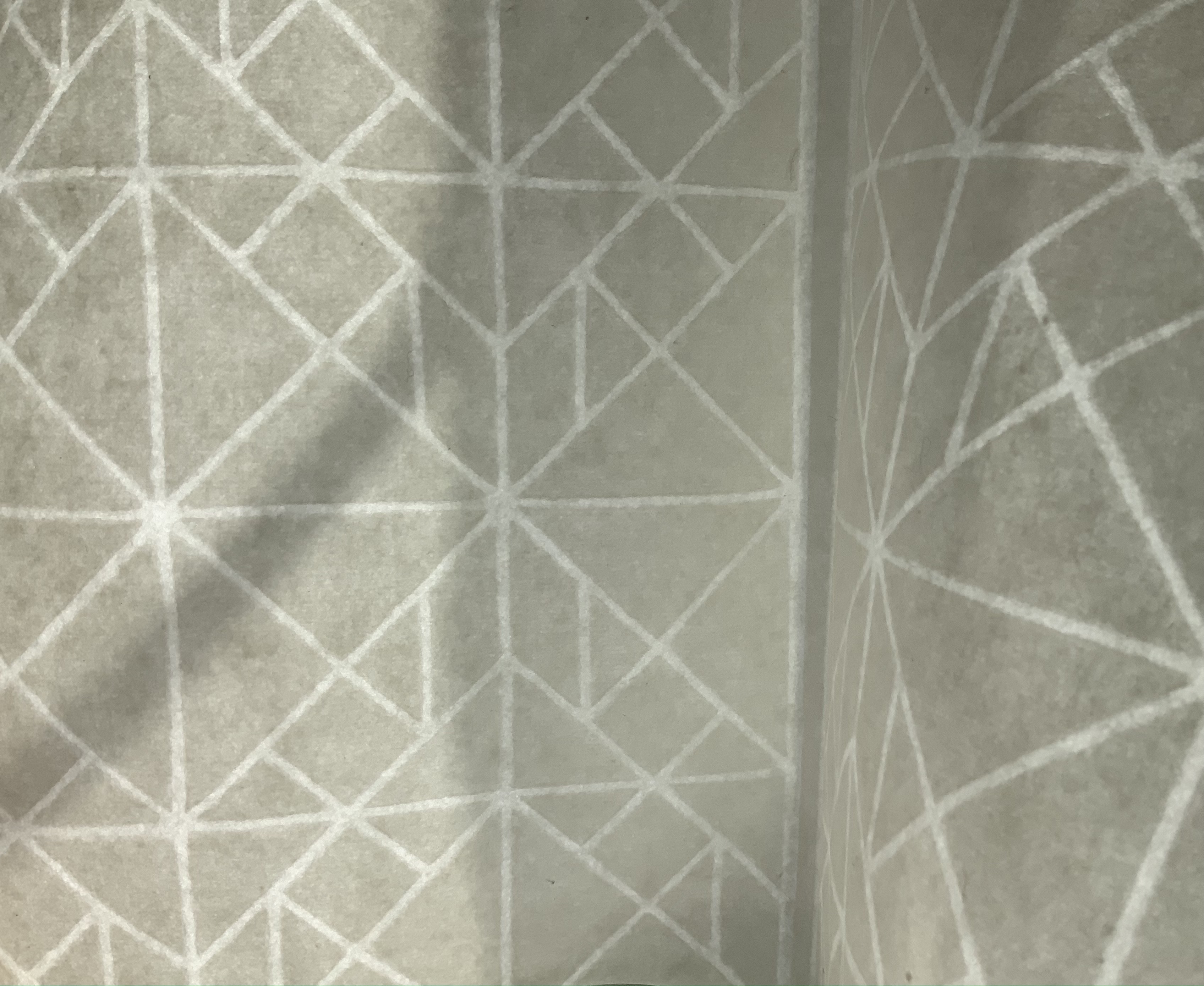
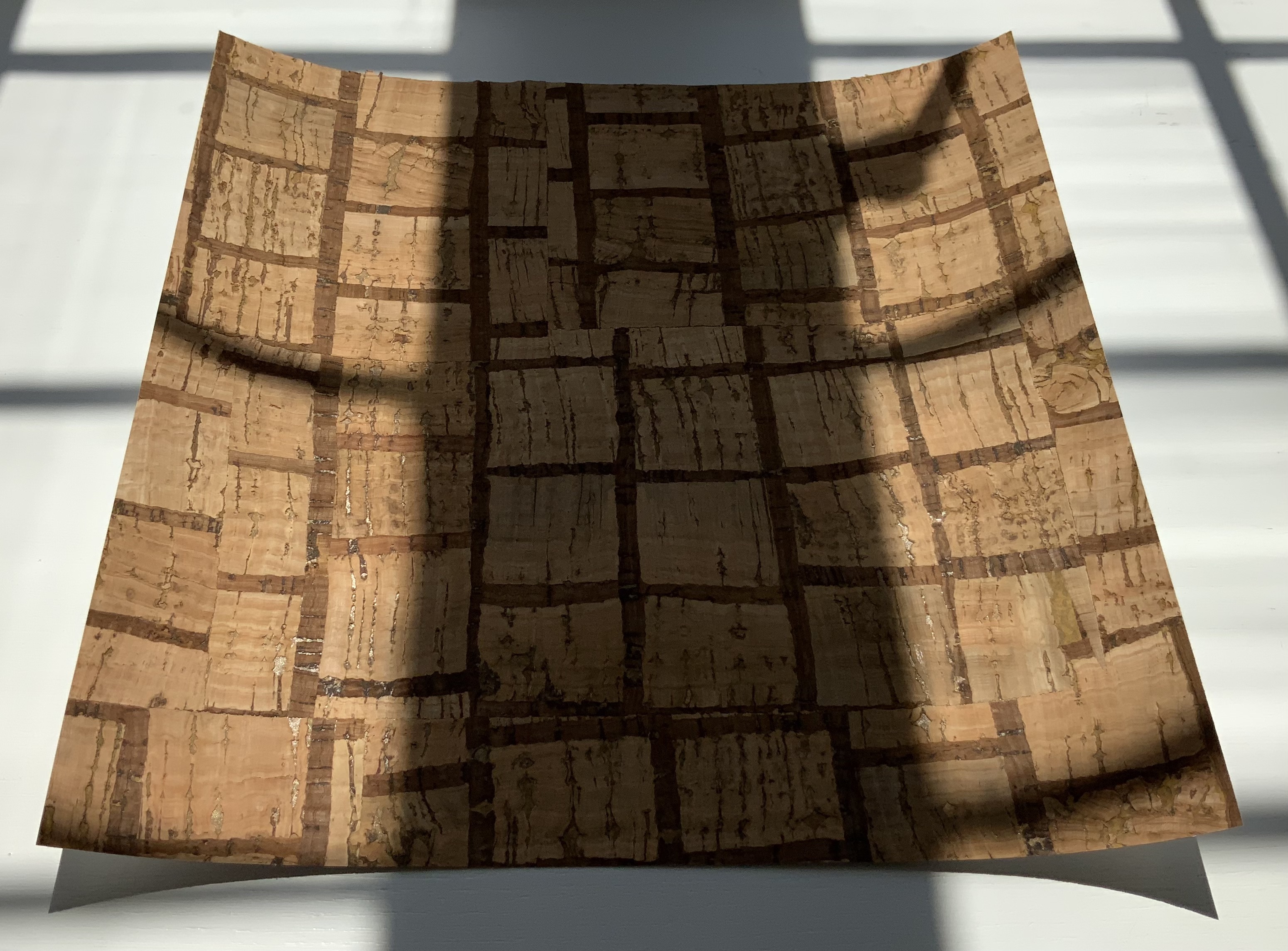
In material and process, the two most interesting papers are Tangram Watermark (100 gsm with thinner watermarked areas, 310 x 460 mm) and Portugese Cork Paper (140 gsm, 255 x 255 mm). Handmade with 100% bleached flax fiber and deckle-edged on all four sides, the Tangram Watermark comes from the Helen Hiebert Studio. The first image below shows the deep impression left by the watermark design cut out of a thin vinyl material and adhered to the papermaking mould. The second image, created with the sheet held up to the light, shows more clearly the tangram design left as a sheet is pulled. The cork tree sourced is highly renewable and organically grown. Handmade in Portugal from the tree’s outer bark, the naturally water-resistant sheet consists of thin layers of cork laminated to a coated base paper. The cork is acid free, but the backing paper, shown in the last image, is not.
The next two curated papers show similarities and differences arising in the Japanese and Korean traditions. The Nanohana Washi (48 gsm, 315 x 470 mm) is a “nature paper” from Awagami Factory in Tokushima, Japan. The images show the changes under different light and from views of different sides. Traditionally, Japanese washi (like Korean hanji) is made from mulberry plant fibers. Here, Awagami has used the nanohana plant (related to broccoli). It grows along the local Yoshino river, and Awagami collects the florets each Spring to mix into these sheets of washi, resulting in the green and yellow flecks. The lightweight hanji (15-19 gsm, 325 x 490 mm) is made from 100% dak (mulberry) fiber, grown and harvested in Korea by Seongwoo Jang, a fourth generation papermaker at Jangjibang, a hanji mill in Gapyeong, Korea. Hiebert notes, “The sheet was formed using the traditional Korean technique called webal or heulim ddeugi, where the slurry flows onto and off the frame in multiple directions, resulting in a strong sheet without a prominent grain direction”. The images in the middle row aim to show this with the sheet laid atop dark art paper in full sunlight and draped over the hand. The detail of the corner in the last row shows the two-ply of the sheet, where — in another interesting difference between the washi and hanji –two thin layers were couched together to form a single strong hanji sheet.
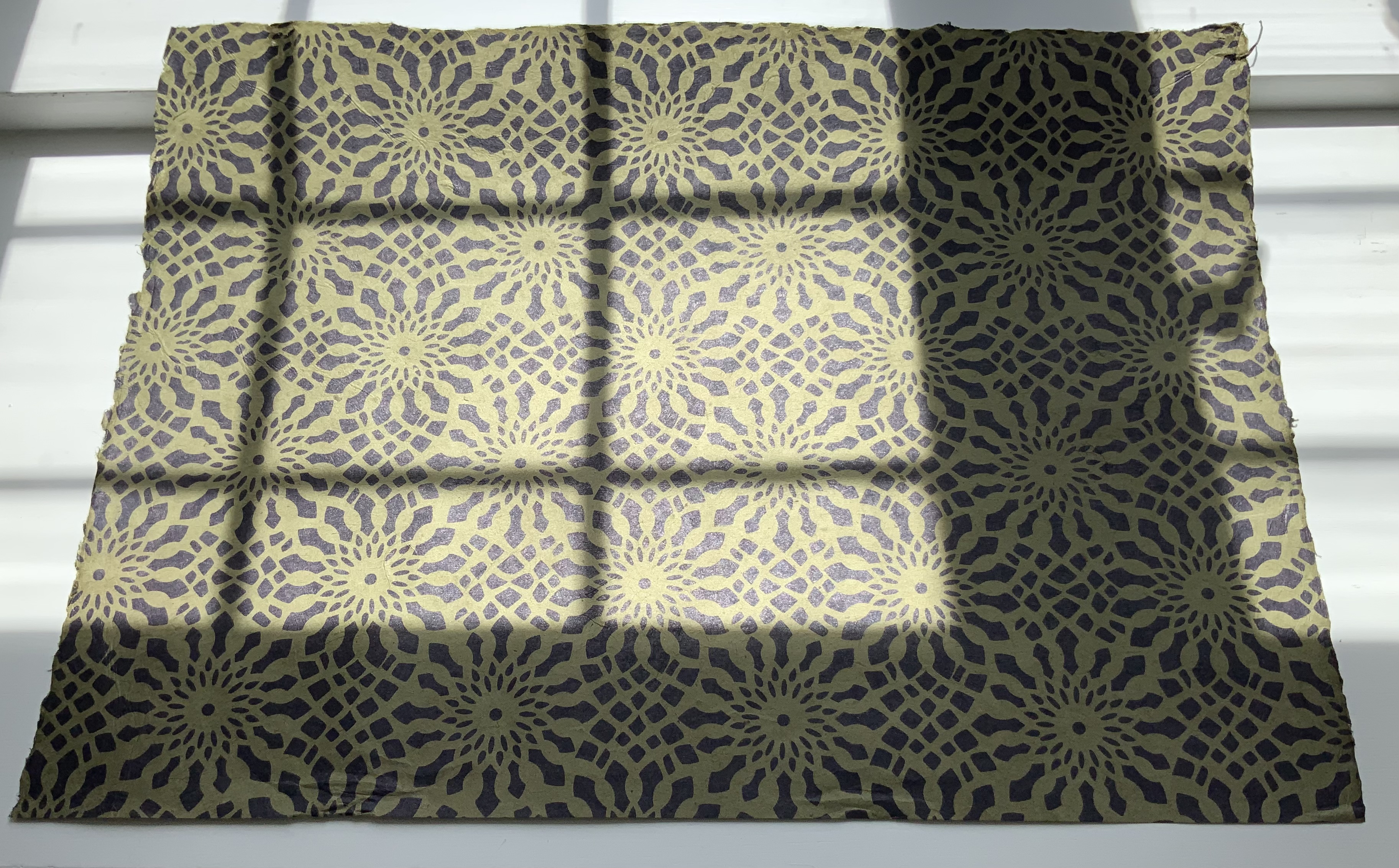
The next two papers are paired for uses and decorativeness. The silk-screened, matte-finish Italian Carta Varese Origami Paper (100 gsm, 350 x 500 mm) is heavier than traditional origami paper, it has a smooth surface and creases well with crisp folds. Smooth-surfaced and creasing well for turned in corners, this sheet with its red scroll pattern would serve well for endpapers. Debra Glanz designed the next set of papers — Paper Assembly (28#-32# text weight, 305 x 305 mm) — with that use, among others, in mind for book and paper artists.
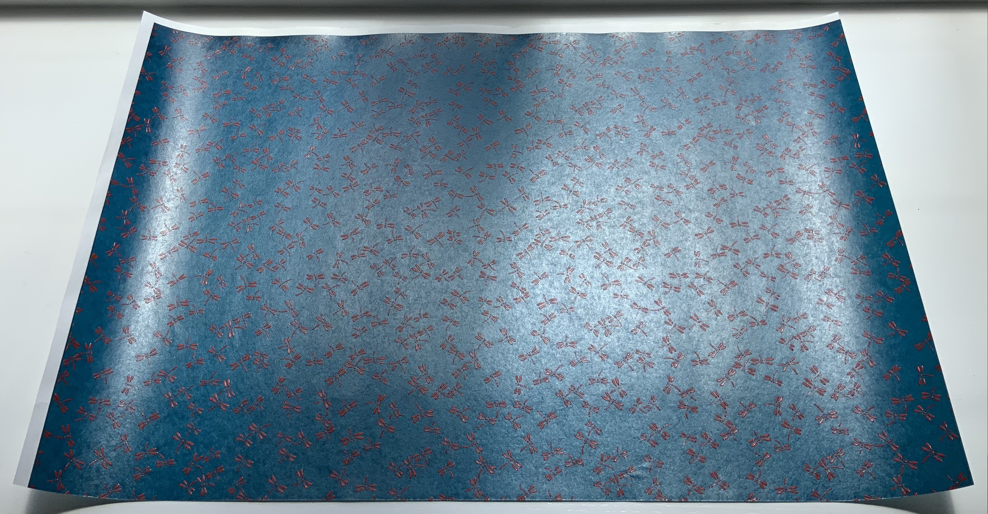
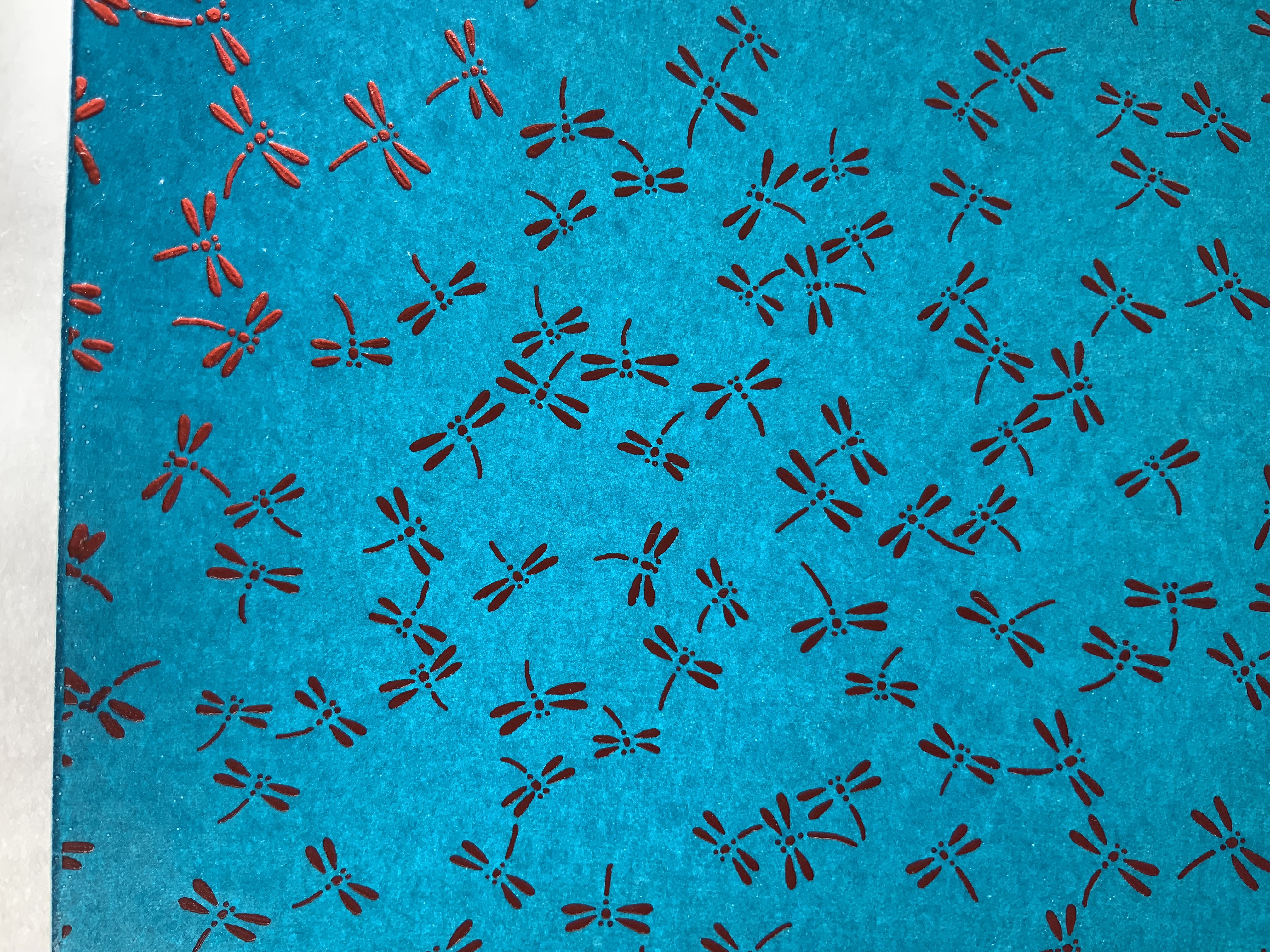
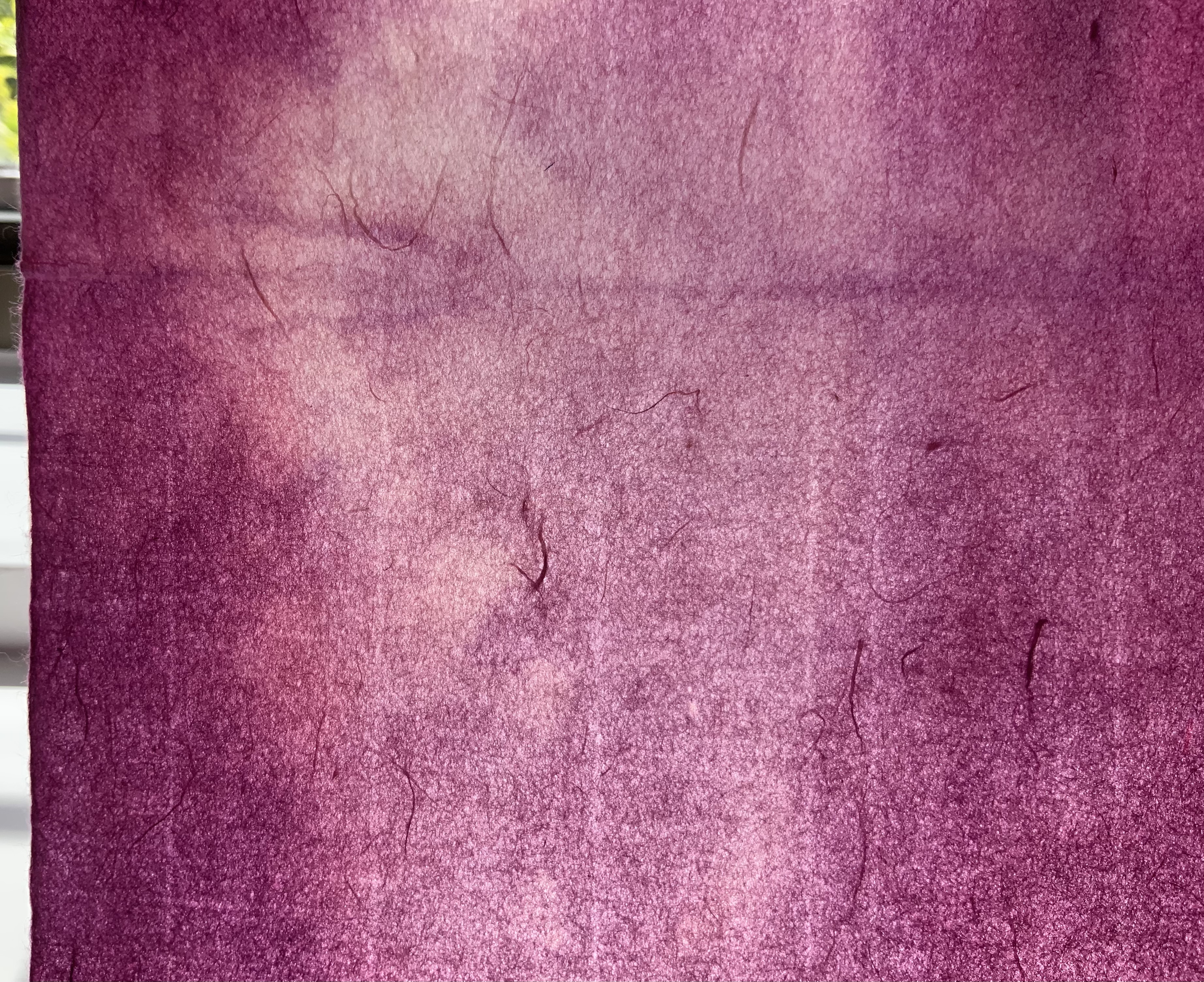
The next two papers demonstrate the curator’s attraction to painterly surfaces. Silkscreen printed by hand with a lacquer-like ink, the Red and Blue Dragonfly Pattern Japanese Lacquered Yuzen Paper (140 gsm, 330 x 485 m) has the depth, texture and glow Japanese lacquer ware, which the first three images attempt to convey. The painting base consists of kozo and wood sulfite. The sheet of paste paper (230 x 305 mm) in the last image comes from the late Louise Lawrence (Larry Lou) Foster. It has an op-art feel to it. More of her unique papers painted with pigmented paste can be found in the limited-edition book The Paste Papers of Louise Lawrence Foster and in the Metropolitan Museum’s Thomas J. Watson Paper Legacy Project.
A blend of abaca fibers and cotton rag, Bistre Mixed Media (150 gsm, 280 x 360 mm) from Kelsey Pike’s Sustainable Papercraft in Kansas City, Kansas, is at once hard, resilient, durable, bulky, thick and soft. The images below attempt to show the sheet’s homogeneous surface and smooth, fine grain texture, intended as the name suggests for all fine art media – pencils, charcoal, conte, pastel, acrylic, watercolor, ink, gouache, etc.
For the Books On Books Collection, Curated Collection #1 presents a challenge for display and storage alongside Fred Siegenthaler’s Strange Papers and the Gentenaar-Torley’s first seven books of the Rijswijk Paper Biennial. Helen Hiebert’s contribution to book and paper art warrants that place.
Curated Paper Collection #2 (2021)
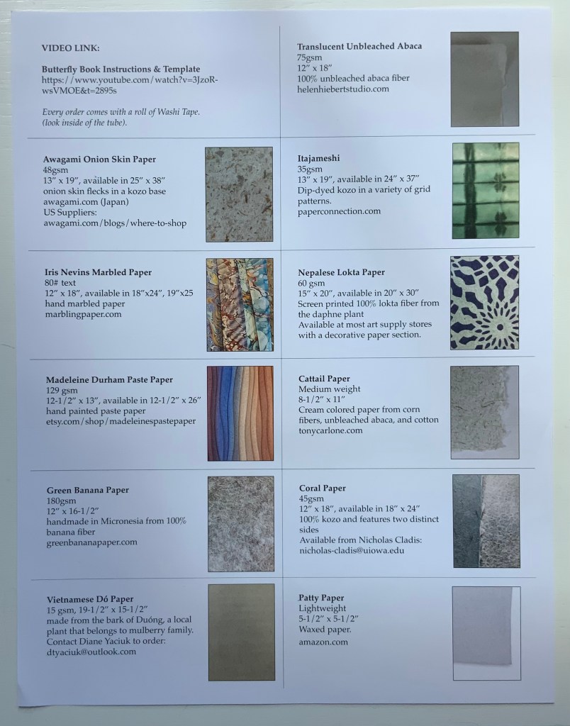
Hiebert’s second round of curation comes with a helpful printed cheat sheet (although it was challenging fun to identify the samples in #1 without the initial help). With inclusion of a video link for creating a “butterfly” book, the cheat sheet also recalls Hiebert’s bustling business in lectures and workshops as well as tempts a collector to raid the collection with a ham-handed attempt.
The first paper in the curation comes from the Fujimori family business. According to its website, 6th generation Minoru Fujimori took over in 1945. In 1970, he was designated an “Intangible Cultural Property of Tokushima” in recognition of his skills. In 1976, Awagami washi was designated as a “Traditional Craft Industry”. In 1986, Fujimori-san was further honored as Master Craftsman and awarded the “Sixth Class Order of Merit, Sacred Treasure” by the Emperor.
Naturally the flecks of onion skin show up differently on the two sides of the sample, and the density almost completely disguises the lines of the mesh. The way the color varies in the light at different angles accentuates the supple drape of the paper.
Awagami Onion Skin Paper, 48 gsm
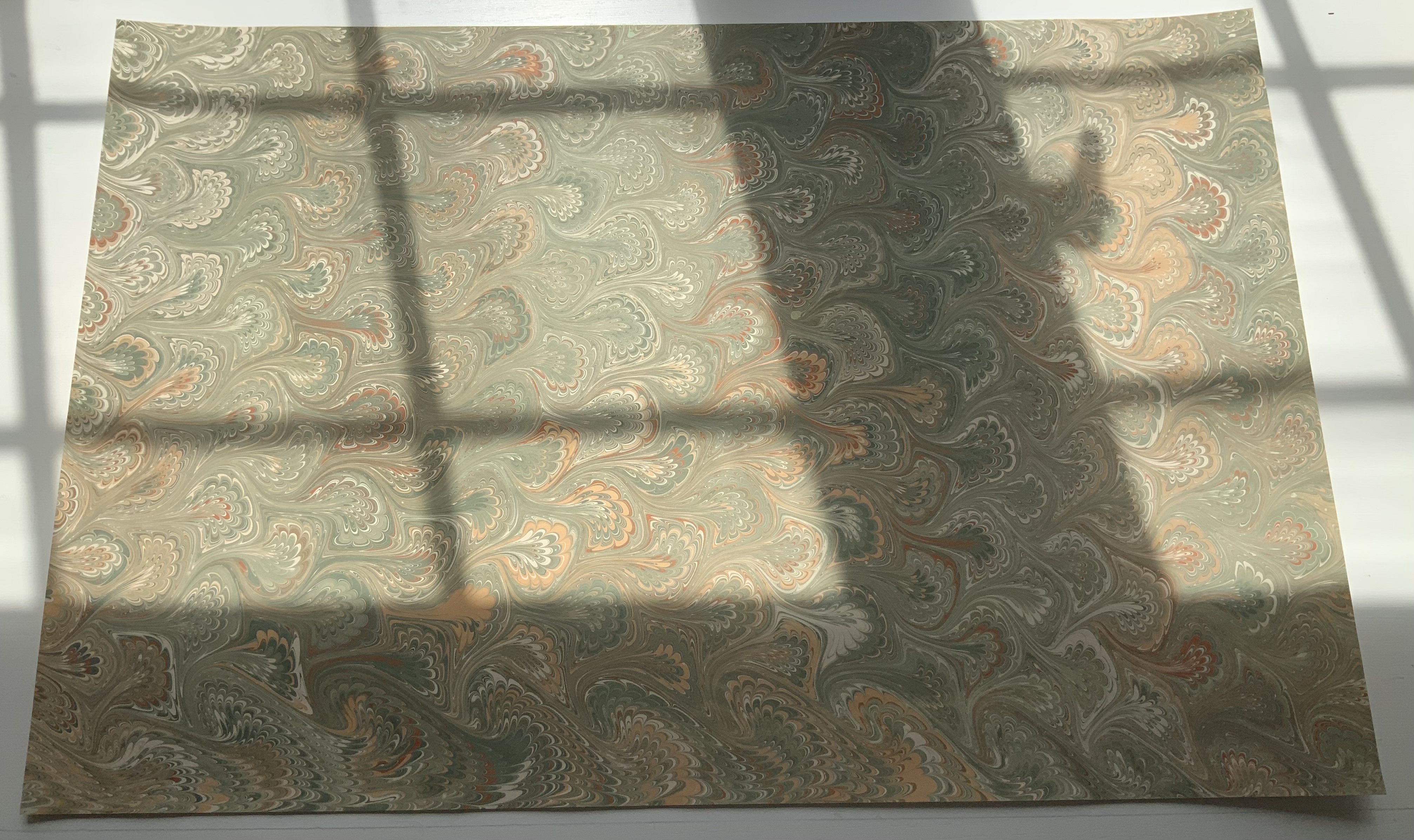
Like Minoru Fujimori above, Iris Nevins is a cultural treasure. Specializing in the reproduction of early marbled papers, she has delved into its past prior to the advent of marbling machines during the Victorian era and creates her “own marbling colors using, where possible, the same pigments used during the period”. On what shelves and in what crusty containers do such pigments reside?
As of August 2021, her work is still being accessioned by the Paper Legacy Project, a permanent collection house in the Metropolitain Museum Of Art, in The Thomas J. Watson Library.
Iris Nevins Marbled Paper
Madeleine Durham’s paste paper is also part of the Watson Library Digital Collection. In her artist’s statement, she refers to samples “representative of my landscape artwork”. With the sample that follows, dunescapes and seascapes come to mind.
Madeleine Durham Paste Paper, 129 gsm
This green banana paper comes from a company of the same name based in Kosrae, Micronesia. Among its products is the Green Banana Paper Wallet. The pictures cannot do justice to the toughness and almost slick feel of this paper. A raincoat or wallet made from it would keep a person and valuables dry and safe.
Green Banana Paper, 180 gsm
Dó paper is a traditional Vietnamese hand-made paper dating back to the 3rd century BC. Made from the self-stripping bark of the Rhamnoneuron balansae tree, Dó paper appears to be headed toward the state of papyrus. Urbanization leading to scarcity of the tree, the narrow seasonality of the bark’s availability (between August and October) and incursion of industrial paper production pose sharp challenges to its survival. The sample below may become a rarity.
Vietnamese Dó Paper, 15 gsm
This piece of translucent unbleached abaca is best appreciated alongside Hiebert’s video “Making a sheet of abaca” (15 August 2020).
Translucent Unbleached Abaca, 75 gsm
Like Shibori, this paper below is thin or tissue washi that has been folded and dyed. The dark, irregular lines where the dye has accumulated in the folds create a sharp contrast with the translucence of the laid lines and chain lines imprinted by the mesh in the papermaking frame.
Itajameshi, 35 gsm
Manohir Upreti discusses lokta paper, “the King of Nepalese paper”, in the Geest van papier = Spirit of paper(2004), one of the Rijswijk Biennial volumes put together by Peter and Pat Gentenaar-Torley. Upreti’s sample and this one below from Hiebert’s curation demonstrate the dramatic patterns possible with this paper.
Nepalese Lokta Paper, 60 gsm
Tony Carlone‘s cattail paper reflects his artistic aim to source material “in a proper and sustainable manner”. His output includes sculptural pieces formed by spraying, pouring and casting processes, large-scale pulp paintings, and straightforward flat sheets for print processes. The cattail paper appears heavy but is actually light and supple.
Cattail Paper, medium weight
Nicholas Cladis is an American-born interdisciplinary artist who lives and works in Fukui Prefecture, Japan. An active researcher and practitioner of traditional and non-traditional papermaking processes, he makes the paper elements of his work in Echizen—an area with over 1,500 years of papermaking history—and is also an international liaison for the papermaking community there. The contrast of the Coral paper’s two sides invites standing a window and turning the sheet over and over against the light.
Coral Paper, 45 gsm
Patty paper, as in waxed paper for food patties, makes its way into Curated Paper Collection #2 for its properties of translucence, proportions suited to origami and challenge as a printing surface. While a butterfly book might make result in an interesting use of this paper, a White Ermine Moth book would respond to all three features.
Jury, David, and Peter Rutledge Koch (eds.) 2008. Book Art Object. Edited by David Jury. Berkeley, California: Codex Foundation. Pp. 246 (Sound Blocks), 247 (Alpha, Beta …).
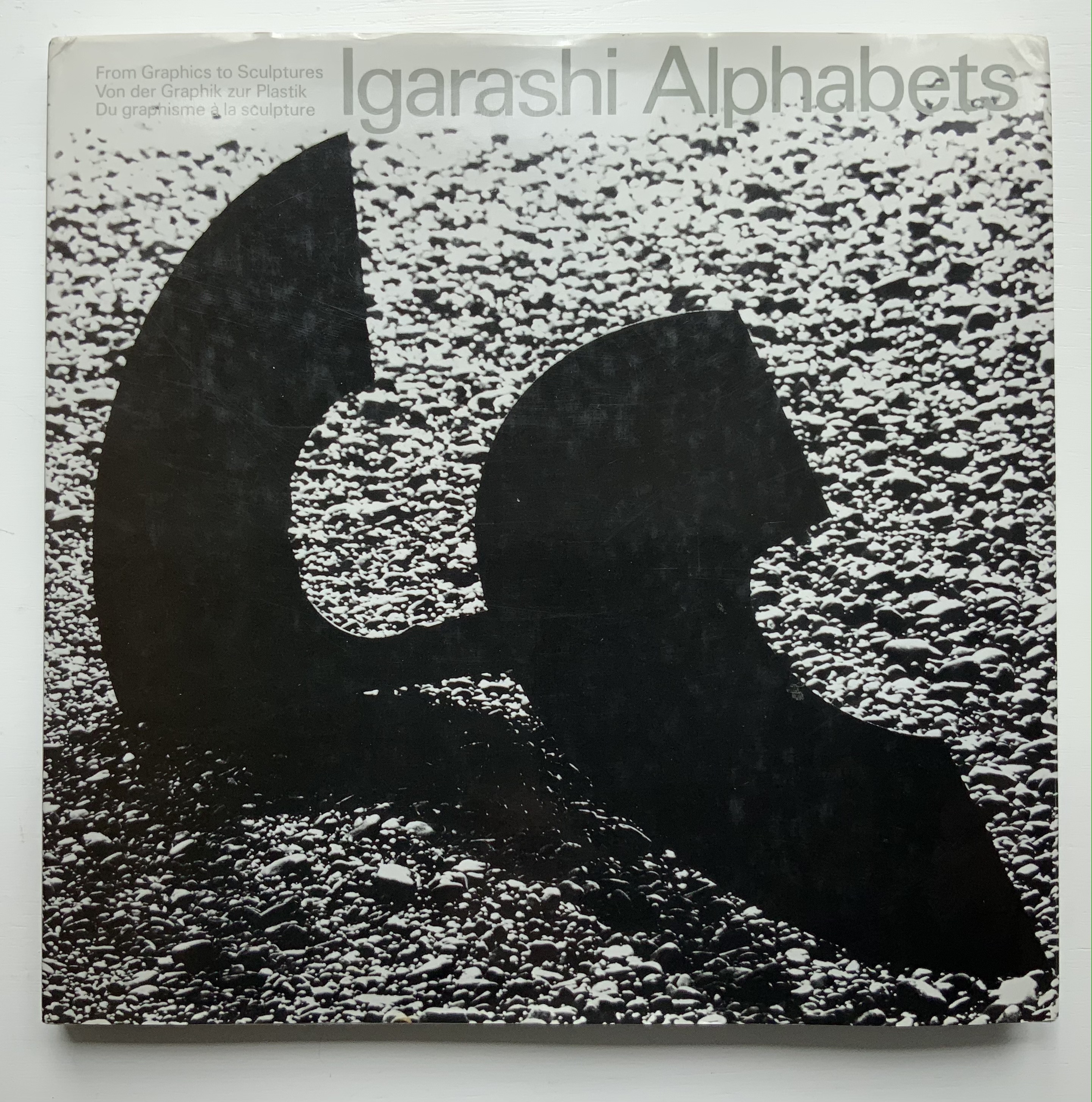
Thirty-three years after this rare volume’s appearance, some renewed interest in Igarishi’s design and artistry has arisen. The Thames & Hudson volume noted below was widely noted but reviewed in depth in only a few places (see below).
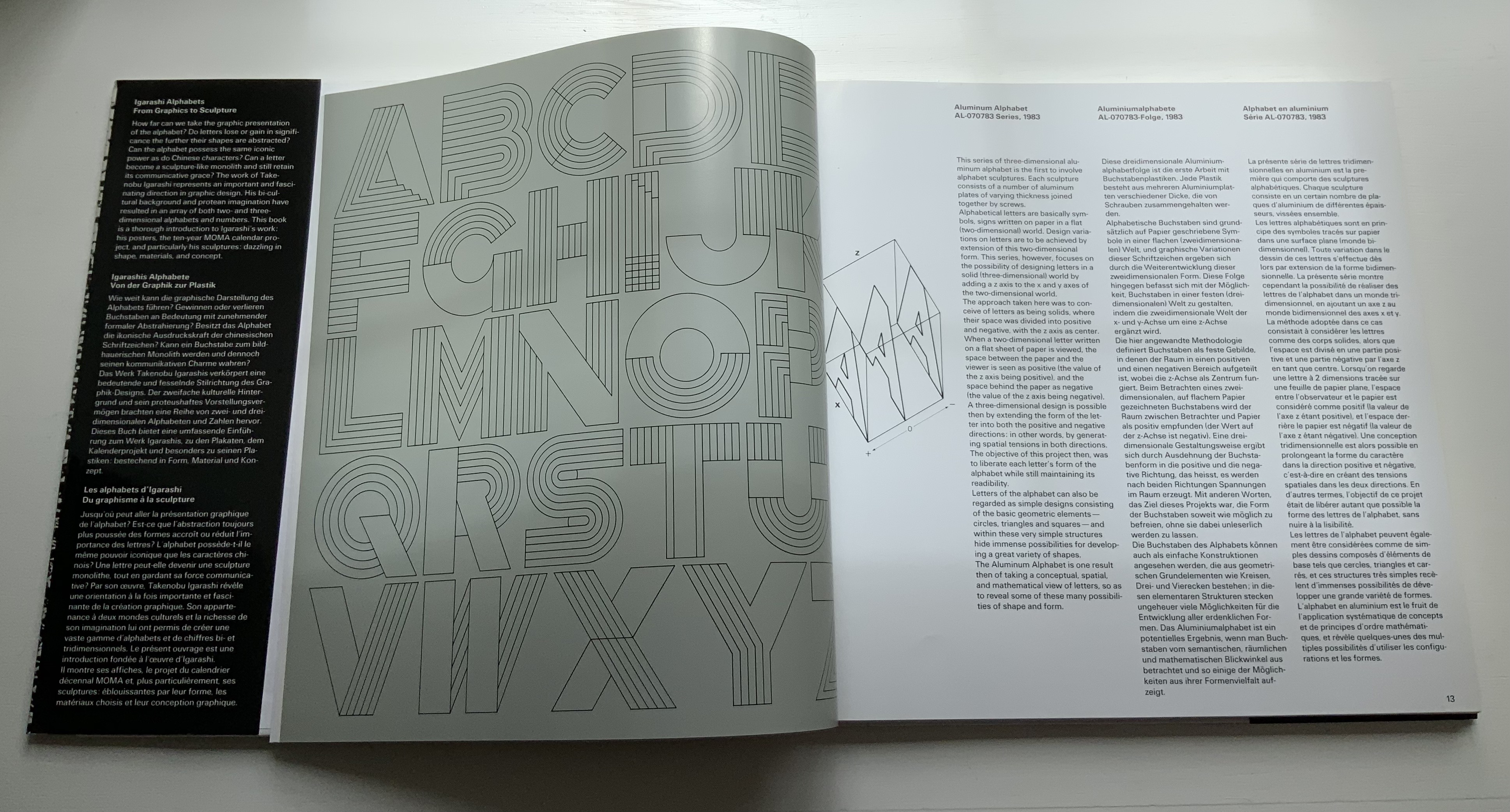
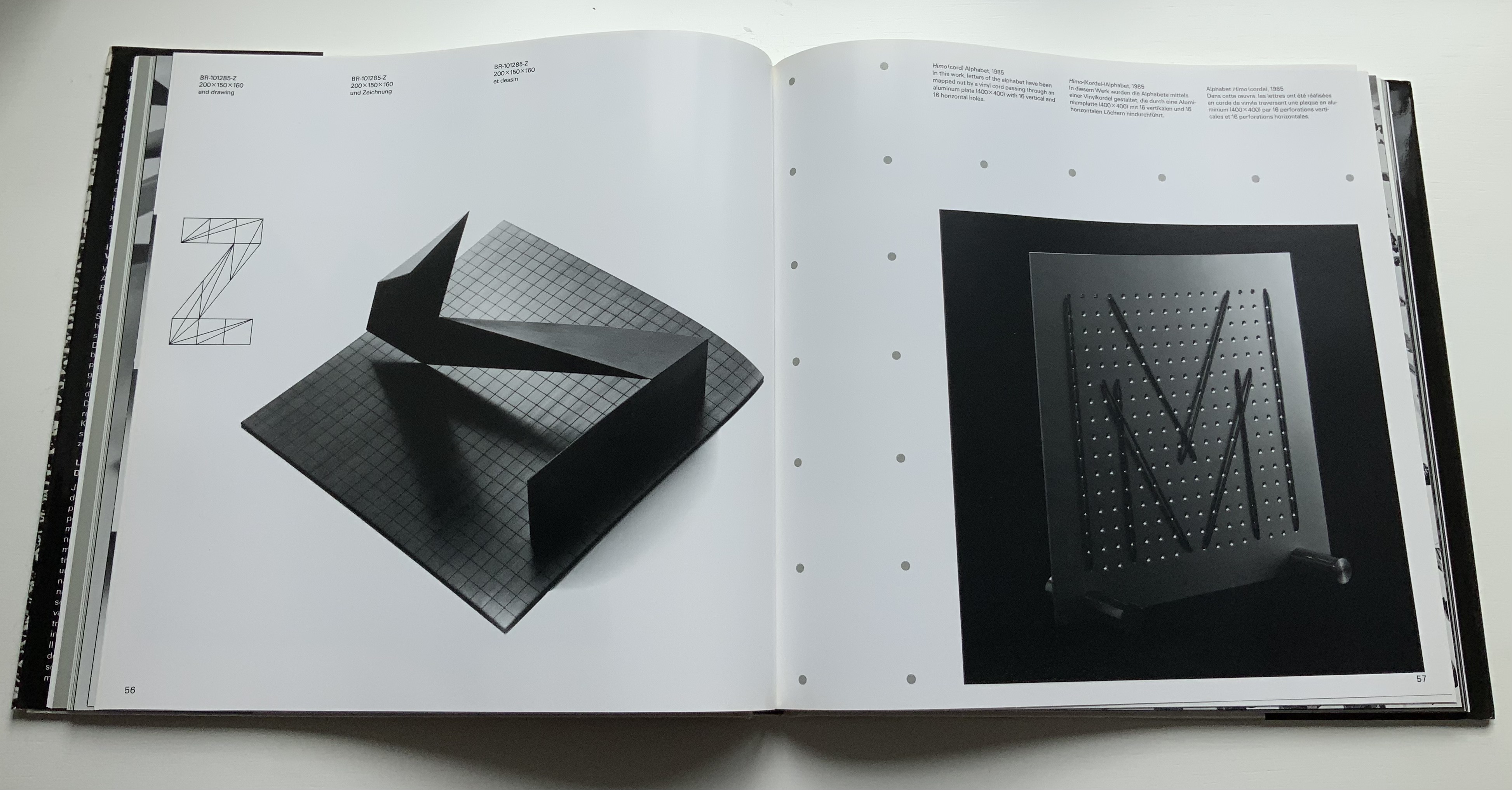
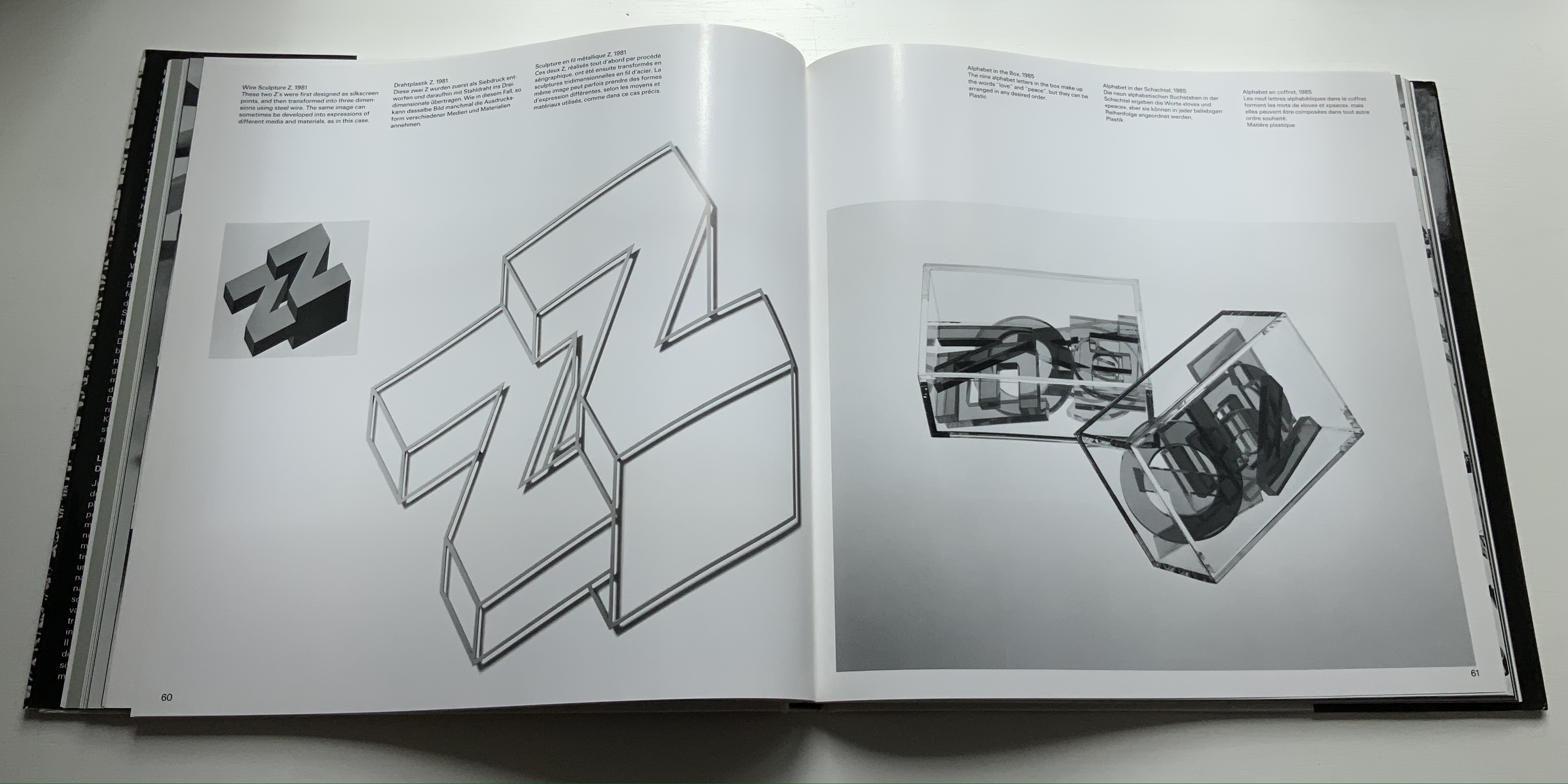
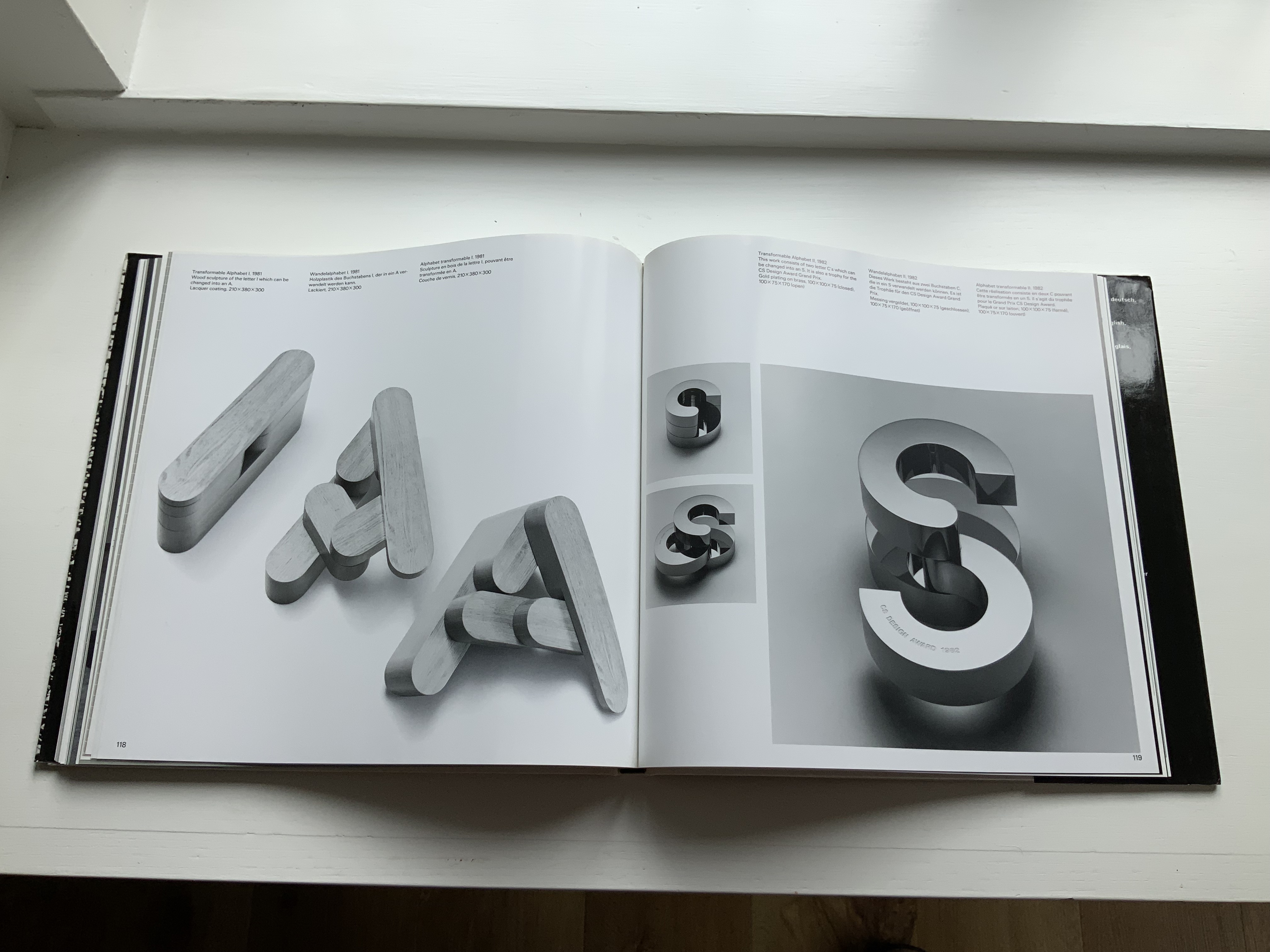
In noting in their 1995 facsimile of Johann David Steingruber’s Architectonisches Alphabeth that three-dimensional alphabet design inevitably reflects its typographic and architectural milieu, Joseph Kiermeier-Debre and Fritz Franz Vogel single out Igarishi’s work in aluminum, concrete, wood and plastic as a perfect 20th century example. Unlike that of his European predecessors, Igarashi’s milieu has been both Eastern and Western. It shows not only in his design, surfaces and choice of material but also in the global attention paid to his work. The briefest search online yields sources in Poland, the Czech Republic, Spain, Singapore and many others besides those expected in the US and Japan.
Along with the works of Katsumi Komagata, Yasushi Cho and Zhang Xiaodong, Igarashi’s volume adds some Eastern balance to the Western bias in the Books On Books Collection.
Hosie’s Alphabet (1972) Pictures by Leonard Baskin, words by Hosea, Tobias and Lisa Baskin Hardback H293 x W203 mm, 56 pages. Acquired from Springwell Books, 7 April 2021. Photos: Books On Books Collection.
The Bodleian Library holds the Leonard Baskin archive, but strangely did not have a copy of Hosie’s Alphabet. Recently (19 July 2023 – 24 January 2024) for its exhibition “Alphabets Alive!”, the full set of original prints created for The Gehenna Alphabet (1982) went on display.
So this acquisition for the Books On Books Collection performs the double duty of adding a Caldecott winner to its subset of abecedaries and, when the Collection arrives as a donation, filling the gap in the Bodleian’s holdings.
Baskin’s artistry in this book not only resides in the pictures. The layout and handling of Bembo vary — sometimes dramatically, sometimes subtly — in just the right way, be it in the use of uppercase, lowercase, roman, italic, bold, size, shading or the sudden introduction of Goudy Text.
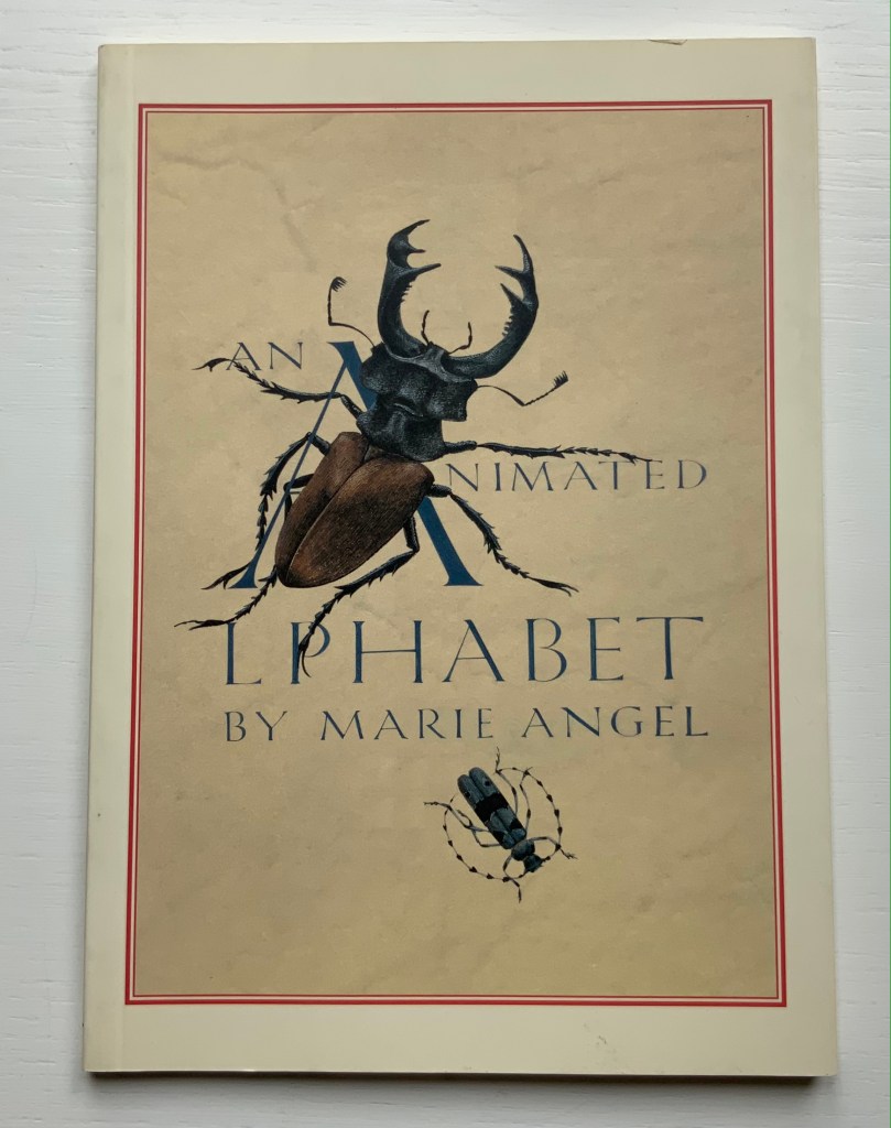
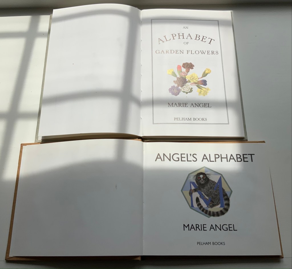
An Animated Alphabet (1996) Marie Angel Paperback, perfect bound. H140 x W160 mm, 64 pages. Acquired from Redux Books, 28 April 2021. Photos: Books On Books Collection.
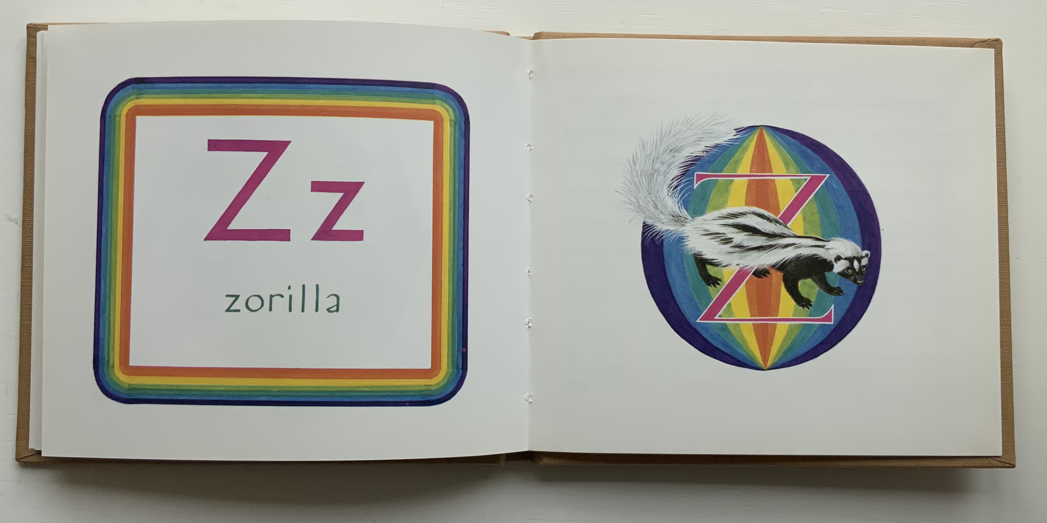
In the 1960s, Philip Hofer of Harvard’s Houghton Library commissioned the British illustrator to create a series of bestiaries. A black and white edition of An Animated Alphabet appeared in 1967. The publisher David Godine issued this full color edition in 1996. Before the Godine edition, other abecedaries appeared, including Marie Angel’s Exotic Alphabet(a lift-the-flap double-sided accordion book) in 1992, the colorful Angel’s Alphabet in 1986 and An Alphabet of Flowers in 1987.
From An Animated Alphabet
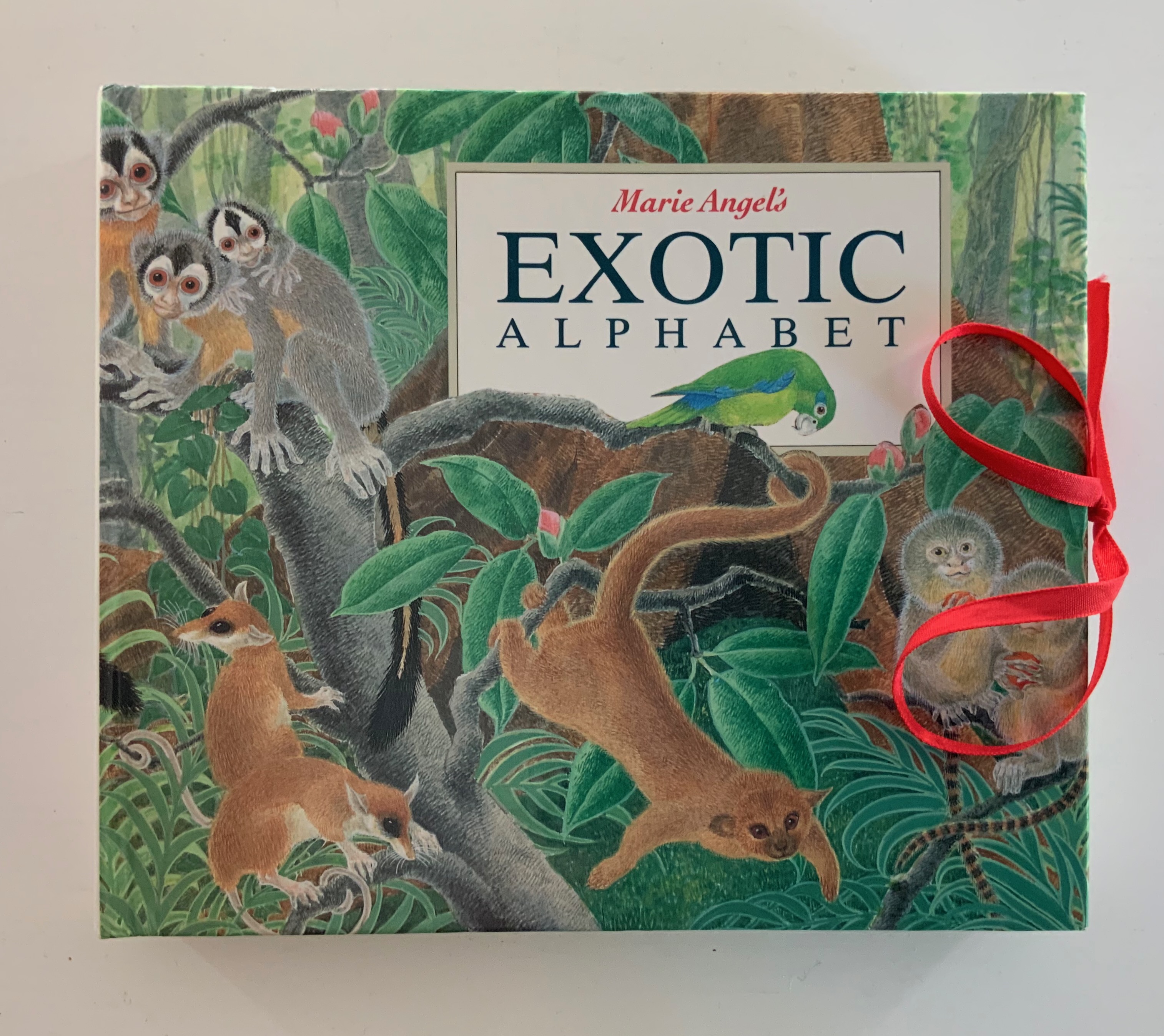
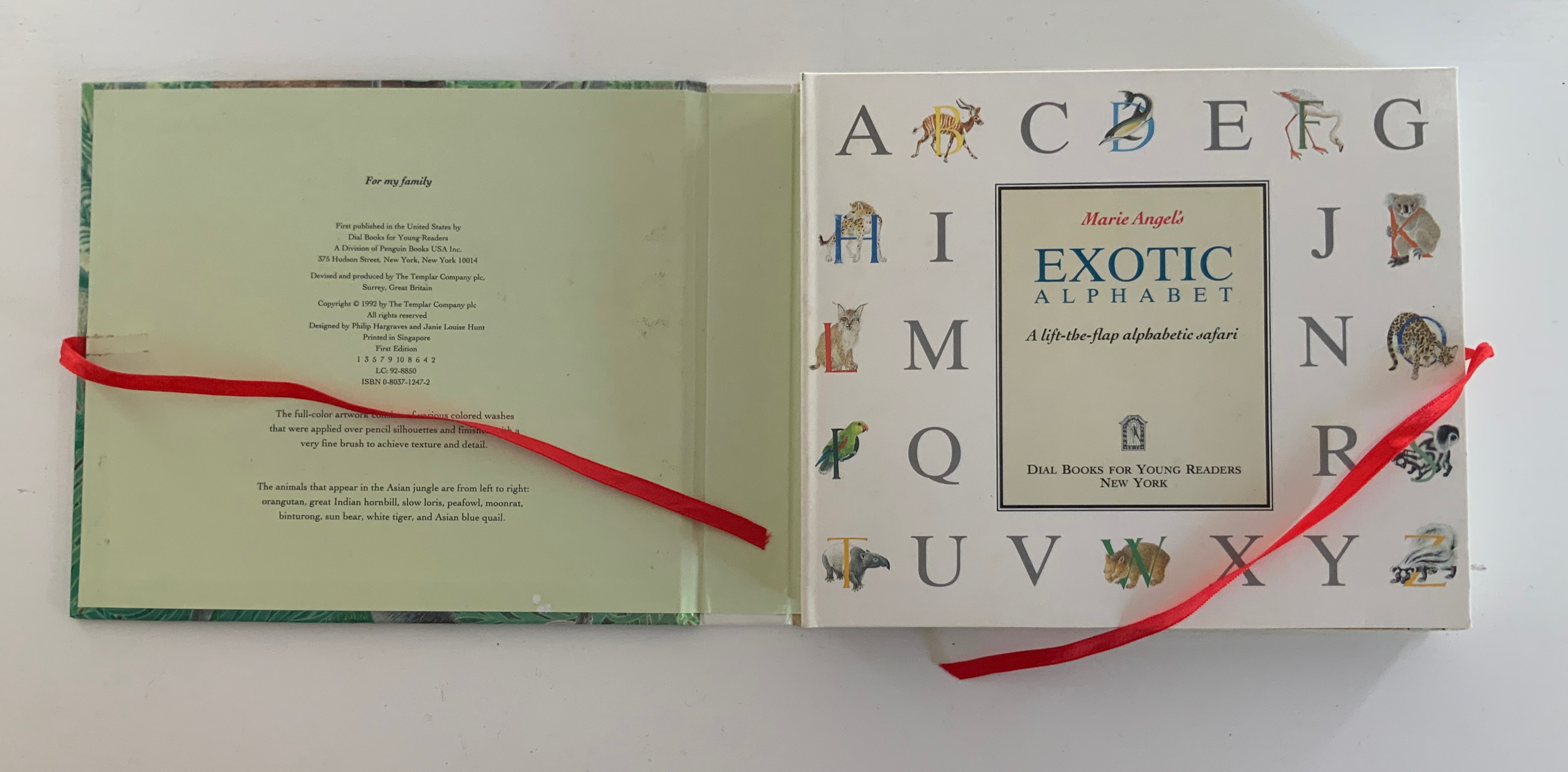
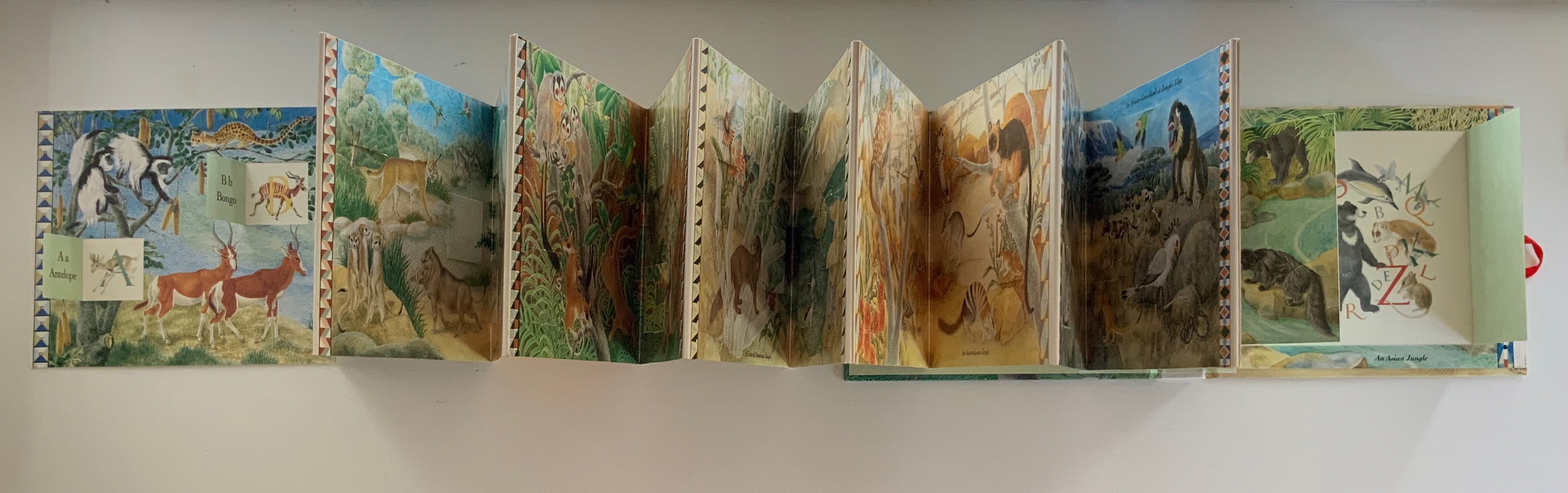
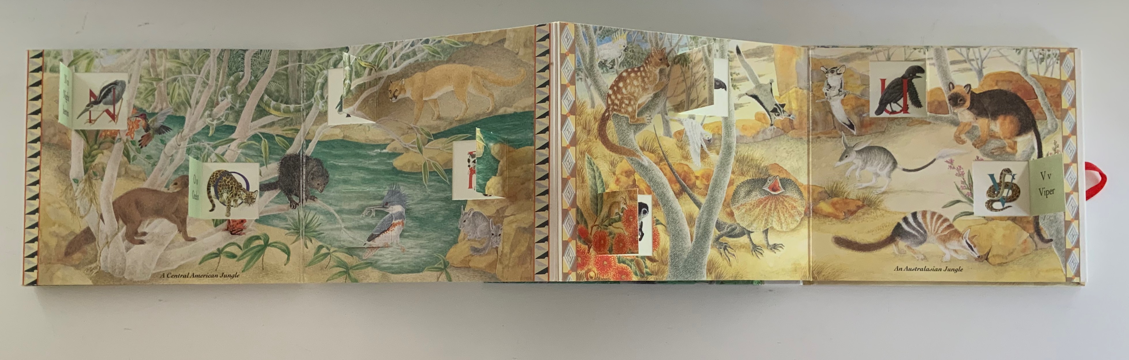
Marie Angel’s Exotic Alphabet (1992) Marie Angel Ribbon-tied, paper on boards case, inclosing lift-the-flap double-sided accordion book. Closed: H172 x W202 x D28 mm. Open: W2730 mm, 27 panels, including title panel. Acquired from Robert Gavora, Fine and Rare Books, 7 September 2021. Photos: Books On Books Collection.
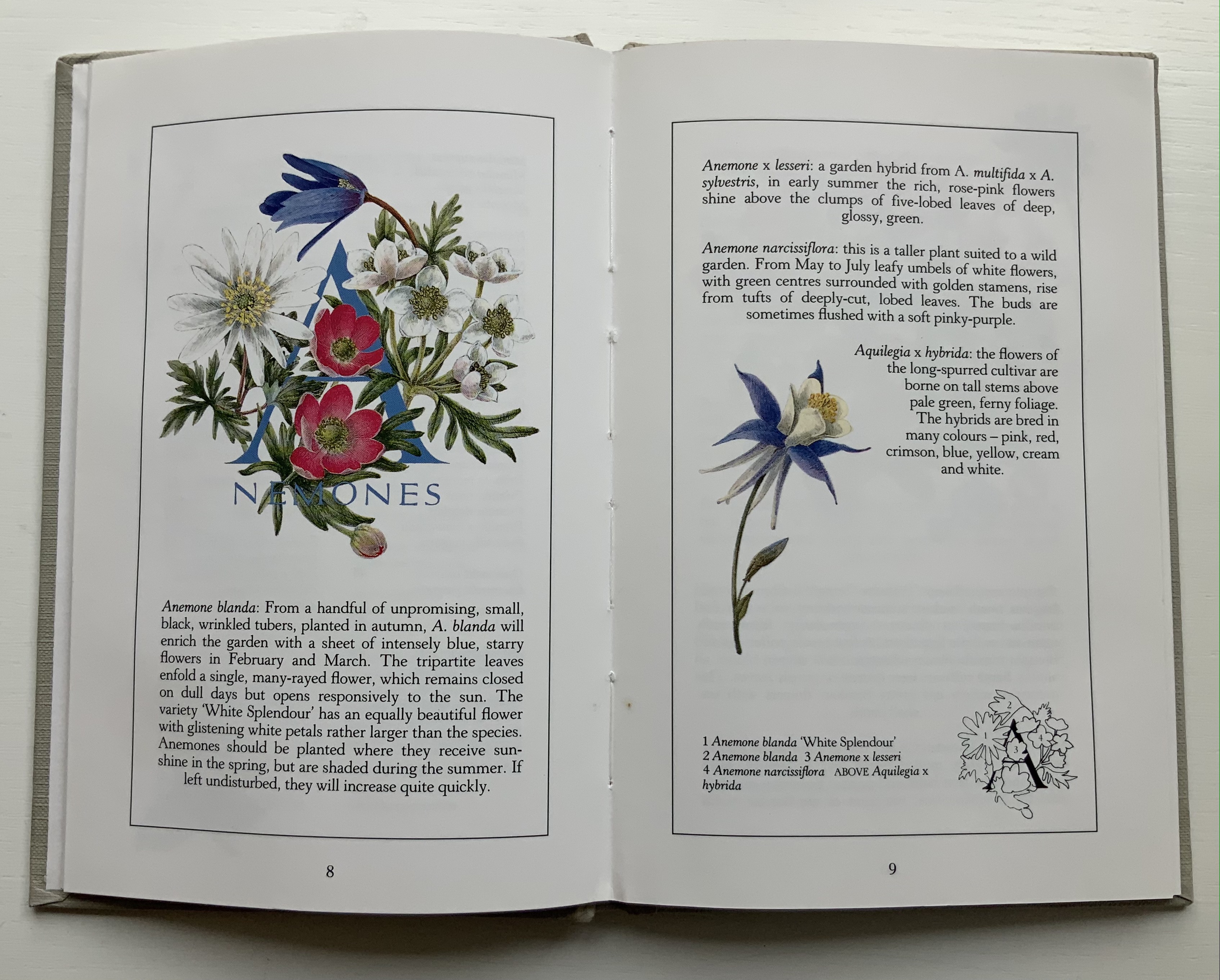
An Alphabet of Garden Flowers (1987) Casebound with decorated endpapers. H205 x W140 mm, 66 pages. Angel’s Alphabet (1996) Casebound with decorated endpapers. H140 x W 160 mm, 60 pages. Acquired 7 June 2021. Photos: Books On Books Collection
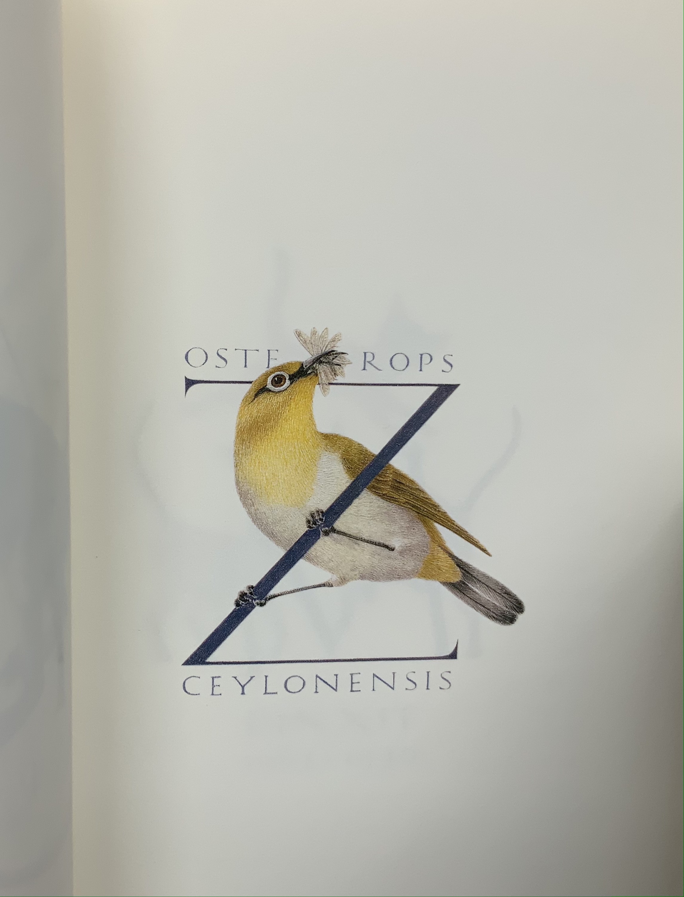
Even with different audiences, Angel’s style and eye for choice show through from A to Z.
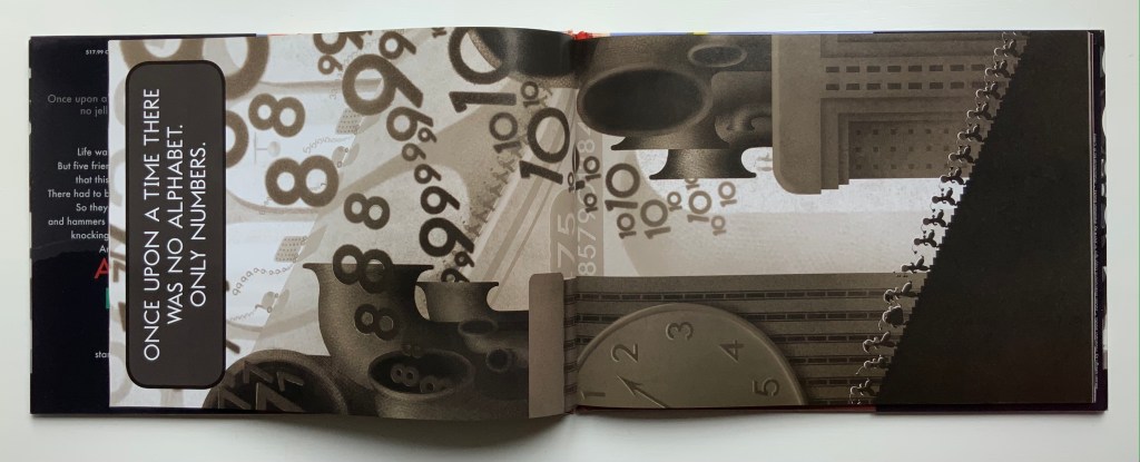
The Numberlys (2014) William Joyce and Christina Ellis Hardback, paper on board. H220 x W300 mm, 52 pages. Acquired from London Bridge Books, 15 April 2021. Photos of the book: Books On Books Collection.
Although bound in landscape, the book reads in portrait … to start and end.
Life was…fine. Orderly. Dull as gray paint. Very…numberly. But our five jaunty heroes weren’t willing to accept that this was all there could be. They knew there had to be more.
So they broke out hard hats and welders, hammers and glue guns, and they started knocking some numbers together. Removing a piece here. Adding a piece there. At first, it was awful. But the five kept at it, and soon it was…artful! One letter after another emerged, until there were twenty-six. Twenty-six letters—and they were beautiful. All colorful, shiny, and new. Exactly what our heroes didn’t even know they were missing.
And when the letters entered the world, something truly wondrous began to happen…
Based on the award-winning app, this is William Joyce and Moonbot’s Metropolis-inspired homage to everyone who knows there is more to life than shades of black and gray. — from the Moonbot Studios’ website. Accessed 28 April 2021.
Archaeologists and paleontologists hypothesize that the alphabet evolved from counting. Clay tokens as signs (8000–3500 BC) and then pictographic marks on clay tablets (3500–3000 BC) were used for counting units of things. Around 3000 BC, someone merged pictographic signs and phonetic sounds to begin the invention of the alphabet. Orly Goldwasser (Hebrew University, Jerusalem) has hypothesized that illiterate Canaanite miners may have been the inventors of the alphabet around 1840 B.C.E.
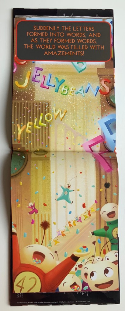
Likewise in The Numberlys, our inventor-heroes (numbers 1-5 or, in their vocalizations, possibly the five vowel sounds?) lead a similarly manual existence, albeit in a more modern industrial setting. They can be viewed at work here in this clip from the award-winning app, no longer available but perilously stored on an early iPad in the Books On Books Collection. As in the app, the book proceeds in gray until the letter Z, when “THINGZ” begin to happen — “Pizza! Jelly beans! Color! Books!”.
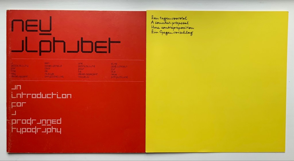
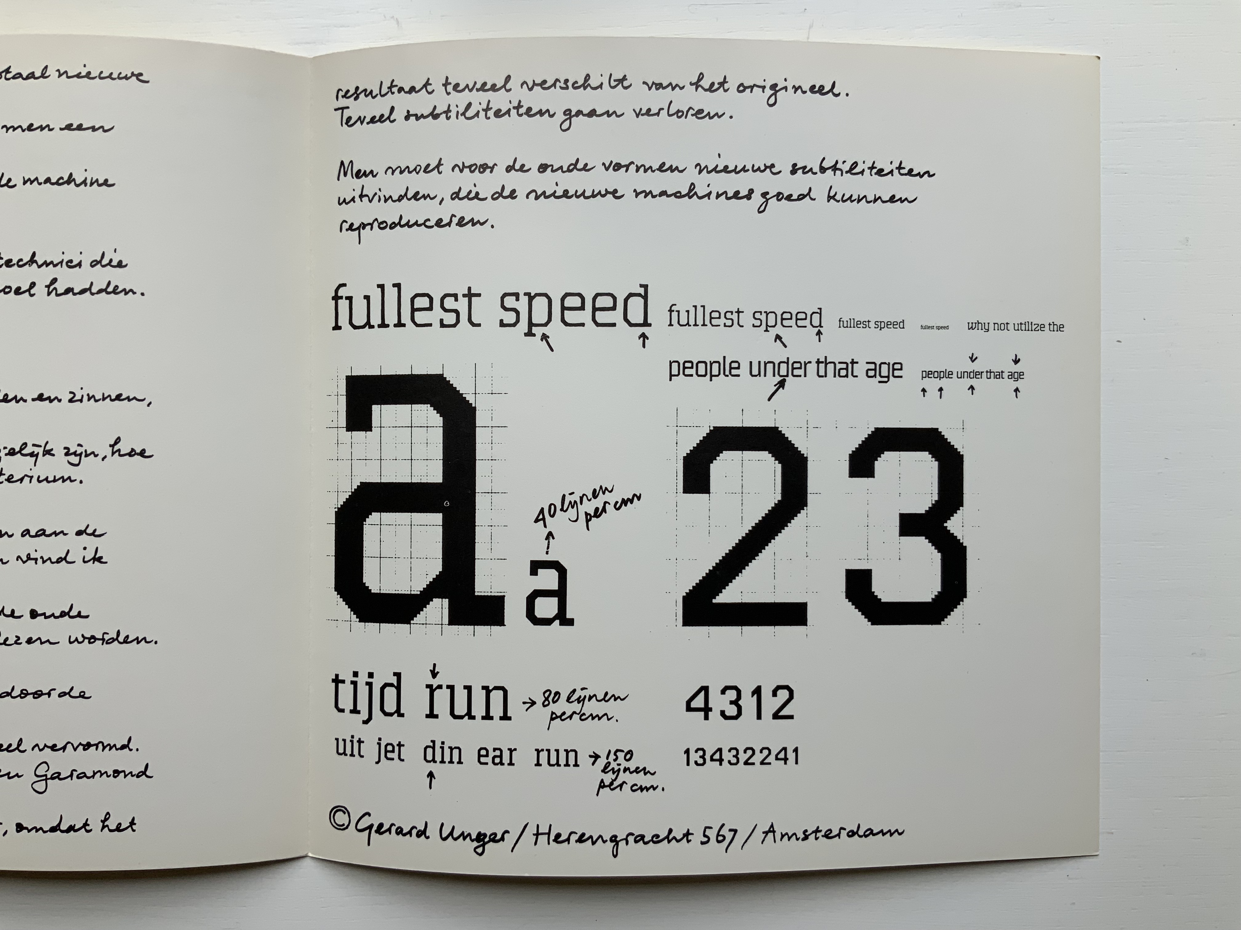
A few months after Pieter Brattinga issued Wim Crouwel‘s New Alphabet (below left), he followed up with this single-fold riposte from Gerard Unger, invited in fact by Crouwel.
Left: Crouwel. Right: Unger.
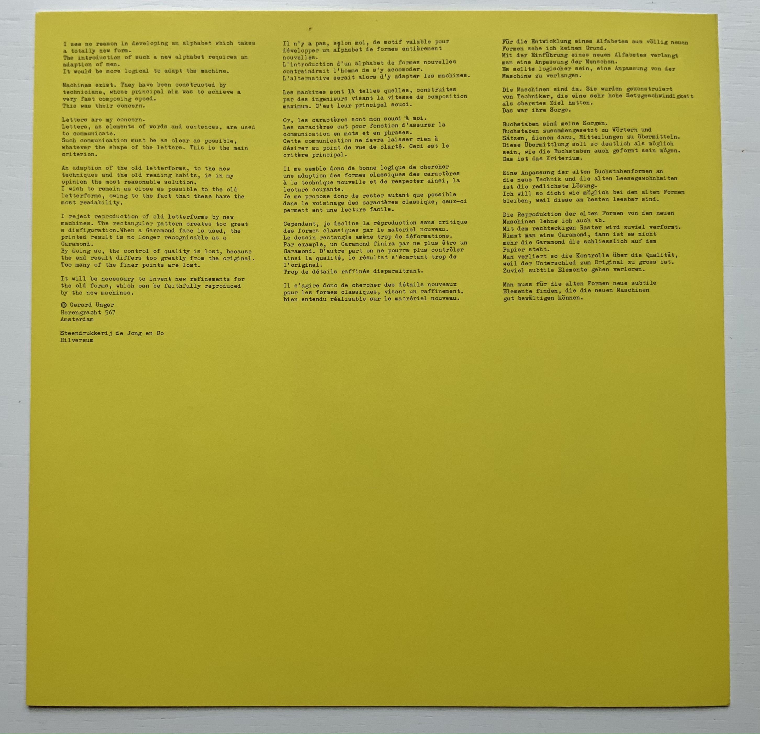
Unger urges designing or teaching machines to accommodate “human-readable” letterforms rather than inventing new fonts for machines. Given advances in digital type and artificial intelligence, Unger’s point may have been prescient, but there is still something to be said for the artistic stimulus of machine constraints.
Brattinga extended the dialogue later to include Timothy Epps and Christopher Evans in 1970. If, as it did, the Epps/Evans alphabet led to LINE UP by Raffaella della Olga and Three Star Press, what other works of art have benefited from similar alphabetic and typographical dialogues?
Alphabet (1970), Timothy Epps and Christopher Evans; LINE UP (2020) Raffaella della Olga
Jeffrey Morin and Steven Ferlauto‘s Sacred Space (2003) has its roots in Ferlauto’s historical research into Roman capitals. Jennifer Farrell‘s The Well-Travelled Ampersand (2019) has its roots in the letterform and design thinking of Adrian Frutiger, Frederic Goudy, Dard Hunter, Edward Johnston and Russell Maret, among several others. Inclusion of source material like that by Crouwel, Epps and Evans, and Unger in the Collection offers paths to increased appreciation of those works of art inspired by them. Something for the future history of book art.
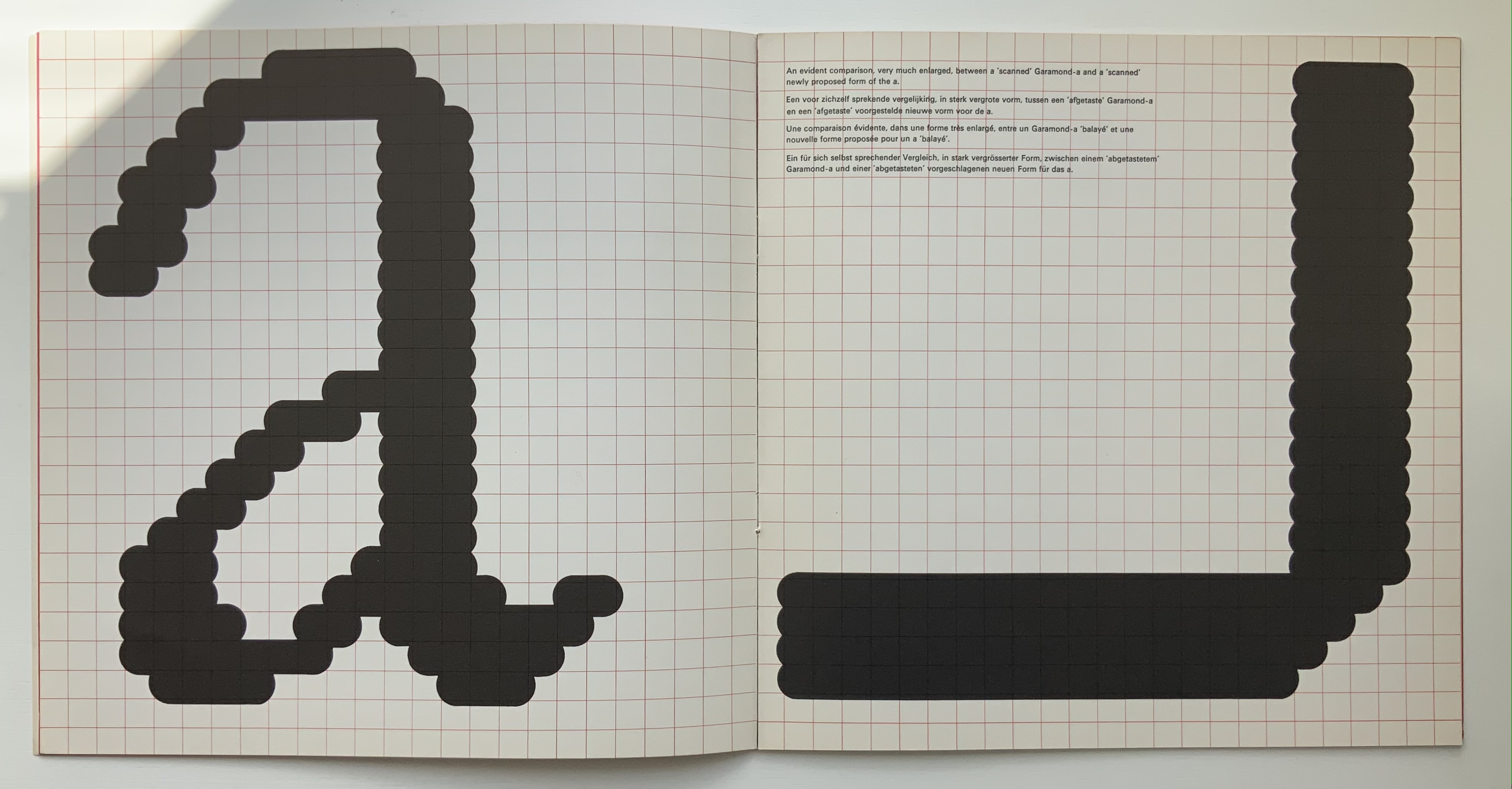
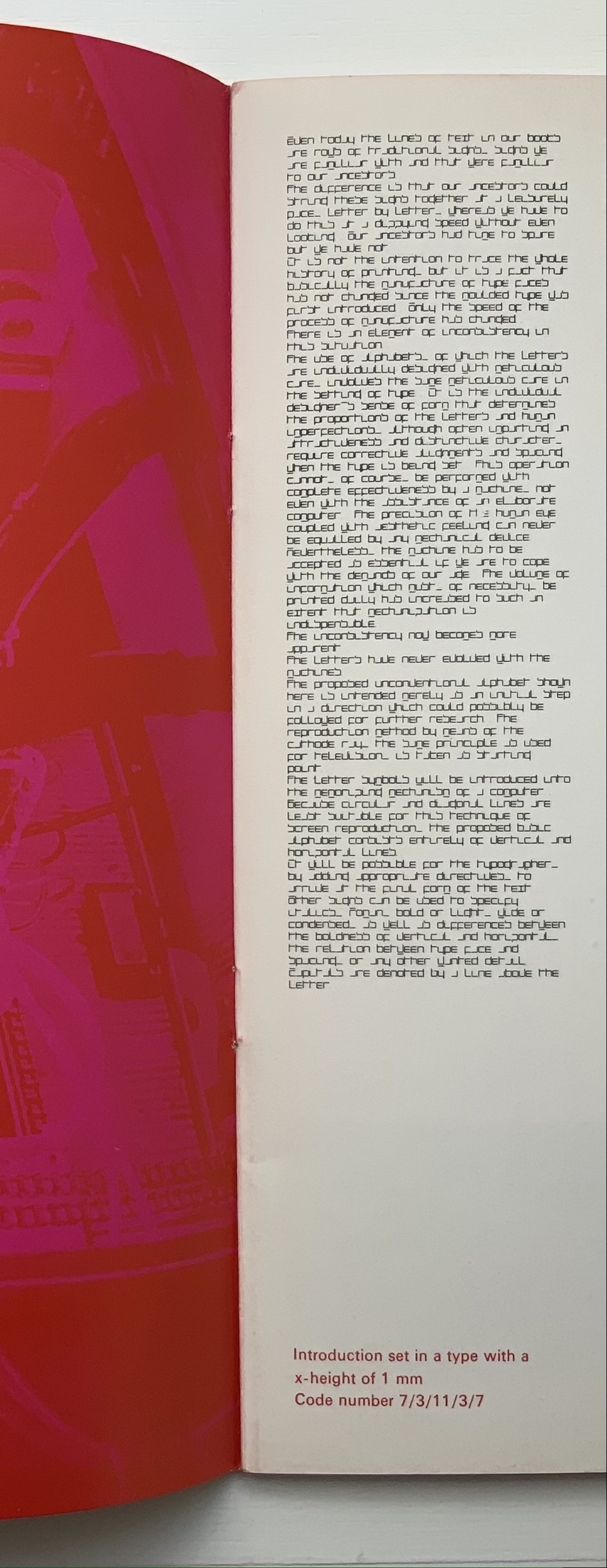
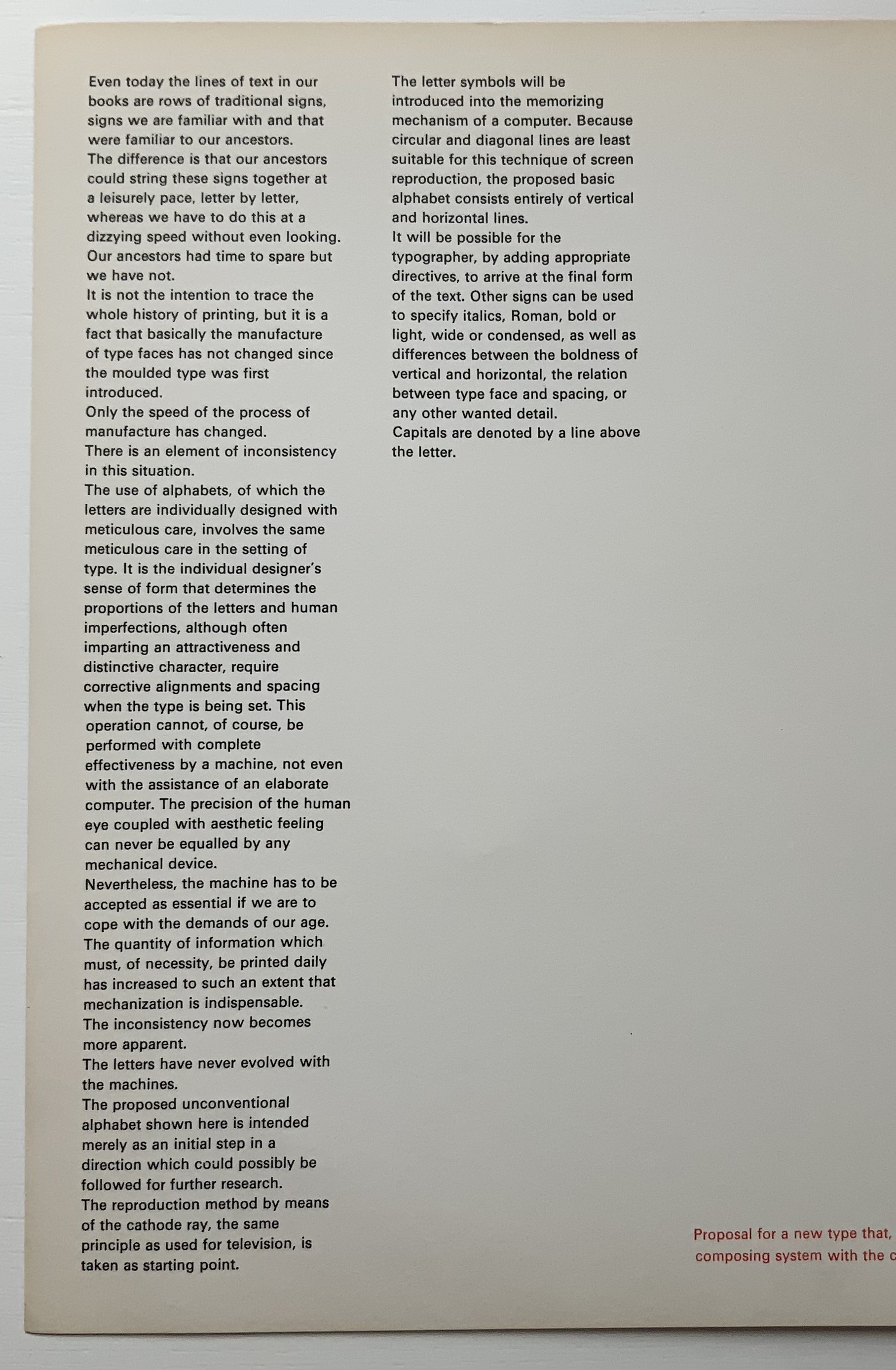
Shocked by the very low resolution output of electronic type-setting machines and sparked by the challenge to define a type that, more than traditional types, would be suited for the speed of machine output (particularly composing systems with CRT — cathode-ray tubes) and still be readable by humans, Crouwel came up with the New Alphabet.
On the left, Crouwel’s introduction in New Alphabet; on the right, in Univers.
A double-page spread (not shown) explains the variables and rules for coding and resizing the letters. Clearly, from the side-by-side view of Crouwel’s introduction (above), humans would need to learn some new conventions (e.g., majuscules are designated by bars over miniscules) for the font to be readable. Some letters, such as “a” (below), would require recognition of an utterly different shape. Despite — or because of — that, the font appealed to album and magazine cover designers in the digital ’80s.
Disturbed by letting machines take precedence over the human eye, Gerard Unger, one of Crouwel’s colleagues, submitted a “counter proposal” — tellingly in handwriting. Juxtaposition of their lowercase “a’s” with Geofroy Tory’s majestic majuscules offers a counter-counter historic perspective on the art of the alphabet.