When I wrote earlier that knot theory seems to be having a moment this year, I was unaware that the Old Operating Theatre Museum and Herb Garret in London was hosting an exhibition called
Knots: Medicine and Superstition
The centerpiece of the exhibition is the Bookscape Collective’s sculpture “After dark vapors have oppress’d our plains” (2025). Hanging from the garret’s beams, this mass of red fibers, ribbon, thread, and wood aptly entwines the auras of art, poetry, and superstition together with the venue’s association with surgical knots and medicinal herbs.
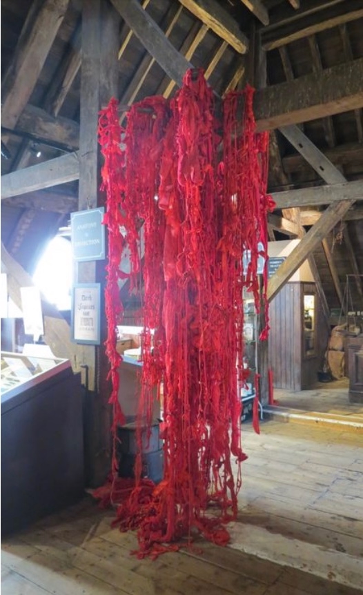
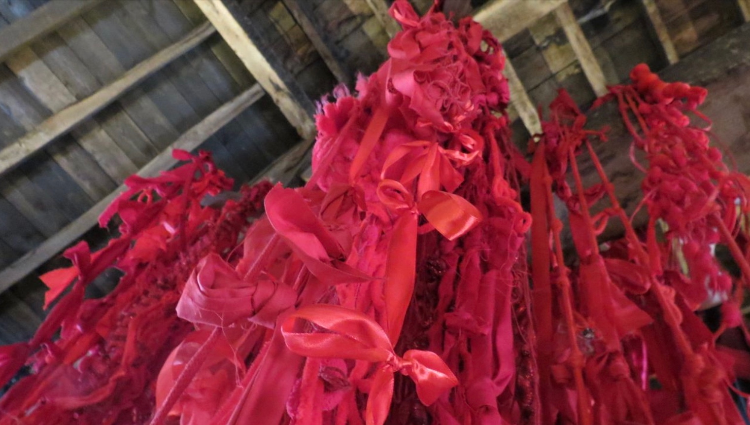
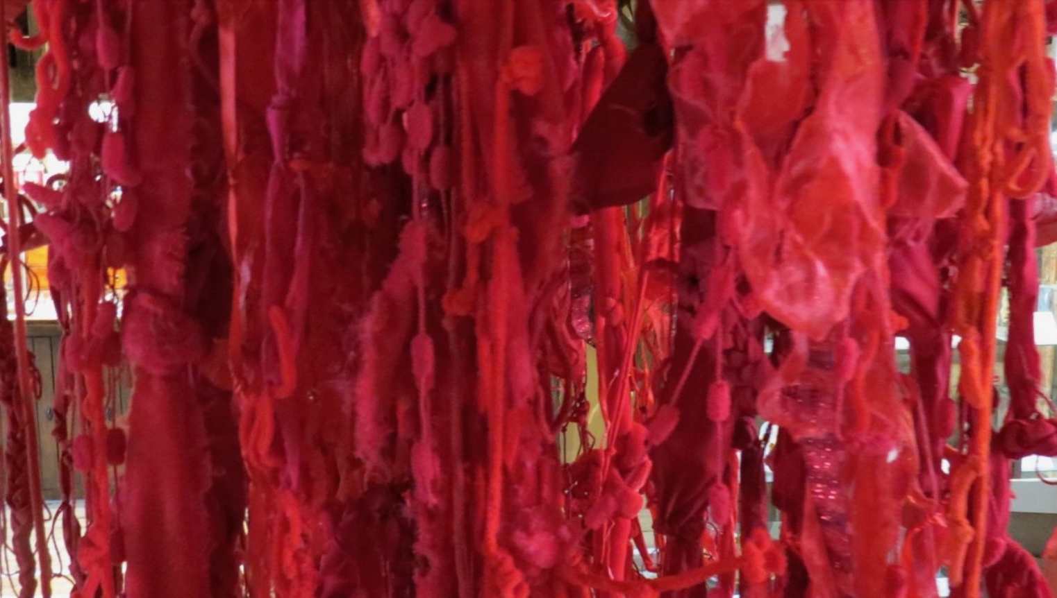
“After dark vapors have oppress’d our plains” (2025)
Sculpture (red fibres, wood, red thread)
Bookscapes Collective
(Chris Ruston; Heather Hunter; Jo Howe; Jen Fox; Karen Apps; Jules Allen)
The sculpture’s title comes from the first line of this sonnet by John Keats (1795 – 1821):
After dark vapors have oppress’d our plains
For a long dreary season, comes a day
Born of the gentle South, and clears away
From the sick heavens all unseemly stains.
The anxious month, relieved of its pains,
Takes as a long-lost right the feel of May;
The eyelids with the passing coolness play
Like rose leaves with the drip of Summer rains.
The calmest thoughts came round us; as of leaves
Budding—fruit ripening in stillness—Autumn suns
Smiling at eve upon the quiet sheaves—
Sweet Sappho’s cheek—a smiling infant’s breath—
The gradual sand that through an hour-glass runs—
A woodland rivulet—a Poet’s death.
As the museum’s caption reminds the visitor:
Knots have been part of everyday life for millennia. Alongside practical uses, they have attracted many superstitious and magical properties. Knots are found among the earliest prehistoric amulets designed to ward off evil, and today knots are essential for suturing the body after surgery, with knot practice forming a fundamental part of contemporary surgical training.
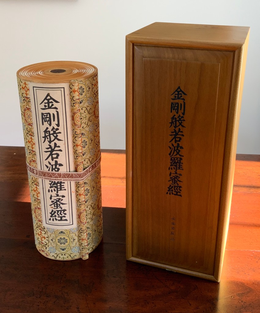
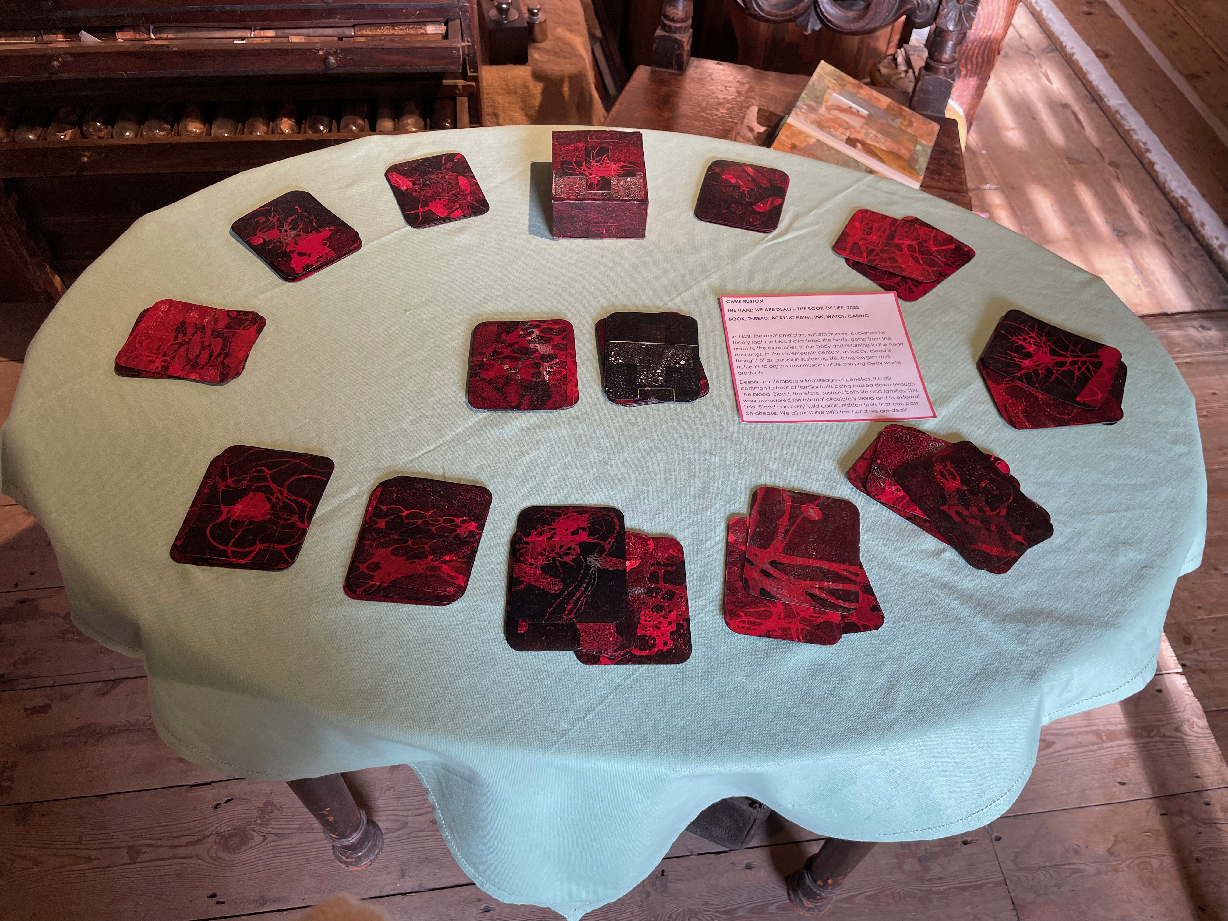
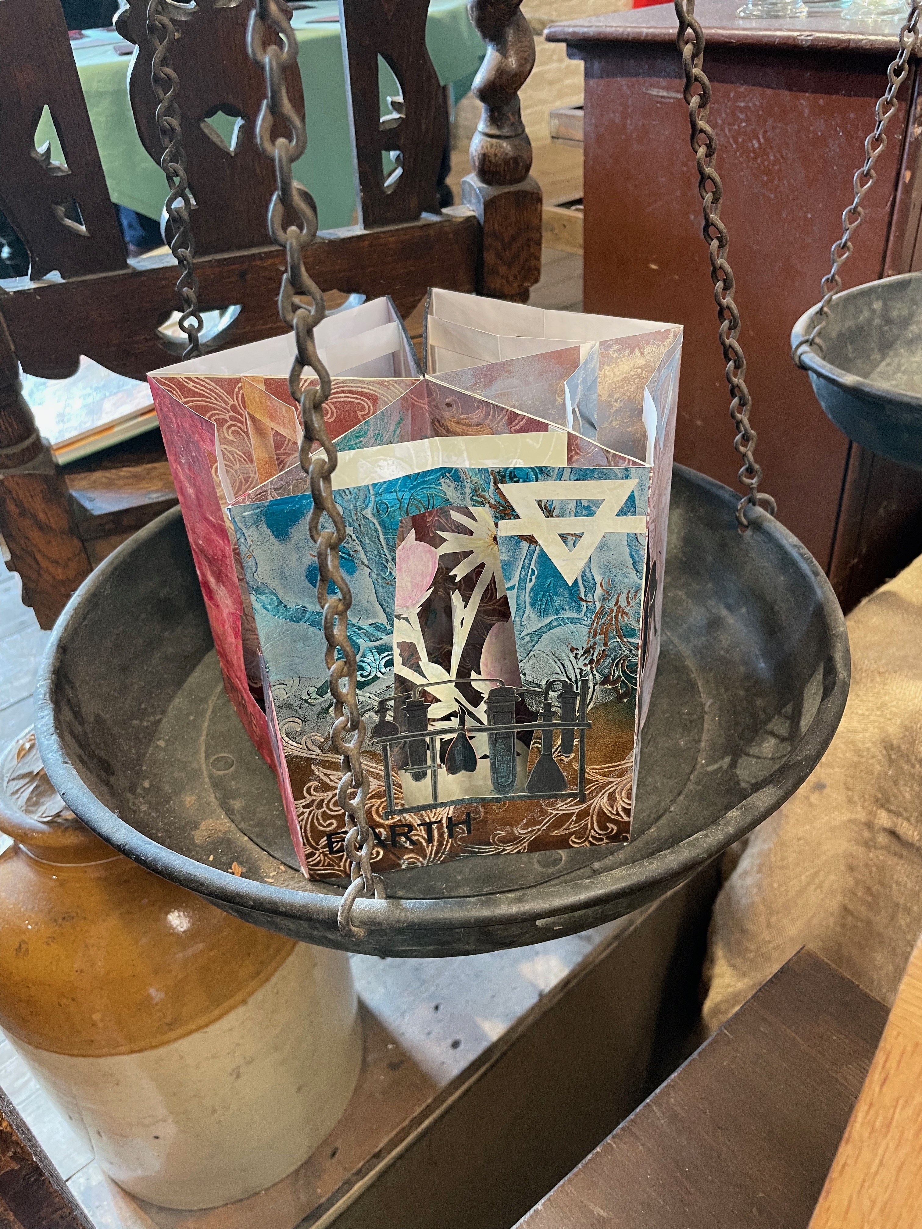
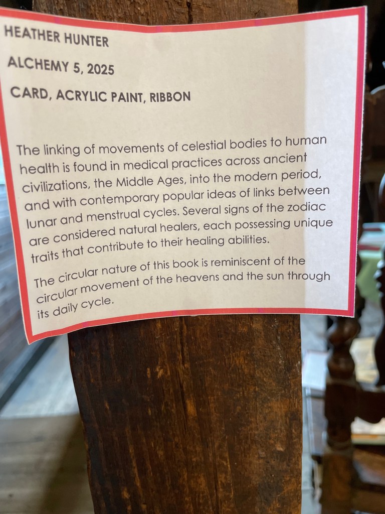
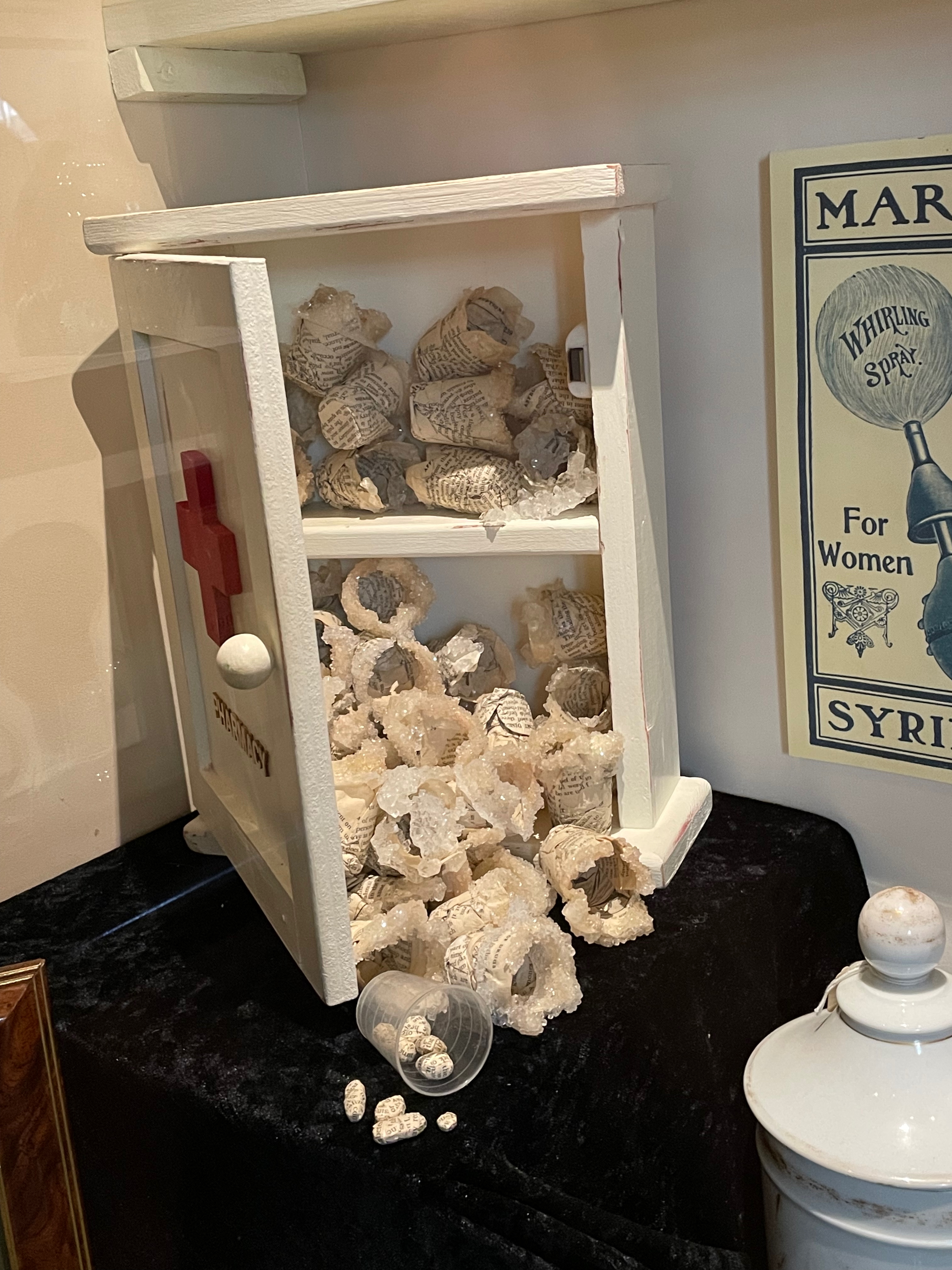
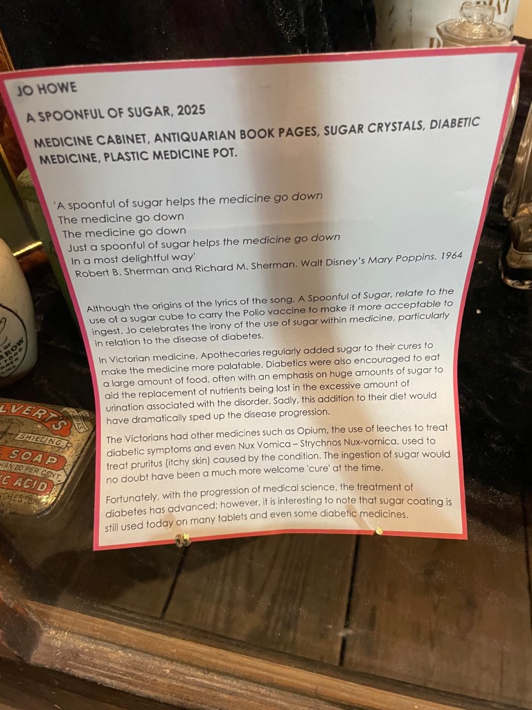
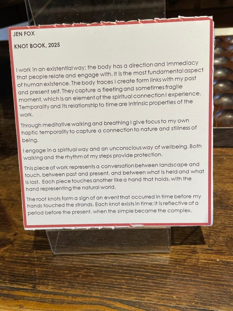
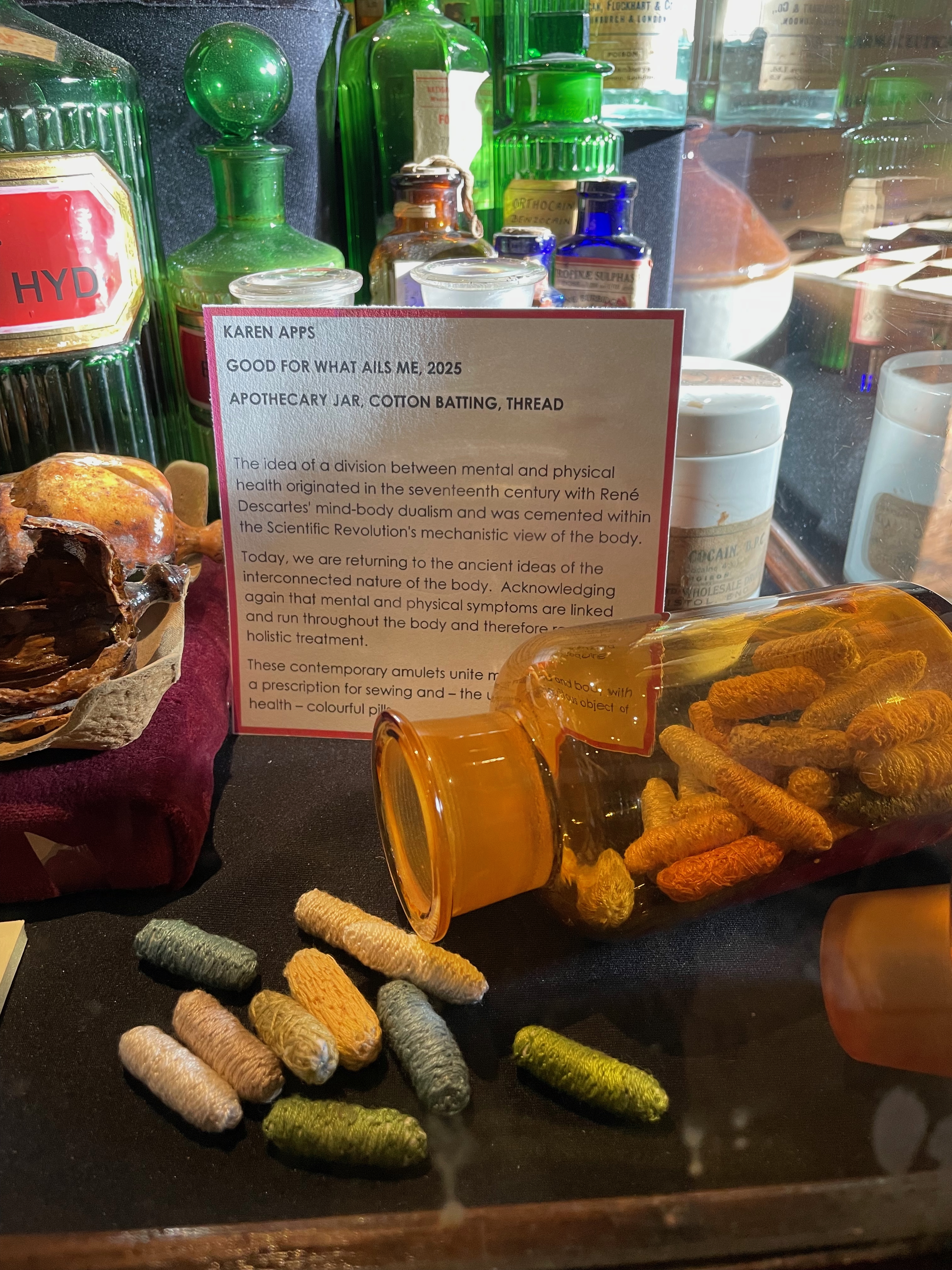
The Bookscapes Collective brings together Chris Ruston, Heather Hunter, Jo Howe, Jen Fox, Karen Apps, and Jules Allen. In addition to the central collaborative piece, the exhibition displays twenty-six additional works by these artists that each reiterate the knots binding together the worlds of science and art.
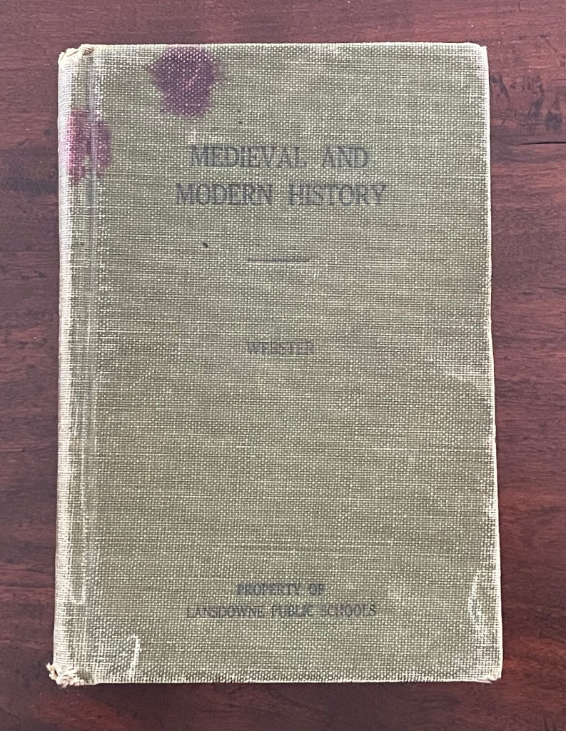
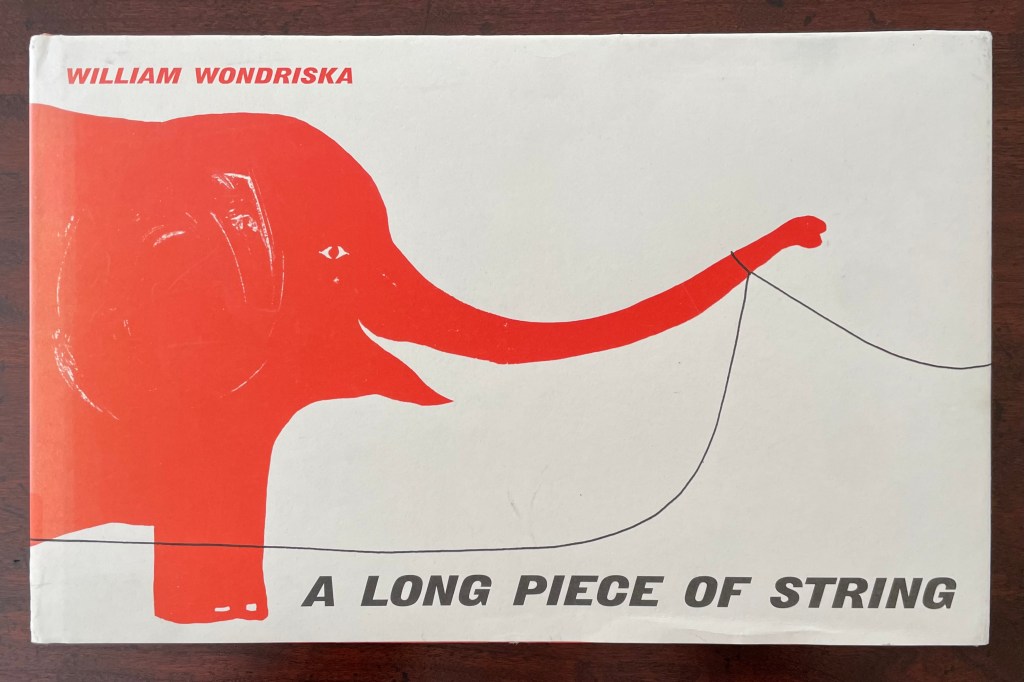
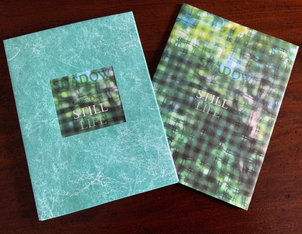
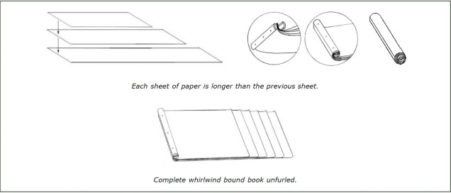
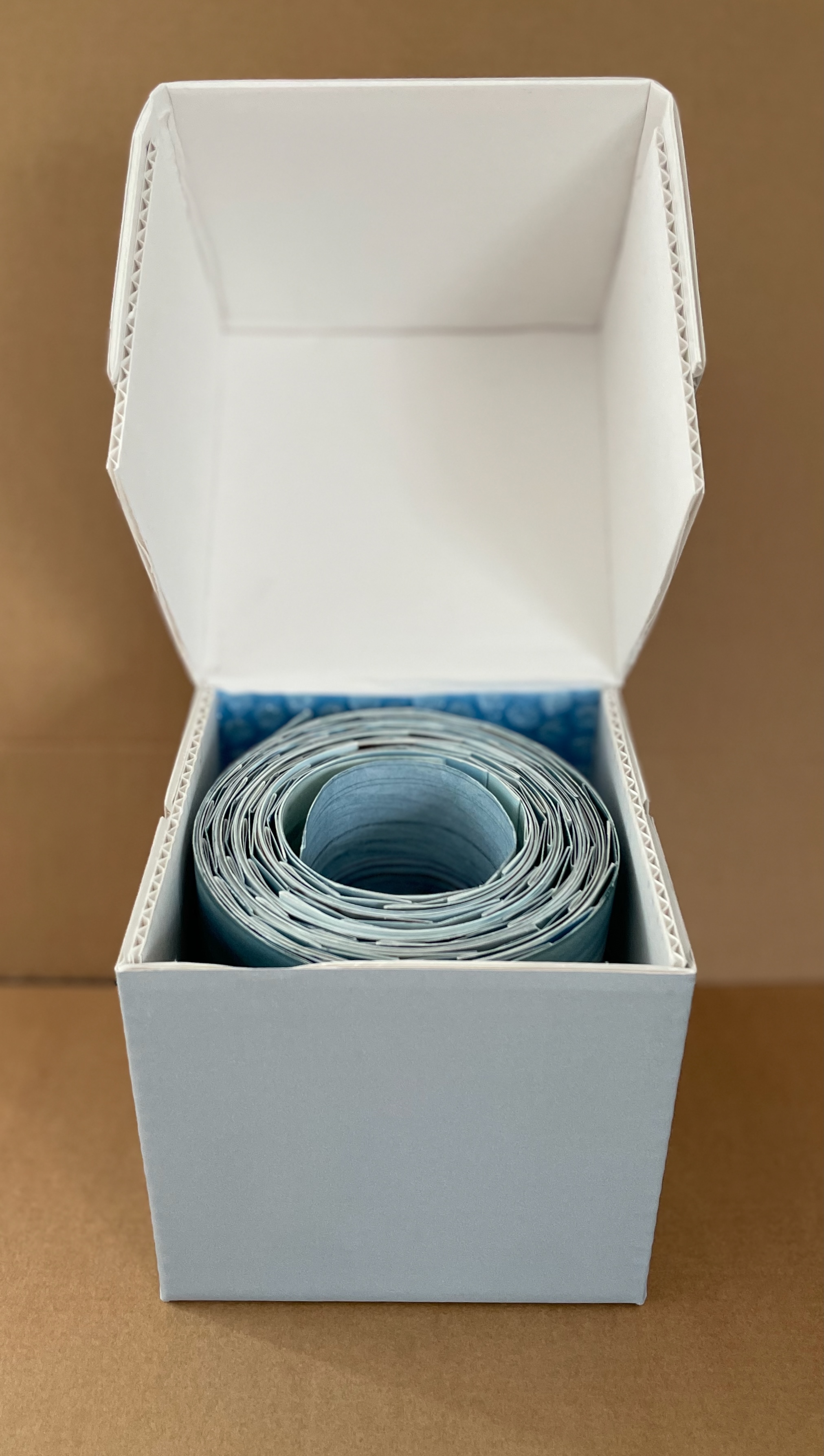
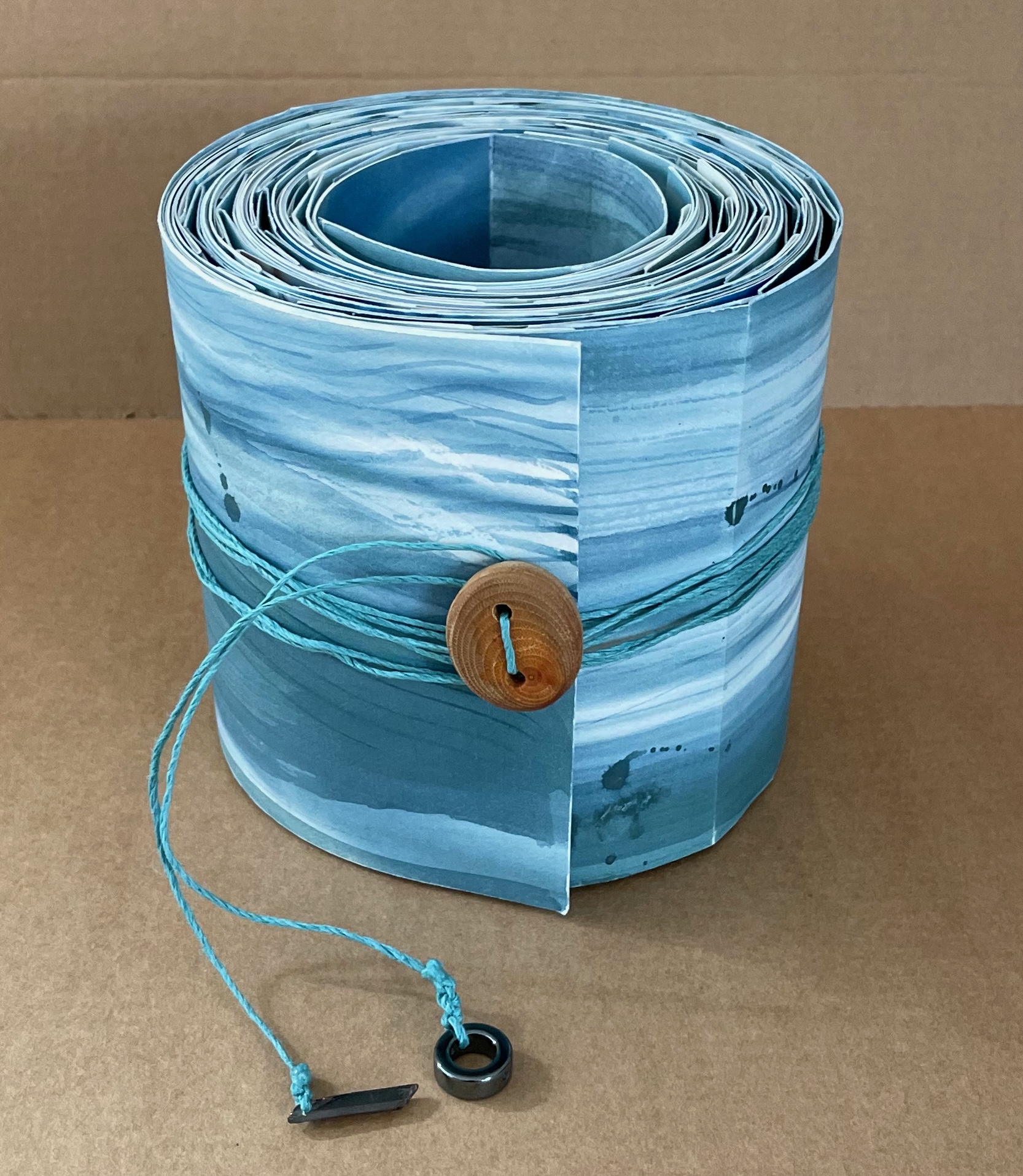
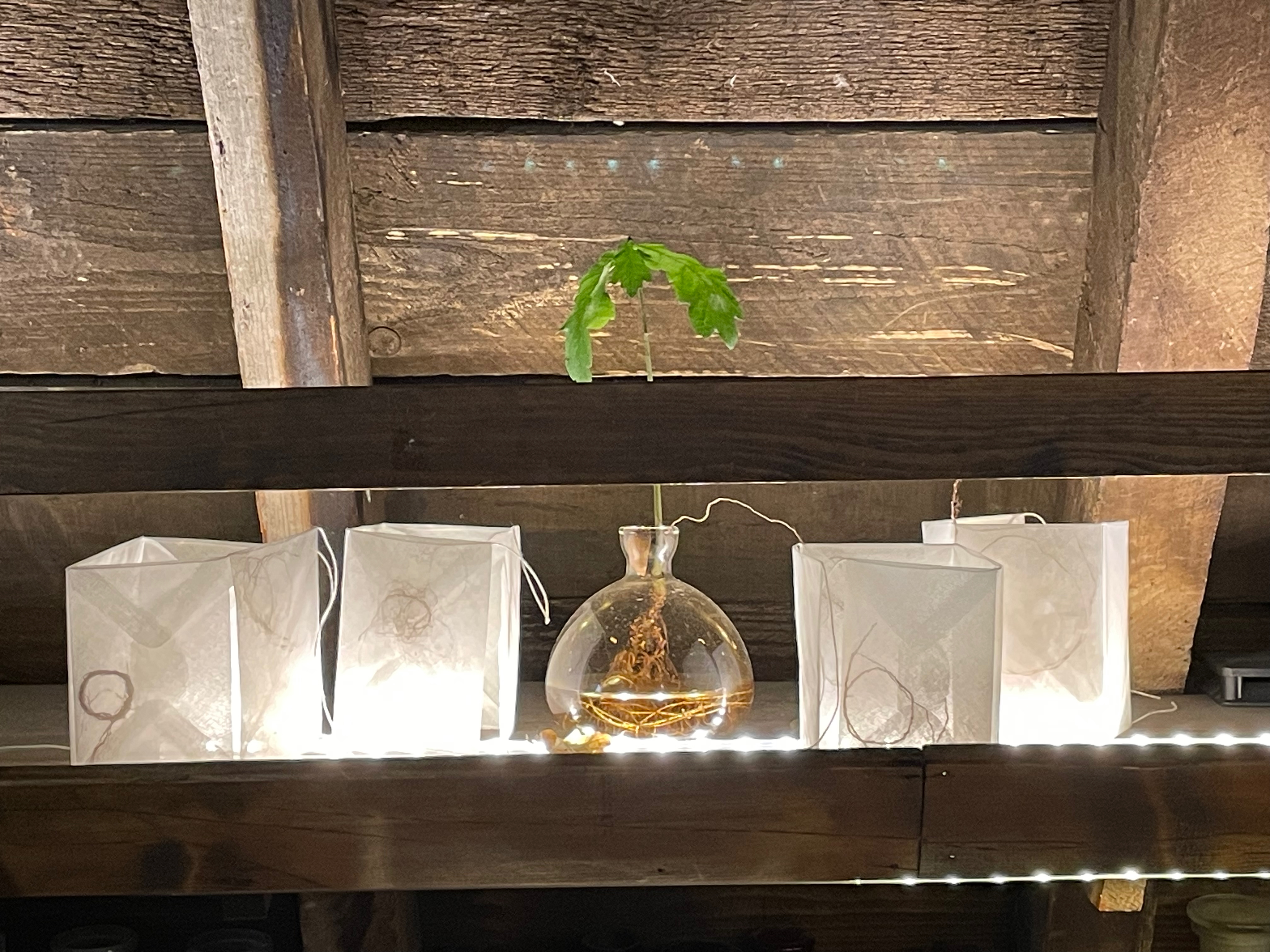
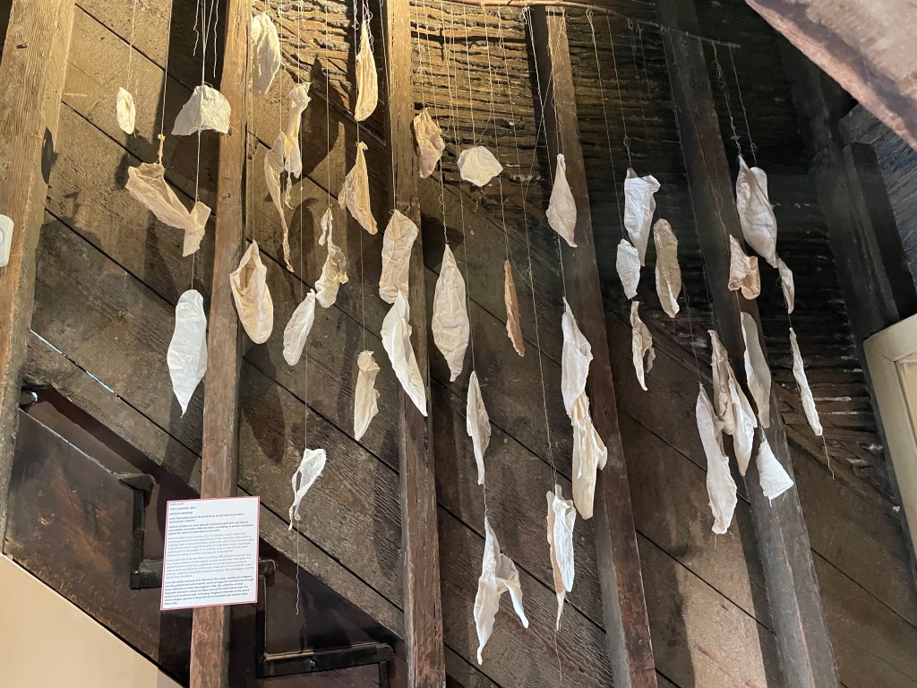
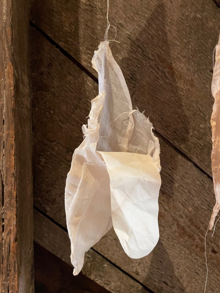
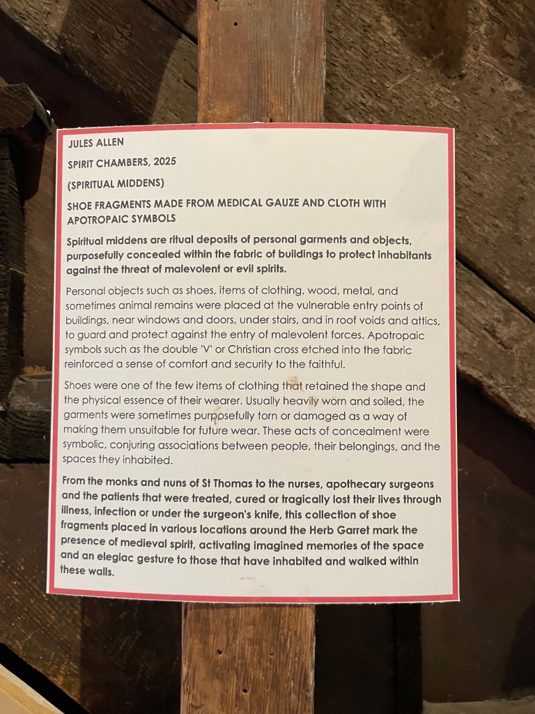
Update: Here are some images from a visit.

Further Reading
Knots: Medicine and Superstition, Old Operating Theatre Museum and Herb Garret in London, 25 September through 30 November 2025.
“Jules Allen and ‘Designing English’“. 23 December 2017. Bookmarking Book Art.
“Joyce Cutler-Shaw“. 5 September 2019. Books On Books Collection.
“Heather Hunter“. 3 April 2013. Books On Books Collection.
“Hilke Kurzke“. 10 October 2025. Books On Books Collection.
“Richard Nash“. 21 April 2022. Books On Books Collection.
“Chris Ruston“. 20 August 2024. Books On Books Collection.