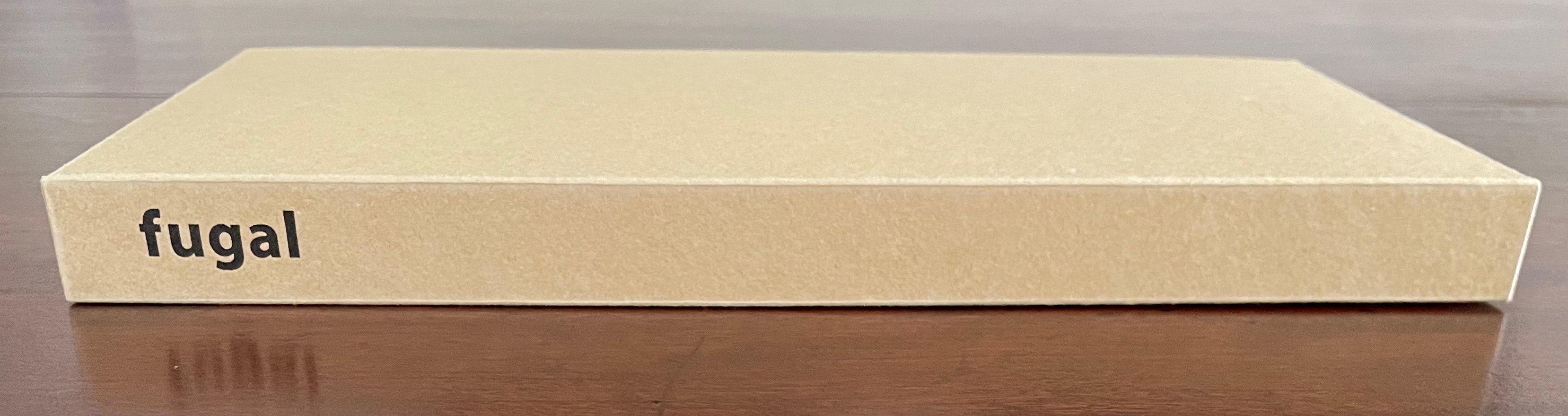
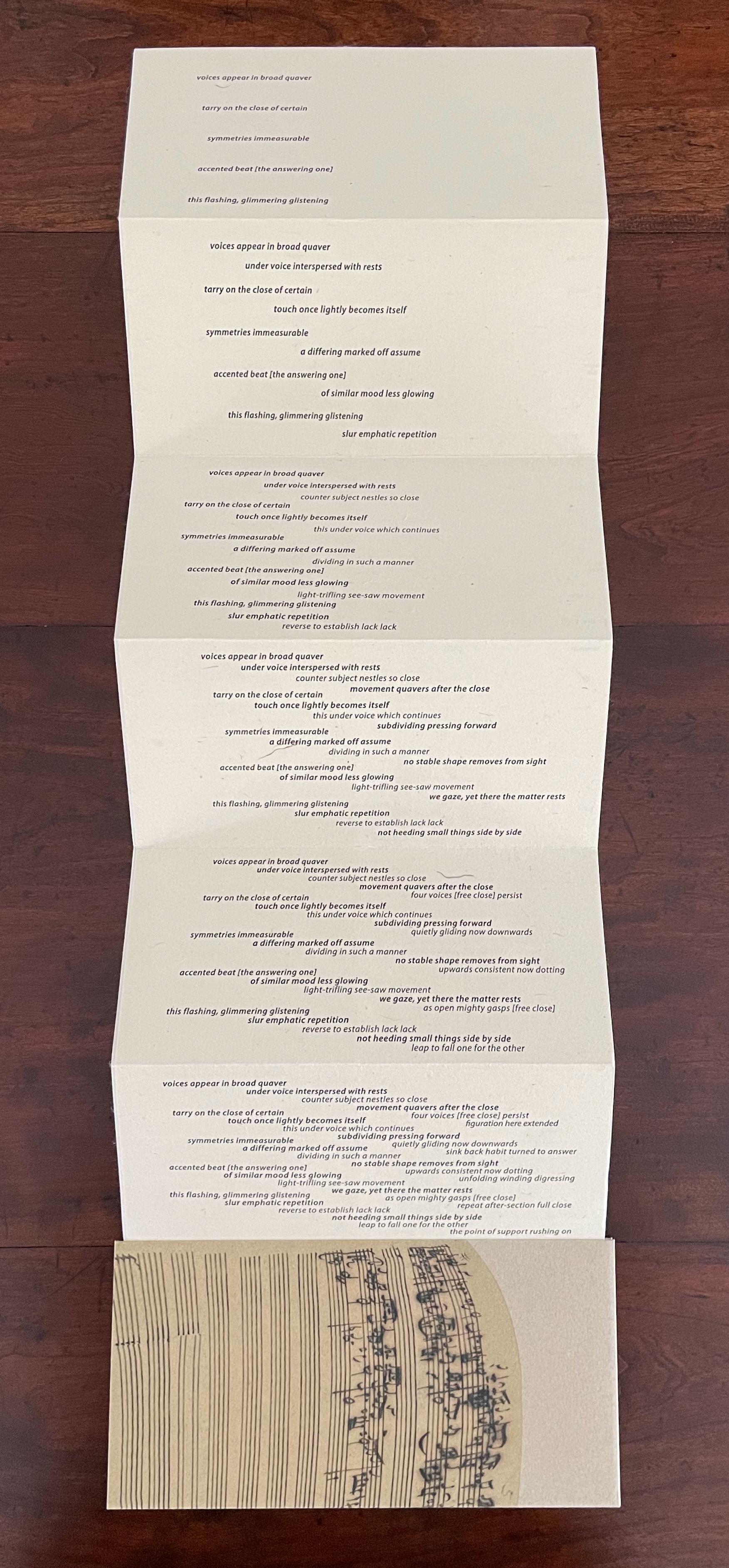
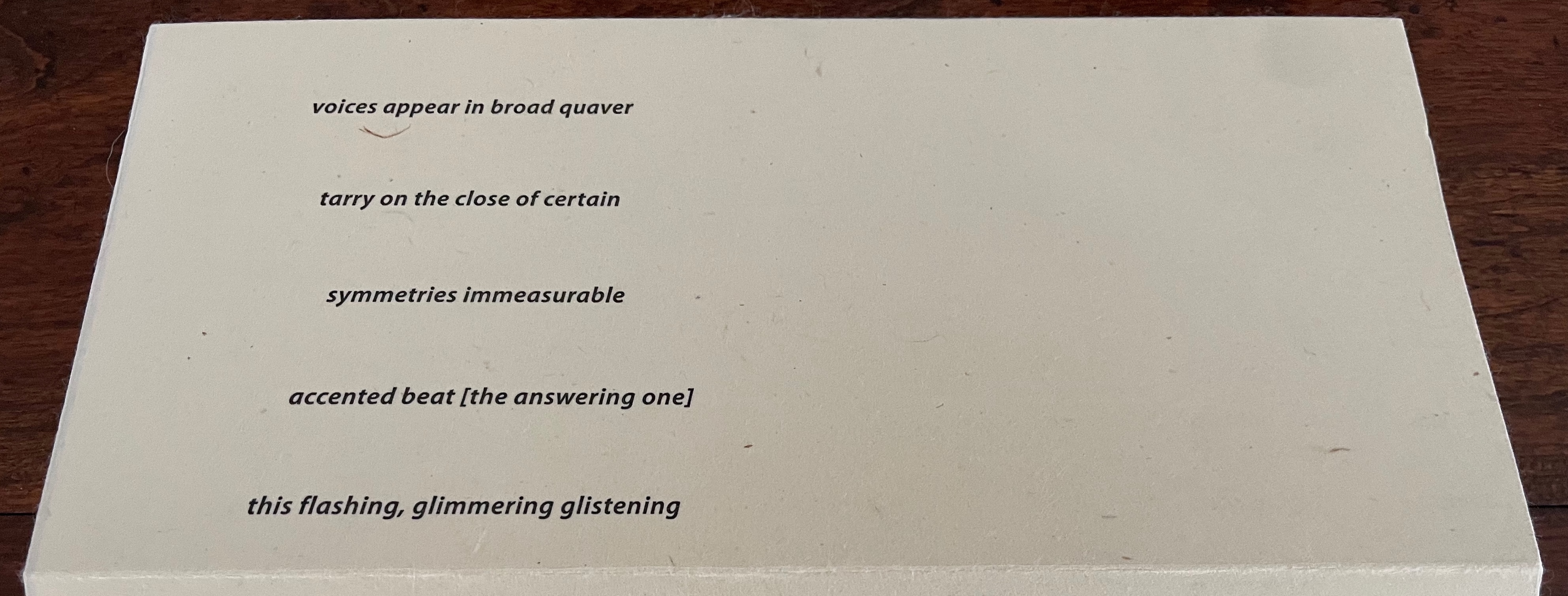
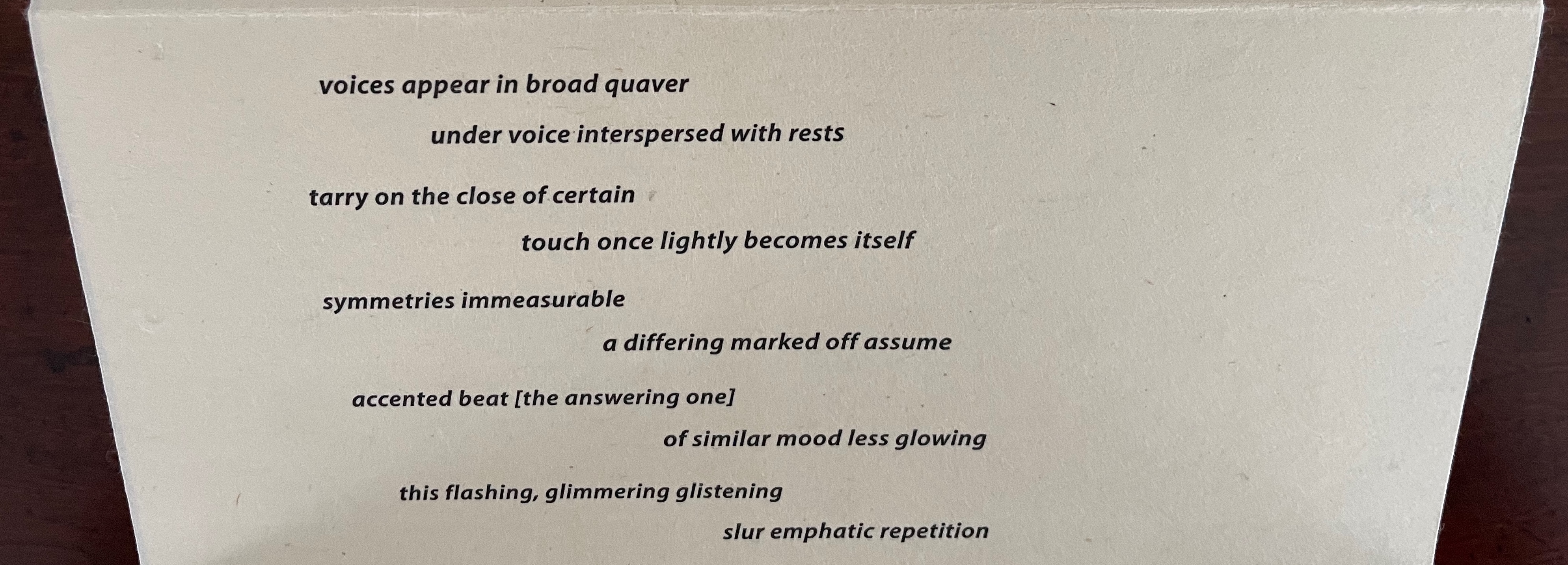
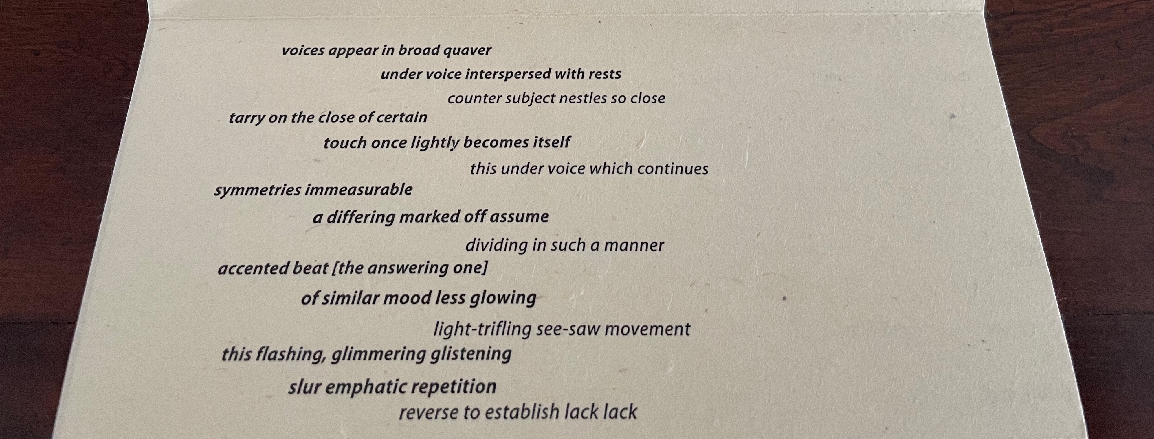
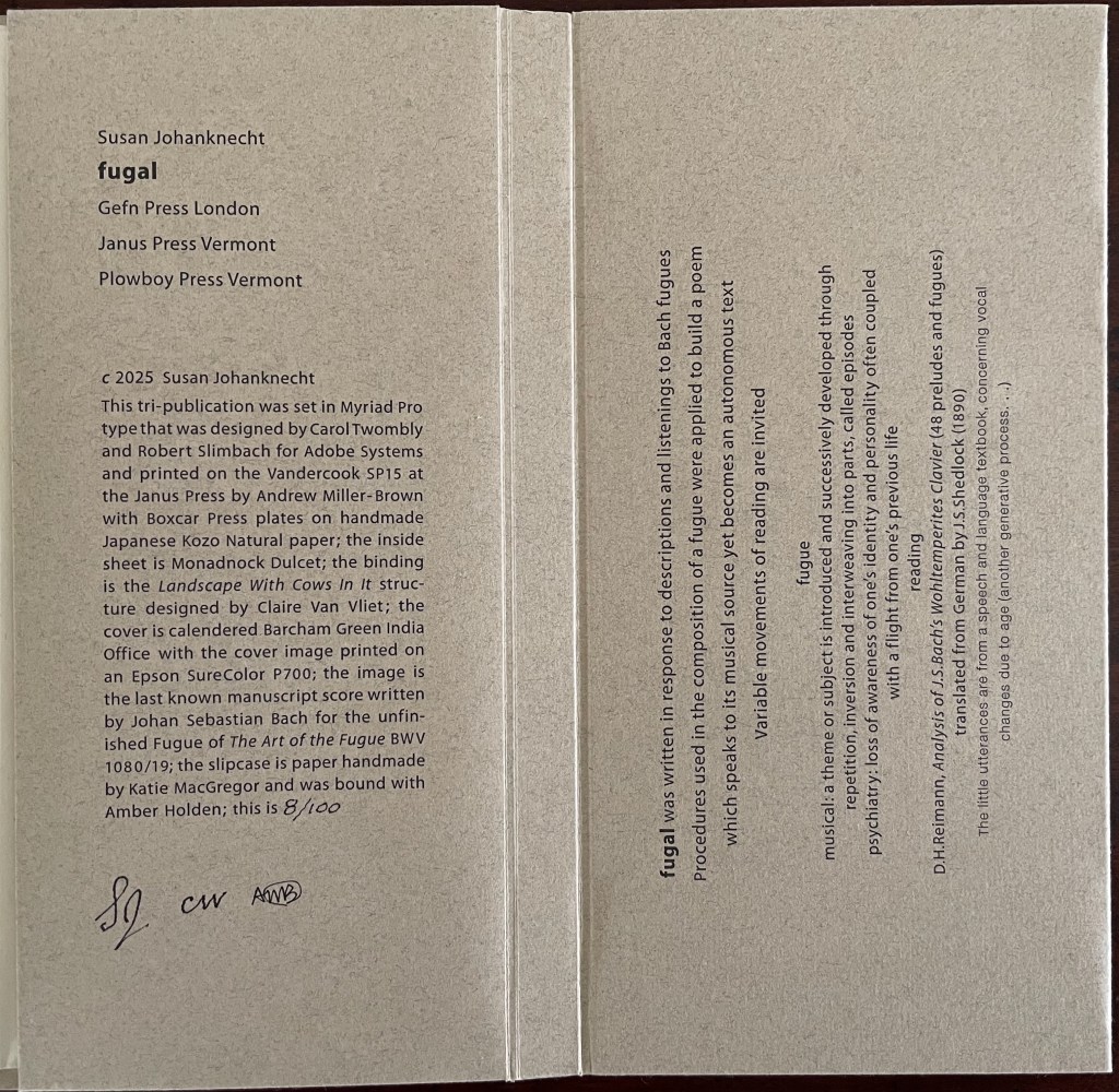
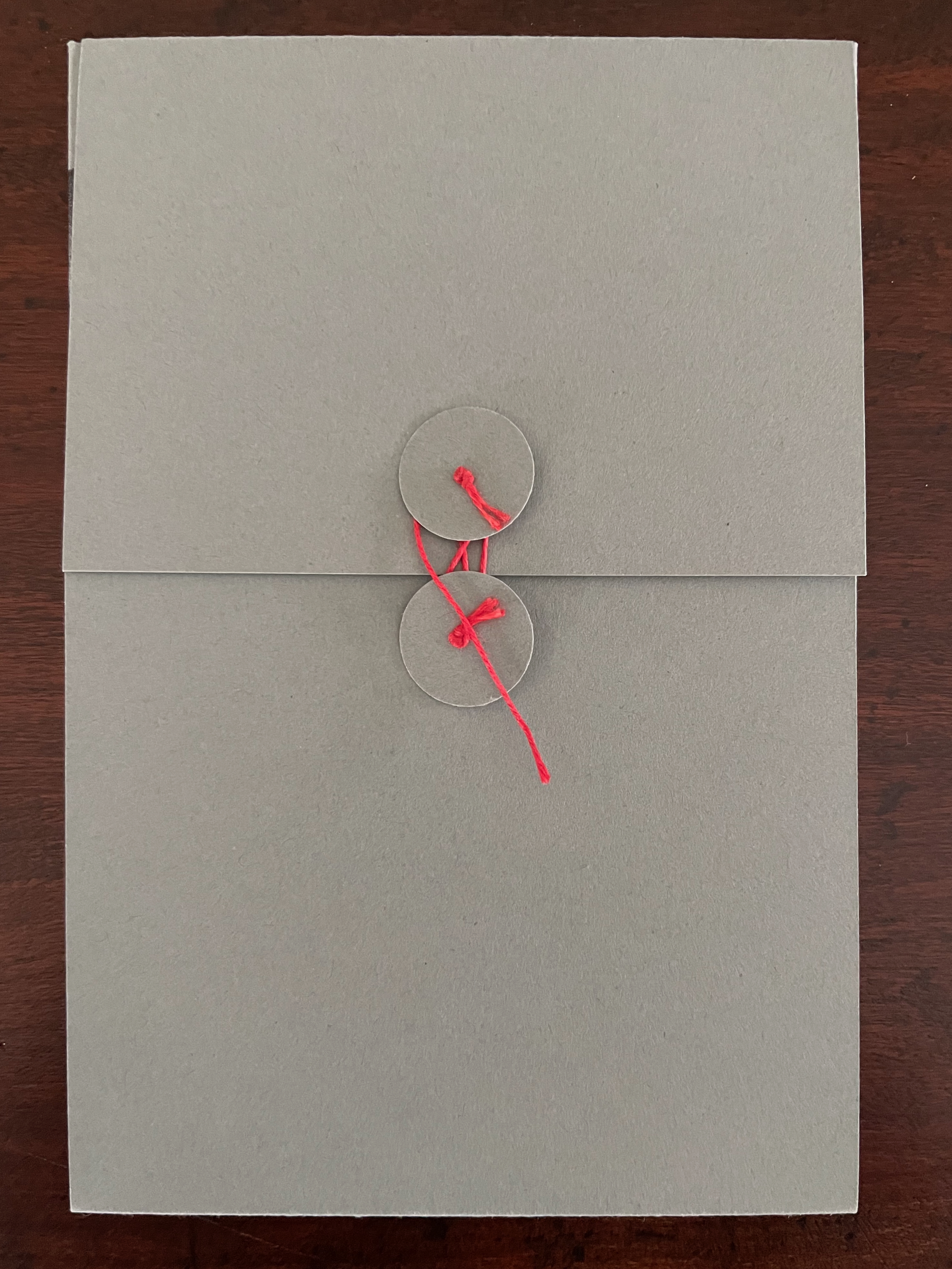
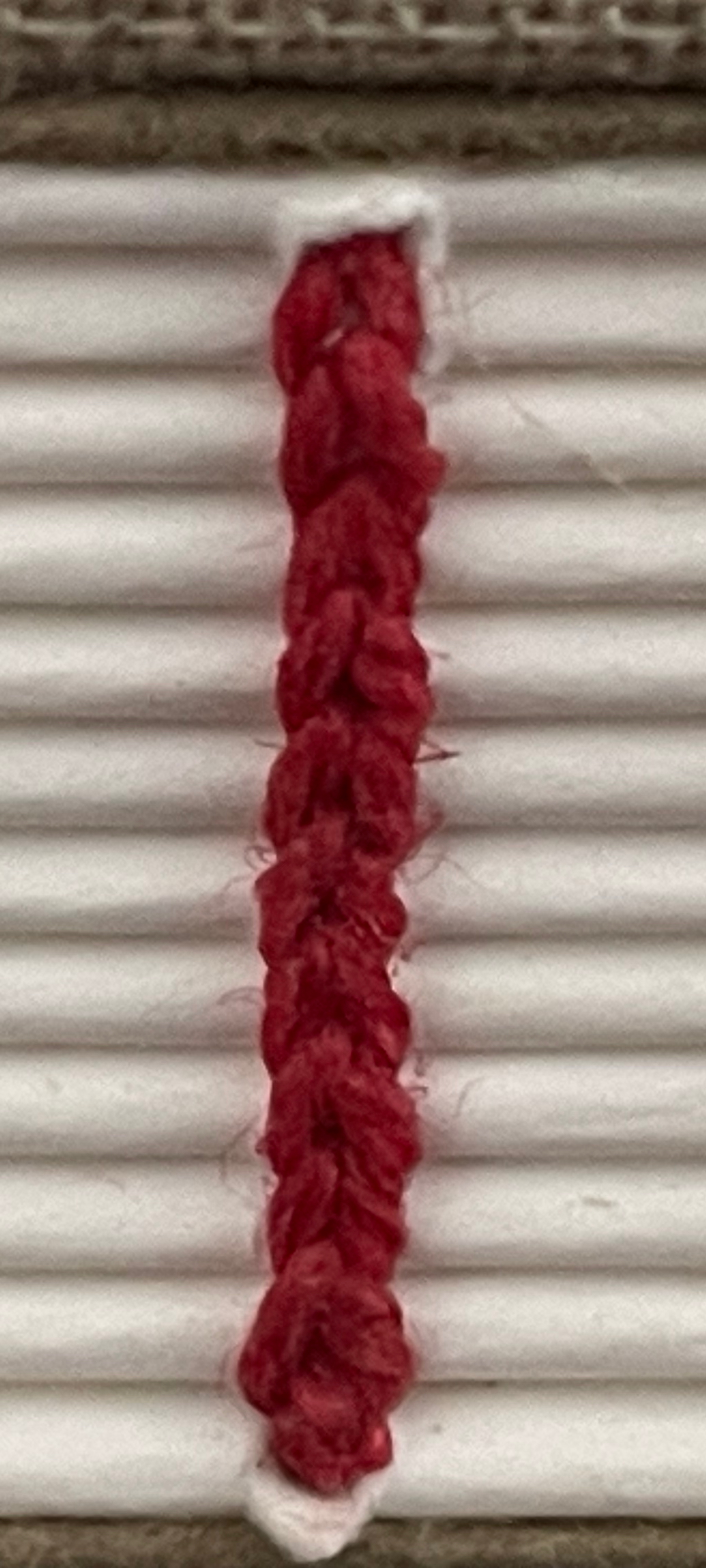
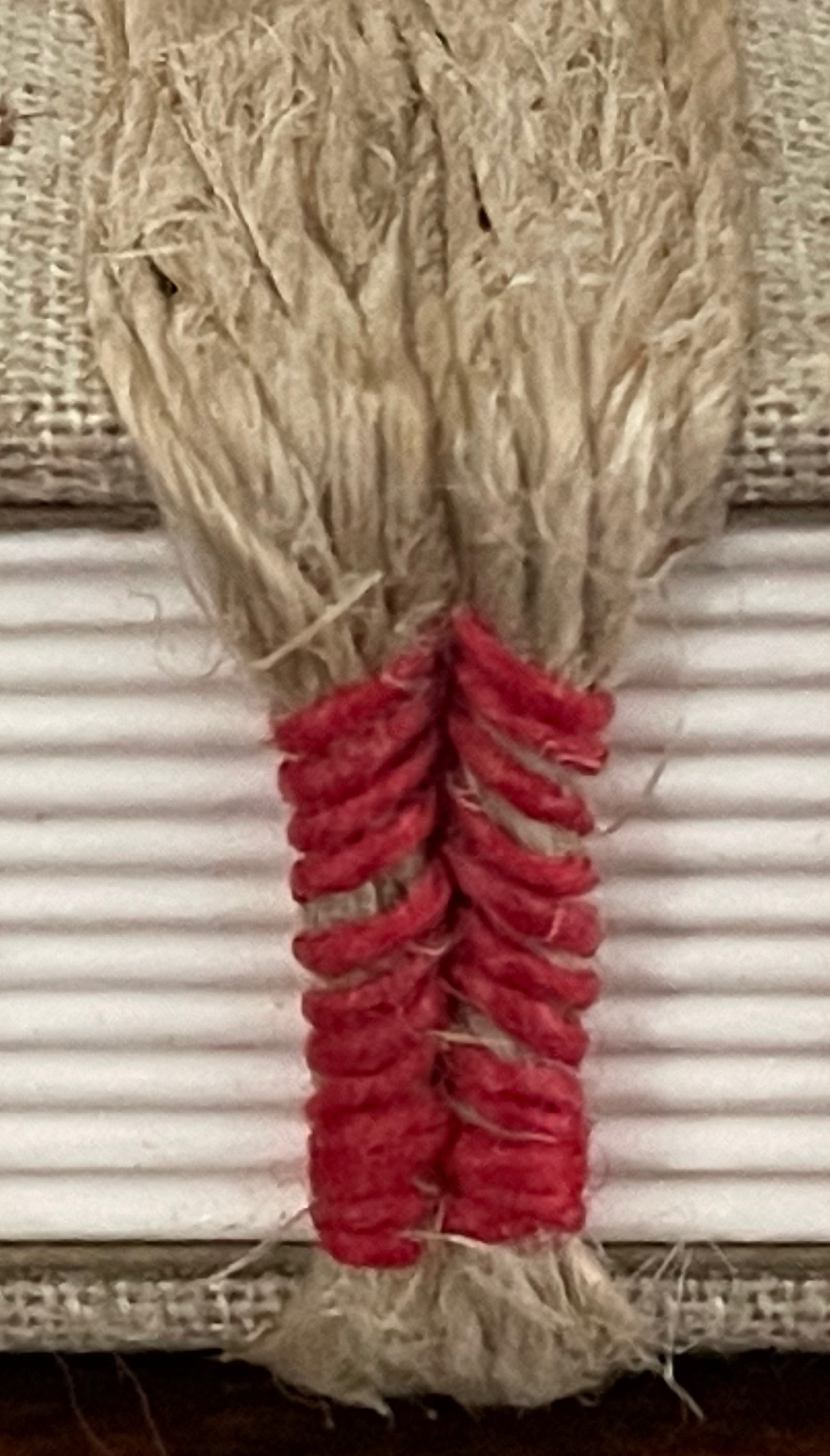
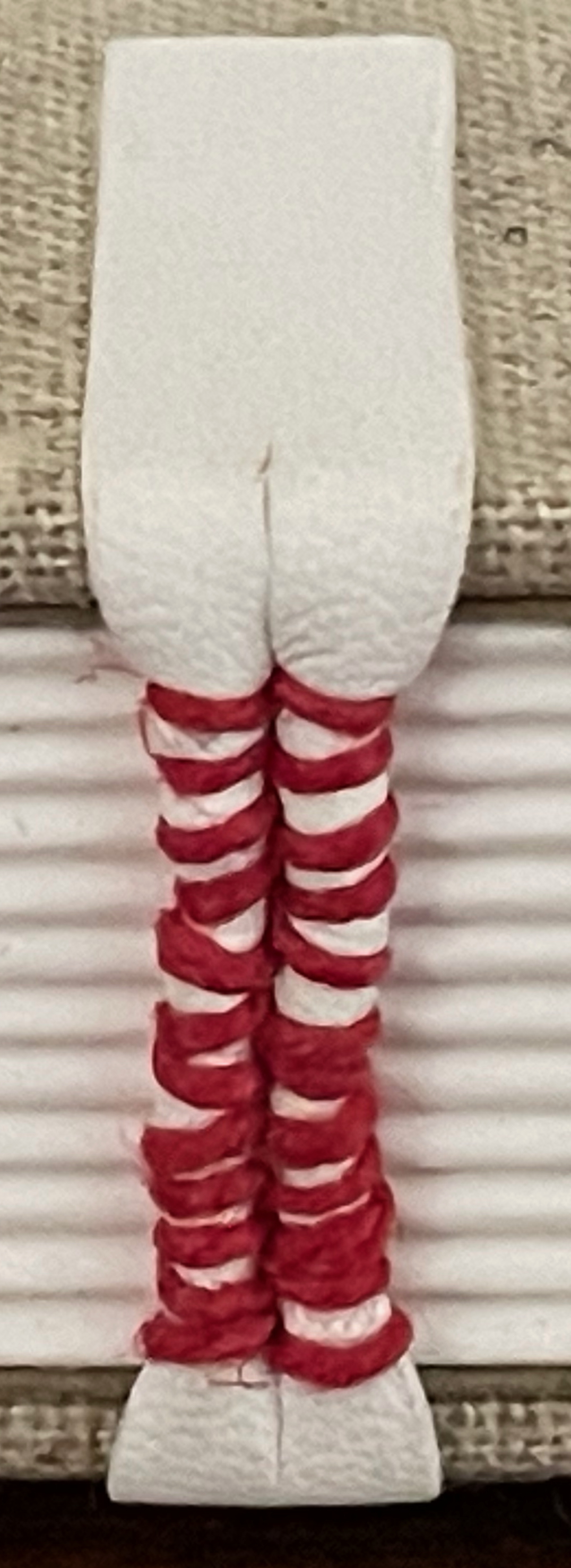
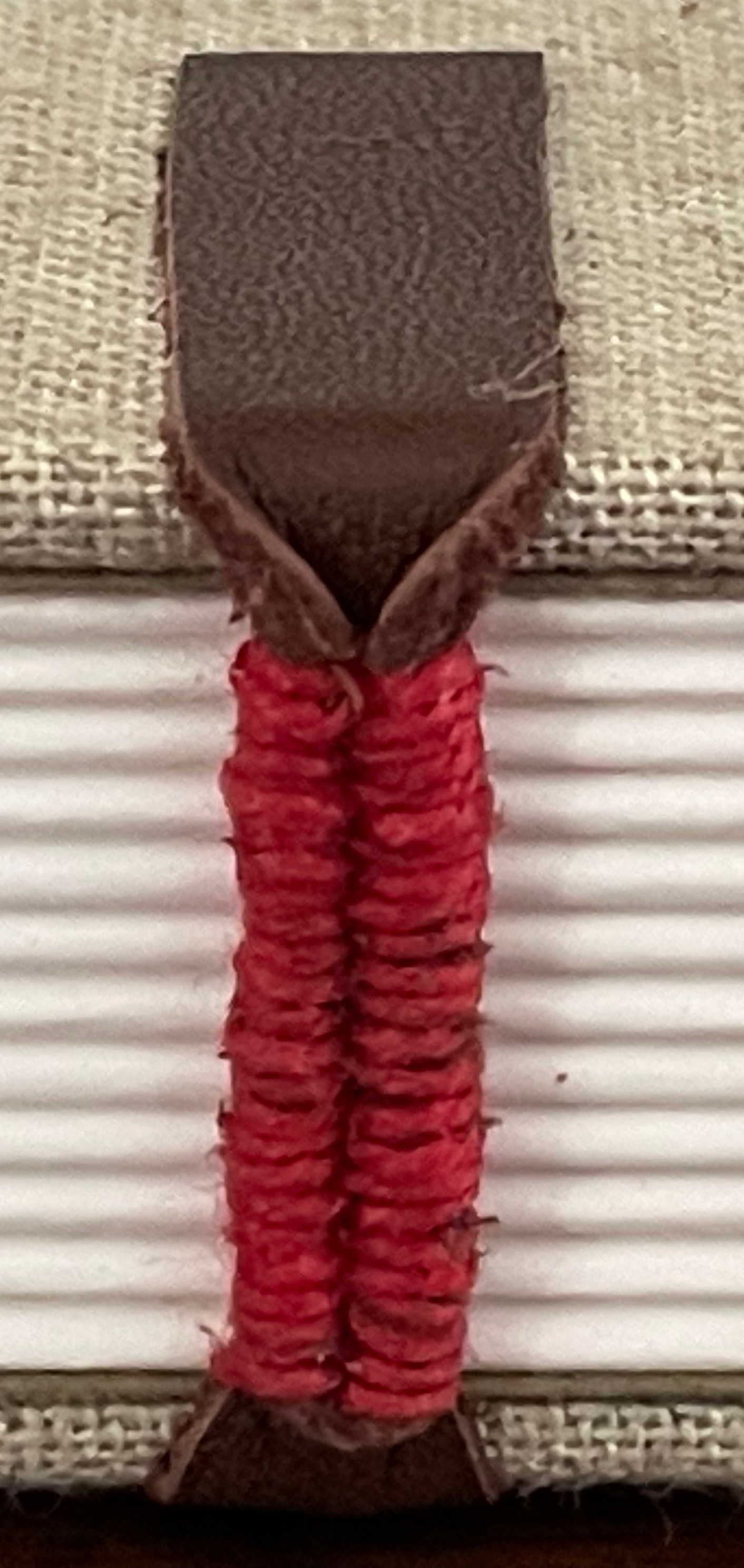
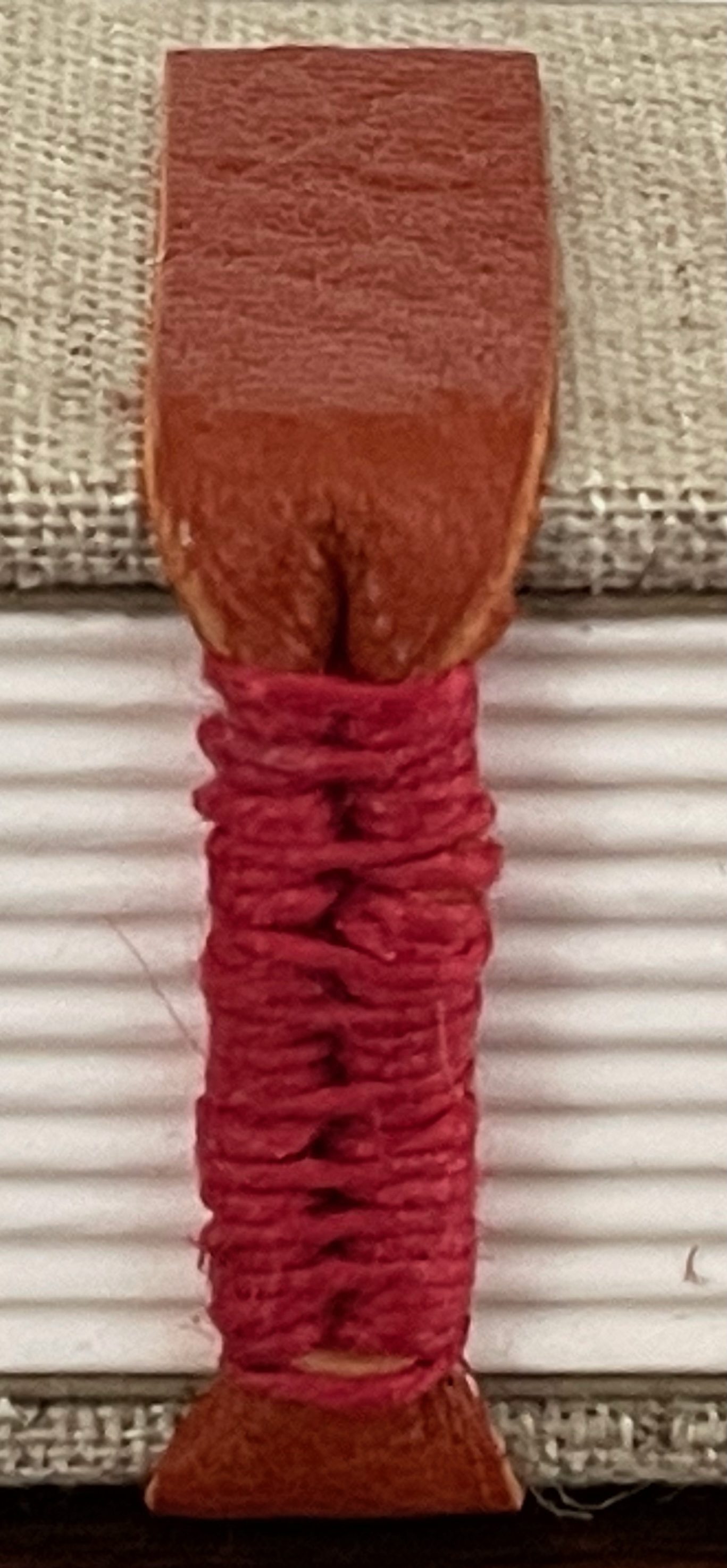
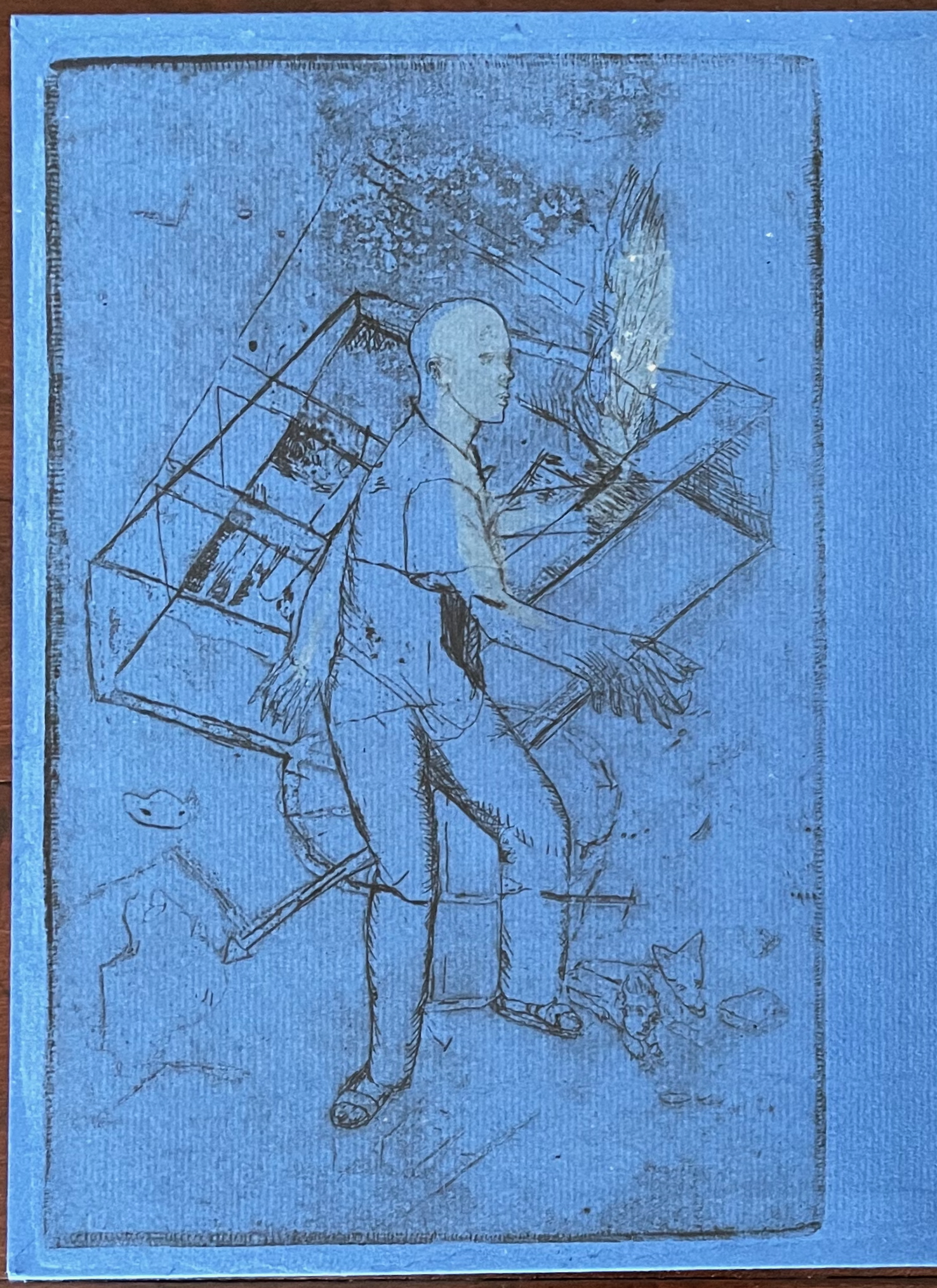
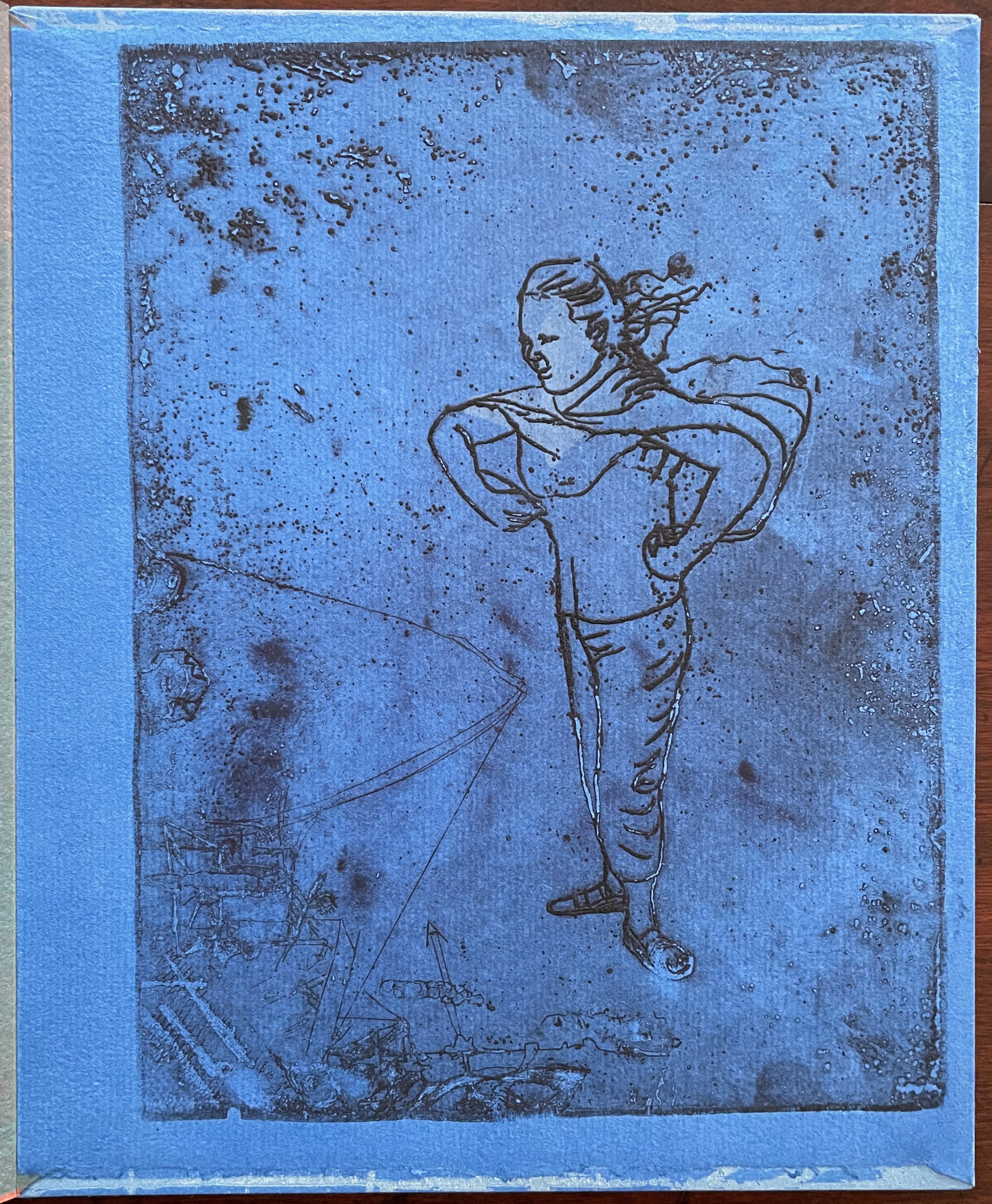
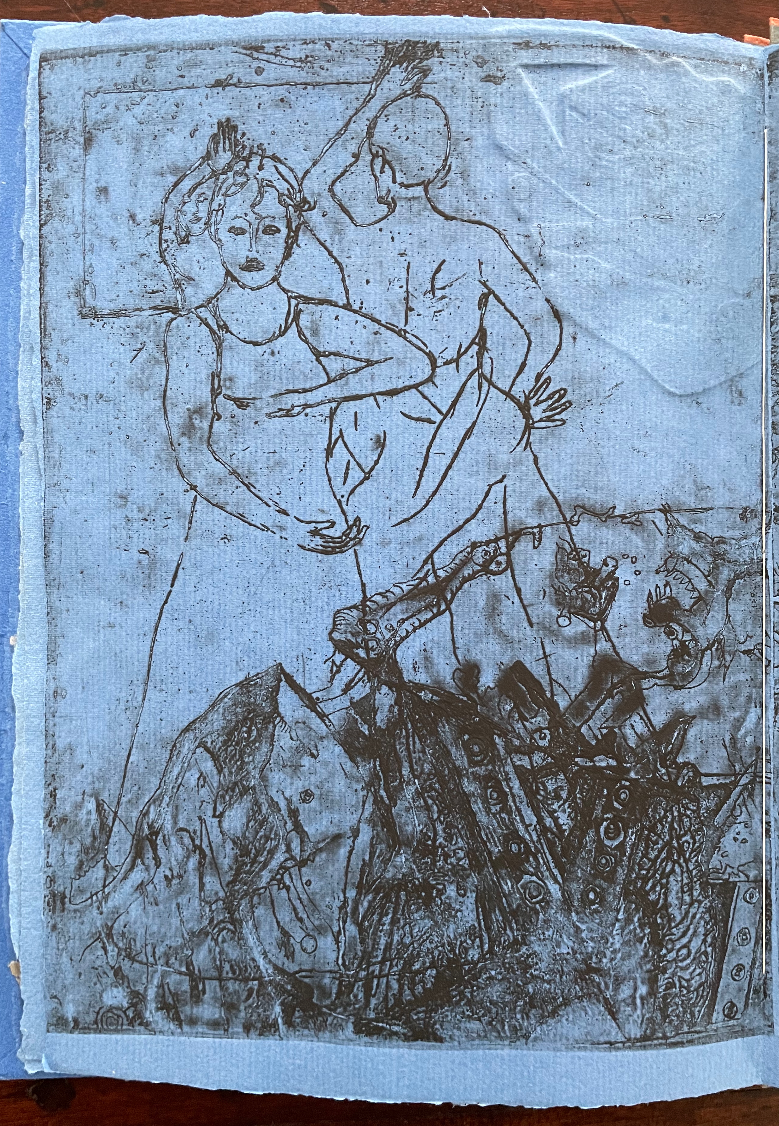
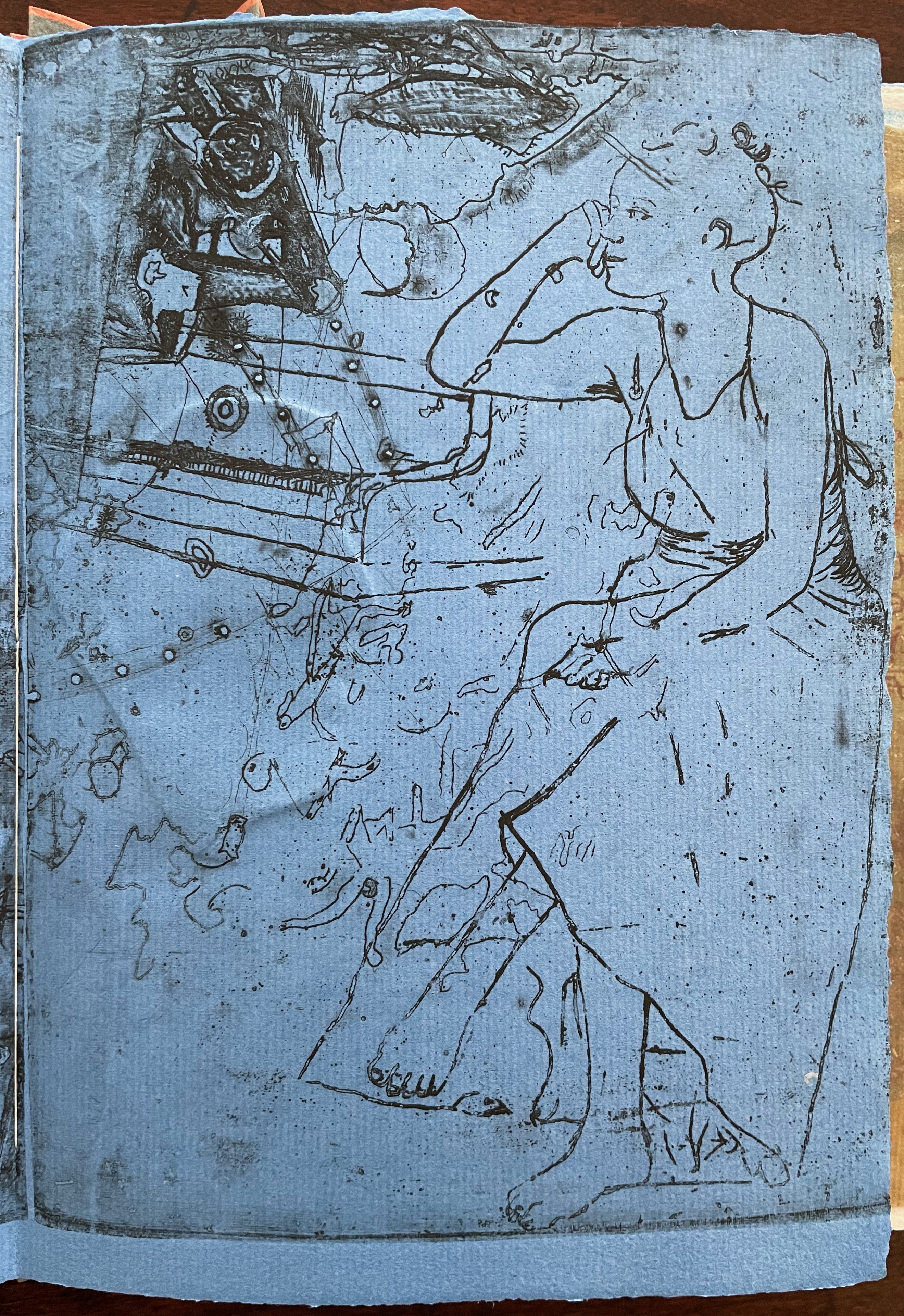
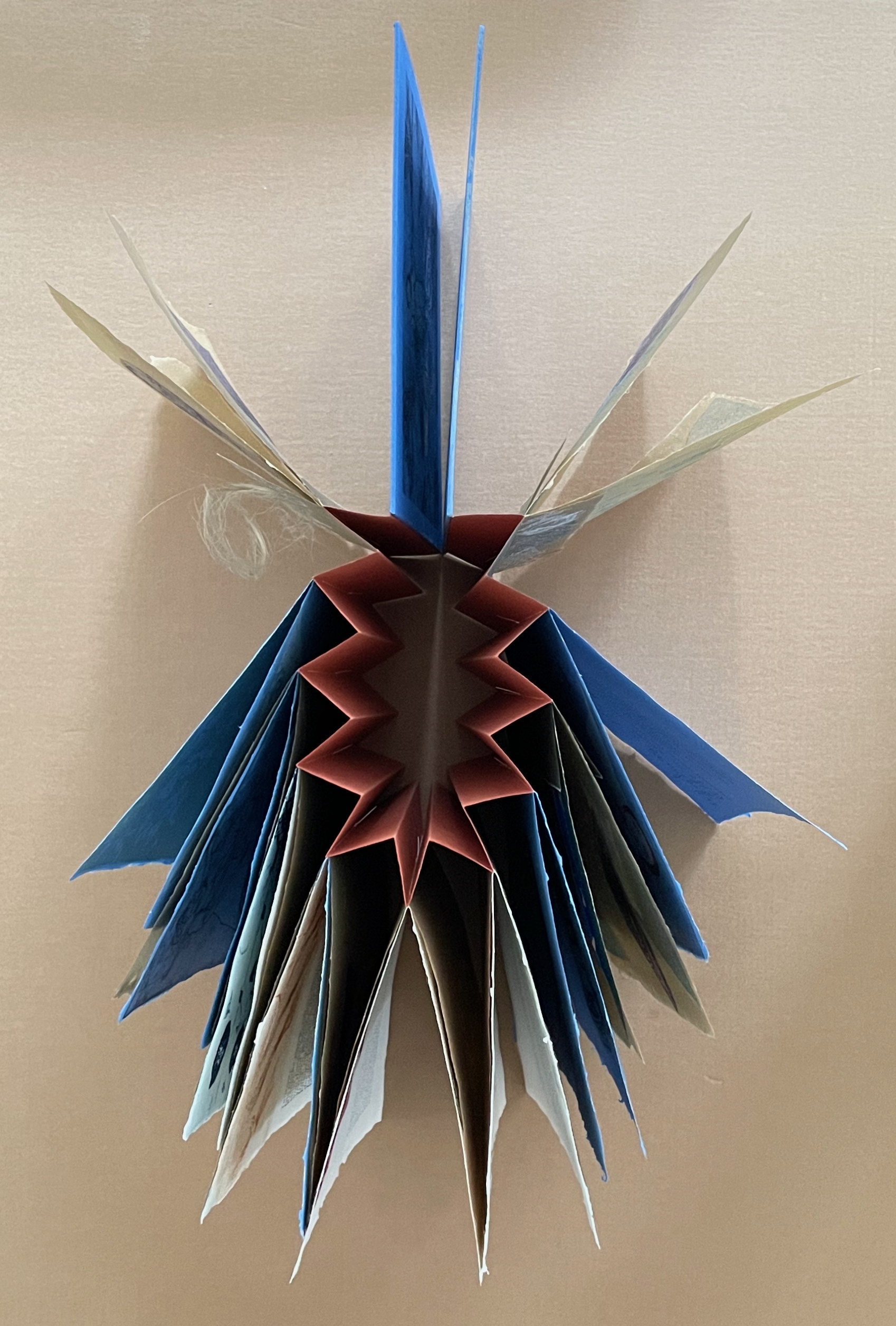
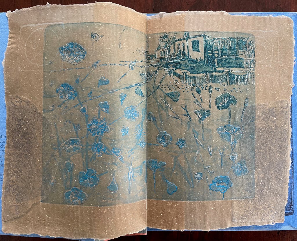
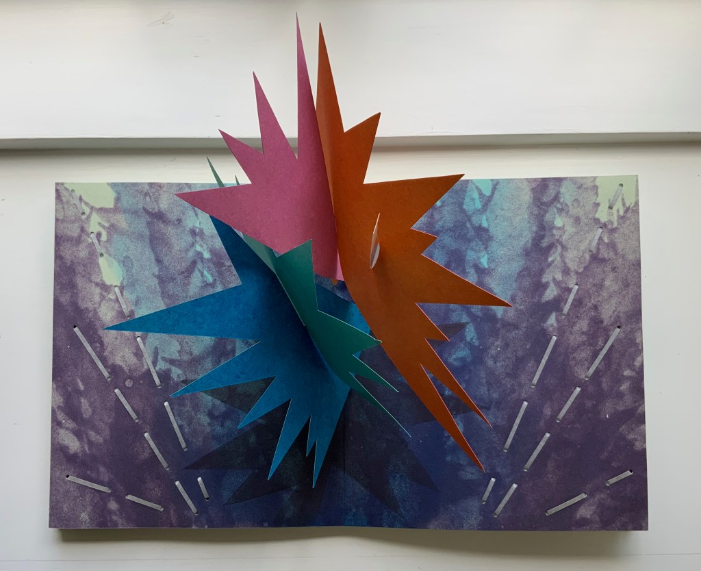
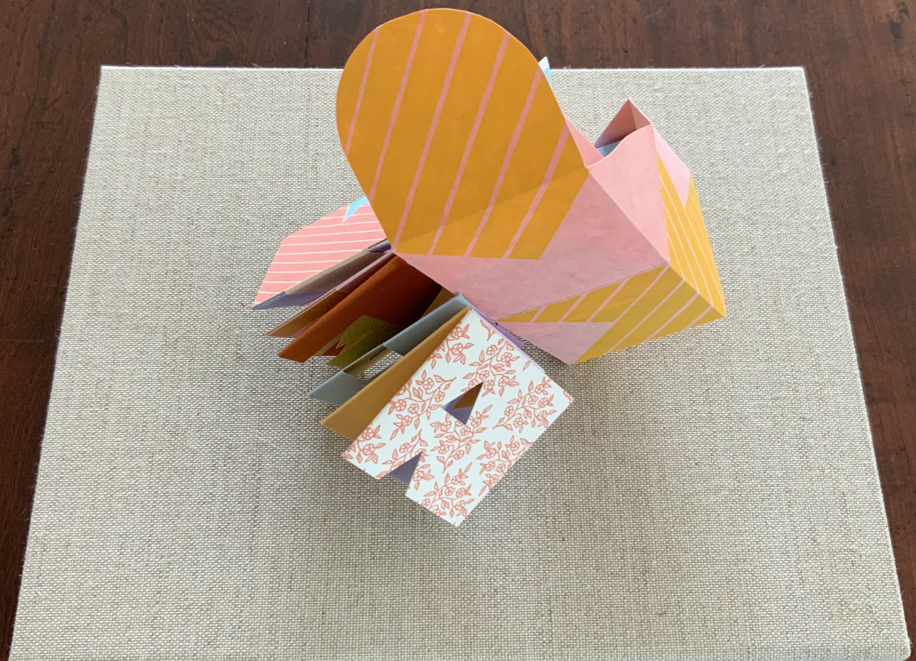
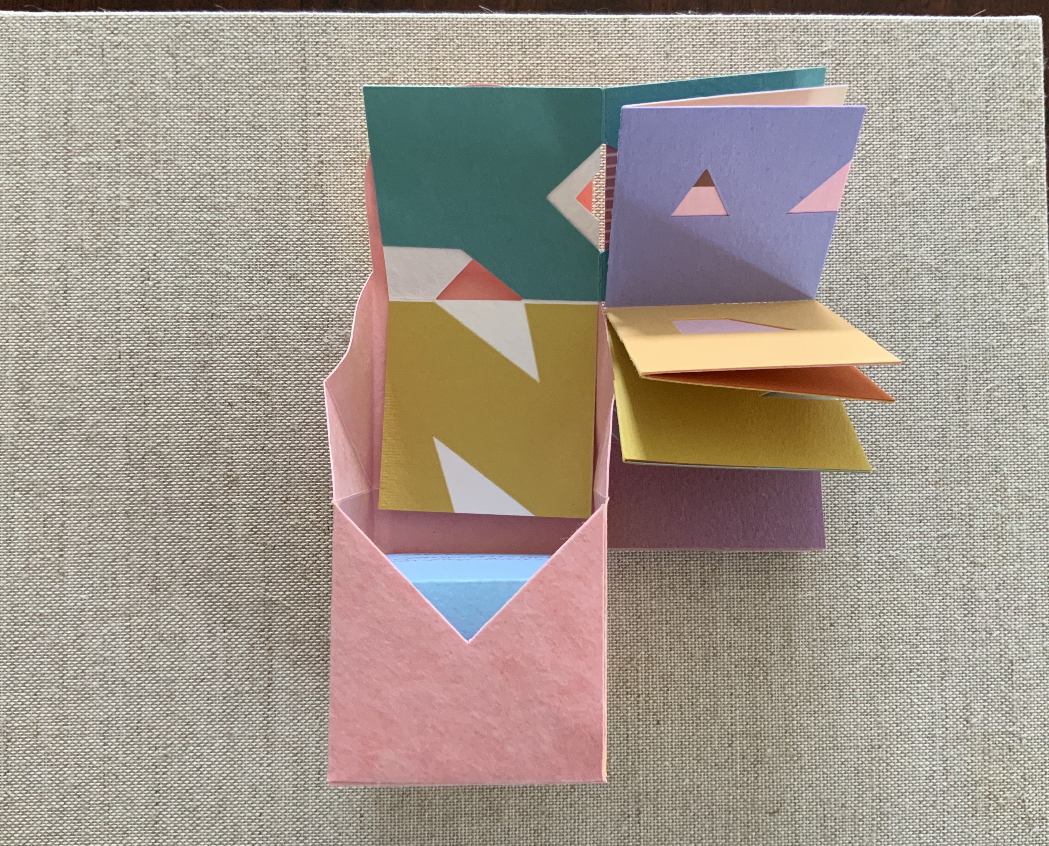
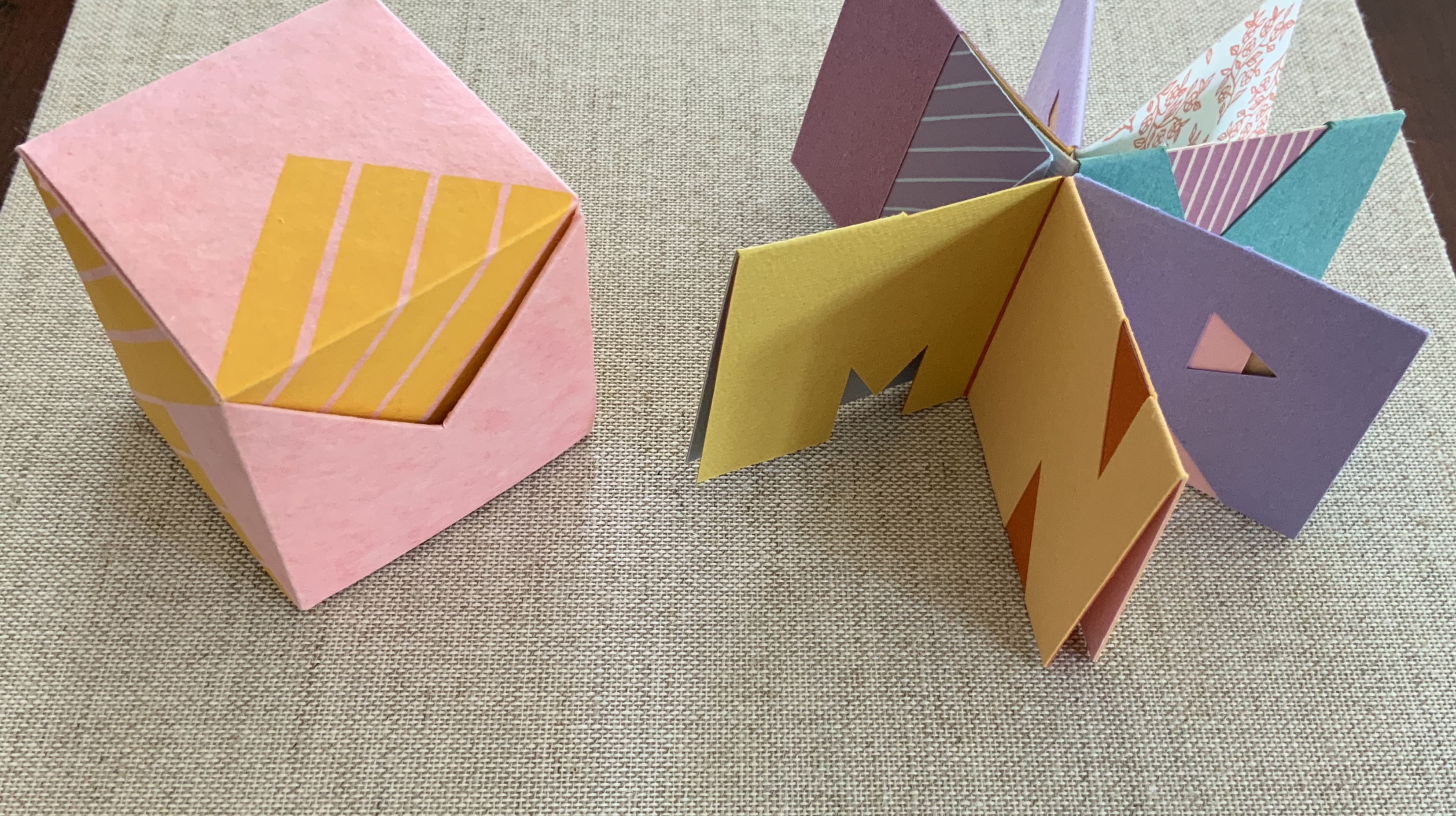
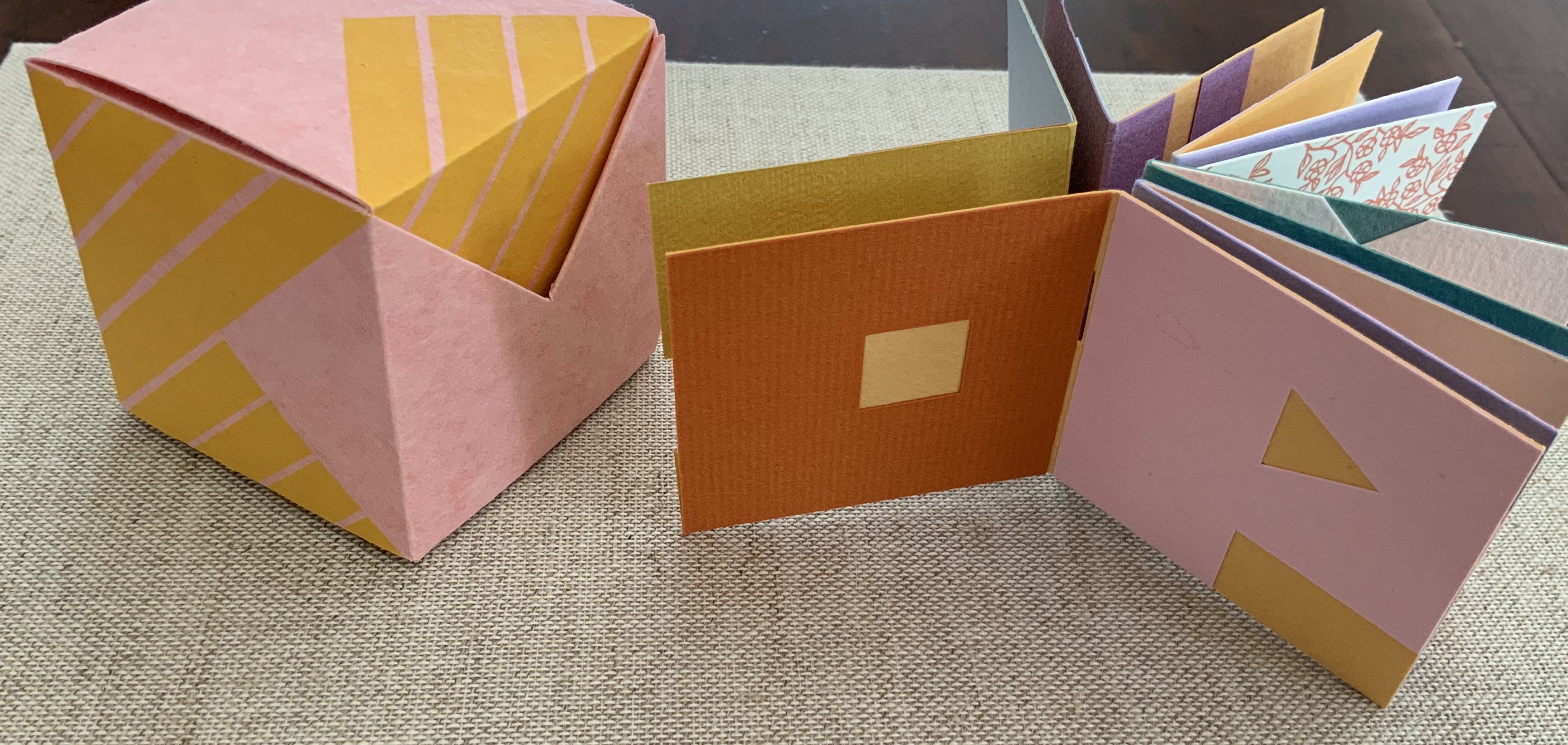
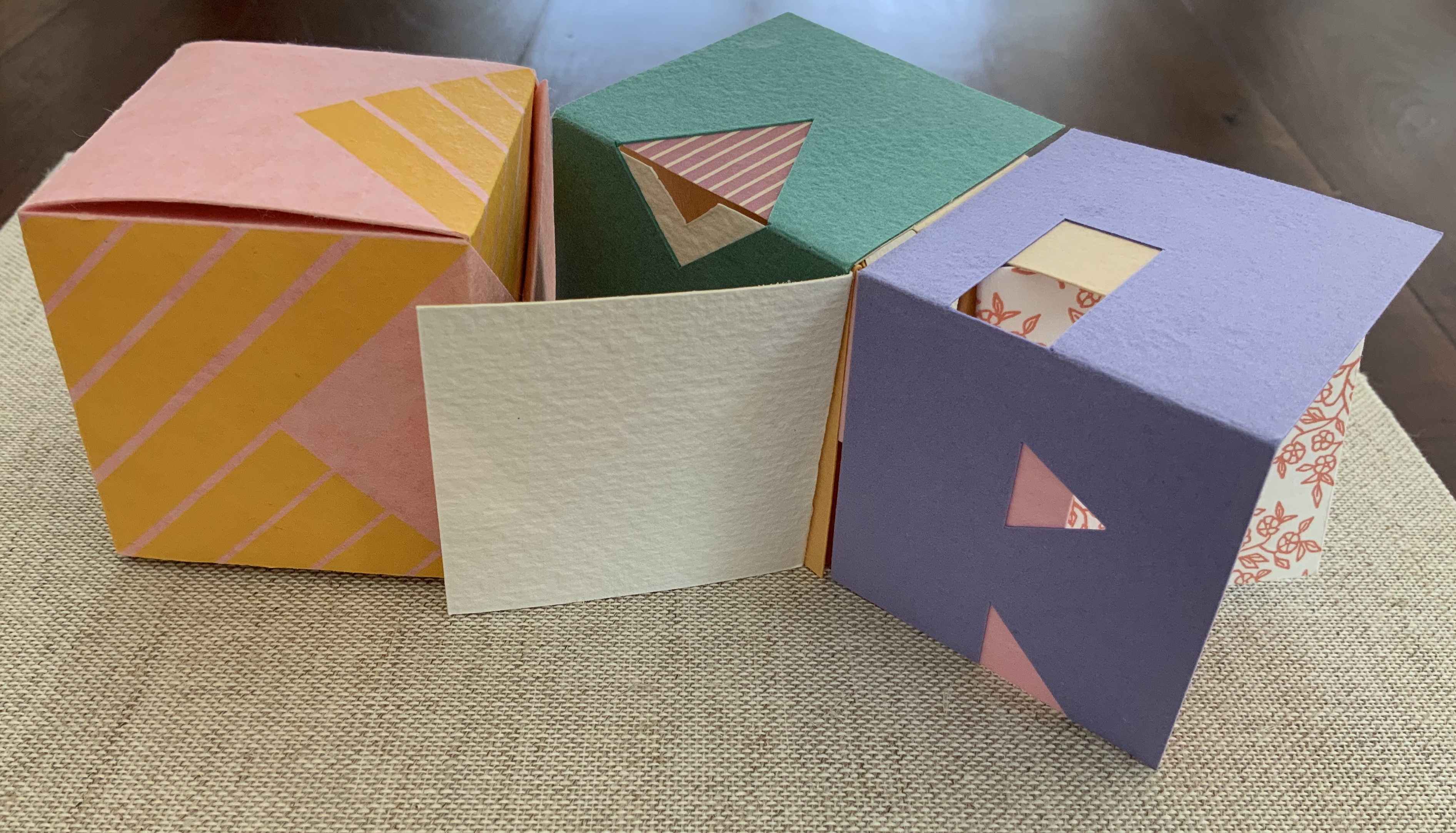
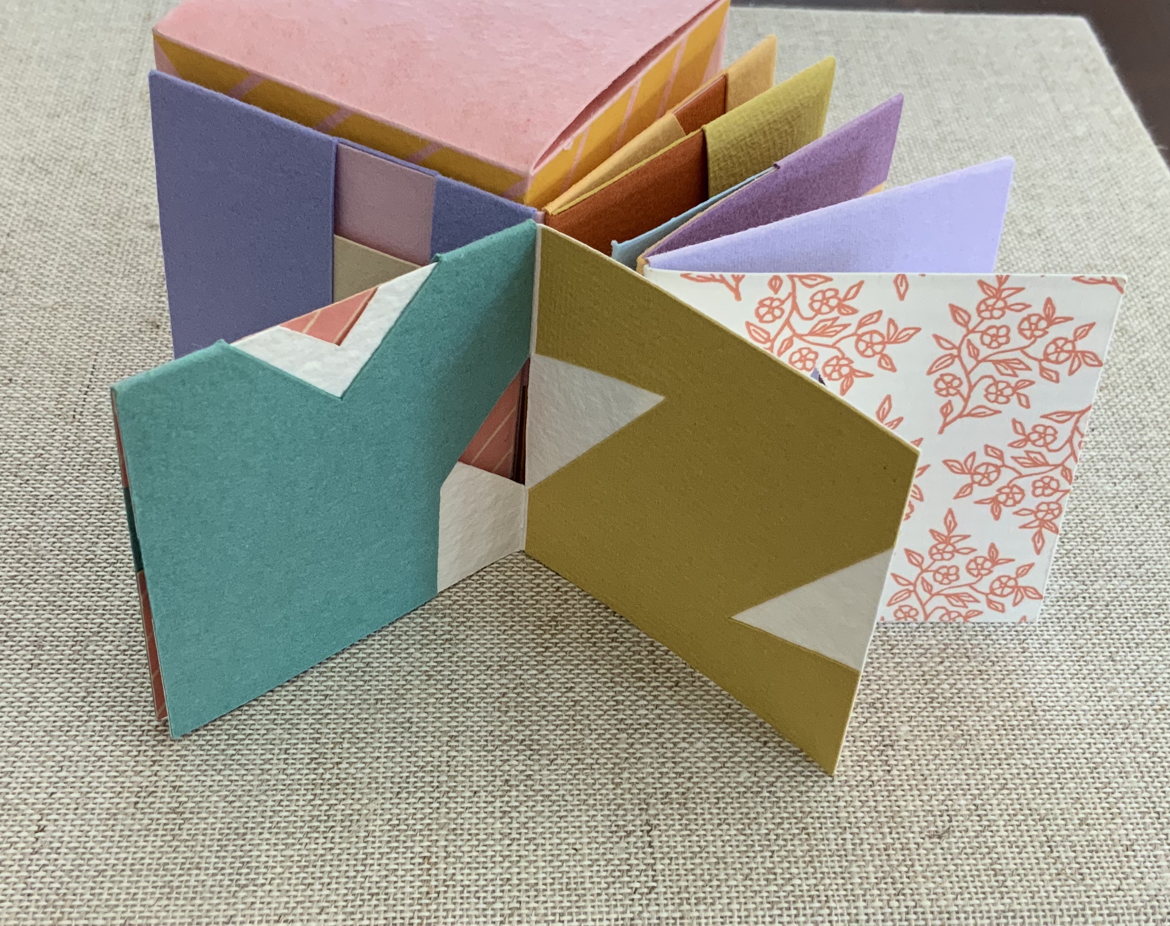
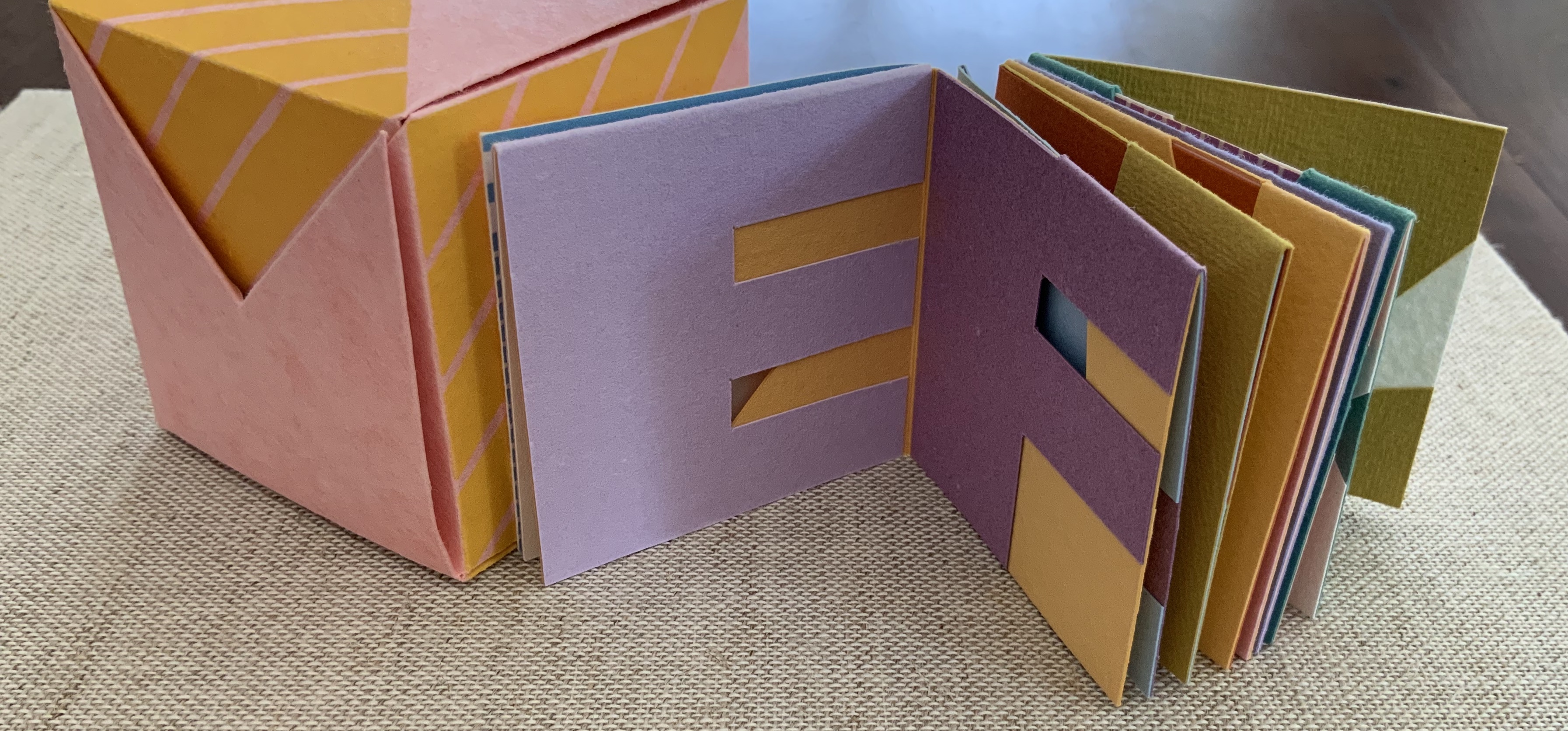
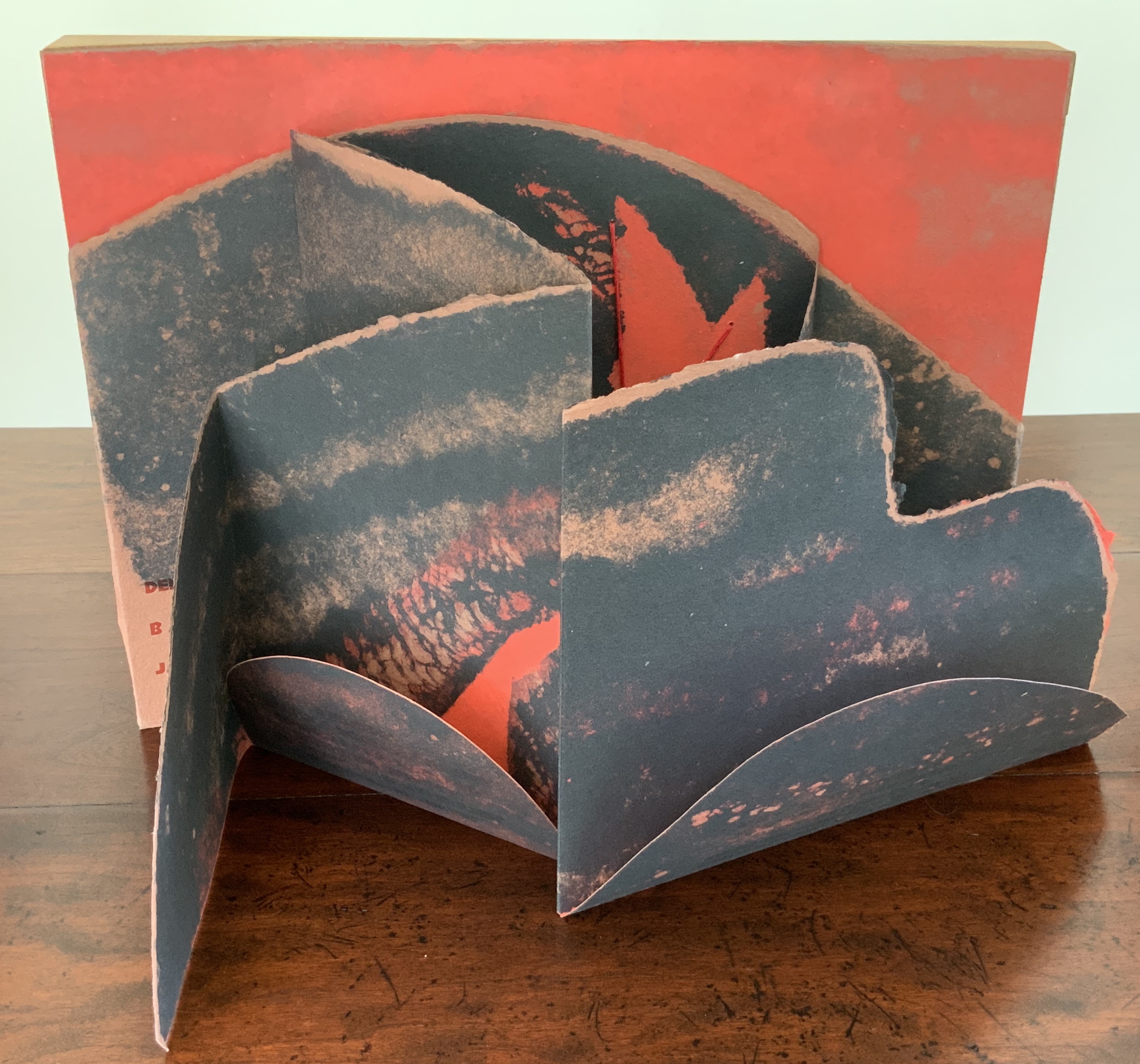
Fugal (2025) Susan Johanknecht , Claire Van Vliet, and Andrew Miller-Brown Vertical double-sided accordion book bound in “Landscape with Cows In It” structure designed by Claire Van Vliet, cover in calendered Barcham Green India Office, interior in handmade Japanese Kozo Natural fixed to Monadnock Dulcet; slipcase of handmade paper. Slipcase: H123 x W248 x D22 mm. Book: H120 x W240 x D18 mm. [6] double-sided panels. Edition of 100, of which this is #8. Acquired from Susan Johanknecht, 26 September 2025. Photos: Books On Books Collection
In the hands of multiple readers, this collaboration among Susan Johanknecht’s Gefn Press, Claire Van Vliet’s Janus Press, and Andrew Miller-Brown’s Plowboy Press becomes the “book as performance” and “book as musical score”. Fugal is an artwork that works best with several simultaneous readers/voices/viewers.
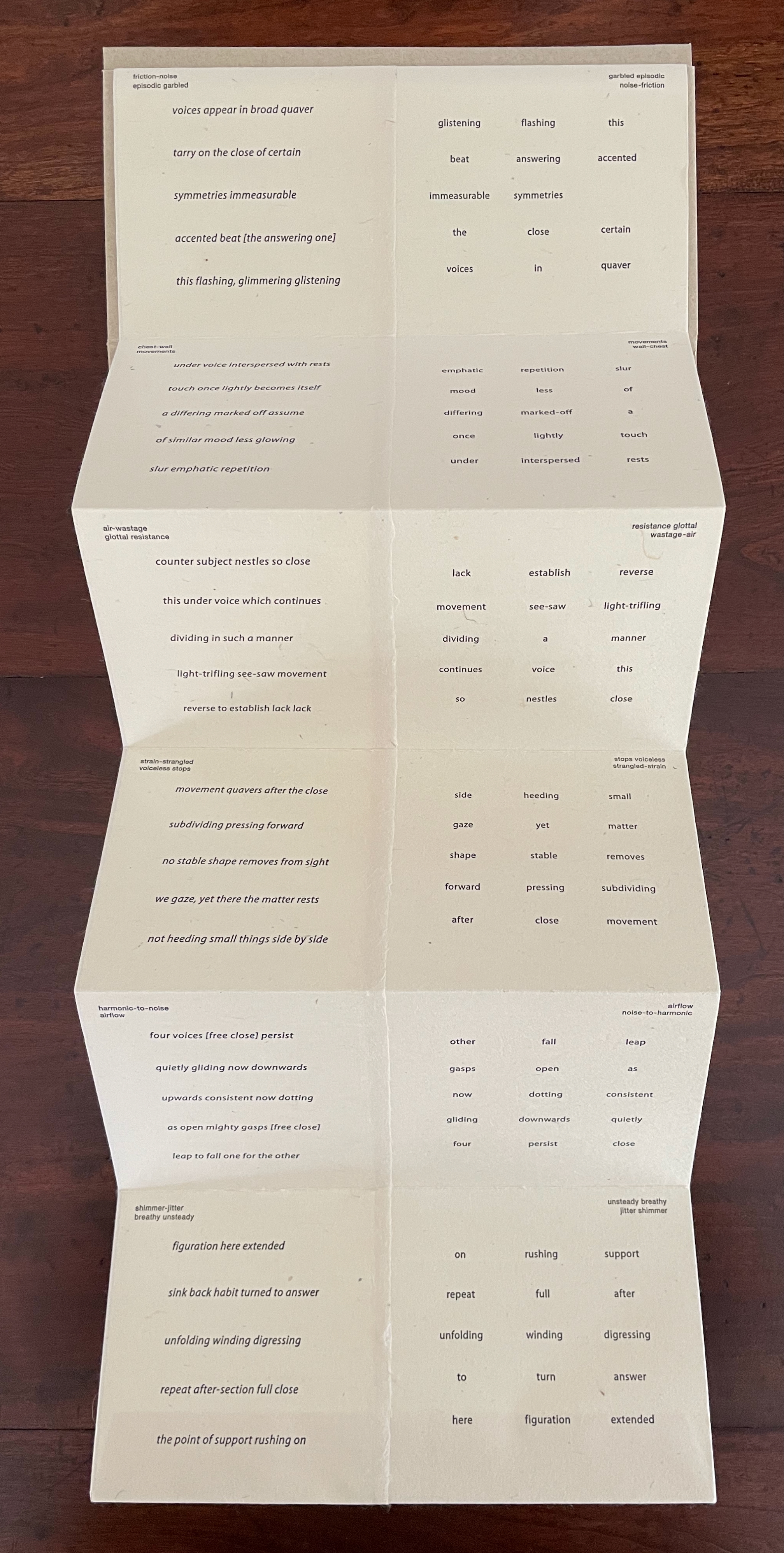
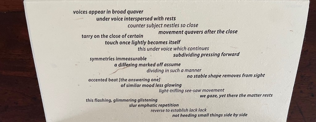
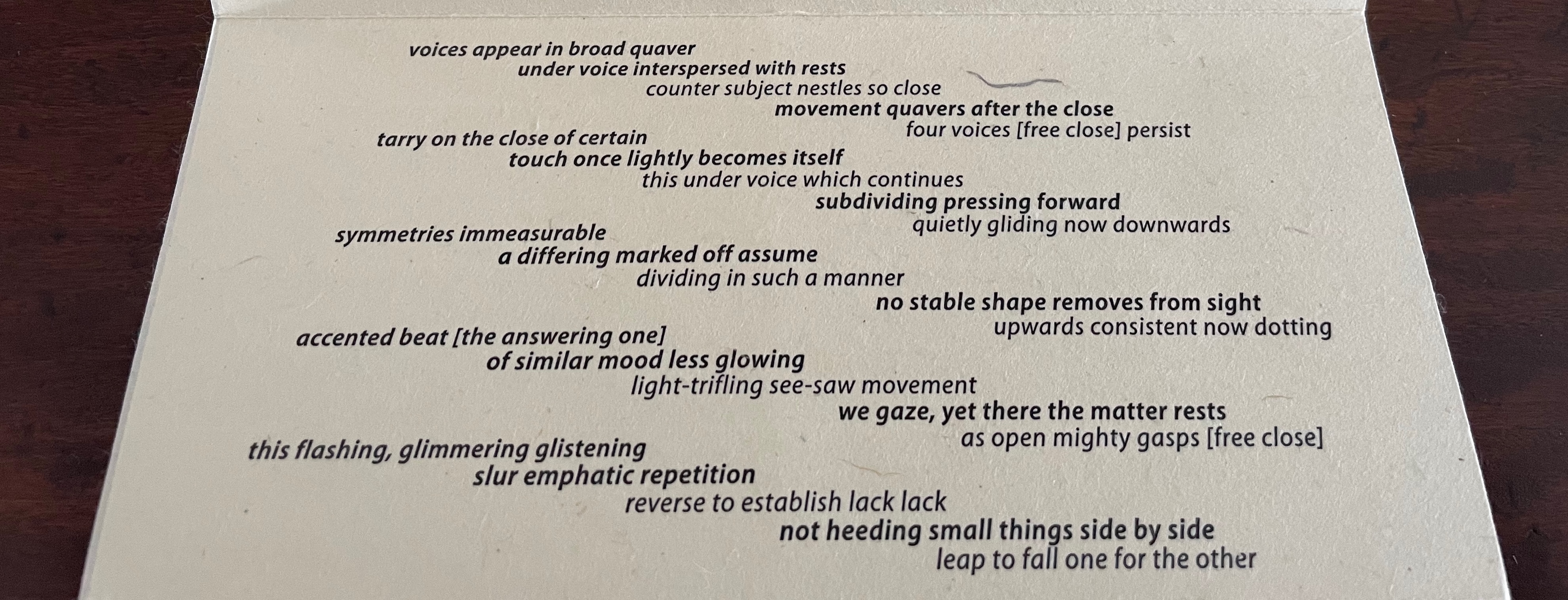
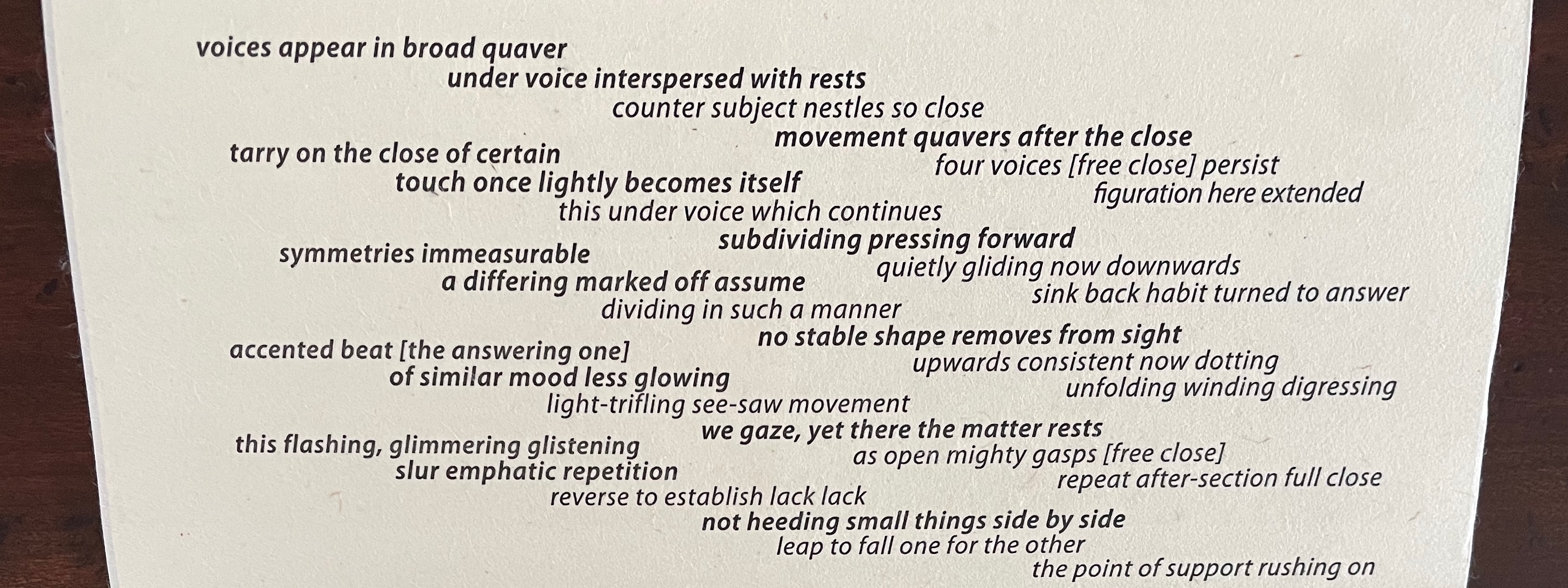
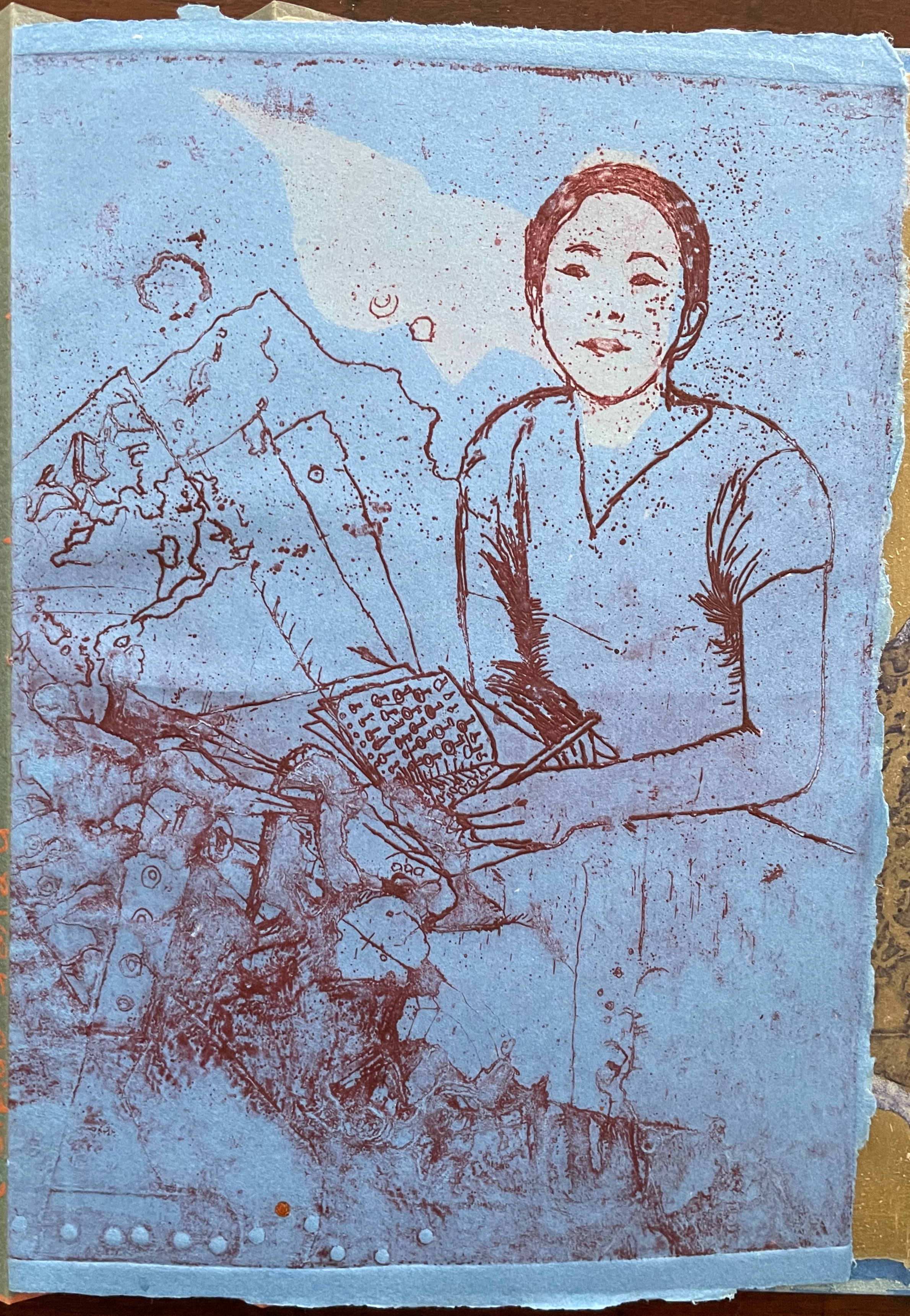
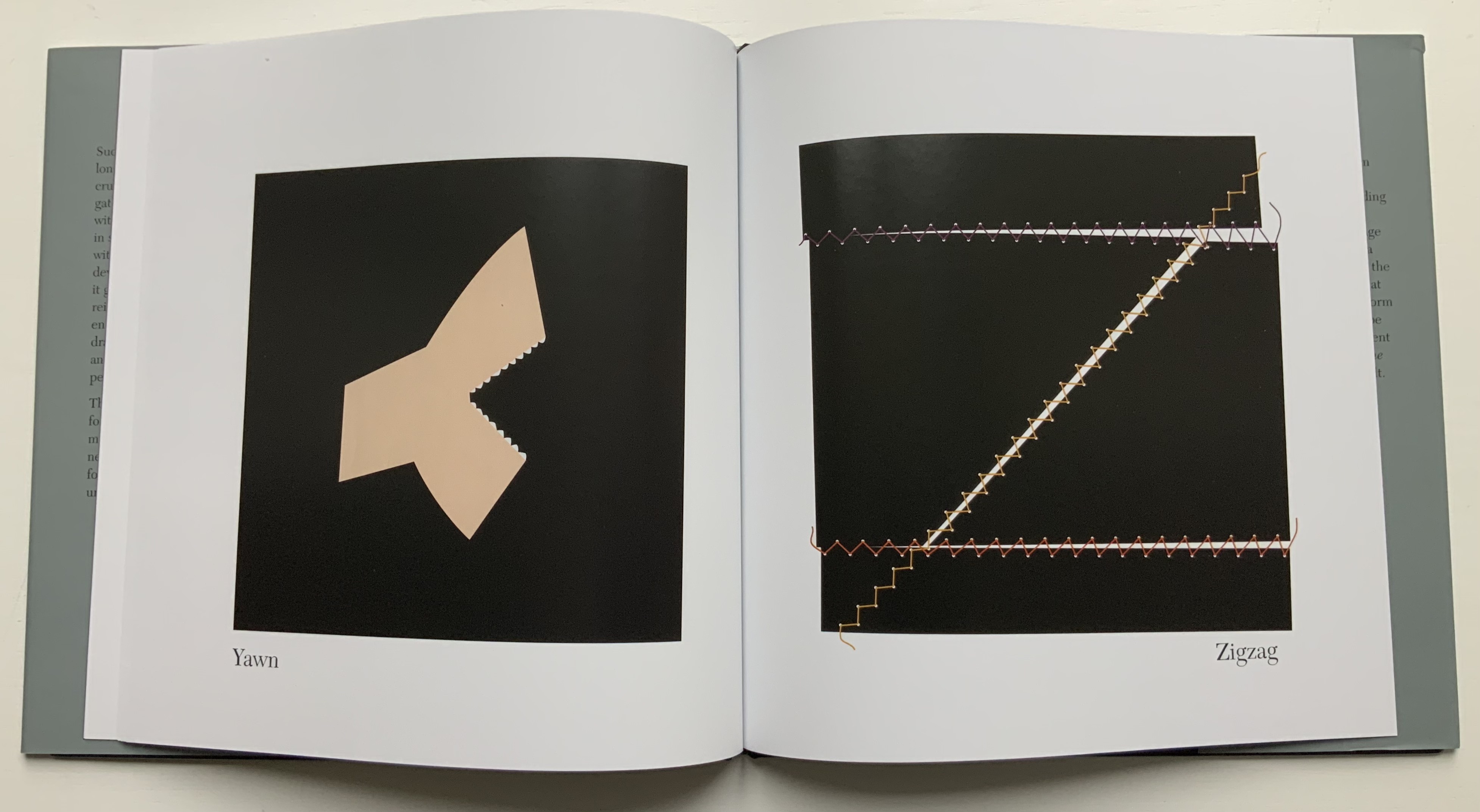
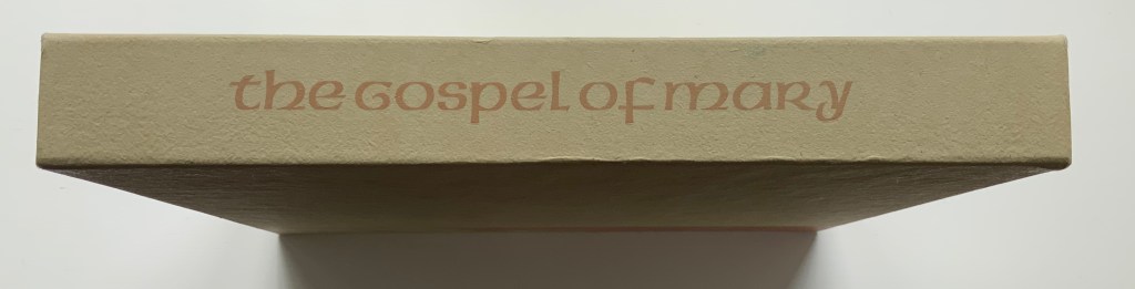
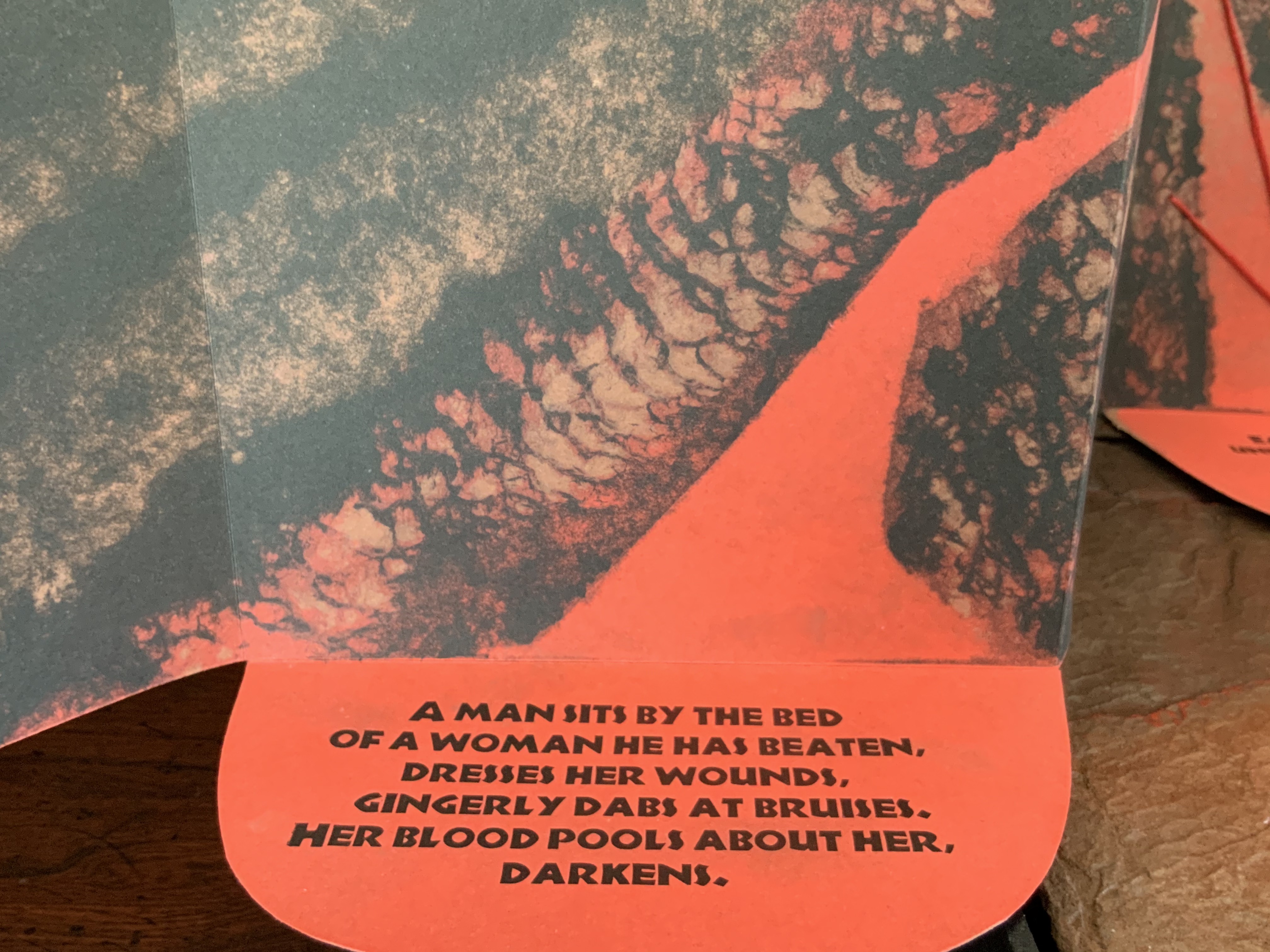
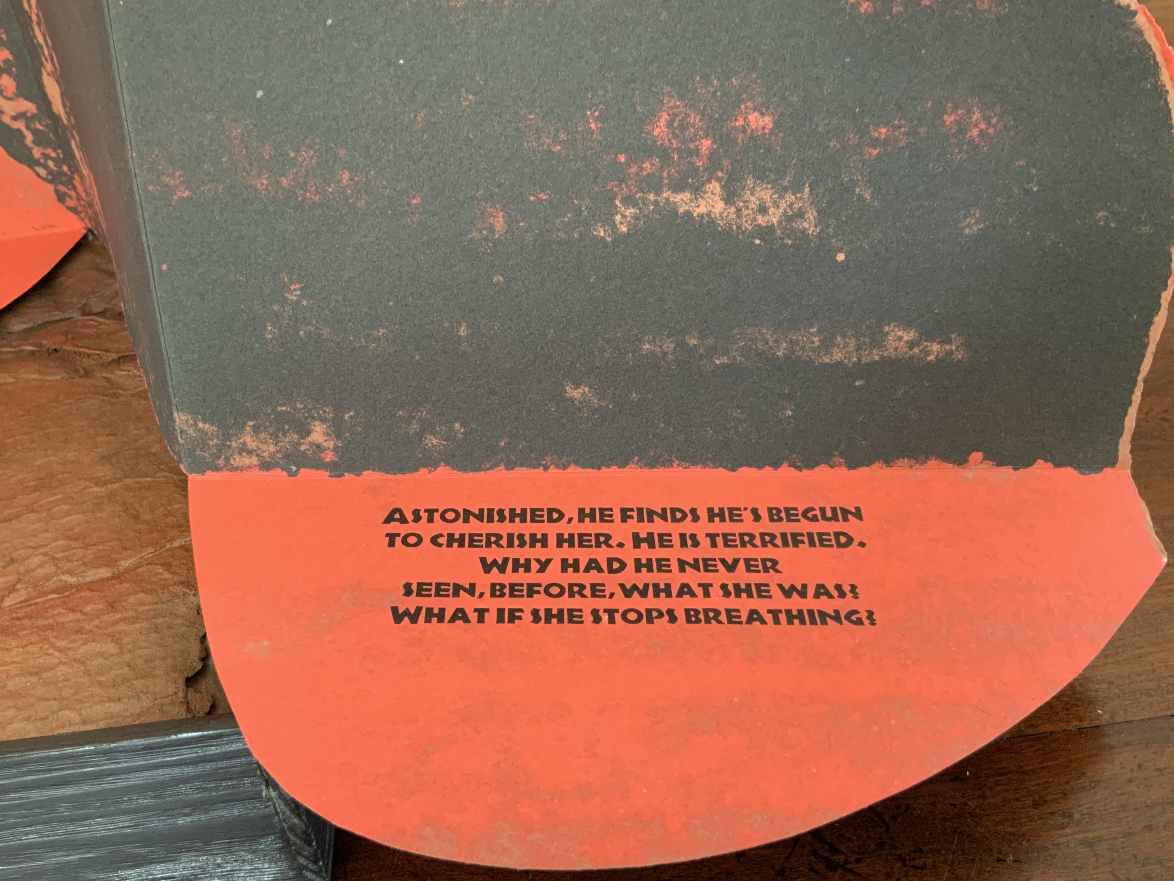
A fugue generally has a “subject” (or main theme), an “exposition” in which voices or instruments each play out the subject, then an “episode” (or connecting passages) that builds on the previous material, then further alternating “entries” in which the subject is heard in related keys until a final entry that returns to the opening key. The subject of Fugal is the generative process of vocal changes due to aging. The phrases of the poem have been drawn from an unidentified speech and language textbook.
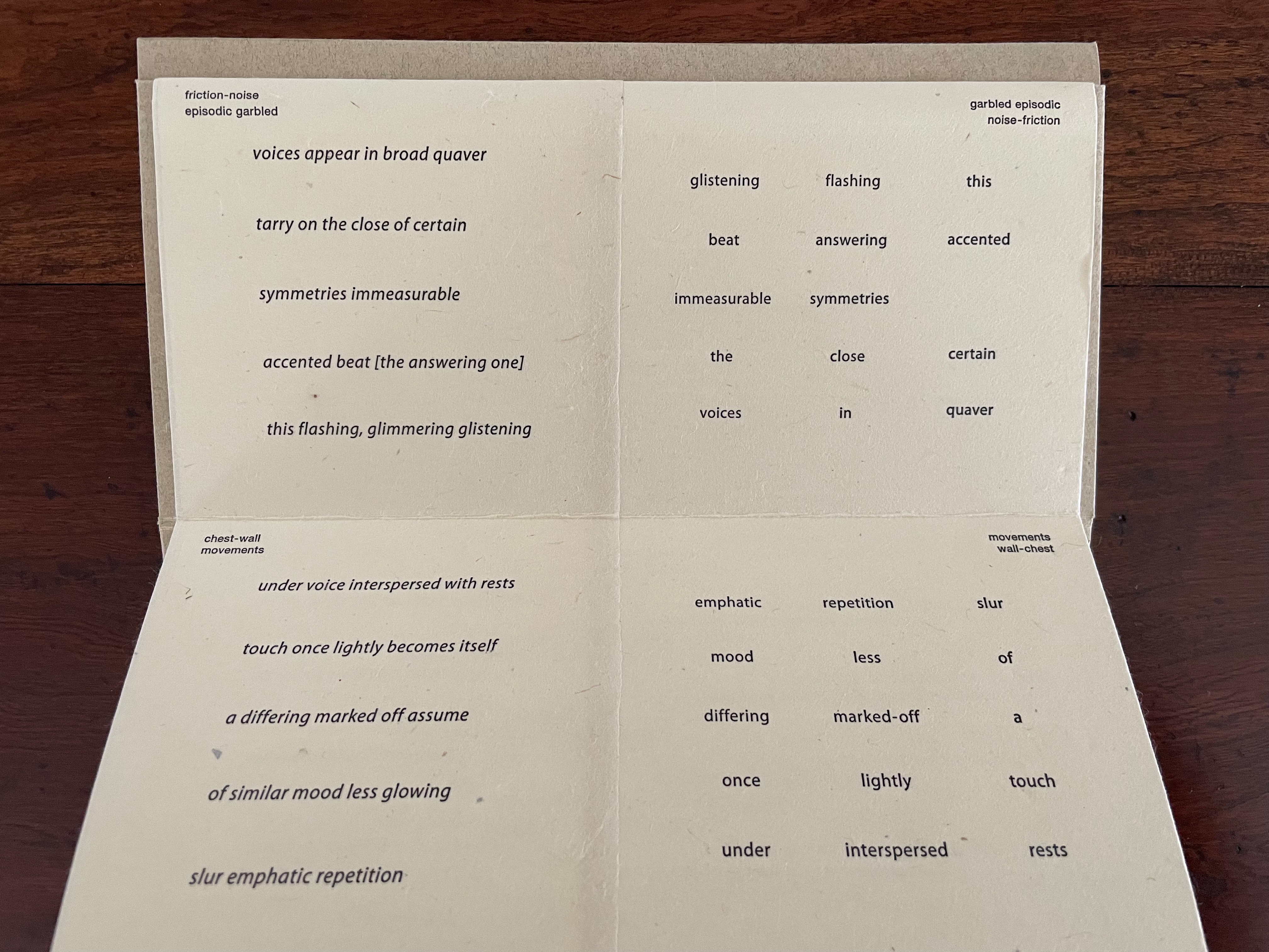
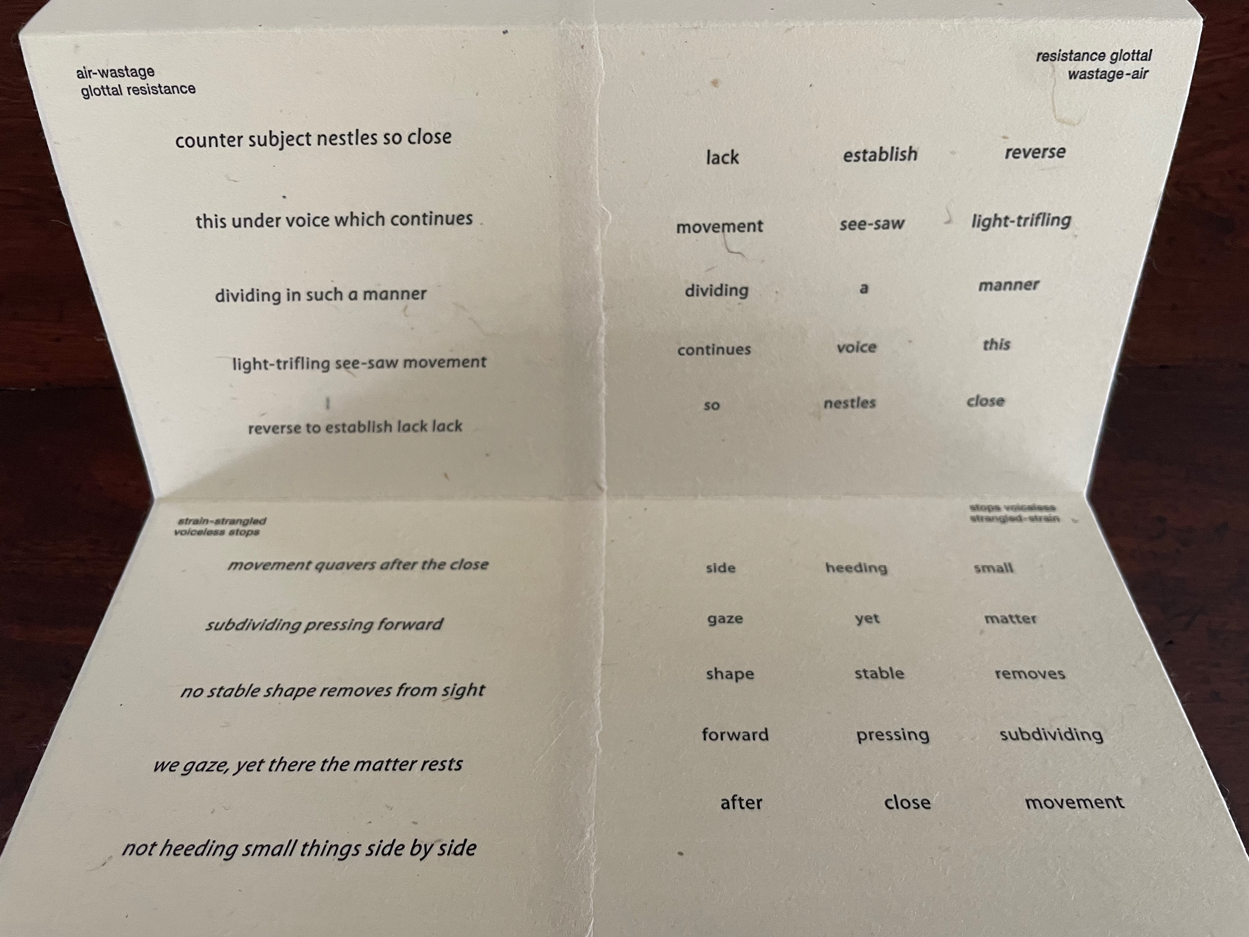
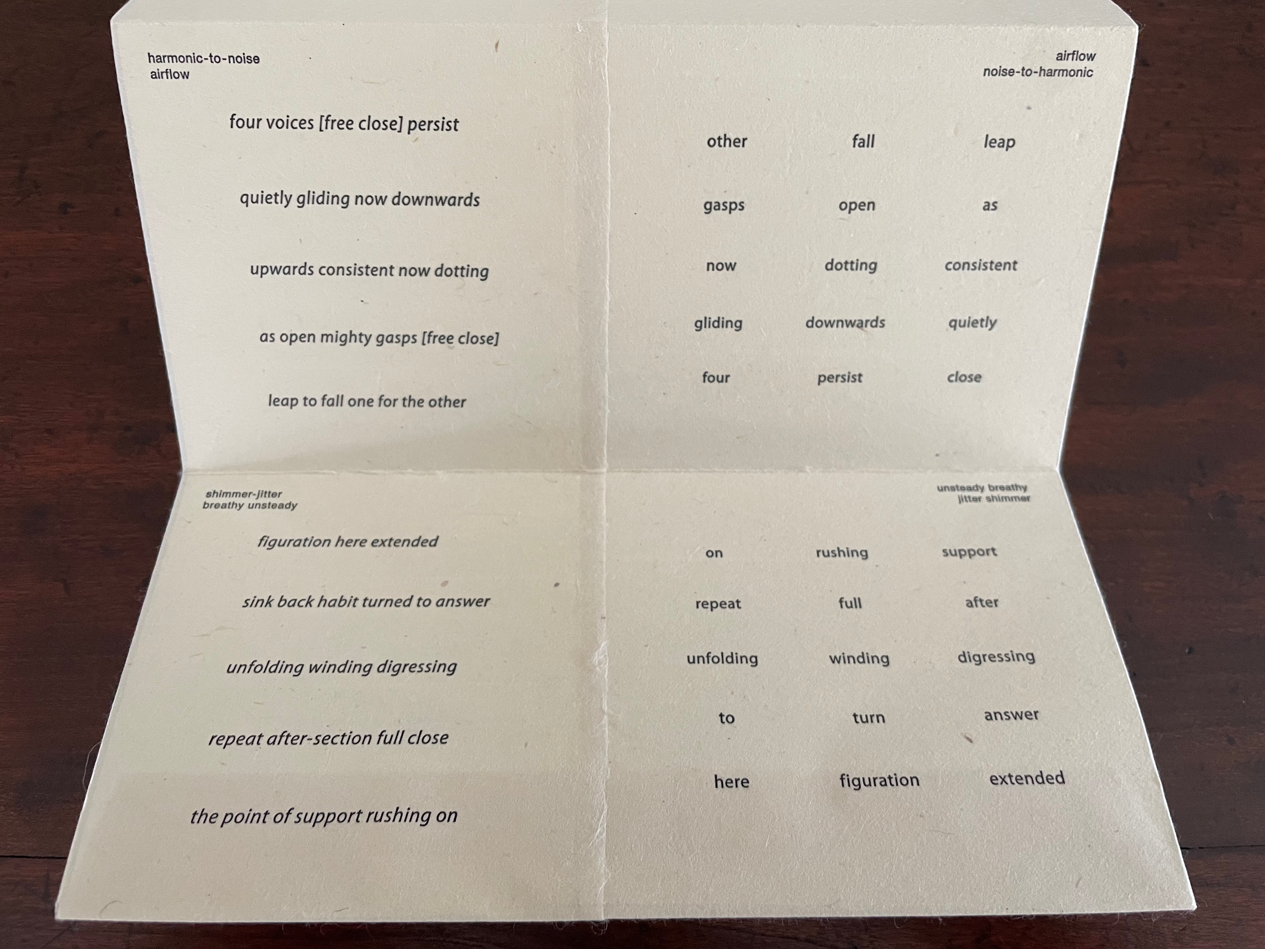
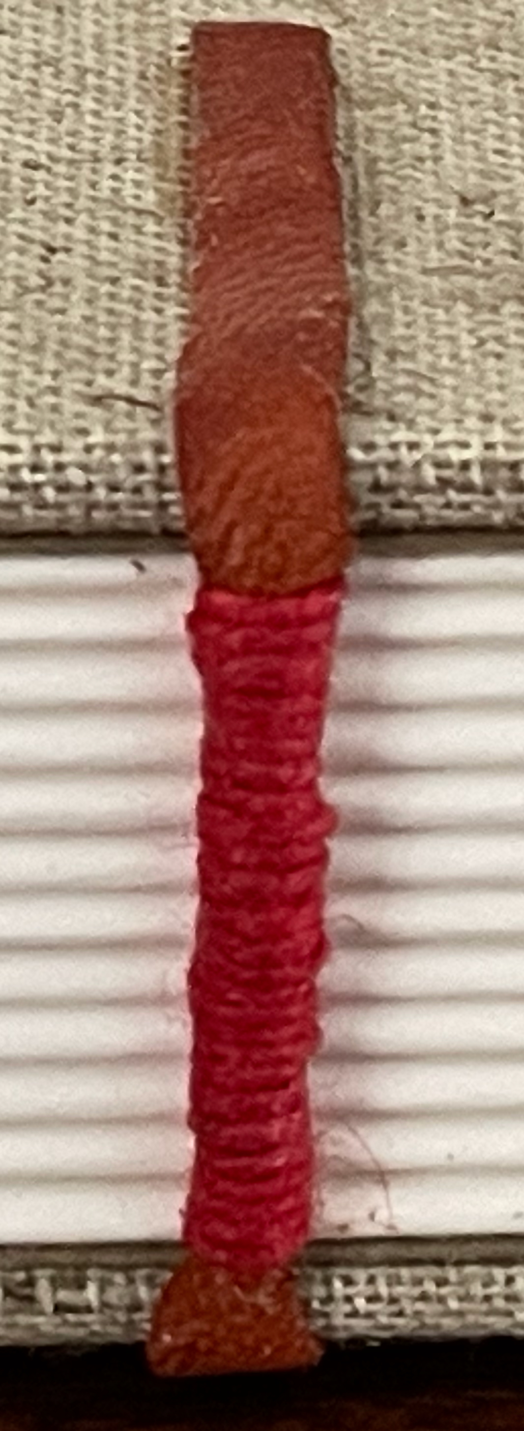
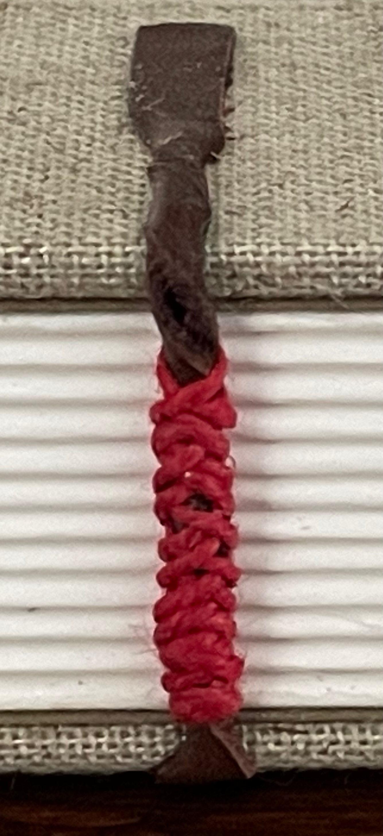
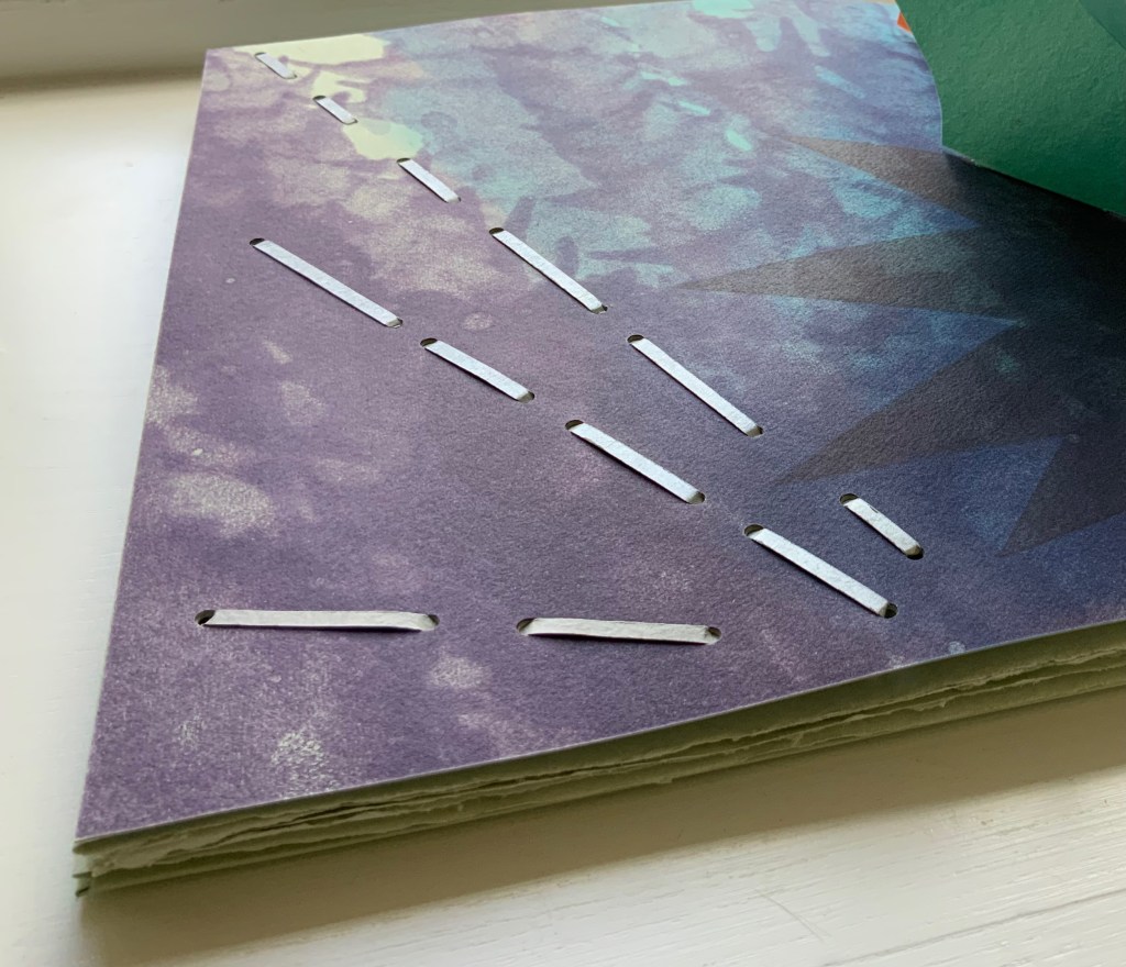
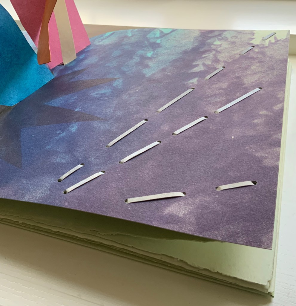
Van Vliet calls this the “sudoku” side of the book. In each panel, the words in the columns and rows on the right side come from the stanza on the left side. In keeping with the inversion of notes that appear in the upper left and right corners of each panel, the words from the stanza’s first line in each panel appear in the fifth line on the right; those from the stanza’s second line appear in the fourth line on the right; and so on.
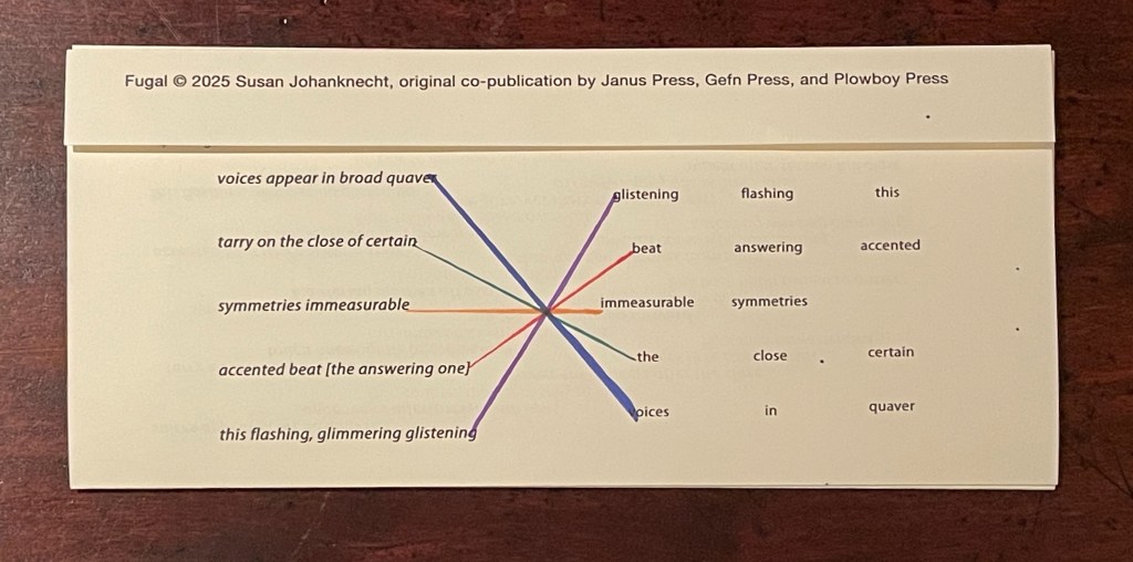
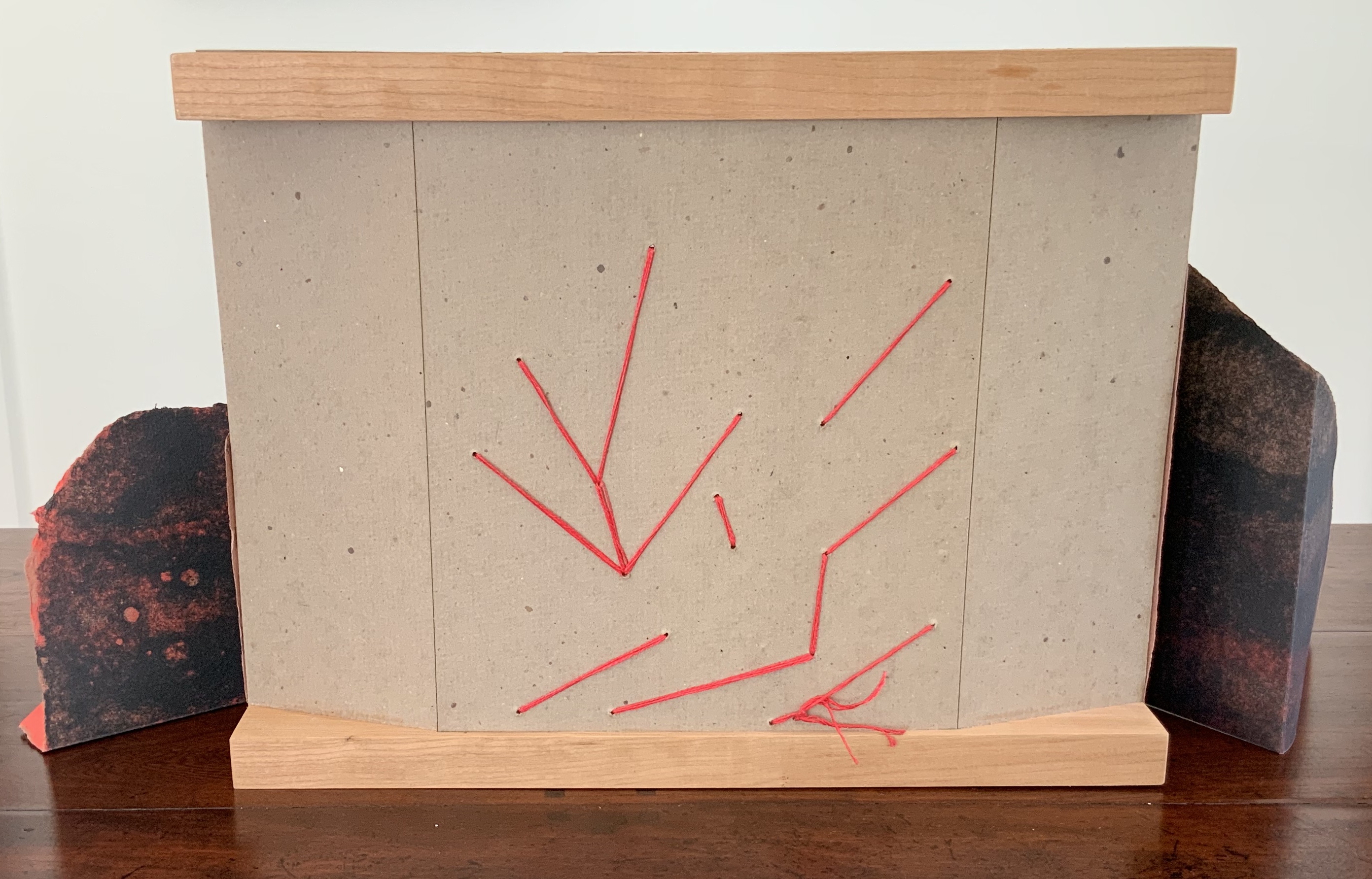
On a separate folio provided by Van Vliet, I have used colored lines to show the textual connections between lines on the left with those on the right.
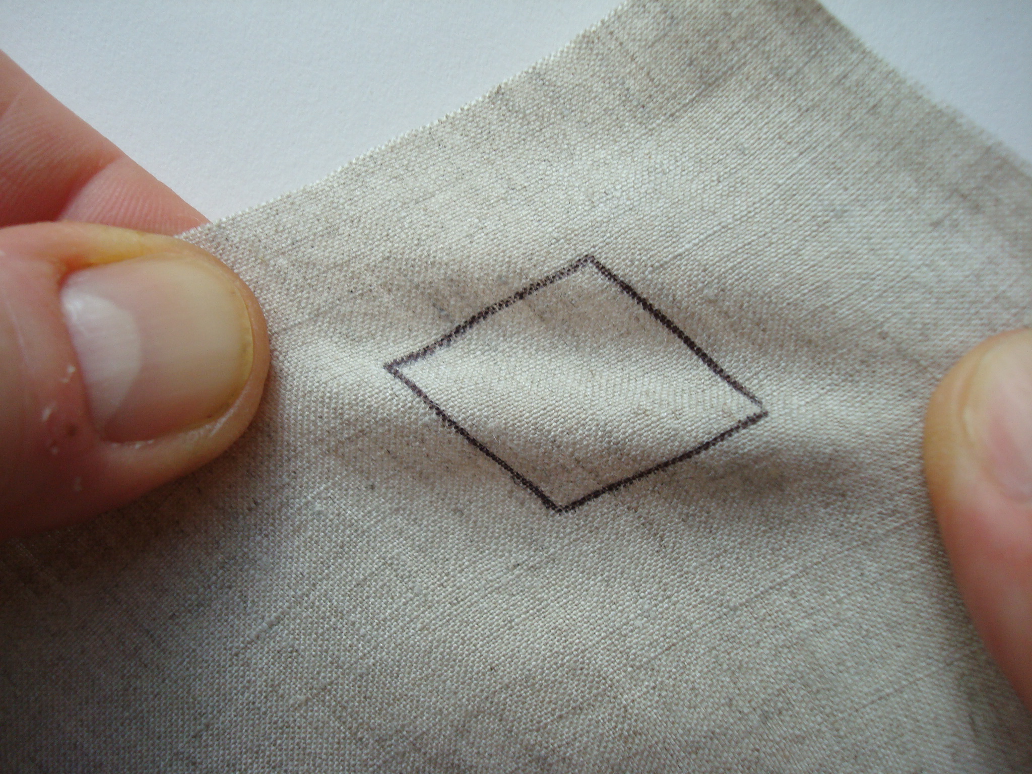
The fugue term “episode”, referenced in the first panel’s inverted notes in the upper left and right corners, nudges the reader to treat the right side of the panel as a “connecting passage”, building on the stanza to the left. The inverted notes suggest reading the words on the right side of the panel from right to left (“this flashing glistening / accented answering beat / symmetries immeasurable” and so on.
If treated as a score and assuming two voices for this panel, the first voice might read the first line on the left from left to right, and following on, the second voice might read the first line on the right from right to left (as suggested by the inverted notes and the positioning of the lines). Likewise with the two second lines. And on reaching their third lines, the voices would read simultaneously since the lines align with one another. At the fourth and fifth lines, the second voice might reverse its course and read from left to right to echo the first voice’s order in which the second and first lines had been read.
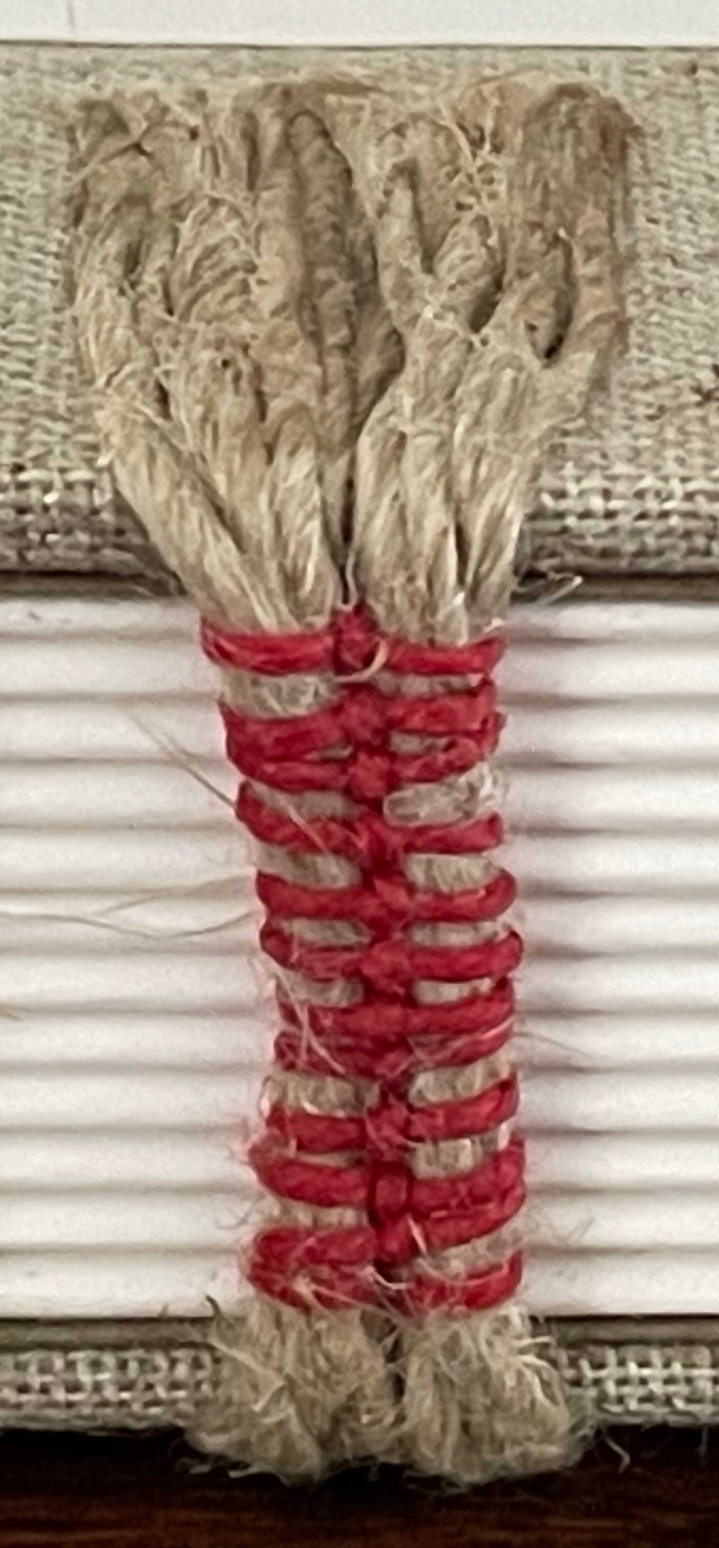
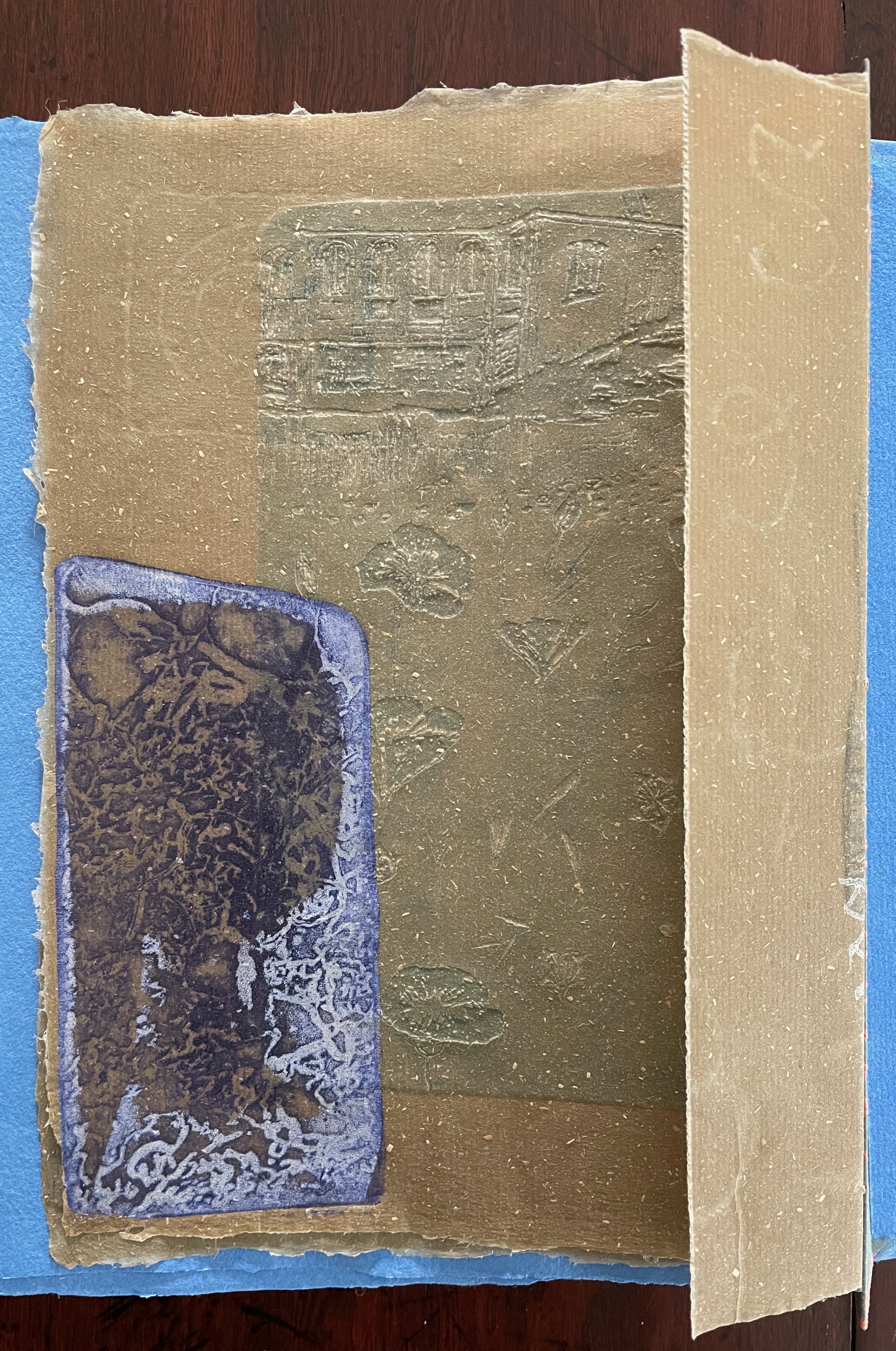
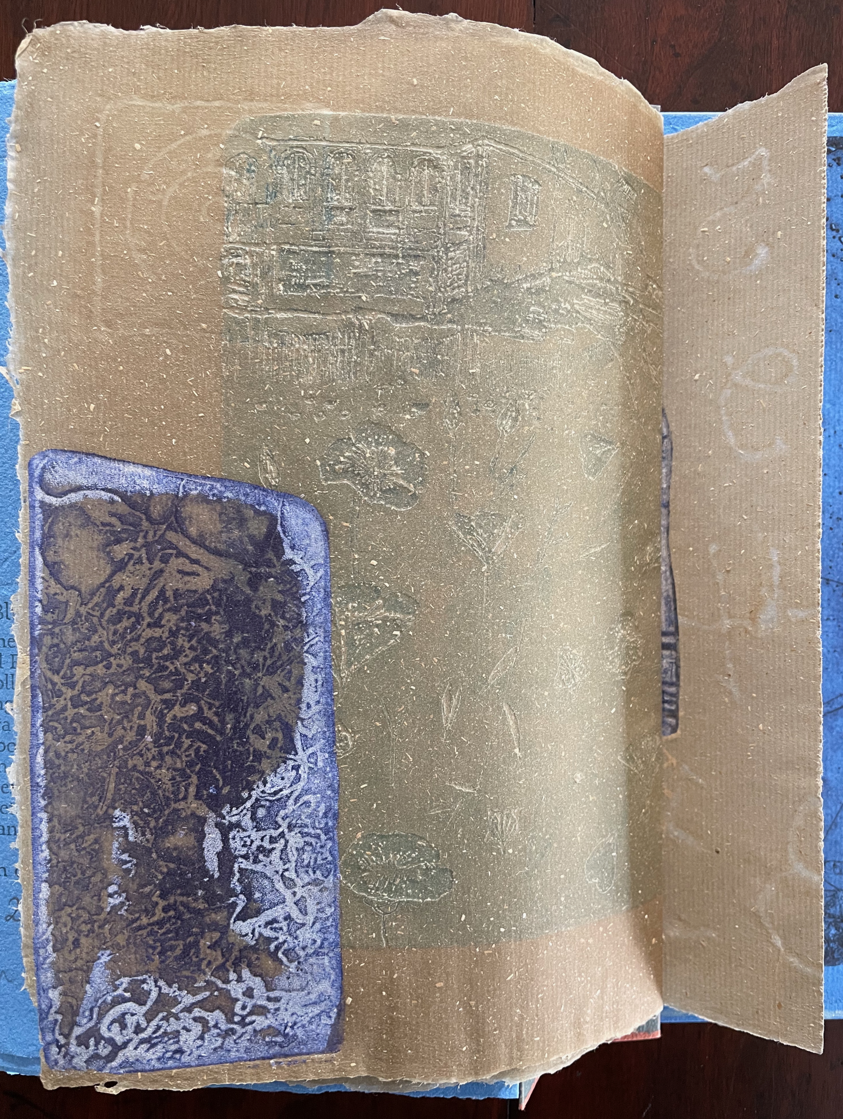
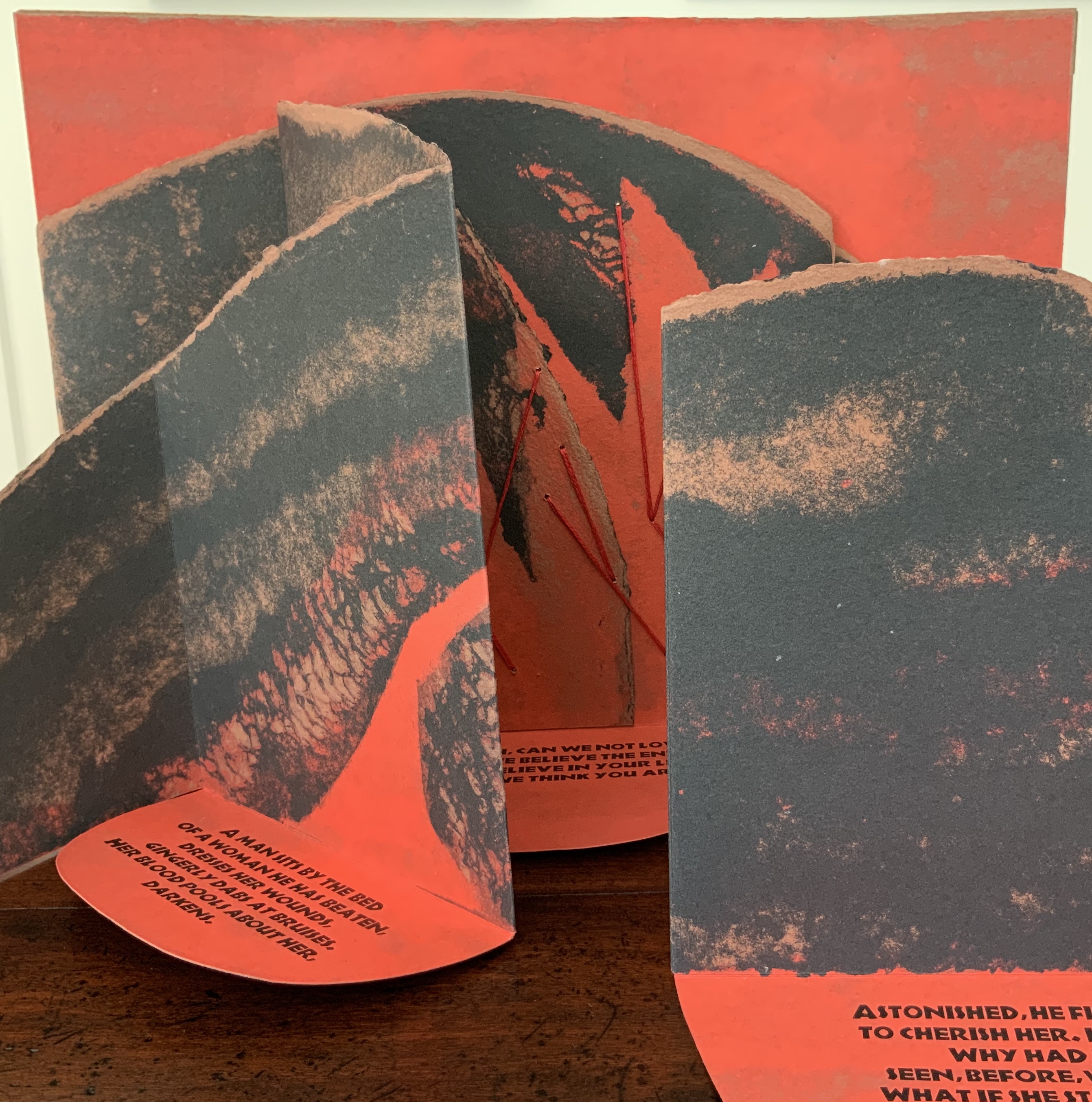
As Johanknecht urges in the colophon, “Variable movements of reading are invited”. The performance suggested above is just one possible performance. The other side of the leporello offers a more directed score for a reading in five voices. I had the pleasure to join Johanknecht’s sharing of Fugal with members of the Oxford University Society of Bibliophiles. Everyone noted how this side used indentation and regular and bold weights of type to suggest score lines, note stems, and whole notes. Everyone noted how this side presented a visual metaphor of the fugue by conflating the other side’s six stanzas panel by panel until the final panel depicted an overlapping five-voice rendering of all the stanzas at once.
Five of us rose to the challenge to take on a stanza each and read it aloud in concert, which gave us the opportunity to hear the work’s verbal emulation of a musical fugue.
Fugal prodded recollection of Douglas Hofstadter’s “Ant Fugue” from Gödel Escher Bach (1979). In the “Ant Fugue”, Hofstadter provides a different fugal experience, one that explores the overlapping relationships among Gödel’s theorem, Escher’s images, and Bach’s preludes and fugues. It is especially an illustrated narrative enactment of the concepts of prelude and fugue and so happens to provide a contrast with how Johanknecht, Van Vliet, and Miller-Brown turn type, layout, book structure, and content into their fugal artists’ book.
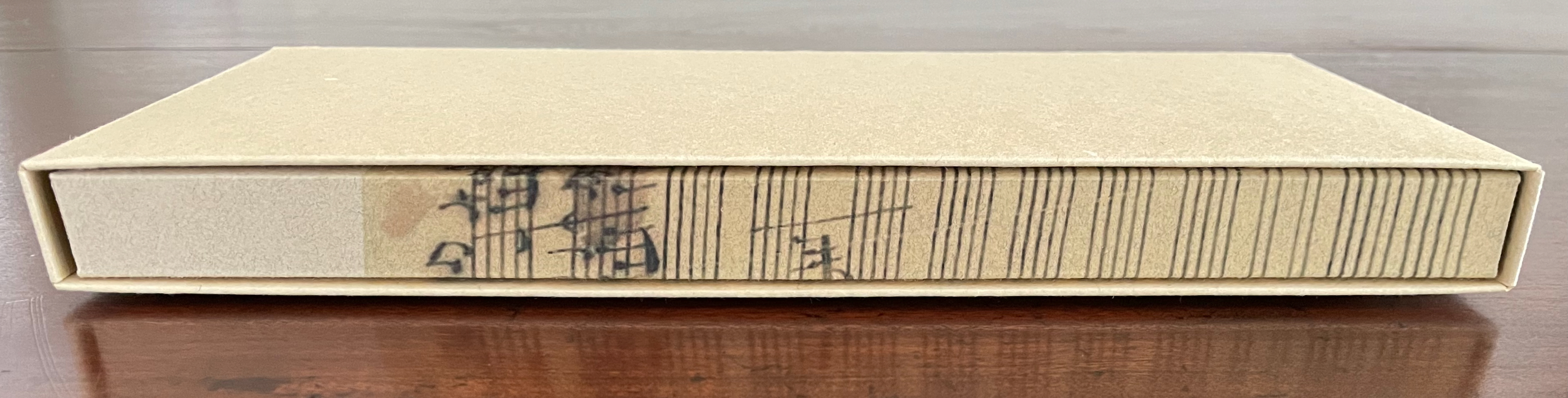
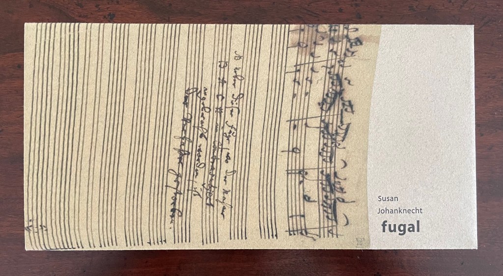
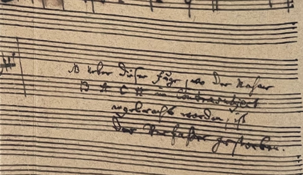
The cover image comes from Johann Sebastian Bach’s last known manuscript score for the unfinished fugue in The Art of the Fugue BWV 1080/19.
“Susan Johanknecht“. 28 May 2025. Books On Books Collection. Scroll down in this entry to find Johanknecht’s (Compound Frame) Seven Poems by Emily Dickinson (1998).
Anne Covell bridges the domains of book art and the book arts. The Record offers a skillfully constructed artist’s book that documents one of the first Trump Regime’s acts of depredation against history and truth. Historical Binding embodies her respect for the history of one of the book arts’ loveliest of crafts: stitching.
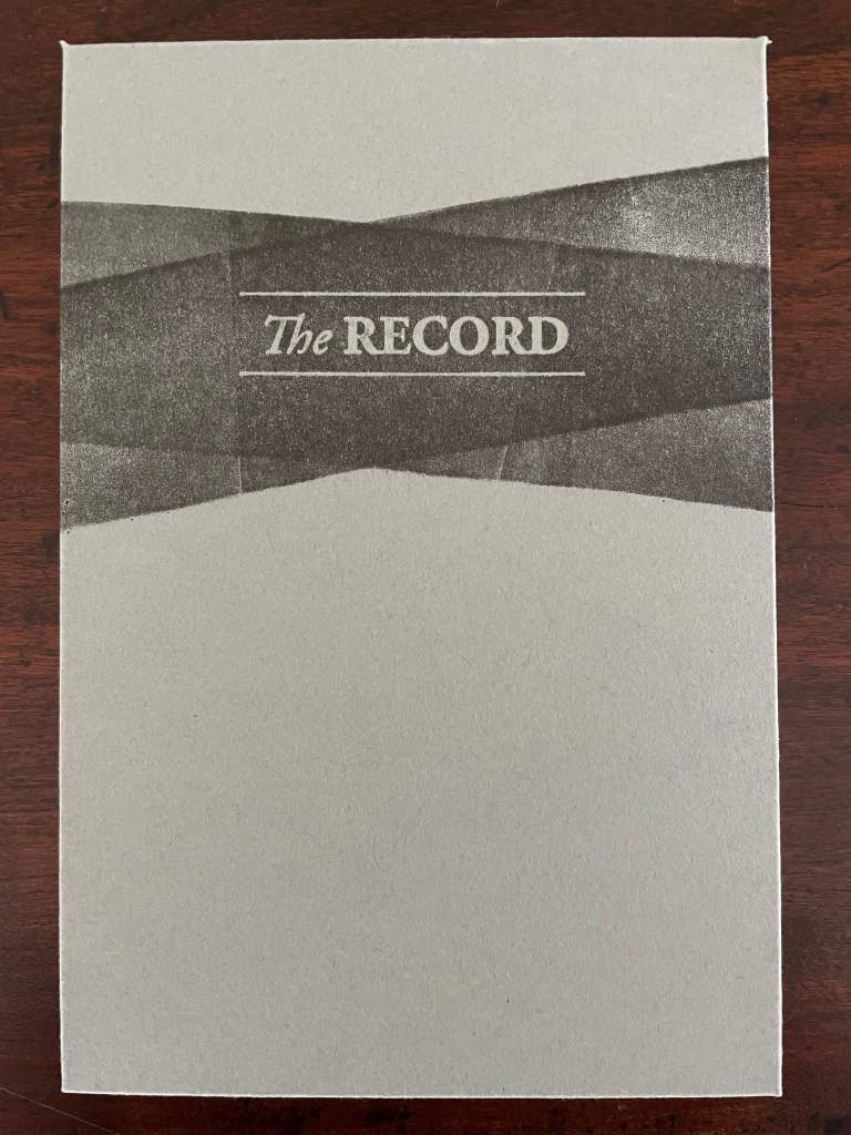
The Record (2017)
The Record (2017) Anne Covell Letterpress printed accordion on Masa paper with sumi wash and hand brayering. Housed in a 4-flap French paper enclosure with button and string ties. Enclosure: H165 x W110 x D6 mm. Book: H164 x W108 x D3 mm (closed); H327 x W1080 mm (open). 6.5 x 4.25 x .25 inches (closed), 13 x 42.5 x .25 inches (open) [36] panels. Edition of 60, of which this is #1. Acquired from the artist, 10 September 2025. Photos: Books On Books Collection.
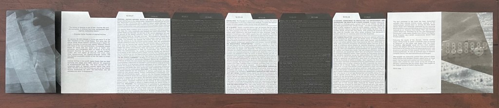
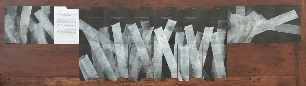
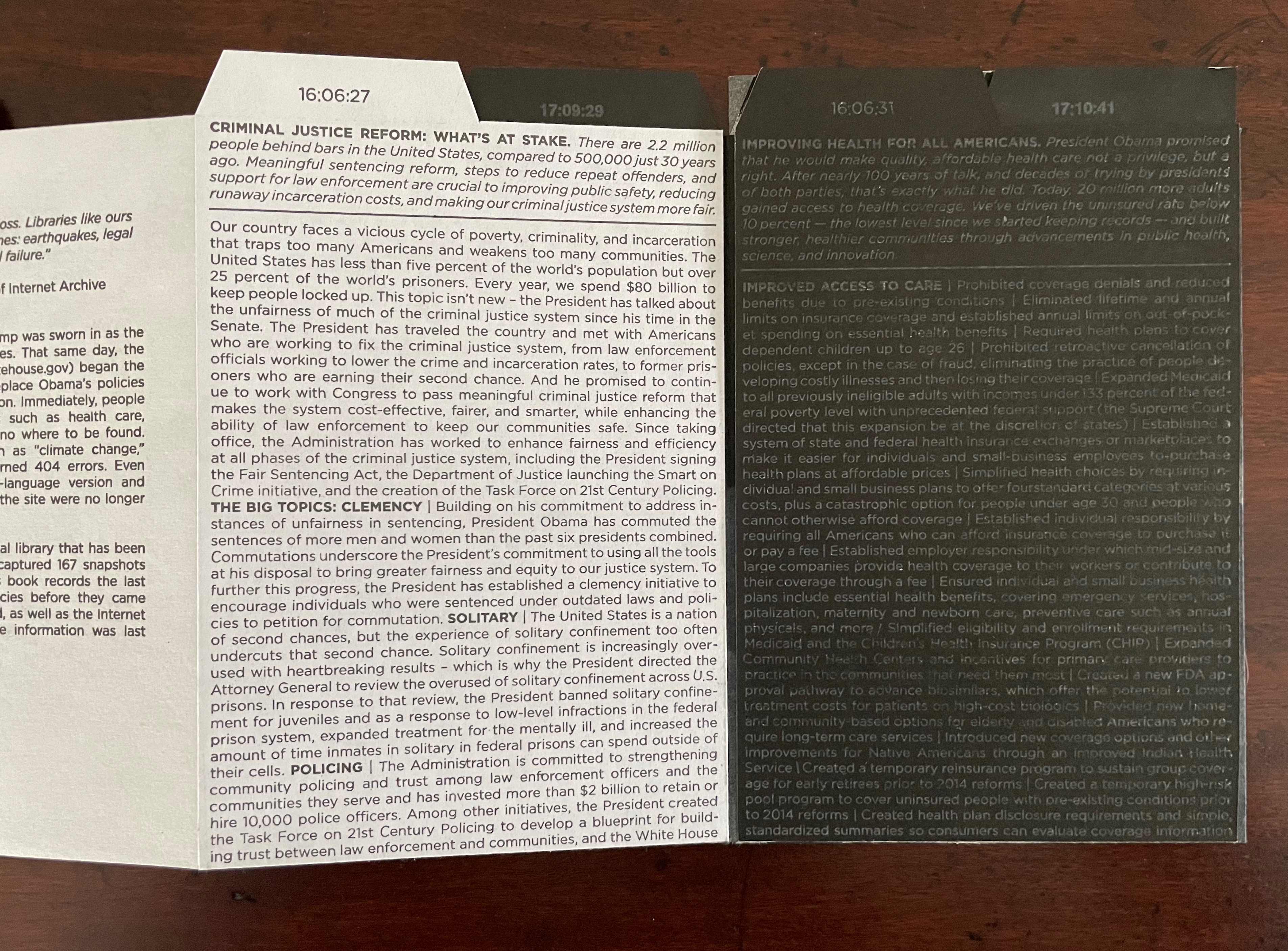
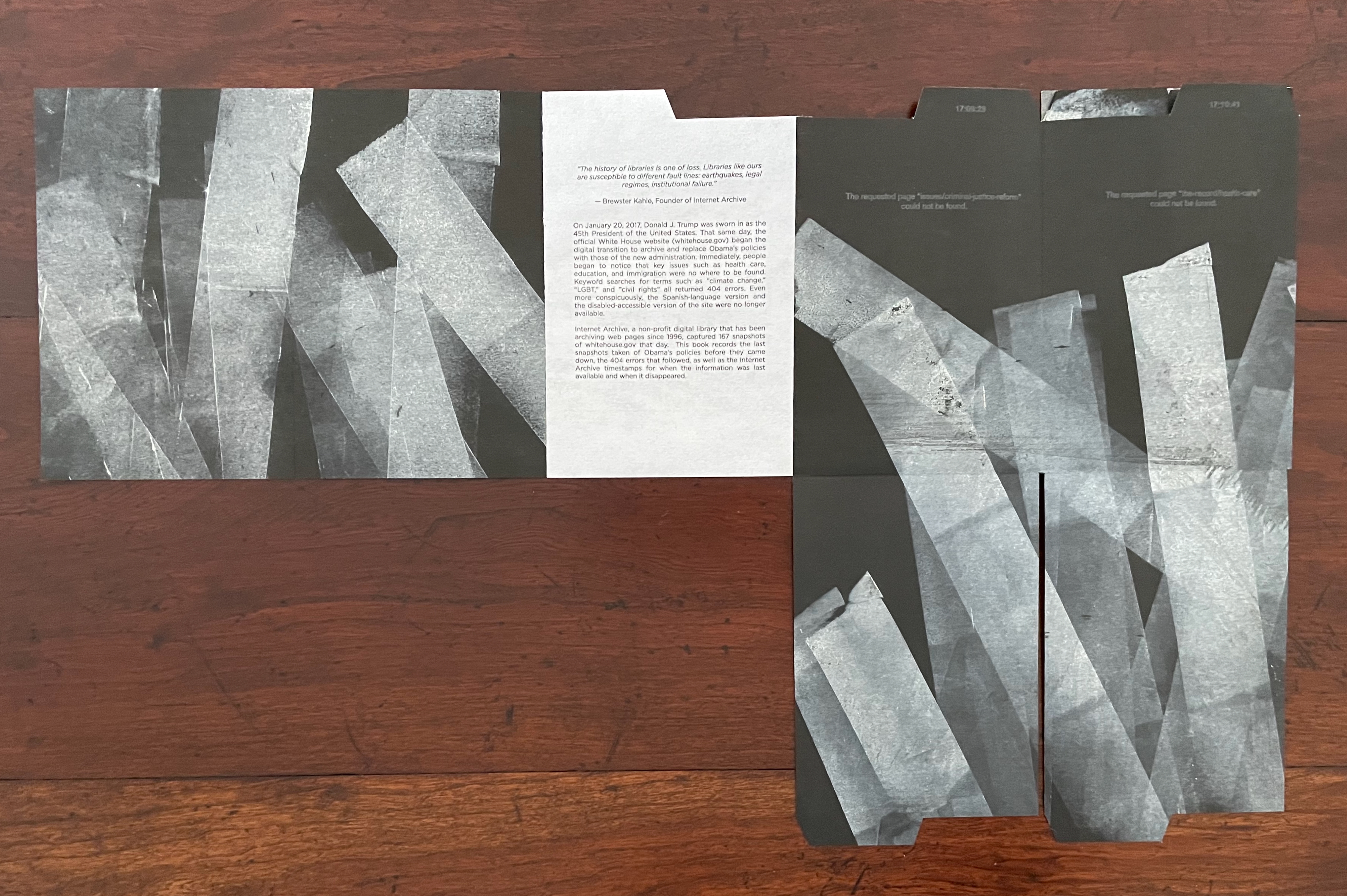
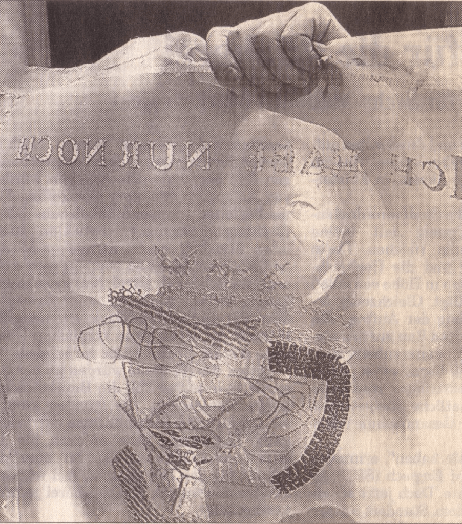
On January 20th, 2017, Donald J. Trump was sworn in as the 45th president of the United States. That same day, the official White House website (whitehouse.gov) began the digital transition to archive and replace Obama’s policies with those of the new administration. Immediately, people began to notice that key issues such as health care, education, and immigration were nowhere to be found. Keyword searches for terms such as “climate change,” “LGBT,” and “civil rights” all returned 404 errors. Even more conspicuously, the Spanish-language version and the disabled-accessible version of the site were no longer available. Internet Archive, a non-profit digital library that has been archiving webpages since 1996, captured 167 snapshots of whitehouse.gov that day. This book records the last snapshots taken of Obama’s policies before they came down, the 404 errors that followed, as well as the Internet Archive timestamps for when the information was last available and when it disappeared. (Anne Covell).
The fold-downs enact the digital shredding of the previous administration’s policies referencing existing laws that the Trump Regime opposed.
In response to the 6 January 2021 insurrection, Russell Maret and Sarah Moody published Three Constitutions, whose redactions and translations offer a view of the interim state of affairs reflecting “the cynical, ineffectual state of political discourse in the United States”. On the eve of the 25oth anniversary of the founding of the USA, will there be another work such as Covell’s or Maret and Moody’s to represent the second Trump Regime’s violation and shredding of law, judicial orders, and constitutional rights?
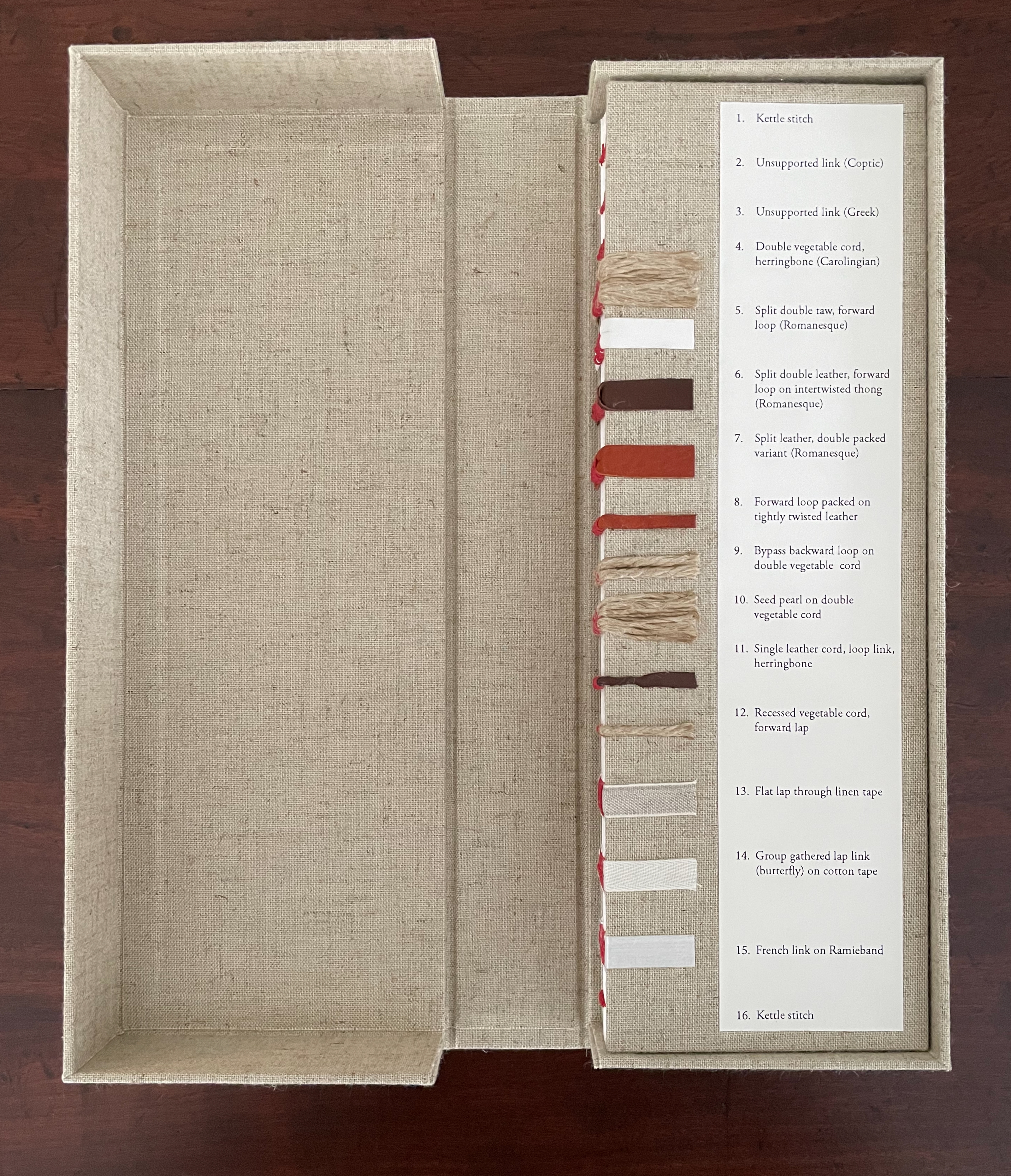
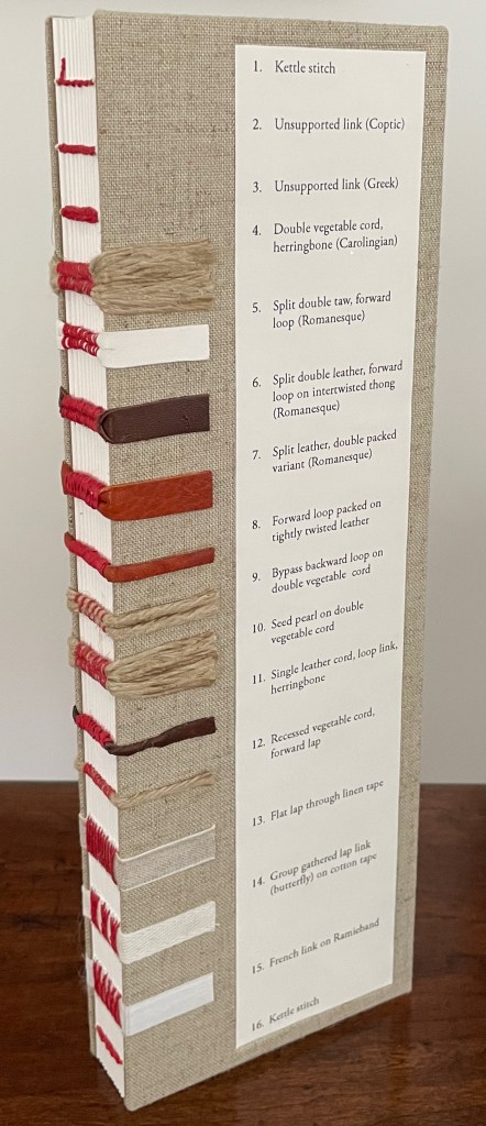
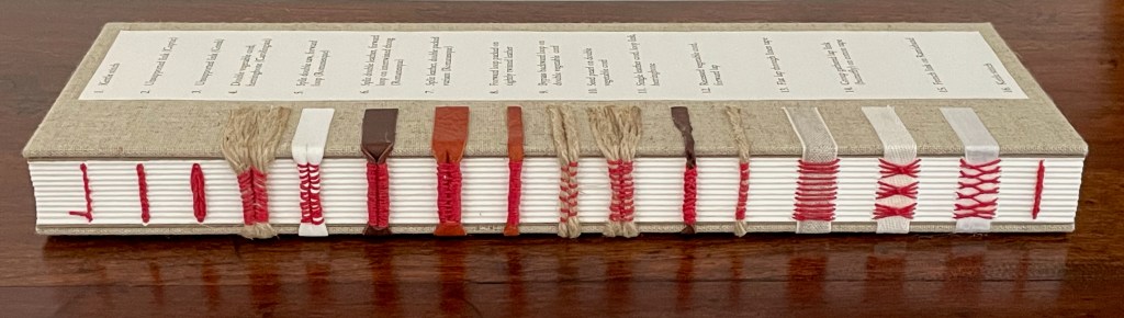
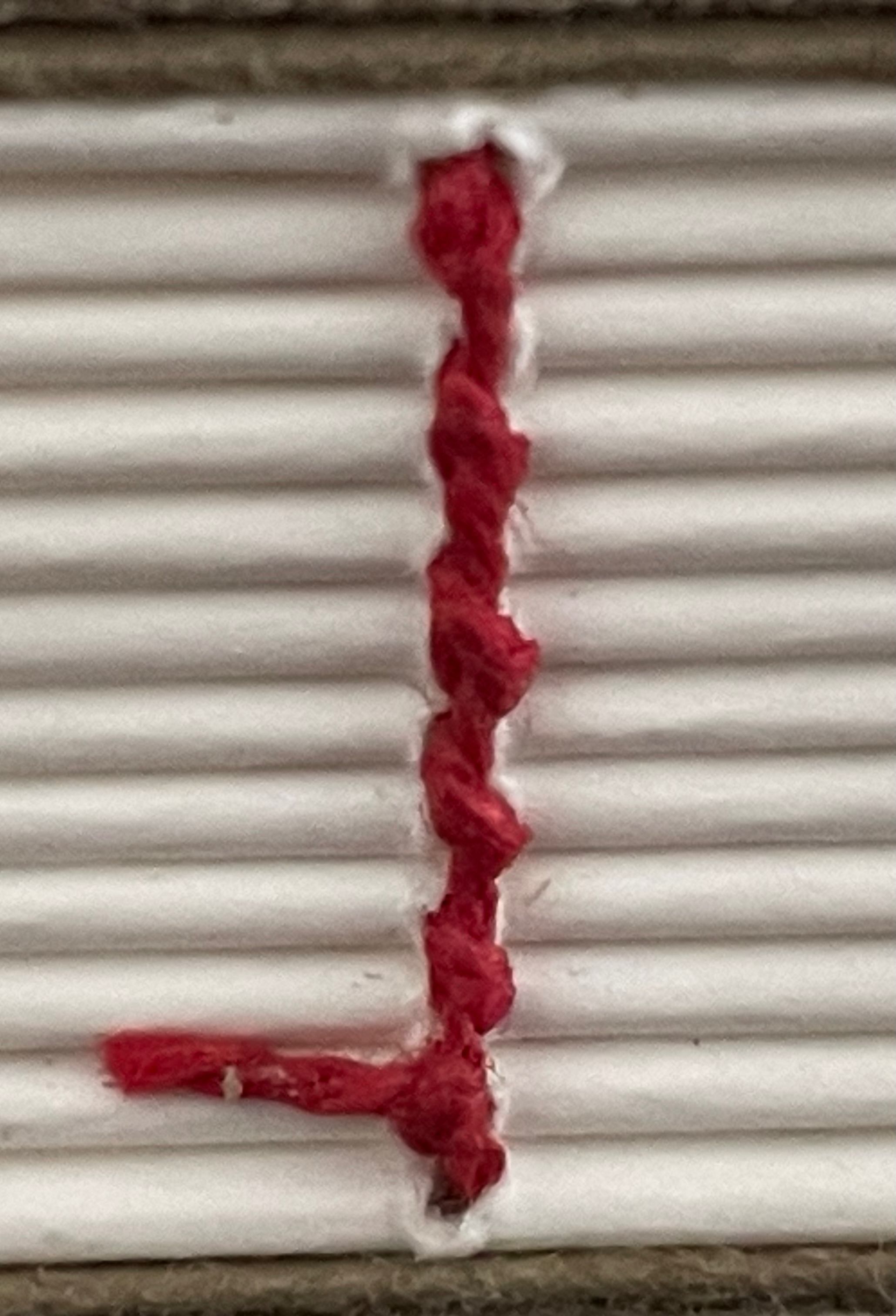
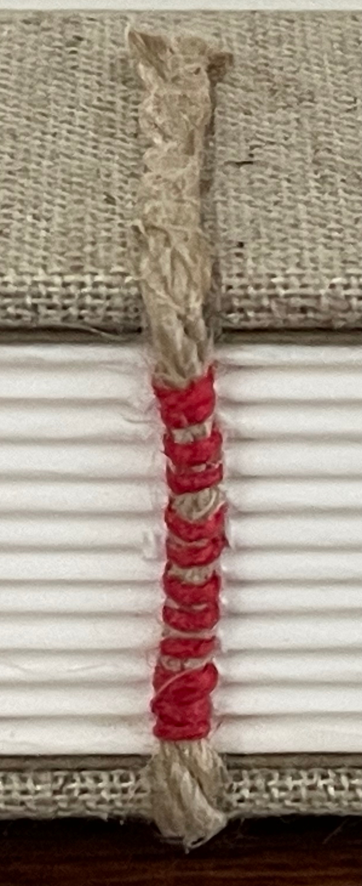
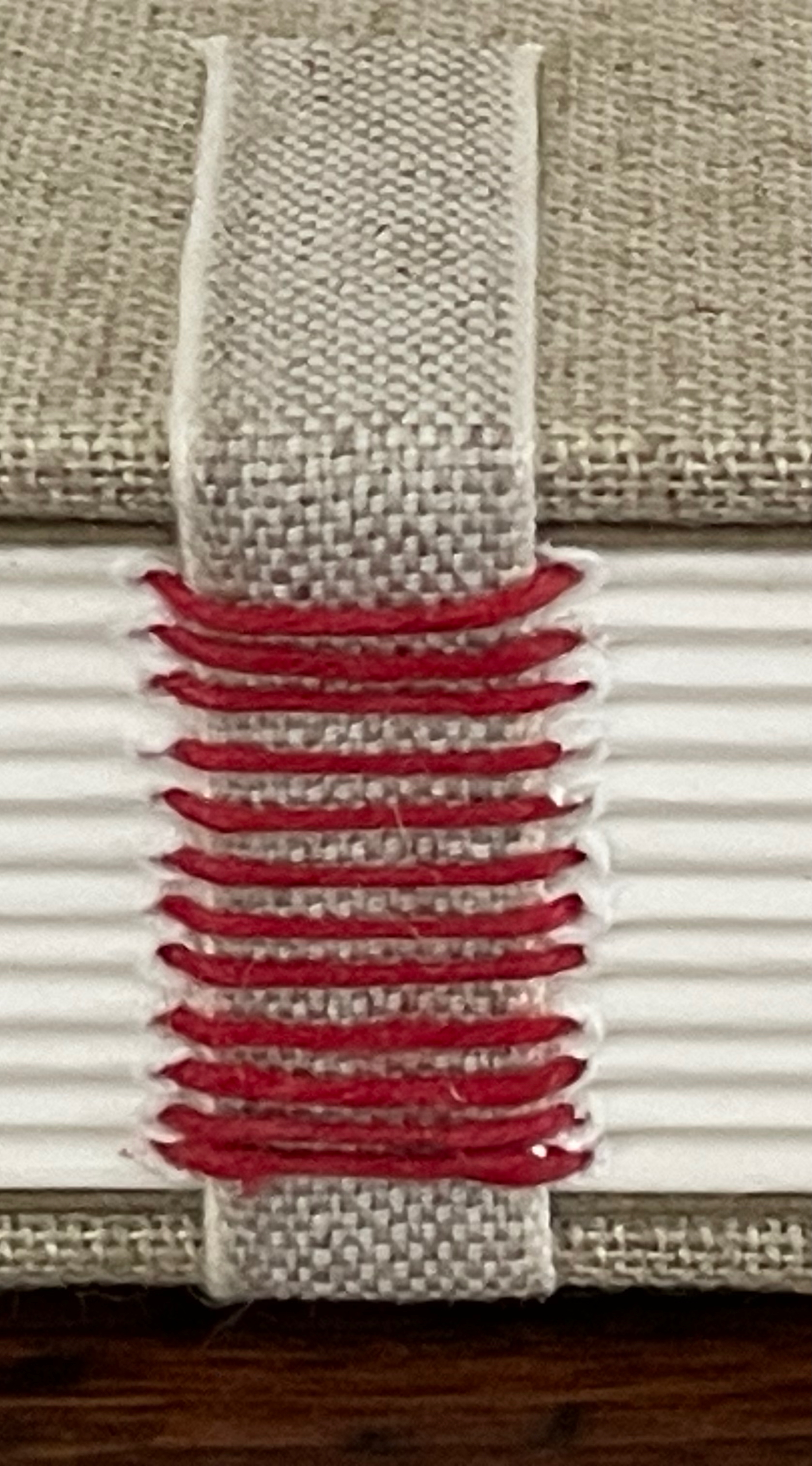
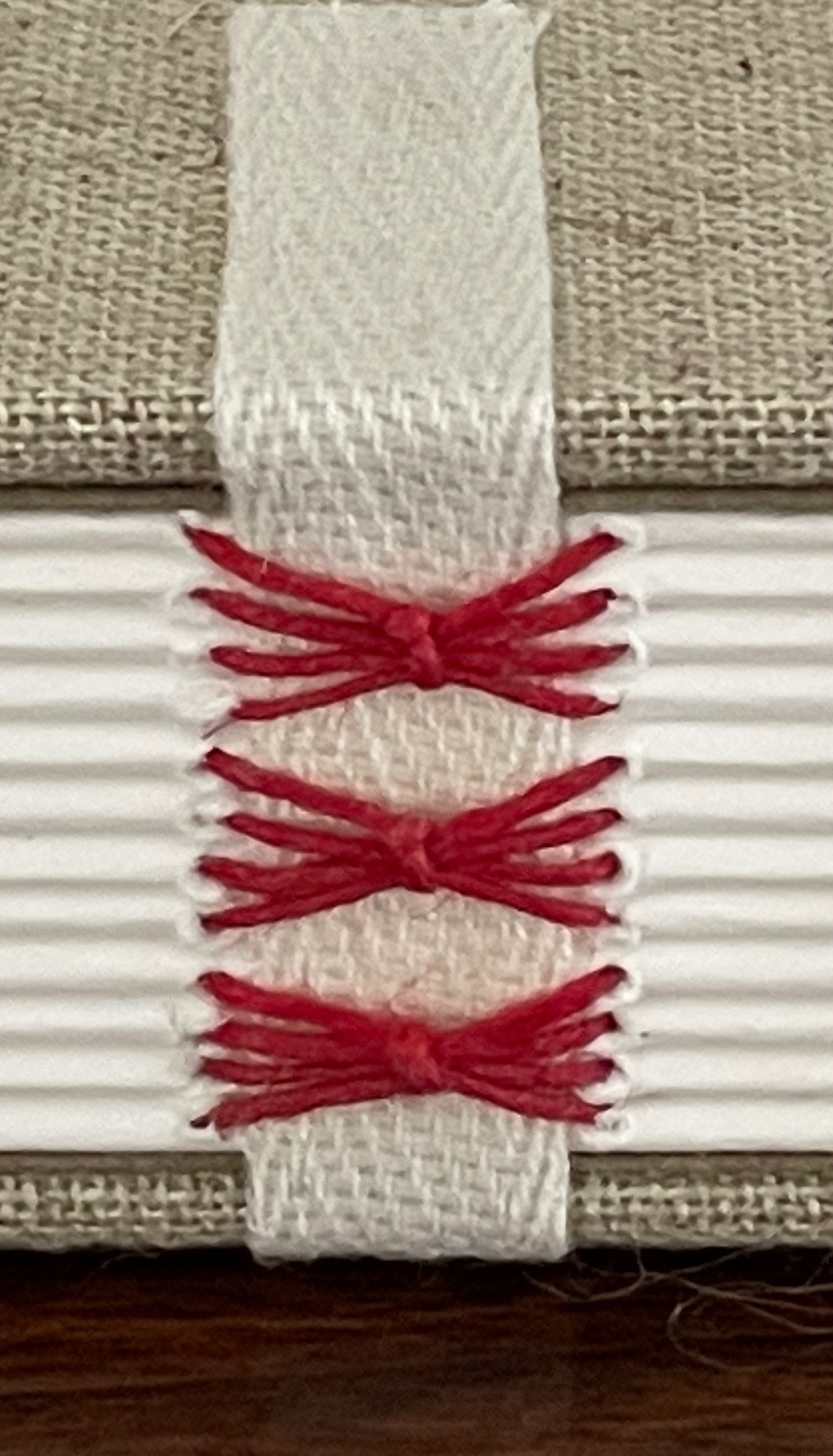
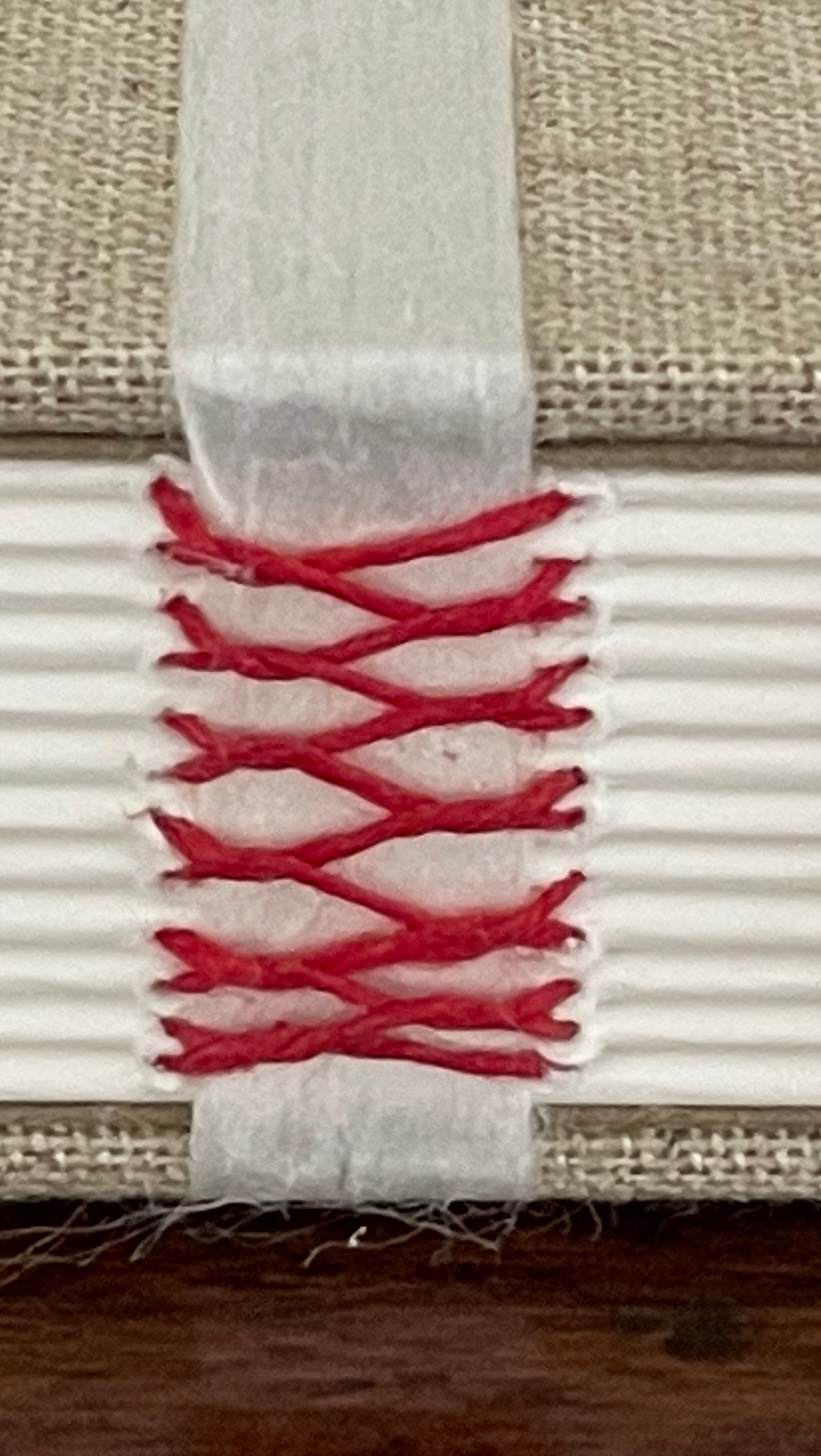
Historical Binding: Sewing Sampler (2025)
Historical Binding: Sewing Sampler(2025) Anne Covell Clamshell box. Open-spine binding with cloth-covered boards and plain doublures. Box: H330 x W120 x D45 mm. Book: H305 x W100 x D25 mm. [288] pages. Made to order. Acquired from the artist 10 September 2025. Photos: Books On Books Collection.
Spine sewing is one of the hidden book arts as it is most often covered by a case binding of paper, cloth, or leather (real or faux). Covell’s Historical Binding: Sewing Sampler:
is designed for bookbinders and book enthusiasts as a personal reference and/or for teachers/historians with a focus in book history and book conservation. This is a large folio size blank book featuring varied sewing techniques that can also be used as a ledger or unique journal or sketchbook. It includes one hardcover sampler book with the option to be housed in a custom clamshell box covered in natural linen bookcloth. The sampler includes 16 different sewing methods both sewn on supports (hemp cord, leather and taw, linen and cotton tapes, and Ramieband) and sewn without supports. The sampler highlights the historical sewing styles inherent to their structure and includes title descriptions that correspond to each sewing station. The styles progress chronologically across the spine from the earliest forms of multi-section sewing to more modern adaptations and sewing variants. (Anne Covell)
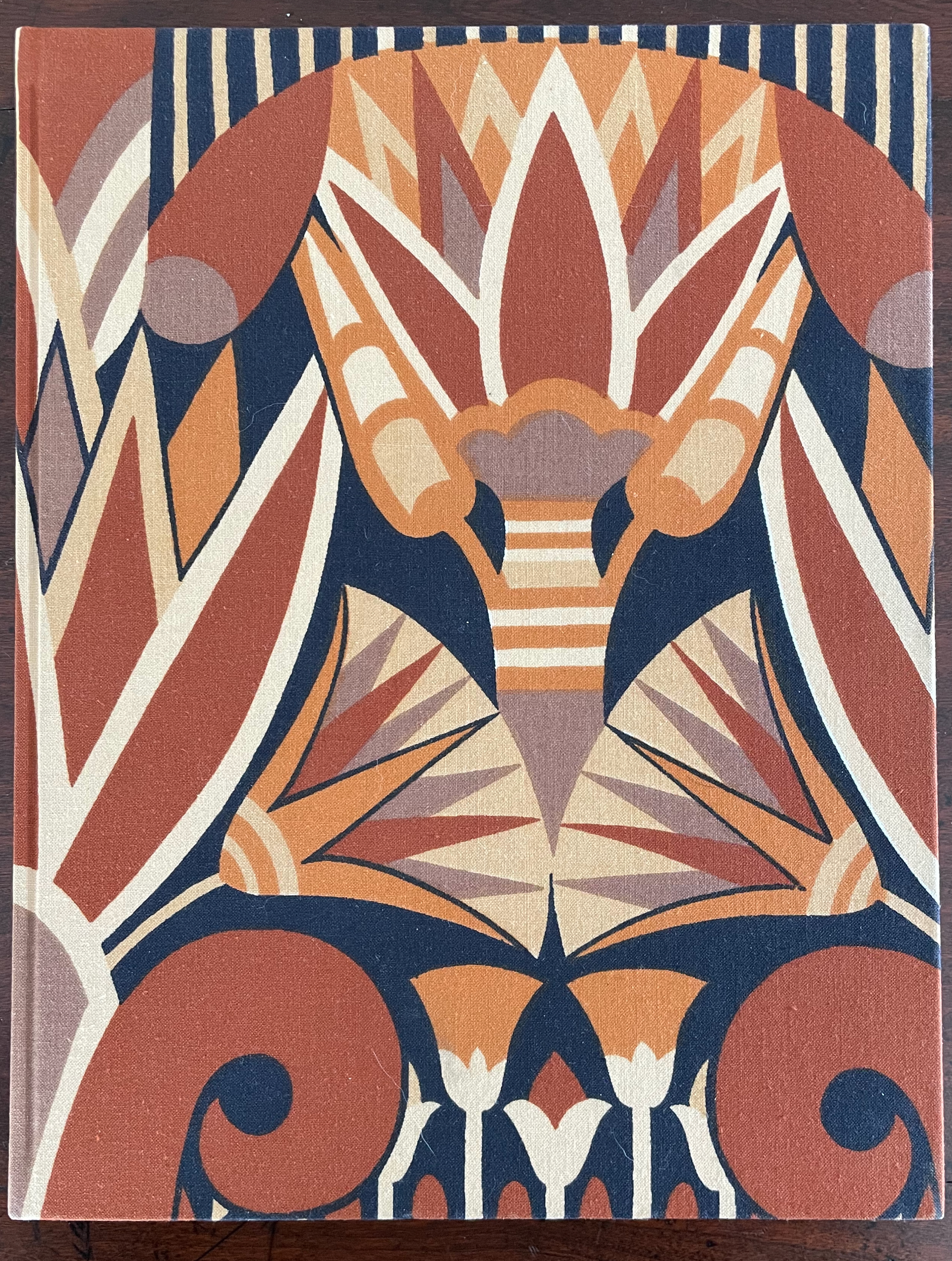
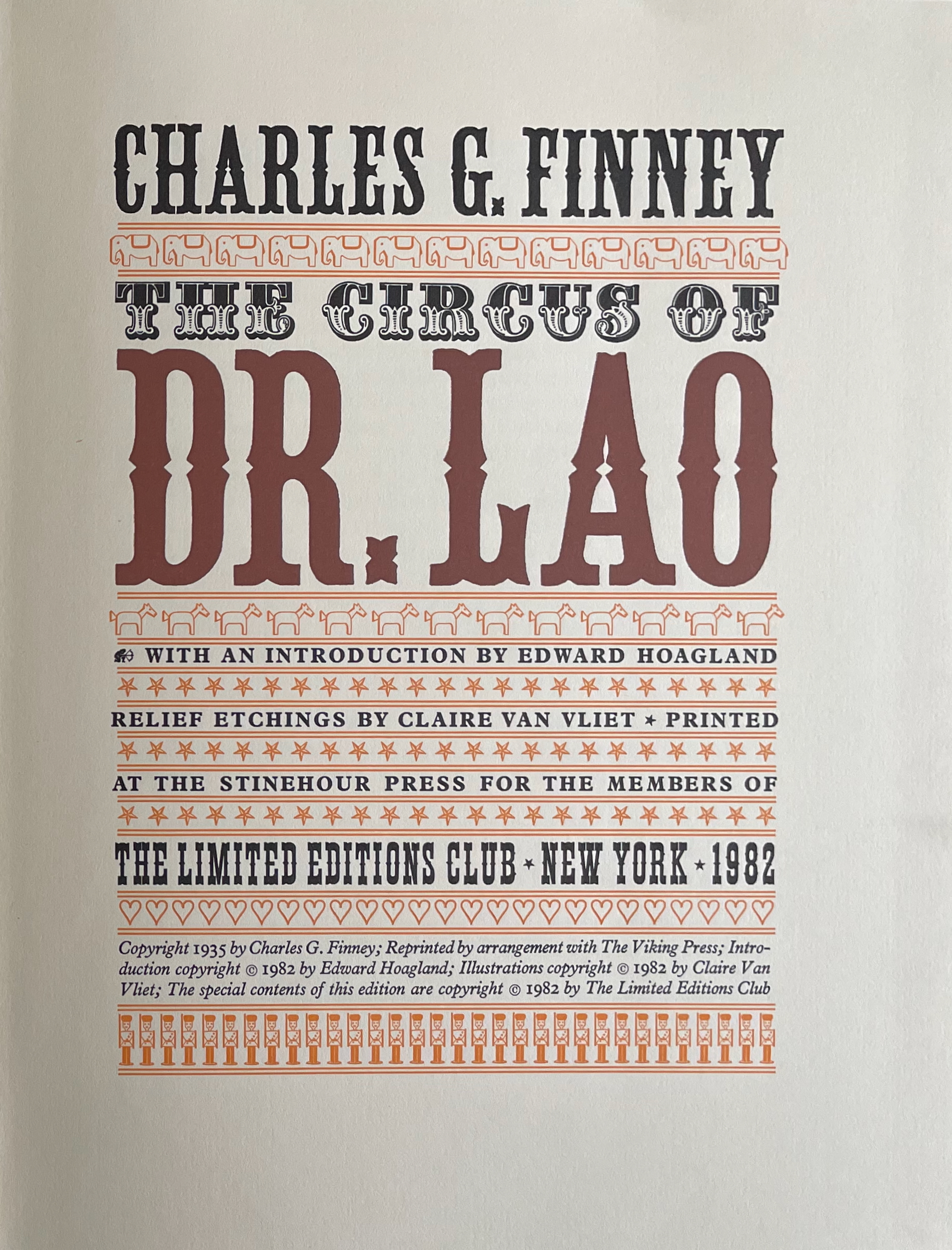
The Circus of Dr. Lao (1982) Charles G. Finney (text) Claire Van Vliet (design and illustration) Hardback, cased in cotton cloth over boards, head and tail bands, sewn. H x W mm. 9 1/4 x 12 inches 140 pages. Edition of 2000, of which this is #996. Acquired from BlueMamaBooks, 9 February 2025. Photos: Books On Books Collection.
If you have read Nathaniel West’s The Day of the Locust (1939) or Flannery O’Connor’s A Good Man Is Hard to Find (1955), Charles Finney’s novella illustrated by Claire Van Vliet will seem only marginally disturbing. If you have seen Tod Browning’s Freaks (1932), it will seem more than tame. Somewhere in between is the appropriate trigger warning for The Circus of Dr. Lao (1982).
Finney drops Dr. Lao’s circus of P.T. Barnum-esque carnival sideshows, a bestiary of distorted mythological creatures and exaggerated stereotypes, into the Arizona backwater of Abalone. The denizen of Abalone and their reactions — from gullibility, lubricious fascination, racist hazing, and violence to shrugs and a smug return to unexceptional normality — are the targets of Finney’s fevered satire. Van Vliet mirrors the range with her illustrations printed from original relief etchings and her selection of contrasting Plantin and Victoria display types.
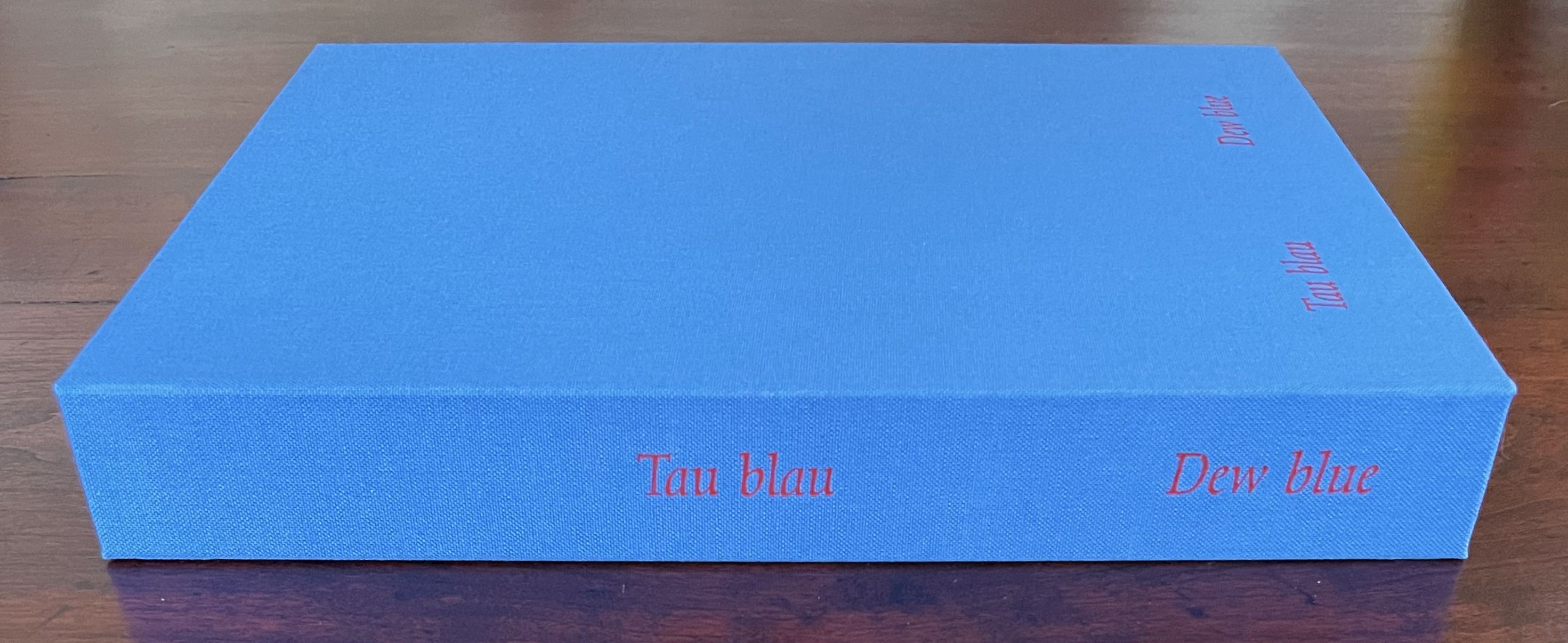
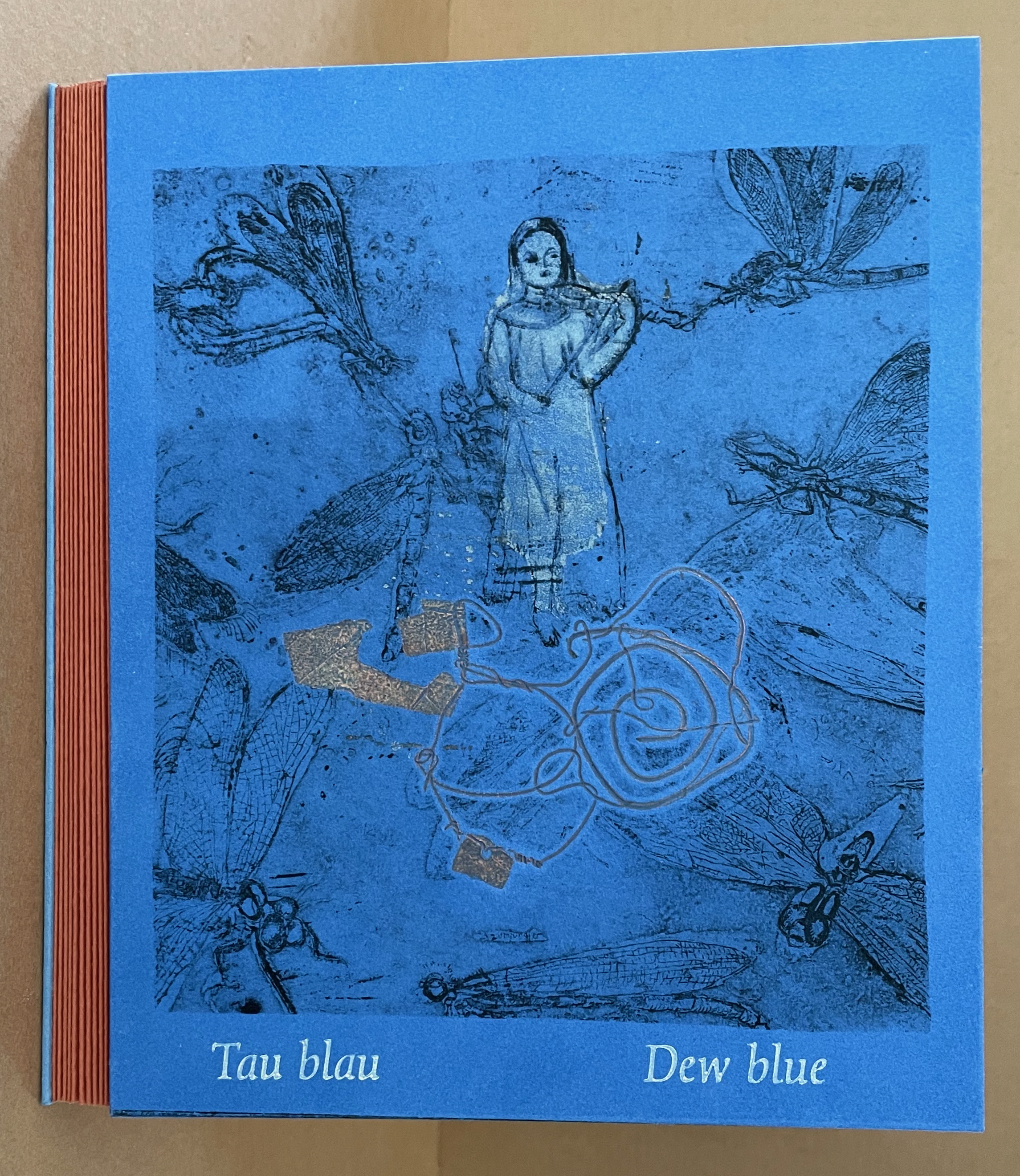
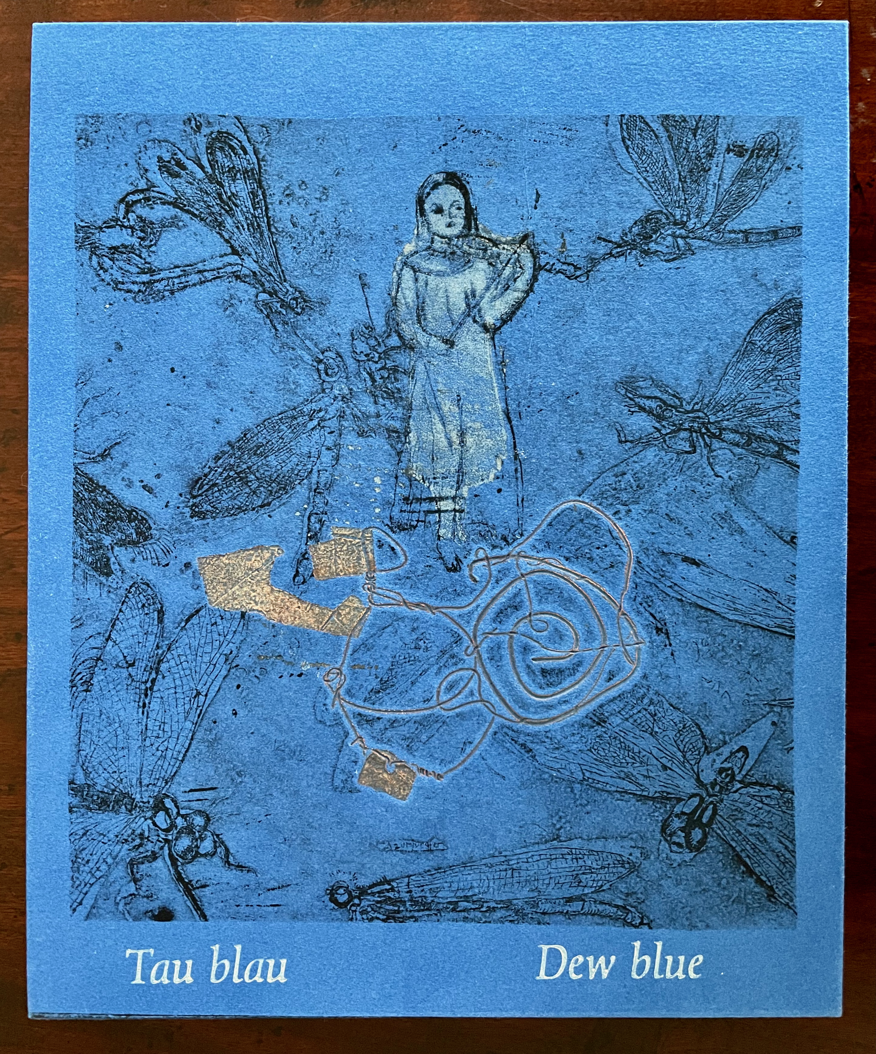
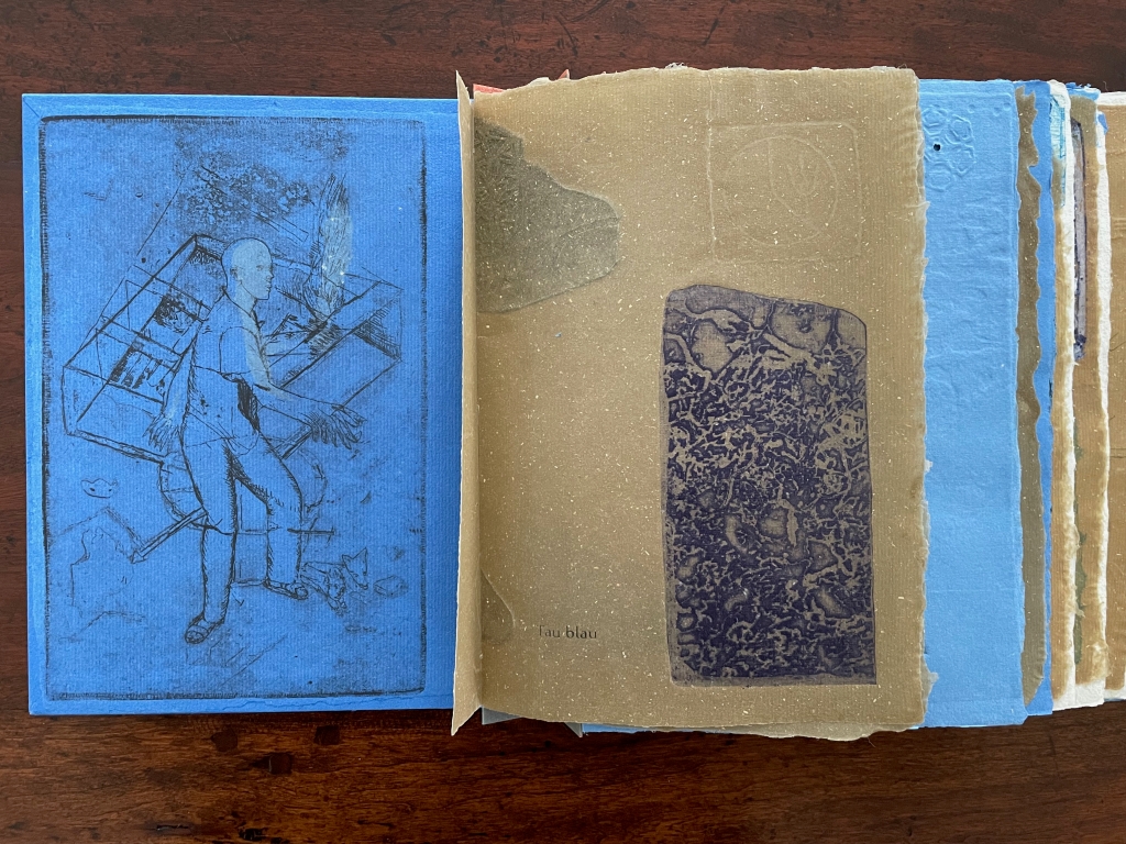
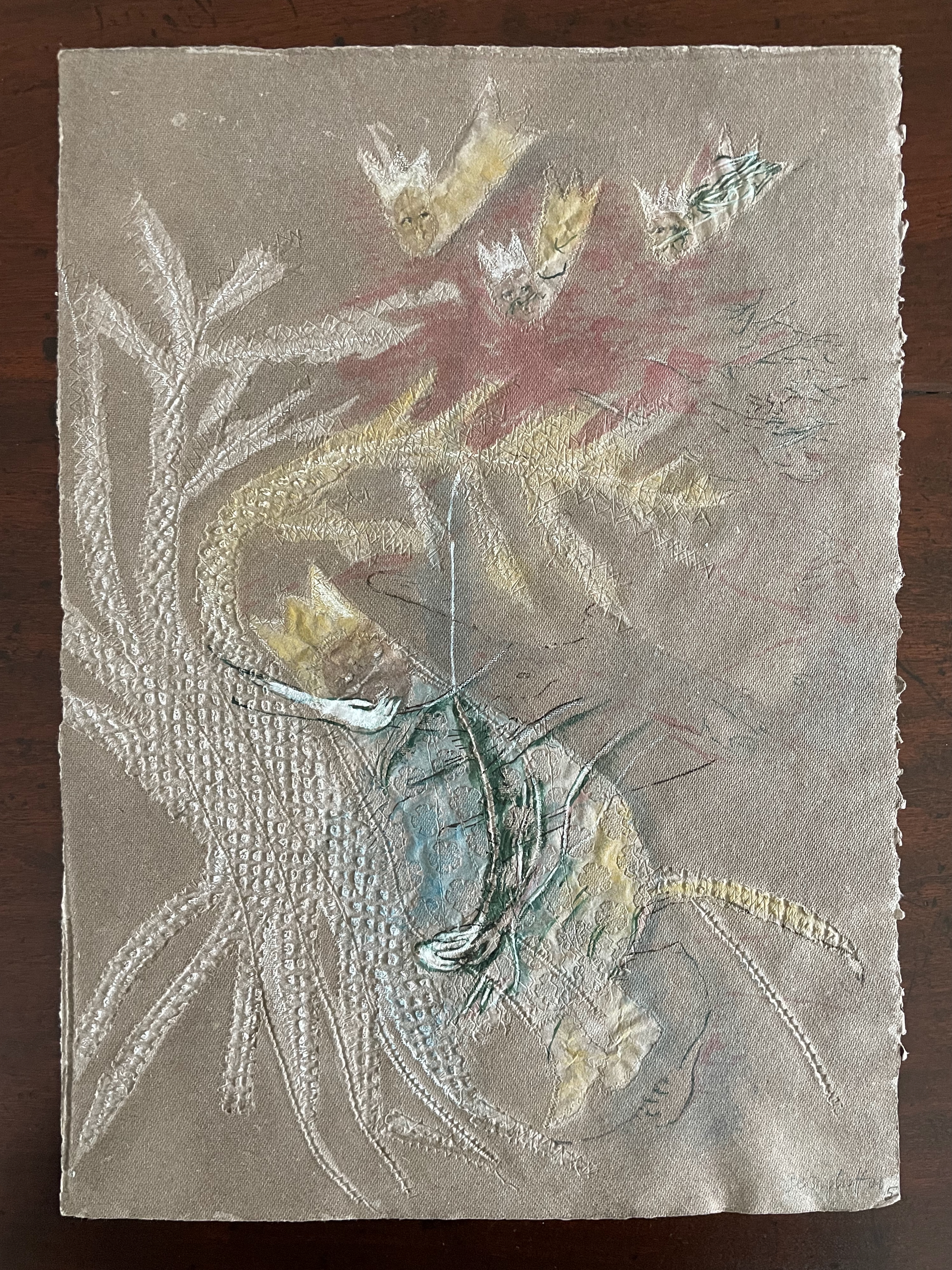
Tau blau / Dew Blue (2013) Barbara Beisinghoff ; Solander box in linen, handbound Vera Schollemann; Flax paper, handmade by John Gerard. Solander box: H240 x W200 x D32 mm. Flagbook: H220 x W180 mm. Edition of 38, of which this is #22. Acquired from the artist, 30 December 2024. Photos: Books On Books Collection.
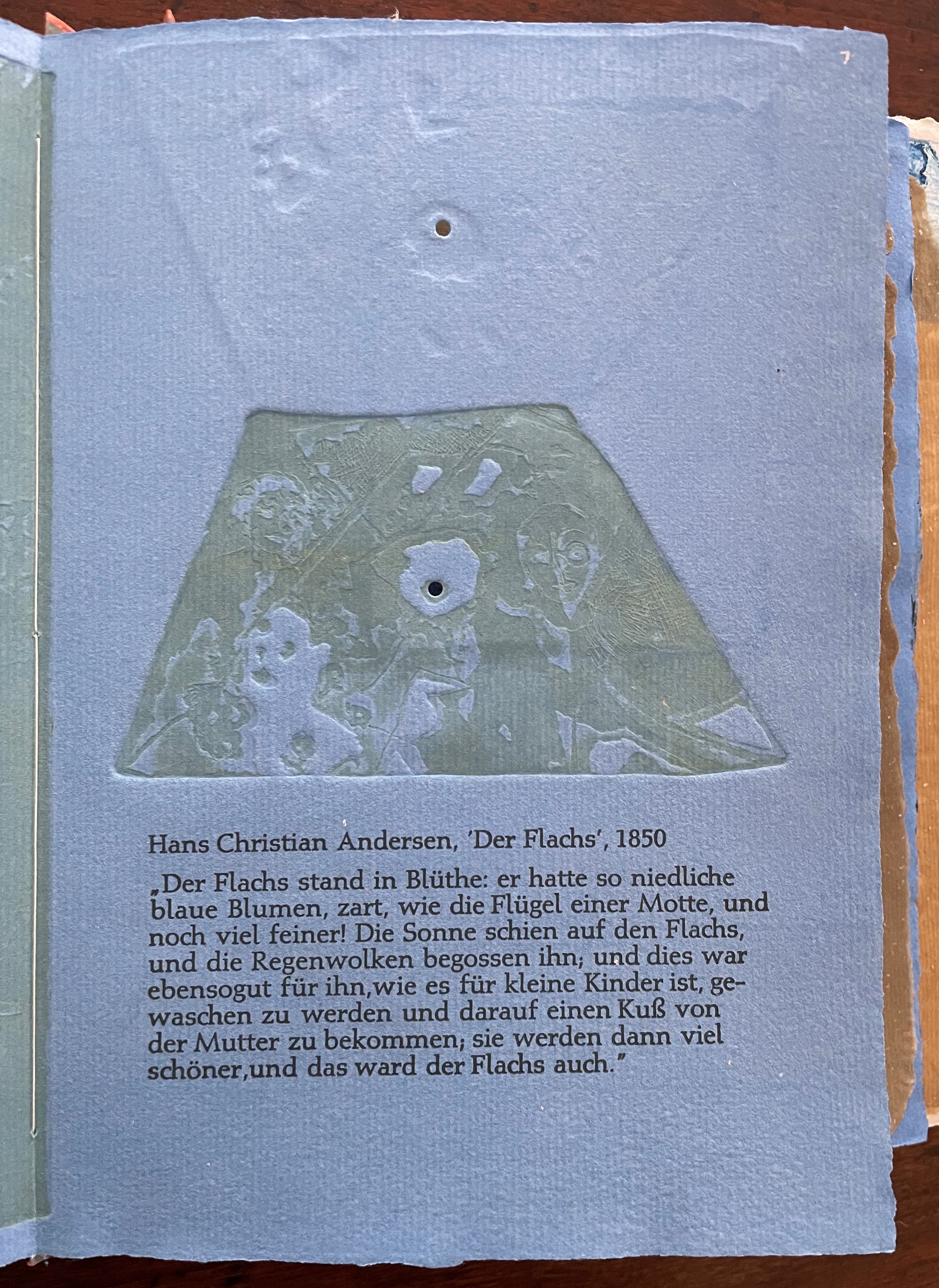
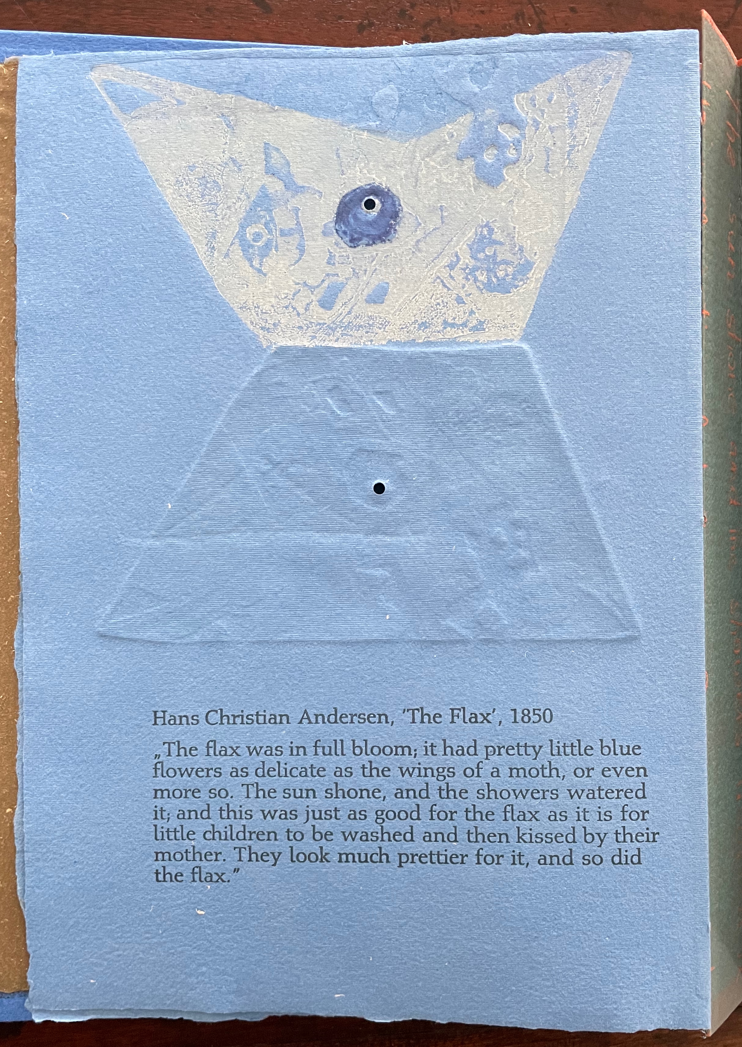
Familiarity with Hans Christian Andersen’s fairy tale Hørren /The Flax enhances appreciation of Barbara Beisinghoff’s Tau blau / Dew Blue. Andersen gives a voice to the plant that expresses its joy, pain, hope and observations at each stage of its blooming, being harvested, turned into linen and clothing then paper, and finally consigned to flames. The H.C. Andersen Centre offers Jean Hersholt’s translation of it here.
Only the opening paragraph of the story appears in Tau blau / Dew Blue, but Beisinghoff documents and illustrates the stages from her own cultivation of flax, observation of its growth and preparation of its processing. And with the etching, drawing, watermarking, handmade papers, linen cloth and thread, and binding structure, Beisinghoff suffuses the spirit of the tale’s metamorphosizing plant throughout the whole of Tau blau / Dew Blue.
From the blue of the plant’s blossoms to the white of its change into linen and paper to the red, burnt orange and black of its sparks and ash when it is consumed by fire in the end, all of the story’s colors are replayed across Tau blau / Dew Blue from its Solander box to its covers and spine like motives in a Baroque musical piece.
In a concerto, motives play off one another and develop. In Tau blau / Dew Blue, the motif of nature (the plant) plays off the motif of artifice and the manmade (the fairy tale, music, linen, paper, etc.). On the front cover (above), a young girl, surrounded by large damselflies, plays a fiddle or violin and seems to hover above a silver foil image of flax thread and tools for making it. In the spread above alongside the front cover, the specks rising over the staves and musical notes (a recurring motif in itself) recall the tale’s final passage in which the bundle of papers (made from linen rags) is cast into a fire:
“I’m going straight up to the sun!” said a voice in the flame. It was as if a thousand voices cried this together, as the flames burst through the chimney and out at the top. And brighter than the flames, but still invisible to mortal eyes, little tiny beings hovered, just as many as there had been blossoms on the flax long ago. They were lighter even than the flame which gave them birth, and when that flame had died away and nothing was left of the paper but black ashes, they danced over the embers again. Wherever their feet touched, their footprints, the tiny red sparks, could be seen.
Images of tools — whether for preparing flax or for making the products from it — also recur on the inside of the front and back covers and throughout the book. The human figures alongside the tools, however, appear engaged in more than manufacturing. Elsewhere in the book, they dance, they sit and meditate or write, they row on ponds beside the growing flax. The fairy tale, too, has these Romantic juxtapositions of nature, art and craft. So, again, the spirit of Andersen’s tale finds another way into Tau blau / Dew Blue.
Inside front and inside back covers.
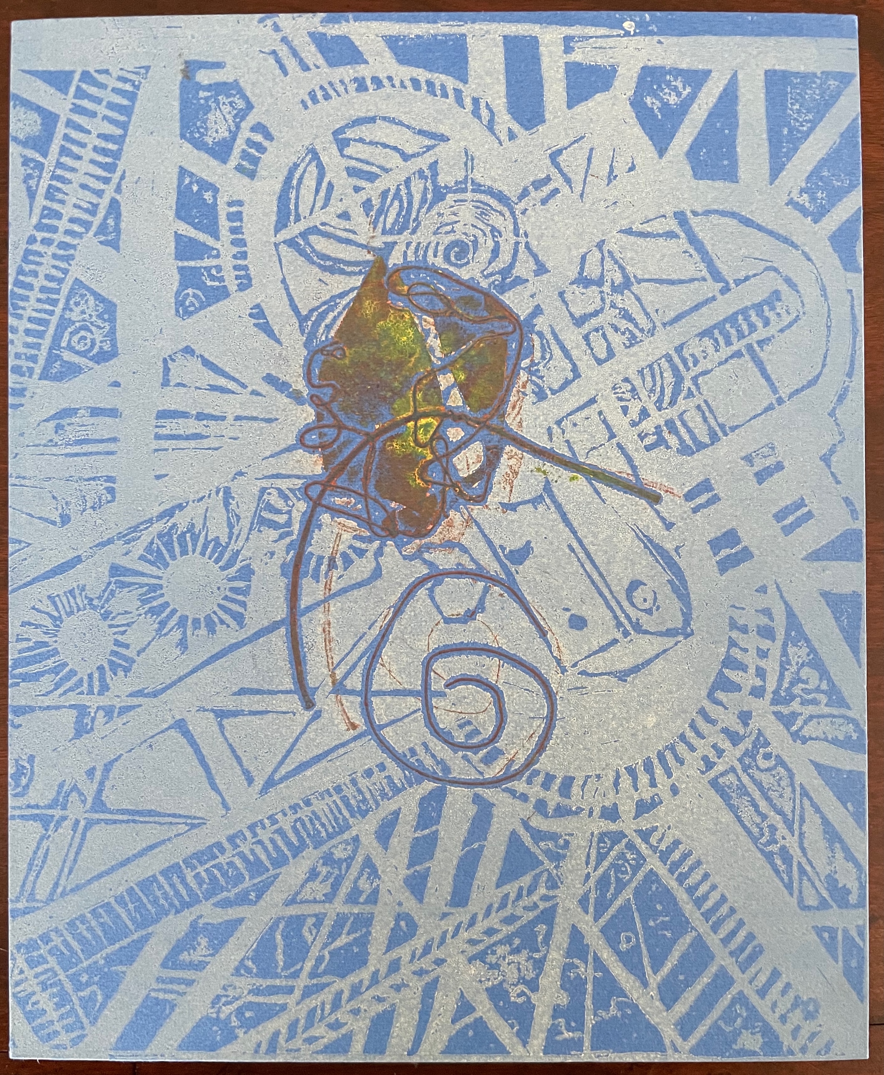
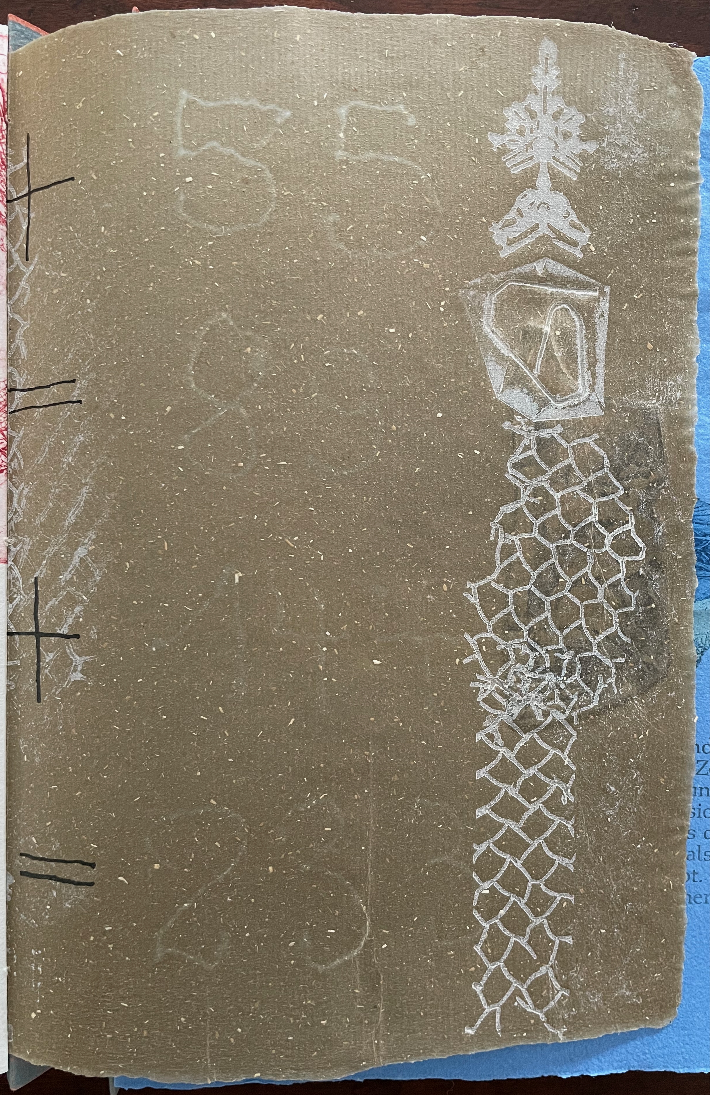
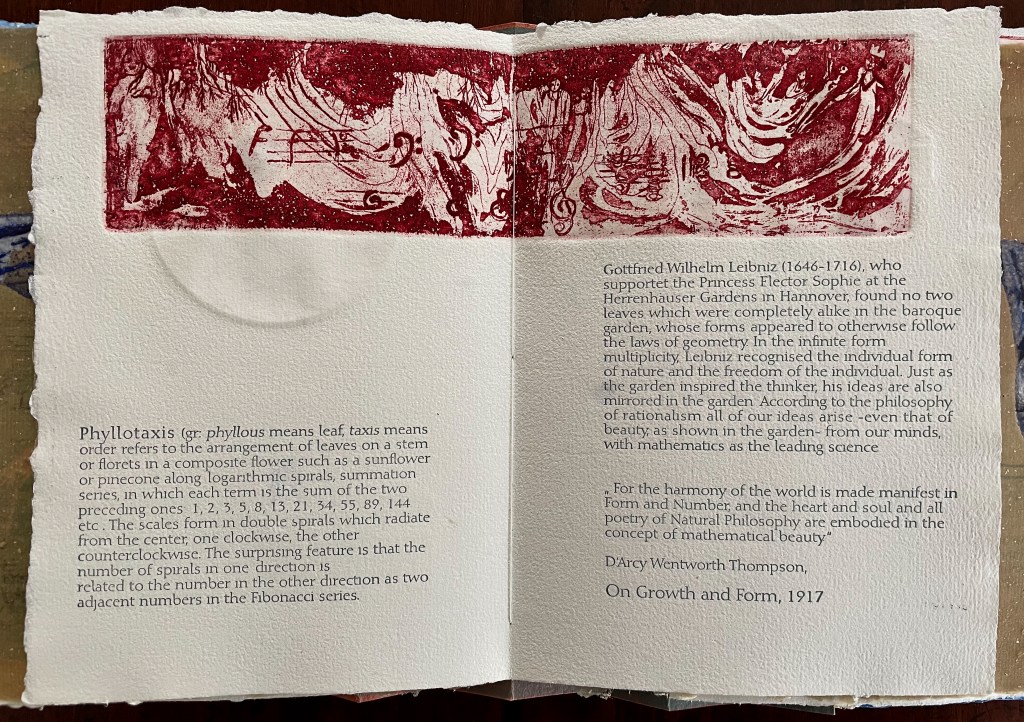
The front cover also announces another motif in those coils of thread below the young girl’s feet. Within the coils is the image of a Fibonacci spiral, which appears on the back cover and throughout the book in different ways. It can be found drawn and printed. It can be found in watermarks in the handmade paper. It can be found in the arrangement of florets in flax. Being a composite flower, flax blossoms display the spiral based on the Fibonacci sequence 1, 2, 3, 5 … 233, and so on. These numbers are waterjet-drawn on the pure flax paper below and explained in an entry printed on the adjacent plain handmade paper folio. By appearing on the book’s front and back covers, the spiral echoes the beginning and ending cycles of birth and rebirth the flax goes through in the folktale.
The Fibonacci spiral on the front and back covers.
The sequence of Fibonacci numbers 1, 2, 3, 5 … 55, 89, 144, 233 … watermarked on handmade flax paper with a water jet.
Description of the Fibonacci spiral side by side with quotation from Thompson’s On Growth and Form (1917), drawing on Leibniz’s Rationalist philosophy.
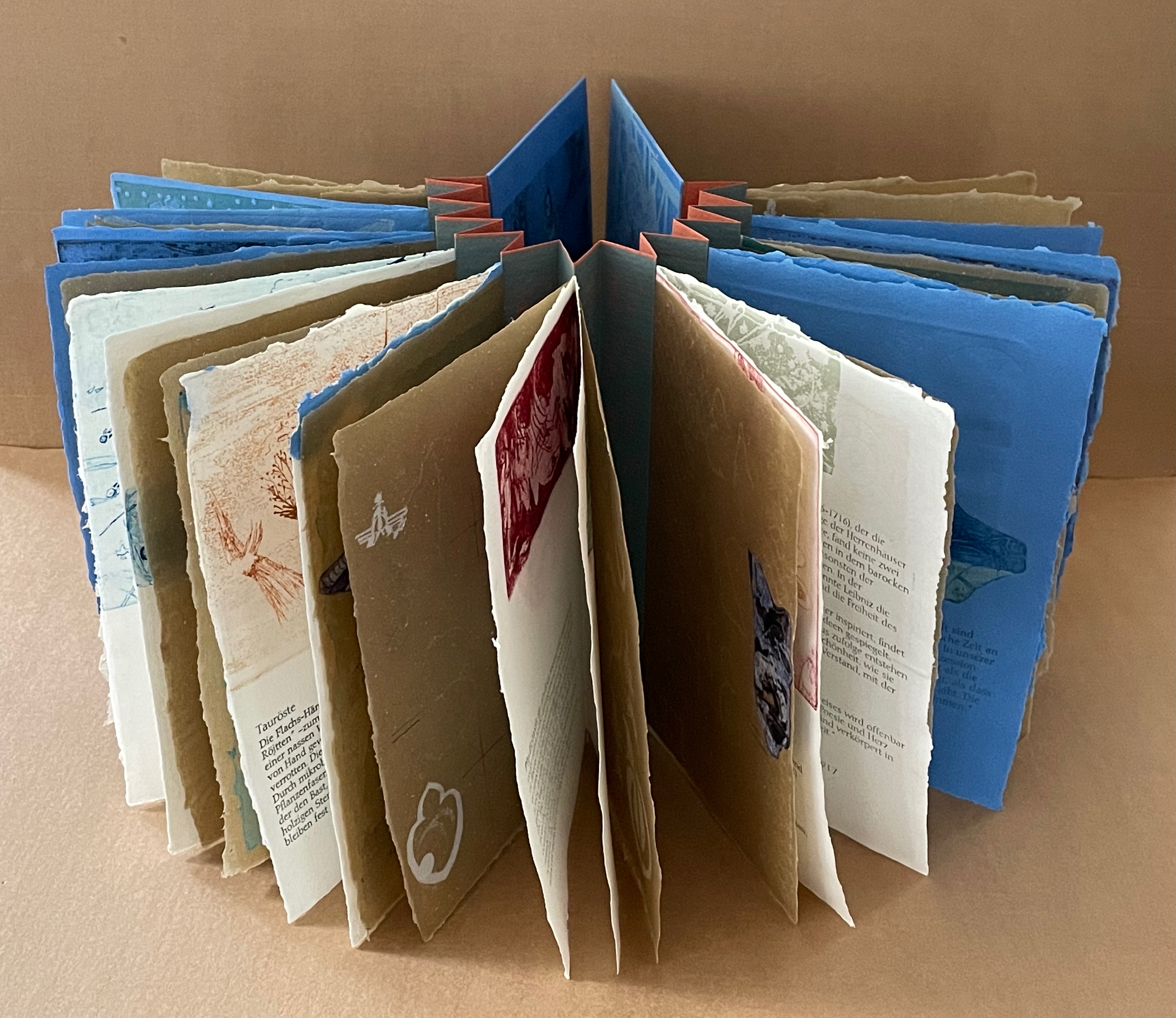
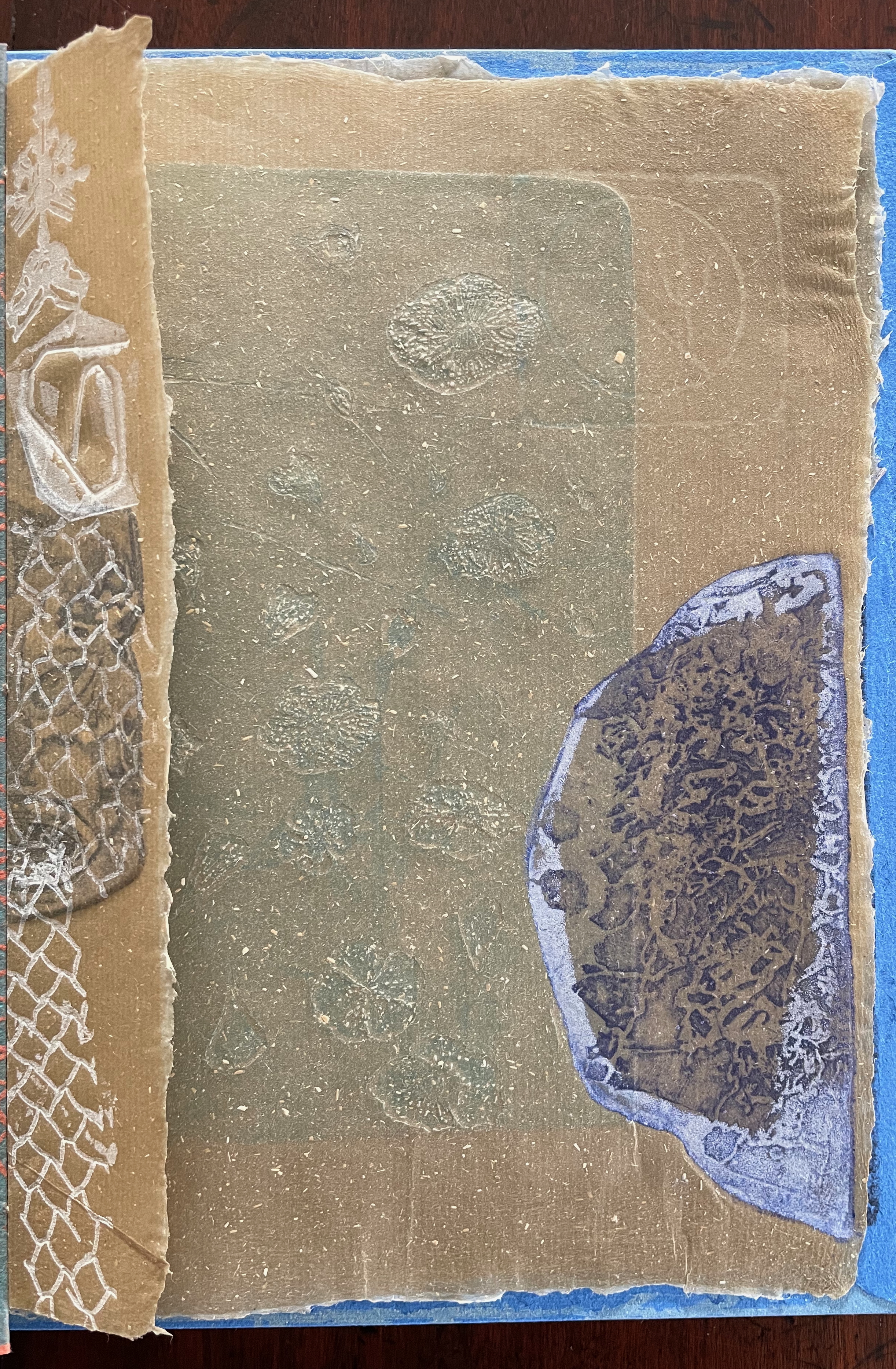
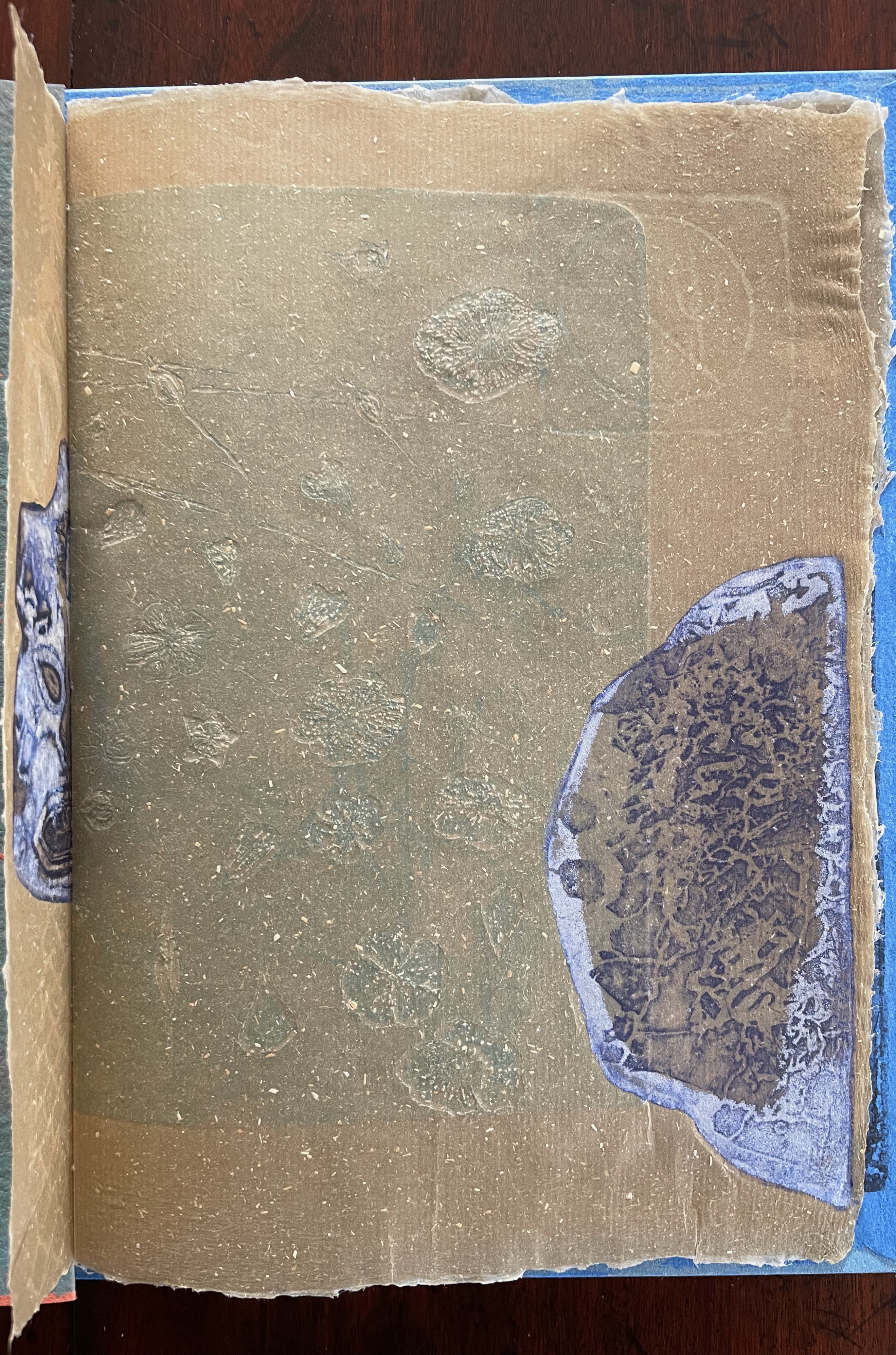
To organize and weave her motives together, Beisinghoff uses an accordion spine to whose peaks eleven sets of folios are sewn with linen thread. Three of the eleven are 4-page folios consisting of blue handmade paper. Another three 4-page folios consist of pure flax paper (handmade by John Gerard). The remaining five gatherings have 8-page folios, each consisting of a pure flax paper folio around a blue or plain one.
Side and top views of the accordion spine.
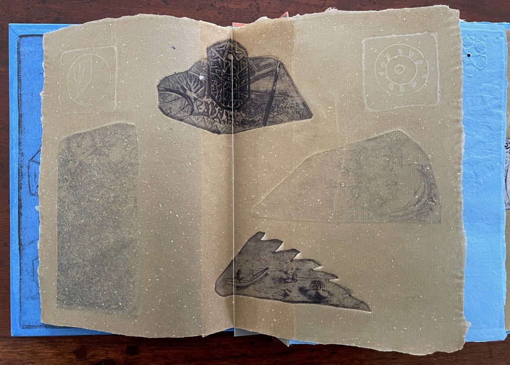
The first pure flax folio begins the book, displaying two title pages (German and English) and two etchings on its first and last pages. In the center spread, two more etchings appear. A watermark symbolizing phyllotaxis shows through in the upper left, balanced by a watermark with a cross section of a flax stalk in the upper right of the center spread. The texture and weight of the flax paper allows the impress and shadow of the etchings to stand out on both sides against the inking and watermarks.
Inside front cover and Tau blau title page and etching.
Center spread of first flax paper folio. Note the watermarks in the upper left and right corners.
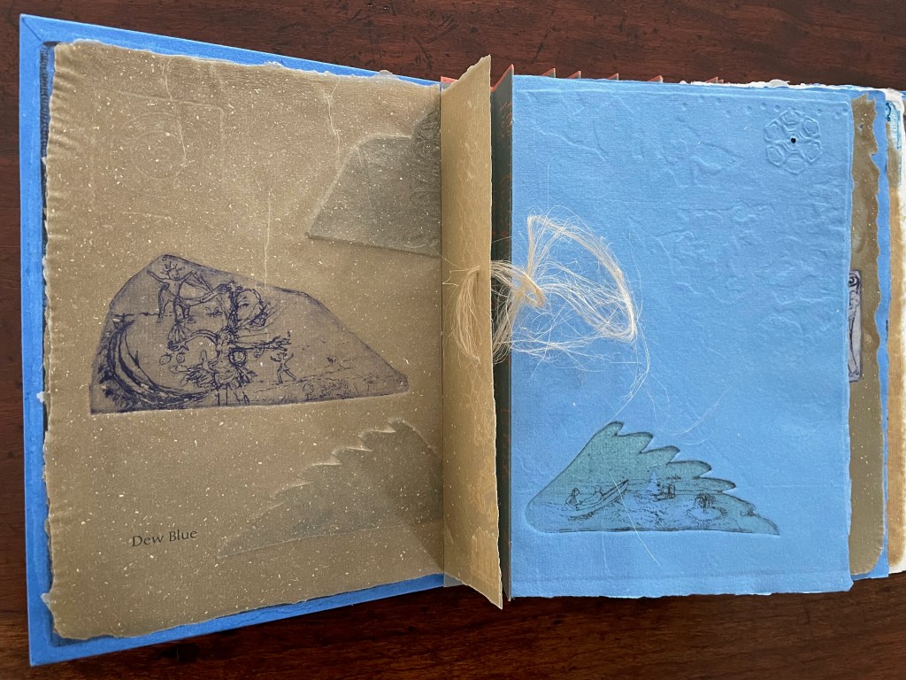
Dew Blue title page and etching, loop of flax fibers, first page of blue handmade paper folio; note its boating image repeated from the prior center spread.
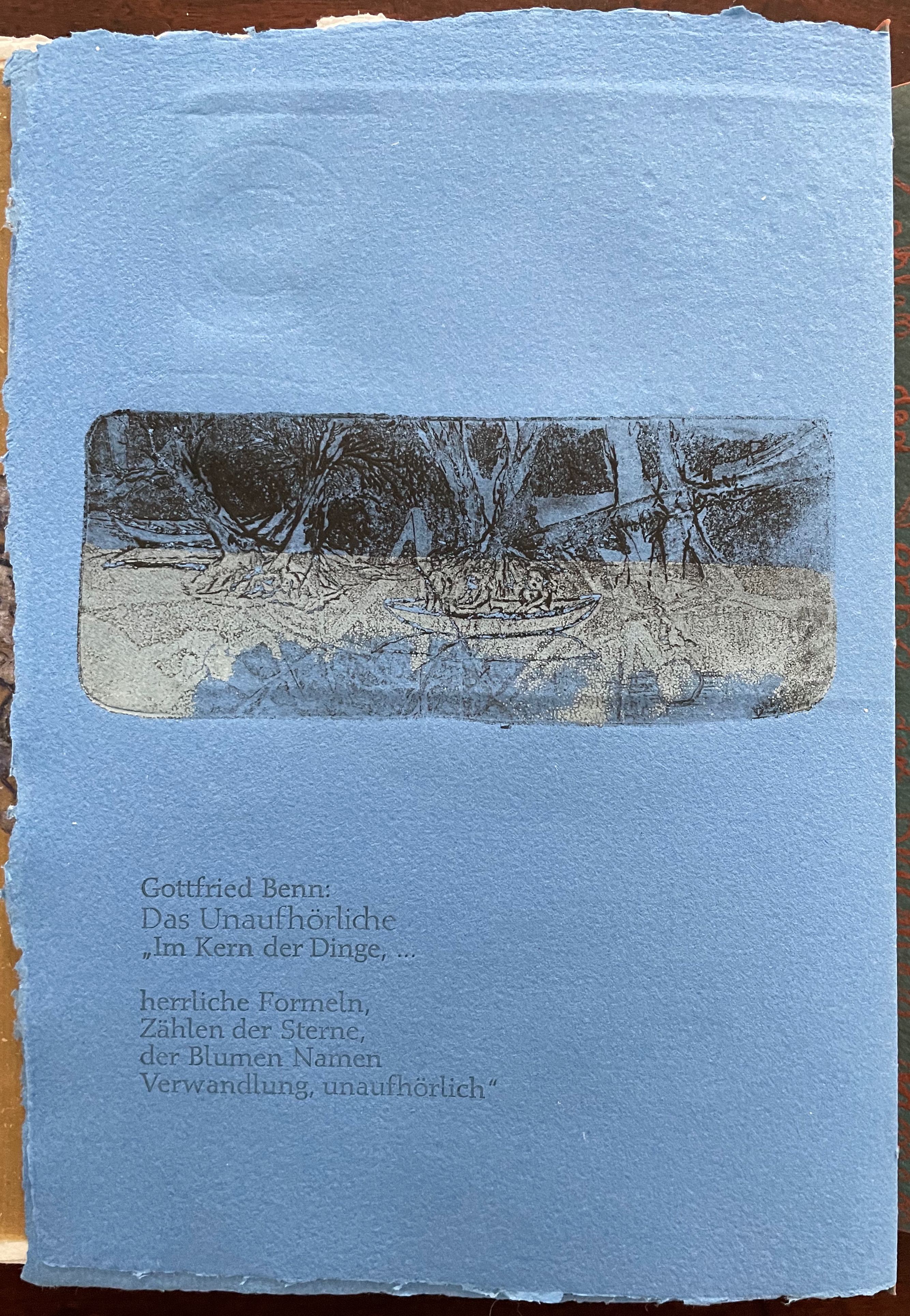
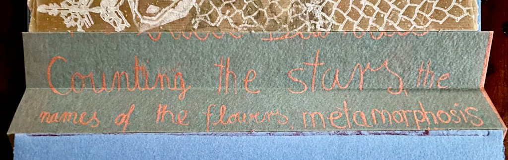
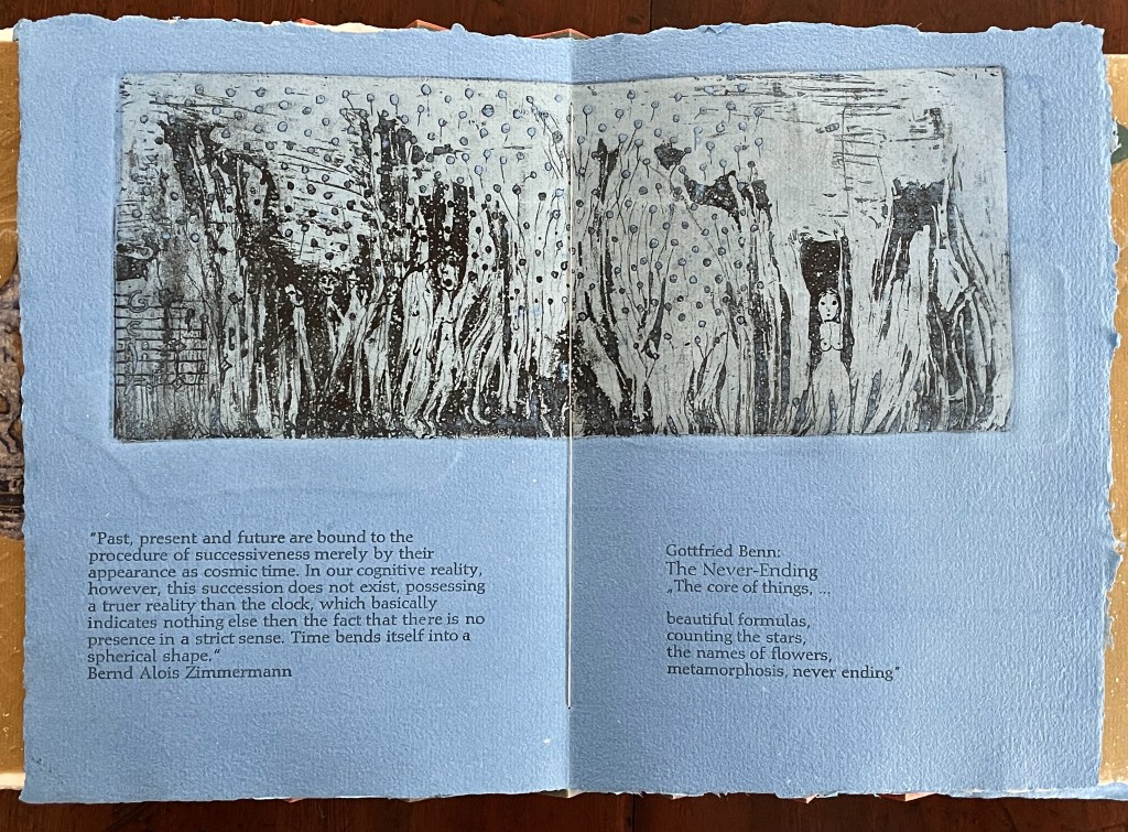
Following the pure flax folio, the first all blue folio gives us that introductory excerpt from Andersen’s fairy tale. Next comes a description of flax comes from Leonhart Fuchs’ Book of Herbs (1543), then the series of planting and harvesting observations from Beisinghoff, then the refrain from Clemens Brentano’s poem “Ich darf wohl von den Sternen singen” (1835), then philosophical observations drawing on G.W. Leibniz from D’Arcy Wentworth Thompson’s On Growth and Form (1917), a much-quoted theorem of musical composition from Bernd Alois Zimmermann’s Intervall und Zeit (1974), and finally (below) a passage of text by Gottfried Benn from the Hindemith oratorio Das Unaufhörliche / The Neverending (1936). In the valleys of the accordion spine, some of the lines from Andersen, Fuchs, Beisinghoff and Been appears handwritten in orange paint.
Translated fragment of Benn’s lyrics for Paul Hindemith’s oratorio Das Unaufhörliche / The Neverending (1936).
Even with these additional texts, Andersen’s fairy tale remains the most central text in Tau blau / Dew Blue, despite the brevity of its excerpt. Brentano’s Romantic/religious expostulations (“O Star and Bloom, Garb and Soul, Love, Hurt and Time for evermore”) sound like those of the plant in the story’s final passage. The occurrence of Fibonacci’s spiral in the plant may be a physical fact, but Beisinghoff turns it into something more mystical by placing the description of phyllotaxis next to Leibniz’ and Thompson’s transcendental view of mathematical science and natural philosophy. Likewise she links the texts from Bernd Alois Zimmermann and Gottfried Benn to the fairy tale by placing them beneath the etching that captures the flax plant’s singing and dancing into its transformation by fire.
Below is the final folio of the work. Like the first, it is made completely of flax paper, but its center spread offers a fuller image: flax blossoms and stalks float in the foreground, and in the background is a sketch of Beisinghoff’s residence where she grows her flax. Like the Fibonacci spiral on the front and back covers, the first and last flax folios round out the work. But go back and listen for the hidden sound installations accompanying Dew Blue. Noticing Beisinghoff’s abstract musical notation, indulge yourself with recordings of a Swedish folk song (“Today is supposed to be the big flax harvest” here or here) to which the notation and phrases allude, and as the flax papers turn and wave on their accordion peaks, listen carefully for their musical rustle.
The final pure flax paper folio.
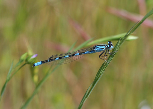
Tule Bluet damselfly perched on flax leaf. Photo: John Riutta, The Well-Read Naturalist (2009). Displayed with permission.
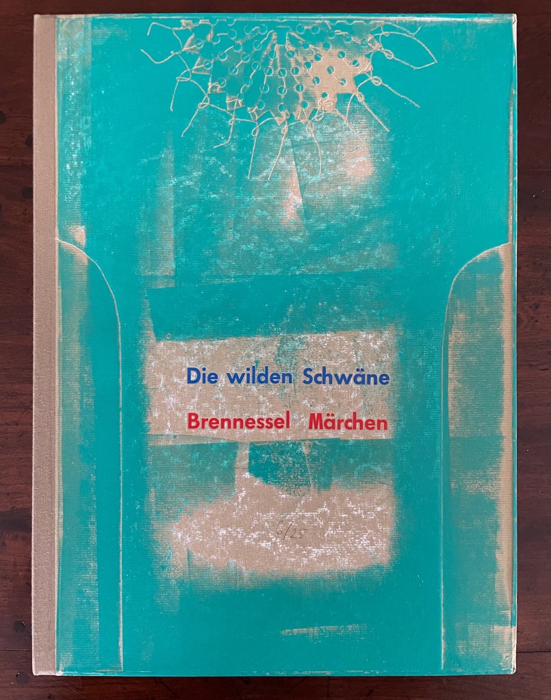
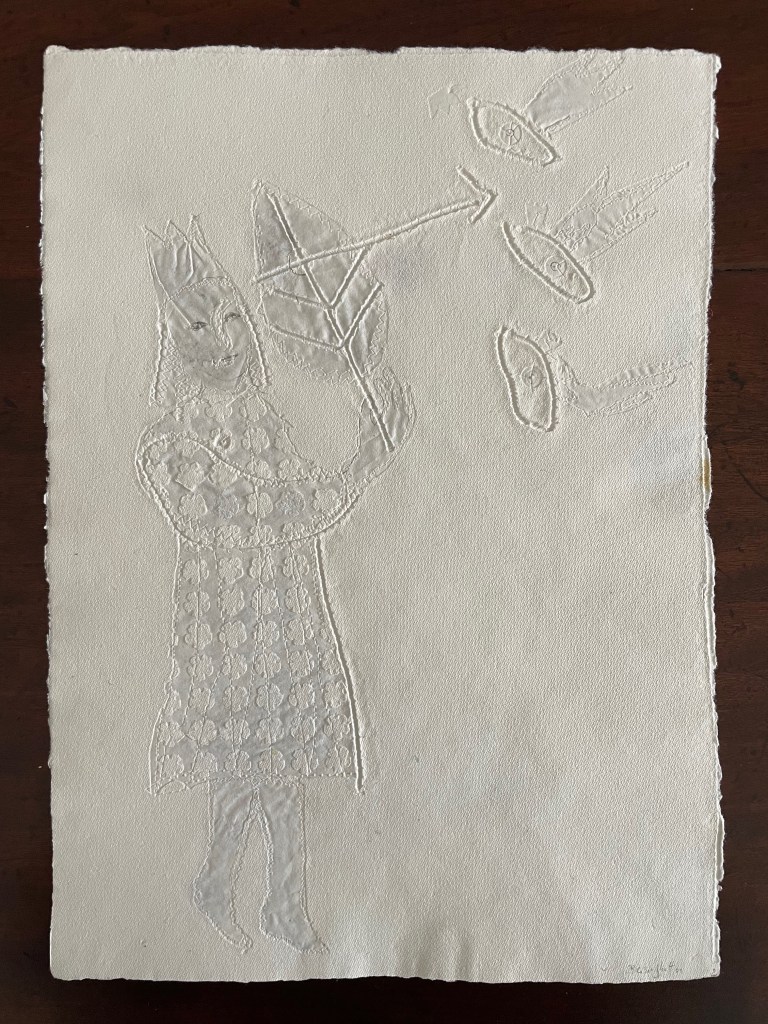
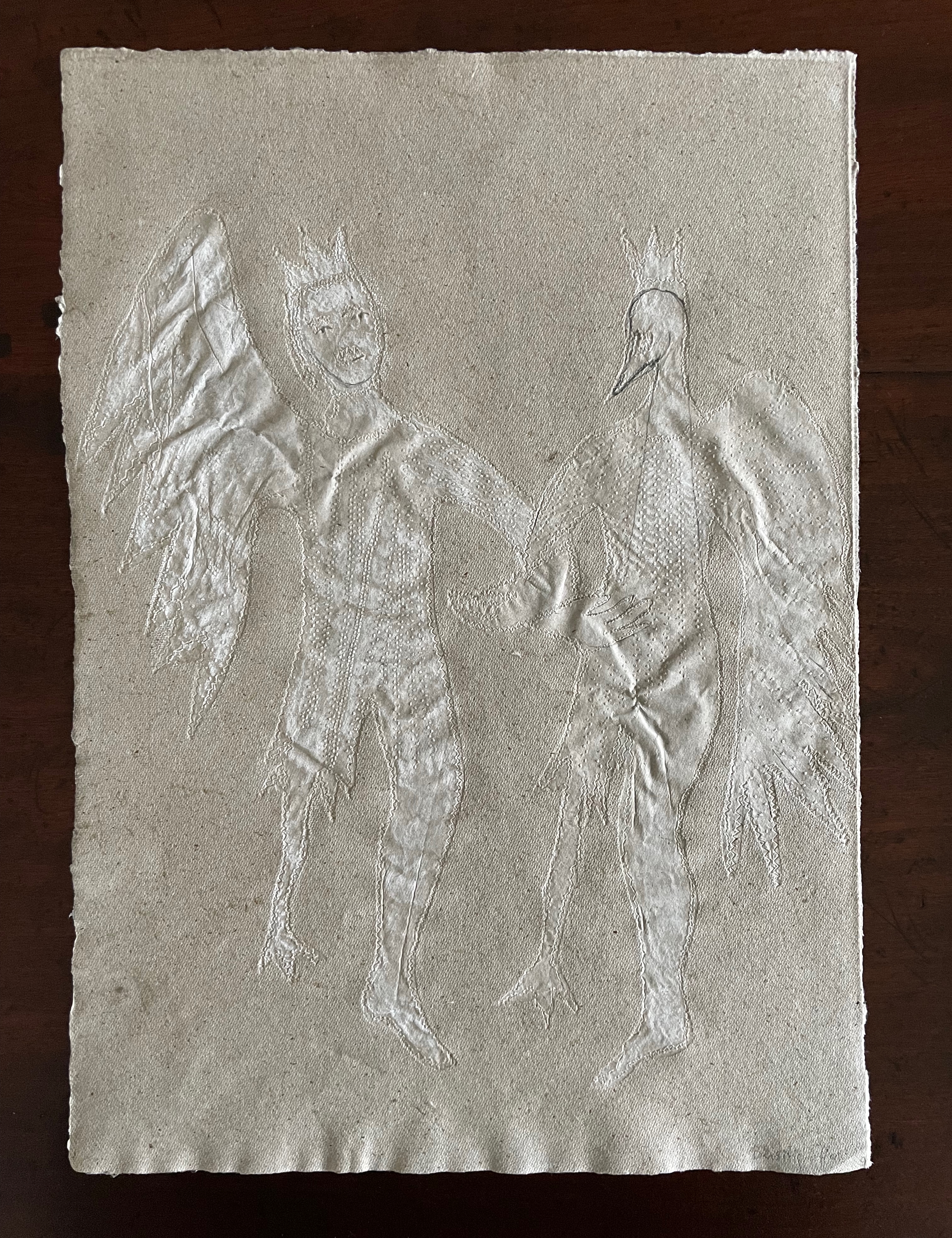
Die wilden Schwäne (2001)
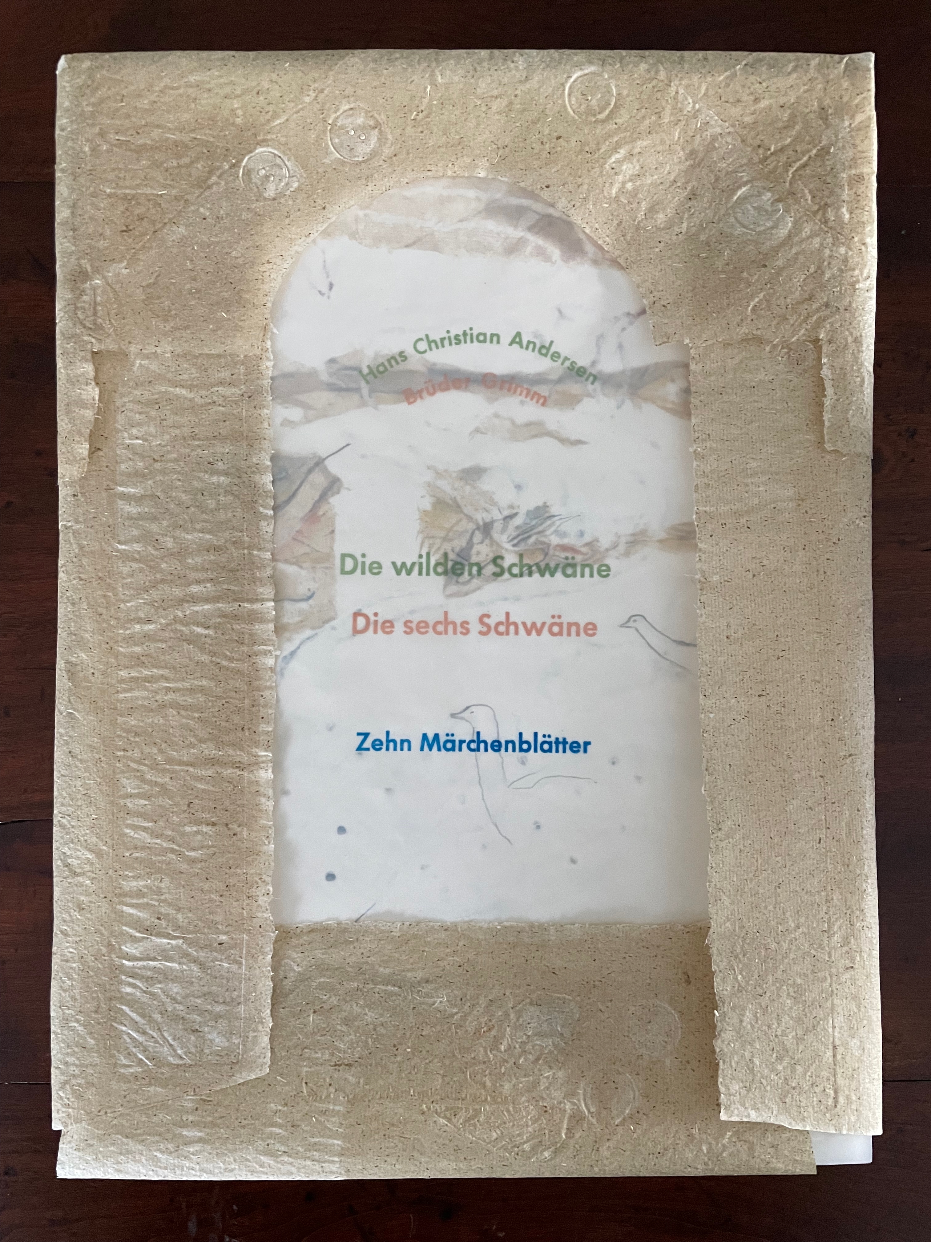
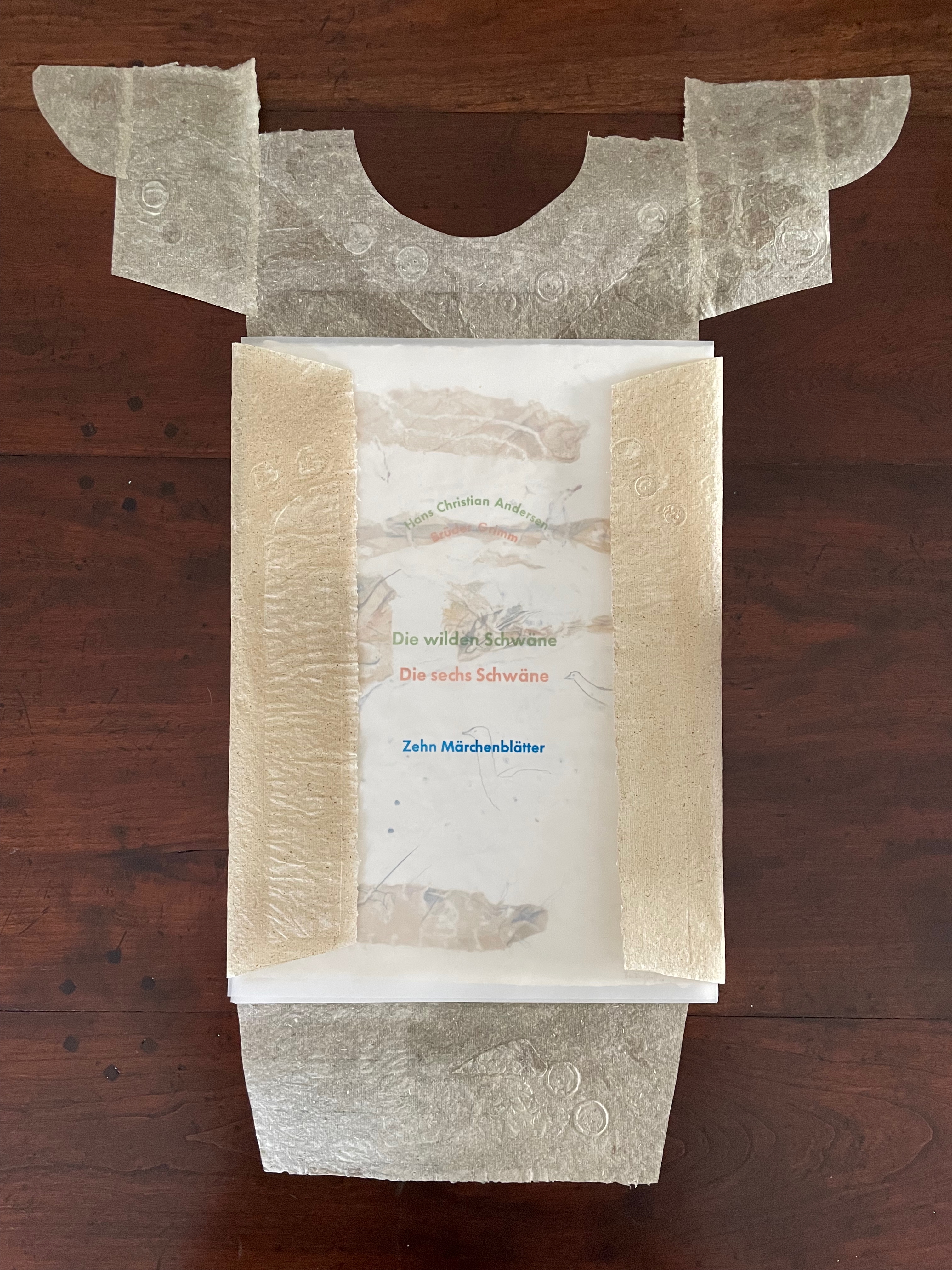
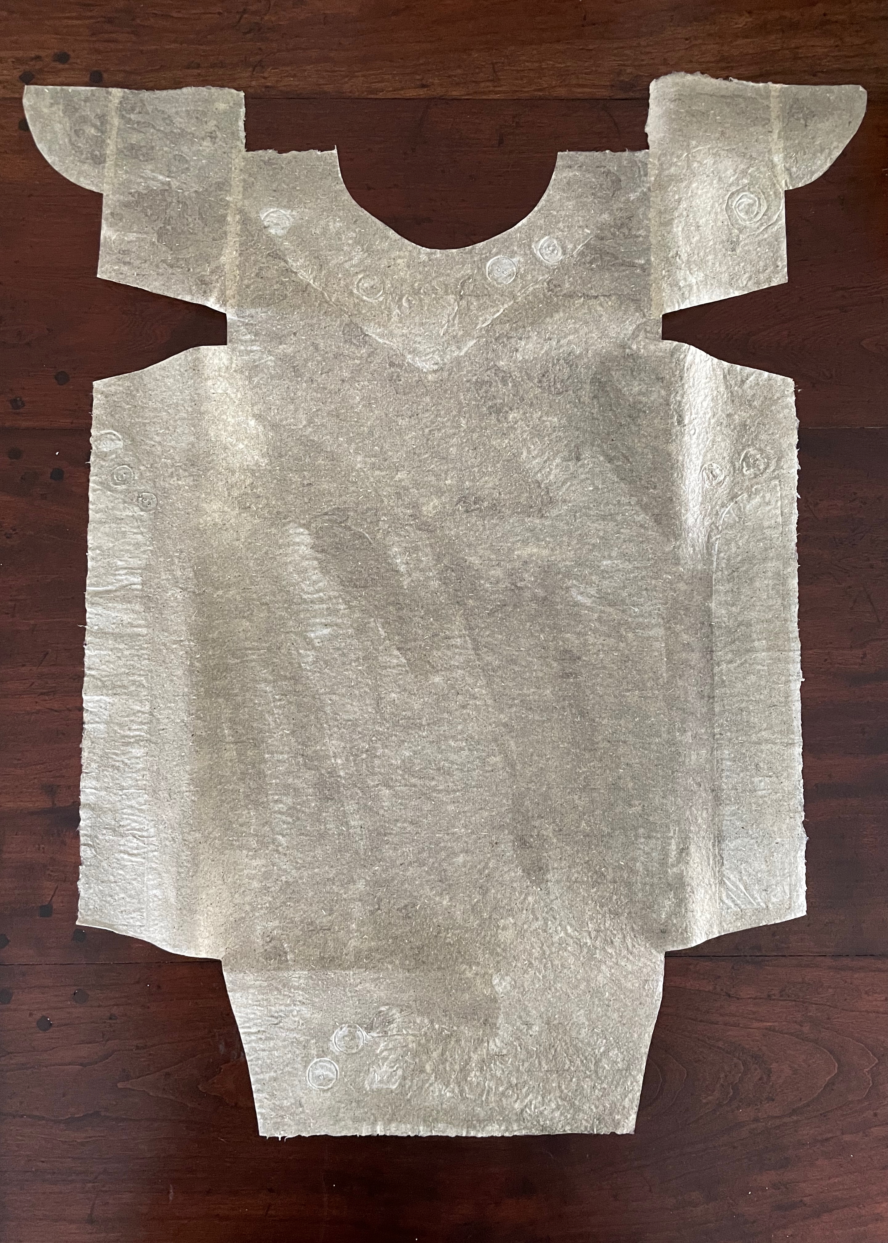
Die wilden Schwäne (2001) Barbara Beisinghoff Box with embossed cover holding folios wrapped in chemise. H35o x W250 mm. 18 folios. Edition of 25, of which this is #6. Acquired from the artist, 20 December 2024. Photos: Books On Books Collection.
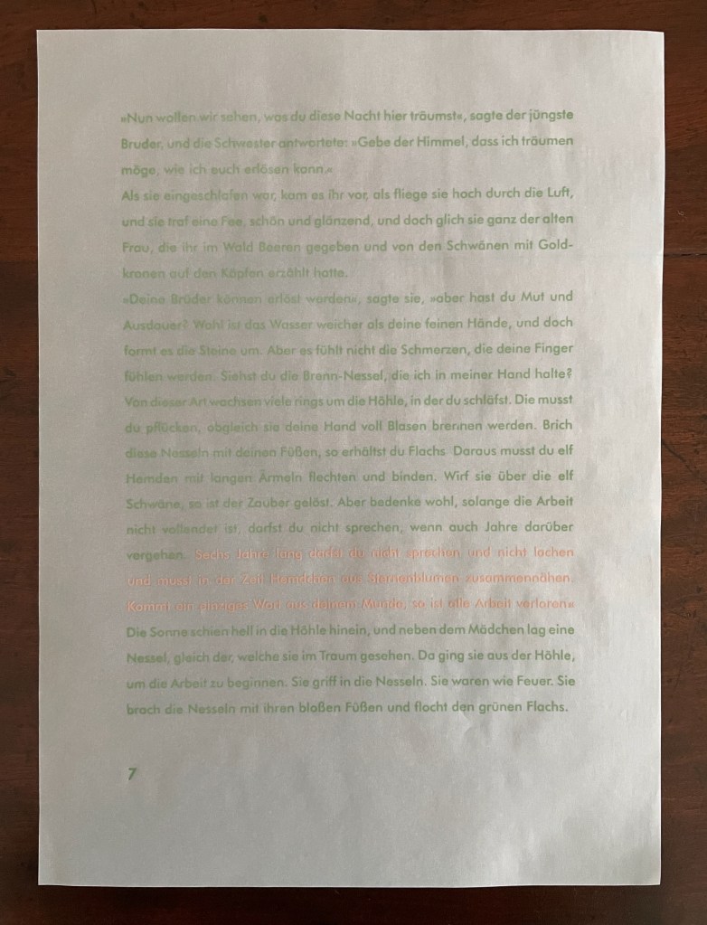
Barbara Beisinghoff’s Die wilden Schwäne is an exemplar of collaboration and craft. In it, she even requires collaboration between Hans Christian Andersen and the Brothers Grimm. Andersen’s Die wilden Schwäne and the Grimms’ Die sechs Schwäne are based on the same tale of brothers turned into swans who are saved by their sister Elisa’s diligent and mute harvesting, pulping, spinning and sewing of stinging nettles into shirts that break the spell when donned. H.C. Andersen, however, is verbose and elaborate in his telling (even including vampires!), and Beisinghoff has done a bit of nipping and tucking with the more succinct Brothers Grimm to create a version more suited to the artist’s book she creates.
To match Elisa’s effort with stinging nettles, Beisinghoff enlisted the collaboration of Johannes Follmer, the owner of a paper mill. Together they obtained cultivated stinging nettles from the Institute for Applied Botany in Hamburg, cut the fibers, left them to rot, boiled them into a pulp, mixed that with water in a vat, scooped up layers in a sieve embroidered with illustrations, couched the sheets, then pressed and dried them into paper. Beisinghoff applied further drawings with a water jet, watercolor and pencil to the watermark-embossed sheets to illustrate aspects of the tale. To present the Andersen/Grimm “collage”, Beisinghoff had the type set and printed at the Gutenberg Museum. Andersen is printed in light green and Grimm in light red on seven numbered translucent sheets and interleaved with the nine folios of paper art (two more translucent sheets carry the cover page and colophon). To wrap the folios together, Beisinghoff made an embossed chemise or “feather dress” of pure nettle fiber, which could represent Andersen’s description of the brothers’ blowing off each other’s feathers every evening when the sun has set or one of the shirts that their sister makes to break their spell.
The “feather dress” of stinging nettle fiber.
“The King’s little daughter was standing in the cottage room, playing with a green leaf, for she had no other toys. She pricked a hole right through the leaf, looked up at the sun, and there it was, she saw the clear eyes of her brothers, but every time the warm rays of the sun shone on her cheeks, she thought of all their kisses.” Translation with DeepL.
“When she had fallen asleep, it seemed to her as if she were flying high through the air, and she met a fairy, beautiful and radiant, yet she looked very much like the old woman who had given her berries in the forest and told her about the swans with gold crowns on their heads.” Translation with DeepL.
“The swans swooped down to her and lowered themselves so that she could throw the shirts over them: and as she touched them, the swan skins fell off, and her brothers stood before her in the flesh, fresh and beautiful.” Translation with DeepL.
“Barbara Beisinghoff (head in the background) covers the frame with this transparent, embroidered and sewn gauze, which is used to scoop and emboss her nettle papers. This is how her large-format watermark illustrations end up on the sheets.” Translation with DeepL. Peter Holle. 30 August 2001. Frankfurter Rundschau. Photo: Oliver Weiner.
This art by watermarking recalls that of other artists in the collection: Fred Siegenthaler and Gangolf Ulbricht, in particular. The technique of pulp painting also finds other practitioners in the collection: Pat Gentenaar-Torley, John Gerard, Helen Hiebert, Tim Mosely, Maria G. Pisano, Taller Leñateros, Claire Van Vliet and Maria Welch. Beisinghoff’s blend of embroidered watermarks, waterjet marking and pulp painting, however, creates a bas relief effect that is echoed only in the collection’s works by Mosely, Taller Leñateros and Van Vliet, albeit achieved differently. These workings of the substrate — as material, color, surface, and even narrative — with the workings of book structure is one of the more magical locations of book art. It is perfect for Beisinghoff’s metamorphical interpretation of the Andersen/Grimm fairy tale.
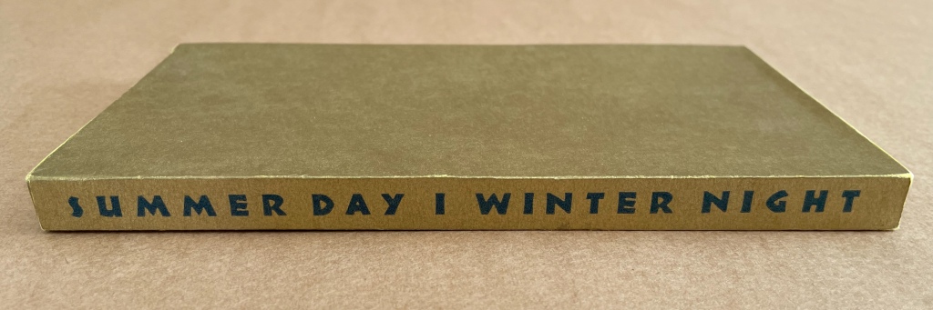
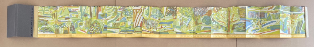
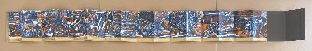
Summer Day | Winter Night (1994) Ruth Fine Papered slipcase with title printed on spine, enclosing a double-sided leporello. Slipcase, H190 x W110 x D20 mm; Leporello (extended), H185 x W1888 mm. [16] panels per side. Edition of 150, of which this is #56. Acquired from Weinrich Books, 12 June 2024. Photos: Books On Books Collection. Displayed with permission of the artist.
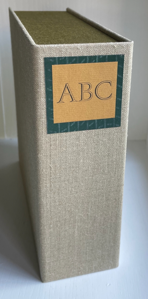
ABC of Bugs and Plants in a Northern Garden (2012)
ABC of Bugs and Plants in a Northern Garden(2012) Judy Fairclough Sgantas and Claire Van Vliet Clamshell box, softcover, open spine, paper-tab-sewn binding. Box: H188 x W192 x D65 mm. Book: H167 x W171 x D35 mm. 27 f&gs, 1 folded pastedown at end. Edition of 120, of which this is #45. Acquired from Vamp & Tramp, 15 September 2023. Photos: Books On Books Collection. Displayed with artists’ permission.
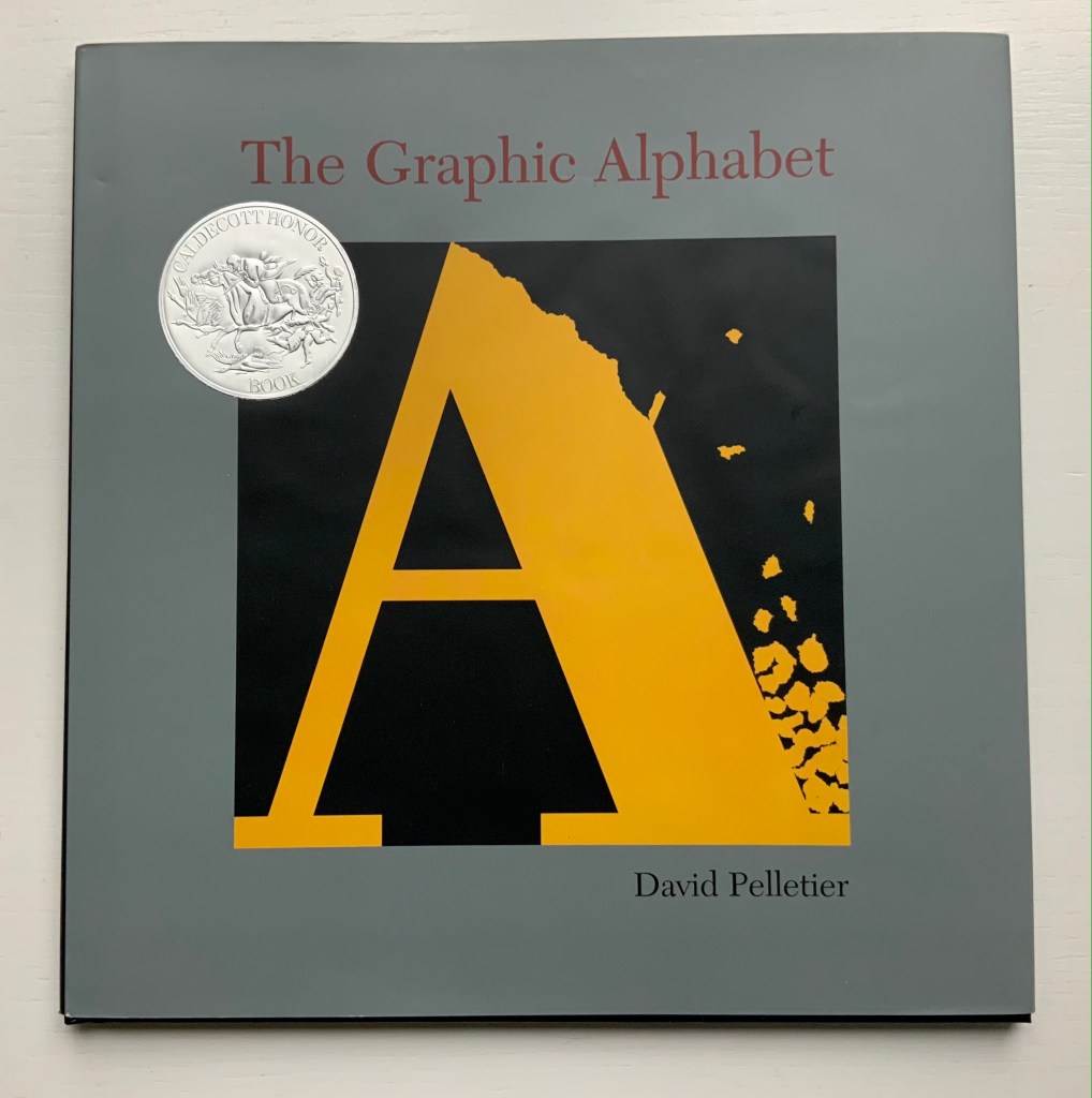
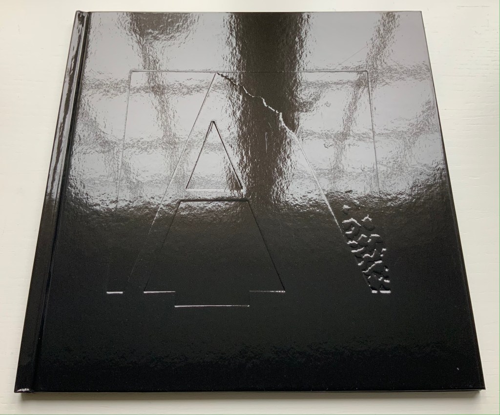
The Graphic Alphabet (1996) David Pelletier Paper on board, embossed with the letter A, casebound, sewn and glued. H255 x W250 mm, 32 pages. Acquired from Amazon, 24 August 2021. Photos of the work: Books On Books Collection.
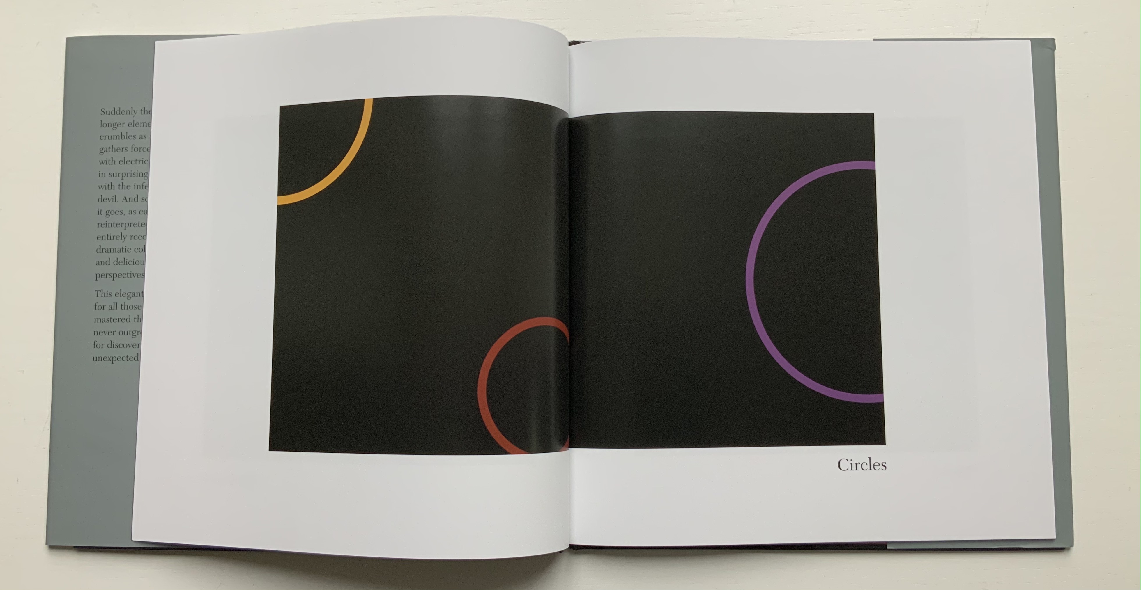
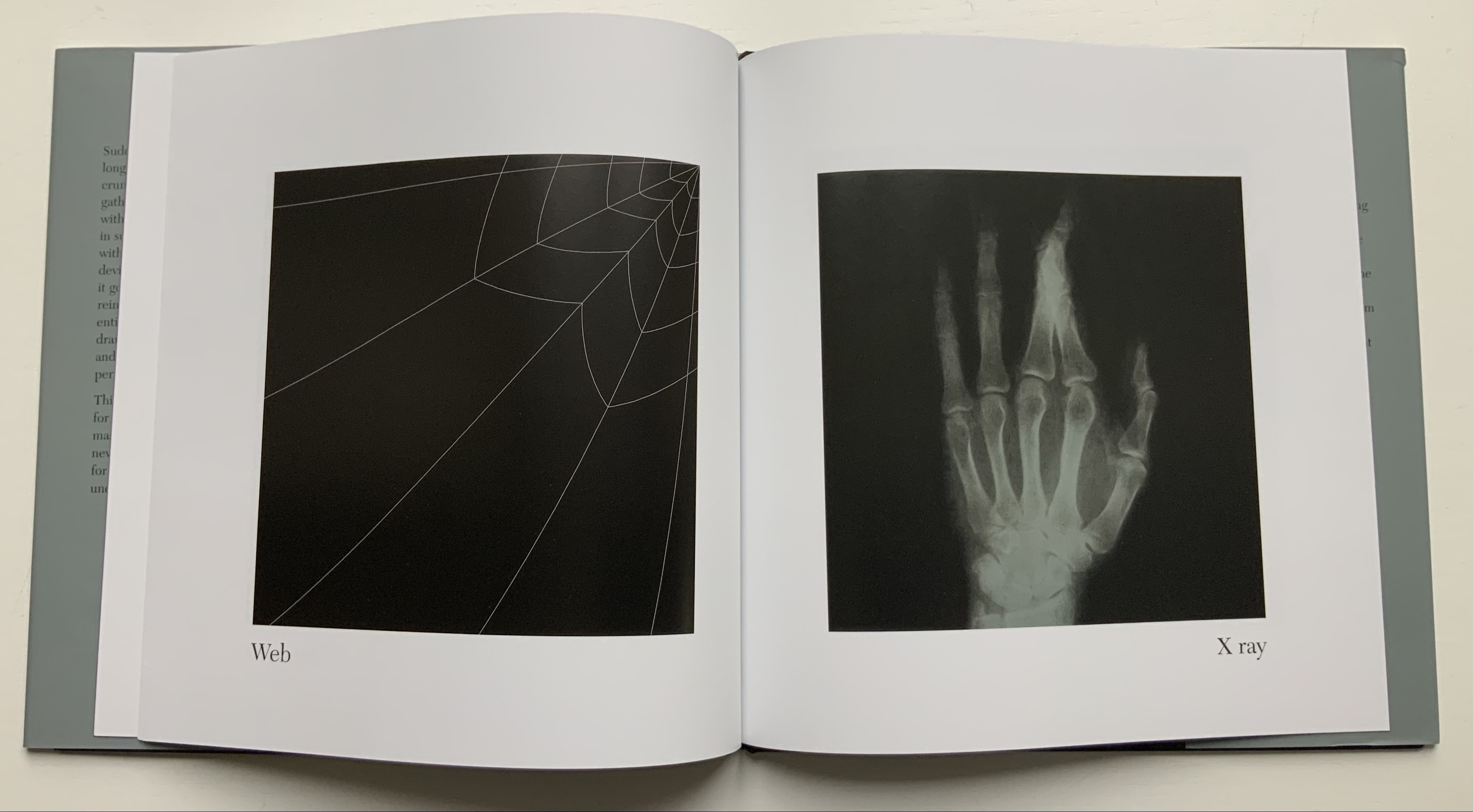
David Pelletier’s 1996 Caldecott Honor Book follows in the footsteps (the tumbles?) of Suse MacDonald’s Alphabatics (1986) another Caldecott Honor Book. The difference between them is a fine one depending in part on the reader’s age — or the collector’s eye. Both push the reader’s visual imagination. Both provide the words to be associated with the letter and image. MacDonald has shapes and images that turn into letters, where Pelletier has letters than turn into images (A), images whose shapes hint at letters and enact words (B and Y), letters found in images (W and X) and letters made from shapes on the page and the enacted word (Z). In a sense, Pelletier keeps the reader jumping more than does MacDonald. He crisscrosses several of the subgenres of alphabet books: wordplay and visual puns, hidden letters, conceptualism and abstraction.
One can see an affinity with Claire Van Vliet’s Tumbling Blocks for Pris and Bruce (1996) and Scott McCarney’s AlphaBooks (1981-2015), which underscores the cross-currents of alphabet books and artists’ books.
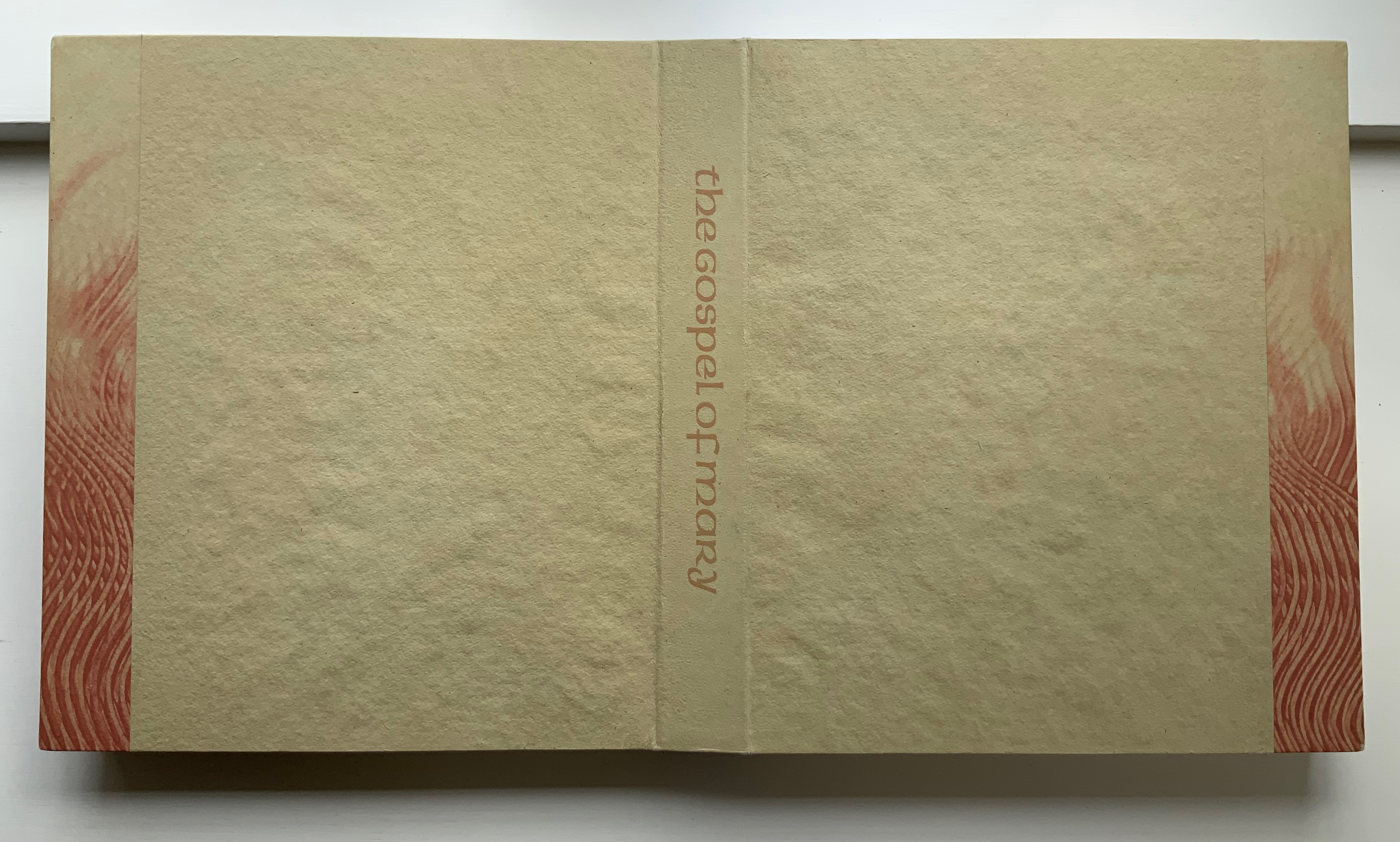
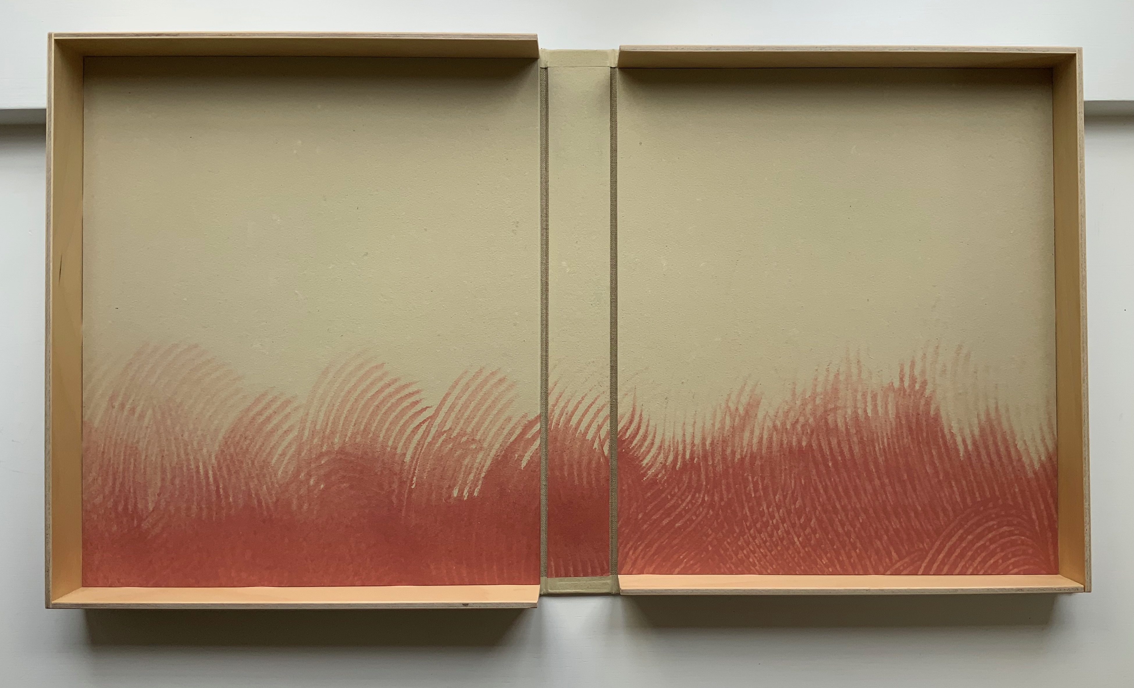
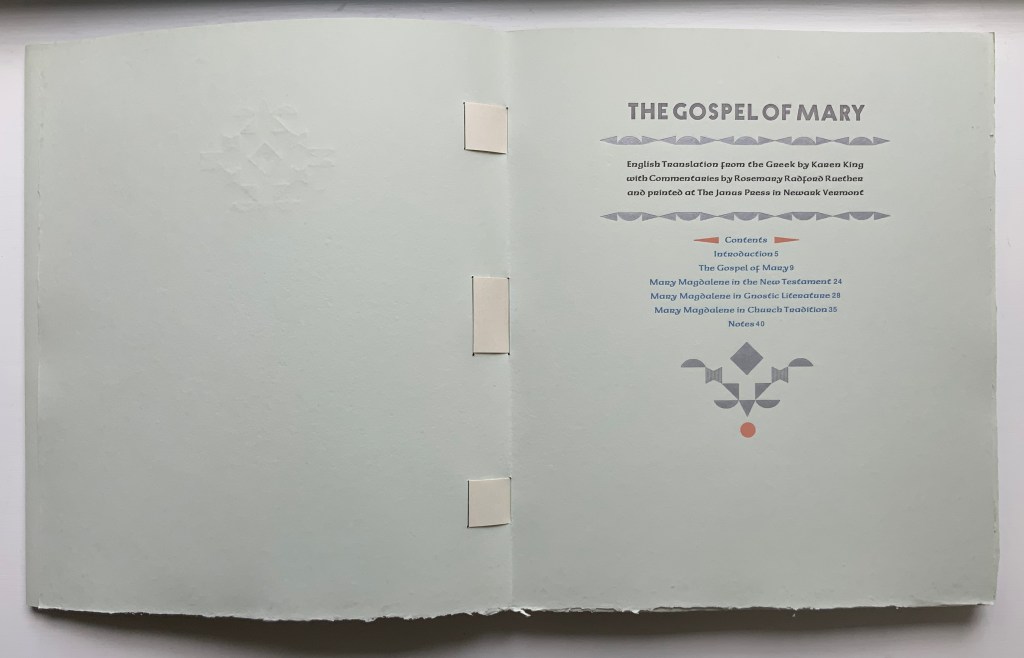
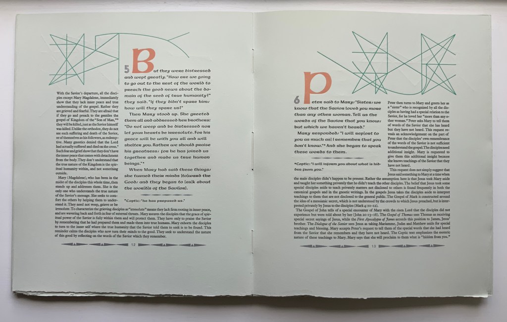
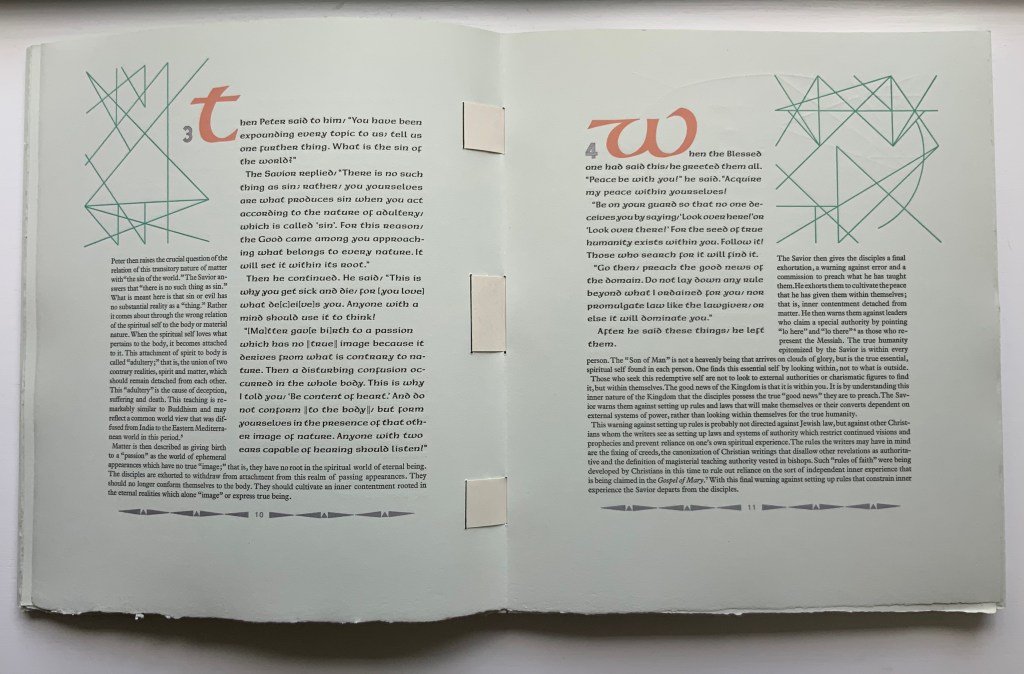
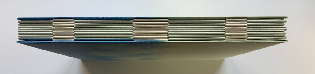
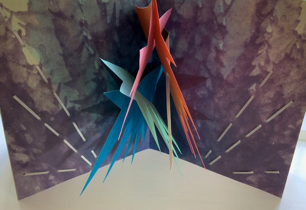
The Gospel of Mary (2006) Claire Van Vliet et al. Woven binding with Barcham Green Cairo paper, housed in De Wint paper-covered and lined birch trays. Box: H320 x W274 x D42 mm. Book: H292 x W250 x D28 mm, 44 pages, center pulp-painted pop-up. Edition of 150, of which this is #27. Acquired from Thomas Goldwasser Rare Books, 18 June 2022. Photos: Books On Books Collection.
Like Woven and Interlocking Book Structures (2002), Tumblr Blocks (1996) and Batterers (1996) below, The Gospel of Mary is an outstanding work of collaboration. Its pulp painting, letterpress, woven binding and layout make this work an important addition to works by Claire Van Vliet in the Books On Books Collection. Van Vliet pulp painted the centerpiece and cover below with Katie MacGregor (Whiting, Maine), who also made the pop-up papers. Andrew Miller-Brown, the Janus Press workshop printer and founder of Plowboy Press, is credited and has signed this copy with Van Vliet. Audrey Holden, who has also signed this copy and worked on Tumbling Blocks, executed the binding. Rosemary Radford Ruether, feminist thelogian, provided the commentary on the text, both of which were typeset with the assistance of Ellen Dorn Levitt, whose collection of book arts projects and teaching materials now resides at the Maryland Institute College of Art.
The four photos below provide views of the binding structure and also the layout in which the commentary embraces the gospel text.
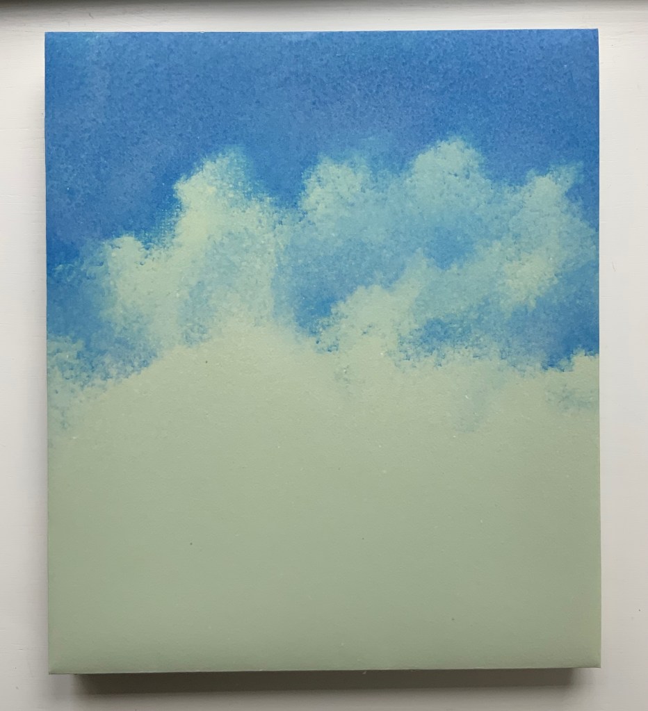
Below, the five-part pulp-painted centerpiece and the silver paper ribbons woven into the double-page spread stand out against the more subtly pulp-painted background. The pop-up echoes the images on the Barcham Green Boxley paper used throughout for the text and commentary (see above).
The size of the work and the way that the printing, paper, pulp painting, layout of text and commentary, pop-up and binding complement one another echo the age of illuminated manuscripts and incunabula. It would make for a rewarding exhibition to juxtapose The Gospel of Mary with several of them.
Additional insights and process photographs can be found on pages 48, 49 and 74 of John Buchtel’s The Art of Paper (see below).
The entries below were previously published on 8 August 2019 and have been moved here.
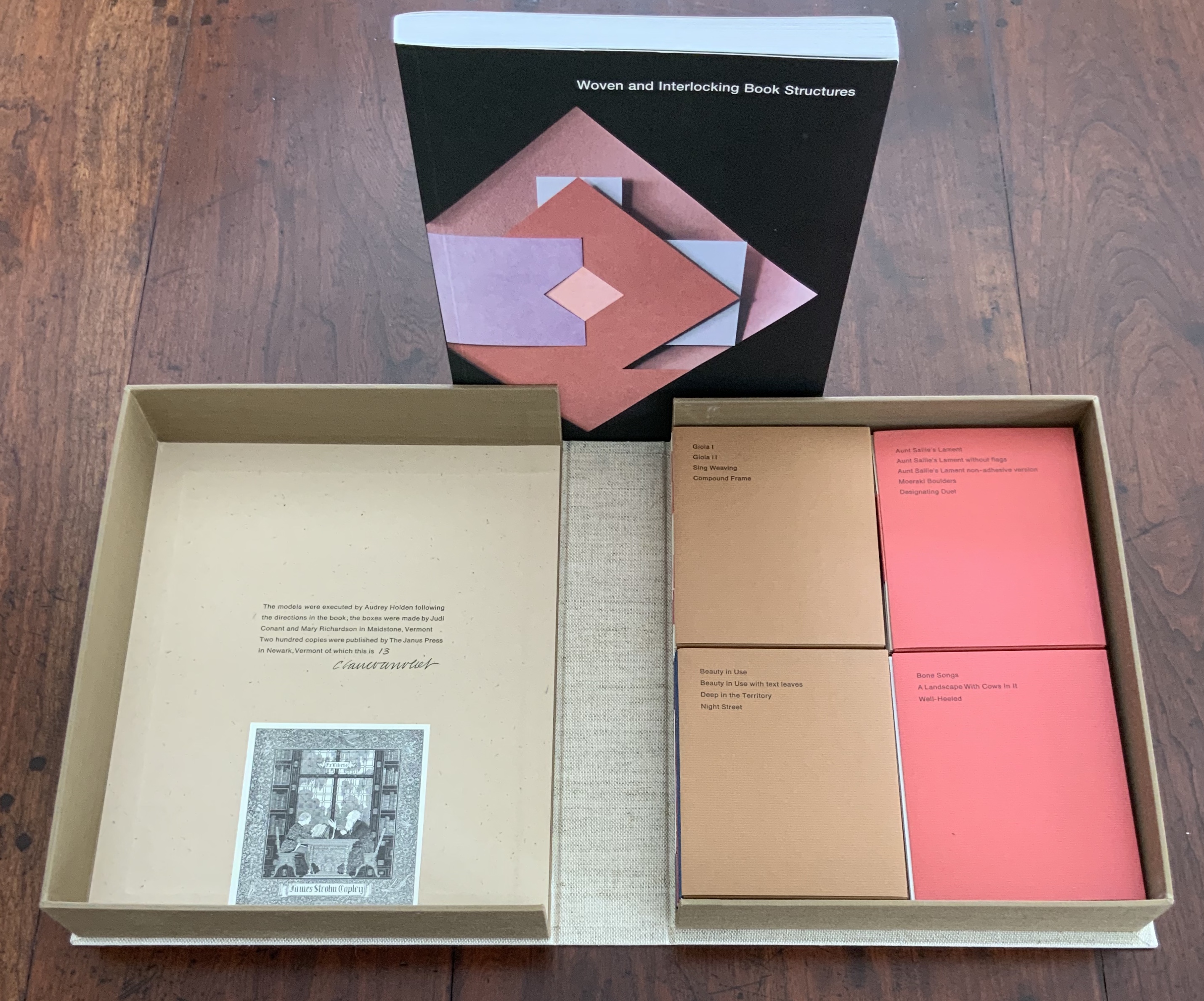
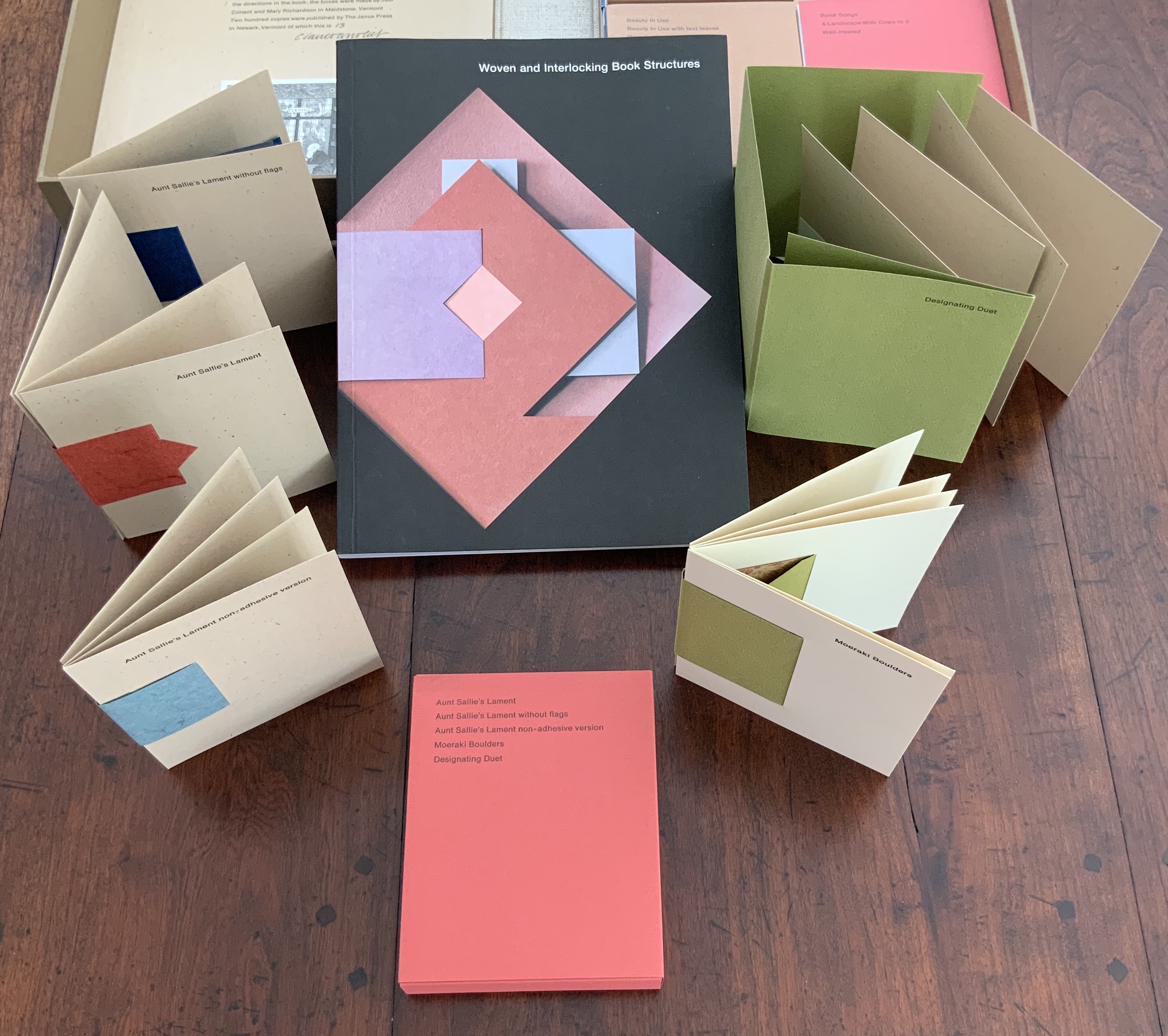
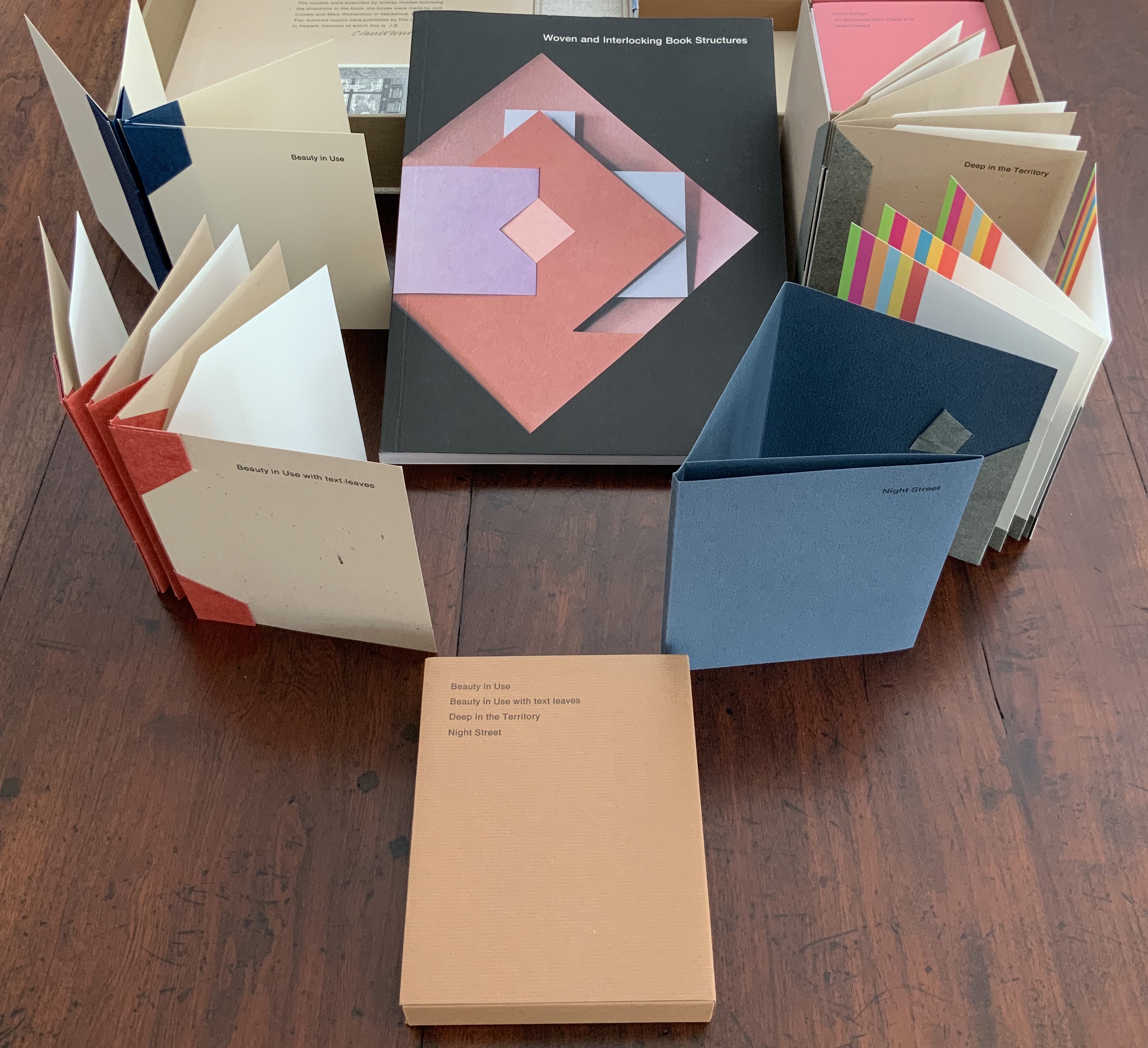
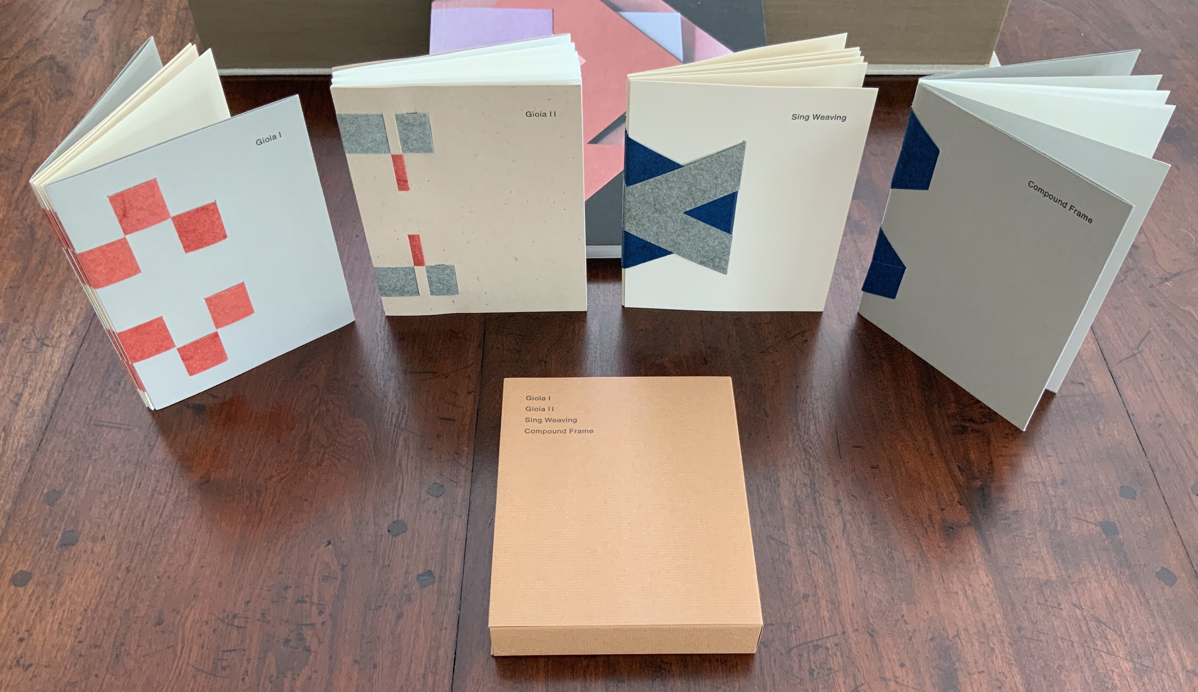
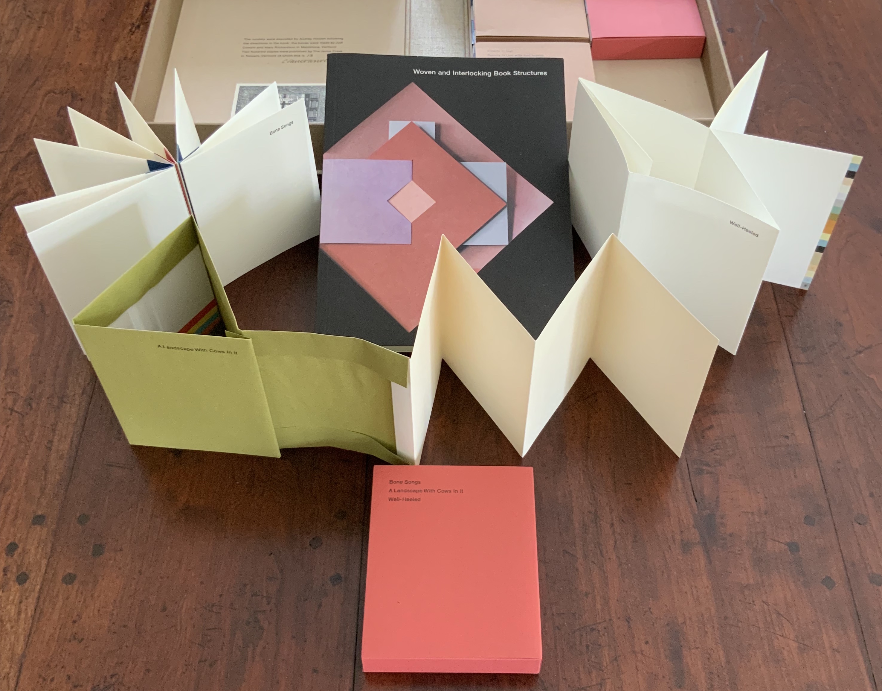
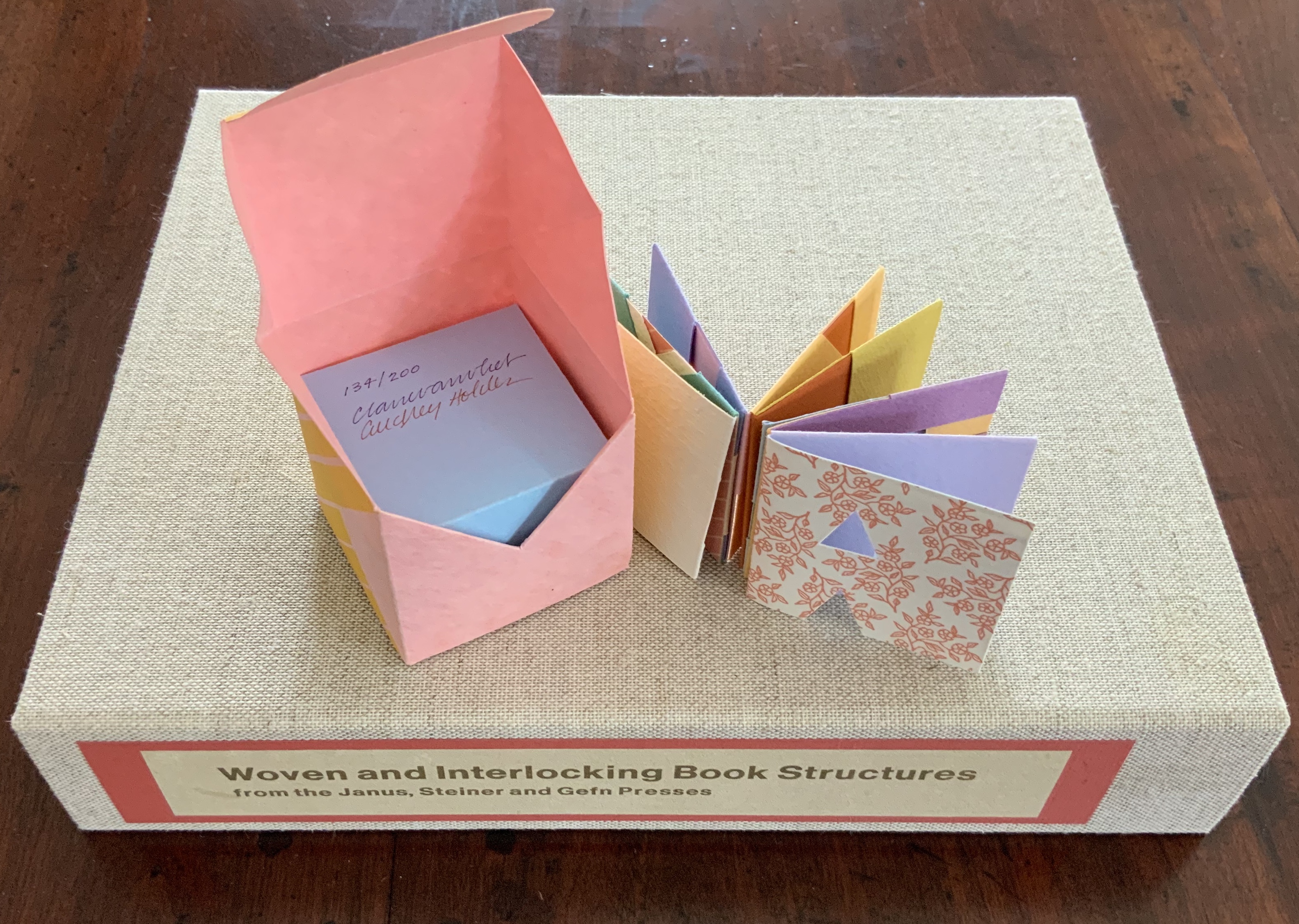
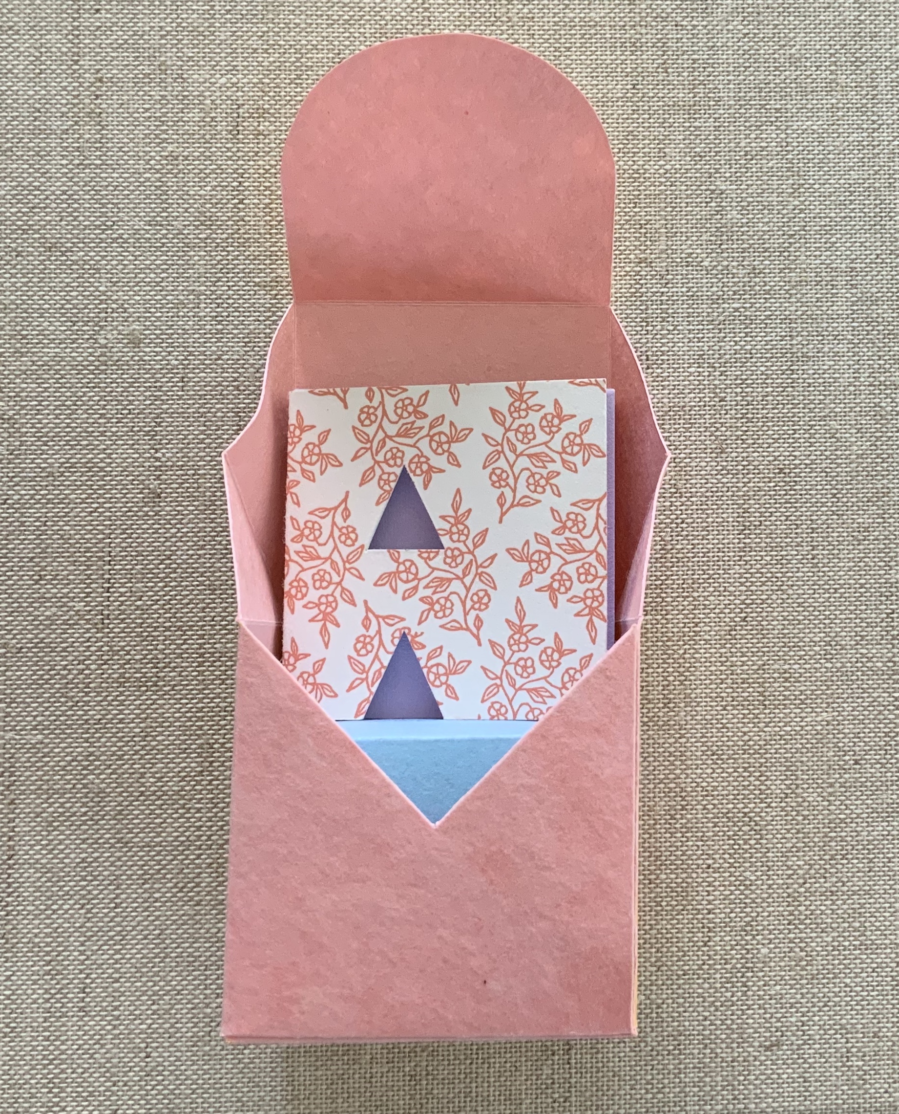
Woven and Interlocking Book Structures (2002)
Woven and Interlocking Book Structures (2002) Claire Van Vliet and Elizabeth Steiner Four slipcases containing 16 book models are enclosed with the book in a cloth-covered clamshell box. Box: H282 x W226 x D55 mm. Slipcases: H128 x W104 mm. Book: H254 x W192 mm, 144 pages. Edition of 200, of which this is #13, signed by Claire Van Vliet. Acquired from James S. Jaffe Rare Books, 1 February 2015. Photos: Books On Books Collection.
The binding models and papers used for them are:
A — Aunt Sallie’s Lament; Aunt Sallie’s Lament without Flags; Aunt Sallie’s Lament non-adhesive version; Moeraki Boulders; Designating Duet. Papers used include Elephant Hide, Fabriano cover and Miliani Ingres, French’s recycled, Marblesmith, Bristol and Saunders laid.
B — Beauty in Use; Beauty in Use with text leaves; Deep in the Territory; Night Street. Papers used include Elephant Hide, French’s recycled, Bristol, Mohawk Superfine and Fabriano cover.
C — Gioia I; Gioia II; Sing Weaving; Compound Frame. Papers used include Elephant Hide, French’s recycled, Bristol, Mohawk Superfine, Linen Index, Neenah UV Columns and Marblesmith.
D — Bone Songs; A Landscape with Cows in It; Well-Heeled. Papers used include Elephant Hide, Mohawk Superfine, Arches laid, and Fabriano text and Miliani Ingres.
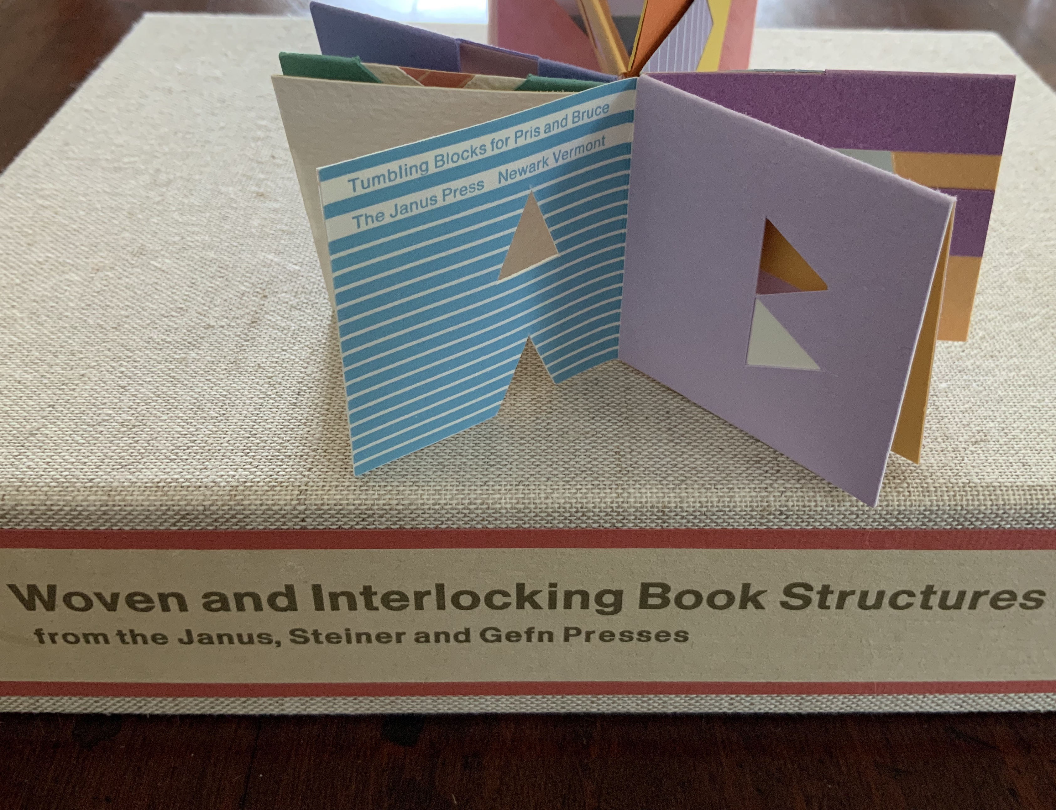
Tumbling Blocks for Pris and Bruce (1996)
Tumbling Blocks for Pris and Bruce (1996) Claire Van Vliet and Audrey Holden Paper cube issued in a non-adhesive paper box housed in a clear plastic box. 58 x 58 x 58 mm. Edition of 200, of which this is #134. Acquired from Abecedarian Gallery, 21 July 2019. Photos: Books On Books Collection.
Working with offcuts from Praise Basted In: A Friendship Quilt for Aunt Sallie (1995), Van Vliet and Audrey Holden cut pairs of letters of the alphabet and glued them back to back. These constitute the cube-book’s leaves, which are folded and glued to permit the book to open into a variety of shapes. Gently tossed from hand to hand, the book will resume its cube shape. “Pris and Bruce” are the Hubbards, Janus Press patrons.
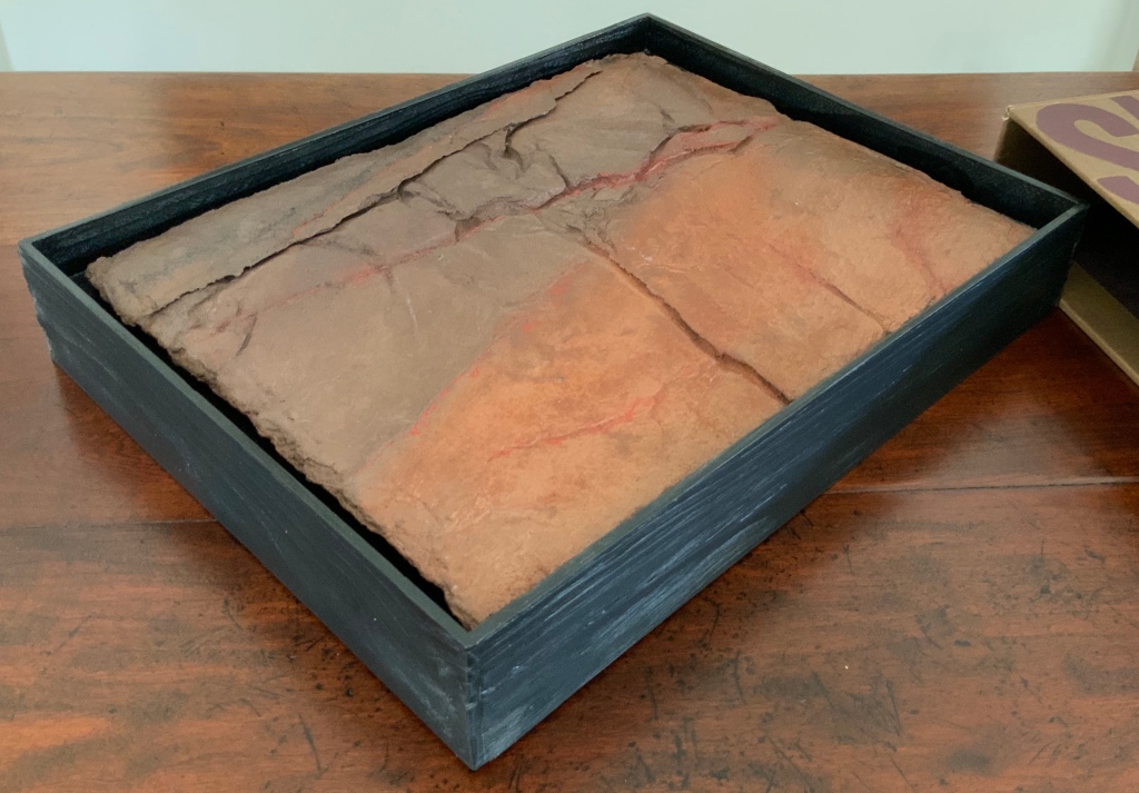
Slipcase: H307 x W387 x D73 mm; Tray: H296 x W380 x D61 mm; Accordion: H270 x W356 x D33 (closed), H270 x W1115 mm (open). Edition of 500, of which this is #5, signed. Acquired from Van Vliet via Vamp & Tramp, 17 July 2020.
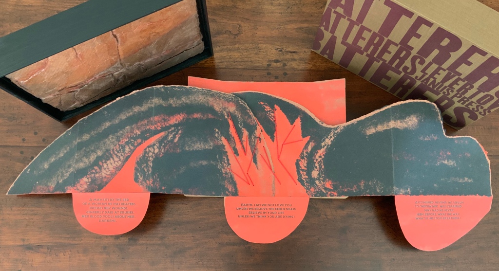
What is remarkable about this sculptural book is its fusion of collaborators’ efforts, of art forms, and of text, materials, techniques and structures.
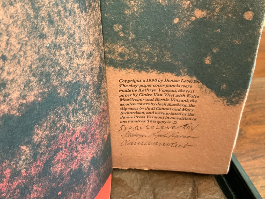
In the late 1980s, Claire Van Vliet and Kathryn Lipke (née Vigesaa) were seeking a collaborative project. After Van Vliet spotted Denise Levertov’s poem “Batterers” in the American Poetry Review (1990:6), they agreed that the poem, which enfolds our abuse of the earth within a metaphor of domestic abuse, was the appropriate text to join somehow with Lipke’s series of structural artworks called Earthskins.
Earthskins (1988-96)
Kathryn Lipke (Vigesaa)
Installation views of the works created from paper pulp, clay and pigments; some reaching 69 feet in length. Photos: Courtesy of the artist.
When letterpress printers consider the reproduction of a short poem, the broadside is the most common art form adopted. Van Vliet’s adoption of it is anything but common. Instead, she has orchestrated a combination of structures and art forms. From the maroon-printed, brown linen slipcase slides a tray made of tamarack wood to which Lipke’s vacuum-formed panel of clay mixed with paper is fixed. As the black tray is lifted, layers of multi-folded paper attached to a backing appear.
The top two layers are glued and sewn with multi-stranded red thread to the third and bottom layer, displaying the names of the author, work and Van Vliet’s press. The bottom layer is glued to a backing of three strong card panels tightly glued to two wood runners, sawn or routered into a slight U shape.
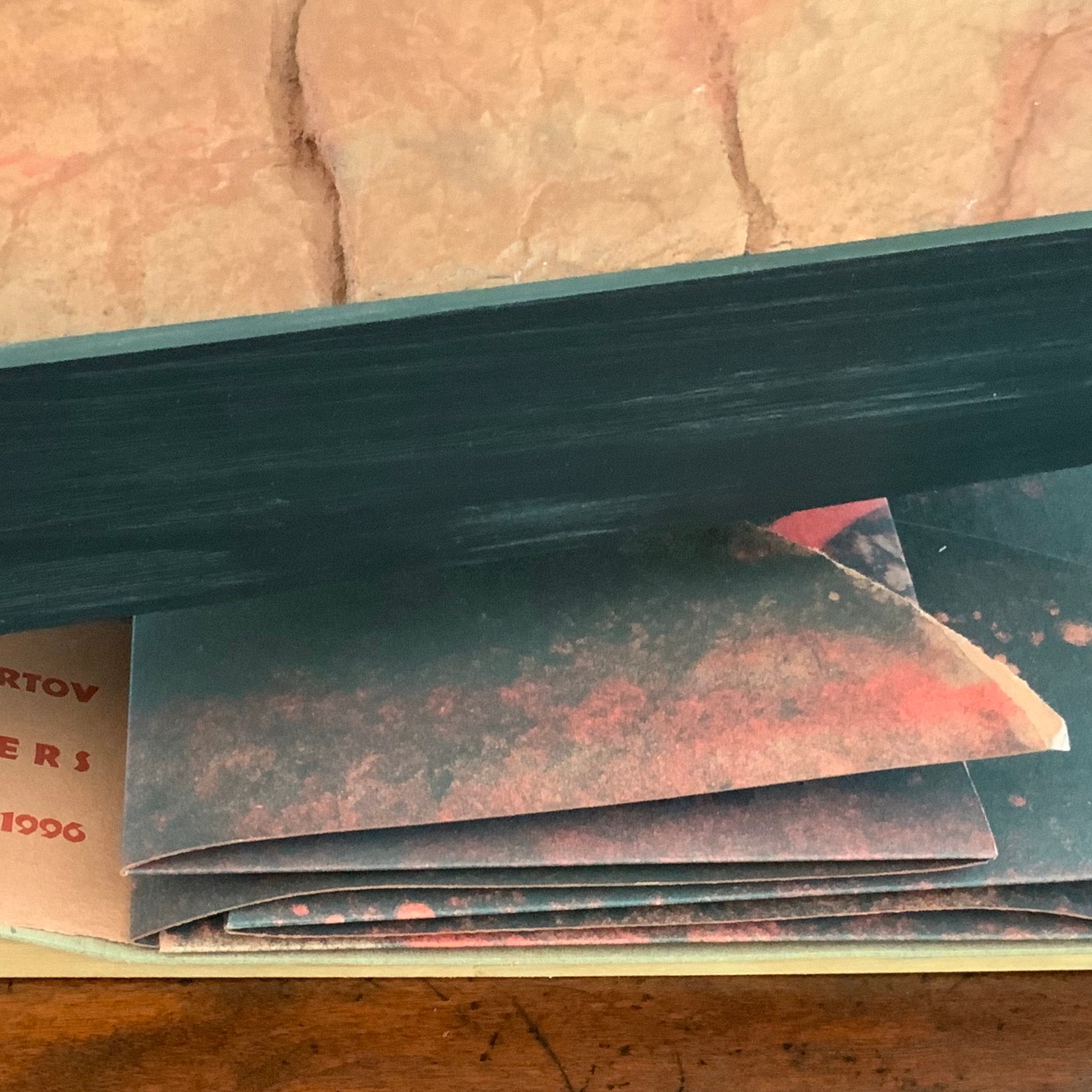
As the top layer is unfolded by pulling it apart, left and right, three tabs drop down to reveal Levertov’s poem.
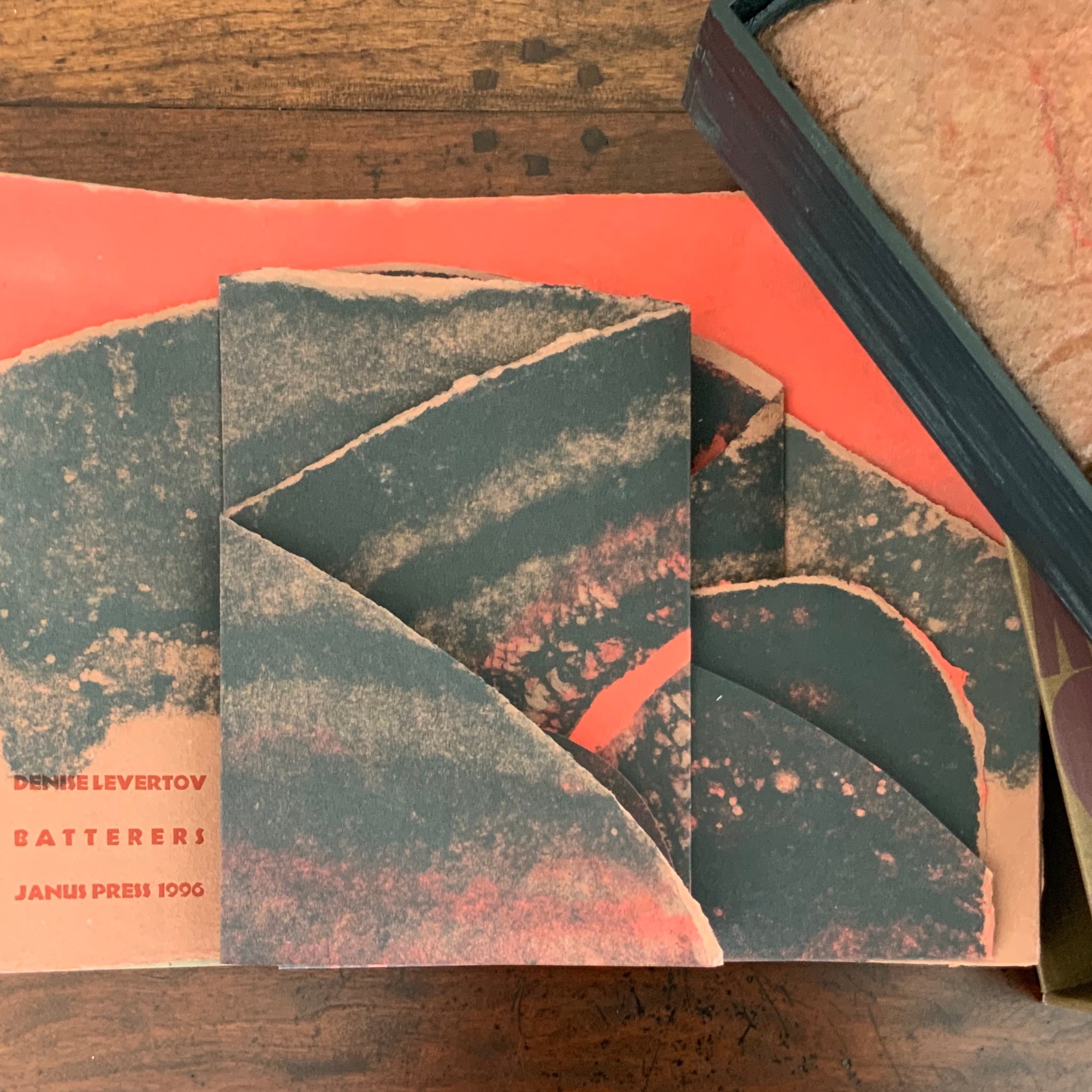
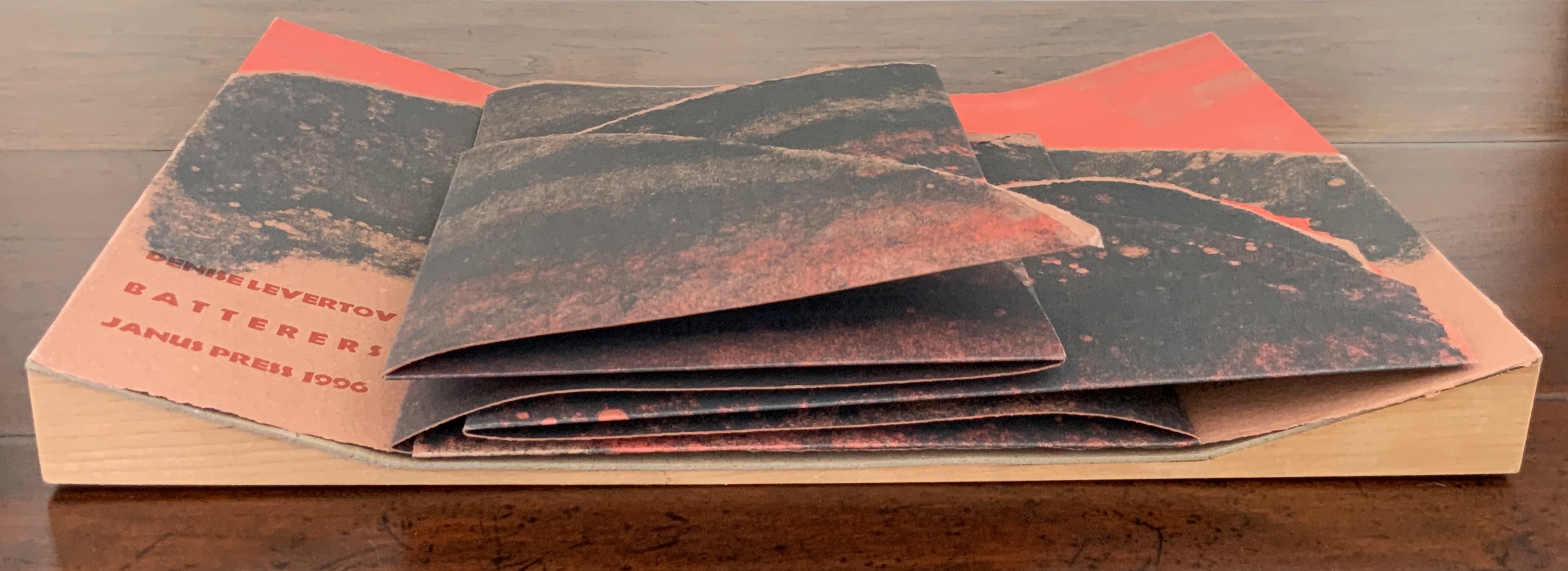
Van Vliet’s combination of structures and forms offers multiple orders in which to read the poem, which pleased Levertov because she liked the poem in both the stanzaic orders of 1-2-3 and 1-3-2 (correspondence with Kathryn Lipke and Claire Van Vliet, 20 July 2020). In a book-like way, the covering tray slides from its slipcover, the cover is removed, and the accordion pages unfold to be read left panel first, right panel second and center panel third, emphasizing the embedded and central metaphor.
Spread fully open, the structure assumes a single-sheet broadside form, and the “center” stanza moves from third to second in order. But there is a third order of reading, as it were. The broadside form “leans” into the art forms of print, painting and bas-relief sculpture. The text, images and design become a whole experience, an object to be taken in as a whole.
Photos: Books On Books Collection.
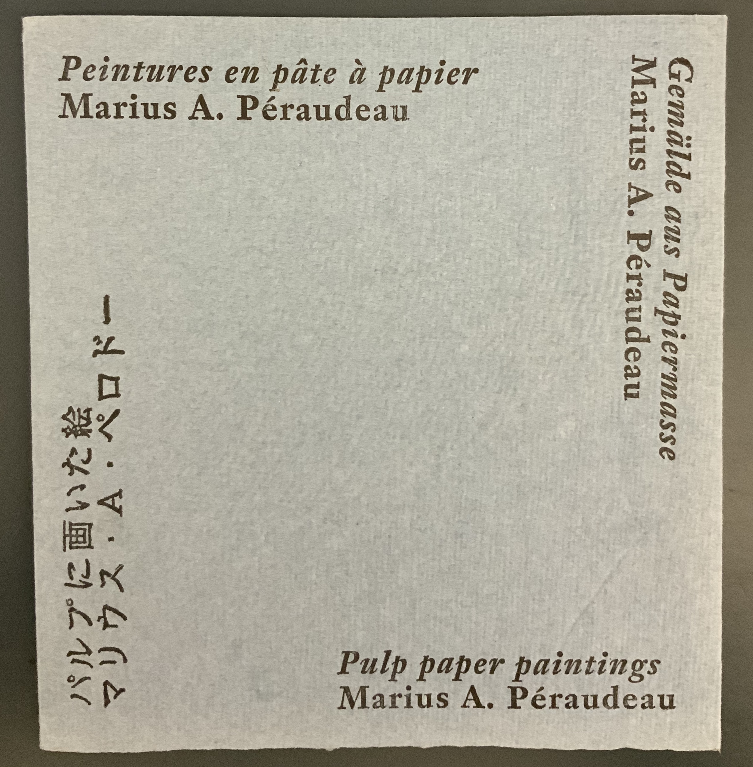
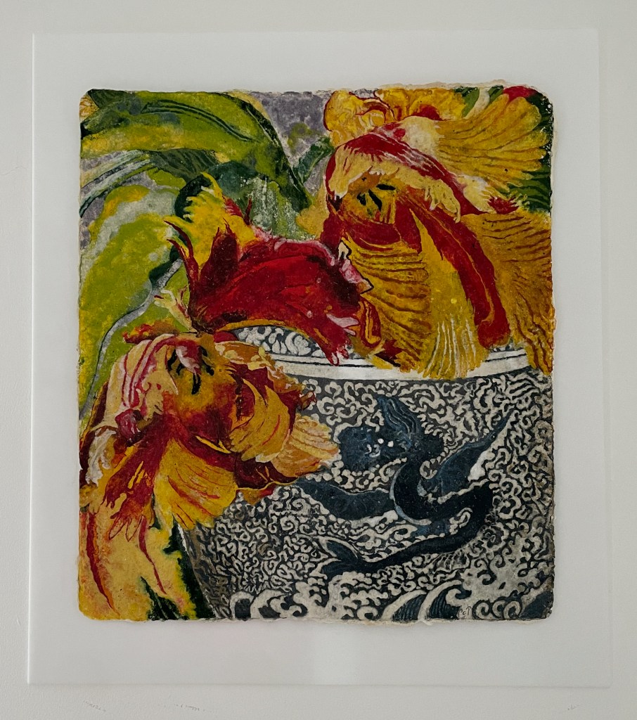
Not only in form does Batterers “lean” into the form of painting: the imagery and colors arise from the technique of pulp painting, a technique defined by the work of Marius Péraudeau in the mid-twentieth century. Pat Gentenaar’s still life Water Dragon in this collection provides another example of the technique.
Top: cover image of Marius Péraudeau: Pulp Paper Paintings (Paris: Ernst Maget, 1991). Photo taken at British Library: Books On Books. Bottom: Water Dragon 2011) Pat Gentenaar-Torley. Photo: Books On Books Collection.
In pulp painting, the paper is the painting. Assisted by Katie MacGregor and Bernie Vinzani in their paper studio in Whiting, Maine, Van Vliet poured different colors of paper pulp into prepared forms to create three sheets of paper on which to print and then collage into the image that suggests dual images: that of a volcano and that of a woman reclining on her side or face down. The fusion of shapes, the fusion of color and fiber in pulp painting, and the fusion of clay and pulp in the covering bas-relief (which can also be used as a stand for the broadside) fuse with the poem’s words and metaphor. Once this artwork has been experienced, reading the poem printed in a traditional book can never be the same.
Additional insights into The Batterers along with illustrations of the papermaking and painting process can be found in pages 43-45 of John Buchtel’s The Art of Paper (see below).
With the permission of the author and The Book & Paper Gathering, this essay by Paula Steere is being reposted at Books On Books because Steere’s observations about bookbinding lead to a closer look at works in the Books On Books Collection. Keep Steere’s essay open in this window, then open another window for one of the entries in this baker’s dozen to start:
Compare images in the open windows. Just as Gary Frost’s conservation work shed light on book art, Steere’s descriptions and explanations can lead to a greater appreciation of these artists’ works and others.
Posted on Thursday 9th June, 2022 by thebookandpapergathering. Accessed 13 June 2022.
What stresses occur when we open a book? How do spine materials affect them? What are we really doing when we stick things on a book spine, sand them back, and then stick more things on? On what are we basing these decisions? As a book conservation student, keen to learn, I looked for spine structure information in popular conservation and bookbinding literature, but I found no satisfactory answers to my questions. So I did what I always do when I want to find out how things work: I talked to a mechanical engineer. This article is based on my MA Conservation dissertation research at Camberwell College of Arts, London. I realised early in the research process that I needed the knowledge of an engineer, and conveniently, there happened to be one in my family. Lee McIlvaine lives and works in the United States, has 30 years of mechanical engineering experience and specialises in mechanism and structural design. Five years later, we are still talking about book mechanics.
Spine lining materials are fundamental to the action of a book spine. Yet, a review of over 250 technical statements about book structure, lining materials or lining techniques from historical and contemporary conservation and bookbinding literature1 revealed that many statements are unqualified or unquantified. For example, Middleton (1998) advises that ‘when enough layers [of paper linings] have been applied, the end of the paper is trimmed off’, but he does not specify how many ‘enough’ would be. Technical information can also be contradictory between authors. For example, Szirmai (2001, p. 275) partially attributes the functional longevity of existing gothic bindings to the ‘restrained’ use of adhesive on the spine. However, Douglas Cockerell (1901, p. 152) advocates giving the spine ‘a thick coat of glue’ when lining heavy books. Diehl (1980 Vol. 1, p. 190) states that the hollow back is ‘one of the most commonest [sic] faults of construction’, but does not explain why. On the other hand, Middleton (1963) simply reports the historical use of recessed thongs with a hollow back to enable more throwup; he does not indicate whether this was a good or bad practice. Advice in the literature requires some level of experience to interpret it, and some statements in the literature reviewed are even technically incorrect2, all of which makes the advice unhelpful for learners. I felt an immediate kinship with an anonymous author who wrote in The British Bookmaker that
Vague generalities may always be used by theorists in describing a process of work, and they may suffice for those who know how to do it, and are consequently able to fill in the omissions of the unpractised and merely theoretical exponent of the craft, but for those who desire to learn, or for those who, being practised workmen, desire to extend their knowledge, vague generalities will not suffice. (1892-3, no page)
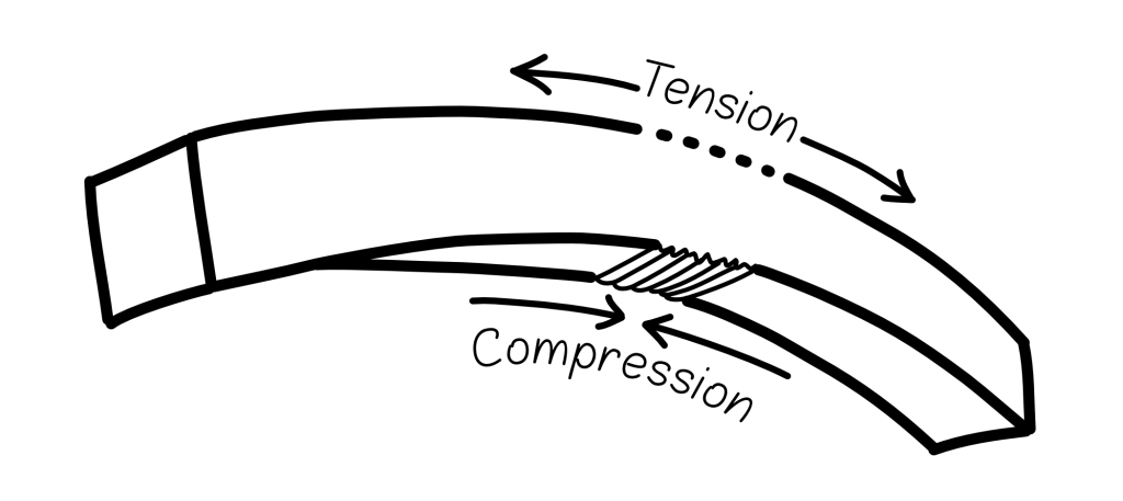
Clear and reliable information about linings is greatly needed. As Miller (2010, p. 100) rightly points out, ‘linings can sometimes be extremely damaging’. With that in mind, the starting point for my research was the well-known article by Conroy, ‘The Movement of the Book Spine’ (1987), in which he describes a fundamental engineering principle important for bindings – the tension and compression principle.
Mechanics of the book spine
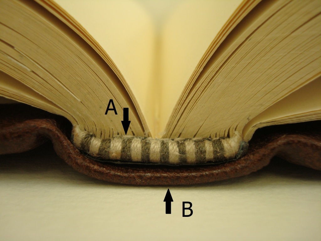
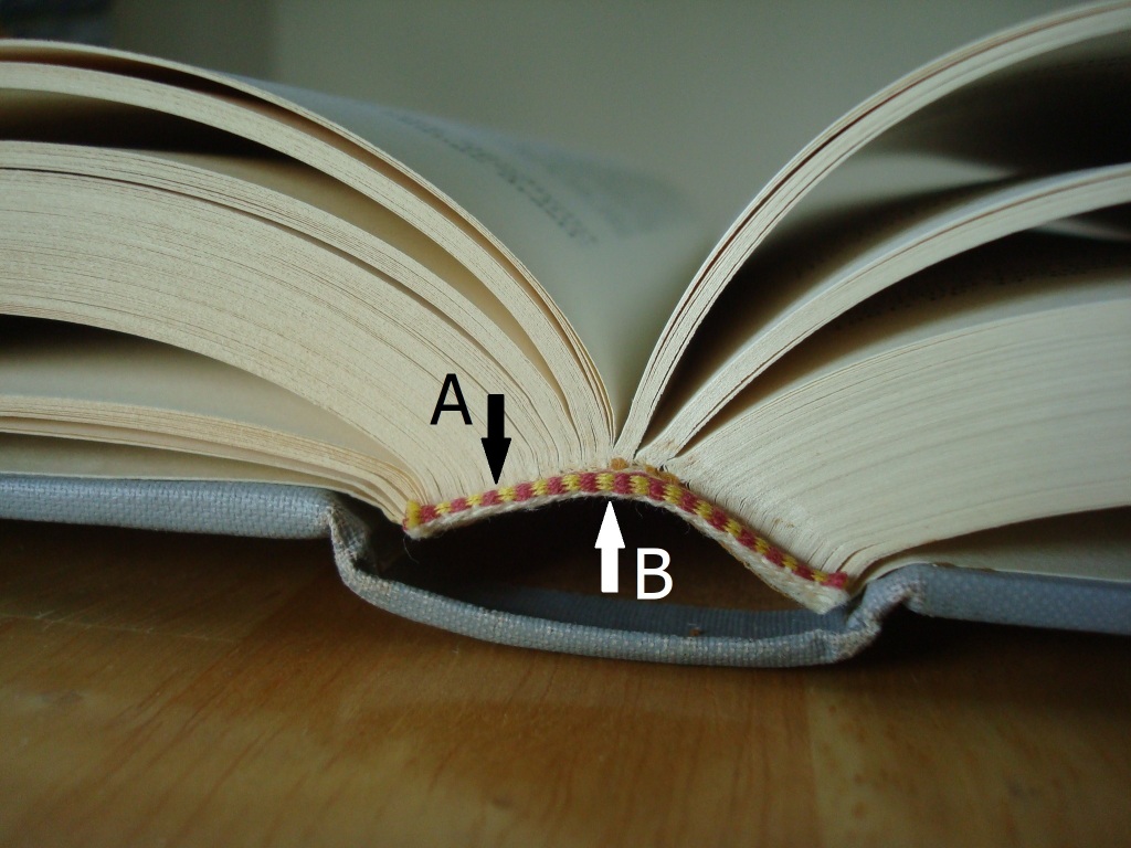
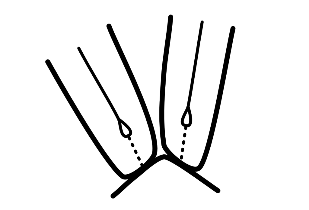
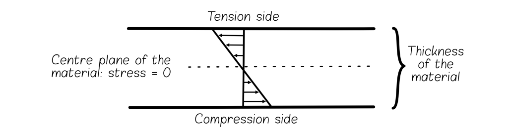
When any material bends, it has a tension side and a compression side (Fig. 1). Material in the tension layer will spread apart, while material in the compression layer will, as the name suggests, compress. This principle applies when a book is opened (Figs. 2, 3). A book spine has a tension and a compression layer. The tension layer consists of the spine folds of the text block (the folded edges of the text sections) and the material adhered directly to them. All materials placed on top of this layer are in compression.
Fig. 1 – The action of a bending object, demonstrating the tension and compression principle. Original drawing by Paula Steere; graphic rendering by The Book & Paper Gathering
Figs. 2, 3 – Tension (A) and compression (B) layers: the tension and compression principle applies to any open book, regardless of the binding type. Photography by Paula Steere
When a book is opened, the movement at the spine folds is largely imperceptible, but its importance should not be underestimated. Too much movement could contribute to poor opening and structural failure. Each of the spine folds moves with some degree of independence. This localised movement can be thought of as a series of flexible mini-bends (McIlvaine 2017a), as illustrated in Figure 4. These mini-bends have different radii and are affected by adhesives and sewing. (Sewing structure will be discussed in Part II.) They create localised strain (deformation) (Fig. 5), and it is this localised strain that causes the spine to fail.
Fig. 4 – Imperceptible movement of the spine folds in an opened book. Original drawing by Paula Steere; graphic rendering by The Book & Paper Gathering
Fig. 5 – Localised bending at each spine fold increases strain. Sewing and adhesives also create non-uniform stiffness; for example, adhesive shrinkage pulls paper down and flattens. Original drawing by Paula Steere; graphic rendering by The Book & Paper Gathering
Linings also move, and these shearing forces contribute to the deformation of the spine folds. The choice of lining materials affects the extent of the deformation. Miller (2010, p. 100) defines linings as a support that allows the spine to flex ‘without the sewn sections parting’. While in reality we cannot eliminate deformation entirely, informed choices can minimise it.
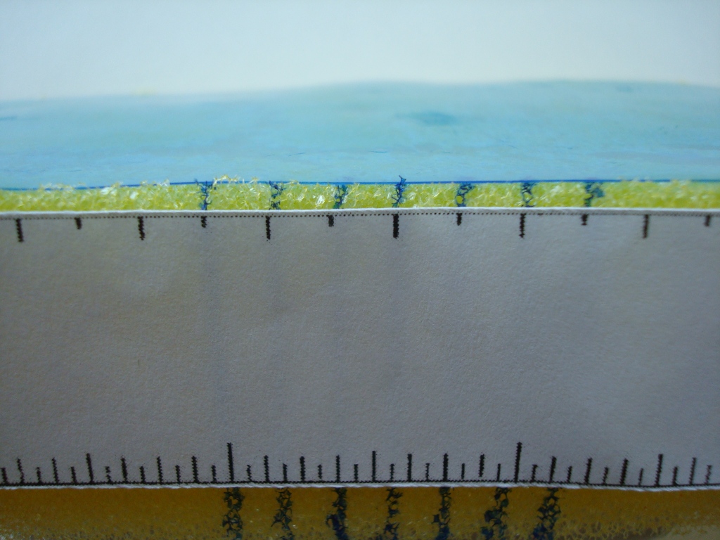
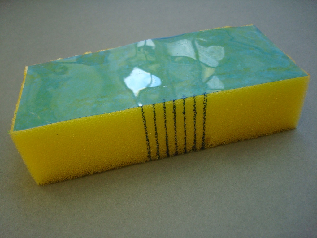
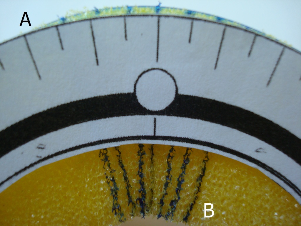
A fundamental aim of spine linings, therefore, is to minimise deformation at the interface between the text block and the first layer (the spine folds and first lining). We can achieve this by minimising the spreading apart (deformation) of the spine folds in the tension layer. Based on principles of mechanical engineering, the first step is to place a stiff and thin first lining against the text block to minimise movement. All subsequent materials, including further linings, adhesive layers and covering material, should ideally be less stiff than this first lining. This is not always an easy task. The model in Figures 6, 7 and 8 shows how adhering a stiff material to a flexible material affects the strain distribution in a composite material. Acetate, a thin and relatively stiff material, is adhered to a sponge (Fig. 6, 7). When the sponge is bent, the stiffness of the acetate minimises movement at the acetate/sponge interface (Fig. 8A). This interface is in the tension layer, and the higher stiffness of this layer drives deformation into the less stiff outer sponge (compression layer), as shown in Figure 8B. This is a simplified model of a book spine, which is also essentially a composite of several materials.
Figs. 6, 7 – A stiff material (acetate) adhered to a less stiff material (a sponge). Photography by Paula Steere
Fig. 8 – The stiffness of the acetate reduces (but does not eliminate) the spreading apart (tension) of the sponge at A. This can be a model of the spine fold – first lining interface. When the tension layer is stiffer, the deformation is driven into the compression layer at B, which represents the exterior book spine and covering material. Photography by Paula Steere
Of course, driving deformation to the outer spine layers could potentially damage the spine leather and tooling of a tight back (Franck 1941, p. 7). We also do not want to prevent movement entirely, as the spine needs to flex to some degree for the book to open well. The required degree of spine stiffness is also affected by other variables, such as the thickness of the sewing supports and type of sewing structure. Nevertheless, the tension and compression principle applies equally to all books and offers tangible criteria on which to base spine lining decisions. However, this is only the first part of the story. We must also understand the performance mechanics of the conservation spine lining materials themselves – paper, linen, cotton and adhesives.
The mechanical properties of spine lining materials determine their use
Research indicates that paper lining materials are not robust enough for book spine linings. In 1708, Zeidler wrote in his book on the philosophy of bookbinding that ‘The French do not care to glue anything on the spine. Some glue only paper strips on, putting everything slovenly over and believing they have come just as far [as putting parchment or linen cloth on neatly and exactly]’3(p. 78). Szirmai (2001, p. 196) interprets these sentiments by saying that Zeidler ‘castigates’ French bookbinders for using paper linings in gothic books.
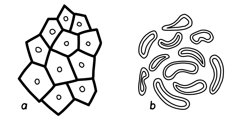
Conroy (1987, p. 4) supports the case against placing paper on the spine. He warns that paper is prone to breaking when stretched (due to tension) and buckles easily when compressed. McIlvaine (2017a) concurs, saying that while paper is a stiff material, it is not strong enough and is susceptible to tearing. Any imperfection would propagate easily. Paper has an irregular and random structure, which determines its physical properties (Corte and Kallmes 1961, p. 14–15; see Fig. 9). Its relative weakness could be attributed in part to this formation.
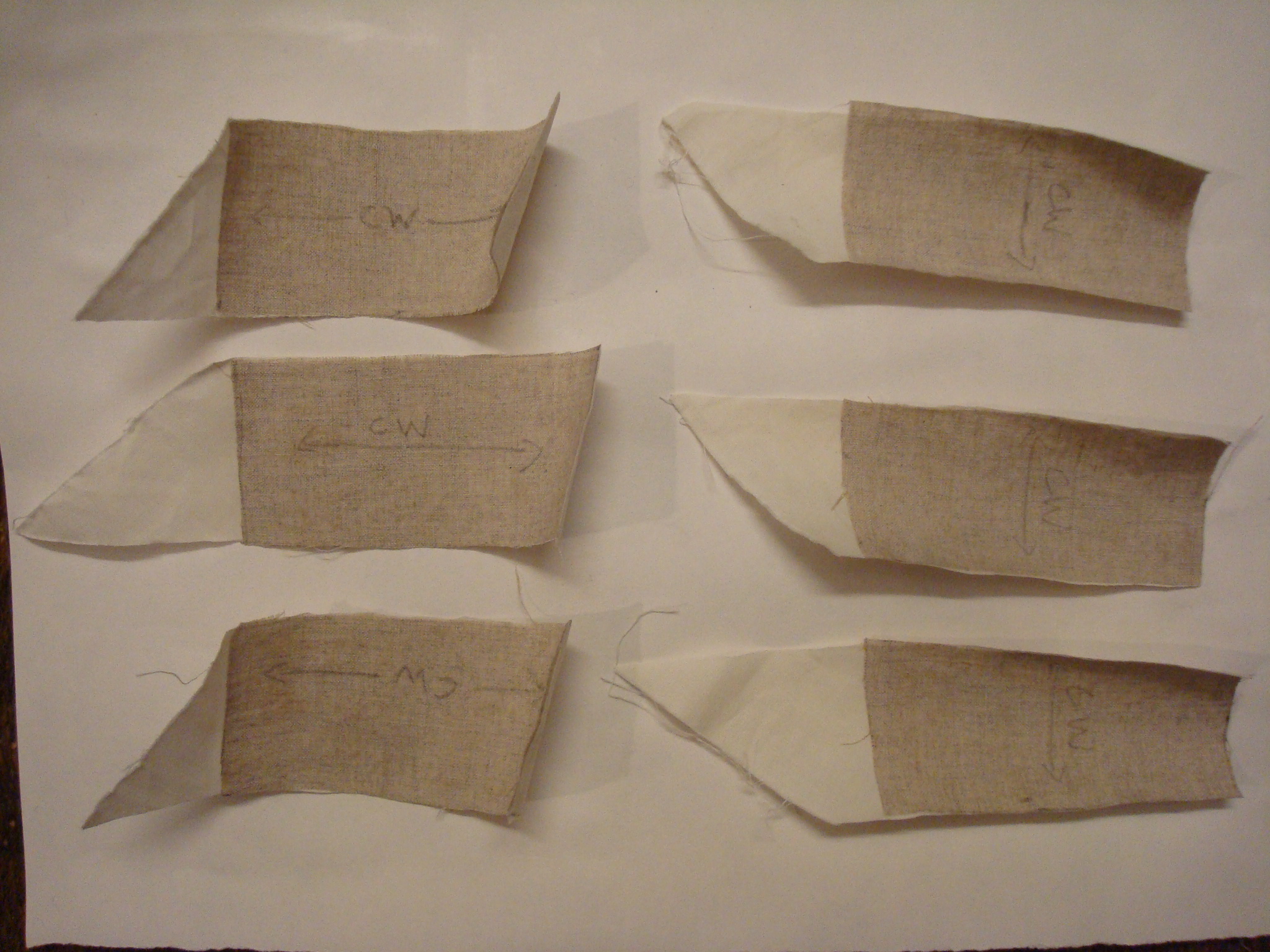
Fig. 9 (left) – Paper consists of randomly arranged separate fibres. Fig. 10 (right) – Fabric consists of twisted, woven and secure threads. Drawings by The Book & Paper Gathering
Fabrics tend to have a stronger base material and structure than paper (Fig. 10). For spine linings, the important properties of fabrics are tenacity (stress at break), extensibility (degree of stretch before breaking) and modulus (resistance to stretch). Tenacity is the term used to describe fibre strength; extensibility contributes to fold endurance; and modulus contributes to stiffness. These properties are determined by the fibre structure of the raw material. Linen is made from the bast stem fibres of Linum usitatissimum. The thick-walled, tube-like cells with small lumens or canals (hollow spaces) (Landi 1998, p. 22) are arranged in bundles, as shown in Figure 11a. Cotton, meanwhile, is made from the seed hair of Gossypium herbaceum and Gossypium hirsutum. Cotton fibres are very different from linen, forming single hollow and flat cells with a large lumen (Landi 1998, p. 21; Fig. 11b).
Fig. 11 – a: A cross-section of thick-walled linen cells arranged in bundles. b: Cross-sections of thinner, flatter cotton cells. Original drawing by Paula Steere; graphic rendering by The Book & Paper Gathering
The thick walls and bundle arrangement of linen cells make linen a stiff and strong material. However, the thick cell walls lower its fold endurance and make it prone to breaking when repeatedly folded in the same place (UAL, no date), because thicker walls undergo more strain when bent. This is analogous to bending a piece of cardboard versus a piece of paper – there will be more damage (deformation) to the cardboard because of its thickness. The thicker a material, the stiffer it becomes when bent due to the neutral axis principle (McIlvaine 2017c), illustrated in Figure 12. This principle states that when a material is bent, there is no tension or compression at the centre line, but deformation increases with distance from this central plane.
Fig. 12 – Neutral axis principle: when a material is bent, the centre plane has zero tension or compression; tension and compression increase with distance from this zero axis. Original drawing by Paula Steere; graphic rendering by The Book & Paper Gathering
Linen also has less extensibility than cotton and will break more easily when stretched. Cotton has higher fold endurance than linen due to its structure: thin walls and a large lumen enable it to collapse on itself, reducing thickness locally and decreasing strain when folded (as per the neutral axis principle). These properties have been confirmed with data from fold endurance and mechanical strength tests published in the well-known books Conservation of Leather and Related Materials and The Textile Conservator’s Manual (Tables 1 and 2).
The data in Table 2 shows that linen is, on average, stronger than cotton because of its higher tenacity. Linen also has a much higher initial modulus (resistance to extension) than cotton, making it the stiffer fabric and a good candidate for a thin, stiff first lining. The less stiff cotton is a good second lining because of its higher fold endurance, and can be used to reattach boards if needed (more on that shortly).
In addition to fibre composition, the orientation of the yarns also affects the mechanical properties of fabric that are relevant to this spine lining design. Warp yarns (lengthwise grain, parallel to the selvage edge) stretch less (are stiffer) because they have a higher modulus than weft yarns (crosswise grain, perpendicular to the selvage edge). Warp yarns are more tightly twisted, and hence stronger (Hackler 2006), than weft yarns. They are tightly stretched during the weaving process (The Taunton Press, no date) to allow the more loosely wound weft yarns to be woven between them. I confirmed the higher stiffness of warp yarns by pulling the fabrics the same distance in both directions. Under tension, weft yarns stretched visibly more than warp yarns. Therefore, additional stiffness in the first lining can be gained by positioning the linen with the warp yarns across the spine width, which minimises the spreading apart of the spine folds. It is worth noting that the bias grain direction has been considered the strongest because the most fibres are available; however, in this orientation, the fabric also deforms easily, and therefore, could be susceptible to damage (Fig. 13).
The properties of adhesives should also be considered. Conroy (1987, p. 4) says that an adhesive does not need to be flexible; flexibility is required only if too much adhesive is used. McIlvaine (2017b) further reminds us of the neutral axis principle (Fig. 12) – thin layers of adhesive are desirable because thin materials strain less when bent.
However, the adhesive must still be thick enough to be effective. I carried out adhesion tests on aero linen and aero cotton swatches to find the smallest amount of adhesive that still yielded strong adhesion between the two fabrics. A 1:1 mix of Evacon R and wheat starch paste (1:3 wheat starch to water v/v) was used for additional strength. A thin, medium and thick layer of adhesive was applied with a brush to clear acetate to serve as a quantity guide. The adhesive was then applied by brush to both cotton and linen swatches to be adhered together. The linen was positioned on the cotton swatches so that both the warp and weft orientations were tested in the direction of the shearing force. The cotton was not used in the bias direction. The fabrics were pressed with a bone folder and air-dried for a minimum of two hours (Fig. 14). There was no adhesive failure or obvious strength difference between the thin, medium and thick coats of adhesive mix when pulling them apart with my hands under maximum manual shearing force (Fig. 15). Therefore, the thinnest coat of adhesive could safely be used to minimise deformation and cumulative stiffness without compromising adhesion strength.
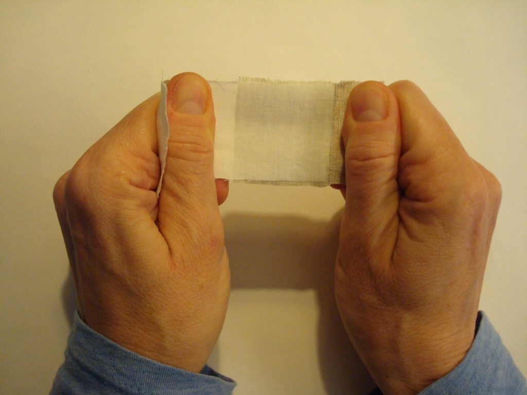
Fig. 13 (left) – Bias grain under tension deforms easily. Fig. 14 (right) – Lining design adhesion test swatches: linen and cotton adhered together with thin, medium and thick layers of adhesive. Pencil arrows show the weft (crosswise) direction. Photography by Paula Steere
Fig. 15 – Manual adhesive strength test: pulling fabrics to mimic shearing forces experienced by spine linings when a book is opened. Photography by Paula Steere
Putting the principles into practice: spine lining design
To review, for optimum functionality and durability, spine linings should minimise deformation at the interface between the spine folds and first lining material. We can achieve this by placing a stiff and thin first lining against the text block to minimise movement and keep the spine folds from spreading apart. All subsequent materials, including further linings, adhesives and covering material, should ideally be less stiff than this first lining.
For the spine lining design based on this research, aero linen should be used as the first lining, with the stronger, stiffer warp yarns placed across the spine width from shoulder to shoulder (Figs. 16, 17). Thinner, less stiff aero cotton, with its greater fold endurance, should be used as a second lining to reattach the boards. (If the boards are still attached, a second lining may not be necessary at all.) To minimise cumulative stiffness in the outer (compression) layer, positioning cotton in the bias direction could be a good choice, since this is the least stiff of the yarn orientations. Additionally, all subsequent linings, such as the paper used to smooth an uneven tight back spine, should be kept to an absolute minimum, with thin adhesive layers throughout. For heavy text blocks, I use WSP and ethyl vinyl acetate (EVA) mix (1:1) to adhere the linen to the spine folds, and I use wheat starch paste alone, without EVA, for materials in the compression layer (to reduce cumulative stiffness). For standard-sized books that are not very heavy, I use wheat starch paste on its own throughout the process; however, I have not tested swatches of wheat starch paste without EVA.
When adding more linings after the linen (and cotton, if reattaching boards), check opening characteristics after each lining has dried thoroughly. Paper linings can be omitted altogether in some instances; for example, if the tight back spine is even, in a case binding, or in a situation where throwup does not require additional control. Keep in mind the engineering principles discussed in this article when deciding on the number of additional linings and the choice of lining material: the compression layer (everything after the first linen lining) should ideally be less stiff than the tension layer. Thinly pared leather, discussed below, can be used instead of paper for additional linings to reduce stiffness.
Fig. 16 – Spine lining design based on the tension and compression engineering principle and the mechanical properties of spine lining materials. Original drawing by Paula Steere; graphic rendering by The Book & Paper Gathering
Fig. 17 – The spine of a leather reback just before reattaching the boards. On the spine is the first lining – aero linen with warp yarns running shoulder to shoulder. It has been adhered directly against the text block spine folds. The fabric above and below the spine is aero cotton and was adhered directly to the linen to reattach the boards. Photography by Paula Steere, courtesy of the College of Arms Library, London
The quarter leather tight back in Figure 18 has a heavy parchment text block, and I wanted to experiment with traditional leather linings because the mechanical properties of leather are excellent for the compression layer of my spine lining design: it is strong, but not stiff, because of the structure of its main component, the protein collagen. The linings in this image are made of thinly pared leather. I have used a graduated lining technique, which I was delighted to discover during my research, to further minimise stiffness in the compression layer. The graduated lining structure is attributed to Francis Bedford, a nineteenth-century bookbinder acclaimed for the ‘even strain’ (Anonymous author 1893, p. 58) of his bindings. The rationale for the graduated lining structure is that the stiffness needed for a book to open well at any given place varies. The centre of the spine takes the greatest strain and should be the stiffest, while less stiffness is required near the beginning and end sections of the text block (McIlvaine 2017b). Subsequent linings after the first one are ‘a little further in’ (Anonymous author 1893, p. 58), stopping a little short of the shoulders, as illustrated in Figure 18.
I also adapted the graduated lining technique to the leather covering material to reduce overall stiffness. The leather over the centre spine folds is thicker than that over the beginning and end spine folds. This was achieved through tapered paring, as shown in Figures 19 and 20. A comparison of opening characteristics before and after treatment can be seen in Figures 21 and 22.
Fig. 18 – The graduated lining structure attributed to Francis Bedford’s workshop. According to the author in The British Bookmaker, every lining after the first is ‘a little further in’, stopping short of the shoulder. The text block of this book was made from heavy parchment, and in addition to using the spine lining design described in this article, I wanted to experiment with traditional leather linings because of their strength. Photography by Paula Steere, courtesy of the College of Arms Library, London
Fig. 19 – Adapting the graduated lining technique to leather paring. Original drawing by Paula Steere; graphic rendering by The Book & Paper Gathering
Fig. 20 – Paring in progress: the thickness of the leather under the central black line will remain as is, and the leather will be pared to taper towards F and B, which indicate the width of the text block. Photography by Paula Steere
Fig. 21 – Opening characteristics of the book from Fig. 18 before treatment. Photography by Paula Steere, courtesy of the College of Arms Library, London
Fig. 22 – The same book after treatment, with improved opening characteristics. Note that some of the improvement is also due to repairs in the text block. Photography by Paula Steere, courtesy of the College of Arms Library, London
In conclusion, exploring the forces present in a book spine and the mechanical properties of familiar book conservation materials has helped me to overcome the ‘vague generalities’ found in the literature. Understanding mechanics and materials enables the conservator to take advantage of engineering concepts that offer tangible criteria on which to base spine lining decisions. I discovered several hidden gems along the way, such as Zeidler’s ire, Bedford’s famed workshop, and, of course, that anonymous kindred spirit from The British Bookmaker for whom vague generalities would not suffice.
Special thanks to my colleagues at the College of Arms, Becky Tabram and Christopher Harvey, head of conservation, who encouraged and allowed me to explore these ideas while I was a conservator there. Their experience and knowledge of books and our ongoing conversations and practical experiments in the workshop were invaluable.
Footnotes
1. I reviewed approximately 36 books and articles, spanning the years 1658 (in a 1977 translation) to 2017.
2. Technical statements in the literature were cross-referenced with a mechanical engineer, Lee McILvaine, for scientific accuracy. This research document is available upon request.
3. Translation by Isana Skeete (2017). No published English translation of this book could be found.
Bibliography
Anonymous author (1892–3) ‘Editorial’, The British Bookmaker, 6, no page number.
Anonymous author (1893) ‘On forwarding’, The British Bookmaker, 7(75), p. 58.
Cockerell, D. (1901) Bookbinding: The classic Arts and Crafts manual. New York: Dover Publications.
Conroy, T. (1987) ‘The movement of the book spine’, The Book and Paper Group Annual, 6, pp. 1–22.
Corte, H. and Kallmes, O.J. (1961) Statistical geometry of a fibrous network. New York: Regis Paper Company.
Diehl, E. (1980) Bookbinding: Its background and technique (2 vols). Rev. edn. New York: Dover Publications.
Franck, P. (1941) A lost link in the technique of bookbinding and how I found it. Gaylordsville, Connecticut: The author.
Hackler, N. (2006) Understanding fabric grain. Rev. edn. Gainesville: University of Florida.
Landi, S. (1998) The textile conservator’s manual. Butterworth-Heinemann: Oxford.
McIlvaine, L. (2017a) Email to Paula Steere, 8 April.
McIlvaine, L. (2017b) Conversation with Paula Steere, 13 April.
McIlvaine, L. (2017c) Email to Paula Steere, 26 April.
Middleton, B.C. (1963) A history of English craft bookbinding technique. Hafner Publishing: London.
Middleton, B.C. (1998) The restoration of leather bindings. Rev. Ed. Delaware, London: Oak Knoll Press, The British Library.
Miller, J. (2010) Books will speak plain – A handbook for identifying and describing historical bindings. Michigan: Legacy Press.
Silverman, R., Cains, A., Ruzika, G., Zyats, P., Reidell, S., Primanis, O., Puglia, A., Anderson, P., Etherington, D., Minter, B., Brock, D., Zimmern, F. (2006) ‘Conservation of leather bookbindings: a mosaic of contemporary techniques’, in Kite, M. and Thomson, R. Conservation of leather and related materials. Oxford: Butterworth-Heinemann, pp. 225–243.
Skeete, I. (2017) Translation of passage in Zeidler, J. (1708), 17 May.
Szirmai, J.A. (2001) The archaeology of medieval bookbinding. Burlington, Vermont: Ashgate.
Zeidler, J.G. (1708) Buchbinder-Philosophie oder Einleitung in die Buchbinder-Kunst. Hall im Magdeburgschen: in Rengerischer Buchhandlung.
Paula Steere has an education background and was head of Art and Design in a secondary school in London before retraining in book and archival conservation at Camberwell College of Arts from 2015 to 2017. She has worked at the College of Arms, the Wellcome Collection, the Senate House Library, the London College of Fashion Archive, the Victoria and Albert Museum and UCL Special Collections. Currently she is a preventive conservator, volunteer coordinator and grant writer at the Hershey History Centre, a nonprofit museum in Pennsylvania, US. She is also a book conservator in private practice.