In the fifth show of his series Raw Craftof visits and interviews to celebrate craftsmen and craftswomen, the late Anthony Bourdain met with Andrew Hoyem, poet, master typographer and now retired printer of Arion Press. Although the Arion Press production of Hart Crane’s poem “The Bridge” does not feature, the episode is worthwhile background for enjoyment of this collaborative work of book art.
The Bridge (1930/2017)
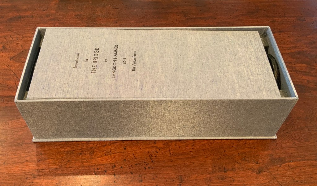
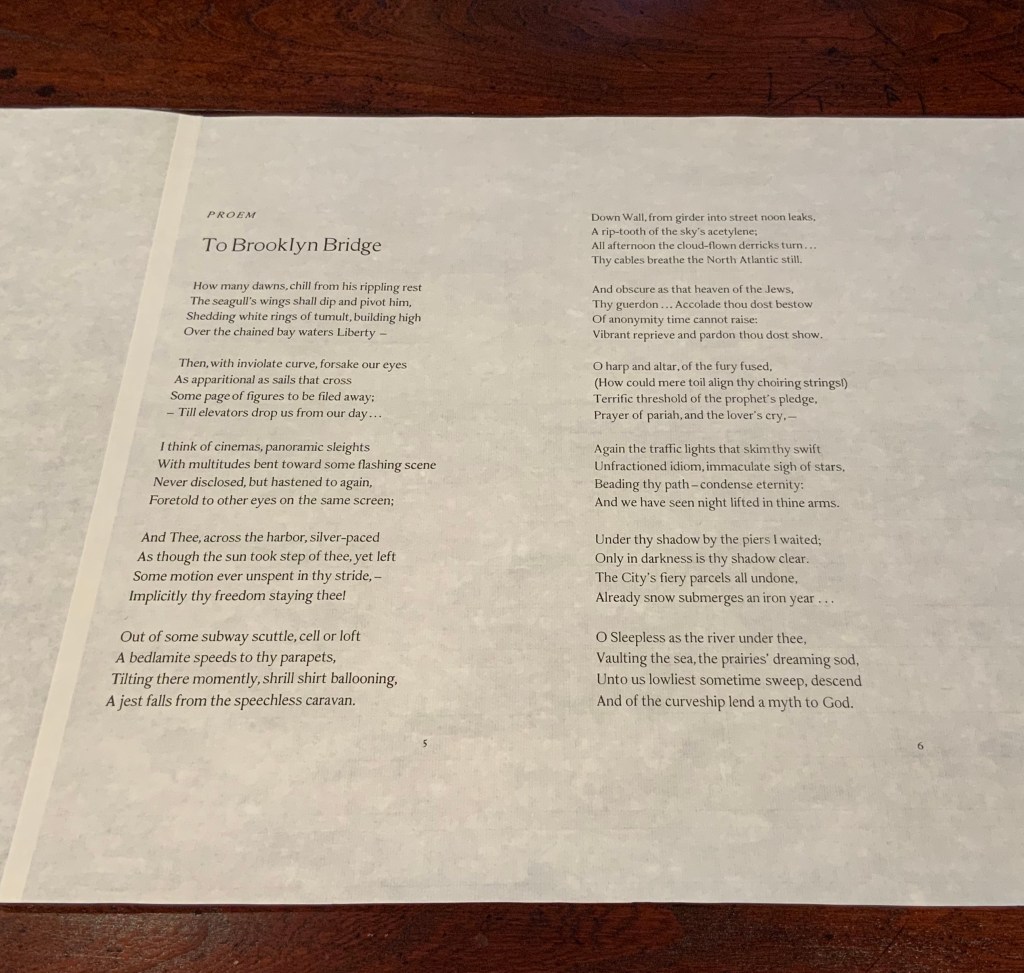
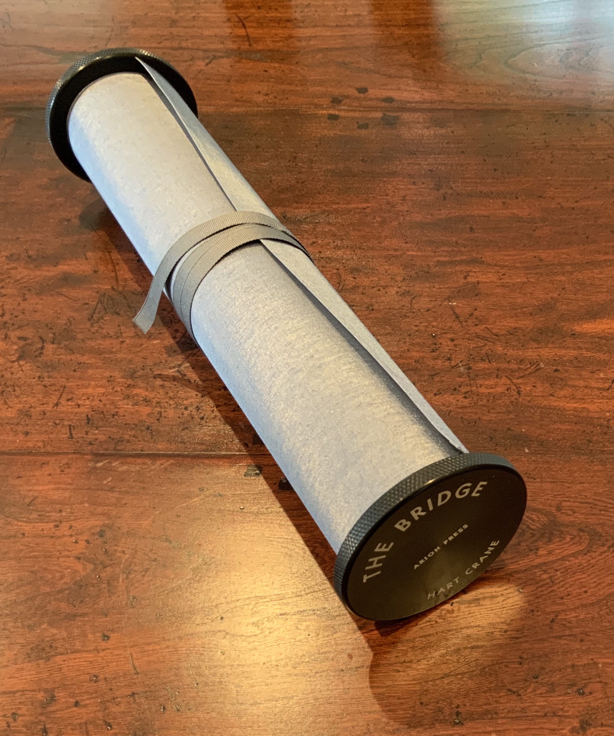
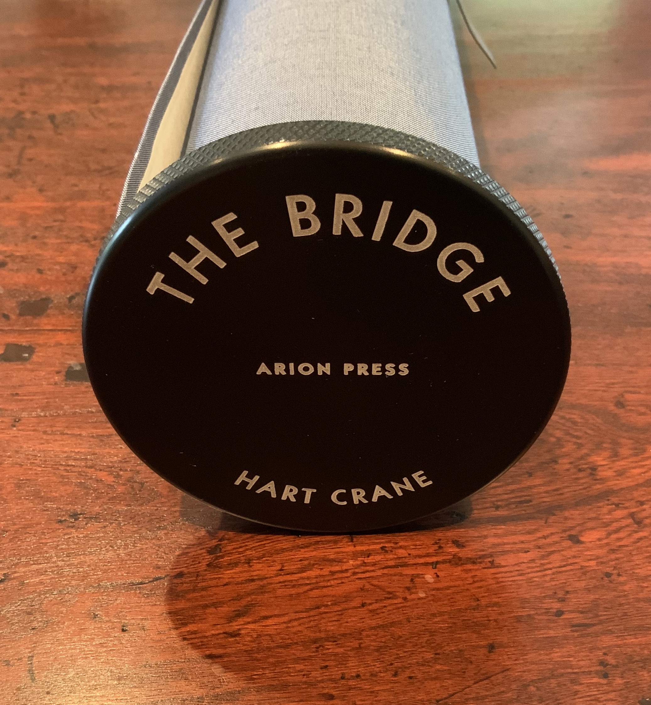
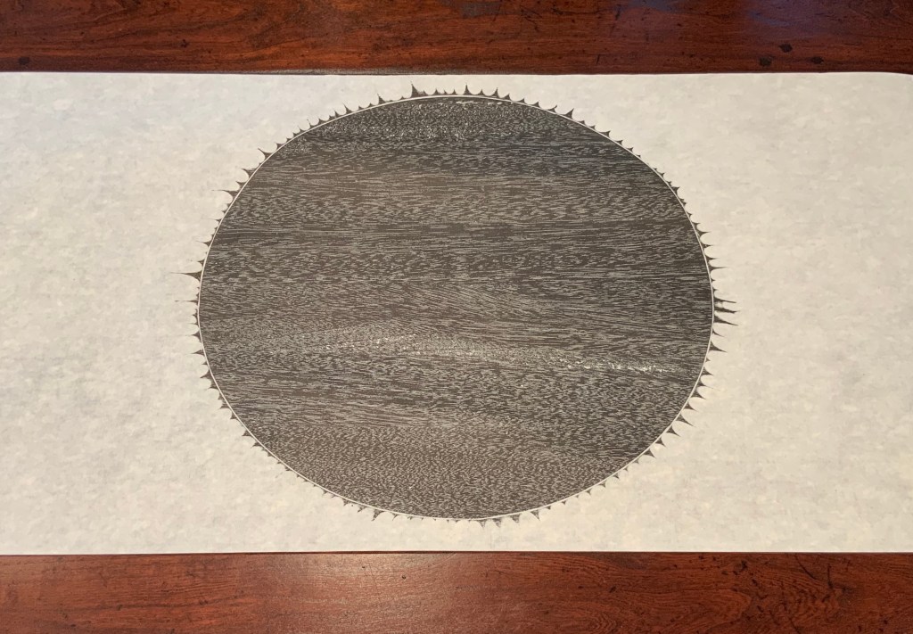
The Bridge(1930/2017) Hart Crane Design, Arion Press. Woodblock prints, Joel Shapiro. Introduction, Langdon Hammer. Scroll, 13-1/2 inches by 50 feet, wound on aluminum spool with bookcloth wrapper, housed in a box. Edition of 300, of which this is #97. Acquired from Classic Editions, 10 June 2020. Photos of the work: Books On Books Collection. Displayed with permission of Arion Press.
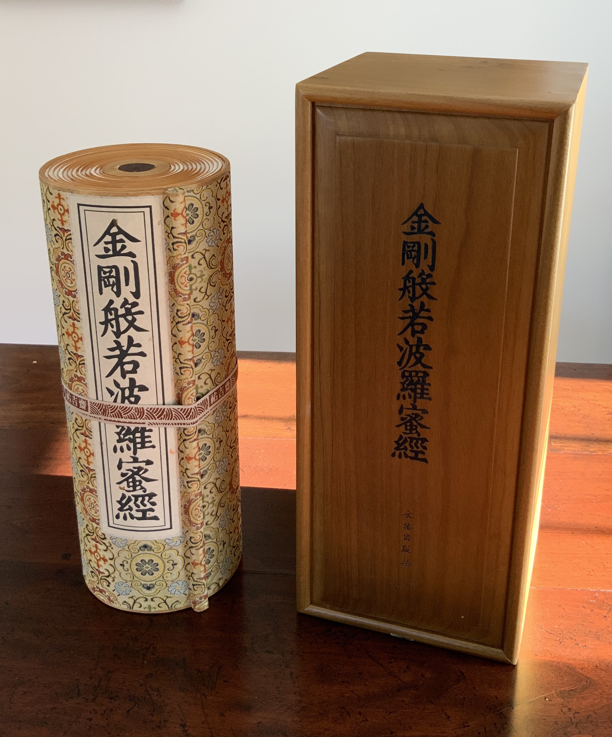
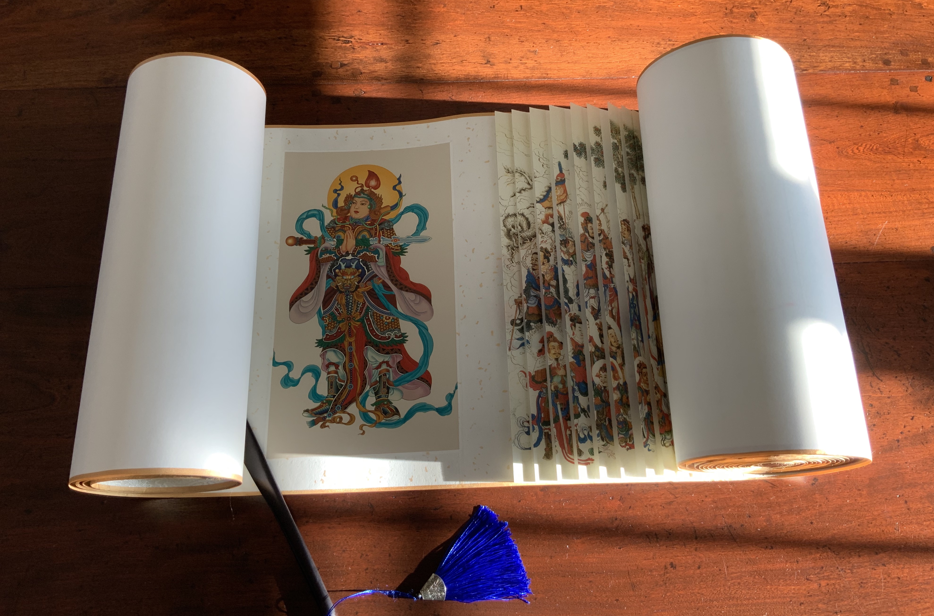
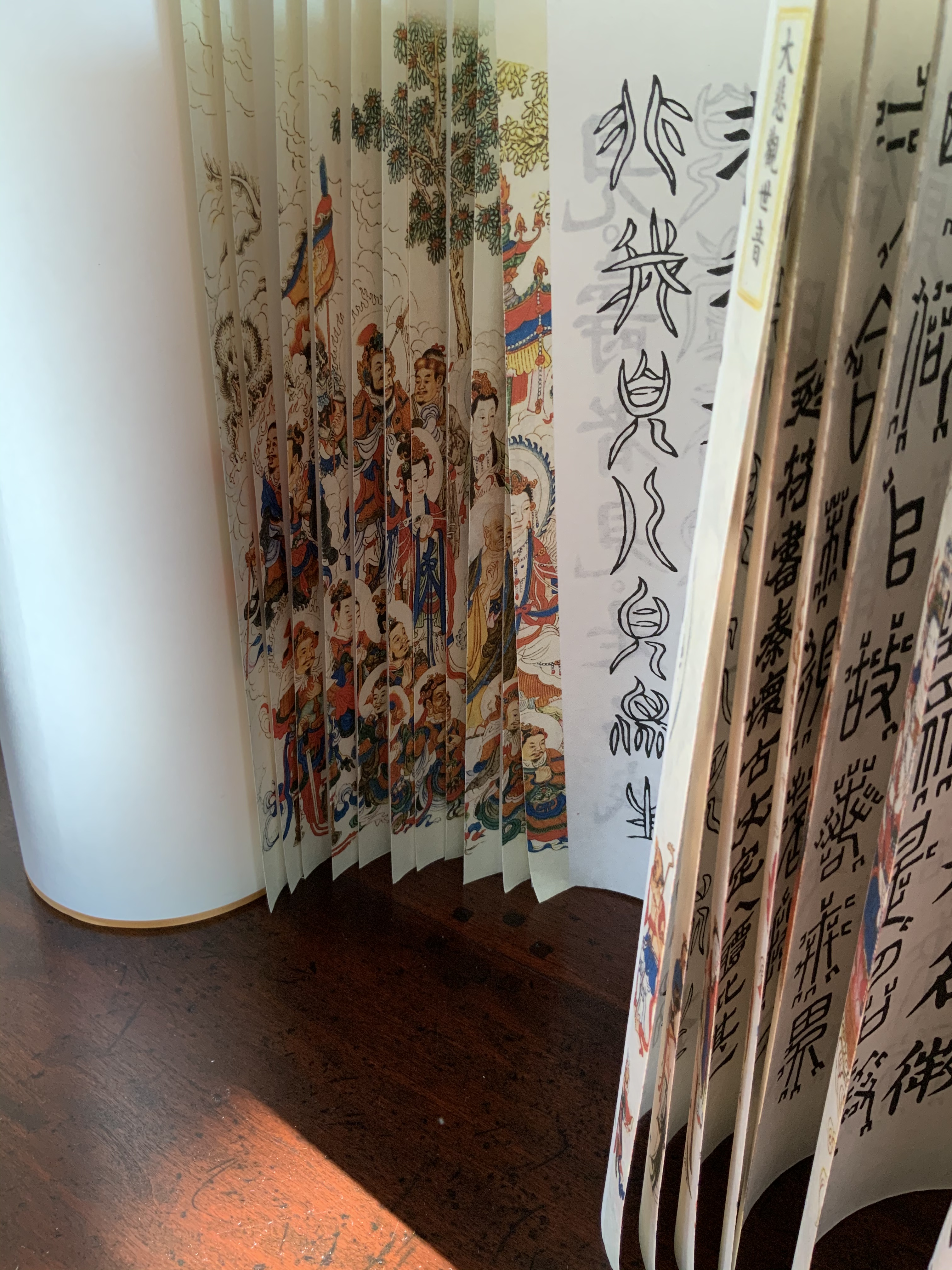
From first sight, this work of art evoked thoughts of an earlier acquisition — the dragon scale binding of the Diamond Sutra, done by Zhang Xiaodong in 2017.
Diamond Sutra, Dragon scale binding (2017) Zhang Xiaodong In 32 zhuan (seal) fonts, 152 x 382×160mm. Edition of 300, of which this #197. Acquired from Sin Sin Fine Arts (Hong Kong), 31 October 2019. Photos: Books On Books Collection.
It was more than the similarities of scrolls stored in boxes. Despite the differences in texts and images, something resonated –still resonates — between the two works. The Arion Press prospectus for The Bridge holds the clue to what that something is:
The publisher, Andrew Hoyem, conceived of a scroll format for “The Bridge” while he and senior editor Diana Ketcham were on a two-week tour of China in April 2017 organized by the Grolier Club, an association of bibliophiles in New York City. The theme of the trip was the history of paper, type, printing, binding, and the collecting of books, both private and institutional, in China.
During the first week they visited the Red Star Paper Company in Wuxi, Anhui Province. The Chinese government has recently sought to revive and support traditional crafts. Red Star is the fore-most producer of handmade paper in the nation, using ancient methods and many plant fibers in exacting proportions to make sheets of beautiful thin paper, used mainly for calligraphy and ink and watercolor painting.
In Beijing they visited the most important book collector in China, who showed them an unmounted scroll from the eighth century. Hoyem was inspired to order handmade paper from the mill and to make “The Bridge” in a single-spool scroll format.
In each case, content, image, structure and handmade paper more than complement one another. Even though they do so in different ways, the rightness and thoroughness with which it is done and the feel of the paper strike that resonant chord. A comparison of the texts of the two works would not ordinarily arise, but once it is made, the prayerfulness of Crane’s “Proem” stands out even more in its French Elzevir handset by Hoyem himself and printed on handmade paper of his choosing. Hoyem’s choices of material and structure put him on an equal artistic footing with Shapiro and Zhang. Note the scroll end’s echo of Shapiro’s woodcut, which itself may be an allusion to the Black Sun Press, first publisher of The Bridge (1930). What is it that bridges the precision mechanical fixture and the wood grain revealed by hand and ink if not Crane’s words? In pairing Crane with Shapiro, Hoyem made as canny and artistic a choice as any that book impresario Ambroise Vollard ever made.
In his comments at the opening of his 2018 exhibition at Pace Prints, which featured The Bridge, Shapiro refers to the rapture and ecstasy of the poem as his chief challenge. Here he is in an earlier interview that speaks to how he approaches such a challenge:
Visual art can be tricky – the goal is not simply to illustrate, but, in this case, to create images which correspond to profound and historically significant prayers and material. My role here is that of mediator – attempting to capture the meaning I see in the material, and translate it into form. — “Artist Joel Shapiro Discusses the Art in Mishkan HaNefesh”.
Alongside those comments, the interplay of artists Hoyem and Shapiro, Crane’s text, the continuous scroll, the French Elzevir typeface and the Chinese handmade paper suggests an entirely new meaning for Dick Higgins’ term “intermediation”. In his 1965 essay “Intermedia”, republished in Leonardo in 2001, Higgins adopted the term from Samuel Taylor Coleridge. As Higgins expressed it, “Many fine works are being done in mixed media: paintings which incorporate poems within their visual fields, for instance. But one knows which is which. In intermedia, on the other hand, the visual element (painting) is fused conceptually with the words” (p. 52). With The Bridge — as with Diamond Sutra, Dragon-Scale Binding — the fusion goes beyond the visual and textual and yields two exceptional works of art.
Further Reading
“Joel Shapiro and Hart Crane“. 19 December 2017. Graphic Arts Collection, Special Collections, Firestone Library, Princeton University. Accessed 4 August 2020.
“Playing Against Type“. 2 November 2017. Antiques: The Magazine. Accessed 4 August 2020.
Higgins, Dick. February 2001. “Intermedia“. Leonardo, Volume 34, Number 1, February 2001, pp. 49-54. Reprint of his 1965 essay with an addendum from Hannah Higgins, co-curator with Simon Anderson (School of the Art Institute of Chicago) of a 2000-2002 travelling restrospective on Dick Higgins’ life and art.
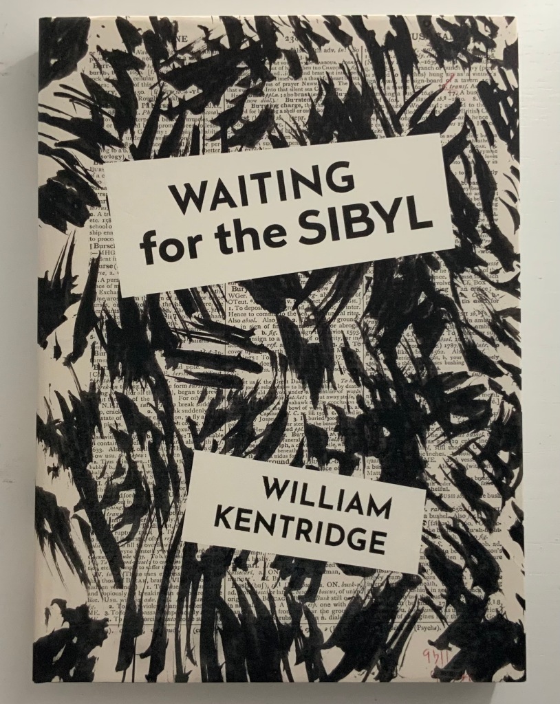
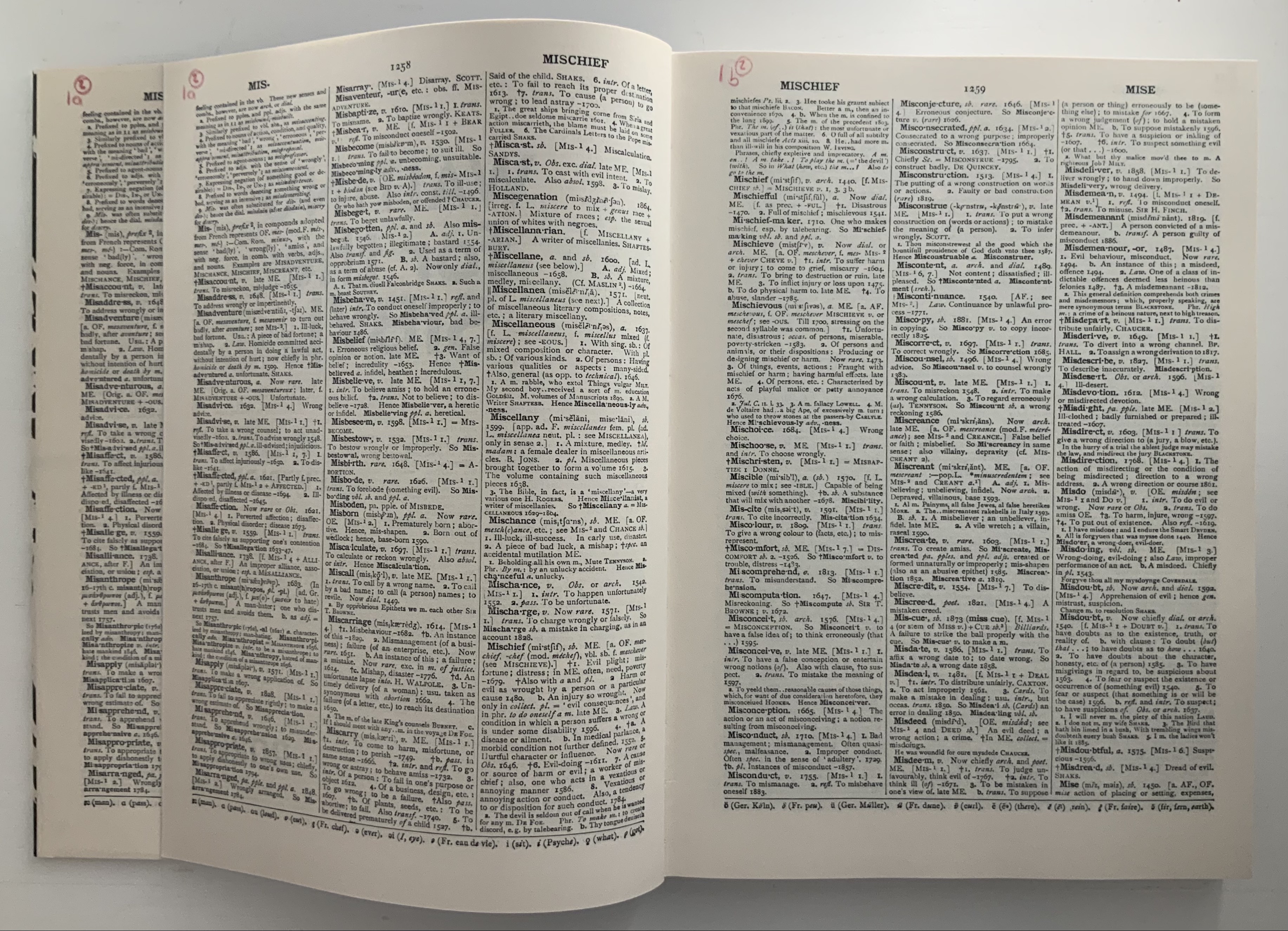
Waiting for the Sibyl (2020) William Kentridge Casebound and dustjacketed. H275 x W200 mm, 360 unnumbered pages. Acquired from Blackwells, 1 July 2021. Photos of the work: Books On Books Collection. Displayed with permission of the artist and the Marian Goodman Gallery.
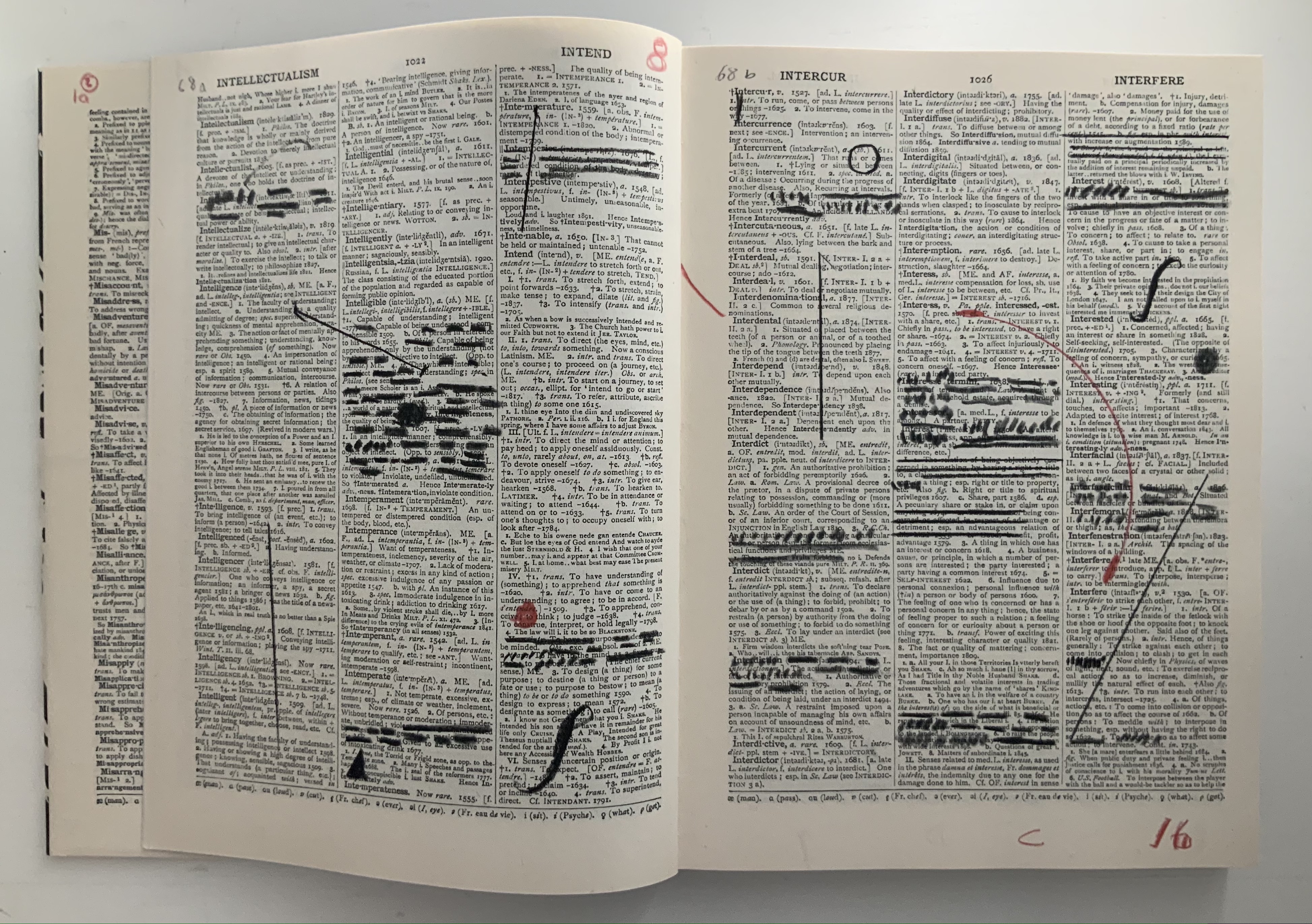
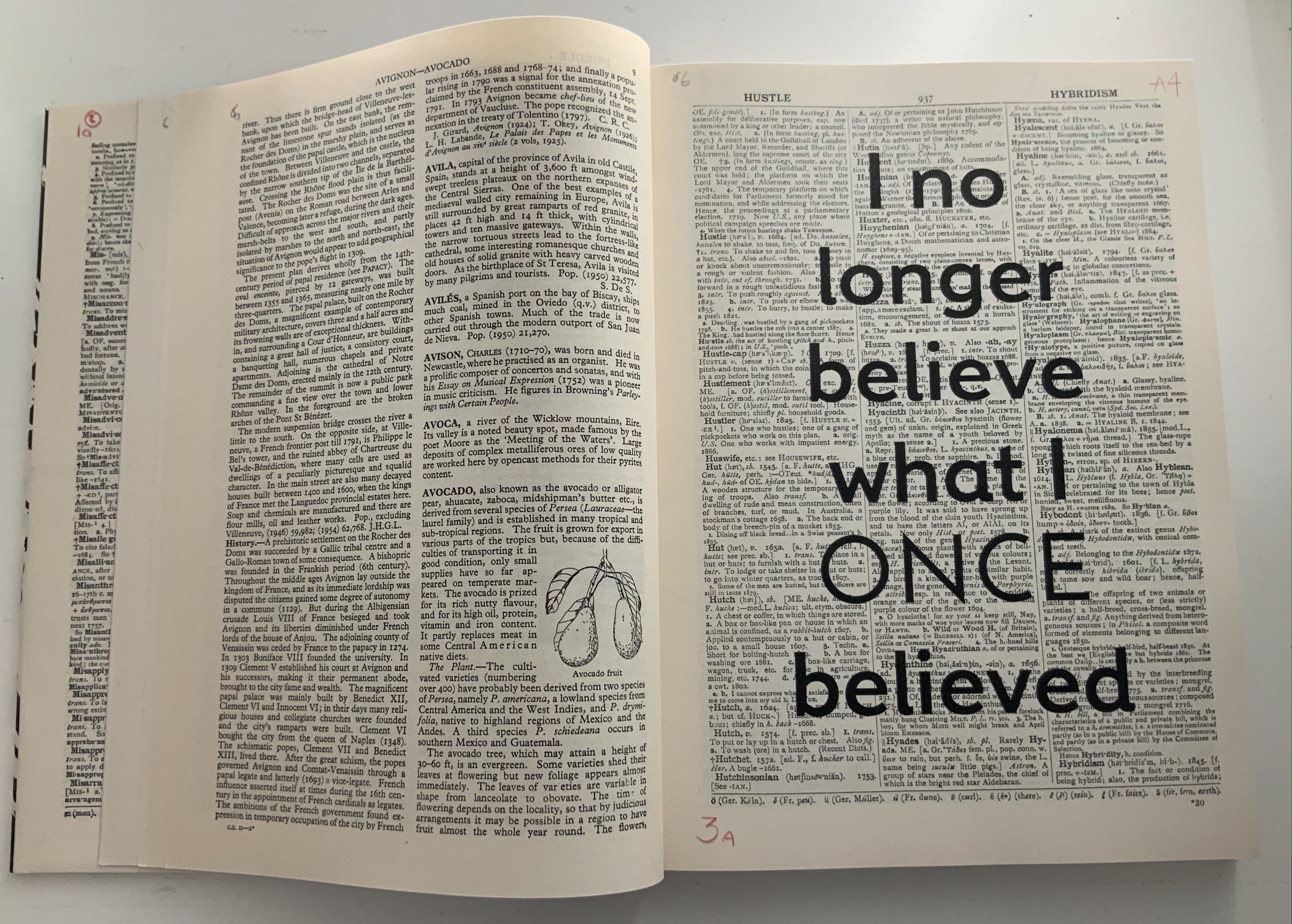
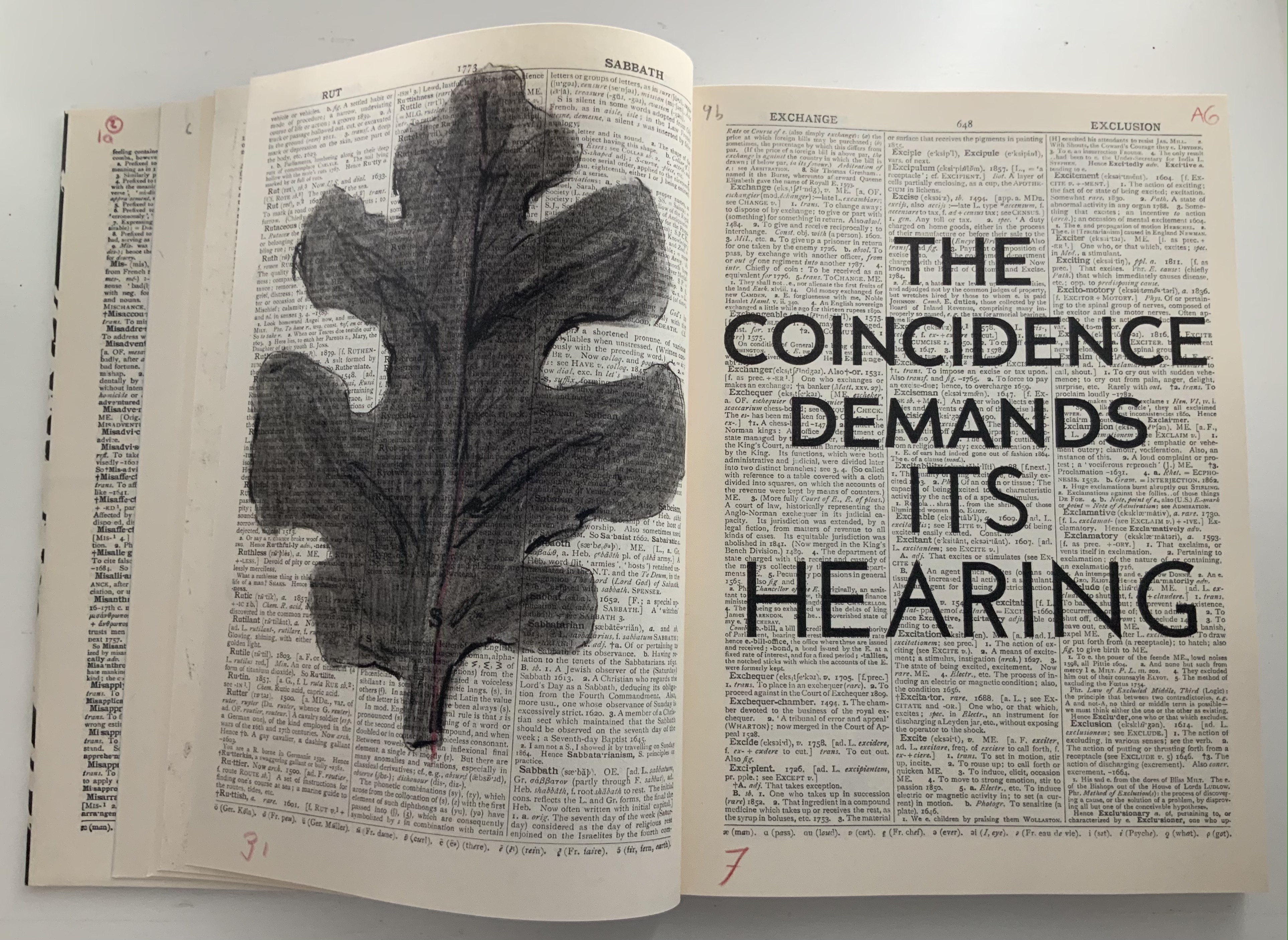
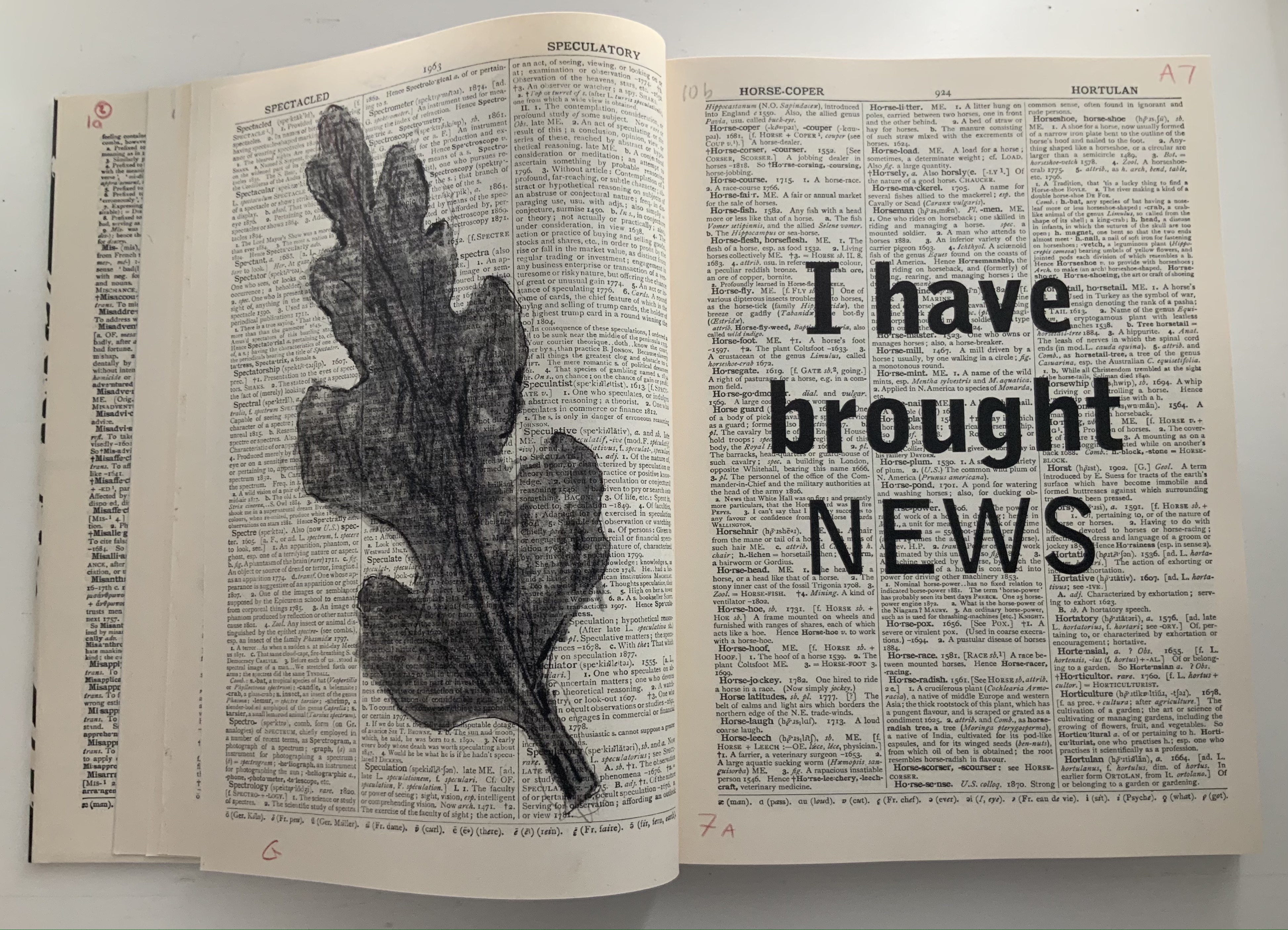
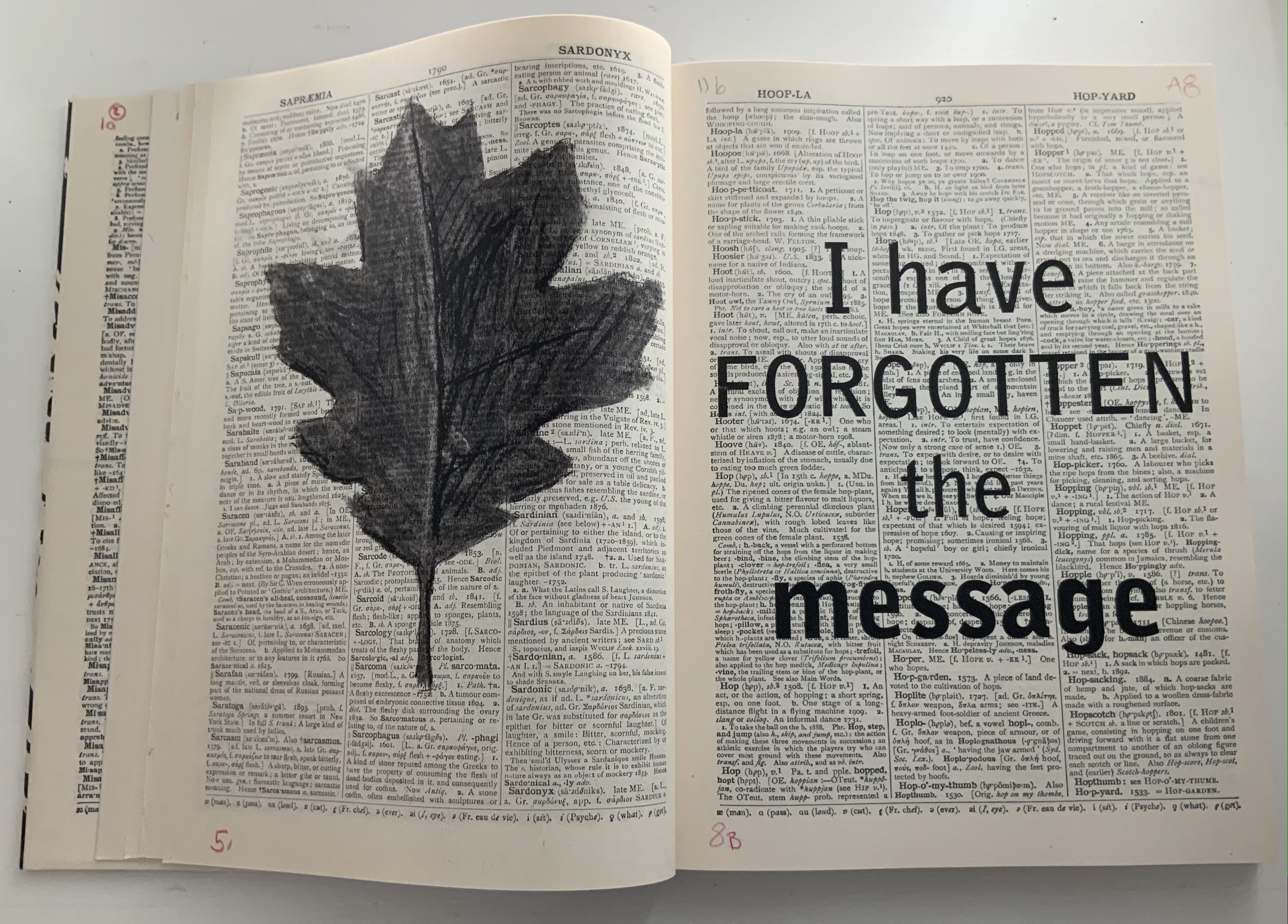
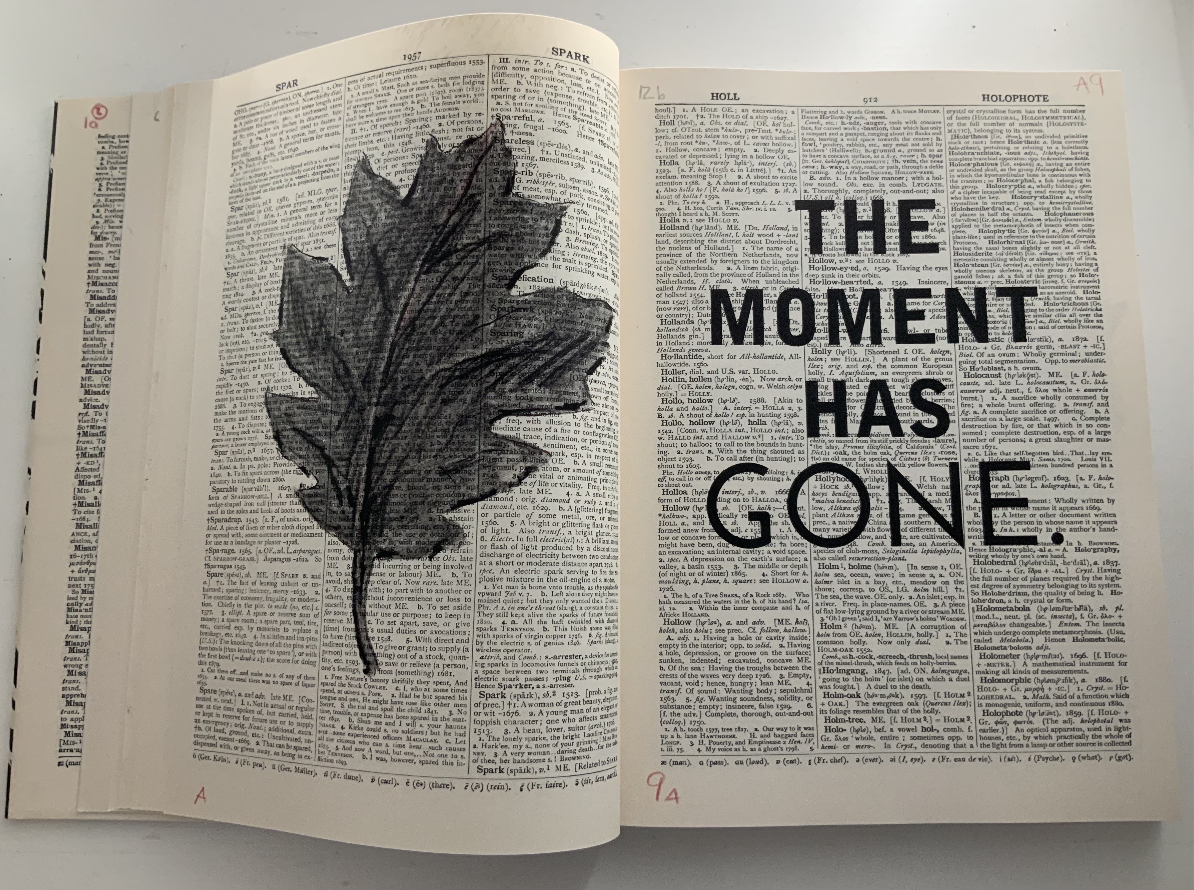
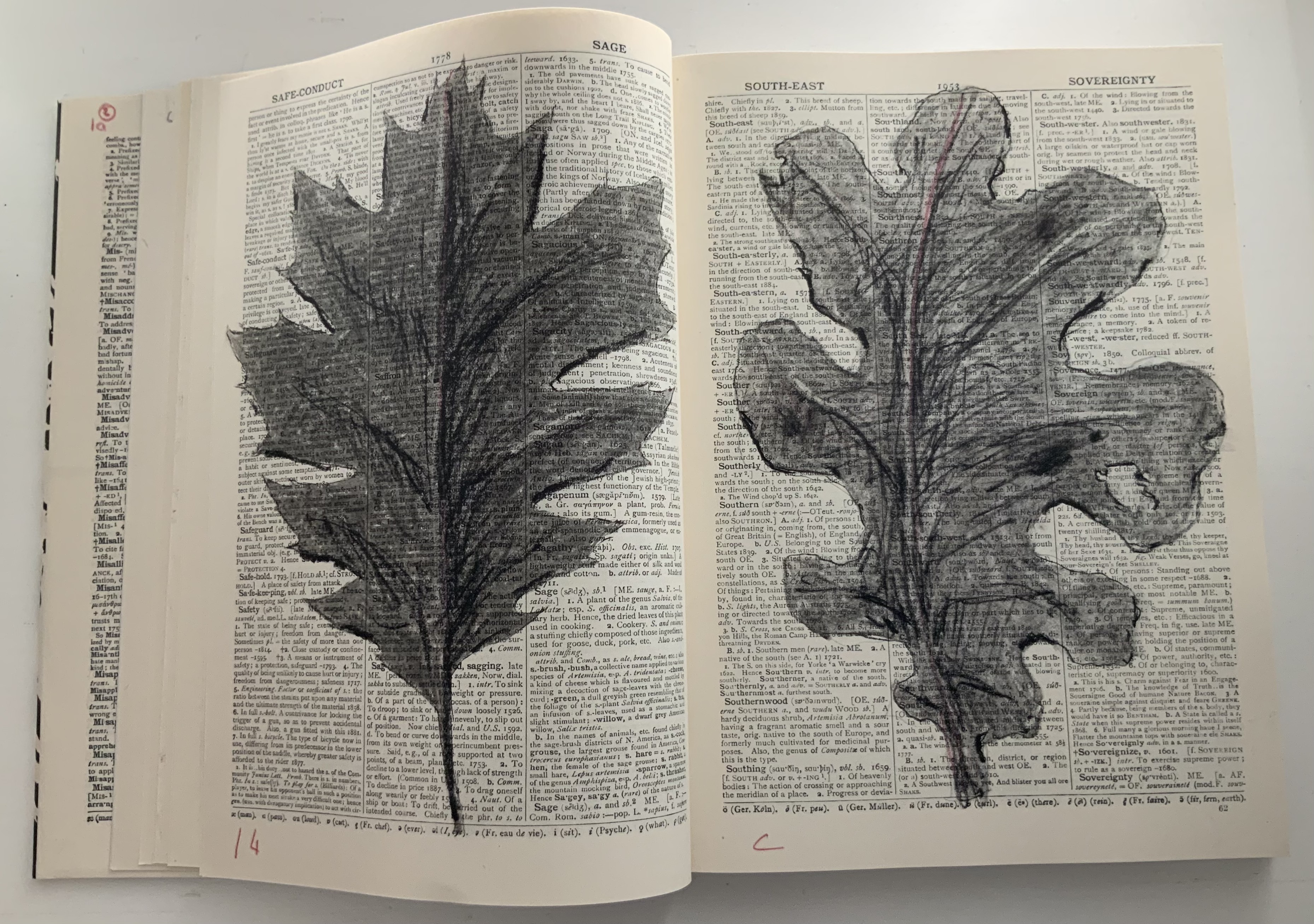
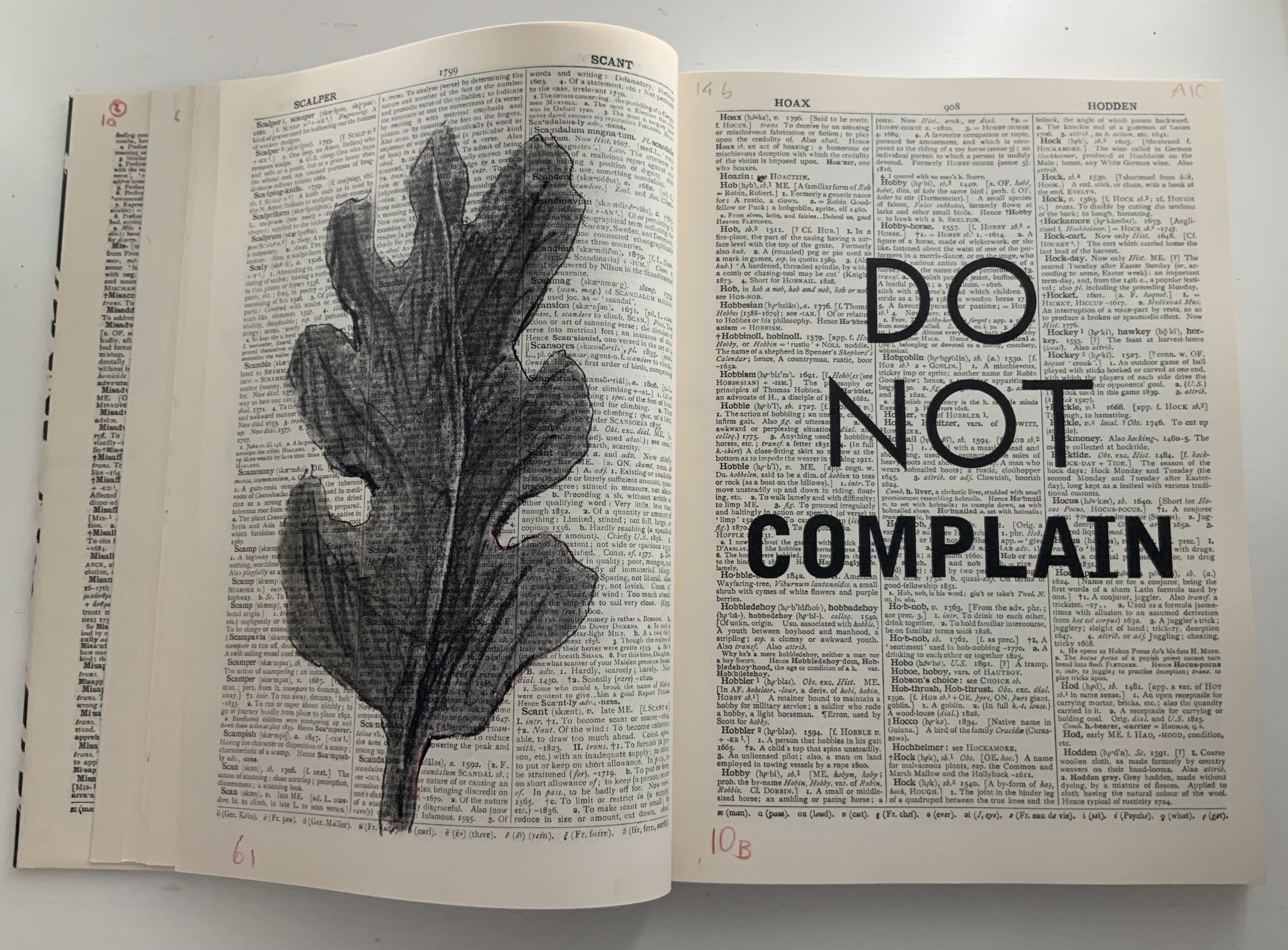
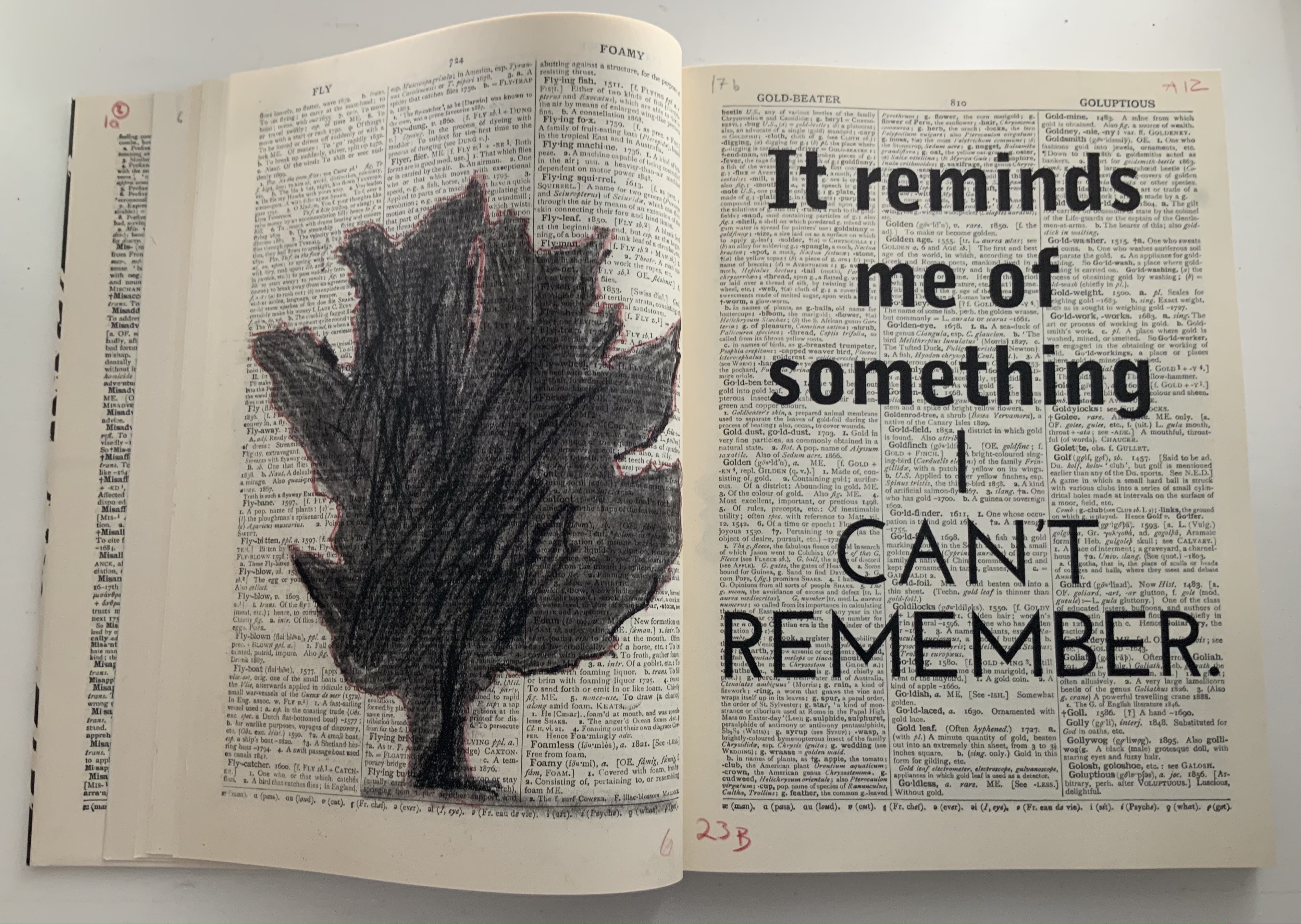
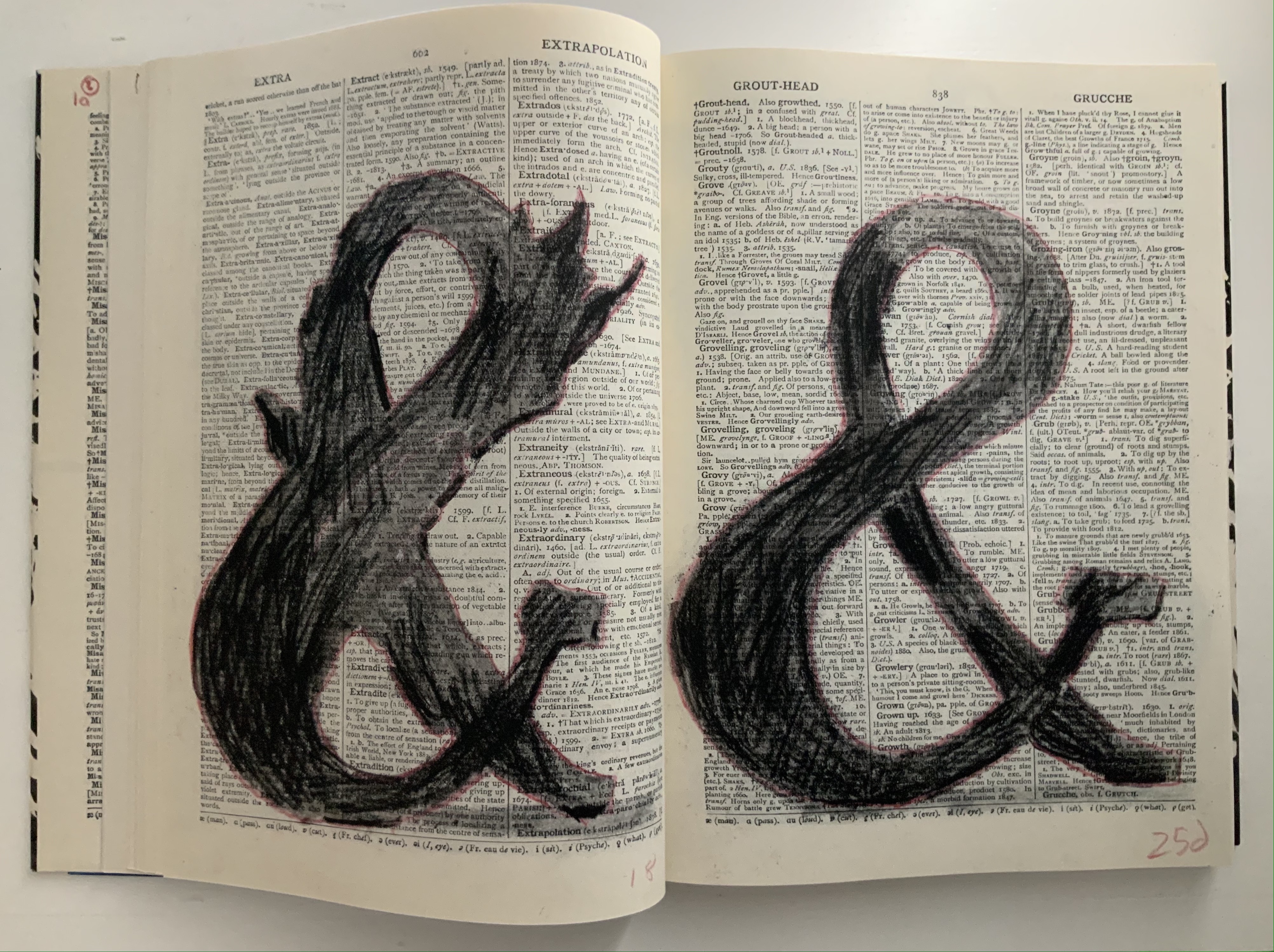
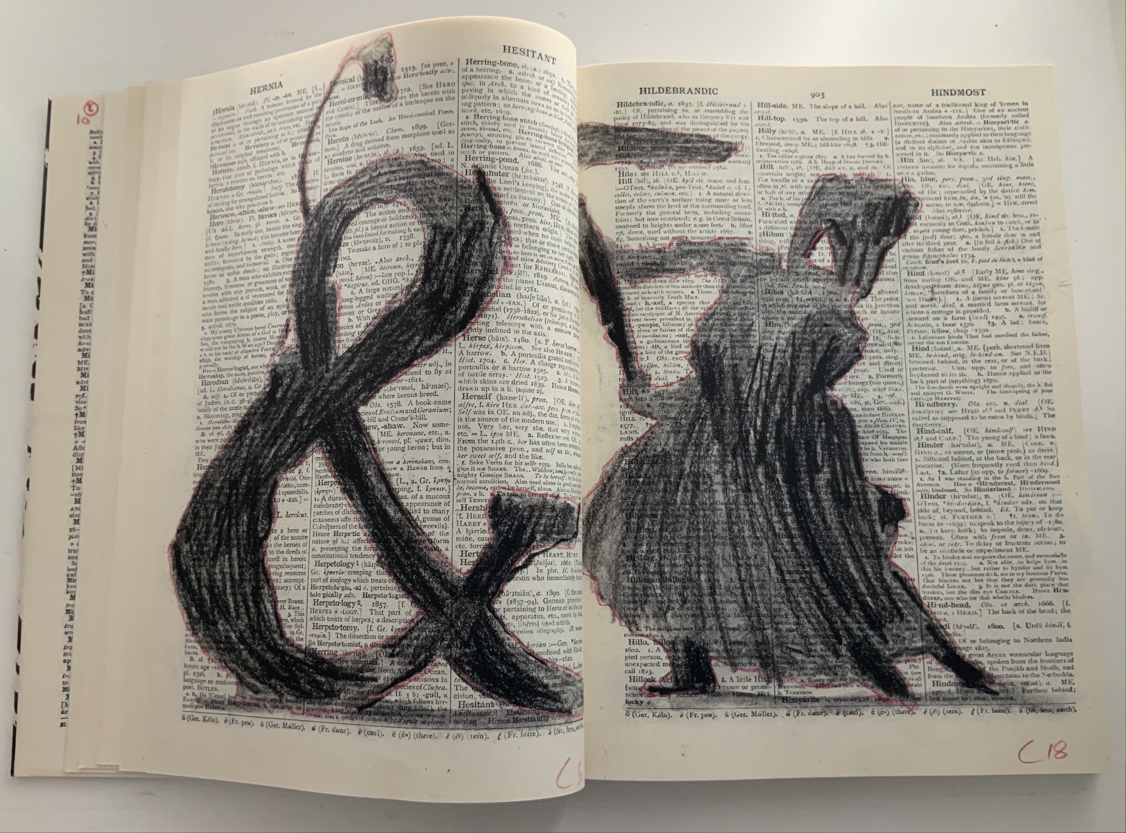
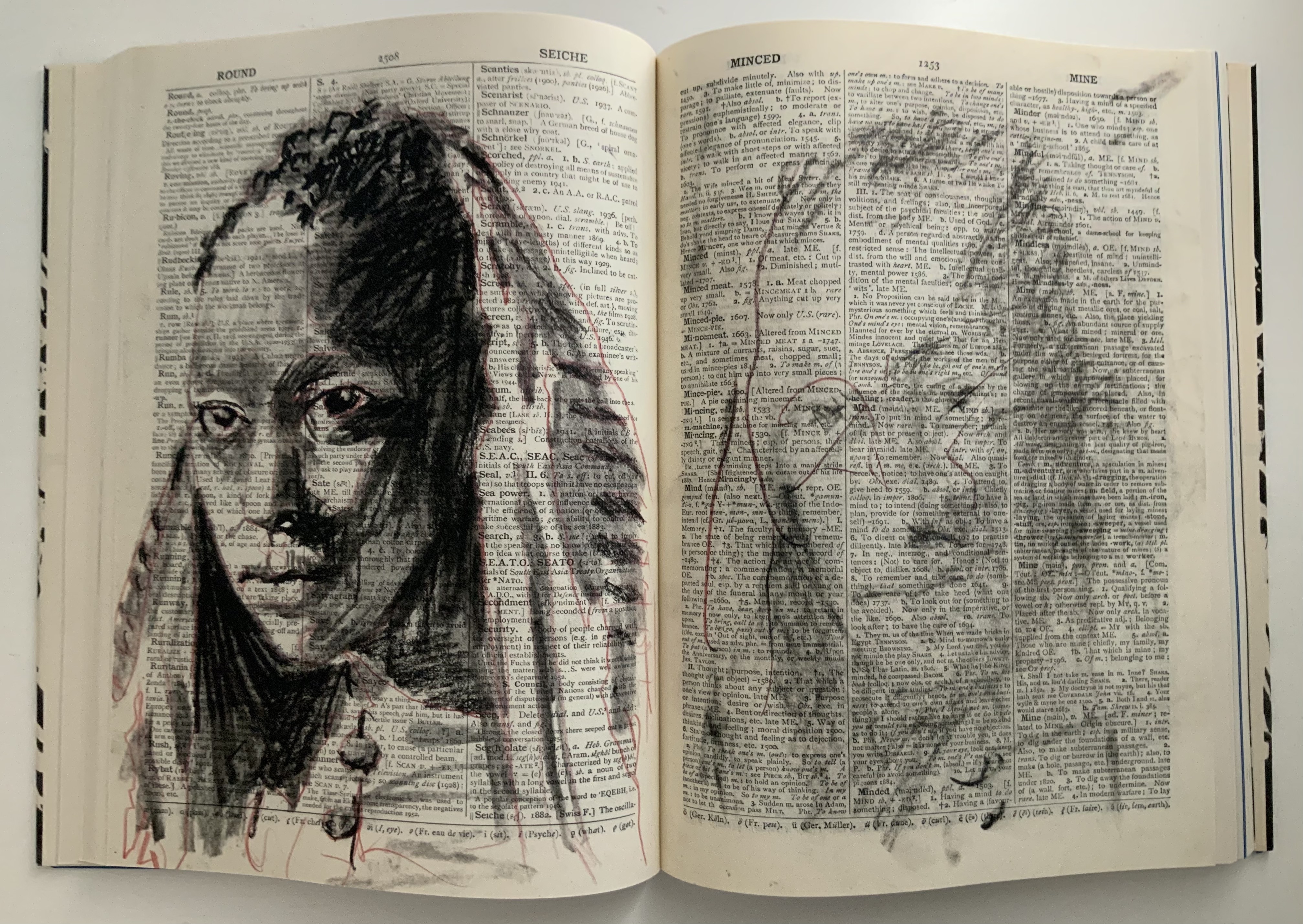
Like the ancient Greek playwrights, William Kentridge begins his chamber opera’s retelling of the Cumaean Sibyl’s myth in medias res — in this case, in the middle of the dictionary at the letter M. Redactions and marks build and build across the dictionary pages, a visual prelude like a musical one. Then they suddenly disappear, leaving the “stage” to unmarked pages from the letter A, a thunderclap announcement in all caps bold and then an explanatory statement slightly reduced in volume with a lighter type face and uppercase with lowercase letters. What is going on?
Because performance of the opera was curtailed by the pandemic beginning in 2019/2020, we have only a few short clips from a trailer and filmed rehearsals to guess at how a live performance might have unfolded: this short clip posted by Teatro dell’Opera di Roma, this one from Quaternaire, this one from The Red Bridge Project and this version posted by the Centre for the Less Good Idea. A description from the Théâtres de la Ville de Luxembourg tells us that the performance consists of a series of six short scenes. From the Red Bridge Project, coordinating the commission, we have Kentridge’s description of four of them:
A scene in the waiting room for the Sibyl. A scene about which is the right decision and which is the wrong one. How do you know which is the chair that will collapse when you sit on it and which is the chair that will support you? Is the plane that you’re rushing to catch the one that will crash or do you relax and not catch that plane and take the next one − and in fact that is the one that crashes?
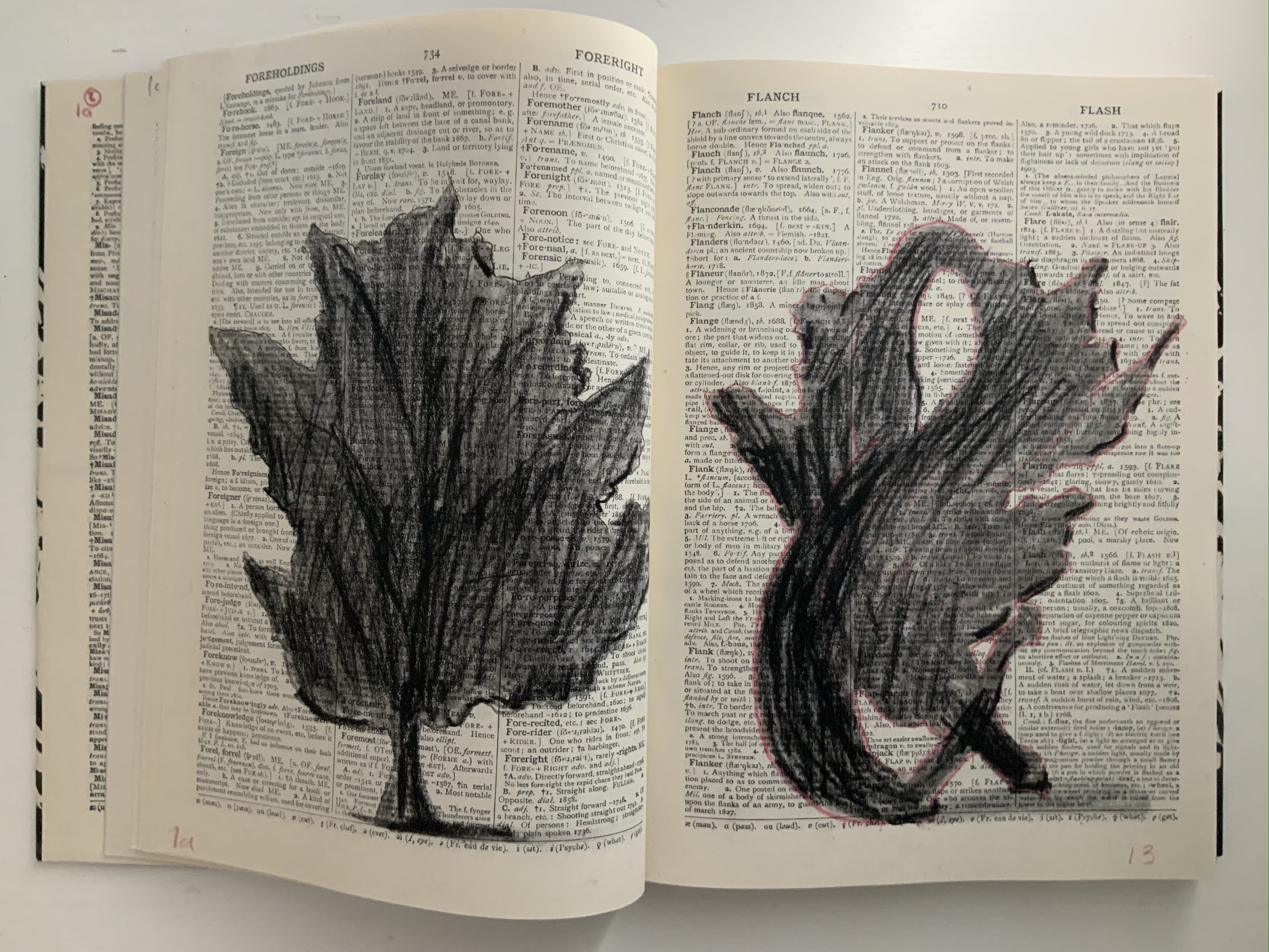
Judging from the videos and description, it is presumptuous to declare that the book and opera begin in medias res. Almost anywhere in the out-of-order pages or chaotic rehearsal scenes of performers snatching at and reacting to the scattered leaves of books, typescript and so on is the middle. But if the left-to-right reading convention of the Western codex prevails, the text to be sung continues to rumble along in the codex after the thunderous proclamations. The chorus or speaker seems to falter, admitting to having forgotten the message and losing the moment of its delivery. All the while, the libretto is being joined on the left by gradually forming images of leaves (a maple and an oak), an allusion to the leaves on which the Cumaean Sibyl would write the predictions of fate she had sung but which would be scattered and whirled by the wind before the supplicant could claim his or her rightful leaf.
As occurs in Kentridge’s other bookworks, these gradual formations draw on the flip-book tradition, introducing that other recurrent media in his work — film — as well as performing an echo of the projections in the to-be performed opera. As the leaves assert themselves, the speaker’s confidence returns in all caps, a larger face and some bold. And while the speaker quickly recedes into lowercase and a lighter typeface, only able of being reminded “of something I can’t remember”, a leaf begins to metamorphose into a tree, an ampersand and then a dancer. Metamorphosis is that mythical translation of one being or object into another. Metaphor is that figure of speech that uses one object to remind us of another. “Etc., etc.” is what we say when we can’t remember or be bothered to complete a statement or series of examples. What Kentridge offers here is unquestionably not mixed metaphor but rather metaphor-mosis.
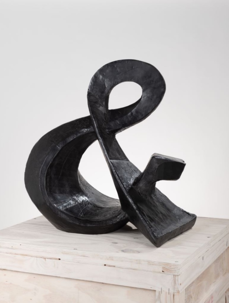
The metamorphosing ampersand recalls an illustrative example from another of Kentridge’s favored media — sculpture. As Kentridge puts it:
The turning sculptures I’ve made in the past have all been ones which have one moment of coherence, when the different components of the sculpture align. From one viewpoint they turn into a coffee pot, a tree, a typewriter, an opera singer. And then, as the sculpture turns, the elements fragment into chaos. — from The Red Bridge Project site, accessed 21 July 2021.
Ampersand (2017) William Kentridge Bronze, 85 x 82 x 54 cm, 87 kg Courtesy the artist and Goodman Gallery
Even though there is a speaker/singer for the libretto, the dancer has the central role in the opera. Performed by Teresa Phuti Mojela, the dancer casts her shadow over the projected pages and seems to “dance” the prophecies. Kentridge notes in the book’s afterword that he has added images of her to stand in for her projected shadows. As this sequence in the codex shows, the dancer/Teresa Phuti Mojela is the Sibyl.
In addition to containing the libretto, serving as part of the setting for the actual performance, presenting the central player and the Sibyl’s transformation into her, demonstrating the dancer’s performance (when flipped like a flip-book) and exemplifying the key props (prophecies on leaves), the codex also reflects the collaborative creative effort that Kentridge extols in describing the opera’s preparation:
… when we had our first workshop in Johannesburg, in which we brought together the singers, the pianist, a dancer to be the Sibyl, costume designer, set designer, videographer, the editor of the animations I’ve been drawing, we discovered very quickly that the magic of the piece was in the live performance of the music. At this point the project became possible to do only if we could have these singers on stage.
As the book’s last page notes, creative collaboration among Kentridge and Anne McIlleron (editors), Oliver Barstow (designer), Alex Feenstra (lithographer) and robstolk® (lithographer and printer) is what has made this work of art possible.
Tummelplatz (2016)
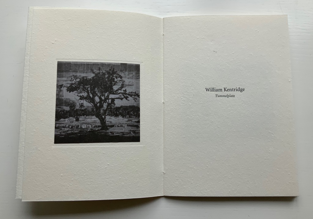
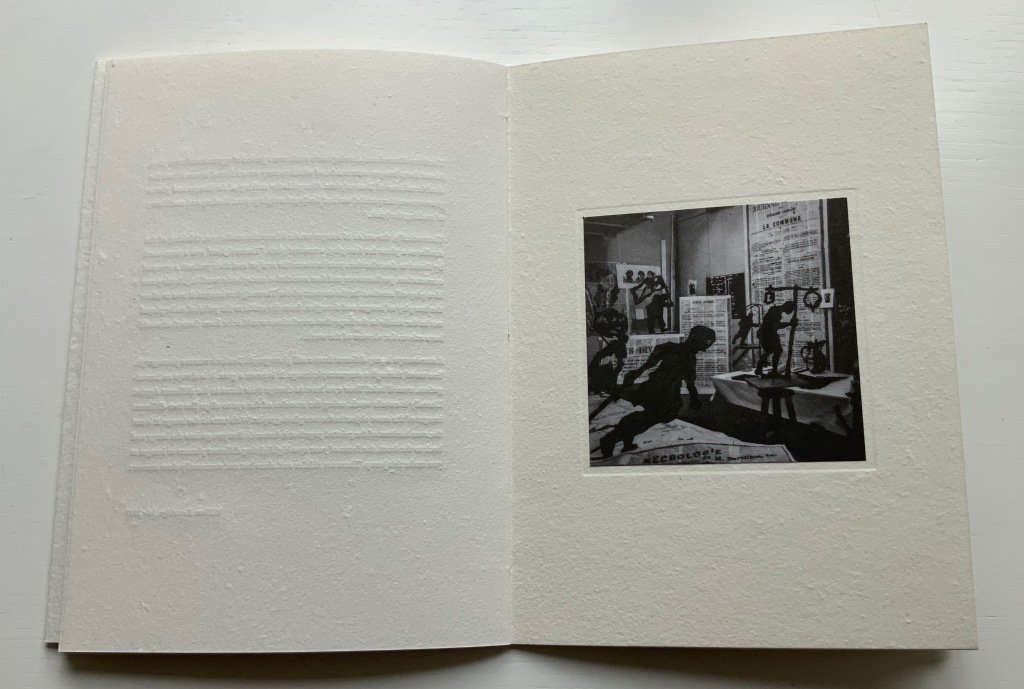
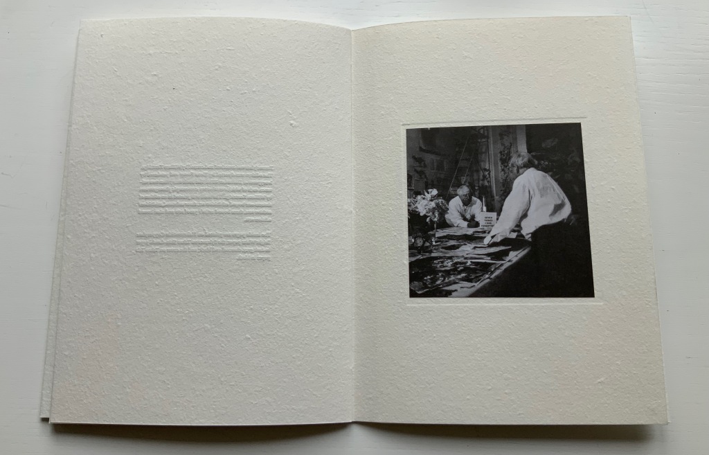
Tummelplatz (2016) William Kentridge Papercased sewn booklet. H214 x W152 mm, 16 pages. Acquired from Lady Elena Ochoa Foster, 28 June 2022, “Sensational Books” exhibition at the Bodleian Libraries. Photos of the work: Books On Books Collection.
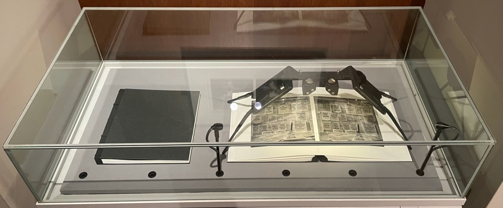
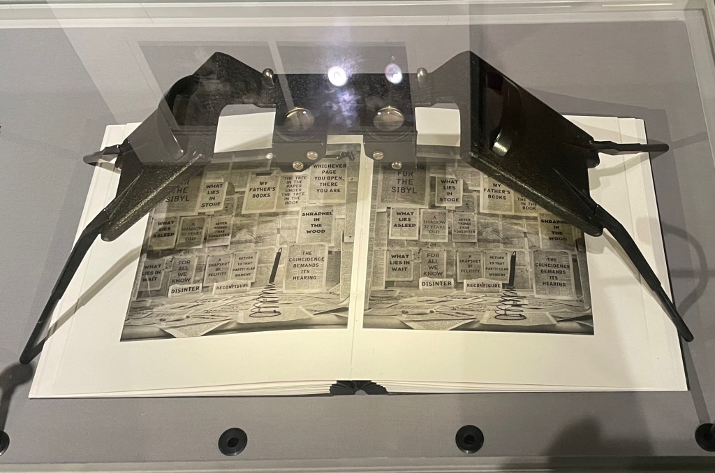
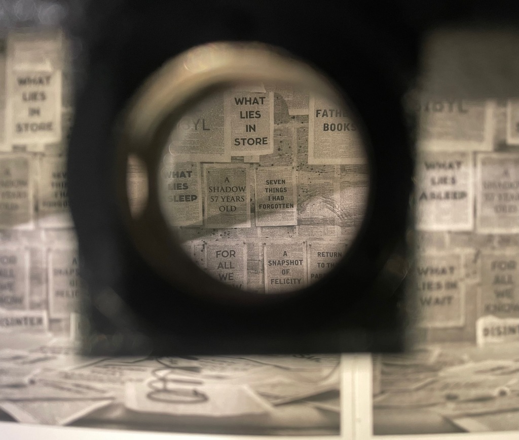
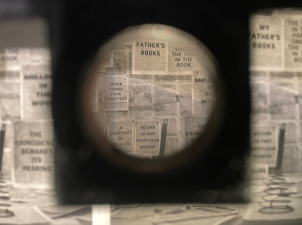
In Tummelplatz the booklet created for the Ivorypress exhibition of the larger eponymous work, William Kentridge explains that tummelplatz is Freud’s term for the space between analysts and their patients. But its literal translation is “playground”, which might be the perfect word for William Kentridge’s studio. The studio is the actual setting for the series stereoscopic photographs reproduced as photogravure images in the double volume of Tummelplatz. With the artist’s charcoal drawings of a landscape background pinned to the walls and others cut out as foreground figures and fixed into position, the studio was transformed into a sort of diorama in which the artist himself posed. A stereoscopic viewing device in fixed position over the volume invites the reader/viewer to join Kentridge in his playground.
These are images that have to be read, not scanned like flat photos. The eyes’ focus has to jump from layer to layer, element to element. In the exhibition “Sensational Books”, Tummelplatz is set up within a glass case, so only one scene is available for viewing and reading, and the distance imposed by the extra layer of glass makes the sensation hard to appreciate. Nevertheless, there is enough of it to set the reader/viewer to wondering whether the technique, the effect of the photogravure and this three-dimensional precursor to virtual reality have transformed him or her into the patient and the work of art itself into the analyst. Or whether it’s just a playdate with William Kentridge in his playground.
Showcased at “Sensational Books” exhibition, Weston Library, Oxford University. Photo: Books On Books, 8 July 2022.
Showcased at “Sensational Books” exhibition, Weston Library, Oxford University. Photo: Books On Books, 8 July 2022.
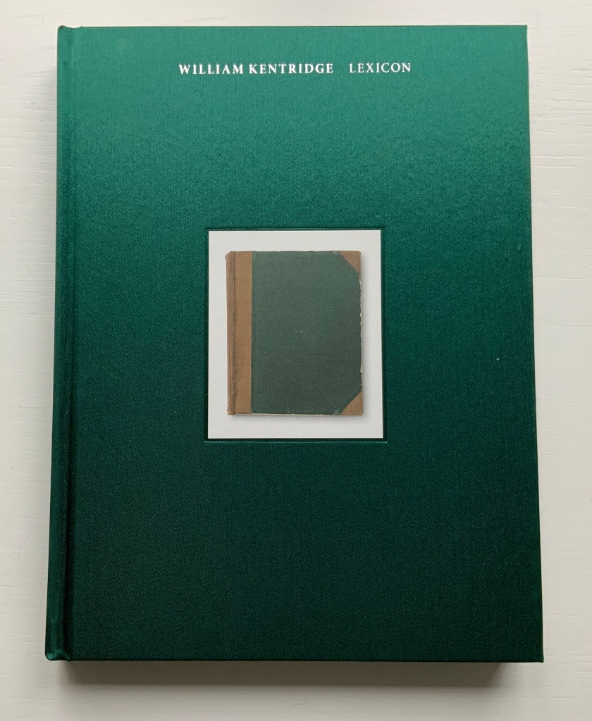
William Kentridge : Lexicon (2011)
William Kentridge : Lexicon (2011) William Kentridge Cloth boards, sewn bound. H234 x W177 mm, 160 pages. Acquired from Specific Object, 2 May 2021. Photos of the book: Books On Books Collection. Permission courtesy the artist and Goodman Gallery.
The first work by Kentridge I ever saw displayed was 2nd Hand Reading (2014) at the Museum Meermanno (The House of the Book) in The Hague. The exhibition was called The Art of Reading and had been curated by Paul van Capelleveen. Curator at the Dutch national library and advisor to the Meermanno, he felt strongly that the challenges of artist books cannot be understood “under glass” and insisted that each work be touchable. So under his supervision, I was able to flip through 2nd Hand Reading and also watch the projected animation of stop-motion images across the pages being flipped. While the forward motion of the animation offers a narrative, its substrate — pages of the Shorter Oxford English dictionary on historical principles — contradicts any notion of logical beginning, middle and end: the drawn-upon pages are not in the original’s paginated or alphabetical order.
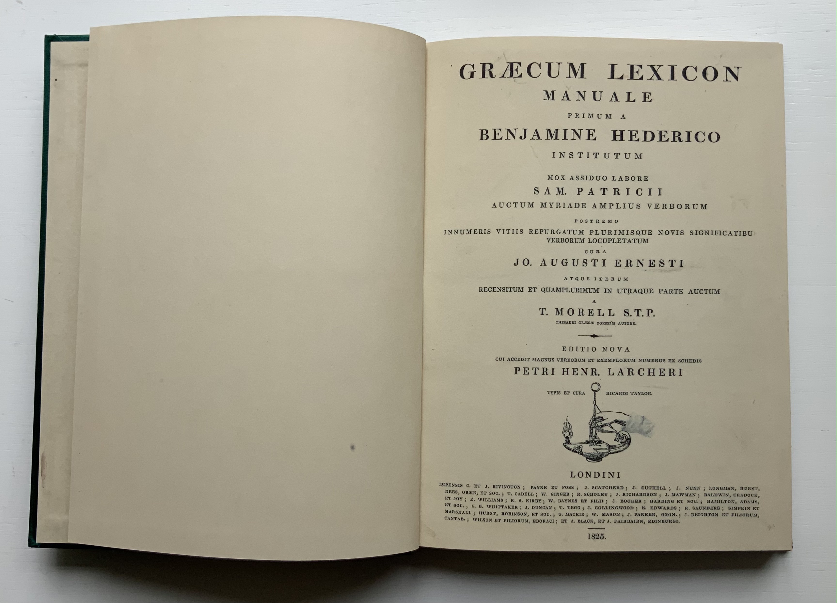
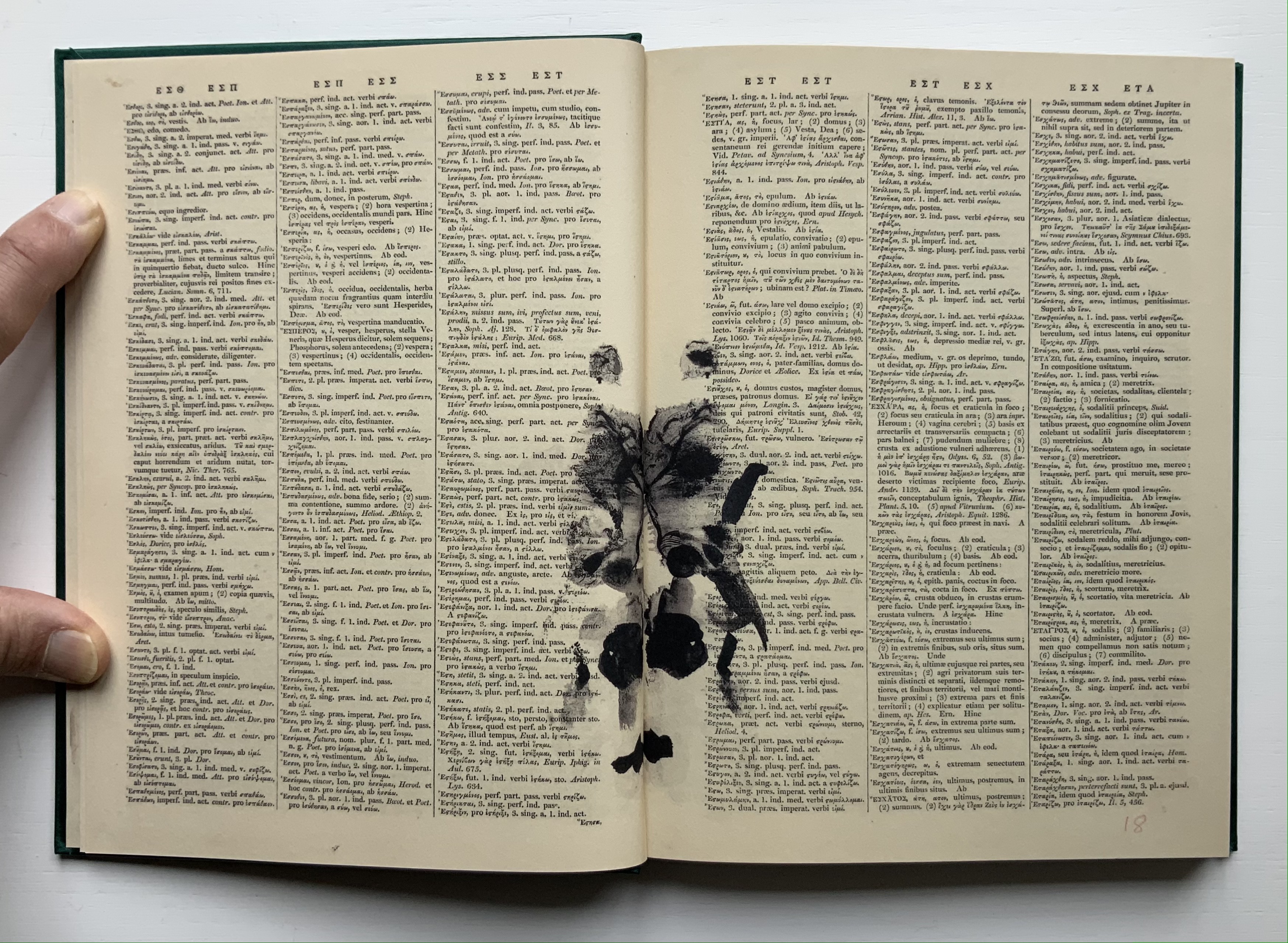
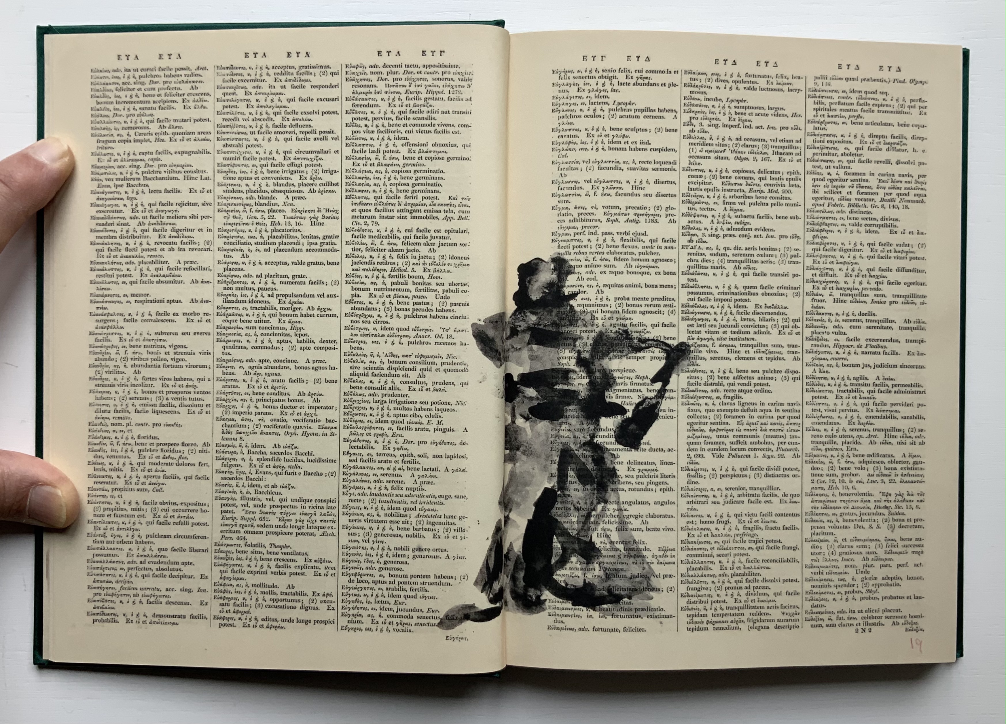
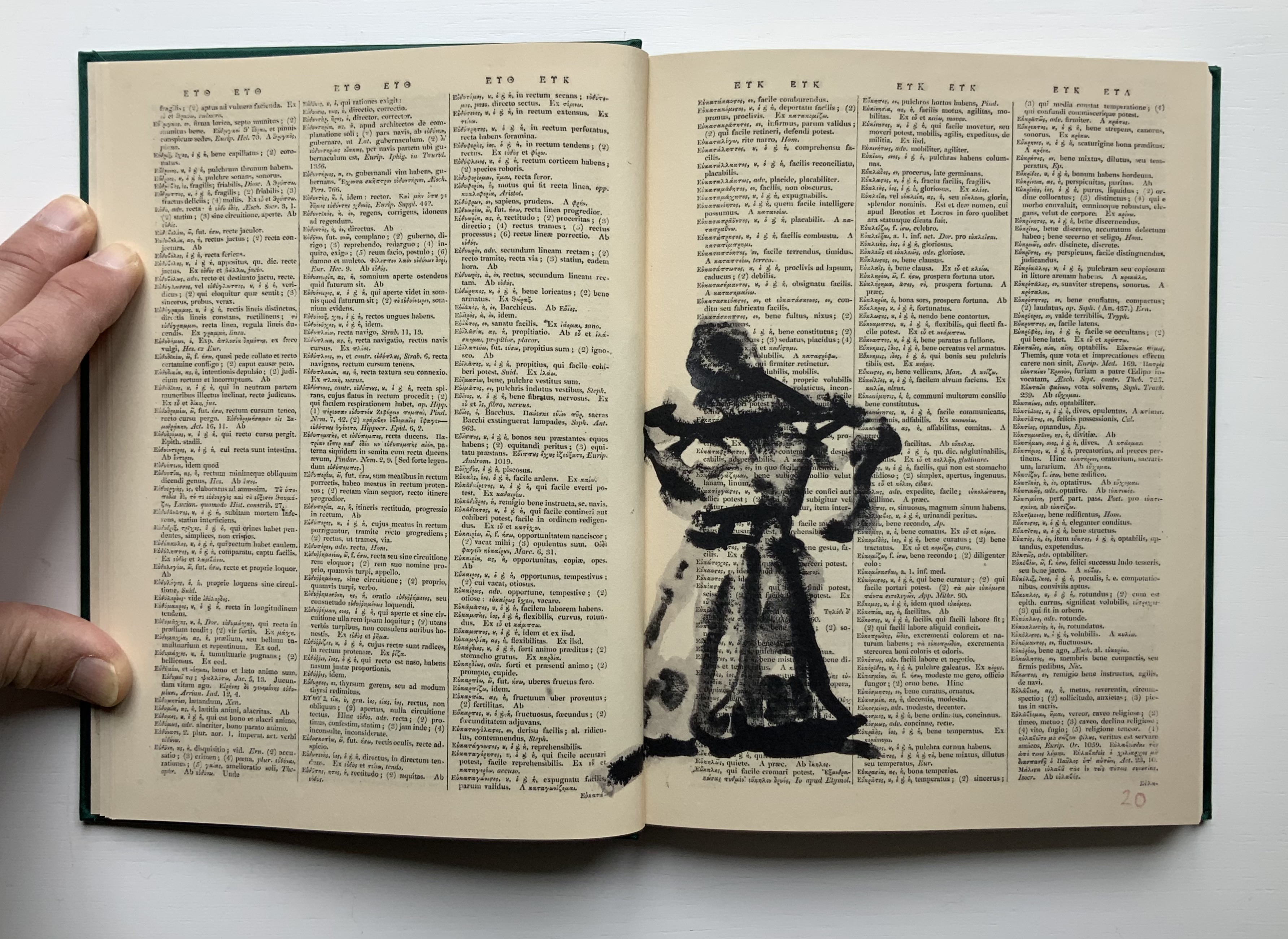
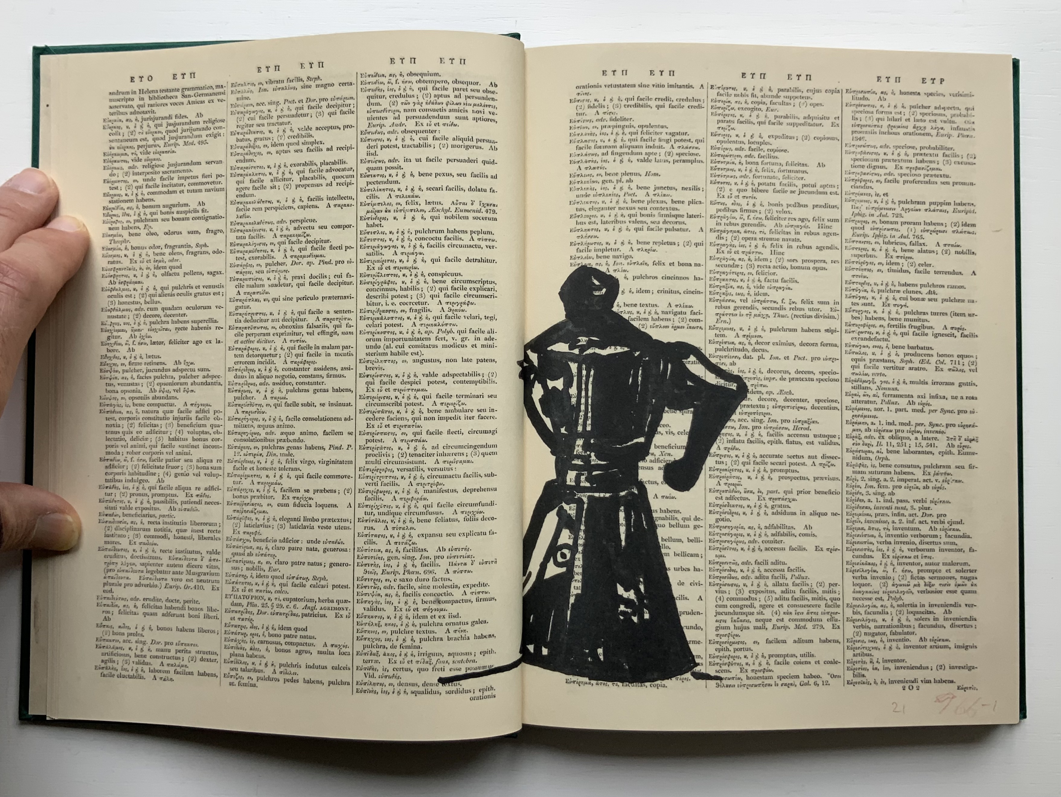
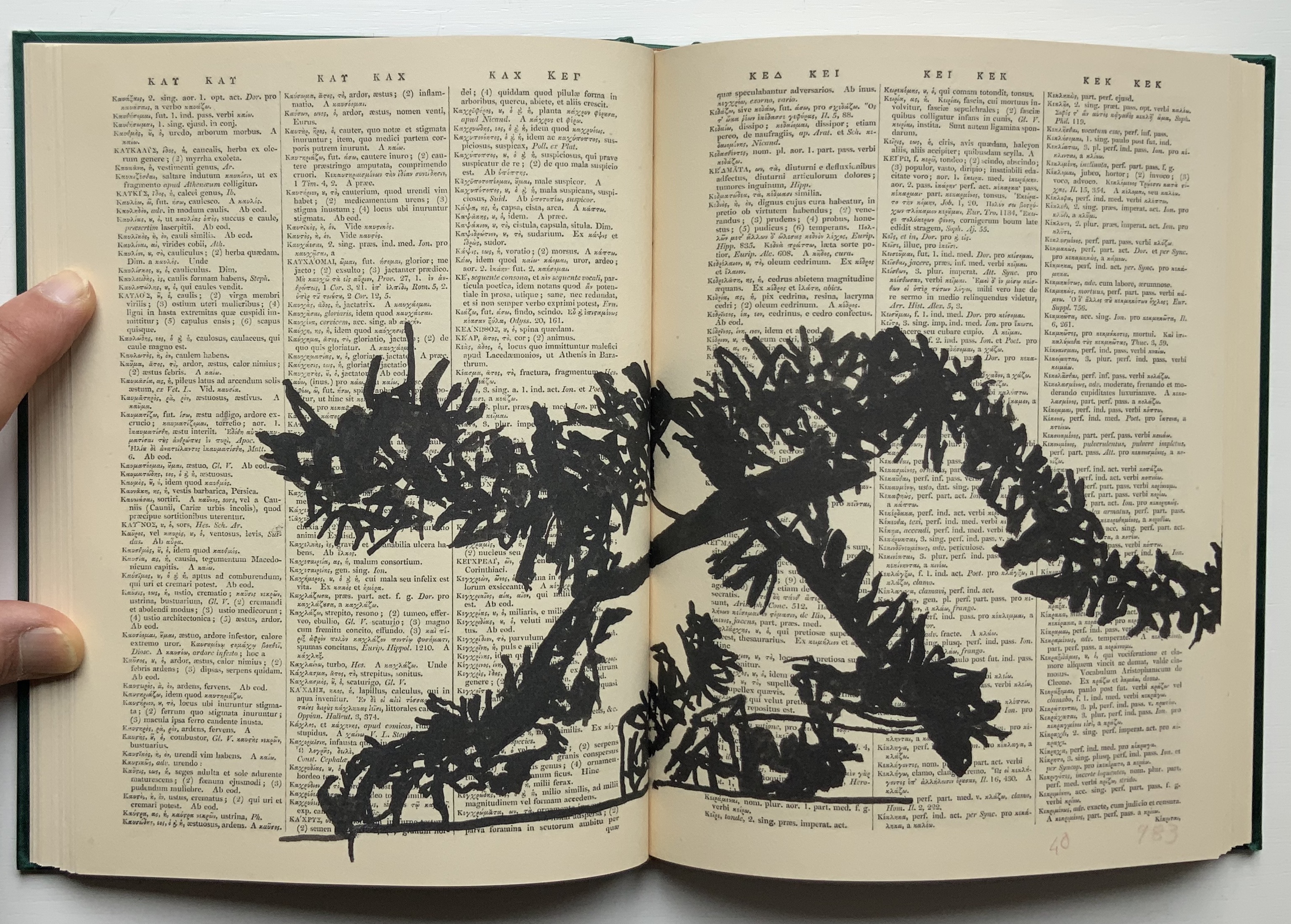
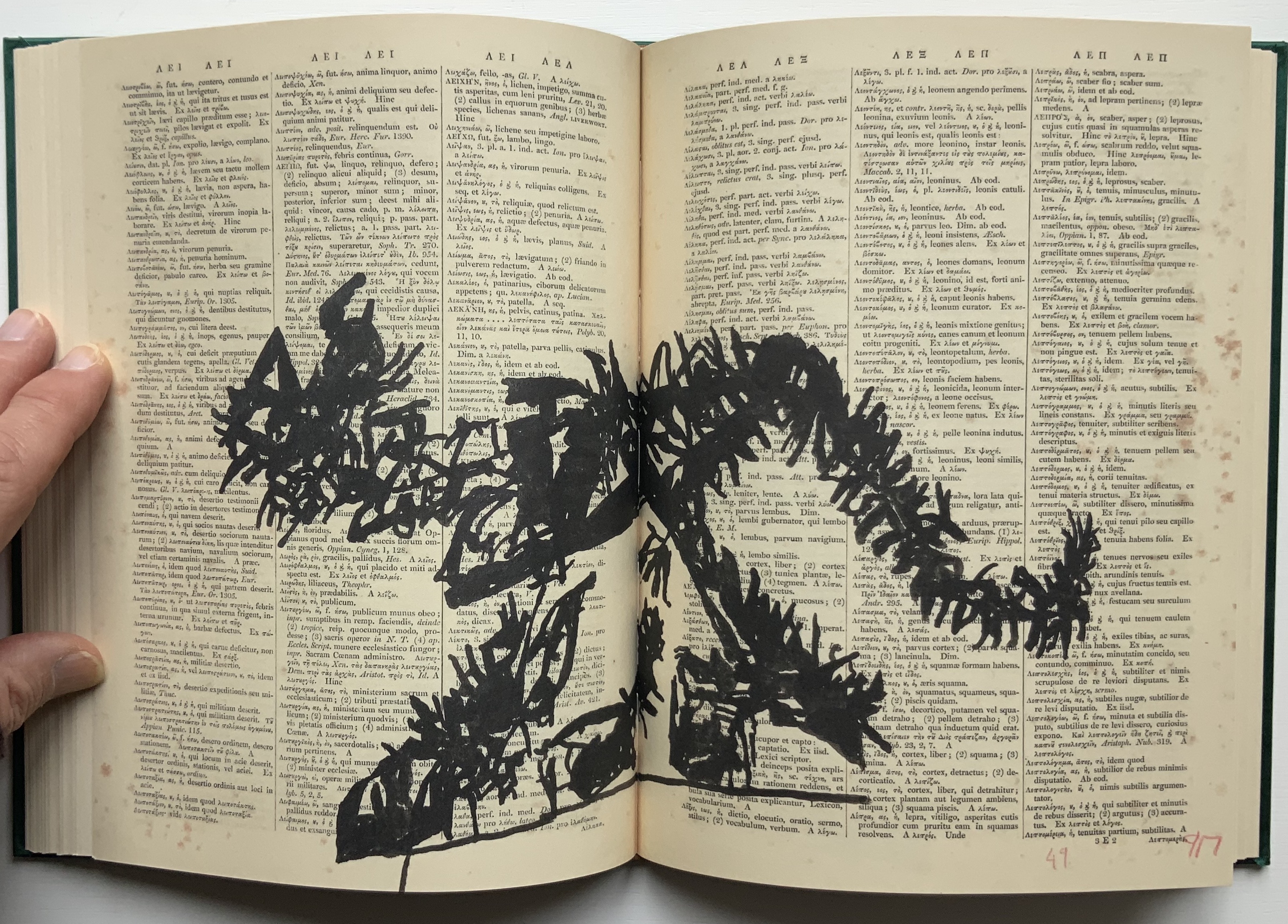
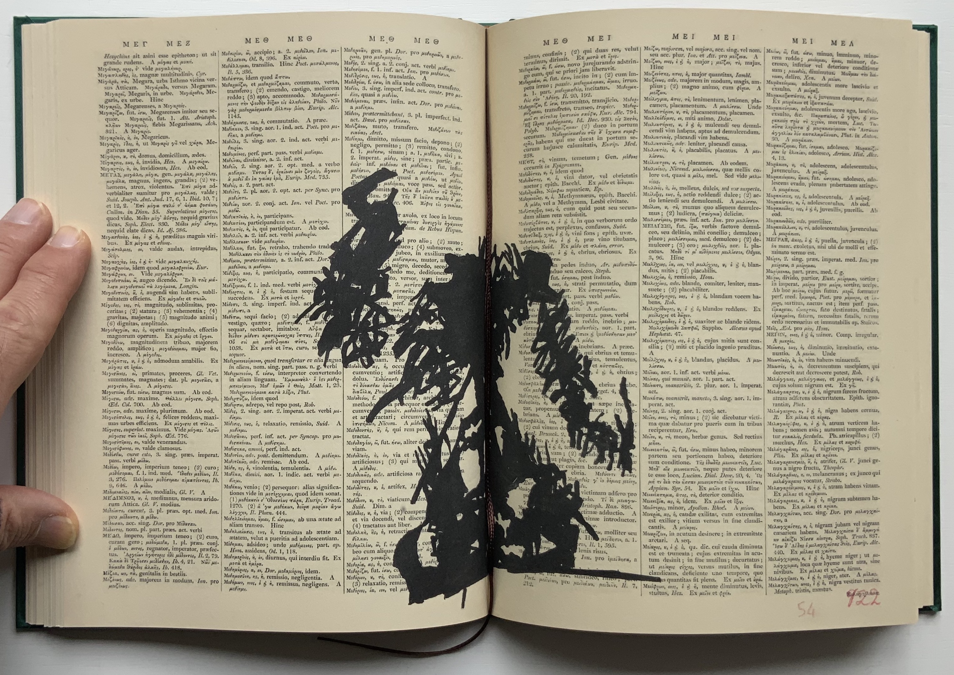
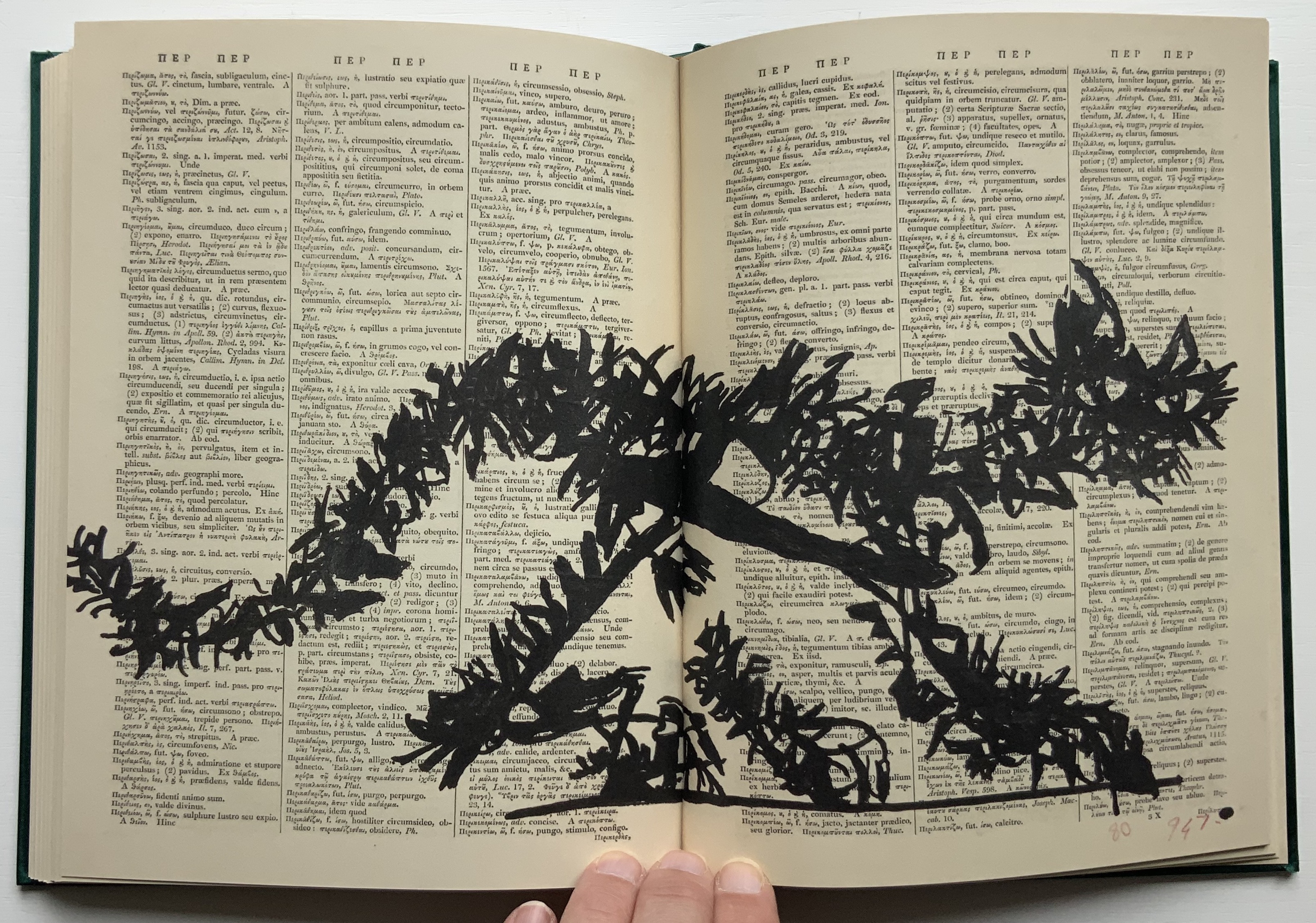
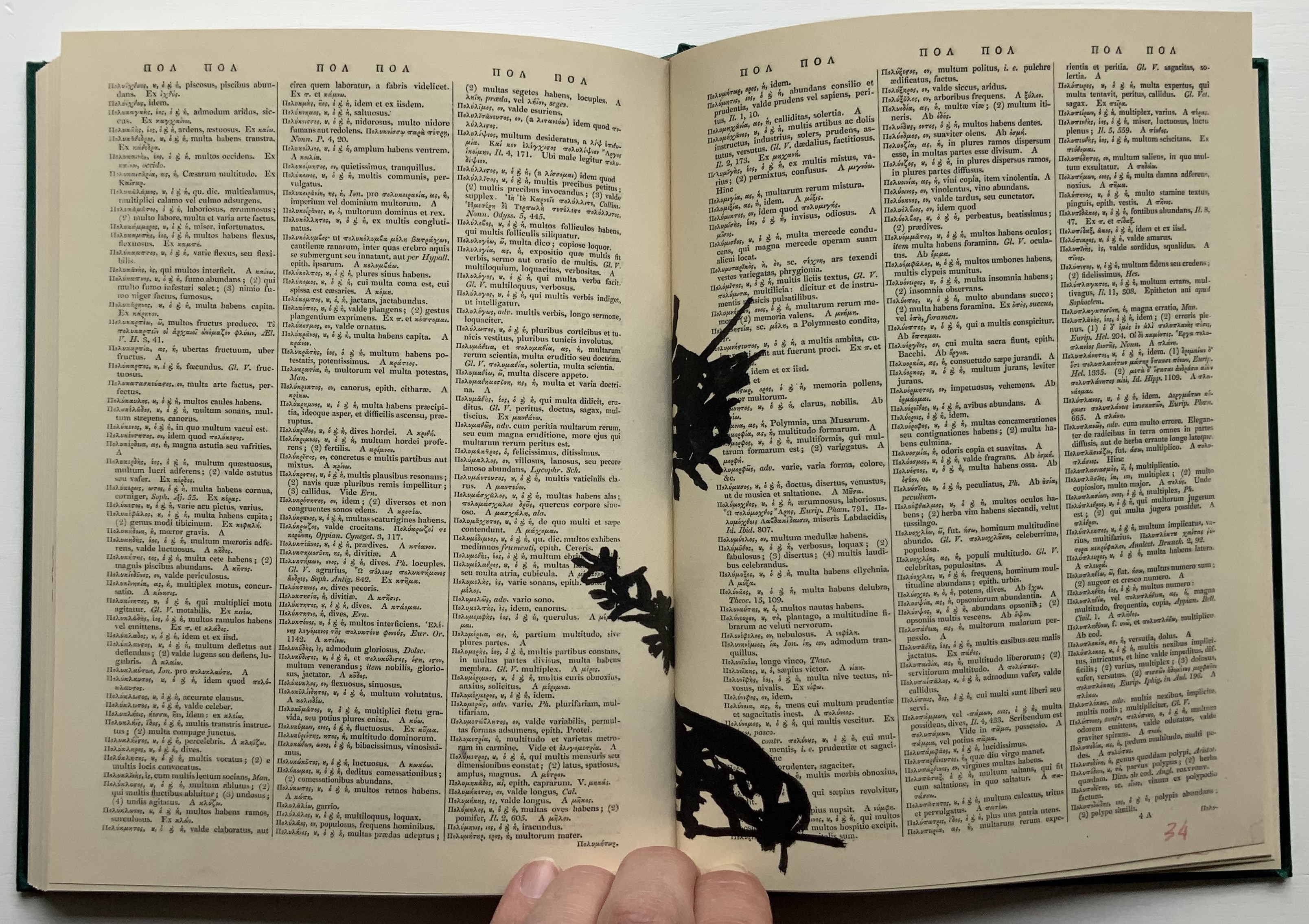
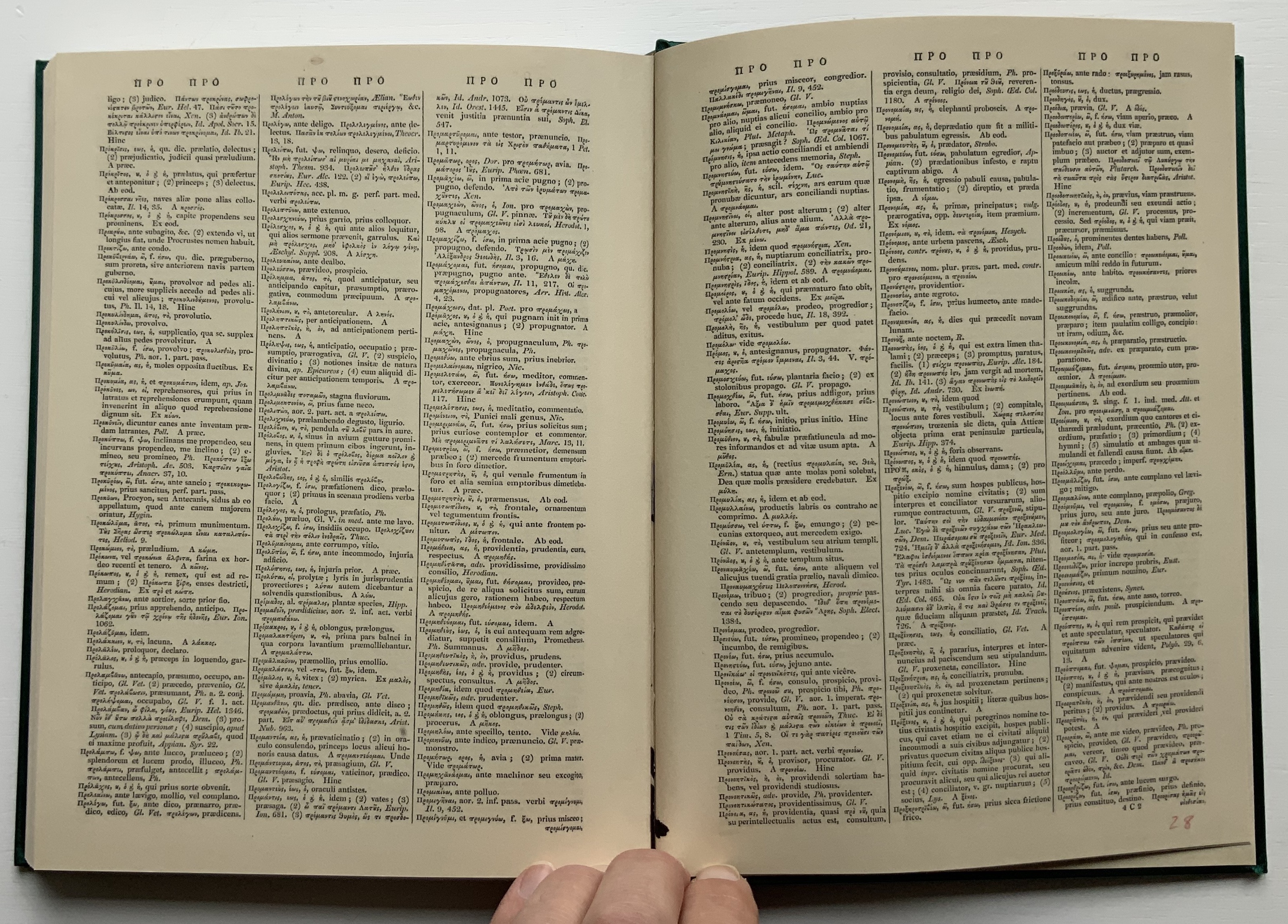
Compared to 2nd Hand Reading‘s 800 pages, Lexicon at 160 pages provides a small reminder of the experience. Bound in a green satin-sheen cloth, Lexicon begins as a facsimile edition of an antiquarian Latin-Greek dictionary. The dictionary’s browned pages and antique languages perform the role of drawing surface or projection screen for a flip-book metamorphosis. In scrawly black ink drawings, an Italian coffee pot emerges from the gutter and starts to tilt and turn.
Gradually the pot changes into a black cat, striding from right to left. Not the direction in which Western reading and narratives usually proceed. In its transformation and movements, the cat seems to pivot on itself as it turns and strides across the Latin and Greek like Rilke’s panther behind its bars until it turns back into a coffee pot. Or does it?
That drawing in the center certainly looks like the coffee pot, but as the pages turn, the cat returns to stride from left to right, expanding then shrinking until it is swallowed by the gutter.
The reference to Rilke’s panther is actually Kentridge’s, made ex post facto in the next book in the Collection.
Six Drawing Lessons (2014)
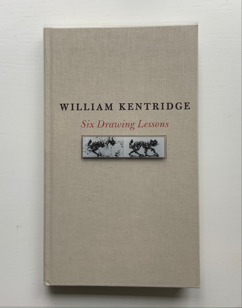
Six Drawing Lessons(2014) William Kentridge Cloth boards, sewn bound. H x W mm, 208 pages. Acquired from Amazon, 23 March 2019. Photos of the book: Books On Books Collection. Permission courtesy of the artist and Goodman Gallery.
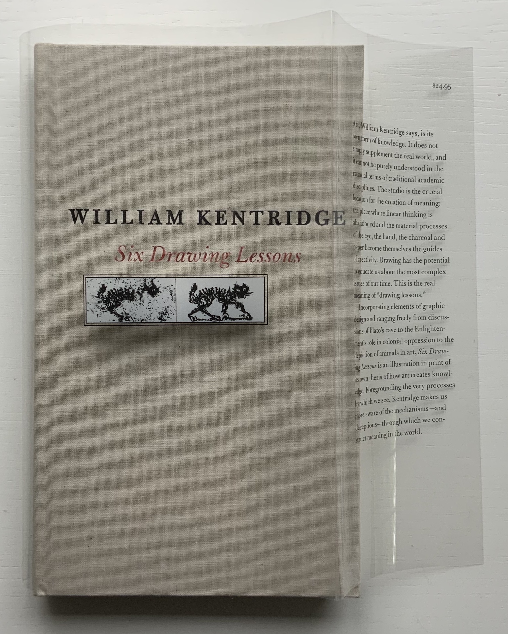
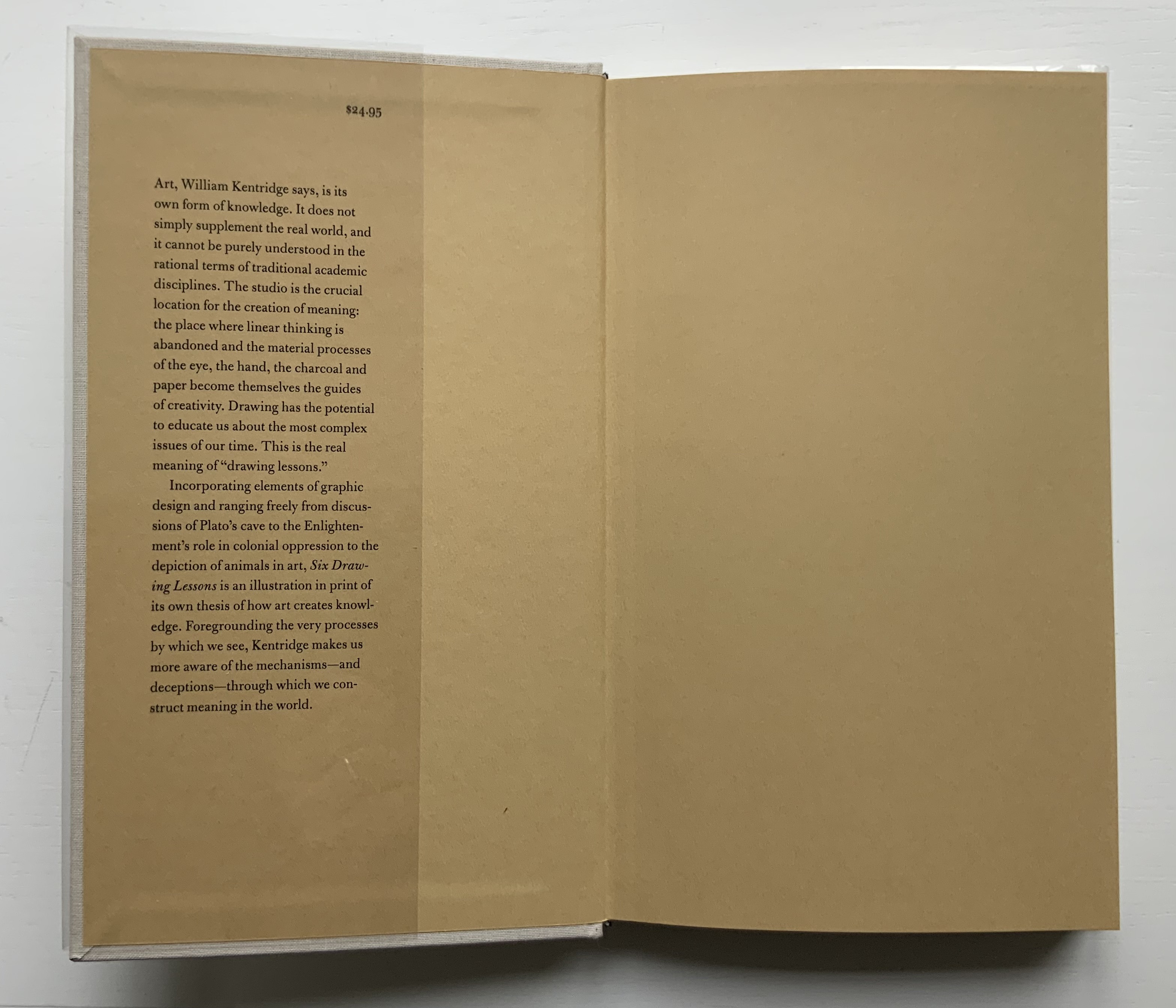
You rarely see a clear dustjacket. Of course, if it has type printed on it, you can see it. Still, it is rare, and in this case — in light of Kentridge’s film artistry — transparently ingenious.
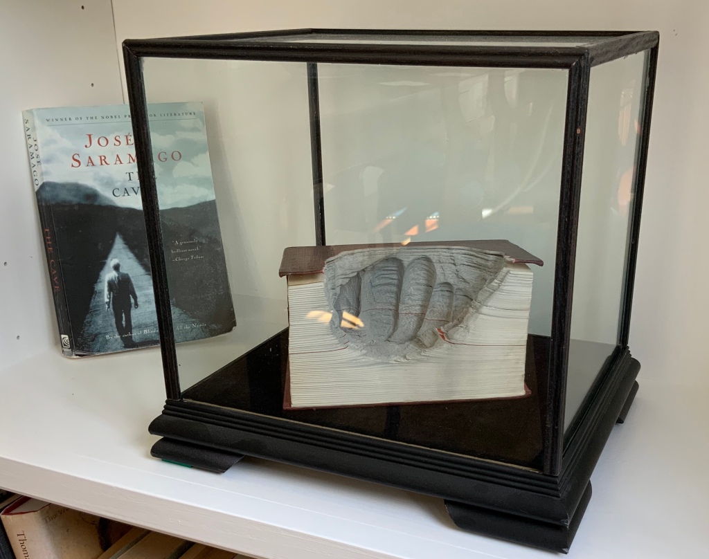
The six lessons — Kentridge’s Charles Eliot Norton Lectures delivered at Harvard — begin with an extended riff on Plato’s allegory of the cave. Variations on the riff recur throughout — applied to film projected from behind the audience, to a stage design of The Magic Flute as the bellows of a tripod camera, to transformations and metamorphoses and to the mining caves under Johannesburg. Kentridge’s interpretation of Plato’s cave reminds me of José Saramago’s interpretation in A Caverna (2014) and Guy Laramée’s homage to A Caverna. All three address “the great cloud of unknowing“, a kind of knowing by not knowing — but without God.
A Caverna (2012) Guy Laramée Portuguese-Spanish dictionary carved. Wood and velvet plinth, wood-framed glass cover. H260 x W276 x D226 mm Acquired from William Baczek Fine Arts, 12 September 2017.
What’s remarkable is how Kentridge brings so many variations, seeming tangents and media in the lectures into coherence. Or perhaps not so remarkable given that he manages it across his body of work and the multiple media in which he works. In breadth of stuff and raw material to hand and in his head, Kentridge himself identifies Picasso’s studio practices and work as an influence. Although not mentioned, Anselm Kiefer’s works such as Das Lied von der Zeder – Für Paul Célan (“The song of the cedar – for Paul Célan”, 2005) and his studio at La Ribaute, near Barjac in France, come to mind in these lectures. Likewise another artist called to mind is Xu Bing, especially his Landscape/Landscript (2013) and massive junk assemblage Phoenix (2008-15) among other works. Both Kiefer and Xu use the book as a medium with which to fuse language or text with the visual. All three artists confront similarly dark, raw cultural inheritances. Kentridge’s lectures, especially Lessons Two and Three, make plain his apartheid inheritance and its presence in his art.
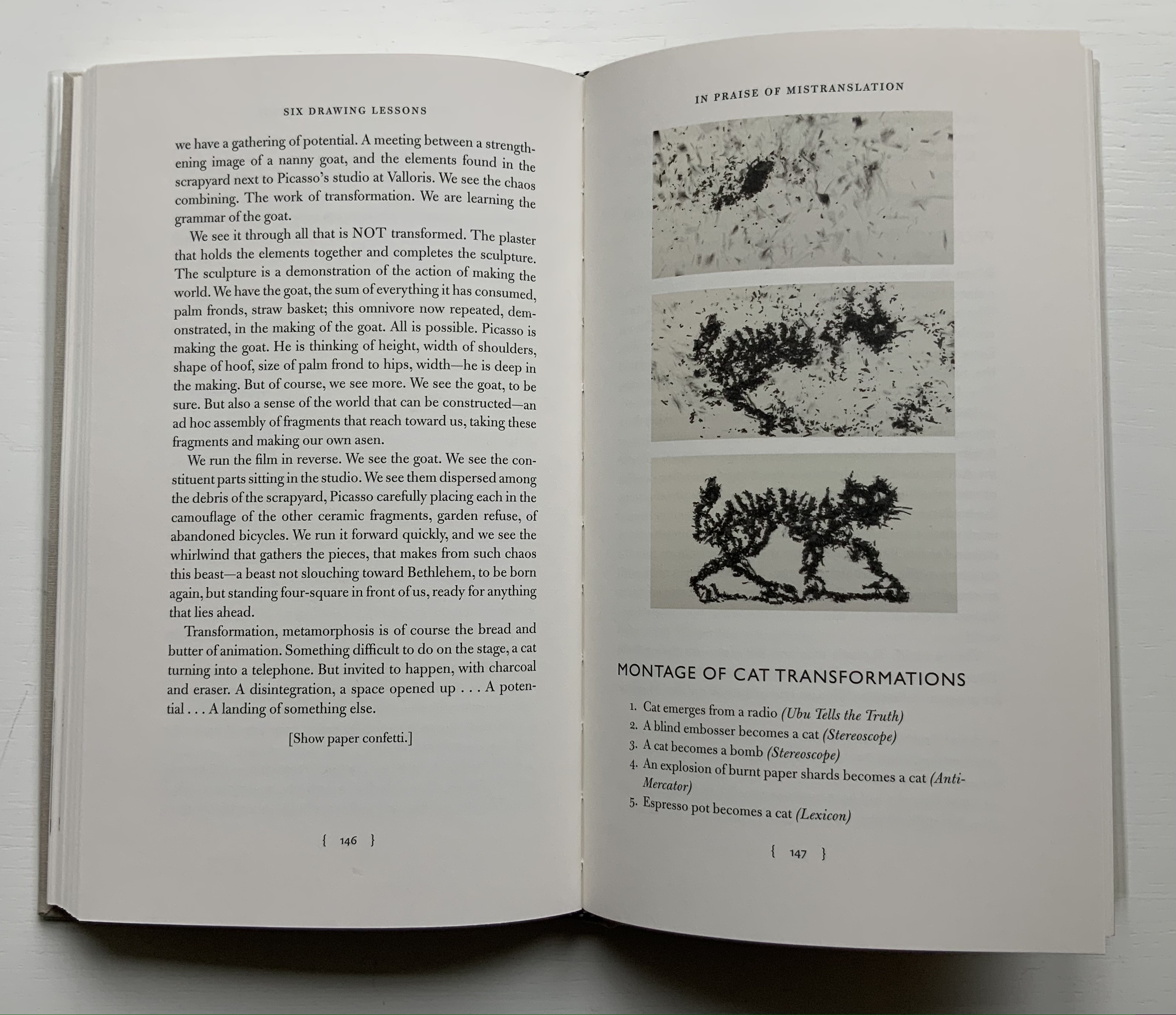
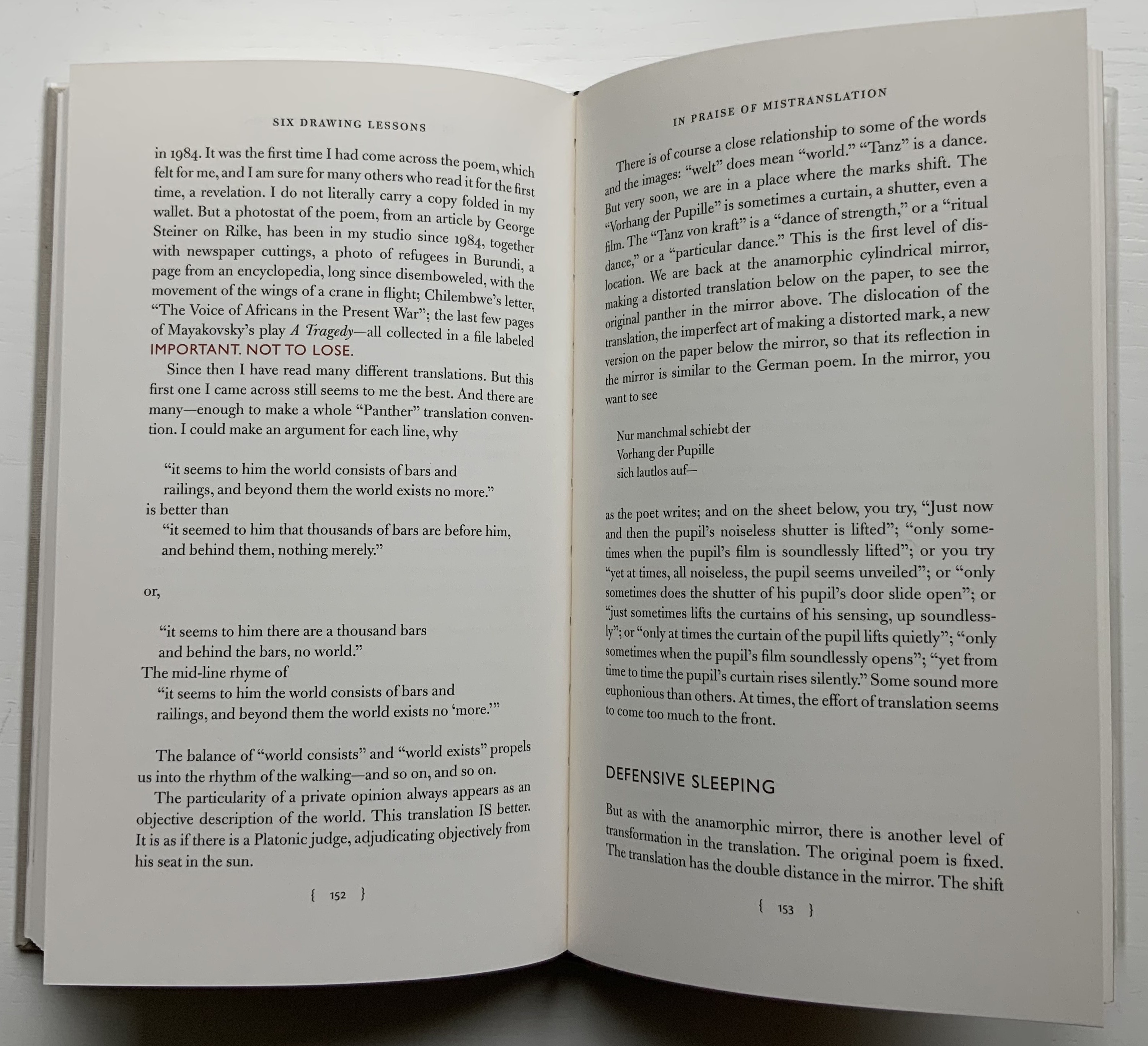
Circling back to the book as artistic medium, the fifth and sixth lessons provide an important insight that underscores Kentridge’s artistry there. “Lesson Five: In Praise of Mistranslation” reproduces Rilke’s “Der Panther” and Richard Exner’s translation of it in full. In that same lesson, Kentridge presents us with a montage of the feline transformations and names the works from which they come, one of them of course being Lexicon.
Before going back to Lexicon for the cat, the reader/viewer would do well to wait for Kentridge to expand in the sixth lesson on the lines describing the panther’s walk around his cage as “a dance of strength round a centre where a mighty will was put to sleep”. He writes:
There is no avoiding it. …it is the circle in the studio, the endless walking around the studio, … Again here we go back to Rilke’s panther, and the radical insufficiency, the radical gap in the center. There has to be some gap, some lack, which provokes people to spend 20 years, 30 years, making drawings, leaving traces of themselves. It has to do with the need to see oneself in other people’s looking at what you have made.
With that, remember the cat — metamorphosing from the Italian coffee pot that slips from Lexicon‘s gutter, prowling from right to left, turning back into the coffee pot, striding from left to right and then being sucked into the center. Can you ever look the same way at the gutter of a book?
Kentridge, William. 2012. Six Drawing Lessons, Charles Eliot Norton Lectures, Harvard University. Six videos from the Mahindra Humanities Center, posted 14-15 January 2020. Lesson 1, Lesson 2, Lesson 3, Lesson 4, Lesson 5, Lesson 6. Accessed between 1 April 2019 and 21 July 2021.
Krauss, Rosalind E. 2017. William Kentridge. Cambridge, Mass: MIT Press.
Mudam Luxembourg. 11 – 12 Jun 2021. “Sibyl“. Announcement. Accessed 22 July 2021. “Waiting for the Sibyl, co-commissioned by the Théâtres de la Ville de Luxembourg, Teatro dell’Opera di Roma and Dramaten – Stockholm and created in collaboration with choral director and dancer Nhlanhla Mahlangu and composer Kyle Shepherd, unfolds in a series of six short scenes, …”
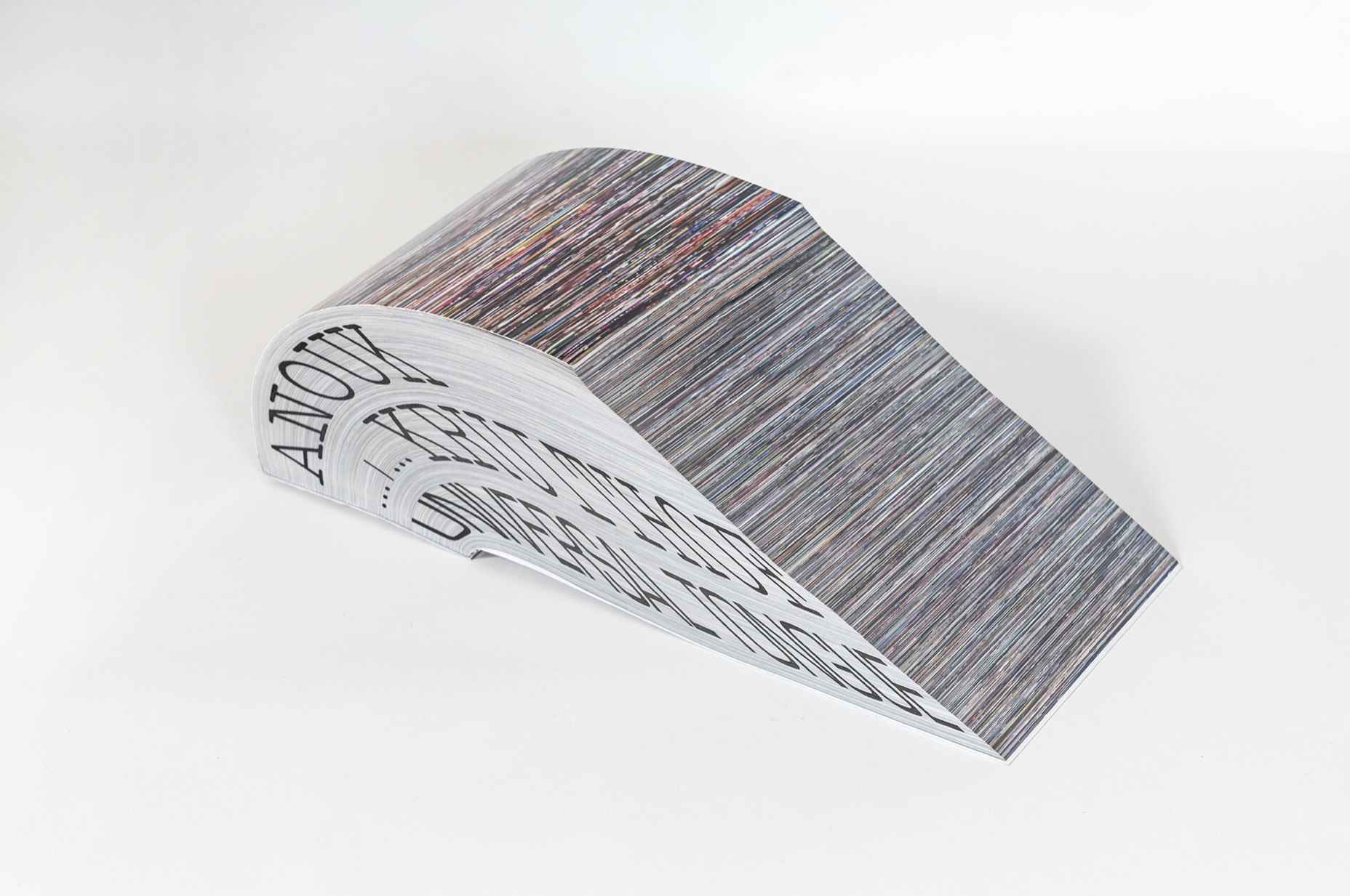
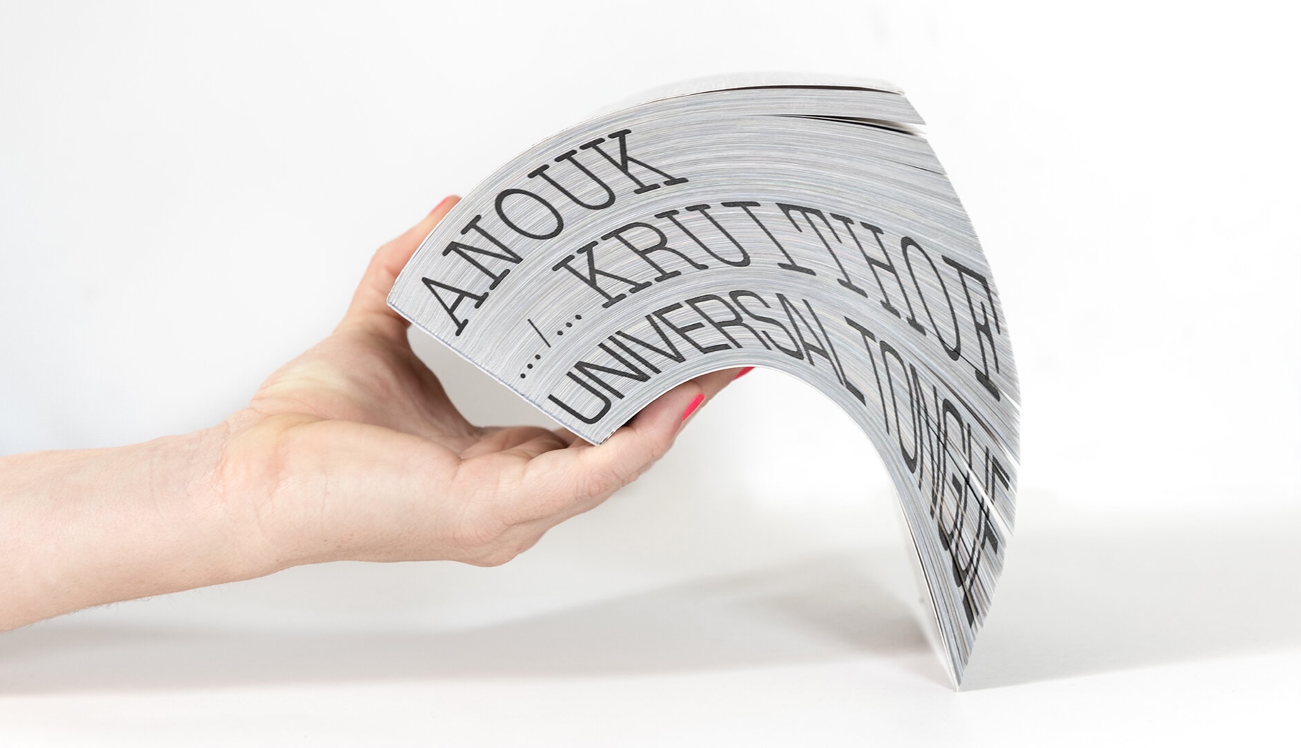
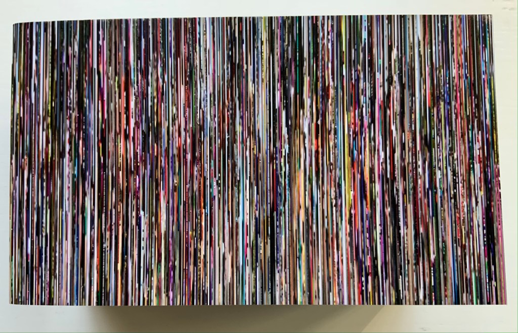
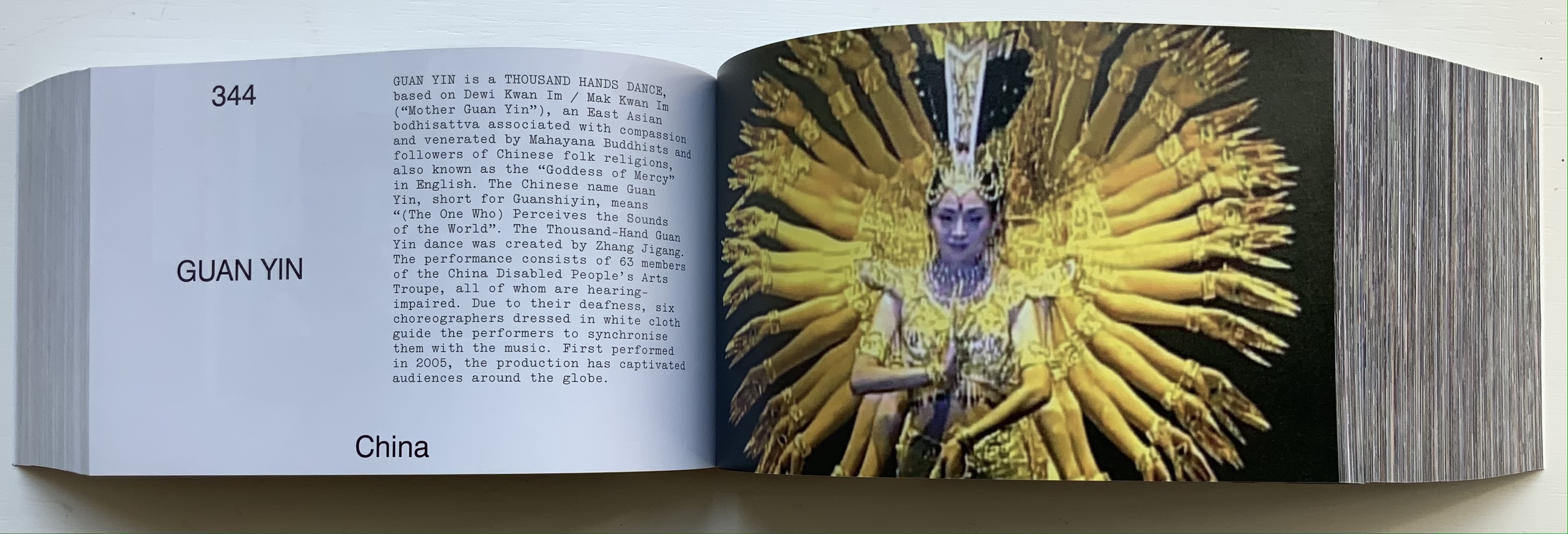
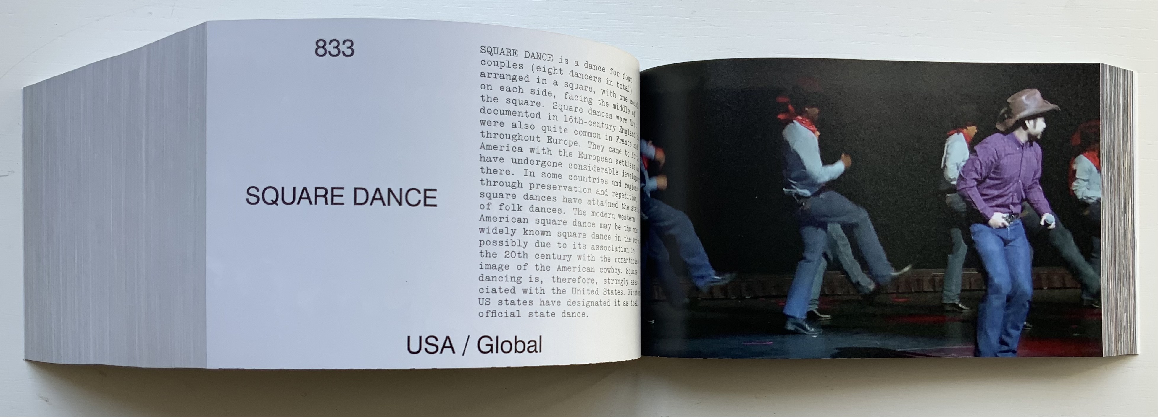
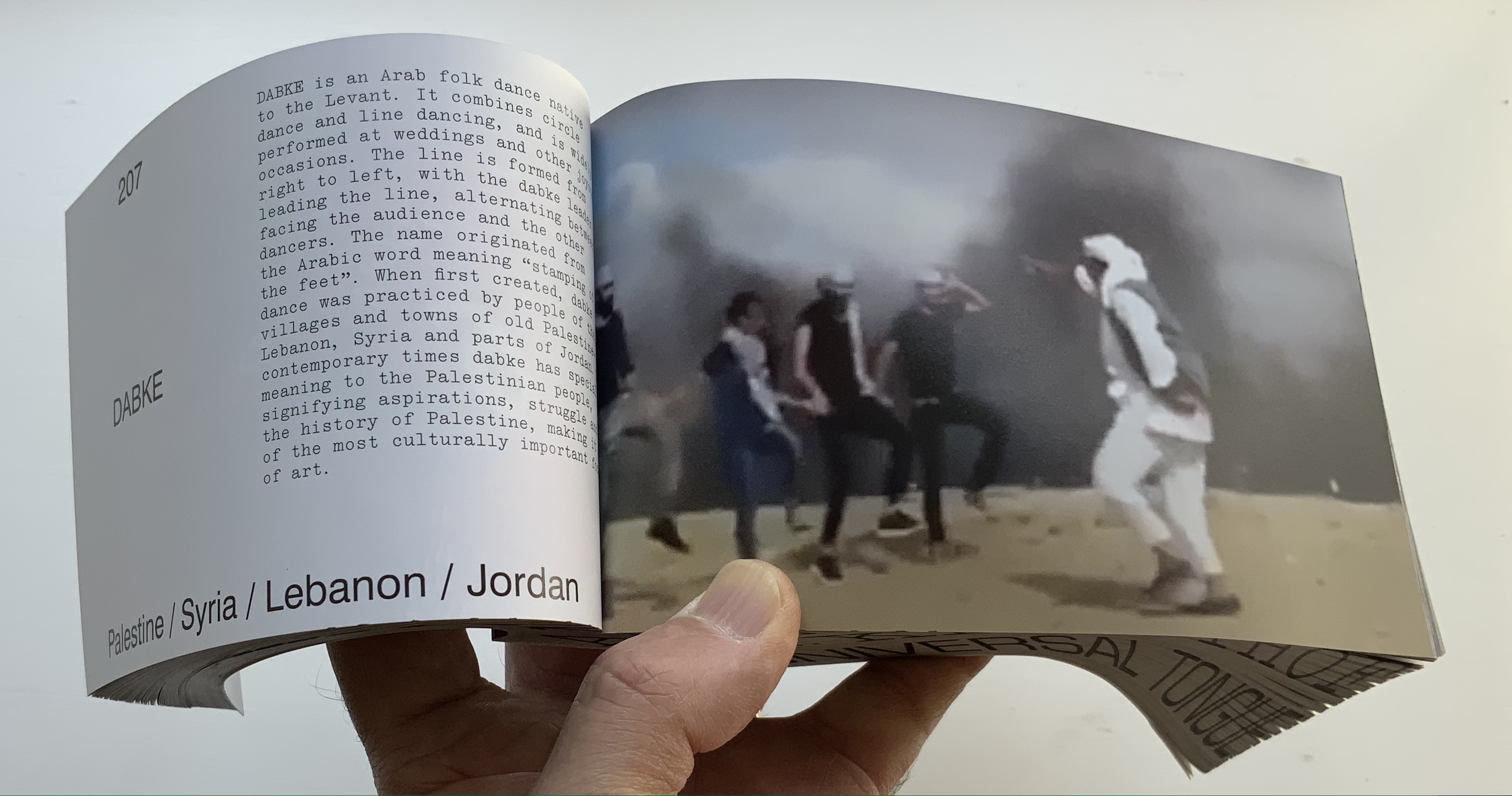
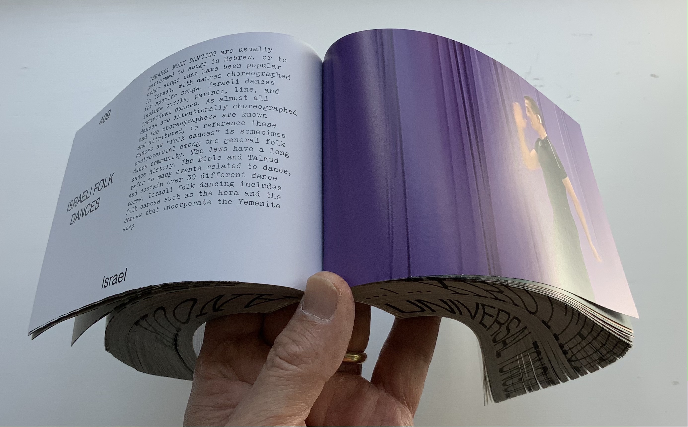
Universal Tongue(2021) Anouk Kruithof Paperback with fore-edge printing. H100 × W170 × D75 mm, 2008 pages. Edition of 500. Acquired from Art Paper Editions, 15 May 2008. First two photos: Courtesy and permission of the artist. Third photo: Books On Books Collection. Displayed with permission of the artist.
If ever a book danced, it is this one. It is a tango between Anouk Kruithof‘s images and Jurgen Maelfeyt‘s design. It is a global line dance with a team of 50 researchers from across the globe. It is a rave, sourced from 8800 online dance videos. It is a still point in motion against Kruithof’s choreographed four-hour eight-channel video version.
Photos: Books On Books Collection. Displayed with permission of the artist.
Photos: Books On Books Collection. Displayed with permission of the artist.
From the artist’s and publisher’s description: This book shows how dance can be a way of knowing about the world. It is by no means exclusive, final, or academic. It is a statement. Organized in alphabetical order by the first letter of each dance style, it confirms the horizontality of Universal Tongue, by erasing typical categories of the world order, such as country, continent, or culture. Instead, it points us towards a more inclusive world with a limitless exchange—a world where simply everyone is a dancer.
Universal Tongue also neatly uses the vertical surfaces of the codex. The bottom-edge printing of name and title calls to mind Around the Corner by Ximena Pérez Grobet. The fore-edge effect of the full-page bleeds calls to mind Irma Boom’s Strip (2003). Both techniques evoke the book form’s ability to embrace. As the physical and haptic constant alongside the digital sourcing, production and video installation, Universal Tongueas book shows that traditional dance and the book remain undiminished in cultural relevance.
AUTOMAGIC (2016)
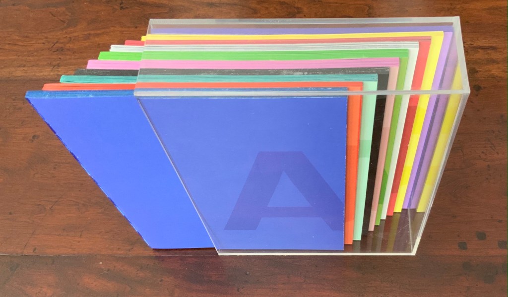
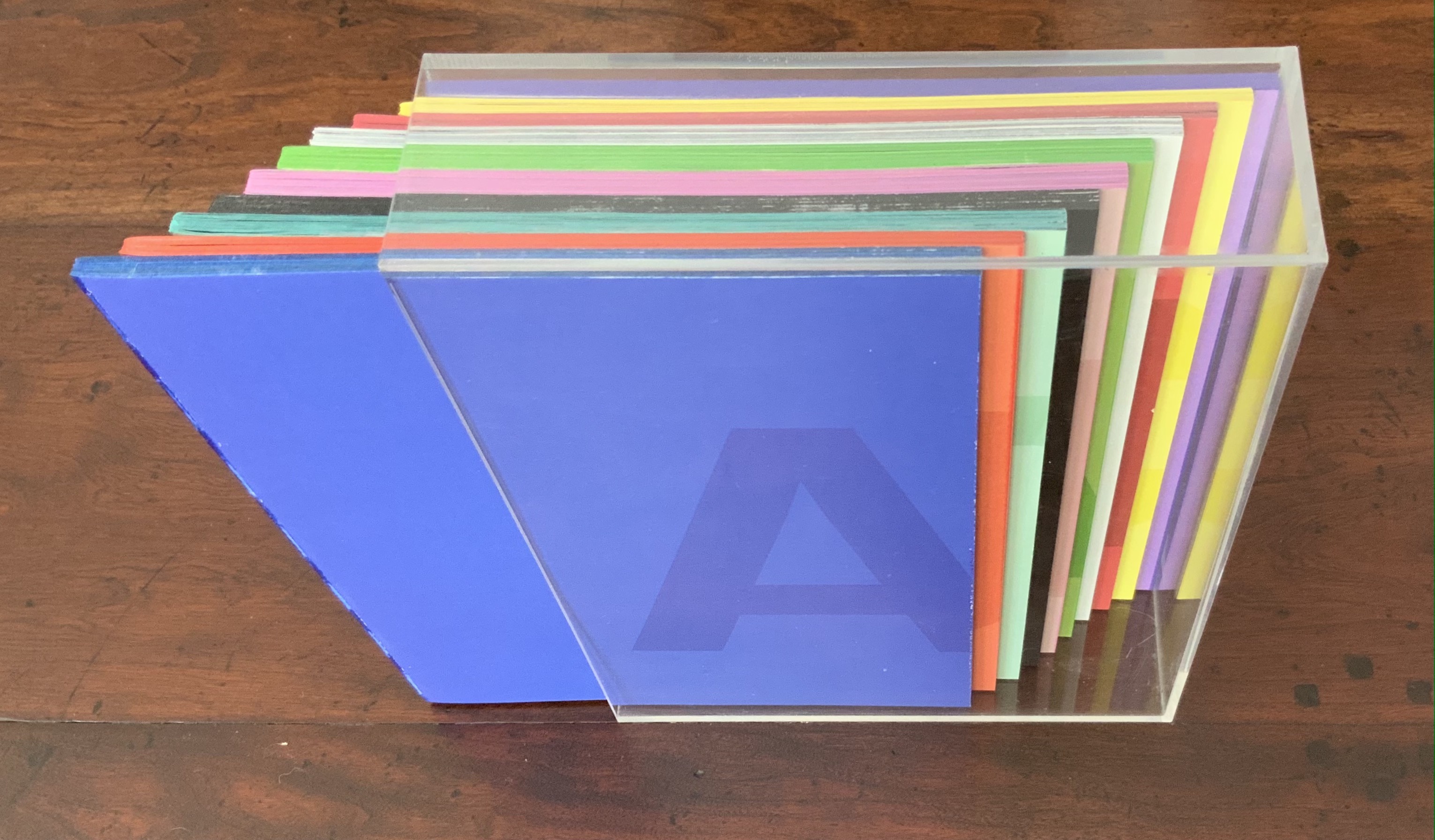
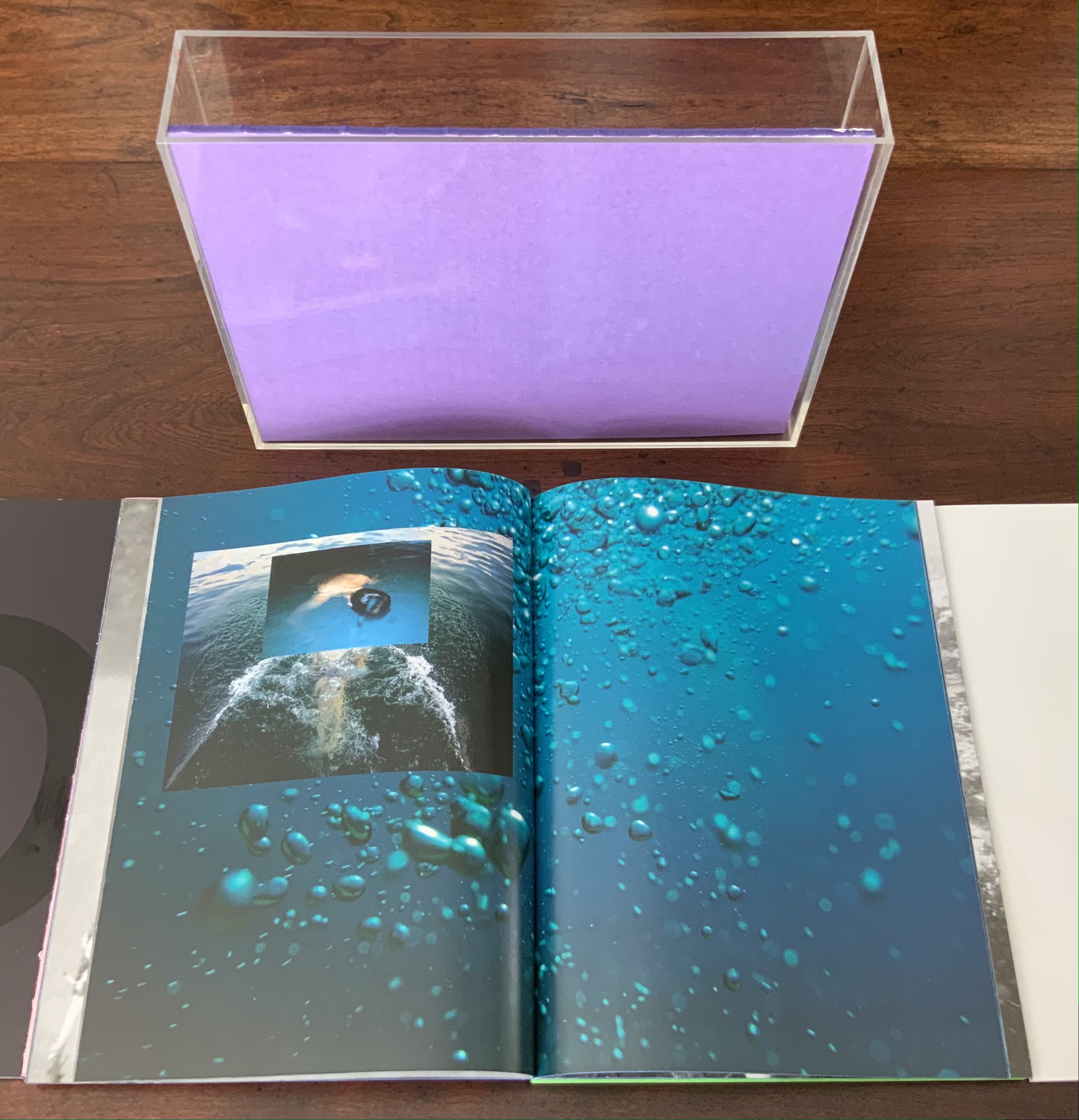
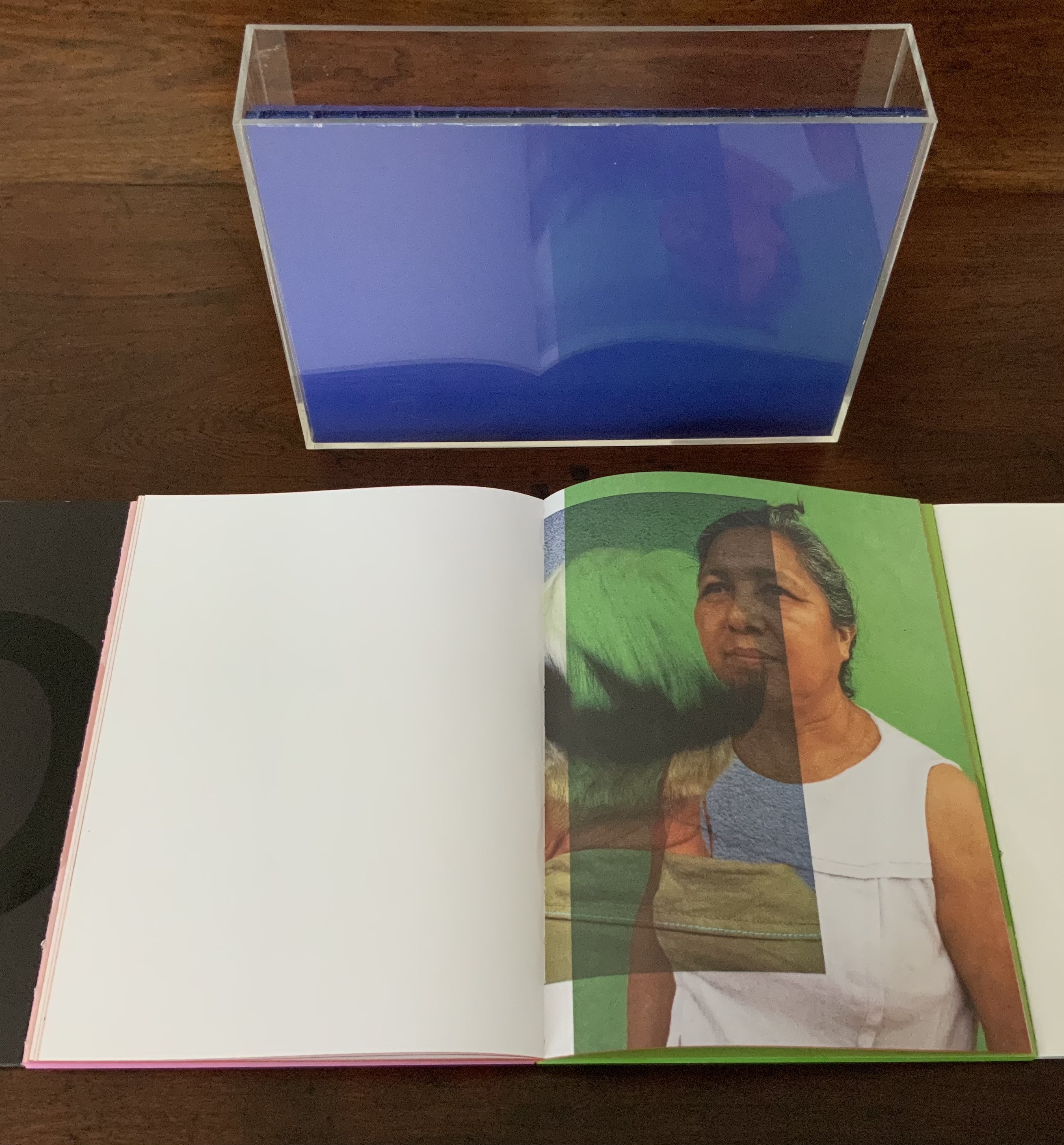
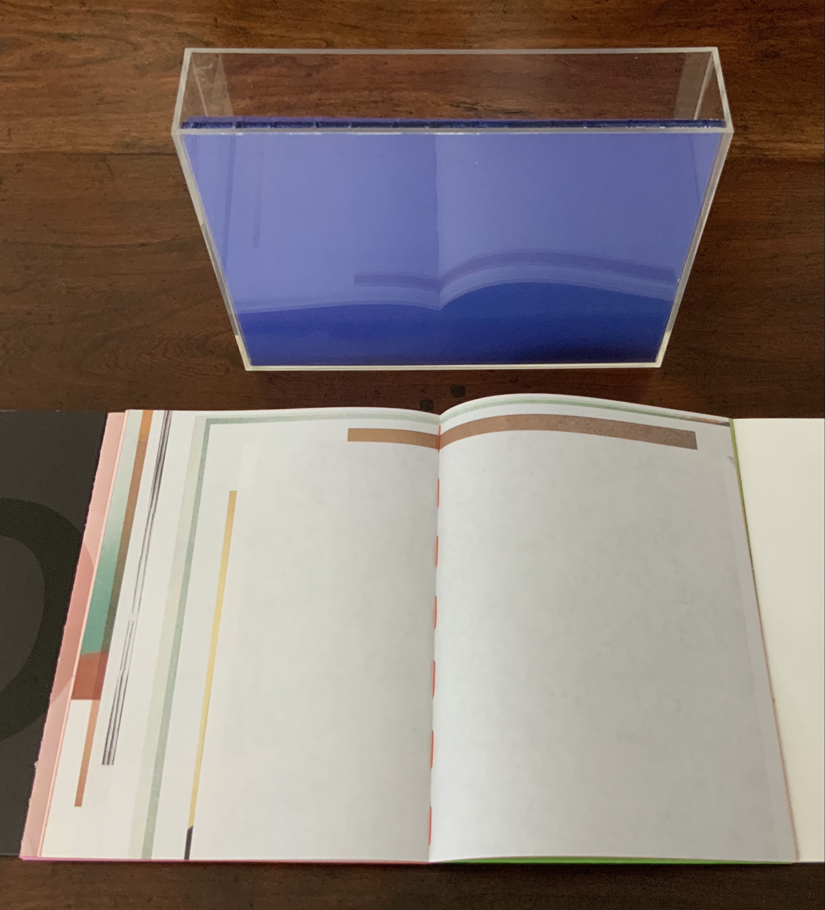
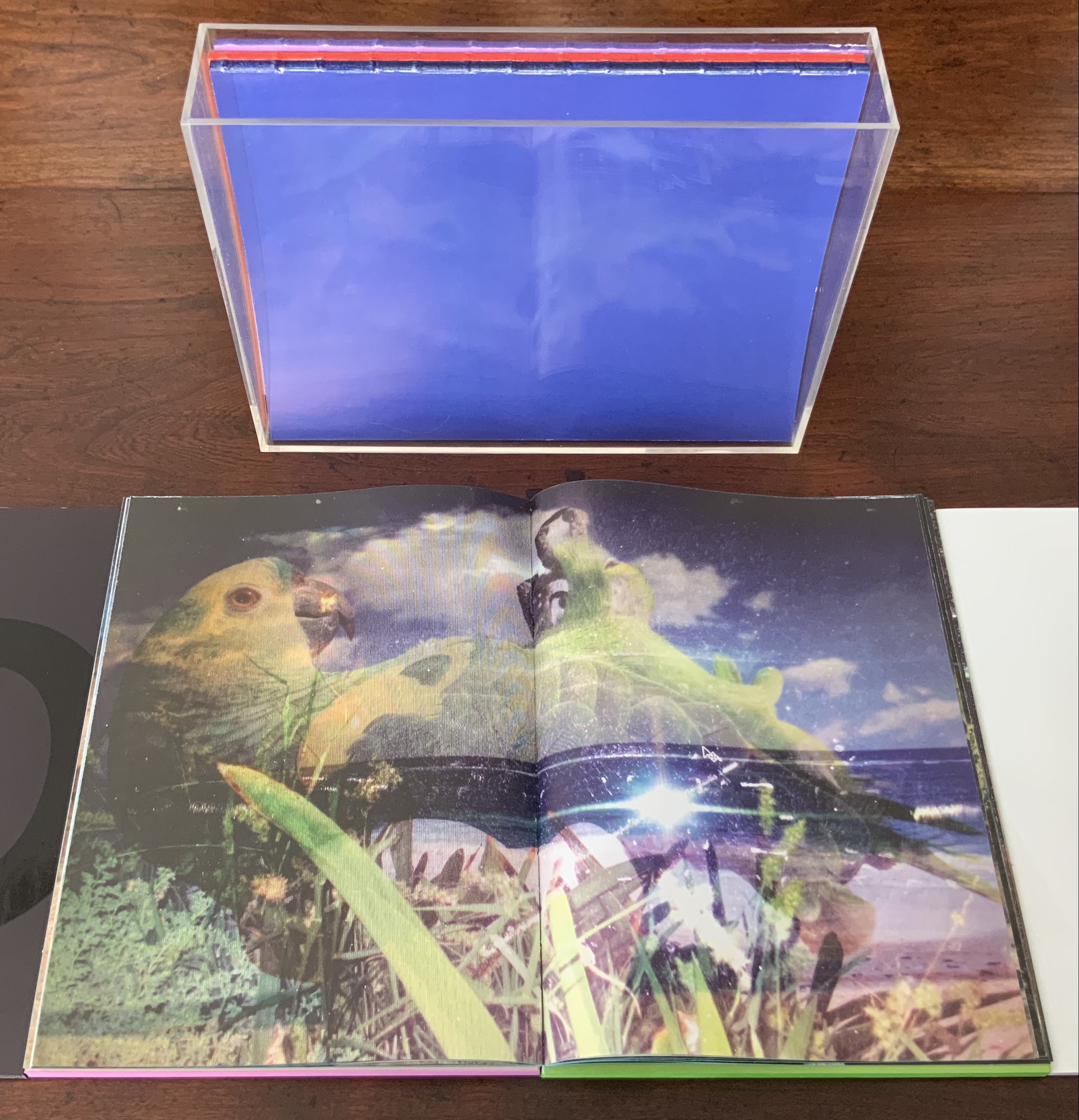
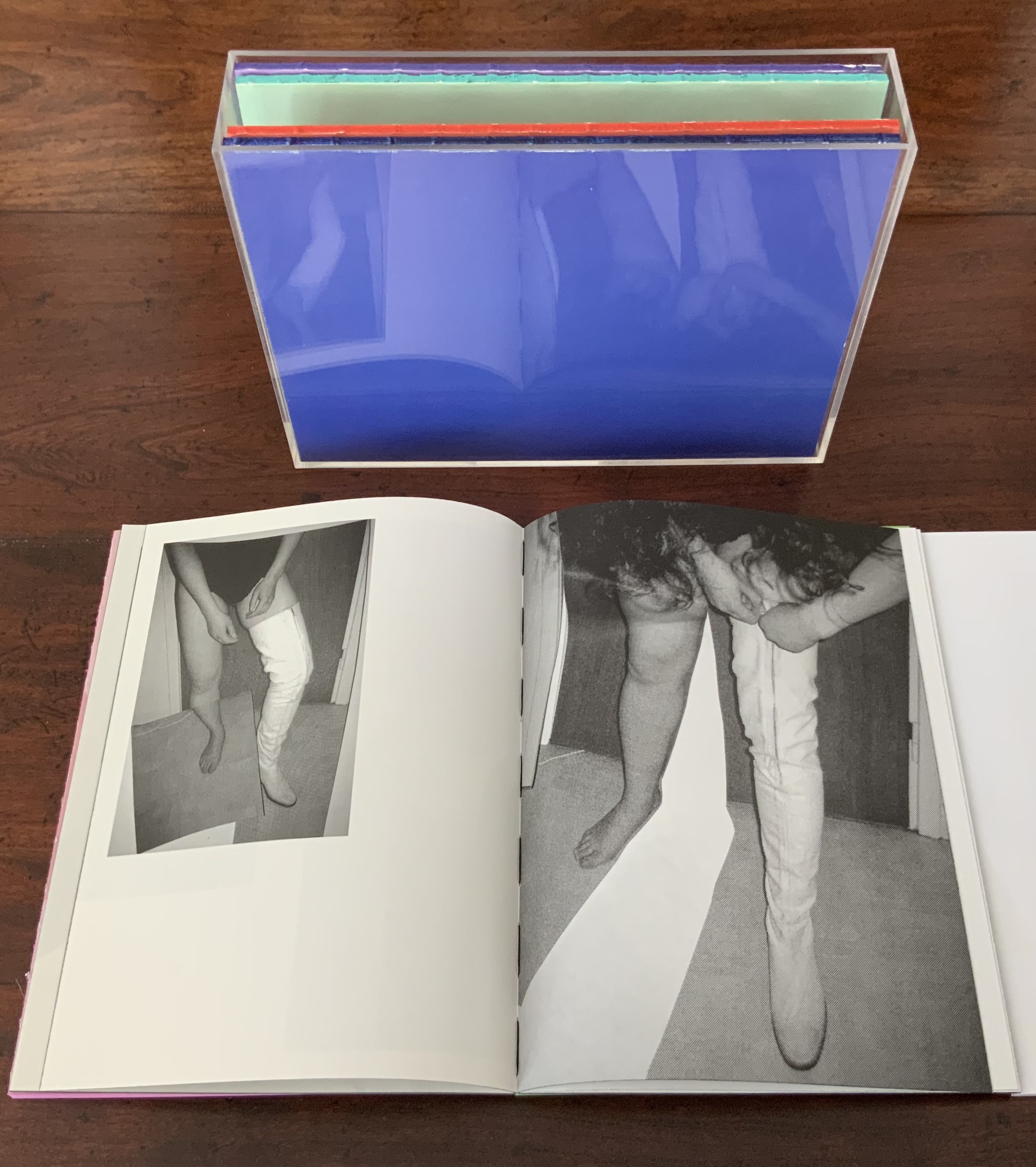
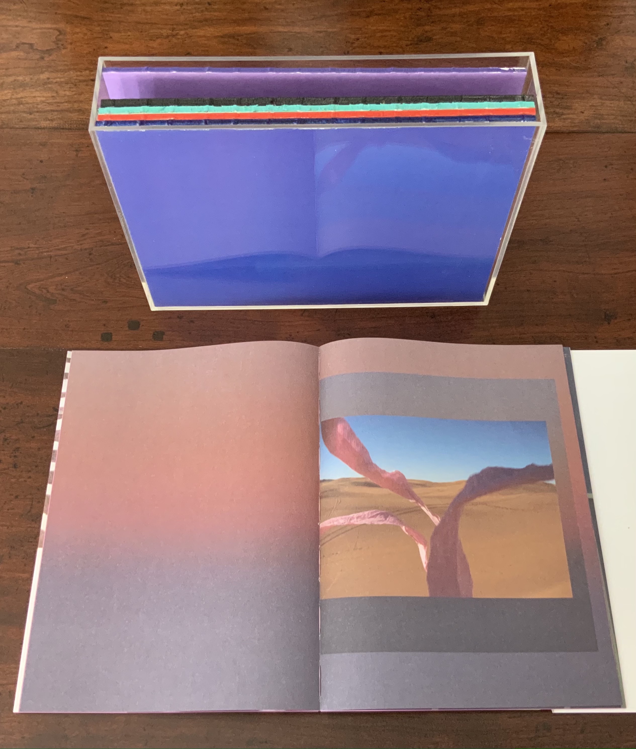
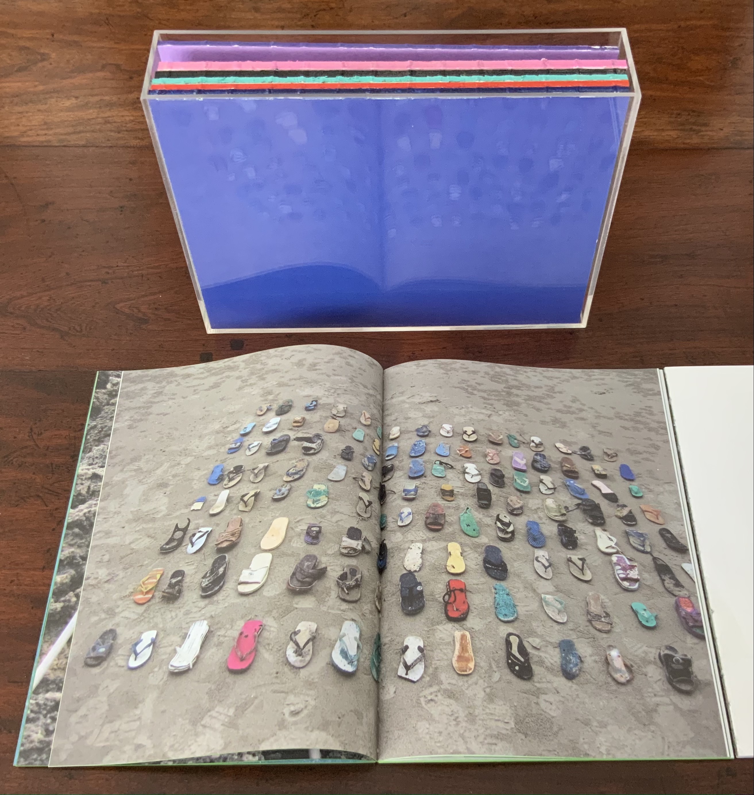
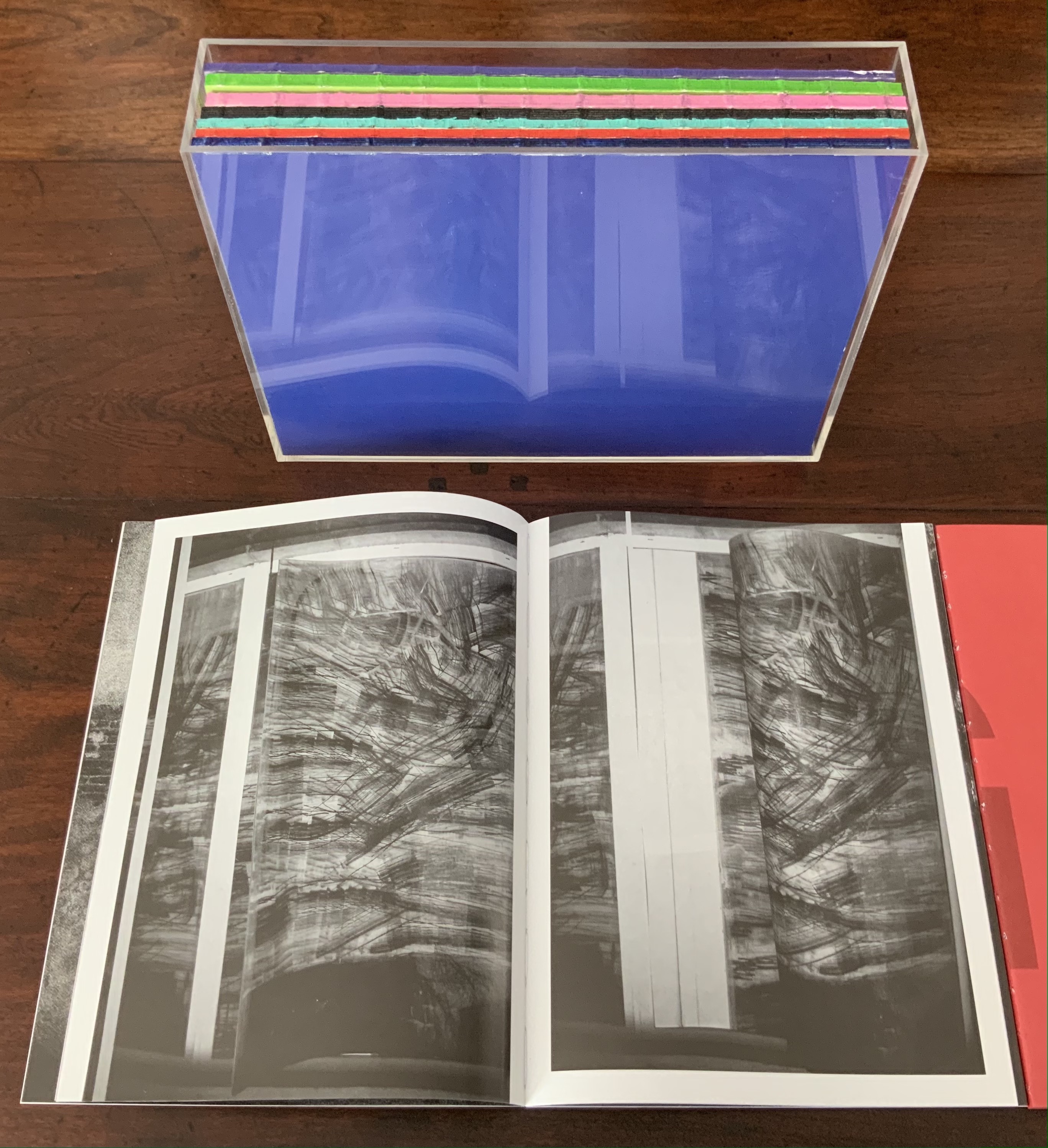
AUTOMAGIC (2016) Anouk Kruithof Transparent acrylic box holding 10 booklets without covers. Box: H235 x W173 x D53 mm; Booklets: H228 x W170 mm each; 768 pages. Edition of 1000. Acquired from the artist, 14 April 2017. Photos of the work: Books On Books Collection. Displayed with permission of the artist.
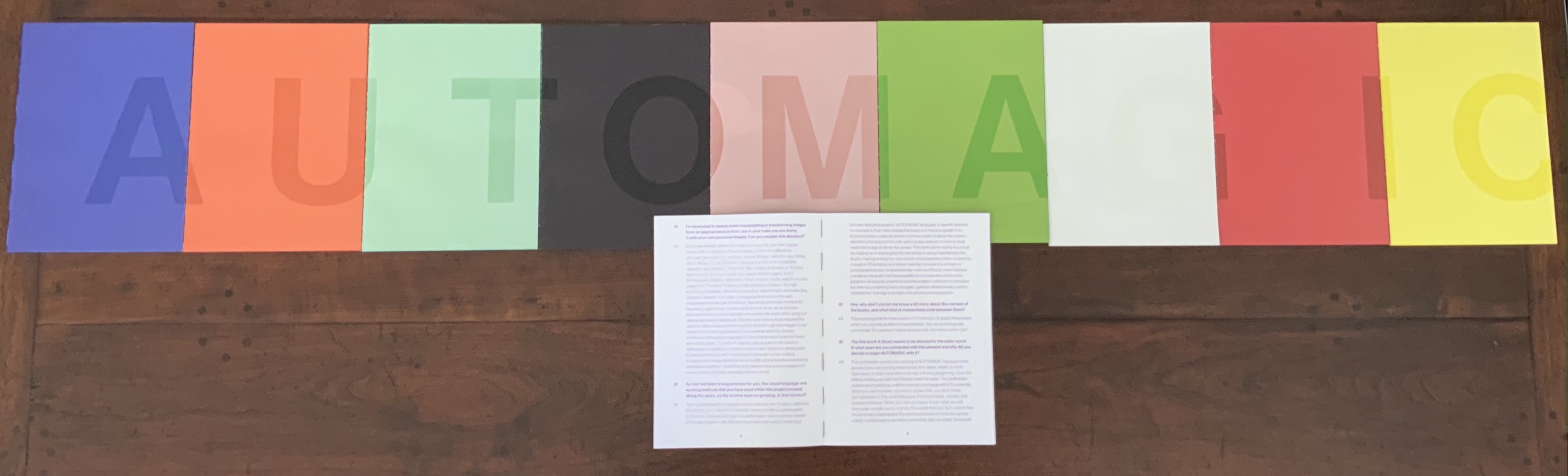
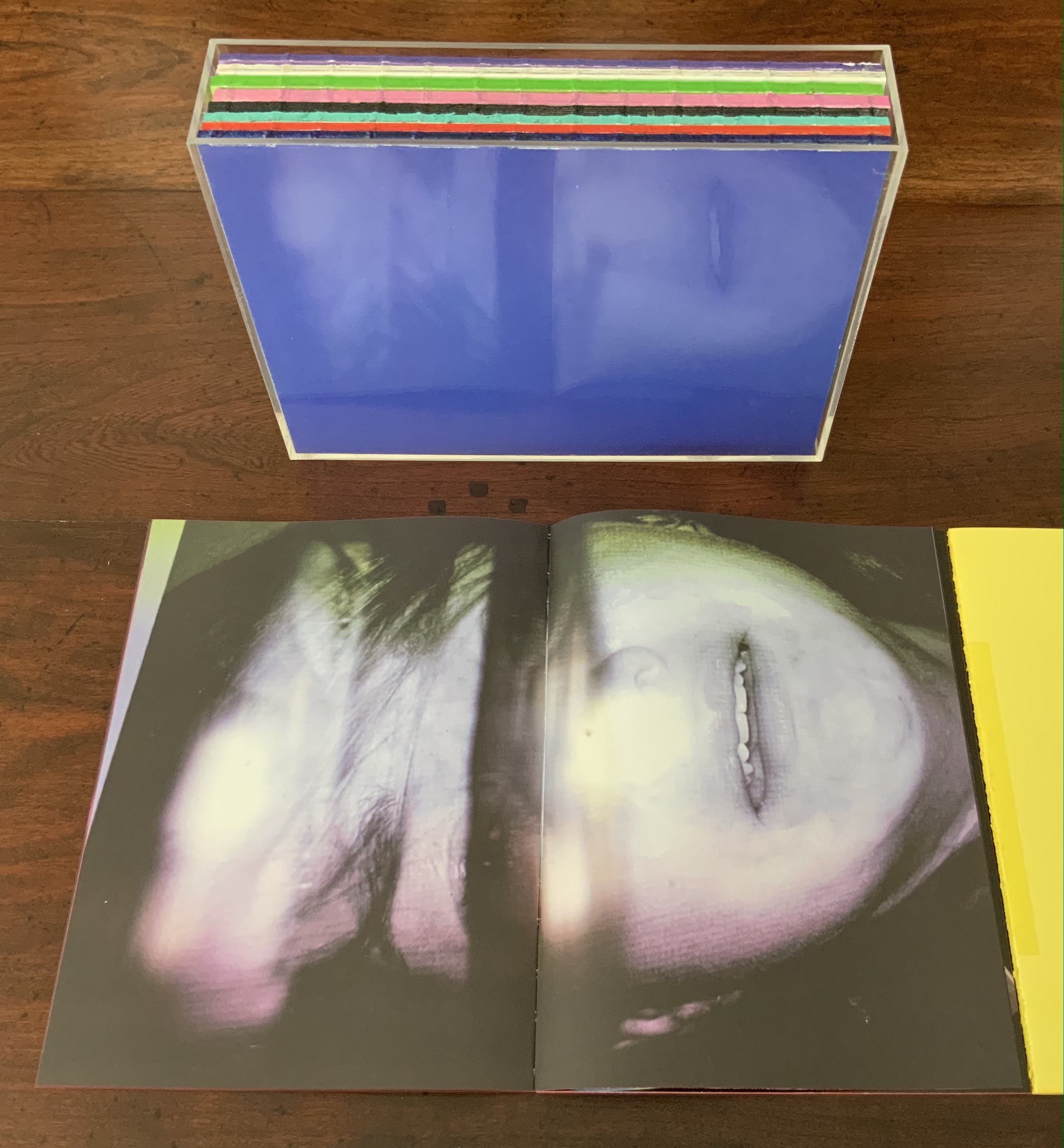
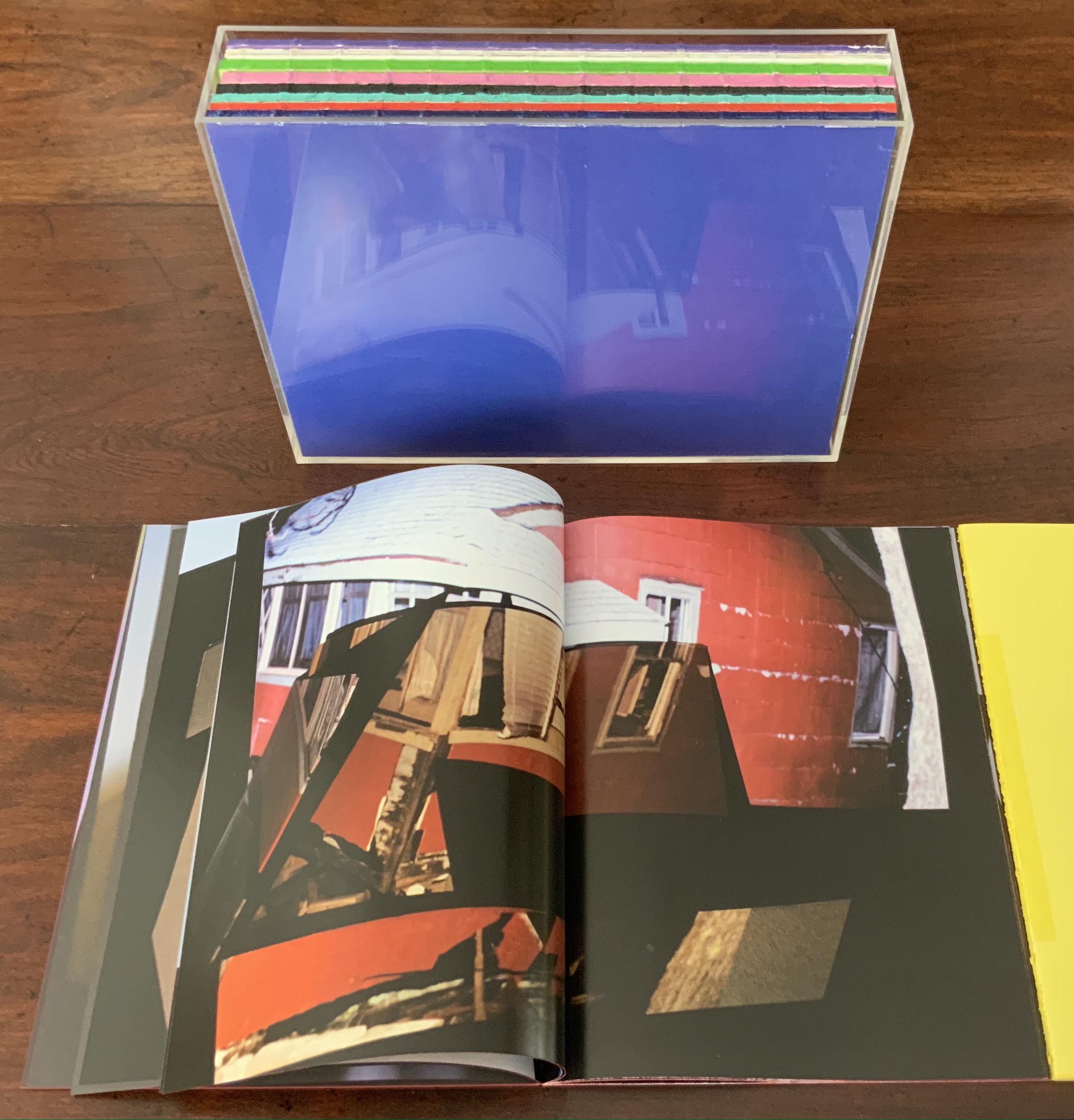
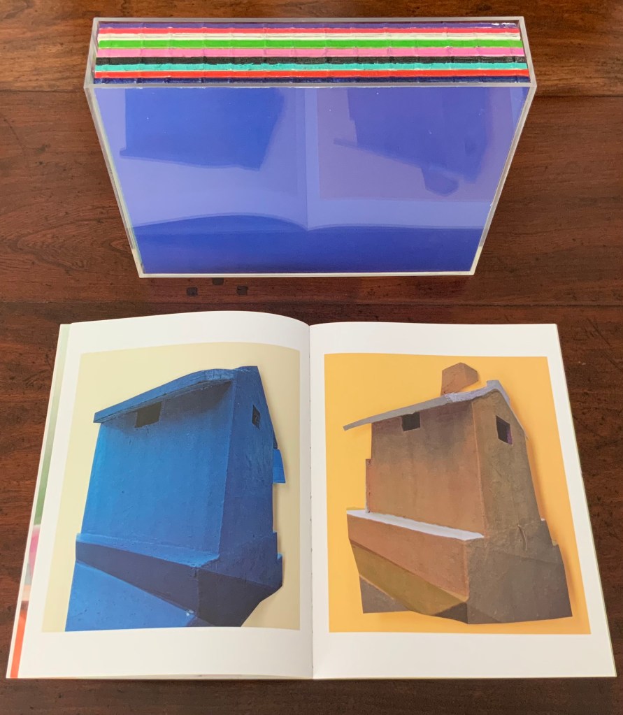
Unlike Universal Tongue, which is based on found images, AUTOMAGIC is drawn from a database of images created (and still being created) by Kruithof herself over the years. With a skill in book artistry as much as photographic artistry, she has curated, edited and montaged the images into nine differently colored booklets, bound by a transparent acrylic shell. As with Universal Tongue, the work is a collaboration, this time with Piera Wolf, the Zurich half of W-E Studio, on the design, and Iñaki Domingo, photographer and professor at the Istituto Europeo di Design, on the text. Domingo’s interview of Kruithof for the book provides the content for a tenth booklet. It is the purple one, edges color sprayed, bound with exposed purple thread and placed like a colophon looking back over the other differently colored nine “chapters” as Kruithof calls them. Laid out in order, the ten front covers spell out “AUTOMAGIC”. The way the individual letters lap over to the back edge of the next cover nods toward the unity the artist intends as well as the metaphorical unity residing in their database source and acrylic box binding.
The tenth booklet lies open under the other nine spelling out the work’s title; its purple cover can be seen in last position in the acrylic box underneath.
AUTOMAGIC is the first work by Kruithof to come into the Books On Books Collection. Its color and bright materiality continually urge taking it down from the shelf and selecting one of the nine “individual chapters” of this long visual work to re-read (re-see). There is, however, a rhythm to the whole work, so they are best read in pairs or trios.
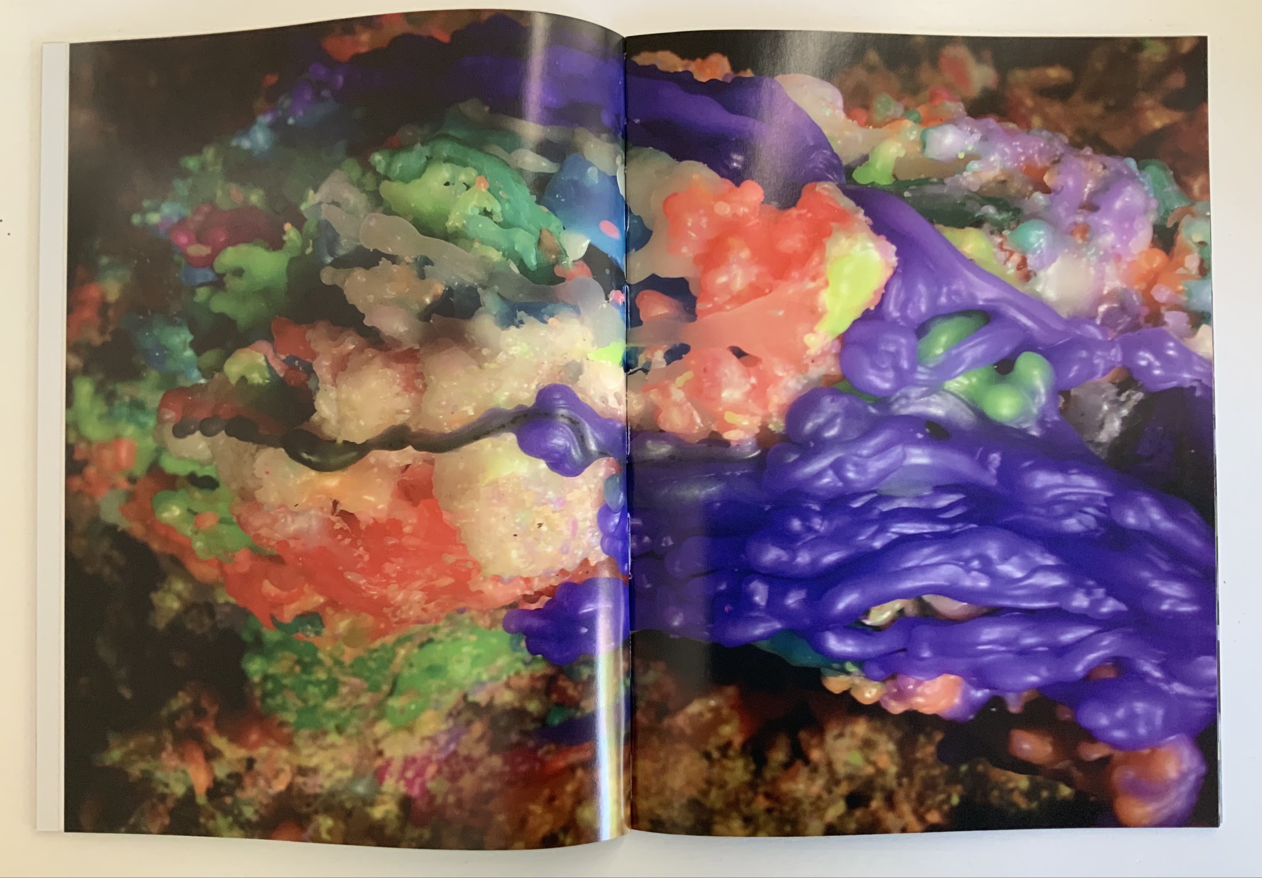
Chapter A (blue), below left, starts the nine-part work with underwater photos and Kruithof’s signature montages on glossy paper.
Chapter U (orange), below right, shifts to portraiture on plain paper, with montages created by laser-printing photos on top of photos, and interspersed with photos of the blank side of the montages with the edge of the picture frame showing. This movement between the portraits and blanks gives Chapter U an easily detectable inner rhythm, all the better appreciated in its contrast with the preceding and following chapters.
Left: from Chapter A (blue). Right: from Chapter U (orange) front and back.
Chapter T (aqua) shifts back to nature, but a “visually psychedelic” one as Kruithof puts it, achieved with layering photos and editing in Photoshop. It also shifts back to a glossier paper like Chapter A, but the paper is thinner and so saturated with ink that the pages must be carefully separated, slowing down the reader/viewer’s movement through the booklet.
Moving into black and white, Chapter O (black) turns more to human forms and activities, depicted in a mix of straight photos, sometimes layered and some re-photographed analogue photo montages, all printed on the heavier glossy paper used for Chapter A.
Chapter T (aqua), Chapter O (black)
Chapters M (lavender) and A (green) move back into color on plain paper. They are two of the thicker booklets. Both are a blend of the human and nature, both have frequent carefully constructed arrangements of evidence of human impact on nature, with Chapter A building this theme more intensively.
Chapter M (lavender), Chapter A (green)
Chapter G (white) has a frenetic almost violent quality in its images and their manipulation. It alternates images of objects (broken windows, destroyed brick walls, melted candles, a partly erased blackboard) with those of humans contorted by awkward poses, layered photos or editing. While the chapter has shifted back to the thicker glossy paper of Chapter A (blue) and Chapter O (black) and has picked up the black and white rhythm of Chapter O, a burst of melted colored candles interrupts that BW rhythm half-way through before letting it return. This frenetic Chapter G feels like a build-up to a distraught Chapter I (red).
Chapter G (white)
Chapter I (red) juxtaposes self-portraits of distress (on matte paper) with images of a hurricane’s aftermath (on glossy paper). The even division between subjects and type of paper individualizes this chapter and drives home the alternating rhythms of the work as a whole.
Chapter I (red)
Chapter C (yellow) consists of “re-photographed analog photomontages of mausolea and images of color smoke bombs in abstract architectural settings”. If the previous eight chapters have expressed a sense of being in the world, this one expresses a sense of exiting it — a sense that is complicated by the fictive enhancement of the brightly colored Mexican mausolea and the fictive smokescreen attempt to impose a ritual and architectural structure on that exit.
Chapter C (yellow)
Pixel Stress (2013)
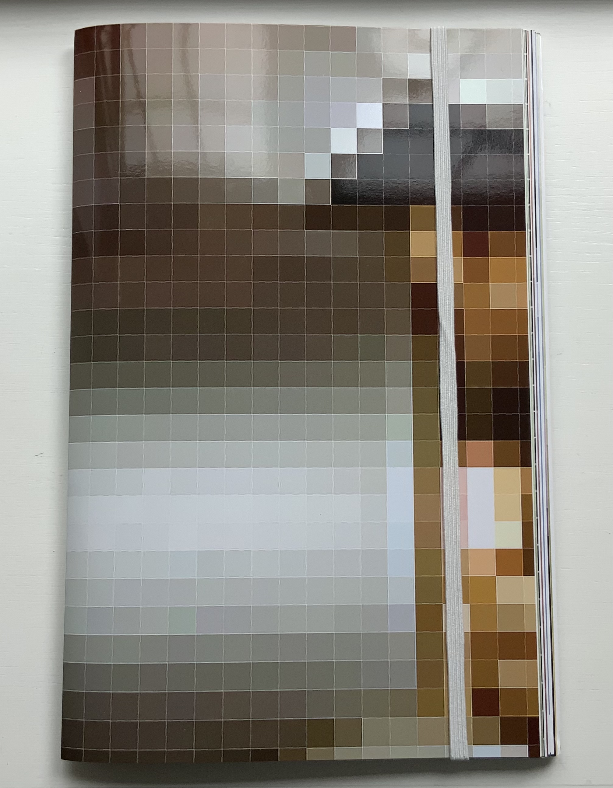
Pixel Stress (2013) Anouk Kruithof Softcover booklet stapled, enclosed in a set of 15 single-fold folios held together with an elastic cloth band. H320 x W200 mm, 100 pages.Edition of 1000. Acquired from RVB, 12 June 2021. Photos of the work: Books On Books Collection. Displayed with permission of the artist.
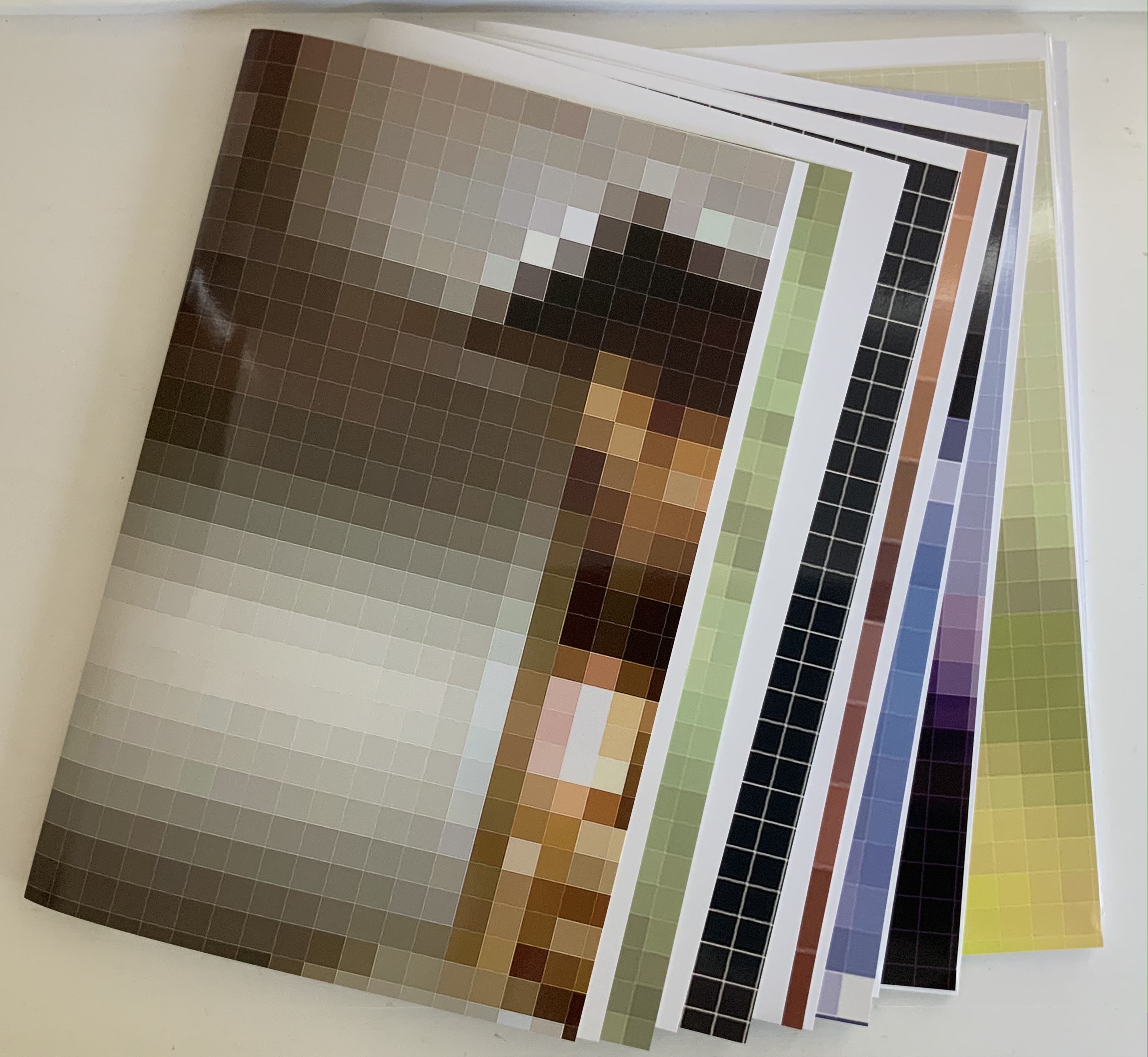
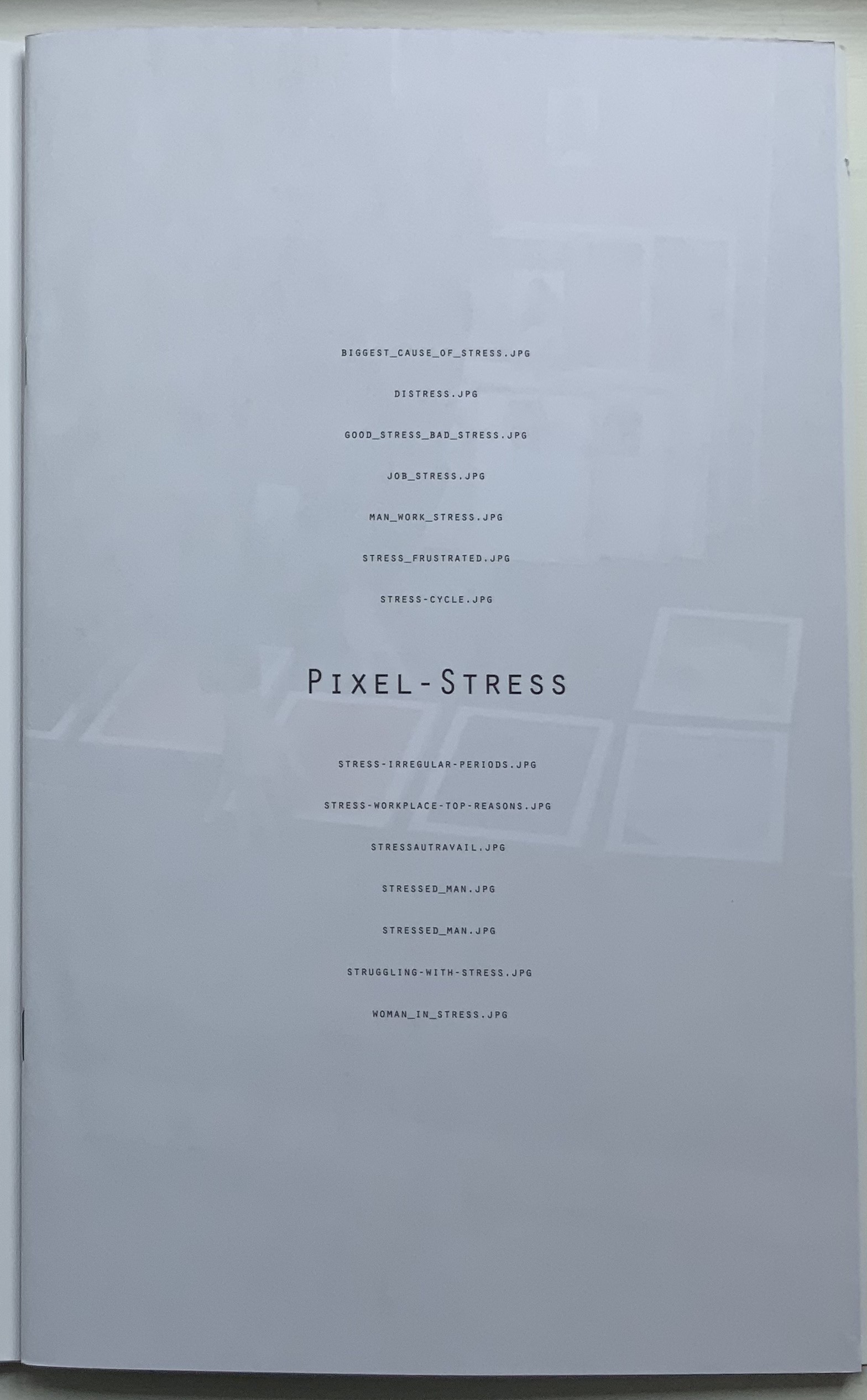
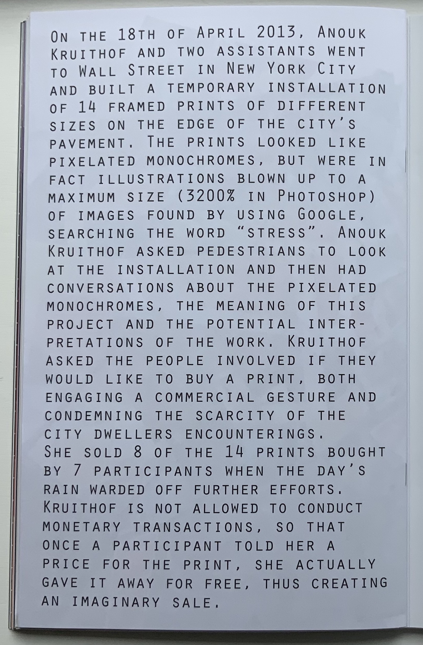
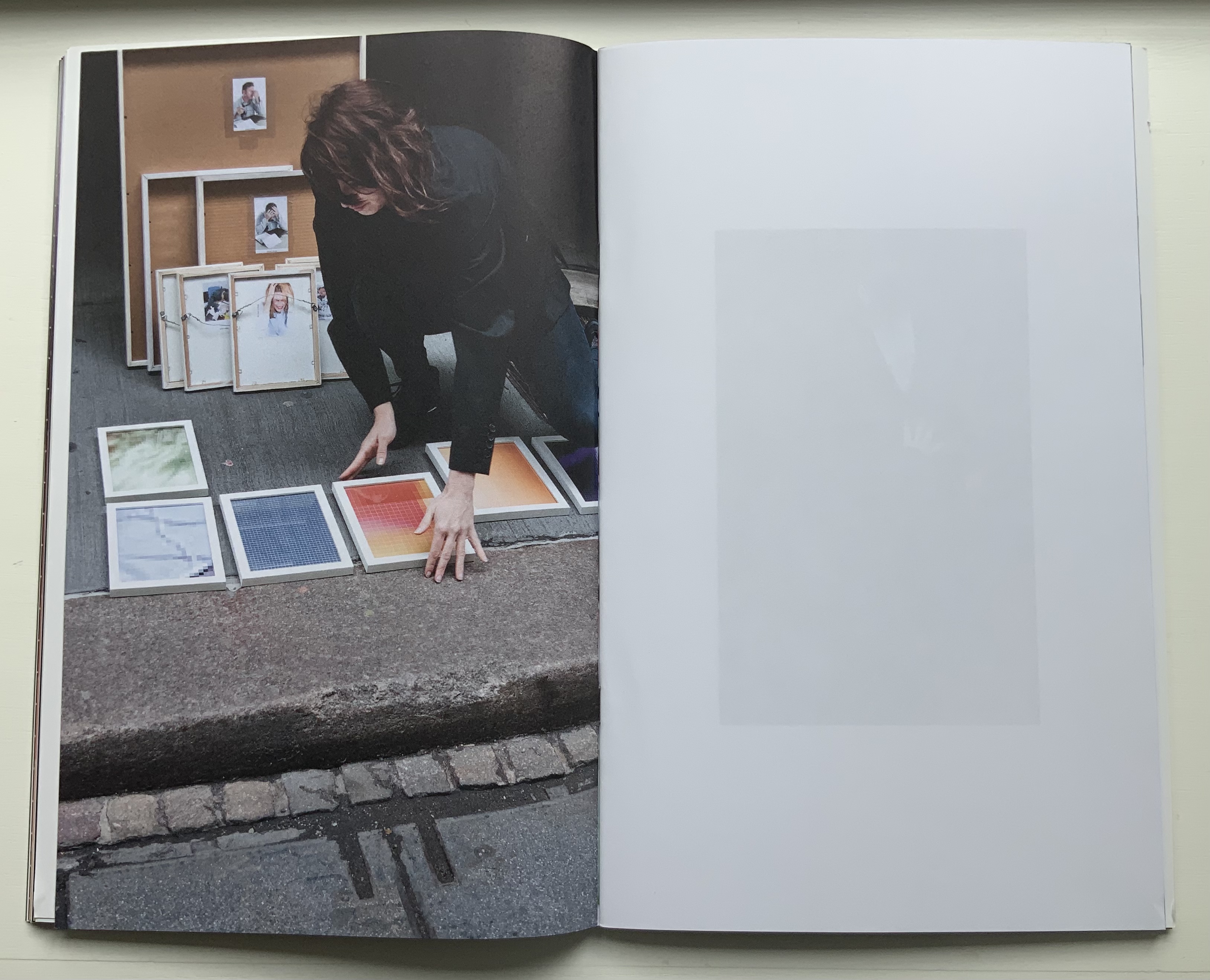
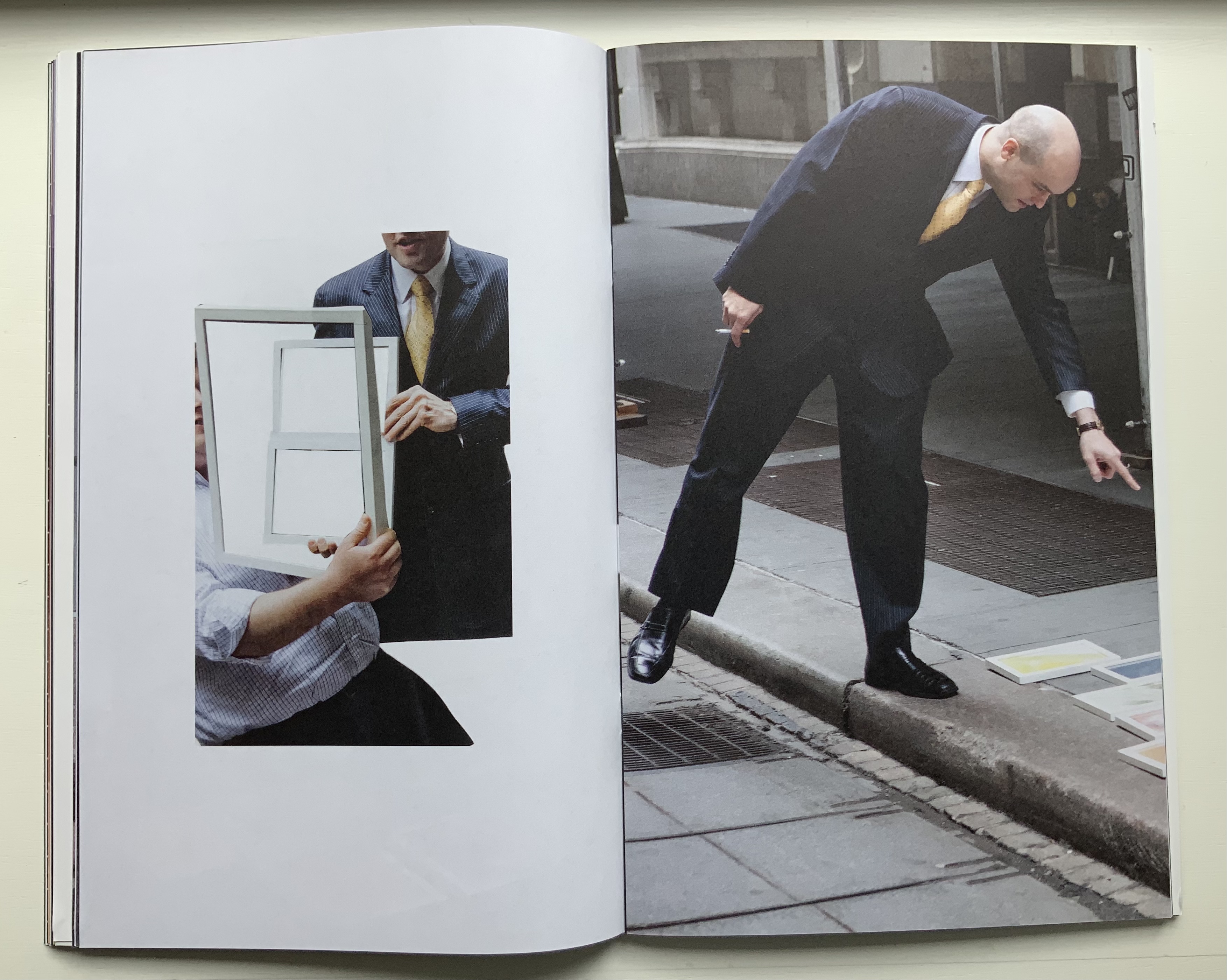
Remove the elastic cloth band and the 15 folios of glossy prints (H320 x W407 mm) folded in half start to slip and slide. At the center of the inmost folio lies a stapled booklet. The booklet’s front cover serves as the title page, its back cover explains the event that yielded this book.
Single-fold folios slipping apart, front and back covers of the booklet enclosed by the glossy folios.
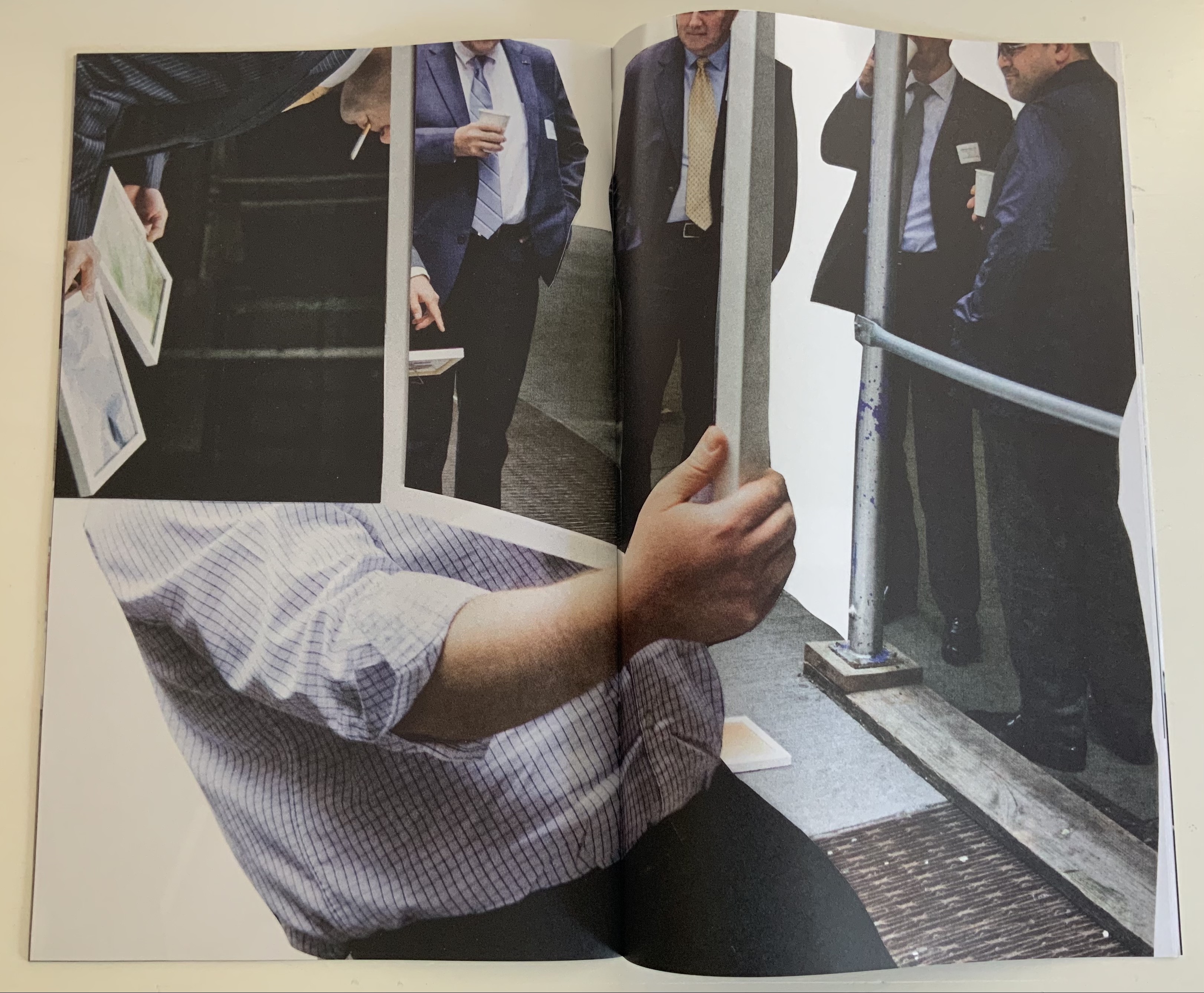
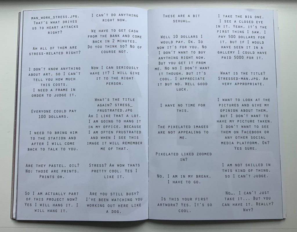
The booklet’s photos and montage pull the reader into the event — busy New Yorkers brushing by and hurrying away, or stopped in their tracks, intrigued and lingering, heads shaking, edging away or absorbed and brightening, then walking off with their prize. Selected comments on the day complete the scenario.
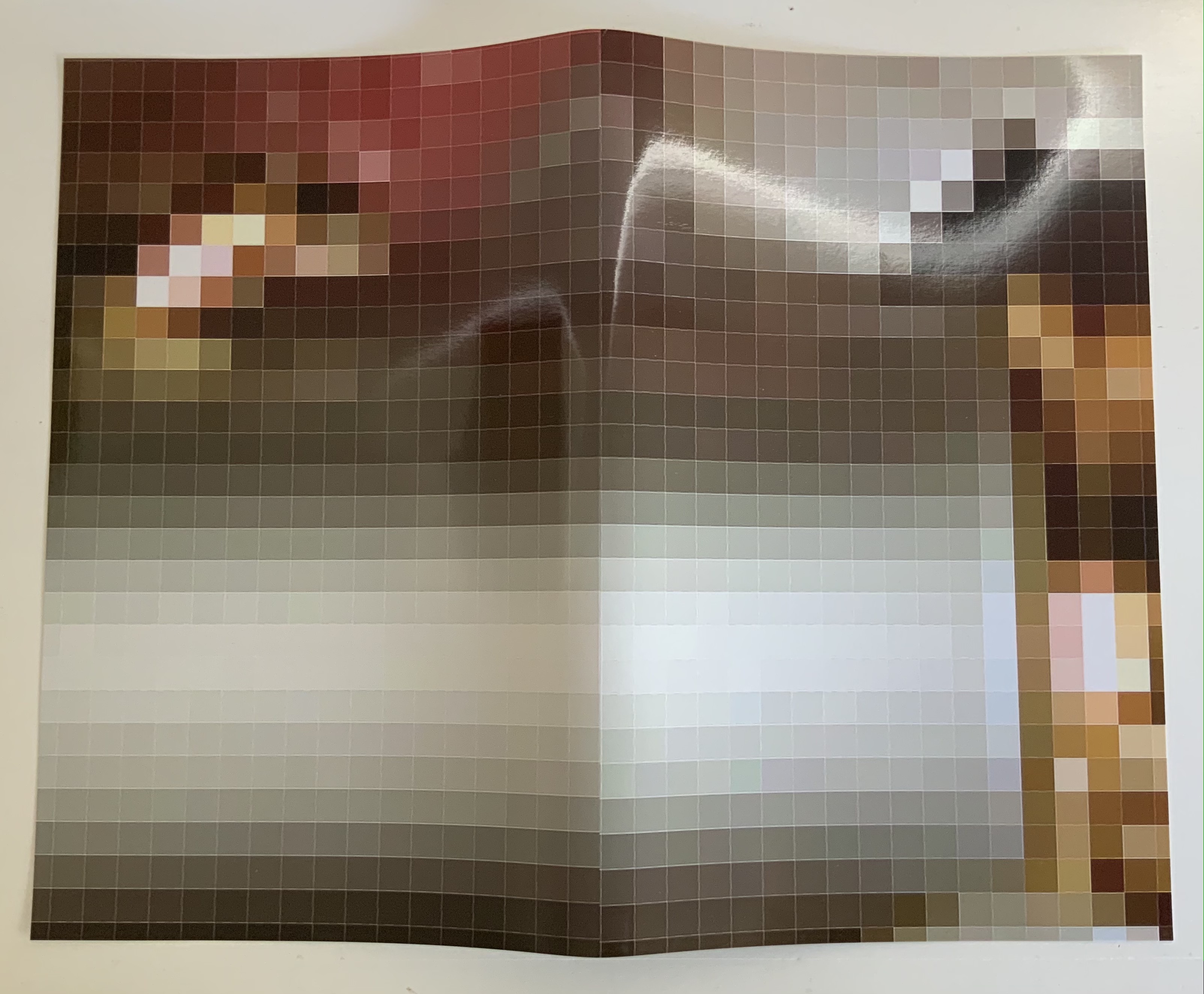
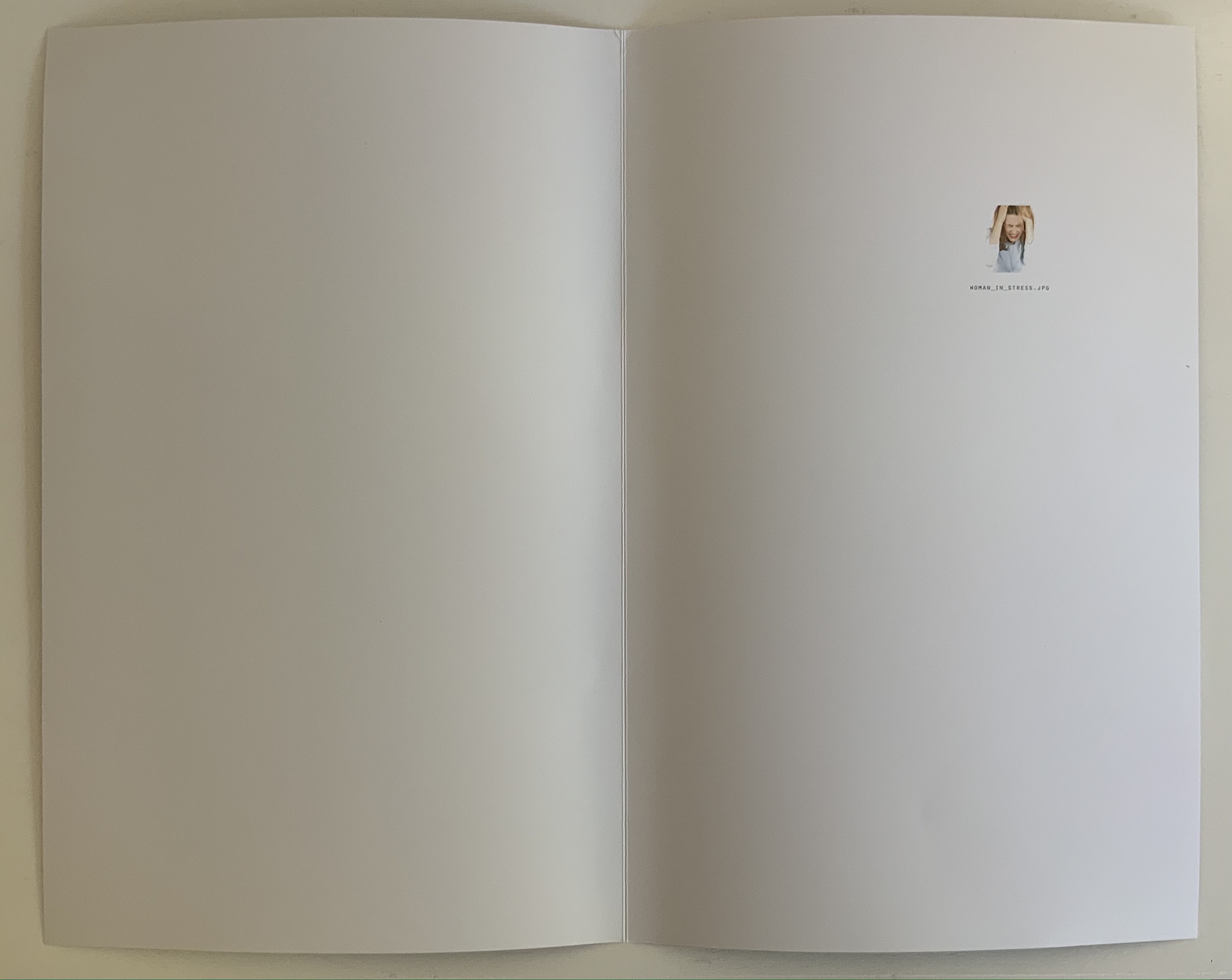
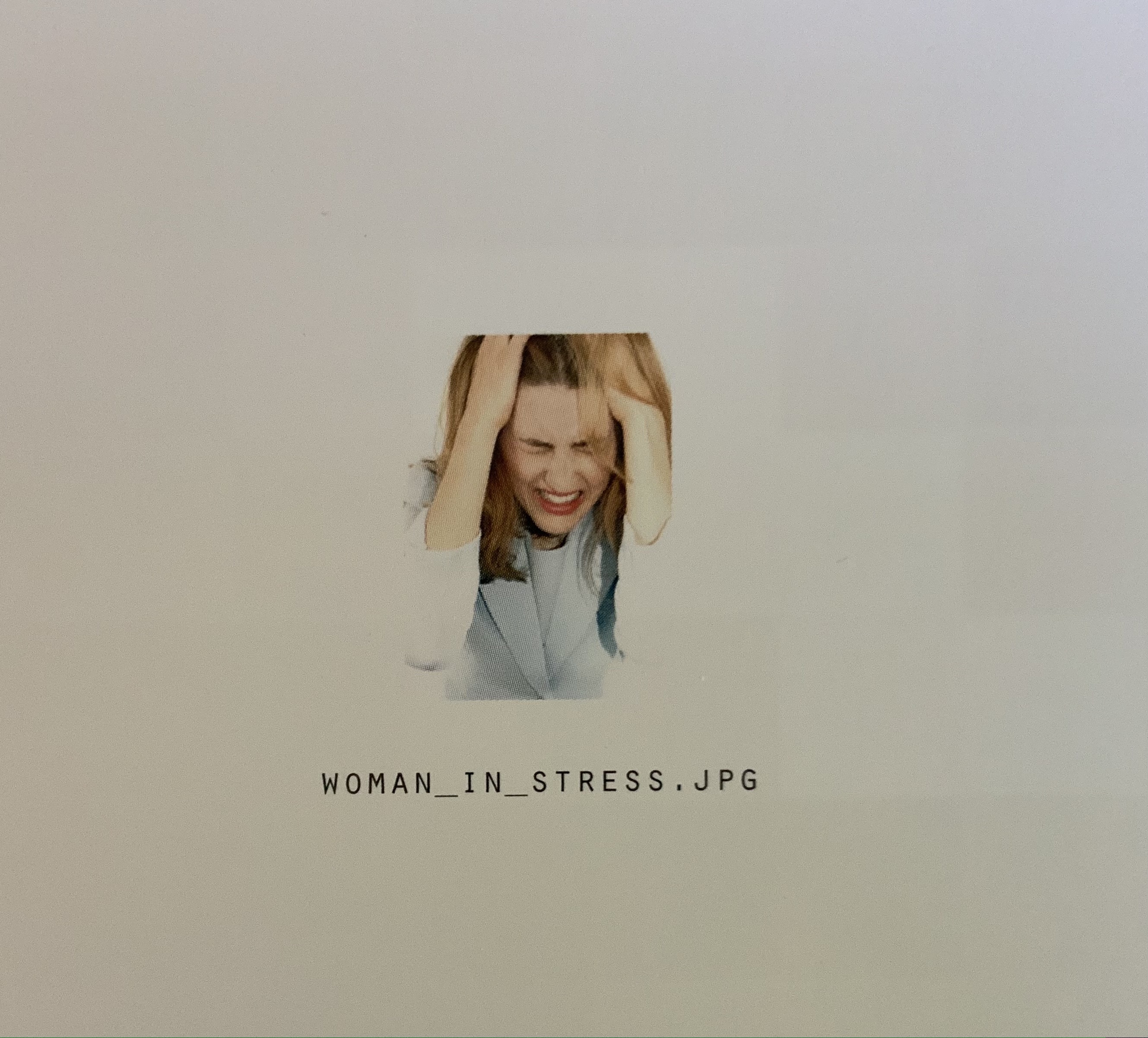
Only the folio that forms the front and back cover presents a complete version of one of the prizes that a New Yorker might have taken away. The print is a detail enlarged from the thumbnail image “WOMAN_IN_STRESS.JPG”, reproduced on the back of the print.
Clockwise: Front of the folio that is the front and back cover of the book. Back of the folio. Upper right of the book’s “inside back cover” showing the jpeg.
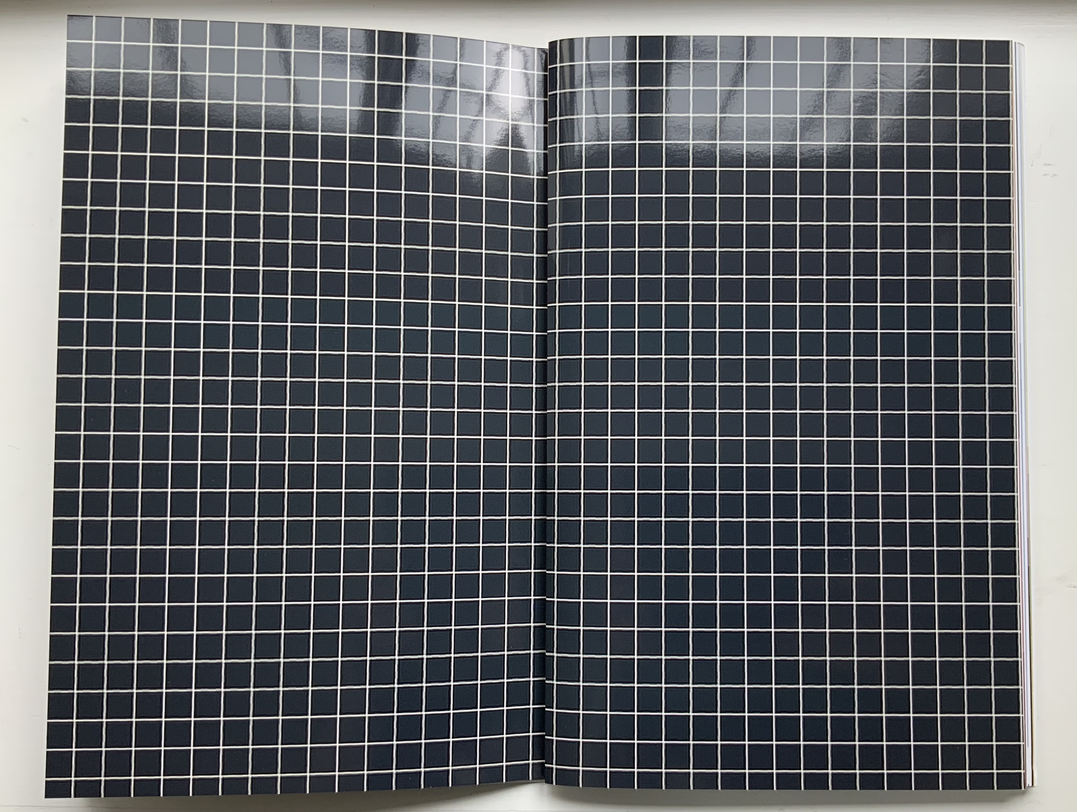
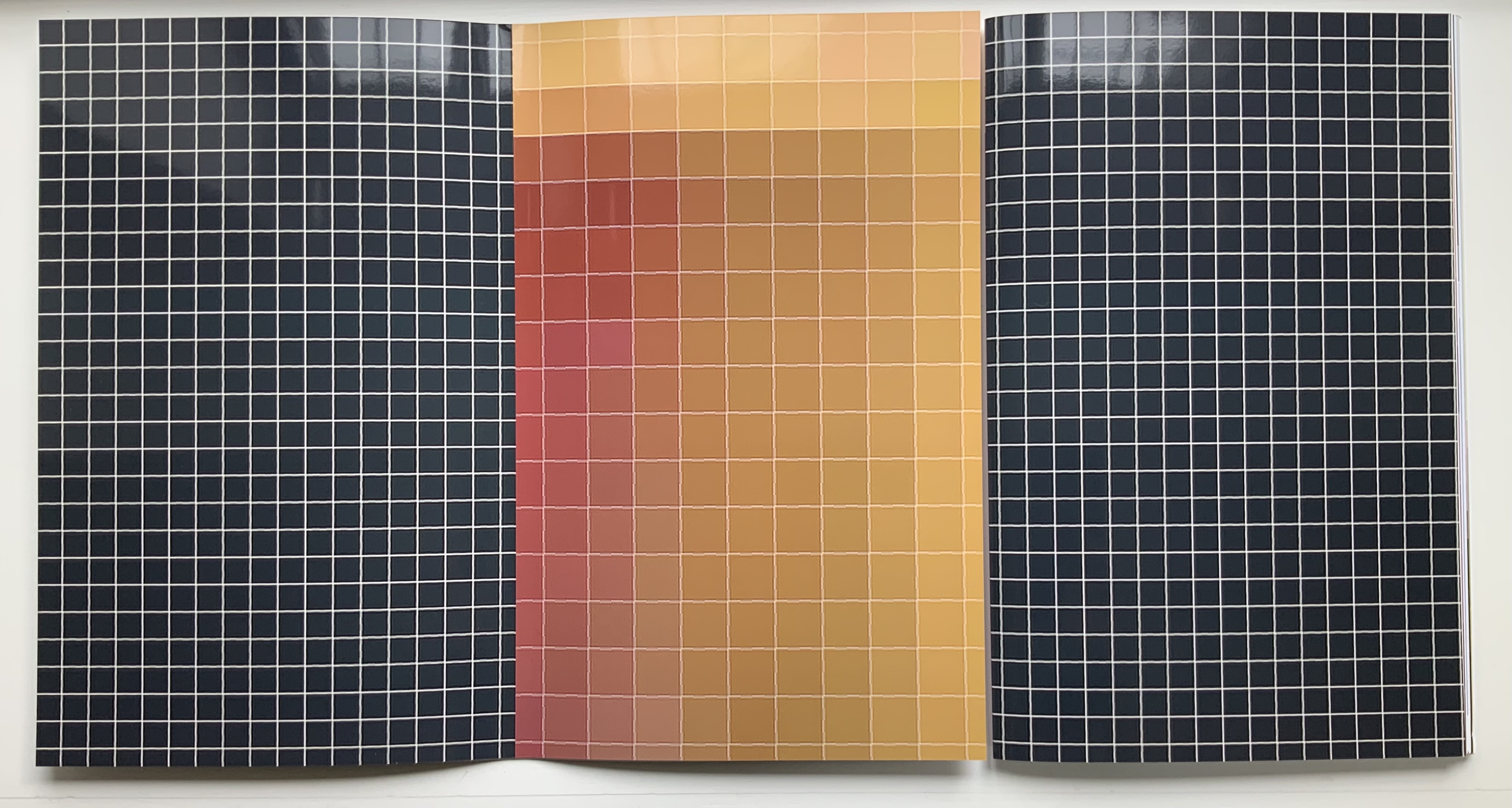
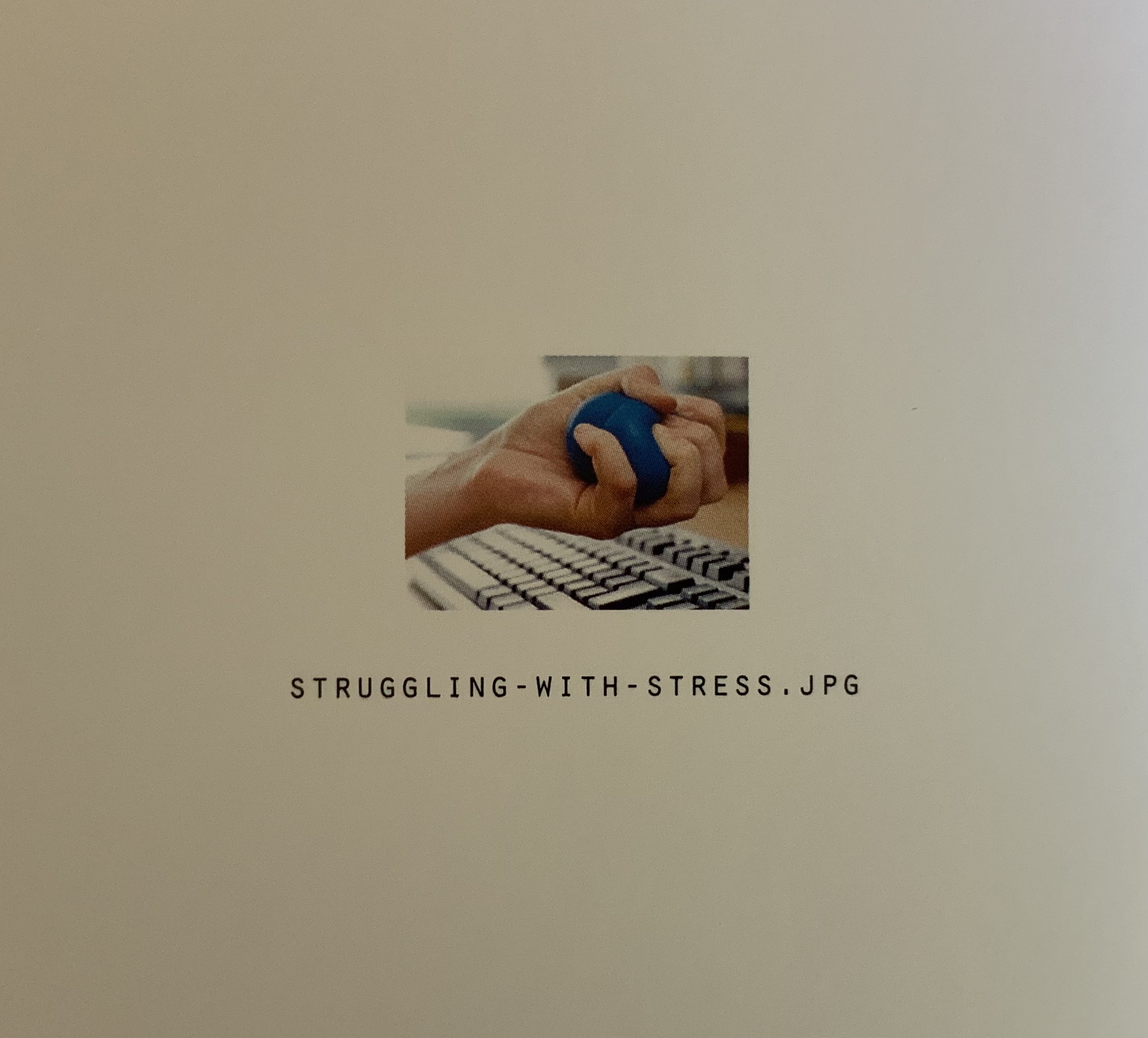
All of the other prizes are transformed in the book into beautifully aligned verso and recto pages. Thus the recto page of the glossy white-on-black grid in this double-page spread below is a bundle of single-fold, gathered folios. The least nudge shifts the bundle to the right exposing the underlying folio: half white-on-black grid, half umber-to-gold enlarged detail of the image “STRUGGLING-WITH-STRESS.JPG”, which appears on the reverse of the enlargement.
Fifty-two color photographs and photo-montages make up the content of Pixel Stress. Glorious as they are in their photographic language, it is the language of the book, spoken fluently by Kruithof and her collaborator Rémi Faucheux of RVB, that makes Pixel Stress a work of art.
Becoming Blue (2009)
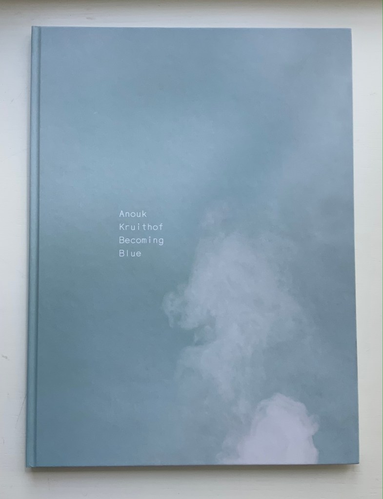
Becoming Blue (2009) Anouk Kruithof Paperback, sewn. H275 x W205 mm, 102 pages. Limited edition of 750. Acquired from the artist, 12 June 2021. Photos of the work: Books On Books Collection. Displayed with permission of the artist.
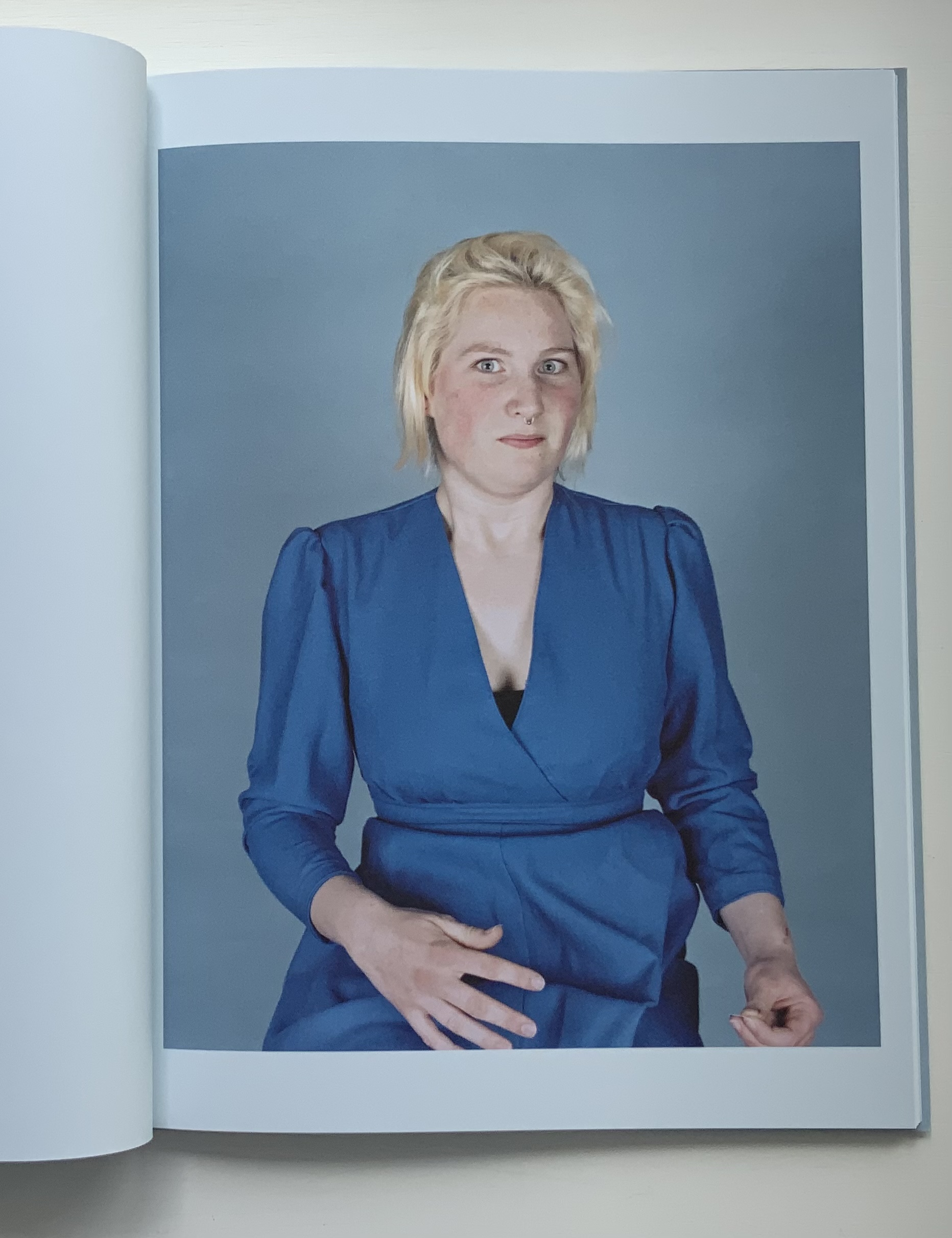
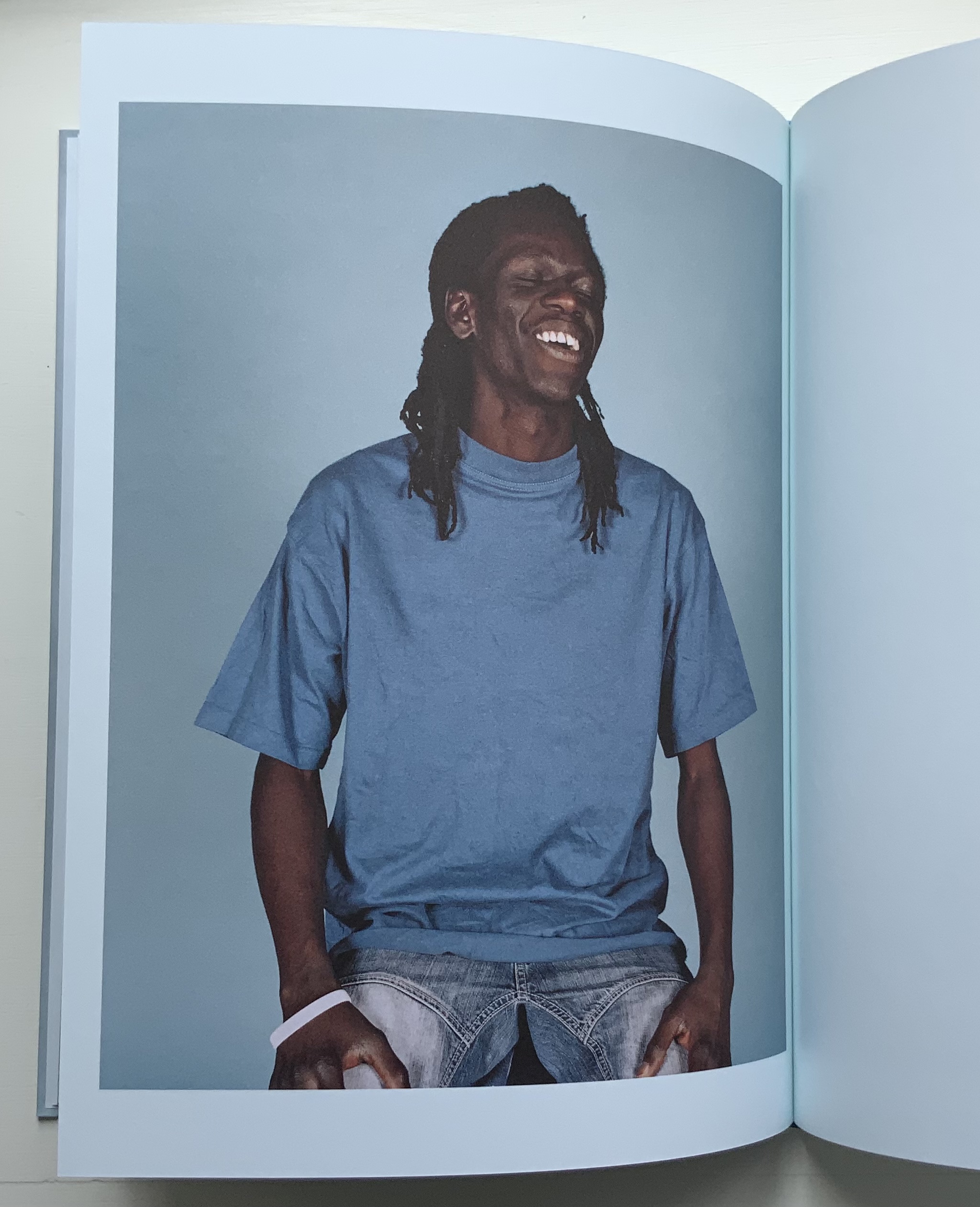
Being the product of a design house (Kummer & Herrman) and photo book publisher (Revolver Publishing), Becoming Blue seems more a showcase of photography rather than of book artistry. It nevertheless reflects Kruithof’s playful investigation of color, creative interaction with strangers (hers is the extra hand, head of hair or shape peeking out from behind the subjects) and love of the quirky and awkward.
Ephemera
Newsprint
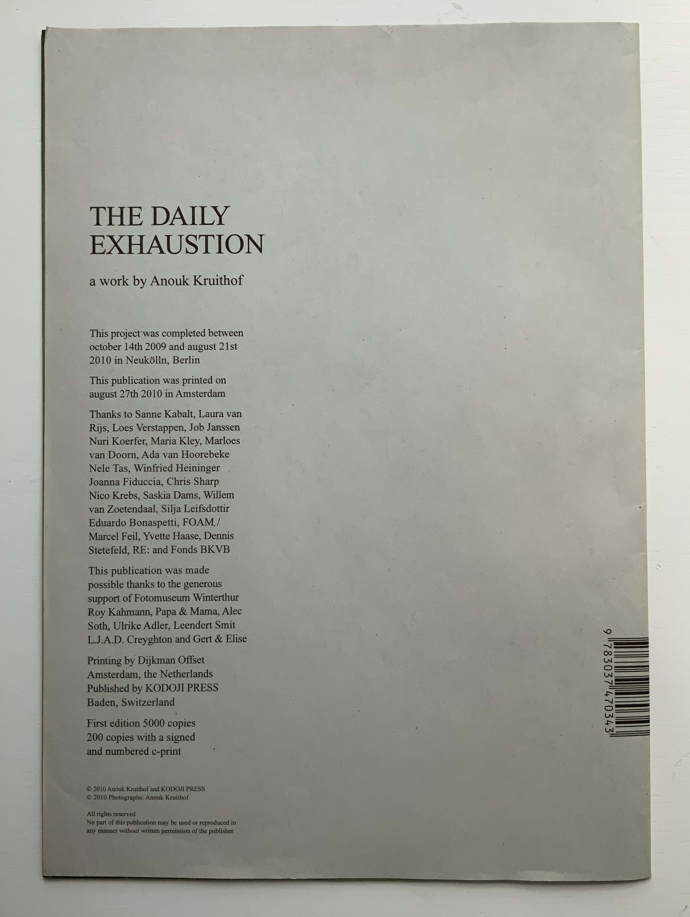
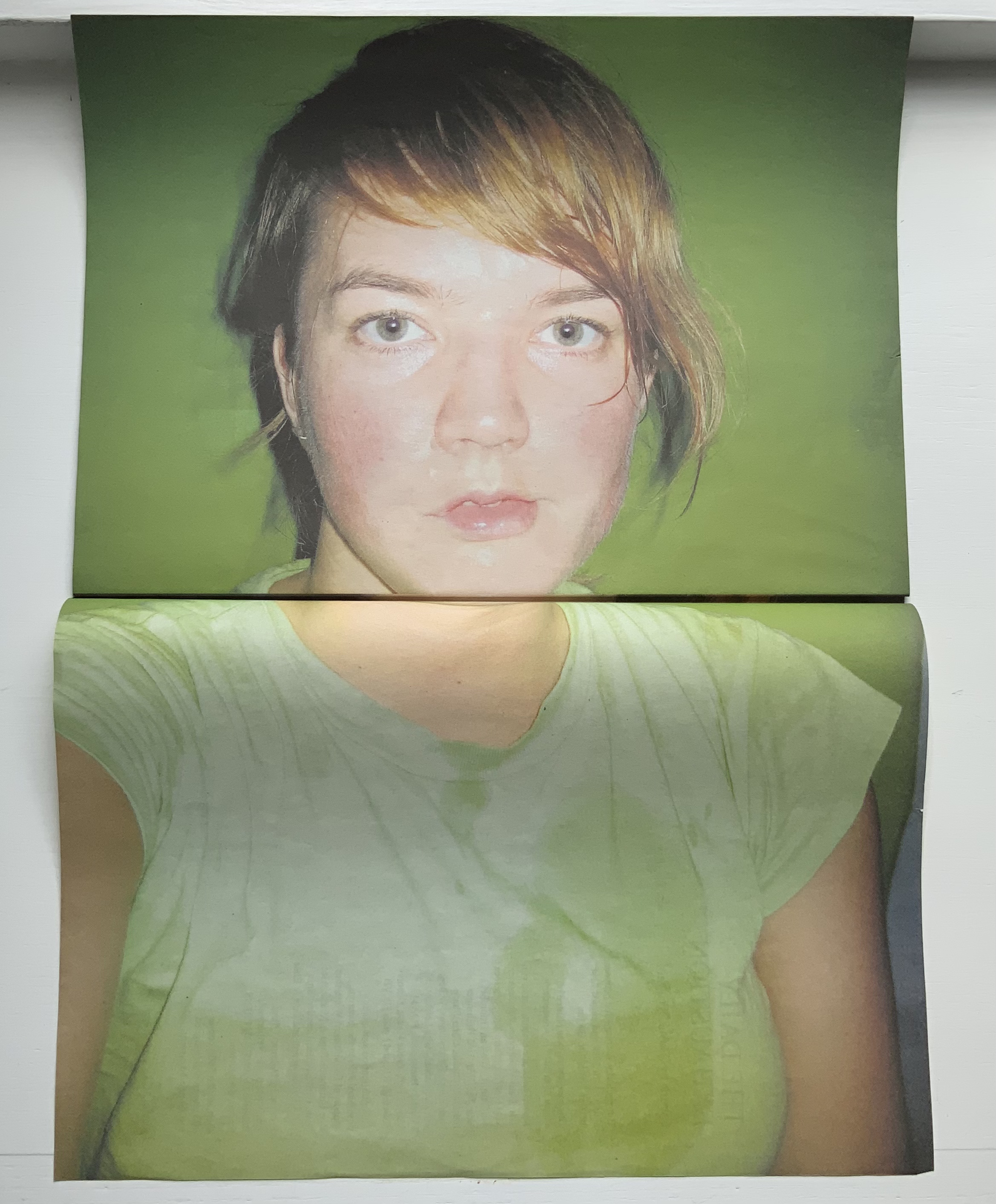
The Daily Exhaustion (2010) Anouk Kruithof Tabloid format newspaper. H275 x W195 mm, 48 pages. Edition of 5000. Acquired from the artist, 12 June 2021. Photos of the work: Books On Books Collection. Displayed with permission of the artist.
A clever contribution to the Dutch self-portrait tradition. Kruithof reworks some of these photos in AUTOMAGIC.
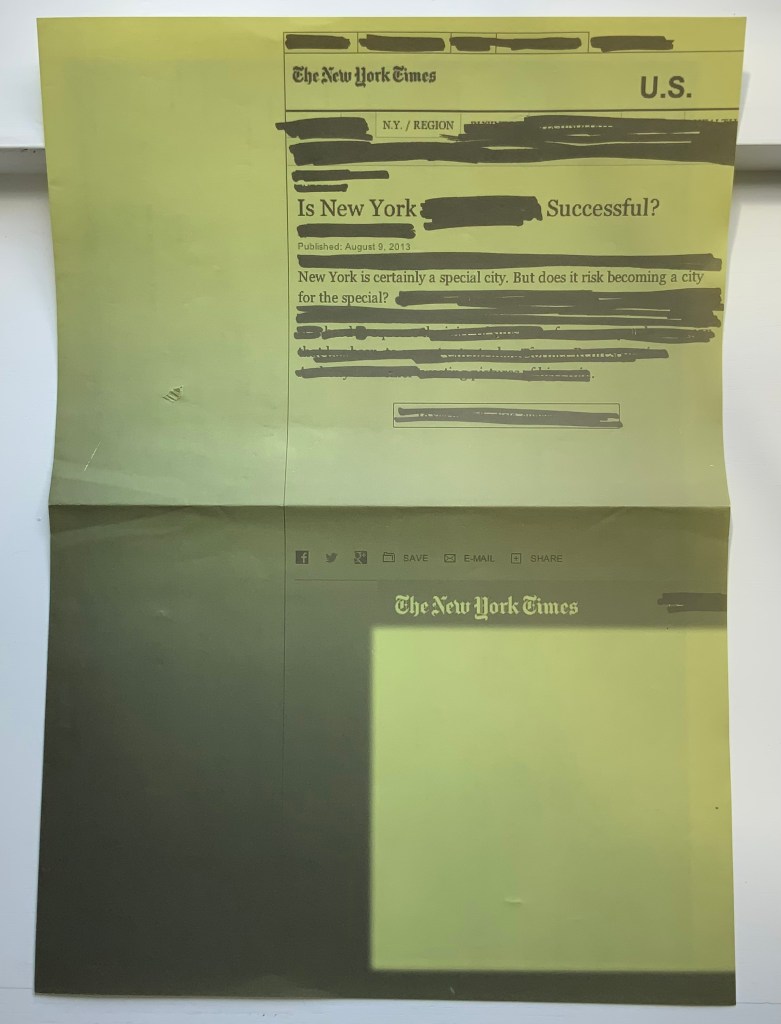
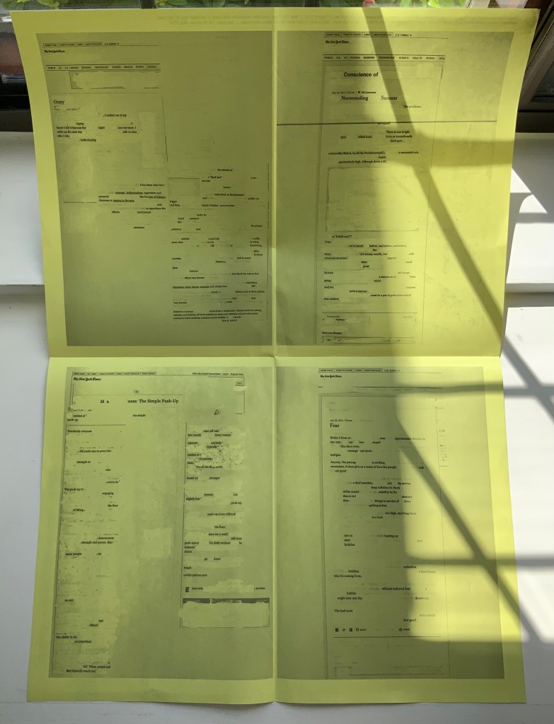
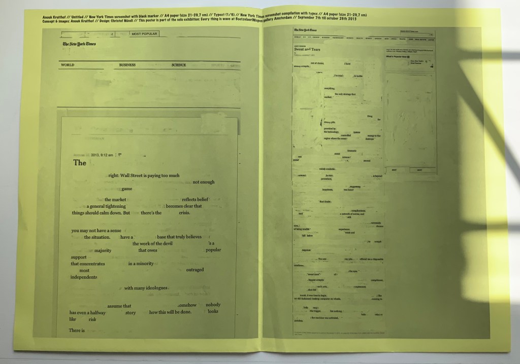
NYC Typext(2013) A2 poster, bw offset print on yellow paper, folded twice to A4. Photos of the work: Books On Books Collection. Displayed with permission of the artist.
NYC Typext is associated with the solo exhibition “Every thing is wave” held in September and October 2013 at the Boetzelaer I Nispen Gallery in Amsterdam.
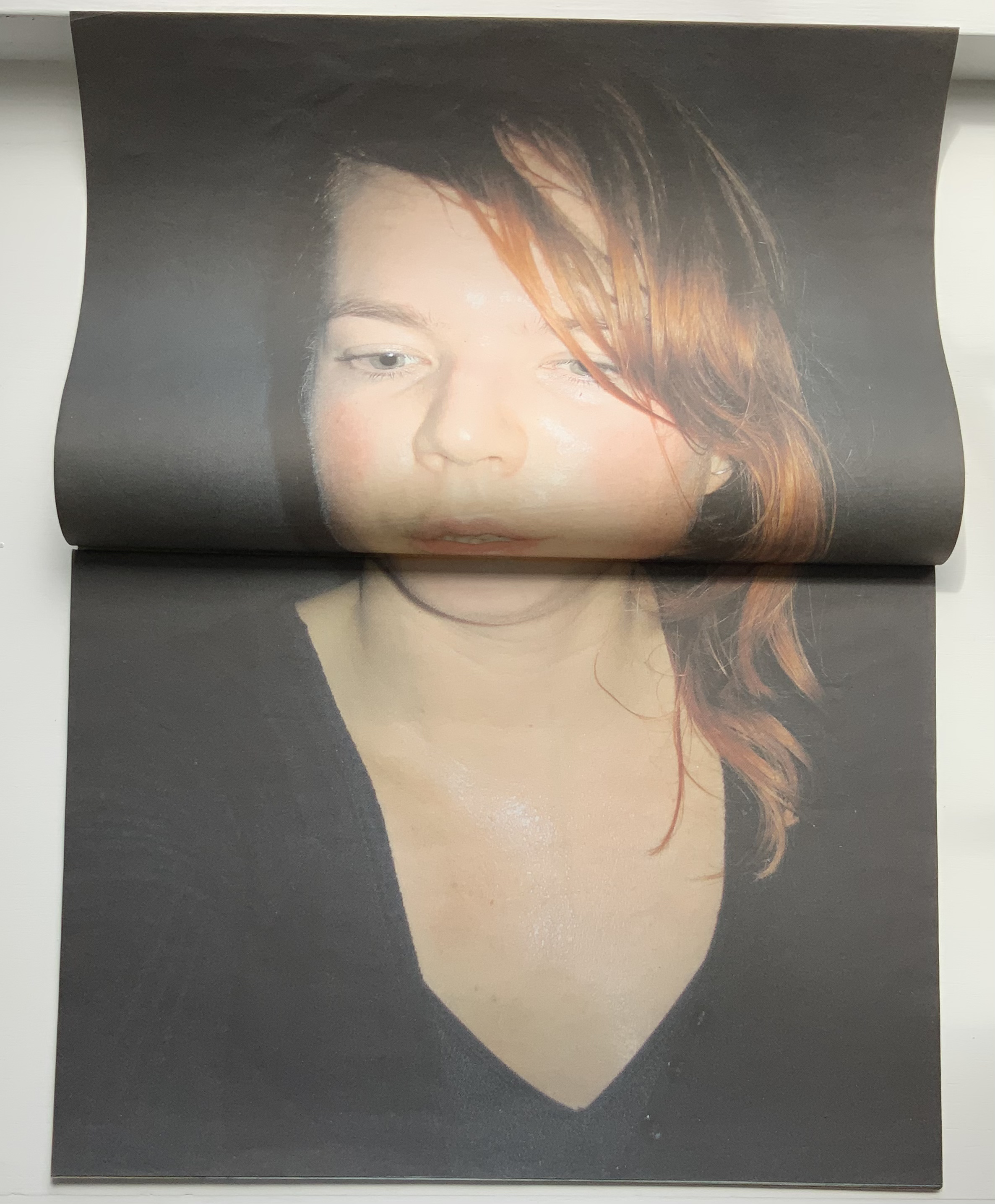
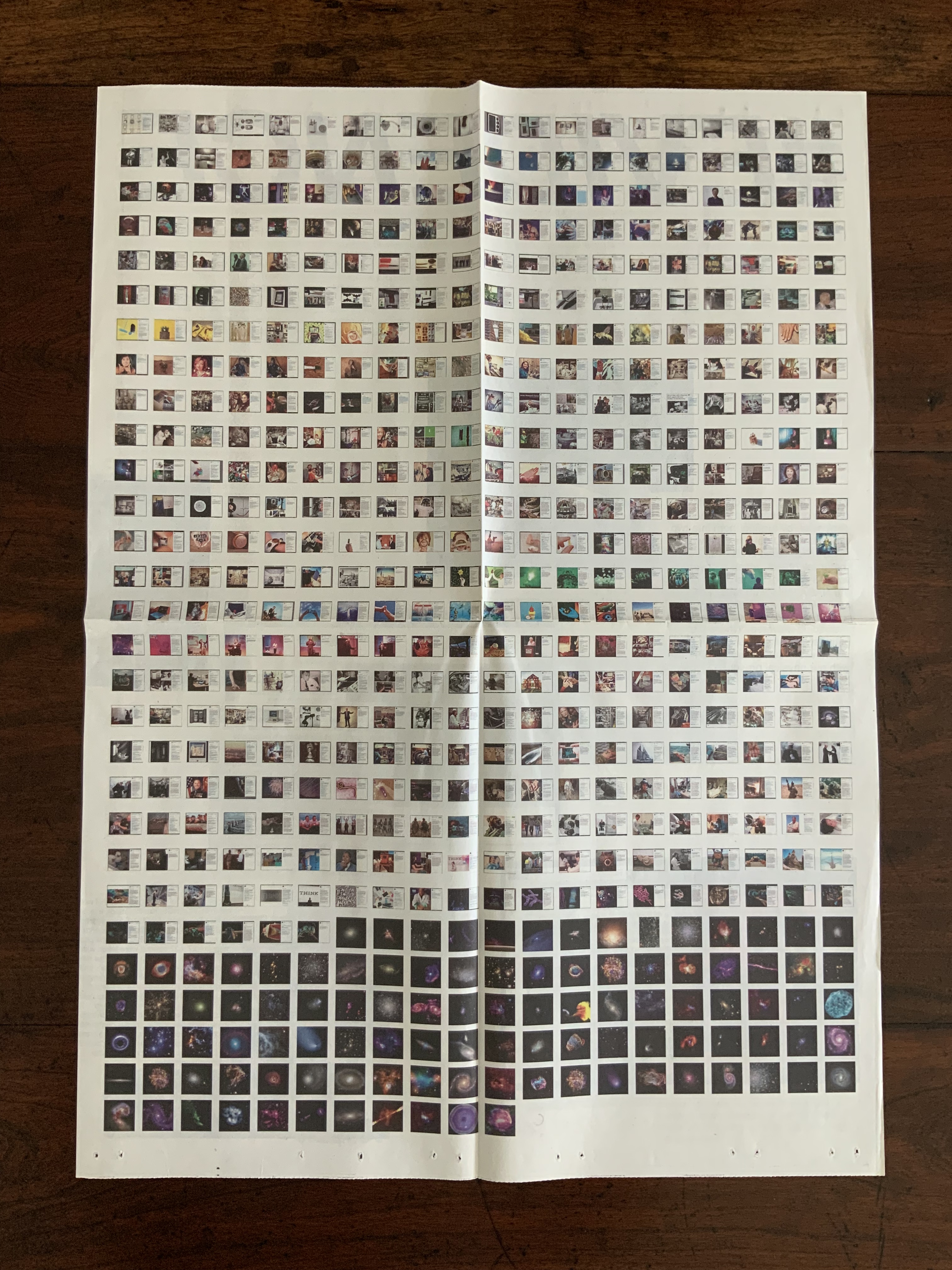
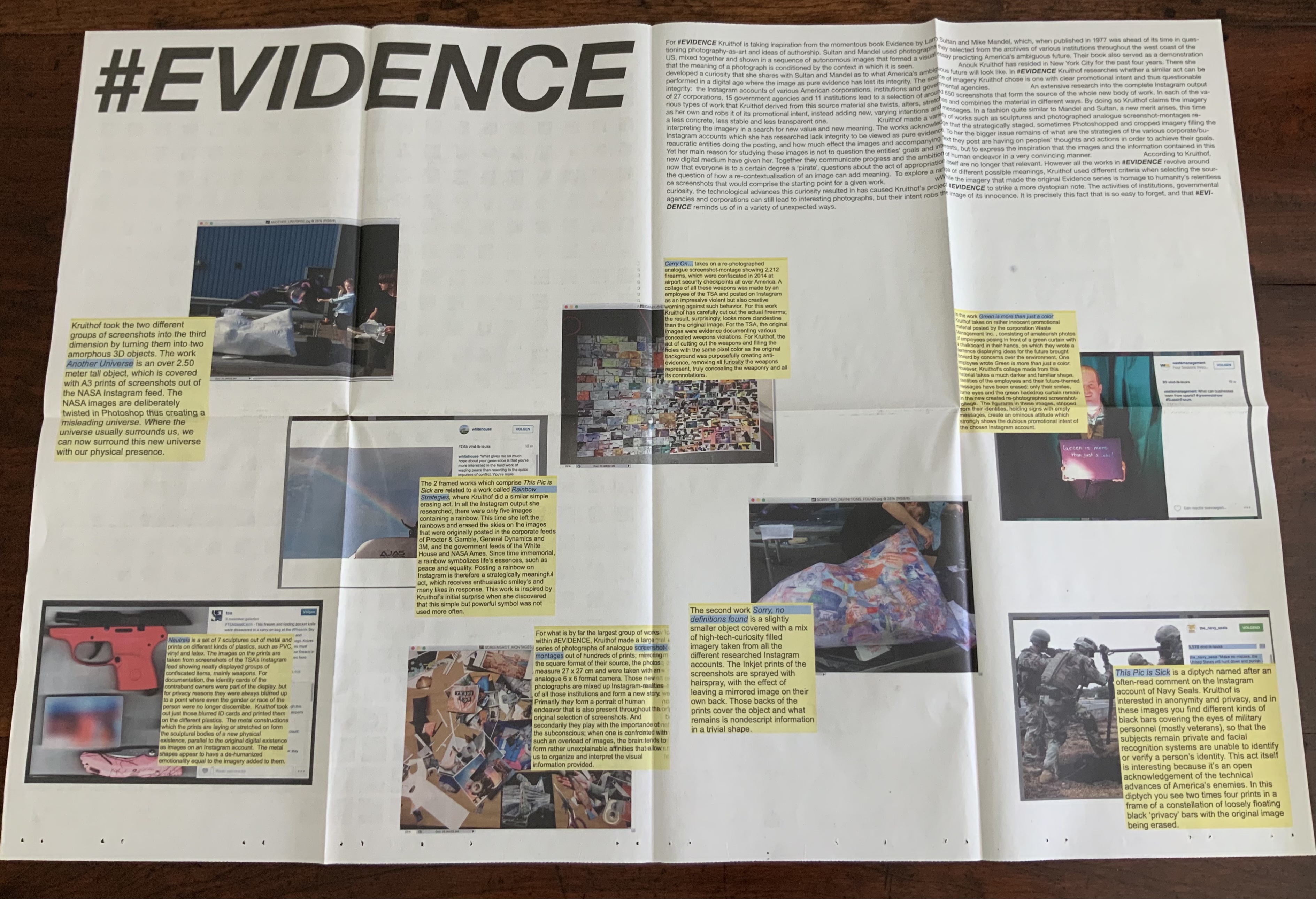
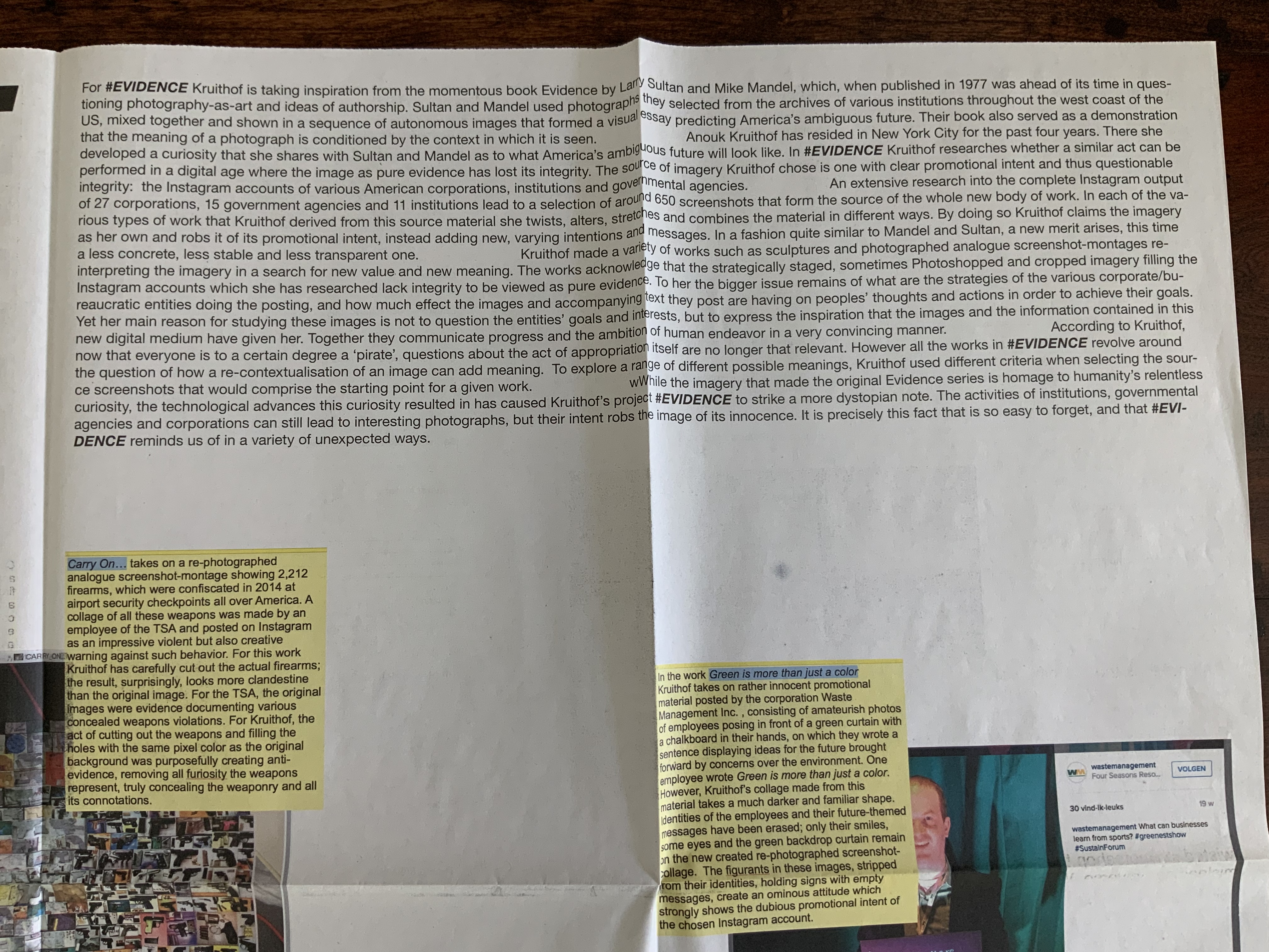
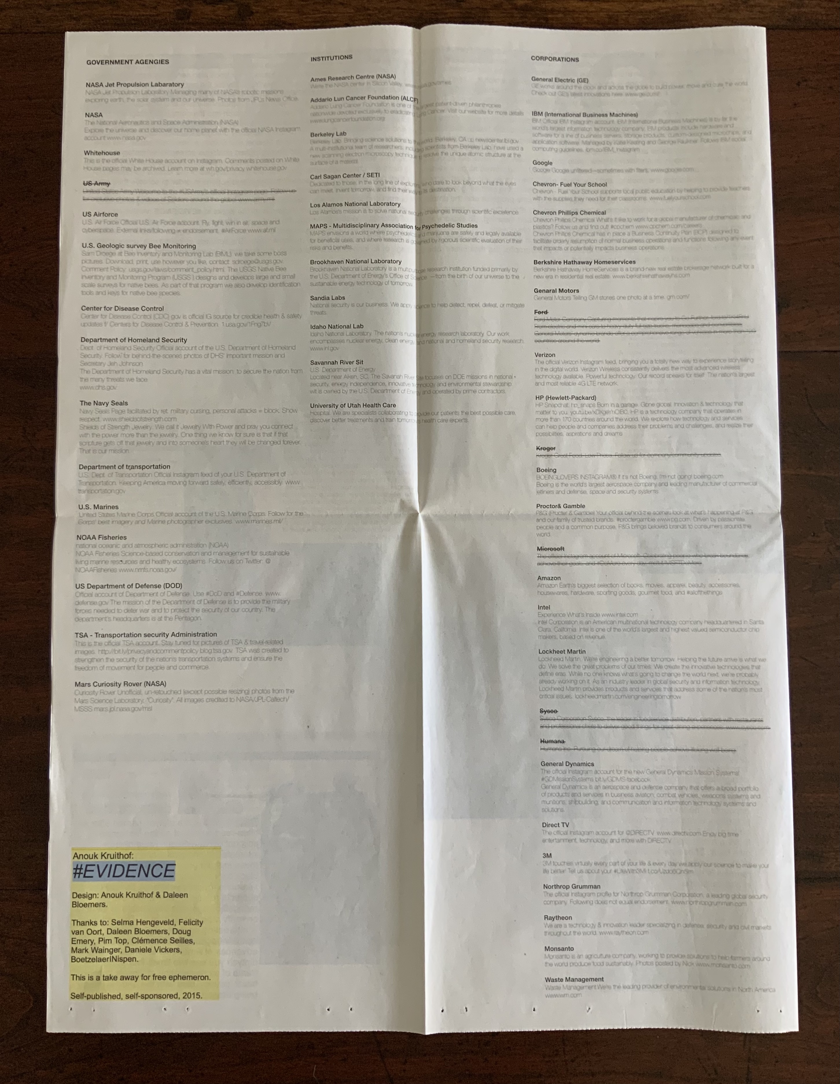
#EVIDENCE (2015) A2 poster, full color newspaper print on recycled paper, folded twice to A4. Photos of the work: Books On Books Collection. Displayed with permission of the artist.
#EVIDENCE is associated with the solo exhibition of the same name held from October through November at the Boetzelaer I Nispen Gallery in Amsterdam.
Poster-Set (2008-12)
Five posters. Edition of 50. Acquired from the artist, 12 June 2021. Photos of the works: Books On Books Collection. Displayed with permission of the artist.
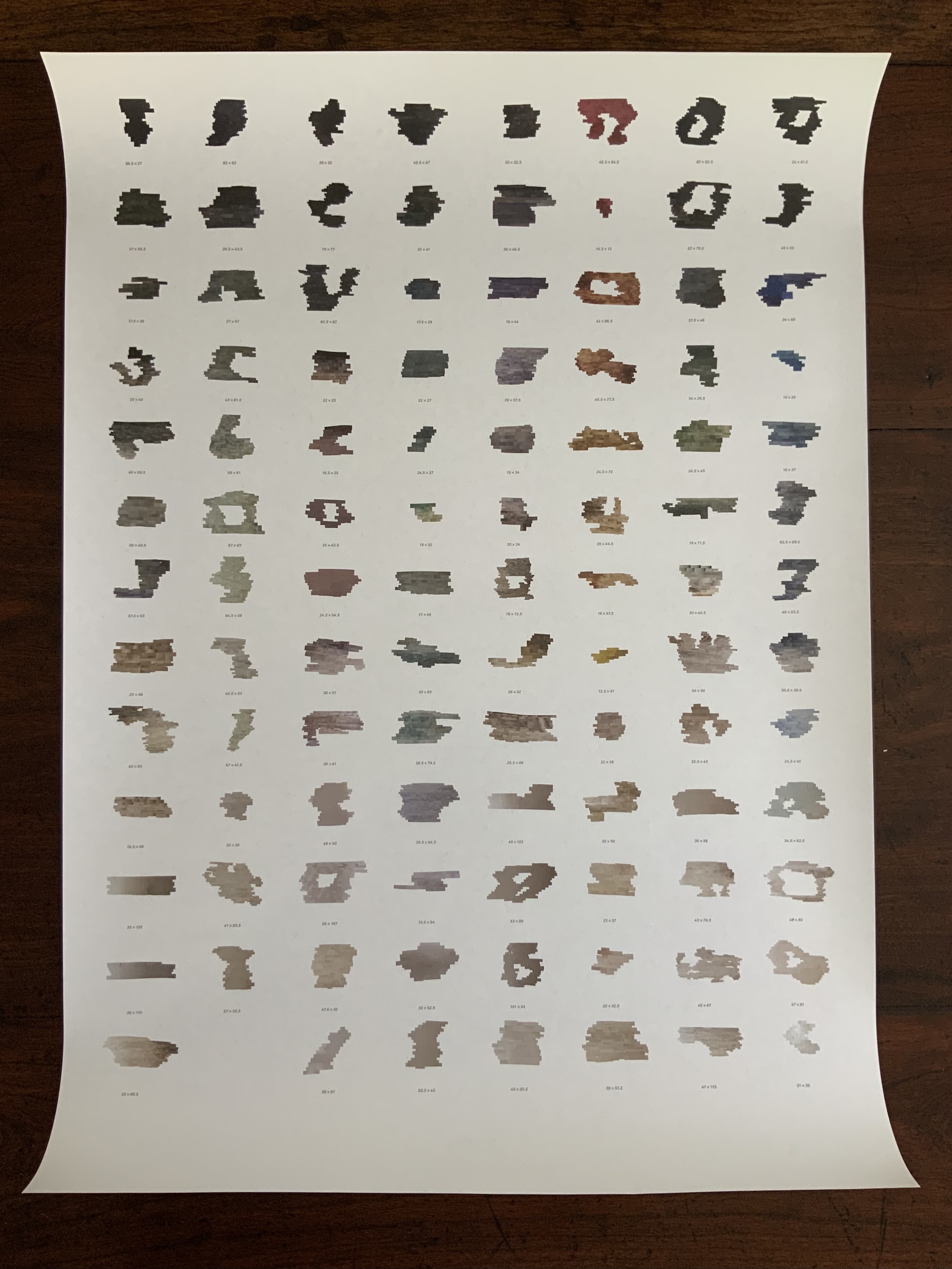
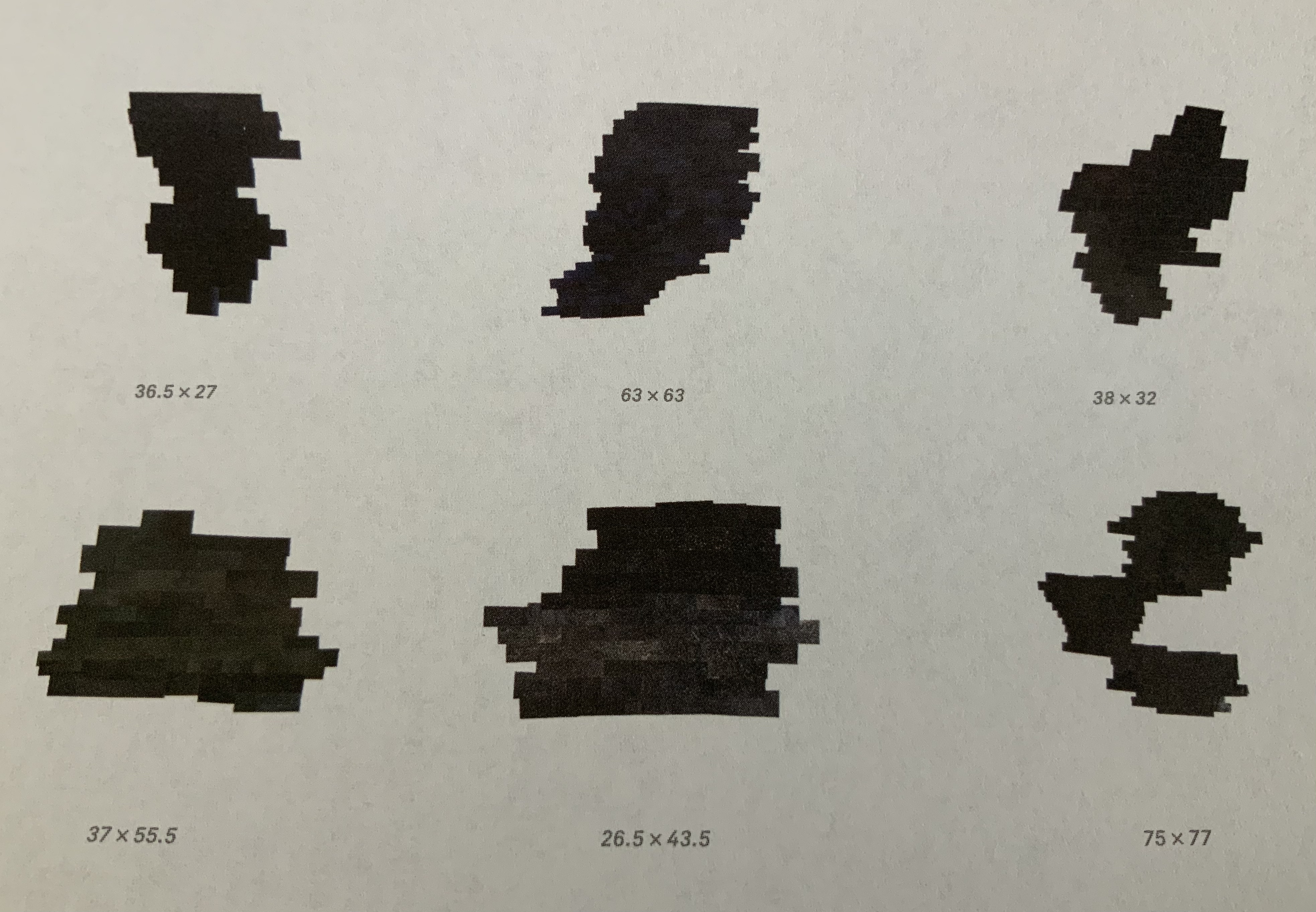
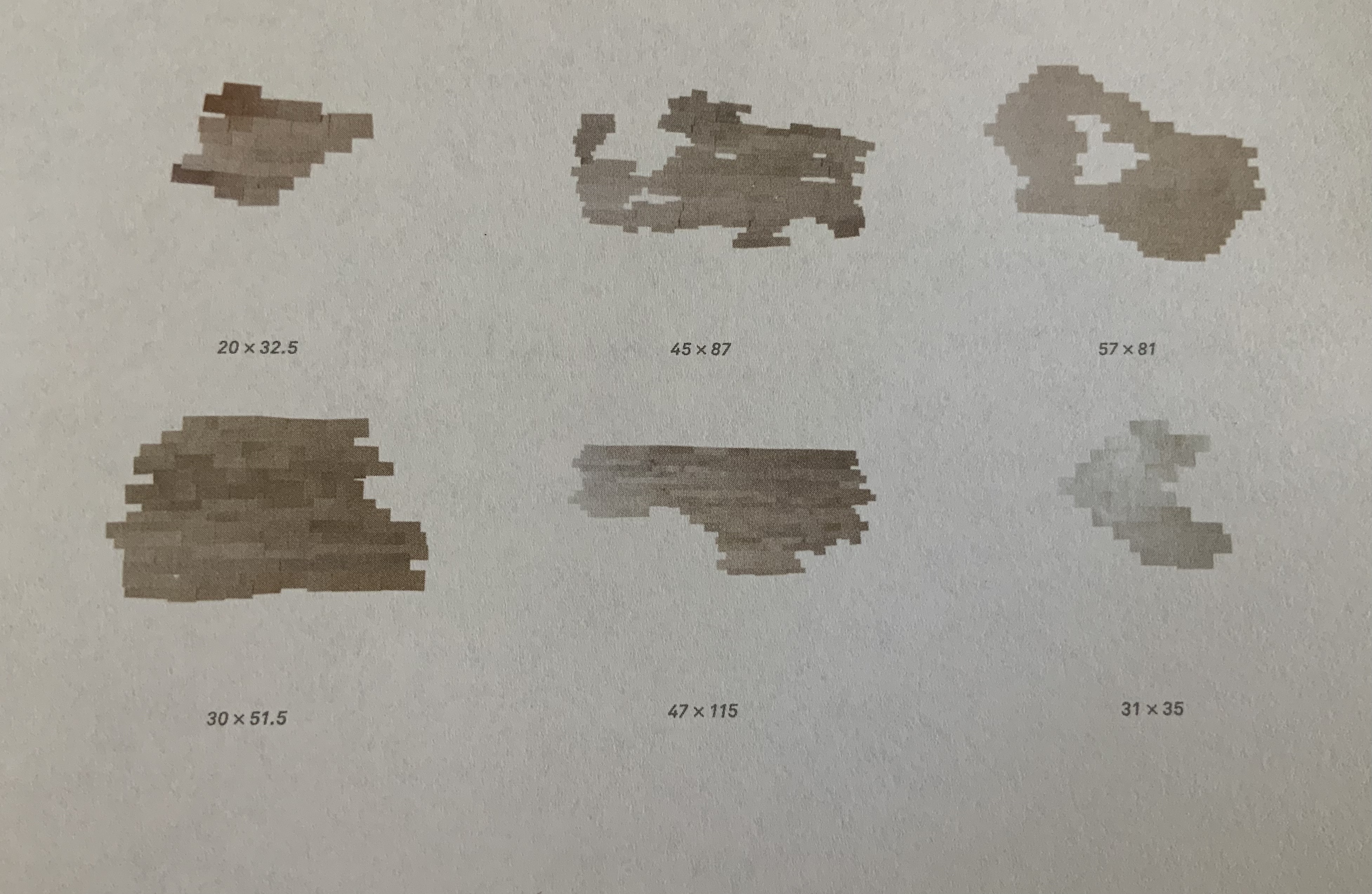
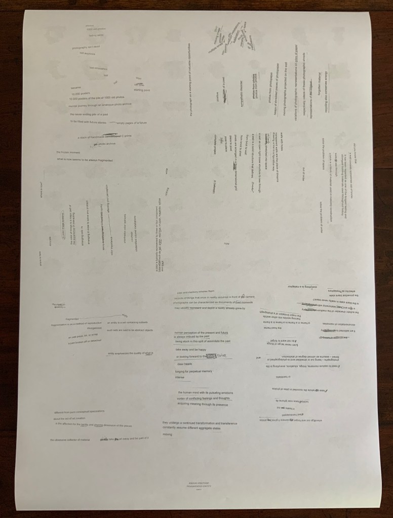
Fragmented Entity (2012) Double-sided A2 associated with the solo exhibition of the same name held at the Boetzelaer I Nispen Gallery in London.
Front of poster and details from upper left and lower right.
Back of poster.
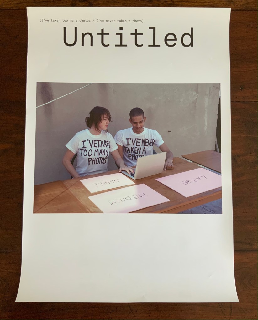
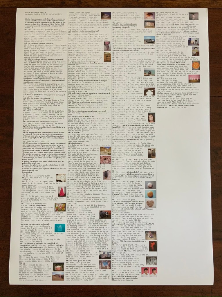
Untitled (I’ve taken too many photos / I’ve never taken a photo) (2012) Double-sided A2 poster, color, first shown at Tour le Templiers, Hyeres, France.
Pictured above with Kruithof is Harrison Medina, who responded to the artist’s ad that read “Did you never make a photo in your life?” Kruithof wanted to engage someone with as little experience of photography as possible to co-edit a selection of photos from her archive. The result was an installation, a book and this poster, on the back of which is printed excerpts from conversations during the editing process.
Back of poster.
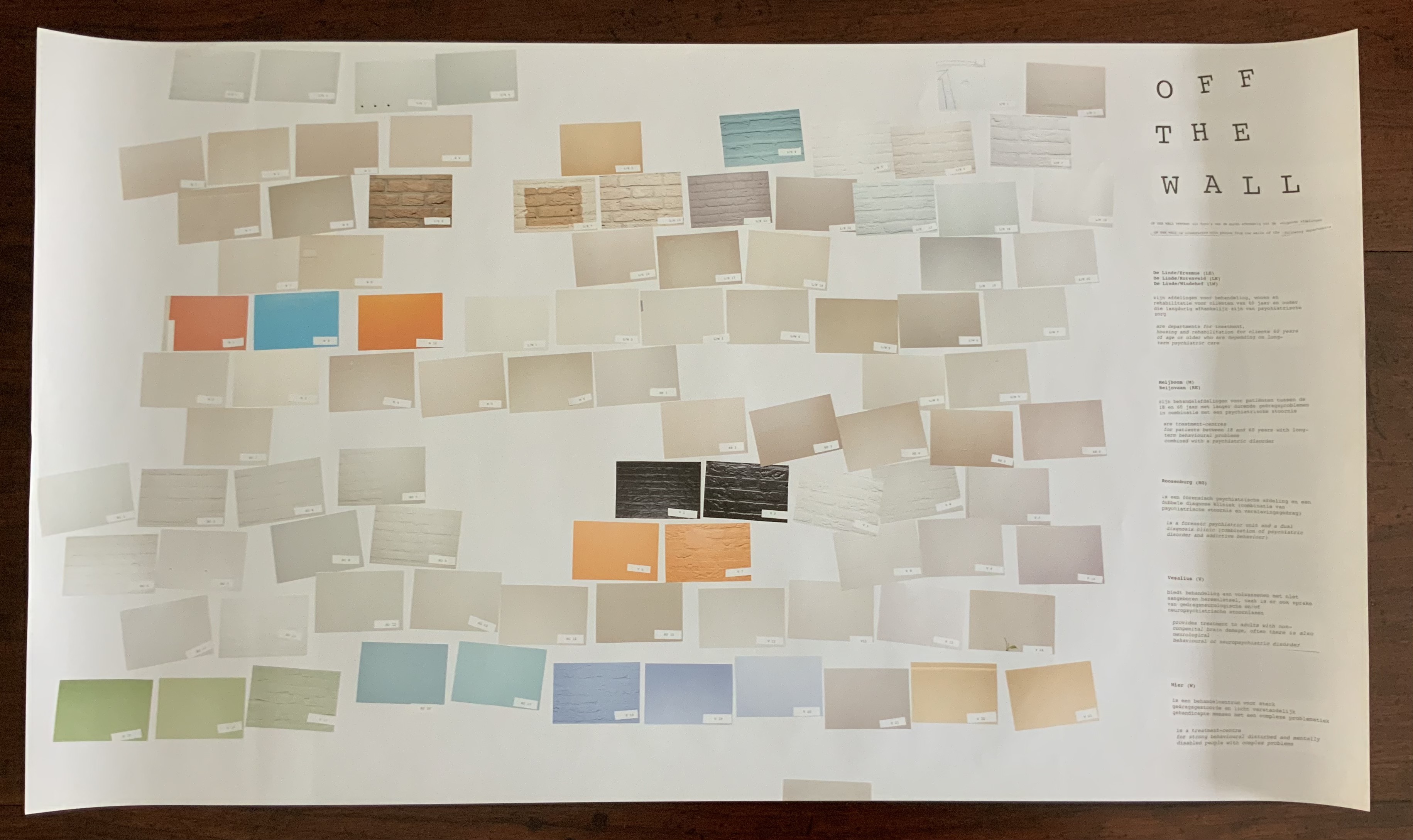
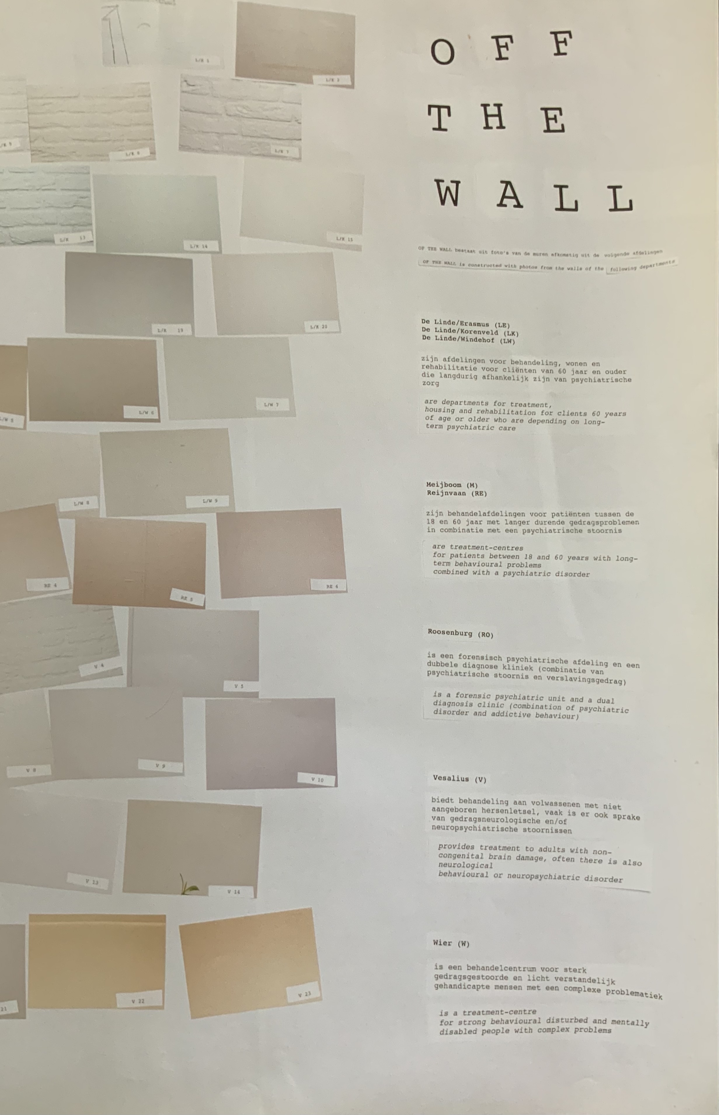
Off the Wall(2011) A3 poster associated with the publication Happy Birthday to You.
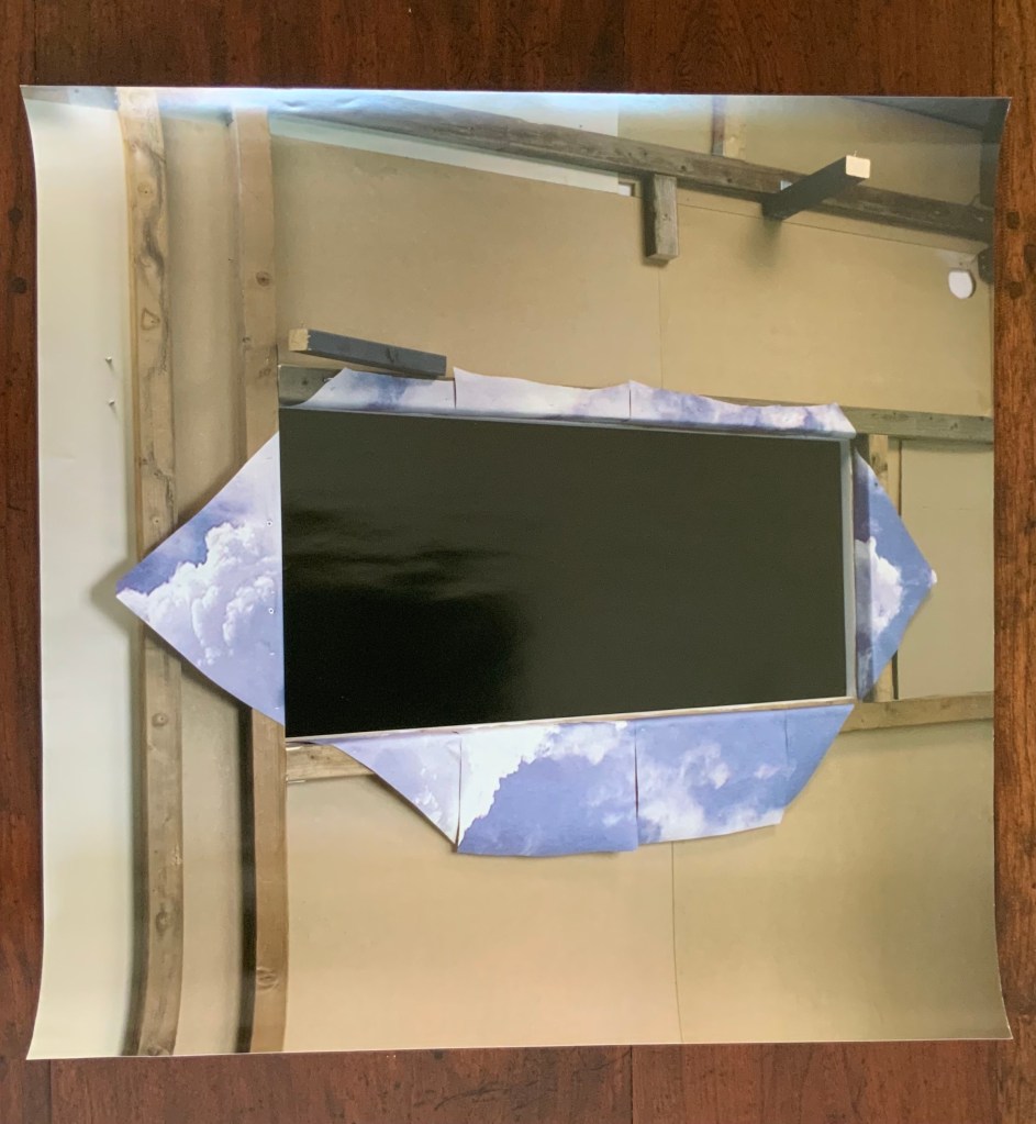
Kruithof took photos of walls in mental health institutions then reduced them to color swatches or individual bricks in an unstable wall. Two years before, she had explored another set of color-combined metaphors.
Enclosed content chatting away in the colour invisibility (2009) One-sided A2 Poster, color, on the occasion of the solo exhibition at the Kunstlerhaus Bethanien.
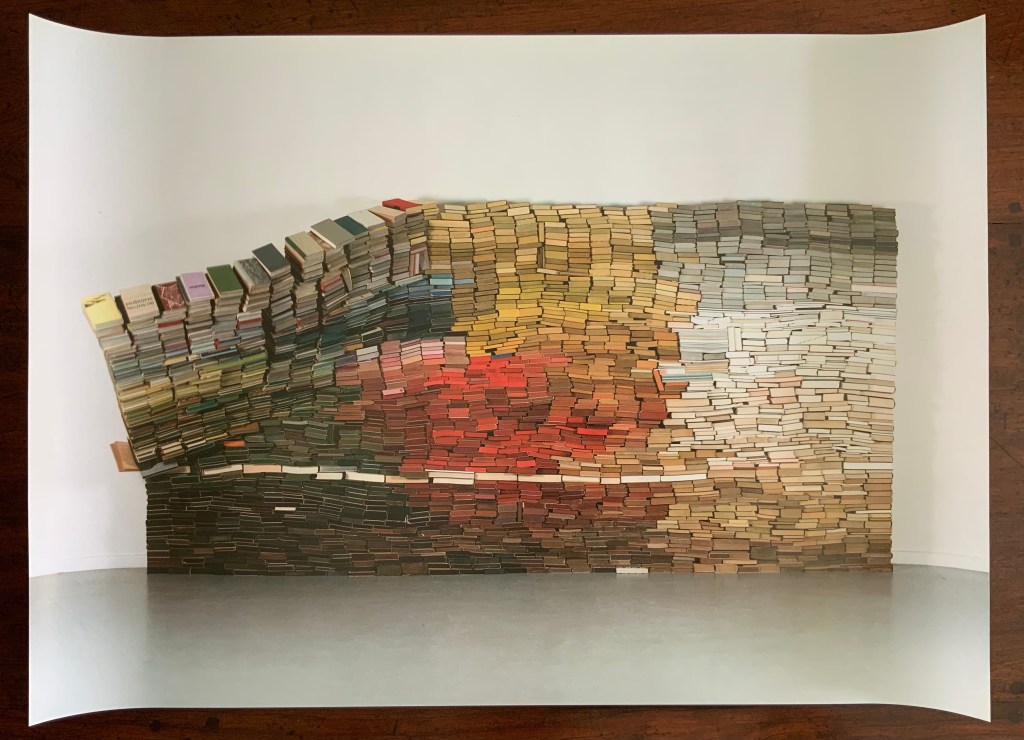
This sculpture consists of approximately 3500 used book obtained from bookshops or a recycling dump and then dyed. The constructed wall is rigged to collapse at some point during the installation, which has taken place in several venues.
Anonymous Poster(2008) 500 x 500 mm. Photos of the work: Books On Books Collection. Displayed with permission of the artist.
This photo montage reflects Kruithof’s early mastery of this element in the language of photography. As can be seen from Universal Tongue, AUTOMAGIC and Pixel Stress in particular, her working of this language, her engagement with friends and strangers, her crossing of borders in geography, media and format, and her fusion of all that into book art are what make her work distinctive.
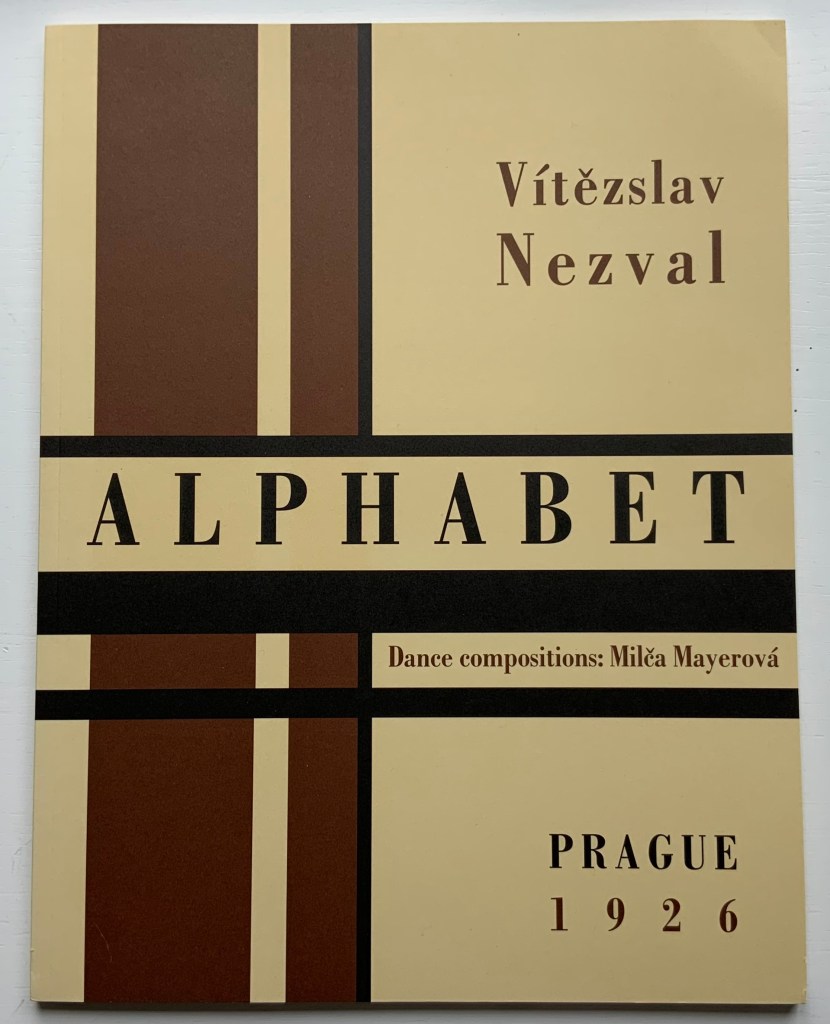
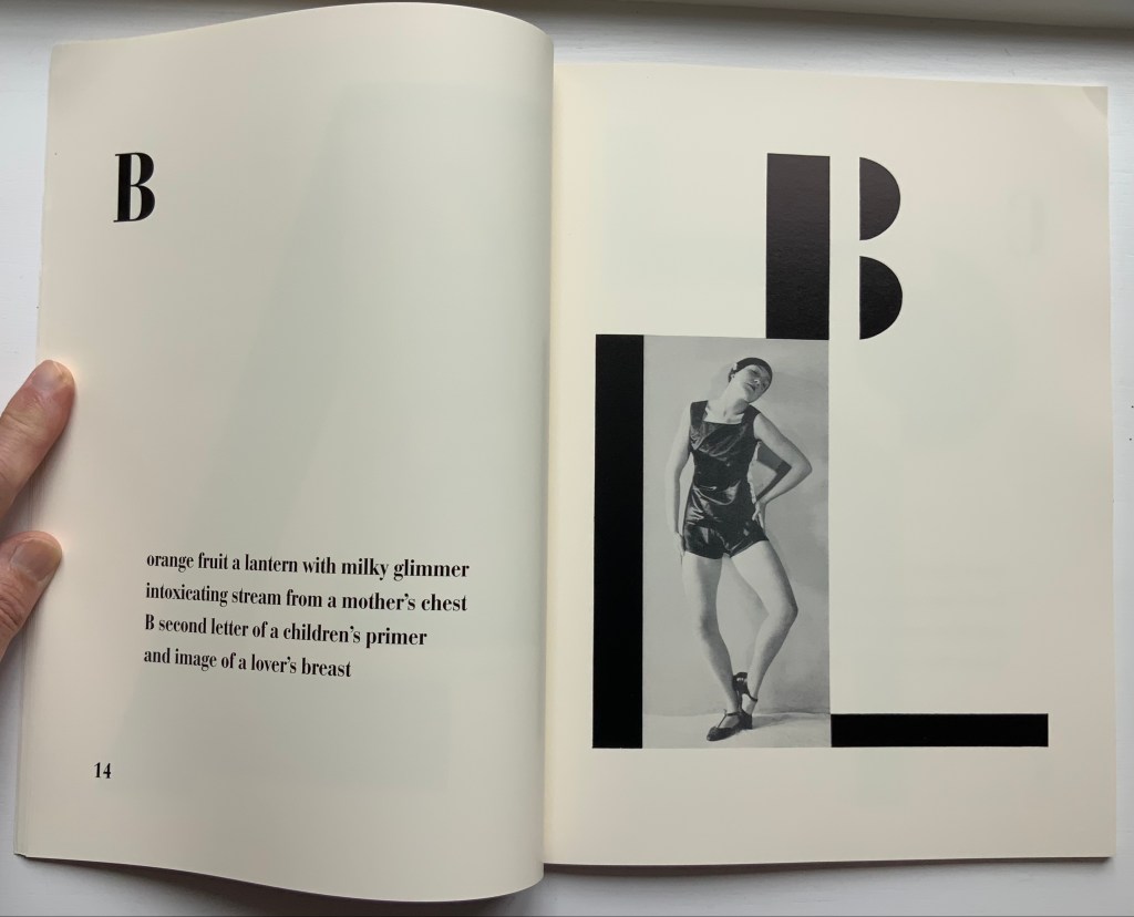
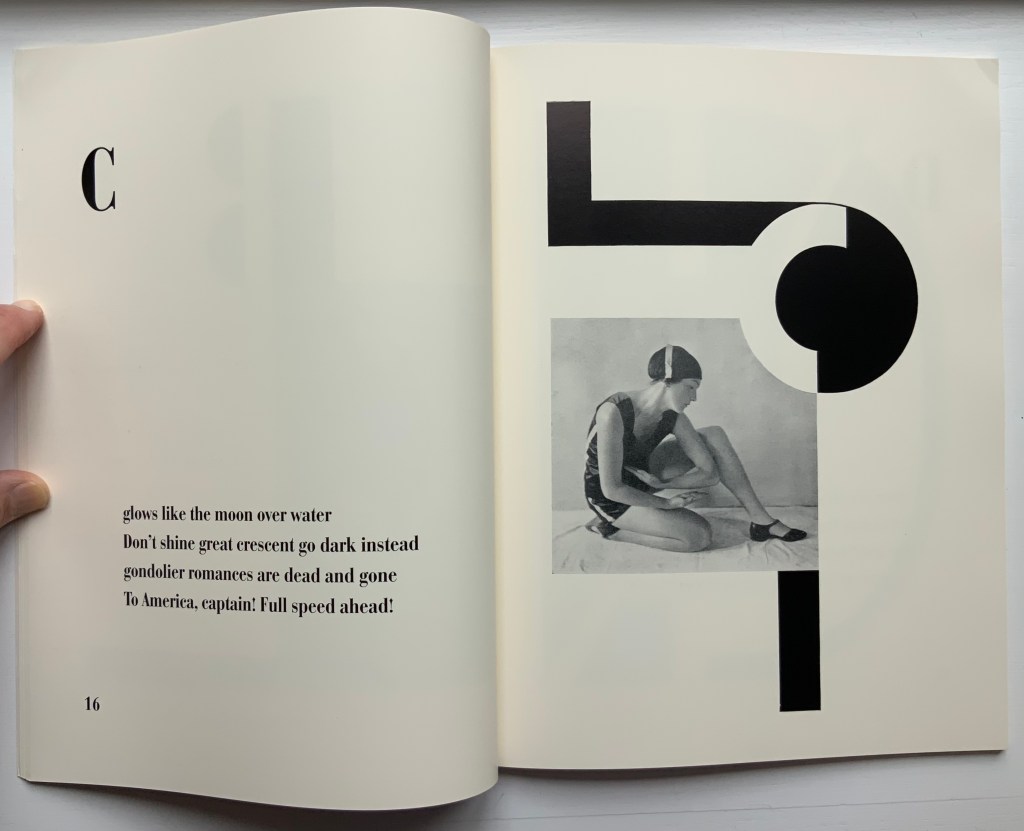
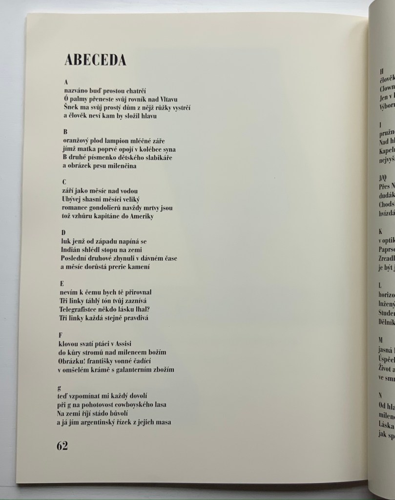
Alphabet (1926/2001) Karel Teige & Vítězslav Nezval / translated by Jindřich Toman and Matthew S. Witkovsky Facsimile and translation of Abeceda. Perfect bound paperback, H305 xW235 mm, 72 pages. Acquired from Ergode Books, 1 July 2021. Photos: Books On Books Collection.
From the Afterword:
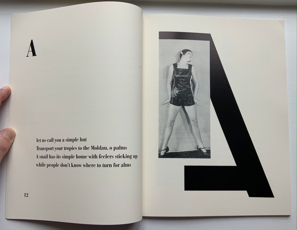
The 1926 book Alphabet (Abeceda) is a landmark achievement in European modernism. Its frequent reproduction in exhibition catalogues and scholarly articles has made it a key symbol of Devětsil (1920-ca. 1931), the Czech artists’ collective within whose ranks the book was conceived, and its importance is increasingly measured in international terms as well. The book consists of a series of rhymed quatrains by Devětsil poet Vítězslav Nezval, titled and ordered according to the letters of the Latin alphabet. Facing each set of verses is a Constructivist photomontage layout by Karel Teige, a painter turned typographer who was also Devětsil’s spokesperson and leading theorist. Teige developed his graphic design around photographs of dancer and choreographer Milada (Milča) Mayerová, a recent affiliate of the group, who had performed a stage version of “Alphabet” to accompany a recitation of the poem at a theatrical evening in Nezval’s honor in April 1926… The project to create a new alphabet epitomizes the proselytizing attitude of avant-gardists in various fields in the years after World War I. From Dada poetry to Constructivist architecture and design, from calls to overhaul theater to revolutions in literary theory, a panoply of experiments took the alphabet as their model or target and disclosed the potency of this elementary linguistic structure as a trope for creative renewal and social revolution.
The Afterword mistakenly asserts that there was no precedent for Mayerová’s choreography and performance of the alphabet. In fact, the Athenian dramatist Kallias (late 5th century BCE?) wrote Grammatike Theoria, sometimes called “a spectacle of letters”, the ABC Show or ABC Tragedy, in which actors and a chorus sang and danced the twenty-four characters of the new-fangled Ionian alphabet. What does seem to be without precedent is the collaboration across poetry, dance, typography, photography and bookmaking.
Carrying on the collaborative tradition and more emphatically challenging gender stereotyping, here is Paulina Olowska dancing Abeceda at the Simon Lee Gallery’s 2019 exhibition of Tomaso Binga/Bianca Menna‘s works, which included Alfabetière Pop (1976), his/her nude alphabet portfolio. If only Tomaso/Bianca or Paulina would find a book artist to reprise the codex part of the collaborative tradition.
Further Reading
“Anthon Beeke“. 21 June 2021. Books On Books Collection.
Culture.pl. n.d. “Paulina Ołowska“. Accessed for update, 31 January 2023.
Gagné, Renaud. 2013. “Dancing Letters: The Alphabetic Tragedy of Kallias”. In Choral Mediations in Greek Tragedy, ed. R. Gagné and M. Hopman, Cambridge University Press 282-307.
Lawler, Lillian. April, 1941. “The Dance of the Alphabet”. The Classical Outlook, 18: 7, pp. 69-71.
Wikipedia. 1 July 2021. “Paulina Olowska“. Accessed 8 July 2021.
Another key performance in Paulina Olowska oeuvre was the Alphabet, which was inspired by the book ABECEDA by Karel Teige, a key figure in the Czech avant-garde who in 1926, in collaboration with Milca Mayerova, created an experimental “mobile alphabet”. Referring to Teige’s project, Olowska combines rhythmicity with a constructivist fascination with typography and points to the rhetorical function of dance: three performers arrange their bodies into 26 letters, from A to Z, confronting the alphabet of written language with the “alphabet” of gestures and movements, creating a new system for expressing meaning. Alphabet was first shown in Berlin in 2005 (Galerie Meerrettich). In 2012 it was exhibited at the Museum of Modern Art in New York, and in early 2014 it was presented at the Museum of Modern Art in Warsaw.” Wikipedia.
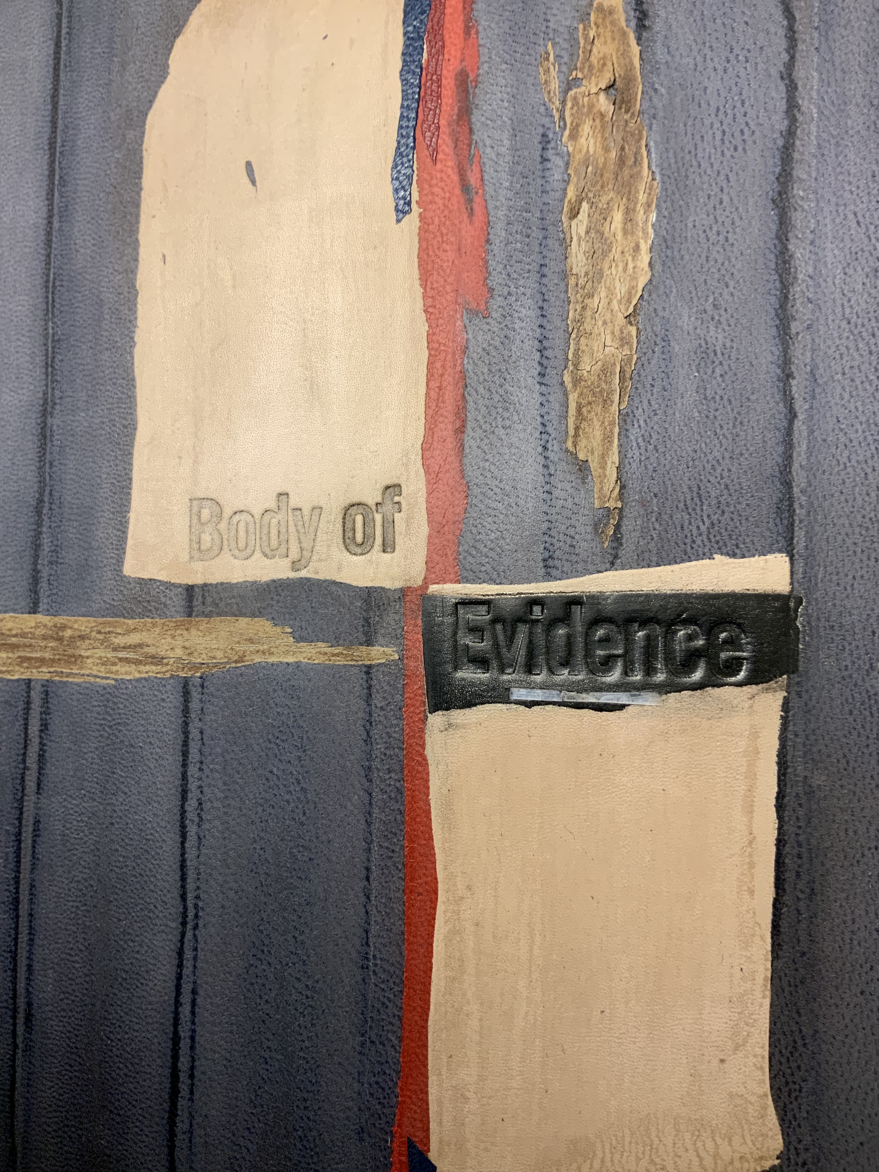
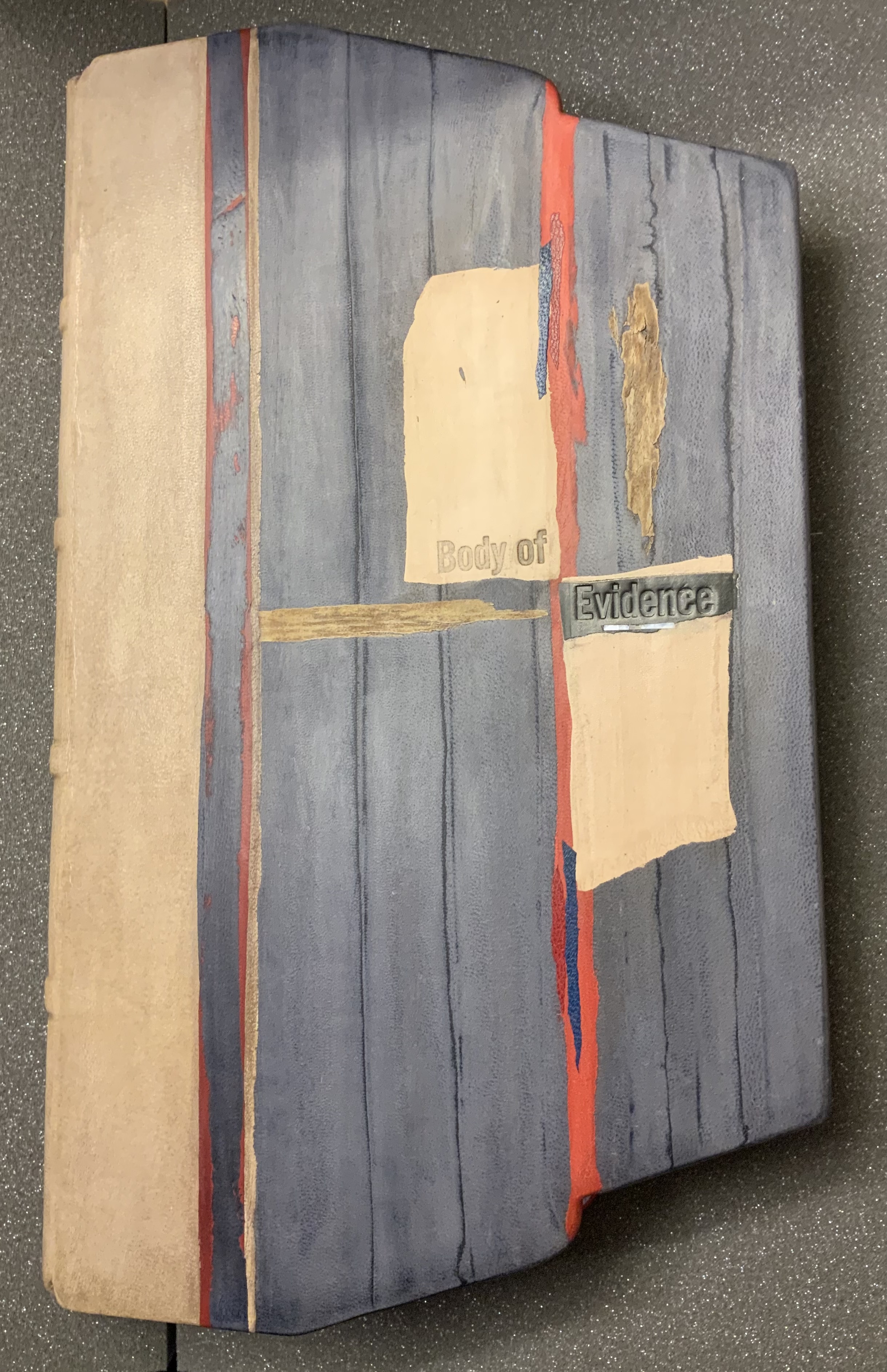
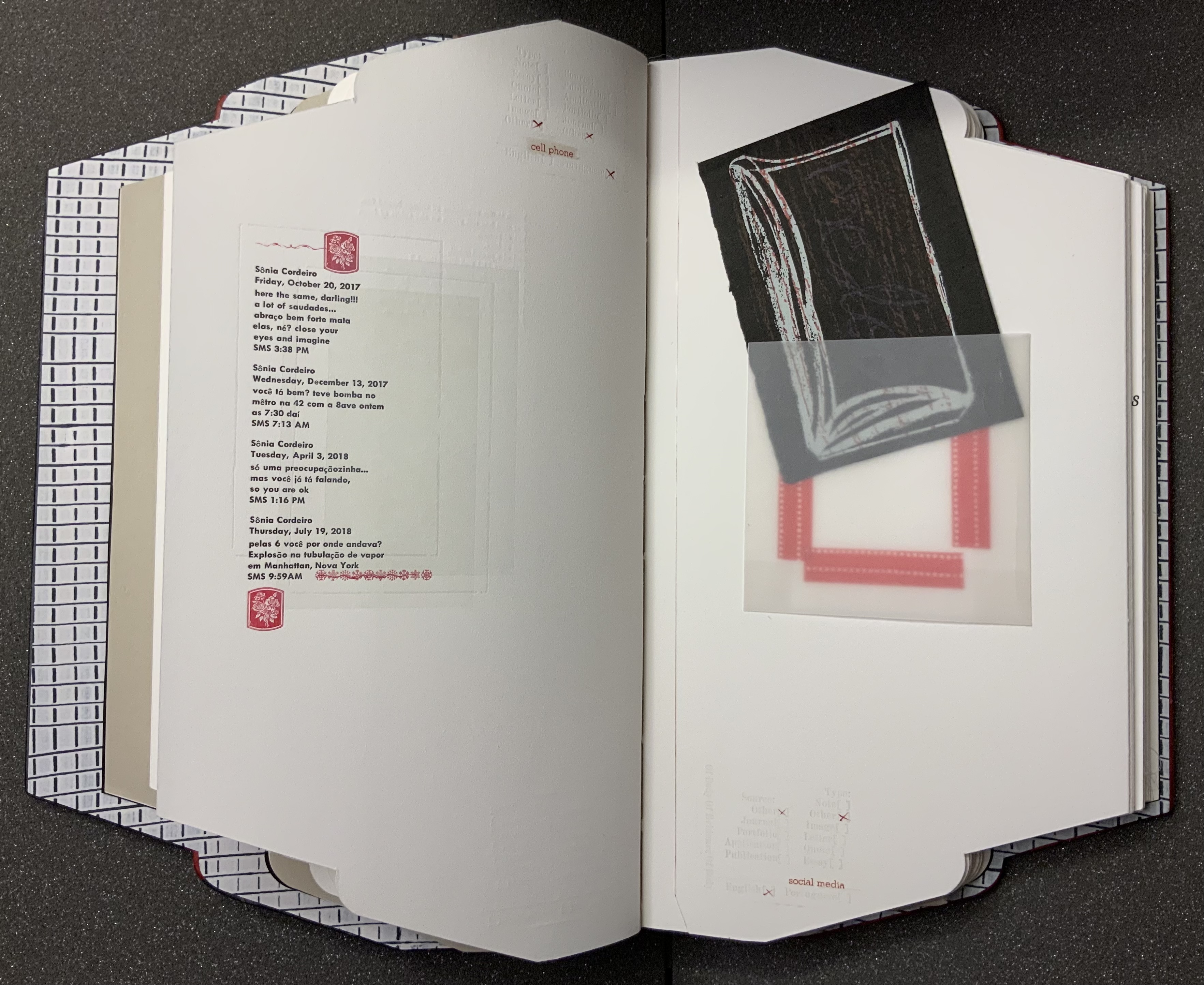
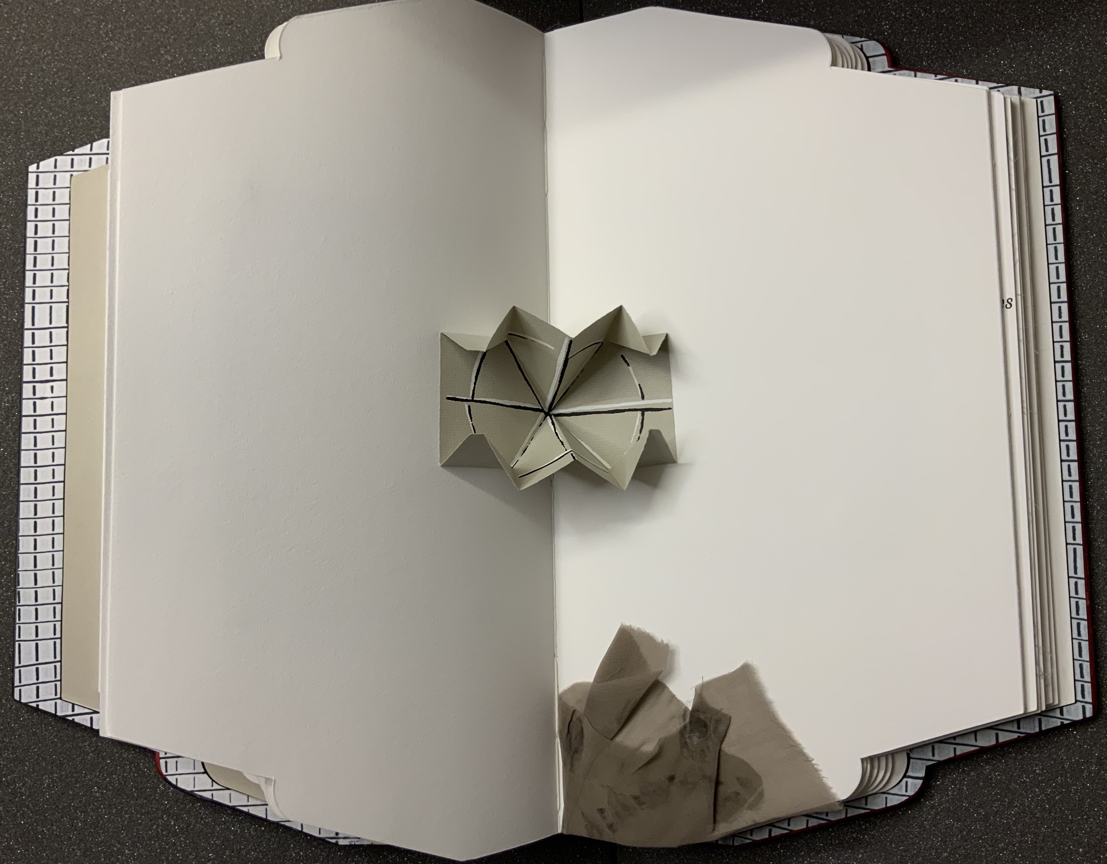
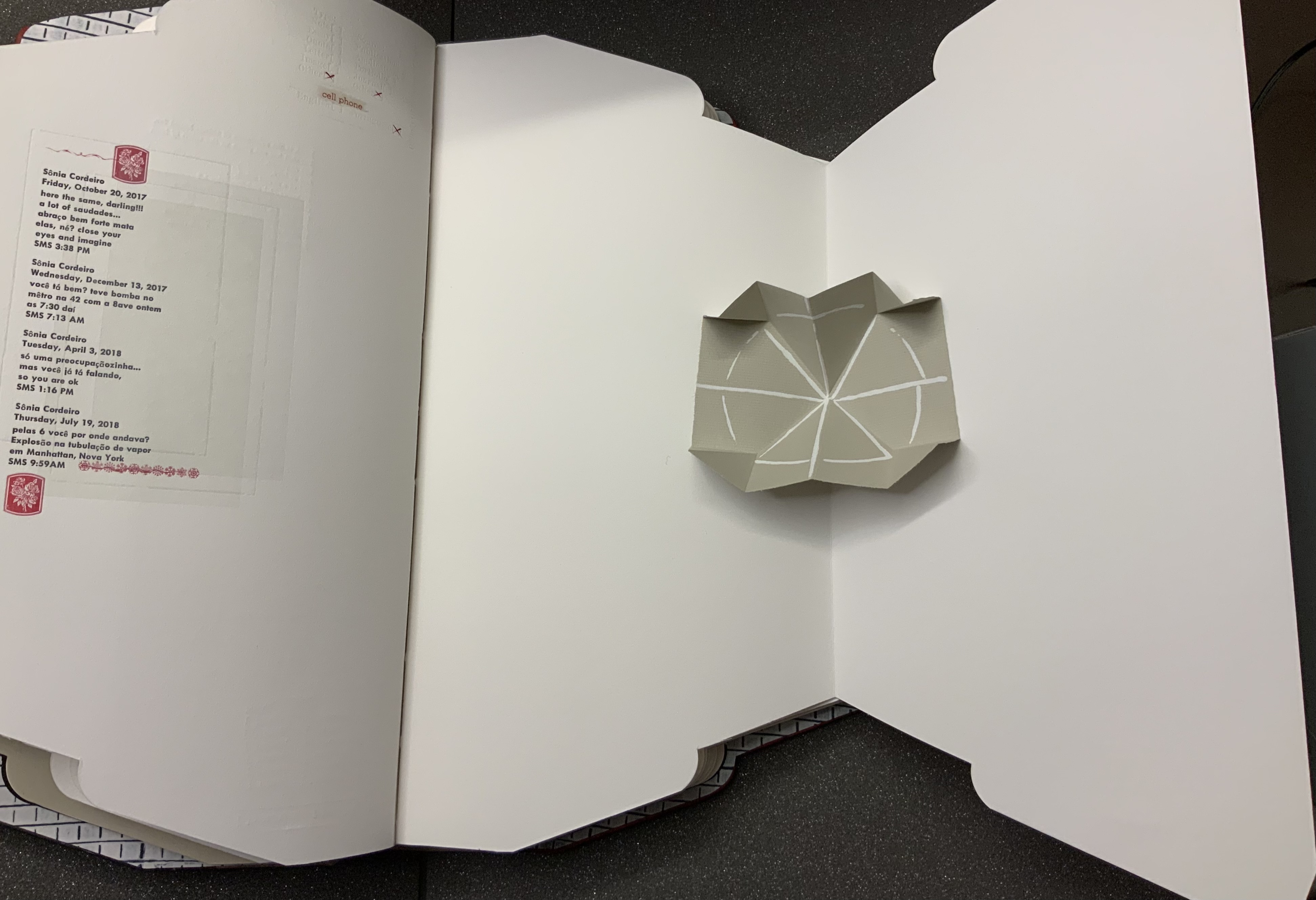
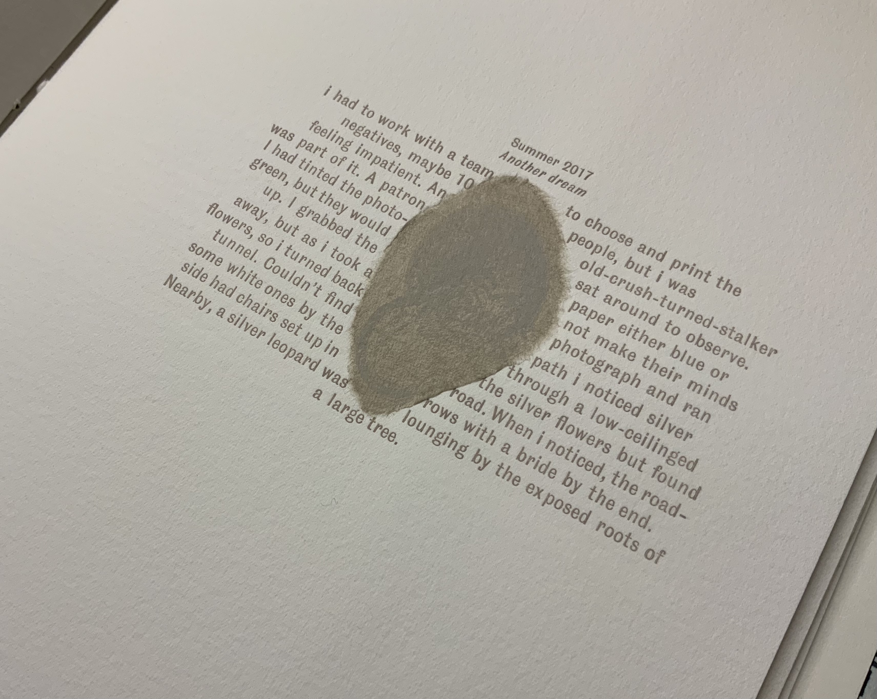
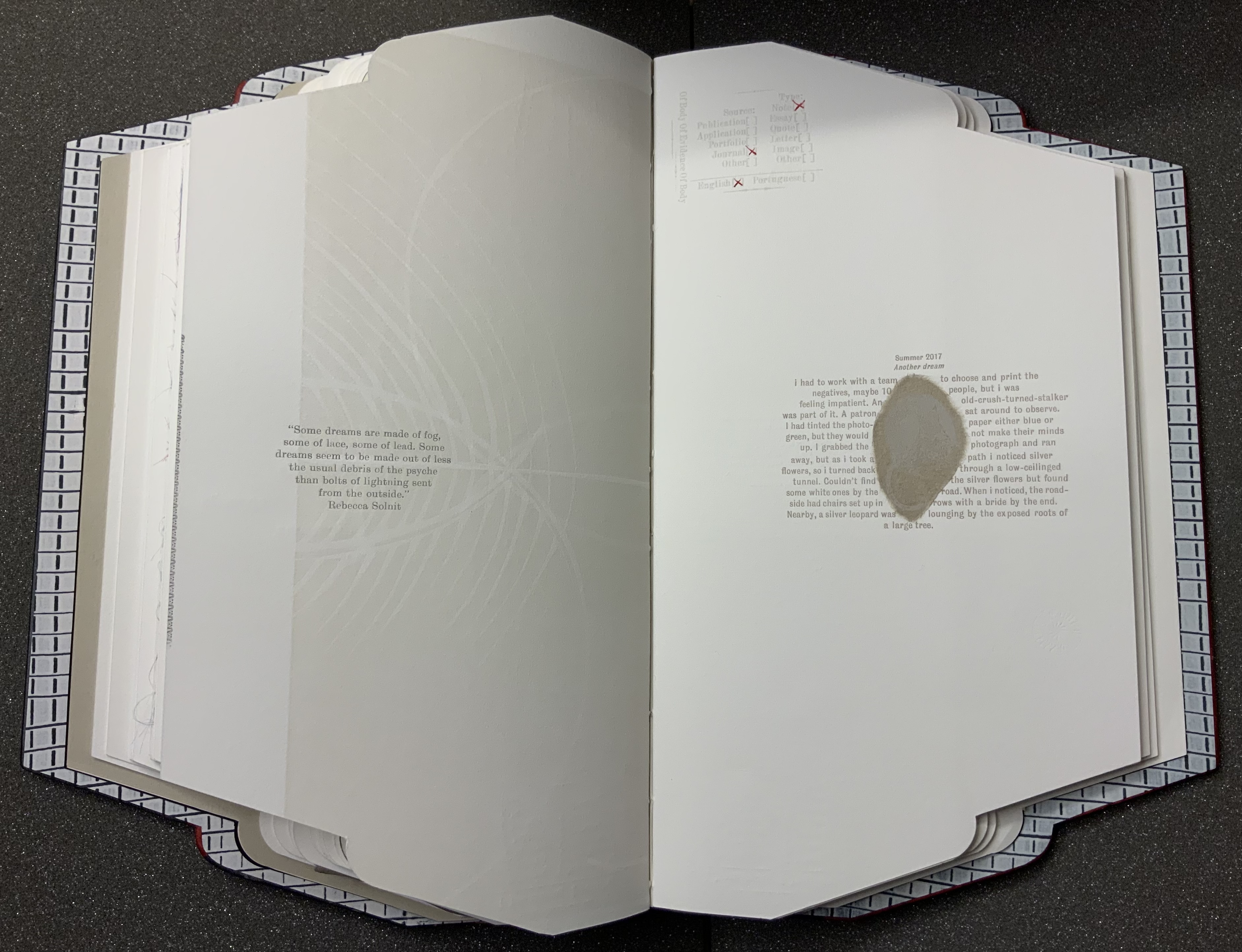
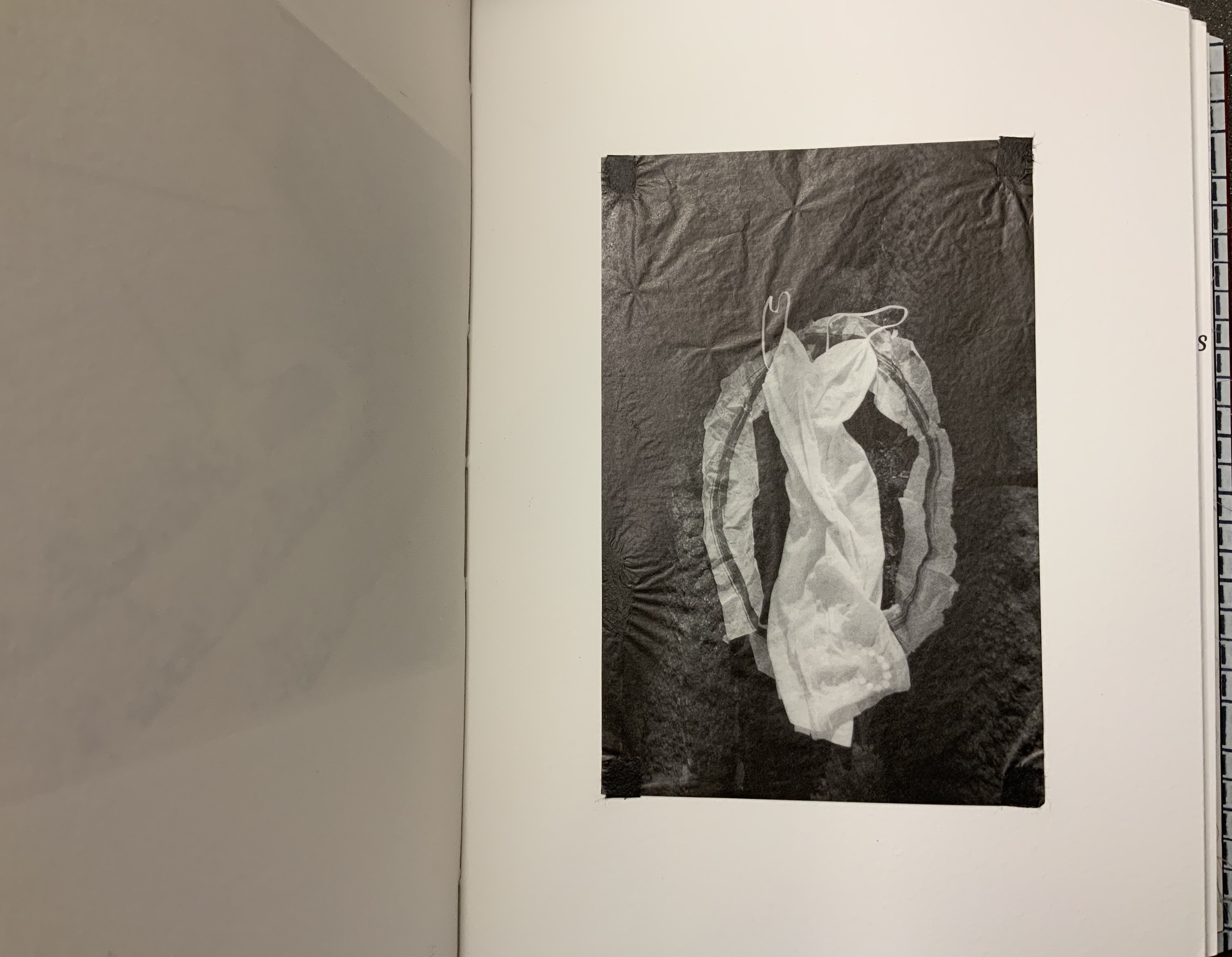
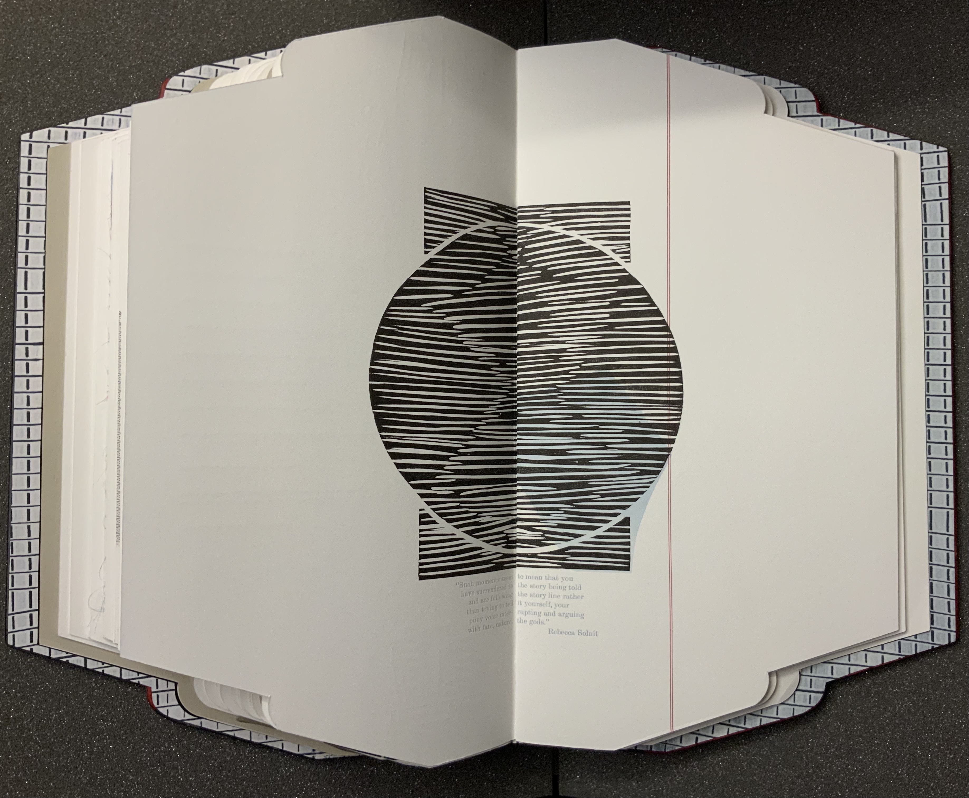
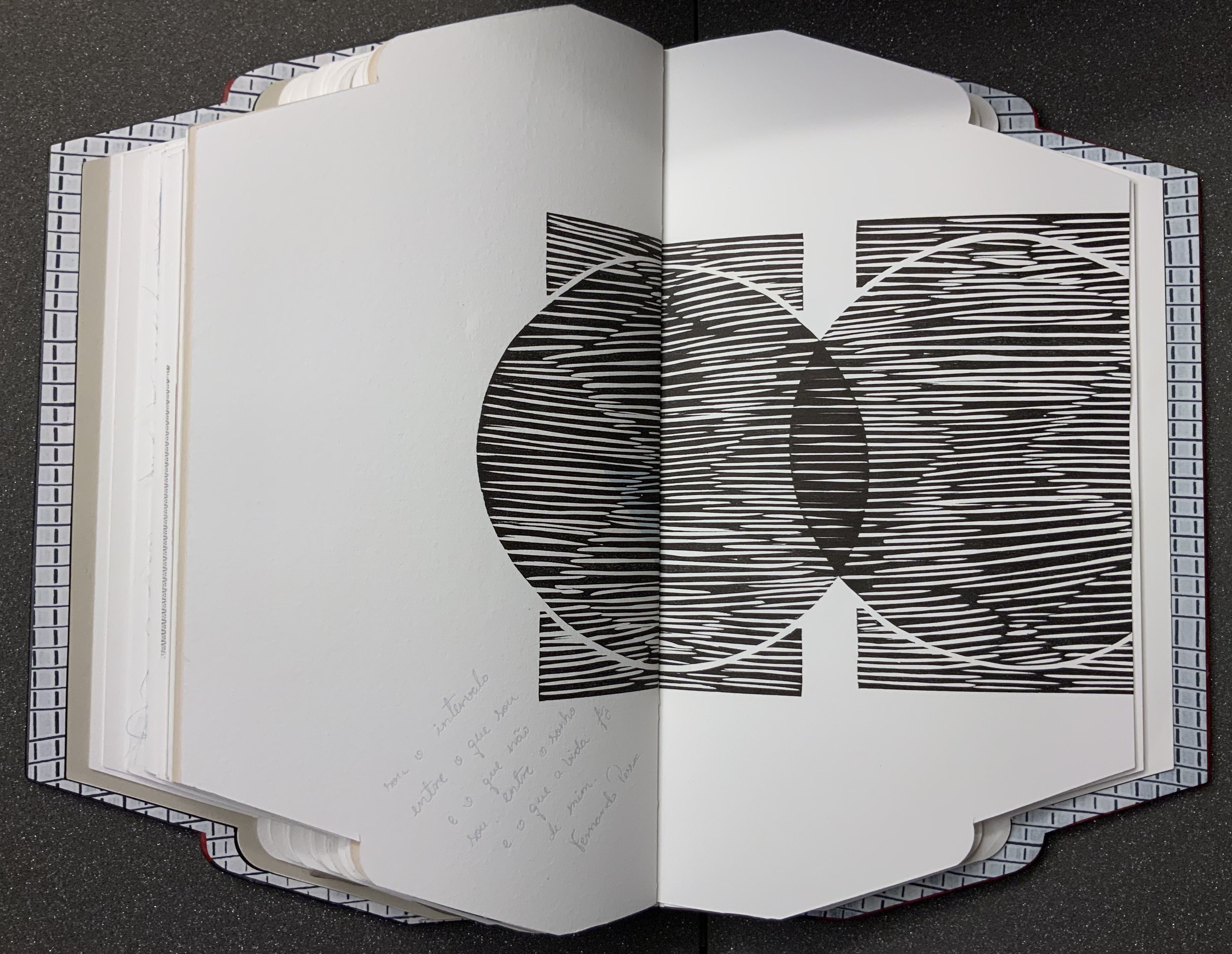
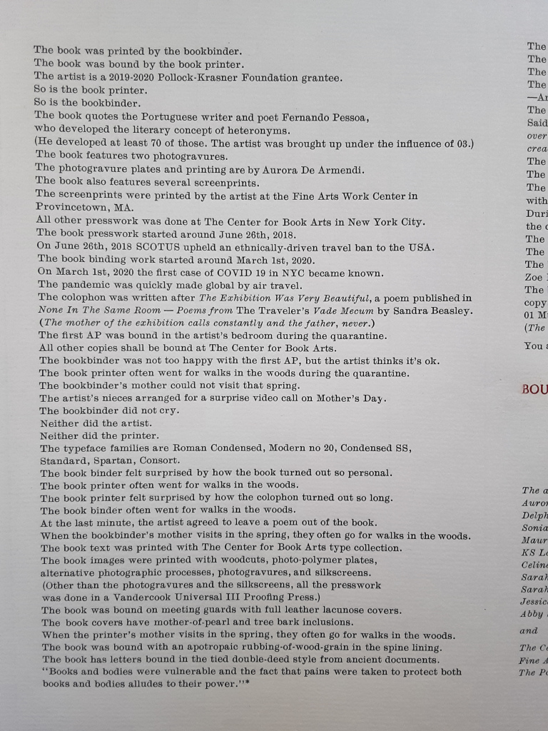
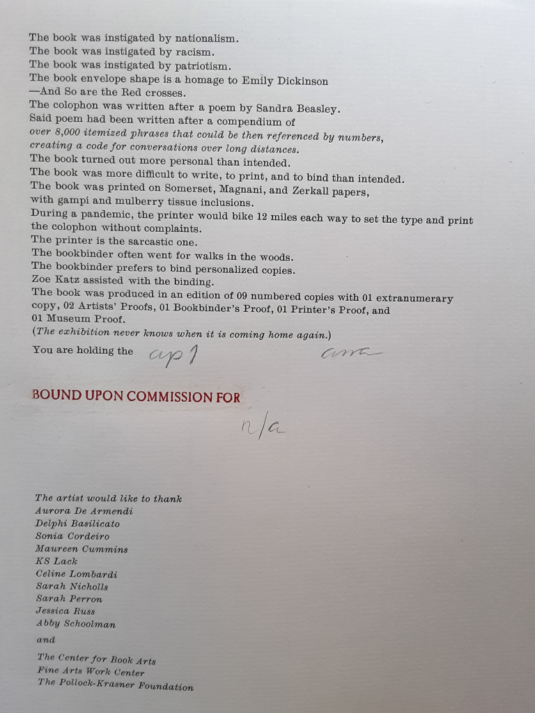
Body of Evidence (2020) Ana Paula Cordeiro Artist’s book. Bound on meeting guards, covers in full leather lacunose panels with tree bark and mother-of-pearl onlays. H16 x W9 in, 30 pages. Somerset, Magnani and Zerkall papers with gampi and mulberry inclusions. Edition of 9; this copy commissioned by the Bodleian Library. Photos: Books On Books Collection, with thanks to Alexandra Franklin, Jo Maddocks and Sarah Wheale of the Bodleian.
When I encounter works of book art, I often recall another collector’s comment — “you don’t collect these works to read them” — and shake my head. Every one of these works expects you to try — even the ones nailed shut, submerged, cast in concrete, burnt to calcification or otherwise hermetically sealed. At their end of the spectrum, those are challenging your expectation that a book is meant to be opened. At the other end are those that “mess with” nearly every material and metaphorical aspect of the book such that they challenge nearly every expectation you might have. Starting with its title and shape, Body of Evidence falls at this end of the spectrum.
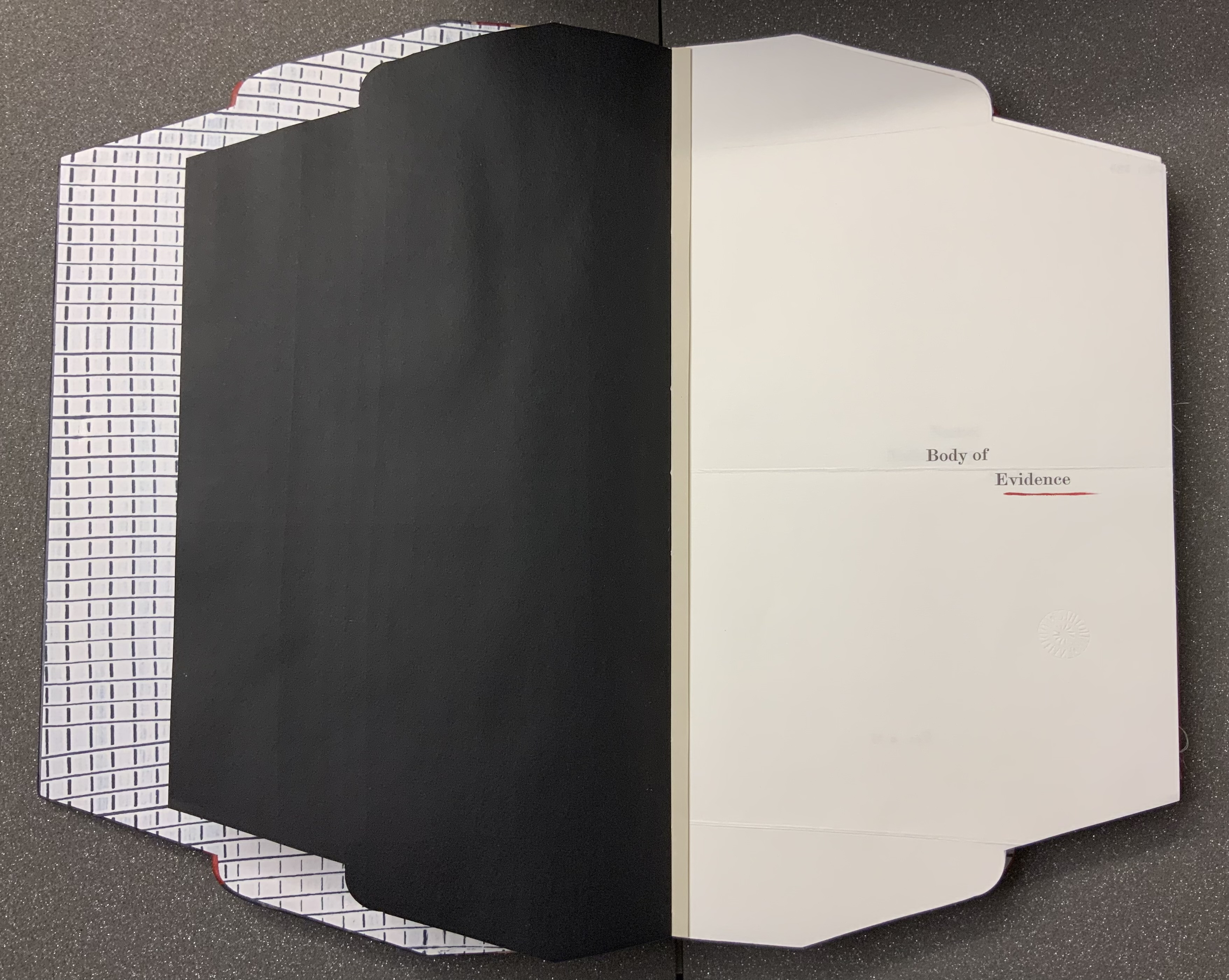
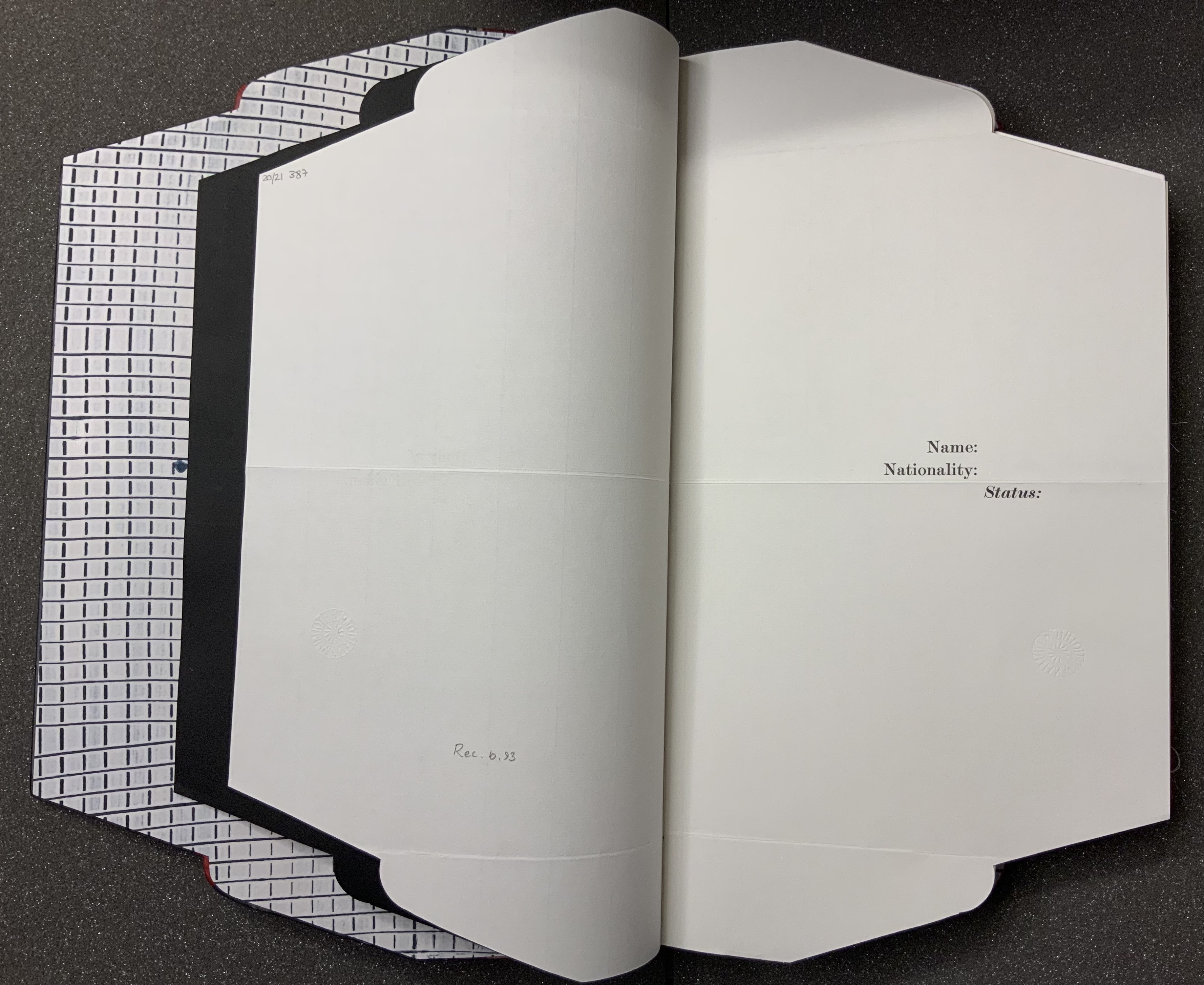
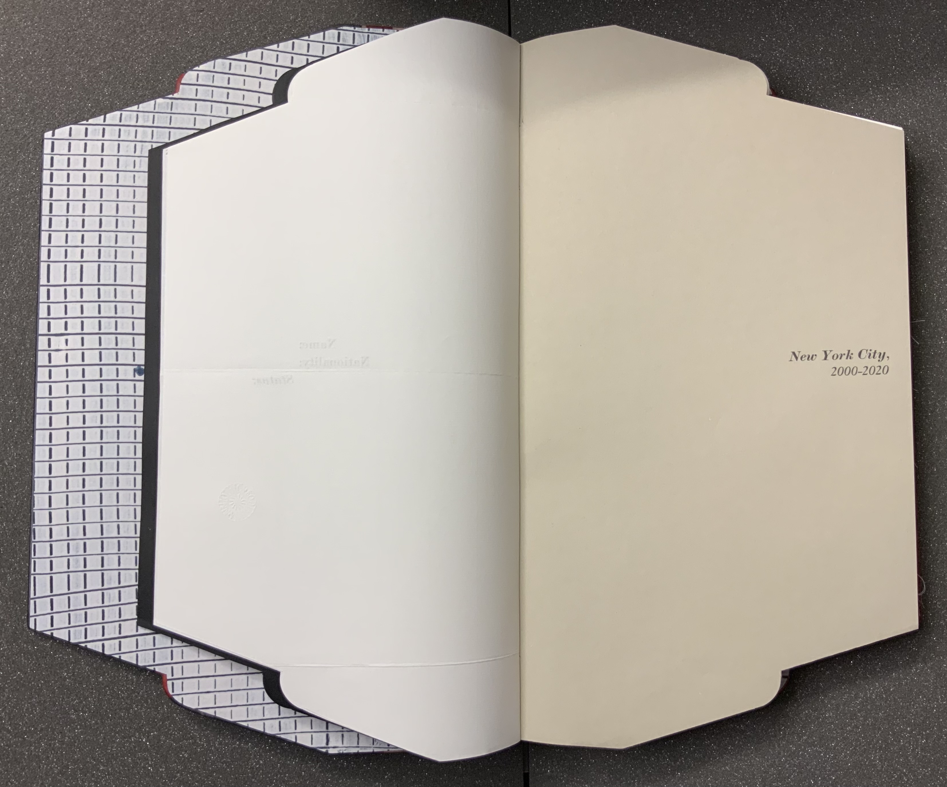
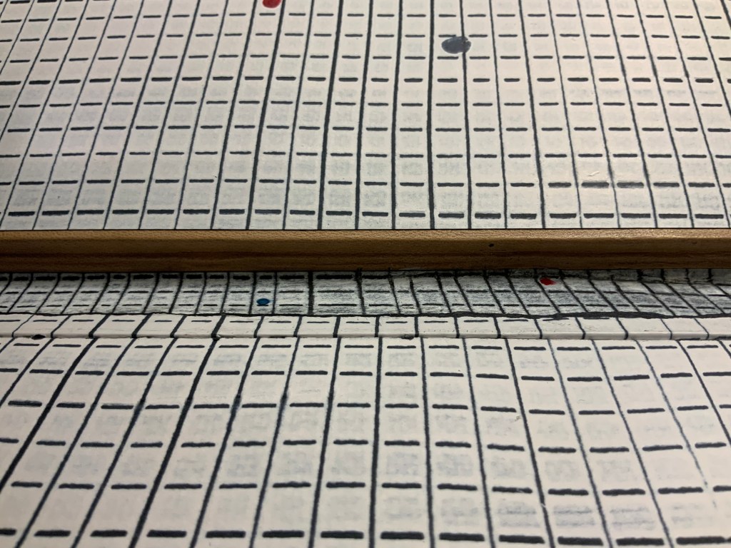
From its folder or opened-envelope outline, you know that, if this is a murder mystery as the title implies, the shape, the gridded endpaper, spotted with drops of red and blue, the flimsy black liner and stiff sheets of the title and subtitle pages are telling you: read with caution, read with unease, read to detect. That the front cover falls away from the book block to show the inner spine to be lined with the same spotted grid as the endpaper tells you: look as you read.
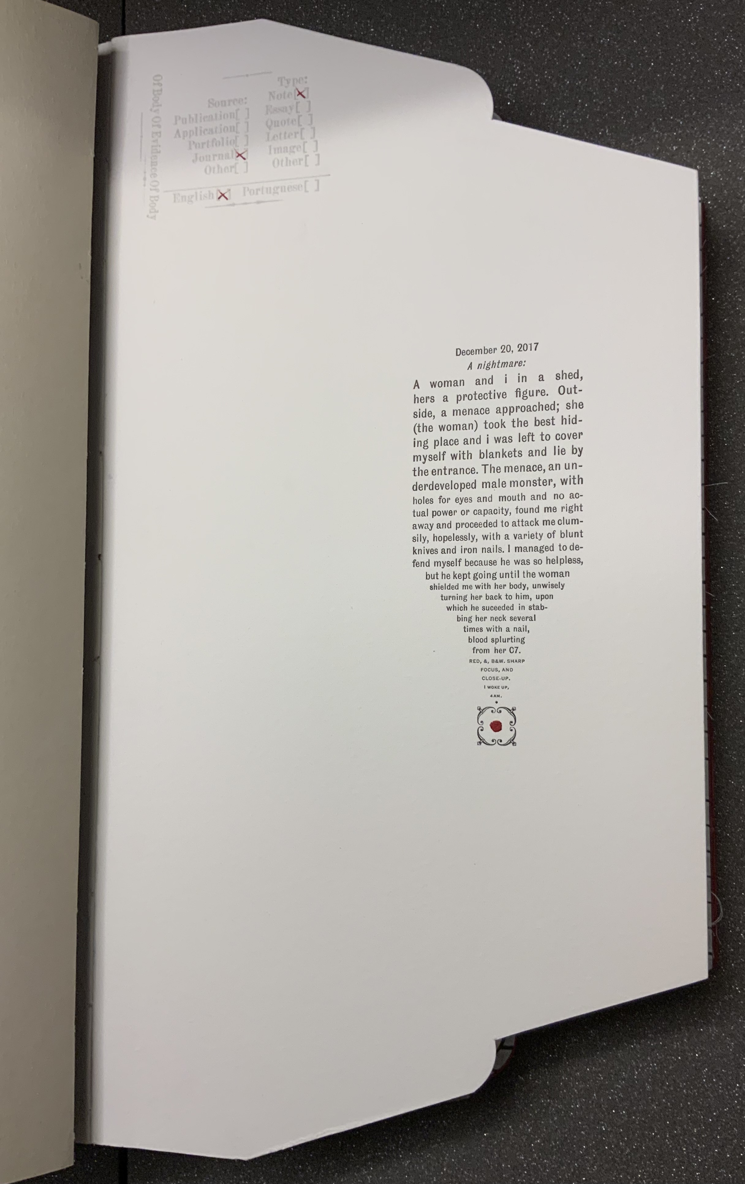
Another urging to look and read is the faint and embossed stamp with not-so-faint red X’s indicating the source and type of evidence presented on the page or spread. The opening text relates a violent assault, but one that occurs in a dream. The X’s in the stamp designate the source as “Journal”, the type as “Note”, the language as “English”, but says nothing about the shaping of the text into a pen nib pointing to a square fleuron, or is it a dagger ending in a drop of blood? The next body of text occupies the same place on its page, the categorizing stamp indicates that it, too, comes from a journal, and its language is English. But its type is “Quote”.
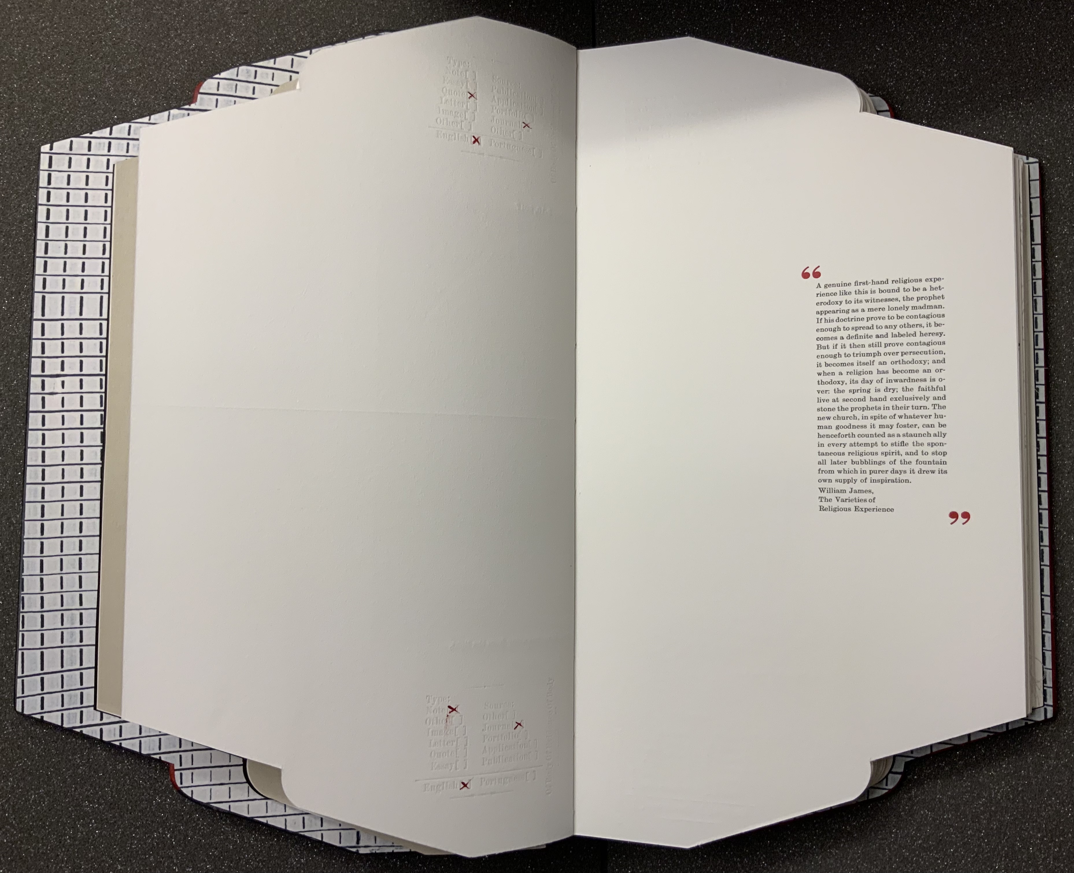
Like the first text’s italicized date headline that suggests its journal origin, the second text’s inverted commas identify it as a quotation. So why then the categorizing stamp? The journal writer is the artist, as the colophon will confirm, but the categorizing stamp and the envelope/folder form of the book identify the artist as collector, categorizer and shaper of the evidence. Is the artist implying “heteronyms” like those invented by Fernando Pessoa, another source of quotations?
This out-of-context quotation from William James’ The Varieties of Religious Experience seems to describe the preceding dream as a “genuine first-hand religious experience”. The dream extract is a piece of evidence. The commonplace extract from James is also a piece of evidence that contextualizes the dream extract. Read them.
Other pieces of evidence include
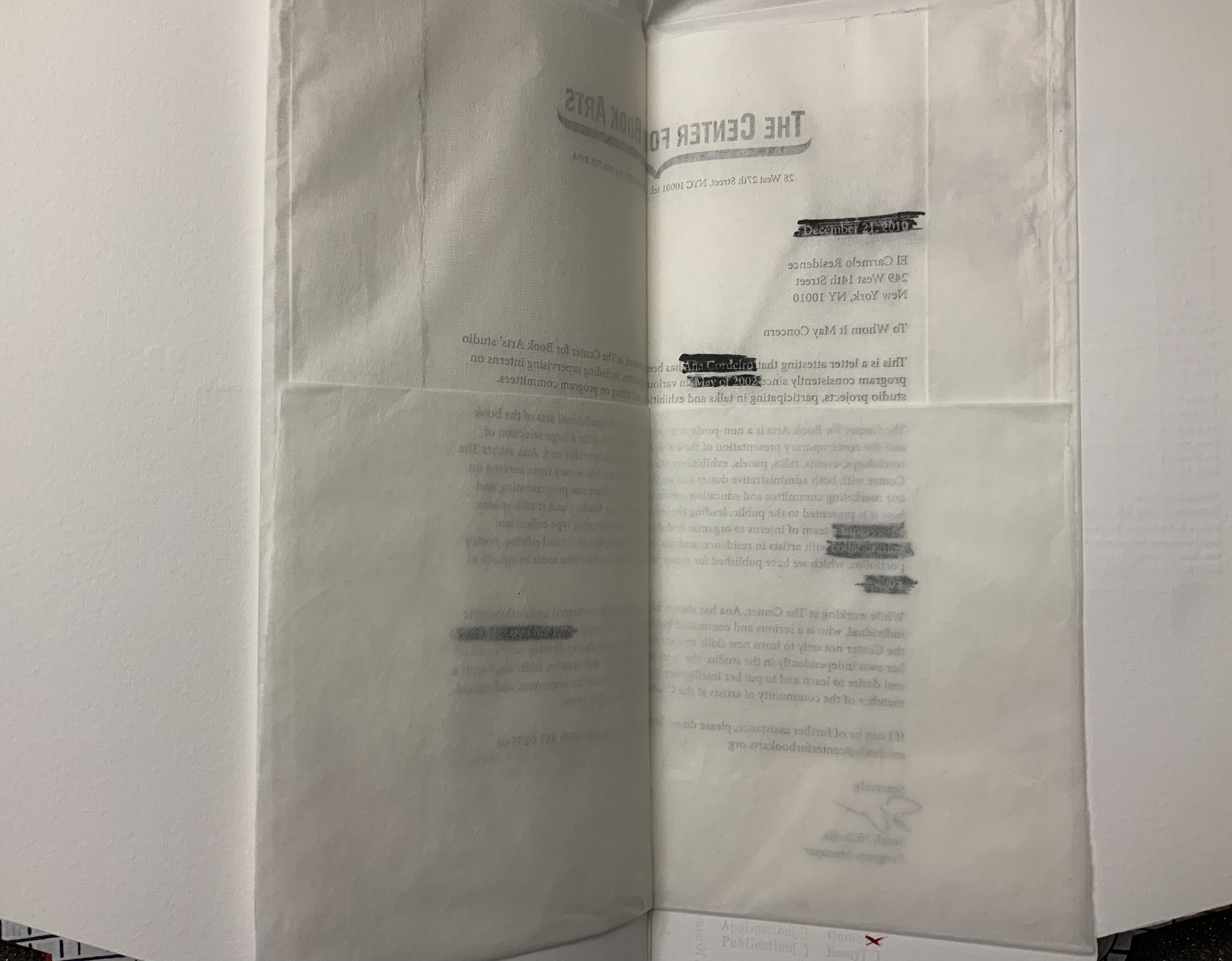
a “To whom it may concern” document on Center for the Book Arts letterhead, folded inwards from all four sides like a deed or secret letter. The letter supports an immigration application. The paper is mulberry tissue paper; so initially the text appears in reverse. Attention is drawn to that view by blocks of black redactions in which right-reading text appears in white (a reverse-out on the reverse side of the letter).
a display of SMS texts between the artist and her mother, made to appear like a print-out that had been folded then sealed with red sealing wax impressed with a sigil.
two Turkish fold maps, both with the same geometric emblem printed inside, one that pops up in the gutter of a double-page spread and one hidden under an inward-folded flap.
a medallion of gampi impressed with the image of a crouching leopard and placed within a journal extract set to surround the medallion. The pressure on the silk-like gampi causes the image to flicker iridescently.
But of what is this a body of evidence? The photo of an empty negligee and the insert of part of a nylon stocking raise the questions – of what body, whose? The empty clothing points to the wordplay on “body” in the categorizing stamp’s own label — “Of Body Of Evidence Of Body”. Perhaps it is missing. Perhaps it is outlined or staring at us from the strobing abstractions over the quotations from Rebecca Solnit and Pessoa. Perhaps it is the artist whose name appears only in only three places — in white against one of the black reverse redactions, in the SMS texts and in her signature in the colophon.
From the artist’s website. Accessed 8 July 2021.
From the artist’s website. Accessed 8 July 2021.
Despite its usual place of culmination, the colophon is just as unusual as the shape of Body of Evidence and its treatment of almost every other material and metaphorical aspect of a book. The colophon comes as an unbound folio, enclosed in a deed-fold sheet that is bound to the book. It is much more than the usual brief assertion of creation by scribe or printer. It is an outpouring, a venting. As the last piece of evidence, it answers the question “Of what is this a body of evidence?”
It is the accretion of the immigrant artist’s tensions and unease in the context of anti-immigrant feeling and, on its heels, a pandemic requiring isolation and its further inciting “fear of the Other”. Like the material aspects of Body of Evidence, those tensions and the unease are complex. In its ambiguity of heteronymy and near anonymity, Body of Evidence invites the reader/viewer to be an empathetic witness to the tension between a desire for privacy and a desire to be open and welcoming. The tension between wanting to belong and not wanting to lose one’s self. A tension arising from hurt inflicted under the guise of intended empathy. The tension of selves.
Whether the reader/viewer can empathize is answerable only from reading, looking and feeling.
Further Reading (and Looking)
Produced by Thomas Gallagher and uploaded 15 January 2021. Accessed 8 July 2021.
Further Reading
Drucker, Johanna. 2004. The Century of Artists’ Books [Second edition] ed. New York City: Granary Books. Drucker’s comments on auratic works under the heading “The Book as Private Archive” would be useful in developing further readings of Cordeiro’s work.
Around the Corner(2020) Ximena Pérez Grobet Japanese bound in slip case open at both ends. H200 x W175 x D70 mm. Edition of 20, of which this is # 2. Acquired from the artist, 1 December 2020. Photos: Books On Books Collection.
Since 2008, the AM Bruno coalition has sponsored artist book challenges. The one in 2020 was entitled “One and Many Pages” and challenged the participants to respond to the image below:
Clive Philpott reviewed the various proposals and selected twelve to go forward. Pérez Grobet’s Around the Corner was one. On the fore-edge you can see the whole image of “a”one and many pages” reproduced. As you remove the book from its slipcase, you are gradually astounded that, in fact, the image produces the book. Like a flip book, each page holds a segment of the whole image of the “one and many pages” photo. As each segment appears as a full-page bleed, this image of a book un-builds and re-builds within and around the corners of the book in your hands.
Richard Kostelanetz writes of an essential distinction that separates the imaginative from the conventional book:
In the latter, syntactically familiar sentences are set in rectangular blocks of uniform type …, and these are then ‘designed’ into pages that look like each other (and like pages we have previously seen). An imaginative book, by definition, attempts to realize something else with syntax, with format, with pages, with covers, with size, with shape, with sequence, with structure, with bnding — with any or all of these elements, ideally reflecting the needs and suggestions of the particular book. Most books are primarily about something outside themselves; most book-art books are primarily about themselves. P. 48.
This catalogue of the exhibition organized by the late Hermann Havekost at Oldenburg University in 1986 qualifies as imaginative on nearly every one of those criteria. To boot, it is about itself as well as about something outside itself.
The ambidextrous book appeared the same year as The Book Made Art, edited by Jeffrey Abt and designed by Buzz Spector. The size of the Oldenburg catalogue dwarfs that of The Book Made Art, is more globally representative (especially of Central and Eastern Europe), and has more of a textual, Fluxus feel to it. Nevertheless, the catalogue’s German and Italian titles, several of its selections and its very production and performance chime with the sculptural, book-object tenor that Spector achieved with his design and Abt with his selections for The Book Made Art.
Among the Oldenburg exhibition’s artists and their works clearly addressing the book as object are
Denise AubertinJournal impubliable (1984), a work of altered, torn, collaged-over pages
Sheril CunningSummer Rain (1984), a codex of pages of gampi and abaca with mica particles, bearing watermarks of a rain storm
Elisabetta GutLibro-incabbiato (1981), a bamboo bird cage with a miniature Italian-German dictionary inside
J.H. Kocman Paper-re-making book No. 057 (1982), a book made handmade paper sheets made from seven books that were ground to pulp in water
Martin PeulenUntitled (c. 1984), a matchbox labelled “Martin Peulen Caution Book!” and holding a stapled book (H20 x W200 mm)
Adam RzepeckiUntitled (1984), a book with a saw stuck halfway through
Franz E. WaltherStoffbuch 2 Zwei (1969), a book of blank fabric pages, closed with cloth straps and resembling a folded straitjacket.
However broadly representative of book art in the 1980s and star-studded (Roberta Allen, Barton L. Beneš, Mirella Bentivoglio, Agnes Denes, Robert Filliou, Dick Higgins, Dennis Oppenheim and Tibor Papp to mention a handful), the Oldenburg catalogue’s chief claim to a place in the Collection remains its status of “catalogue as book art”, a claim to “book art” that rests on its four-fold binding structure. In this, it is similar to The Book Made Art (1986) with its trim and trompe l’oeil vitrine pages; or Irma Boom’s The Architecture of the Book (2013), a catalogue miniaturisé; or Odd Volumes (2014) with its more “traditional” dos-à-dos binding.
These “interrogations” of the book’s structure serve to excite the appetite for even more complex, self-reflexive acrobatics with exhibitions of book art. Which institution of book art will spring for this six-fold structure?
An Alphabetical Accumulation (2017) Francesca Lohmann Handpress printed and calligraphed book. H157 x W117 mm, 26 leaves + title + colophon. A black and red tray case, H171 x W128 mm. Edition of 36, of which this is #16. Acquired from The Veatchs, 11 June 2021. Photos: Left, Books On Books Collection; Right, Courtesy of The Veatchs. All photos displayed with permission of the publisher.
Rollin Milroy of Heavenly Monkey, Francesca Lohmann and Claudia Cohen collaborated on this work of art. The alphabetical accumulation is the accumulation of 36 letter A’s entirely hand drawn in red, 25 calligraphed partial alphabets reproduced in black from polymer plates, and 900 pages in which the next letter in the sequence of the partial alphabet has been drawn in red. Each copy of the edition thus presents the full alphabet in original calligraphy across its pages. Printed and calligraphed only on the recto side, this is an alphabet that repays page by page attention. As each new letter arrives in red, all the previous ones and their accumulated foliage fall into black. Not every letter appears in capitals. The letters’ size, arrangement and ligatures shift as the alphabet accumulates.
The edition is also an accumulation of unusual production artistry. Those tapes exposed on the binding — a non-adhesive limp vellum, gold-tooled at the edges, with the title calligraphed in red on the spine — are strips from the old vellum manuscripts used as “paste”downs that are not pasted down. Three different papers — all printed damp at Heavenly Monkey on an Ostrander-Seymour handpress — are used: Crown & Sceptre, J. Whatman, and T.H. Saunders. Deckled leaves and trimmed leaves intermingle.
Fittingly the colophon is calligraphed and reproduced in black from a polymer plate, leaving space for the calligrapher to supply finishing strokes: the number and signature in red.
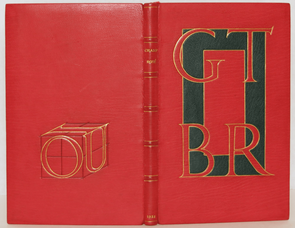
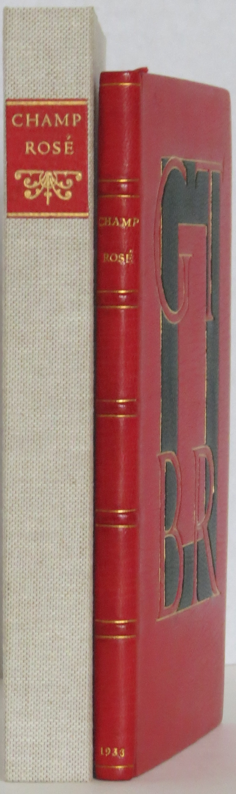
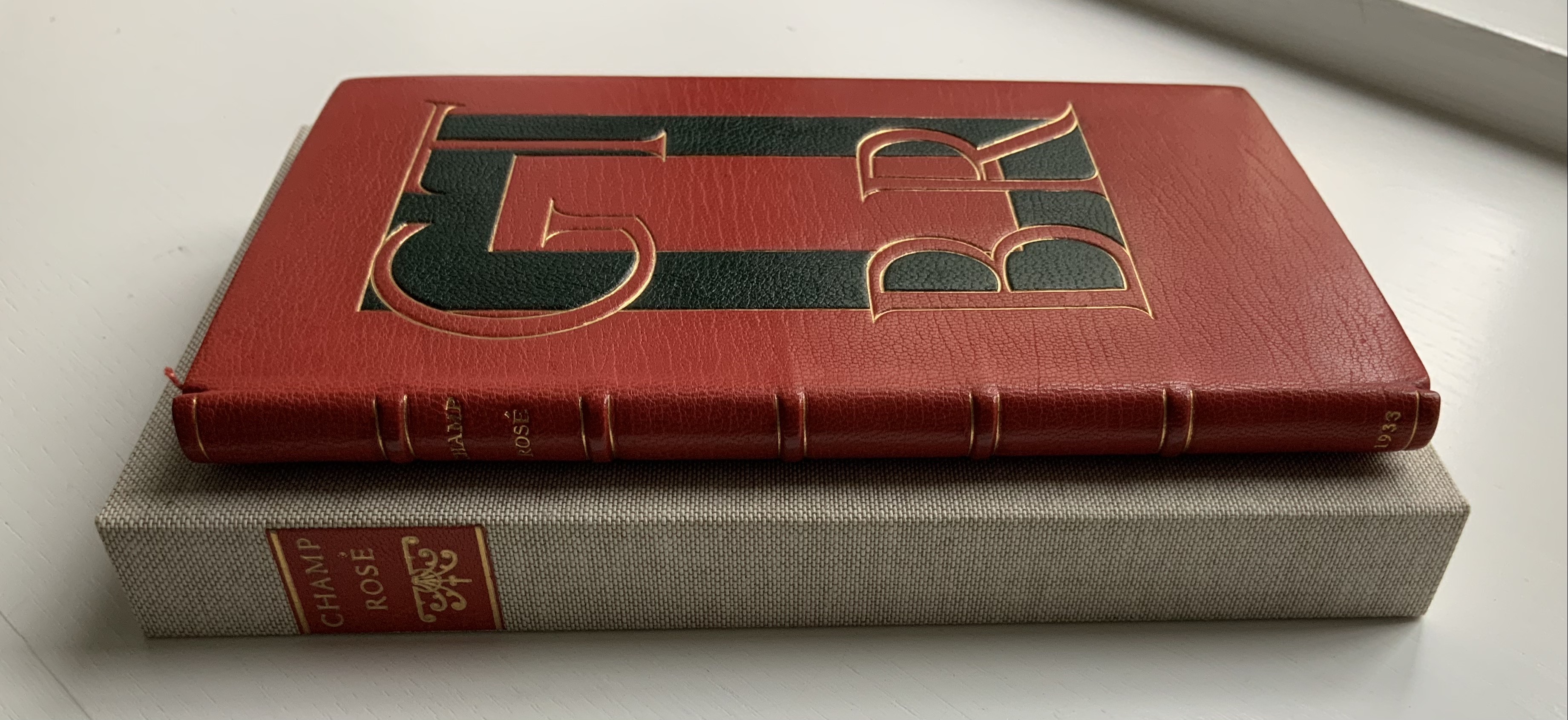
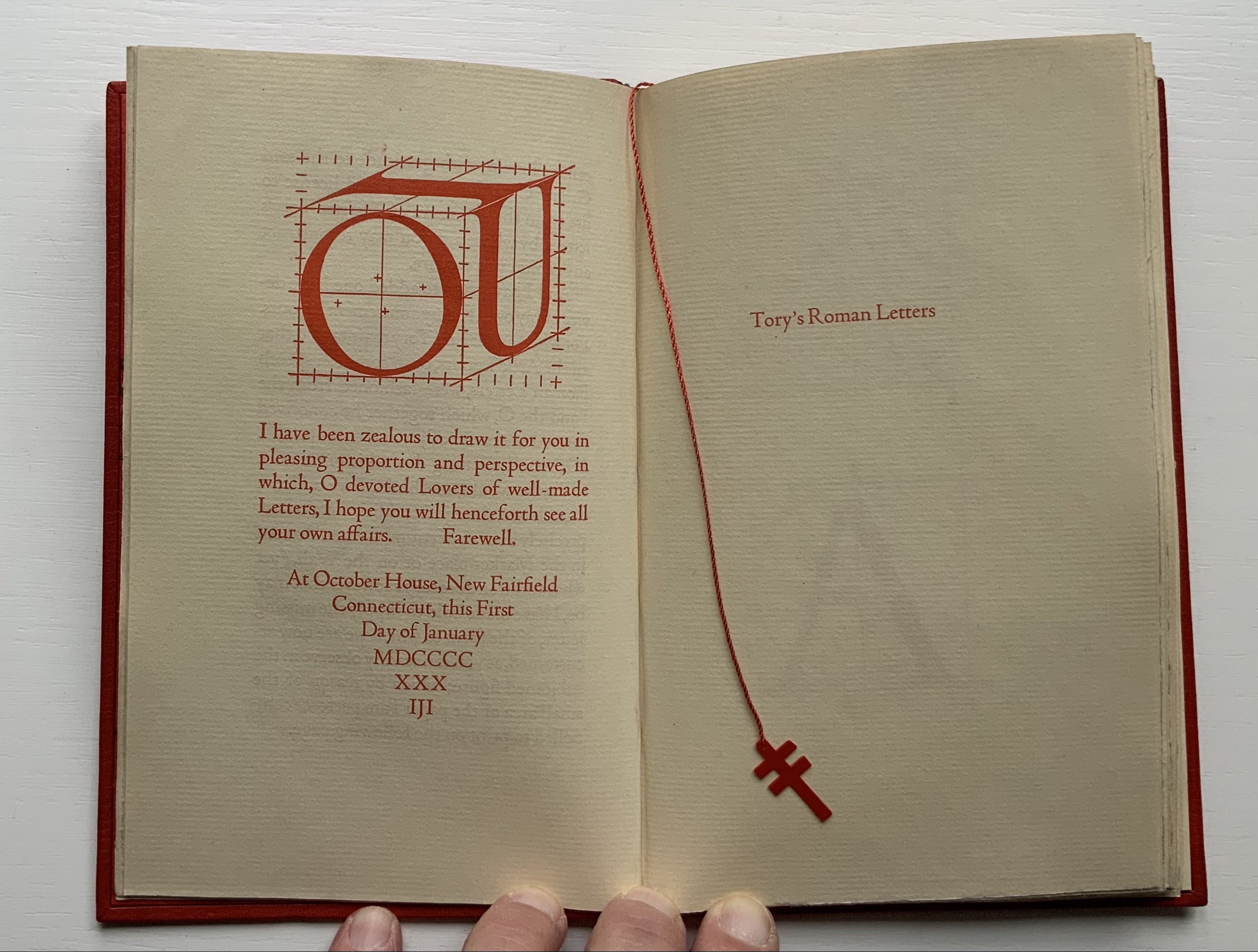
Rogers constructed the IOU device in a joking Depression-era homage to Tory. Referencing the mythological tale about Jupiter, Juno and poor IO who was turned into a cow, Tory maintained in Champ Fleury that all the Roman letters were fashioned from the “I” and the “O.” By placing Roger’s IOU on the back cover, binder Peter Geraty doubles Rogers’ pun on the debt to Tory’s “letterology”. Both Geraty and Rogers are acknowledging a debt to Tory as a book designer.
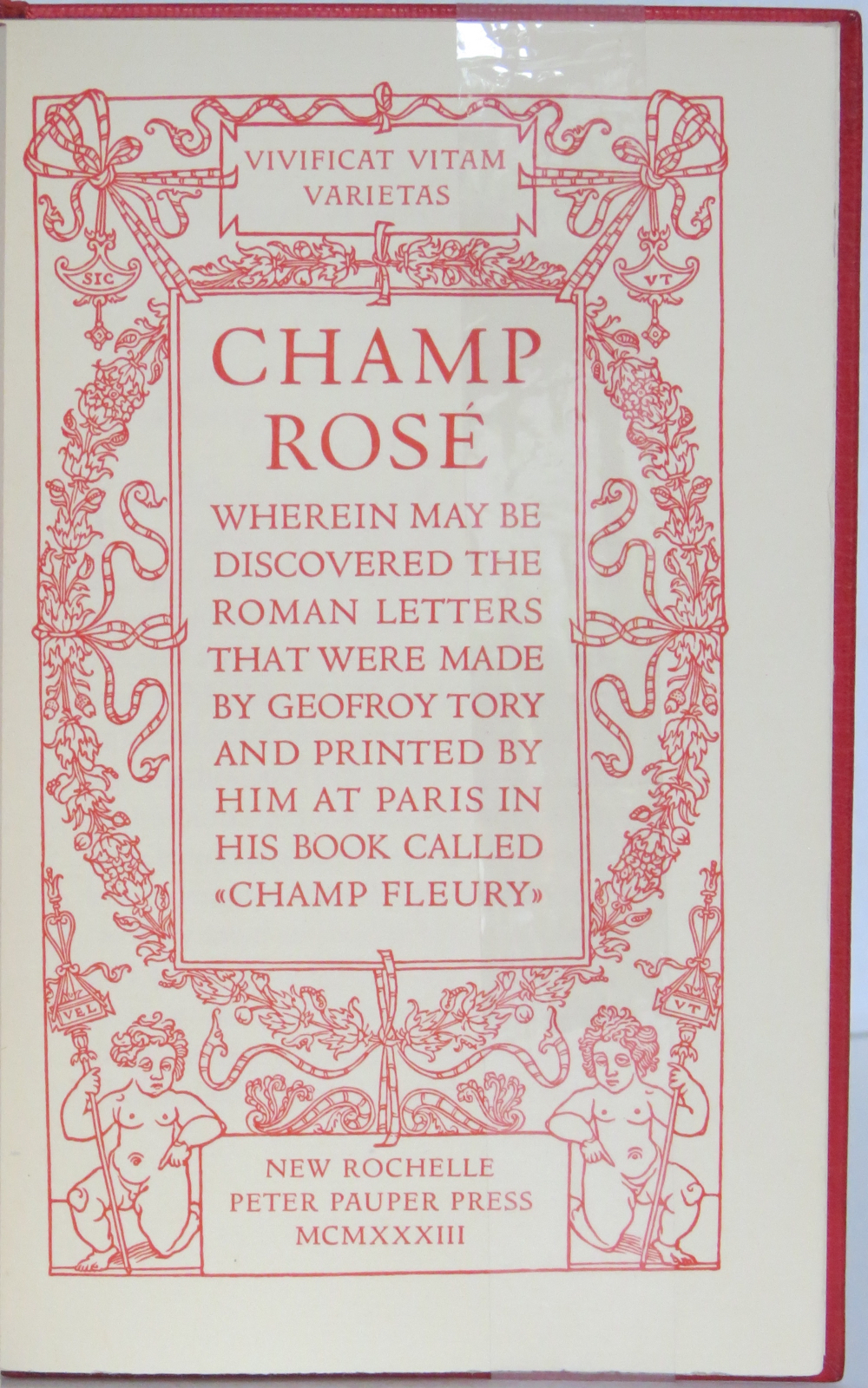
Adding to his joke, Rogers printed the whole of Champ Rosé in red, which Geraty follows. Rogers explained the red ink in his poor man’s Champ Fleury “as in these aforesaid days of hardship & depression much Book-Keeping is being written down in red…perhaps it would be better for Book-Selling too if Printing were done in that cheerful colour.…”
Geraty’s binding was part of the 1989 Guild of Book Workers exhibition.
Photos: The Veatchs.
Photos: Books On Books Collection.
The Books On Books Collection also holds a copy of George B. Ives translation of Champ Fleury, designed, typeset at printed by Rogers.
The art of the alphabet seems to be a rite of passage for graphic artists. Perhaps it is that art and the alphabet find common ground in the urge to make sense of the world. Perhaps it’s that the alphabet’s invention, development and artistic treatment present a rich tradition for artists to follow or challenge. Perhaps it’s that letterforms and the alphabet offer raw material, subject and organizing principle all in one. Semic or asemic. Calligraphic, typographic or even plastic. Representational or abstract. All are options. But most often, something bookish results. From Islam Aly’s 28 Letters(2013) to Ludwig Zeller’s Alphacollage (1979), a significant part of the Books On Books Collection is taken up with artists’ books based on the ABCs and letterforms. The Collection’s two facsimiles of Geofroy Tory’s Champ Fleury provide a useful historical backdrop that throws into relief several of the Collection’s works and their performance of this rite of passage.
It should be no surprise that Geofroy Tory de Bourges (c.1480-1533) serves up such an exemplar. In her Playful Letters, Erika Boeckler writes
An accomplished designer, typographer, printer, poet, author, translator, calligrapher, illustrator, woodcutter, and engraver, he received his education in Italy and ultimately settled in Paris, setting up a bookstore, writing his own works, running a press, and collaborating with or working for Simone de Colines, director of one of the most influential and experimental fine publishing houses of the time. Personally writing the text, designing the woodcuts, and cutting some of them, organizing the layout, perhaps even setting the type, Tory created Champ Fleury as what we might call today an artist’s book. (p. 29)
Tory straddles the letters of the late Middle Ages and Renaissance. Appointed by François I in 1530 as his printer, Tory operated on the Petit Pont under the sign of le Pot cassé (“the broken pot”) and was known for his workshop’s handwritten Book of Hours (1524). Rooted in the horae tradition reaching back to the 13th century, Tory’s Book of Hours is an early-to-mid-Renaissance version of its predecessors. As beautiful as his Book of Hours is, Champ Fleury (1529) became his best known work. Authored and designed by Tory, it was produced by hand typesetting and letterpress printing in Paris with Giles Gourmont. Printed less than 100 years after Gutenberg’s innovation, Champ Fleury represents the printed book toddling out of its incunabula period.
Book of Hours Geofroy Tory (1524) Bound in the 18th century, 113 leaves of vellum. Lessing J. Rosenwald Collection (Library of Congress). Accessed 30 May 2021.
According to Jeremy Norman’sHistory of Informationsite, the first separate printed title page appeared in 1463. Subject indices date back to the 13th century, originating at the University of Paris, and the first printed indices, to 1470. Champ Fleury‘s front matter boasts a title page, two prefaces to the reader, a statement of the King’s Privilege awarded for the book for ten years (a forerunner to the copyright page), a name index without location references and a subject index with folio references. Champ Fleury’s back matter consists of a colophon preceded by a lengthy appendix illustrating various forms of the alphabet (Hebrew, Greek, Latin, etc.).
Tory’s placement of the indices in the front matter rather than the back matter reflects the gradual development of the anatomy of the book towards the structure that would ultimately be codified in reference works like the Chicago Manual of Style. Paratextual elements like the title page, table of contents, page numbers, etc., did not spring up overnight. If, as Eric Havelock and others assert, society, the arts and culture are a superstructure erected on the foundation of the alphabet (see below), Champ Fleury and its “letterology” make for a particularly fitting exemplar of the book as an element of the superstructure arising from the alphabet.
Perhaps book artists sense this, which again leads to that alphabet art rite of passage and the elaborate variations on it. The illustration of various forms of the alphabet in the appendix also draws on another developing tradition: the typesetter/printer’s sample book advertising the firm’s fonts. Abecedaries and artist books have sprung from that tradition, too.
Tory was not the first to propose an art and science behind the letterforms of the alphabet. Predating his efforts were Giovanninno de’ Grassi (1390-1405), Felice Feliciano (1463), the Anonymous Chicagoensis and Anonymous Monachensis (1468?), Damianus Moyllus (1480), Fra Luca Pacioli (1509), Sigismondo Fanti (1514), Francesco Torniello (1517), Ludovico Arrighi (1522), Albrecht Dürer (1525) and Giovanni Battista Verini (1527). Leading up to Champ Fleury, these earlier efforts track the development of humanism. Arguably, Tory’s effort is a capstone, combining myth, allegory, metaphysics, geometry, linguistics, calligraphy, typography and cryptography.
Book One, concerned with the mythical origins of the French language, also addresses the fabled origins of the alphabet: the story of Jove, Io and Mercury behind the letters I and O and their claim to being the first letters and also the tale of Apollo’s accidental murder of Hyacinth explaining the letters A and Y and their similar claim. Two works in the Collection built on alphabet origin stories are Francisca Prieto’s Printed Matter series (2002-2008) William Joyce’s The Numberlys (2014), but many more follow in Champ Fleury’s art and science footsteps.
Tory’s late medieval/early Renaissance perspective gives way to 20th and 21st century poetics and phenomenology in most works of the Collection. Aaron Cohick’s The New Manifesto of the NewLights Press (third iteration) (2017) offers a good example. Another — closer to Tory’s moral and geometric perspective but of a more modern spirituality — is Jeffrey Morin and Steven Ferlauto’s Sacred Space (2003).
Compile all the abecedaries ever created and it would approximate the result of Adam and Eve’s task of naming all the creatures and things of the world. Leonard Baskin echoes that innocence in Hosie’s Alphabet(1972) with its words and animals supplied by his children. If Adam and Eve had had an alphabet, they might have been tempted into pareidolia, which is represented in the Collection by VUES/LUES: Un Abécédaire de Marion Bataille (2018) and Typographic Universe (2014) by Steven Heller and Gail Anderson. Heller and Anderson’s compendium extends to letters formed of natural and drawn objects from the real world, which Champ Fleury’s appendix foreshadows with its floral and fantastic alphabets.
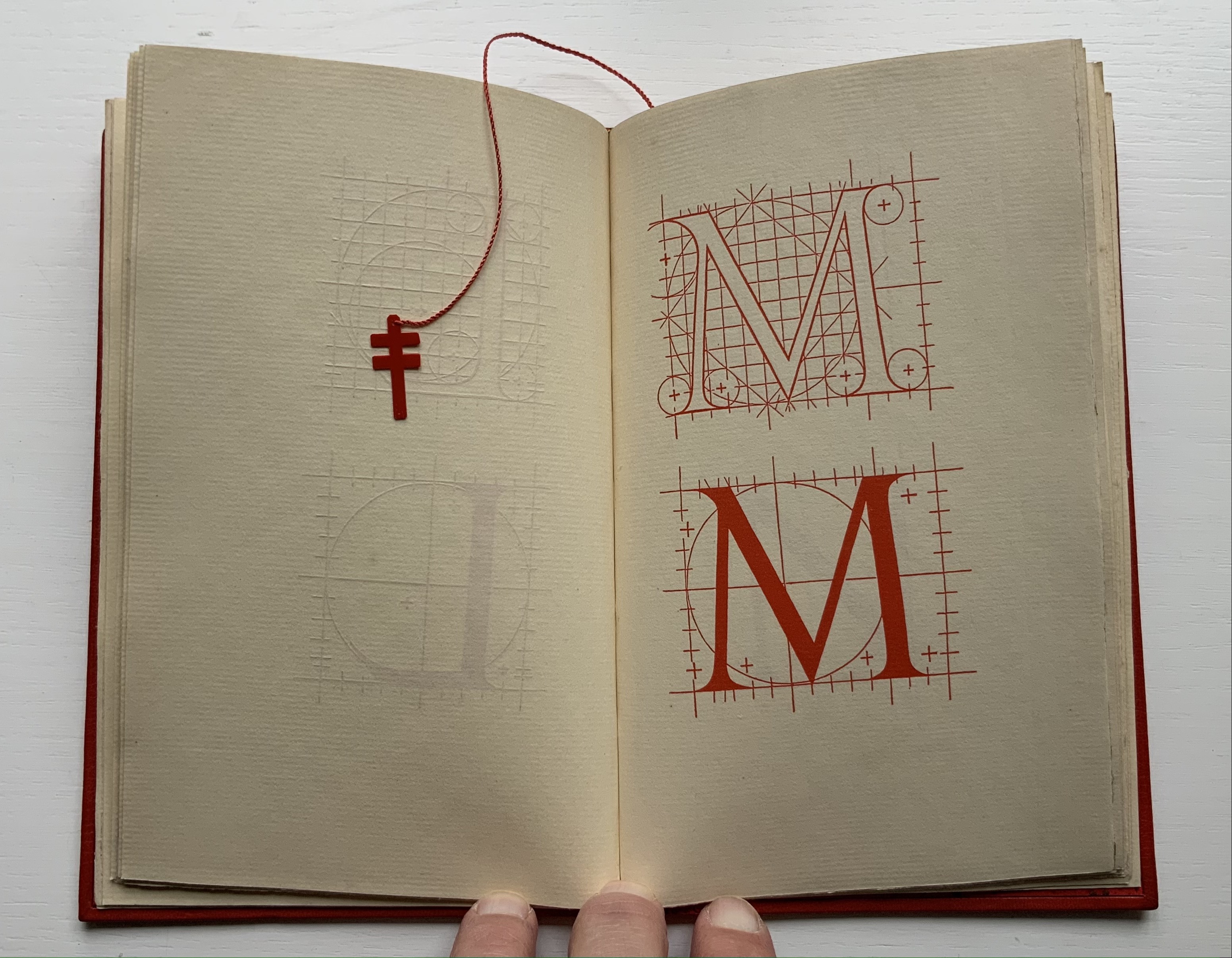
Of course, Tory’s work is not an abecedary. In Books Two and Three, it develops into a full-blown treatise on letterforms whose meaning and appearance are explained allegorically and driven by the compass, rule and geometry expressed within a 10x10x10 cell cube. It would overstate the case to call it “typographic design”. As drawn, Tory’s diagrams would serve poorly for cutting and forming punches or matrices (although it has been done). Nevertheless, his geometric approach foreshadows the grids and algorithms of Wim Crouwel’s New Alphabet (1967), Timothy Epps and Christopher Evans’ Alphabet(1970) and Ji Lee’s Univers Revolved: A Three-Dimensional Alphabet (2004).
Before the age of computers and algorithms, though, the artist and designer Bruce Rogers did bring typographic design to bear on Champ Fleury. The Grolier Club sponsored the printing of George B. Ives’ English translation. Rogers’ design “translates” Champ Fleury just as much as Ives does, perhaps more so. The Grolier Club edition is one of only ten books to be set completely in the Centaur typeface designed by Rogers.
Of course, the translation entails a complete resetting of the text, and Centaur naturally delivers crisper letters. Also, in redesigning with Centaur, Rogers alters the original’s layout and, therefore, the reader’s experience of it. Notice in the OAHK pages above and in the three double-page spreads below how Rogers changes Tory’s flow or jumpiness to something fixed or stately. Attention to the page and its layout offers book artists as well as book designers yet another creative avenue. For proof of that, compare the Collection’s entries for Angel, Baskin and de Cumptich.
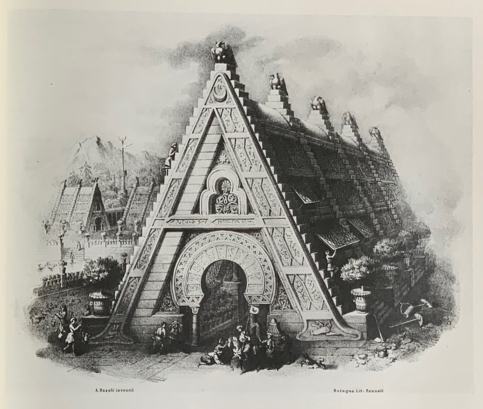
Architecture is another of Tory’s well-developed analogies and explanations of the ancients’ thinking behind the letterforms. In his drawings below, he aligns the letters AHKOIS with the parts of a building and letters IL with floor plans. He connects the circularity of the Coliseum’s exterior and the ovalness of its arena with the proper shape of the letter O. In the Collection, the analogy reappears fantastically in Johann David Steingruber’s Architectural Alphabet (1773/1972), Antonio Basoli’s Alfabeto Pittorico (1839/1998) Antonio and Giovanni Battista de Pian’s efforts in 1839 and 1842.
The architectural analogy provides Tory with his segue from plane to solid geometry in aligning the shapes of letters with human anatomy and virtues. His three-dimensional analysis of letterforms also finds contemporary analogues in two of Pieter Brattinga’s Kwadraat Blad series: Crouwel’s, mentioned above, and Anthon Beeke’s Alphabet (1970). Tory’s three-dimensional letterforms foreshadow Crouwel’s investigation of units based on the assembly of organic cells and his later musings on a laser-generated four-dimensional typography (Elliman, 62). And it is hard to evoke anything more humanoid and three-dimensional — albeit far less analytical or prudish — than Beeke’s alphabet formed with naked female models. (Tory comments that in a correctly drawn A, the crossbar will virtuously cover the genitals of Vitruvian man inscribed in the 10×10 grid. Modesty seems to extend to H as well but not so much to O and K.)
The calligraphic impulse that underlies Champ Fleury‘s typographic representations shows itself clearest in the woodcuts for the Cadeaulx alphabet in the appendix. The Books On Books Collection has its share of calligraphic abecedaries such as Marie Angel’s An Animated Alphabet (1996) and Andrew Zega and Bernd Dam’s An Architectural Alphabet (2008) as well as more purely calligraphic alphabets such as Islam Aly’s, mentioned above, and Suzanne Moore’s A Blind Alphabet (1986) .
Two artists whose abecedaries blend the calligraphic and typographic are Robert de Vicq de Cumptich and Cathryn Miller. In de Cumptich’s Bembo’s Zoo (2000), letters and punctuation marks from the Bembo typeface form calligraphic animal shapes. Miller’s L is for Lettering(2011) joins up the alphabetic rite of passage, calligraphy and typography by allying each of her hand-drawn letters with the name of a typeface from “A is for Arial” to “Z is for Zapfino”.
The last page of Tory’s illustration of additional alphabets is not the end of his work. The colophon plays that role. Curiously, Tory misses out the character that plays that role for the alphabet itself: the ampersand. “Curiously” because the character & appears throughout Champ Fleury — even at the end of the colophon’s fourth line in French — and it is after all the most flowery of the alphabet’s characters. Perhaps some book artist will follow Bruce Rogers’ example in his joking Depression-era homage to Tory on the back of Champ Rosé and create an homage to Tory and Rogers of three-dimensional ampersands.
Gelb, Ignace J. 1974. A Study of Writing. Chicago: University of Chicago Press.
Golec, Michael. 2015. “Champ Fleury in the Machine Age”, lecture at the School of Visual Arts, NYC. Uploaded 4 June 2015. Accessed 12 May 2021. Good slides and a comparative look at Tory’s original and Rogers’ resetting.