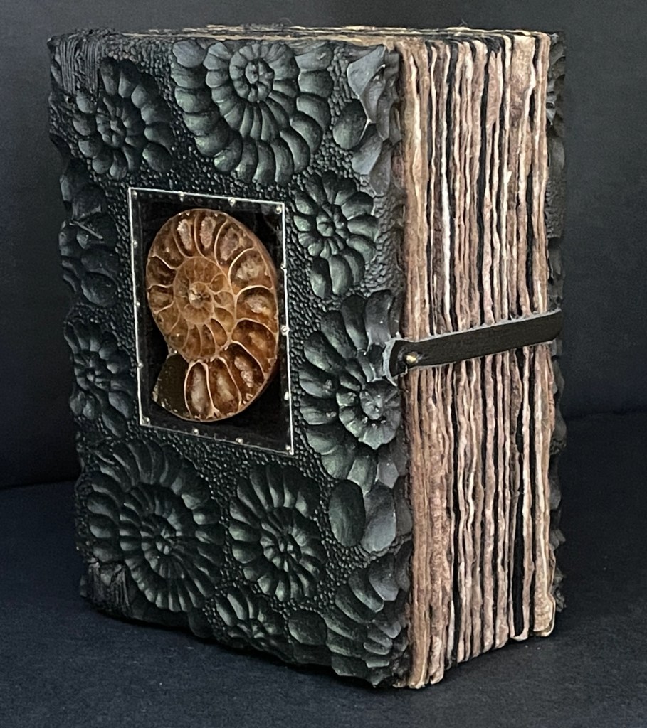
Ammonite (2015) Daniel Essig, Graeme Priddle, and Melissa Engler Ethiopian and Coptic bound book, sewn with waxed black linen thread, walnut-dyed handmade flax and Ingres Antique black papers, with carved front and back covers of maple, each with a bisected ammonite fossil embedded beneath a mica sheet, fixed with 1/8 brass brads. H127 x W90 x D63 mm. [384] pages. Unique. Acquired from the artists, 30 May 2025. Photos: Books On Books Collection.
Even a cursory glance through the Books On Books Collection confirms the variety of choices book artists face when creating an artist’s book. In Ammonite (2015), the book block and its binding are the site and material of Daniel Essig, Graeme Priddle, and Melissa Engler’s sculptural art. In their collaboration, Essig drilled and prepped the wooden covers, Priddle carved the ammonite surface, Engler painted the covers, and then Essig added the mica window with ammonite fossil, prepped the book block, and bound the book.
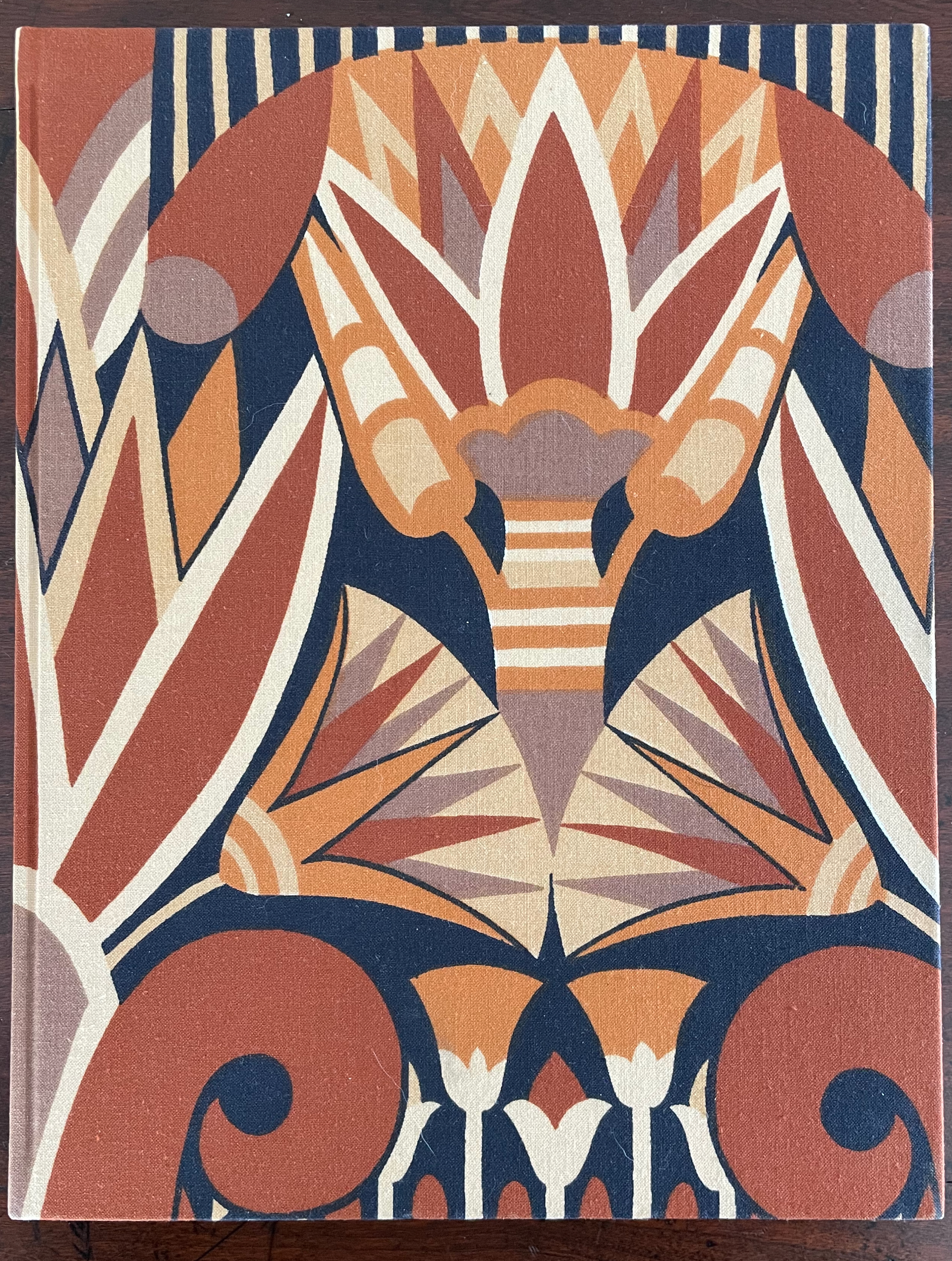
The Circus of Dr. Lao (1982) Charles G. Finney (text) Claire Van Vliet (design and illustration) Hardback, cased in cotton cloth over boards, head and tail bands, sewn. H x W mm. 9 1/4 x 12 inches 140 pages. Edition of 2000, of which this is #996. Acquired from BlueMamaBooks, 9 February 2025. Photos: Books On Books Collection.
If you have read Nathaniel West’s The Day of the Locust (1939) or Flannery O’Connor’s A Good Man Is Hard to Find (1955), Charles Finney’s novella illustrated by Claire Van Vliet will seem only marginally disturbing. If you have seen Tod Browning’s Freaks (1932), it will seem more than tame. Somewhere in between is the appropriate trigger warning for The Circus of Dr. Lao (1982).
Finney drops Dr. Lao’s circus of P.T. Barnum-esque carnival sideshows, a bestiary of distorted mythological creatures and exaggerated stereotypes, into the Arizona backwater of Abalone. The denizen of Abalone and their reactions — from gullibility, lubricious fascination, racist hazing, and violence to shrugs and a smug return to unexceptional normality — are the targets of Finney’s fevered satire. Van Vliet mirrors the range with her illustrations printed from original relief etchings and her selection of contrasting Plantin and Victoria display types.
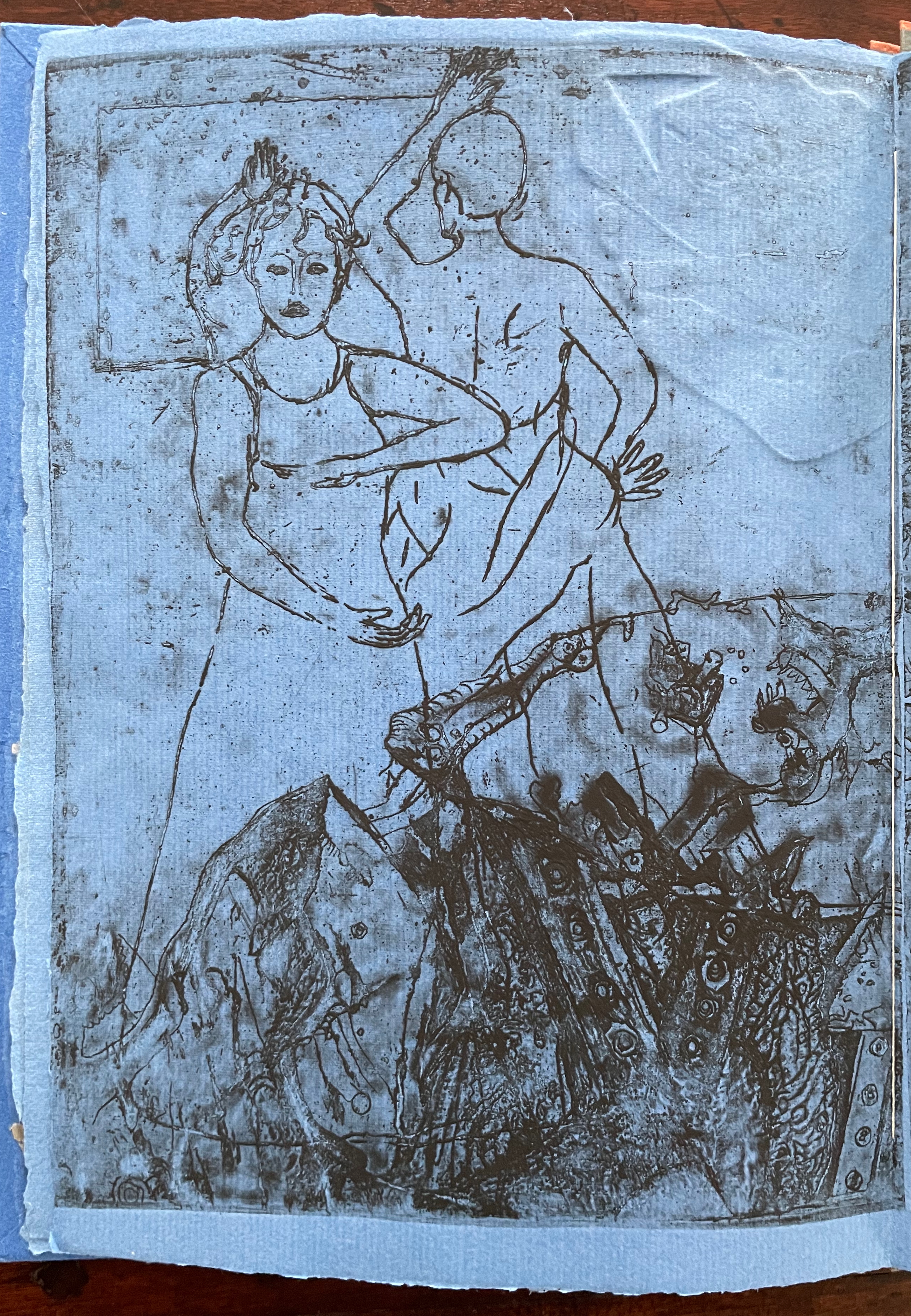
These are Bruno Munari’s words that I share. I play and I have fun with my papers and my colours, but it is a job and a job, even if enjoyable, is a serious thing. My notes on image diaries are serious. A collection of thoughts translated into images, that are daily, just like a diary, “annotated” on nearly three hundred pages. I use the stencil technique with a monochromatic press, an imaginary thread connects them and creates a long history that develops, touching on events that have hit me in a particular way. It is my imaginary world, but at the same time, very real.Paper, card, fabric, needle, thread, colours and gouges are the materials that allow me to work and to leave my fantasy and creativity free. I have one very small study, but it is sufficient. It is welcoming, full of books, with a great ceiling window, three tables, two chalcographic presses and one press. When I am sitting in my workplace, I manage to isolate myself in my world. I can stay seated for hours without the passing time weighing on me, making me happy with this choice of life. — Eleonora Cumer
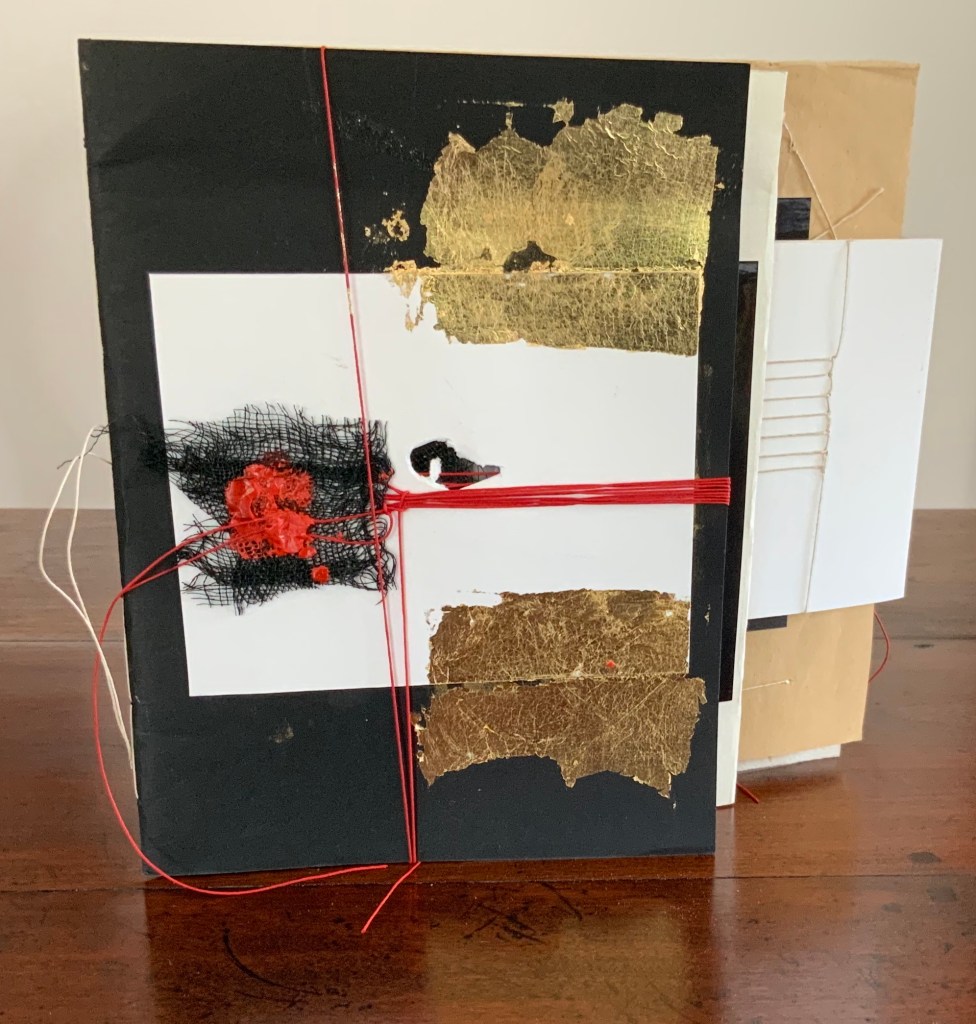
libro catalogo con interventi manuale (2019)
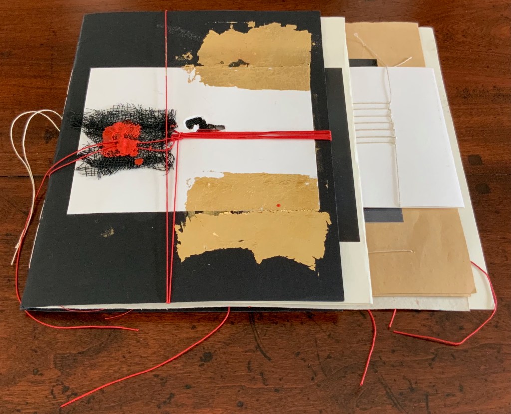
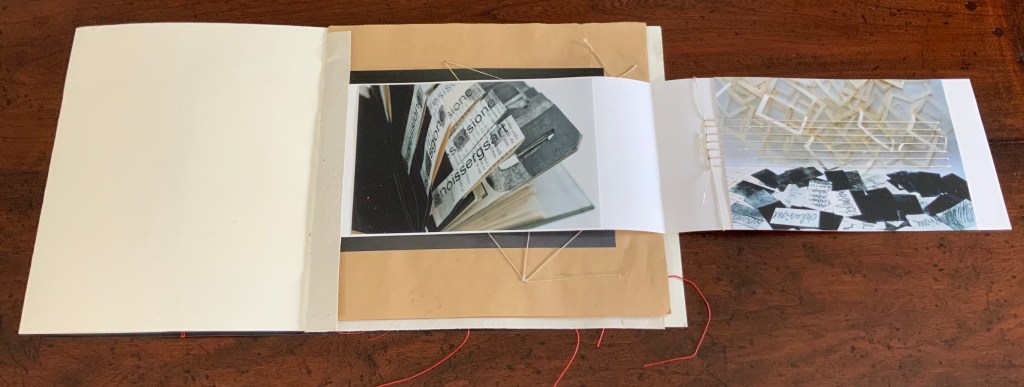
libro catalogo con interventi manuale / “book catalogue with manual interventions” (2019) Eleonora Cumer Sewn booklet, various papers including photographic, gold leaf, thread, mesh, string, wax. H200 x W220 (variable) mm. [16] pages. Unique. Acquired from the artist,. Photos: Books On Books Collection.
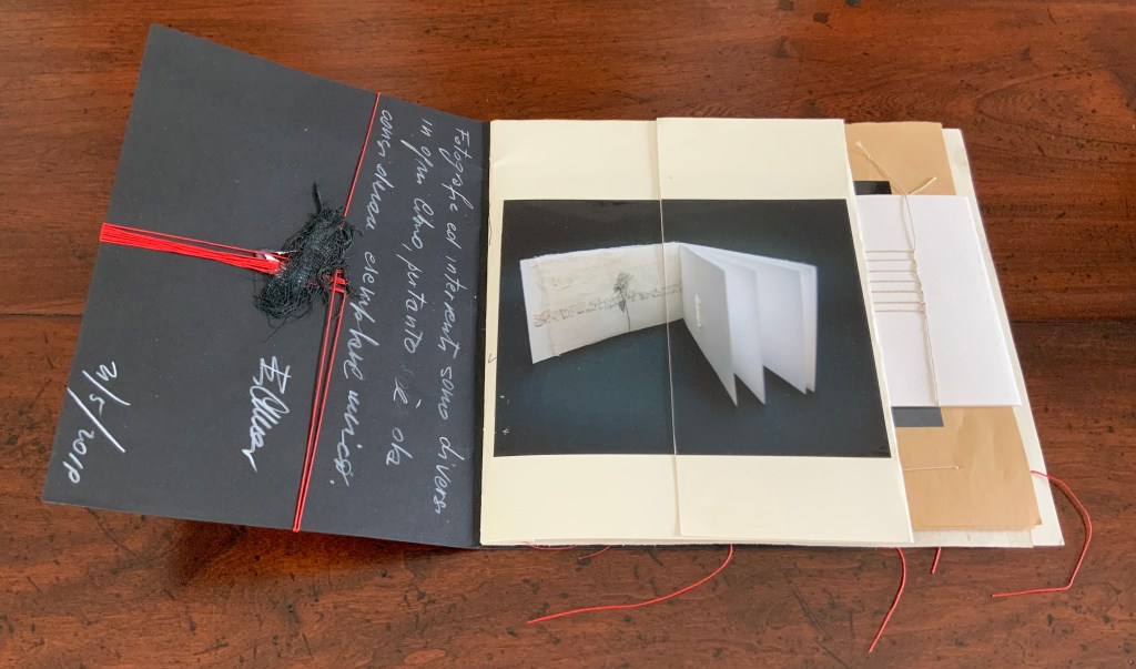
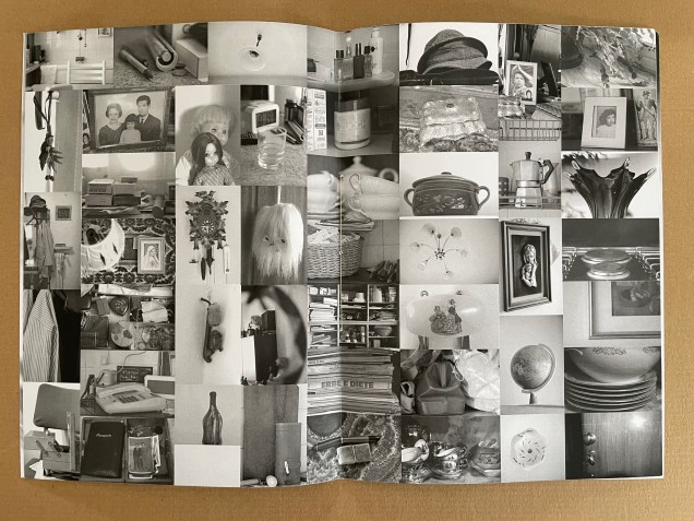
Many catalogues of individual artist’s books aim to be works of art themselves. Some attempt this with fine press production and limiting the edition, which sometimes succeeds. Some embody the very material and techniques that the artist used to create the items represented in their pages. Eleonora Cumer’s libro catalogo con interventi manuale / “book catalogue with manual interventions” (2019) is an extreme and stunning example of the latter. It is extreme because it is unique, not a limited edition. It lacks any identifying captions or list of works (the captions below appear only as a convenience for this entry in the Books On Books Collection). Libro catalogo con interventi manuale stands on its own as a stunning work of book art.
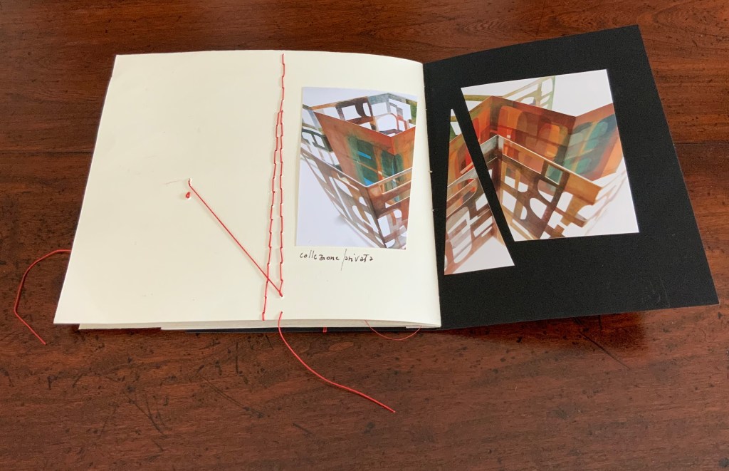
As the richly textured and gold-leafed cover turns, notice how Cumer presents the image of the catalogue’s first work: Parole non dette, frasi in sospeso / “Unspoken words, unfinished sentences” (2018). Split and pasted on two sides of the first folio, the glossy photograph of Parole non dette reunites with precise registration in the center of the folded folio.
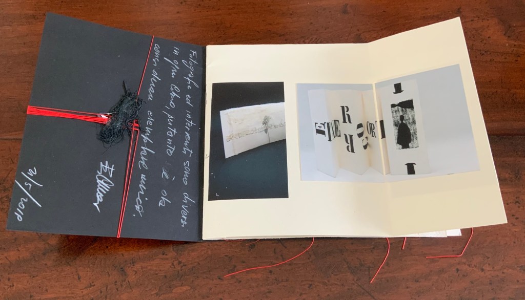
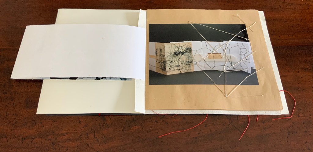
When the right half of Parole non dette turns, the second work — controcorrente /”against the current” (2010) — comes into view.
Although pasted on one side of the folio, the photograph of controcorrente splits in two at the fold, the left side and right side precisely registered with one another on either side of the fold. This is subtle. First an image reunited and aligned by virtue of cut and fold, then second an image separated but aligned by virtue of cut and fold. We may be long used to how juxtaposition works artistically on the flat surface of collage or the multiple surfaces of assemblage. Cumer teaches this afresh with the flat and multiple surfaces of book structure as well as with the materials and techniques of bookmaking.
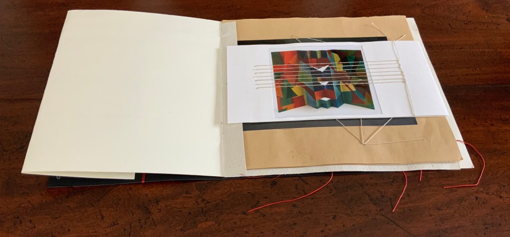
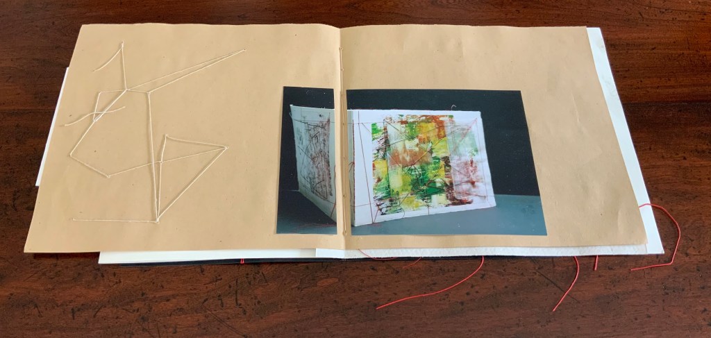
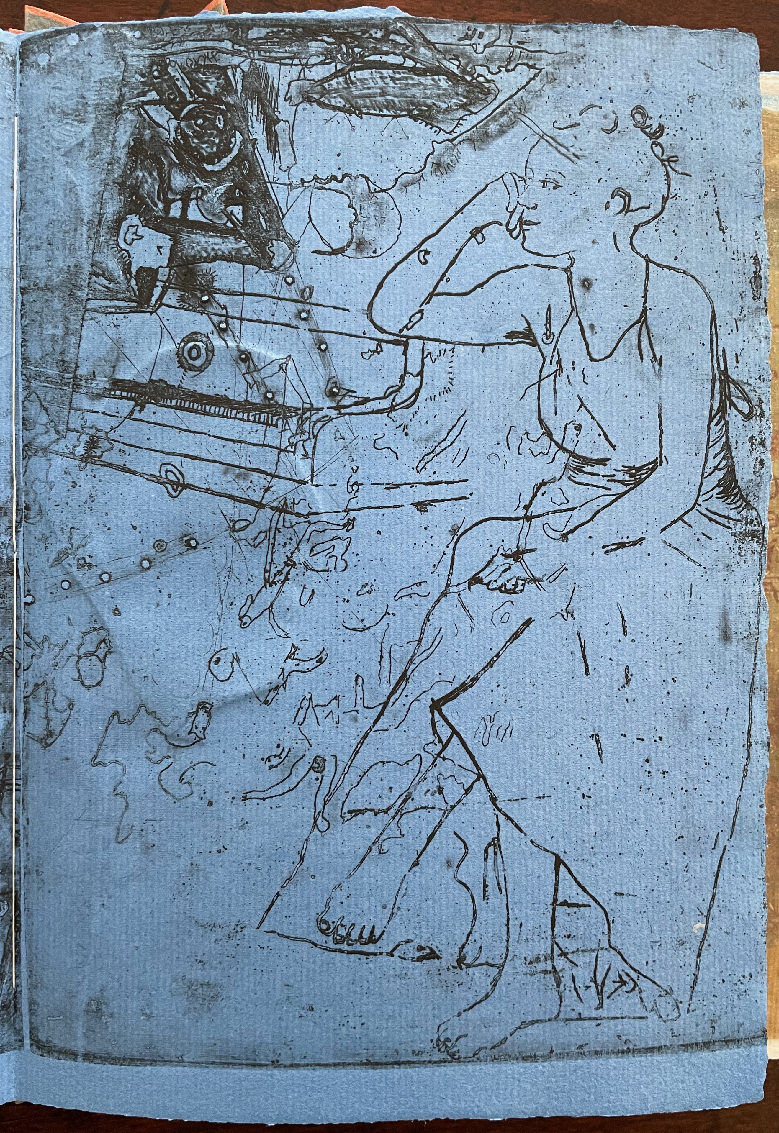
The next three works appear in a fold-out insert attached to the stub of a textured folio that also supports a brown paper folio following the insert. The colorful città / “city” (2018) reflects how Cumer’s palette and sculptural repertoire extends beyond the black and white leporello of controcorrente. The threads sewn in parallel over the photograph of città not only reflect another part of Cumer’s material repertoire, they also enact another part of her sculptural repertoire in the way they work with, in, and across the photographs and folios.
When the image of città / “city” folds out to the right, photographs of two more works appear: desiderio di … arte / “desire for … art” (2012) and illusione – delusione / “illusion – delusion” (2012). The image of desiderio highlights Cumer’s use of the flag book structure, although there is structurally much more to that work’s composition. The parallel threads that extended over the photo of cittá on the other side of the fold-out now pierce the photograph of illusione – delusione.
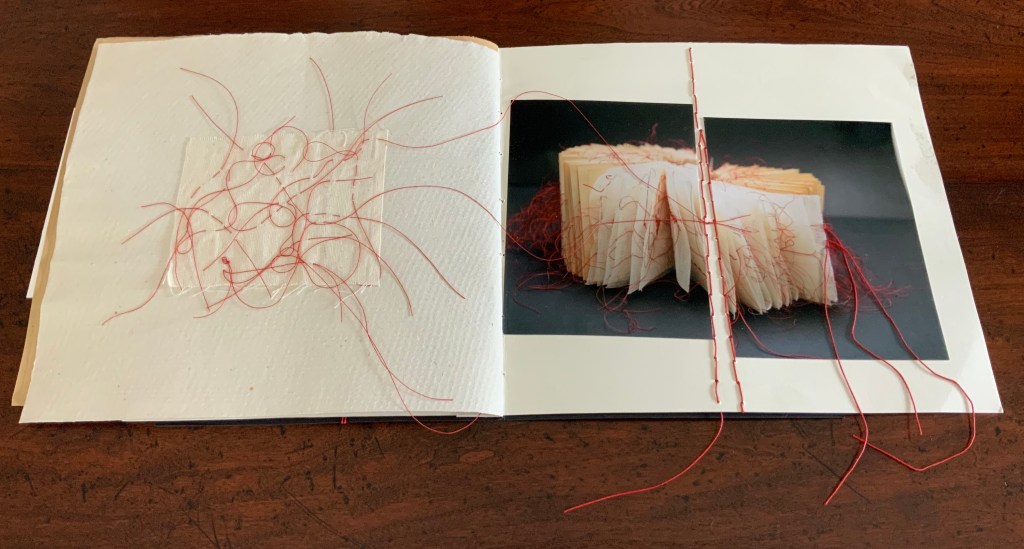
The next work to appear — il libro segreto /”the secret book” (2018) — carries on with the intervention and penetration by thread. The patterns formed by the thread reflect and extend those which can be seen in the photograph of il libro segreto. Leaping out of the photograph and penetrating the supporting brown paper folio, the thread introduces a new motif that will recur in just a few more pages.
The spread presenting the next work — fili intrecciati / “twisted threads” (2018) — reverts to the split aligned photo as used with controcorrente, but here the division comes at the center of the double-page spread. Off to the left side, the abstract figure in stitched thread echoes the technique used in fili intrecciati itself and starts another recurring motif in the catalogue.
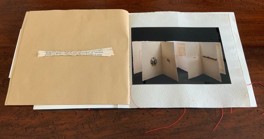
No intervention occurs in the photograph of cancellazioni e riscruttare / “cancellations and rewritings” (2018). No cuts, no folds, no threads, but on the facing verso page, Cumer brings to life one of the cancelled/rewritten objects that can be seen in the photograph. Just as in fili intrecciati, the thread-bound bundle of strips of cut text has leapt from two dimensions to three dimensions, highlighting again how Cumer uses the flat and multiple surfaces of book structure as well as the materials and techniques of bookmaking to re-teach us how juxtaposition works artistically on the flat surface of collage and the multiple surfaces of assemblage.
Following but elaborating on the previous spreads’ motif of juxtaposing an extract of the work with a photograph of the work, Cumer places a red-threaded square of tartalan across from the cut and misaligned photograph of la poesia dell’universo / “the poetry of the universe” (2018). The cut photograph is split by a red stitch that divides in two itself.
Here is where the variation on the two dimensional becoming three dimensional introduced by il segreto libro recurs. Defying the gutter’s separation of the tartalan sample from the whole work and the severing of the photo on the recto page, threads from the sample cross the gutter, fall across one half of the photograph, and link up with the severing stitch. The thicker thread of the severing stitch passes under the other half of the photograph to exit from it on the right and fall across the image of red threads similarly exiting the work itself. The ways in which this double-page spread speaks to the self-reflexive nature of book art and the paradoxical relationship of art to what it re-presents are remarkable.
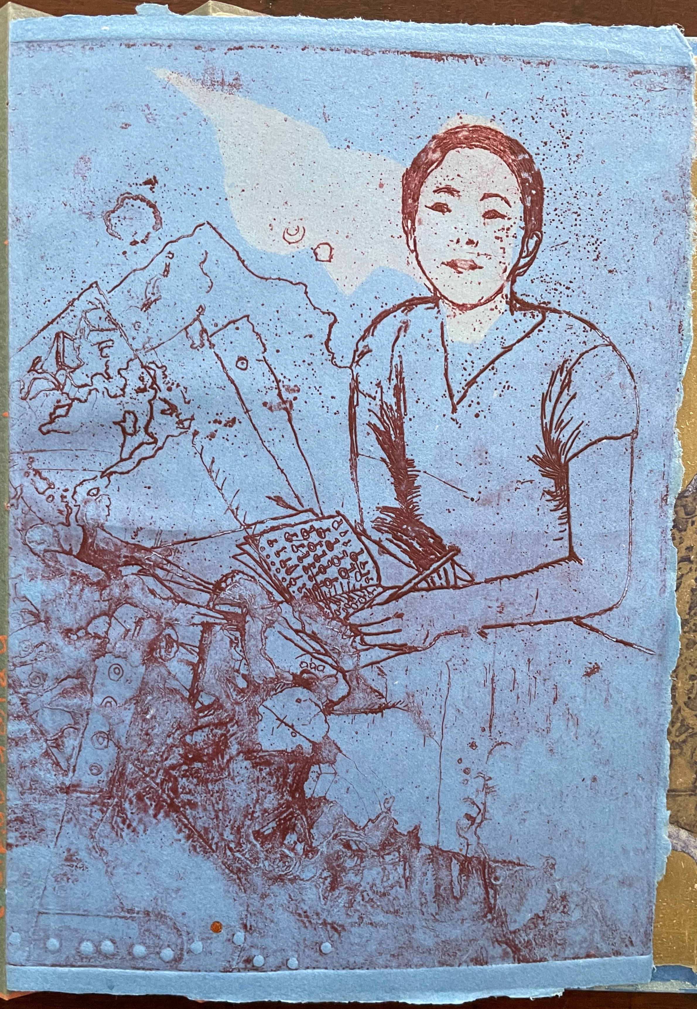
The final work in the catalogue — visioni urbani / “urban visions”(2015) — resides in the Books On Books Collection. More about it can be found here. Threads do not make an appearance in visioni urbani, but their triangular appearance here does reflect on urbanivisioni. If the space to the left of the red stitching can be counted as a page, this is a “three-page” spread echoing the three-way split of the photo of the work, which echoes the tripartite physical structure of the work itself.
In the colophons of several earlier works, Cumer has drawn attention to this practice in libro catalogo of recycling her works. She labels them as part of projects “born of work with old books”, “born from her artist’s books”, and “born of her work with old theater posters”. Three of them are explored below, and three others can be found in a previous entry on her work.
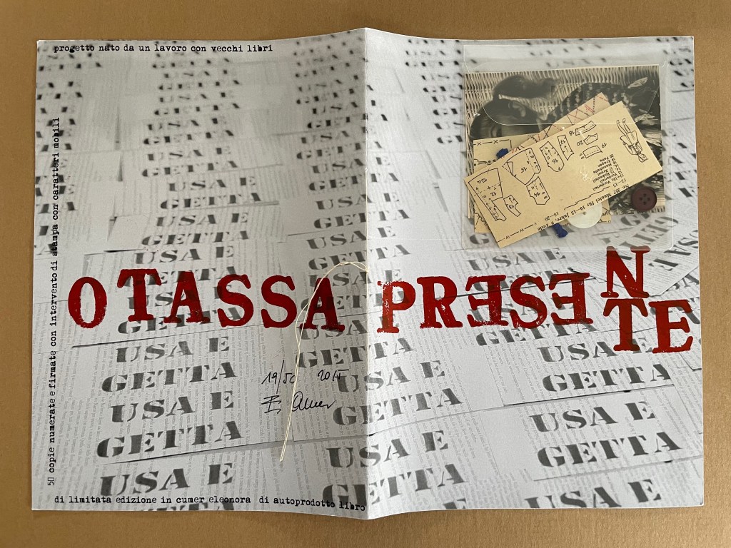
PRESENTE/OTASSA (2015)
PRESENTE/OTASSA / “Present / Tax” (2015) Eleonora Cumer Sewn booklet. H287 x W204 mm. [8] including cover. Edition of 50, of which this is #19. Acquired from the artist, . Photos: Books On Books Collection.
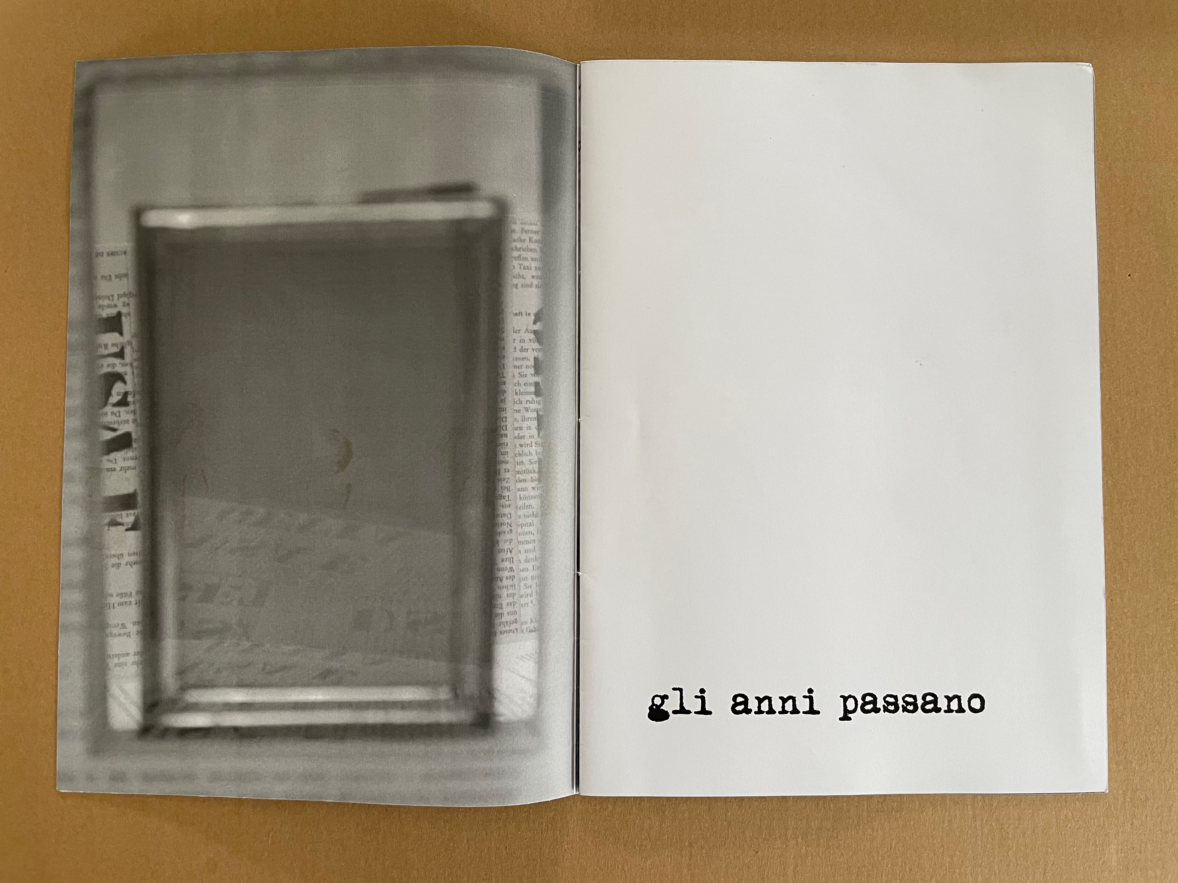
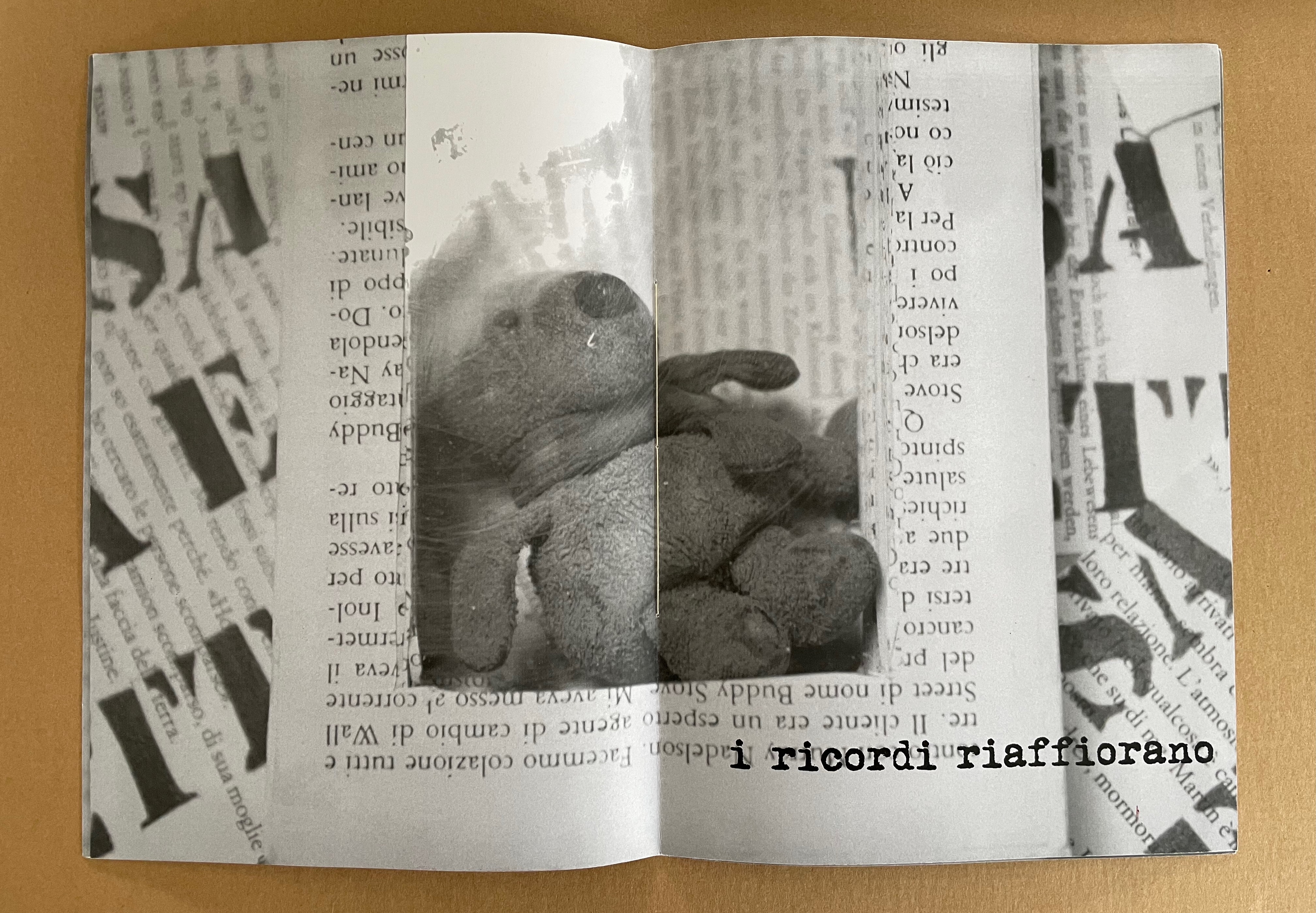
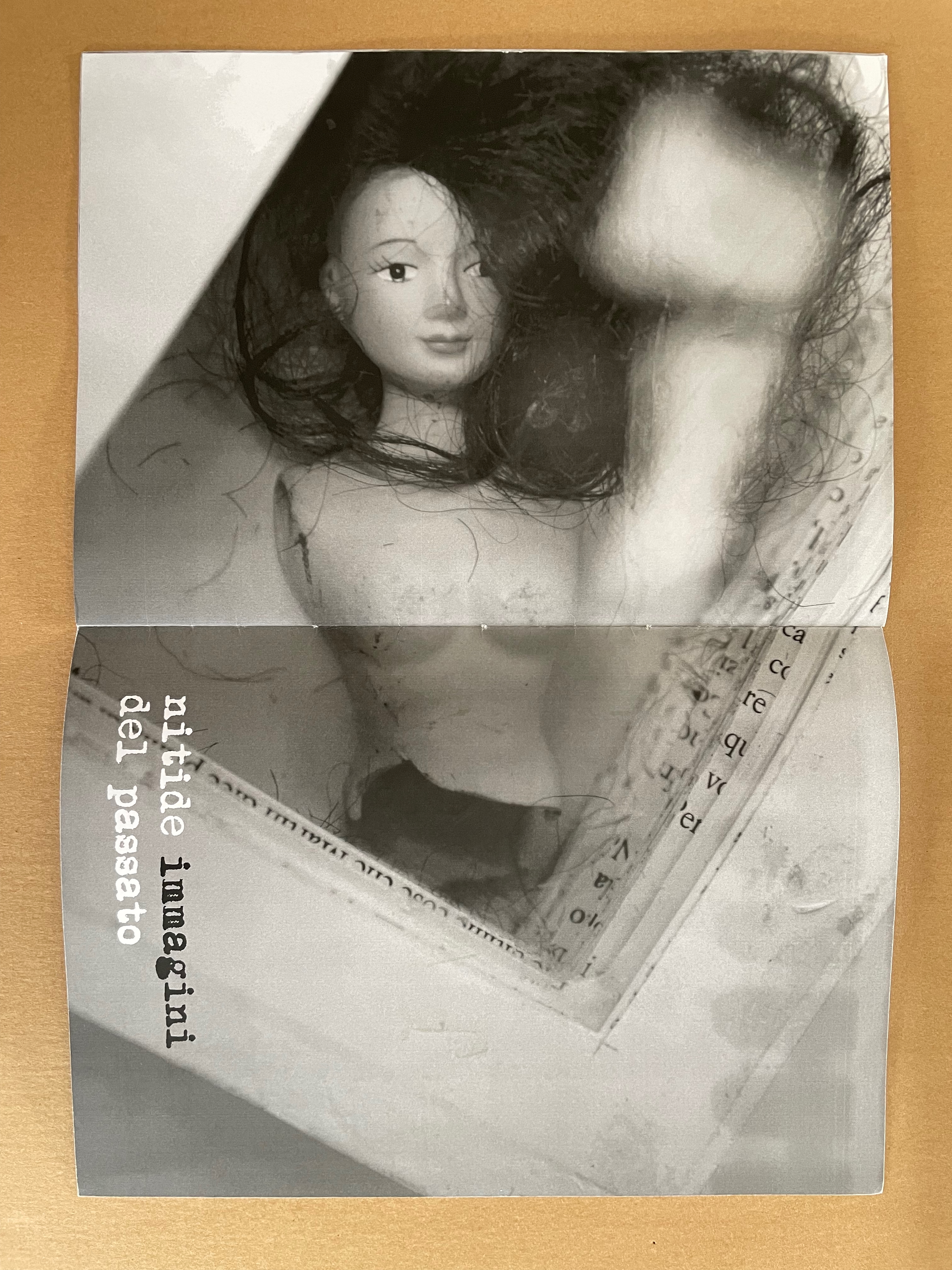
Whether read as otassa presente or presente otassa, the translation of this sewn booklet’s title comes out the same: a present tax. The phrase in the background — usa e getta — stamped over ghosted images of cutout book pages means “disposable” and is used as the title of a 2014 work. The ghosted book pages come from the Italian edition of Mario Puzo’s last novel Fools Die, a Hollywood/Wall Street potboiler. The front cover’s sealed plastic envelope containing cut-up sewing patterns, buttons, thread and an old photograph of a little girl wearing a knit shawl and sitting in a white wicker chair makes the intriguing juxtapositions only more so. What do these collaged and assembled elements have to do with one another?
Some clarity dawns with phrases on the interior pages: gli anni passano (“years go by”), i ricordi riaffiorano (“memories come back”), and nitide immagini del passato (“clear images of the past). “Disposable” alludes not only to the novel whose pages wallpaper the cover and interior pages but also to Cumer’s work of the preceding year — USA E GETTA (2014), a series of unique altered books. The series is the source of the images inside PRESENTE/OTASSA. Each shows a hollowed-out book with an object held in place between clear plates — a picture frame (empty except for the reflection of the foreground — the rest of the work it comes from), a stuffed toy, and a broken dress-up doll. Things of the past that in general are disposable (like sewing patterns no longer needed or broken dolls) nevertheless come back as clear images: a tax on the present.
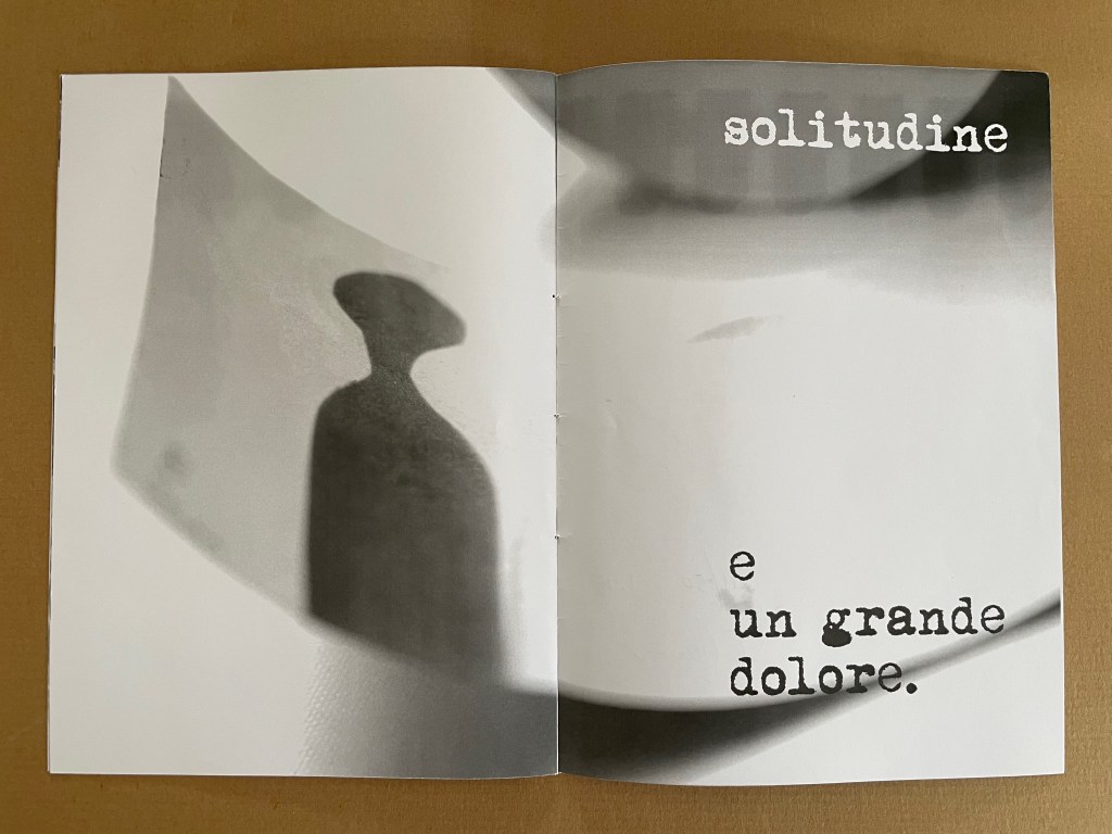
radici/ in memoria dei miei genitori (2015)
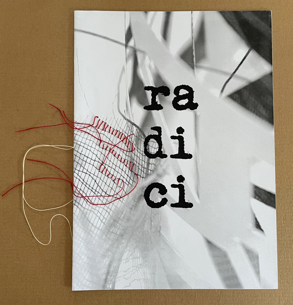
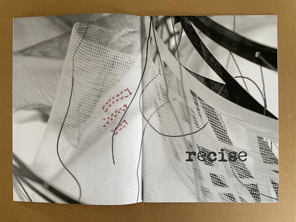
radici/ in memoria dei miei genitori / “roots/ in memory of my parents” (2015) Eleonora Cumer Sewn booklet with stitching. H287 x W206 mm. [8] pages. Edition of 50, of which this is #11. Acquired from the artist, . Photos: Books On Books Collection.
The theme of memory continues in radici/ in memoria dei miei genitori / “roots/ in memory of my parents” (2015) but perhaps more poignantly than in presente/otassa. Drawing on the previous works moltitudine e solitudine/ “multitude and solitude” (2013) and no time no space (2015), the booklet also evokes Cumer’s passion for textile and fabric art. The small image of a sewing box in the lower left hand corner of the central spread may speak to a parental source of that passion, but the words on the other spreads — recise and solitudine e un grande dolore (“severed or sever or cut” and “loneliness and a great sorrow”) — turn that central spread into a collage of loss almost more so than a collection of memories. It is one of the more somber works by Cumer in the Books On Books Collection.
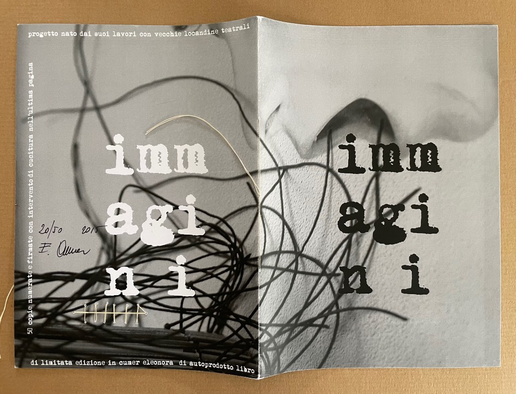
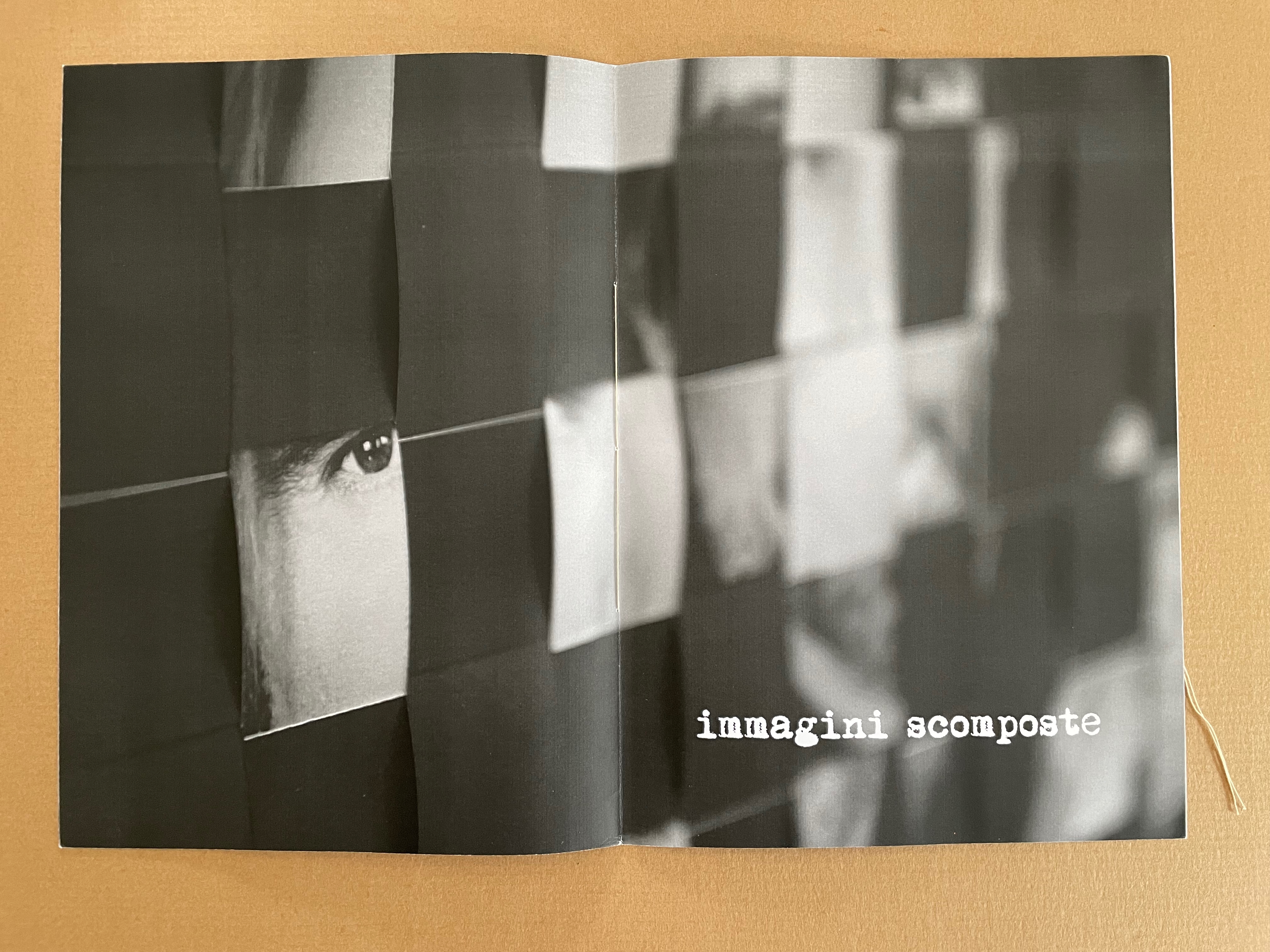
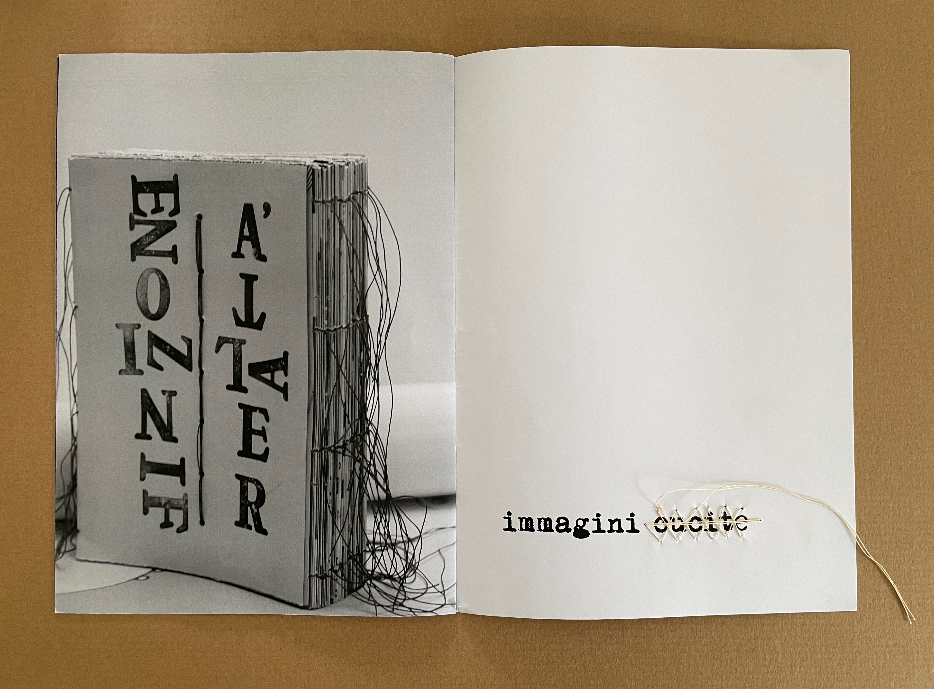
immagini (2015)
immagini / ‘“images” (2015) Eleonora Cumer Sewn booklet with stitching on the last page. H287 x W206 mm. [8] pages. Edition of 50, of which this is #20. Photos: Books On Books Collection.
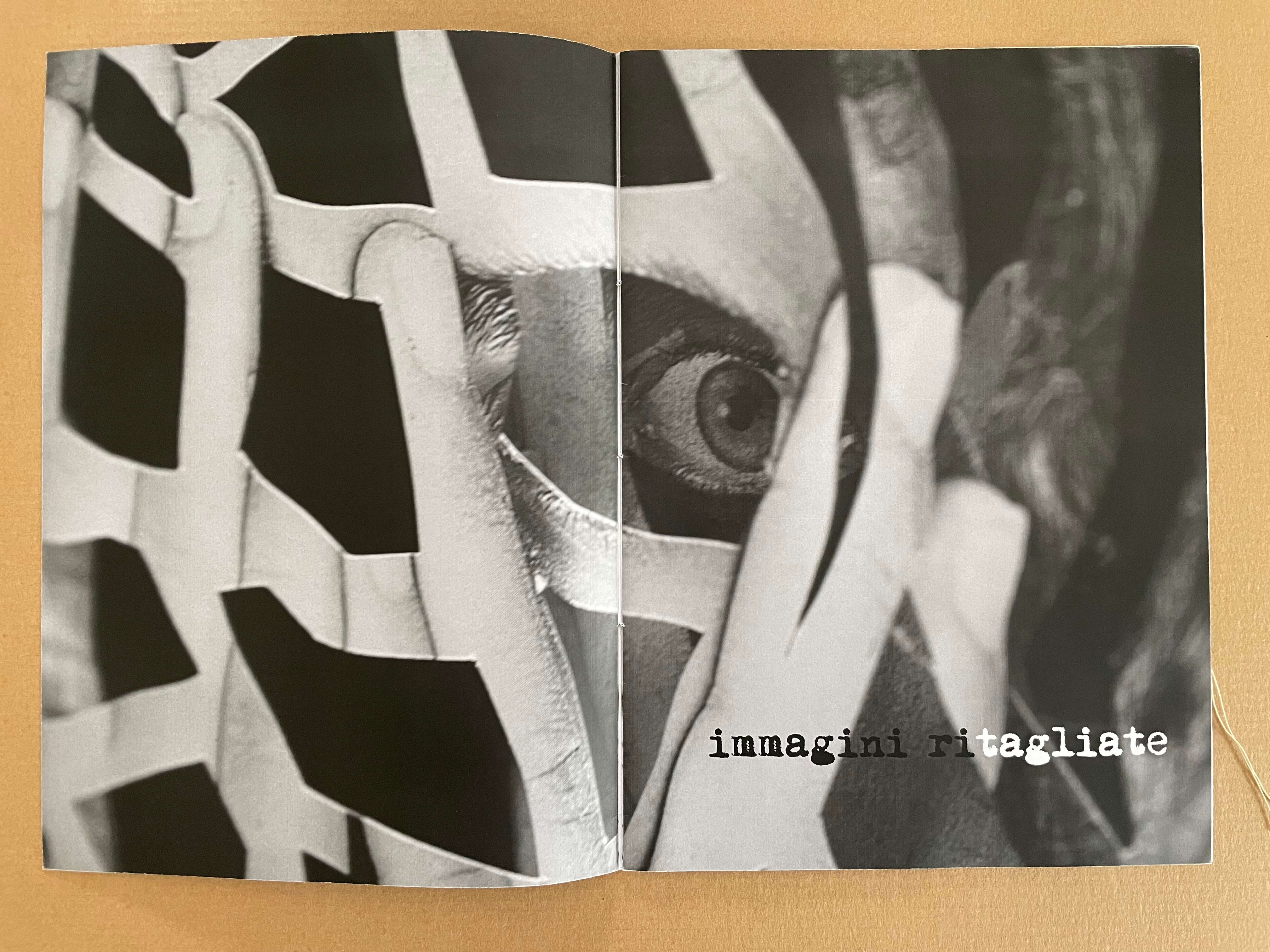
The overlaid phrases immagini ritagliate, immagini scomposte, and immagini cucite can be translated as “cut out images”, “distorted images”, and “stitched images”, respectively. On the cover of the unreadable book displayed, the words FINZIONE / “fiction” and REALTÁ / “reality” are spelled in reverse. As in libro catalogo, there is self-reflexivity at play here. Cumer plays with the word ritagliate by printing ri in black and tagliate in white, creating two verbs — ritagliate (“cut out”) and tagliate (“cut”), which apply to the word itself, the technique in the poster displayed, and the fragment of it blown up on the double-page spread. By blurring the image on the recto page of the second double-page spread, she makes the spread play out the meaning of scomposte — “distorted”. And in the third spread, she playfully stitches over the word cucite — “stitched” — which comments not only on the word but also on the stitched unreadable book on the verso page.
*Giocare è una cosa seria! I bambini di oggi sono gli adulti di domani aiutiamoli a crescere liberi da stereotipi aiutiamoli a sviluppare tutti i sensi aiutiamoli a diventare più sensibili. Un bambino creativo è un bambino felice!
“Playing is a thing! Today’s children are tomorrow’s adults. Let’s help them grow up free from stereotypes. Let’s help them develop all their senses. Let’s help them become more sensitive. A creative child is a happy child!” Bruno Munari, on occasion of 1986
Bruno Munari, 1986, on occasion of a Children’s Workshop Laboratory, prompted by a series of seminars promoted in 1977 by Franco Russoli, Superintendent of the Pinacoteca di Brera.
In the 1970s, post-Minimalism, post-Conceptualism, Language-based Art, Neo-Dada, Fluxus, Arte Povera, OuLiPo, the commodification of art and the “dematerialization of the art object” — all made a messy milieu for visual and literary artists. According to Stefan Klima, this is also the period when the messy notion of the artist’s book or “book art” gained recognition as a genre with exhibitions curated by Dianne Vanderlip for Moore College of Art and Design, Germano Celant for Nigel Greenwood Gallery, and Martin Attwood for the Arts Council of Great Britain.
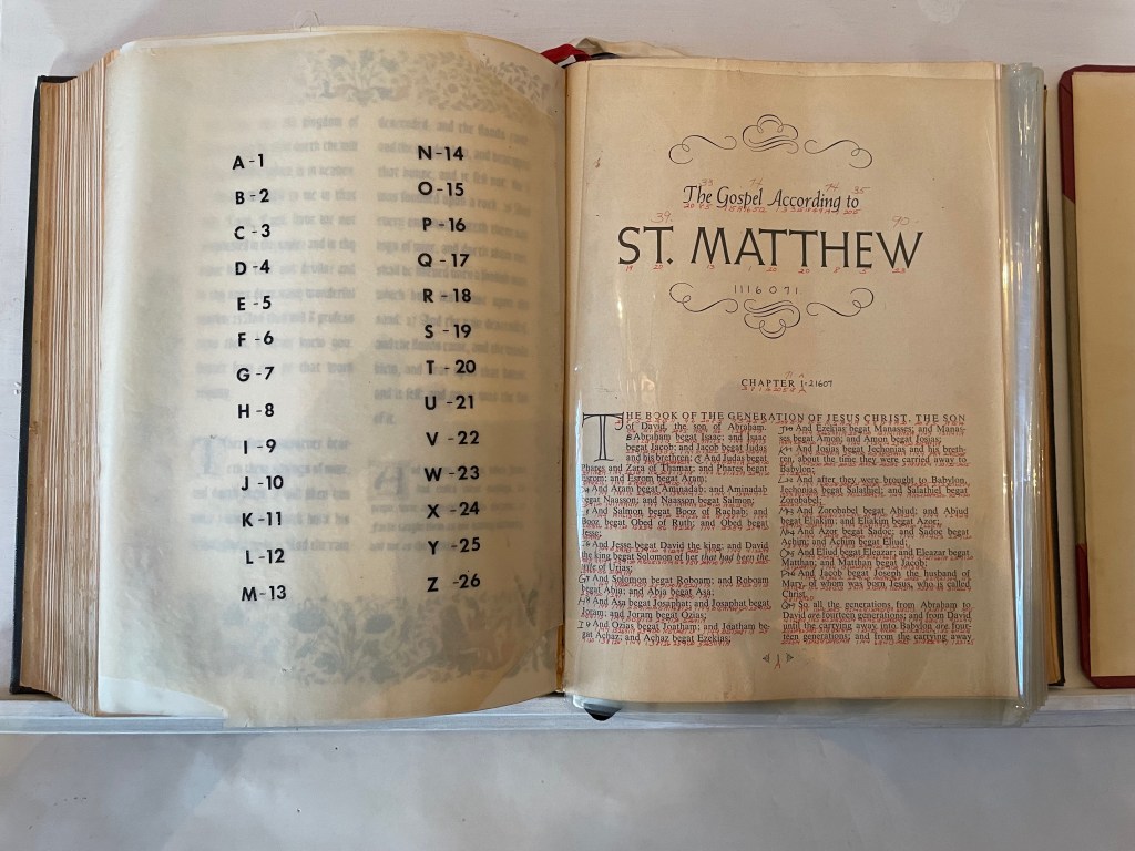
Into this environment came Bronx-born Karen Shaw, an aspiring artist and data analyst for the broadcaster NBC. On the job, she learned about the hash function — that one-way cryptographic algorithm that condenses input data of any size into an output of fixed lengths. When she saw that she could change a word into a number by assigning each letter a number according to its place in the alphabet and then summing them up, she arrived at the idea of reducing “the masterpieces of literature, poetry and prose to a number, which would signify the ‘essence’ of the work”.
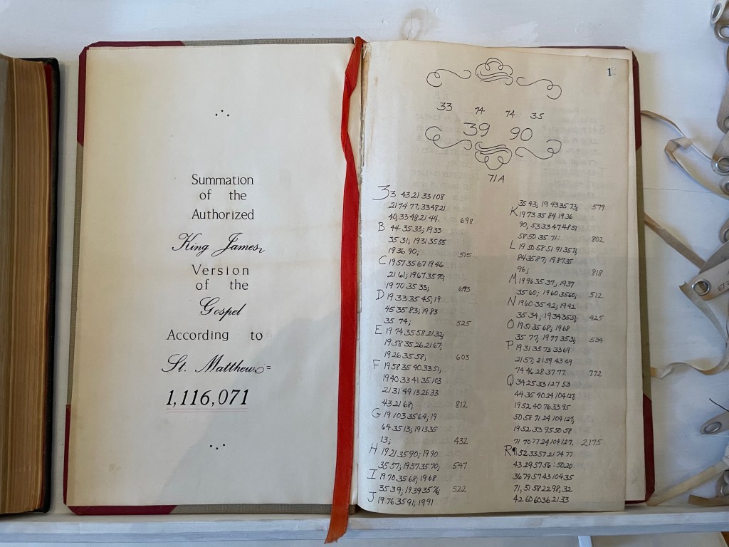
After applying the approach to Blake, Shelley, Keats and others, she tackled the King James version of the Gospel according to St. Matthew. Here’s her description of the procedure:
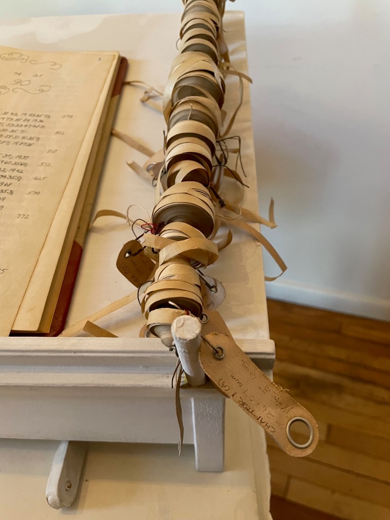
I wrote the numerical equivalent of each letter under each letter … in the Bible itself. Then I added up the number/letter of each word until I had the sum for each word, verse, and chapter. I then recorded the sums in an accounting book. This became the second version …. Next I added it all up on adding tapes, one tape for each chapter, which I measured to find out the length of each chapter. I then attached each labeled tape to a rod at the edge of a shelf that had been built to hold the work. This was the third version …. (Sellem, “Karen Shaw = 100”.)
Here was an utterly different form of artist’s book by alteration: an assemblage of a “Rembrandt” Bible’s St. Matthew Gospel with each letter hand-numbered according to its place in the alphabet; each of the gospel’s words summed and recorded in an accounting book with all of its word-sums summed to its essence of 1,116,071; and the “scrolls” of the adding machine tapes for each chapter ranged alongside the Bible and accounting book. For Shaw, this altered-book form of art was merely a first step into a series of discoveries and inventions that led to a lifetime of artistic exploration and creation.
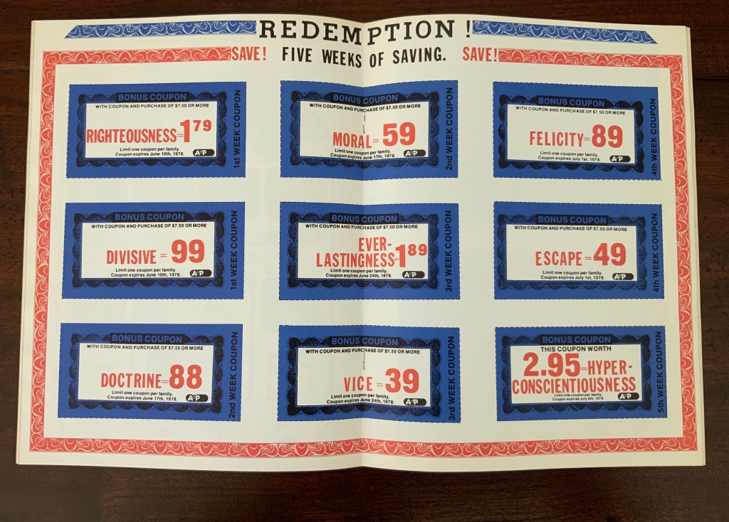
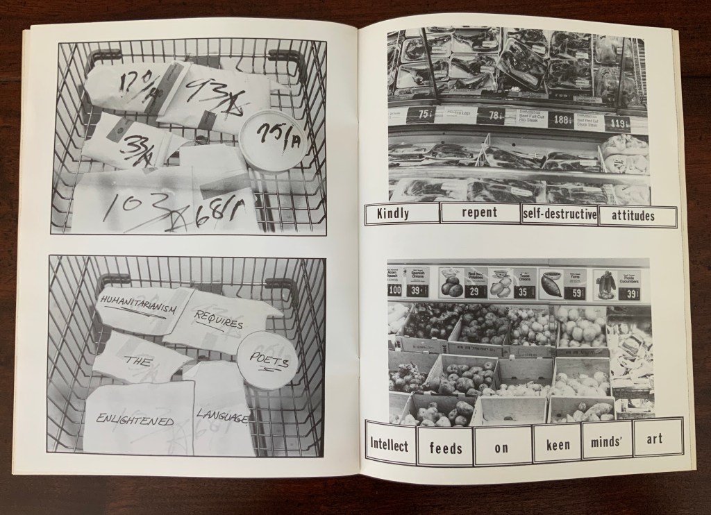
As she plied her calculations, she noticed that obviously many words had the same number. The impulse to collect words equalling 100 (the sum of her name’s letters) led to creating a numerical dictionary — the Sumantic Vocabulary Collection — listing words with equal sums. With that, Shaw began to see words in what she called “the numerical waste” surrounding her: numbers on receipts, savings coupons clipped from newspapers, brand labels, barcodes and pricing stickers and other everyday consumer signage. Strange poems could be derived from them. Eventually “sumantic” — playing on sum and semantics — evolved into “summantics” as her description of her artistic methodology. Her 1978 artist’s book Market Research spells (or numbers?) this out in its foreword.
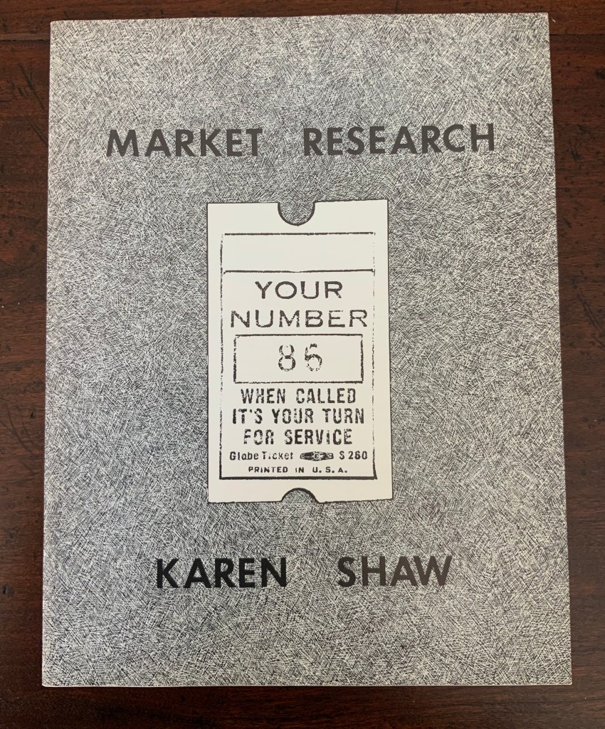
Market Research (1978)
Market Research (1978) Karen Shaw Softcover booklet, saddle stitched with staples, translucent fly leaves. H280 x W215 mm. 24 pages. Acquired from , . Photos: Books On Books Collection.
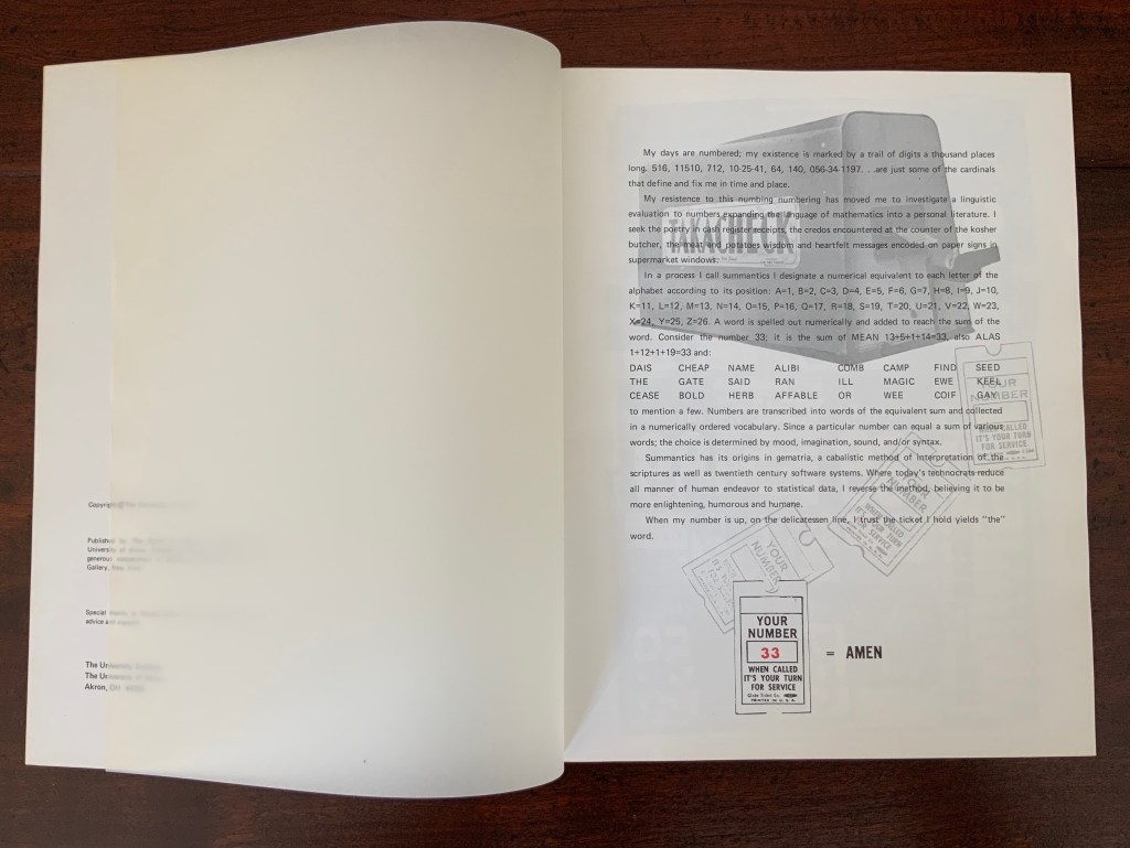
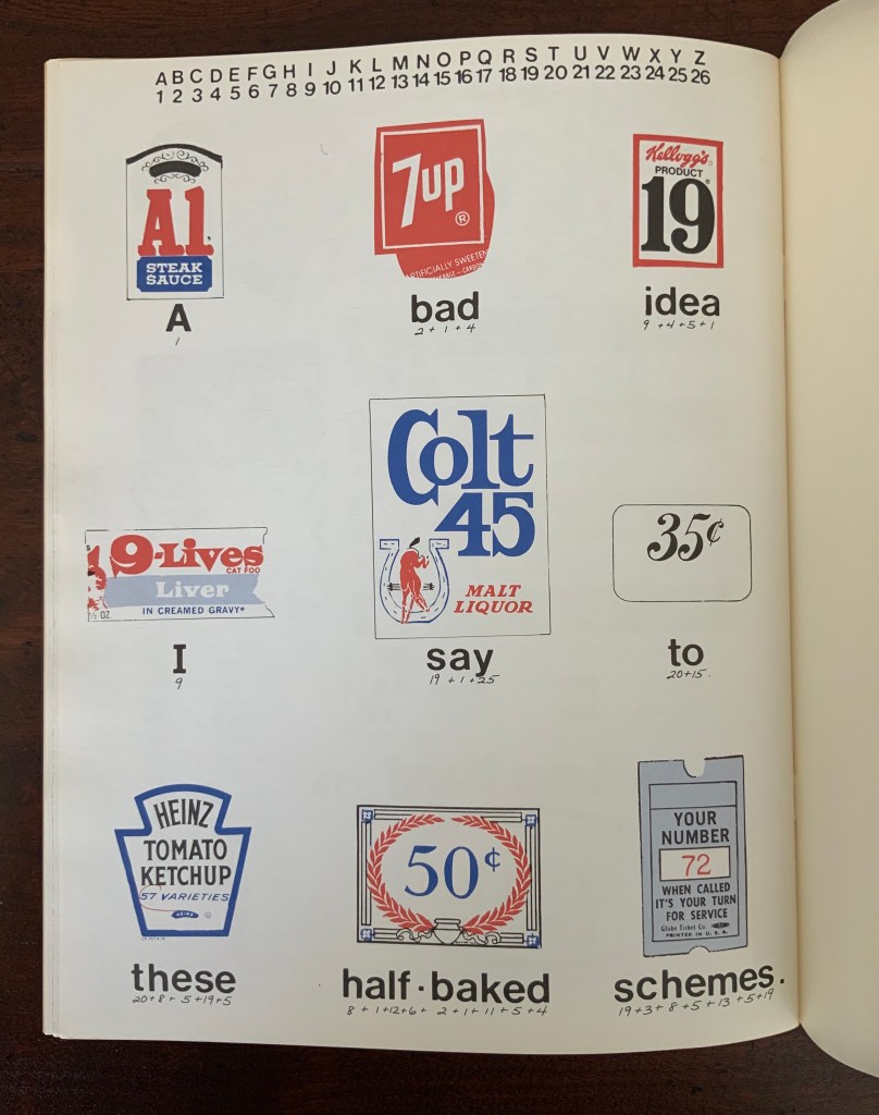
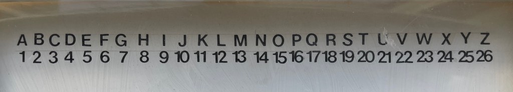
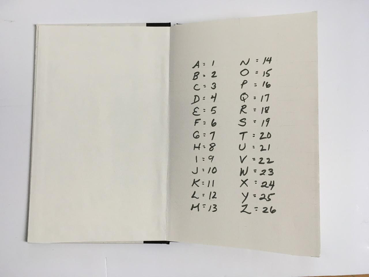
In a process I call summantics, I designate a numerical equivalent to each letter of the alphabet according to its position: A=1, B=2, C=3, D=4, E=5, F=6, G=7, H=8, I=9, J=10, K=11, L=12, M=13, N=14, O=15, P=16, Q=17, R=18, S=19, T=20, U=21, V=22, W=23, X=24, Y=25, Z=26. A word is spelled out numerically and added to reach the sum of a word. Consider the number 33. It is the sum of MEAN = 13+5+1+14 = 33, also ALAS = 1+12+1+19 = 33 and:
DIAS CHEAP NAME ALIBI COMB CAMP FIND SEED THE GATE SAID RAN ILL MAGIC EWE KEEL CEASE BOLD HERB AFFABLE OR WEE COIF GAY
to mention a few. Numbers are transcribed into words of the equivalent sum and collected in a numerically ordered vocabulary. Since a particular number can equal the sum of various words the choice is determined by mood, imagination, sound, syntax and/or grammatical structure.
Summantics has its origins in gematria, a cabalistic method of interpretation of the scriptures as well as late twentieth century software systems. Where today’s technocrats reduce all manner of human endeavor to statistical data, I reverse the process believing it to be more enlightening, humorous and humane.
Given the humor of the work’s opening, it’s likely that the title Market Research cheekily refers to her data analysis work with NBC questionnaires completed by mothers for tracking the impact of TV violence on their young sons.
In his review of the 1978 exhibition “Artists’ Books and Notations” (Touchstone Gallery, 118 E. 64th Street, New York), Lawrence Alloway noted Karen Shaw’s methodology as another instance of “the ways by which language has entered recent visual art, formerly protected from such incursions by the prestige of Form. If artists use words in their work, it is not because they are now more dependent on writers or on theory than in the past, as has been suggested, but because language has become available as subject matter” (p.653). With Shaw in particular, it was a case of language and numbers becoming available as subject matter.
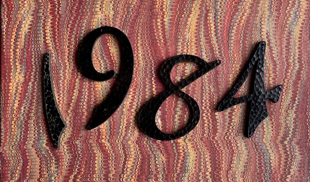
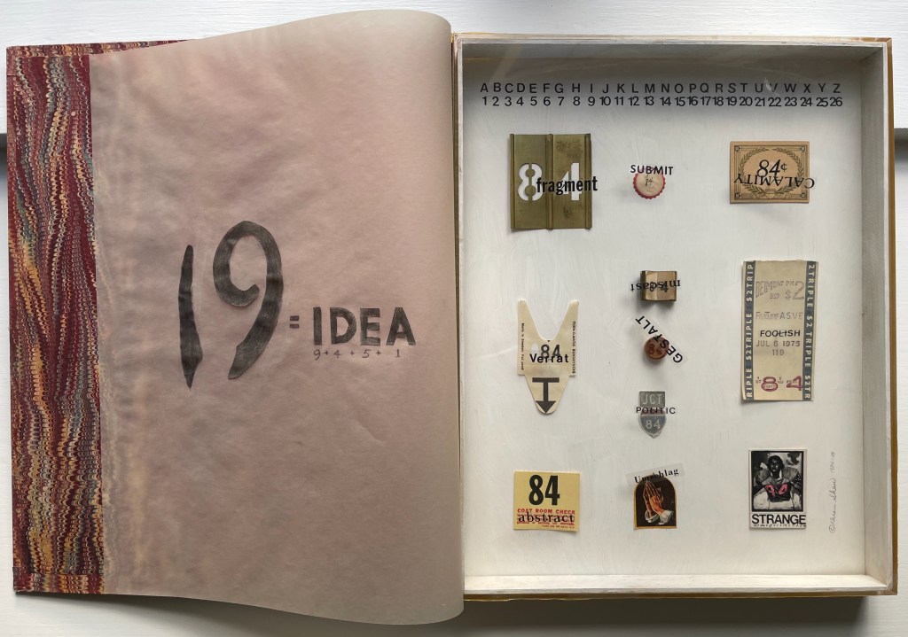
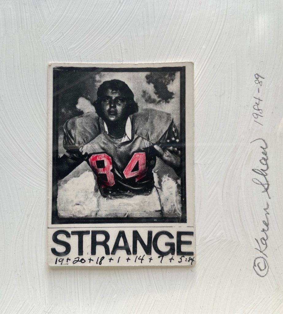
George Orwell 1984 (1984-89)
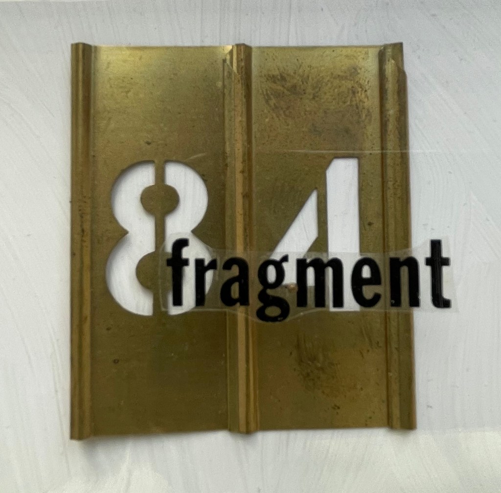
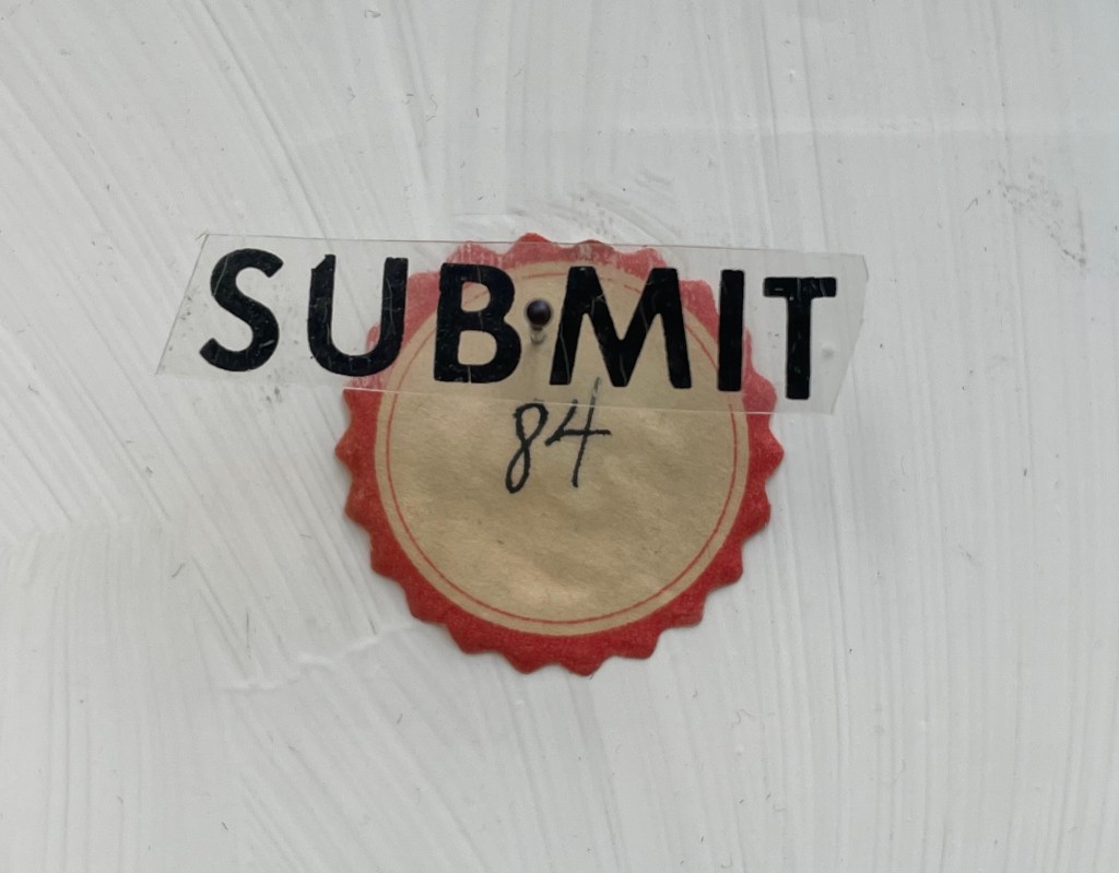
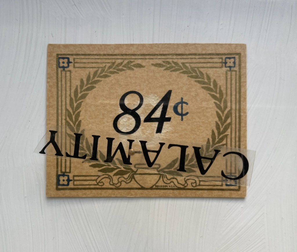
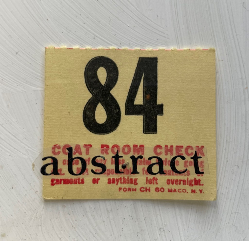
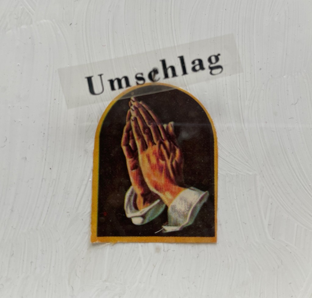
George Orwell 1984 (1984-89) Karen Shaw Diptych box covered with marbled paper on front and spine, wrought iron numerals 1984 and plastic letters fixed to front cover, translucent flyleaf with inked symbols and numbers, with text colored and cut out from translucent paper, plexiglas glued to wooden case with gessoed interior and 11 found items bearing the number 84, each fixed to the interior wooden panel with a black-bead-headed pin. H360 x W290 x D40 mm. Unique work. Acquired from Peter Kiefer Buch- und Kunstauktionen, 21 October 2023. Photos: Books On Books Collection.
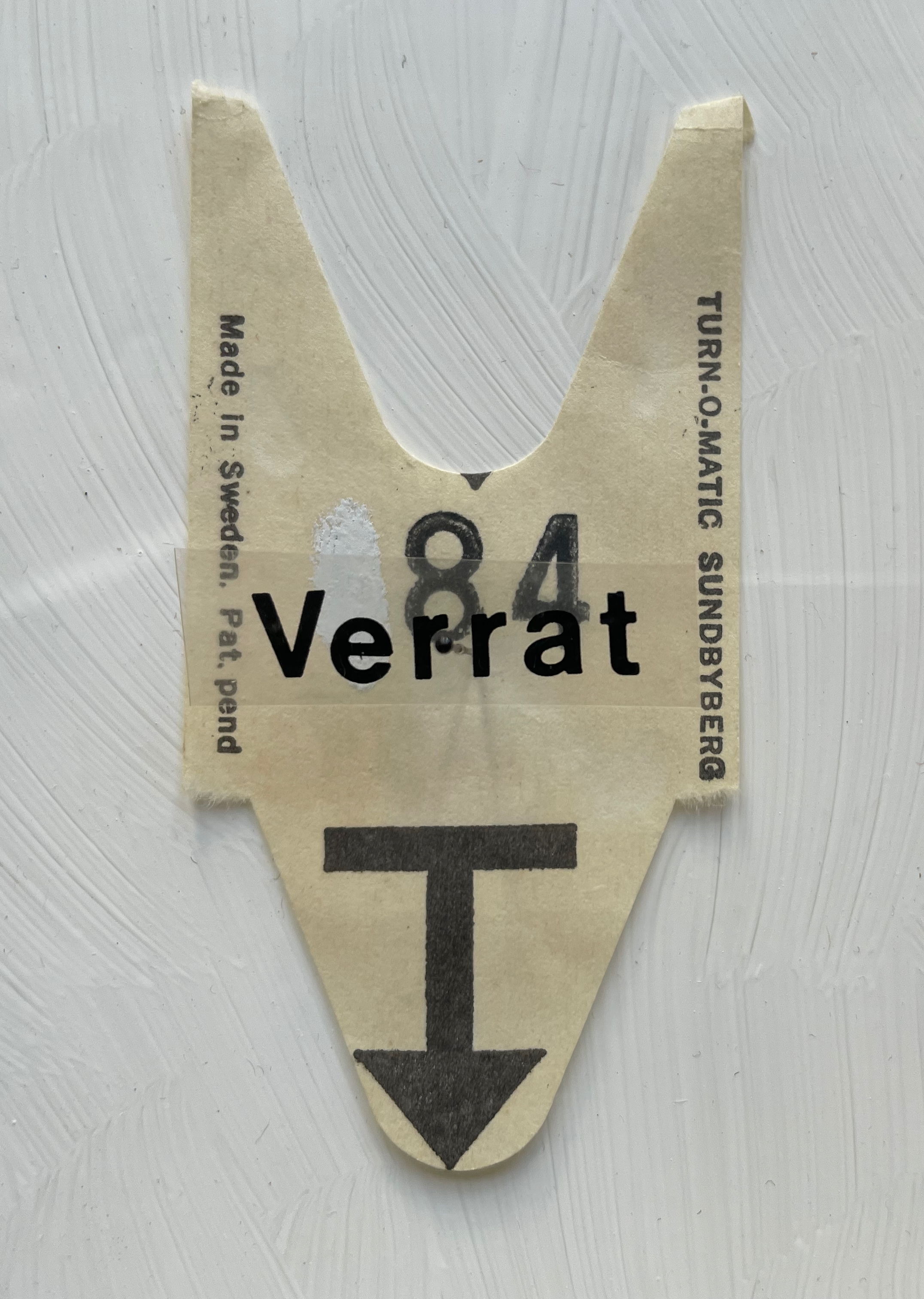
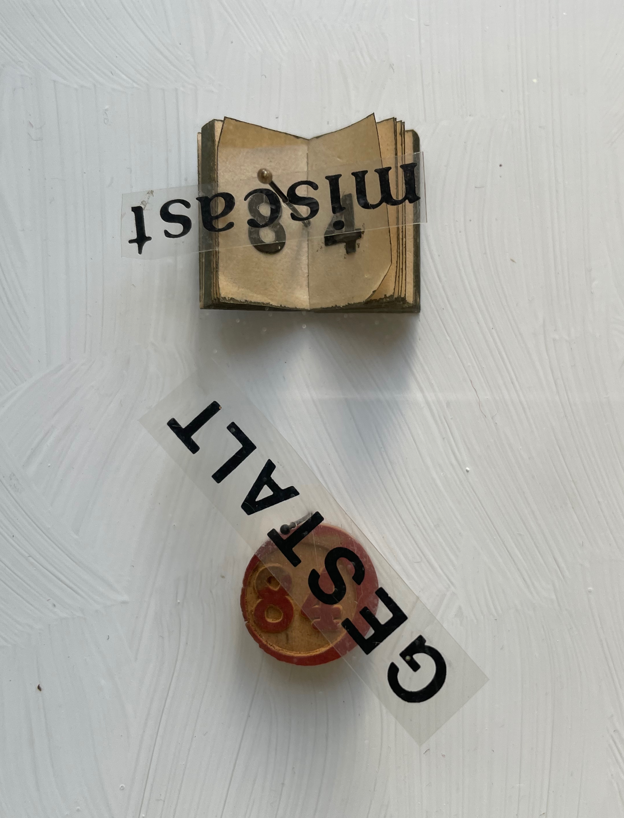
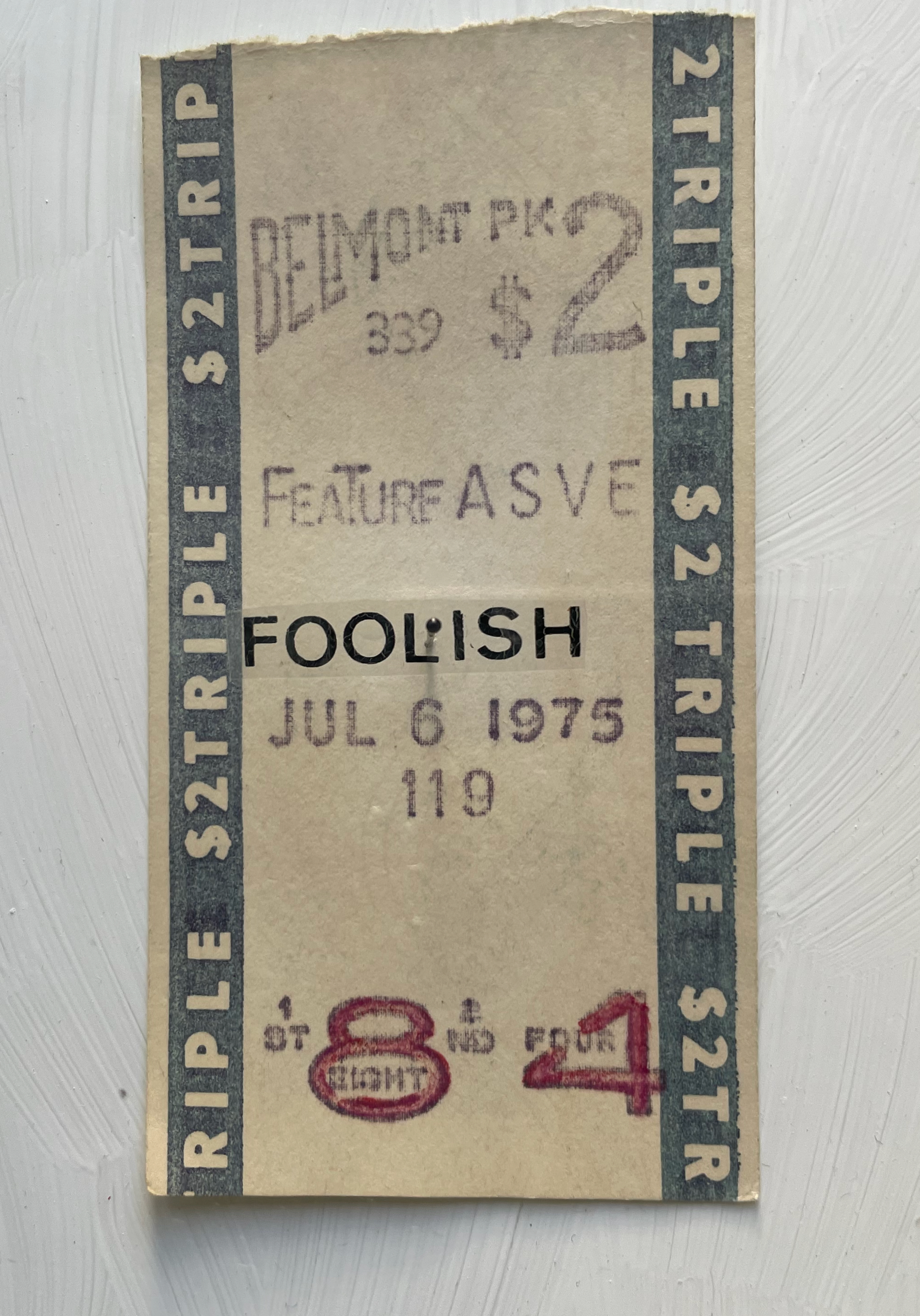
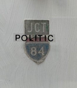
Whether tabulating words or deciphering numbers, Shaw leaned further into three-dimensional assemblages resembling one- or two-page books. The somewhat-damaged homage George Orwell 1984 blends her interest in transposing literary works into hash codes with that of reversing numbers in the numerical wasteland into words with the help of her dictionary. Shaw plays off Orwell’s idea of double-speak by splitting his title in two. The first half is the sum of the numerical values of the letters in “idea”, appropriate for an idea-driven book. For the second half, however, she seeks out words that sum up to 84, letrasets them on clear plastic, and pins them over found and sometimes manipulated objects. A word may allude to its found object, or it may vaguely relate to Orwell’s book, or whether there’s any association at all may be obscure. A Belmont racetrack betting slip makes an ironic match with “foolish”, but seems unrelated to the novel. The German word Verrat translates as “betrayal”, which certainly fits the book, but what it has to do with the queue ticket (manipulated to show “84”) is unclear. That the word “calamity” has spun upside down over its manipulated token is an accidental irony, and what association the overwritten token has with the word or novel is also unclear.
Like Louis Lüthi’s A Die with Twenty-six Faces (2019), built on a collection of literary works entitled with a single letter, Shaw might have extended this part of her oeuvre with other number-titled works: Ray Bradbury’s Fahrenheit 451 or Joseph Heller’s Catch-22. Had she been inclined, she could have even used Lüthi’s book and its reference to Marcel Broodthaers’ quip “The alphabet is a die with 26 faces”. These might have yielded results more compelling than George Orwell 1984, but she would have still been captive to finding luckily appropriate words with the right word-sums.
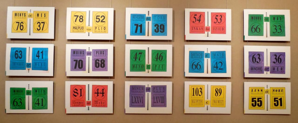
Two summantic works not in the collection — Less is More: Proof in 15 Languages (1999) and Summantic Proofs (2019) — are more compelling and uncanny. The fact that so many languages’ words for “less” have word-sums greater than the word-sums for the words for “more” is simply uncanny, and Shaw’s typography, color and layout in her spiral sketchbook presentation are compelling.
Less is More: Proof in 15 Languages (1999) Karen Shaw Photo: Courtesy of the artist.
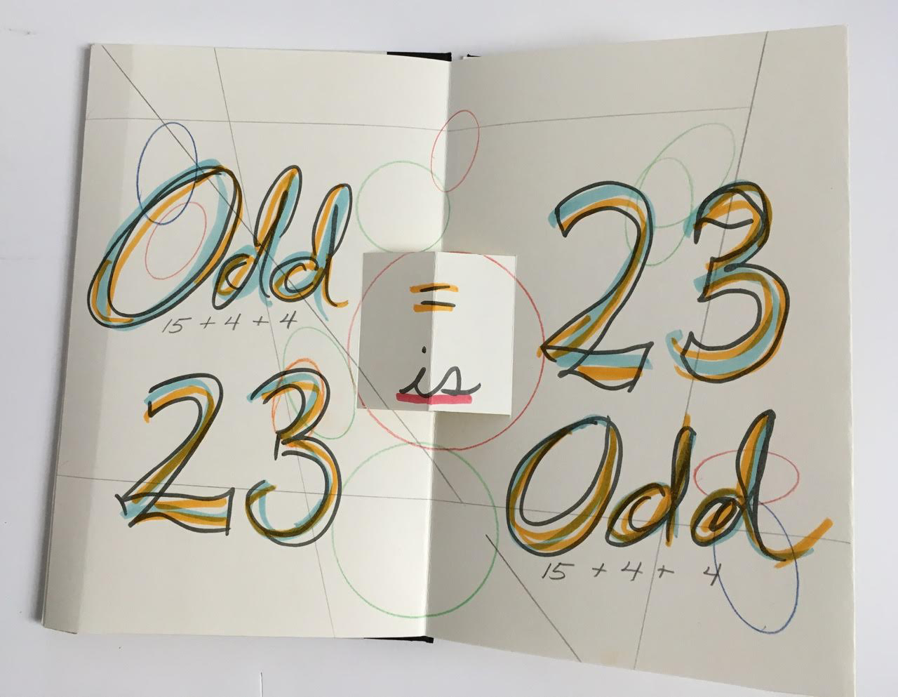
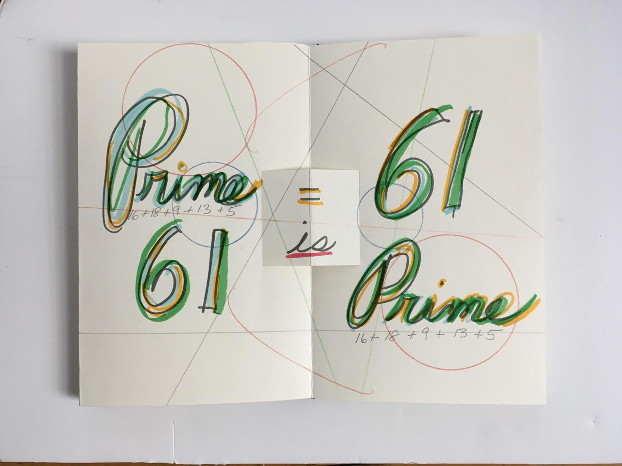
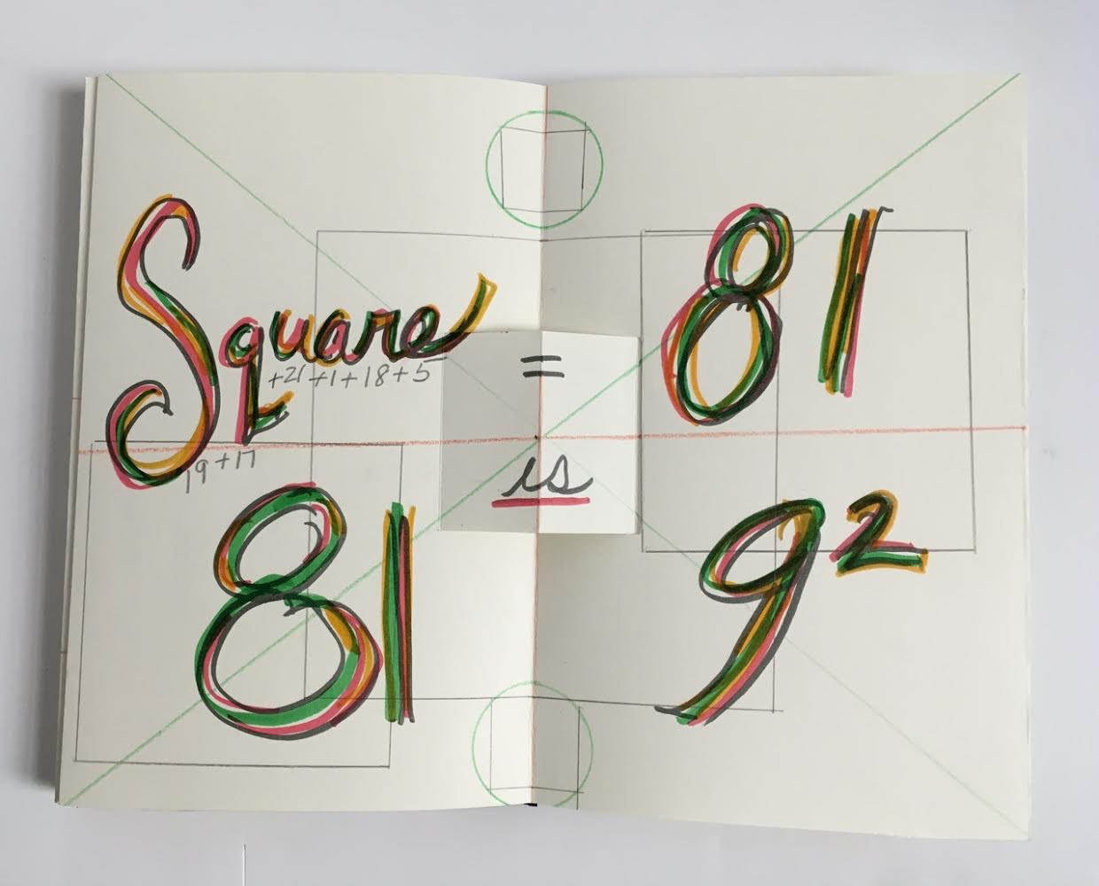
Also uncanny is her later collection of “proofs” in which she demonstrates that the word-sum for “odd” is an odd number, that the word-sum for “prime” is a prime number, and that the word-sum for “square” is 9 x 9. The pop-up equals sign, the ruler-drawn lines and the hand-colored script in this late mock-up reflect her ongoing artistic drive.
Summantic Proofs (2019) Karen Shaw Photos: Courtesy of the artist.
The most striking and consistent of Shaw’s works in the collection departs from her summantic method. It nevertheless embodies the ingenuity, humor, and humanity at play in her art.
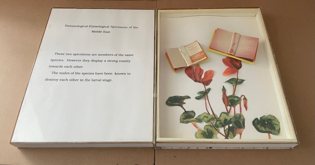
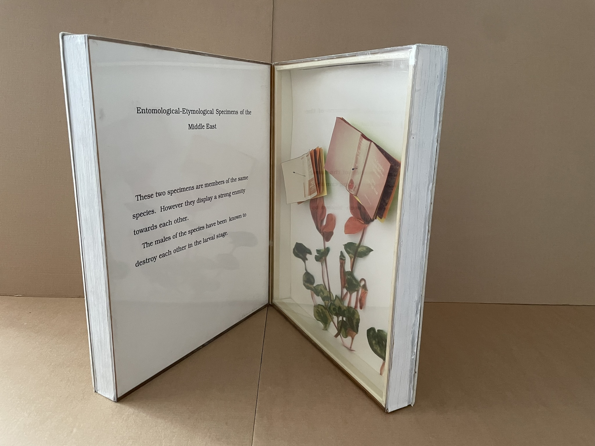
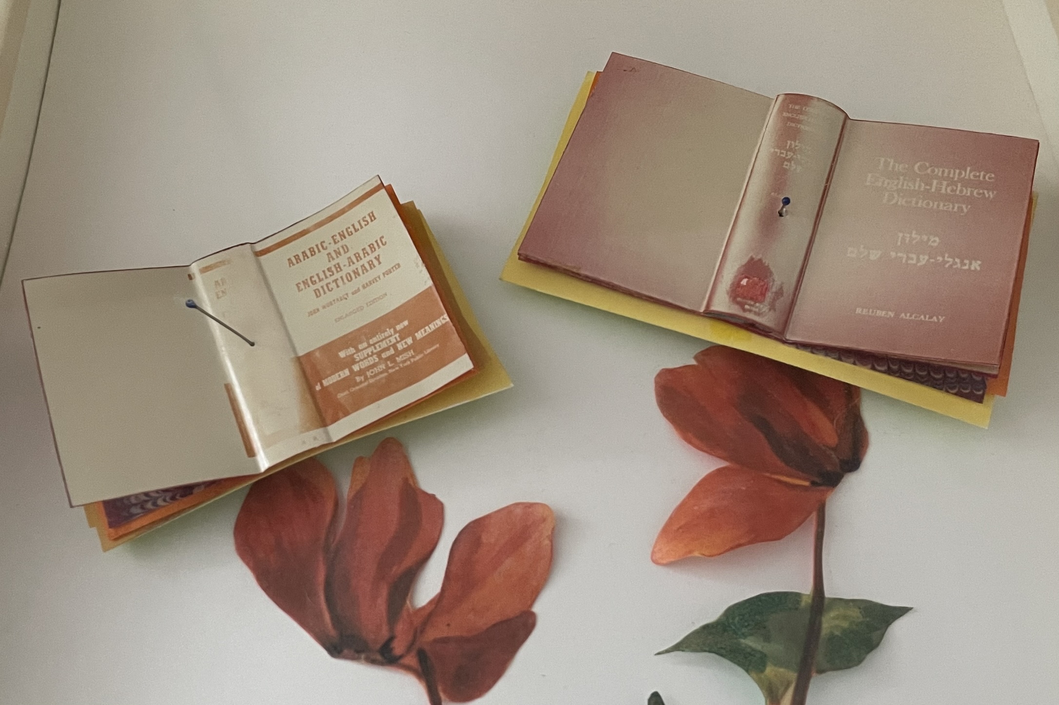
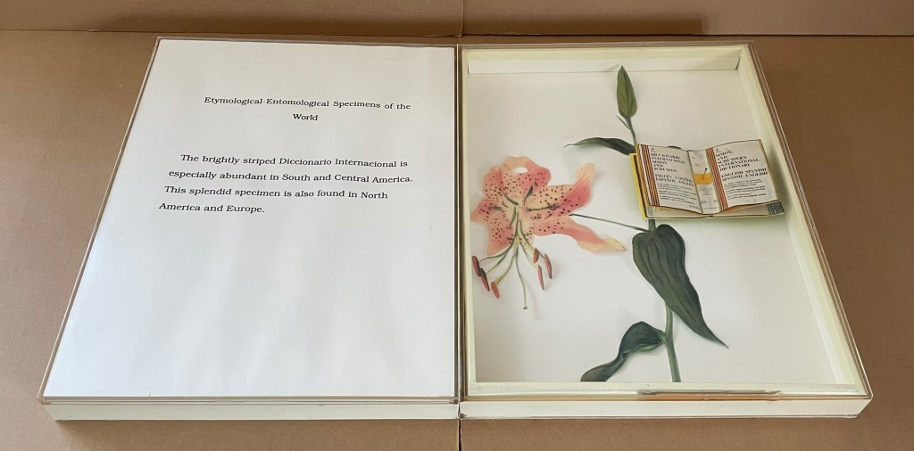
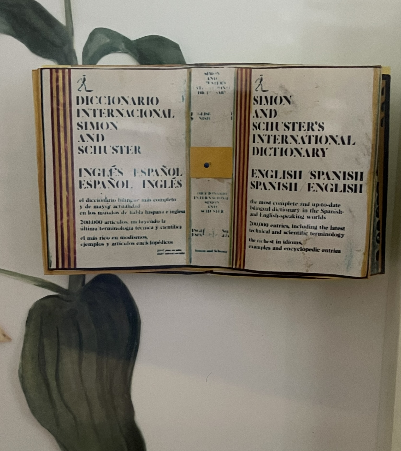
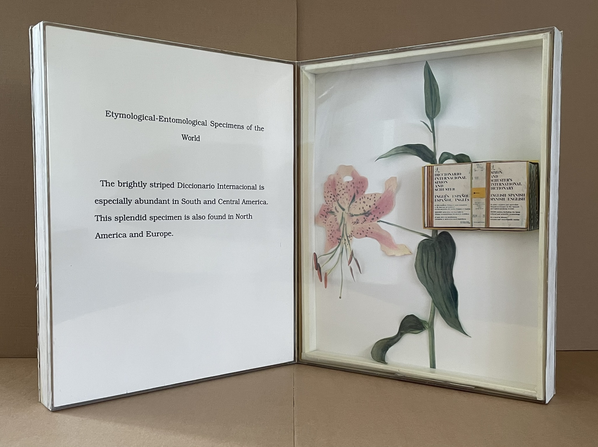
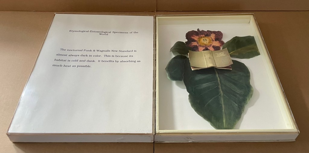
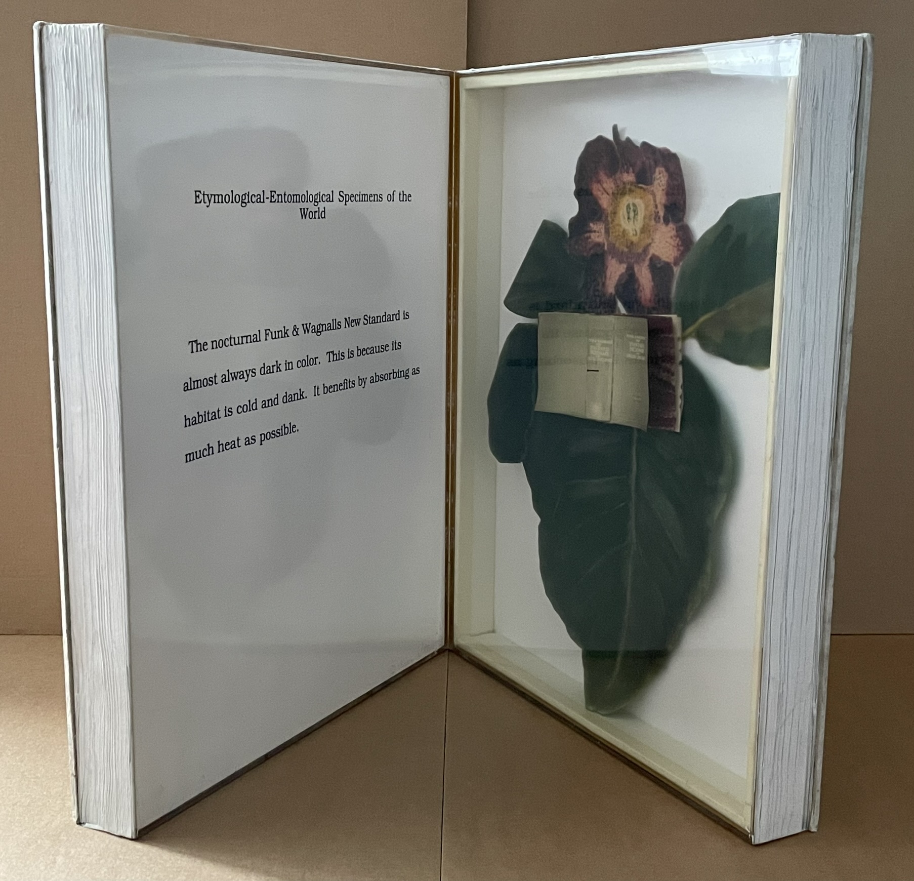
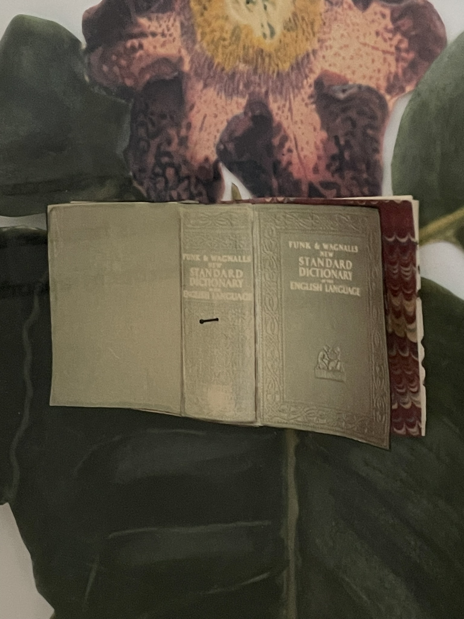
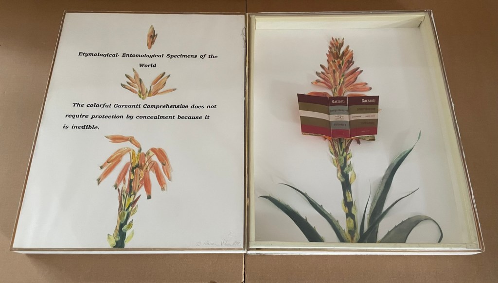
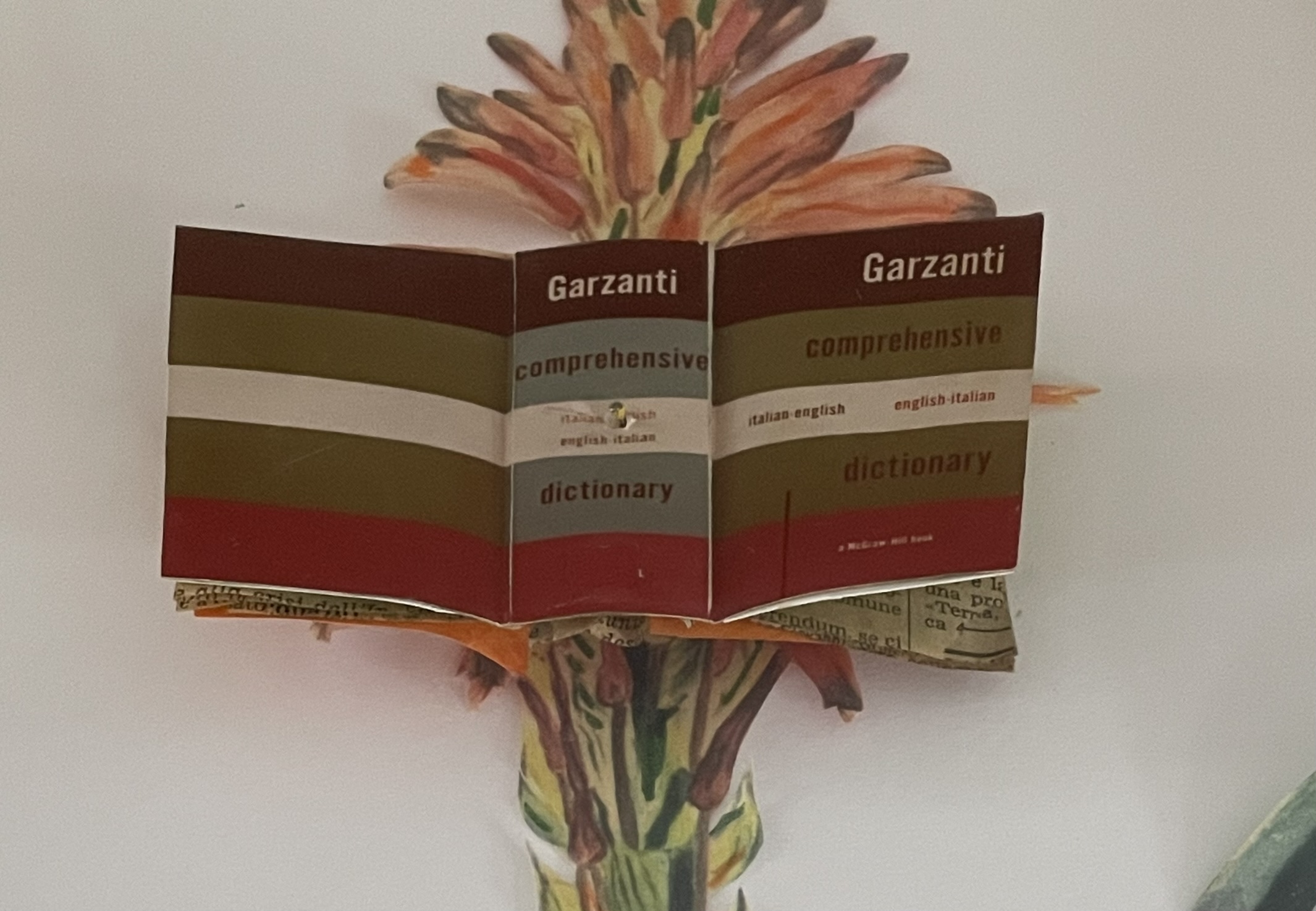
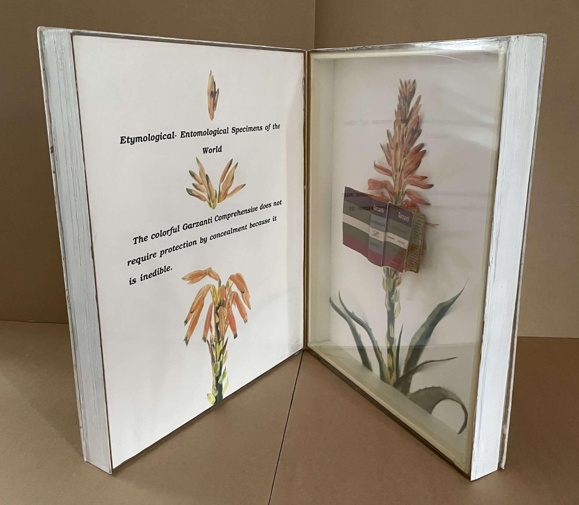
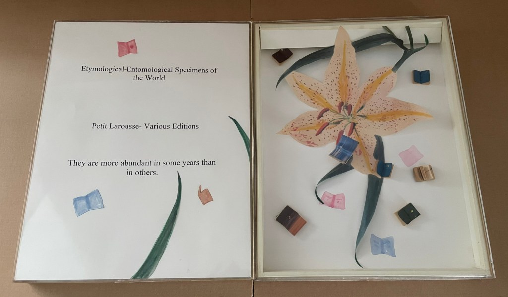
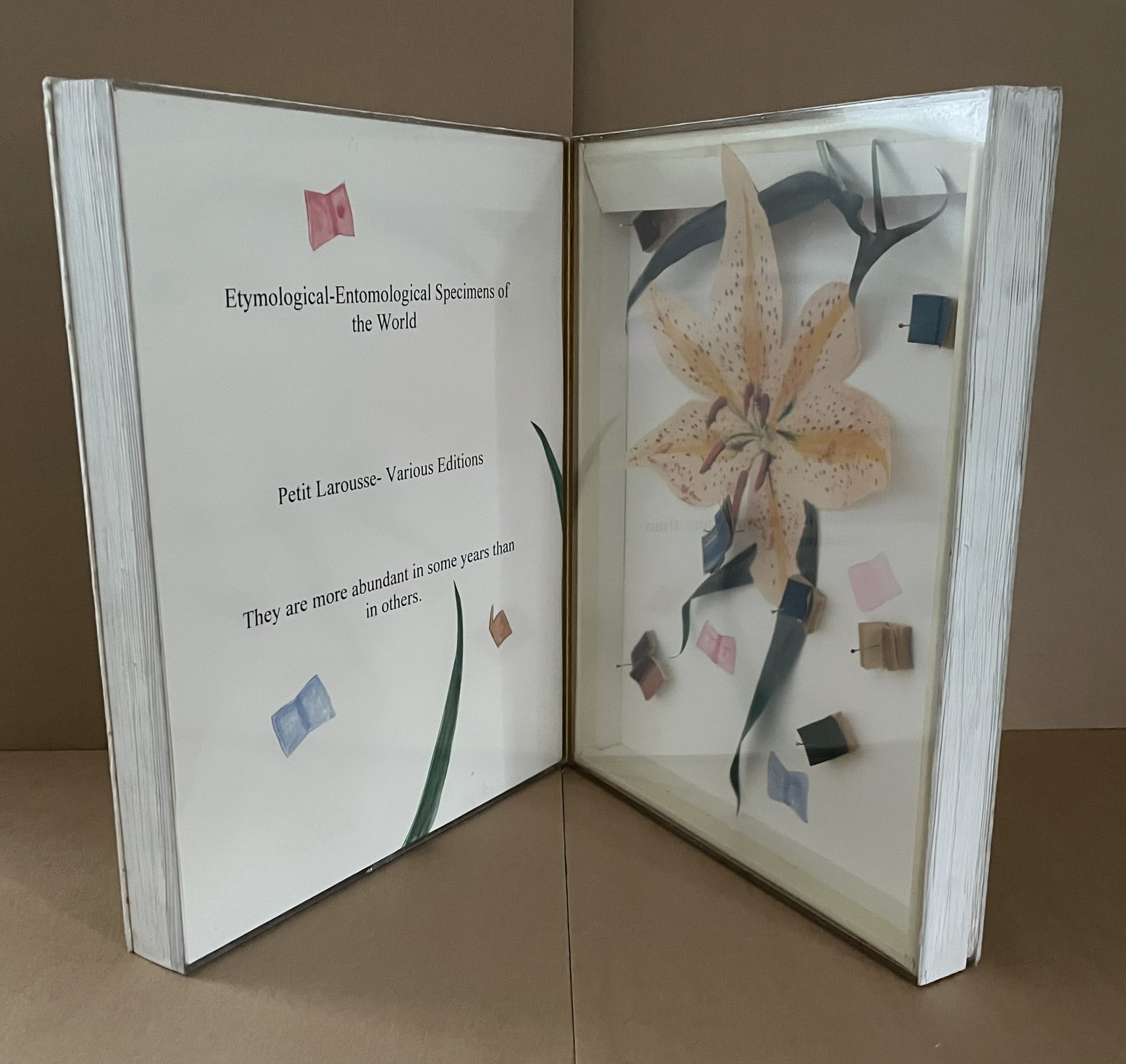
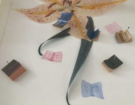
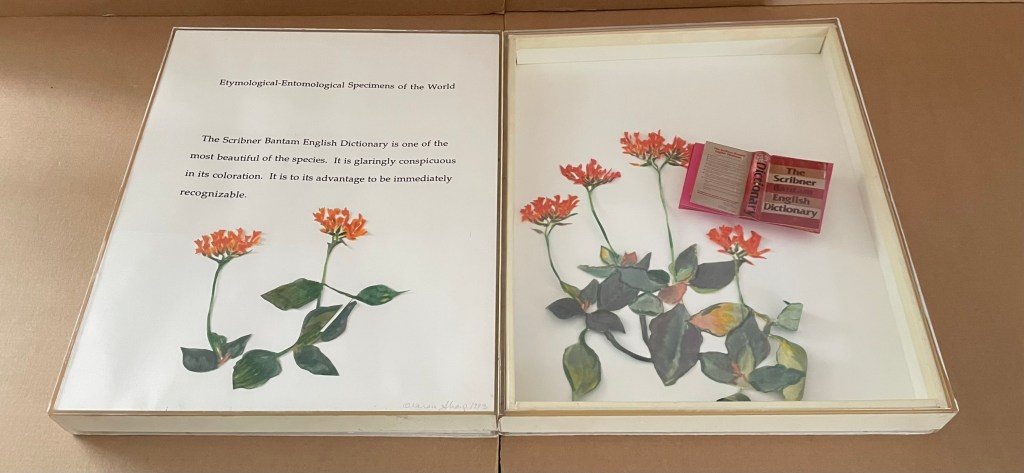
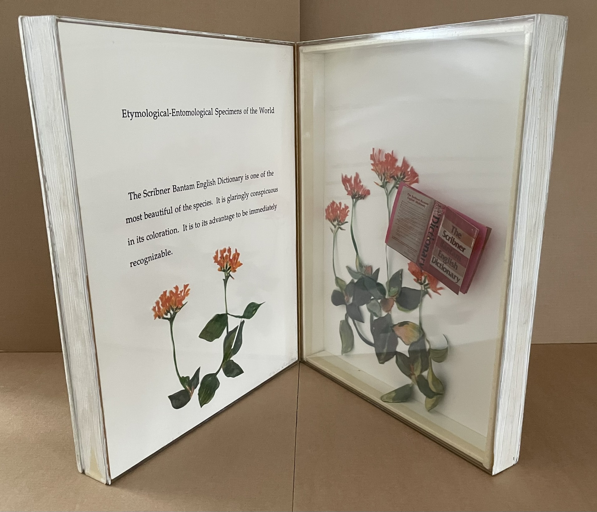
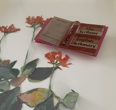
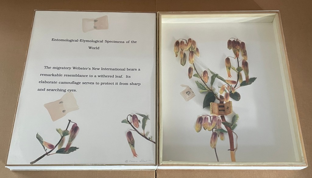
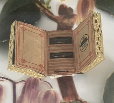
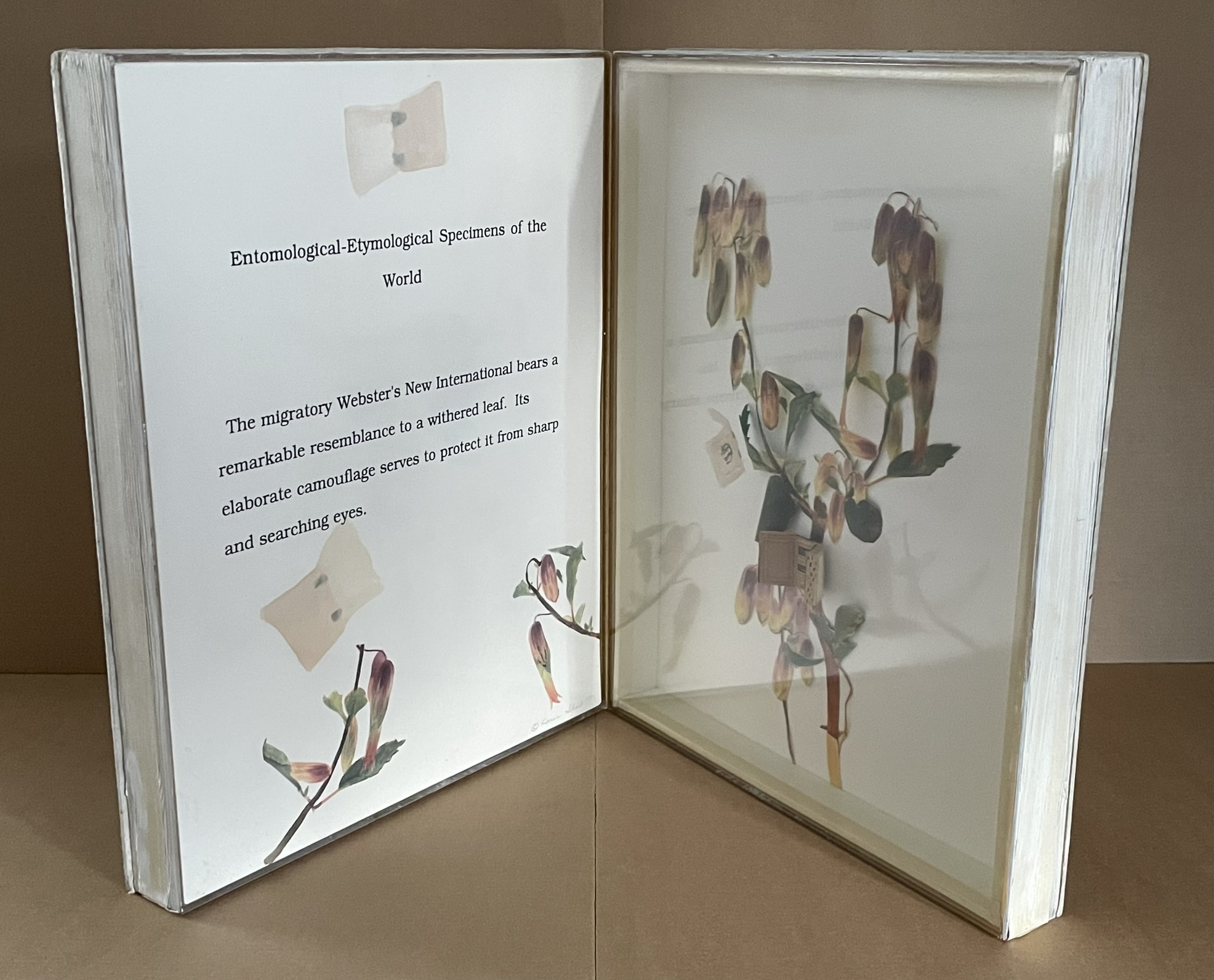
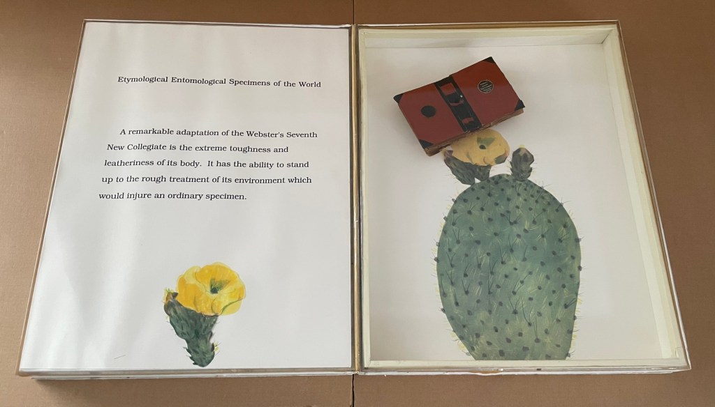
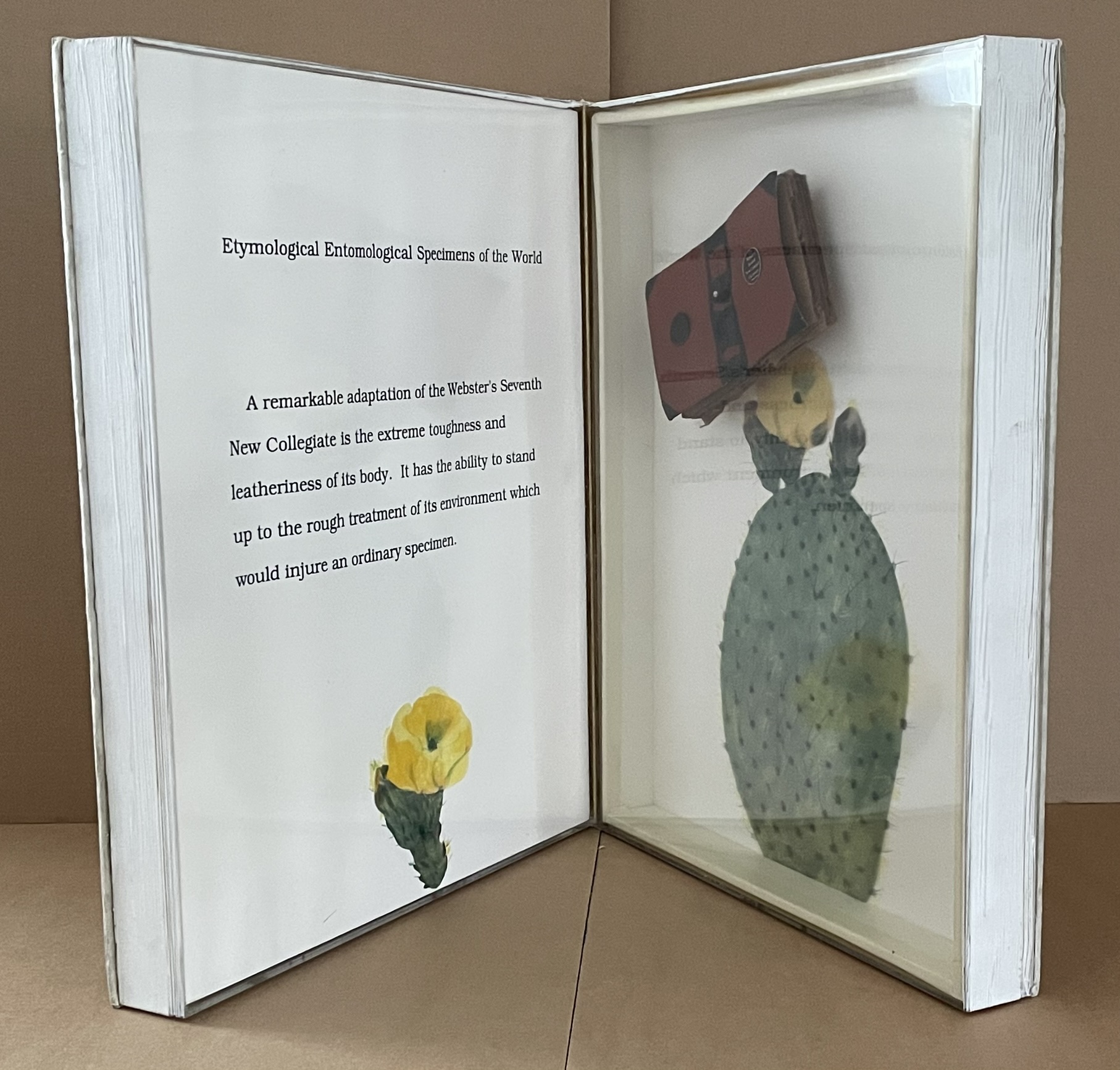
Etymological-Entomological Specimens of the World (1993)
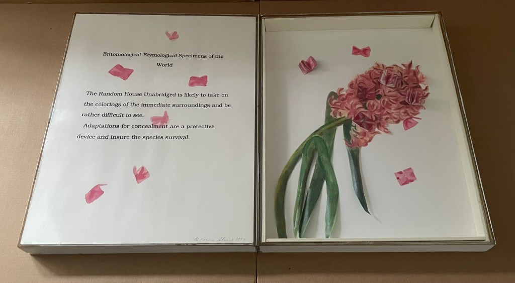
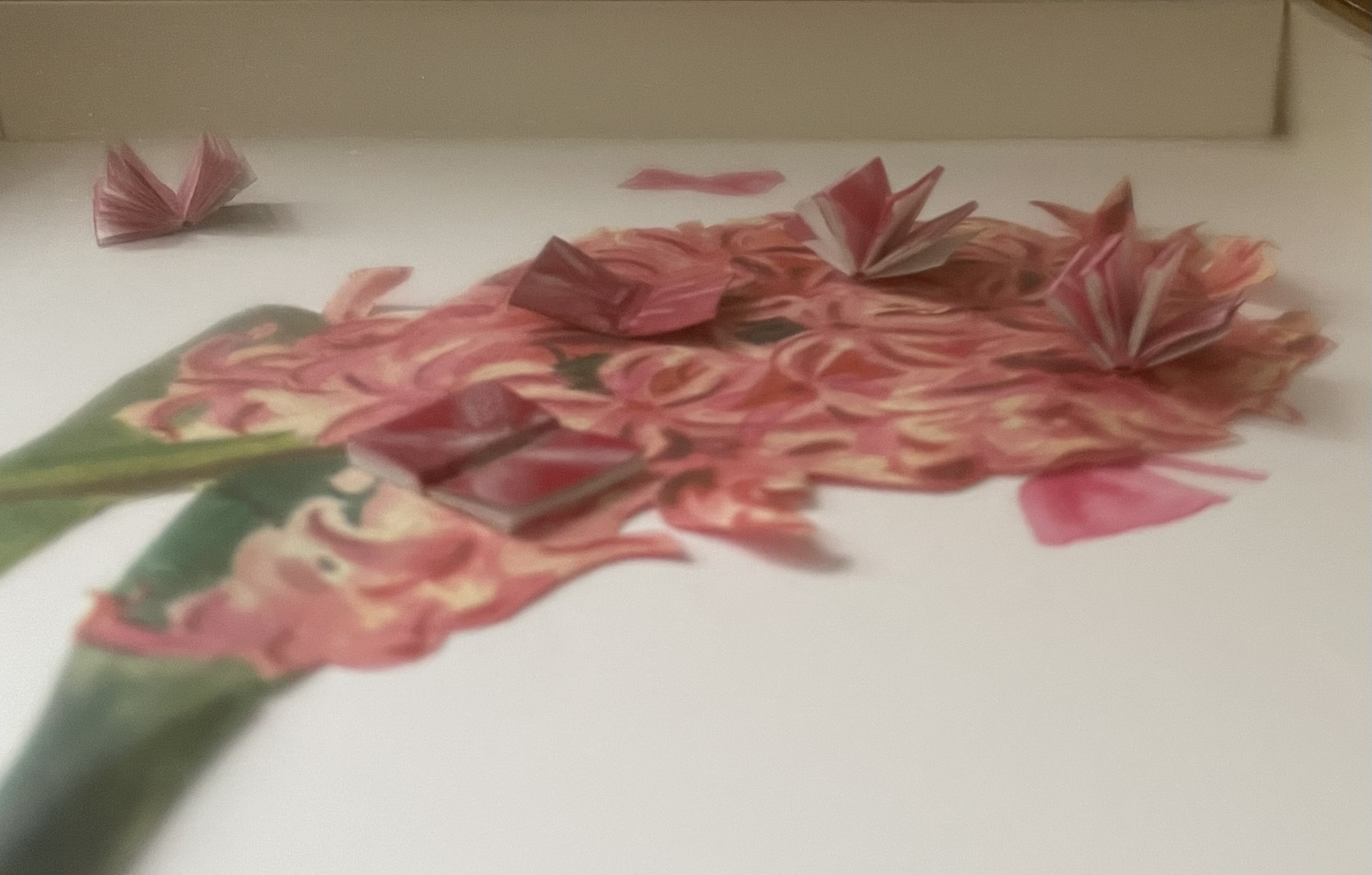
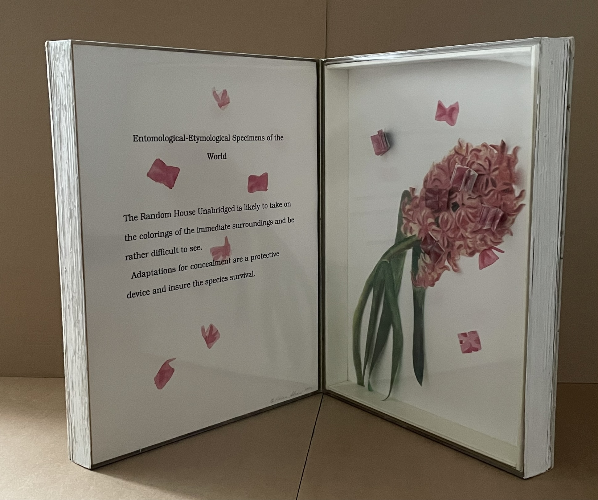
Etymological-Entomological Specimens of the World (1993) Karen Shaw Nine codex-shaped boxes of paper-covered boards, each opening to plexiglas-covered diptychs miniature books of various sizes posed as butterflies among text, handcut and painted paper foliage and flowers. H368 x W268 x D77 mm. Acquired from Karen Shaw, 8 October 2024. Photos: Books On Books Collection.
Jean Sellem’s interview with Shaw in the bilingual review Heterogénesis has been quoted earlier. In that exchange, we are lucky to have Shaw’s reply to question: “Why do you combine the concept of entomology with that of etymology?”
KS : In the past, I always used to confuse those two words. I knew the definition of each of them, but I couldn’t remember which definition belonged to which word. Eventually, I taught myself a mnemonic method to remember which word was which. “Ent” sounds like ant, so entomology is the study of insects, and so etymology is the study of words. When I was looking for a format for my ideas, using entomology pins seemed like the perfect way to attach words to numbers. The closeness of the spelling and the complicity of the two words was fun and made sense to me. The needles themselves are beautiful, long and thin. It just seemed like the perfect solution.
It’s happenstance. It’s the physical material. It’s the fun and humor of wordplay. It’s the artistic eye that finds meanings at the curious intersections of nature and language. All of this in Karen Shaw comes to the fore in the nine volumes of Etymological-Entomological Specimens of the World (1993). The top, bottom and fore edges of these book-shaped diptychs mimic closed books, whose mimicry yields to a mimicry of entomological display cases under clear covering, which in turn yields to miniature dictionaries posed to mimic butterflies. A mnemonic solution to an unwanted confusion of words leads to the book artist’s deliberate visual and verbal punning of dictionaries with insects.
In the interview, the only movements and artists directly influencing her work that Shaw remembers are Dada, new-Dadaism, Eva Hesse, On Kawara, Douglas Huebler, Joseph Kosuth and Conceptual Art. For Specimens, she has noted in correspondence a direct inspiration: the interest of Vladimir Nabokov in lepidoptery. Seeing butterflies as miniature dictionaries also overlaps a bit with Nabokov’s perceiving letters of the alphabet as having colors. Nabokov’s chasing butterflies and leaping from letter to color finds a simulacrum in Shaw’s chasing words, numbers, and meaning in her everyday environs with her artist’s book butterfly net.
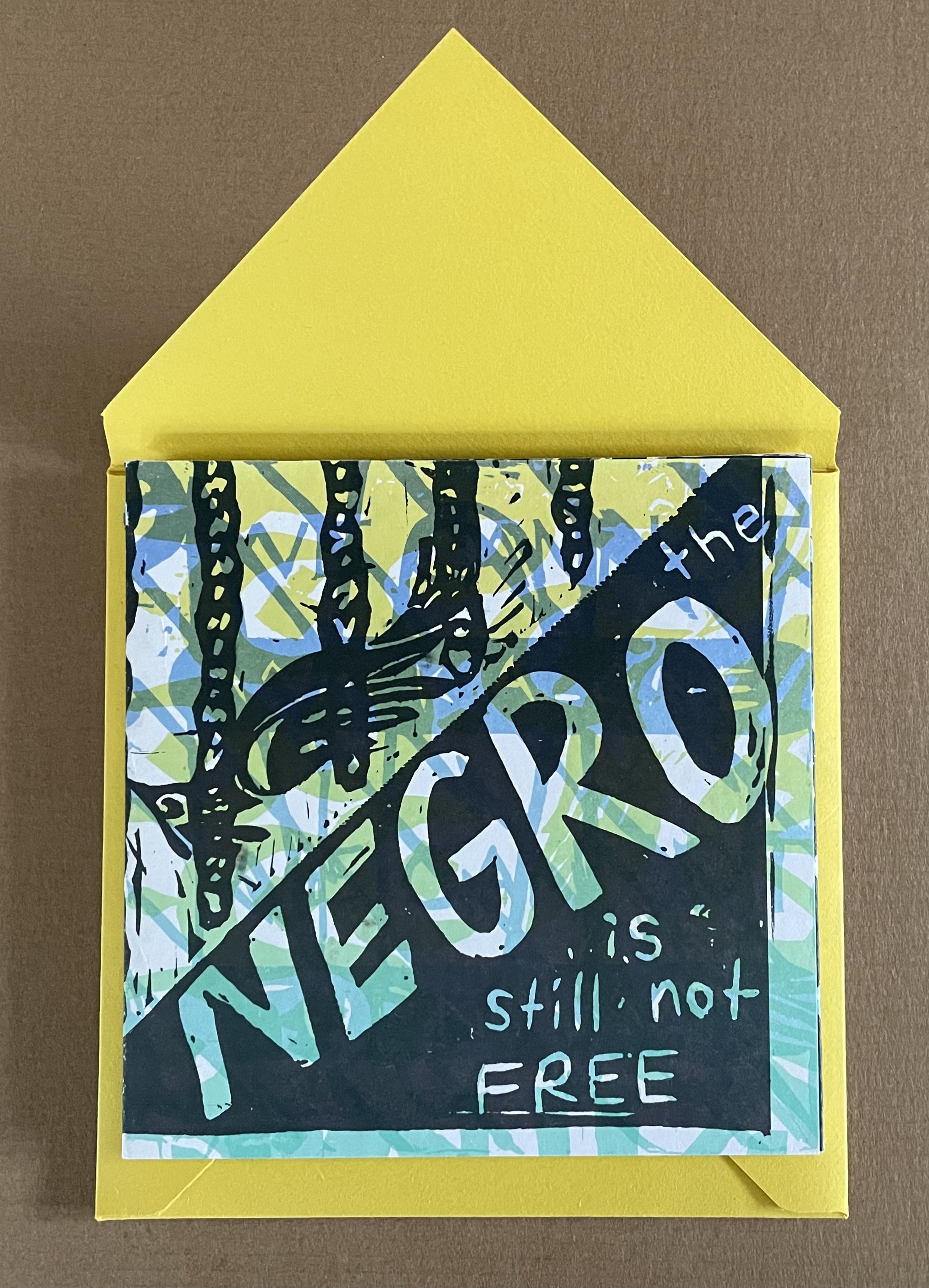
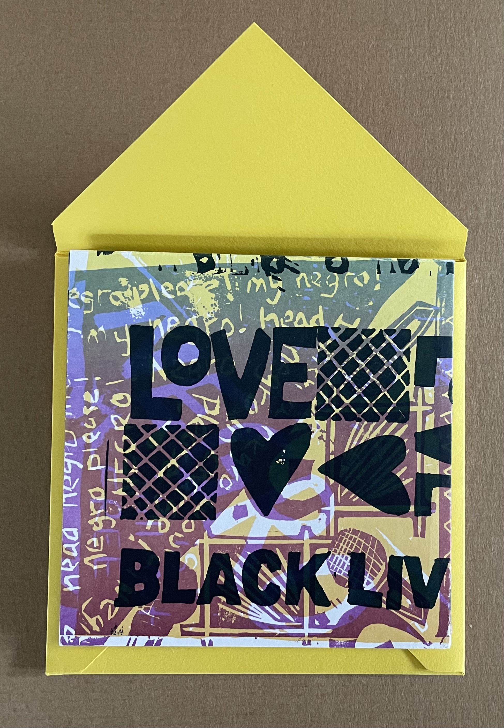
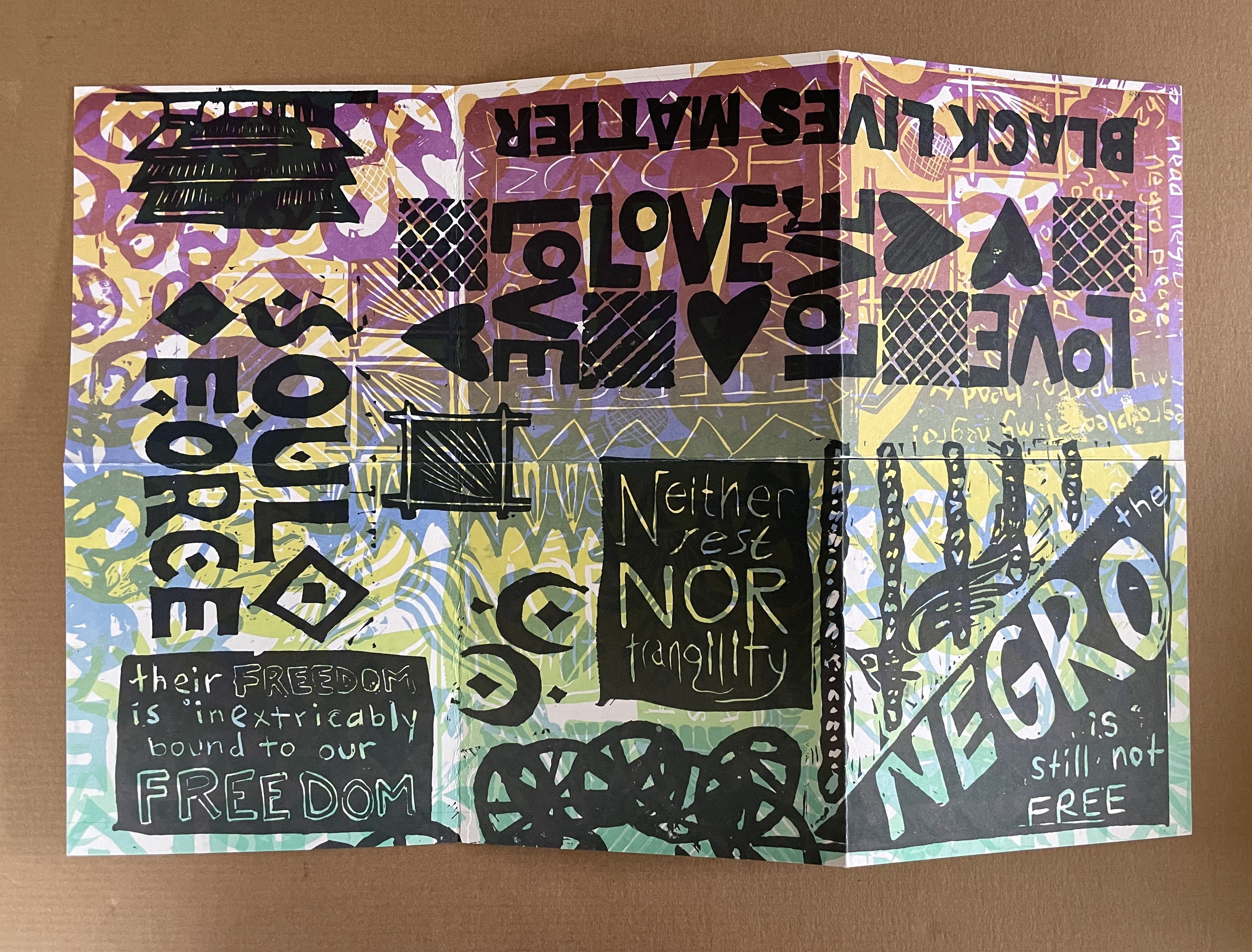
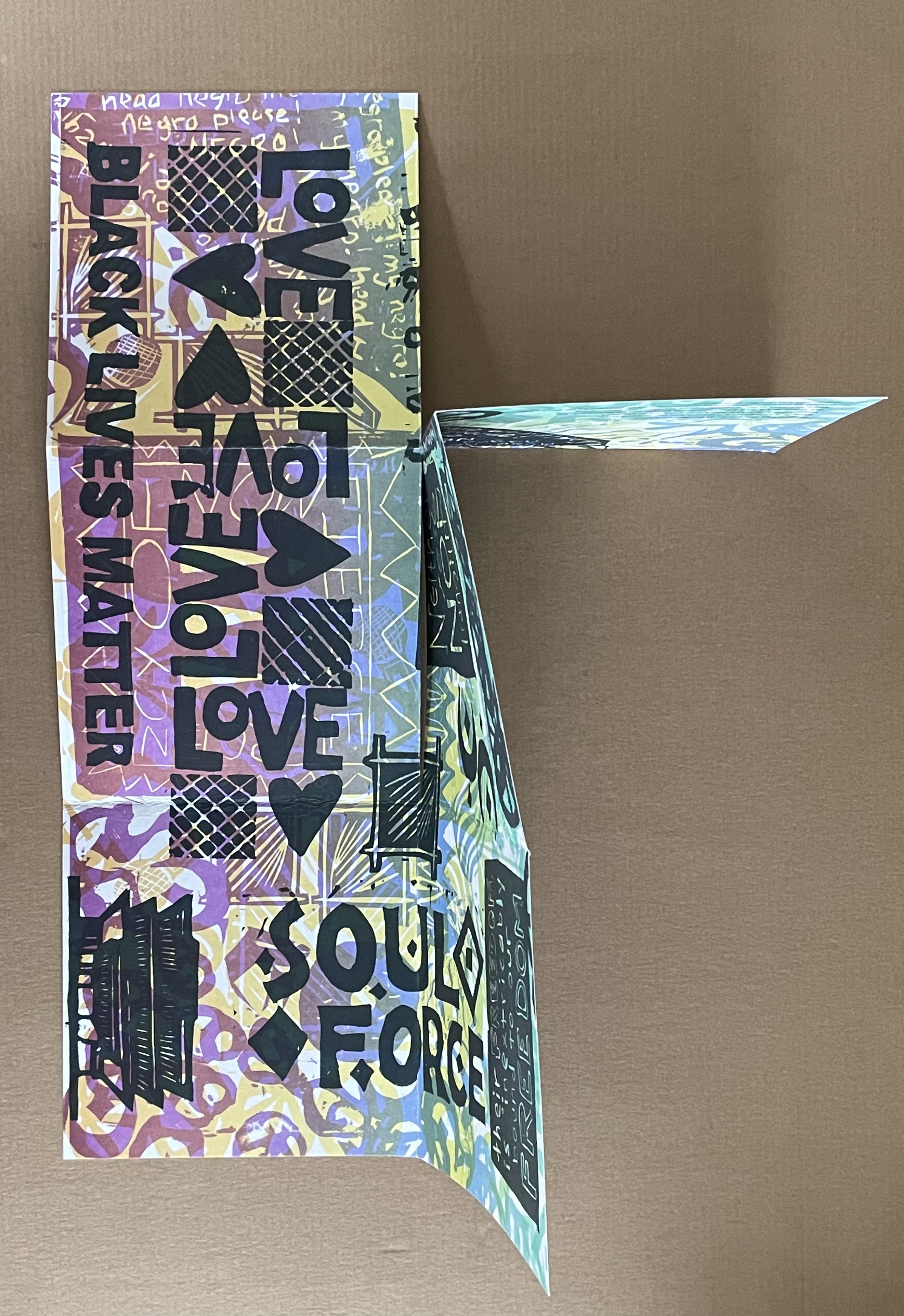
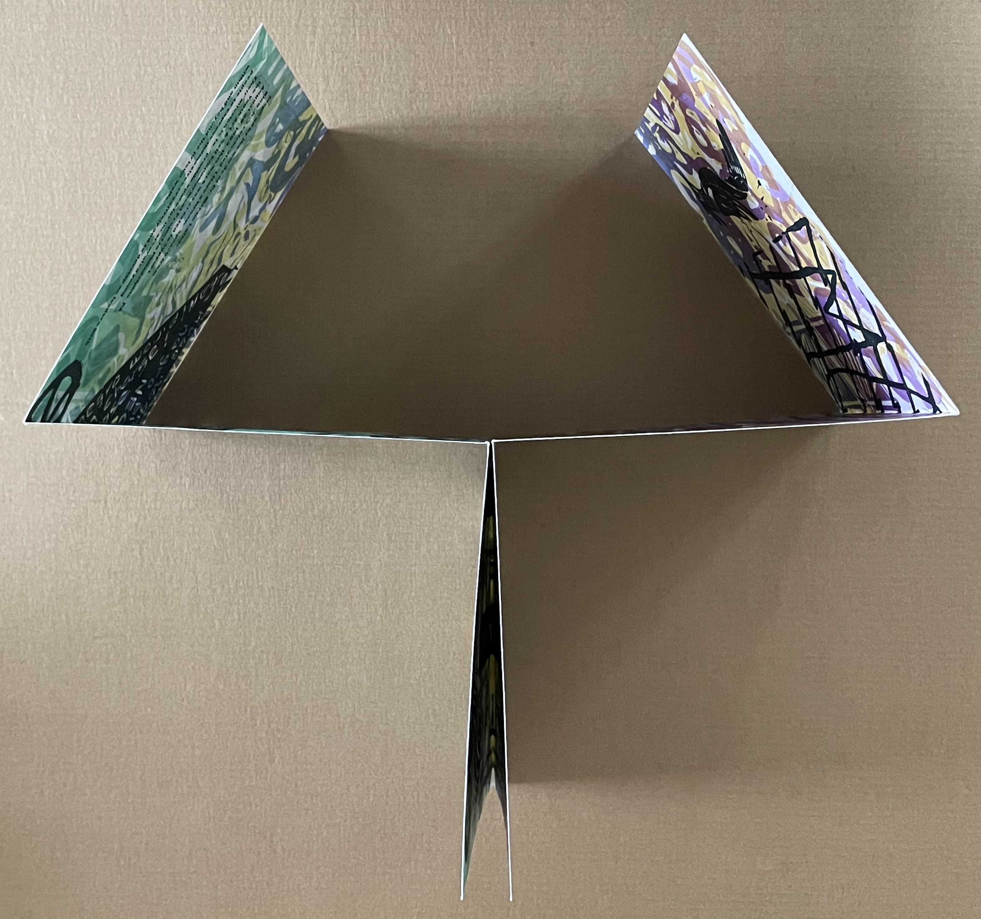
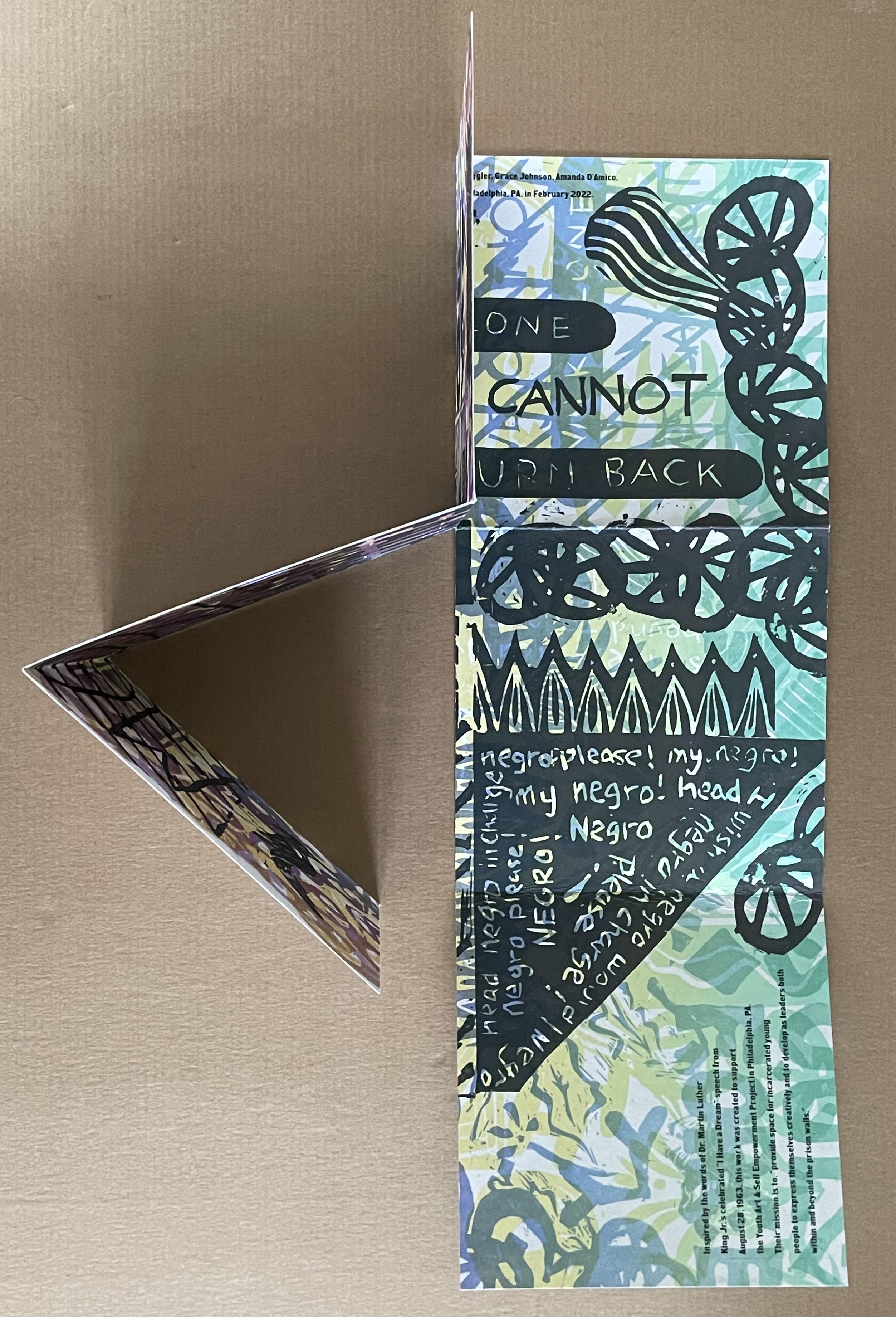
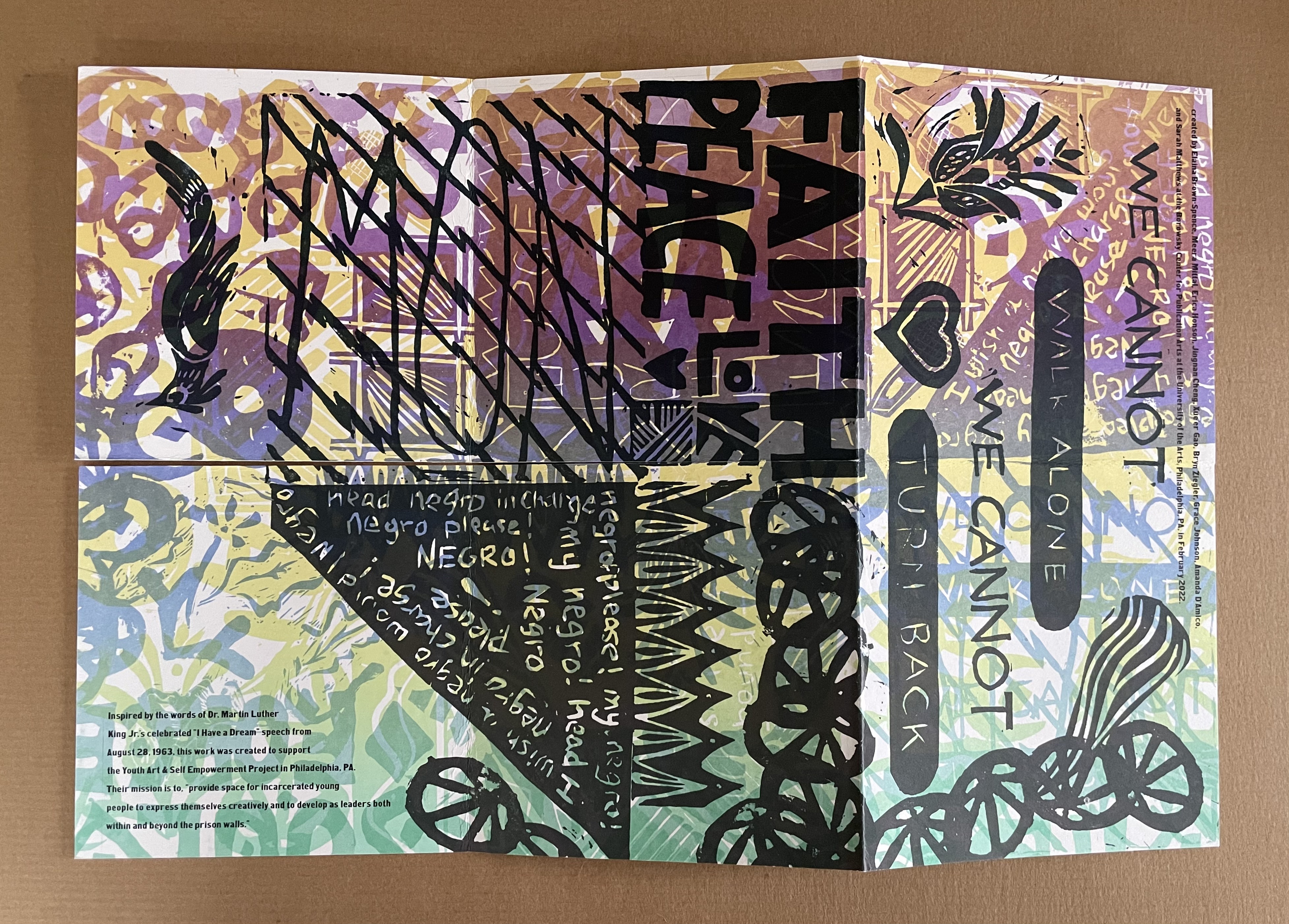
The Negro Is Still Not Free (2022) Elaina Brown-Spence, Meera Mittari, Erica Honson, Jingnan Cheng, Xue’er Goo, Bryn Ziegler, Grace Johnson, Amanda D’Amico, and Sarah Matthews Double-sided single-page book in a pants fold. 152 x 152 mm. Acquired from Sarah Mathews, 6 August 2024. Photos: Books On Books Collection
The Negro is Still Not Free was created by Elaina Brown-Spence, Meera Mittari, Erica Honson, Jingnan Cheng, Xue’er Goo, Bryn Ziegler, Grace Johnson, Amanda D’Amico, and Sarah Matthews at the Borowsky Center for Publication Arts at the University of Arts in Philadelphia, PA during the month of February 2022. In its color and style, it reflects the influence of Amos Paul Kennedy, Jr. Its double-sided single-sheet pants-fold book structure, cleverly fuses the traditions of poster and book (or zine).
Inspired by the words of Dr. Martin Luther King, Jr’s celebrated “I Have A Dream” speech from August 28, 1963, the work was created to support the Youth Art & Self Empowerment Project in Philadelphia, PA. Their mission is to “provide space for incarcerated young people to express themselves creatively and to develop as leaders both within and beyond prison walls.”
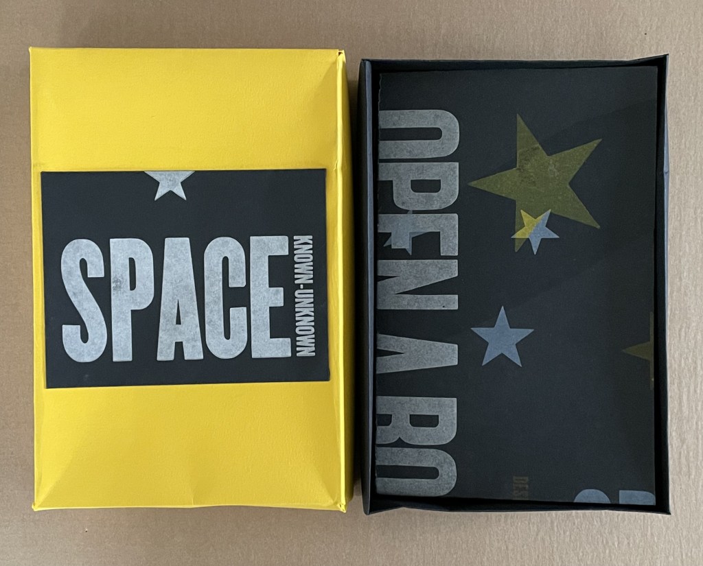
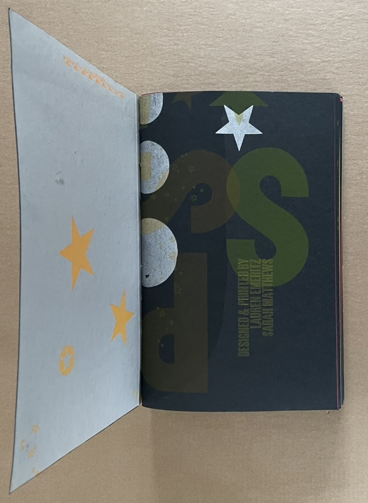
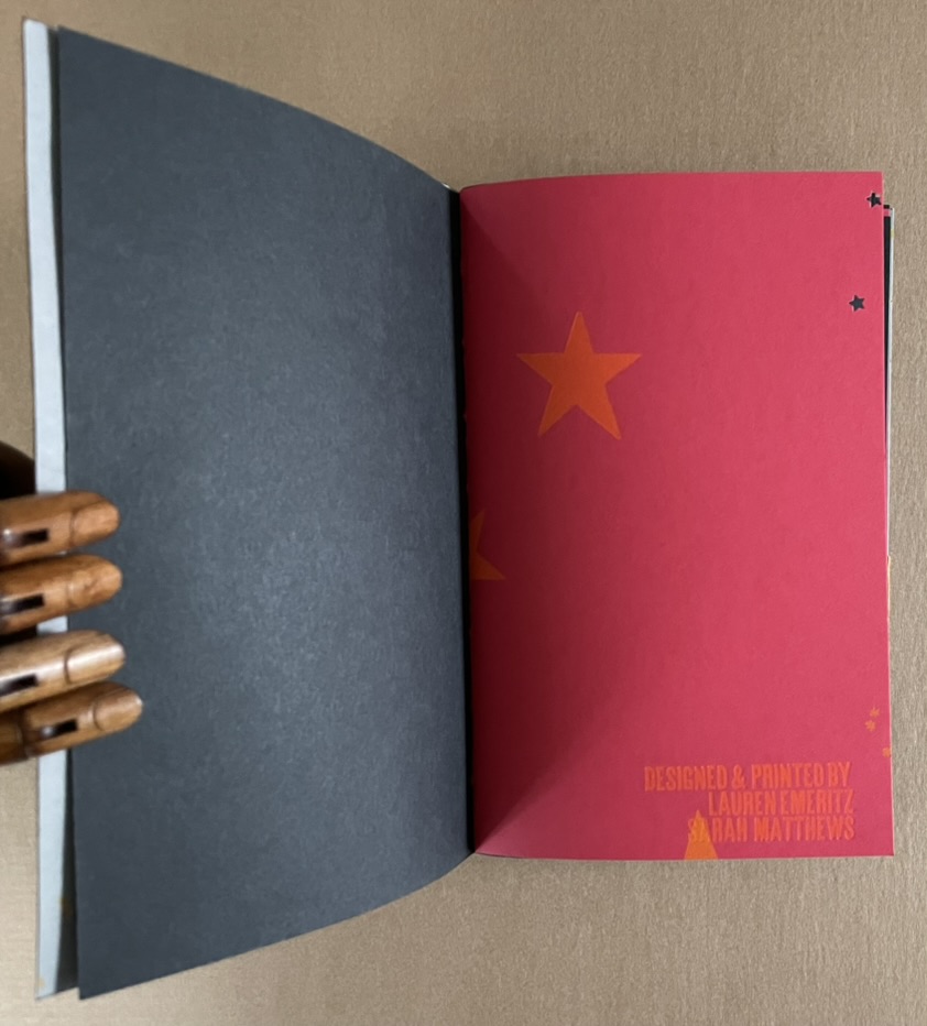
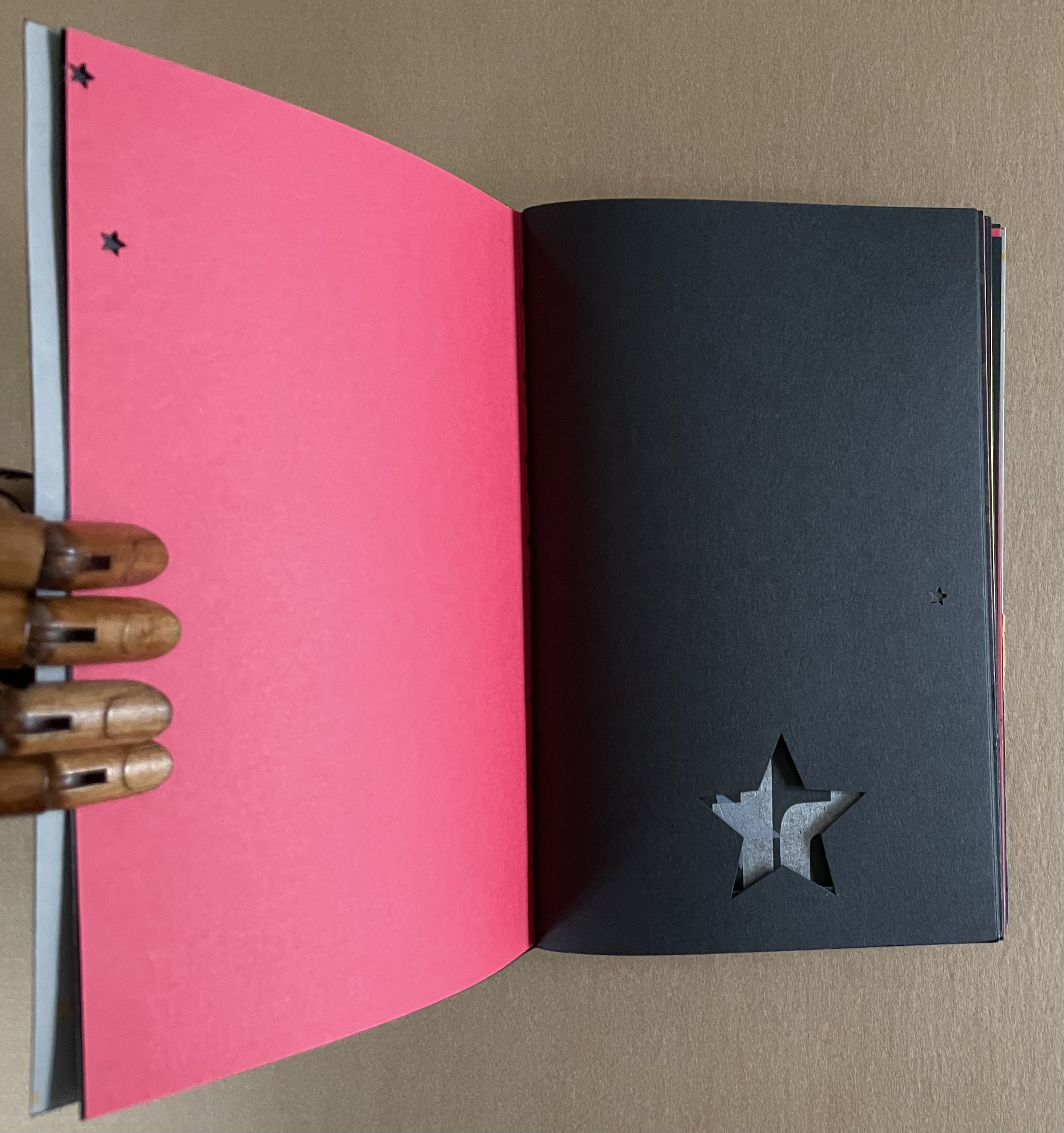
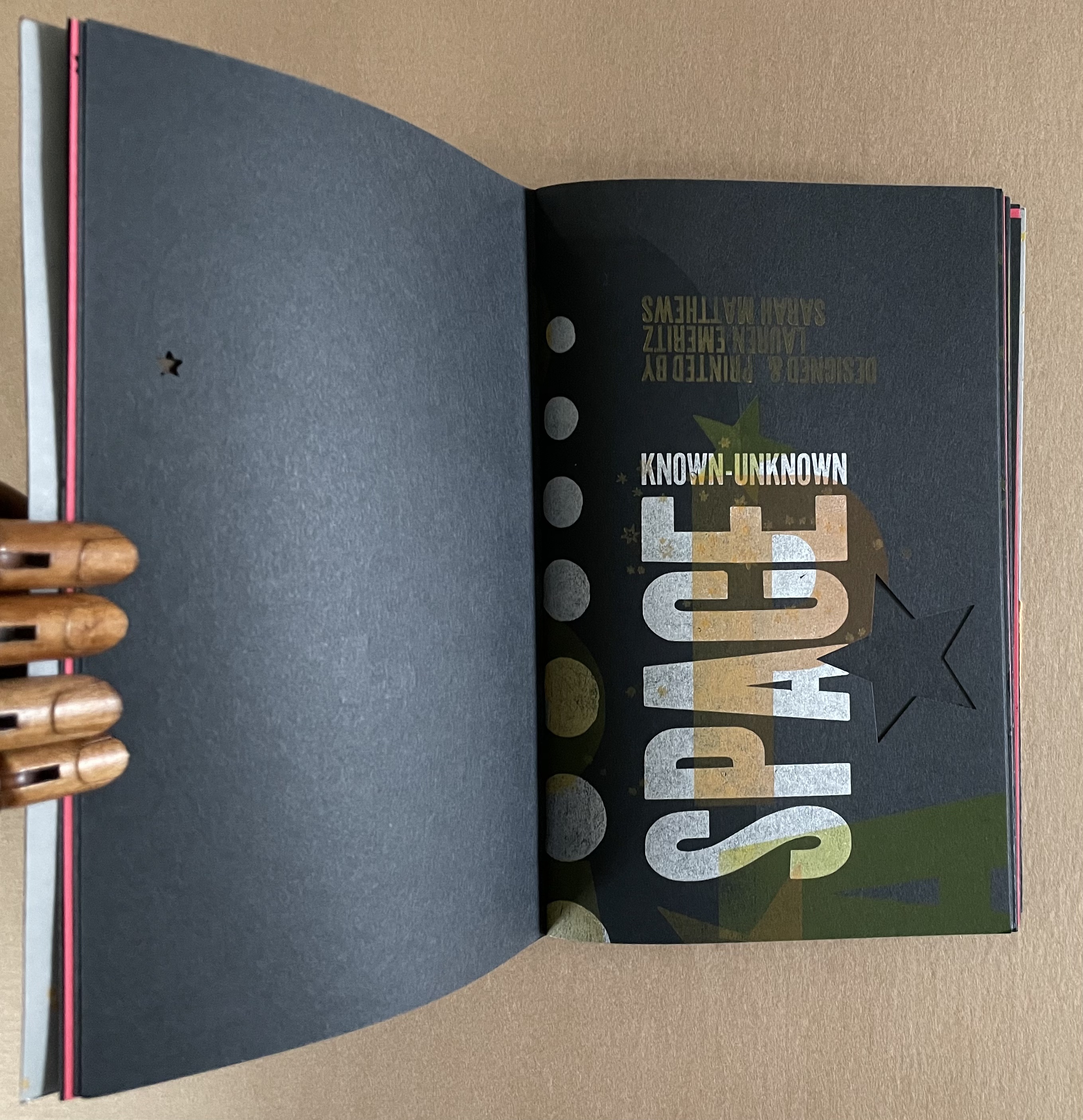
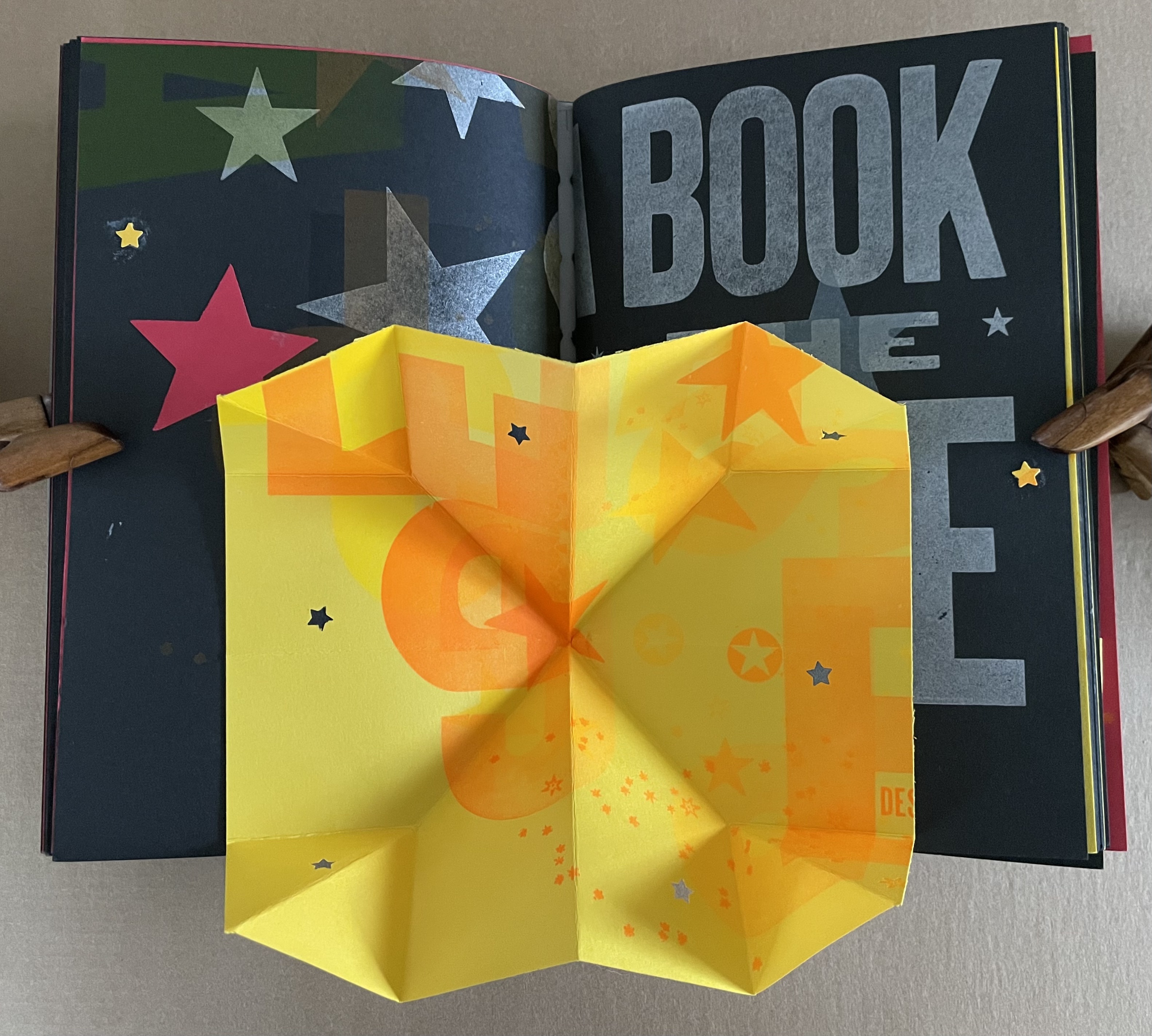
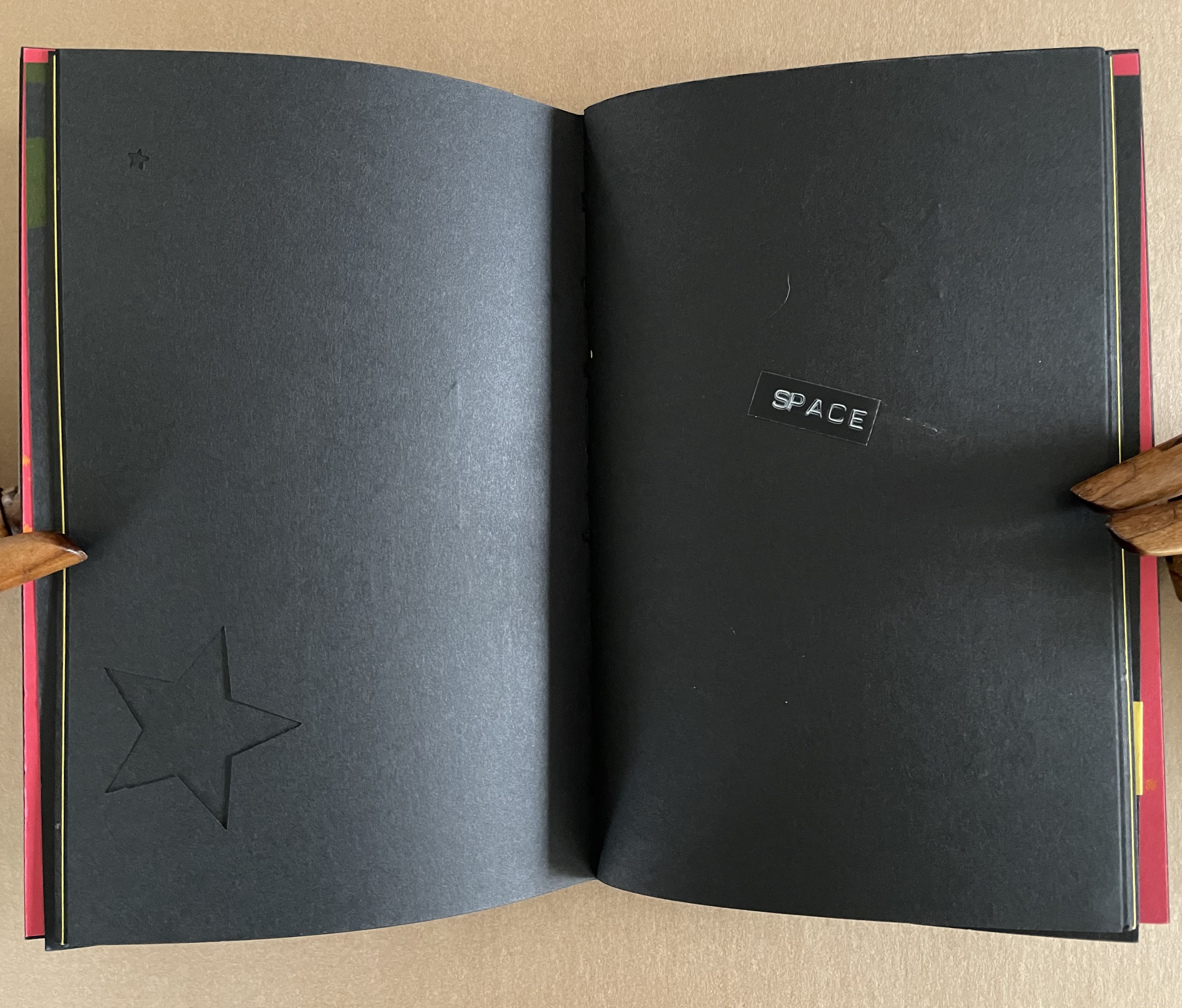
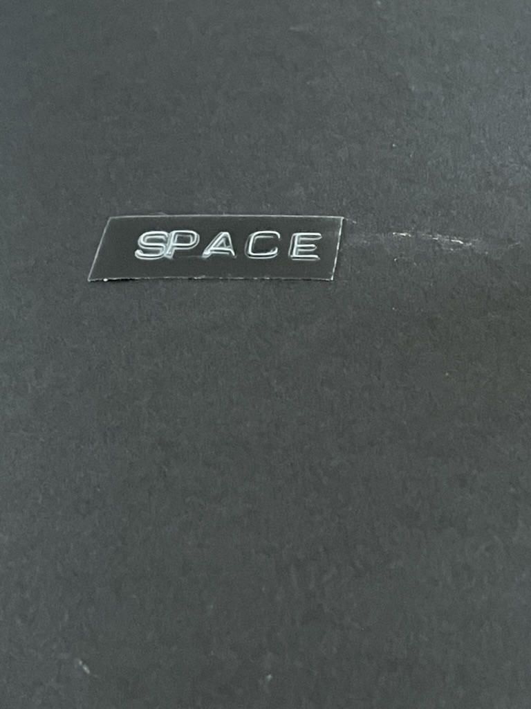
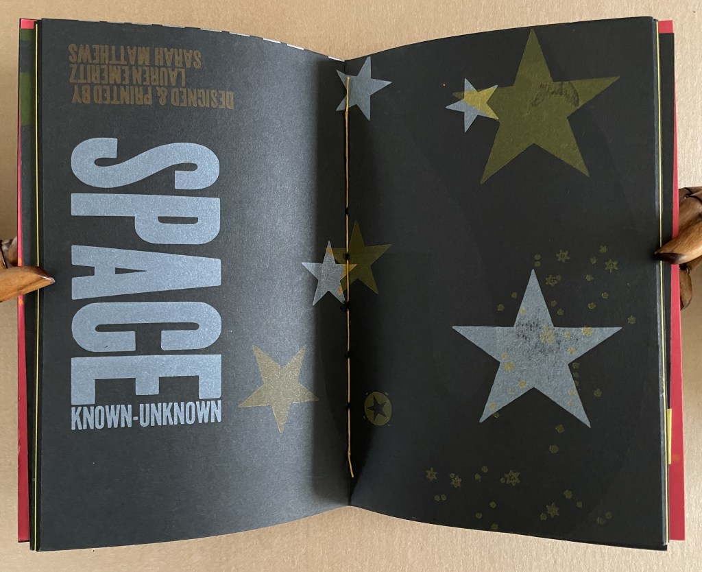
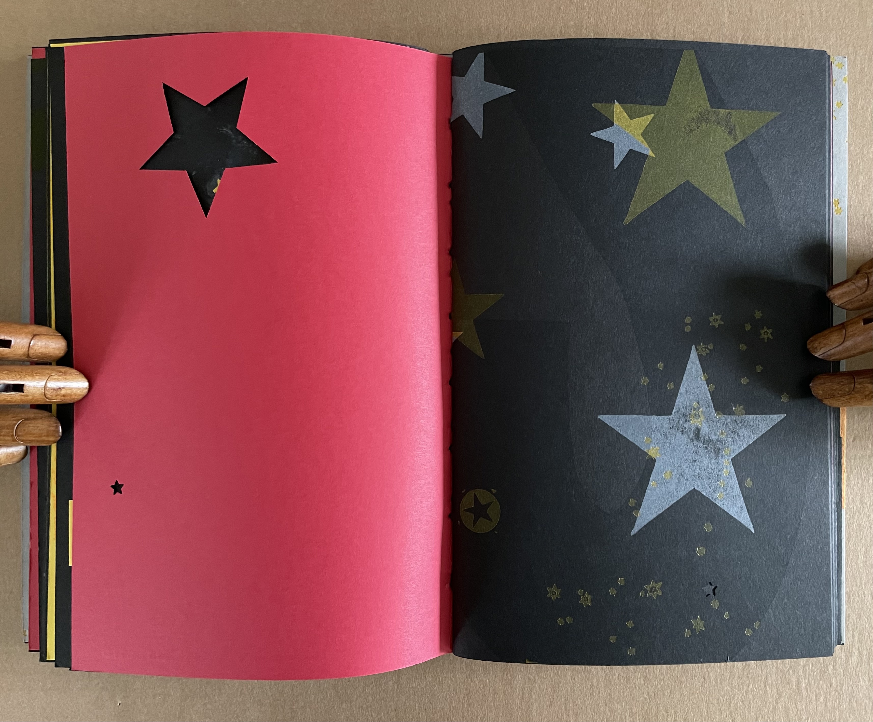
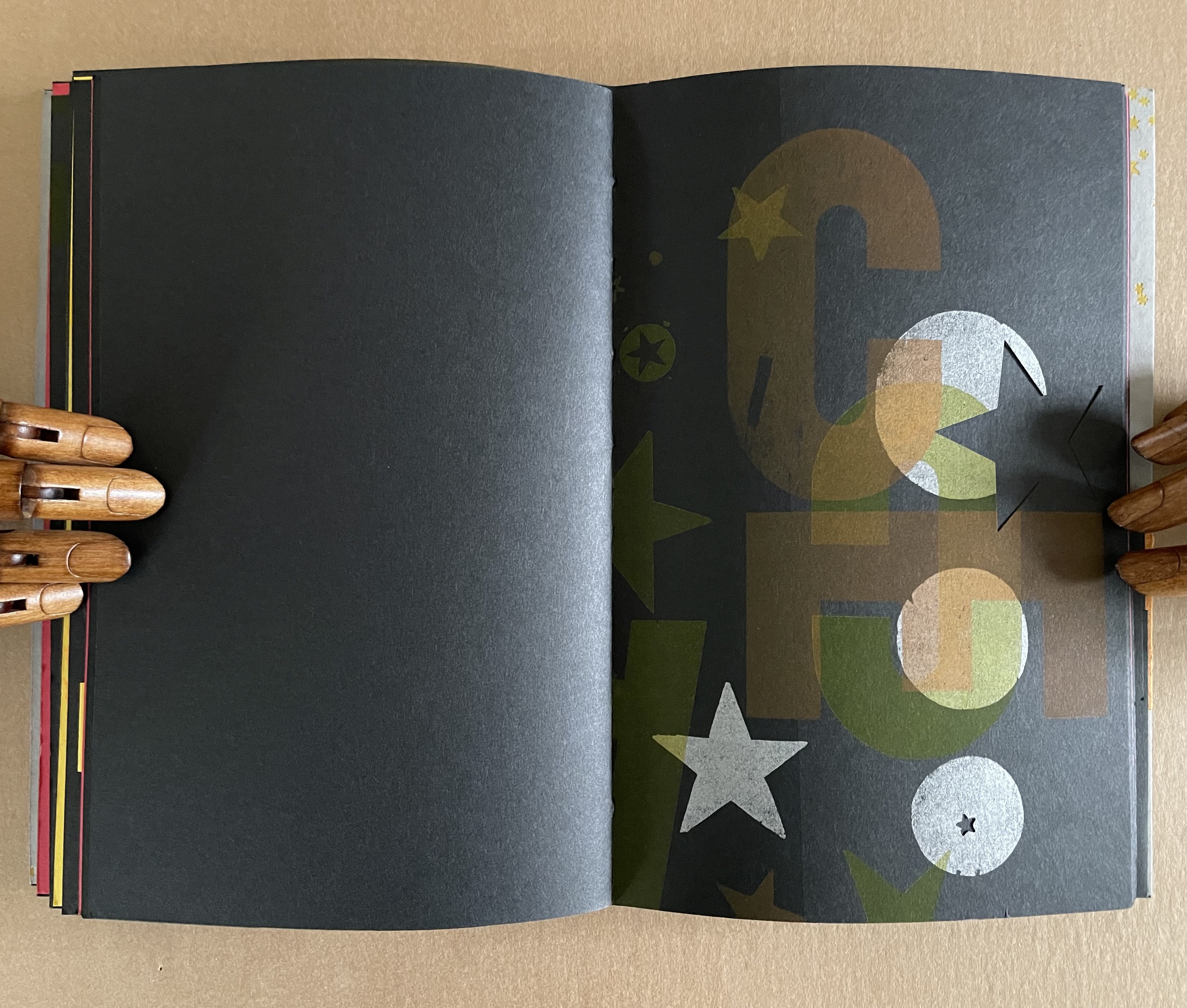
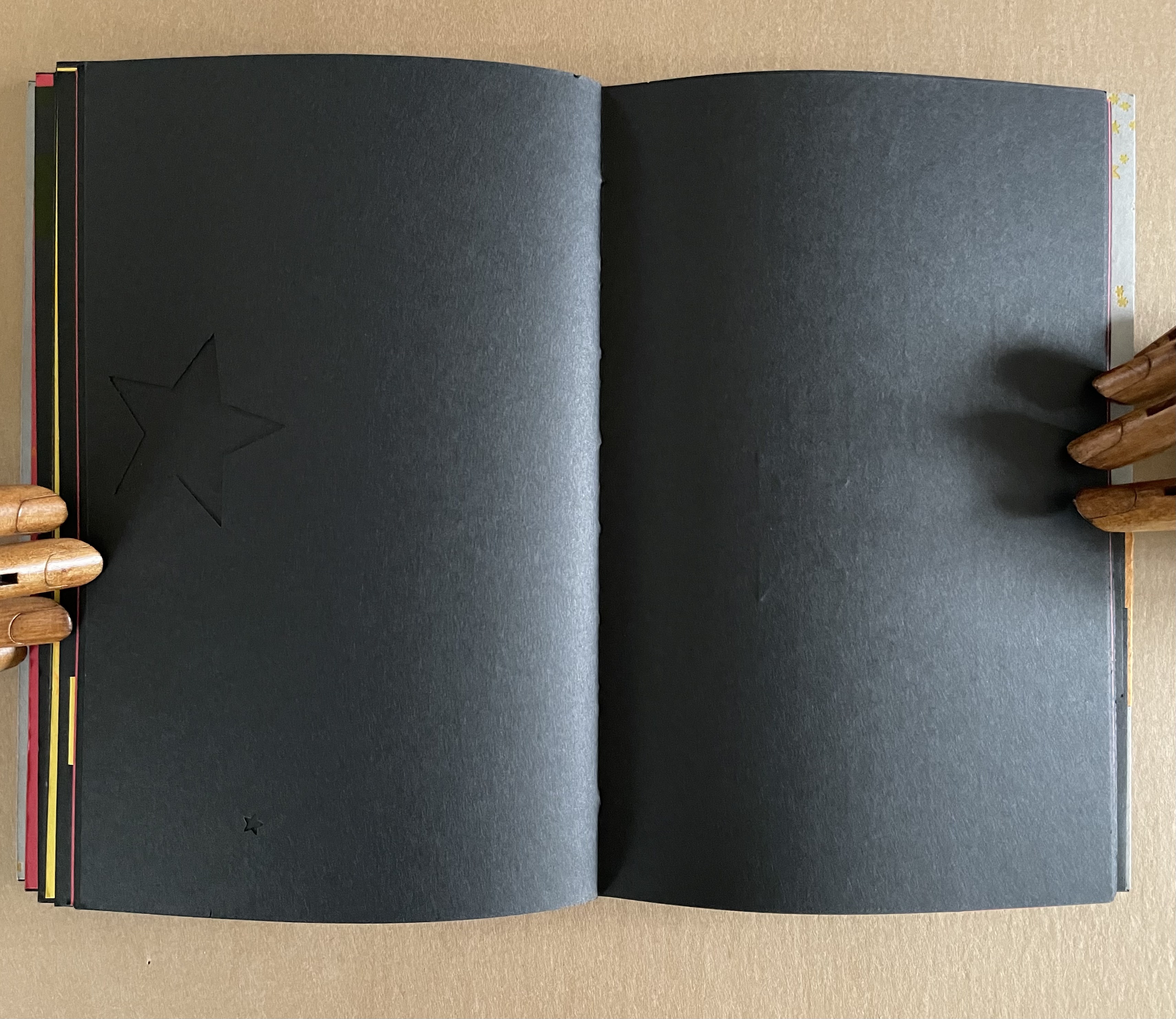
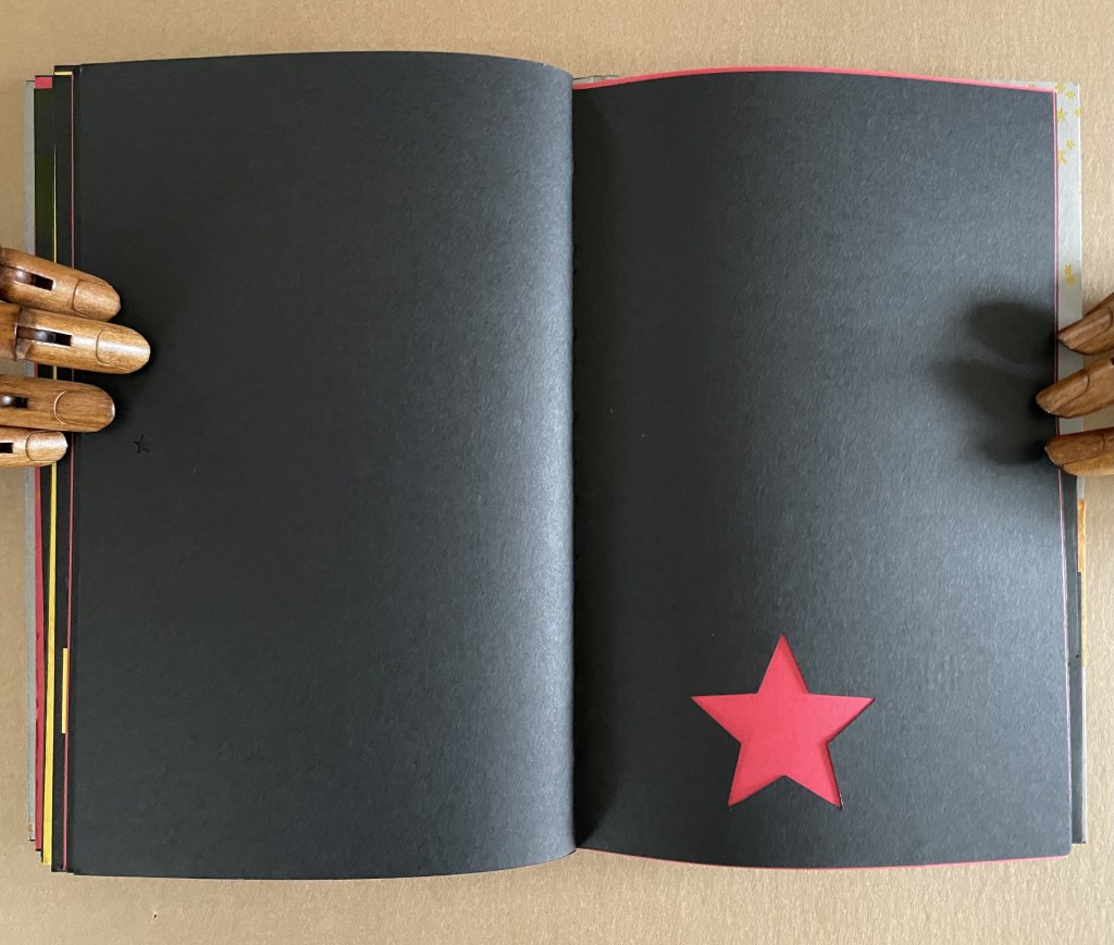
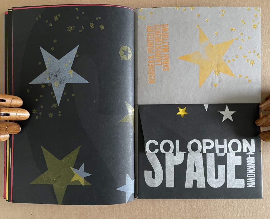
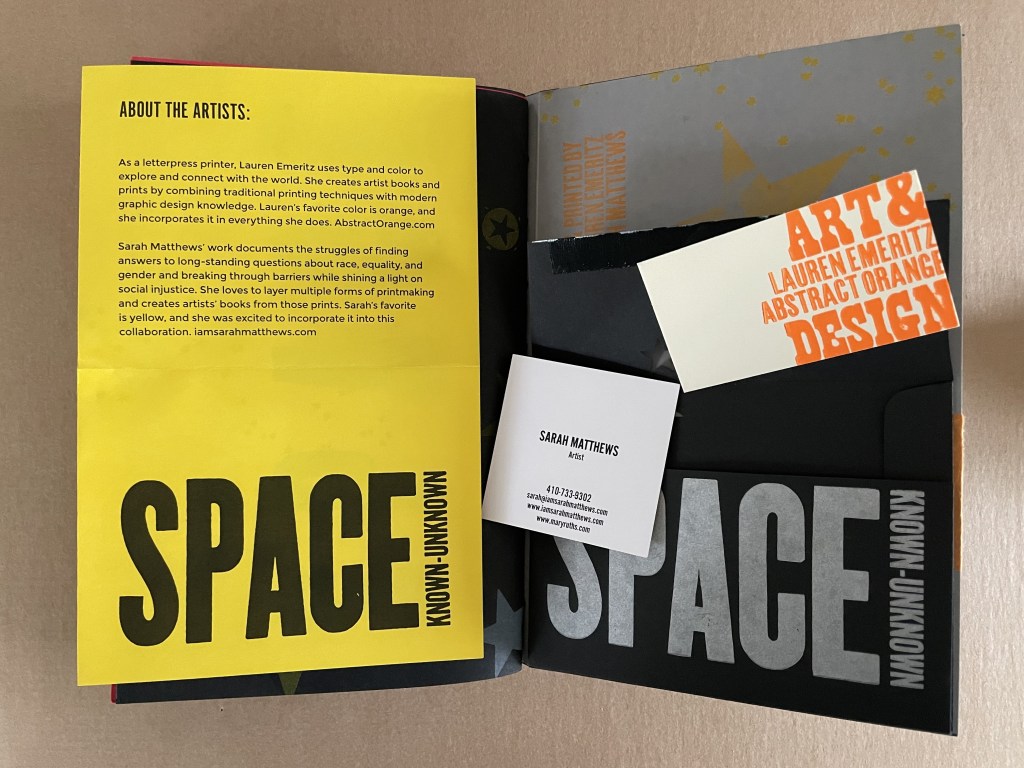
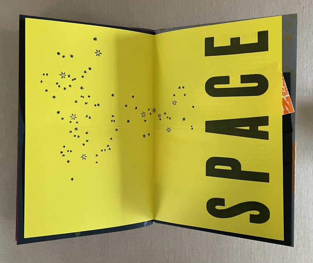
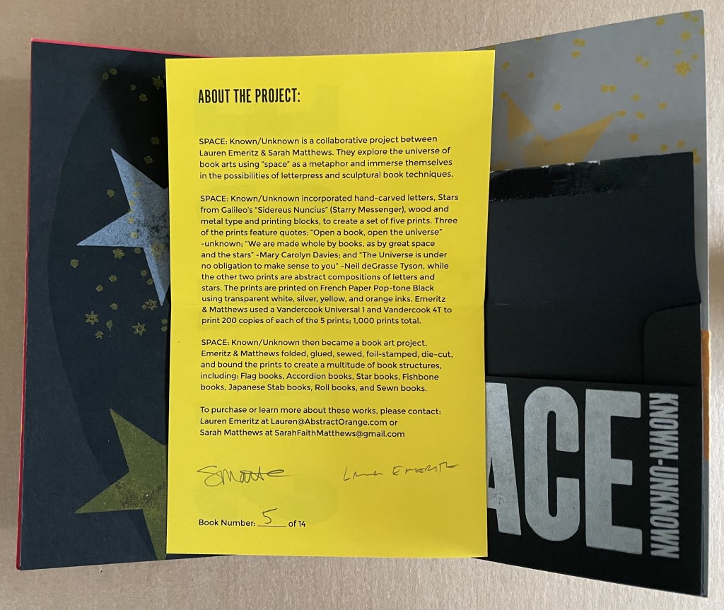
SPACE: Known/Unknown (2022)
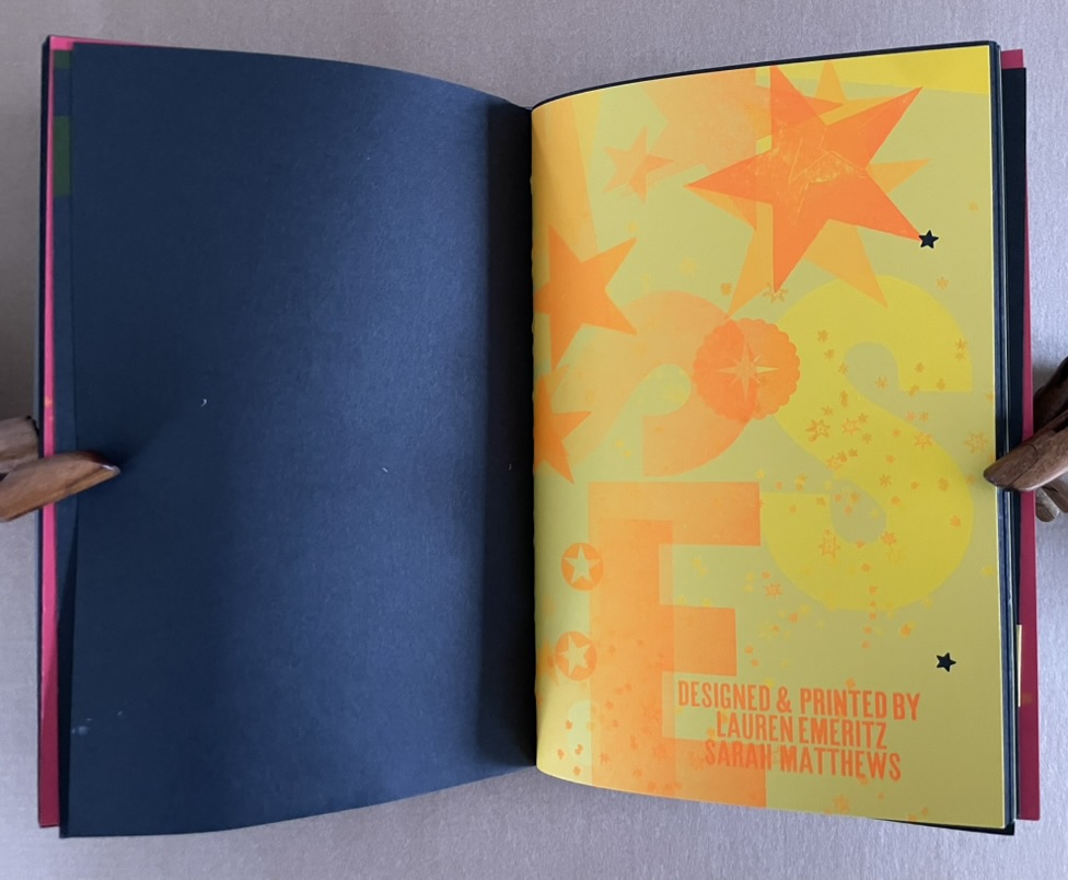
SPACE: Known / Unknown Lauren Emeritz & Sarah Matthews Box with pastedown title enclosing softcover book. Box: 237 x W157 x D50 mm. Book: H230 x W150 x D25 mm. 48 pages and loose 4-page colophon in envelope attached to inside back cover. Edition of 15, of which this is #5. Acquired from Sarah Mathews, 6 August 2024. Photos: Books On Books Collection.
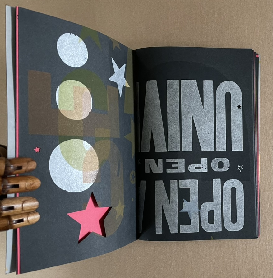
A collaborative project between Lauren Emeritz & Sarah Matthews, SPACE: Known/Unknown features three telling quotations:
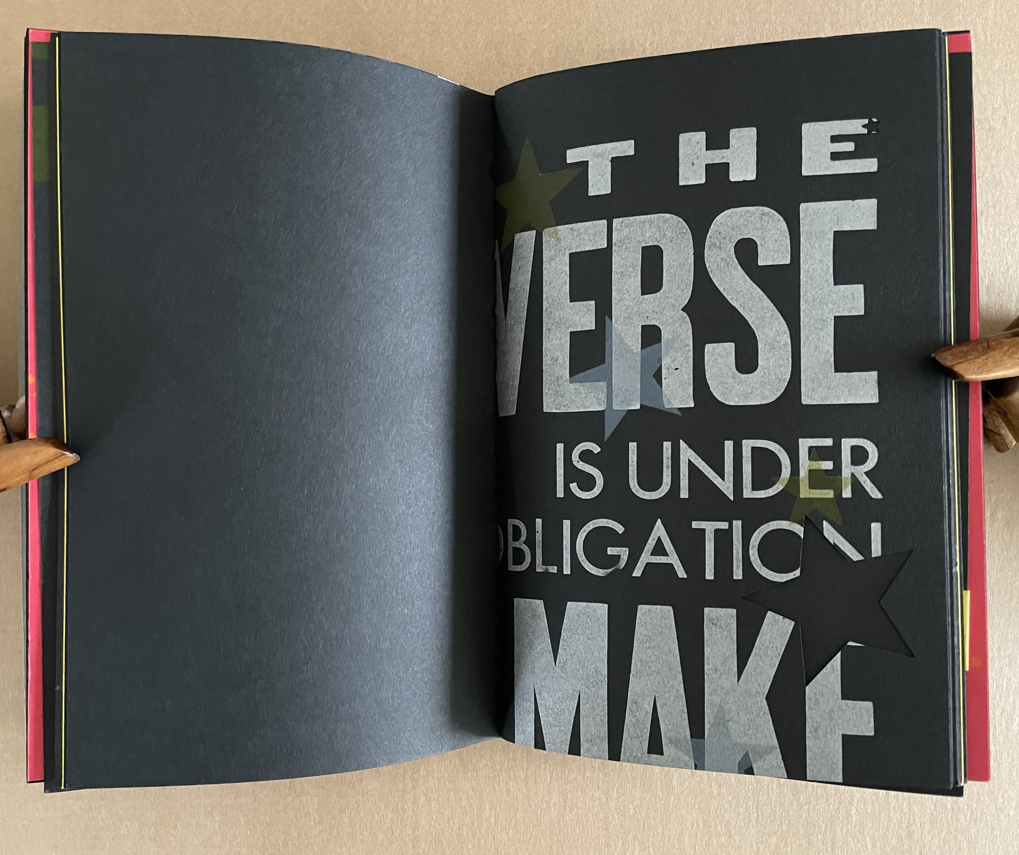
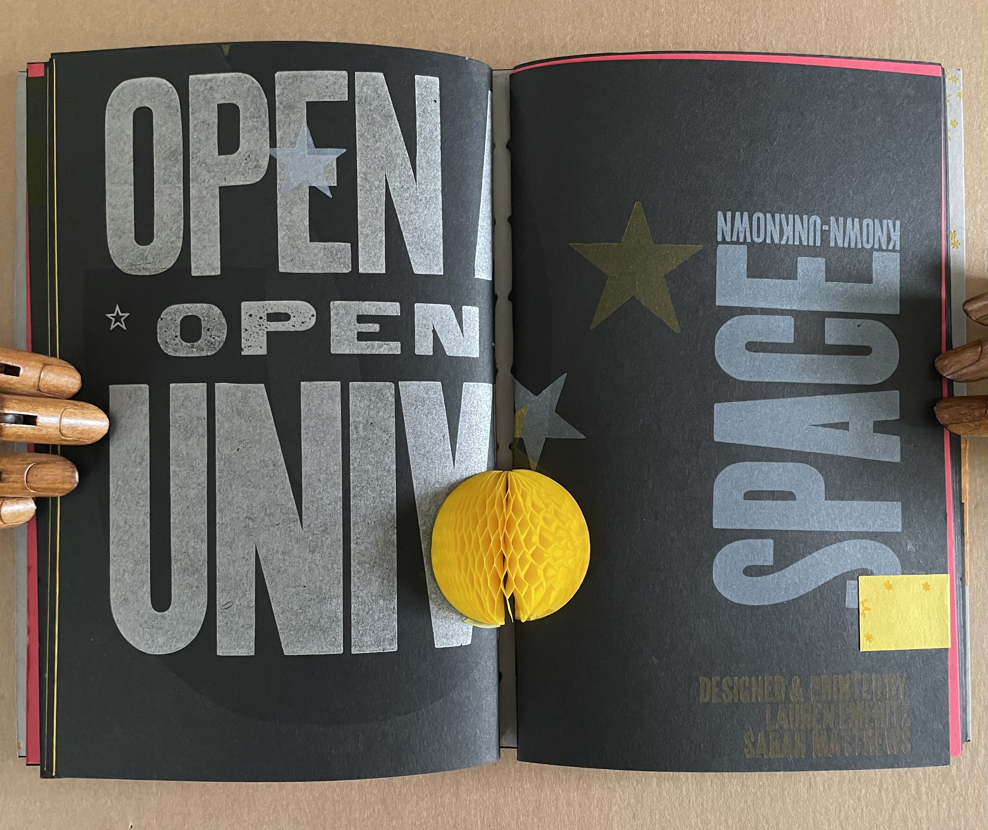
“Open a book, open the universe”– Unknown “We are made whole by books, as by great space and the stars” — Mary Carolyn Davies “The Universe is under no obligation to make sense to you” — Neil deGrasse Tyson
The universe of this artist’s book is that of letterpress, handcarved letters, wood and metal type, embossed printer labels, multiple inks and foil stamping, die cuts, paper engineering, and multiple binding structures. This and its crazy quilt imposition make it a lively universe to explore, and it certainly lives up to deGrasse Tyson’s quip.
Does this book subscribe to the “argument by design” made by Socrates and St. Thomas Aquinas?
A universe in which page layout turns one way and then another is under no obligation to make sense.
A Turkish fold of constellations.
The artists must have traveled back in time to include one of these embossed sticky labels.
The universe and title page can appear in multiple places — even in the middle.
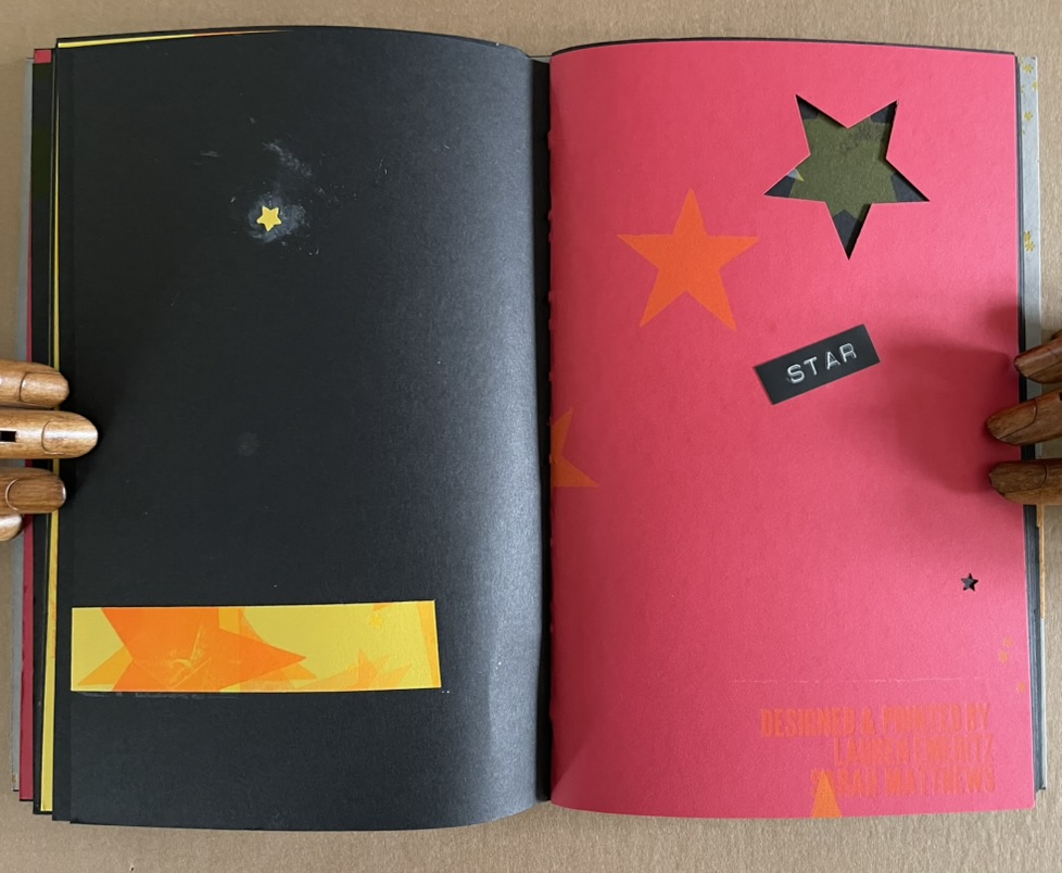
A sunburst — and then star label in case we missed it?
A multi-color galaxy of ink leads to die-cut black stars (or holes?).
Not exactly a dwarf red star, but it’s the artists’ universe, they get to decide.
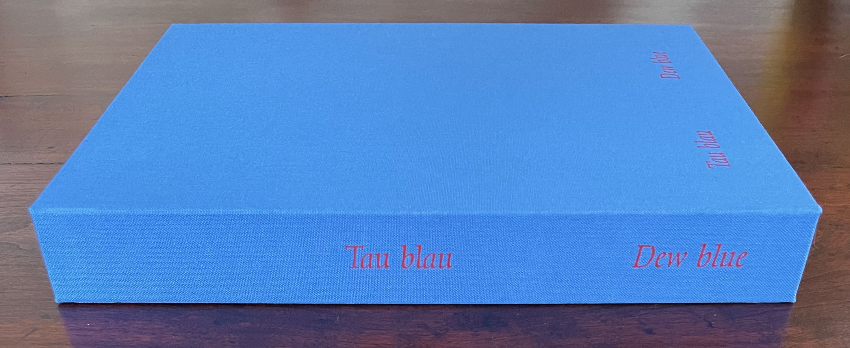
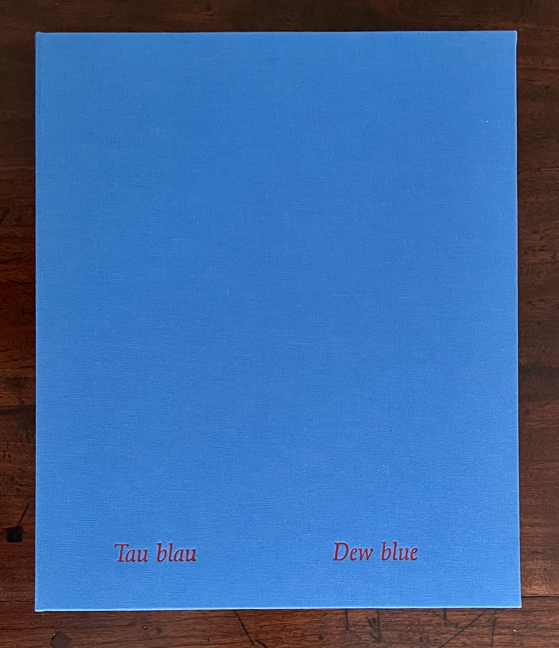
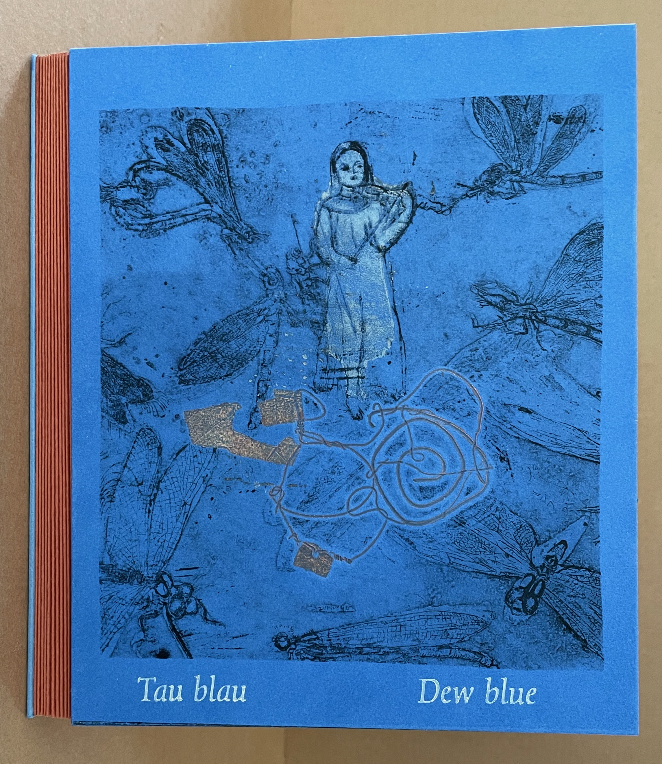
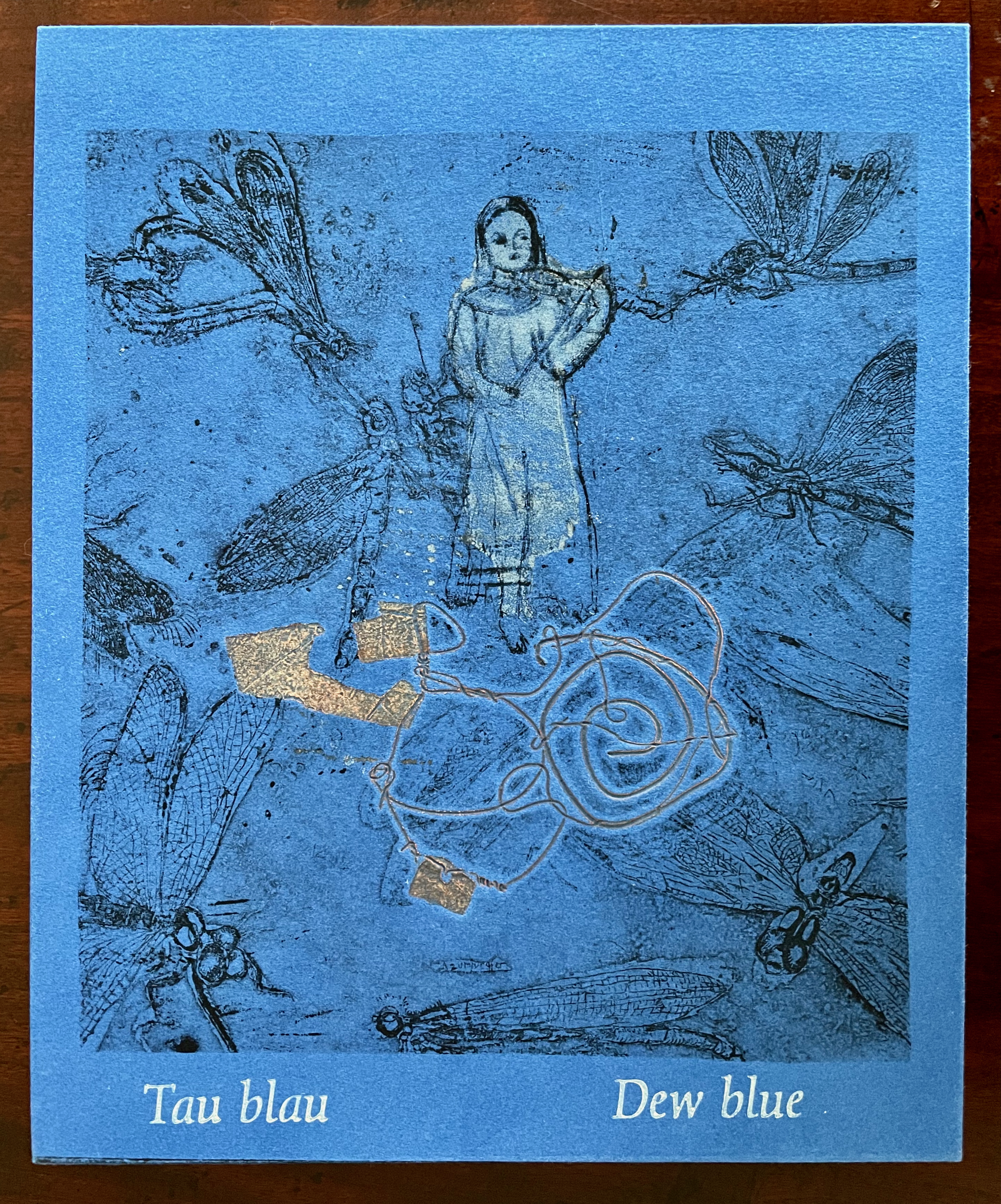
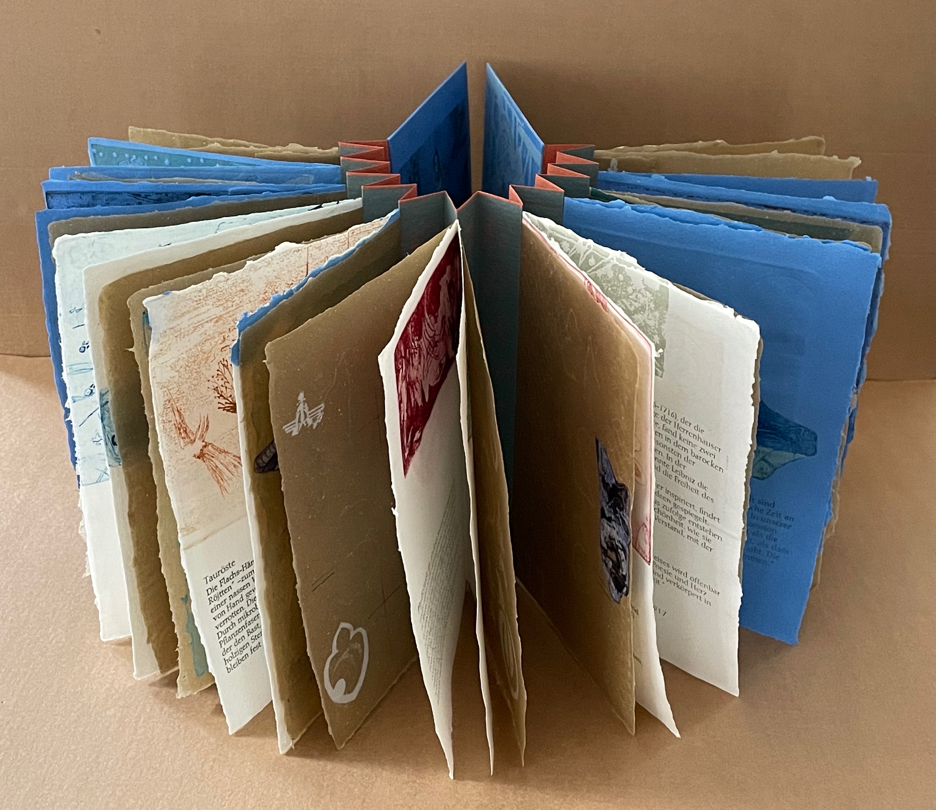
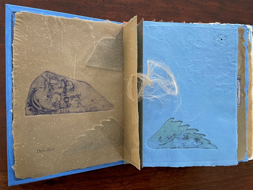
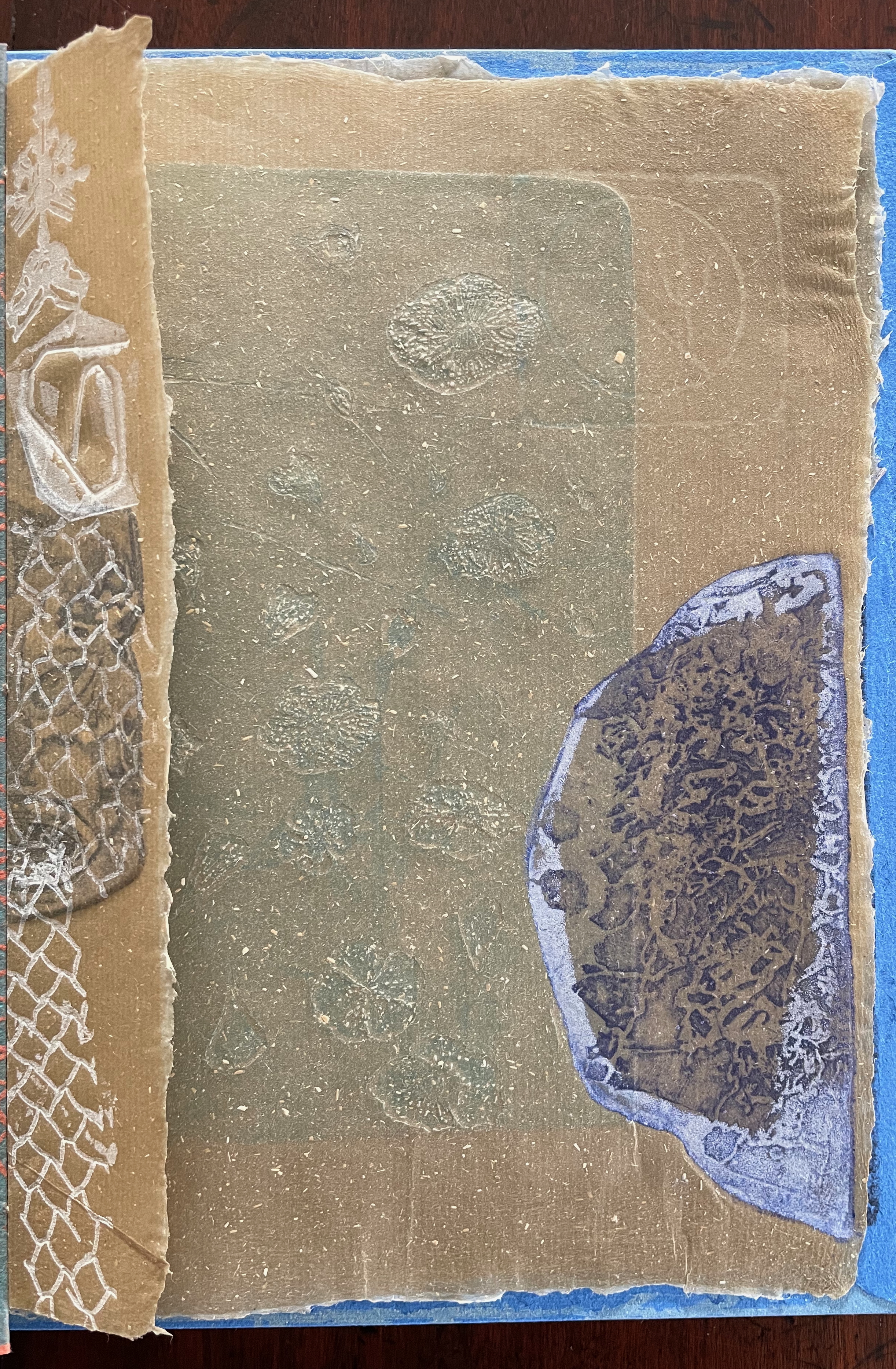
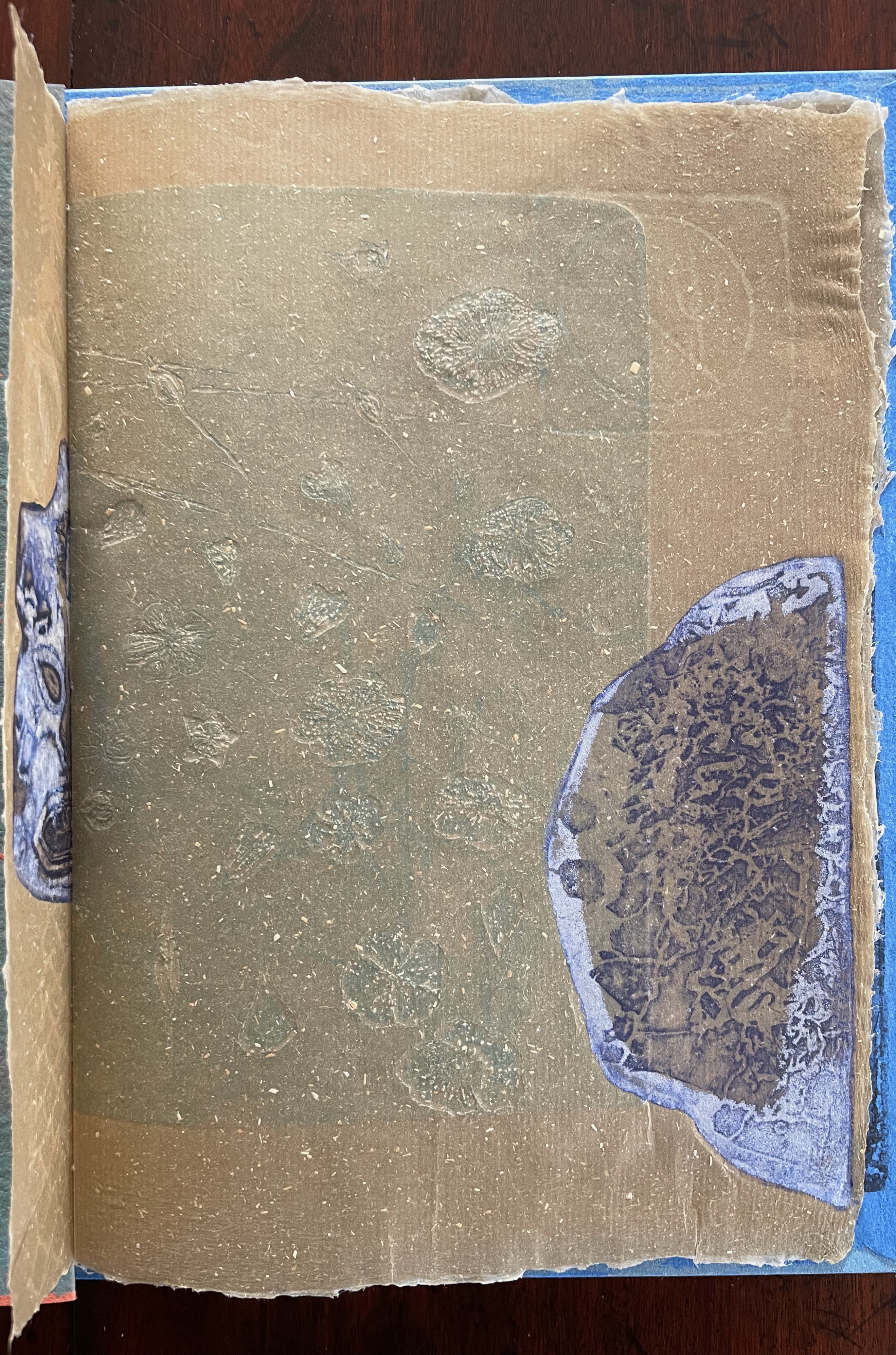
Tau blau / Dew Blue (2013) Barbara Beisinghoff ; Solander box in linen, handbound Vera Schollemann; Flax paper, handmade by John Gerard. Solander box: H240 x W200 x D32 mm. Flagbook: H220 x W180 mm. Edition of 38, of which this is #22. Acquired from the artist, 30 December 2024. Photos: Books On Books Collection.
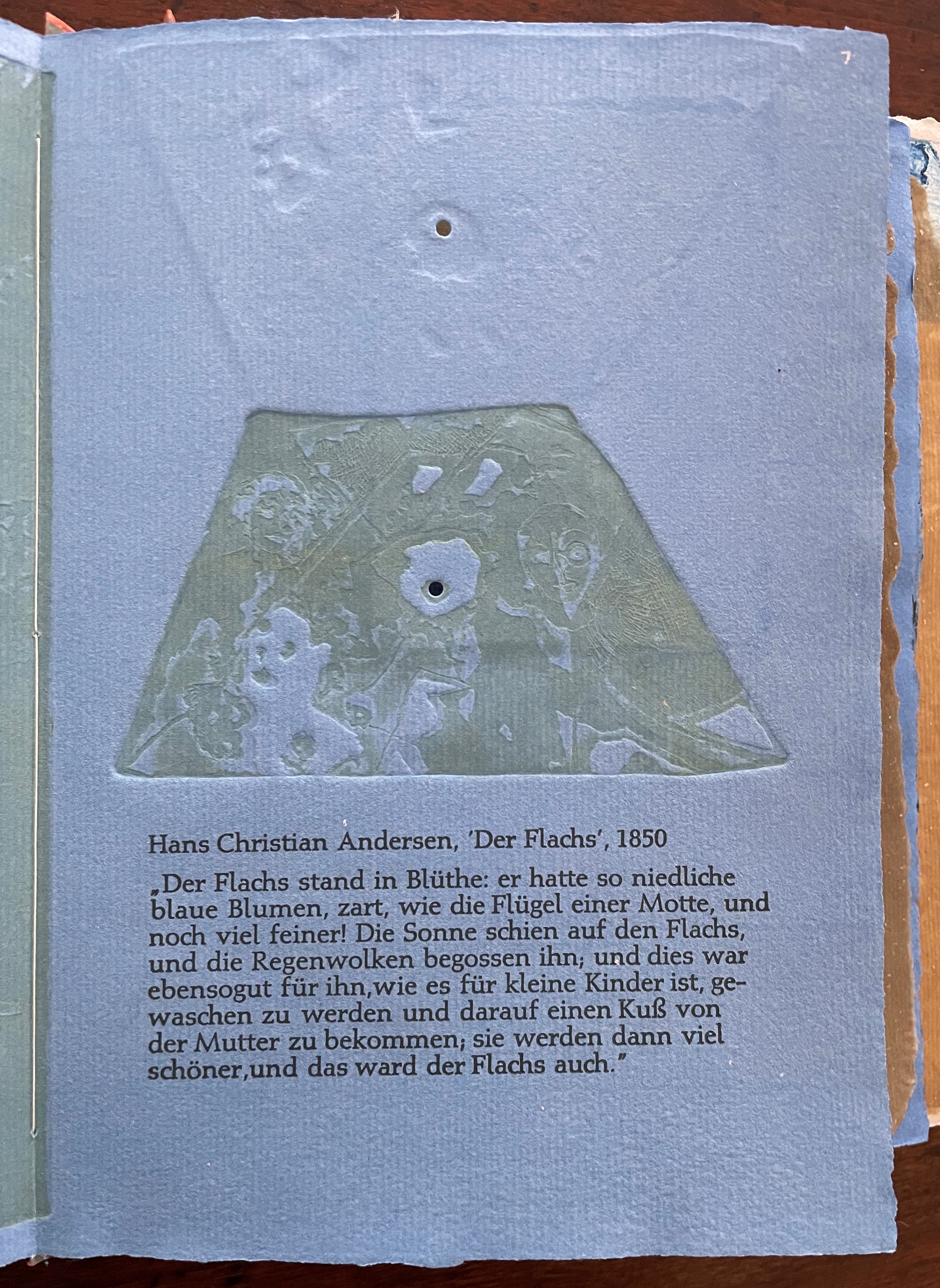
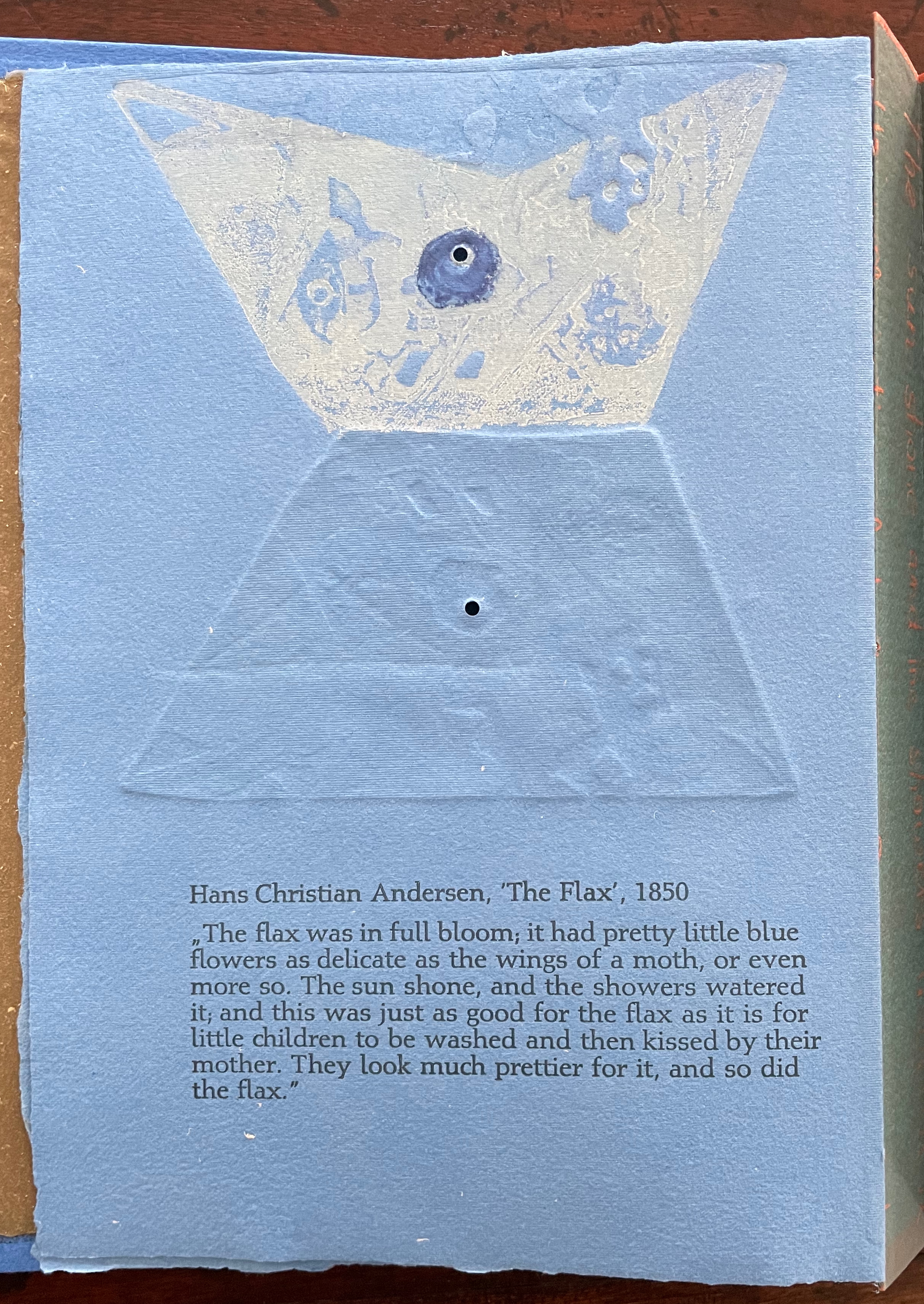
Familiarity with Hans Christian Andersen’s fairy tale Hørren /The Flax enhances appreciation of Barbara Beisinghoff’s Tau blau / Dew Blue. Andersen gives a voice to the plant that expresses its joy, pain, hope and observations at each stage of its blooming, being harvested, turned into linen and clothing then paper, and finally consigned to flames. The H.C. Andersen Centre offers Jean Hersholt’s translation of it here.
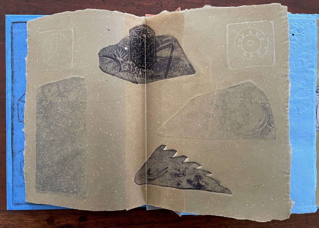
Only the opening paragraph of the story appears in Tau blau / Dew Blue, but Beisinghoff documents and illustrates the stages from her own cultivation of flax, observation of its growth and preparation of its processing. And with the etching, drawing, watermarking, handmade papers, linen cloth and thread, and binding structure, Beisinghoff suffuses the spirit of the tale’s metamorphosizing plant throughout the whole of Tau blau / Dew Blue.
From the blue of the plant’s blossoms to the white of its change into linen and paper to the red, burnt orange and black of its sparks and ash when it is consumed by fire in the end, all of the story’s colors are replayed across Tau blau / Dew Blue from its Solander box to its covers and spine like motives in a Baroque musical piece.
In a concerto, motives play off one another and develop. In Tau blau / Dew Blue, the motif of nature (the plant) plays off the motif of artifice and the manmade (the fairy tale, music, linen, paper, etc.). On the front cover (above), a young girl, surrounded by large damselflies, plays a fiddle or violin and seems to hover above a silver foil image of flax thread and tools for making it. In the spread above alongside the front cover, the specks rising over the staves and musical notes (a recurring motif in itself) recall the tale’s final passage in which the bundle of papers (made from linen rags) is cast into a fire:
“I’m going straight up to the sun!” said a voice in the flame. It was as if a thousand voices cried this together, as the flames burst through the chimney and out at the top. And brighter than the flames, but still invisible to mortal eyes, little tiny beings hovered, just as many as there had been blossoms on the flax long ago. They were lighter even than the flame which gave them birth, and when that flame had died away and nothing was left of the paper but black ashes, they danced over the embers again. Wherever their feet touched, their footprints, the tiny red sparks, could be seen.
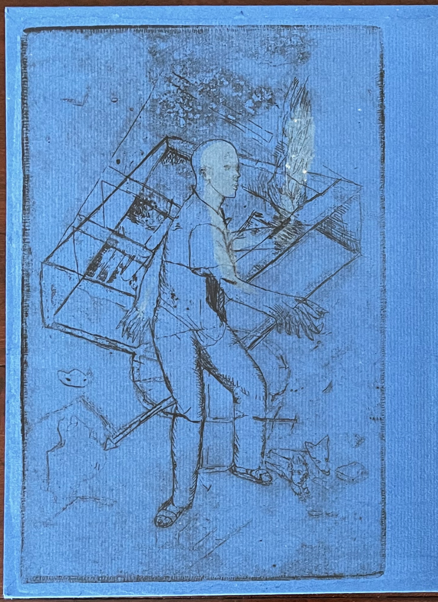
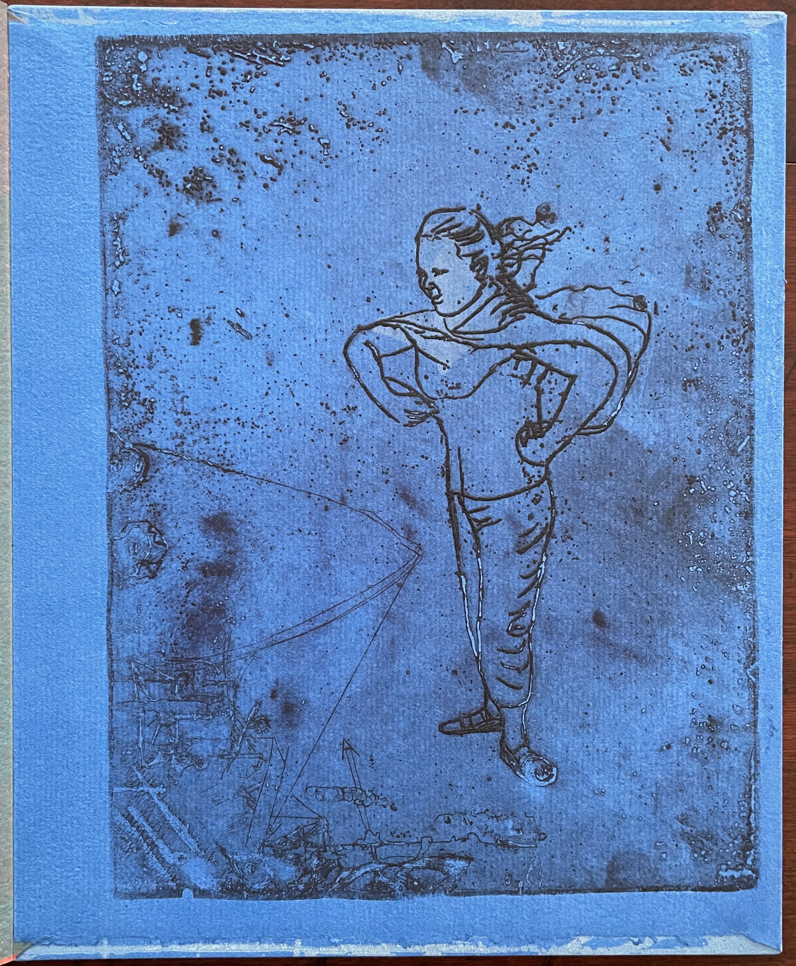
Images of tools — whether for preparing flax or for making the products from it — also recur on the inside of the front and back covers and throughout the book. The human figures alongside the tools, however, appear engaged in more than manufacturing. Elsewhere in the book, they dance, they sit and meditate or write, they row on ponds beside the growing flax. The fairy tale, too, has these Romantic juxtapositions of nature, art and craft. So, again, the spirit of Andersen’s tale finds another way into Tau blau / Dew Blue.
Inside front and inside back covers.
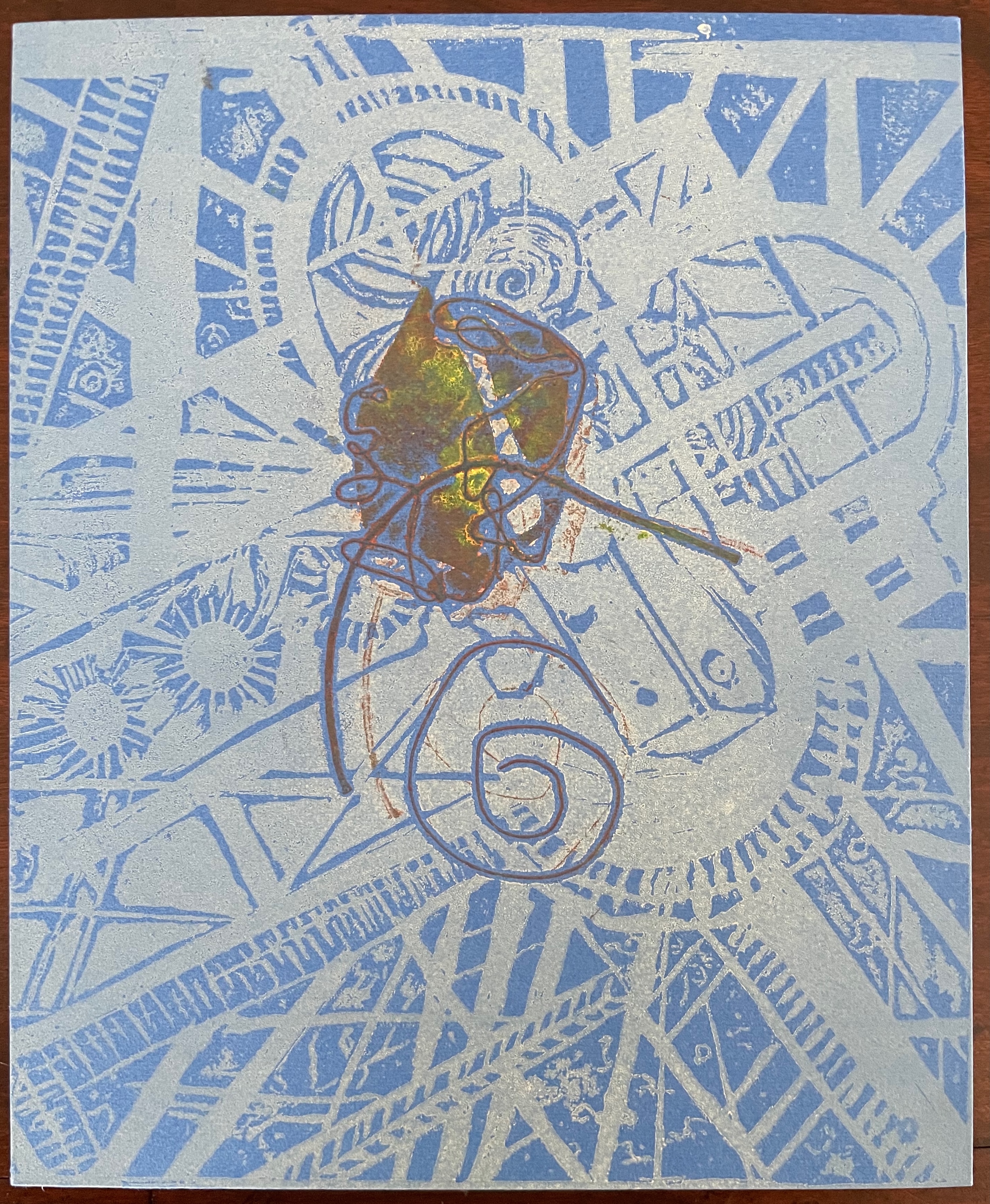
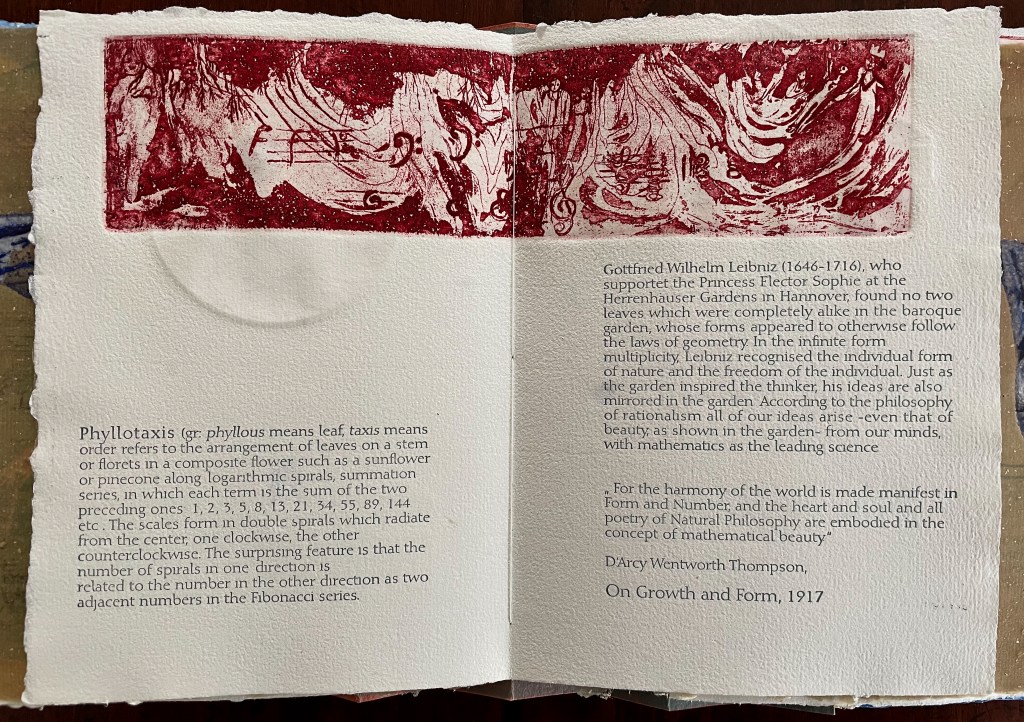
The front cover also announces another motif in those coils of thread below the young girl’s feet. Within the coils is the image of a Fibonacci spiral, which appears on the back cover and throughout the book in different ways. It can be found drawn and printed. It can be found in watermarks in the handmade paper. It can be found in the arrangement of florets in flax. Being a composite flower, flax blossoms display the spiral based on the Fibonacci sequence 1, 2, 3, 5 … 233, and so on. These numbers are waterjet-drawn on the pure flax paper below and explained in an entry printed on the adjacent plain handmade paper folio. By appearing on the book’s front and back covers, the spiral echoes the beginning and ending cycles of birth and rebirth the flax goes through in the folktale.
The Fibonacci spiral on the front and back covers.
The sequence of Fibonacci numbers 1, 2, 3, 5 … 55, 89, 144, 233 … watermarked on handmade flax paper with a water jet.
Description of the Fibonacci spiral side by side with quotation from Thompson’s On Growth and Form (1917), drawing on Leibniz’s Rationalist philosophy.
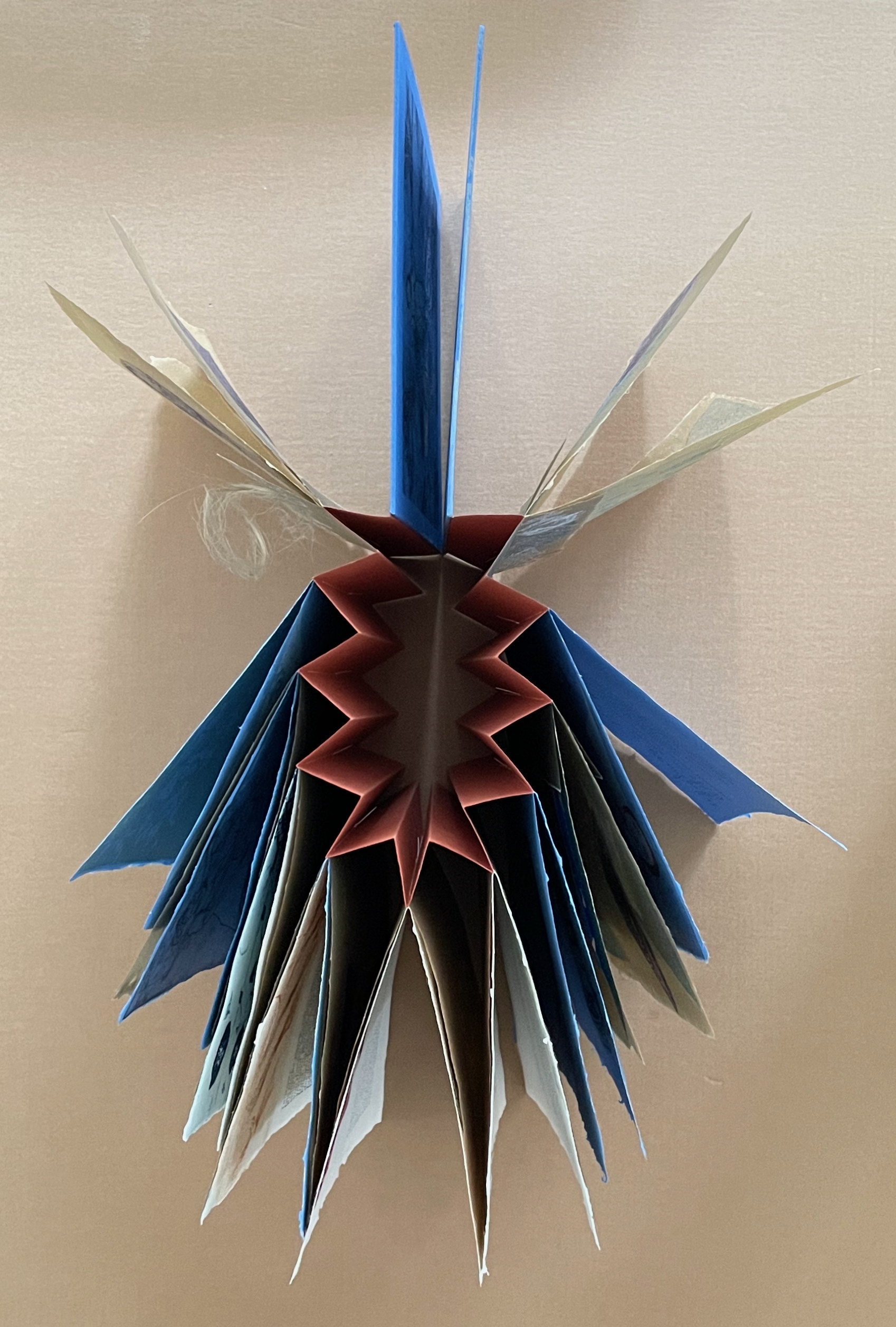
To organize and weave her motives together, Beisinghoff uses an accordion spine to whose peaks eleven sets of folios are sewn with linen thread. Three of the eleven are 4-page folios consisting of blue handmade paper. Another three 4-page folios consist of pure flax paper (handmade by John Gerard). The remaining five gatherings have 8-page folios, each consisting of a pure flax paper folio around a blue or plain one.
Side and top views of the accordion spine.
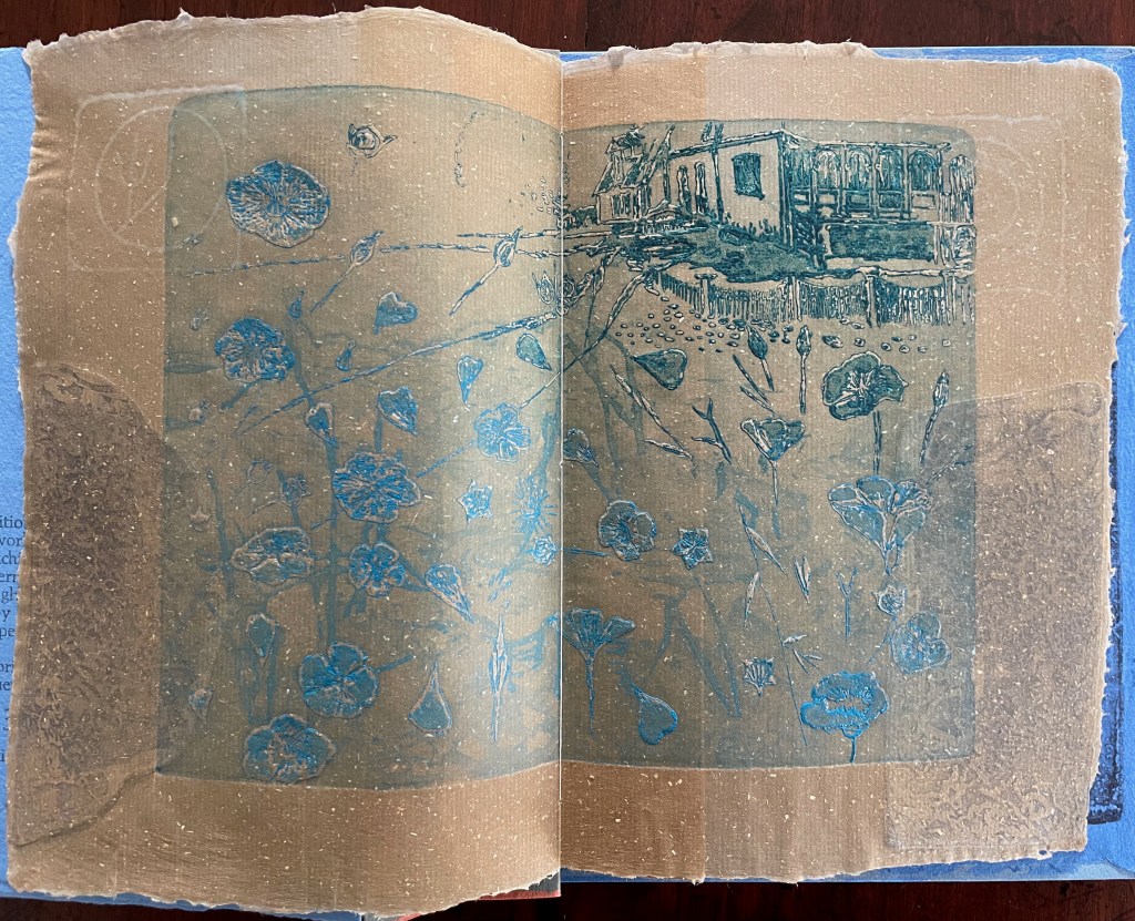
The first pure flax folio begins the book, displaying two title pages (German and English) and two etchings on its first and last pages. In the center spread, two more etchings appear. A watermark symbolizing phyllotaxis shows through in the upper left, balanced by a watermark with a cross section of a flax stalk in the upper right of the center spread. The texture and weight of the flax paper allows the impress and shadow of the etchings to stand out on both sides against the inking and watermarks.
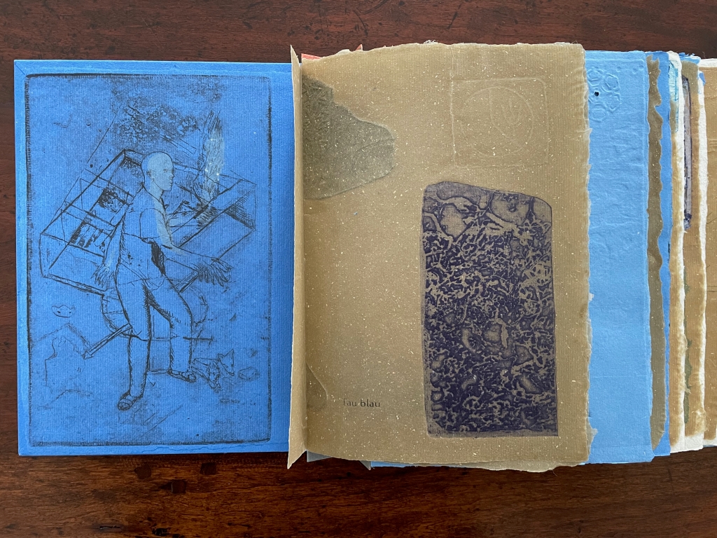
Inside front cover and Tau blau title page and etching.
Center spread of first flax paper folio. Note the watermarks in the upper left and right corners.
Dew Blue title page and etching, loop of flax fibers, first page of blue handmade paper folio; note its boating image repeated from the prior center spread.
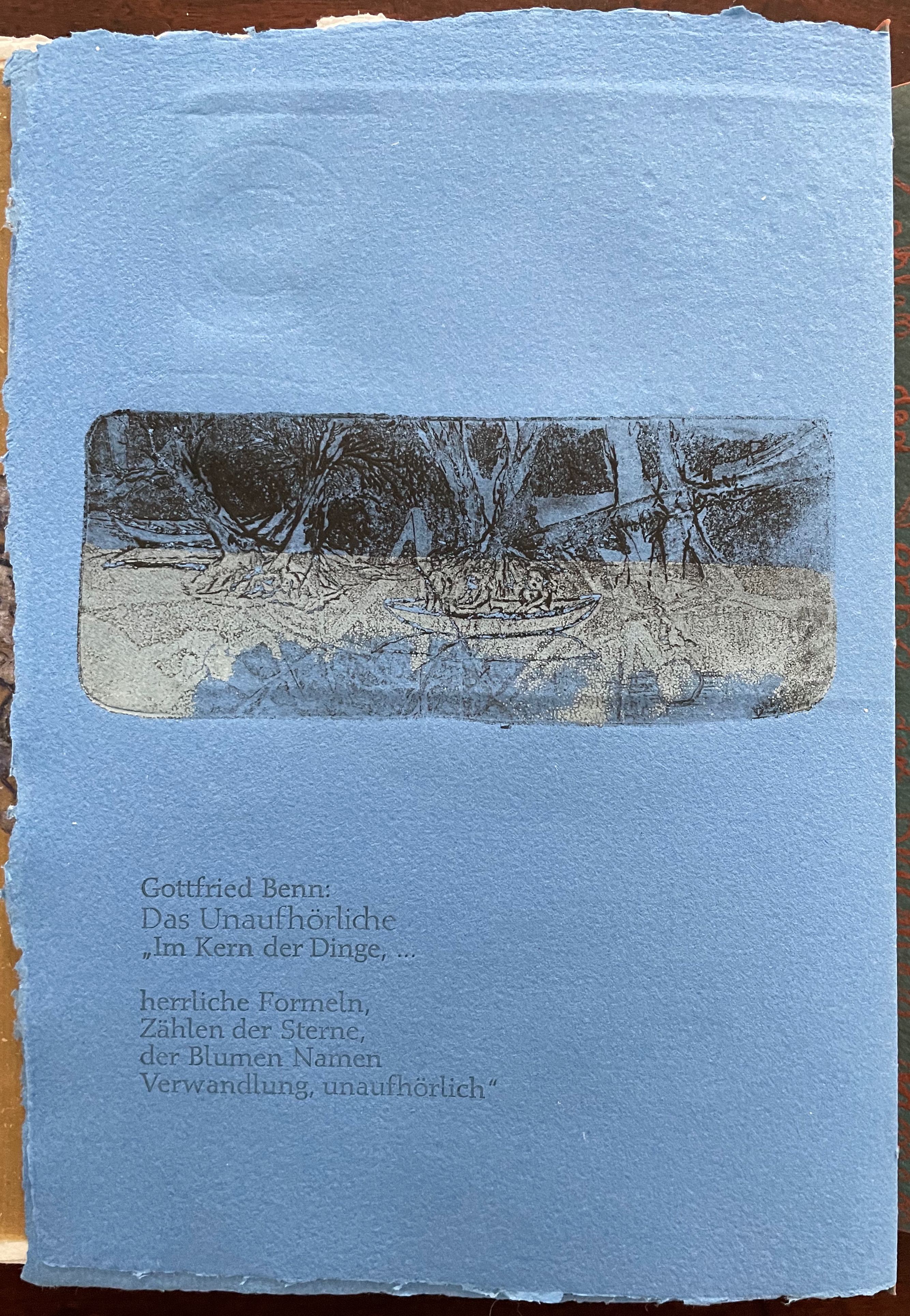
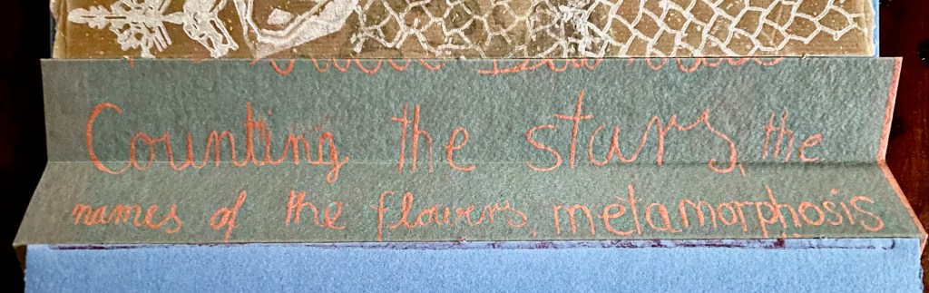
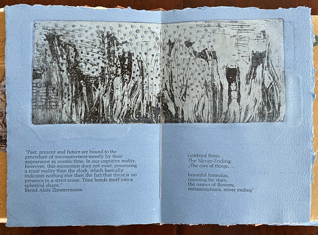
Following the pure flax folio, the first all blue folio gives us that introductory excerpt from Andersen’s fairy tale. Next comes a description of flax comes from Leonhart Fuchs’ Book of Herbs (1543), then the series of planting and harvesting observations from Beisinghoff, then the refrain from Clemens Brentano’s poem “Ich darf wohl von den Sternen singen” (1835), then philosophical observations drawing on G.W. Leibniz from D’Arcy Wentworth Thompson’s On Growth and Form (1917), a much-quoted theorem of musical composition from Bernd Alois Zimmermann’s Intervall und Zeit (1974), and finally (below) a passage of text by Gottfried Benn from the Hindemith oratorio Das Unaufhörliche / The Neverending (1936). In the valleys of the accordion spine, some of the lines from Andersen, Fuchs, Beisinghoff and Been appears handwritten in orange paint.
Translated fragment of Benn’s lyrics for Paul Hindemith’s oratorio Das Unaufhörliche / The Neverending (1936).
Even with these additional texts, Andersen’s fairy tale remains the most central text in Tau blau / Dew Blue, despite the brevity of its excerpt. Brentano’s Romantic/religious expostulations (“O Star and Bloom, Garb and Soul, Love, Hurt and Time for evermore”) sound like those of the plant in the story’s final passage. The occurrence of Fibonacci’s spiral in the plant may be a physical fact, but Beisinghoff turns it into something more mystical by placing the description of phyllotaxis next to Leibniz’ and Thompson’s transcendental view of mathematical science and natural philosophy. Likewise she links the texts from Bernd Alois Zimmermann and Gottfried Benn to the fairy tale by placing them beneath the etching that captures the flax plant’s singing and dancing into its transformation by fire.
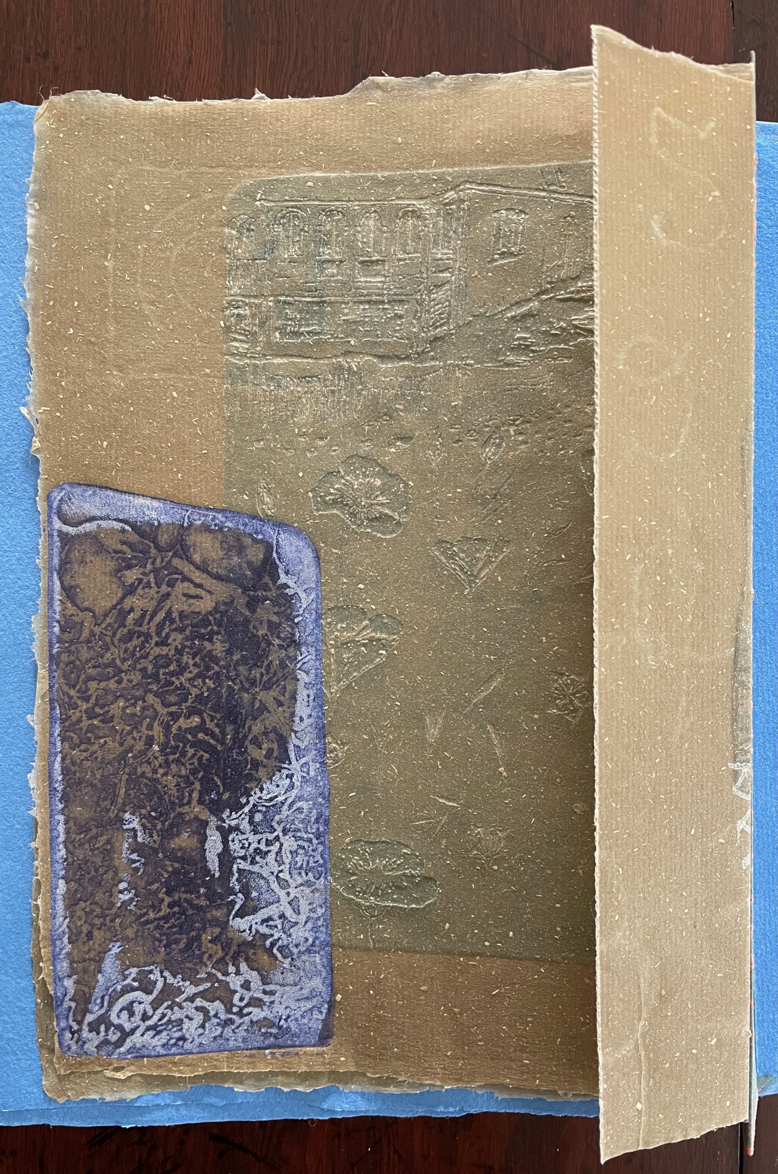
Below is the final folio of the work. Like the first, it is made completely of flax paper, but its center spread offers a fuller image: flax blossoms and stalks float in the foreground, and in the background is a sketch of Beisinghoff’s residence where she grows her flax. Like the Fibonacci spiral on the front and back covers, the first and last flax folios round out the work. But go back and listen for the hidden sound installations accompanying Dew Blue. Noticing Beisinghoff’s abstract musical notation, indulge yourself with recordings of a Swedish folk song (“Today is supposed to be the big flax harvest” here or here) to which the notation and phrases allude, and as the flax papers turn and wave on their accordion peaks, listen carefully for their musical rustle.
The final pure flax paper folio.
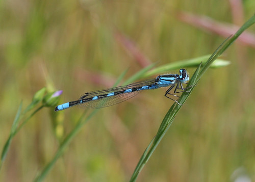
Tule Bluet damselfly perched on flax leaf. Photo: John Riutta, The Well-Read Naturalist (2009). Displayed with permission.
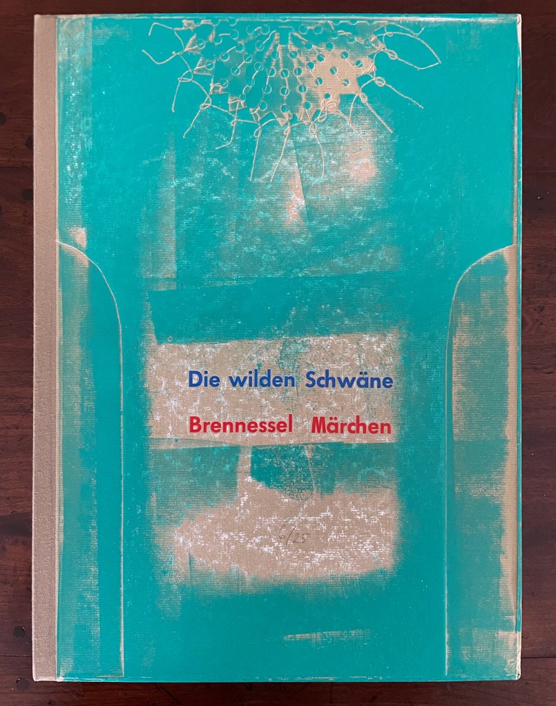
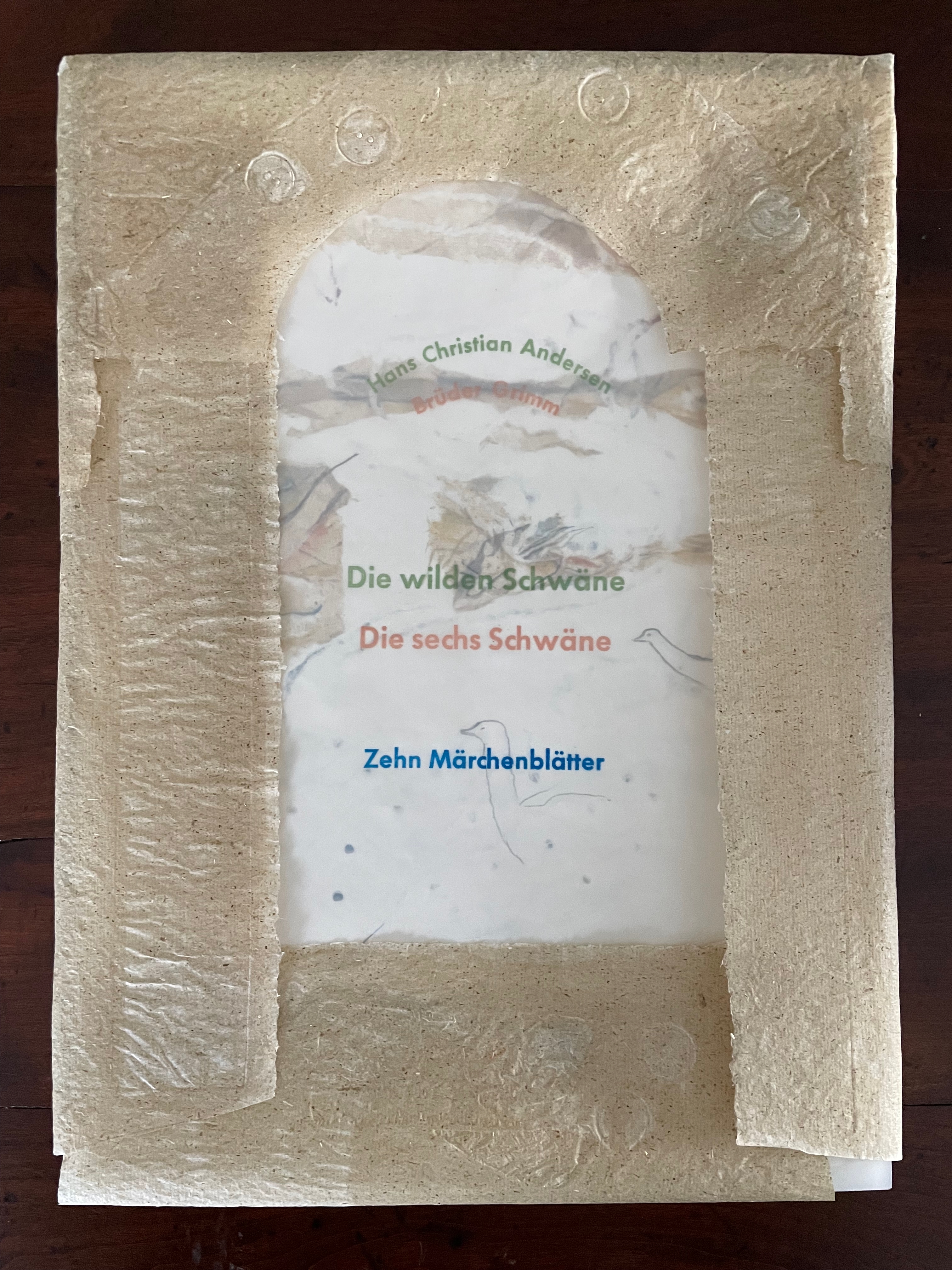
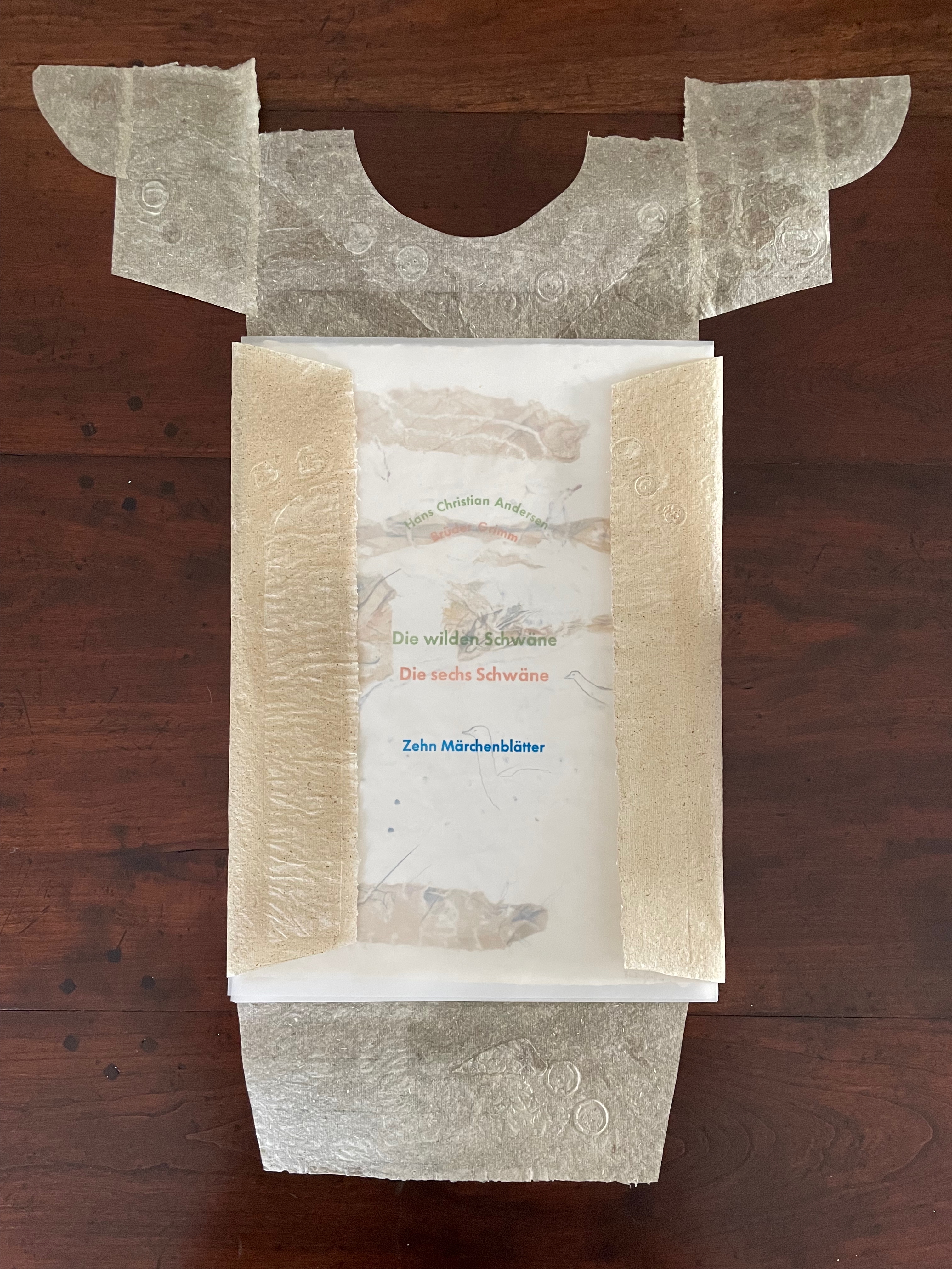
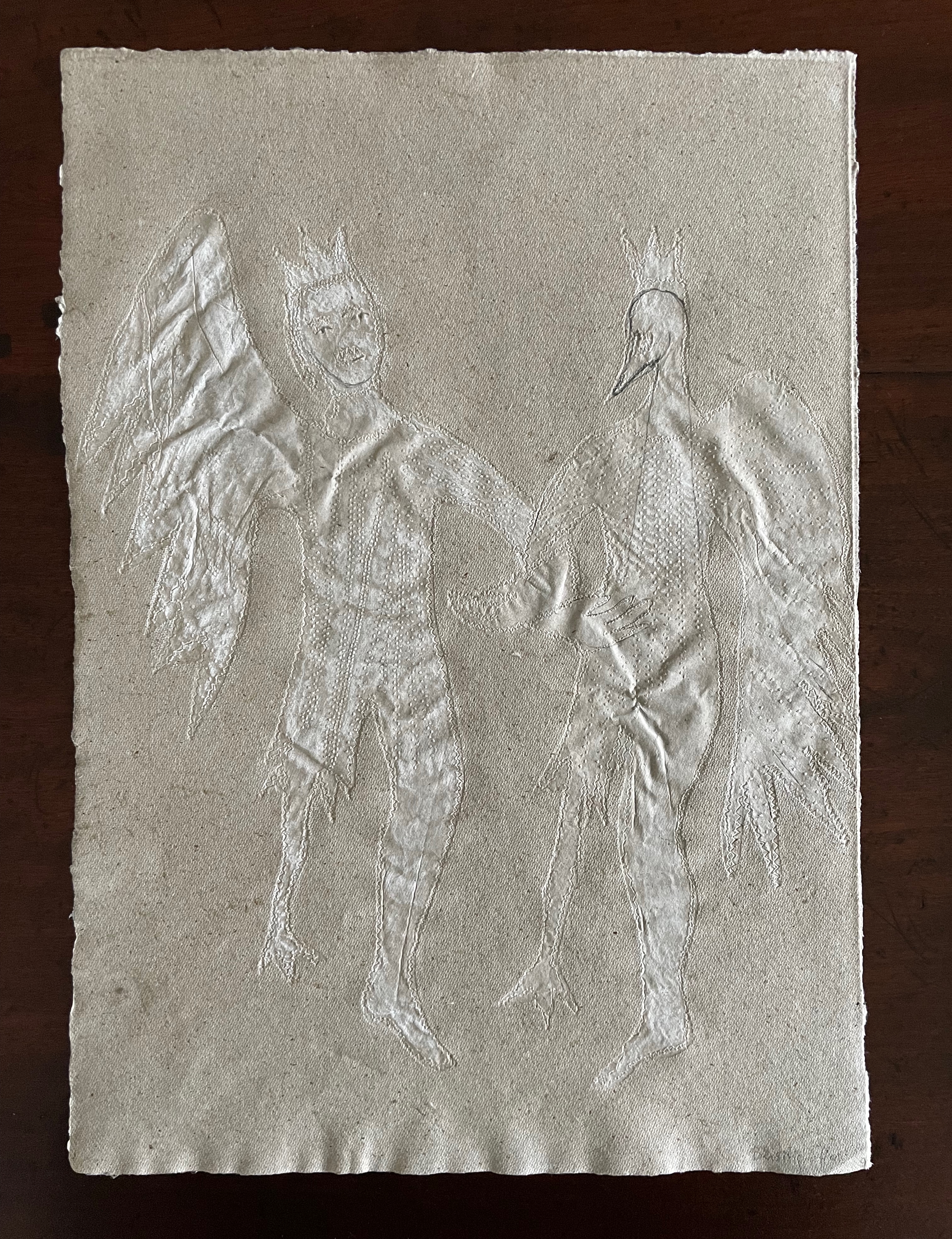
Die wilden Schwäne (2001)
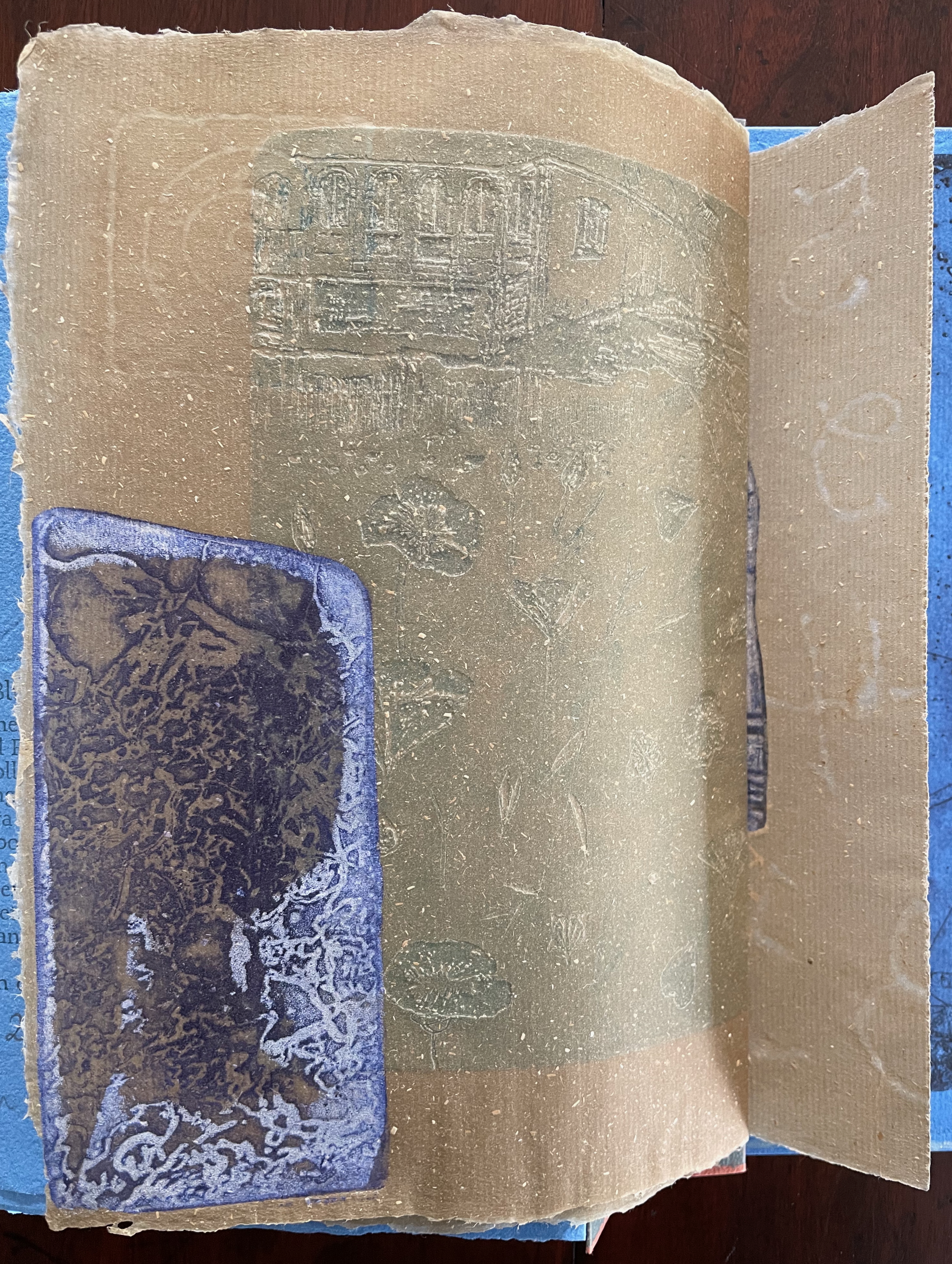
Die wilden Schwäne (2001) Barbara Beisinghoff Box with embossed cover holding folios wrapped in chemise. H35o x W250 mm. 18 folios. Edition of 25, of which this is #6. Acquired from the artist, 20 December 2024. Photos: Books On Books Collection.
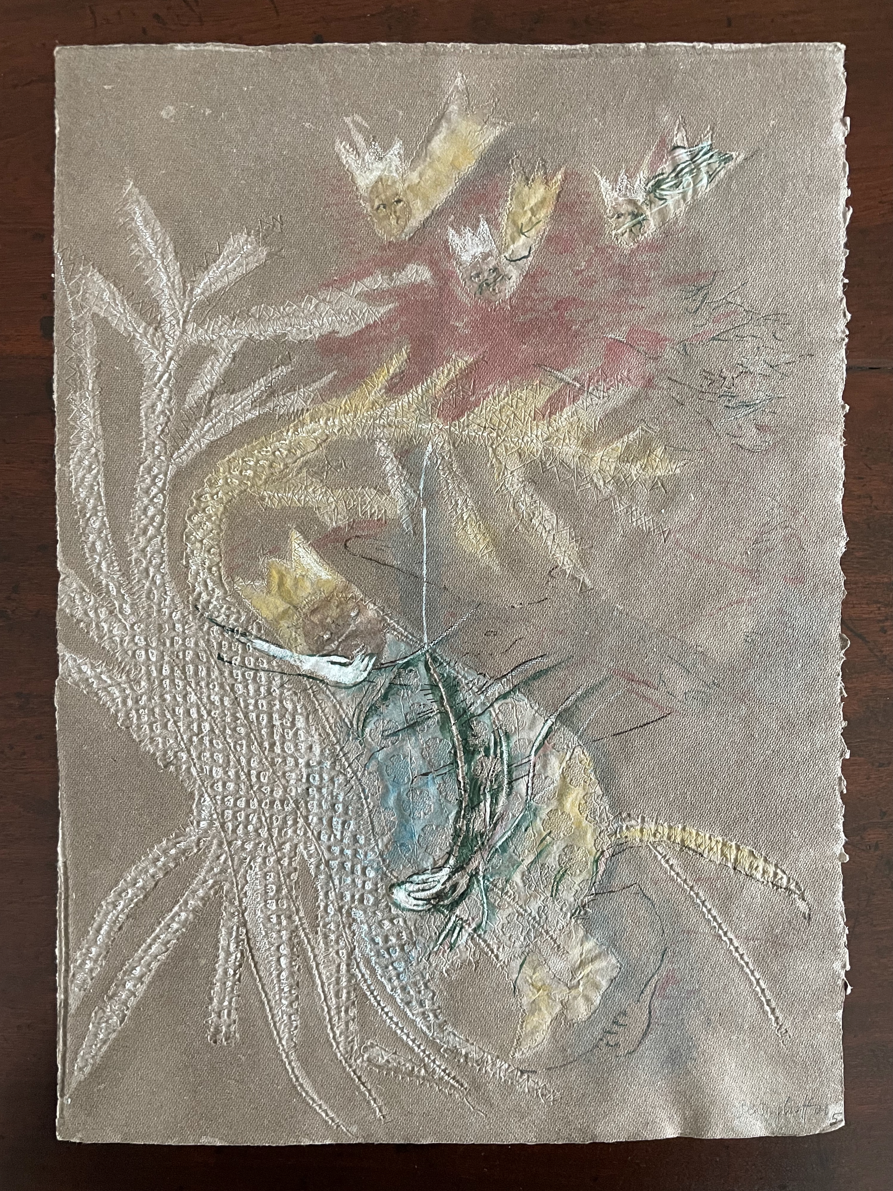
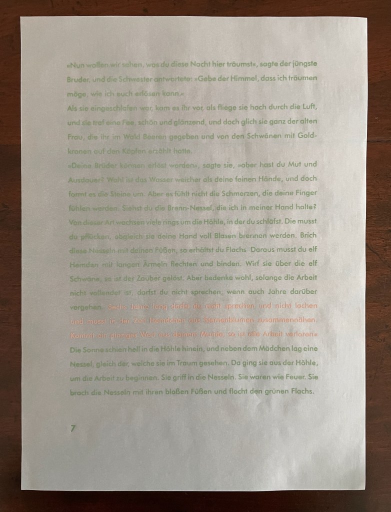
Barbara Beisinghoff’s Die wilden Schwäne is an exemplar of collaboration and craft. In it, she even requires collaboration between Hans Christian Andersen and the Brothers Grimm. Andersen’s Die wilden Schwäne and the Grimms’ Die sechs Schwäne are based on the same tale of brothers turned into swans who are saved by their sister Elisa’s diligent and mute harvesting, pulping, spinning and sewing of stinging nettles into shirts that break the spell when donned. H.C. Andersen, however, is verbose and elaborate in his telling (even including vampires!), and Beisinghoff has done a bit of nipping and tucking with the more succinct Brothers Grimm to create a version more suited to the artist’s book she creates.
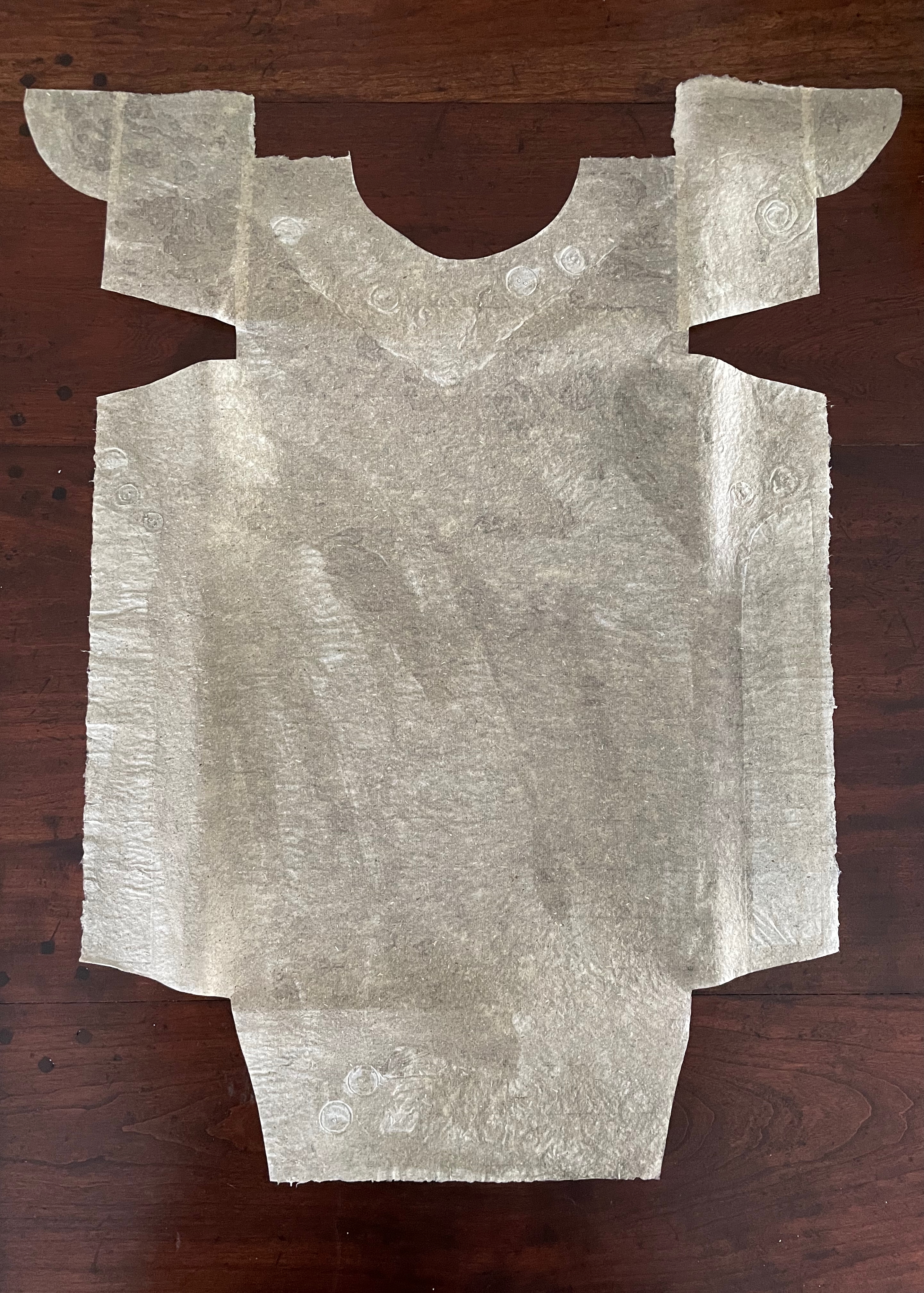
To match Elisa’s effort with stinging nettles, Beisinghoff enlisted the collaboration of Johannes Follmer, the owner of a paper mill. Together they obtained cultivated stinging nettles from the Institute for Applied Botany in Hamburg, cut the fibers, left them to rot, boiled them into a pulp, mixed that with water in a vat, scooped up layers in a sieve embroidered with illustrations, couched the sheets, then pressed and dried them into paper. Beisinghoff applied further drawings with a water jet, watercolor and pencil to the watermark-embossed sheets to illustrate aspects of the tale. To present the Andersen/Grimm “collage”, Beisinghoff had the type set and printed at the Gutenberg Museum. Andersen is printed in light green and Grimm in light red on seven numbered translucent sheets and interleaved with the nine folios of paper art (two more translucent sheets carry the cover page and colophon). To wrap the folios together, Beisinghoff made an embossed chemise or “feather dress” of pure nettle fiber, which could represent Andersen’s description of the brothers’ blowing off each other’s feathers every evening when the sun has set or one of the shirts that their sister makes to break their spell.
The “feather dress” of stinging nettle fiber.
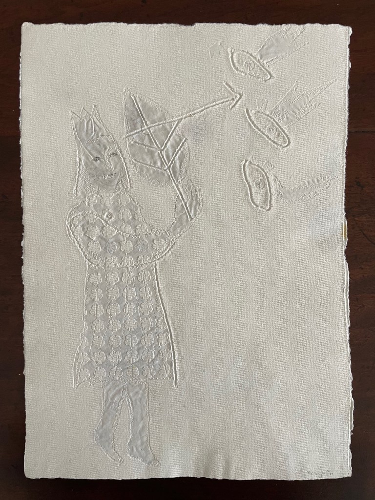
“The King’s little daughter was standing in the cottage room, playing with a green leaf, for she had no other toys. She pricked a hole right through the leaf, looked up at the sun, and there it was, she saw the clear eyes of her brothers, but every time the warm rays of the sun shone on her cheeks, she thought of all their kisses.” Translation with DeepL.
“When she had fallen asleep, it seemed to her as if she were flying high through the air, and she met a fairy, beautiful and radiant, yet she looked very much like the old woman who had given her berries in the forest and told her about the swans with gold crowns on their heads.” Translation with DeepL.
“The swans swooped down to her and lowered themselves so that she could throw the shirts over them: and as she touched them, the swan skins fell off, and her brothers stood before her in the flesh, fresh and beautiful.” Translation with DeepL.
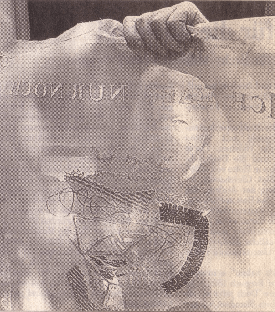
“Barbara Beisinghoff (head in the background) covers the frame with this transparent, embroidered and sewn gauze, which is used to scoop and emboss her nettle papers. This is how her large-format watermark illustrations end up on the sheets.” Translation with DeepL. Peter Holle. 30 August 2001. Frankfurter Rundschau. Photo: Oliver Weiner.
This art by watermarking recalls that of other artists in the collection: Fred Siegenthaler and Gangolf Ulbricht, in particular. The technique of pulp painting also finds other practitioners in the collection: Pat Gentenaar-Torley, John Gerard, Helen Hiebert, Tim Mosely, Maria G. Pisano, Taller Leñateros, Claire Van Vliet and Maria Welch. Beisinghoff’s blend of embroidered watermarks, waterjet marking and pulp painting, however, creates a bas relief effect that is echoed only in the collection’s works by Mosely, Taller Leñateros and Van Vliet, albeit achieved differently. These workings of the substrate — as material, color, surface, and even narrative — with the workings of book structure is one of the more magical locations of book art. It is perfect for Beisinghoff’s metamorphical interpretation of the Andersen/Grimm fairy tale.
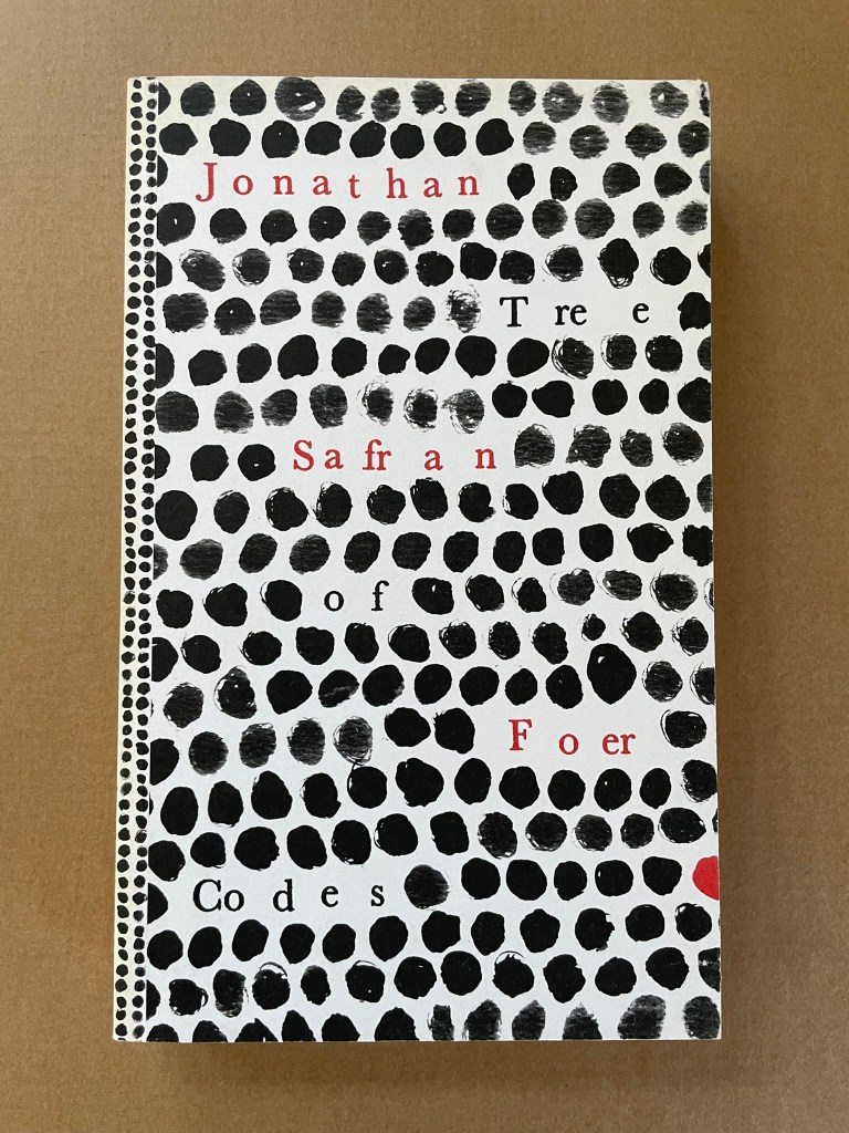
Tree of Codes (2010) Jonathan Safran Foer Perfect bound paperback of die-cut pages. H220 x W135 mm. 284 pages. Acquired from Visual Editions, 30 January 2014. Photos: Books On Books Collection.
The artist’s book “tradition” of excising words from the page goes back at least to Marcel Broodthaers’ and Mario Diacono’s renderings of Un Coup de Dés Jamais N’Abolira le Hasard by Stéphane Mallarmé. Jonathan Safran Foer’s Tree of Codes (2010) takes that tradition to the more complex plane that Tom Phillips reached with A Humument (1980-2016). In the hands of Foer and his publisher Visual Editions, the treatment becomes simultaneously more personal and mechanical. The more personal aspect is best expressed in Foer’s afterword (see below). The mechanical aspect is the use of die cutting for production and the reader’s use of a blank sheet to enable reading the text left over from Bruno Schulz’s The Street of Crocodiles (1934, trans. 1963) that forms the new narrative of Tree of Codes.
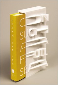
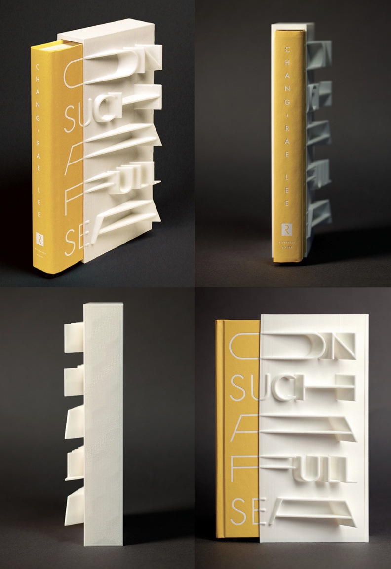
On Such a Full Sea (2013) Chang-rae Lee Jacket and slipcase design Helen Yentus Book in slipcase. H23o x W150 mm; slipcase only, W110 mm. 368 pages. Edition of 500, of which this is #178. Acquired 1 October 2018. Photo: Riverhead Books and AIGA.
Riverhead art director Helen Yentus and members of the MakerBot team designed this slipcase for Lee’s novel. An edition of 500, made with the MakerBot® Replicator® 2 Desktop 3D Printer with MakerBot PLA filament, a bioplastic made of corn and fabricated by MakerBot in Brooklyn, New York, appeared in 2013 just before the trade edition in 2014.
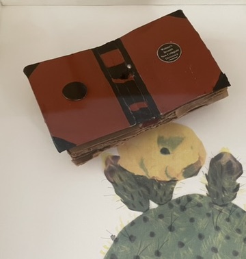
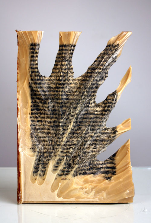
Carving 9 (2012) Jessica Drenk Altered book and wax. H203 x W152 x D38 mm. Unique. Acquired from the Seager Gray Gallery, 10 February 2019. Photo: Courtesy of the gallery.
Once a book becomes another material from which art can be made, the rectangular block offers itself up to an unbounded variety of treatments. It can be folded into something else. Or macerated and squeezed out, or into, something else. Or shot, burnt, frozen, soaked, coated or buried and dug up. Or torn, shredded and reconstituted or scattered. Or carved with any number of implements into any number of shapes.
But that oblong of material just lying there and the techniques of altering it are not usually sufficient starting points for the artist. In Jessica Drenk’s case, a visit to a botanic garden’s “large greenhouse full of hundreds of different succulent species” provided the necessary catalyst. As she explained in an interview with Patron: “It blew me away to see so much slight variety within the same category of plant and this experience sent me down a path of experimenting with books in the studio; I wanted to see how many different shapes and objects I could make out of the one material.”
Why should an obscure poem like Stéphane Mallarmé’s groundbreaking Un Coup de Dés Jamais N’Abolira le Hasard: Poème (1897) have become the cornerstone of an art-industrial complex of literary, critical and artistic responses ranging from essays, books, edited collections, countless editions, and appropriations in the form of fine press livres d’artiste, book art and sculptures, films and theater, ballets and fado, musical compositions, digital programs and installations, and even pavement art?