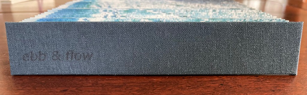
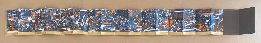
Ebb and Flow (2023) Jane Cradock-Watson Concertina book with cloth hard bound covers. H155 x W27 mm (closed), W680 mm (open). 64 panels. Edition of 20. Acquired from the artist, 21 January 2024. Photos: Books On Books Collection. Displayed with artist’s permission.
An exploration, both visually and physically, the ‘edge’ of the sea where it meets the land, with its continuous ebb and flow of the breaking waves, rhythmically rolling back and forth onto the sand. (Artist’s description)
With the binding and her photography in Ebb and Flow, Jane Cradock-Watson has sculpted and painted the sea’s edge. Four digital photographs printed on Zerkal paper have been spliced together between two cloth-covered boards. The flexibility and extent of the concertinaed paper create an undulating structure that turns seascape stills into mesmerising cinema.
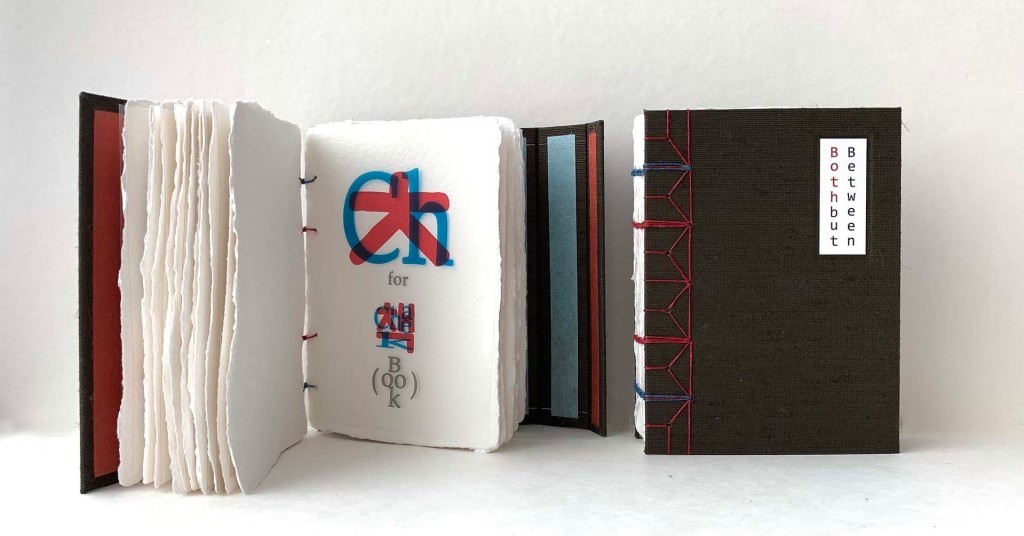
Both but Between (2021) Jana Sim Cloth-covered boards, exposed binding. H149 x W114 5.8 mm. 17 handmade paper leaves; 16 OHP film leaves. Edition of 27, of which this is #14. Acquired from Vamp&Tramp, 15 July 2022. Photos: Jana Sim (above) and Books On Books Collection (below). Displayed with artist’s permission.
Both but between is a bilingual abecedary. If punning in a foreign language indicates successful mastery of a non-native tongue, punning in that language and doing so materially with an artist’s book must indicate an altogether higher level and higher kind of mastery. Jana Sim demonstrates such mastery with an extraordinary use of letterpress printing and laser printing to underscore the “both but between” metaphor of her bicultural experience in this bilingual abecedary.
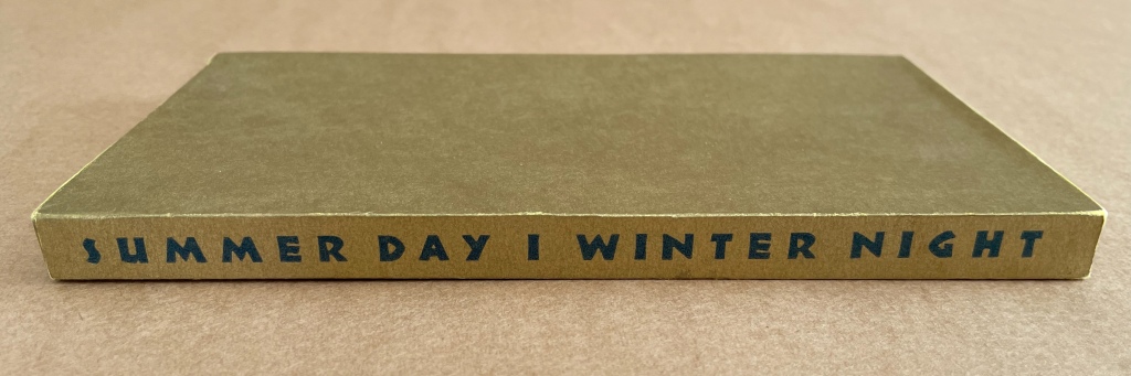
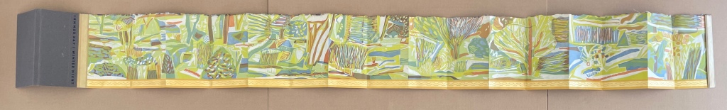
Summer Day | Winter Night (1994) Ruth Fine Papered slipcase with title printed on spine, enclosing a double-sided leporello. Slipcase, H190 x W110 x D20 mm; Leporello (extended), H185 x W1888 mm. [16] panels per side. Edition of 150, of which this is #56. Acquired from Weinrich Books, 12 June 2024. Photos: Books On Books Collection. Displayed with permission of the artist.
ABC of Bugs and Plants in a Northern Garden (2012)
ABC of Bugs and Plants in a Northern Garden(2012) Judy Fairclough Sgantas and Claire Van Vliet Clamshell box, softcover, open spine, paper-tab-sewn binding. Box: H188 x W192 x D65 mm. Book: H167 x W171 x D35 mm. 27 f&gs, 1 folded pastedown at end. Edition of 120, of which this is #45. Acquired from Vamp & Tramp, 15 September 2023. Photos: Books On Books Collection. Displayed with artists’ permission.
Inscription: The Journal of Material Text, Issue 4 on Touch Simon Morris, Gill Partington and Adam Smyth (eds.) Cased perfect bound paperback, printed paper cover. 313 x 313 mm. 120 pages. ISSN: 2634-7210. Acquired from Information as Material, 29 November 2023. Photos: Books On Books Collection.
Different readers will come to different conclusions on whether Inscription #4 dedicated to the subject of touch evokes the level of tactility in Melville’s famous Chapter 94 “A Squeeze of the Hand”. But all can agree that they share a certain seminality. Like Herman Melville with his preliminaries to Moby Dick, the editors of Inscription lead their fourth issue with definitions and choice quotations on the subject of “touch”, as much a Leviathan subject as that of Melville’s novel. Where Melville merged scholarly apparatus with narrative fiction to create a novel literary work, Simon Morris, Gill Partington and Adam Smyth have merged photography, poetry, augmented reality and audio with academic and critical essays to create a novel form of scholarship.
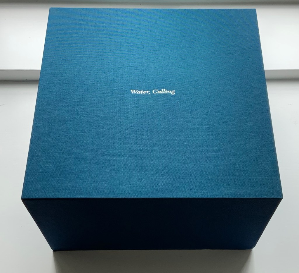
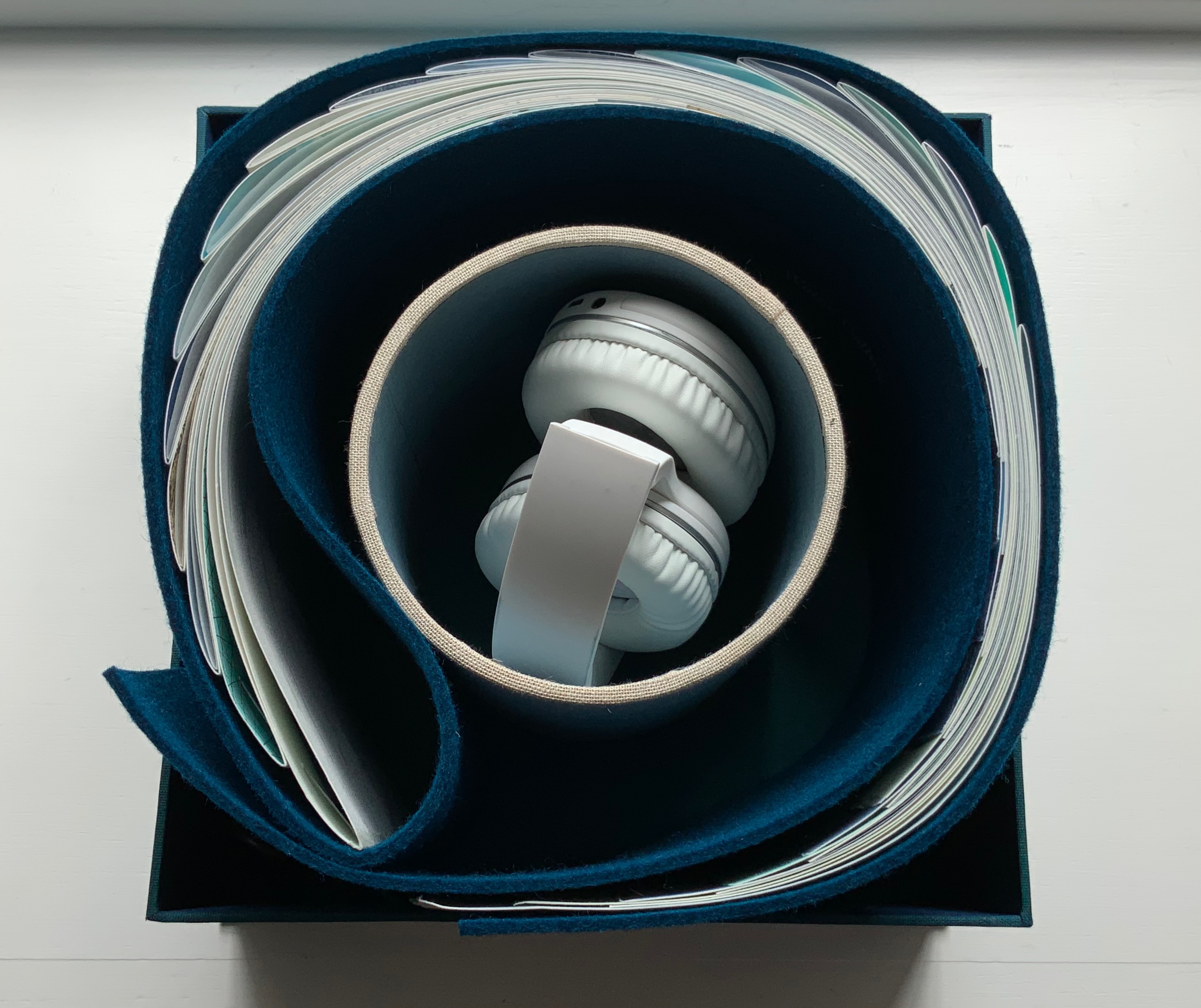
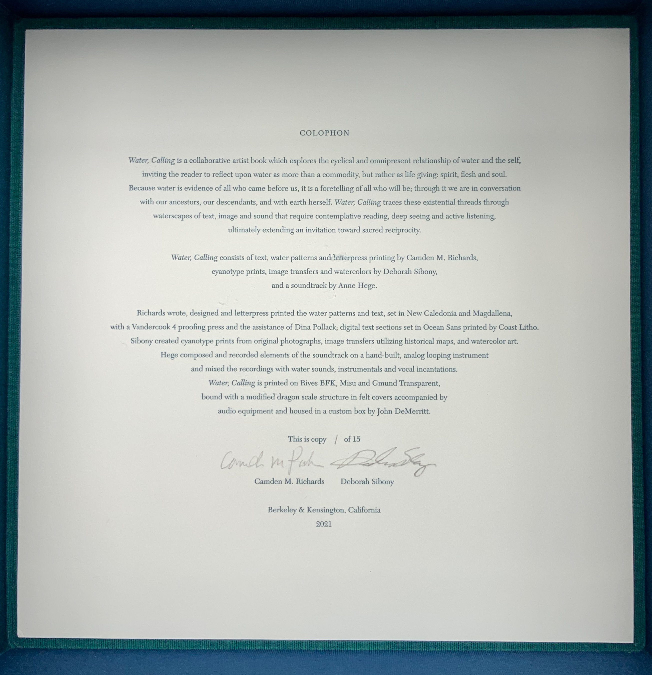
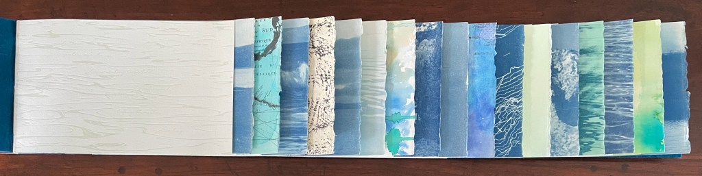
Water, Calling (2021) Camden Richards & Deborah Sibony Felt-covered, modified dragon-scale bound artists’ book, accompanied by audio equipment in custom box. Box: 262 x 262 x D170 mm. Book: H155 x W775 mm (closed). 110 pages. Edition of 15, of which this is #1. Acquired from the artists, 5 October 2022. Photos: Books On Books Collection. Displayed with artists’ permission.
Colophon “Water, Calling is a collaborative artist book which explores the cyclical and omnipresent relationship of water and the self, inviting the reader to reflect upon water as more than a commodity, but rather as life giving: spirit, flesh and soul. Because water is evidence of all who came before us, it is a foretelling of all who will be; through it we are in conversation with our ancestors, our descendants, and with earth herself. Water, Calling traces these existential threads through waterscapes of text, image and sound, extending an invitation to enter more fully into a dialogue composed of acts requiring active listening, contemplative reading and deep seeing with the hope of inspiring sacred reciprocity.”
Handscapes (2016) Margaret (Molly) Coy & Claire Bolton Casebound, hand sewn and bound with doublures and two ribbon bookmarks. H260 x W310 x D30. 80 folios. Edition of 12, of which this is #9. Acquired from the artists, 19 October 2023. Photos: Books On Books Collection. Displayed with artists’ permission.
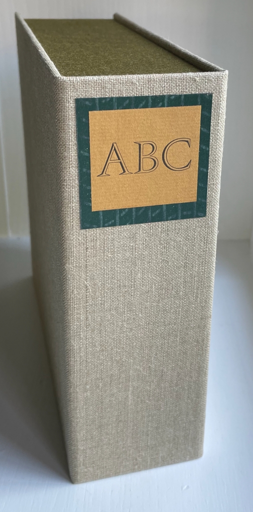
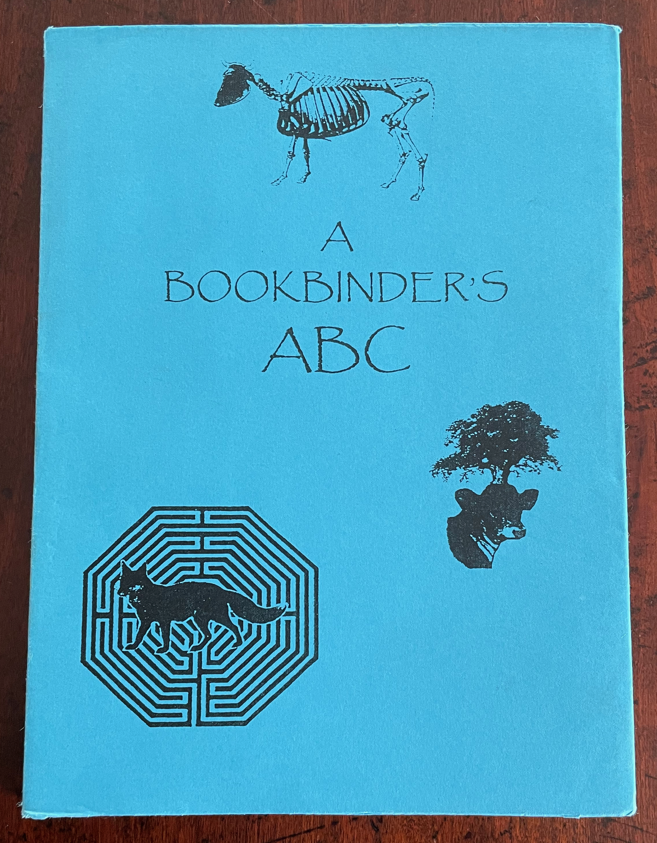
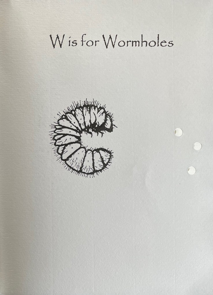
A Bookbinder’s ABC (2003) Christopher Hicks, Leaning Chimney Press Editions Soft cover (buff card, illustrated paper jacket glued to spine, sewn block). H200 x W150 mm. 34 pages. Edition of 75. Acquired from Barter Books, 18 October 2023. Photos: Books On Books Collection.
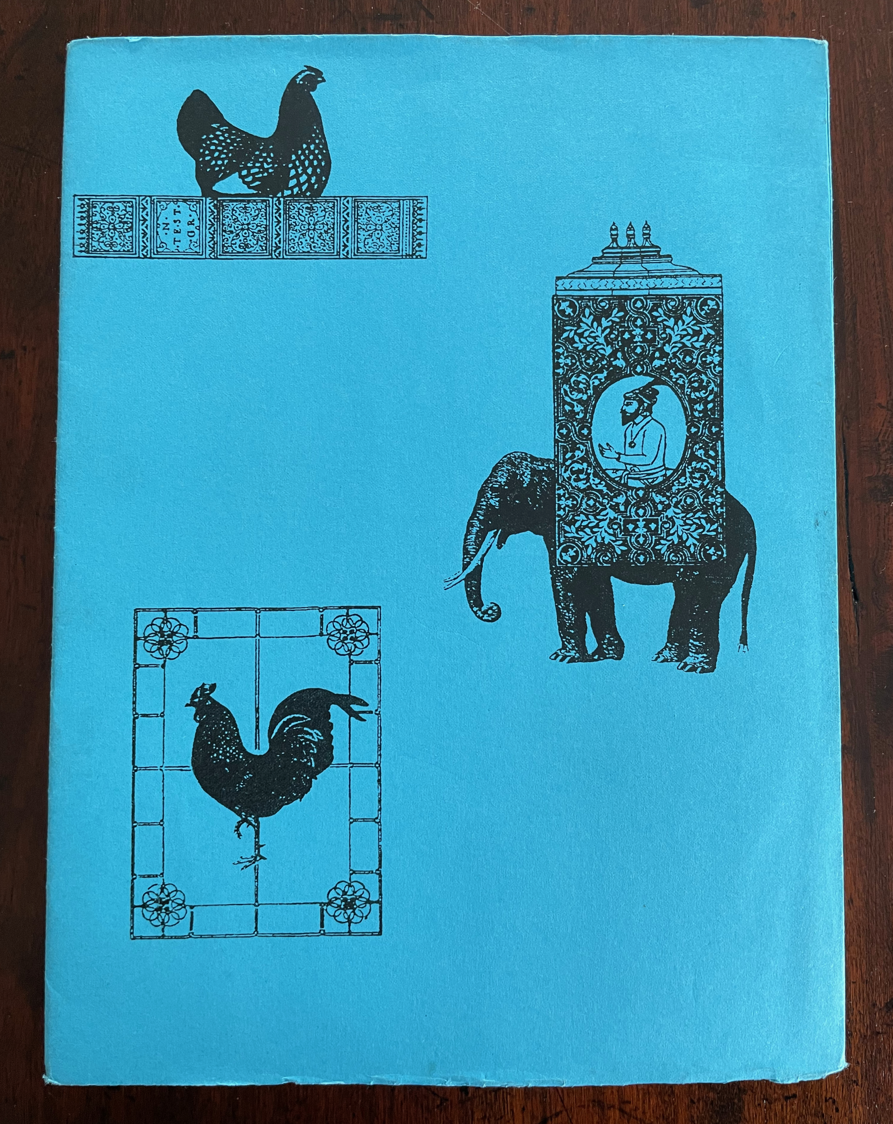
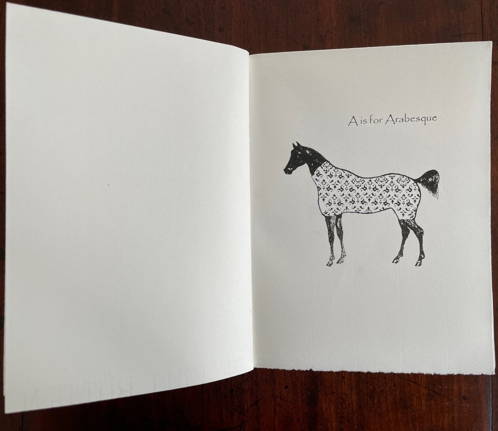
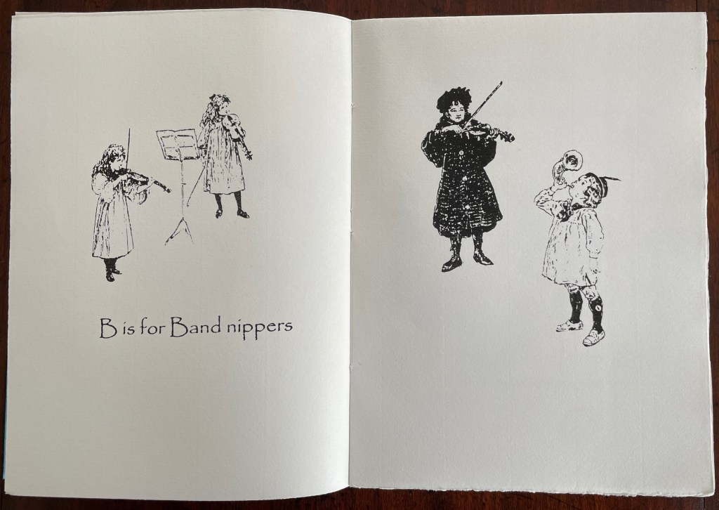
Although Glaister’s Encyclopedia of the Book is the canonical dictionary for book terminology, A Bookbinder’s ABC provides 26 humorous visual reminders.
An Arabian stallion in a decorative onsie for recalling the description of fleurons and other devices derived from Islamic patterns.
What else would a binder call a children’s orchestra?
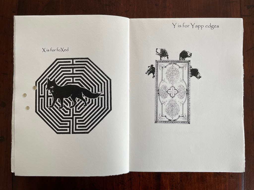
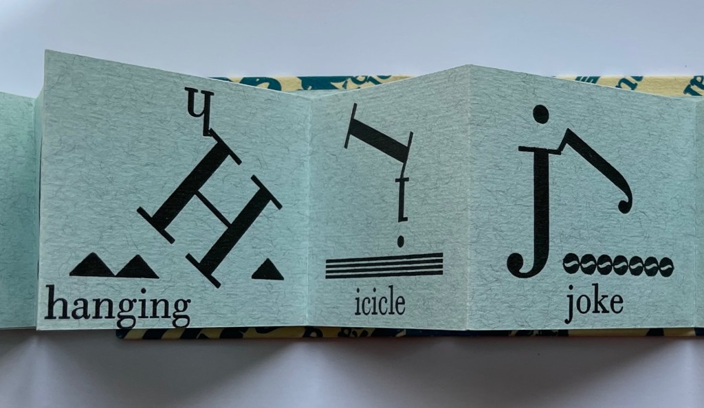
A fox flummoxed by a maze is certainly “foxed”. This one is also likely puzzled by the holes carried over from “Wormholes” on the previous page. Barking dogs springing from a book cover might be a helpful mnemonic for the name of the wide soft edges or flaps for Bible covers devised by the 19th century London bookseller Yapp.
The work’s own binding has simple but interesting features. The front and back covers in buff card are glued to the first and last sewn gatherings, respectively, and the sewn gatherings are glued in between and sewn together. The blue paper jacket’s spine is glued to the spines of the gatherings and its fore edges fold over the fore edges of the buff card. Curious but not as self referential as the features of two nearby birds of a feather from Andrew Morrison’s Two Wood Press.
Detail of uncut top edges and gluing of gatherings and spine.
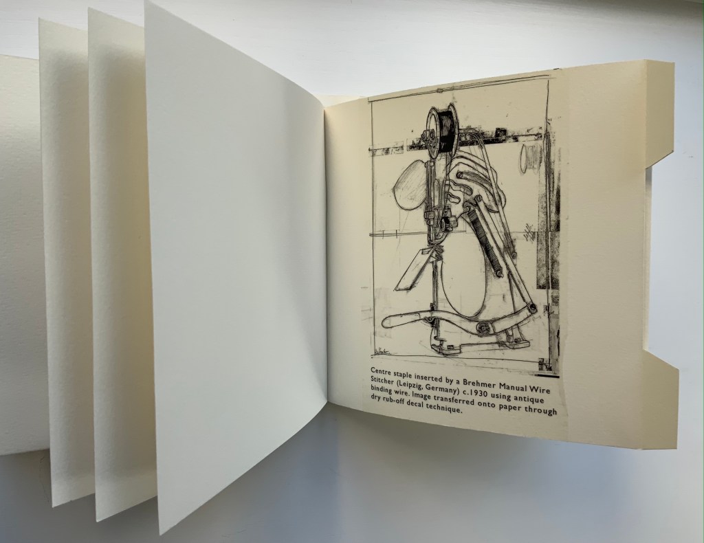
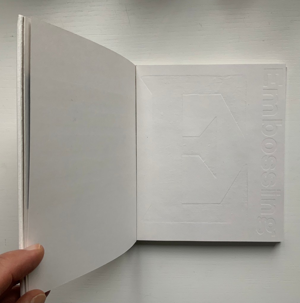
From Morrison’s Provenance (2018), showing an actual wire-stitched gathering and then an illustration of the mechanism; from Morrison’s Two Wood Press A-Z (2003), showing showing an embossed page illustrating E for Embossing. Photos: Books On Books Collection.
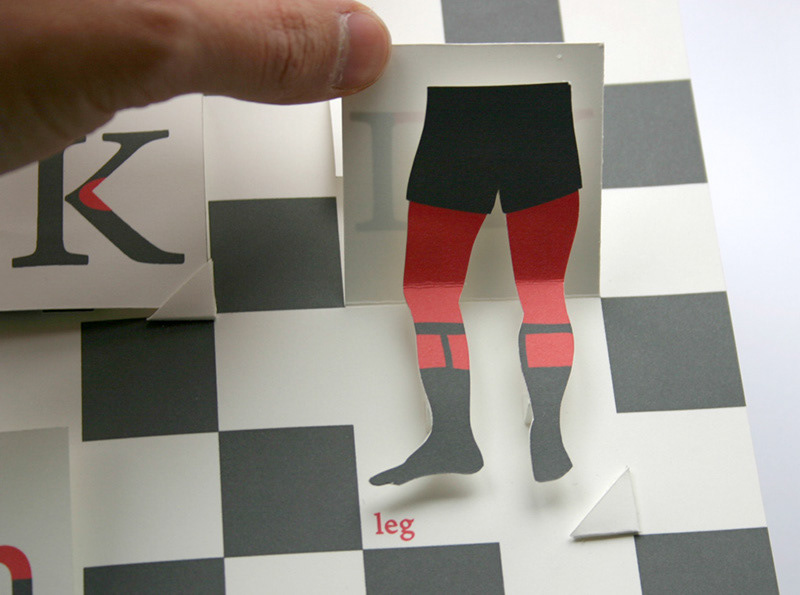
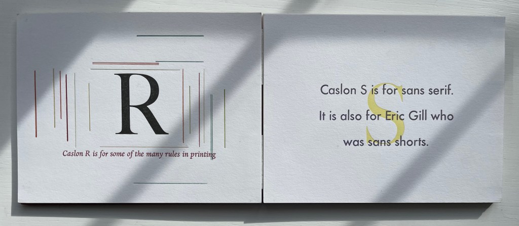
But what would a self-referential binding for A Bookbinder’s ABC look like — especially one that might carry on the punnery of the contents? Presumably because they are closer to the words, entries in letterpress abecedaries such as Morrison’s Two Wood Press A-Z (2003) and Kevin M. Steele’s The Movable Book of Letterforms (2009) have an easier time of the visually self-referential.
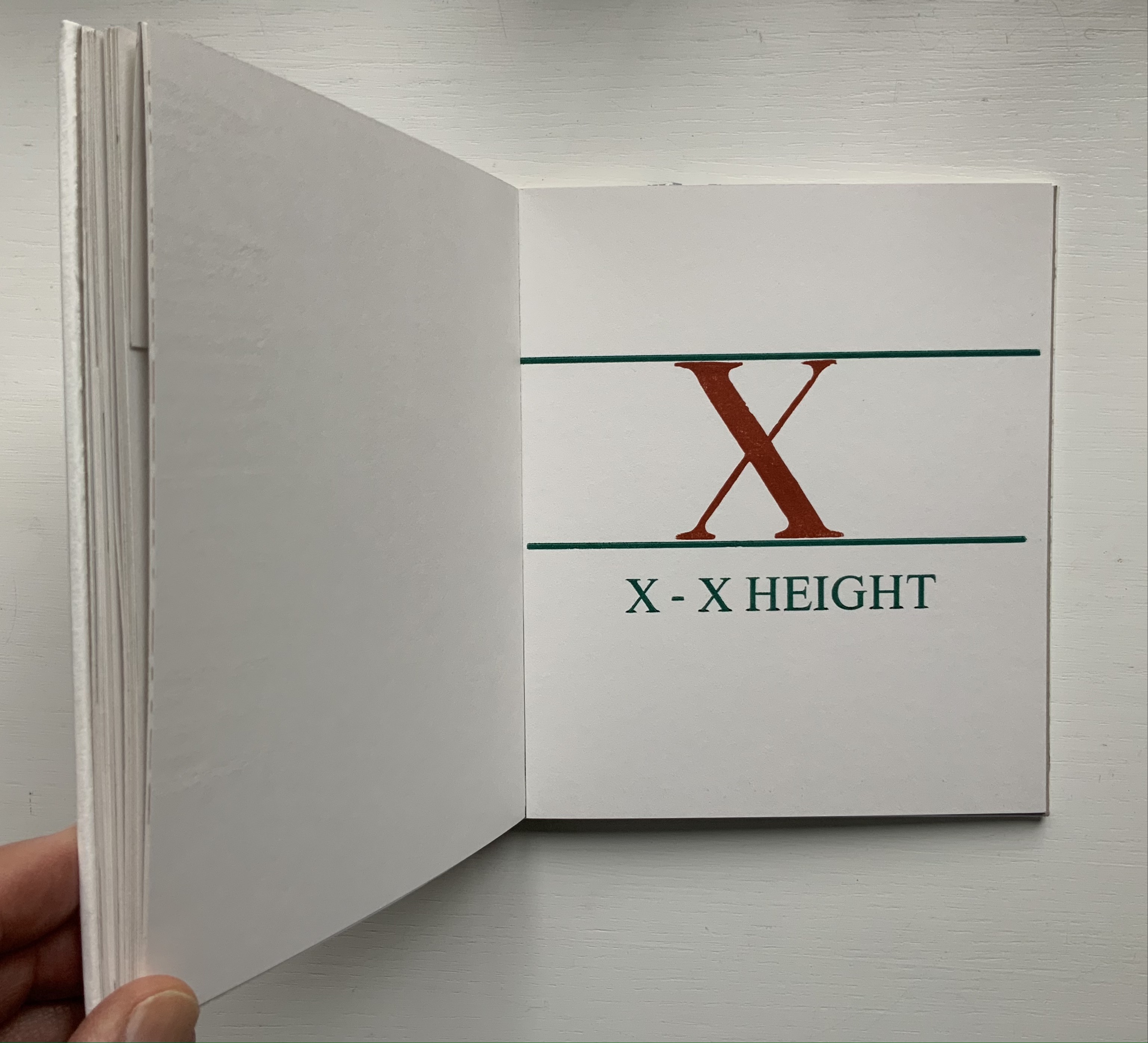
From Steele’s A Movable Book of Letterforms, showing the anatomical term for the red areas of the L & R (a leg lift?); from Morrison’s Two Wood Press A-Z, showing x’s definition of its height.
Closer still to the words are the typographical punsters such as Marie Dern and William Caslon’s Typographic ABC (1991), Nicolas McDowall and A Bodoni Charade (1995) or Sharon Werner & Sharon Forss and Alphabeasties and Other Amazing Types (2009).
From Dern’s William Caslon’s Typographic ABC, McDowall’s A Bodoni Charade and Werner & Forss’ Alphabeasties and Other Amazing Types.
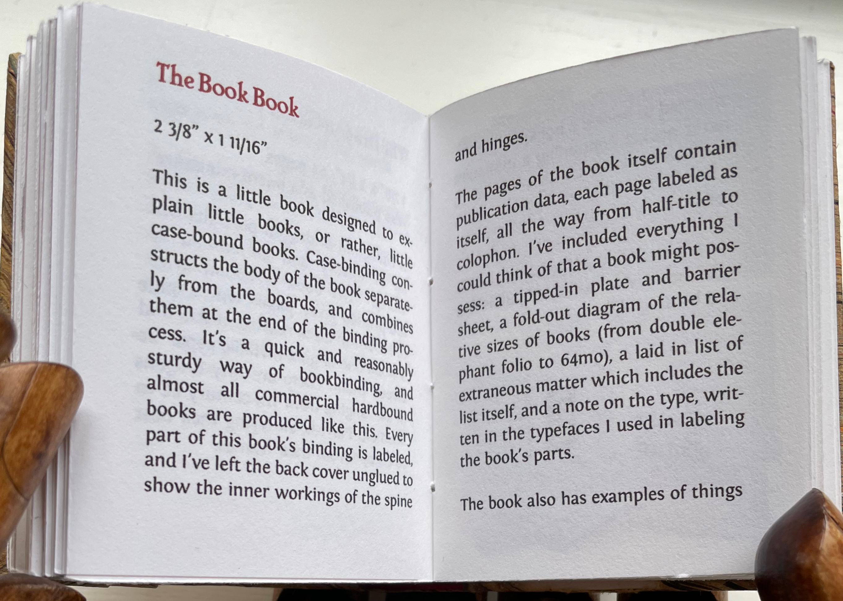
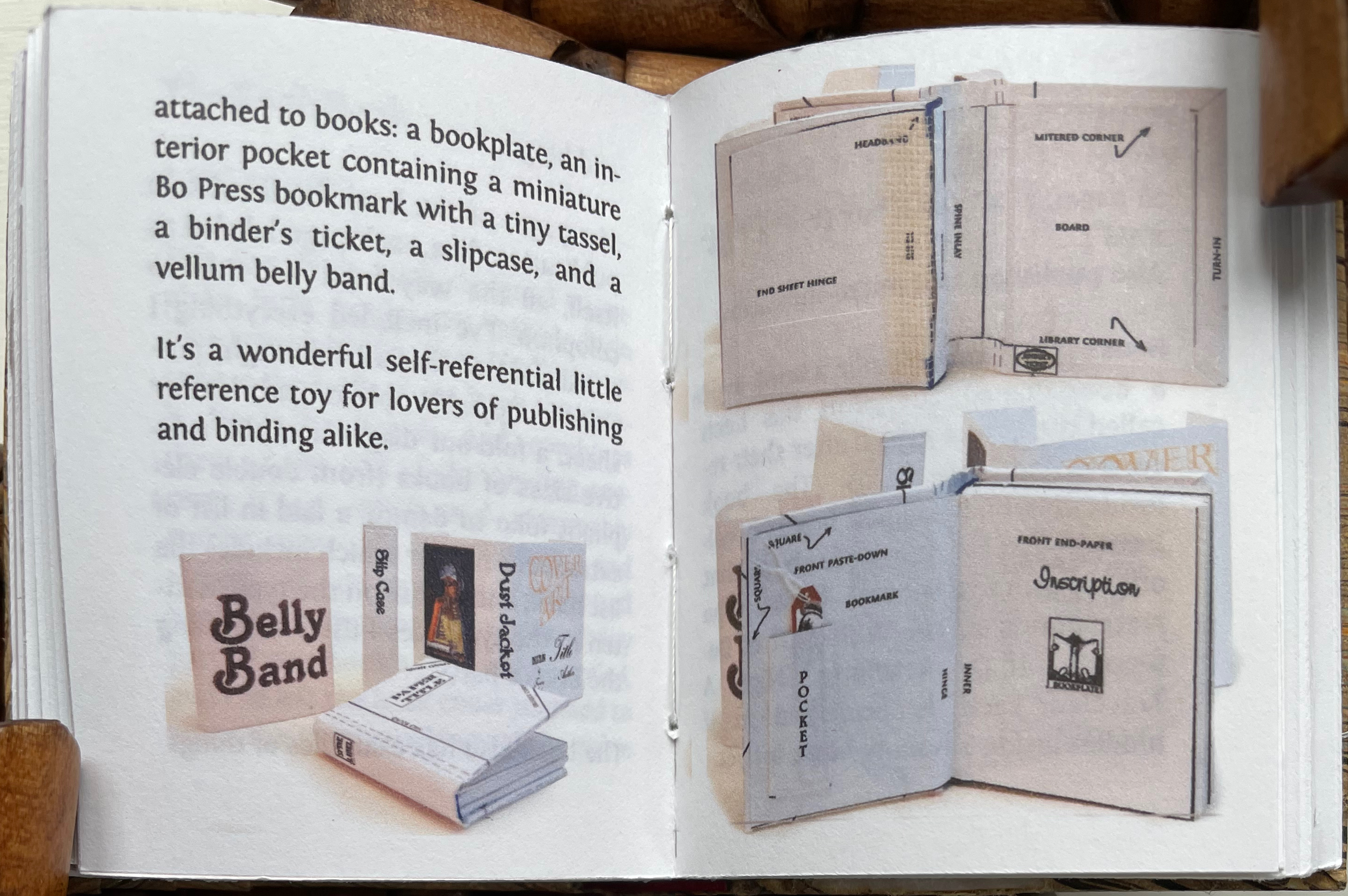
Perhaps Pat Sweet’s miniature The Book Book (2010) comes closest on self-referentiality in a work about binding. For the puns, we will have to wait for another bookbinder to take a stab at it.
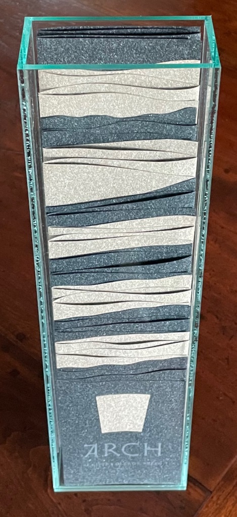
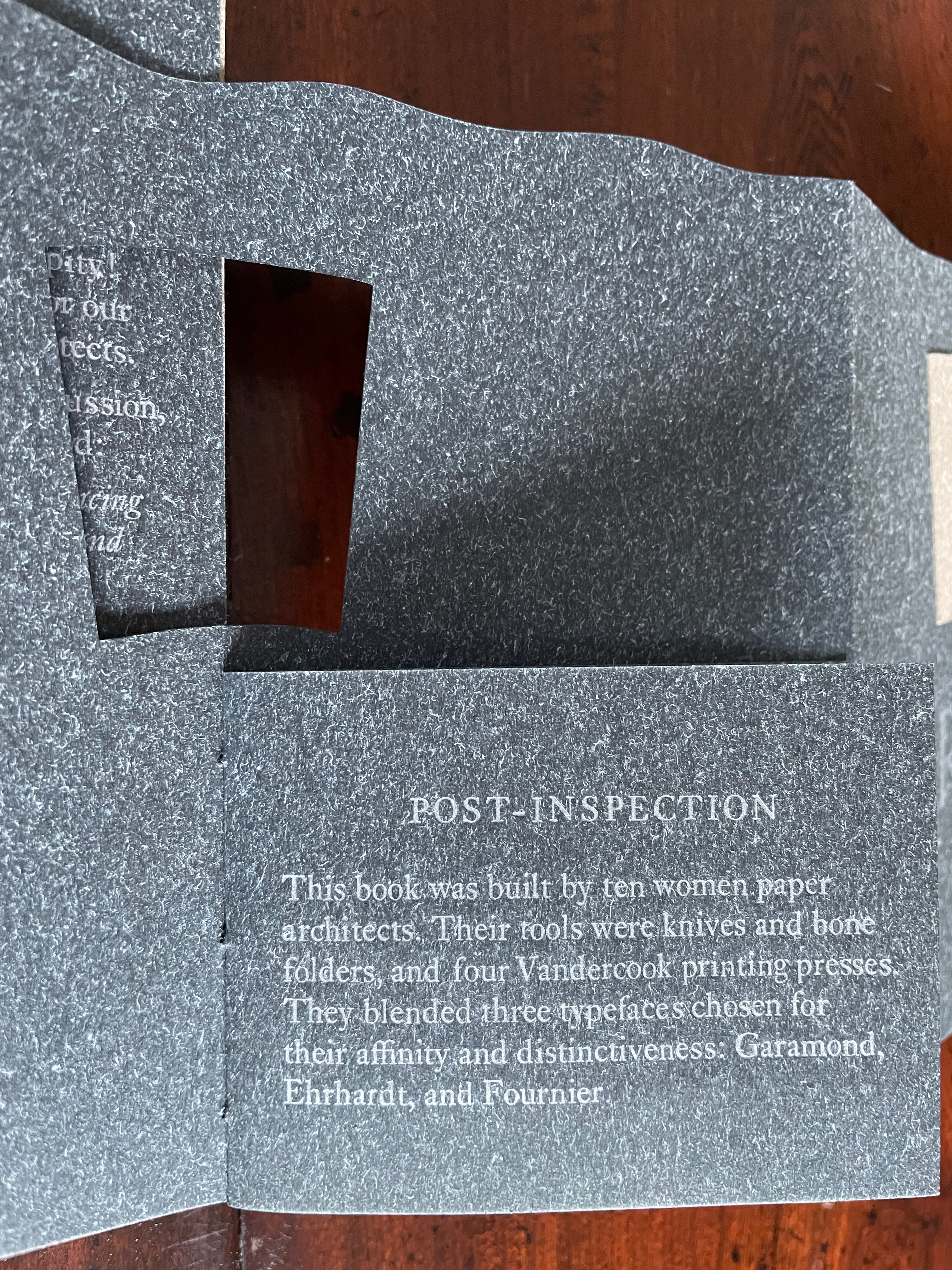
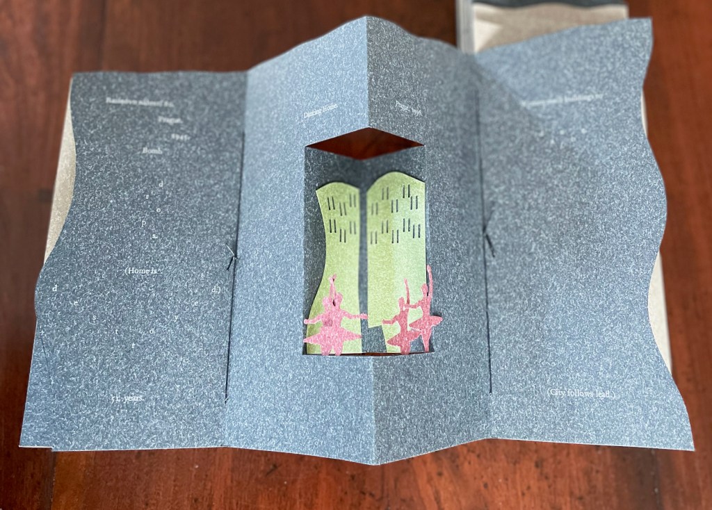
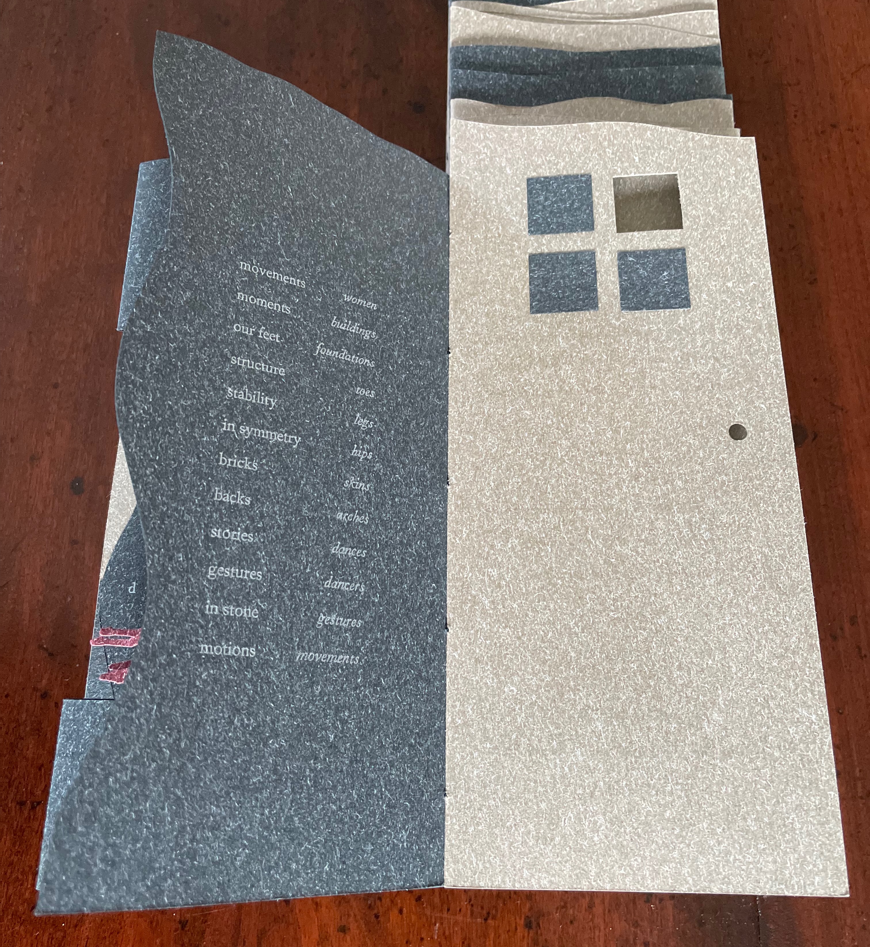
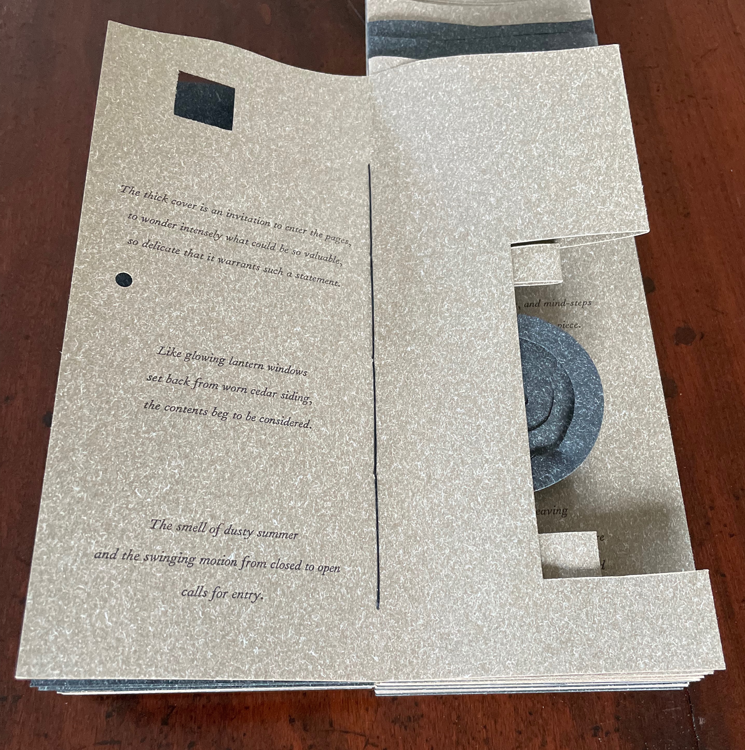
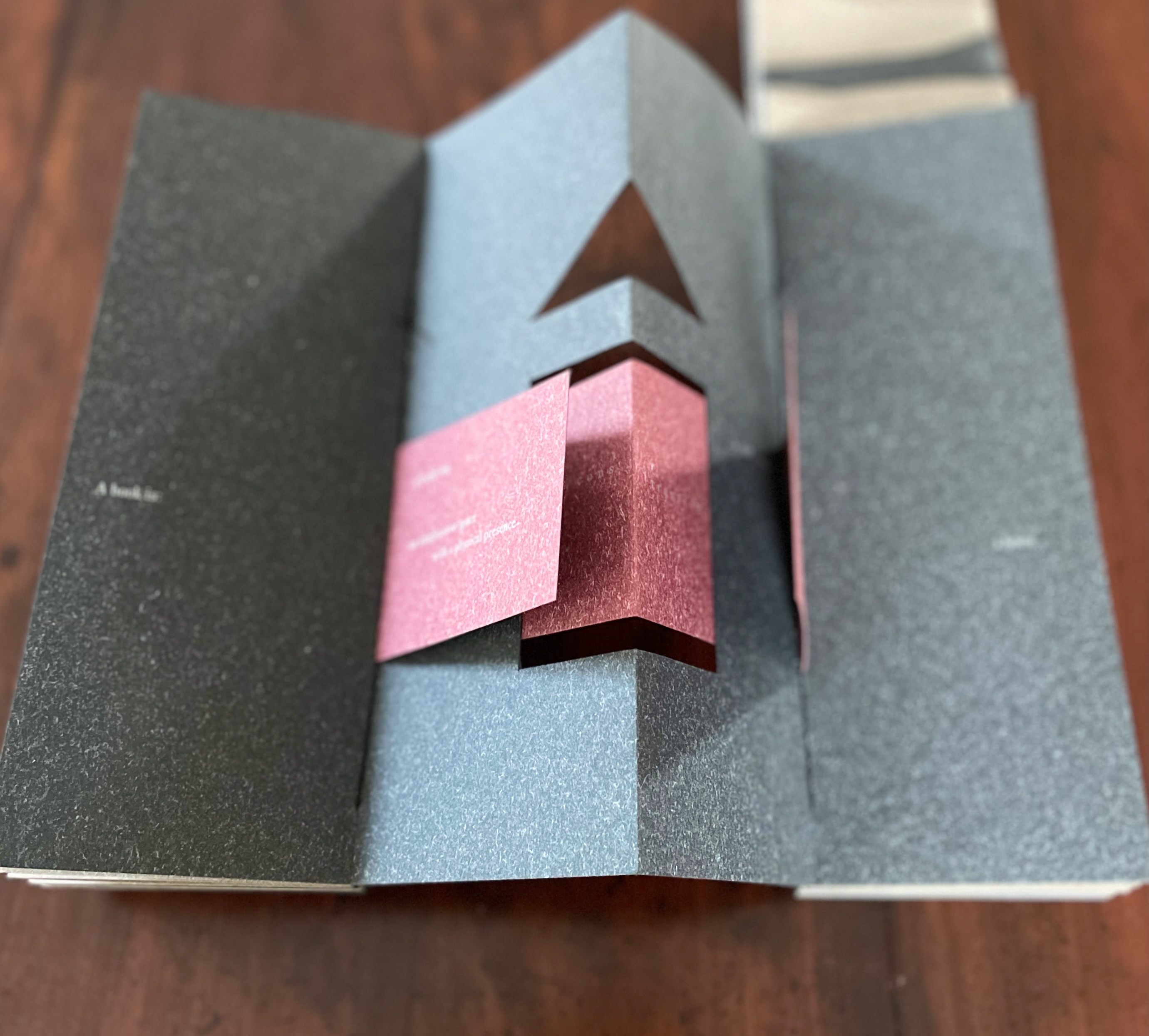
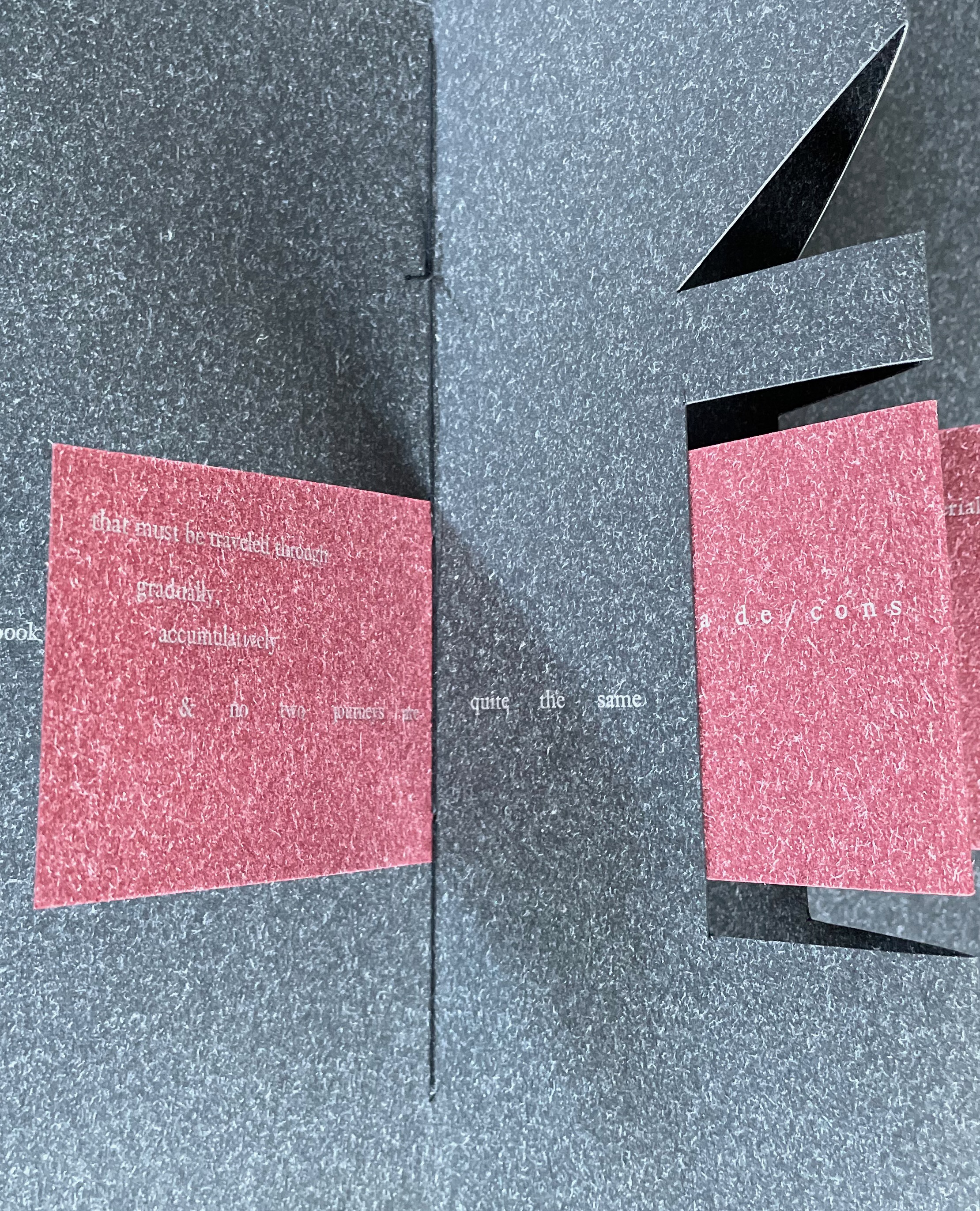
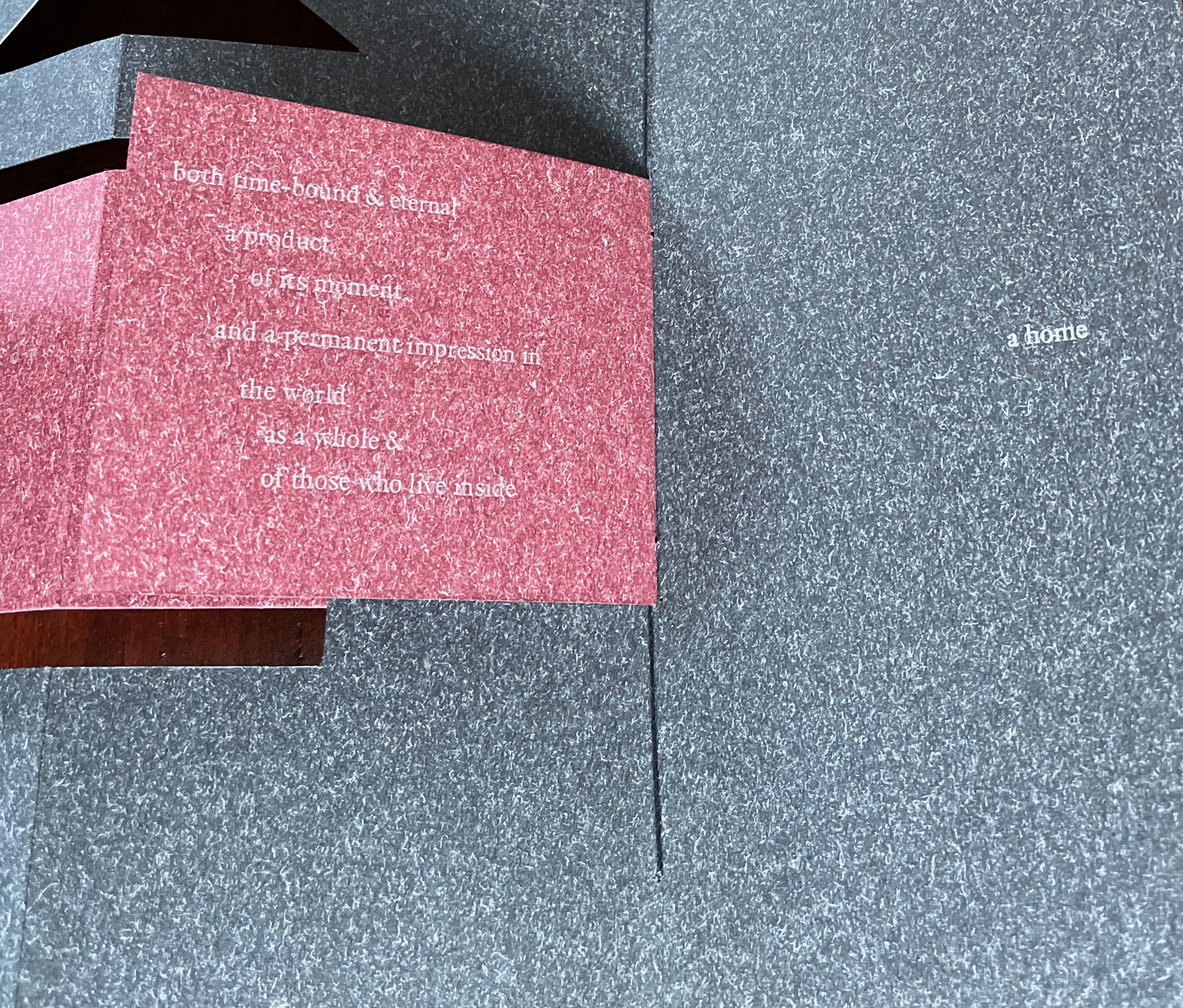
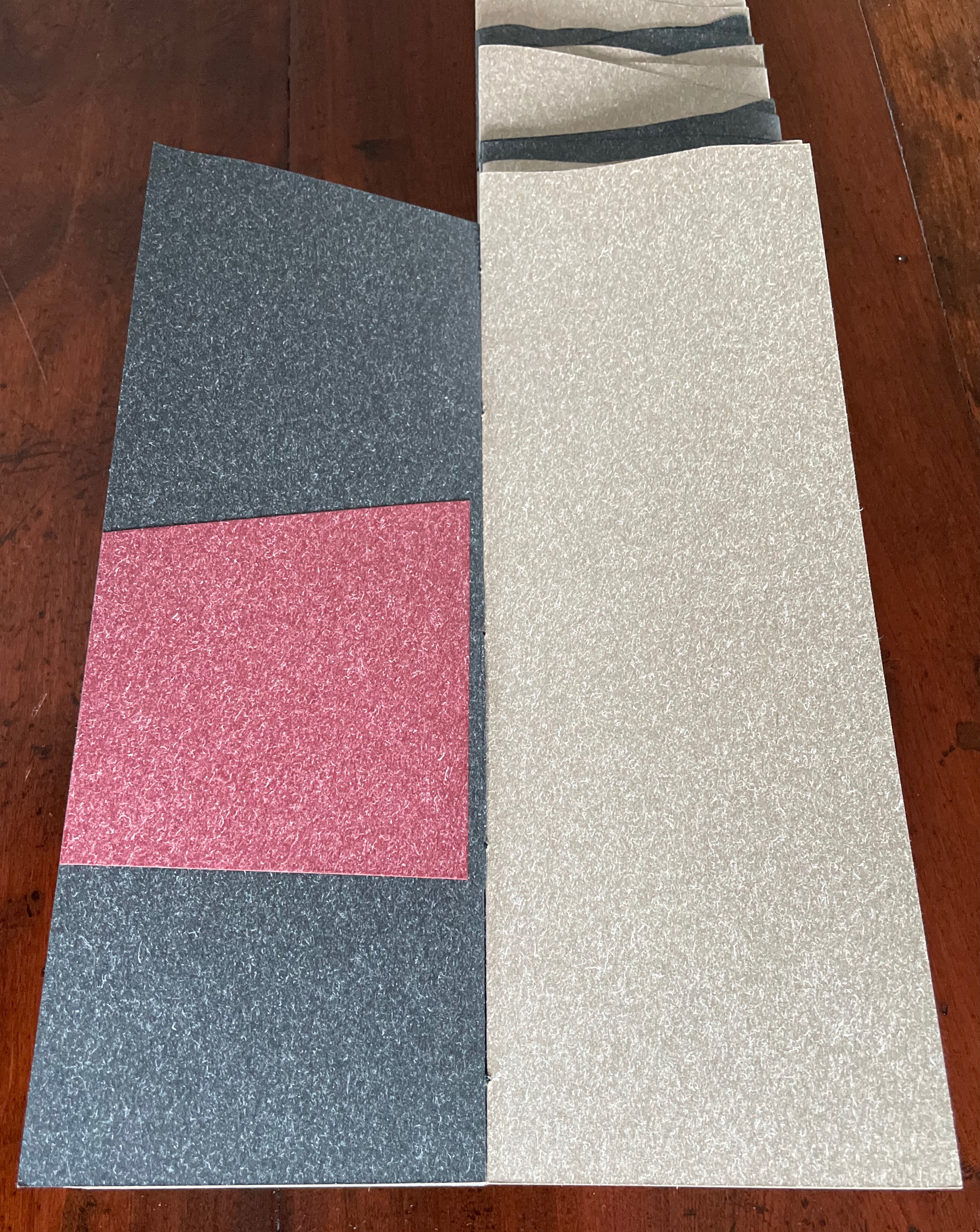
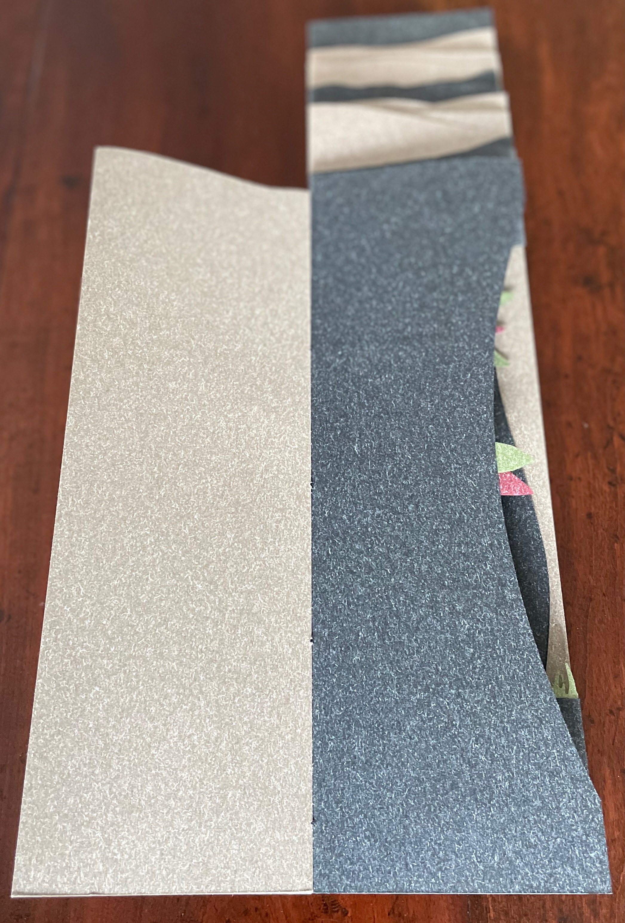
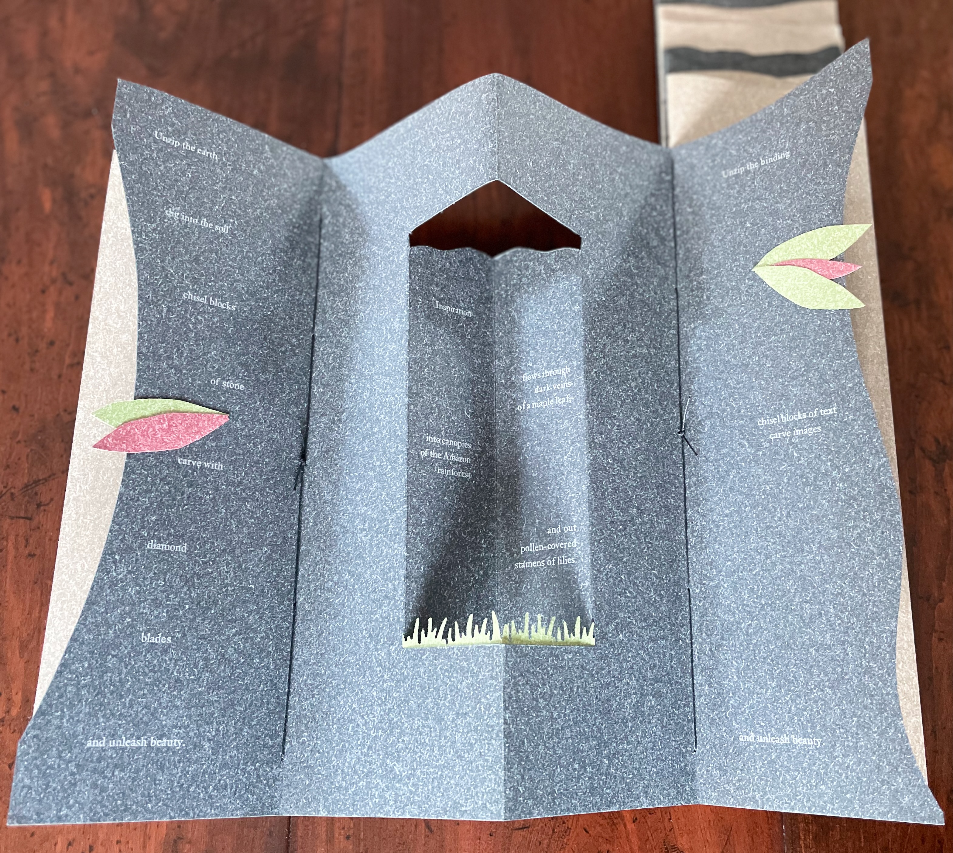
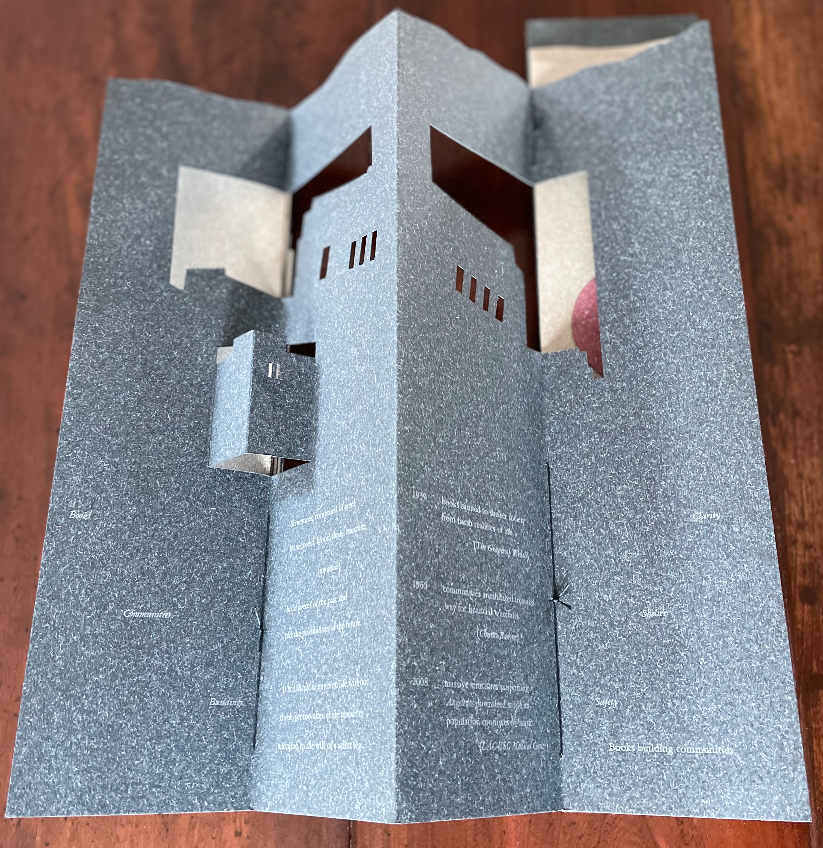
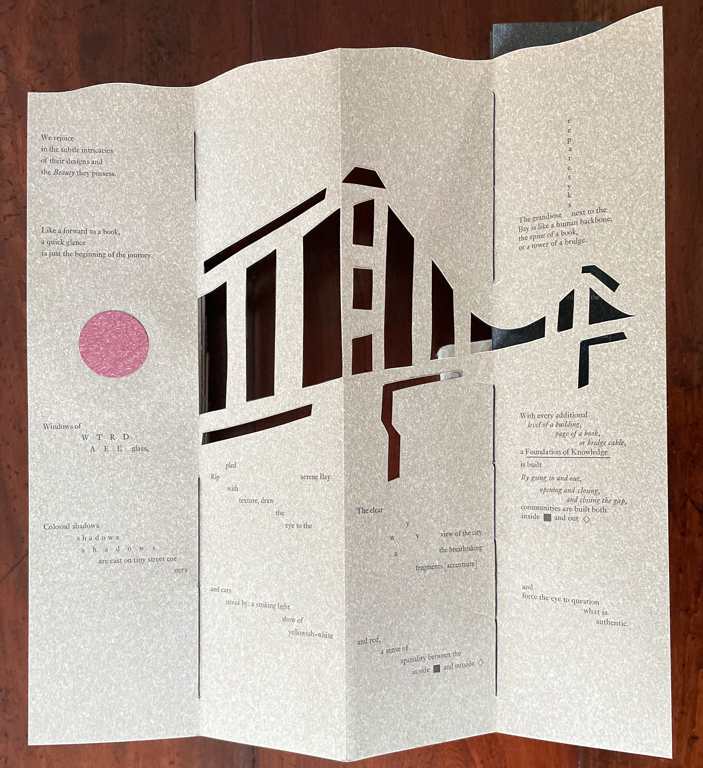
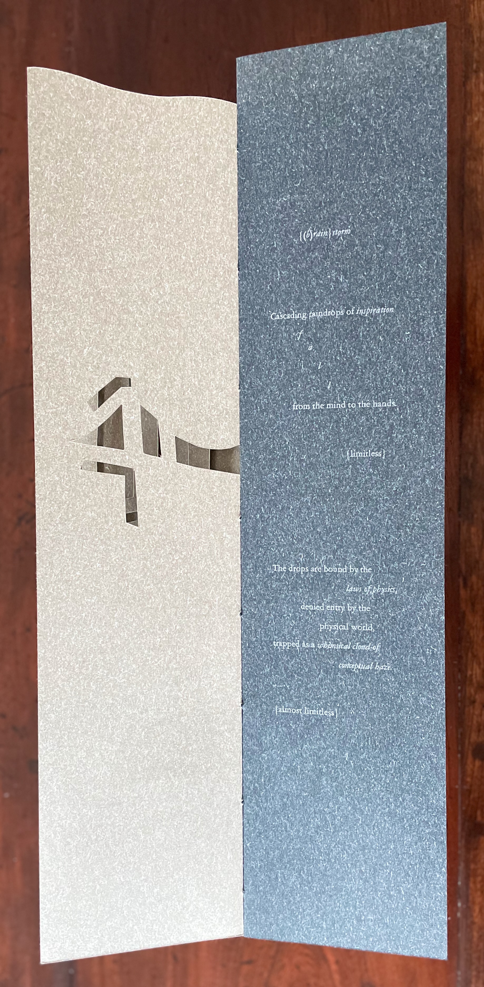
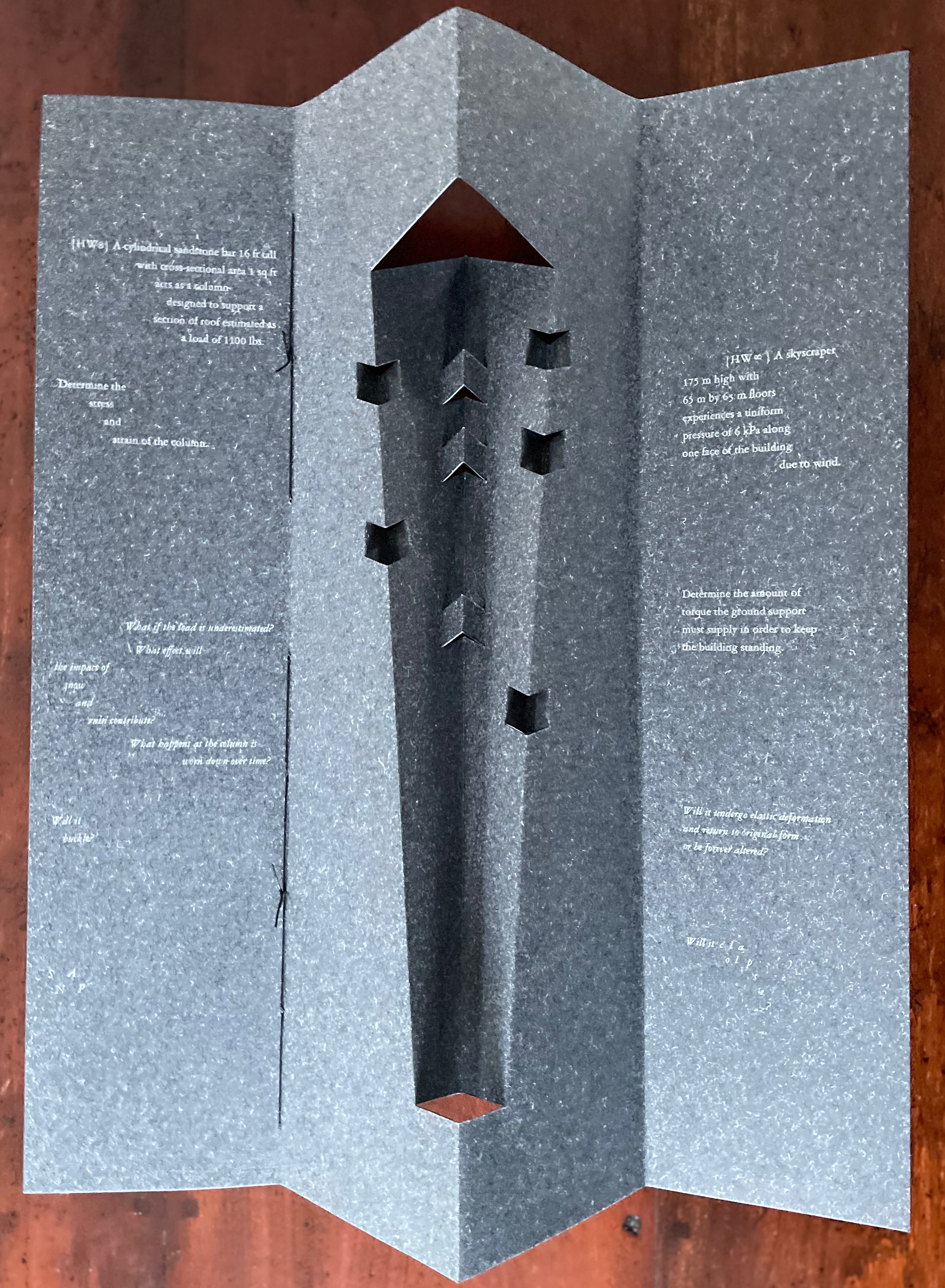
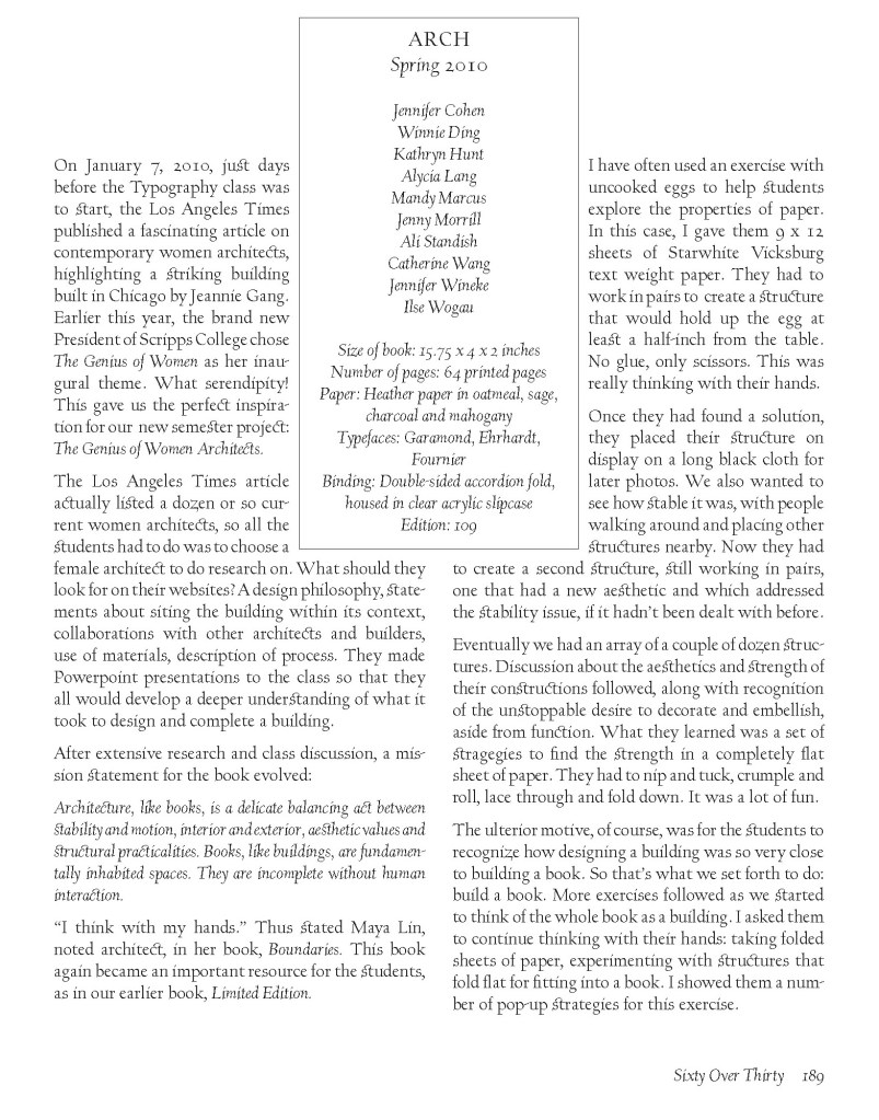
Arch (2010) Kitty Maryatt, Jenny Karin Morrill, Ali Standish, Alycia Lang, Jennifer Wineke, Mandesha Marcus, Catherine Wang, Kathryn Hunt, Ilse Wogau, Jennifer Cohen and Winnie Ding Acrylic slipcase, leporello formed of self-covering booklets sewn together. Slipcase: H410 x W110 x D50. Leporello: H400 x W 90 mm (closed). 64 pages. Unnumbered copy from edition of 109. Acquired from Bromer Booksellers, 7 December 2022. Photos: Books On Books Collection
Nôtre-Dame de Paris (1831), Archdeacon Claude Frollo points to the book in his hand and then to the cathedral and says, “This will kill that”. It is ironic that Hugo’s book (popularly known now by its English title The Hunchback of Nôtre-Dame) was written in large part to save the then-decaying cathedral (post-Revolution, it served as a warehouse), and it succeeded. It is also ironic that, while the fictional character’s metaphor has a point about the book’s permanence of replicability outlasting the building’s permanence of stone, it misses the collaborative foundations of both.
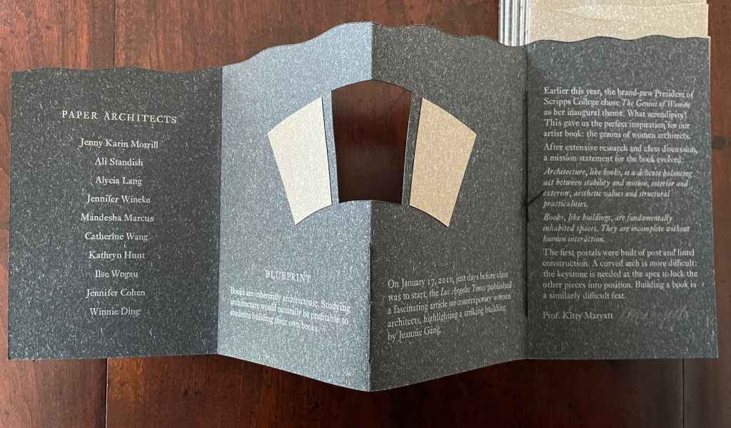
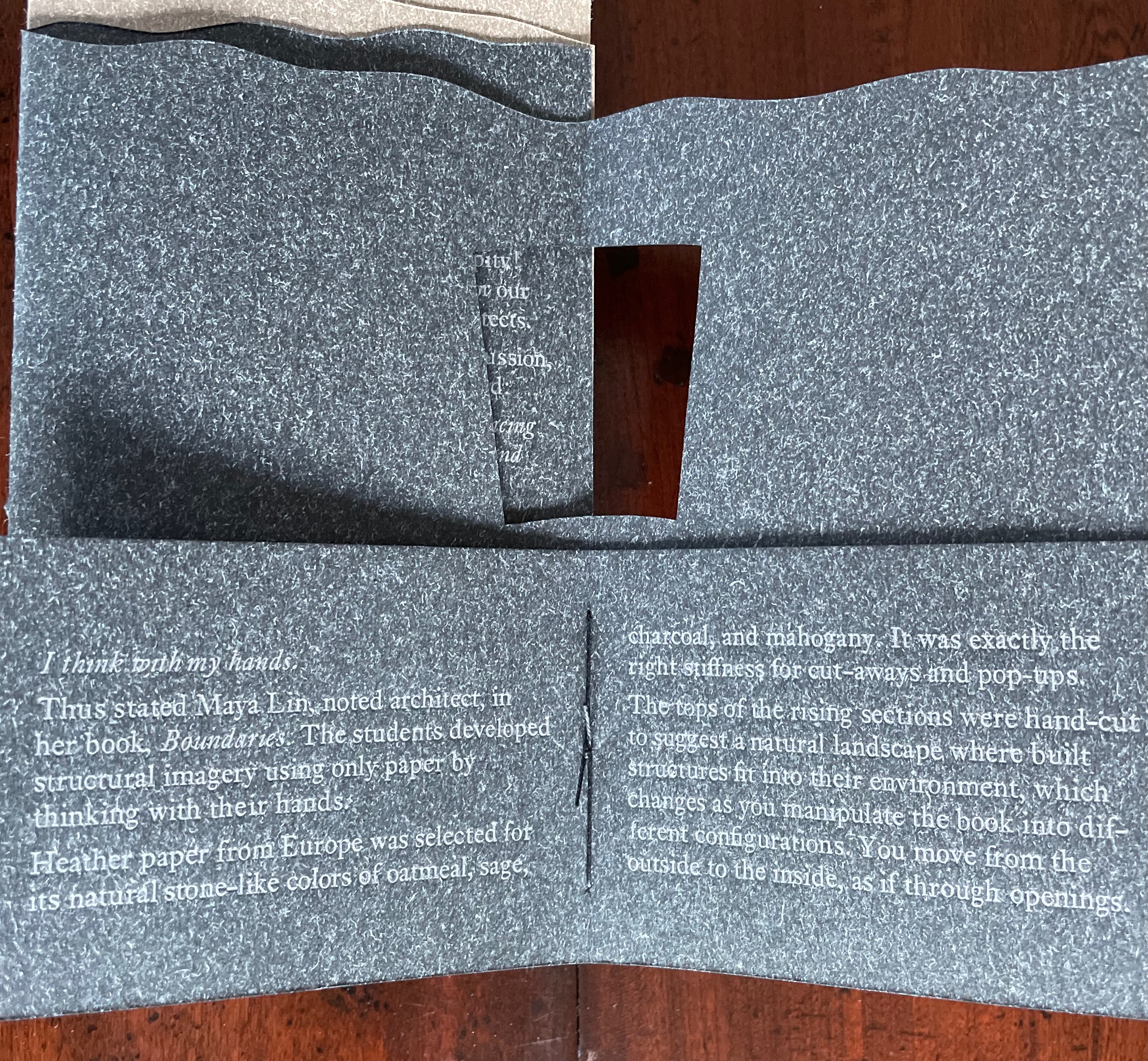
Arch (2010), created by ten students at Scripps College under the direction of Kitty Maryatt, reminds us that the creation of a book — even a work of book art — is a collaborative effort. All the students involved in the design, planning and production were women, a happenstance serendipitously blessed ahead of time by a Los Angeles Times article celebrating women architects. Drawing on that article and Maya Lin’s Boundaries (2000) as well as other research, the students agreed on a mission statement for the work: “Architecture, like books, is a deliberate balancing act between stability and motion, interior and exterior, aesthetic values and practicalities. Books, like buildings, are fundamentally inhabited spaces. They are incomplete without human interaction.”
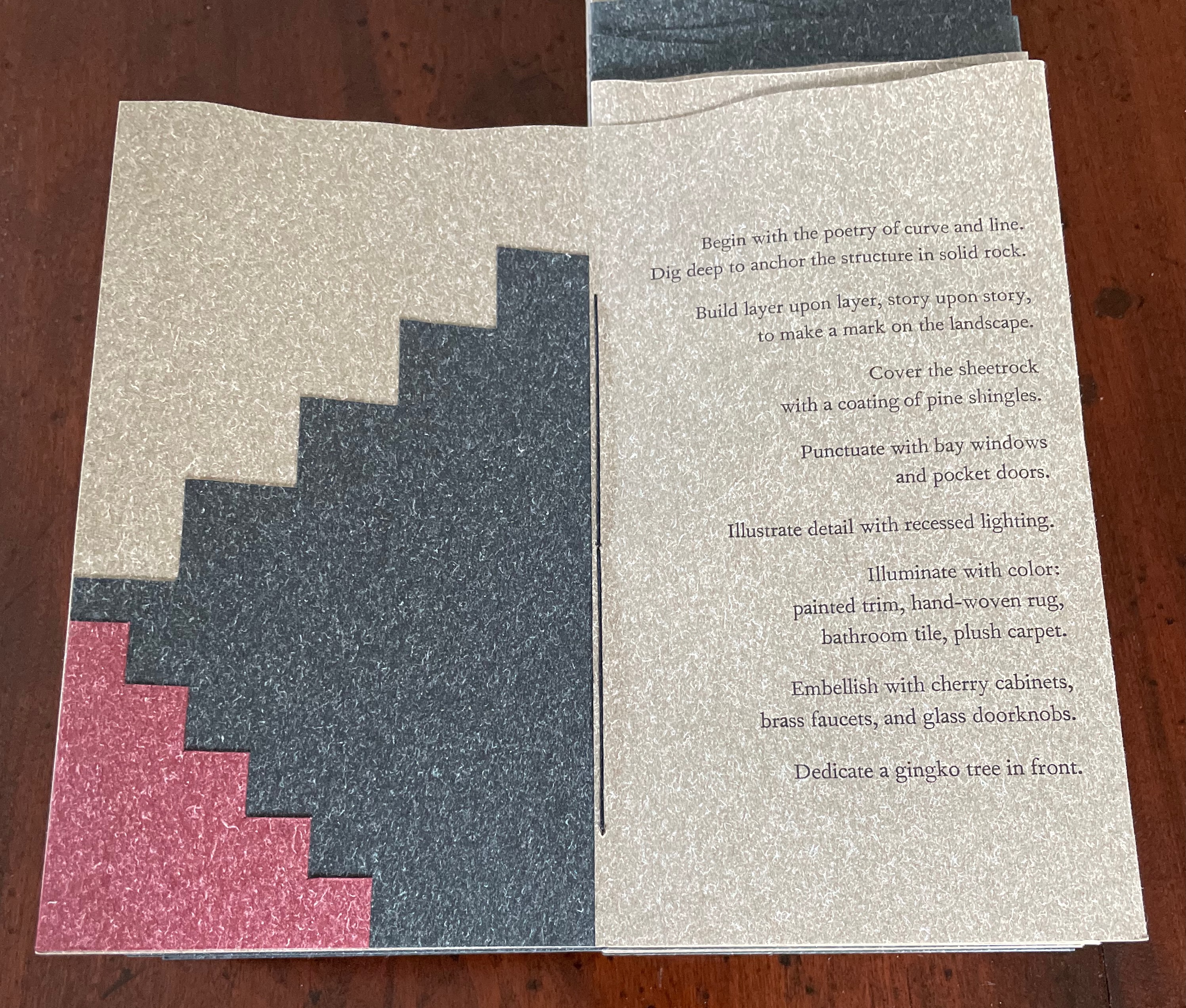
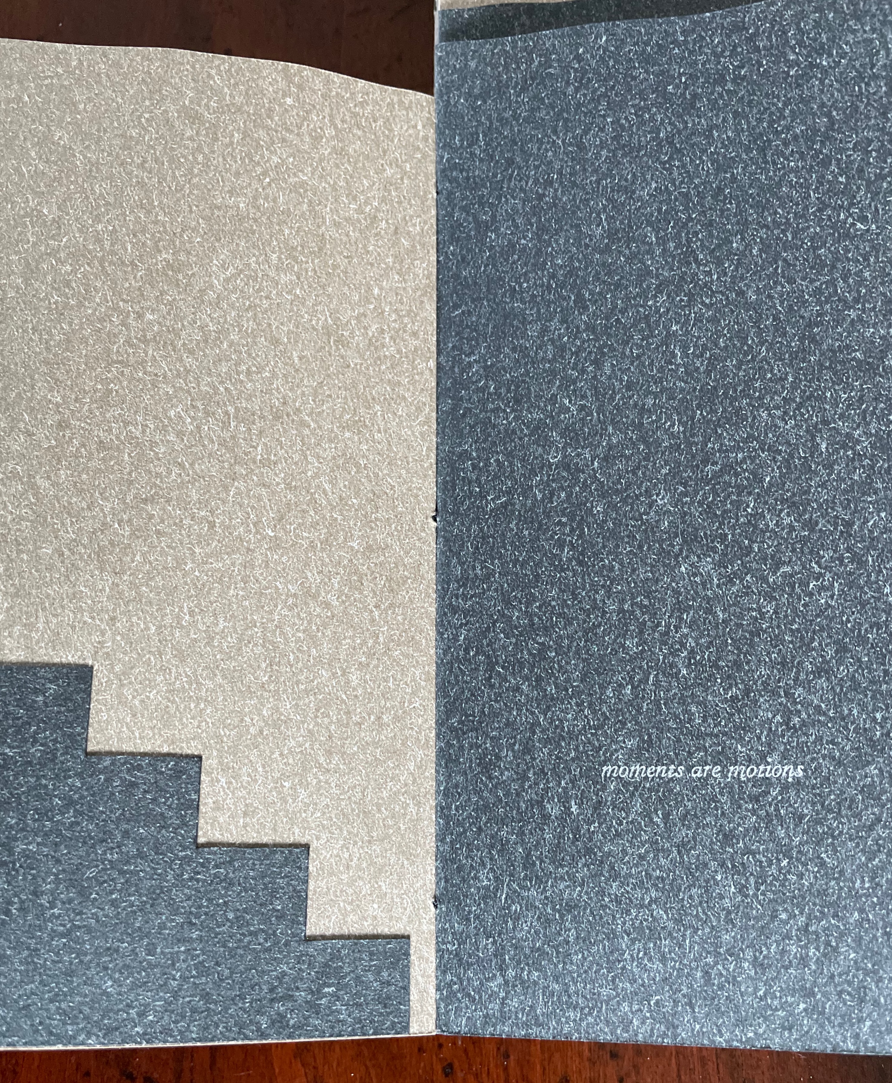
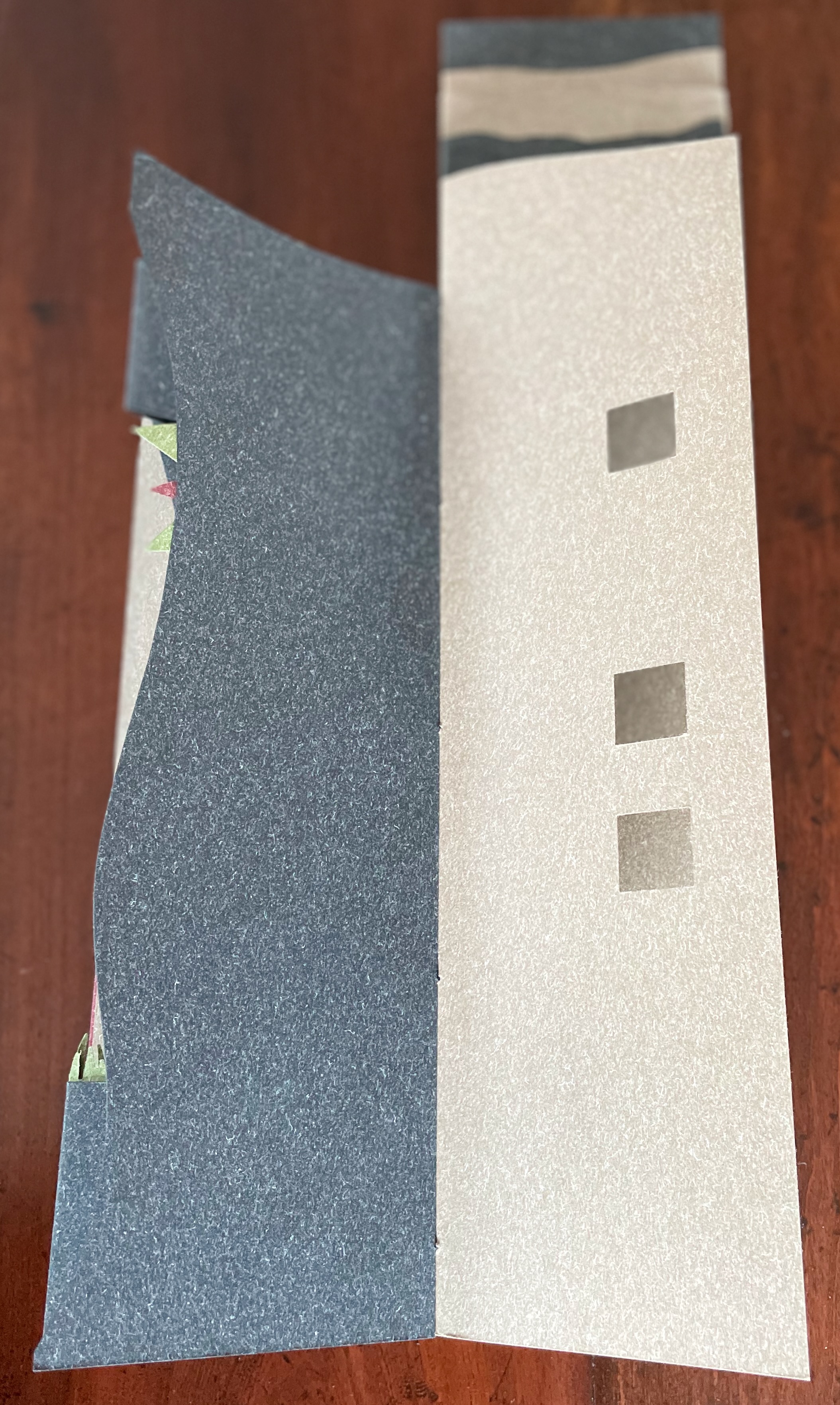
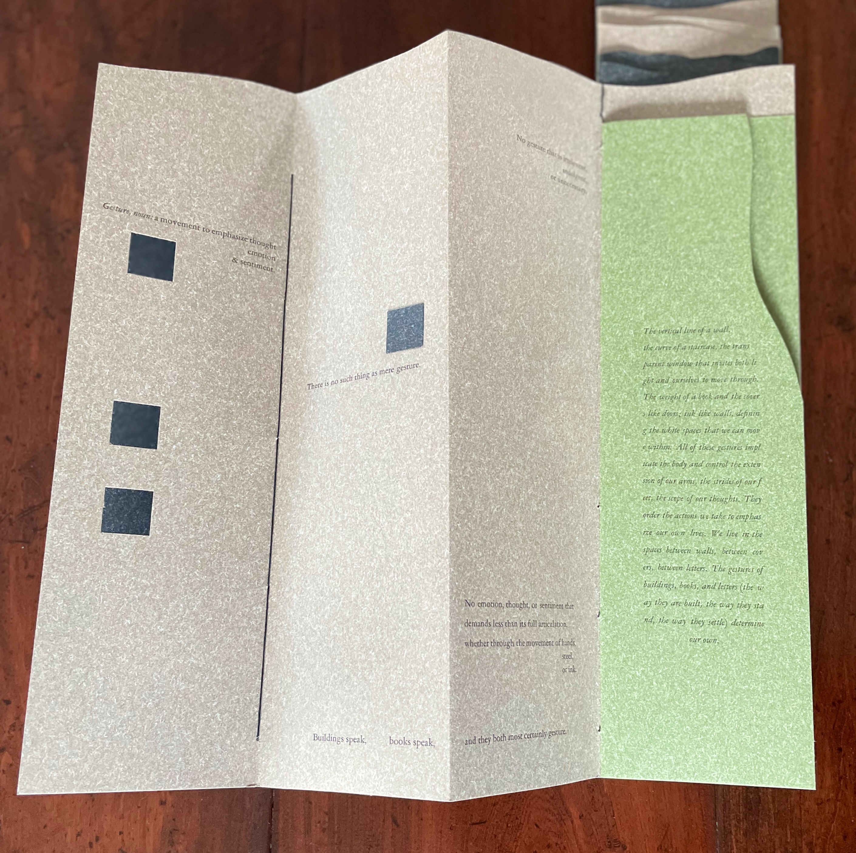
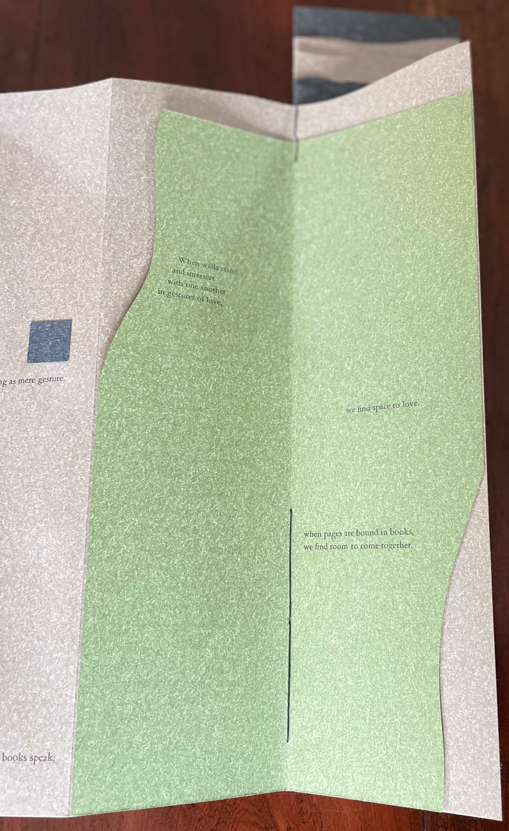
Clever structural use of paper with a stone-like appearance, paired with apt choices of text matched with equally judicious choices in typography, evoke the similarities between books and buildings. Each architect/bookmaker’s contribution is a self-covering booklet in leporello format. Of different heights, the booklets are sewn together to create a tiered tower to be housed in an acrylic slipcase.
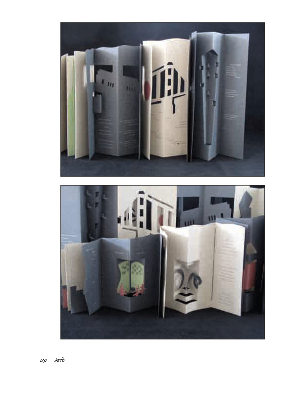
The first booklet, open below, incorporates Maryatt’s introduction, entitled “Blueprint”, all of which appears in the work’s entry in the publication Sixty over Thirty: Bibliography of Books Printed Since 1986 at the Scripps College Press (2016). The entry is reproduced in full further below.
The next booklet lists the sources of architectural inspiration, and as the lattice door on the list’s facing page turns, two sets of stairs, cutouts in contrasting colors, ascend on the verso page to the text that begins at the top of the recto page and ends at the foot of descending stairs on the next double-panel spread. Like Maya Lin, Maryatt’s students built their works by learning to think with their hands. The reader, too, has to think with the hands to experience fully this booklet and those that follow. The whole work conjures up the titles of Juhani Pallasmaa’s books — The Thinking Hand and The Embodied Image. Readers of this online entry will have to expand the images below, enjoy the words and imagine their way through with the title of another of his books — The Eyes of the Skin.
Lynn, Greg. 2004. Folding in Architecture Rev. ed. Chichester, West Sussex: Wiley-Academy. See for references to Mario Carpo, Gilles Deleuze and Peter Eisenman.
Macken, Marian. Binding Space: The Book as Spatial Practice (London: Taylor and Francis, 2018). A trained architect and book artist, Macken articulates and illustrates the how and why of the overlap between architecture and book art.
Williams, Elizabeth. 1989. “Architects Books: An Investigation in Binding and Building”, The Guild of Book Workers Journal. 27, 2: 21-31. This essay not only pursues the topic of architecture-inspired book art but turns it on its head. An adjunct professor at the time, Williams set her students the task of reading Ulises Carrión’s The New Art of Making Books (Nicosia: Aegean Editions, 2001) then, after touring a bindery, “to design the studio and dwelling spaces for a hand bookbinder on an urban site in Ann Arbor, Michigan”. But before producing the design, the students were asked “to assemble the pages [of the design brief and project statement] in a way that explored or challenged the concept of binding”. In other words, they had to create bookworks and then, inspired by that, create their building designs. Williams illustrates the essay with photos of the students’ bookworks. [Special thanks to Peter Verheyen for this reference.]