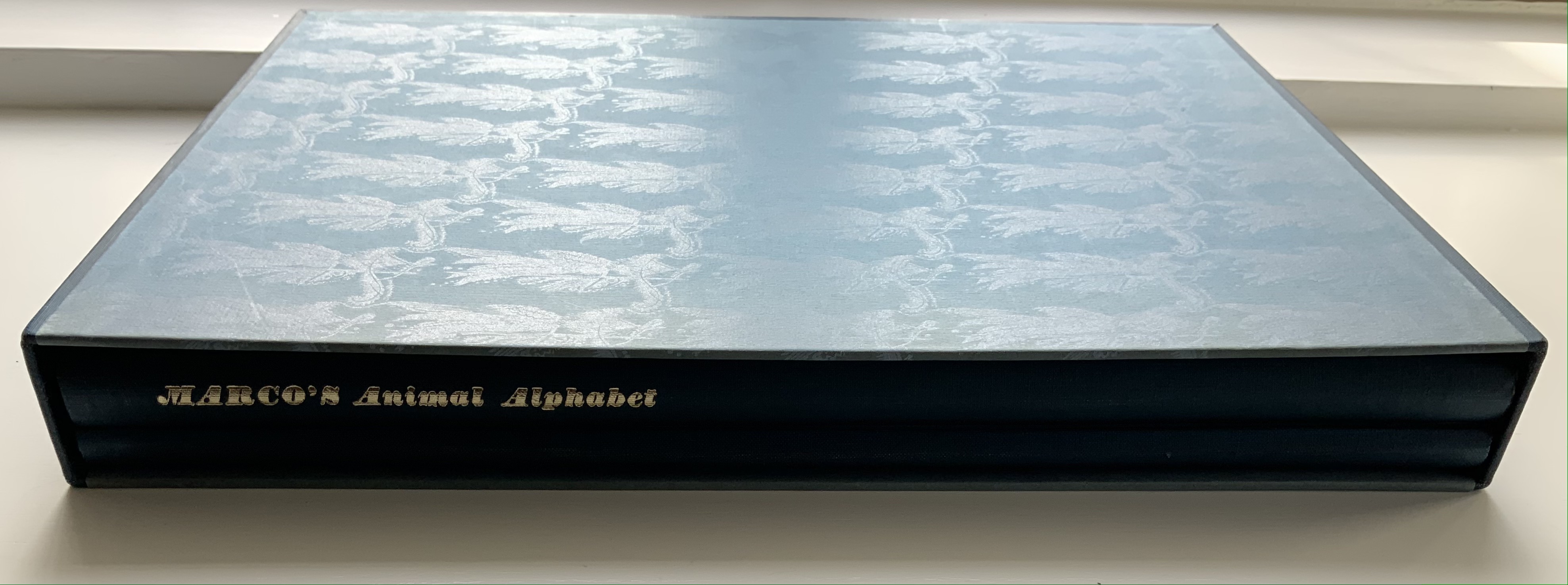
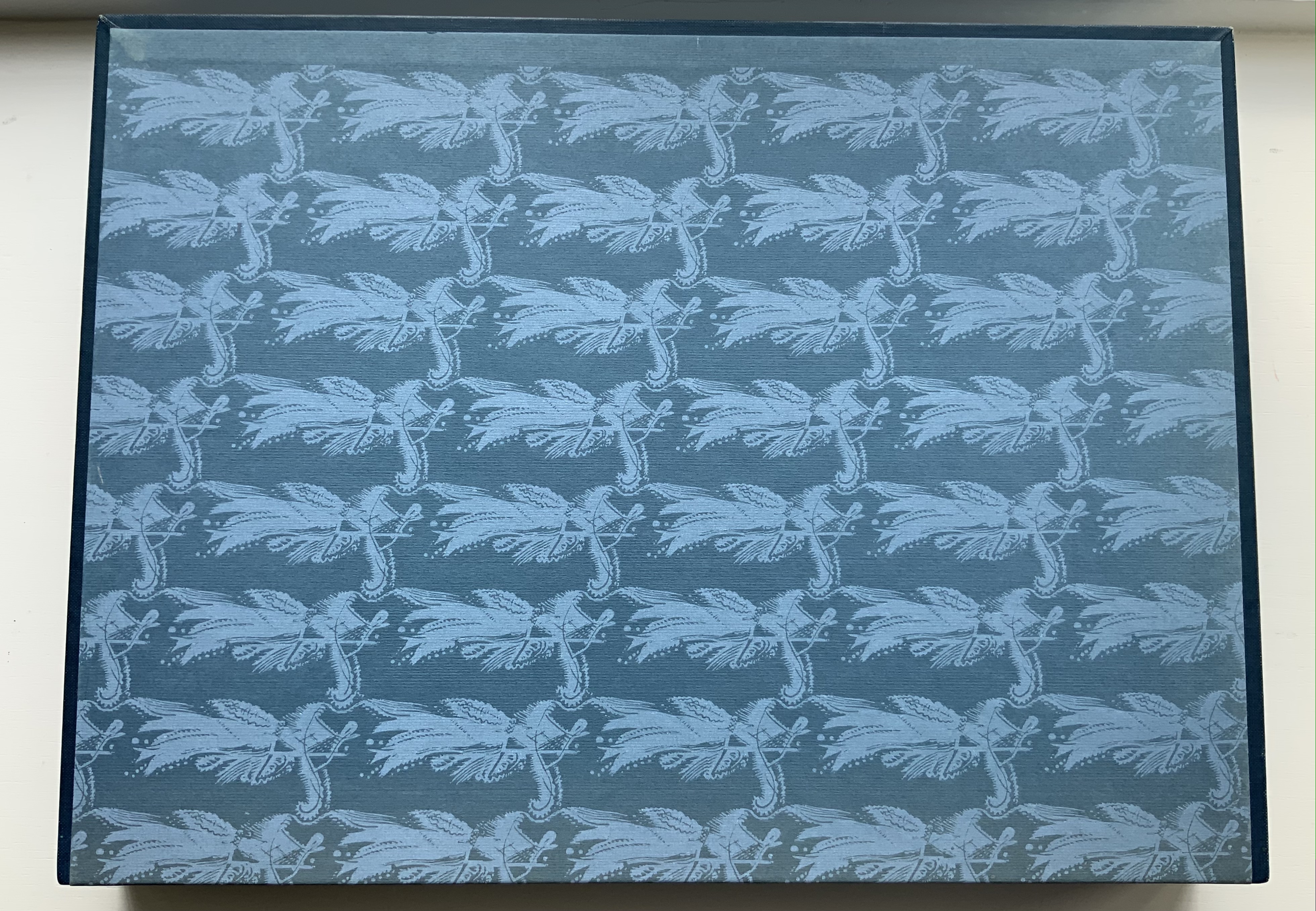
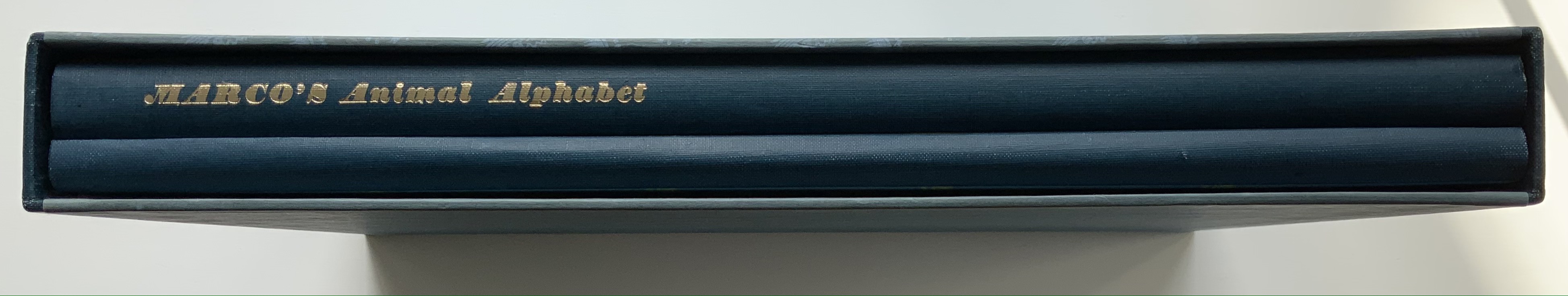
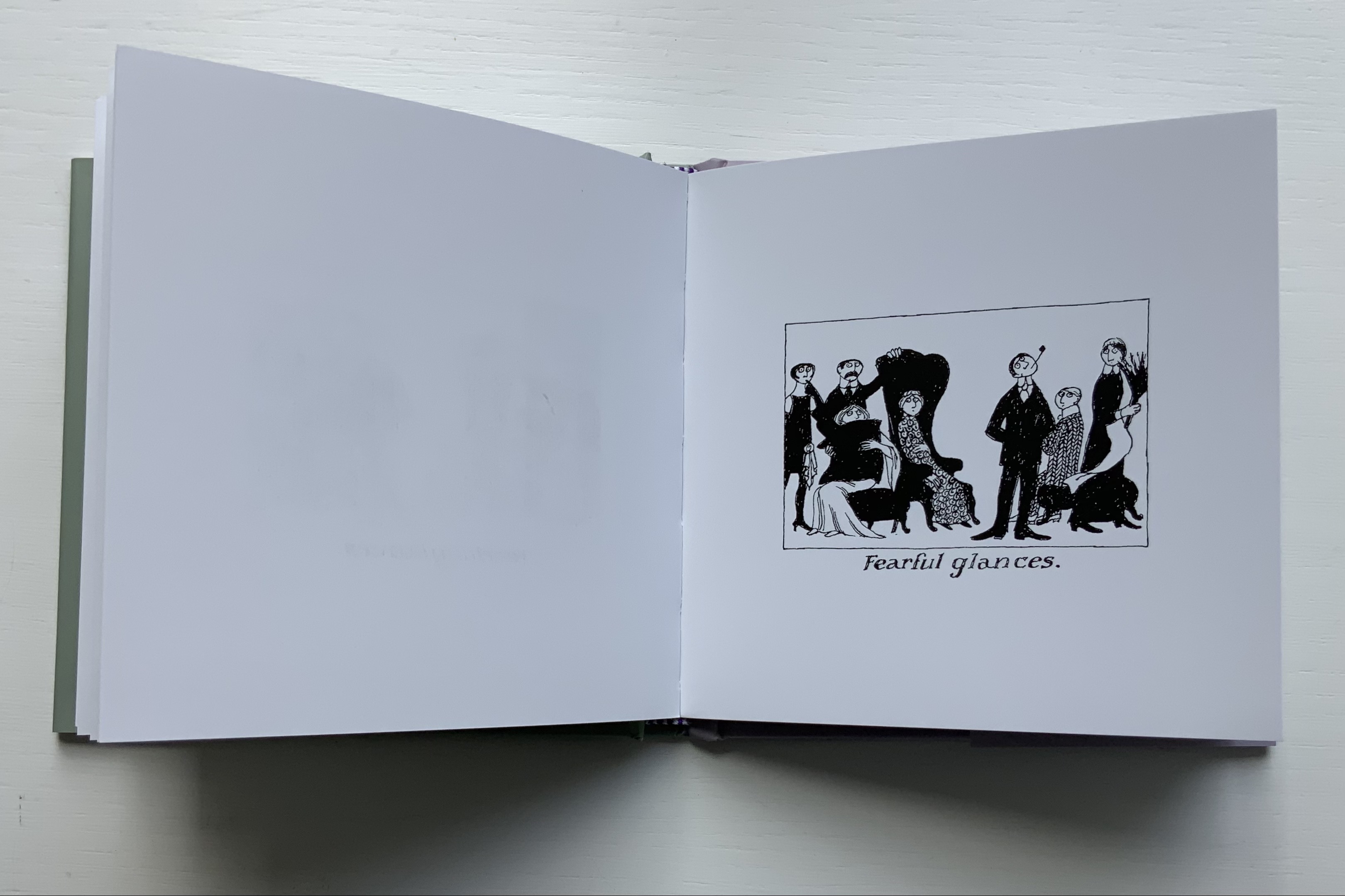
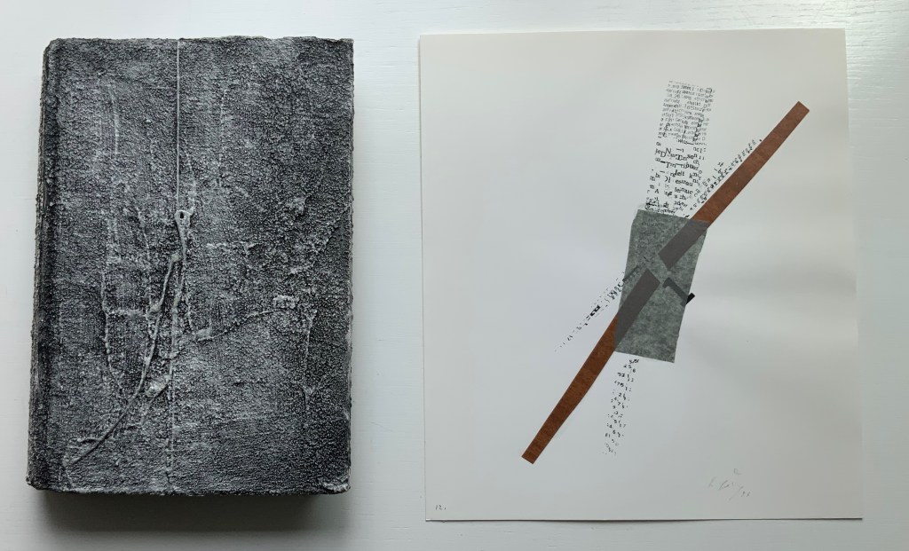
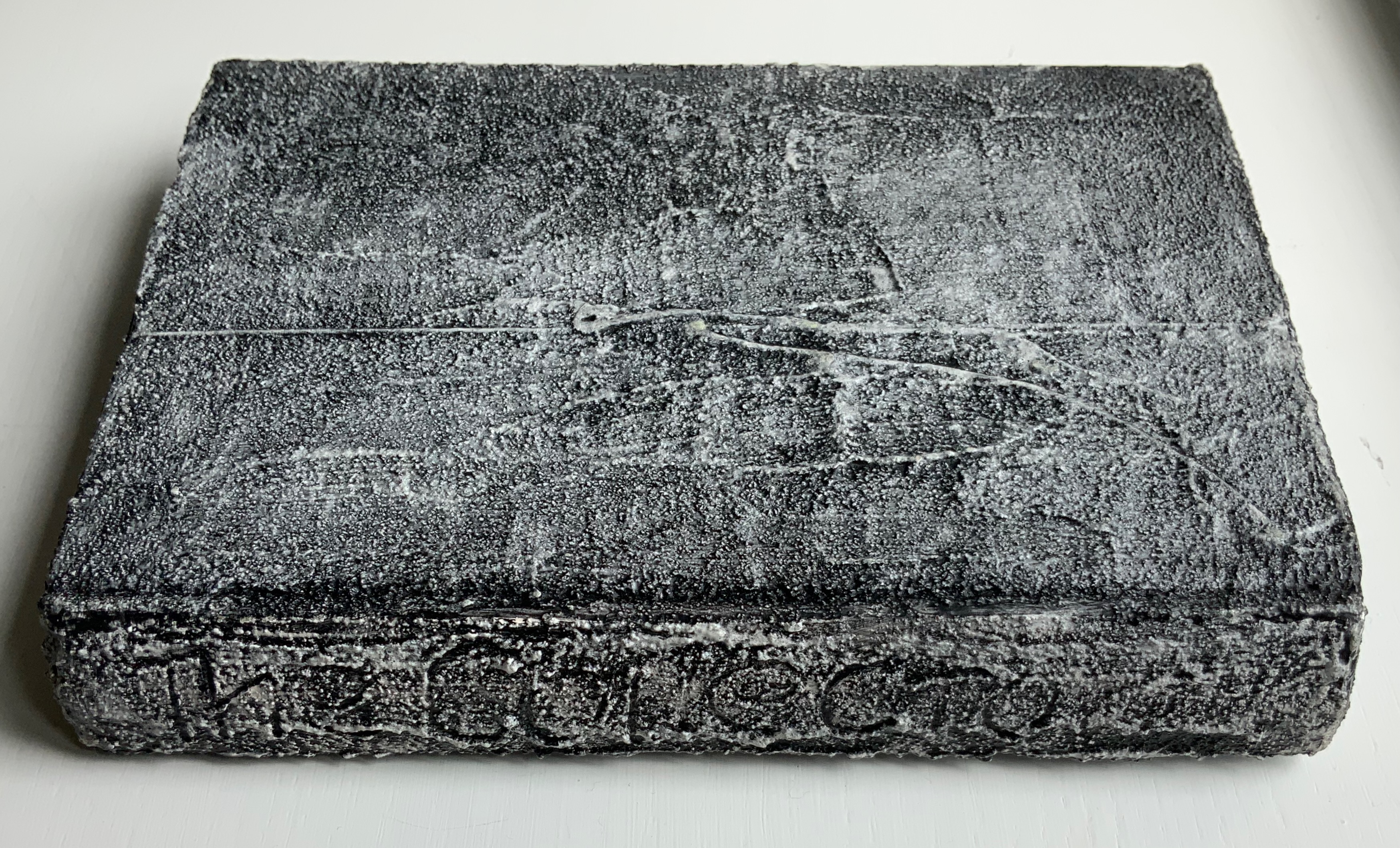
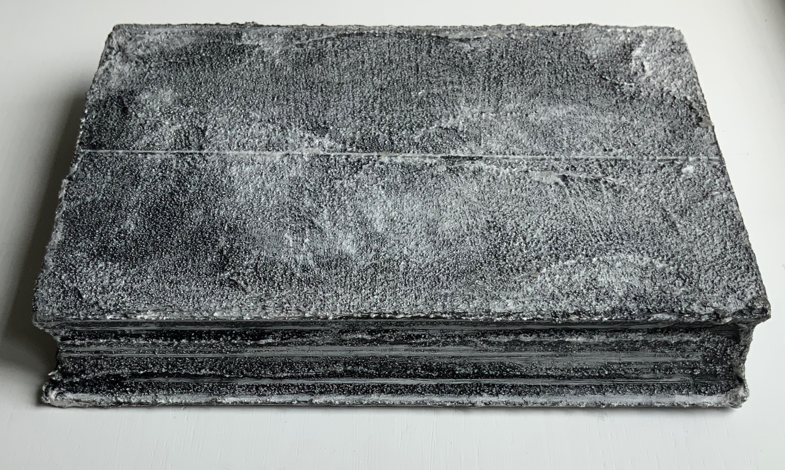
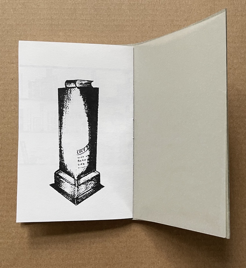
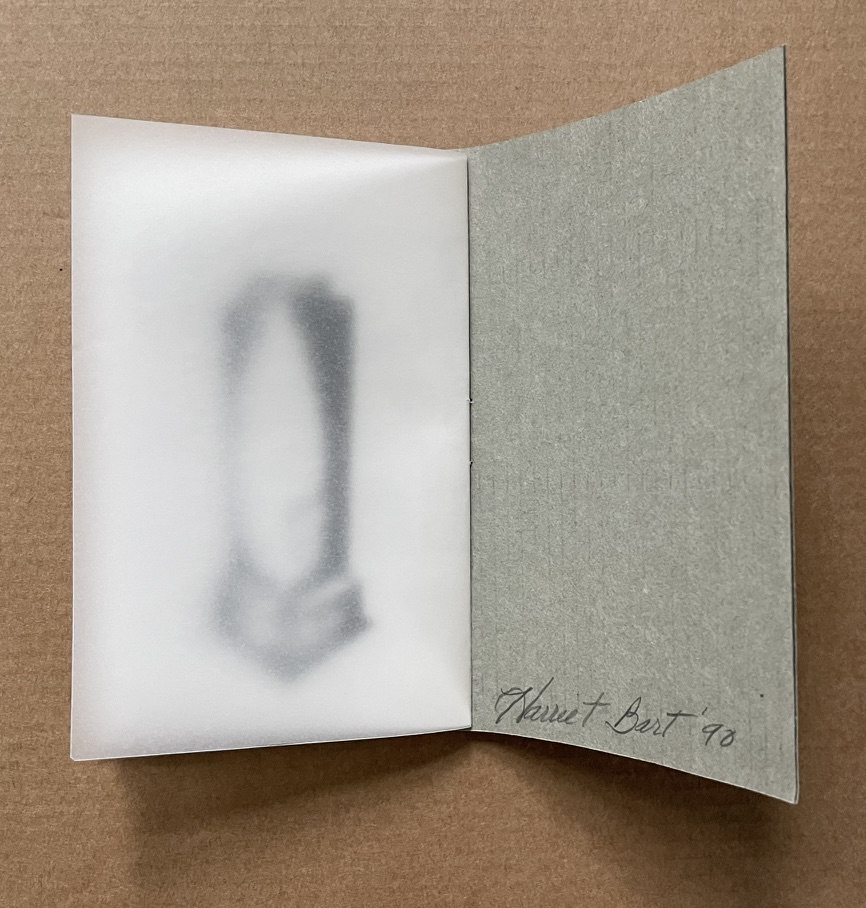
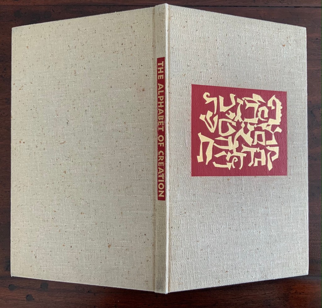
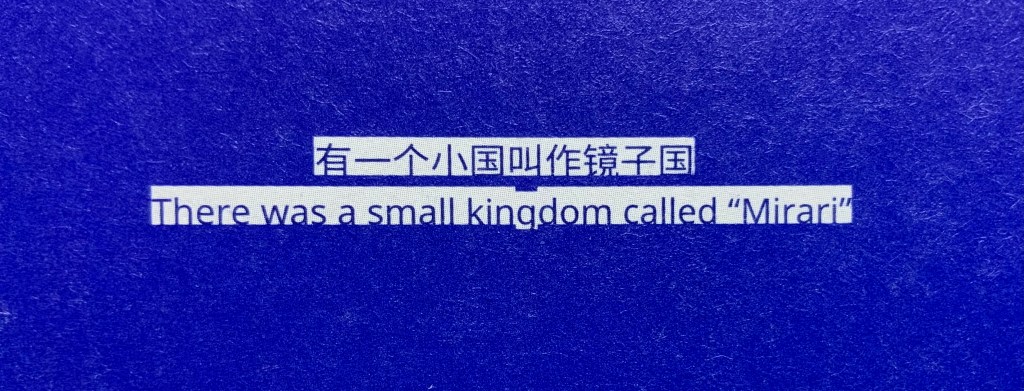
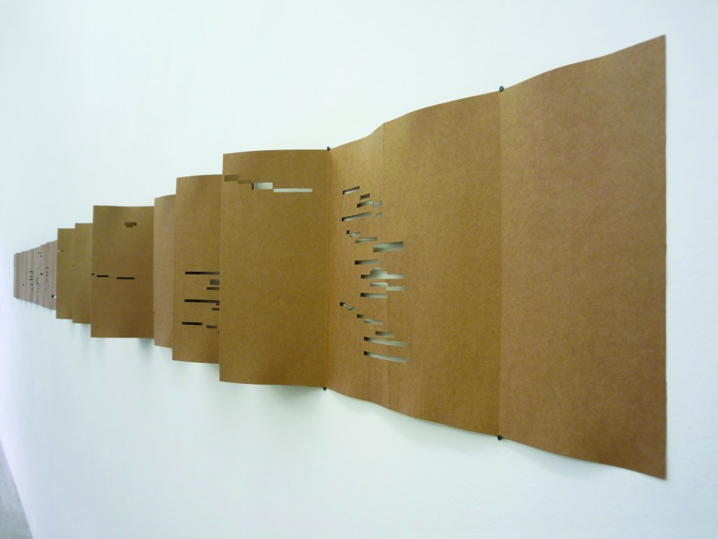
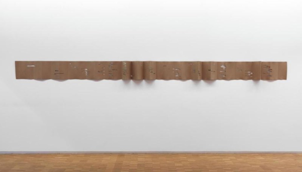
In Memoriam+ (2021)
In Memoriam+ (2021)
Alastair Noble
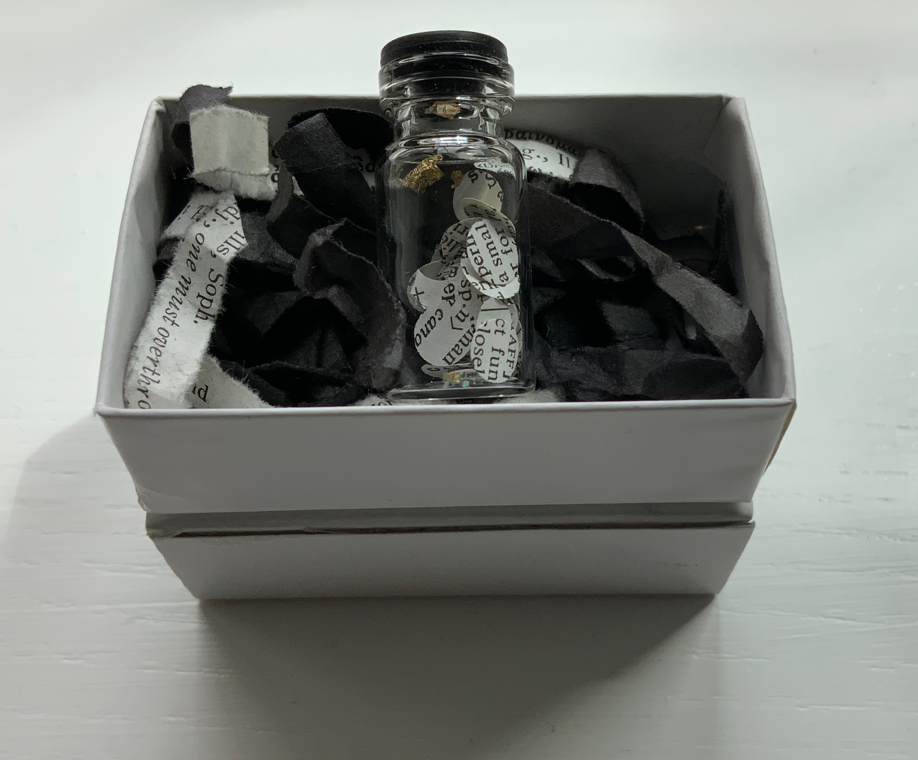
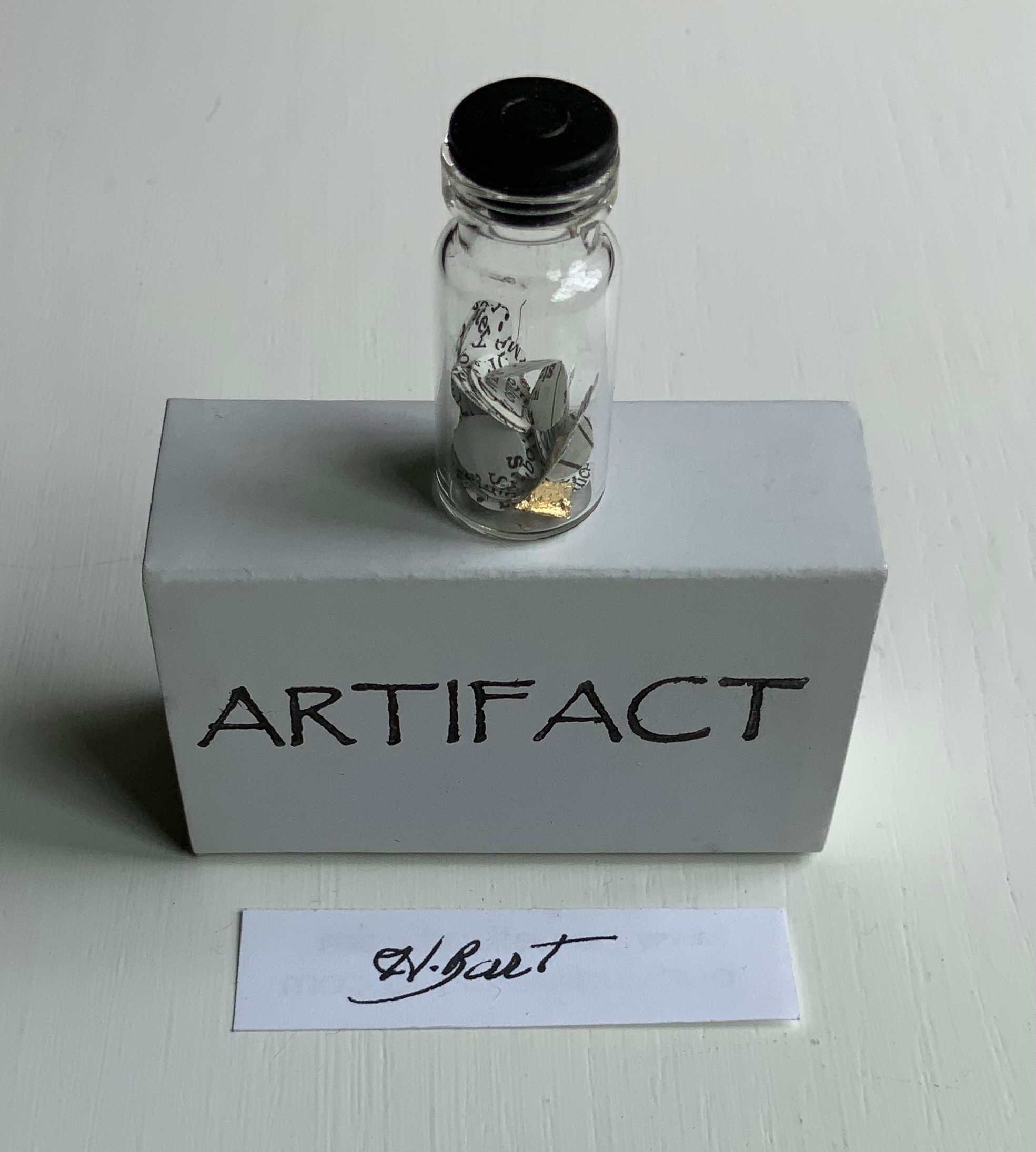
Booklet thread-bound to HMP boards, cover with cutout. H210 x W205 mm, 12 pages. Edition of 22, of which this is #4. Acquired from the artist, 25 April 2021.
Photos of the work: Books On Books Collection. Displayed with permission of the artist.
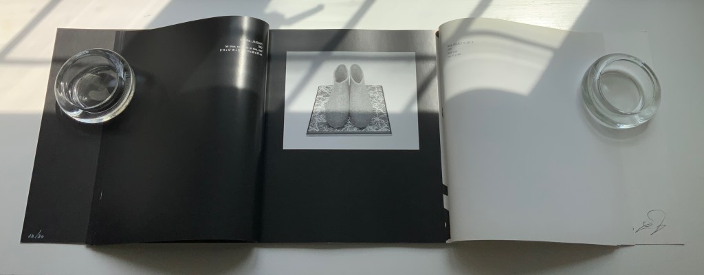
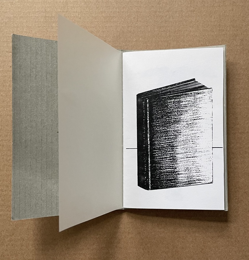
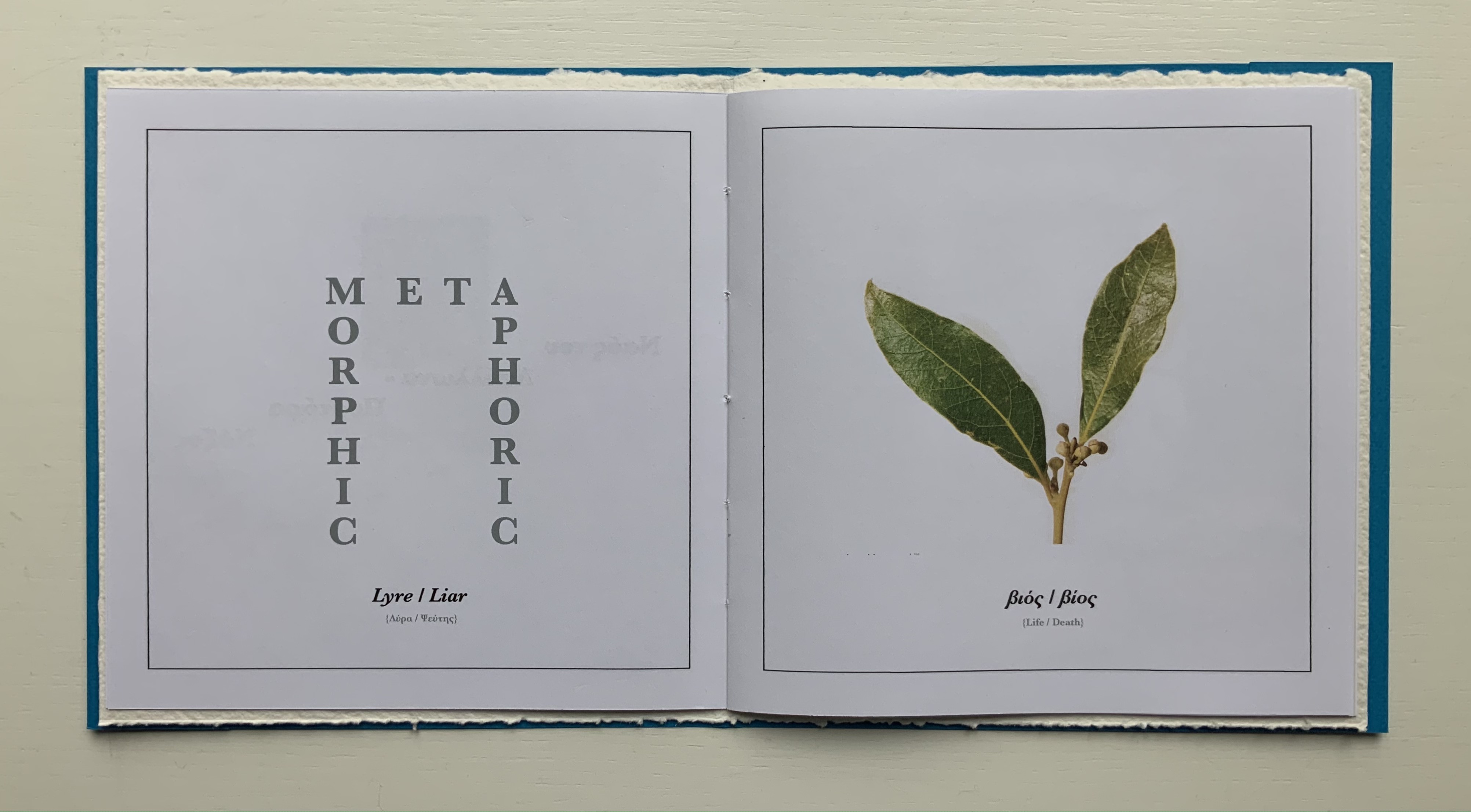
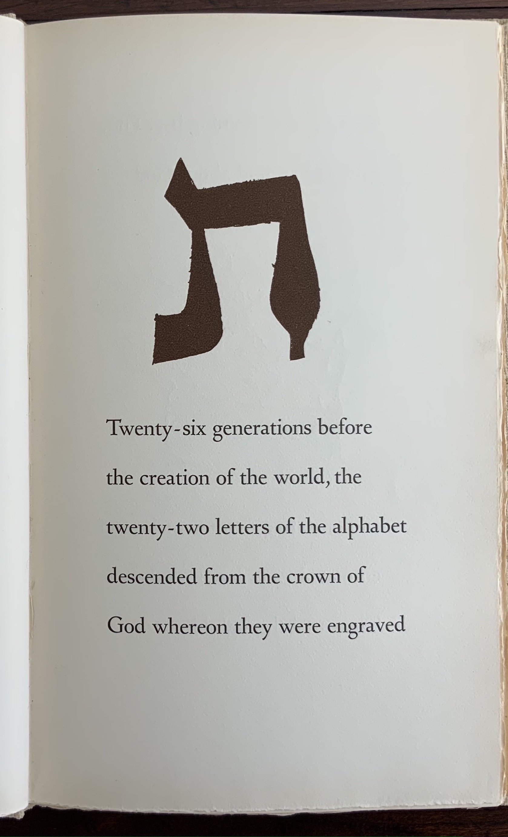
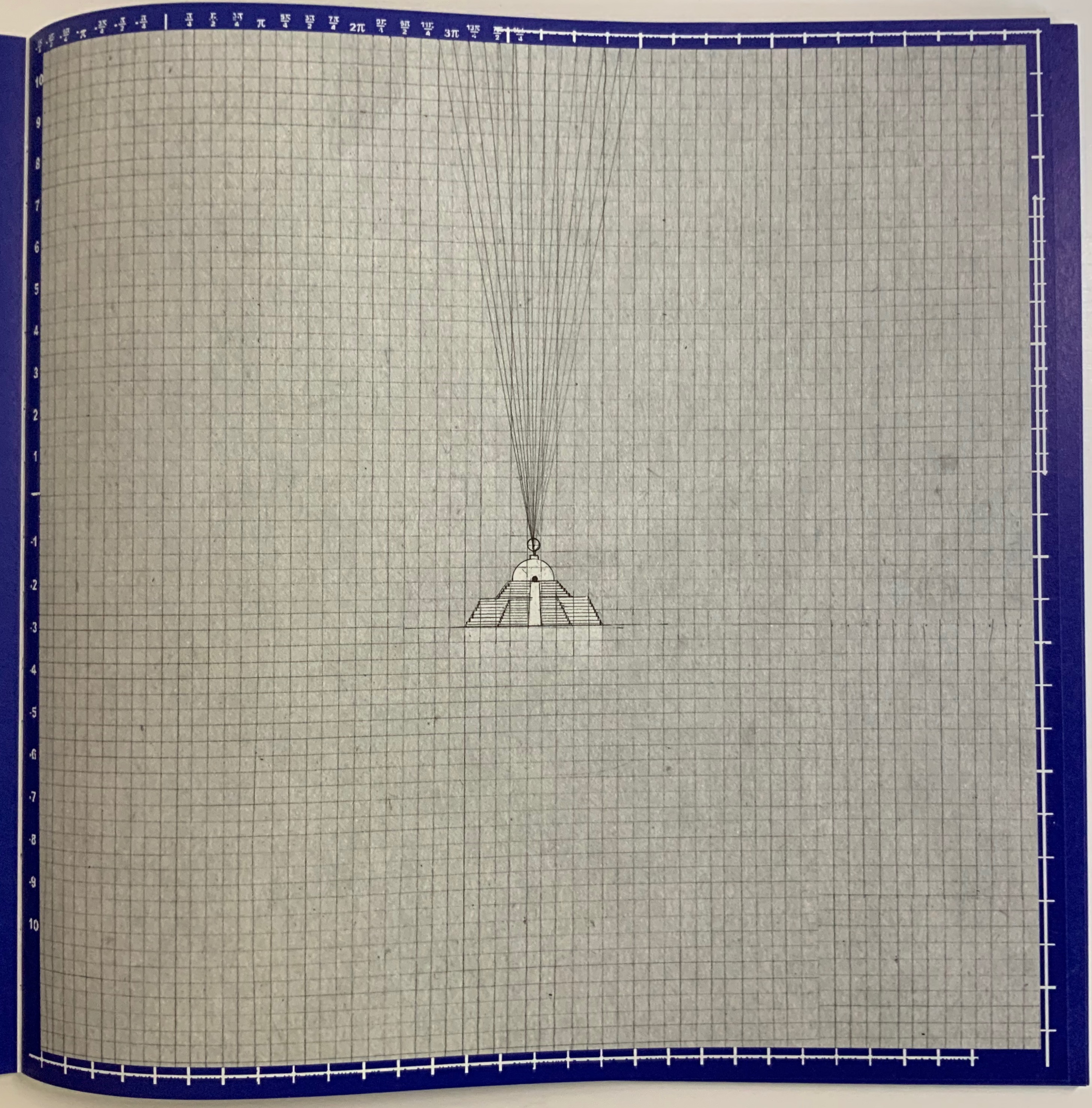
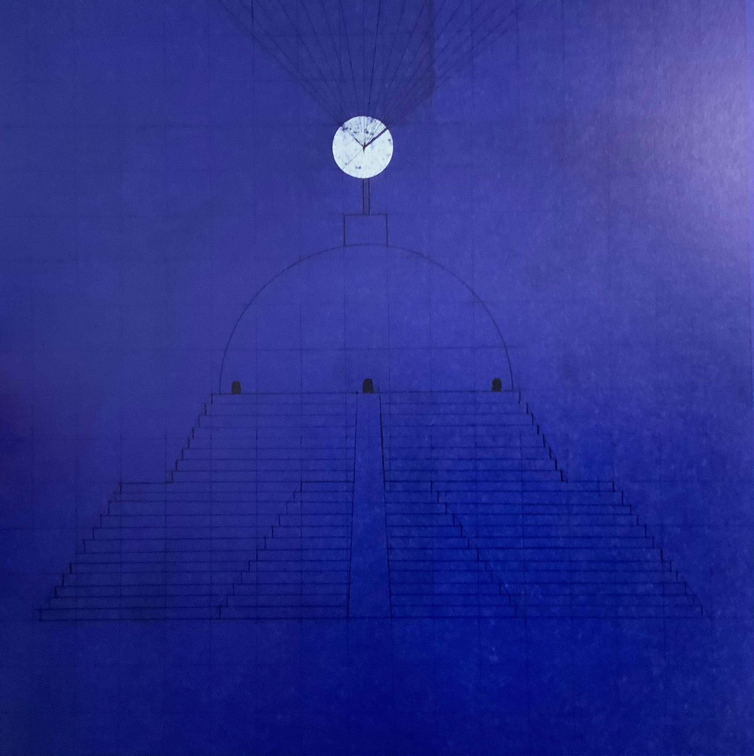
This work pays tribute to Ian Hamilton Finlay, whose Little Sparta, a garden across seven acres in Scotland, that expresses an artistic vision through typography, sculpture, installations and nature. Noble writes about the origins of his tribute:
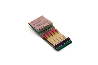
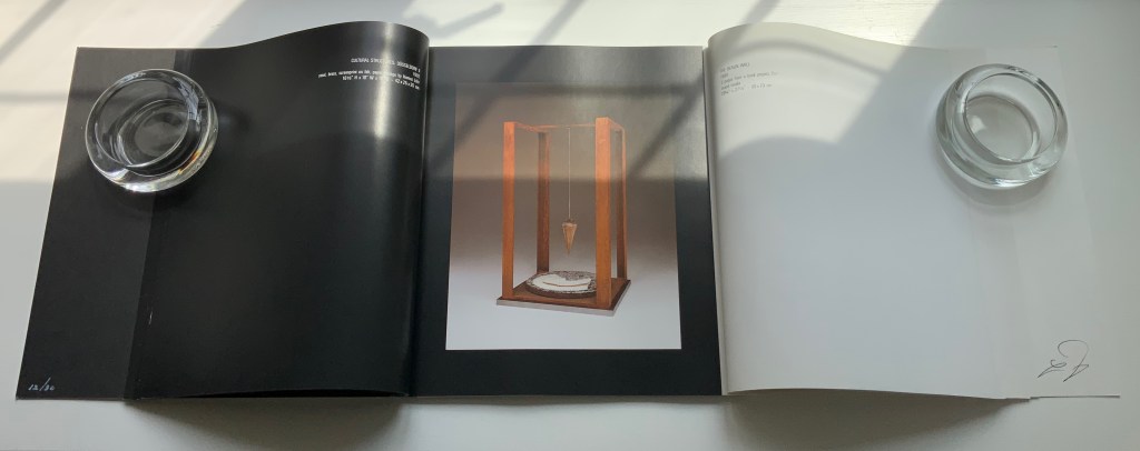
I first visited Little Sparta twenty years ago and then again last year in July out of lockdown. Thereafter, coincidentally I found a brick buried in my garden with the work “Temple” embossed on it. Consequently this became the catalyst for a little homage in form of small installation in my garden that used the brick as a foundation to an arch made from white marble fragments that suggests the Portara for Apollo’s
Temple Naxos. This installation became the stimulus for this small artist’s book completed during lockdown in my studio in Liverpool, UK. — Entry in Book Arts Newsletter, No. 138 March – mid-April 2021, p. 43.
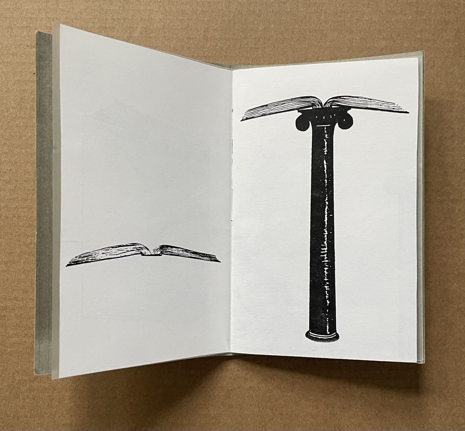
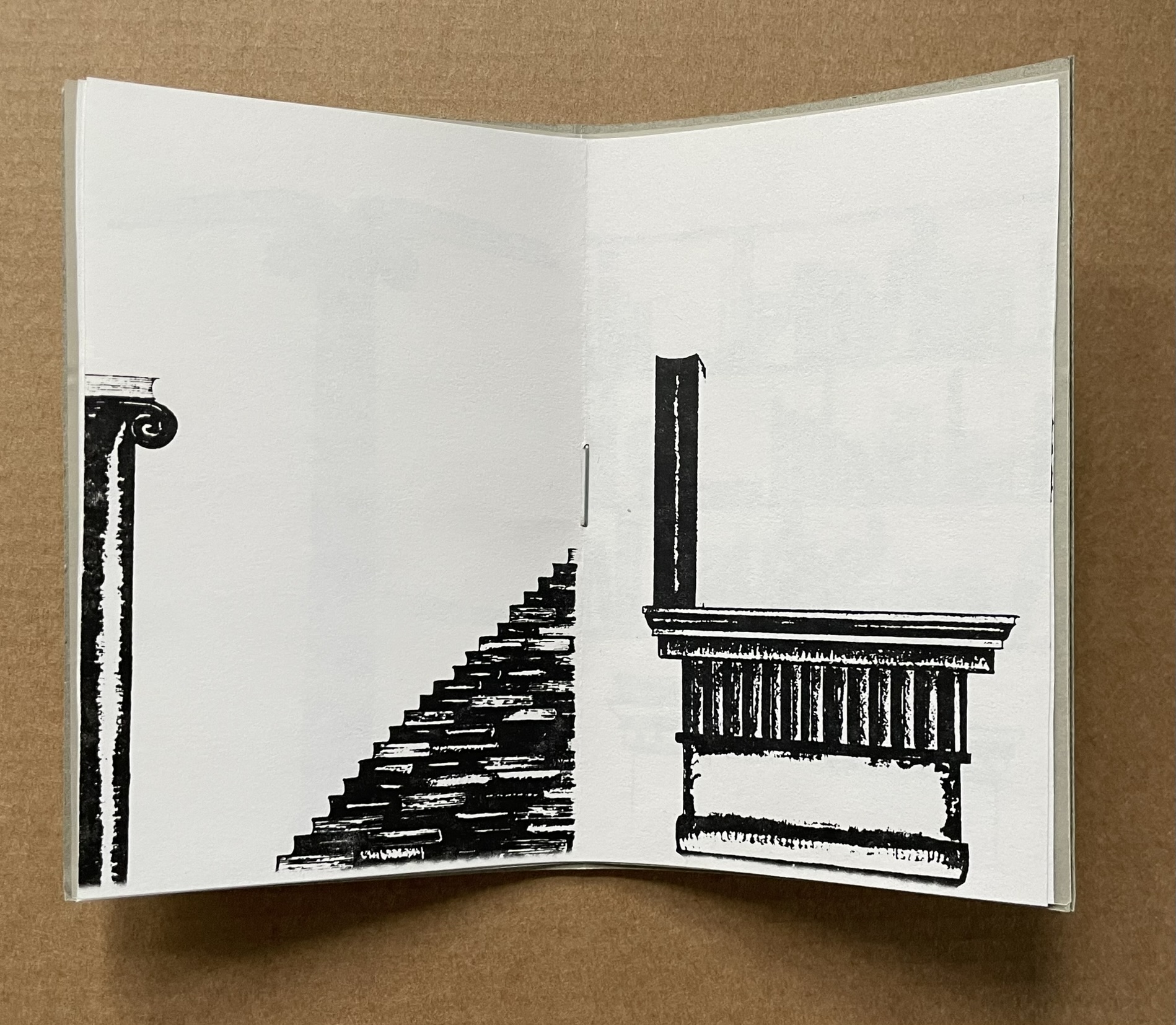
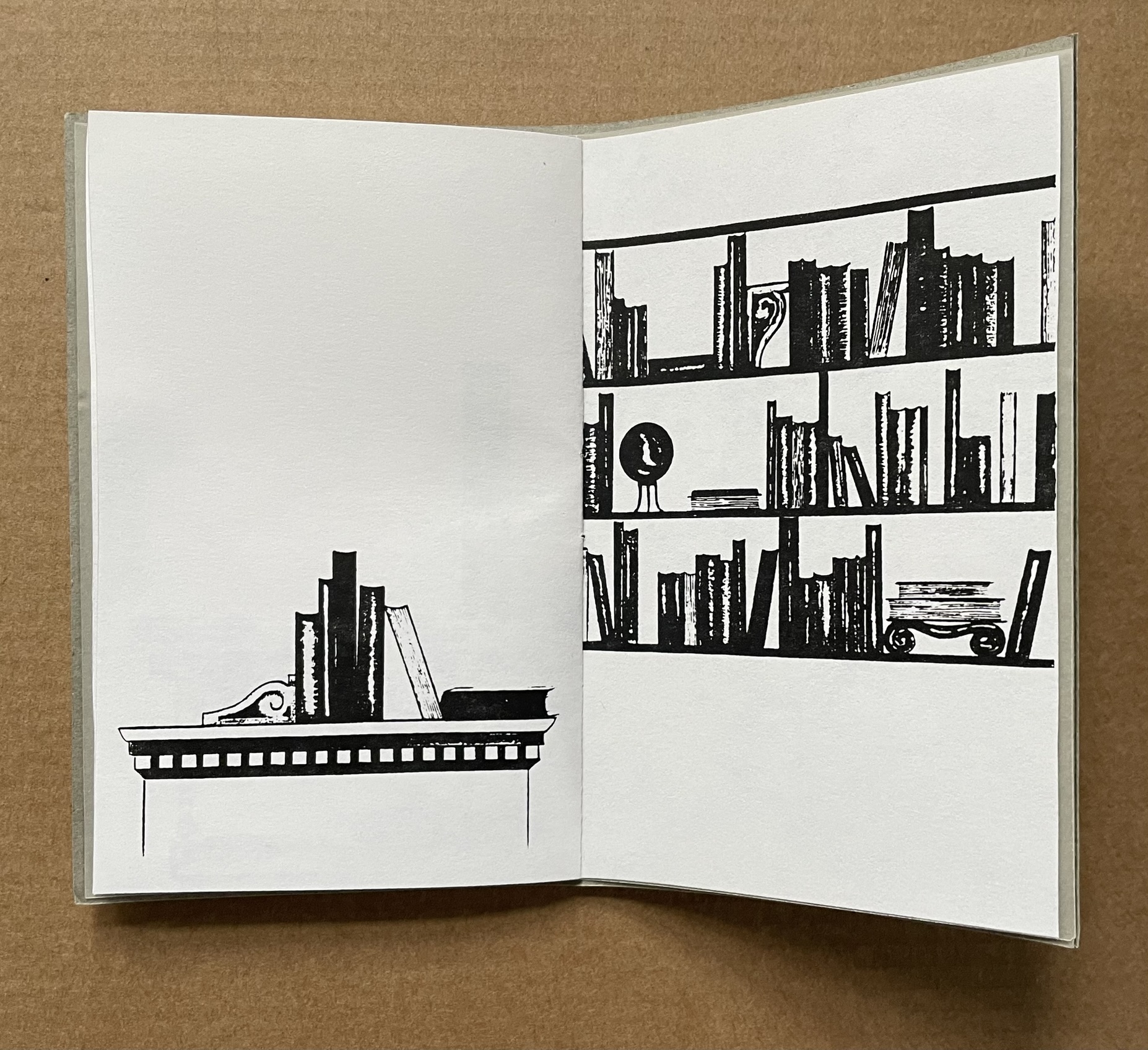
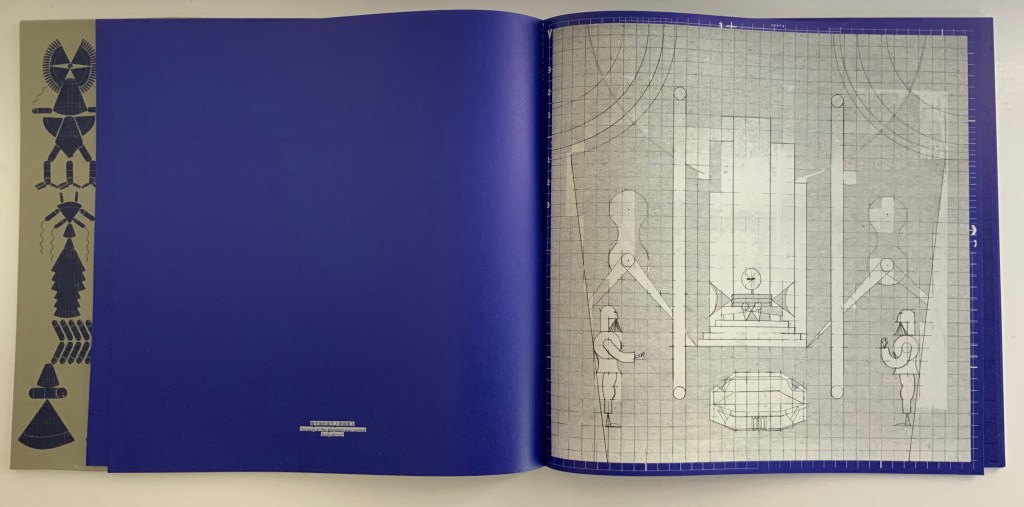
Noble has expanded and intensified his small garden homage into a slender and rich work of book art. The sculpted structure of it — how the cover, pages, images and text work with each other — rhymes with Finlay’s art, Greek mythology and Nature. Noble’s choice of the portal to Apollo’s Temple to link the found brick and arch of marble fragments to Little Sparta and Finlay’s art finds one of its echoes in the cover’s cutout and the marble-white textured board behind it. Another echo lies in the words “metamorphosis” and “metaphoric” laid out to form an arch on the page below. And just as sonic echoes overlap one another, the words and image themselves echo across the double-page spread with the laurel leaf emblem of Daphne’s transformation to escape the pursuit of the lyre-bearing sun god and mythic patron of poets laureate.
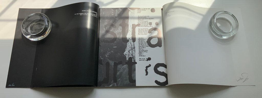
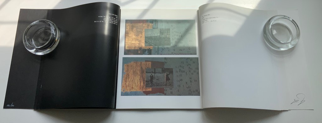
Other overlapping echoes arise from the Greek and English word pairs on the double-page spread below. The presence of the Greek words obviously chime with Apollo’s Temple, but the presence of the English chimes more deeply with the word “metamorphic”. What is a translation if not a metamorphosis? And the rhyming of “lyre” and “liar” chimes even more deeply with “metaphoric”. What is a metaphor if not like a lyre and liar at the same time that tells us Daphne’s death is her translation into life as a tree?
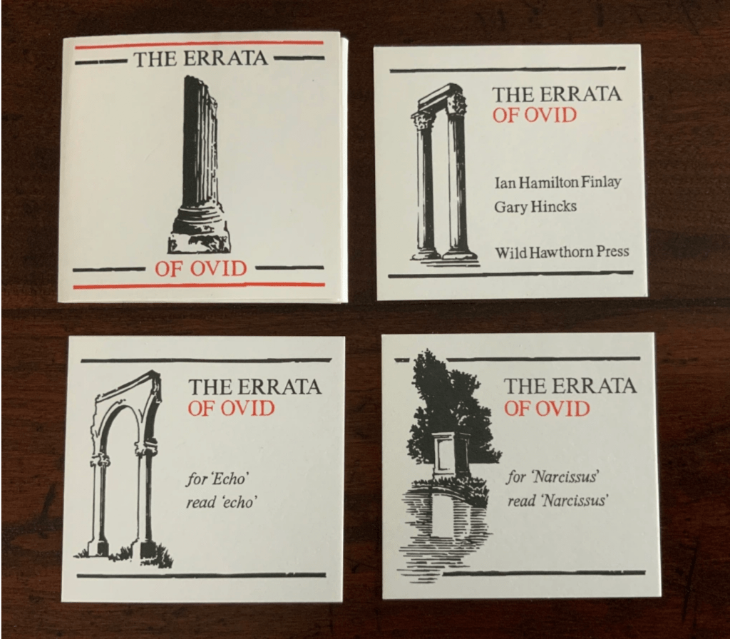
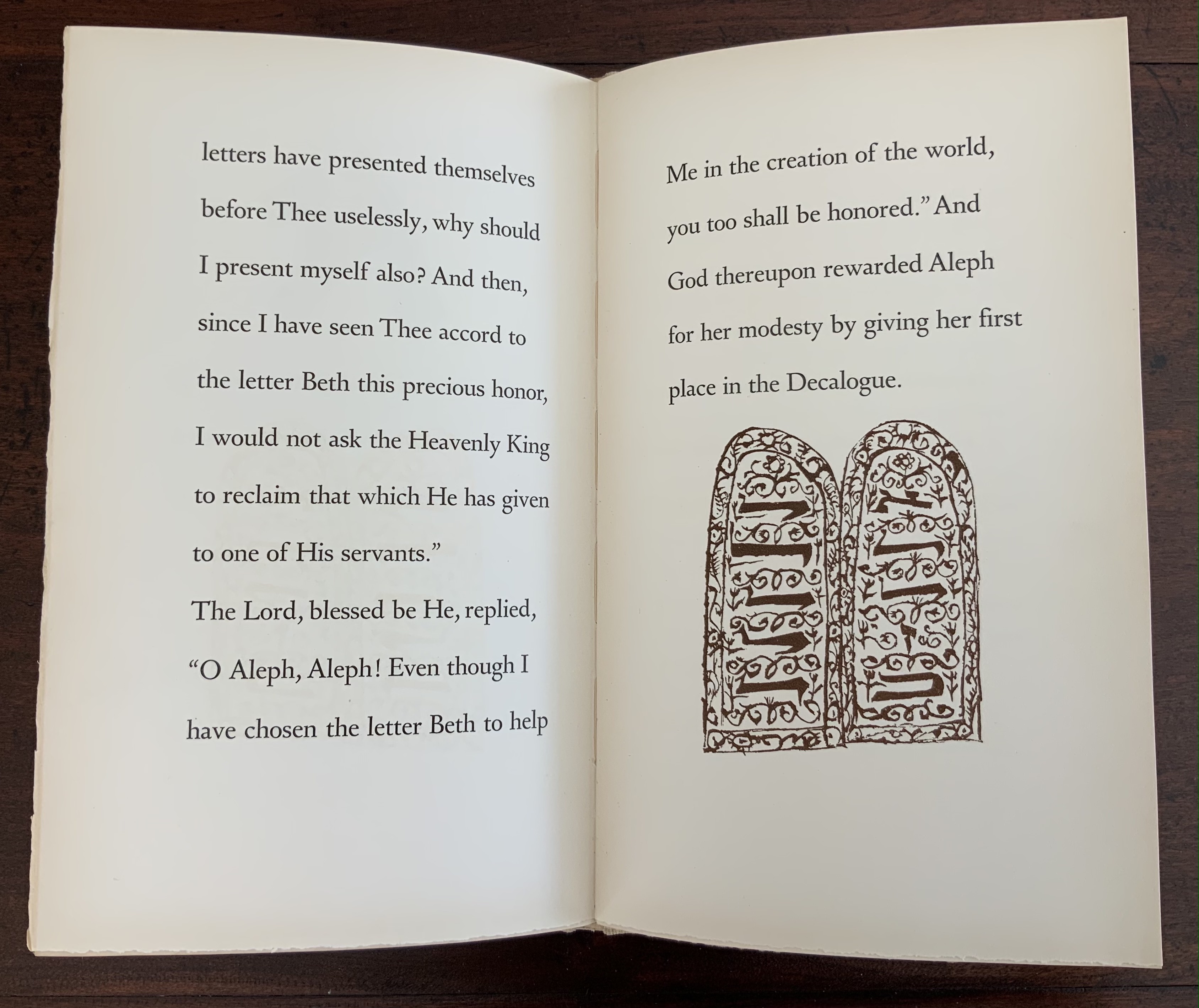
Noble’s use of “meta” for his arch’s lintel also echoes Finlay’s aphoristic concrete poetry, a good example of which is The Errata of Ovid.
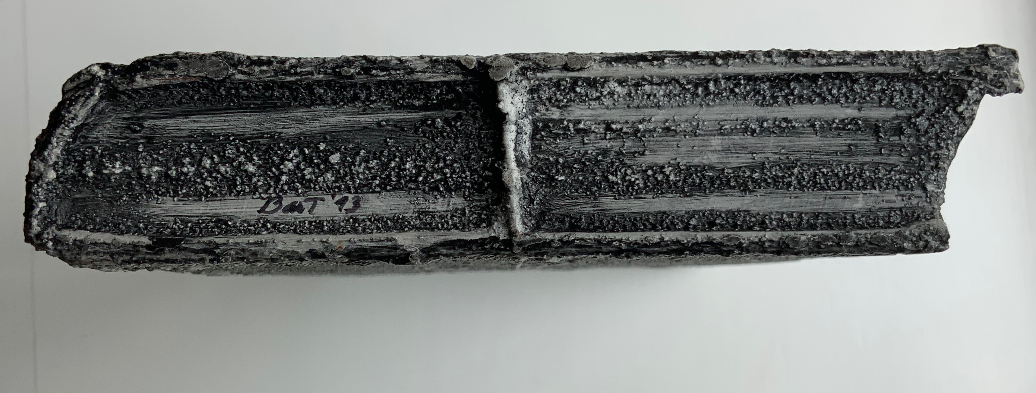
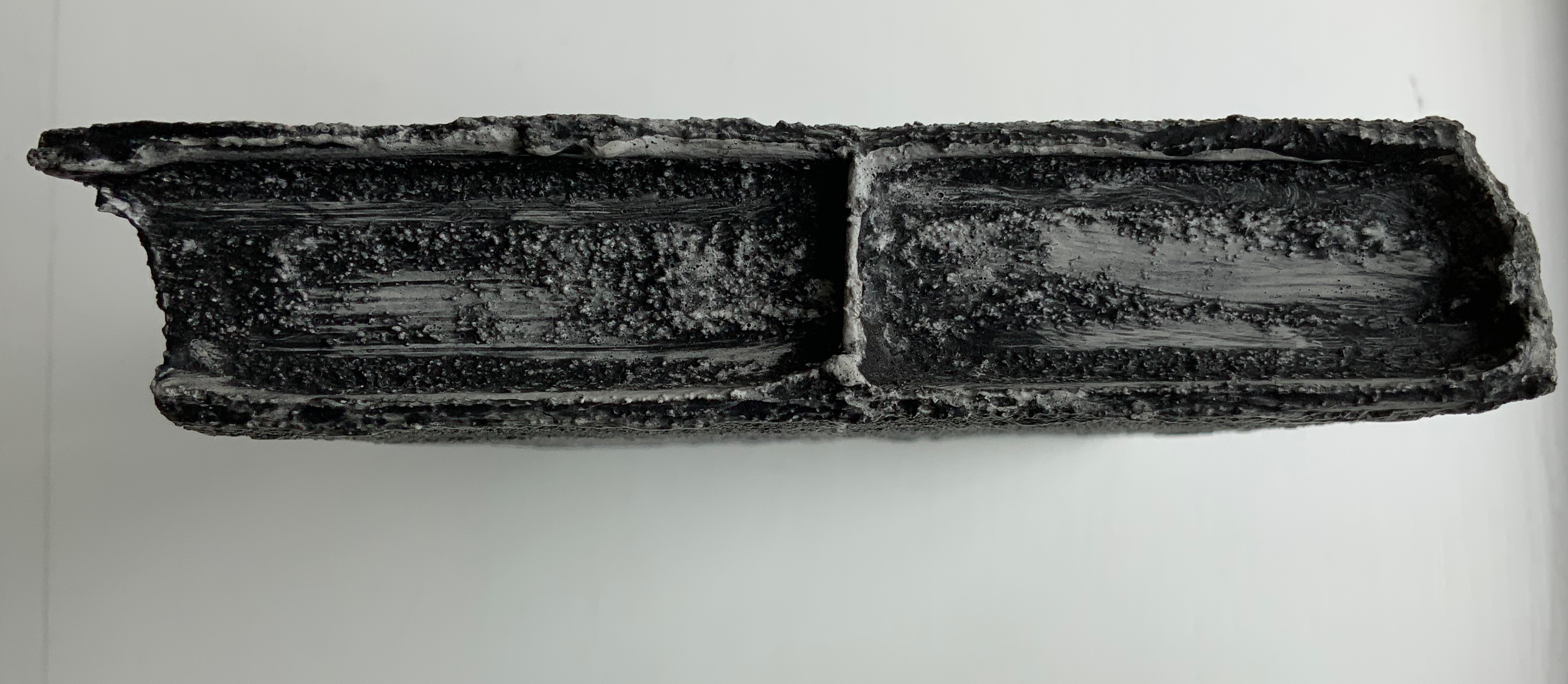
The Errata of Ovid (1983/4)
Ian Hamilton Finlay, Gary Hincks
Miniature portfolio. H76 x W80 mm.
Offset printed in red and black, eight loose cards enclosed in a flap folder. Typeset in Bruce Old Style(?); illustrations by Gary Hincks; card stock unknown.
Acquired from Woburn Books, 31 October 2019.
Photos: Books On Books Collection
Beyond the tribute of image/word-play, Noble’s artist’s book strikes a performative echo with the history of Finlay and Hincks’ artists’ book. A few years after the publication of The Errata of Ovid, Finlay drew up ”Six Proposals for the Improvement of Stockwood Park Nurseries in the Borough of Luton”, which included a caprice with a wall and plaques. The wall in Stockwood Park stands today, presenting the text of The Errata of Ovid engraved in eight stone plaques (minus the colophon but with the addition of “For ‘Adonis’ read ’Anemone’”). So Noble’s artist’s book followed his garden installation whereas Finlay’s garden installation followed his artist’s book. If only for perfection of that echo, one might wish Finlay’s installation be transported to Little Sparta and let Luton be satisfied with its airport!
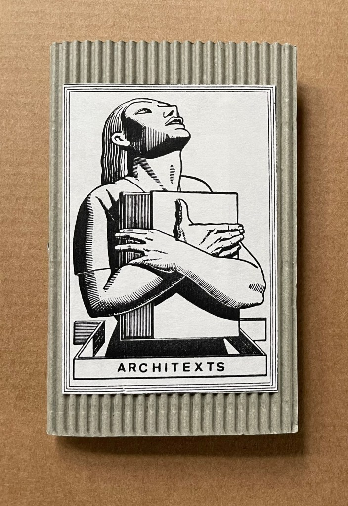
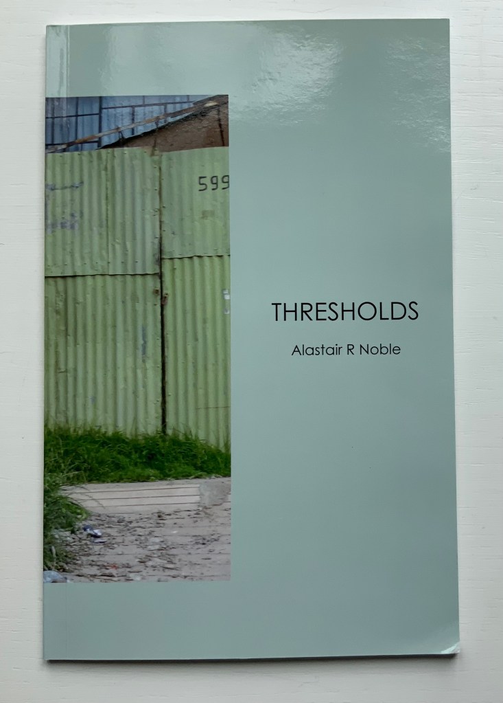
Thresholds (2020)
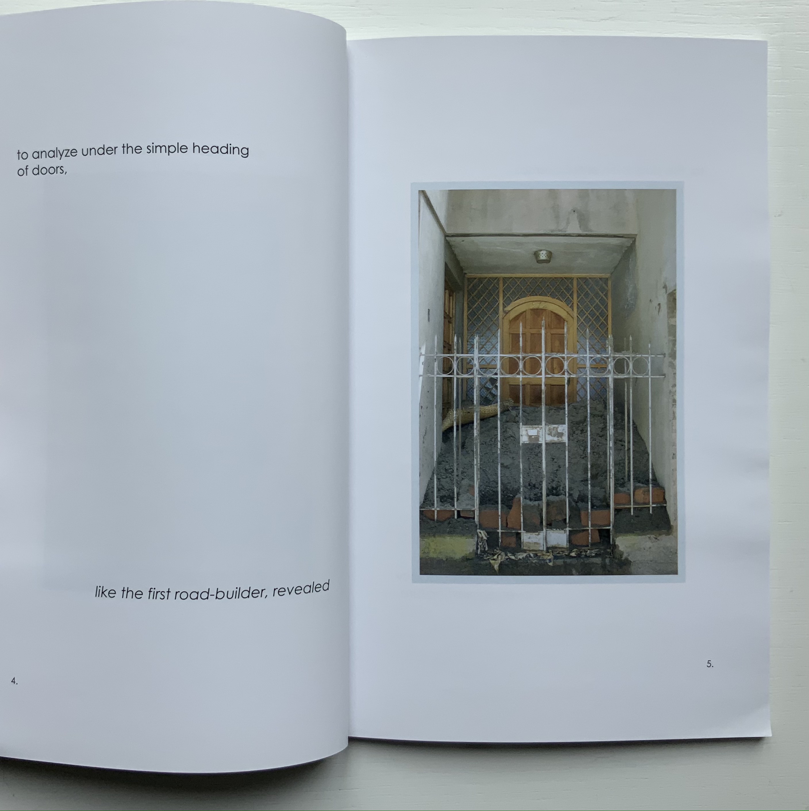
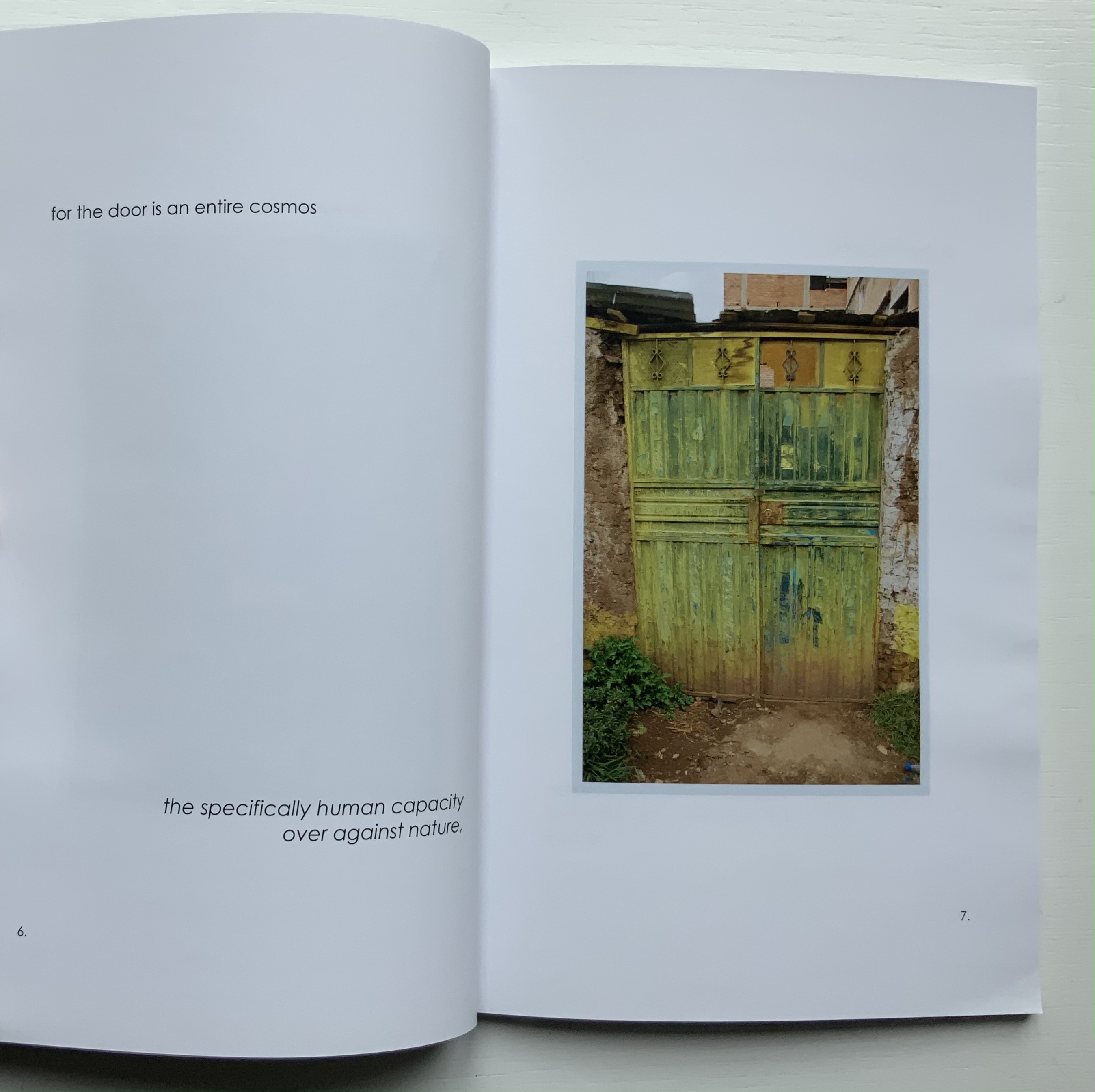
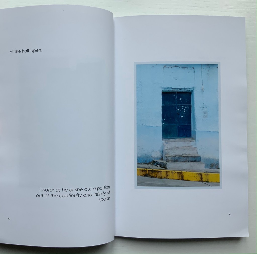
Thresholds: Doors, Gates & Barriers Puno Peru (2020)
Alastair Noble
Perfect bound paperback. H215 x 140 mm, 48 pages. Acquired from the artist, 11 May 2021.
Photos of the work: Books On Books Collection.
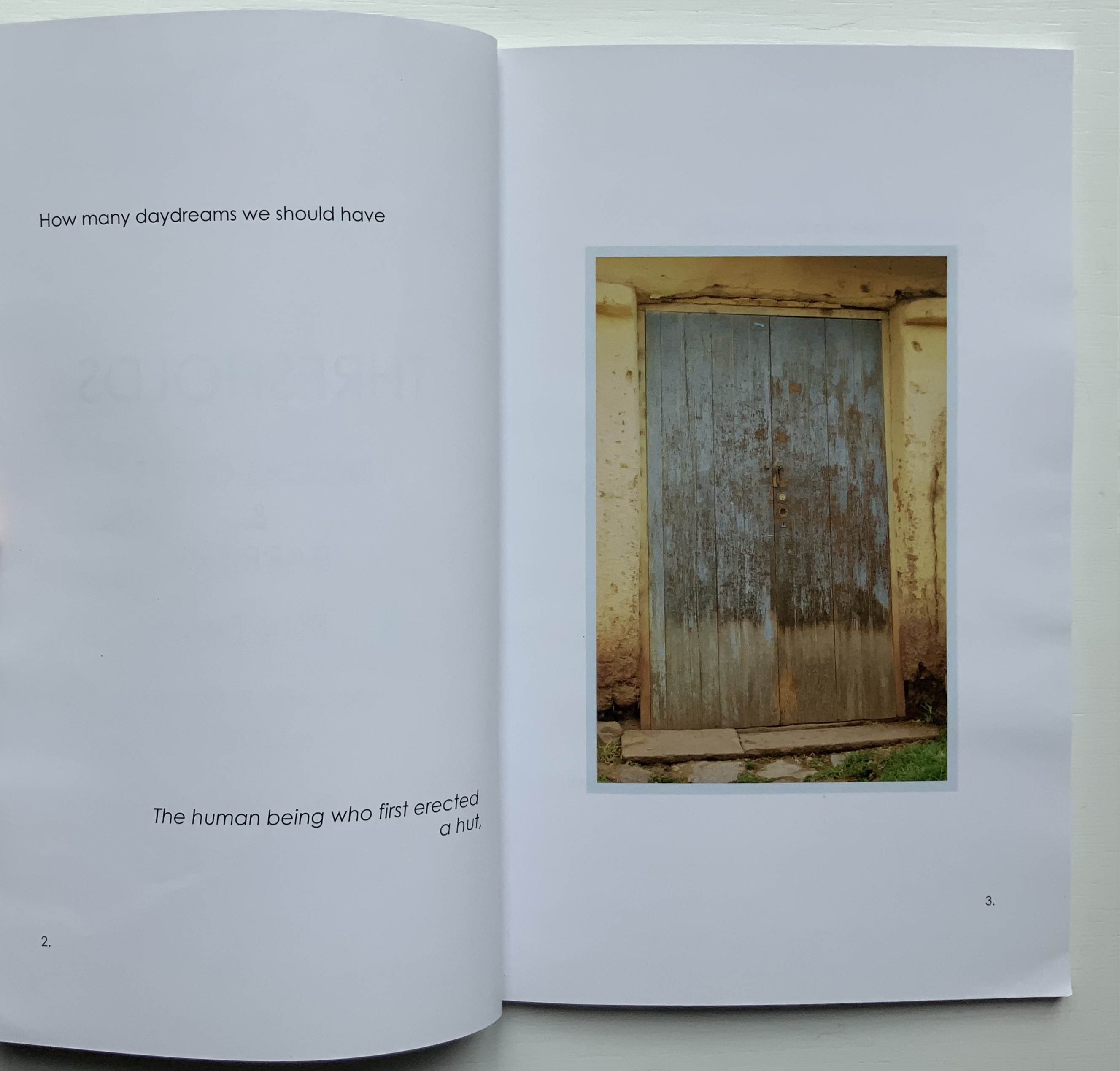
Like In Memoriam+, this work has its roots in location and a portal metaphor. While also employing juxtaposition of text and images as a structural device, it relies on images of a category of sought readymades (doors, gates and barriers) rather than a found object (like the garden brick on which the artist builds his arch) for a structuring device that is simultaneously material and metaphor.
The way Noble uses his sources of text (Gaston Bachelard’s The Poetics of Space, Martin Heidegger’s “Building Dwelling Thinking” and Georg Simmel’s Bridge and Door) causes the reader/viewer to contribute to structure and metaphor. The first sentence of Bachelard’s excerpt begins “How many daydreams” and starts at the top of page 2; Heidegger’s beginning “The threshold” starts in the middle of page 26; and Simmel’s beginning “The human being” starts at the bottom of the page 2. Bachelard’s first sentence ends on page 8, Heidegger’s on page 28, and Simmel’s on page 12. Unless one has the mind of a symphonic composer or connoisseur, it is impossible to attend to all three excerpts simultaneously and turn the pages in one sequence. Instead, it is necessary to turn the pages back and forth along three tracks to absorb the excerpts, and the metaphoric effect is to open and close those doors, gates and barriers repeatedly, which is …
… what Noble’s very last page implies.
But finally, over the course of multiple readings/viewings, the linear photographic sequence on the recto pages seems to shift. Each image takes on a different aspect depending on the excerpt being followed. Combined with the back and forth page-turning, this shifting and break in the linear photographic sequence leaves the reader/viewer with the simulation of walking around, up and down and through Puno and its doors, gates and barriers.
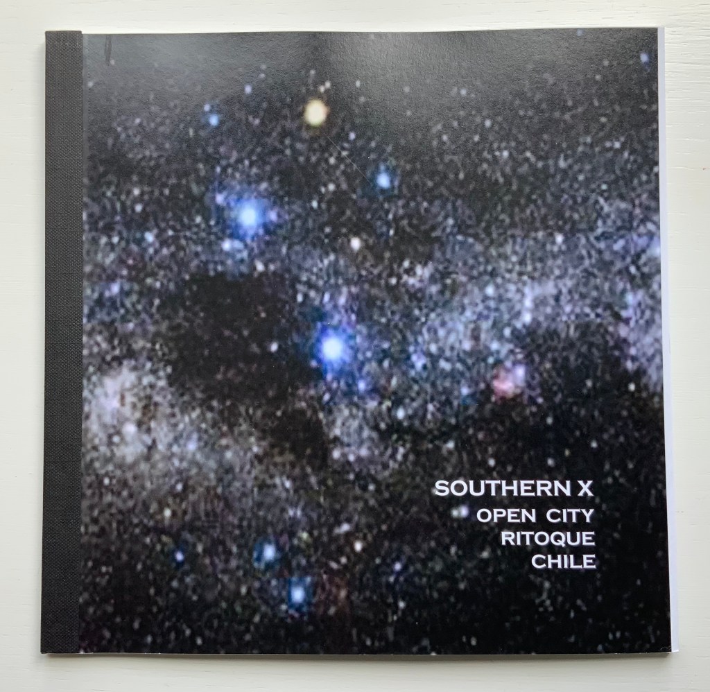
Southern X 2006 : Open City, Ritoque Chile (2006)
Southern X 2006 : Open City, Ritoque Chile (2006)
Alastair Noble
Perfect bound paperback, spine taped. H215 x W218 mm, 32 pages. Acquired from Specific Object, 2 May 2021.
Photos of the work: Books On Books Collection.
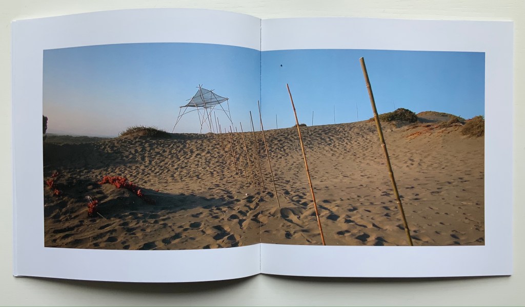
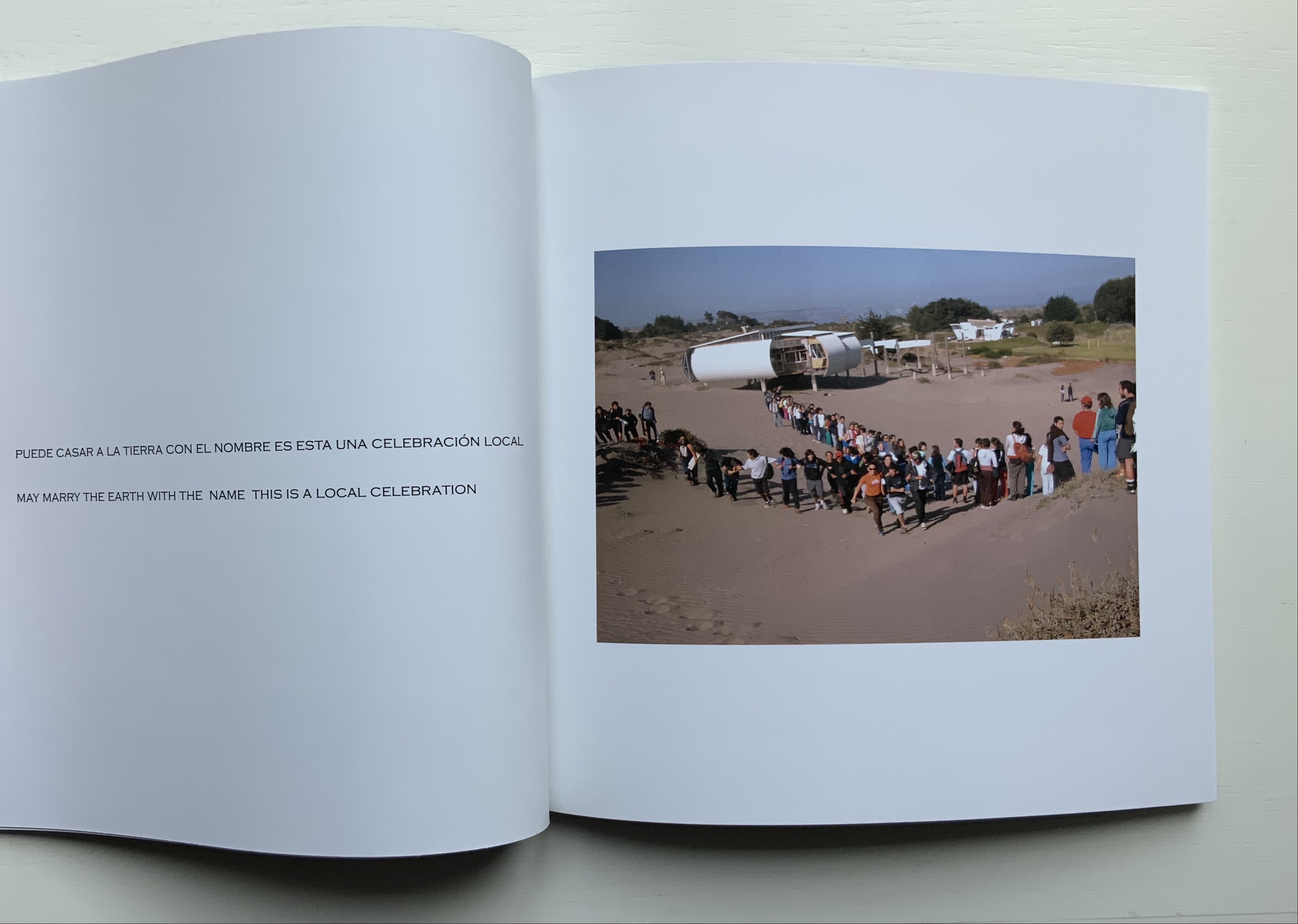
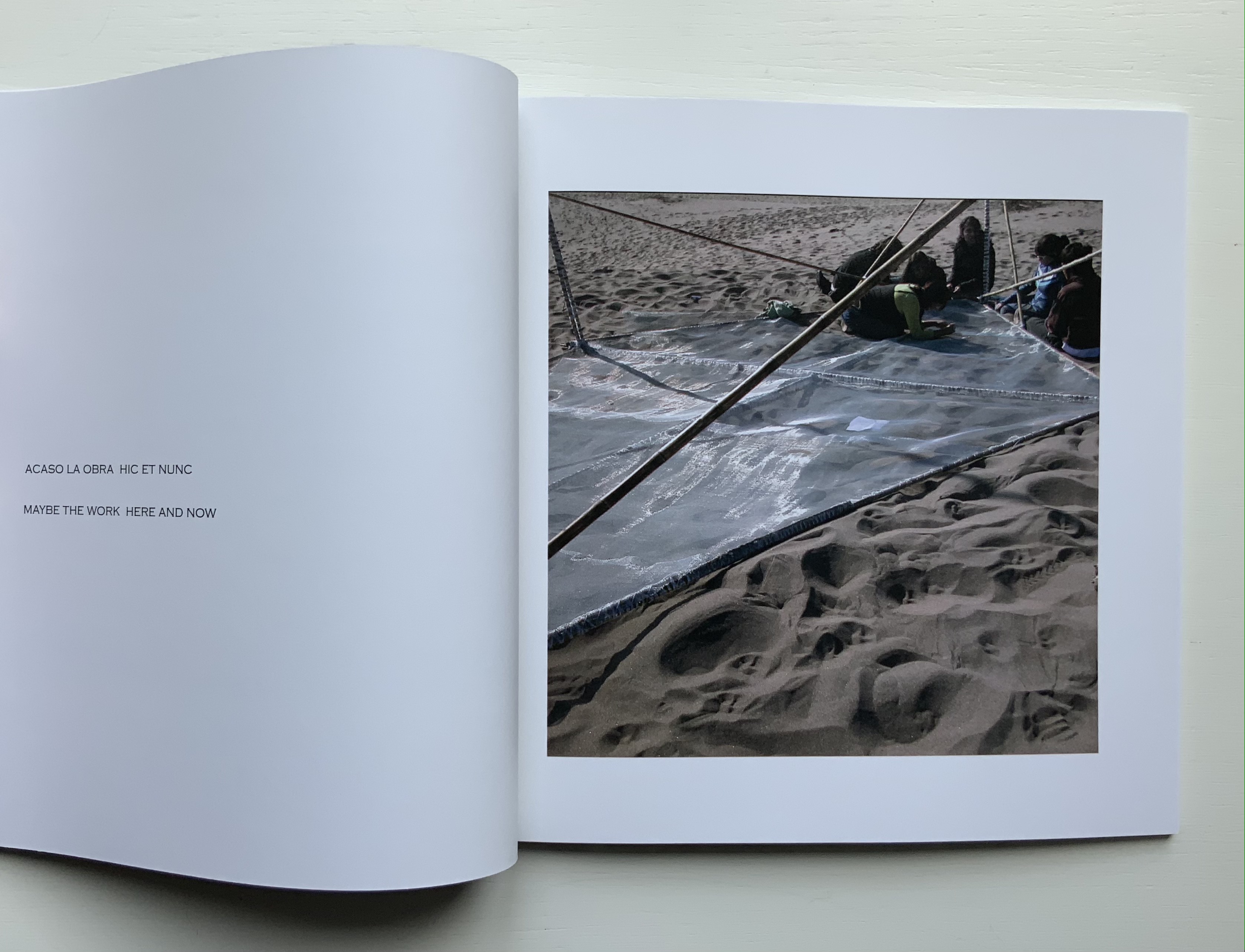
Like Thresholds, this work, too, has its roots in location, but more akin to In Memoriam+, it draws on poetry, installation and performance. Open City is a utopian site affiliated with the School of Architecture of the Catholic University of Valparaíso. Accommodations and buildings have arisen by collective collaboration. There is no plan. One of the traditions associated with construction on the site is the reading of excerpts from the book Amereida (1967), a collective epic poem, which the school describes as “a poetic vision of the American continent”.
Reading the text takes us into the permanent question about being American from the recognition of the appearance of America seen as a discovery or gift. From the first page of the poem, the encounter with the unknown opens the possibility to begin to think of the new world as a gift, a gift. Its main sign: the Southern Cross, the light that goes up the horizon and guides in the north. — “Amereida“
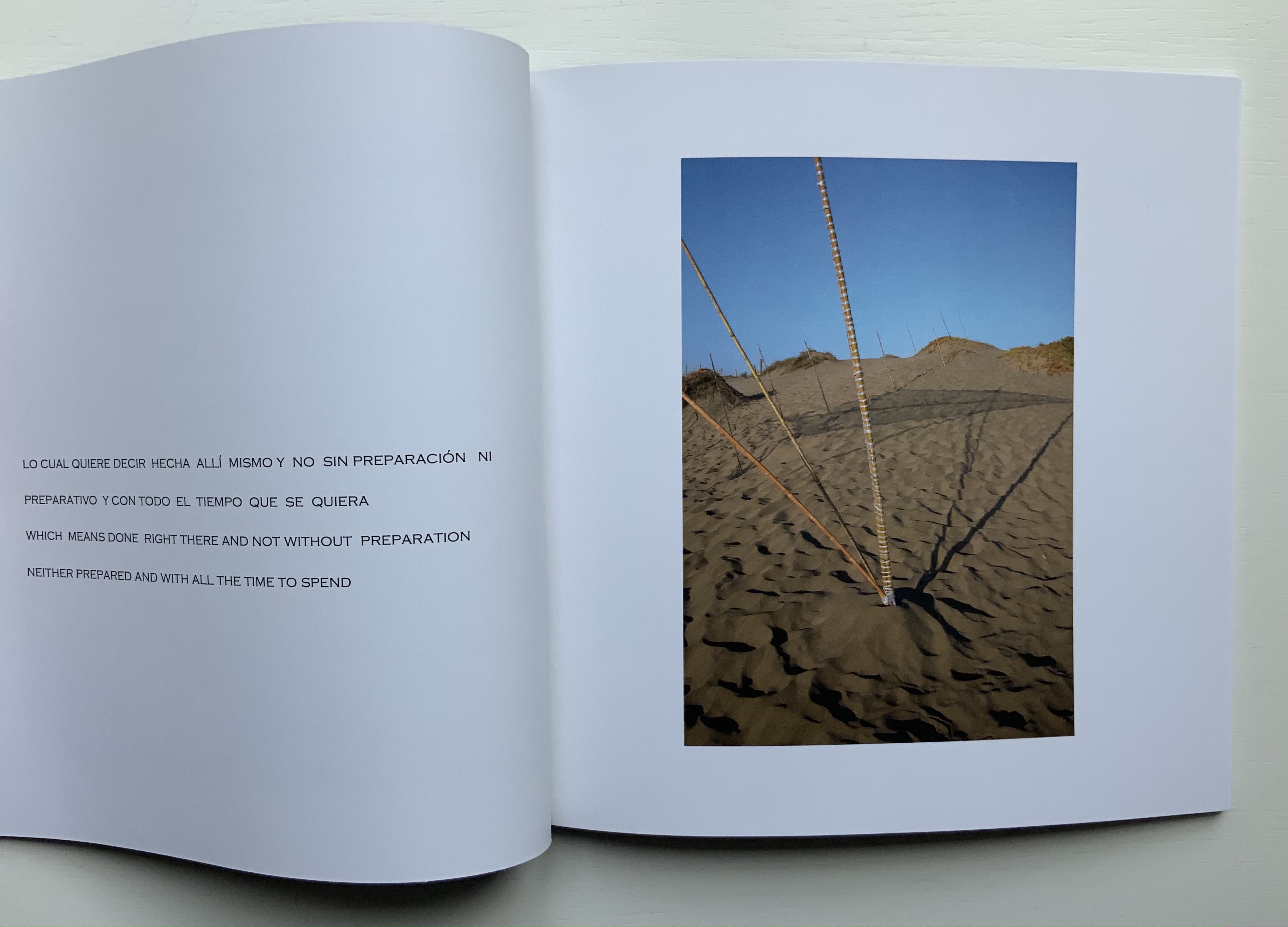
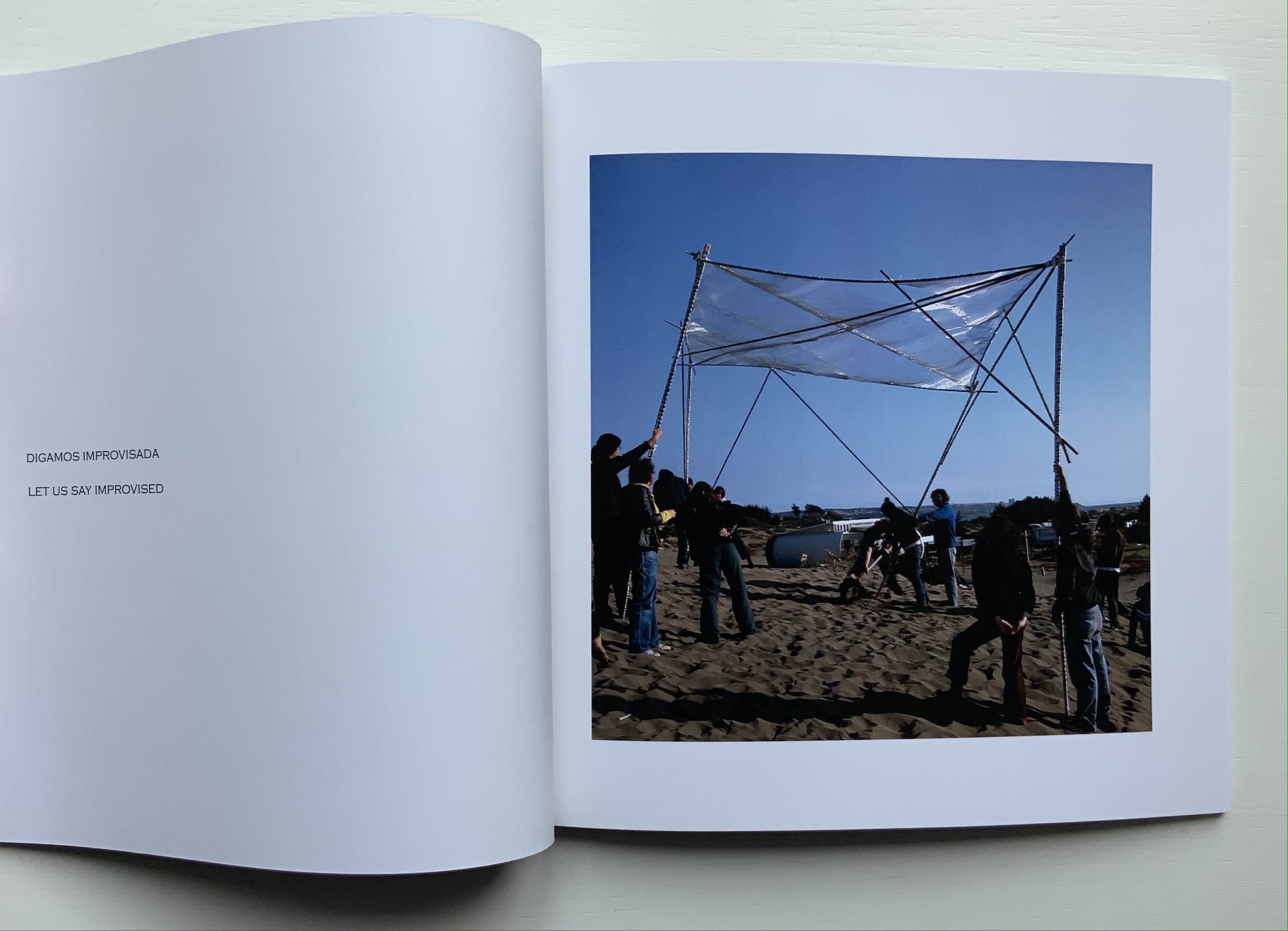
Inspired by the Amereida during a sabbatical visit to the school and Open City, Noble proposed an installation: Southern X 2006. Given that the Amereida takes the Southern Cross for its main sign and that this sign appears across the night sky in the shape of a kite, Noble’s direction for his installation sculpture was set before he began.
The actual sculpture is but a piece of a larger collective artwork consisting of Manuel F. Sanfuentes Vio’s reading from the Amereida, the students’ procession in the shape of the Southern Cross to the site selected by Noble, the collective construction of the kite, the planting of poles and the placement of the kite on them — and of course this book that photographically documents the performance of the installation and textually presents the read passages of the Amereida.
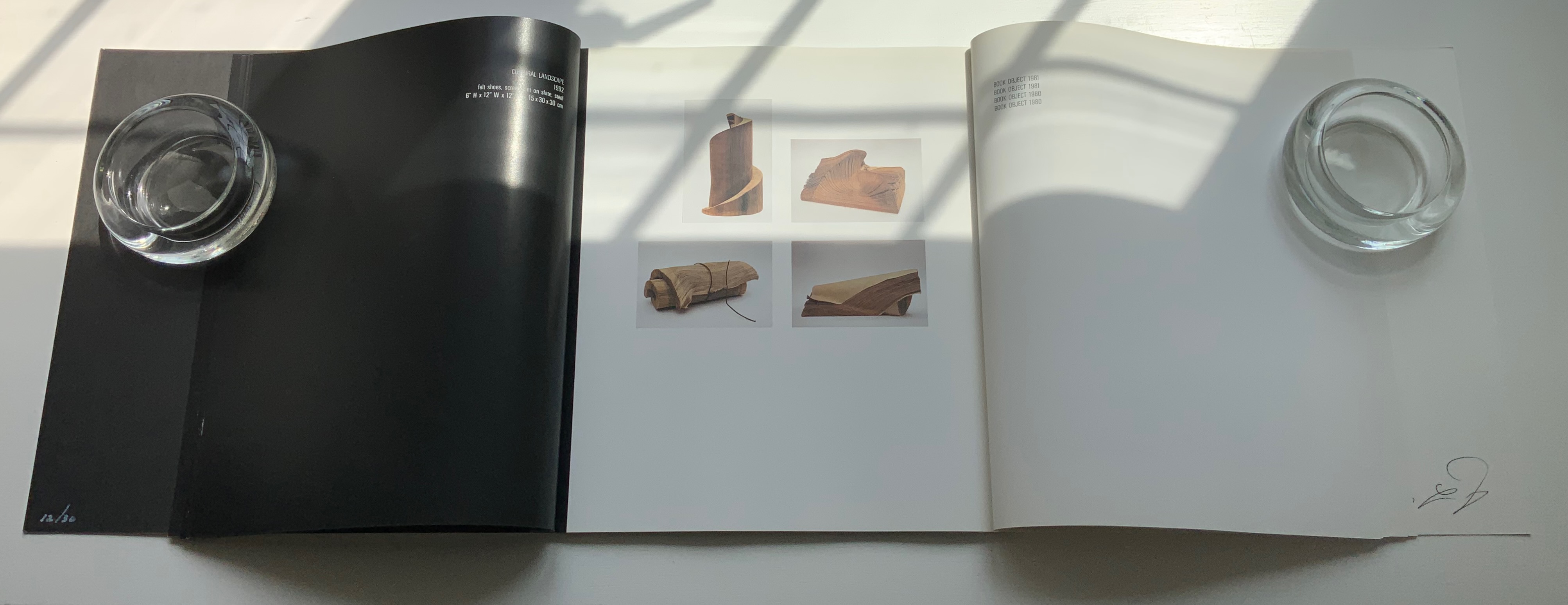
Foldings (1998)
Ephemera for Foldings (1998) Kathy Bruce and Alastair Noble. Poster and staging sketches.
Photo: Books On Books Collection.
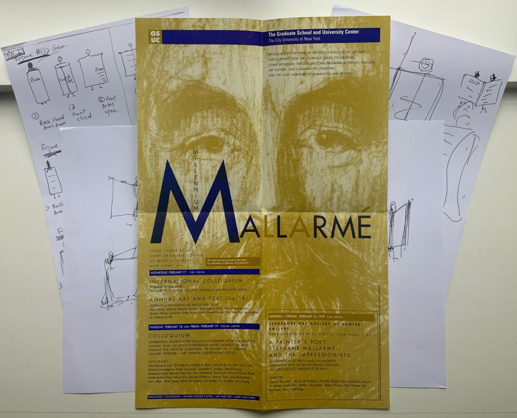
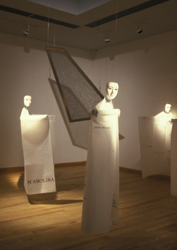
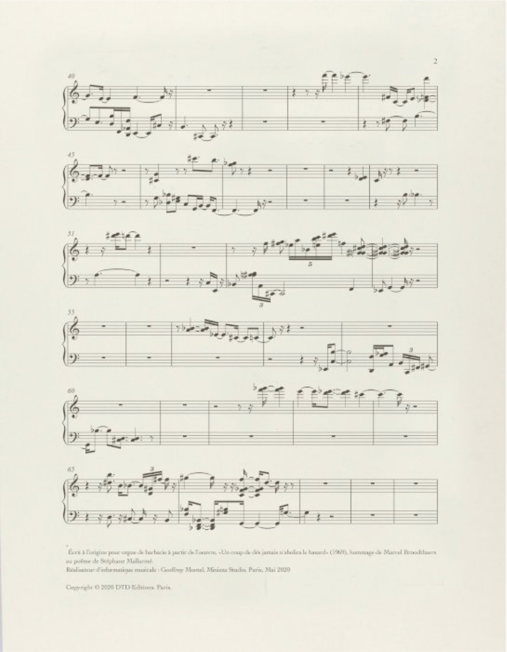
With Foldings, Noble joined forces with Kathy Bruce, his wife. Six masked dancers wear costumes that are in effect human-size folios across which the pages of Un Coup de Dés have been printed front and back in French. As a prerecorded English translation is read by numerous voices corresponding to the changing fonts, the dancers rotate and display the lines being read. A performance was given as part of the exhibition A Painter’s Poet, held at the Leubsborf Art Gallery (Hunter College). This fell under the aegis of the Millennium Mallarmé celebrations in New York, the poster for which can be seen above overlaying the staging sketches for the performance. Later, as part of an installation under the title Navigating the Abyss (Brookdale Community College, Lincroft, New Jersey), the costumes were suspended from the ceiling along with a framed screen mesh reminiscent of Noble’s As if / As If (see above).
Postcard from the performance (1998). Images from the installation Navigating the Abyss © Kathy Bruce and Alastair Noble. Permission to display from the artists.
Photo of staging sketches and poster: Books On Books Collection.
Further Reading
“Ian Hamilton Finlay“. 3 November 2019. Books On Books Collection.
“Un Coup de Dés Jamais N’Abolira l’Appropriation” — An Online Exhibition”. 1 May 2022. Bookmarking Book Art.
Admin. 25 October 2011. “Alastair Noble exhibits Babel/Babble at the SCGP Art Gallery” Simons Center for Geometry and Physics. Accessed 18 June 2021.
Danto, Arthur. December 2020. “Making Choices“. Art Forum. Accessed 18 June 2021.
Howard, Michael. 1 September 2008. “Alastair Noble: Imagination Made Material“. Sculpture Accessed 18 June 2021.
Noble, Alastair. May 2007. “Open City“. Sculpture 26 (4): 20-21. Archived from the original on 31 August 2017. Accessed 29 April 2021.
Pendleton-Jullian, Ann M. 1996. The road that is not a road and the Open City, Ritoque, Chile. Cambridge: MIT Press.
Pérez de Arce, Rodrigo, Fernando Pérez Oyarzun, and Raúl Rispa. 2003. Valparaiso School: open city group. Basel: Switzerland.