The Abolition of Chance: Sequence (2019)
The Abolition of Chance: Sequence (2019)
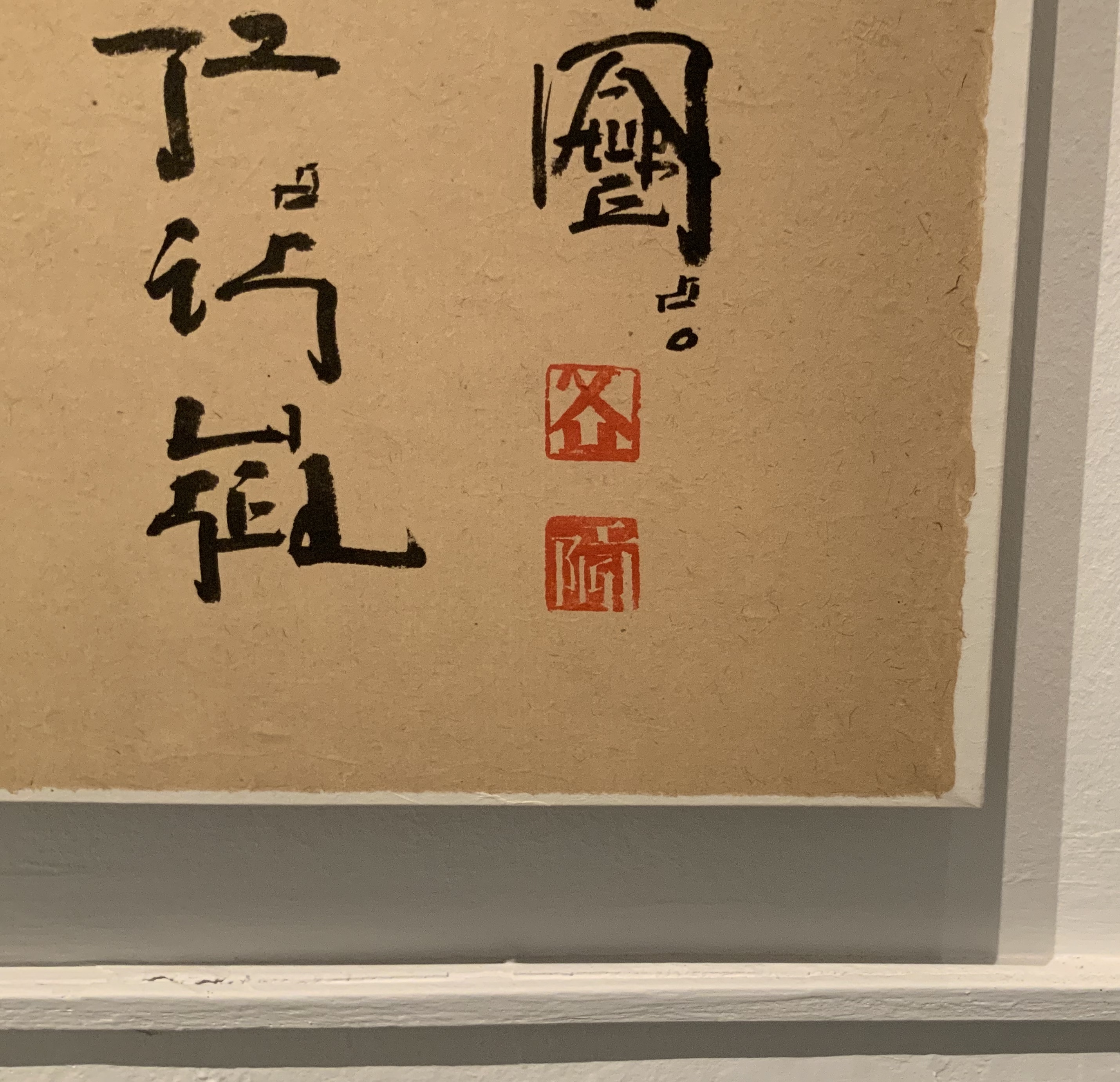
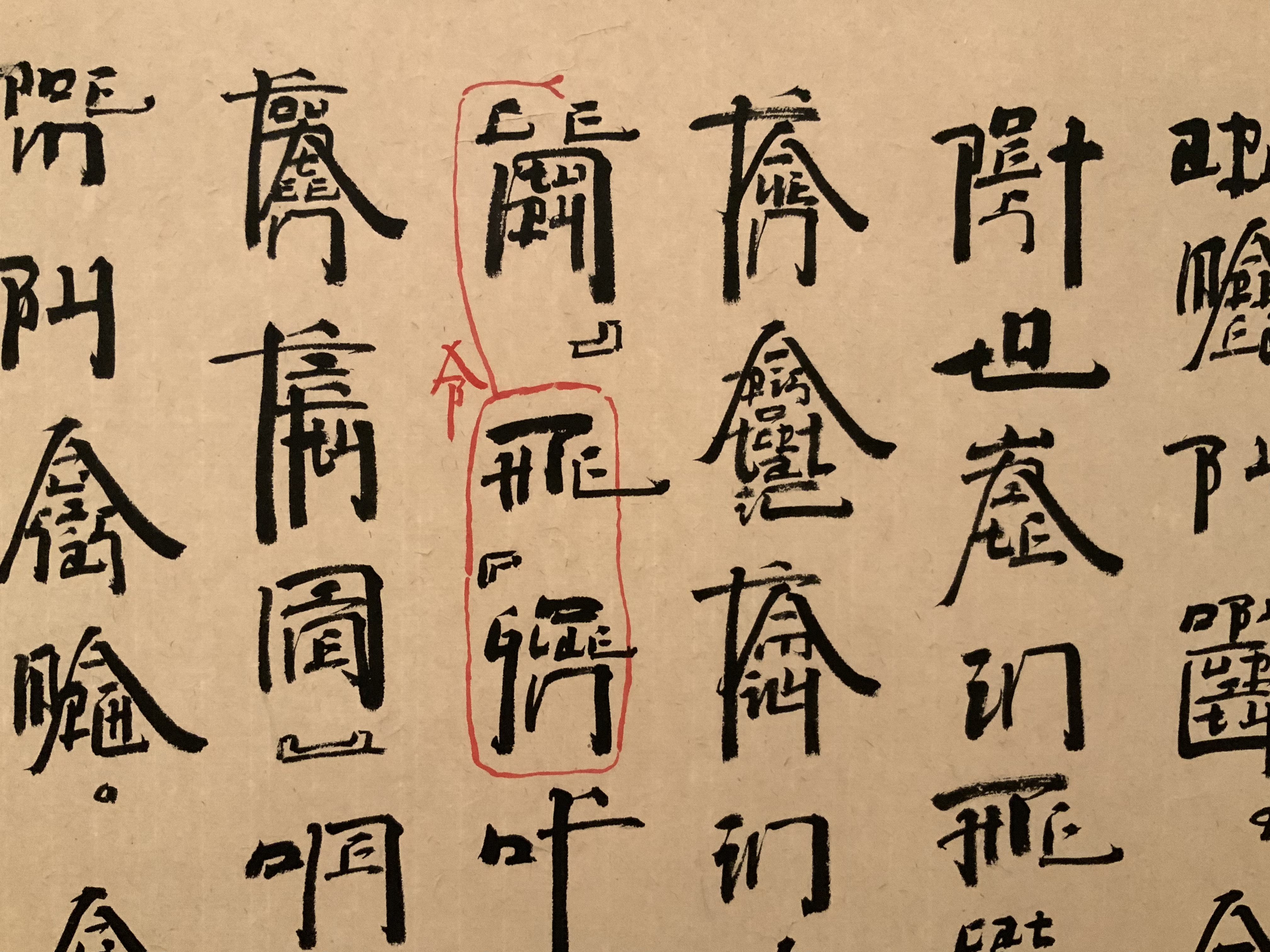
Benjamin Lord
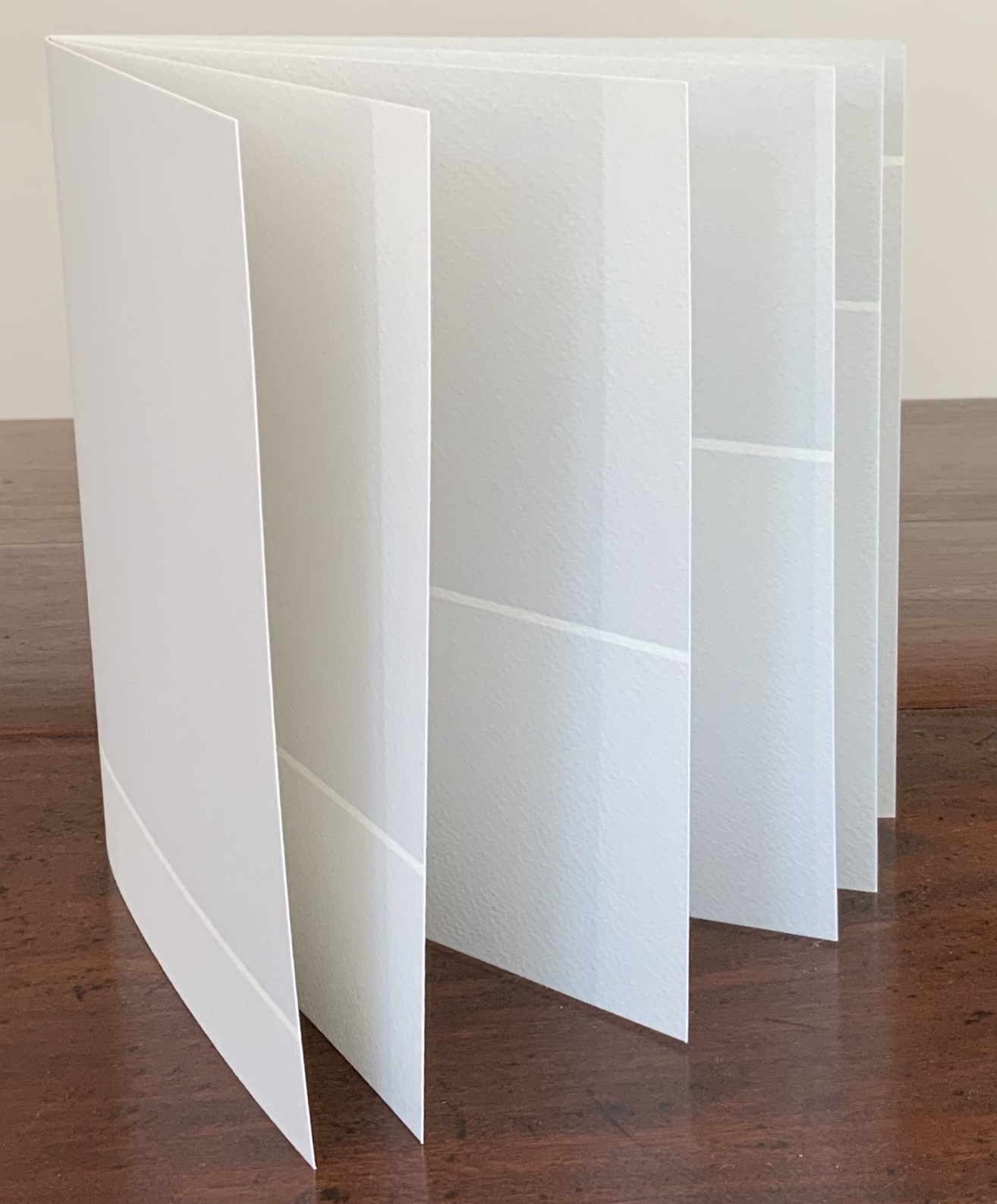
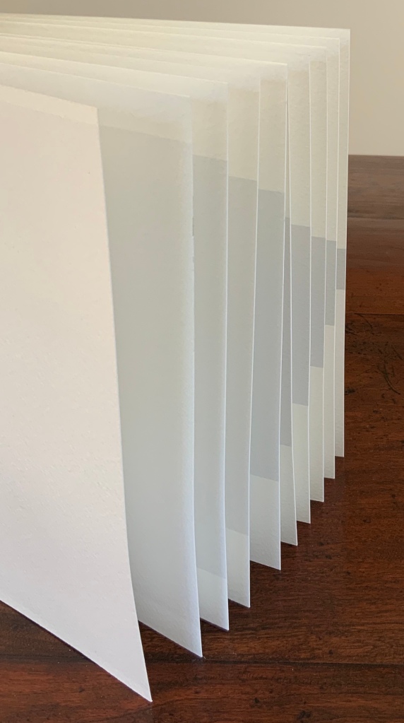
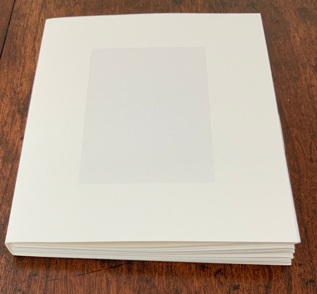
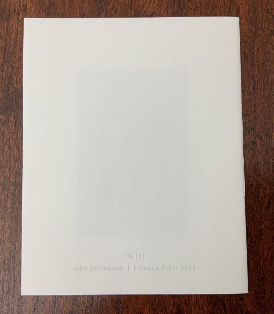
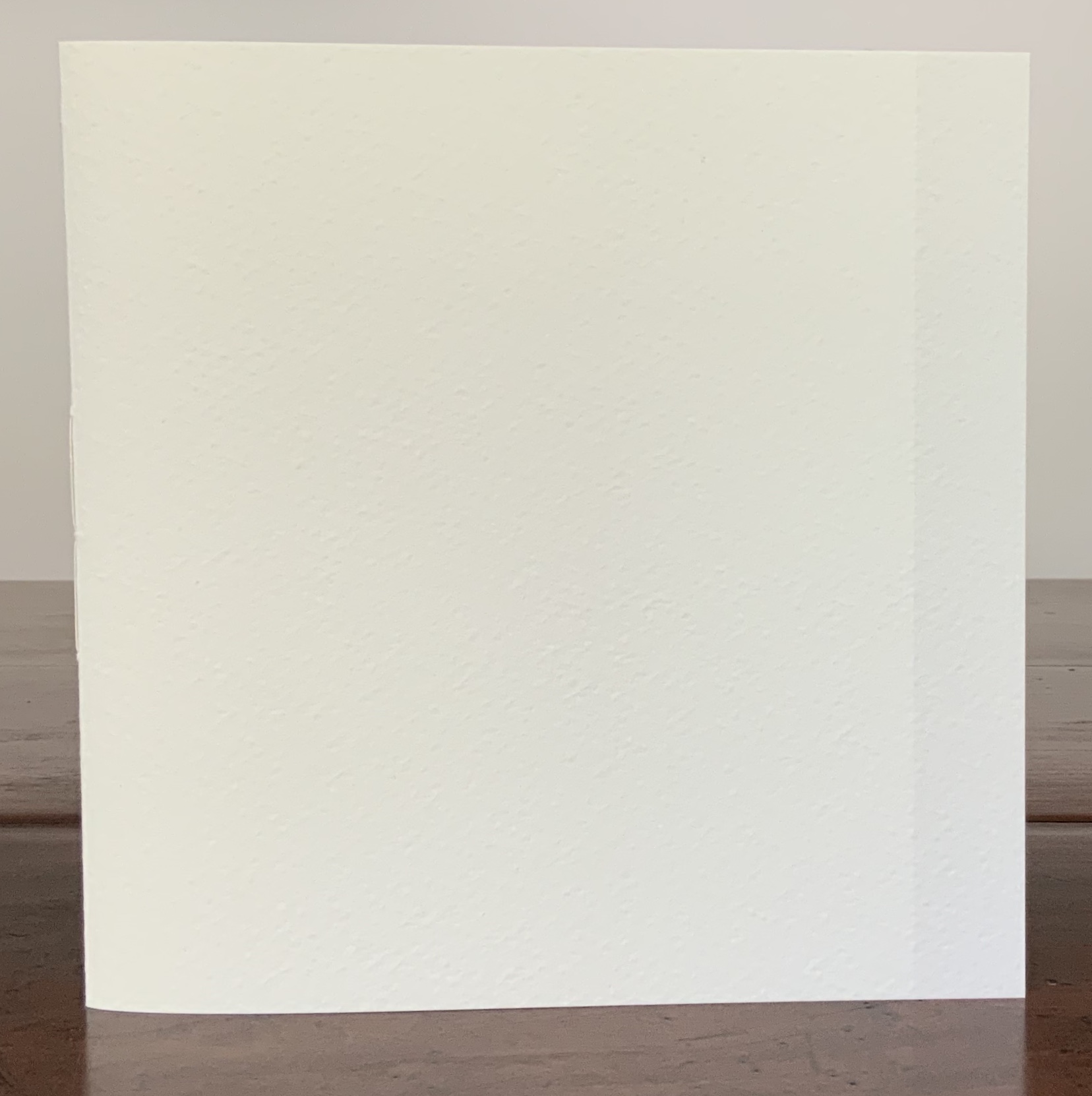
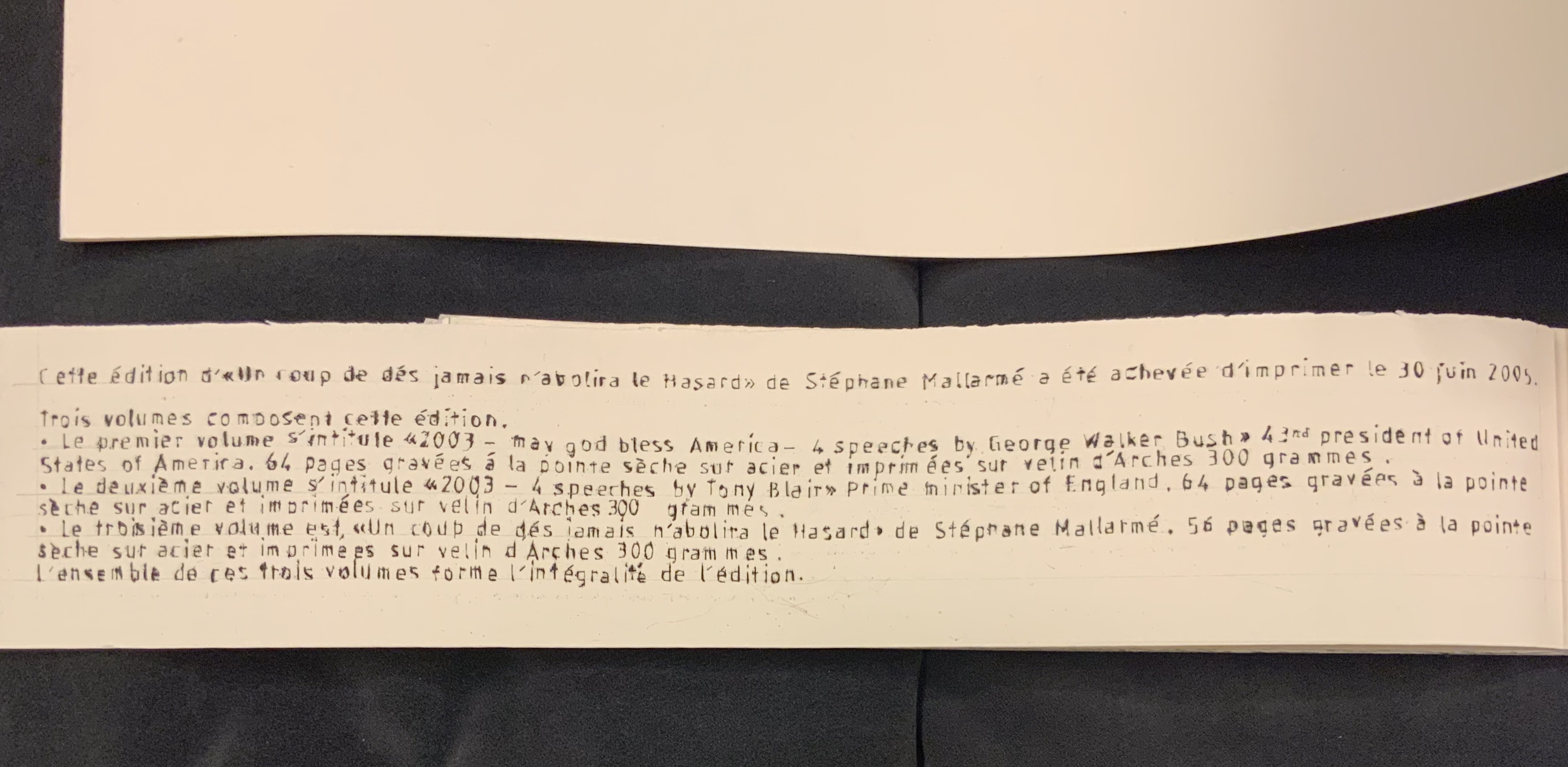
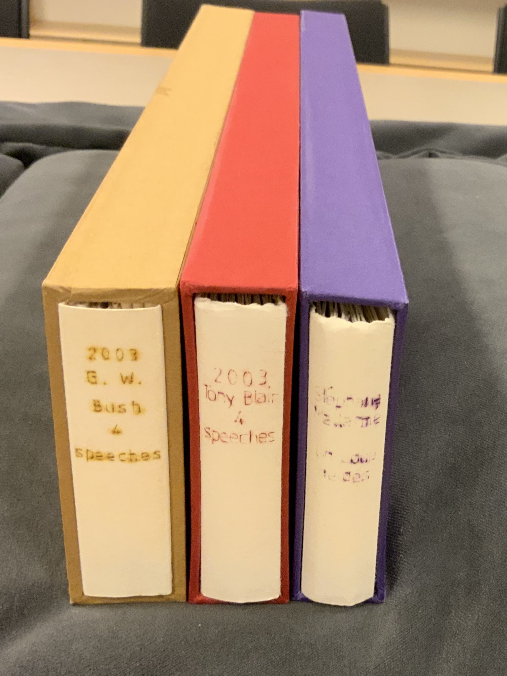
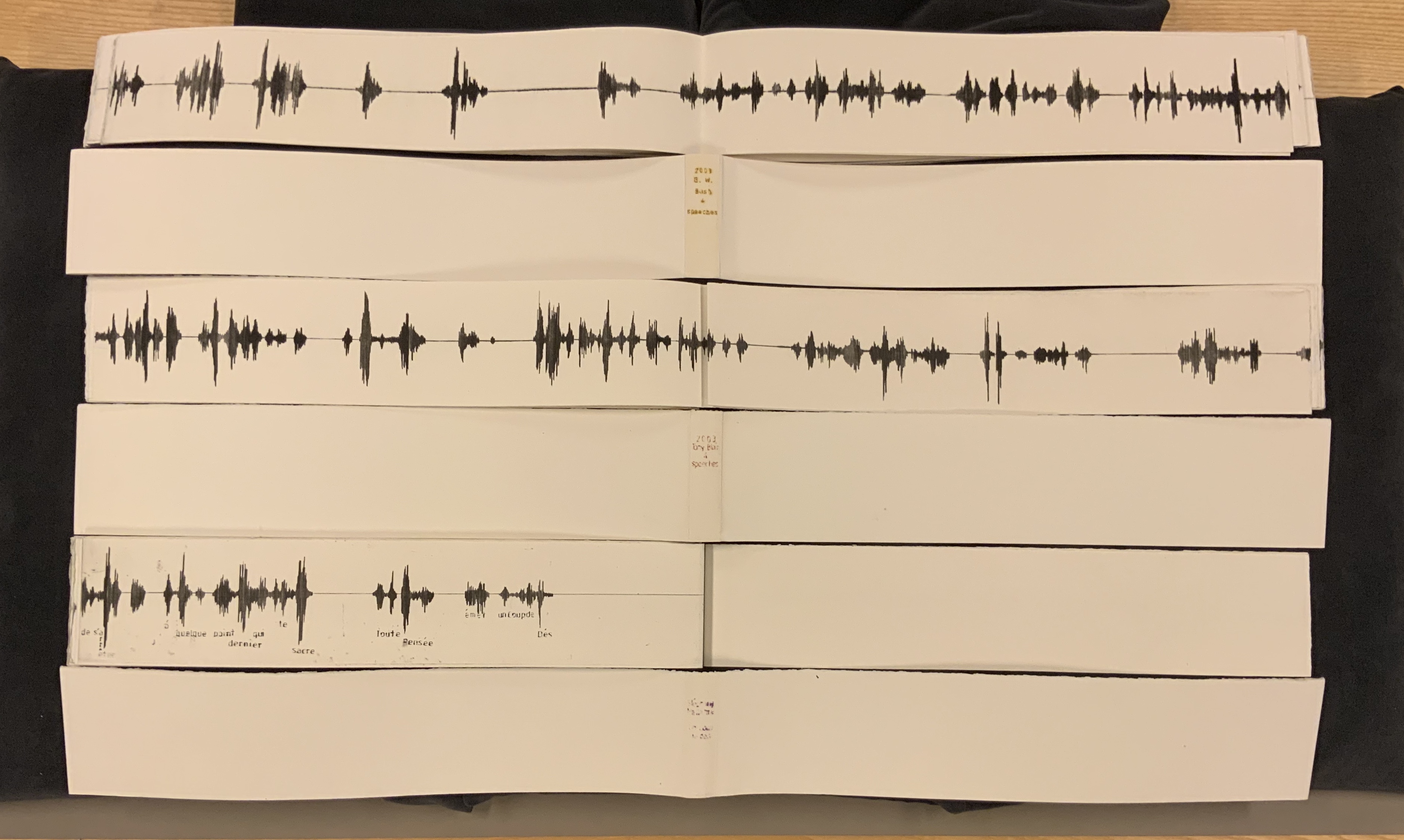
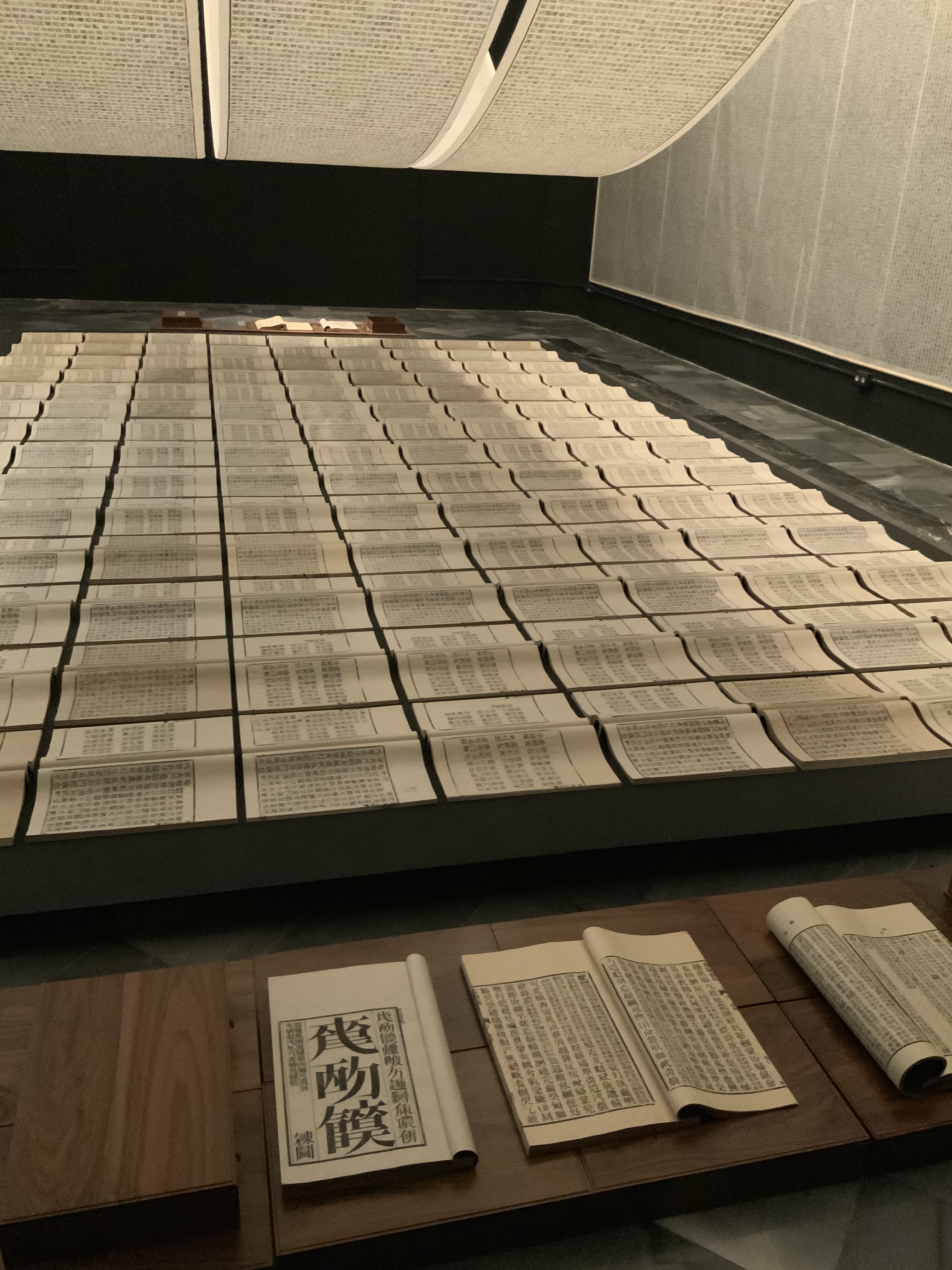
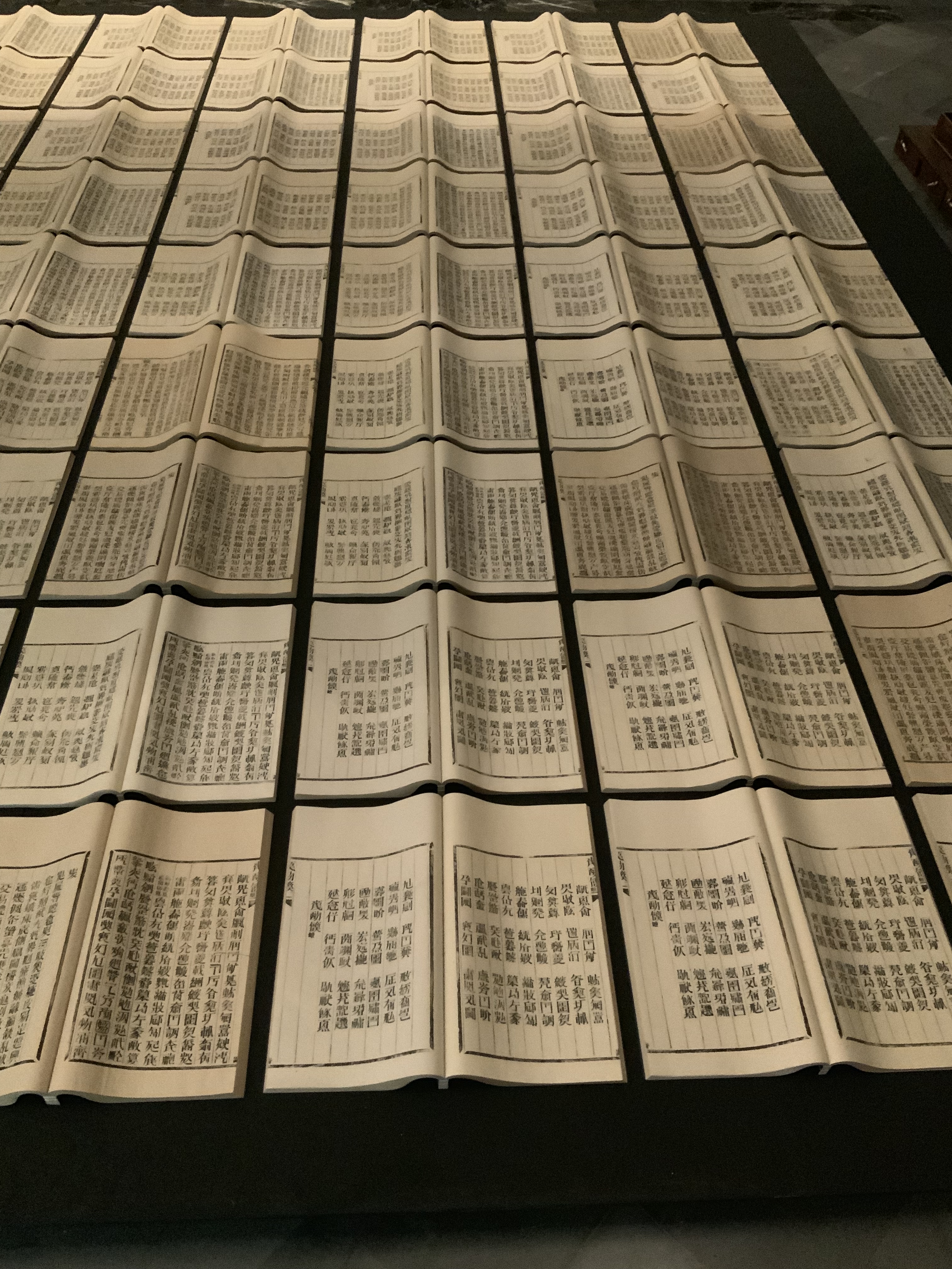
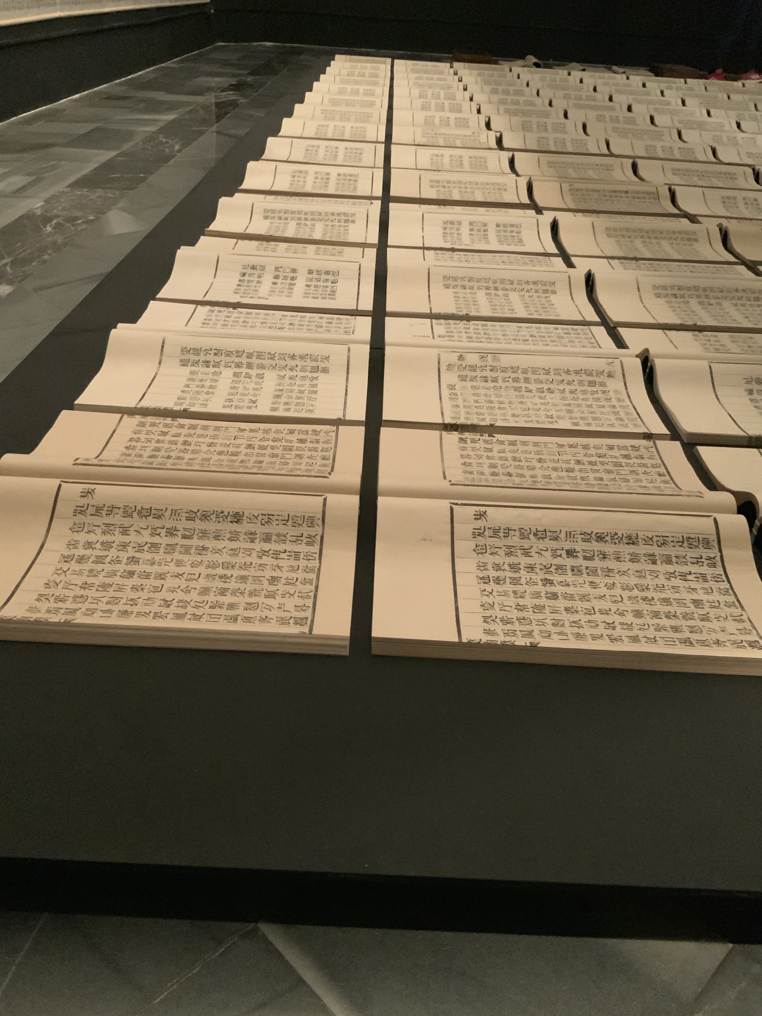
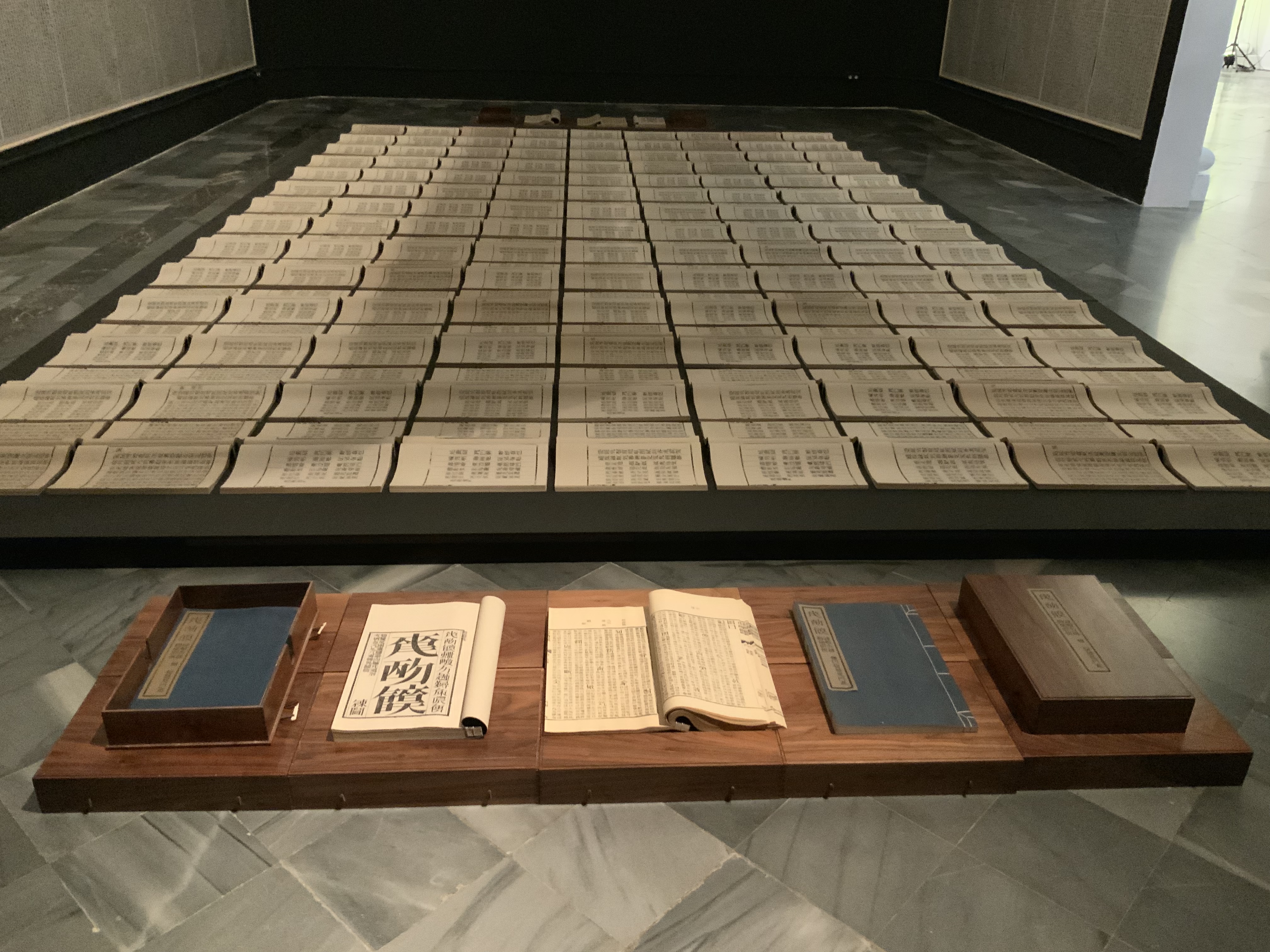
Laid finish card cover; hand-assembled perfect binding with inlaid red linen thread;
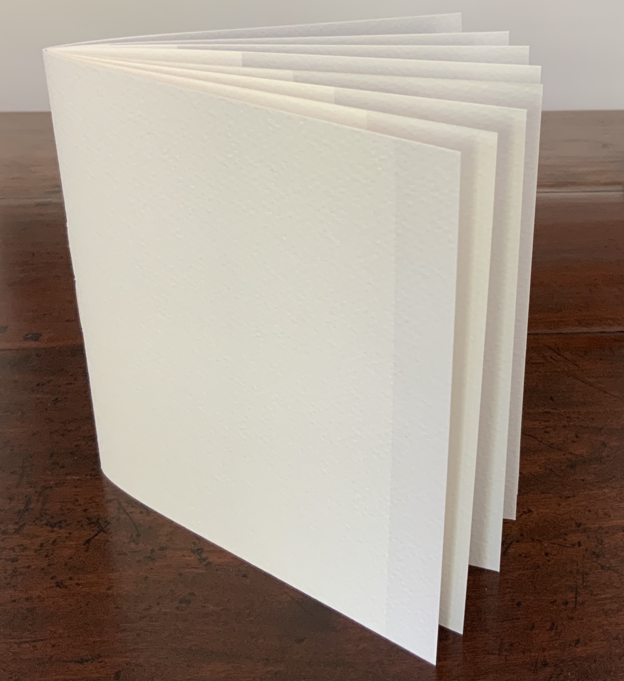
70 pages printed on translucent cellulose paper. H10 1/2″ x W8 1/4.
Edition of 50, unnumbered. Acquired from the artist, 24 April 2020. Photos: Books On Books Collection.
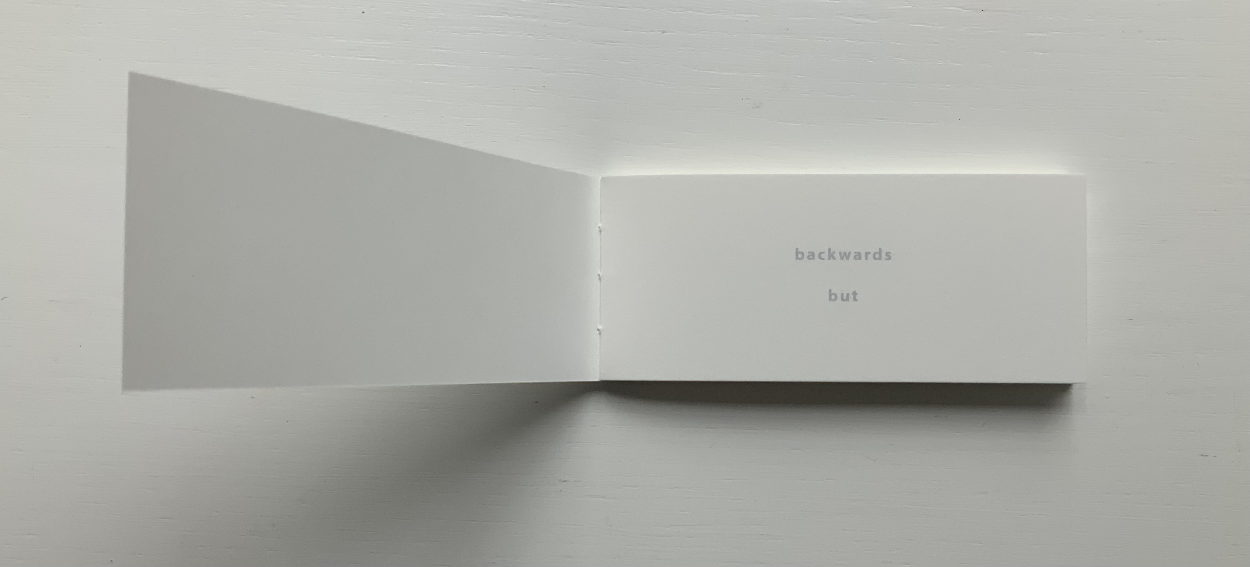
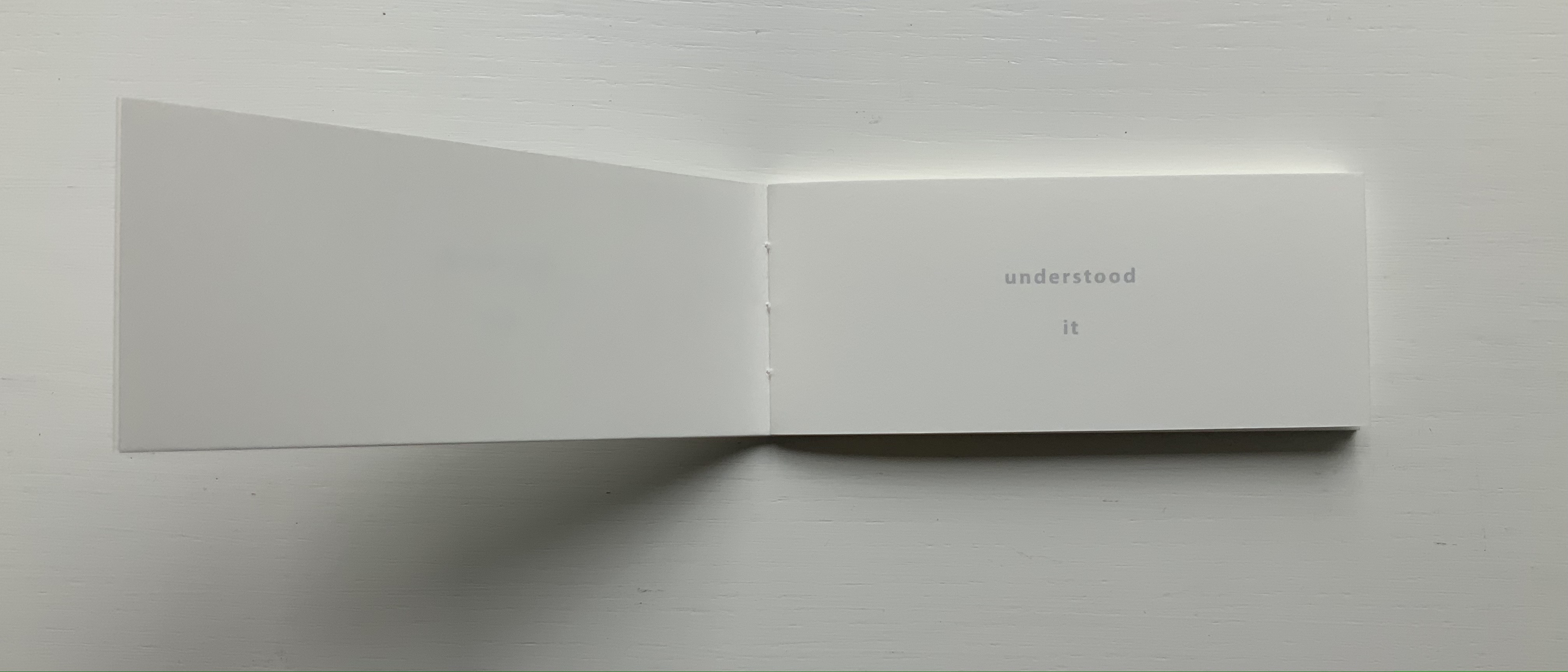
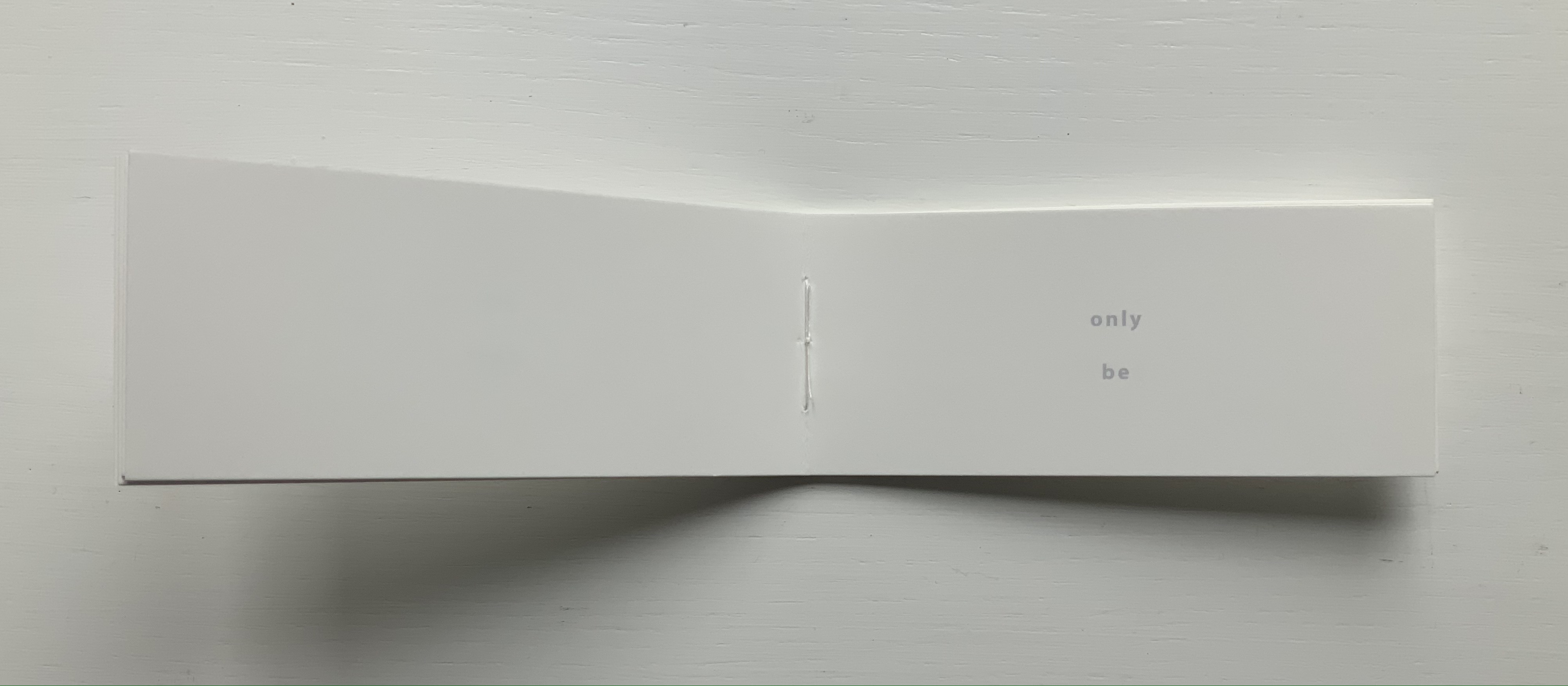
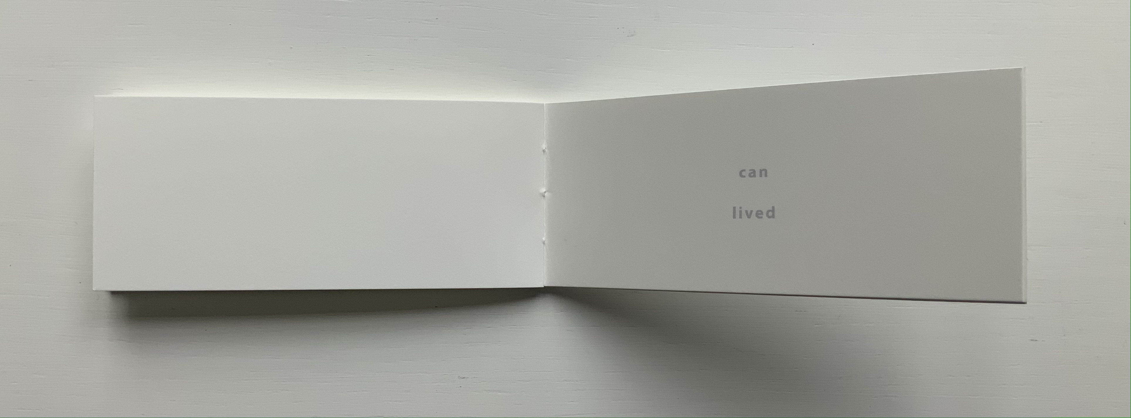
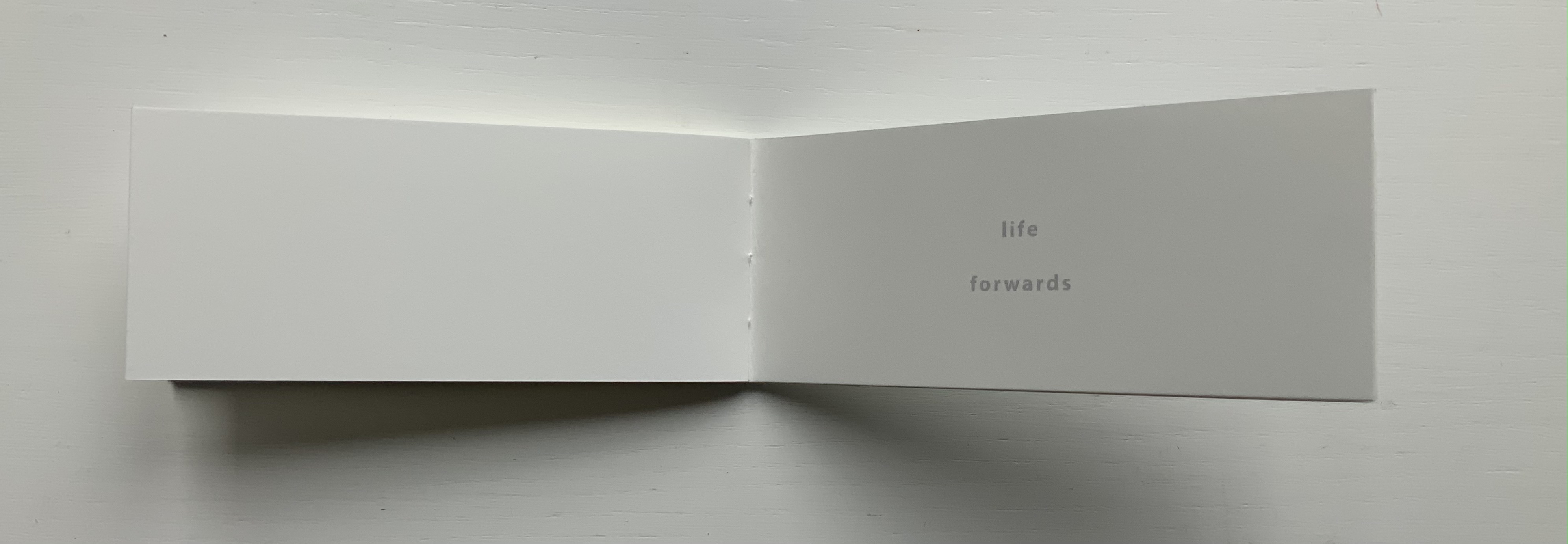
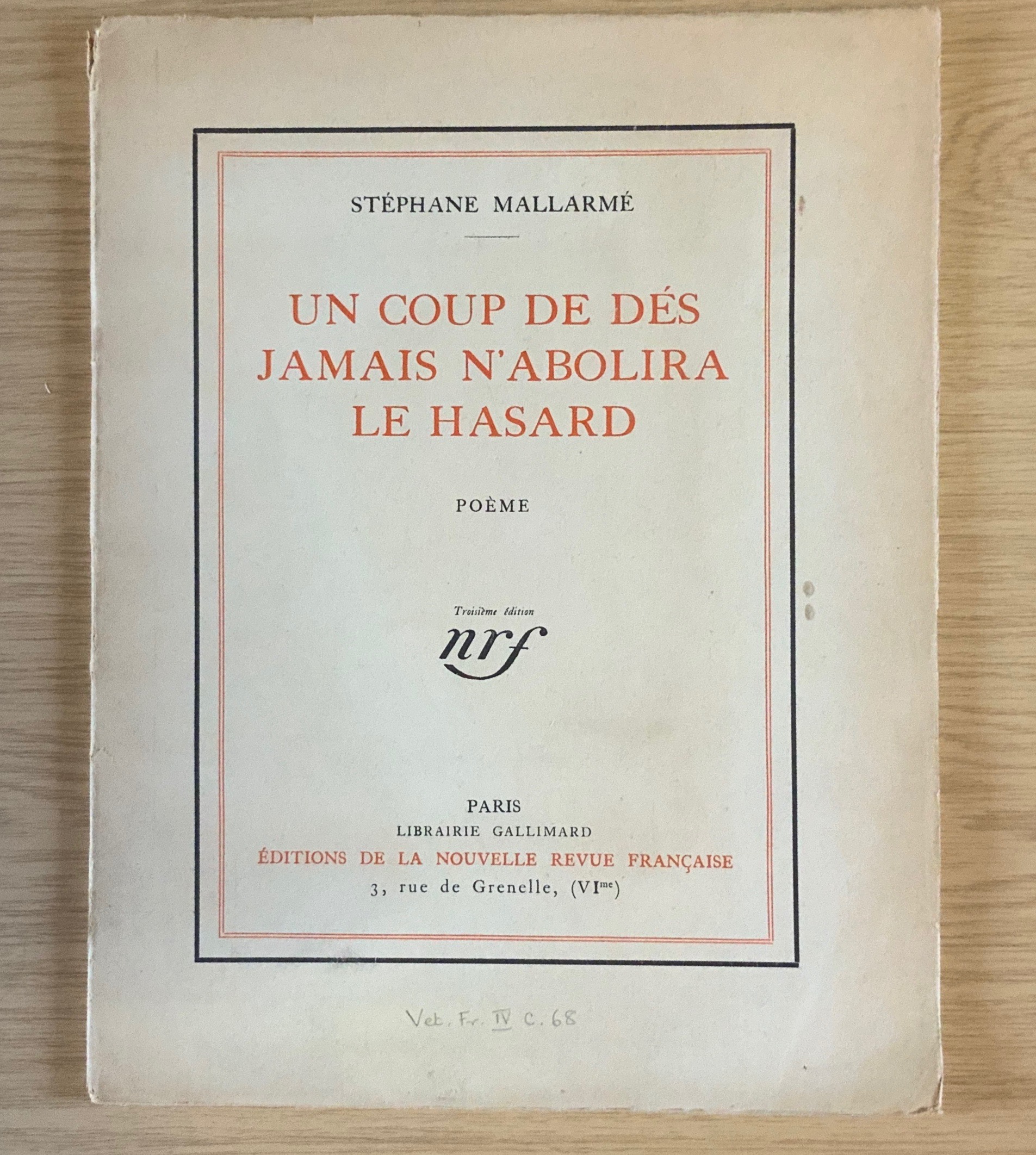
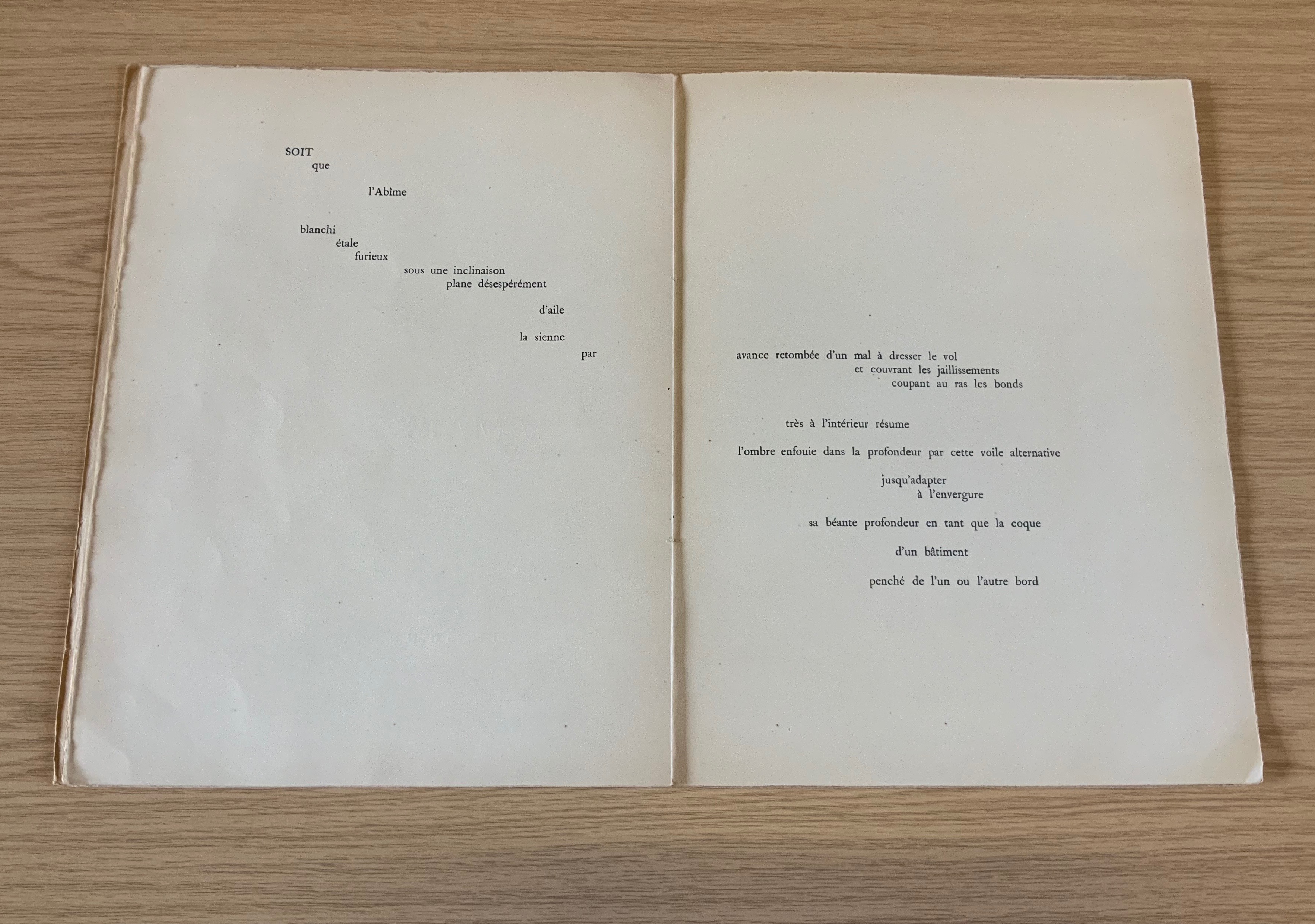
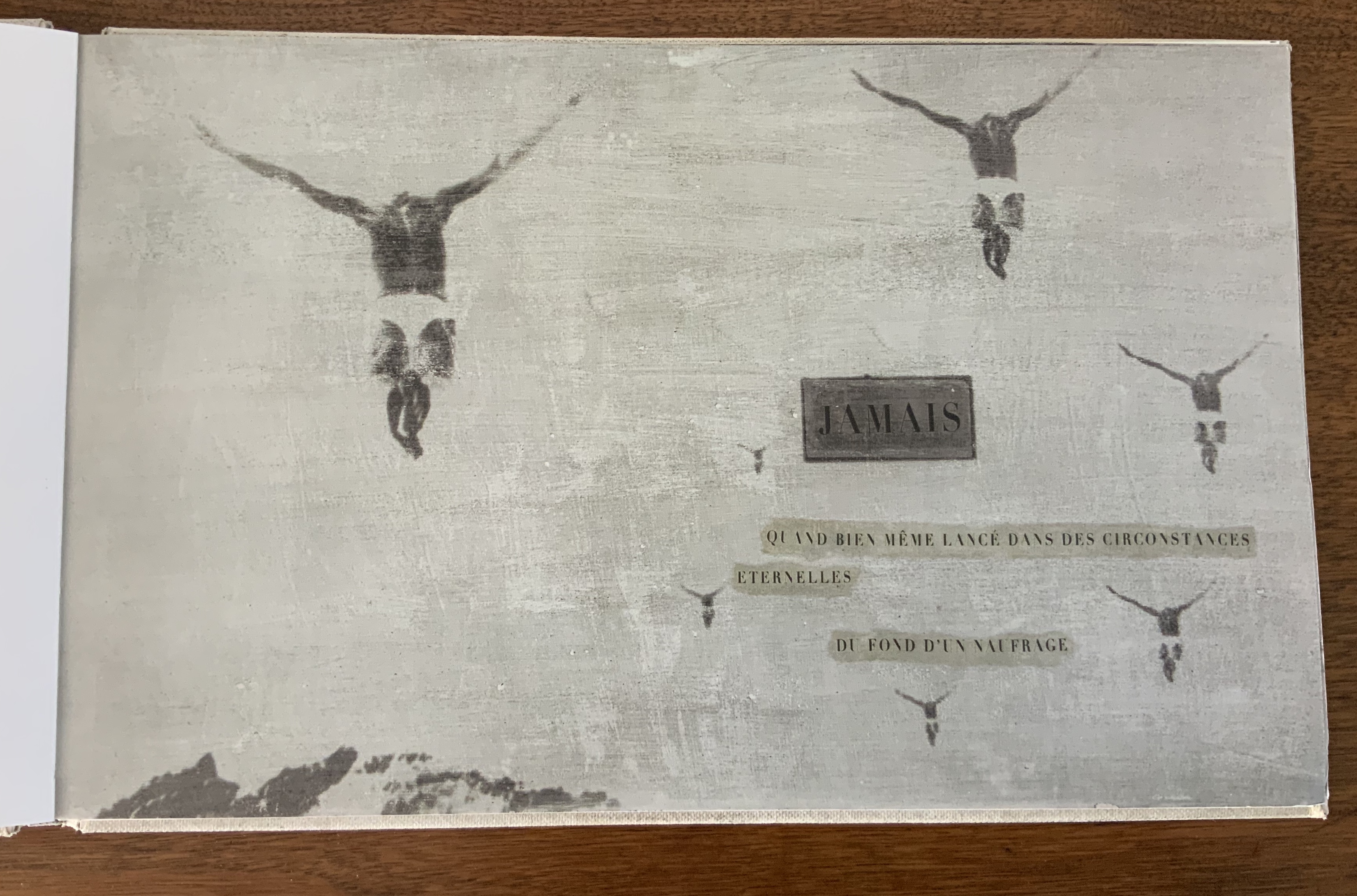
The title of Benjamin Lord’s book names what Mallarmé’s Un Coup de Dés declares can never be accomplished by a throw of the dice: the abolition of chance. Taking the predicate of Mallarmé’s title (its verb and object), elevating it to the title position, substituting the word “sequence” for the subtitle Poéme, and placing it in a cover layout reminiscent of the 1913 NRF edition of Mallarmé’s book, Lord’s cover raises expectations and questions. Perhaps chance can be abolished? Perhaps by a certain sequence — of words?
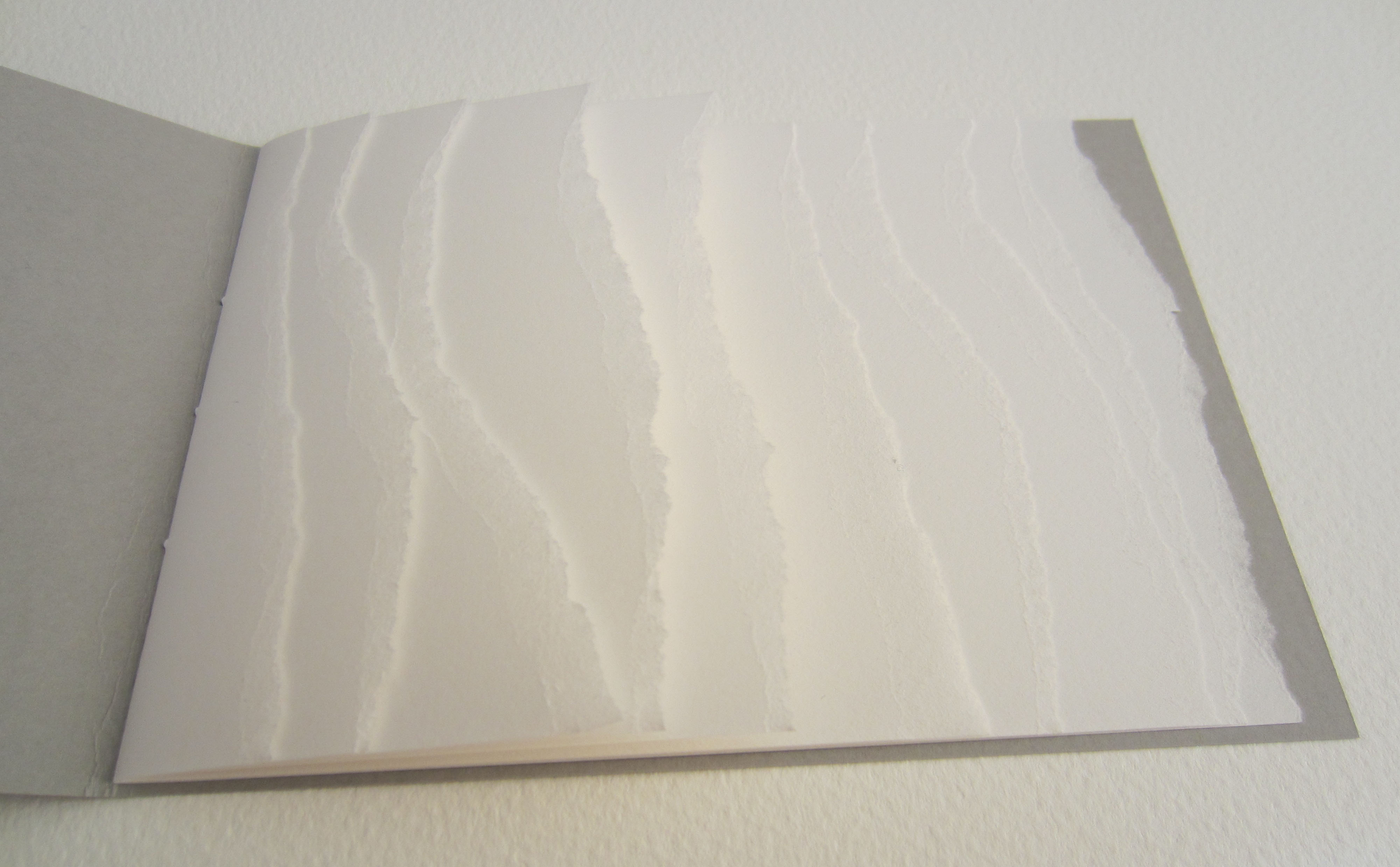
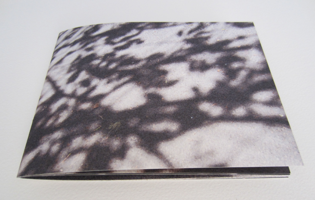
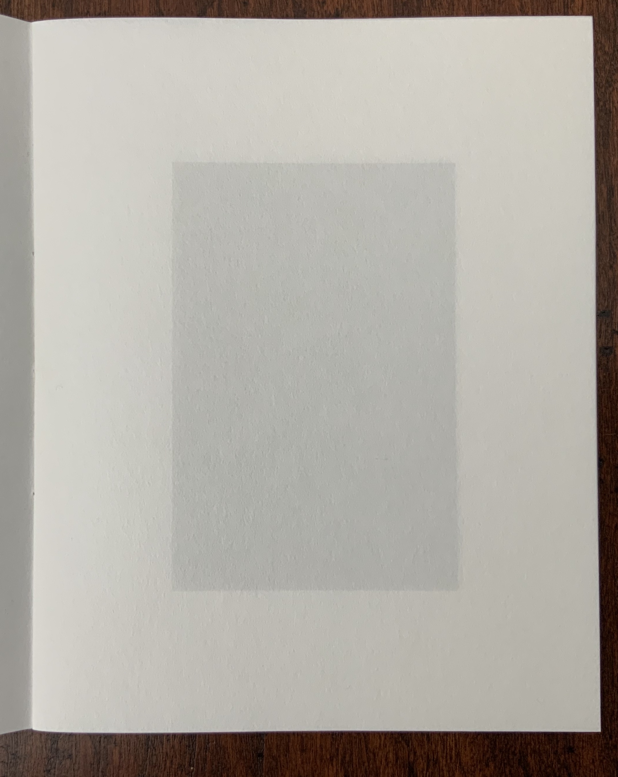
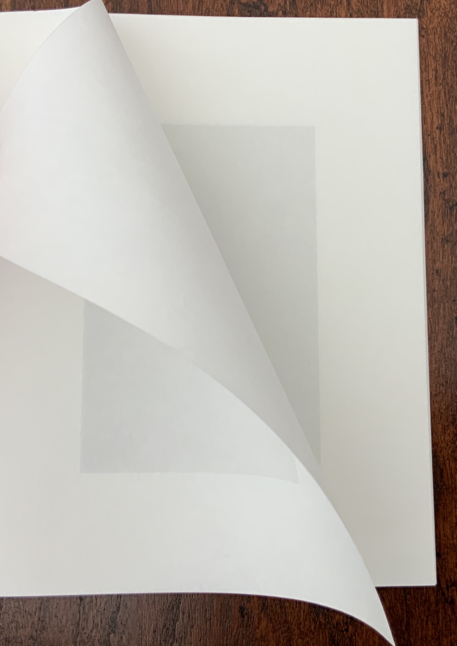
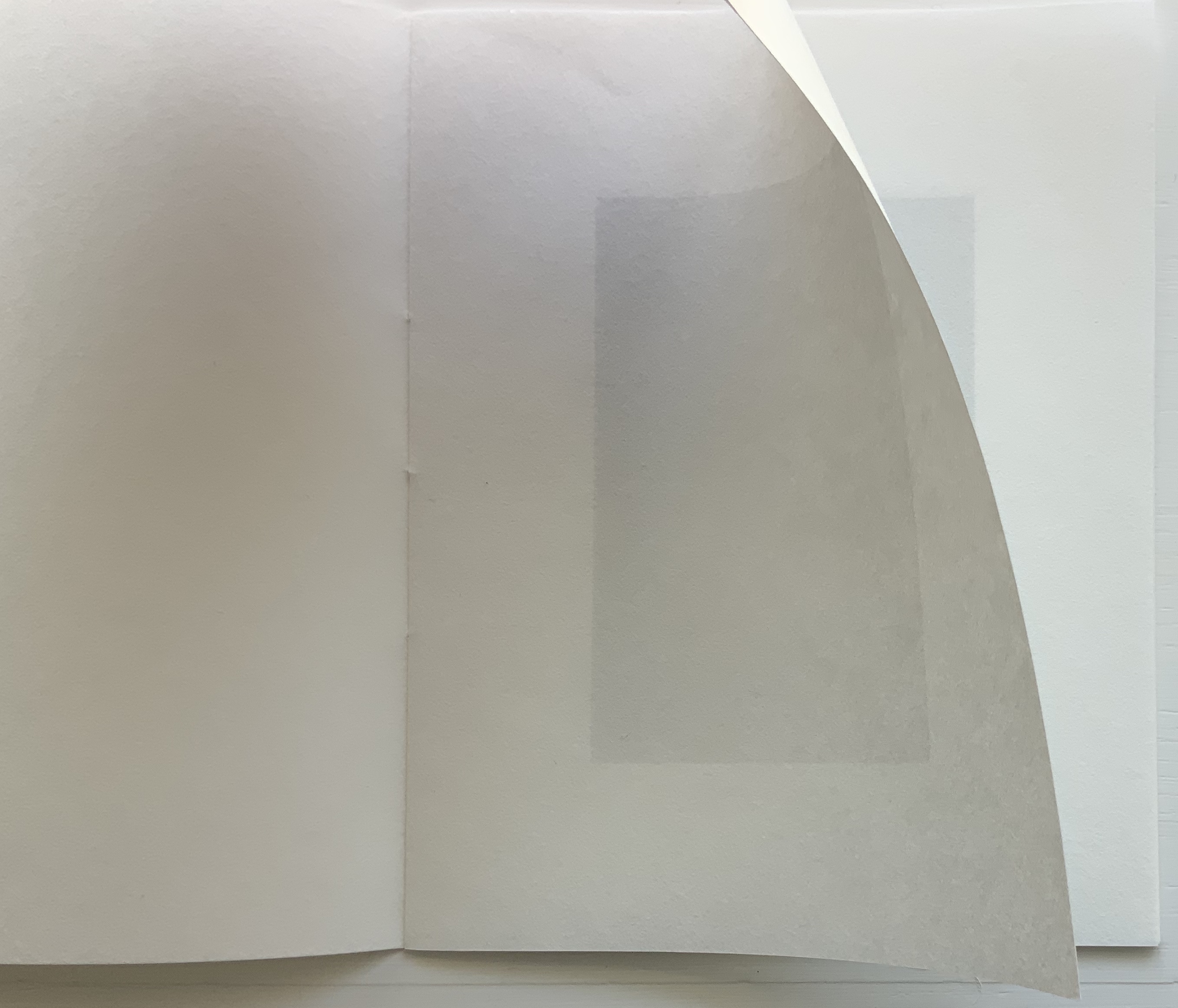
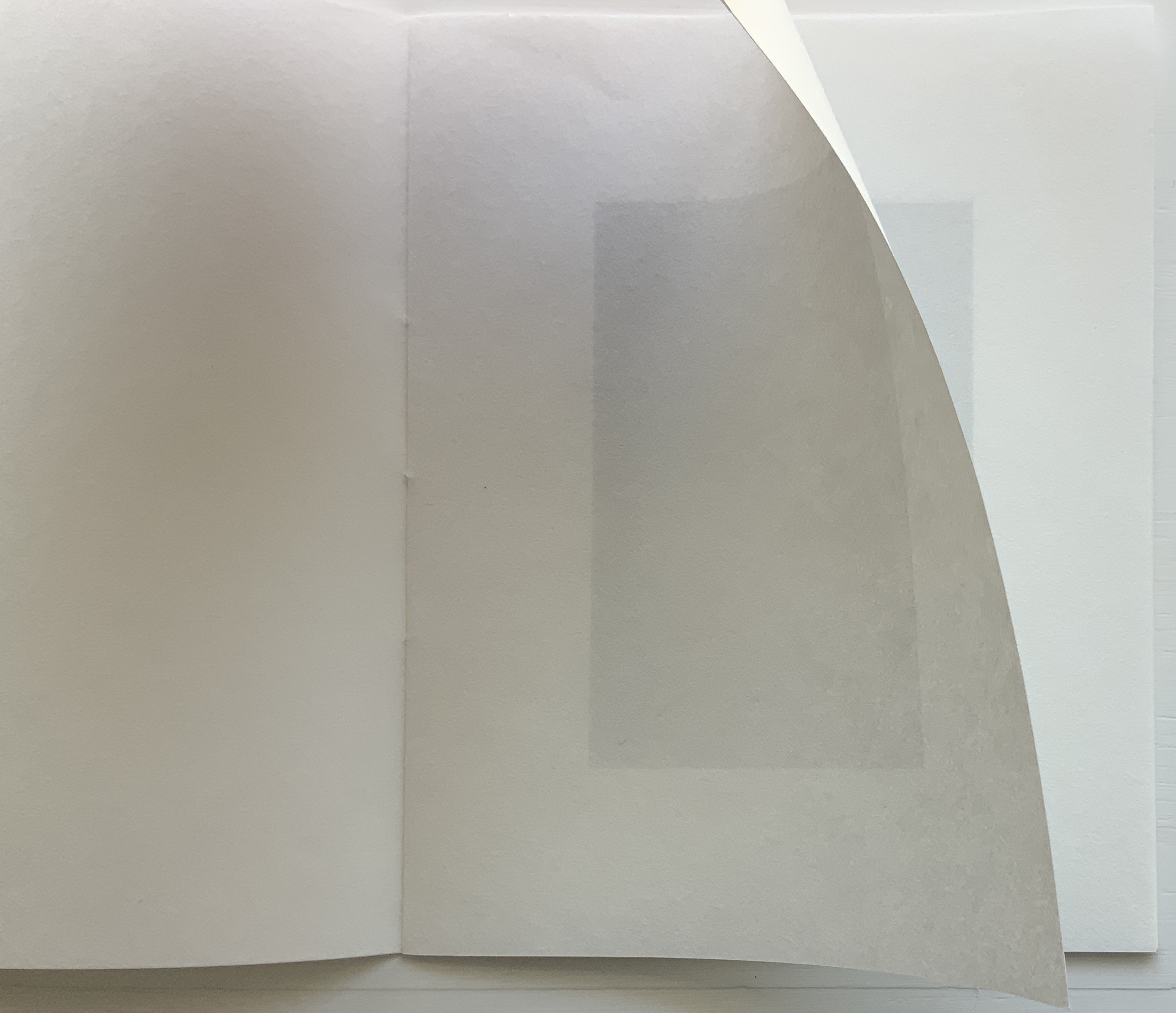
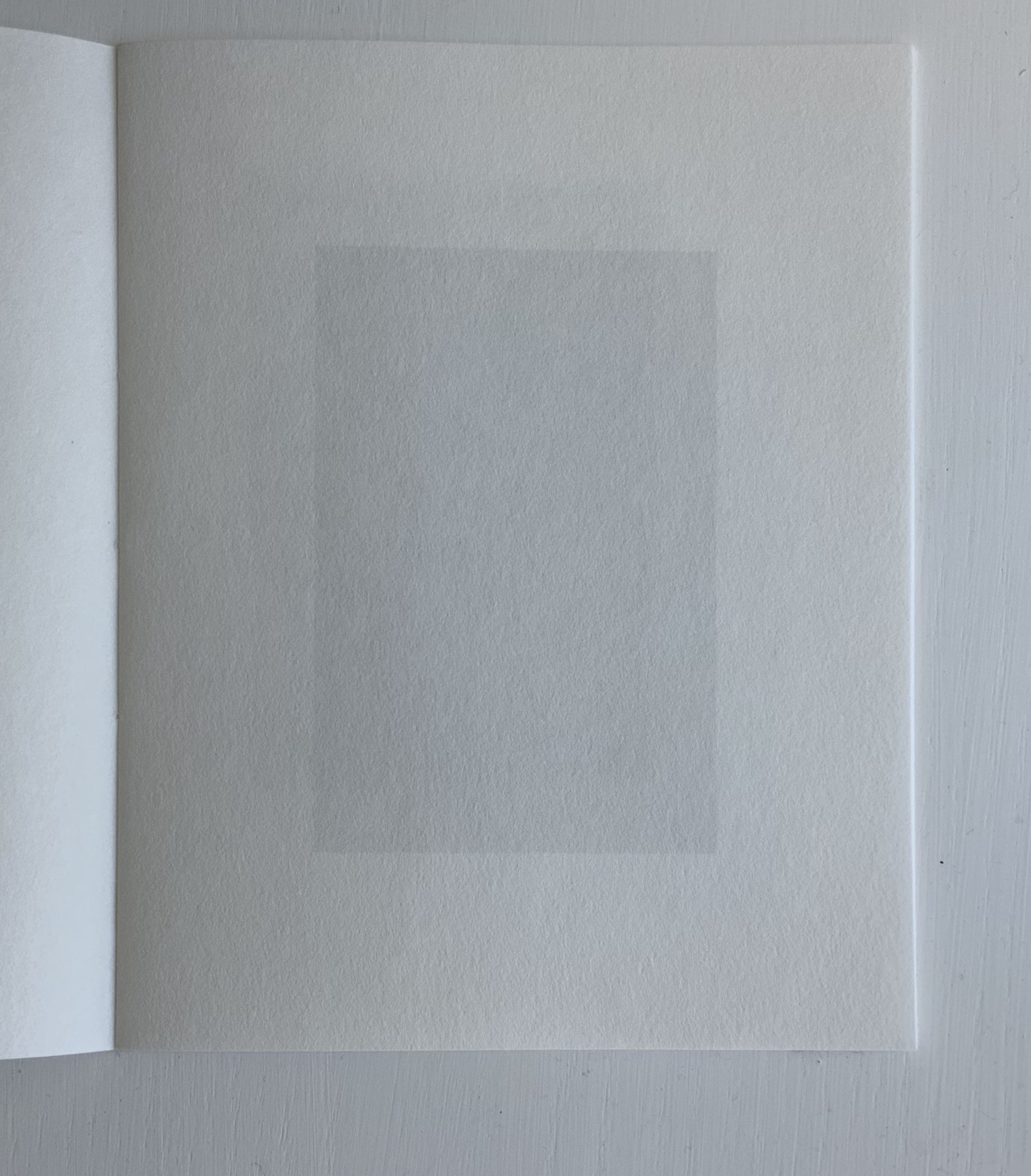
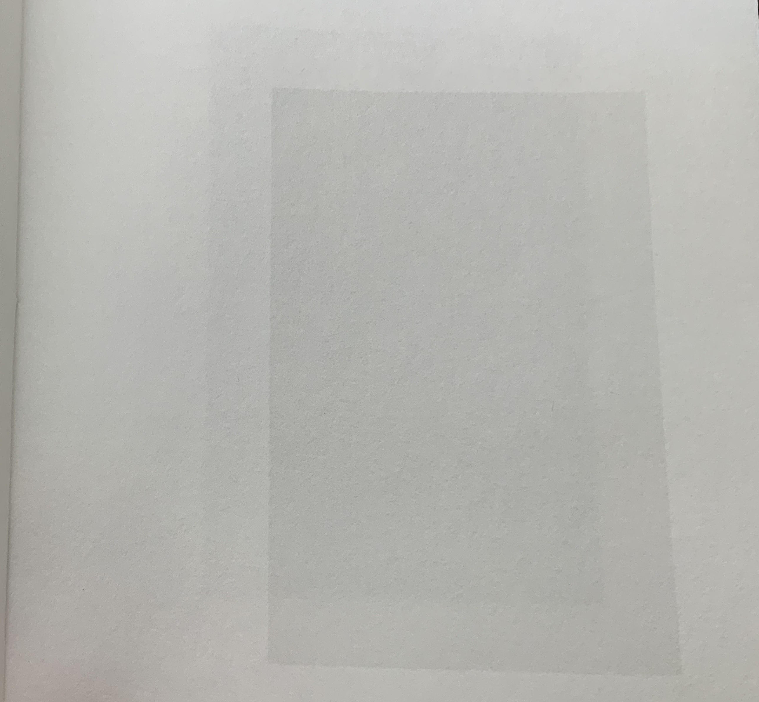
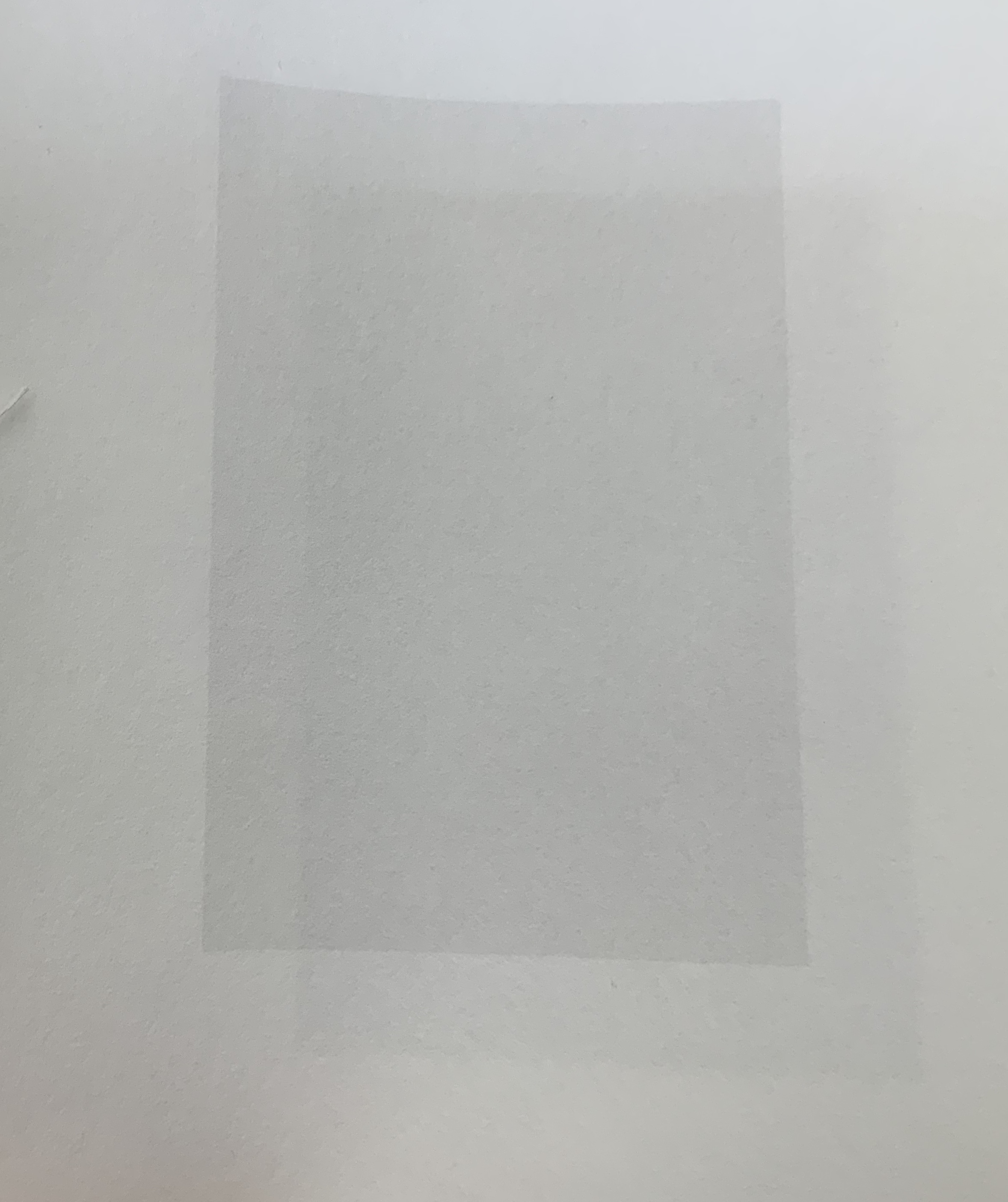
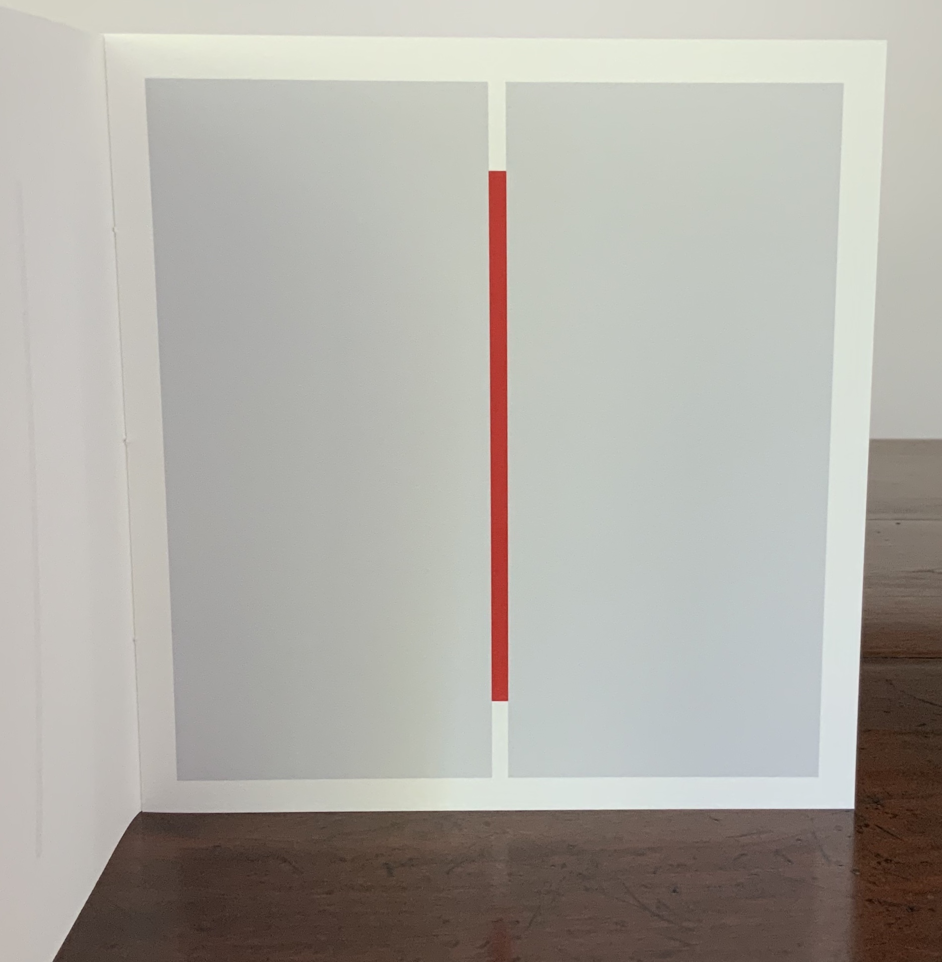
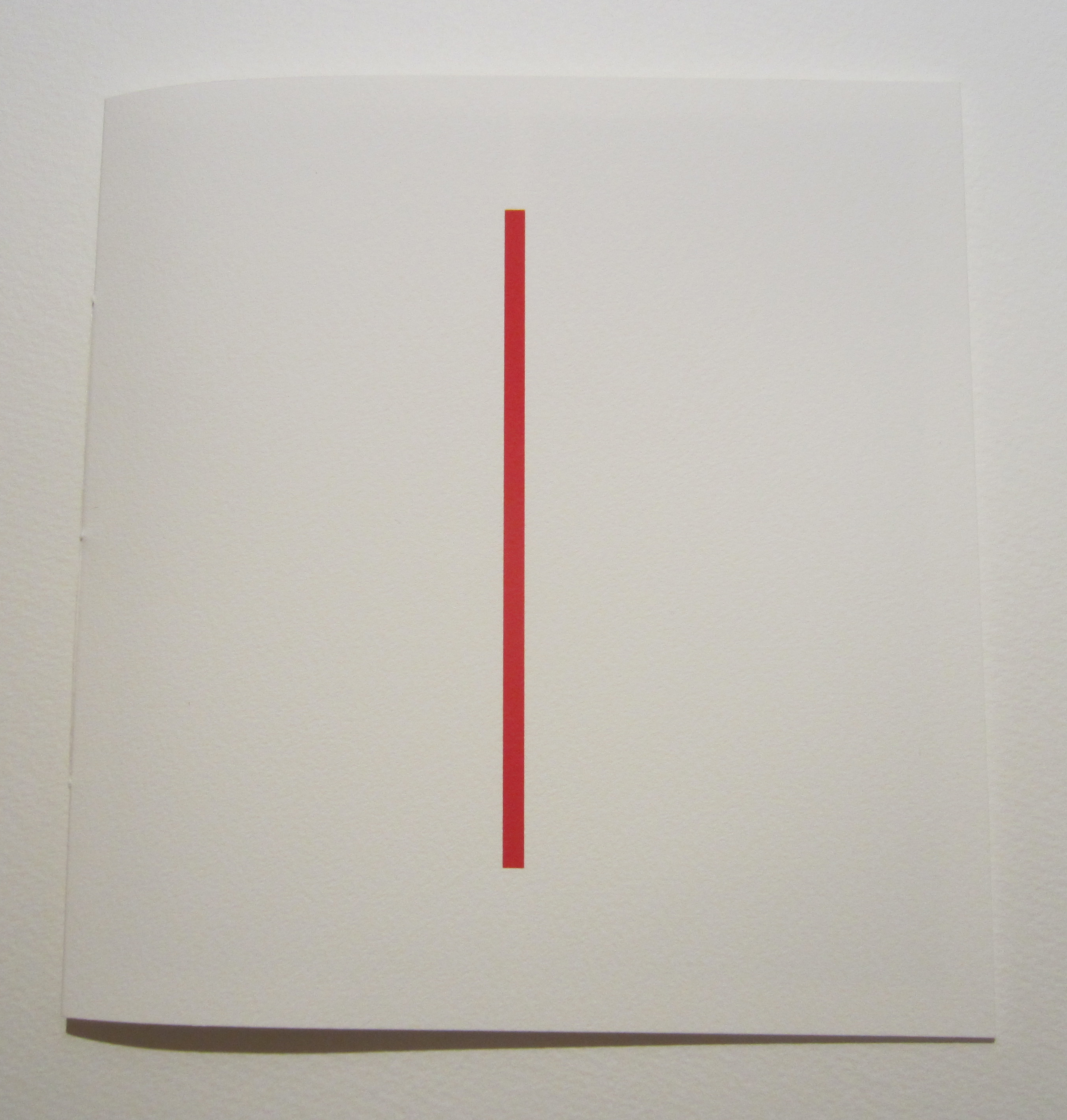
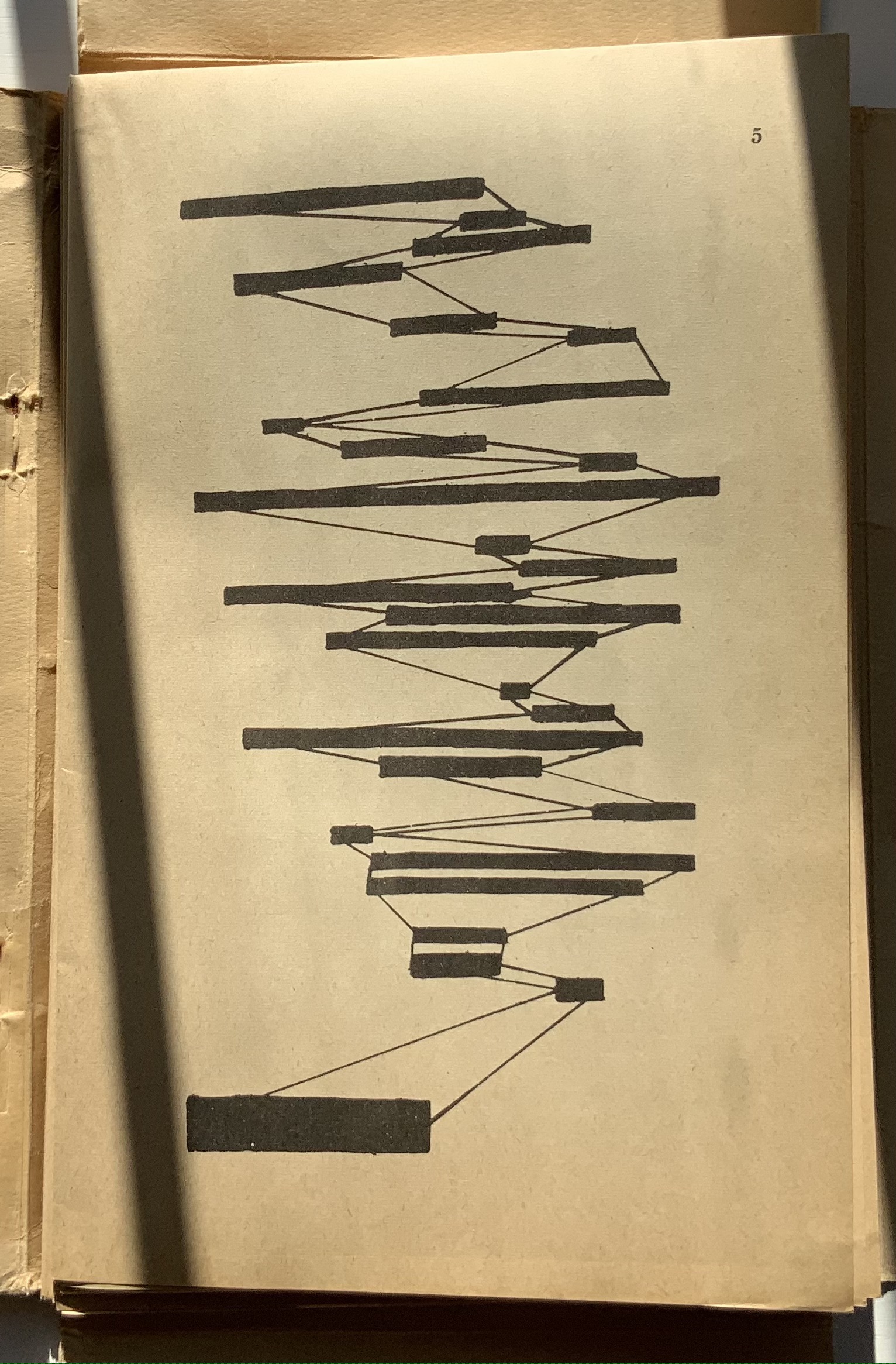
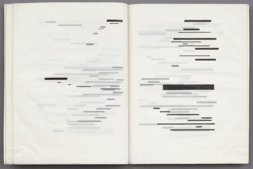
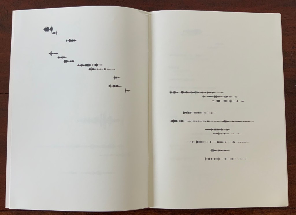
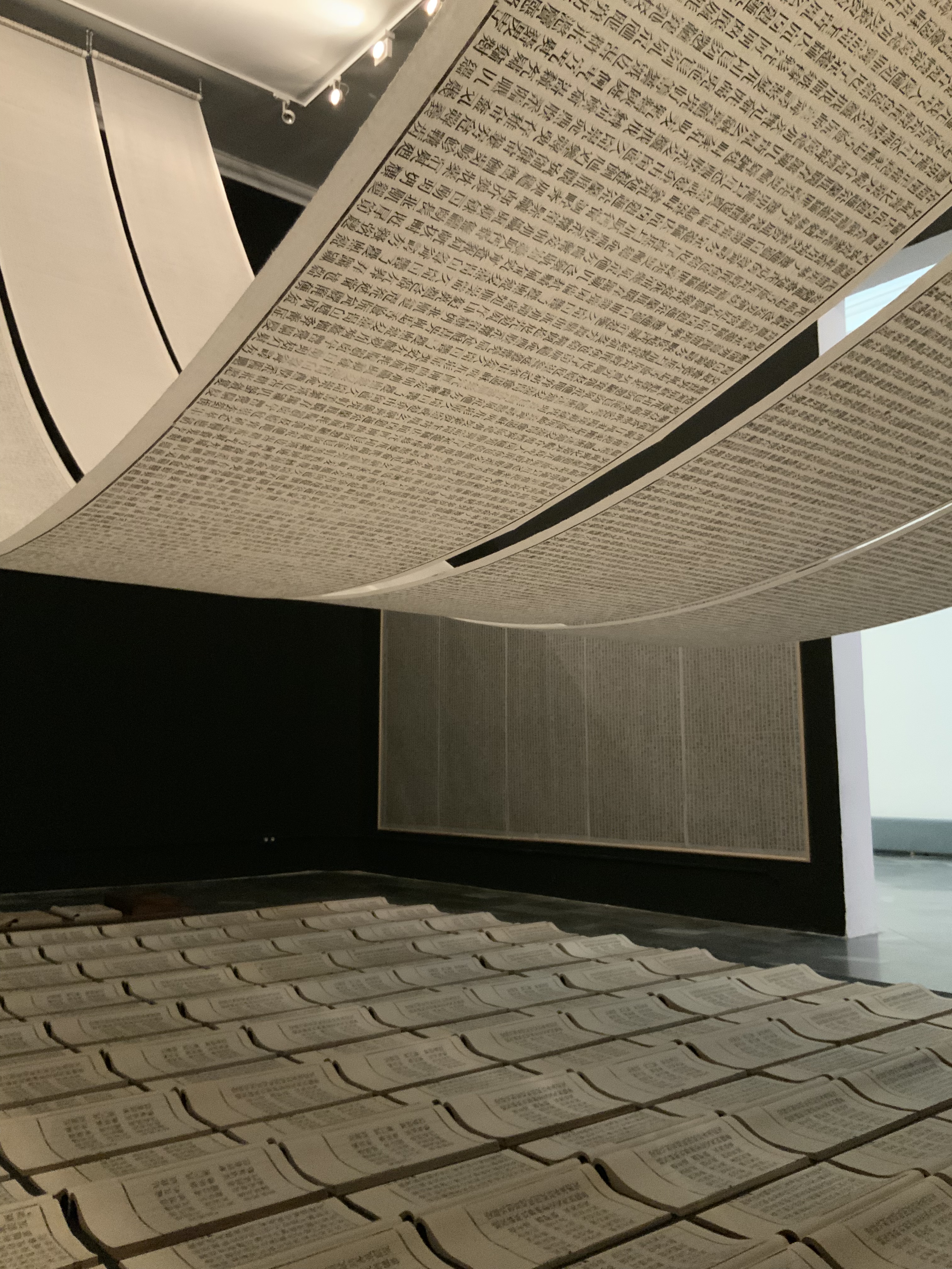
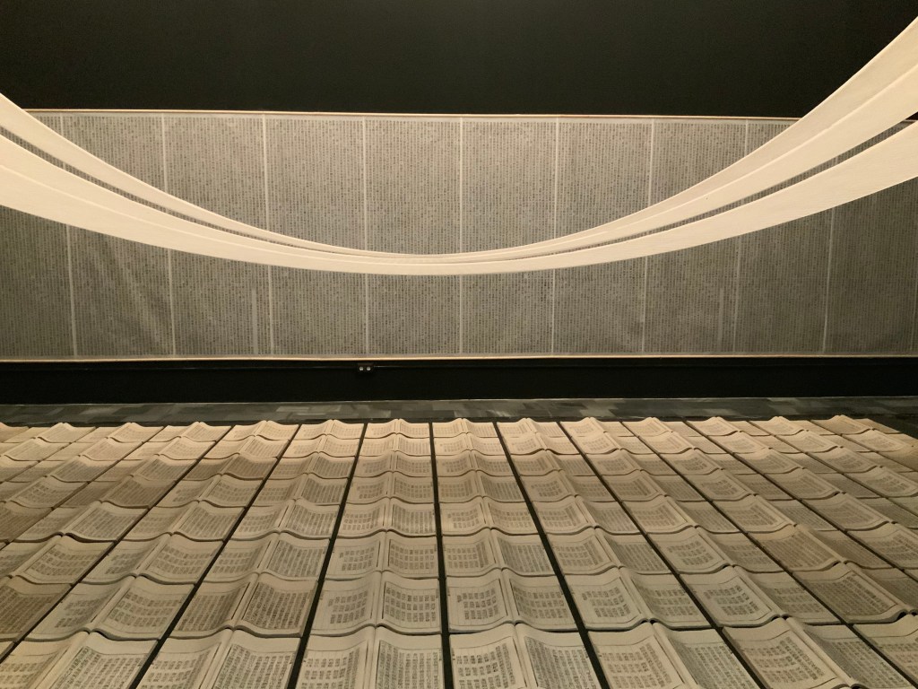
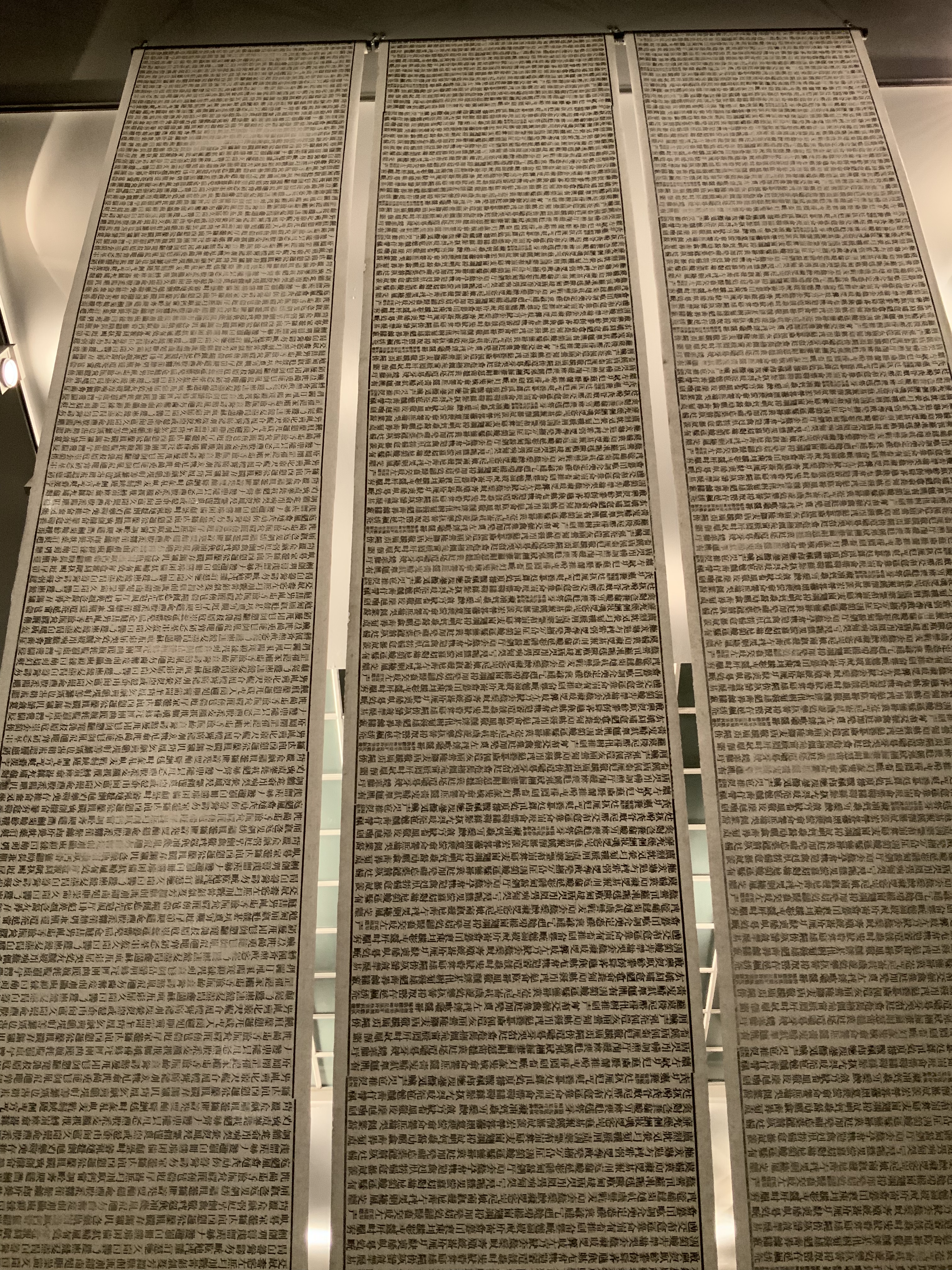
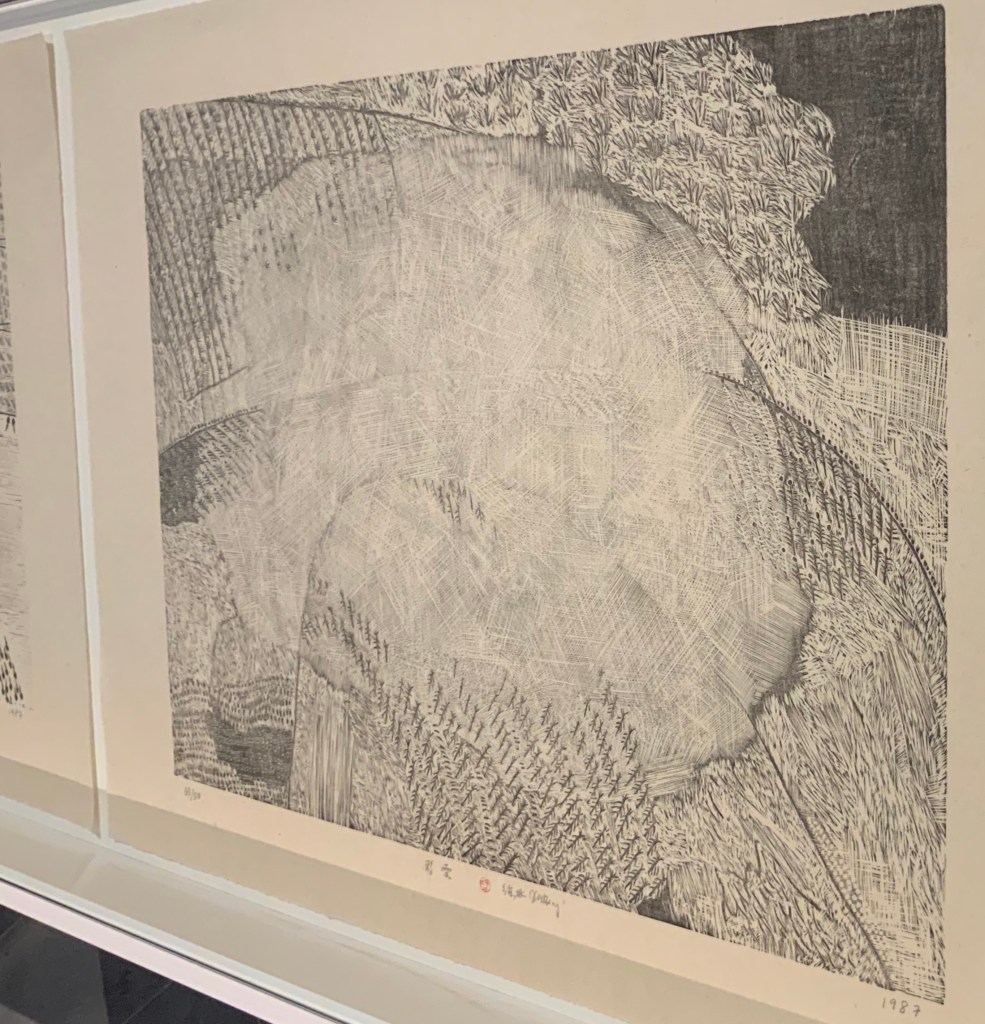
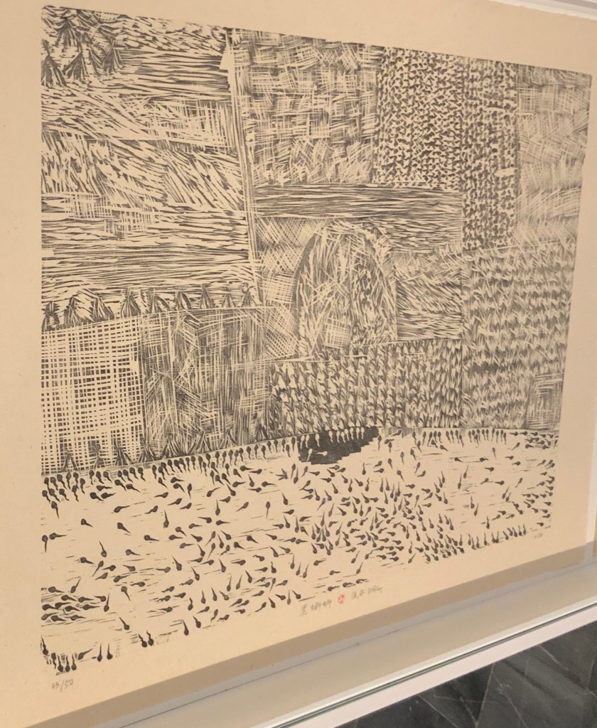
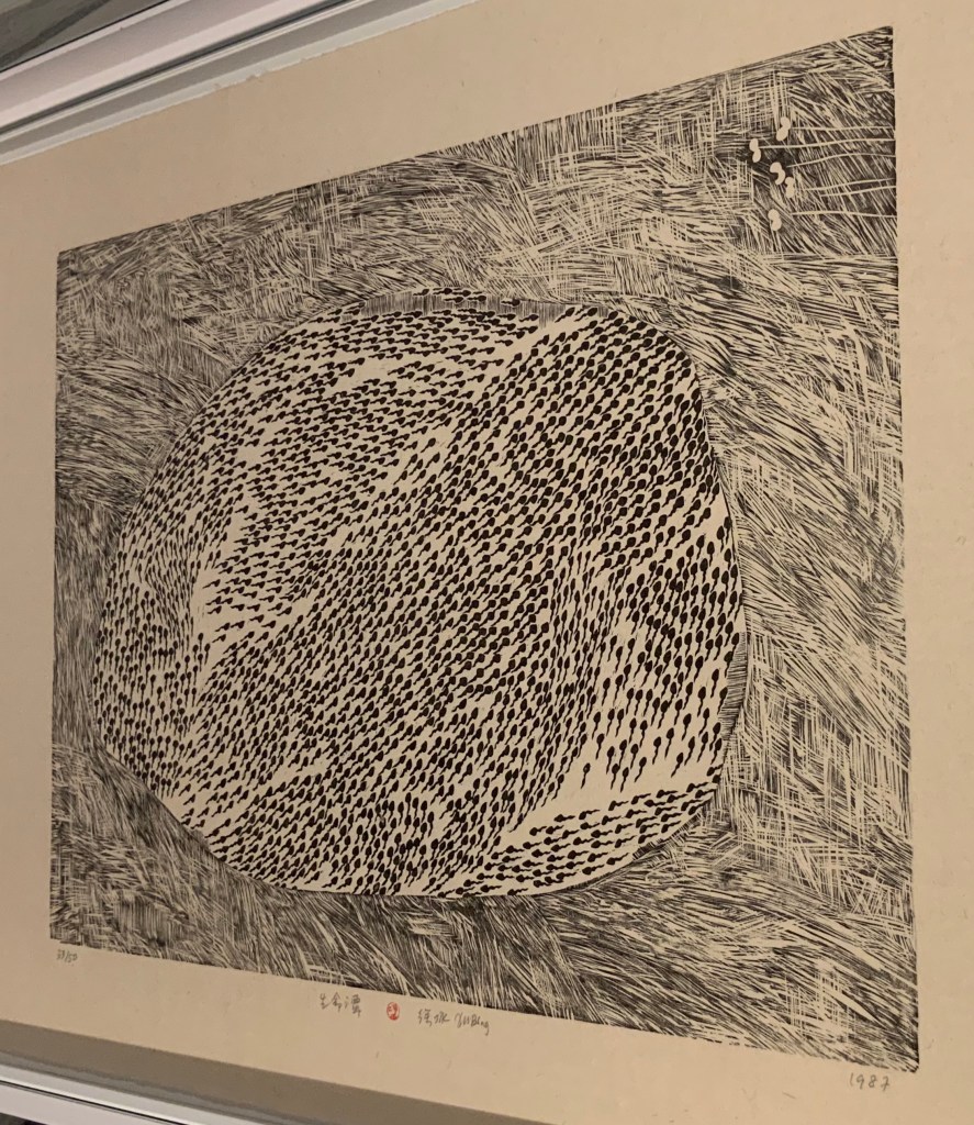
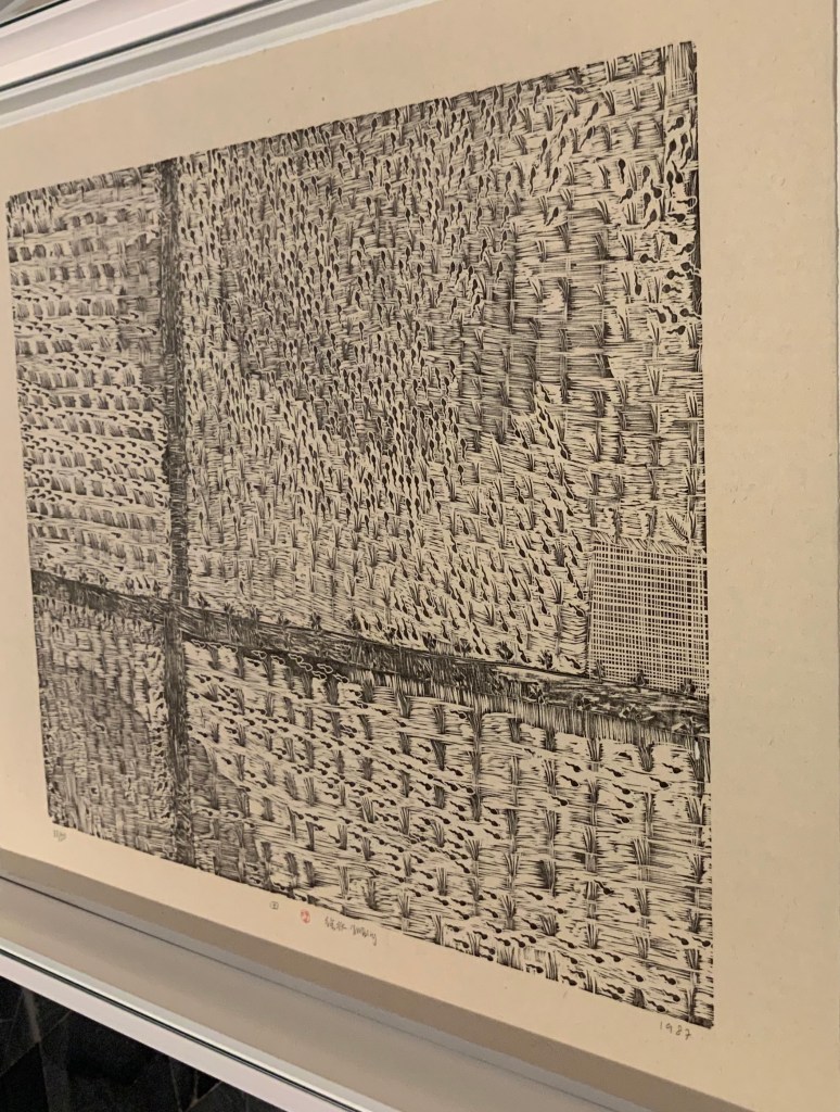
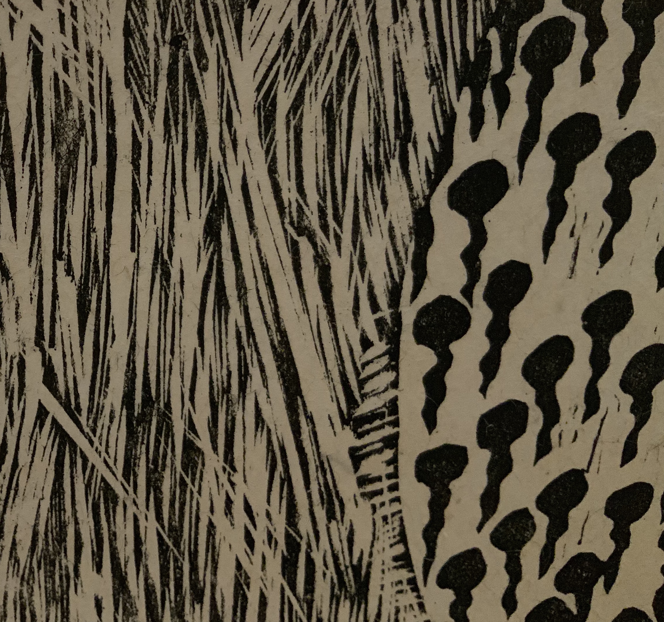
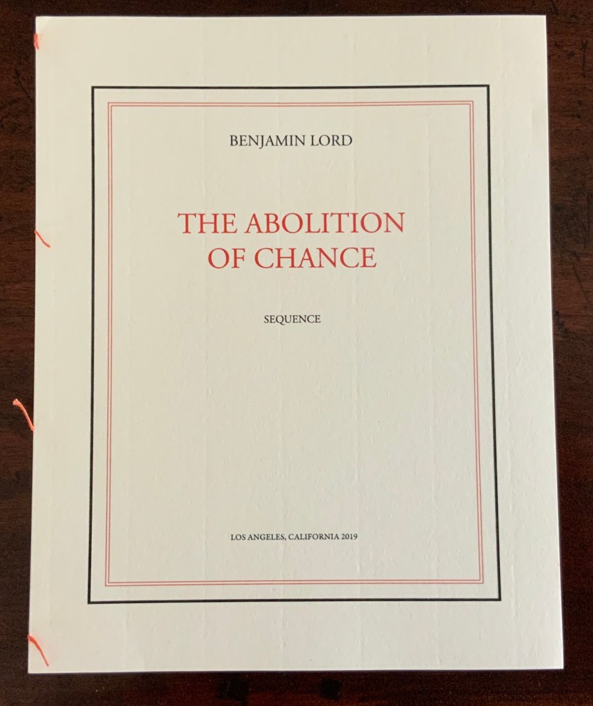
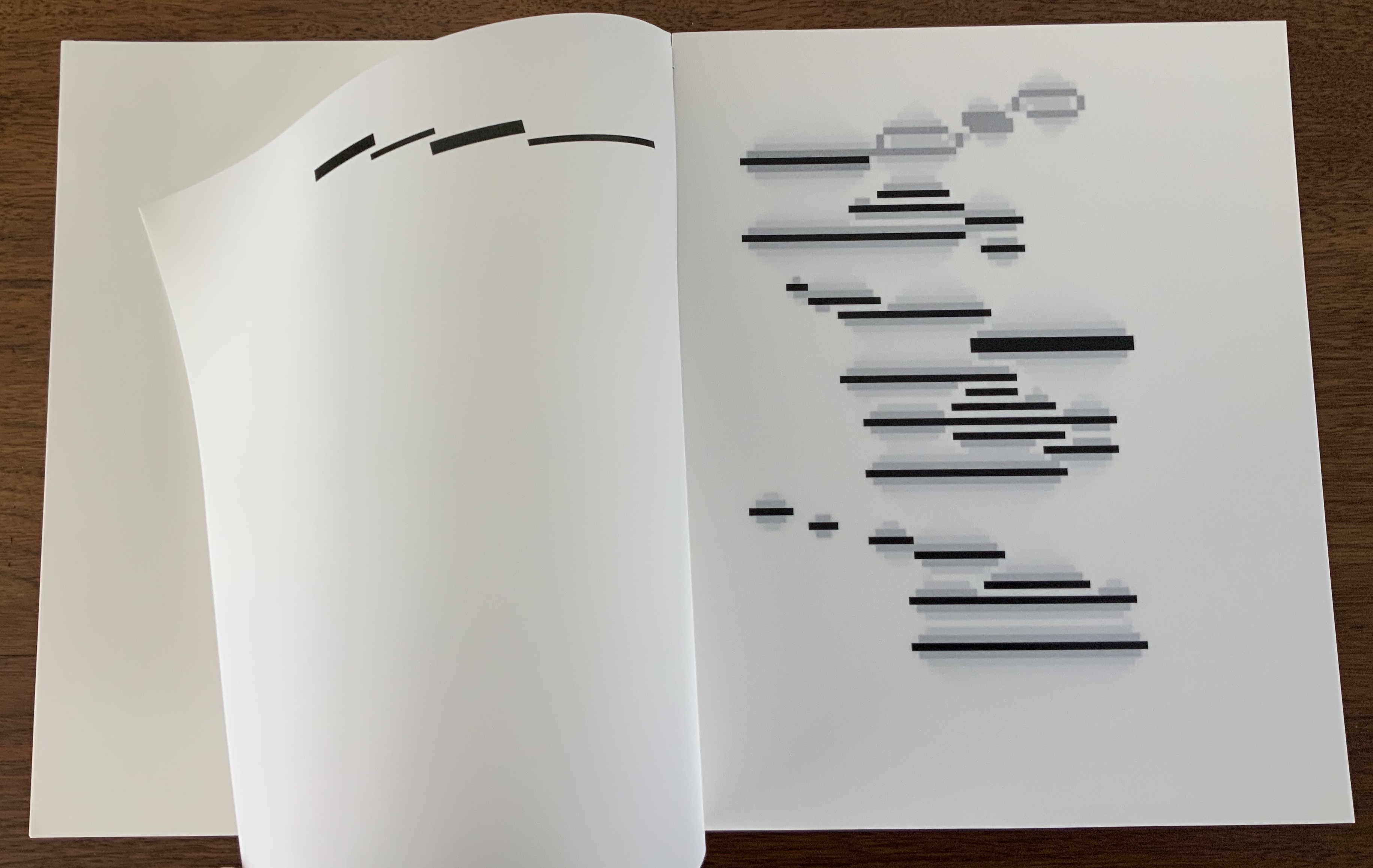
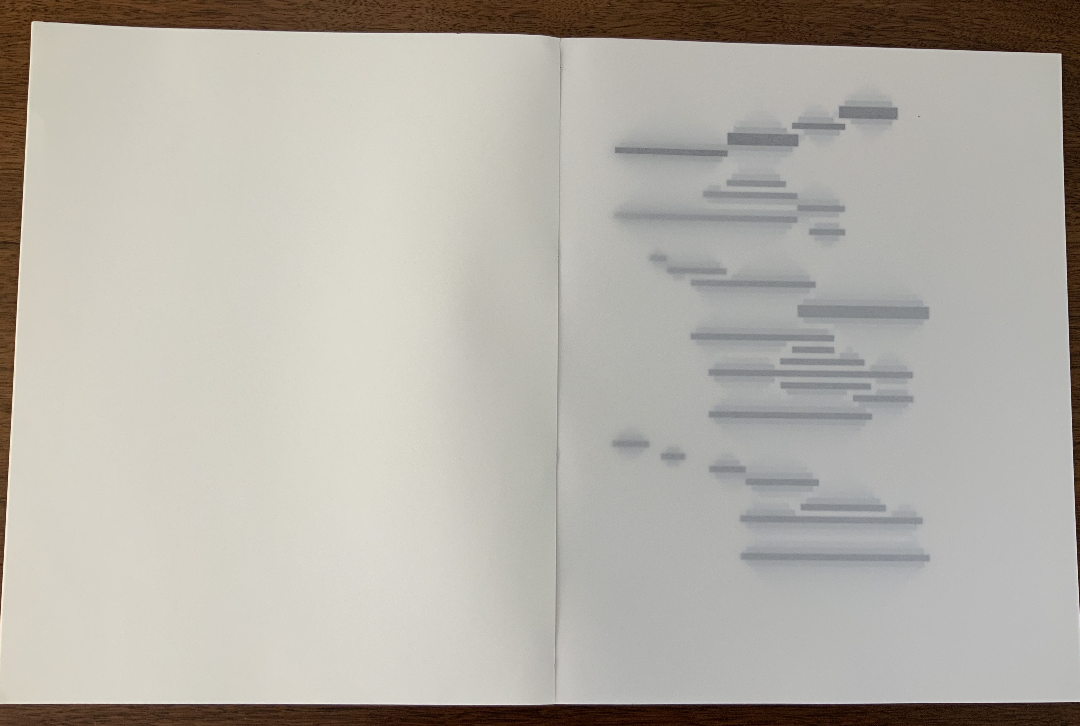
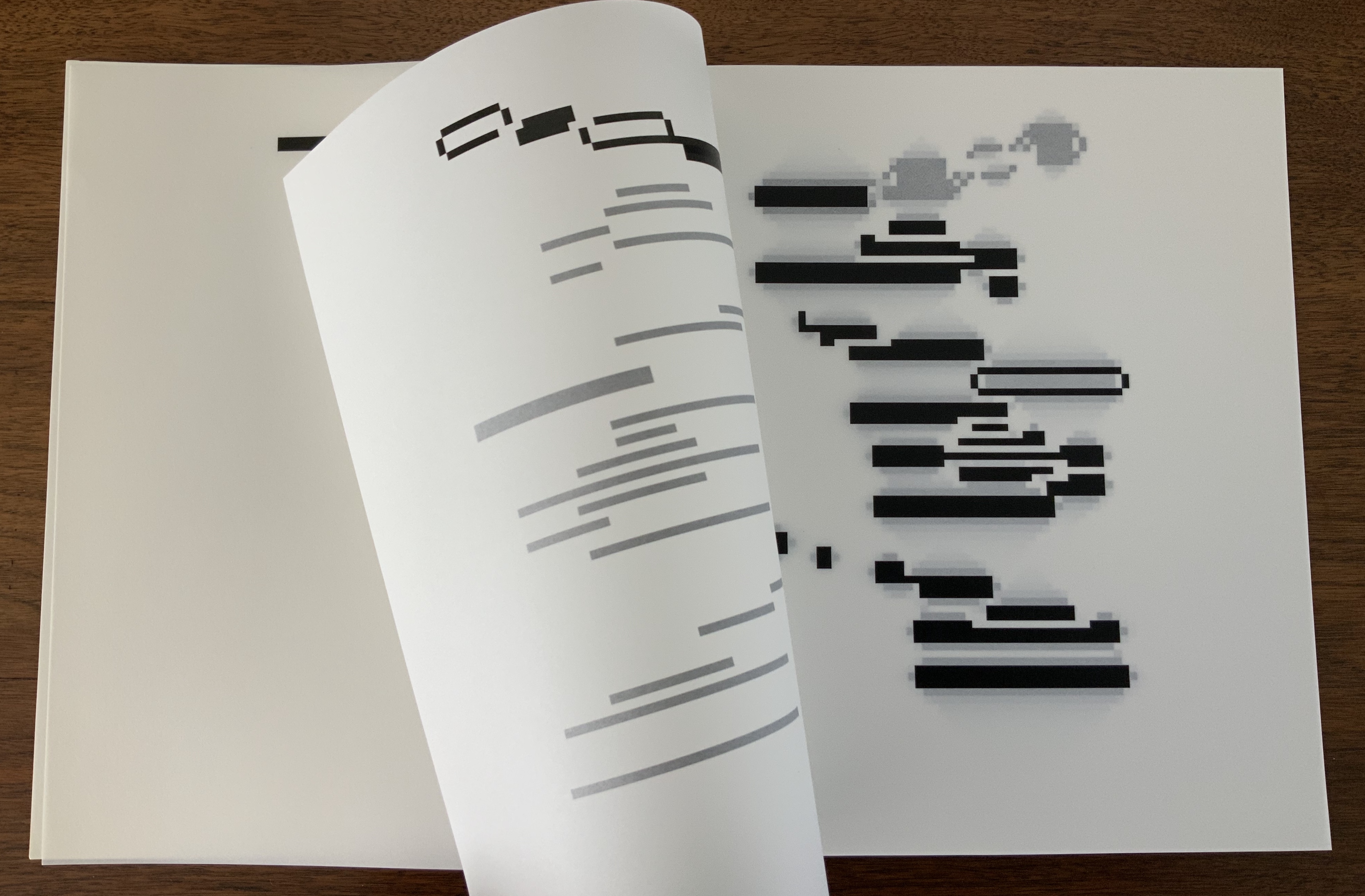
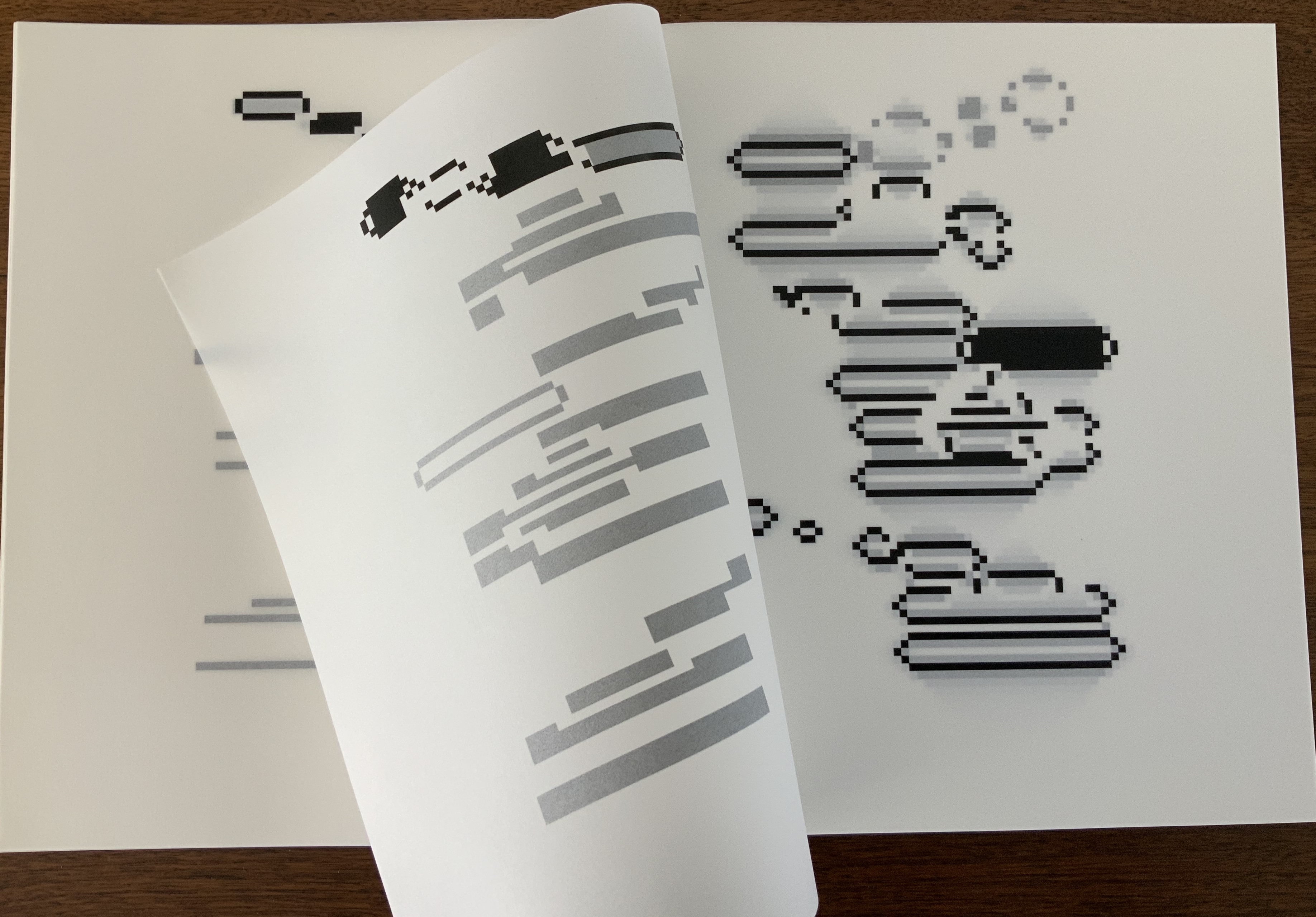
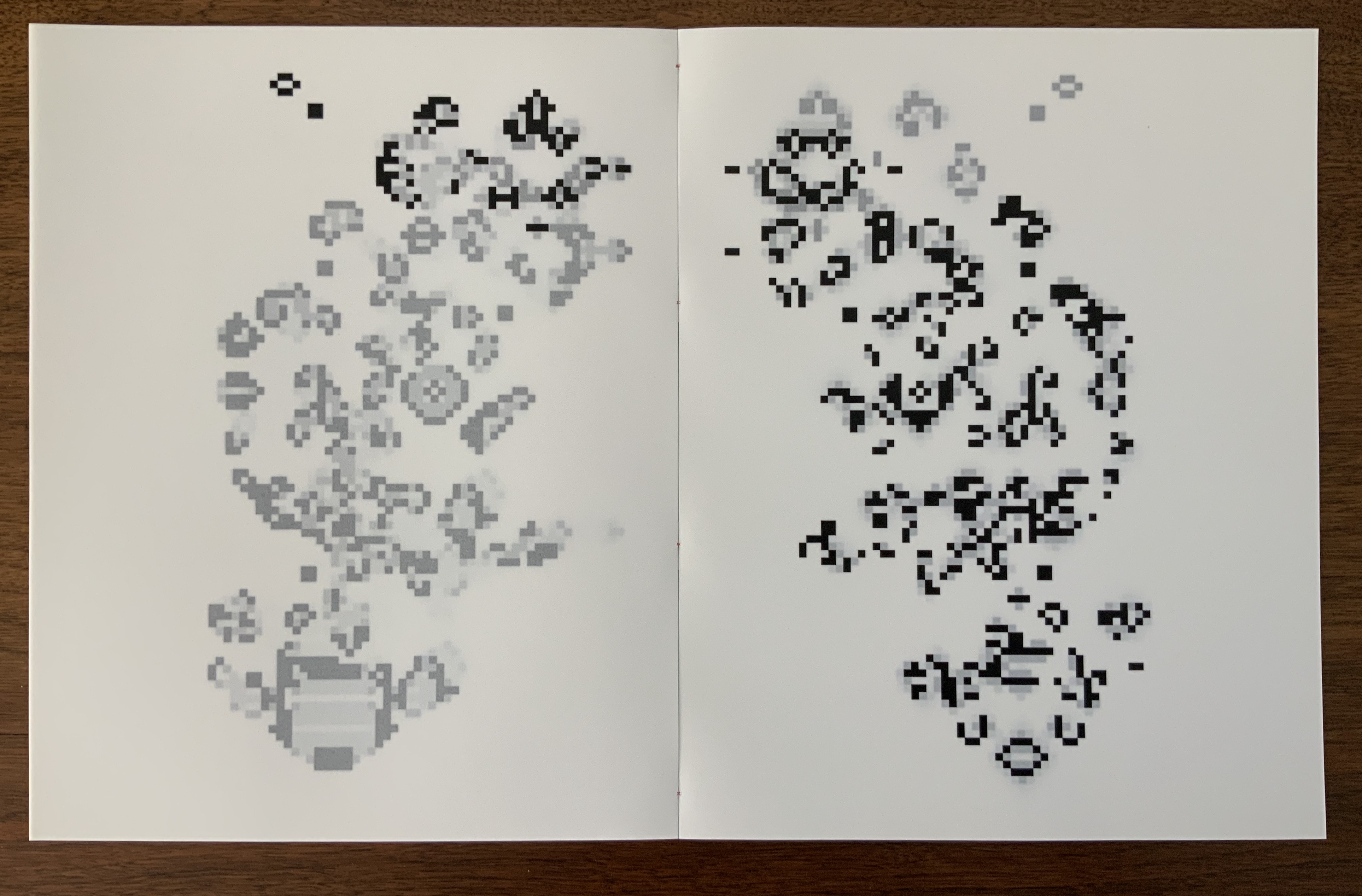
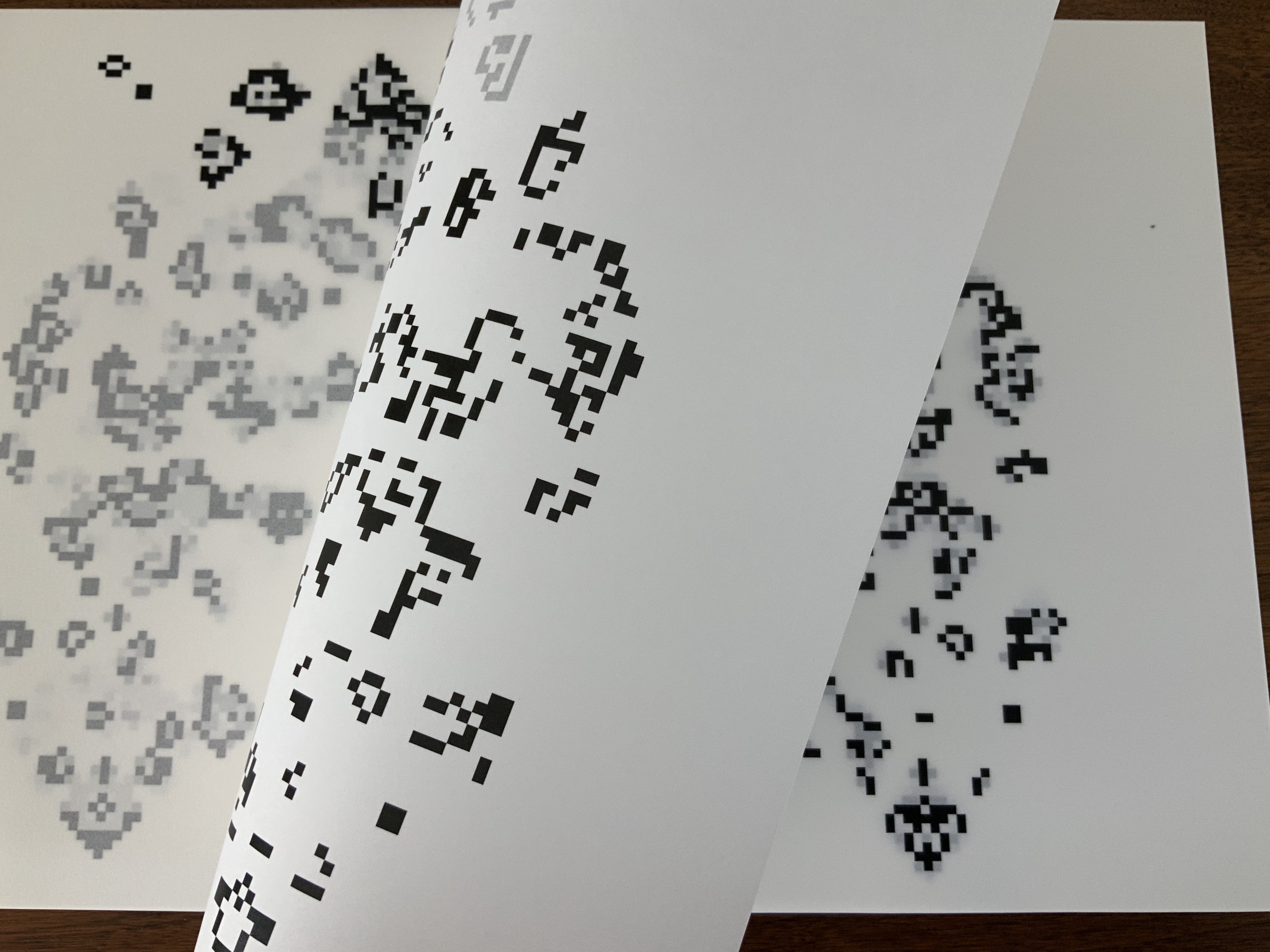
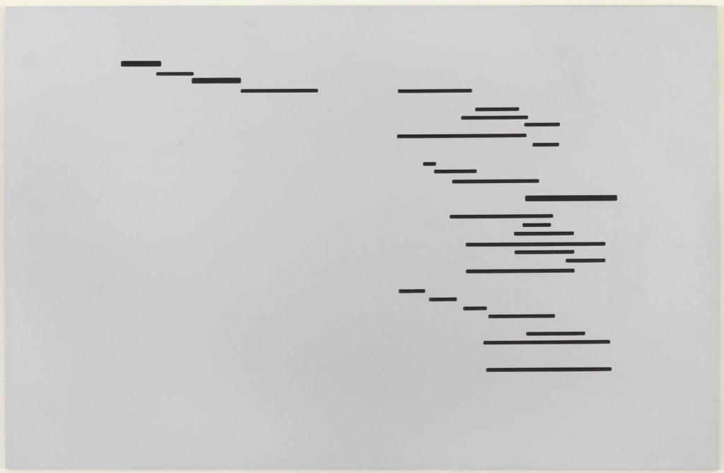
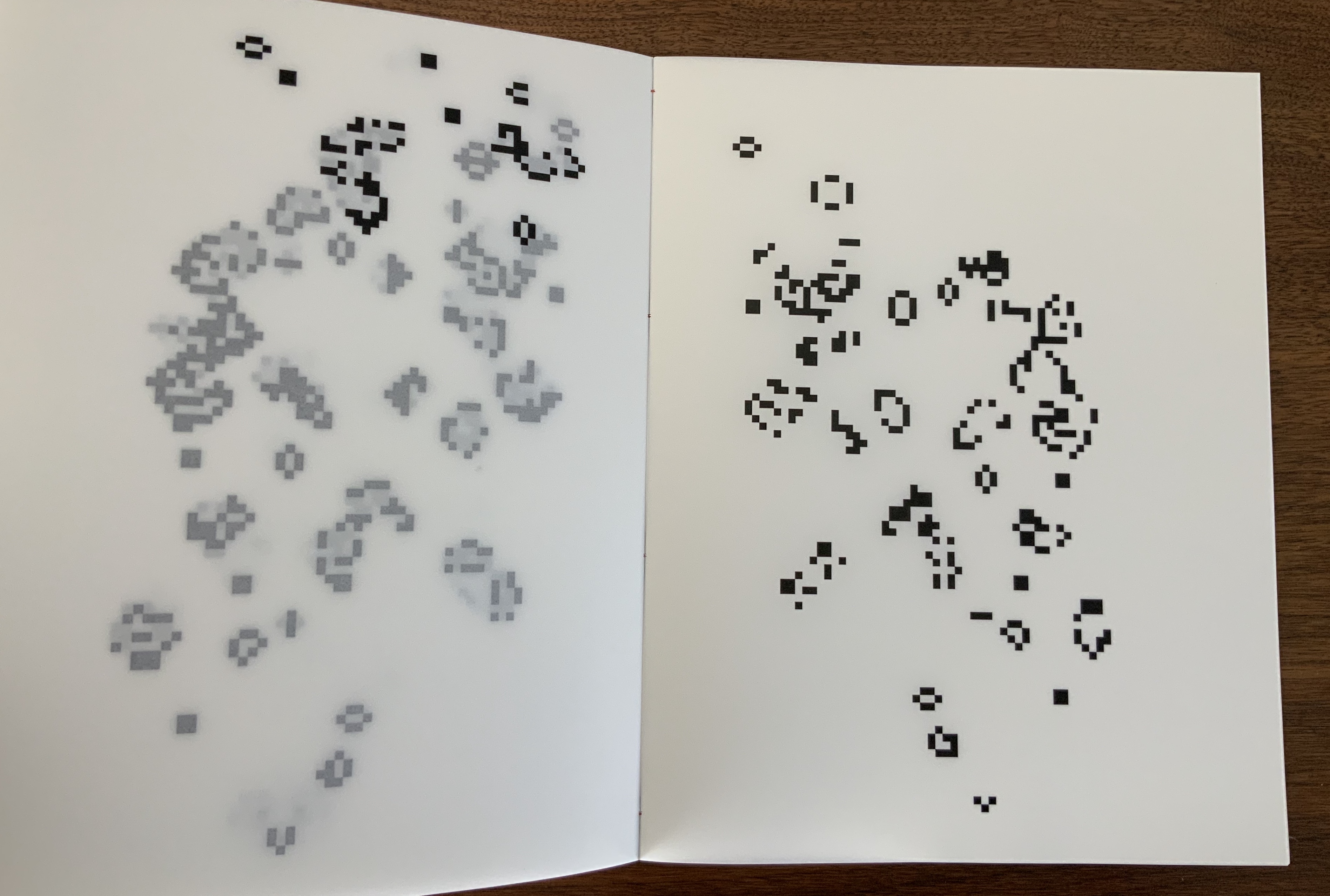
Bowling over the textual expectations raised by the cover, the interior pages offer only images — images that gradually shift from linearly arranged black rectangles to what seem to be digitally generated Rorschach tests, shifting QR codes or snapshots of a bitmap computer game, all blurred by the turning of the translucent paper. The translucency and images add another layer to each page and double-spread of images and also add another set of expectations and questions. What determined the starting point of those arranged rectangles? What drives the sequence of their change?
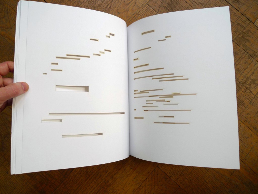
Without Lord’s own description of the work, a highly developed form of art-historical, science-historical visual genius is required to answer those questions. A genius with the visual recall to recognize that “The first spread of the book copies the last spread of Marcel Broodthaer’s book Un coup de dés jamais n’abolira le hasard (A throw of the dice will never abolish chance), made in 1969.” A genius that can recognize the sequence as being “generated using a simple mathematical formula known as the Game of Life, originally devised by the mathematician John Conway, also in the year 1969.”
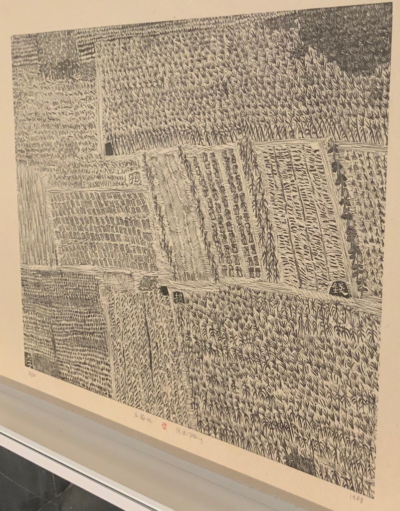
Blocking out Mallarmé’s words with black bars of varying sizes corresponding to the poem’s typography and turning Poème into Image, Broodthaers’s homage has provided the starting point to several works of visual homage: Derek Beaulieu, Jérémie Bennequin, Klaus Detjen, Sammy Engramer, Cerith Wyn Evans, Rainier Lericolais, Alexandra Leykauf, Michael Maranda, Guido Molinari, Michalis Pichler and Eric Zboya. To their common starting point, each brings to bear his or her own approach. For Lord’s approach, the term “starting point” is more properly “seed”. In Conway’s Game of Life, a seed is any pattern of square cells, some filled (“live”), some unfilled (“dead”). Here are two basic patterns:
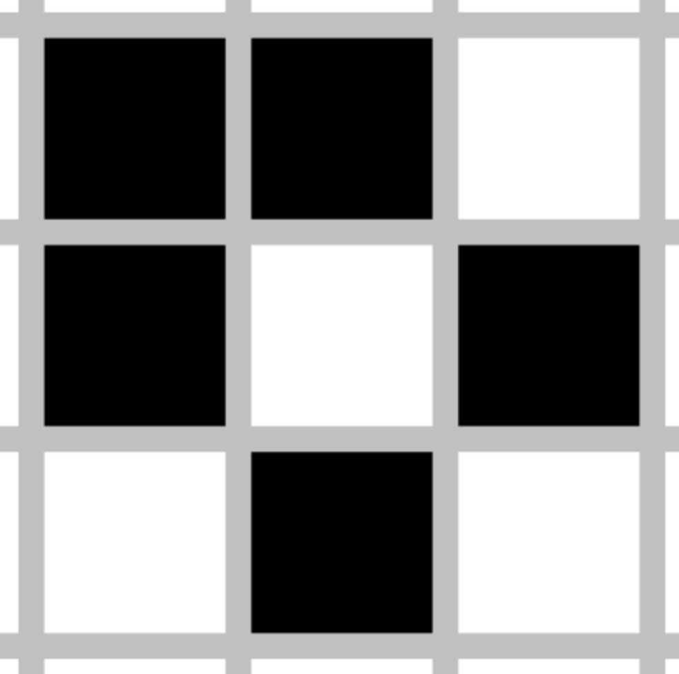

On the left is a “still-life” seed known as “Boat”; on the right is “Gosper’s glider gun”, an obviously more complicated pattern named after its creator, Bill Gosper. A forerunner of simulation games, Conway’s game poses a set of simple rules to be played out within an infinite grid:
- Any live cell with fewer than two live neighbours dies, as if by underpopulation.
- Any live cell with two or three live neighbours lives on to the next generation.
- Any live cell with more than three live neighbours dies, as if by overpopulation.
- Any dead cell with exactly three live neighbours becomes a live cell, as if by reproduction.
Here is Gosper’s glider gun, activated by the Game of Life’s rules encoded in a GIF:

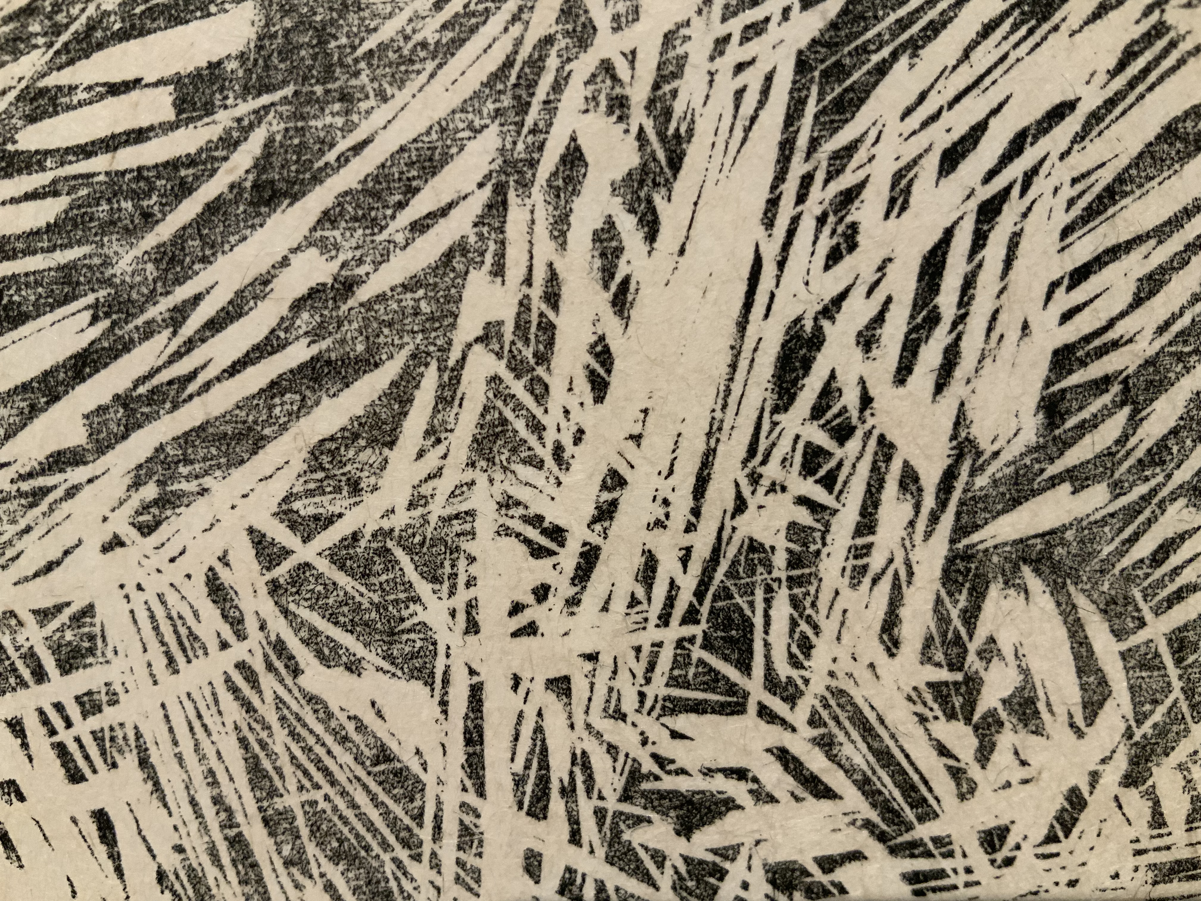
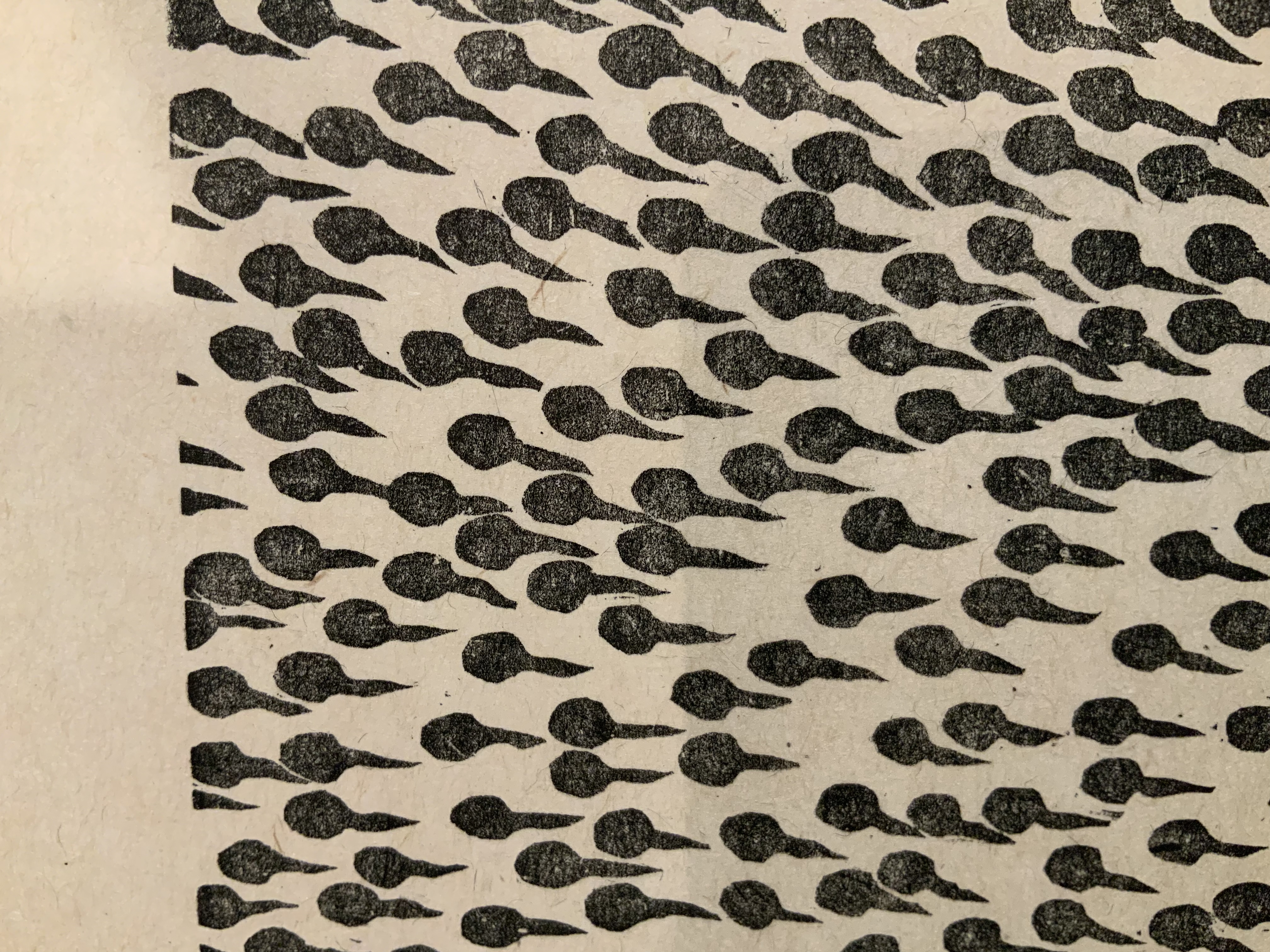
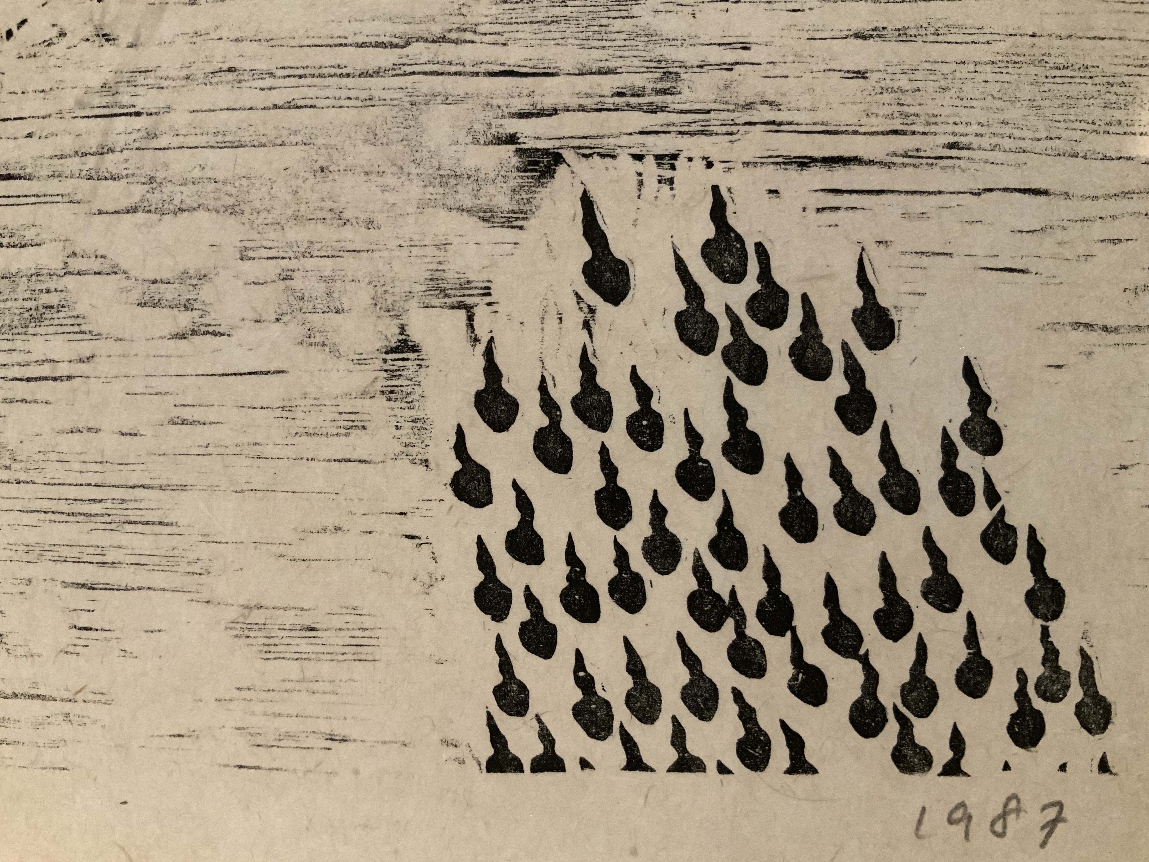
Lord’s seed is the image of the last double-page spread in Broodthaers’ version of Un Coup de Dés.

Like a more complex glider gun, it generates the subsequent double-page spread images, each image being the seed for the next image. As Lord puts it,
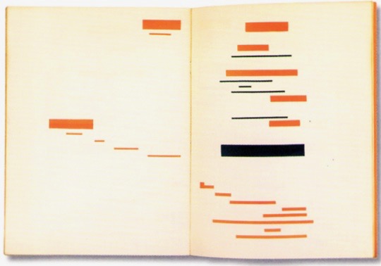
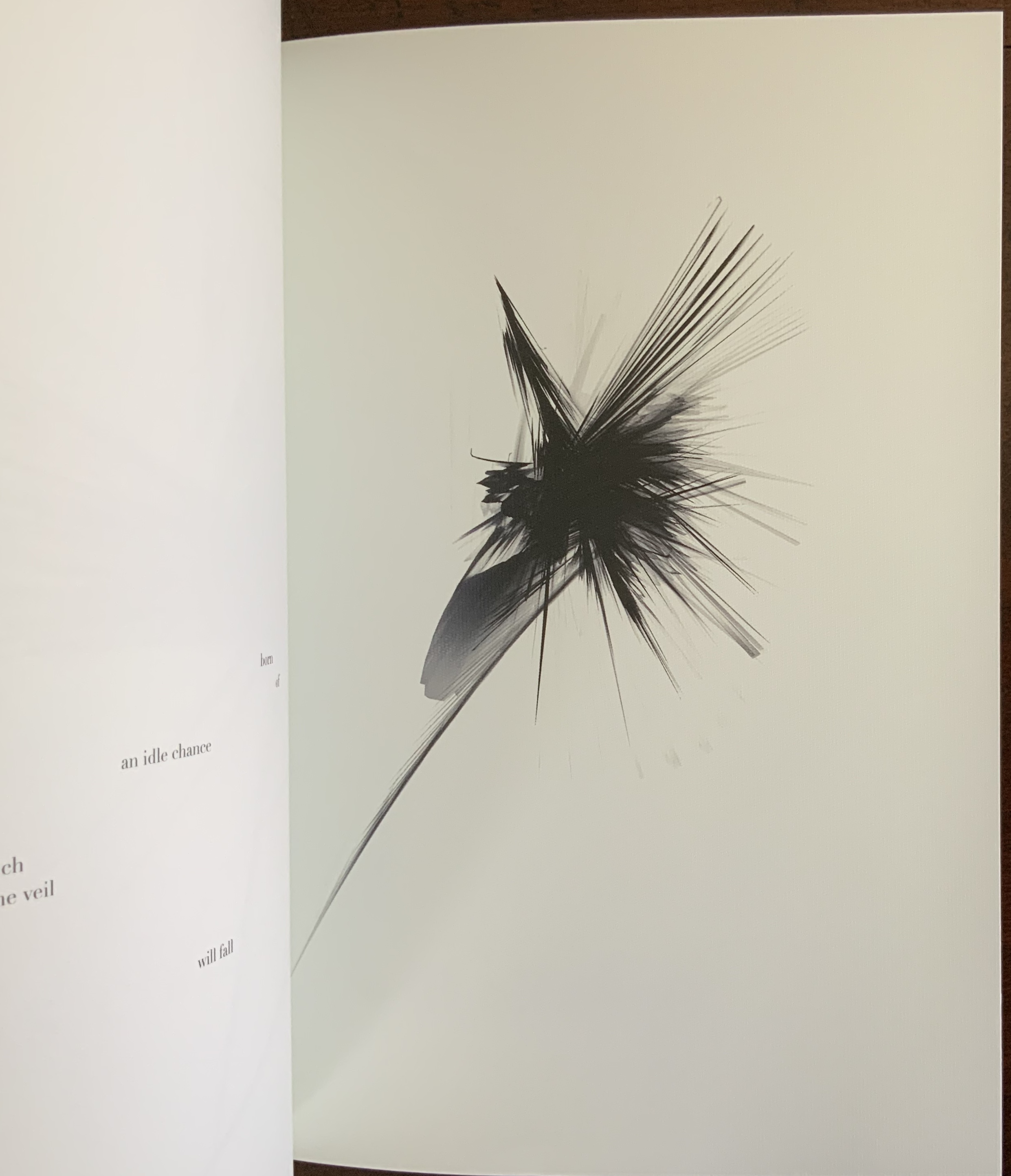
The lines of Mallarmé’s poem inflate into balloons which expand and then pop into nothingness, or collide with each other to generate debris, or collapse into thicker bars. The image fragments into a vibratory bitmap constellation of expansions and contractions, in which interactions between forms continuously generate new forms, in a way that is neither random nor intuitive.
This 21st century American artist turning with a 20th century paintbrush dipped into the words of a 19th century French poet via a 20th century Belgian artist calls to mind The Education of Henry Adams. Throughout, Adams refers to himself in the third person. Post-Broodthaers, there is something “third-person-ish” — of being at two removes — in Lord’s homage and those of Beaulieu et al. above. But there is more to the recollection than grammar. Consider this passage from The Education in which “one” writes,
Historians undertake to arrange sequences,–called stories, or histories–assuming in silence a relation of cause and effect. These assumptions, hidden in the depths of dusty libraries, have been astounding, but commonly unconscious and childlike; so much so, that if any captious critic were to drag them to light, historians would probably reply, with one voice, that they had never supposed themselves required to know what they were talking about. Adams, for one, had toiled in vain to find out what he meant….he insisted on a relation of sequence, and if he could not reach it by one method, he would try as many methods as science knew. Satisfied that the sequence of men led to nothing and that the sequence of their society could lead no further, while the mere sequence of time was artificial, and the sequence of thought was chaos, he turned at last to the sequence of force; and thus it happened that, after ten years’ pursuit, he found himself lying in the Gallery of Machines at the Great Exposition of 1900, his historical neck broken by the sudden irruption of forces totally new. Chapter XXV
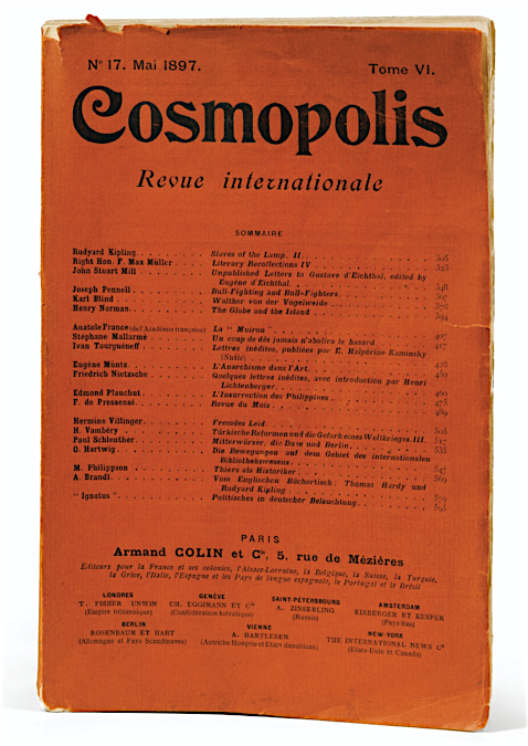
Adams and his third-person self were in Paris in May 1897, when Un Coup de Dés first appeared in the quarterly Cosmopolis. Despite their proximity, a common interest in quarterlies and the popular press, and a near obsession with the electrical forces of the dynamo, the men’s two paths did not cross. Adams mentions Mallarmé in a letter only in passing.
Sartre called Mallarmé the poet of nothingness. Its title and Lord’s description of The Abolition of Chance as a “constellation of expansions and contractions, in which interactions between forms continuously generate new forms, in a way that is neither random nor intuitive” suggest an alternative to nothingness. The final double-page spread does present a pattern of live cells. Lord, perhaps like his fellow American, responds to nothingness with a type of Buddhist repose, if not affirmation, much as Adams responded to the memorial for his wife that he had commissioned from Augustus St. Gaudens:
His first step, on returning to Washington, took him out to the cemetery known as Rock Creek, to see the bronze figure which St. Gaudens had made for him in his absence. Naturally every detail interested him; every line; every touch of the artist; every change of light and shade; every point of relation; every possible doubt of St. Gaudens’s correctness of taste or feeling; so that, as the spring approached, he was apt to stop there often to see what the figure had to tell him that was new; but, in all that it had to say, he never once thought of questioning what it meant. … From the Egyptian Sphinx to the Kamakura Daibuts; from Prometheus to Christ; from Michael Angelo to Shelley, art had wrought on this eternal figure almost as though it had nothing else to say. The interest of the figure was not in its meaning, but in the response of the observer. Chapter XXI
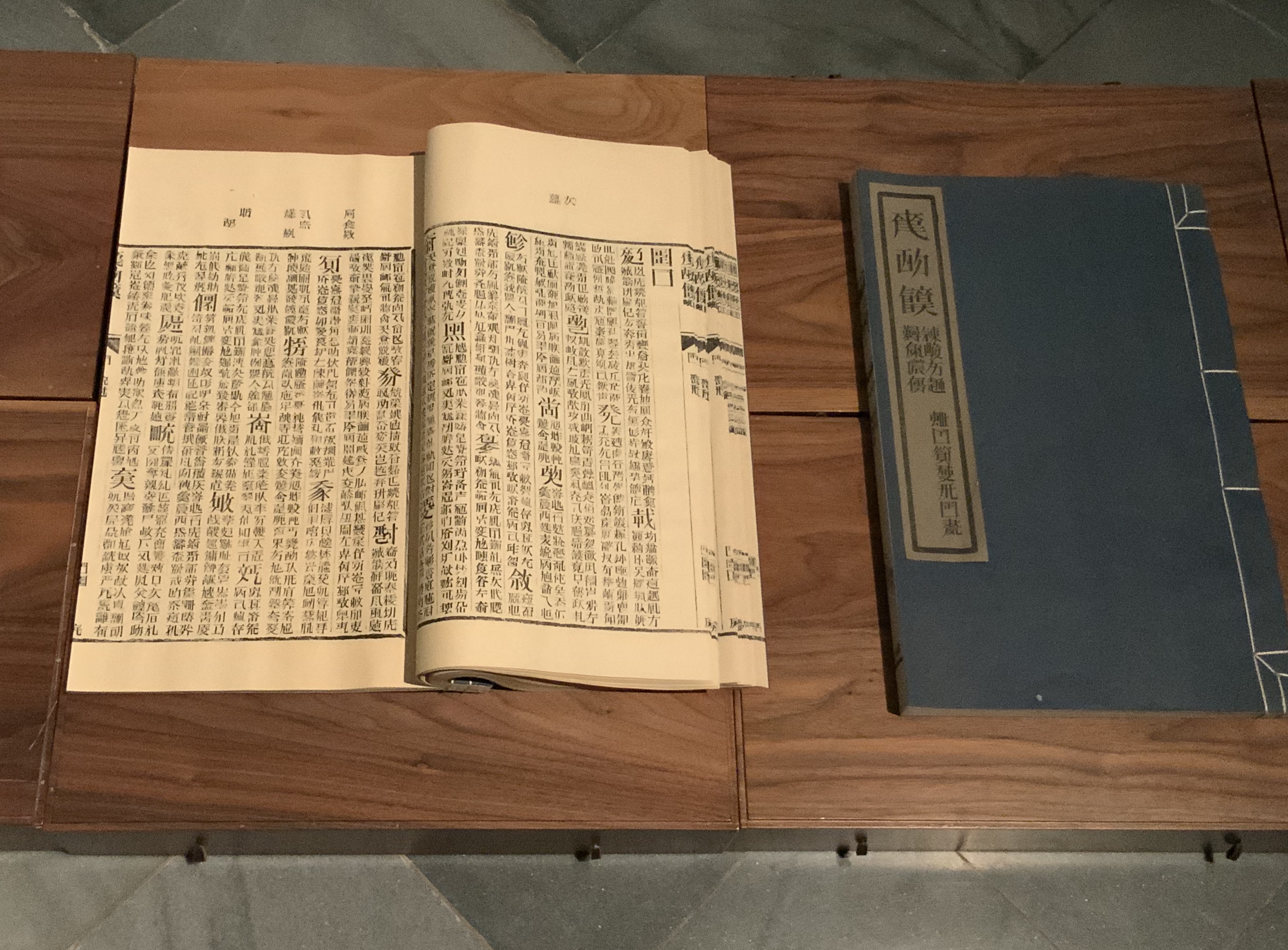
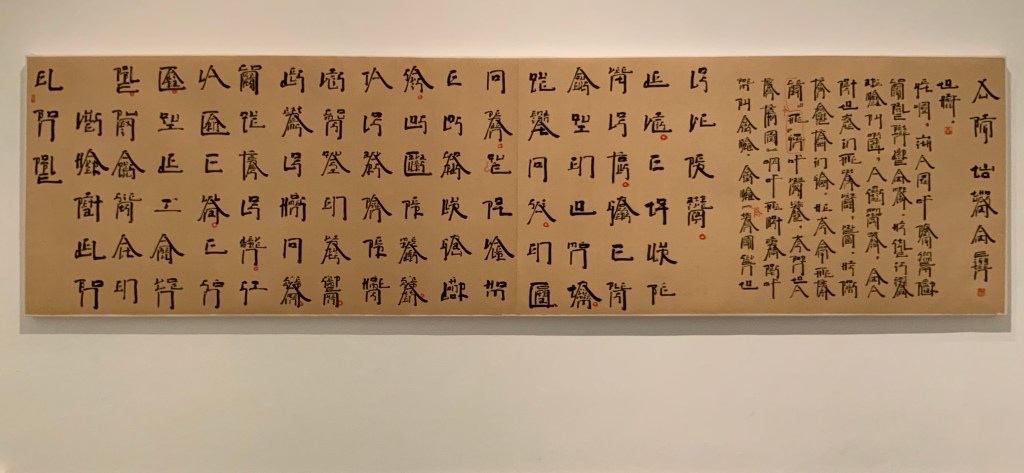
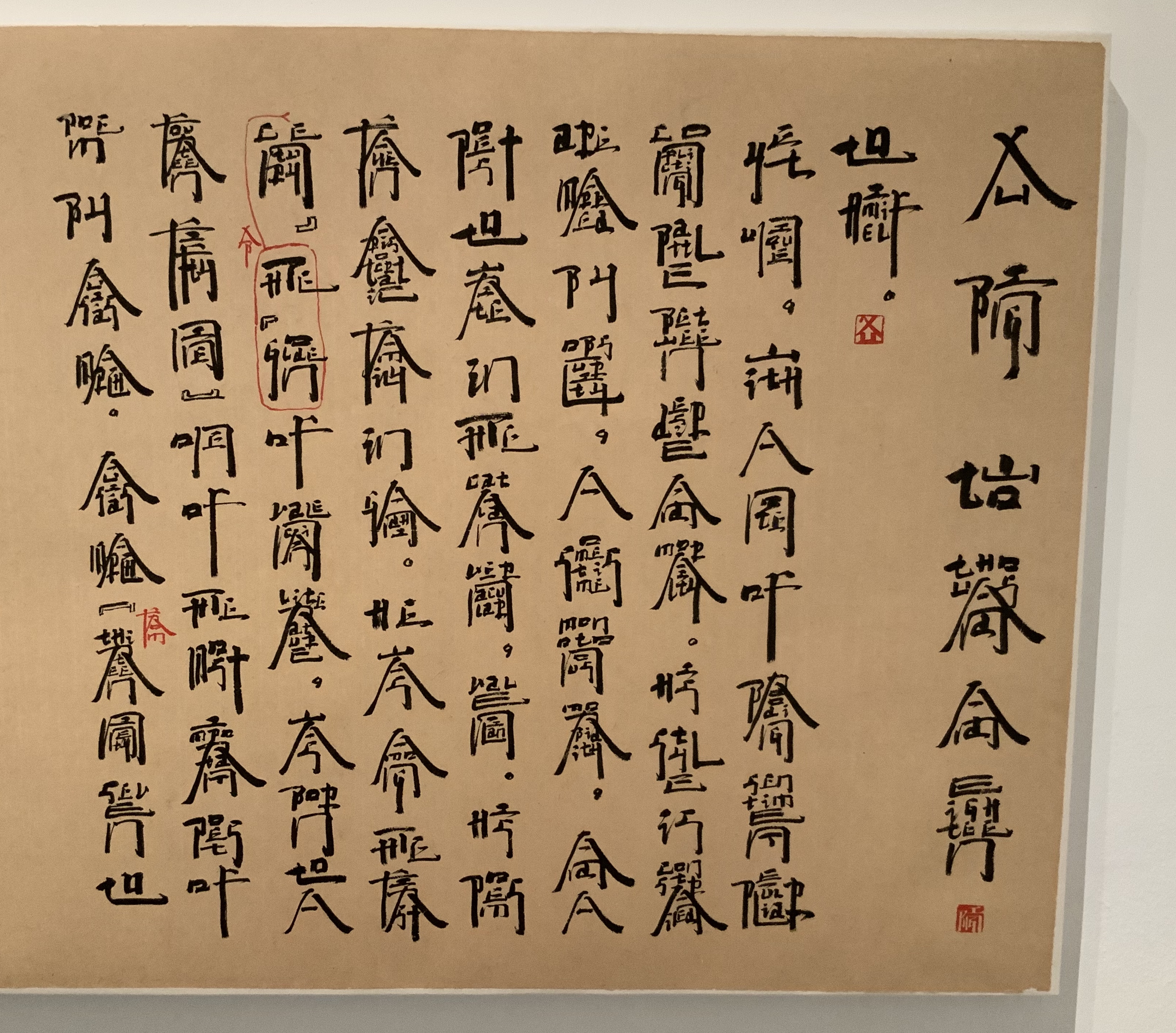
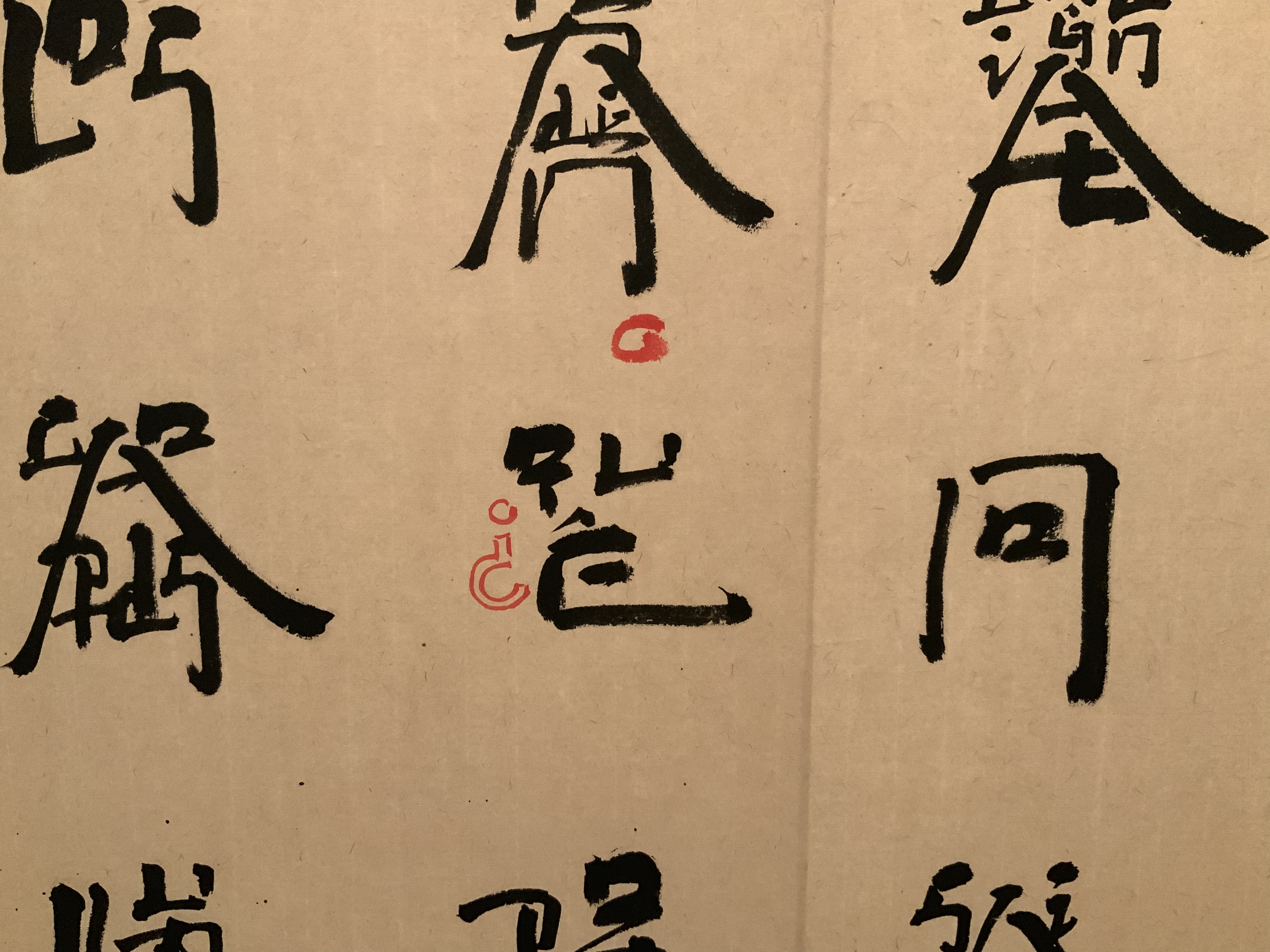
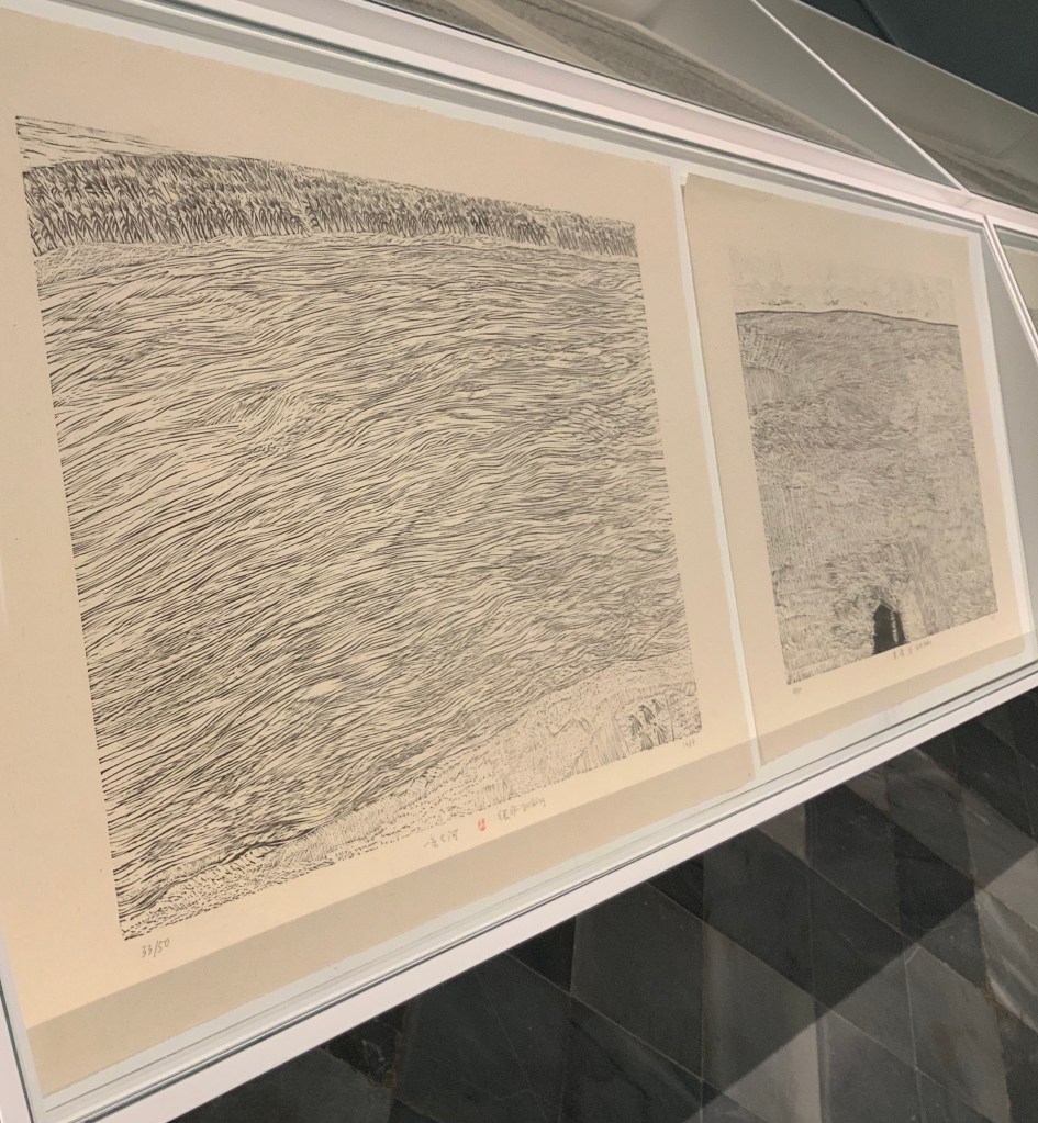
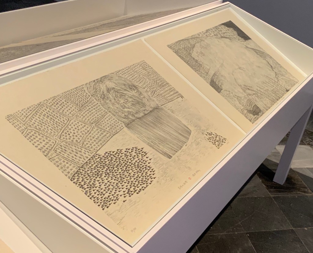
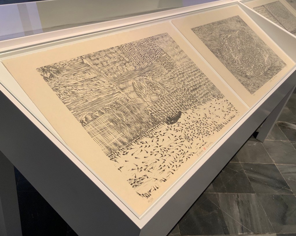
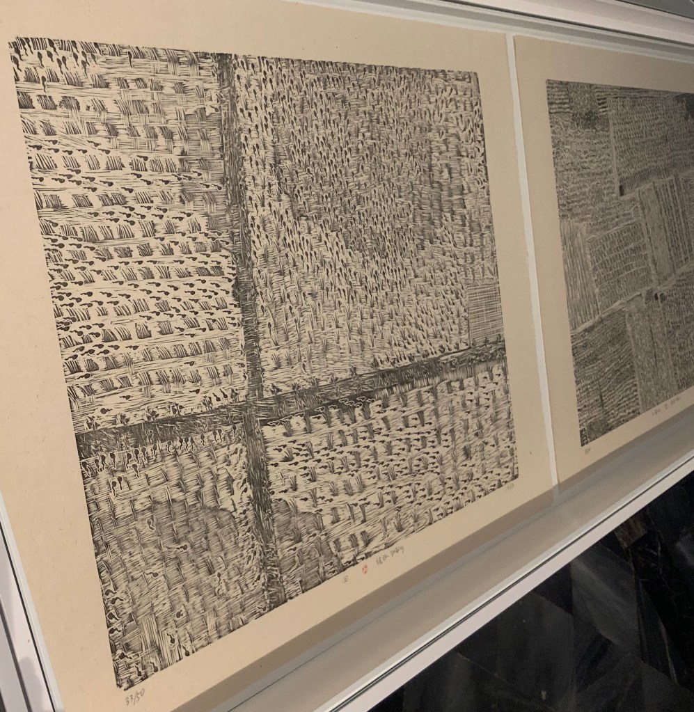
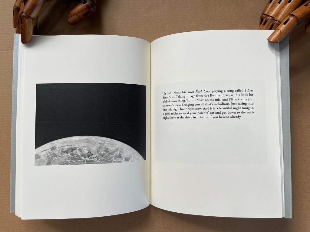
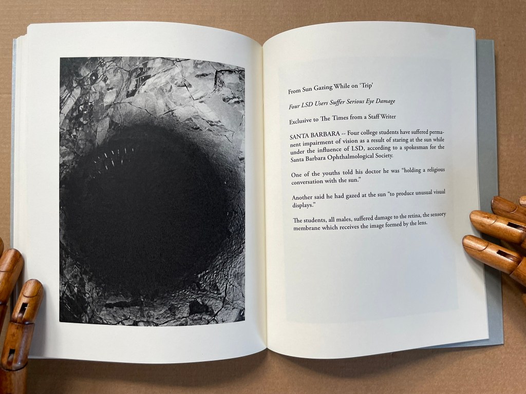
Solution of the Cosmological Idea of the Totality of the Composition of the Appearances of a Cosmic Whole (2010)
Solution of the Cosmological Idea of the Totality of the Composition of the Appearances of a Cosmic Whole (2010)
Benjamin Lord
Perfect bound softcover. H203 x W164 mm [68] pages. Acquired from Veatch’s, 11 June 2021.
Photos: Books On Books Collection.
Further Reading
“Derek Beaulieu”, Books On Books Collection, 19 June 2020.
“Jérémie Bennequin“, Books On Books Collection, 11 April 2020.
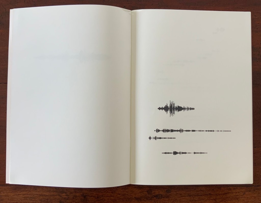
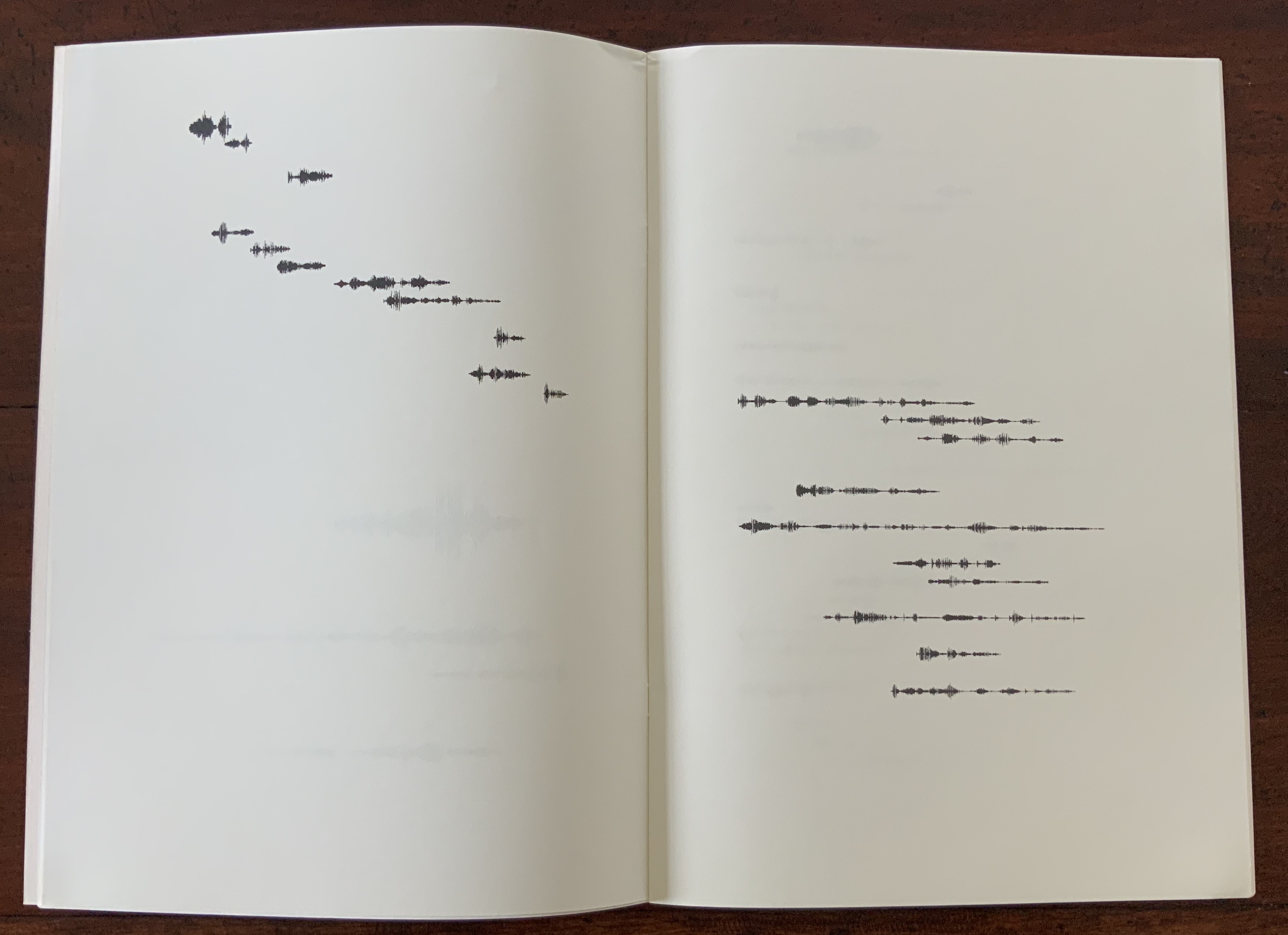
“Sammy Engramer”, Books On Books Collection, 1 June 2020.
“Cerith Wyn Evans”, Books On Books Collection, 16 April 2020.
Michaud, François. Alexandra Leykauf: Chateau de Bagatelle (Nürnberg: Verlag fur moderne Kunst Nürnberg, 2010)
“Guido Molinari”, Books On Books Collection, 13 April 2020.
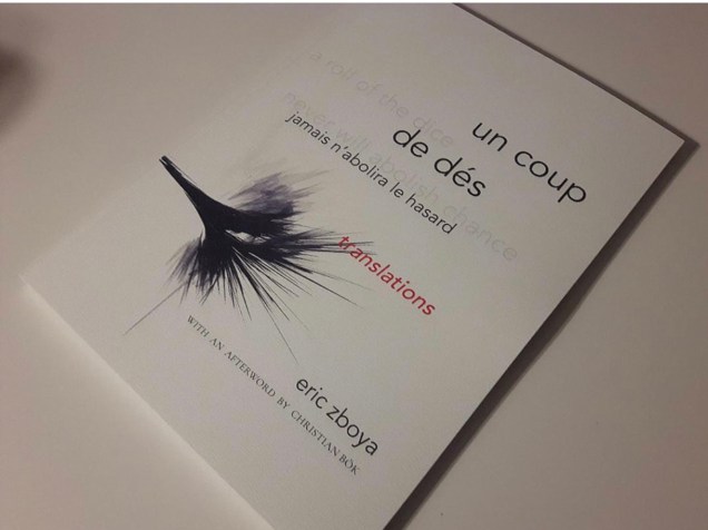
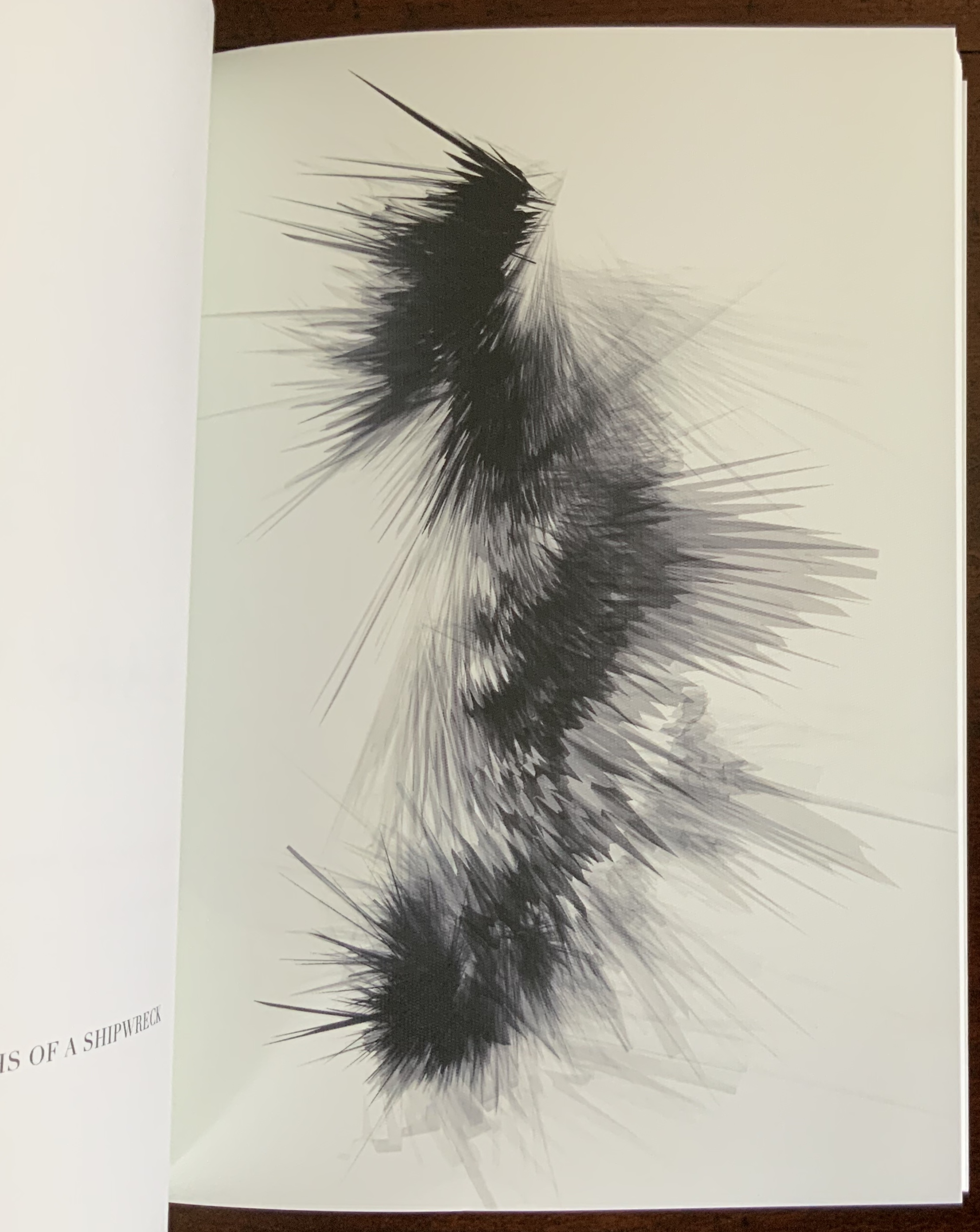
“Eric Zboya“, Books On Books Collection, 1 June 2020.